
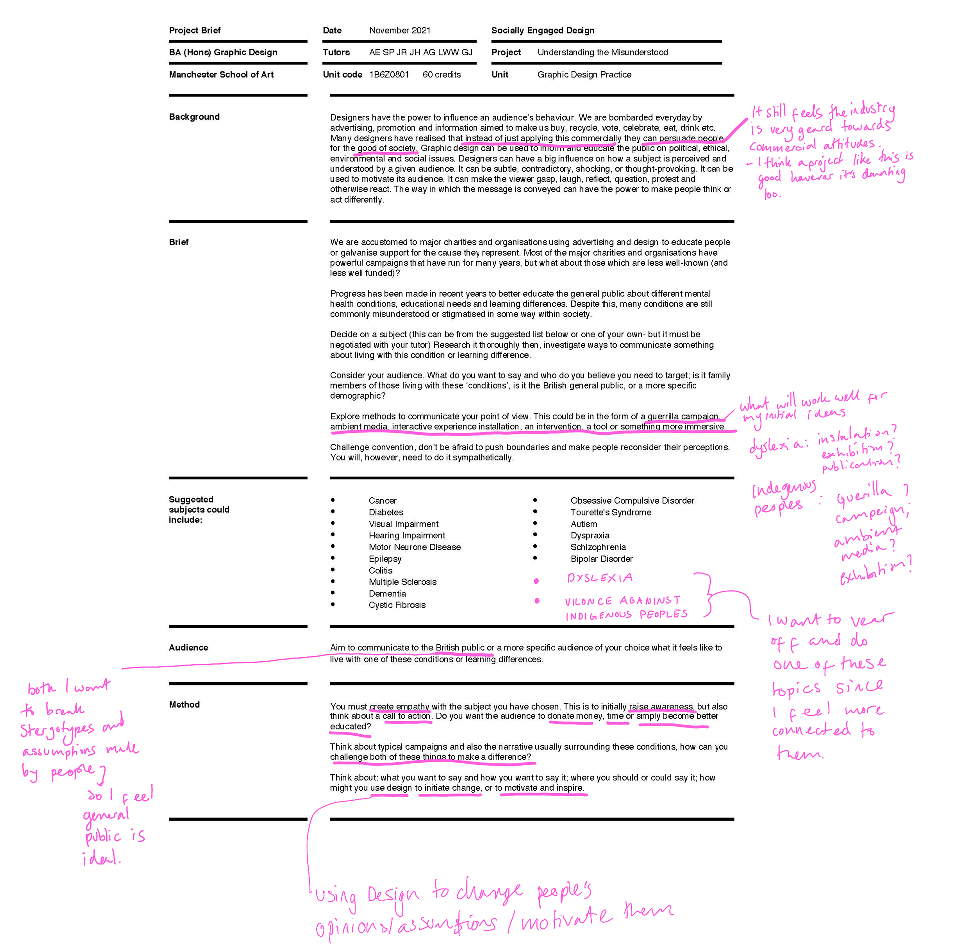
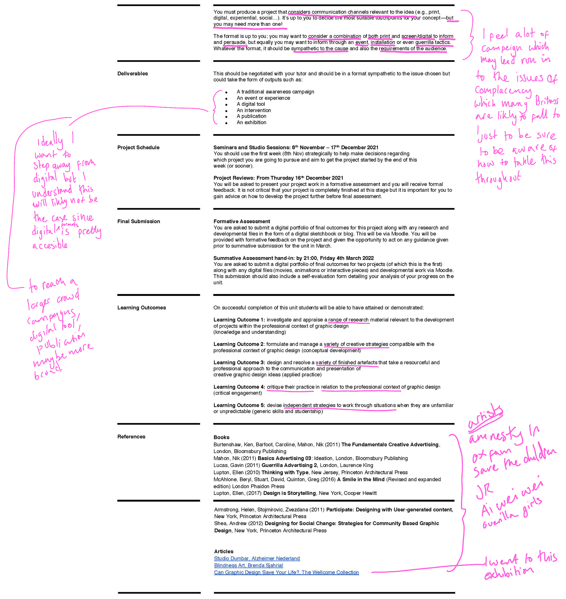
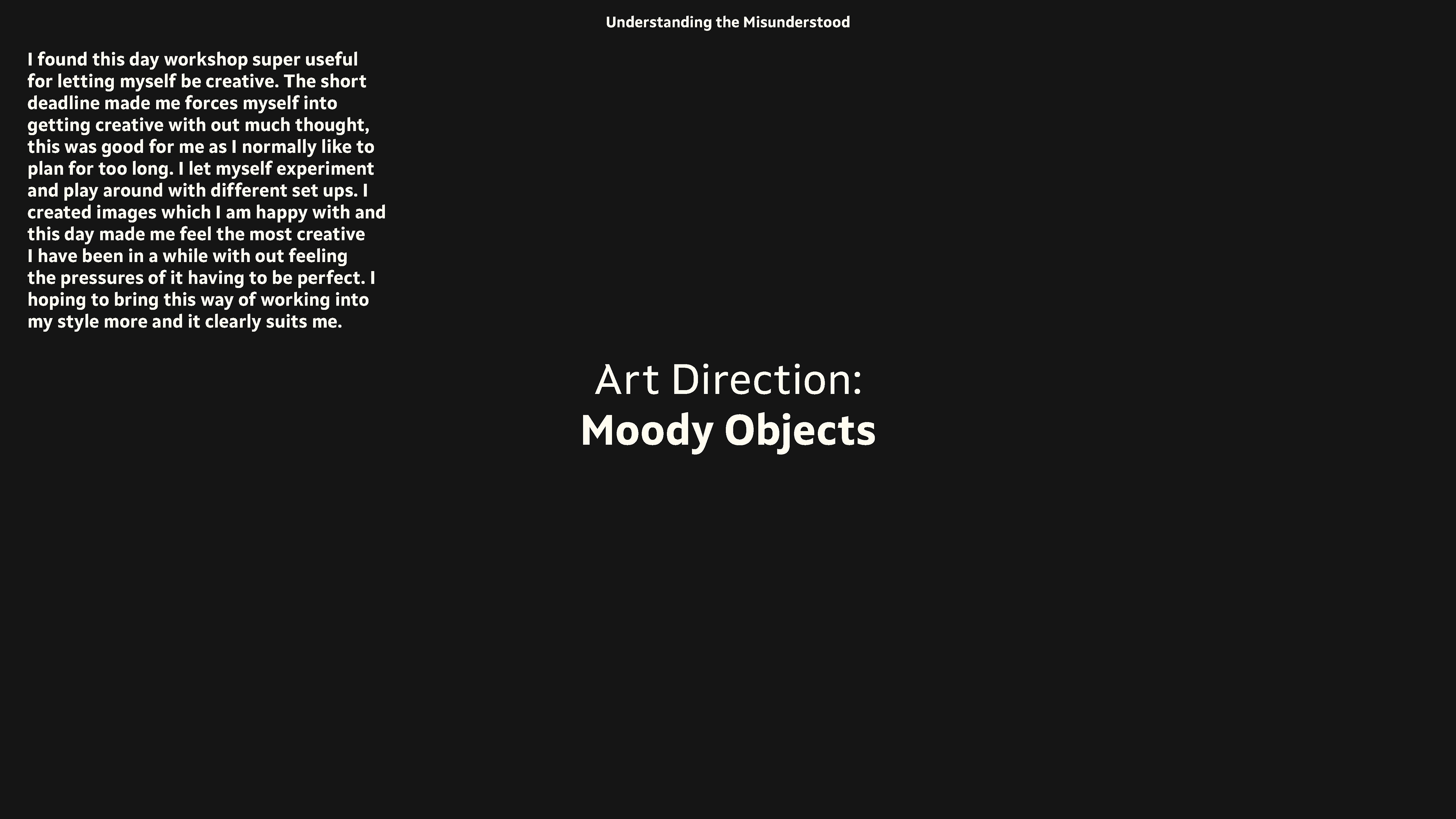
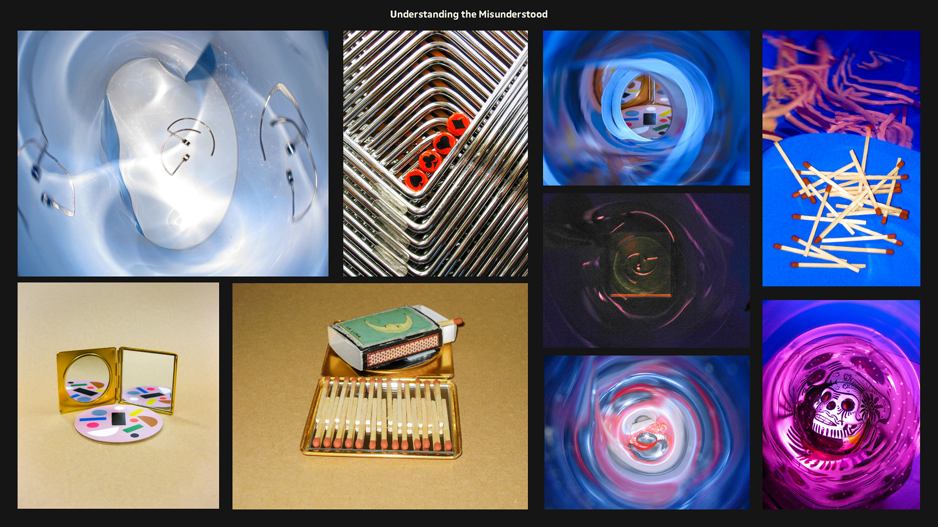
The page works with my writing below an image.
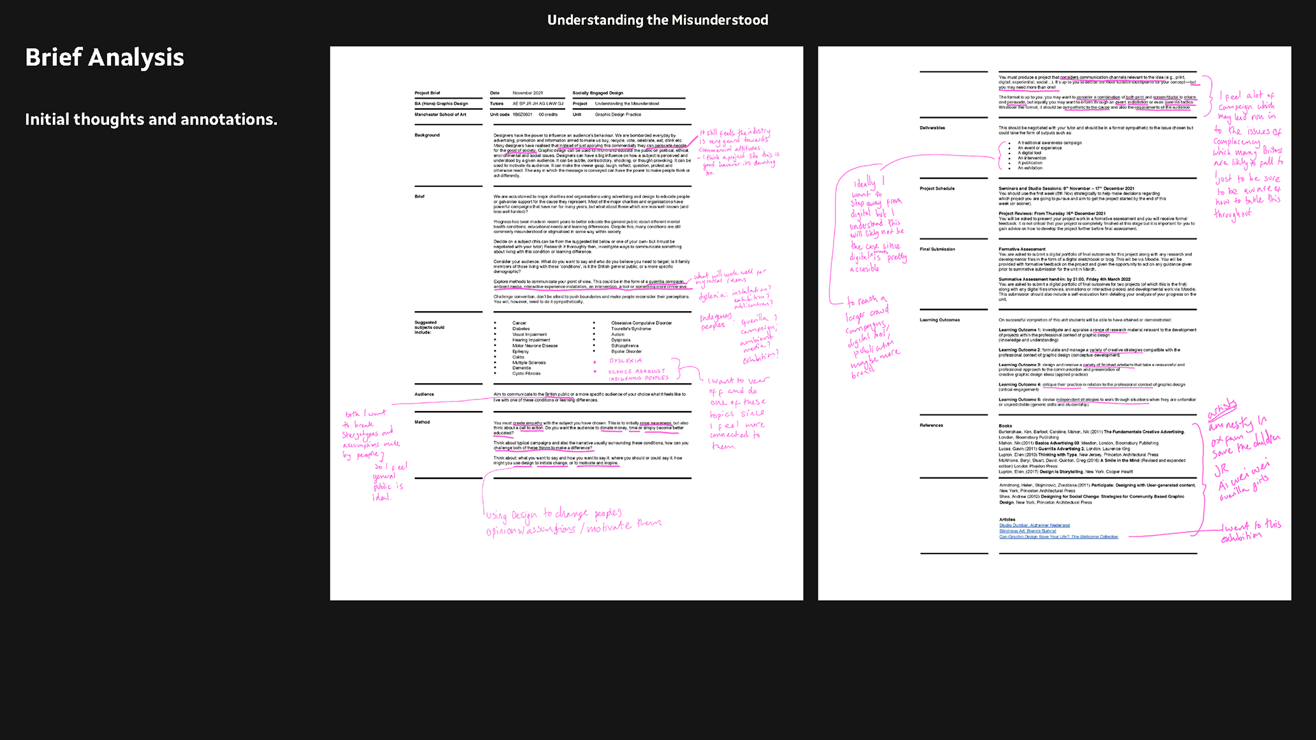
brief annotated - WITH MY THOUGHTS ANNOTATED
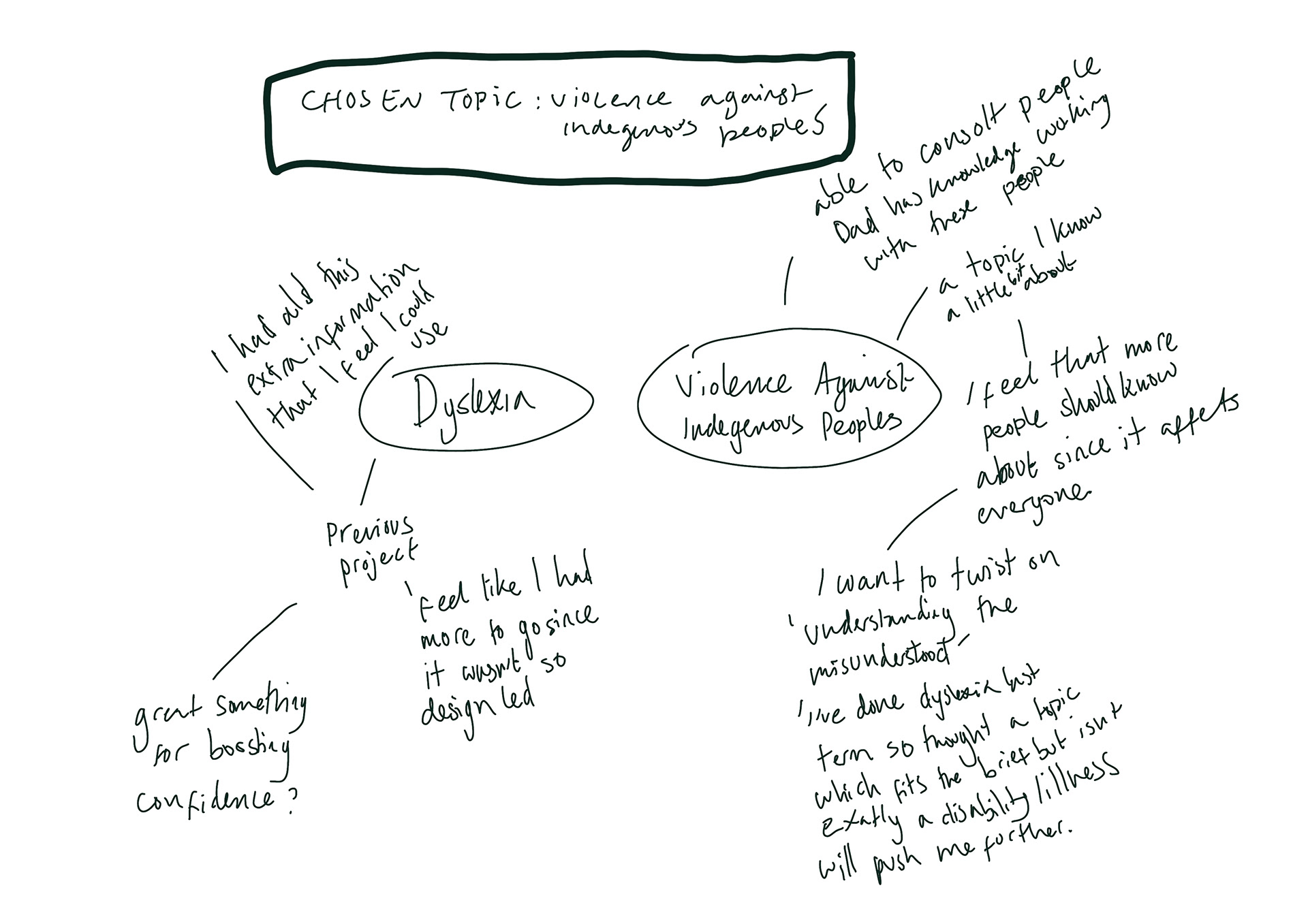
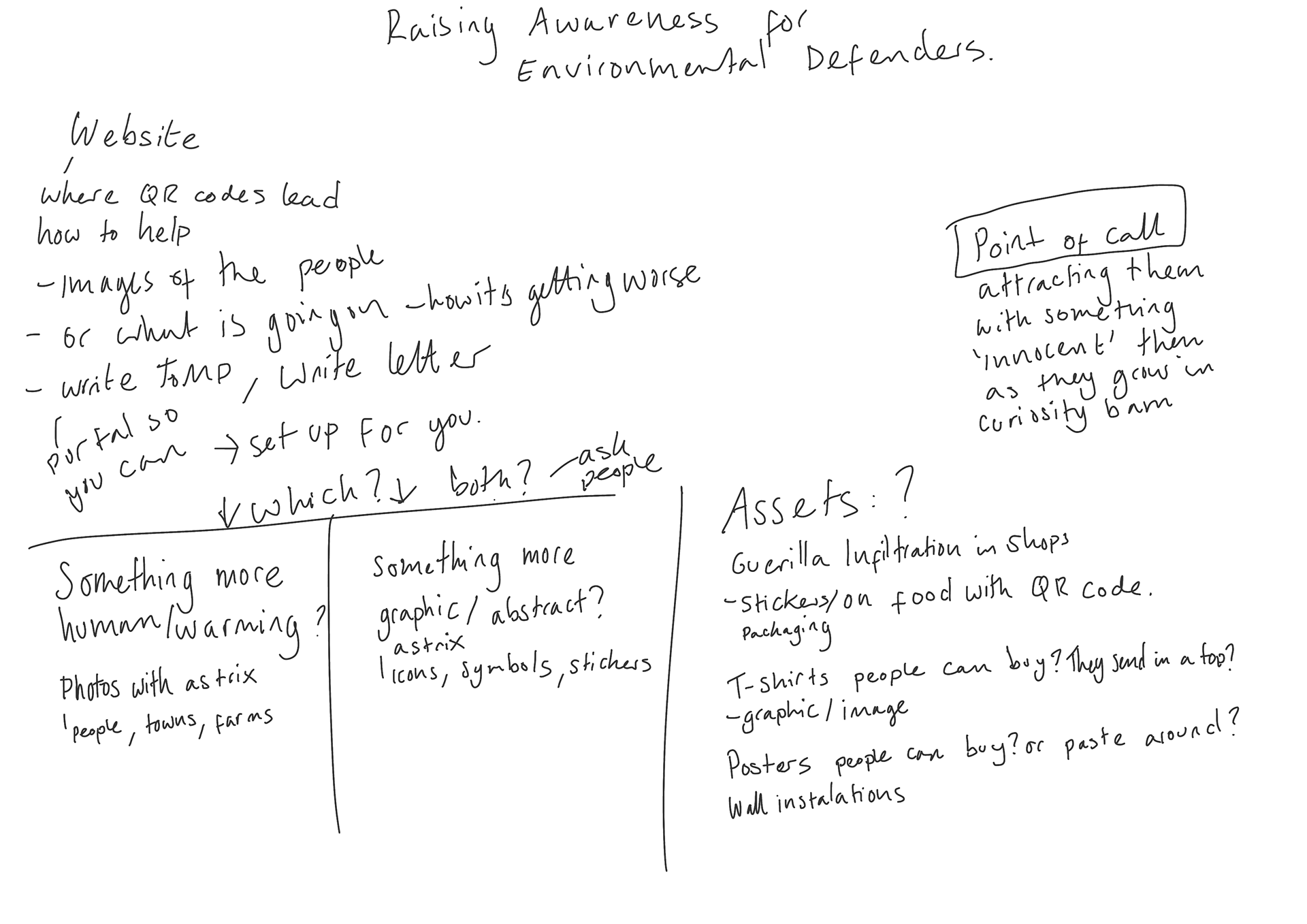
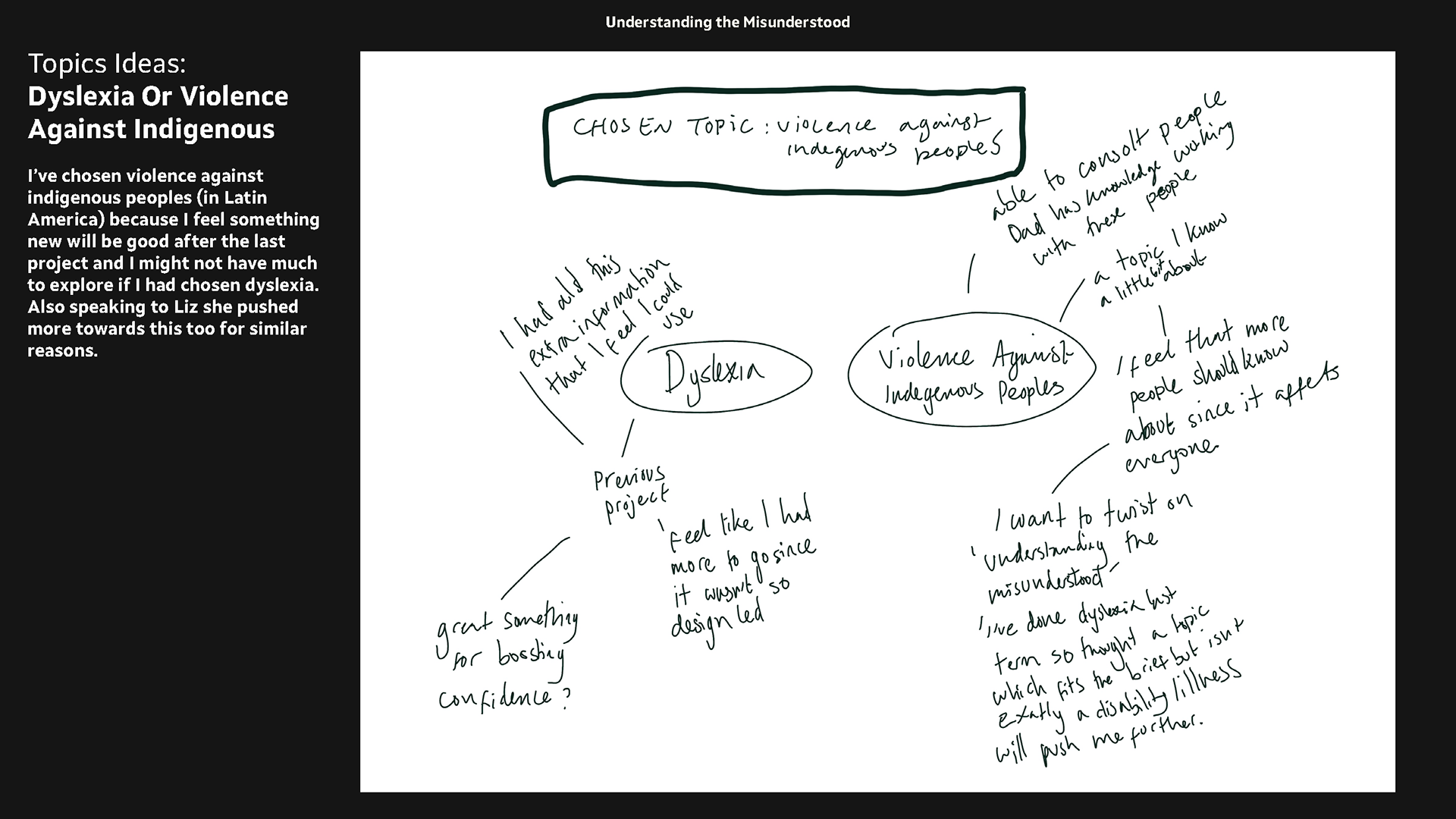
mind map of ideas - dyslexia, environmentalism, what i have chosen.
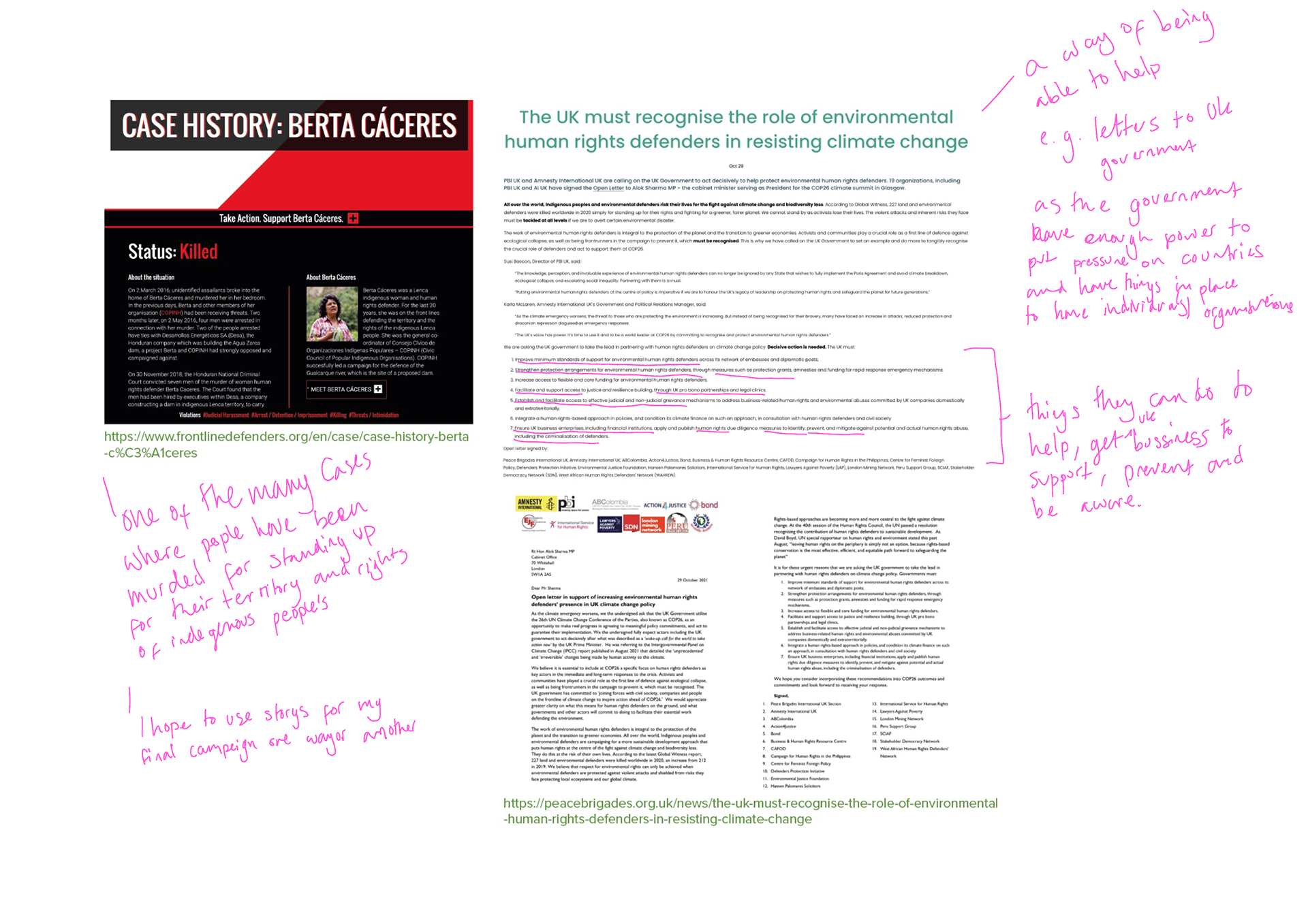
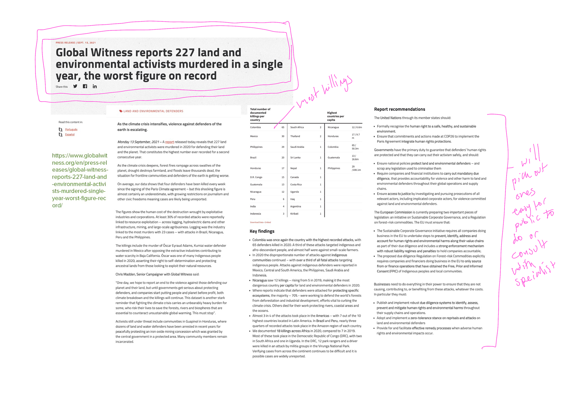
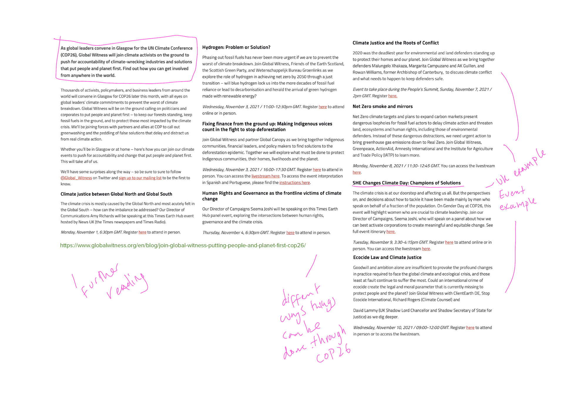
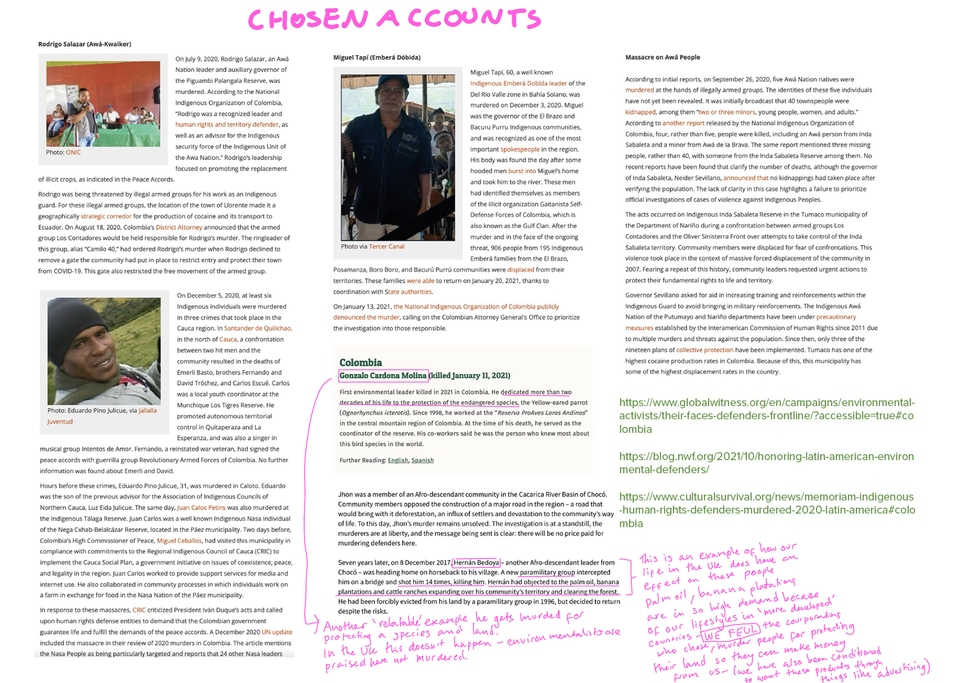
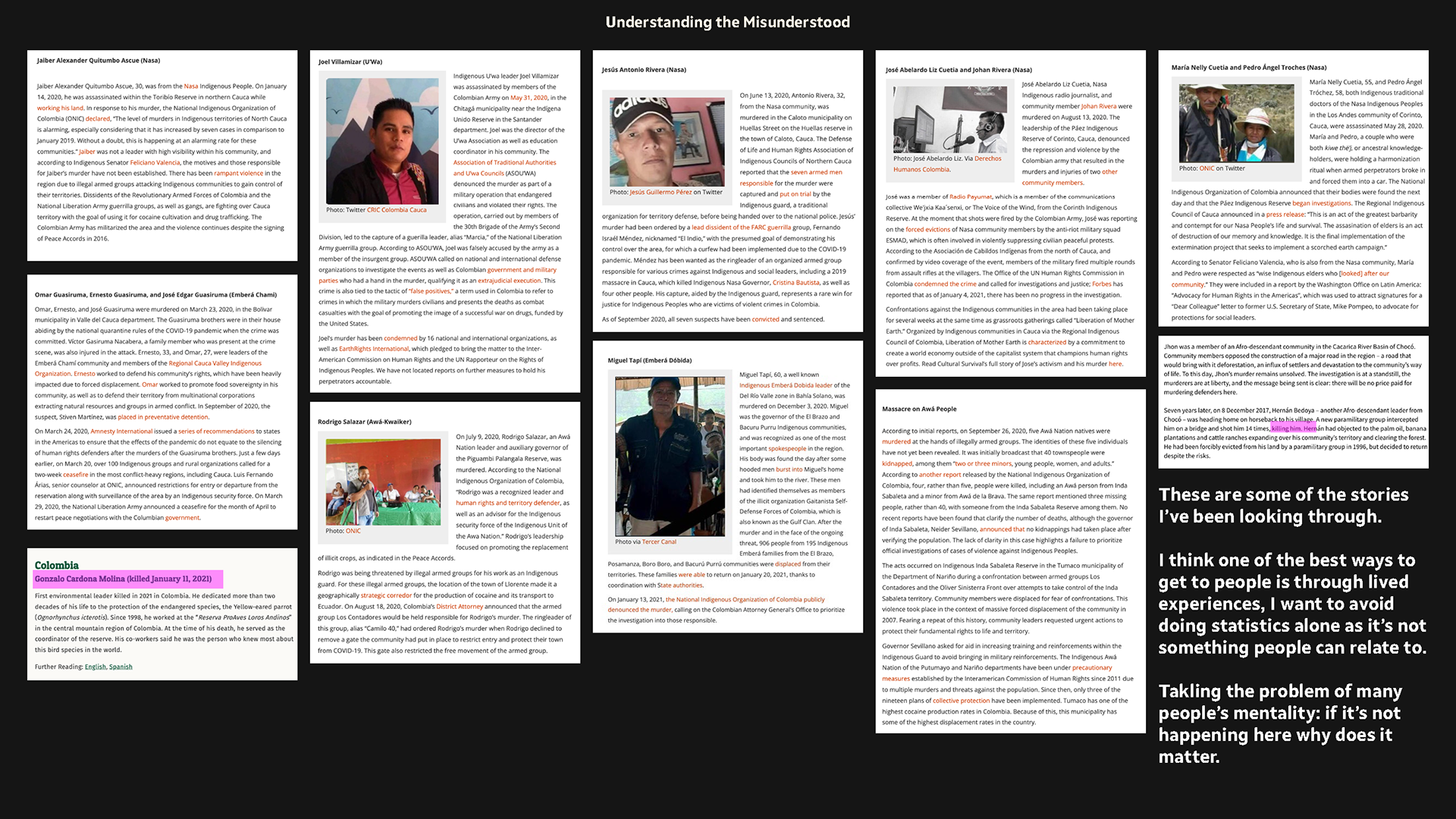
Research into environmentalist in Latin america
Case studies like these really help you understand the situations. However due to how long they are a format like this wouldn't work for as a call to action if it were a campaign of any sort. I do think these videos are vital for finding out more so they could be used as a secondary or final point of call on a website or something at the stage of when you want to find out more - you would get there from a catchy initial point to call,
initial research - visual
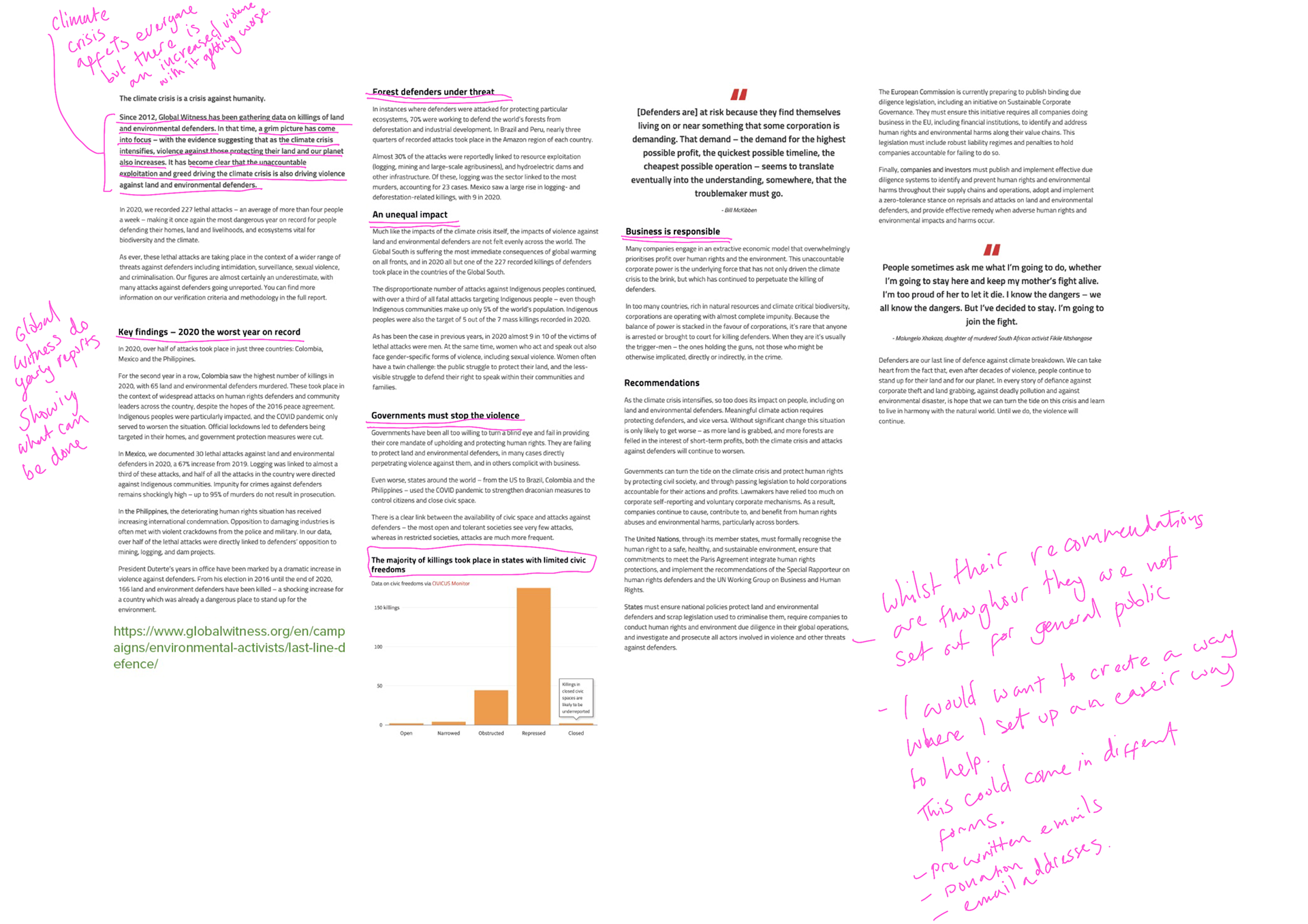
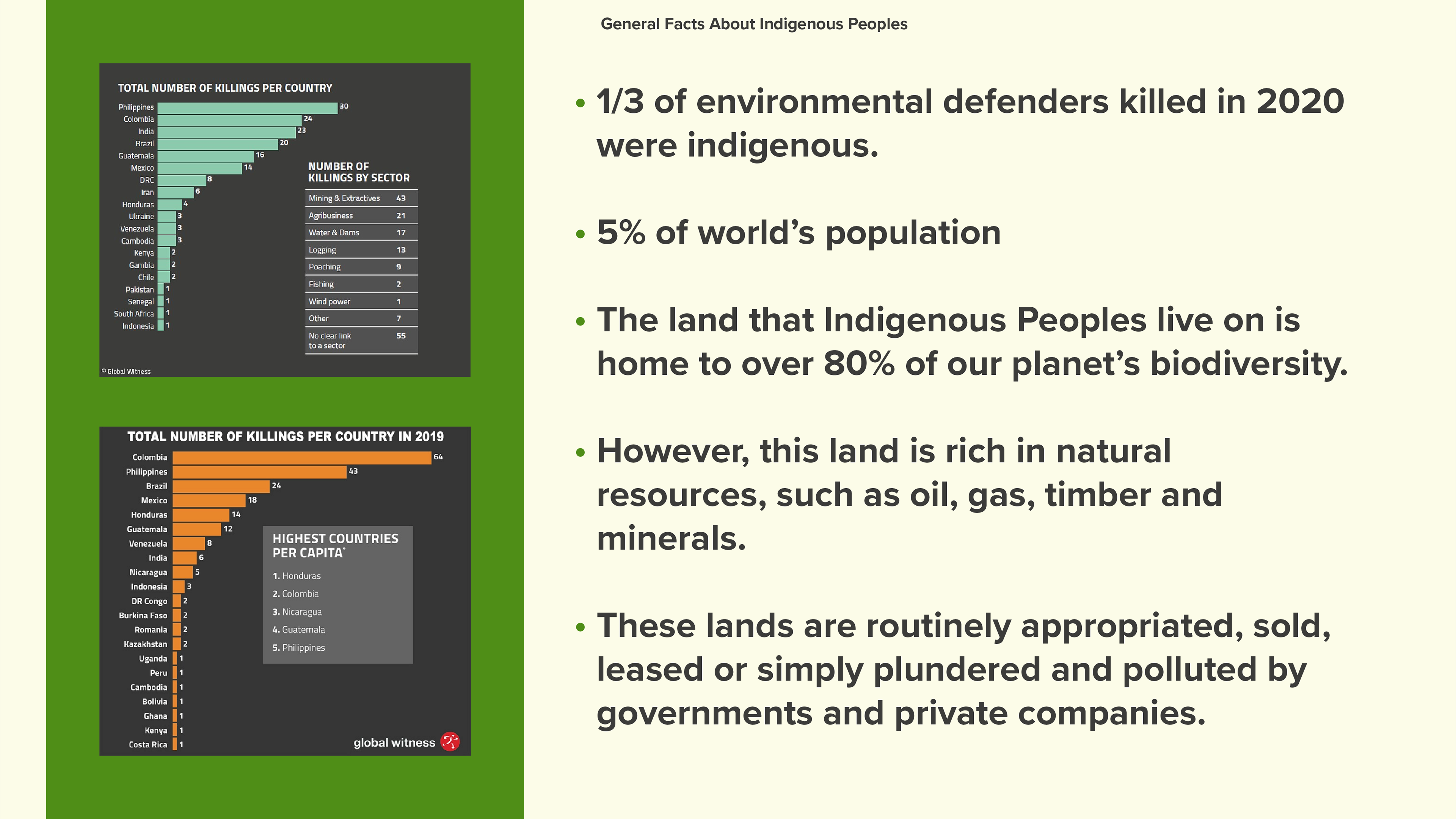
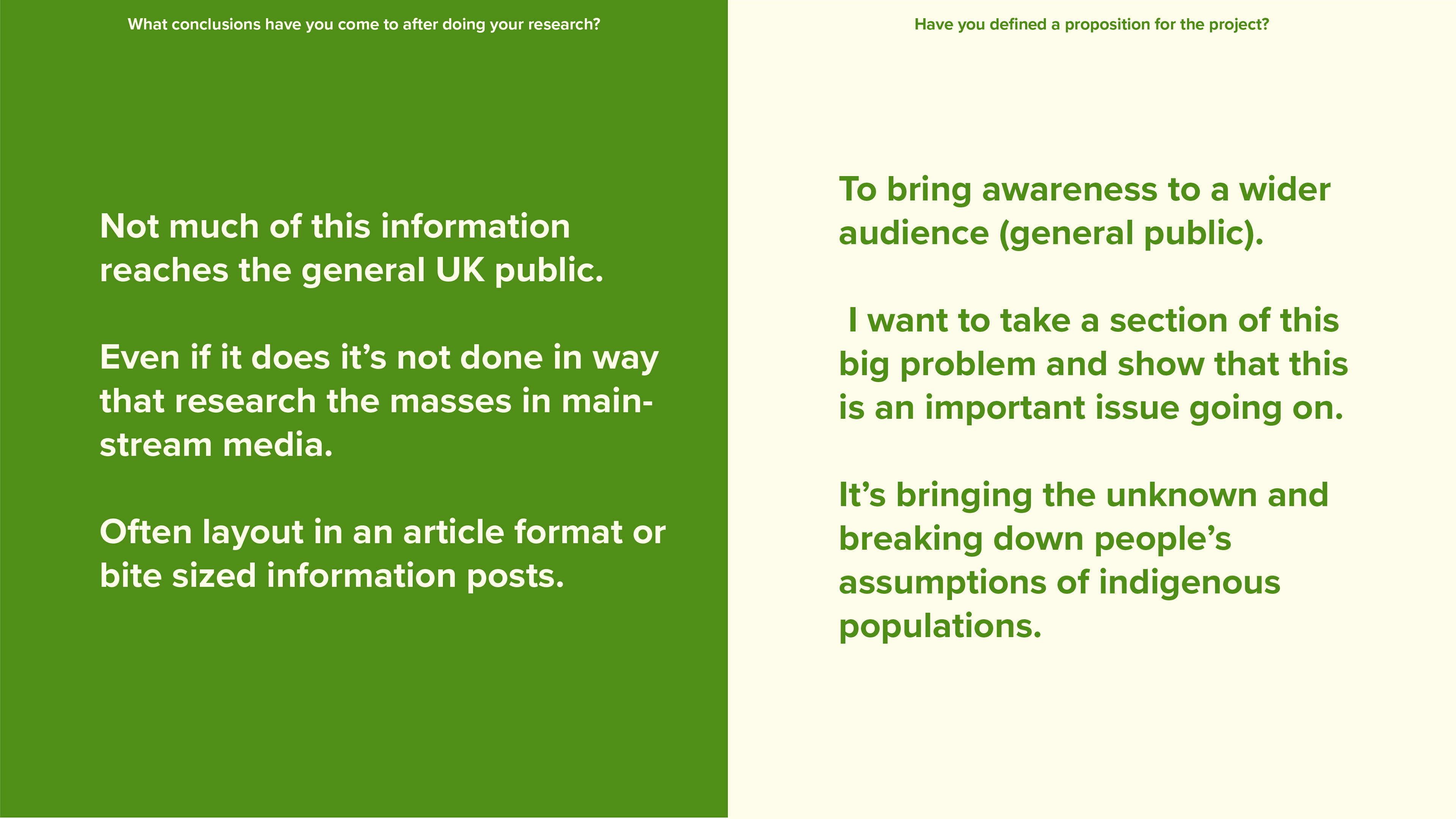
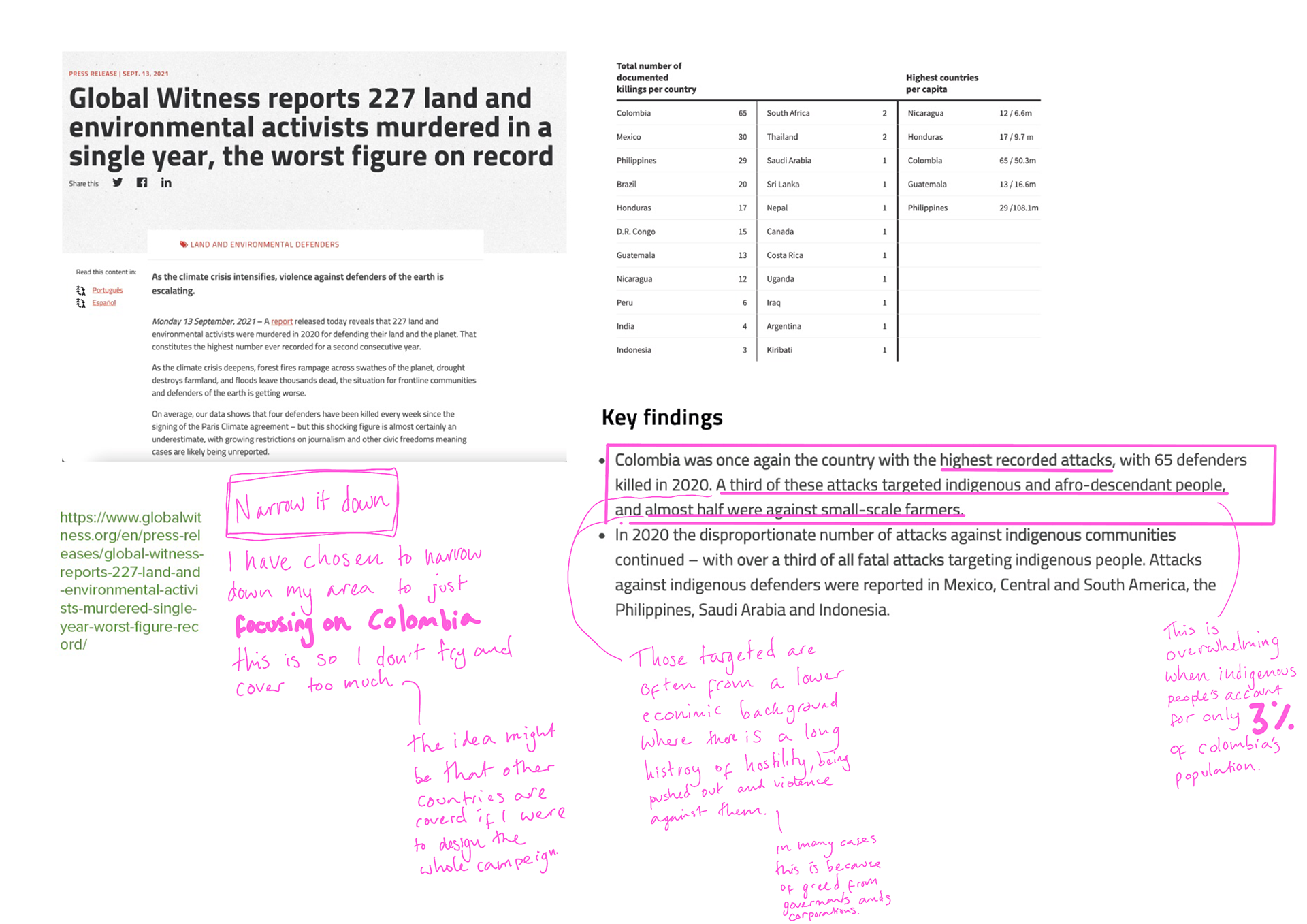
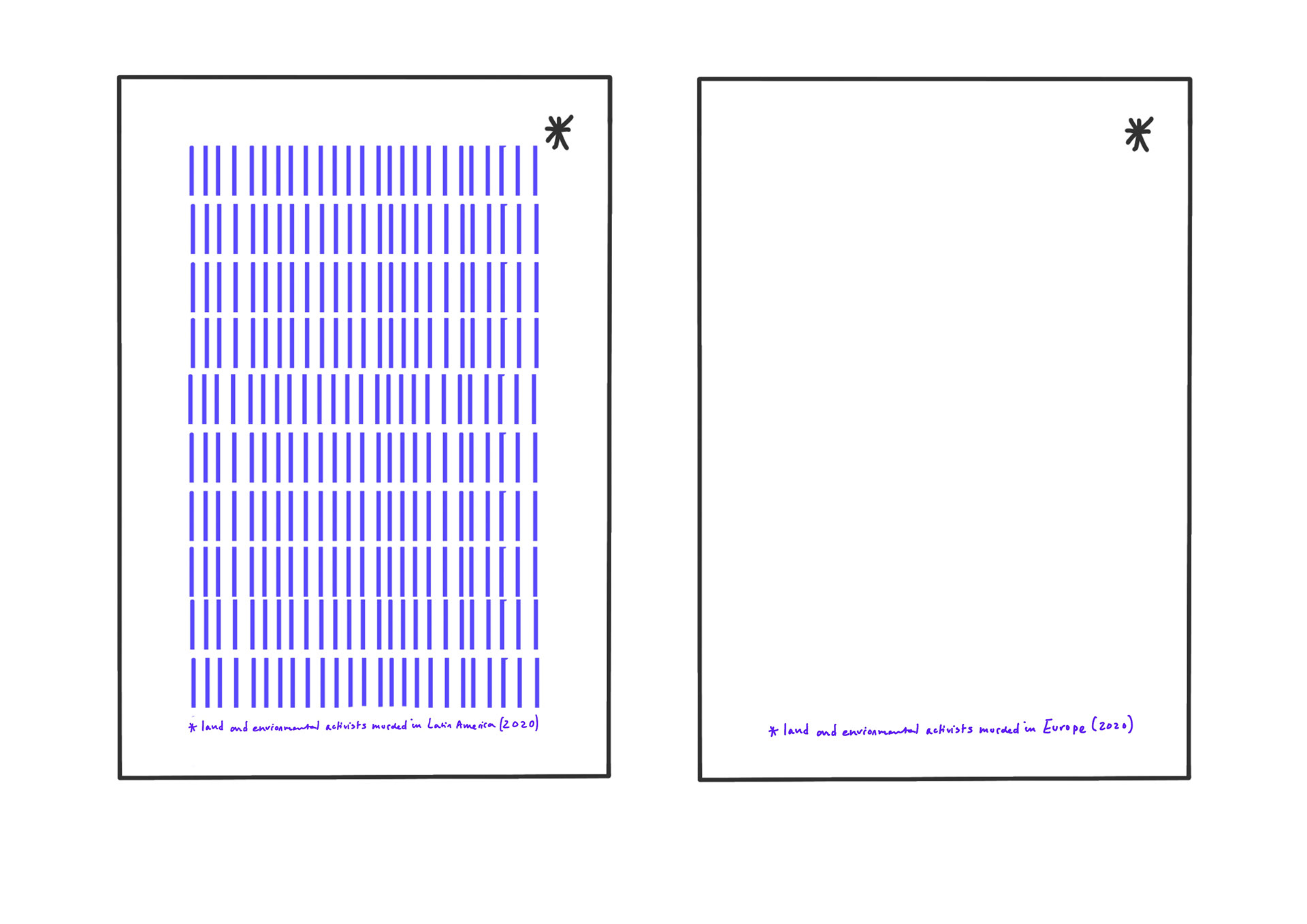
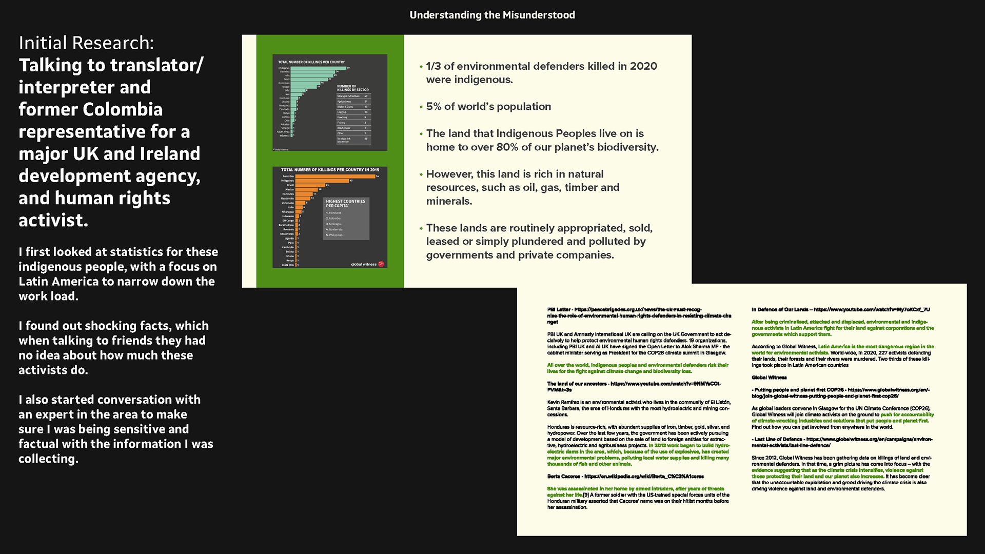
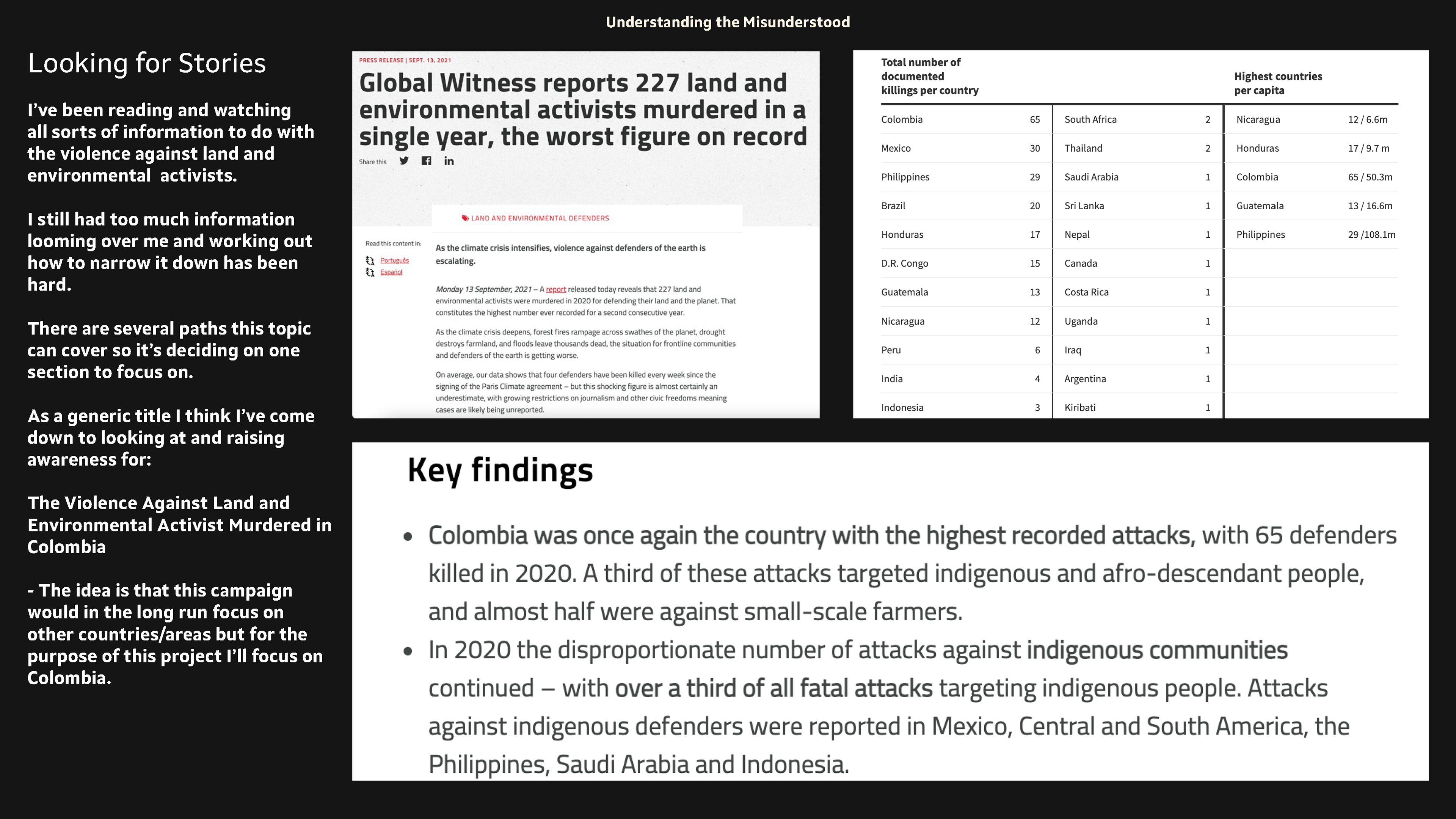
Looking at charity global witness who work with other organisations compiling yearly reports on violence against environmental activists globally this year.
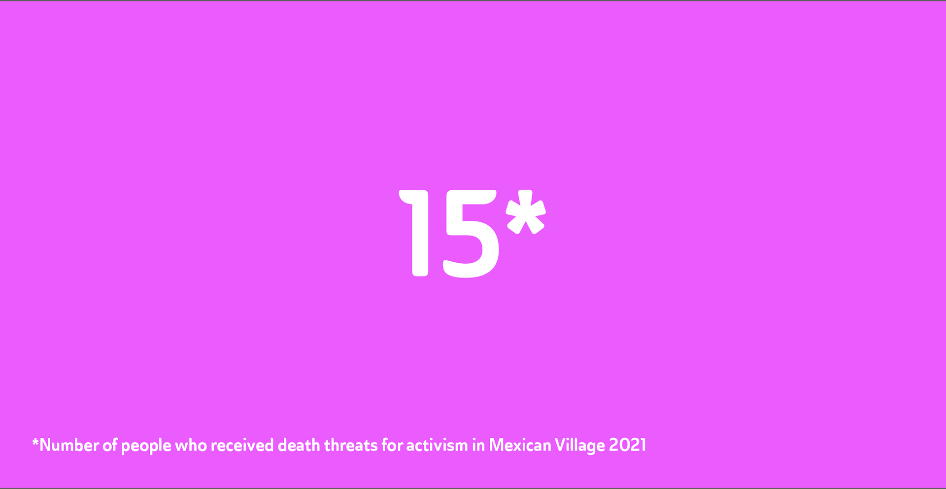
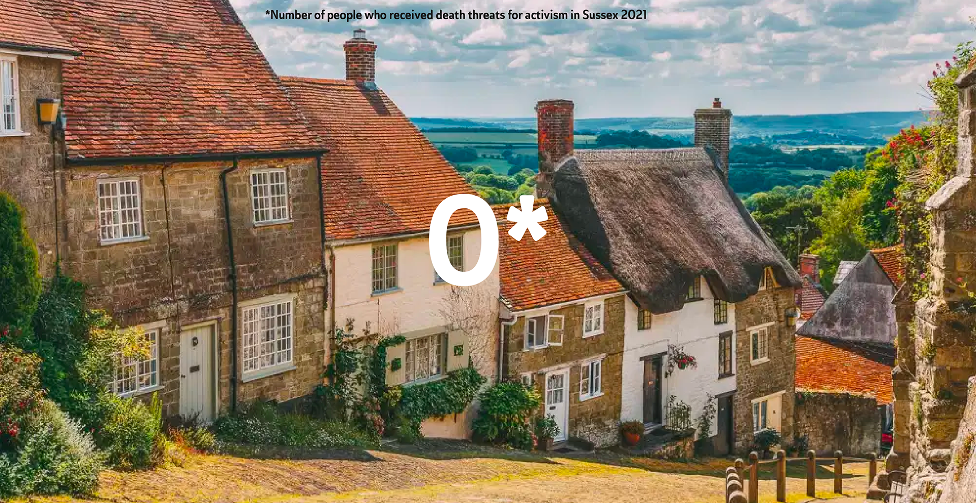
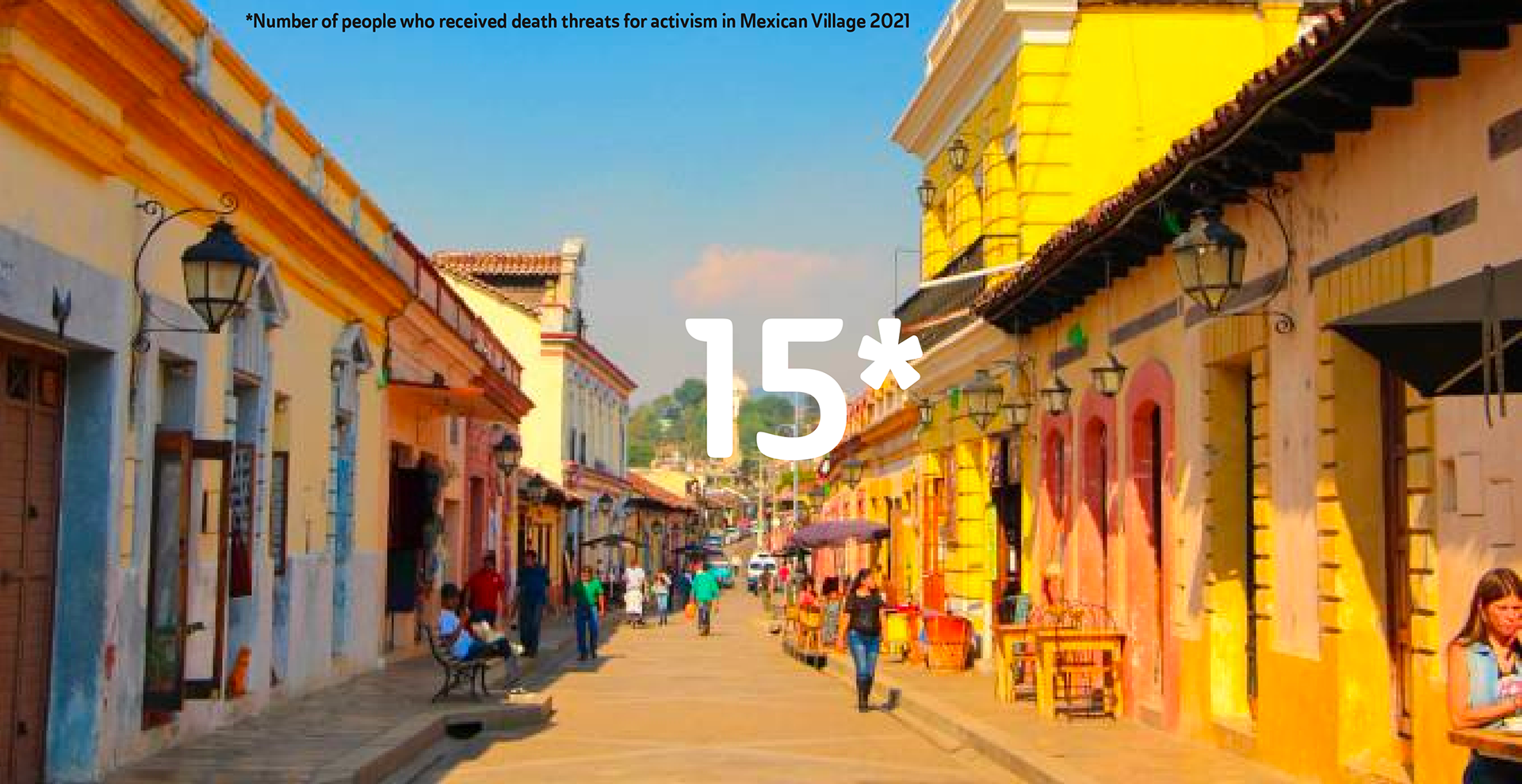
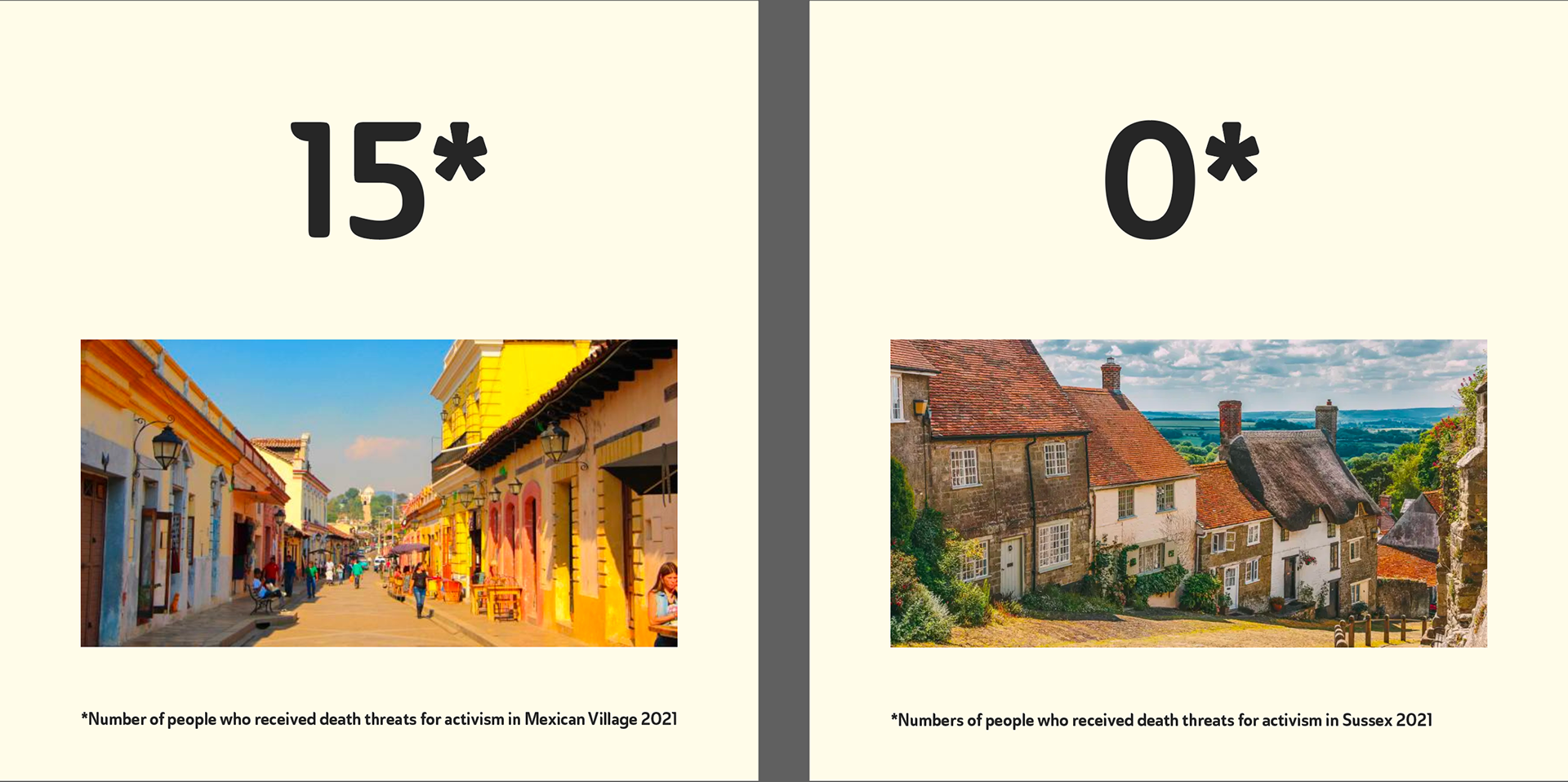
They outline out how as climate change is getting worse and so is violence against these environmentalists. I want to raise awareness for these people are often threatened and even murdered for things that in the UK would not get in much trouble for.
I also want to do this for the fact that even though it doesn't feel like it affects people in the UK directly all these things are connected in one way and that there are things anyone can do to help.
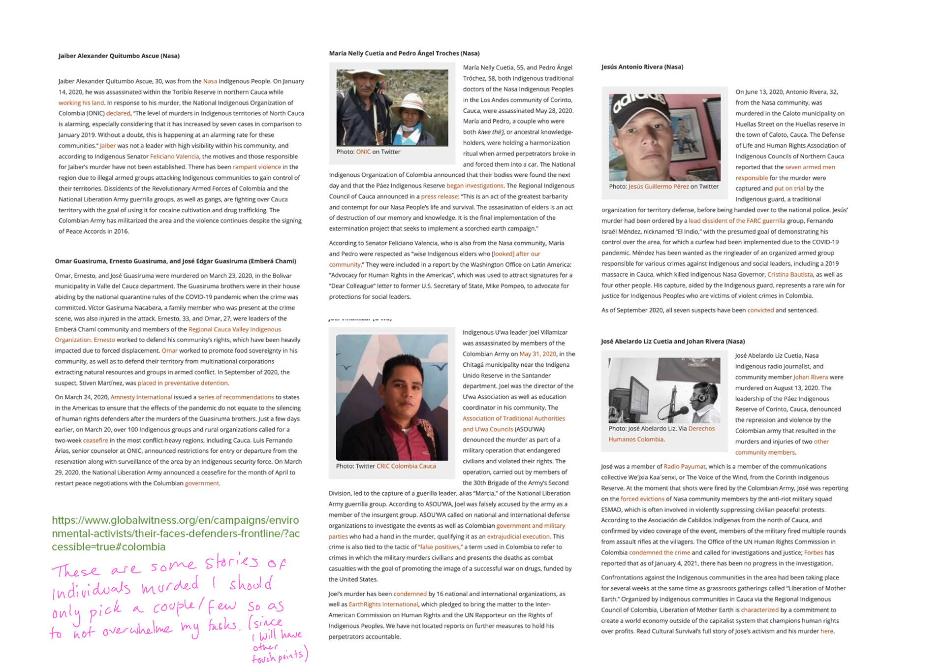
I also spoke with (and will along the way) a translator/interpreter and former Colombia representative for a major UK and Ireland development agency, and human rights activist.
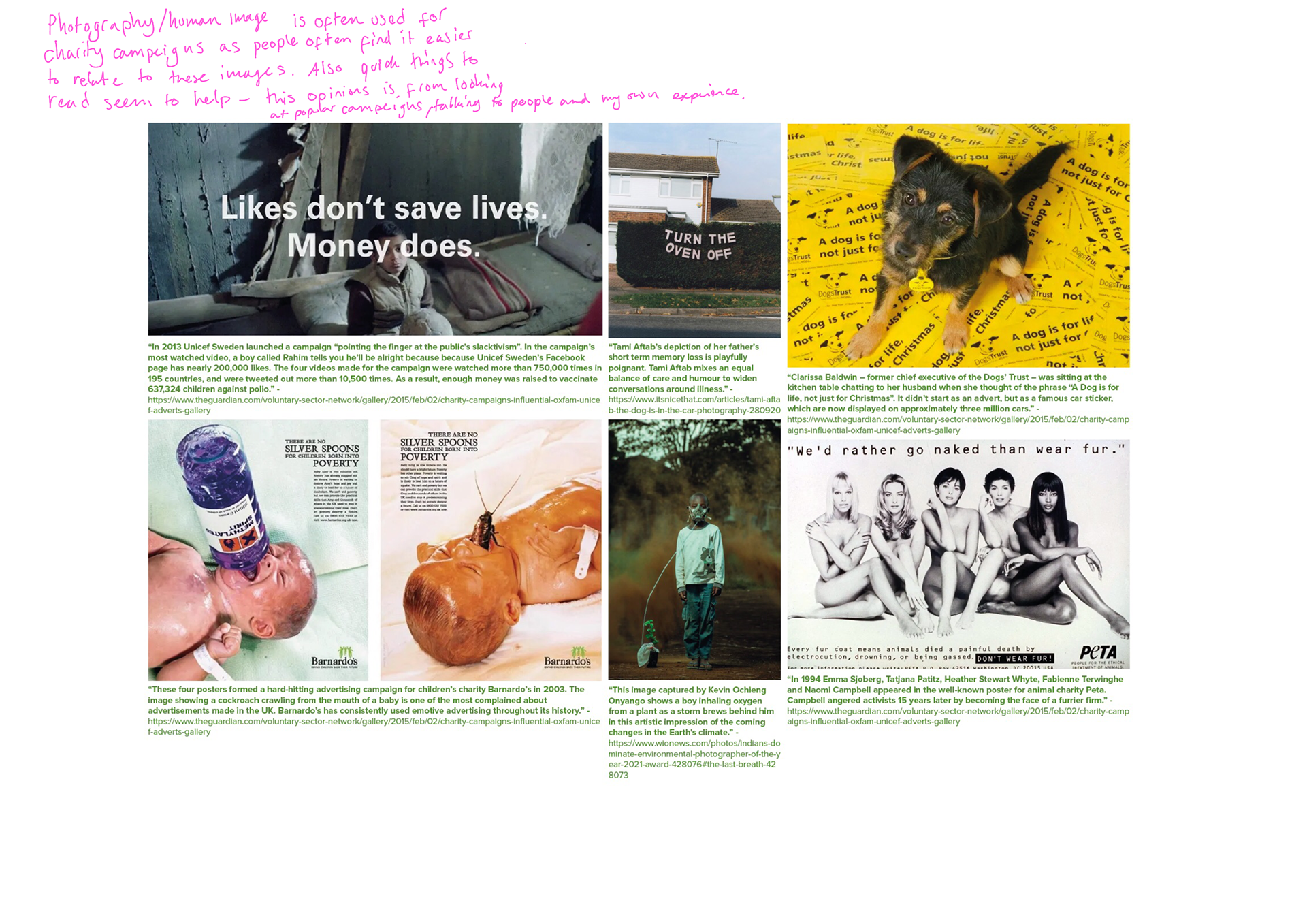
I feel that quick attention grabbers may be the way to go. Due to my topic being something people may shy away from since it can be seen as a tough topic. I want to do something that someone understands quickly and understands and wants to know more about instantly. Working out the best way is what i've started to think about above are some annotations.
I feel a mix between a charity campaign with guerilla tactics could work. Often something provocative and disruptive does a good job of getting people's attention - I want to explore this but am wary as to how as it can been off putting to many and seen as forcible.
I also want to be sensitive to the topic and people - I don't want something that causes the reactions that fear mongering does.
My Proposition Proforma
Group Presentation
I collated my current research.
Some of the feedback: narrow down the topic and focus on in one area, to be aware about peoples complacency, people said it's interesting but they know nothing about it.
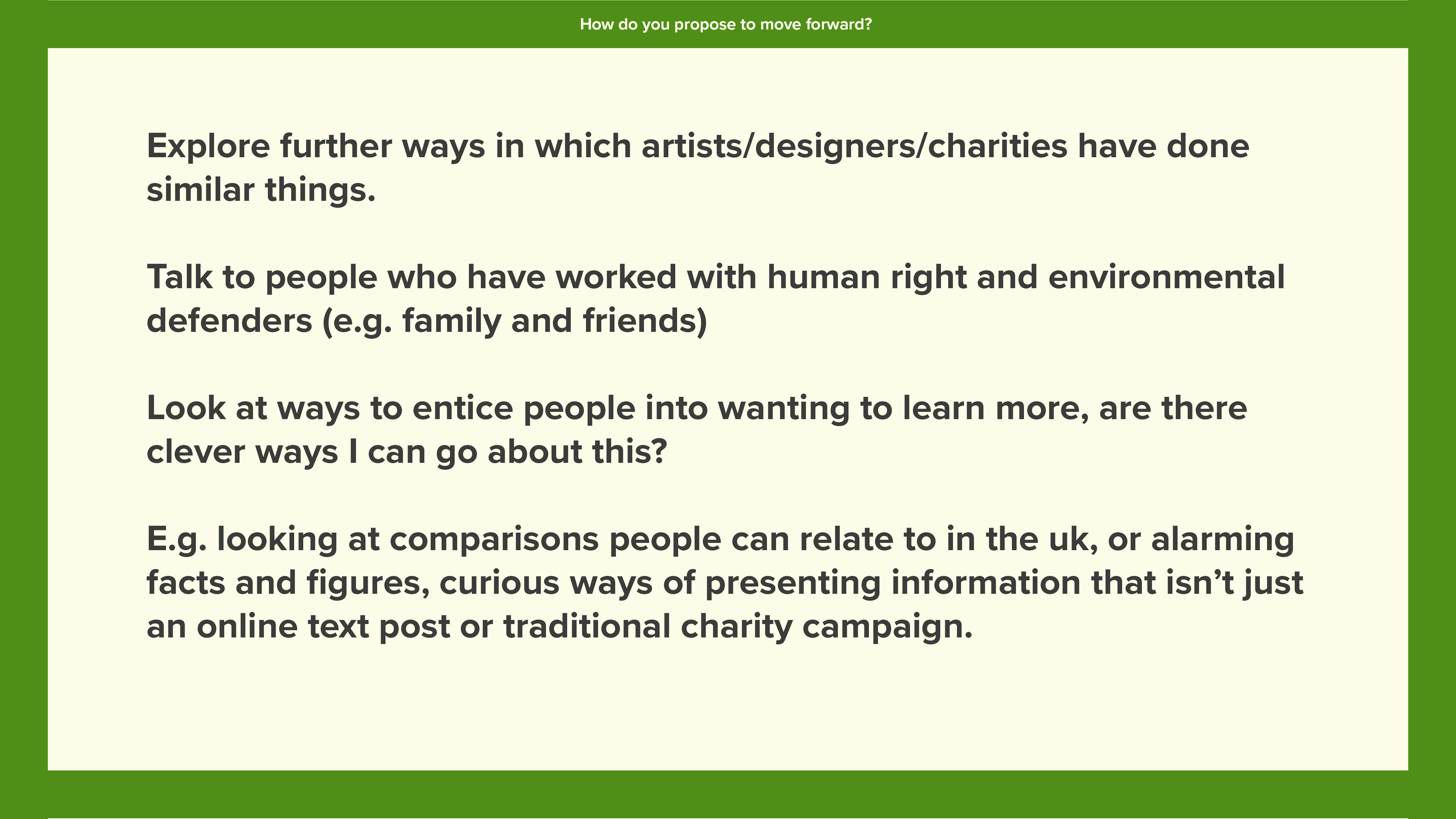
Narrowing down the area
This is how I have narrowed it down - annotations on images.
LOOKING INTO SLACKTIVISM AND SOCIAL MEDIA TECHNIQUES FOR ACTIVISM
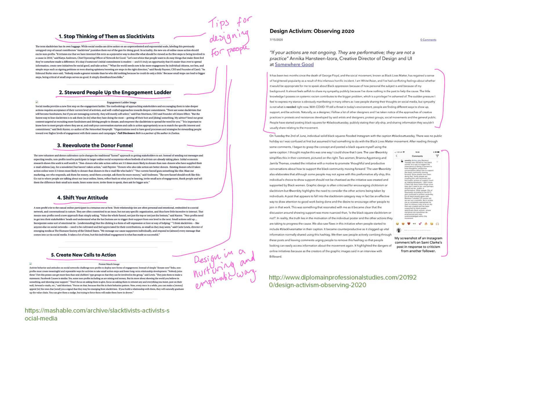

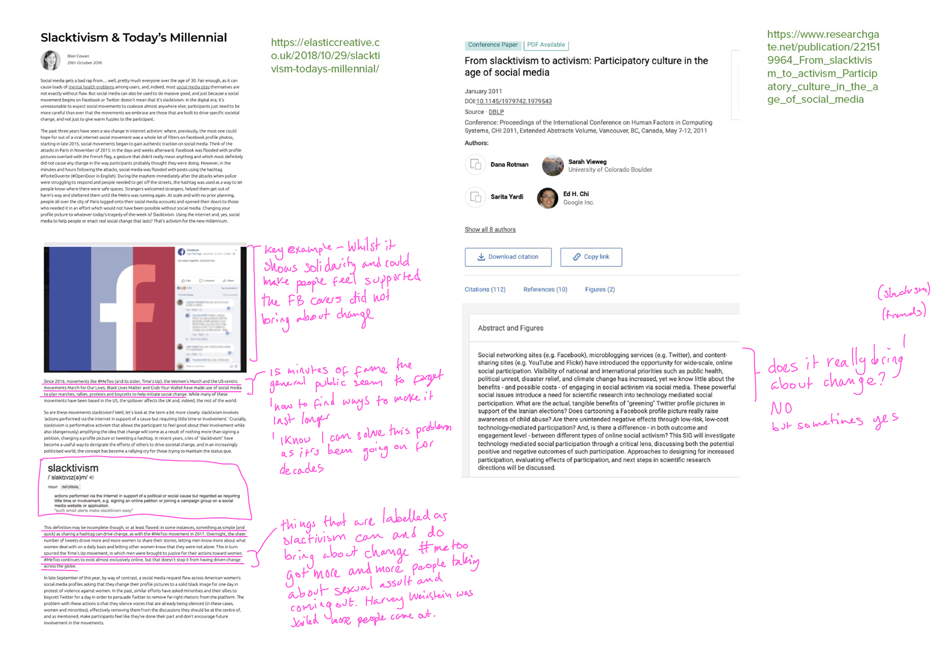
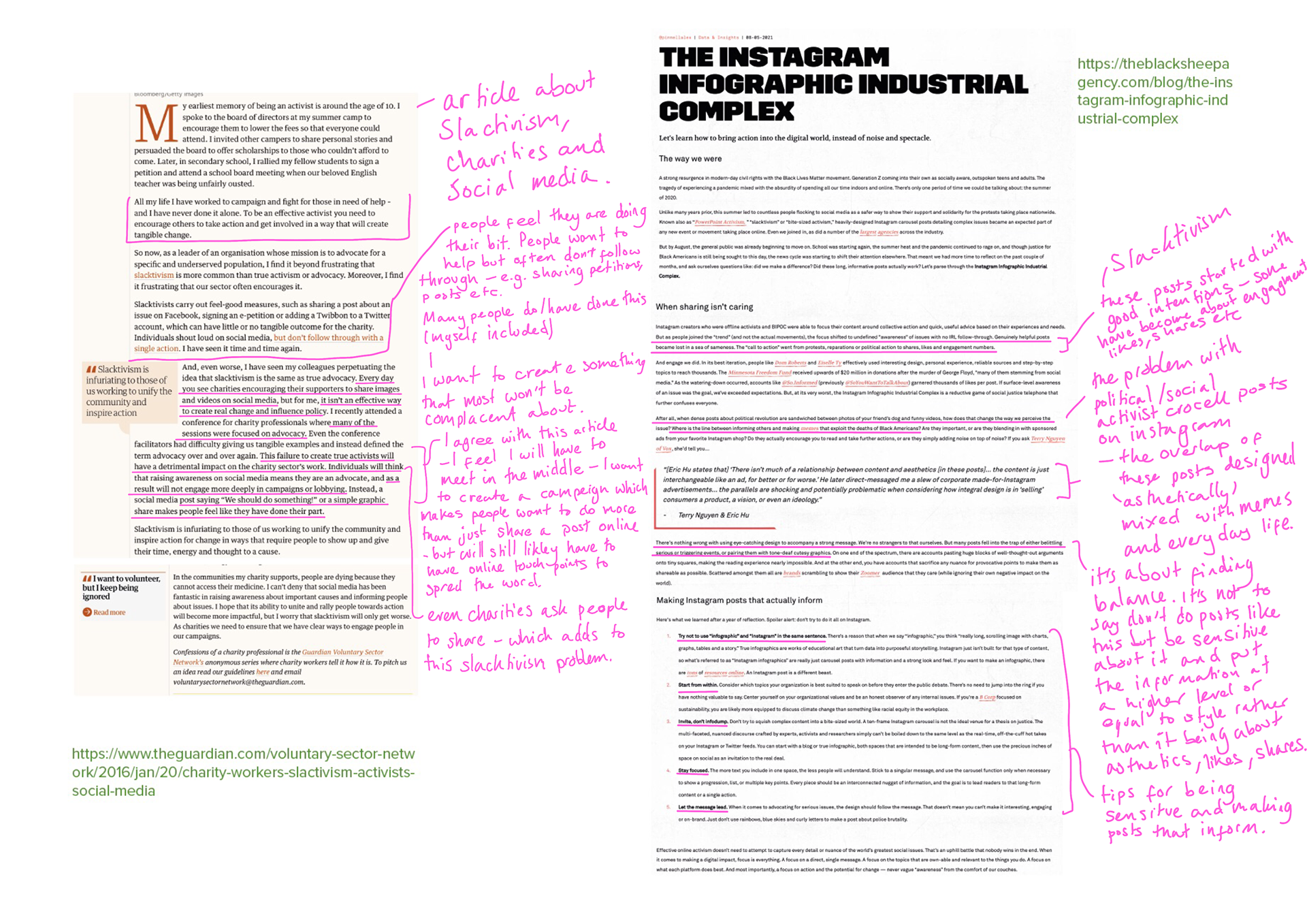

Annotated my findings. Looking at the facts and how to be aware of slacktivism and peoples opinions has been interesting. Overall it seems there's not outlined solution but I think it's about being sensitive to the topic and also being realistic that things like social media are a good way of getting news to spread. Balance...
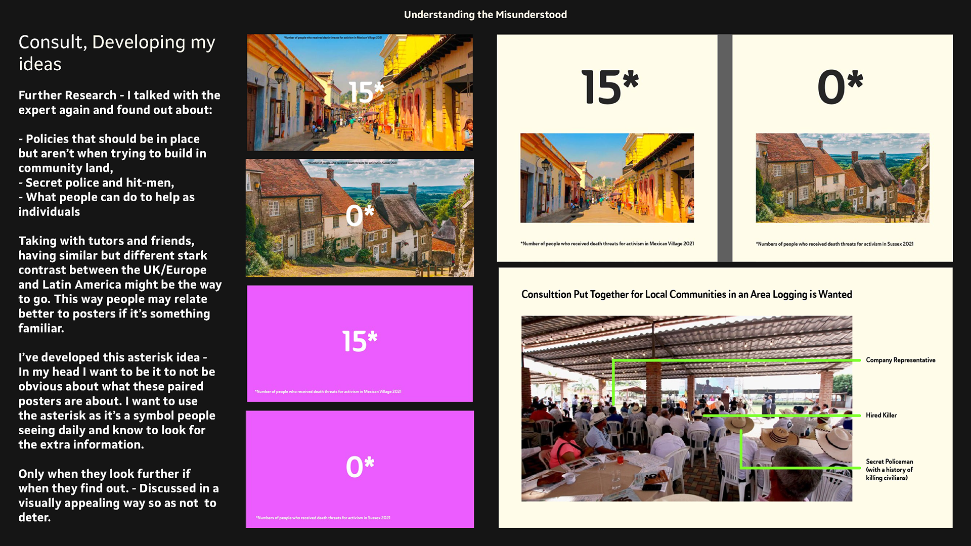
conversation with expert - policies etc
I talked some more as I am trying to find the best way to narrow my area in a way that isn't too intense initially for the public.
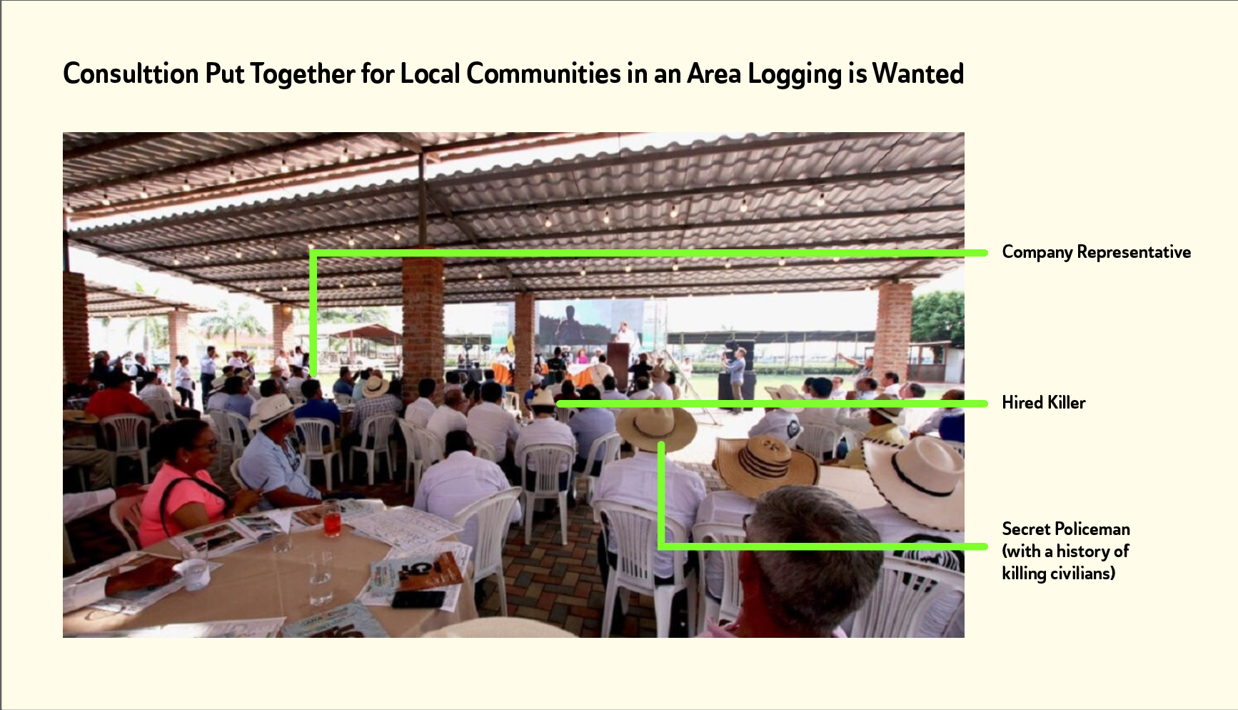
He spoke about how companies are required to host consultations if they want to do work in an area (normally indigenous or small scale farmers). Whilst they don't always do this, when they do they can often have moles in them. Like hired assassins, company representatives and undercover police/military.
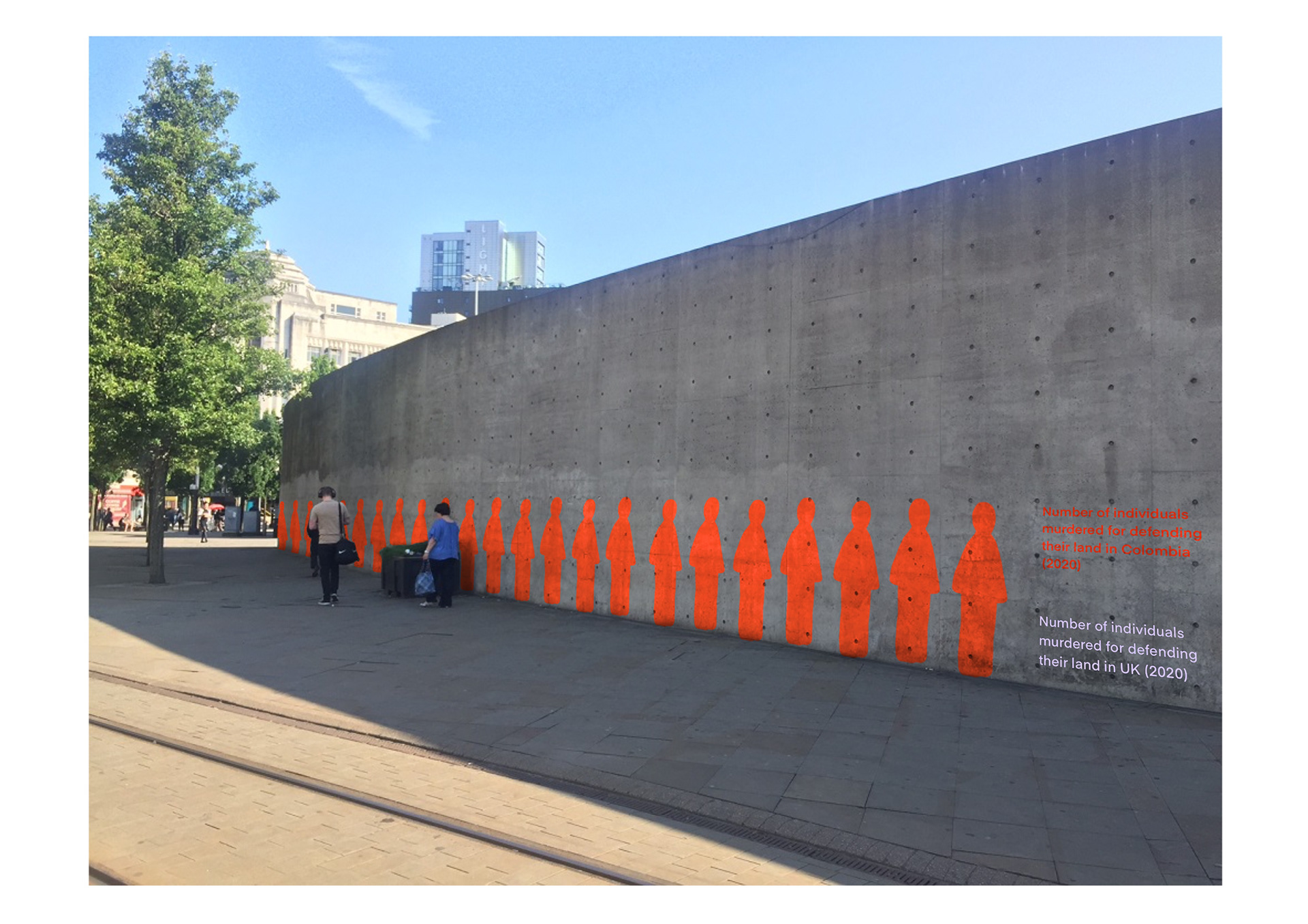
the conversation has led me to want todo comparisons and how vastly different things are done in the UK and that if they were done there would be vast outrage. Also maybe a group of people with lines going out showing the hidden people.
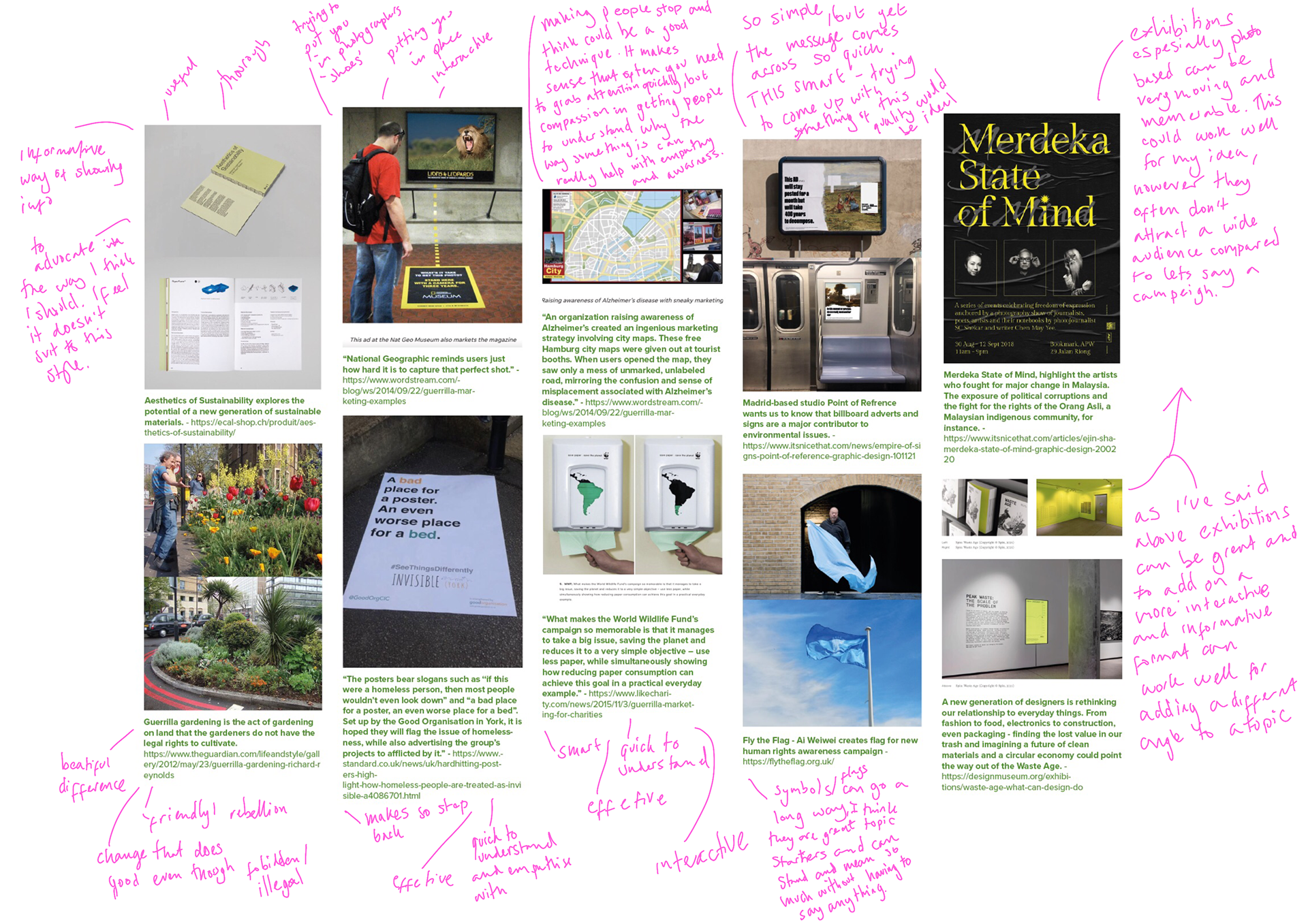
research into guerrilla marketing techniques
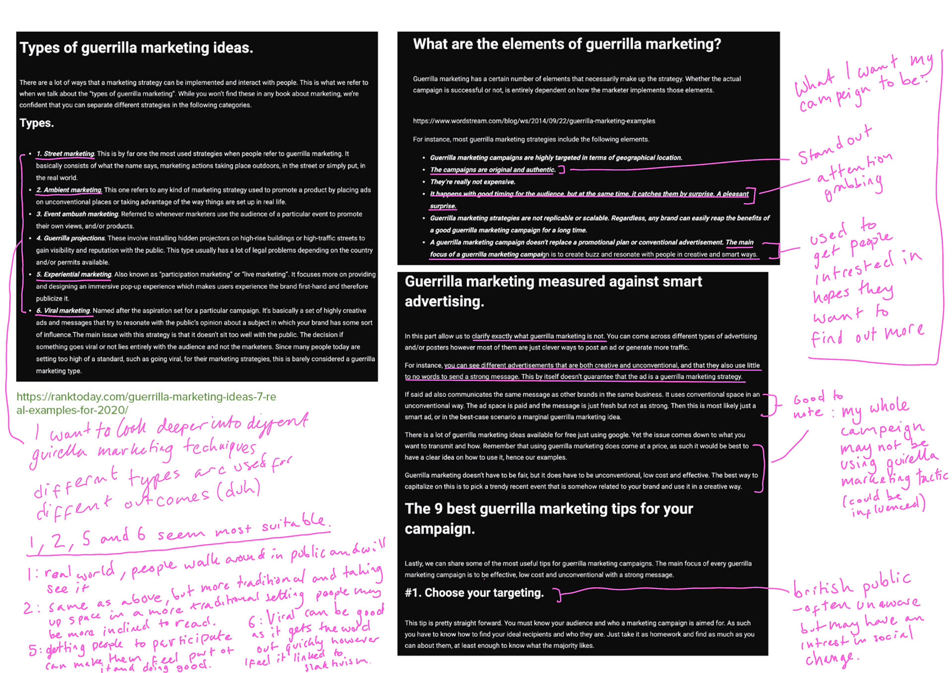
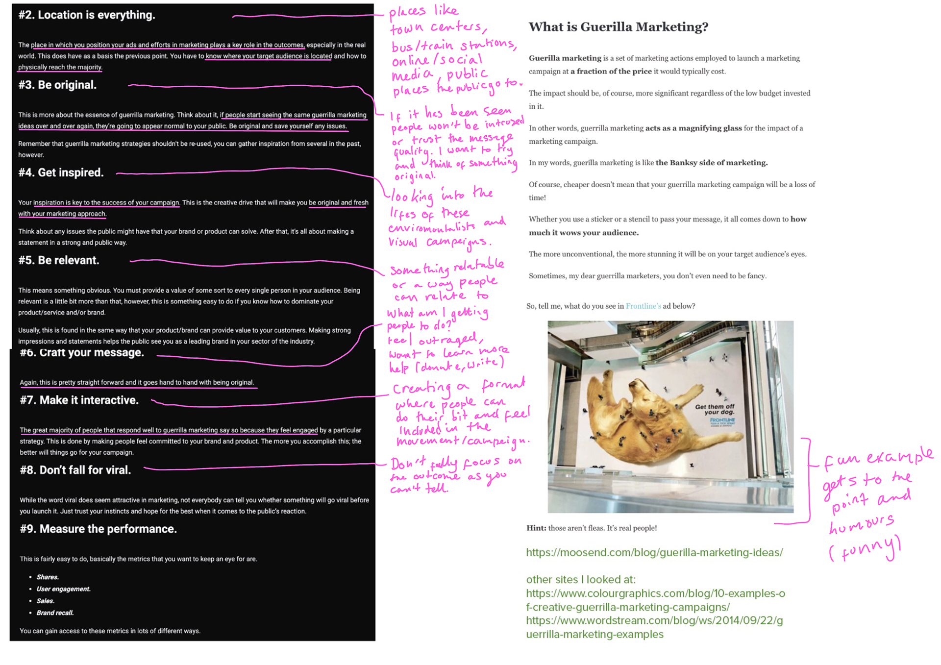
I wanted to look at examples and advice on creating guerrilla marketing.
Visual Idea Development
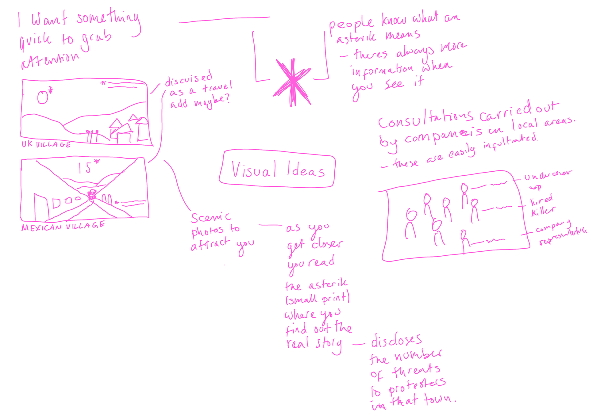
Visual Ideas tested
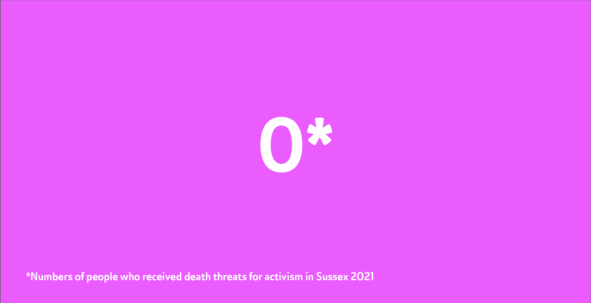
I wanted to get some quick ideas down - they definitely need development but I get an idea for what could be a poster campaign. With the small print bit this will need to be re-evaluated since if it were a poster or billboard people wouldn't be able to read it unless they were super close, which is unlikely to work as a campaign effectivity do to peoples attention spans.
I like maybe following a travel advert idea but I want to develop other ideas as I feel they may be stronger. I like the idea of bold type with a contrast or maybe a bold asterisk I could use to grab people's attention.
I also made one about the consultations which i'm not sure are effective since it's not clear what it is about.
ALSO - I still haven't got a call to action and it isn't clear what these are about and what I am trying to get people to do. I need to work out what I need and what message I am getting across as well as what I will want people to do.
I want this to be provocative or attention grabbing at the very least so people are outraged enough to do something.
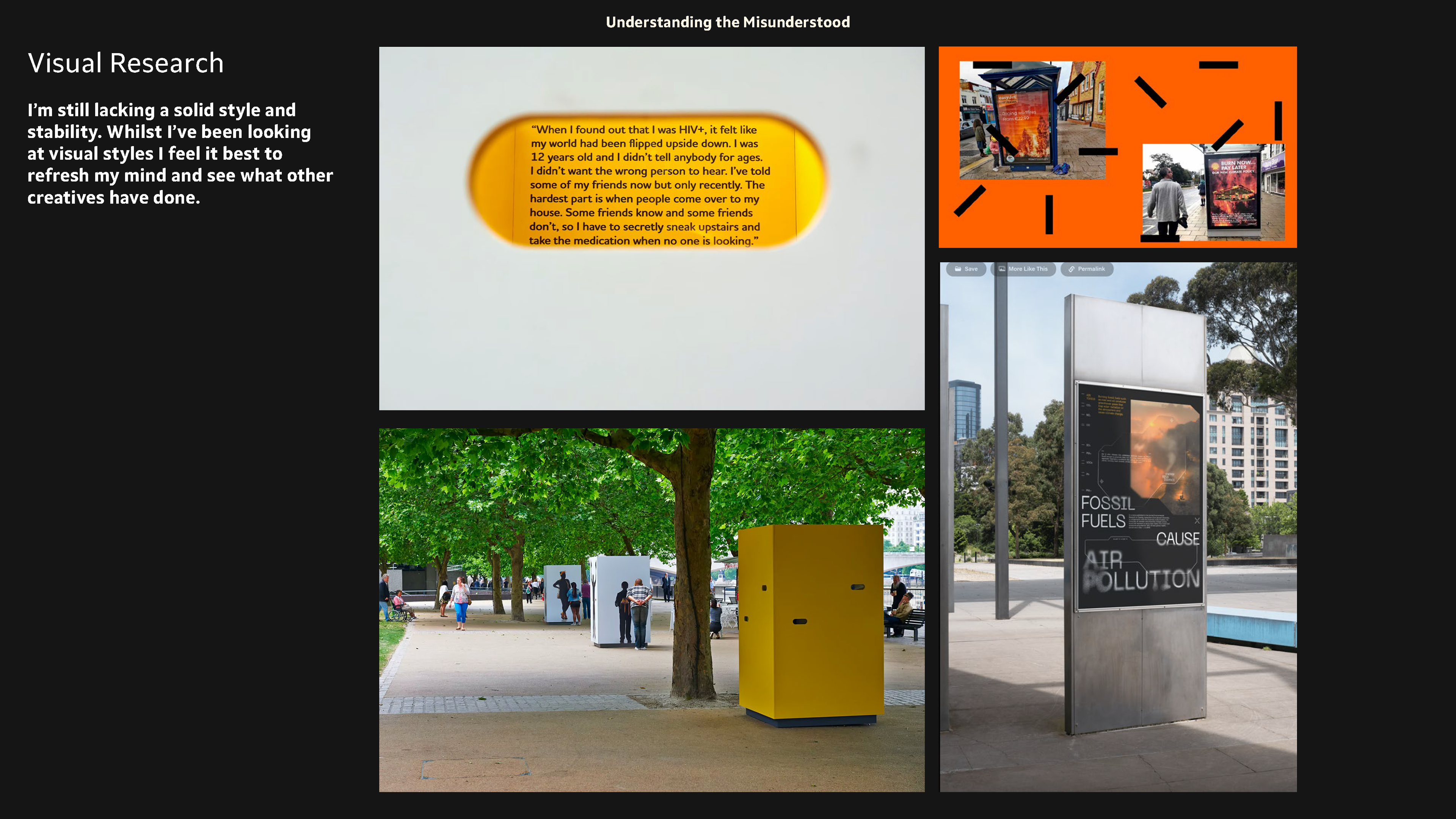
Visual Research Again
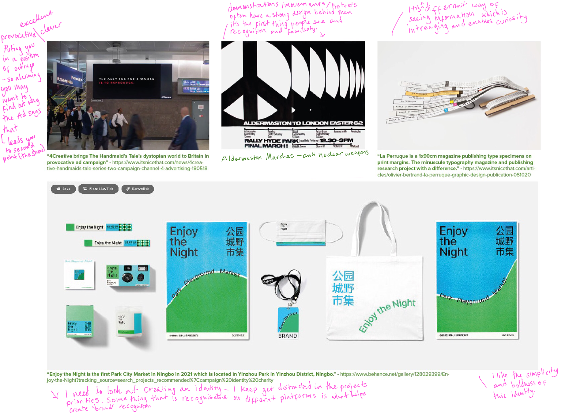
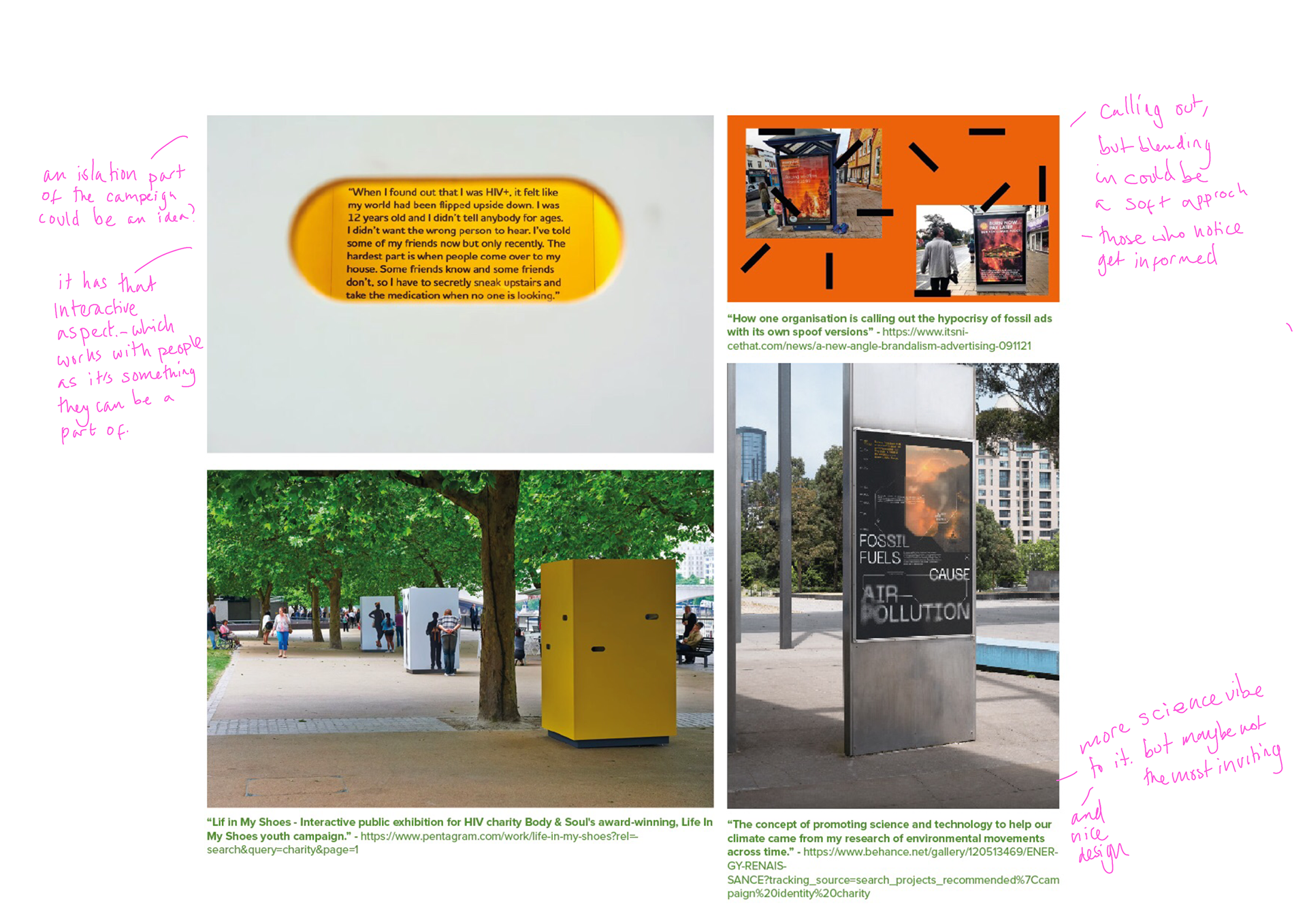
visual research again as I’m still lacking a solid style and stability. Whilst I’ve been looking at visual styles I feel it best to refresh my mind and see what other creatives have done.
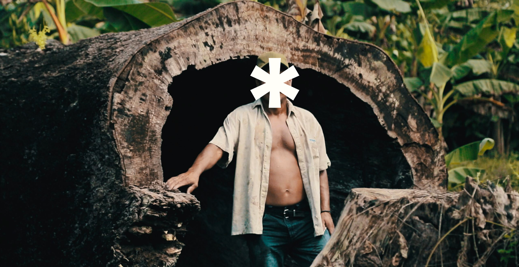
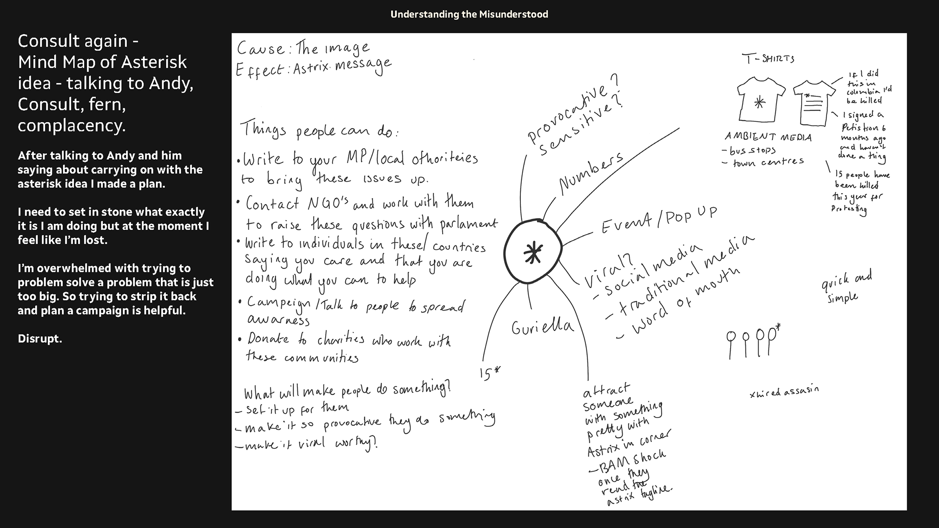
Developing Asterisk Idea
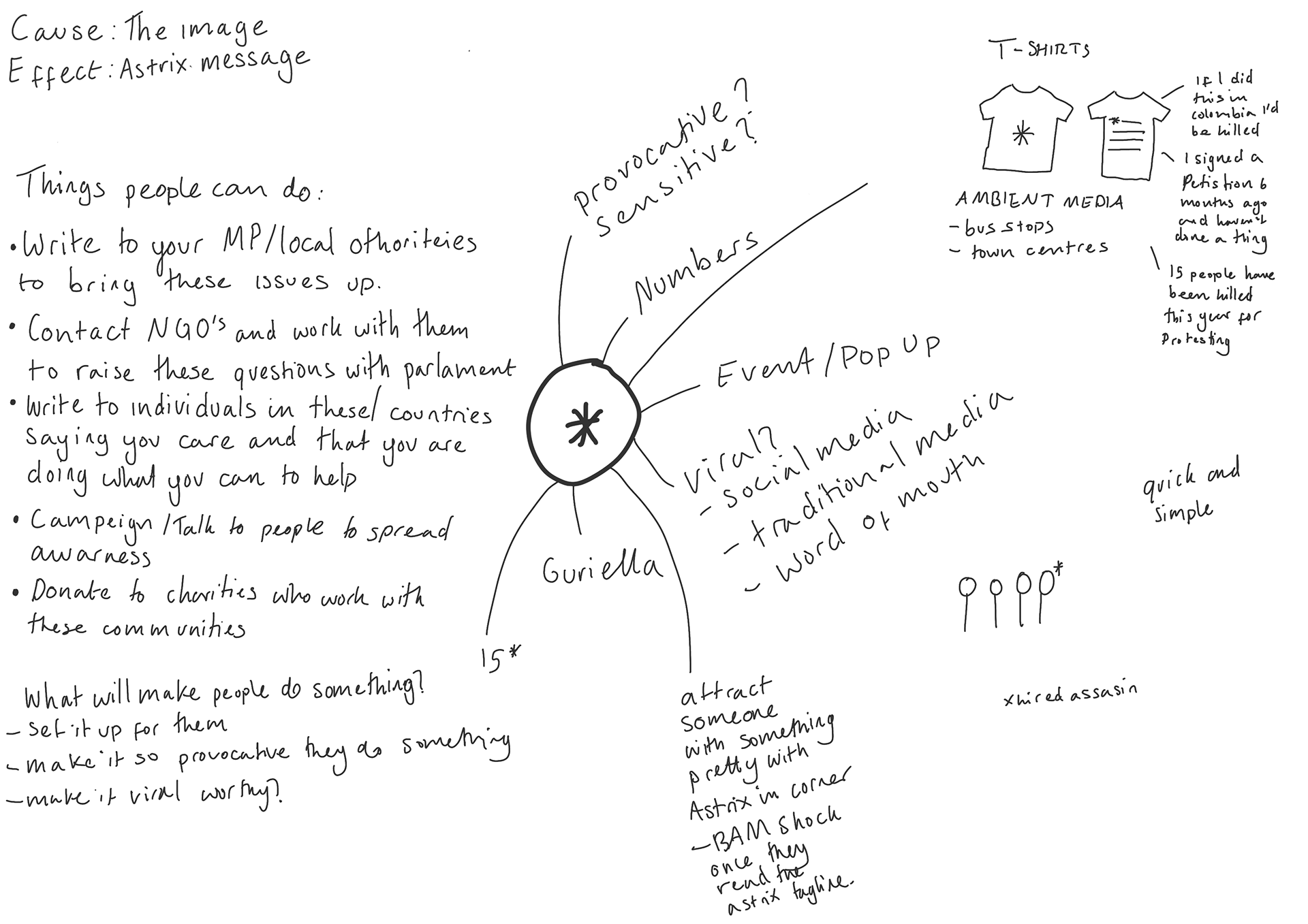
I need to add some structure as to how I am go to build this campaign. Above are some ideas I've had. I also spoke with andy and showed him my asterisk idea and he felt it had potential. It's about working out what I want people to do from this campaign, how to attract them, ambient media, merch etc and just coming up with how I am going to tell the public people experiences.
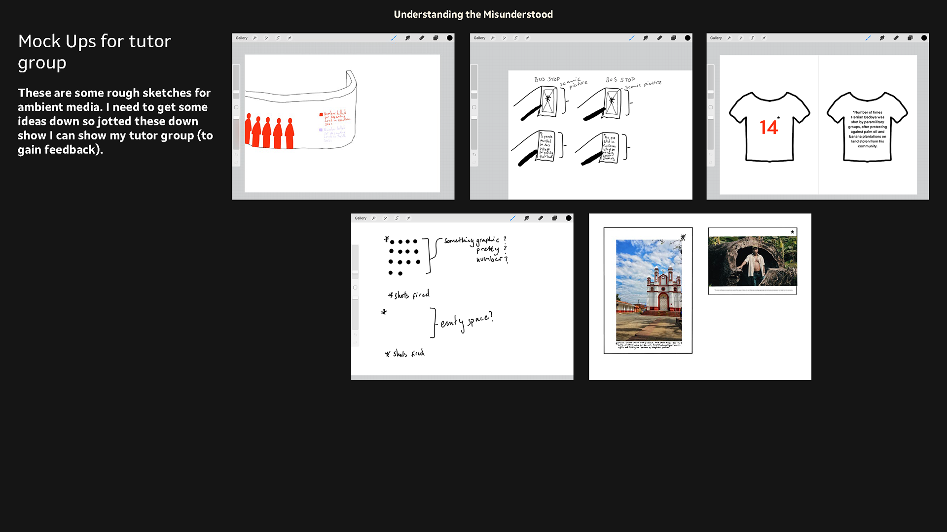
Mock Ups for tutorial


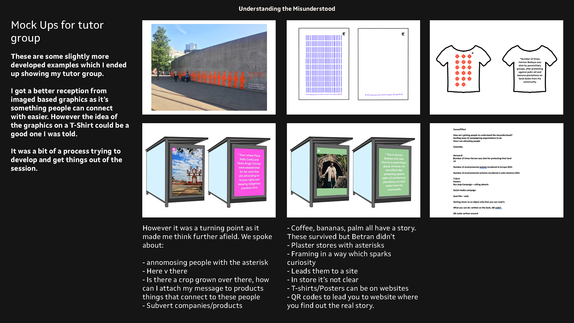
From my mind map these are some ideas I developed that I showed my tutor group.
I'm trying to convey contrasts between countries and how something seemly innocent actually has something has a backstory. you only find out if you look for the asterik - my hope is that this could develop in to an established idea where people will be curious to want to know more.
I need some advice however talking with my tutor group helped with this.
feedback From Tutor Group
I got a better reception from image based graphics as it’s something people can connect with easier. However the idea of the graphics on a T-Shirt could be a good one I was told.
It was a bit of a process trying to develop and get things out of the session.
However it was a turning point as it made me think further afield. We spoke about:
- annomosing people with the asterisk
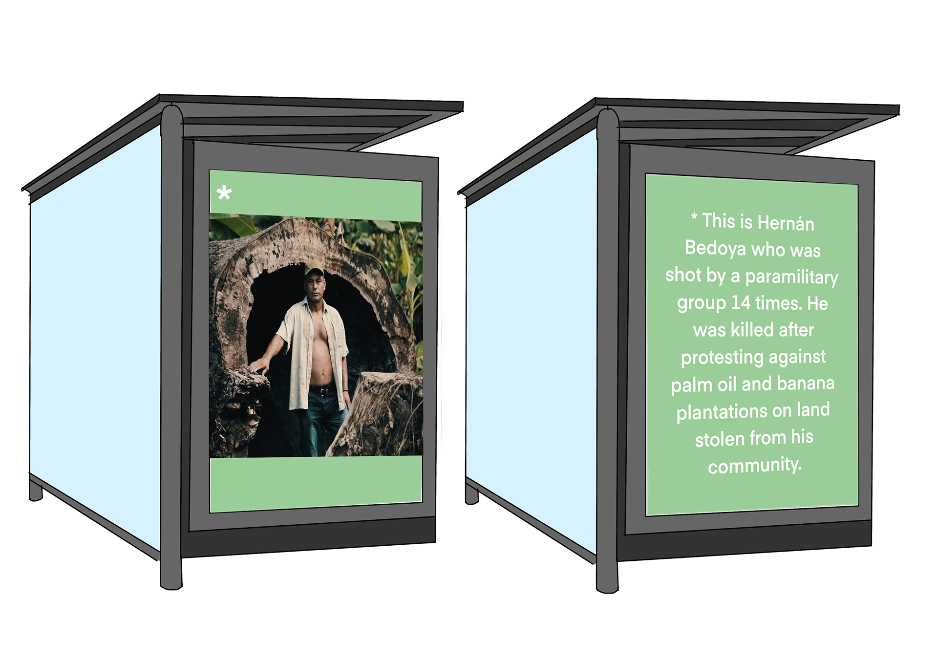
- Here v there
- Is there a crop grown over there, how can I attach my message to products things that connect to these people
- Subvert companies/products
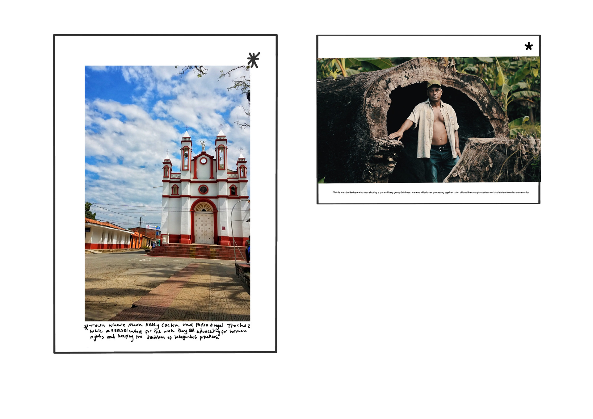
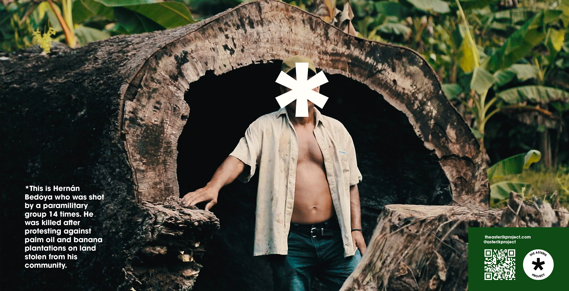
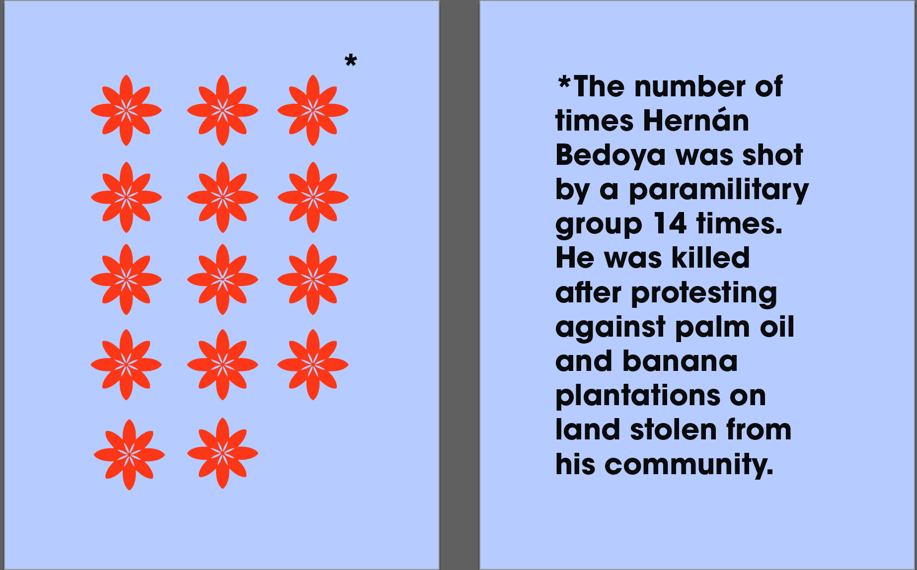
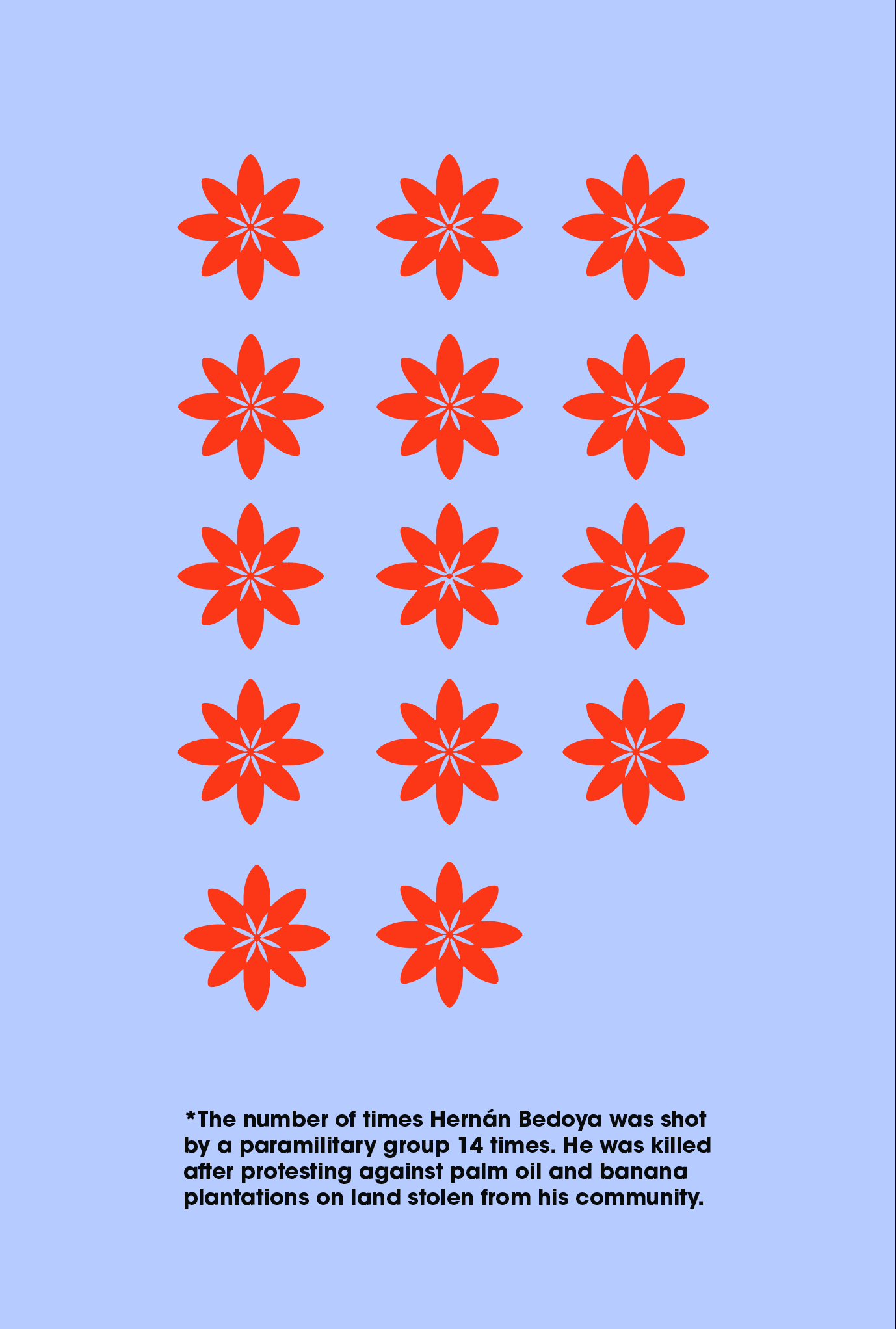
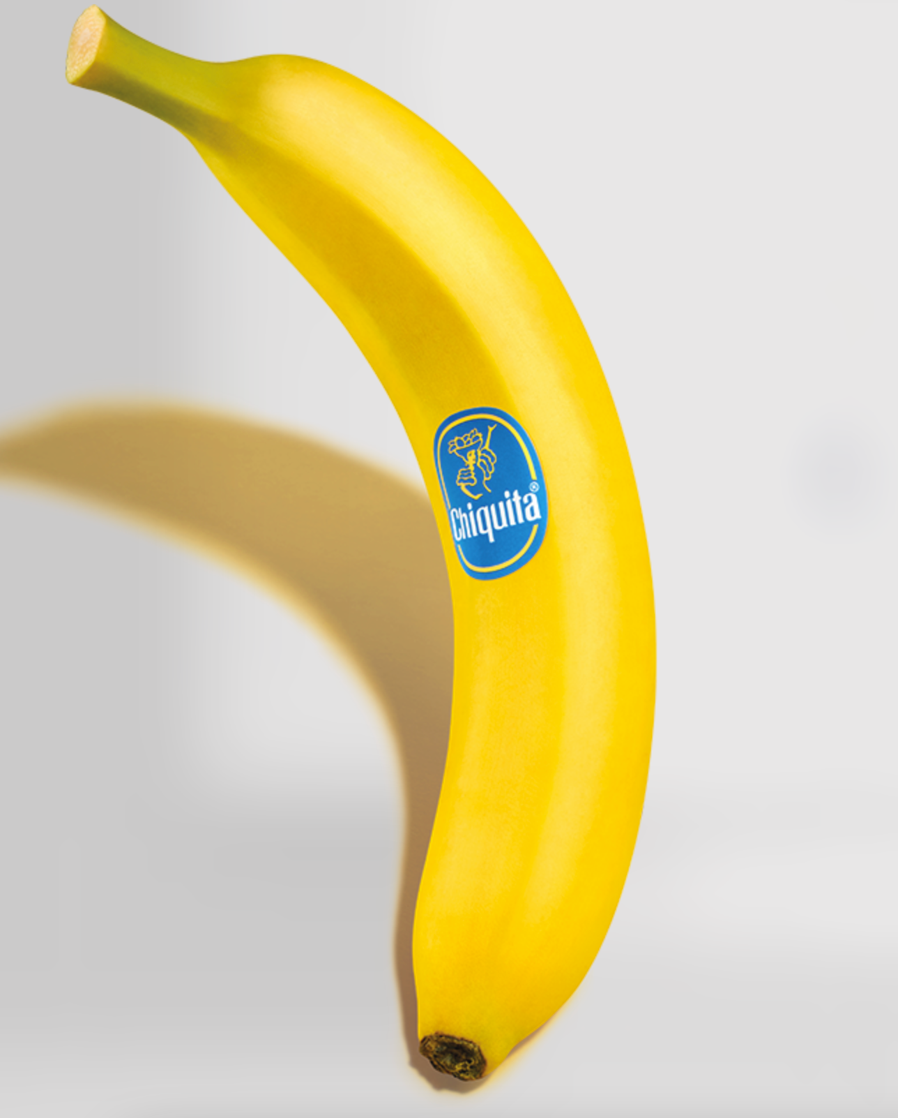
- Coffee, bananas, palm all have a story. These survived but Betran didn’t.
- Plaster stores with asterisks
- Framing in a way which sparks curiosity
- Leads them to a site
- In store it’s not clear
- T-shirts/Posters can be on websites
- QR codes to lead you to website where you find out the real story.

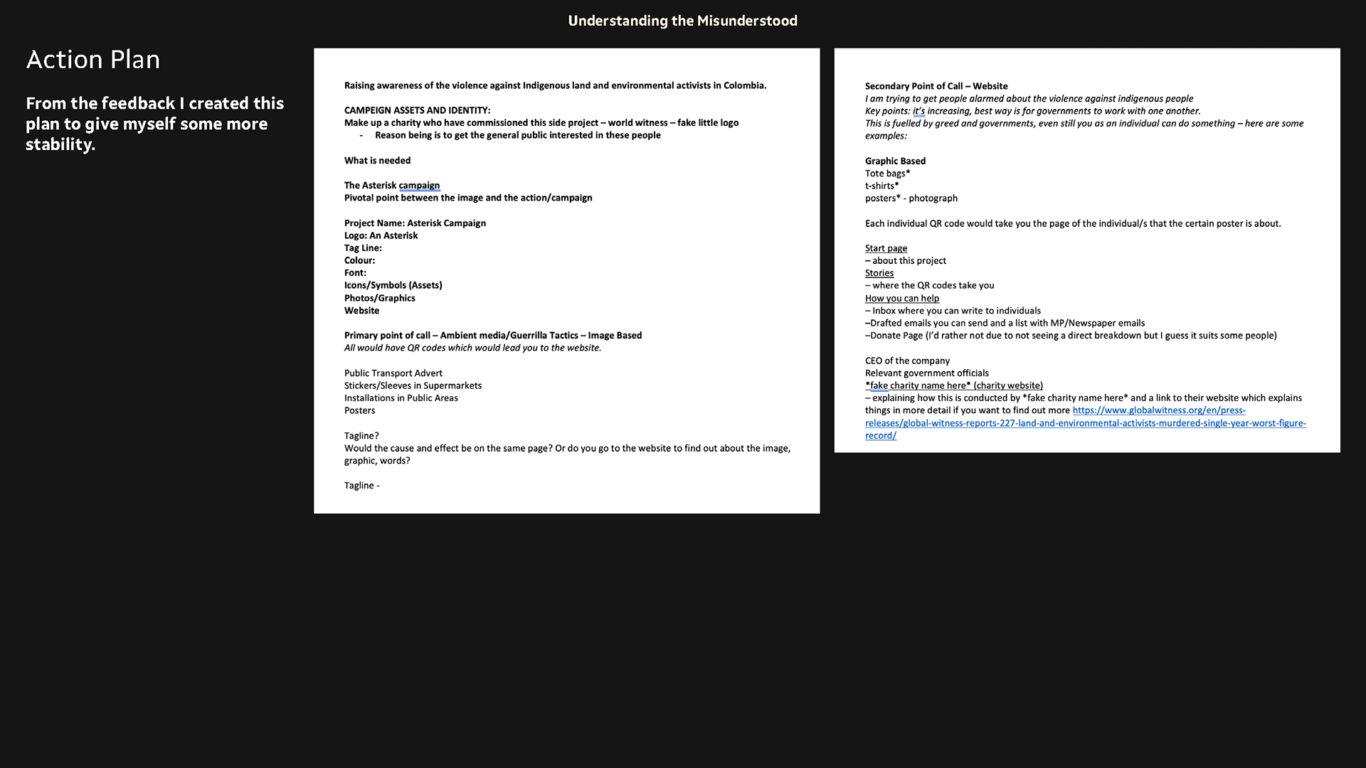
This is an action plan I made after to the tutor group to help me feel more stable in my next steps. And bring stability to my overall idea so I can properly start developing it.
IMPORTANT READ MY PLAN ABOVE
quick visual development and experimentation
Deciding between image and graphic based. Images were received better however the graphic concept I think could work well for things like t-shirts.
So it feels like I need to develop a way in which they work together in a concise manner.
I feel experimenting with an identity first may be a better idea as it will get me thinking it a more structured way of how this campaign may be structured.
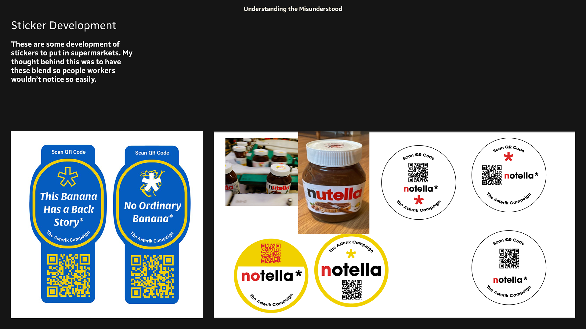
Sticker development
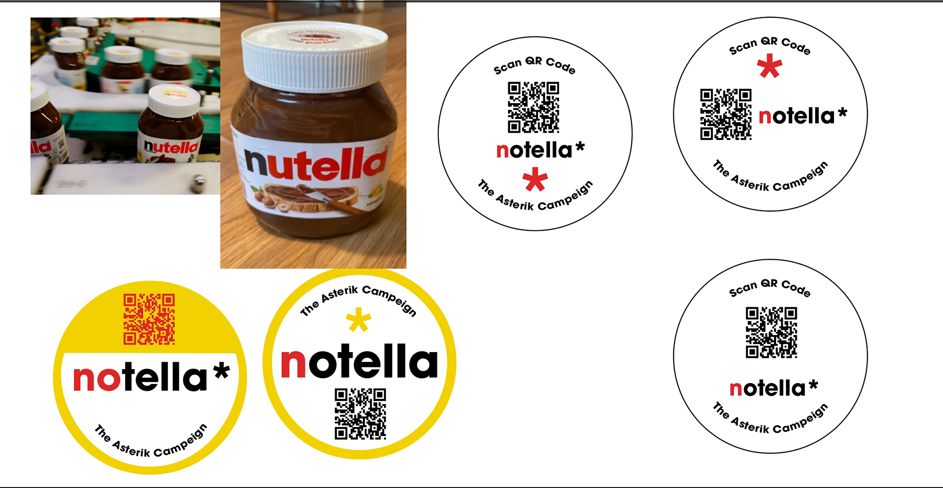
These are some development of stickers to put in supermarkets. My thought behind this was to have these blend so people workers wouldn’t notice so easily.
I think they could work however they have no identity and just blend in TOO well - I feel it needs to be recognisable and stand out in the supermarket.
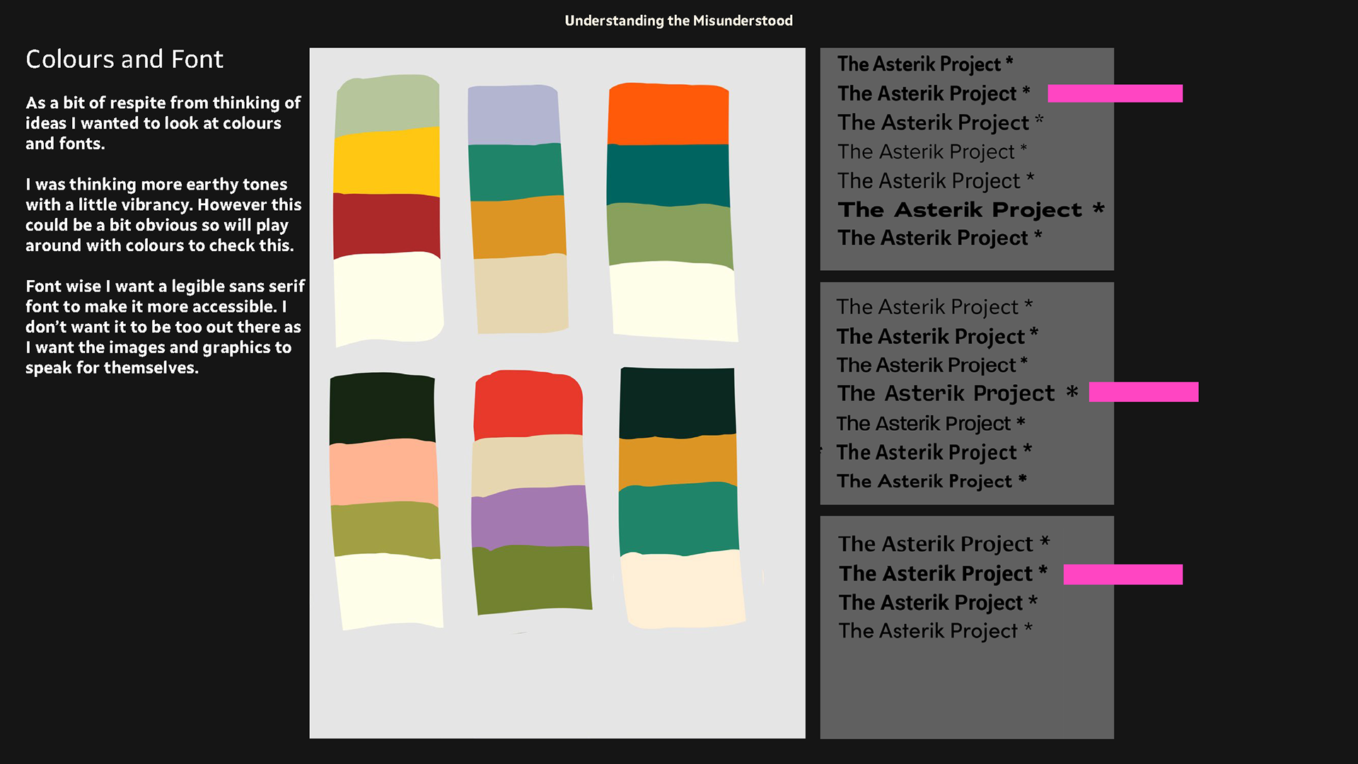
colour and font development
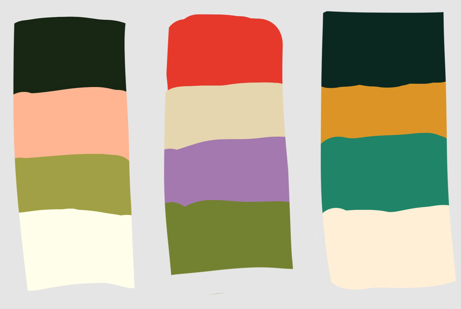
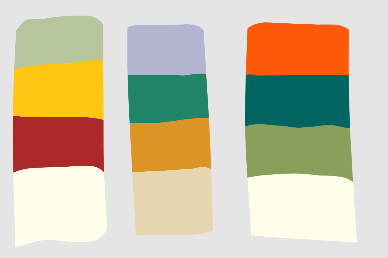
As a bit of respite from thinking of ideas I wanted to look at colours and fonts.
I was thinking more earthy tones with a little vibrancy. However this could be a bit obvious so will play around with colours to check this.
Font wise I want a legible sans serif font to make it more accessible. I don’t want it to be too out there as I want the images and graphics to speak for themselves.
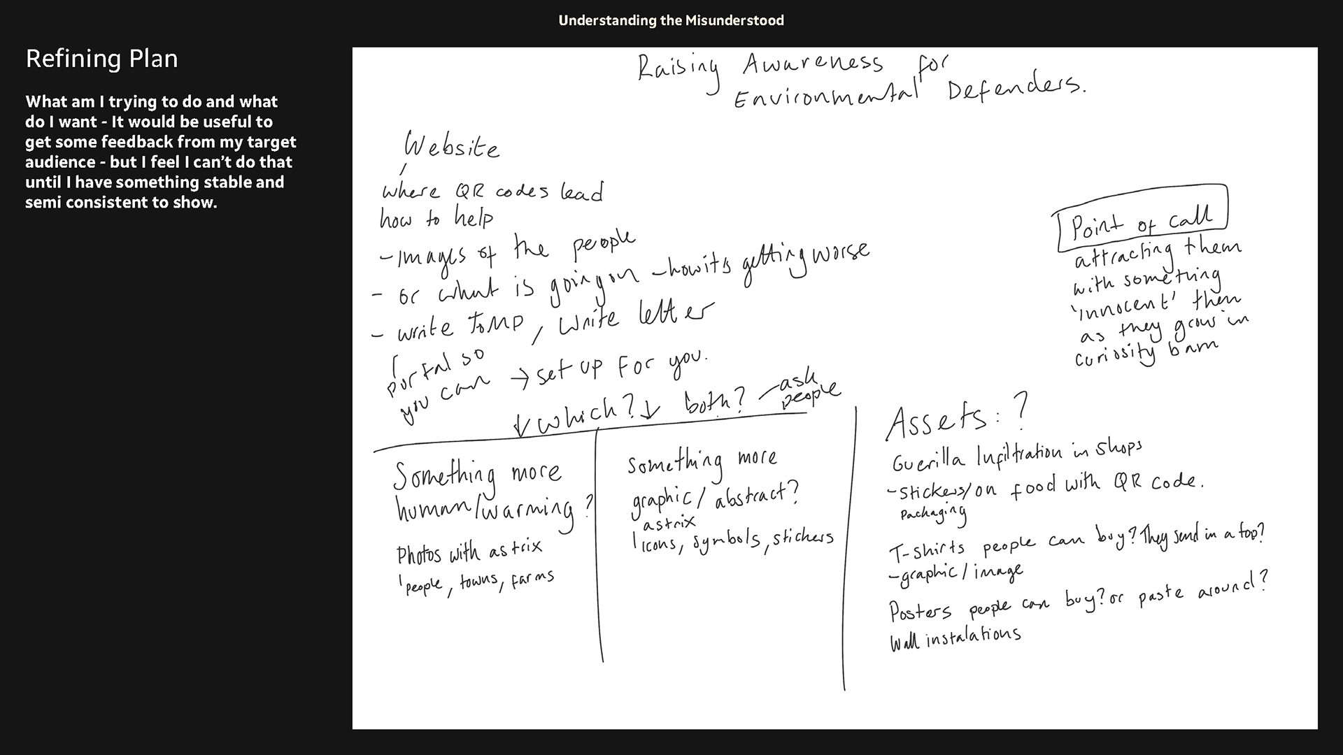
refining my campaign plan
It's about evaluating what is needed for it to become a fully fledged campaign idea. Having a point of call that leads people to find out more. (read notes above for more detail).
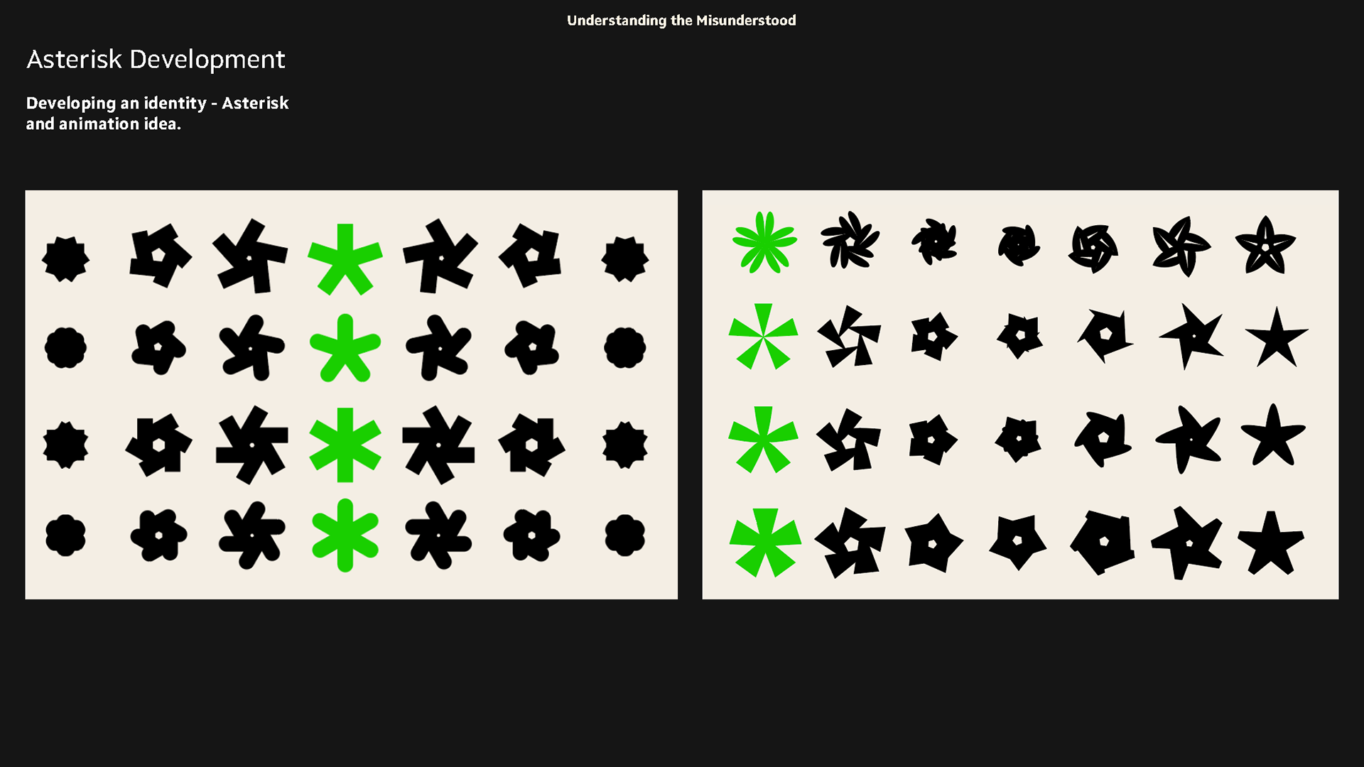
Asterisk Development
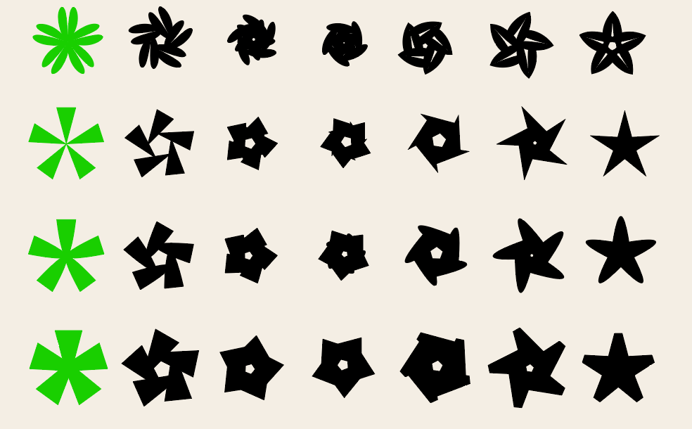
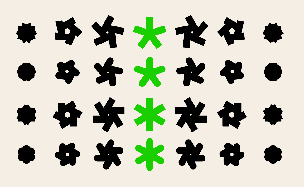
Developing a logo/symbol. I wanted to look at different ways I could design an asterisk. I feel it will be the recognisable thing for this campaign and it has to be strong and bold. The bits in black are for if I were to do an animation and the green asterisks are possible ones i'll choose.
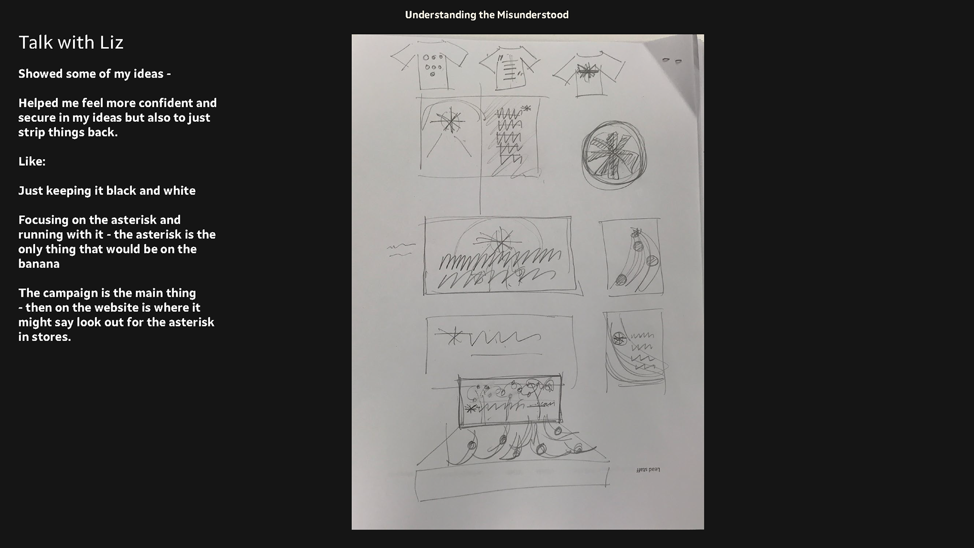
Talk with Liz
Showed some of my ideas -
Helped me feel more confident and secure in my ideas but also to just strip things back.
Like:
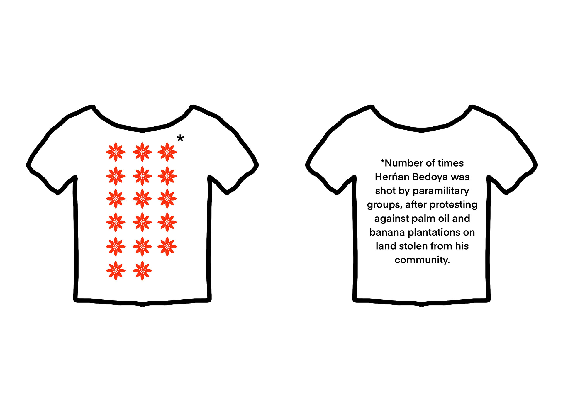
making the posters large scale with in asterisk small print big.
having back to front information on t-shirts.
Just keeping it black and white
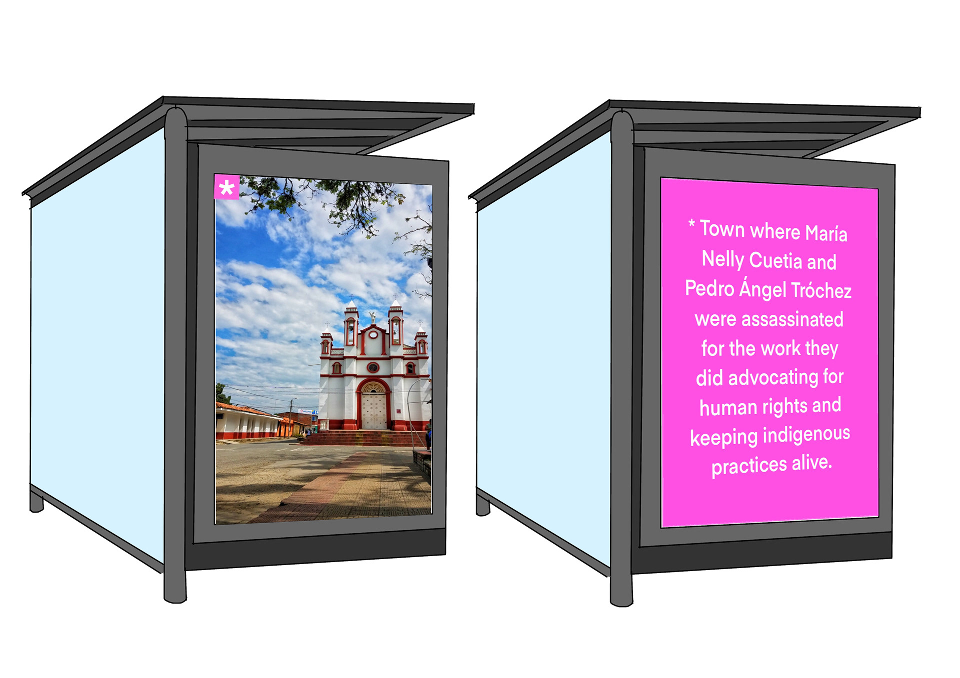
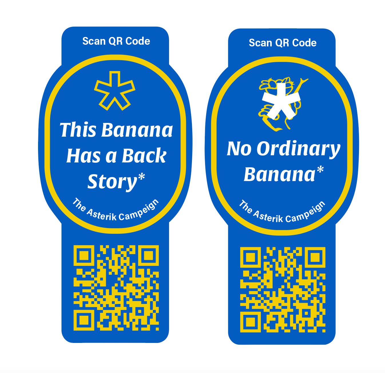
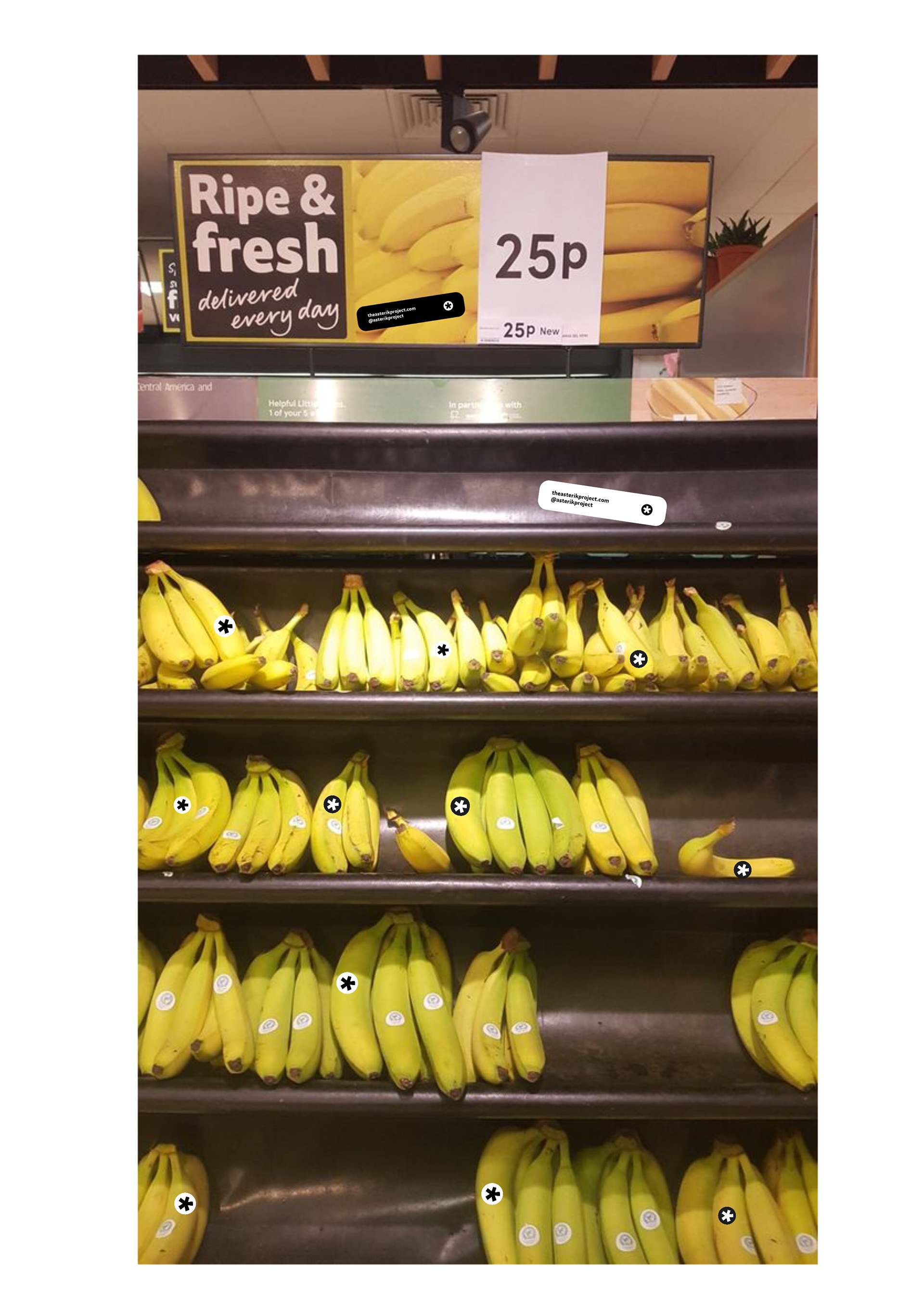
Focusing on the asterisk and running with it - the asterisk is the only thing that would be on the banana
This is part of the initial call to action in the campaign - then on the website is where it might say look out for the asterisk in stores.
I'm going to try this out and see where it takes me.
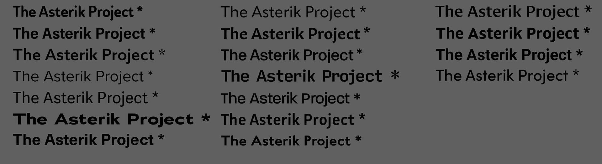
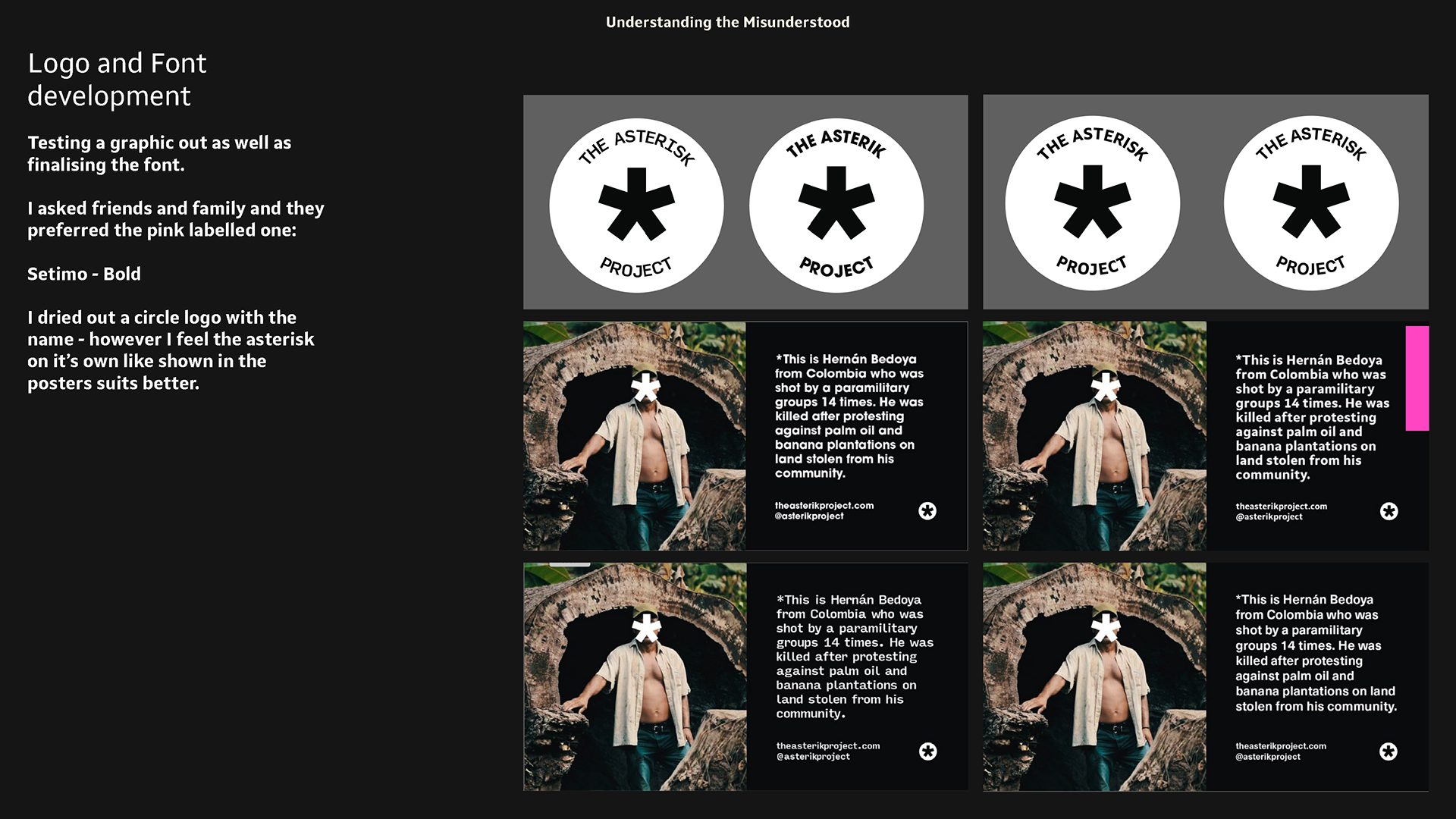
logo and Font Development

Testing a graphic out as well as finalising the font.
I asked friends and family and they preferred the top right font which is:
Setimo - Bold
I tried out a circle logo with the name - however I feel the asterisk on it’s own like shown in the posters suits better.
Also I feel these poster designs are already stronger. It may be a little too wordy but I feel they are powerful. However they don't exactly stand out so I will likely try to experiment with this.
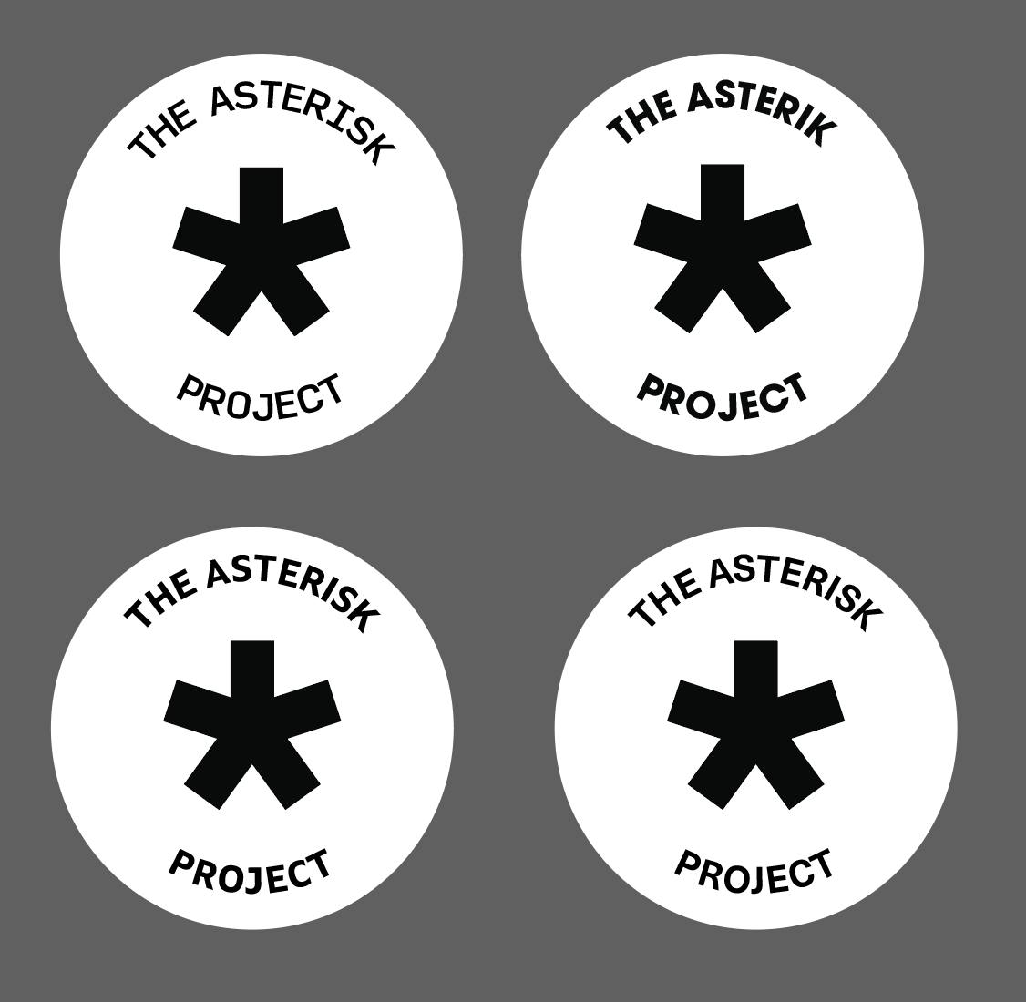
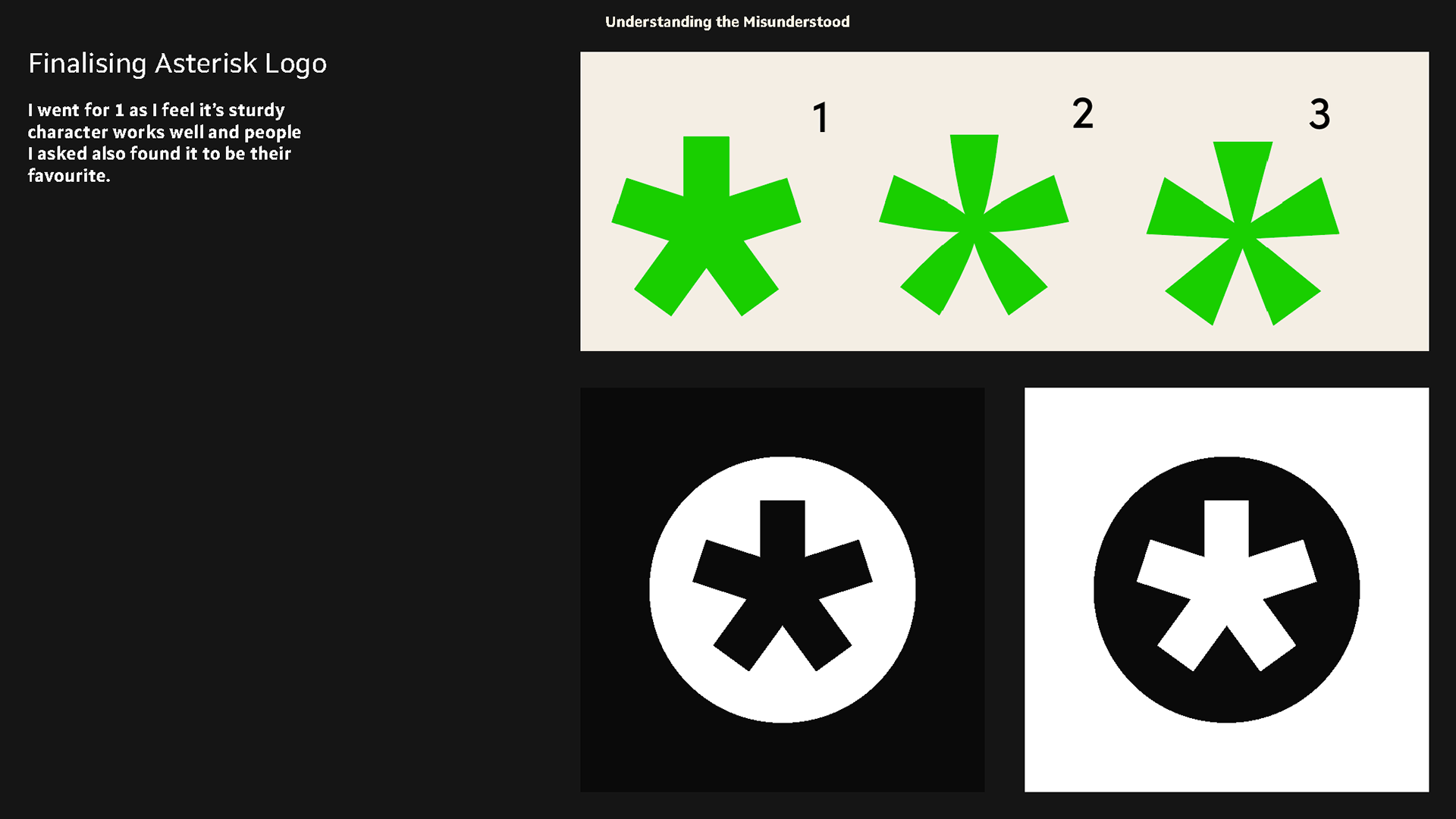
Finalising Asterisk Logo


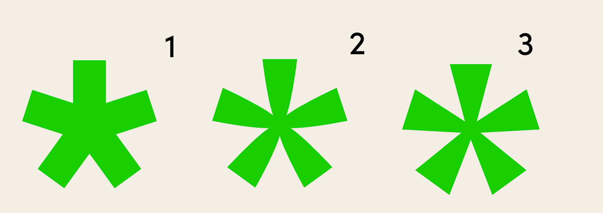
finalising asterisk logo I went with 1, partly because people who I asked preferred it and I feel the stability the even spokes have are good for giving this campaign as leg to stand on. Also I placed it in a circle to make it's a stand alone piece that is a logo that stands for itself and doesn't blend into the background of a poster.
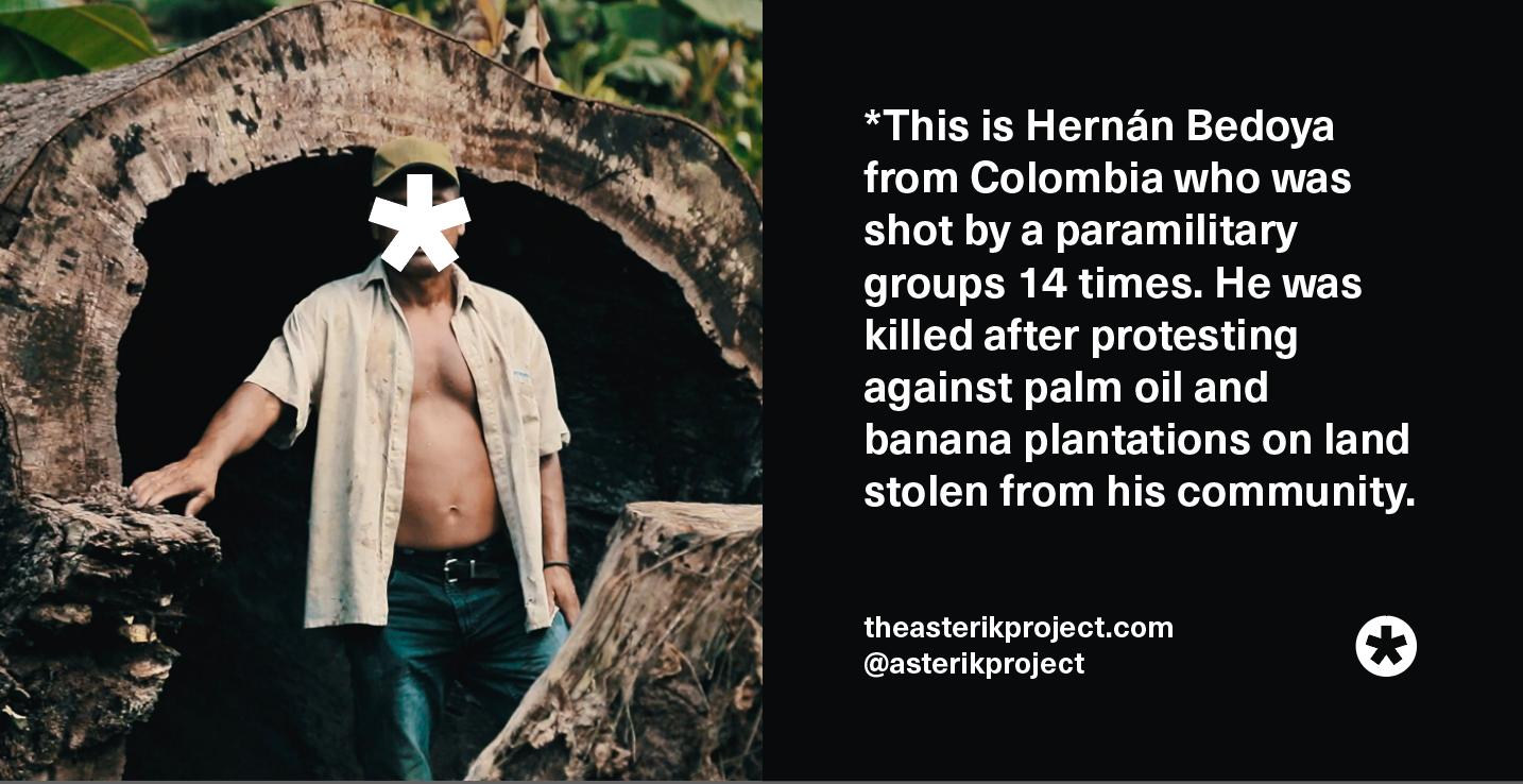
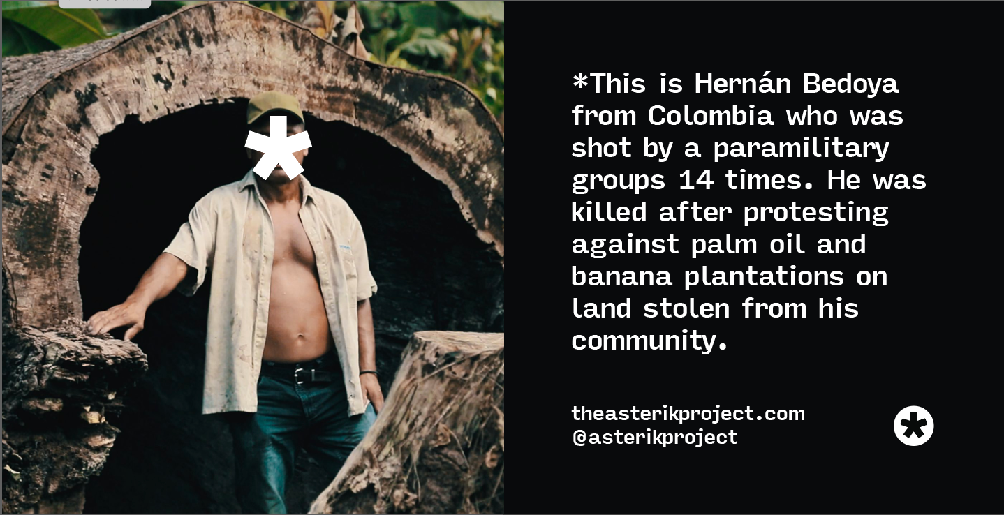
stories the public can relate to - development
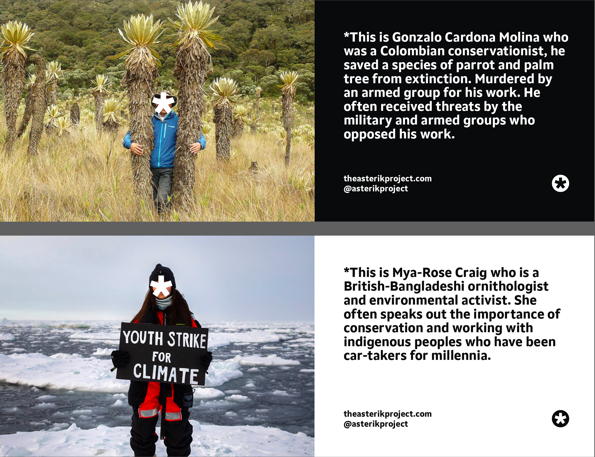
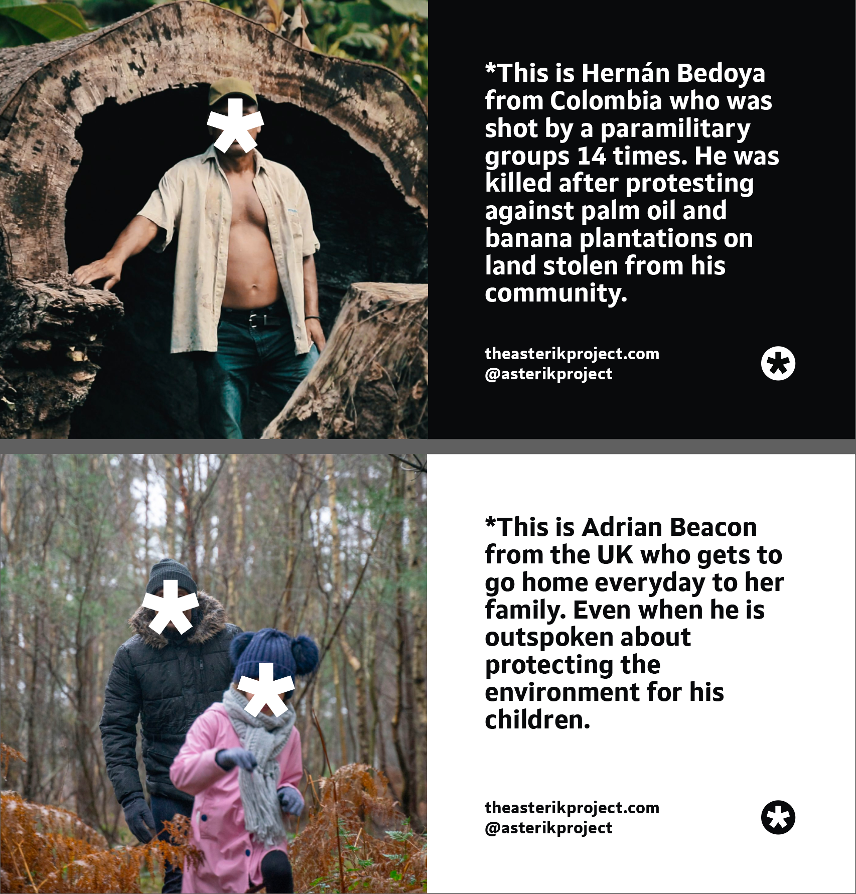
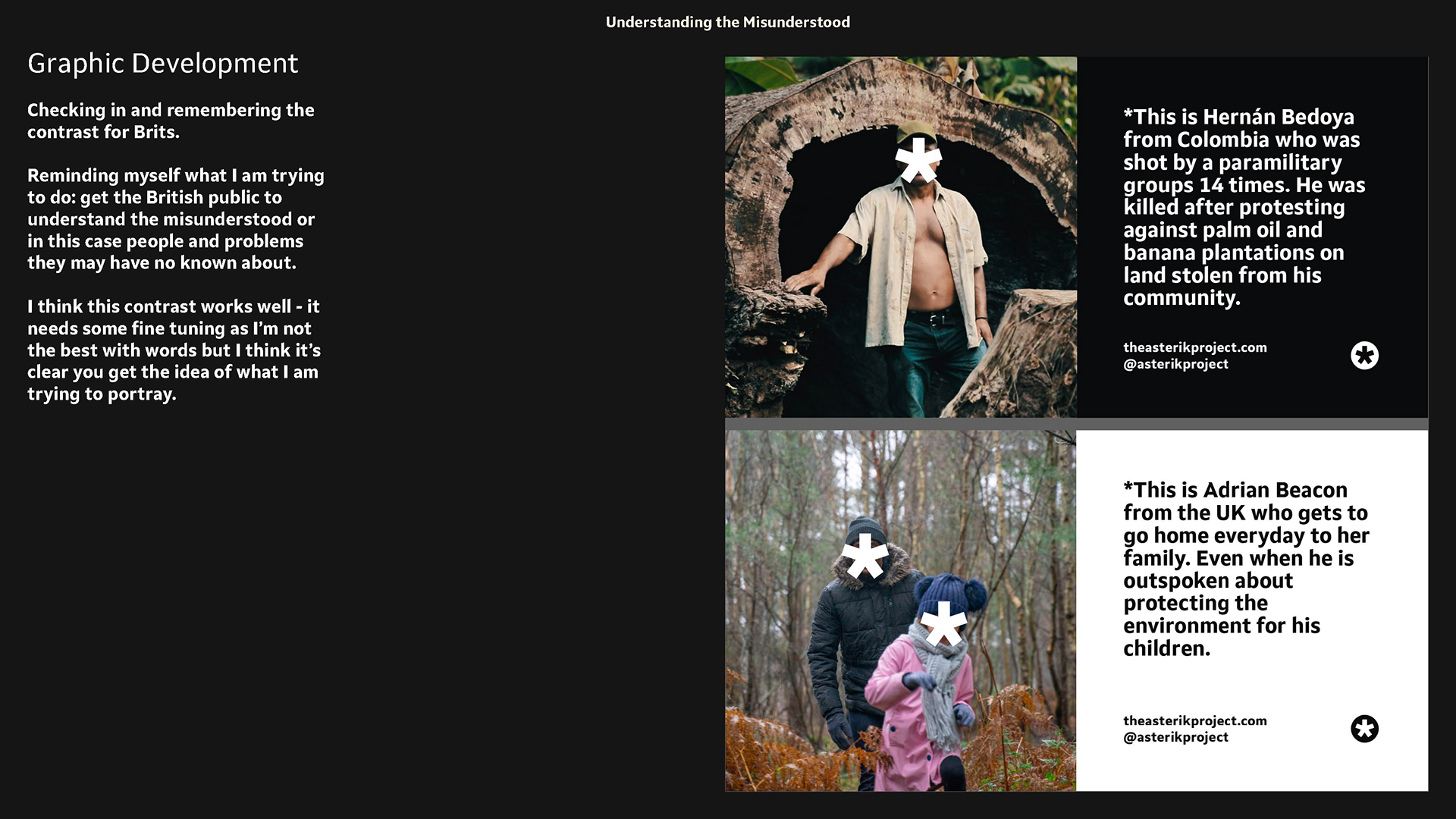
Checking in and remembering the contrast for Brits.
Reminding myself what I am trying to do: get the British public to understand the misunderstood or in this case people and problems they may have no known about.
I think this contrast works well - it needs some fine tuning as I’m not the best with words but I think it’s clear you get the idea of what I am trying to portray.
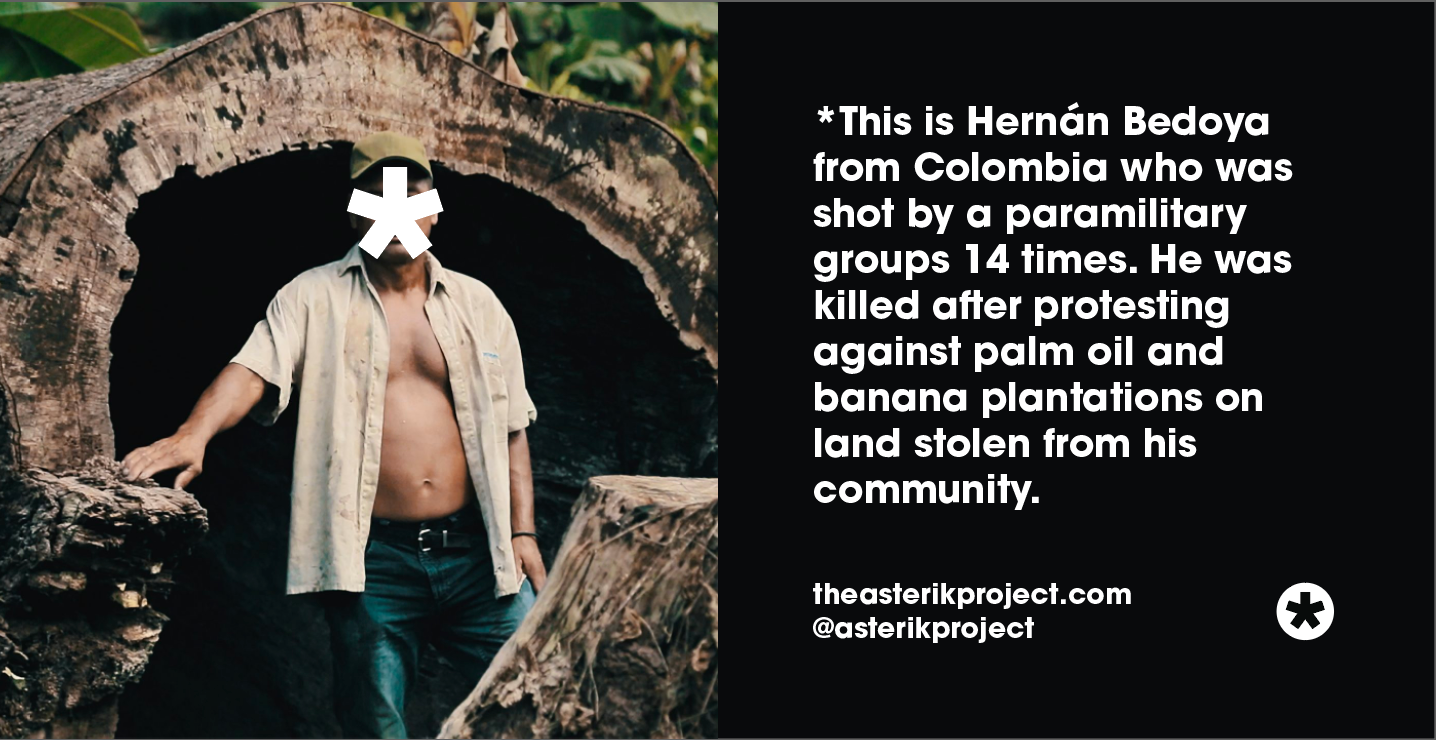
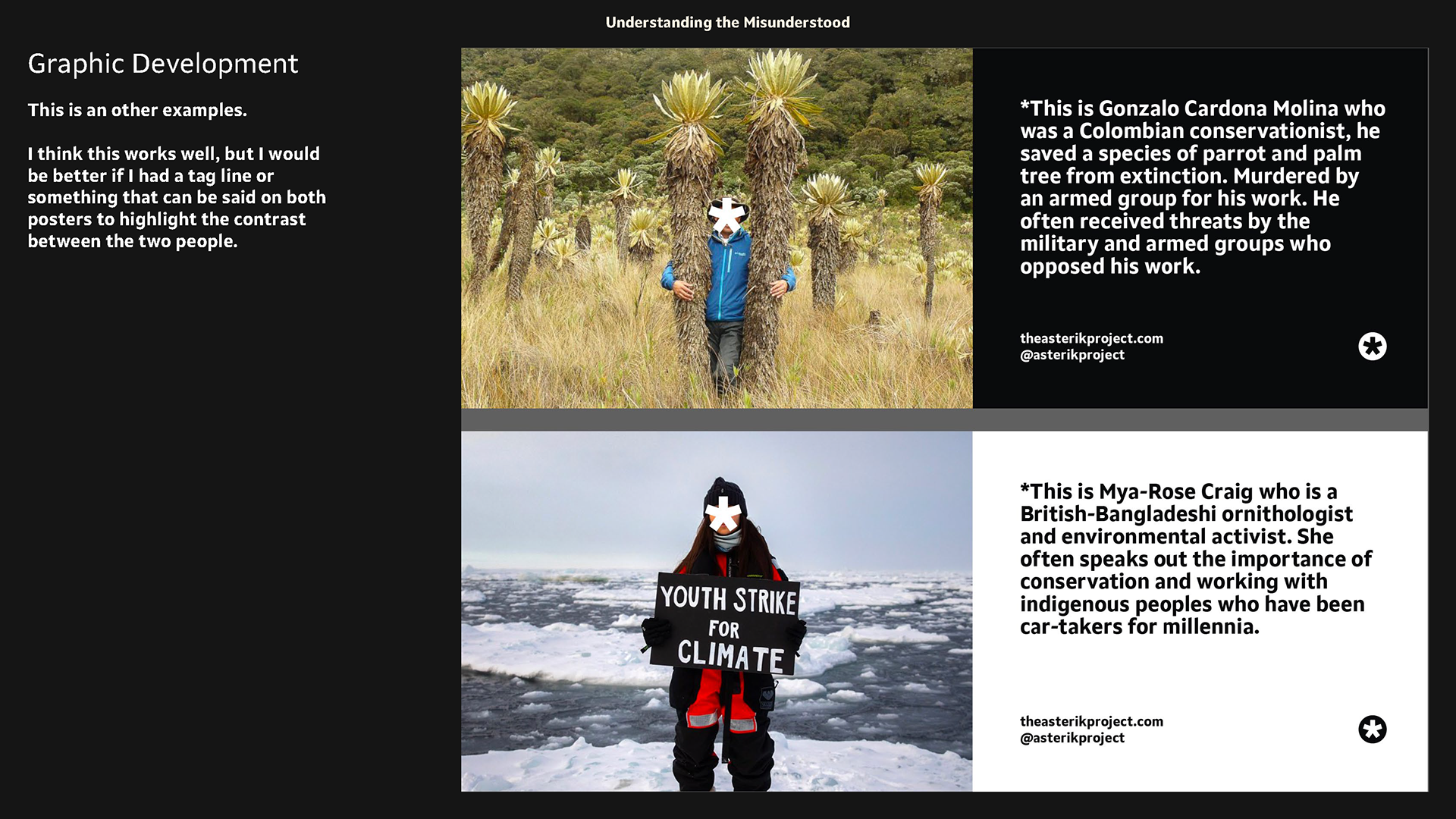
I used a fake story and made up Adrian Beacon but Mya-Rose Craig is a real activist and I feel paired very well with Gonzalos' story.
The idea is that contrasting posters would be paired so the public can see each story and see the similarity. I feel a good tag line could work with these and if they were written in a similar way would make it effective. Also i've put too much information as the point of these is to get people's attention quickly.
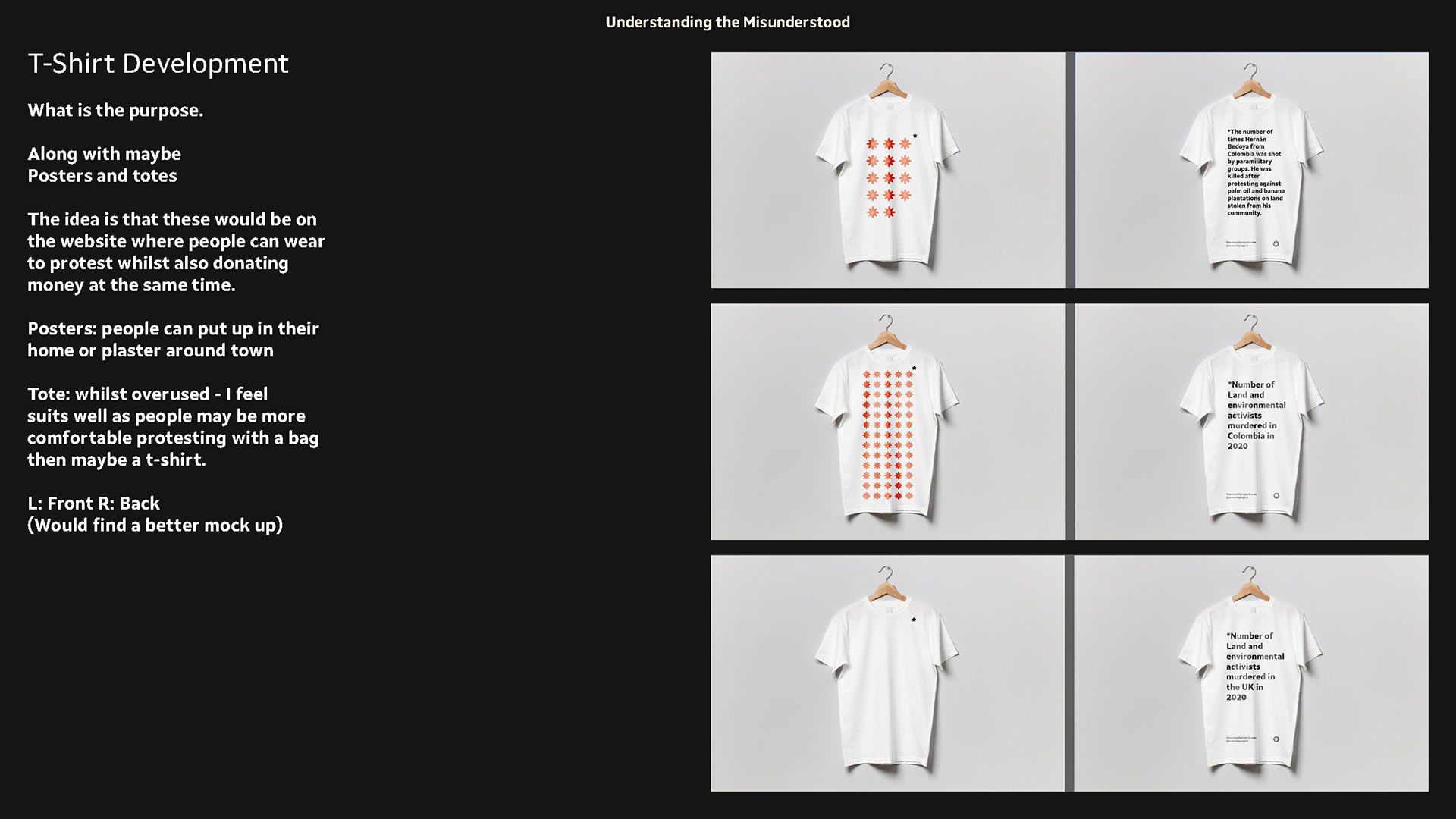
graphic tee development
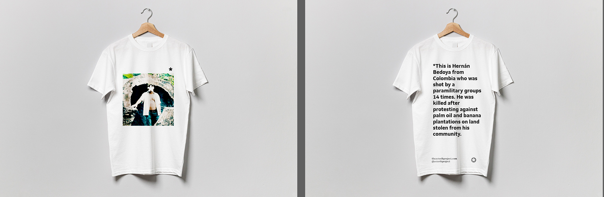

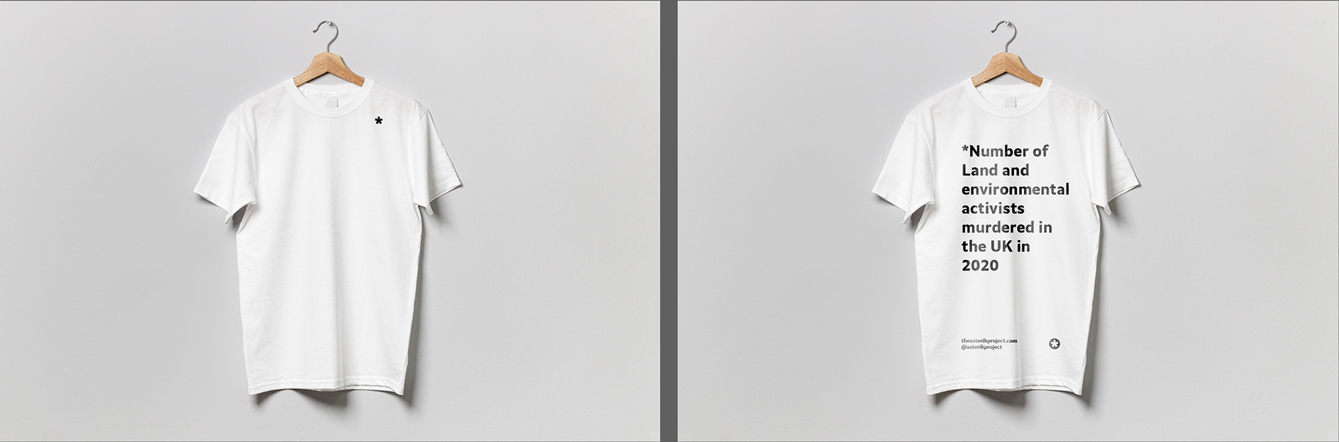
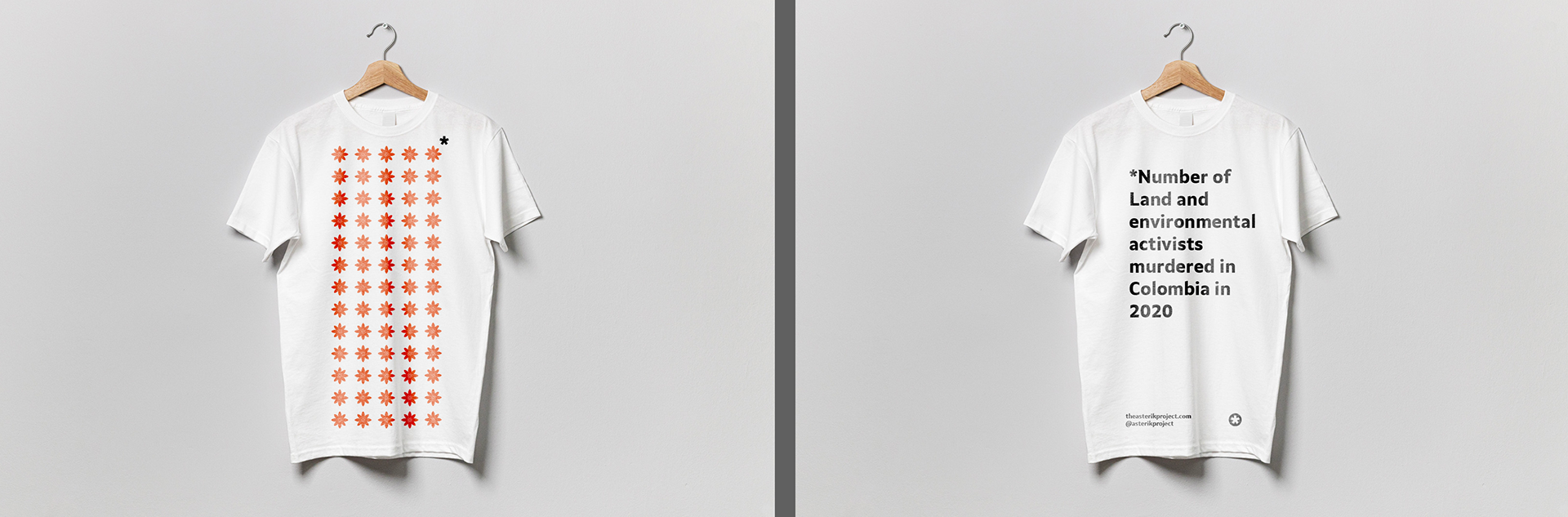
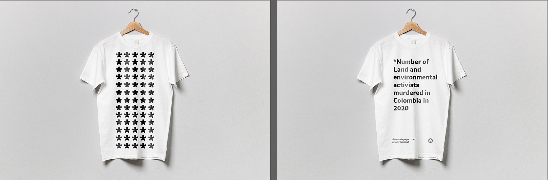
What is the purpose.
Along with maybe
Posters and totes
The idea is that these would be on the website where people can wear to protest whilst also donating money at the same time.
Posters: people can put up in their home or plaster around town
Tote: whilst overused - I feel suits well as people may be more comfortable protesting with a bag then maybe a t-shirt.
L: Front R: Back
(Would find a better mock up)
I think these could be really strong and something people would like to be involved with due to their simple but effective design.
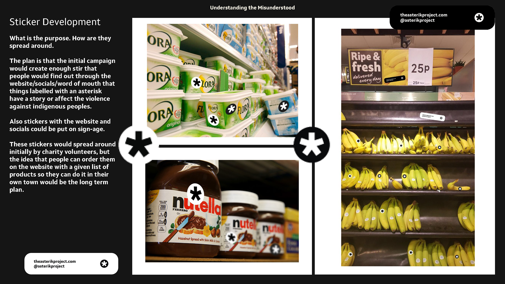
Sticker Development
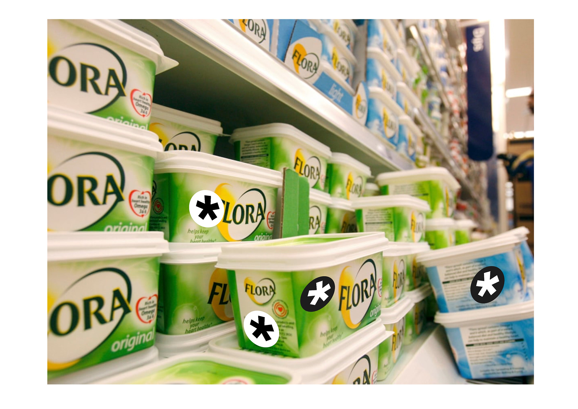
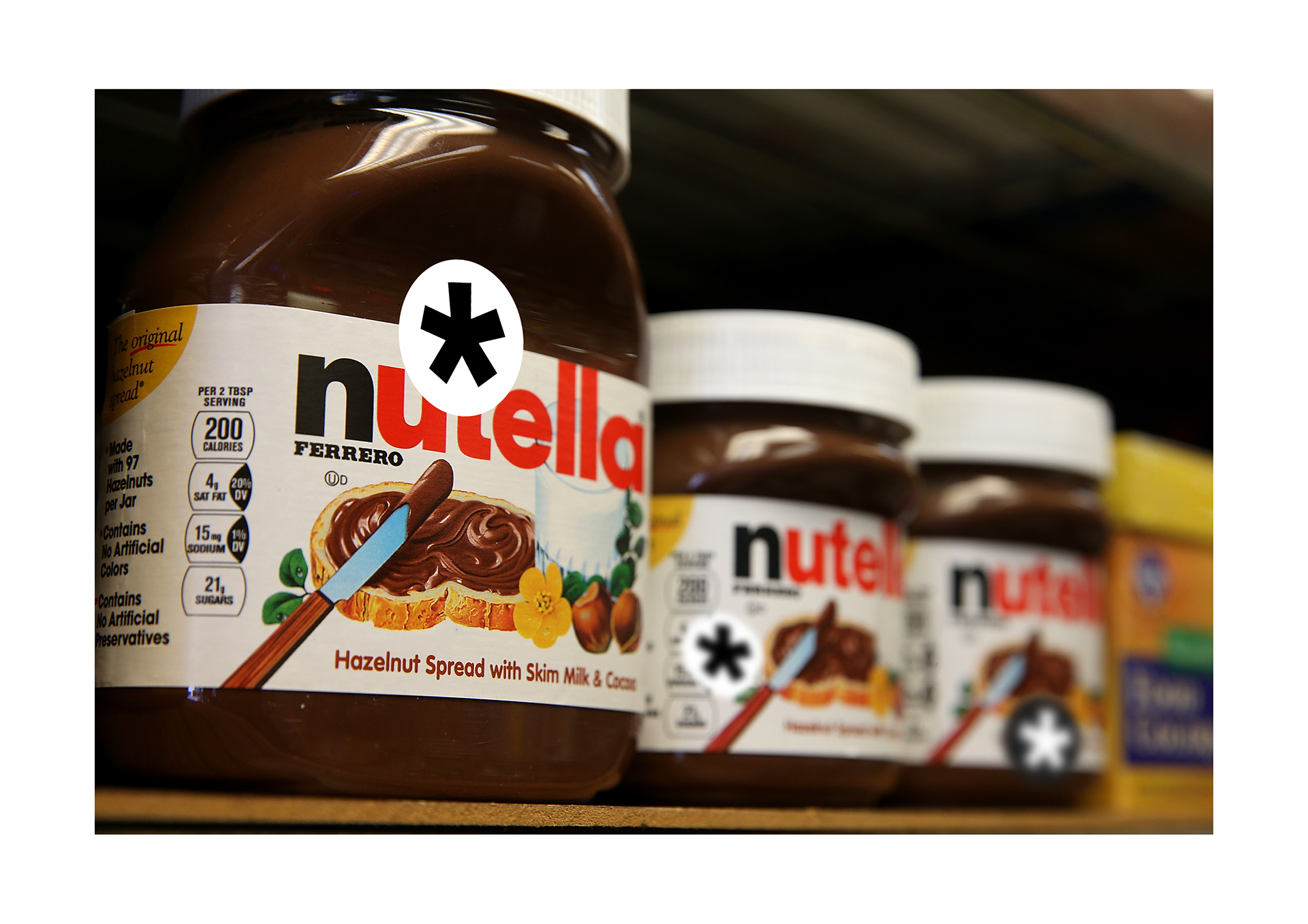
What is the purpose. How are they spread around.
The plan is that the initial campaign would create enough stir that people would find out through the website/socials/word of mouth that things labelled with an asterisk have a story or affect the violence against indigenous peoples.
Also stickers with the website and socials could be put on sign-age.
These stickers would spread around initially by charity volunteers, but the idea that people can order them on the website with a given list of products so they can do it in their own town would be the long term plan.
They do blend in so maybe swaying away from B&W could be a solution.
Website Plan
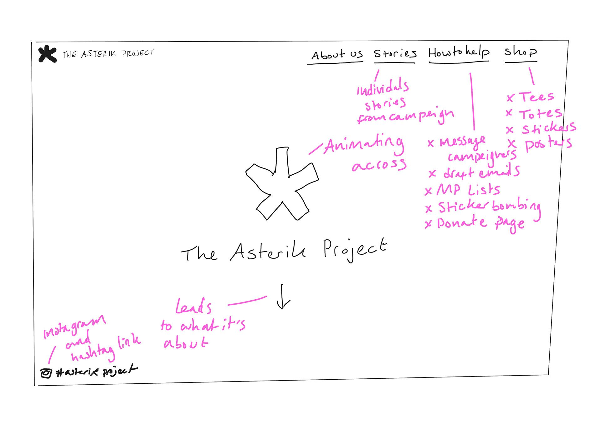
What is the purpose?
This is where people go to help and find out more. After the initial call points this is where people go to find out more. I've annotated certain resources and notes on things like social media, individual stories, shop etc.
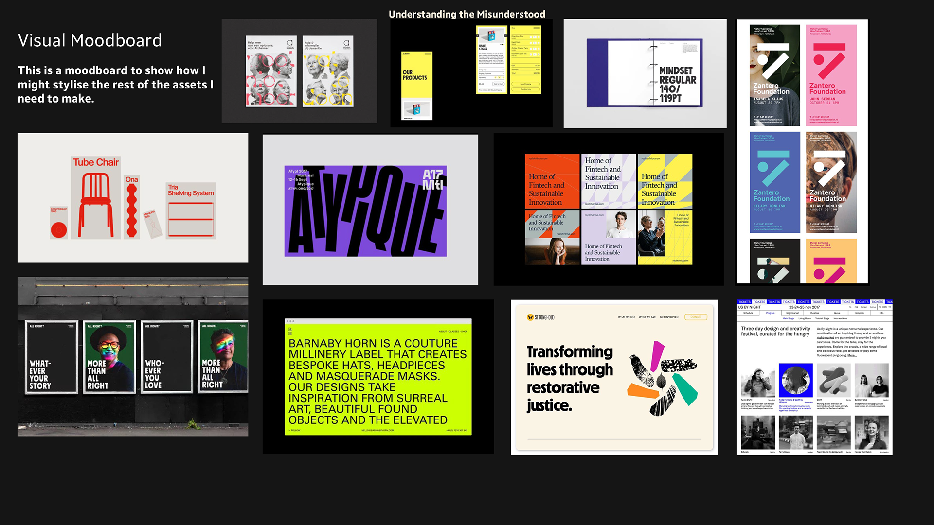
Visual Moodboard


This is a quick visual moodboard I put together to show how I may next develop my brand identity and assets. I might want to go for bright colours and bold font so it stands out and is clear.
Presentation and feedback


This is my presentation for the end of term.
Areas of strength and areas to improve:
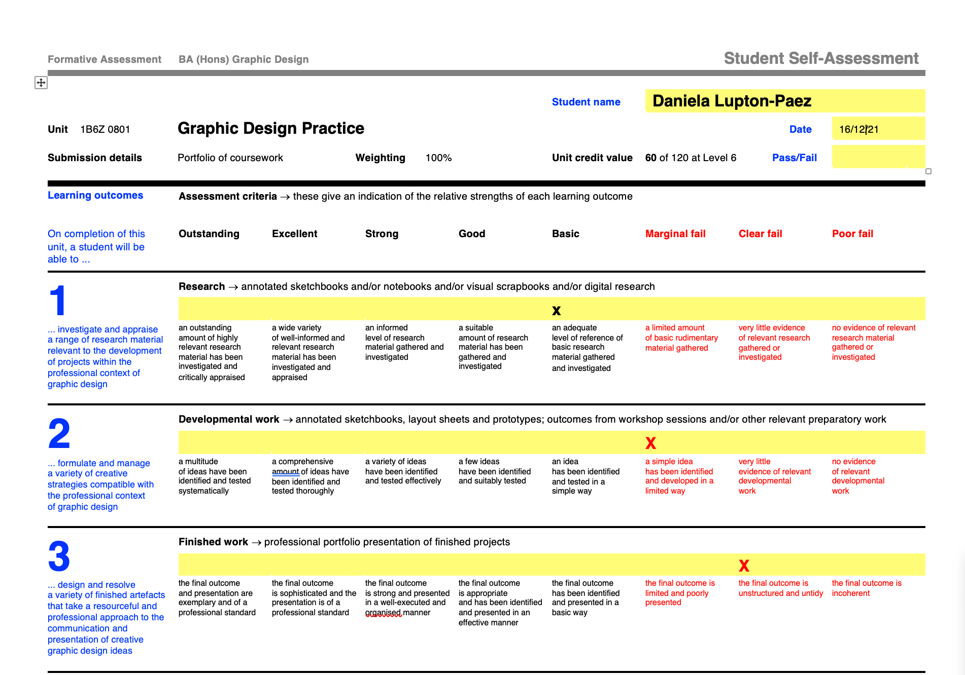
"I think my ideas are fairly solid and my interest is there. I’m just not ahead as I should be which has caused me to rush and skip some vital steps. I need build my developmental work and clearly show the research I have done, with the end goal being to have a well-rounded final piece. I hope to explore further pathways to make sure I’ve really thought out my options and well as getting feedback from a range of people to ensure the design works."
Also I marked my self low because I felt that if this were handed in right now it wouldn't pass.
Feedback from presentation:
"It’s about developing my asterisk idea and working out the various touch points needed. For example, a website? Instagram? Other social media. It’s about creating snippets of information that would clearly build gradually to create an established campaign (like how may I used ambient media or guerrilla tactics). I need to work out where I go from the asterisk, and how do people end up at the website etc. To look further at developing the identity e.g. testing colours, layouts etc. I also want to user test it more as I feel this would help generate a well thought out campaign which attracts my audience. "
logo ANIMATION
These are some animations I did after my feedback. I wanted to just experiment a bit and re-introduce the idea of colour as it's what I got in my feedback from Andy and Will. I like the playfulness of these and will begin to explore and develop my idea.