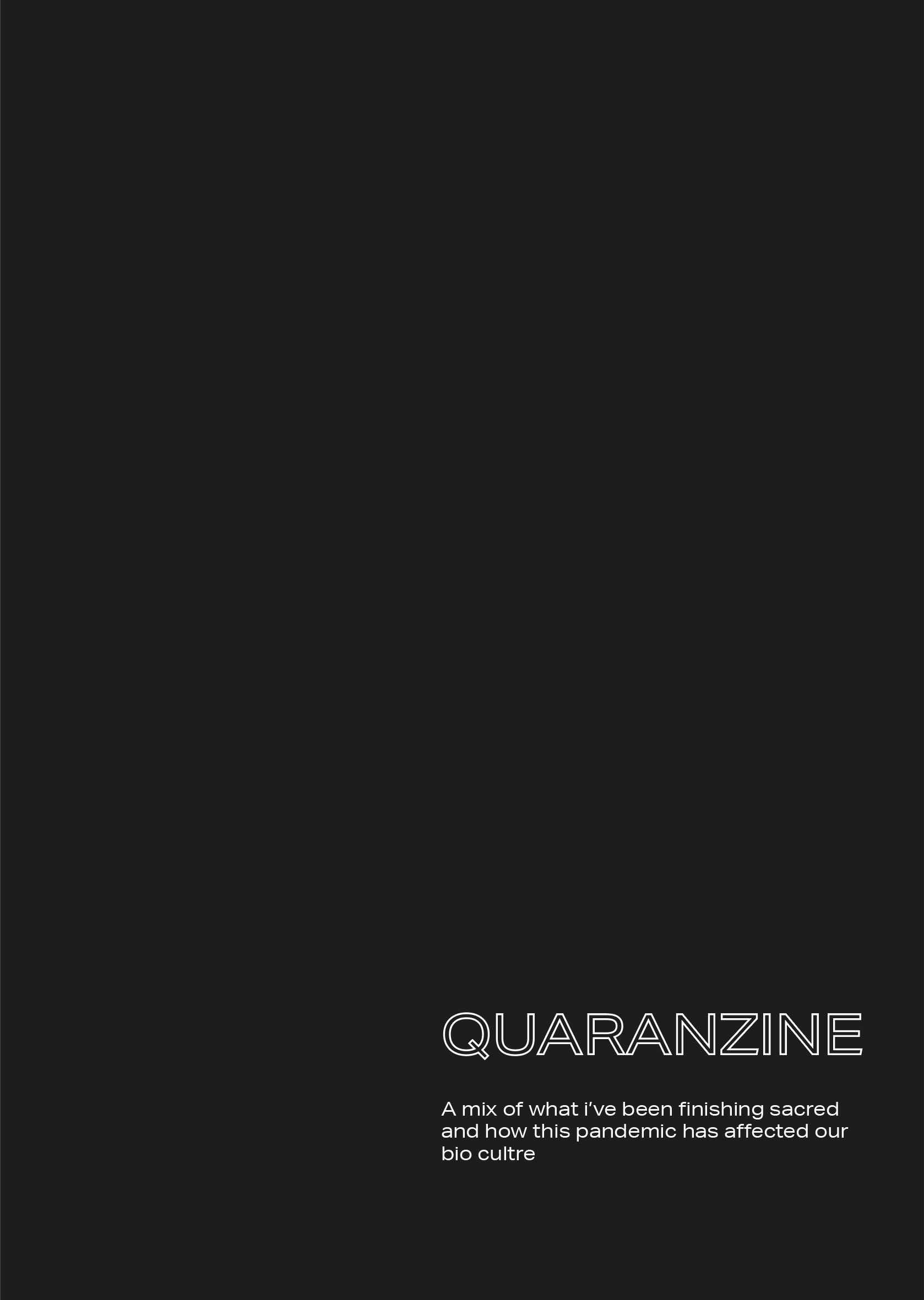
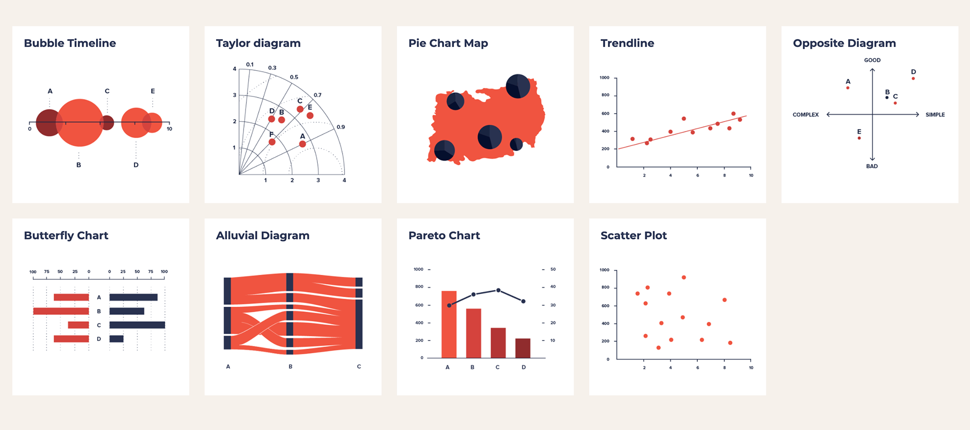
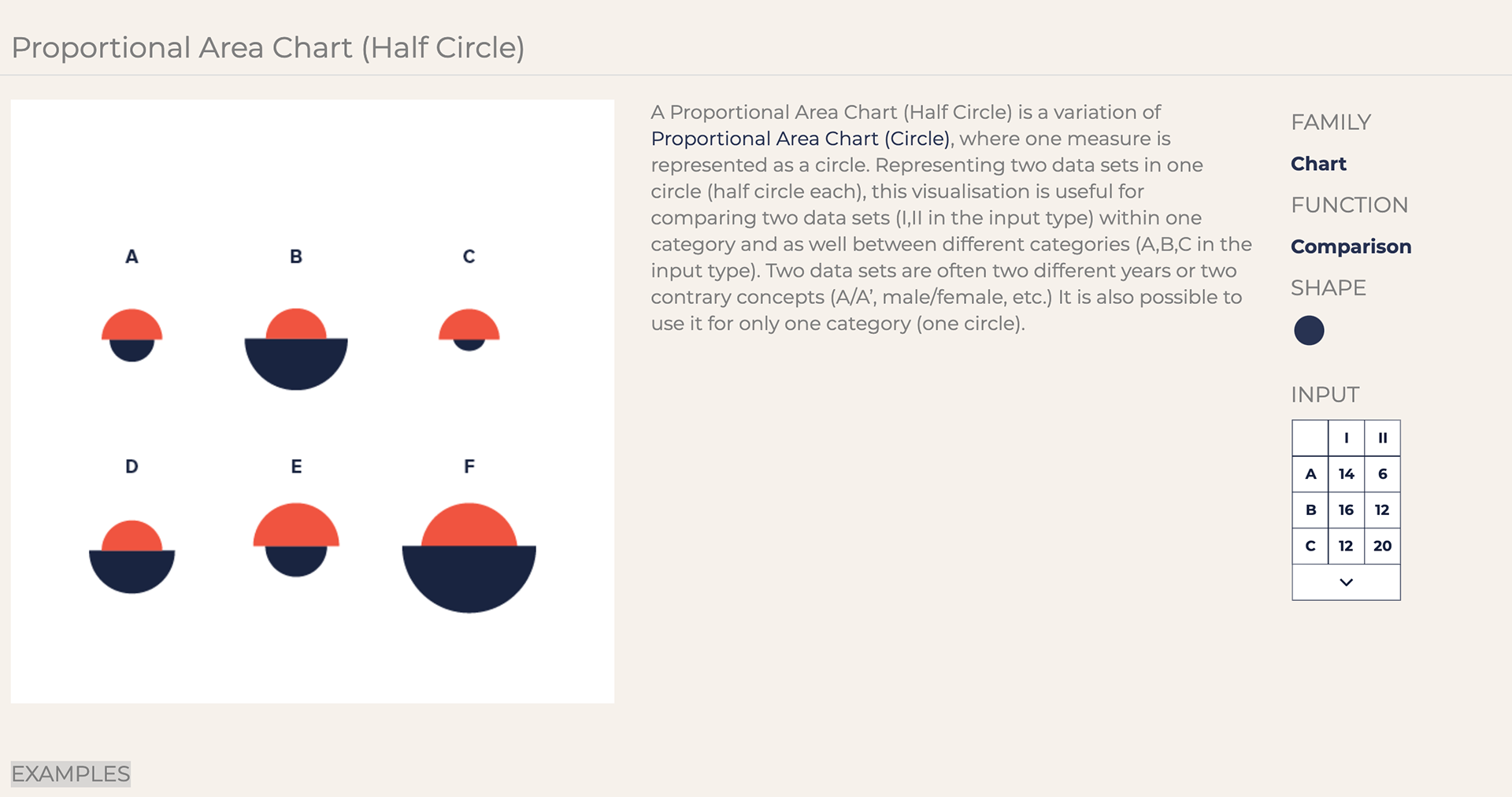
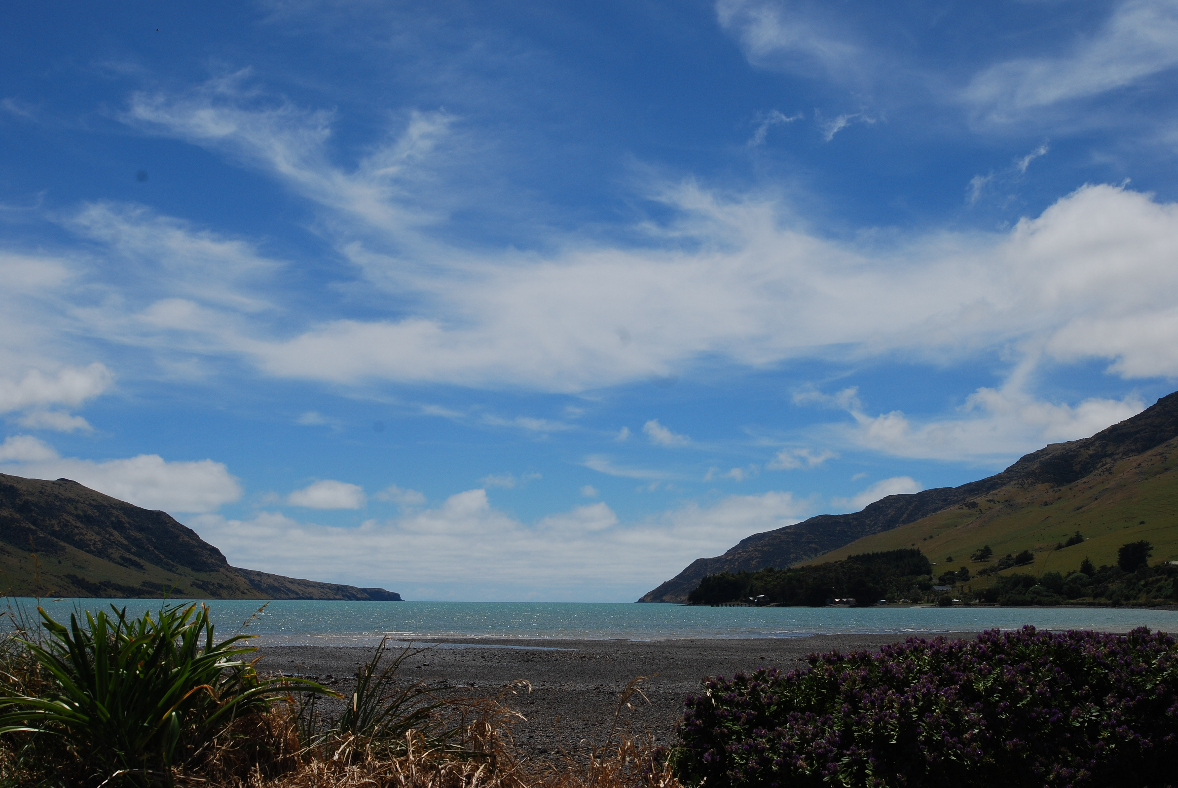
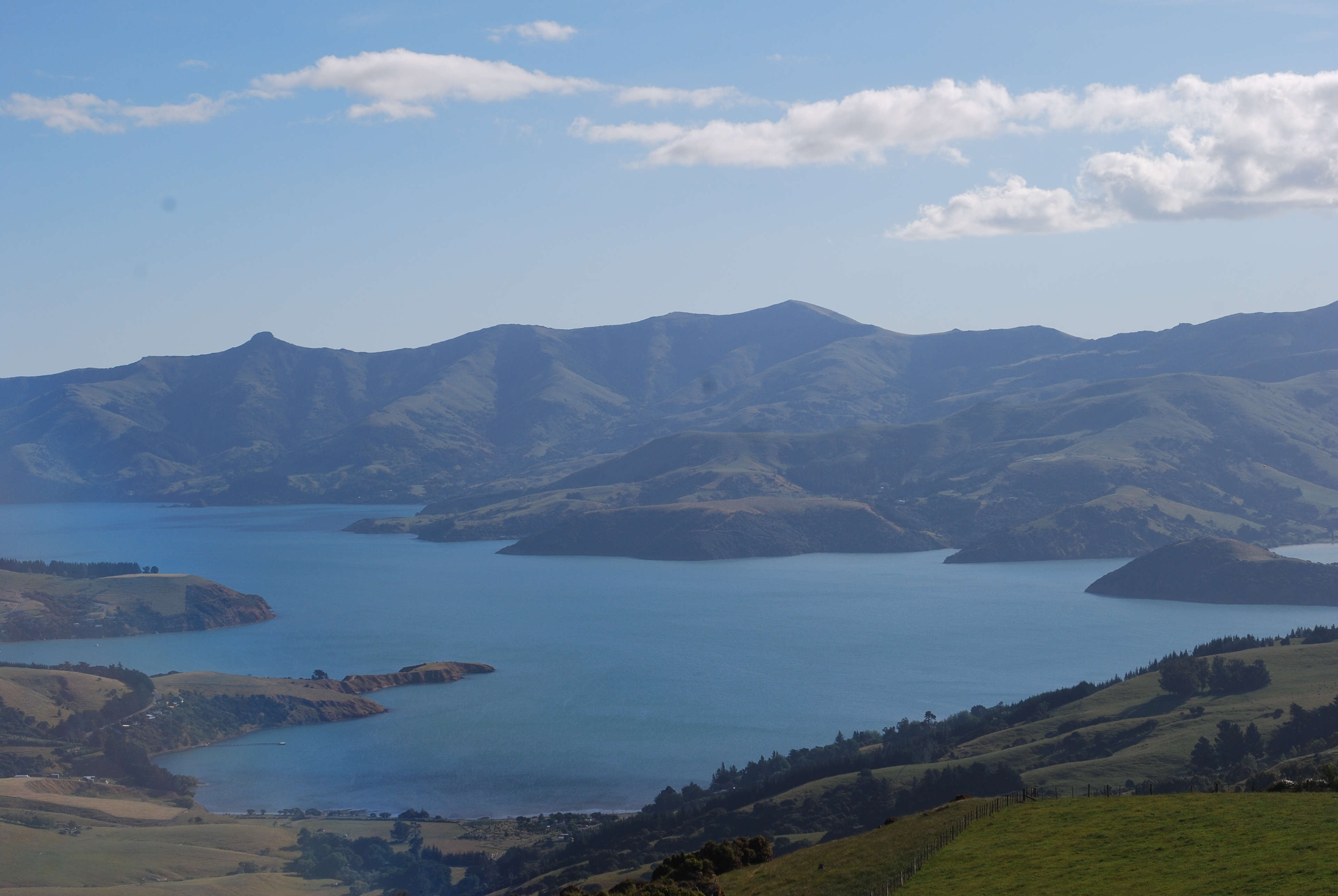
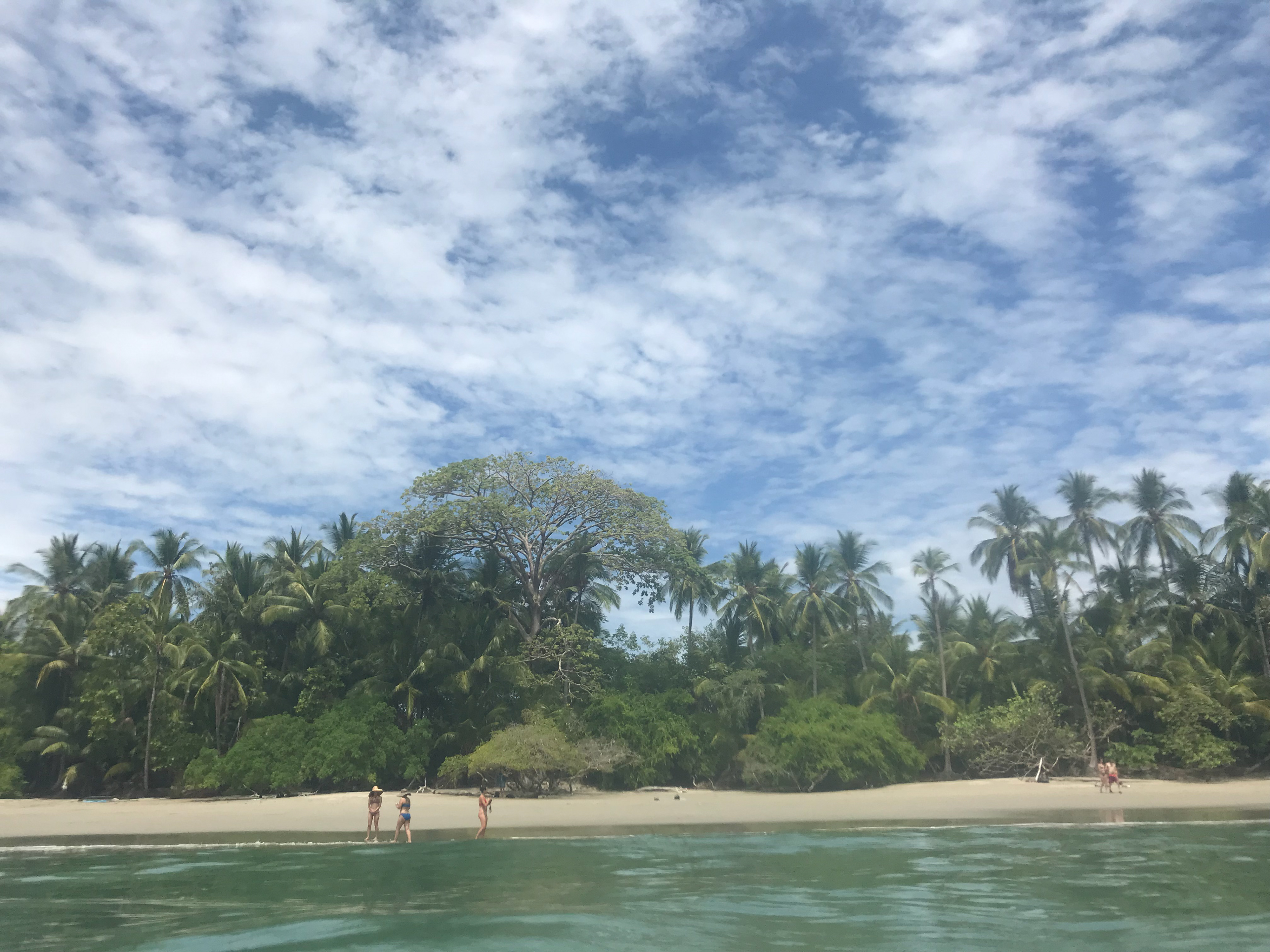
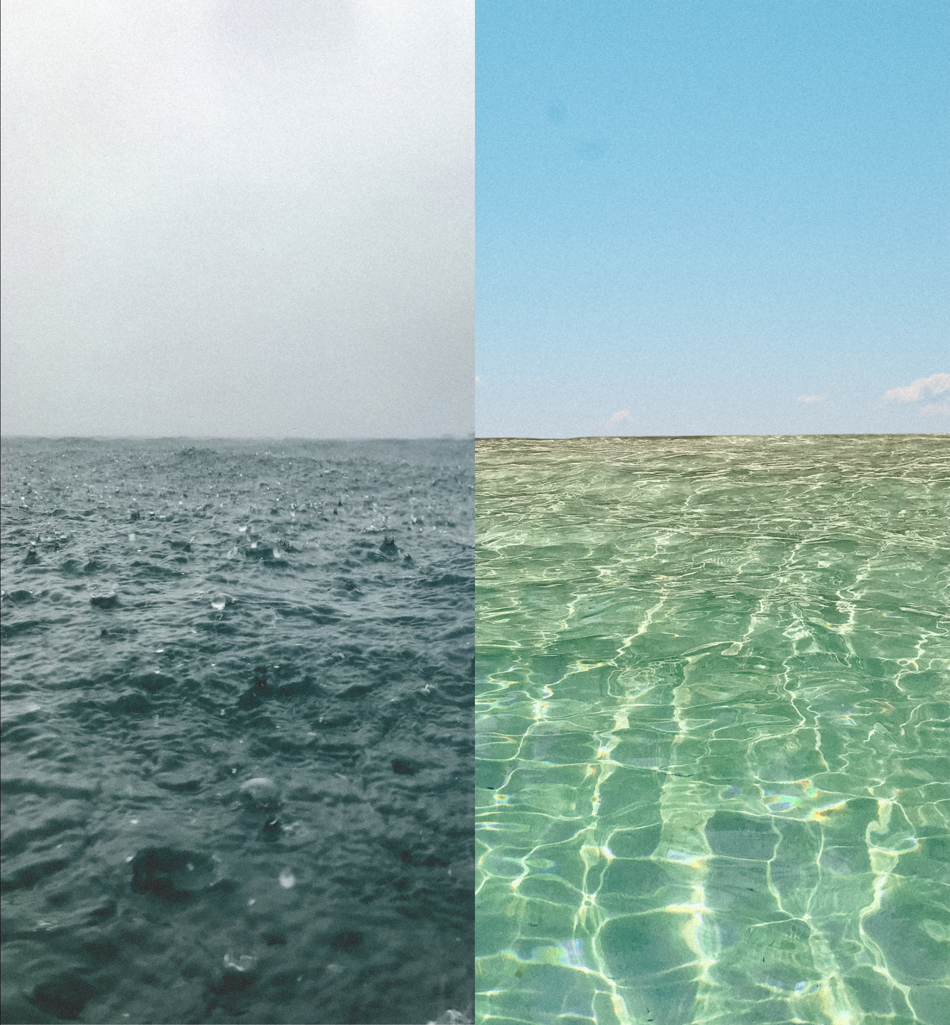
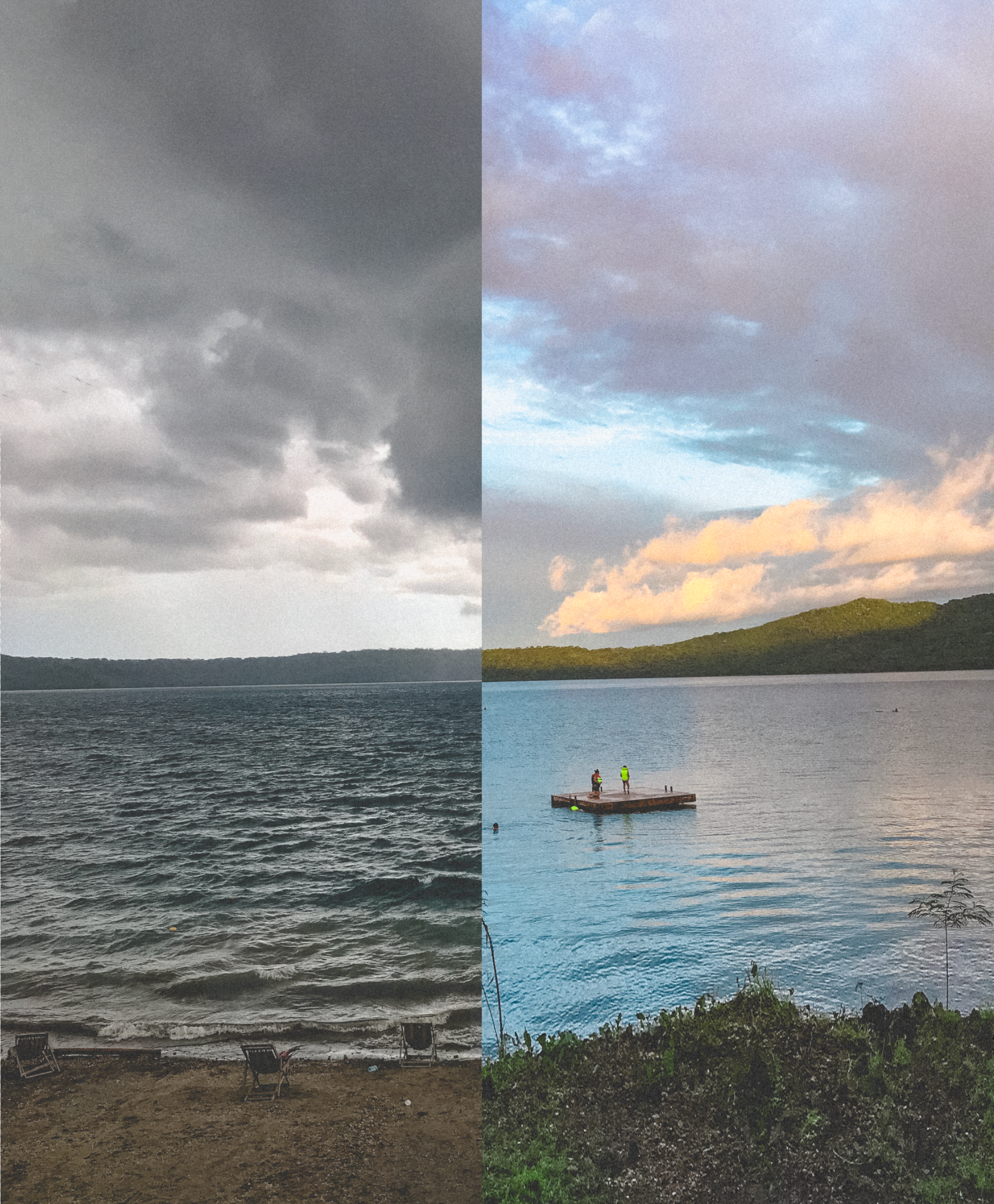
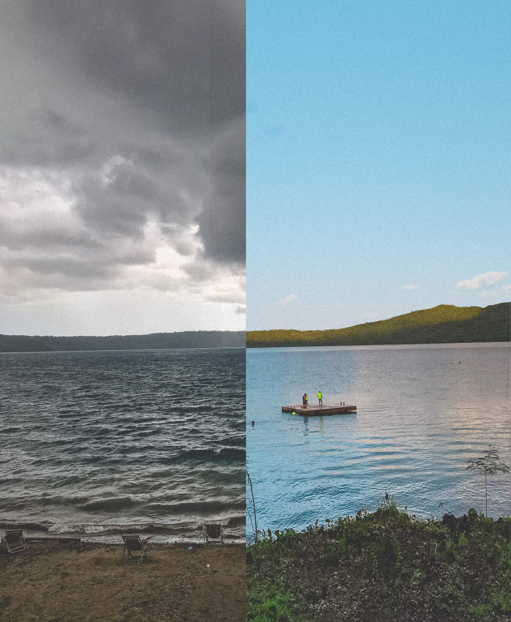
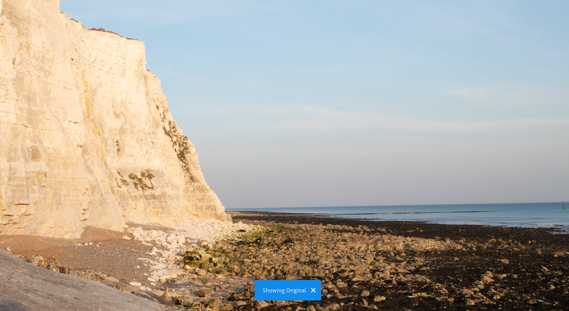
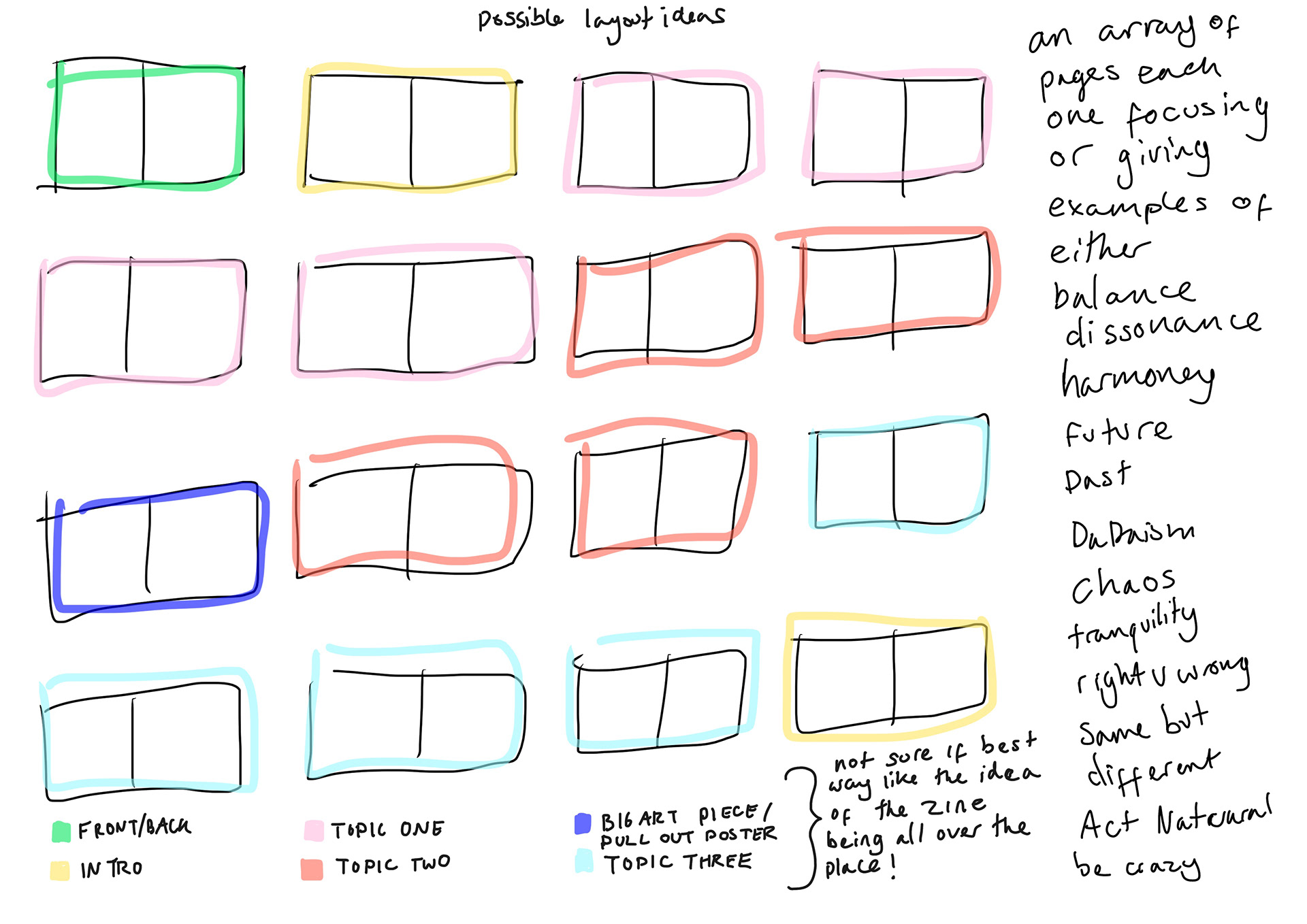
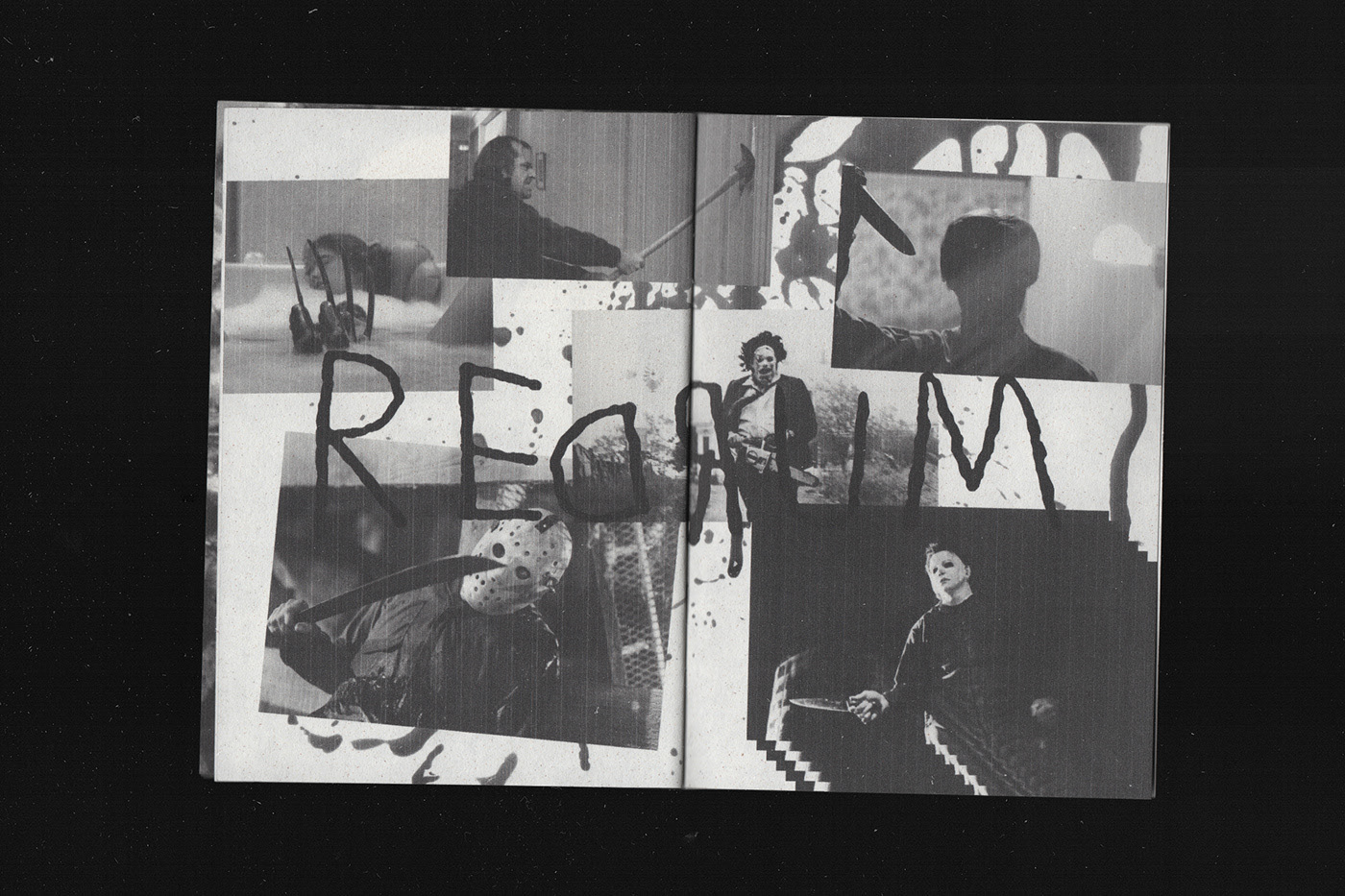
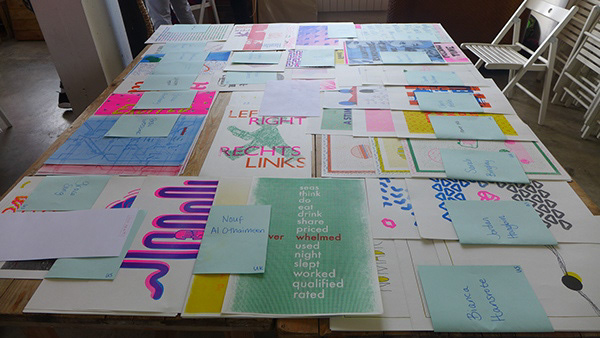
Visual Collider
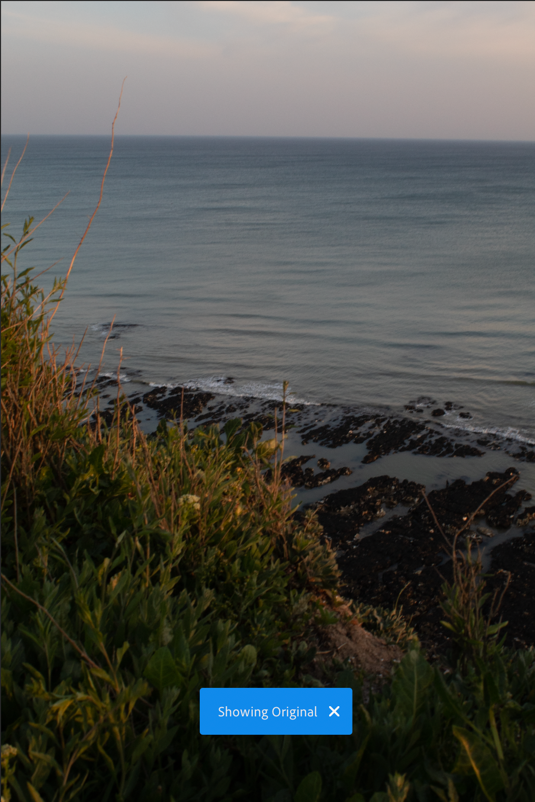
Start from the bottom of the page - click on images if you need a close up - tried to highlight what is important to read but some will be in the notebook photographs so you may have to zoom in
I've had to carry on this development on another page as there is too much on this and it's lagging in uploading my work so easier for me to just continue on a new page. Carry on page is called UNIT X P2.2
NEXT STEPS
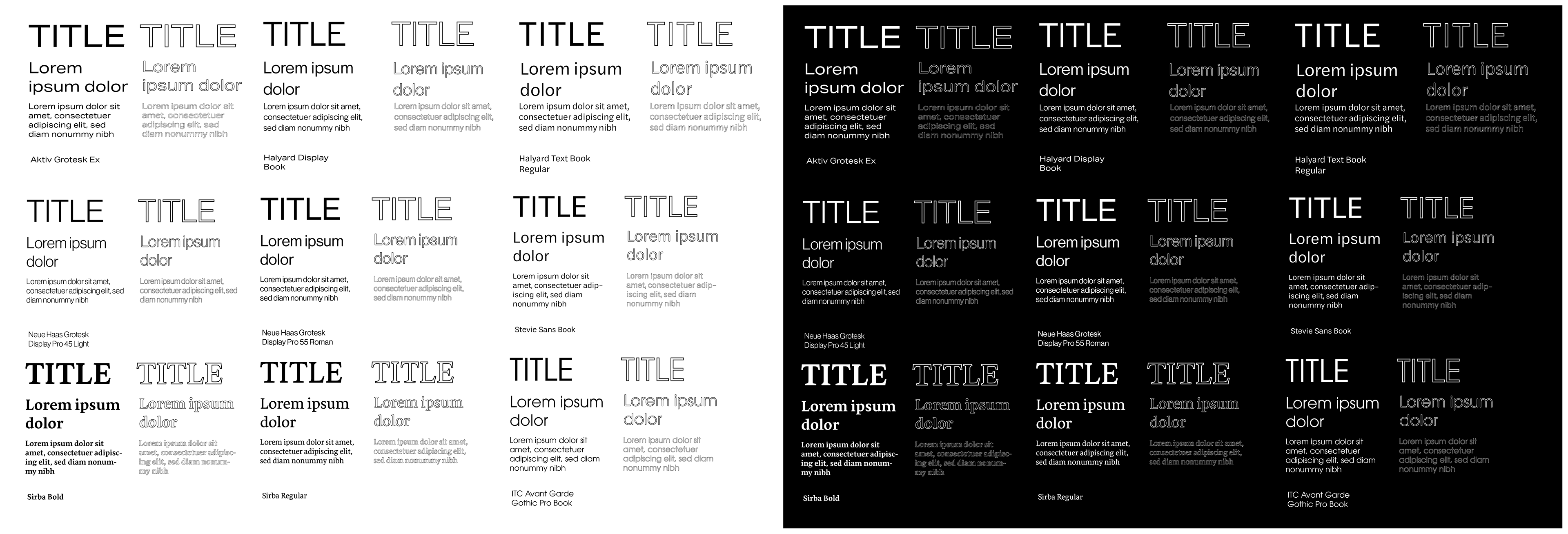
Whilst finishing these page themes it did occur that I should be thinking of something stronger in terms of design as the left page image right page title and body text is a little bland. I arranged a zoom call with Kevin to show my work, he said I would have a complete publication if I fine tuned the titles and body text but that if I did have time try to experiment as much as I can since being able to link it stronger to the original sources and create something stronger and in my words more confident could really help bring up the quality of my work.
Suggestions of going back to graphis and seeing if any of the assets I’ve made would work in that format or just doing whatever comes to mind may end up helping come up with new ideas. These are some of my further notes from our call.
My next steps are to note down some experiment ideas and then do it - if I find myself not feeling inspired I’ll go back to fine tuning my current publication but I would have liked to try something even if I ‘fail’.
I agree about going across the pages and that at the time my reason for doing one sided pages was what I thought wa good at the time but now I agree it would be good to experiment a little further. The topics I've chosen have shown that it is more complex than black and white - so now I want to explore a more fluid format and use some of kevin's suggestions to hopefully help me get there.
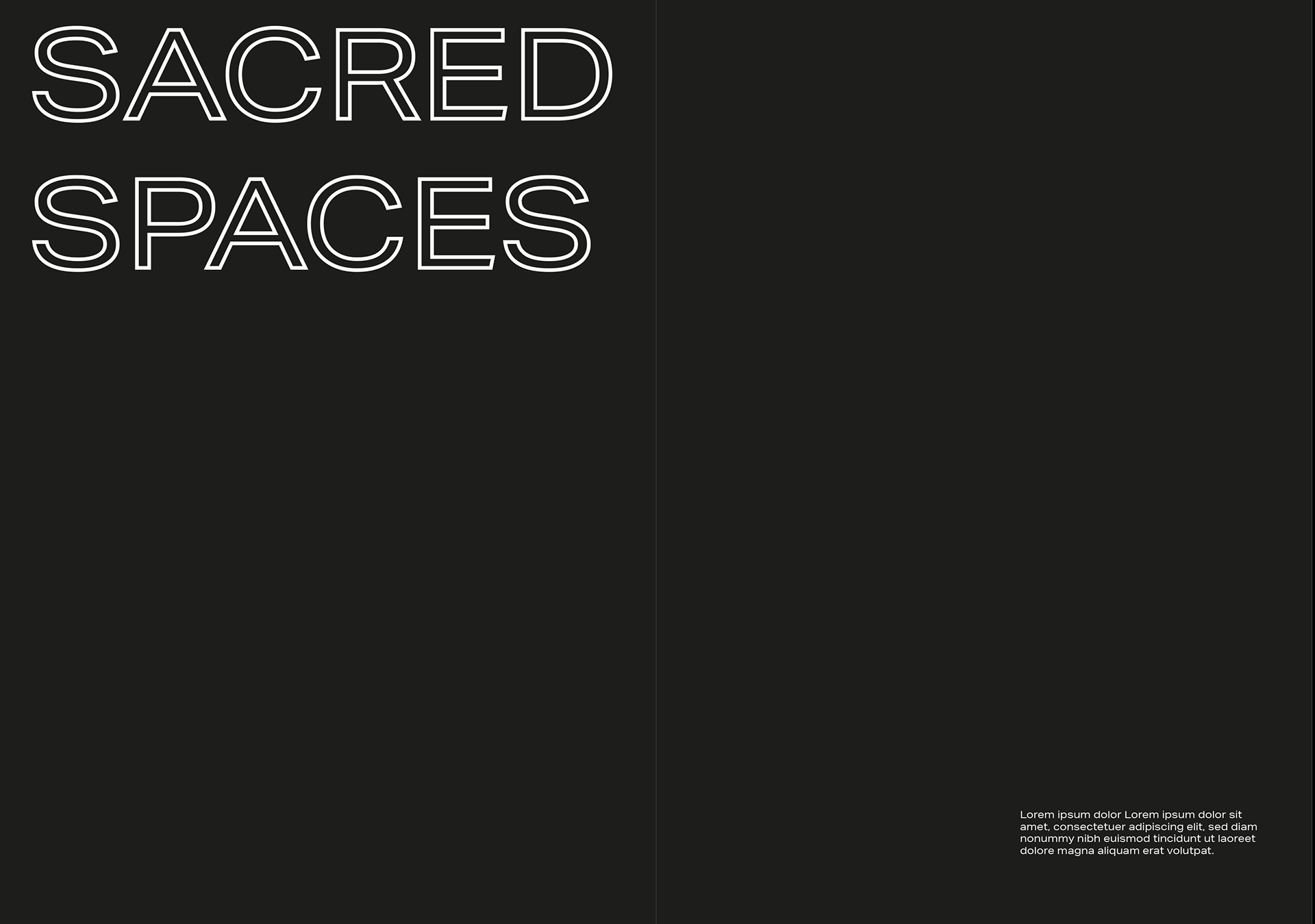

Between my email and zoom call with Kevin I thought that a good way to split up the zine I made would be the more personal things would be mine and my sacred spaces where as the other half would be covering the wider subject of how our bio culture is affected. I like the idea of still focusing on these themes even if I end up focusing on the one as I feel it could form a strong link with my original sources.
To sum up that this piece is about coronavirus and our relationship with nature and each other therefore it's about bioculture which is a bif theme of the sacred spaces book. I think the designs also reflect the design values in graphis.
INSERT PICTURE OF INTRO TO SITES
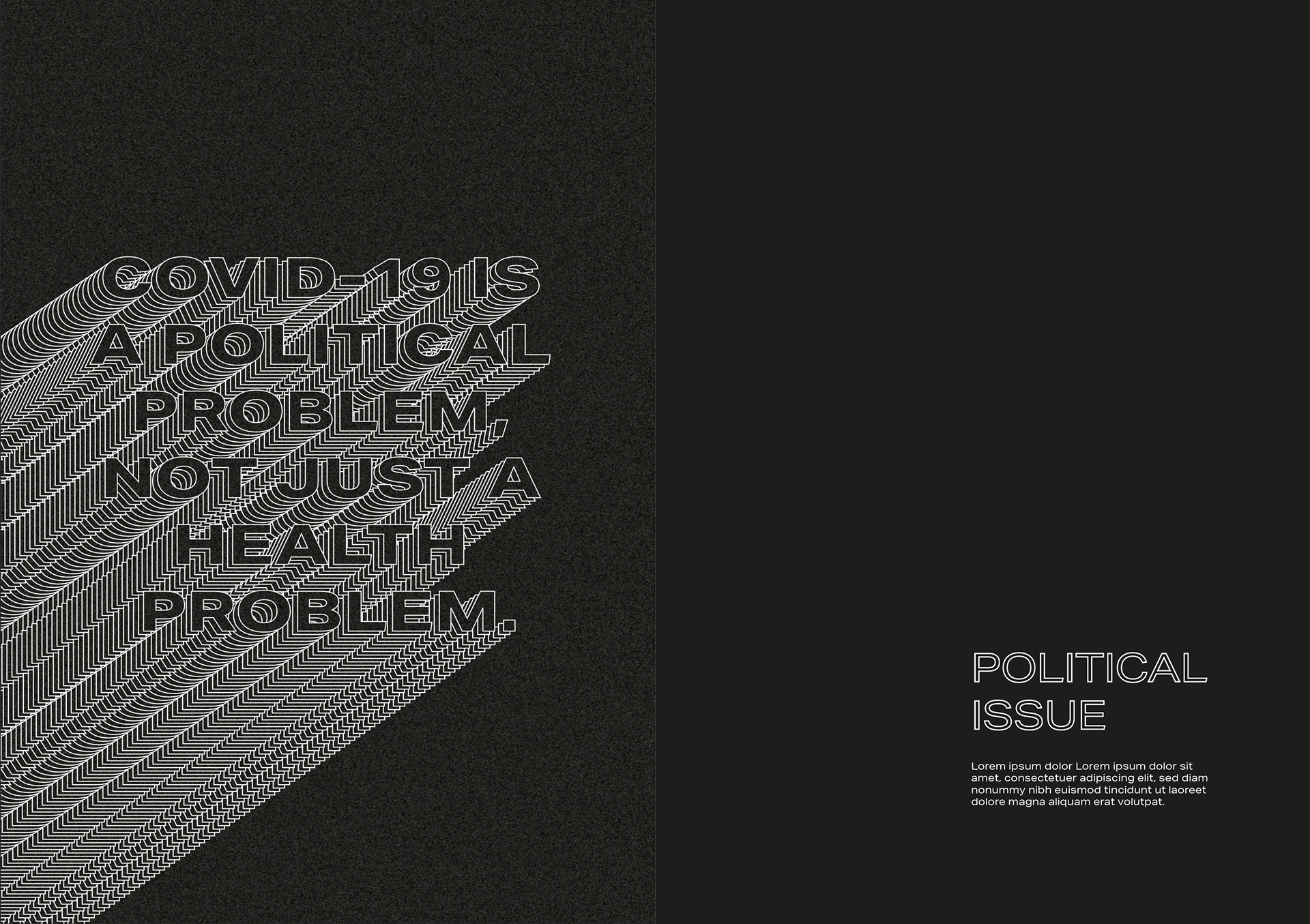
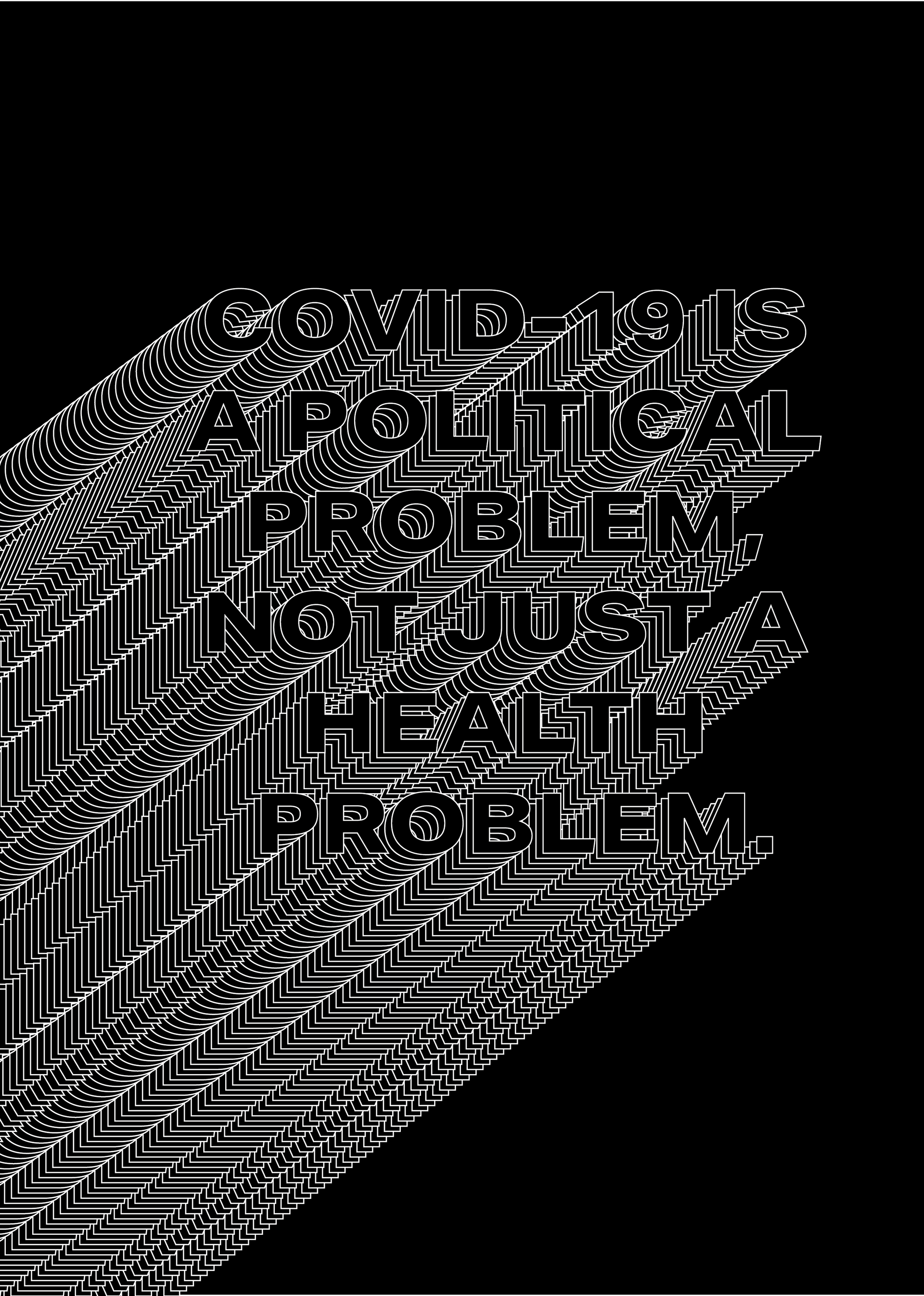
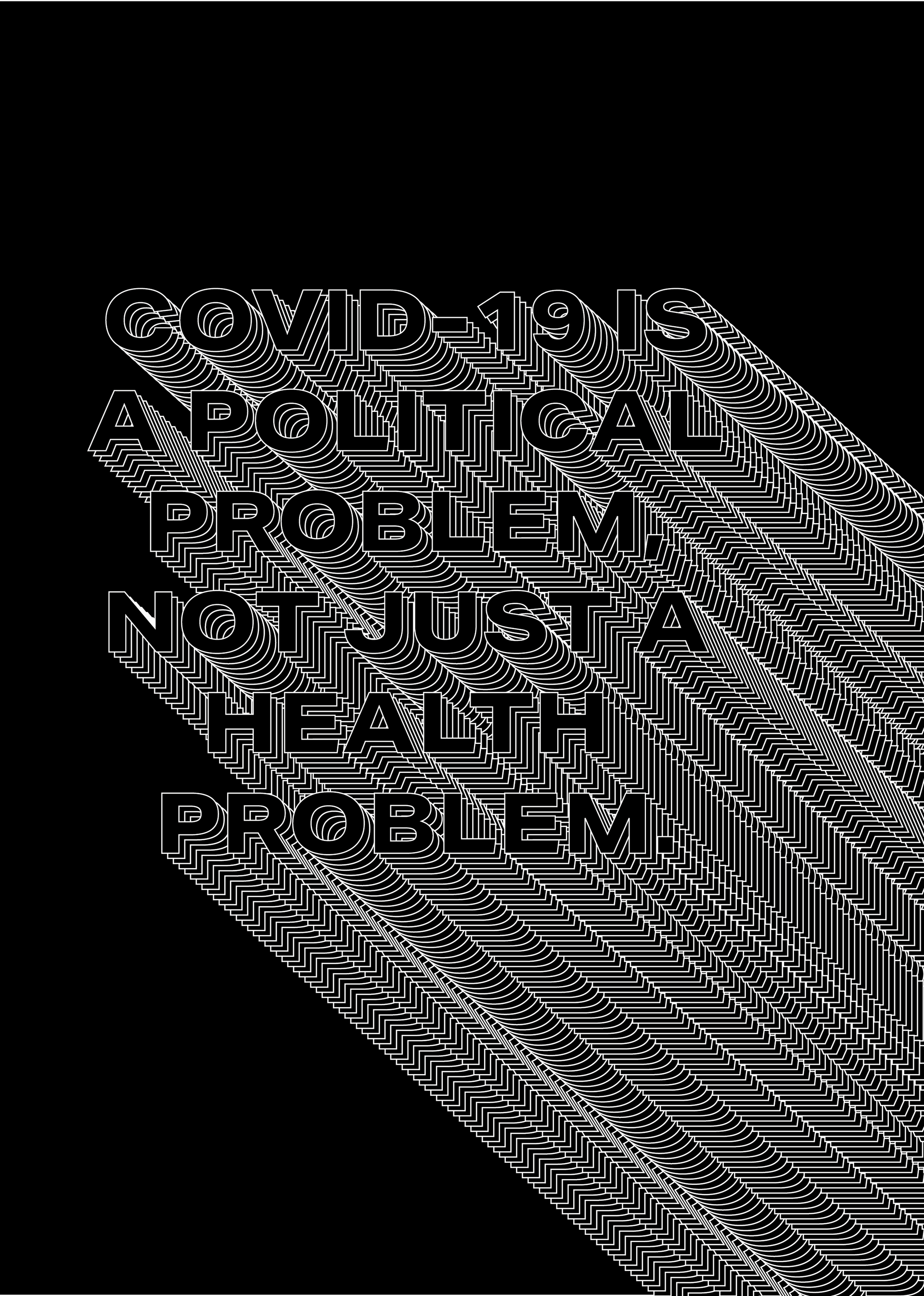
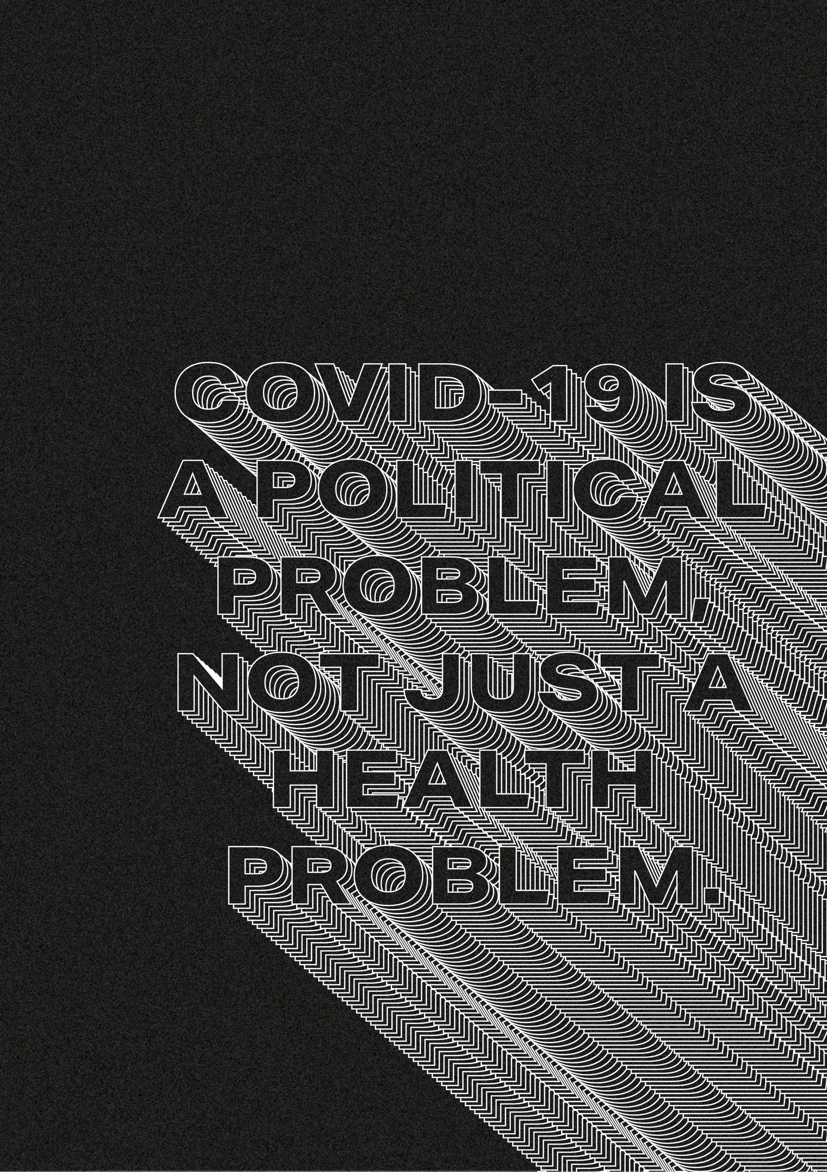
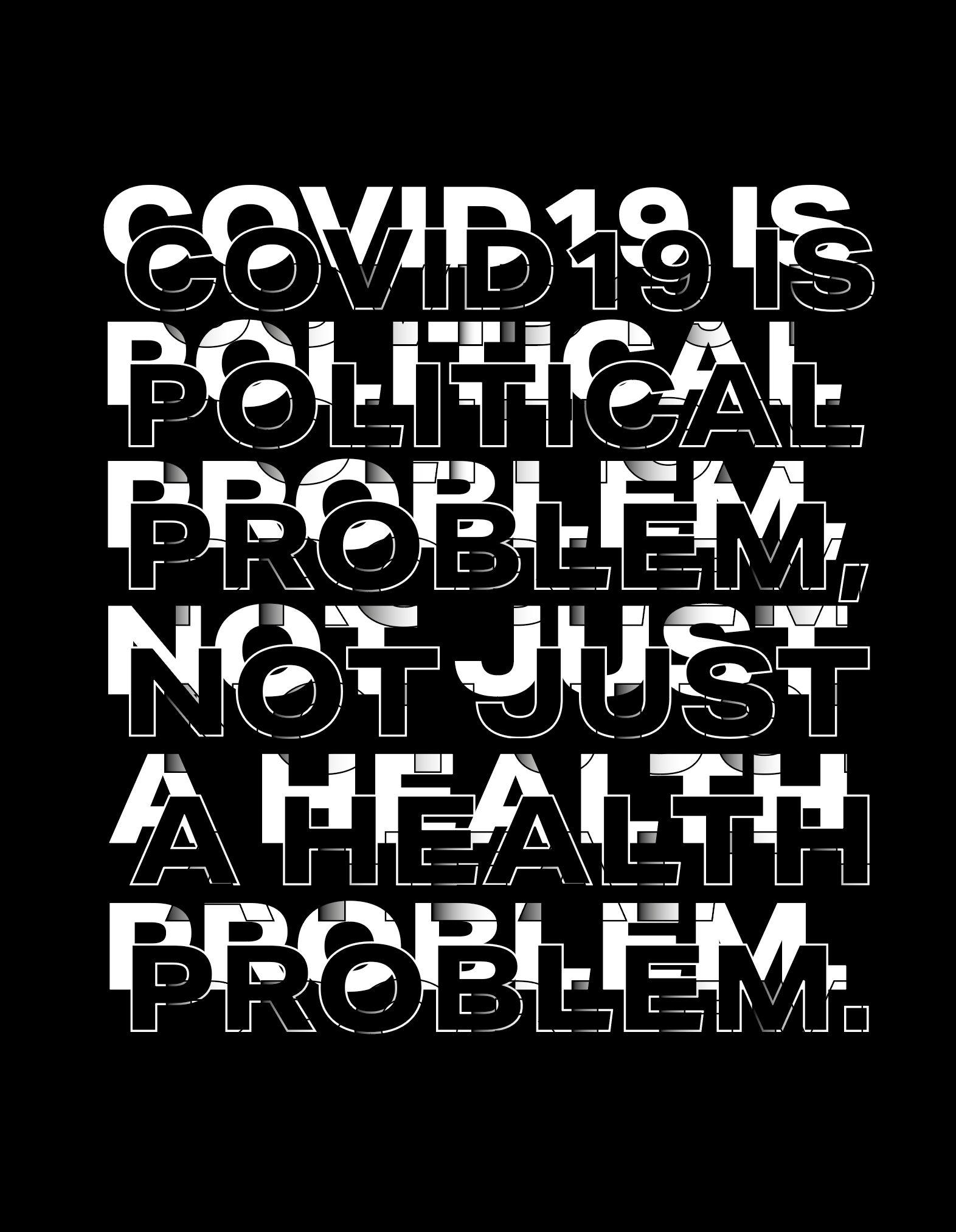
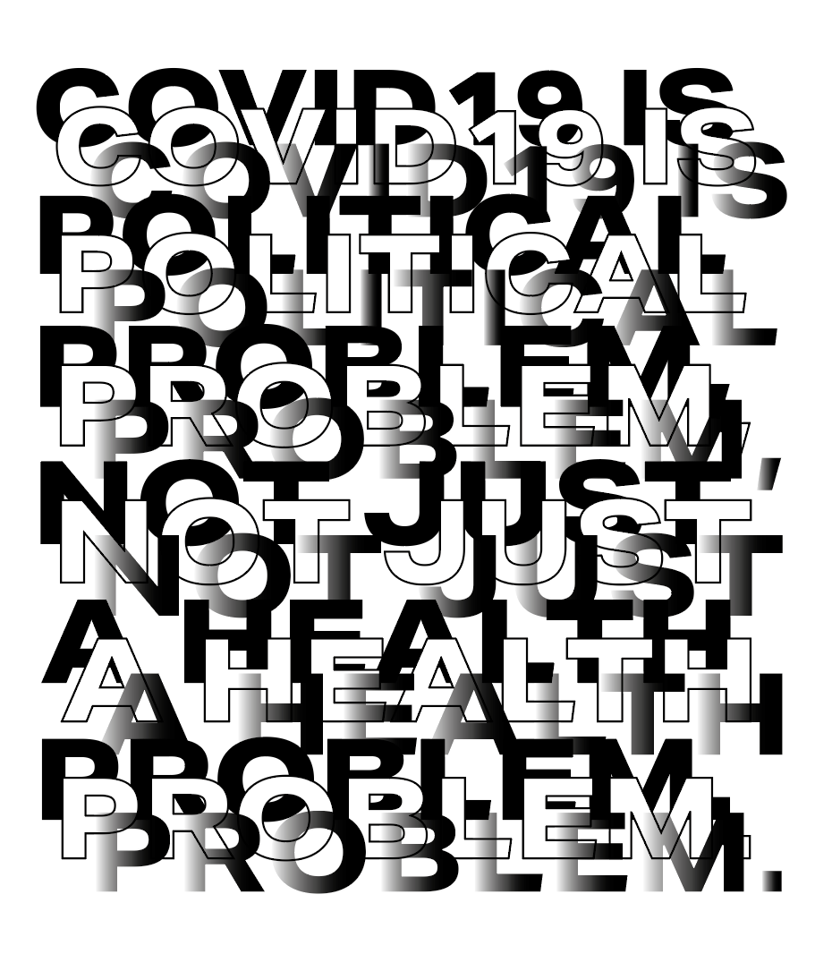
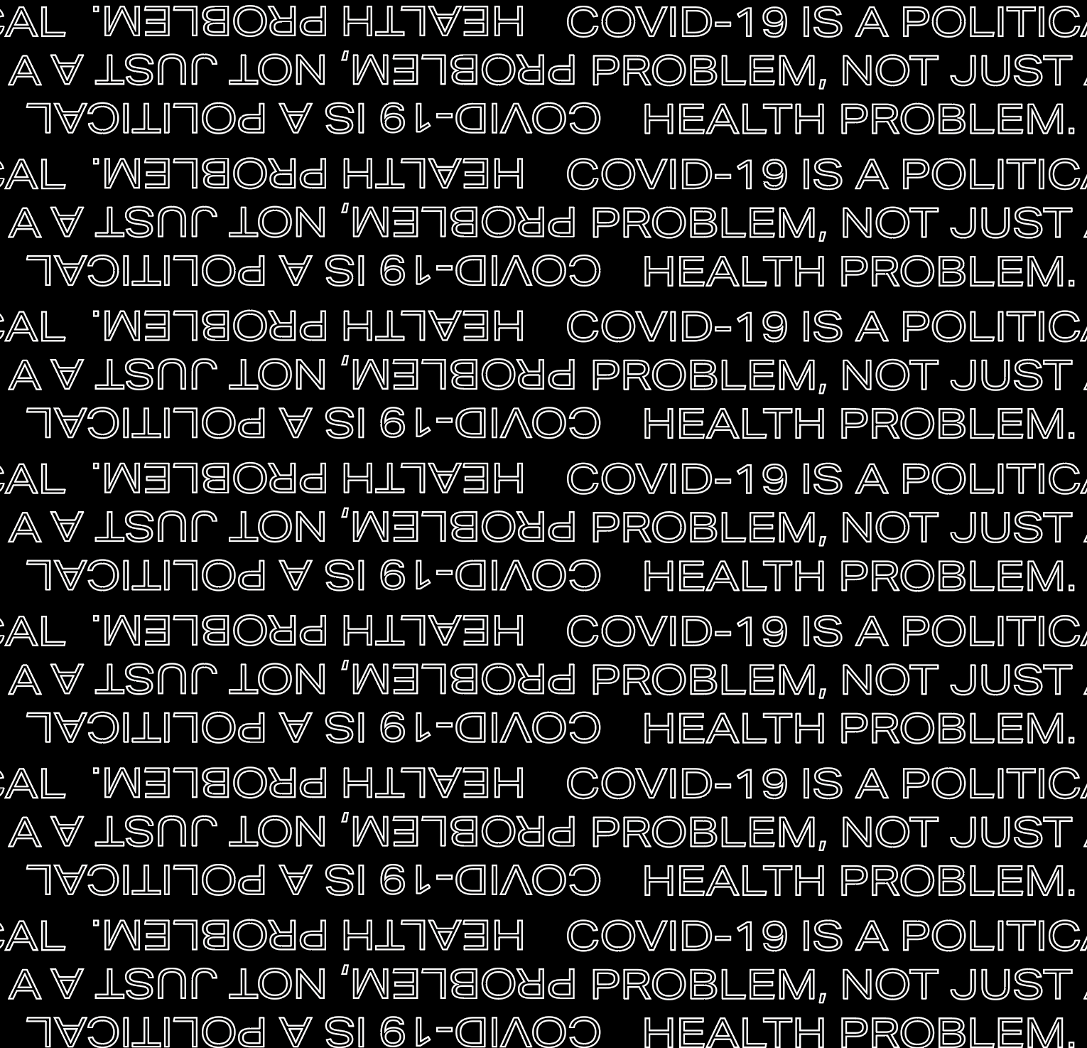
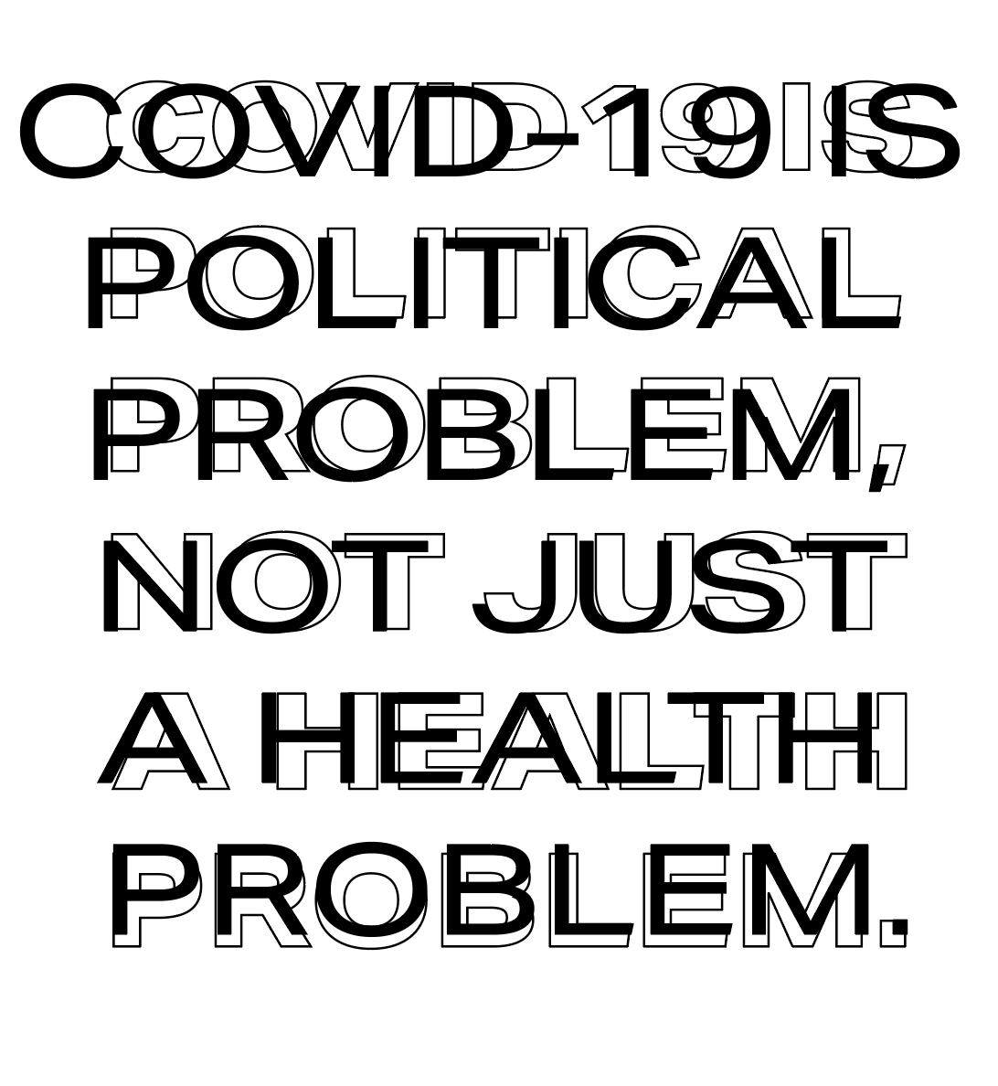
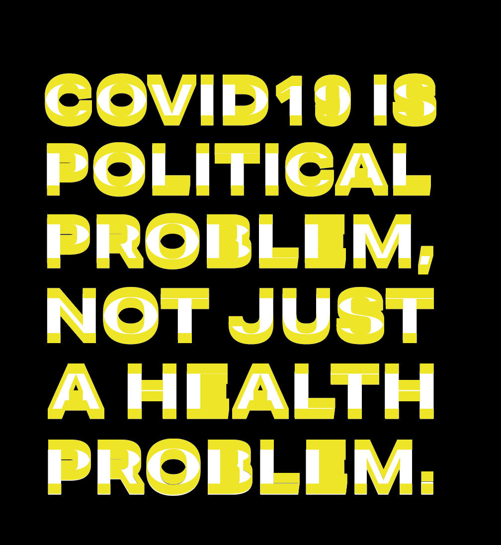
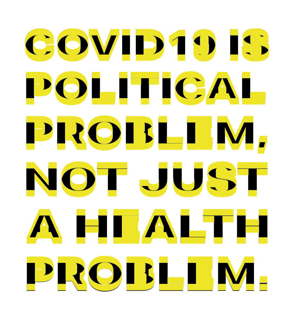
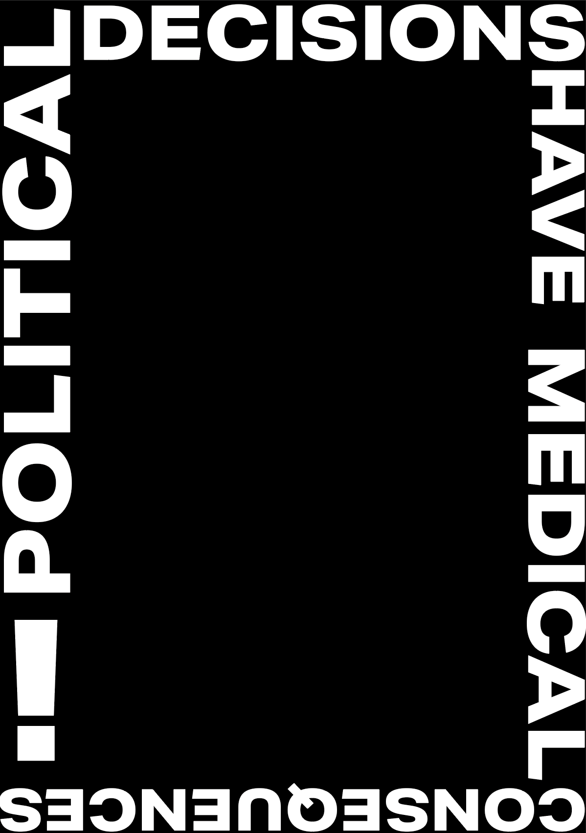
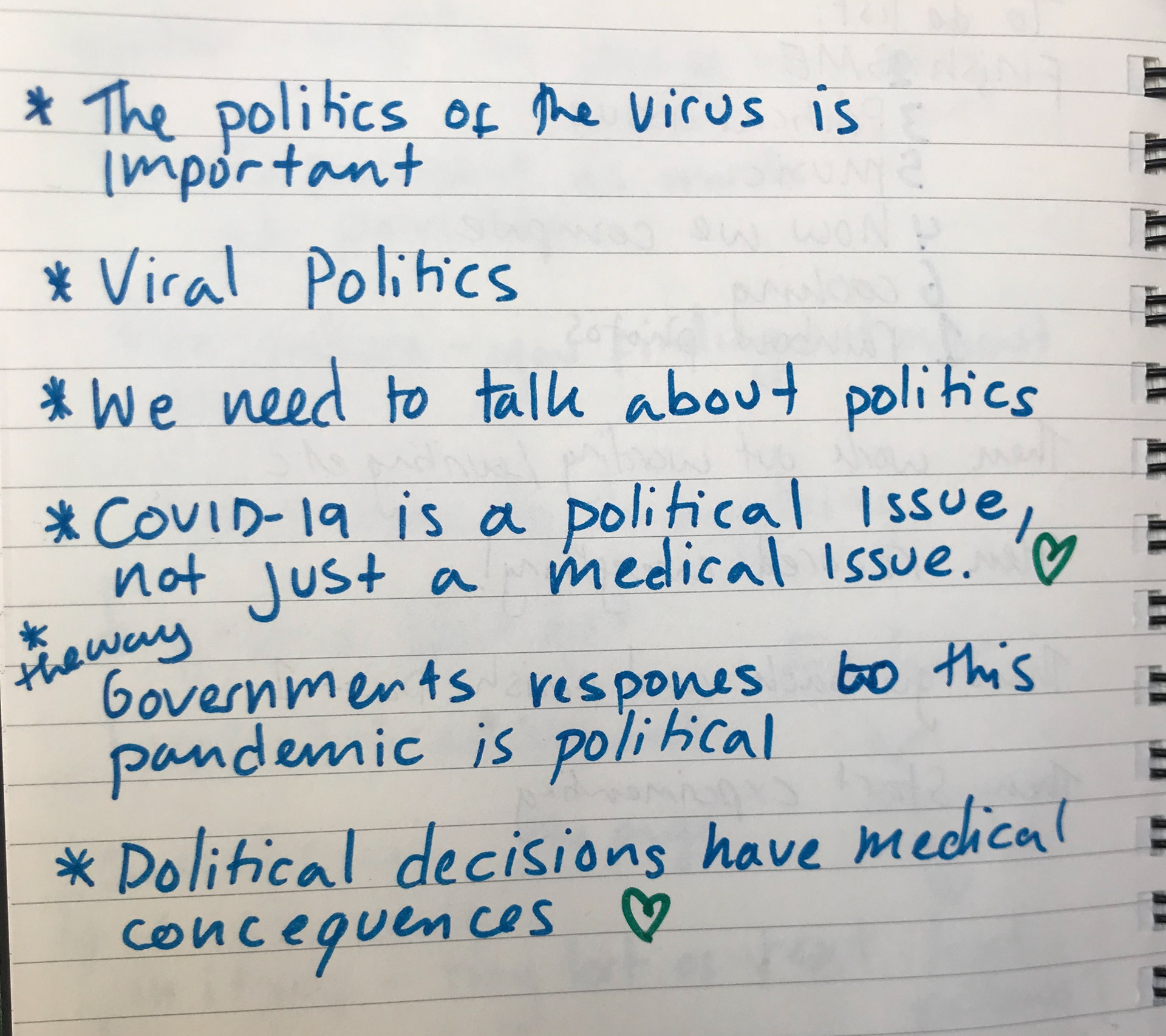
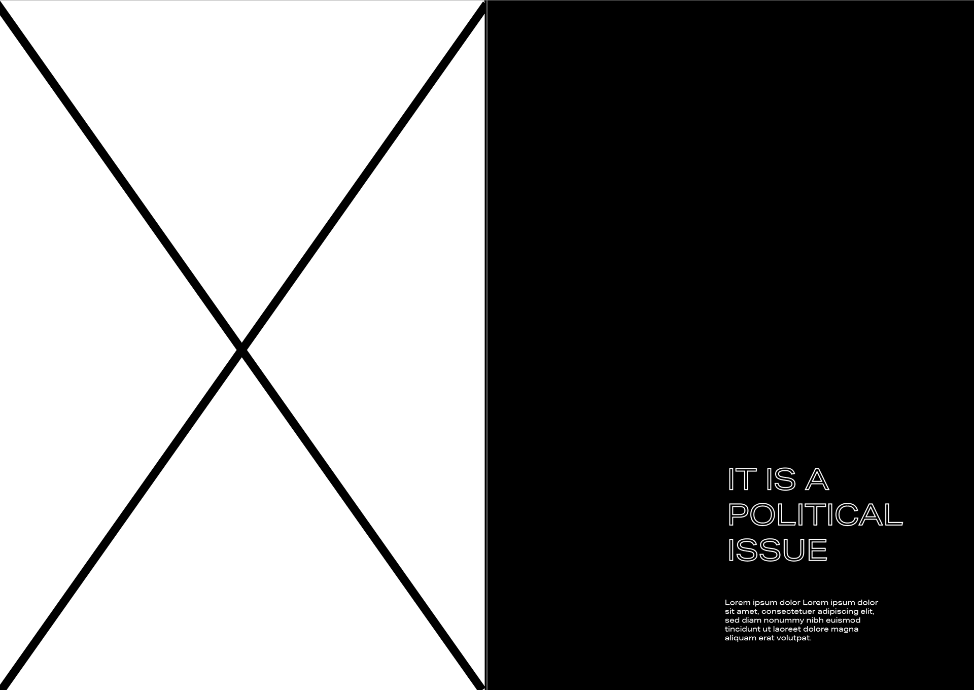
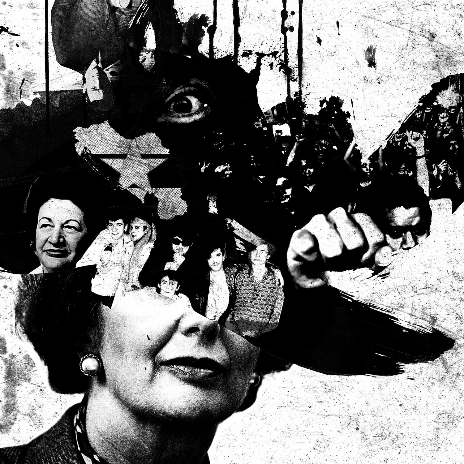
POLITICAL PROBLEM
For me personally I’ve found it very tricky when people seem to see there is an issue or not realising that the way the government deal with this crisis is political. They want to set people’s differences aside and fight this as a community but in reality it doesn’t work that way - Boris is trying his hardest and people need to wake up to the fact there are more deaths being caused then there should have been either directly or indirectly because of covid-19. I wanted to make a poster stating one of my opinions as it’s something that I see daily and hear about daily making it a part of my quarantine culture…
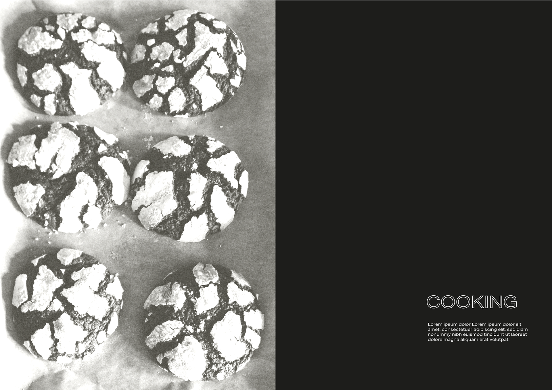
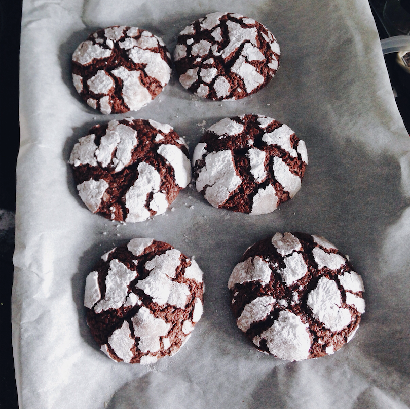

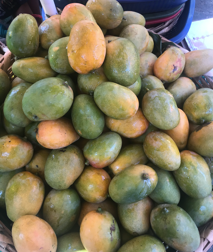
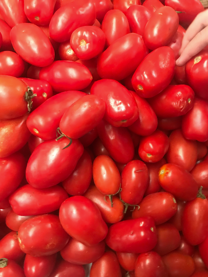
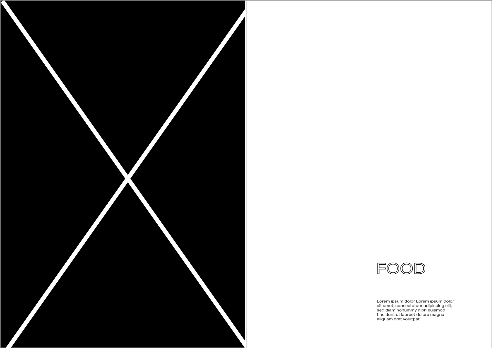
COOKING
I wanted to do some ingredient layout photography but never found the right time/light studio space. I looked at some the food photos I’ve taken during quarantine and felt like this cookies I made could be a nice idea - It’s not very strong but I wanted to have something I’ve made for this page. I want to go back to this a look at it but at the moment I want to get something of mine on each page and then I’ll at fine tuning or just picking and choosing aspects from these pages
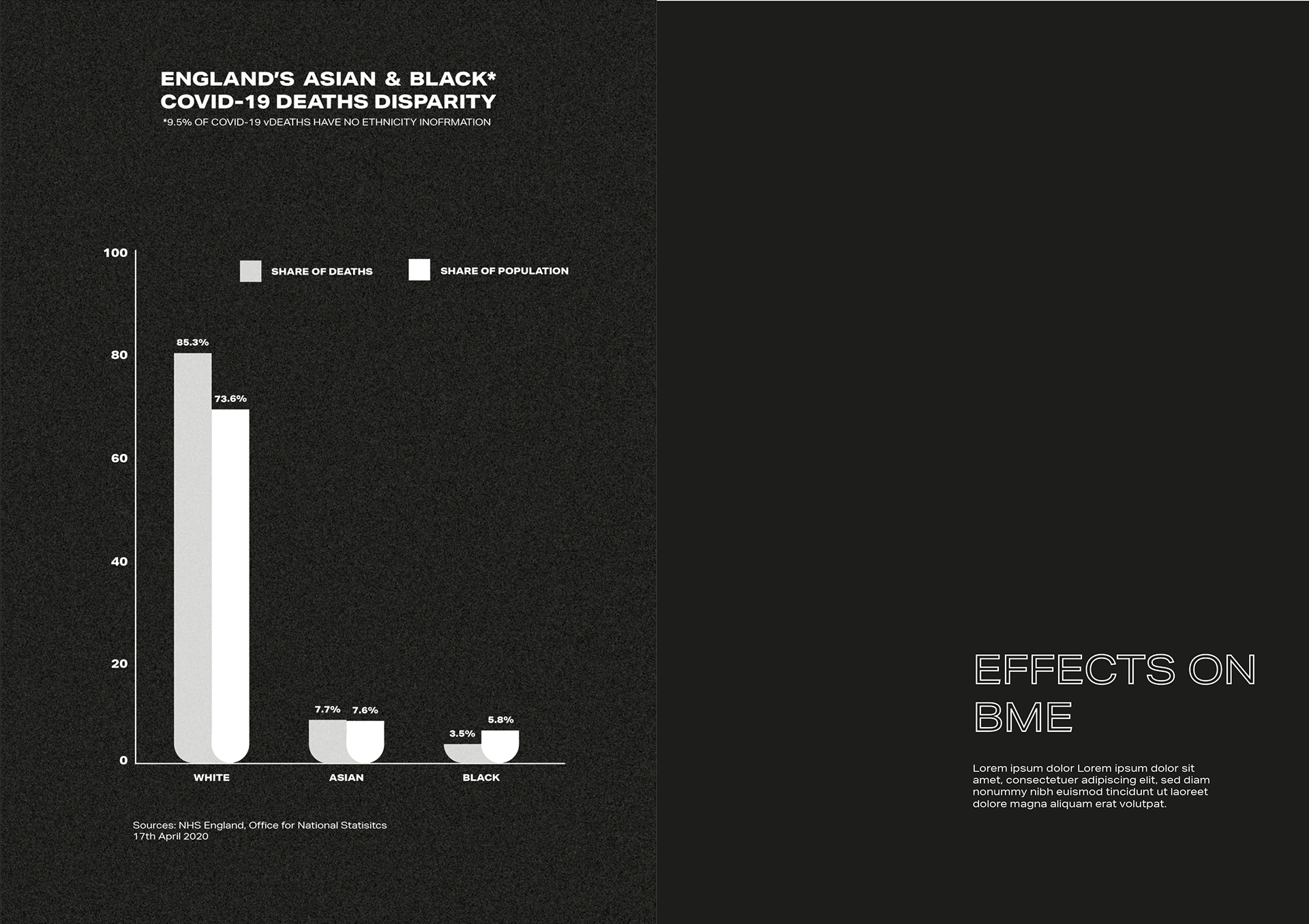
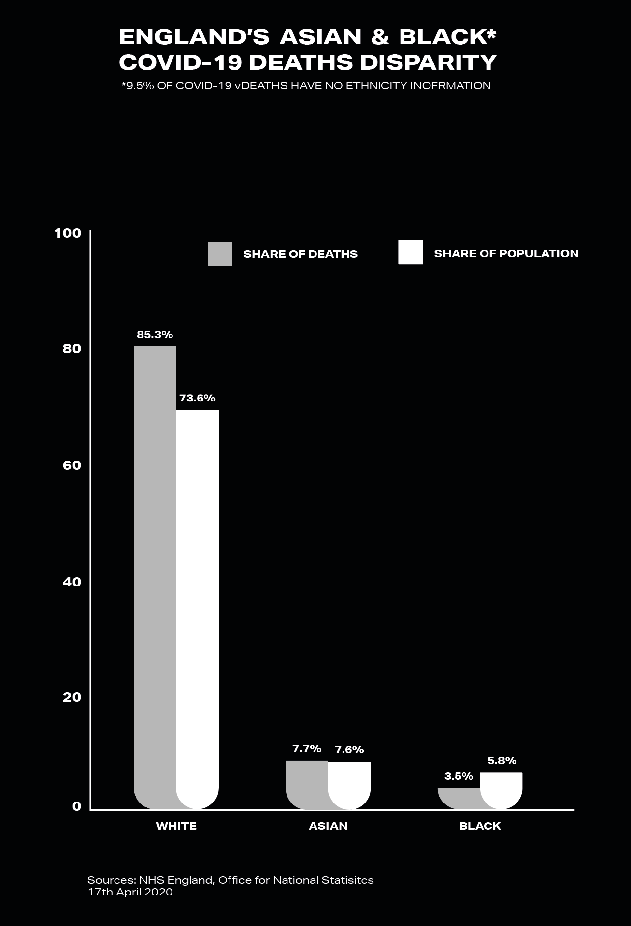
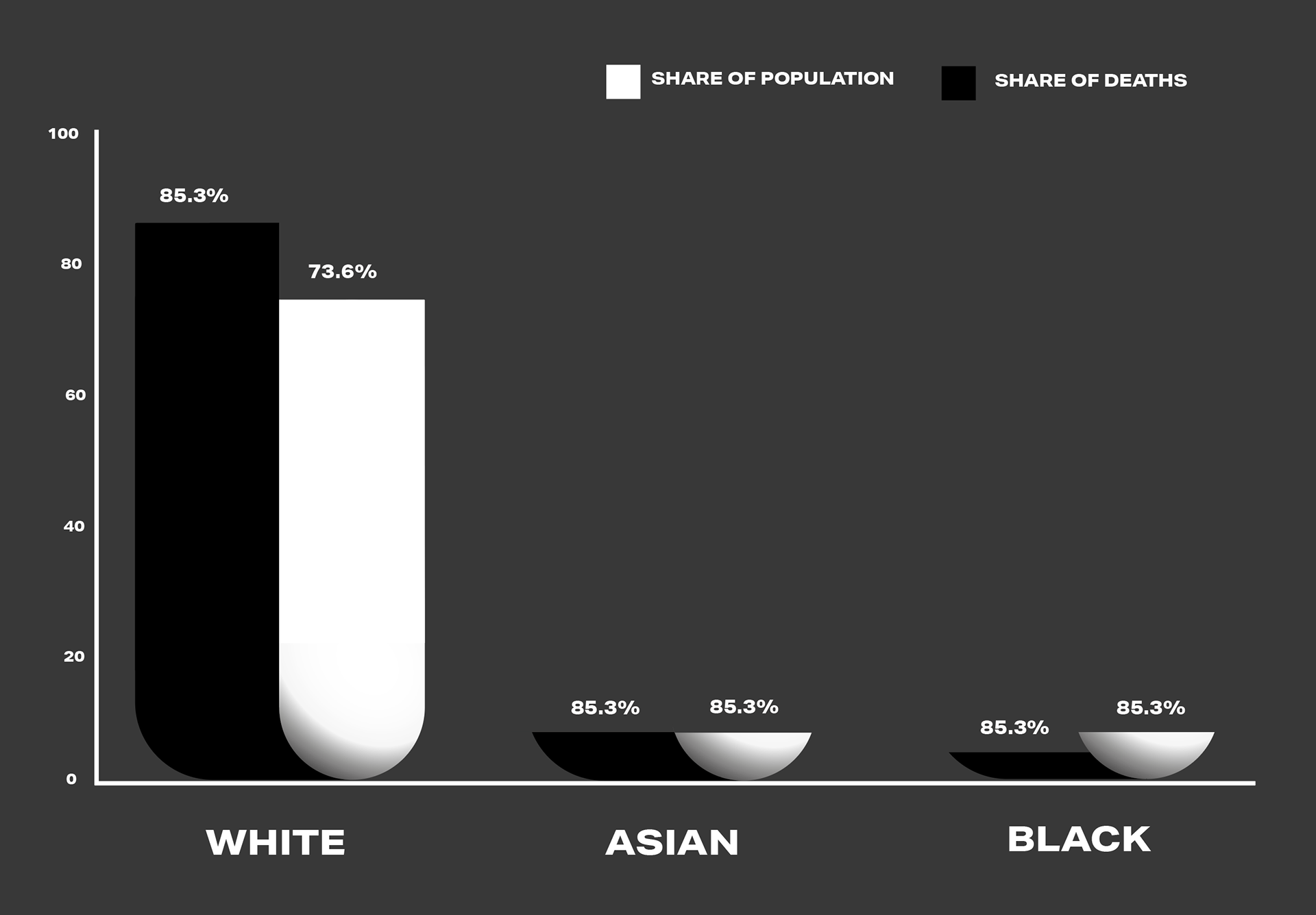
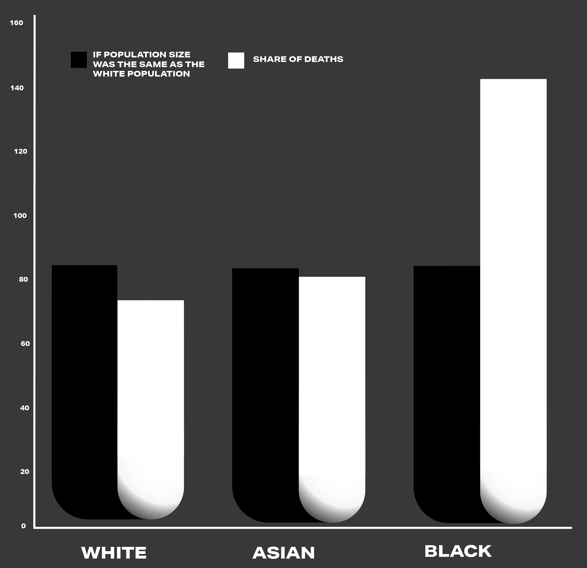
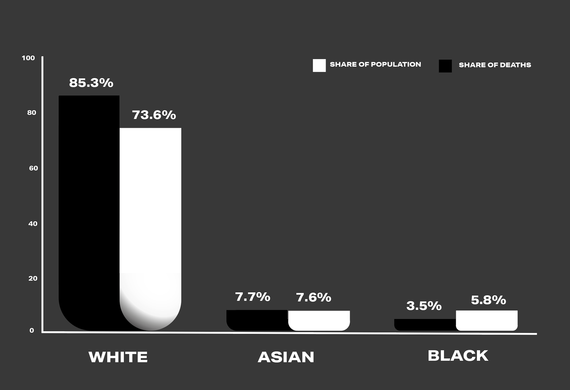
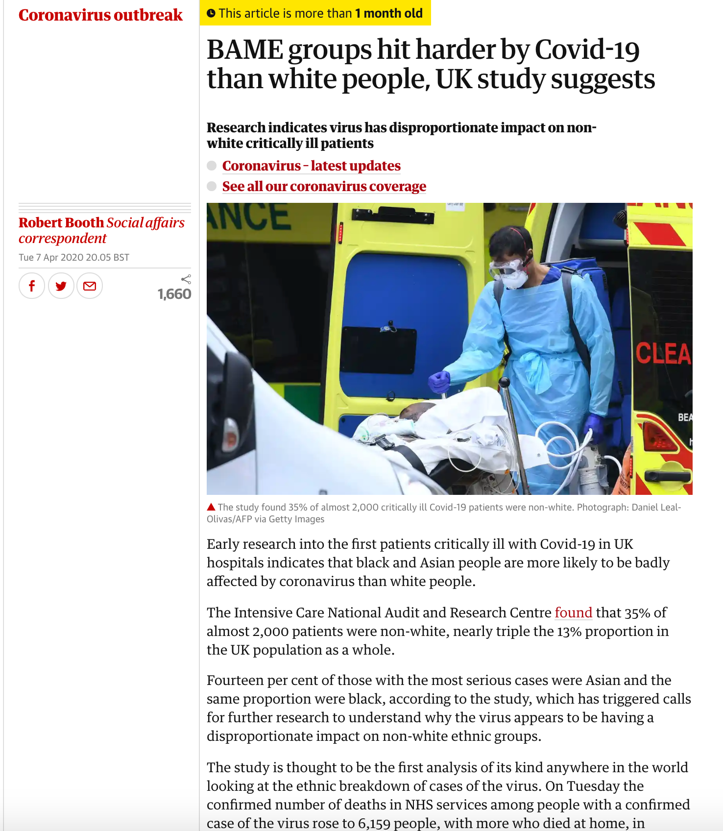

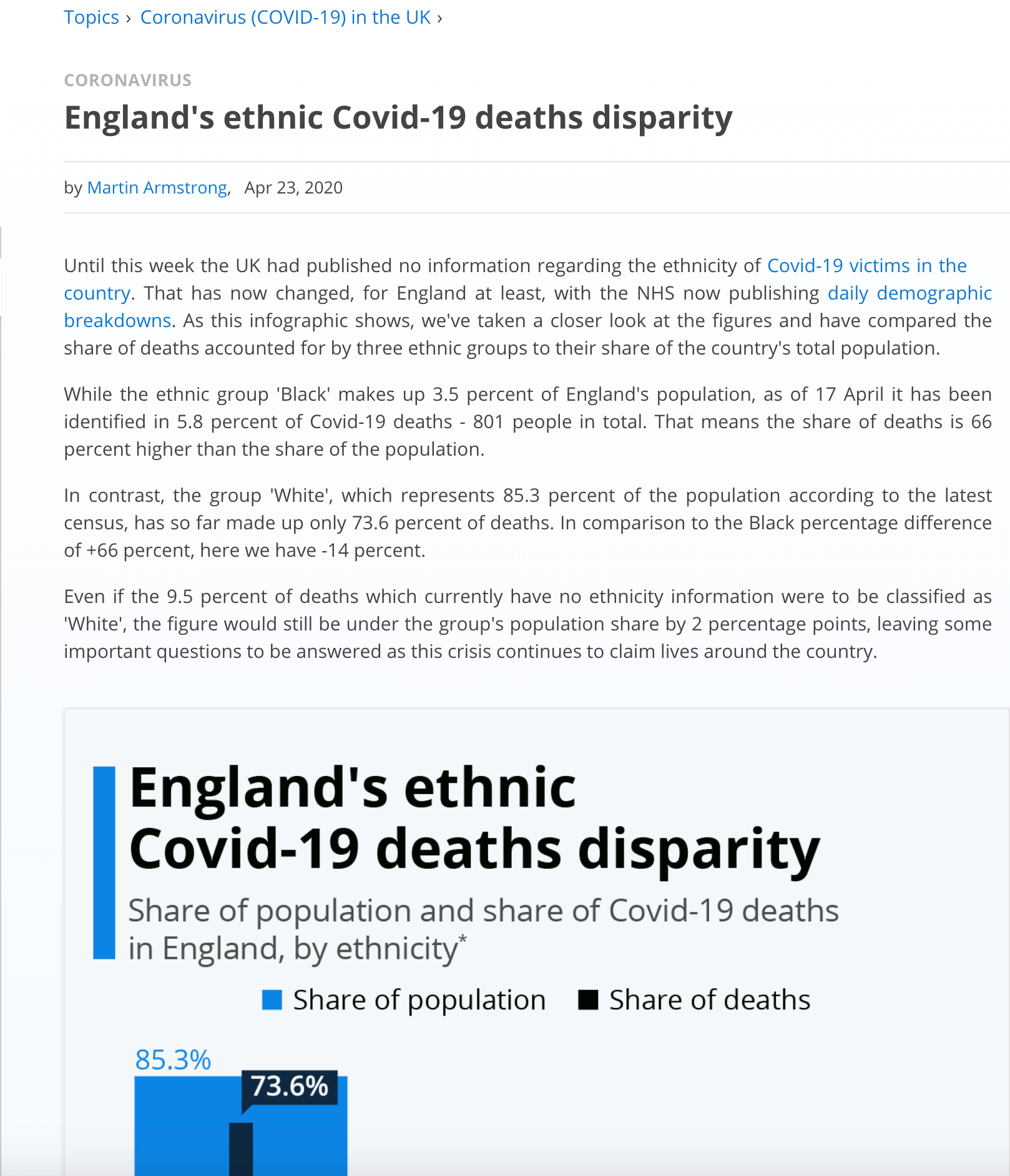
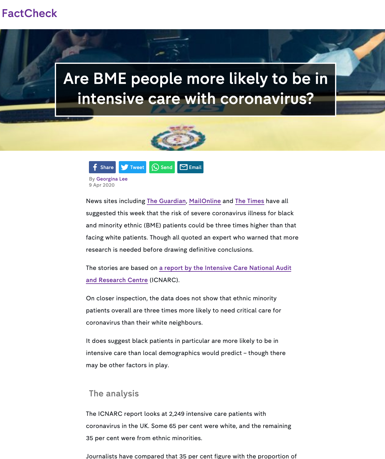
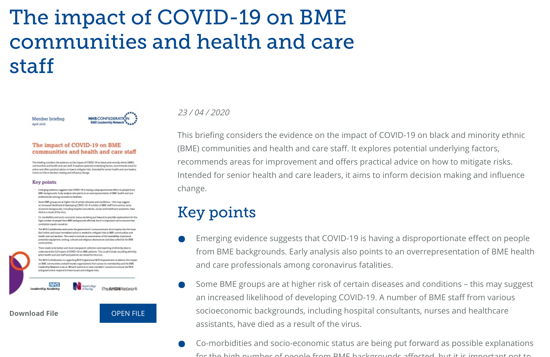
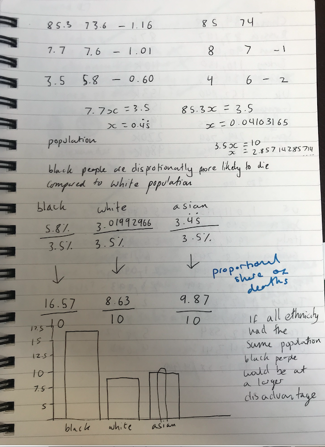
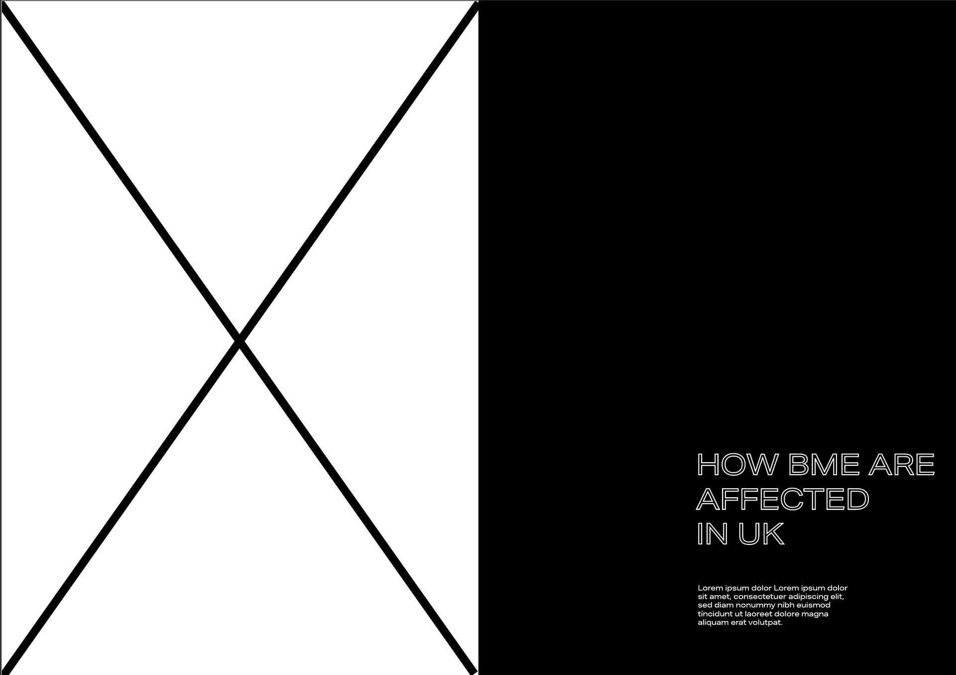
BME DEATHS
I found it hard because since this is still new and studies can be hard to make sure they are accurate can be hard I could only find one solid source which shows only Englands ethic deaths disparity - it too has its problems with not accounting for 9.5% of the populations and that there are also white people who are ethnic minorities…anyway I could go into a rabbit hole about the issues.
At first I thought about showing a graph IF the total population for each group was the same (calculations further down in my notebook) and then I’d show the share of deaths in that way but speaking to people for advice we ended up agreeing that it probably wasn’t best as it could be taken as being the half truth. So I ended up deciding on a slightly nicer looking version compared to statistics graph. I’m not crazy about the design as I don’t think its that visually appealing but I feel like it still kind of works. I may go back to this a reevaluate.
https://www.tuc.org.uk/blogs/coronavirus-why-structural-racism-putting-bme-lives-risk
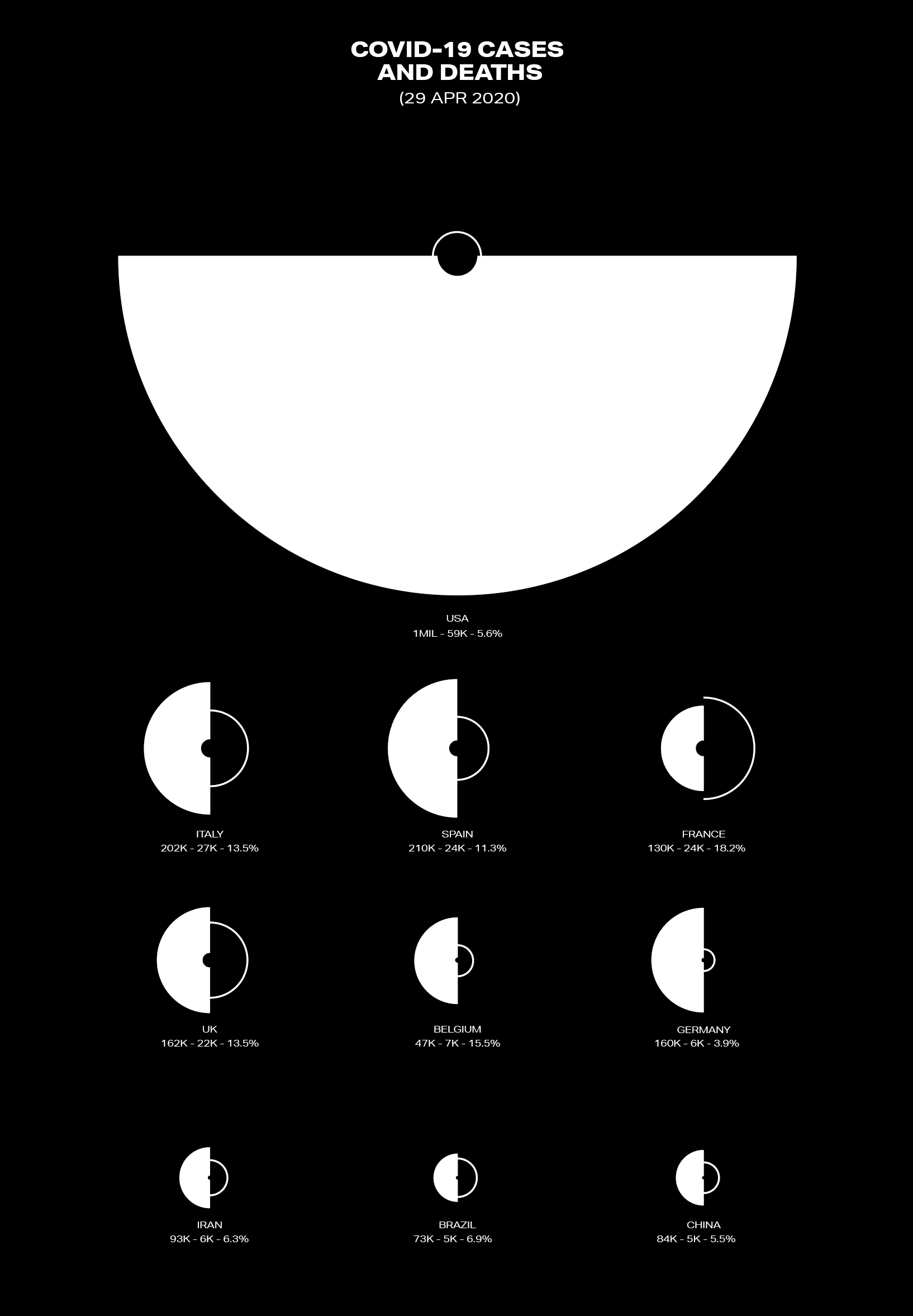
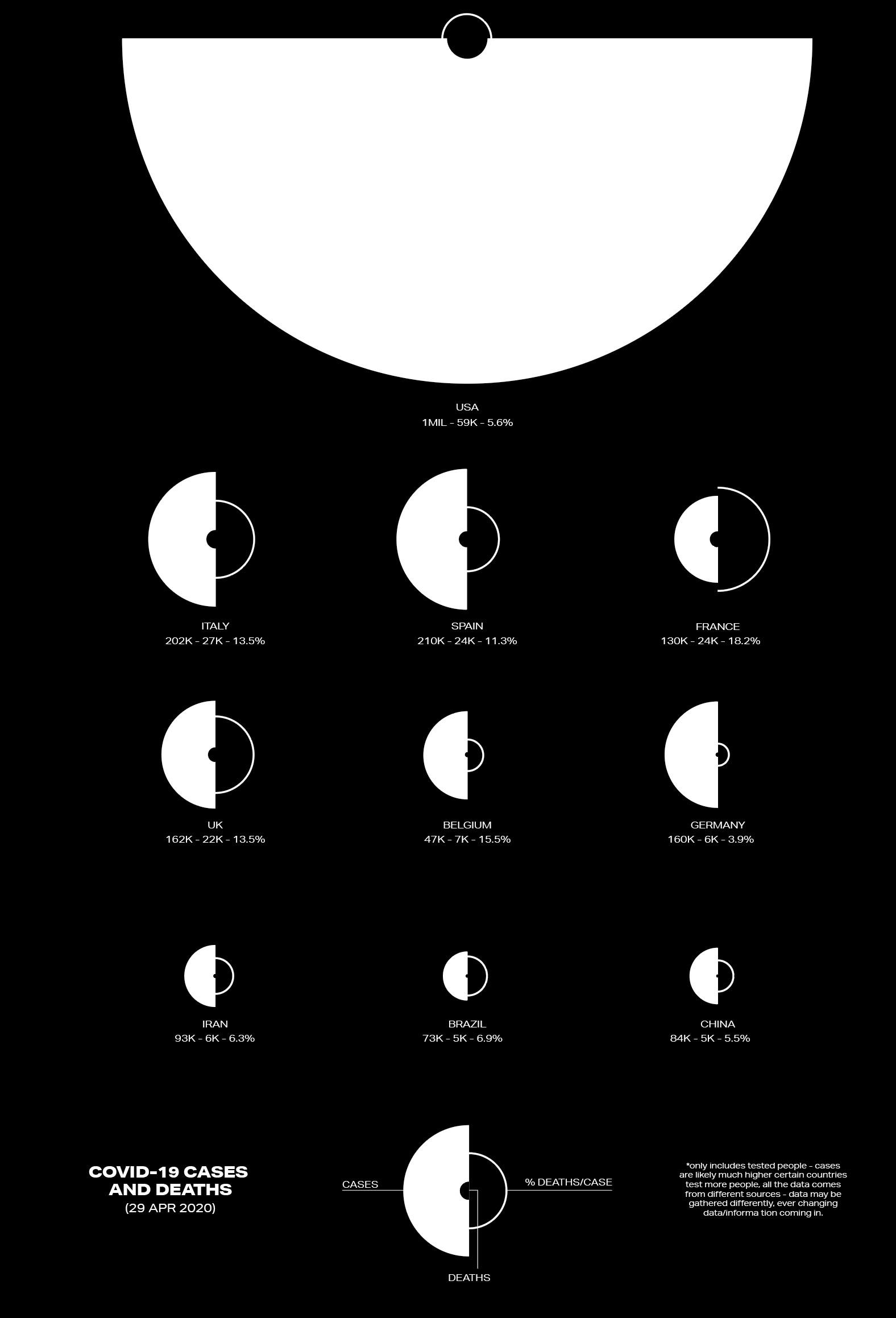
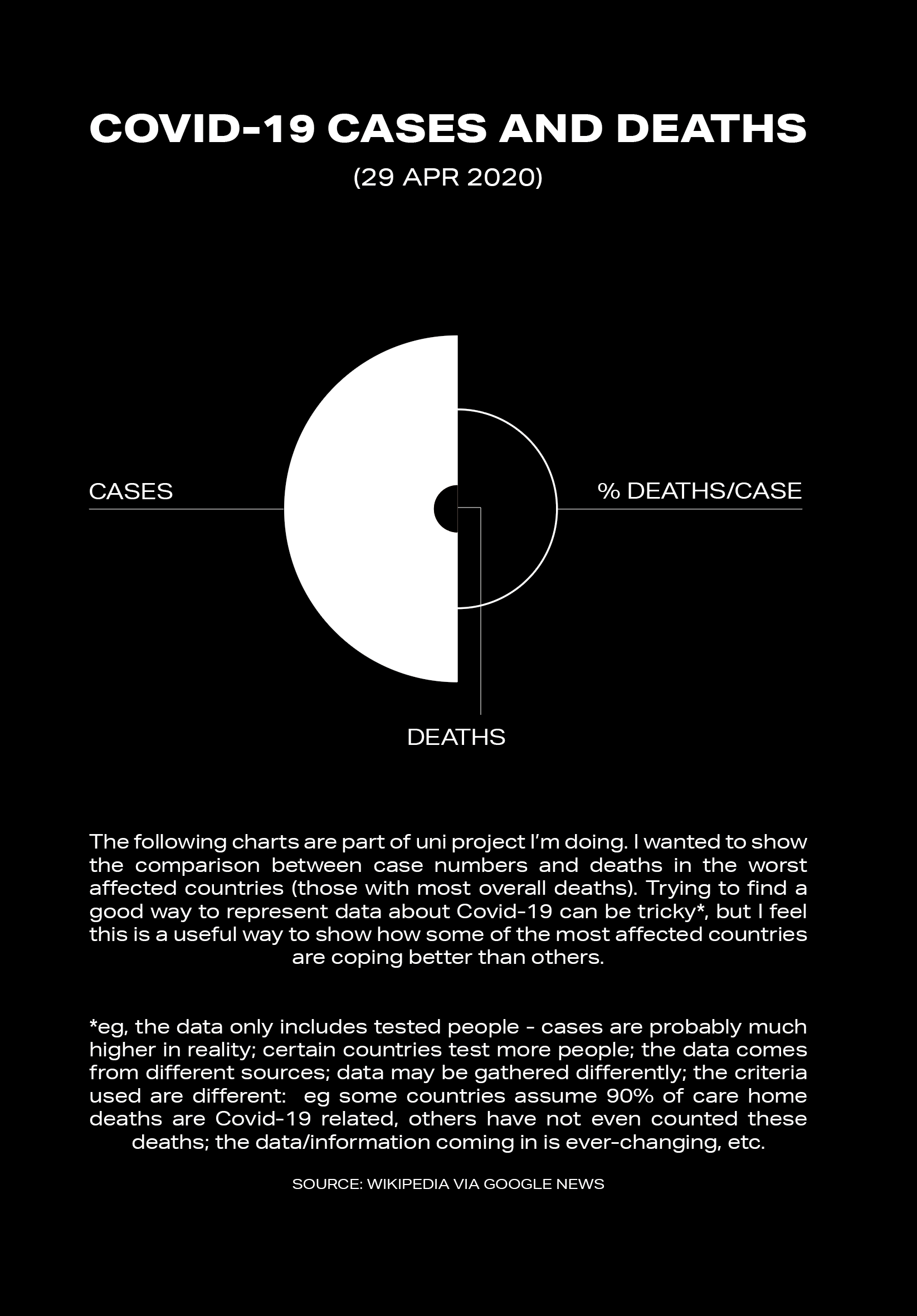

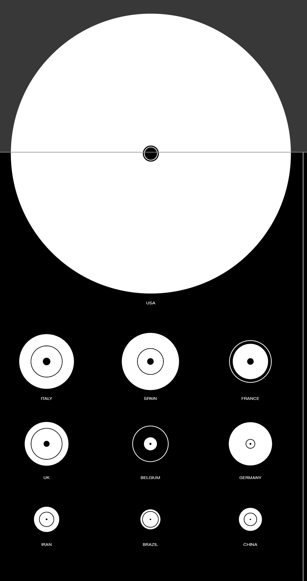
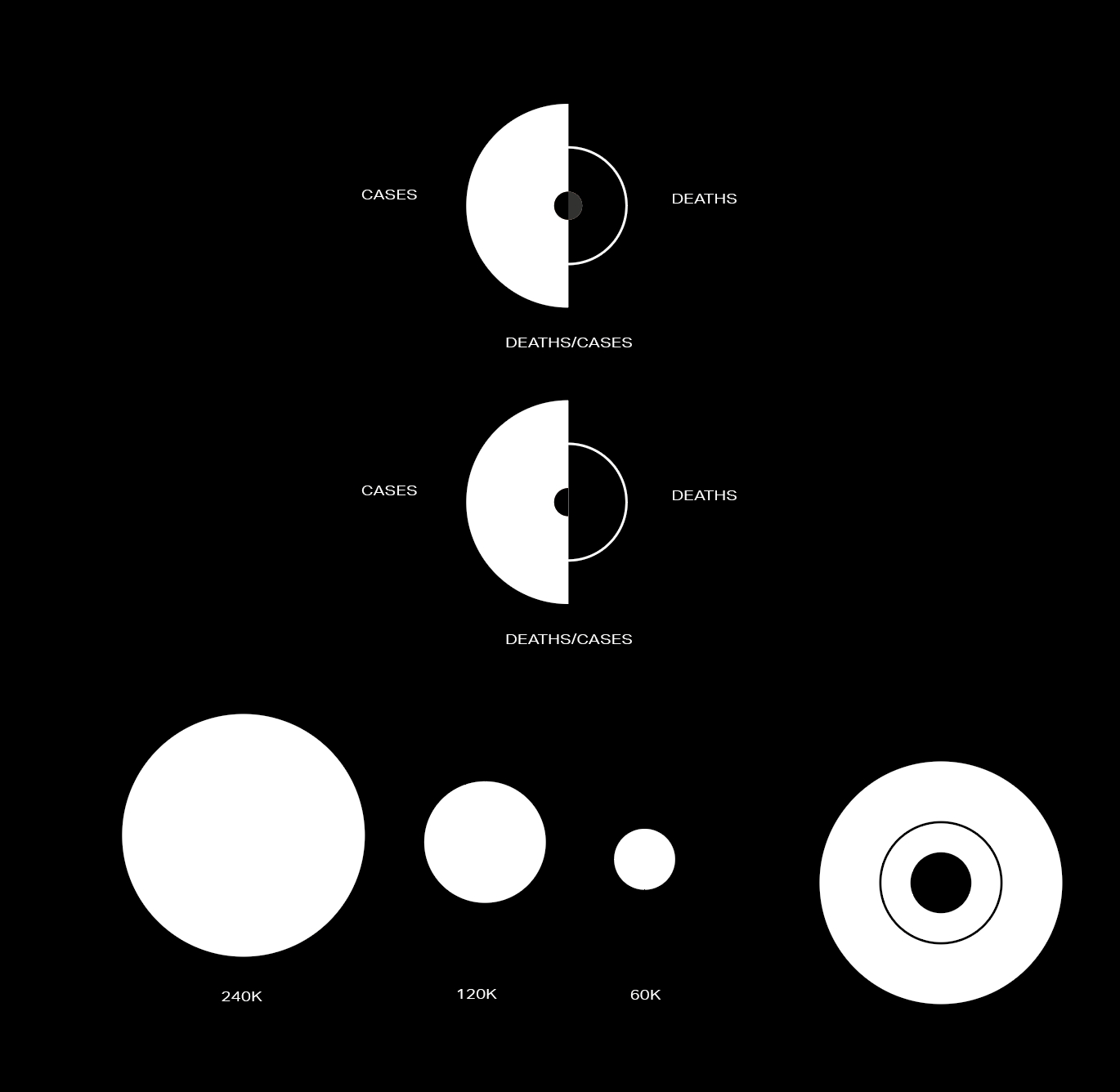
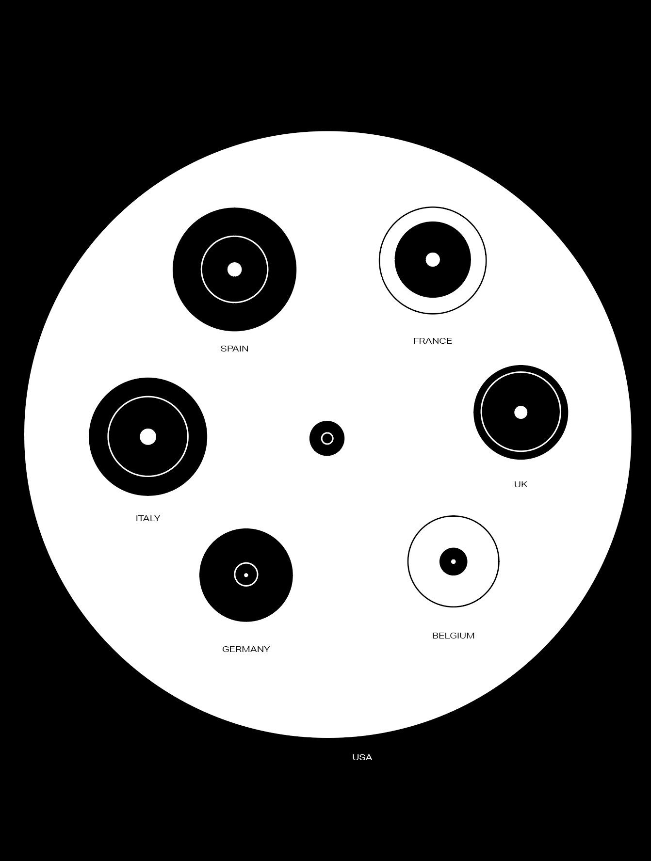
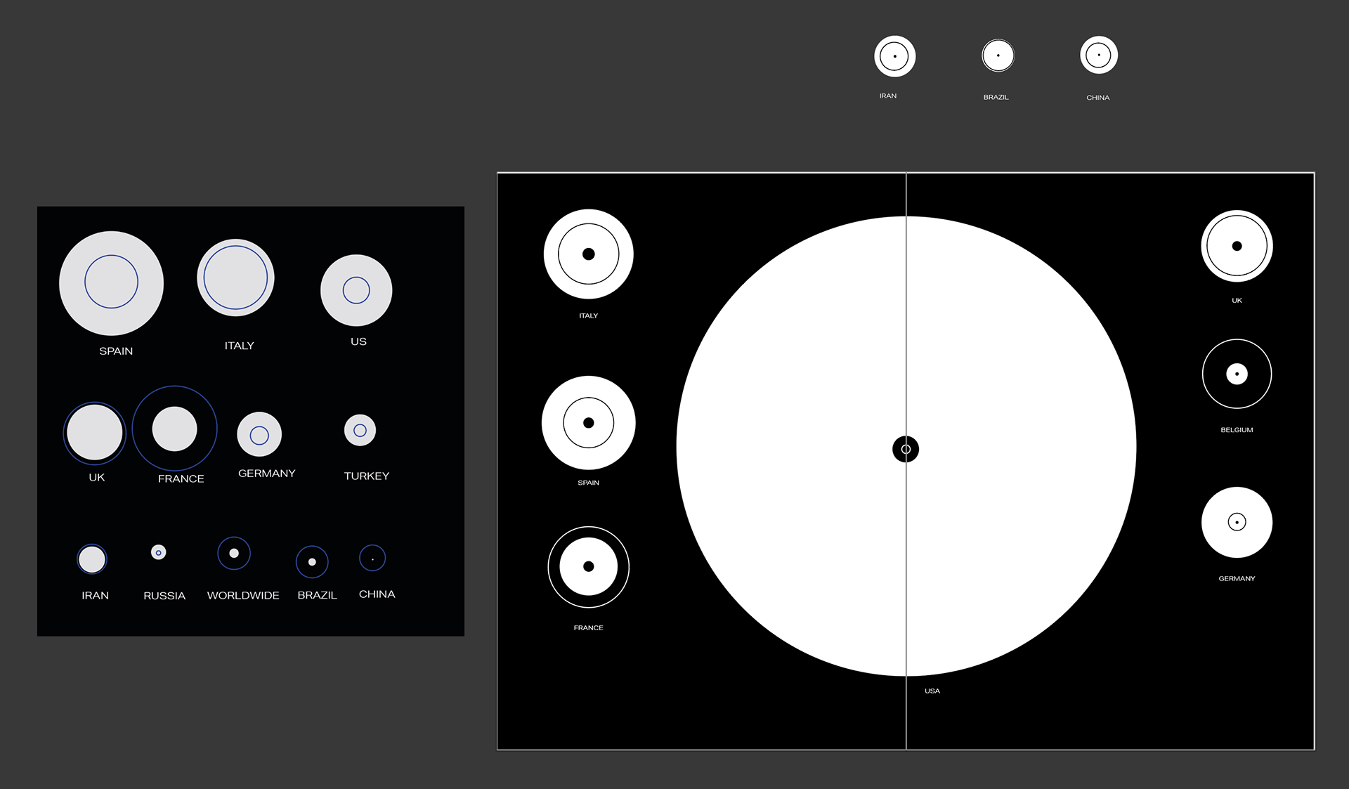
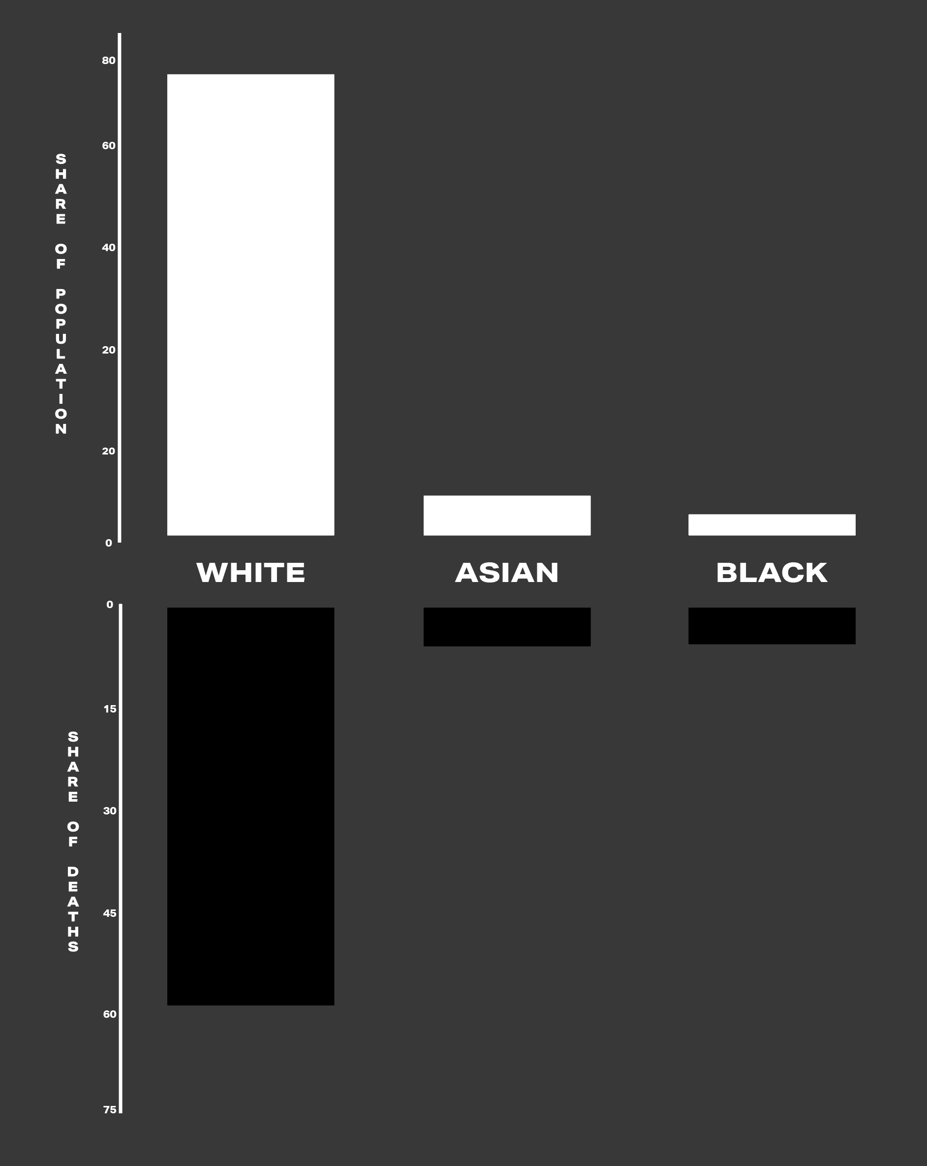
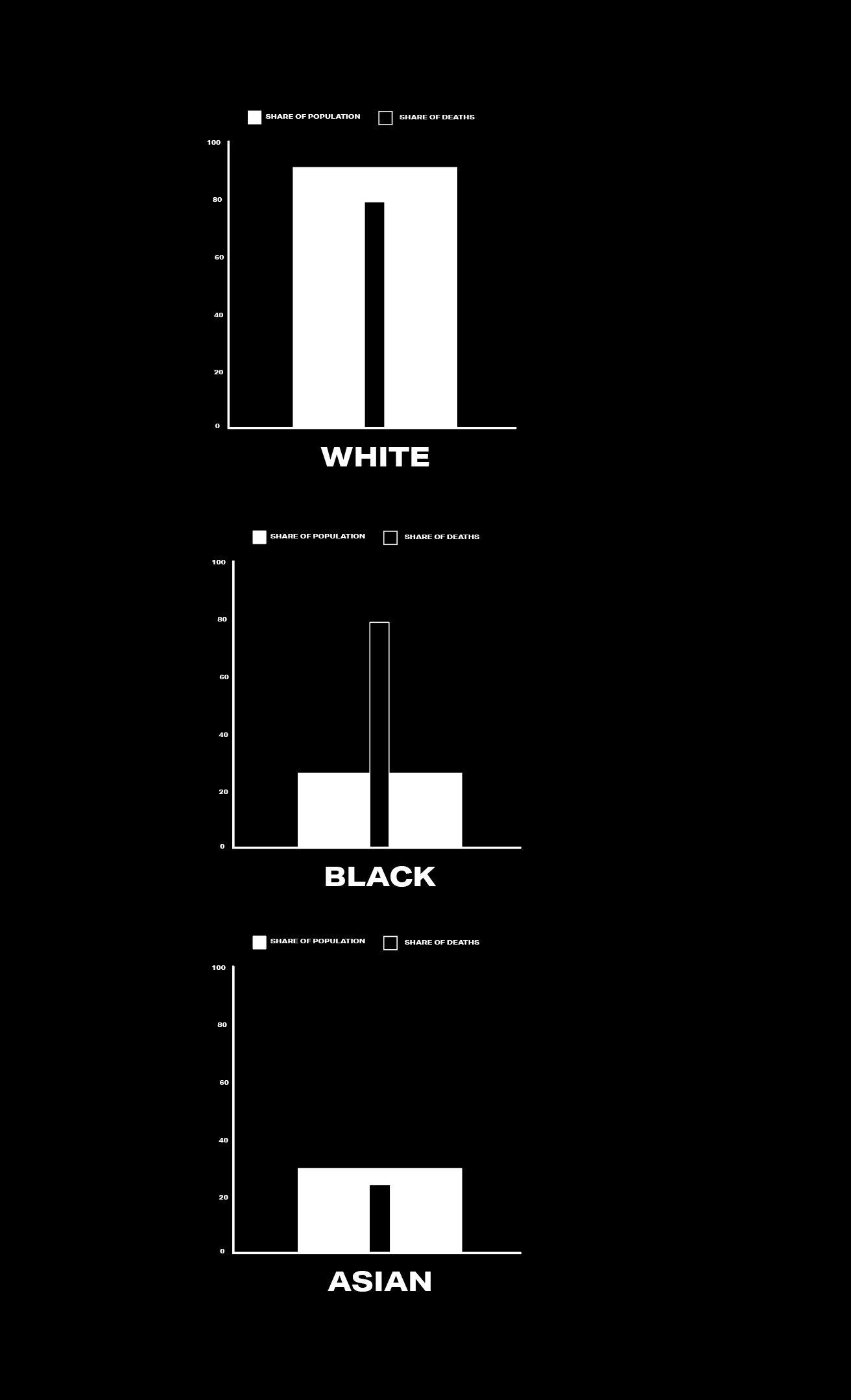
HOW WE COMPARE
I spent longer on this than I had hoped because working out the best way to use the data I had access to was tricky as I am not a data analyst. I felt deaths in comparison to countries population were pretty important - I ended up find a video released by VOX (INSERT LINK HERE) talking about the problems that I had incurred - countries having different ways they collect data, and variables and delays of how it works - they said deaths is a good indicator of how good or bad a country is doing so I felt carrying on with that was a good start.
I thought showing the percentage of deaths per case was the best indicator I could find when I am showing cases and deaths at the same time. It meant I ended up finding out that whilst America may have the most deaths their deaths per case is actually far lower than Italy, Spain and the UK. I go in to mention the issues with this format also but I feel as if it show a rough idea of how the worst affected countries are doing…
MOON-NATURE-VIRUS NATURAL & MOON-DIFFERENT AFFECT

Data viz project is something I’ve used in my previous dat work, it really helps me work out the best type of graphs to use depending on my data input method. Coincidently the figures I’ve ended up using means I could use similar graphs, shapes etc but I want to have some disparency so I have picked different methods.
I think it’s important give as much clarity to people in a way that people may understand better. Whilst I’m still learning there are ways that may have been better but there is only so much I can factor in to make it as fair as possible. I’m making these as people deserve as much transparency as possible.
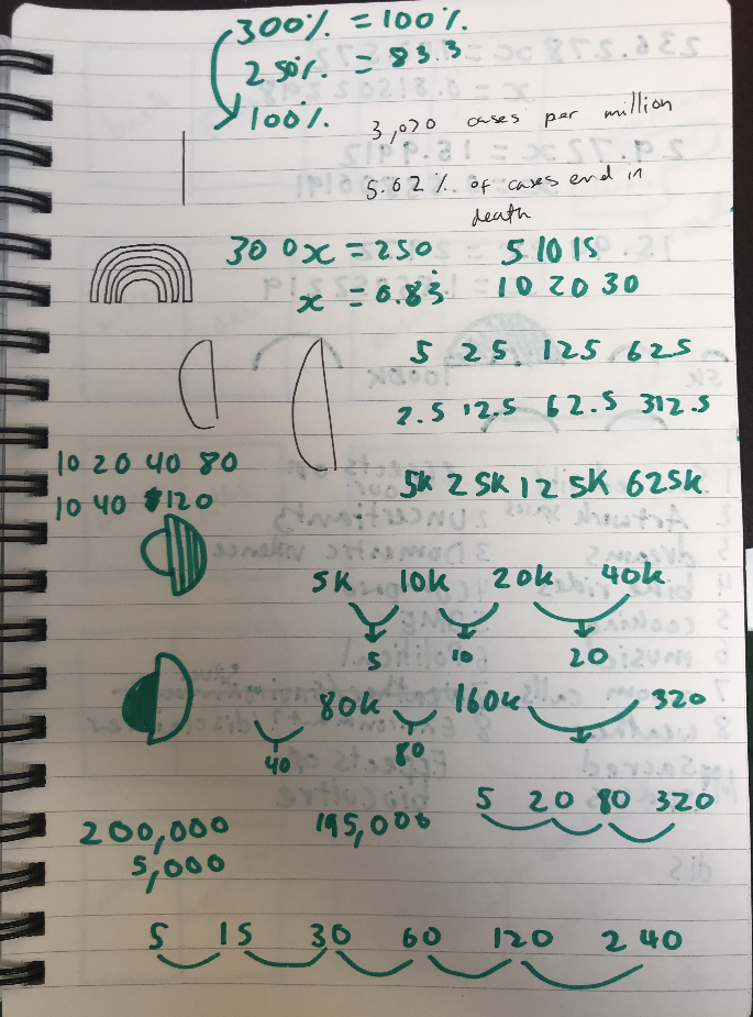


My next stages is doing my two data visualisation pages. I want to demonstrate the cases/deaths amongst the worst affected countries as well as how BME are affected in the UK. These are some ways of possibly visualising it and also a bit of maths to work out the best ways I can show the data.
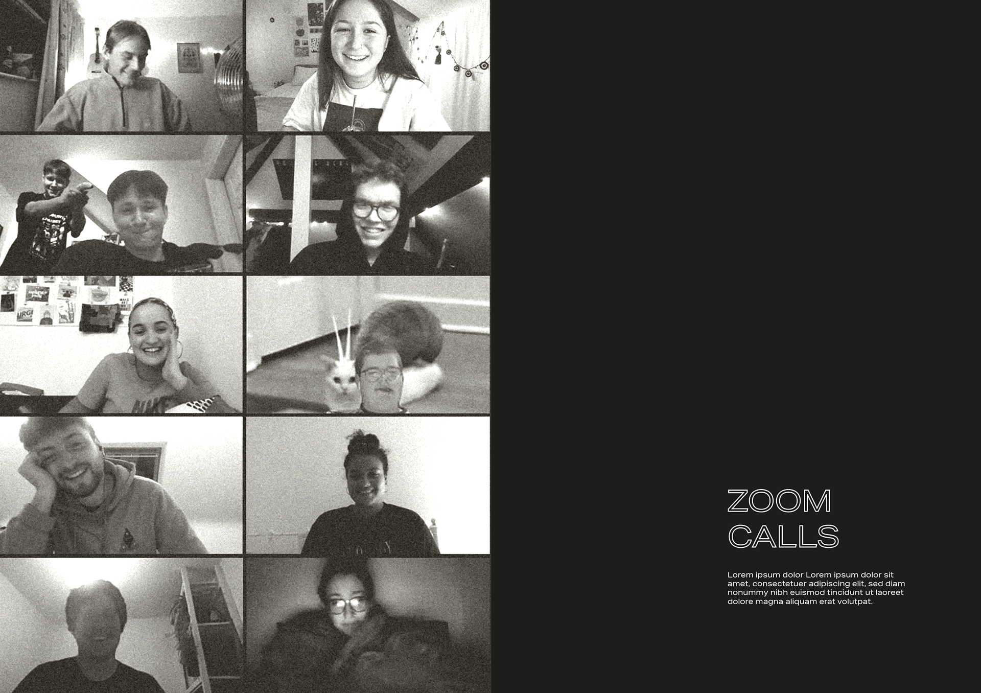
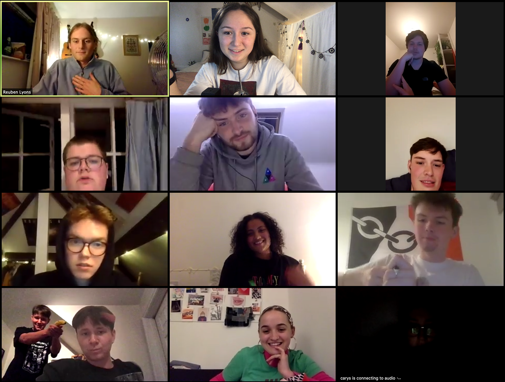
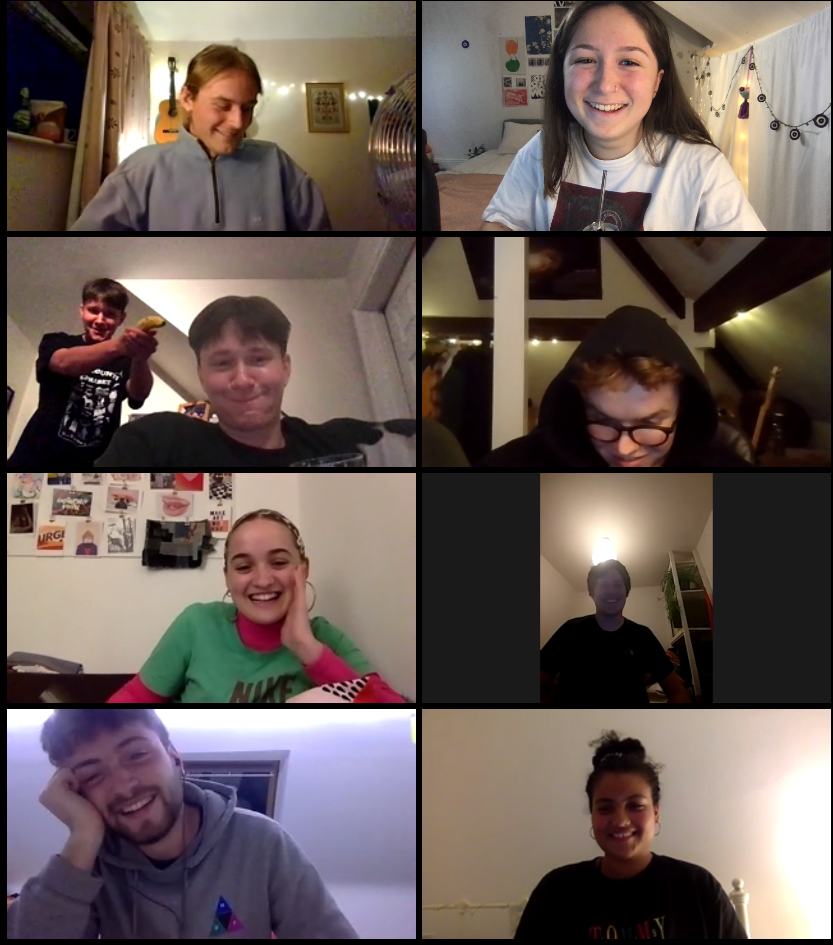
ZOOM
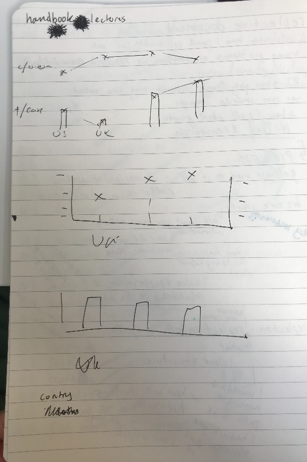
Video calls have been a fun break from being indoors with my family - being able to stay in contact with friends and family and being able to actually see them is so great. It's interesting to note that this may be a pro to the media culture and how we are relying much more on the internet than ever before during this time.
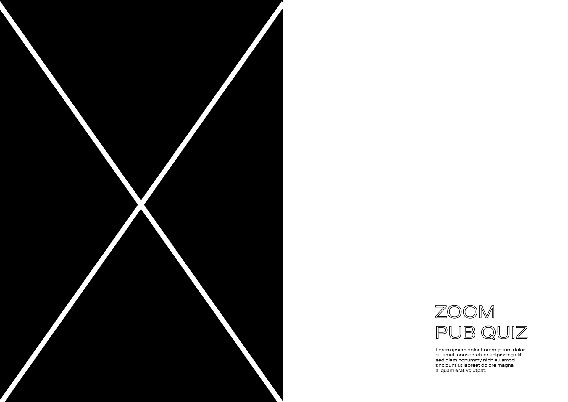
I wanted to do a page on this as it's a big part of my socal life now being able to do pub quizzes is the closest thing to going to the pub we've been able to do in over a month. I want to commemorate how I have been socialising to stay in contact with people around the world so think it fits well with one of my sacred spaces.
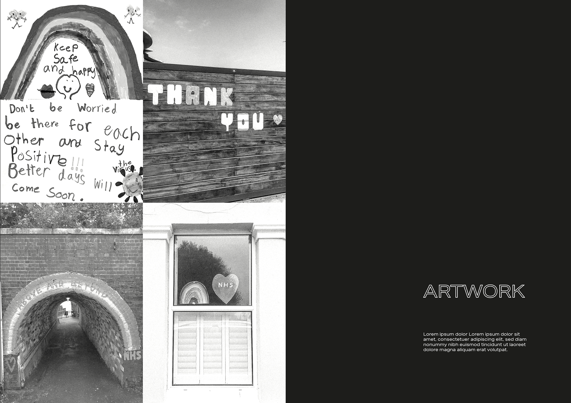
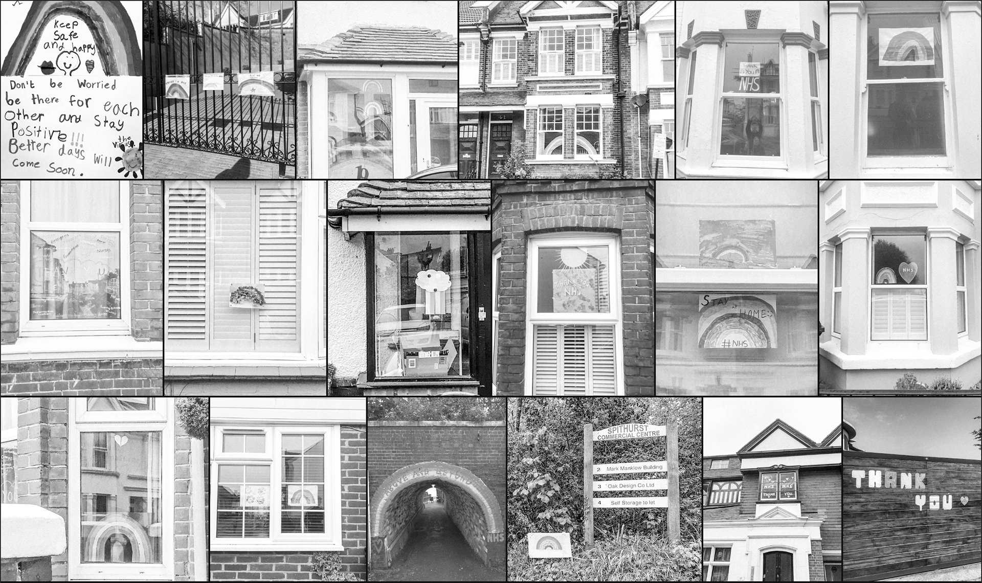

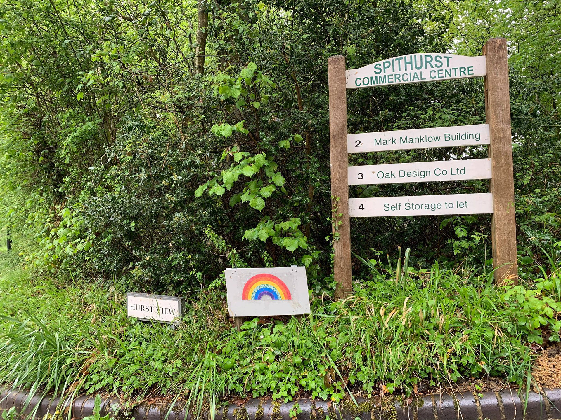
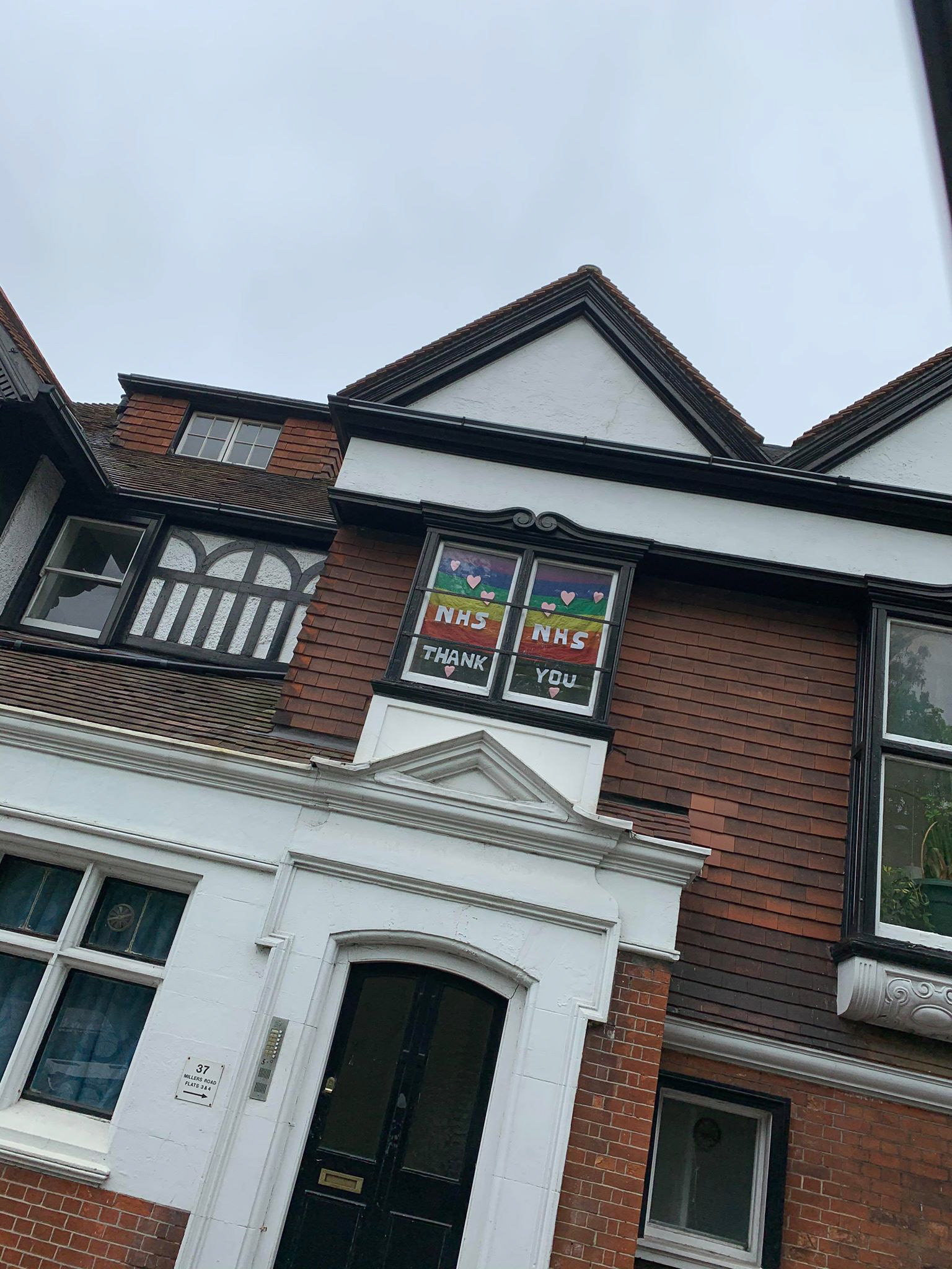


ARTWORK
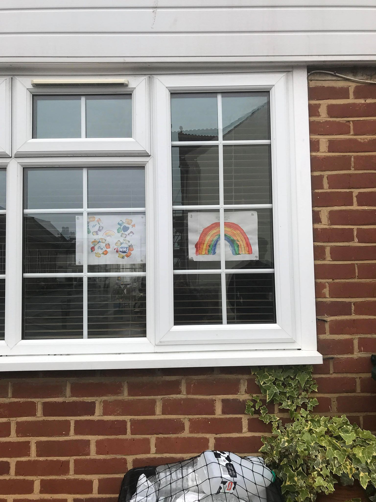
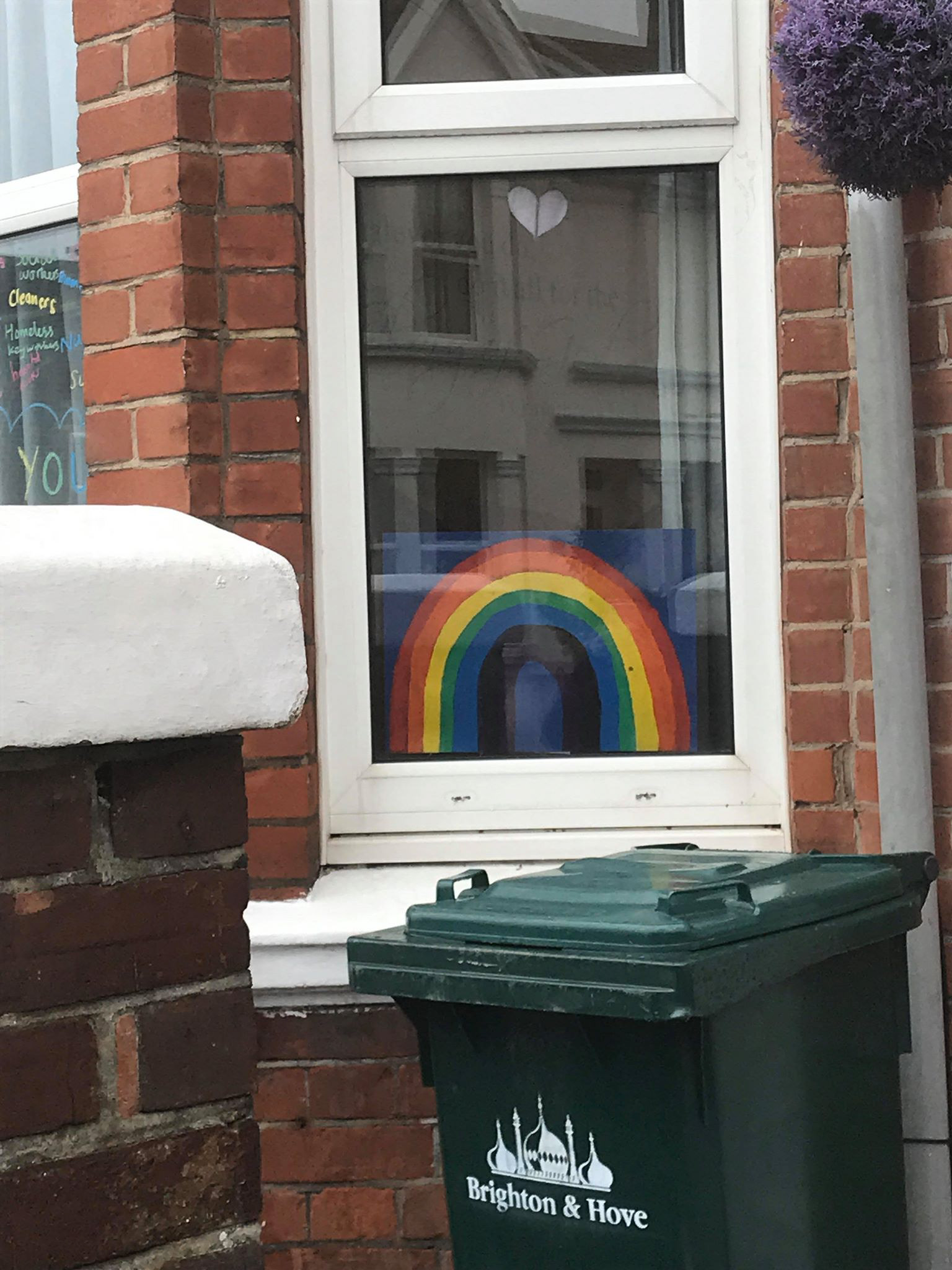
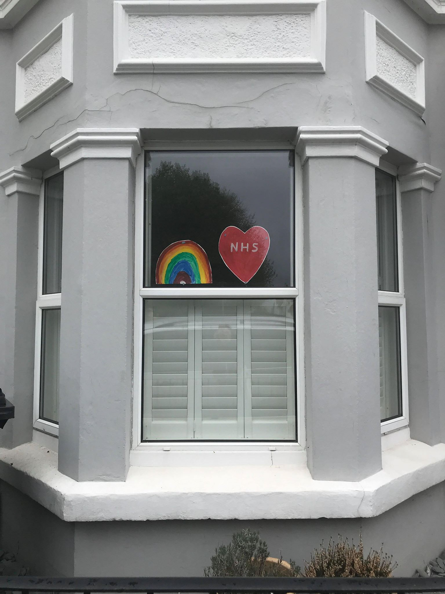
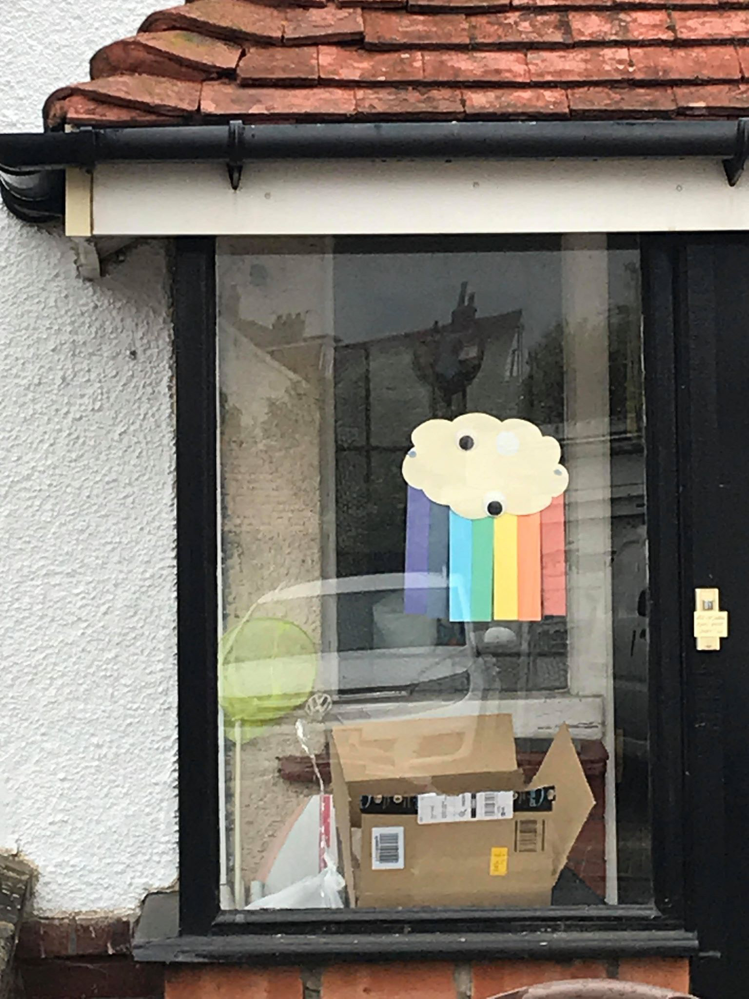
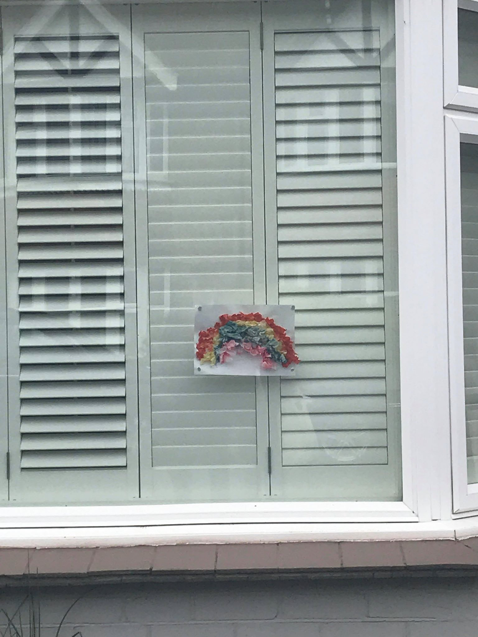
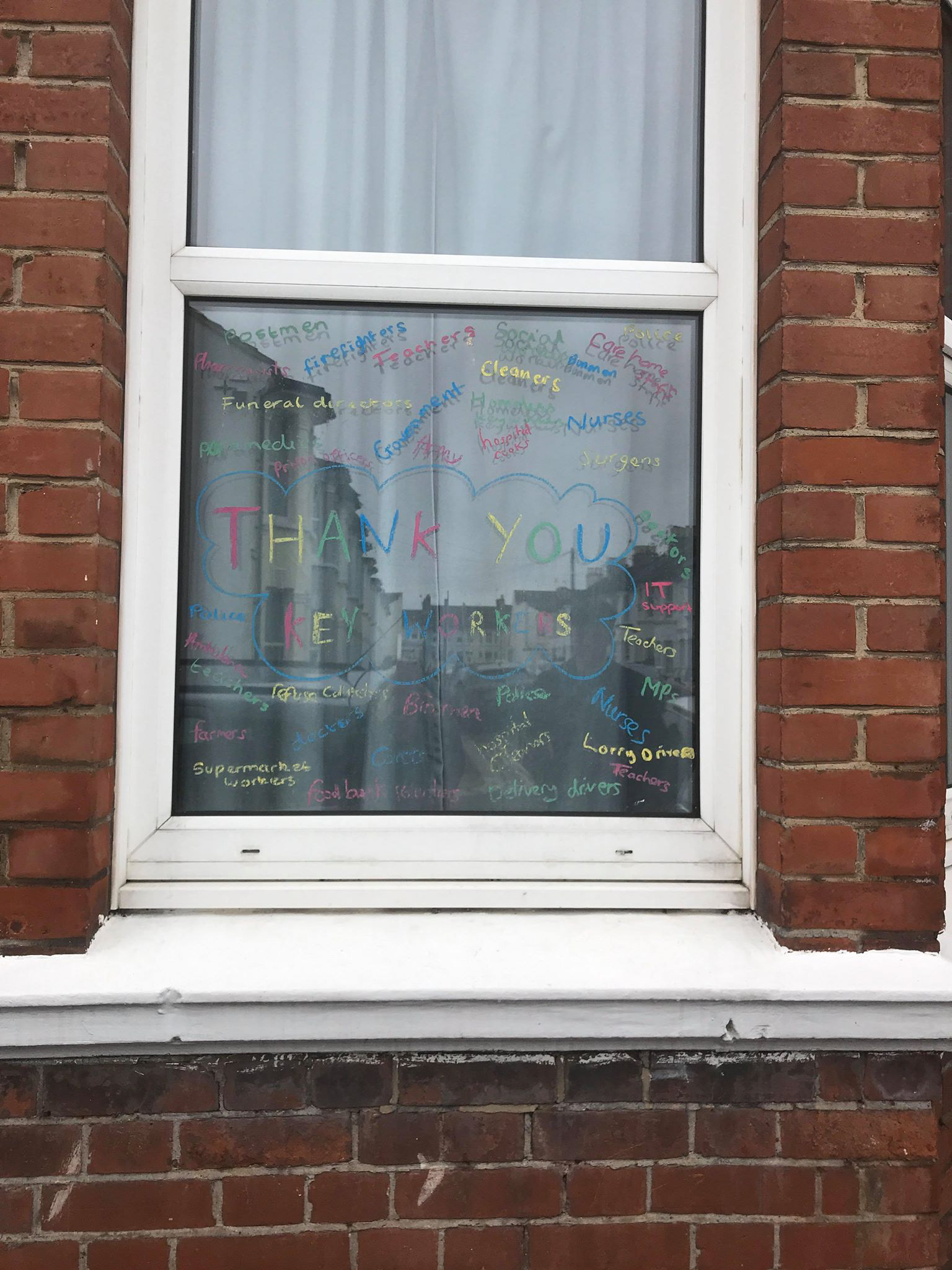
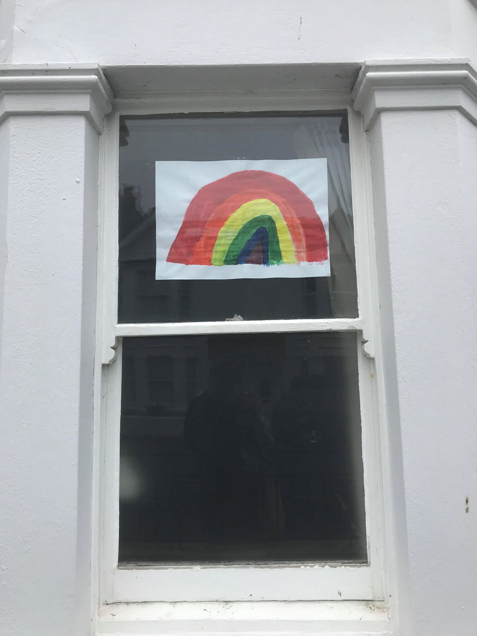
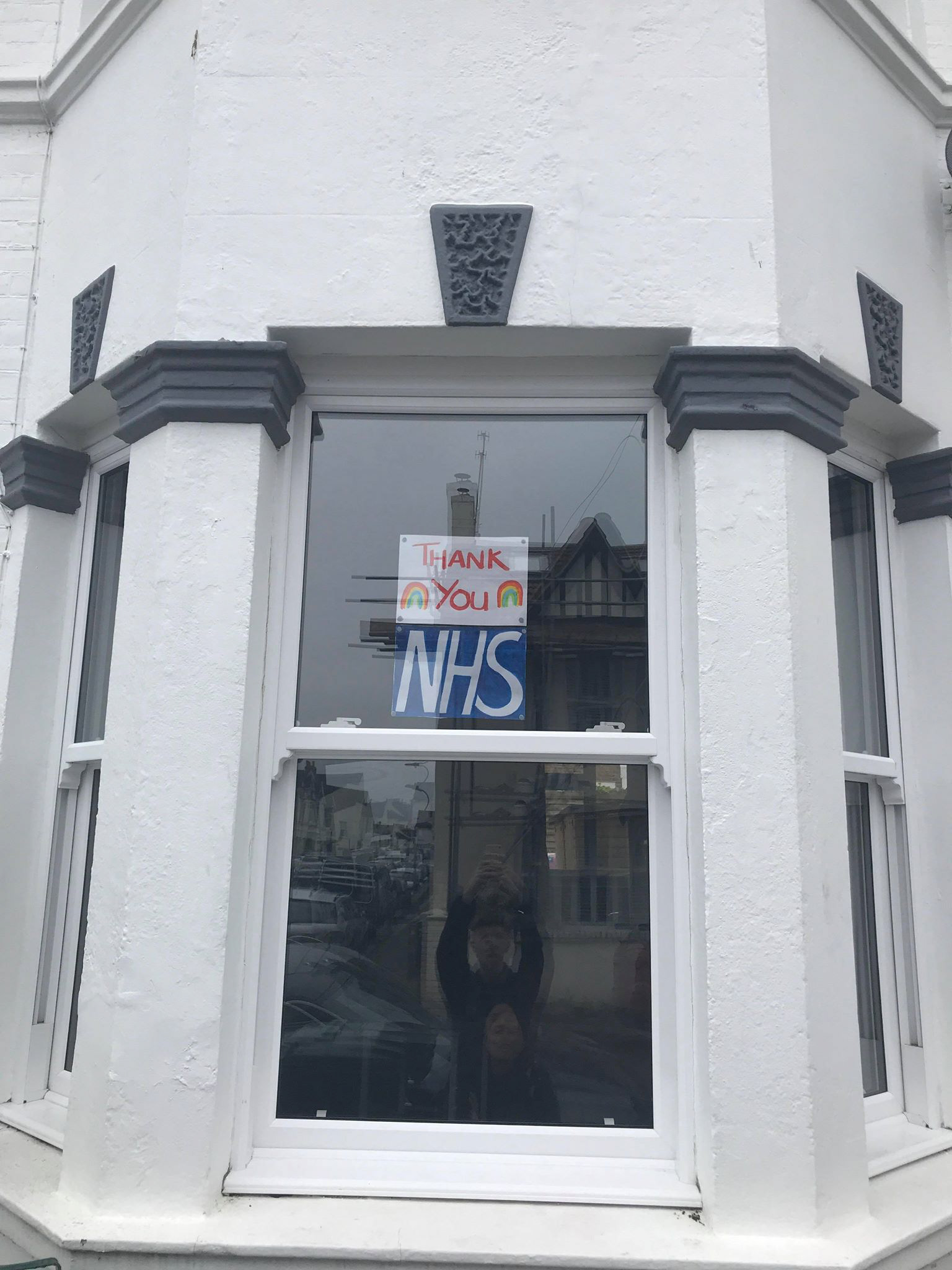
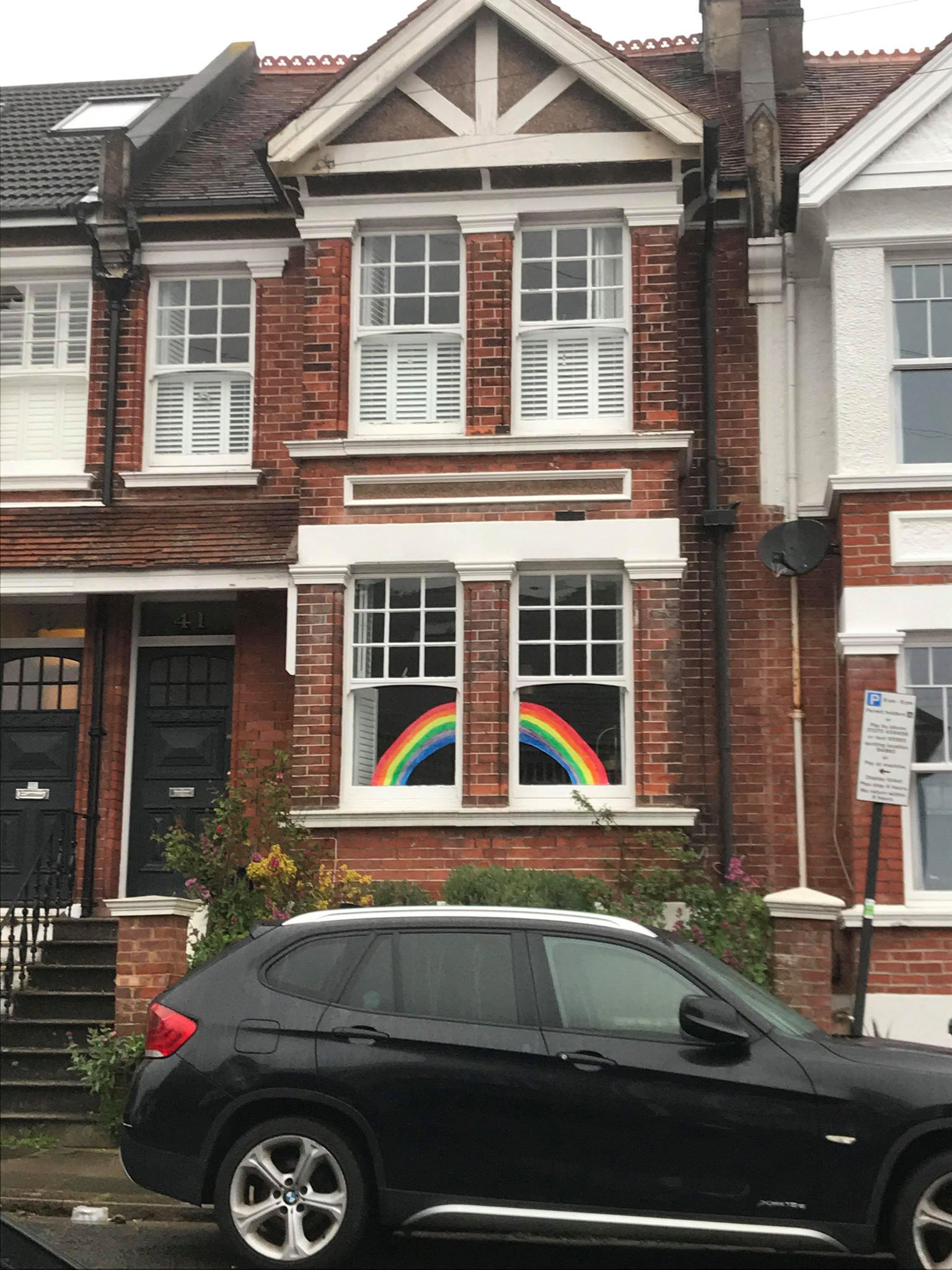
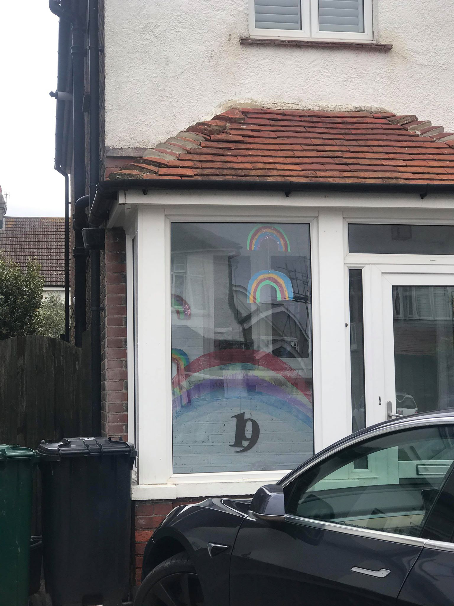
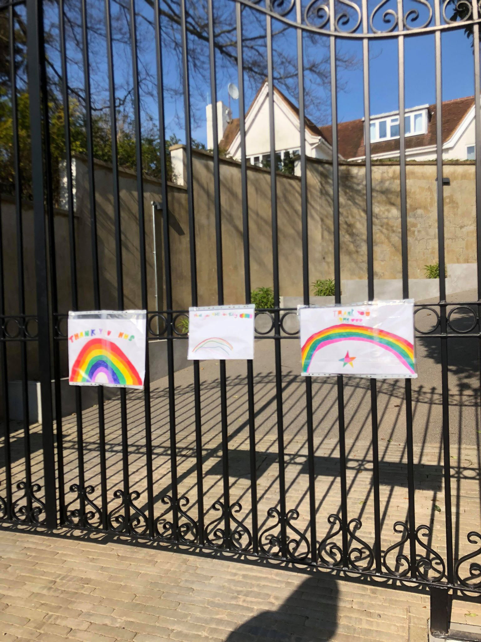
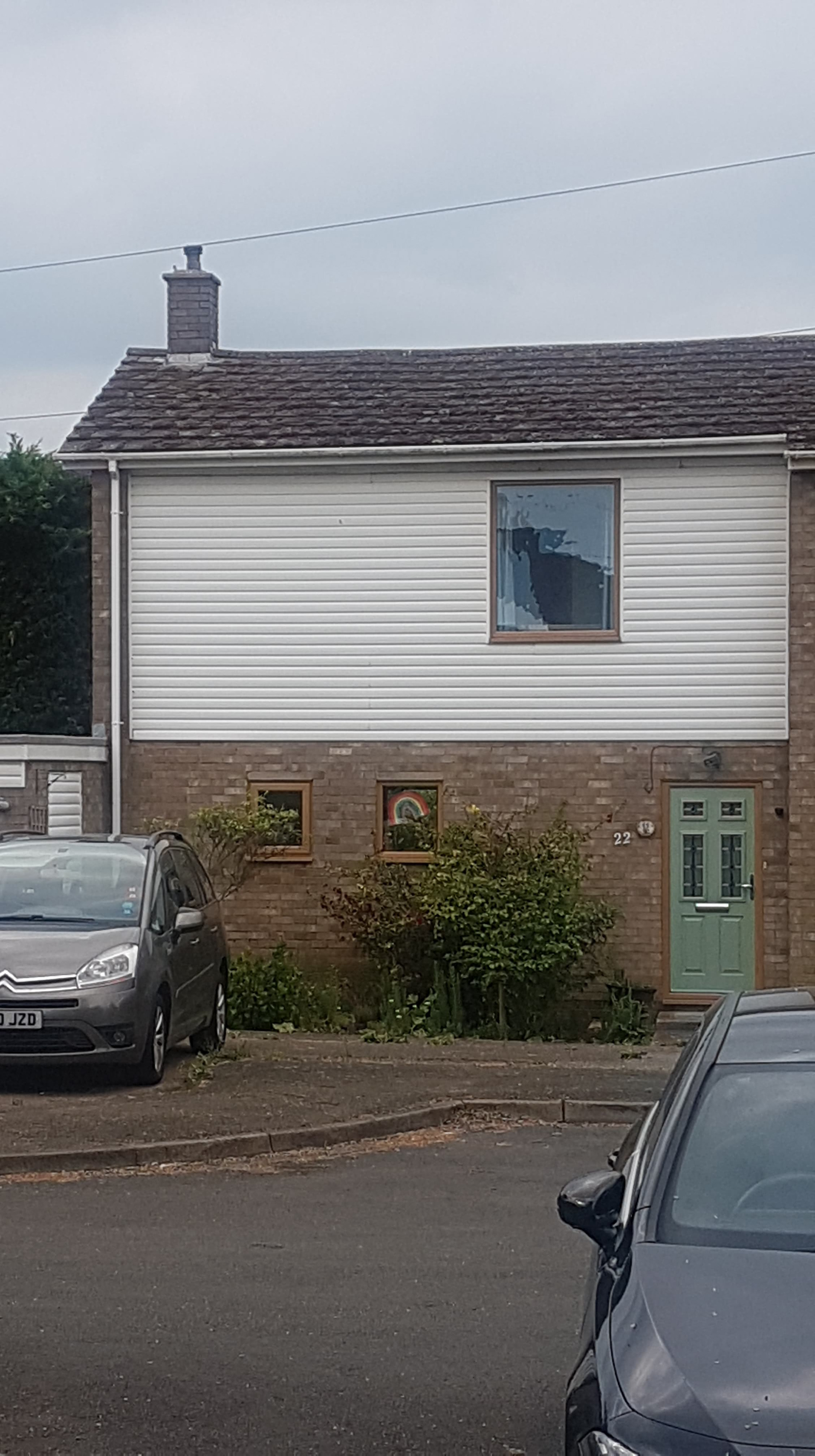
I've enjoyed walking past houses with rainbows so I also asked my friends to send me any picture they had so I could get a big collection. The sense of community of the rainbows is lovely when walking around, I want to commemorate it in some way so thought getting a collection of the photos would be good,
I will mentioned that since I have a monotone theme going on it is kind of trying to really embrace the rainbows so it's why I picked fewer photographs. Increasingly I'm thinking of rearranging the layout of this publication but I will see where I am at when I finish each page topic.
MENTION RAINBOW - MIGHT NOT BE AS GOOD MIGHT CONSIDER SOMETHING ELSE LATER
I emailed Kevin some of the work my portfolio link - he mentioned to remember how this all links to my initial sources. I have noticed whilst I’m trying to finish each page topic that I may be swaying further away from a clear link between my both sources. my thinking in how it links it’s that this quarantine experience is a new culture and way of live for millions - I want to show my personal level but also the wider part to this pandemic. The sense of this new culture links losing to the cultural themes presented in sacred sites and space since it has strong links with bio culture but yes I do see how it has less of a sacred feel. In terms of relating to graphs the fact this is about a modern day thing and that I’m trying to make it contemporary and about currently affairs links to it.
I do after having said that see how I am grasping for links - I think with maybe a bit of rearranging and working on the titles could help it come together better. My plan is to finish these page topics and then either reevaluate the whole thing or just try to change it around with title/body text.
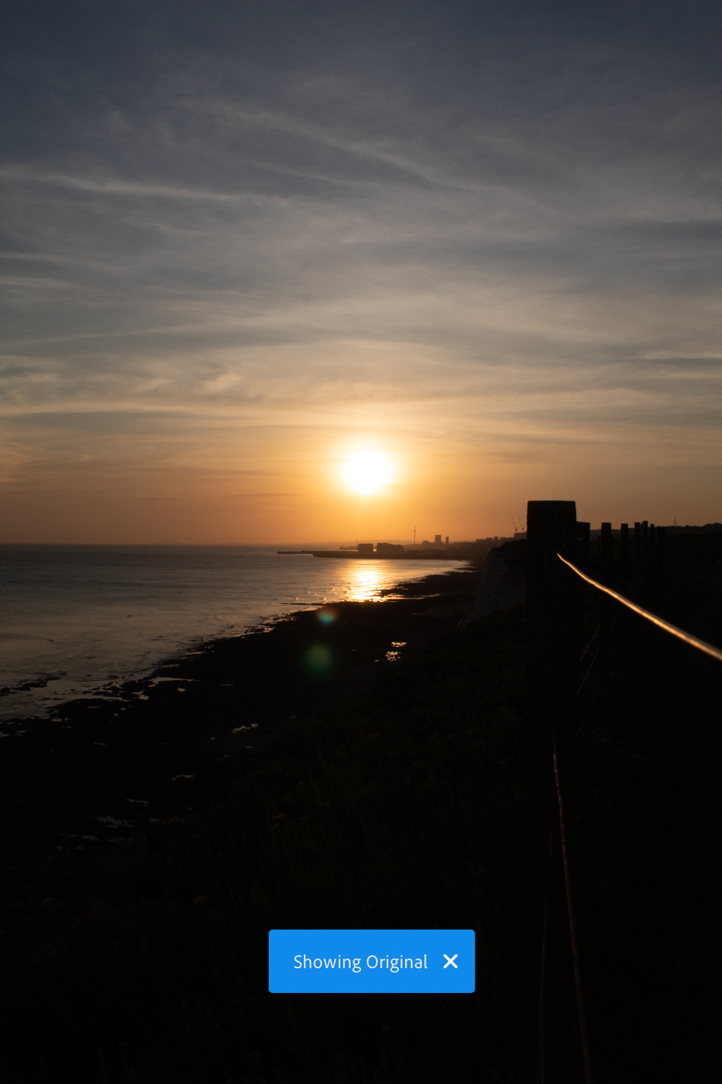
Above this text is what I tried to do.
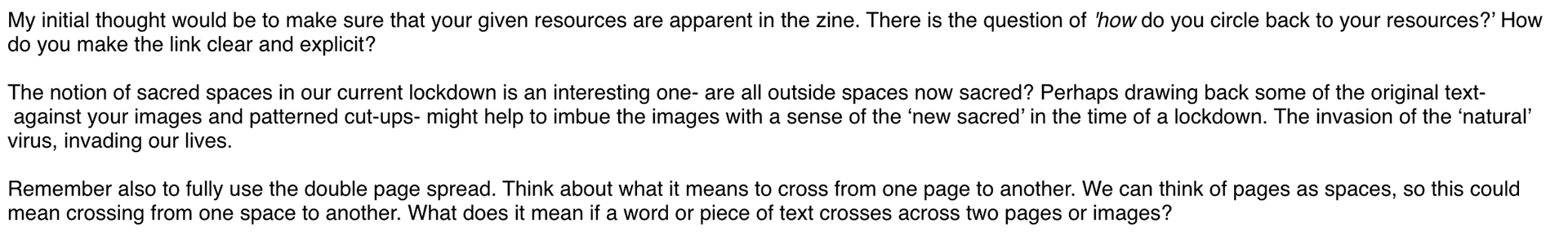
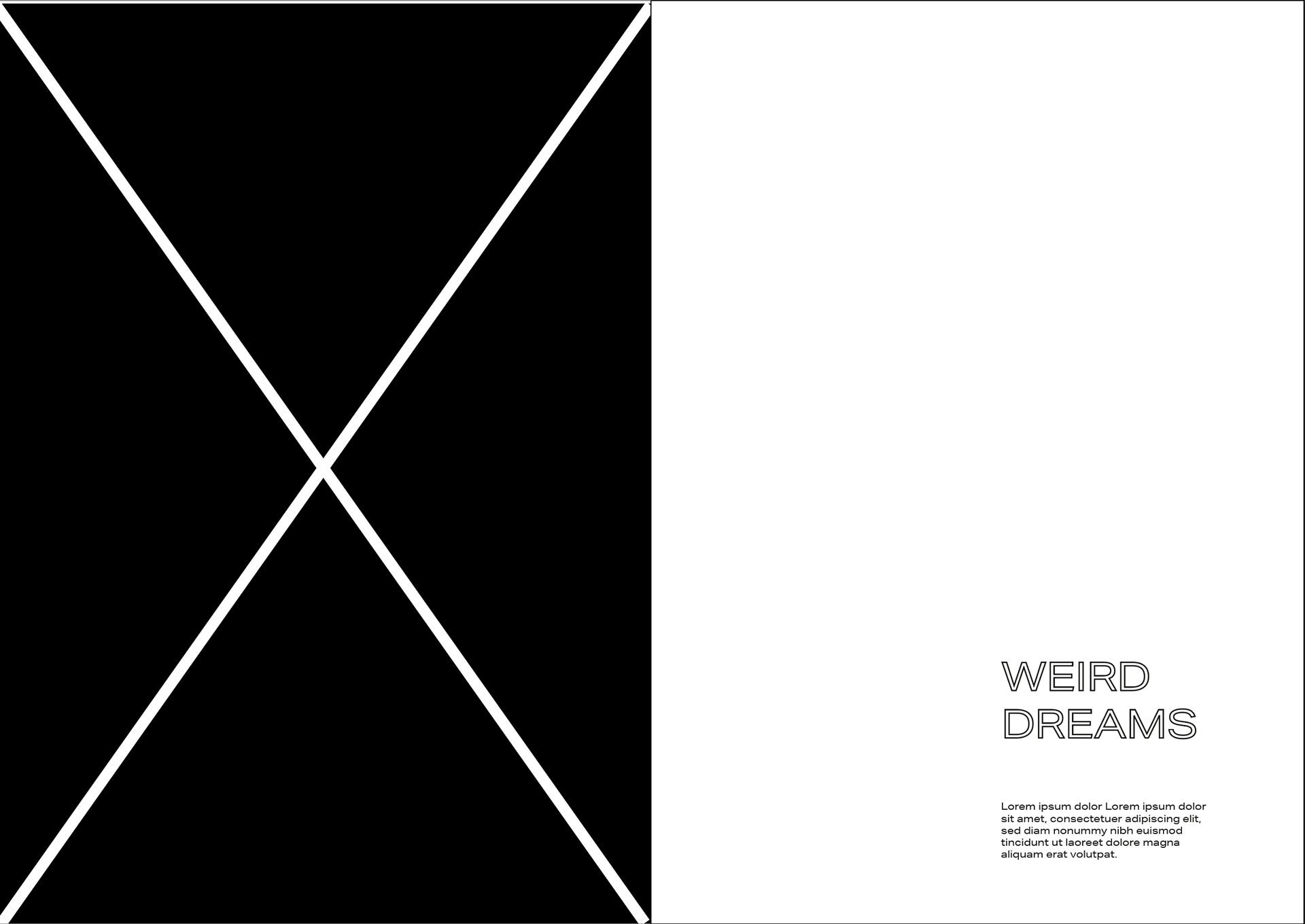
DREAMS
One thing I experienced in the beginning was very vivid dreams I'd wake up in the morning thinking I had already done a certain task and then realising in fact I did said task in my dream. I spoke with friends about it and they too had the same thing of have weird realistic dreams. Also increasingly the passing of time has made it feel like the past has just been a dream and that people can't quite believe this is happening and are waiting to be woken up.
I have good memories of just staring at clouds on a sunny day and just adoring our nature - I felt looking through my photographs for pictures of cloud to represent dreams felt like a well fitting visual representation. I tried editing some but ended cropping a photography I already had - I think the dark shadows on the underside work well and that they aren't that perfect cloud shape is great.
UNCERTAINTY
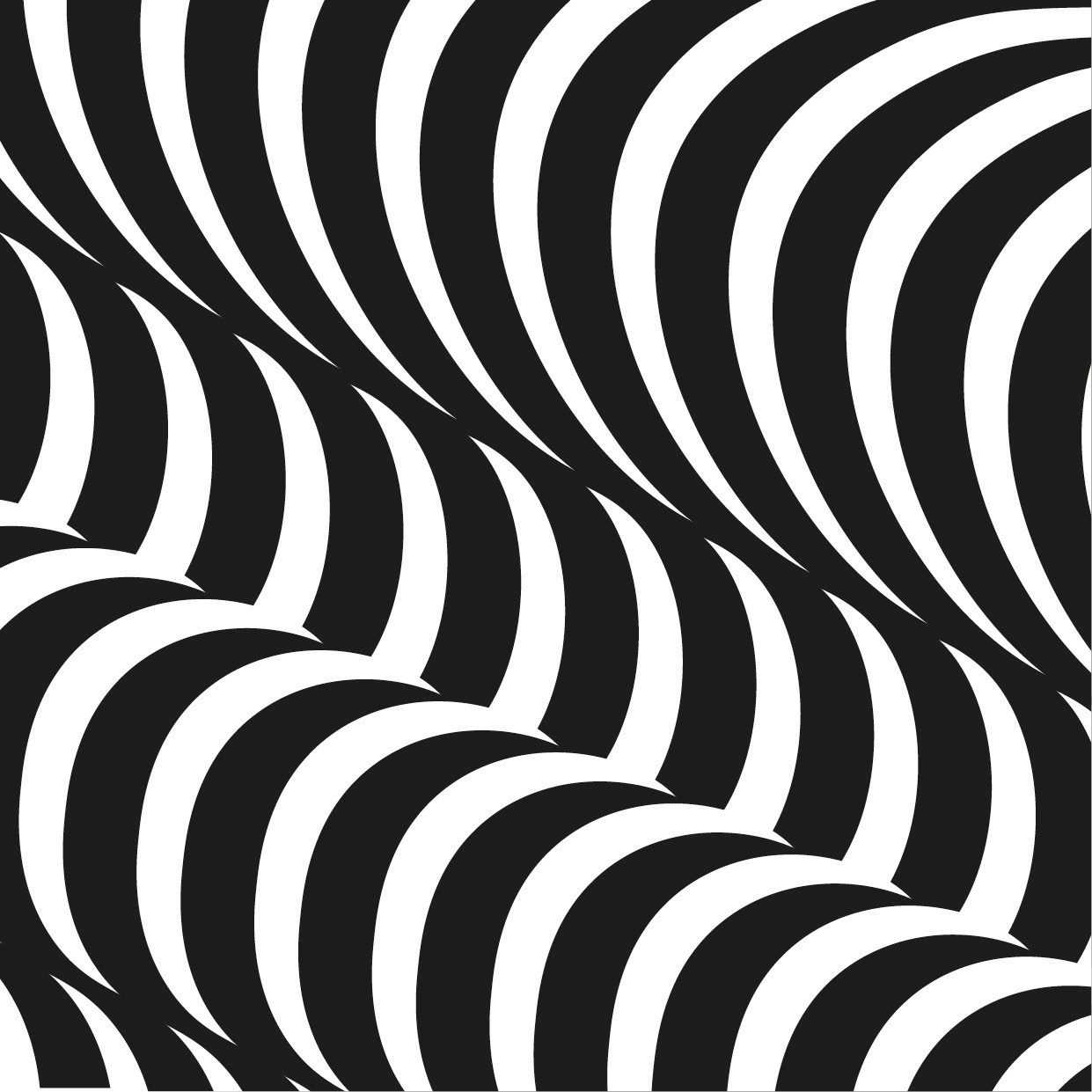
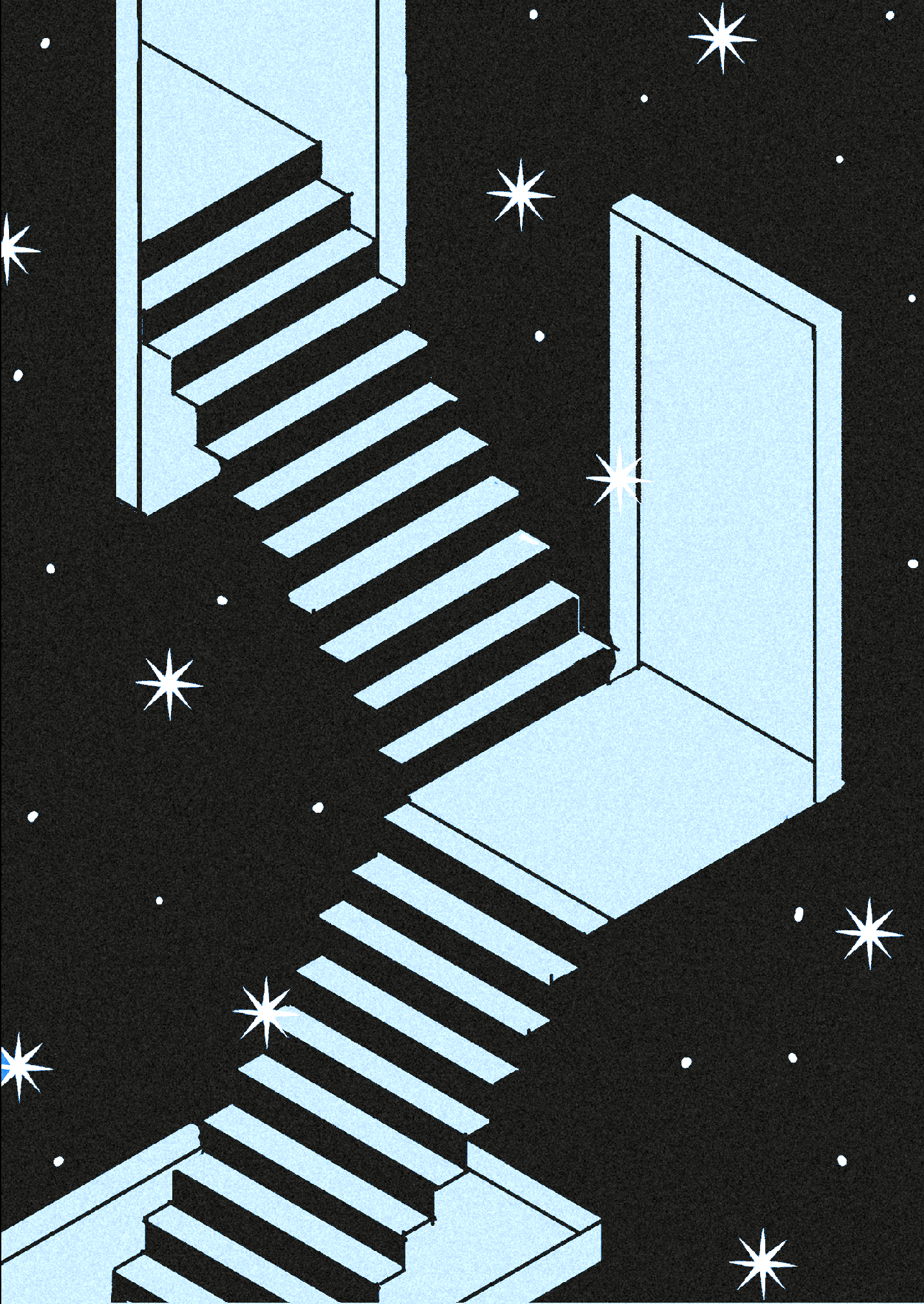
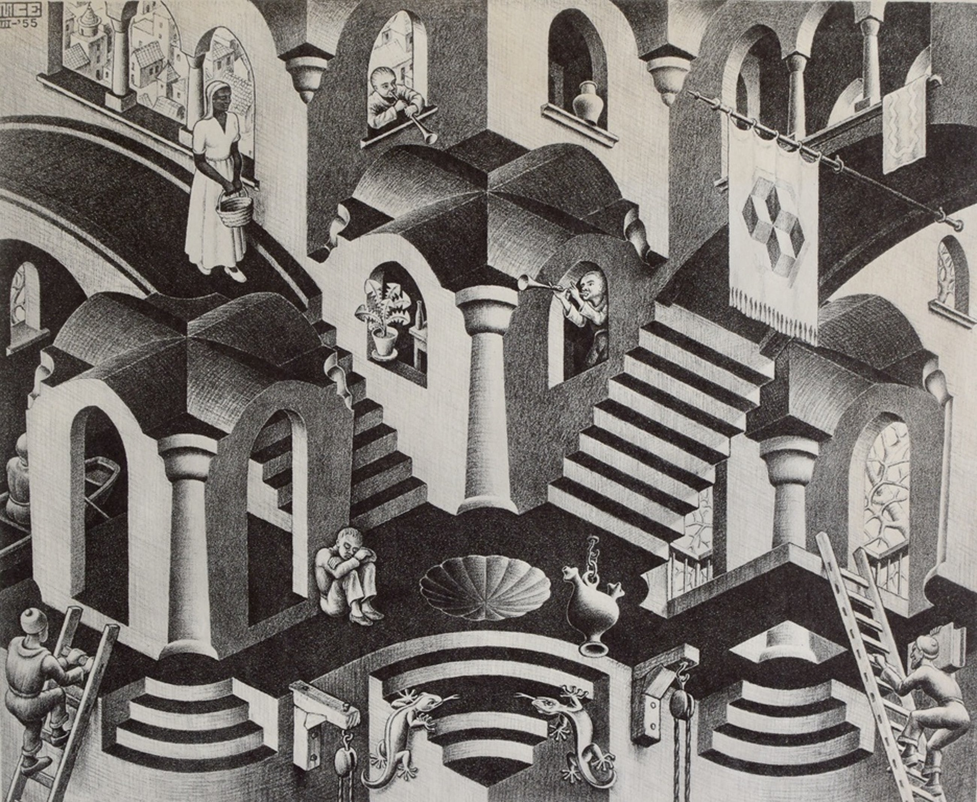
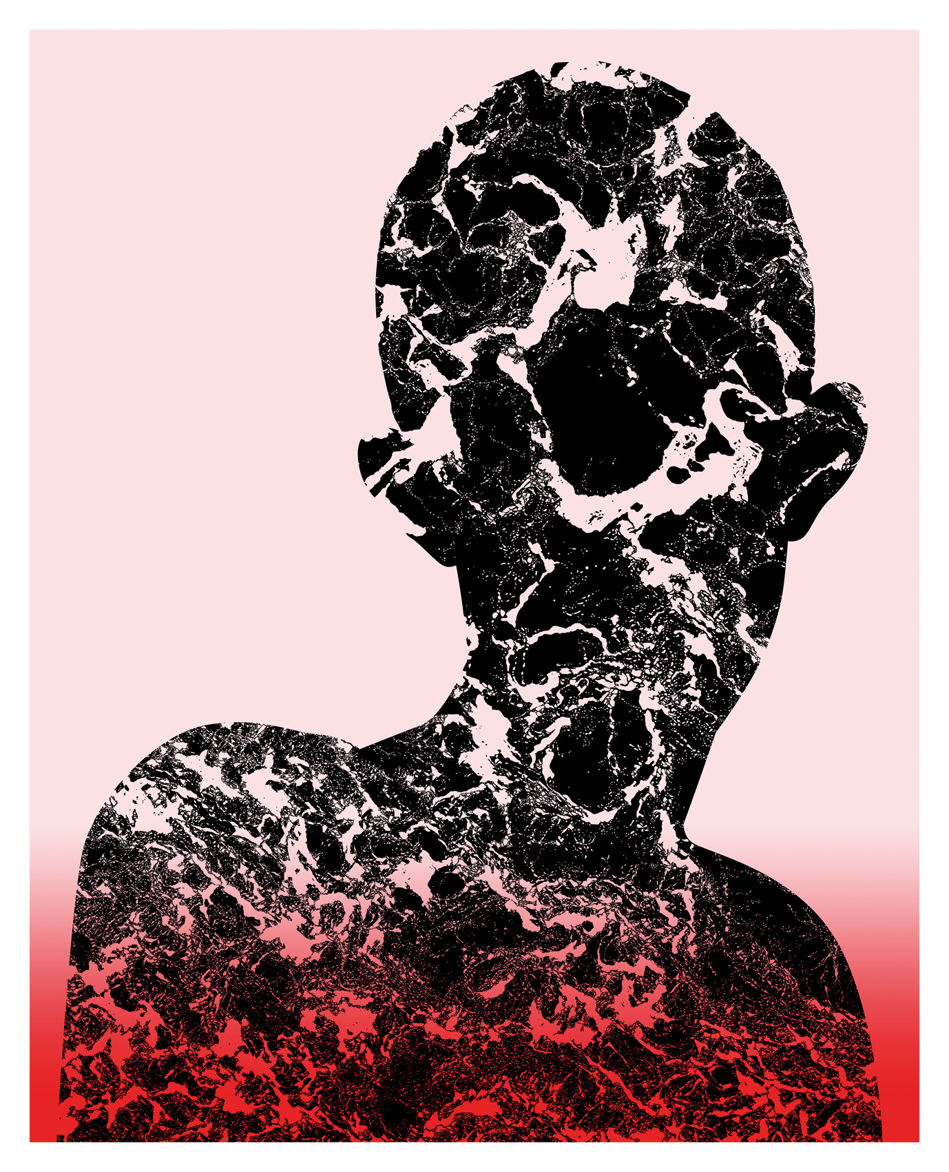
This is my idea for the uncertainty page, it's been a big topic that comes up when I'm talking to friends and family. Due to this unprecedented no one really knows what is going to happen. I made this piece in a escher style way because I feel it does a good job of visually representing the feeling of uncertainty - the different staircases floating in space which are going to different 'doors' give that feeling of the unknown which I feel reflects the uncertainty we are all feeling.
I hope to add some shading to make it a better looking piece but I plan on it roughly looking like this.
Wanted to make note that when I thought of this I linked it to escher's work, his unrealistic world he made through his art really fits with the feelings of uncertainty.
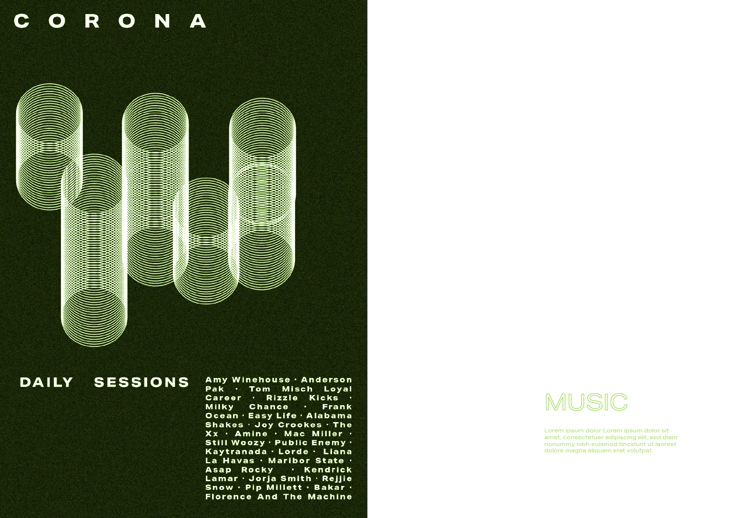
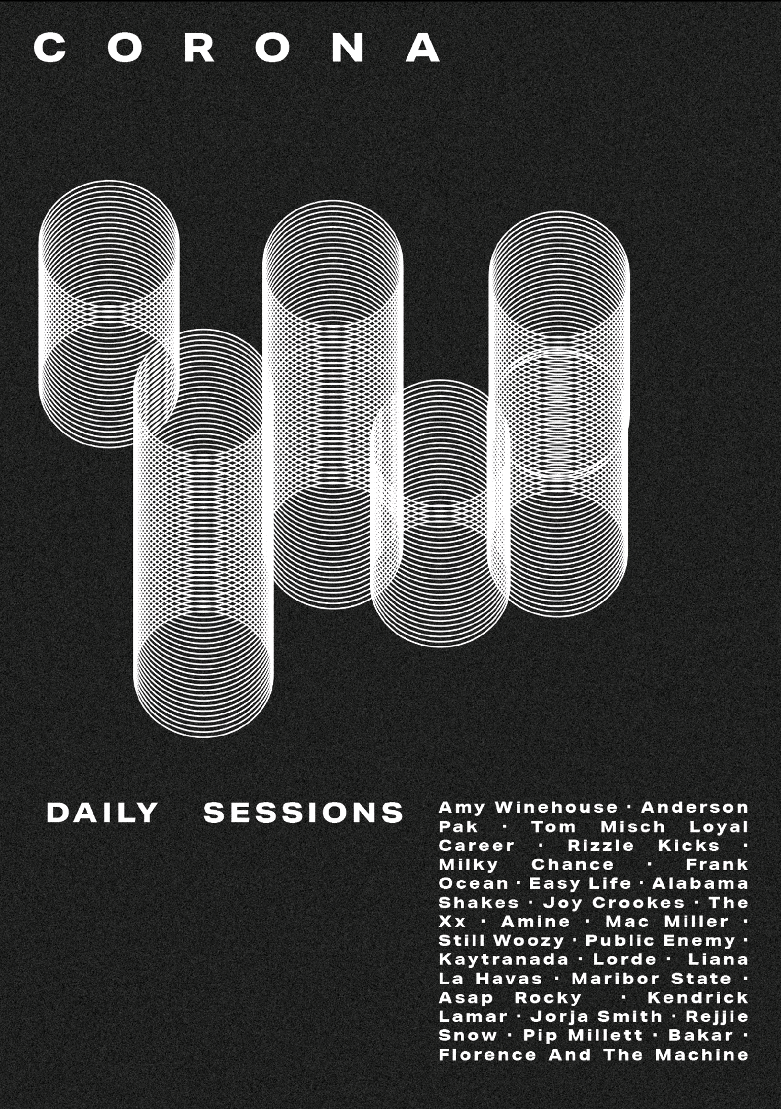
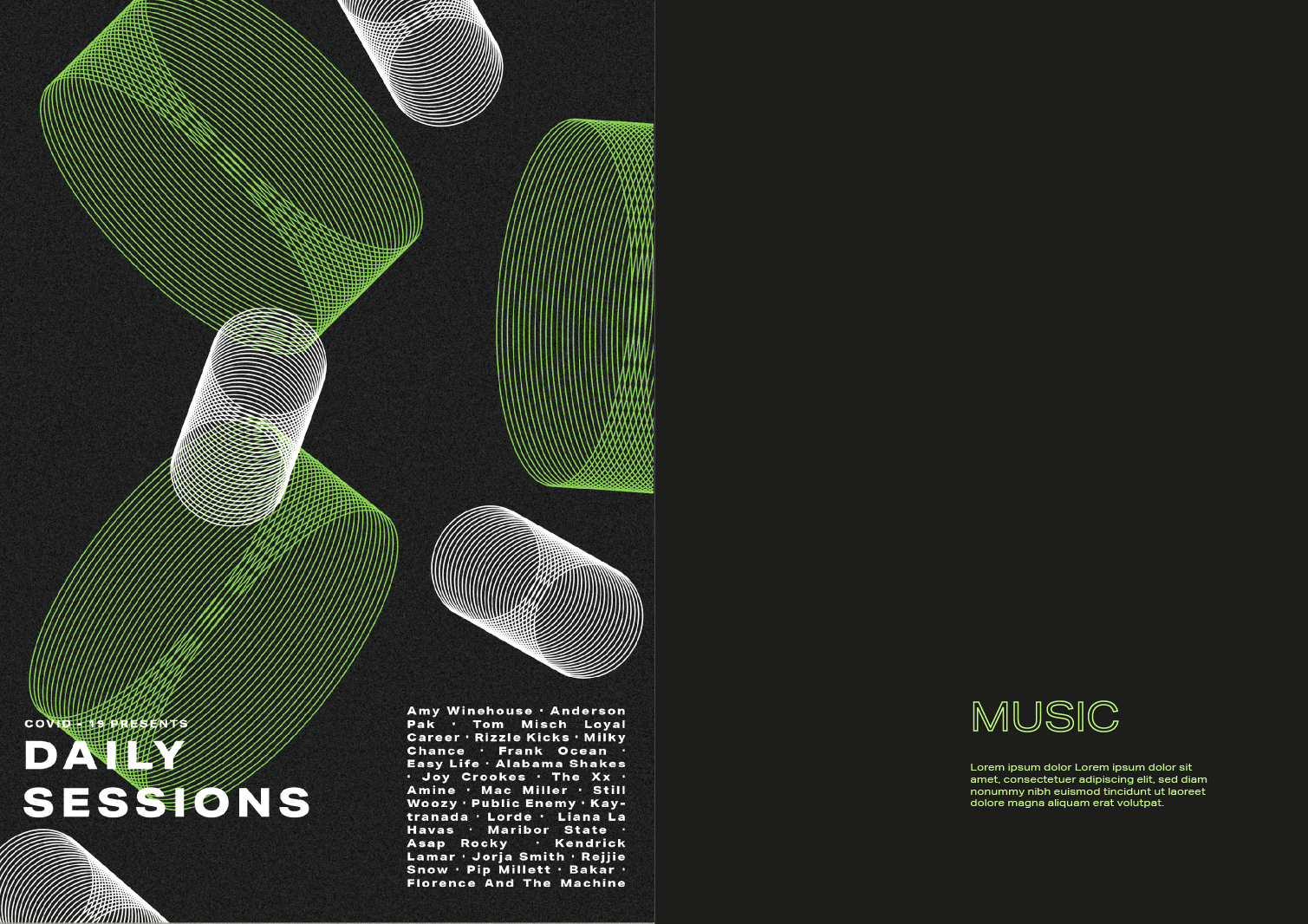
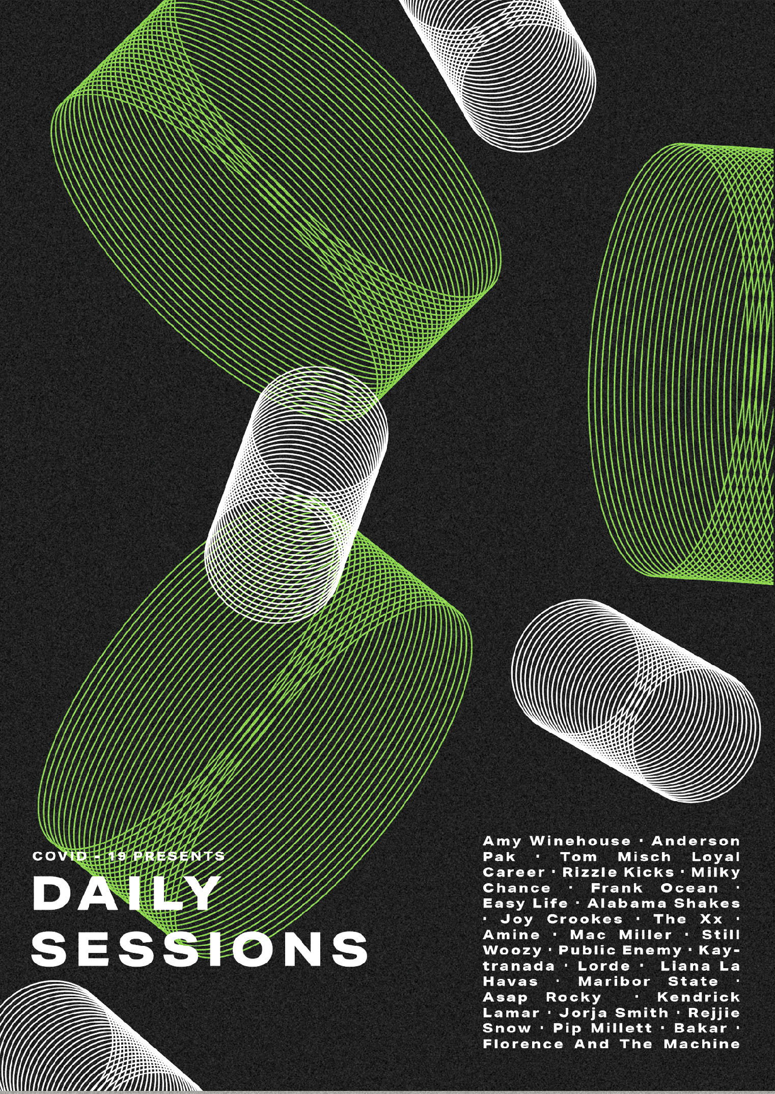
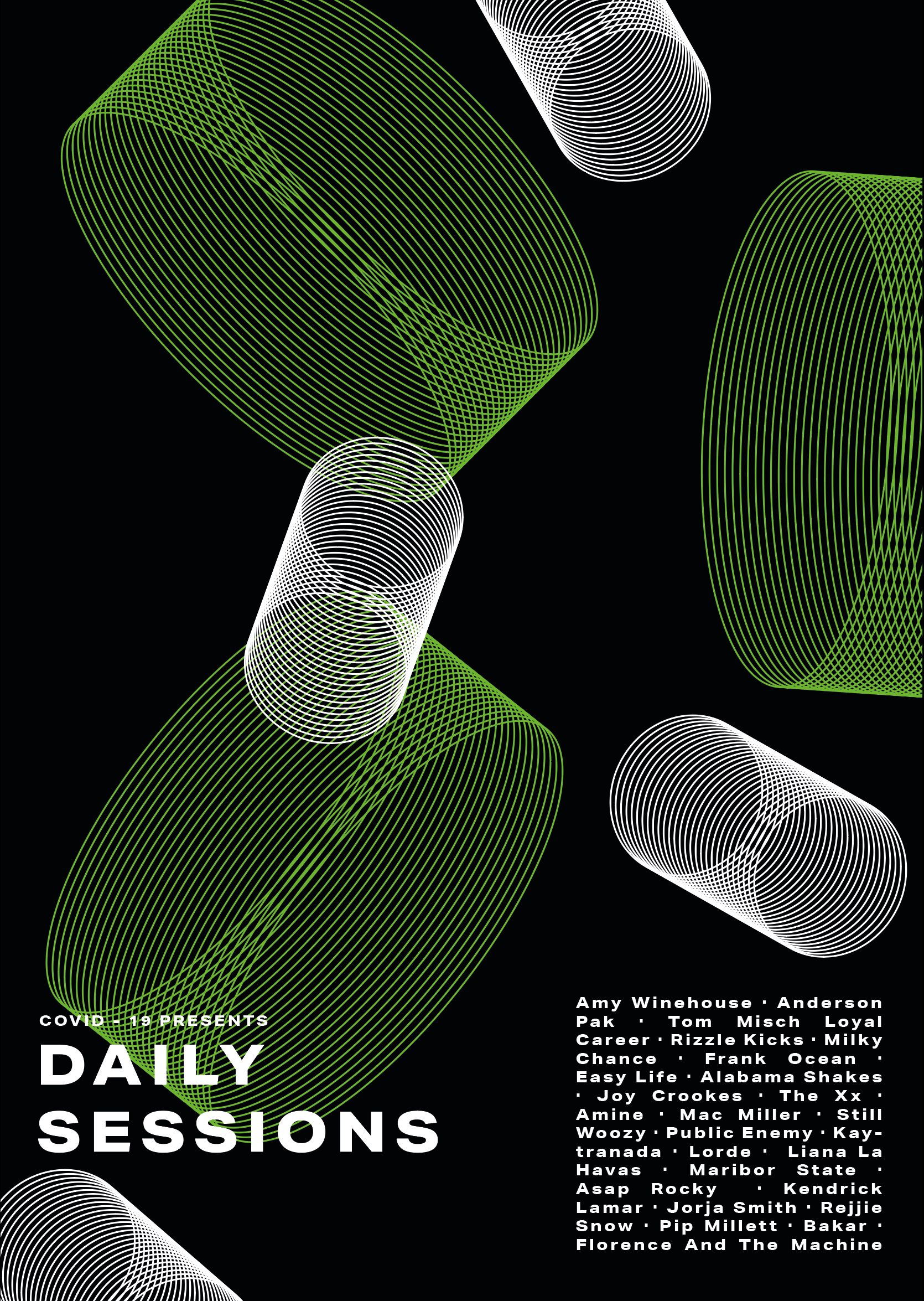
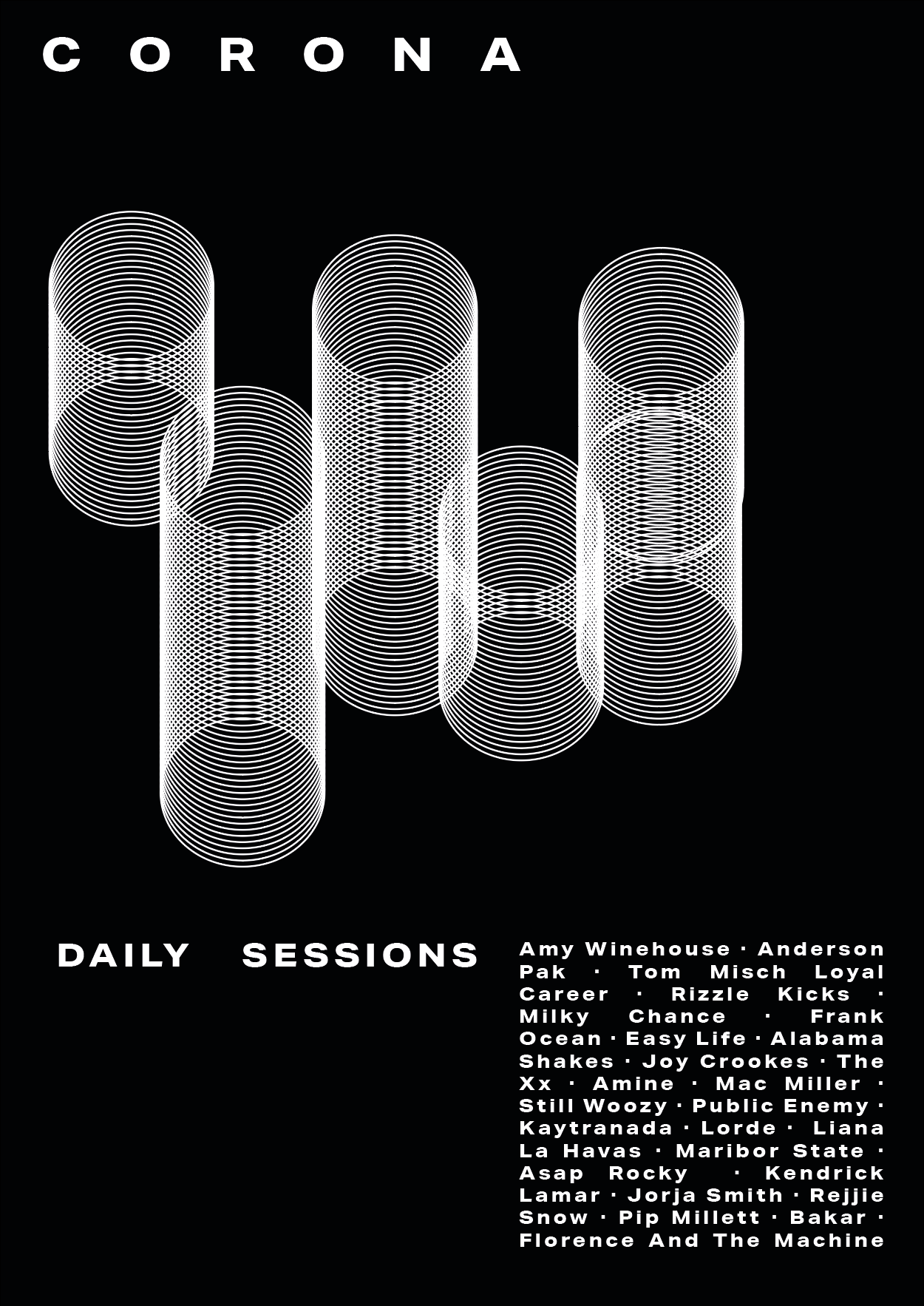

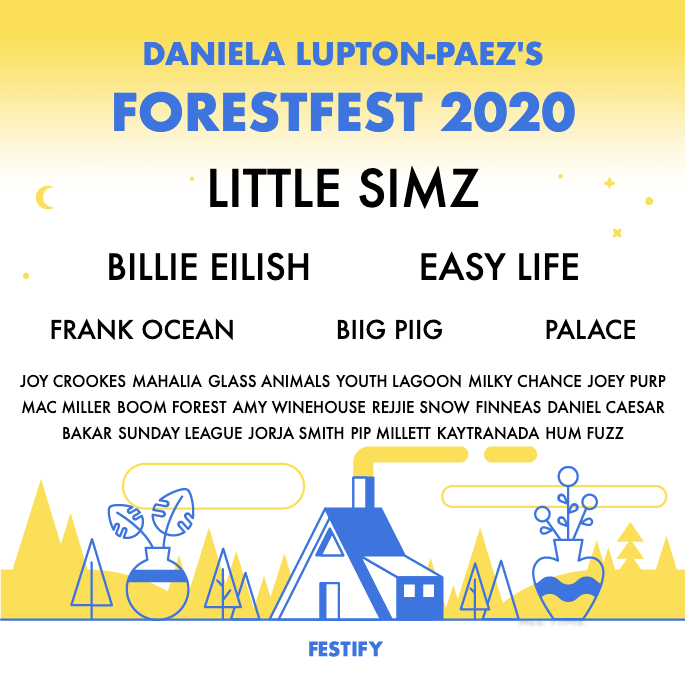
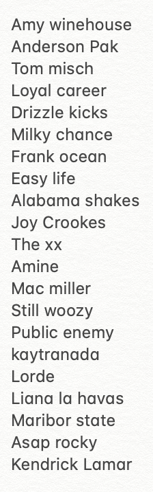
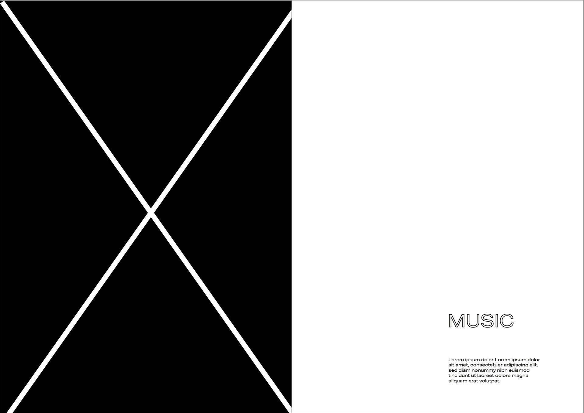
MUSIC
can't have festivals but can still have music but can't have the community feel - festivals that we can't enjoy but doesn't stop us from listening to music.
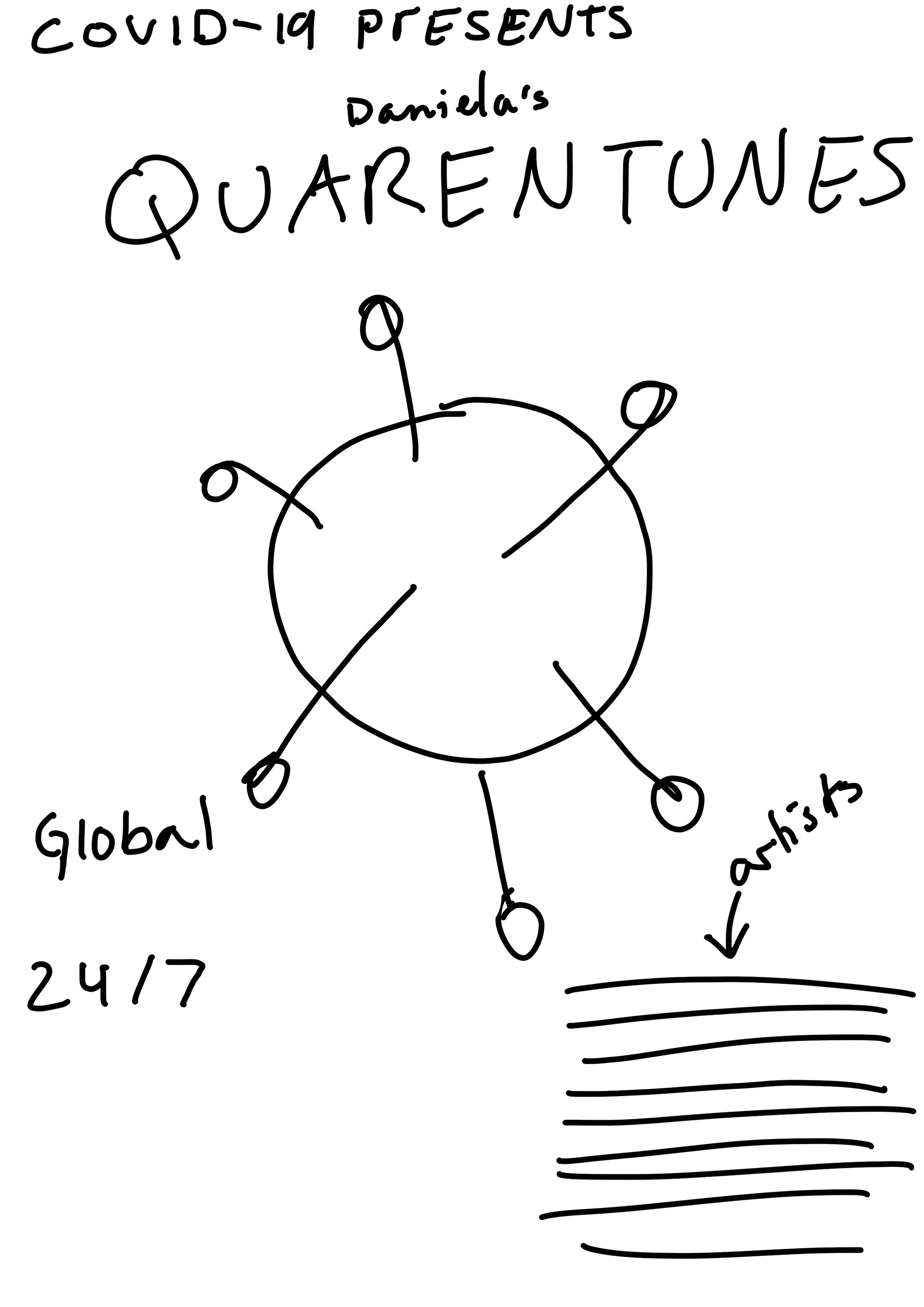
My initial idea was to put together all the album covers of the music that I've been listening to during quarantine, whilst I might still involve these I remembered about a website that makes mini festival posters for your most listened to music on spotify (https://salty-beach-42139.herokuapp.com/). I also remember seeing fake quarantine posters at the beginning of quarantine so I like the idea of making my own little poster showing my favourite artists during this period - music is such an important thing that it's a nice way to celebrate it.

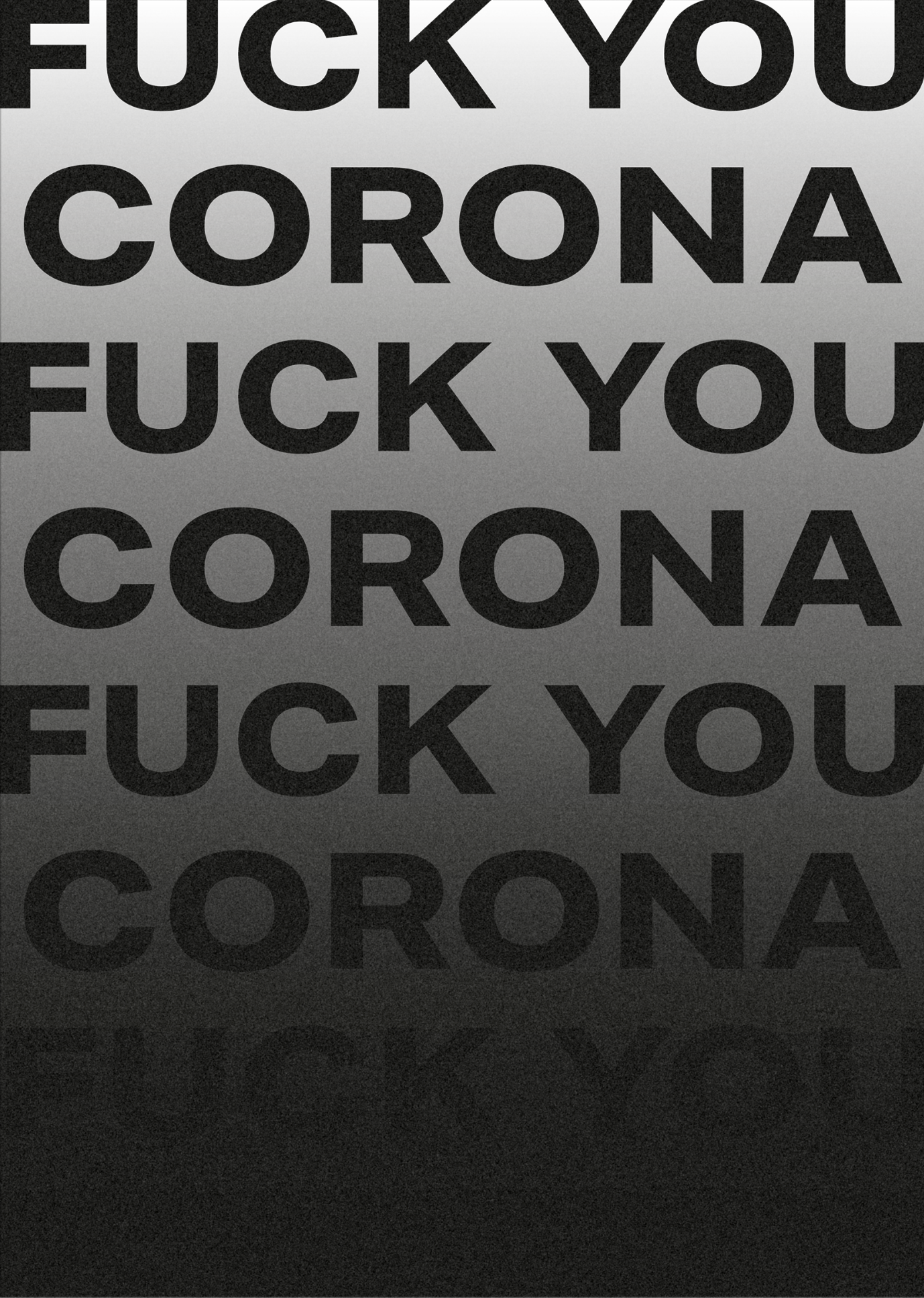
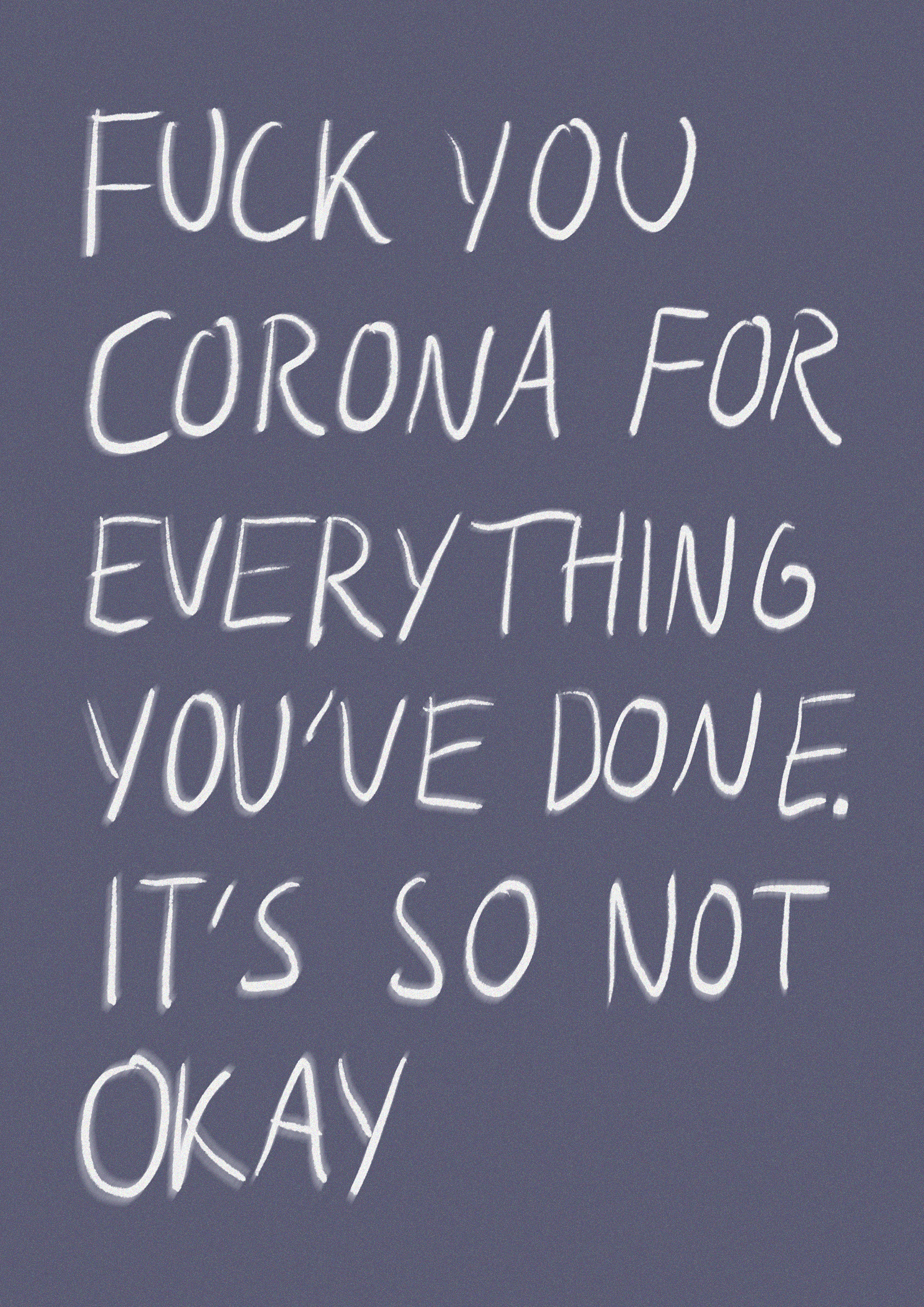
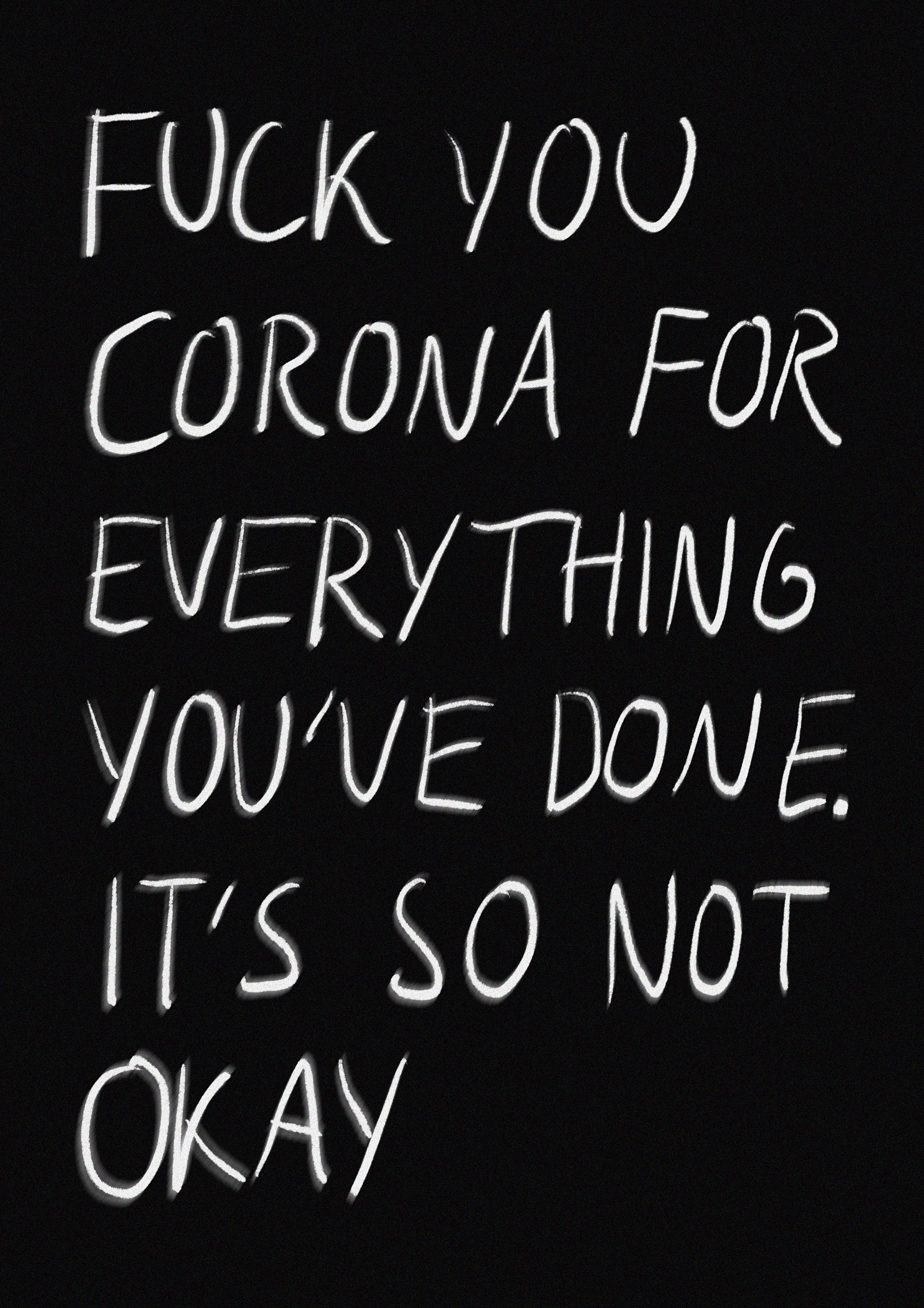
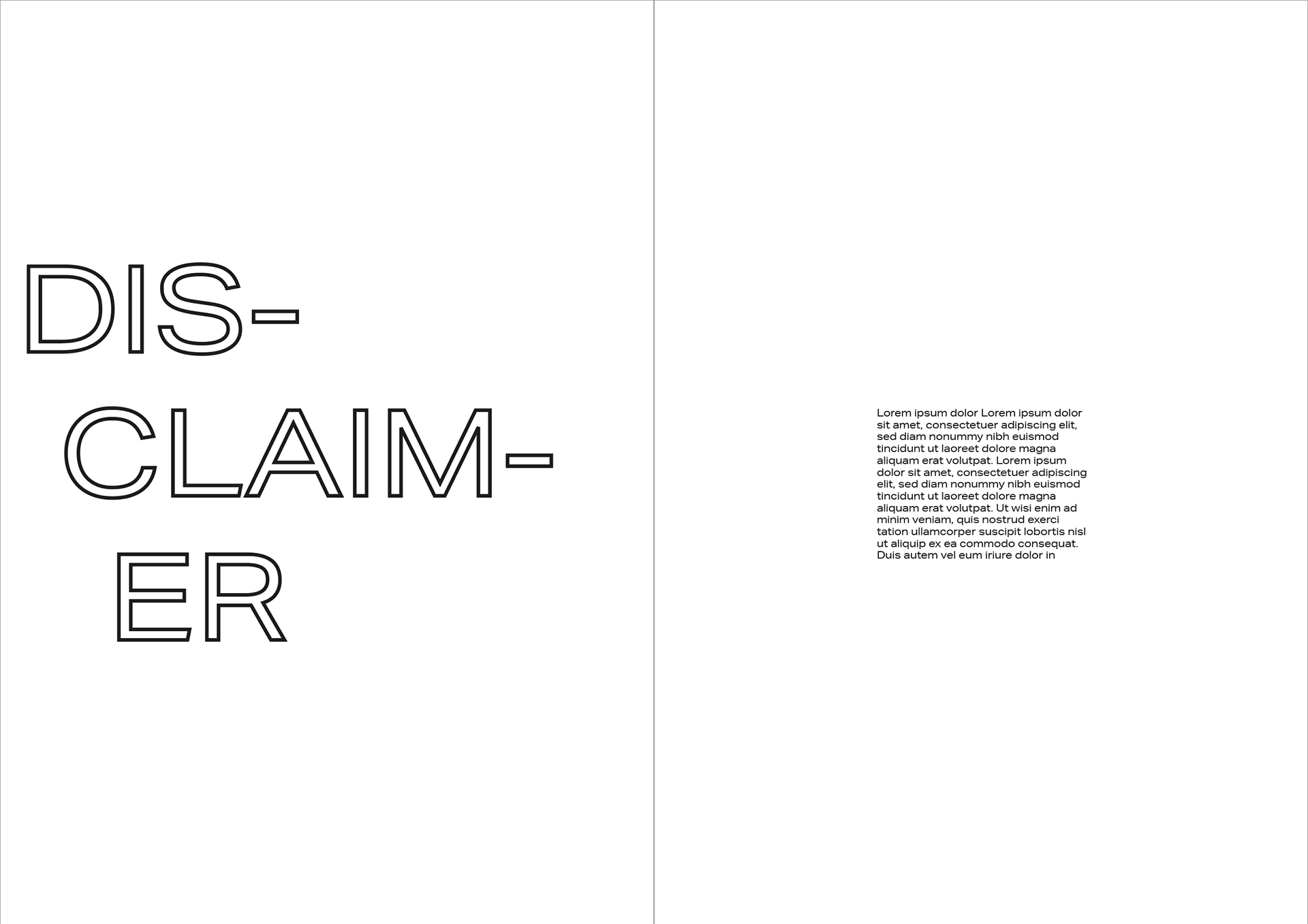
DISCLAIMER
This was a quick idea for the disclaimer page I will likely not stick with it as wanna be able to keep this PGish but I kind like how it turned out. I was going for like an angry note look as if it was written without thinking (which it was). I'm going to try to think of a better way of wording it.

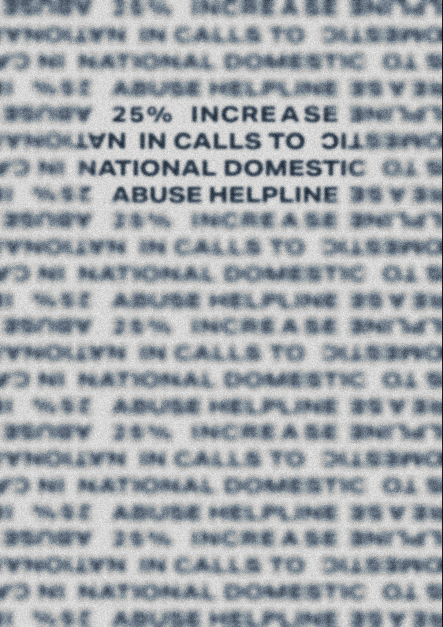
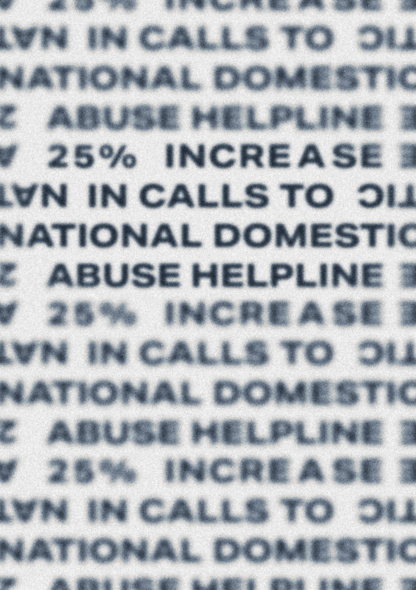

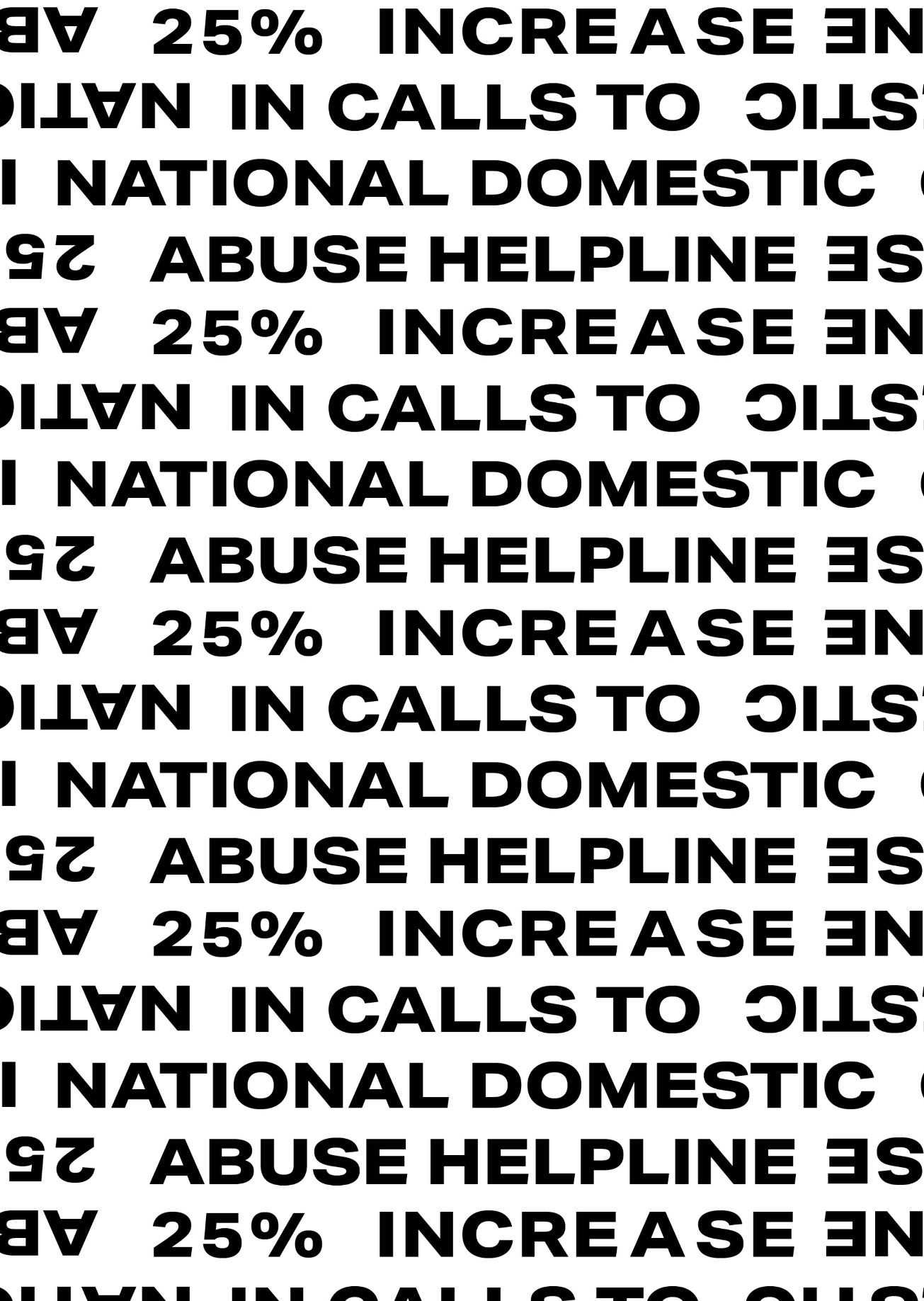
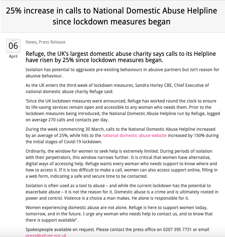
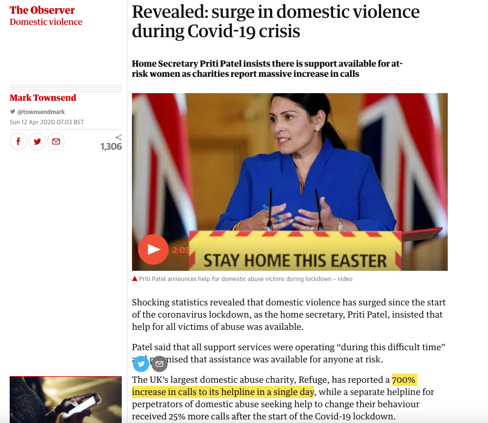
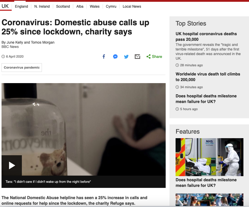
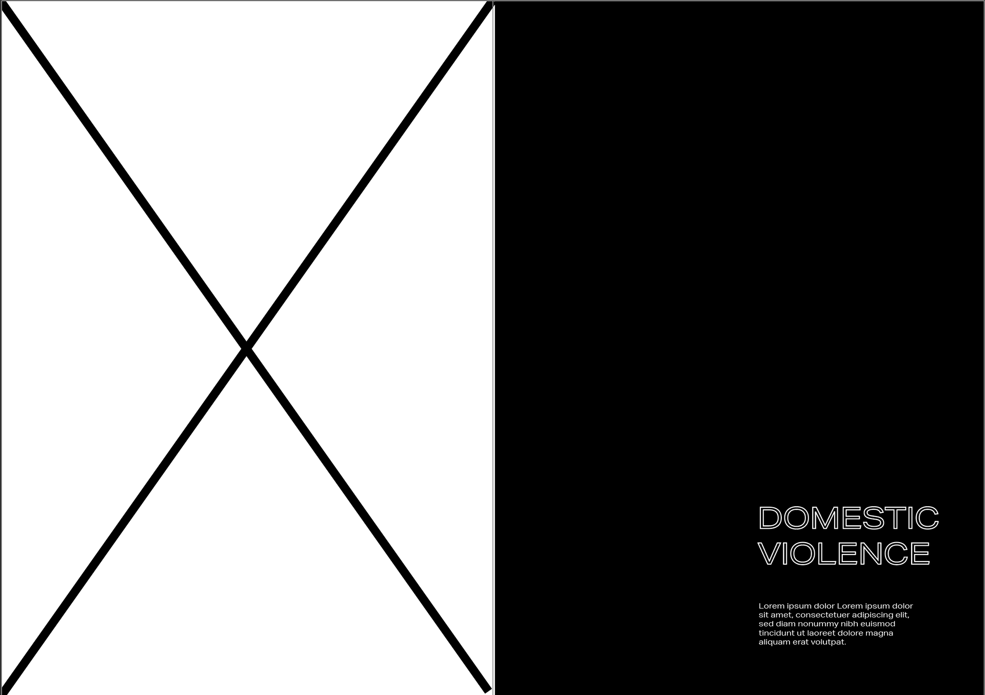
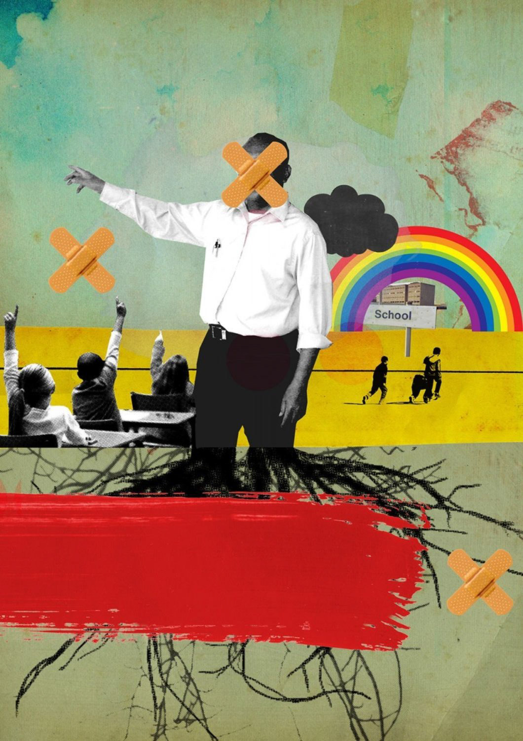
DOMESTIC VIOLENCE
I wanted to show an alarming statistic for domestic violence as I feel as if its an important figure. I added the blur and focused onto one point as I feel as if many of the reports or people will feel like they are forgotten about or won't get the help they need. Where only a tiny amount will get out - so only a tiny bit get's focused on here.
In the articles above it shows 25% increase ADD TO THIS
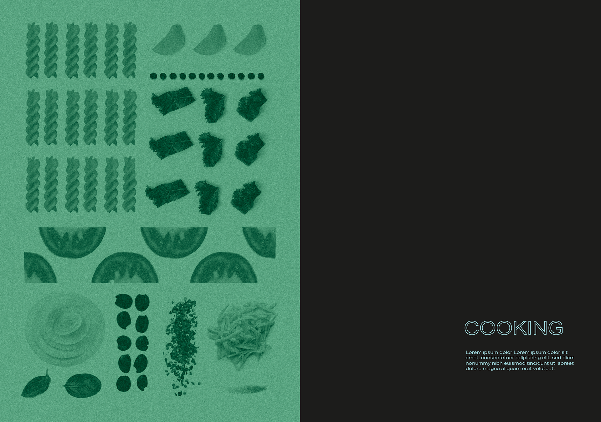
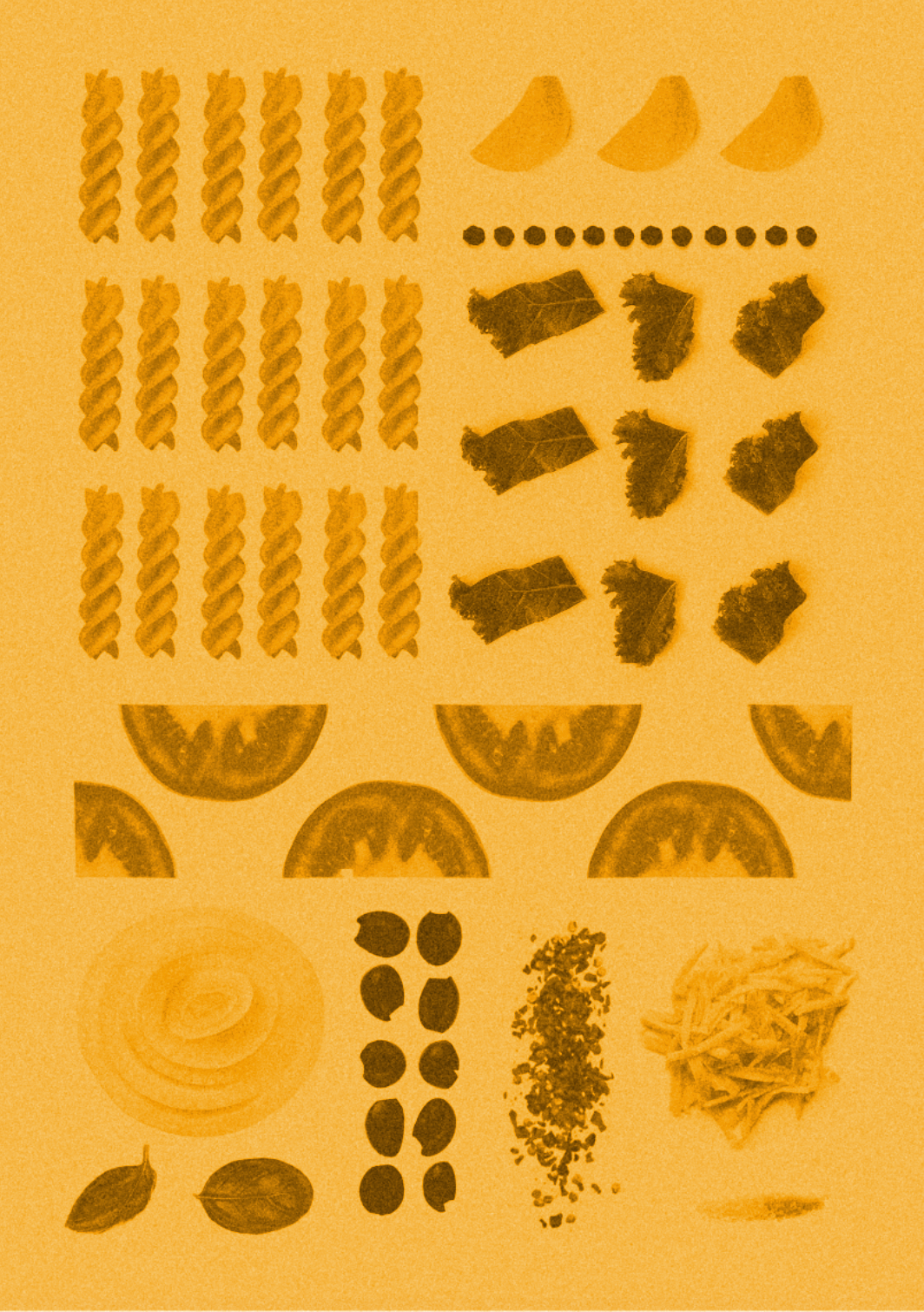
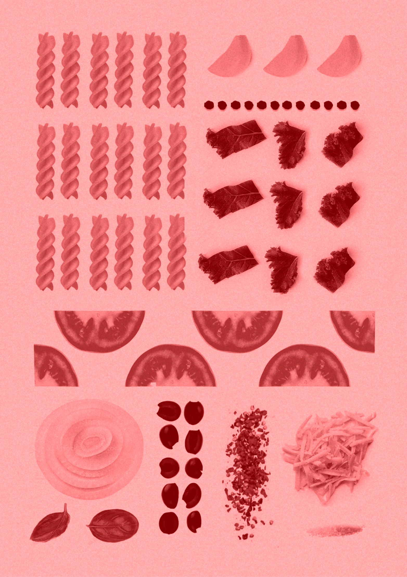
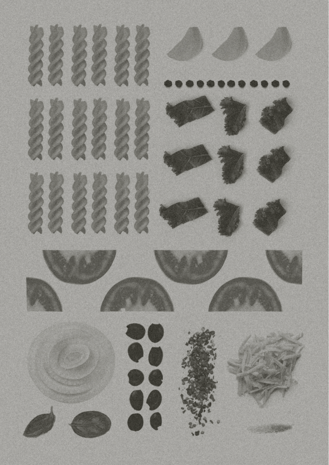

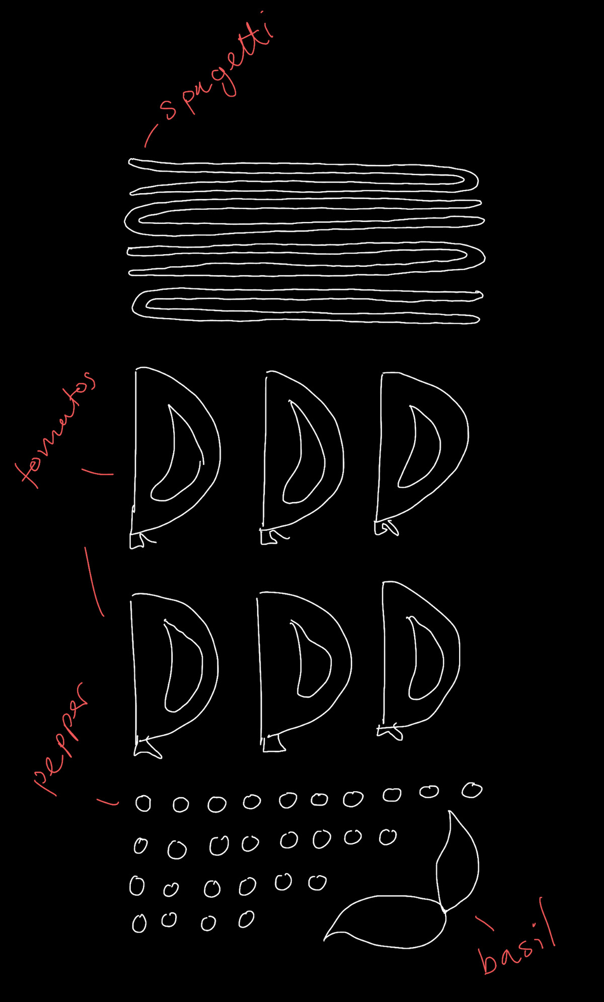
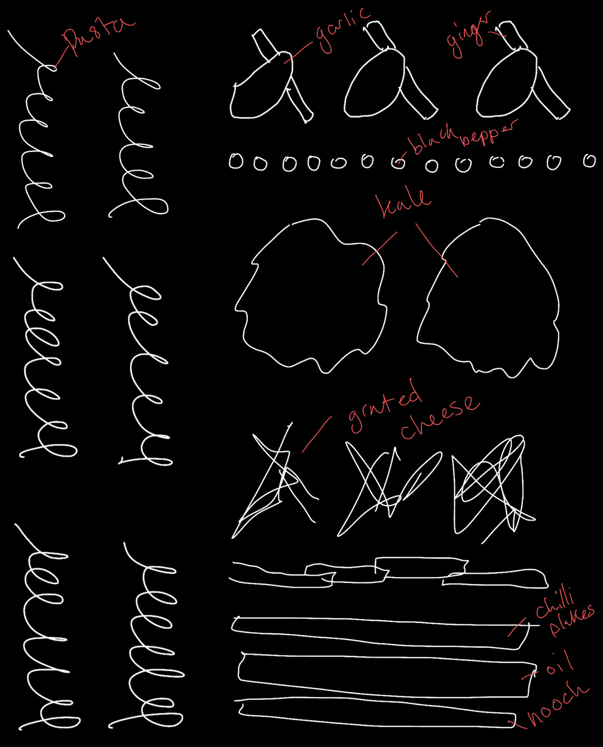
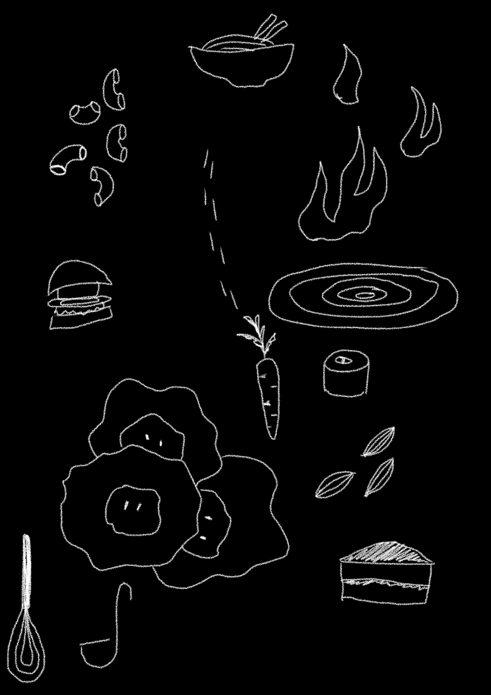
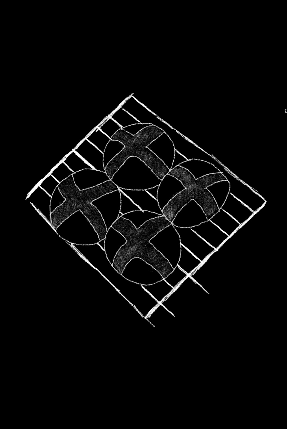
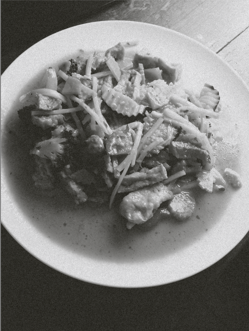
COOKING
This is what I came up with in terms of representing the cooking i'd been doing - I felt as if my pictures were not great so my idea with this was to display one of my favourite meals and doing an ingredient layout.
I've experimented with different colours as I kind of like the idea of maybe having a rainbow theme throughout to represent the artwork people have been doing involving rainbows.

These are some quick examples of how my photography spreads may look like - the pink isn't definate and nor is the type layout but I do quite like the way this looks. I experimented with different blending modes.

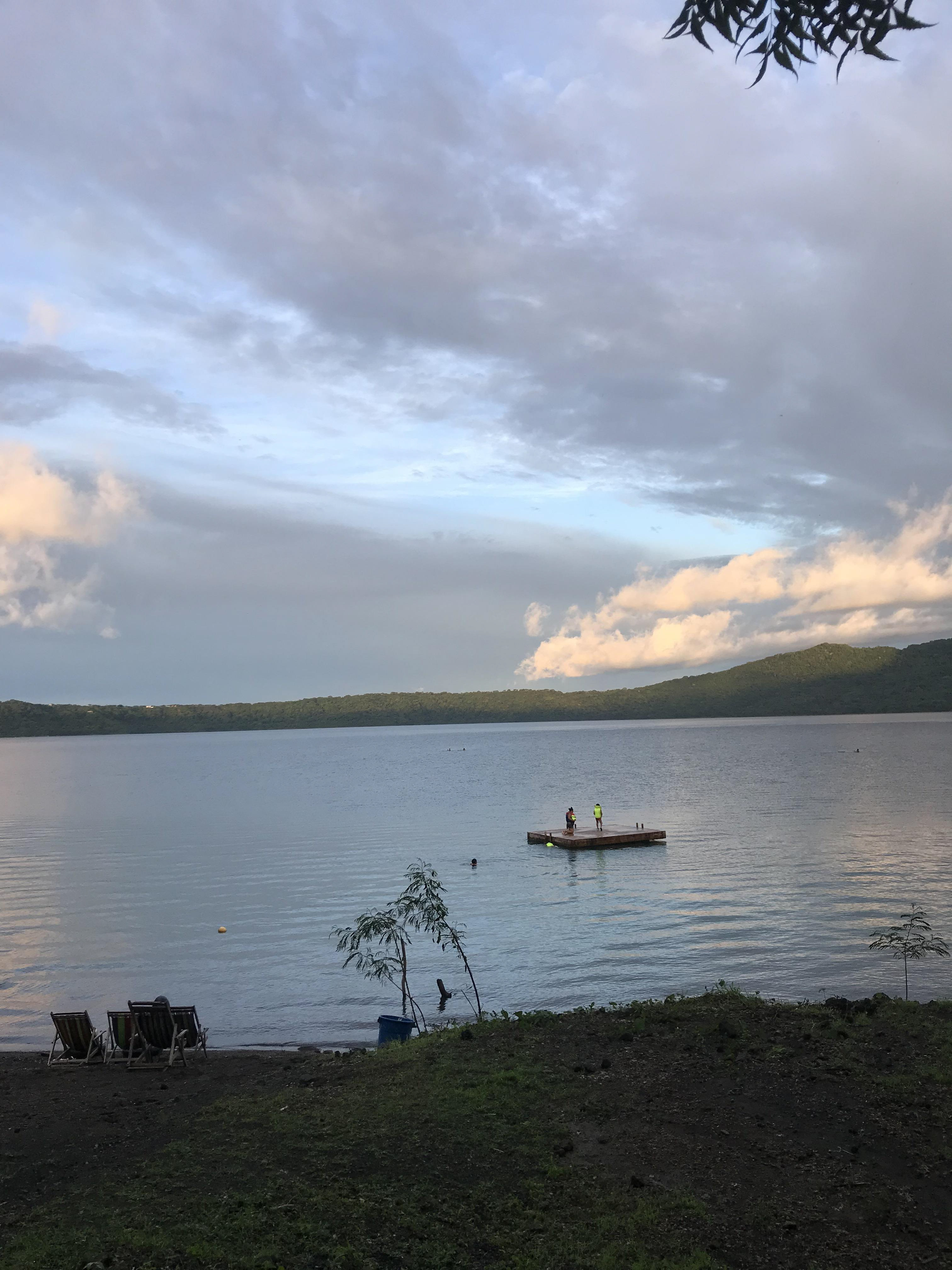
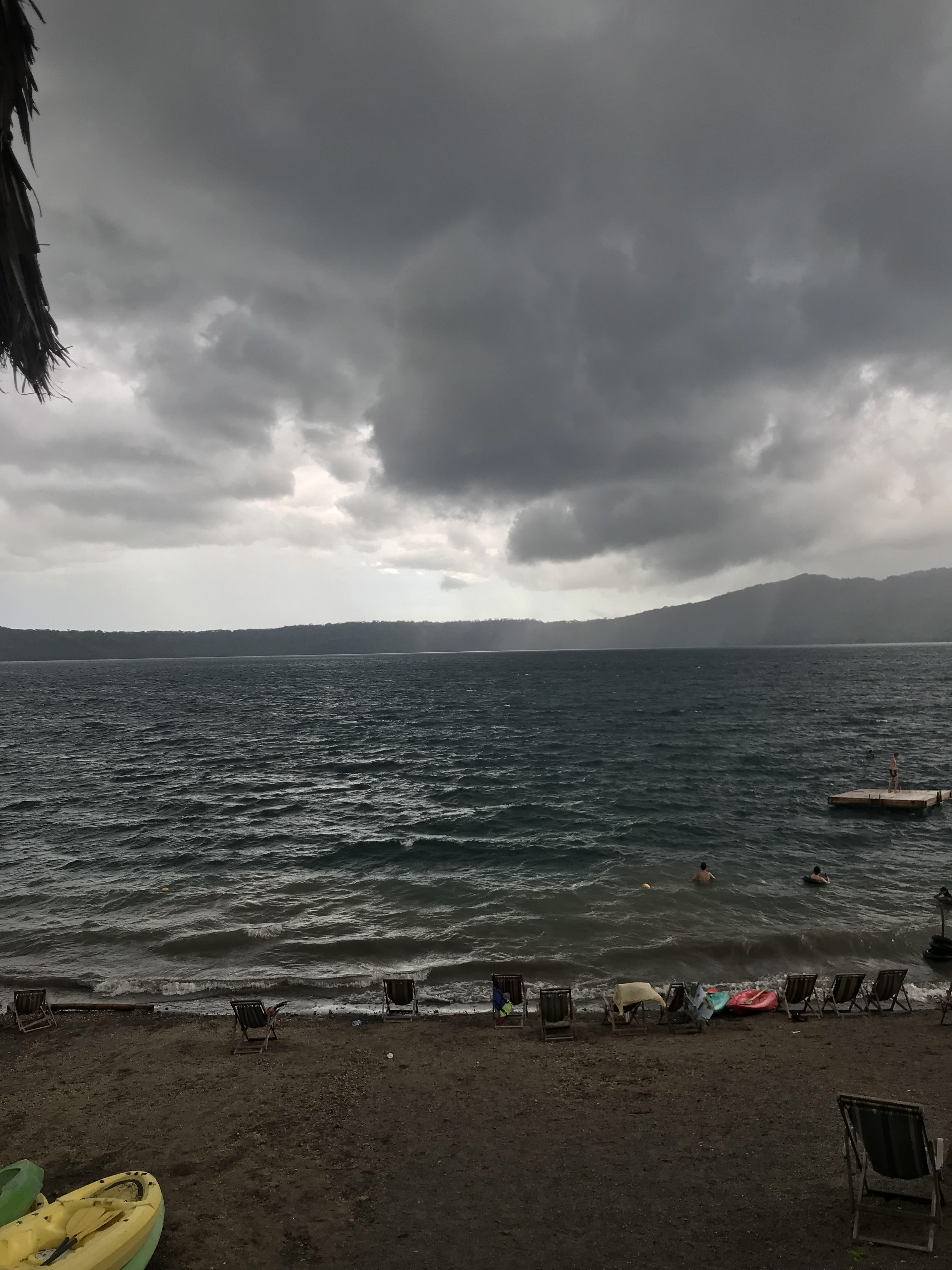
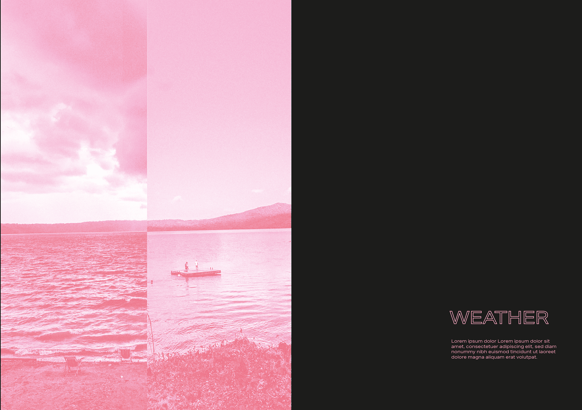
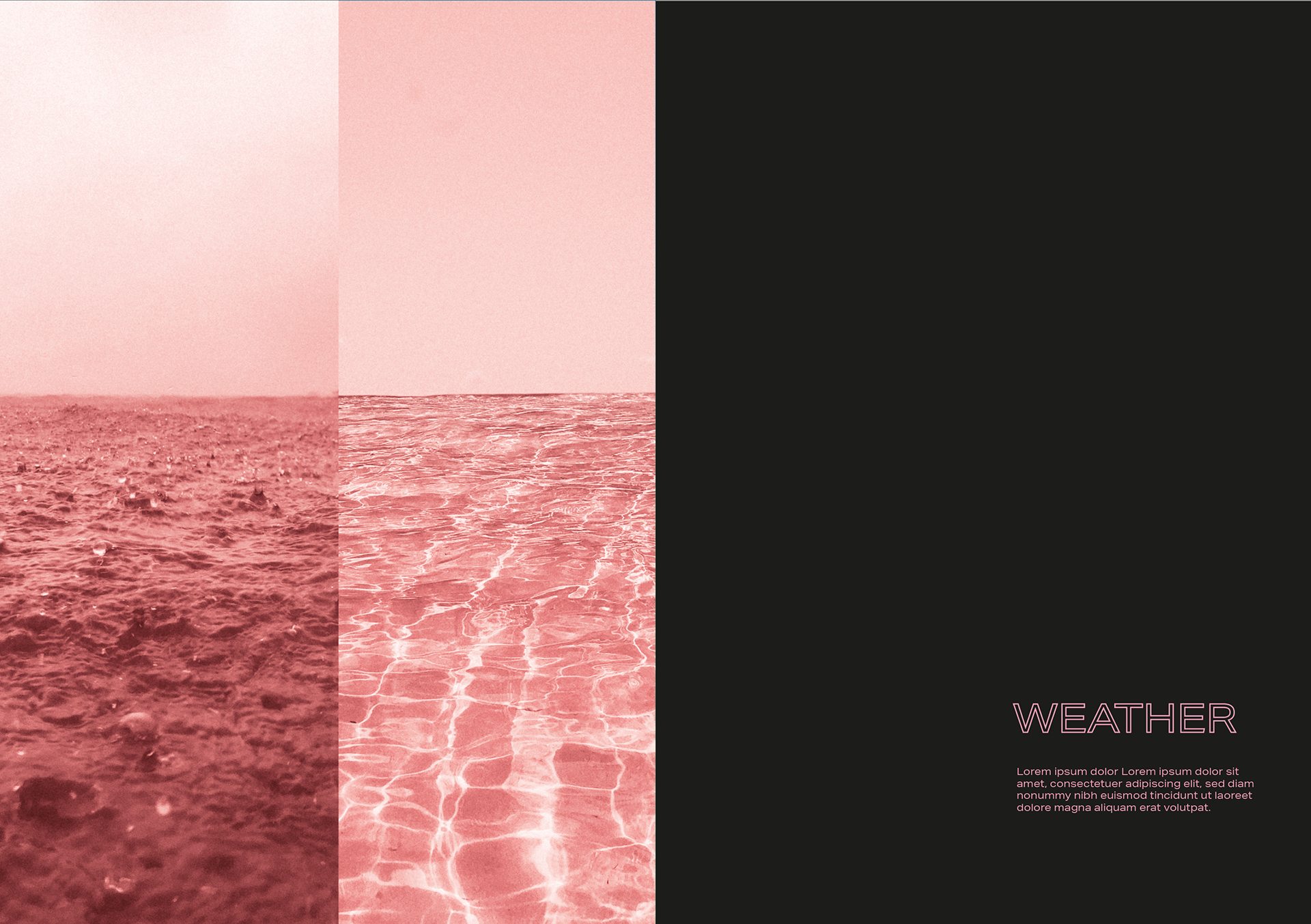
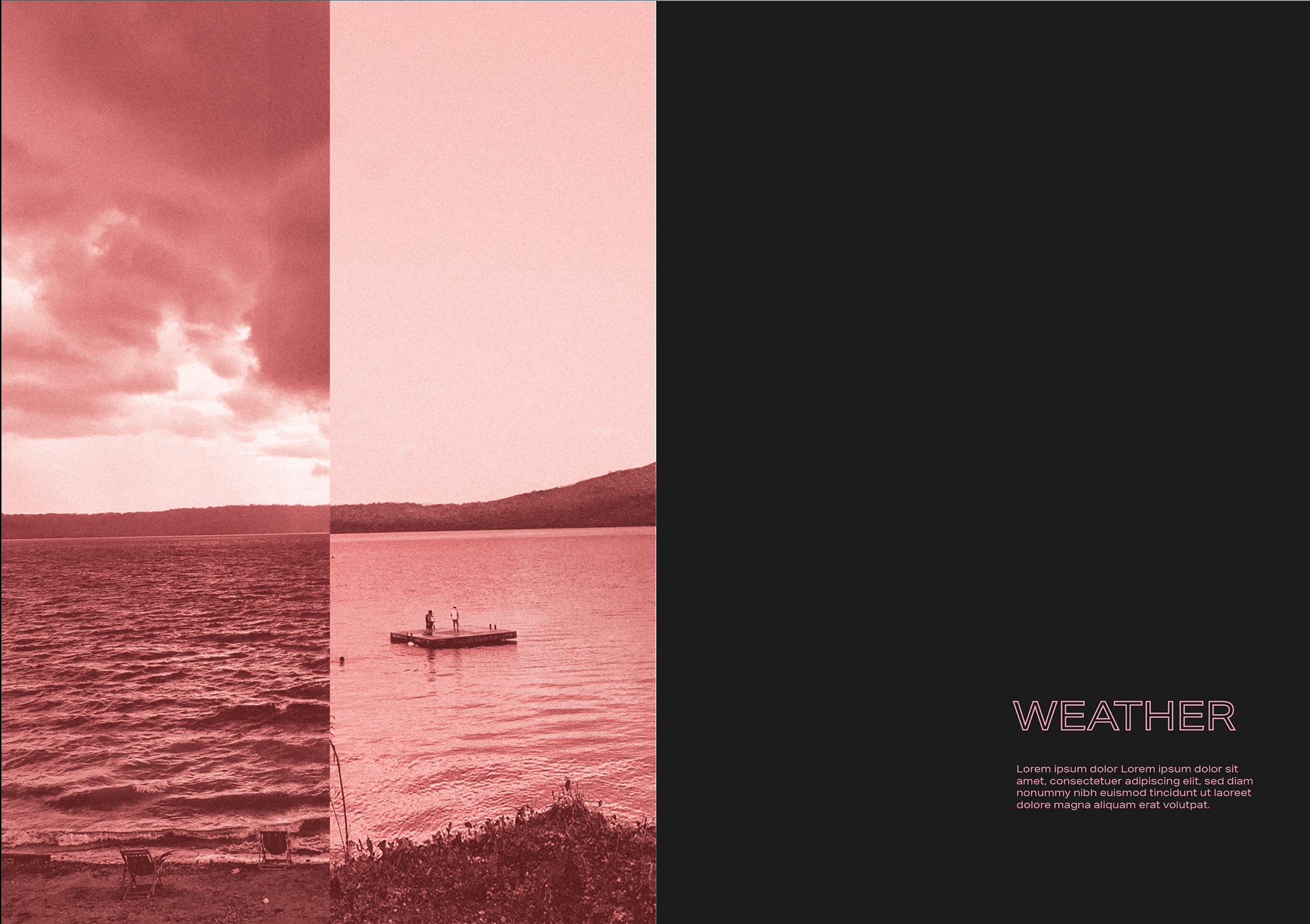
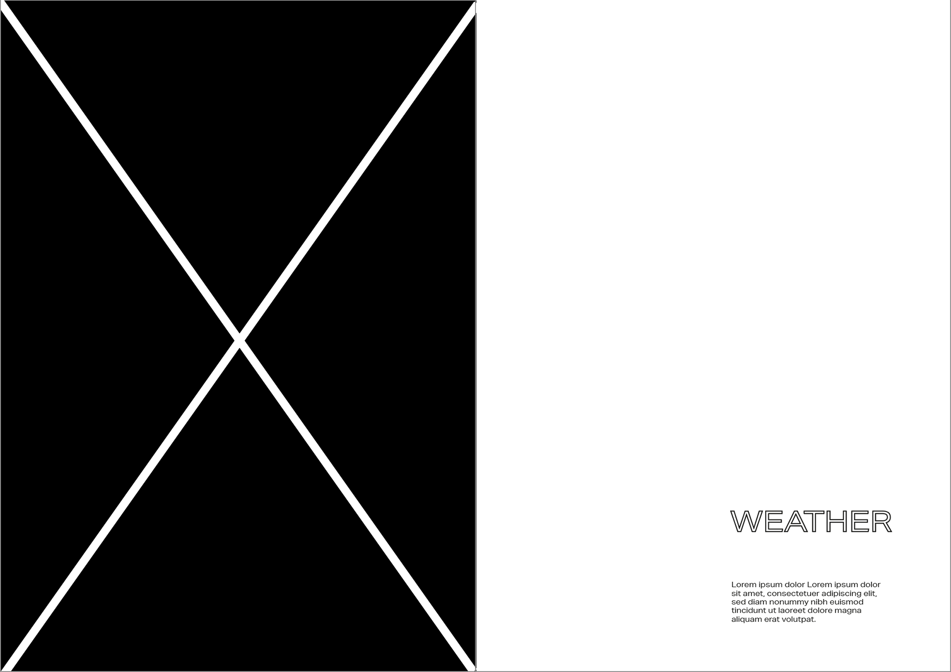
WEATHER
The top images are my examples for my weather spread, I sorted through some of my previous photographs I have taken to see what I could make. I want to make fun at how the weather currently is beautiful compared to april normally being known for its showers. Whilst it's likely due to climate change it is torture and beauty at the same time. I had to get creative with editing some of the pictures...
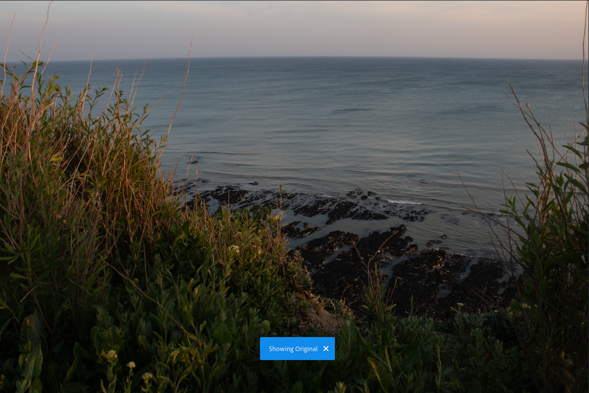


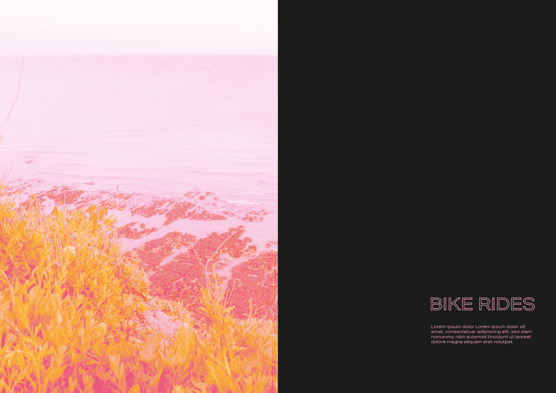
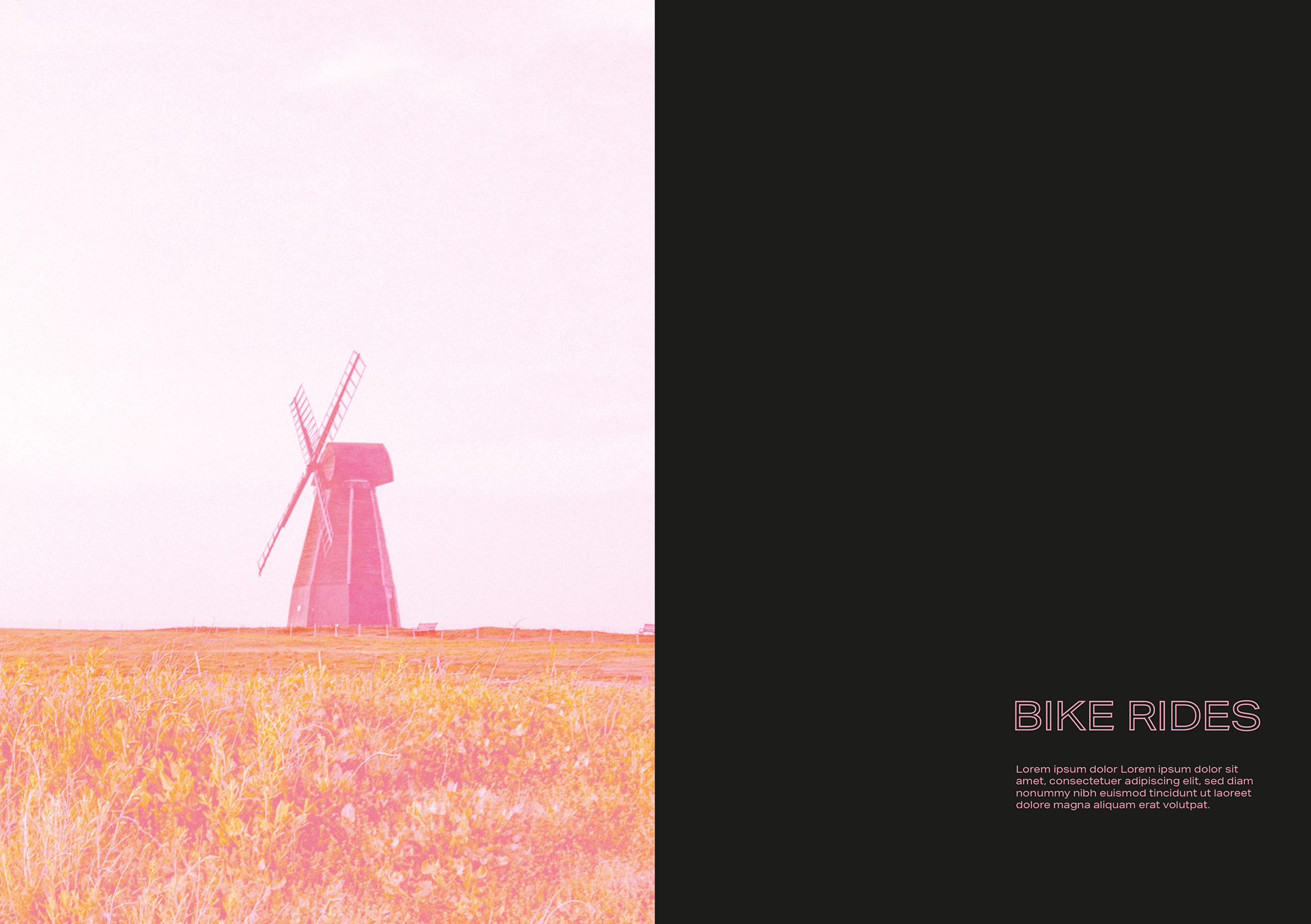
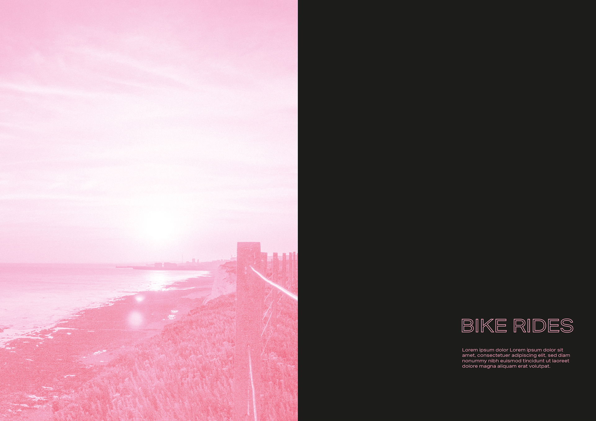
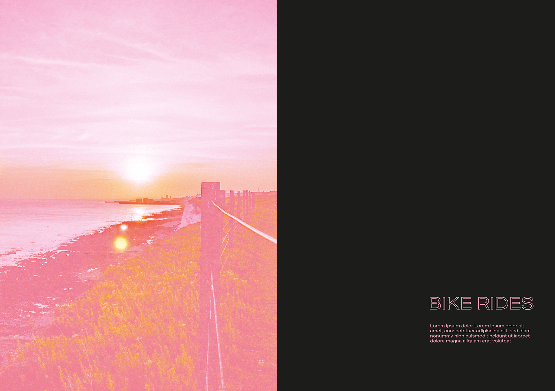
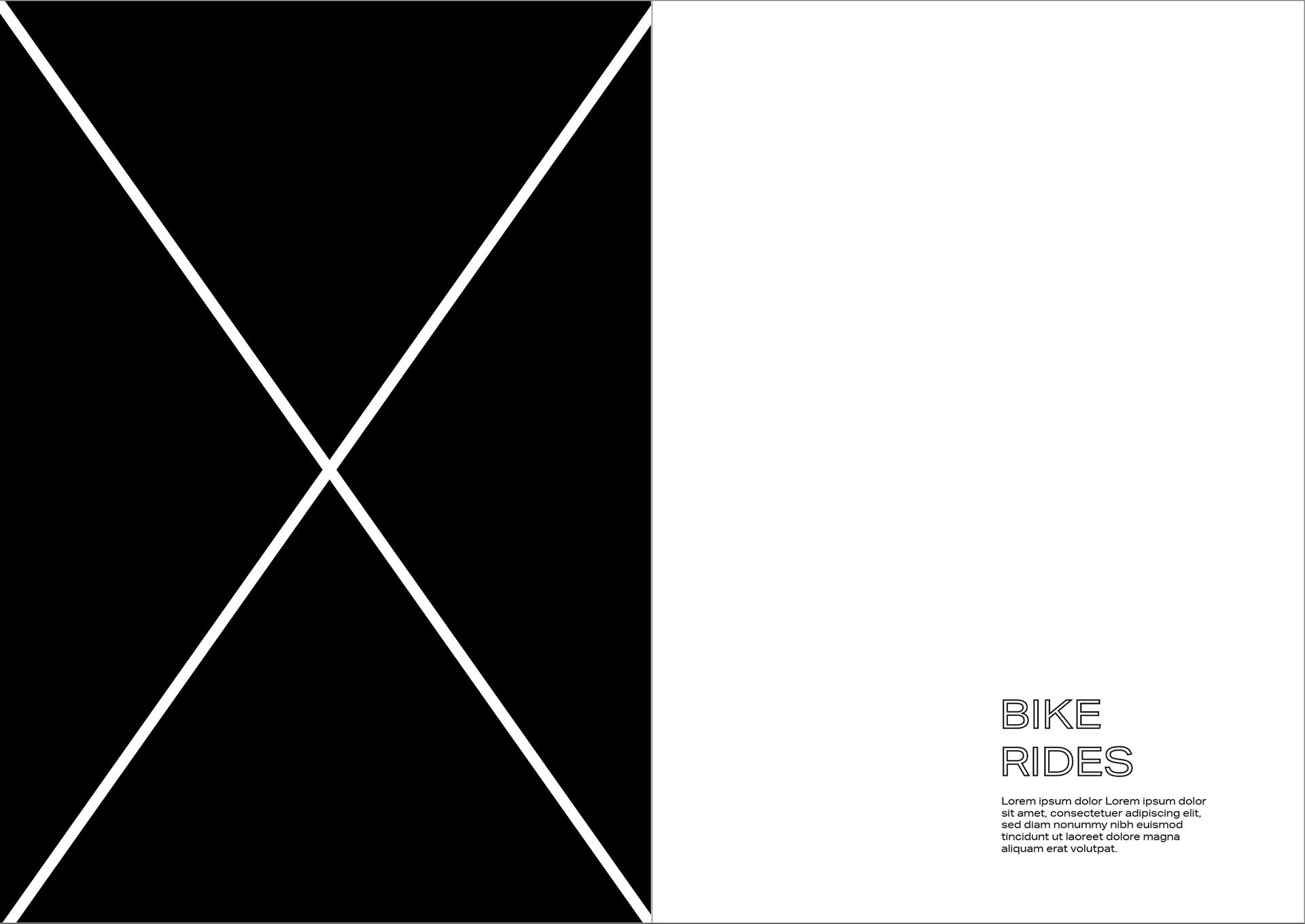
BIKE RIDES
These are my shots from one of my bike rides, I've taken this route frequently as it allows me to see all aspects of brighton (seaside, countryside and the city). These are my favourite pictures I took pre and post editing in lightroom.
My plan is to turn the image I choose black and white as I'm still hoping for a monotone theme however I may end up changing that as I progress.

These are my rough ideas for what medium each page would be, I'm a little stuck on some and also feel I could chose a better topic for some. I need to think of some rough ways of visuals for each page as well.


This is a very quick layout mock up I did just so I could get my thoughts on paper. The topics would likely change a little but I feel there is a flow to it and strong(ish) idea. I like the idea of either keeping it monotone or have one accent colour. I am going to experiment on styles in my next stage to see what I may develop. Also page numbers are wrong as i'm a little confused as to how many to do...
With this pandemic everything has changed so I thought I could demonsrate this wih a strong contrast between oposite pages.
These are some articles i've found to help me sort what my zine will include. I like the community feel that has come out of the crisis especially the creative side to it which has been shown through social media but also from walking on the streets seeing rainbows everywhere. It's also important to the the isolation and difficulties that has come with the isolation to mental/physical health and the social inequalities that come with the management of a pandemic by governments.
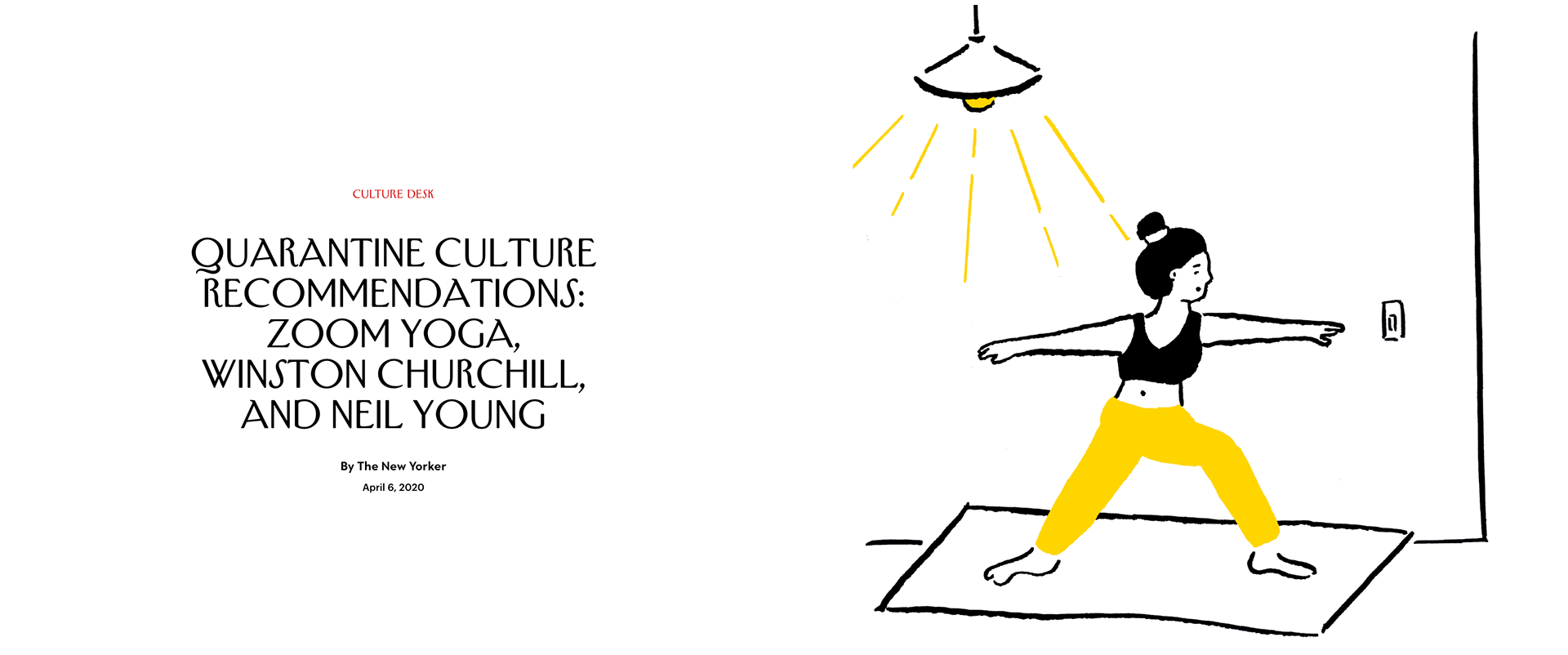
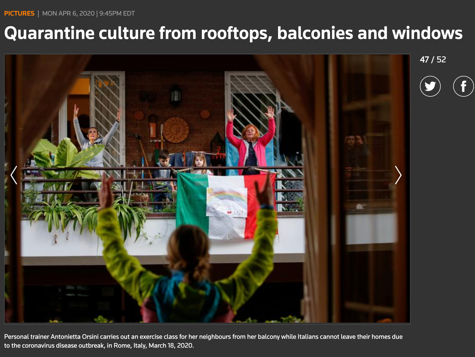
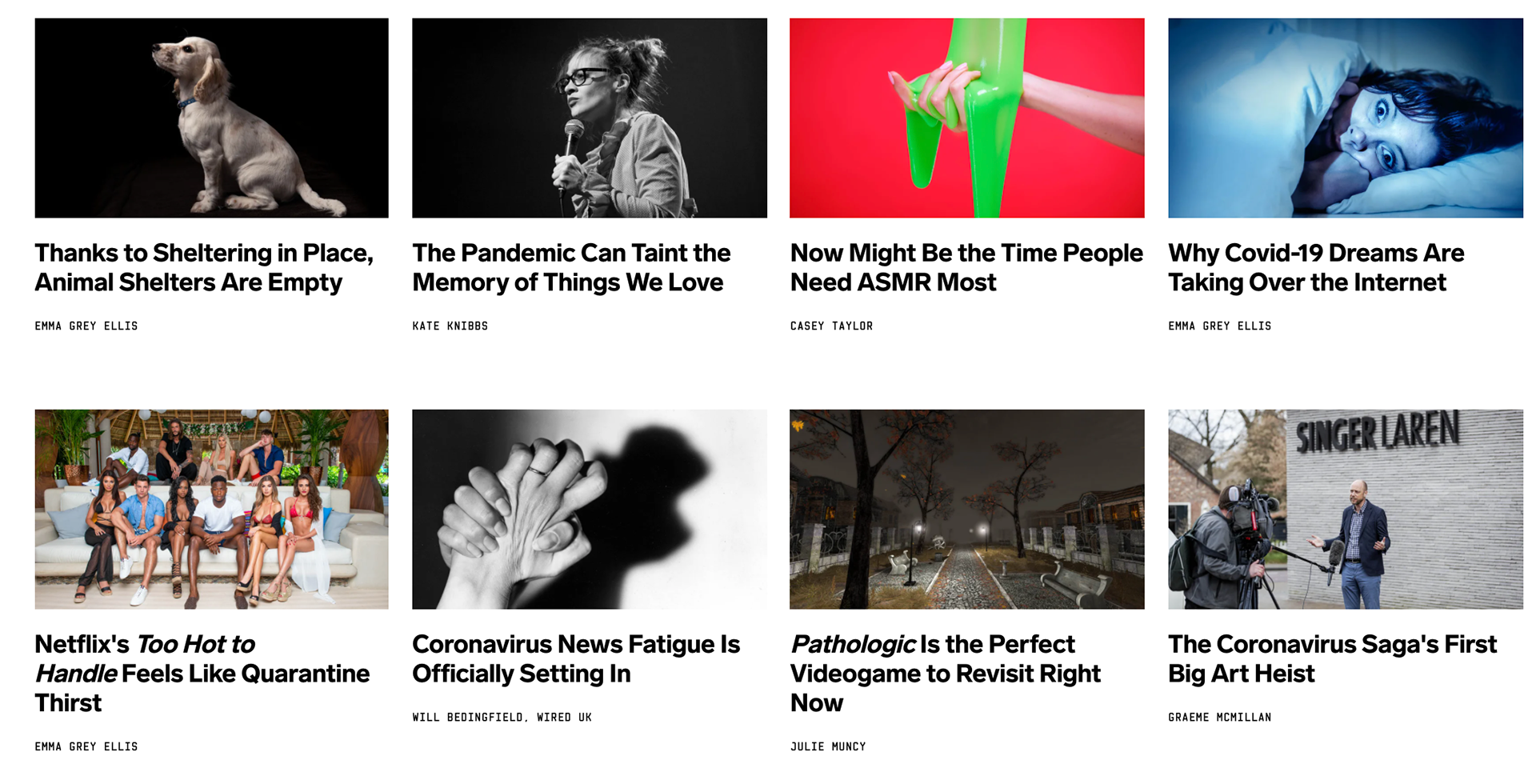
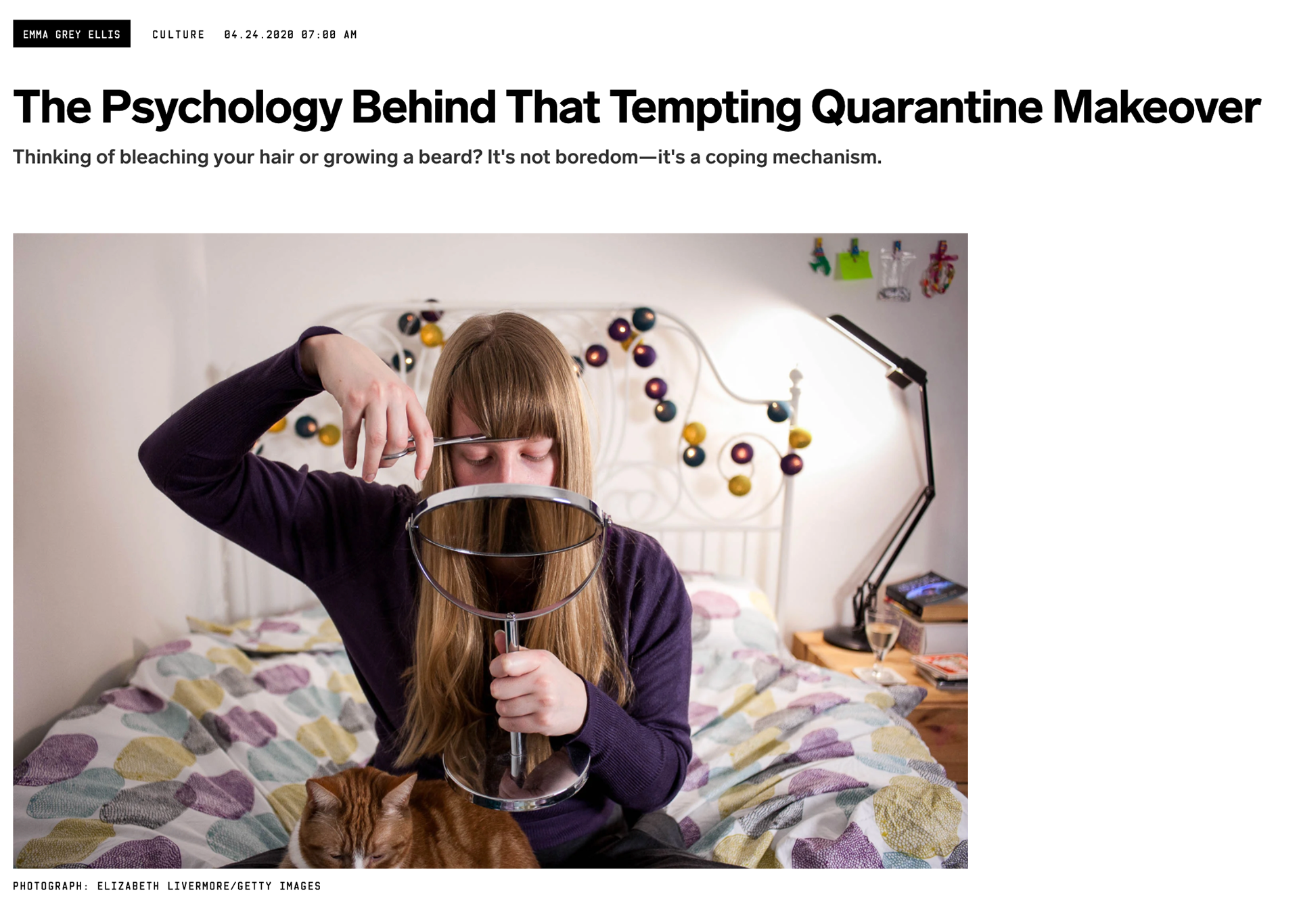
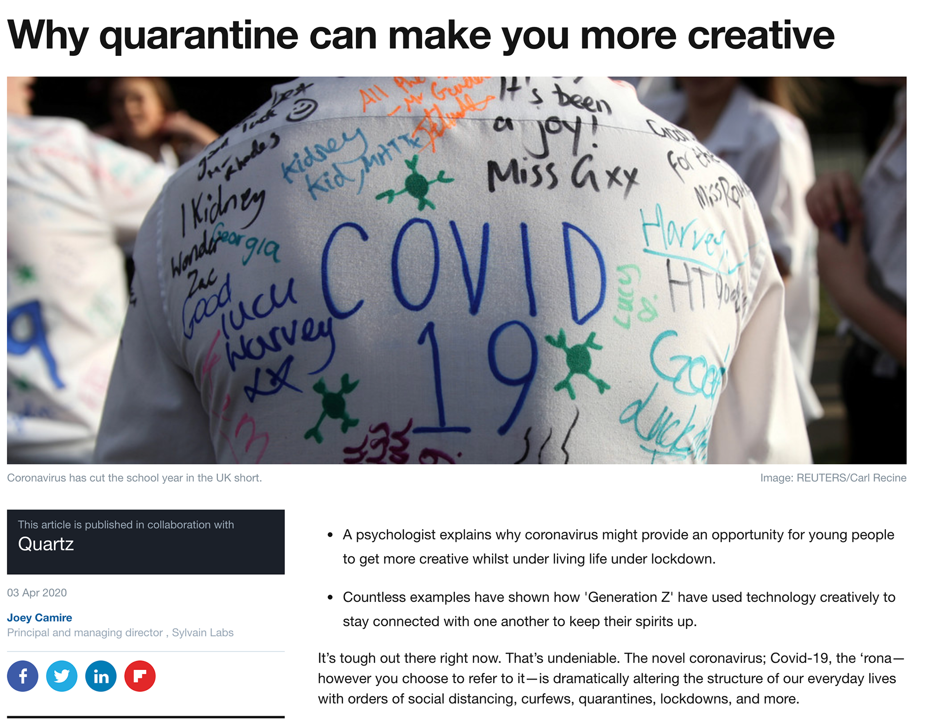
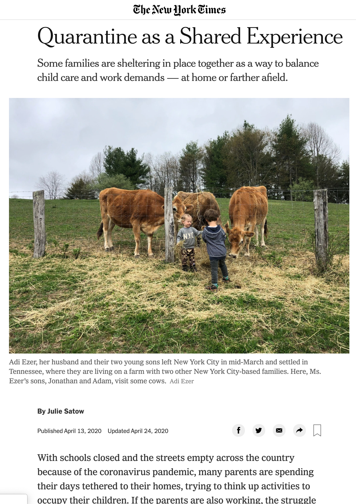
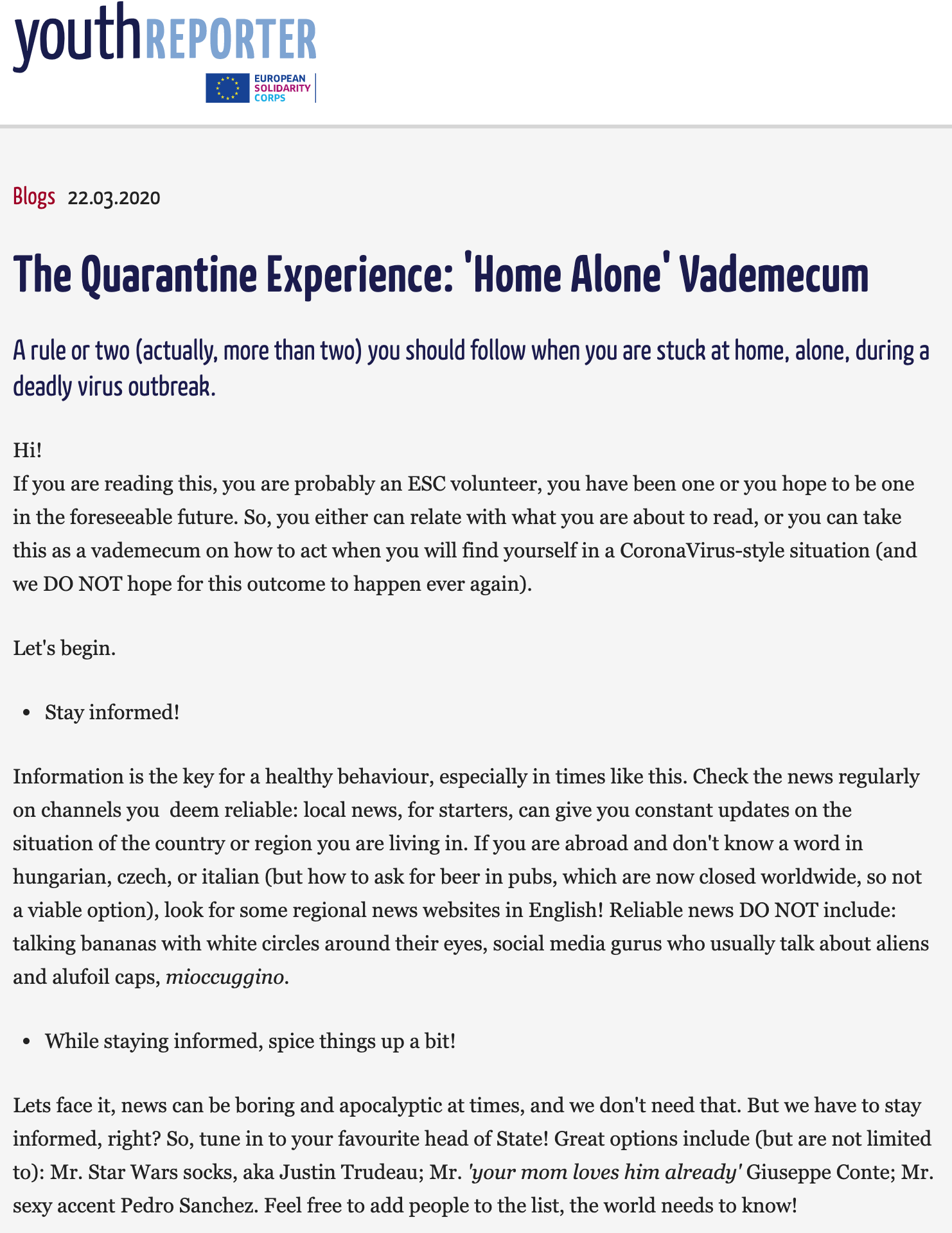
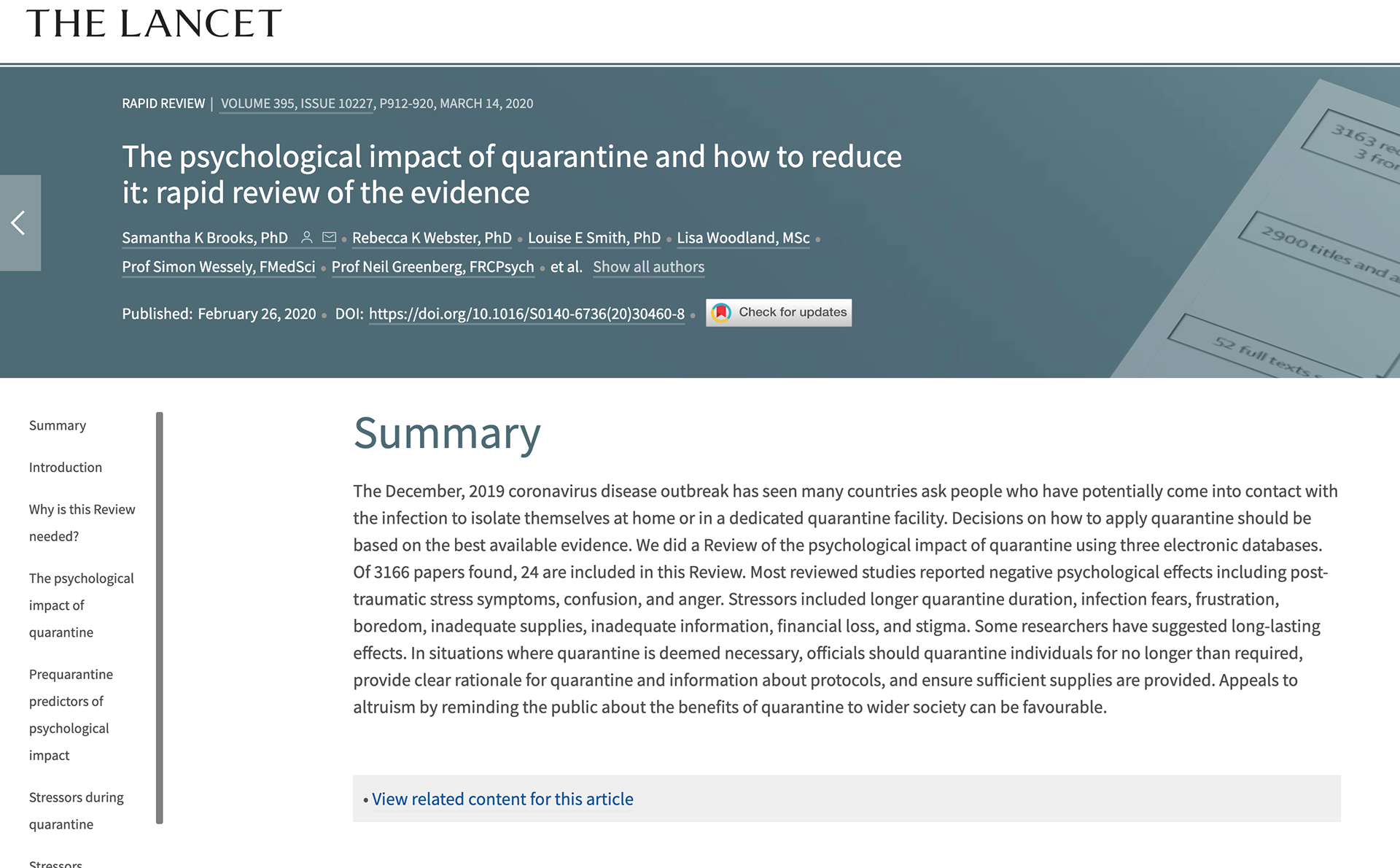
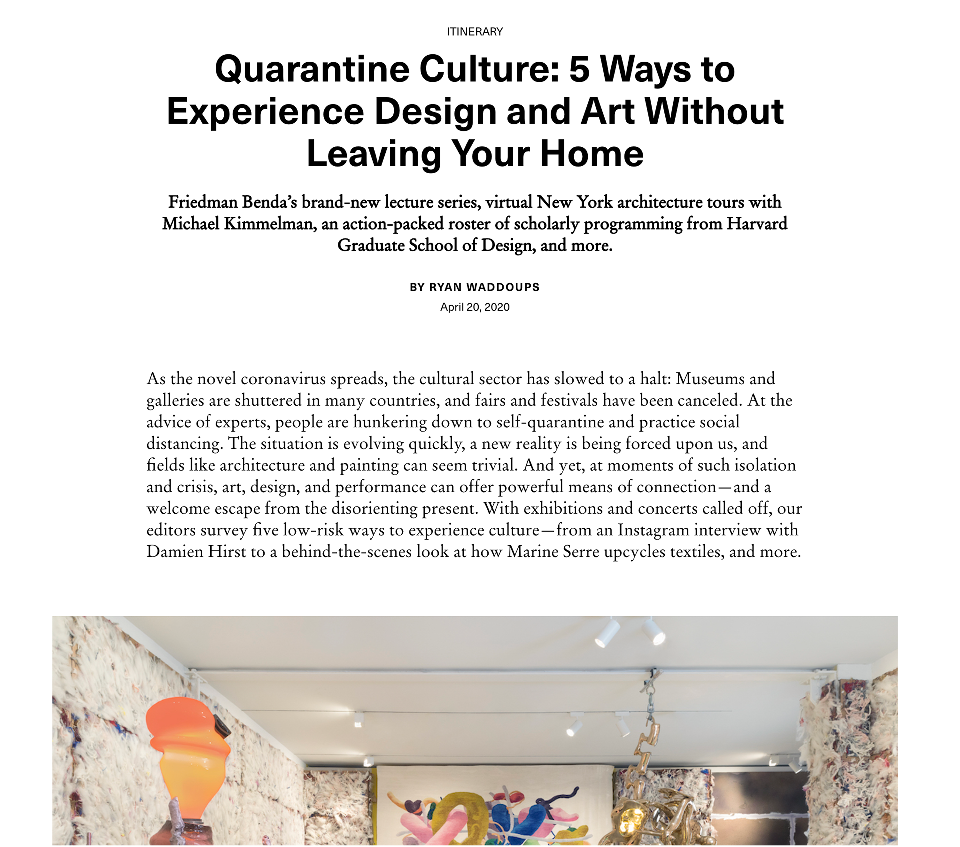
https://www.reuters.com/news/picture/quarantine-culture-from-rooftops-balconi-idUSRTS373GI https://www.newyorker.com/culture/culture-desk/quarantine-culture-recommendations-zoom-yoga-winston-churchill-and-neil-young https://www.ft.com/content/91efd994-7324-11ea-90ce-5fb6c07a27f2 https://www.surfacemag.com/articles/experience-design-art-without-leaving-home-quarantine-culture/ https://www.thelancet.com/journals/lancet/article/PIIS0140-6736(20)30460-8/fulltext https://www.youthreporter.eu/de/beitrag/the-quarantine-experience-home-alone-vademecum.16099/#.XqSU1JNKiL5 https://www.nytimes.com/2020/04/13/realestate/coronavirus-quarantine-as-a-shared-experience.html https://www.weforum.org/agenda/2020/04/quarantine-creative-teenagers-genz-coronavirus-covid19-technology/ https://www.wired.com/story/psychology-quarantine-makeover/

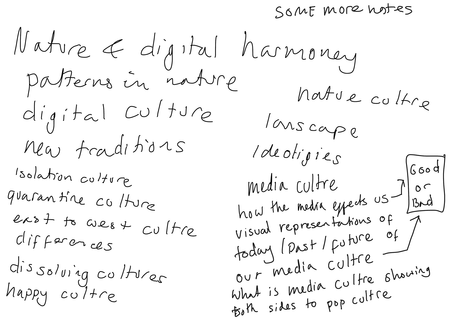
CHANGE IN DIRECTION - COVID-19
As stated below I'm looking to make something to do with the media culture of today. Due to the fact that it is so broad I need to think of a certain area to choose, I thought about looking at the pros and cons to media culture and basically creating a good and bad visual representation zine. While I think this could work I felt I wanted to do something more than that.
I then had a thought about somehow involving what I have been up to. I and many others have found it hard to get inspired and be motivated during this difficult time. So I thought why not make it about my quarantine "culture" experience - this unprecedented time has changed everyone and it seems to be on everyone's minds so I thought why not make a representation how how quarantine is - in this case from my point of view. I want to show to good and bad sides and just my overall outlook and how i've dealt with it.
I would link it to graphis in the sense that this is a modern topic which has affected our future - current affairs after all. The modern approach to making a zine about it I think can fit with graphis as I plan to make using photography, illustration, typography etc...
I would link it to sacred species and sites in the way that this has all happened because of a virius which is part of nature and it shows what a big impact a pandemic can have on the population of the world. I would also link it as was I may put in this zines have made up my new routine traditions and that way society works from now on may be different.
DESIGN VALUES FROM GRAPHIS - IDEAS I GOT FROM SACRED SITES/LANDSCAPES - I was thinking our sacred thing OUR SACRED NATURE WITH OUR RELATIONSHIP TO FOOD, NATURE, TO OUR BODIES(EXERCISE)CONTACT WITH OTHER HUMAN BEINGS TO MUSIC...ALSO LOOKING AT THINGS THAT ARE NOT SACRED AS BOTH BOOKS LOOK IN AT OUR RELATIONSHIP TO NATURE IN TERMS OF HOW OUR CULTURE WORKS - HUMANS AND THE NATURAL ENVIRONMENT INTERACT (BIOCULTURE). GOOD V BAD THINGS WEATHER=BAD/GOOD, PRODUCE A MAGAZINE THAT REFLECTED SOMETHING OF THIS COMPLEXITY. ON A PERSONAL & POLITICAL LEVEL. AFTERALL IT CONFIRMS THE PERSONAL IS THE POLITICAL - HOUSE WIFE=WORK
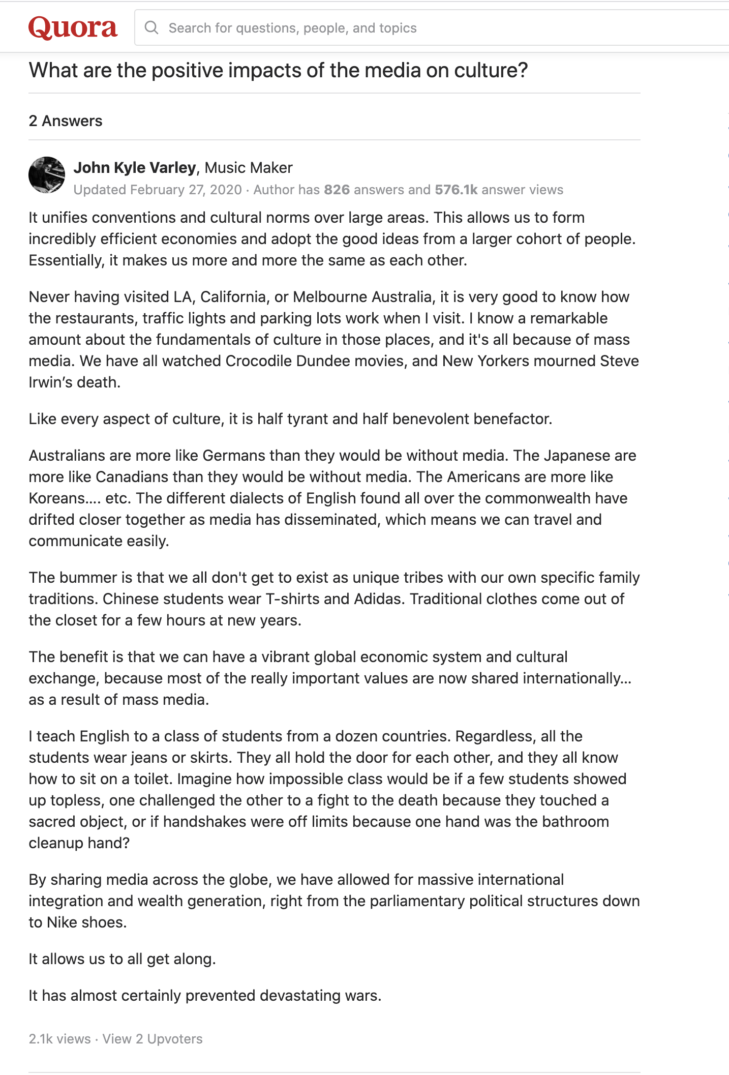
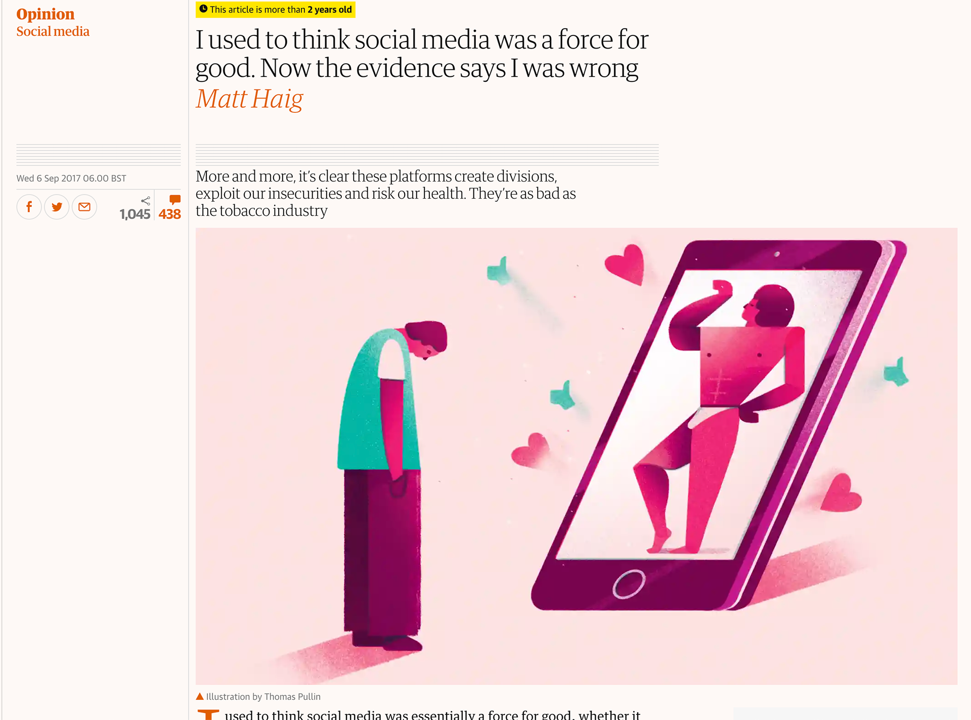


I have my own opinions about media but I think it's a constant topic that has pros and cons either way (like many things in life). I like the idea of furthering this route so I had a look at different opinions on whether the media culture today is a good or bad thing...
Honestly because there are so many pros and cons on either side it can depend on personal preferences which may be affected in your upbringing, location and a whole lot more. It's important to consider everyone's views so hopefully I can come up with a rough concensies of the good and bad things of media culture.
For me I think digital media can really help educate us and opens up more possibilities in things that we can discover but I also think it can be a bad place where pressure can be put on one another to be something that isn't healthy.

IDEA WITH SUBSTANCE
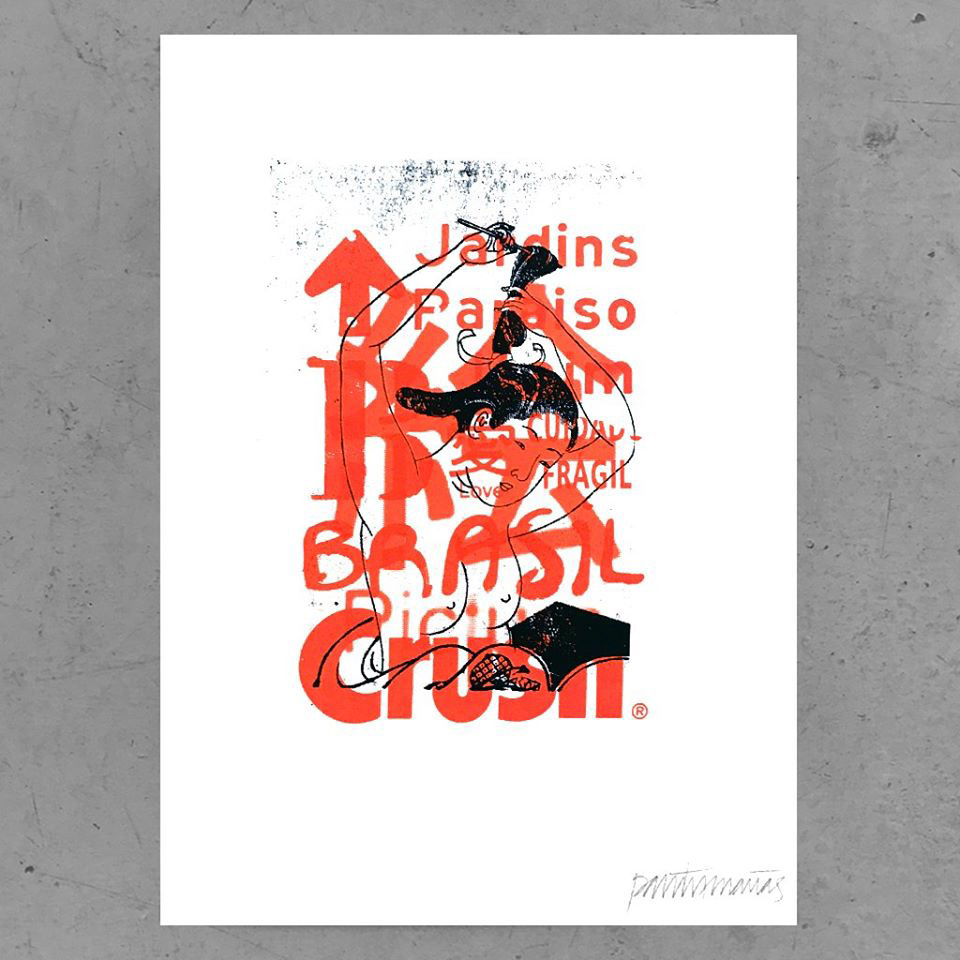
This rough idea would be a zine including type, photography, illustration, design etc. Each piece will have something to do with today's media culture be it a good or bad thing...I did it will a 90s theme (tried too) as my graphis issue is from then but also 90s themed design seems to be a popular design trend especially for music events.
This is a quick mock up for a front cover I'm not extremely happy with it but I think it's a step in the right direction - on the right is a video development of how I got to the front cover on the left.
I am at the stage where my exploring of different methods has ended and now I'm looking choosing an idea to make my publication. Some of the following ideas reflect my exploration but things may be come along as I develop my publication idea. I'm now trying to figure out what exactly the publication will be about and make it relevant enough to both my sources.
My idea with this was quite loose, but I was thinking of somehow showing two different circles merging to create one thing - a bit like modern/past modern/nature merging to create something new and present but it not foregetting about the past. I wouldn't say you can see it in the piece but that's what I had planned to convey - I didn't master it but still had fun creating it.

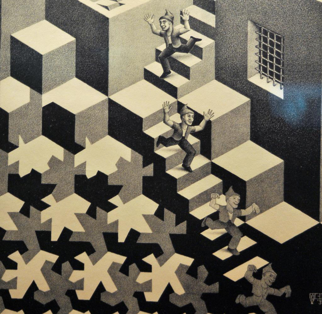
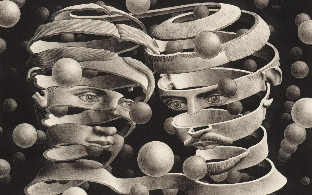
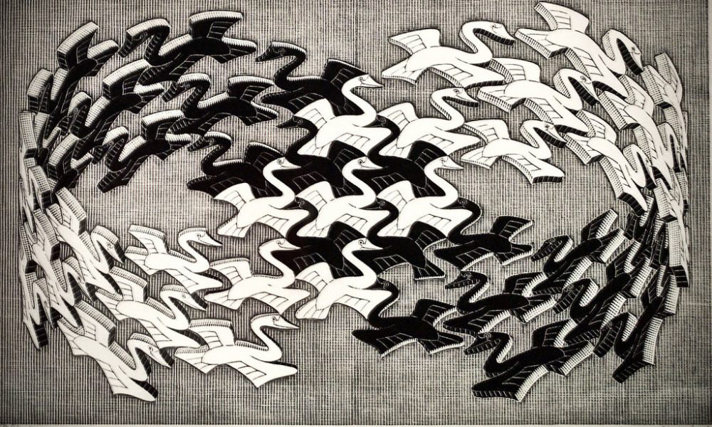
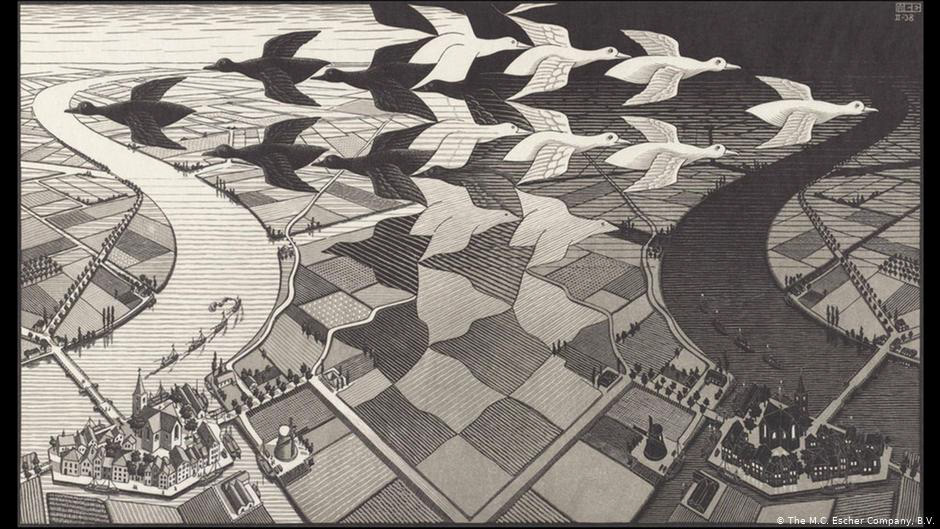
When I was writing my notes about differences colleding I thought of M.C. Escher work. Most notably his geese going over fields. I feel with my two sources can be represented well in this image as whilst they are very different on the surface they encounter similarities - graphis talks about the future in a more design/media sense and what is/may happen and the sacred species book talks about how with the modern world it's important to remember traditions, culture, ethics etc... In Escher's piece it's got the geese inverted so whilst they are opposites they also very similar at the same time.
I also want to note on some of his other works. They give me a feel of the future but also about how the possibilities are endless they have a sort of spiritual feel but also a feeling of the unknown. His works include harmoney but also vast differences which is how I see the two sources.
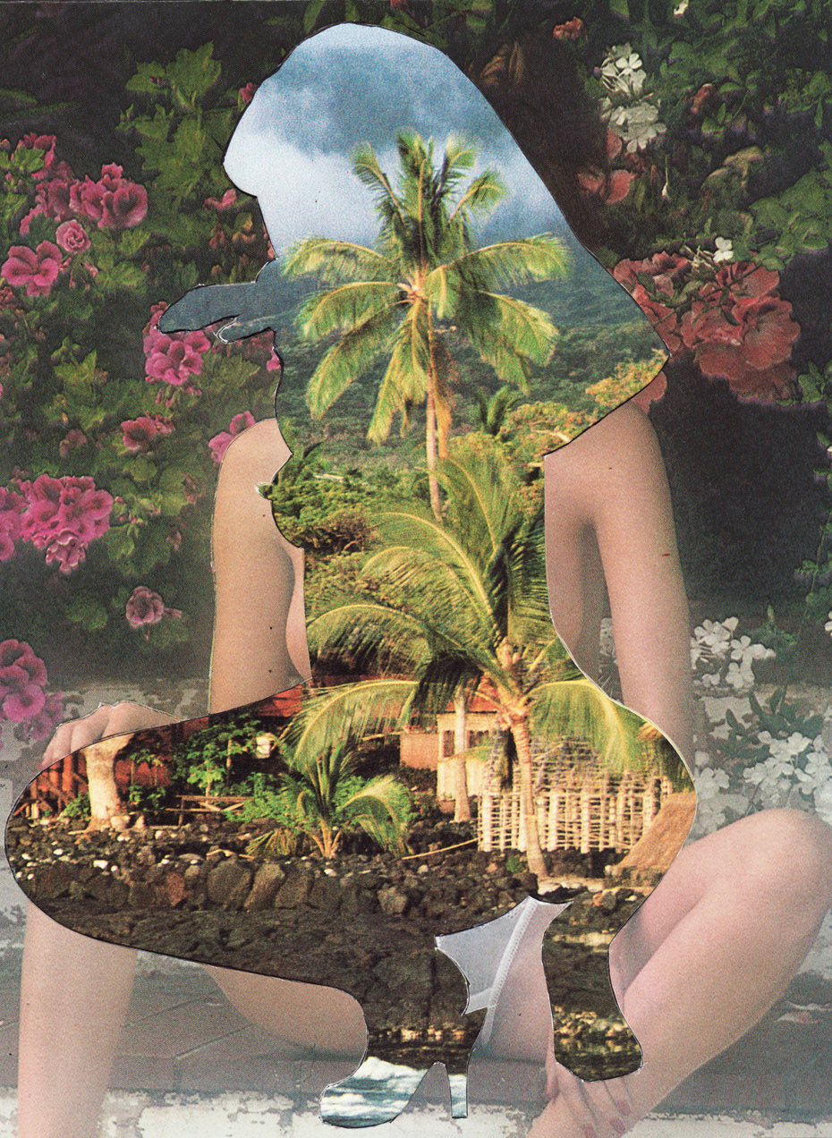
I later touch on this with a staircase poster as well as previously with my lizard/man collages - they link to the two worlds colliding - humans and nature...


patterns in nature - this was some illustrations I did linking in with pattern that connects. I like this idea and feel like finding patterns in nature and making them digitally can bridge a link between both sources - maybe I could create something about nature but fashion it in a modern way?
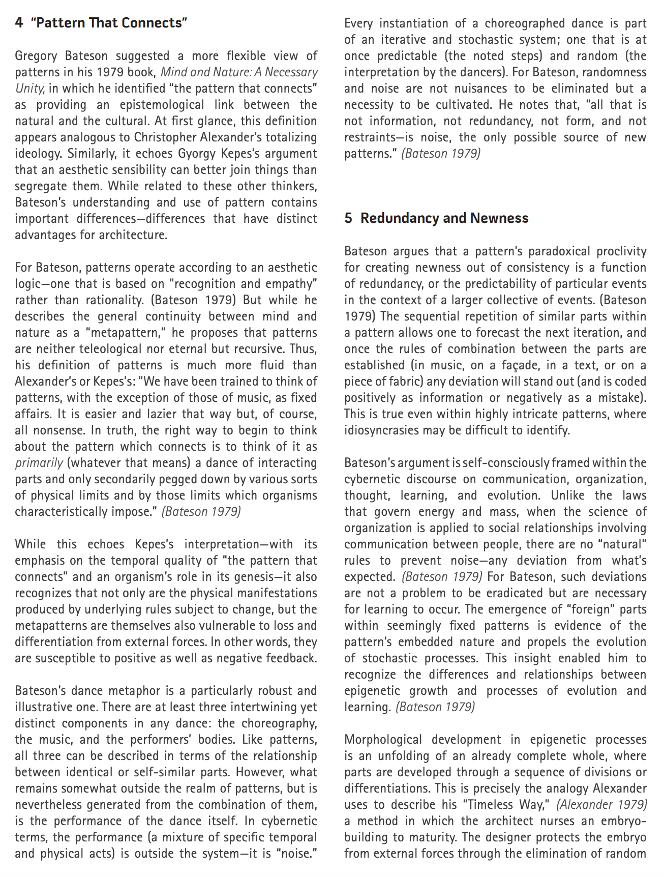
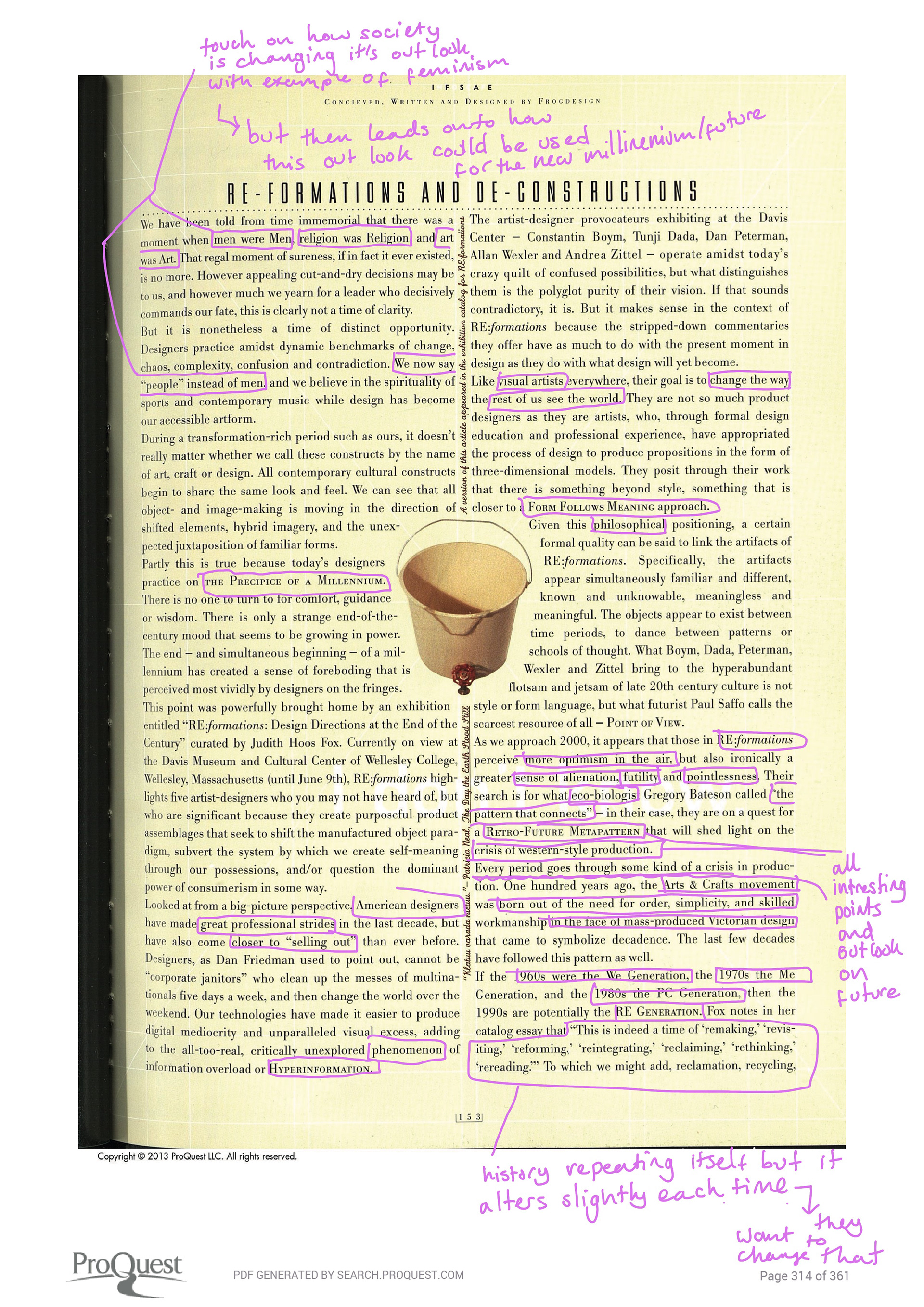
In relation to the RE: Formation article below I found out about eco-biologist Gregory bateson talking about patterns that connect - what he has to say in relation to the future is pretty interesting.
I like the idea of the thing that is "wrong" or unexpected in a pattern being NEEDED for new patterns to emerge. The idea that noise is good, not something that's annoying.
cd take the idea of patterns moving to chaos eg (basic example) a jaguar's spots transforming into soemthing else, or the words on a page bmergng into something else, lots of things like that
or: patterns connecting between each other: maybe merging from one to another?


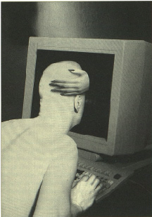
These are some further articles I found about the culture in the world of the internet - since both sources have prevalent themes of culture in one way or the other looking into how I see the internet as a culture I thought it would be an interesting way of looking at it. I found that since it's something that millions today use and so much of our time is spent either working, socialising and more on the internet or using electronics it does in fact weave into today's human culture. Whether this is a good or bad thing is something I am interested in looking into and possibly what I might make my publication about.

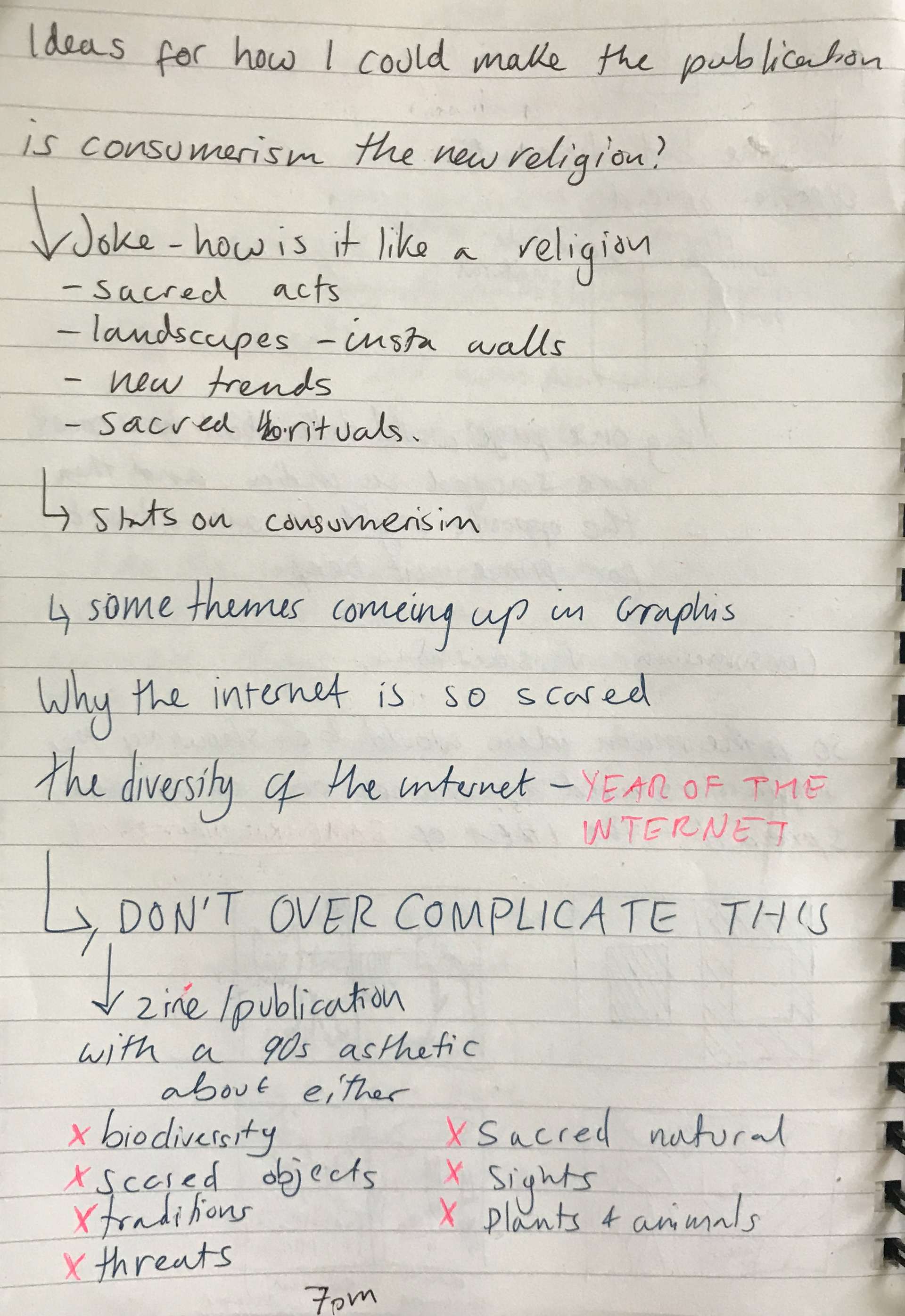
I'm interested in how consumerism can affect our future world. Its prevalent that graphis is a more consumer led magazine compared to sacred sites talking about how increasingly people seem to forget what is sacred in life. Both sources aren't so black and white as they both seem to talk about the future and the changes that may arise whether good or bad. A contrast I see initially is that sacred sites is more of an educating piece about the past and hoping we don't forget certain things and graphis has more of a focus of the present and the future.
It's important to note that consumerism isn't always all bad which is why I looked at these articles, graphis may be adding to the parts but it is also talking about what is bad and the way that consumerism is rising in the age of digital programmes. My thinking is could I look at the path of how consumerism has consumed us so much that it could be considered a new norm/ religious like movement. I mean in the same way sacred sites are so important to some that this new materialistic wave is the new norm?
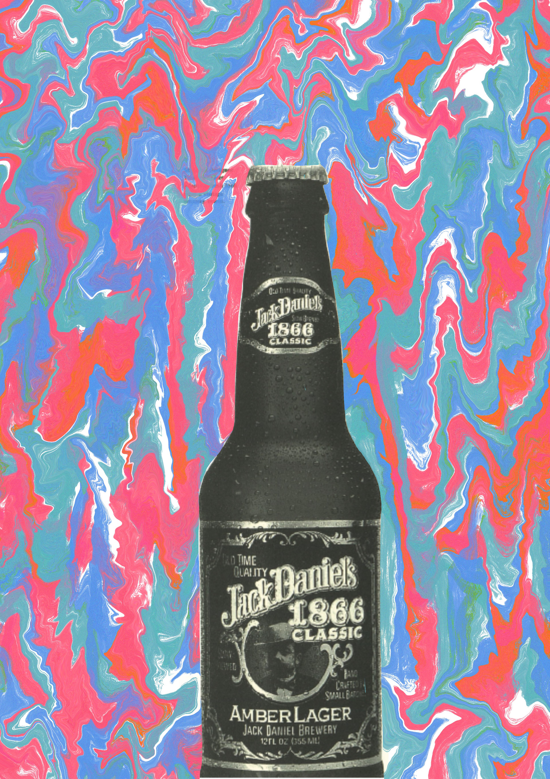
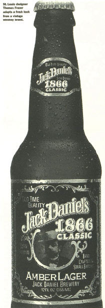
This was just a random experiment. My thinking with it was that jack daniels is a classic household known company. Many people will be able to recall memories of a time they drank it - many of which good. So i wanted to add colour to the background to try to represent the happy memories people may of had drinking it. In relation to linking the sources together I don't have a specific reason but feel that playing around with pages in graphis could potentionly spark ideas.
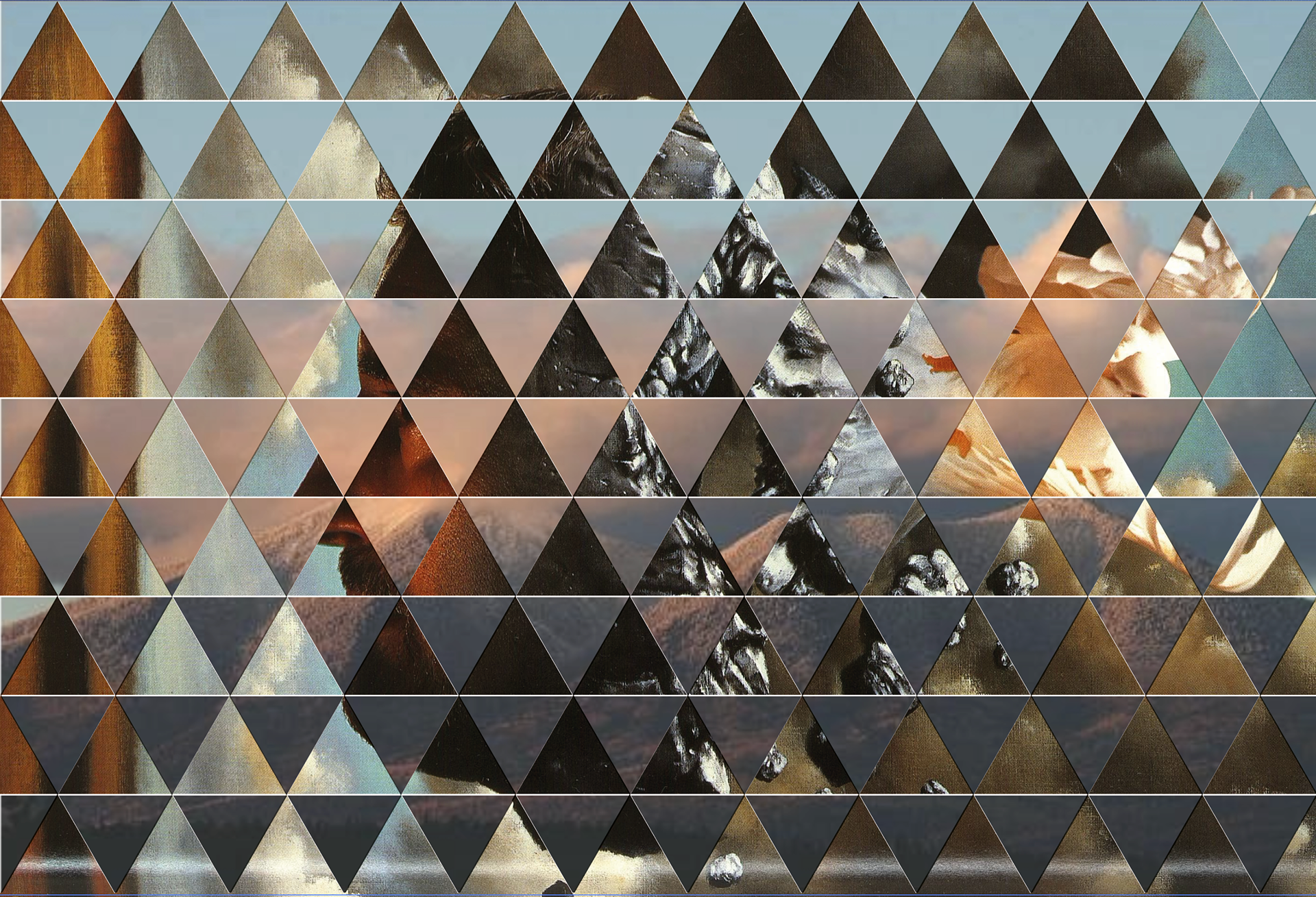
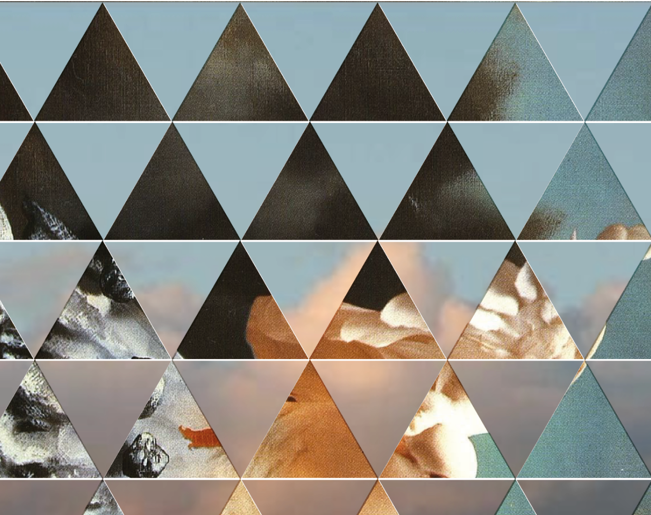
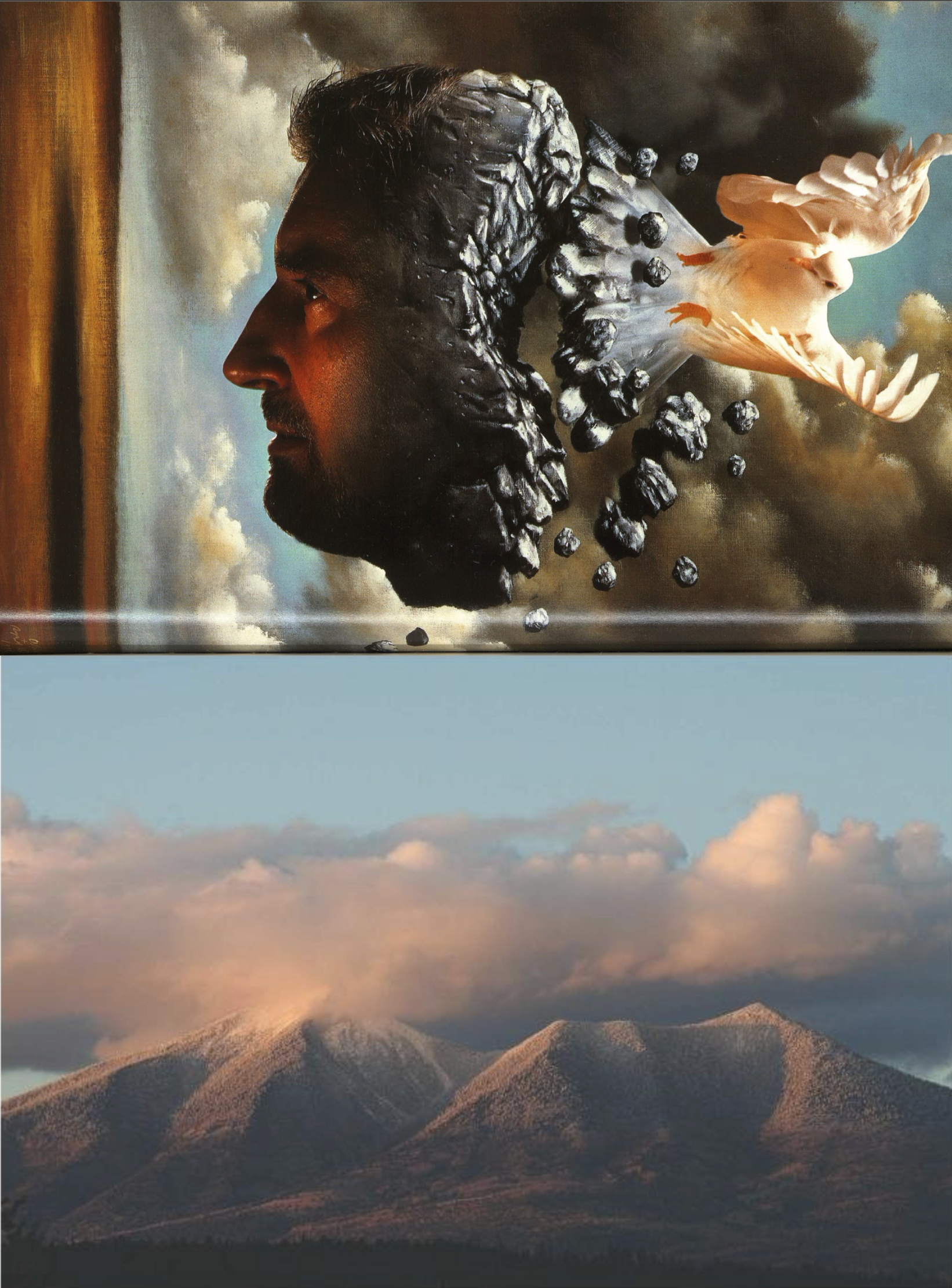
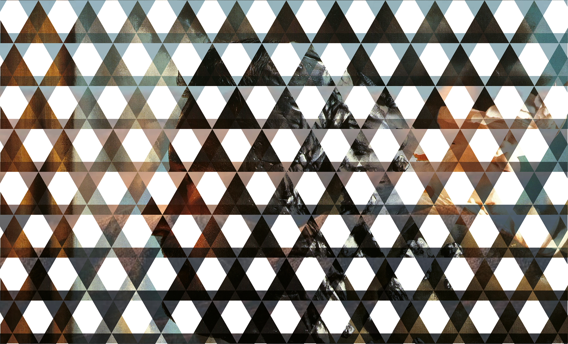
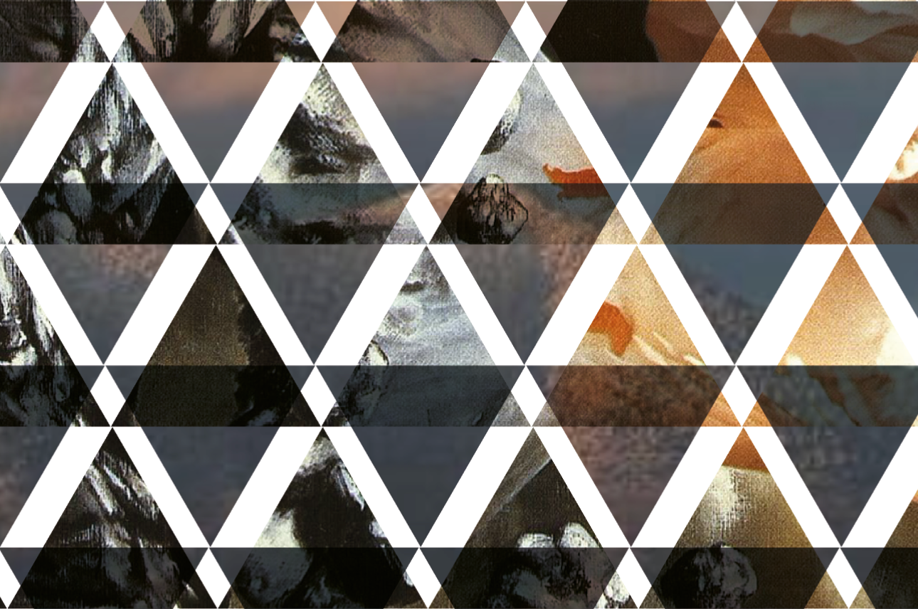
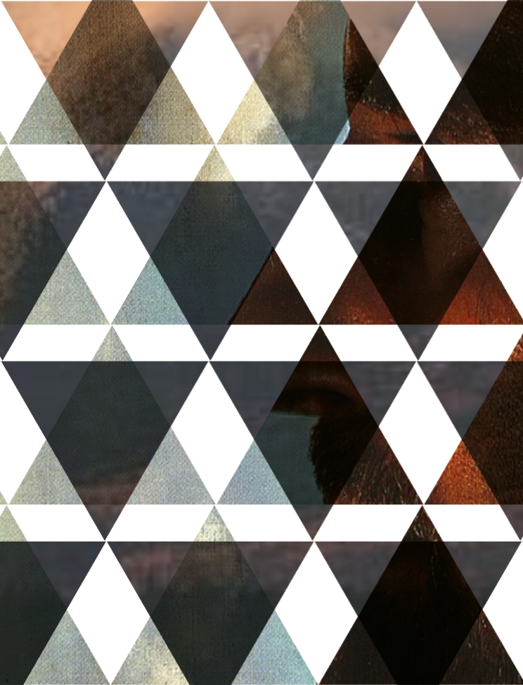
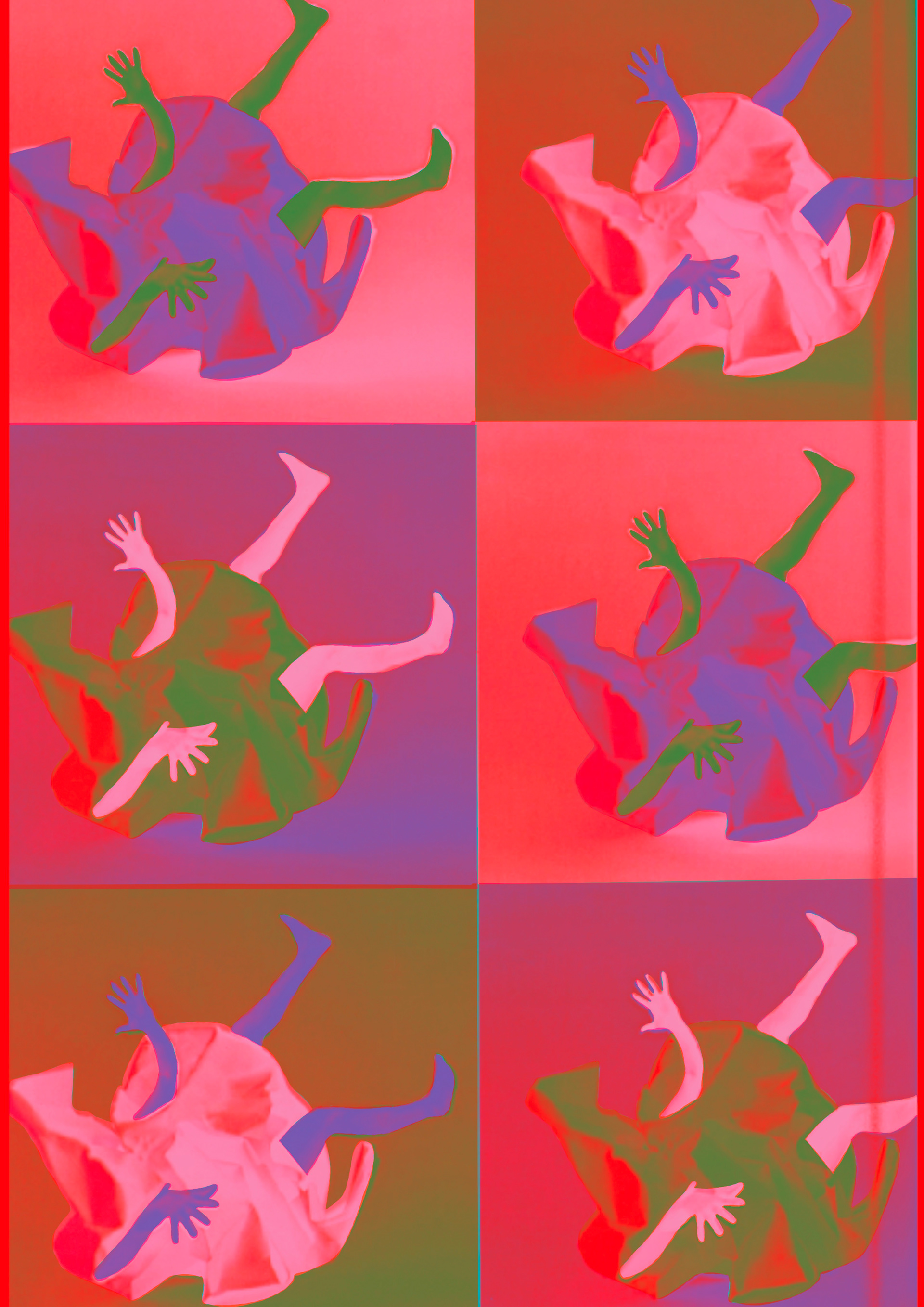
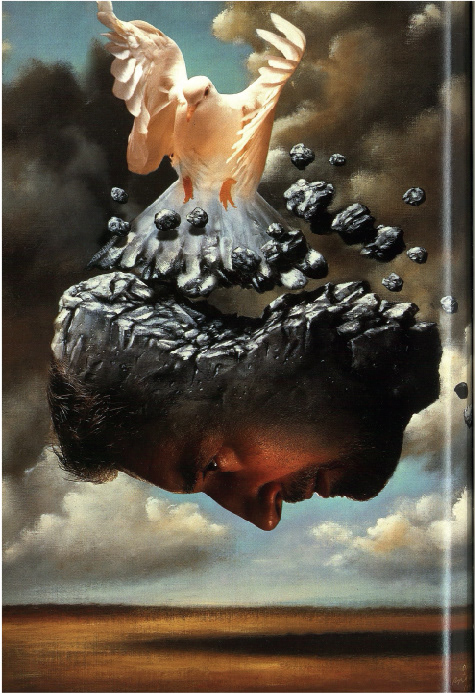
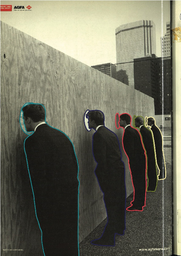
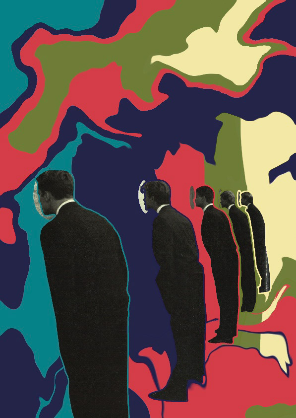
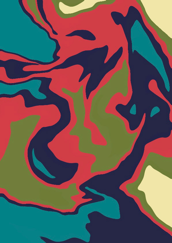
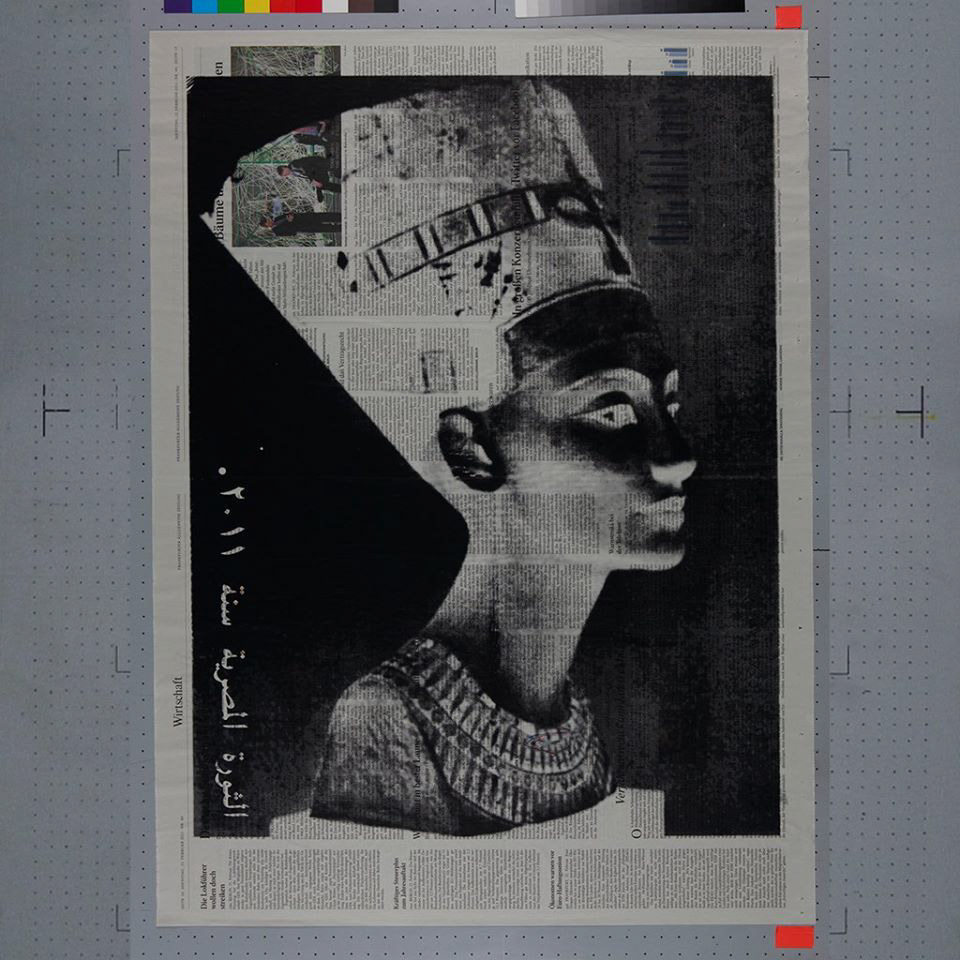
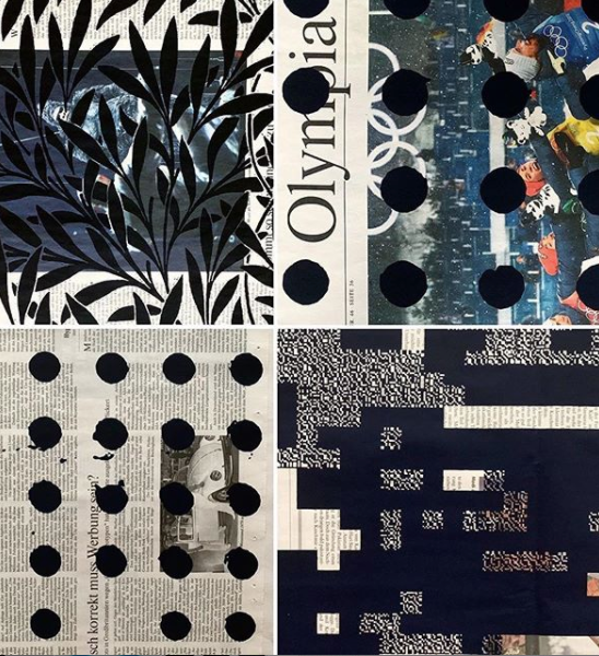
As with the images below I found some further work from each source that I felt had a similarity visually and the meaning that comes across. I wanted to cut these up in a different way and I feel like triangles were a good fit since they resemble mountains/landscape which both images include. Playing around with the blending modes and jolts the triangles made for new interesting patterns.
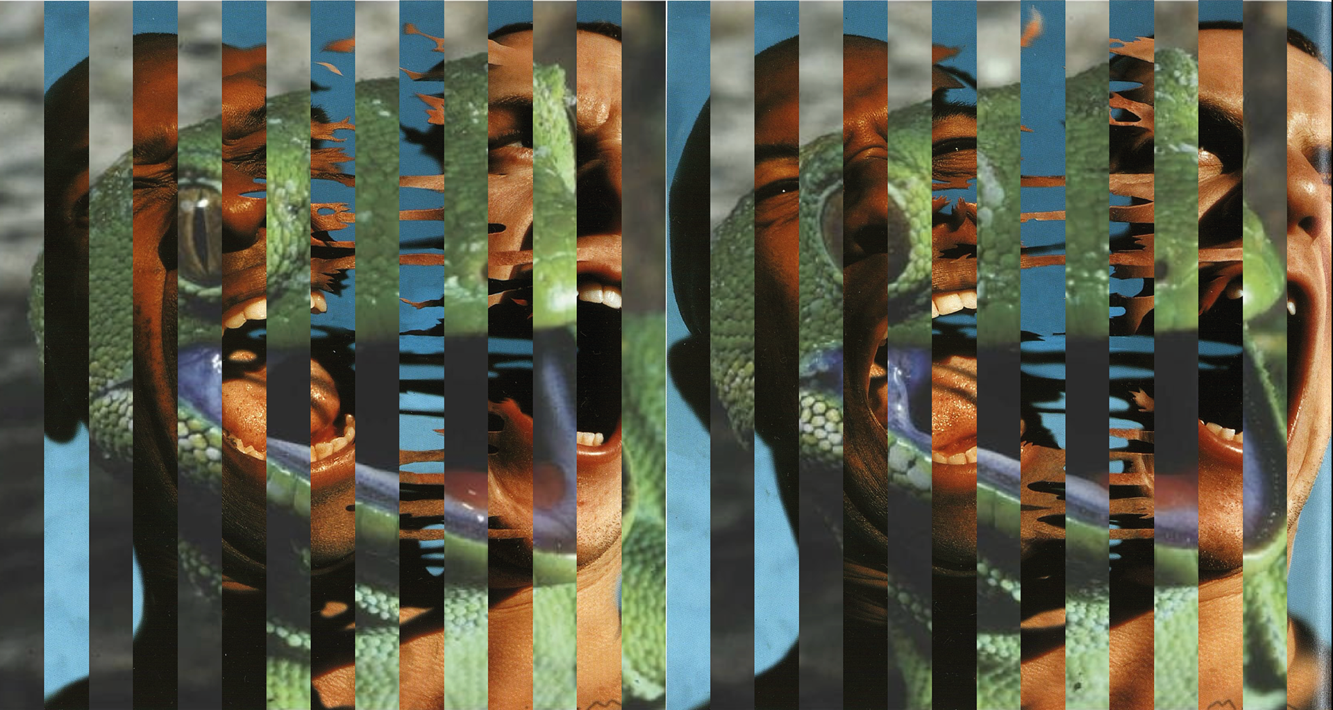
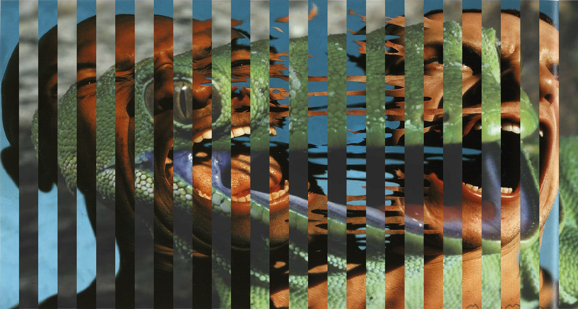
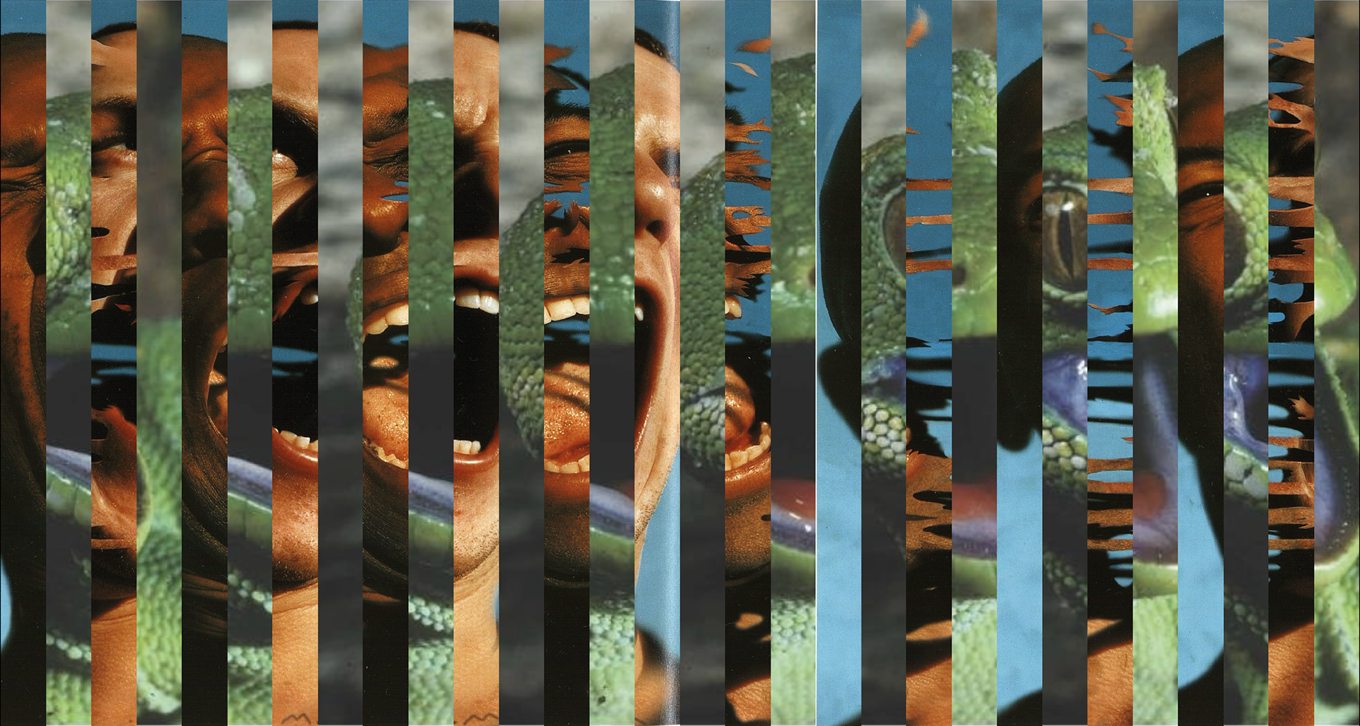

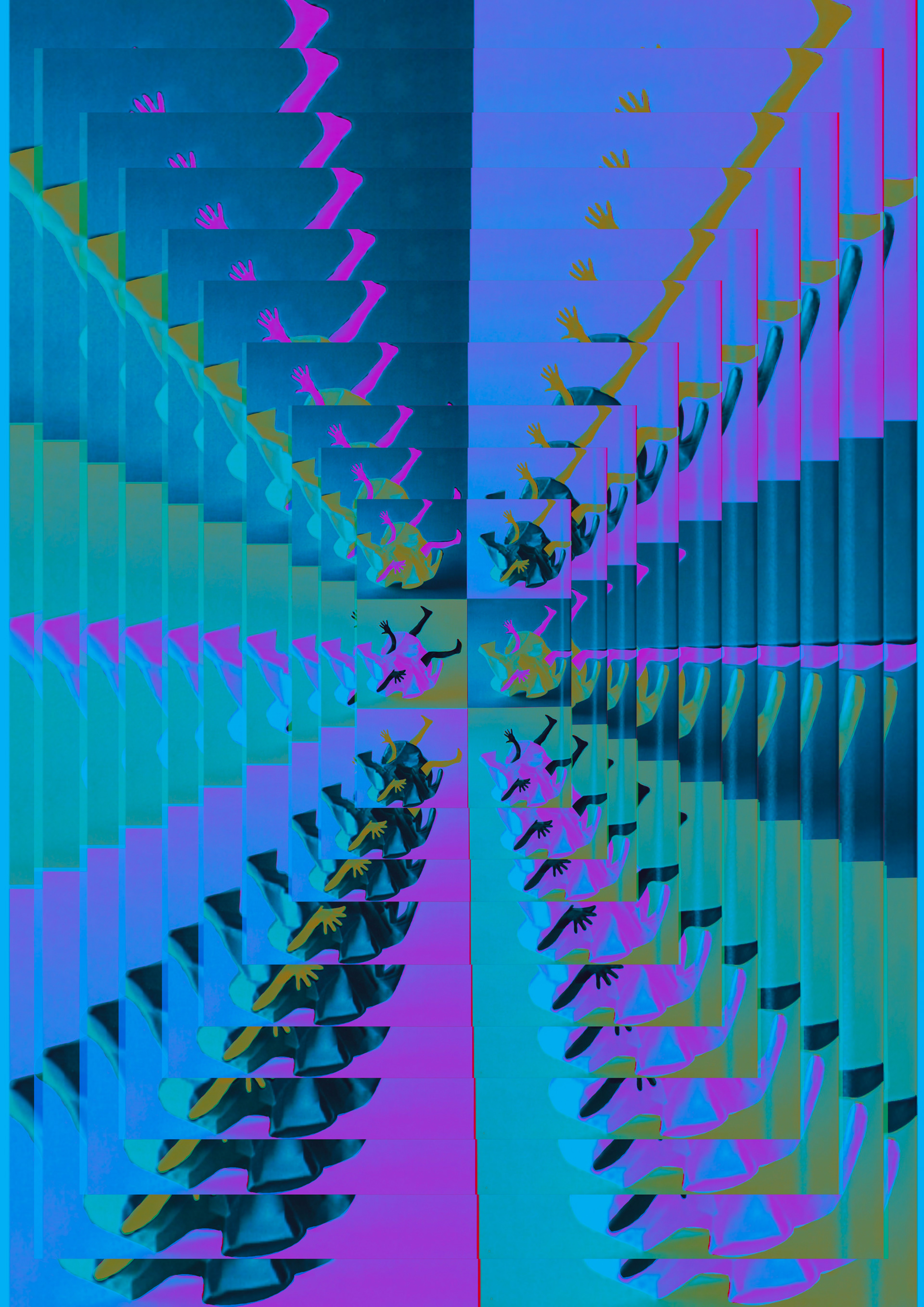
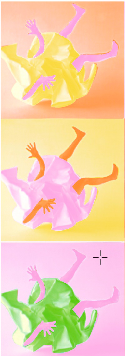
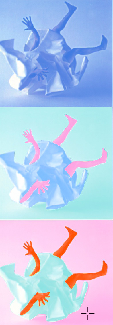
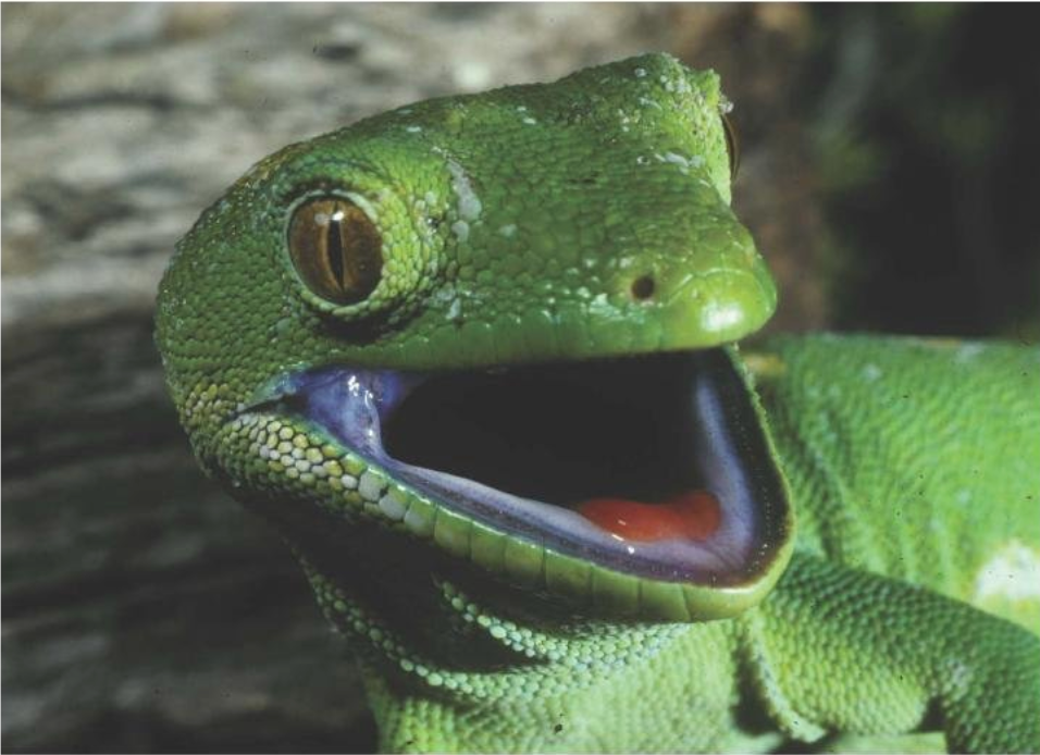
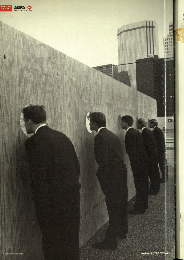
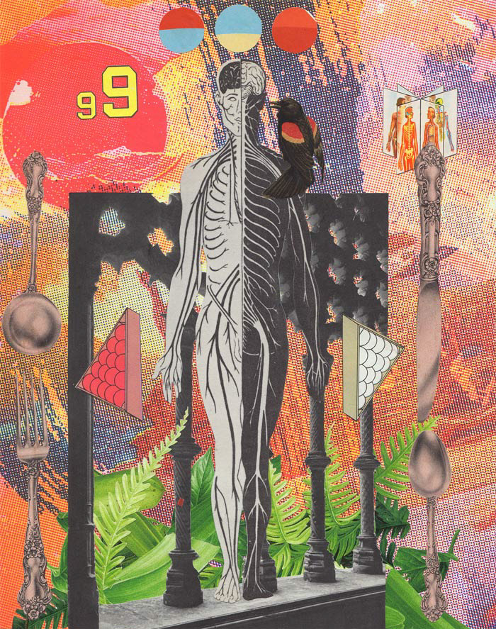
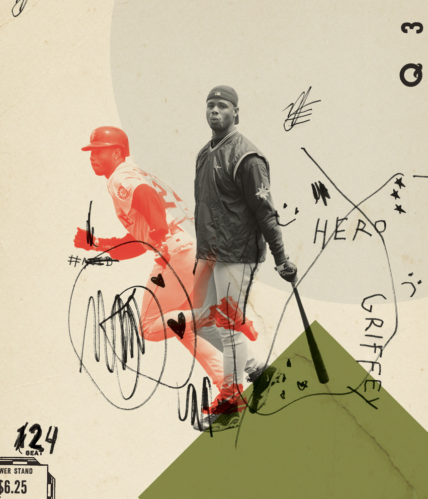
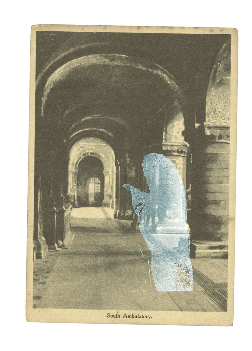
I want to do a mix of both sources and felt these two images from either source fit well with each other. The lizard being from sacred sites and the two men from graphis. Over the years i've seen and also made collagings by cutting them up and then sticking them together again. I felt like this has worked nicely since both images seem to have screaming animals - they also symbolize each source well lizard-sacred being with a more nature aspect to it like the report and then men for graphis symbolising today's current world. Nature v Humans etc
Video on the right.
I kinda of like how these have turned out and like the idea of these potentially being cutting up and mixed around to make a bigger piece.
I wanted to experiment with a pop art feel and this is sort of what I ended coming up with, I had no intended direction but I just want to great something without thinking too much into it.


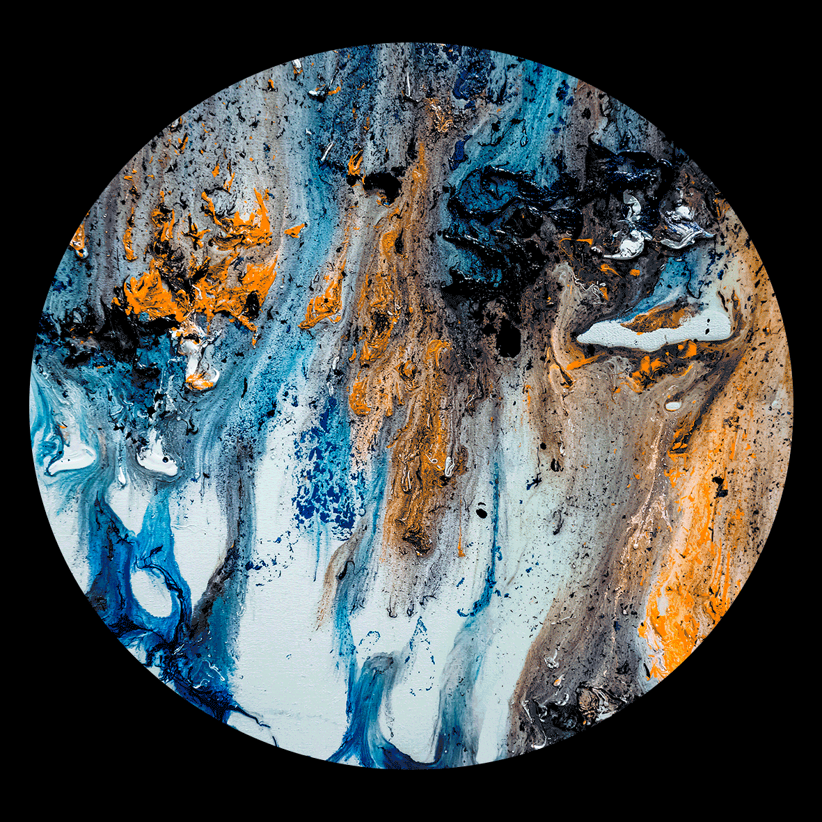
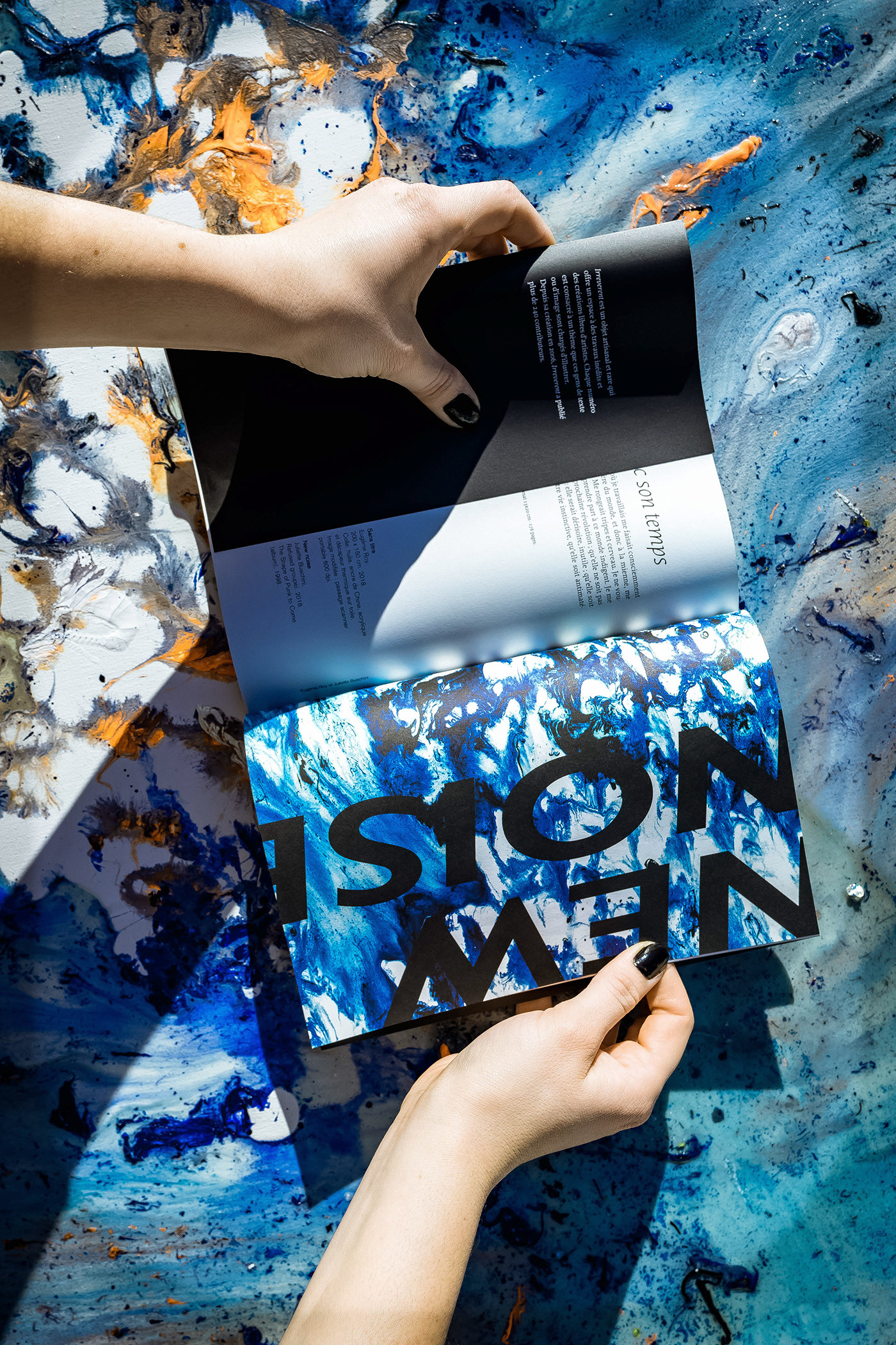
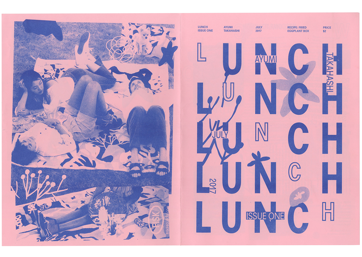
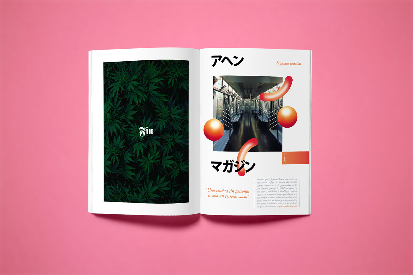

Behance Inspo
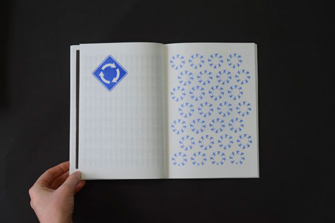
I wanted to get some inspiration of possible ways I could made the publication but also get some ideas for the style. I like the homemade feel to a lot of these zines, but especially like how they all look visually appealing and work for the topic it covers.
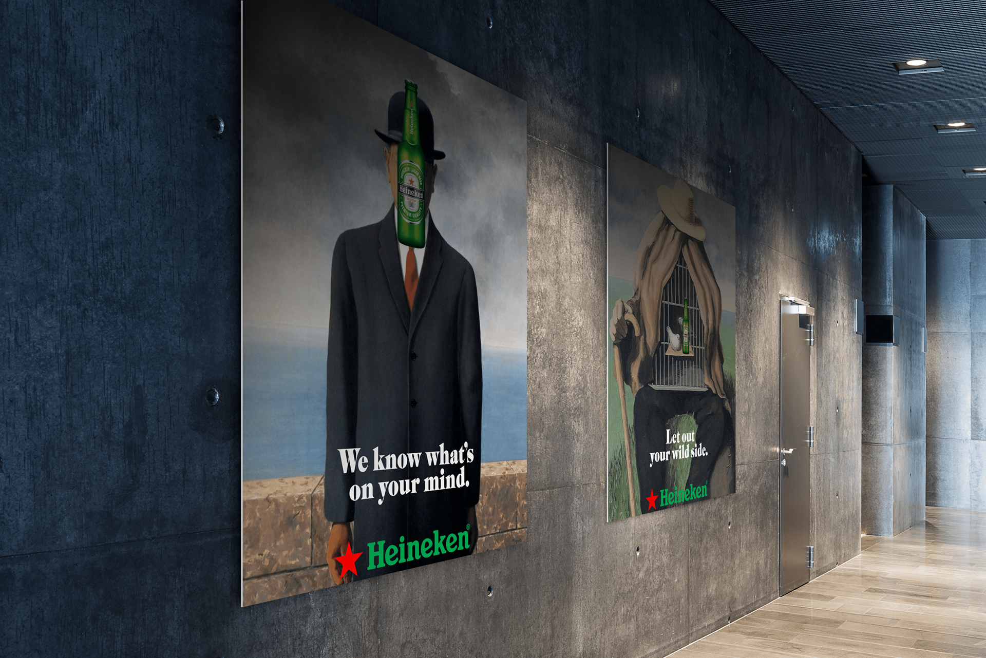
1. Heineken/SF MOMA Collaboration (school project) - https://www.behance.net/gallery/79777967/HeinekenSF-MOMA-Colloboration-%28school-project%29?tracking_source=search_projects_recommended%7Ccolloboration
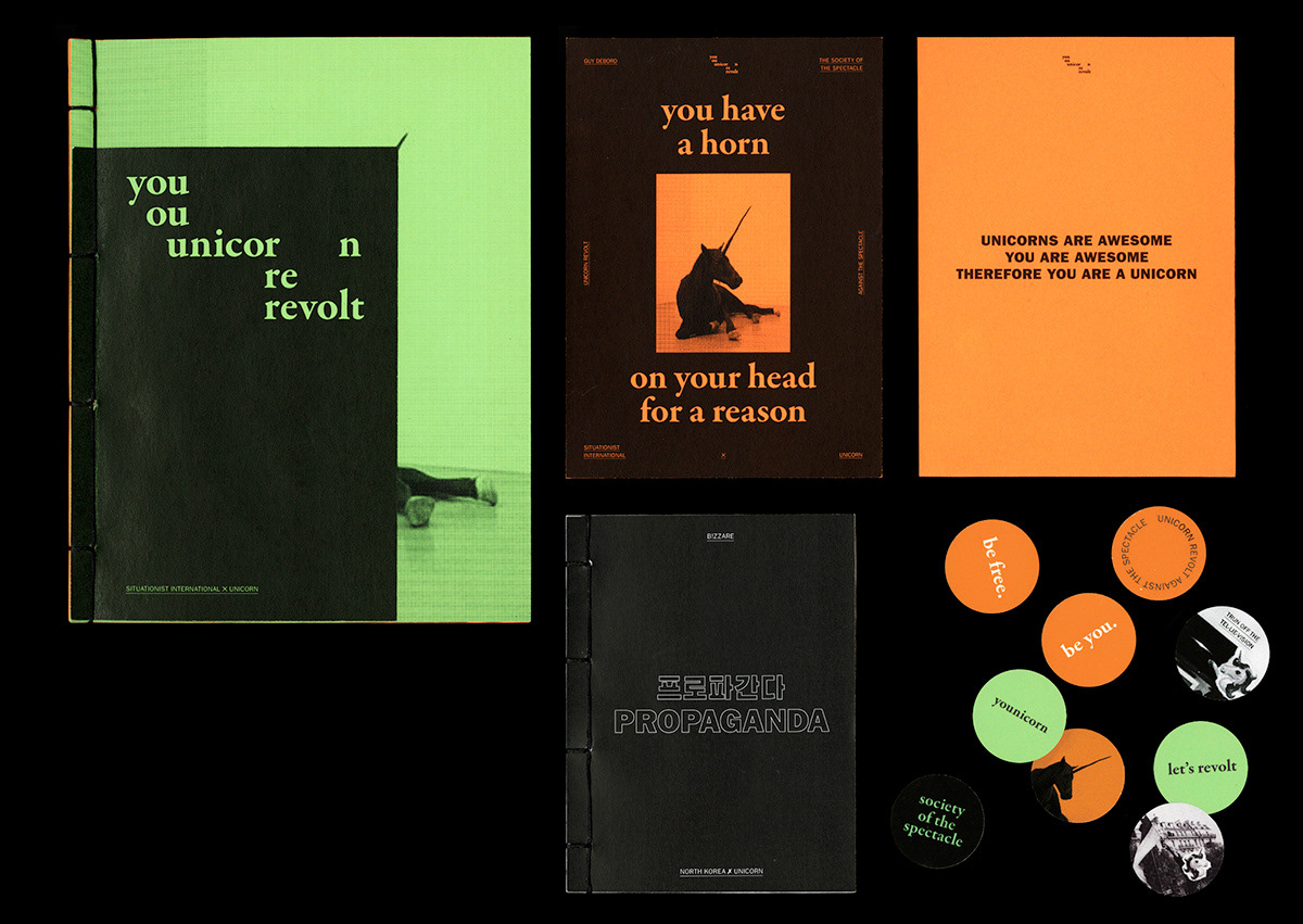
2. Unicorn Revolt Zine - https://www.behance.net/gallery/65529937/Unicorn-Revolt-Zine?tracking_source=search_projects_recommended%7Cprint%20zine
3. Papandayann - https://www.behance.net/gallery/93232511/Papandayann?tracking_source=search_projects_recommended%7Cprint%20zine
4. Ignorant Zine © - https://www.behance.net/gallery/44896853/Ignorant-Zine-?tracking_source=search_projects_recommended%7Cprint%20zine
5-6. MY CREEPIEST NIGHTMARE (Zine) - https://www.behance.net/gallery/62766319/MY-CREEPIEST-NIGHTMARE-%28Zine%29?tracking_source=search_projects_recommended%7Cprint%20zine
7. Secret Society Zine - https://www.behance.net/gallery/76518347/Secret-Society-Zine?tracking_source=search_projects_recommended%7Cprint%20zine
8. zine001 / same but different - https://www.behance.net/gallery/92780453/zine001-same-but-different?tracking_source=search_projects_recommended%7Ccollage%20zine
9. LOOK AGAIN - https://www.behance.net/gallery/82479155/LOOK-AGAIN?tracking_source=search_projects_recommended%7Ccollage%20zine
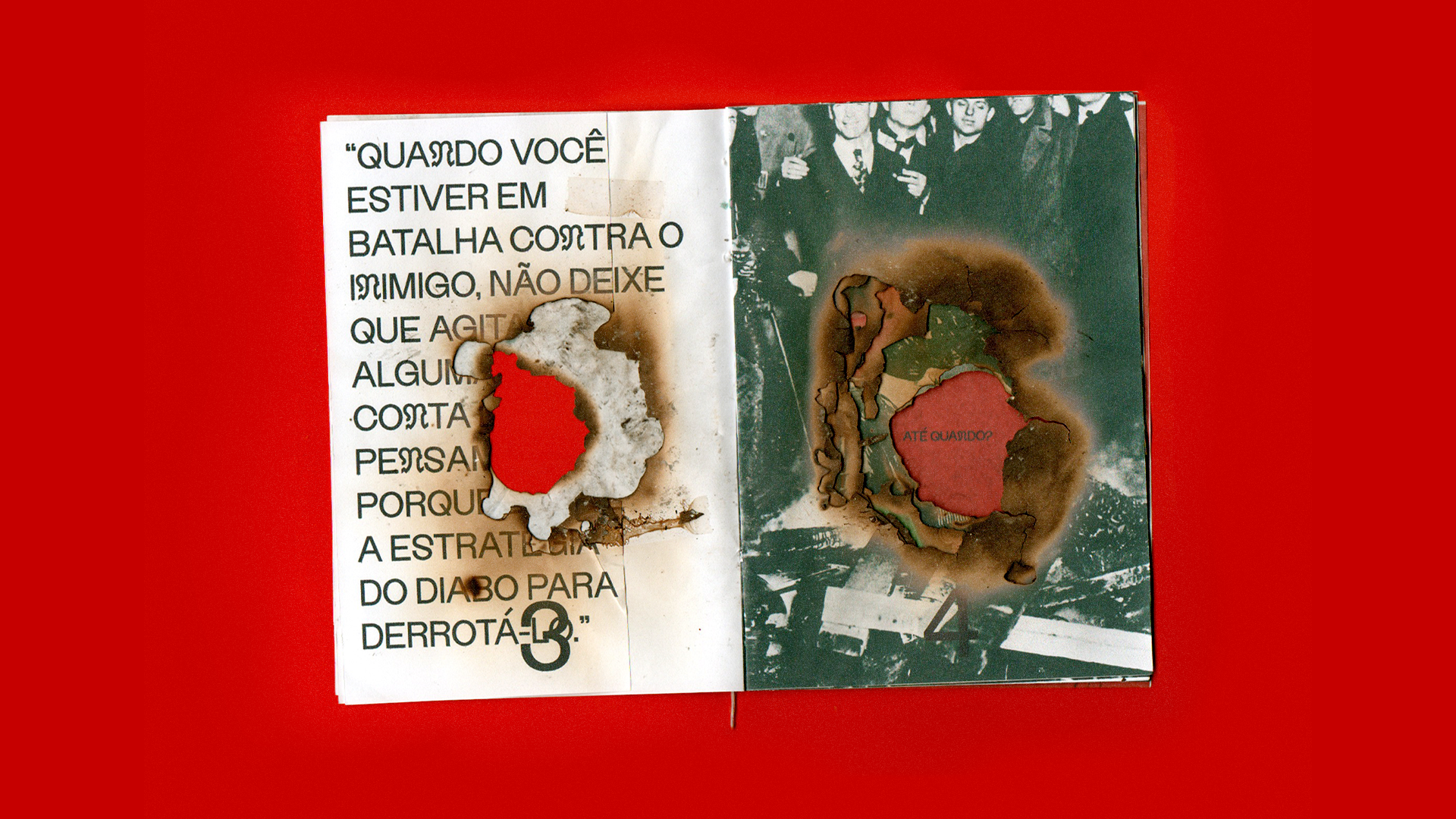
10. ATÉ QUANDO? - https://www.behance.net/gallery/84432175/ATE-QUANDO?tracking_source=search_projects_recommended%7Ccollage%20zine
11. All the pieces fit together - https://www.behance.net/gallery/66680287/All-the-pieces-fit-together?tracking_source=search_projects_recommended%7Ccollage%20zine
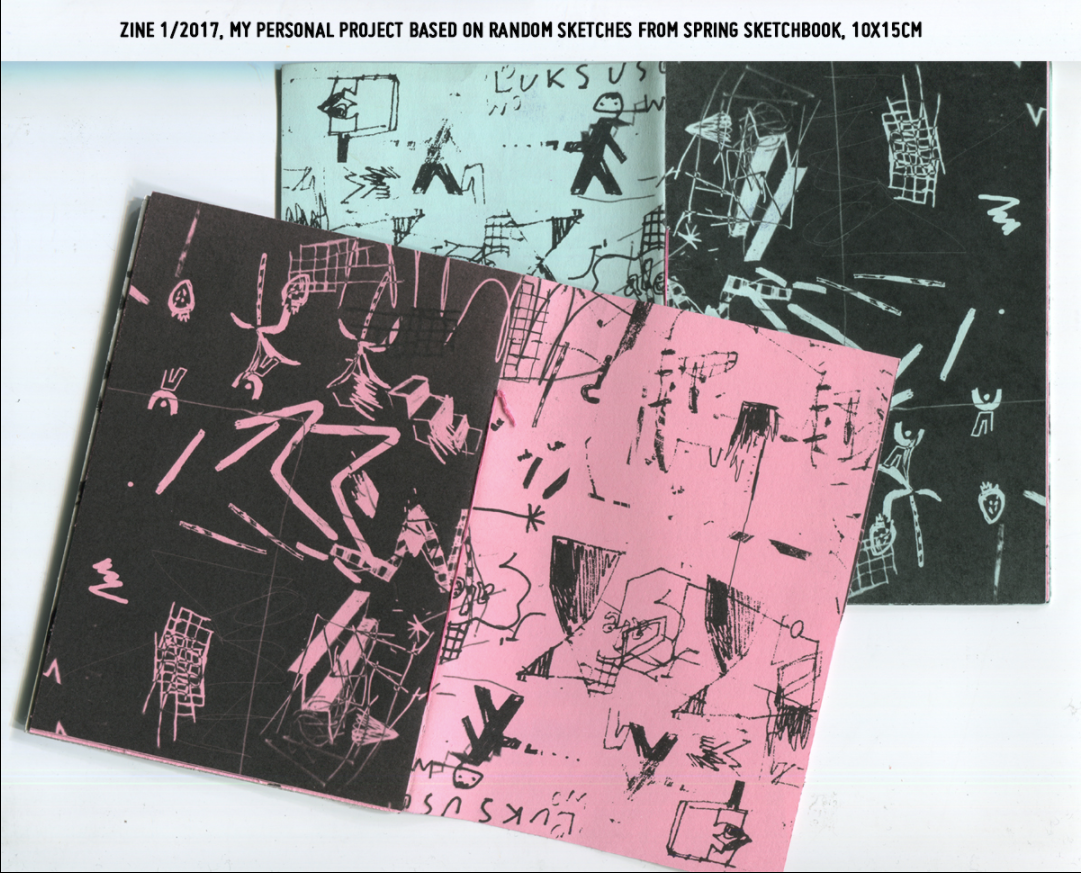
12. Zine 12017 - https://www.behance.net/gallery/61662443/zine-12017?tracking_source=search_projects_recommended%7Ccollaboration%20zine
13. Untitled - https://www.behance.net/gallery/74397307/Untitled?tracking_source=search_projects_recommended%7Ccollaboration%20zine
14. Scanner Mood - Riso Zine - https://www.behance.net/gallery/70182071/Scanner-Mood-Riso-Zine?tracking_source=search_projects_recommended%7Cprint%20zine
15-15a. IRREVERENT XIII : Refus - https://www.behance.net/gallery/92823833/IRREVERENT-XIII-Refus?tracking_source=search_projects_recommended%7Ccollaboration
16. LUNCH - https://www.behance.net/gallery/60261667/LUNCH?tracking_source=search_projects_recommended%7Ccollaboration
17. •OPIO• MAGAZINE - https://www.behance.net/gallery/54409431/OPIO-MAGAZINE?tracking_source=search_projects_recommended%7Cprint%20zine
18. $imilarly Differ€nt - https://www.behance.net/gallery/21805247/Similarly-Differnt?tracking_source=search_projects_recommended%7Ccolloboration
19. Barry McGee — T.O.S. - https://www.behance.net/gallery/93075223/Barry-McGee-TOS?tracking_source=search_projects_recommended%7Cprint%20zine
20. The Roswell UFO Festival - https://www.behance.net/gallery/61280821/The-Roswell-UFO-Festival?tracking_source=search_projects_recommended%7Cprint%20zine
21. Posters - https://www.behance.net/gallery/78457527/Posters?tracking_source=project_owner_other_projects
22. Pale Blue Dot - https://www.behance.net/gallery/84102499/Pale-Blue-Dot?tracking_source=search_projects_recommended%7Cprint%20zine
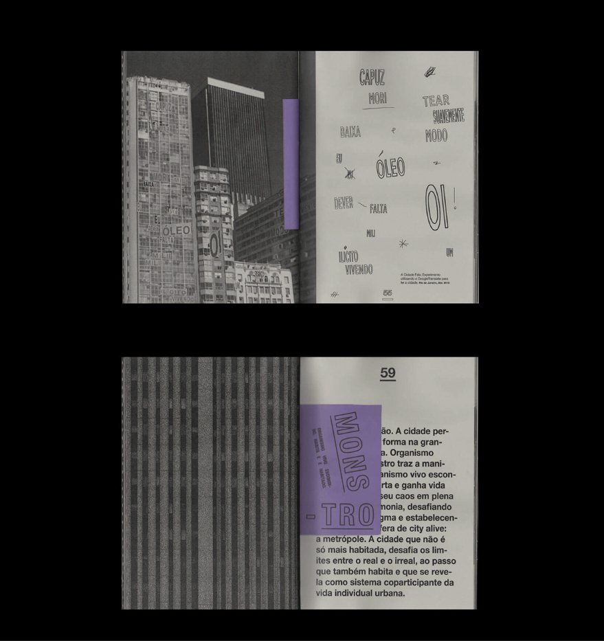
23. CITY ALIVE - https://www.behance.net/gallery/66678657/CITY-ALIVE?tracking_source=search_projects_recommended%7Cprint%20zine
24. Prefix/Suffix - https://www.behance.net/gallery/5885625/PrefixSuffix?tracking_source=search_projects_recommended%7Ccolloboration
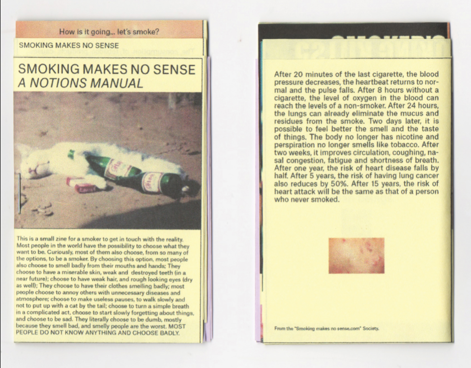
25. "Smoking makes no sense" Zine - https://www.behance.net/gallery/72351001/Smoking-makes-no-sense-Zine?tracking_source=search_projects_recommended%7Cprint%20zine


Source 1:
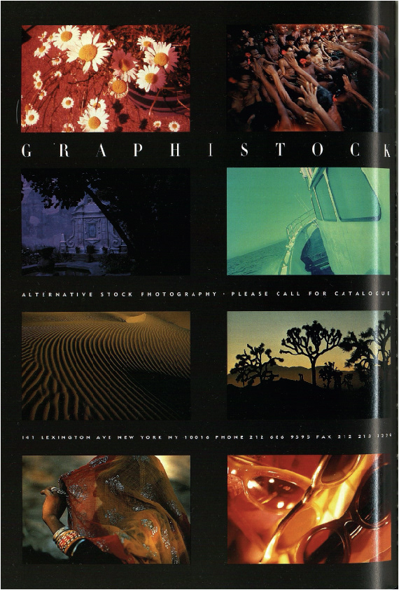
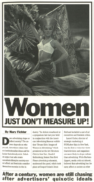
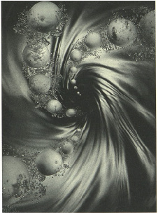
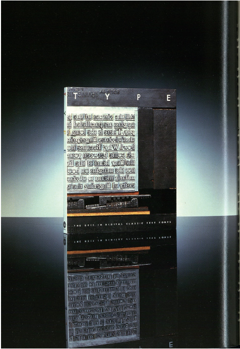
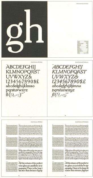
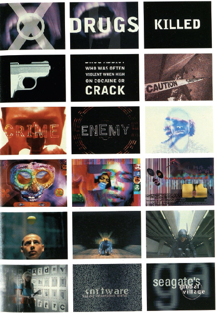
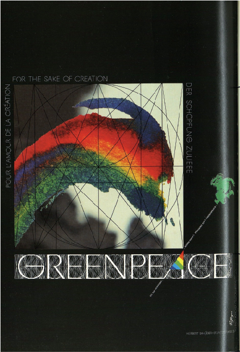
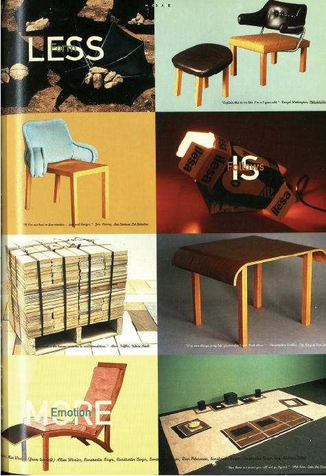
The images above are what i've picked out from the graphis magazine. I feel they do good job at representing the magazine but also for me personally they are the strongest and most interesting images.
I want to either use these images or take influence from them and combine them with my second source.
some ideas
look at chapter titles and then create something in the style of graphis
form sentences and create image out for pieces from graphis
use colours on graphis page to go over the top of one of the images for the book
add a bio diversity side to the adverts
add greenery to stuff
add landscapes to images
create an advert that looks like graphis about the book?
In my head I like the idea of the contrasts that the two sources have - one being a magazine used for design, reviews, art etc but also advertising and the other talking about biodiversity among other things. One is more corporate and the other more "free". This theme is something that I may want to focus on for my final publication but for now I want to do as many experiments linking the sources in anyway I can think of.
As I was looking through the graphis magazine I saw the be theme advertising I thought of this idea as big difference I've noticed between the two sources is that graphis is a magazine and it plays into the capitalist market with it's advertisements but also with the fact that a big part of design is done to make money.
These mean look like business men and my idea with this collage is that it could be interpreted as them looking for the answers of how to make money when they are blindsided by the beauty of the world around them. The beauty can be seen in the sacred species and sites source as it focuses more on biodiversity.
JTF sources. There are so many ways that I could do it I wasn't quite sure where to start...
Talking is kevin and (insert name) it's clear that it could be in any way possible.
I think my plan it to write down a couple of ways I could combine them and just do them and then see what I come up with and take it from there.
I have a couple of ideas that I could easily set in stone now but I want to experiment and see what I can create. I want to keep the "door" open so I can see if I surprise myself by creating something new!

This was just a quick overlay of different pages of both my sources just to see if I like it.
I wouldn't say it's bad but a little lazy because I didn't do much apart from placing pages on top of each other.
Marvin Chun
write about what I think of artist work
Karl Lemieux and David Bryant
This animation reminds me of exhibitions I went to when I was a child and a quite fine art style to it, I like the medium but it isn't my go to style.
Rosanna Wan
Wans animation style is beautiful I really like the style and that each animation is just to visualise a topic. I feel animation is such a great way to explain a story and the brighton colours and simple shapes are enticing.
Winston Hacking
Hacking work has a really clever all over the place style to it, his transiistions and the way he creates his work is fun. It's fun to watch and its all well put together.

Michelle thompson
I like the message of Thompson work I feel she does a good job of creating something visually appealing but also being able to campeign for change and more.


Hollie Chastain
My favourite bit about Chastain's work is the cut outs and weaving of different papers she uses, it's also fun seeing the creativity of using mxed media to create bigger images.

Kolaj Magazine
I think this is a well planned out collage I do like them but they're not my favourite style but it's good to see differant collage styles.
Dr ME - hUCK magazine
Dr Me's work is bold and strong I really like this style and feel the pops of colour work very well with each other. Also the cut outs and ways he pieces together different images work really well to produce a high quality print.
Cristiana Couceiro
In part one in my group we looked at Couceiro - I love her mixed media style and layering of images. I also feel her colour palette is v nice.

Moonstrips: Eduardo Paolozzi and the printed collage
wow these prints are so strong I love the juxtaposition of the patterns with old and new images. This style could really work for image concepts. - MAKE LINK WITH GRAPHIS OR WORK YOU MAY HAVE DONE


STEPHEN FOWLER
These stamps by Fowler are really nice - I like the use of single colour print based and could be a useful technique.
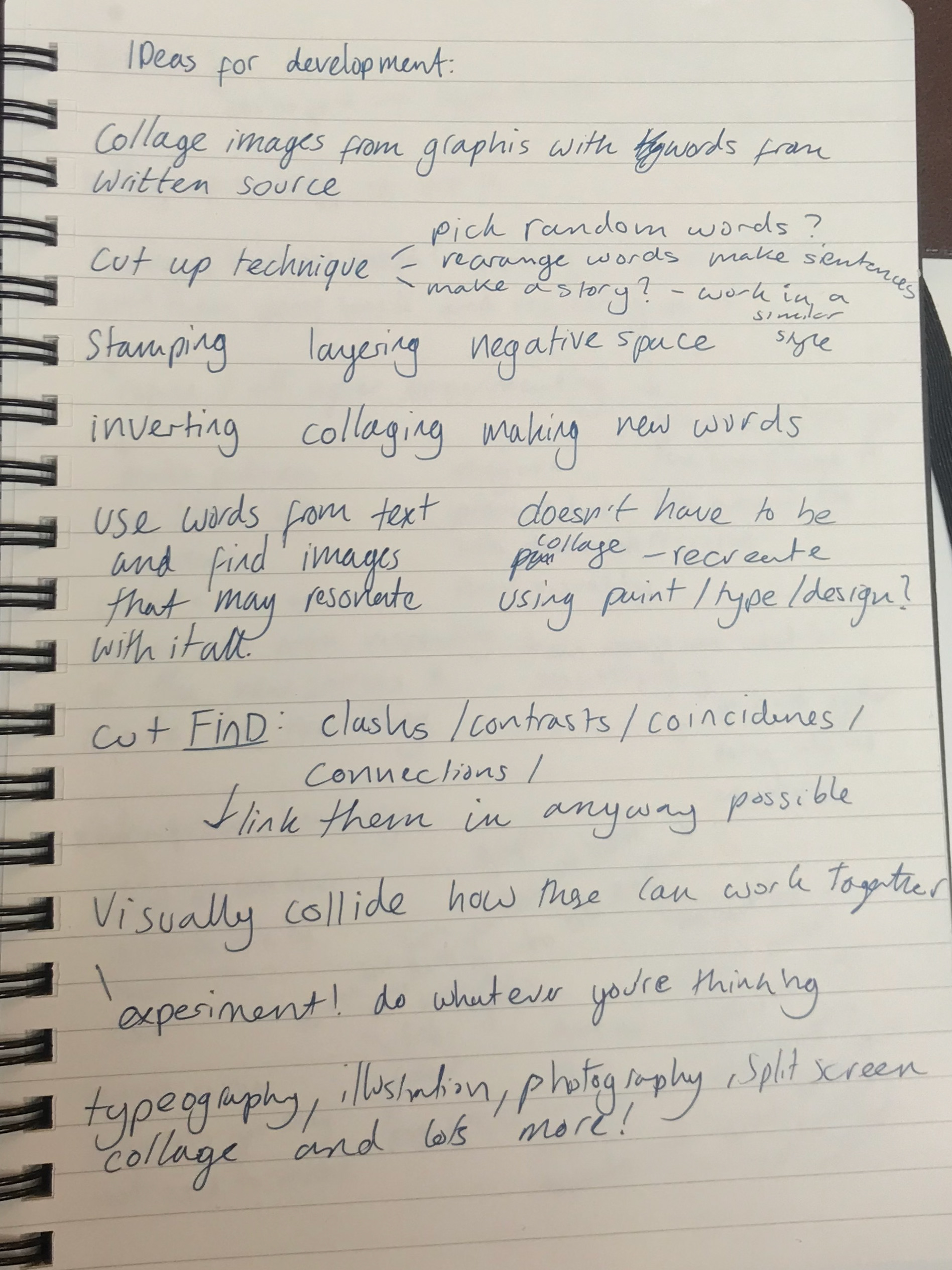
Cut up technique
The cut up technique could be a good idea if I am stuck of how I can work with the text in the sacred sites source. It sounds like a fun way to get into it.
Patrick thomas
As soon as I saw Thomas's work I was instantly drawn to the bold screen print patterns. I love the use of new and old and simplicity of his prints. The bold patterns work really well and I feel his work is just a really nice style. I feel like this good lend itself to giving me ideas for what I end up creating.
MIND MAP
Initial development thoughts
ways I can breakdown the sources and ways I can overlap
on the right are my initial ideas of how I can combine both sources. I will be doing this but to begin with I will be looking at some artist references to help me get in the right creative space.
INITIAL thoughts/sources
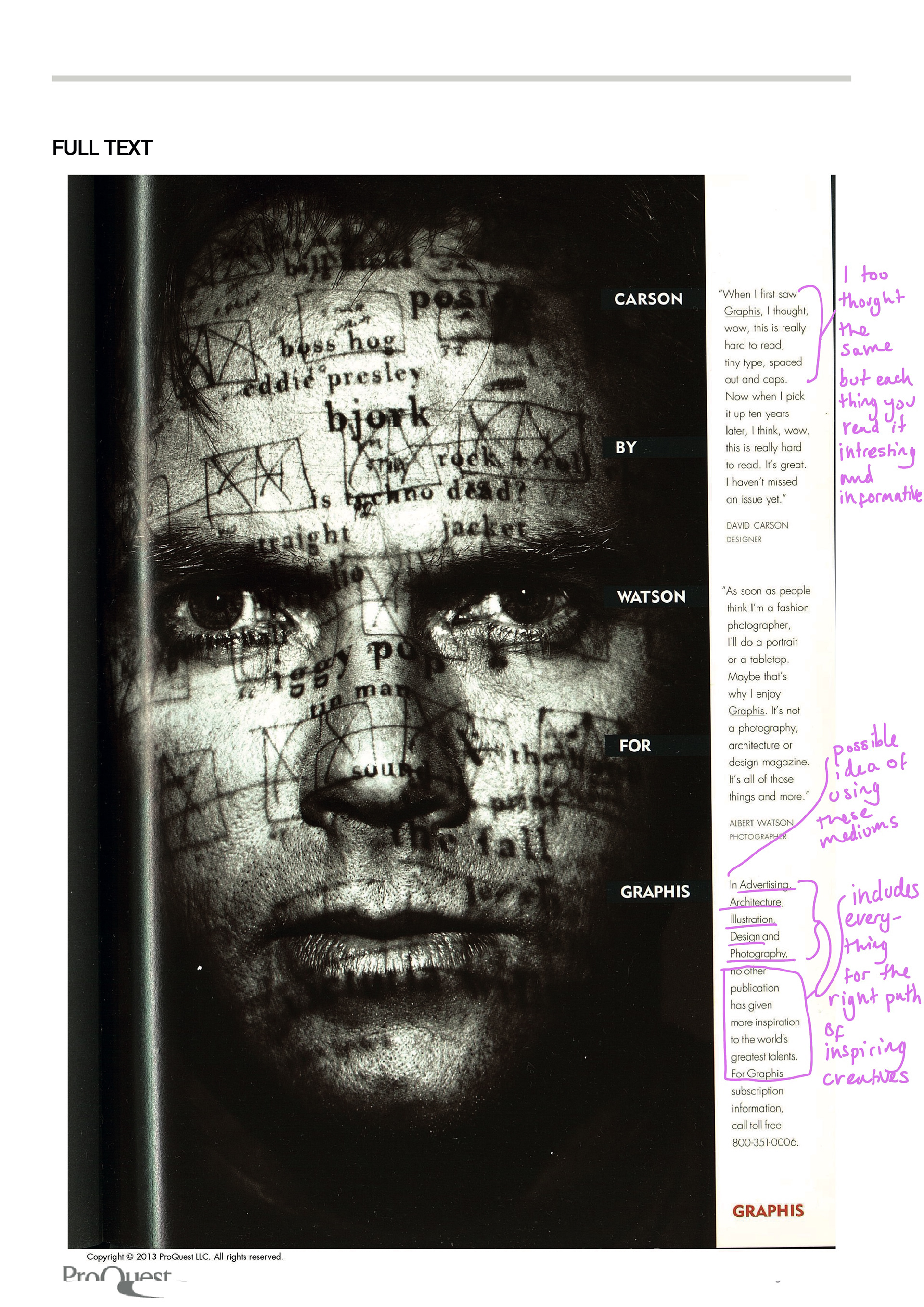
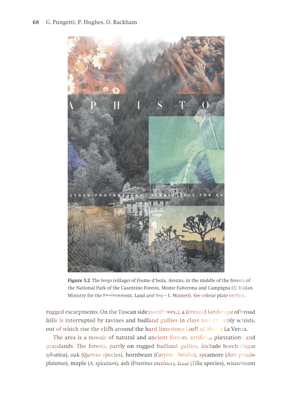
Image based source: Graphis Mar 1, 1996; Vol. 52 (302)
Graphis was first published in 1944. Mr. Herdeg one of the original publishers became the sole publisher in 1964. His son and him stayed working on it until 1986 when it was sold. " A few years later, the Graphis headquarters were relocated from Zürich to New York City. The Annuals were redefined and new books were added to the Graphis roster, including Advertising, Photography, Logo, Branding and Typography, among others."
The first thing I noticed with Graphis issue 302 (and it's other issues) is the huge variety of content. There's a whole range of content including illustration, graphics, photography, adverts, news, reviews, artwork and a whole lot more. The styles also vary hugely which I think is nice to allow me to work in a way I am not used to.
Also since the issue is from 1996 the design style is very different to what is "popular" at the moment. I think it will be interesting to see how I link both sources together and I think will push me out my comfort zone in the sense that I want to try to respond and experiment in different ways,
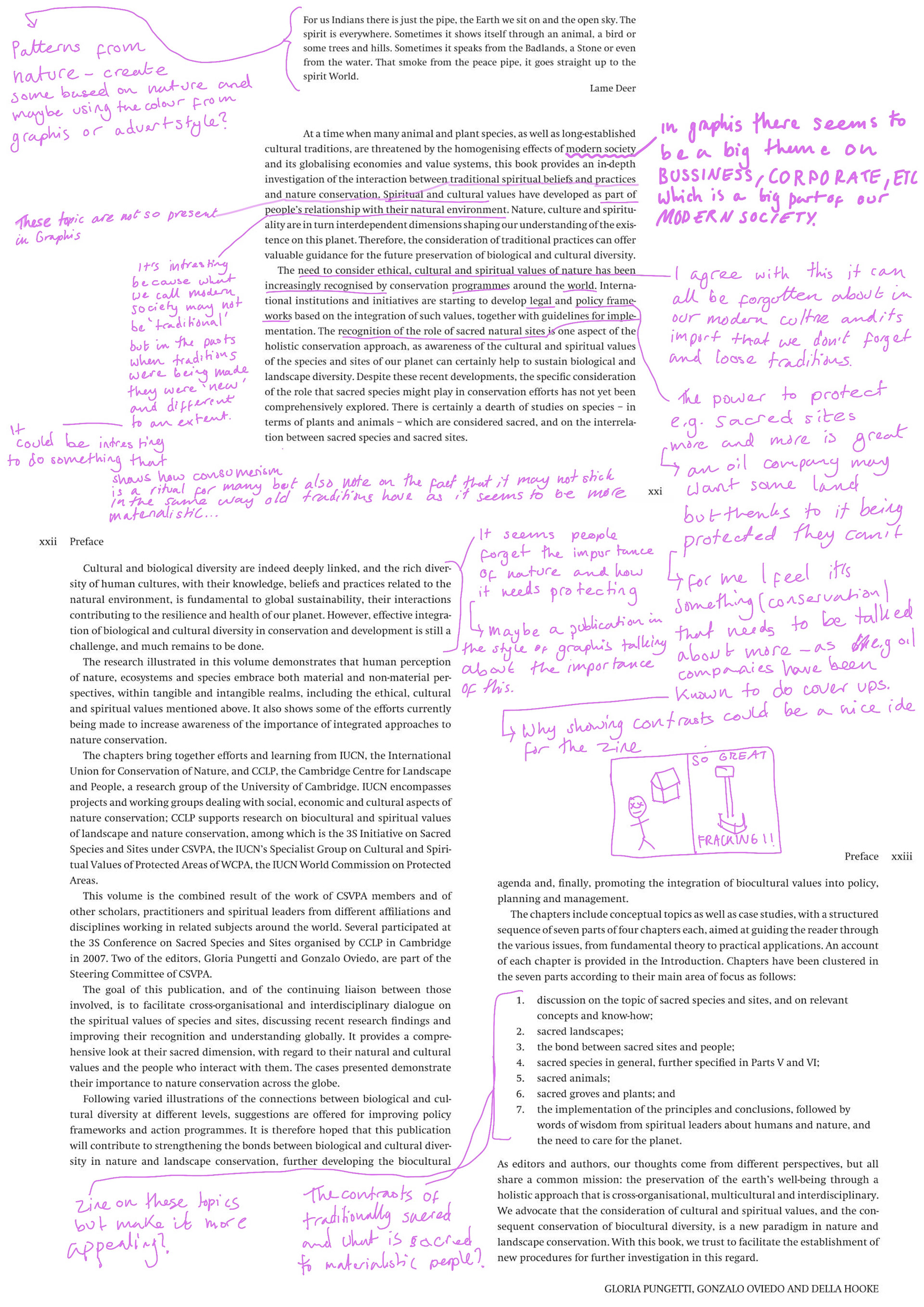
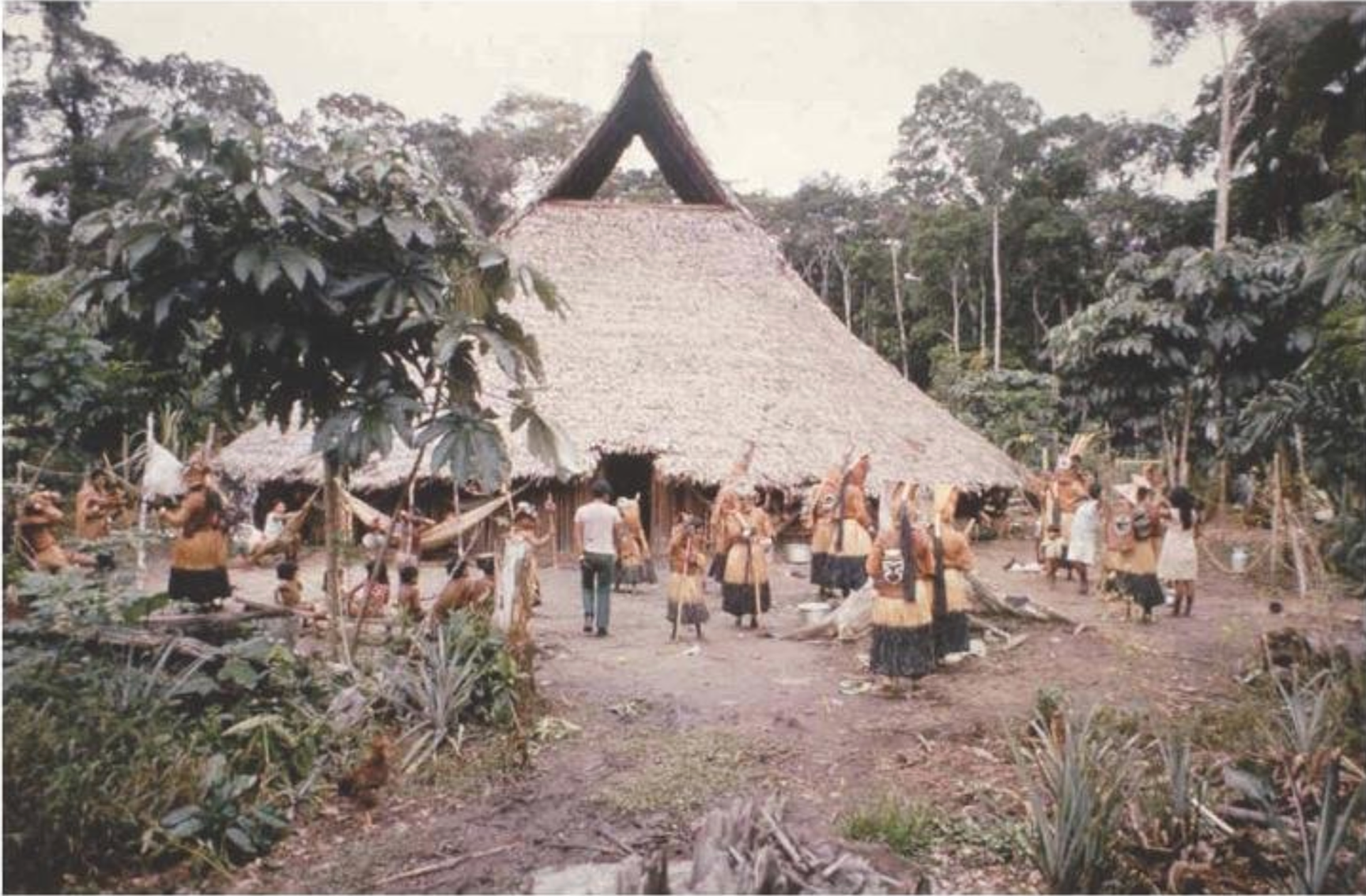
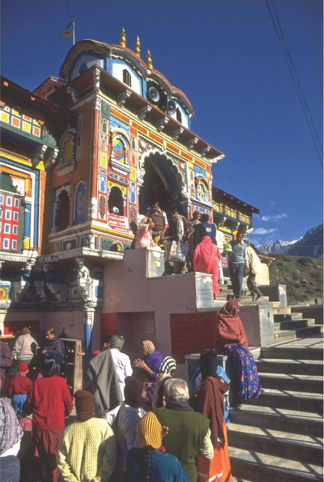
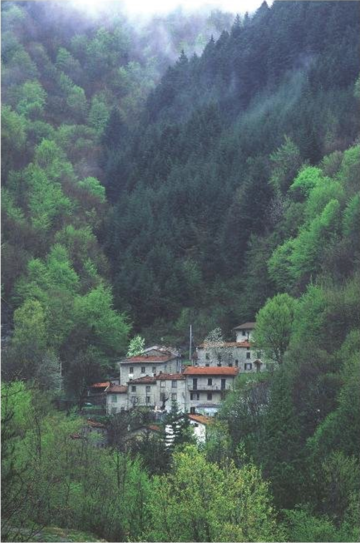
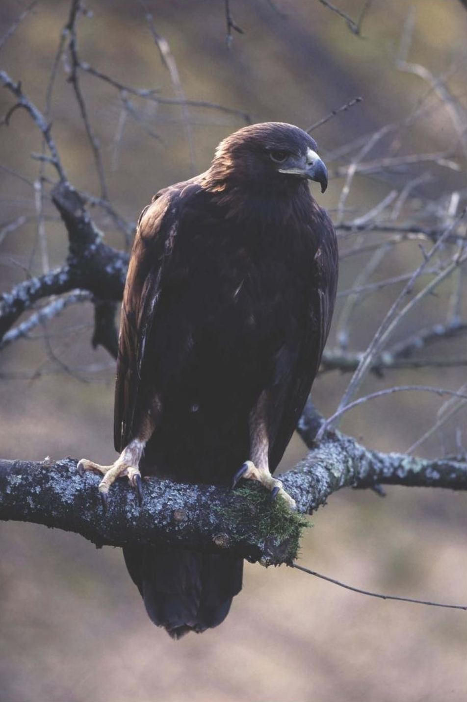
Written based source: Sacred Species and Sites
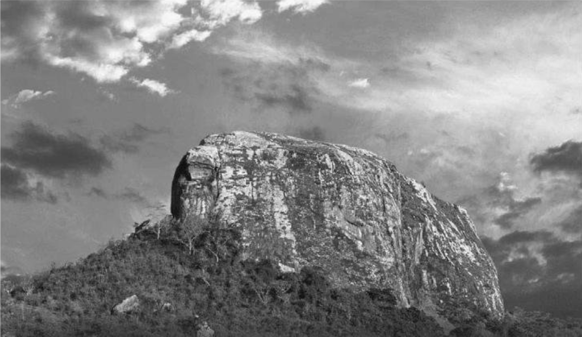
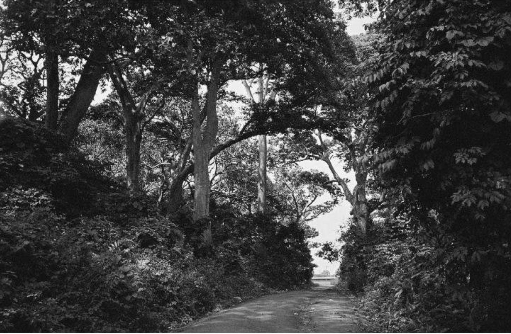
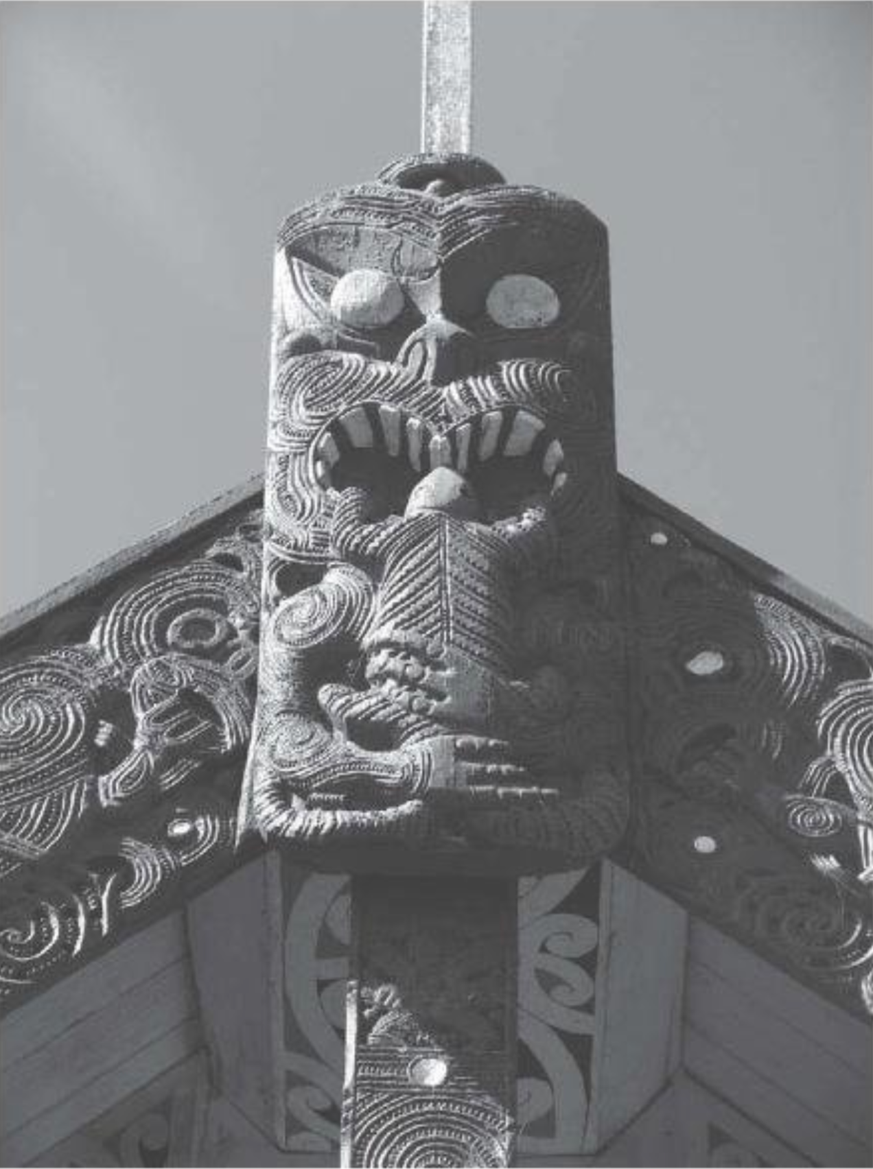
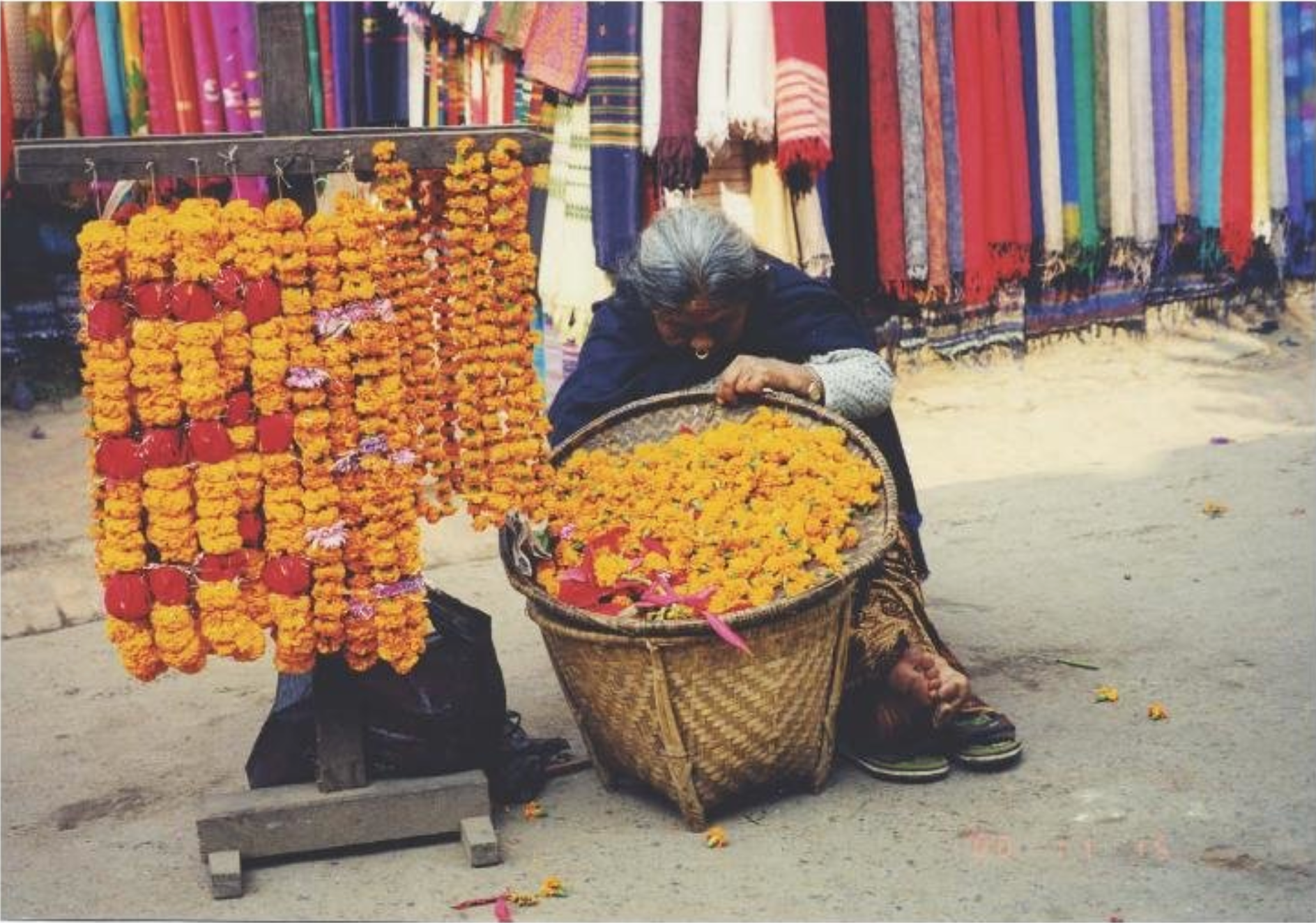
Biocultural diversity conservation. My initial thoughts of is book is that it cover a topic i'm interested in but don't know loads about. I like how it covers nature conservation as it's something I am interested in but also the spiritual beliefs and traditions that can come with the history of how nature has been conserved over the years.
I've read a couple snippets and also looked at some of the photography/images in the book and I feel as if this is a topic that will lend itself well to my interests. However at the same time I will be exploring new information as well and possibly a new way to look at sources and how I can link it to my image source. I am excited to see what I end up coming up with.