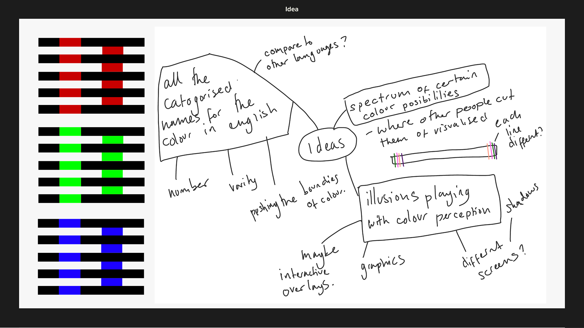
ANALYSING the Brief and Initial ideas
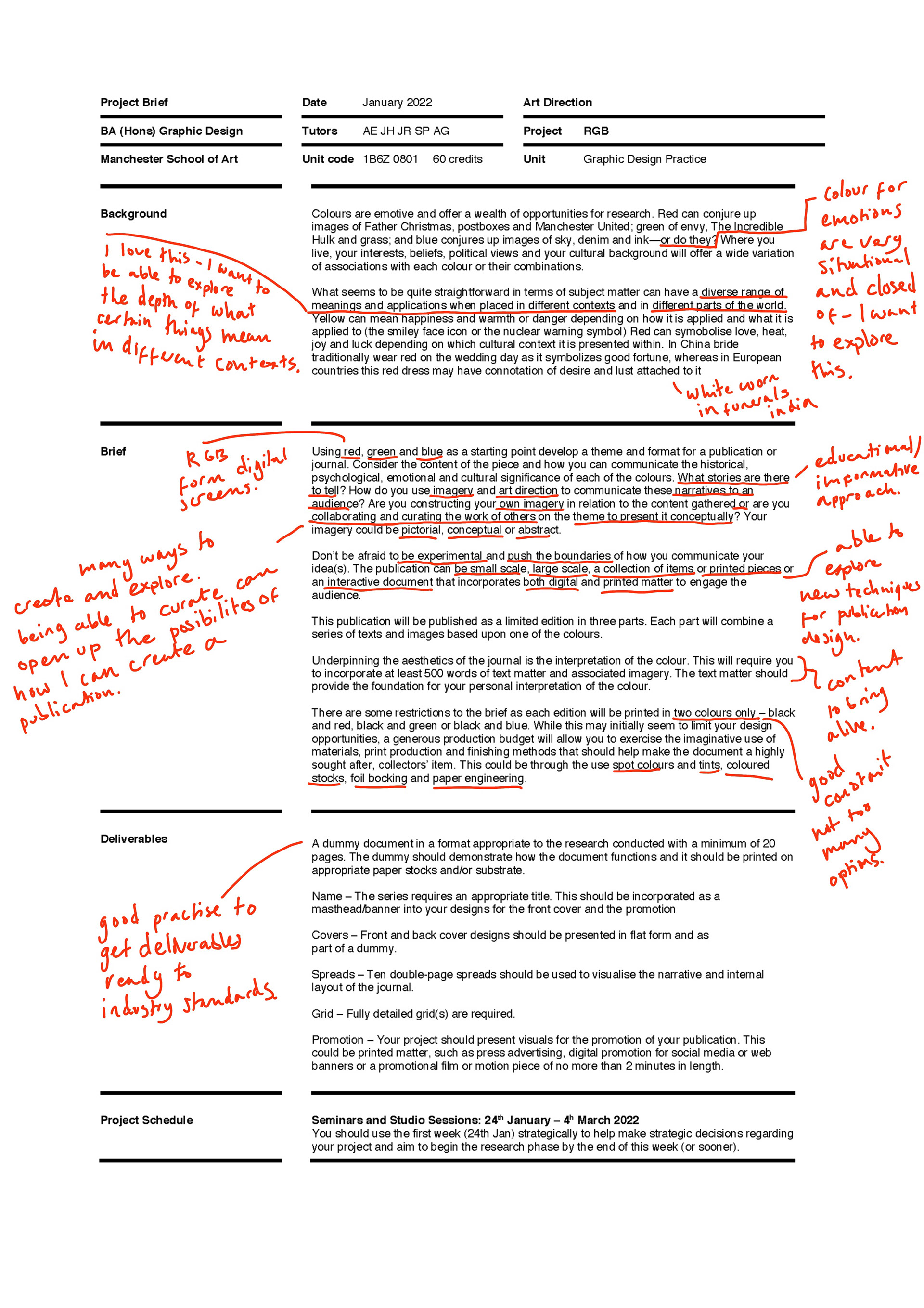
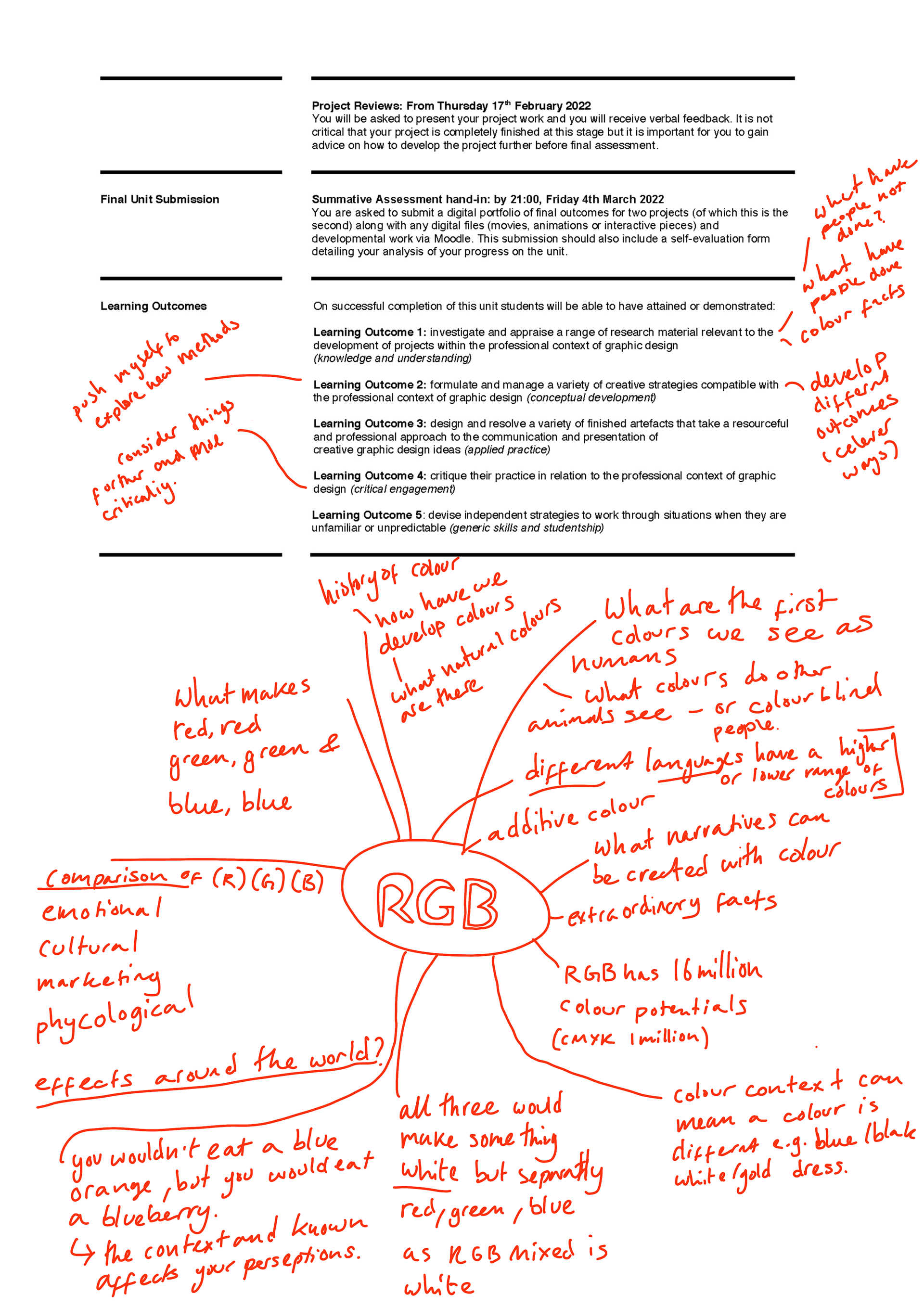
Annotated are my initial thoughts of the brief and my first brainstorm about ideas.
RESEARCH STAGE
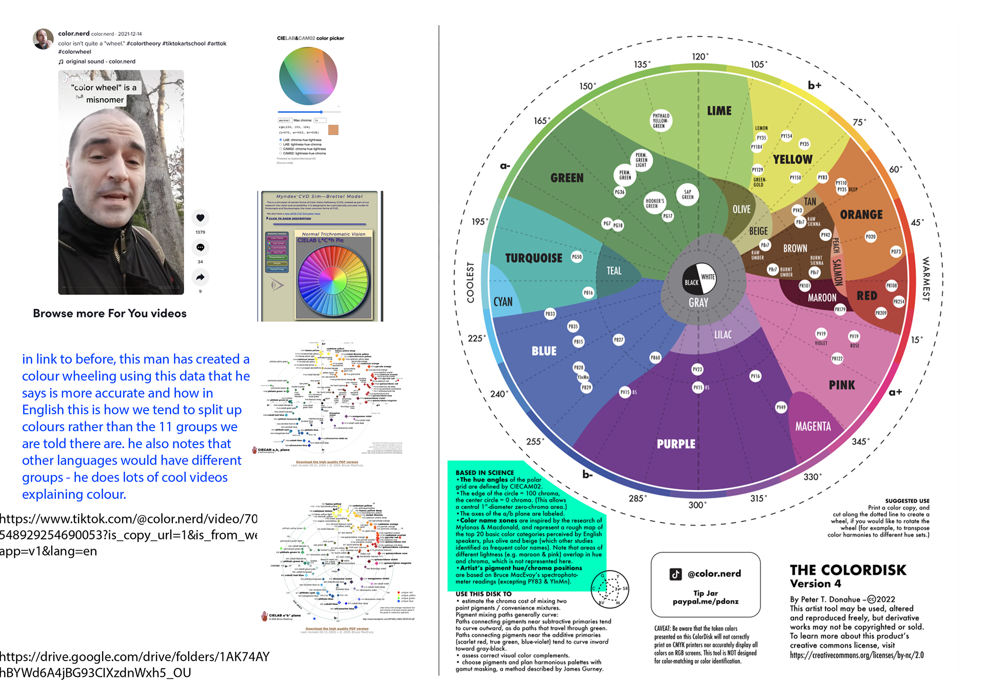
Colour Theory
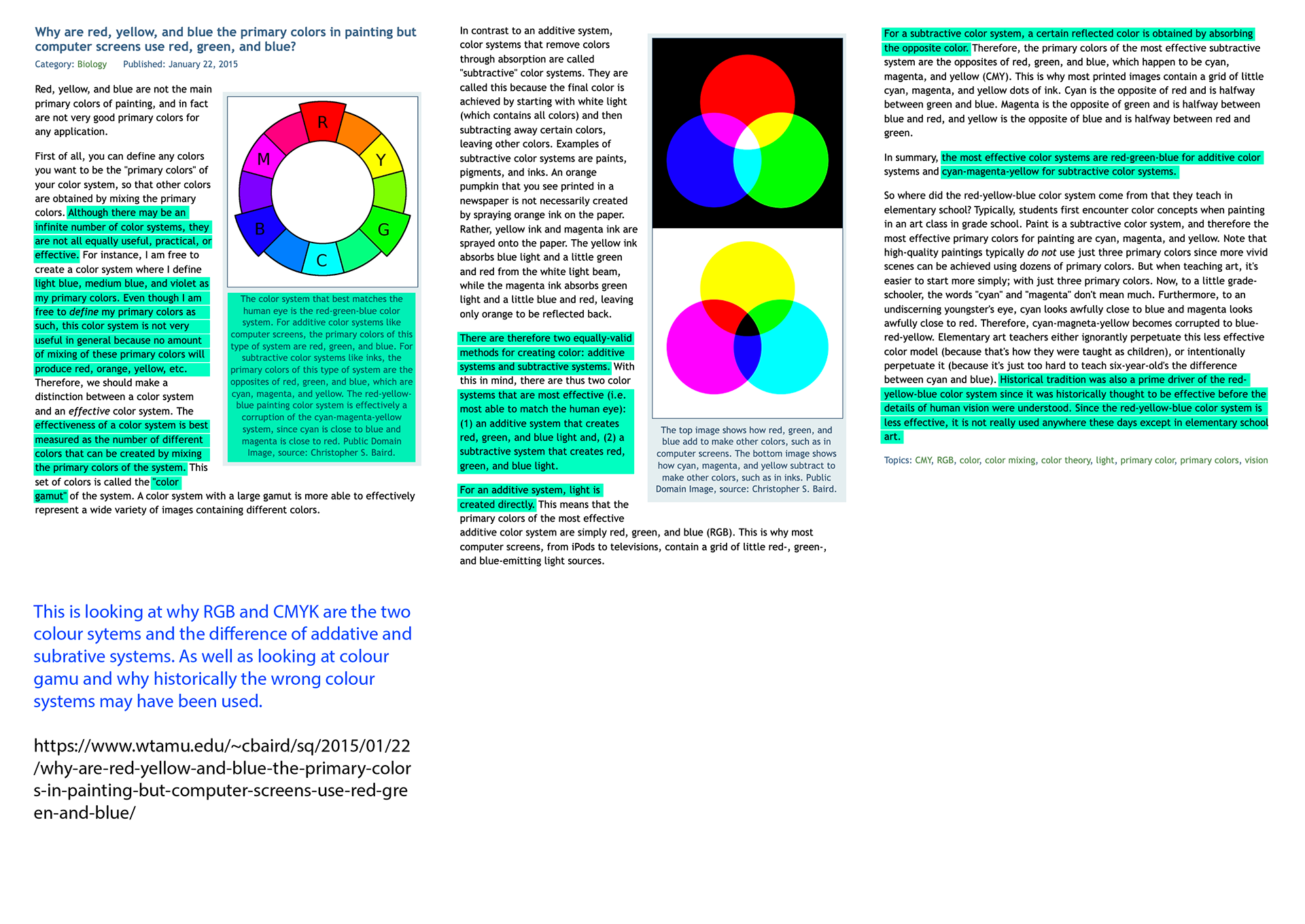
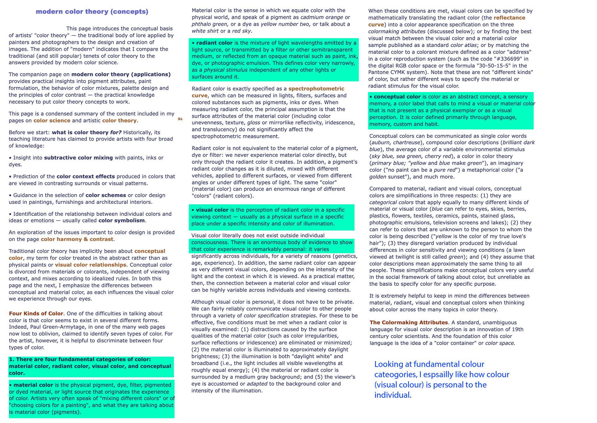
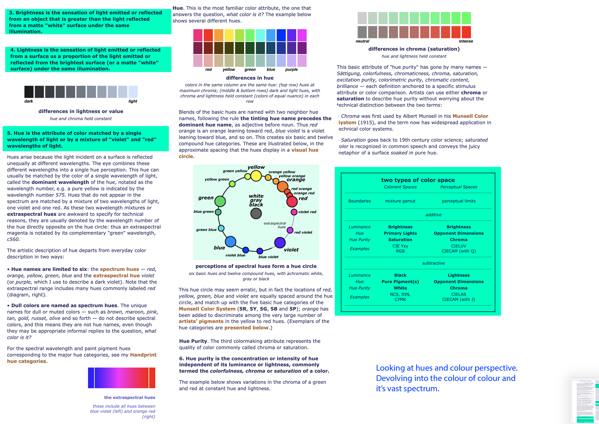
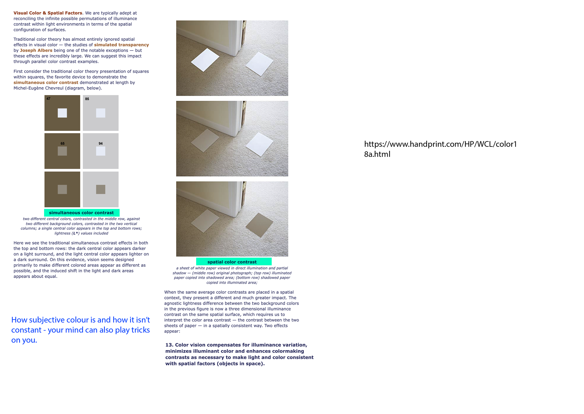
Highlighted in turquoise are bits of information I feel is interesting and in blue are my annotated thoughts.
Colour Symbolism
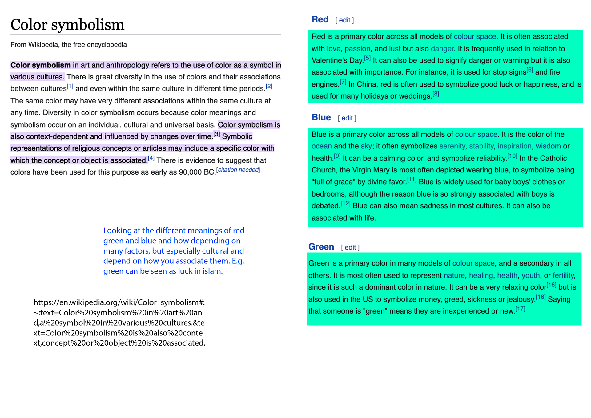

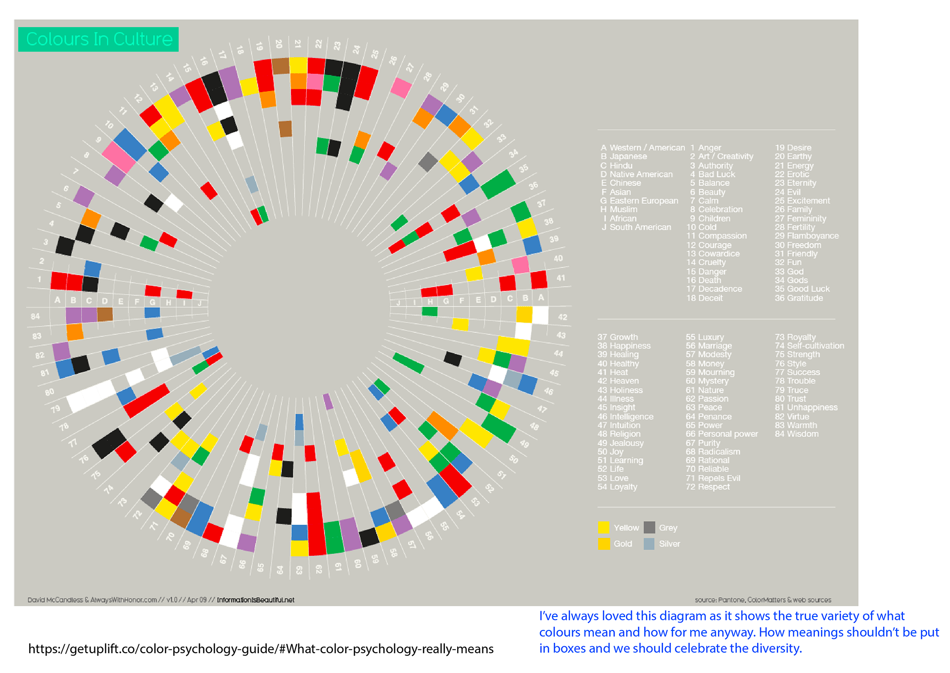
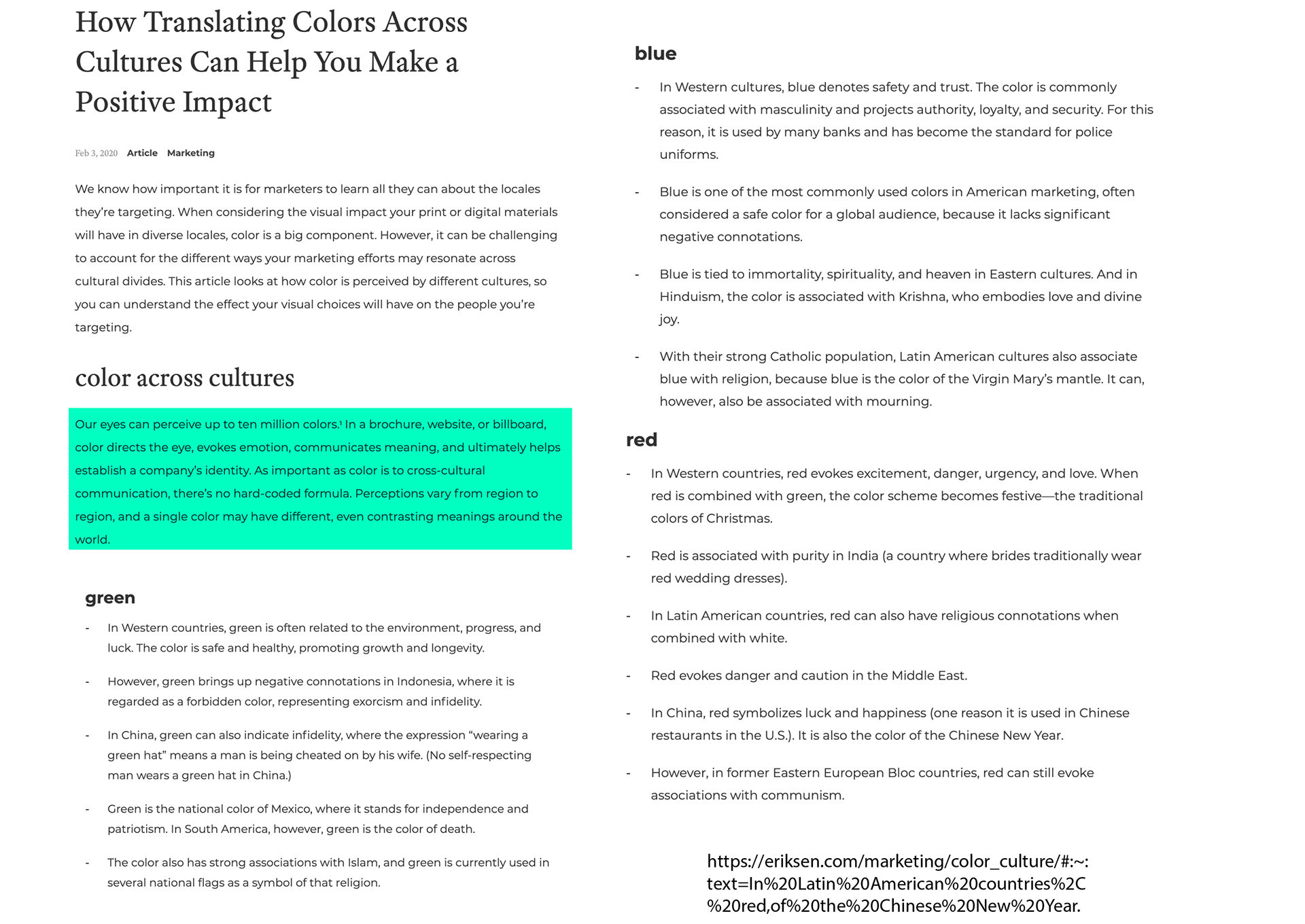
Highlighted in turquoise are bits of information I feel is interesting and in blue are my annotated thoughts.
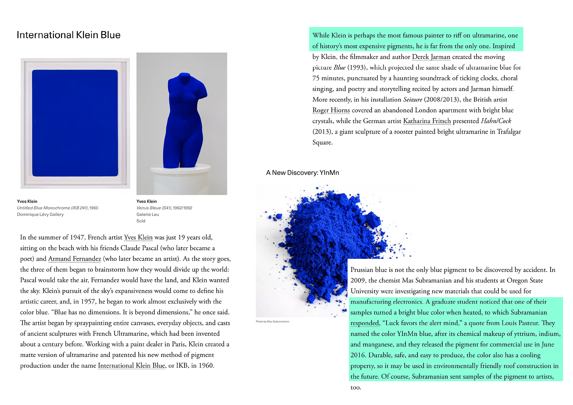
Art and History
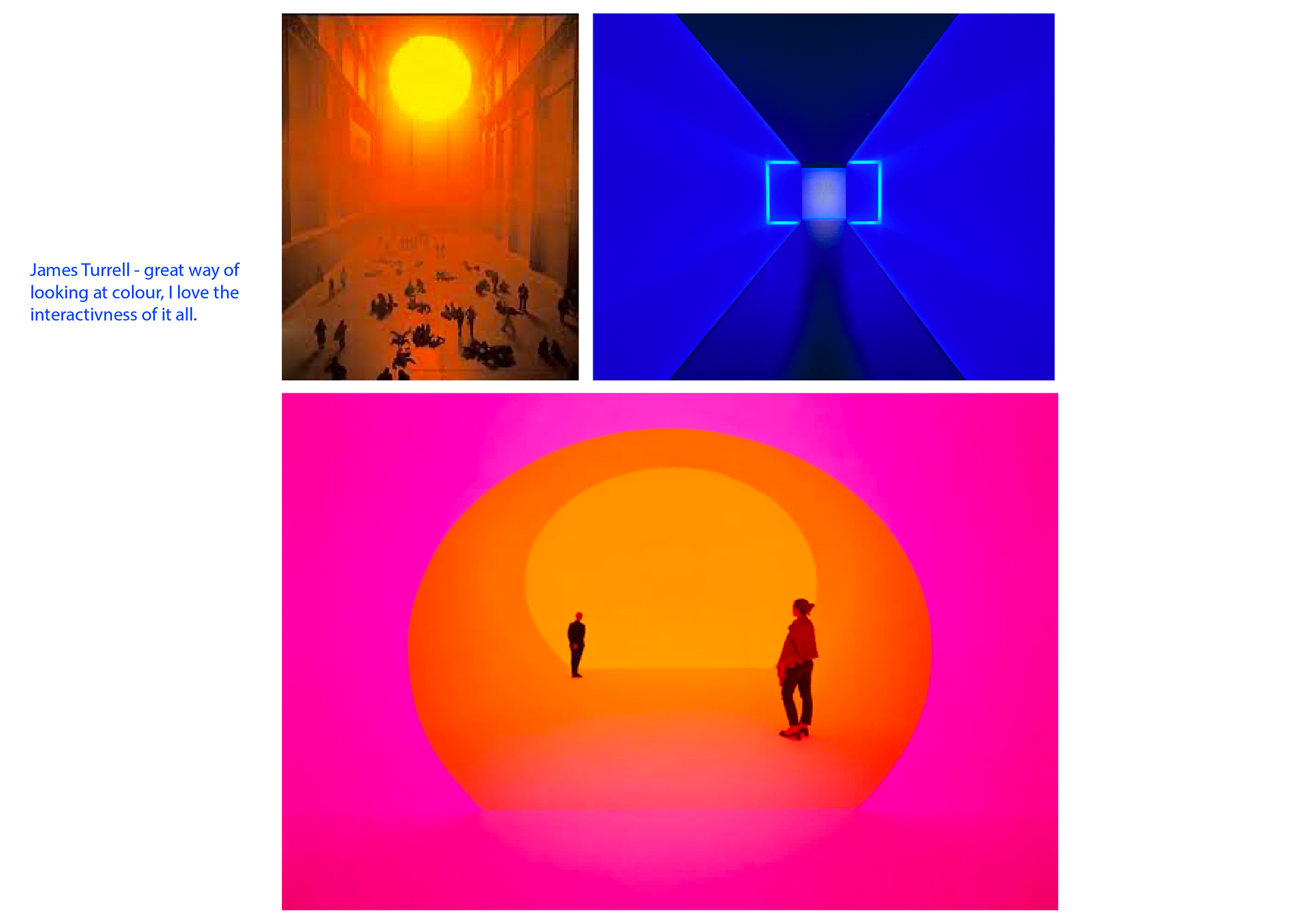
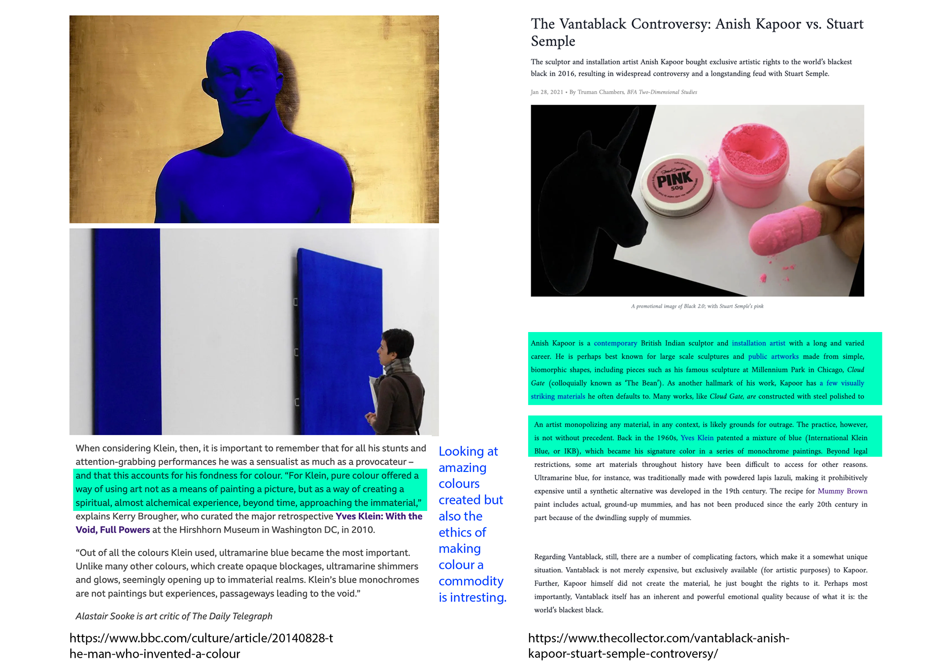
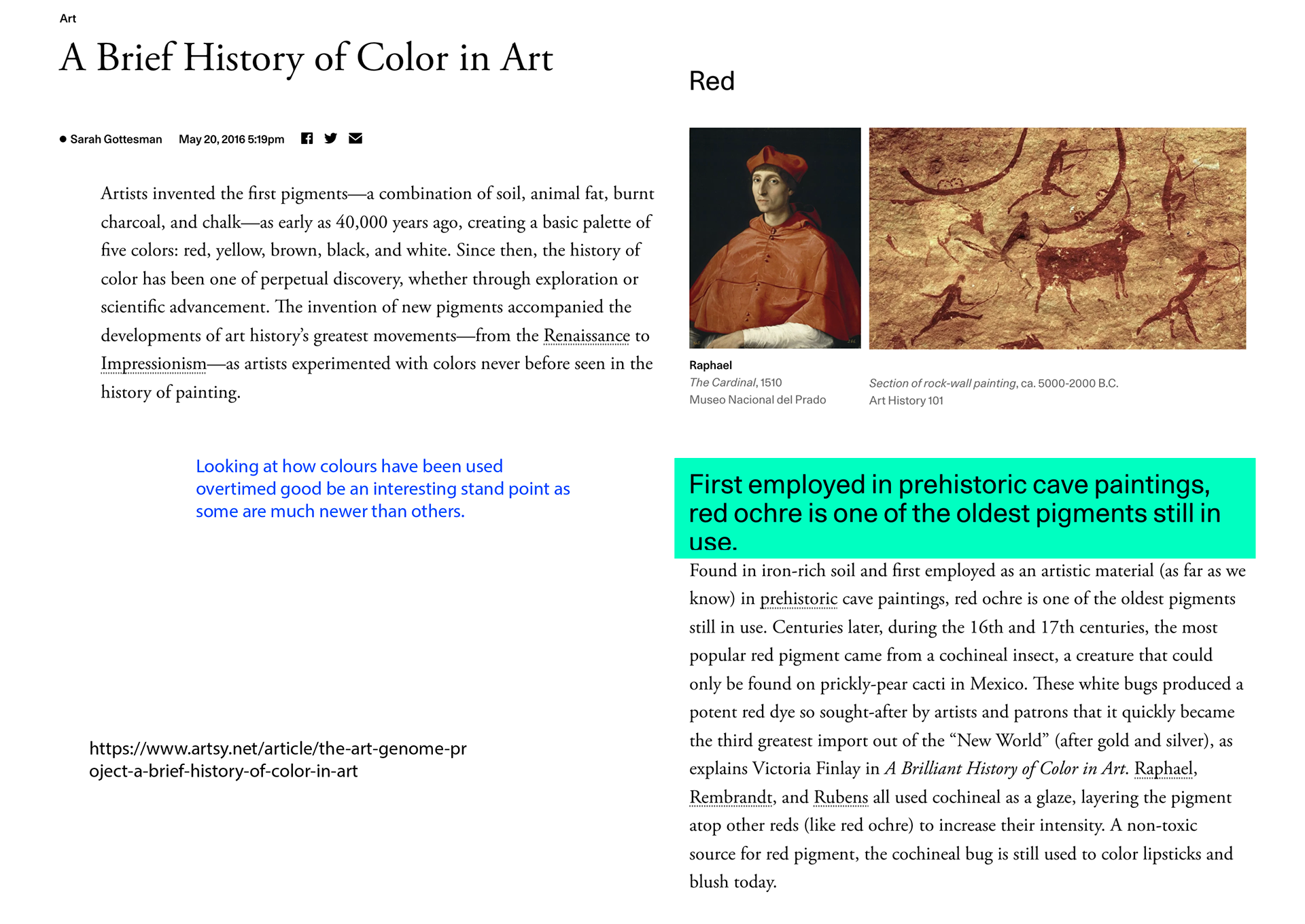
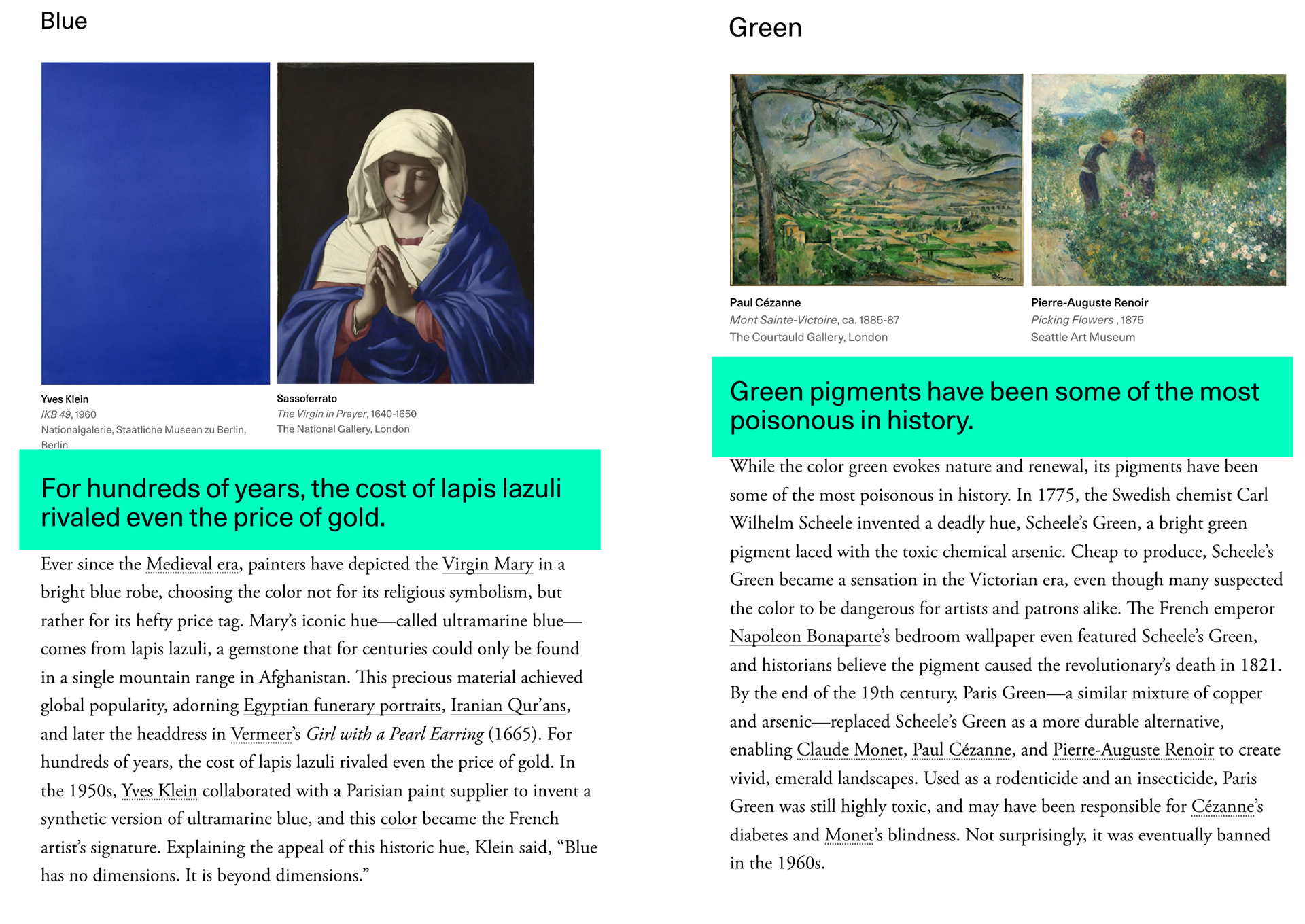
Highlighted in turquoise are bits of information I feel is interesting and in blue are my annotated thoughts.
note: sunrise is Olafur Eliasson
DYES and deadly colours
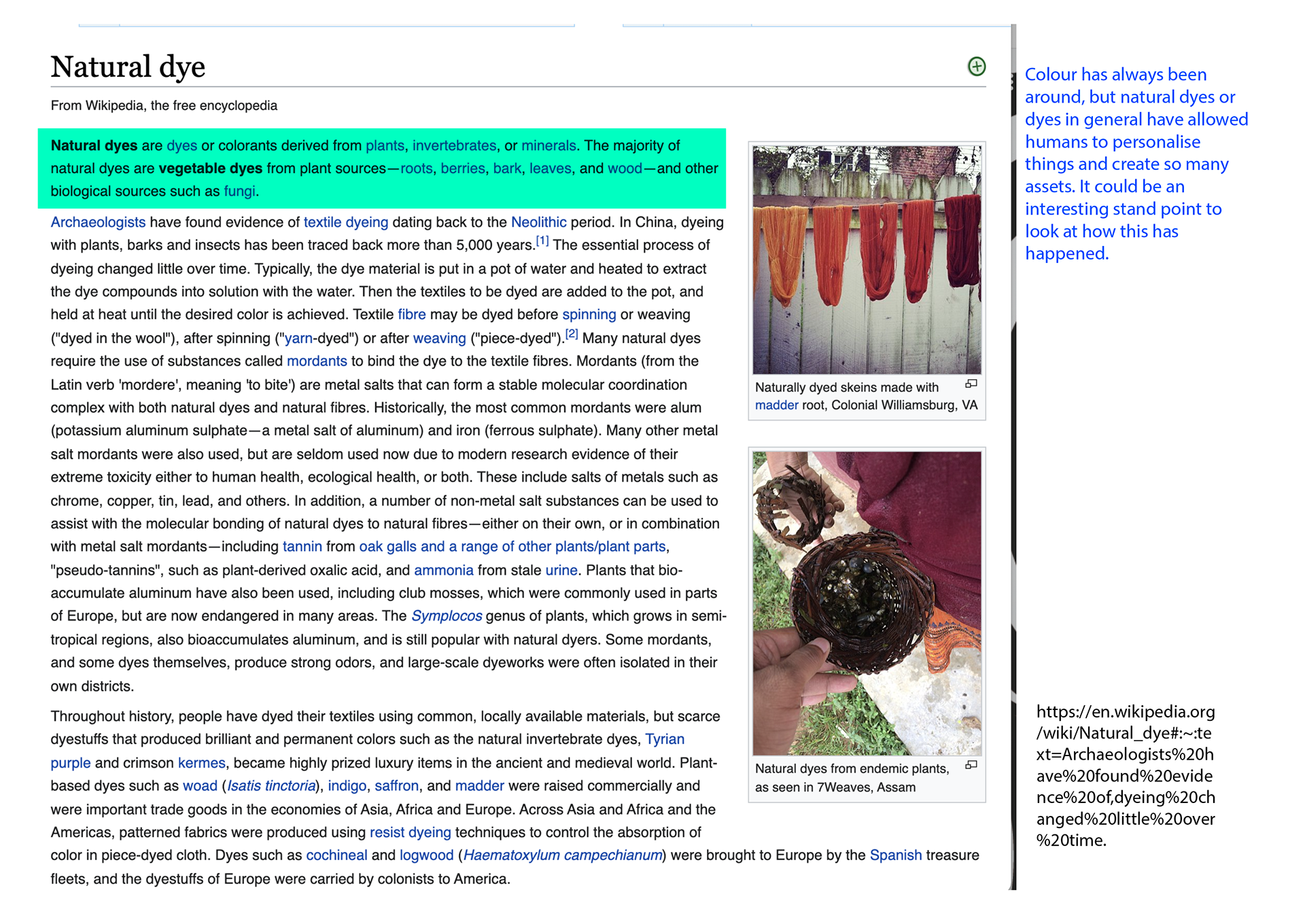

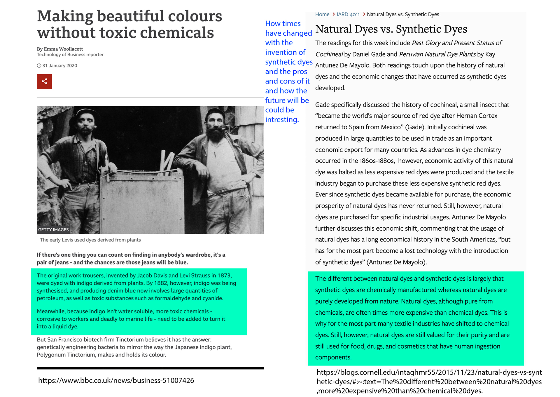
Highlighted in turquoise are bits of information I feel is interesting and in blue are my annotated thoughts.
It's interesting how so many colours have toxic backstories and they have gone unnoticed.
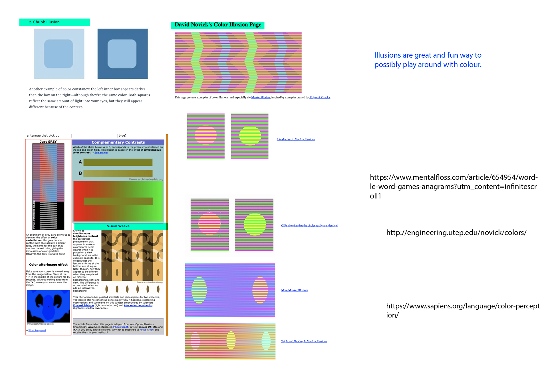
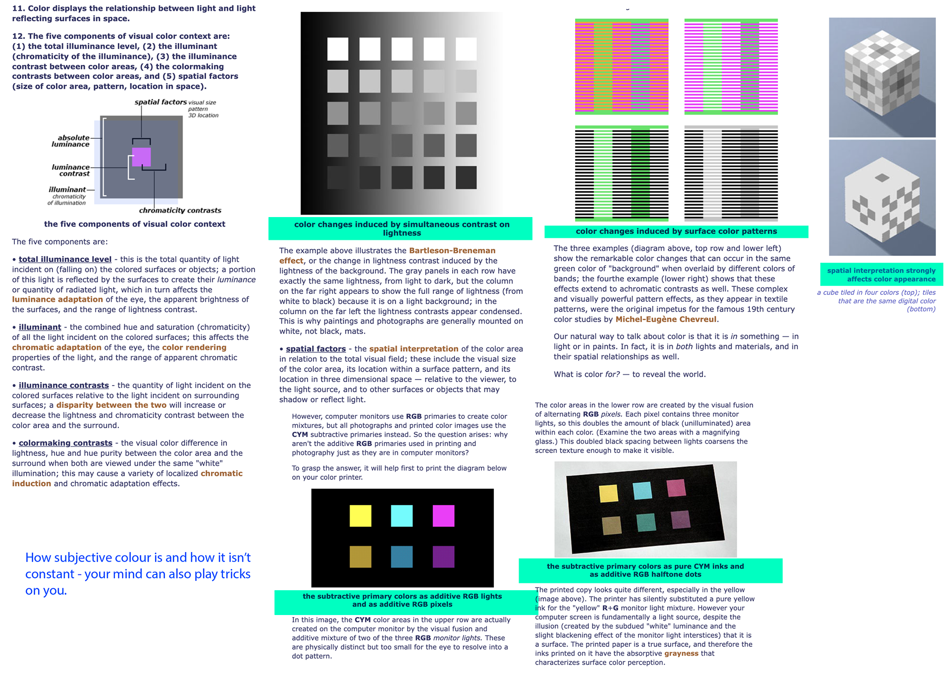
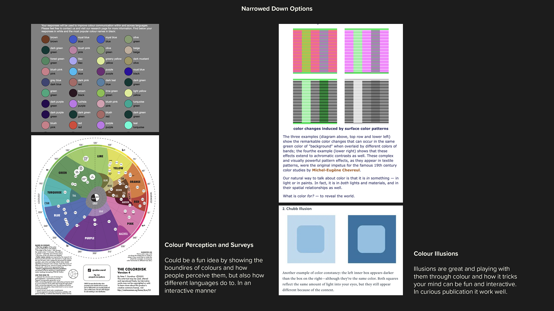
Is your Red the same as Mine?
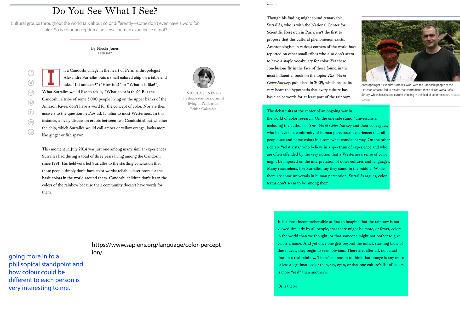
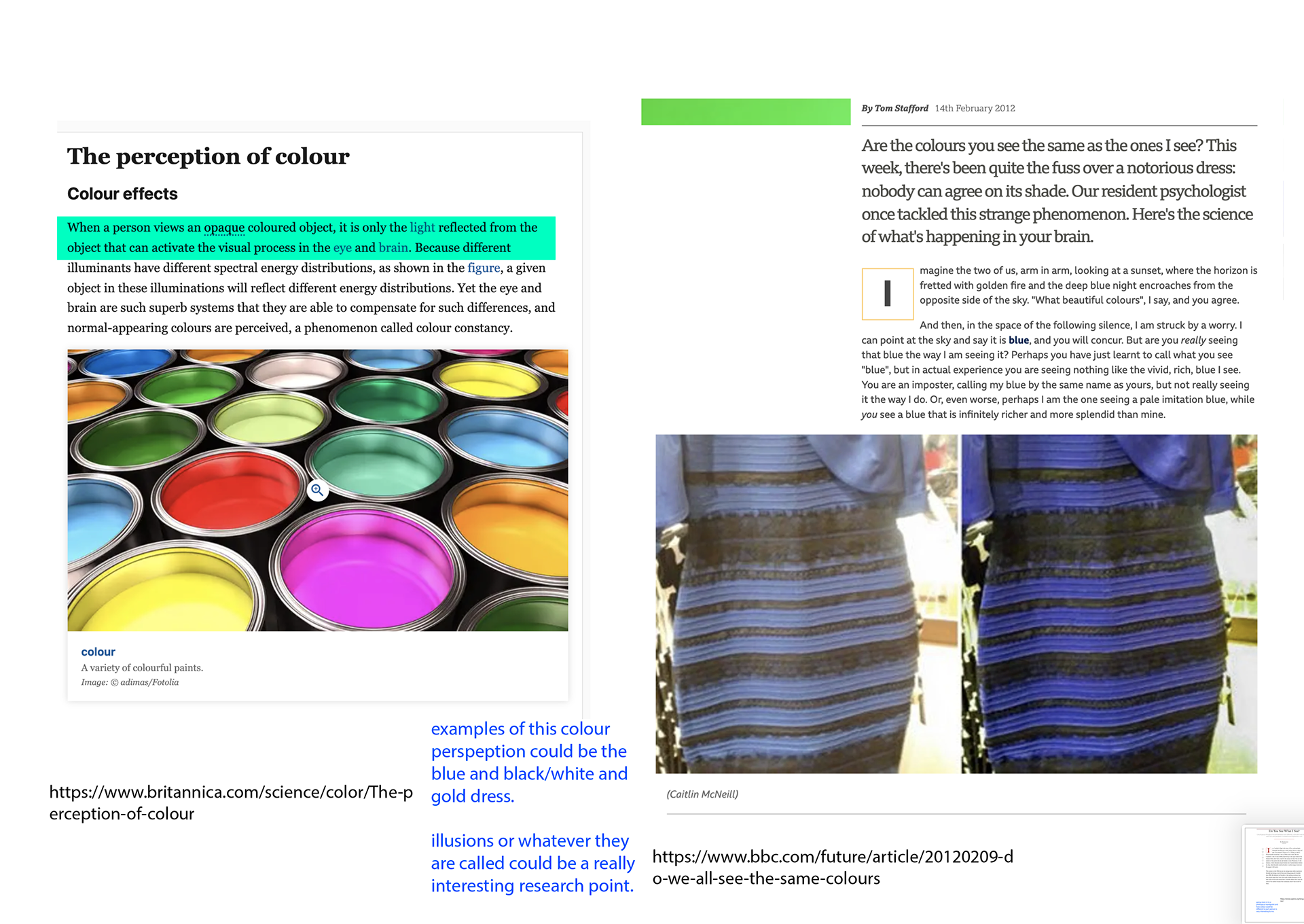


Highlighted in turquoise are bits of information I feel is interesting and in blue are my annotated thoughts.
It's a thought I've have pondered about colour perception and could be a fun thing to explore. I will say most colour does seem to be perceived in similar ways but even still there are some differences e.g. blue and black vs gold and white dress.
Forbidden Colours
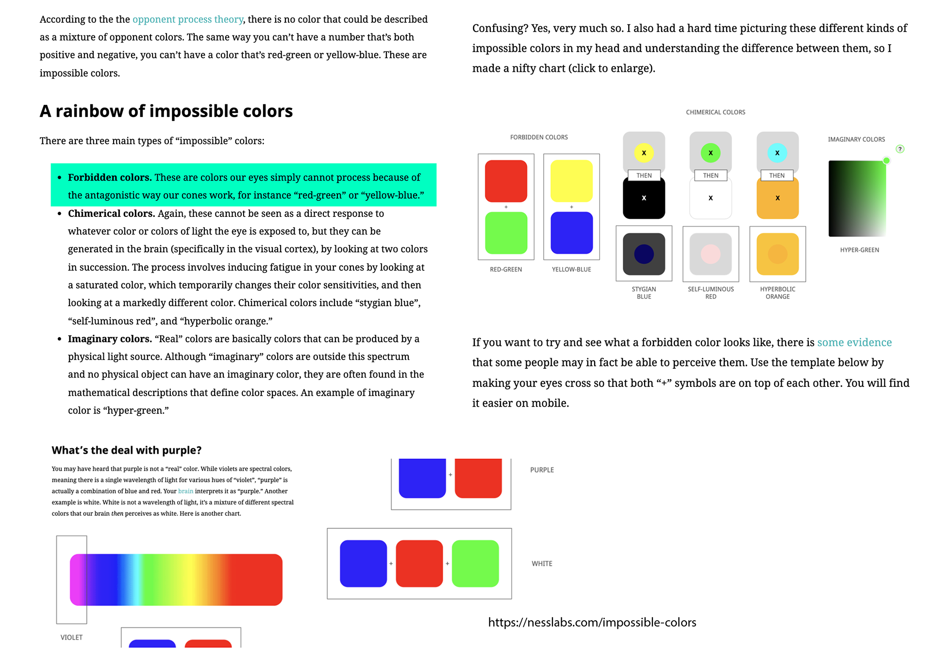
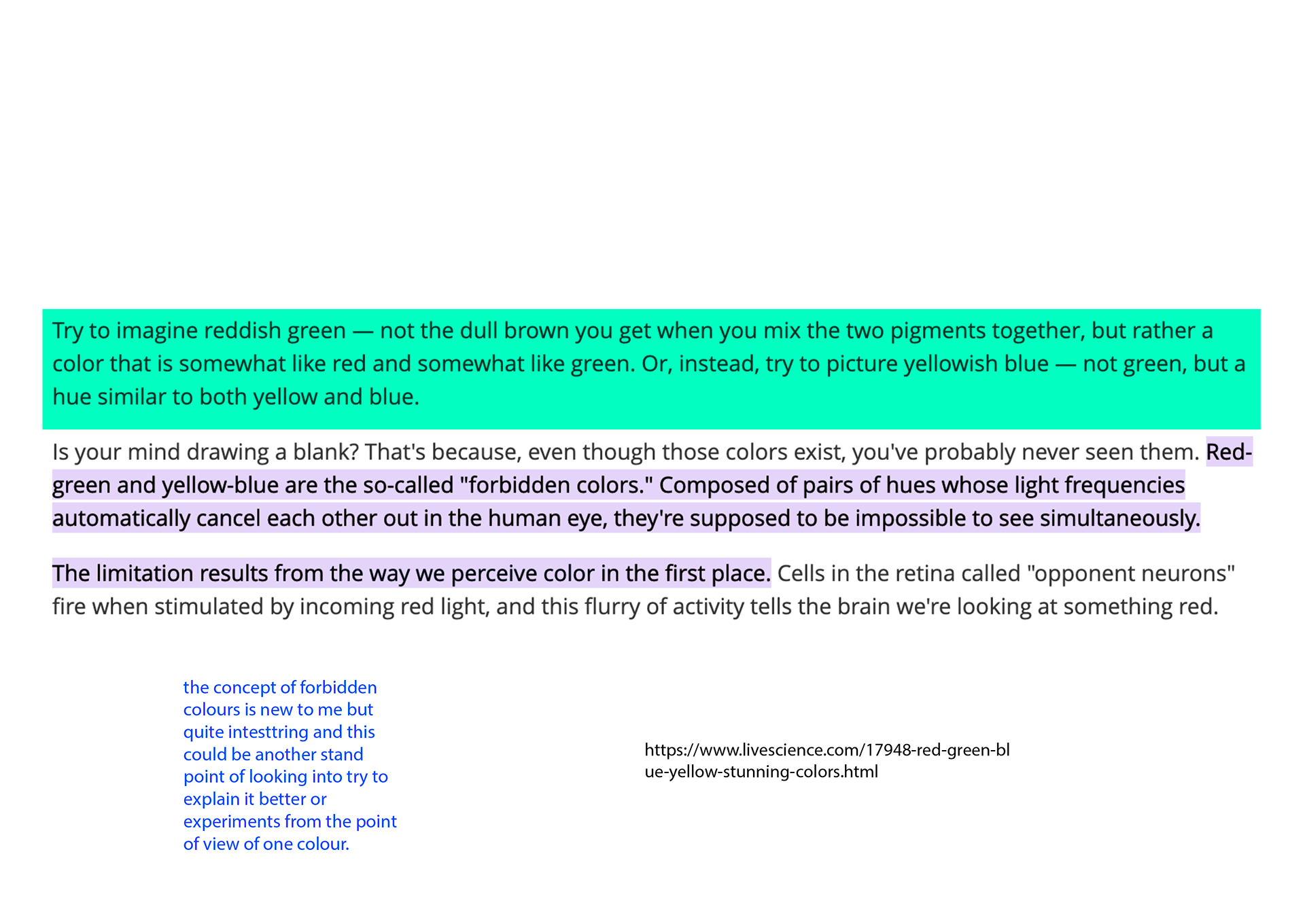
Highlighted in turquoise are bits of information I feel is interesting and in blue are my annotated thoughts.
Colour Survey

Highlighted in turquoise are bits of information I feel is interesting and in blue are my annotated thoughts.
Visual Moodboard
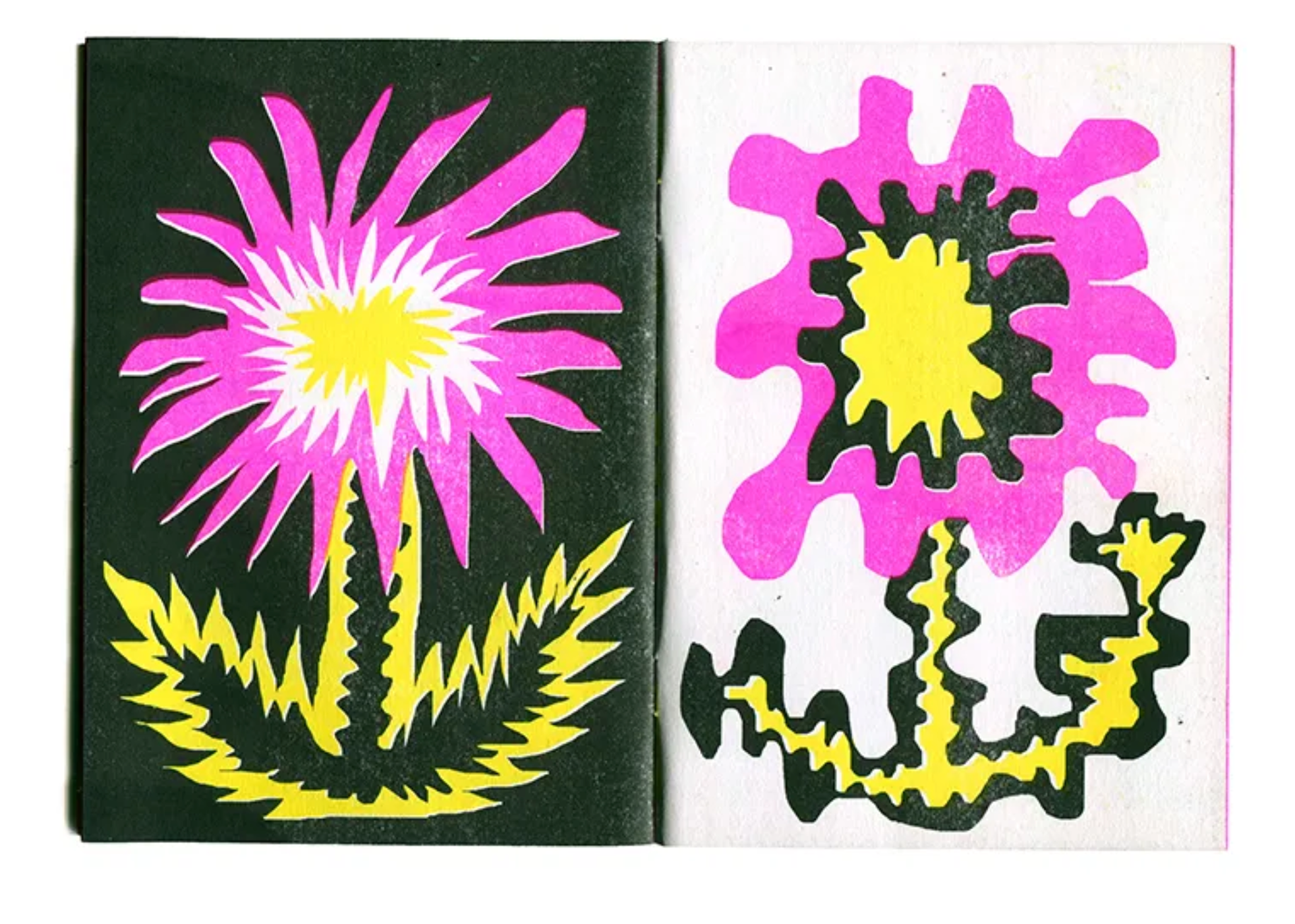
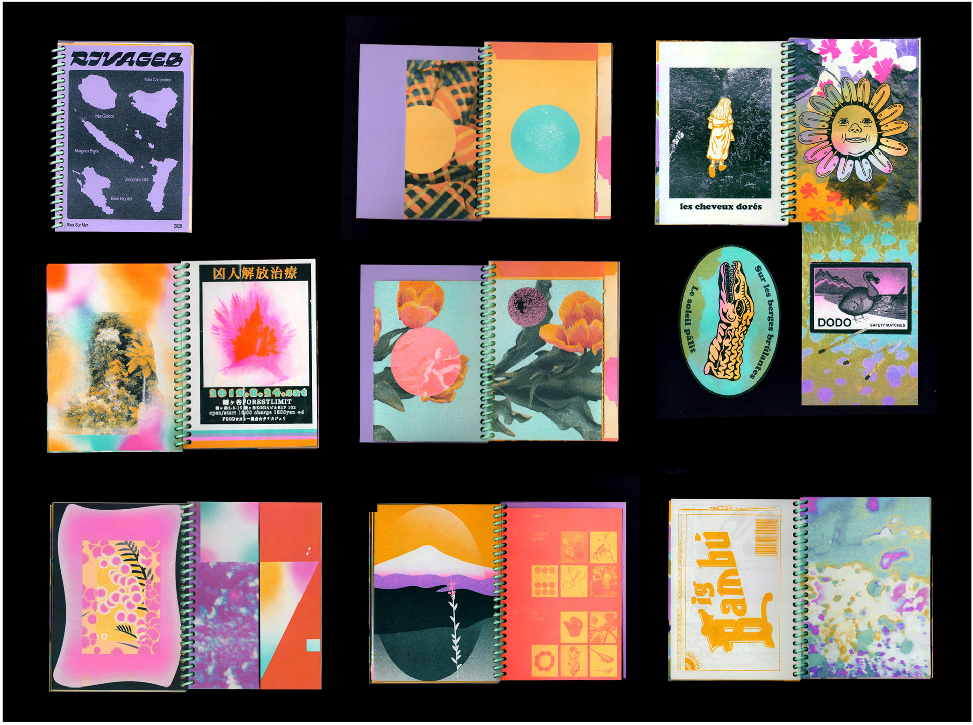
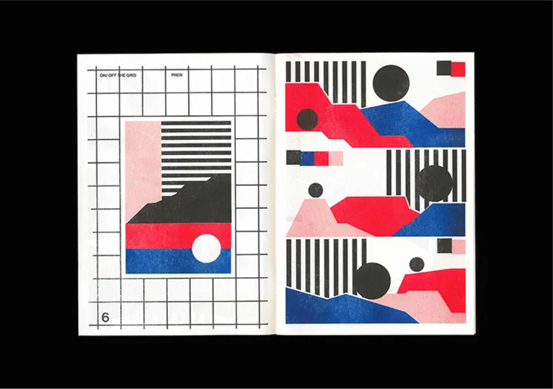
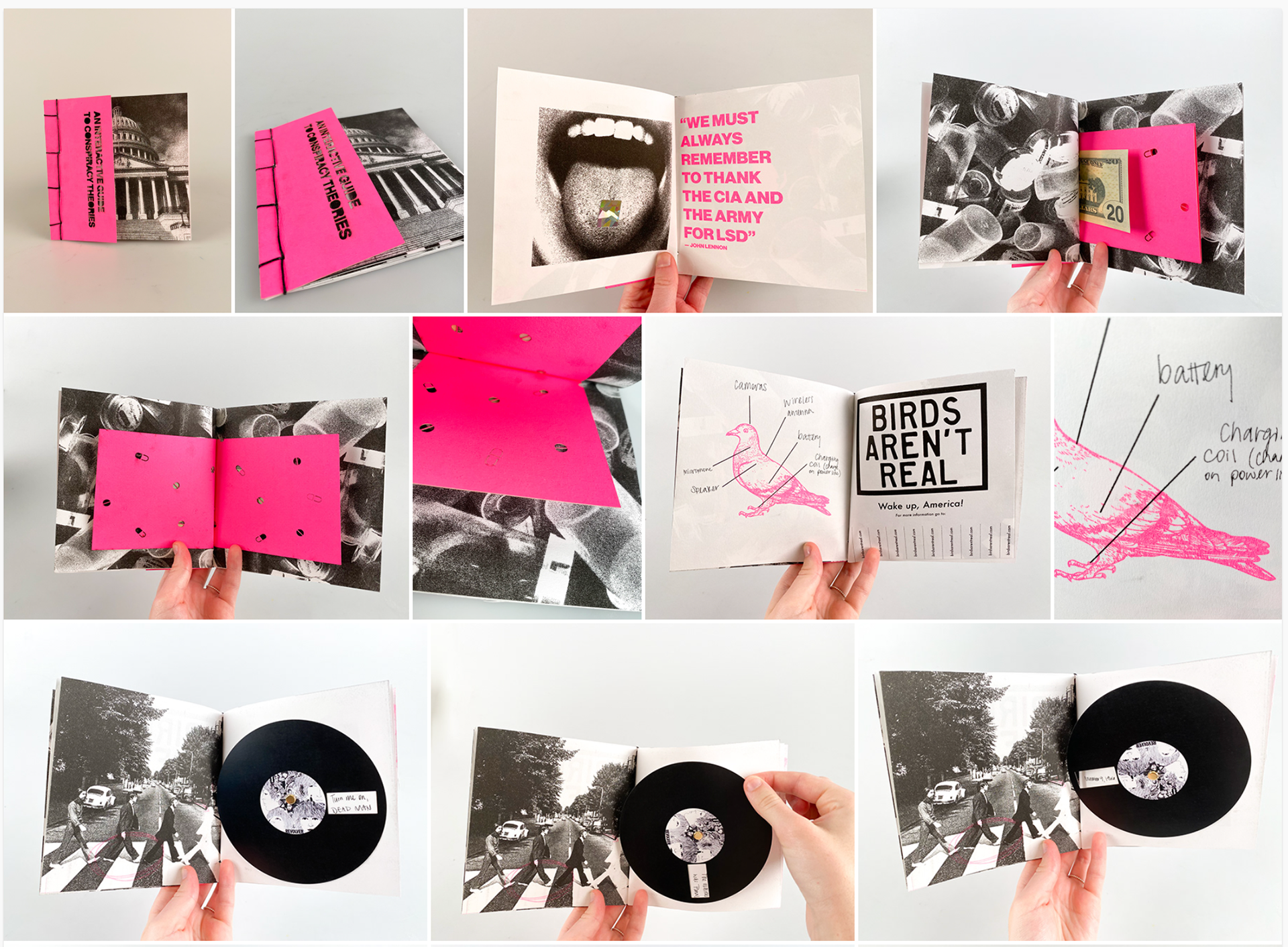
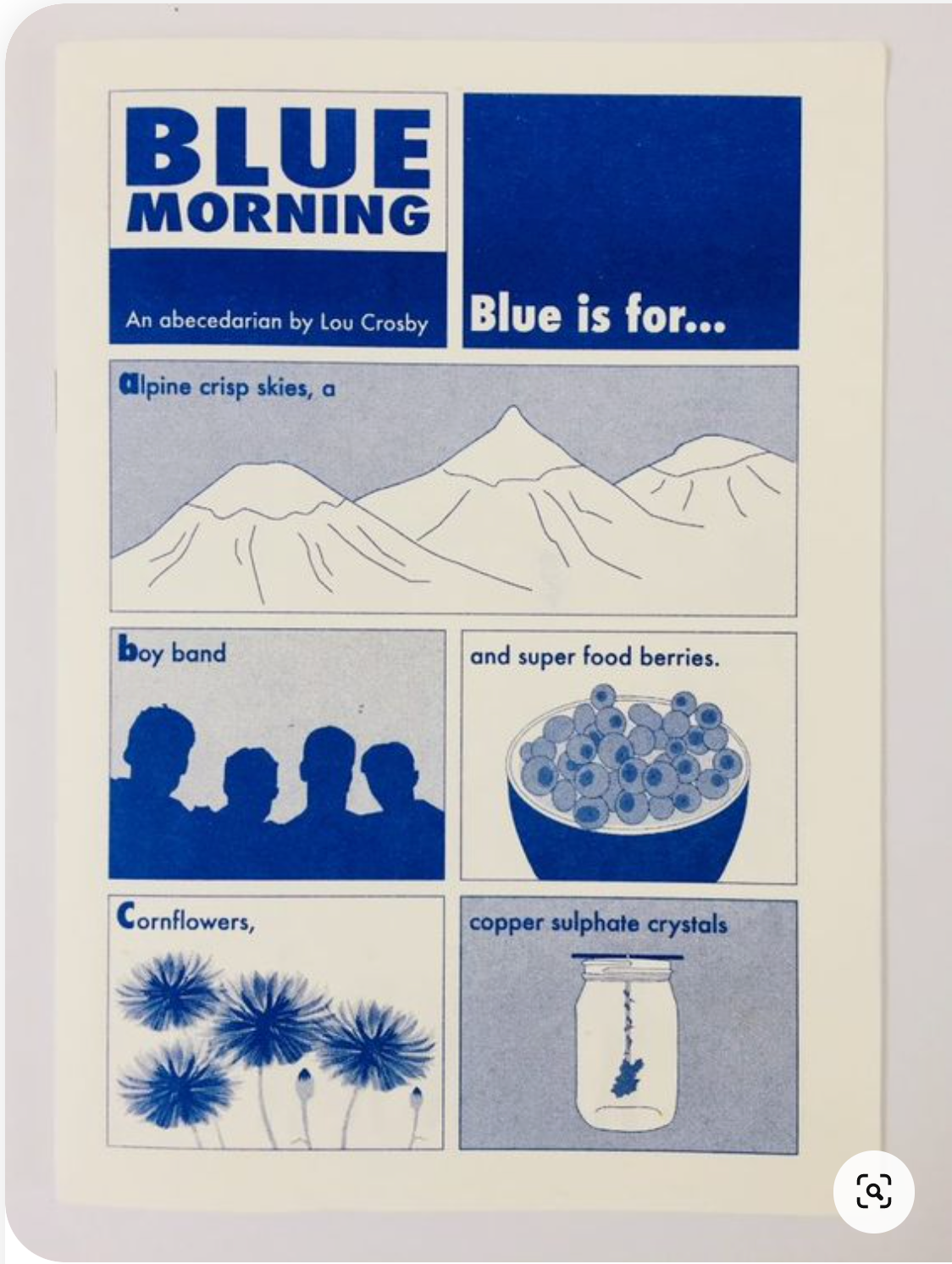


This is visual moodboard I put together with printing methods and design styles I like. I feel gravitated towards RISO for it's sustainable properties and the most vibrant colours available to me.
I like the interactive and playfulness of a variety of tidbits, pull outs, layers etc as I feel it makes the viewing experience enjoyable.
Presentation


This is the presentation I put together to show my initial thoughts and directions I want to go in.
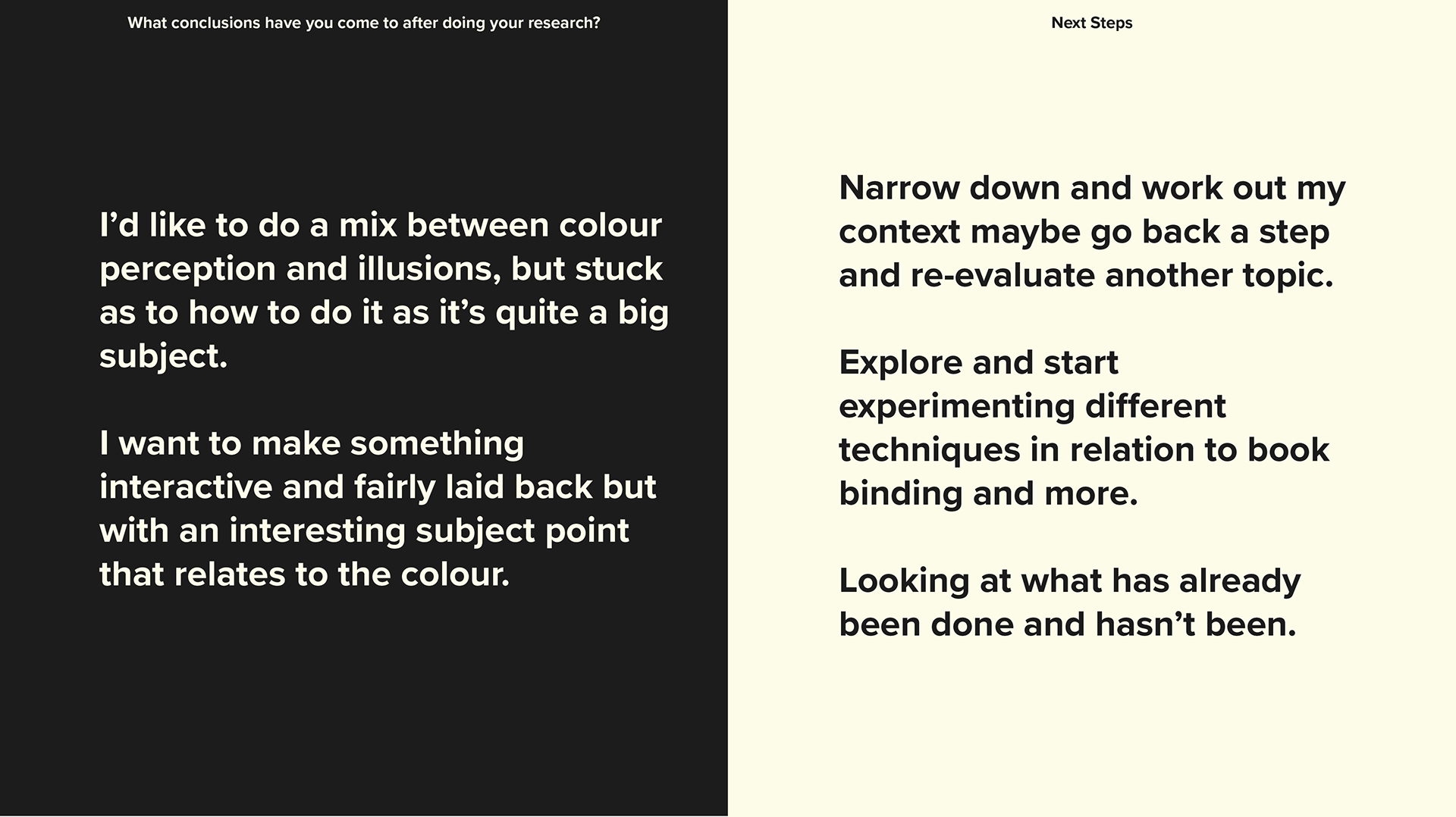
I'm drawn to colour perception and illusions as they are interesting and complex topics that if used correctly it could create a fun but informative publication. And I'd hope it would maybe change perceptions.
i like depending on people's experience it may alter what they call certain colours or if you pair colours in a certain way or setting it can alter their appearance. I like the playful qualities this could lead to but I talked about because it is quite a complex topic i'm not sure what the best way to do this would be.
I've also showed some book binding styles that i've briefly looked at to show what I have been thinking.
My next thoughts are to narrow down and work out my context and maybe go back a step and re-evaluate another topic. This is because I worry I'm a little out of my depth.
FEEDBACK
Some feedback I got was how colour perception is a large topic so if I were to follow that path it's to work out what am I trying to do with it e.g. is it educational, interactive, for kids etc. But that it may be good to go back a reevaluate what I want to do and why I want to create it.
I mentioned I want it to be interactive, but what does that mean? in which ways can this happen>
Things to Develop

These are some notes I jotted down after presentation in my tutorial. It explains things to explore and looking at blue pigments overtime, things I see like a visual diary as well explaining why I am moving away from colour perception. Also to test other techniques.
Also to pick just one colour: I have chosen blue.
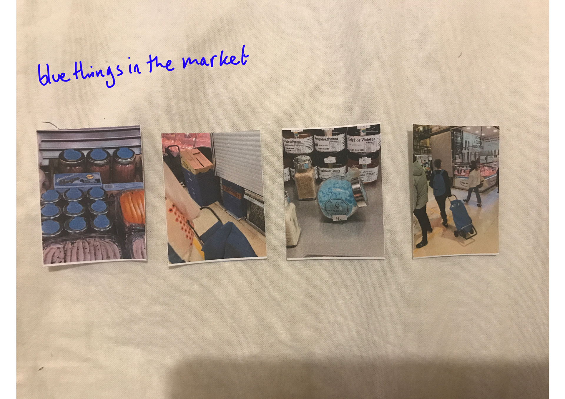
BLUE THINGS


Searching blue on my photo album comes up mainly with blue skies. I'm so sure this is interesting enough but I could make it work if I explore it.
Blue Pigments
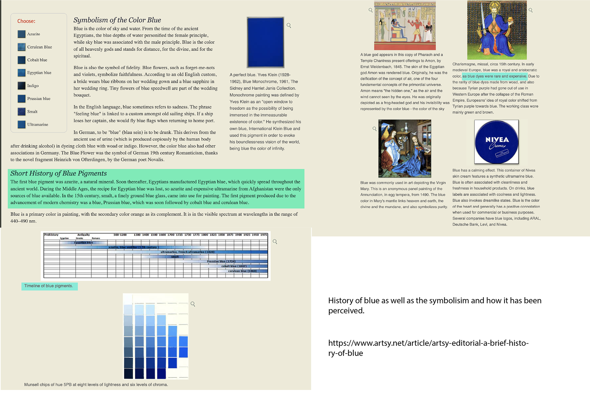
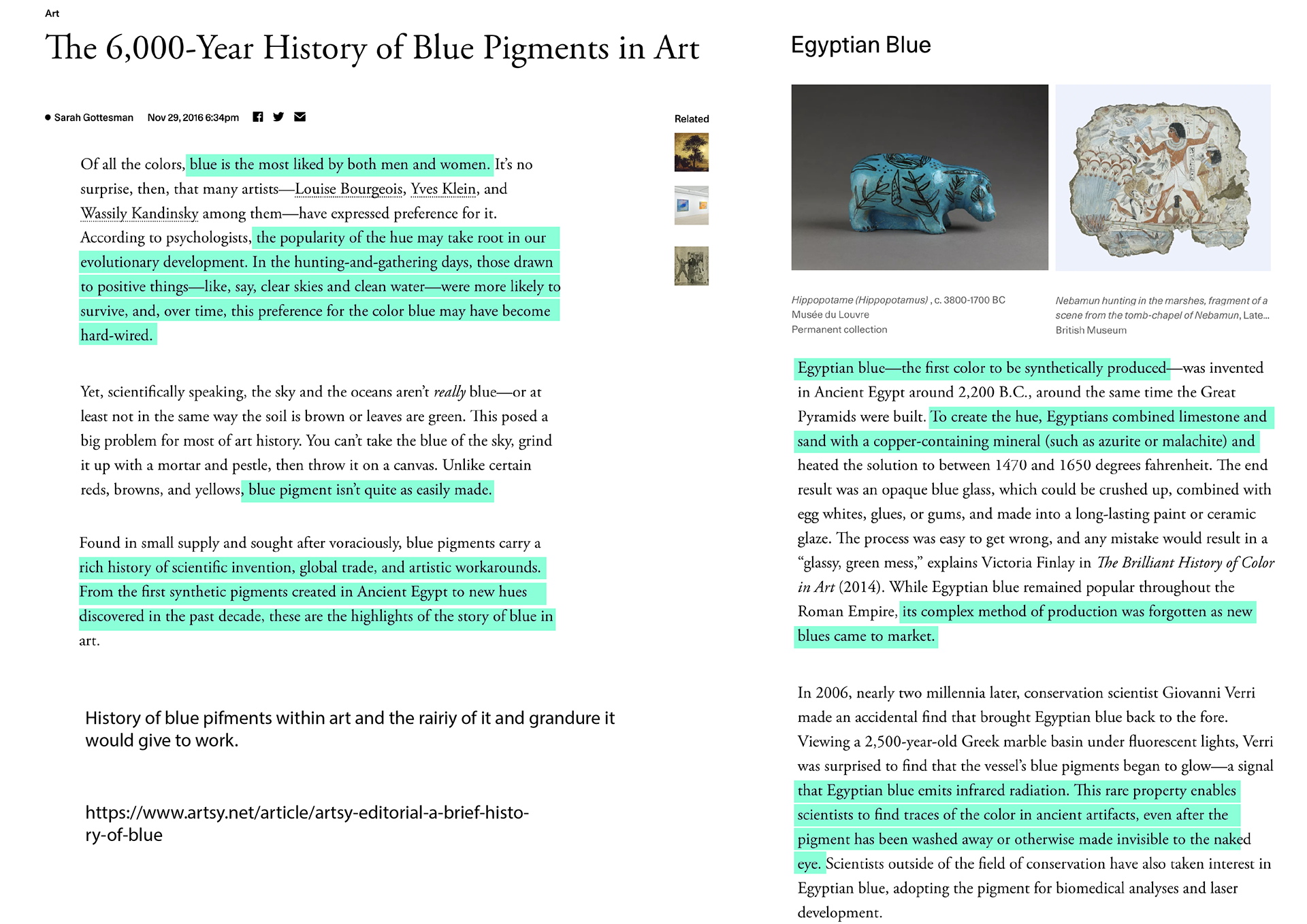
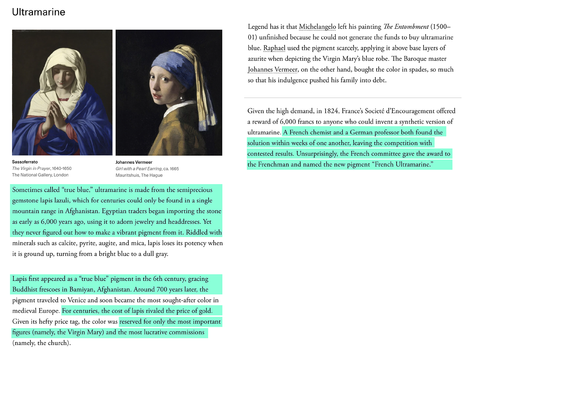
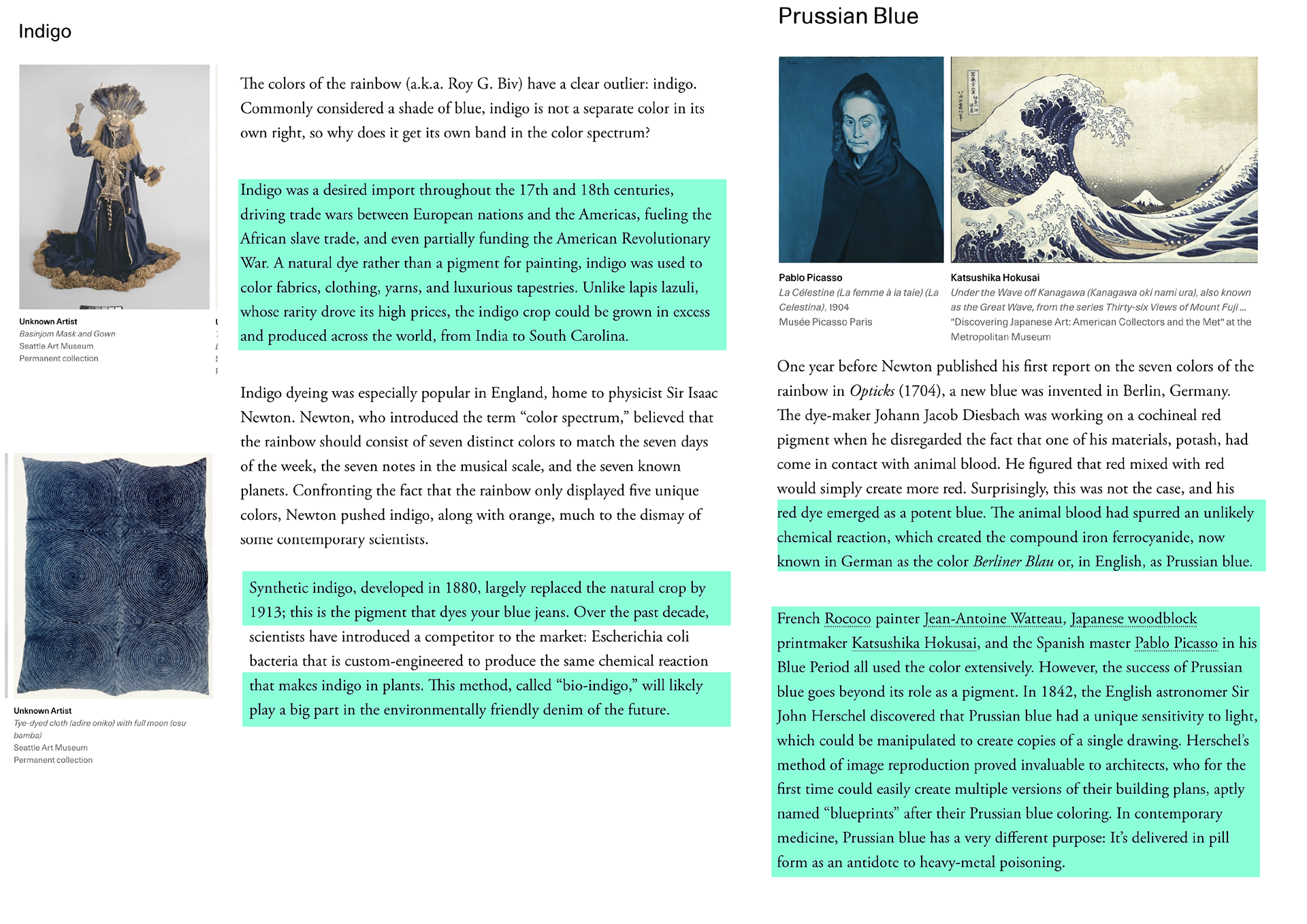
Highlighted in turquoise are bits of information I feel is interesting.
Impact of RGB
Notes from things I read from my research and angles to look at and things to look at experiment with.
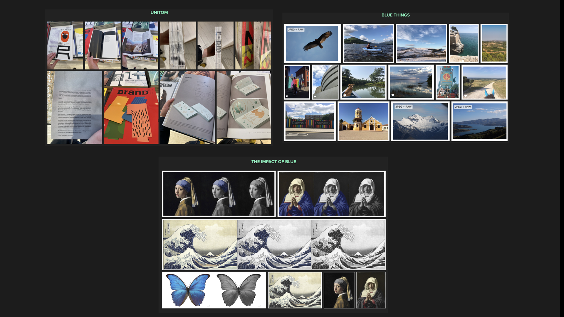
The Impact of Blue
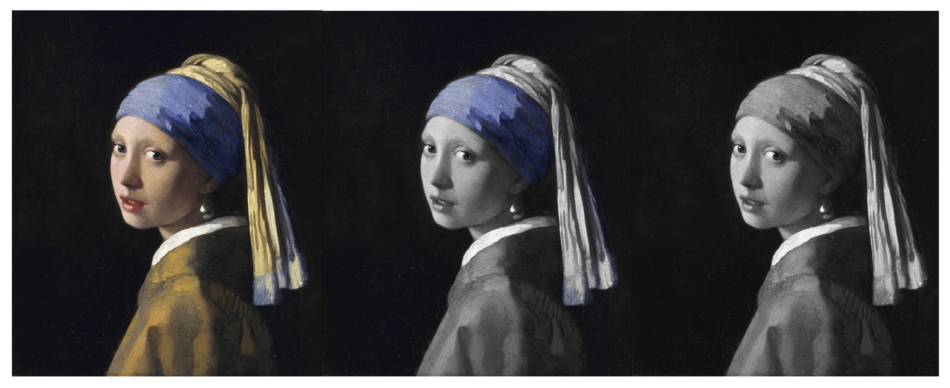
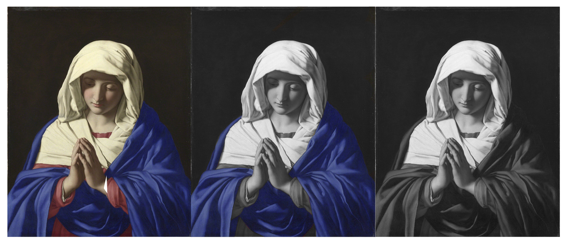
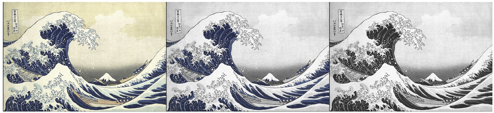
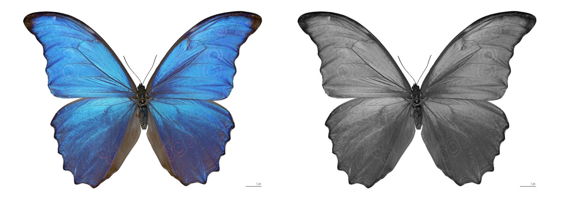

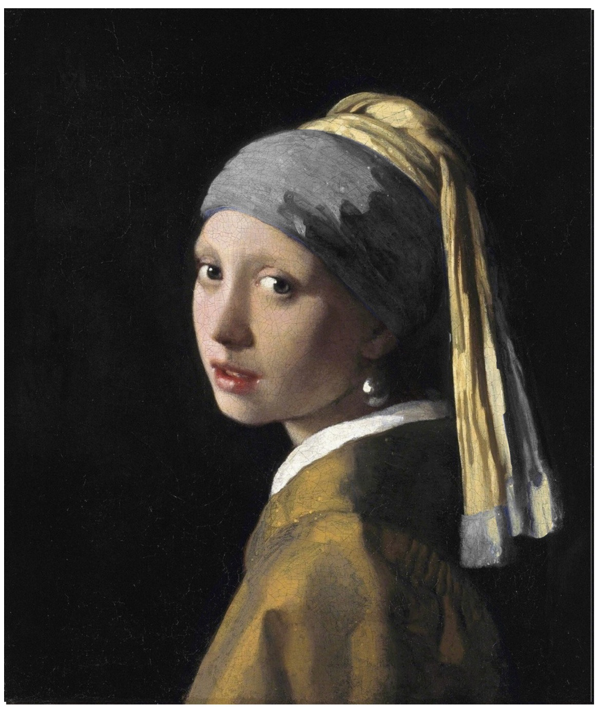
These are some experiments I did where I took away the blue from famous things and also took away everything but the blue. I did this to try and show the impact of blue.
Maybe something showing the impact of blue could be what I do with this.
RGB Split
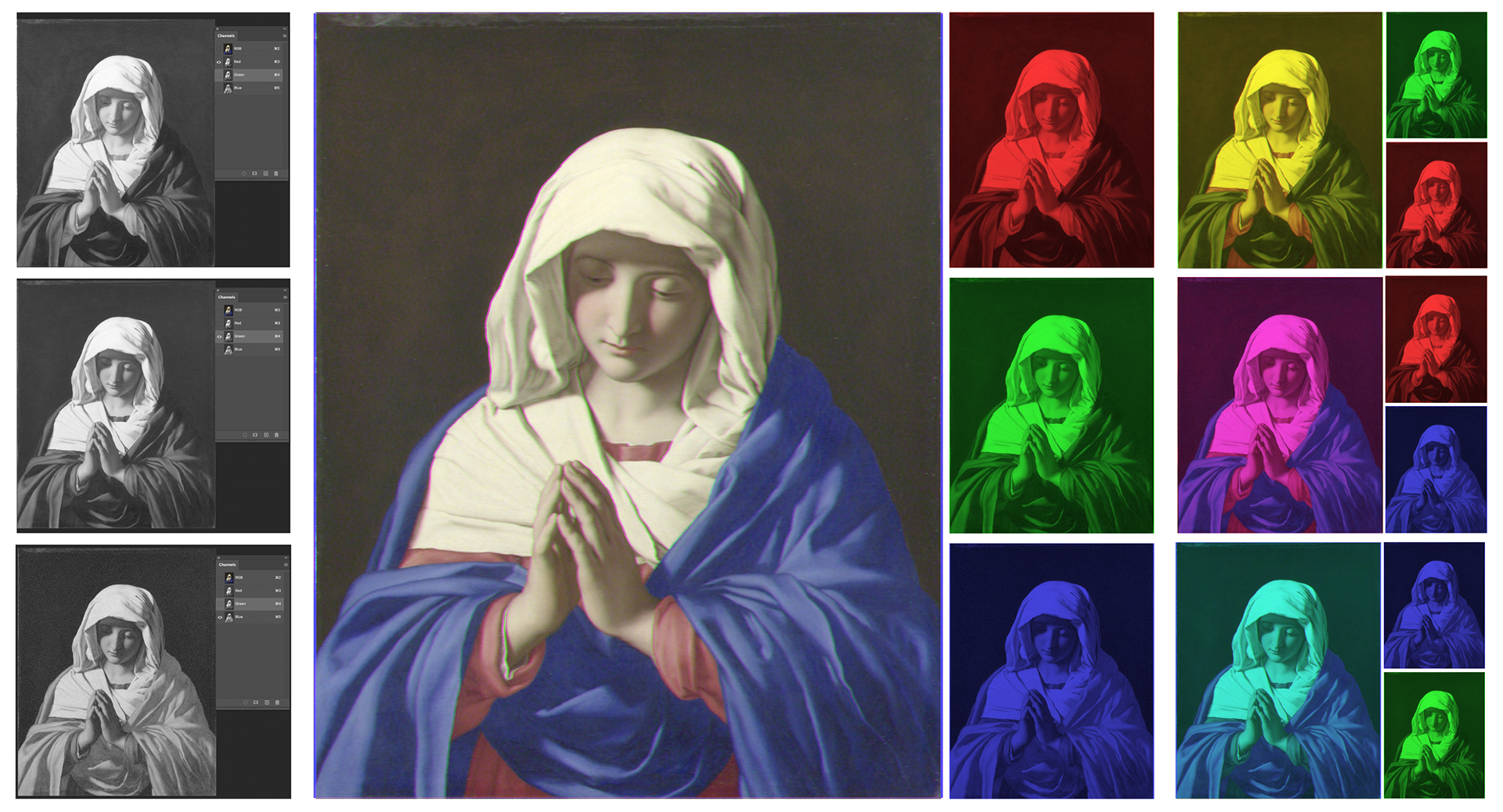
Since the brief is called RGB I wanted to try in Photoshop splitting up an image to see if I the overall RGB collection could be overlapped with filters to give the full image or just showing the blue layer for images/photographs/artwork.
RGB only work works on screen however so it doesn't really work.
CMYK COLOUR SPLIT

I tried it with CMYK and experimenting with different blending methods with cyan, magenta, yellow and key as well as red, green, blue and black to see the difference it makes. I feel I could play around with this.
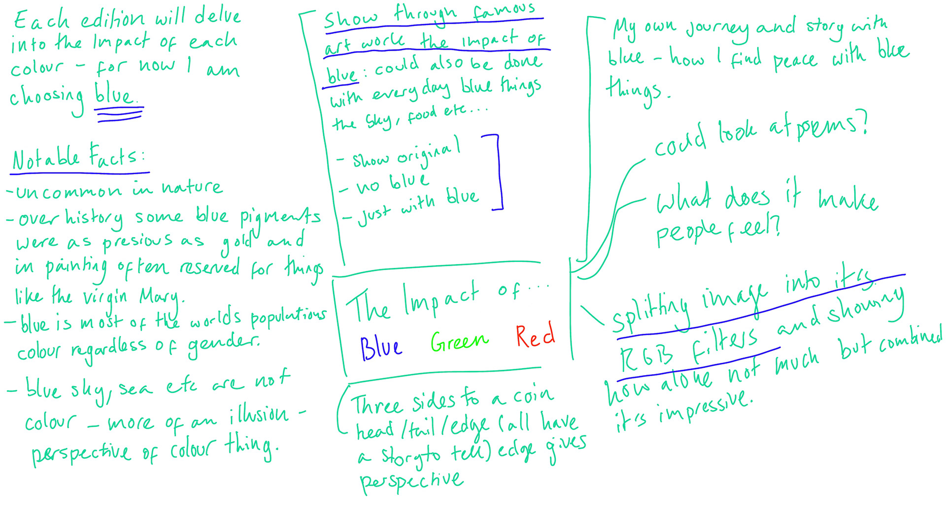
Feeling Lost - Things to Consider

Feeling a little lost so wrote down what I was thinking and ways I could present as well routes I could take.
Read my brain storm.
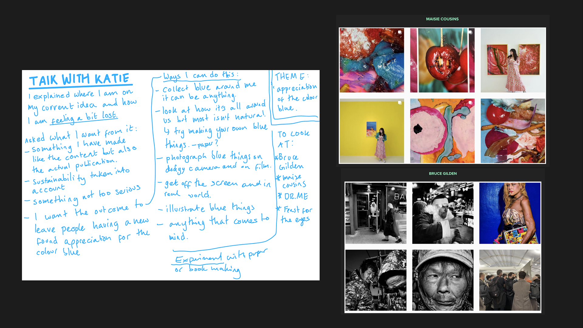
One to One Tutorial
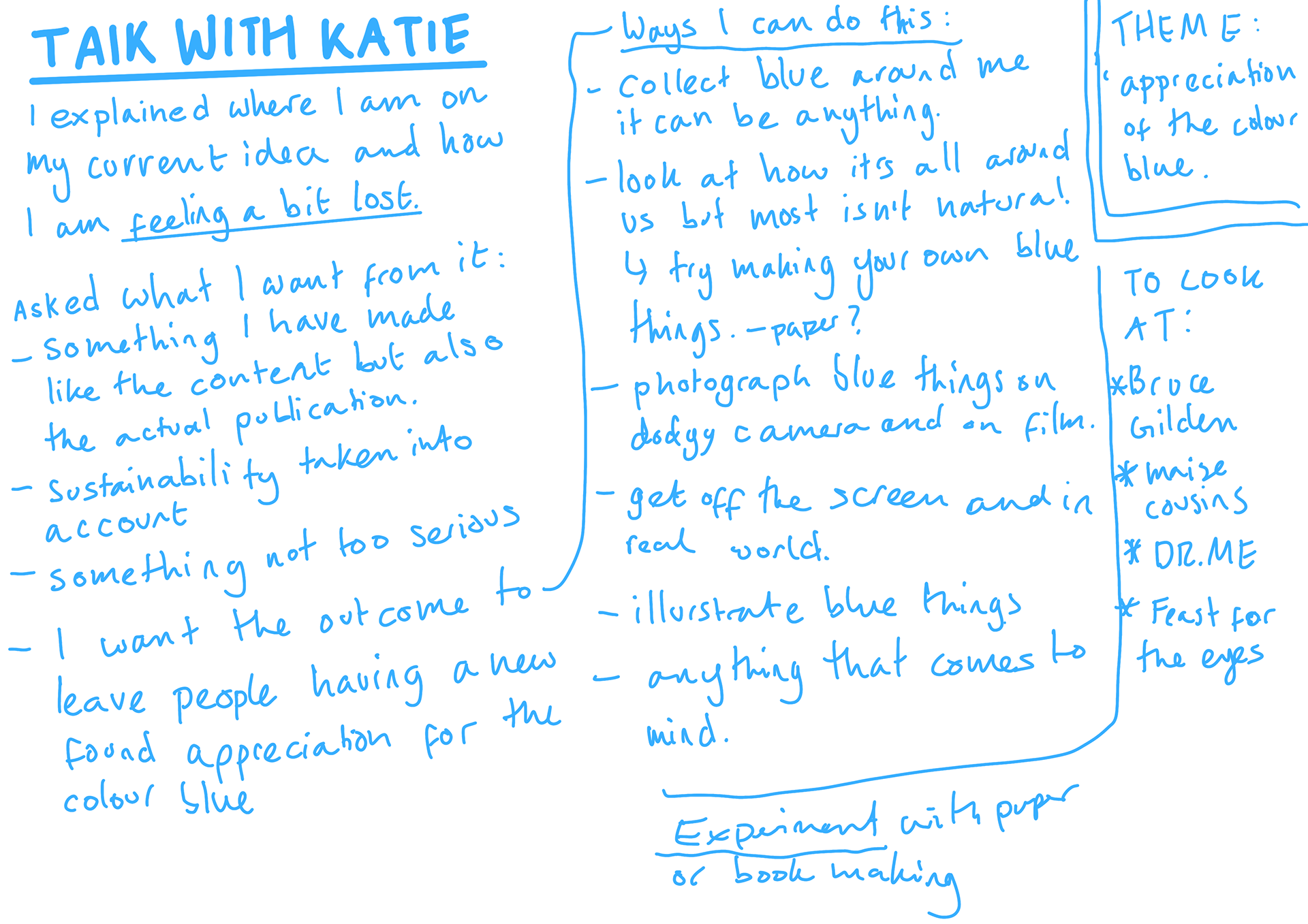
I had a tutorial with katie explaining how I am feeling. She asked what I want from this project, which I don't think i have thought about enough. I want to make something and try a be away from the screen a bit. I like scrapbooks and zines and like the handmade and personality to them. I want people to read my publication leaving with the feeling of a new appreciation of blue.
To begin I am going to collect blue things and takes pictures of them when I'm in Spain visiting my mum.
Katie also recommended some things to look at.
Current theme: appreciation of the colour blue
Read notes from talk.
Dr Me

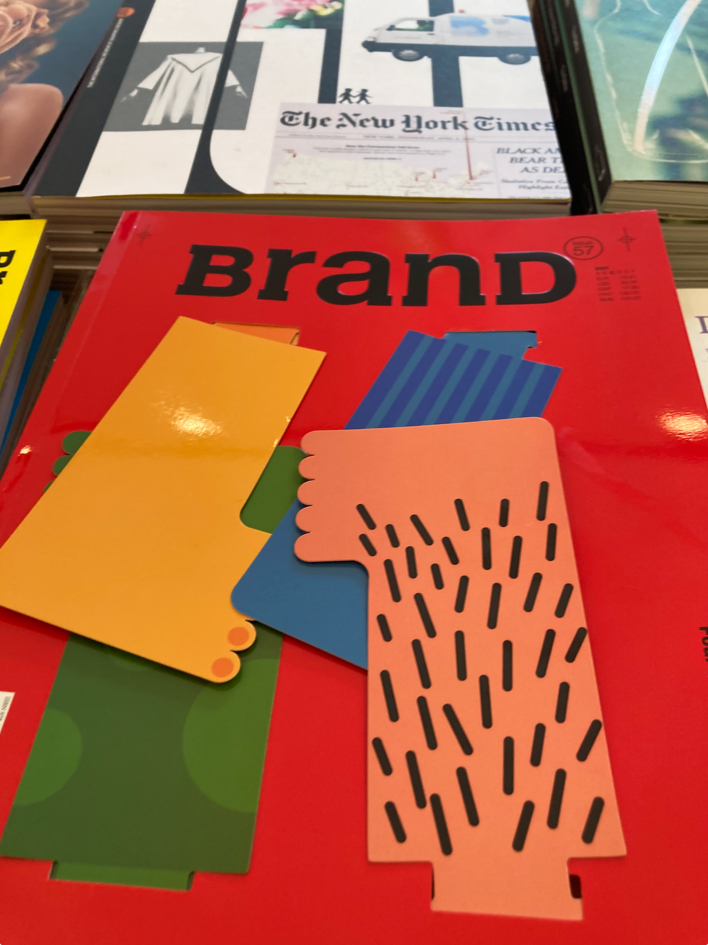
The DR Me publication mix match variety is something that I may want to take inspiration from. It seems like an amalgamation of all sorts of ways whilst still looking considered. The tidbits inside and side people has a playful aspect which I quite like.
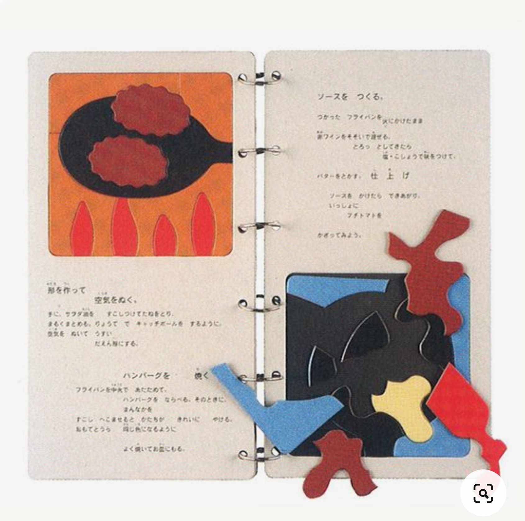
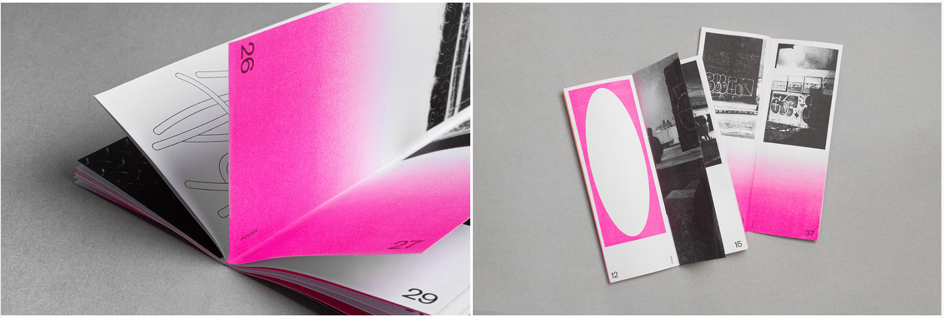
Unitom
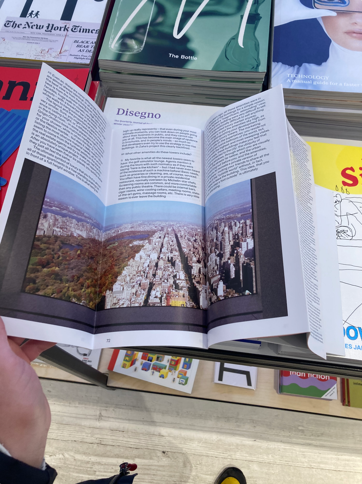
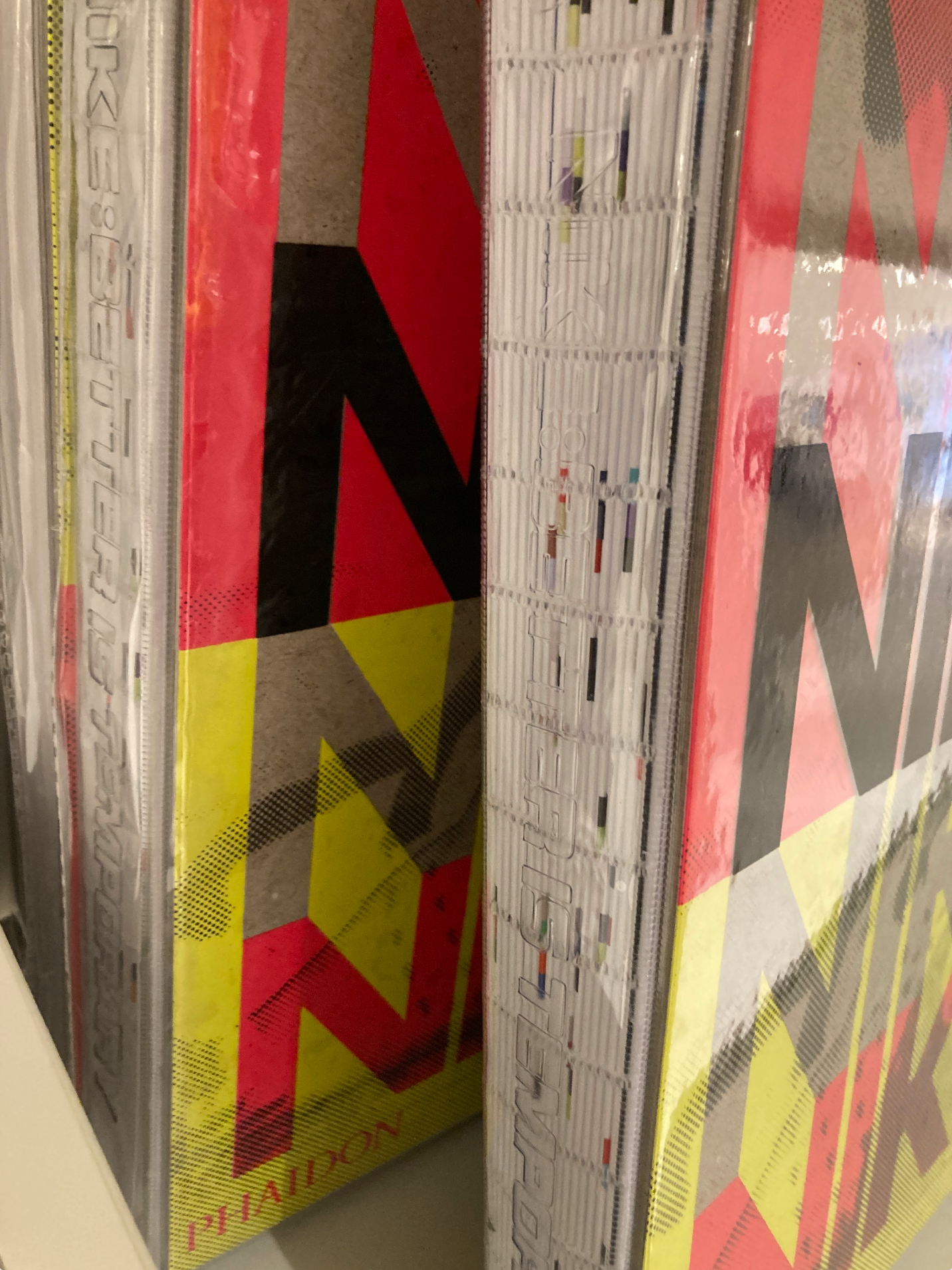
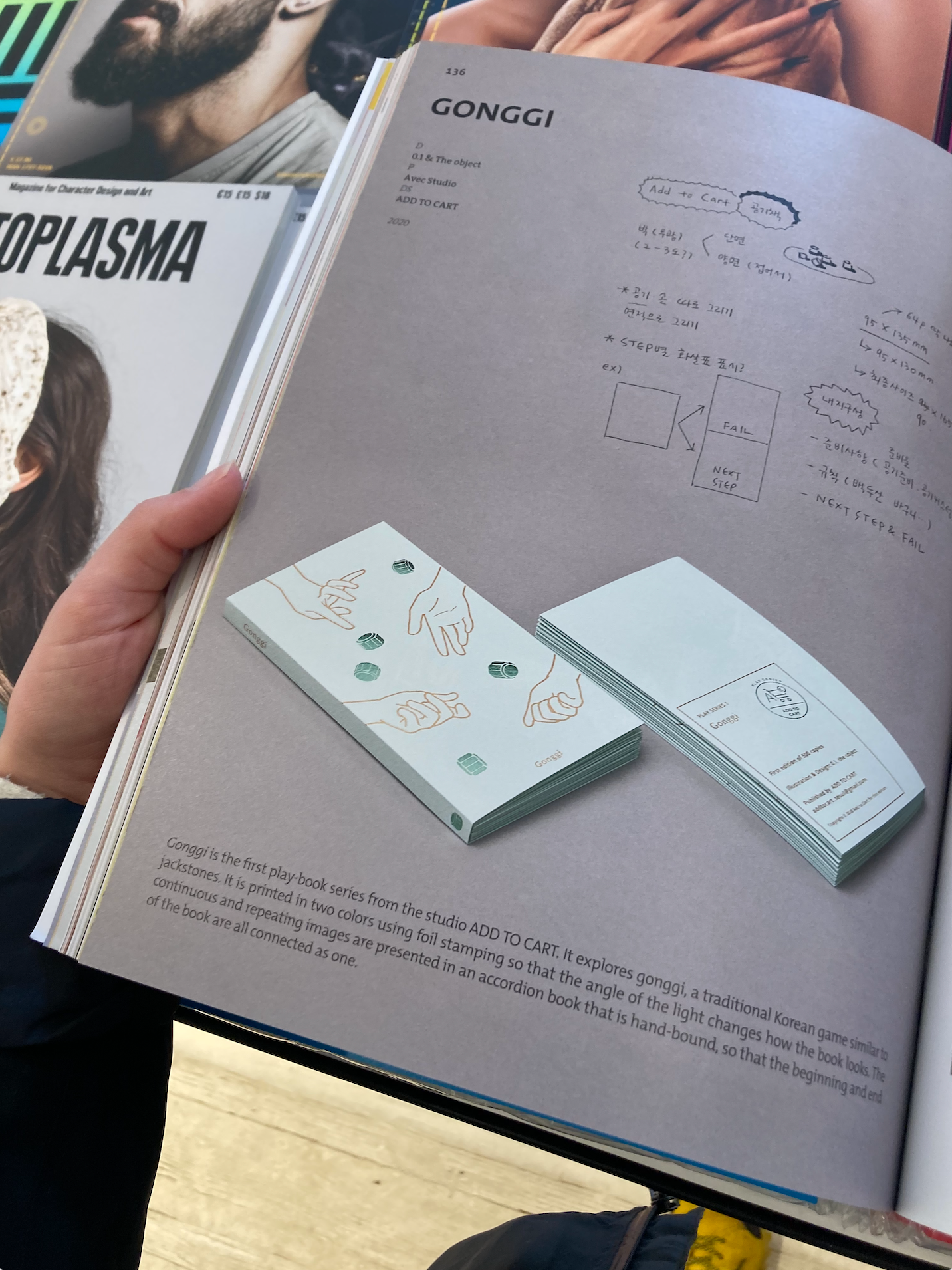

I went to Unitom in the northern quarter where I took pictures of layouts and binding techniques that I am interested in. I really like the open binding which allows for text of the spine of the book. The only thing I am wary of it many of the publications I looked at were likely a lot higher in page count than I wanted.
bruce gilden
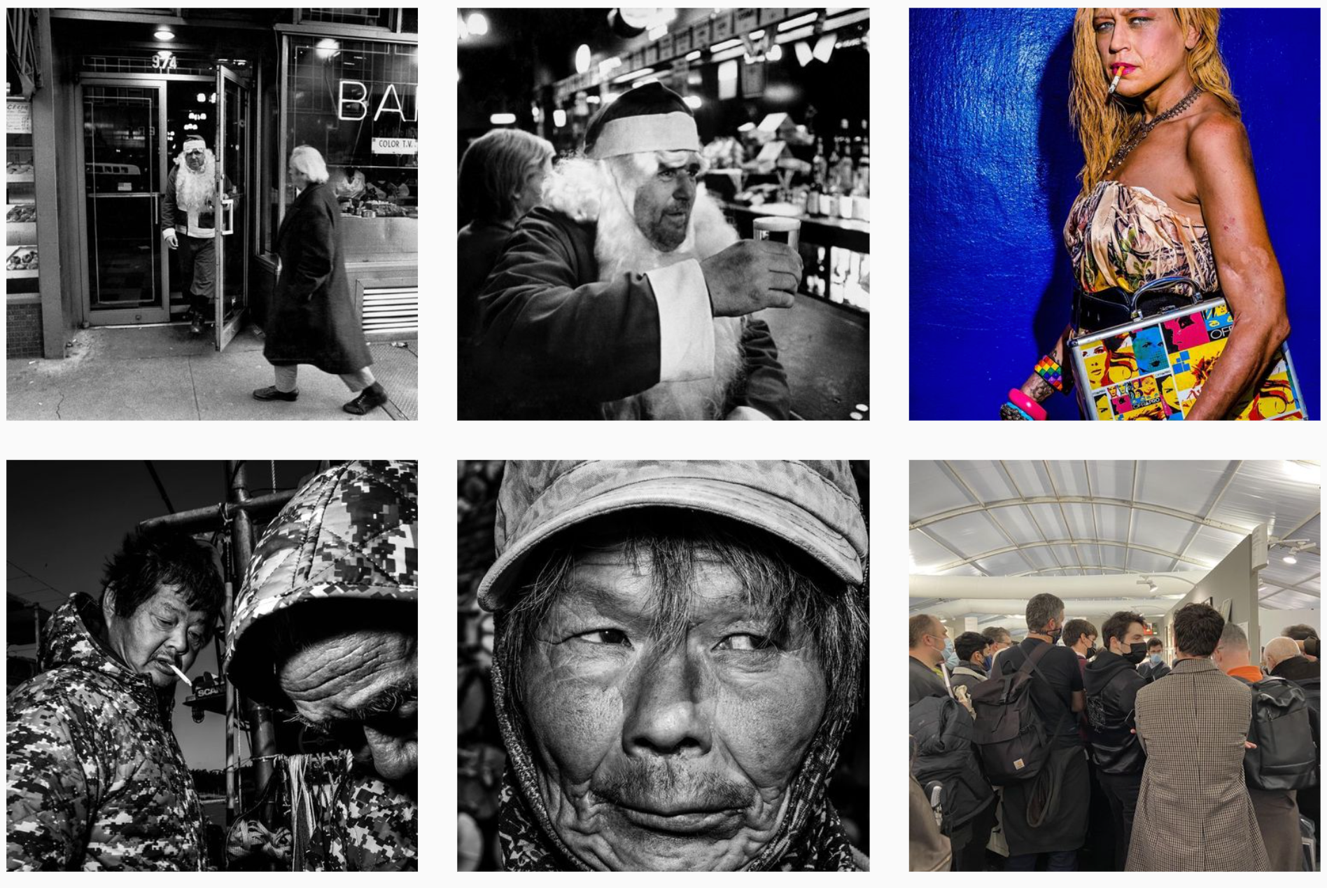
Bruce Gilden images are raw and impactful, I like the style and could see vibrant hints of blue working in this style, however i'm not much of a person photographer. But they are still good to look at.
MAISIE cousins
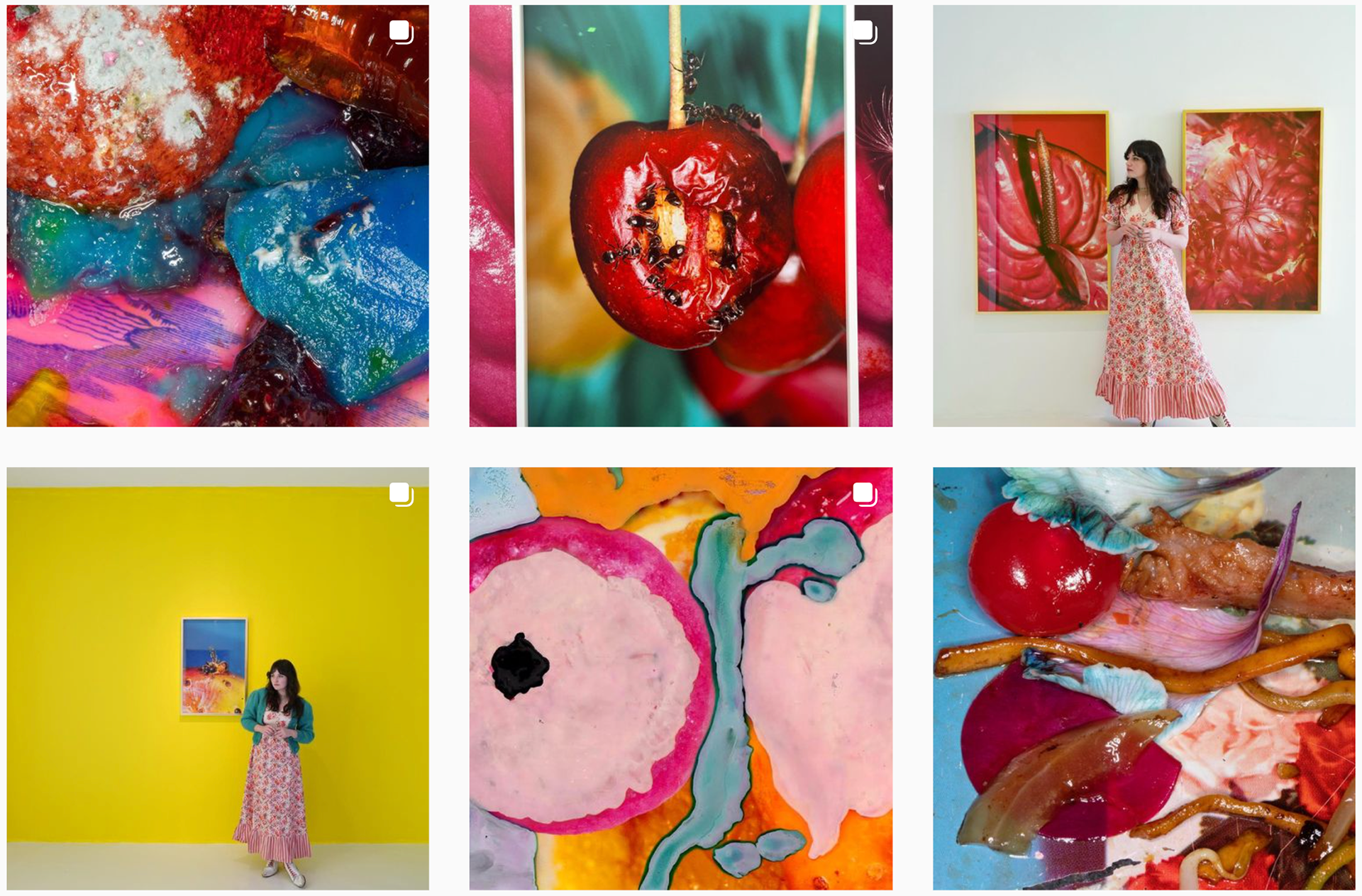
Maisie Cousins images brightness and saturation I like. The background and mix of colours i like but since I can only use two colours it may not have the same effect.
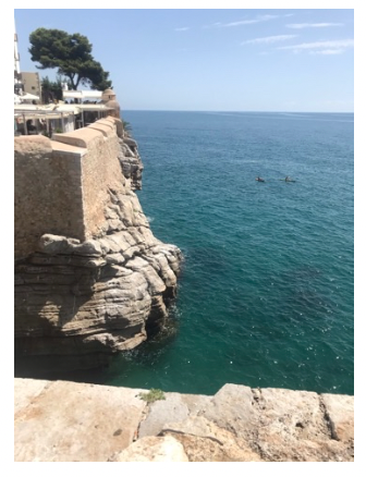
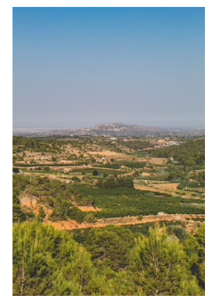
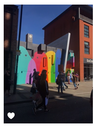
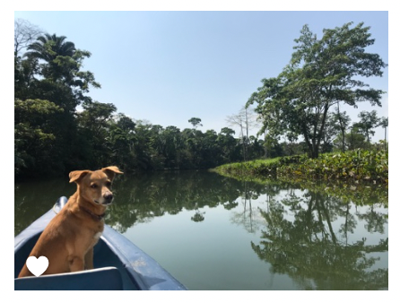
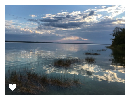
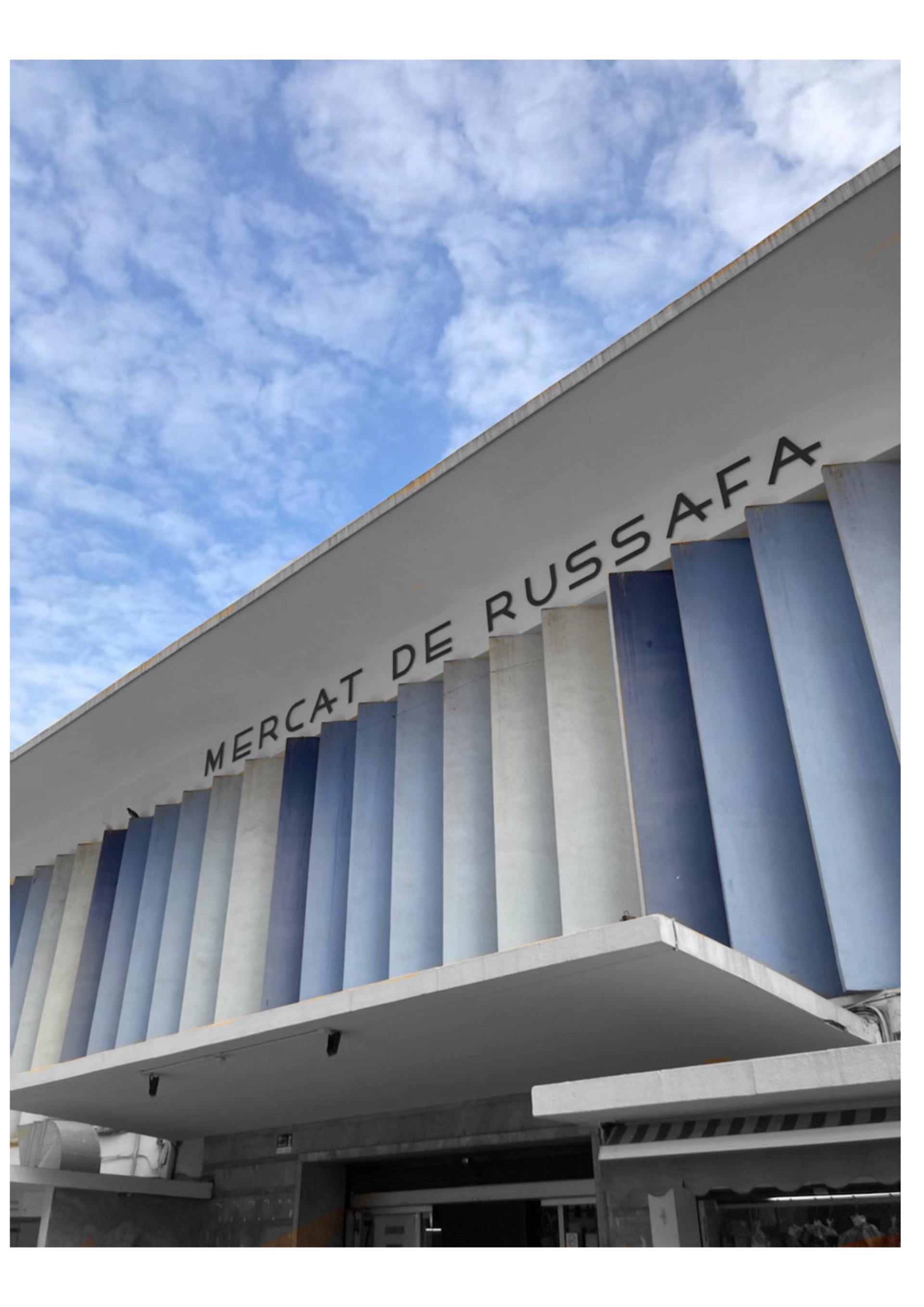
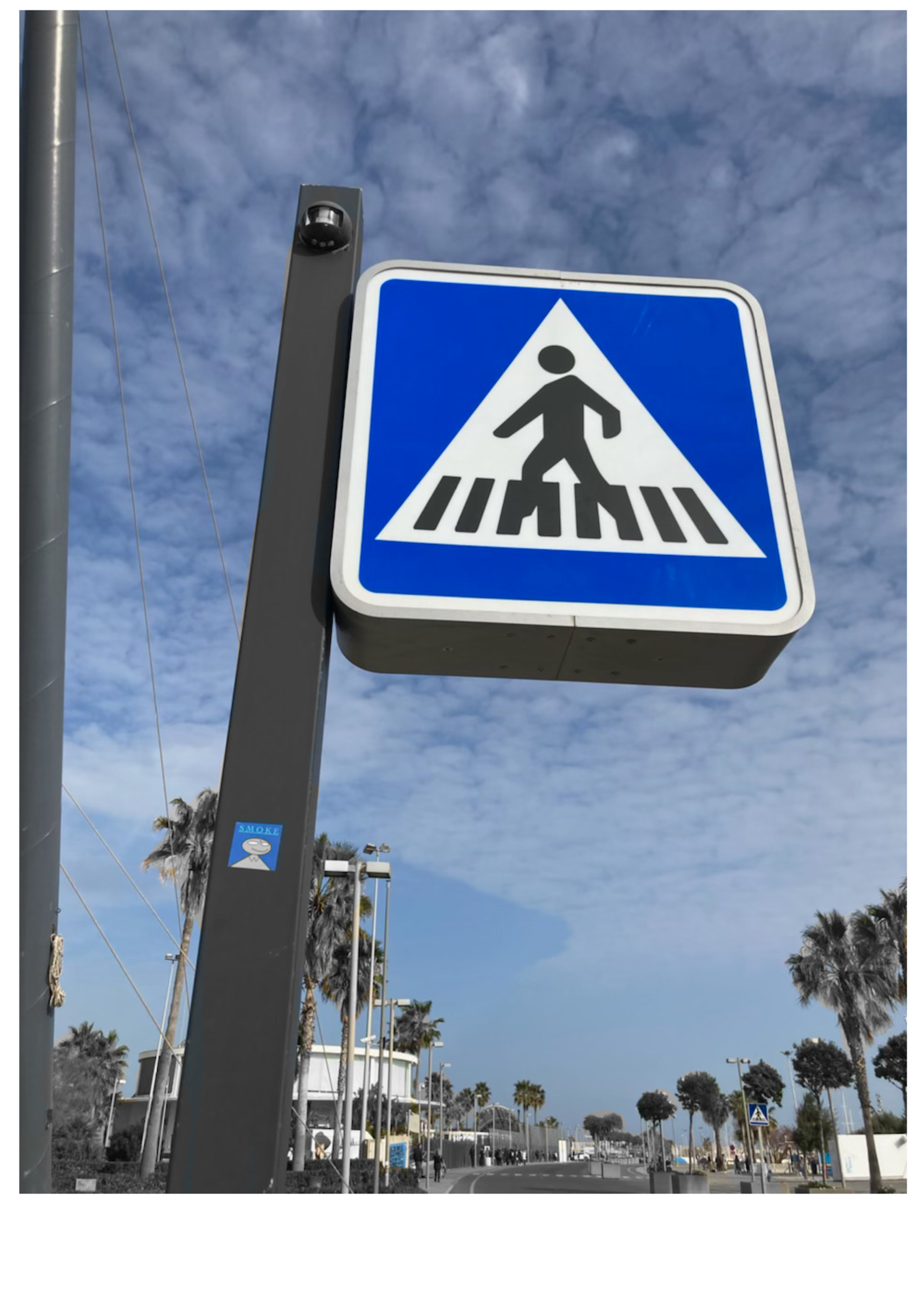
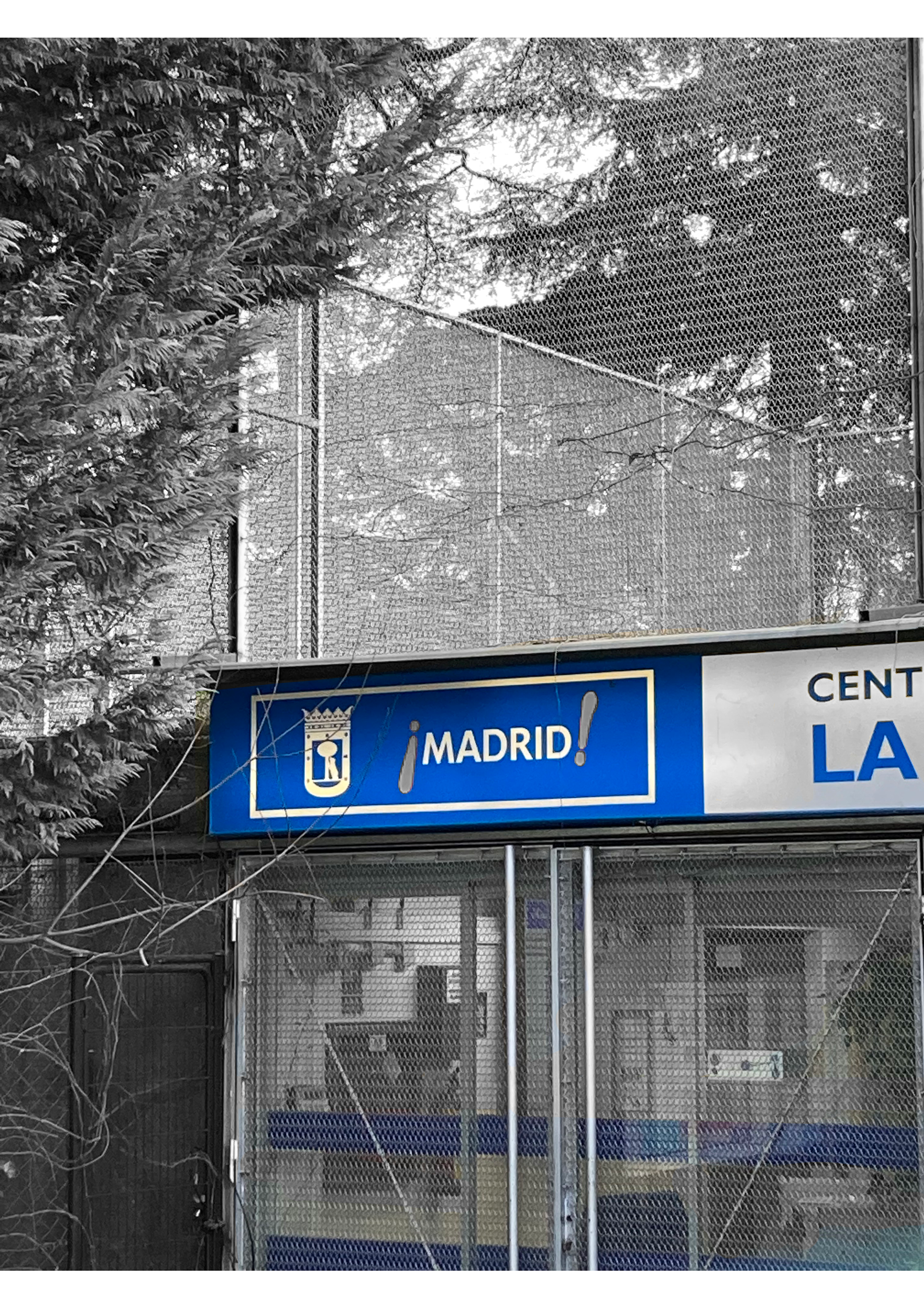
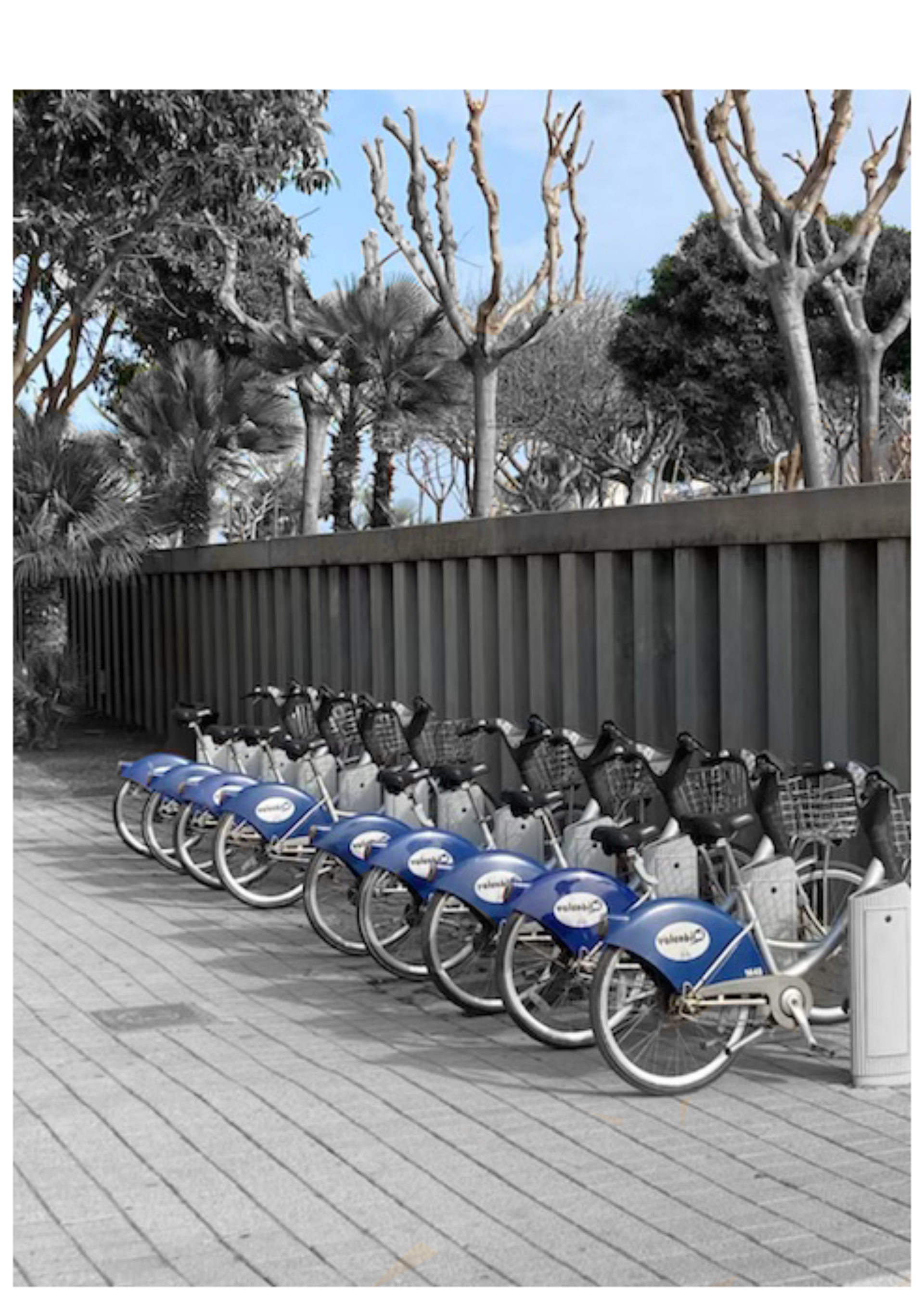
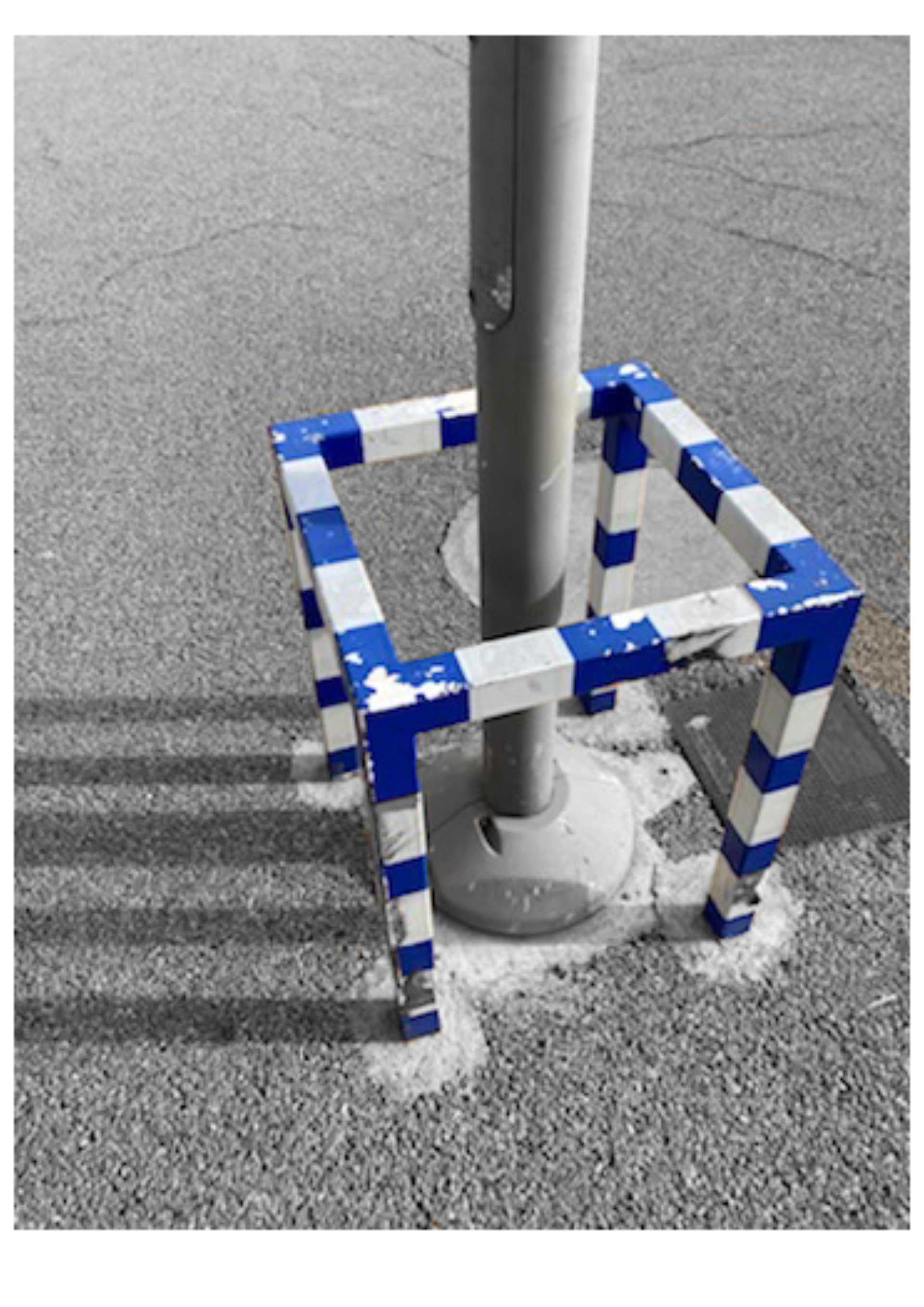
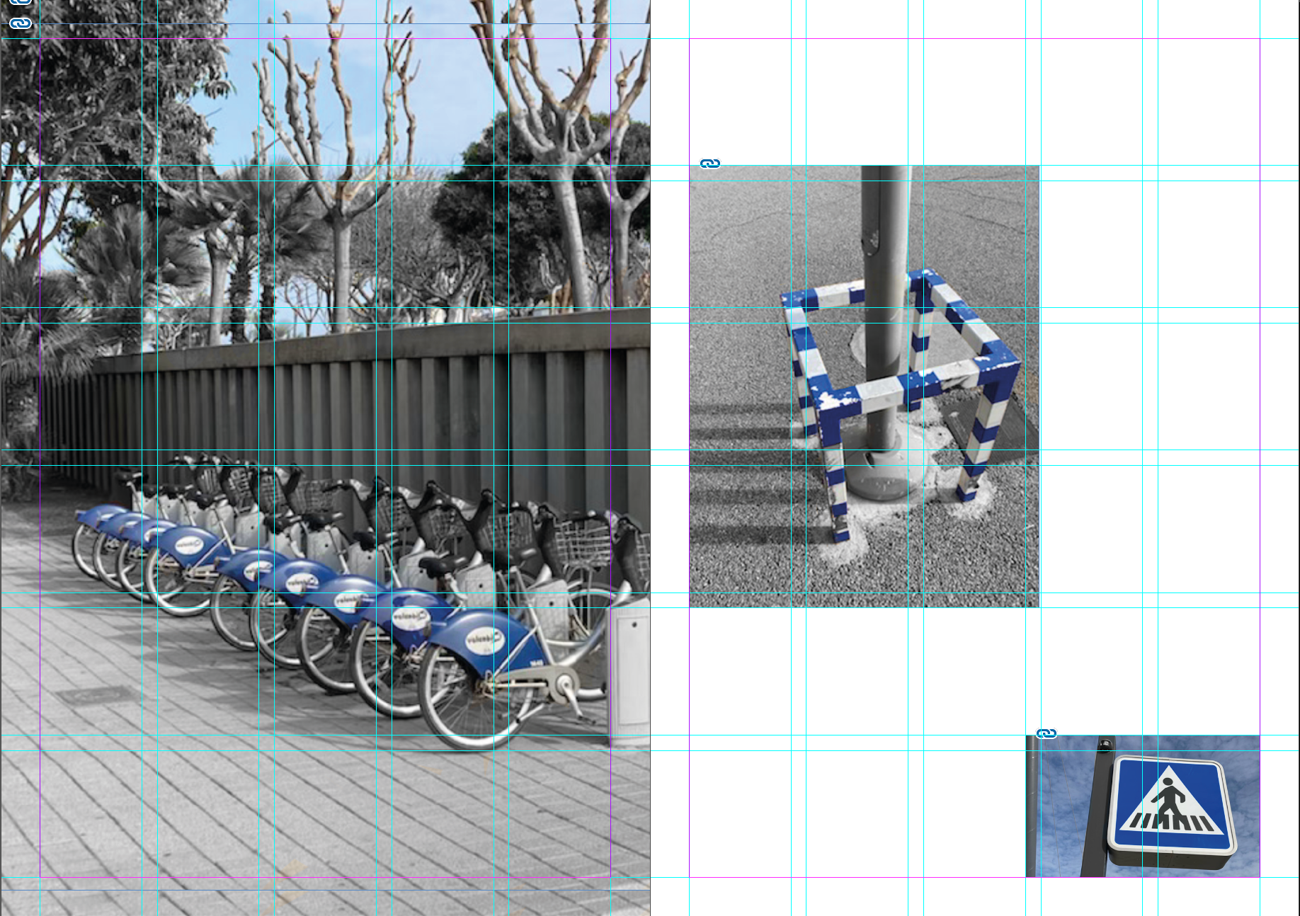
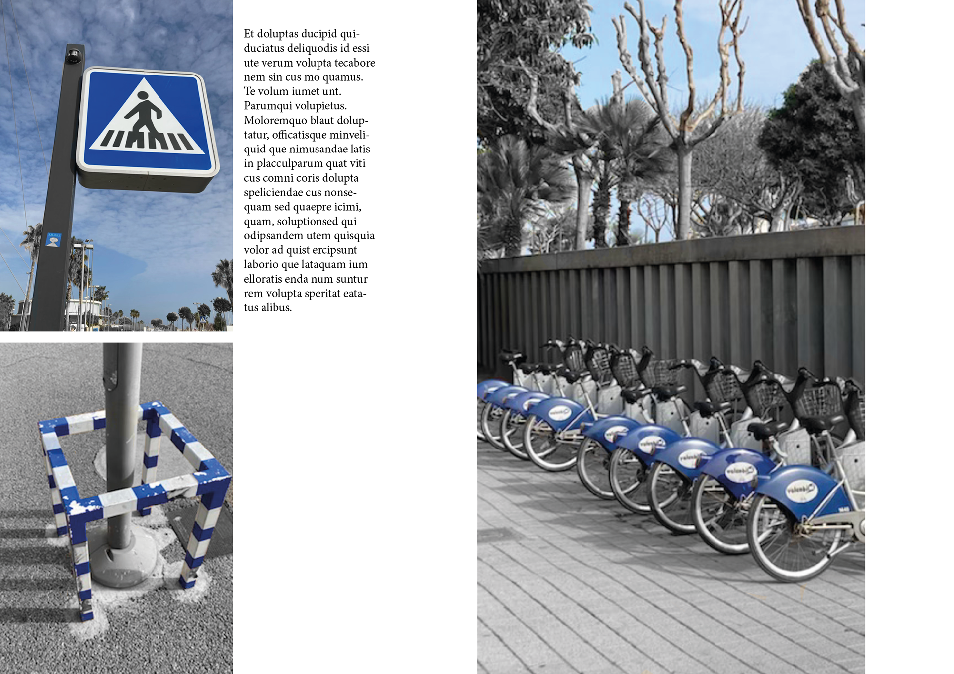
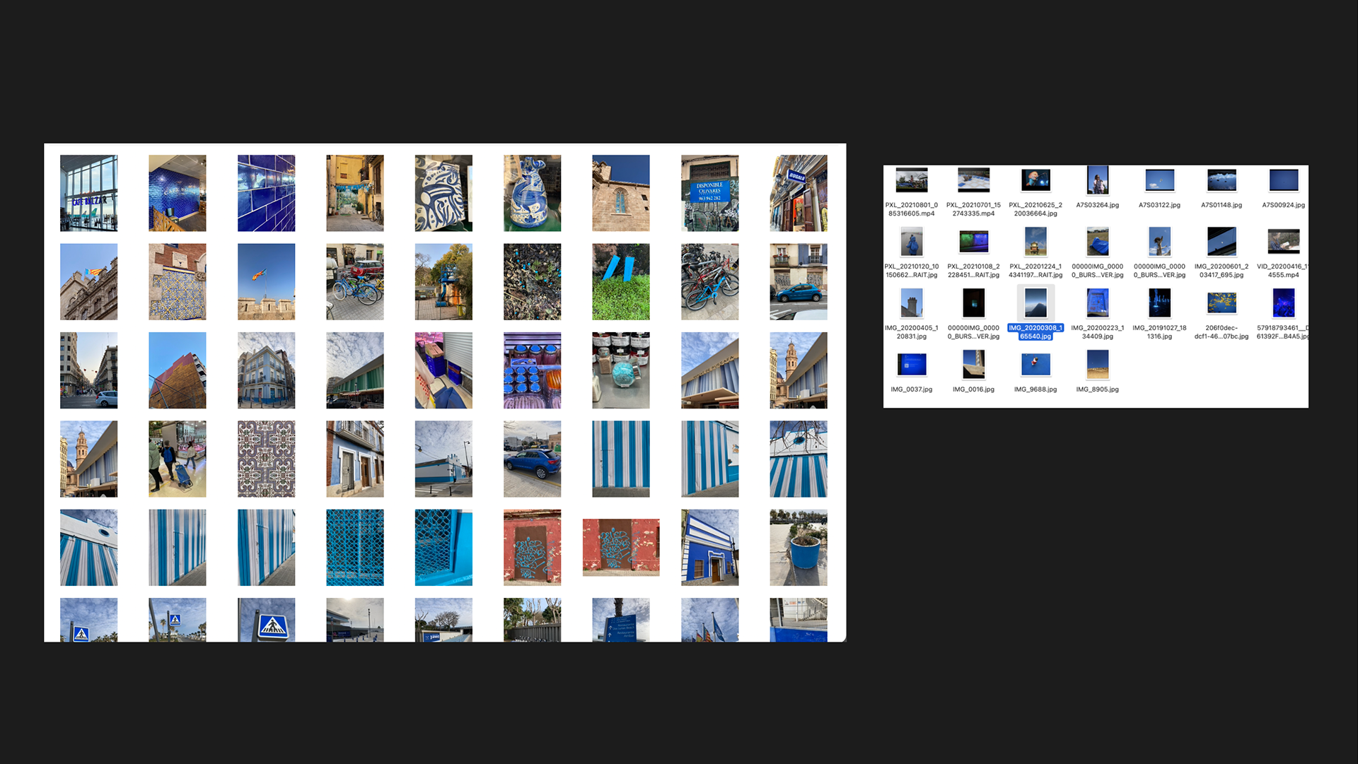
Valencia: Images Taken
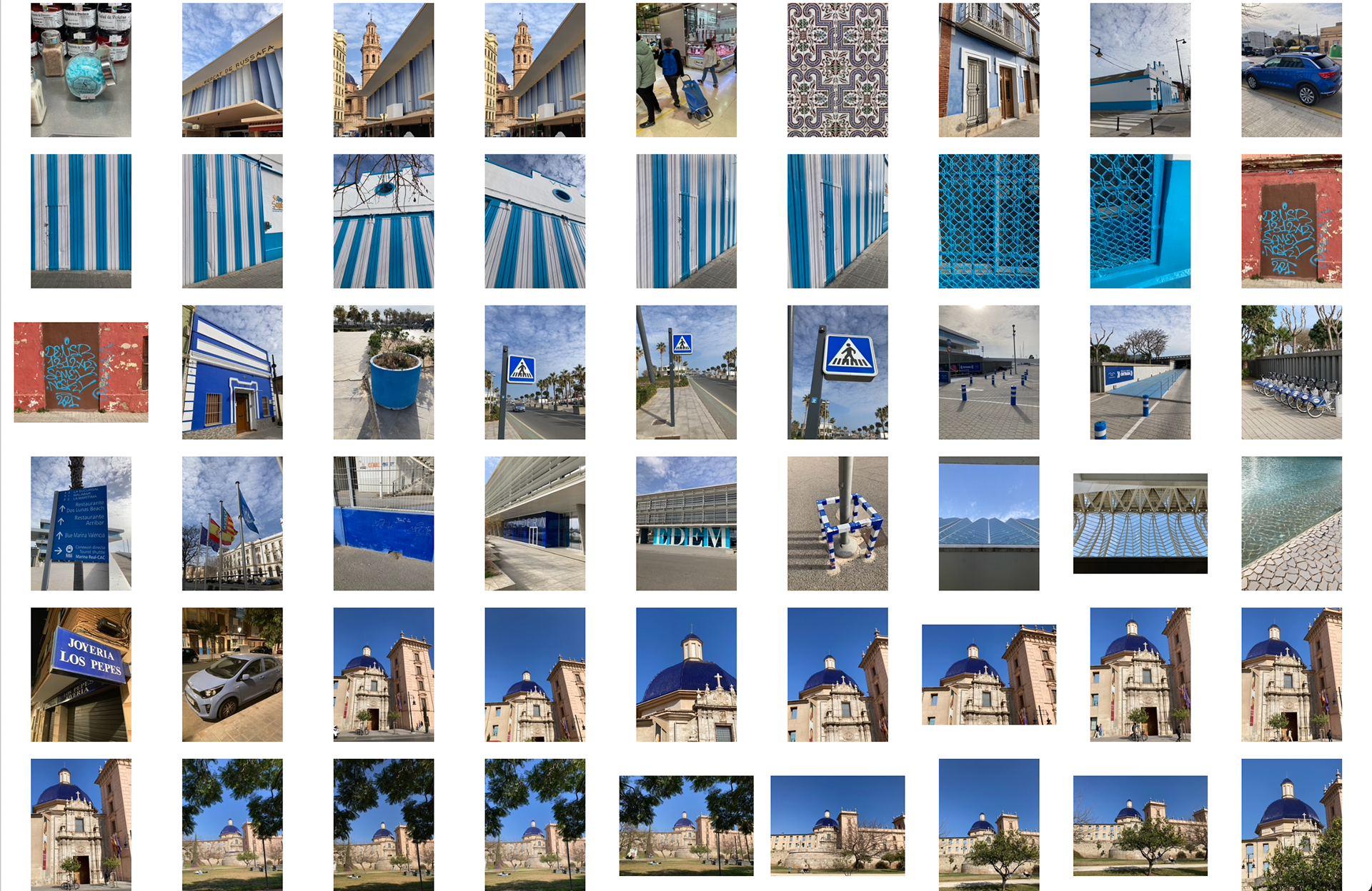
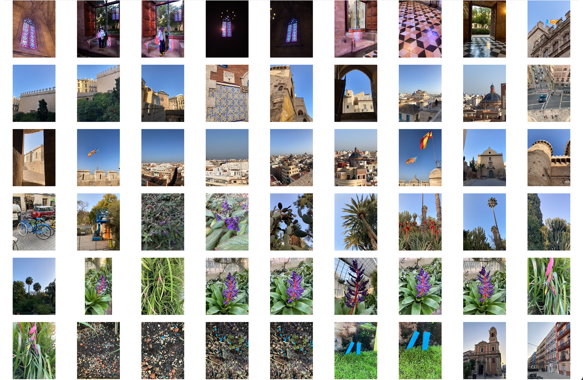
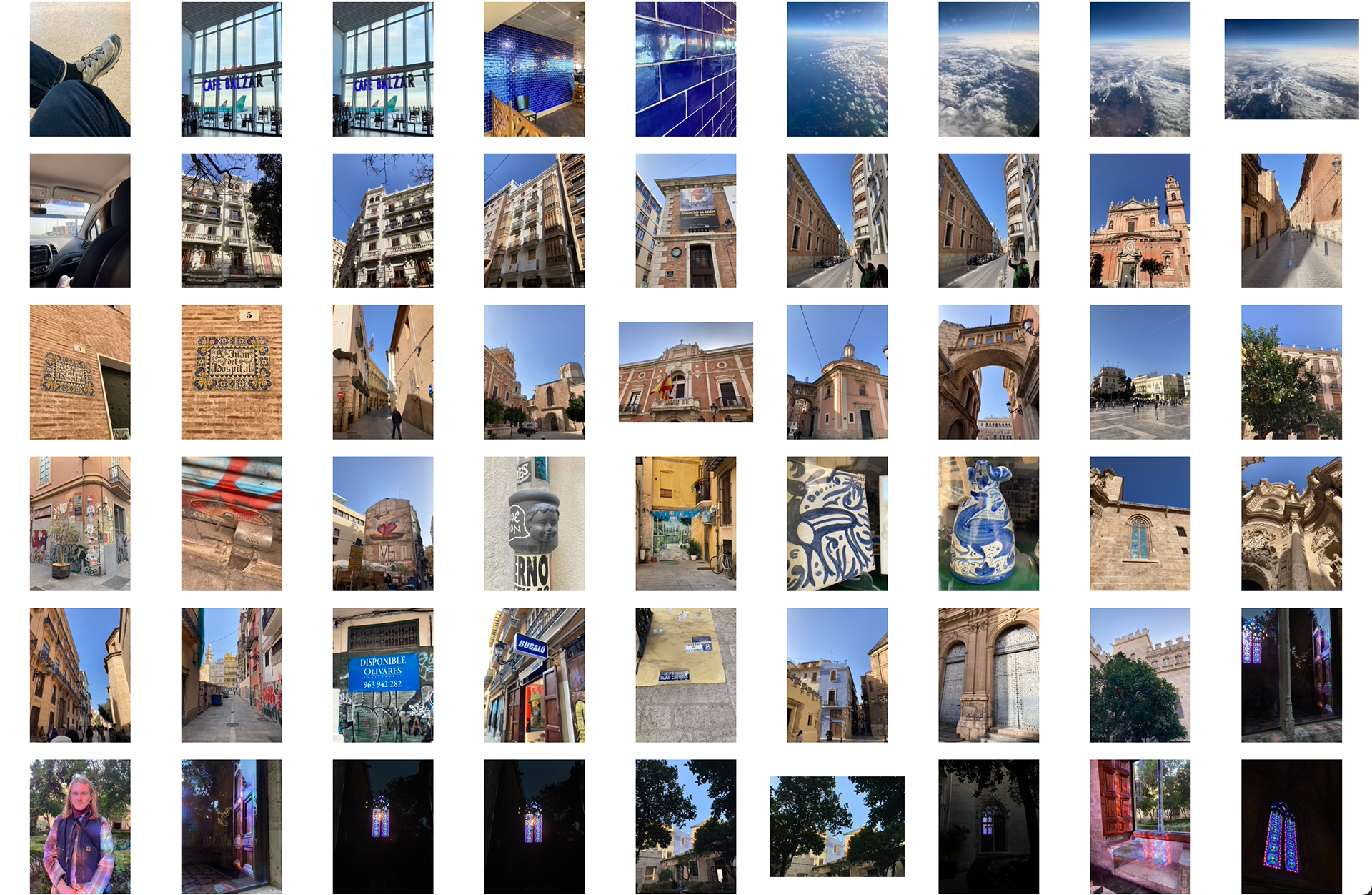
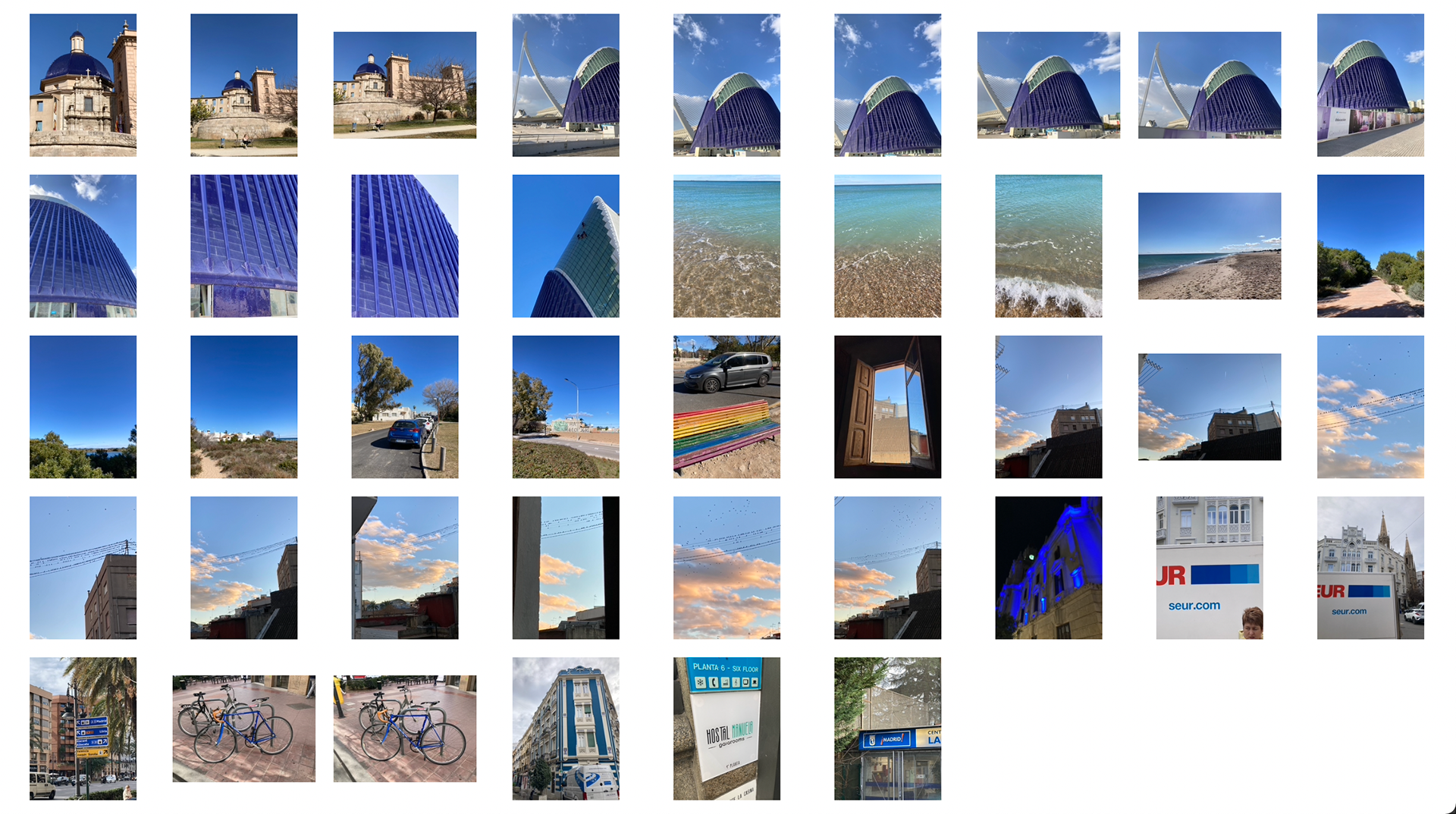
I used an iphone to take pictures of all the blue things I saw around my time in Spain. It was half me taking the pictures and half those I was with asking them to take of the blue things we passed. The reason being is because my phone camera is broken so had to keep borrowing phones.
I also took pictures on my film camera but I'm not sure I'll be able to develop them in time.
Edited Photo Sample
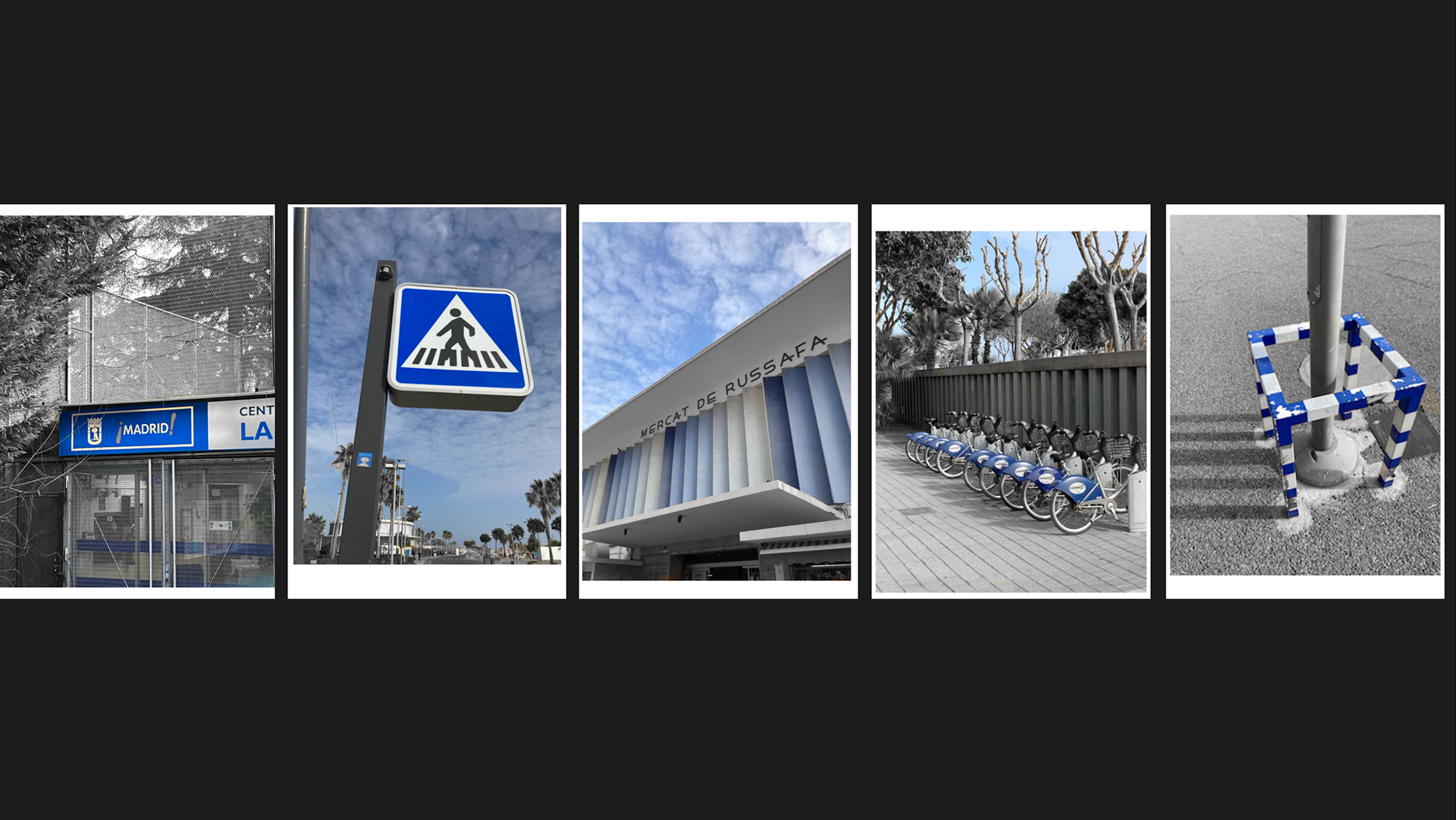
This is a quick experiment I did taking out all the colour apart from blue. I like the compositions of the images and the impact the blue has.
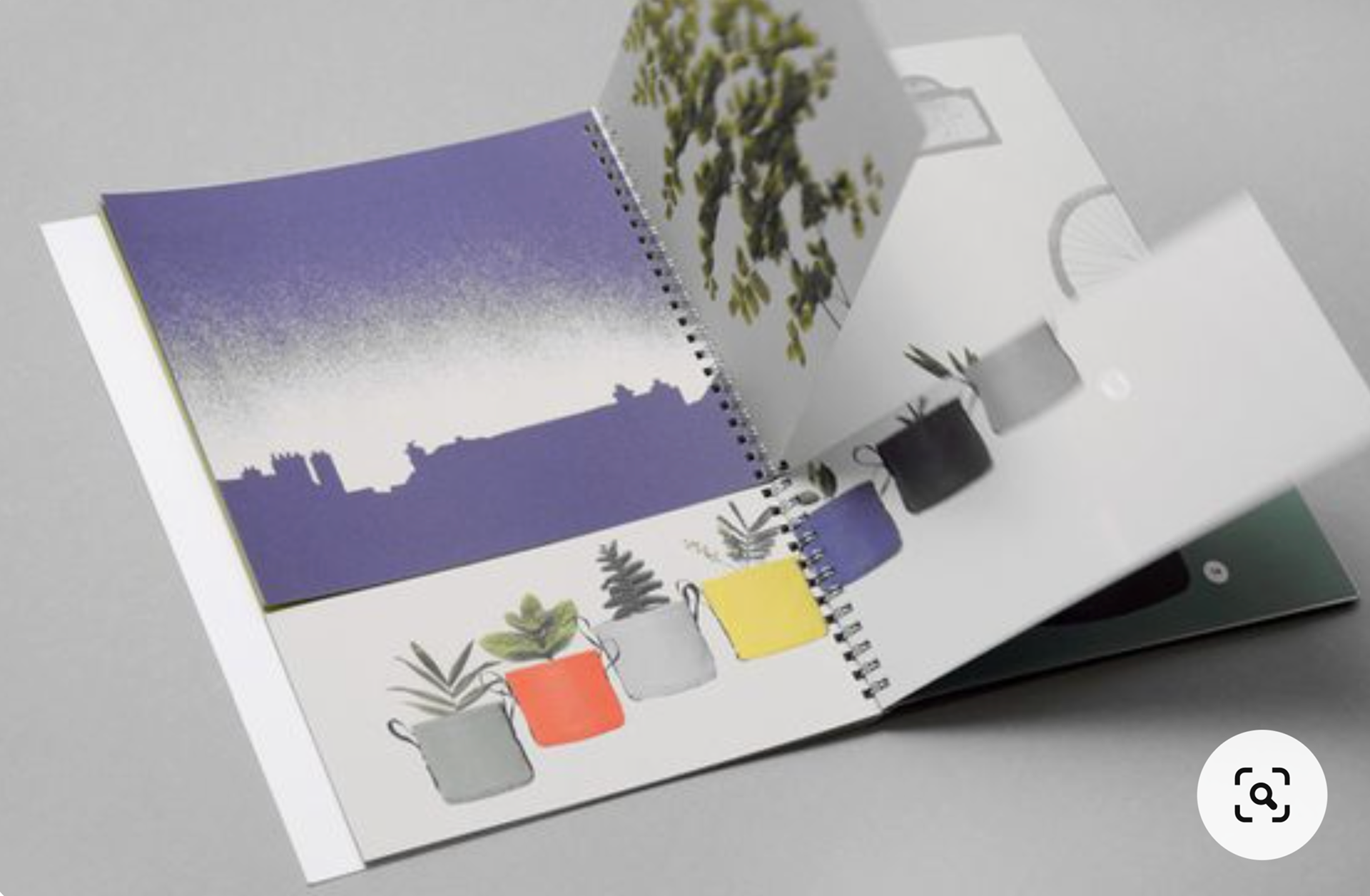
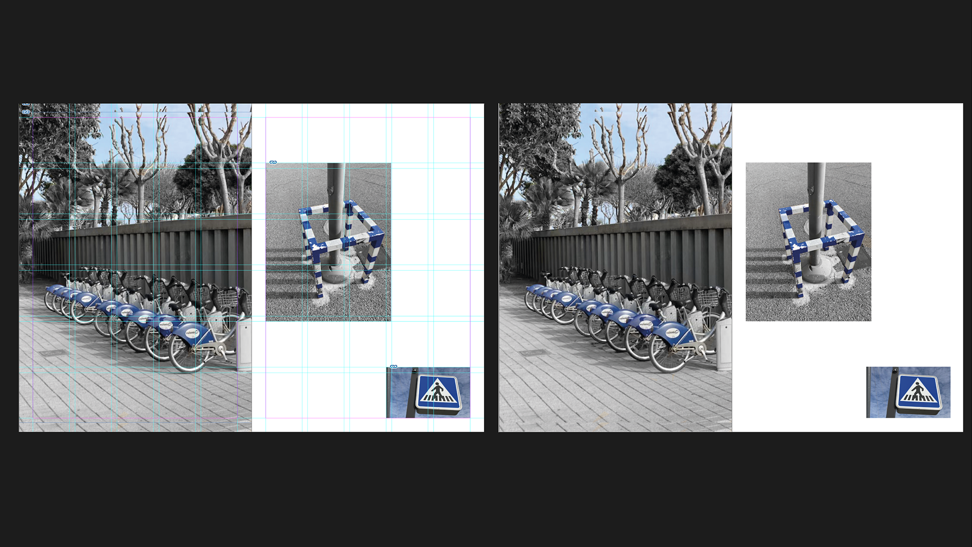
Layout Examples
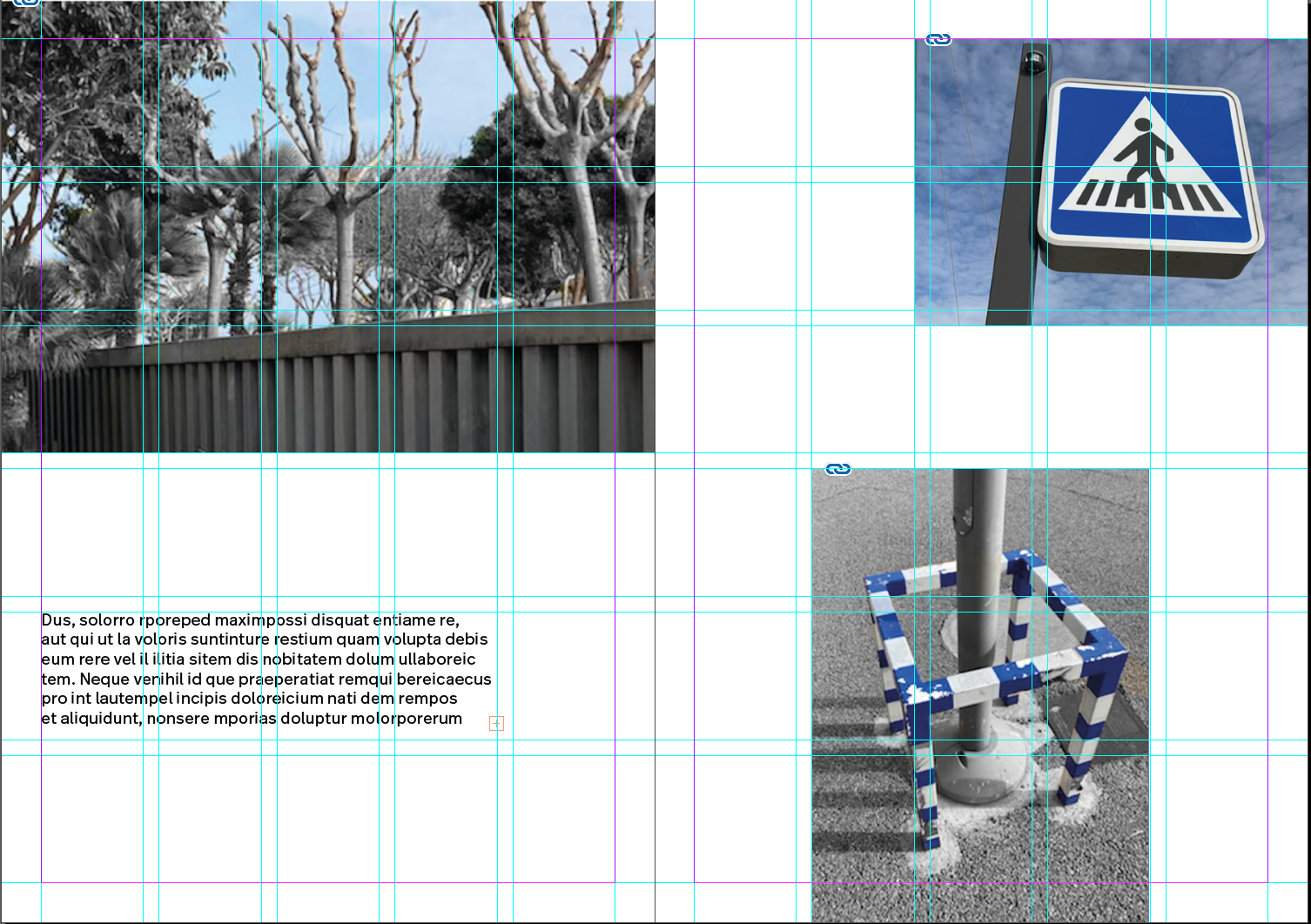
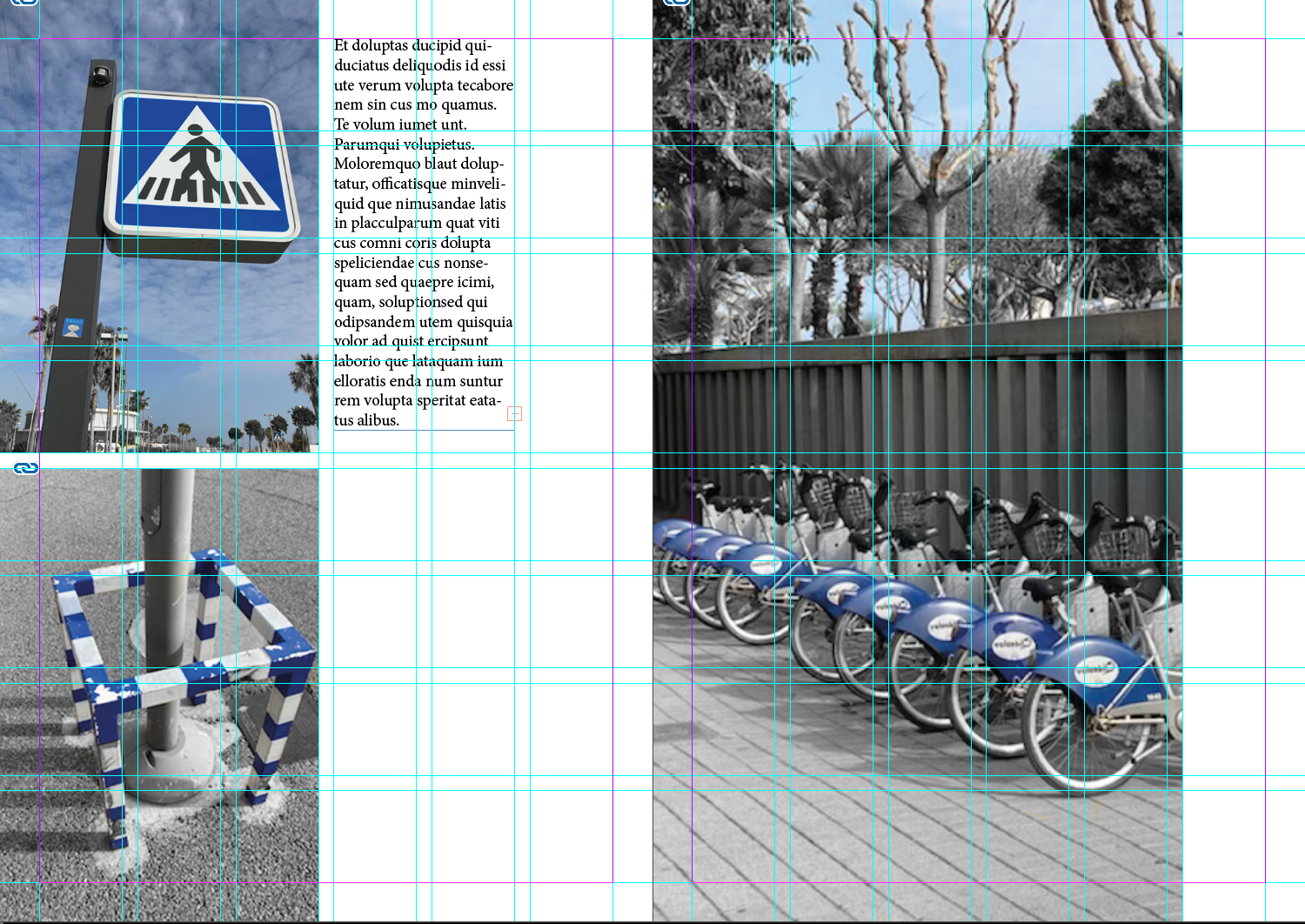

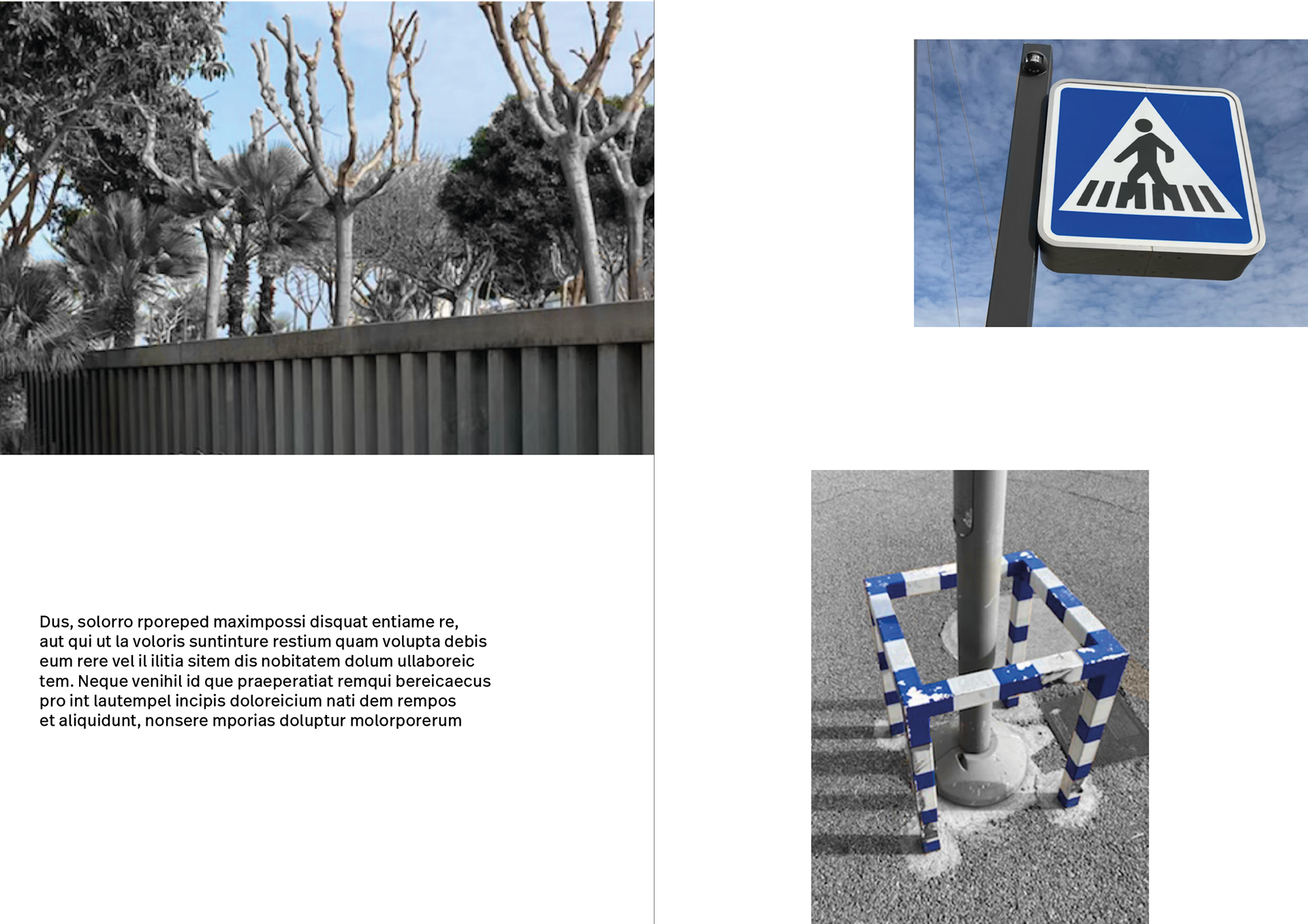
These are some quick layout experiments I did just to see what they look like on the page. I should however look at the context I will have the images and why they are spread out like that.
I like how the bike image with the nature in the background is a good juxtaposition of blue in different contexts: nature vs human-made.
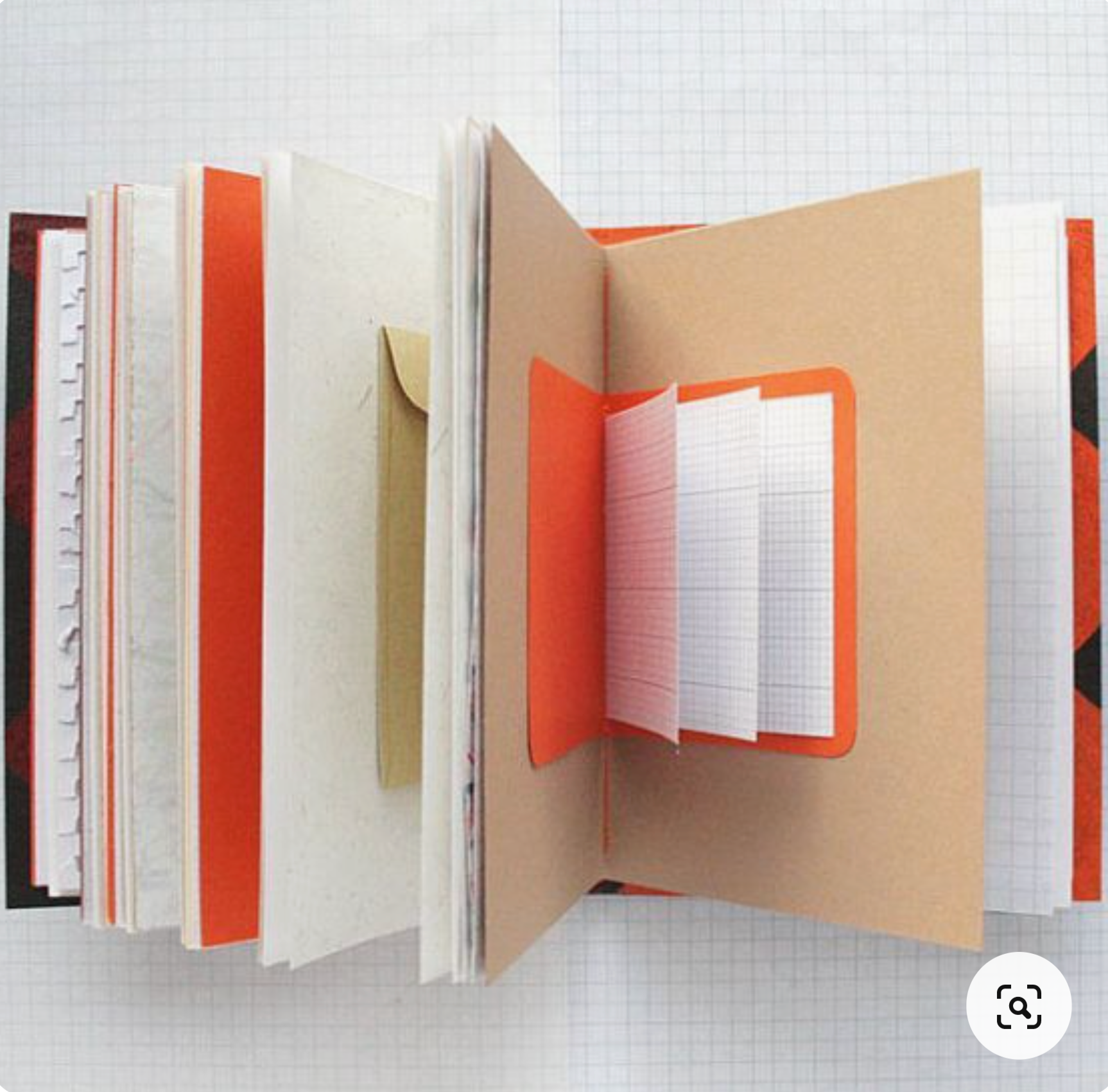
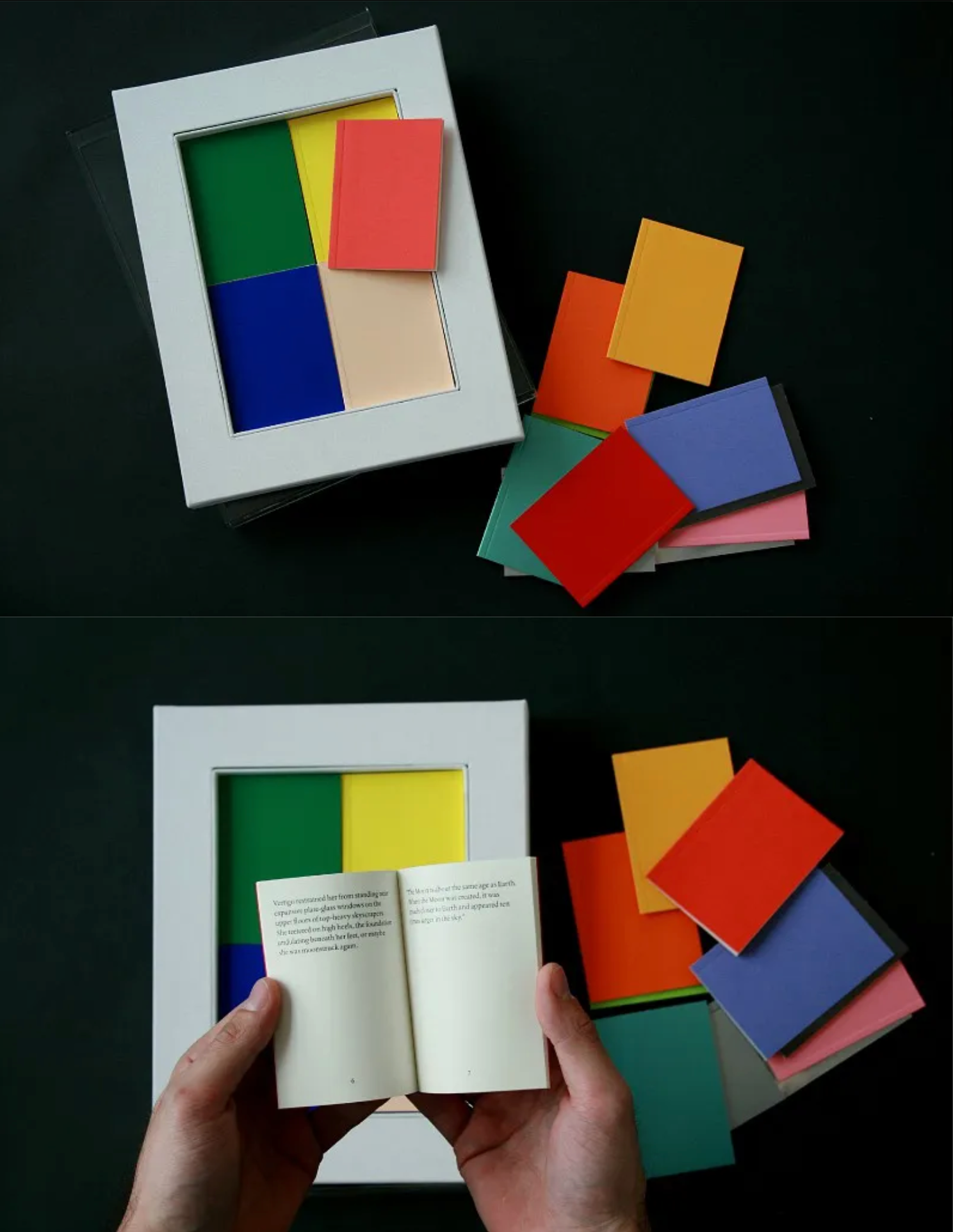
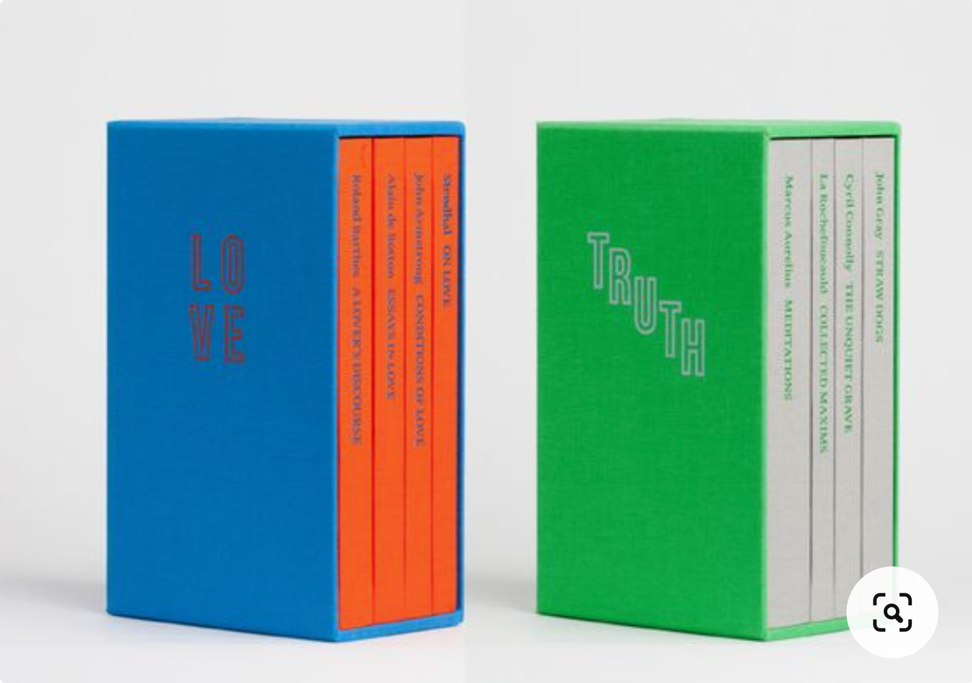
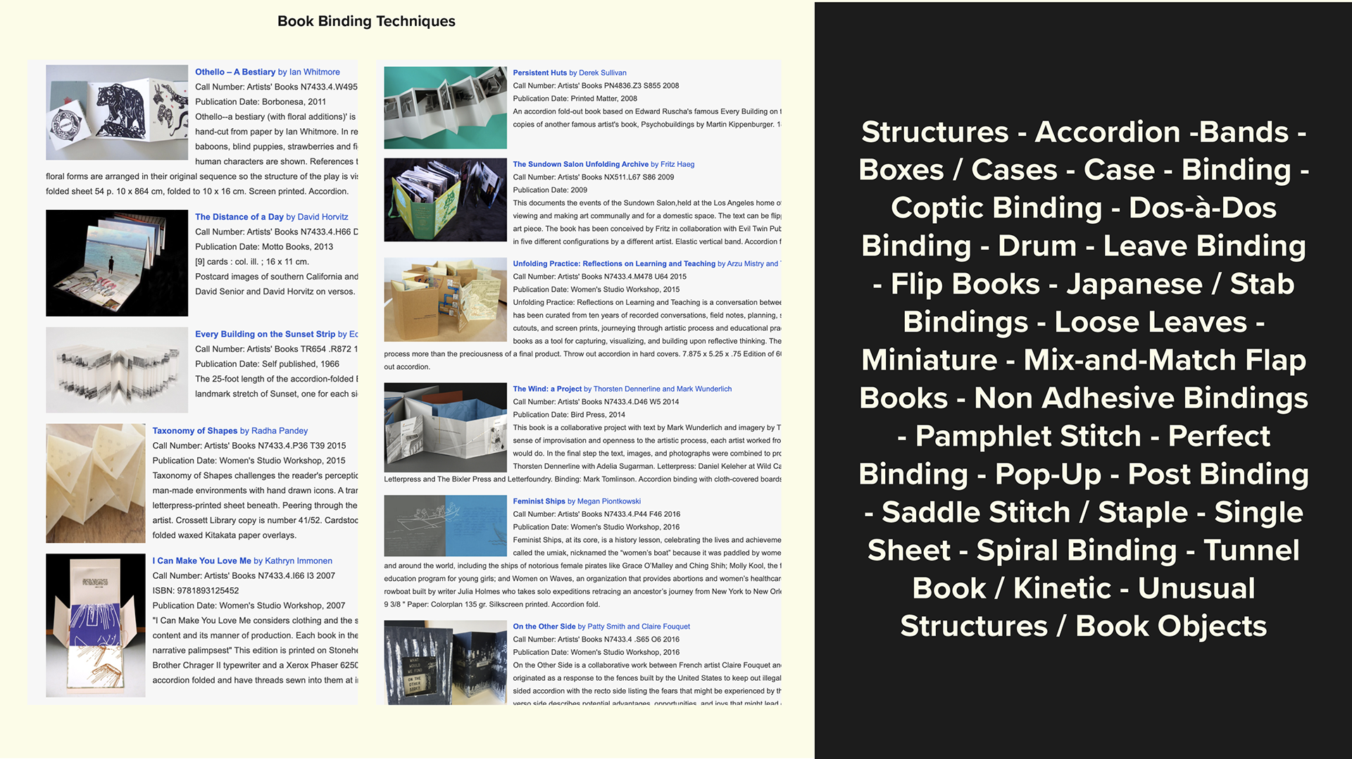
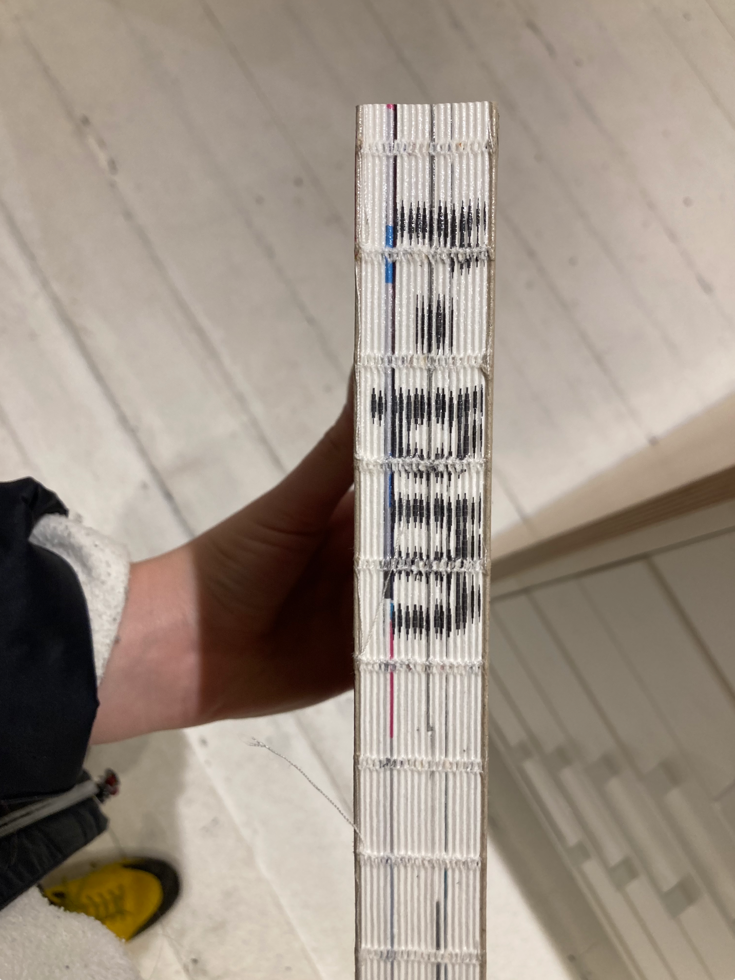
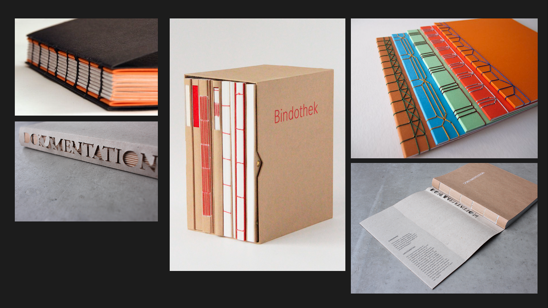
Binding Techniques


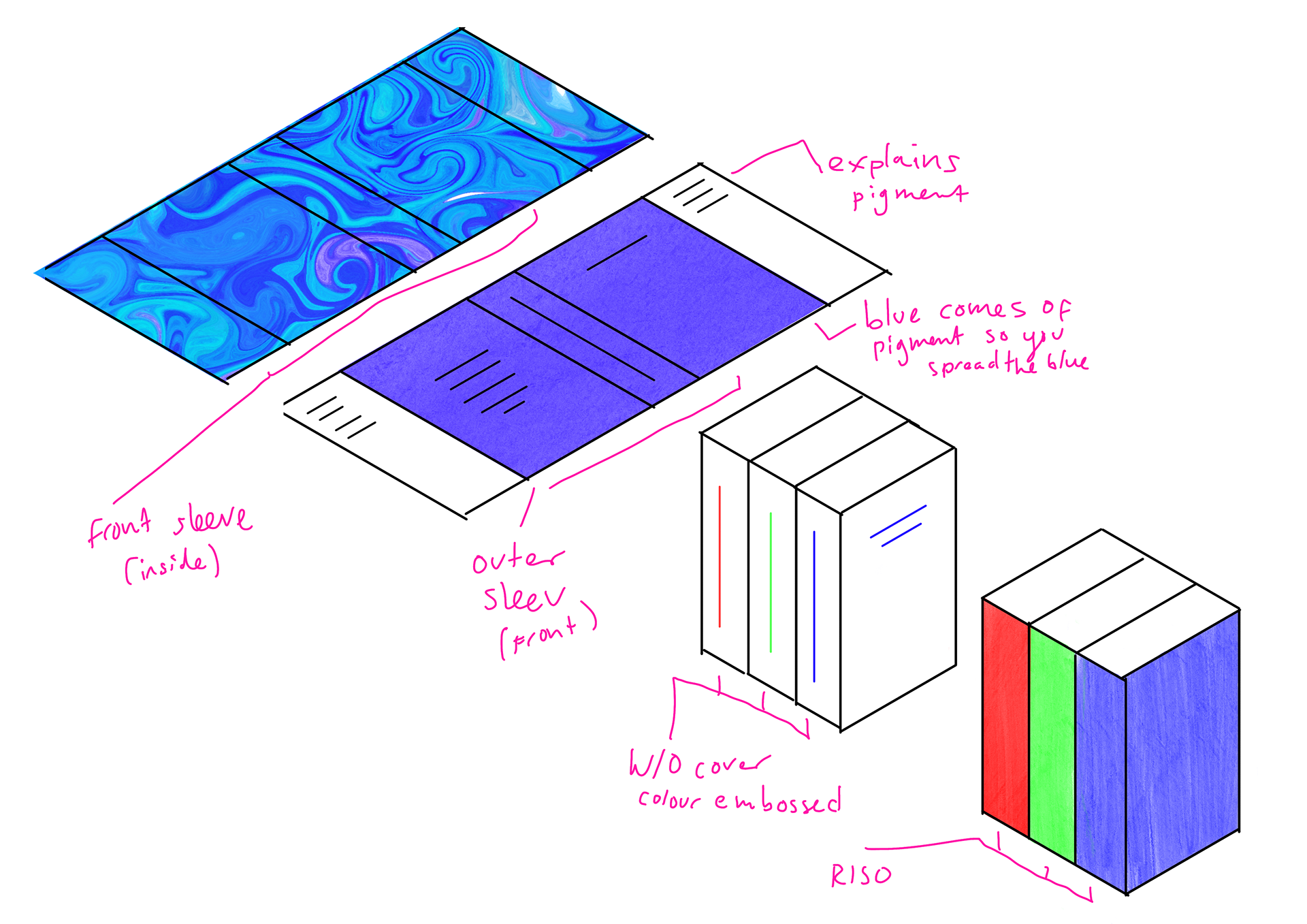
This is a drawing I did looking at a possible idea in my head for the book cover design and how the red, green and blue publications would go together.
I also looked at some book binding techniques that I like and may consider, the only I worry about is that this publication is meant to be only around 10 spreads. But I will see what I have.
Experiments

Whilst I have my photographs, I wanted to try and find other ways I can do things with blue. This is a list of experiments I have that I want to do.
Tutor Swap Presentation


This is my presentation for my tutor group swap presentation. It was useful swapping tutors and tutor groups to get a different perspective of my idea. I showed my images and what I have done and what kind of experiments I would like to do and how it's designed as an appreciation of blue.
Feedback Notes - important
The feedback I gained was very useful. It helped me with what to do next. It was suggested that I try to categorise the photos (print them out and mixe them up) and maybe documenting my thought process whilst I took them. It's maybe seeing my photographs as a starting point. It's working out the journey I want people to take when they see them - possibly making it personal or opening it up as a collaborative thing.
One thing I thought of is that different images could be in different categories, and that I could work out a way that allows for views to rearrange and see the own categories themselves. May I could have a key showing how I would categories them. If it were ring bound people could do it themselves so people can have their own interpretation of blue.
MY ROUGH NOTES:
page plan - with subject matter of each page - can move them around - understand how much should go on each sprea
french fold
tipin
formats - gavin ambrose - bloomsbury
context of blue
appreciation
different forms
personal
cultural
asign catergourys that are not restrictive
finding ways to catergorise
MacGuffin - explore one thing each issue
collection
my source material as the starting point
audience interation - submissions
how they sit and catogorise in the
natural v man made
juxtapose
bike v sky
how we perservie things -
journey
reason why I think these should be together - the tie between images
are you taken there deliberately
so many ways to categories
each image has different meaning
like an A-Z
Three different section book
ring-bound - the user can recatorgise it
non permance of it all
section dividers - a system that you can create or that someone else could create
reconfigure it
print of my photographs
Categorising
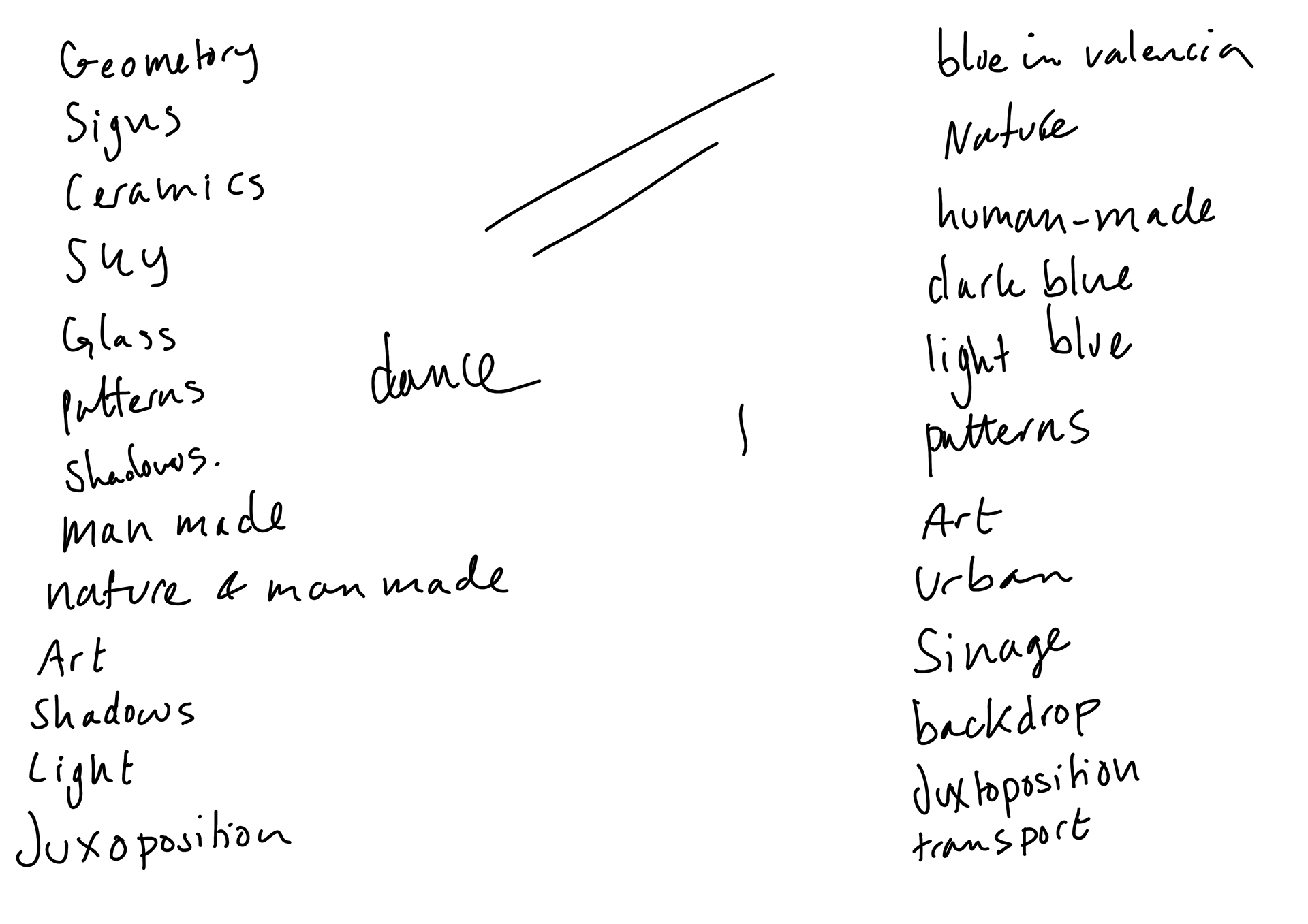
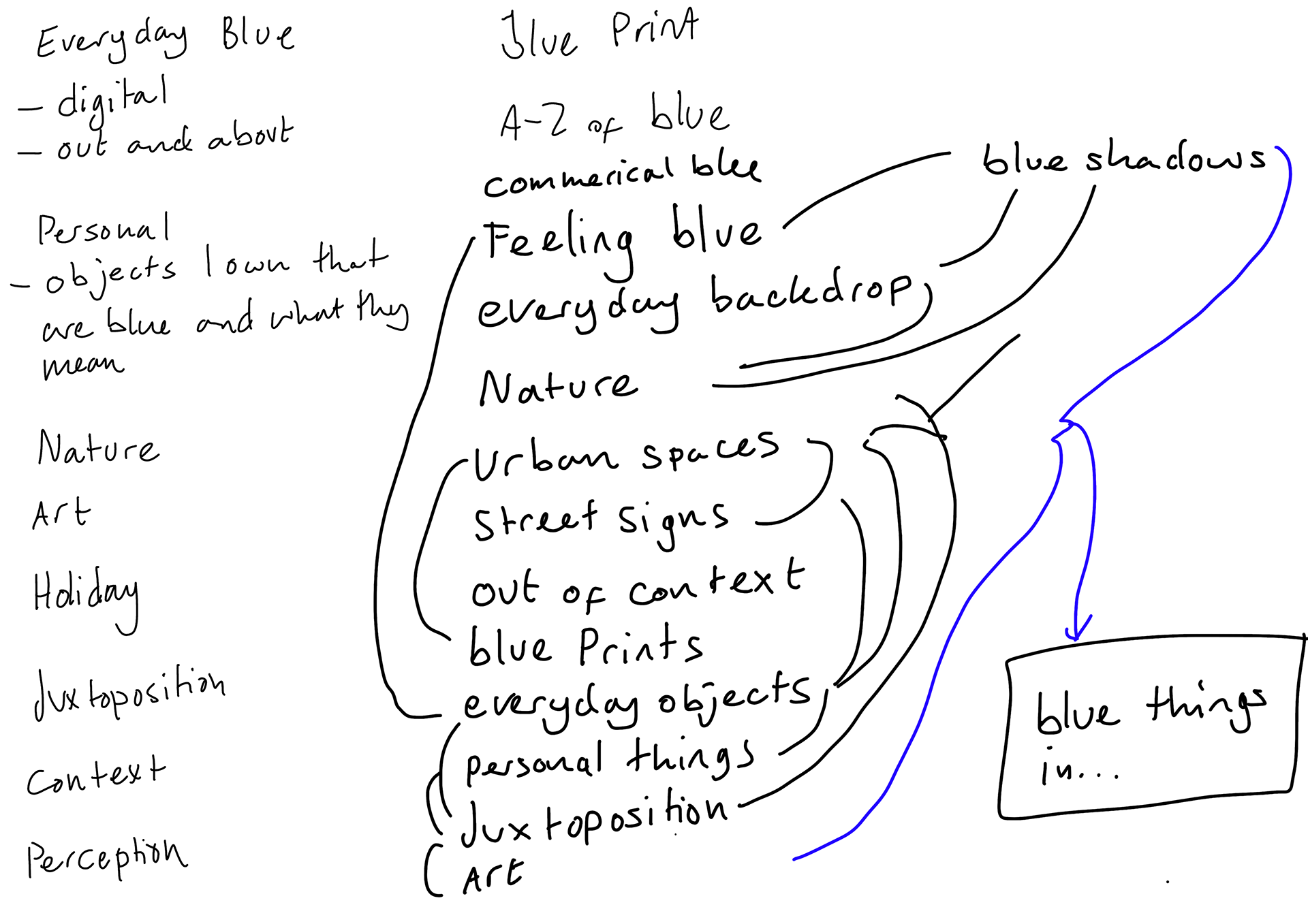
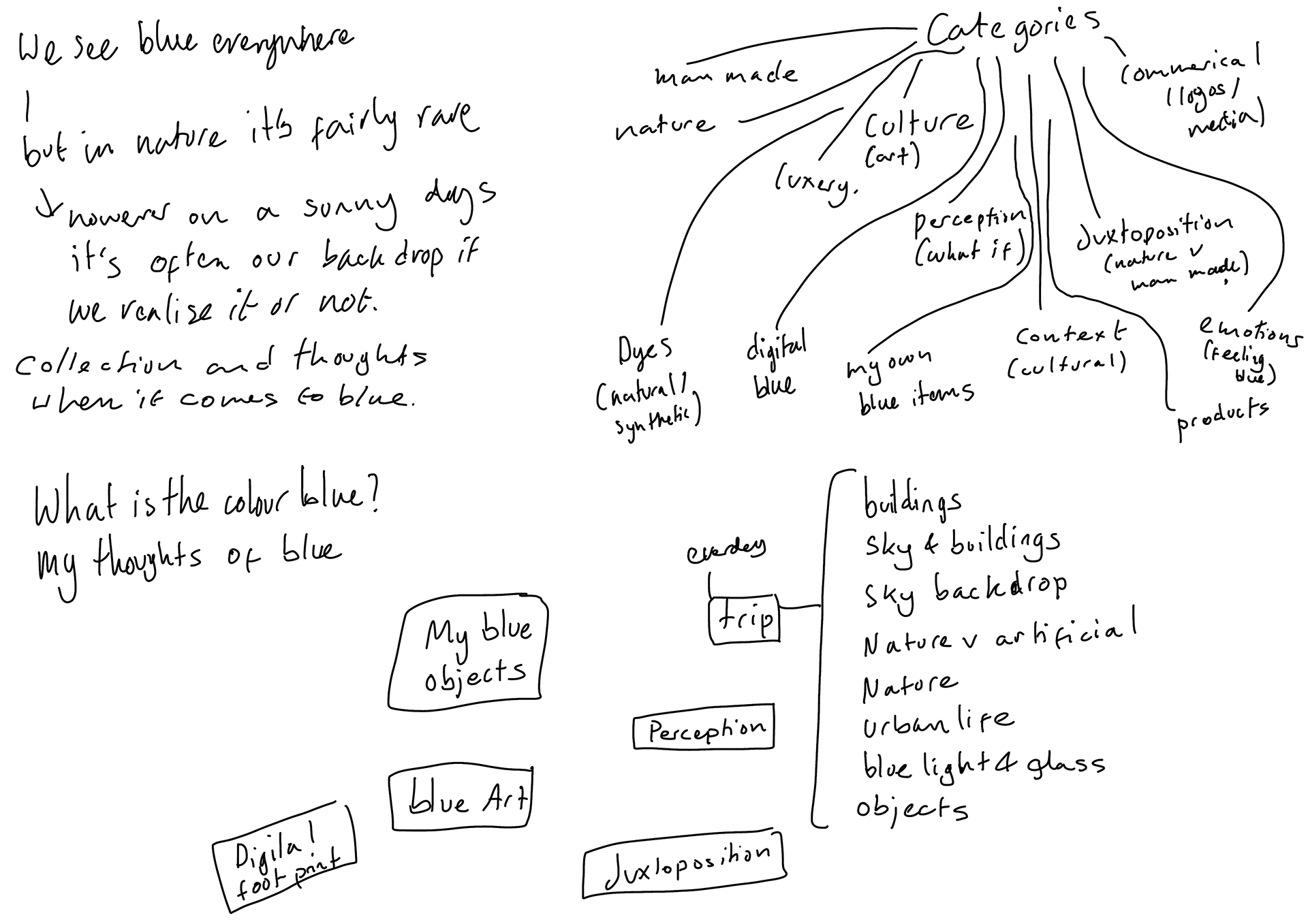
These are some notes I made of different ways I could categorise from looking at my photographs. Read my notes.
Print out Categorising
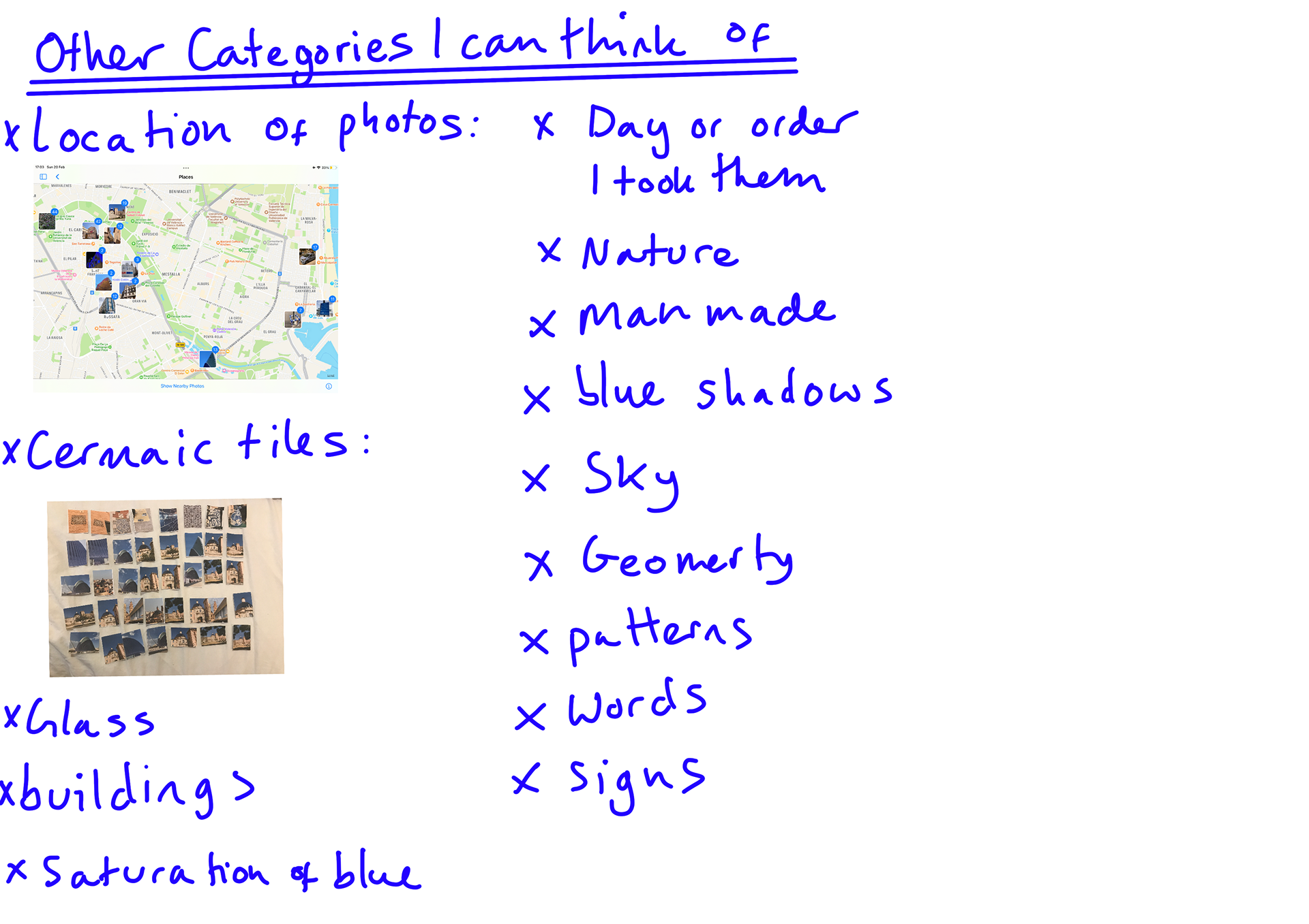
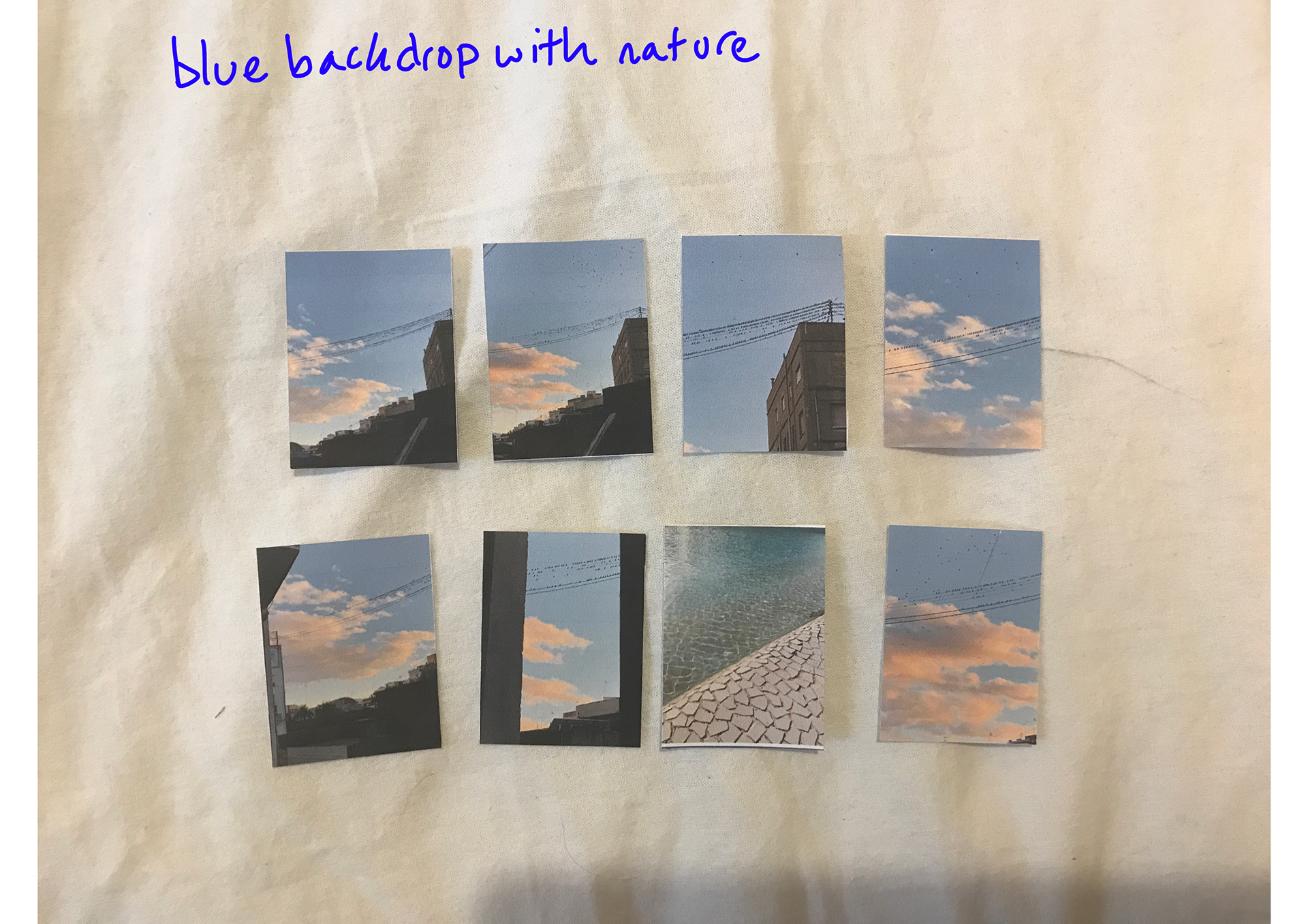
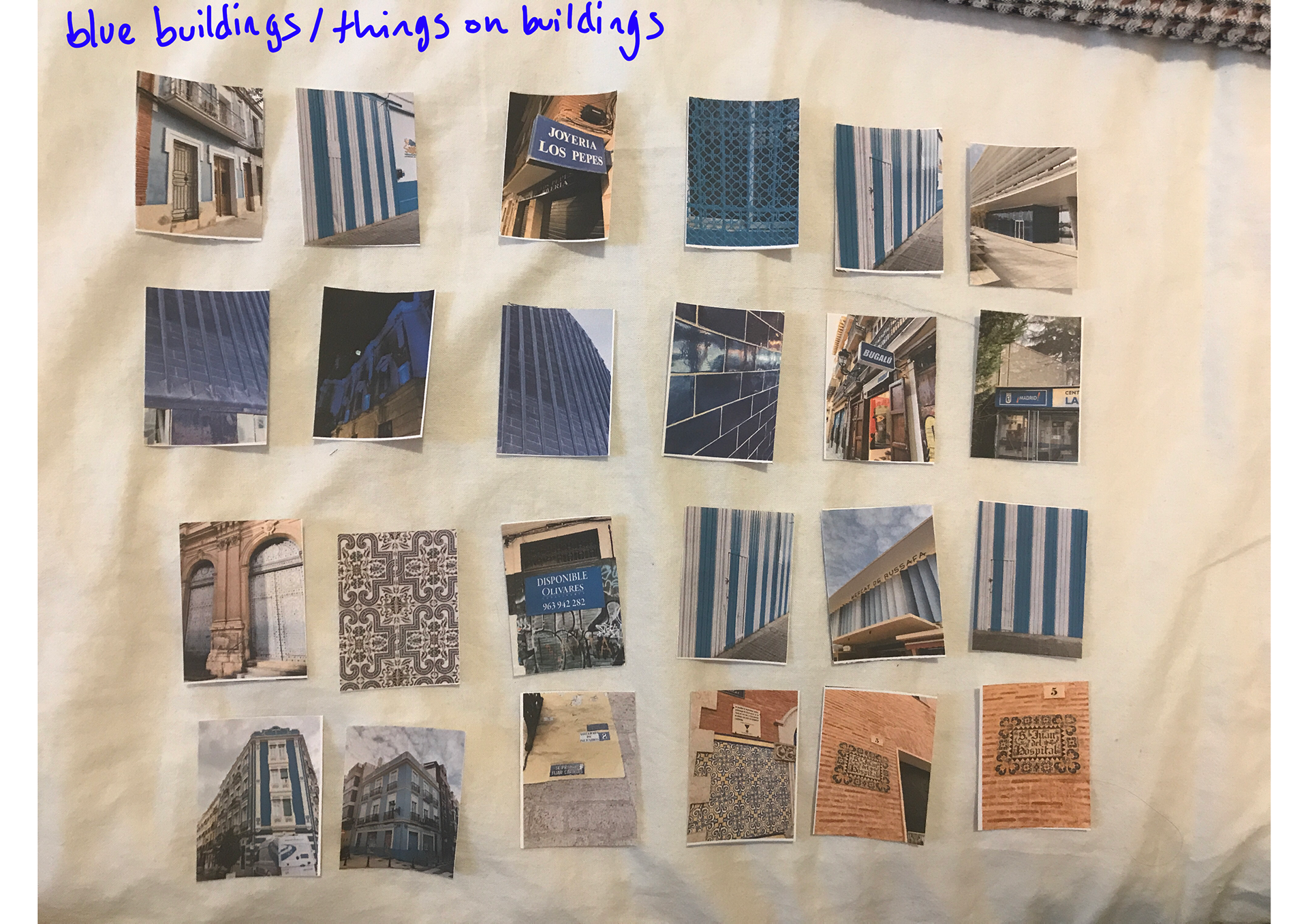
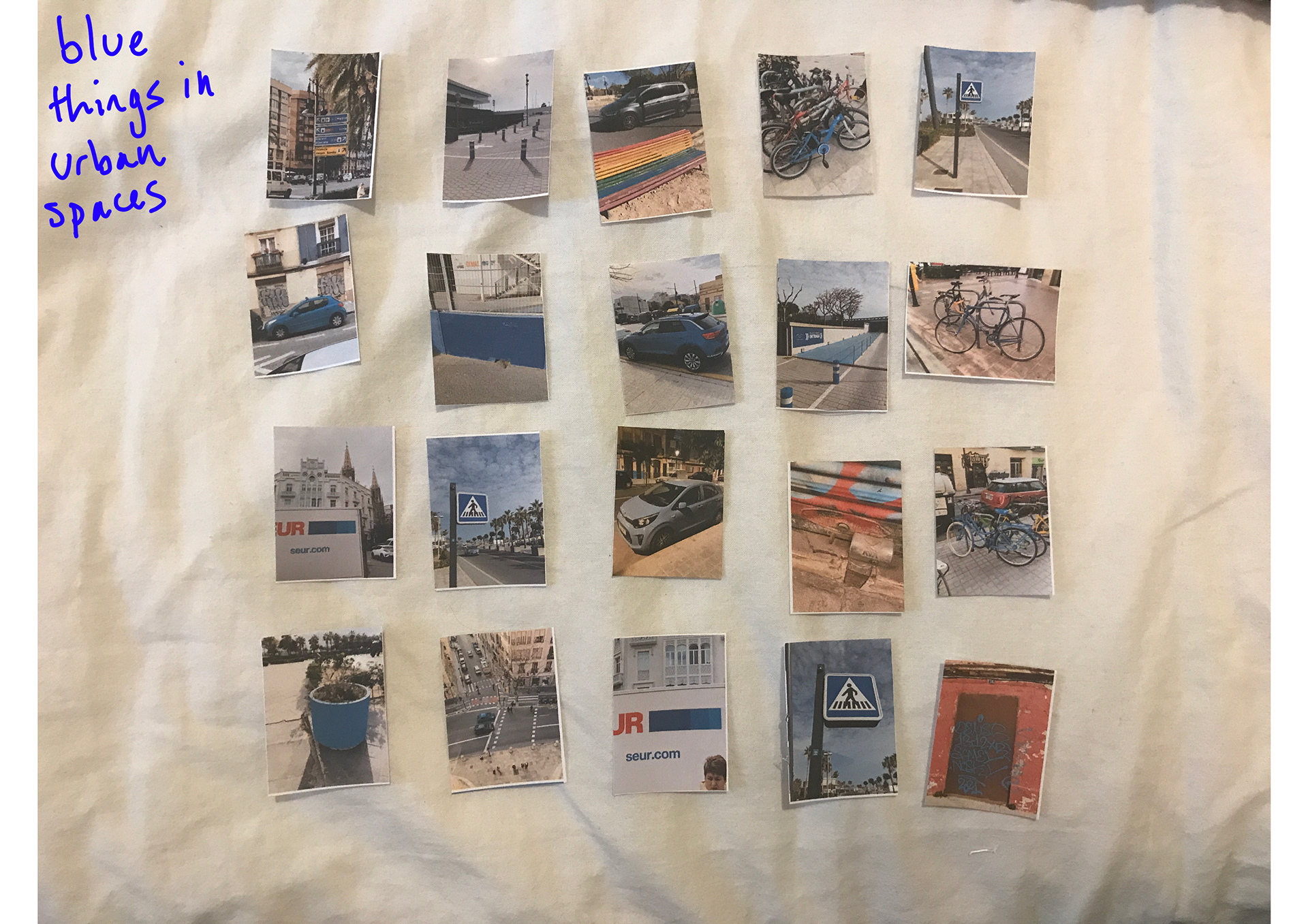
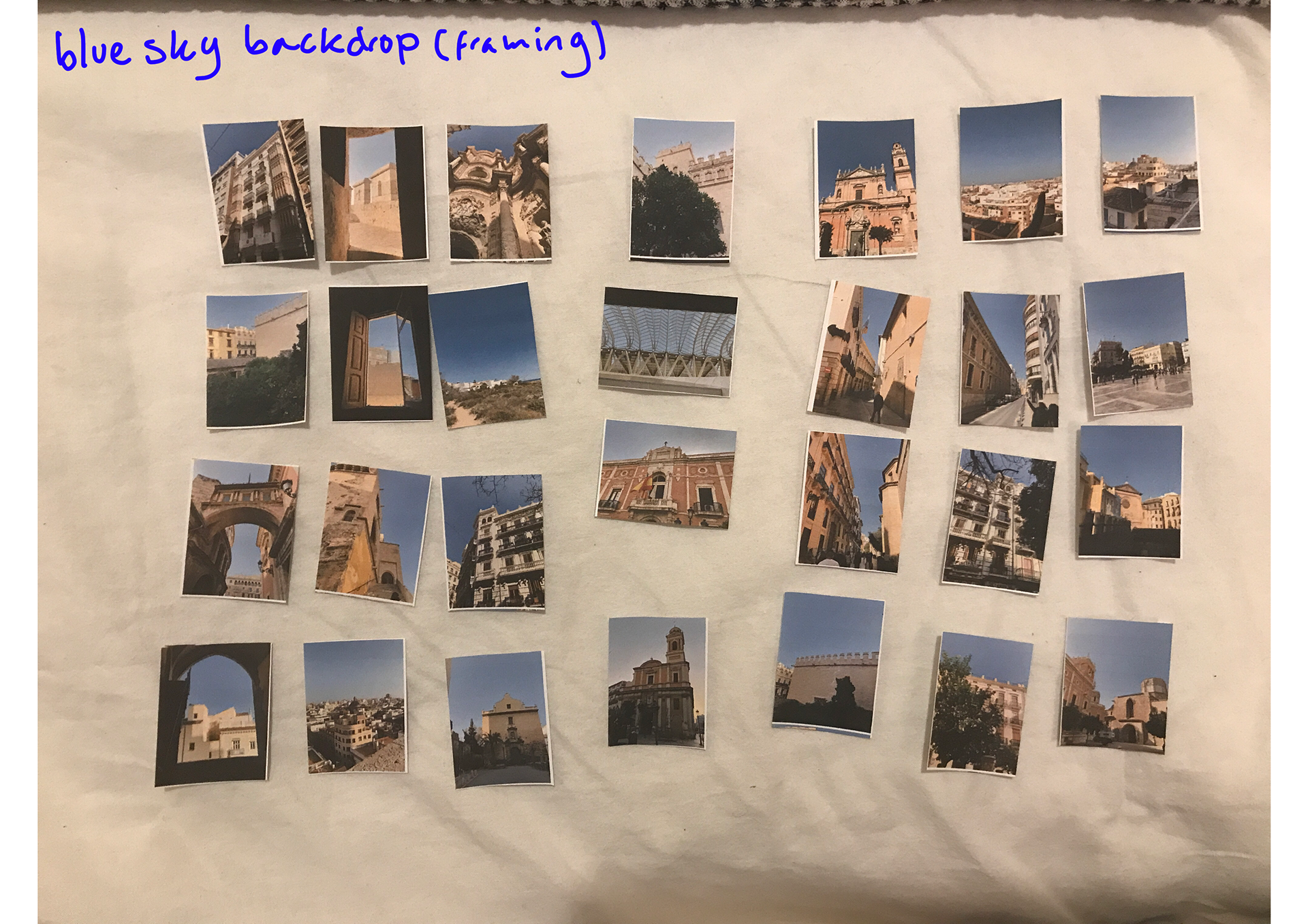
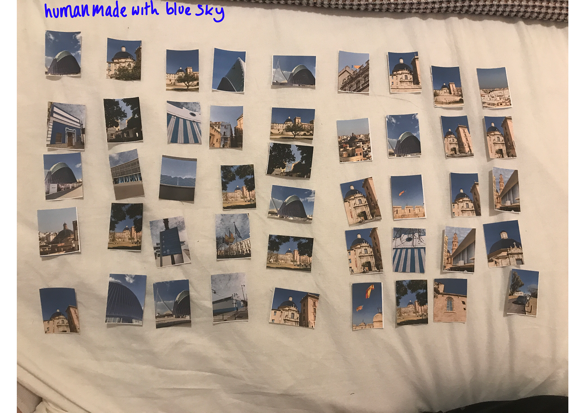
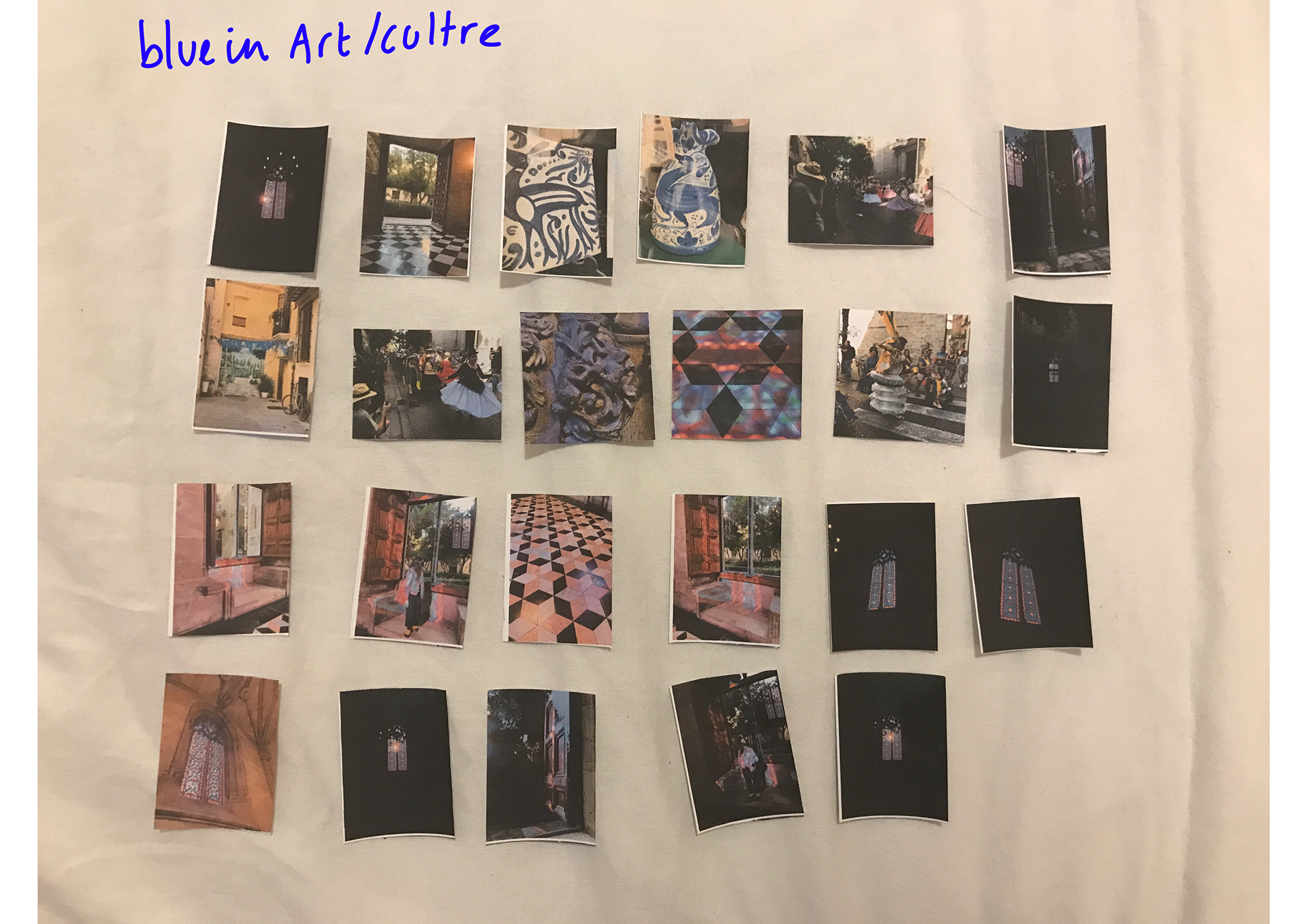
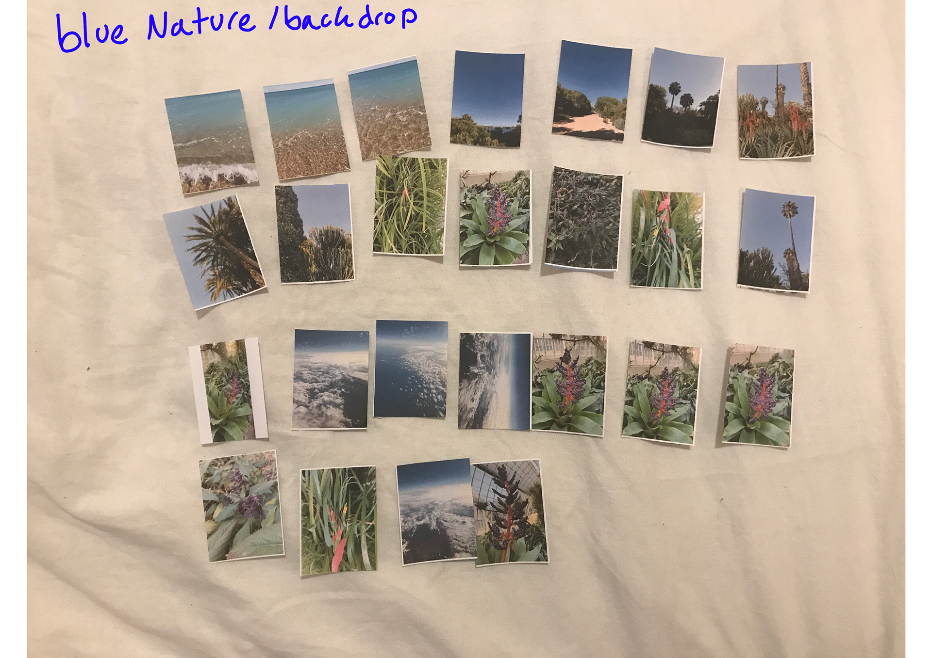
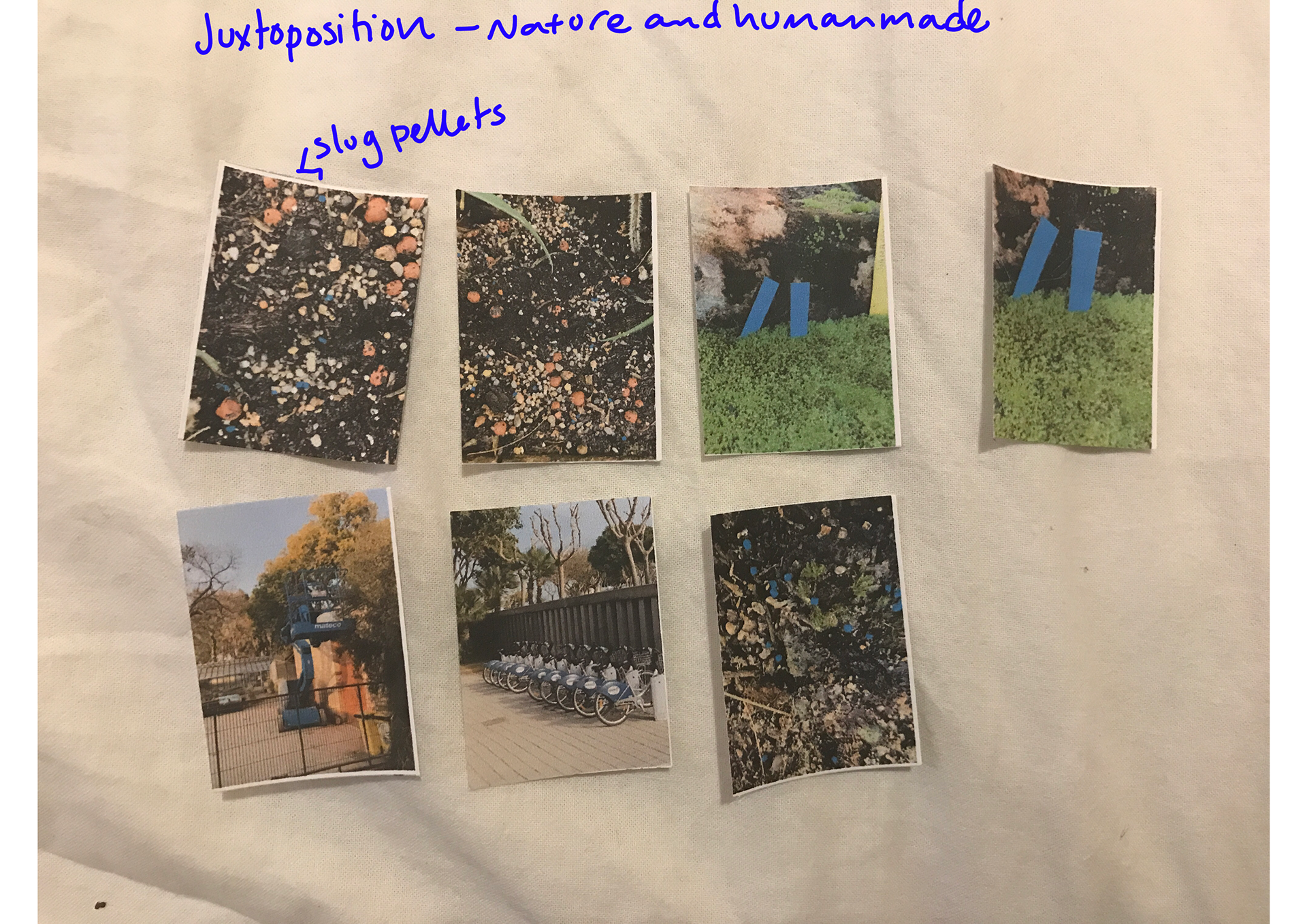
Printing them out and getting away from screen really helped push the category options along.
Whilst I have these categories and further way they can be categorised again. I would need to find a way they all connect and flow with one another. I'm not sure the best way to do this so I am going to brainstorm again.