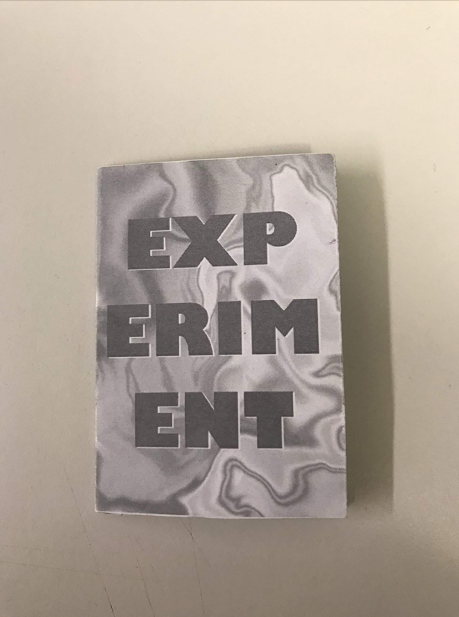
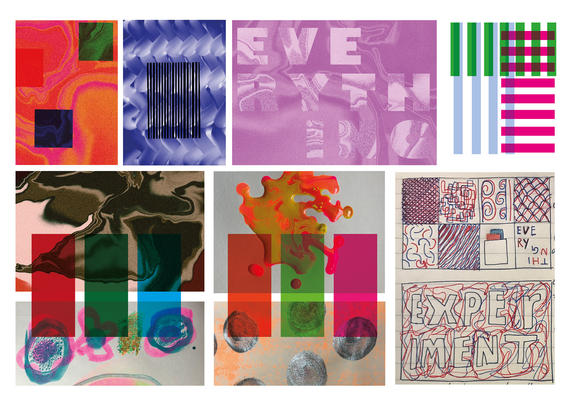
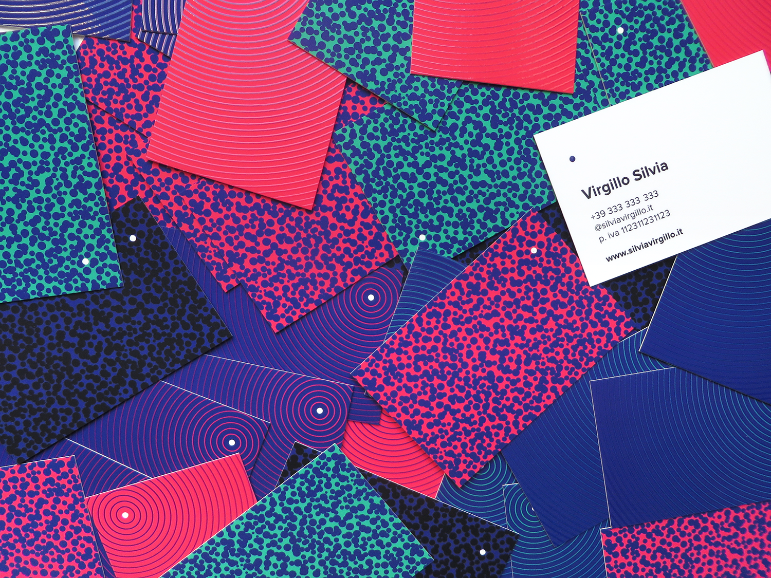
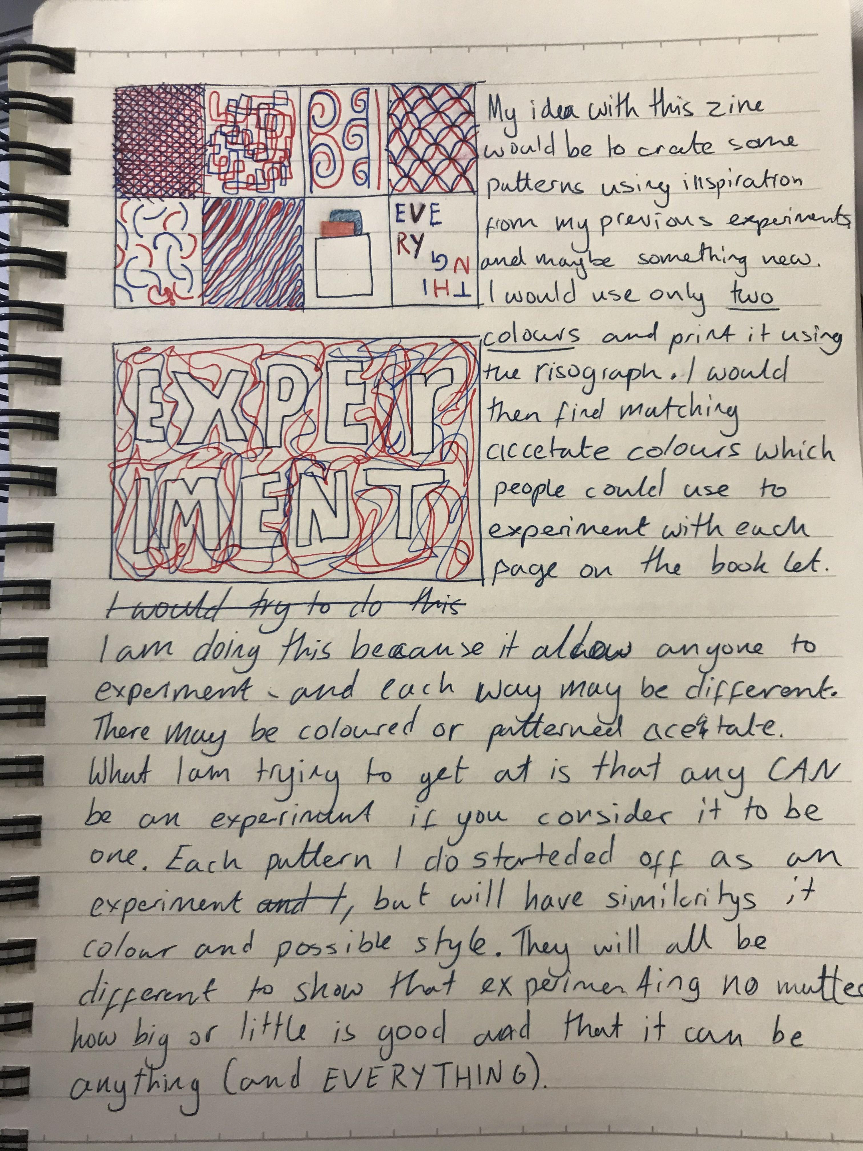
This is my final piece
Overall I'm pretty happy with how it turned out. The print turned out just how I wanted and I like the interactiveness that the acetate adds. Going back to Sister Corita Kent's rule, I feel it's important to consider everything an experiment, as I see this zine as that. I want people to pick it up to experiment and see what they can create - hoping that it may lead them on a path to an idea or just to have fun experimenting.


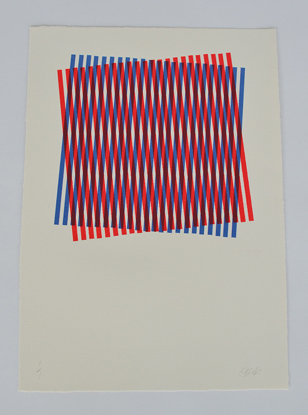
This is how I set the work up for the riso printer. There are two posters as one is for the zine and the other is for the acetate pouch.
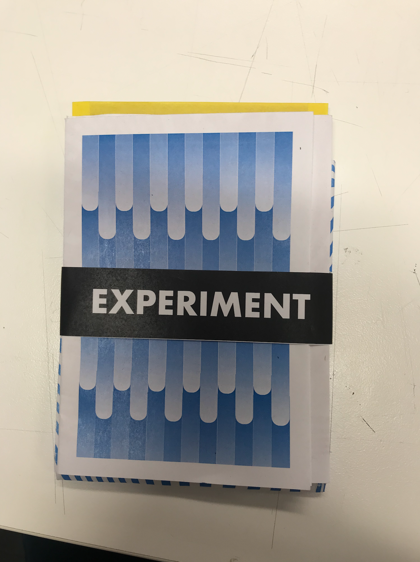
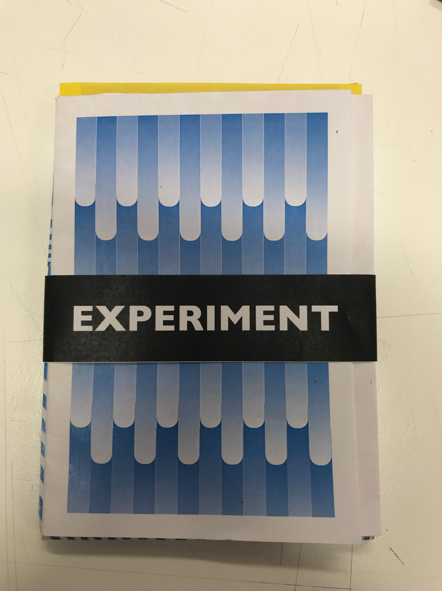
These are my bellyband experiments. At first I had decided I would use Gill Sans Ultra Bold (5th on top row). I'm glad I decided against that, as after printing out different options I felt that Gill Sans Bold would work best for this because Gill Sans Ultra feels too artistic.


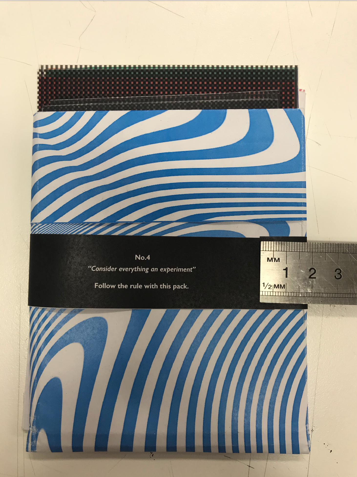
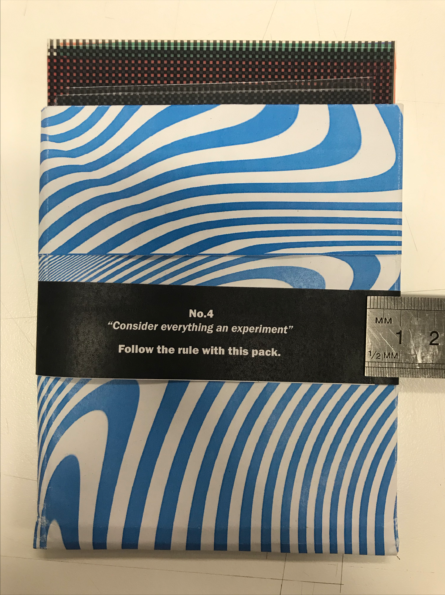
POUCH
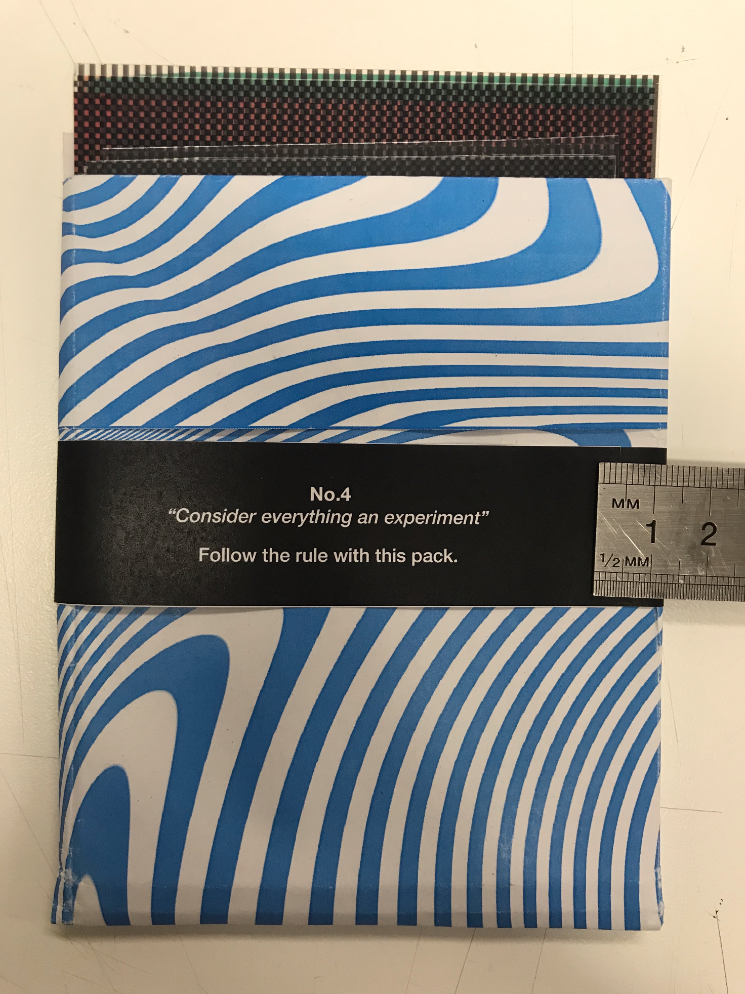
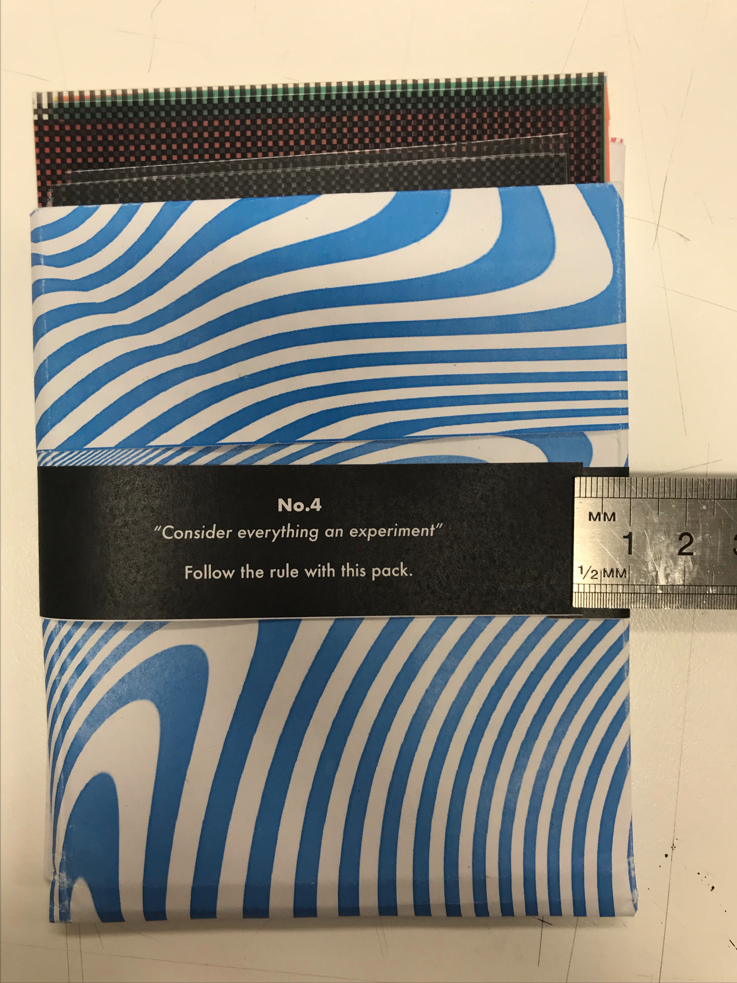
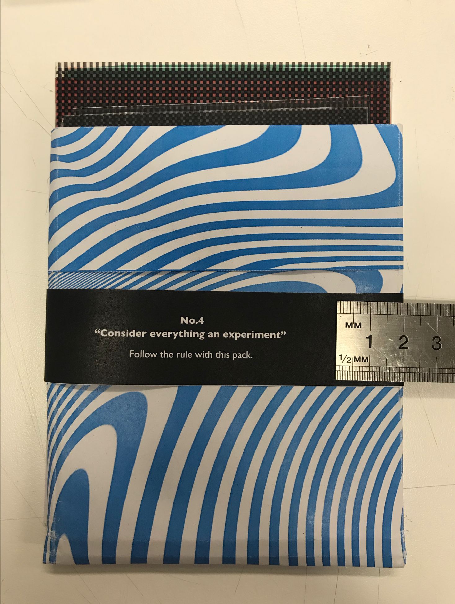
Next up was designing a pouch for the acetate filters! I briefly tried out designing an envelope at the beginning of this project, but felt like an envelope wouldn't be needed, as I want it to be easy to get the filters out of the pouch. So I divided a piece of paper into three and made an open style-pouch. After I was happy with the dimensions I gave it a go with a blue version of the poster, which I am going to have on the back of the zine. I like the way it looks, and I plan to tie it and the zine together with a bellyband.
This is a print out I did to test out if I liked the final designed and whether the acetate worked with each design.
I'm very happy with how it turned out and feel I'm ready to get the pouch and bellyband ready to keep the acetate in.
I had a go at adding some text to the poster design but I feel like it isn't needed so decided to go for the poster without text.
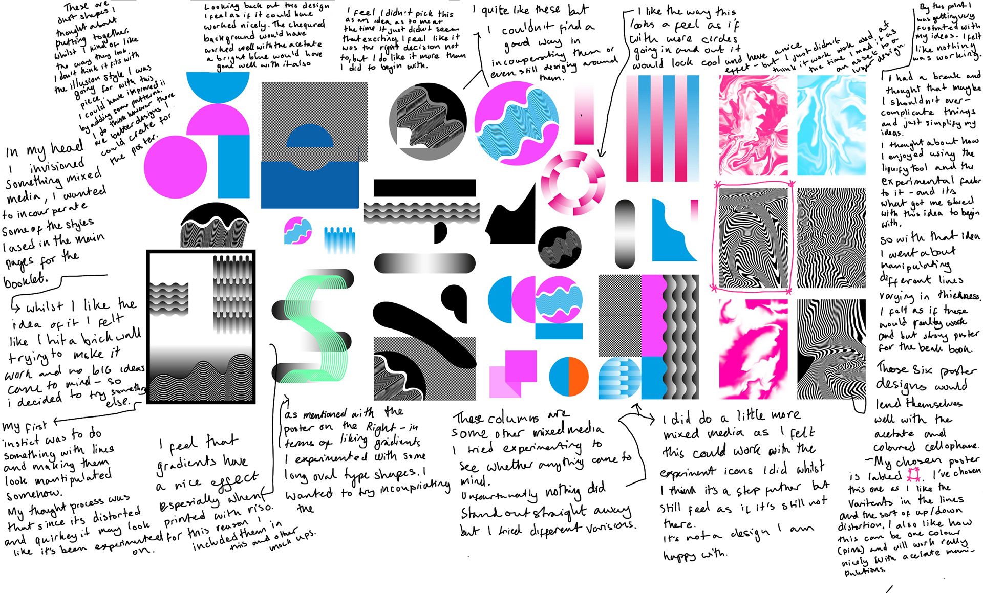
After getting a plan for the pages I need to design the poster for the reverse side of the beak book. Above is the process of getting to my final choice.
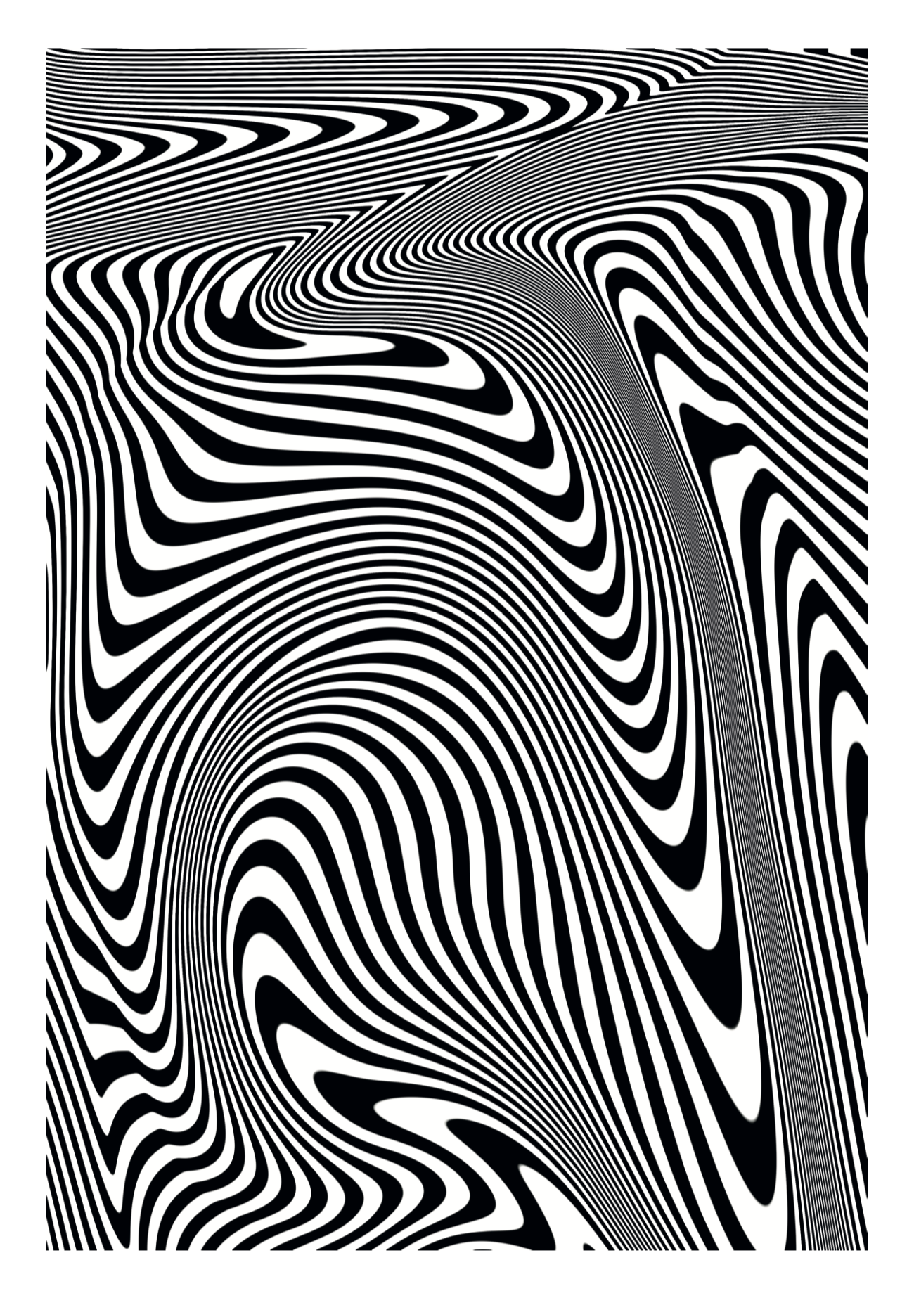
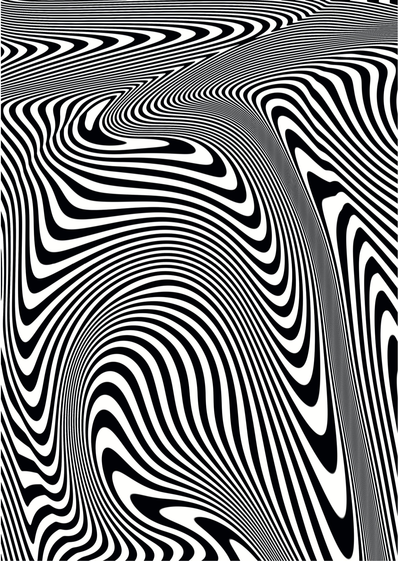
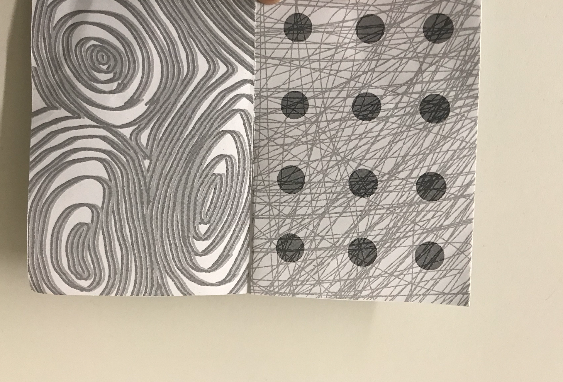
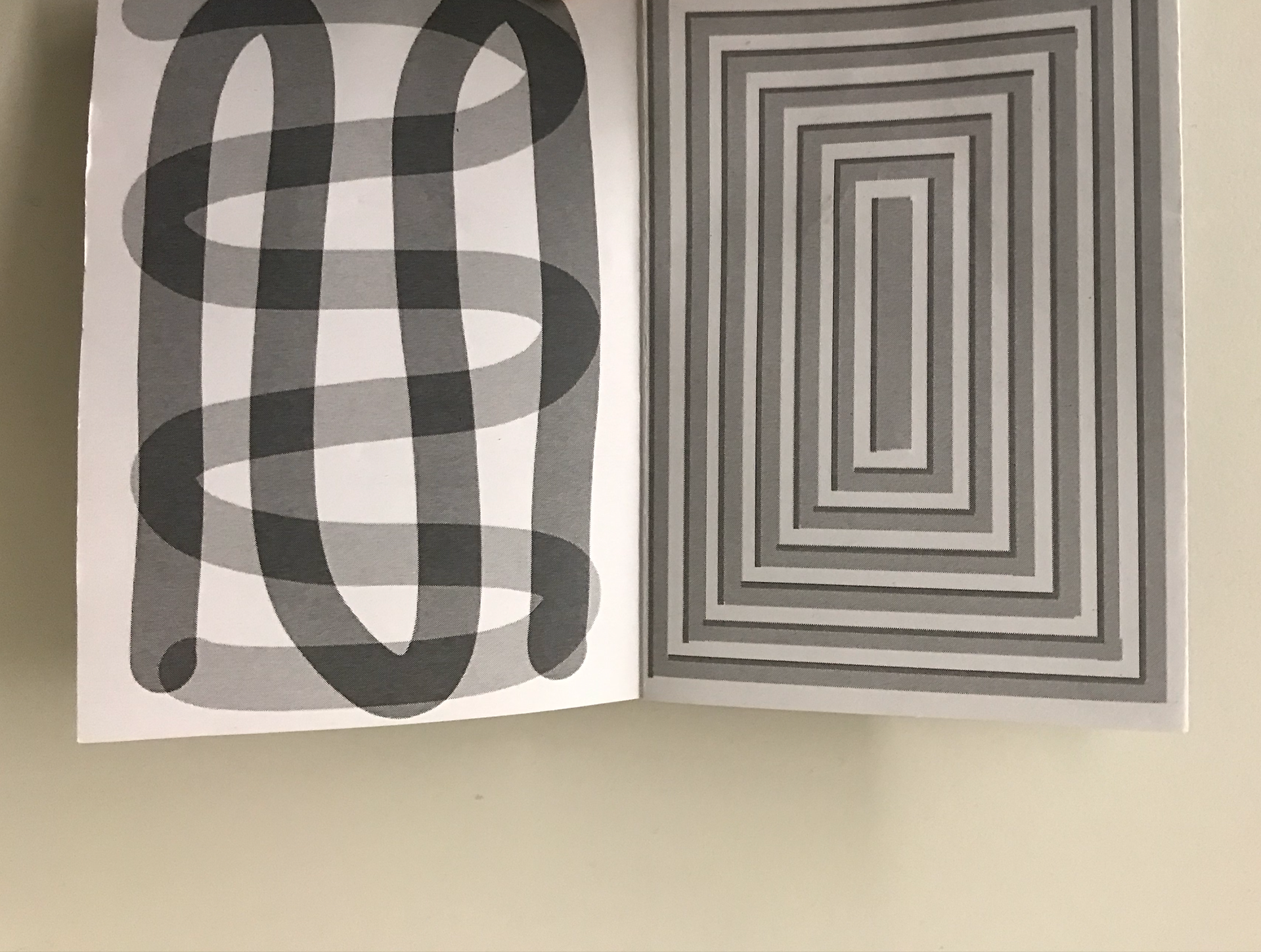
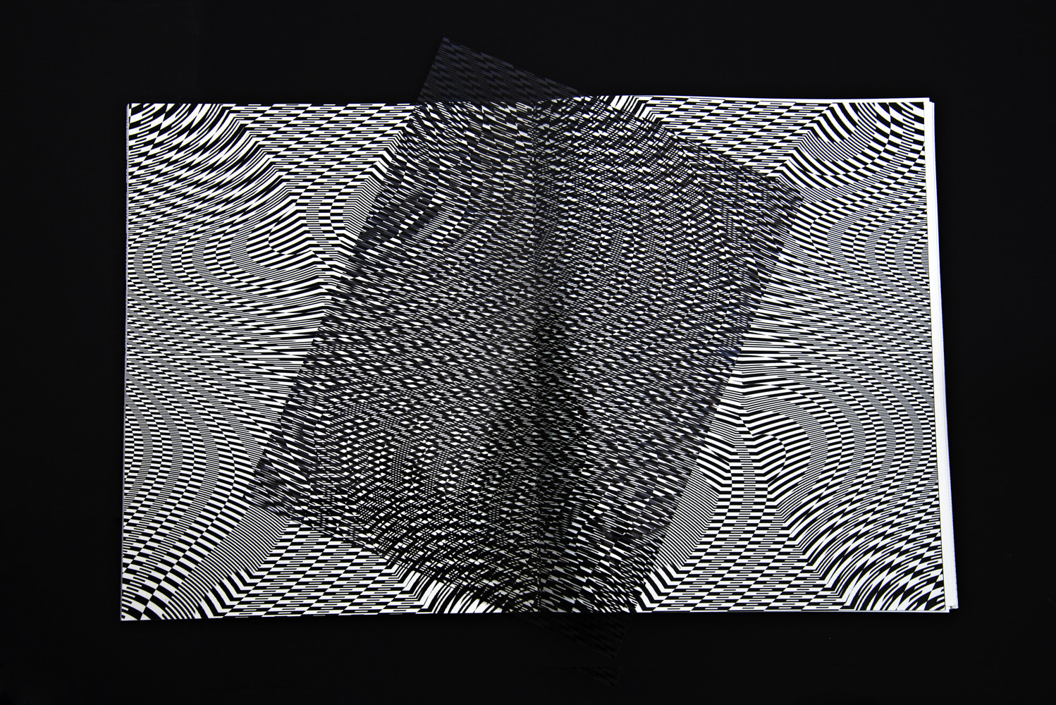
I wanted to print the zine out to see whether it would work with the acetate as well as checking how it looked printed out. I'm very happy with the overall design as I think they all fit within the illusion styled pattern.
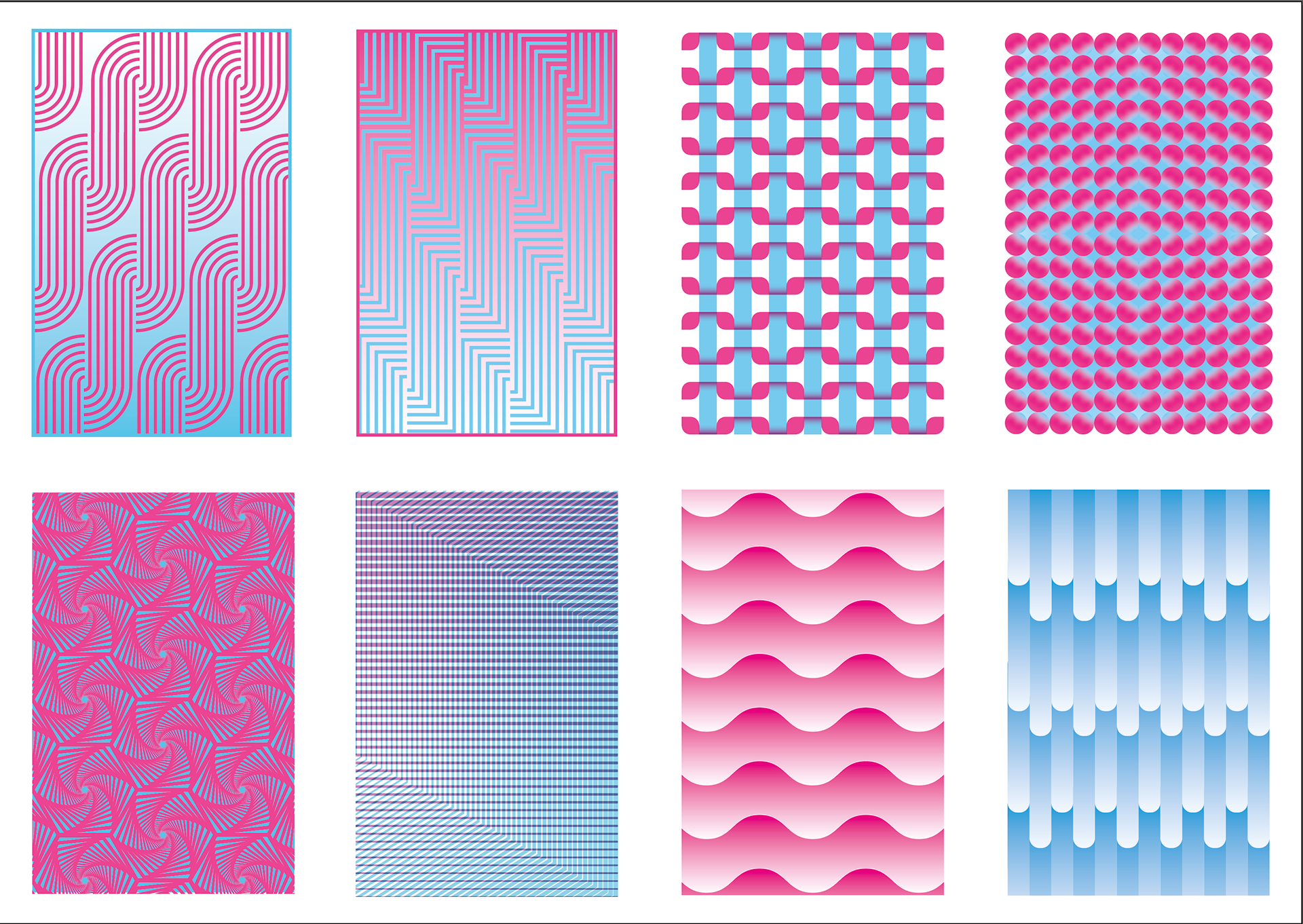
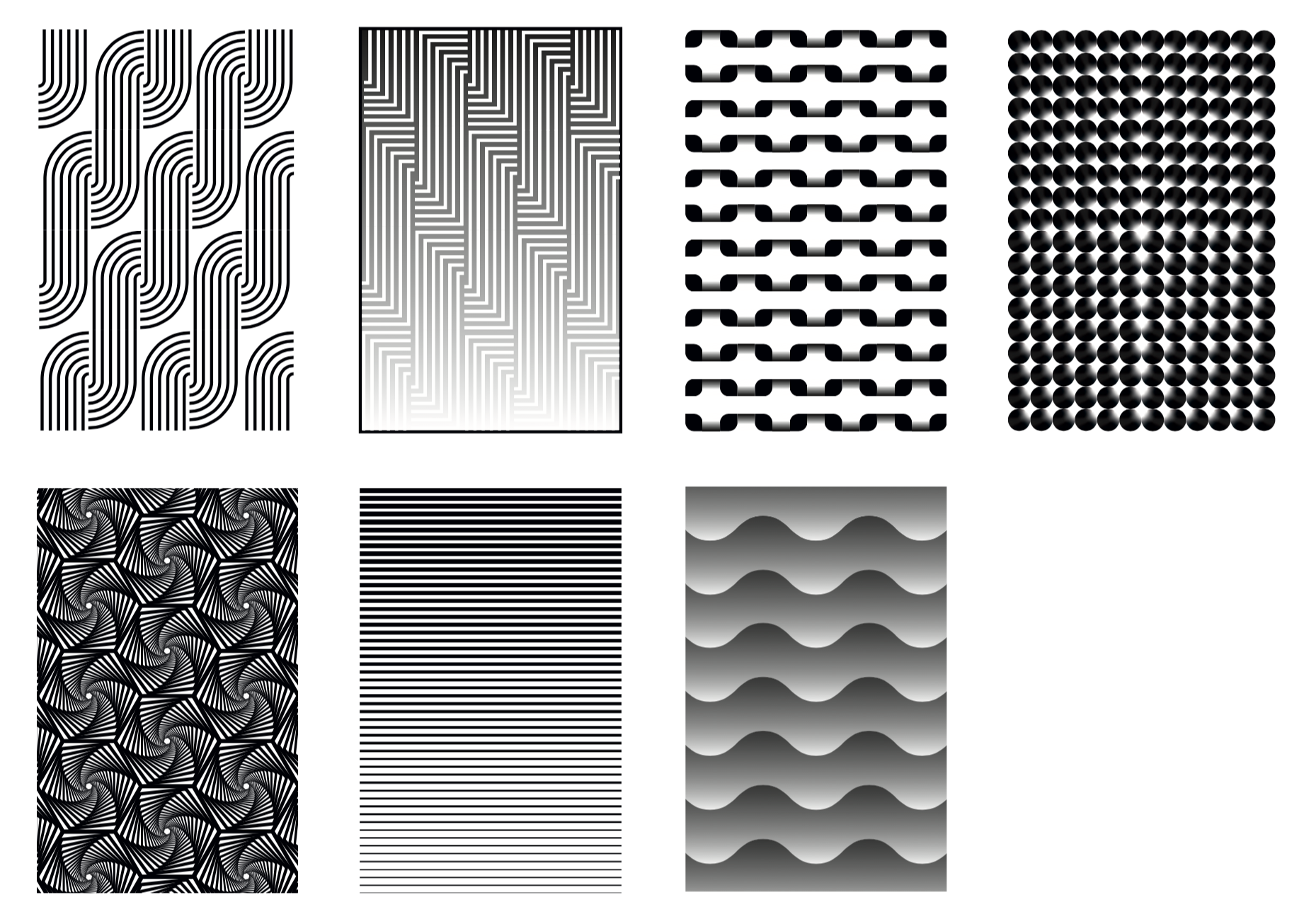
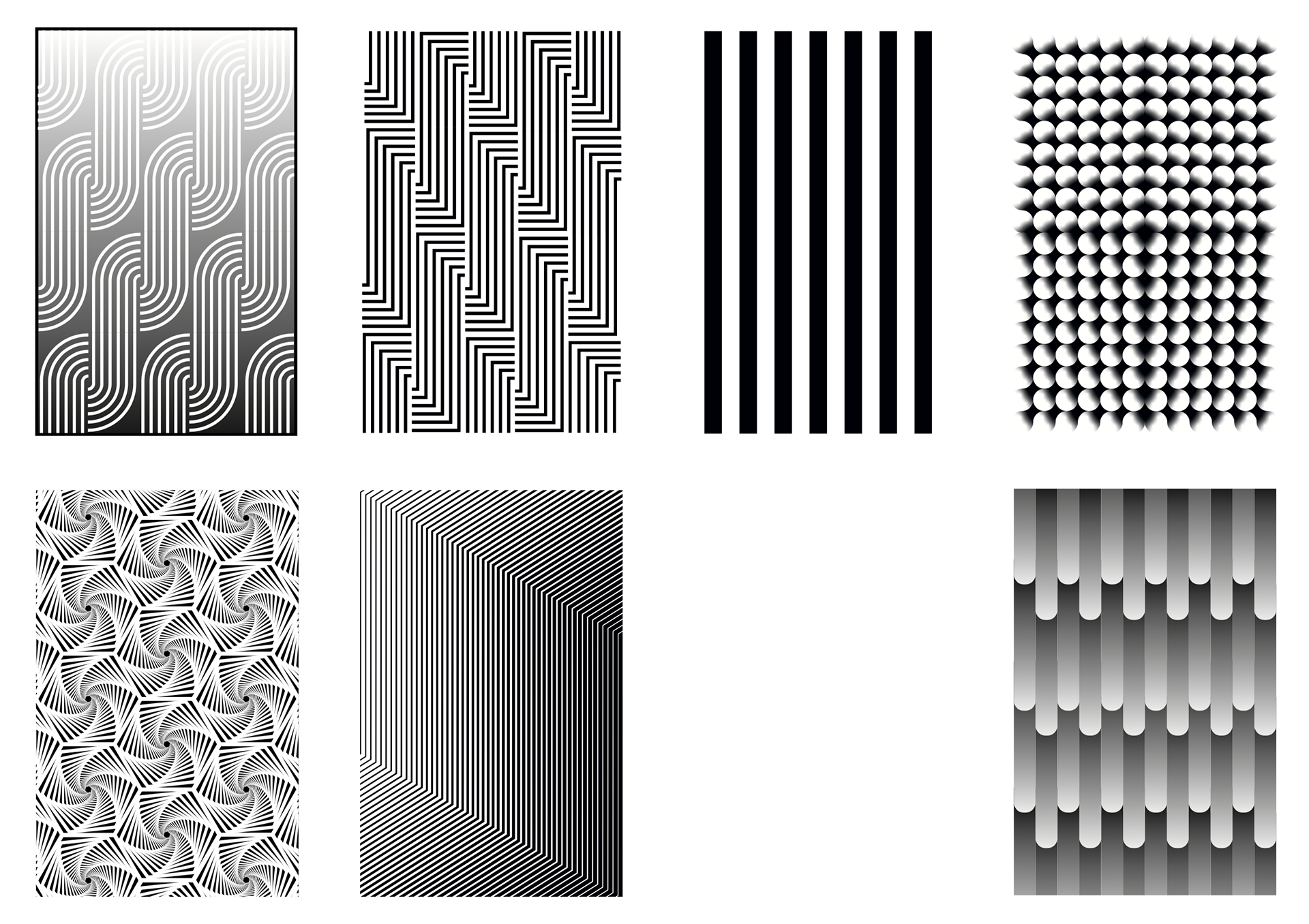
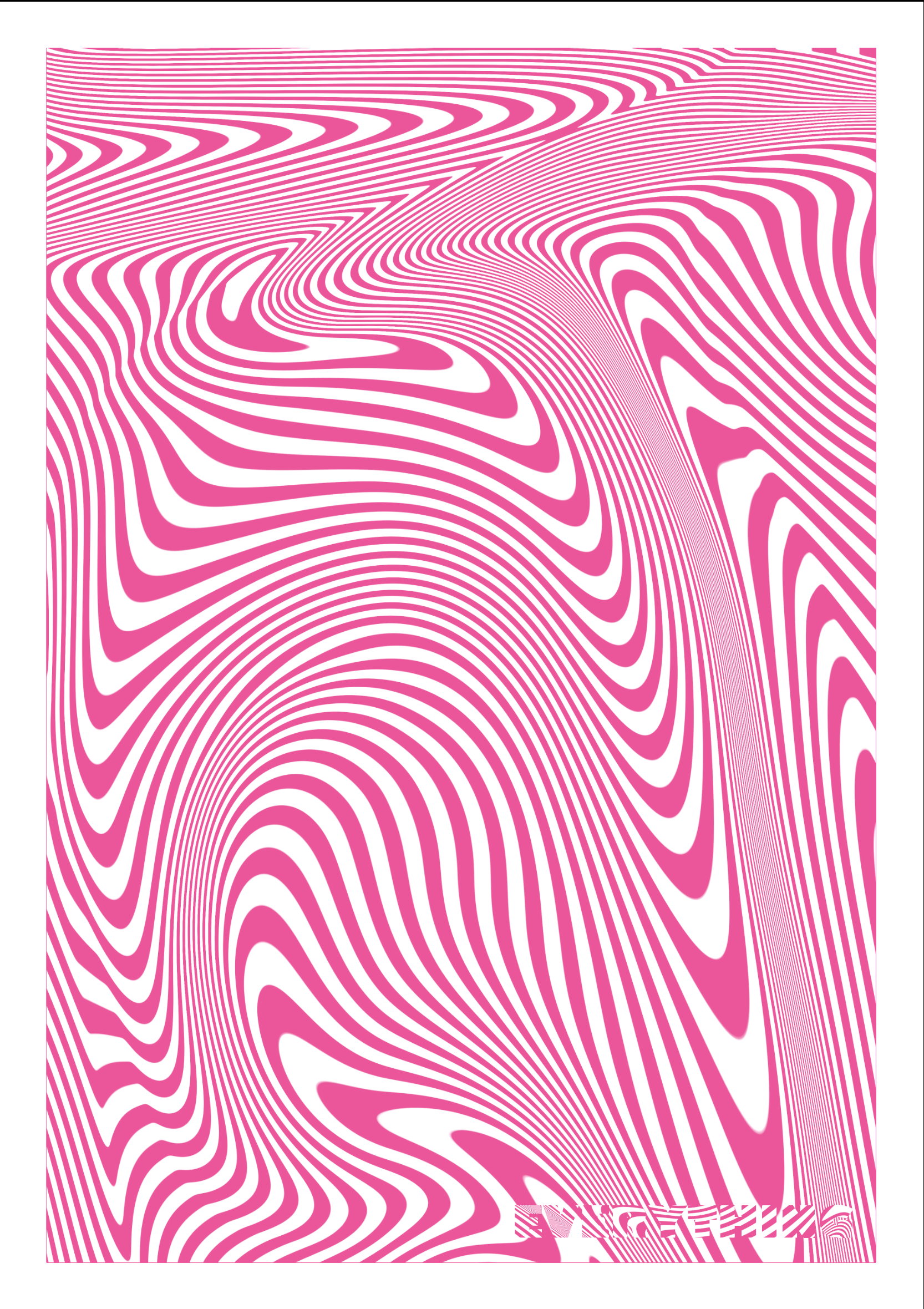
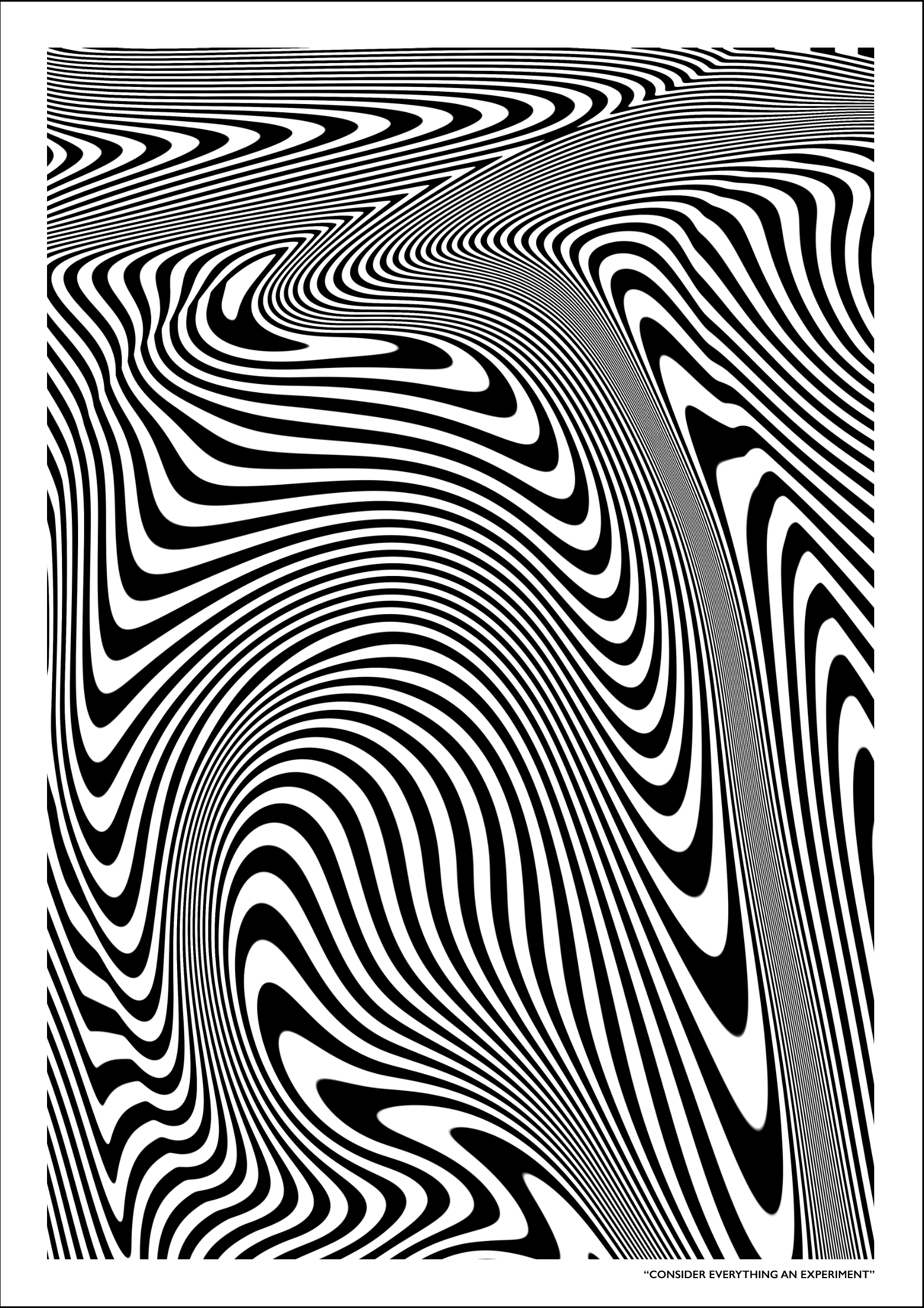
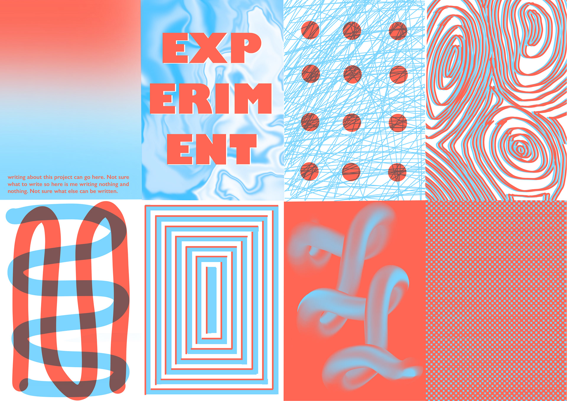
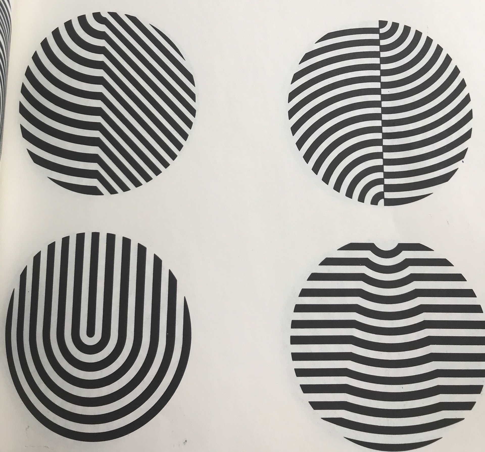
These are my chosen designs.
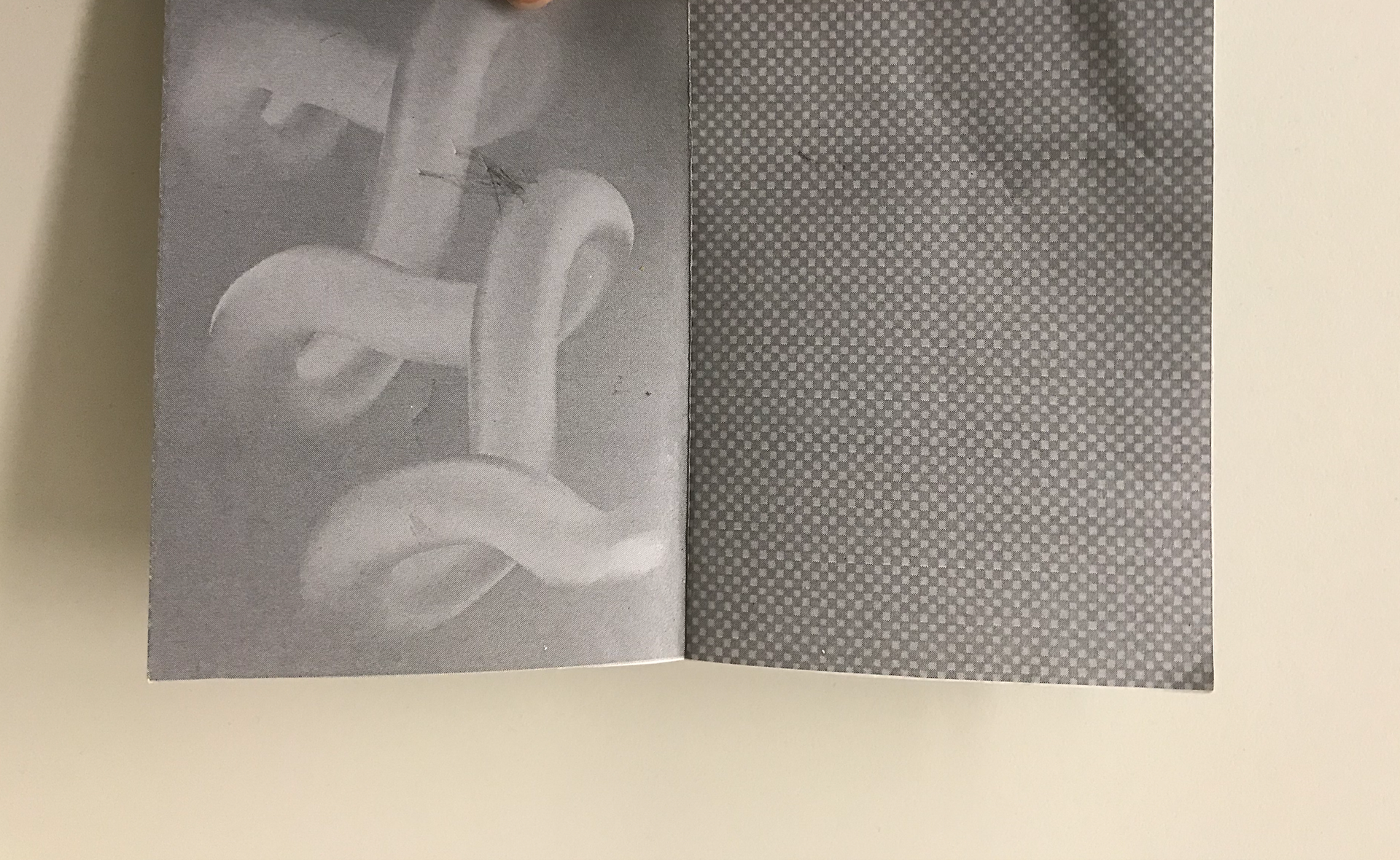
For the front and back cover I chose to use just one colour for each, to distinguish them from the pages in the zine.
The top two on the left are opposite versions of themselves and I feel as if the gradient will work nicely on both their background.
For the top two on the right I wanted to do a softer pattern with a subtle gradient. I thing these have turned out nicely also.
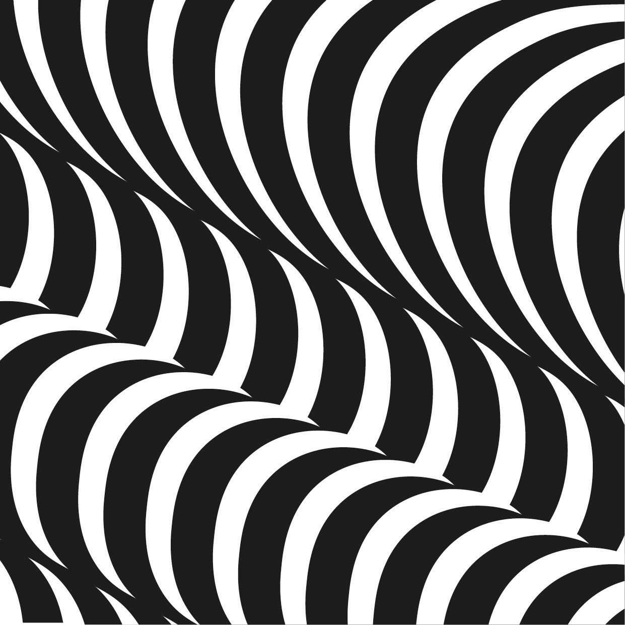
The bottom two on the left are my more geometric/illusion style pieces. I imagine these will react well with the lines on the acetates, and I am excited to see how they end up.
For the front and back cover I chose to use just one colour for each, to distinguish them from the pages in the zine.
The top two on the left are opposite versions of themselves and I feel as if the gradient will work nicely on both their background.
For the top two on the right I wanted to do a softer pattern with a subtle gradient. I thing these have turned out nicely also.
The bottom two on the left are my more geometric/illusion style pieces. I imagine these will react well with the lines on the acetates, and I am excited to see how they end up.
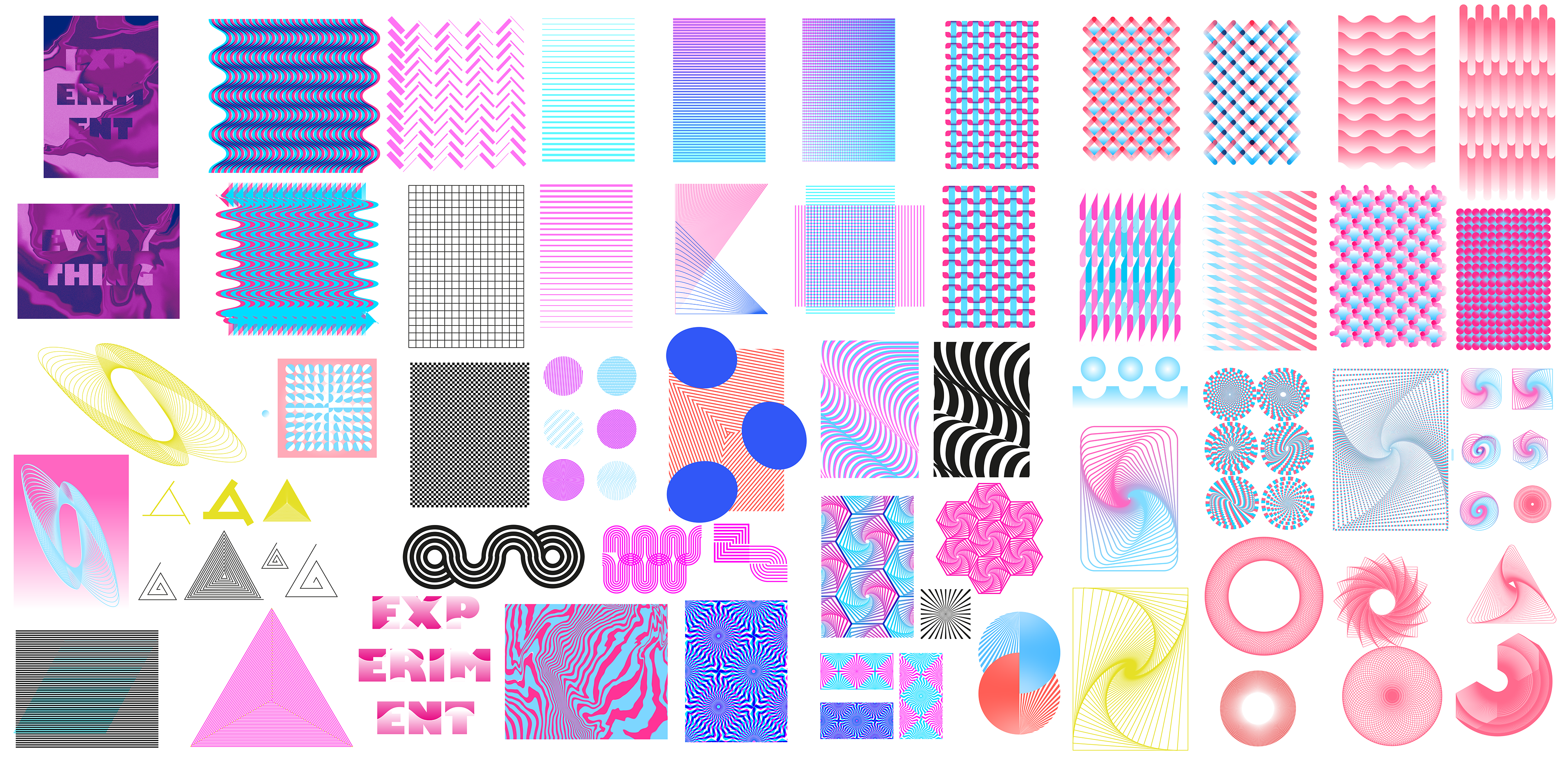
Knowing I had more of a path I wanted to follow, I started experimenting with possible approaches.
As you can see I did quite a few options. I started doing triangles like the ones in the bottom left area. I wasn't sure exactly what I was planning, but this helped me get to the patterns in the bottom right corner. I throughly enjoyed playing around with angles and copies of shapes to create the symbols in the bottom right, but didn't really know where to take the idea. I then made some experiments with lines and gradients (top right). Along the way you can see I tried many other things. I ended up solving some of my problems: e.g. using a hexagon and its copies to create a nice pattern.
As you can see I did quite a few options. I started doing triangles like the ones in the bottom left area. I wasn't sure exactly what I was planning, but this helped me get to the patterns in the bottom right corner. I throughly enjoyed playing around with angles and copies of shapes to create the symbols in the bottom right, but didn't really know where to take the idea. I then made some experiments with lines and gradients (top right). Along the way you can see I tried many other things. I ended up solving some of my problems: e.g. using a hexagon and its copies to create a nice pattern.
My notes below show I just wanted to get something done that would mean I could see a layout in the sort of style I wanted. Looking at it I will admit it's a little all over the place, but what I like is that it has given me a better idea of what I do and don't want. I like the idea of a two colour piece and creating something different on each page.
I have come to the conclusion, however, that I want repeating patterns on each page. I feel like this will keep it consistent throughout and will link each piece together.
I have come to the conclusion, however, that I want repeating patterns on each page. I feel like this will keep it consistent throughout and will link each piece together.
I'd also rather have no text in the booklet, I want to keep simple and let the users experiment themselves. I do, however, plan to have a little phrase to explain what I have done.

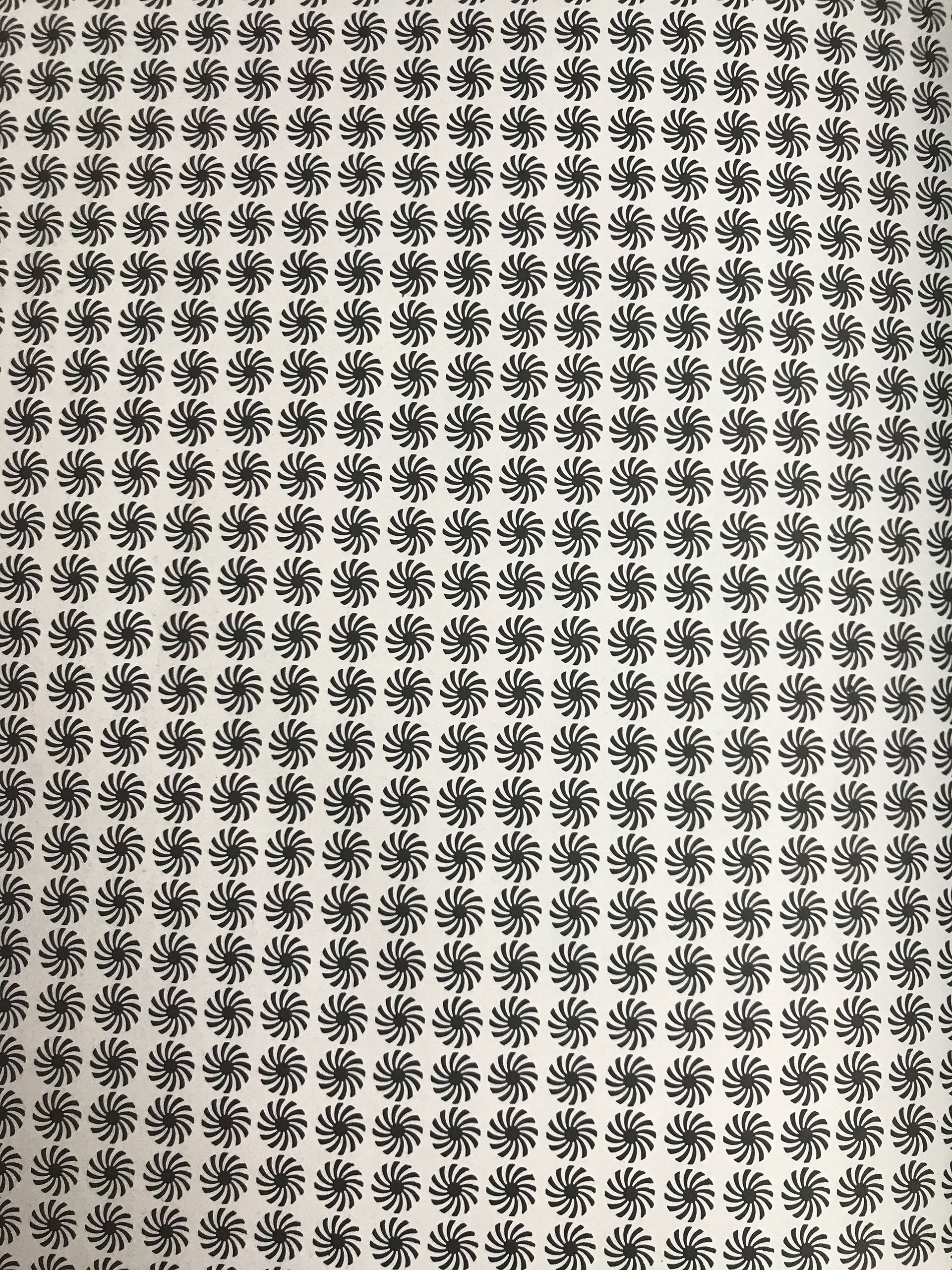
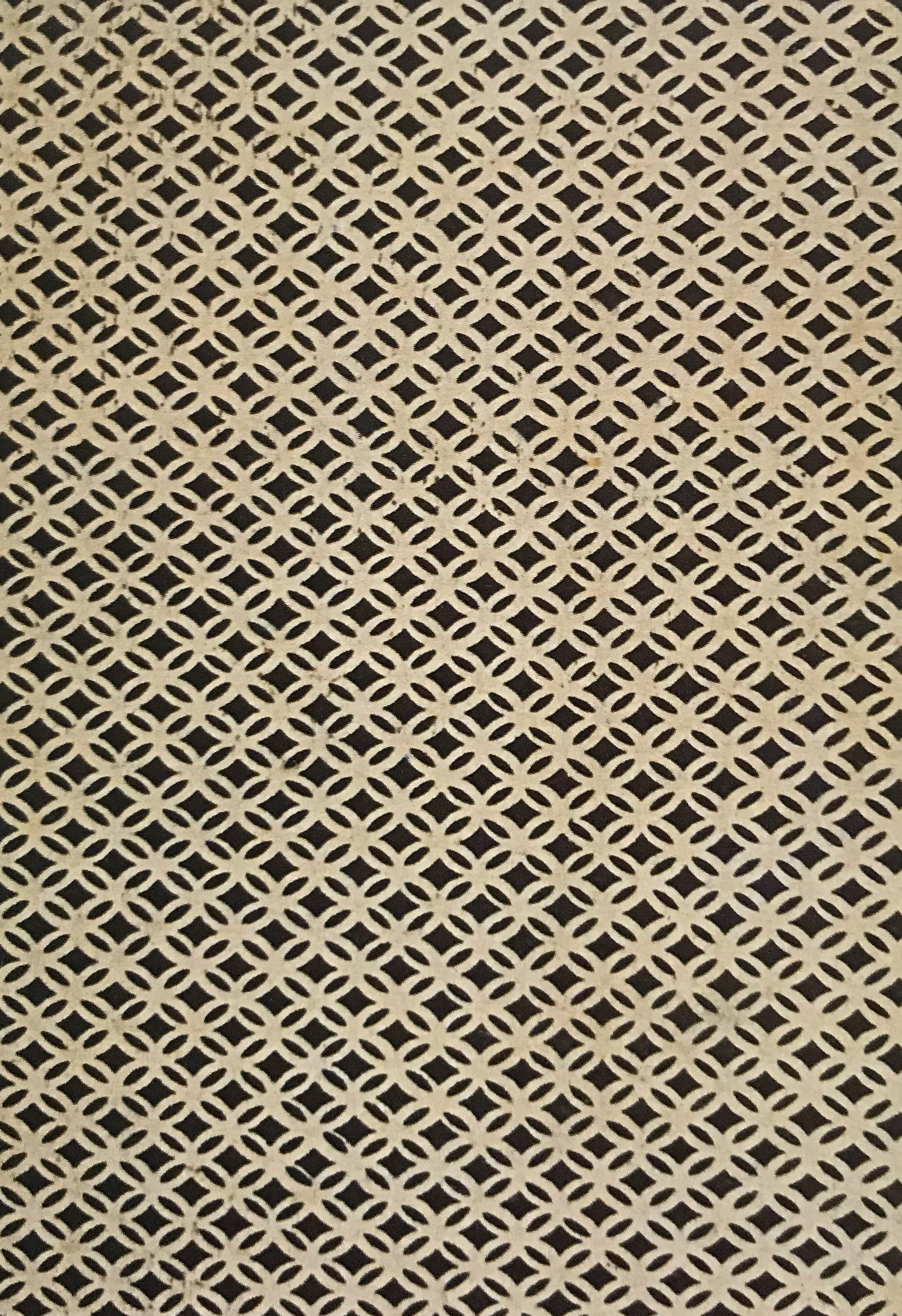
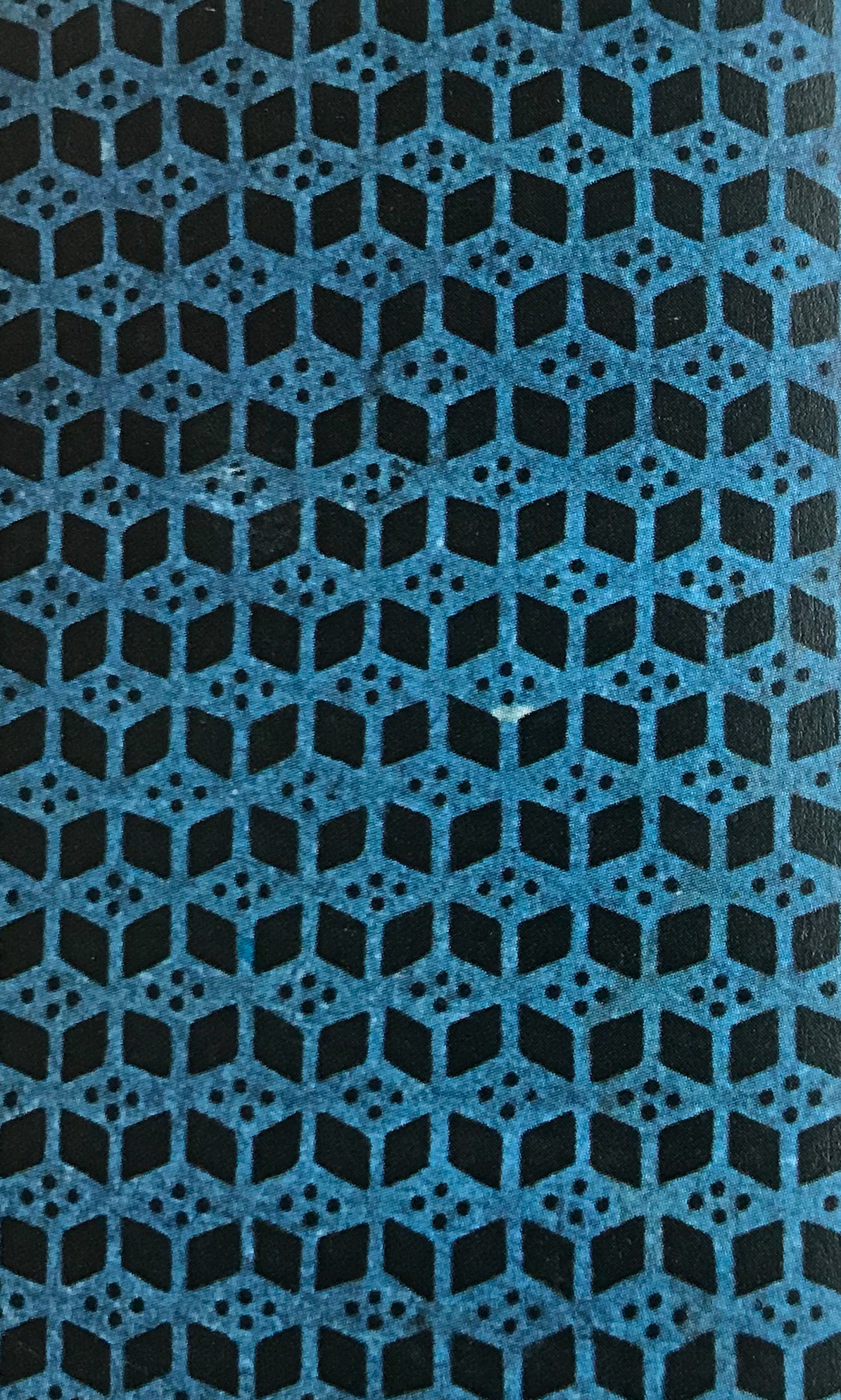
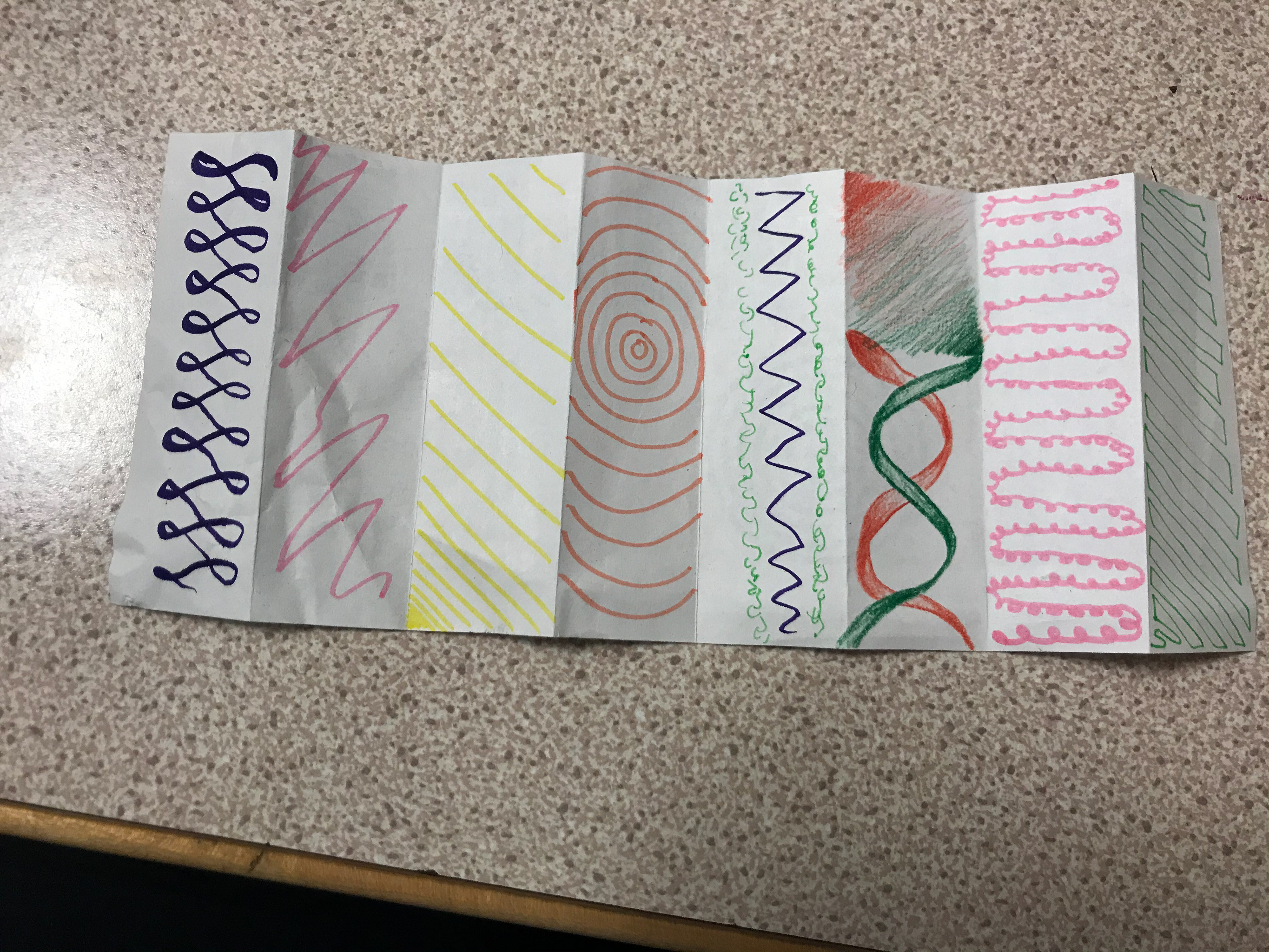
These are some quick doodles on ideas for the zine I am going to make, I like the idea of making geometric/illusion based artwork which these represent.
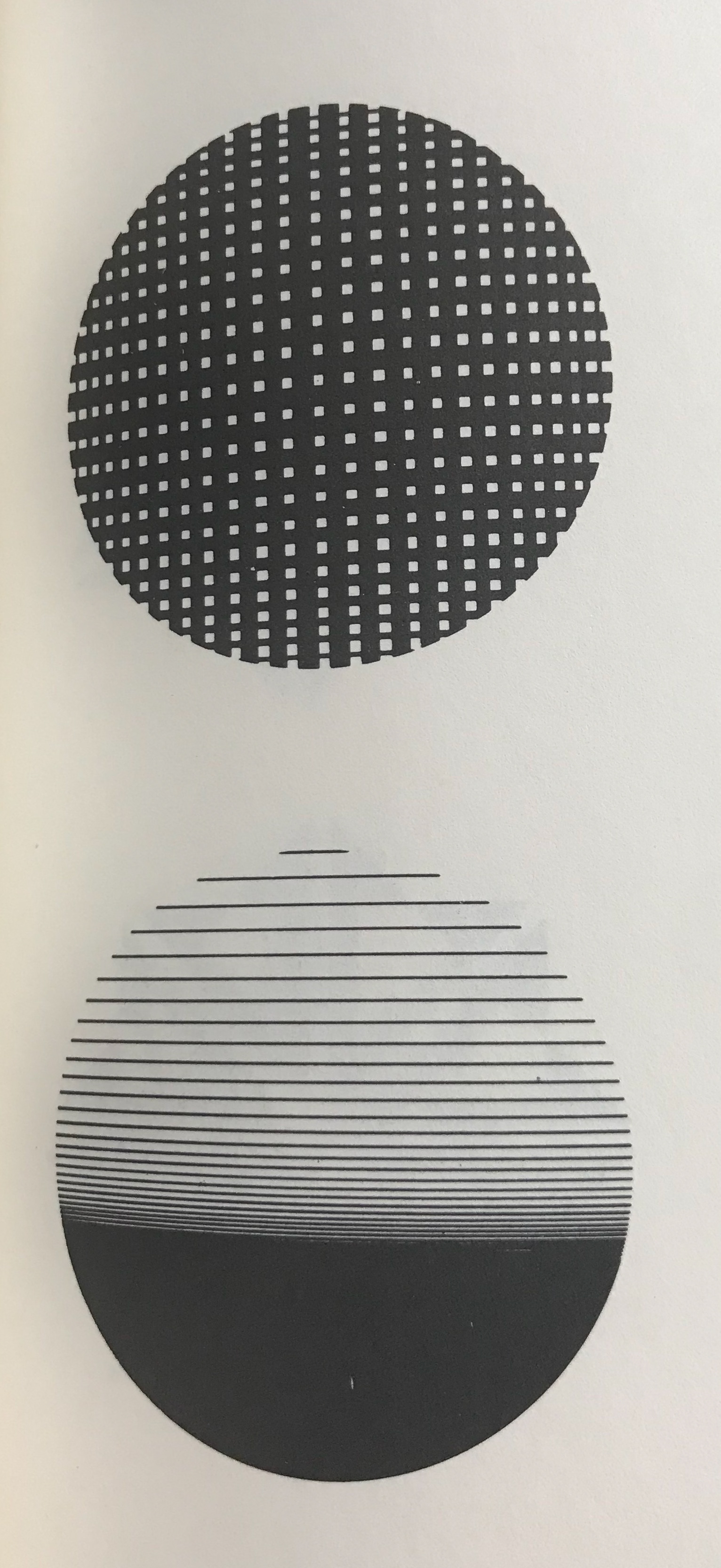
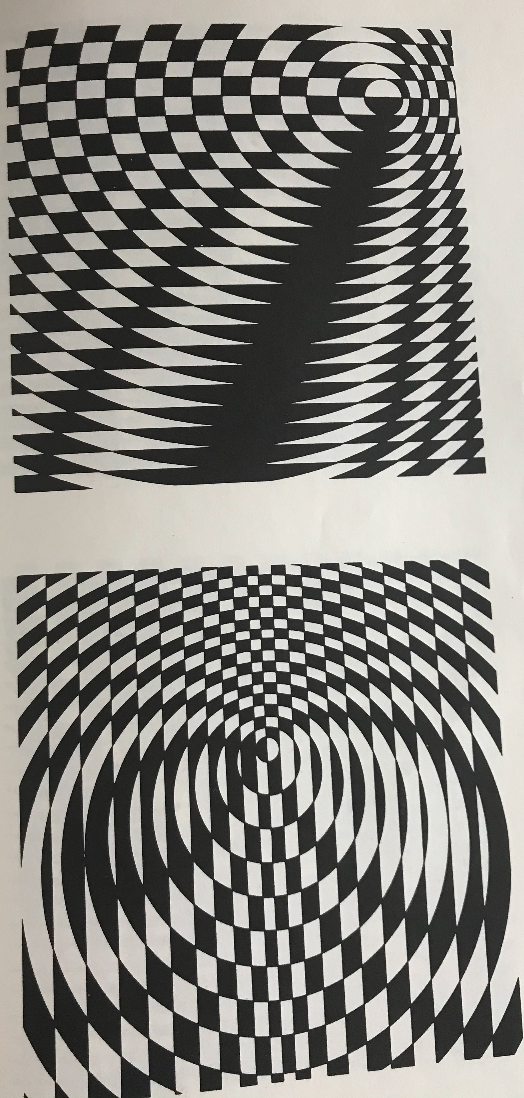
These are some experiments I've done, inspired by my research. I've tested out different ways I can do the moiré effect - some of which worked really well and some of which didn't so much...
My next steps are to experiment different illusions in different ways.
I want to create patterns which will link together and give the OPPORTUNITY THEMSELVES to experiment.


All these pieces use styles/design I feel would look nice in the zine I am making. I got these together to give me some inspiration as to how I could make the zine. I think the use of geometric shapes as well as some added moiré effects would be a nice asset to the design I plan on doing.
Behance.net. (2019). Behance. [online] Available at: https://www.behance.net/gallery/25240379/Conditions-of-Connectivity-Loose-leaf-portfolio?tracking_source=search%7Canaglyph [Accessed 2 Nov. 2019].
Behance.net. (2019). Behance. [online] Available at: https://www.behance.net/gallery/43069349/Graphic-Design-Elements-Optical-Illusions?tracking_source=search%7Coptical%20illusion%20zine [Accessed 2 Nov. 2019].
Behance.net. (2019). Behance. [online] Available at: https://www.behance.net/gallery/33650552/Dzwonnik-z-Notre-Dame-The-Hunchback-of-Notre-Dame?tracking_source=search%7Coptical%20illusion%20zine [Accessed 2 Nov. 2019].
Behance.net. (2019). Behance. [online] Available at: https://www.behance.net/gallery/18778927/LITTLE-BURGUNDY-The-Illusion-Issue?tracking_source=search%7Coptical%20illusion%20zine [Accessed 2 Nov. 2019].
Behance.net. (2019). Behance. [online] Available at: https://www.behance.net/gallery/57305271/CMYN?tracking_source=search%7Coptical%20illusion%20zine [Accessed 2 Nov. 2019].
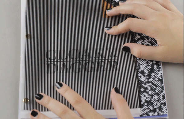
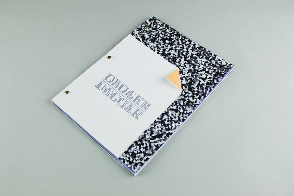
Behance.net. (2019). Behance. [online] Available at: https://www.behance.net/gallery/8427623/Cloak-Dagger?tracking_source=search%7Coptical%20illusion%20zine [Accessed 2 Nov. 2019].
Behance.net. (2019). Behance. [online] Available at: https://www.behance.net/gallery/71492133/School-of-Motion-Advanced-Motion-Methods?tracking_source=search-all%7Coptical%20illusion%20art [Accessed 2 Nov. 2019].
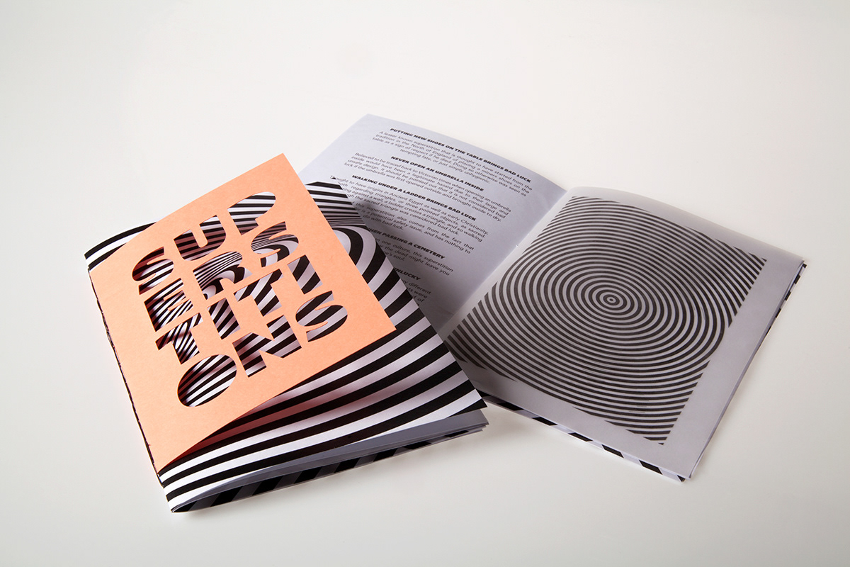
Behance.net. (2019). Behance. [online] Available at: https://www.behance.net/gallery/30759631/Superstitions-Zine?tracking_source=search-all%7Coptical%20illusion%20art [Accessed 2 Nov. 2019].
Behance.net. (2019). Behance. [online] Available at: https://www.behance.net/gallery/25880607/ILLUSION-OF-MOVEMENT-TIY-(TWEAK-IT-YOURSELF)?tracking_source=search%7Coptical%20illusion%20zine [Accessed 2 Nov. 2019].
Behance.net. (2019). Behance. [online] Available at: https://www.behance.net/gallery/6397385/Spaces-Zines?tracking_source=search%7Coptical%20illusion%20zine [Accessed 2 Nov. 2019].
Behance.net. (2019). Behance. [online] Available at: https://www.behance.net/gallery/24601387/ILLUSION-OF-MOVEMENT-(moir-experiments)?tracking_source=search%7Coptical%20illusion%20zine [Accessed 2 Nov. 2019].
Behance.net. (2019). Behance. [online] Available at: https://www.behance.net/gallery/35542205/Illusion?tracking_source=search%7Coptical%20illusion%20zine [Accessed 2 Nov. 2019].
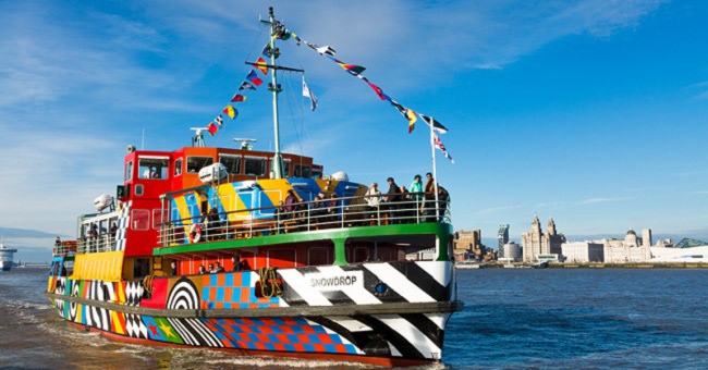
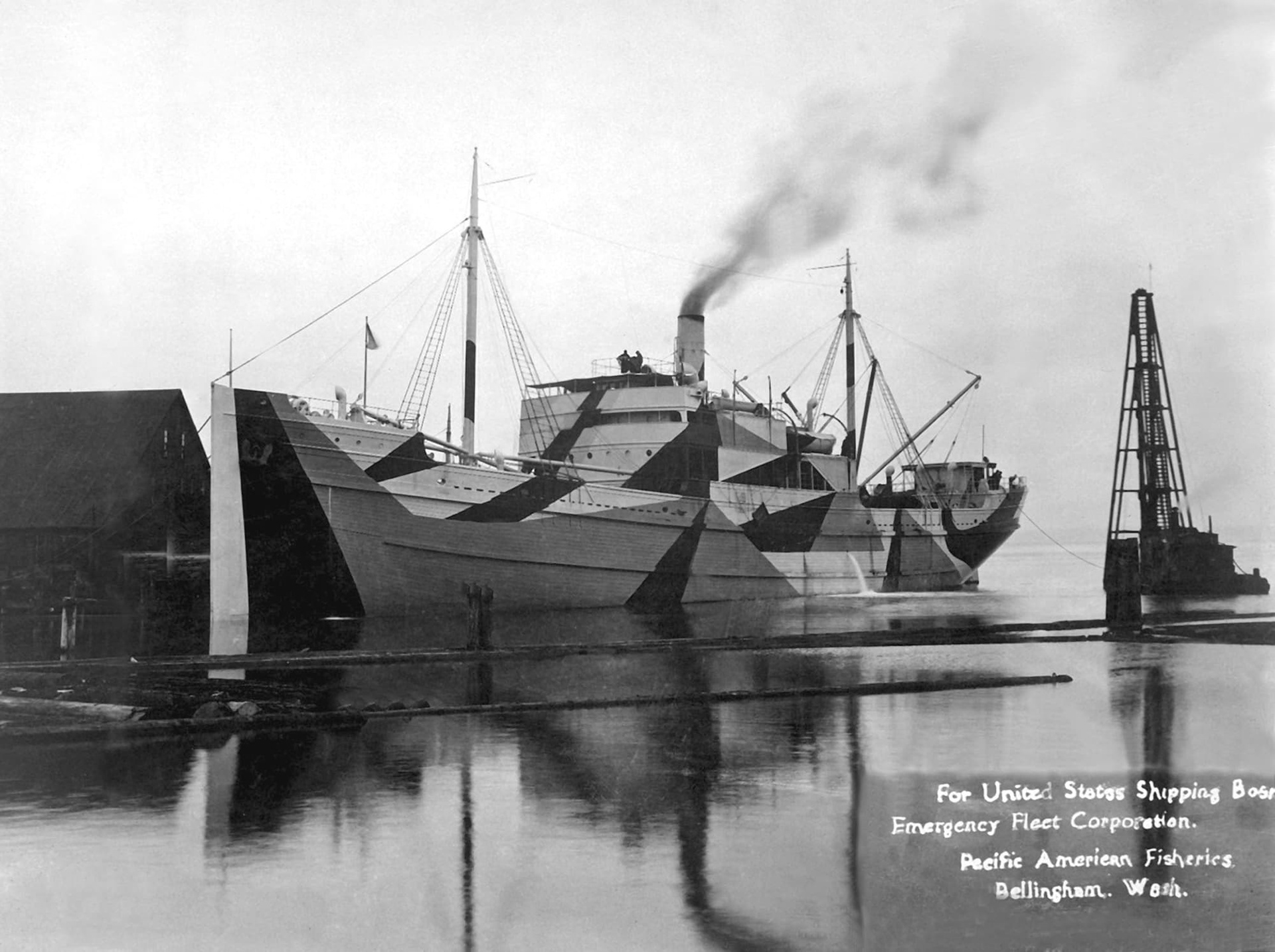
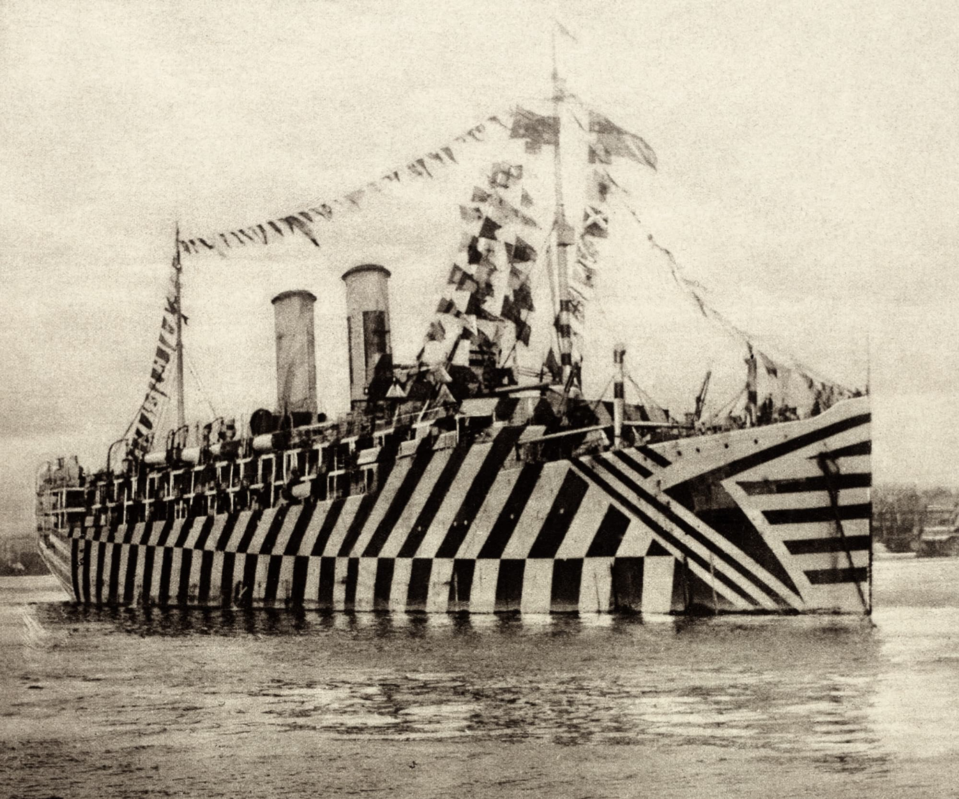
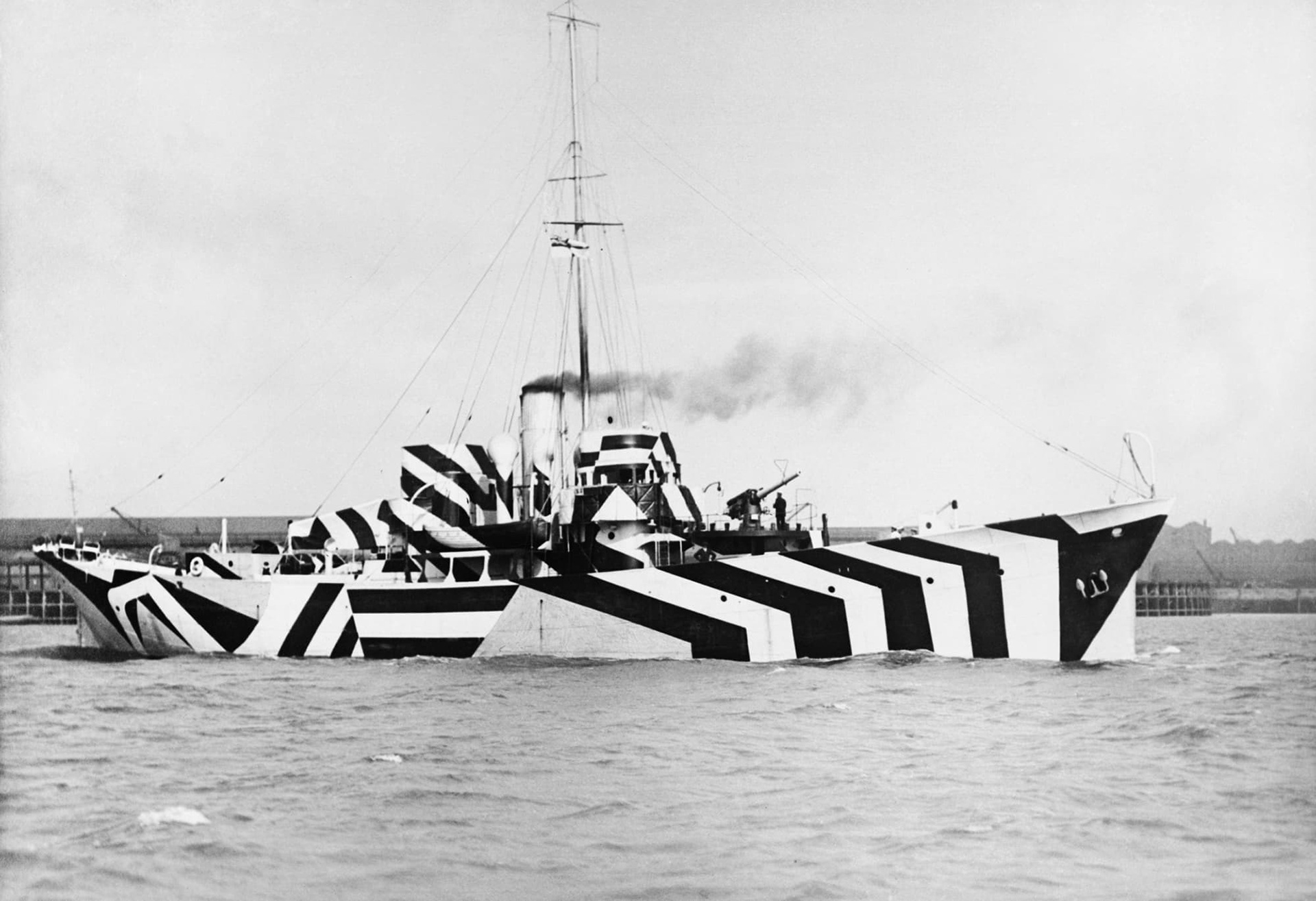
I find dazzle ships really fun. I like their design, which gives me a type of memphis vibe, but also how they actually worked to give an illusion that confused the size and shape of ships in the war. I also wanted to add the razzle dazzle ship in Liverpool which is a fun modern update on the traditional ones.
Merseyferries.co.uk. (2019). Dazzle Ferry Calendar . [online] Available at: https://www.merseyferries.co.uk/dazzle/Pages/Calendar.aspx [Accessed 2 Nov. 2019].
Biennial.com. (2019). Video Channel | Liverpool Biennial of Contemporary Art . [online] Available at: https://www.biennial.com/video/timelapse-everybody-razzle-dazzle-by-sir-peter-blake [Accessed 2 Nov. 2019].
History.com. (2019). [online] Available at: https://www.history.com/news/dazzle-camouflage-world-war-1 [Accessed 2 Nov. 2019].
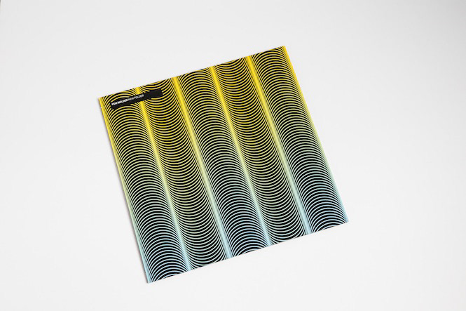
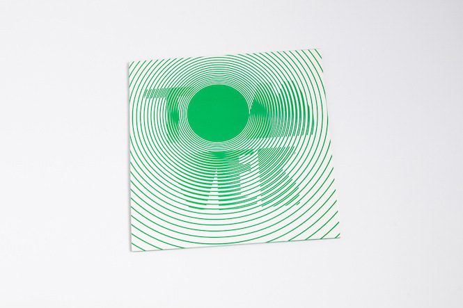

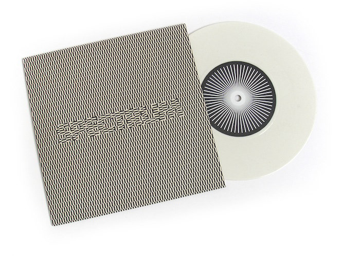
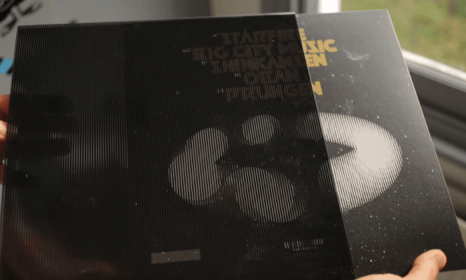
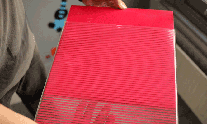

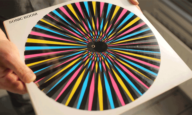
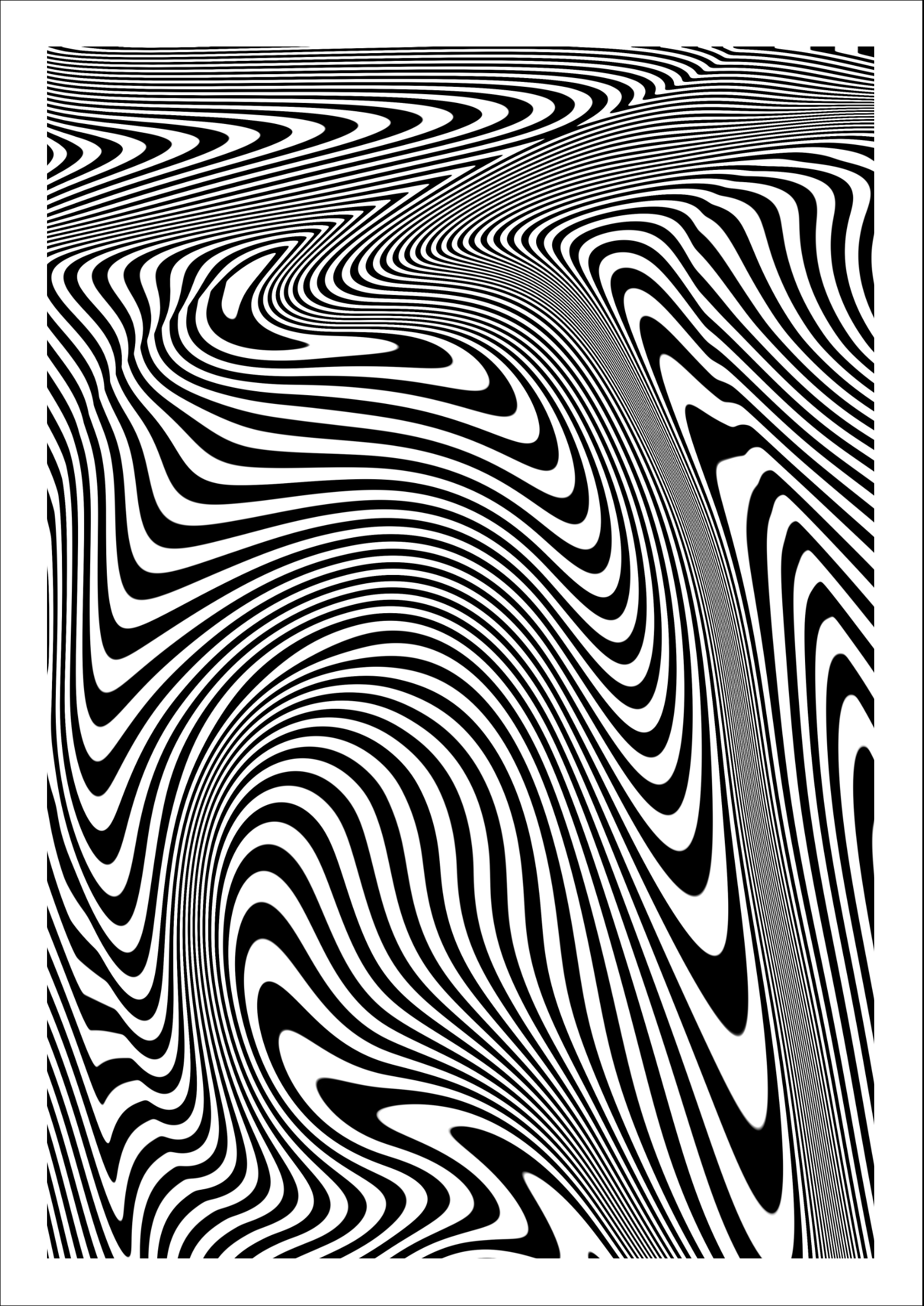
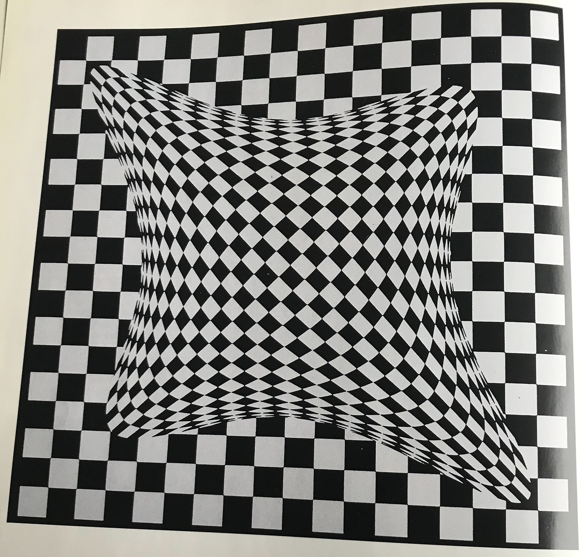
These are some examples of the moiré effect. I love the effect that it gives, and it can be hard to believe it's real. The vinyl covers at the top whilst they aren't moving, create the illusion they are. It's quite crazy to think about the simplicity of these designs, but they are finished to a high standard. Distorting the line in different ways it a nice way to create the illusion effect and I feel like I will be looking into this for my final patterns.
Food, D. (2017). Freaky Formats: The hypnotic world of moiré effect record sleeves. [online] The Vinyl Factory. Available at: https://thevinylfactory.com/features/freaky-formats-moire-effect/ [Accessed 2 Nov. 2019].
Spice, A. (2016). Freaky formats: Optical art on vinyl - The Vinyl Factory. [online] The Vinyl Factory. Available at: https://thevinylfactory.com/features/freaky-formats-optical-art-on-vinyl/ [Accessed 2 Nov. 2019].
I wanted to have a look at different optical illusions, this video from vsauce goes through many types of illusions. I found it interesting that muller-lyer illusion is perceived differently to depending if you are from the 'east' or 'west'.
This video explains how the moire effect works, I've found this useful in the sense that I now know what patterns with 'react' with each other.
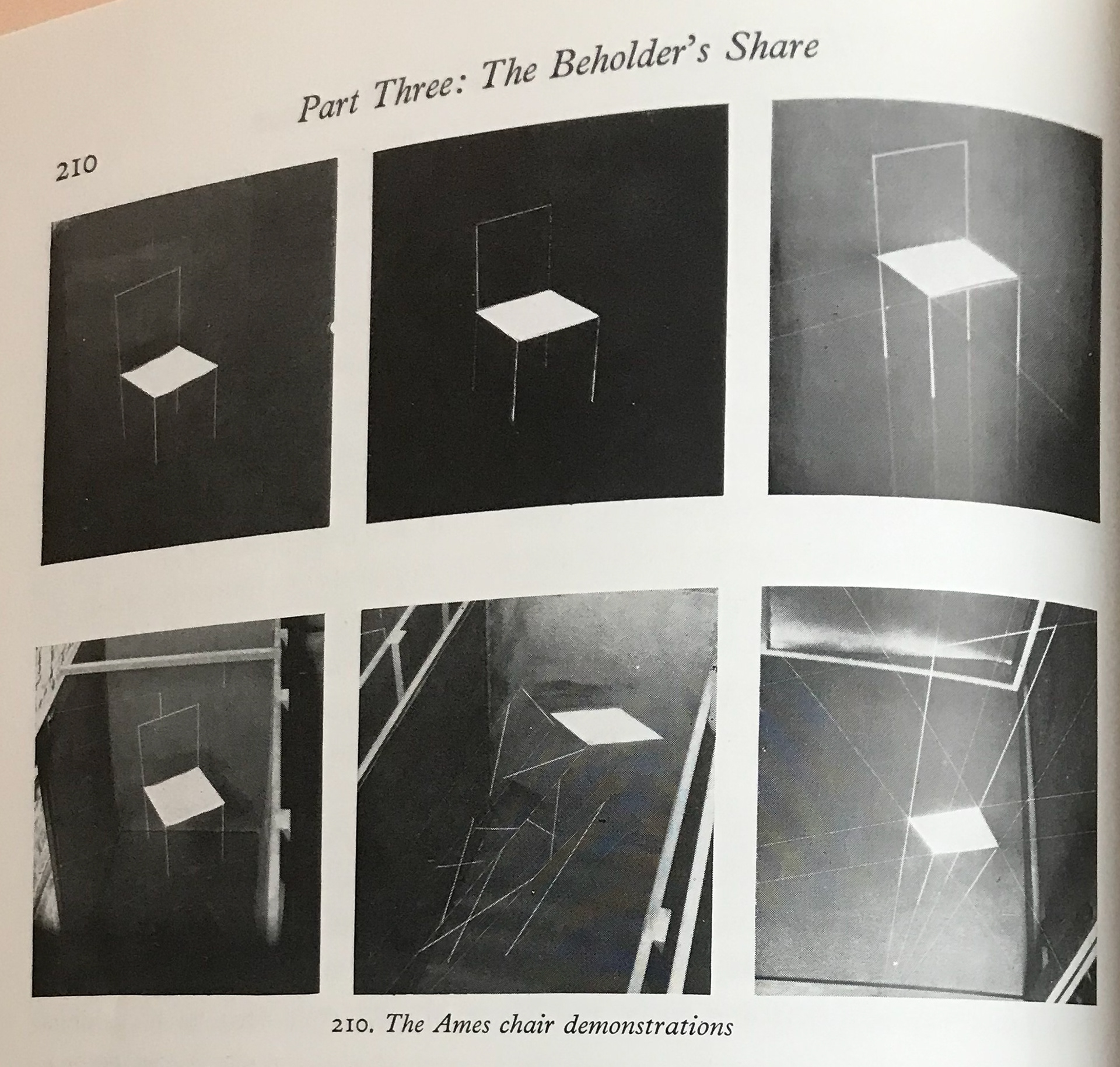
I just really like the illusion of this chair and how it's made of mini charis.
This is another video demonstrating another way to represent the moire effect with cirlces.


I chose these images as they show different types of illusions/intense patterns. I never realised the Fraser's spiral was made from concentric circles and just amazed as to how illusions work. I had a little look at the anaglyph but not sure if it's the exact route I'd like to take as it seems to work better with photographs. The patterns on the bottom row I all really like and like this sort of illusion effect / illusion style pattern. I feel as if I will be taking inspiration from these.
Gombrich, E. (1960). Art & Illusion. 6th ed. London: PHAIDON, pp.184, 210, 226, 242, 243, 260.
Hal, M. and Symmes, D. (1982). Amazing 3-D. BOSTON: Little, Brown Company, pp.9, 124.
Reynaud, F., Tambrun, C. and Timby, K. (2000). Paris in 3D. London: Booth-Clibborn Editions, pp.13, 16, 67.
Ouchi, H. (1977). Japanese optical and geometrical art. Dover, pp.45, 83, 107, 130, 154.
Yoshimoto, K. (1980). Over 900 patterns of traditional "small motif and middle figure" design collection. Tokyo: Research Association for Old textiles, pp.14, 28, 30, 77, 104.
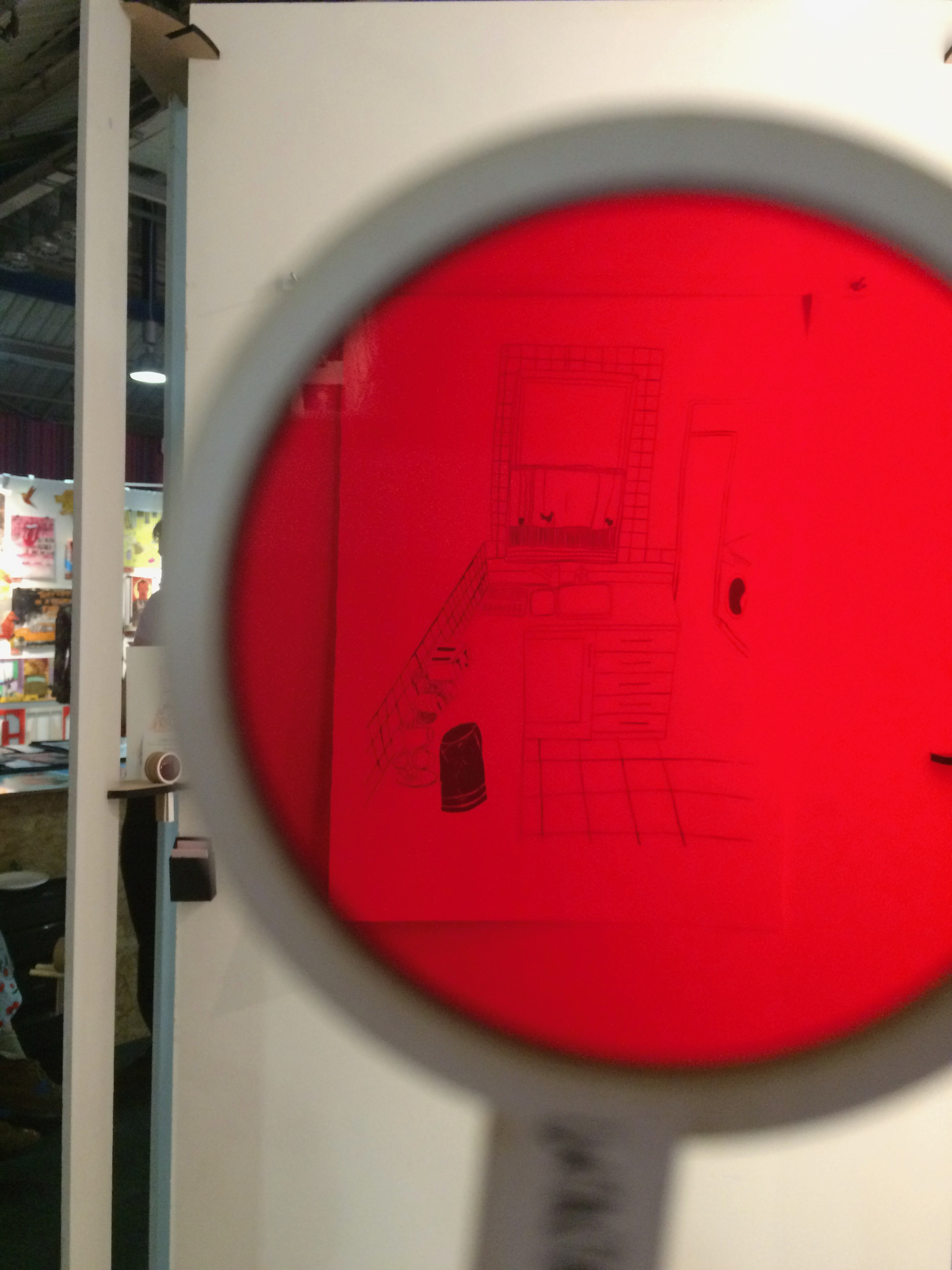
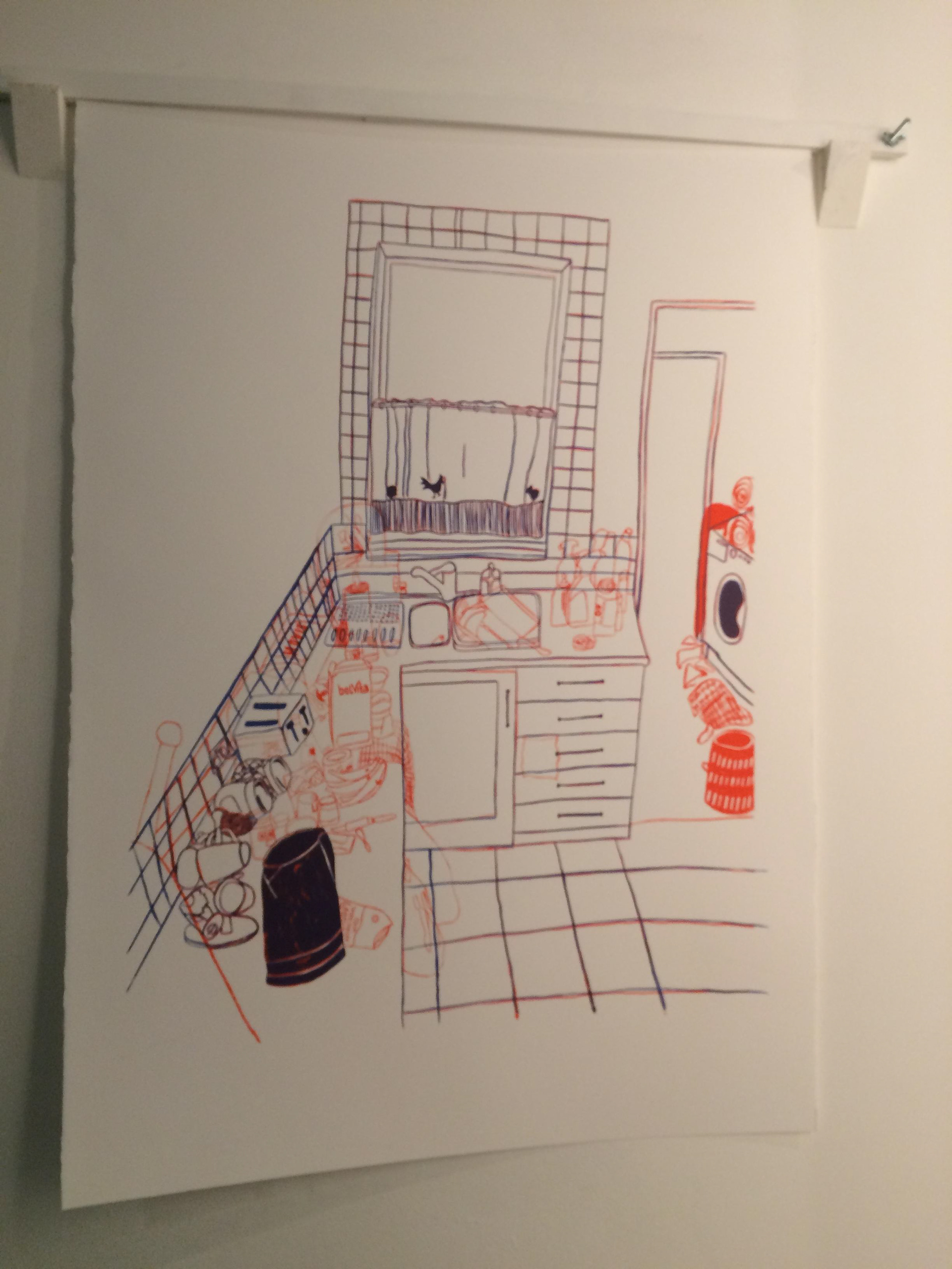
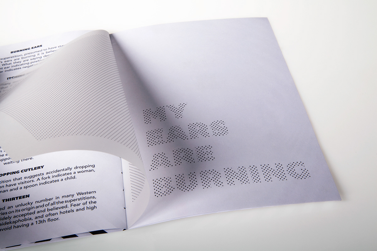
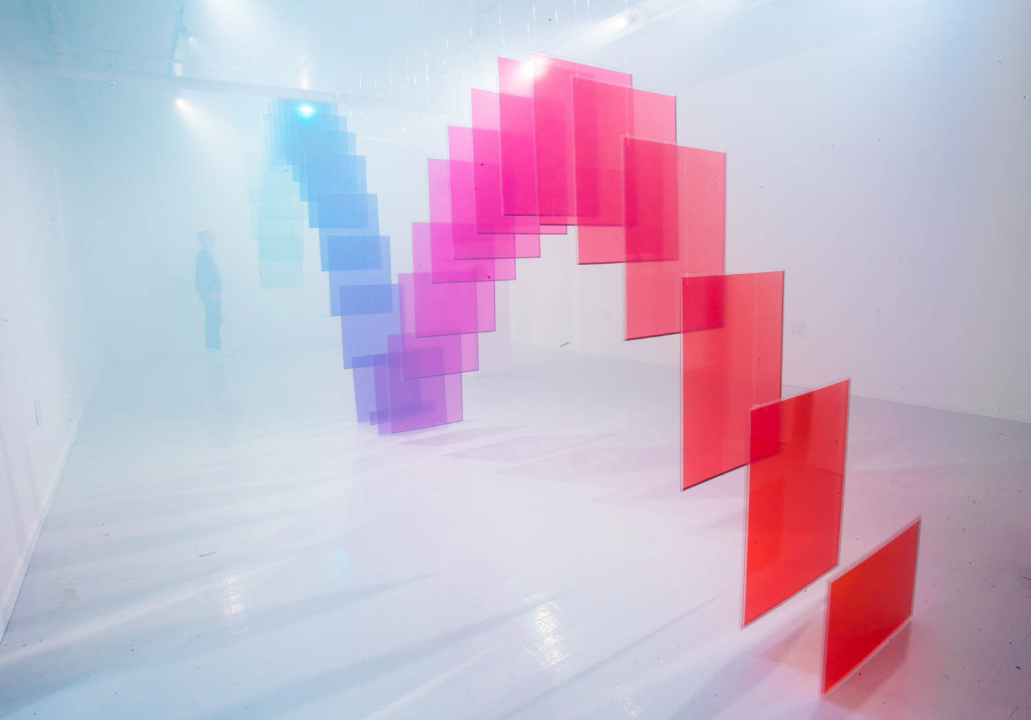
This is an exhibition I went to a couple of years ago. I remember when I first saw it, I didn't quite understand why there were two colours. The colours are what brought me to the poster and made me want to find out more.
The artist had two circular colour filters (one red and one purple). I don't exactly remember the idea behind the piece, but the red hides the mess in the kitchen whilst the purple only shows it.
I like the interactivity of the piece - it is what makes me feel it would be suited to this project.
Everyone should be able to try new things out, and I like the idea of giving whoever sees my work the chance to be part of the overall experiment. This is quite a nice way to do a piece of work in my opinion,
Research
I want to further develop my idea to give it more of a meaning. While I still want to do patterns I would like to focus them on either looking like, or actually being, some sort of illusion.
I will be researching different things, mainly focusing on either:
- Optical illusions including the moire effect and anaglyphs
- Designers/Artist who have made patterns/shapes I like
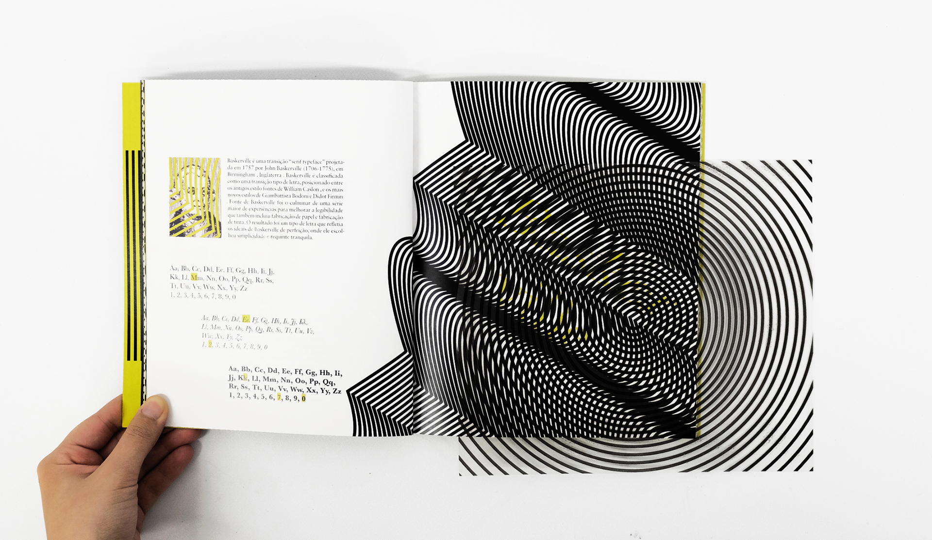
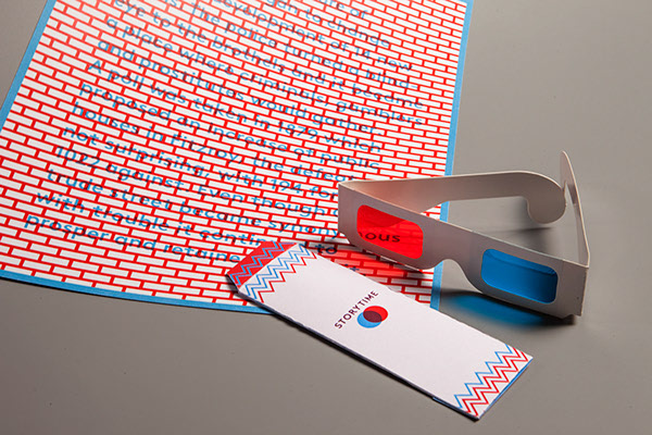
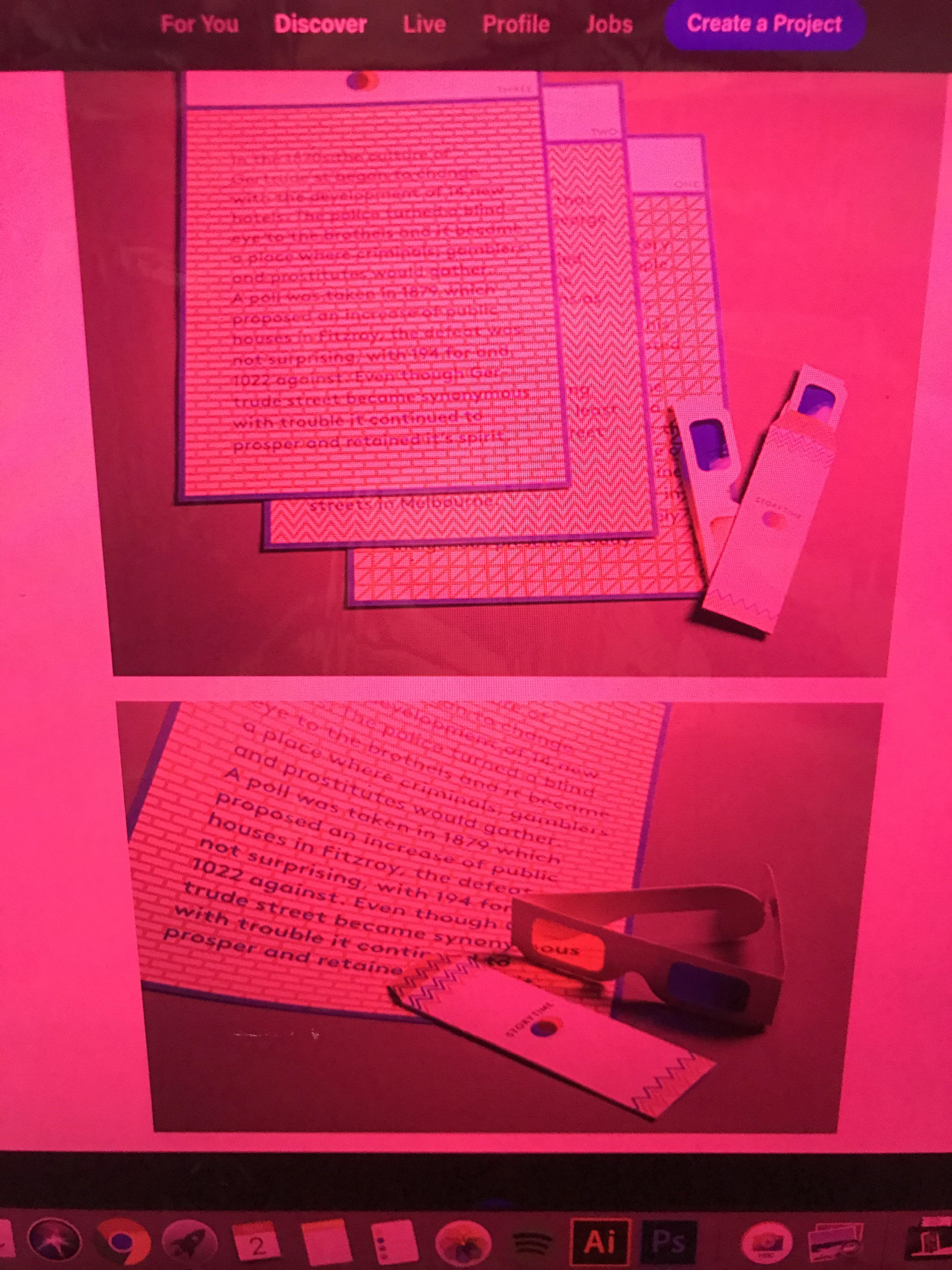
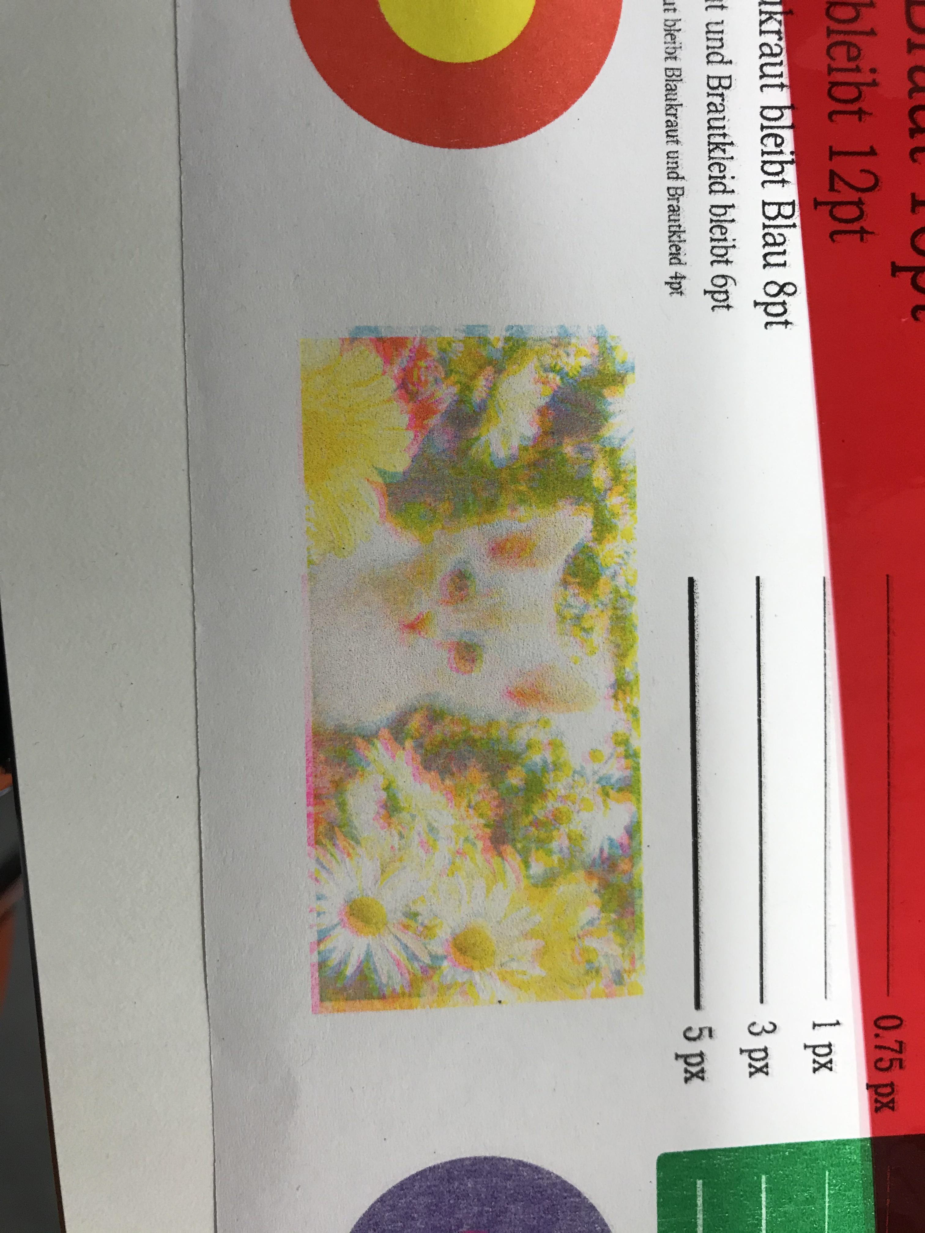
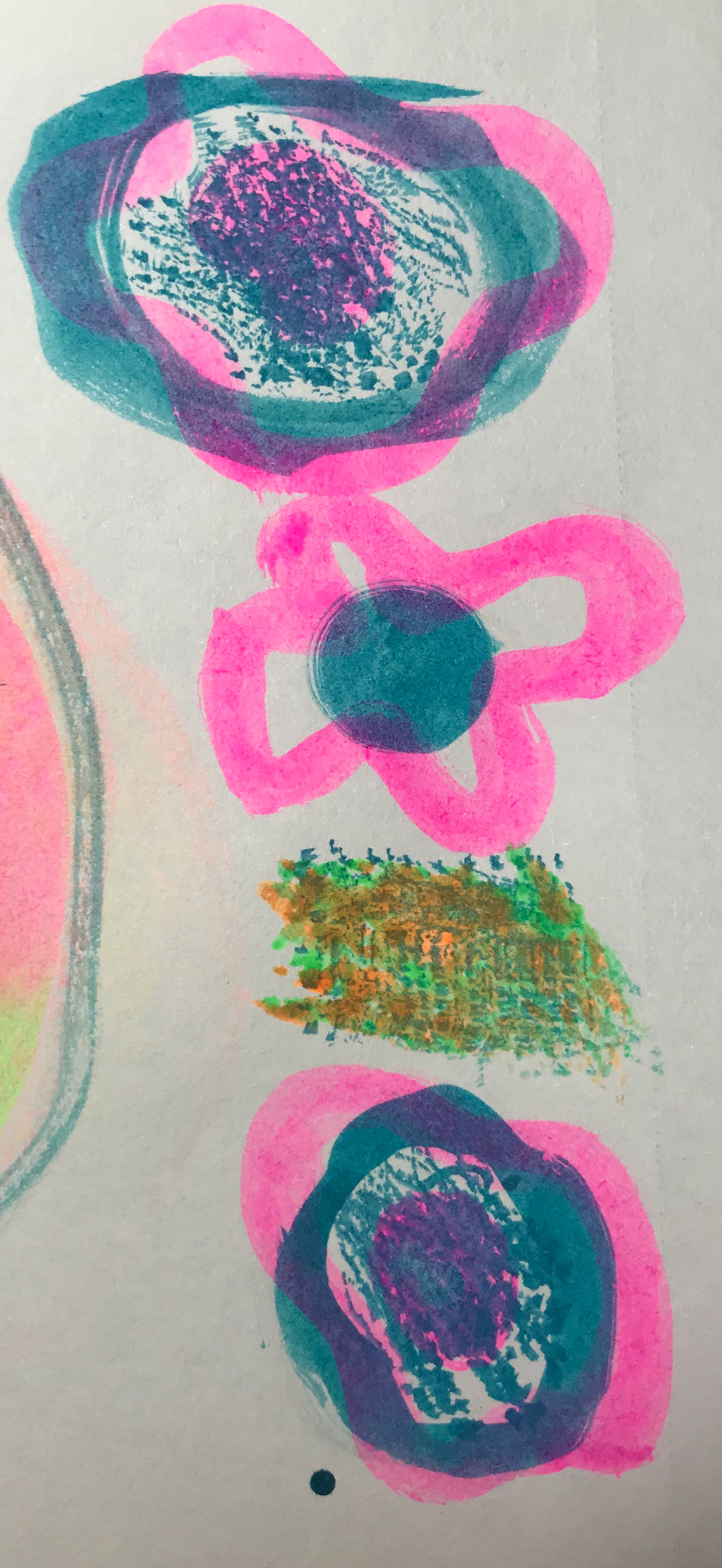
This is a layout out presenting my idea visually. I wanted to show how the acetate might affect a certain pattern, as well as giving an idea as to how it will work. I like this idea, as it's all formed of different experiments and how each colour creates different visuals.


BOOK Experiments
L-->R annotations
I've decided to use the risograph printer, I want to create my book (or zine) on one sheet of paper. I've decided to experiment different ways I could make my zine.
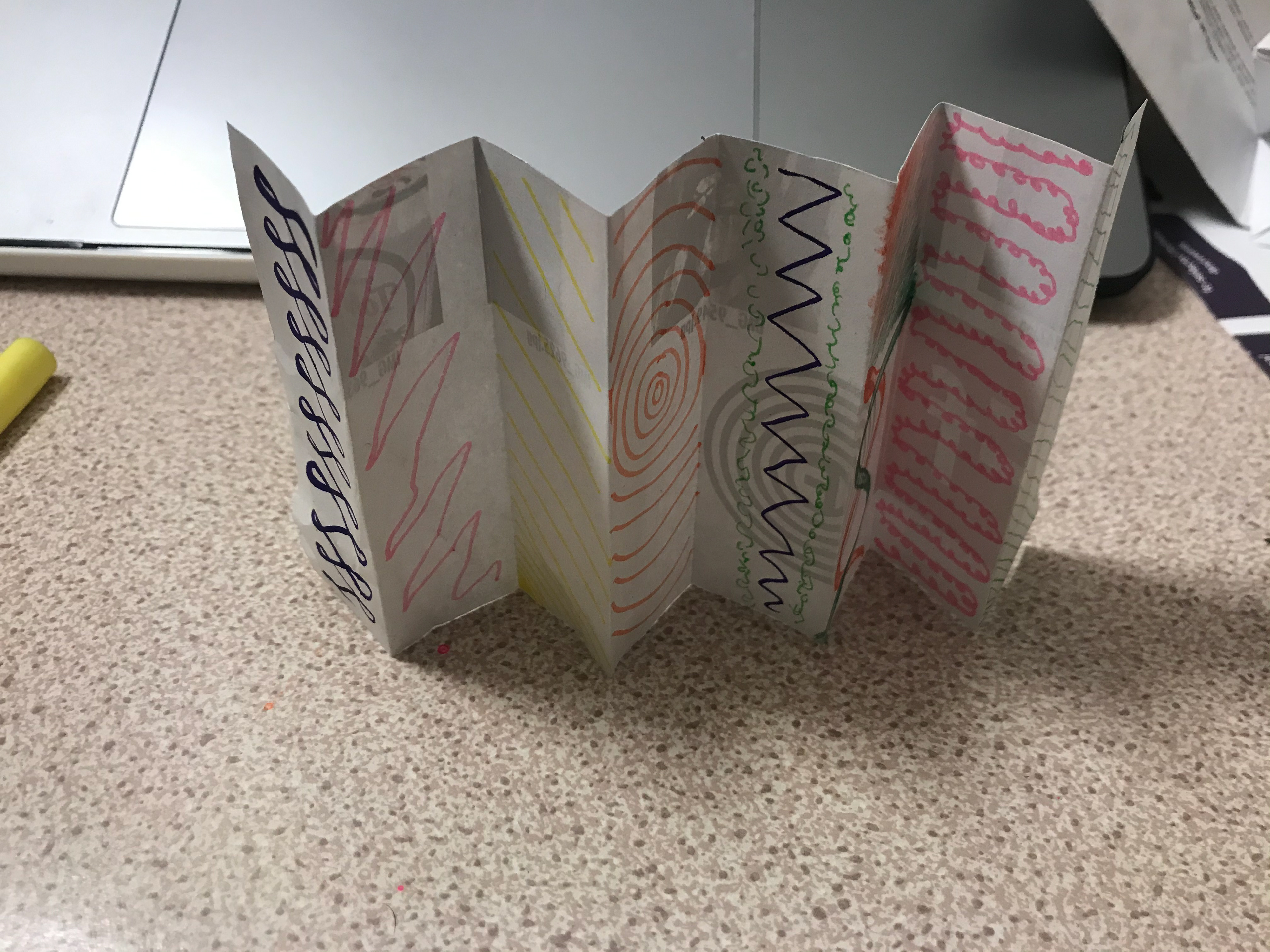
1,2,3 This book is just a piece of A4 which is folded down to a two page A6 book. I like the idea that I could put a poster on one side and then have a just front/back and two pages inside, but I think for what I'm wanting to do I would like to have more spreads for the patterns.
4, 5 These are two different sized pop out books (can't remember the name) made from A4 and A3 sheets of paper. I don't think this style would work for what I am looking for as I feel it's a bit all over the place and doesn't have distinct pages since you're meant to fold it flat out.
6, These are two different sized beak books. I want to do this because of how relatively easy they are to do and that it gives me the option of creating eight pages as well as a fold-out poster. I like the way they look and they're a nice way to make a zine.
7, 8, 9 This isn't necessarily a book but I thought it would be fun to give it a go. It is one of those paper finger fortune teller things that I would make a lot as a kid and still do if I see a square piece of paper. It has lots of fold out and thought it could be a fun idea if I lined everything up correctly. Also means there could be a square poster once fully folded out. Like with photos 4,5 I feel like the style would be all over the place since it needs to be folded out and wouldn't give all the space I envision.
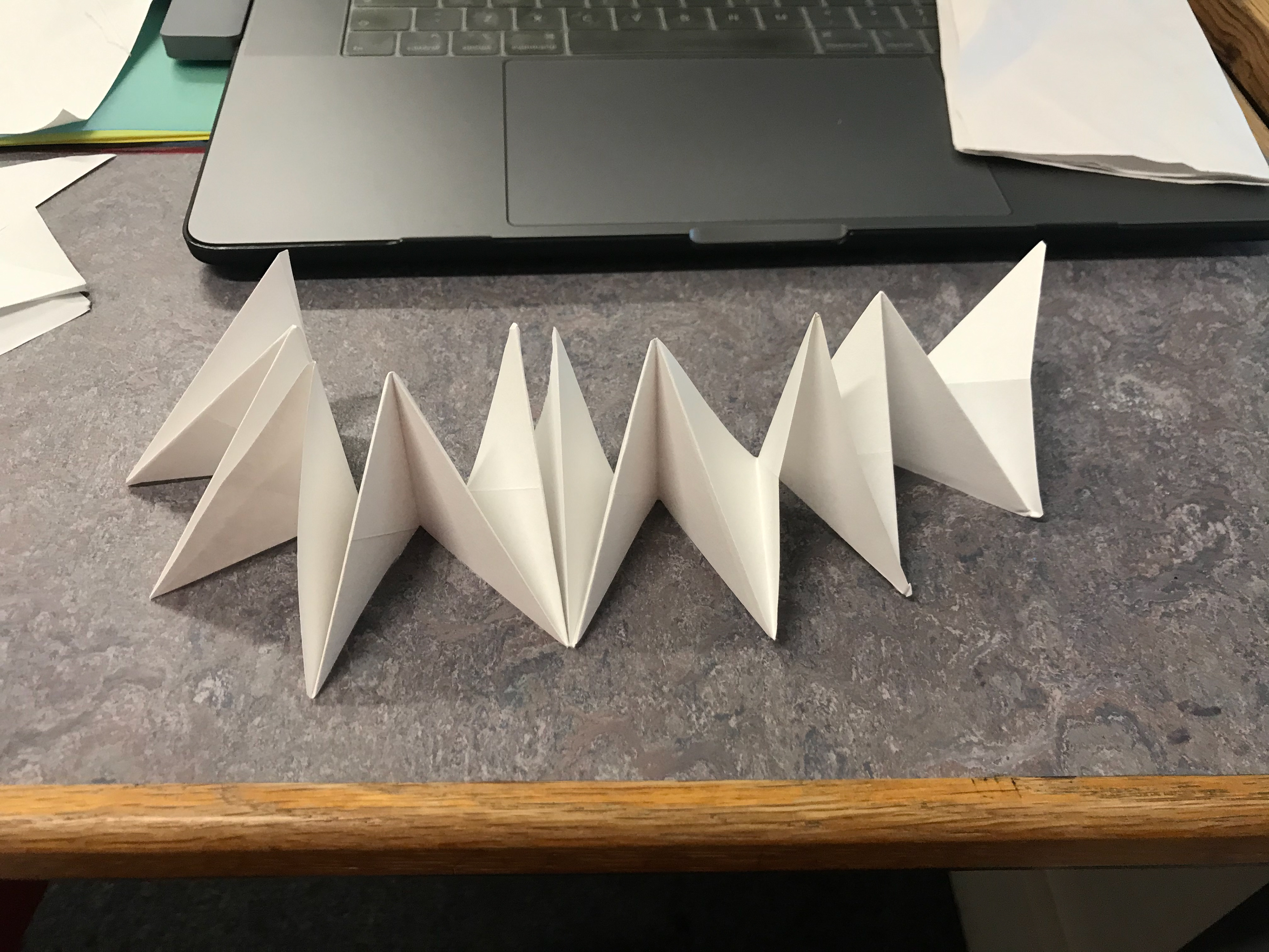
10, 11 This is a triangle version of a zig zag book. I like the playfulness of it but I think it wouldn't be suited for what I am looking for, as ideally I would like to make a poster using one side.
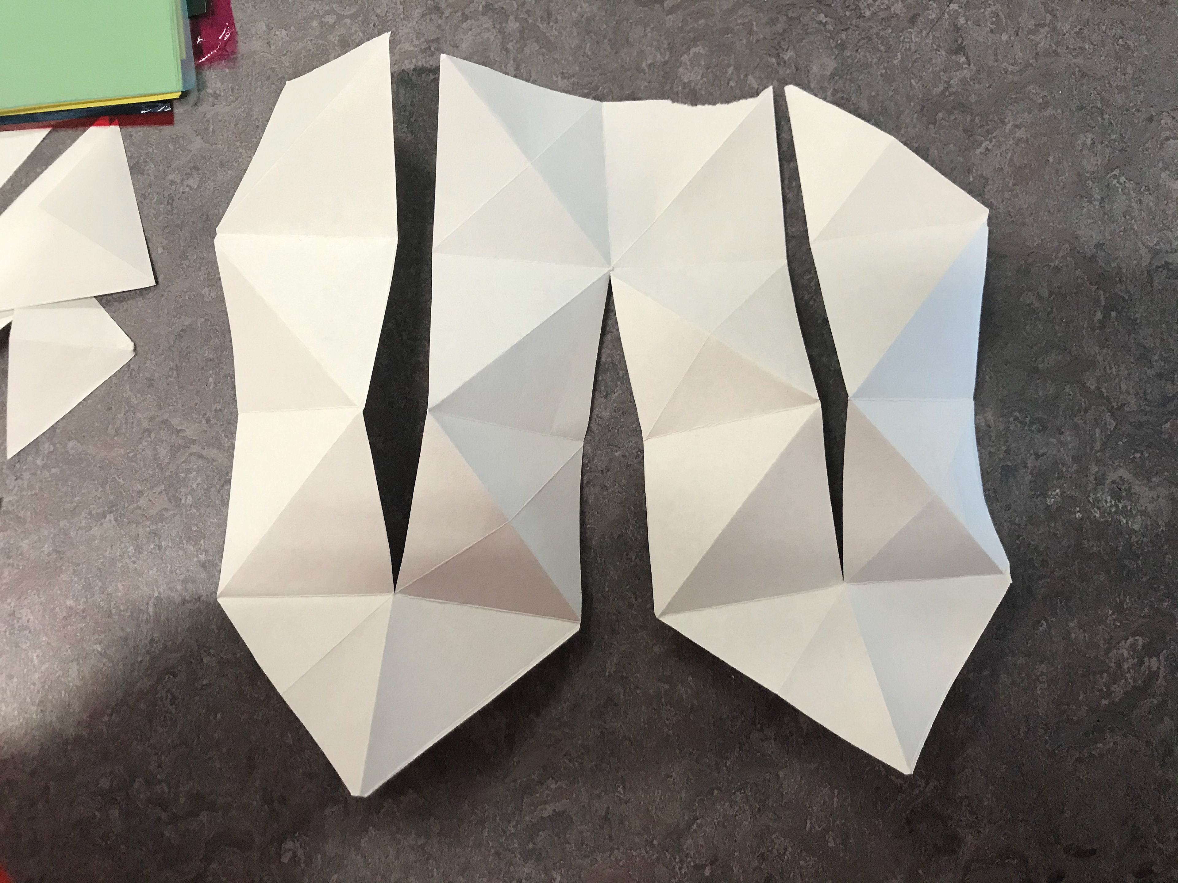
12, 13 Like with some of the other examples, this is a little pop-out book. It folds down a lot less and gives the opportunity of making a poster. I have concluded I would like more of a book style for my zine.
14, 15 This was a close second and these type of zig zag books are quite effective. The design ticks the boxes I was looking for. However, I chose a beak book over it as I just prefer the way it looks.
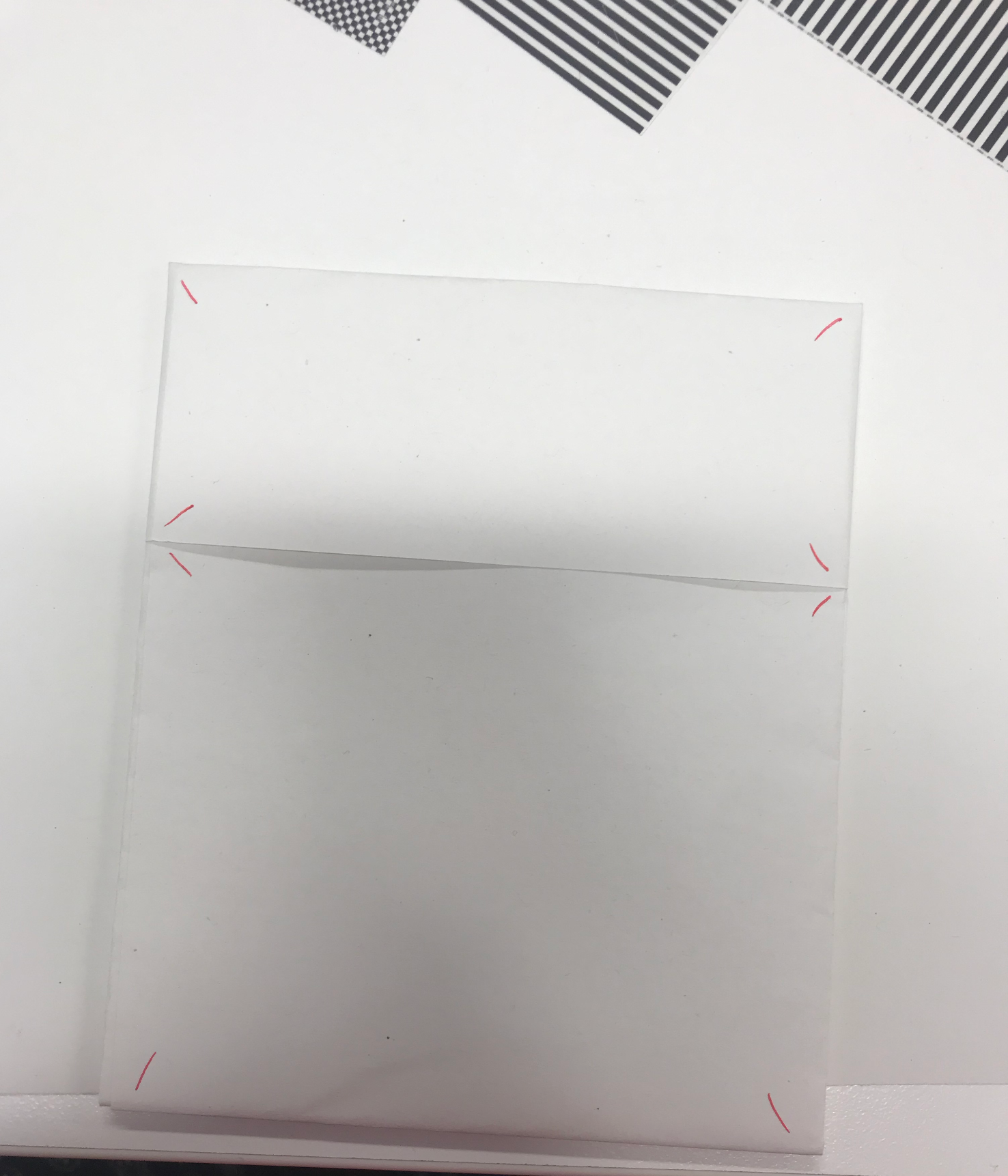
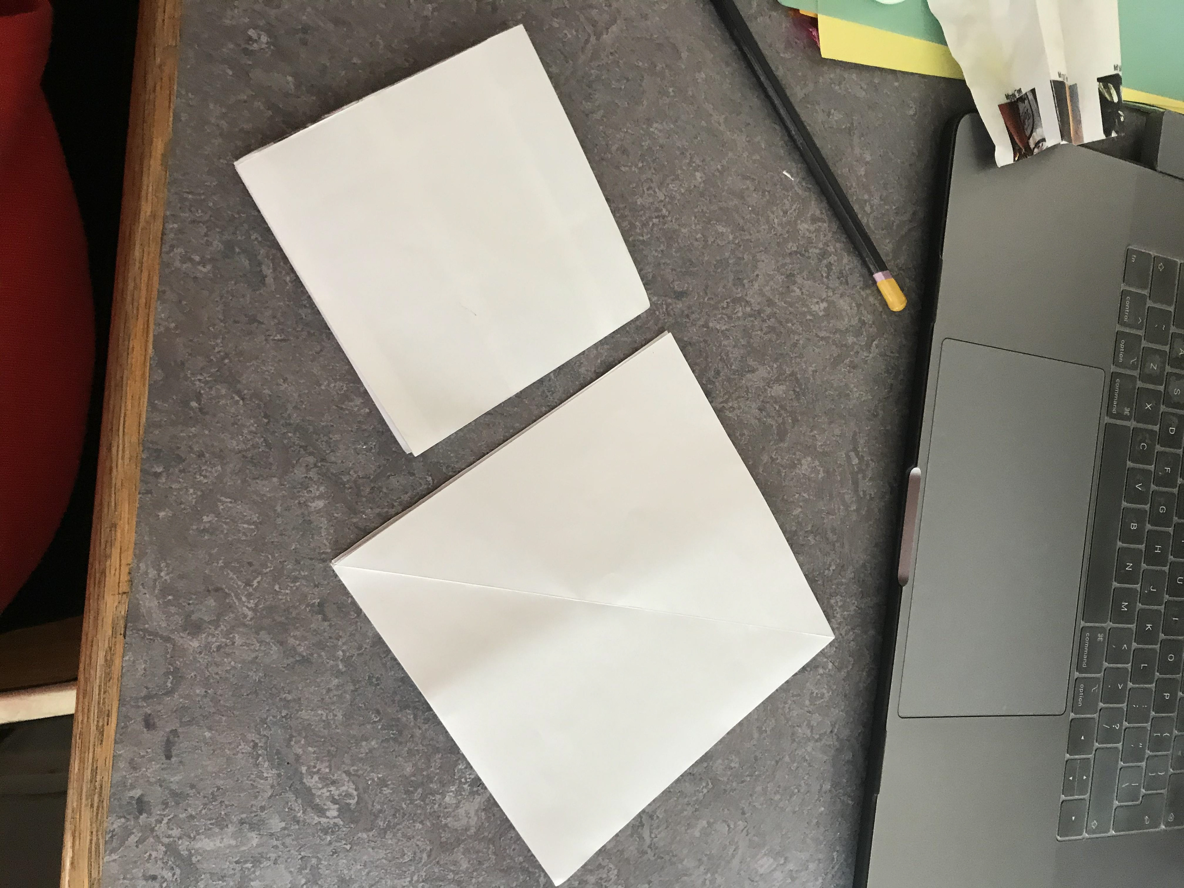
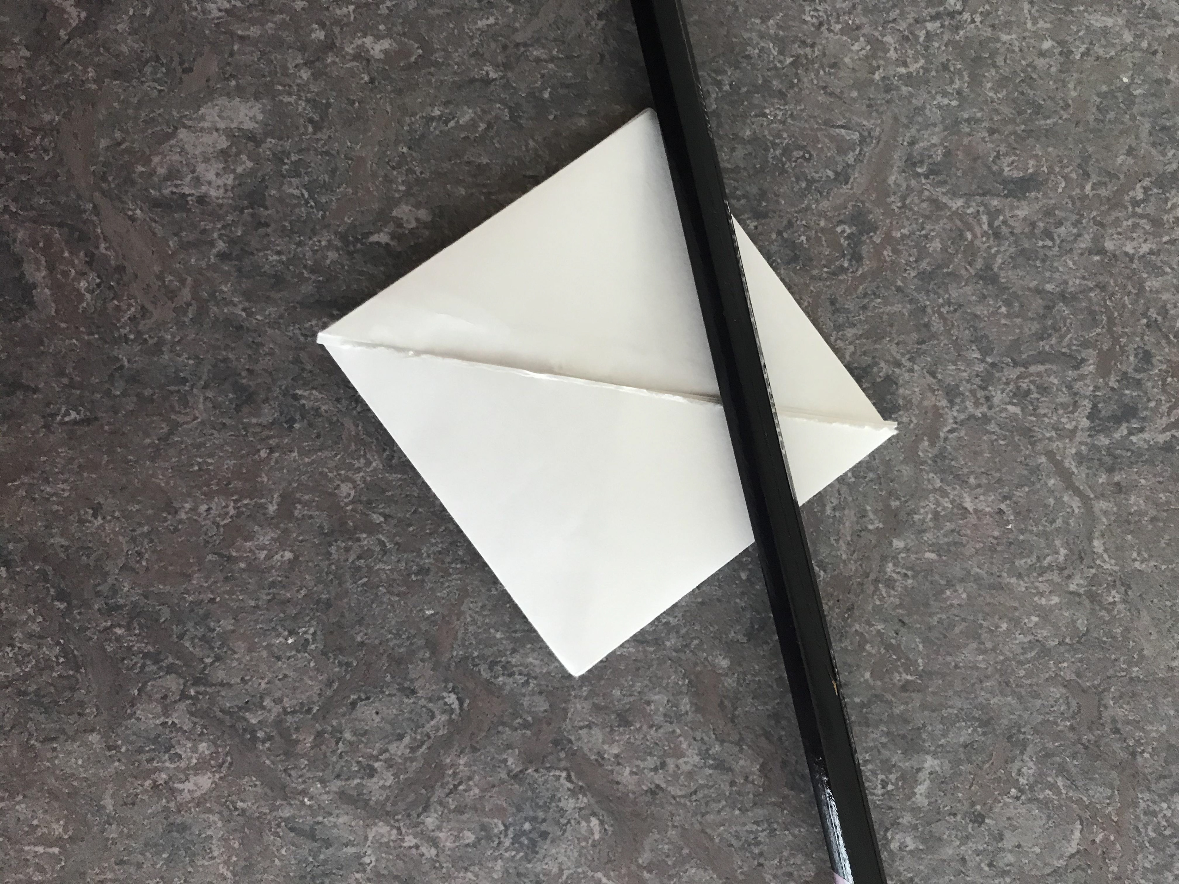
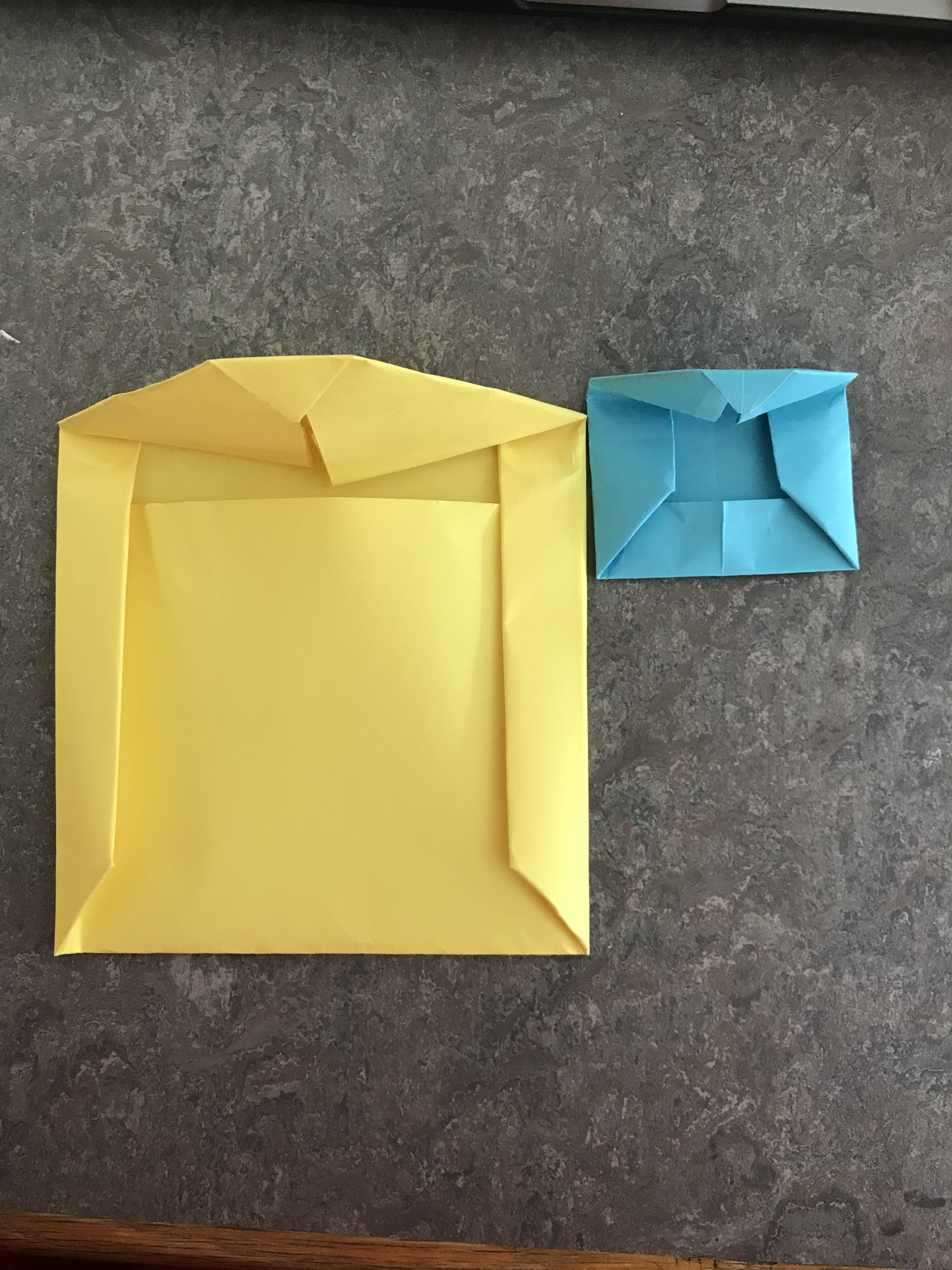
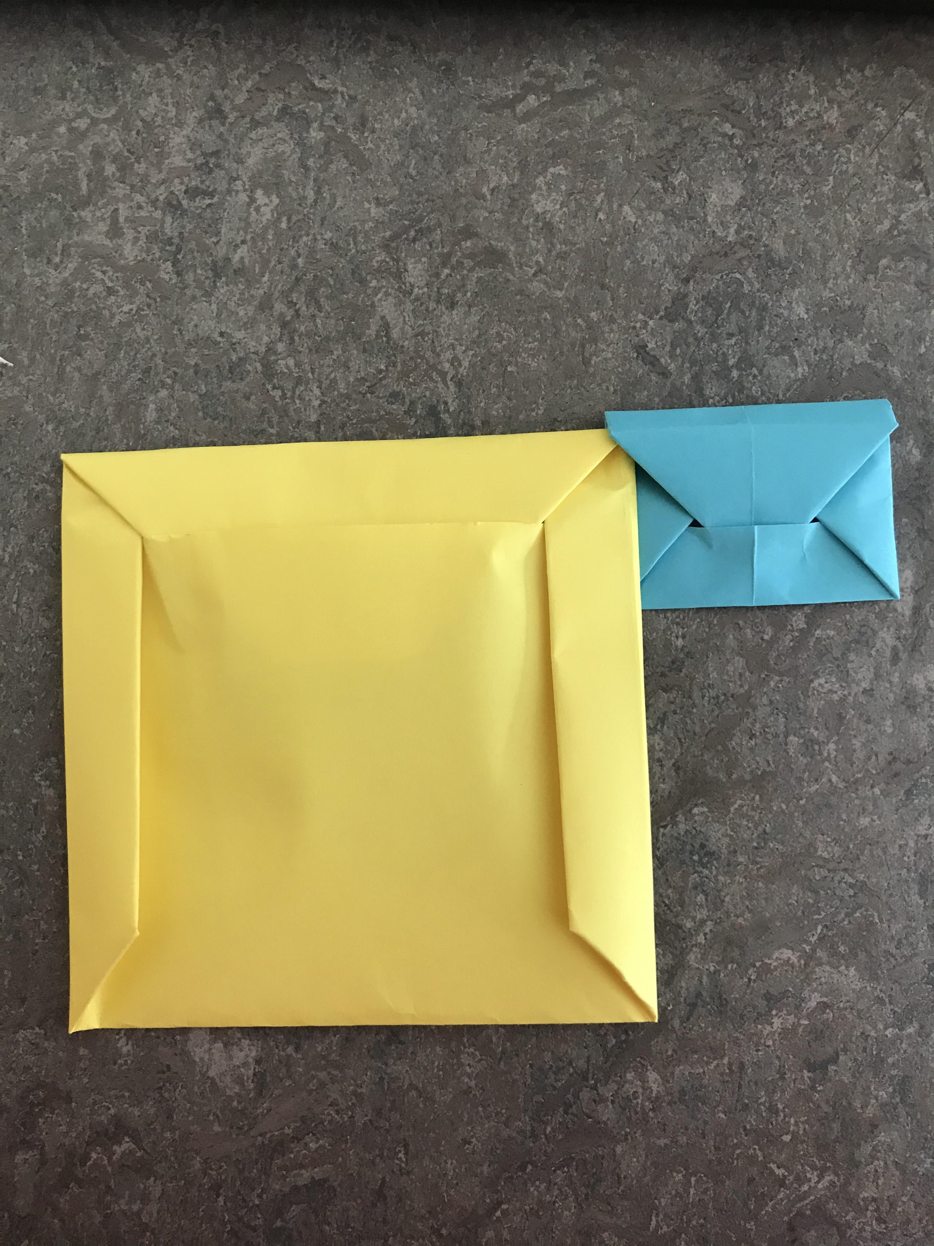
16, 17 These are some origami envelopes I made, just to start a possible development of how the acetate might be stored.
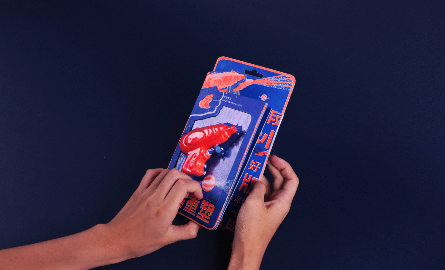

I wanted to get some initial inspiration to help me develop my idea. These are some of my favourites. I love the effect the riso prints have and backs up that I really want to use this idea for my final as the grain effect I think is a nice touch. The anaglyph zine I chose to show the kind of idea I had in mind of using coloured acetate. I also like the the experimentation of different paper sizes inside the yellow book.
Behance.net. (2019). Behance. [online] Available at: https://www.behance.net/gallery/17532155/Unleash-Your-Inner-Animal?tracking_source=search%7Cacetate [Accessed 2 Nov. 2019].
Behance.net. (2019). Behance. [online] Available at: https://www.behance.net/gallery/37056411/Shine-bright?tracking_source=search%7Ccoloured%20acetate [Accessed 2 Nov. 2019].
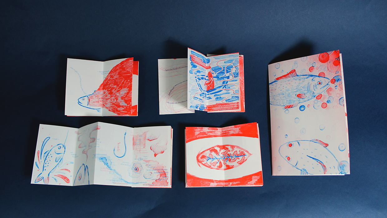
Portfolios.risd.edu. (2019). the fish (illustrated risograph zine) on RISD Portfolios. [online] Available at: http://portfolios.risd.edu/gallery/65004799/the-fish-(illustrated-risograph-zine) [Accessed 2 Nov. 2019].
Behance.net. (2019). Behance. [online] Available at: https://www.behance.net/gallery/51945143/Naive-zine?tracking_source=search%7Crisograph [Accessed 2 Nov. 2019].
Behance.net. (2019). Behance. [online] Available at: https://www.behance.net/gallery/84348085/Contemporary-Jane?tracking_source=search%7Crisograph [Accessed 2 Nov. 2019].
Behance.net. (2019). Behance. [online] Available at: https://www.behance.net/gallery/69169291/vol1?tracking_source=search%7Crisograph [Accessed 2 Nov. 2019].
Behance.net. (2019). Behance. [online] Available at: https://www.behance.net/gallery/56711283/Graphic-Notebook-2017?tracking_source=search%7Crisograph [Accessed 2 Nov. 2019].
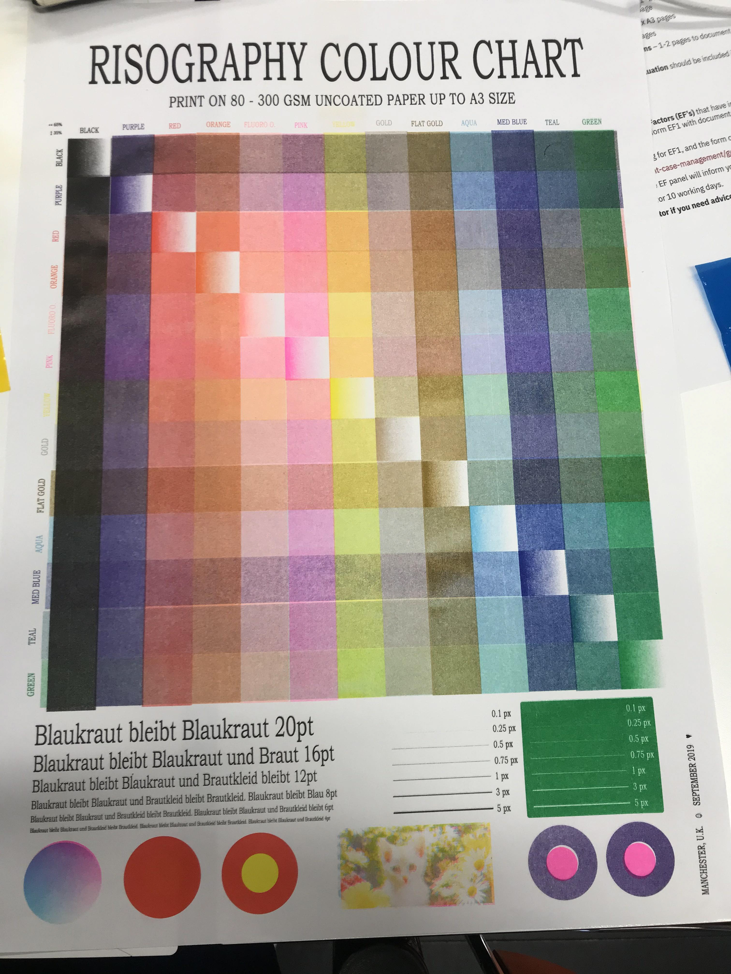
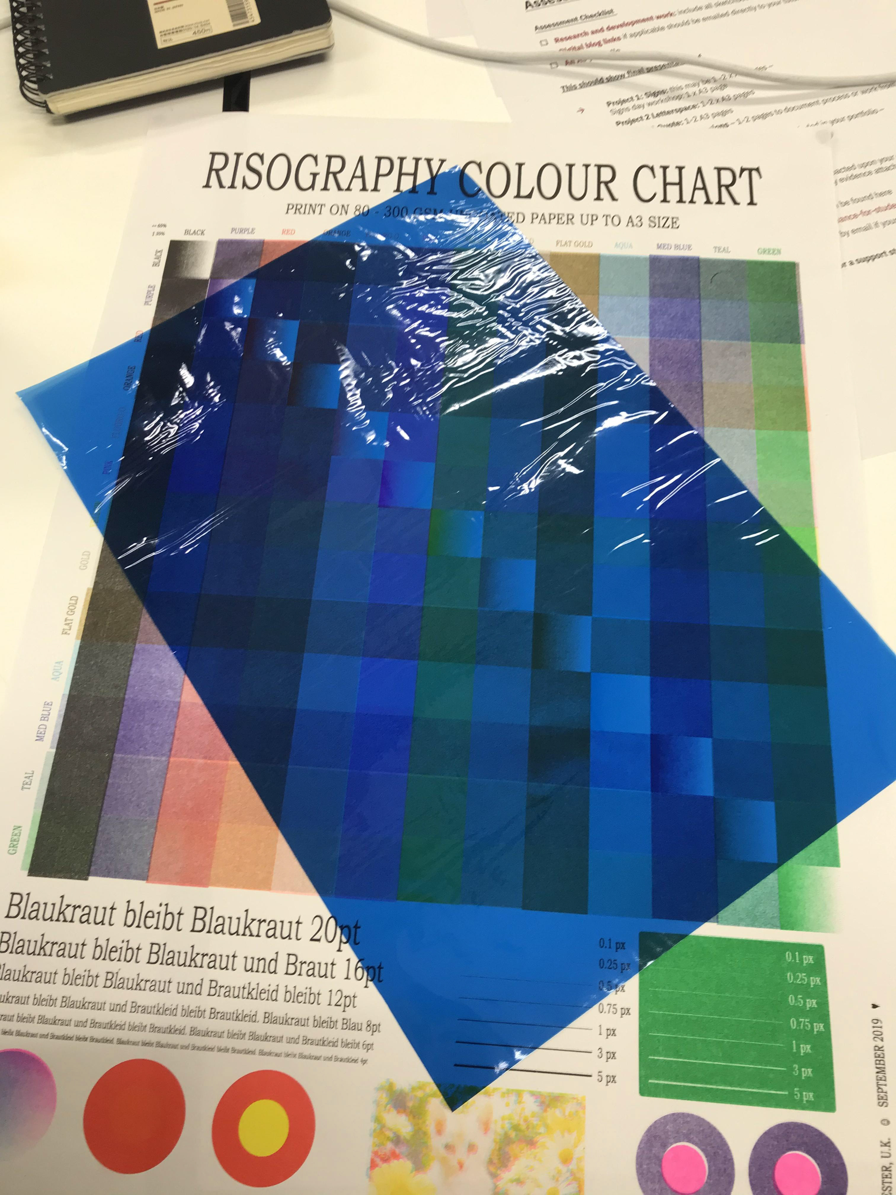
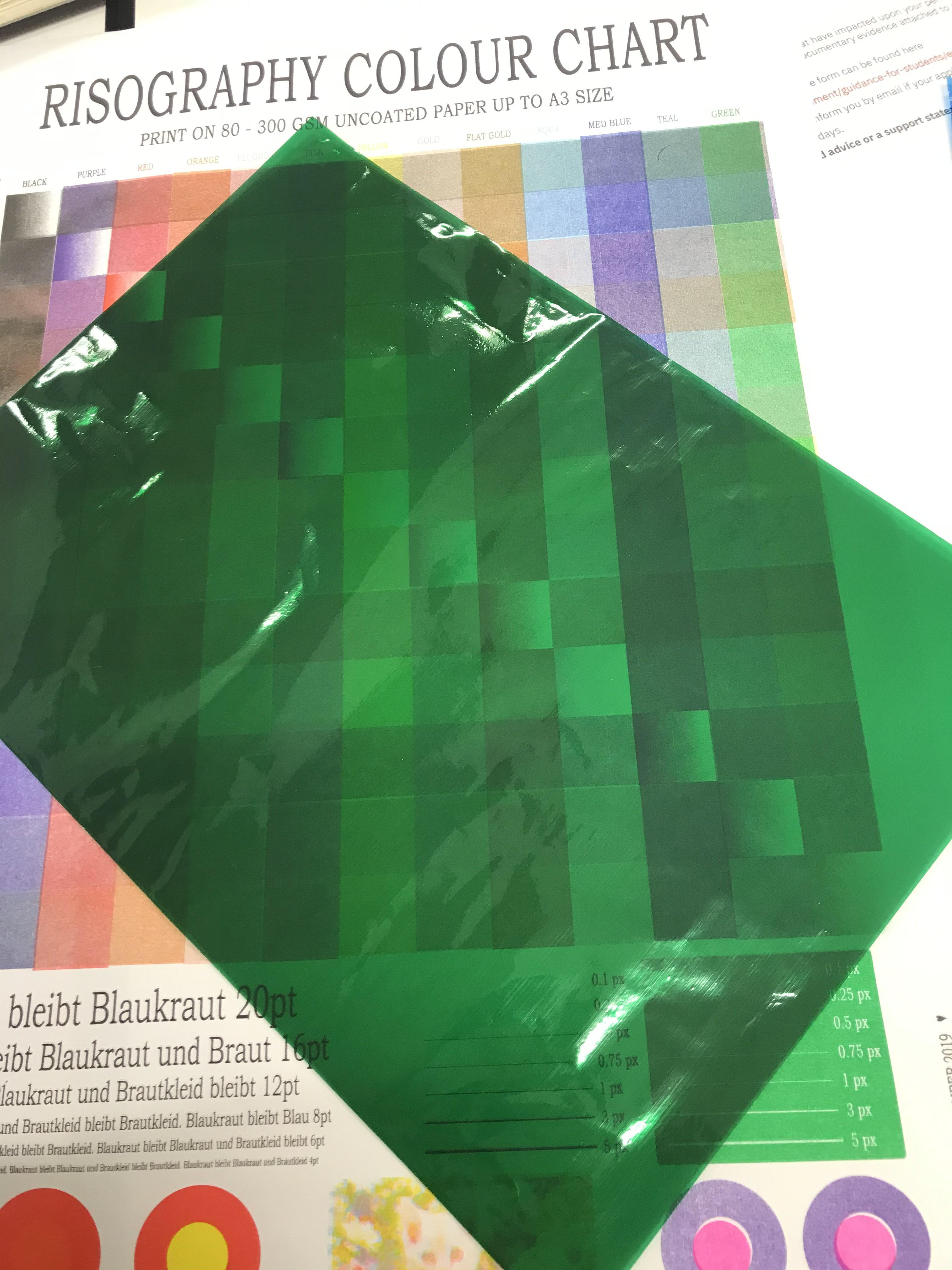
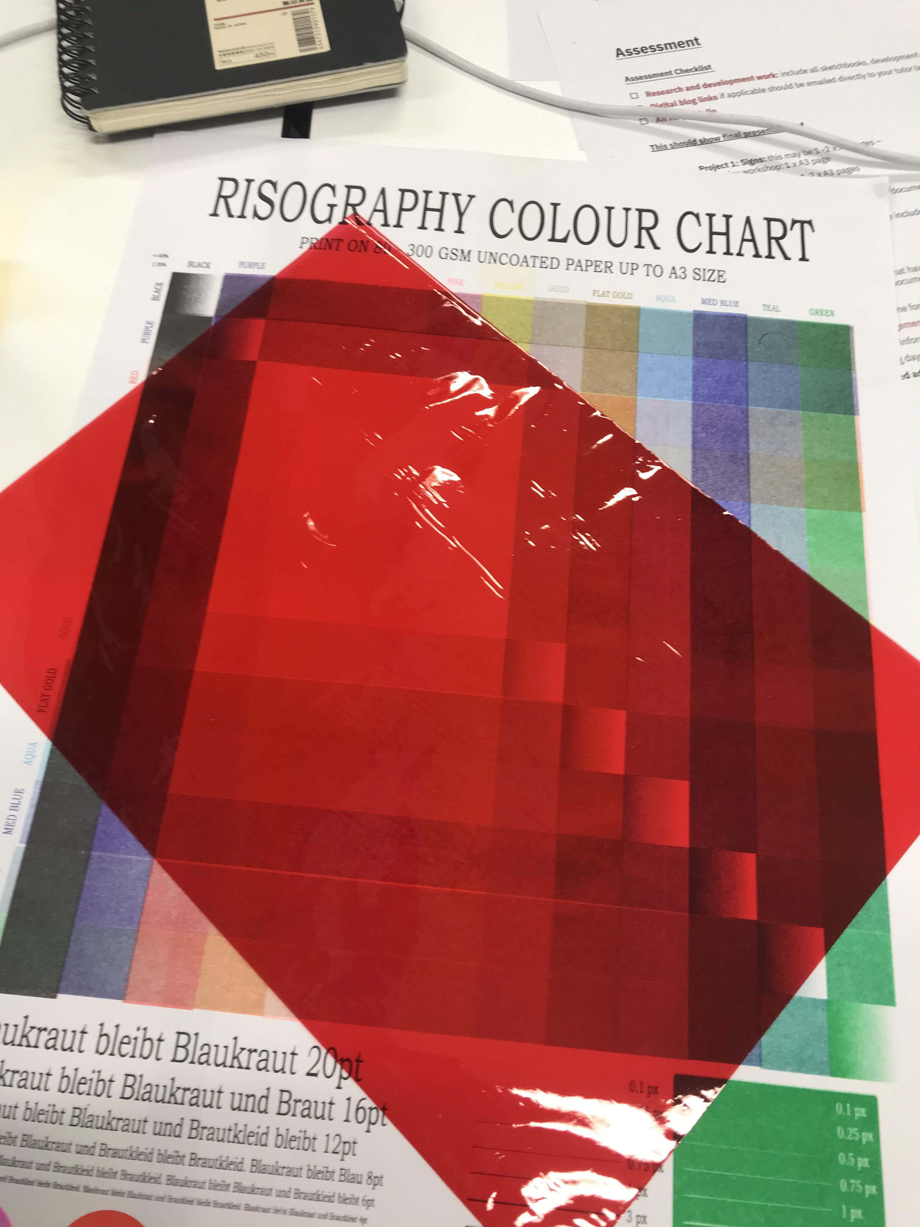
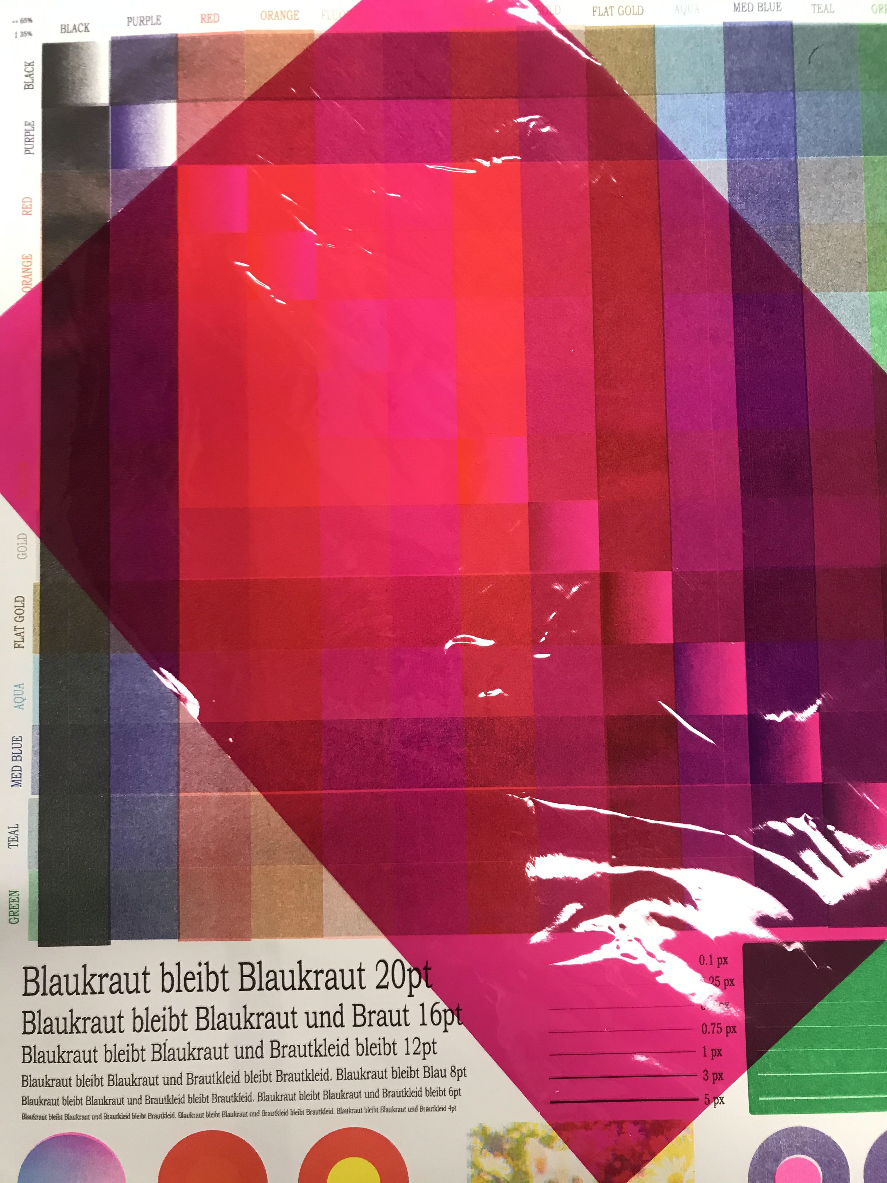
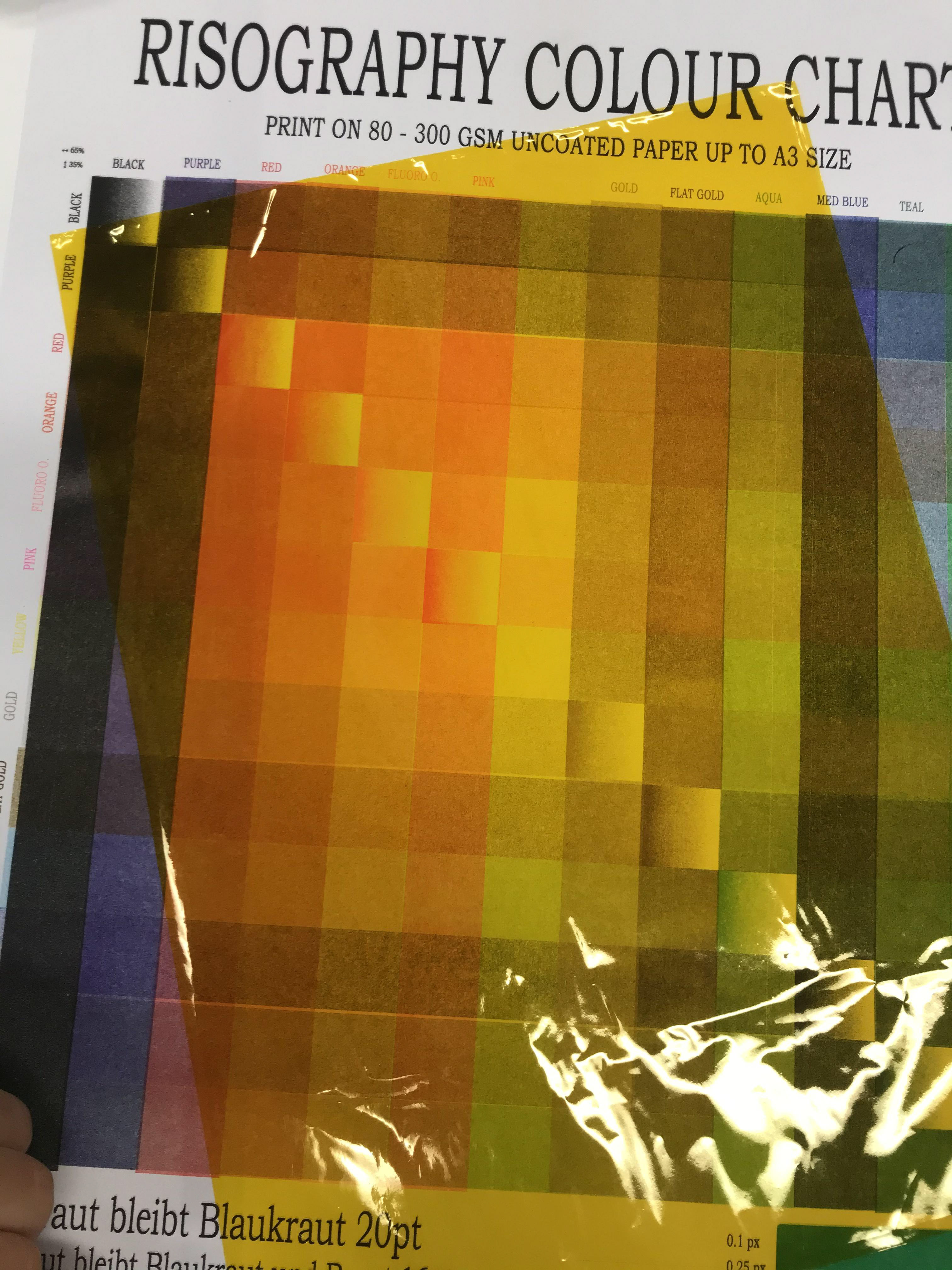
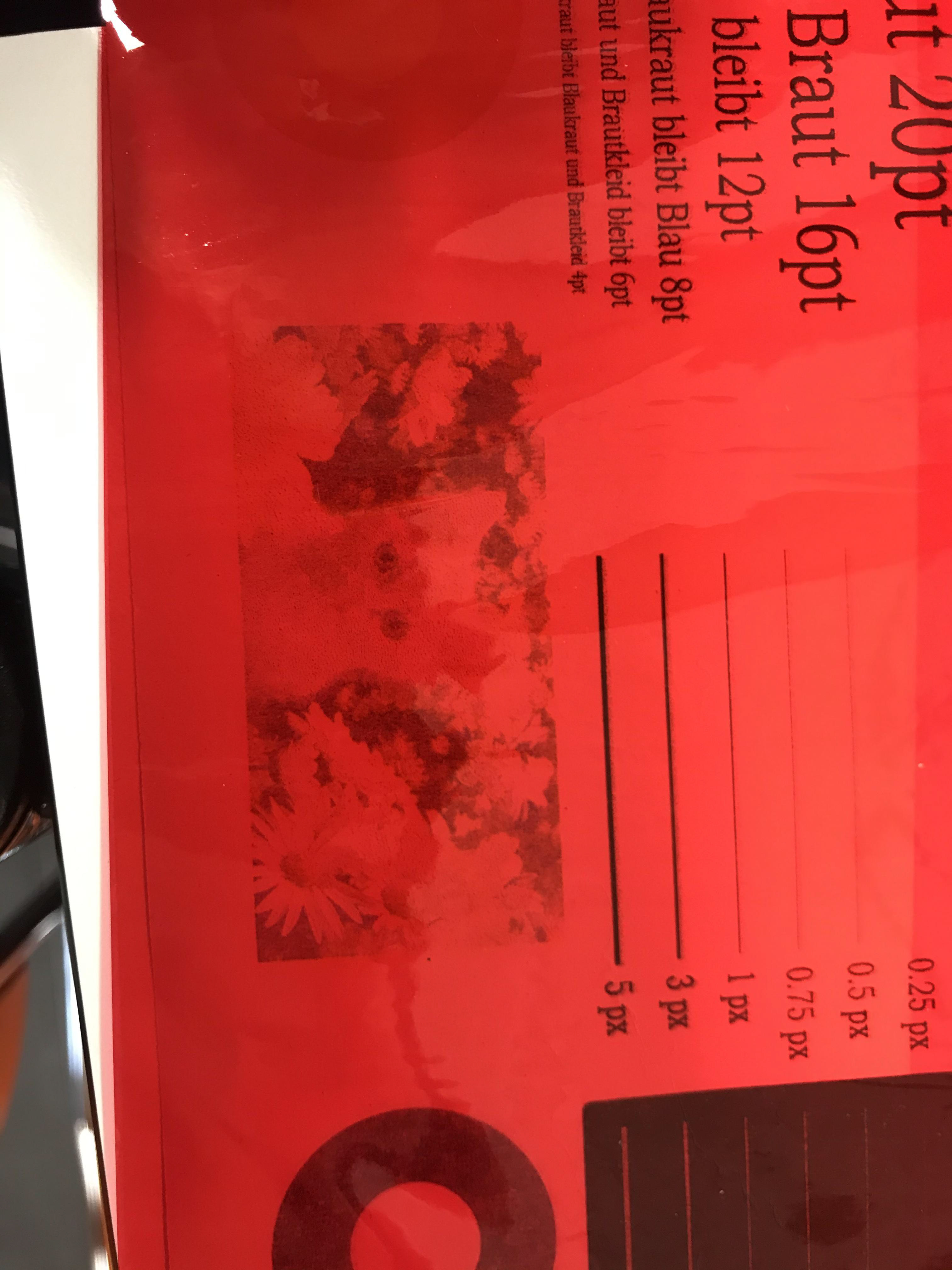
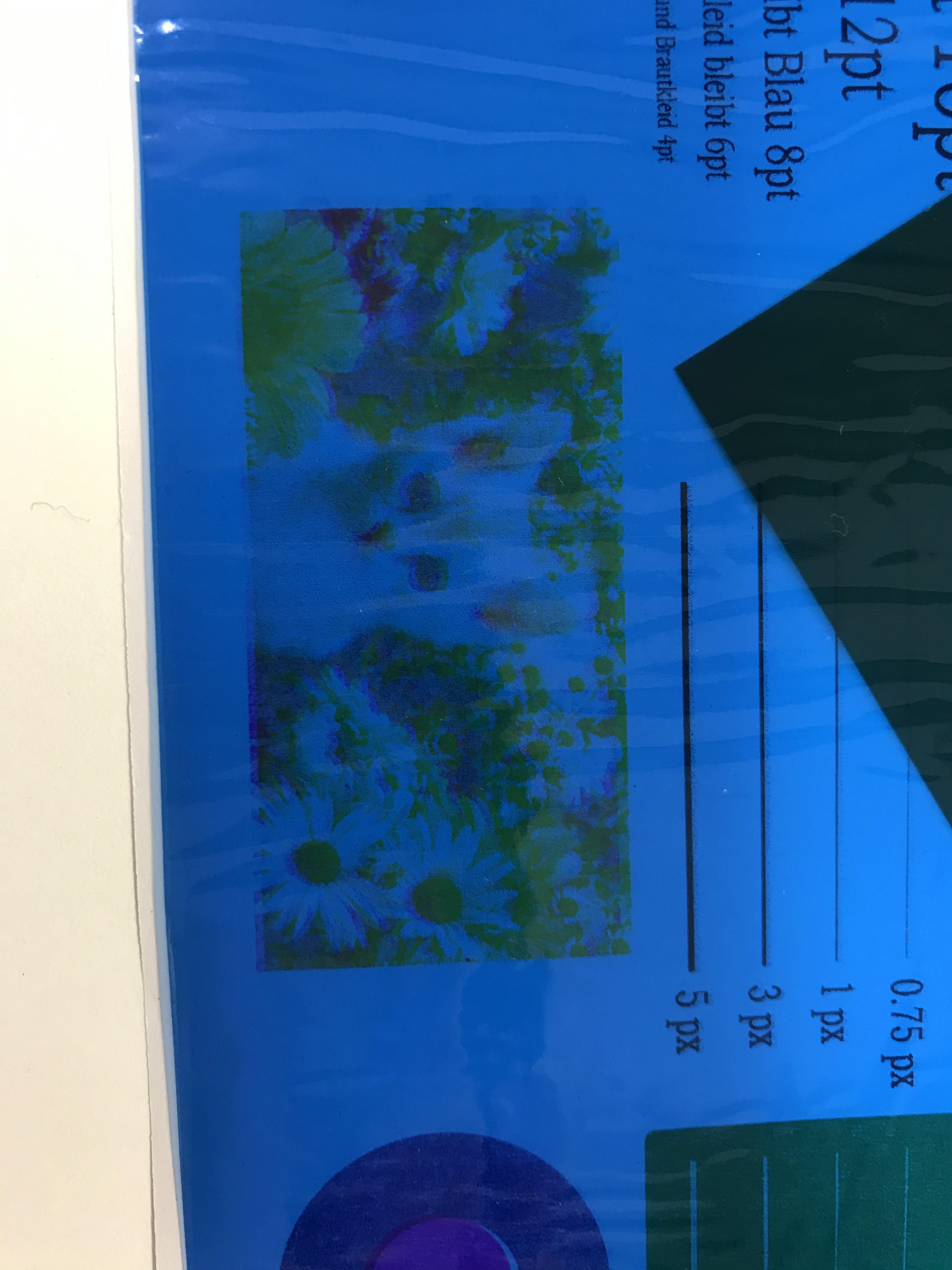
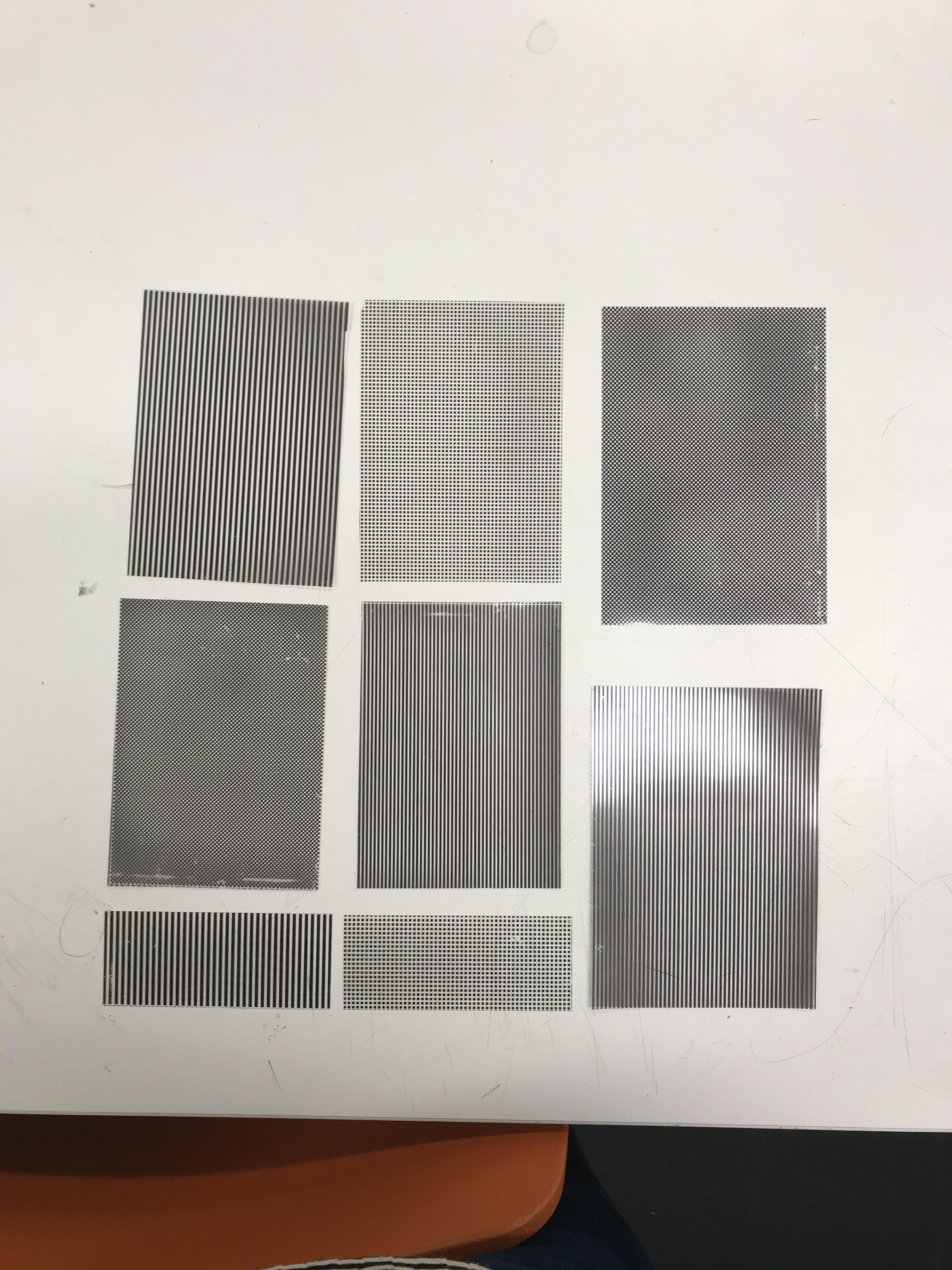
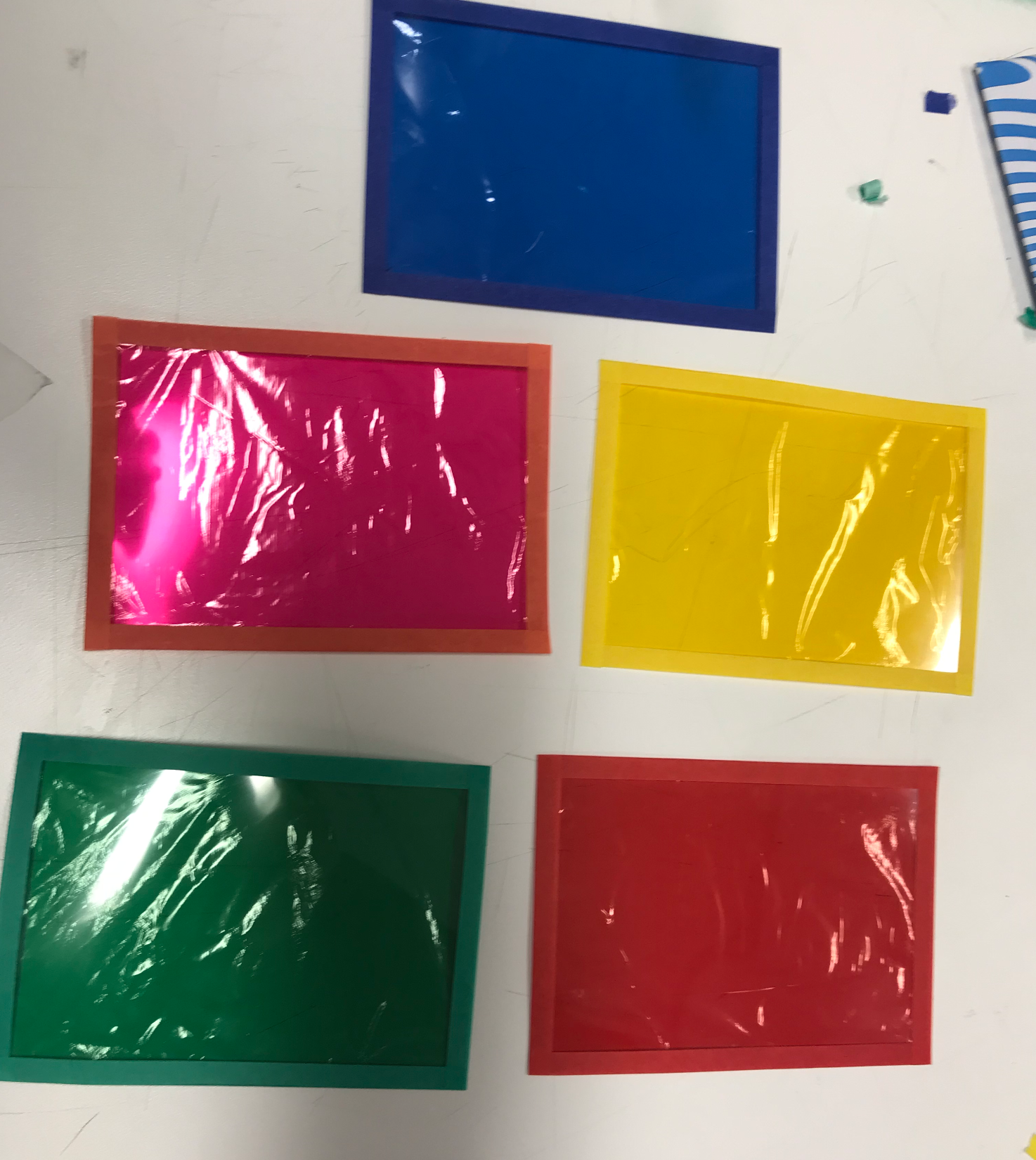
Since I want to use the risograph. I thought it to be best to test out the cellophane colours in how the effect the risograph colours. In my head I wanted red and blue tones as I feel they're colours that go well together. Red is on the stronger side which will mean it will react greater with more colours than a blue tone.
Having had a look the blue only really cancels out the aqua which in my eyes is good as I want to use a lighter blue for this print.
The red on the other-hand cancels out quite a few of the red tones. I'm still on the fence of whether to choose fluro orange or pink I feel like both would go well with the blue. I didn't choose red because I want this to be slightly different to a traditional anaglyph colours.
I have the other cellophane colour examples as I'm going to have them in the pack and wanted to see how they work with the riso colours.
After working on different experiments I felt as if I was at a point of some finished-ish ideas.
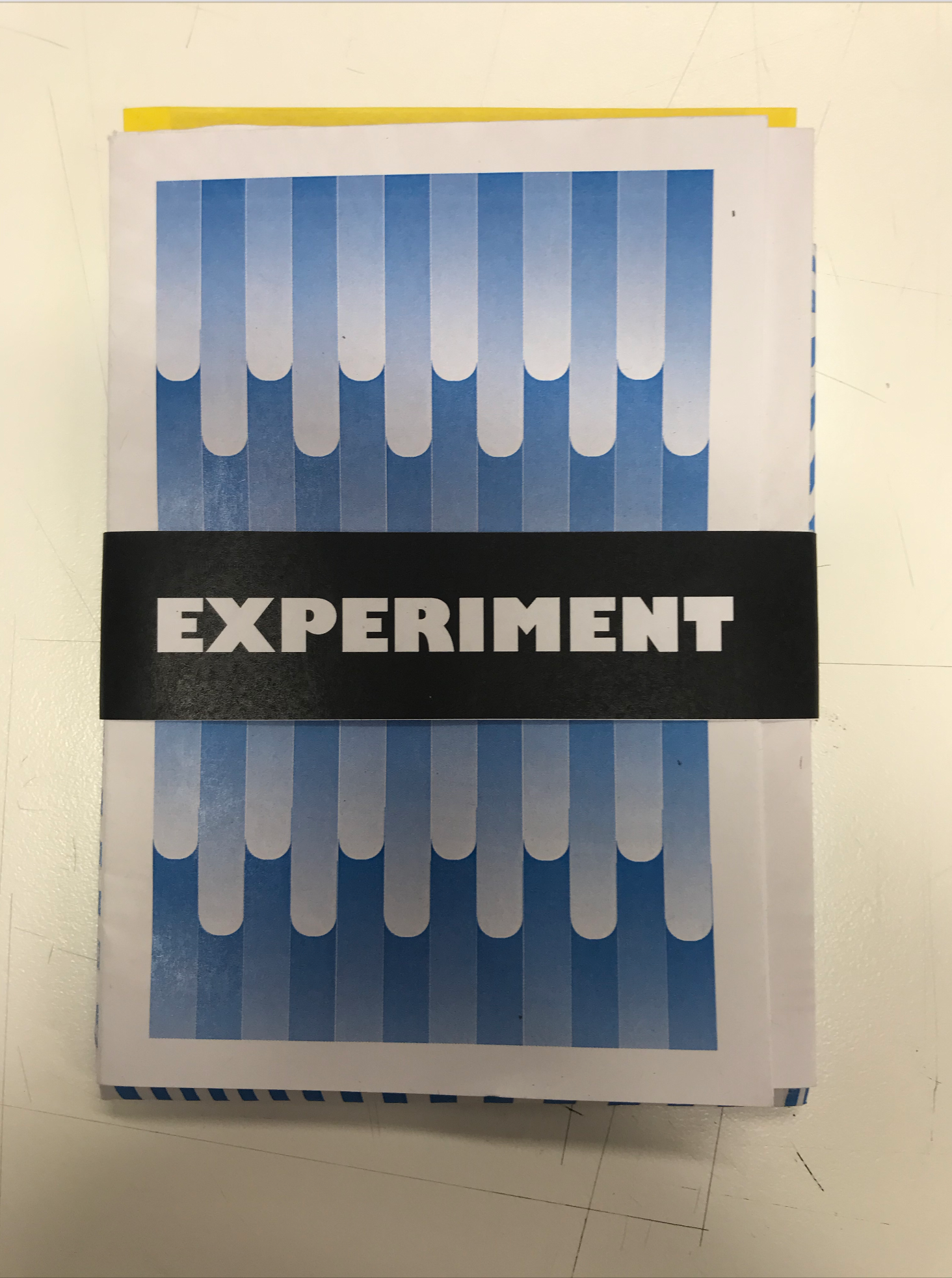
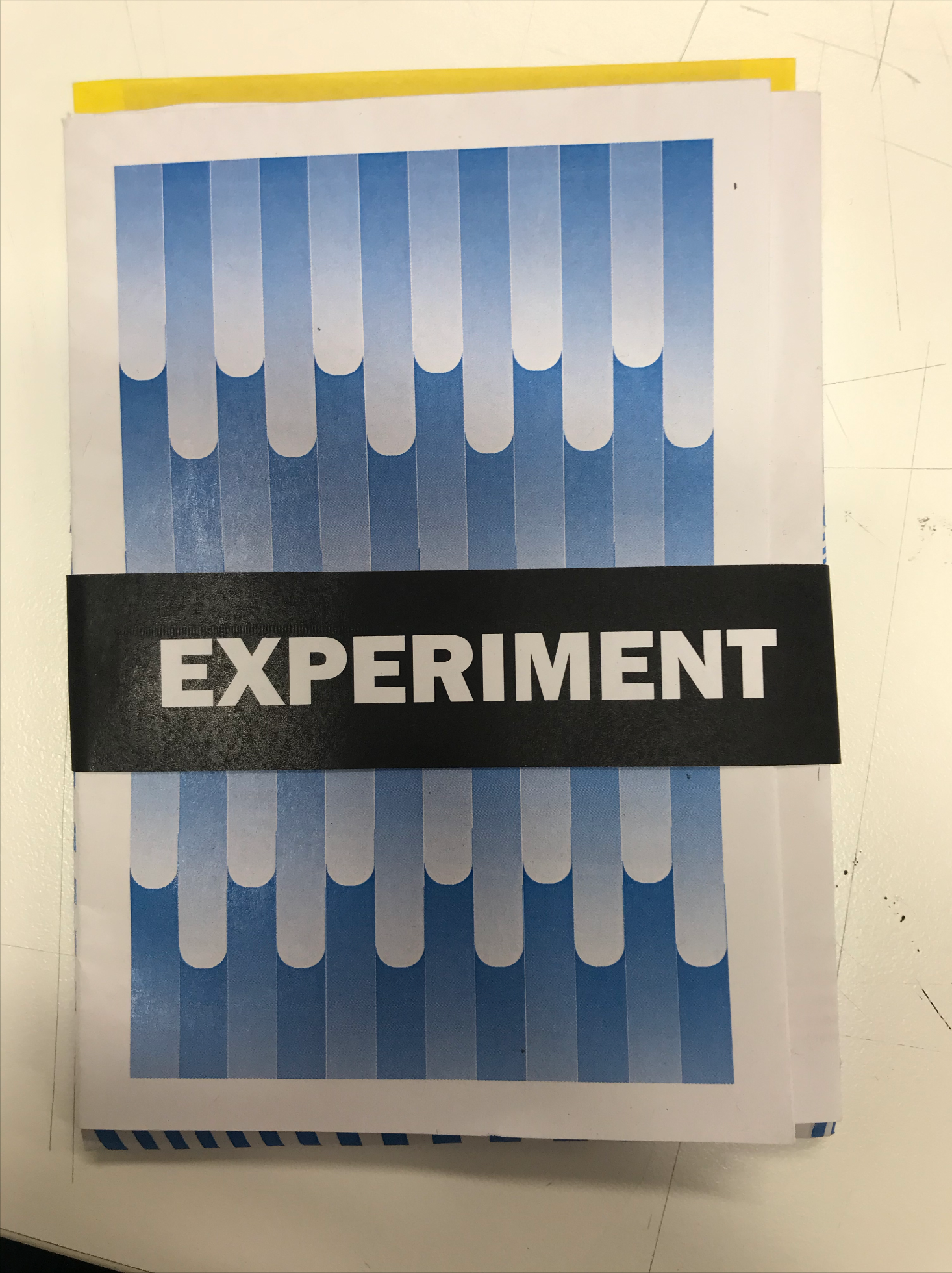
The first idea came to mind while I was playing around with gradients. I thought that each ones of these was an experiment and had their similarities. I thought, what about a booklet with different gradient experiments on one side of the page and a fold out poster on the other, possibly with something to symbolise the rule e.g. the word "everything". I would link that to the fact that anything can be an experiment.
I did think this idea was lacking something, it just felt like it didn't link so well to the rule. As I was thinking of possible ideas I remembered seeing some artwork which uses acetates which you can lay over an image and move around. Depending on the colour the acetate might hide a certain colour or bring another one out. It means the 'user' can interact by themselves and experiment with the colour/patterns.
In the image above I go on the explain my idea...
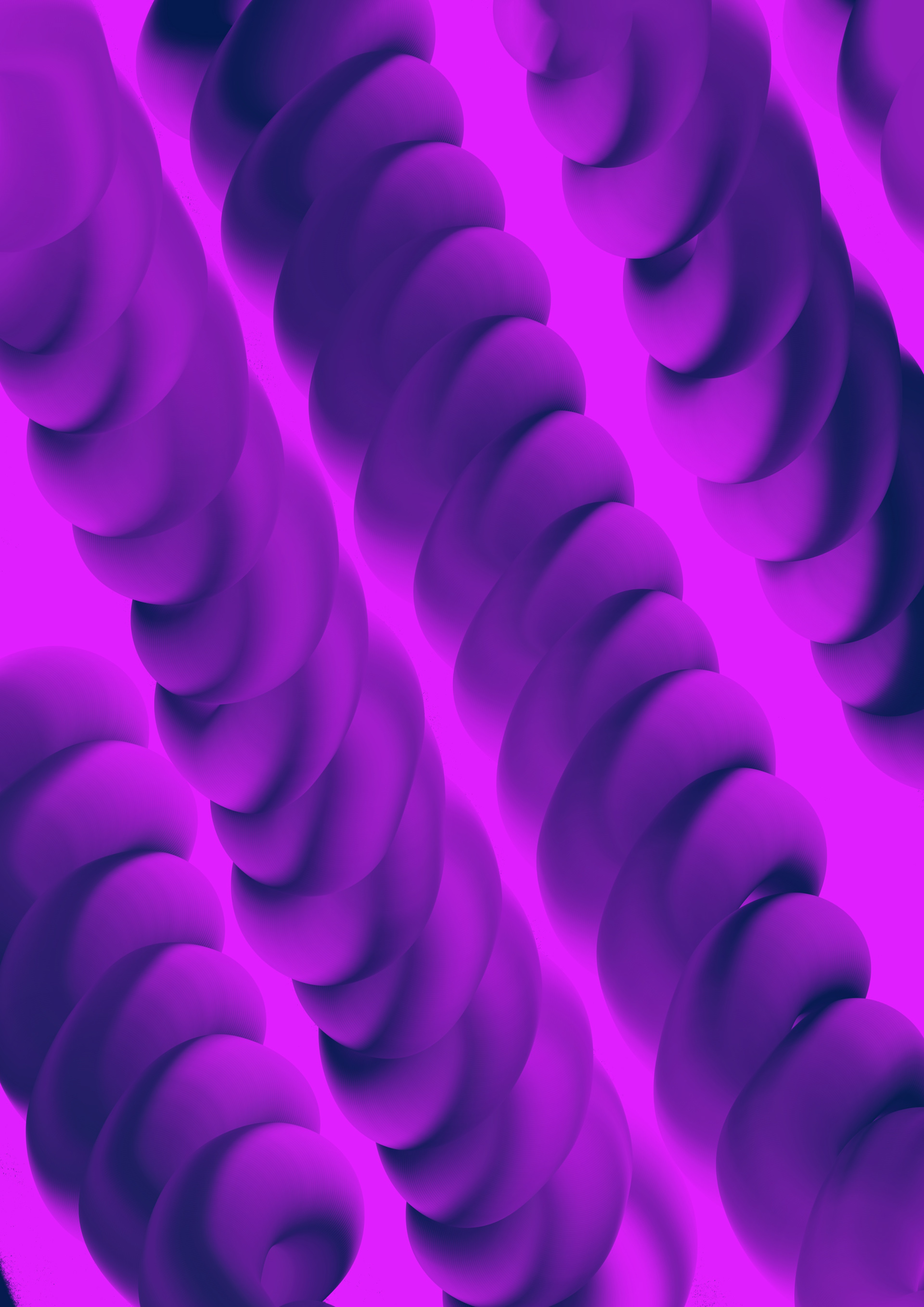
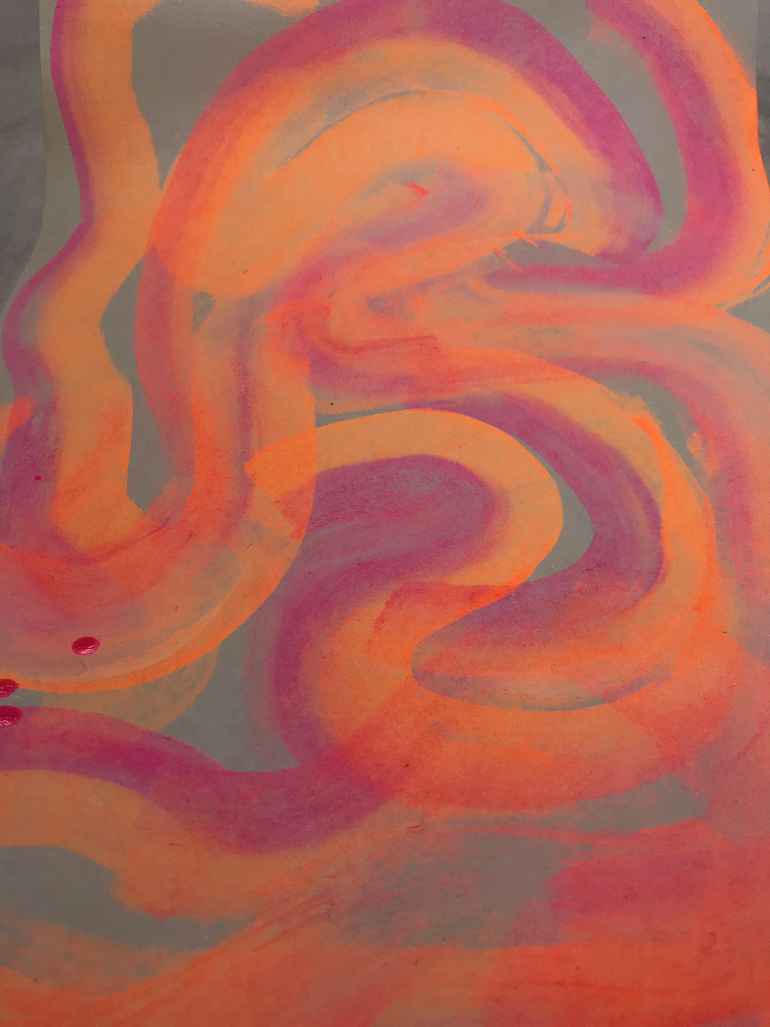
I always enjoy playing with liquify tool, the way the colours mix together and how every piece is different due to the little control in making them.
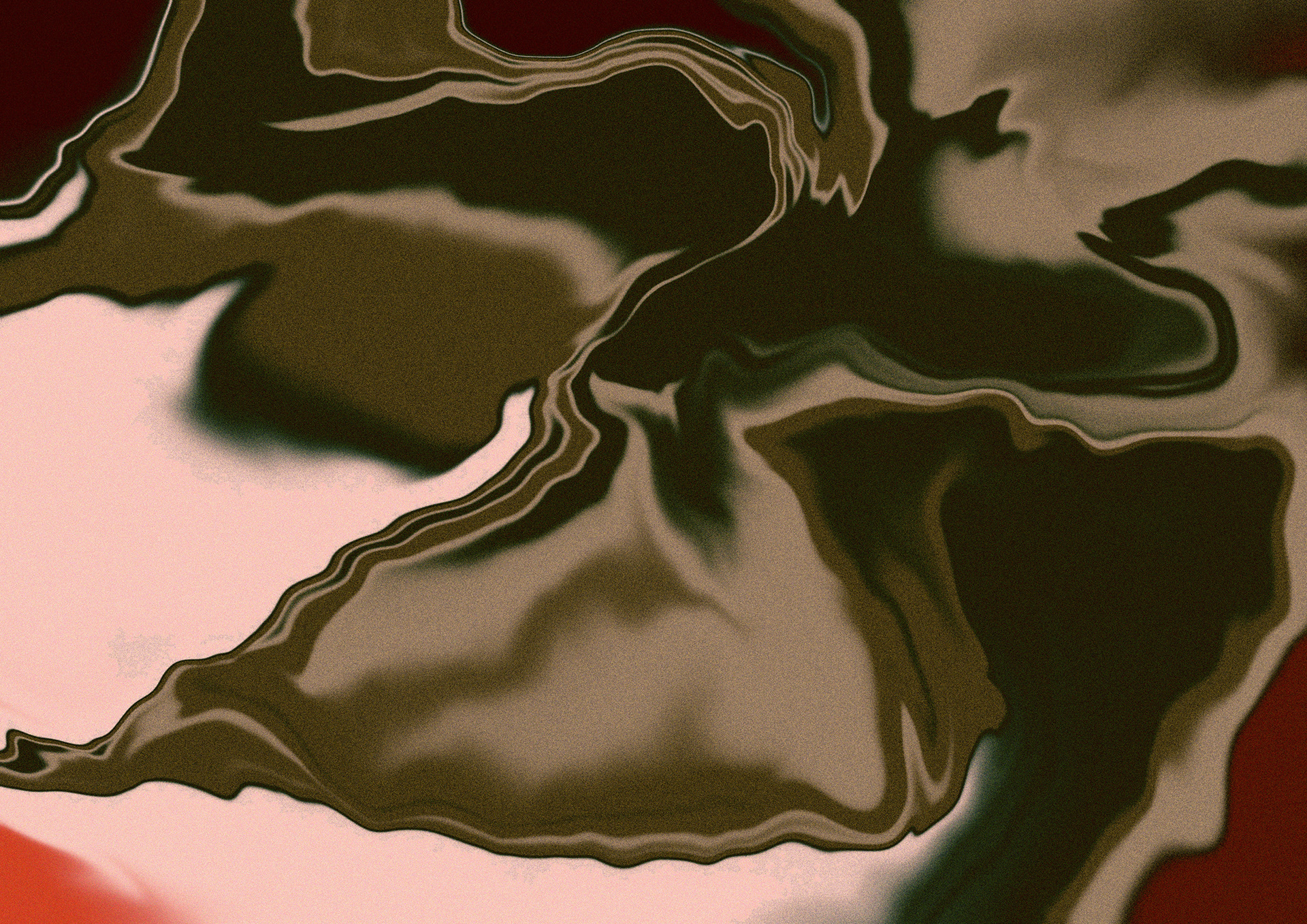
Same goes for this liquify piece. It was originaly orange but added a black overlay and liked the colour it turned.
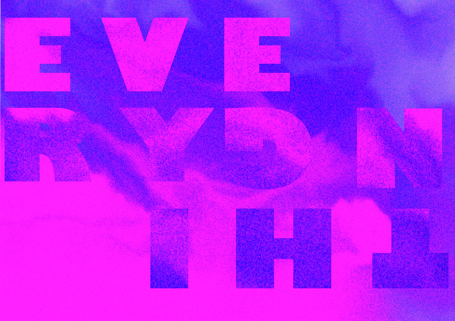
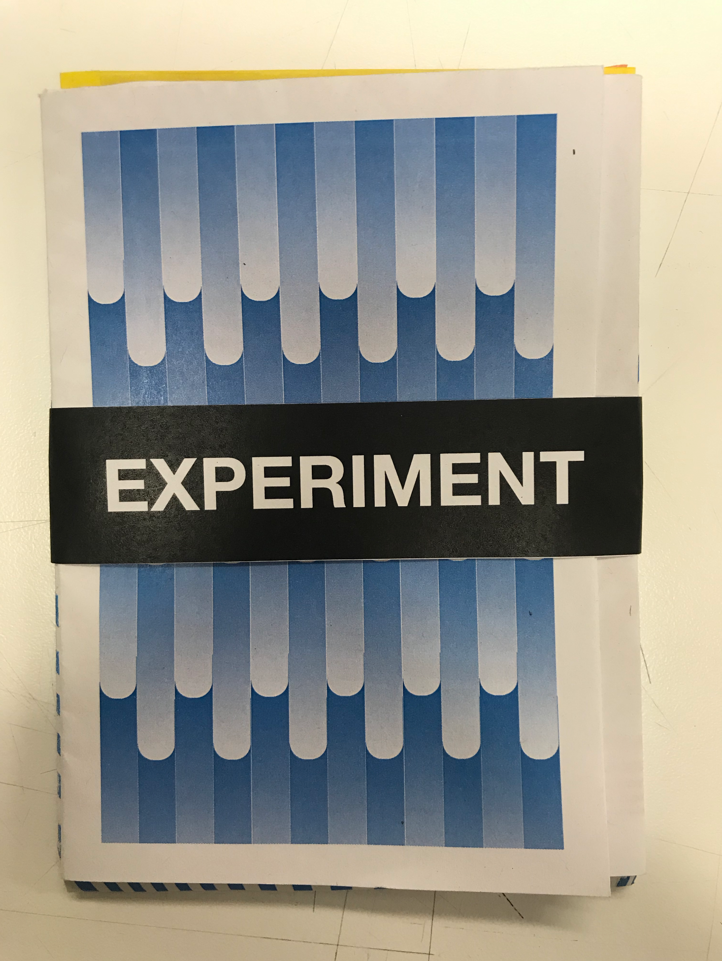
Since the rule says "consider everything an experiment" I thought it would be fun to do an experiment on the word everything.
Same goes for this experiment. Since the rule says "consider everything an experiment" I thought it would be fun to do an experiment on the word everything.
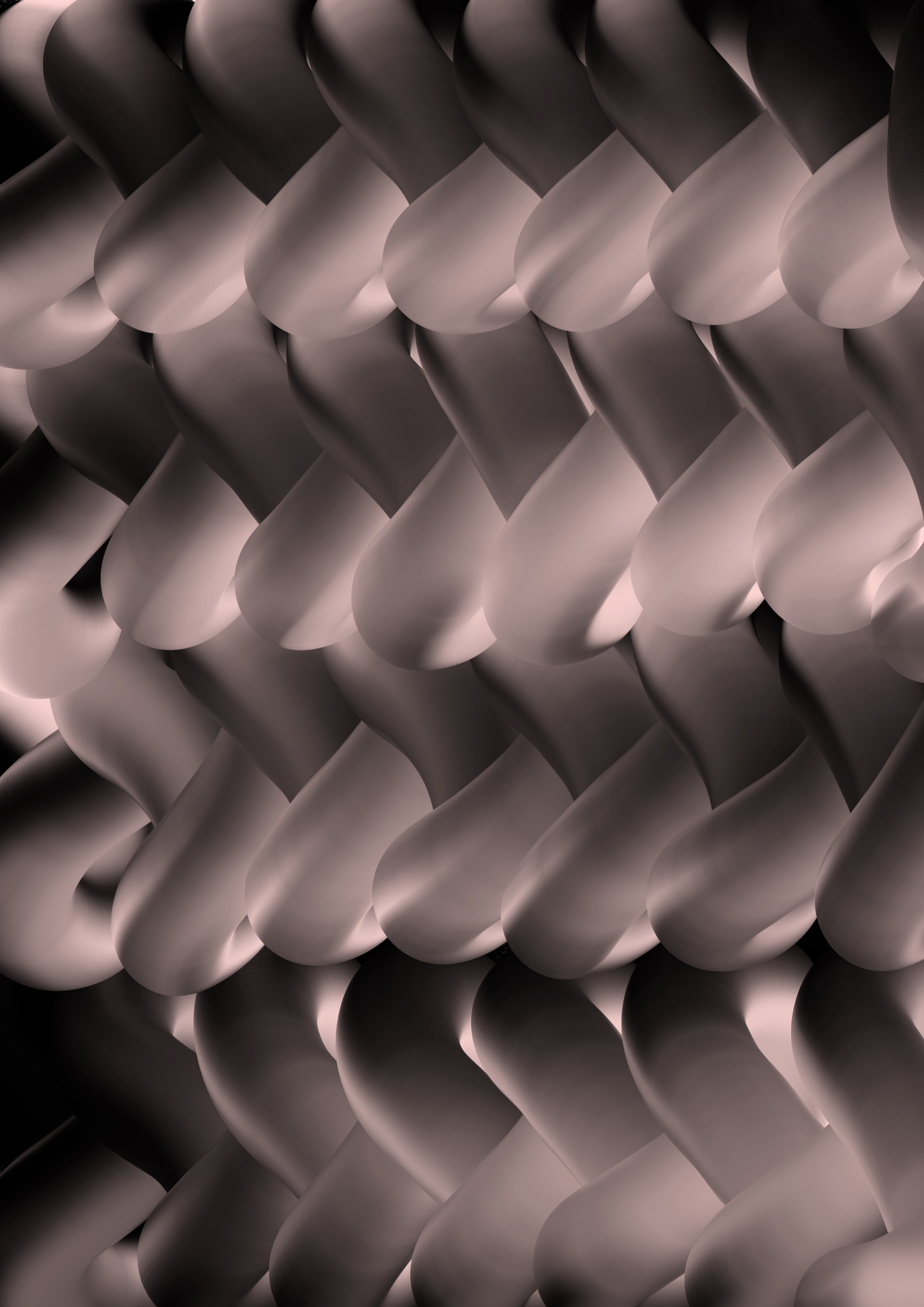
This is done using the smudge brush on the iPad app procreate. I like the 3D effect it gives as well as the repetition.
Same applies to this. This is done using the smudge brush on the iPad app procreate. I like the 3D effect it gives as well as the repetition.
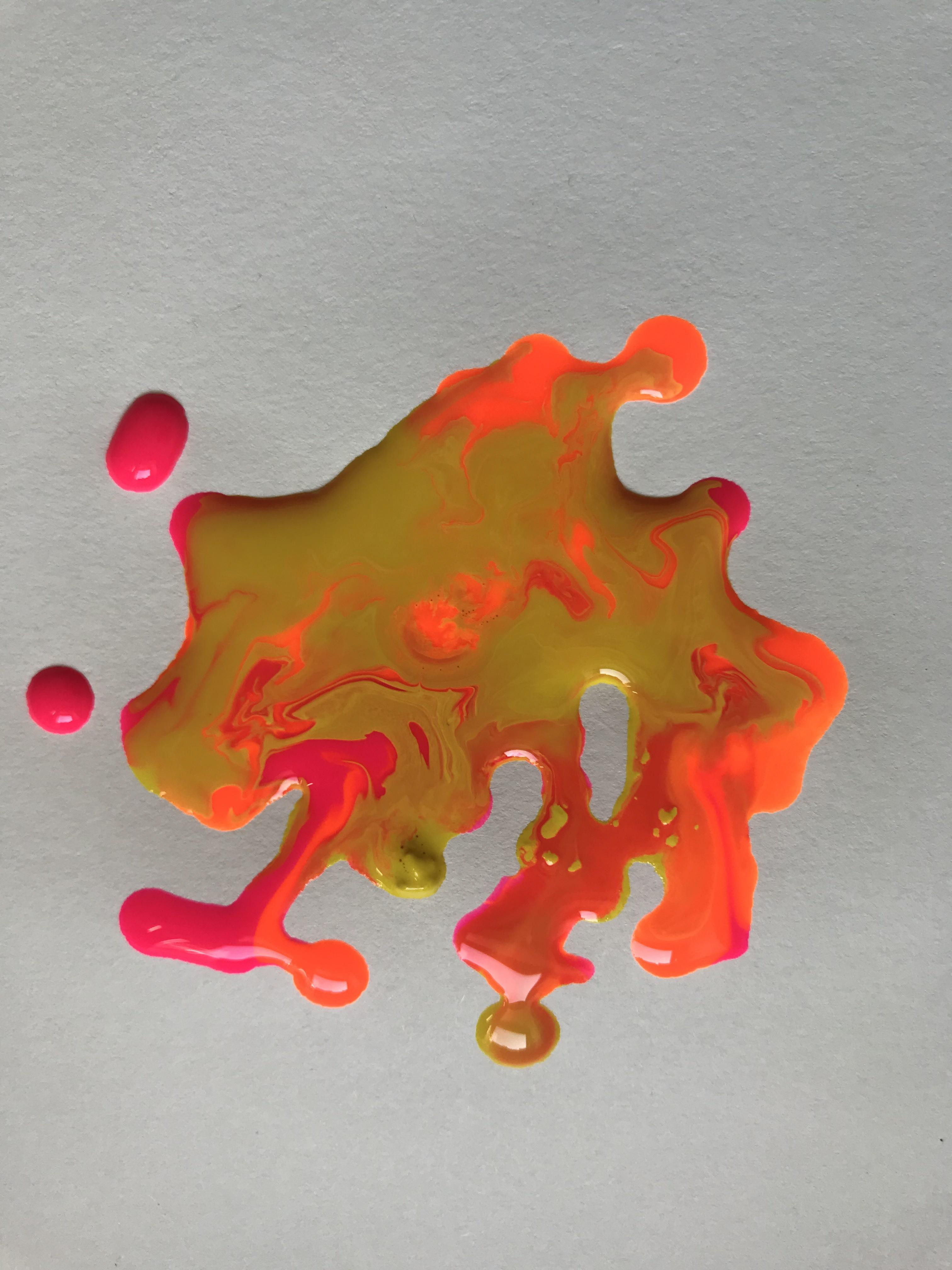
These are some bright acrylic inks I was mixing to see how they would reacting with eachother. I love the vibrancy of the orange and pink.
After experimenting with the blobs of in I did a butterfly effect by folding the paper in half. I like how there are drops of the first ones I did of yellow which you couldn't see at the top of the puddle due to the thickness.
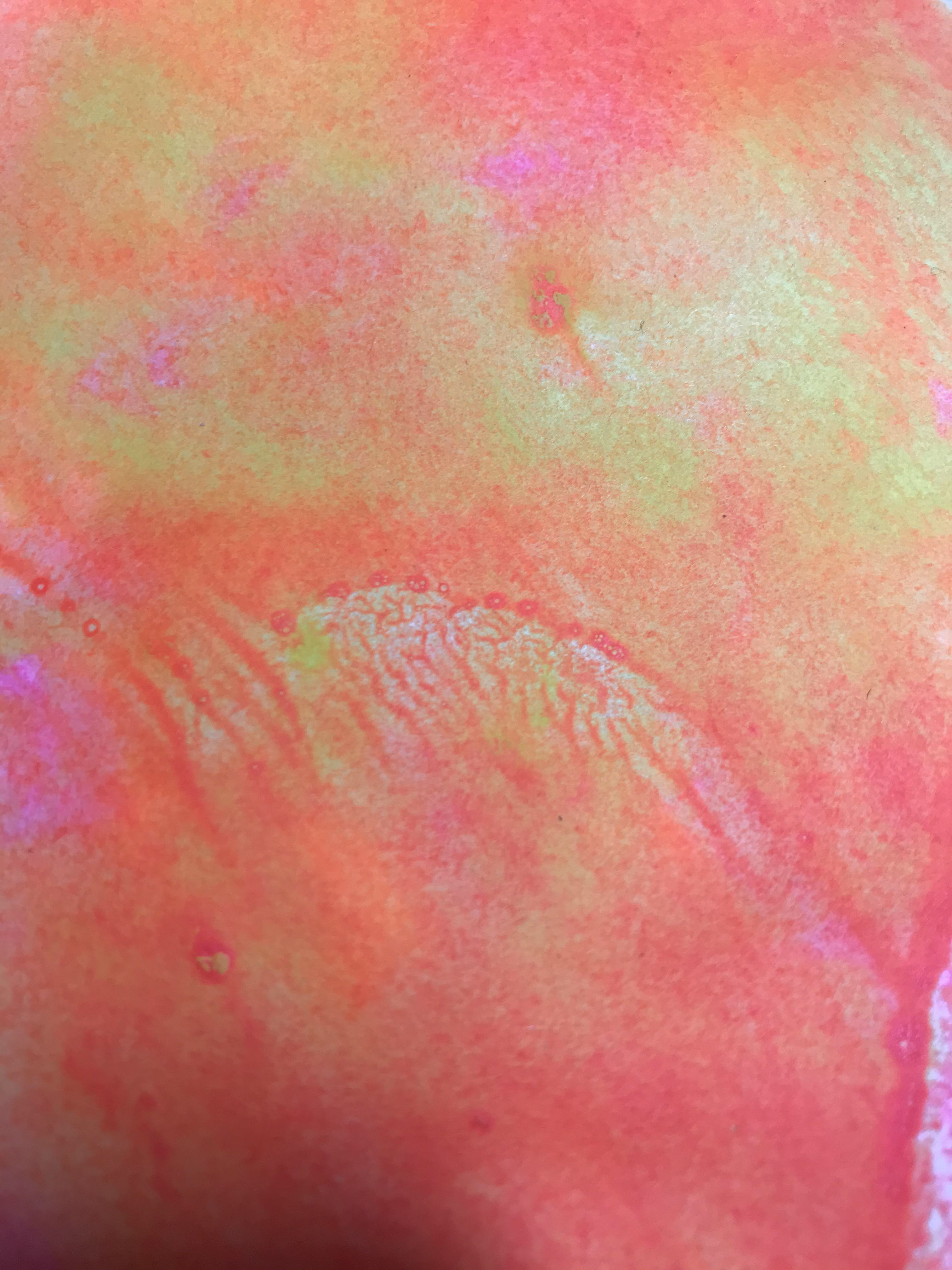
This is a print onto another peice of paper using the butterfly effect I did. I then decied to paint a black glitter around it as I want to see the conrast of colours.
I like the way the bright colours overlap and have a bit of transparency. The actual 'painting' I'm not so keen on, but I mainly wanted experiment how the colours work and react with each other.
This was the first ink experiment I did I just felt like swirling around the inks and seeing what happened. I like how the inks is transparent and shows the different "layers'.
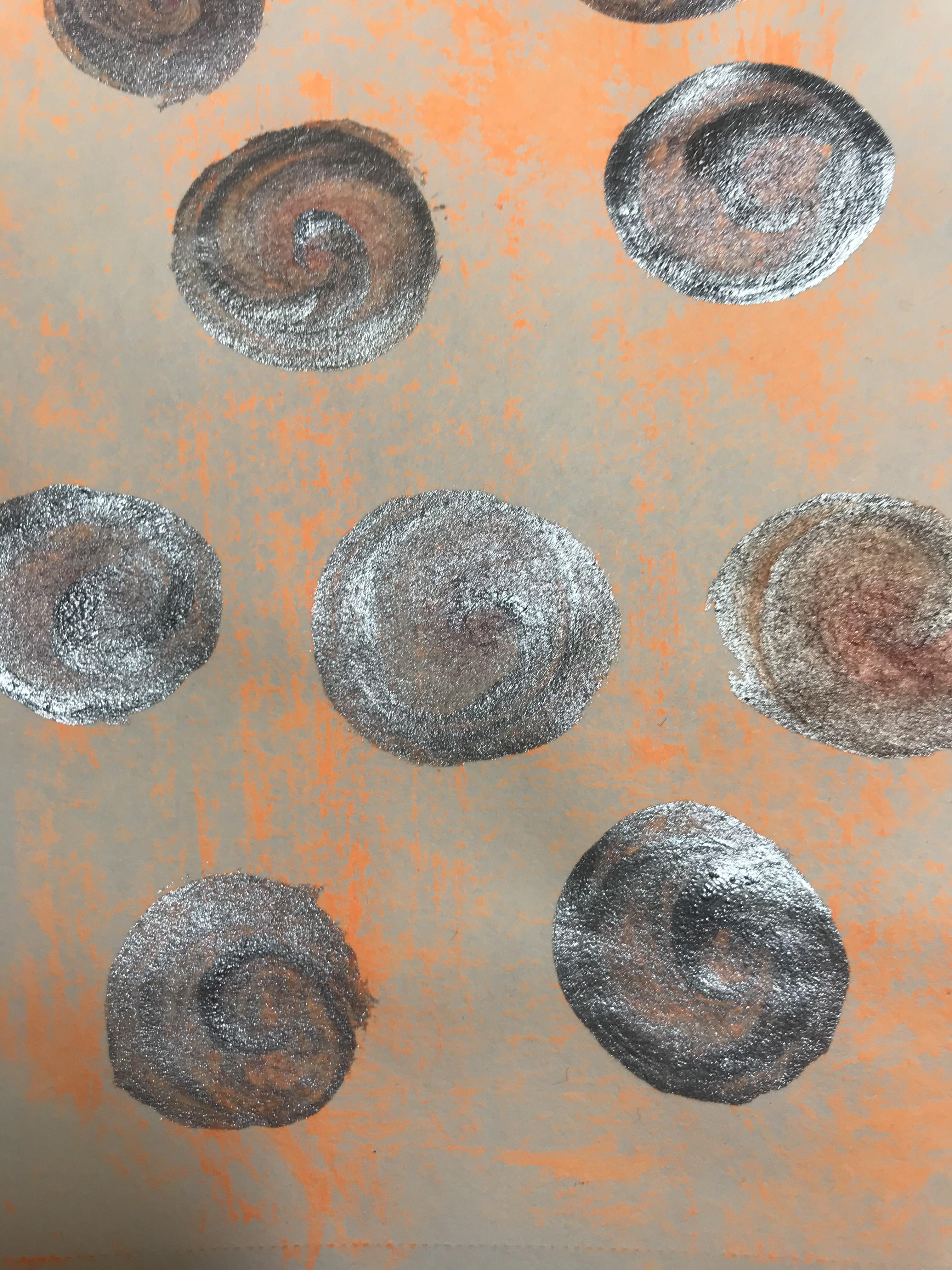
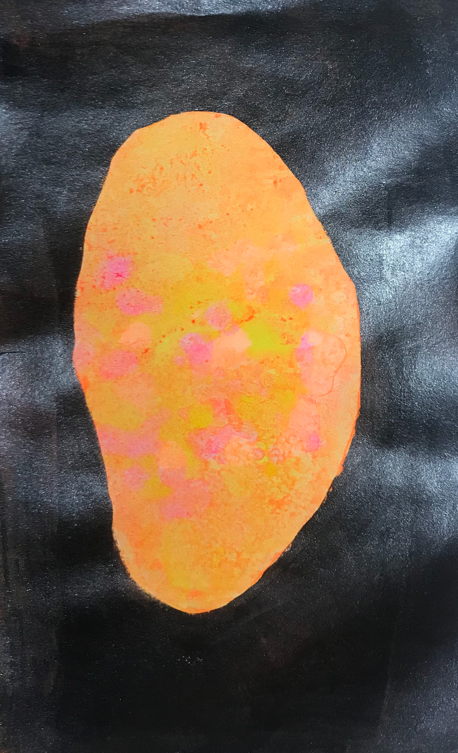
I like the subtlety of the orange in the background and the bright silver glitter circles. I think it makes a cut print.

This turned out a little sifi for me. I'm not sure if the colours work so well. I just want to give a print a go as an experiment.
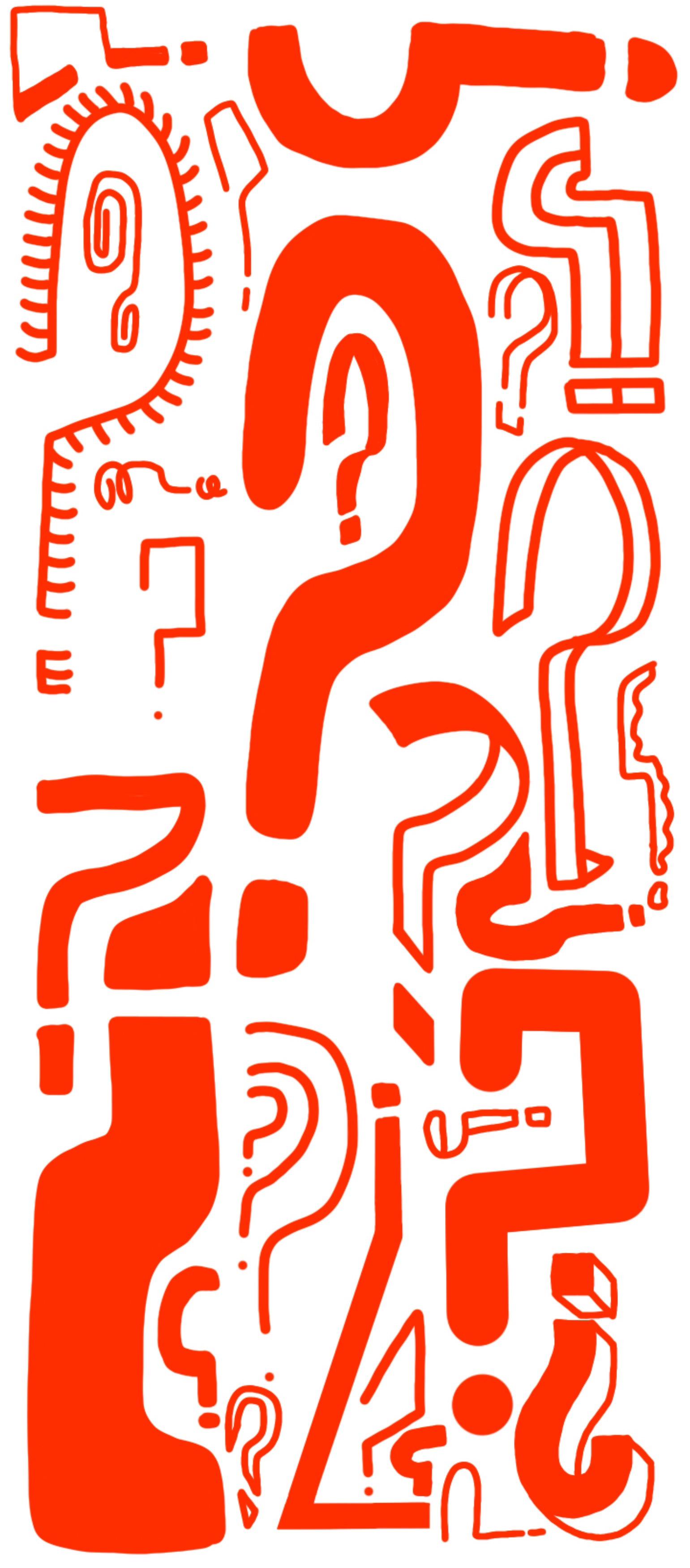
This links to consider everything an experiment. I thought putting loads of question marks coud represent what counts as an experiment. It could also signify experiments as a whole as I tried to experiment in ways of making question marks.
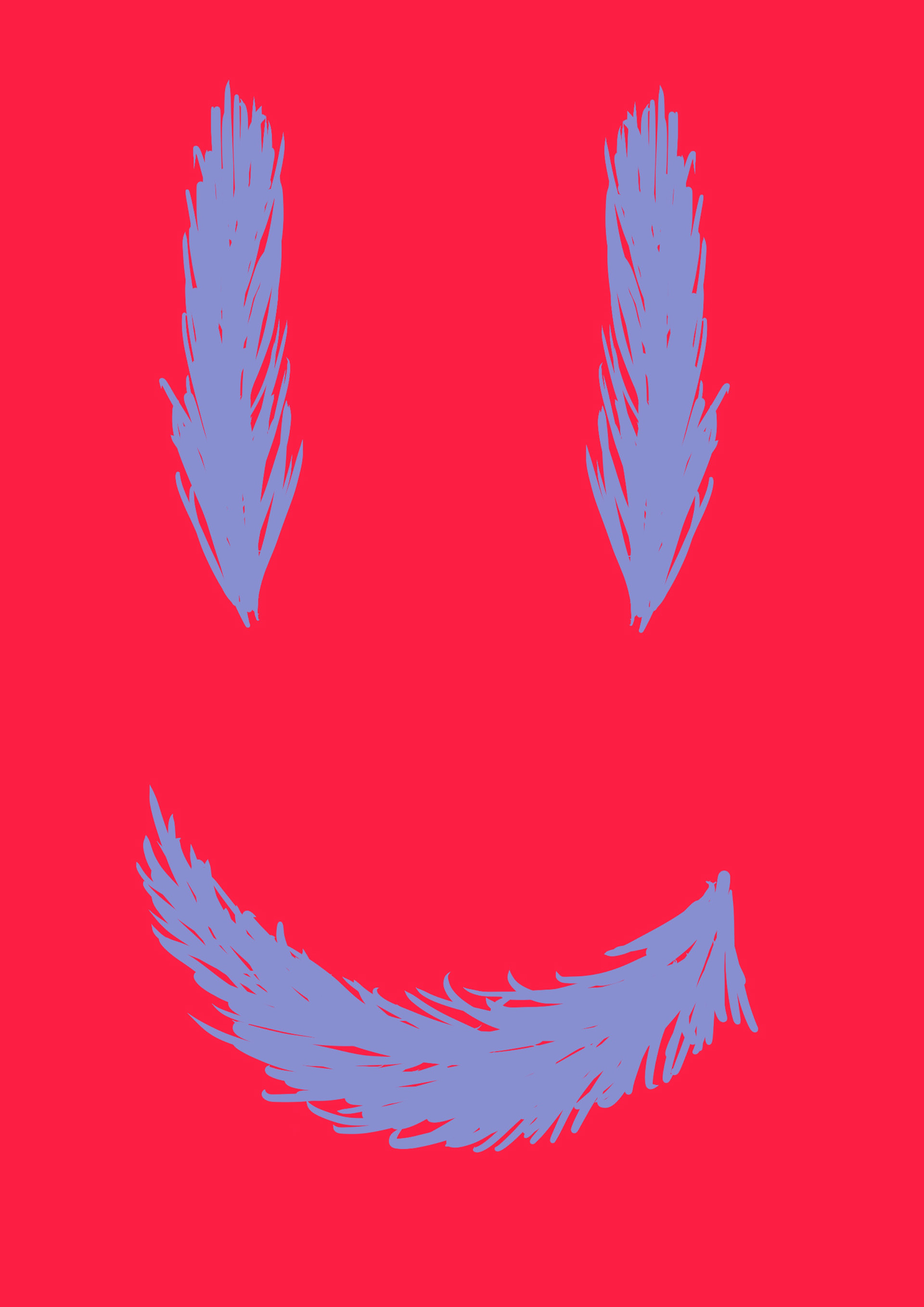
These two link to another rule (no.9). I just thought that since feathers are light and the rule it be happy that feathers making a smiley fit would be a good fit.
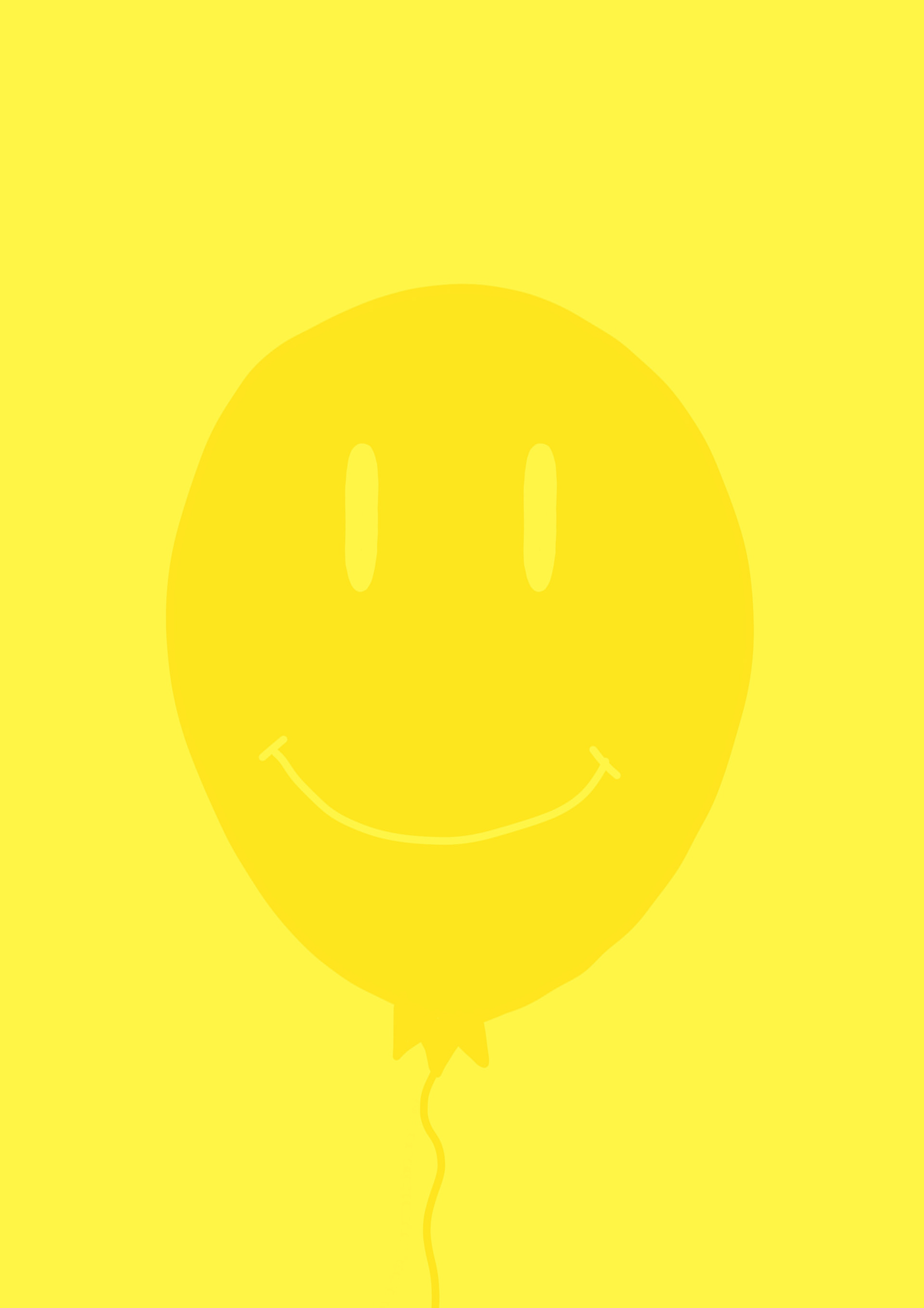
These two link to another rule (no.9). As with the feather I had the same idea, but with a light balloon instead!
Click on images for annotation
These are some further experiments, I wanted to let loose and just do whatever came to mind and see whether that would give me some ideas. Some work and some not so much but they did overall help me come up with my next idea.
How acrylic inks mix together
conclusion - don't overdo it but it's quite fun to do.
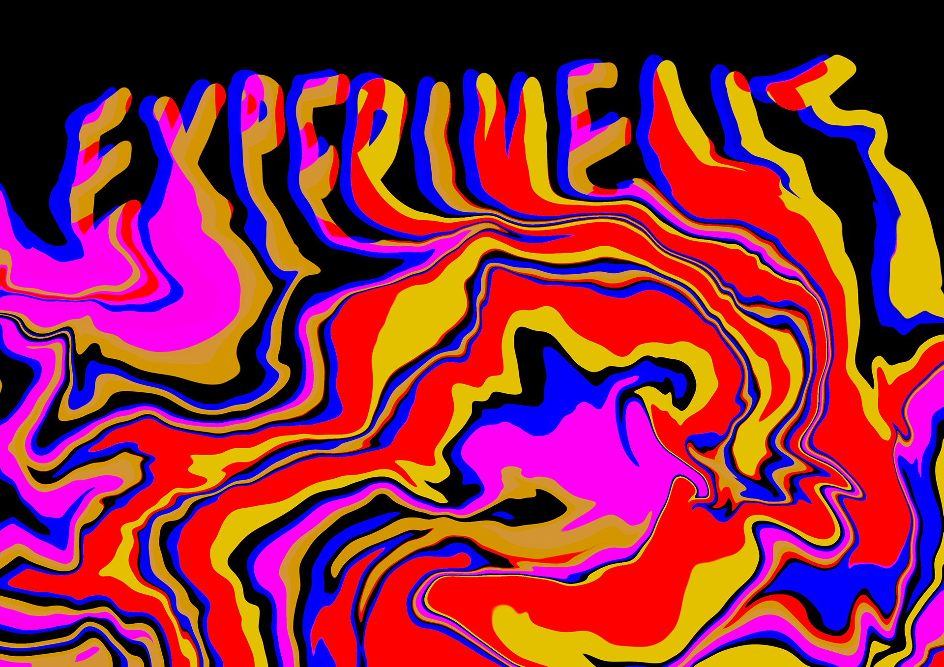
Experimenting with the word experiment. As the rule says consider everything an experiment...

How different colours mix using multiplied colours.
I made this by layers a gradient of RGB colours on different layers and moving them around separately.
I would however be nice to see what trying different colours would look like.
I recently saw artist Felipe Pantone made a table using the same premise. I like the interactiveness of the coffee table and feel like a lot of his work is about experimentation.
Experiments are a big part of his work. For examples with the pieces of art he sells you. As a customer you can pick and choose and create a bigger piece. I like art like this as it makes you feel part of the piece and that you can add your own touch to it.
I will also add I love his use of colour and the large installations he does - bring art outside of a room is always fun.
What I am going to do
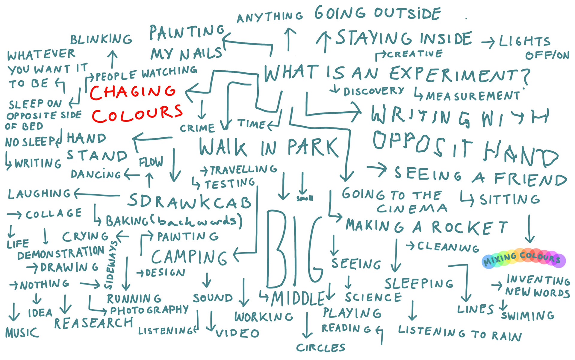
While I mentioned some possible ideas, I had nothing set in stone. I thought why not take a different approach, I took inspiration looking at the mind map I had made. I thought: just experiment with anything I can think of and hope for the best.
One thing I have loosely focused on is colour. I feel it makes a lot of sense if i'm representing a rule on experimentation I MUST experiment. Often I will have an idea in my head of the path of experimentation I will follow. With the work above it came by sitting down and telling myself I would use xyz medium, nothing else.
I didn't plan any of these experiments (a few I kinda did, actually - more on that later). I need to let loose and be less regimented in my work style I just wanted to do whatever came to mind.
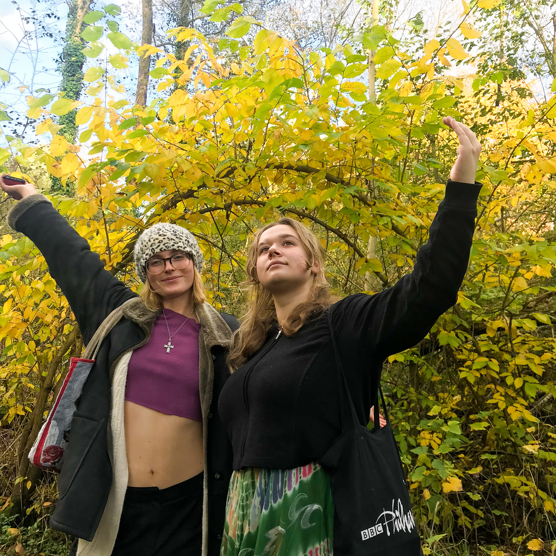
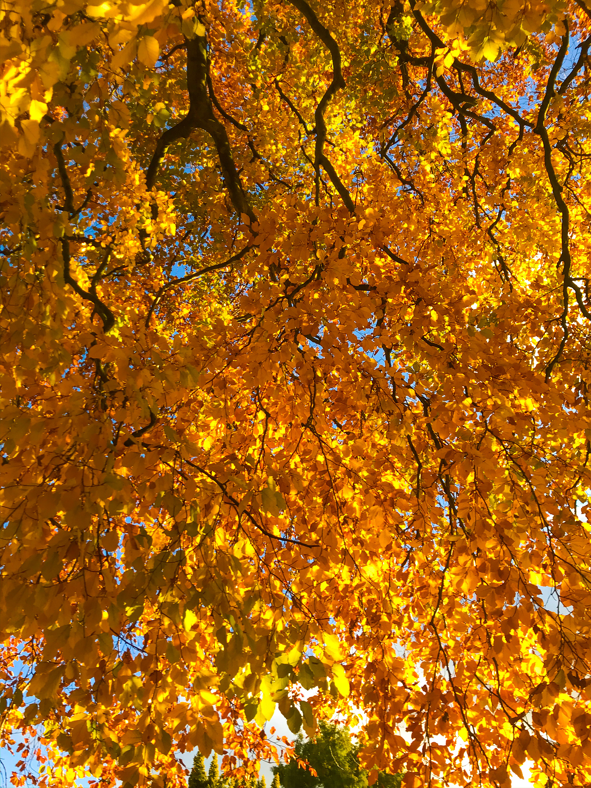


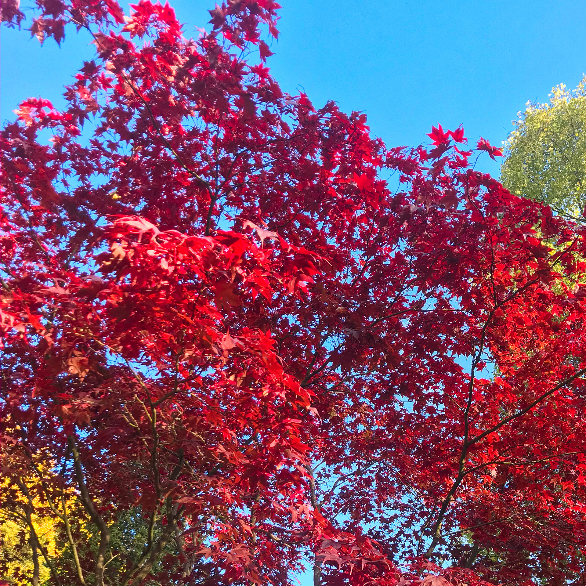

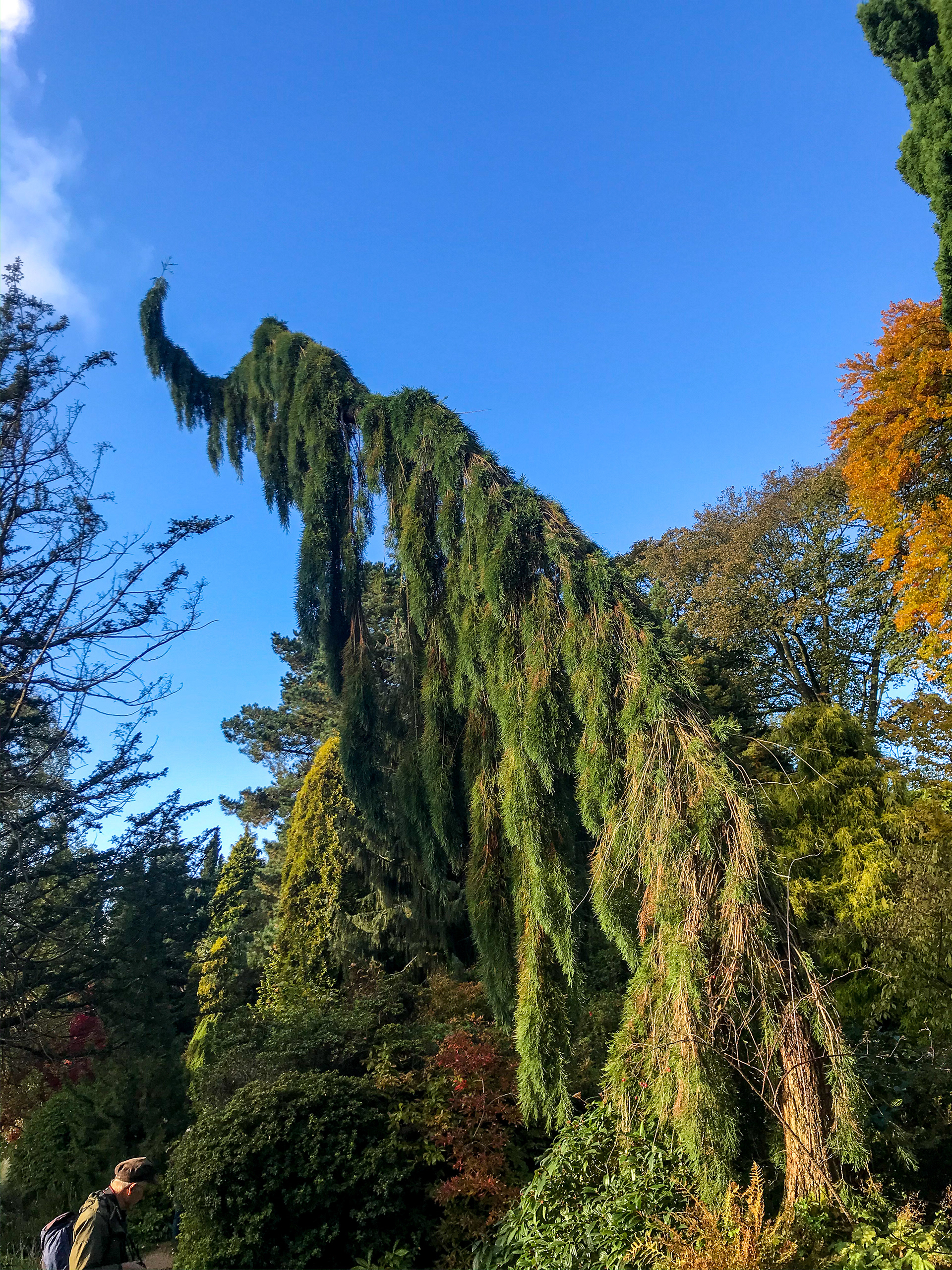
The first thing I wanted to do was go on a walk. Having been clogged up inside I needed some fresh air and wanted to see if there was anything in nature that would inspire me. I visited Fletcher Moss with a couple of friends.
The colours this day were so beautiful we all couldn't believe how lovely the weather was as well as the colours coming from the trees. I see this as my first experiment.
What was I experimenting with? How many pictures could I take? 122. How many dogs did I see? Lots. Should I do this more often? Is taking a break worth it? Yes. Why is the sky blue? Will this give me ideas? The colours and landscape I'm sure will, but who know if for this project. Can plants look like animals? Yes, have you seen the elephant? The Elephant reminds me of Dr Seuss illustrations.
My first thought was: what counts as an experiment? In terms of a creative process, I've concluded that anything can be an experiment if I back it up. Or maybe even if I don't, because anything I may do every day will have an effect on how I work in a big or small way.
Above are some quick thoughts about what could be an experiment or what the definition is. In reality, anything can be an experiment and I think this is what is so great about the rule: it makes you realise that experimentation can be anything you feel it to be.
"CONSIDER EVERYTHING AN EXPERIMENT."
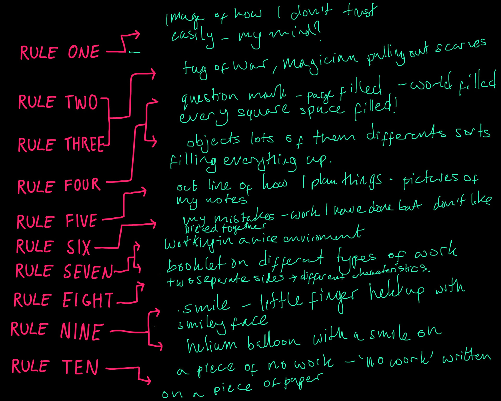
These were some quick ideas I noted down to see which rule spoke to me the most. Instantly I felt like rule 4 was the one I could get most excited about, the one that was most likely to lead to good ideas. It's a rule that I think is important for people to be thinking about and I think I could come up with some nice ideas for it.
Rule 9 I have my qualms about, as I've written about below, but I do quite like the idea of a helium balloon with a smiley face to visualise the rule. Another idea could be feathers making a smiley face? It may be quite literal but I think it would a fun idea to play with.
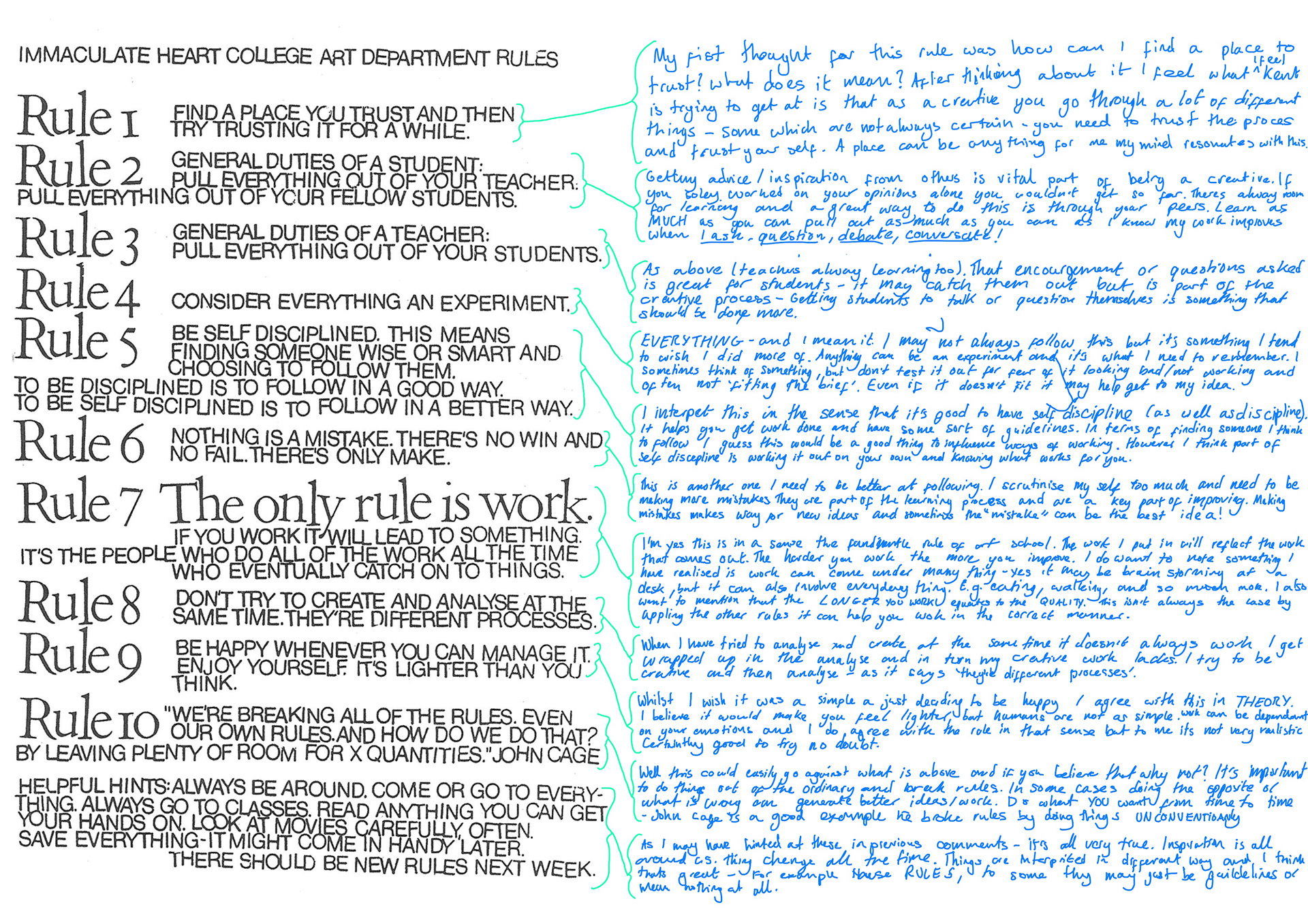
My initial opinion on these rules was that they're just your typical art school phrases. Which yes they are, as they have similarities to things I've been told by creatives ever since I started drawing as a child.
'Make mistakes' 'experiment' 'don't throw things away' 'take inspiration from your surroundings' 'enjoy it' 'don't dwell' 'break the rules' 'just do it' 'relax'
Whilst these are very much the preemies of Kent's rules I feel as if when I was younger I wouldn't listen. I would (still do) get stressed when I felt things weren't going right or I feel as if what I'm producing isn't good enough.
I have come to realise that as young creatives we are sometimes led feel like anyone could up with our ideas and possibly even that we are 'lazy' for choosing this path. I think that what Sister Corita noticed was that the way we work means we always have to be working, we are always thinking of new ideas. That doesn't mean having to be at a desk all day or always being in work mode. We need to have fun, and I mean this in the sense that anything can be work. Going on walks, seeing a movie, cooking dinner, and so much more, can all get your ideas flowing. These rules celebrate the whole creative process. Some may not apply to every project/idea, but if you follow most of them you will create excellent work.
Sister Corita Kent made these rules for an art class she was teaching at Immaculate Heart College.
She referred to John Cage in rule 10. When working at Heart College she invited people involved in art and design to talk to her students. Her rules were posted up in her classroom.
Rule 10 uses the words of John Cage. I feel that Sister Corita quoted Cage because of the work he was doing at the time. He was exploring the limits of where musical composition could go. For example, when he met his long-term partner, choreographer Merce Cunningham, he was exploring the physical dimensions of sound. He was a very controversial figure in the musical word. He was able to show that nobody is in the position to define what music and sound are, or even to differentiate the two. He experimented with non-traditional compositions, and when using pianos or small orchestras I feel as if he would use them as tools rather than instruments.
His thinking of how he could create music and the way he did it really fit with Sister Corita Kent's rules. So much so that he was the one that popularised them - his partner Cunningham also had a copy in his rehearsal space. I could relate many of these rules to Cage's work, for example his own, number 10. He was notorious for refusing to follow the rules throughout his whole career, which was based on the fact that he was breaking the boundaries of sound and music, showing how they're closer than one may think. In many ways, Sister Corita's work, though it seems much less intellectual, did something similar: mixing poster art, politics and love and with extraordinarily beautiful visual images.
'Consider everything as an experiment' and 'Nothing is a mistake. There’s no win and no fail, there’s only make' I feel as if this applies well to him also. Everything he did would be a part of his work even if it wasn't part of a plan. For instance, with his first live performance on TV he wanted the radios to be plugged in but this wasn't allowed so instead he threw them off the tables, there was also laughter from the audience. I doubt either of these things were planned and it goes to show that nothing is a mistake and that whilst it may have been different to what he has planned he made something AND he experimented.
John Cage was known for many things: as a composer but also as an artist, music theorist, and philosopher. Some argue he's one of the most influential composers and he is a leading figure in the post-war avant-garde.
Having looked into his work I can definitely see how he was breaking the rules followed by the 'typical' artist. Many people believe his piece (4'33") is just just 4 minutes 33 seconds of silence but in fact he's showing that no matter how 'silent' a place is, it is not silent at all. I enjoyed sitting and listening to a performance of 4'33" and, like the presenter mentions, wherever you are it will sound different. My dad went to a performance of it in Manchester when he was a student, but with two grand pianos not a full orchestra and he says the same thing.
I would imagine at the Barbican it would sound more impressive than sitting in my living room in the middle of the night - for me I mainly heard fuzzy white noise with my interrupted coughing. I think it's a great piece in the sense that it makes you sit and take everything in. It feels like it's wrong but it's right.
I also enjoyed listening to some of Empty Words - I like how at first it sounds like real words but you come to realise its sounds are actually made up of different things. The demilitarisation of language [what do you mean by this?} is shown greatly in this piece and I feel the longer you listen to it the better it gets. You pick up new sounds, whether it's what Cage is saying or the background noise. It turns into a tranquil soundtrack. I also like the way the line is used in the video to visualise the sound of the words-not words. As a piece of design it works very well, but also when it goes still, you think: has he died? Has something else died...? As if you were looking at a monitor in a hospital.
I love her work. I'm a big fan of colours and these pieces of hers have meaning behind them. I think it's great that each piece speaks for something. The story of her visiting an Andy Warhol exhibition getting her started into this type of style resonates with me, because I remember the moment I wanted to get into graphic design.
I was at a college open evening, and seeing the the brightly coloured pieces of work really got me excited that I too could create work like that. I feel like this sort of design is good for change as it entices you to look at it, and I think it's good how some pieces have a significant amount of writing, which helps explain the piece:
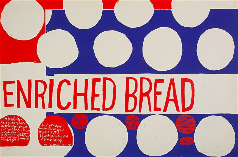
1, This image forces you to look into it further. What could it be saying about enriched bread? Then, once you've read the other parts, you get the idea of the piece. If you just glance at the poster it seems like shapes and colours that fit well together. But it's more than that, and that's why I like her work. The image in this url is easier to read: http://cmato.org/corita-kent
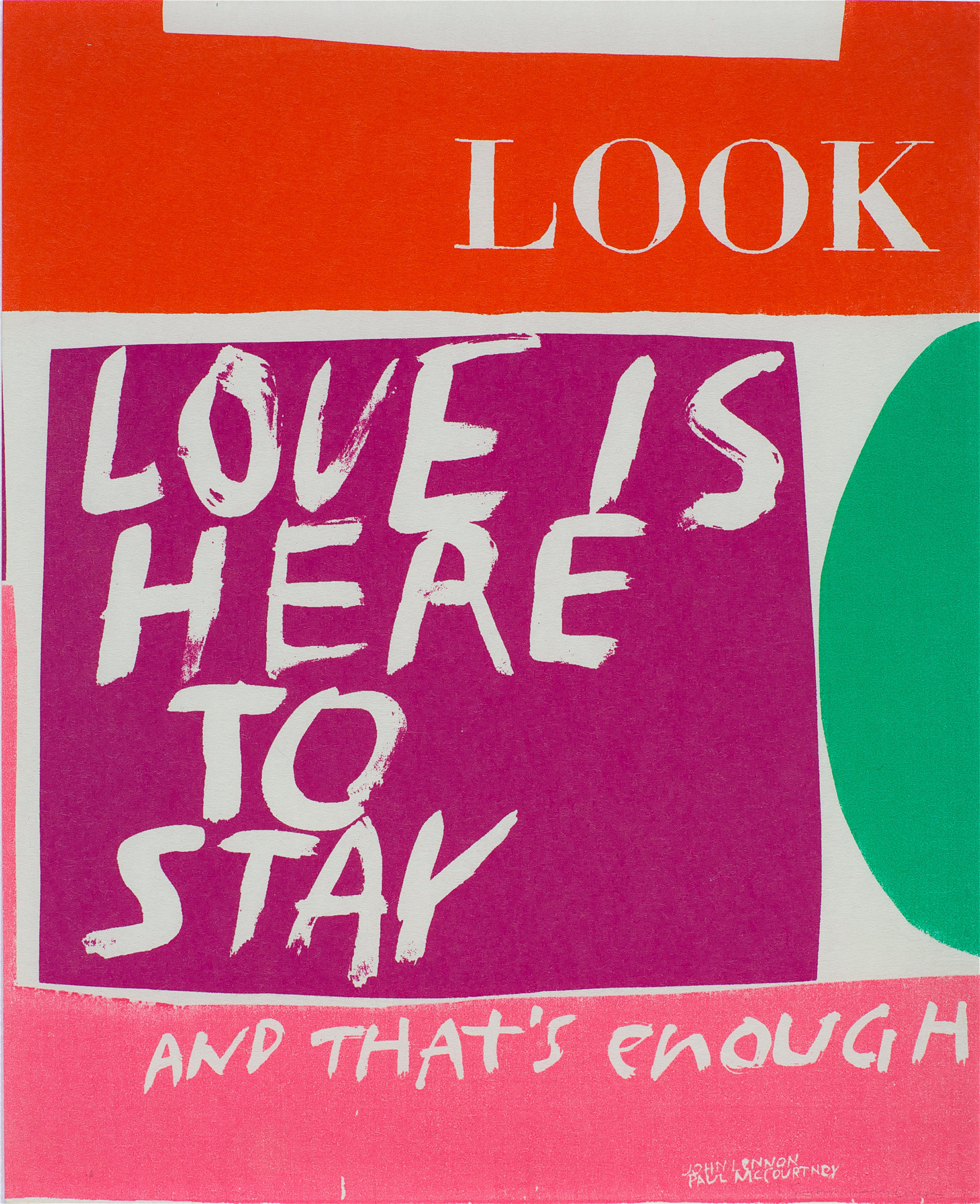
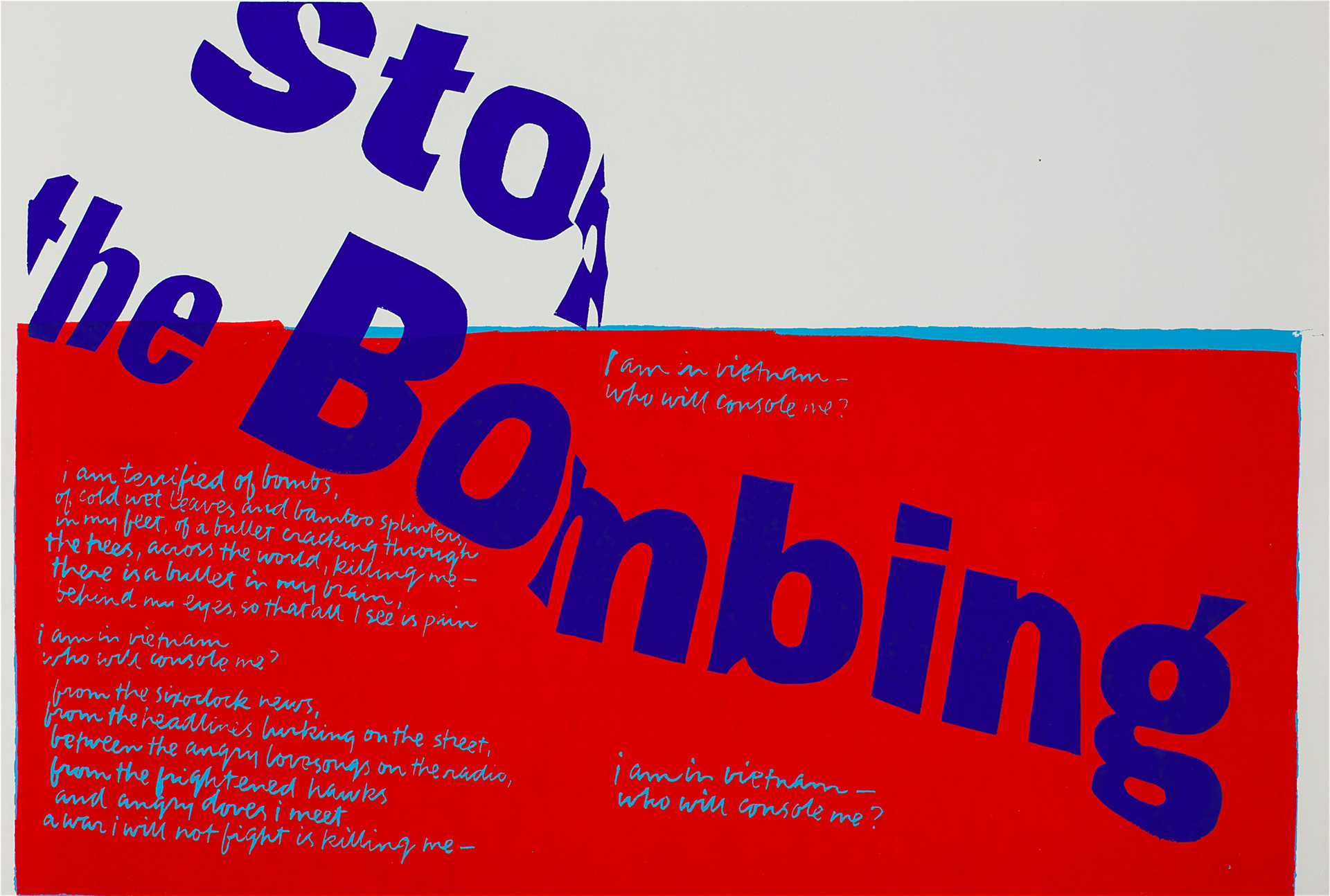
2,3 These pieces are clearer in their meaning but I think it's important to speak up for change, which these pieces are doing in different ways.
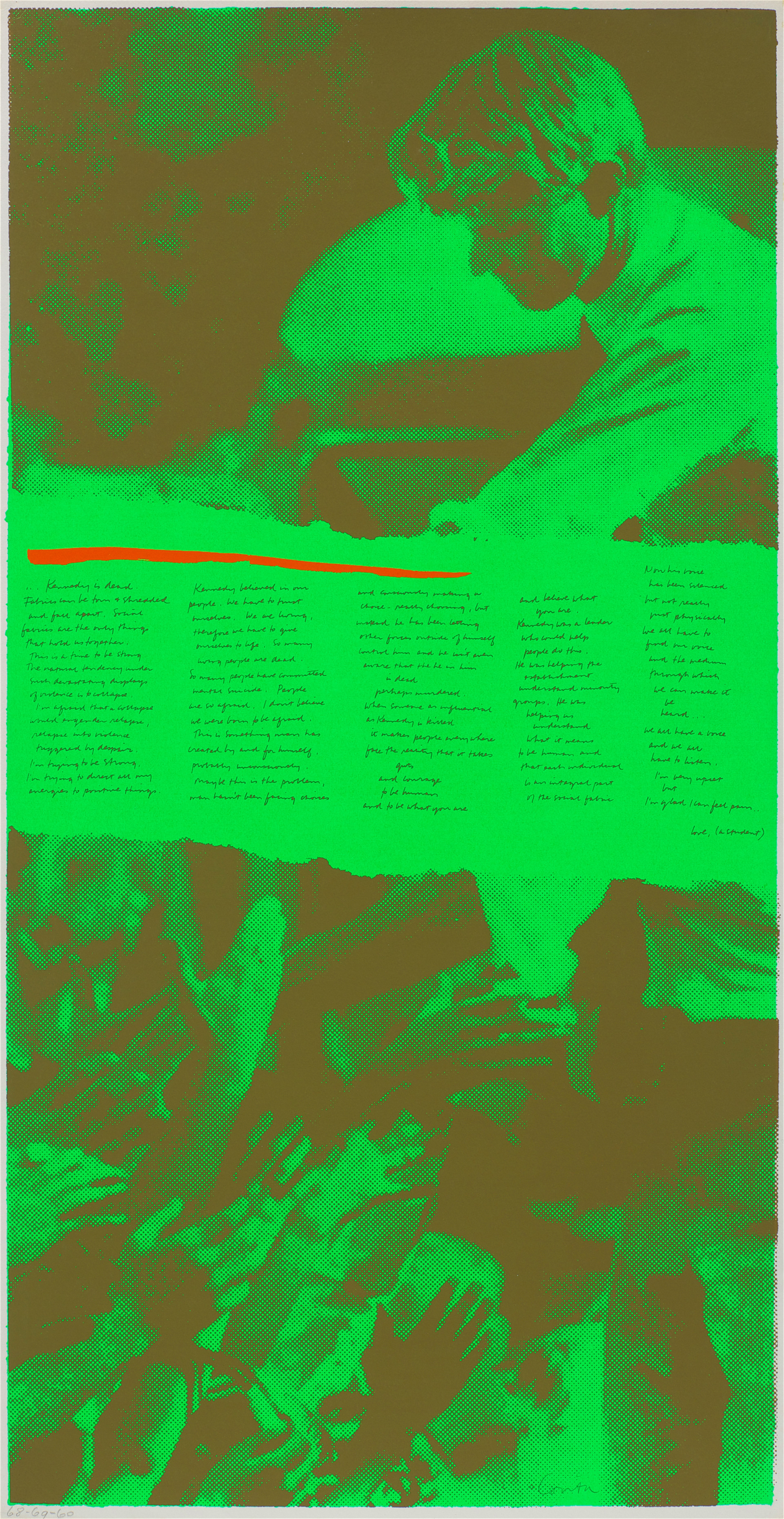
4, I must say that I don't like this piece so much, as it reminds me of those publicity stunts celebrities do, though of course the Kennedys were in many ways early celebrities, in the era of the Beatles, etc. The piece is talking about the Kennedys and the impact of the assassination of Robert Kennedy in 1968, and how great he was because of all he did to help people. What I like is that it goes into peoples' mental health and has an underlying meaning of Love and having a voice. It is also Corita quoting students, and I like this open-mindedness she showed, which I think is reflected in her choice of themes and her beautiful clean designs.
Center, C. (2019). The Corita Art Center. [online] Corita.org. Available at: http://corita.org/collection [Accessed 26 Oct. 2019].
Sister Corita Kent was an artist; most of her work used serigraphy. Her prints raised important issues to do with poverty, racism and war. She also shared messages of peace and social justice. These topics are still of great importance to people today and her work can still be appreciated for its message as well as its striking colours and design.