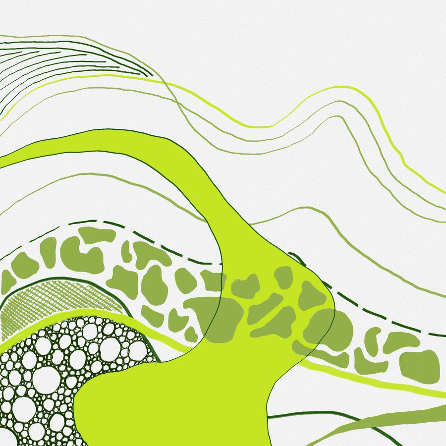
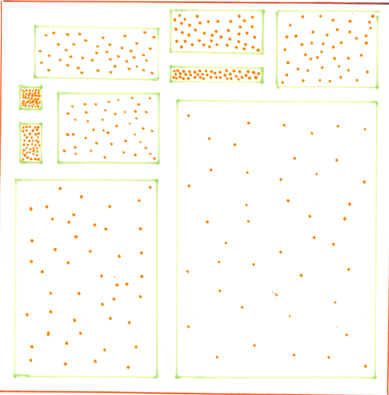
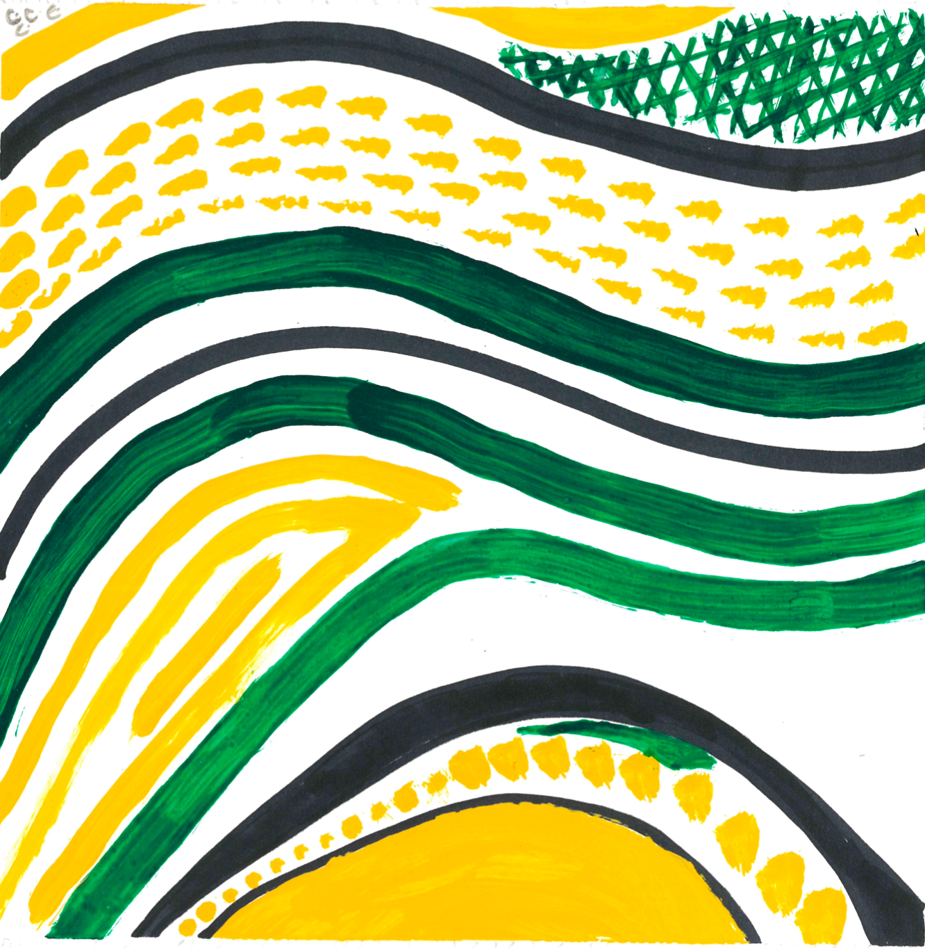
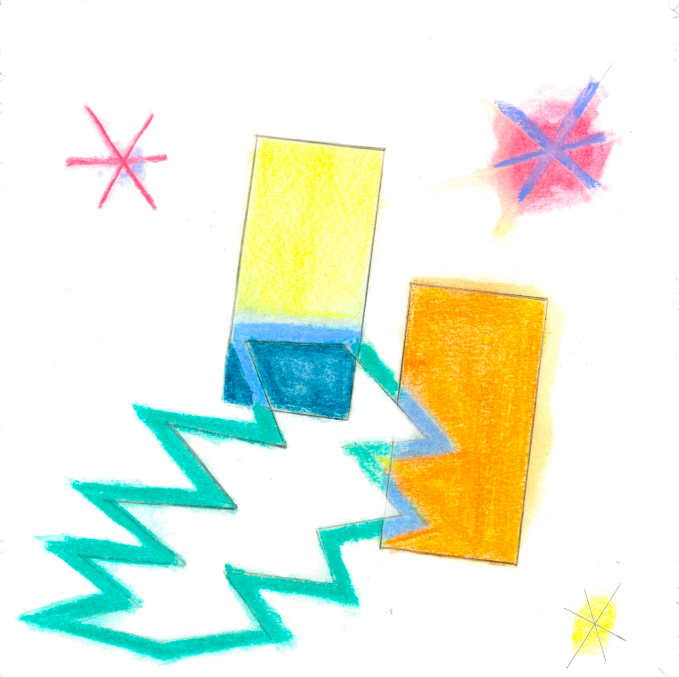
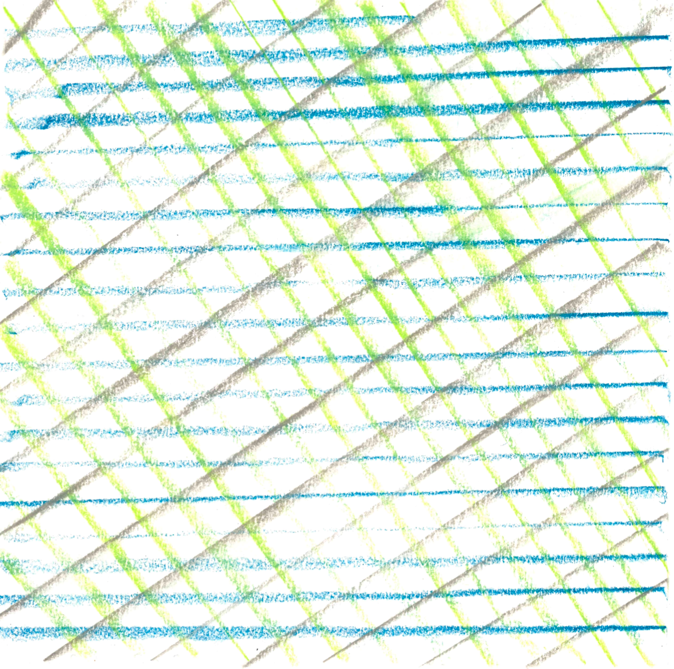
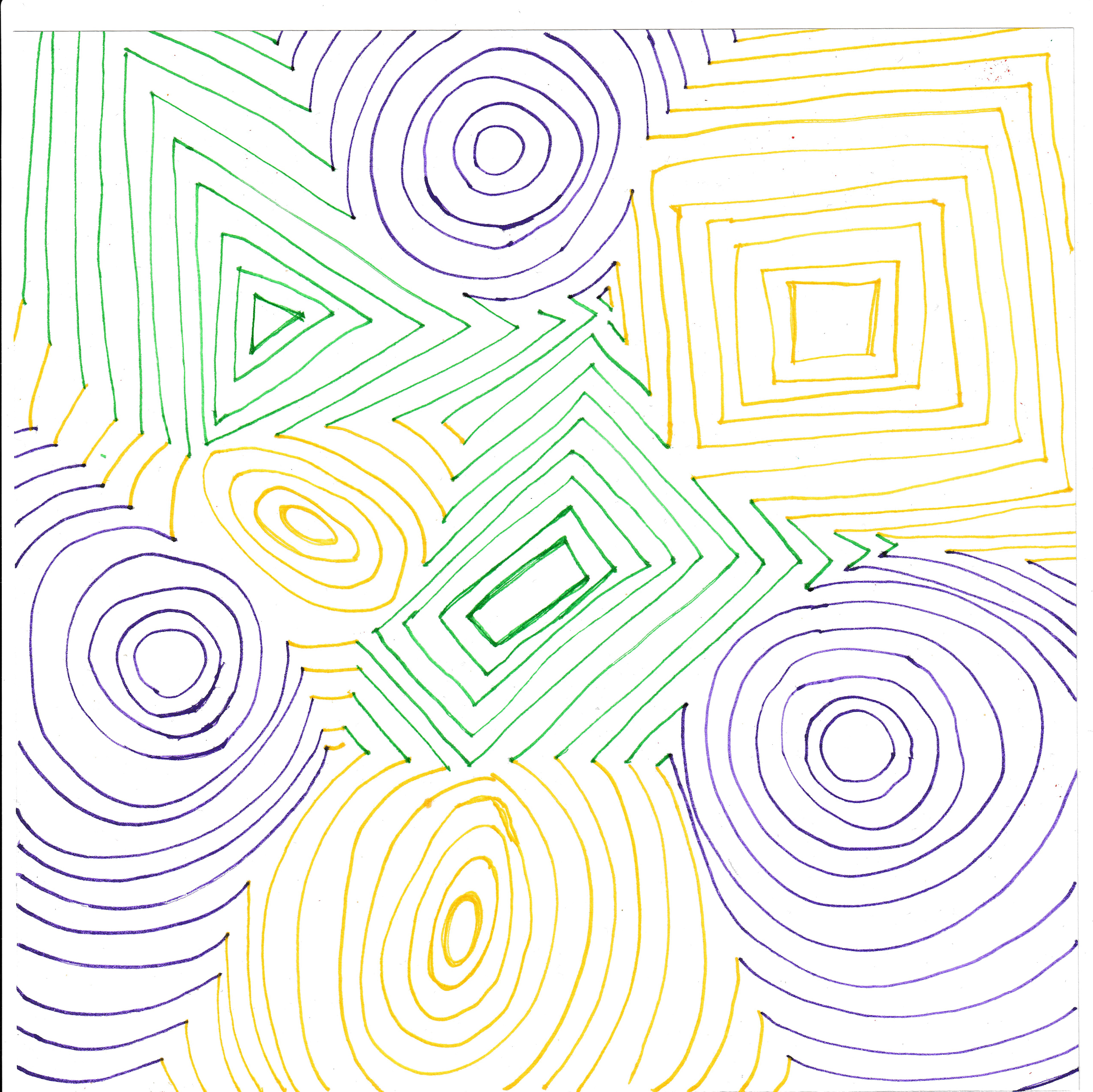
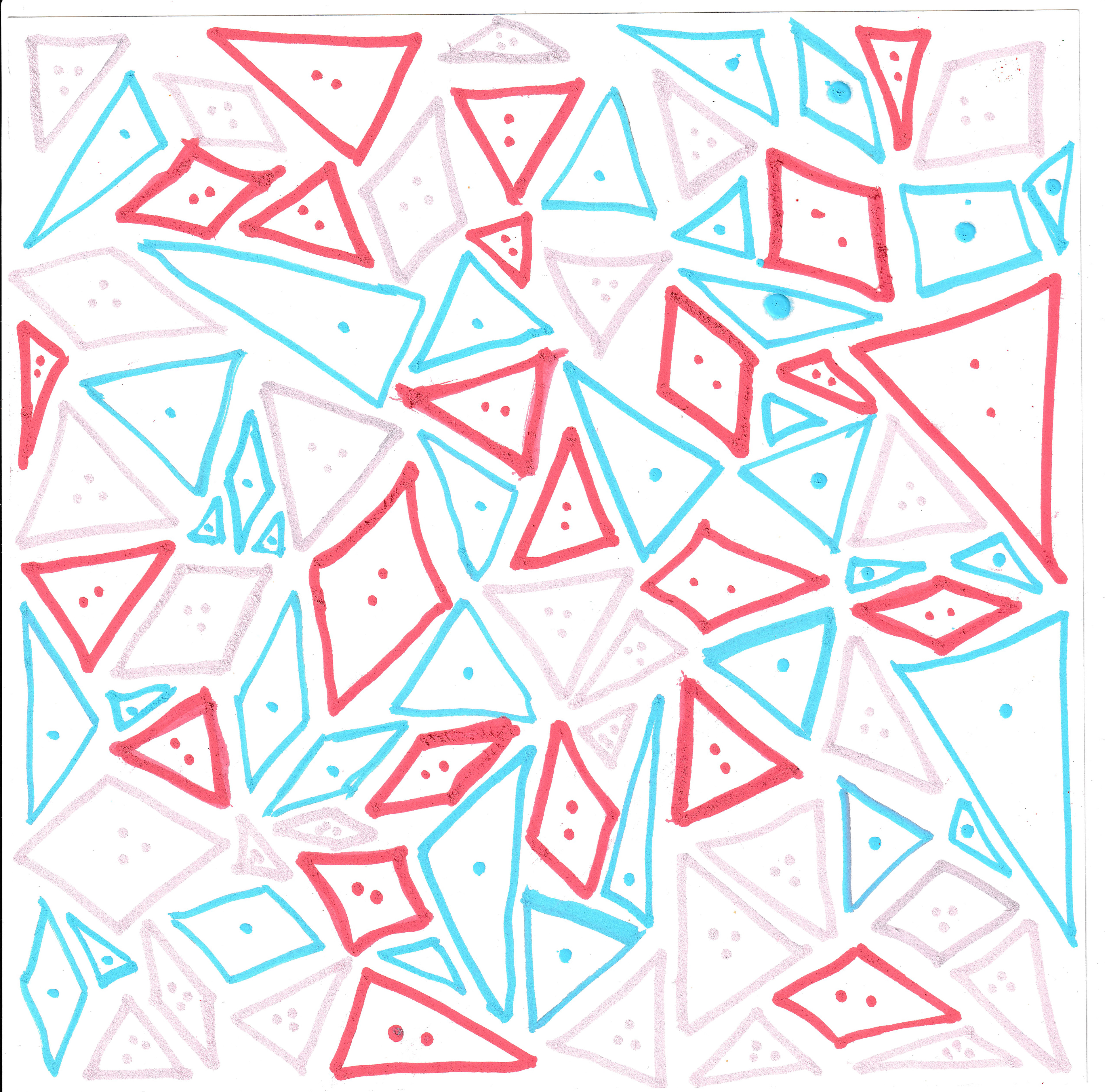
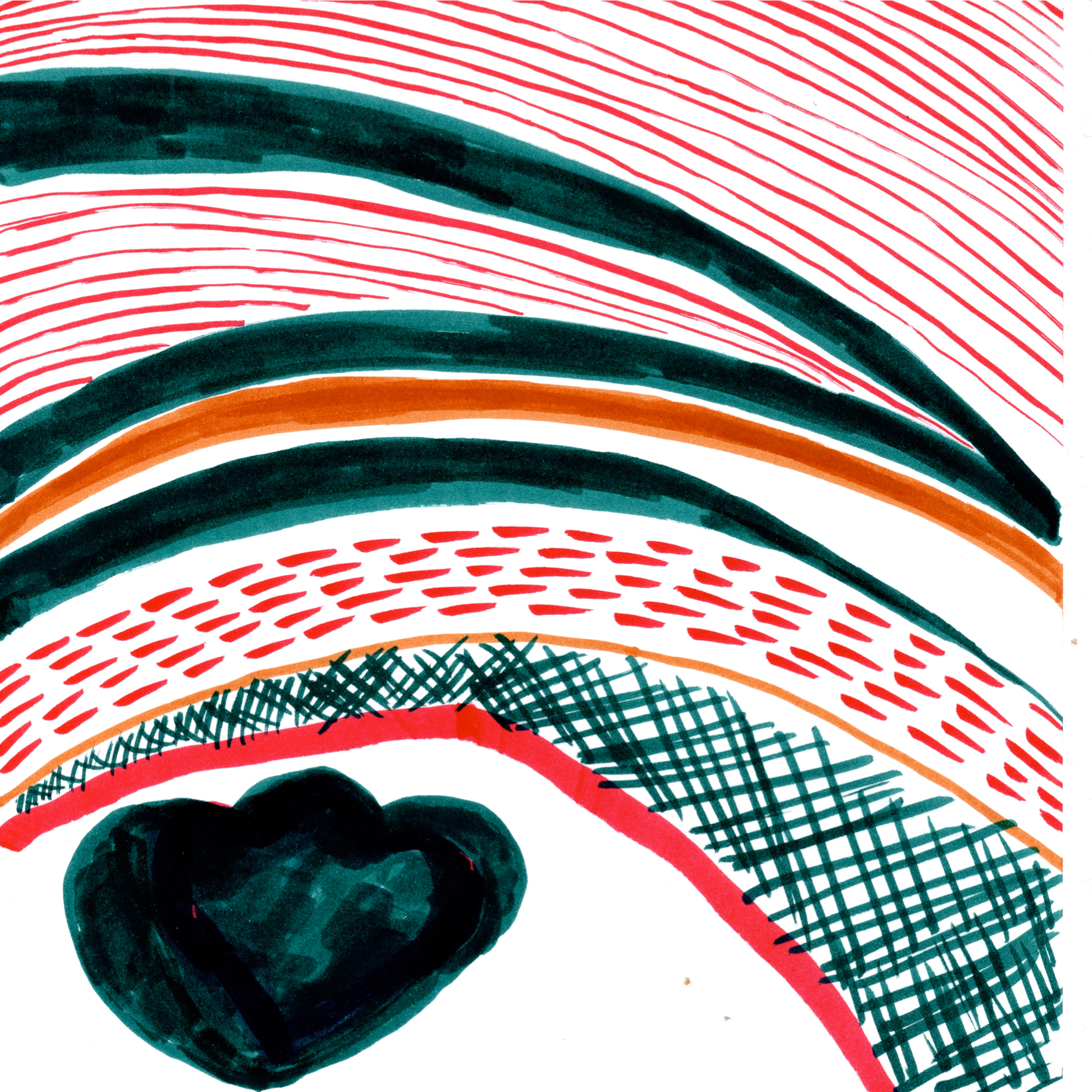
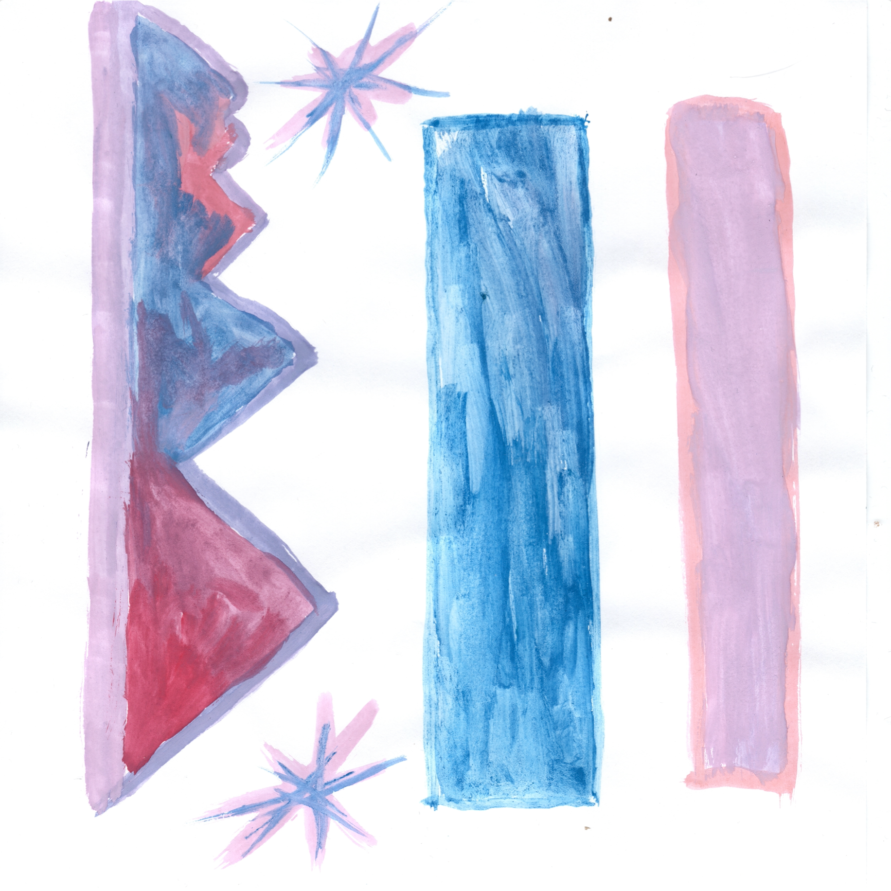
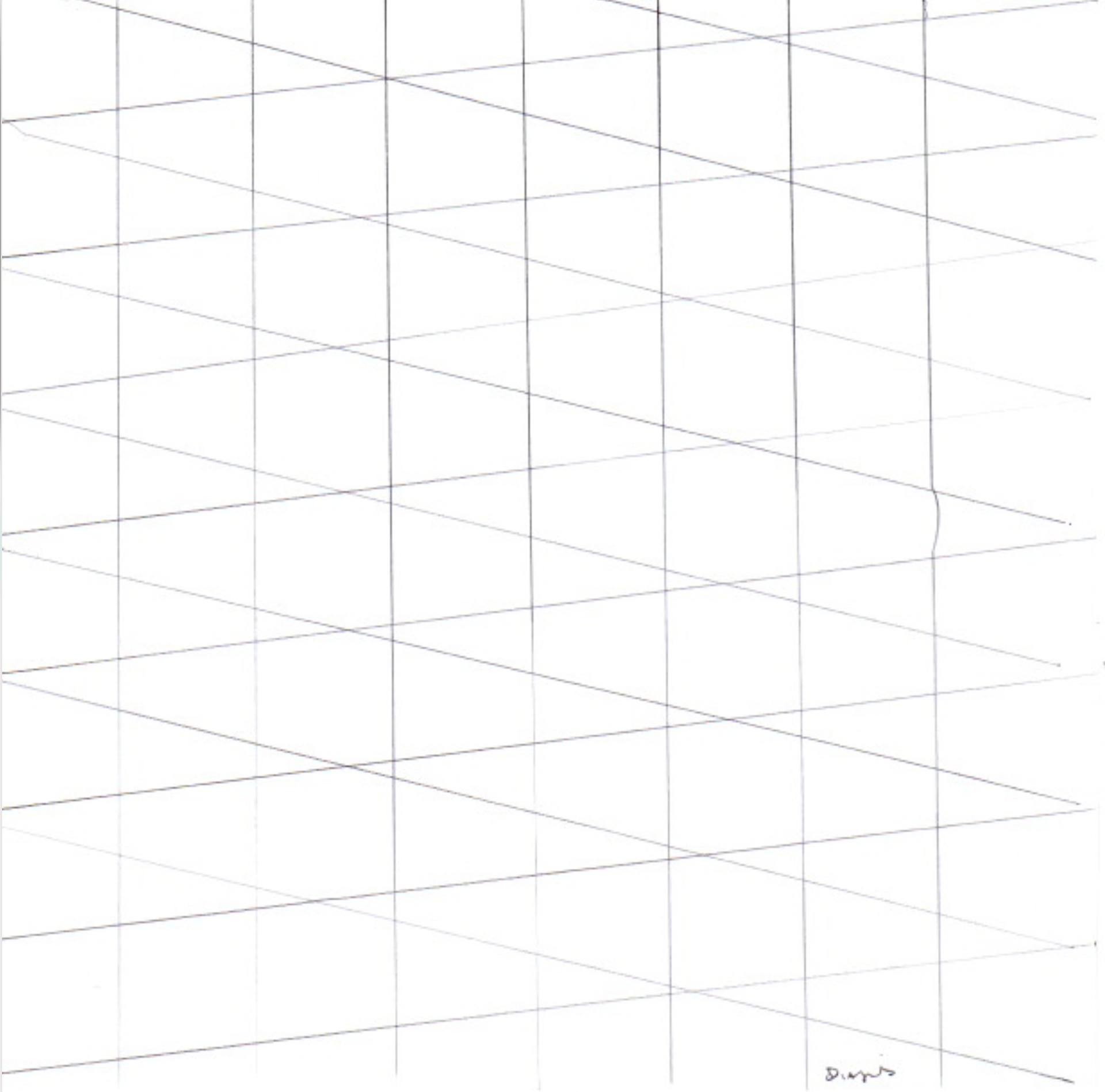
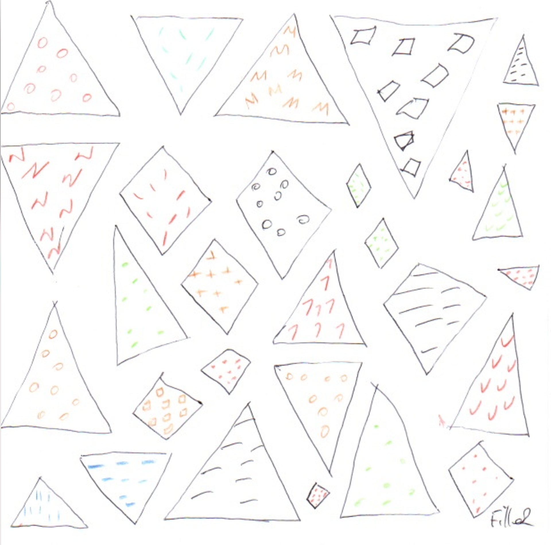
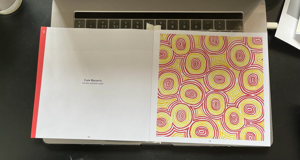
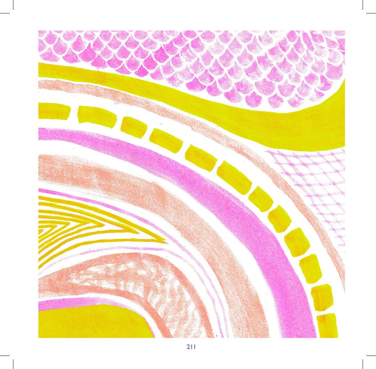
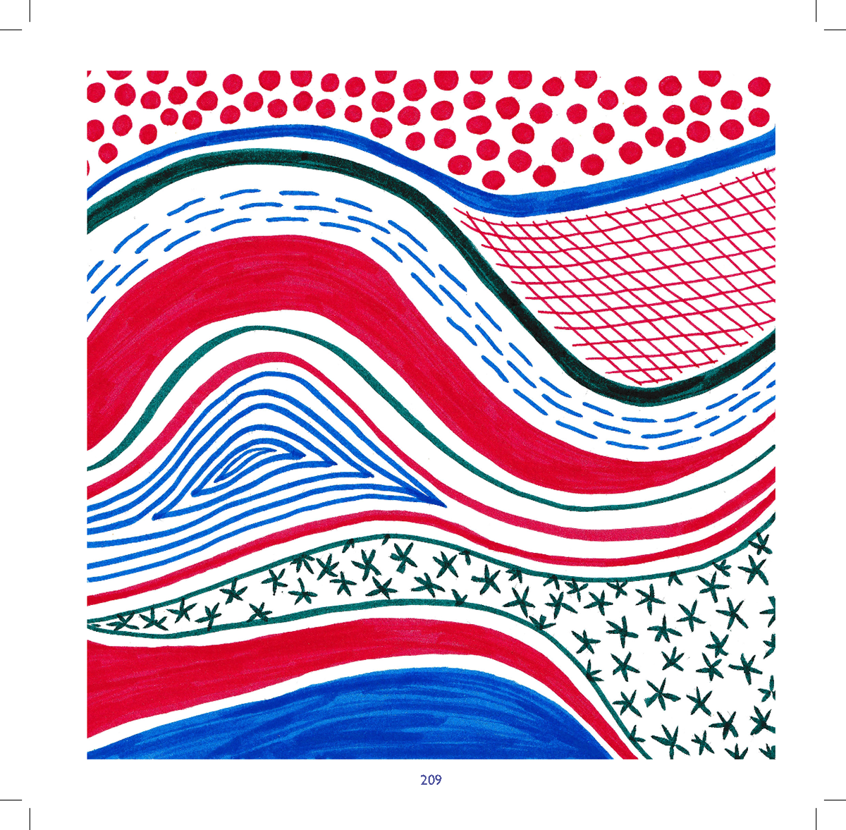
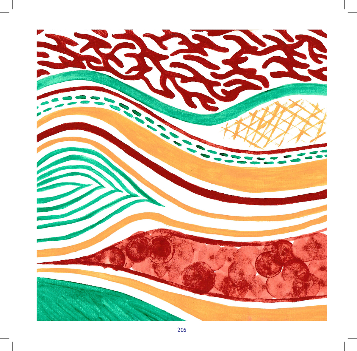
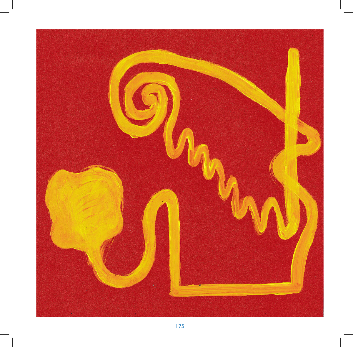
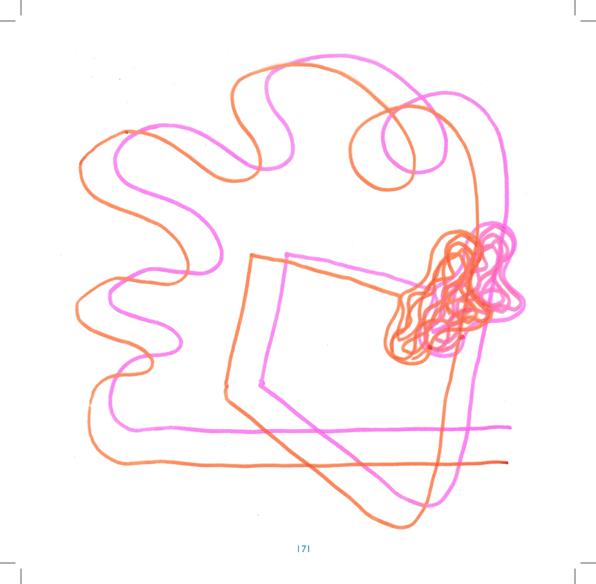
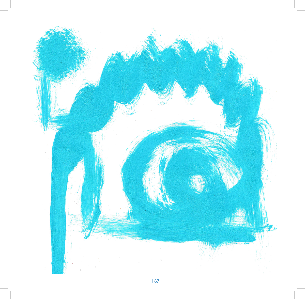
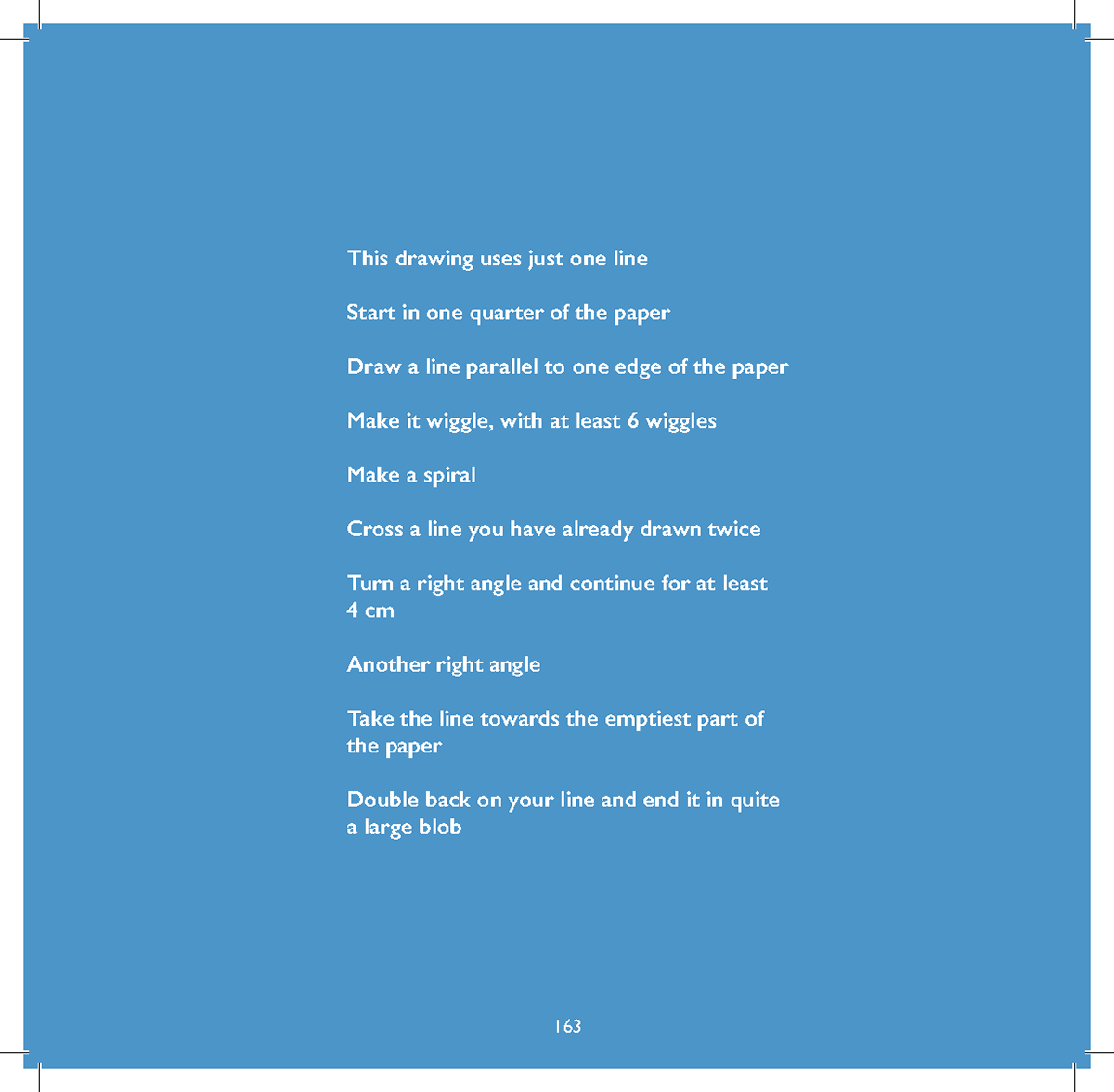
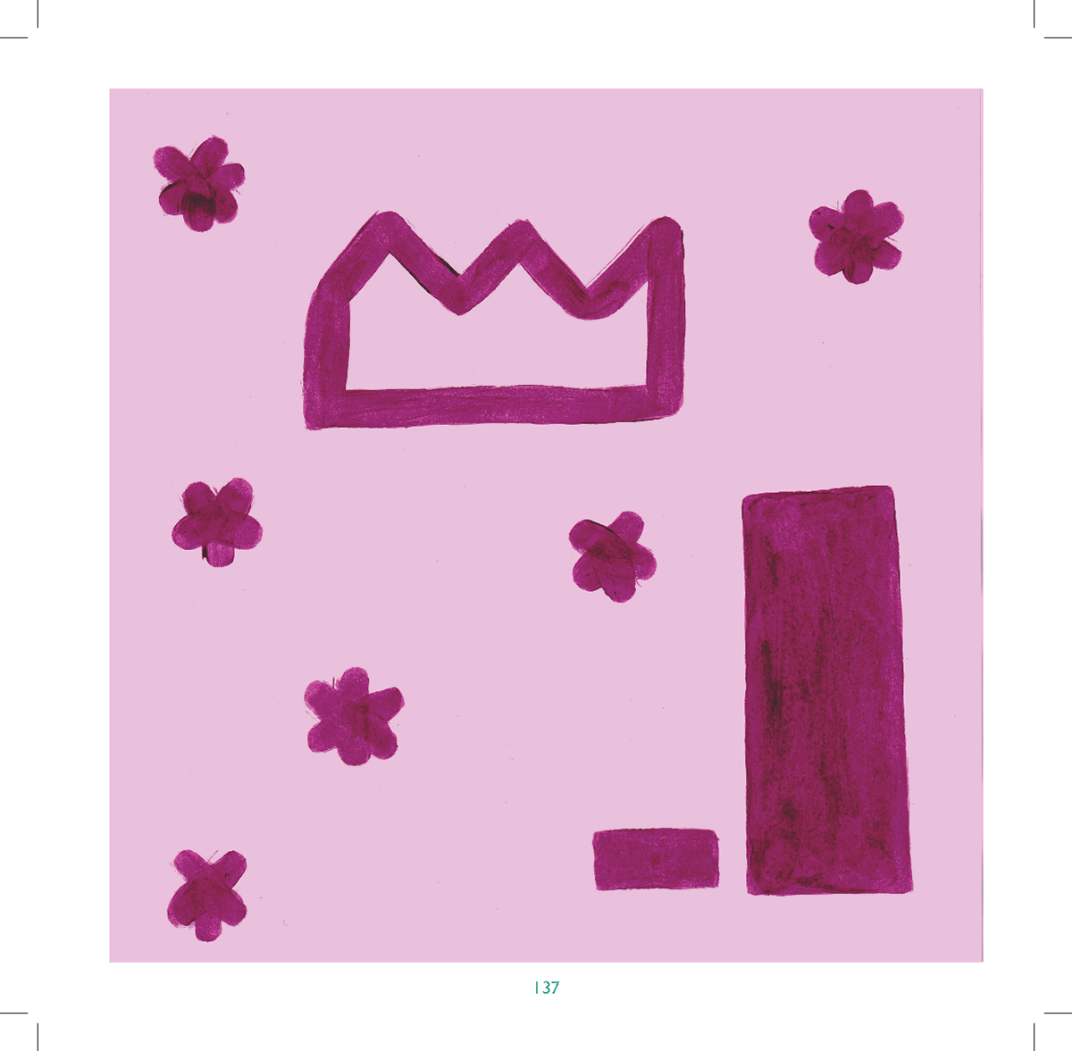
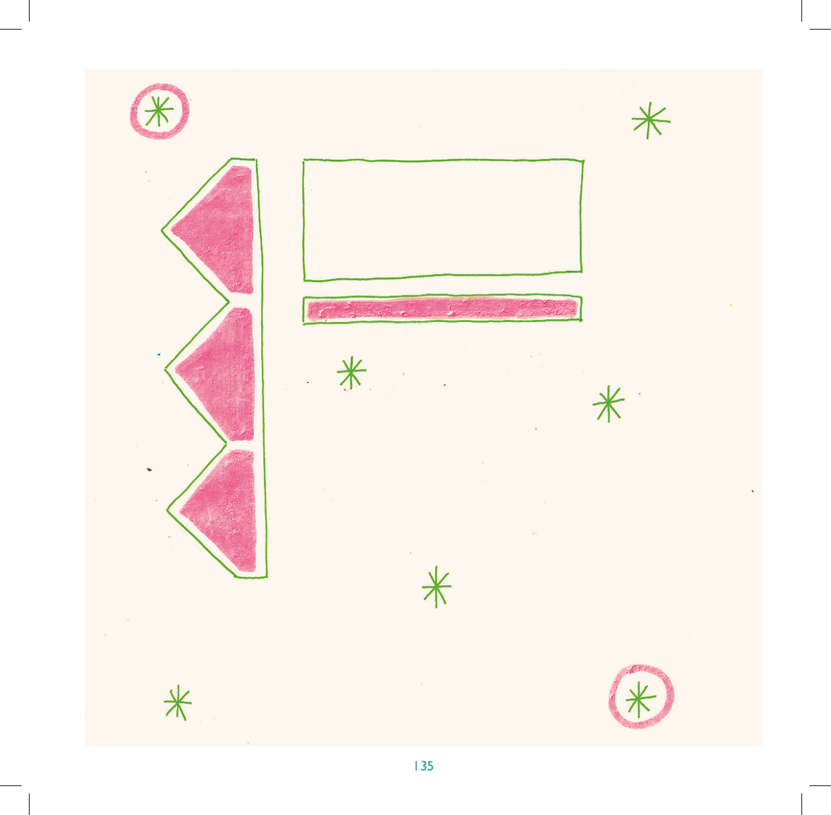
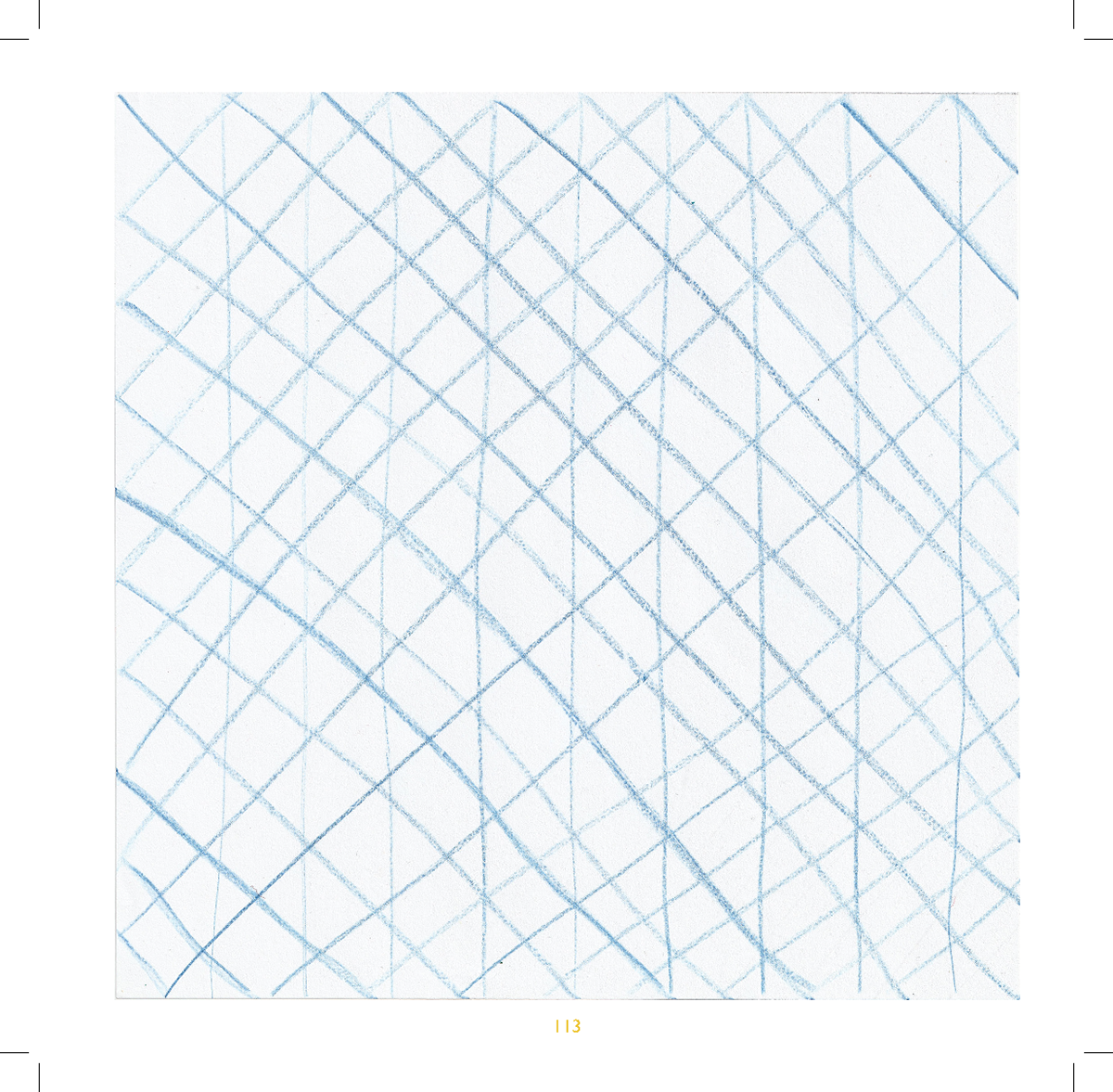
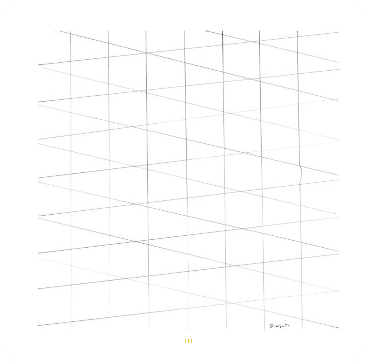
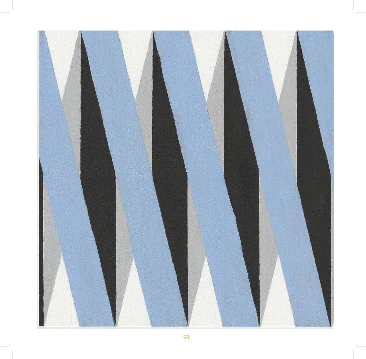
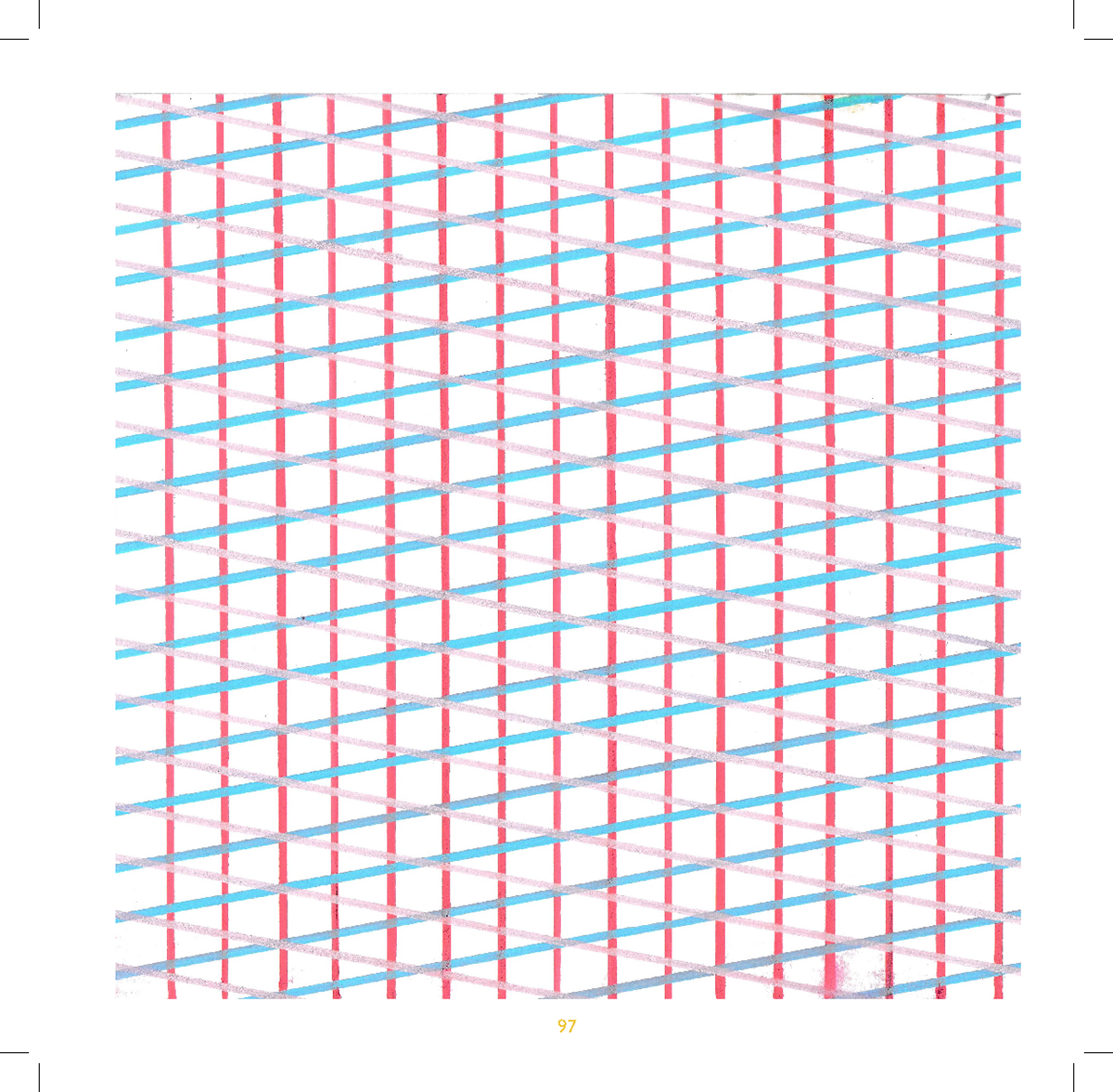
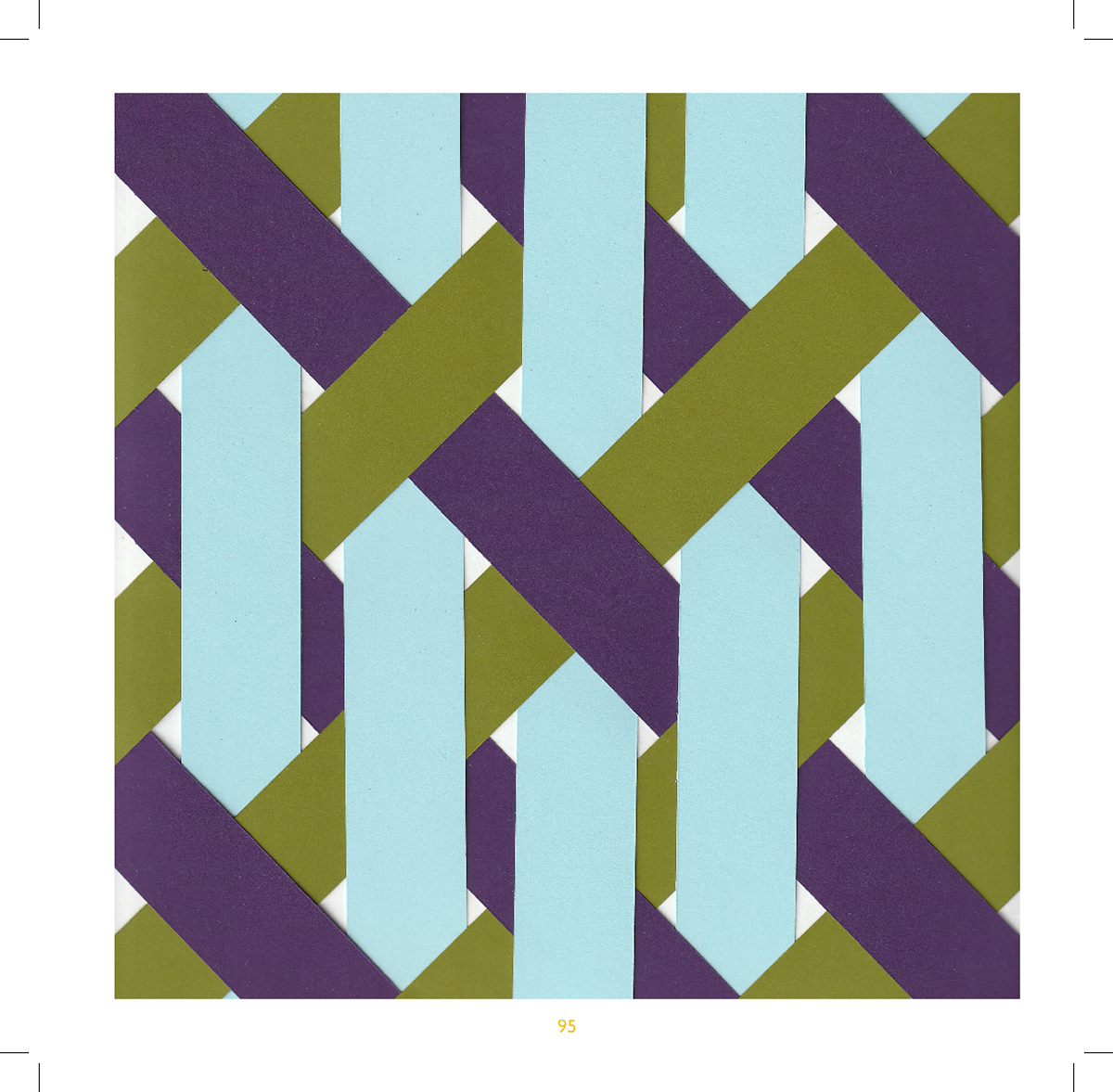
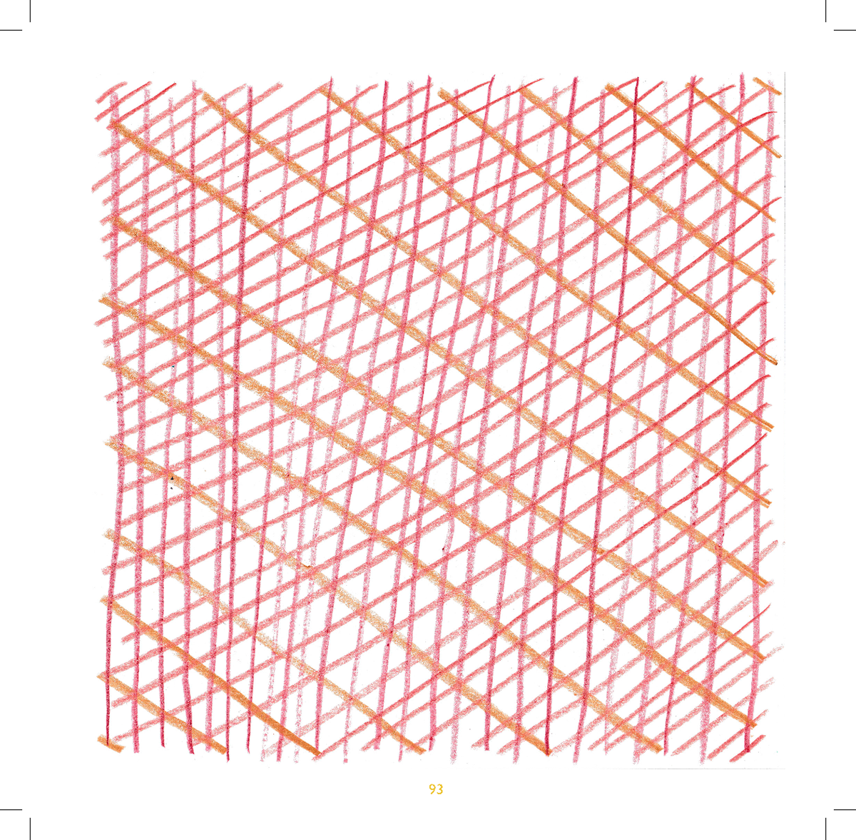
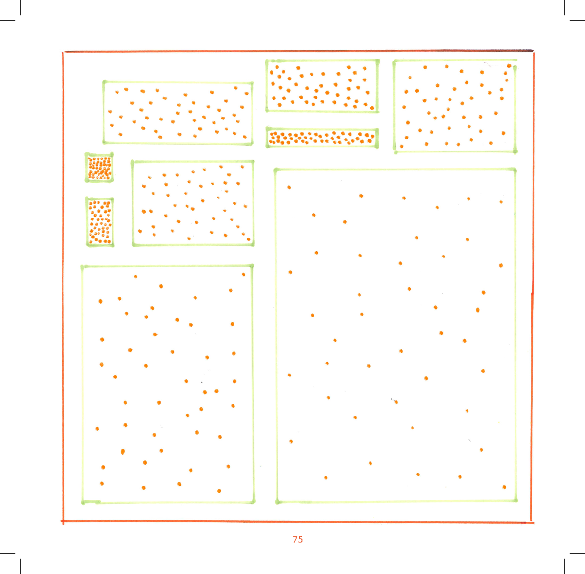
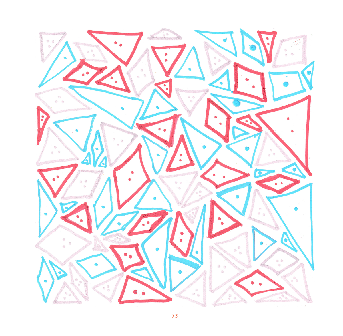
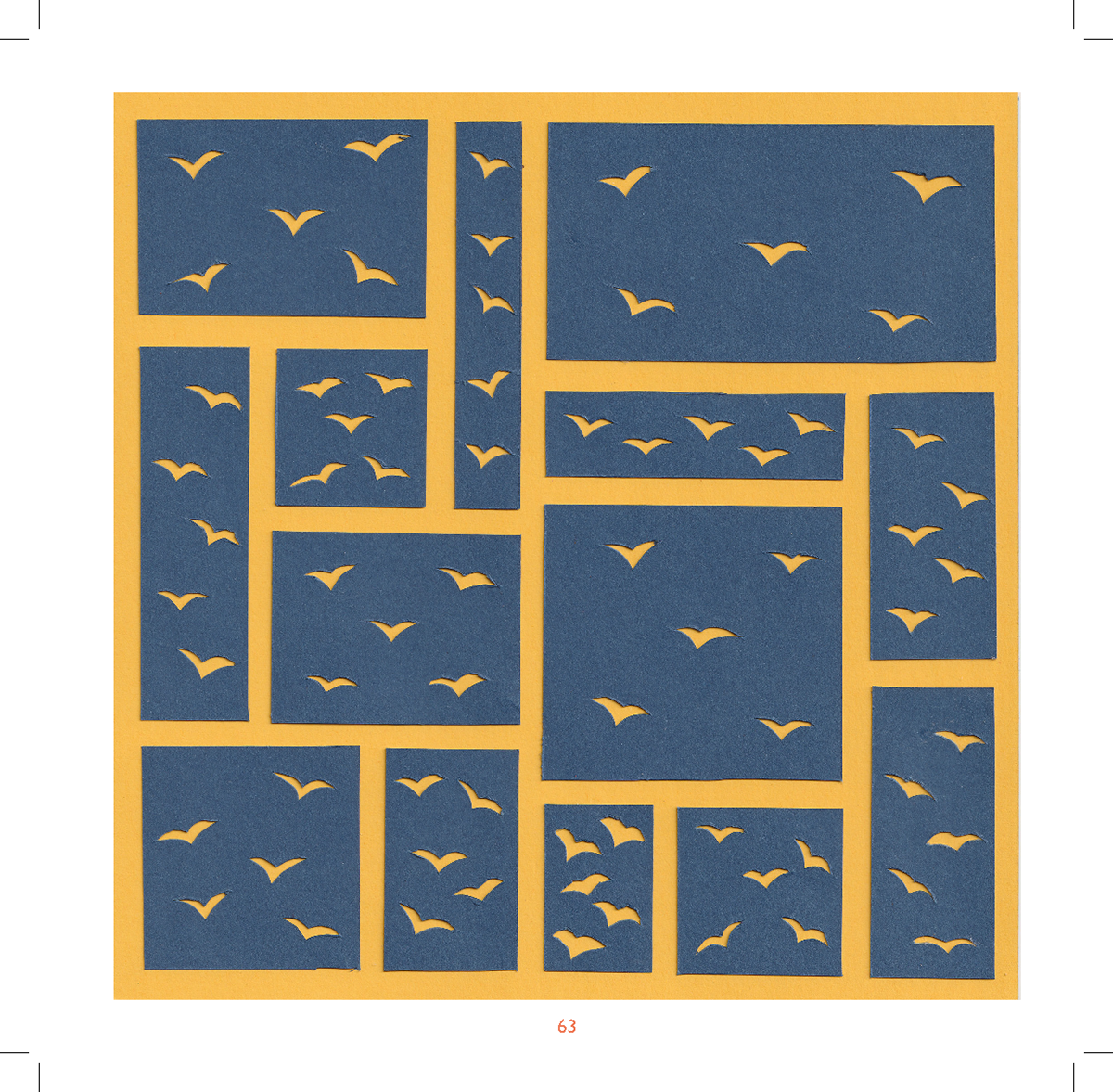
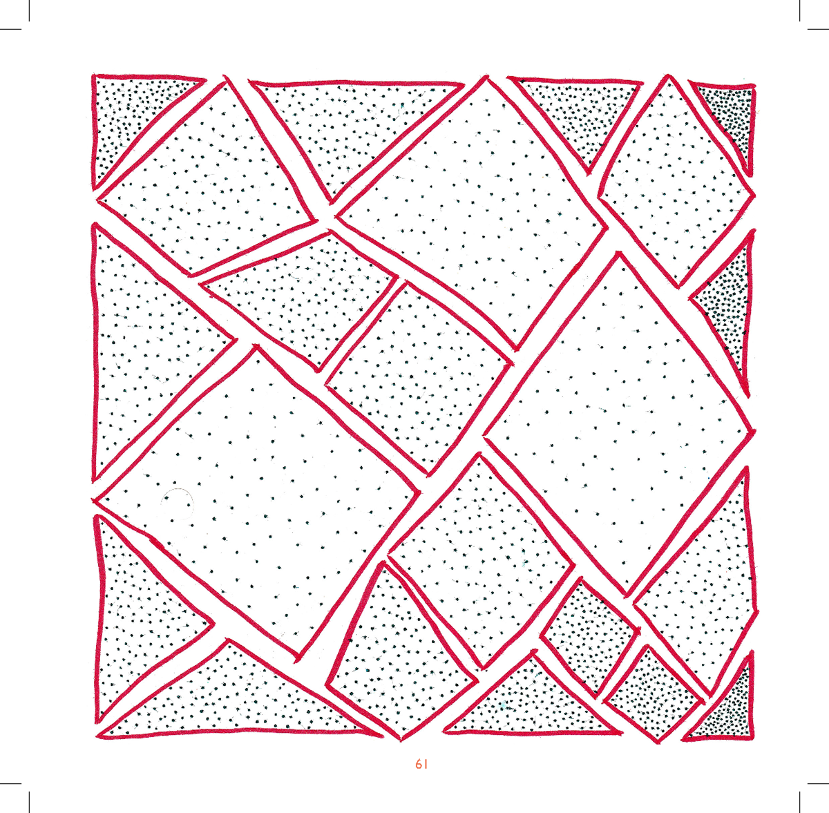
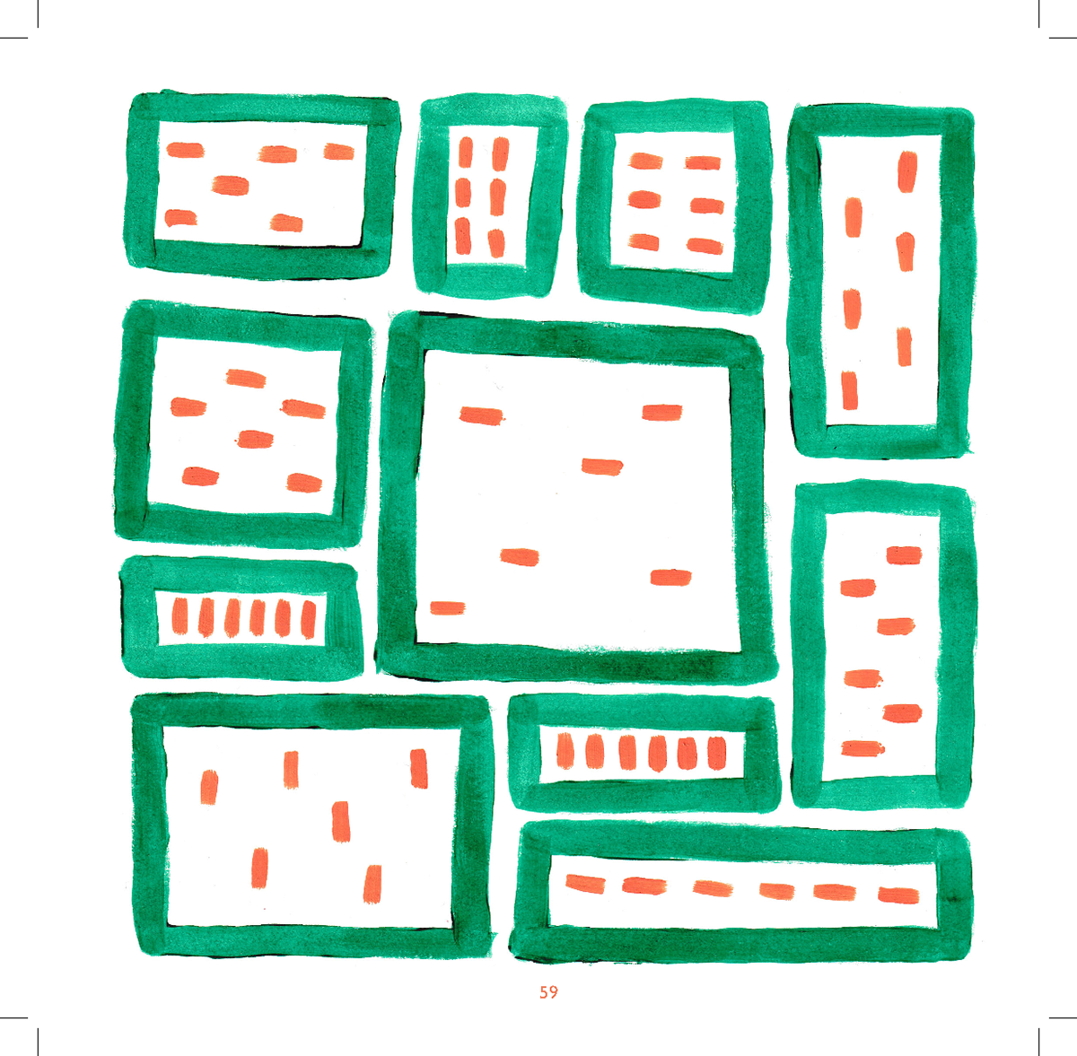
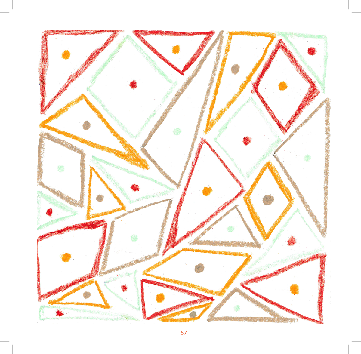
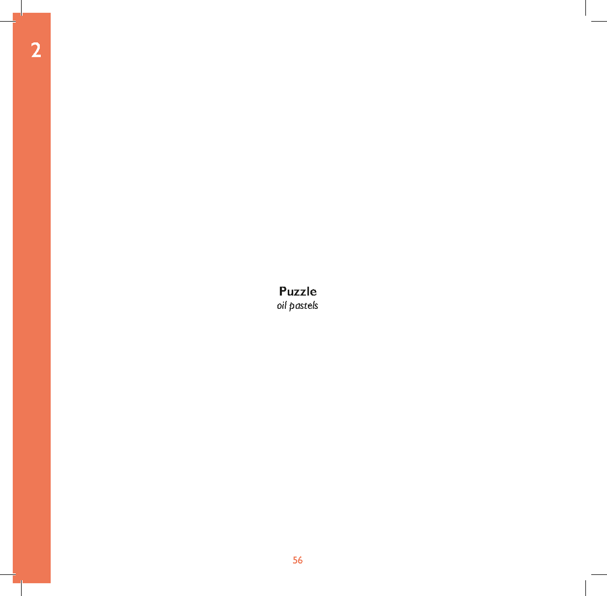
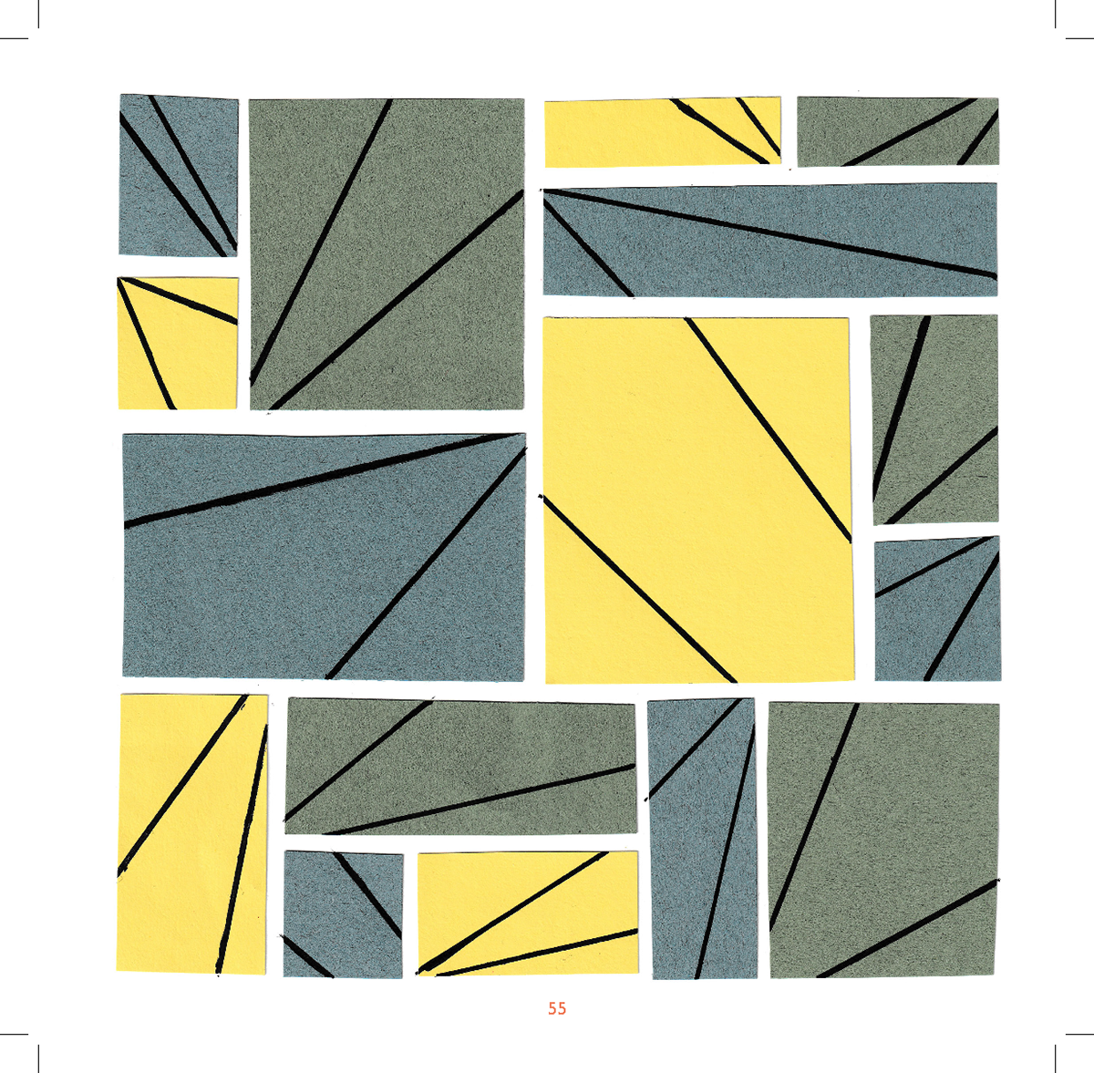
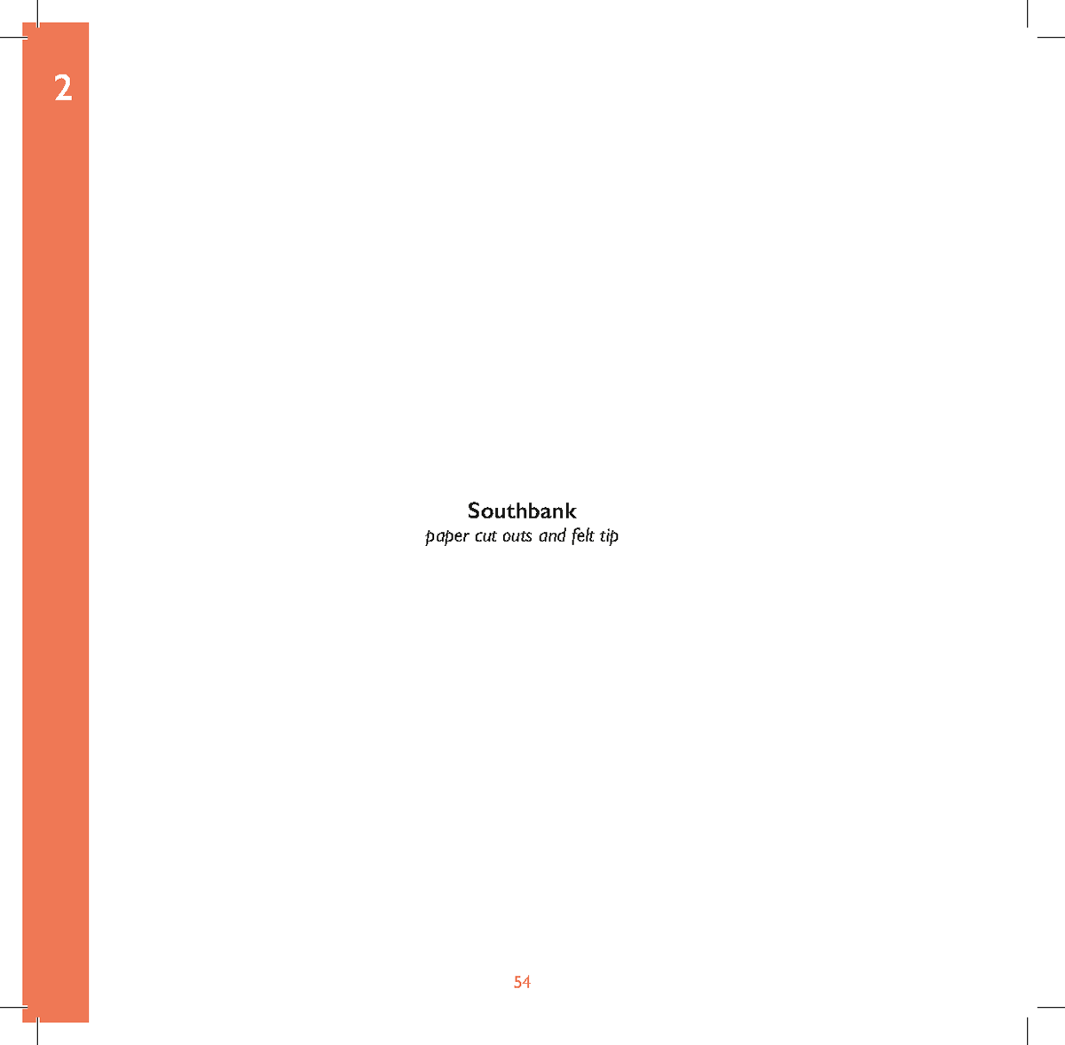
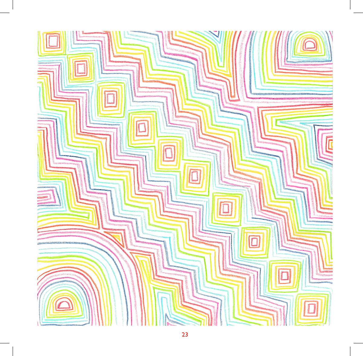
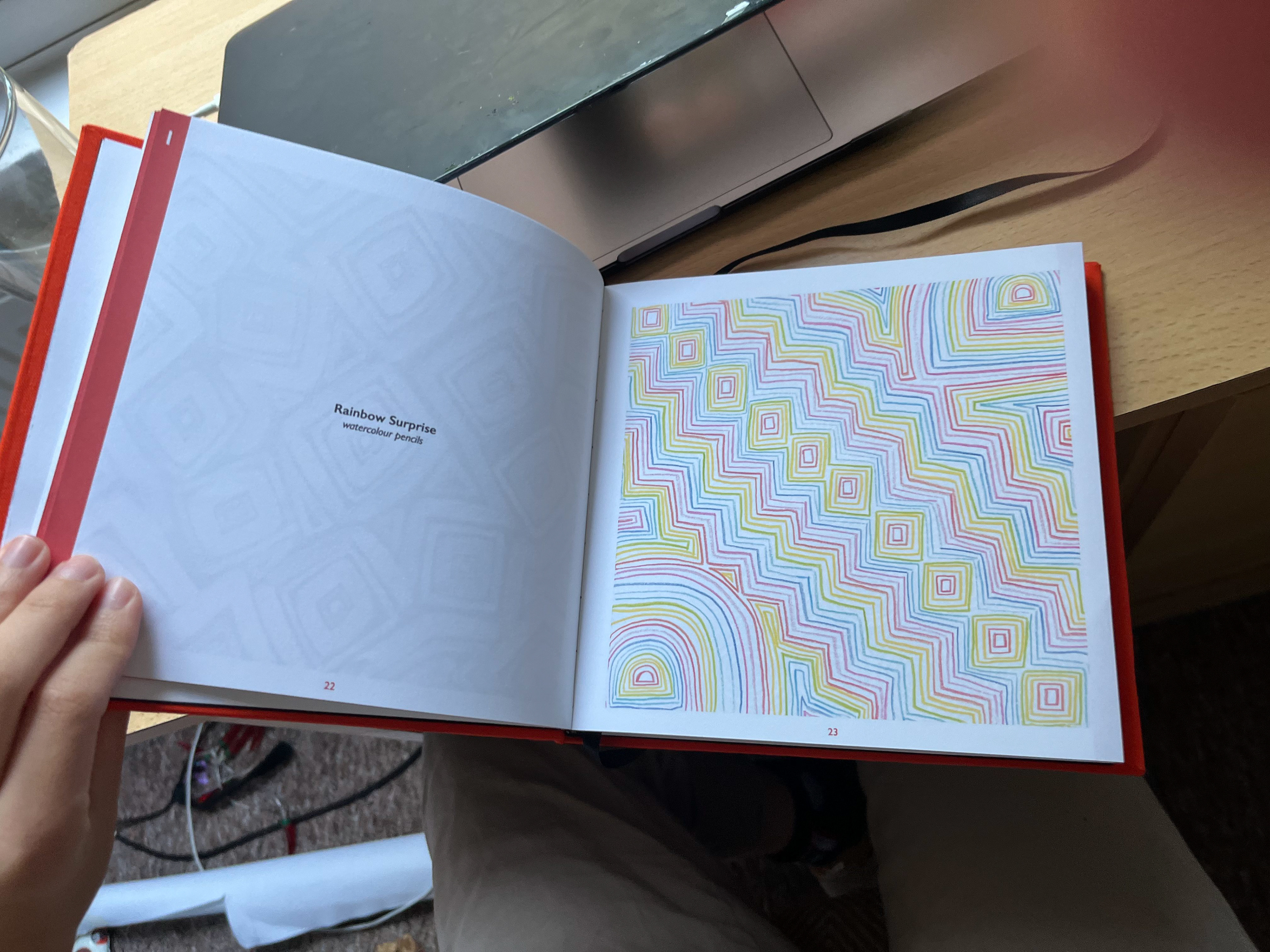
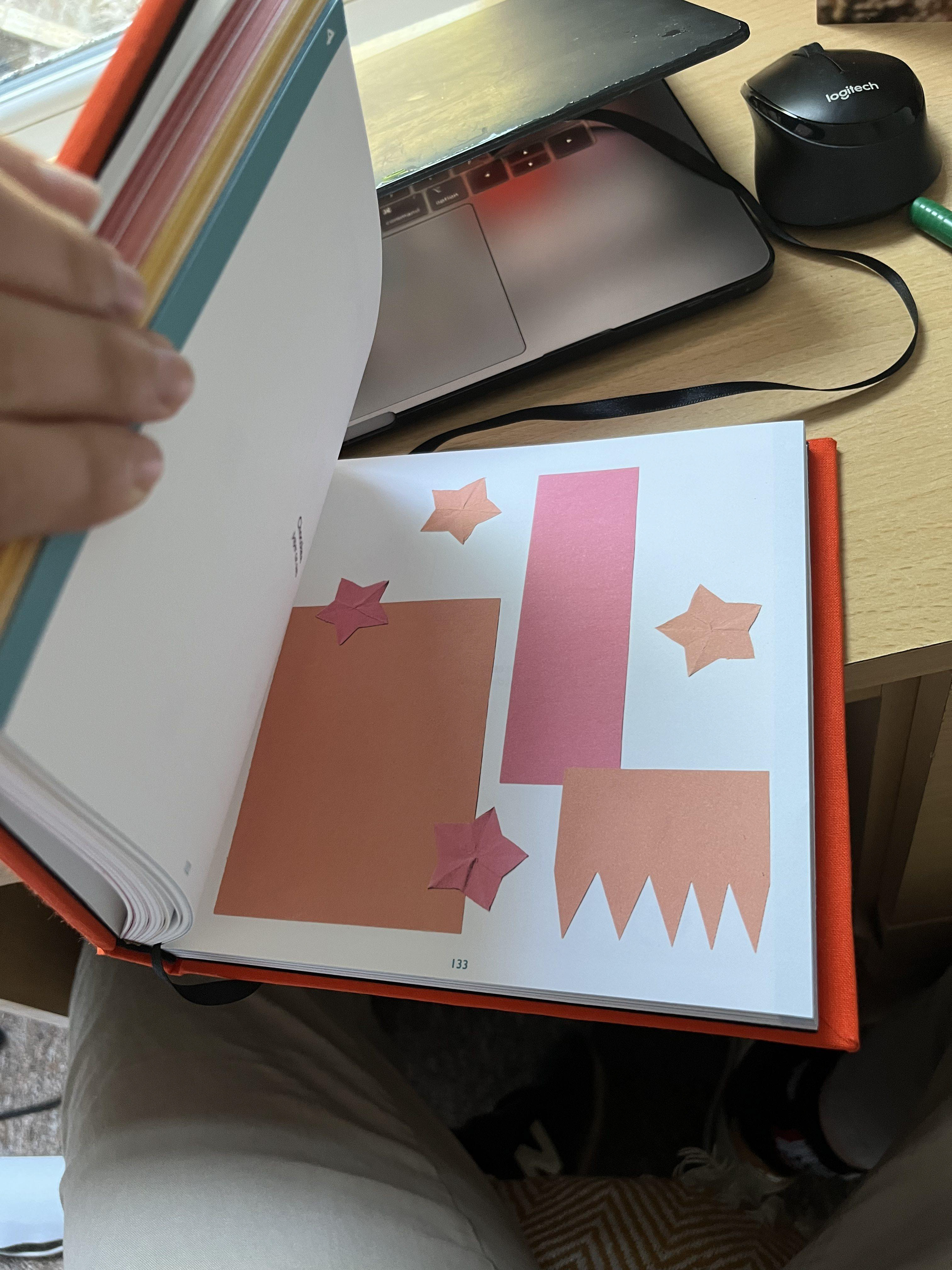
My Final Pieces
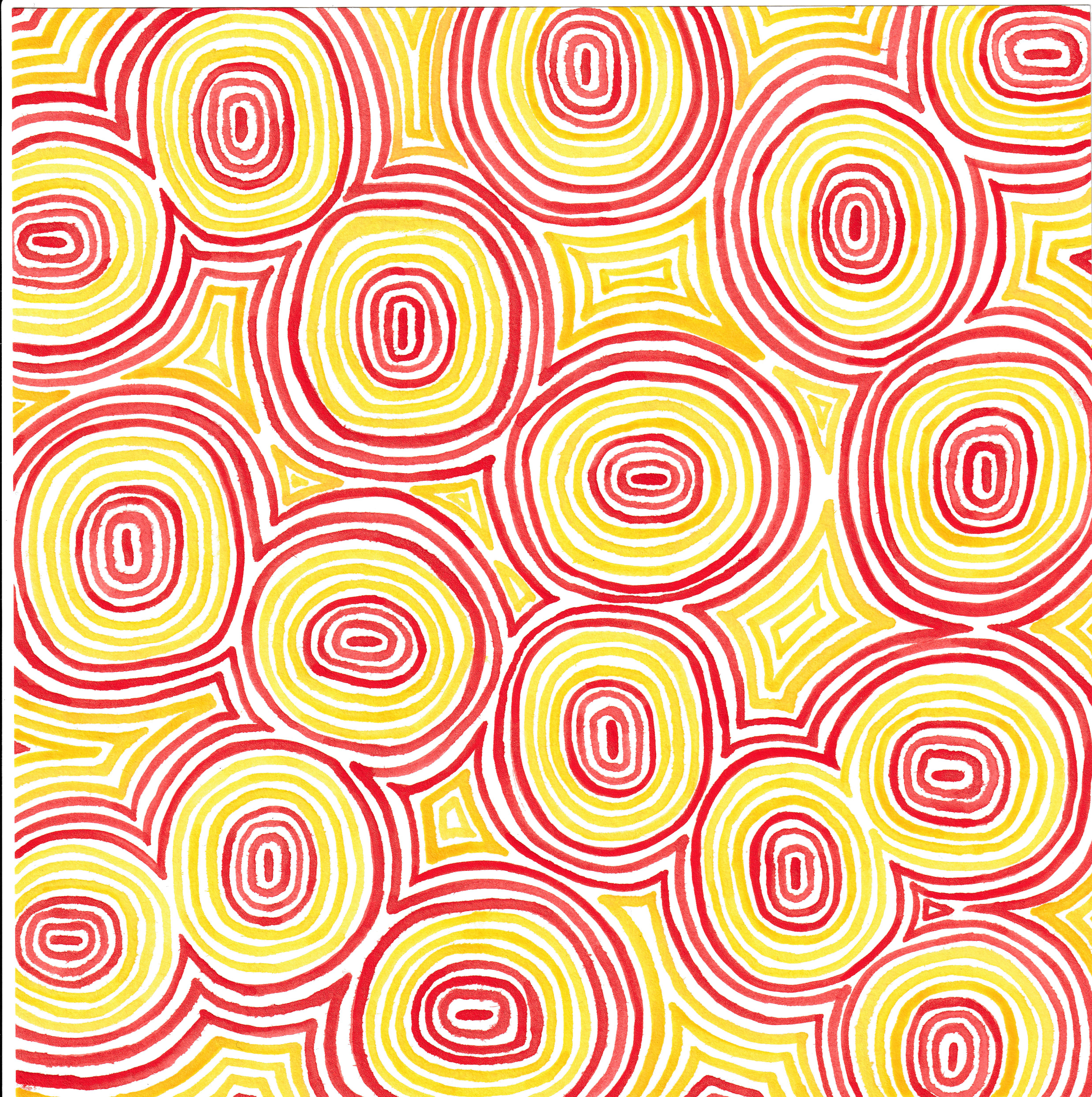
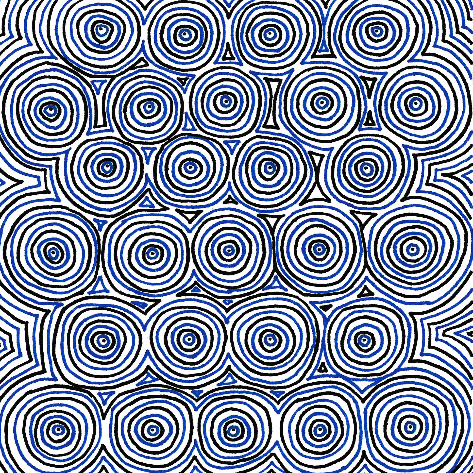
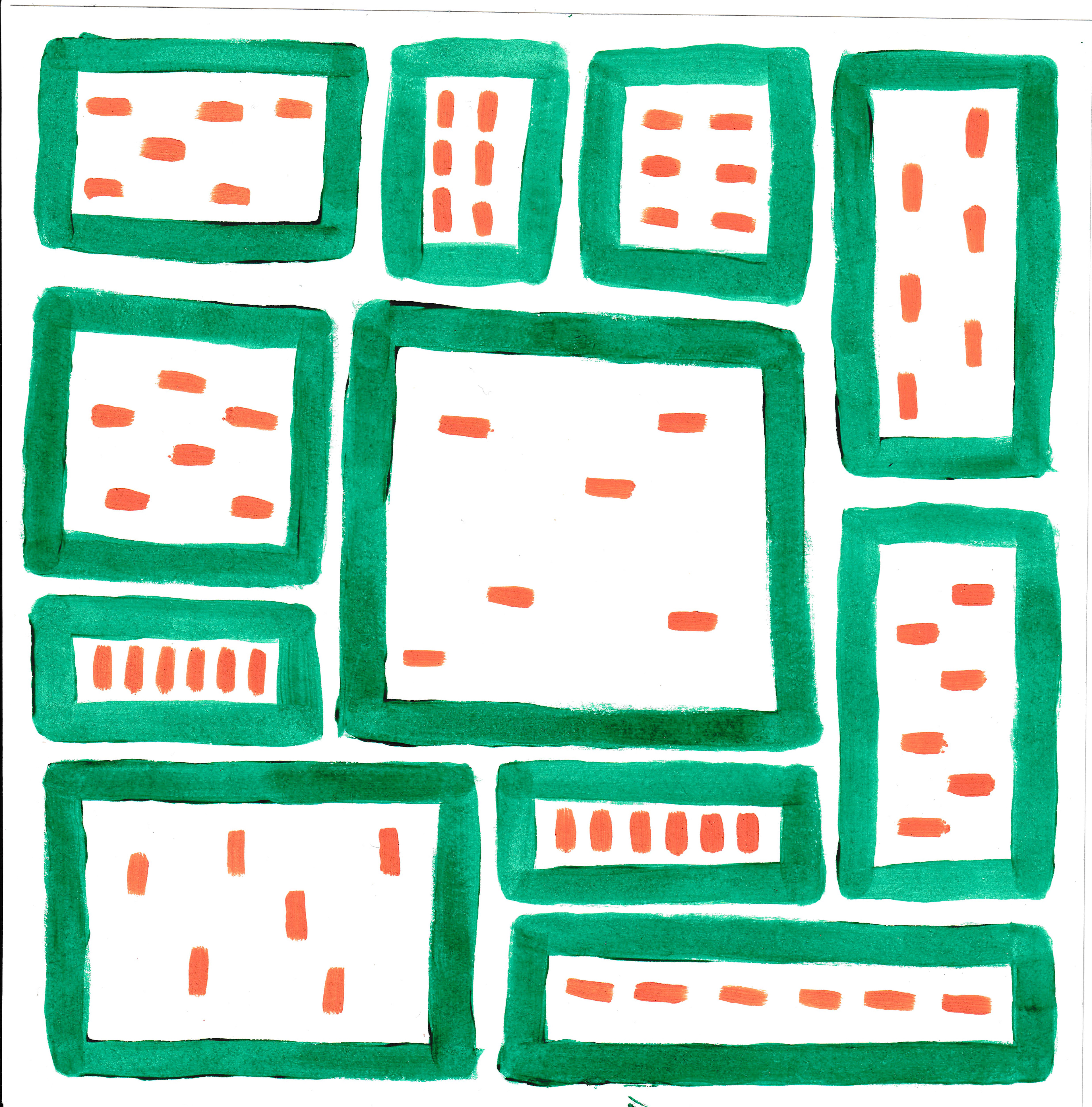
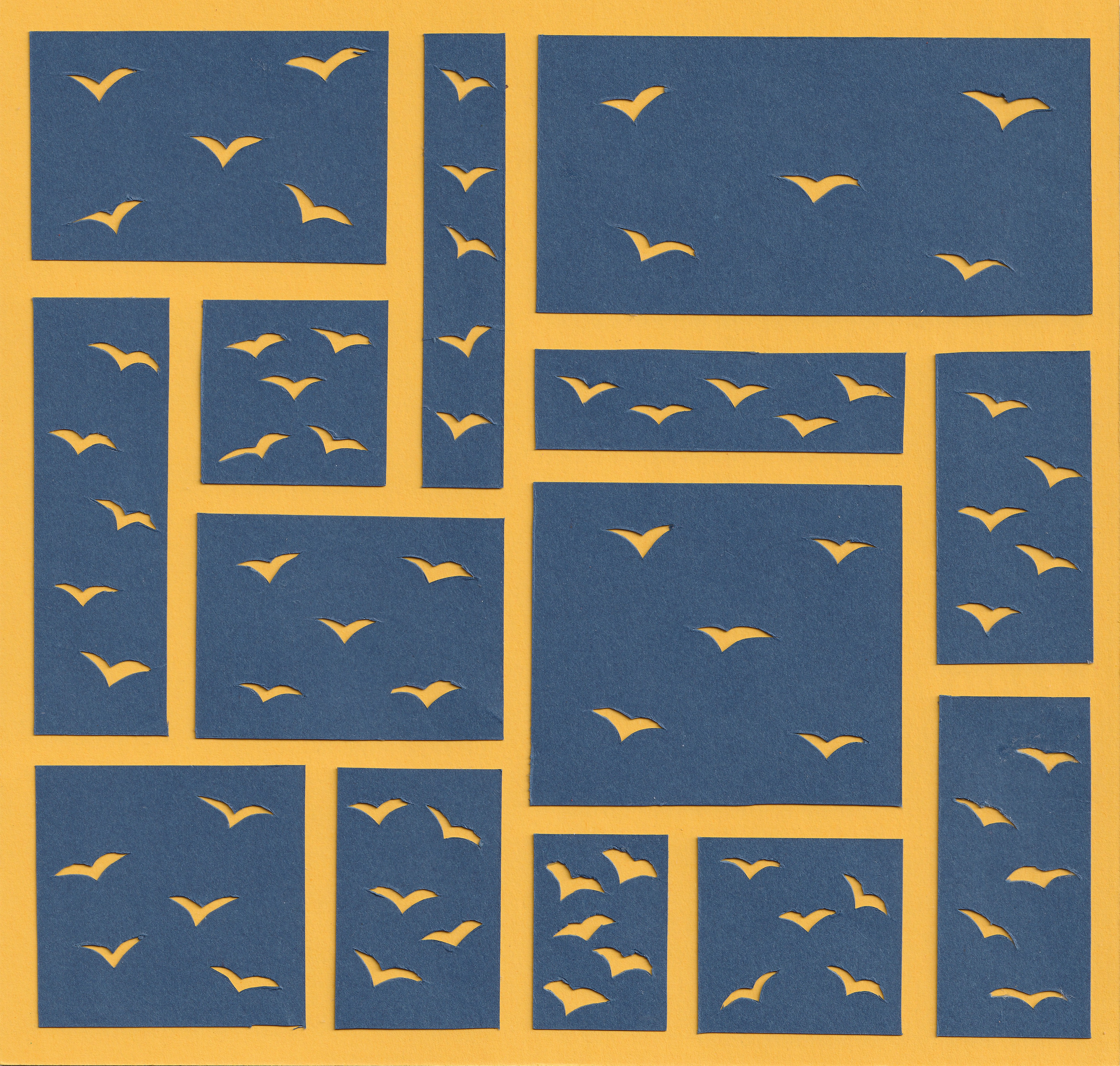


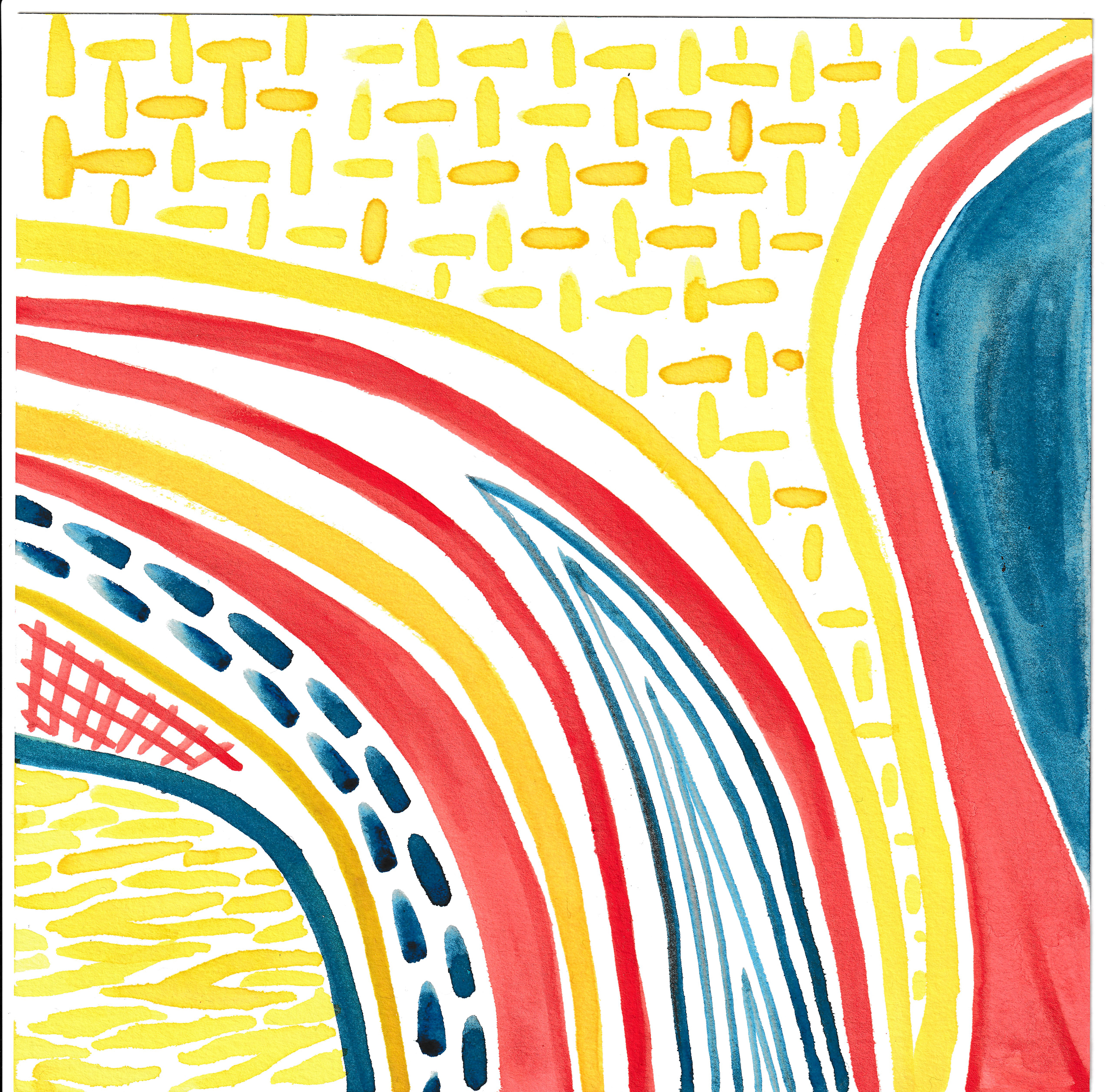
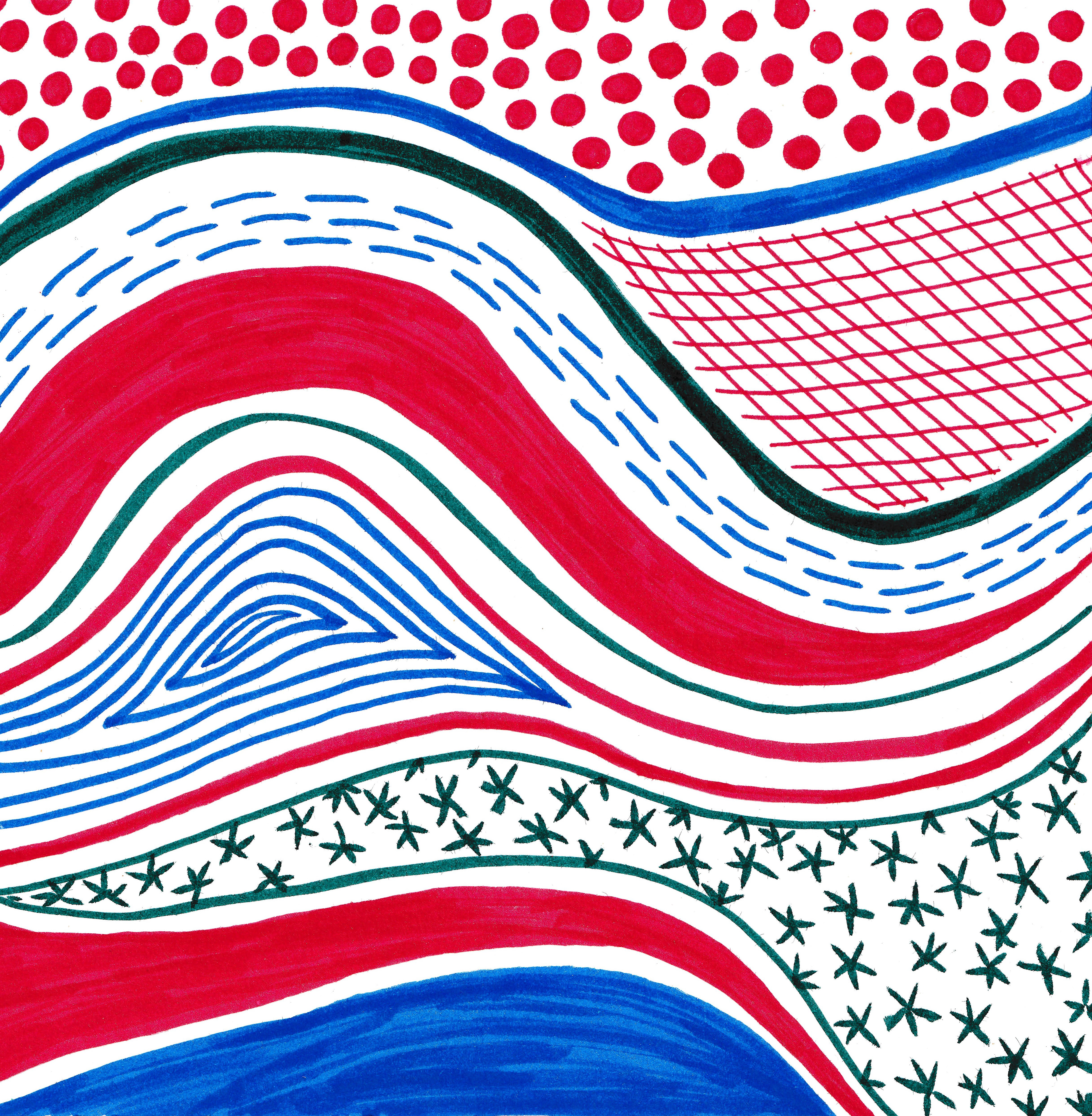

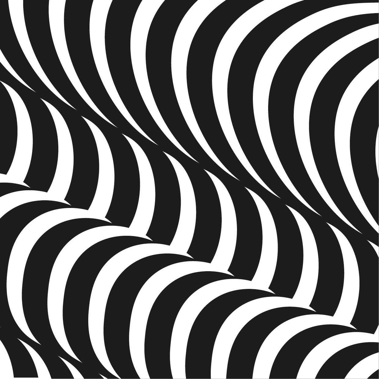
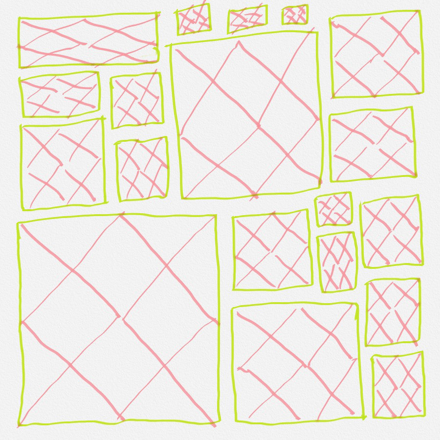
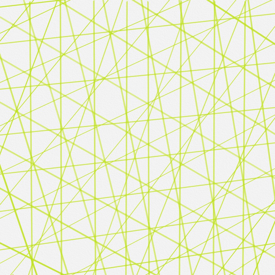
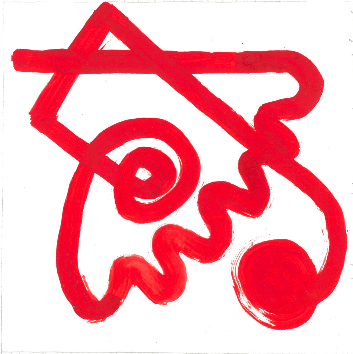
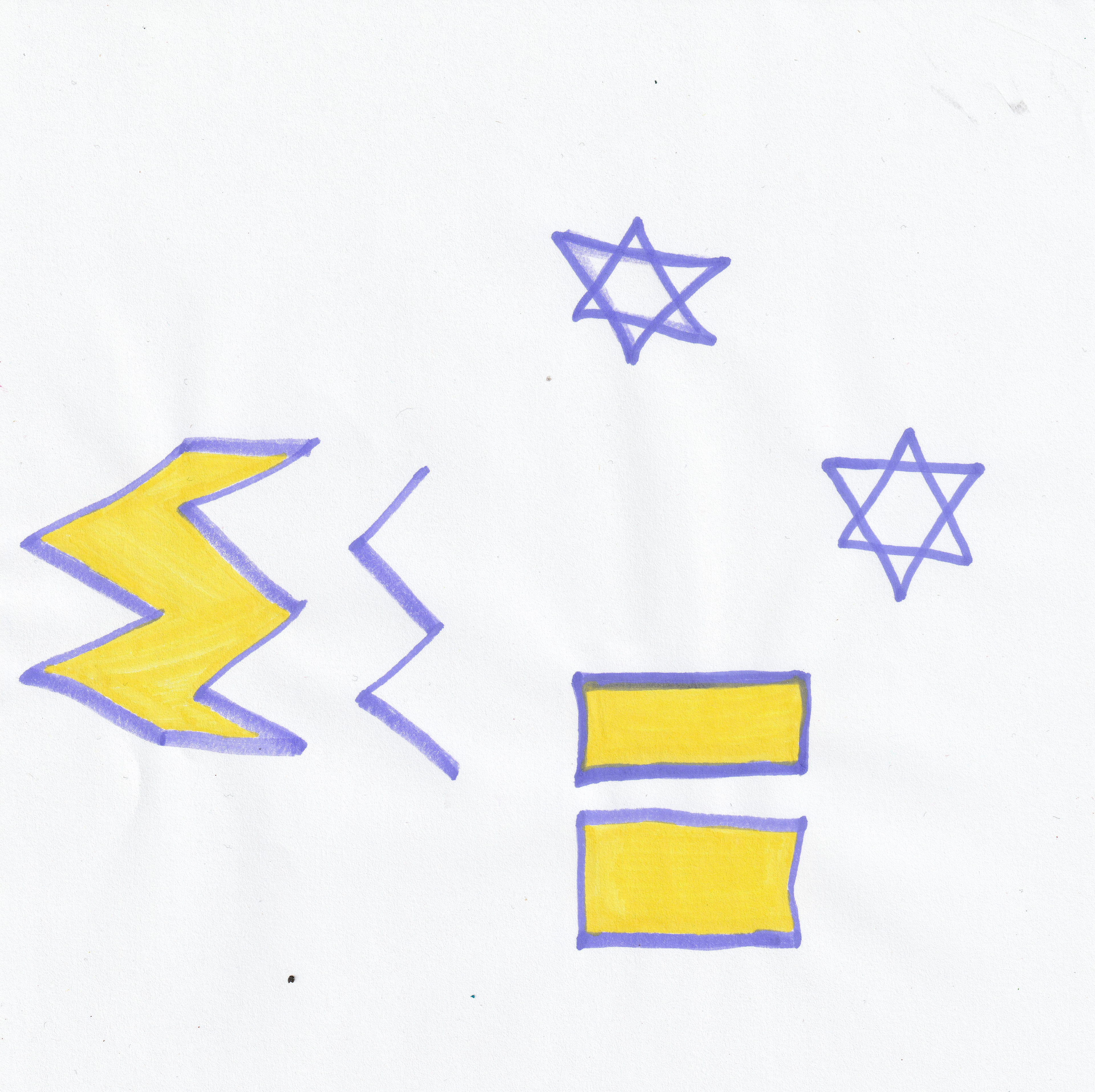
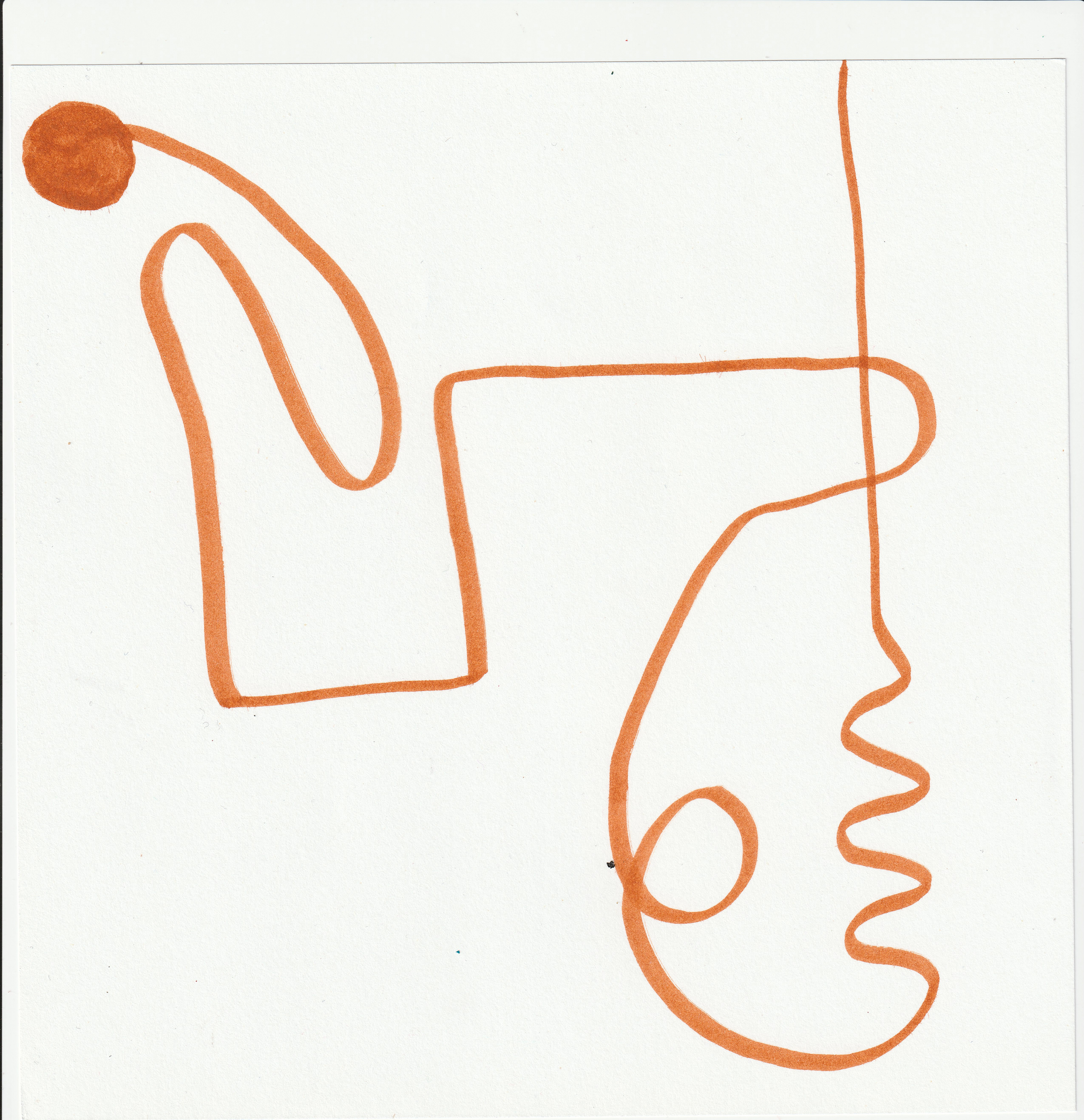
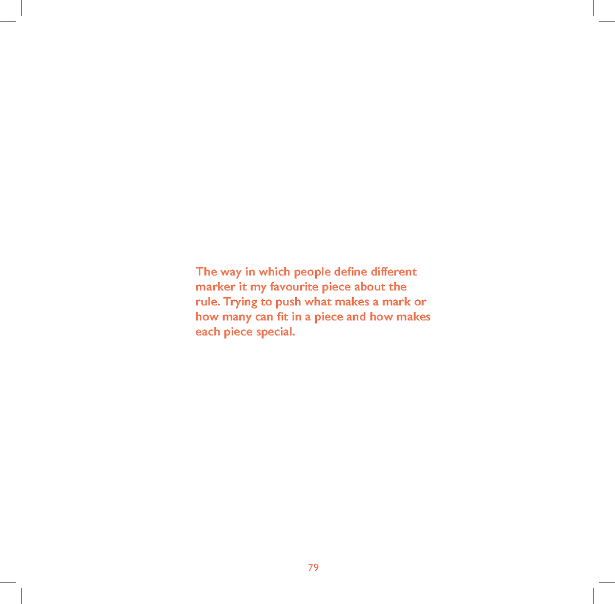
These are my responses to the rules. I enjoyed to process of being able to focus on one this and I was able to experiment with trying different mediums and styles. I tried changing styles and seeing how I could push the boundaries of the rules.
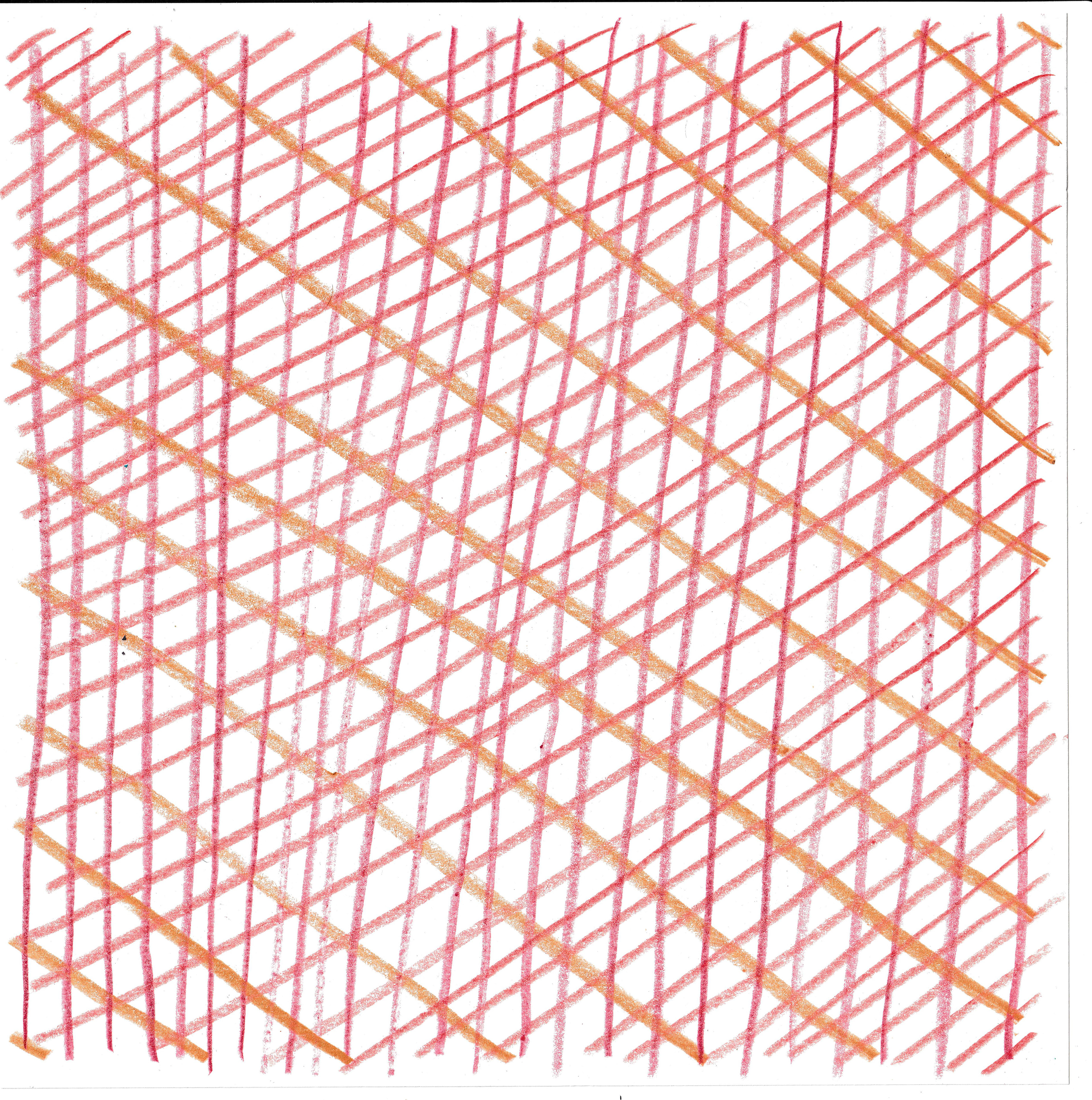
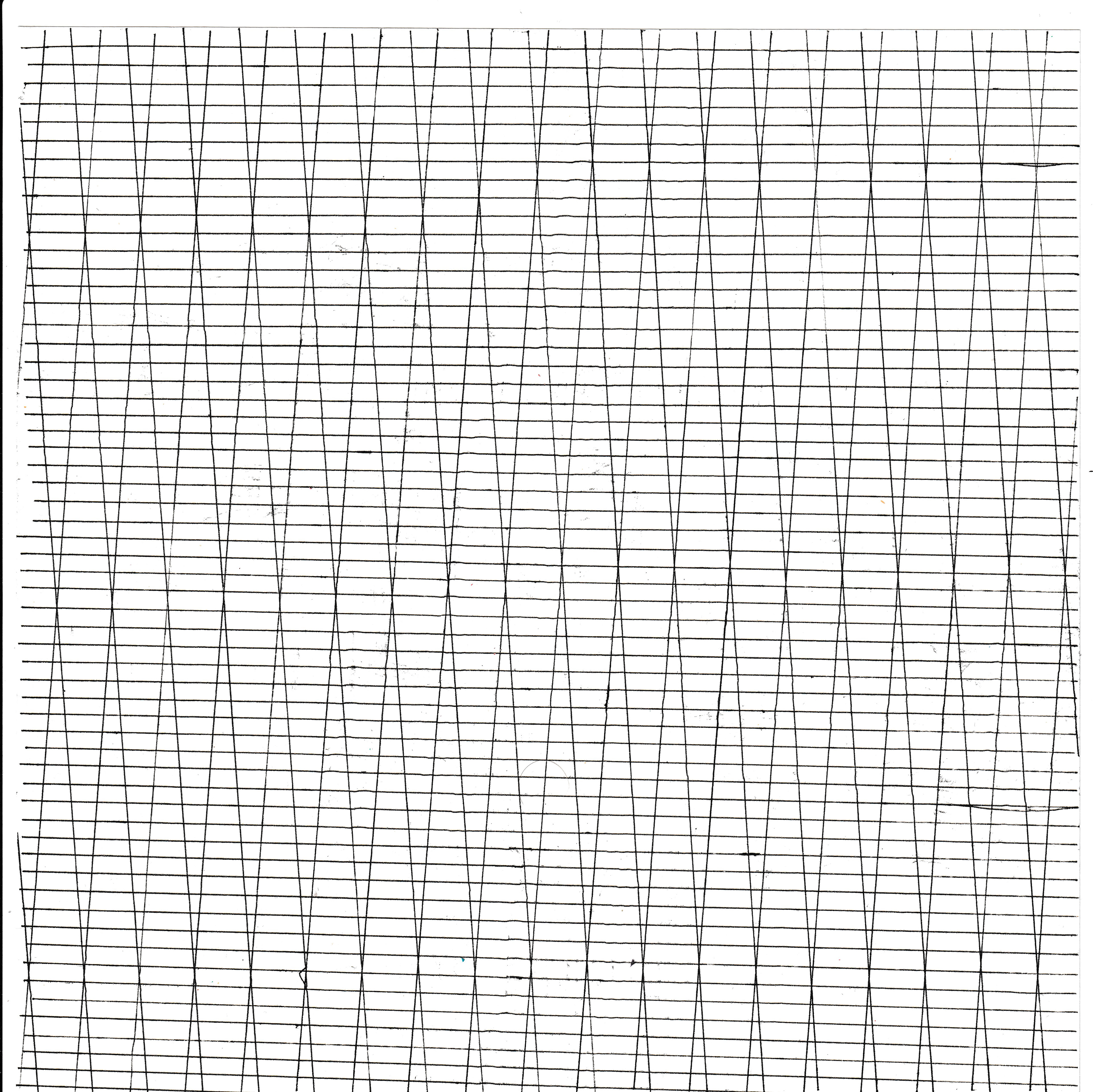
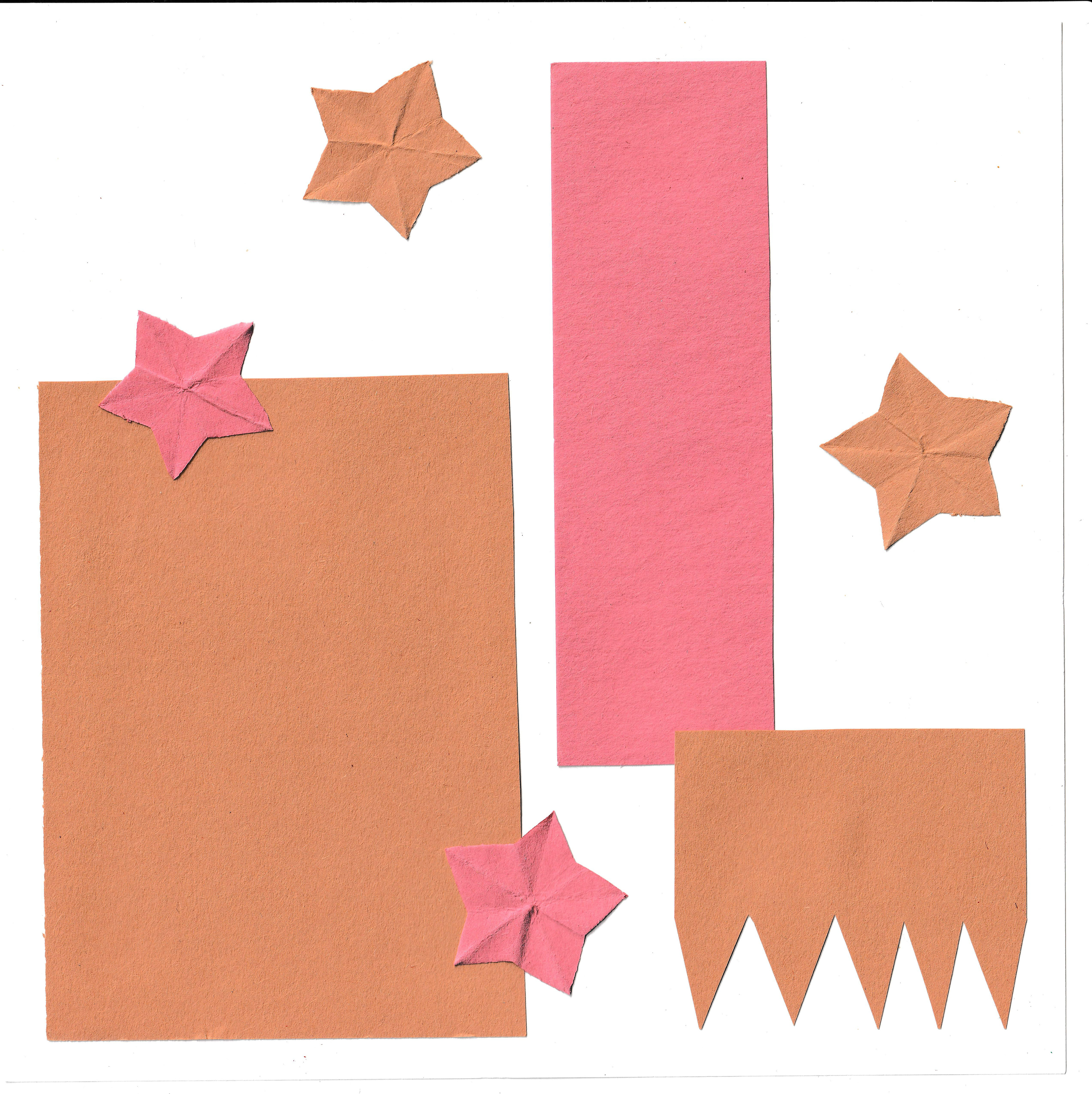
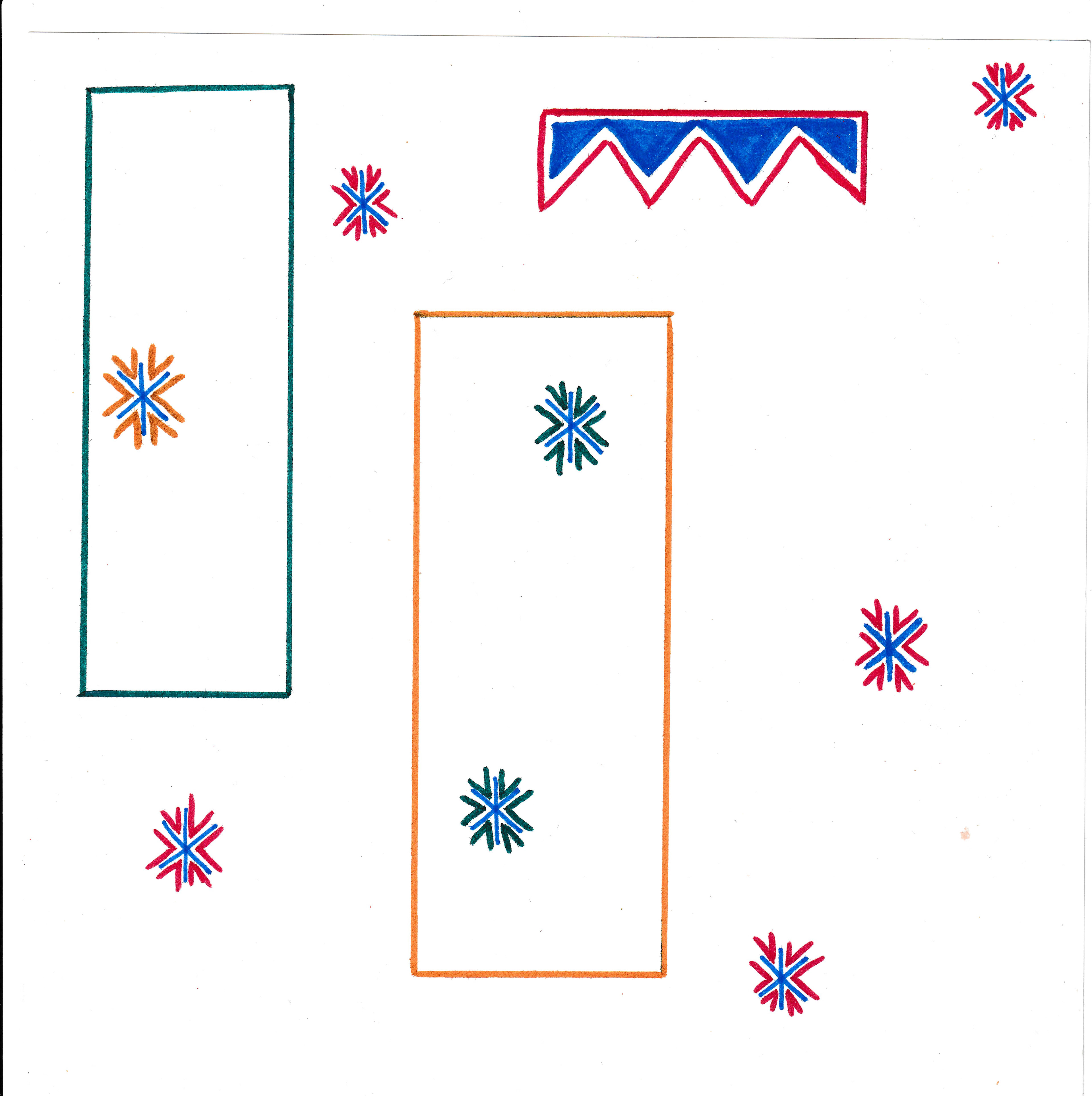
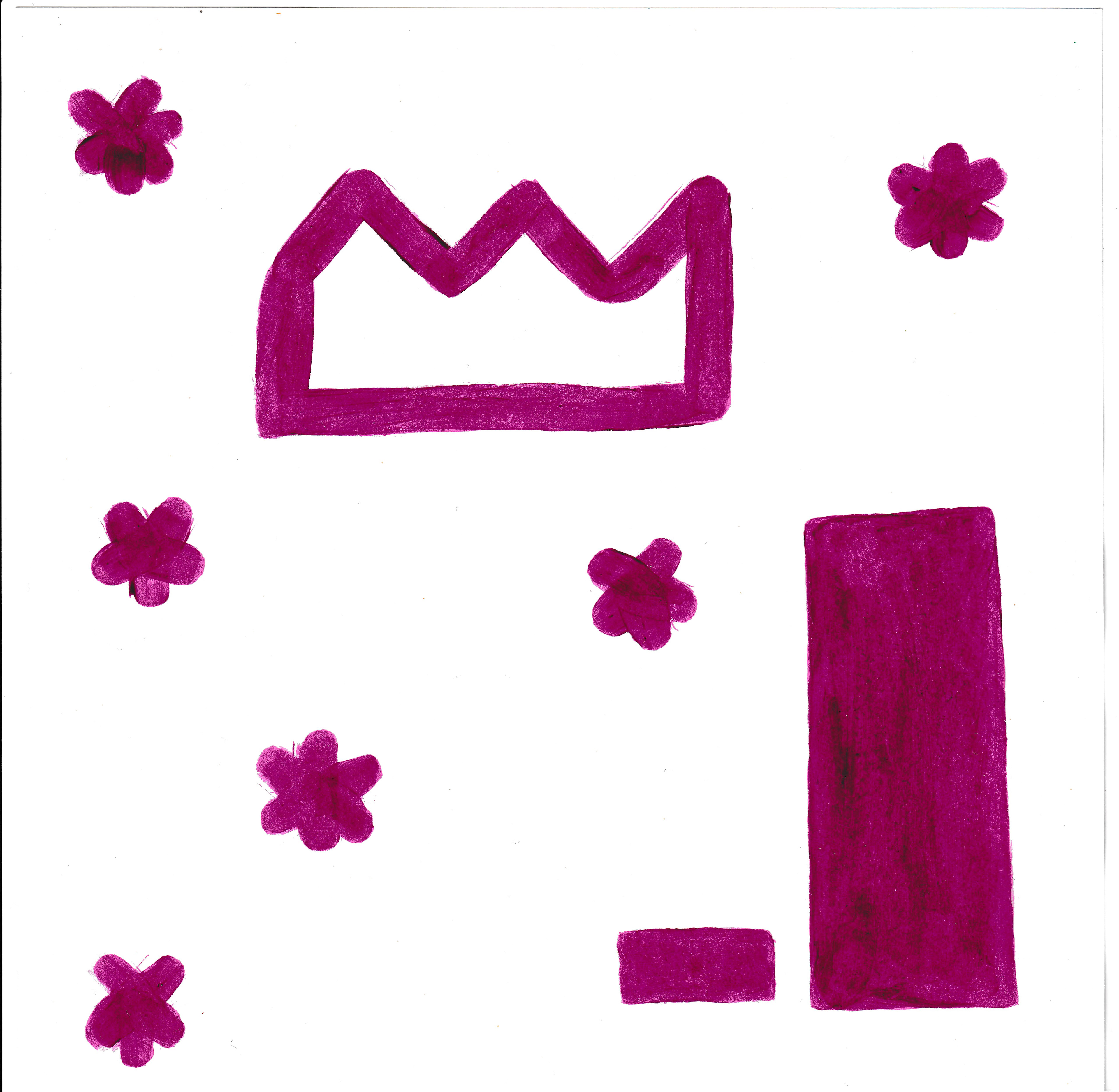
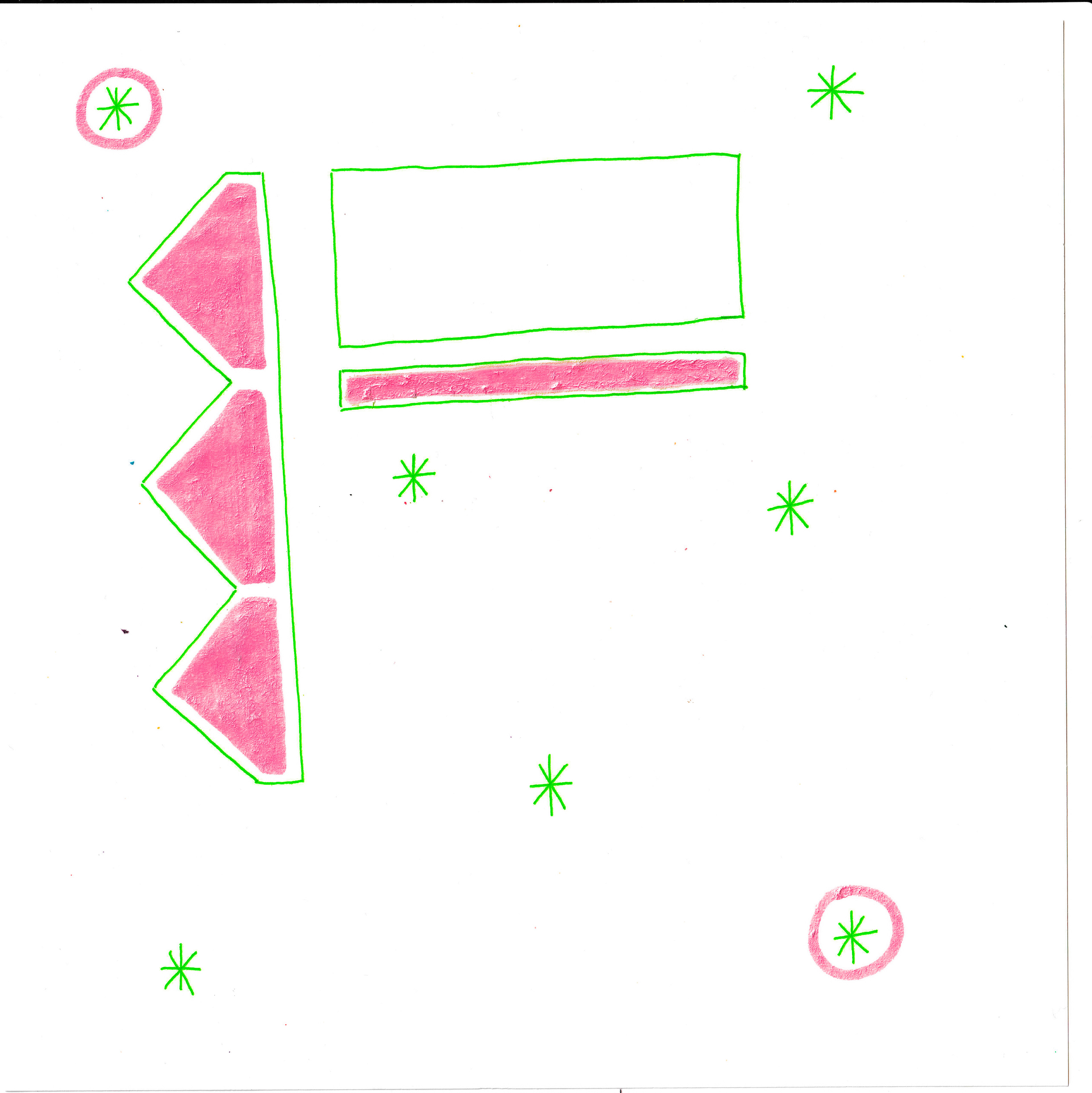
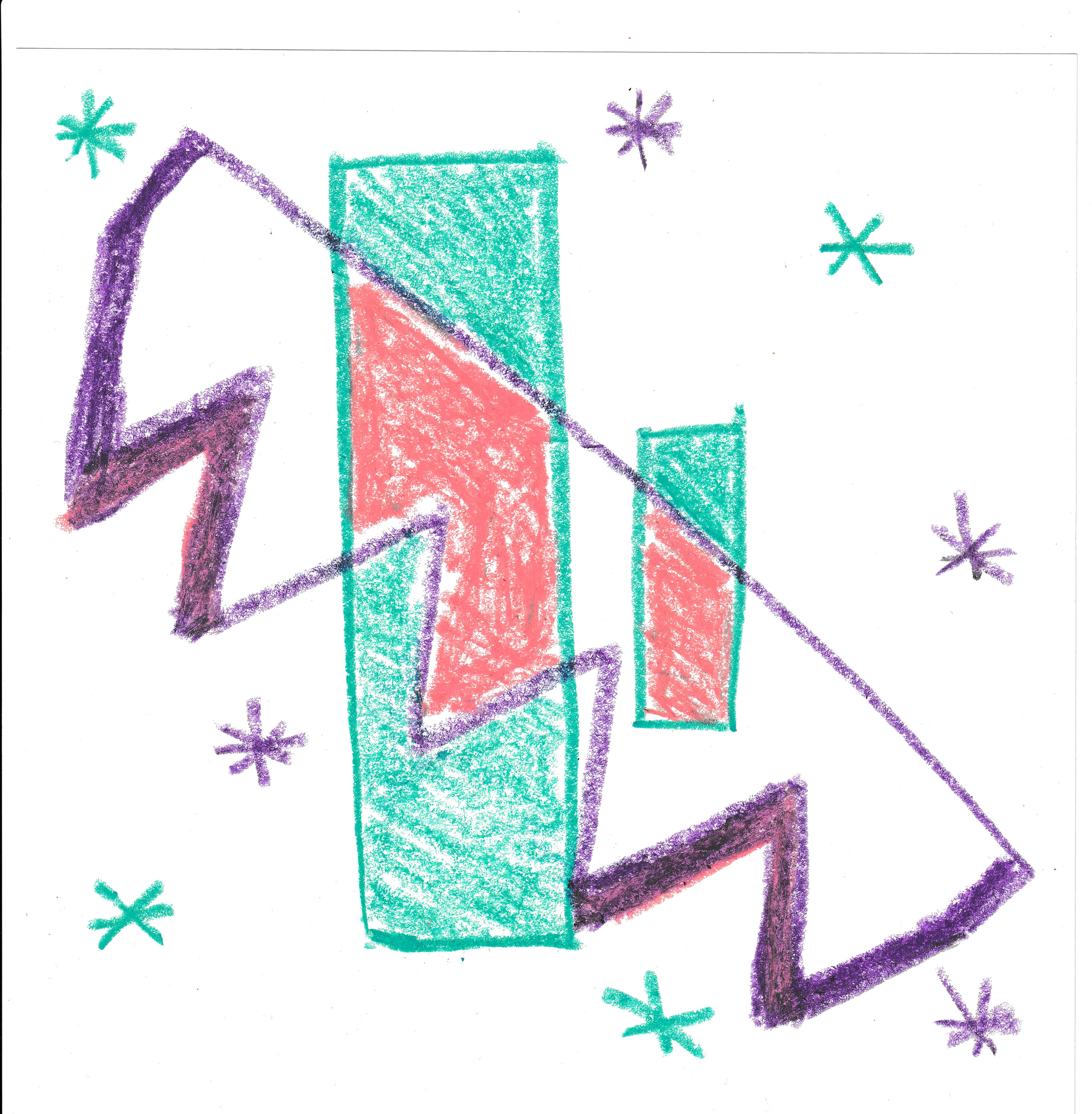
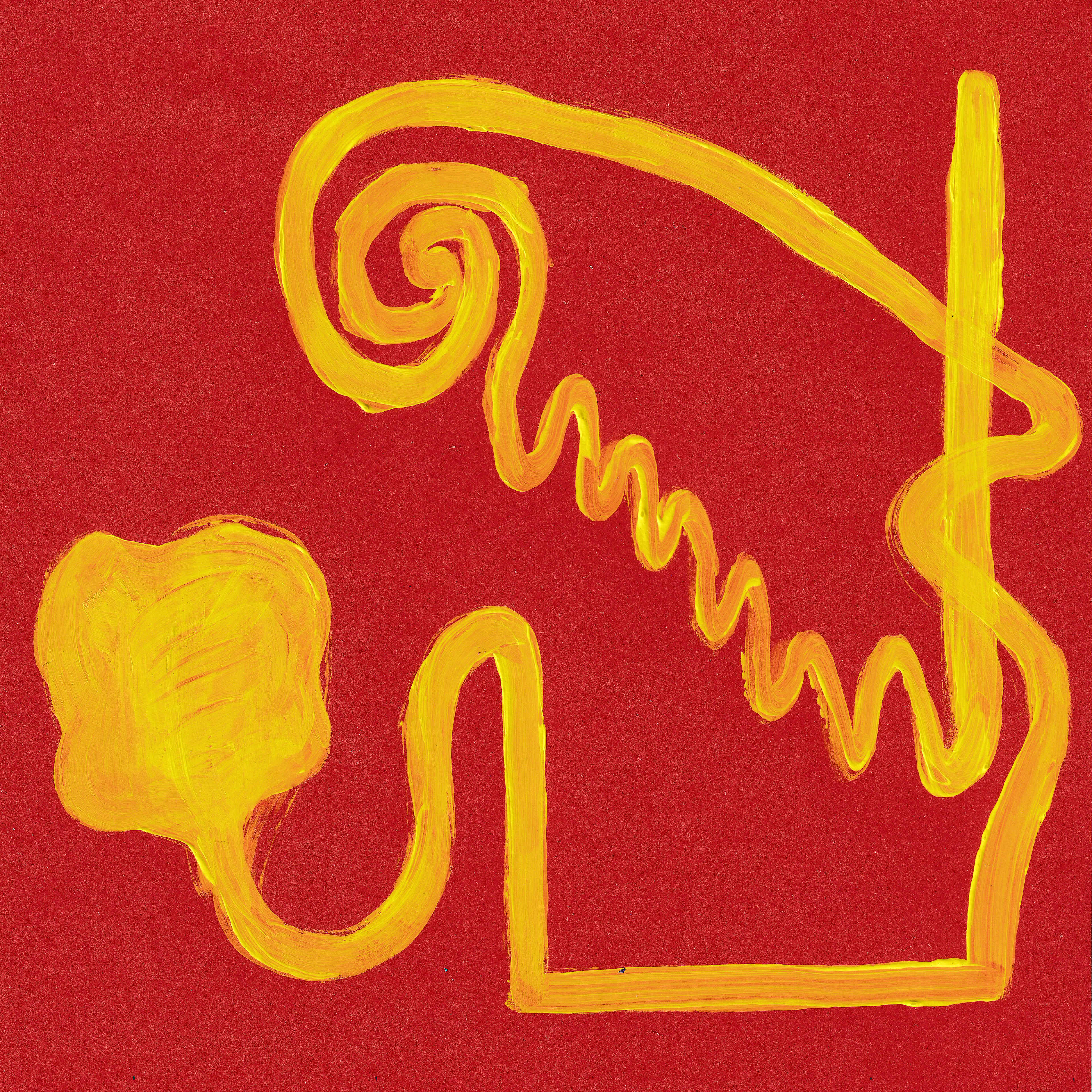
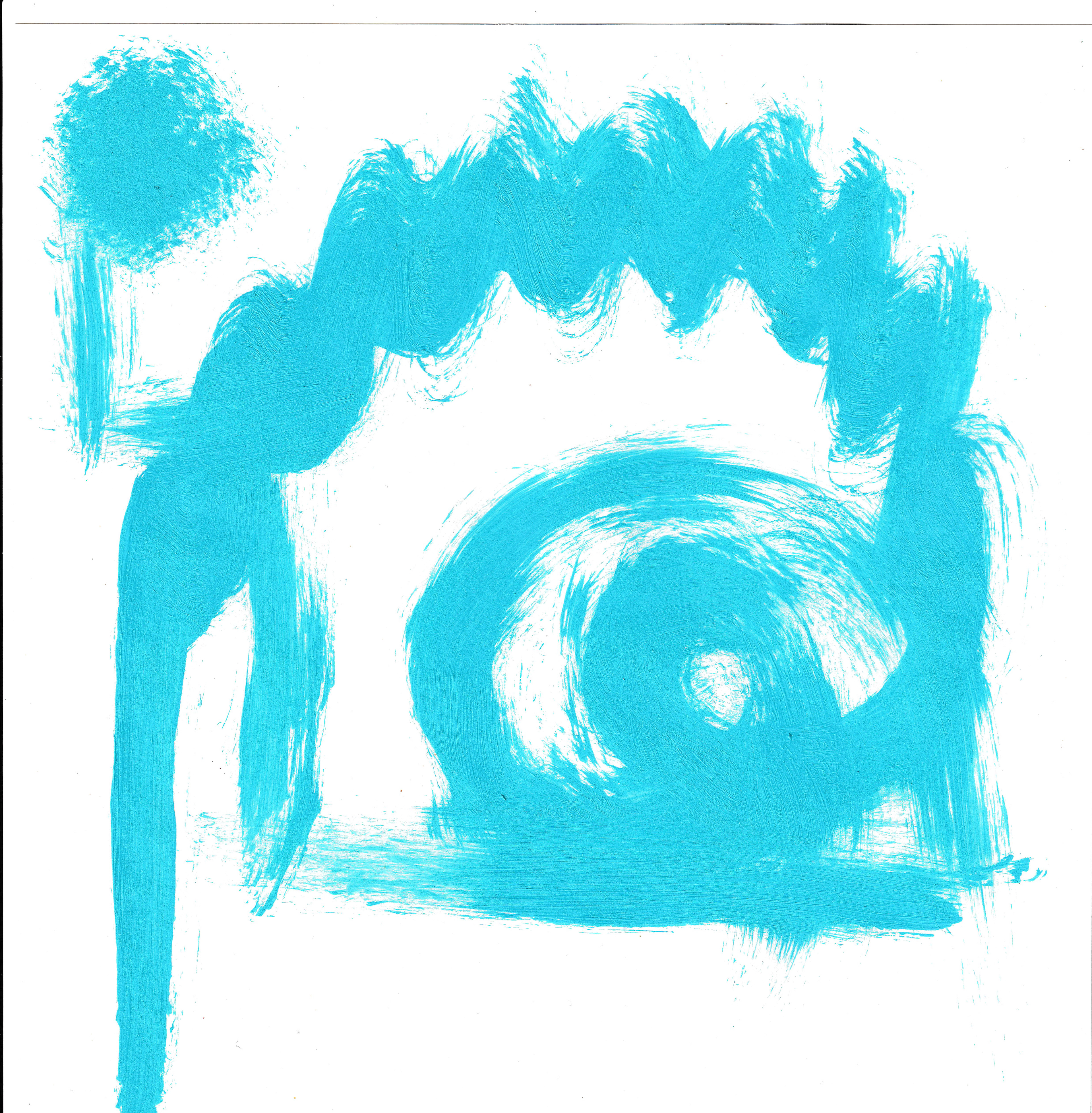
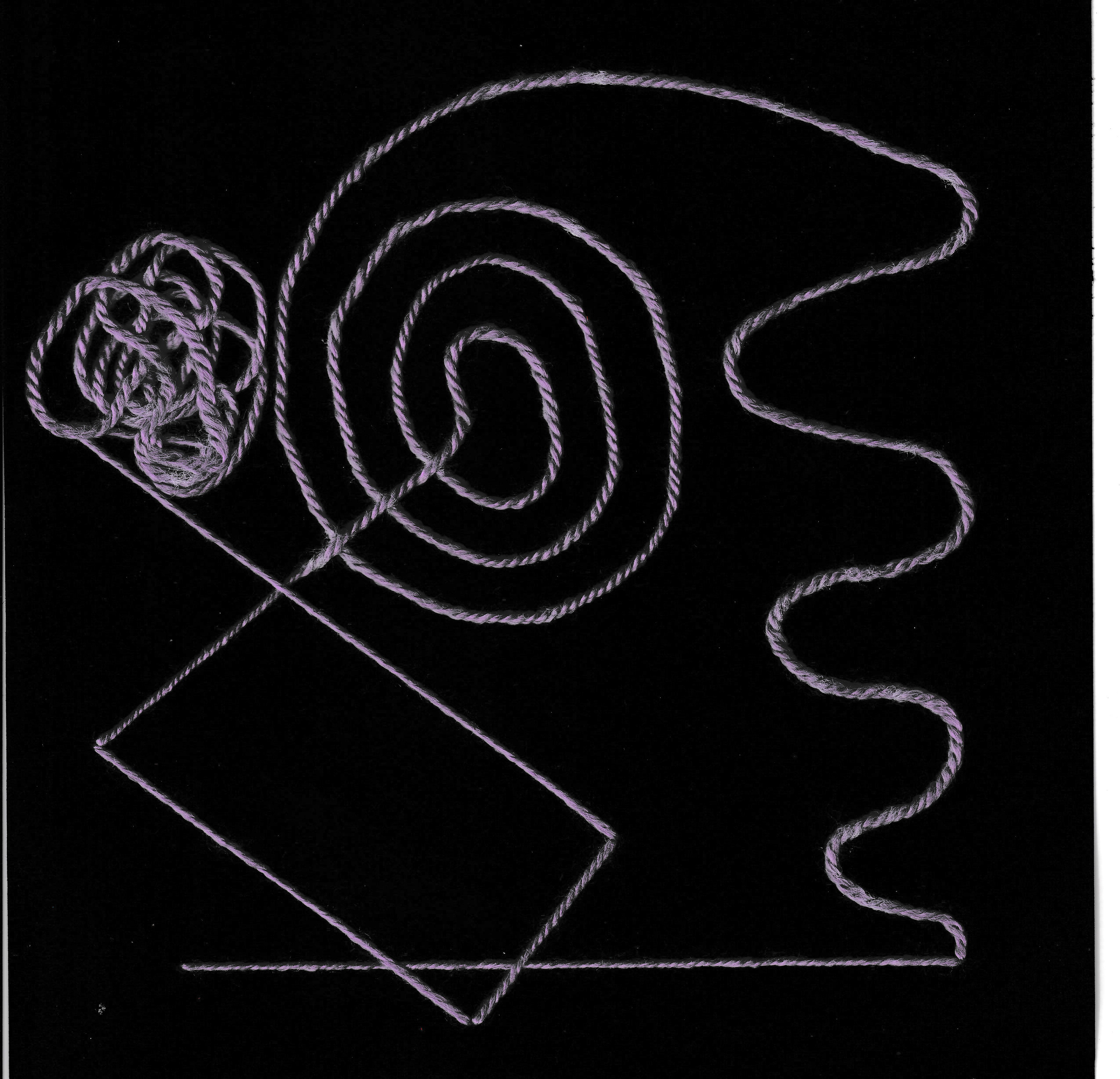
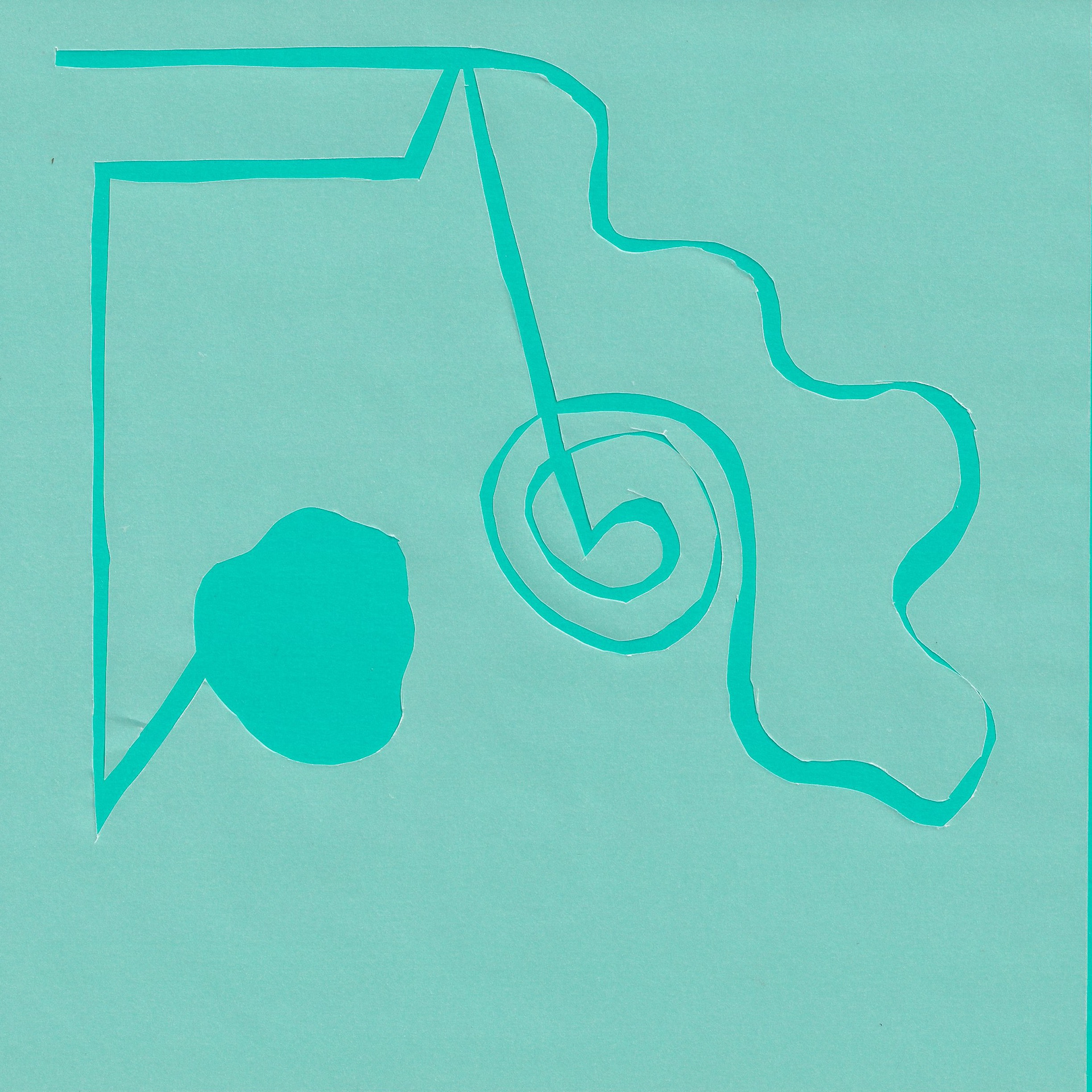
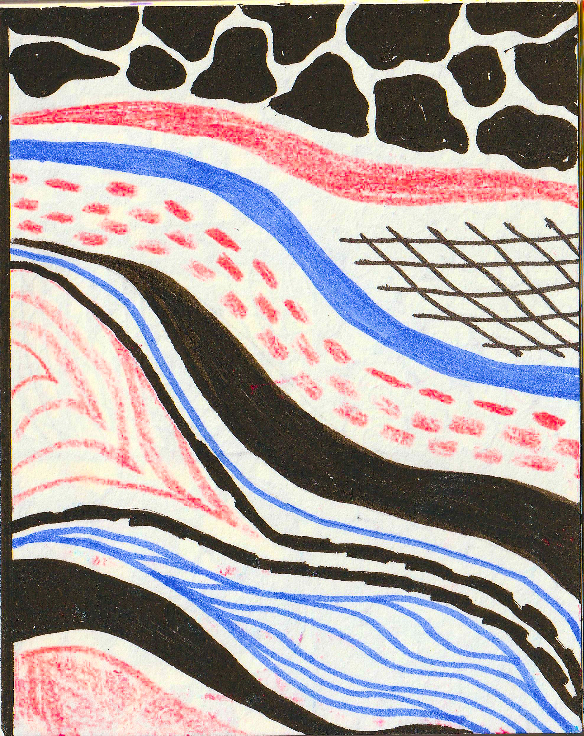
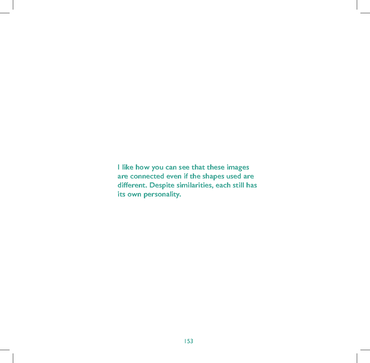
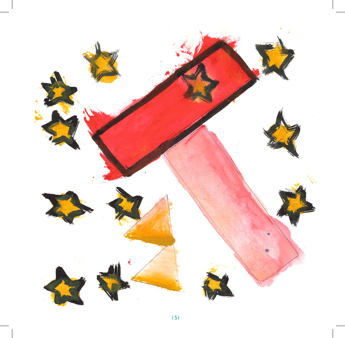
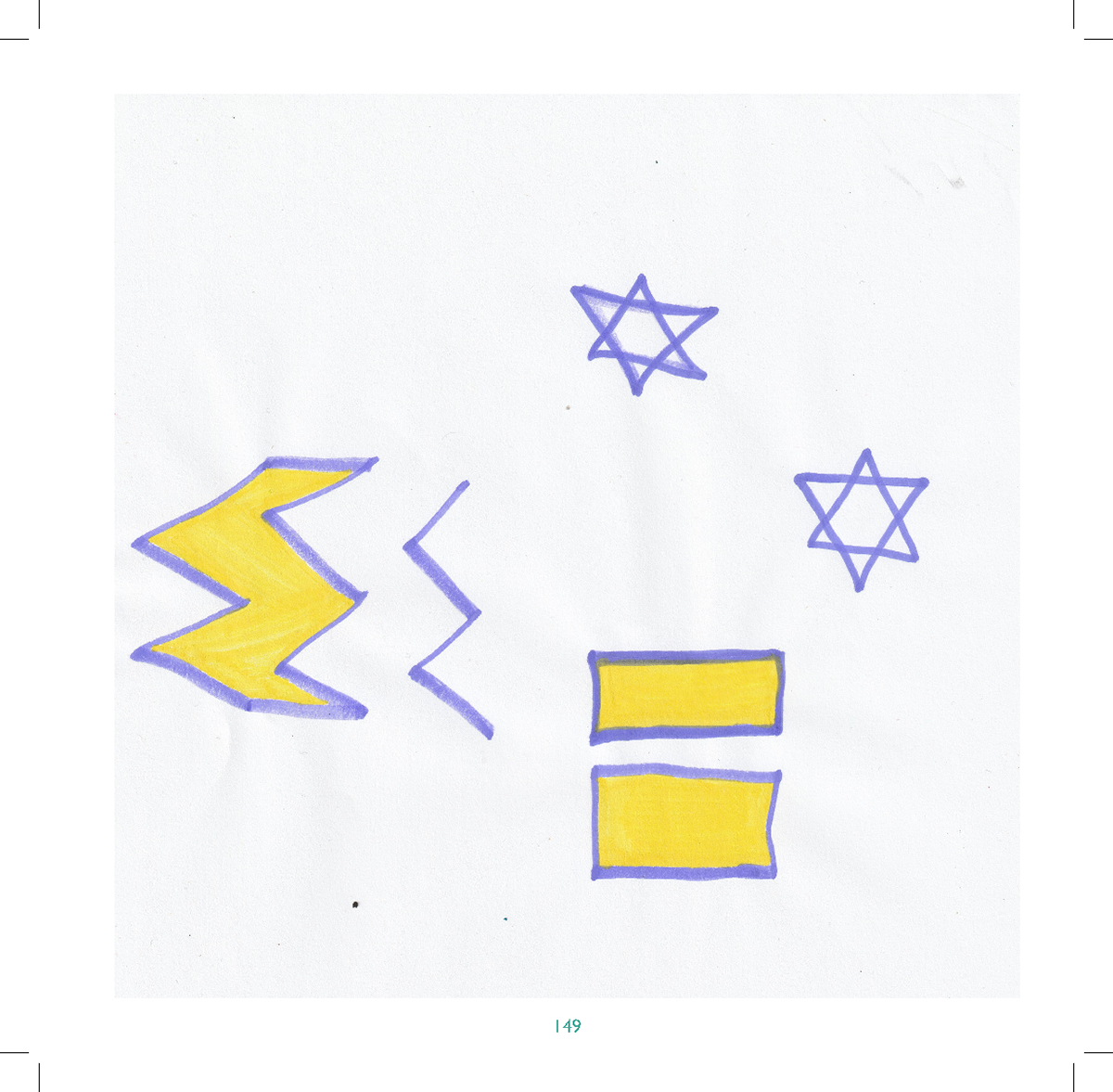
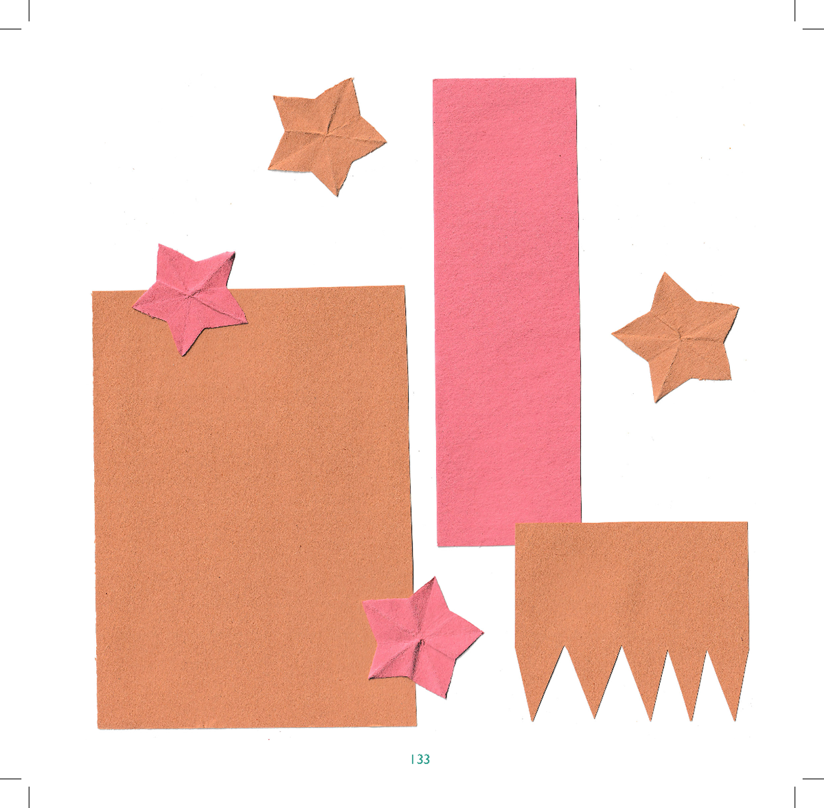
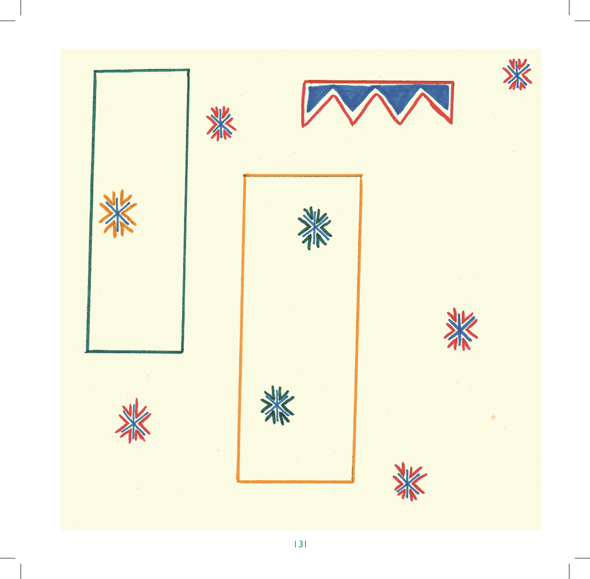
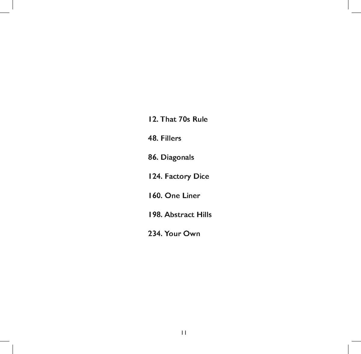
Each row is a different rule.
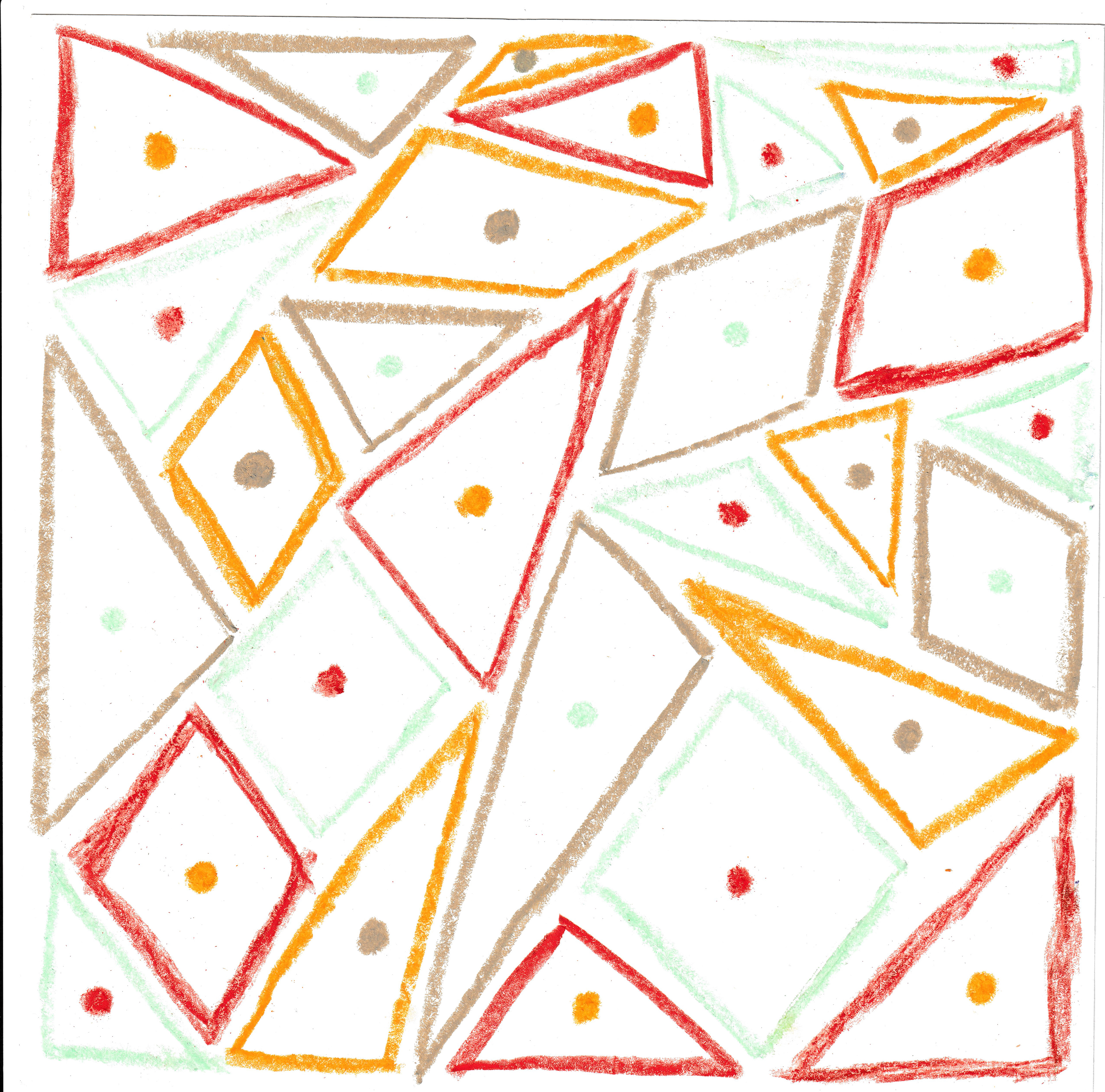
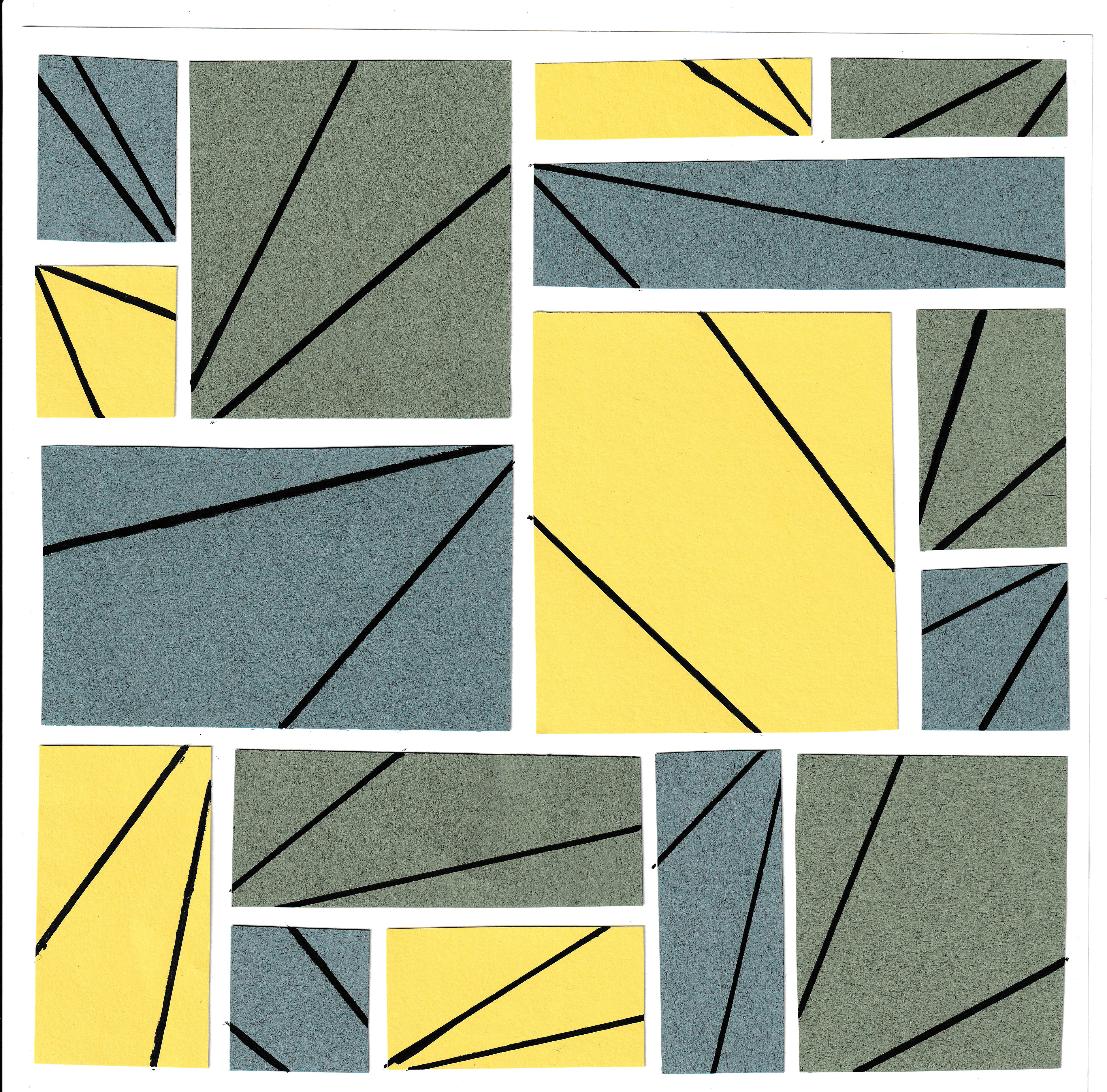
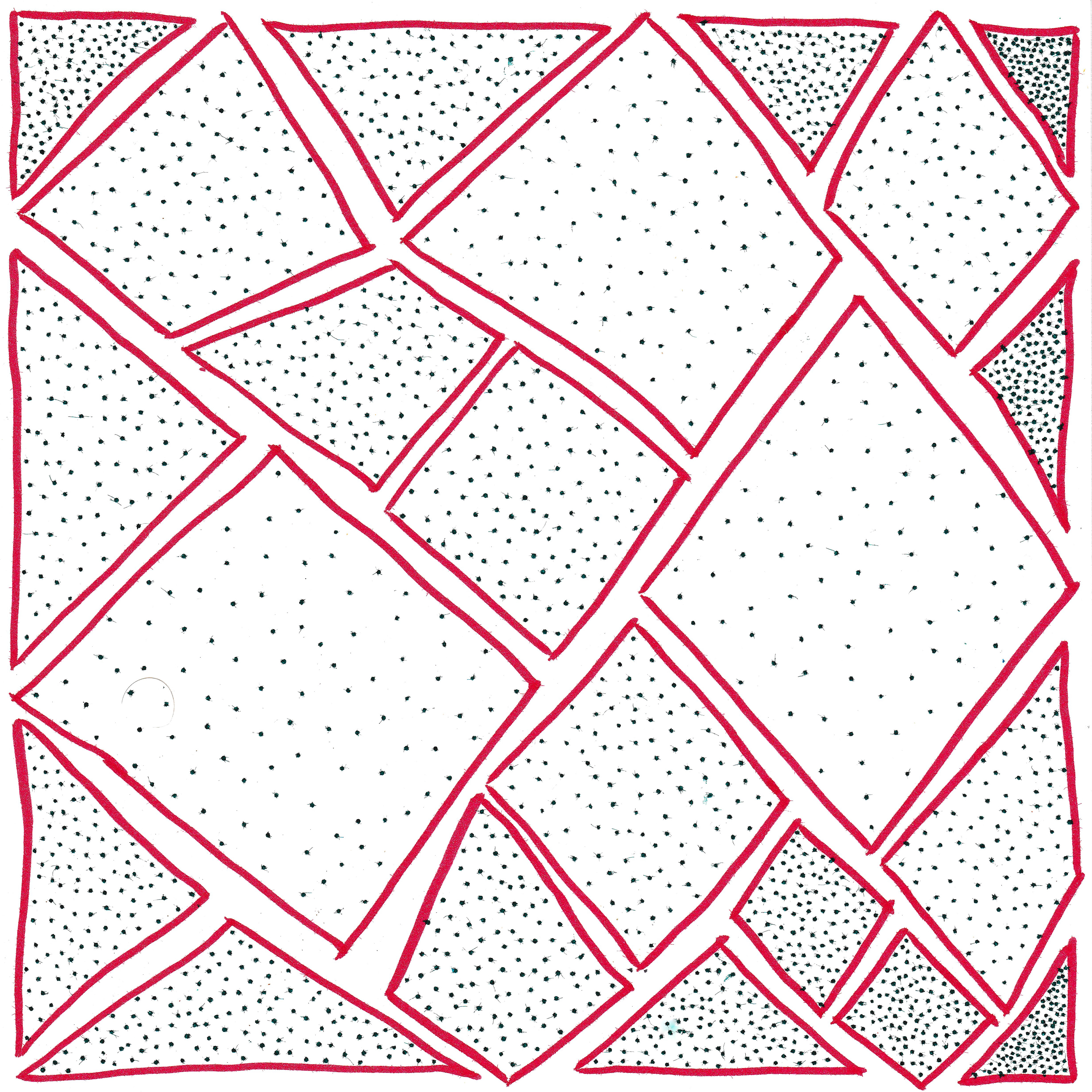
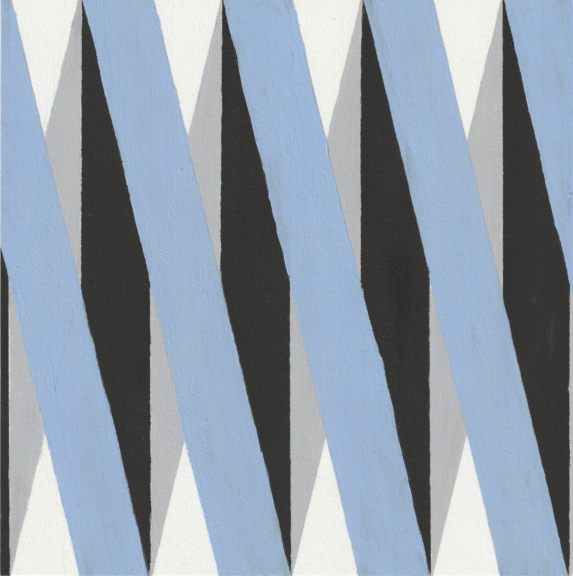
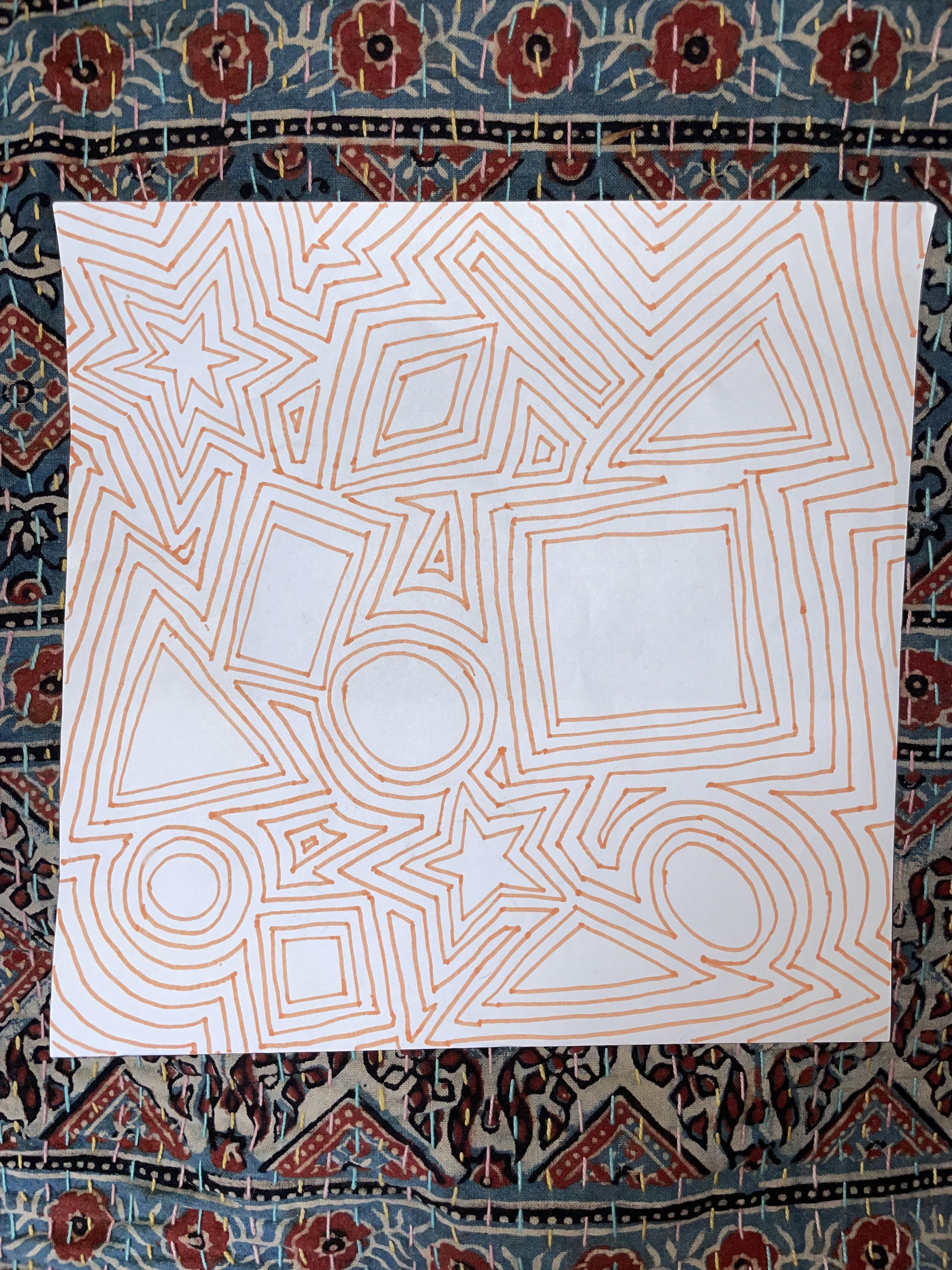
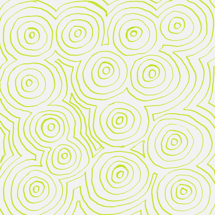
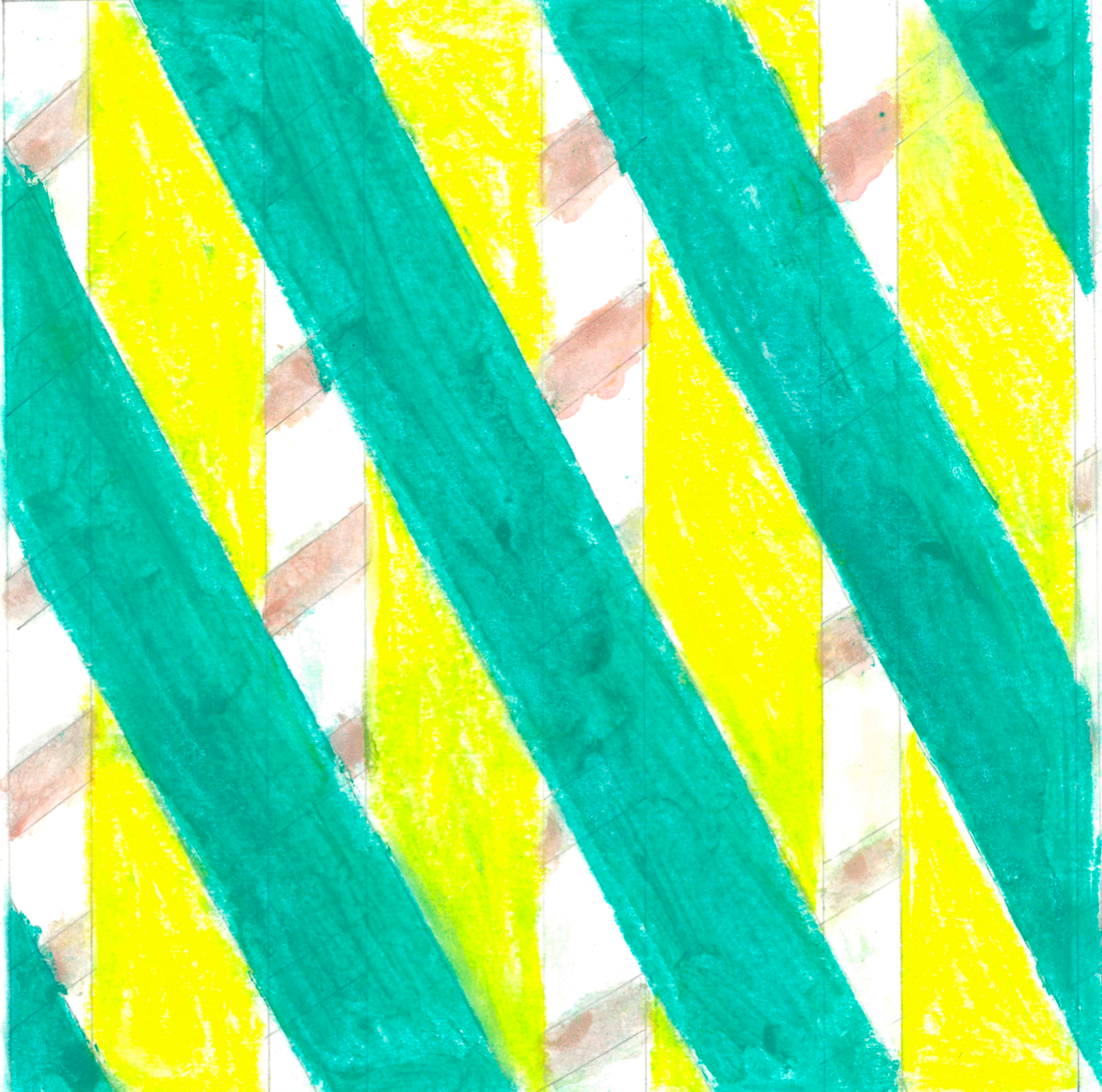
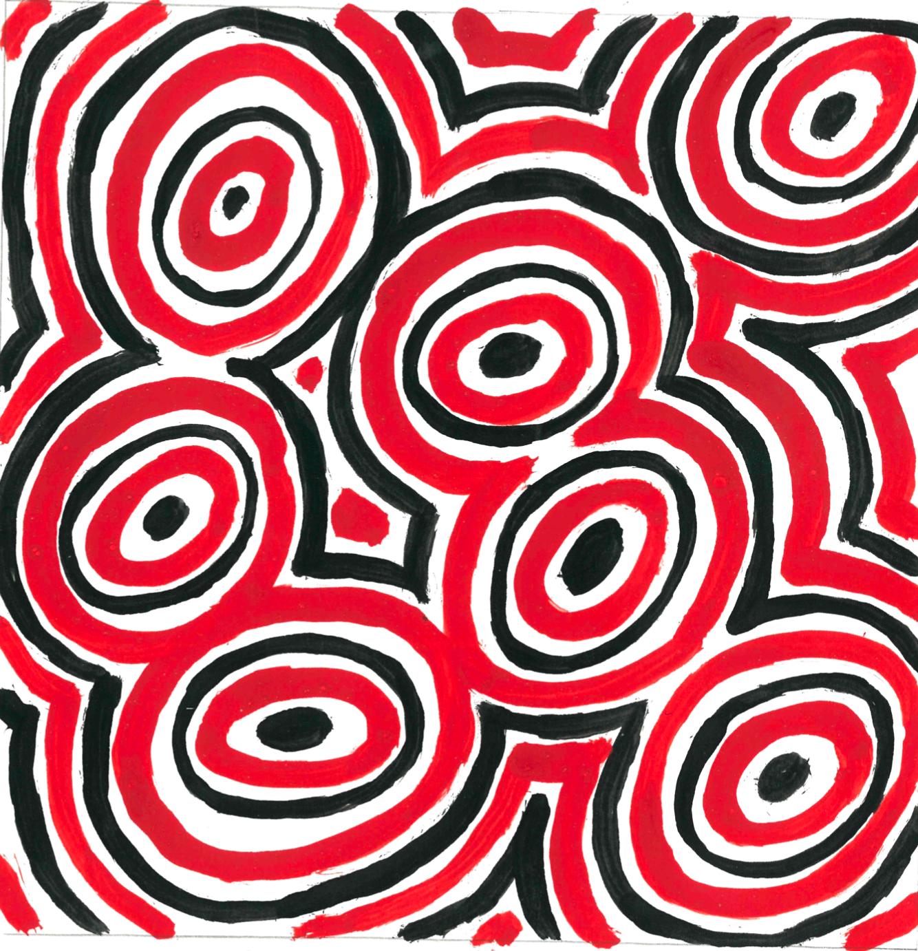
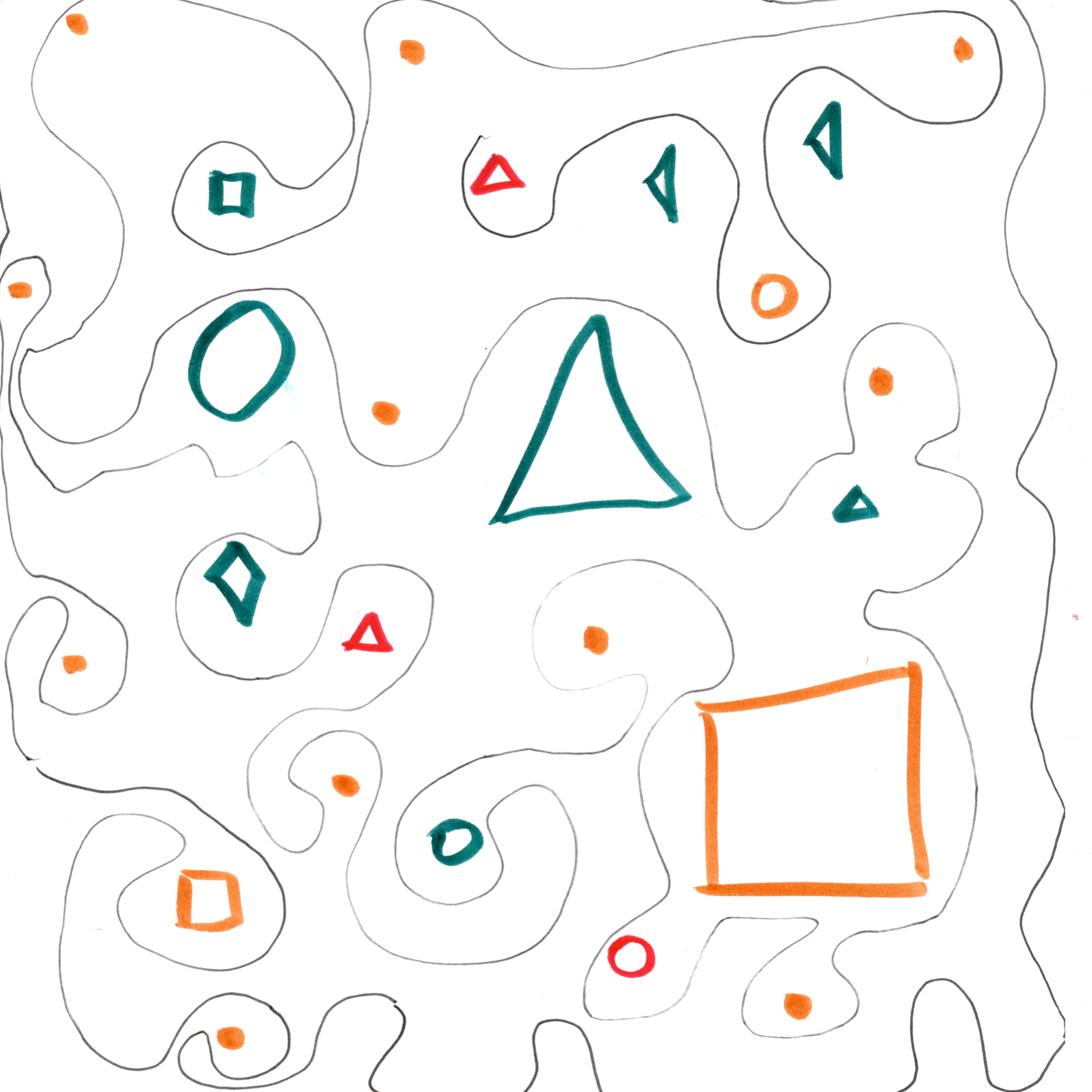
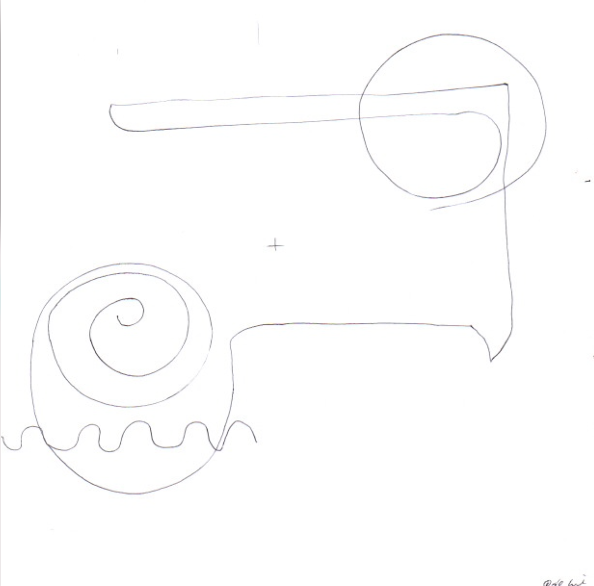
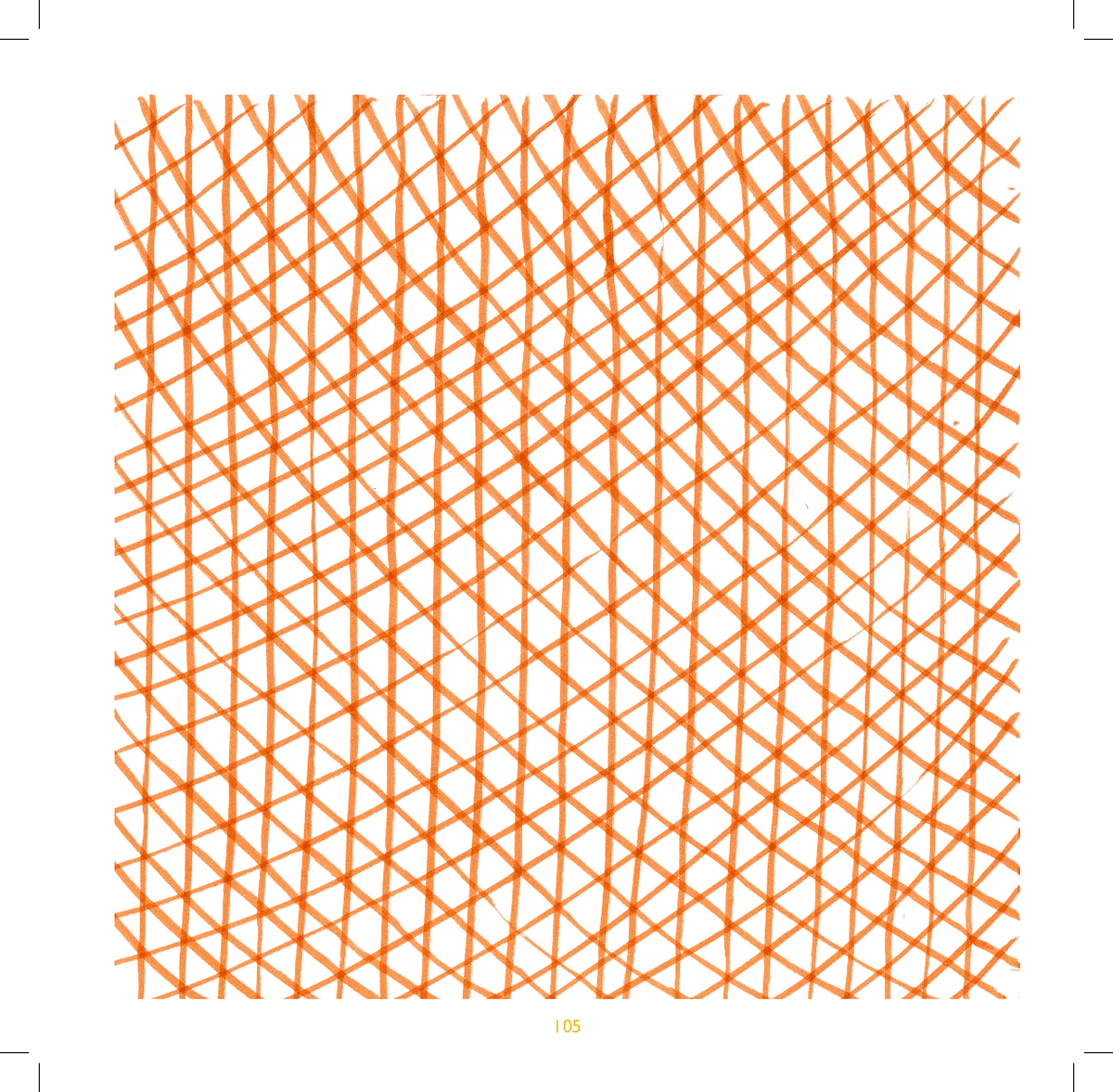
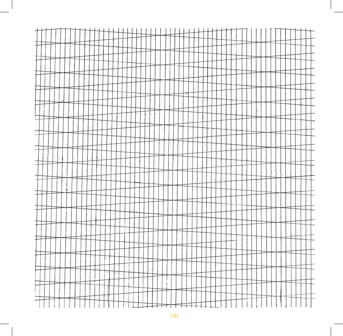
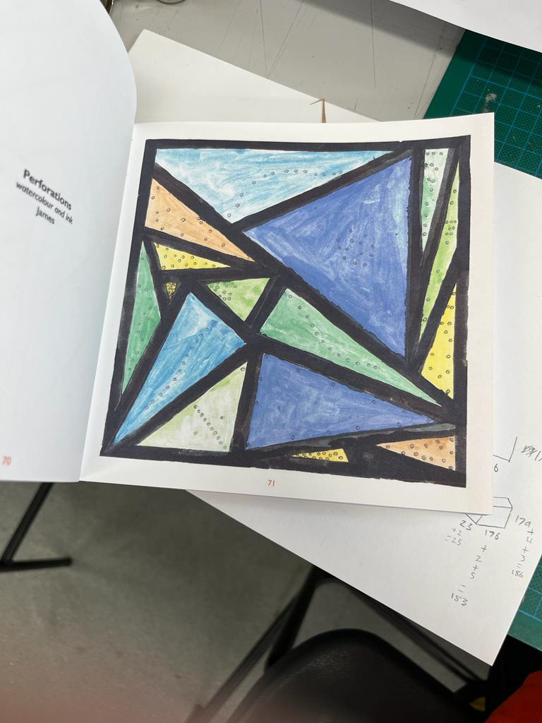
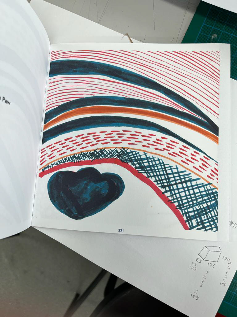
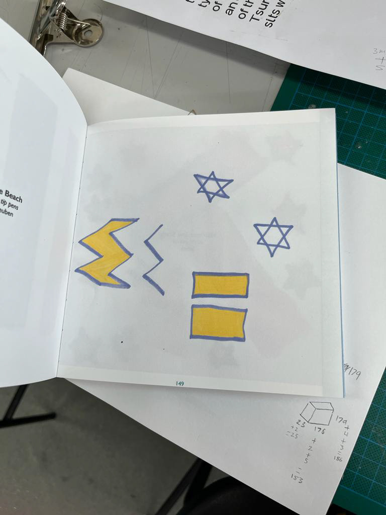
COLLABORATORS
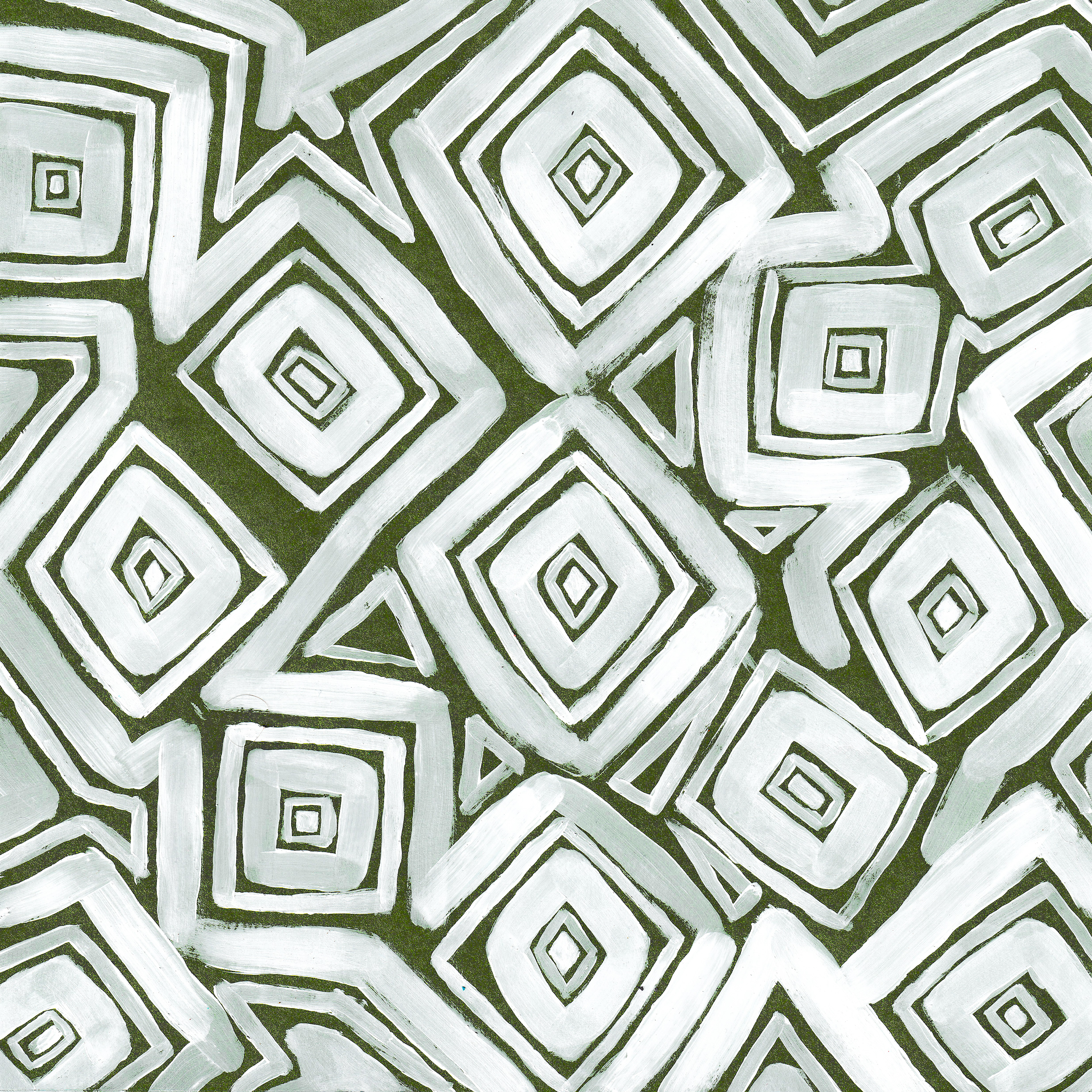
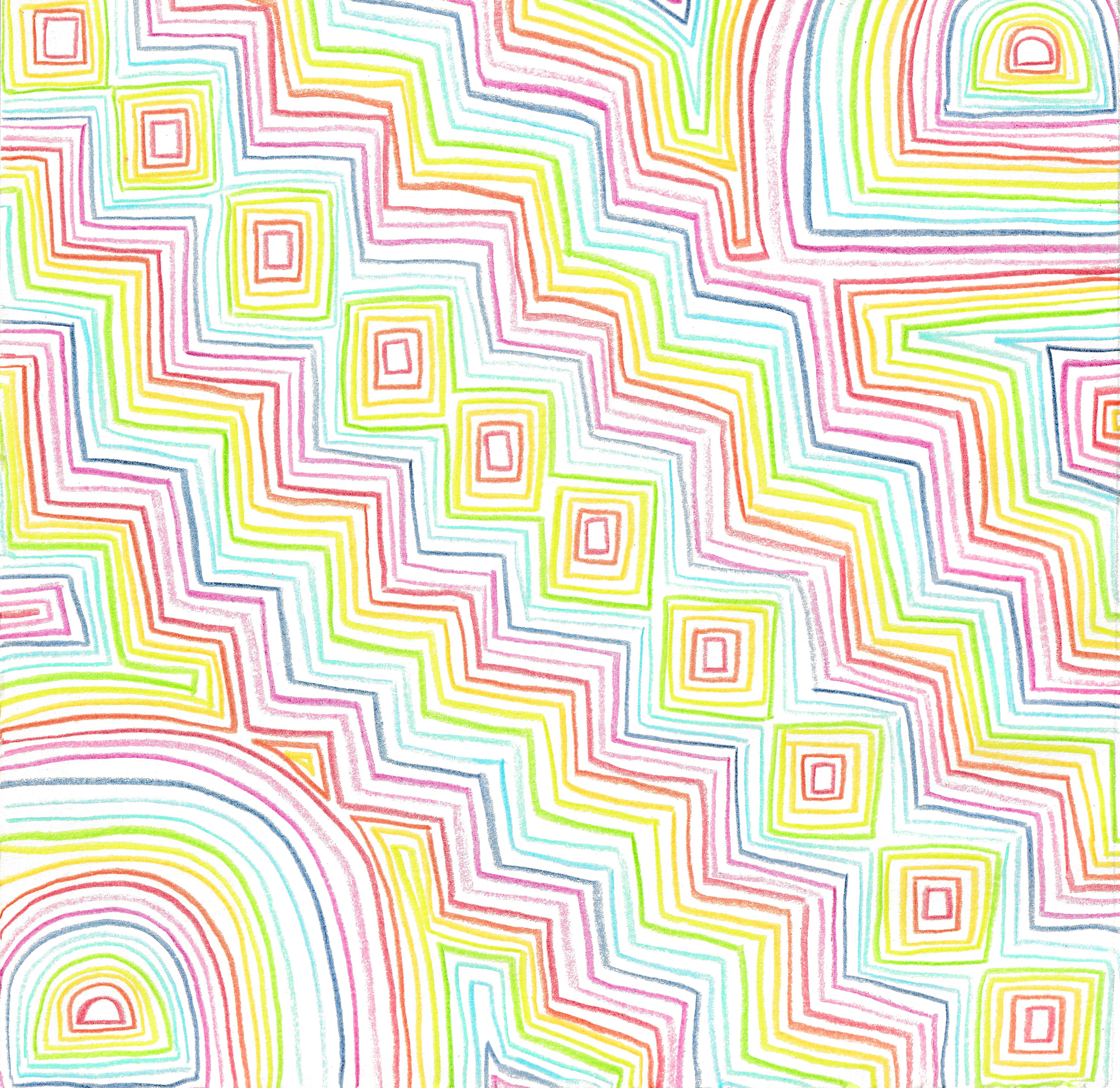
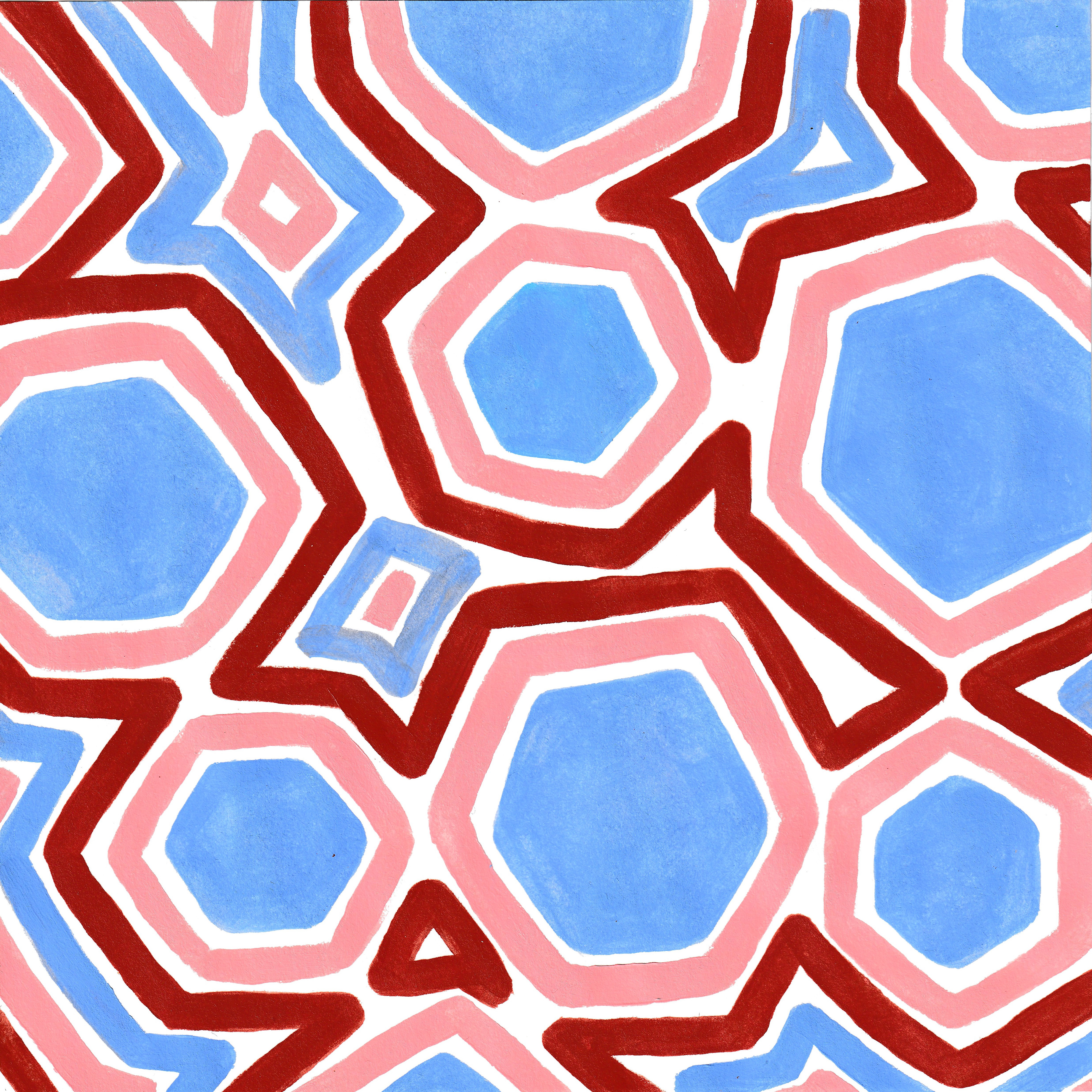
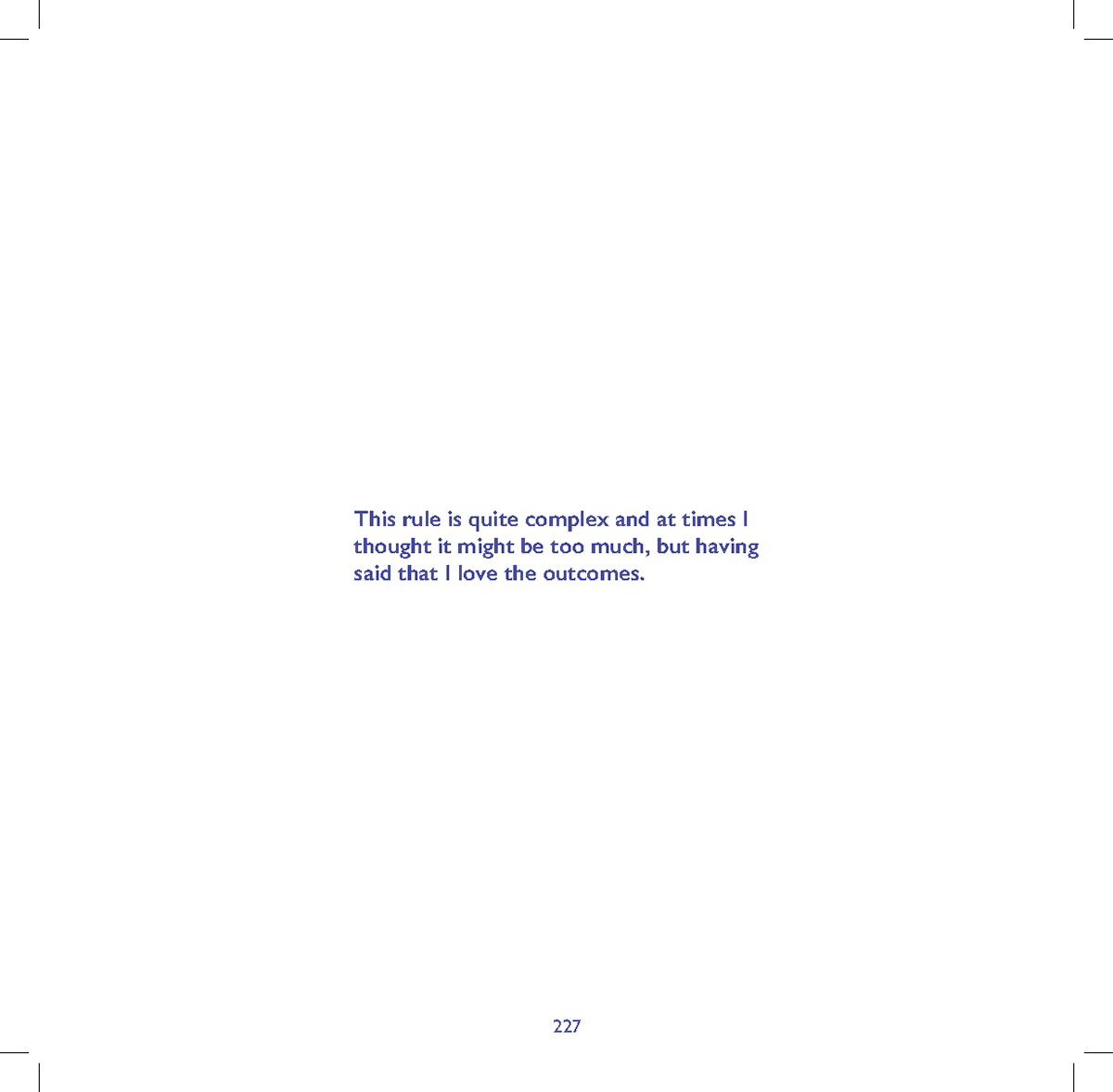
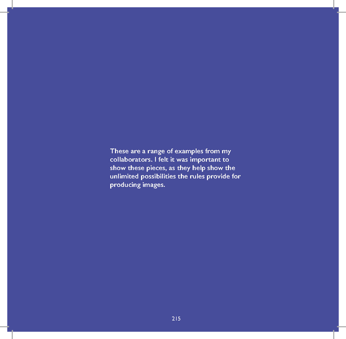
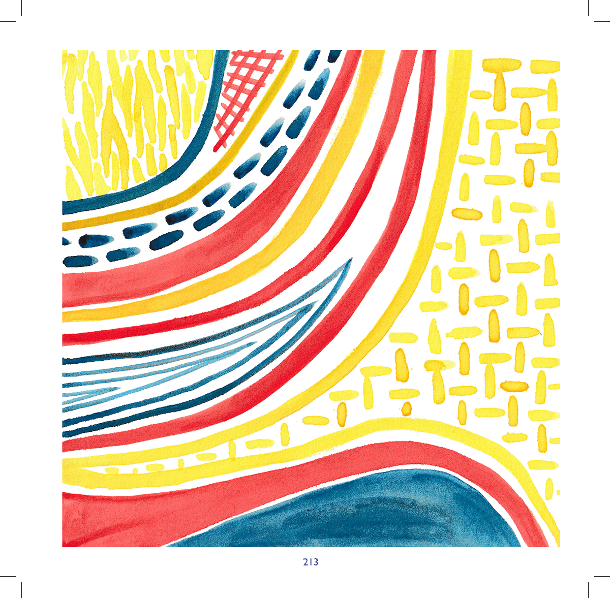
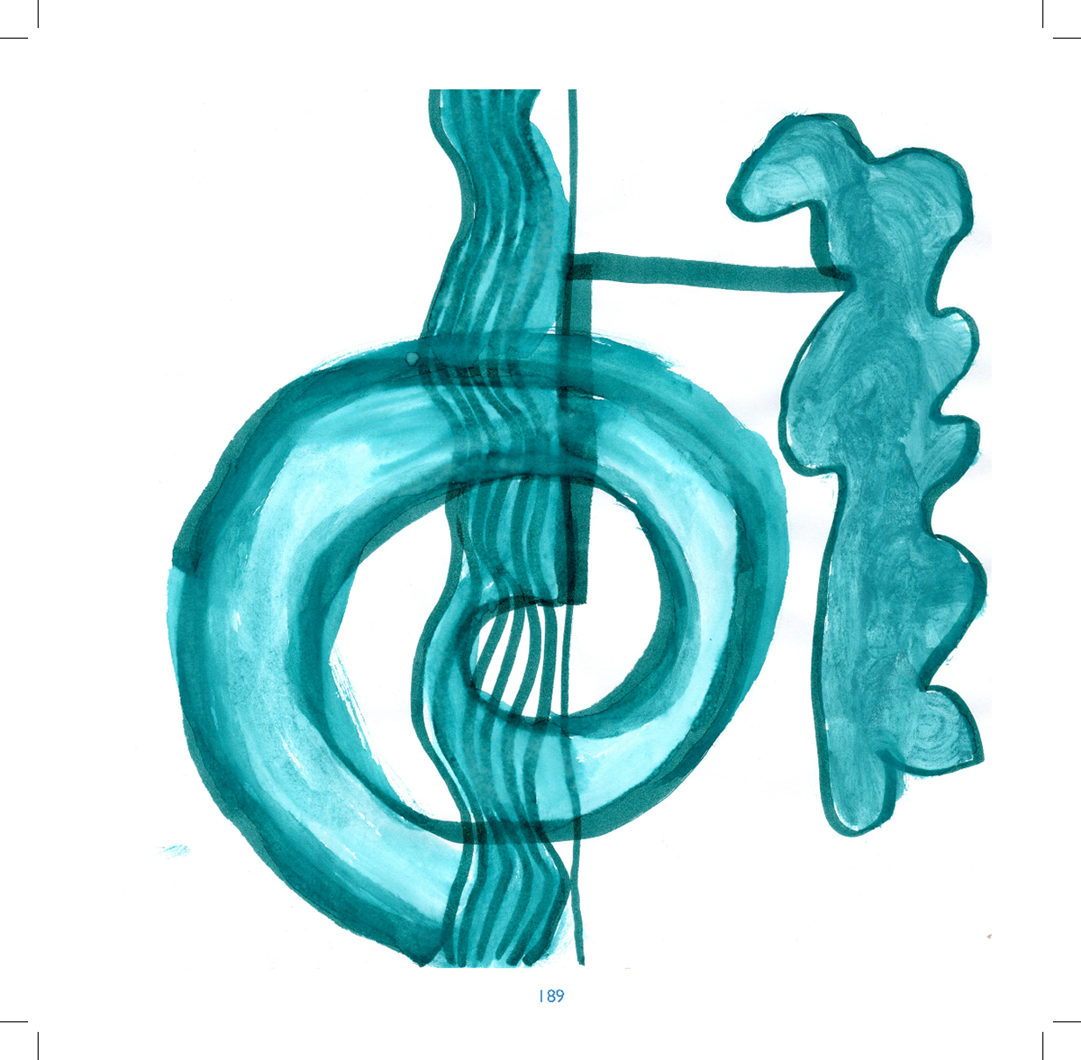
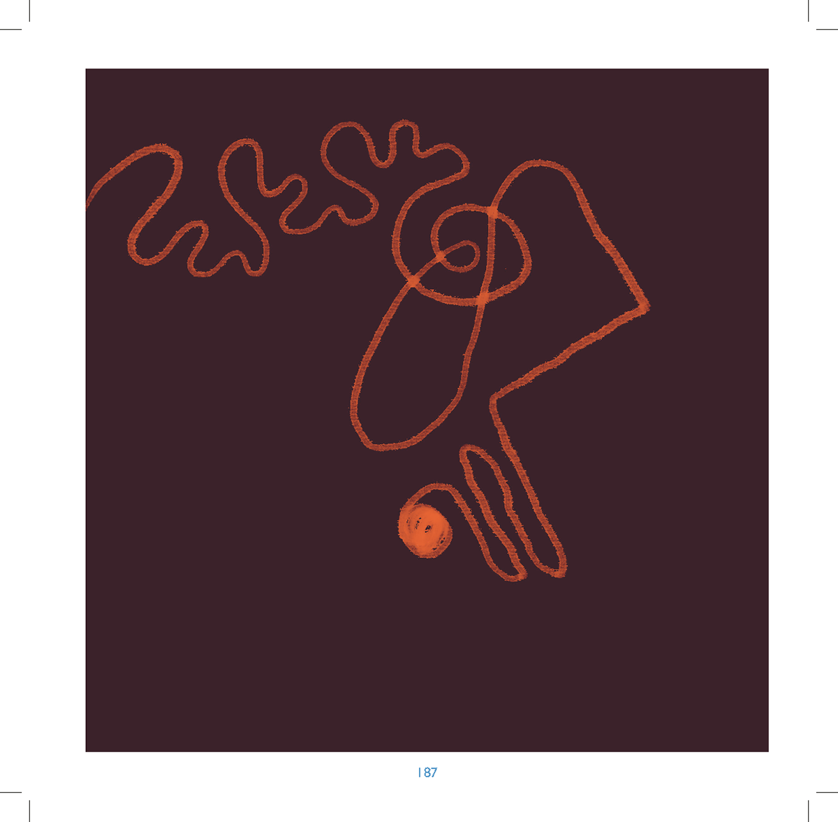
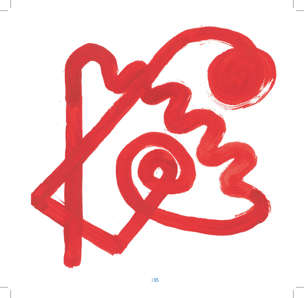
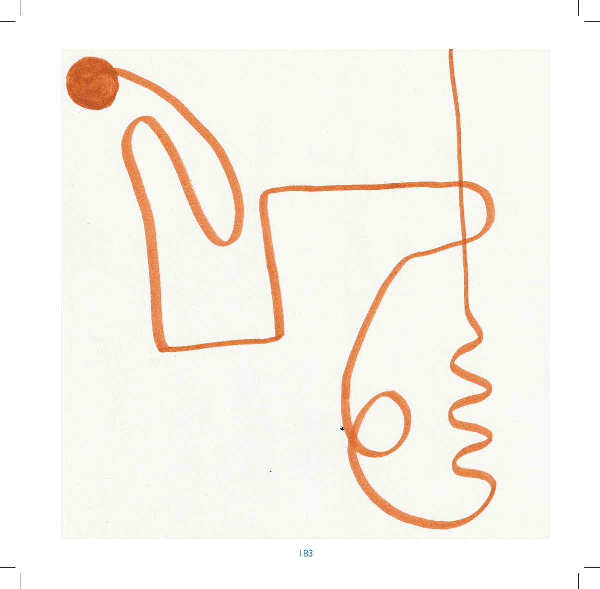
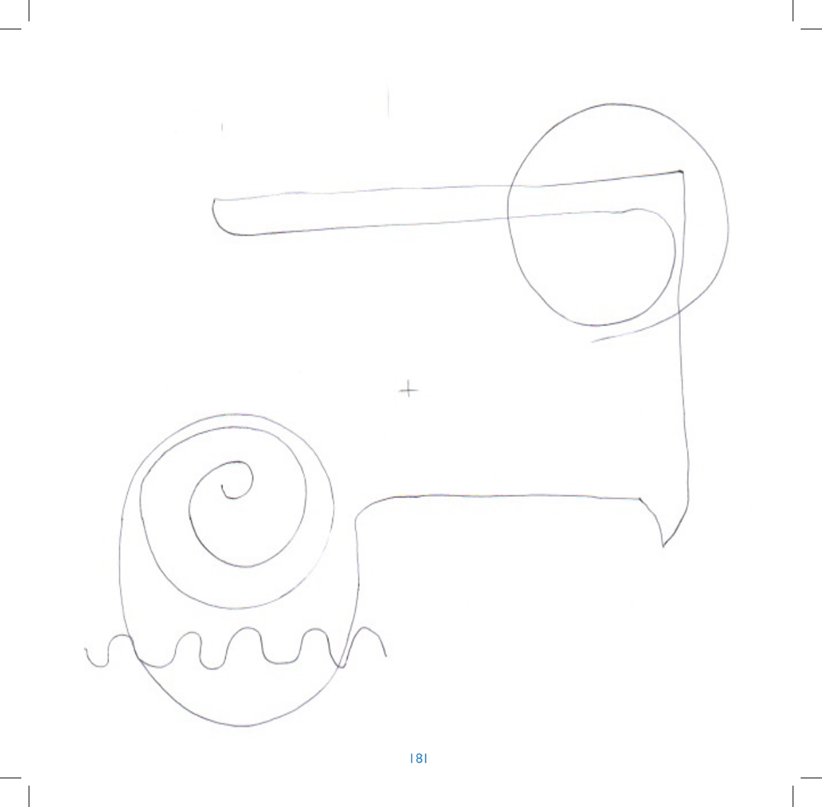
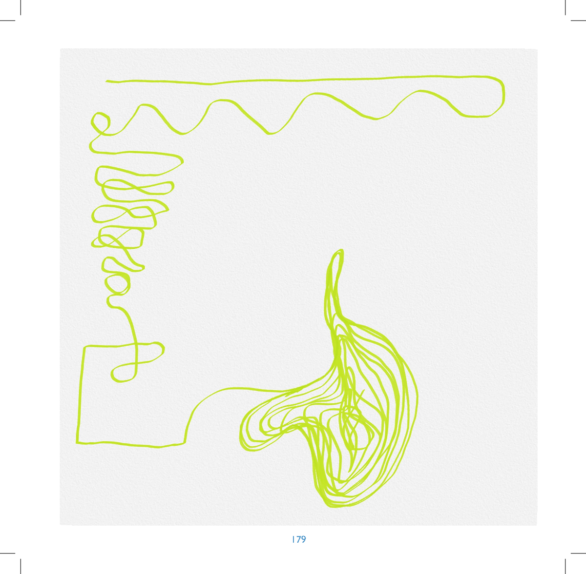
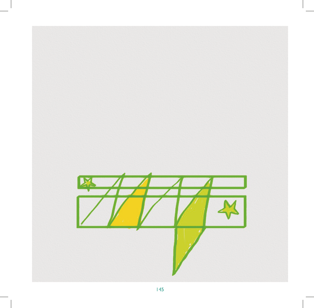
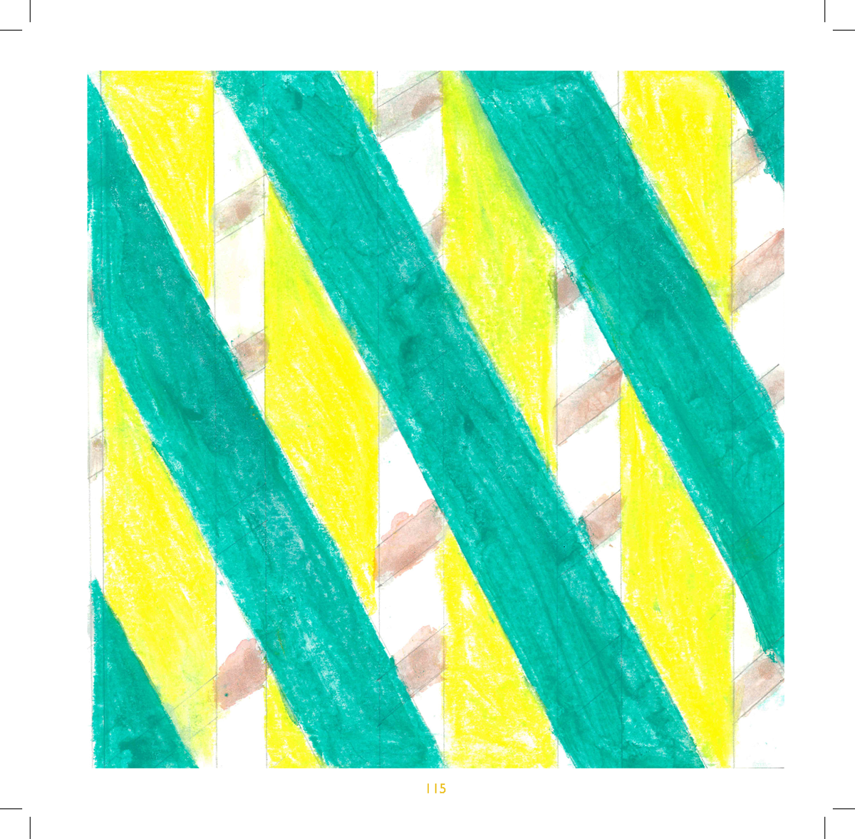
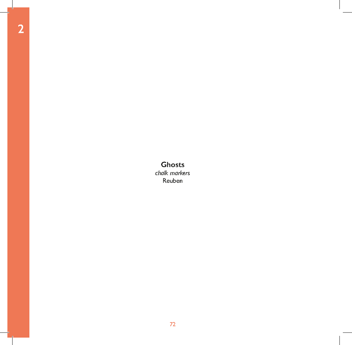
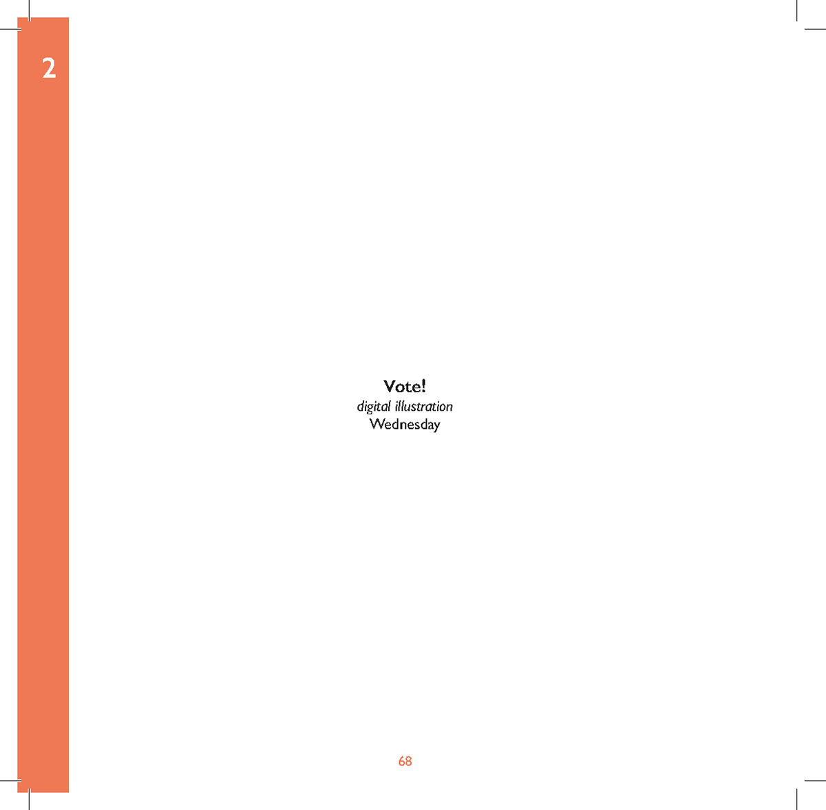
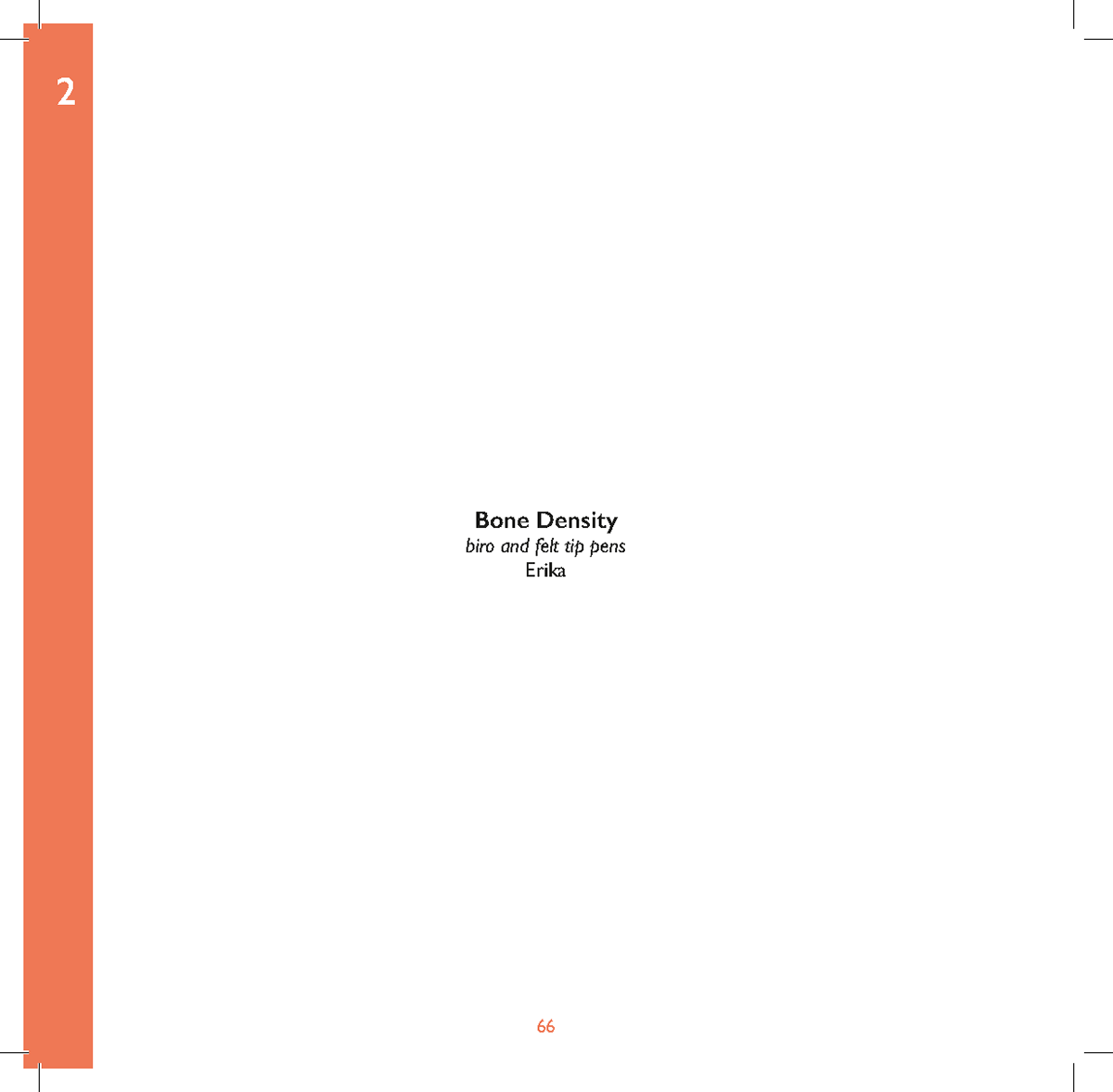
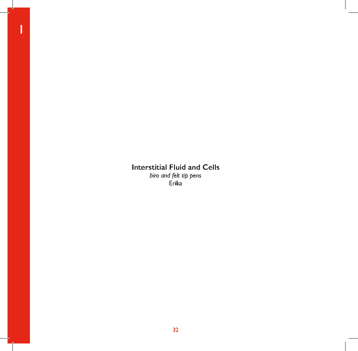
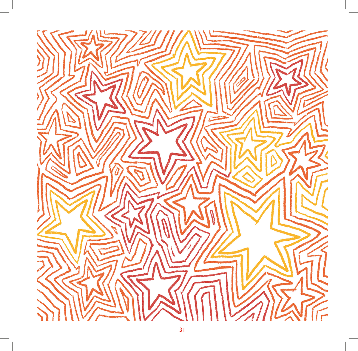
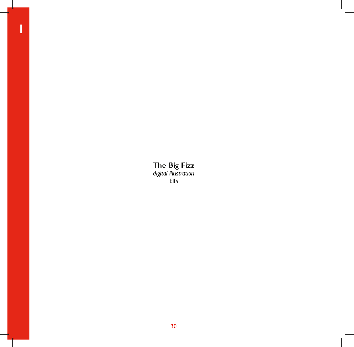
The responses below are done by family and friends that I asked. I love the variety and how different people have interpreted the rules, it's exactly what I want it's great seeing such a range of responses as it highlights how great variety is.


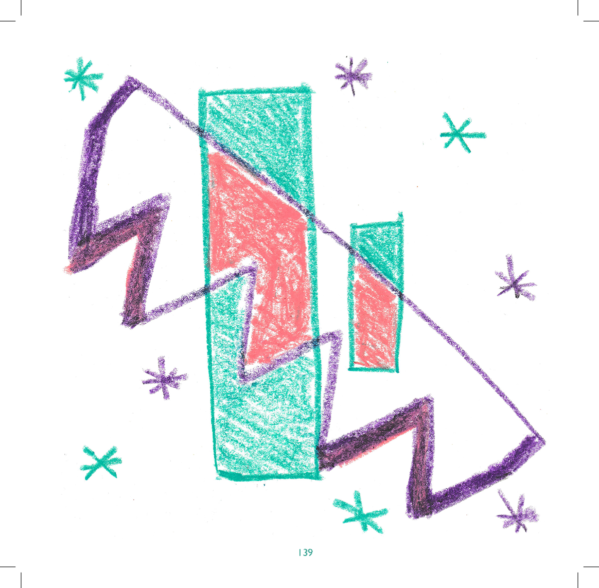
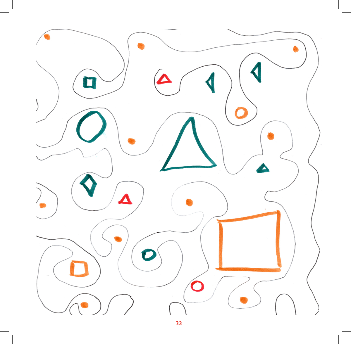
Ella
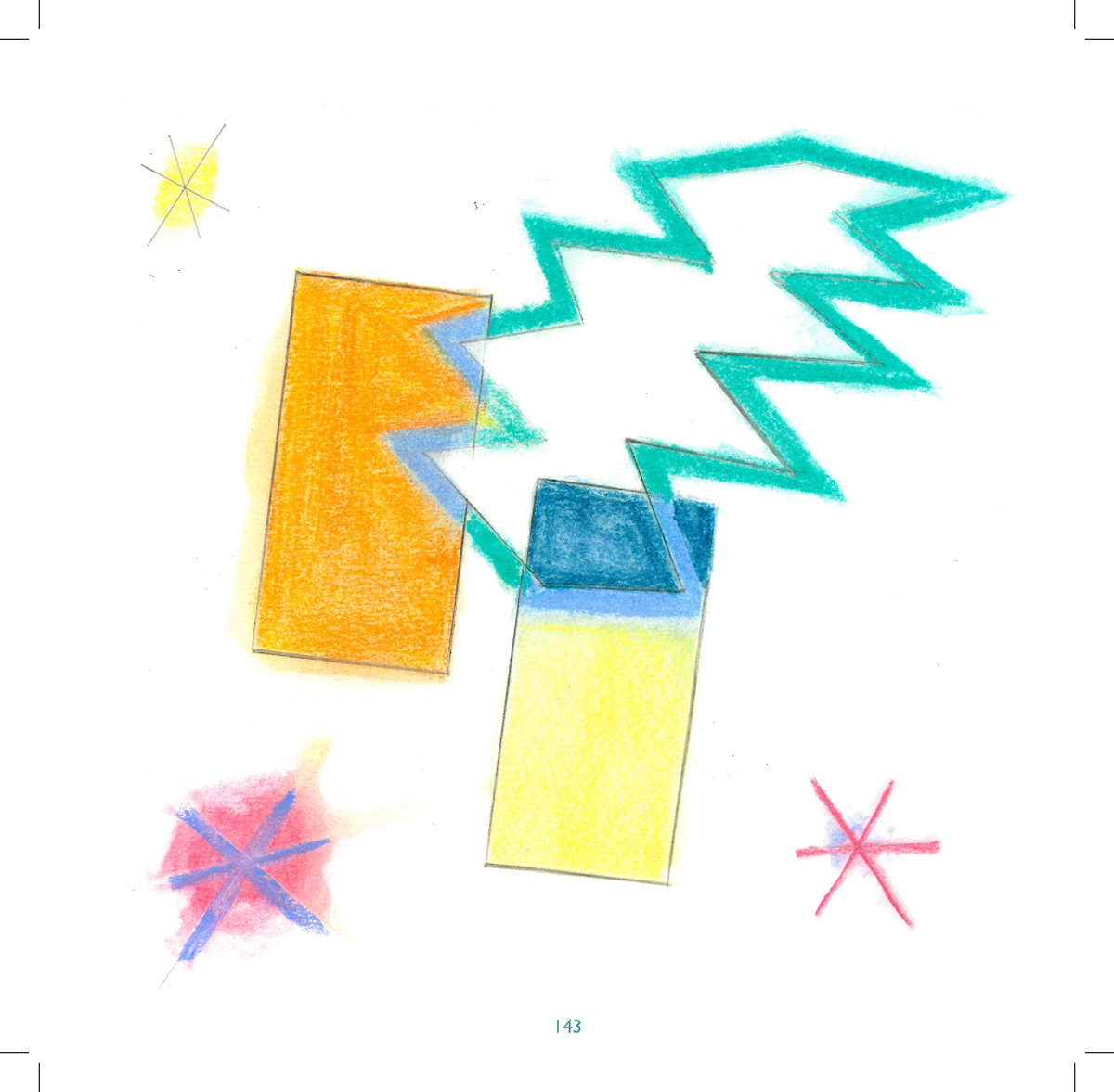
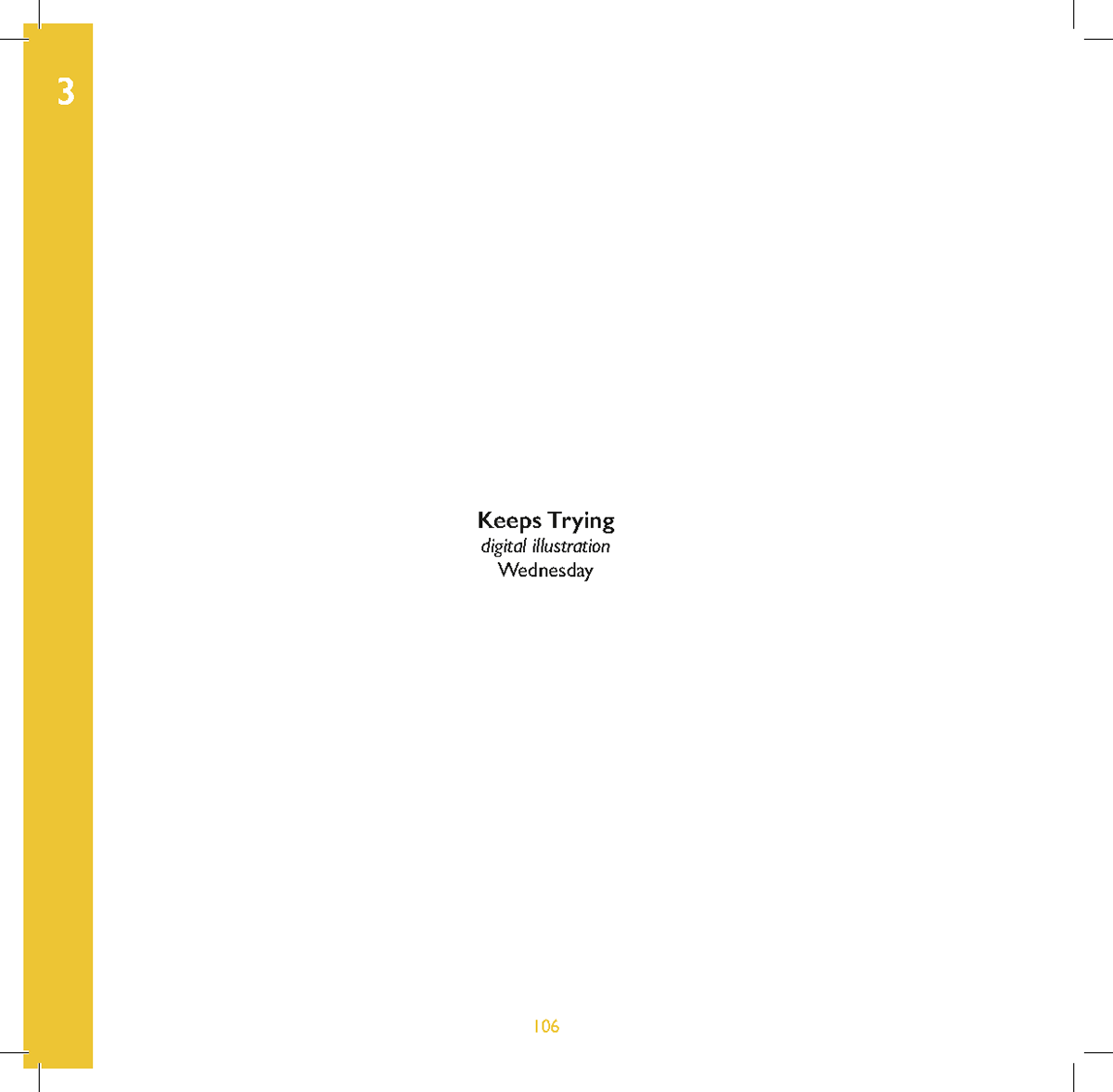
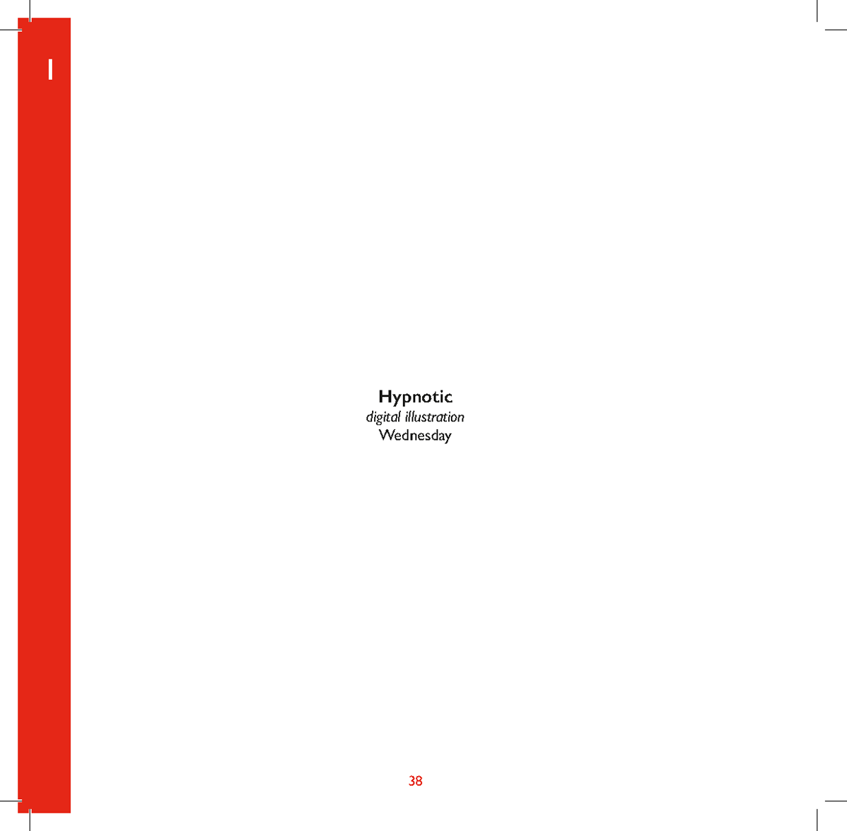
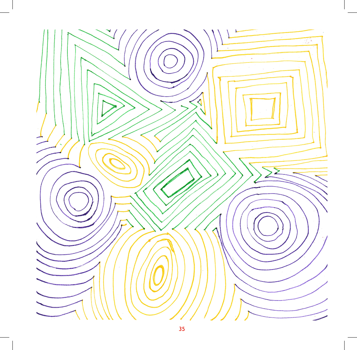
Wednesday
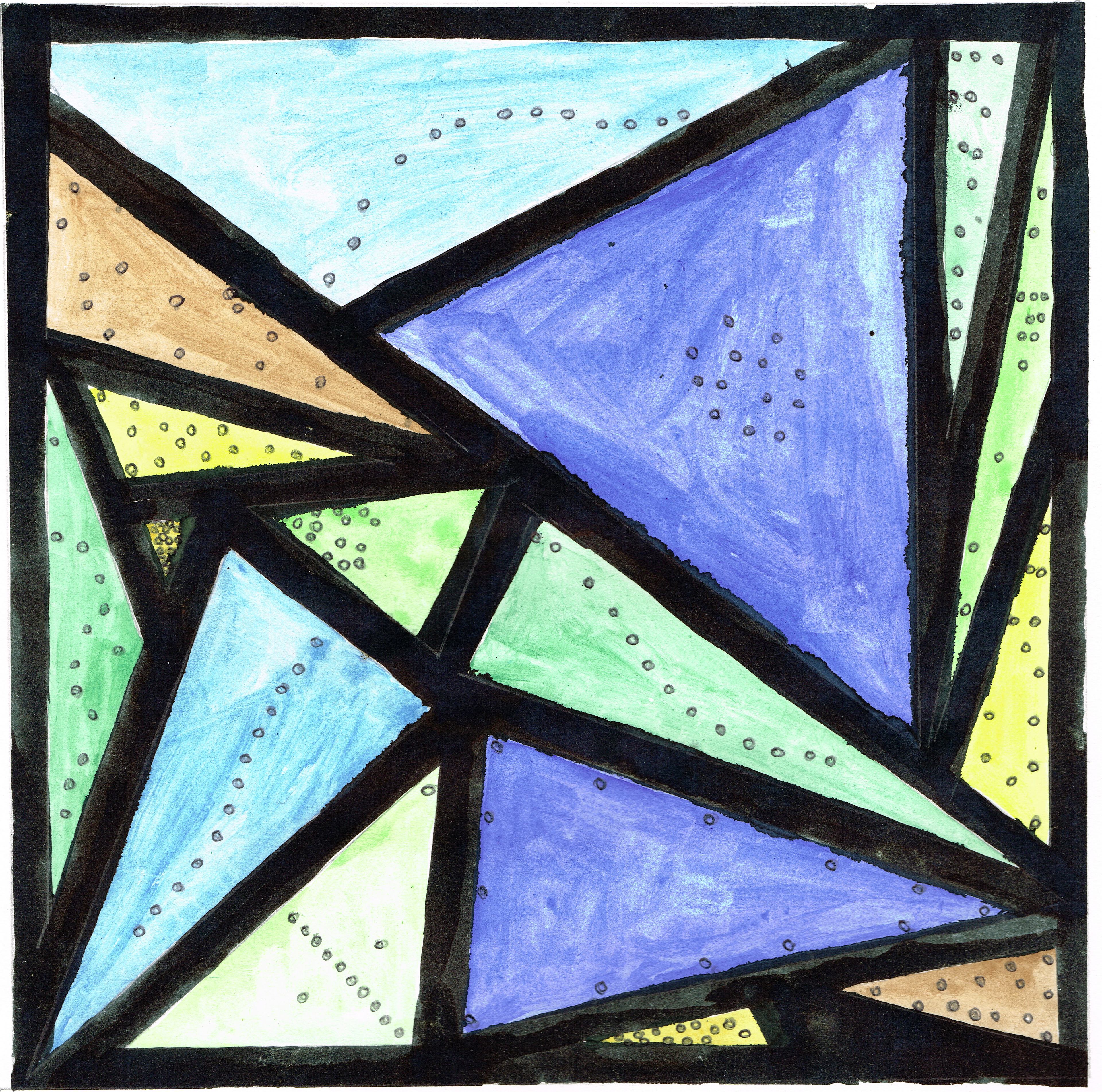

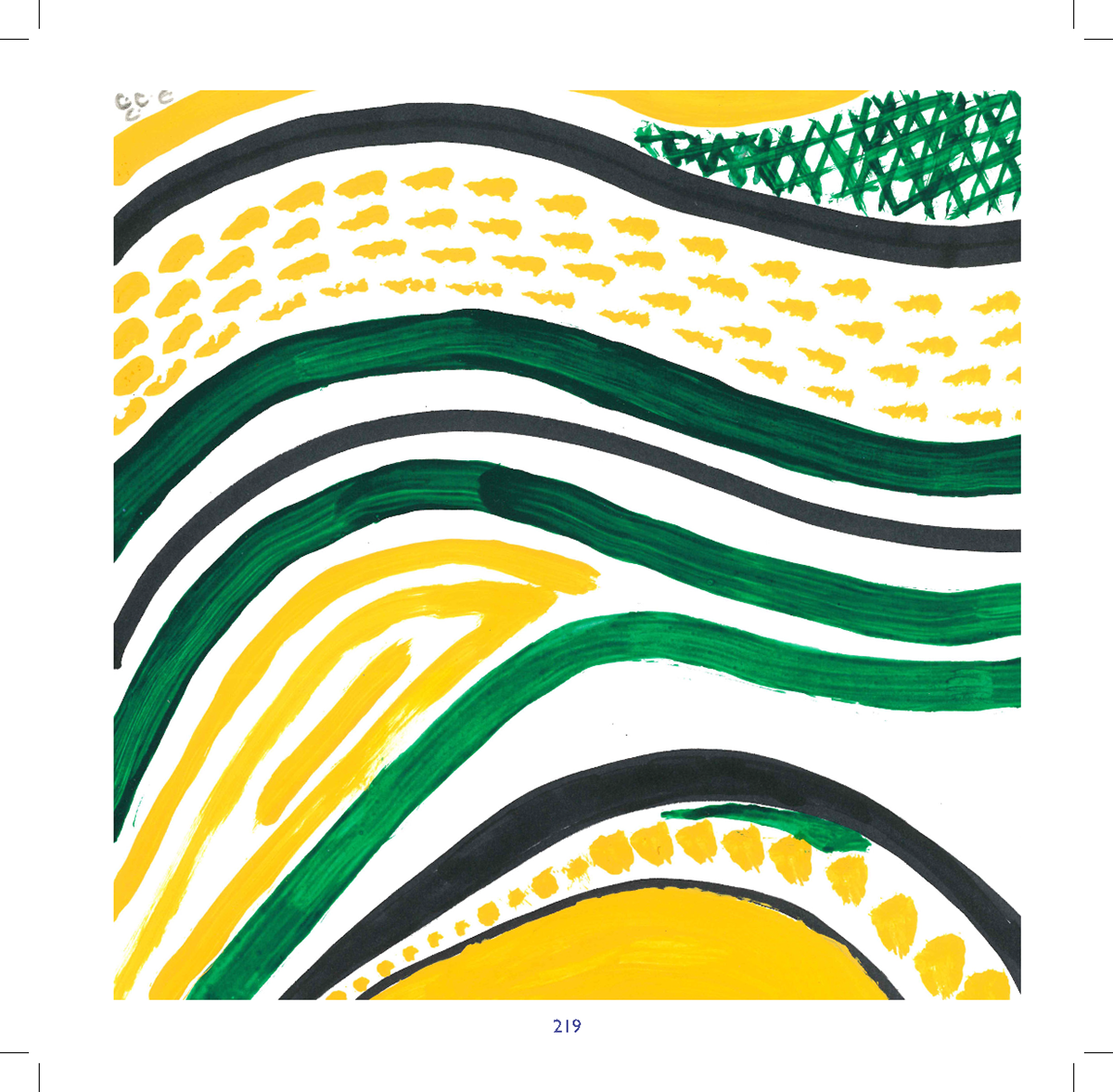
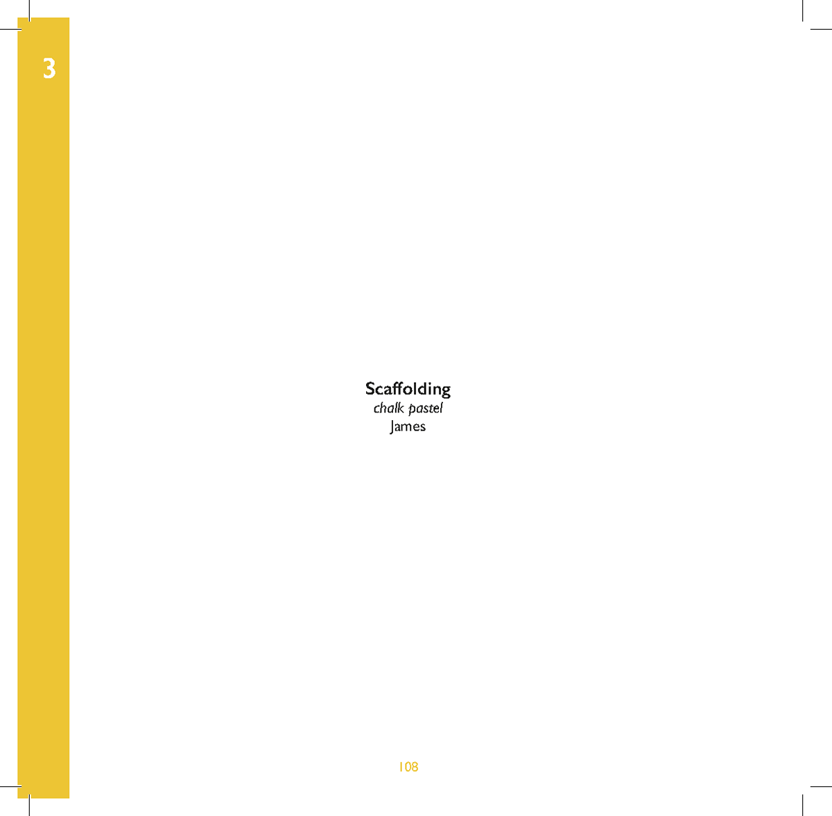
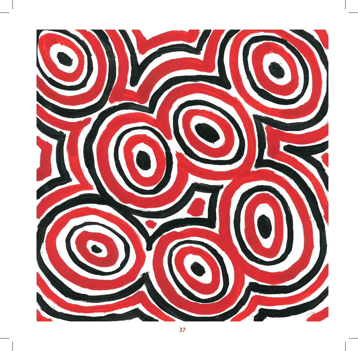
James
Reuben


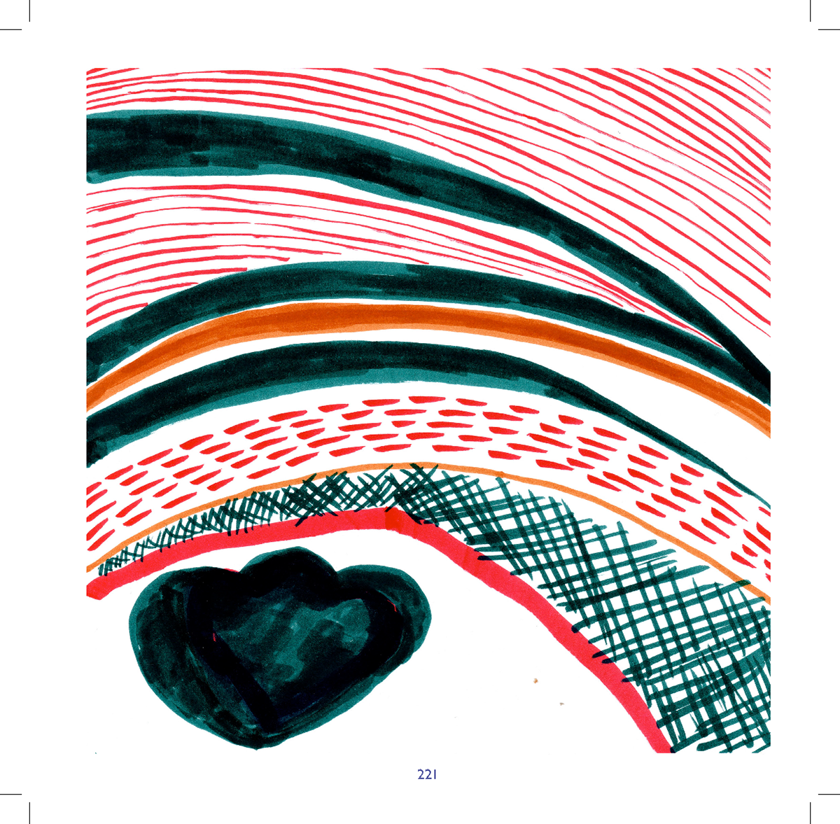
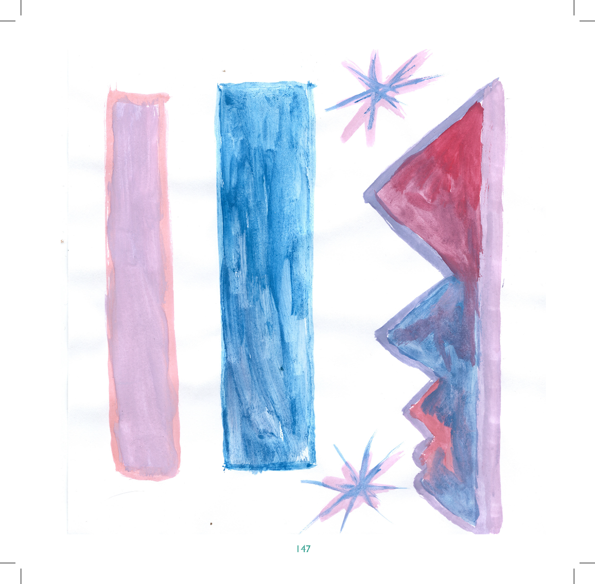
Erika
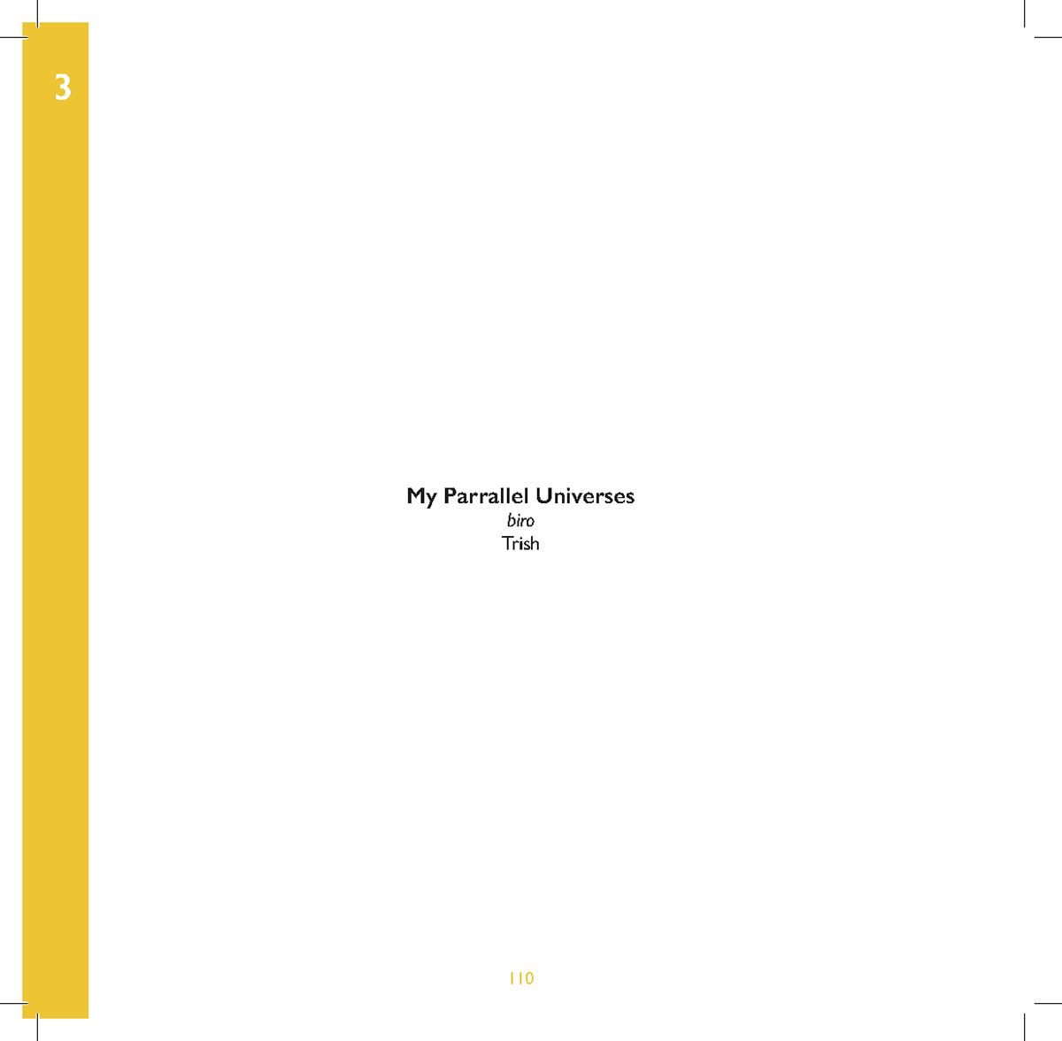
Trish
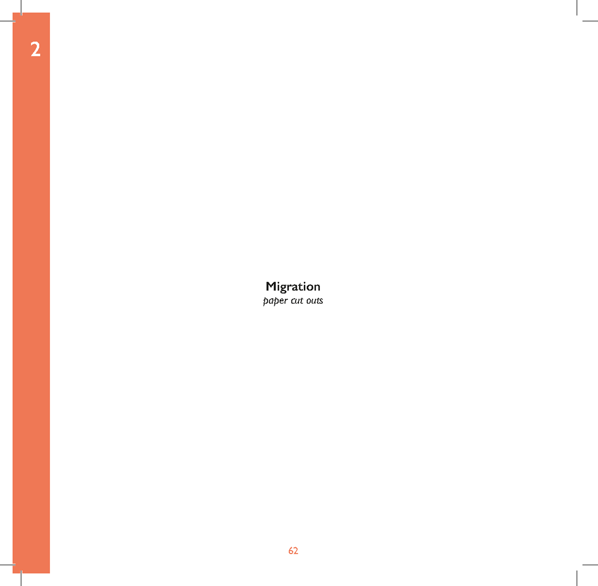
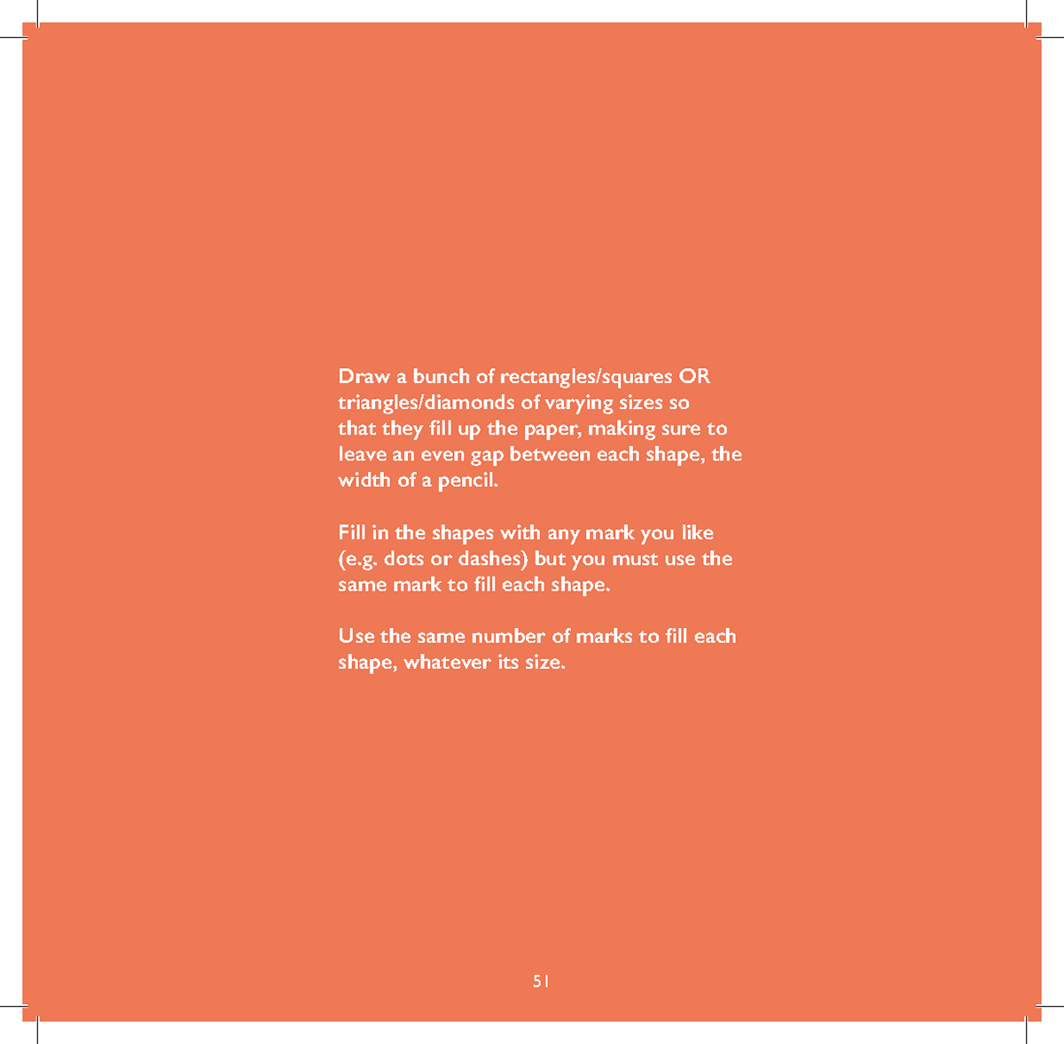
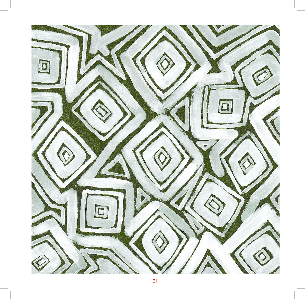
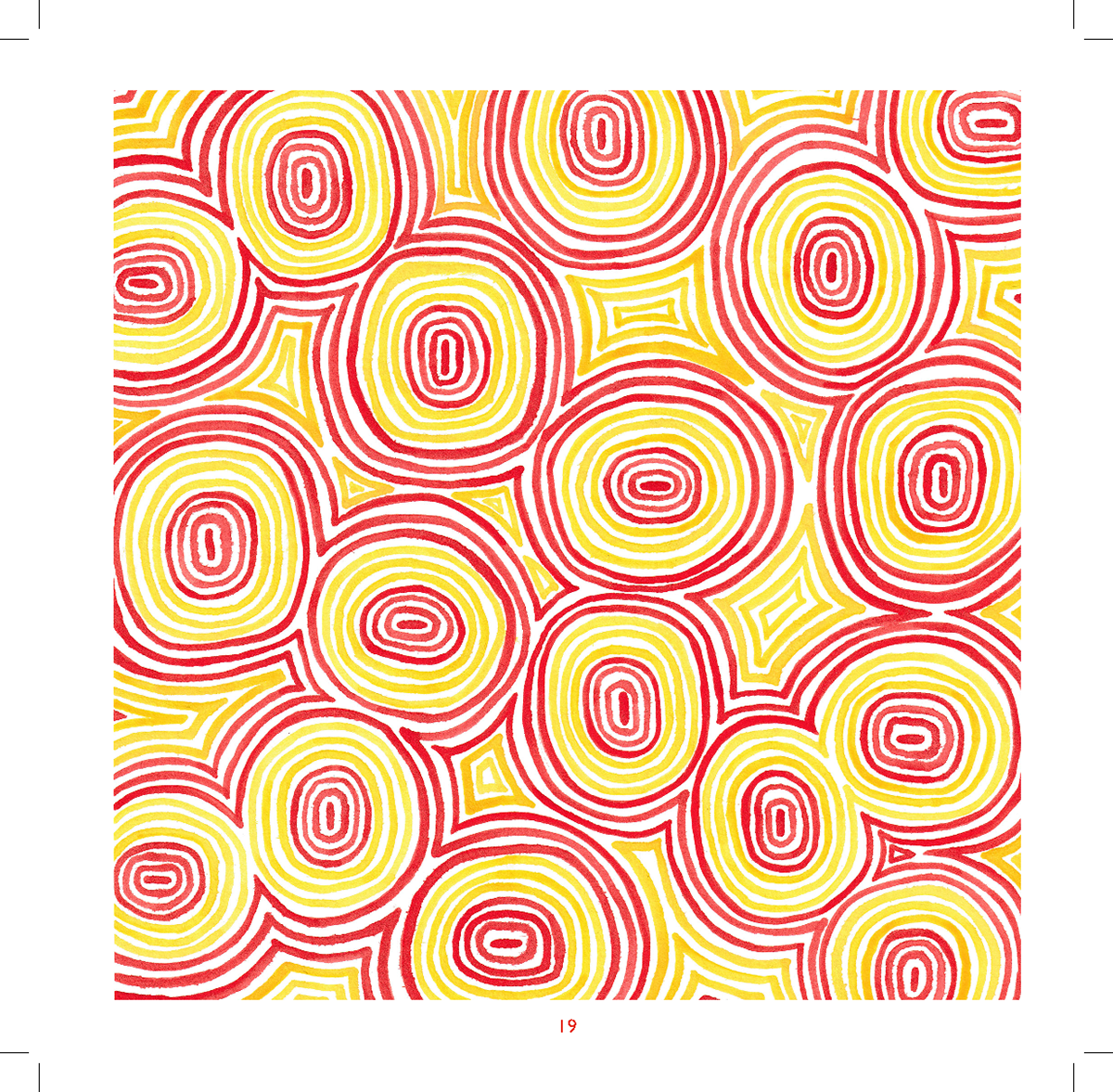
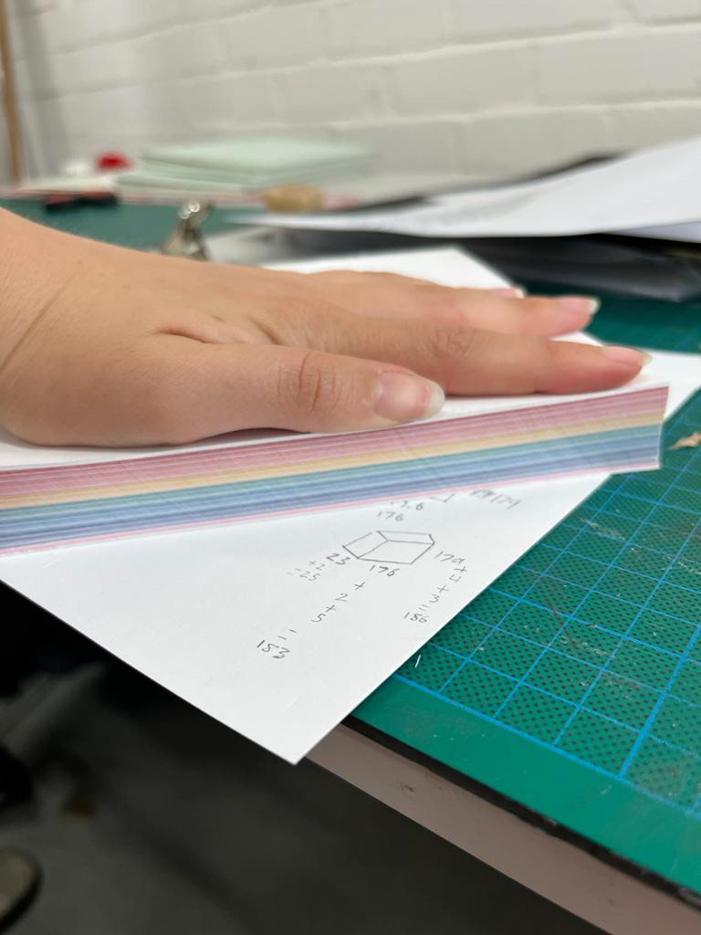
Paper Options
I decided to go with 120gsm as I wanted it to feel high quality whilst not being too thick that pages don't fold as easily. I went for brilliant white which is a slightly warm white as I feel its a nicer tone to look at whilst still showing a good colour.
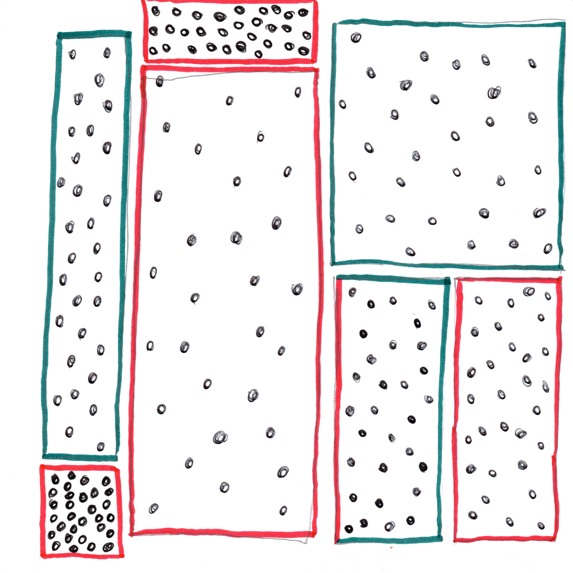
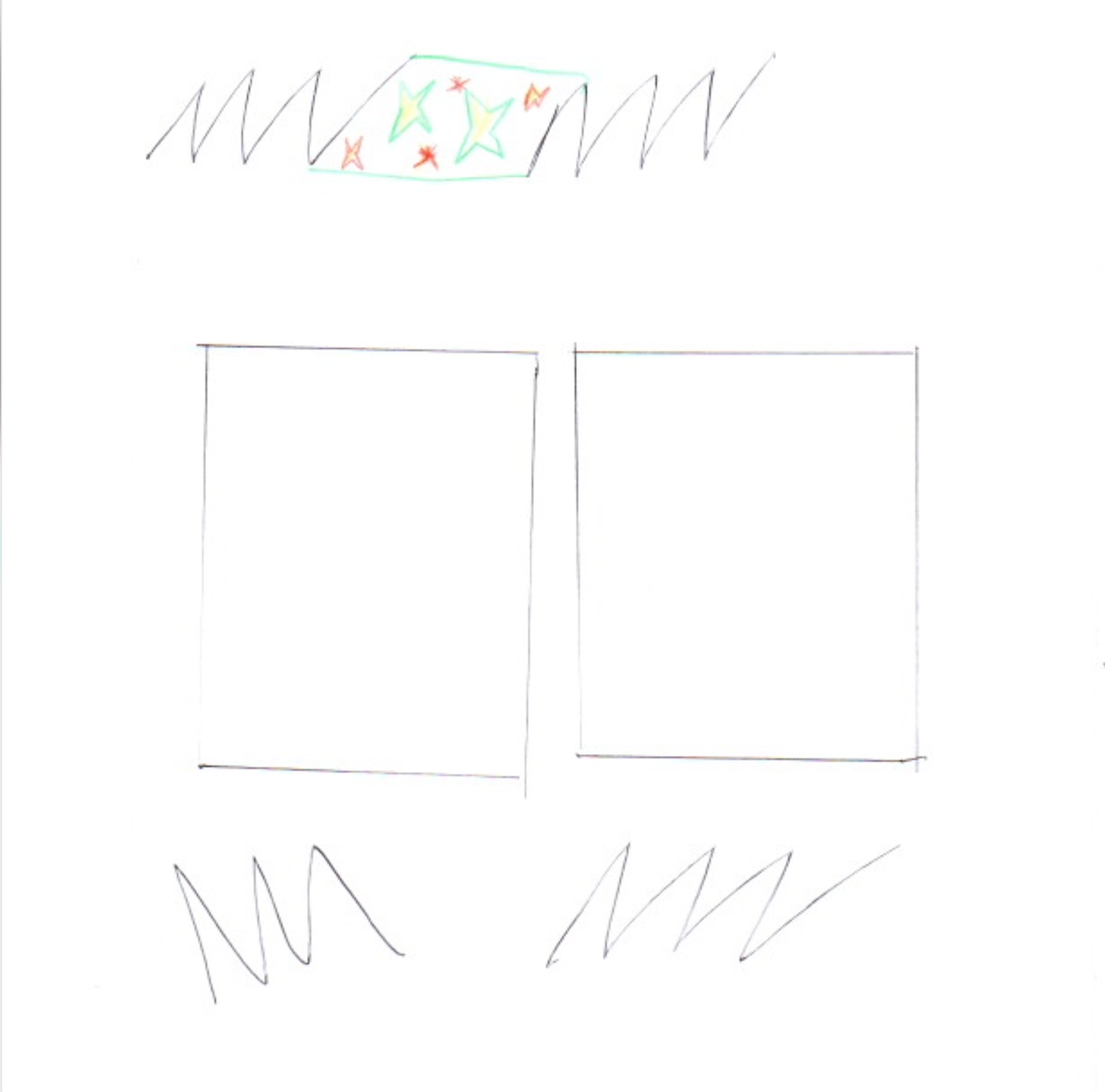
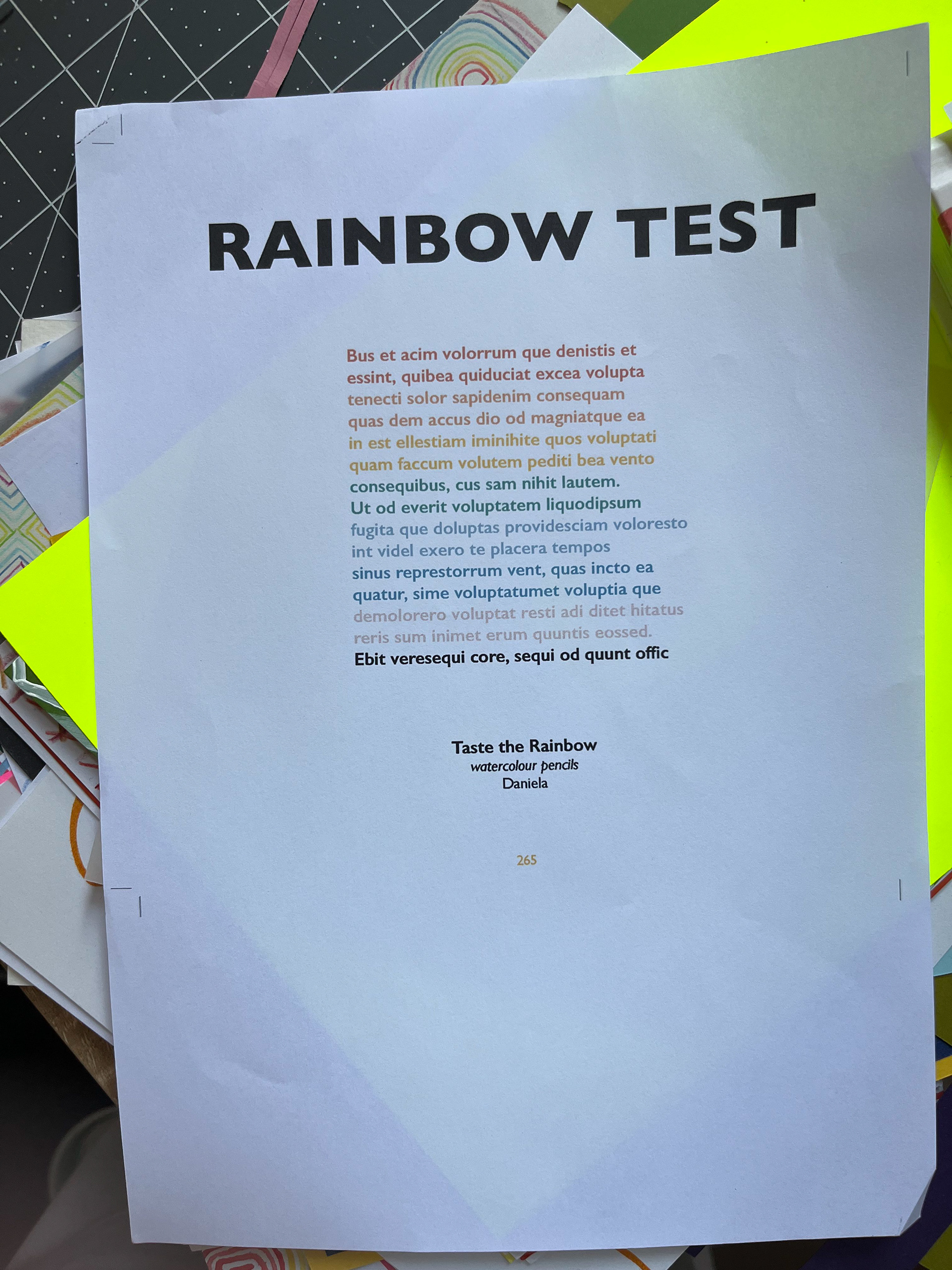
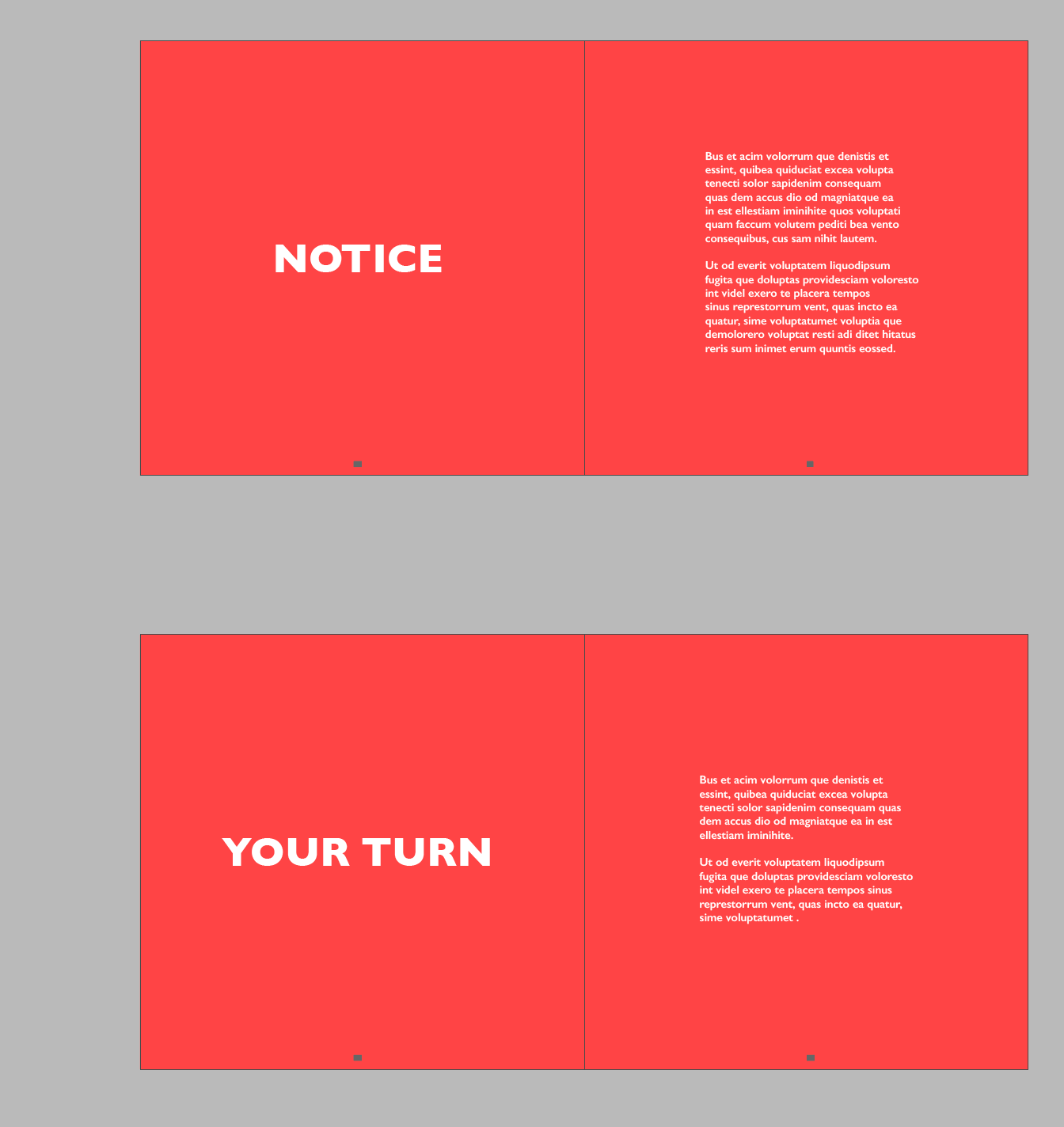
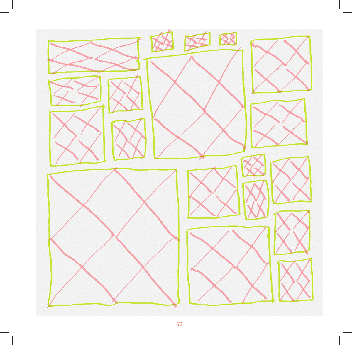
Print Test

I decided to do a print test to check the font size/layout and how my printer printed the colours. I'm happy with how it looks but will make the font slightly smaller as in person it looks a bit too big. Another thing I will go for the larger border (1cm) as it gives each piece room to speak for itself.
The darker colours printed out a bit darker than I wanted so I will try play around with it and pick some new ones. I went for rainbow colours as I like the association with creativity and a rainbow.
Colour Print Test Again

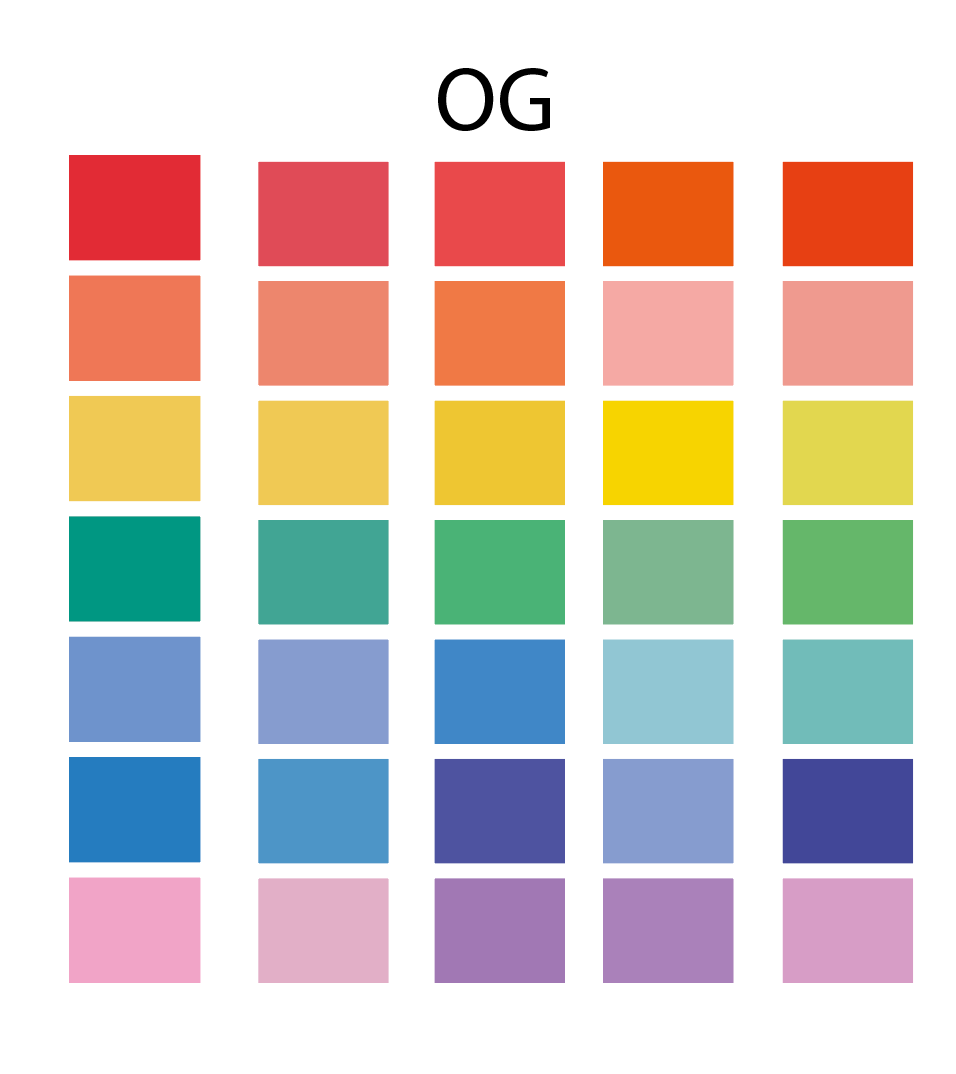
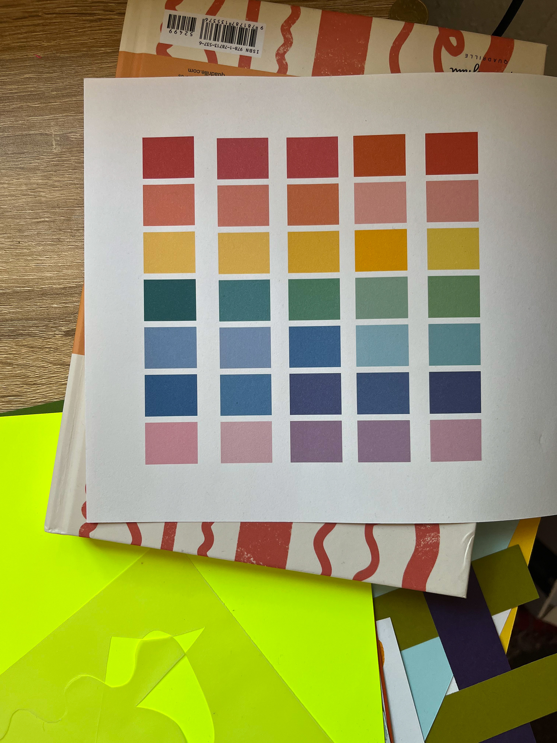
This is what I ended up going with I mix a couple of my palette and feel like the single selection on the left is the best out come. Each colour is distinct enough and a good tone as well.
Style refinement
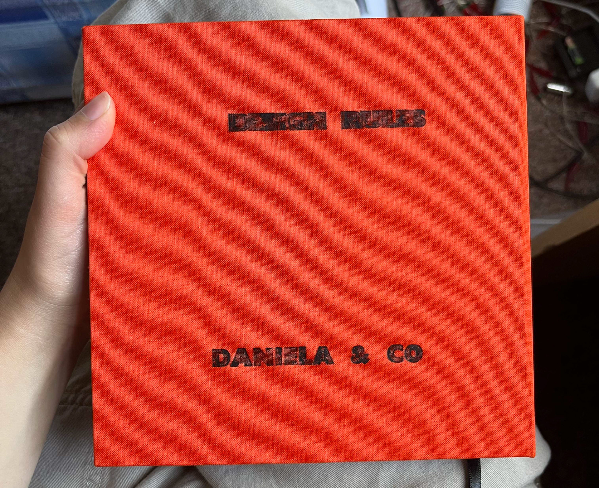
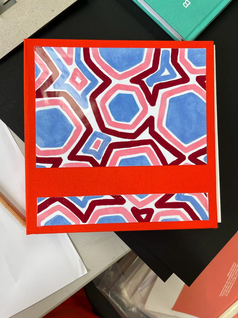
I want the front cover to incorporate a response to the rules, my running idea is that I would want it sold in a museum/gallery or library gift shop, because of this I want a cover that stands out and it's why I think the slip cover idea works really well. The tactile layers to how I envision the slip cover and hardback front cover is what will bring the book up a place as it's satisfying to hold.
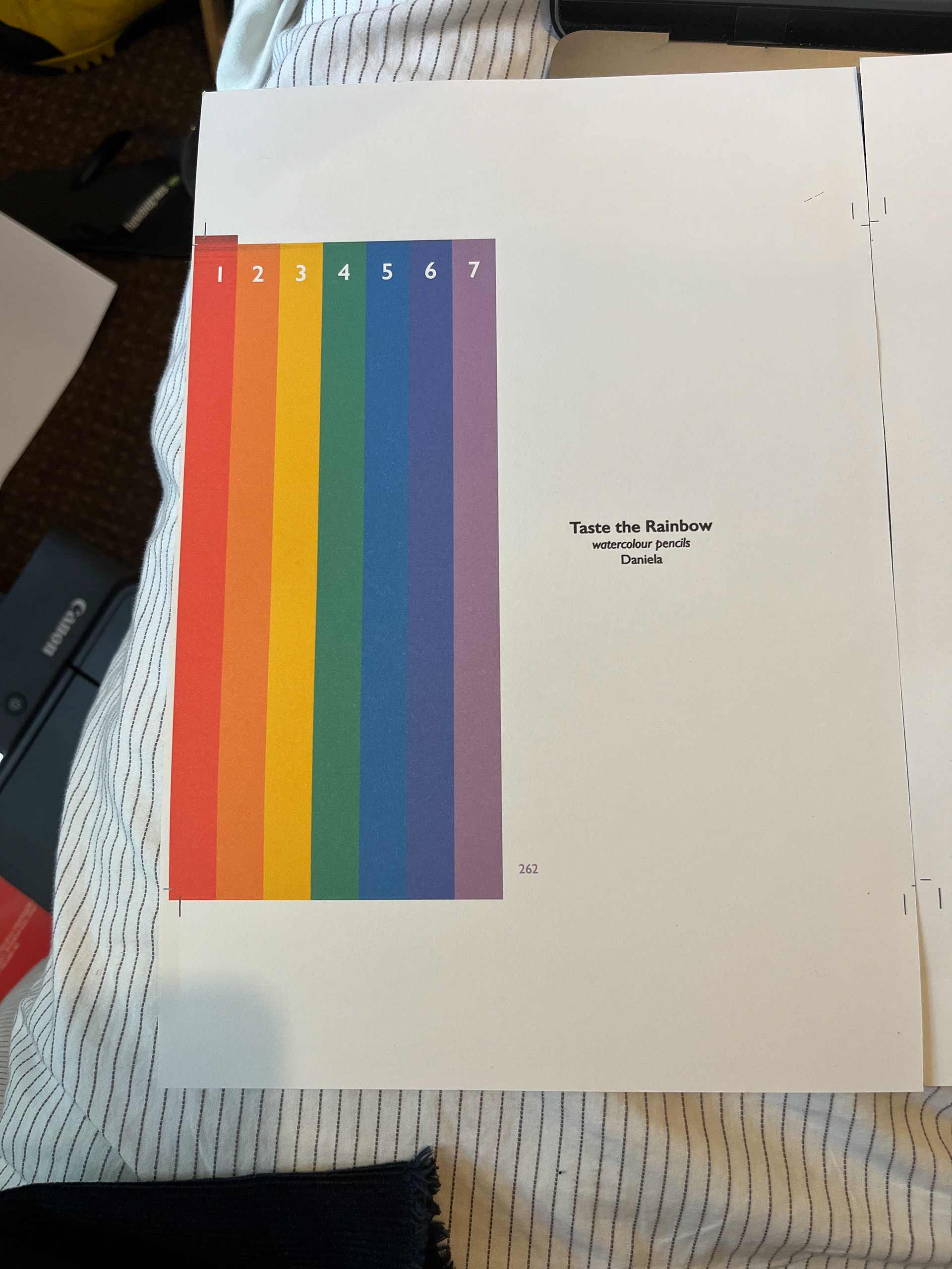
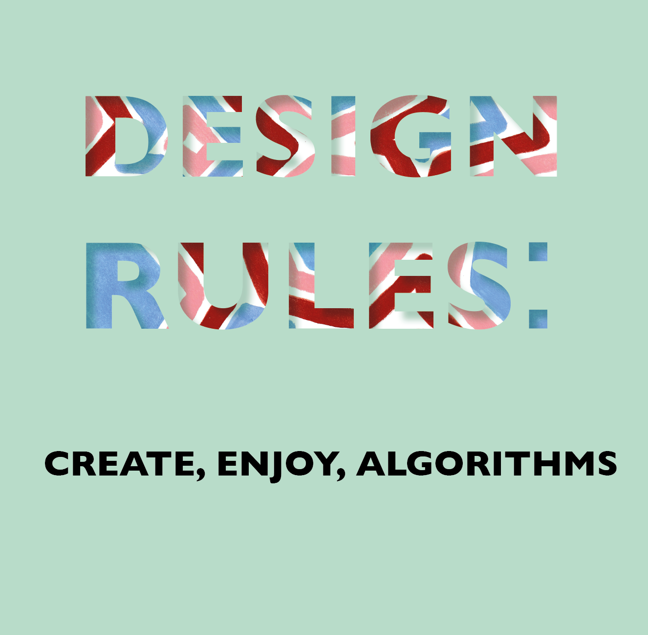
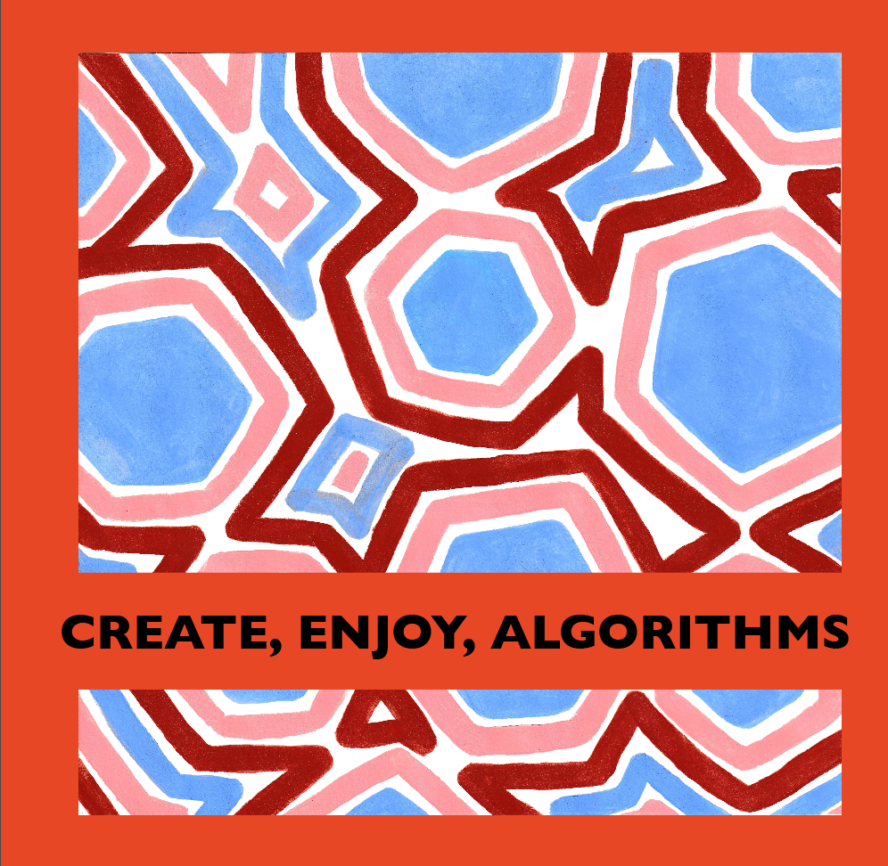
For the layouts I have the intros being colourful. 7 colours for 7 rules (reason for 7th rule on next section where copy is). Then pretty blank for the response pages will a bar of colour so you know how far in you are.
copy AND ADDED RULE
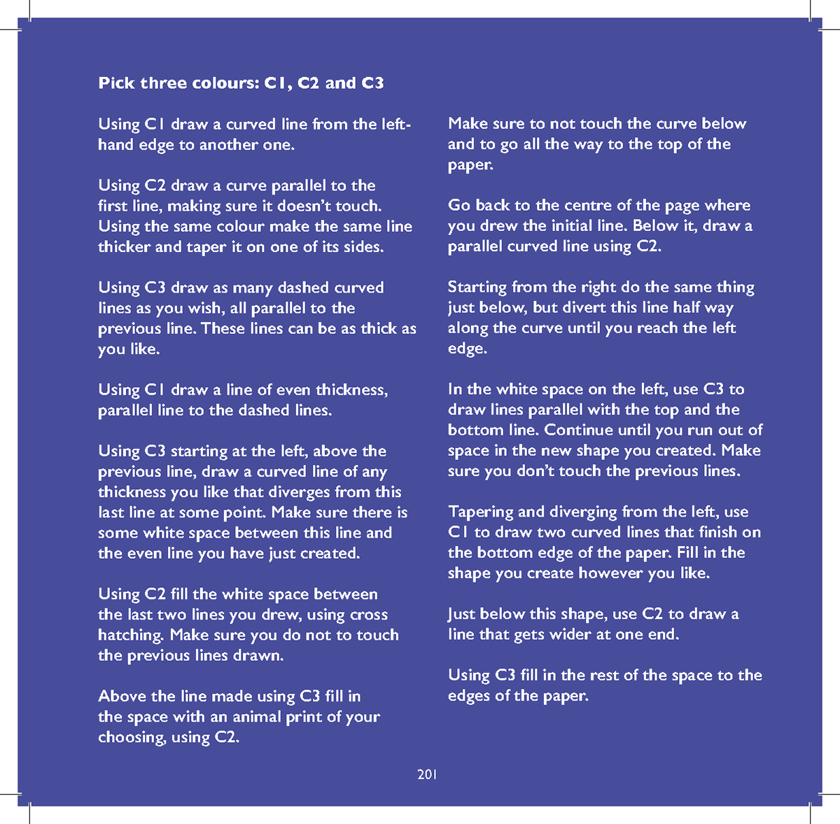
This is my copy that I am going to use.
In the introduction pages I wanted to introduce the ideas of this being a playful and collaborative project based on rule based art, giving the impression that there is no wrong way and suggesting different ways of using the book (if they want it).
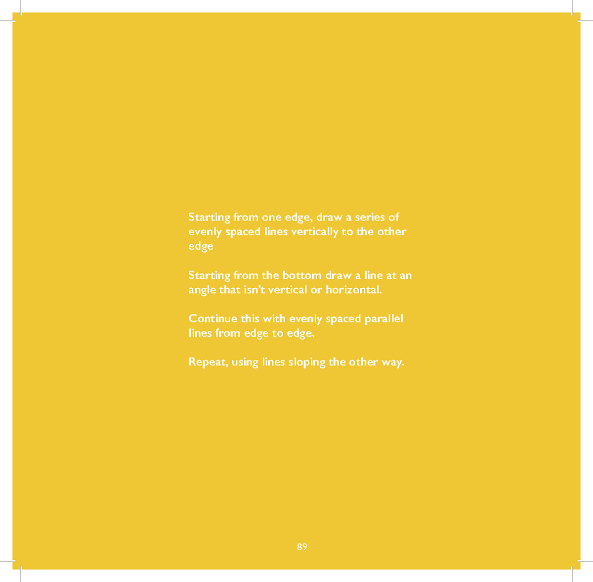
I've kept the intros the same and added my own observations including dimensions and how to do the rules.
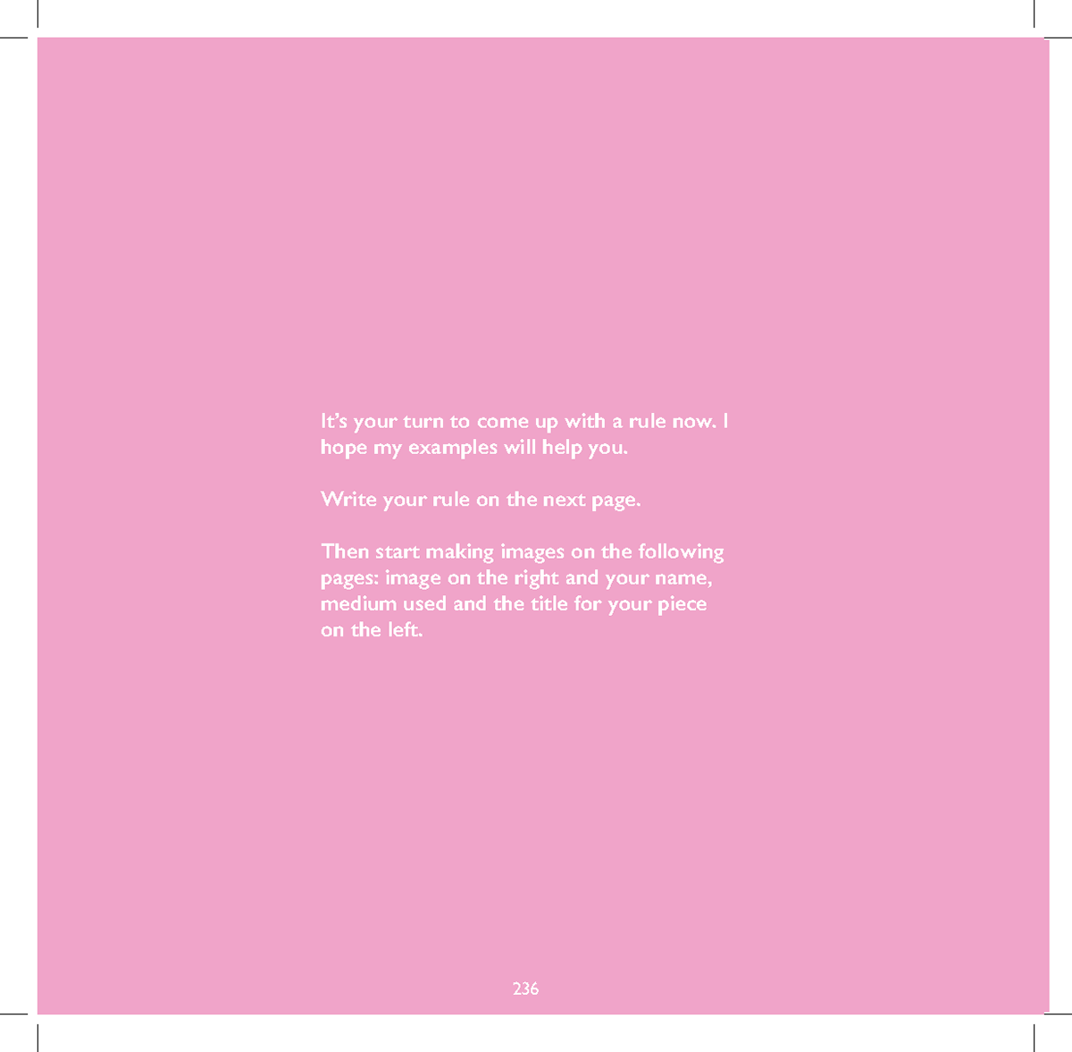
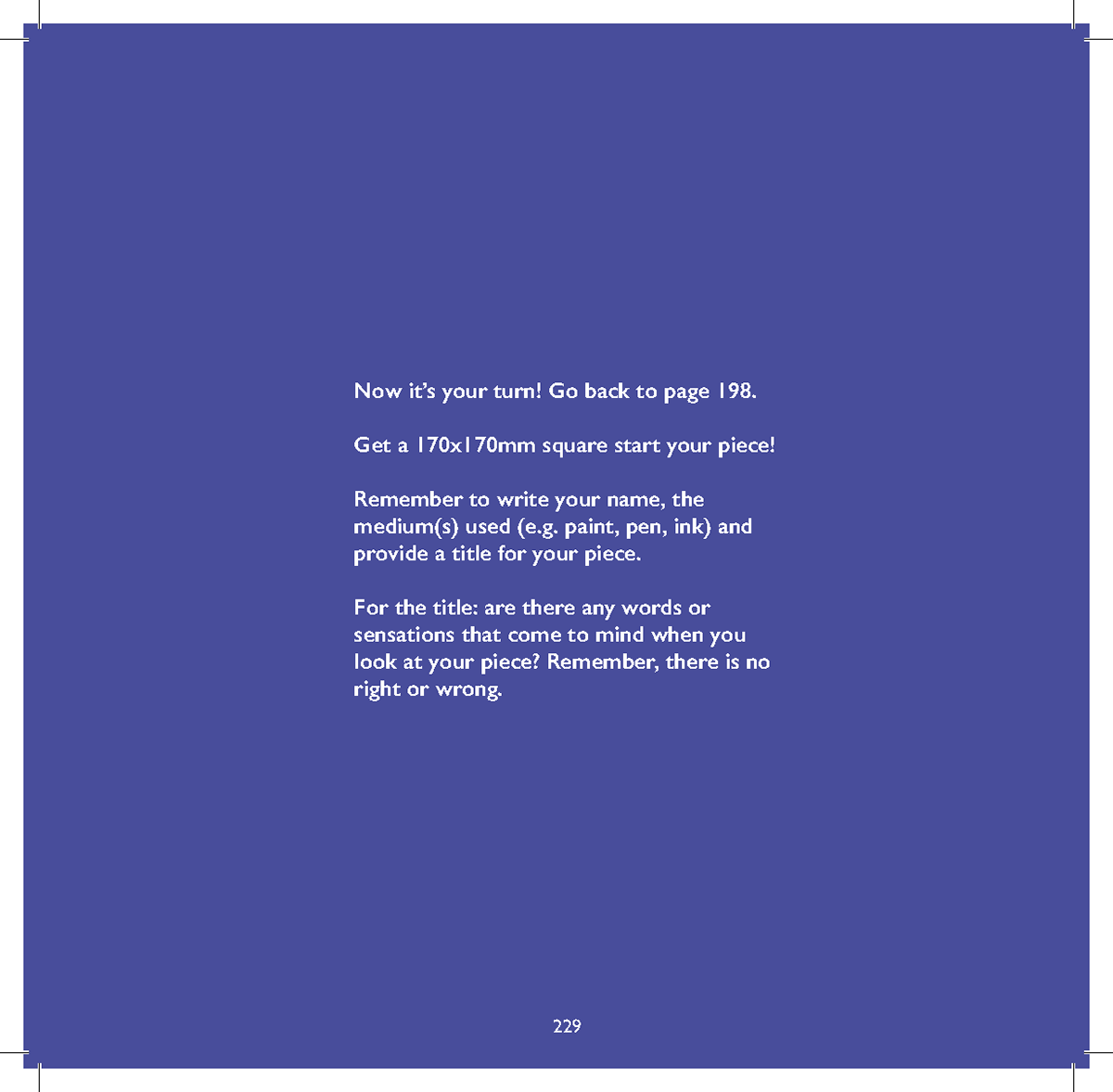
The 7th rule: I'd had the idea of the 7th rule as a way of making the reader a greater part of the collaboration. The idea is they would write their own rule and either do their own responses or do it with friends and family.
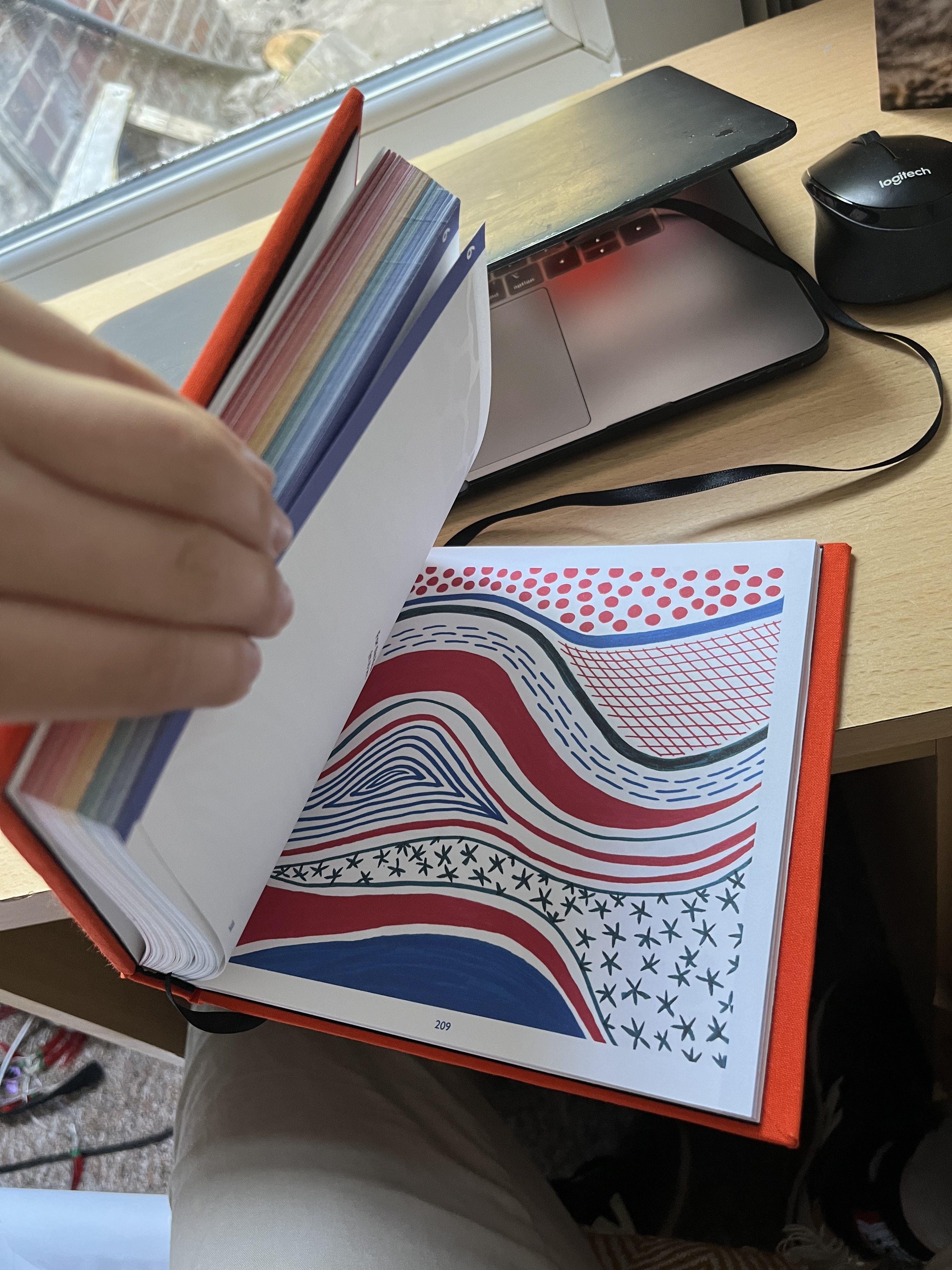
Final layout
(it's back to front for some reason so start from the bottom of the collection of images and work back)


So this is my final layout, I'm really happy with how it has turned out and has the right personality of being inviting whilst still looking well designed.
*Unfortunately whilst I did get my copy check (i'm very bad at seeing bad spellings since i'm not very good) I managed to mess up the spelling of "myself" on the My Own introduction pages.*
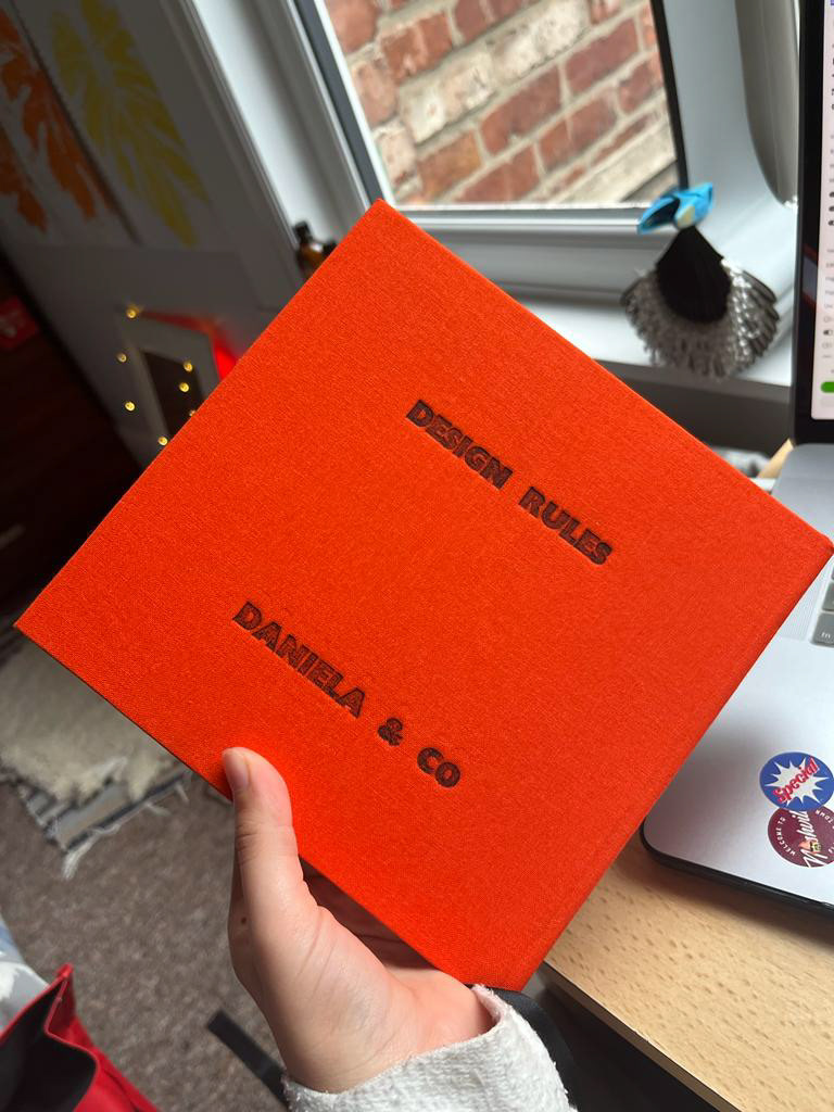
Print and Binding

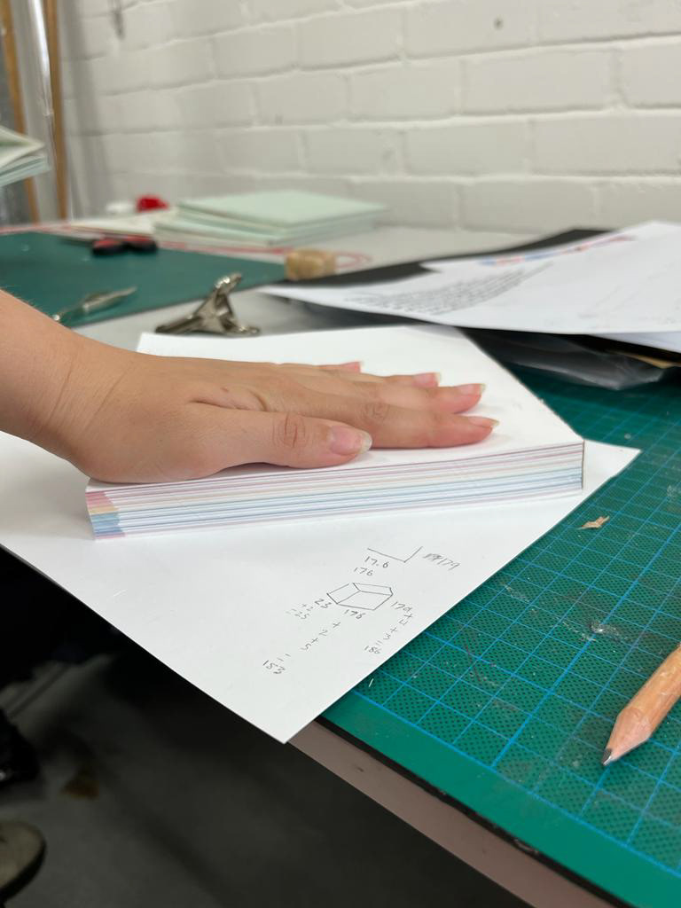
The first binding didn't go as smoothly as I would have hoped, the first mistake was that due to print margin error the pages weren't 100% aligned so it's gradually wonky on the edges due to me lining the paper evenly - at the beginning it starts out okay but at the end the margins are a lot smaller. Also when printing the title on the back the machine misaligned when I did it.
Even though i've had these setbacks it still looks okay, but I will be making another one.
Second book
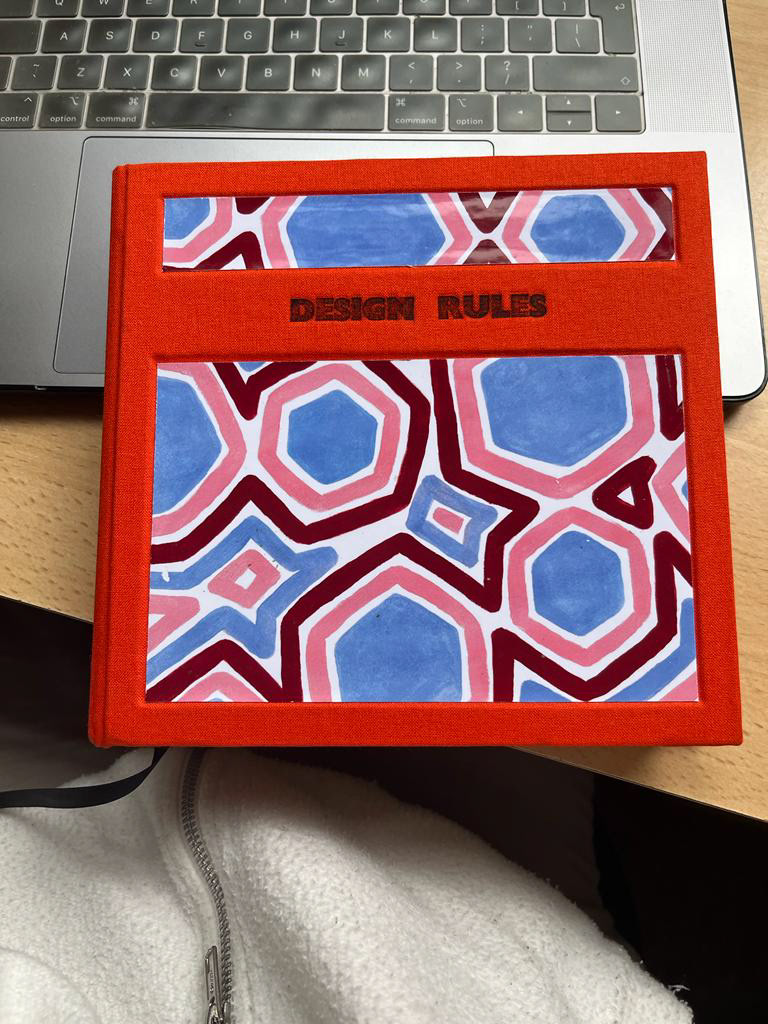
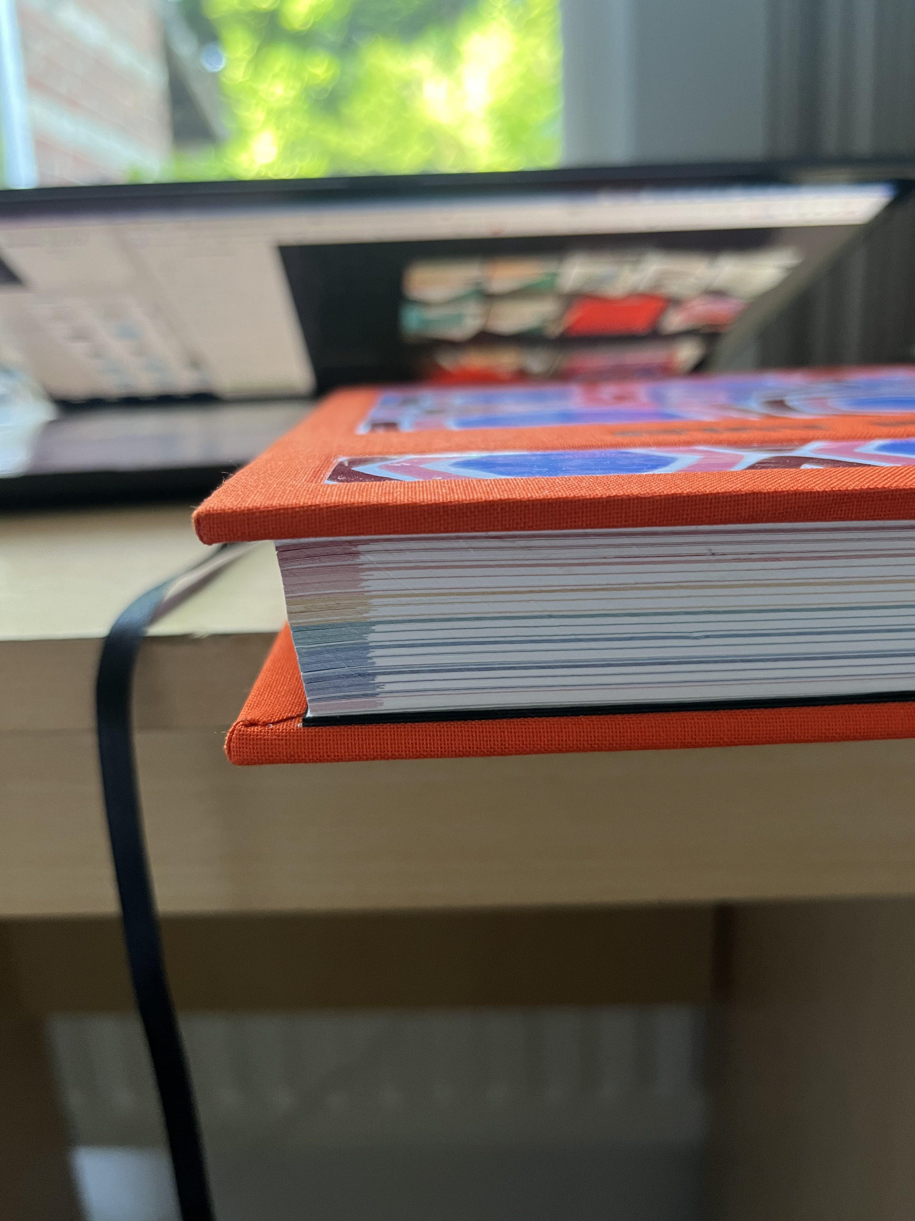


The second book went a lot better as I knew what to expect. I cut the pages in smaller batches which helped, and I also flipped the position of the title.
To make the cover look more professional I used two greyboards and cut windows in one of them and then covered it in fabric so it has an indent for the art piece.
Promotion Idea

For the promotion it comes in different stages, the way it's presented in shops, the website for buying the book and the instagram for building the community and adding its own rules and responses, then in person workshops at where they are sold.
I think this suits the book well as it's a collaborative piece and it's subject would work well for being a starting point for a community project. I also like the idea that profits from sales would go to funding the workshops and projects.
Look at the notes for more info
Photoshoot ideas
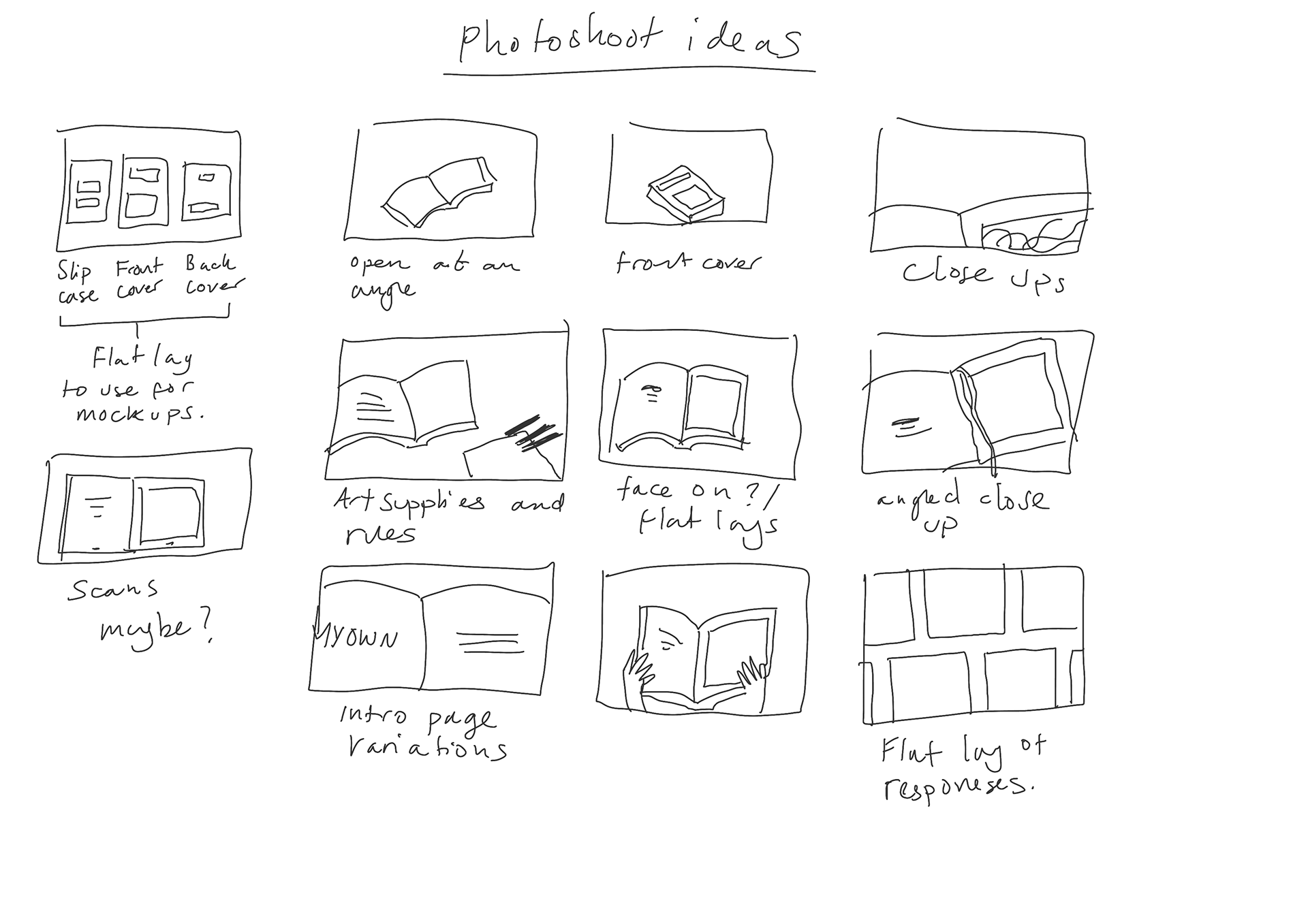
Now that the book is completed I need to plan the photoshop, these are some ideas I have for how to shoot it.