Evaluation
https://stummuac-my.sharepoint.com/:w:/g/personal/18013139_stu_mmu_ac_uk/EVv-dX8OAqZEuO76PvyFjm8BP24pmp5jEupPhieJcJ1VCQ?e=Vcl4nj
Check List
https://stummuac-my.sharepoint.com/:w:/g/personal/18013139_stu_mmu_ac_uk/Ebz5gli8ZwhGntVEPjk0UQUBXpGttosw-KTQ9JQs3v179A?e=9oNmbq
before printing it all I had to work out to print it all as double sided printing wasn't working so will have to stick the back of pages together


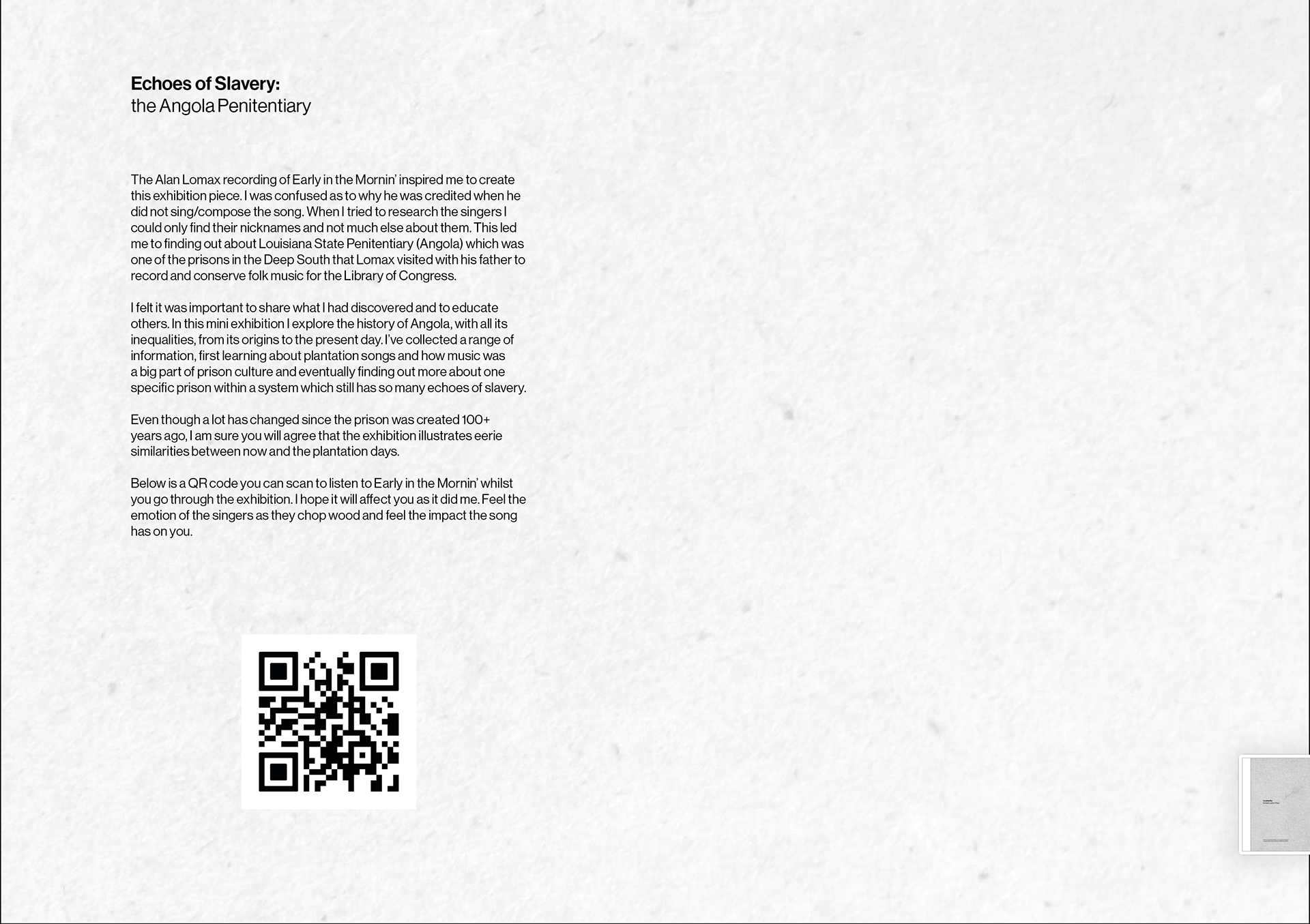
I was very happy with the feedback received and I like the idea of it being produced as a catalyst for change. If it were to go to market this is how I would like to do it - ideally the booklet be available free for whoever wnated it.
Feedback:
I asked for some feedback from friends/family and this is what they had to say.
This looks really cool !!! I think the design is gorgeous and I love the vision for how it could be made like mass produced or limited addition I really like the idea of it being like made a bit sturdier. I think that it could look really nice on maybe the inside could be like flyer paper like you getting pamphlets and exhibitions lovely idea at the embossed and I like the idea that it’s an exhibition in a book or a portable exhibition and you didn’t really mention it but like if there is a specific audience it would be cool to sell that more like maybe this could be used as an education resource in schools and so that could become a thing like it’s an education pack or is there like a specific purpose. Are you trying to shock them / educate/ awaken anger or whatever I think the design really suits the tone and piece and I really like that I think the only thing to sell it even more is to hammer home the concept purpose and audience which I think you could just do like separate from booklet and I really like the idea of it being either limited-edition or having like a specific target and purpose for it and maybe it could be a hypothetical catalyst for change in that audience.
Looks really good, particularly like the charts and timeline.
It is excellent Daniela and with the photos felicitaciones!
Gosh is beautiful, congratulations.


I was at the stage of staring at a screen and wasn't sure if any of this actually looked good. I am aware that I haven't developed it too much but I thought it best to print out and then I can annotate stuff.
I think it looks pretty good and works well as a set it's also helped work out if the scale

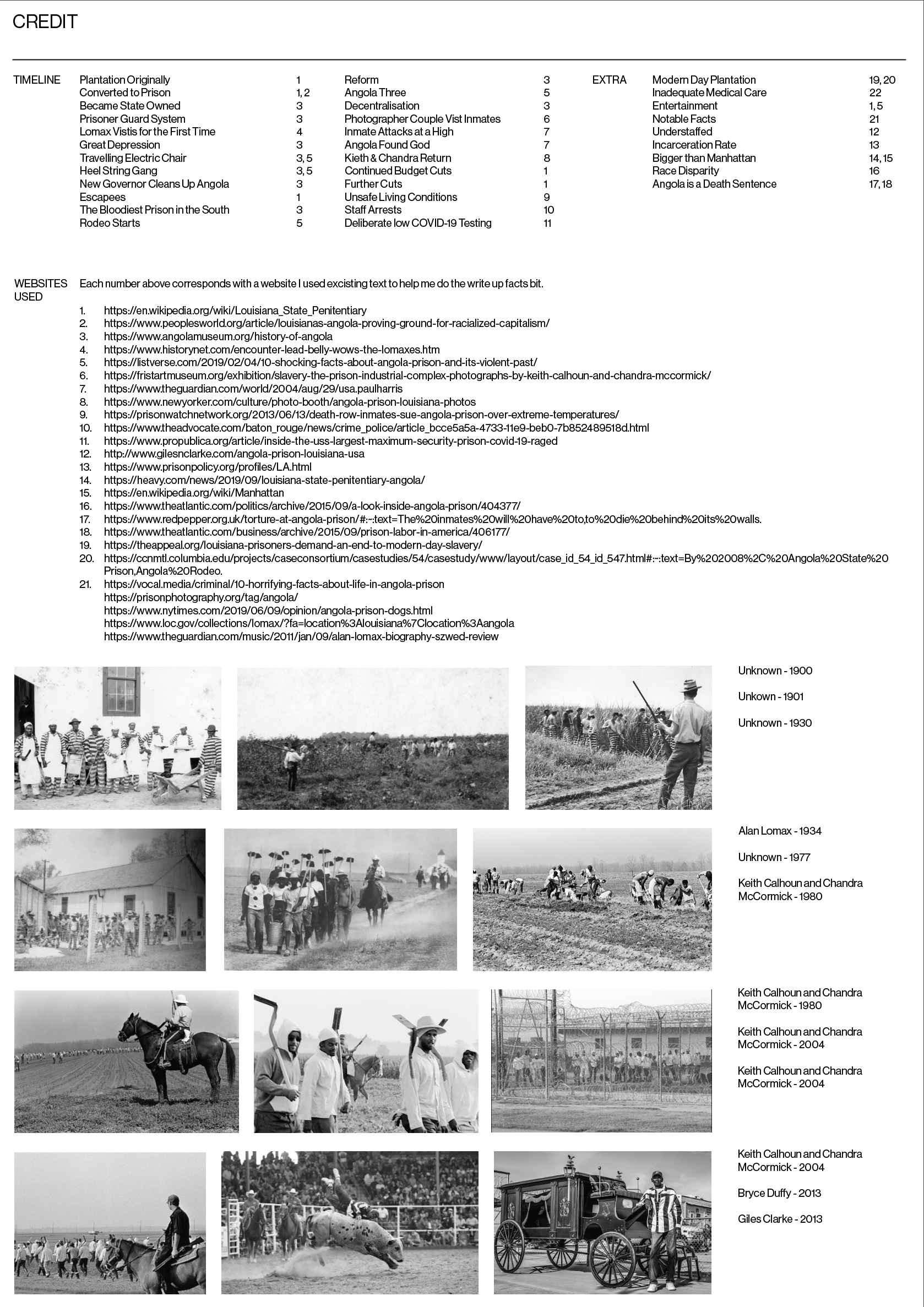
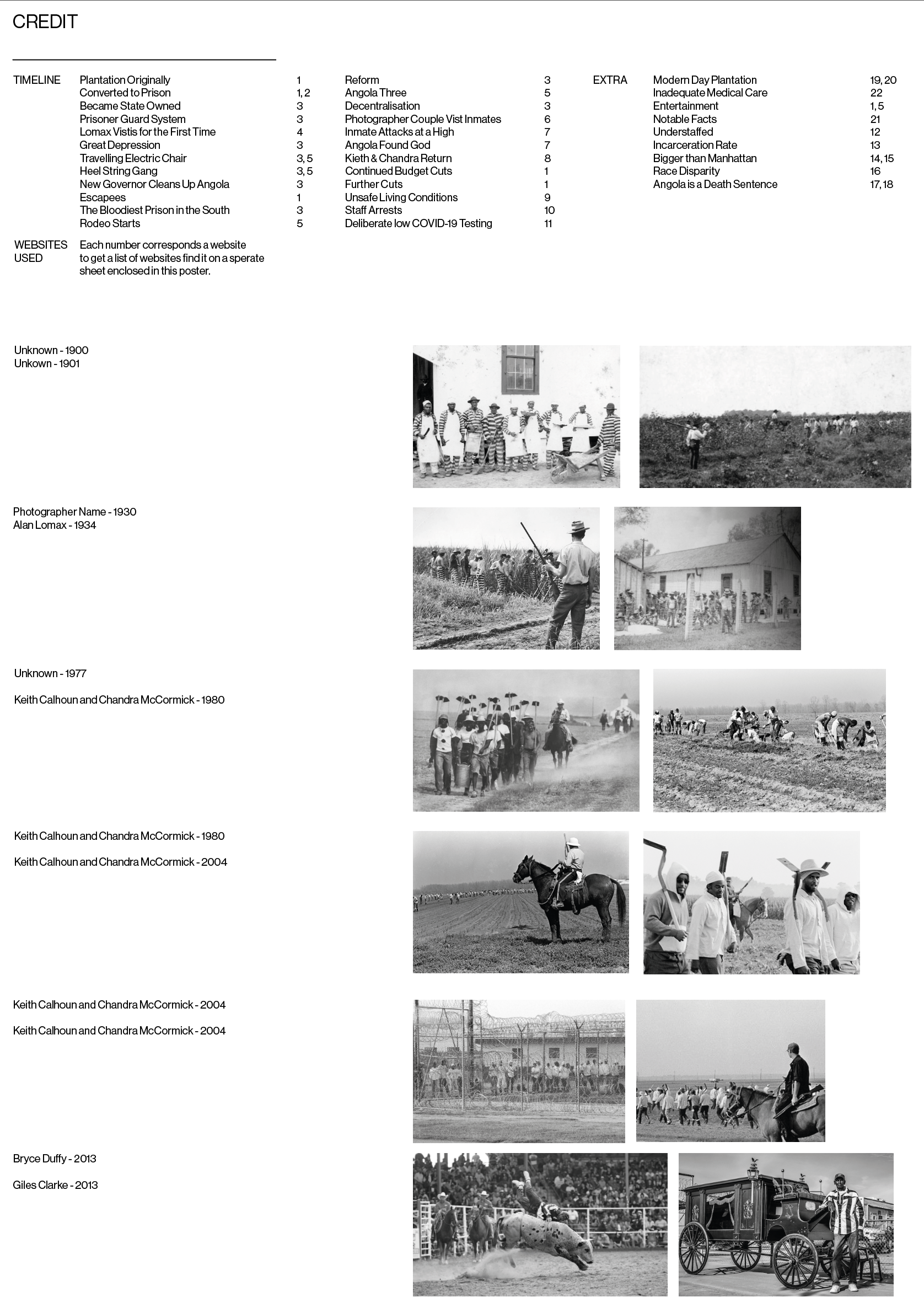

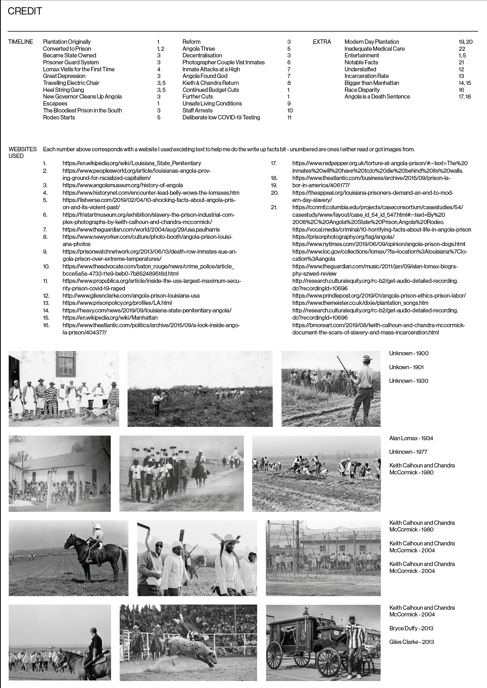
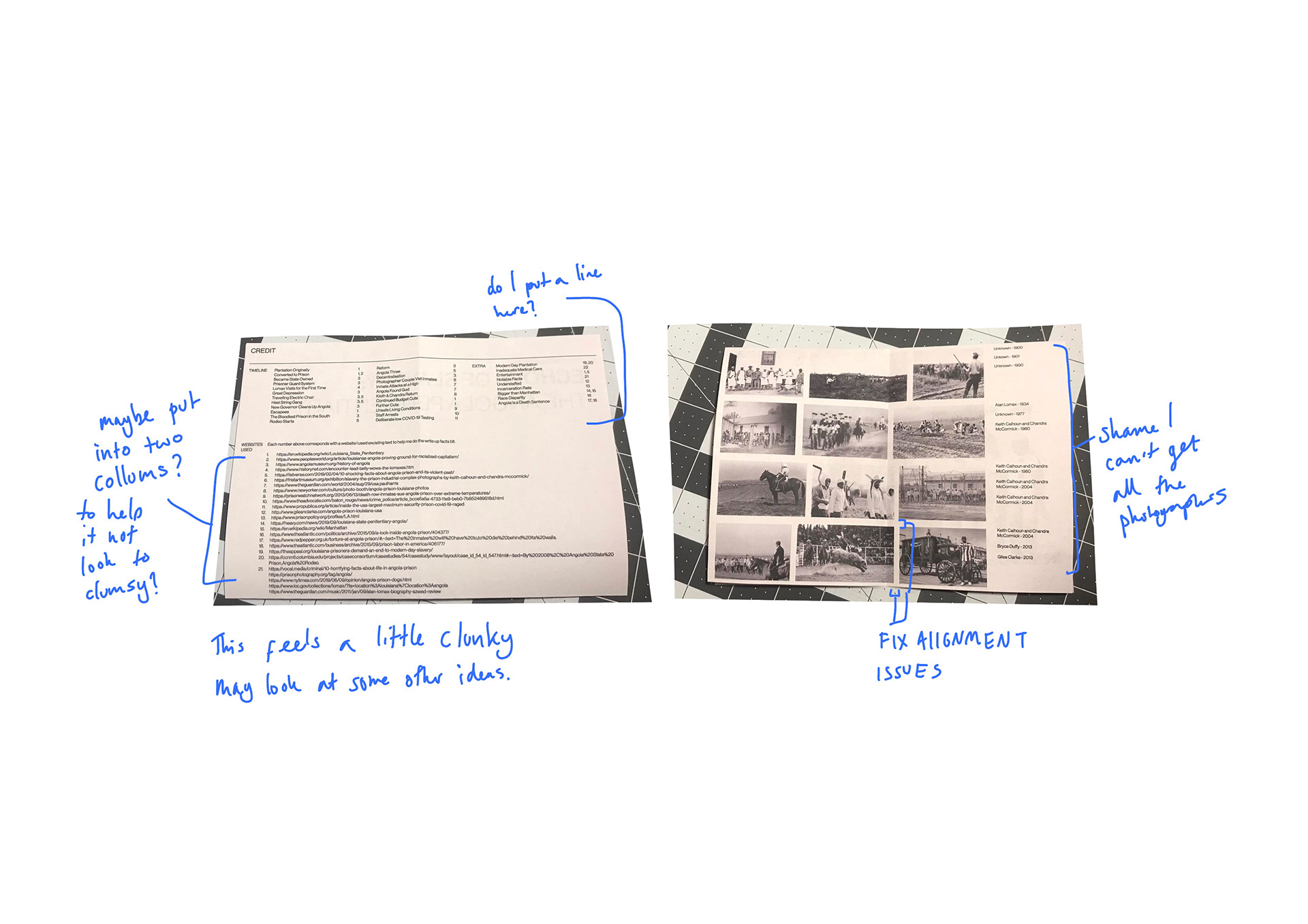
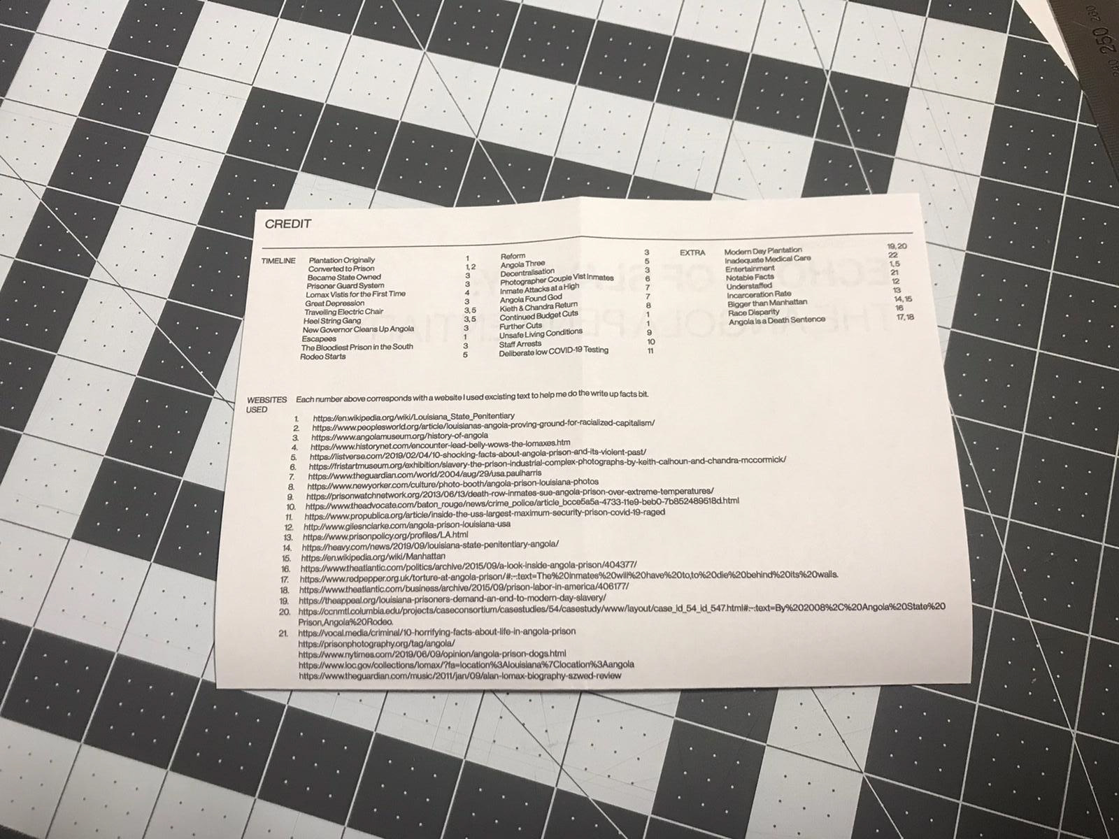
This is me trying to find the best way I could arnage the images and the credit information.
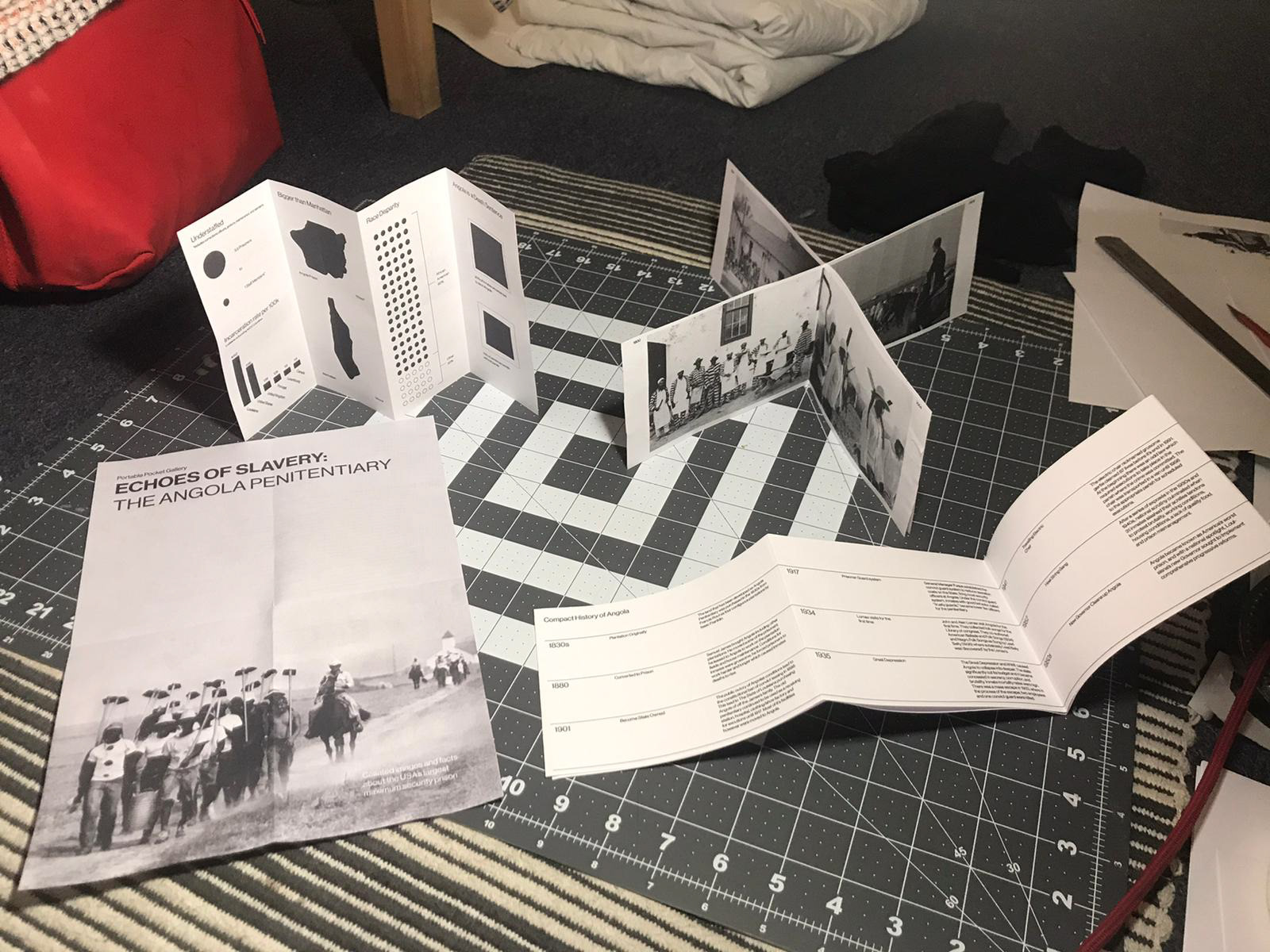
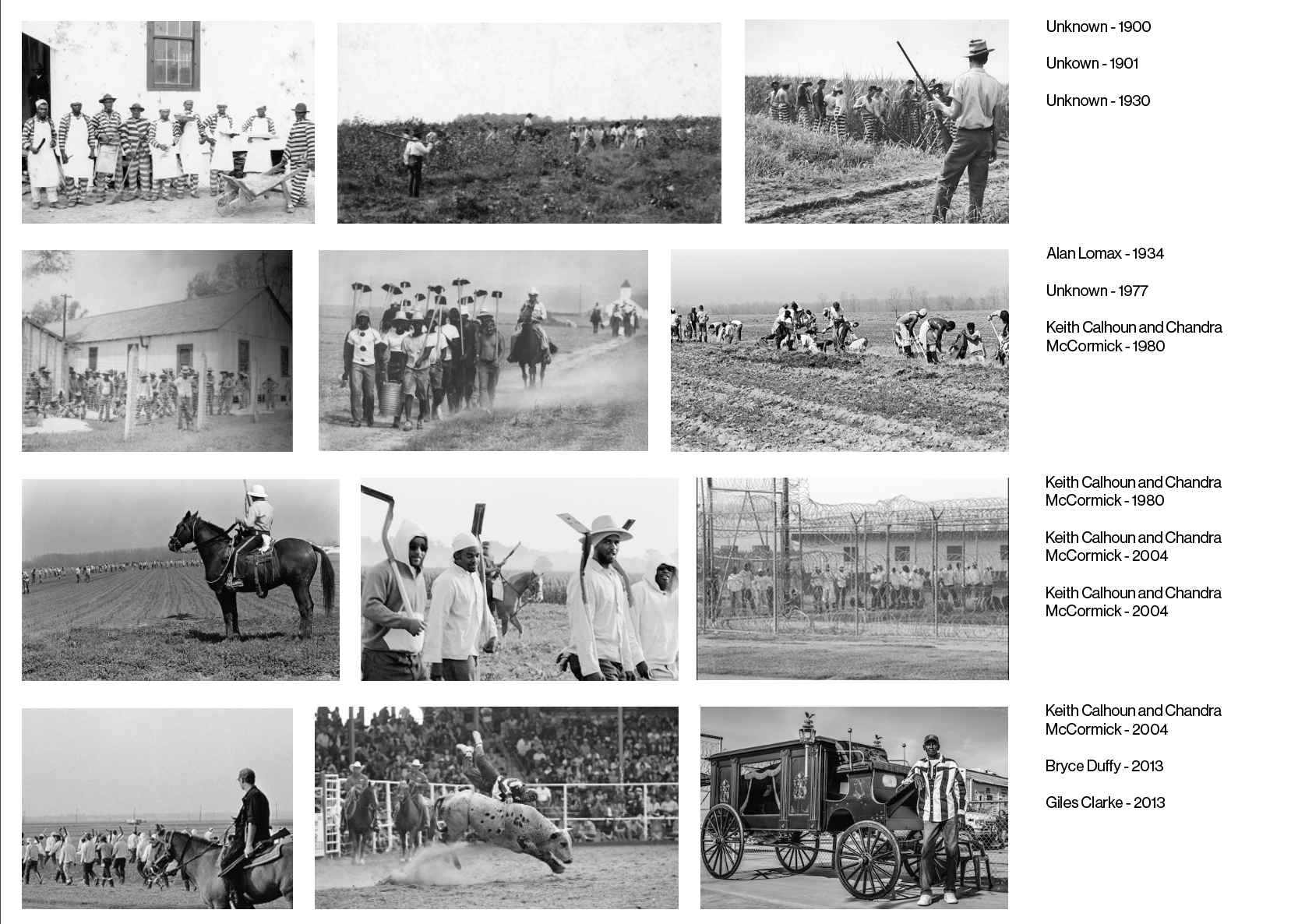
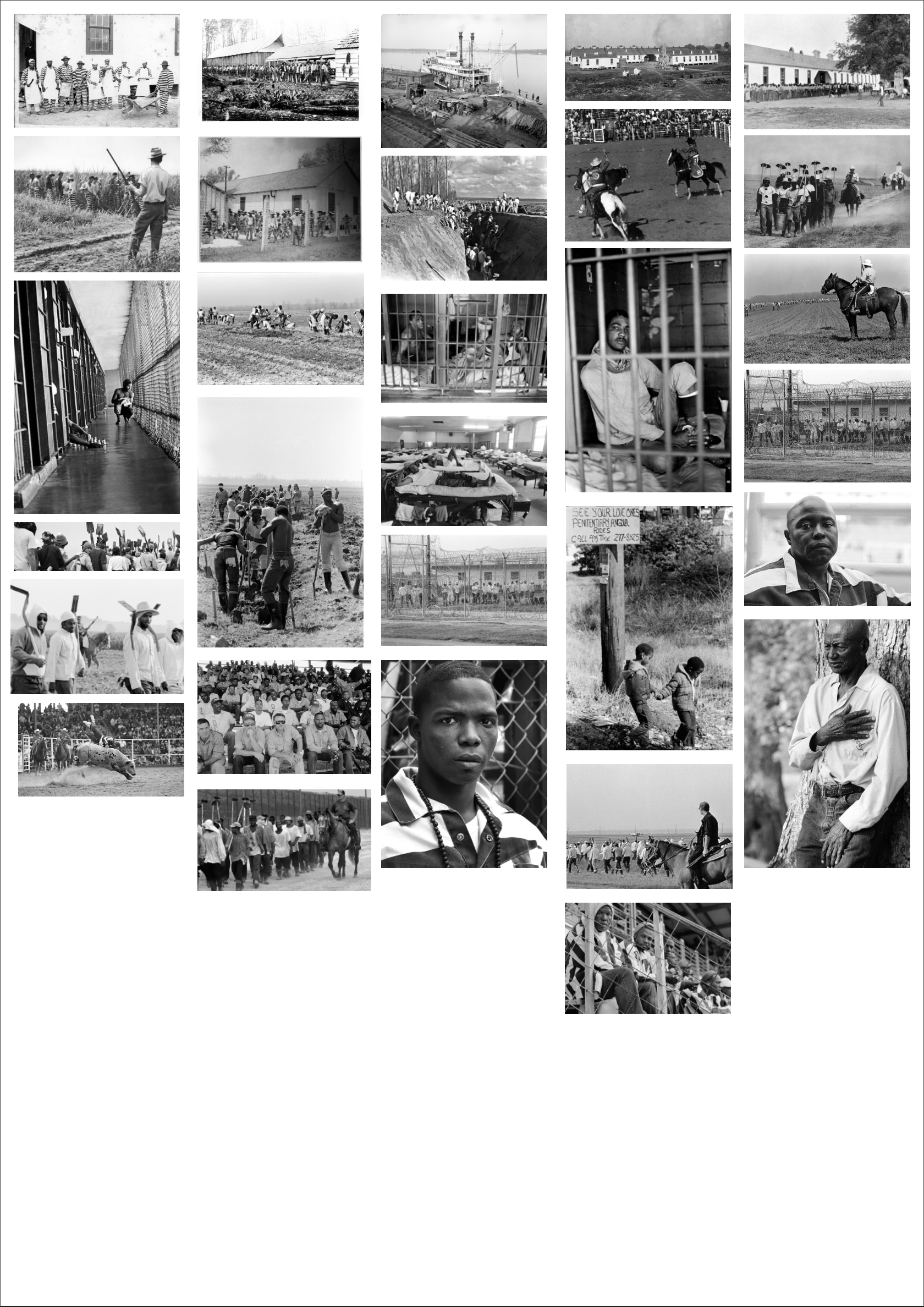
Feedback i have gotten in the past is to reference where I got the work from or the photographers. This isn't the neatest way but I think it works okay for now. I've included all photos I'm going to use and the idea is that you would look at each section themselves with the A4 piece folded in two.
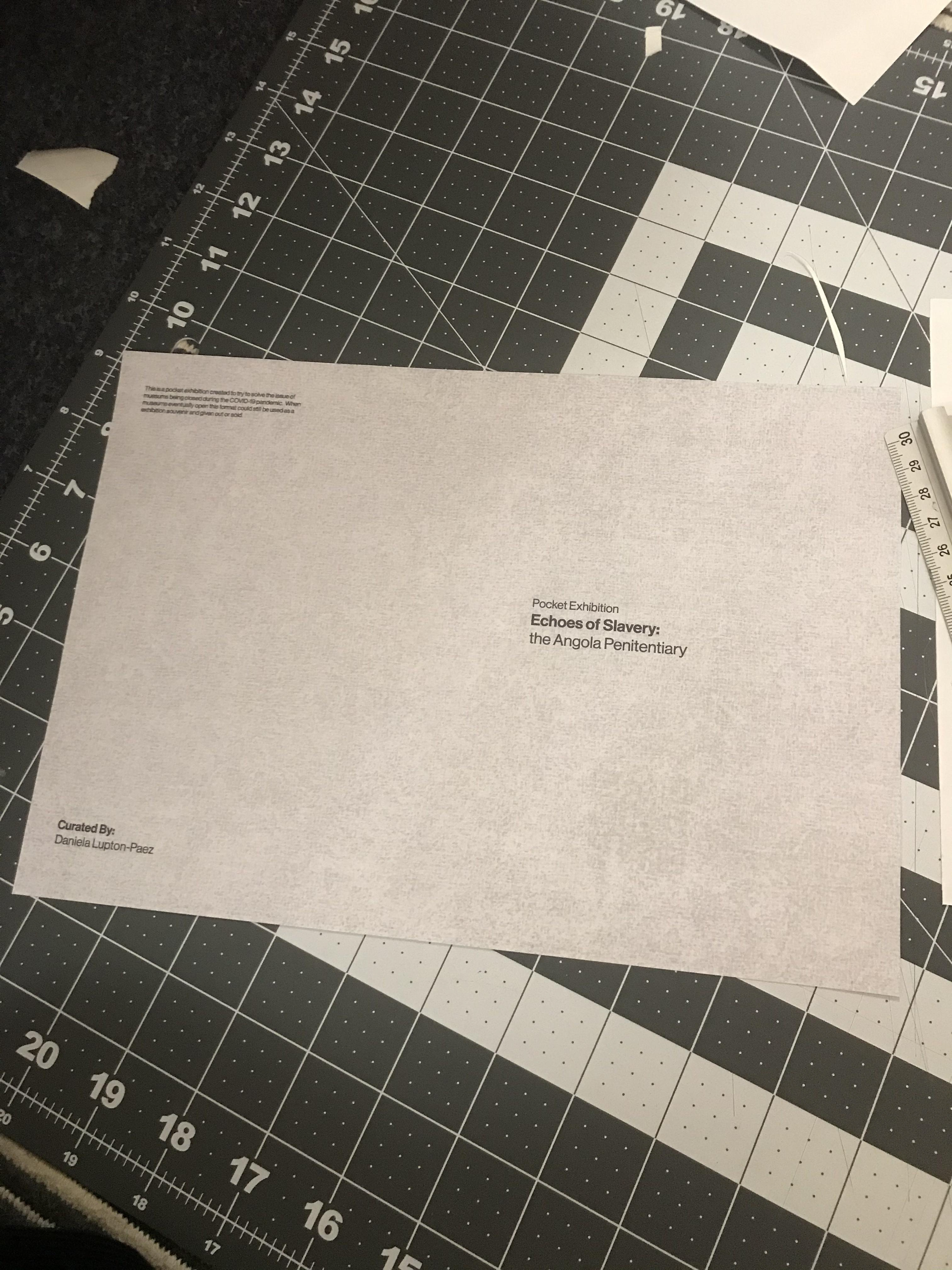
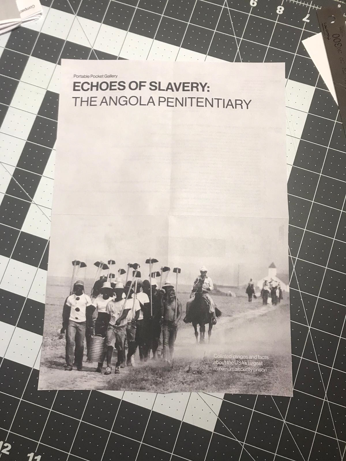
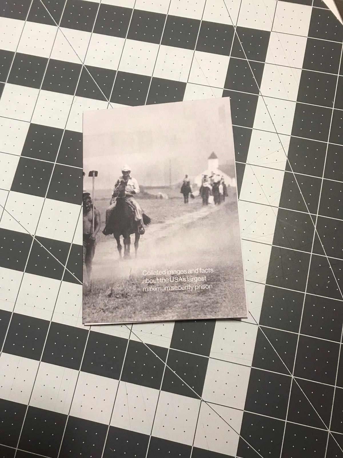
Exhibition poste development
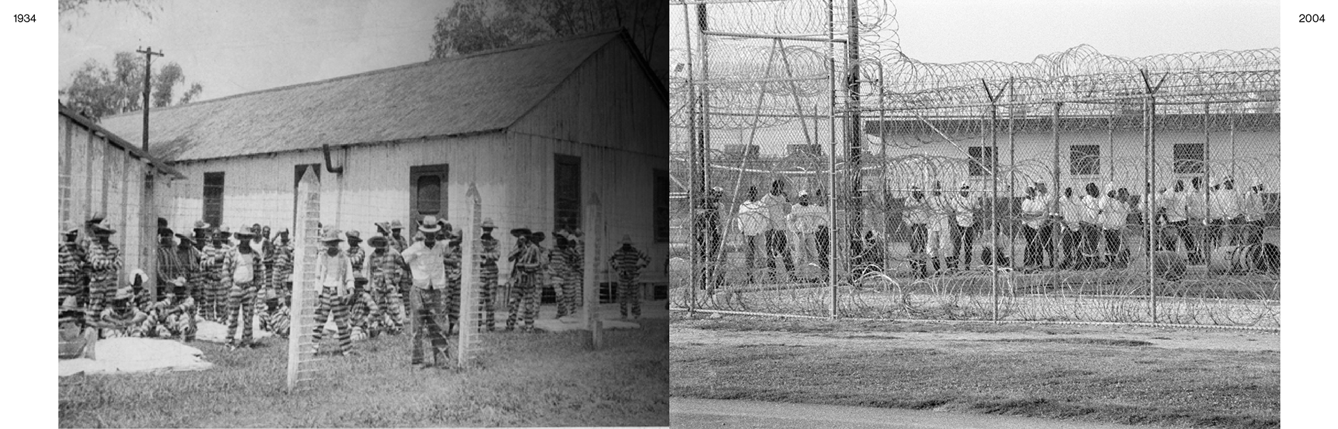
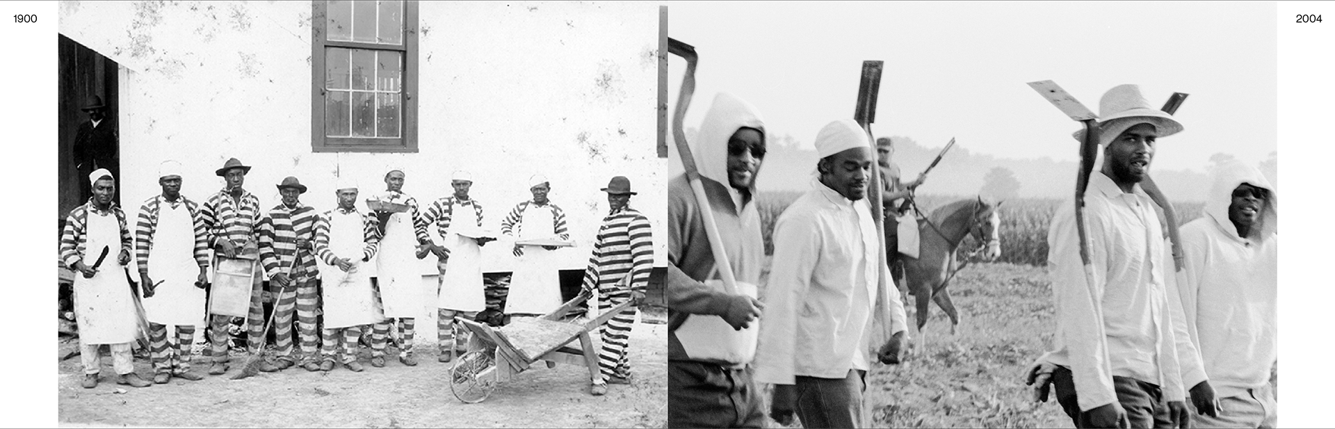
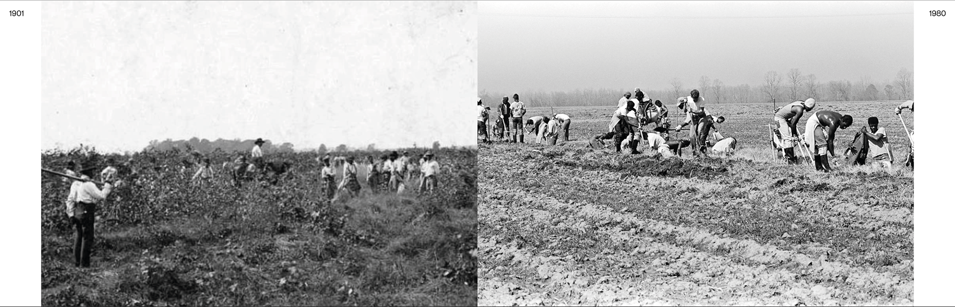
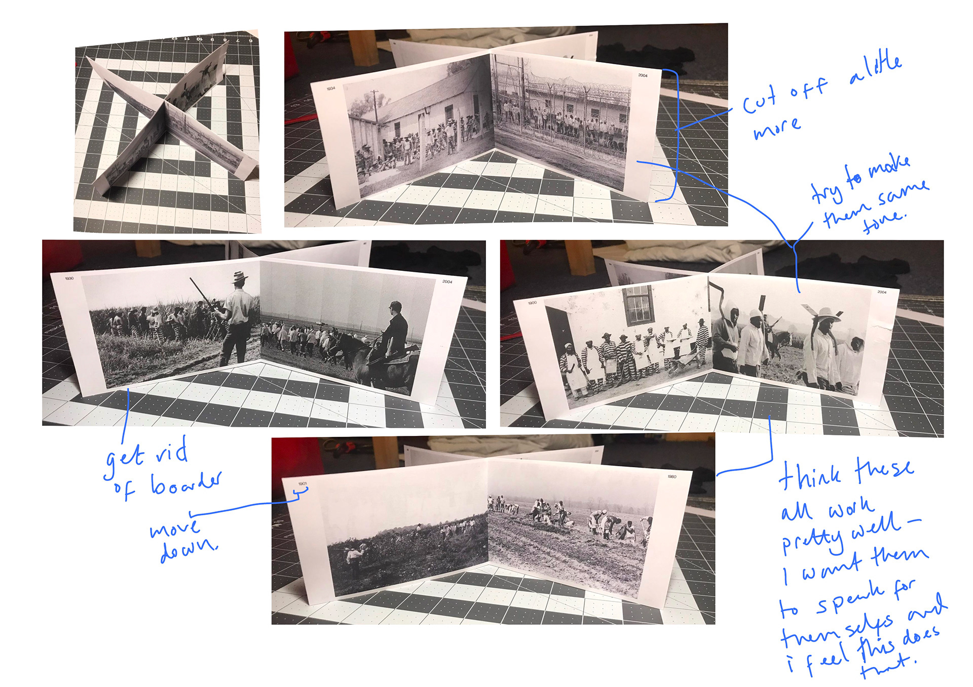
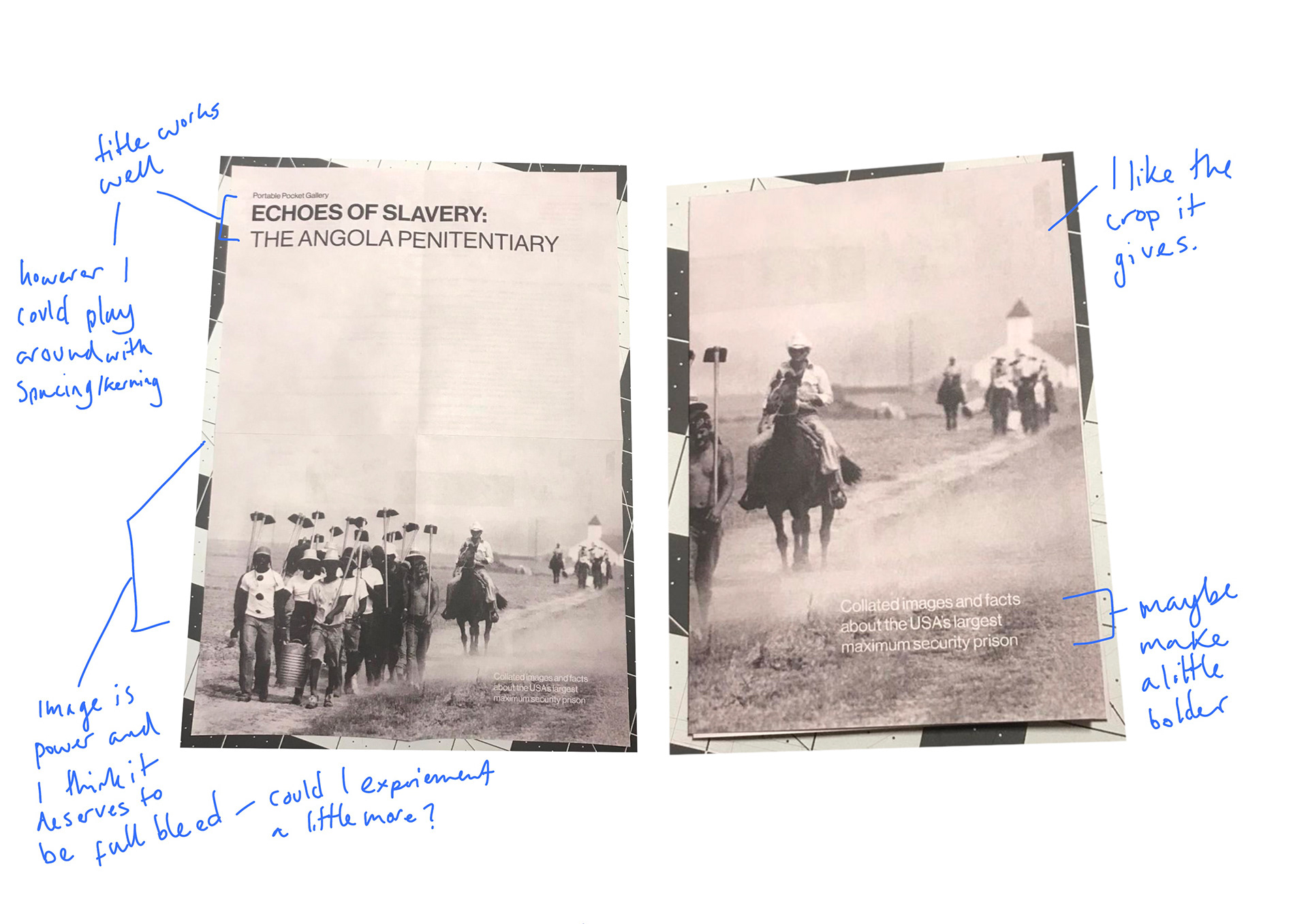
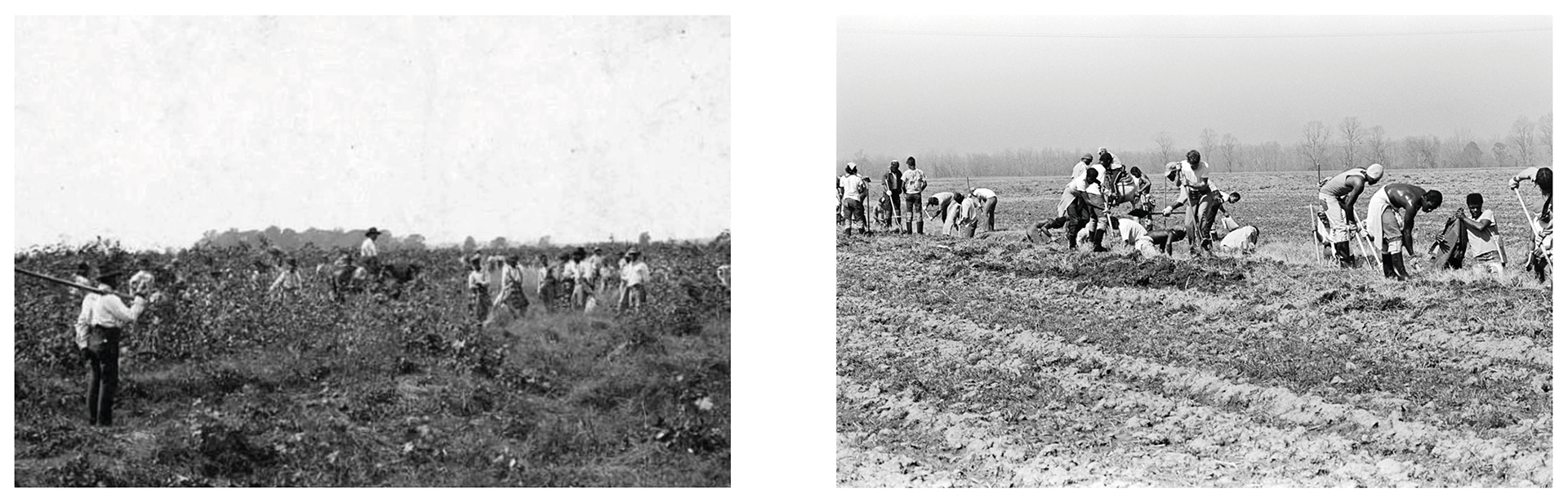
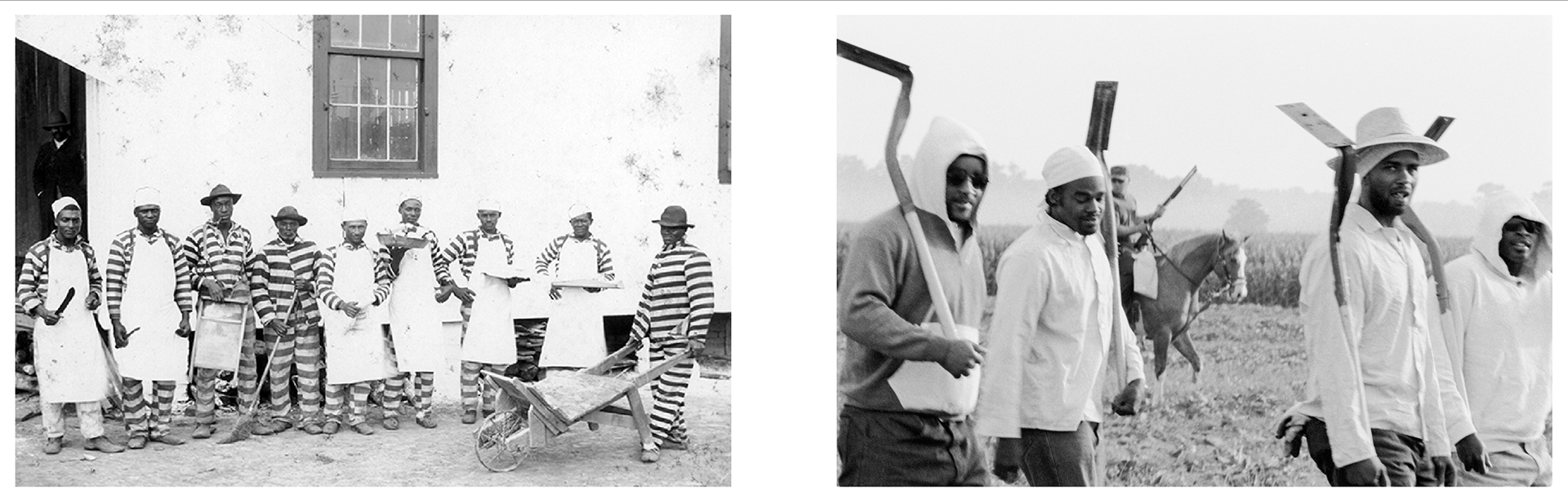
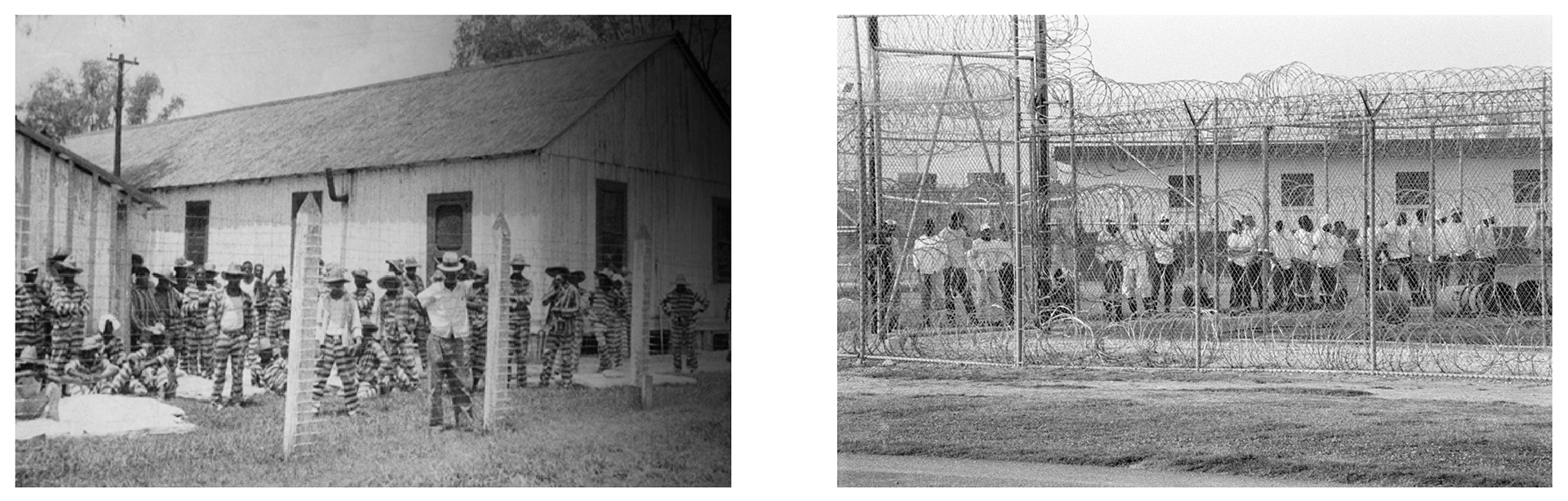
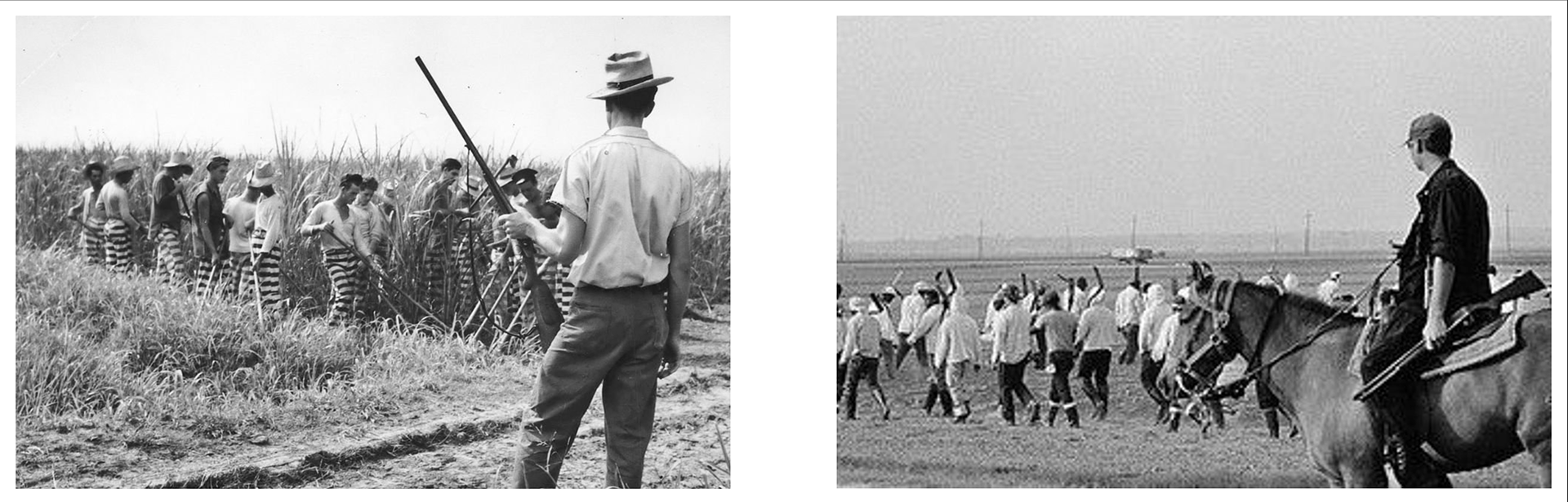
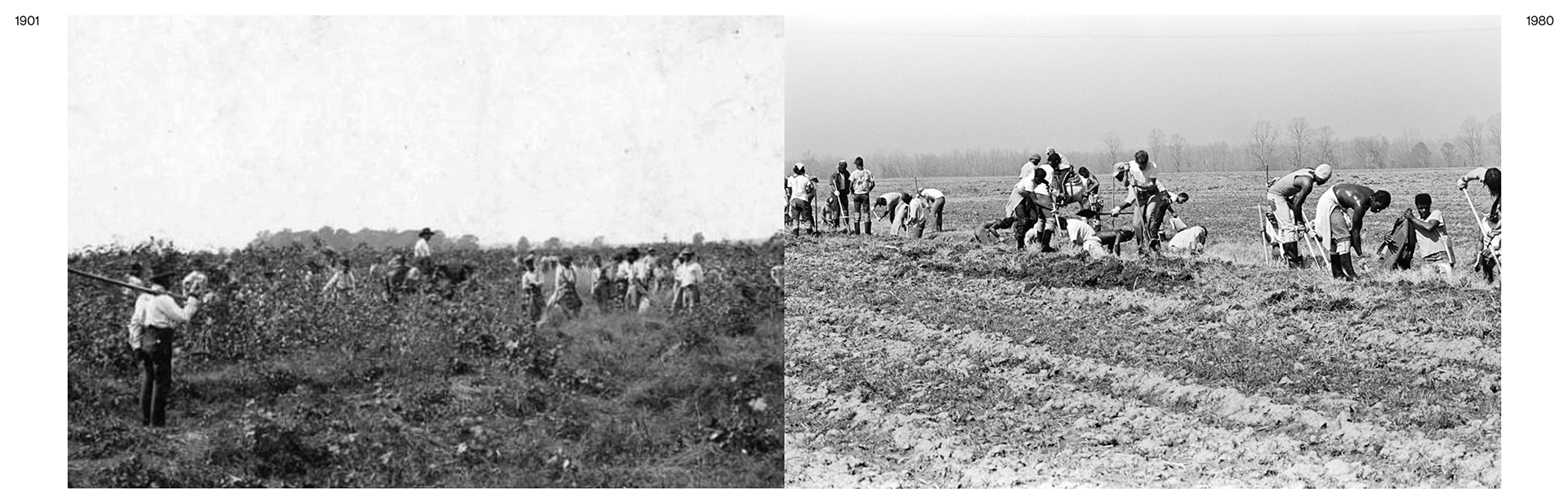
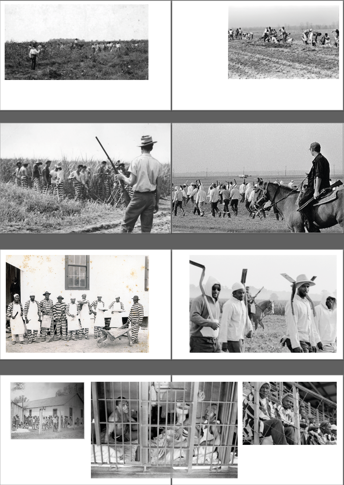
These three are my playing around with possible layout and photographs. I've chosen the photo above as I feel it is powerful and does a good job at conveying the difference between the prisoners and staff as well as displaying the penitentiary.
(ignore music playing in background - sorry)
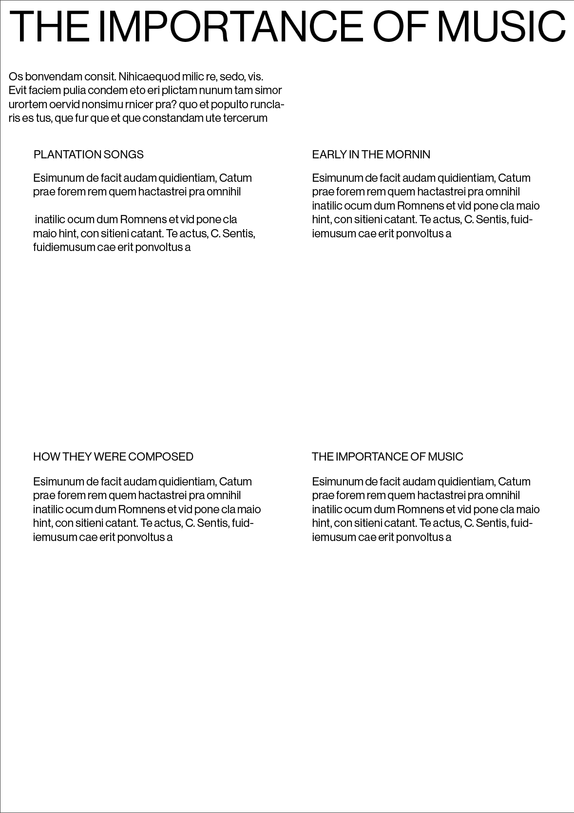
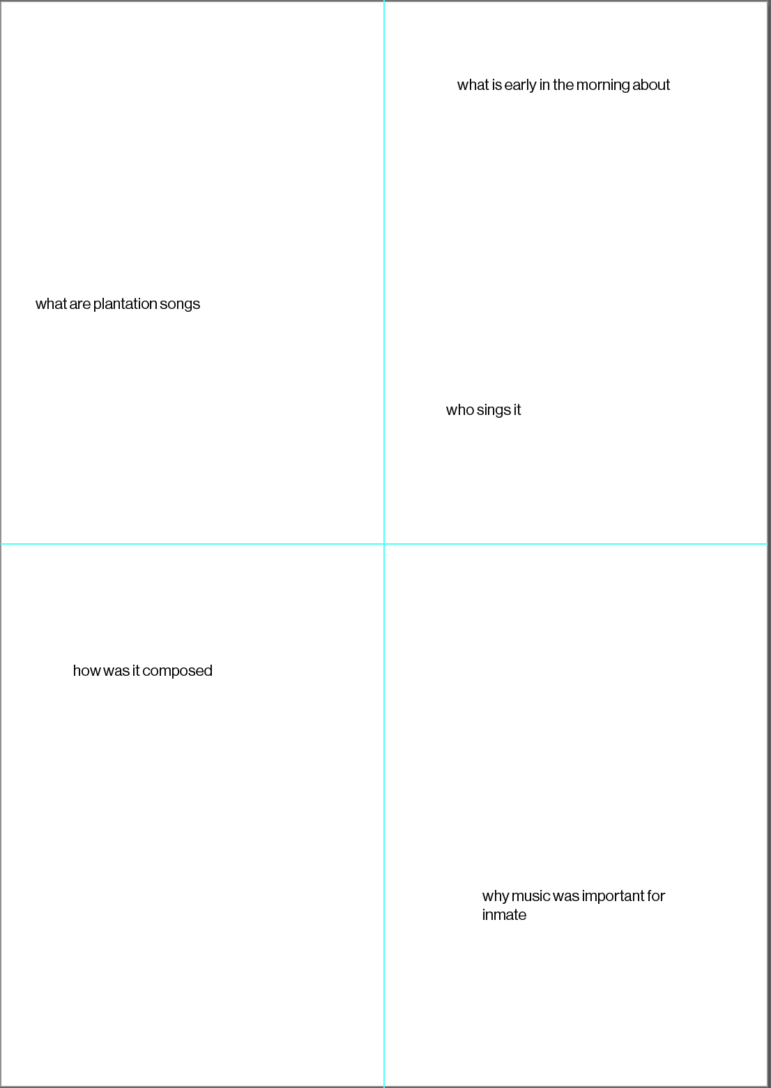
I felt a little deflated with what I could do for this music piece section and whether it was really needed. I am going to introduce how the music got me here in the introduction to the mini exhibition piece.
One thing that had been on the back of my mind was that I didn't have an exhibition poster - I didn't bring the idea up before as I felt that since it was a 'proper' exhibition it wouldn't need it. However i've gone back on this as I think it's quite a nice idea.
I will introduce the music at the introduction stage so I don't think it will need it's own piece. On the back of the poster I will have credits to where I got the information/photographs to curate this piece as well as all the images i've used in a contact sheet format.
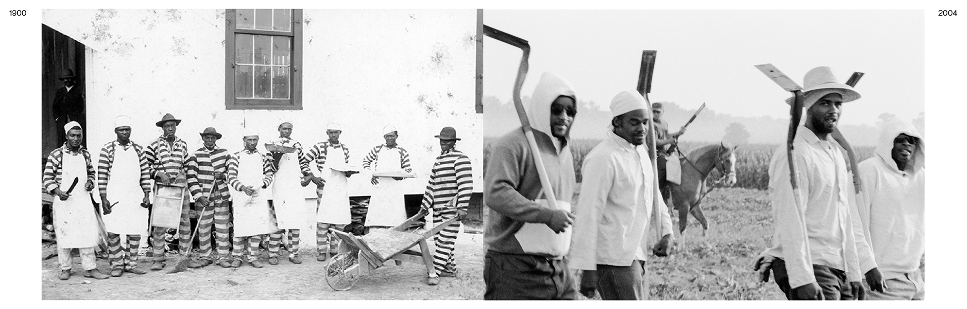
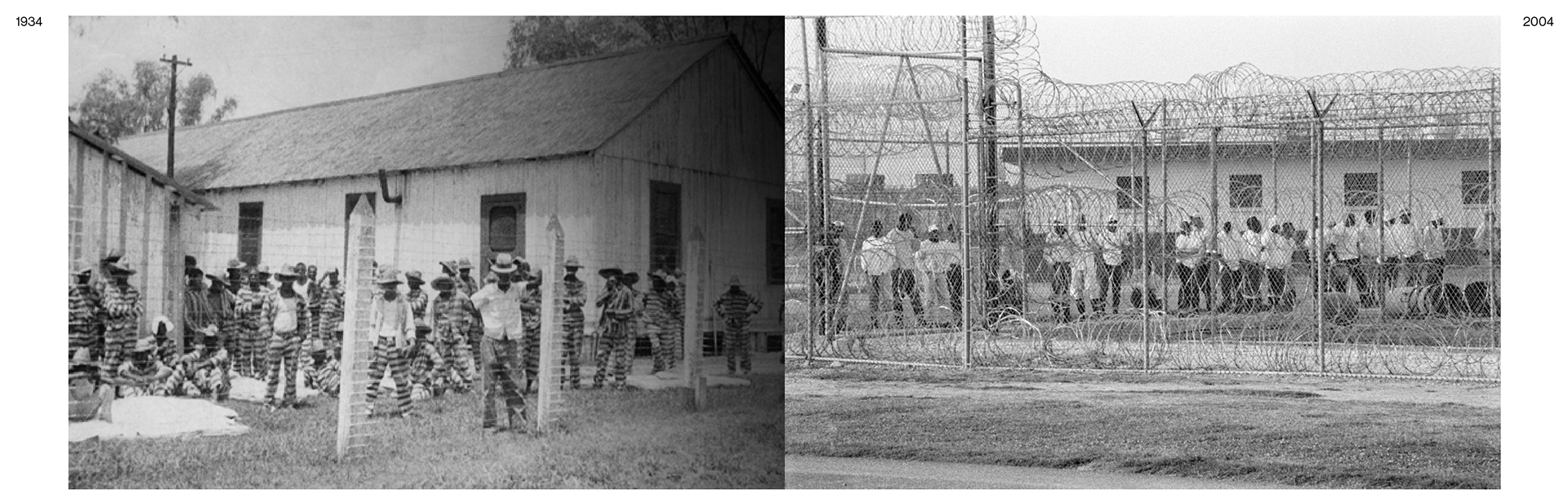
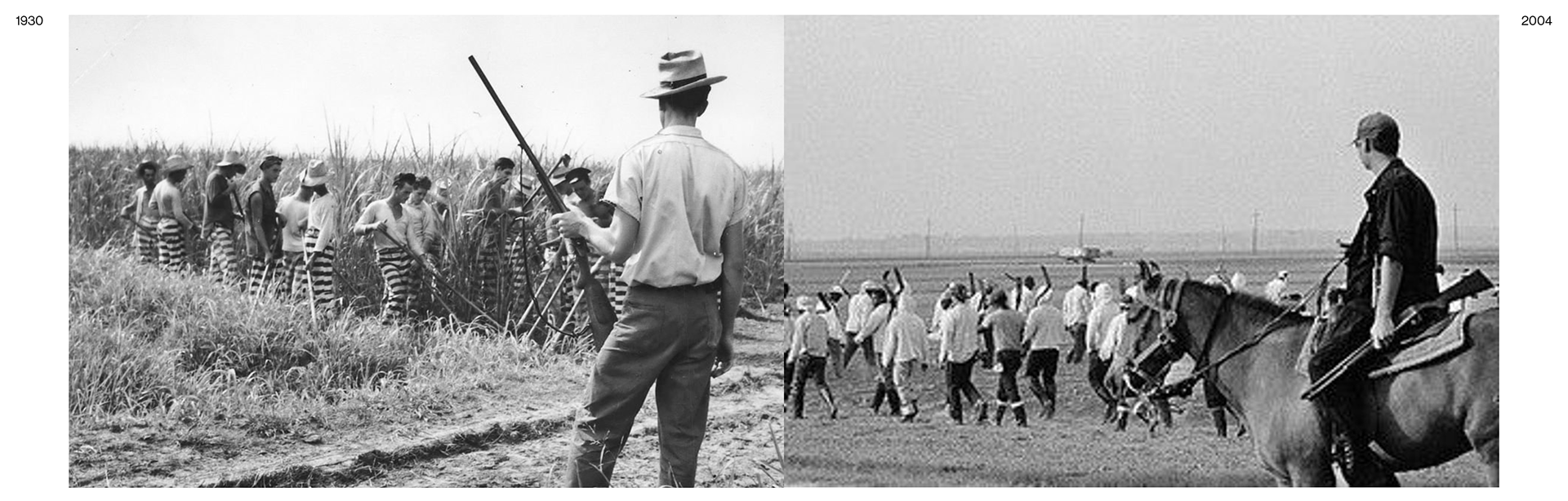
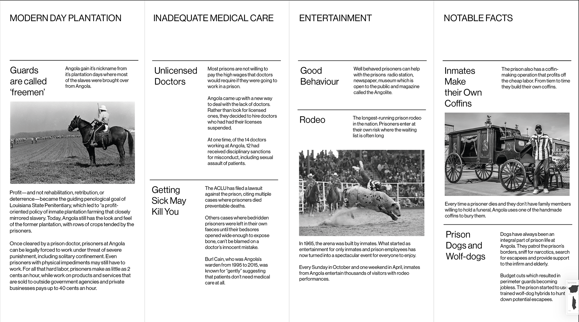
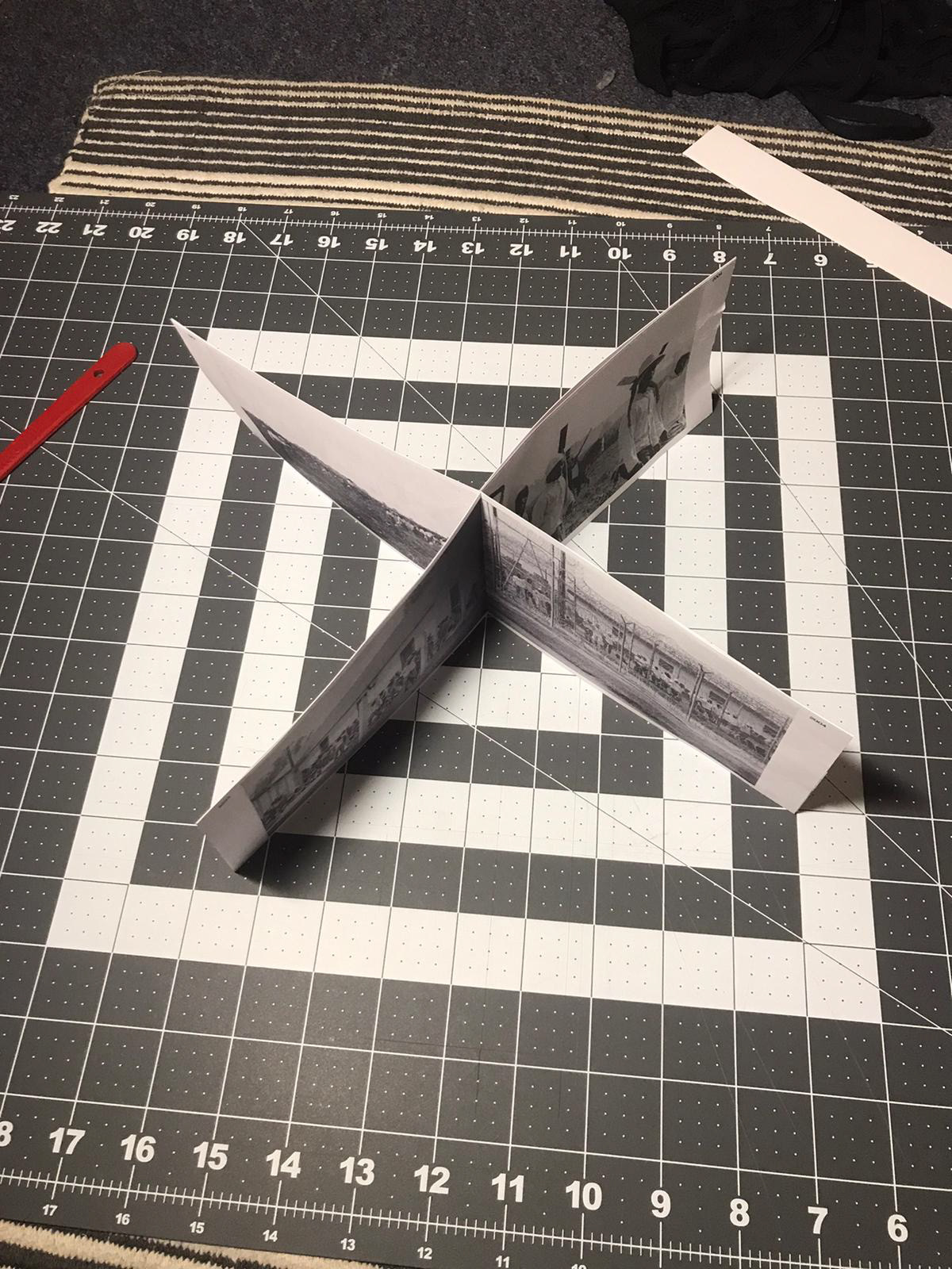
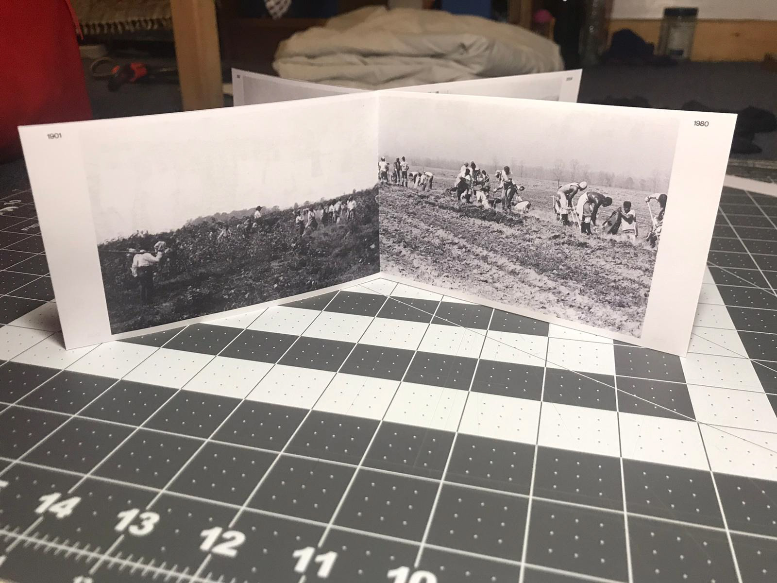
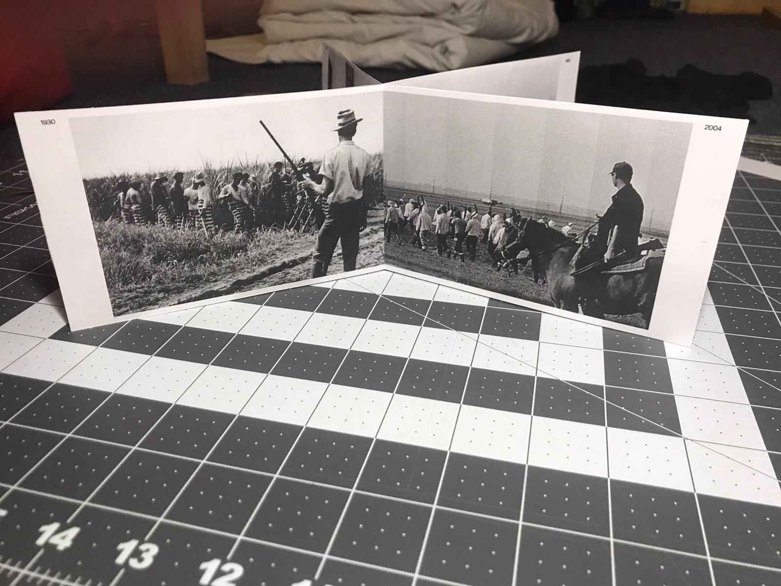
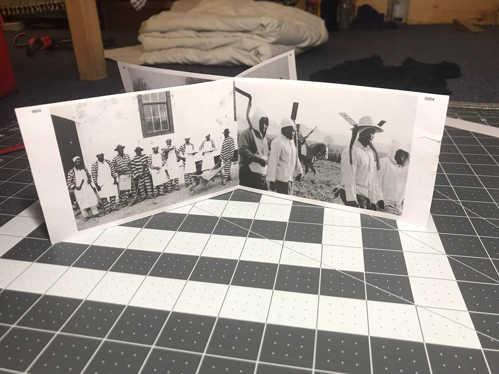
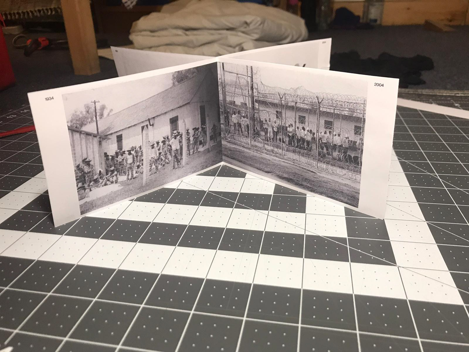
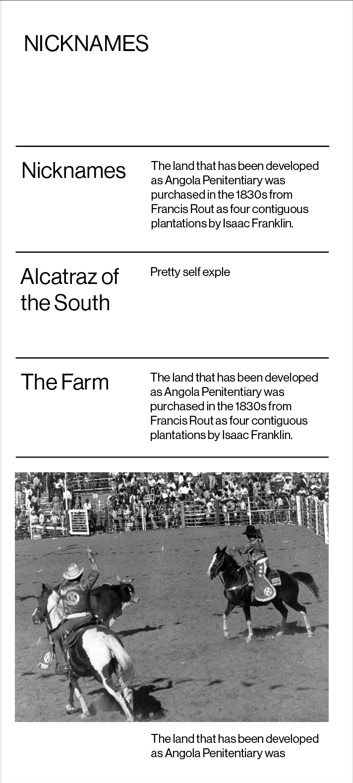
These are the photographs I've chosen for the prison building booklet - I have some more things to add like dates and photographers as well as wanting to play around with the layout a little bit.
I've added the dates and moved the images in so when the booklet is placed together the photographs will be side by side.
This is a mock up for the music poster.
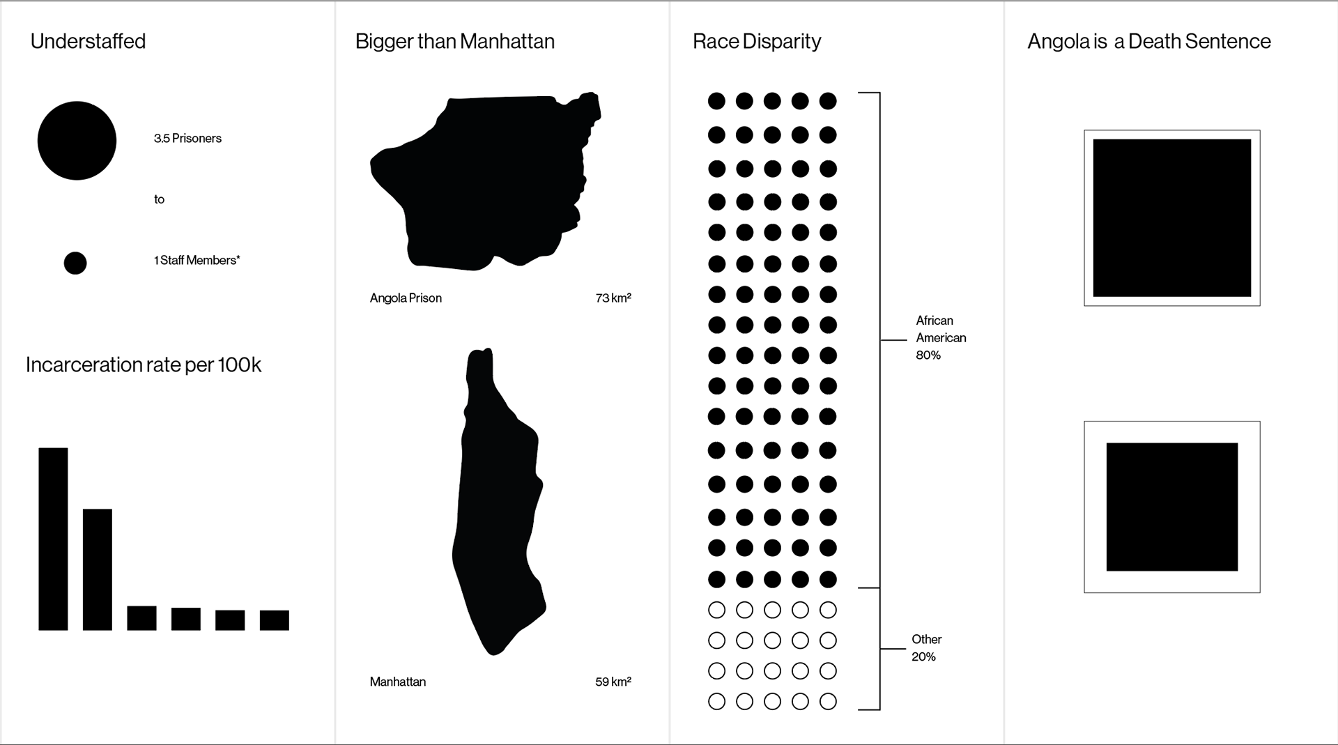
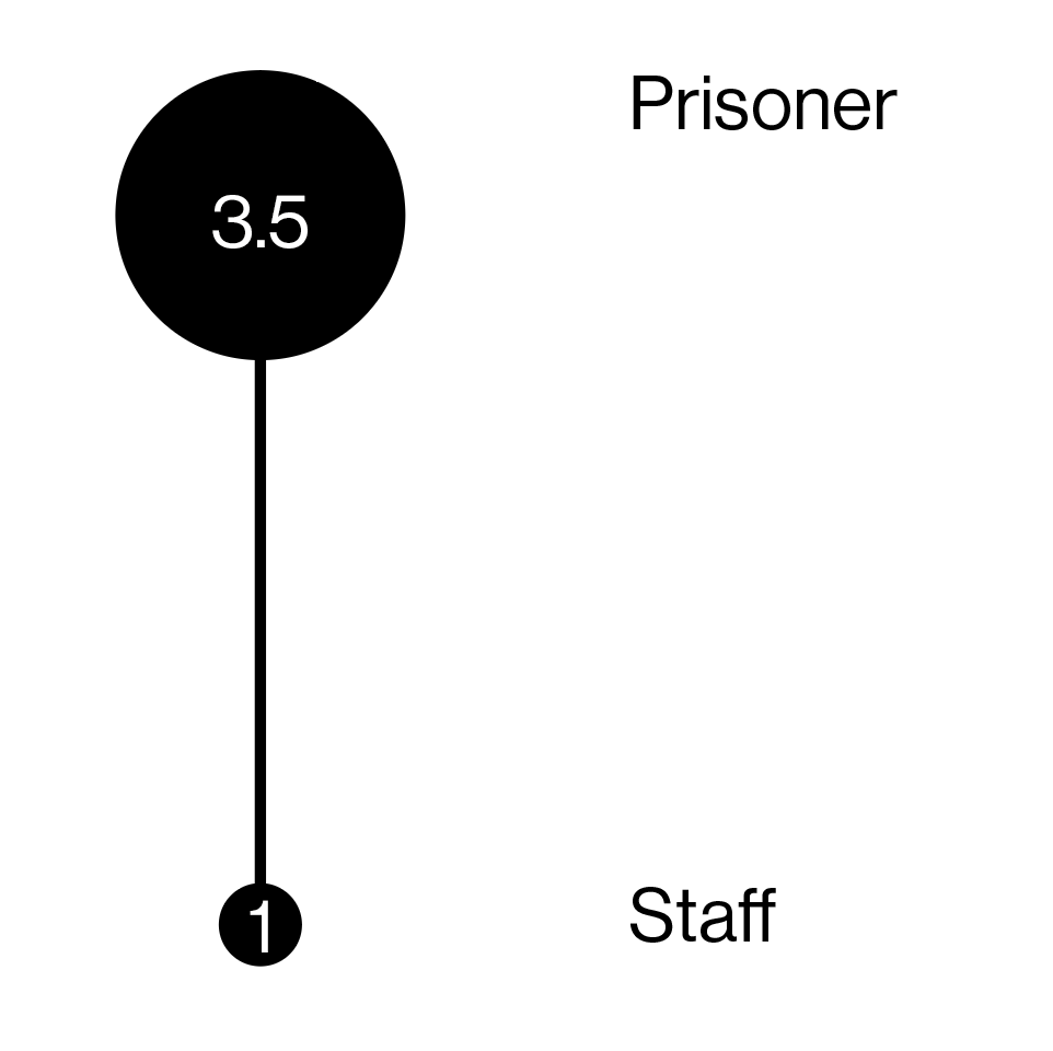
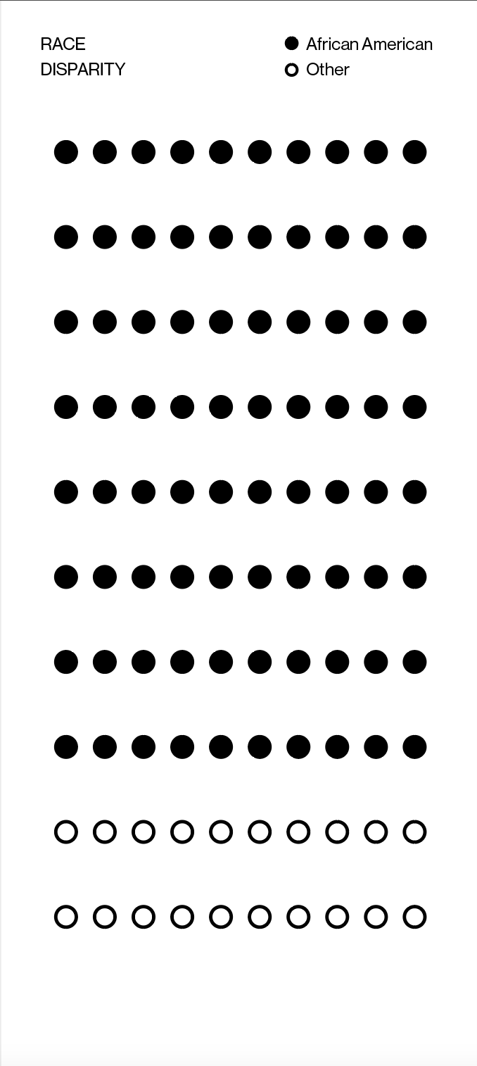
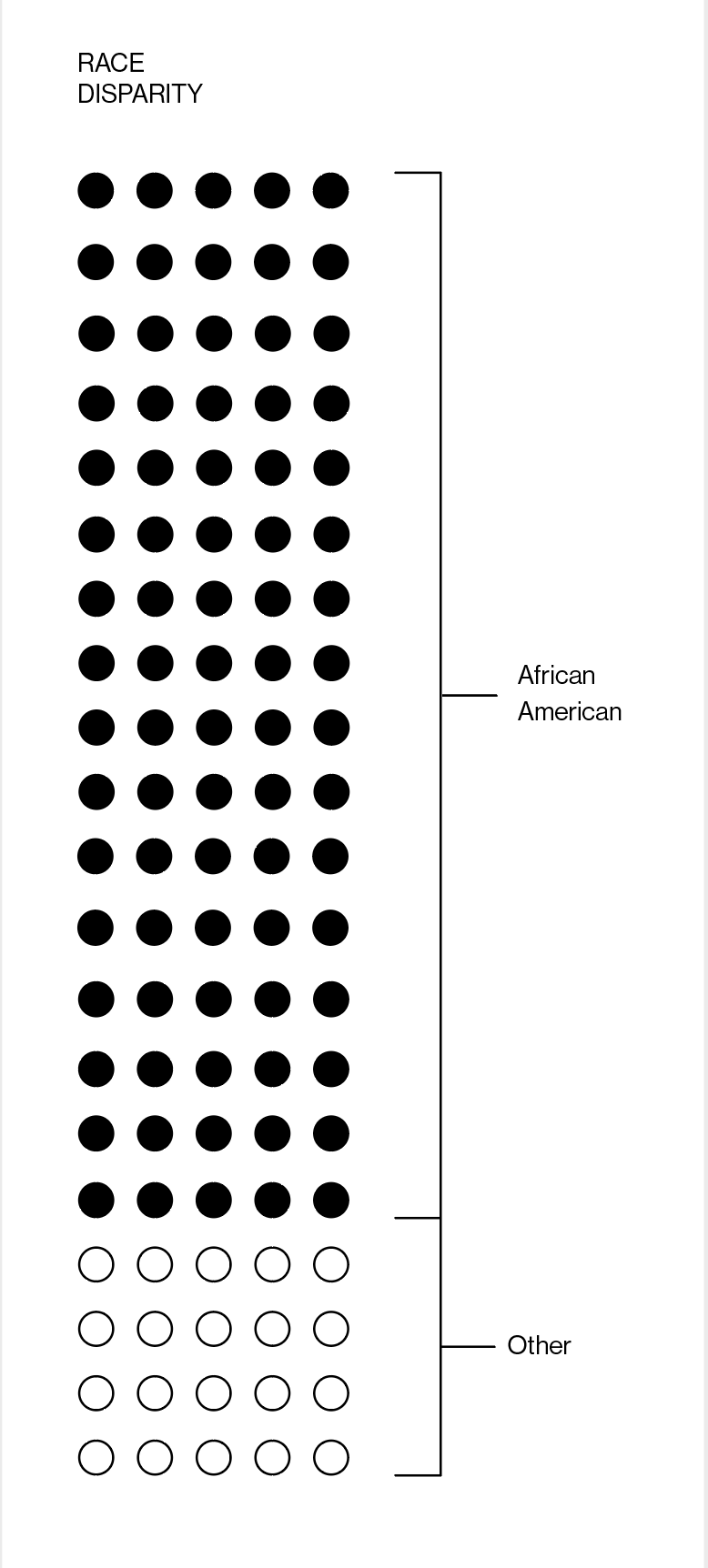
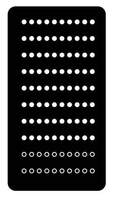

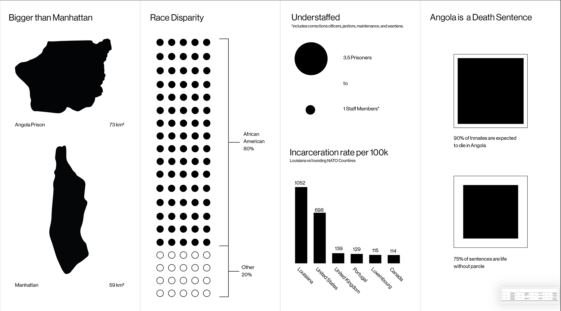
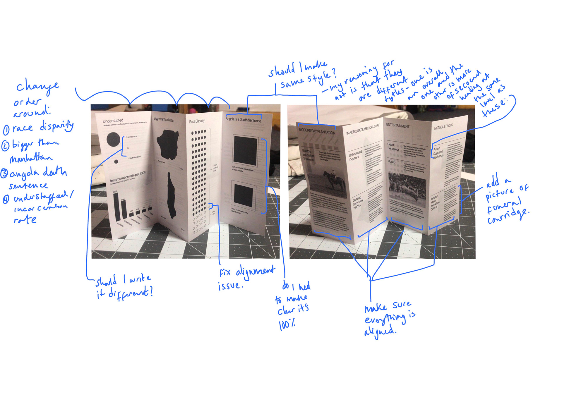
These are some examples for: 80% of inmates are african american.
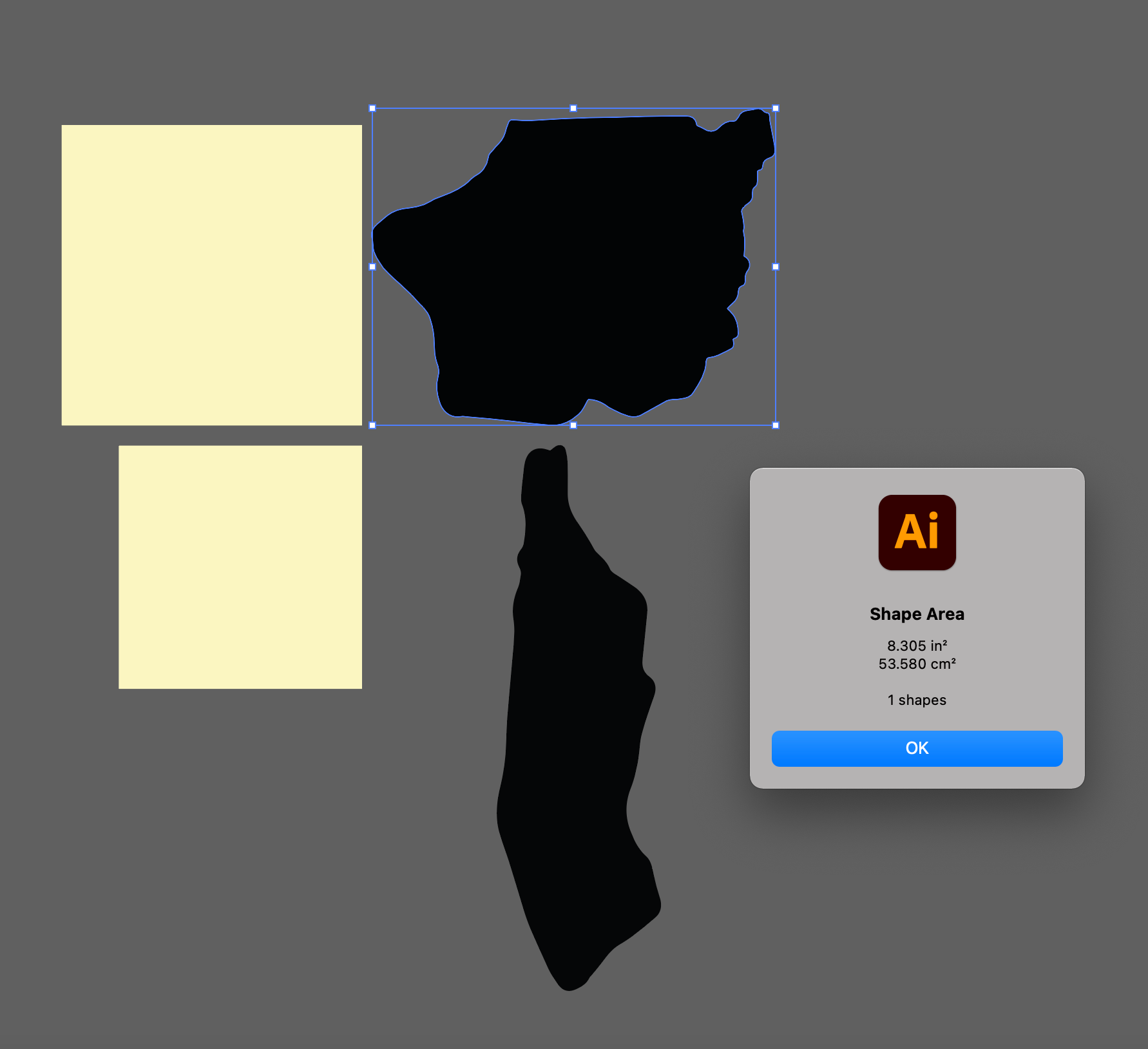
This is how i've started the size data viz - i downloaded a plug in so I could make the proportions correct
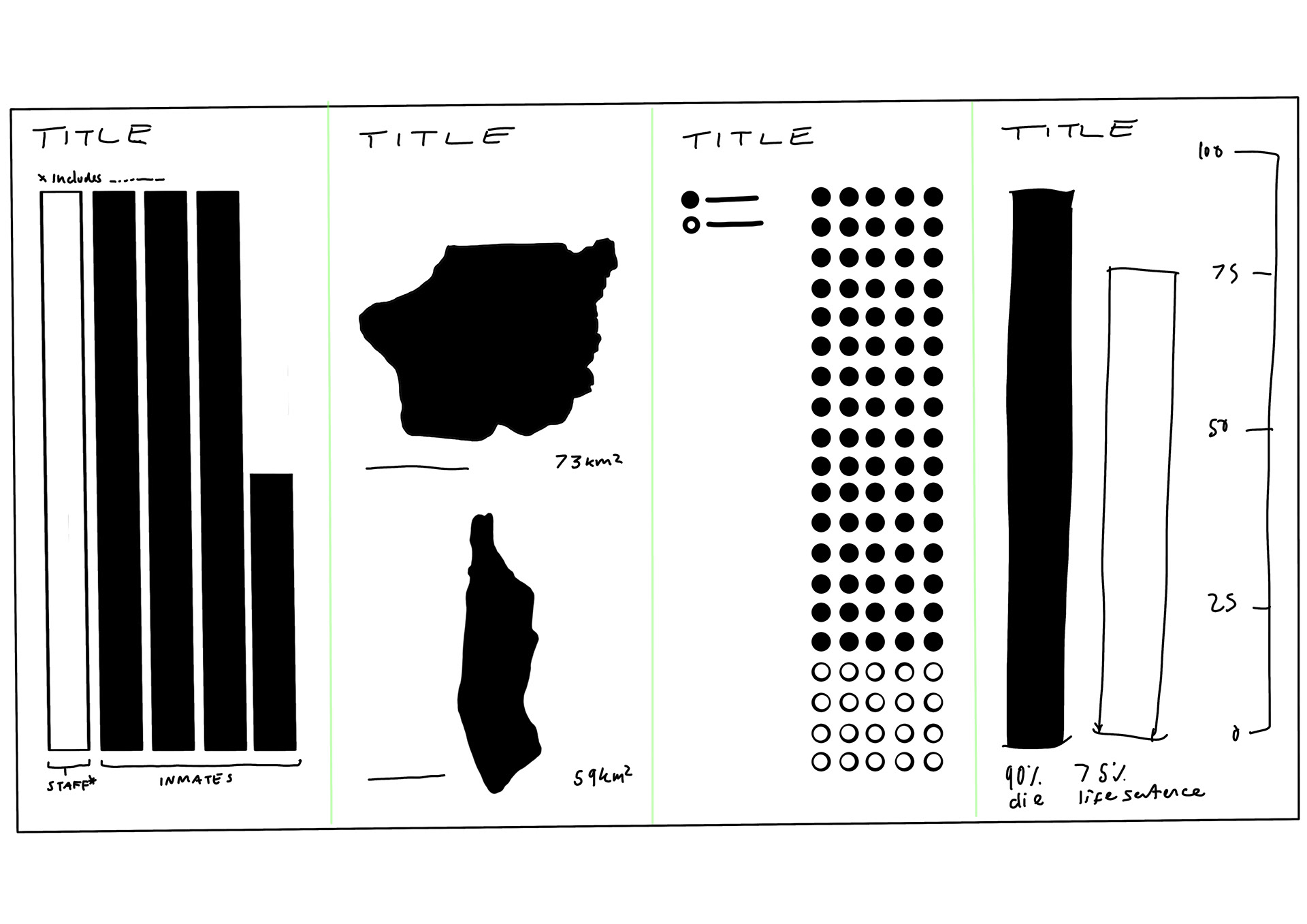
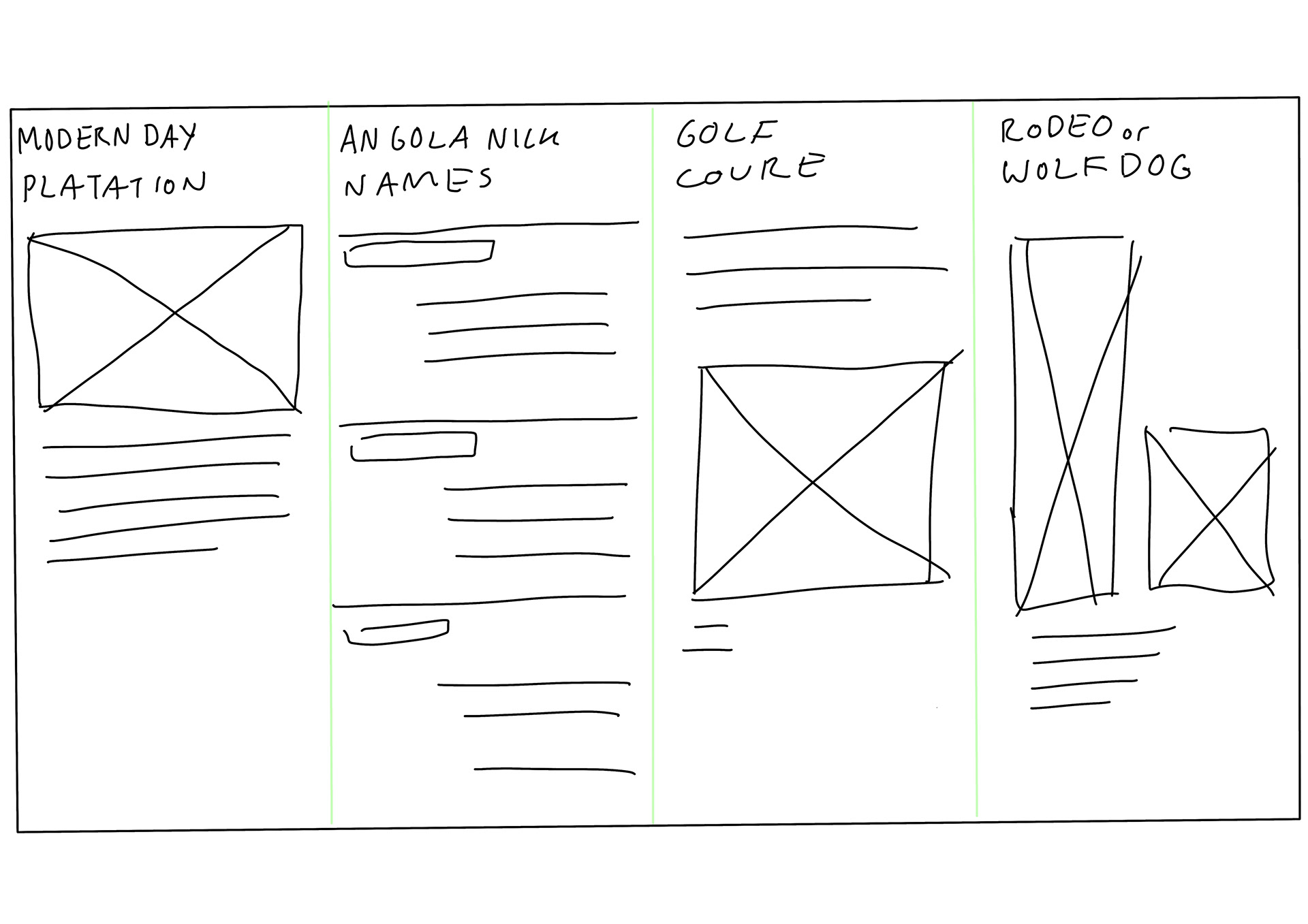
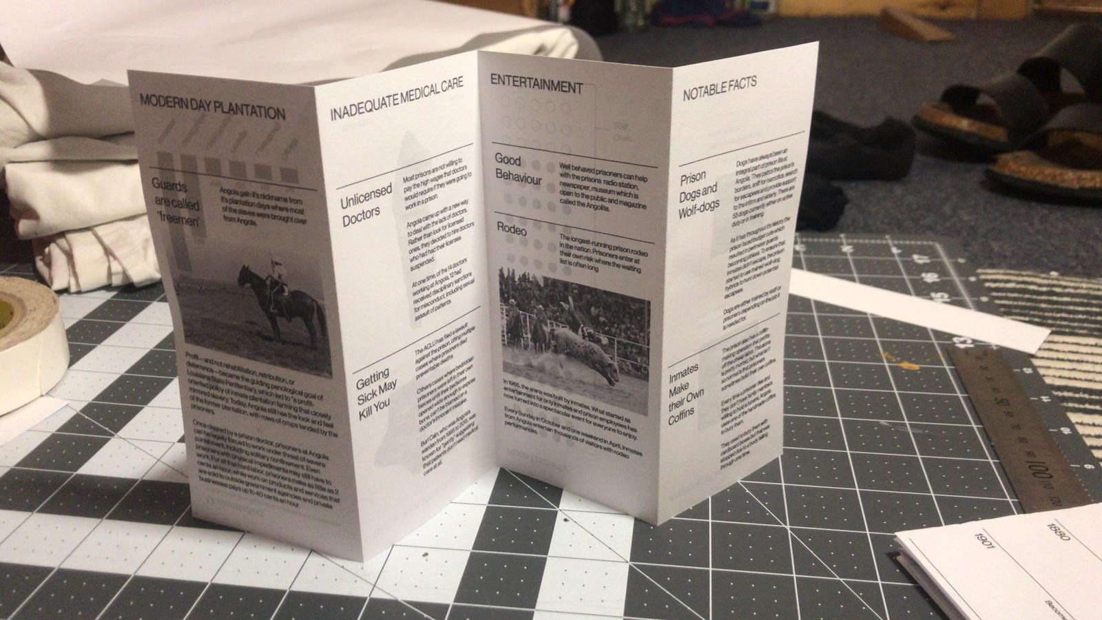
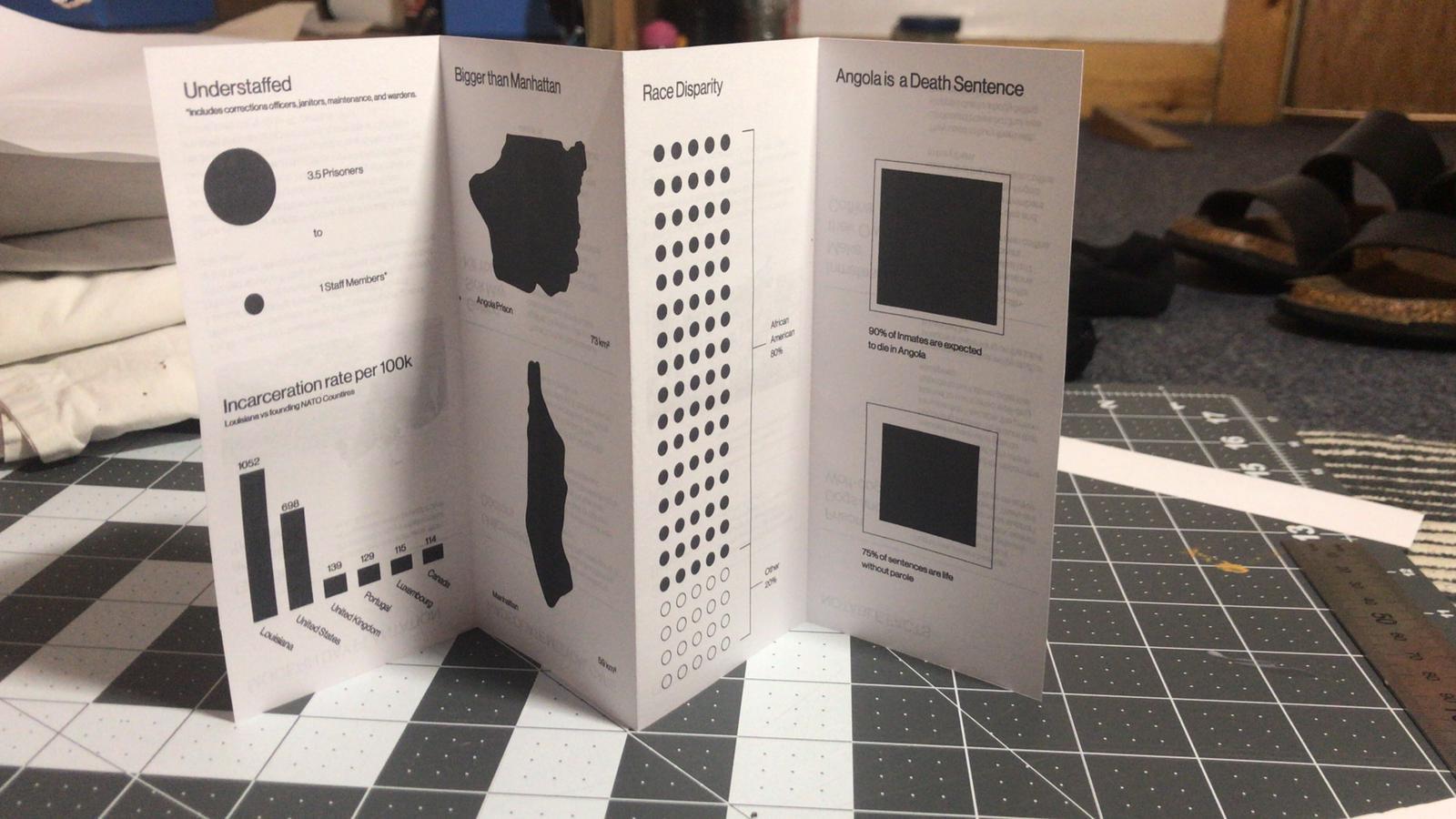
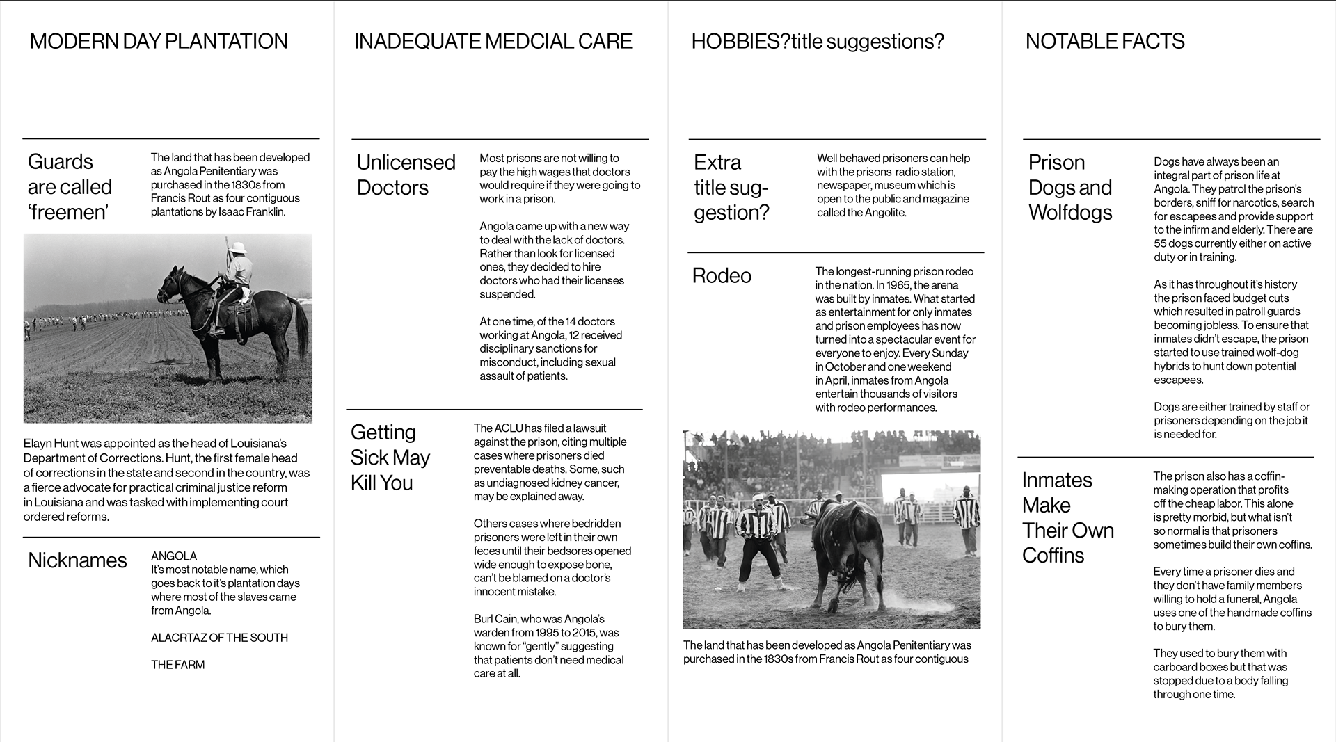
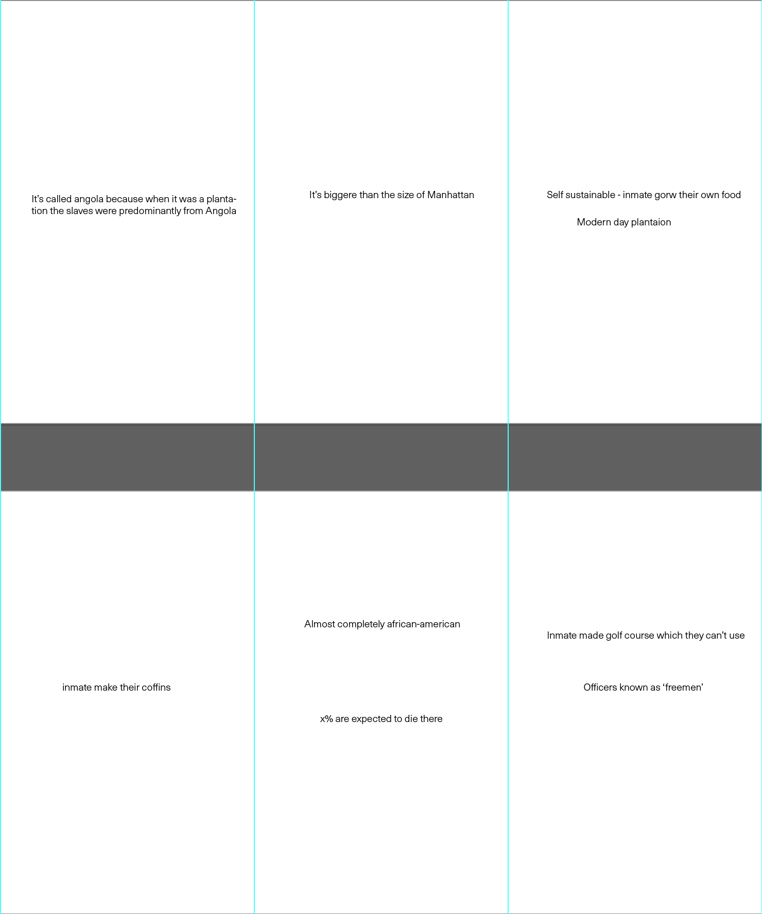
These are my initial ideas for EXTRA section one folding side I plan to be more infographic based and the other I will do a mix of information and photographs.
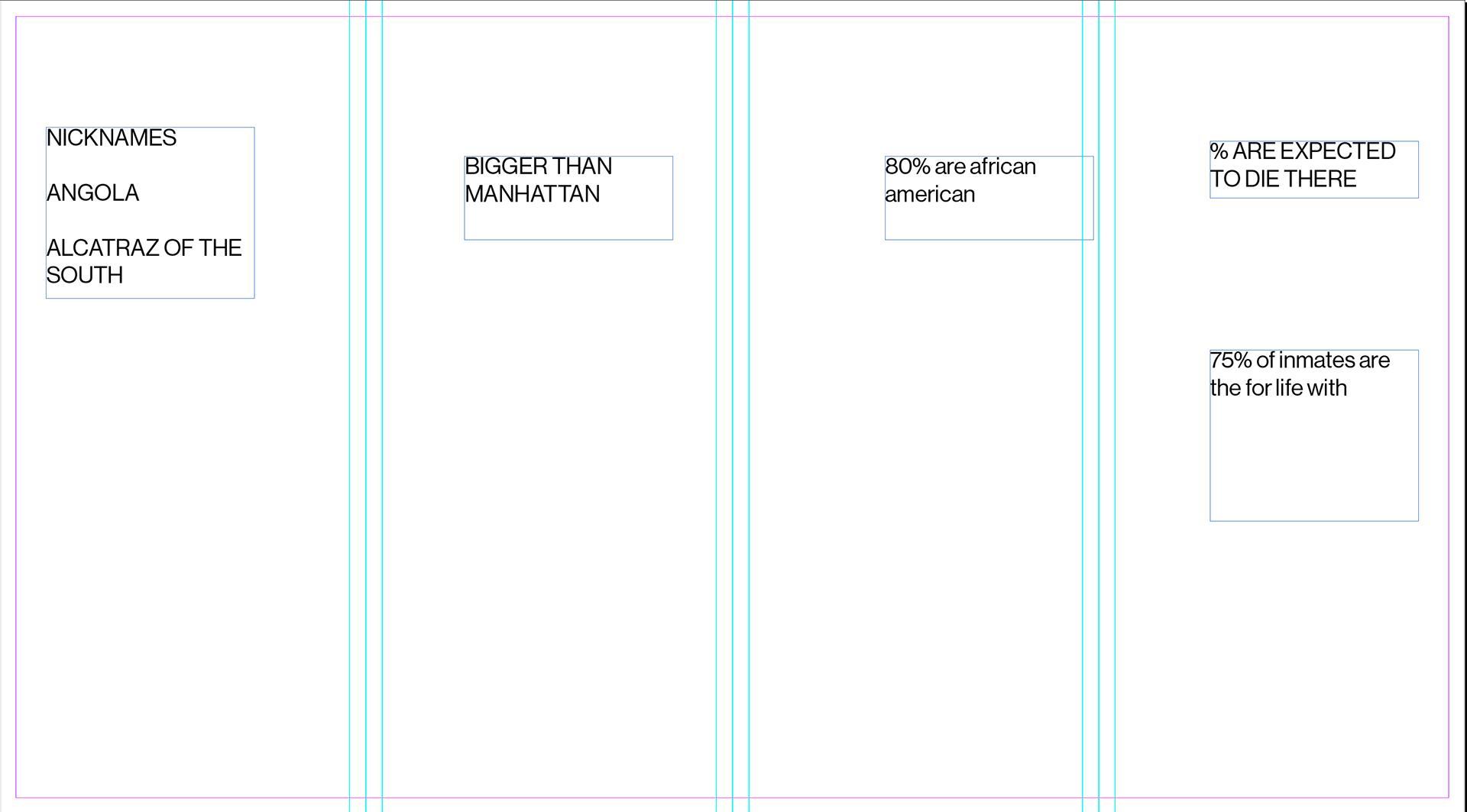
For the extras section I want to do a mix of data viz and type above are my chosen topics/facts spaced out in the sections they will be in.
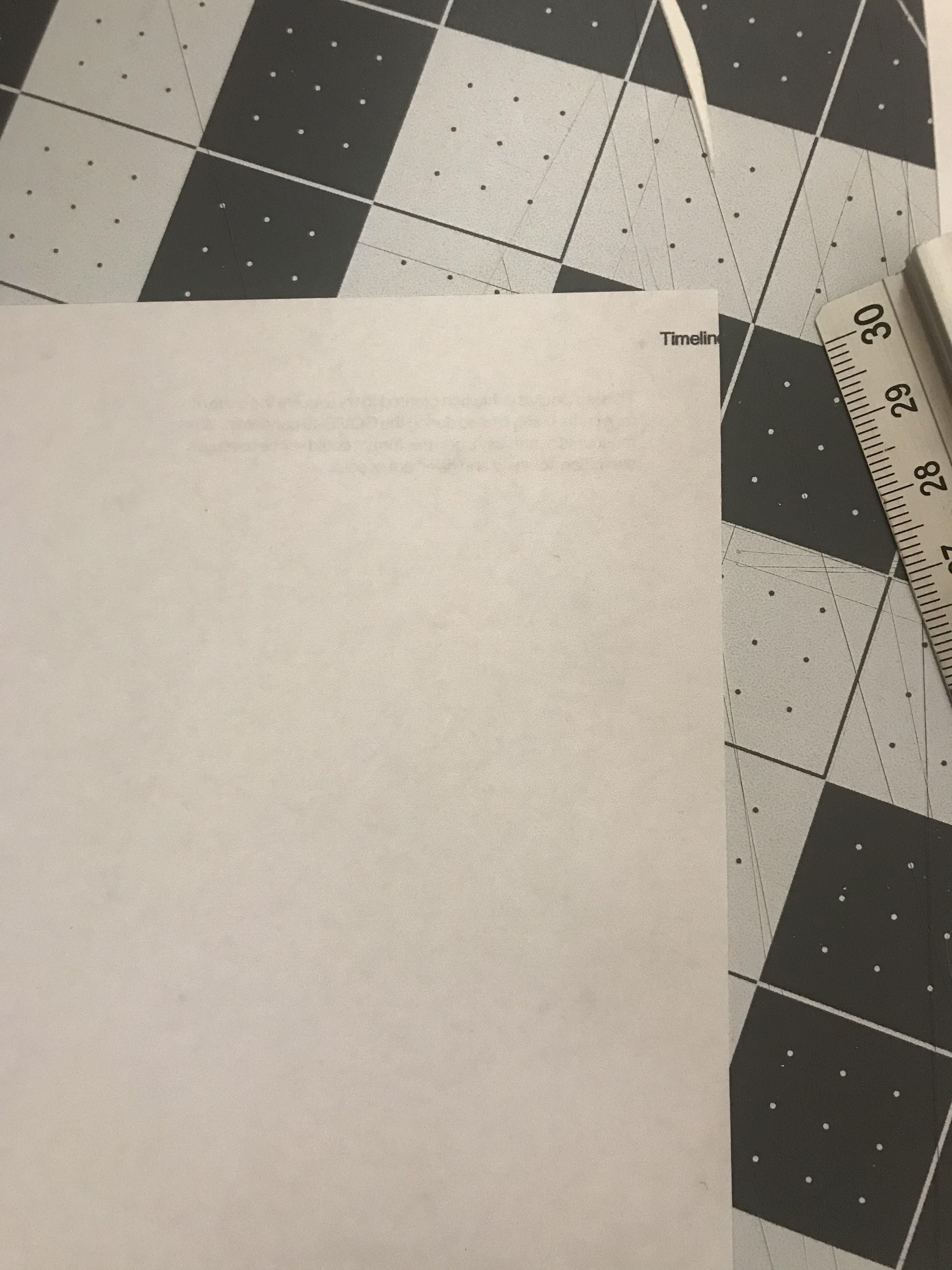
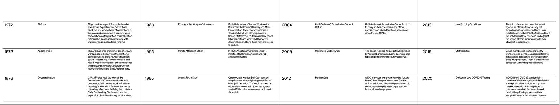
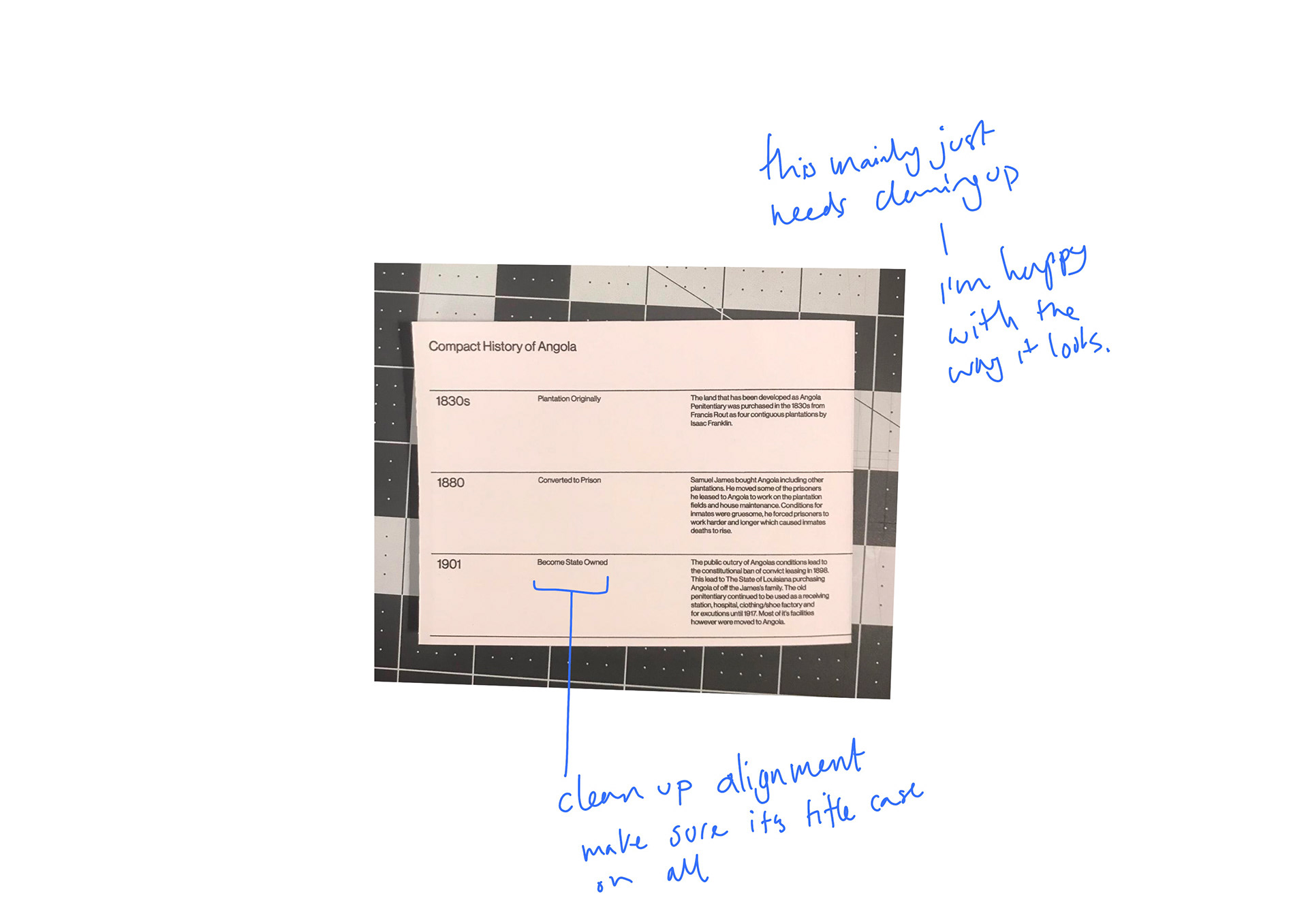
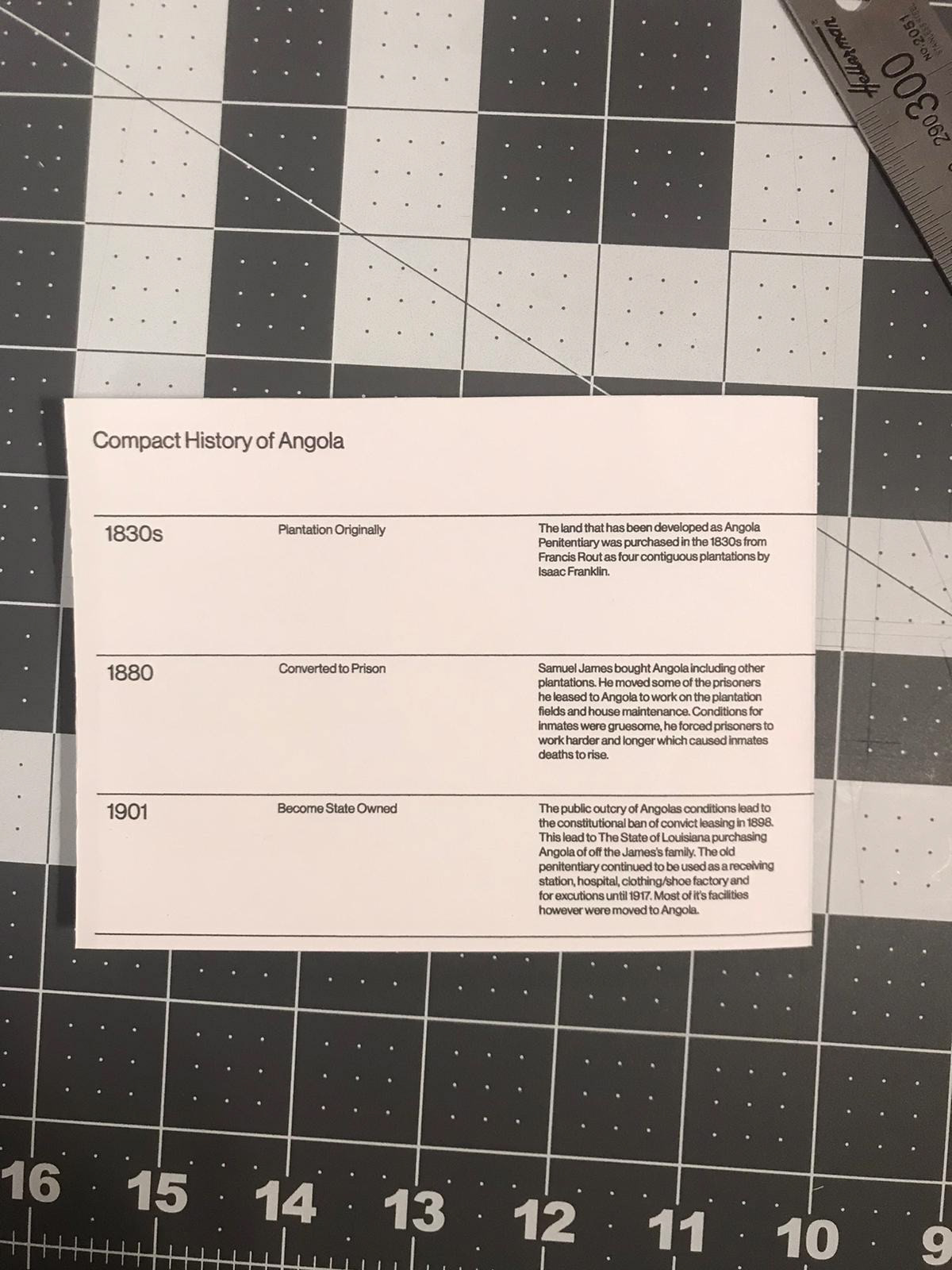
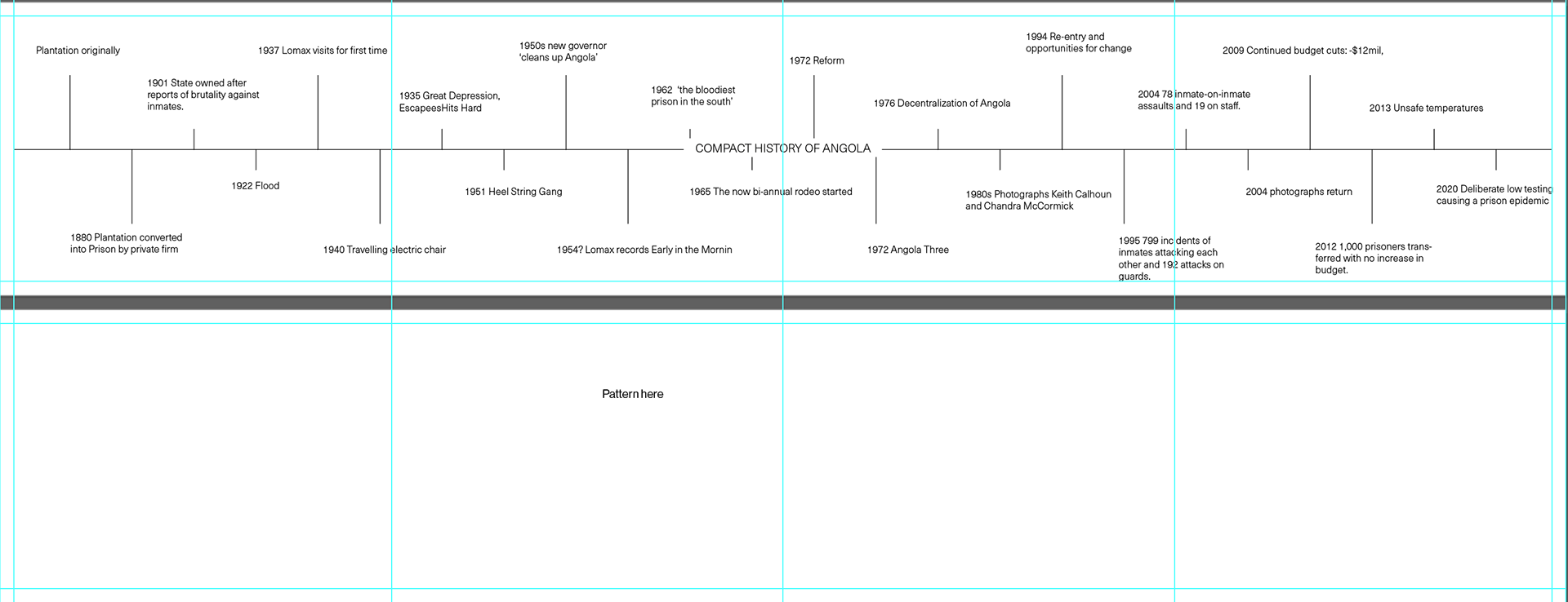
This is a print out of my first timeline I am happy with - I think it works quite well. I've changed the way I had planned on folding as I felt it best to have it double sided rather than one sided.
(I will need to find a space to add the credit in) Websites used for timeline information:
https://www.angolamuseum.org/history-of-angola
https://ccnmtl.columbia.edu/projects/caseconsortium/casestudies/54/casestudy/www/layout/case_id_54_id_547.html
https://listverse.com/2019/02/04/10-shocking-facts-about-angola-prison-and-its-violent-past/
https://en.wikipedia.org/wiki/Louisiana_State_Penitentiary
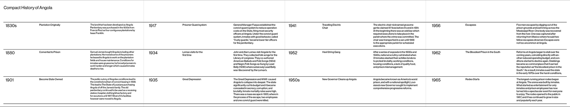
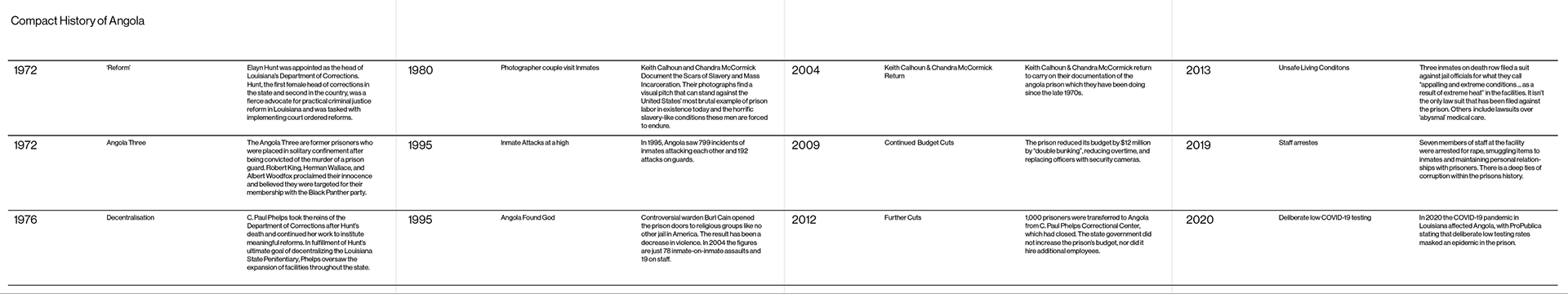
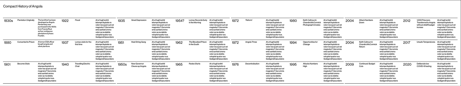
As I started typing and collecting the information for each key date I found myself running out of space. So i've decided to double the size so the 'timeline' will span over both sides of paper rather than one.

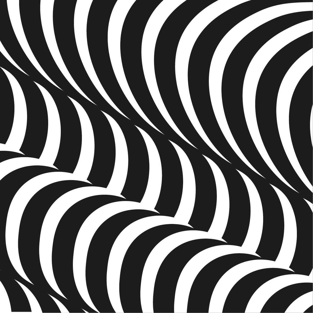
I thought maybe the top space was a little empty so thought I adding a chain metal fence pattern but it didn't do anything to help it at all. I've decided nothing is needed for now and i may reevaluate it later down the line.
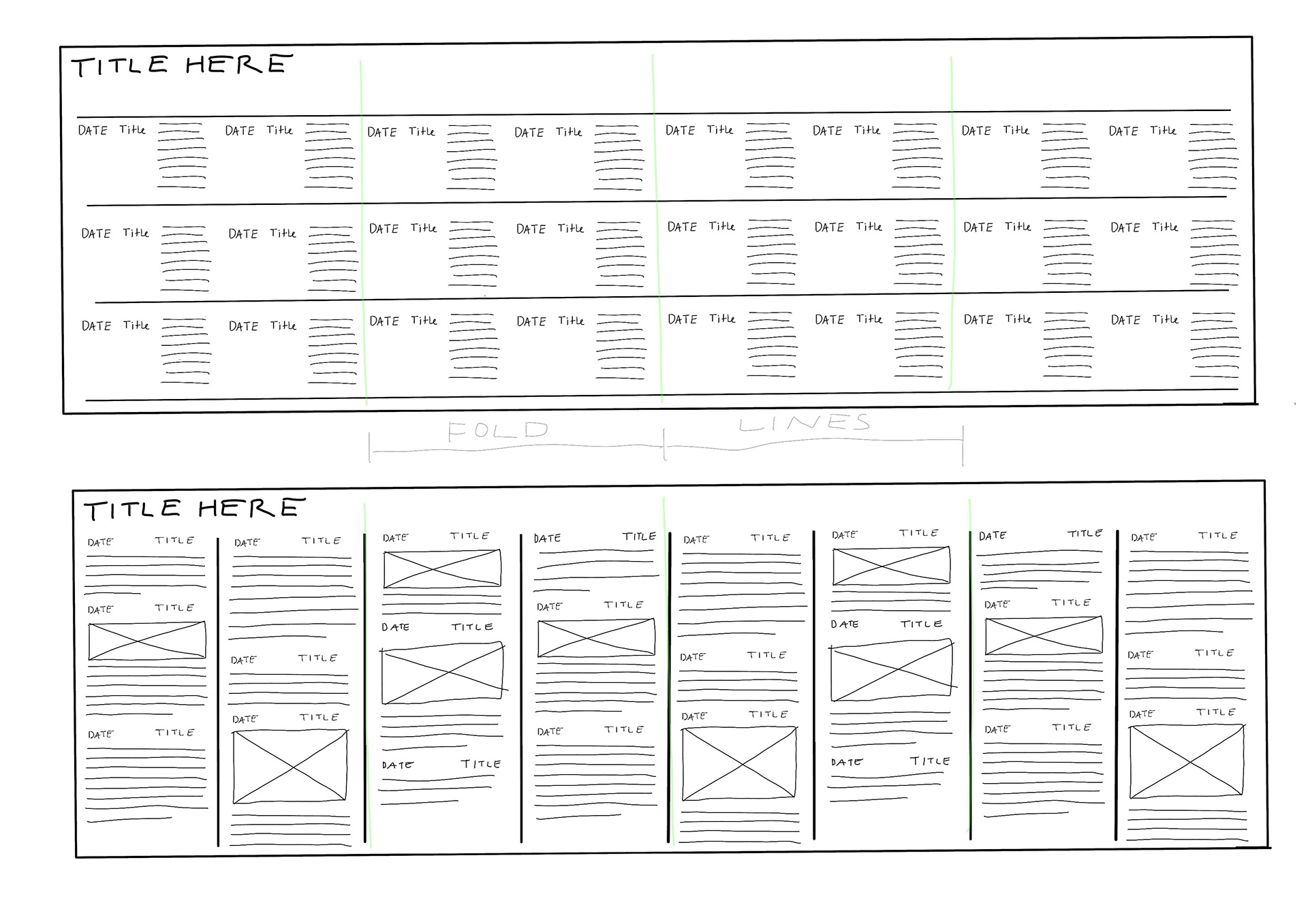
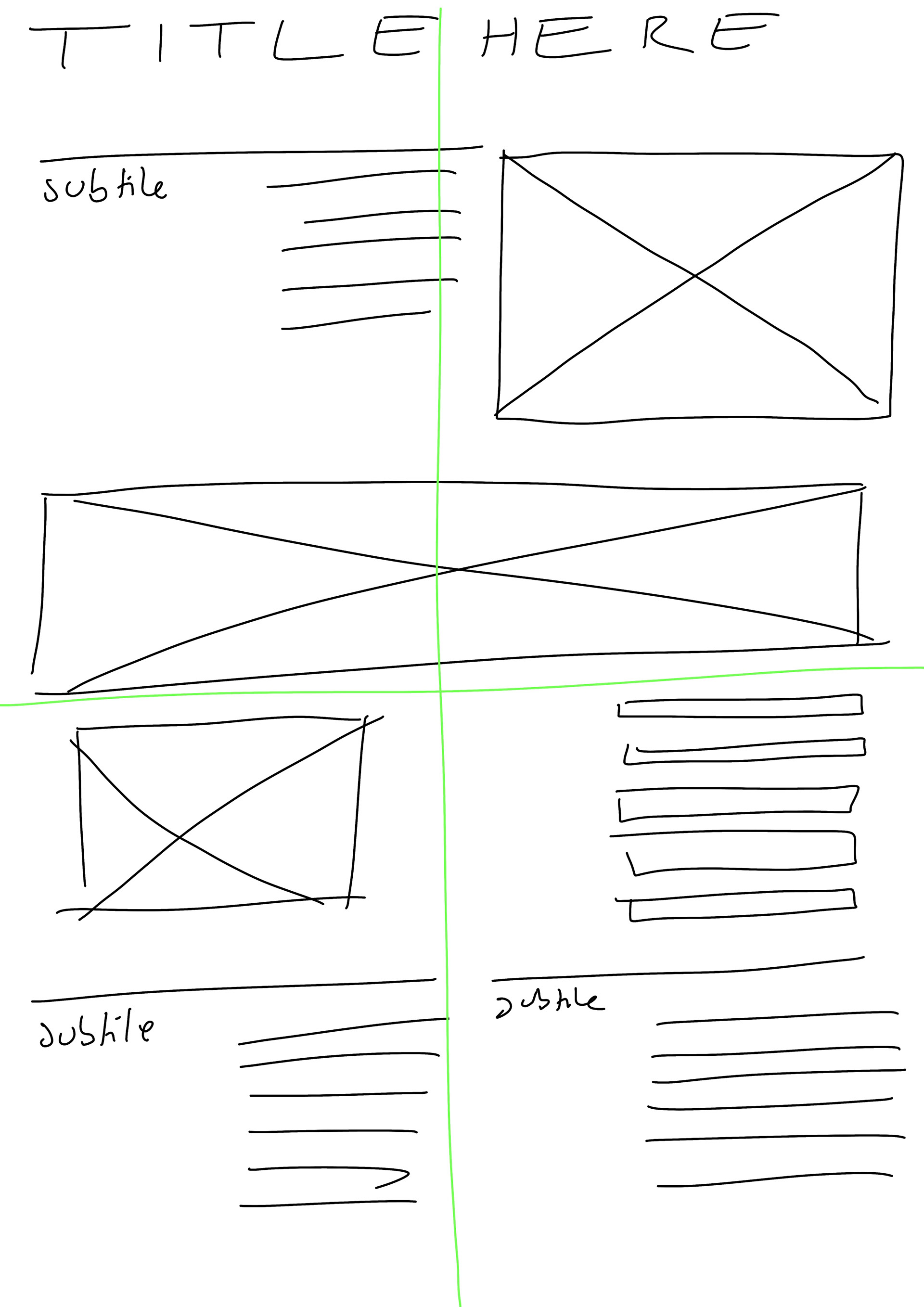
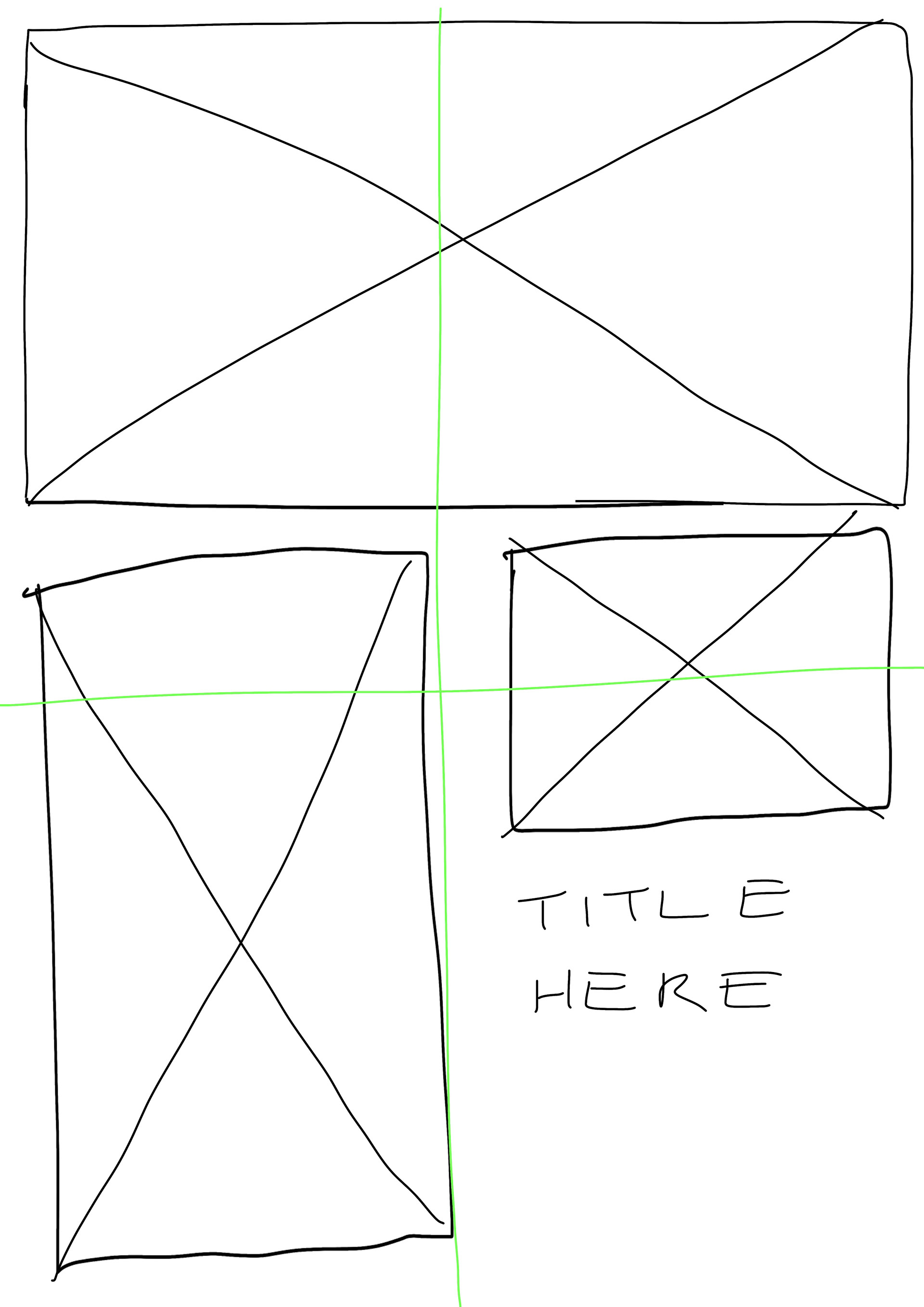
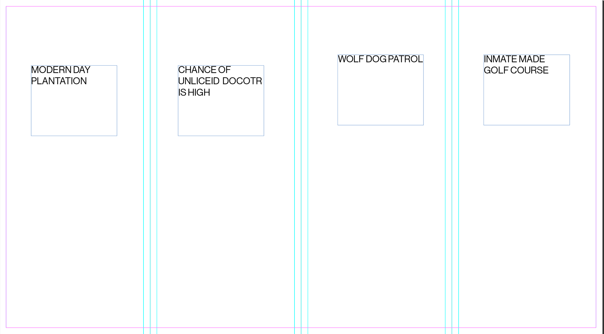
I wasn't sure exactly how to start so have done some wire frames. I like the idea of a list format as I feel it is a easier to follow compared to going up and down in a zig/zag type way.
In the video I explain my first steps and what content will be in each 'asset'