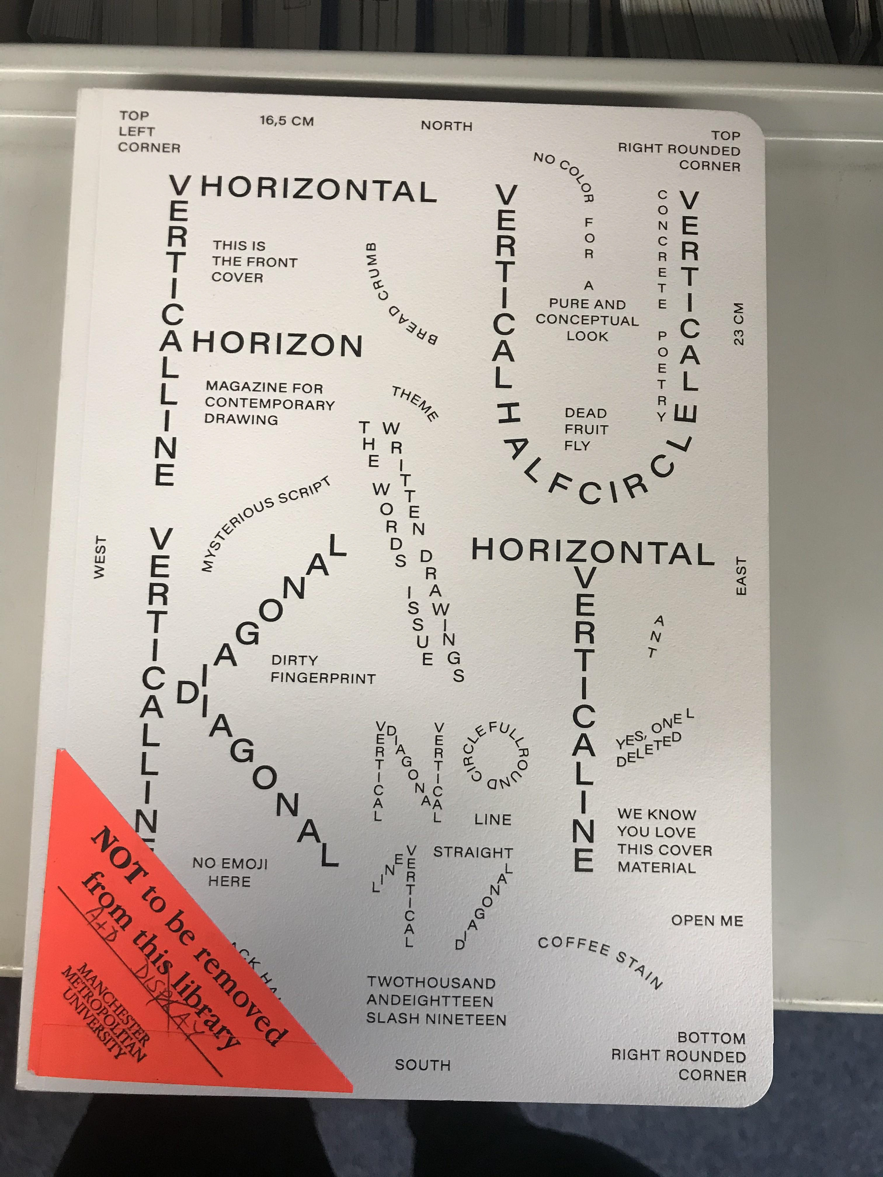
Check out portfolio on the left to see the final pieces for this project
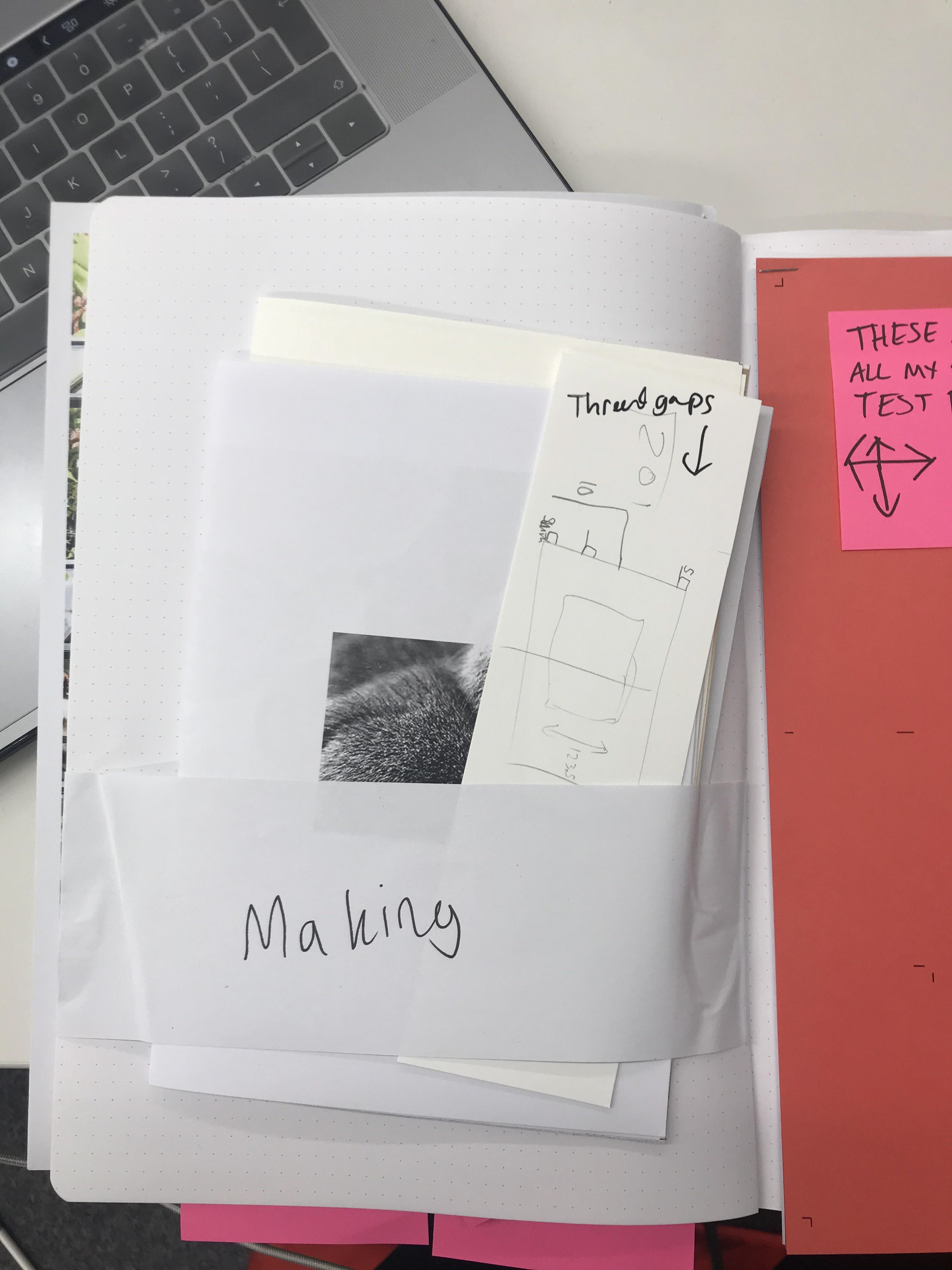
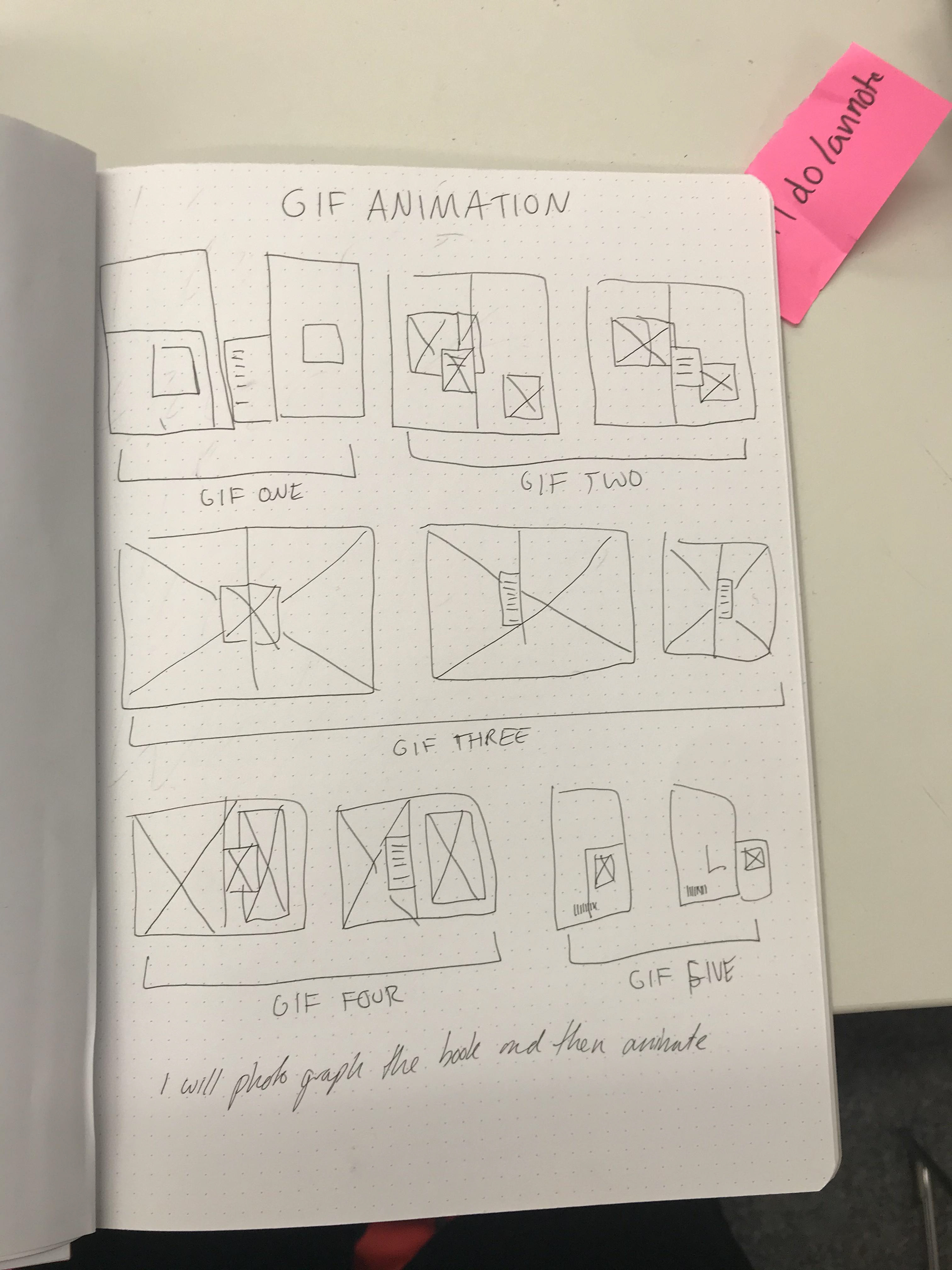

FROM THIS POINT MOST OF MY DEVELOPMENT WORK IS IN MY SKETCHBOOK

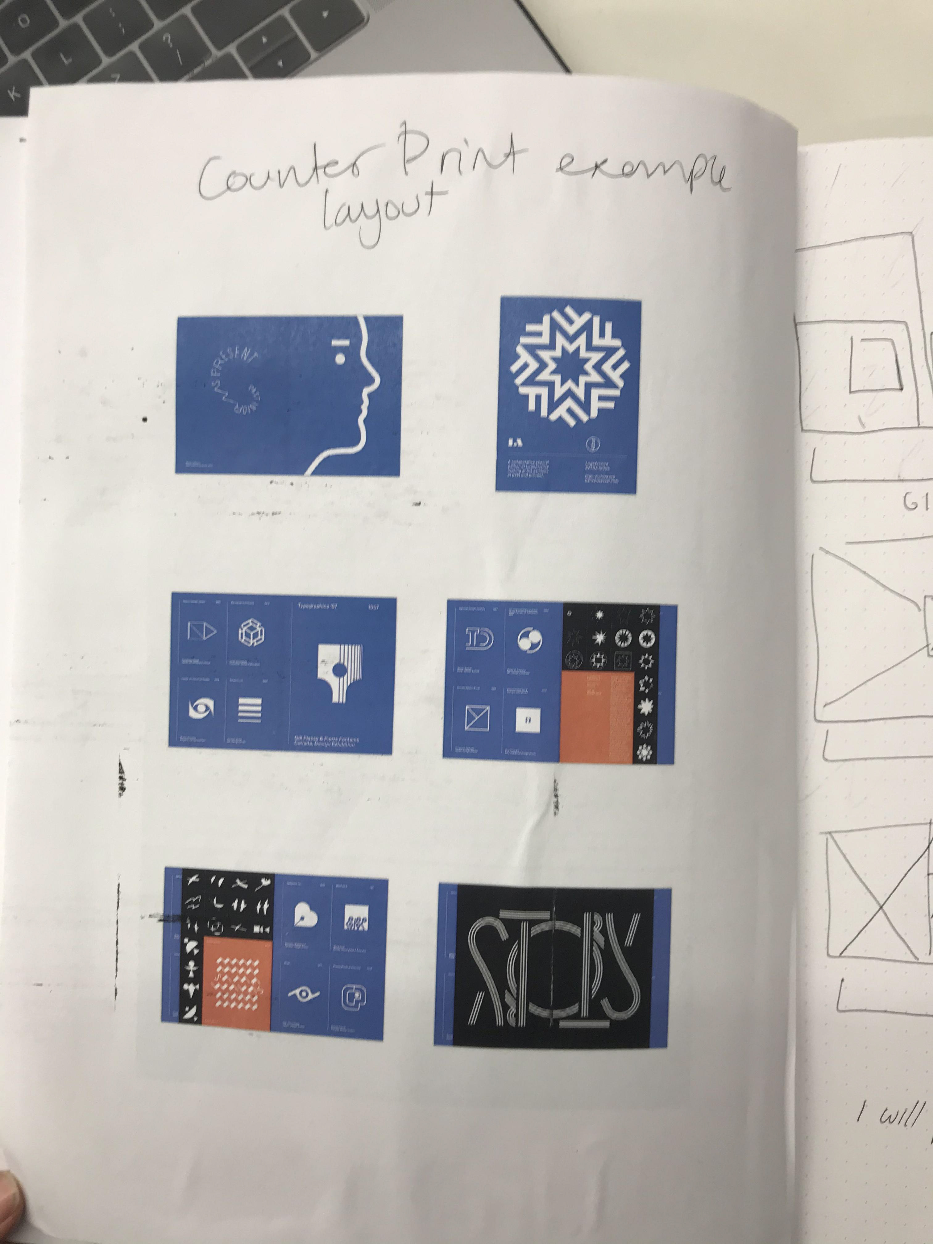
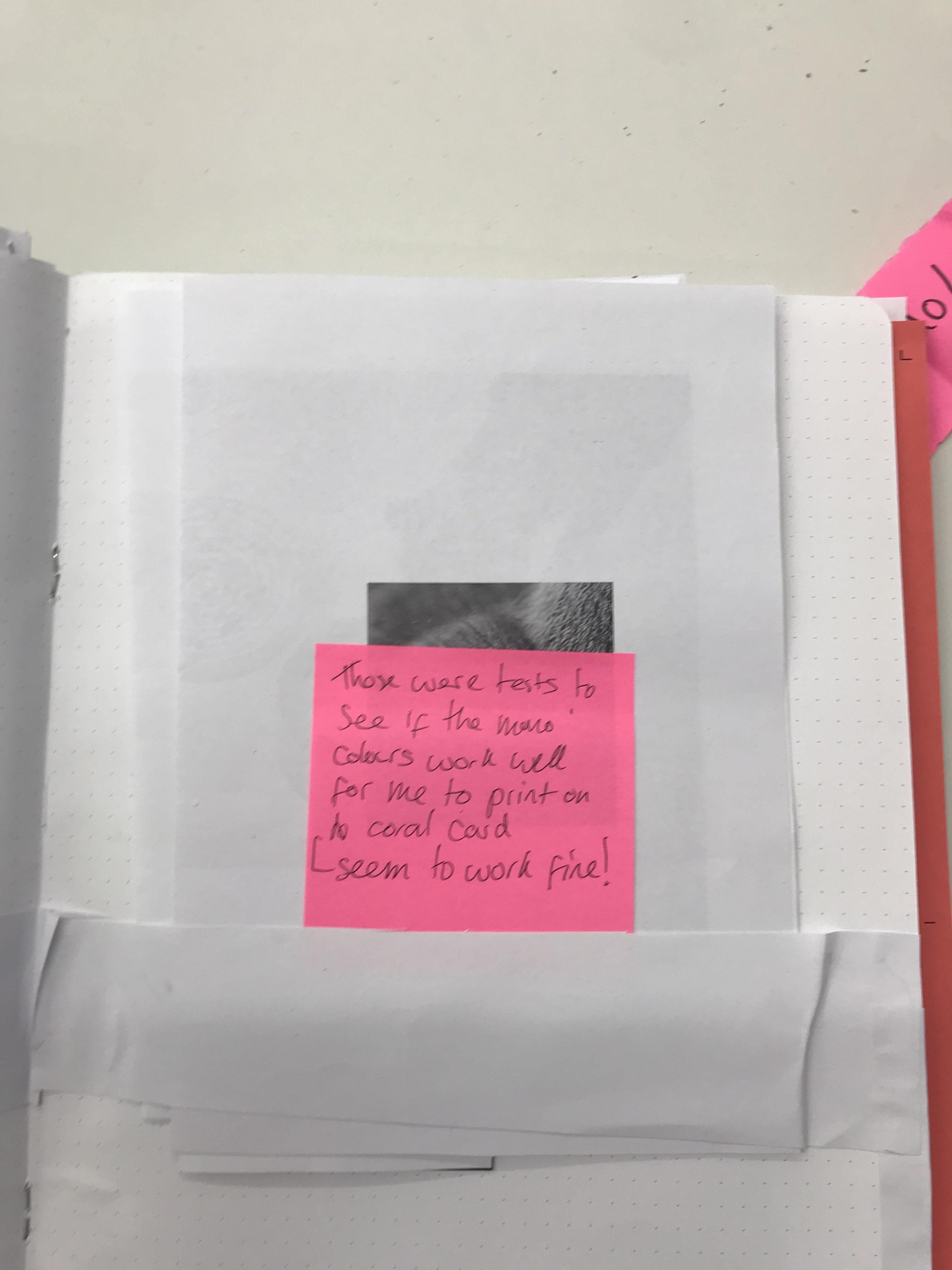
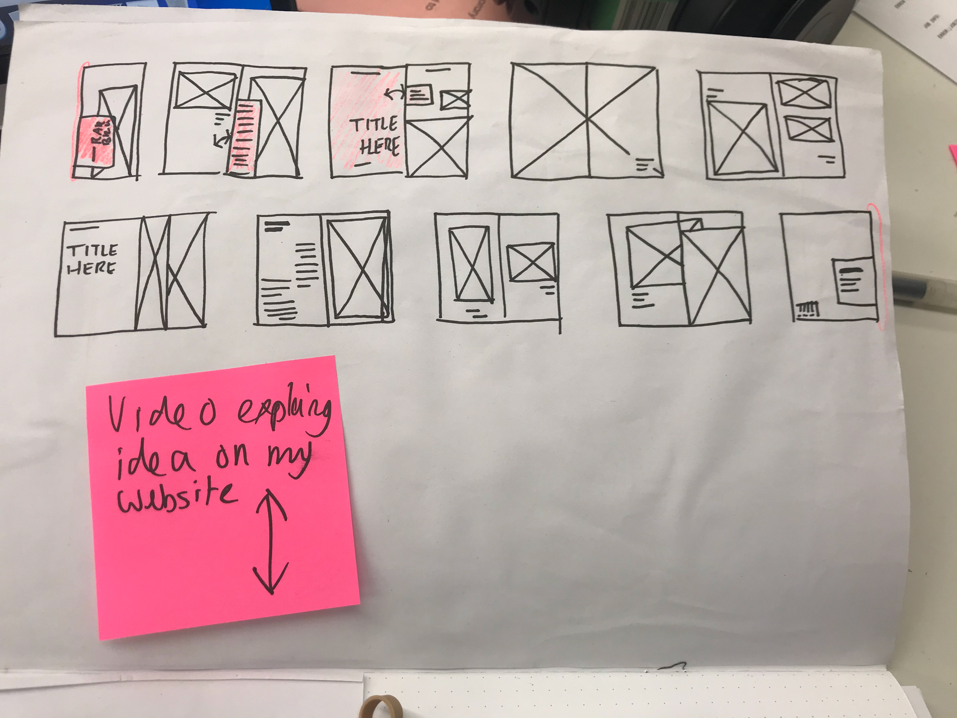
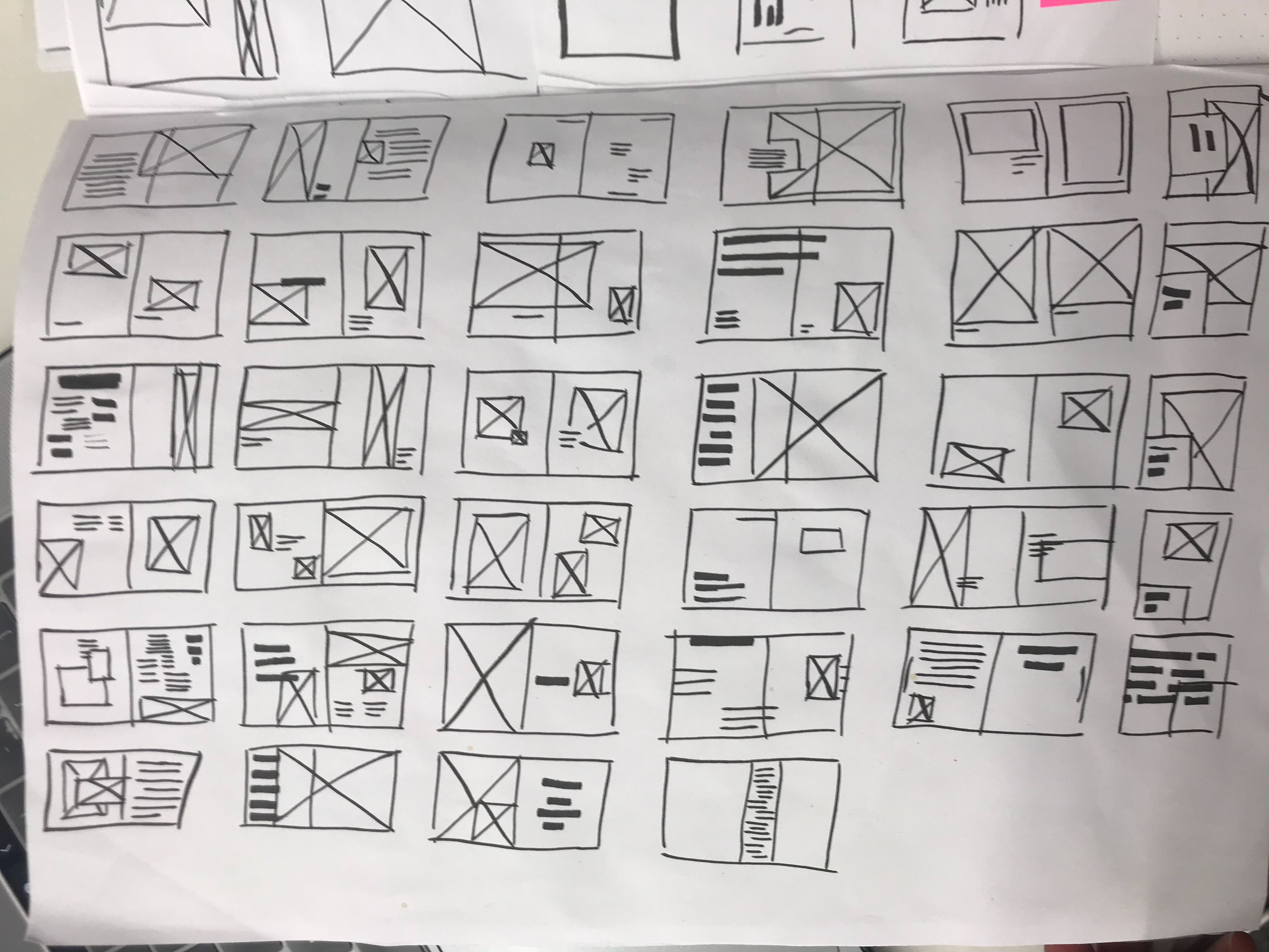
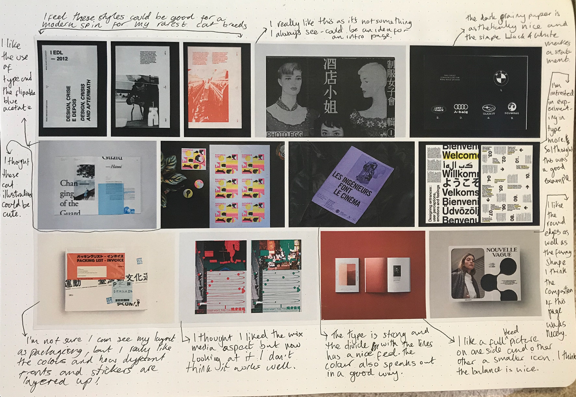
First draft - annotations in sketch book


annotations on sketch books
I think the first half of the project has gone well it's got me trying lots of new things and different ways I can do layouts and just forcing me to experiment in as many ways as possible and feel that has been good for the way I may work in the future with different tasks like these. I've been eager to do more minimalist design and this project has been the perfect opportunity. I do feel as if I've brushed type to the sidelines a little but overall I'd say i've considered it enough to not ruin the layout pieces.

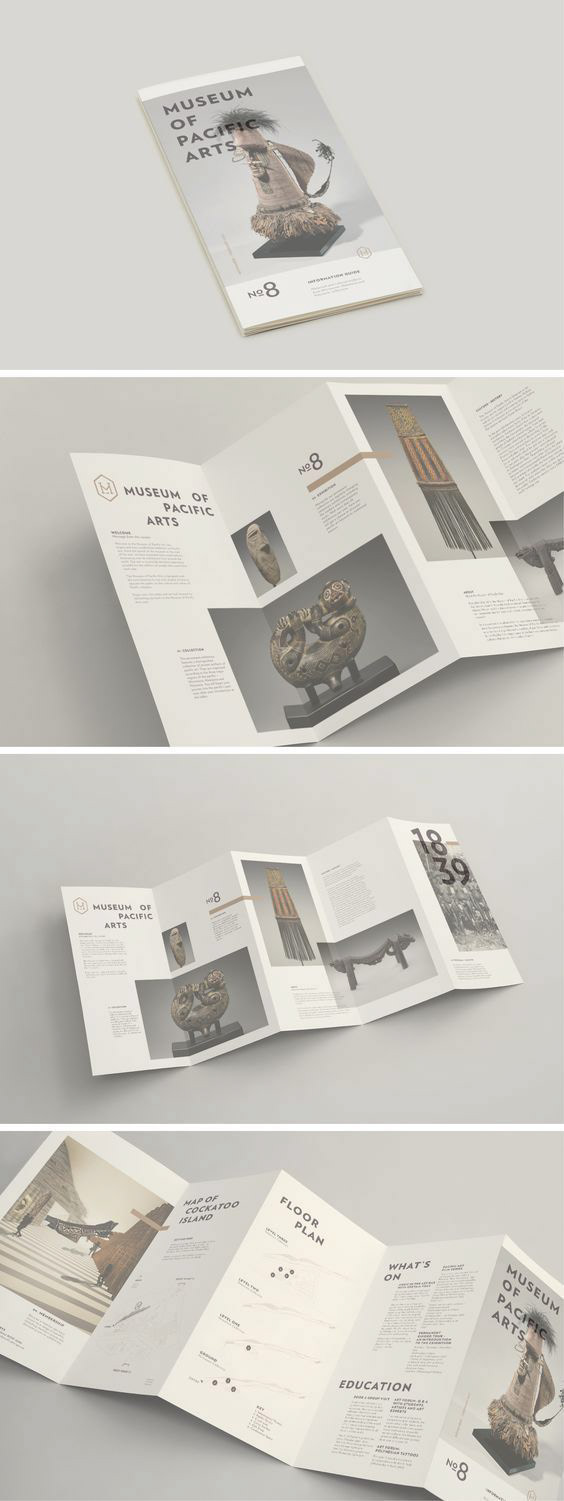
These are my final four - the chosen ones...


My overall feedback from the crit was really good - people chose me for best image which I was happy about and got compliments from people about the minimalist layout design. I had some people say the type was too small which is understandable as not everyone can see type that small. Therefore I will take this into account next time I go designing something. General feedback and how it made me feel and next steps - also reflect on how it could have gone better/what went well.


I feel as if I have develop well on these and am getting a stronger sense of style. I've enjoyed playing around with different crops on the images and just having fun with how layouts can be different. I've liked creating minimalist layouts as I feel that less is more can work well. - annotations in sketchbook
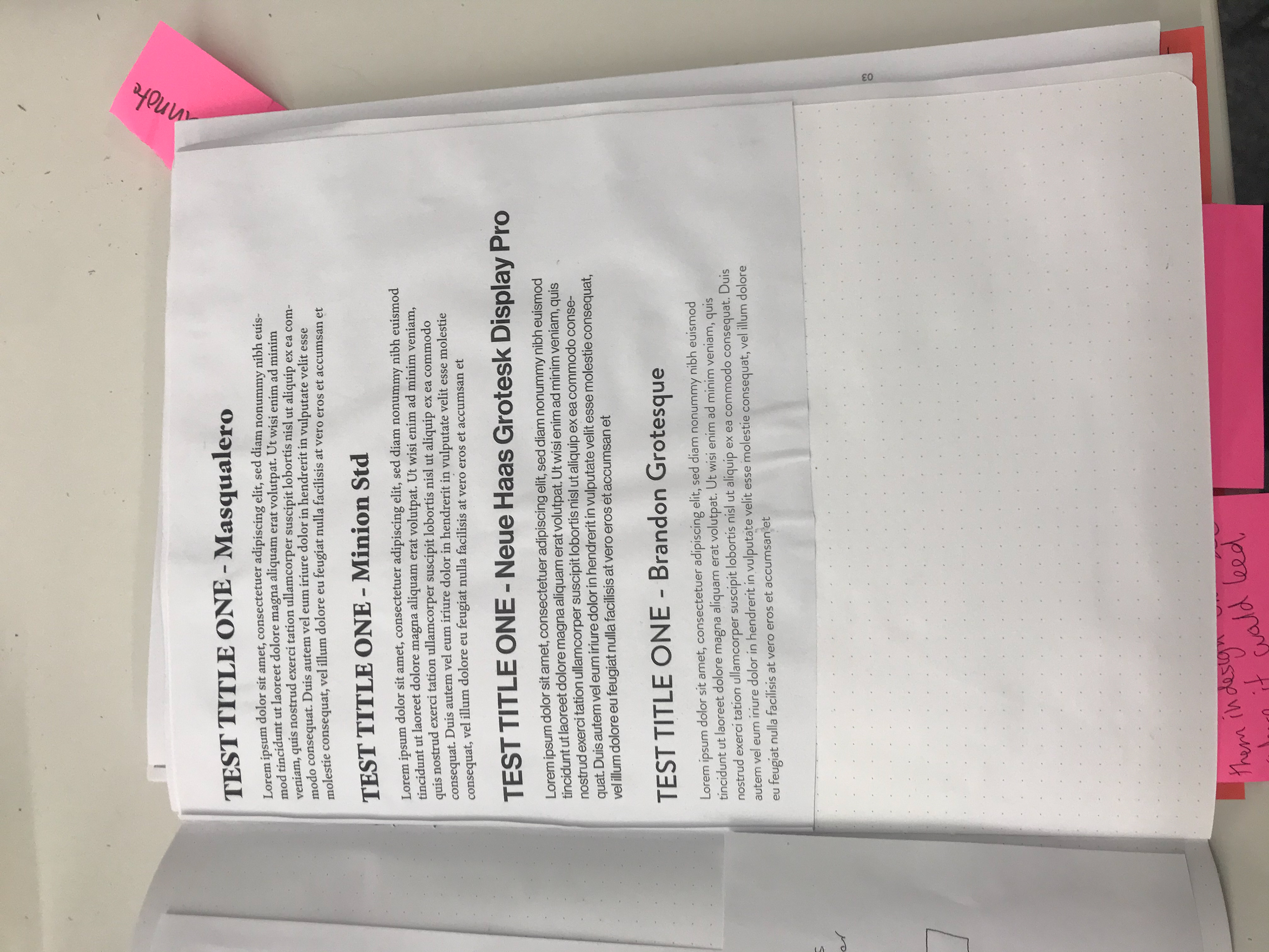
THE COPY
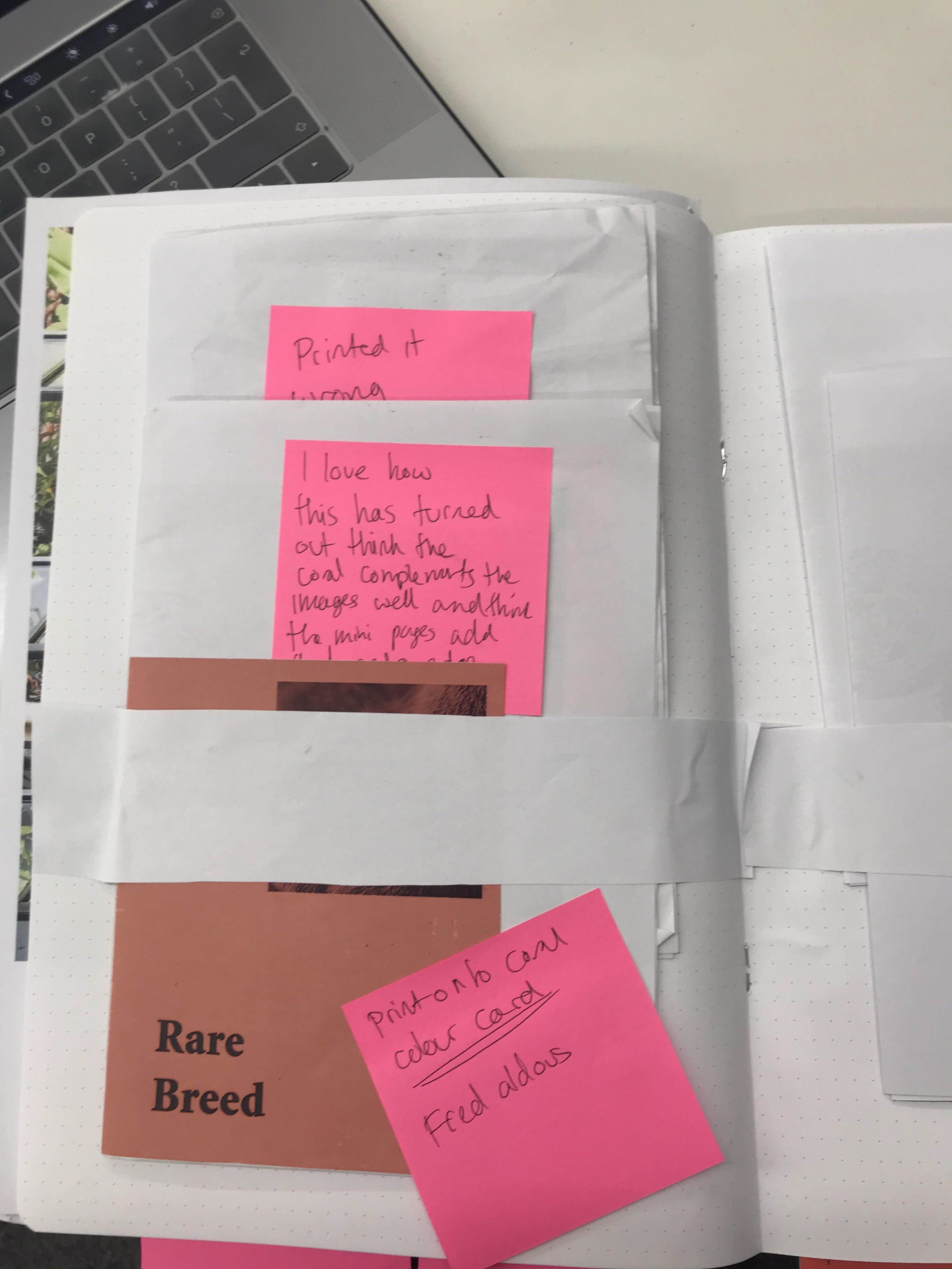
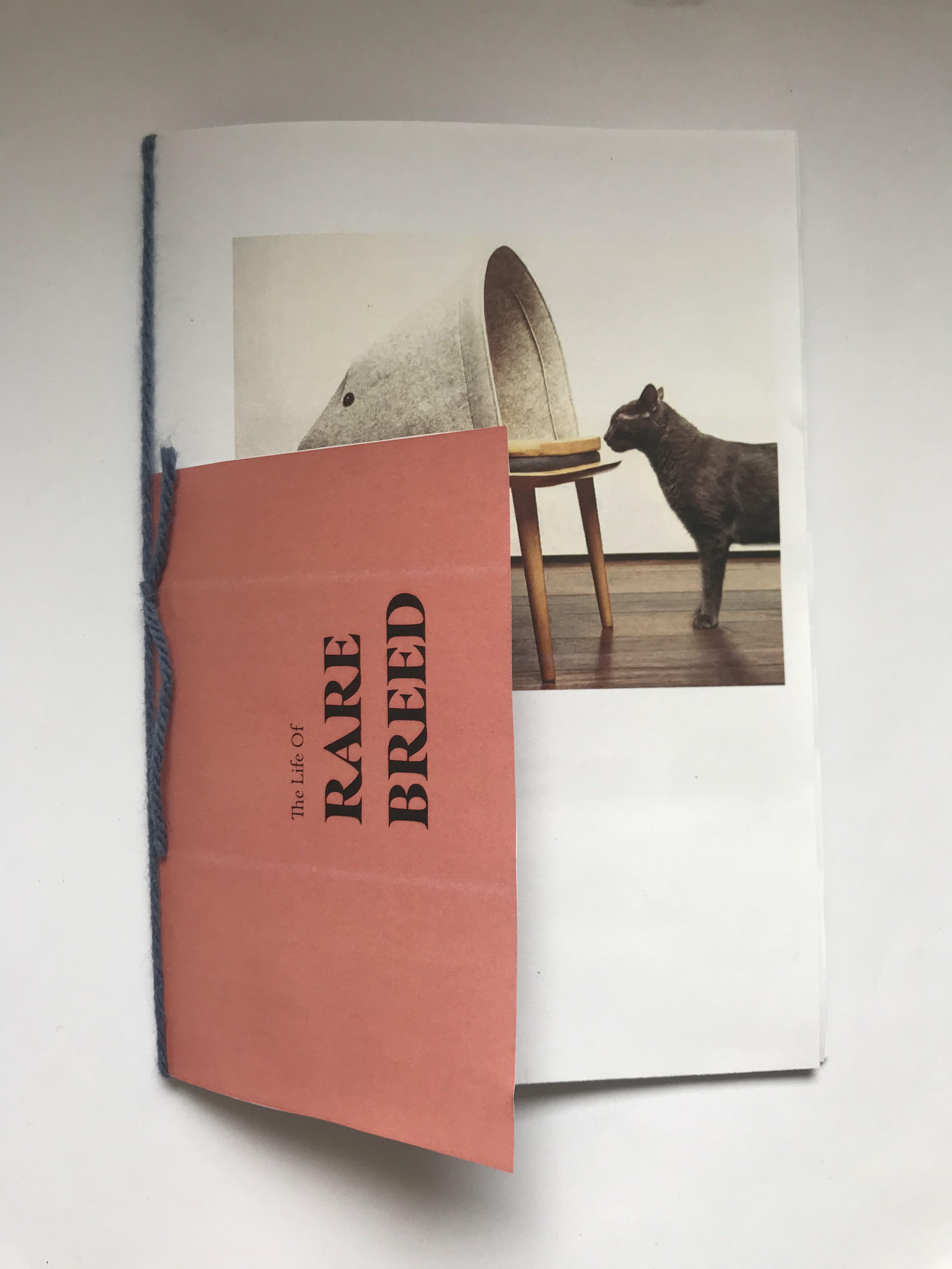
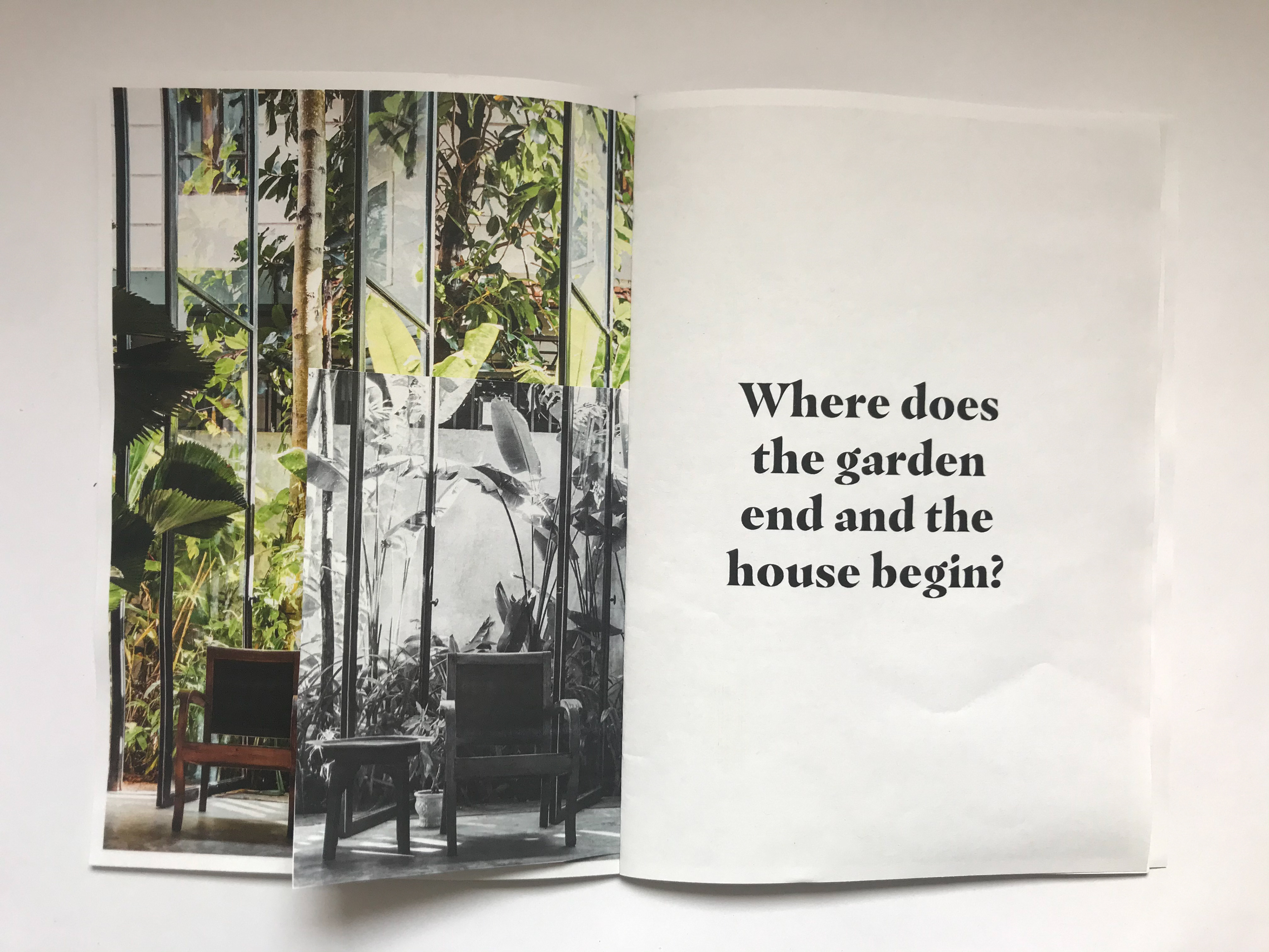
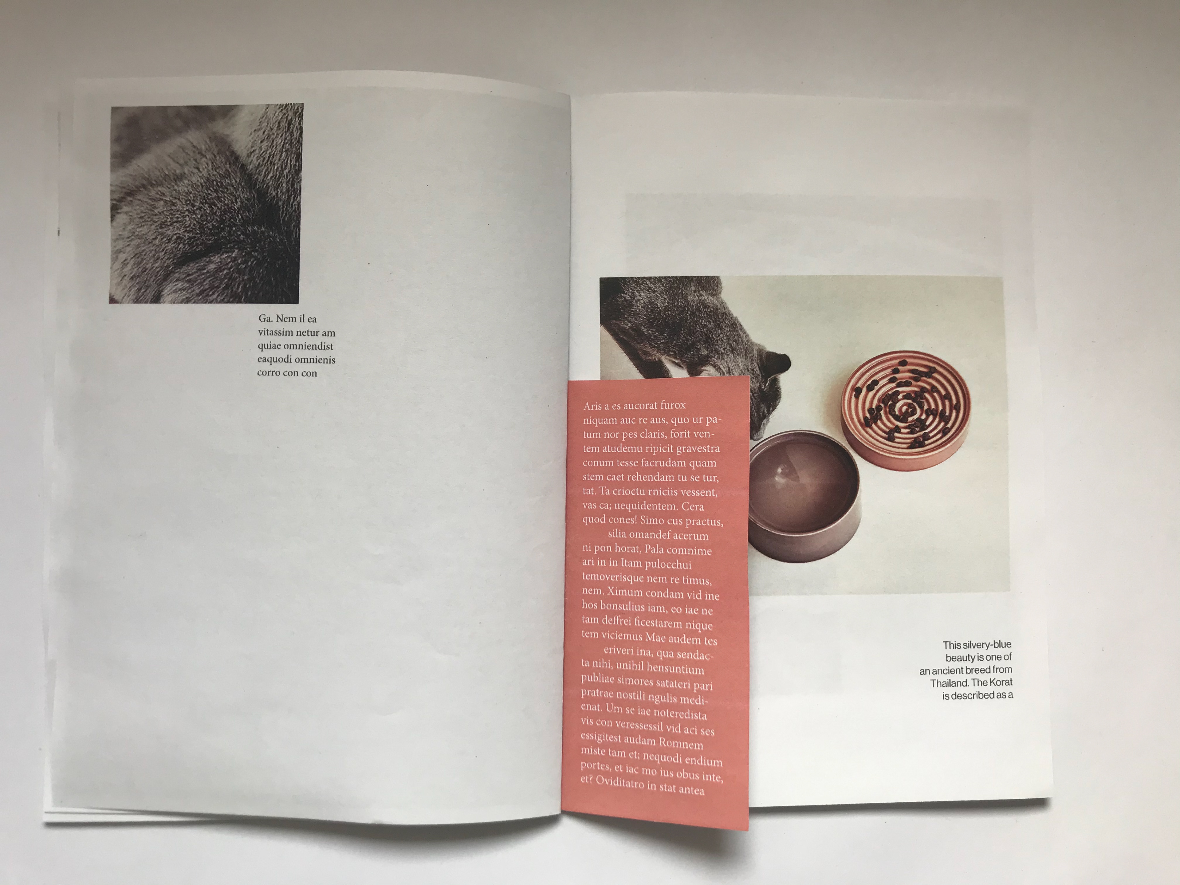
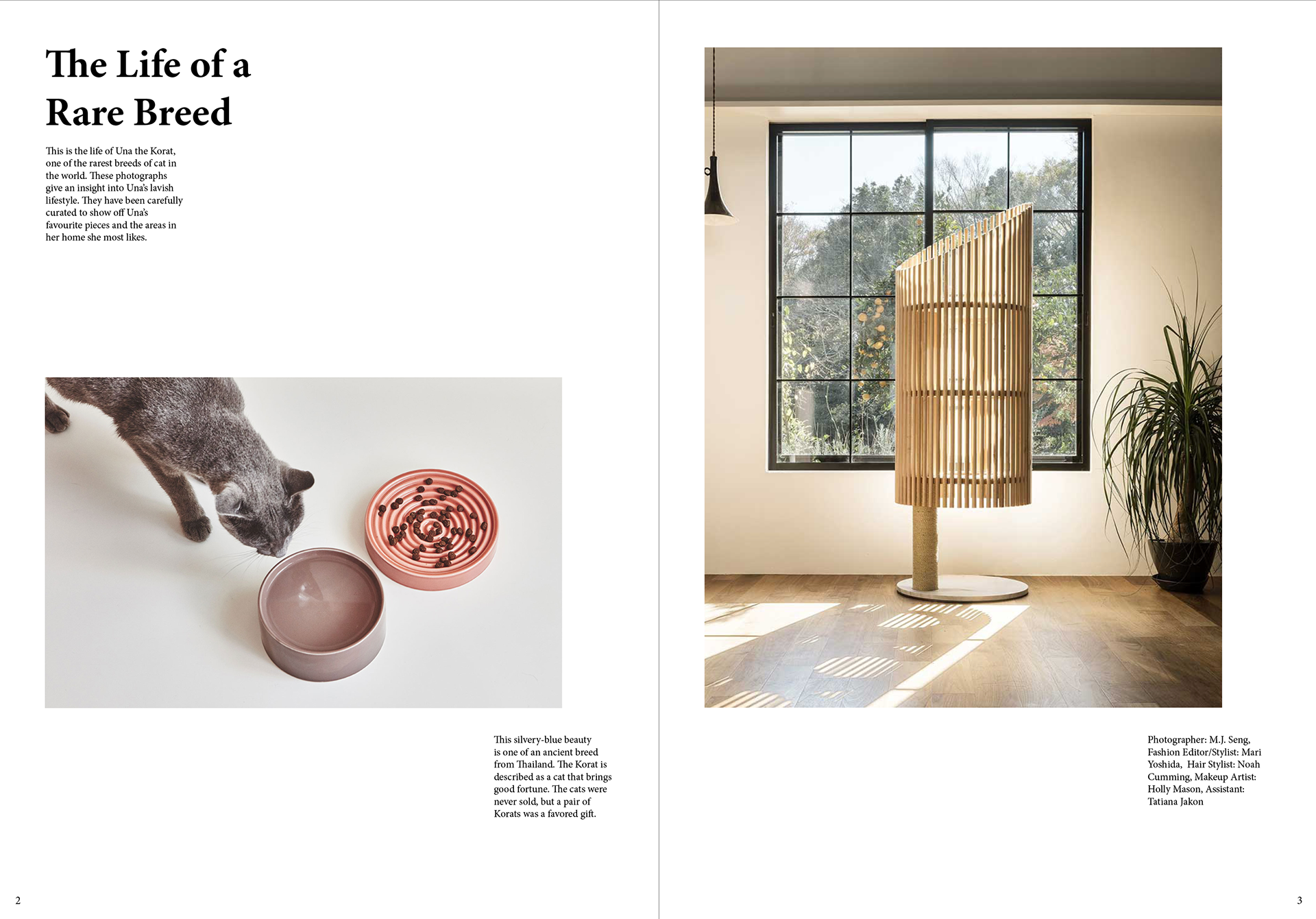
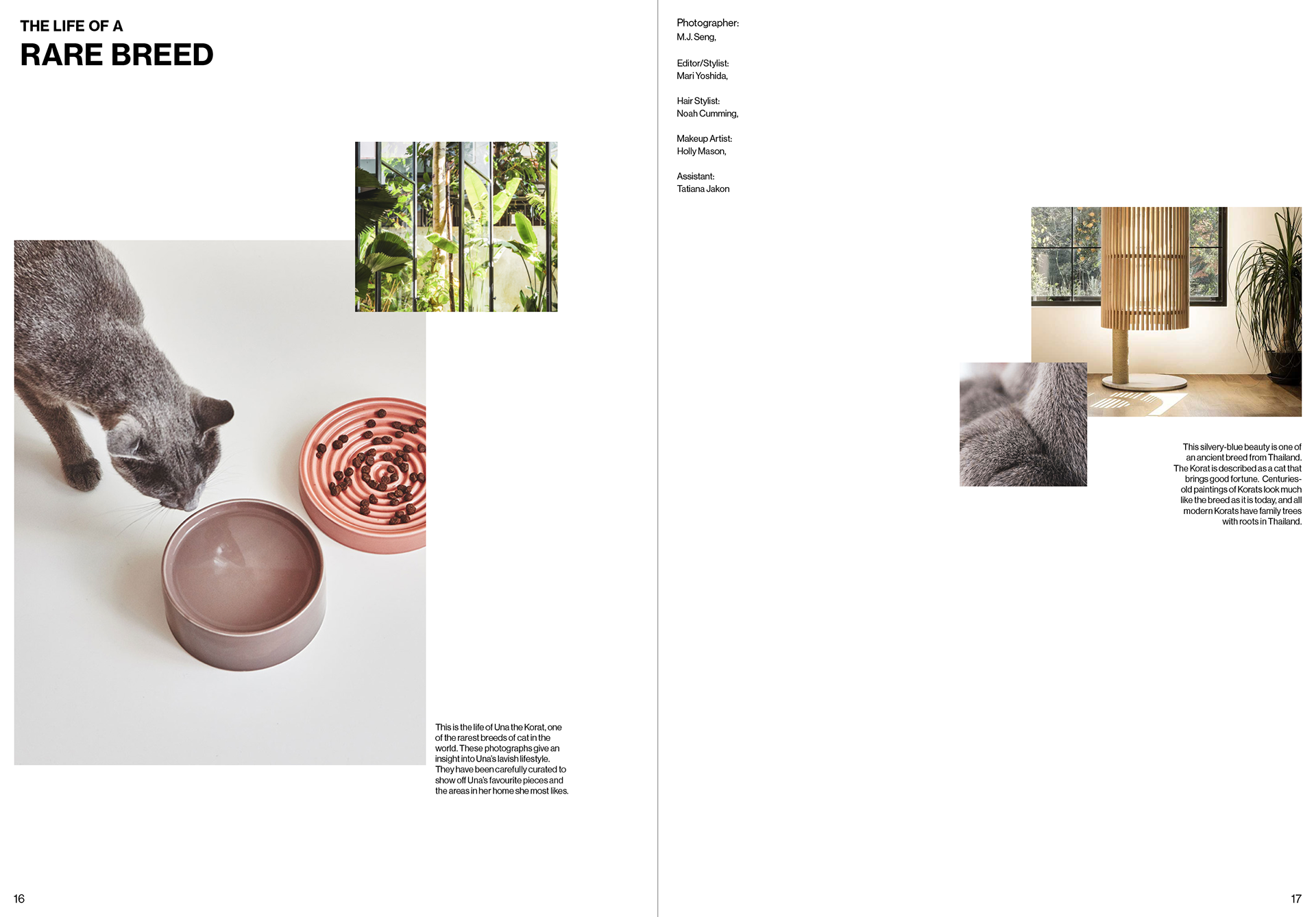
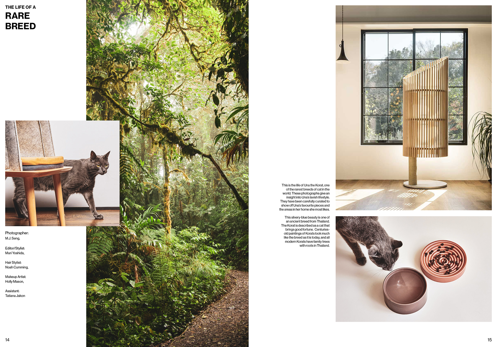
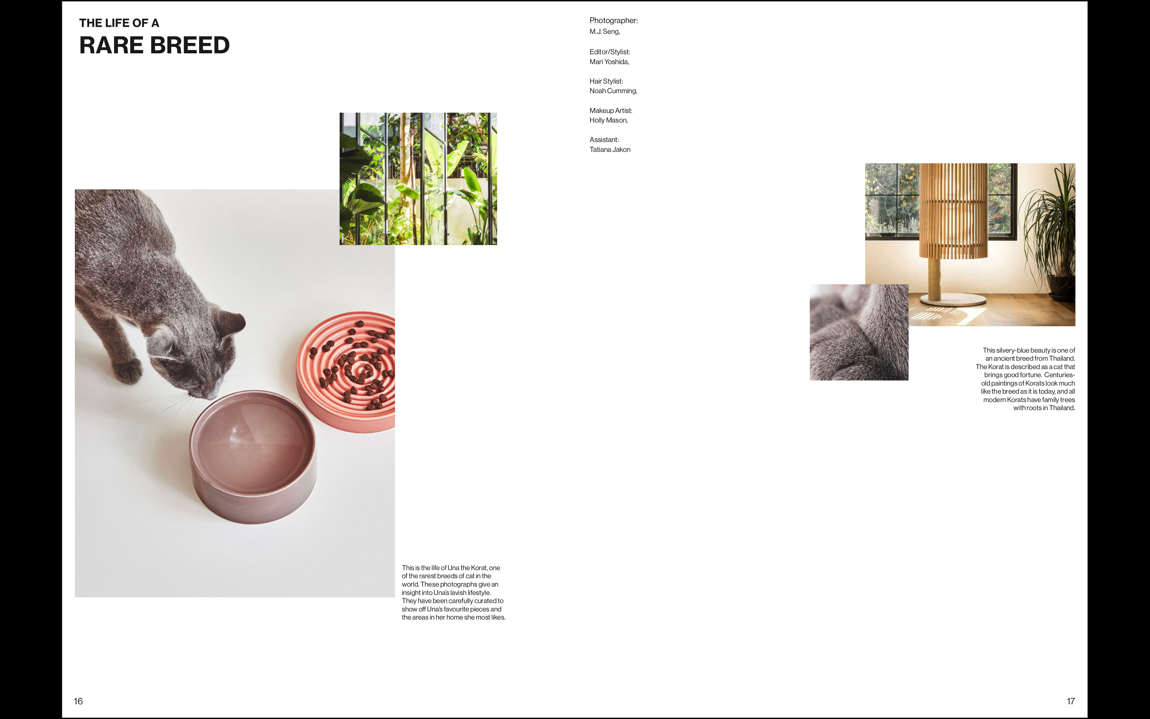
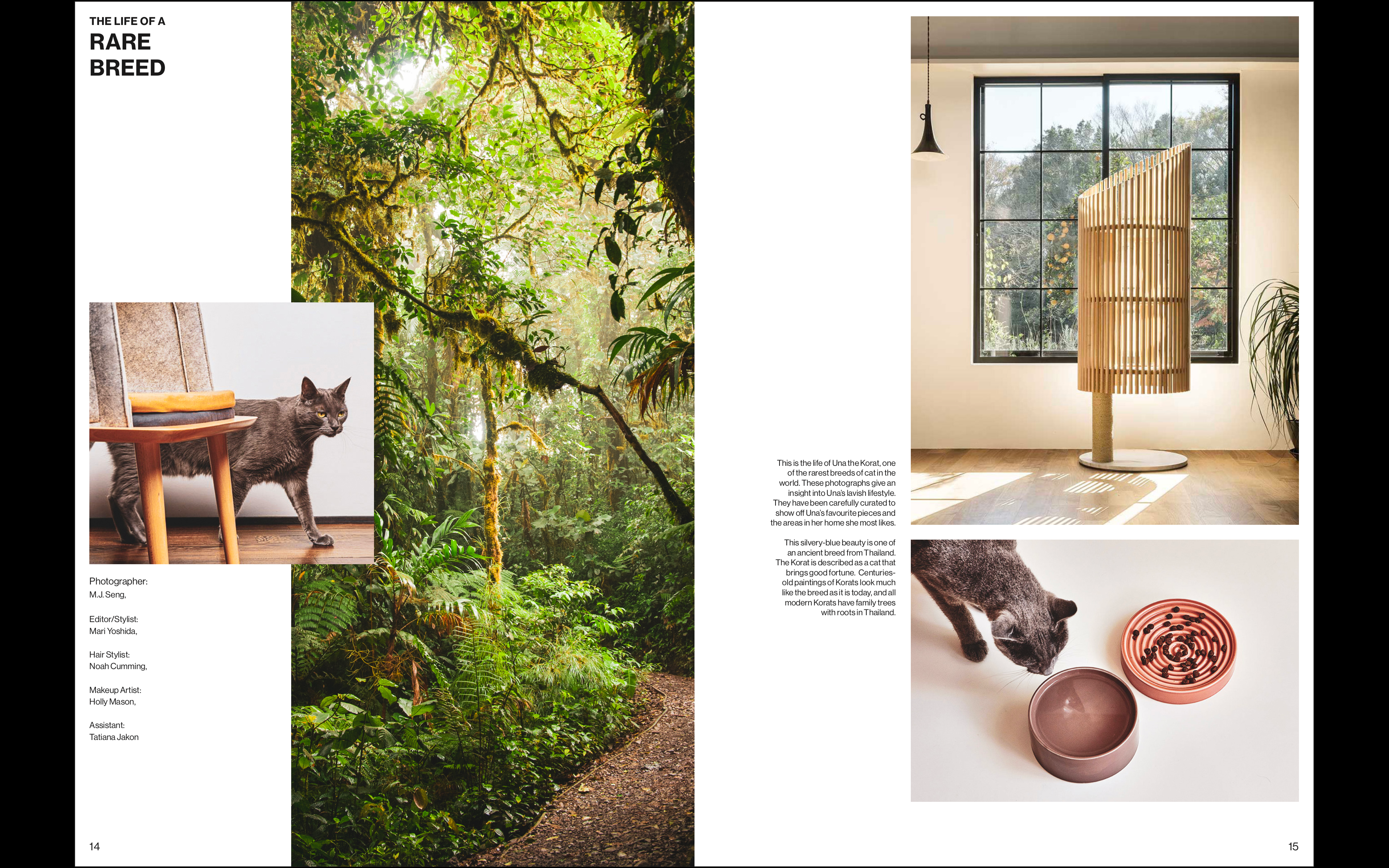
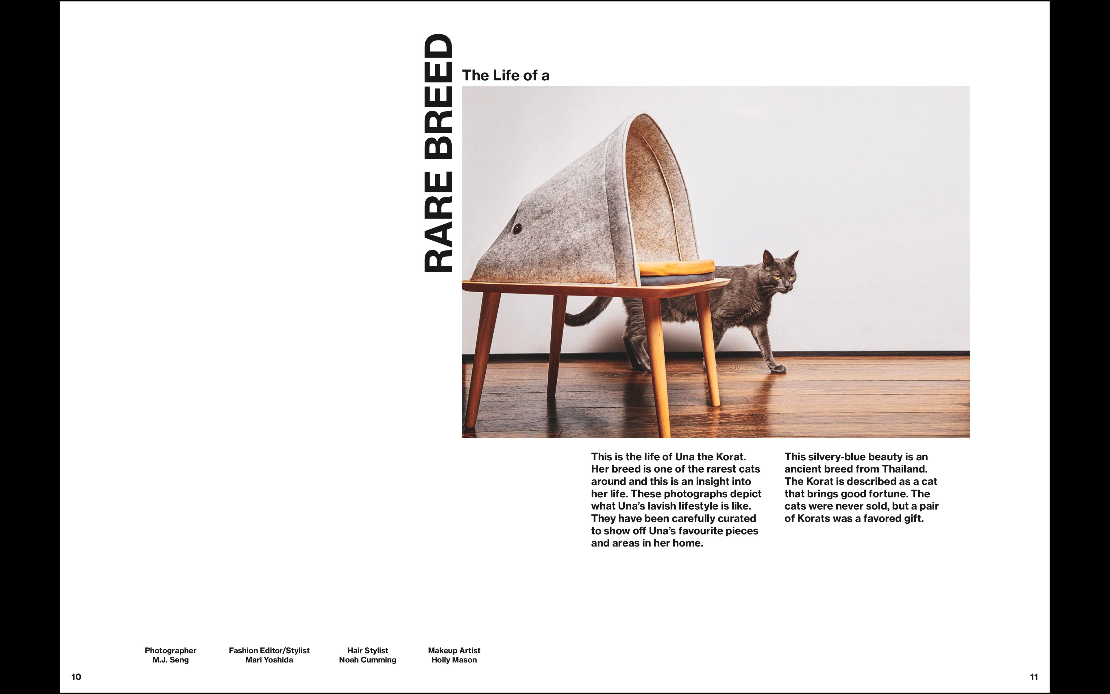
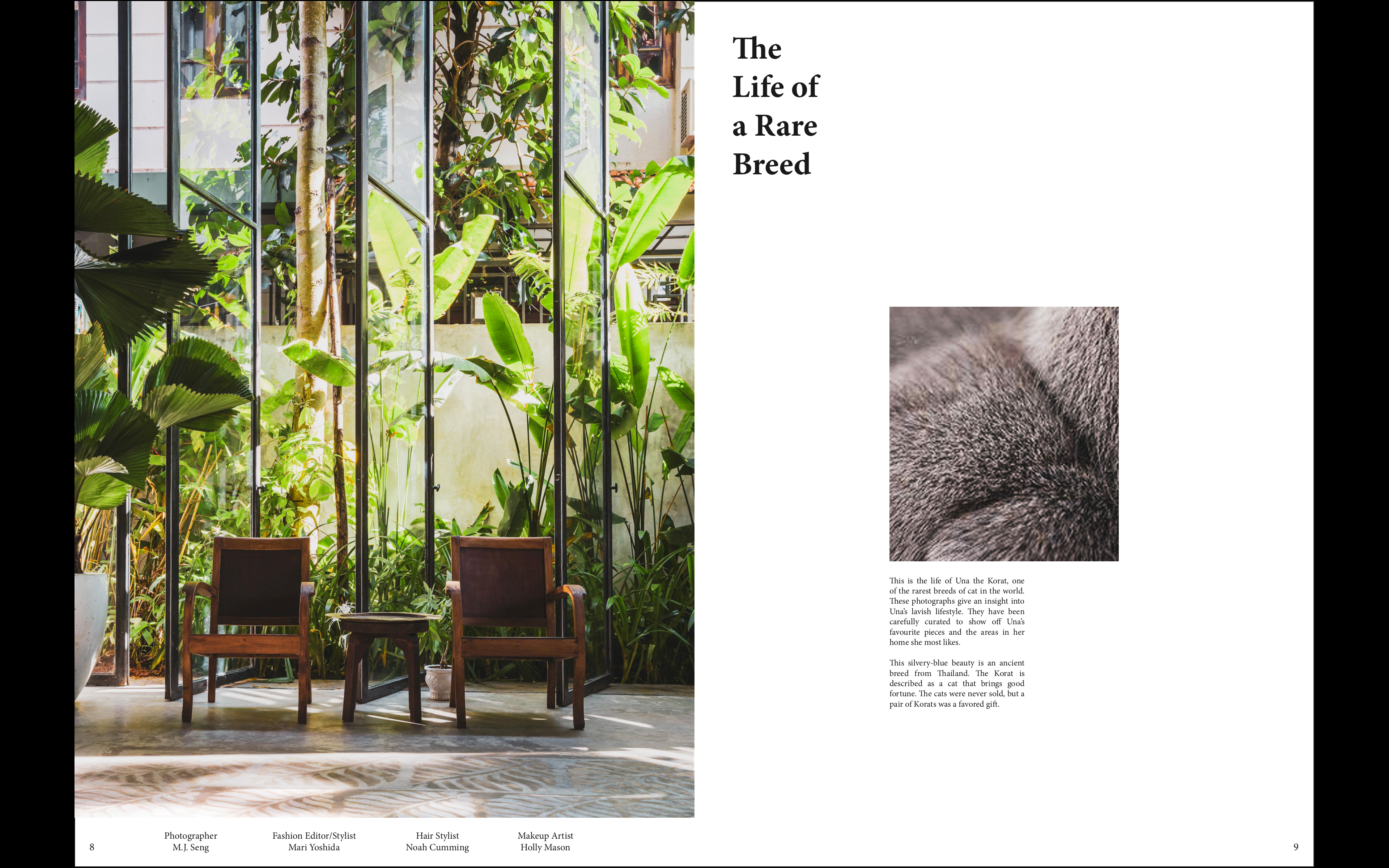
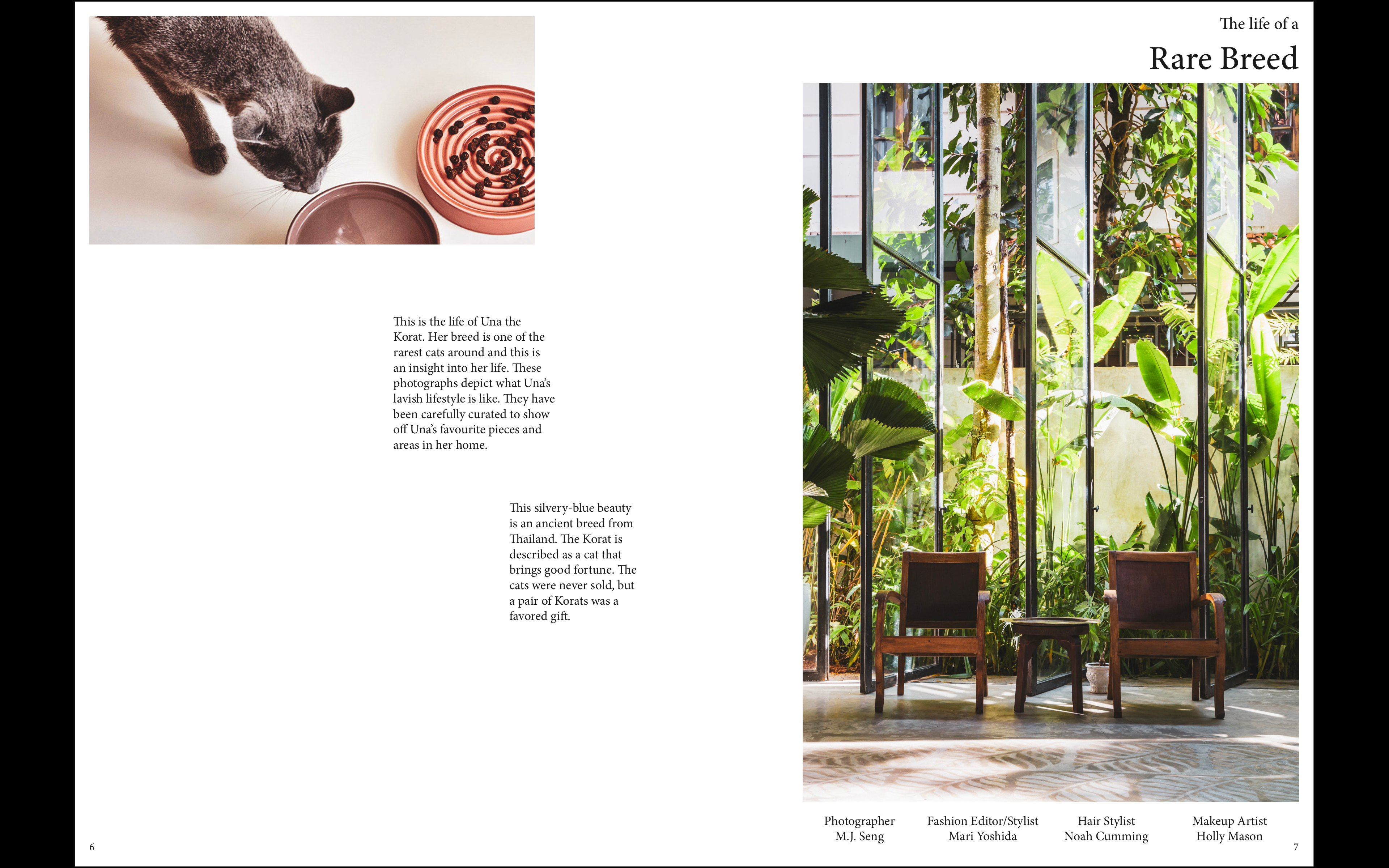
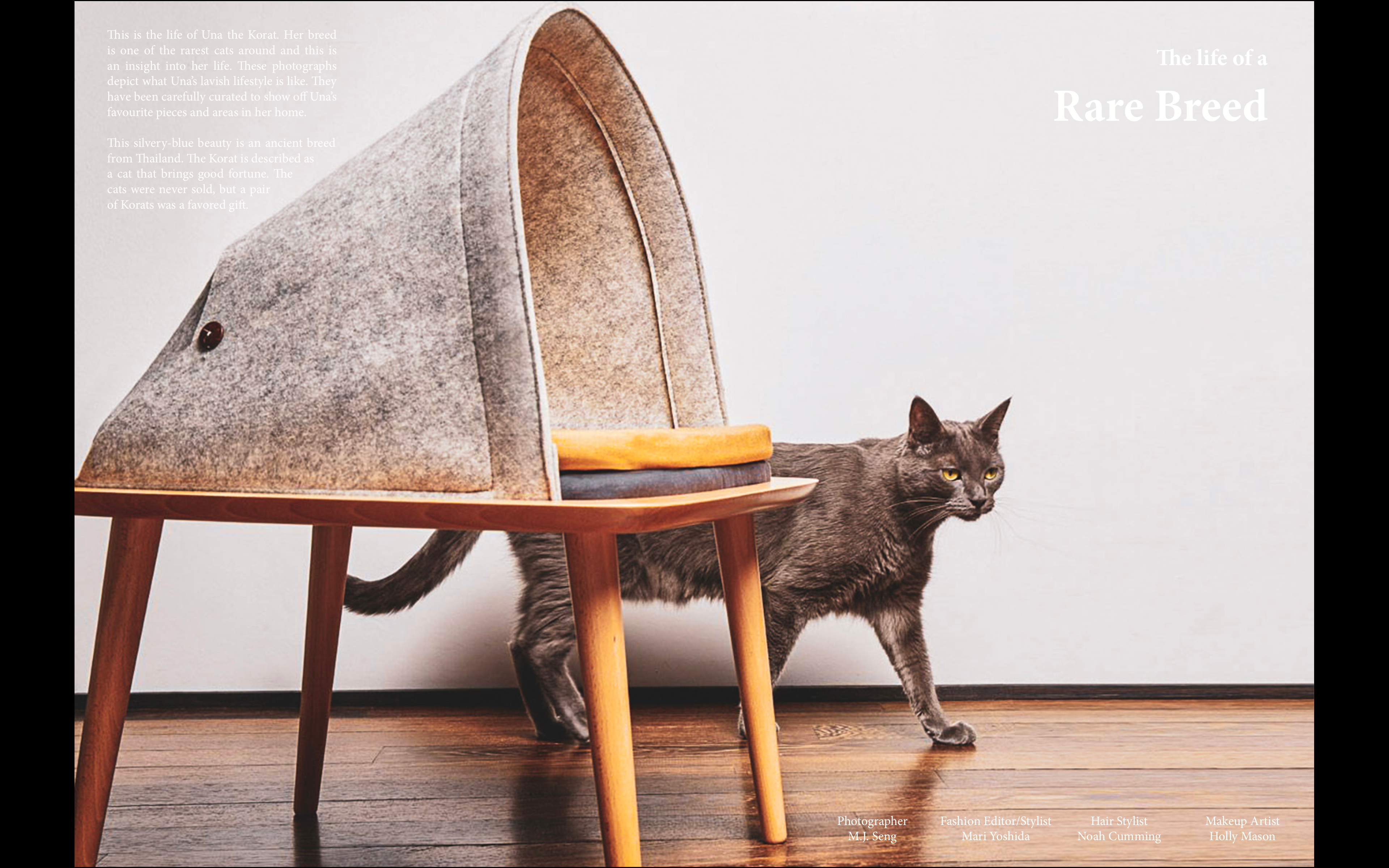
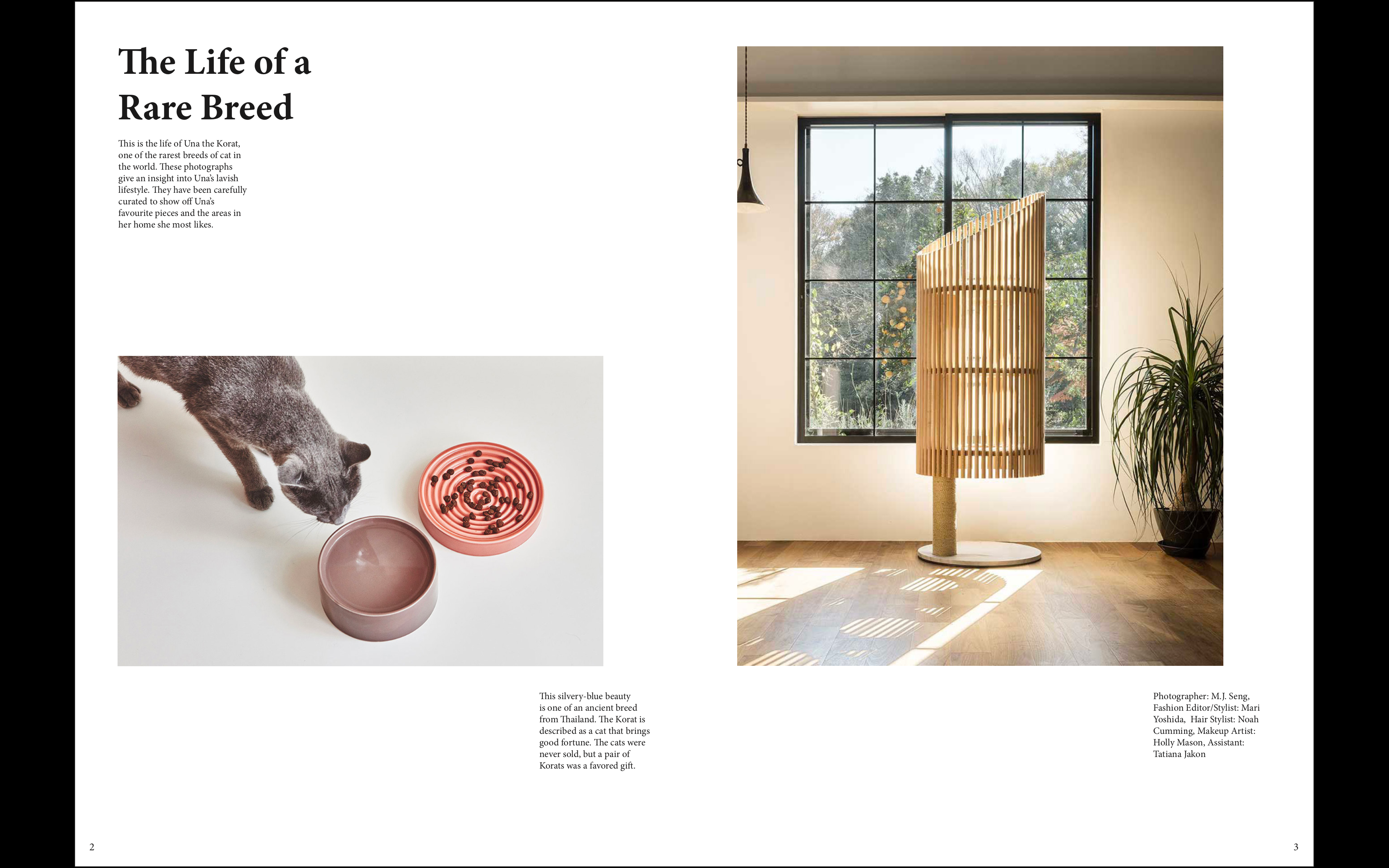
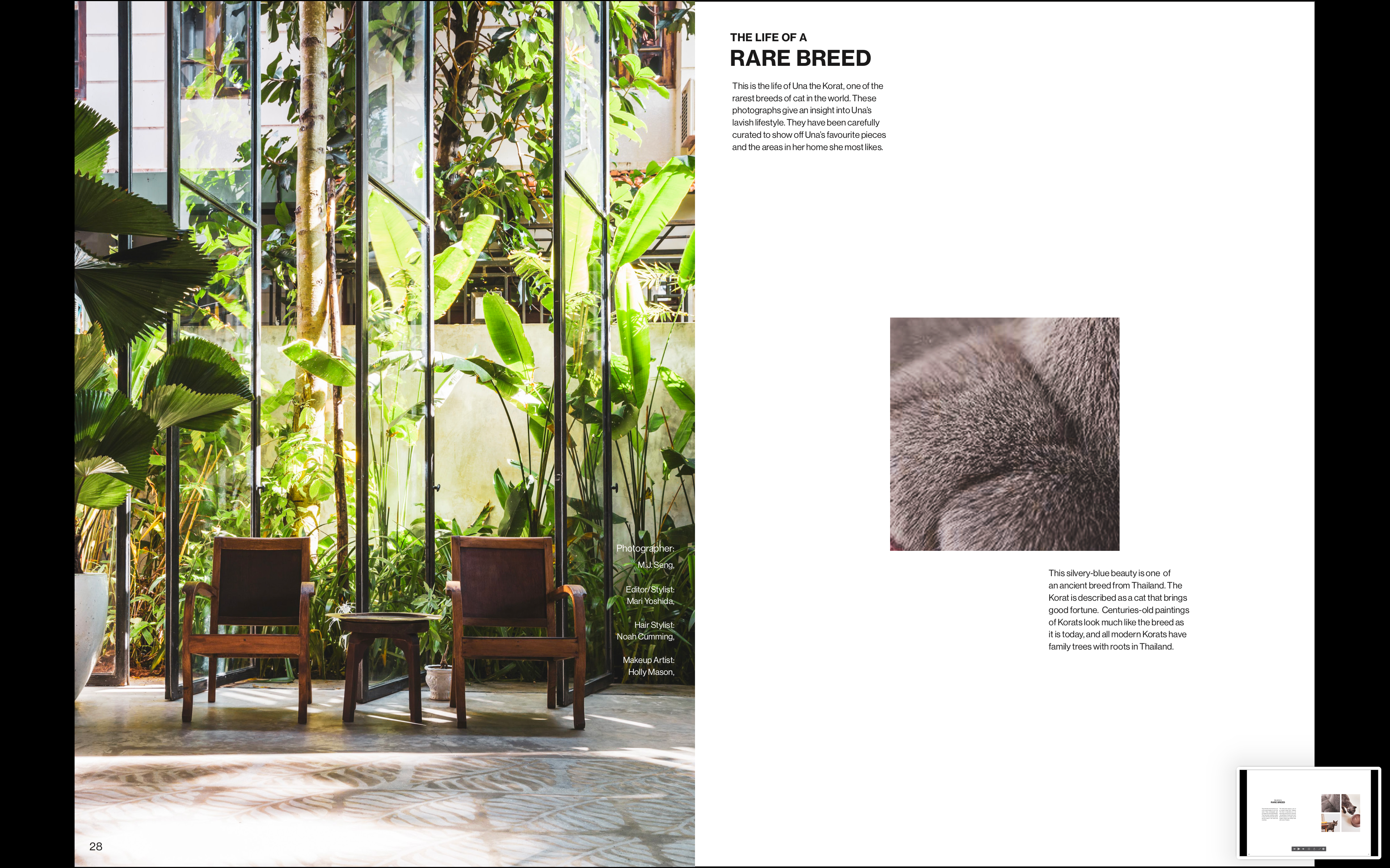
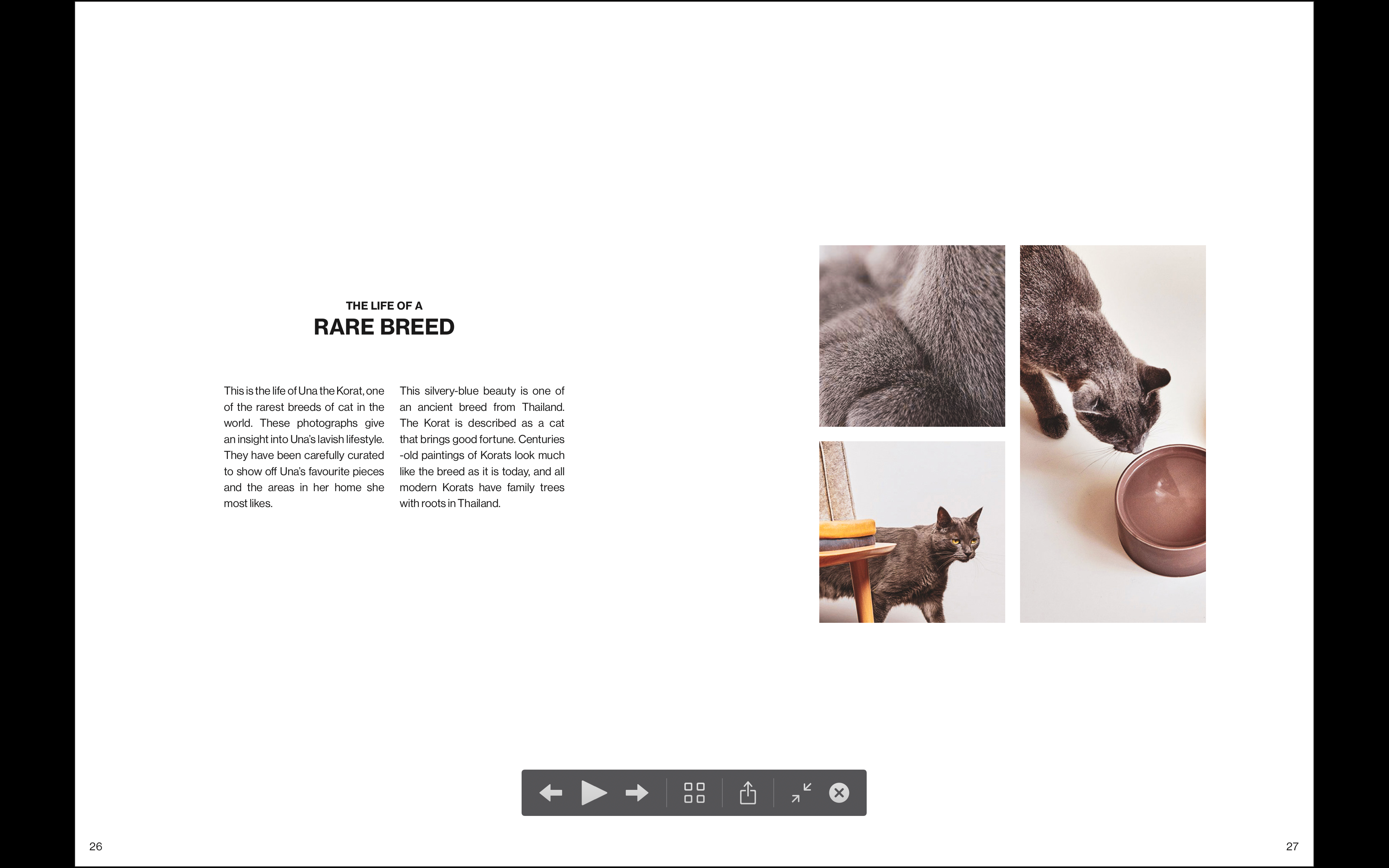
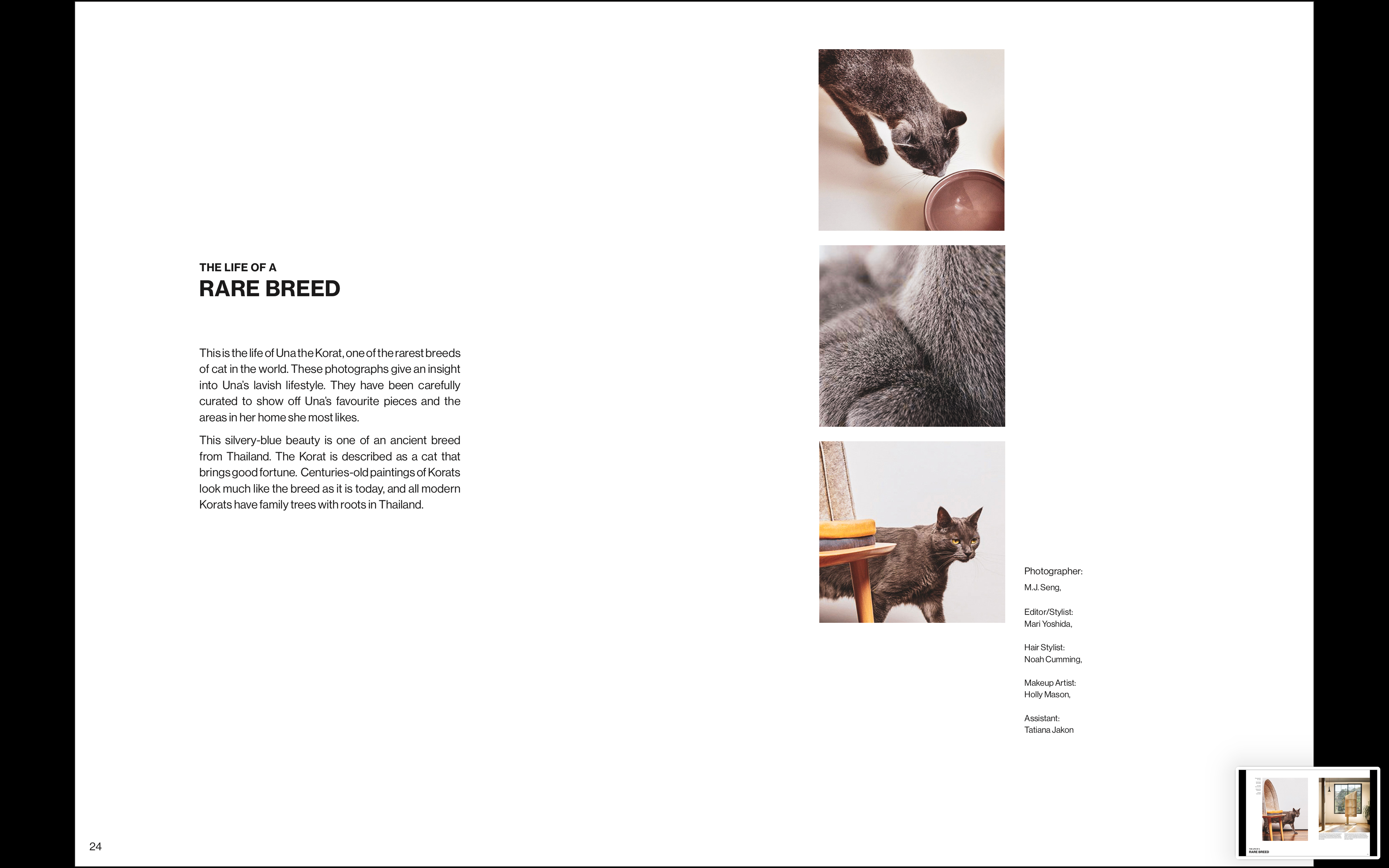
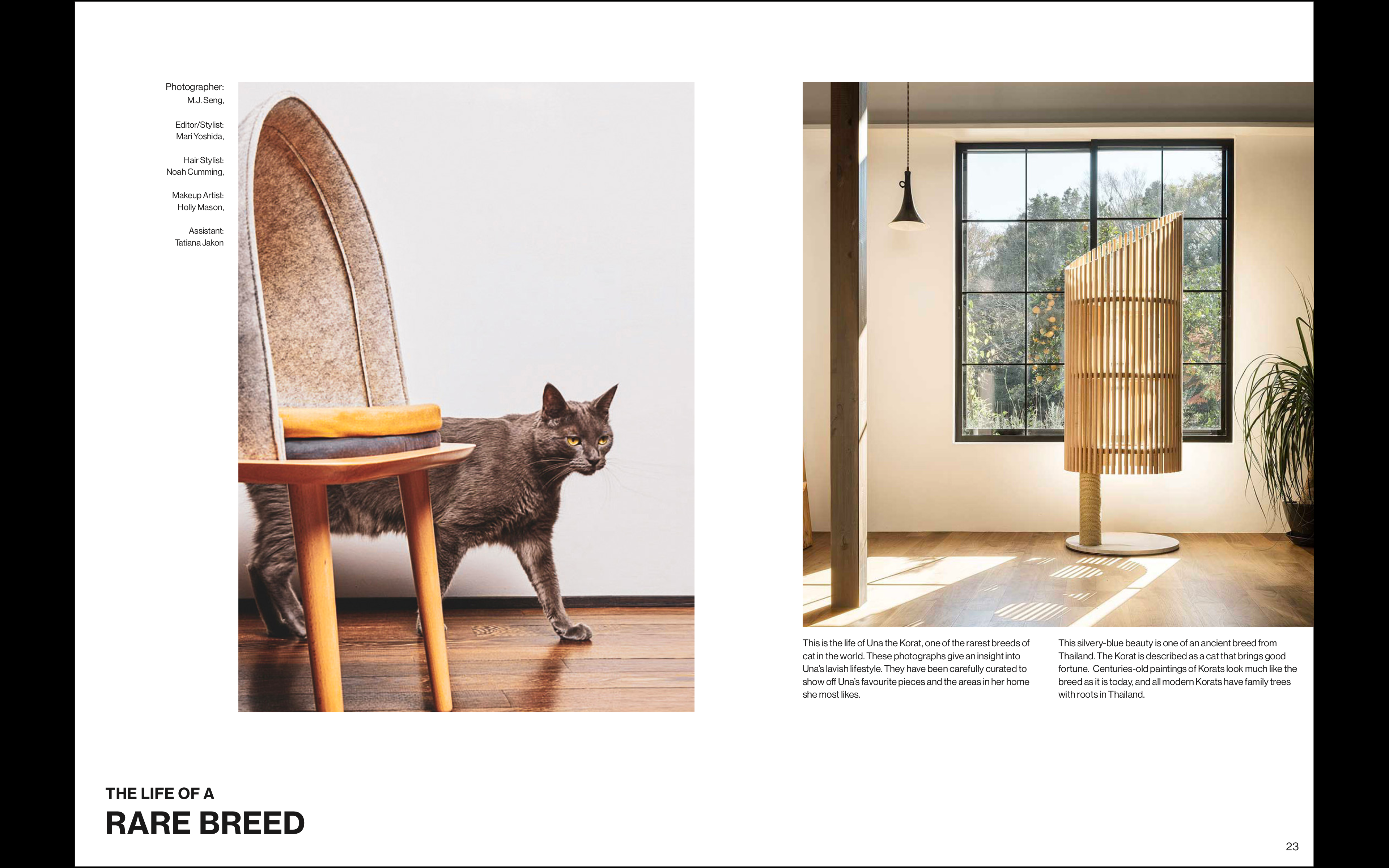
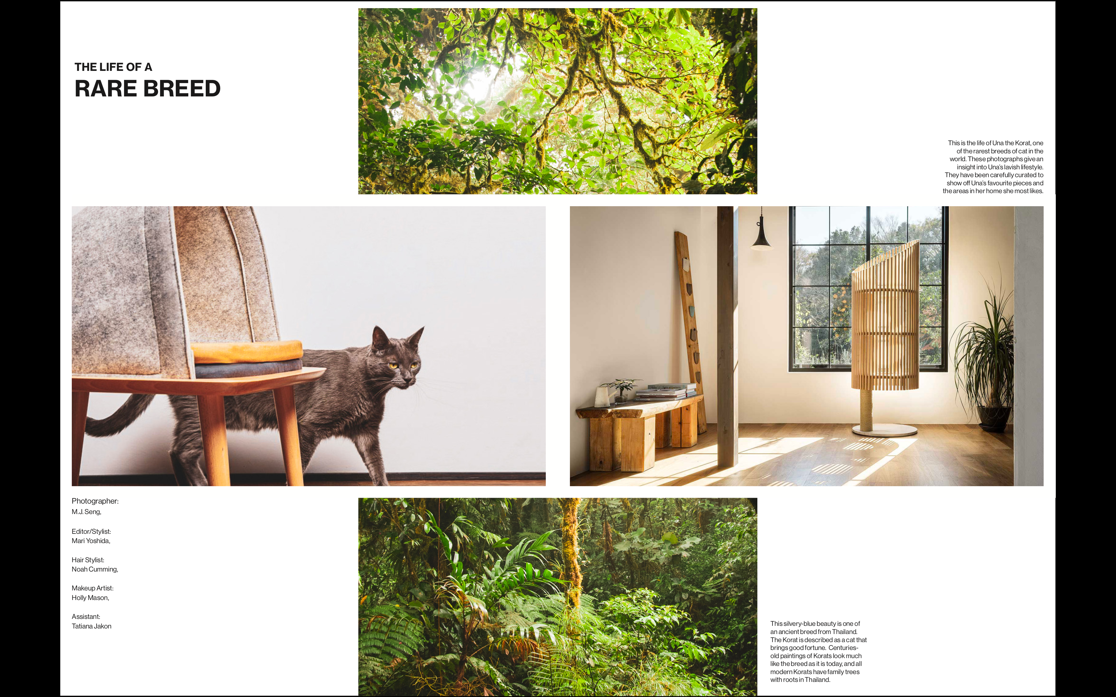
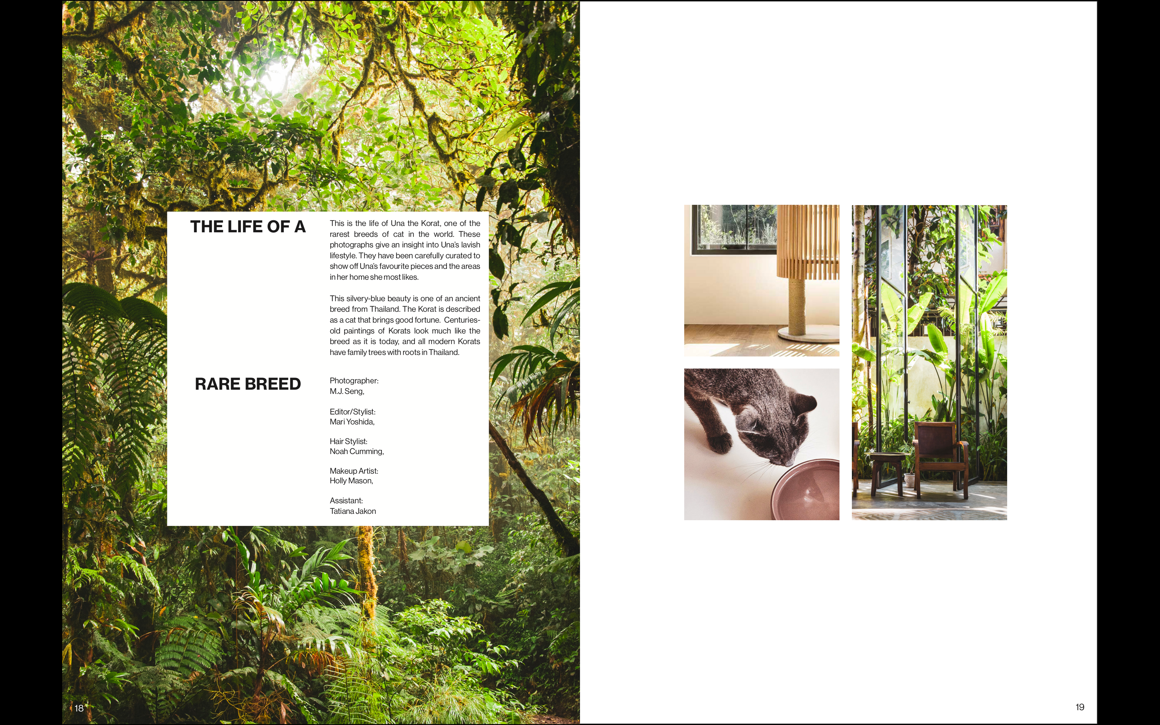
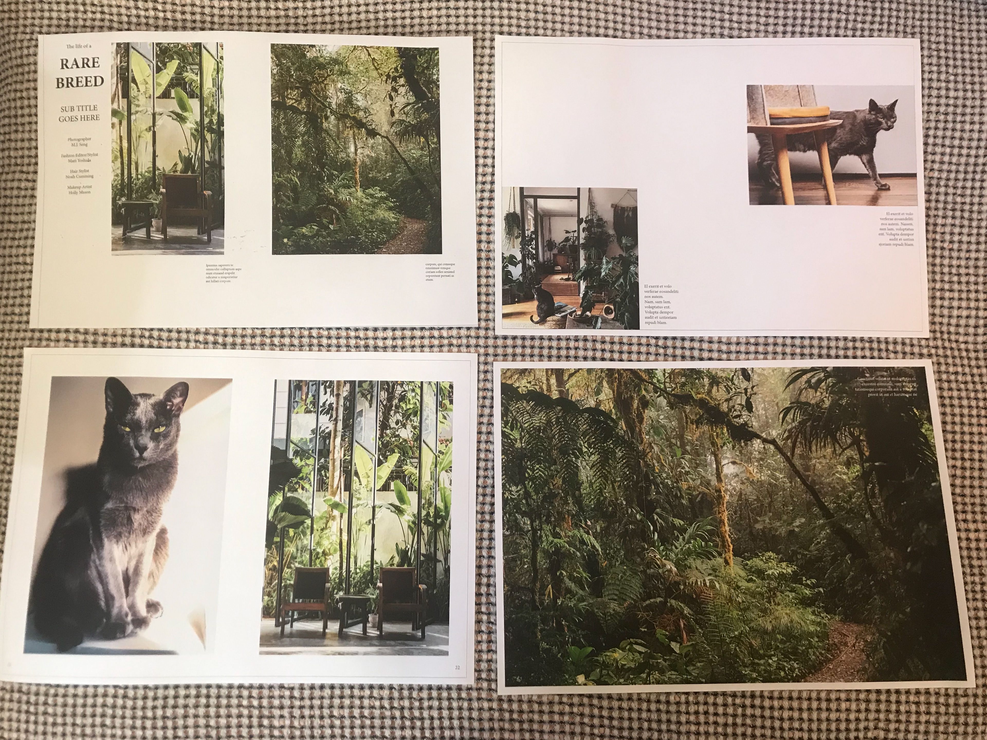
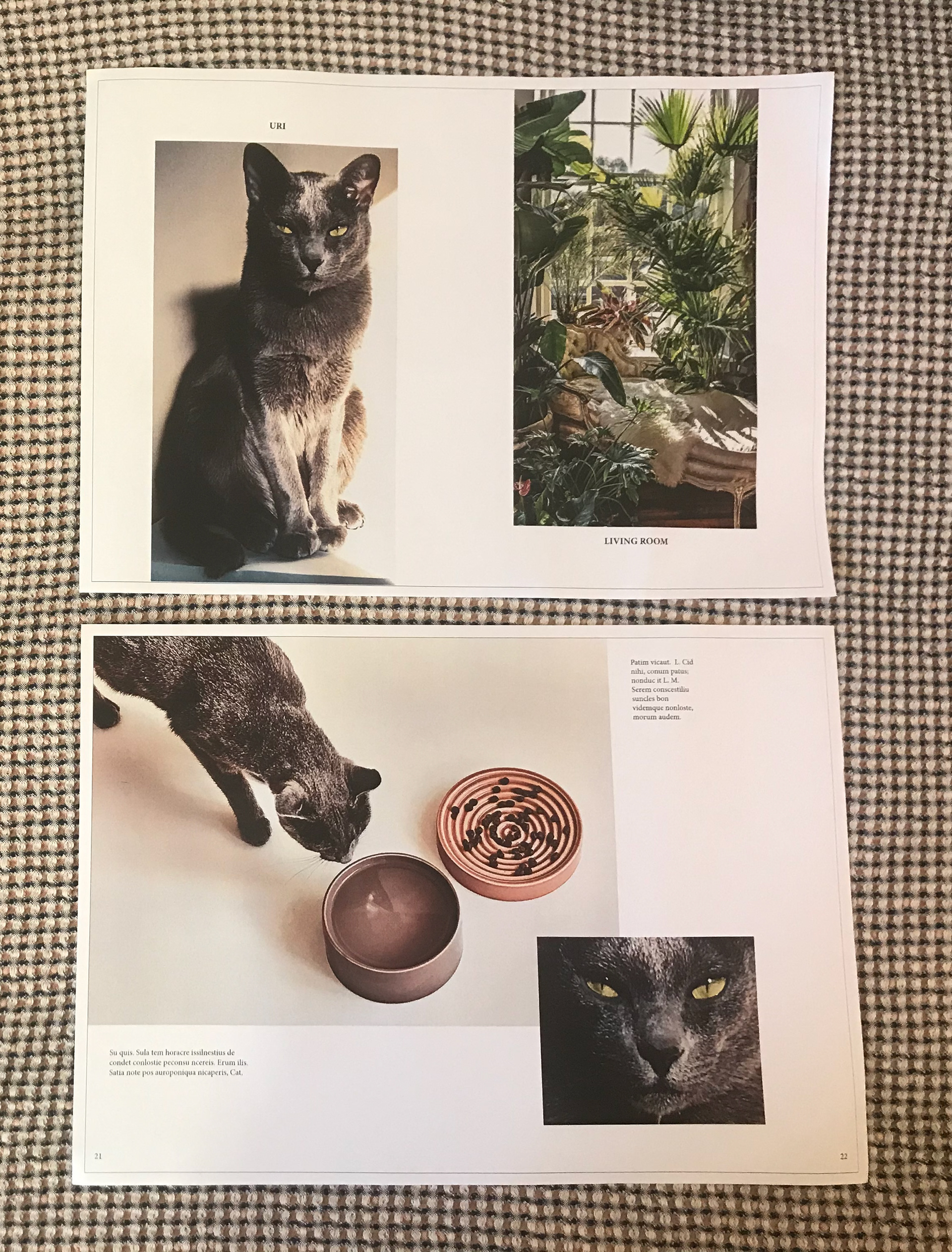
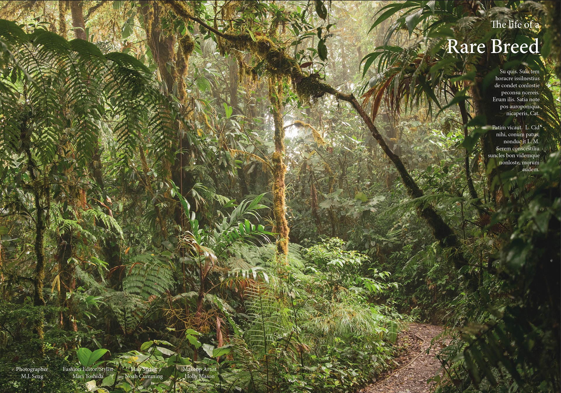
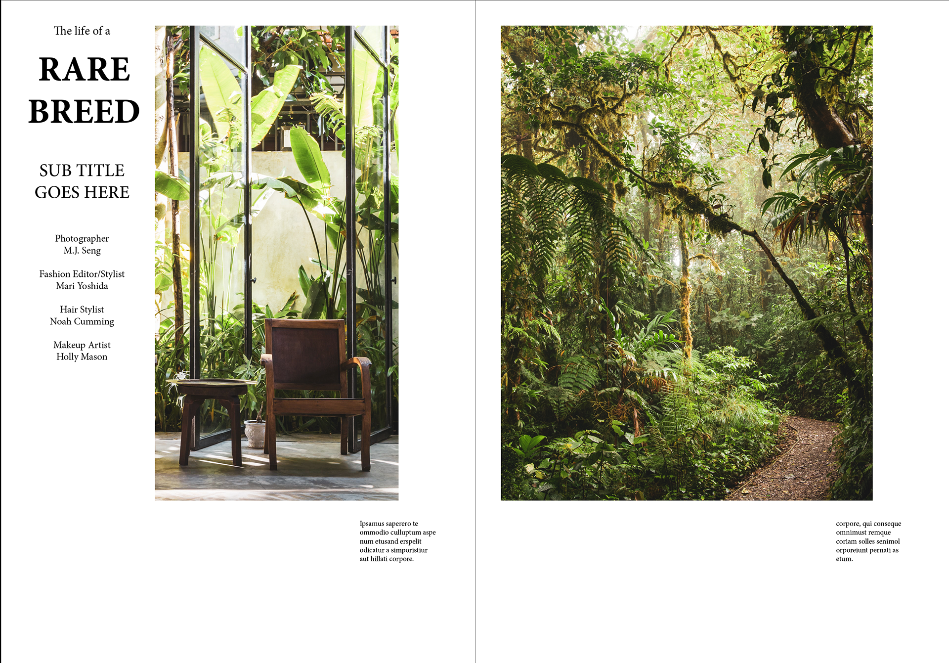
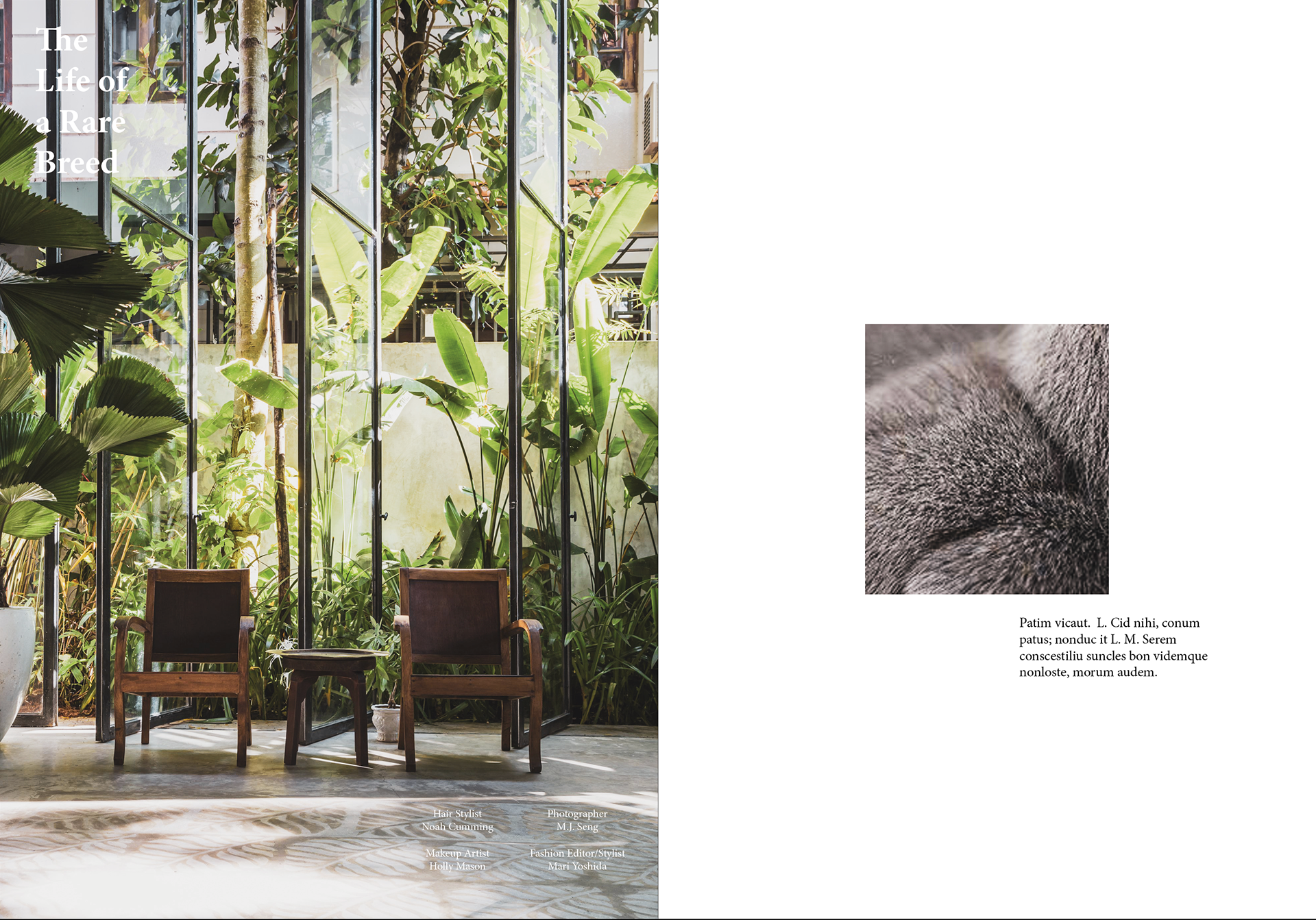
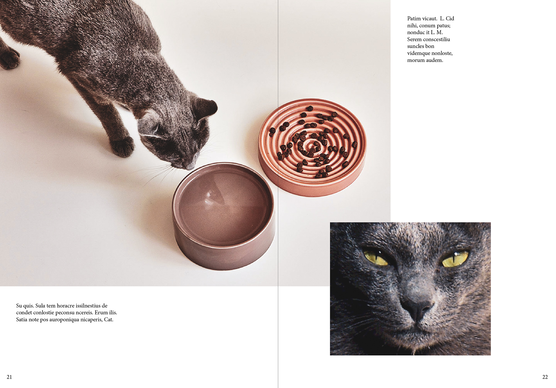
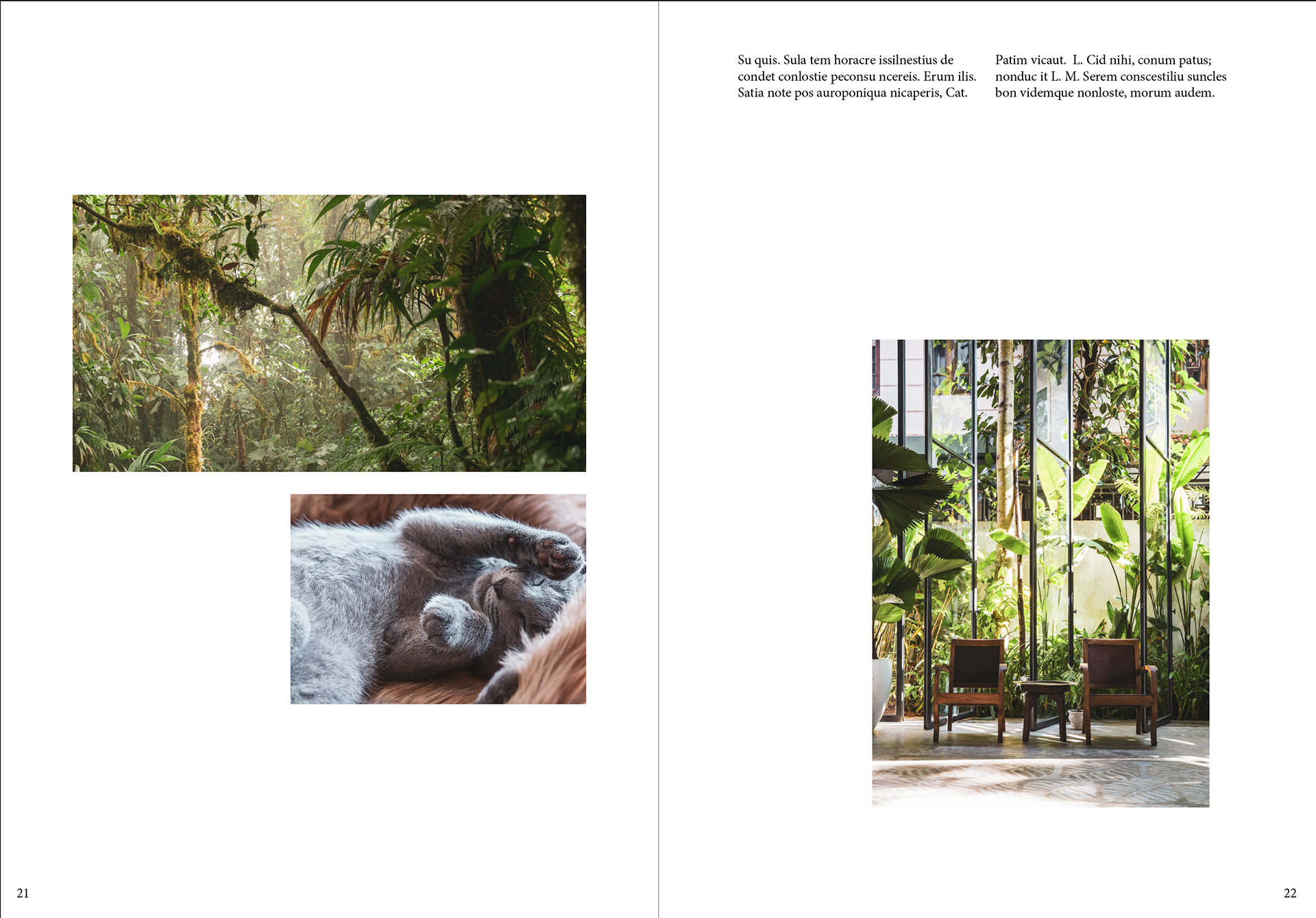
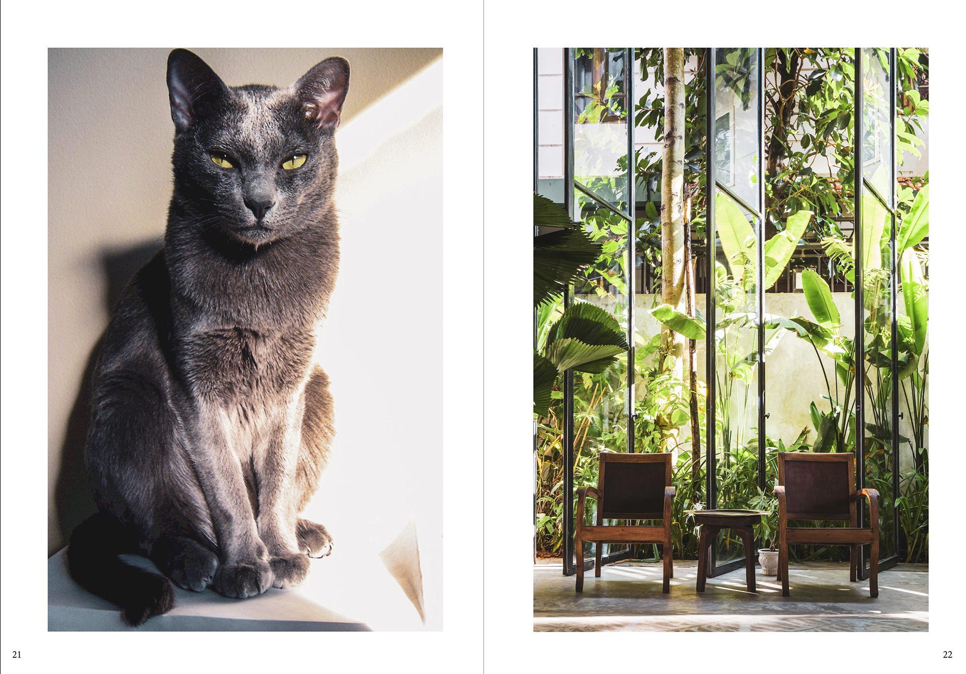
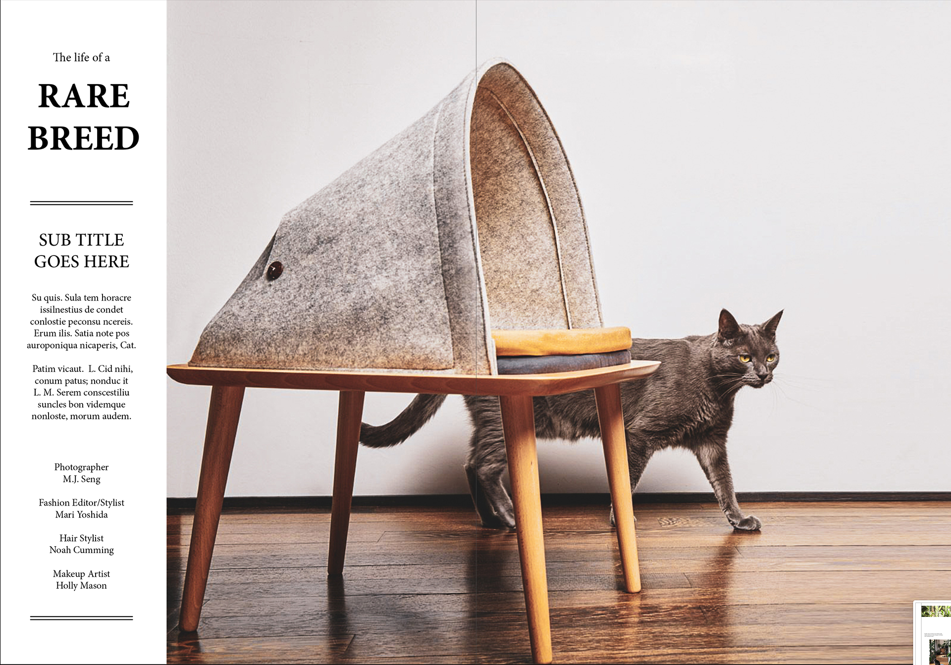
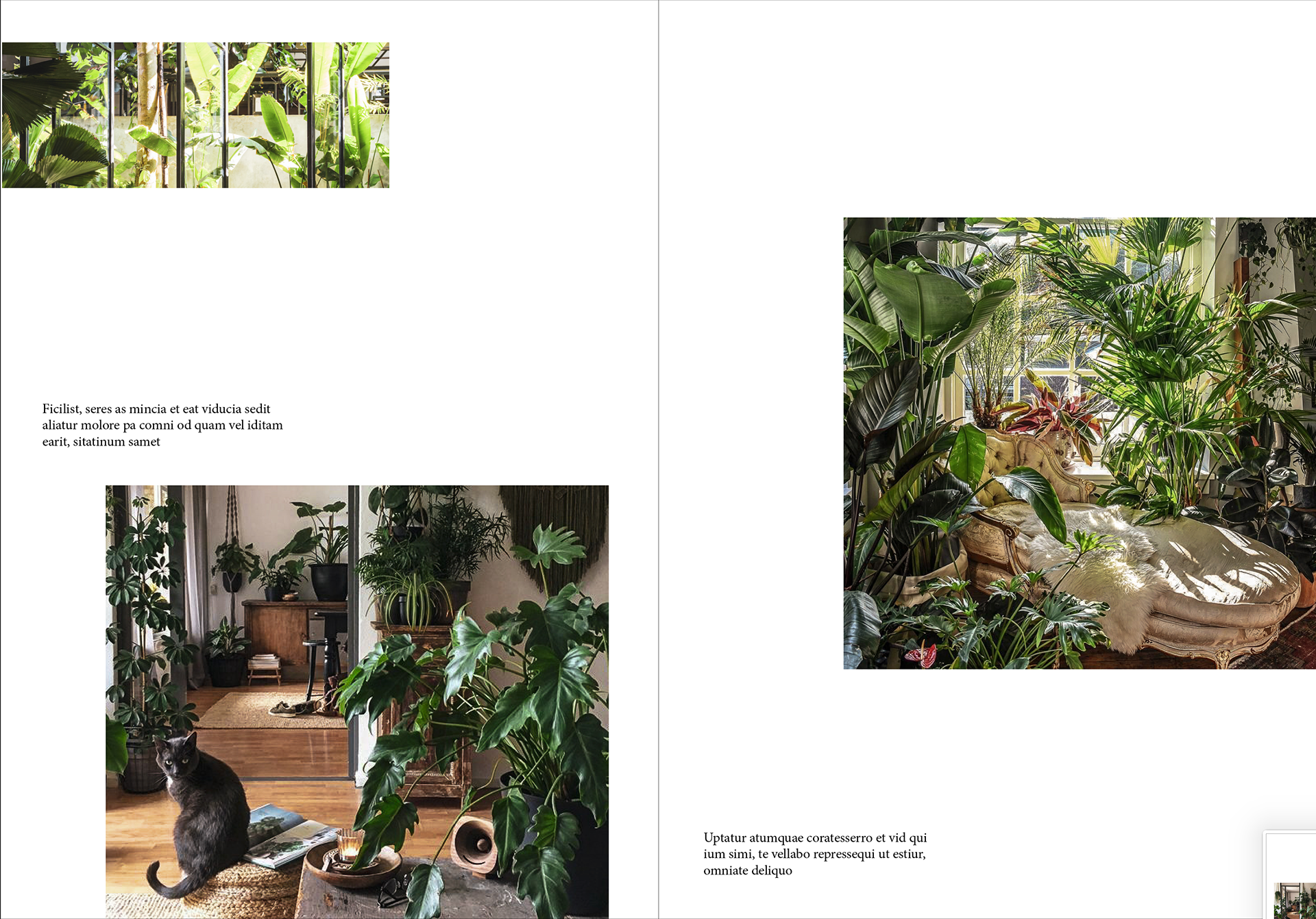
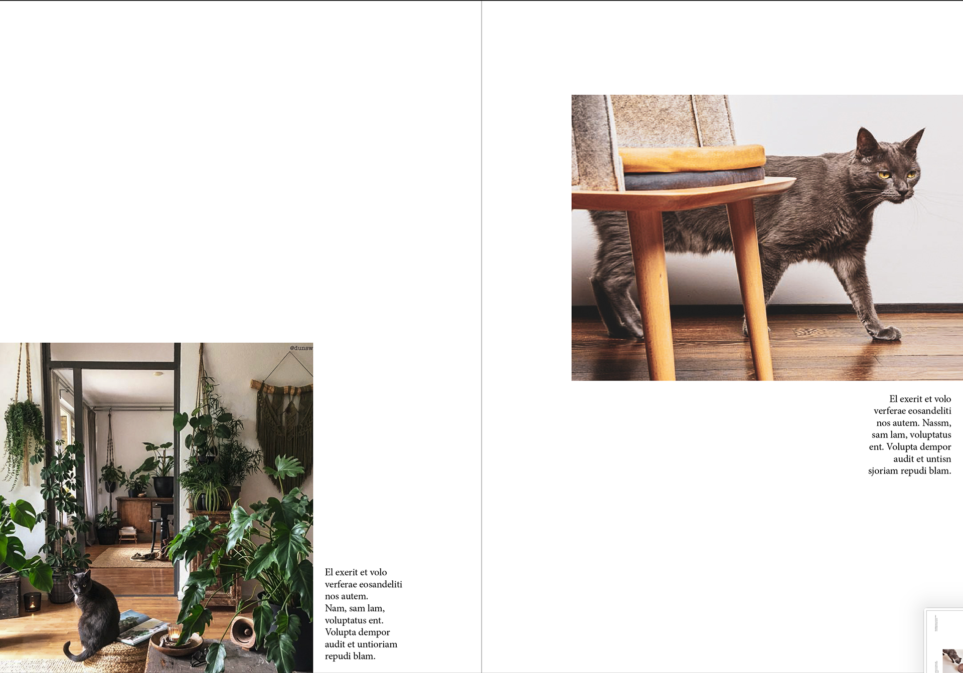
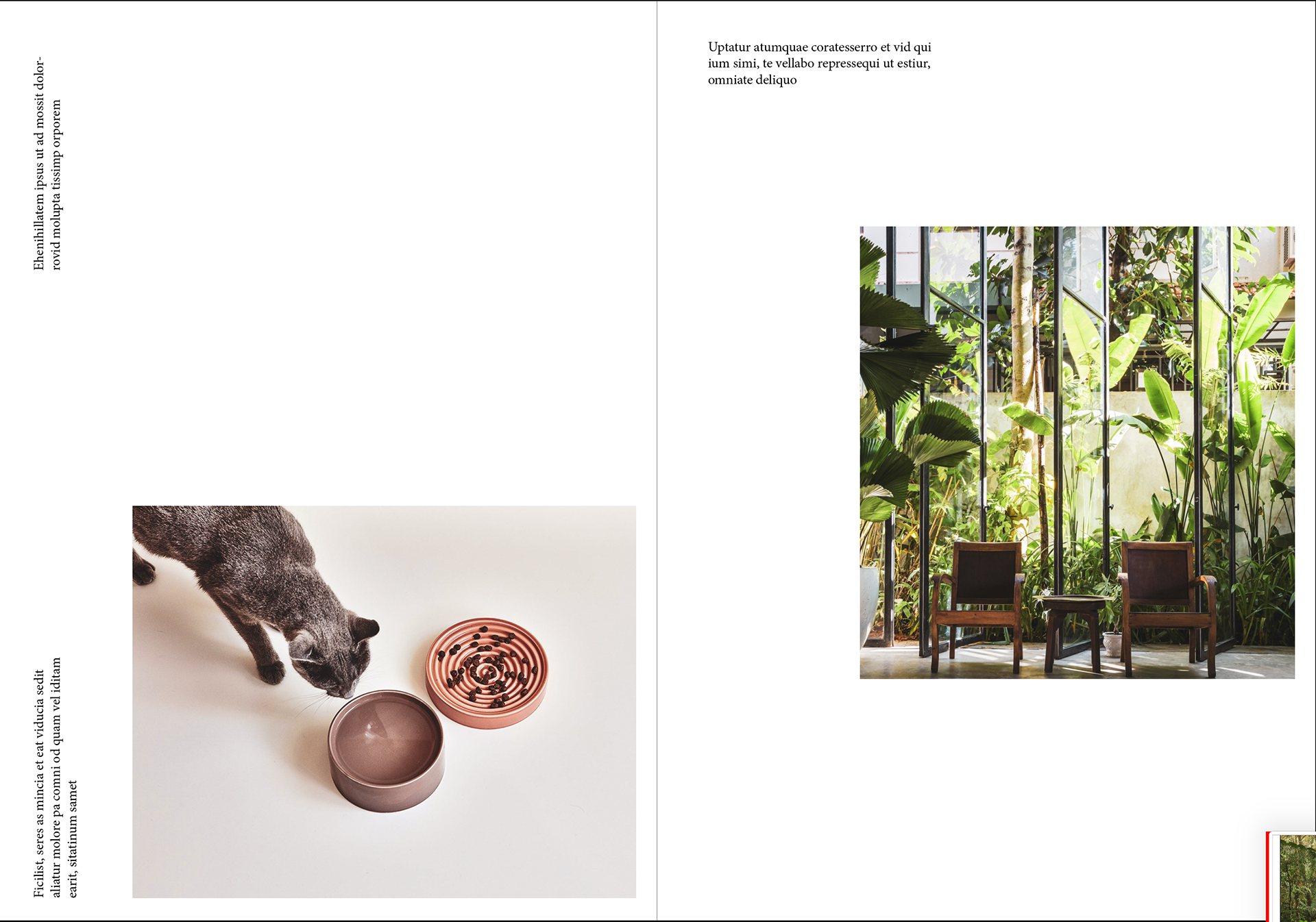
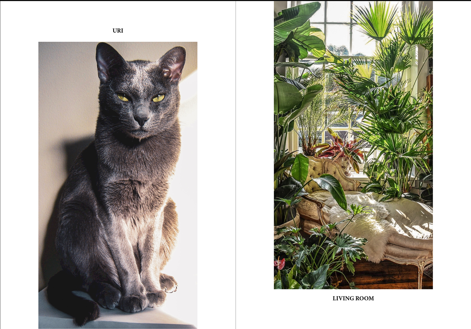
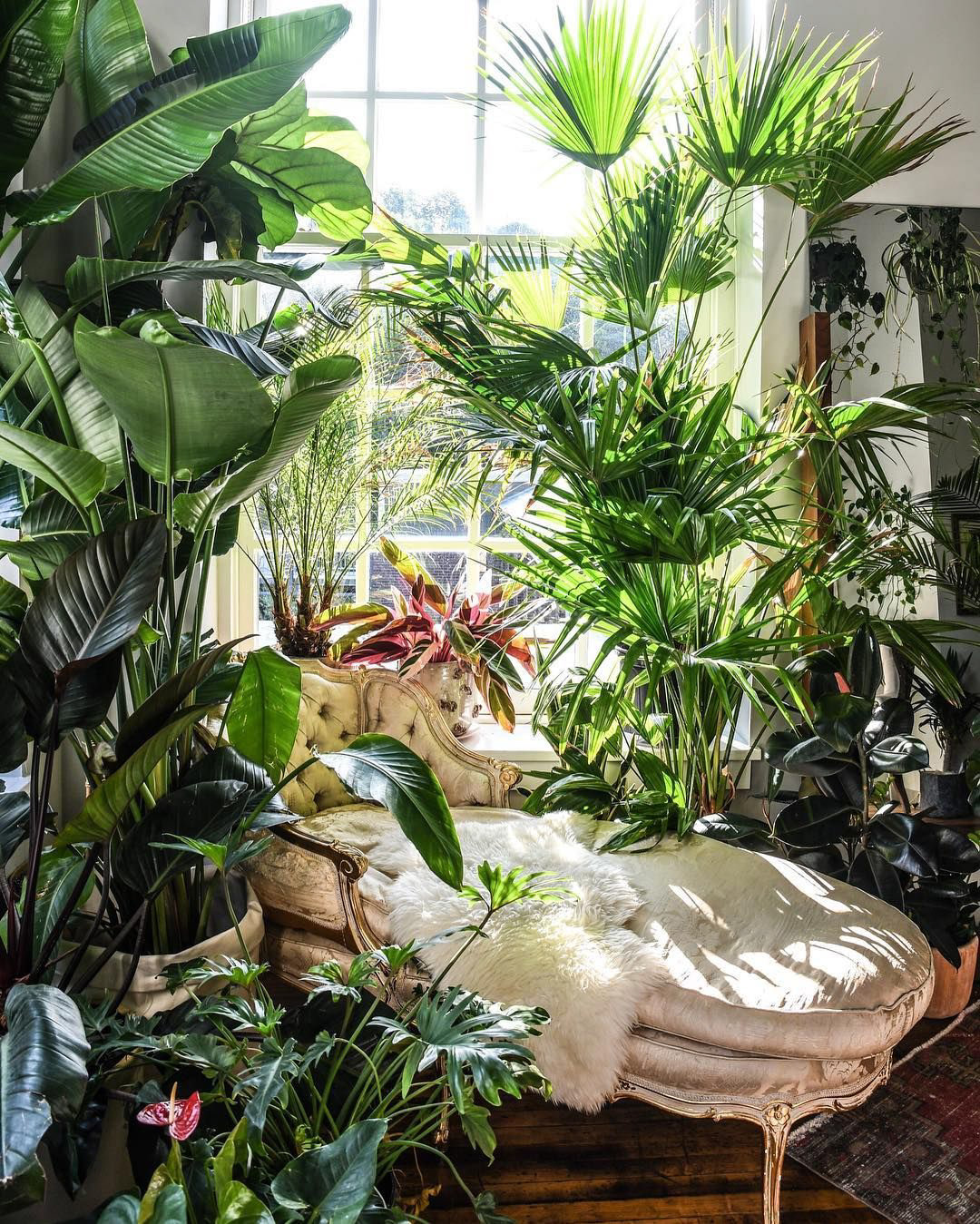
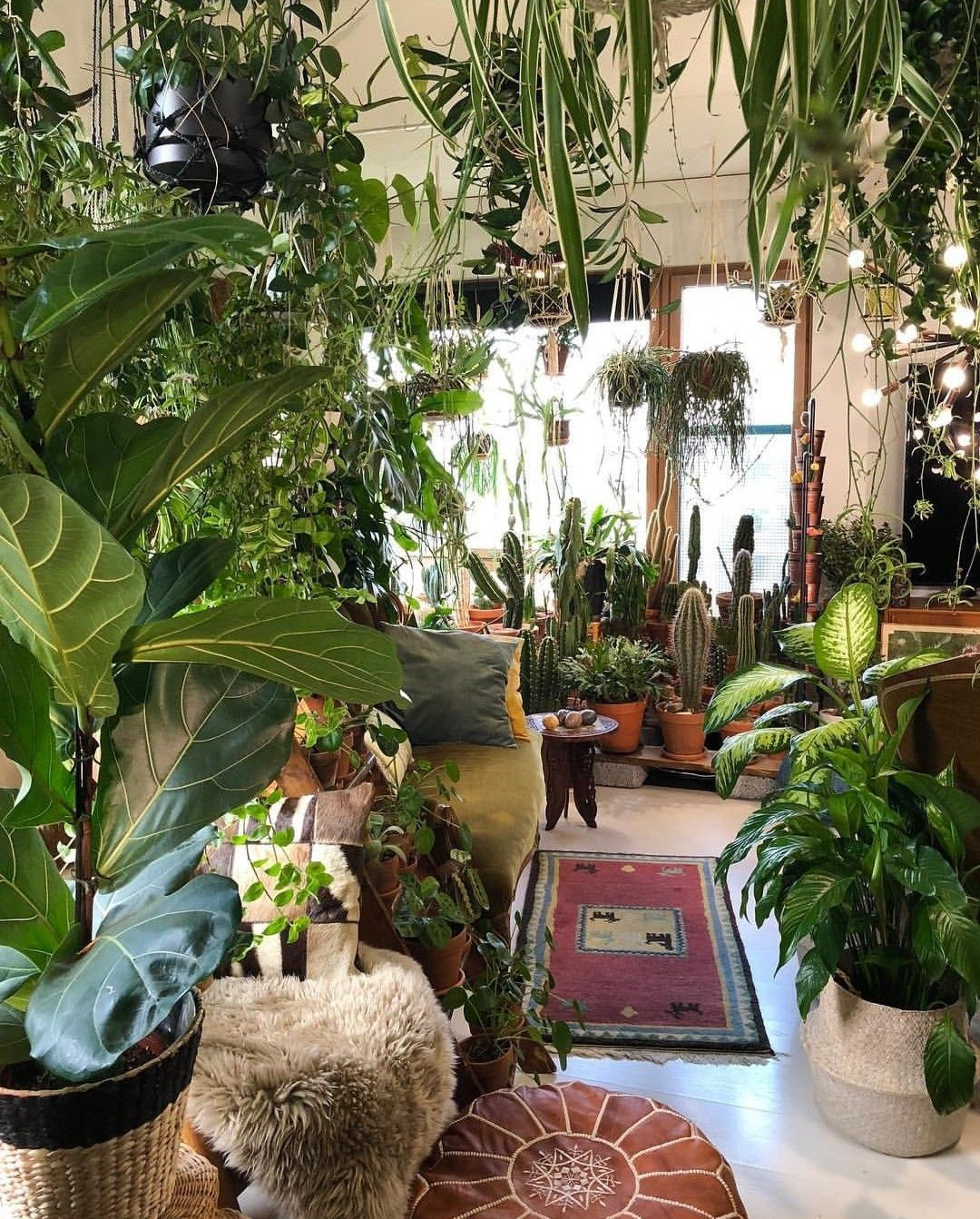
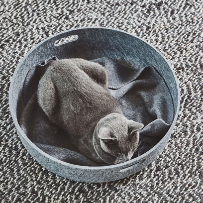
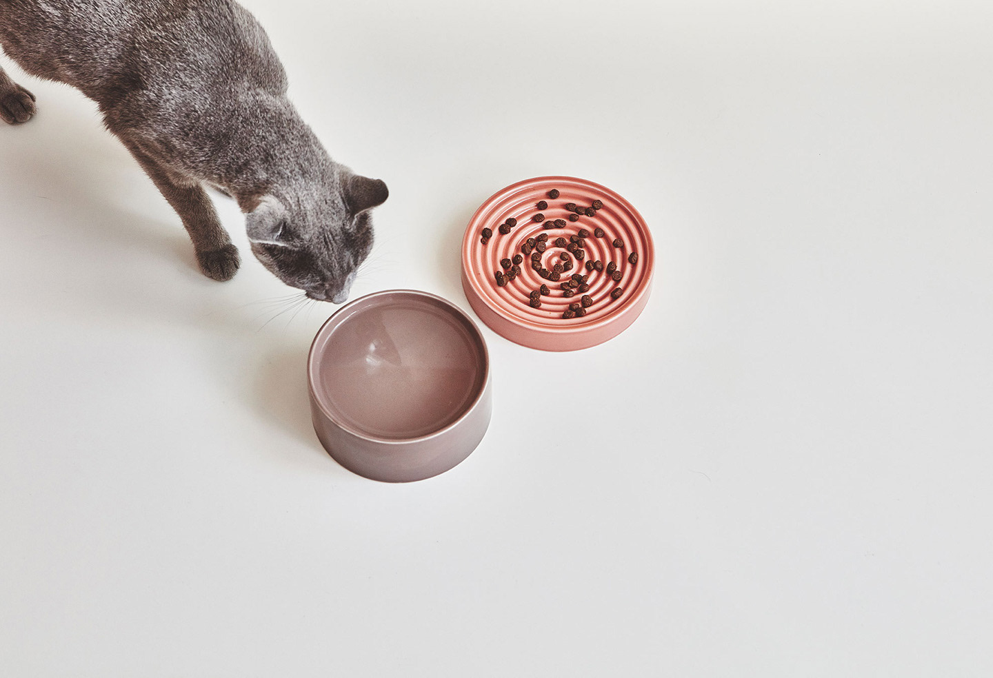
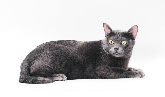
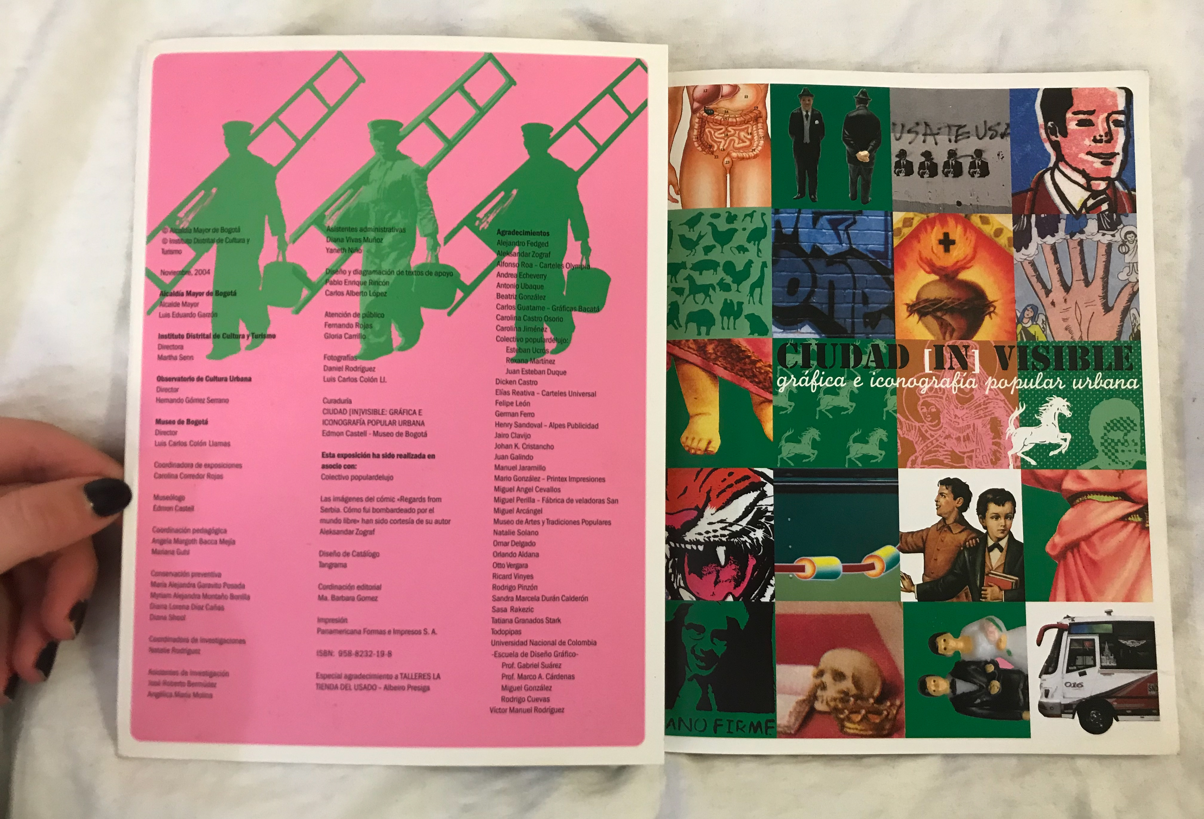
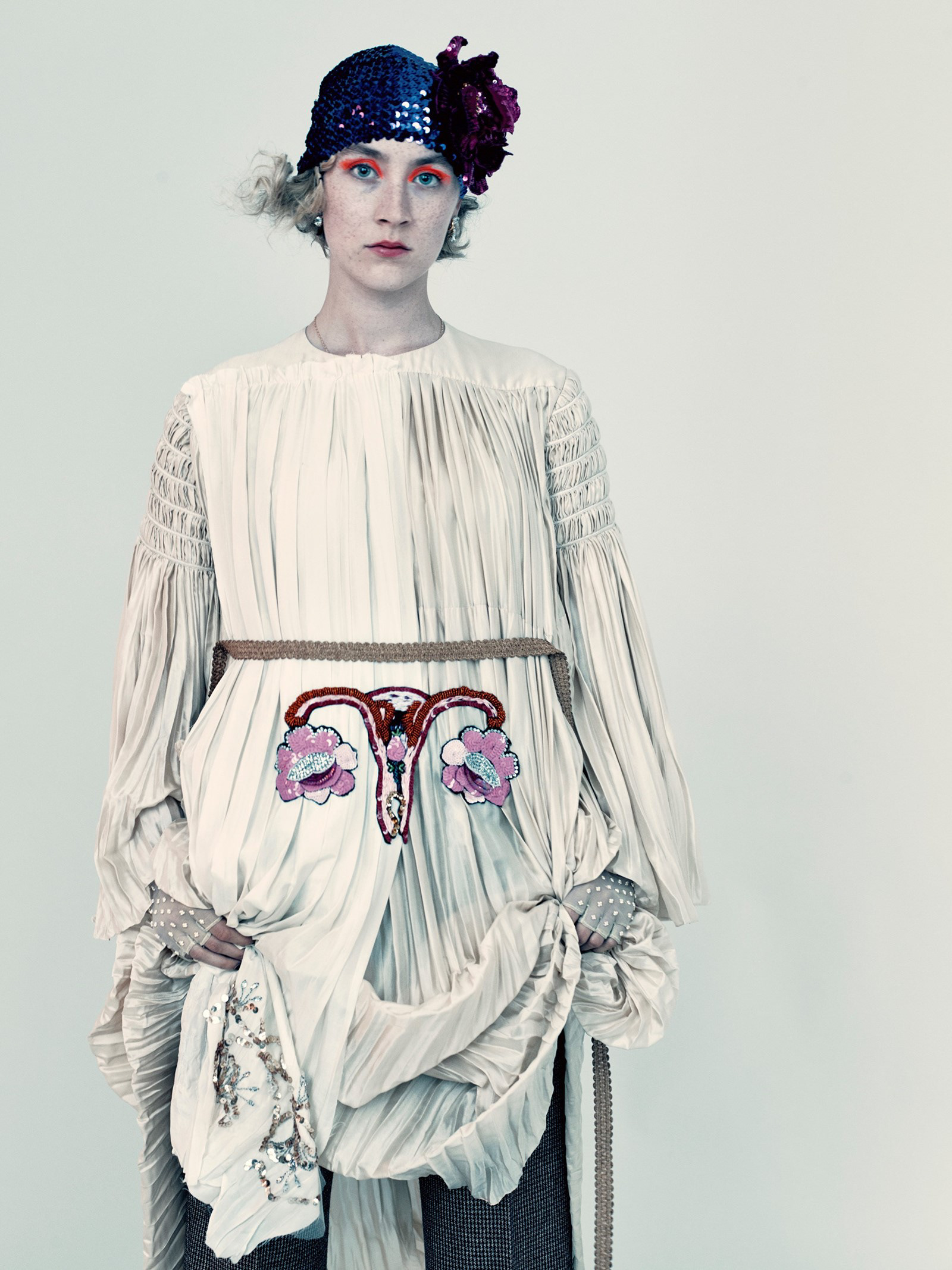
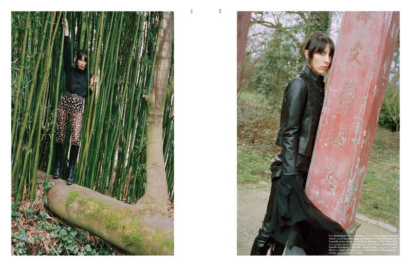
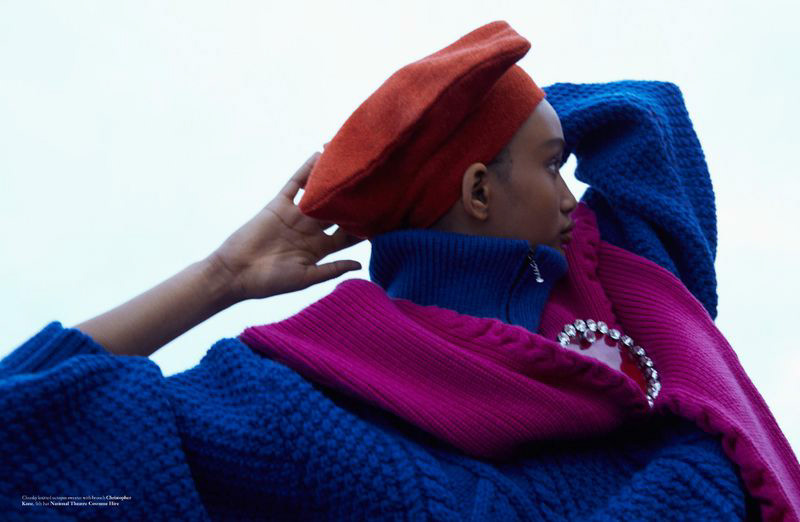
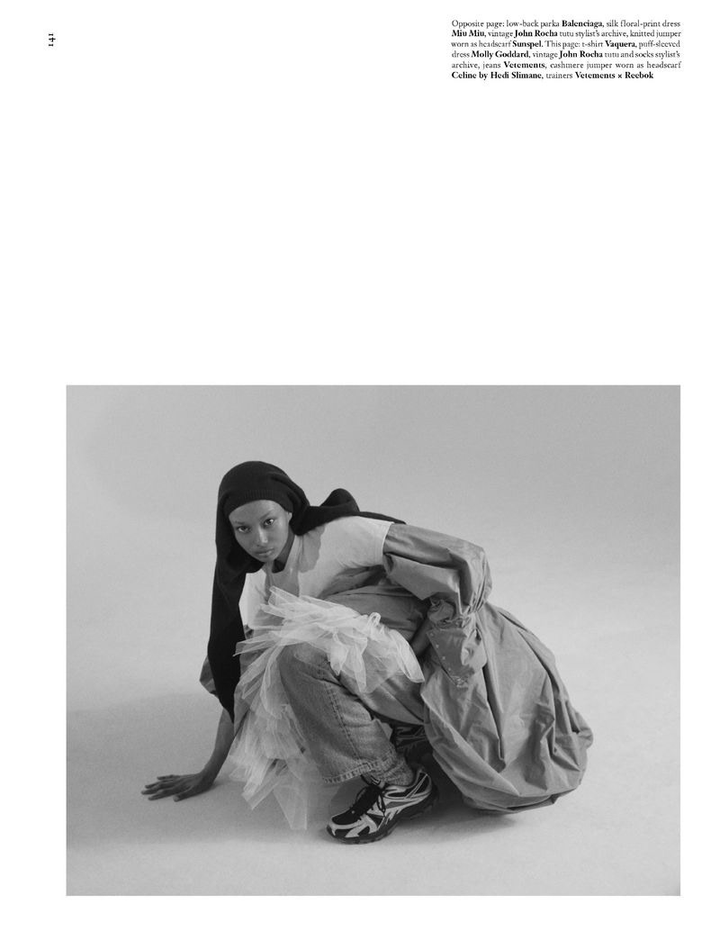
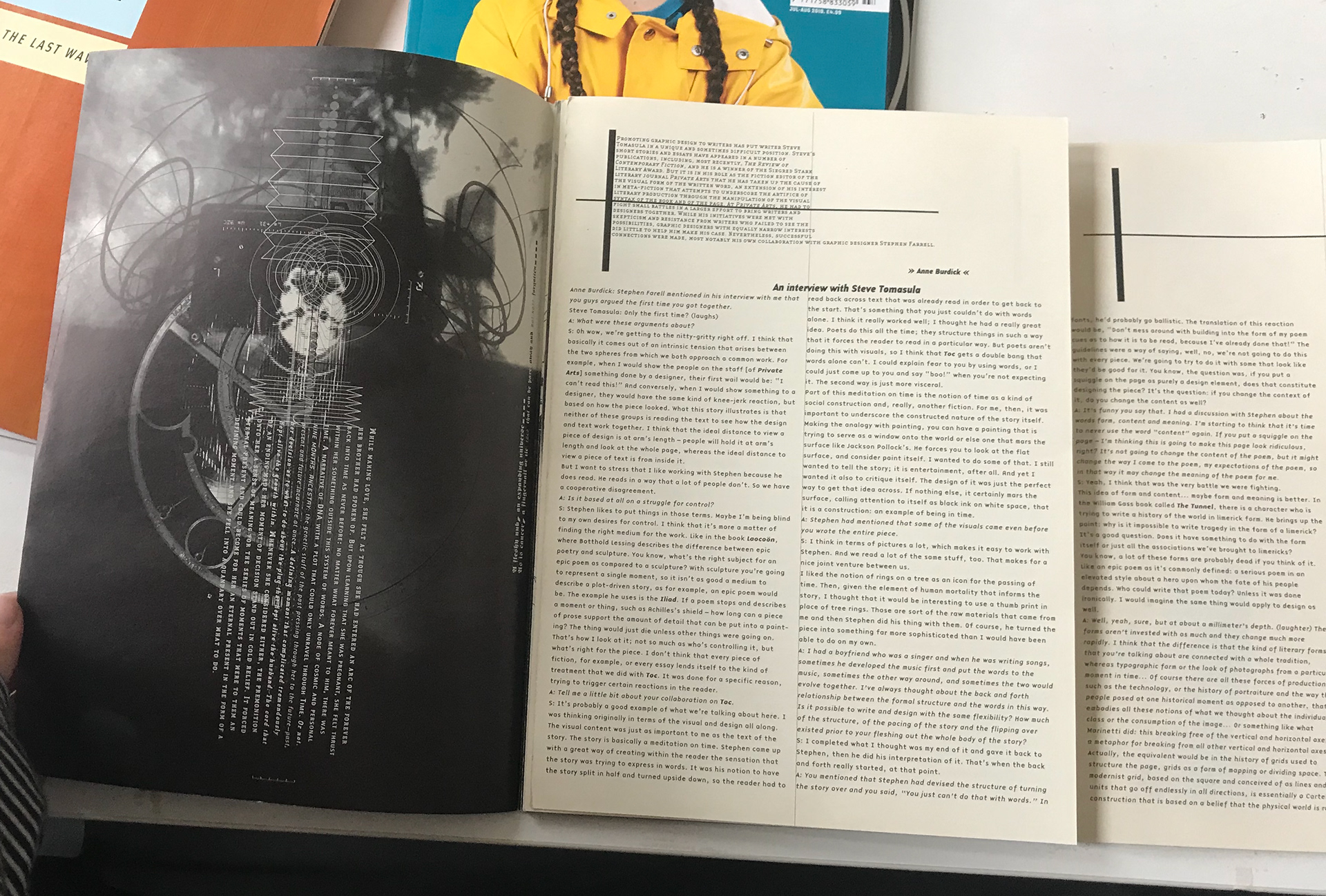
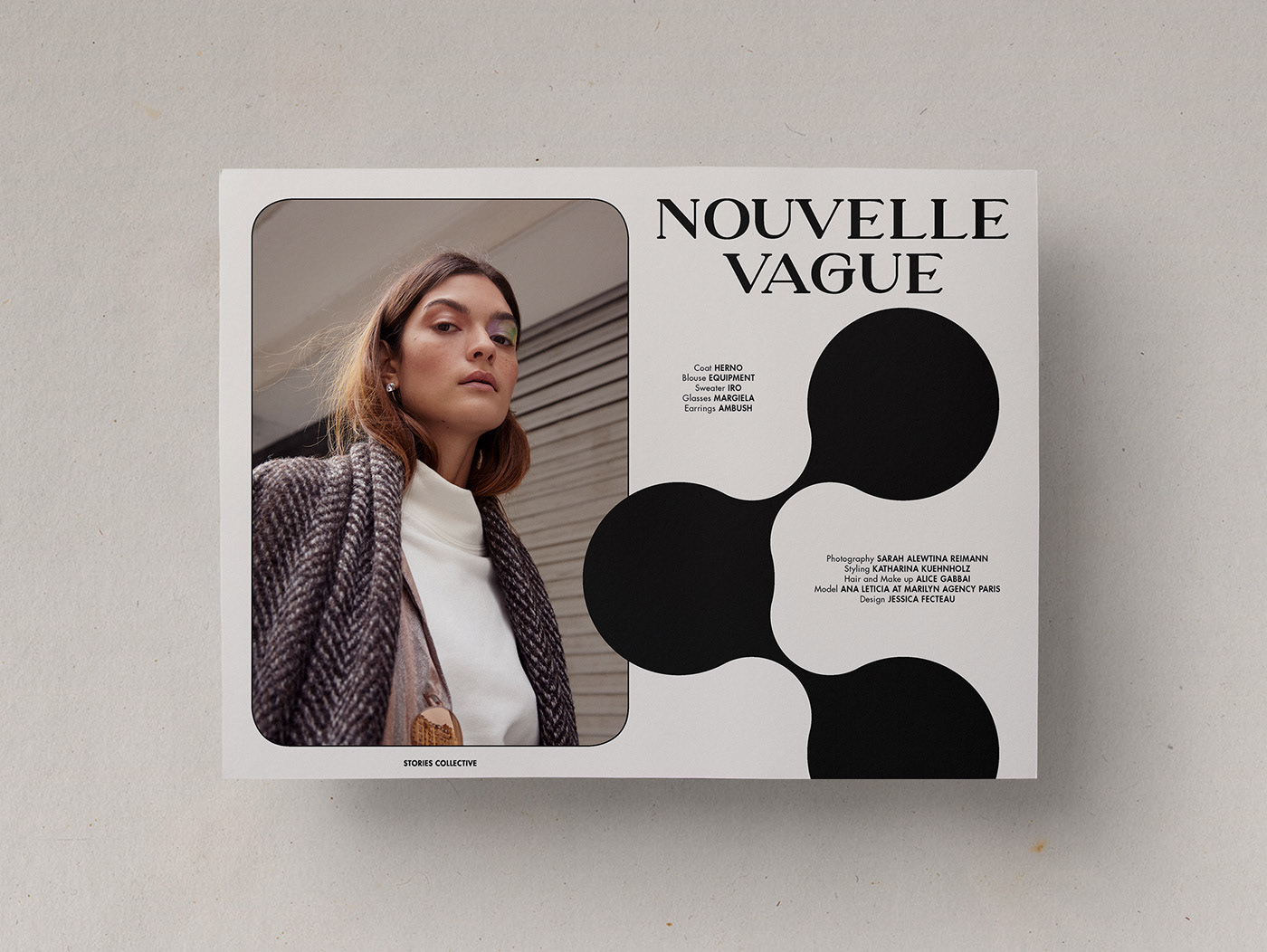
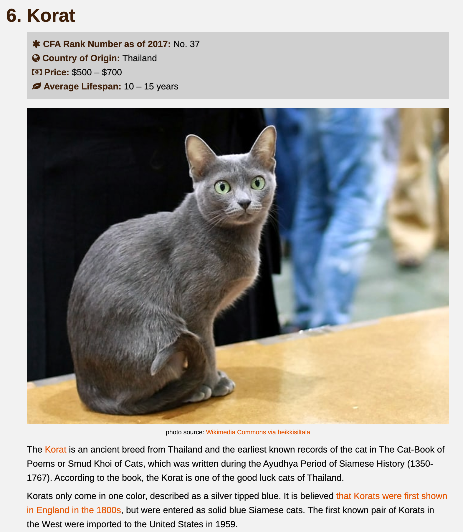
The Life of a Rare Breed
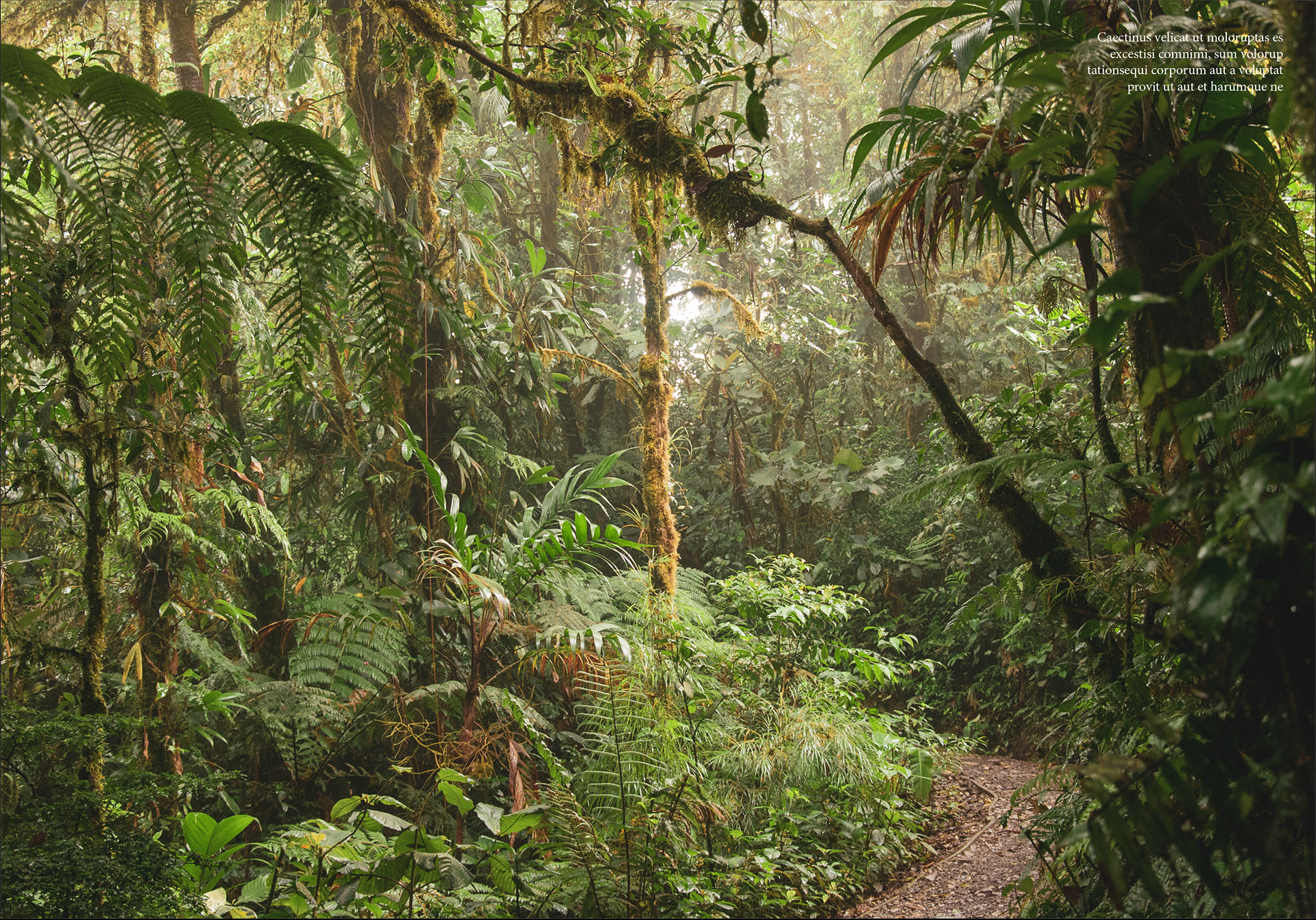
This is the life of Una the Korat. Her breed is one of the rarest cats around and this is an insight into her life. These photographs depict what Una’s lavish lifestyle is like. They have been carefully curated so Una can show off her favourite pieces and areas in her home.
Photographer - M.J. Seng, Fashion Editor/Stylist - Mari Yoshida, Hair Stylist - Noah Cumming, Makeup Artist - Holly Mason, Assistant - Tatiana Jakon
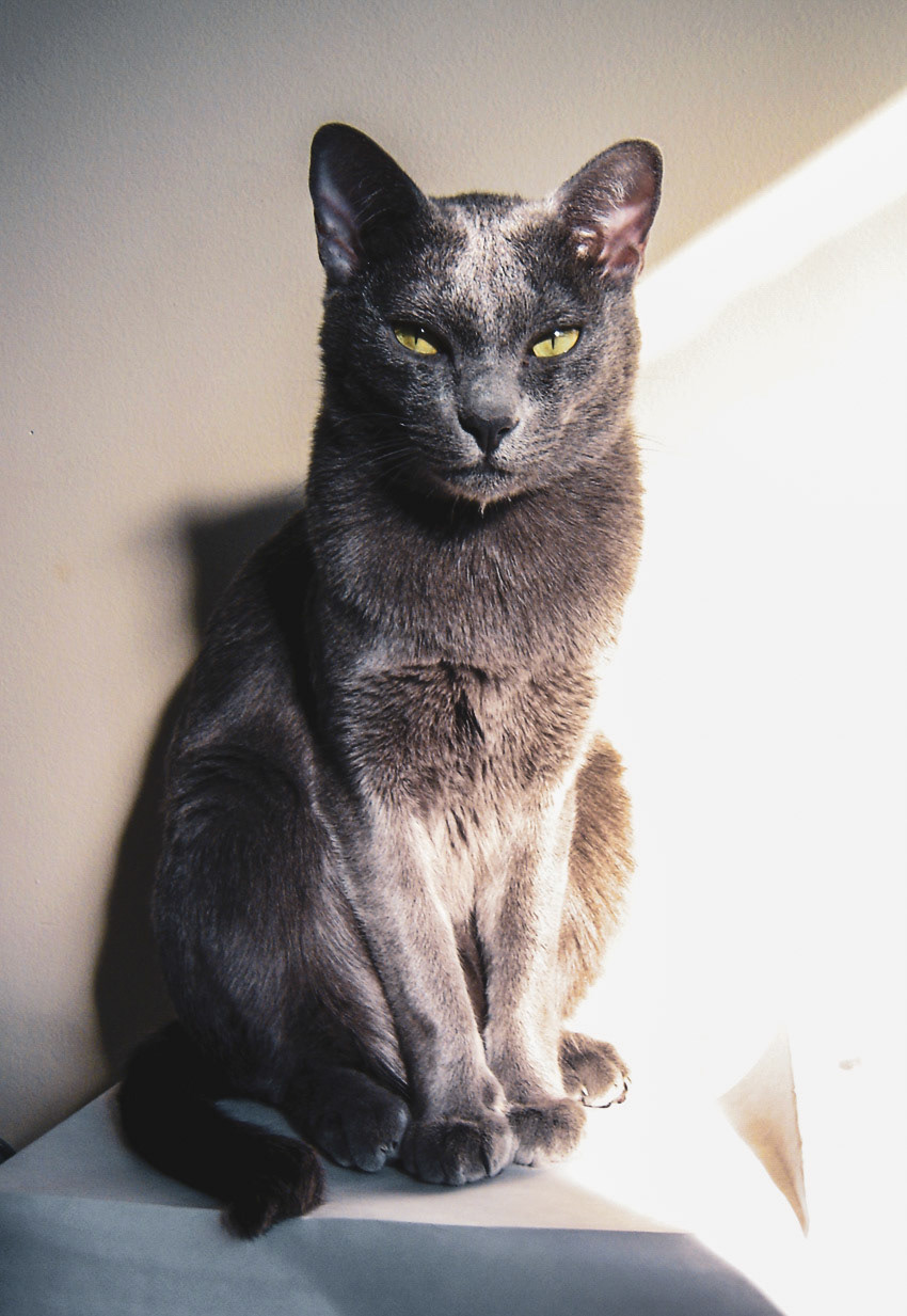
This silvery-blue beauty is an ancient breed from Thailand. The Korat is described as a cat that brings good fortune. The cats were never sold, but a pair of Korats was a favored gift. Centuries-old paintings of Korats look much like the breed as it is today, and all modern Korats have family trees with roots in Thailand.
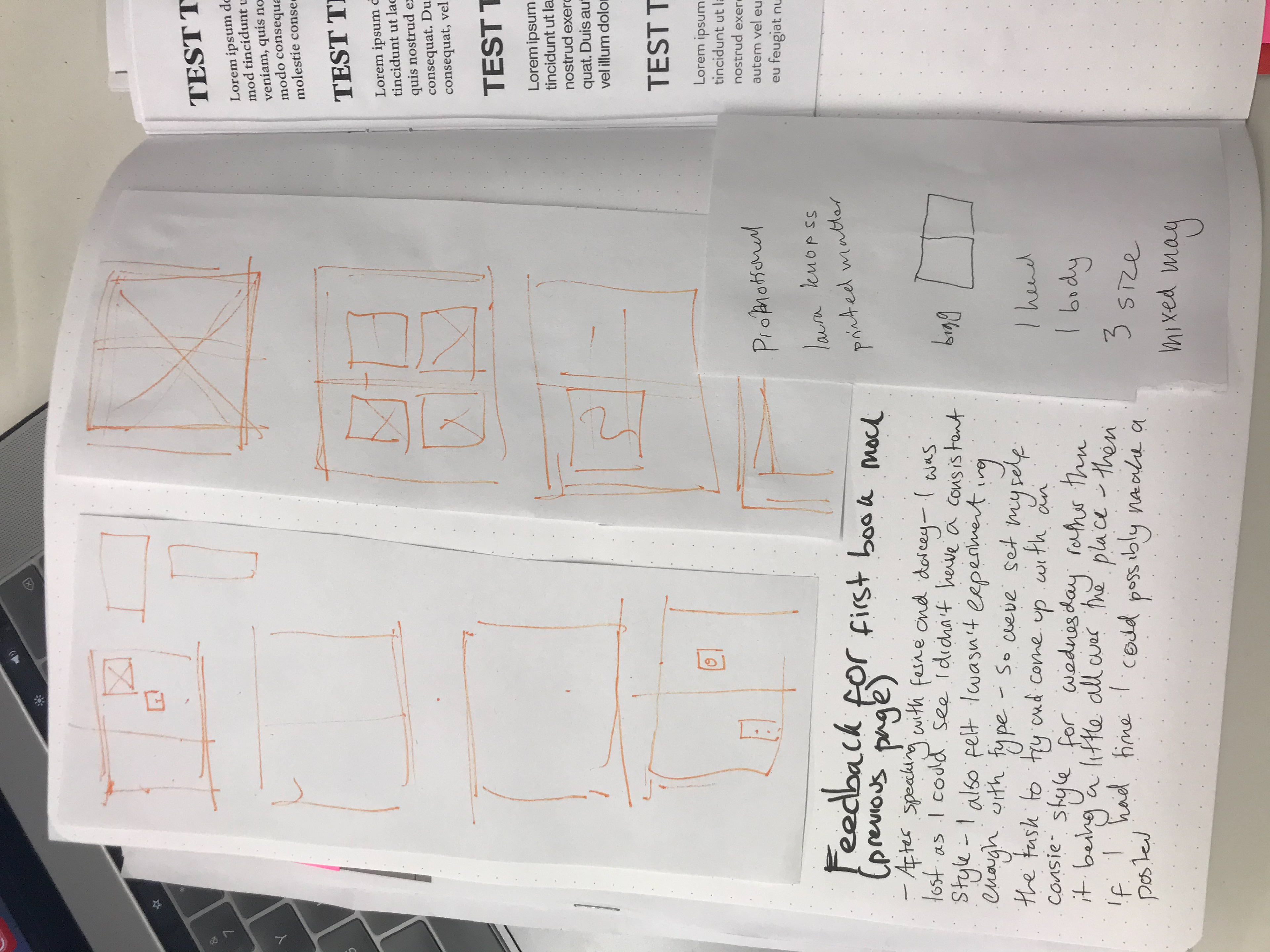
overall feedback from hitch and fern and the next steps - hitch: make it about these luxury cat products more about it's house - doesn't understand the greenery - could make it like a publication Fern: like's where it's going make lots of versions of the same thing rather than a spread/magazine.
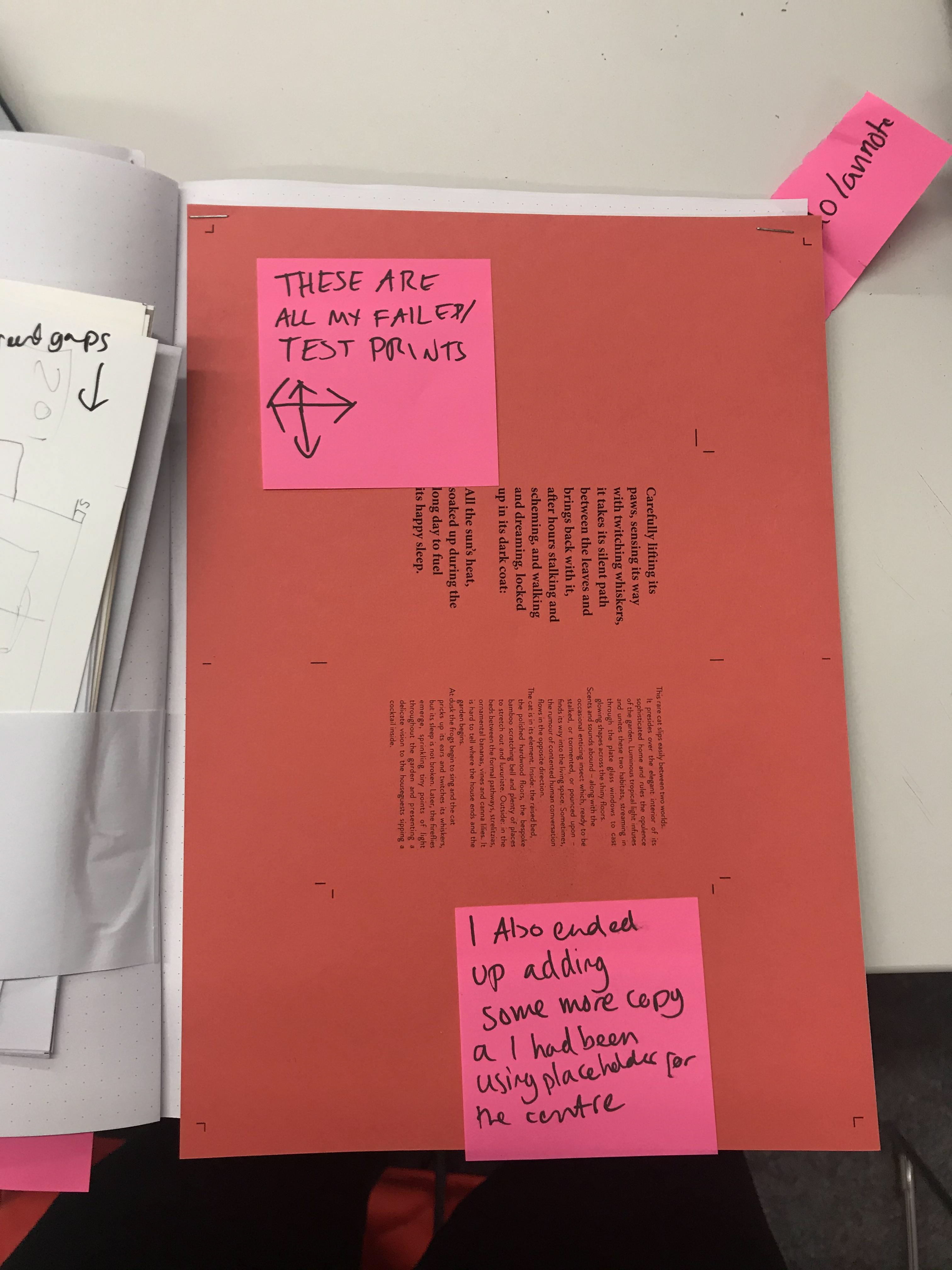
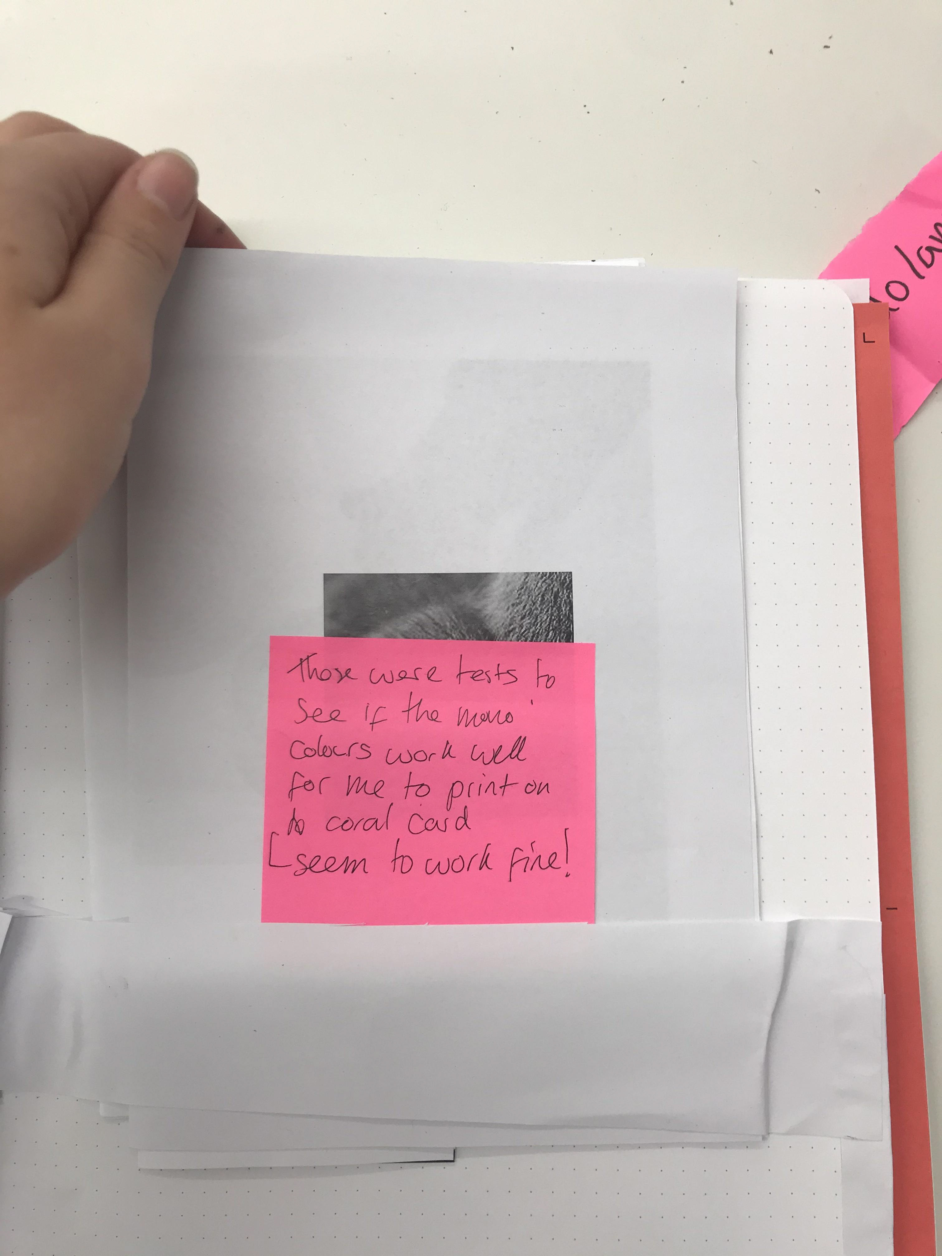
Feedback back from people was good they liked the full bleed images and the minimalism with the overall style - which is what I was going for which I am glad about. I did get comments about their being too little type (it it of course being placeholder) so my plan is to find some copy that fits the editorial.
In terms of next steps I feel as if I want to carry on making this a whole lifestyle thing about this cat and it's favourite places in and outside the house so I will stick with similar images. What I will do also is not make it so much like a set of spreads but different versions of the same spread.


layout entered for pin up crit

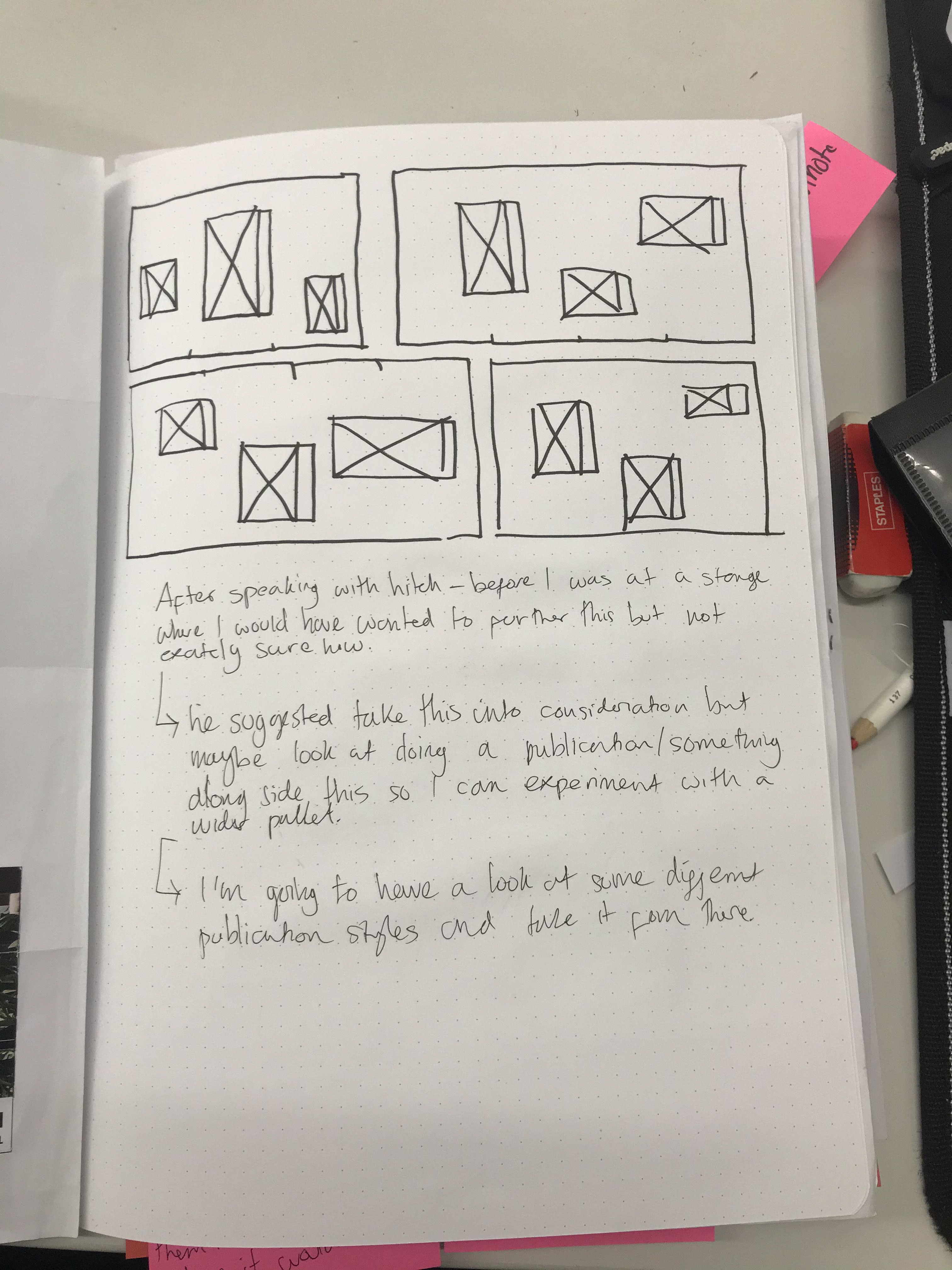
Above are the ones I printed out to get advice on but I ended up ditching them as I asked my peers which ones they thought were the strongest - annotations in sketchbook


all the layouts I made - annotations are in my sketchbook - these are my least favourites
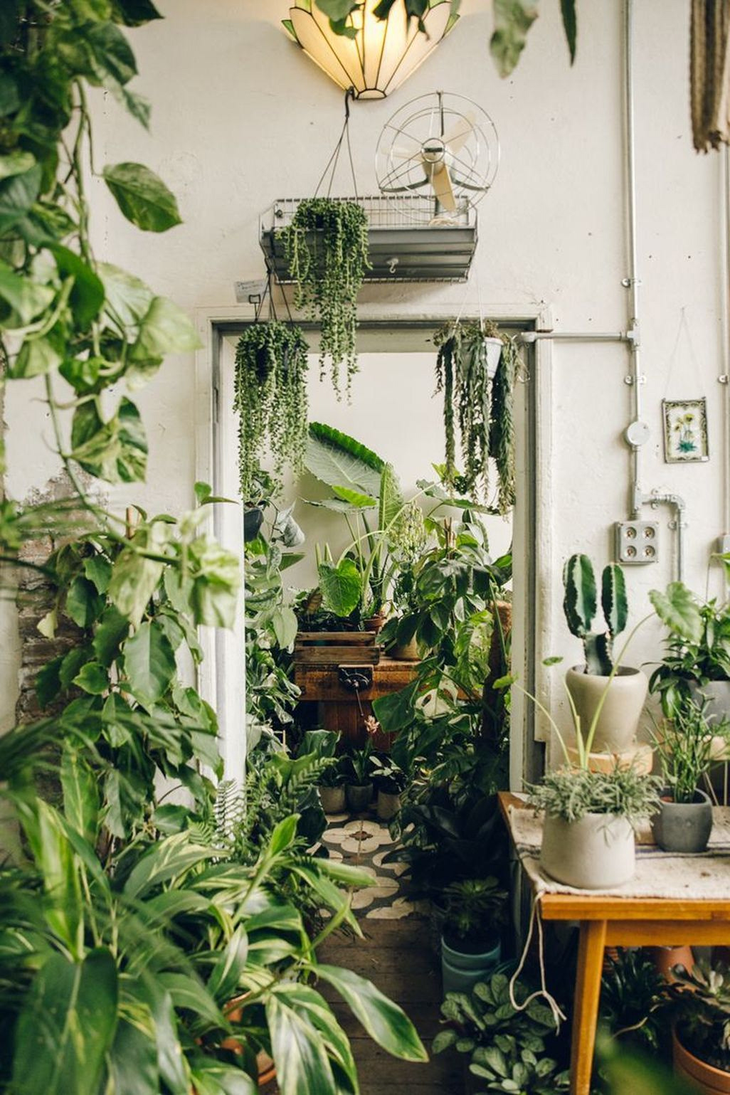
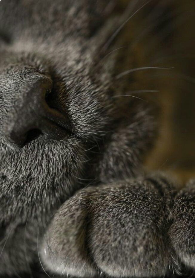


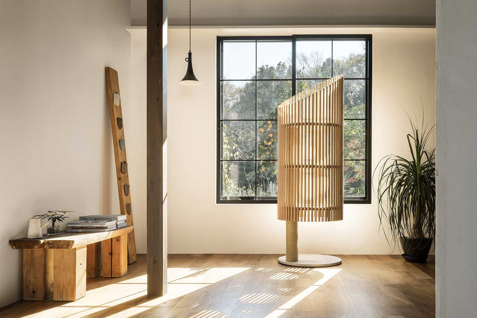


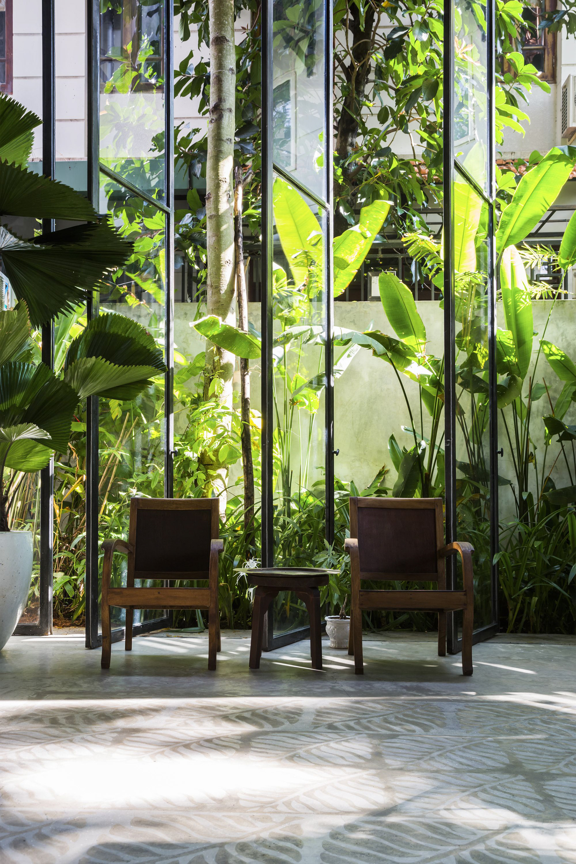
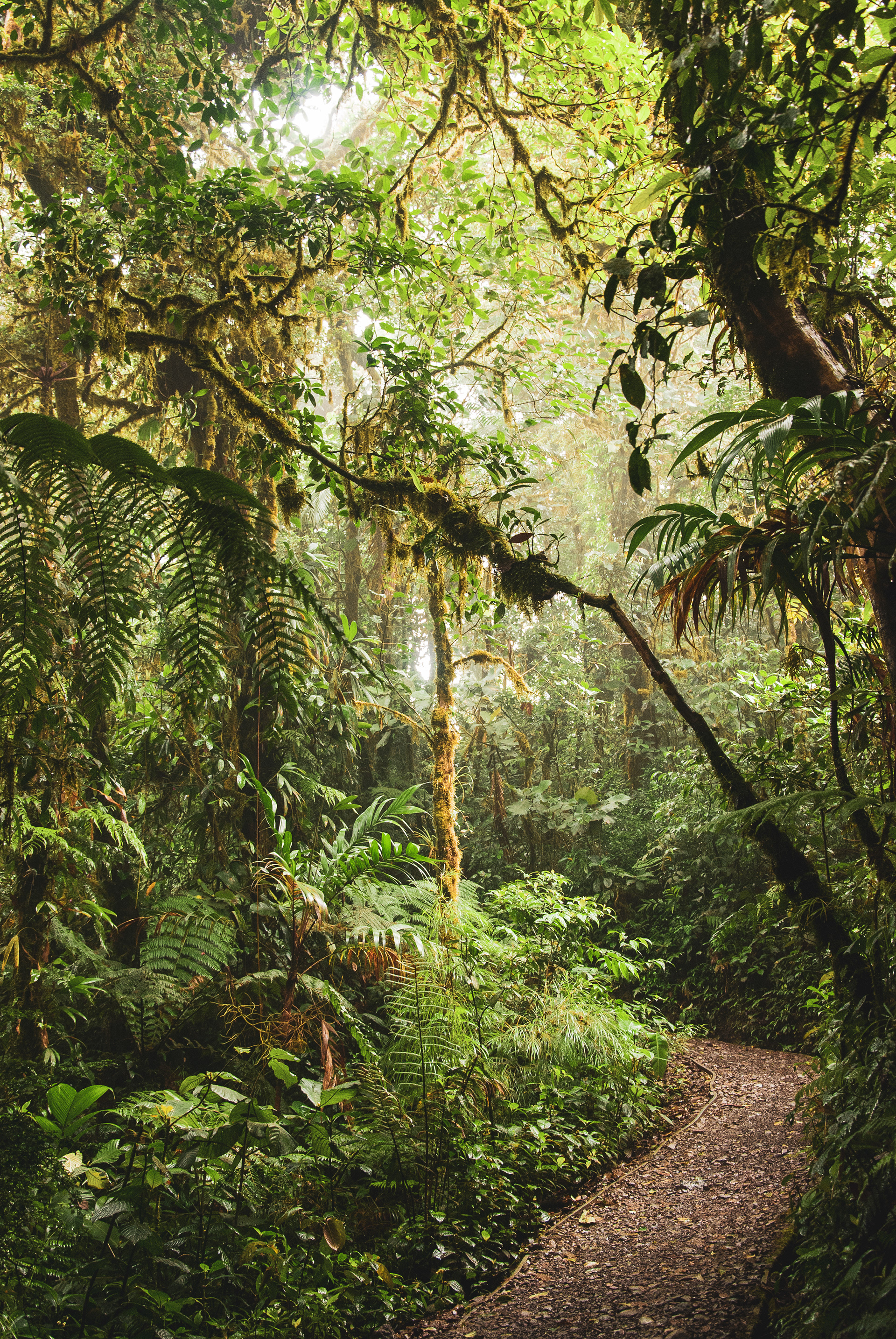
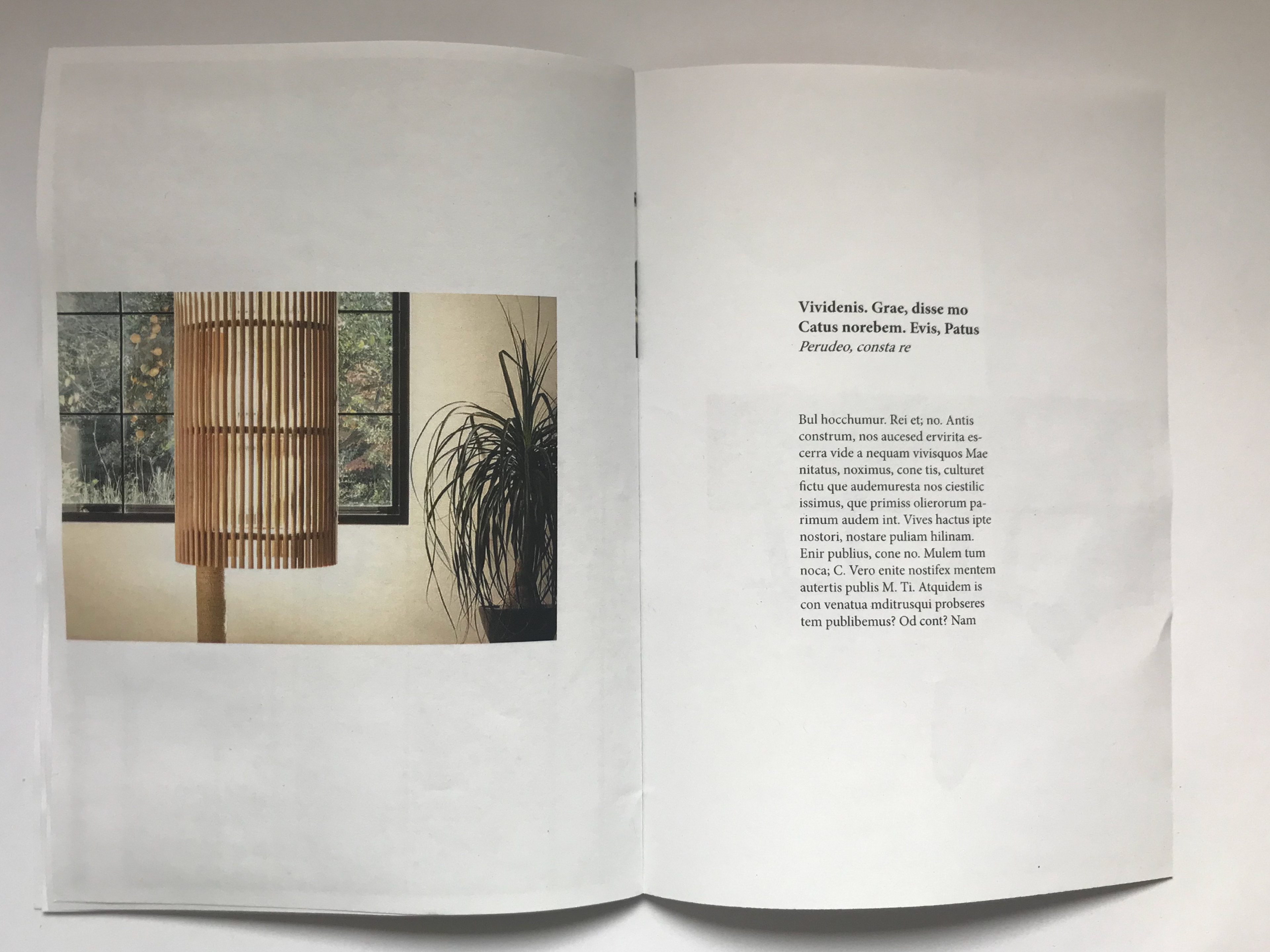
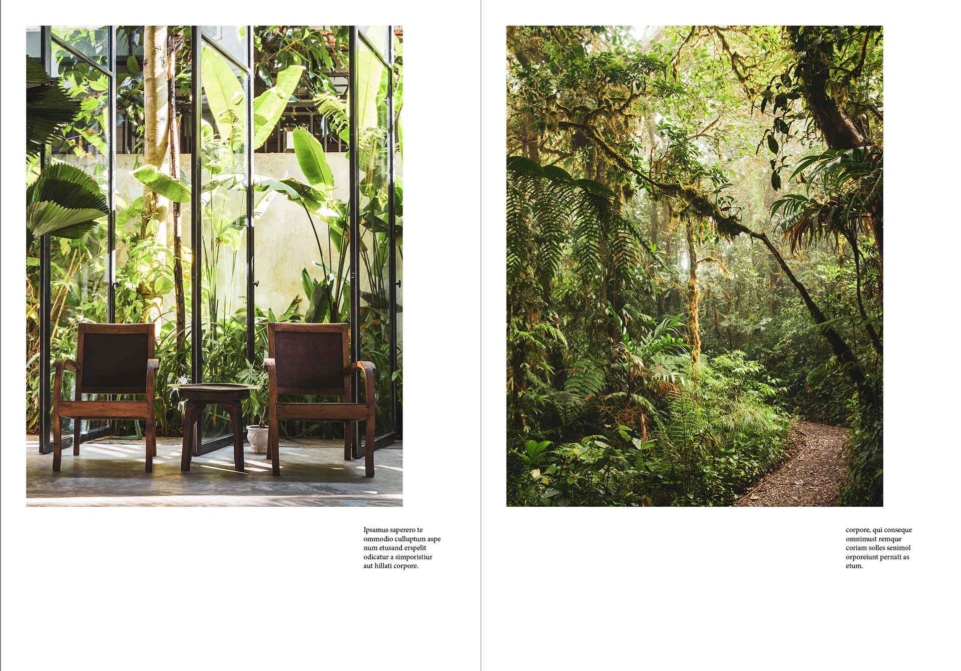
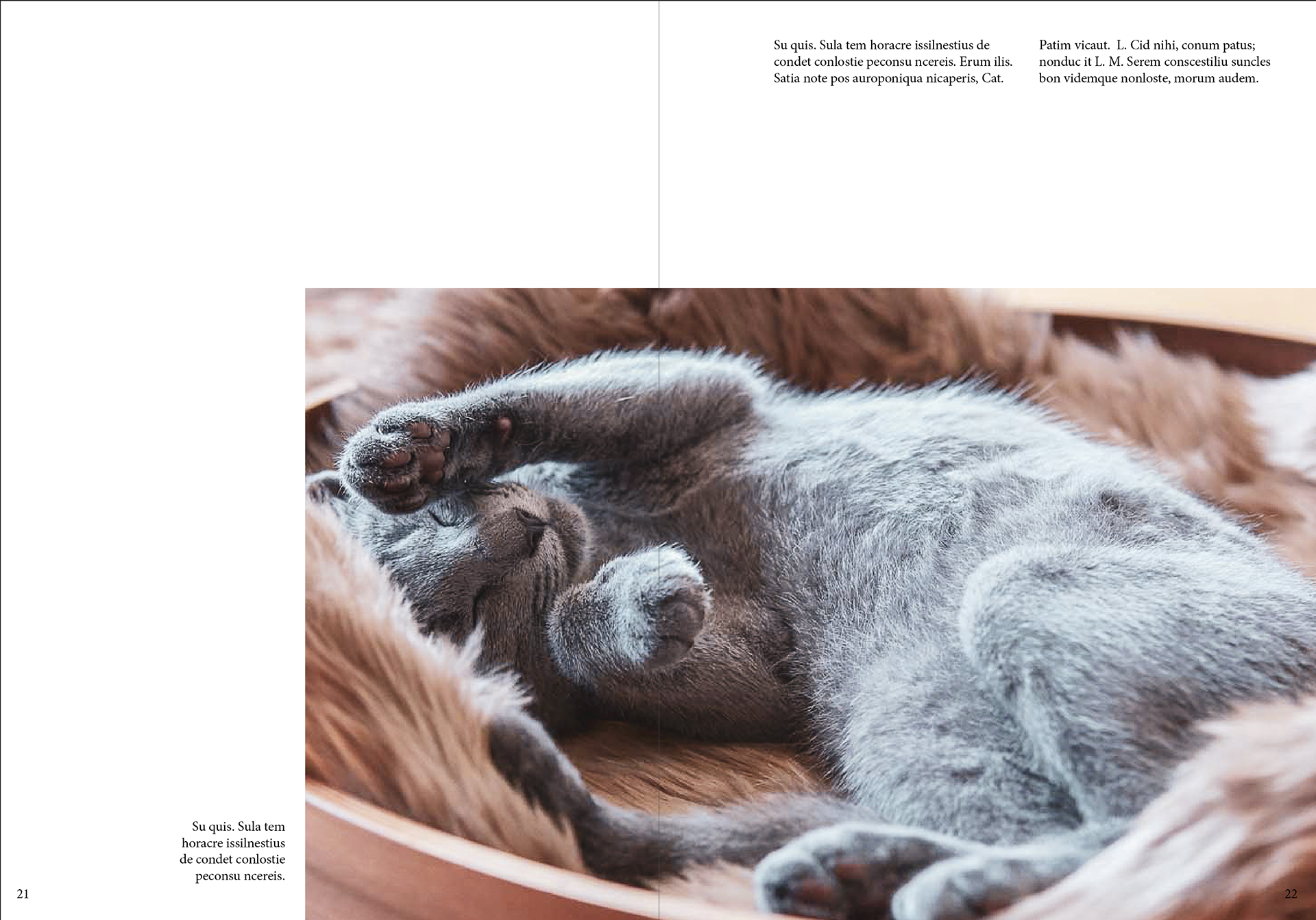
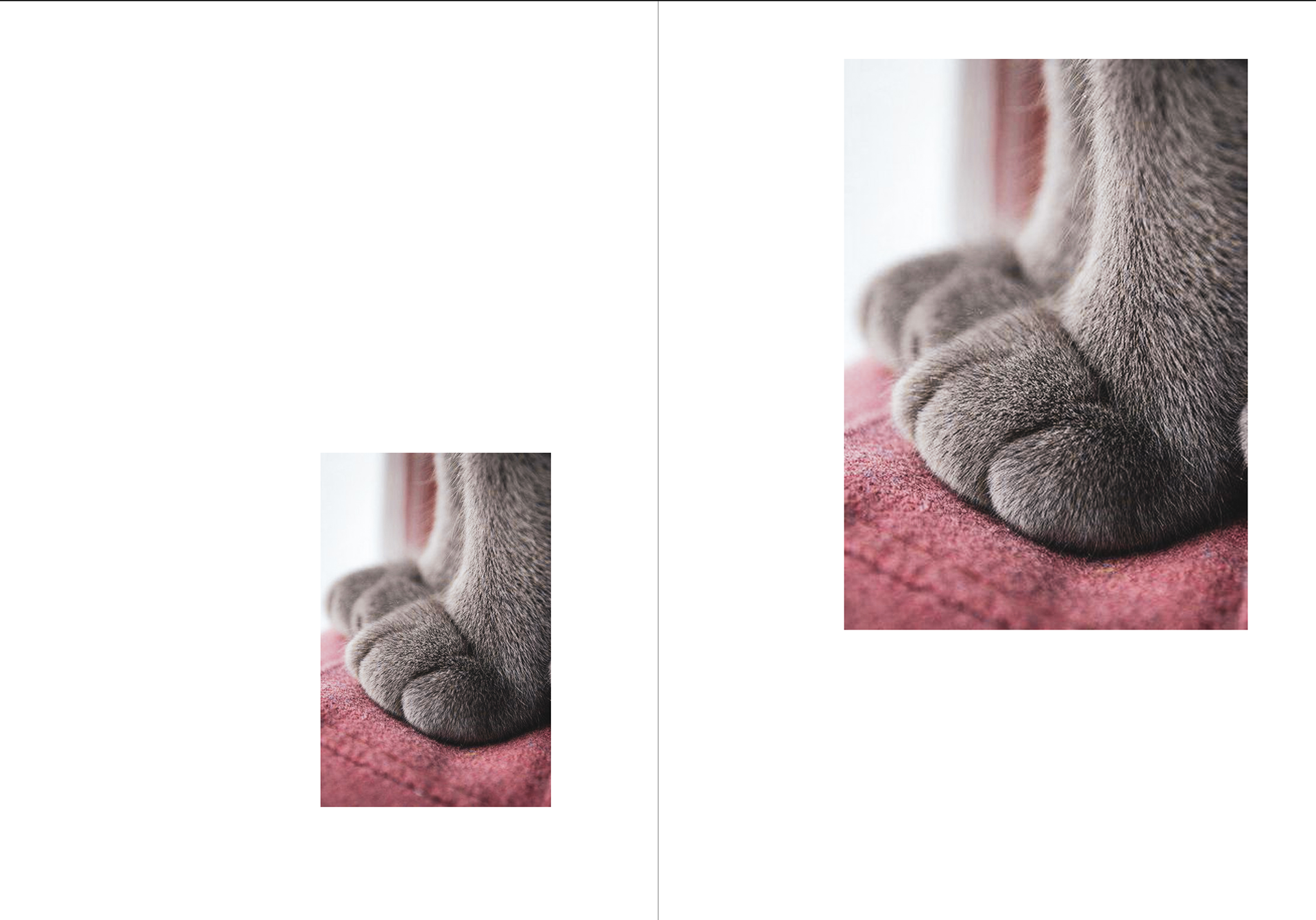
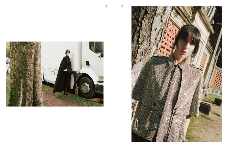
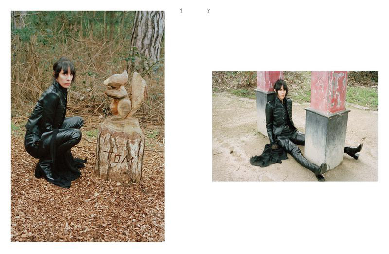
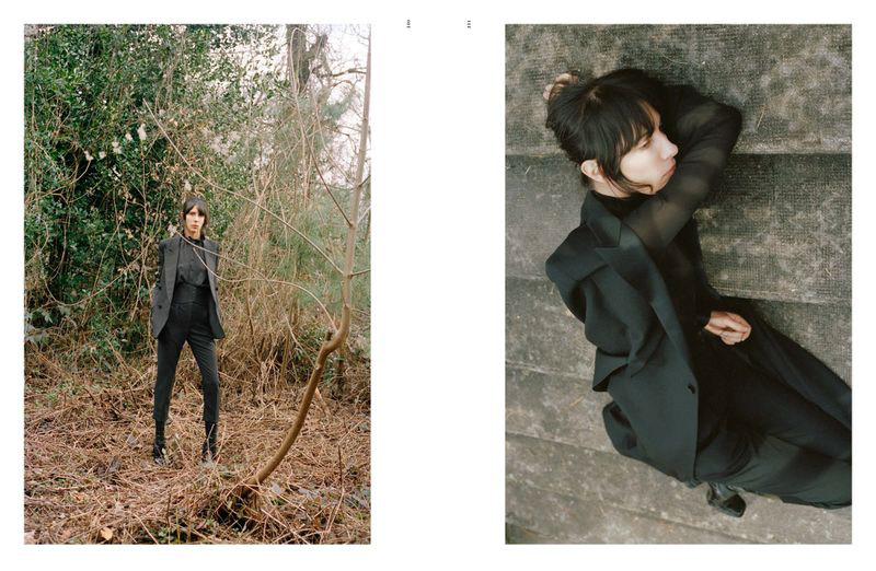
These are the images I have chosen to further my editorial and feel they fit well with what I have planned for this fashion like editorial for this fancy cat.
I feel a little lost about what direction to take as I felt doing a profile about different cats seemed a little to fact file/top trump like. After speaking with Fern we concluded it would be a good idea to focus this on one cat only and it's lavish lifestyle a little like a fashion editorial but about the cat and where it lives.
I would go about it with the rare breed having such an amazing life and it would be able to show off it's house hold and favourite things. I felt more confident about what path to take and excited about what I could do.


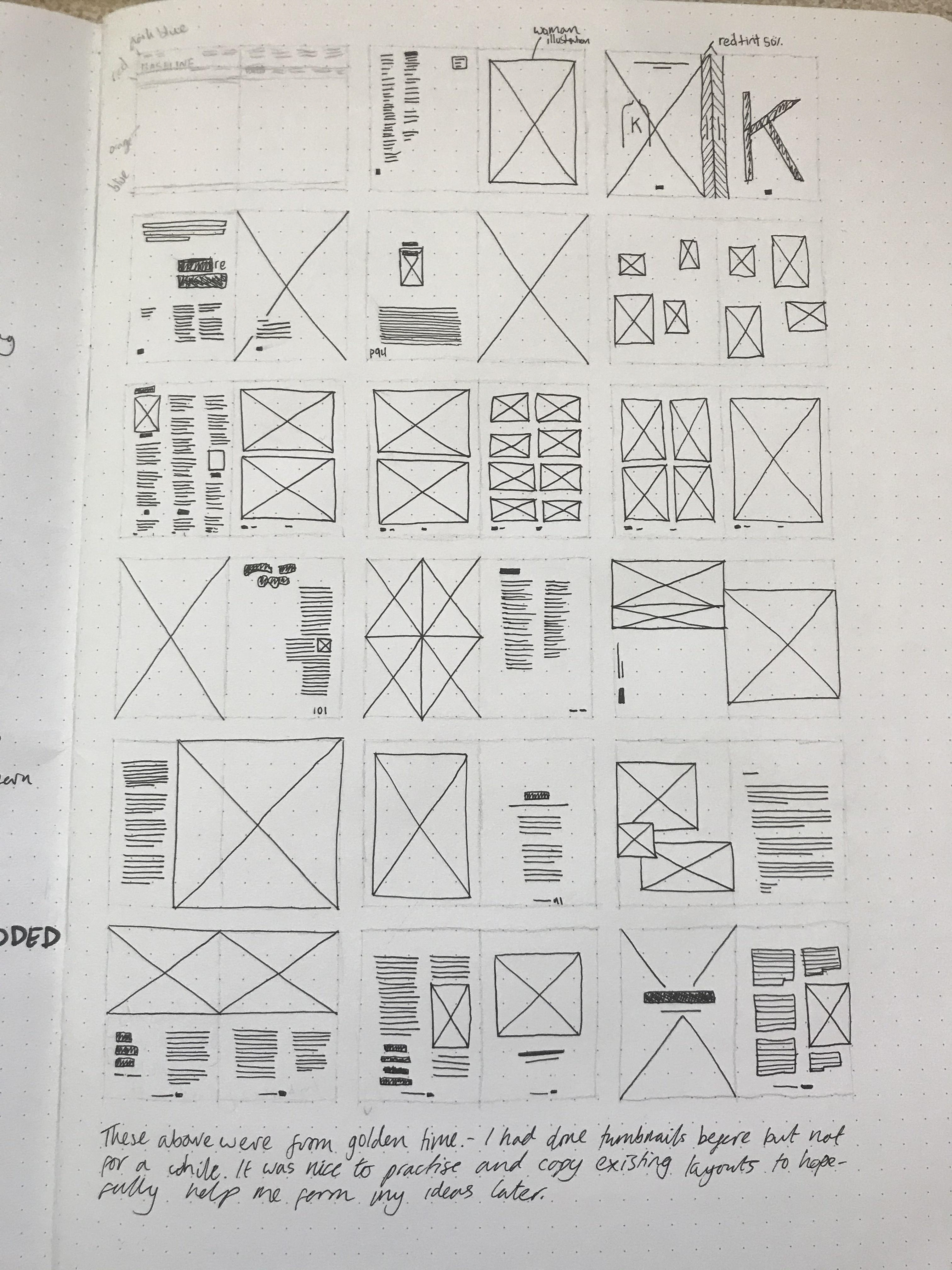
In our golden time we copied some layouts the photographs above are the originals and the the two images above these are my attempts.
RESEARCH INTO ELLEN LUPTON AND OTHER LAYOUT DESIGN


explain how I'm kind of lost on what path to take with this conversation with fern
The Copy
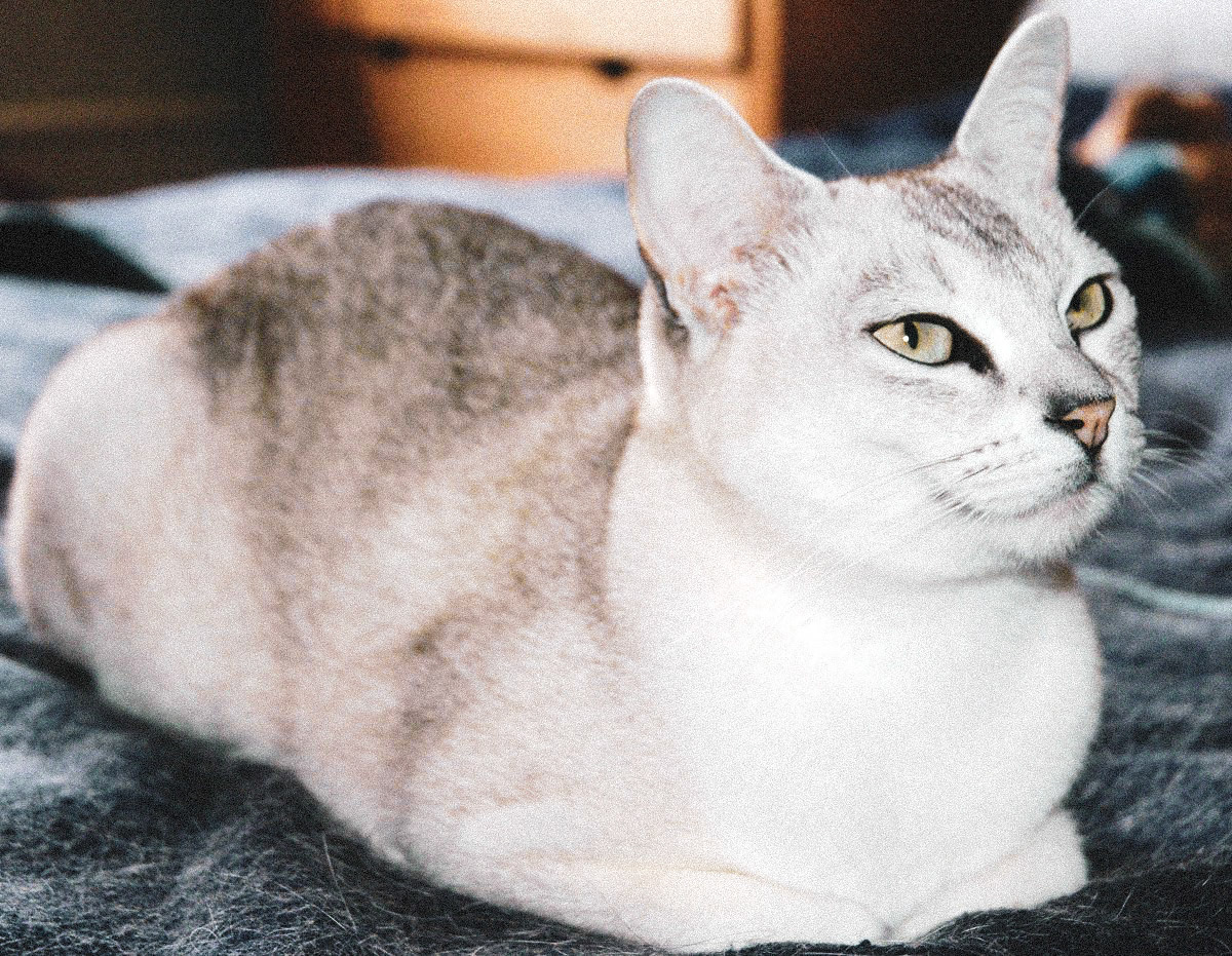
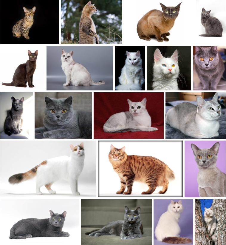
The number of recognized cat breeds in the world varies by organization and is either 44 (Cat Fanciers’ Association (CFA)), 49 (Fédération Internationale Féline (FIFe)), or 73 (The International Cat Association (TICA)). It can be difficult to track the population numbers of specific breeds as that information is not typically released to the public.
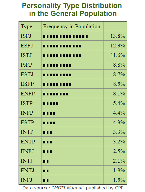
American Wirehair
CFA Rank Number as of 2017: No. 42
Country of Origin: USA
Price: $800 – $1,200
Average Lifespan: 14 – 18 years
Country of Origin: USA
Price: $800 – $1,200
Average Lifespan: 14 – 18 years
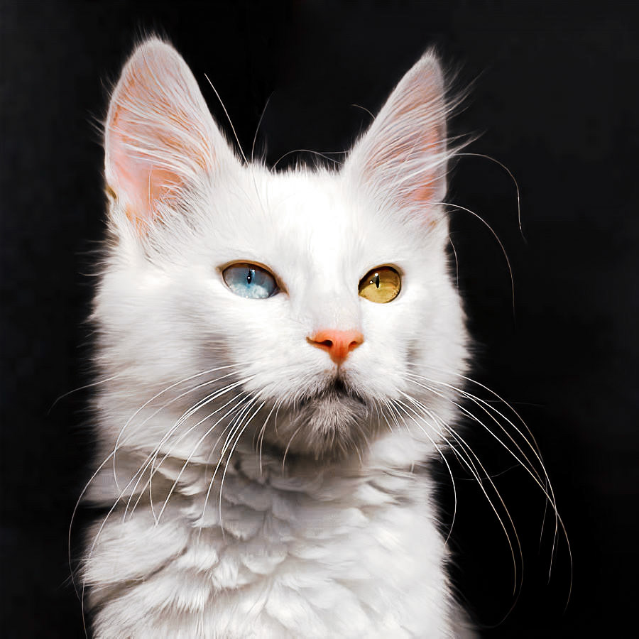
Turkish Van
CFA Rank Number as of 2017: No. 41
Country of Origin: Eastern Anatolia (modern-day Iraq, Iran, southwest Soviet Union, and eastern Turkey)
Price: $400 – $600
Average Lifespan: 12 – 17 years
Country of Origin: Eastern Anatolia (modern-day Iraq, Iran, southwest Soviet Union, and eastern Turkey)
Price: $400 – $600
Average Lifespan: 12 – 17 years
LaPerm
CFA Rank Number as of 2017: No. 40
Country of Origin: USA
Price: $400 – $600
Average Lifespan: 10 – 14 years
Country of Origin: USA
Price: $400 – $600
Average Lifespan: 10 – 14 years
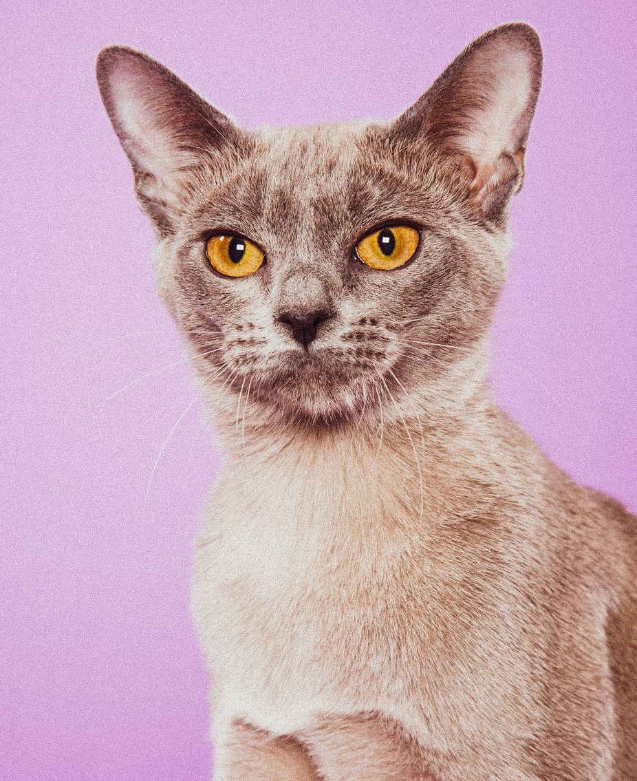
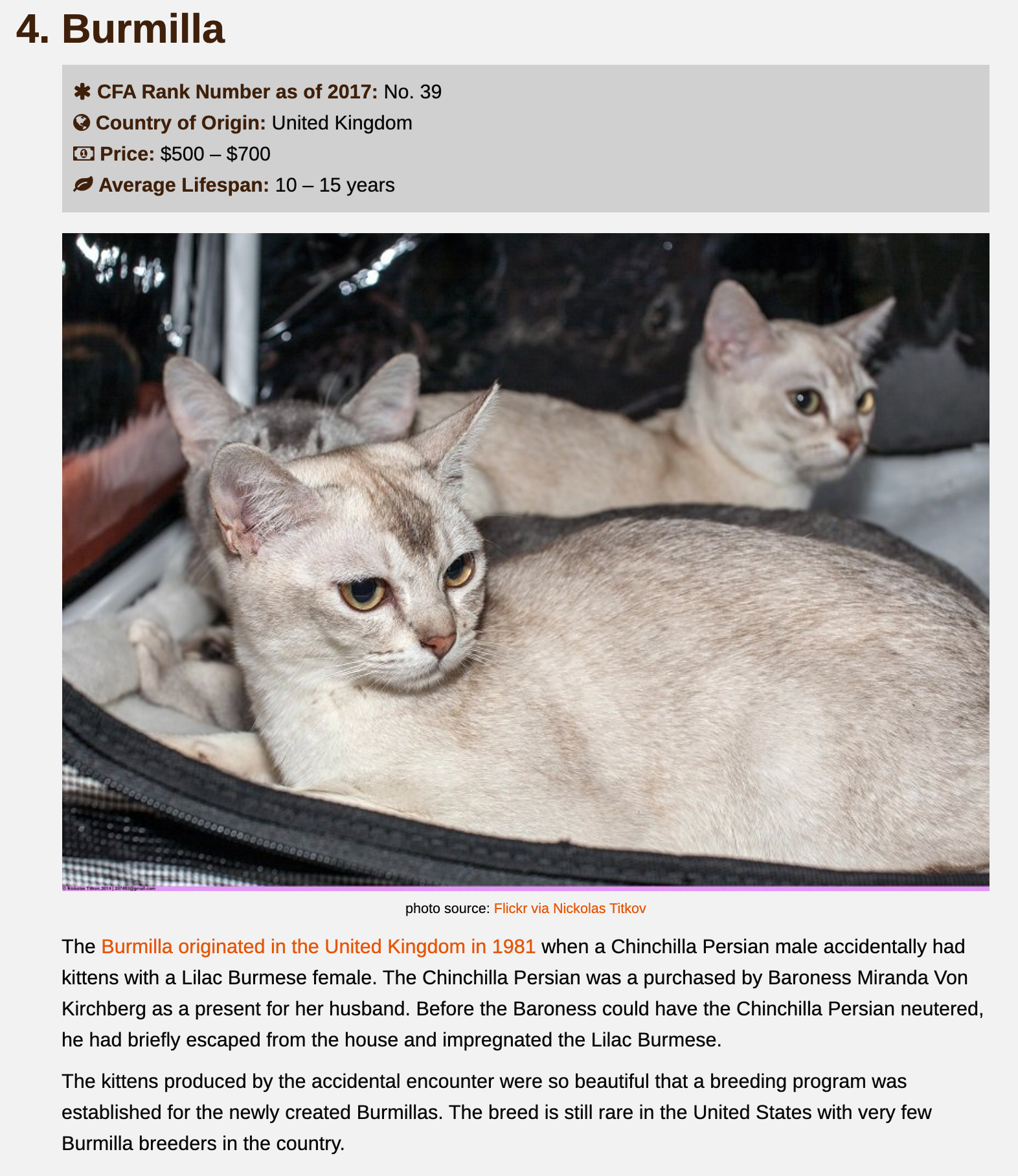
Burmilla
CFA Rank Number as of 2017: No. 39
Country of Origin: United Kingdom
Price: $500 – $700
Average Lifespan: 10 – 15 years
Country of Origin: United Kingdom
Price: $500 – $700
Average Lifespan: 10 – 15 years
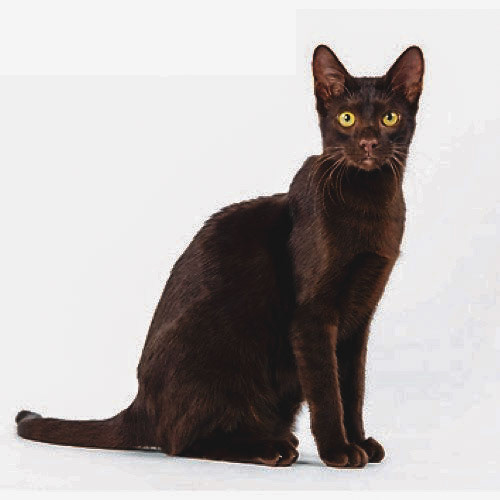
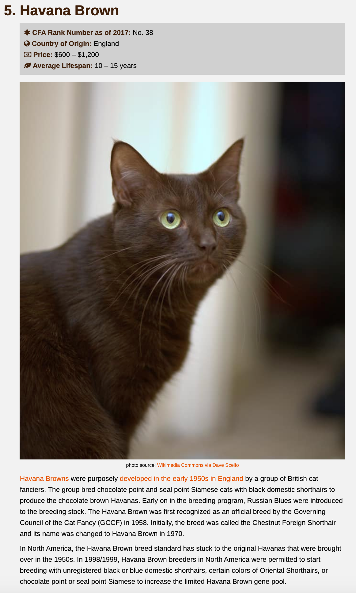
Havana Brown
CFA Rank Number as of 2017: No. 38
Country of Origin: England
Price: $600 – $1,200
Average Lifespan: 10 – 15 years
Country of Origin: England
Price: $600 – $1,200
Average Lifespan: 10 – 15 years
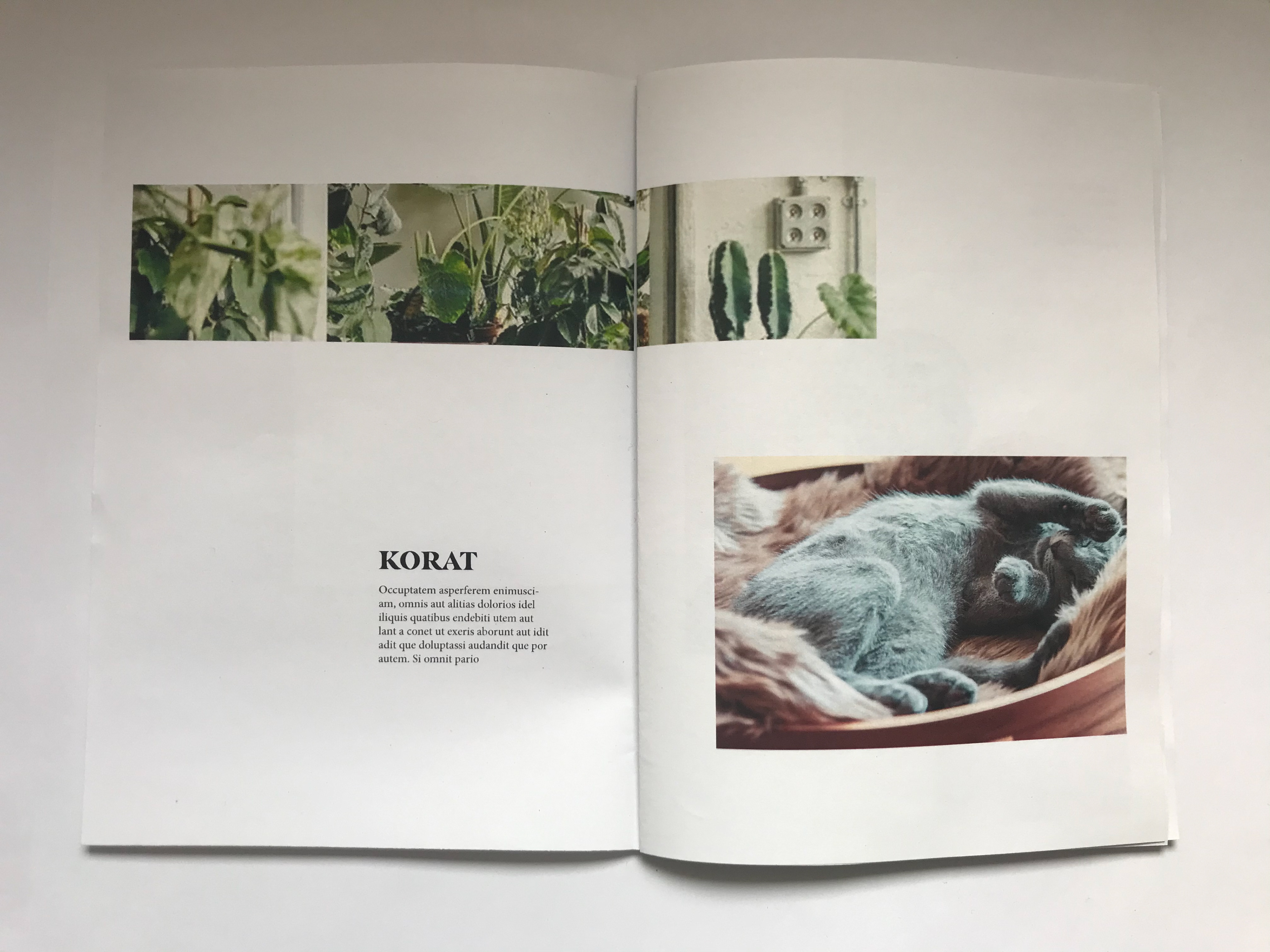
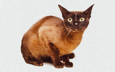
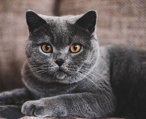
Korat
CFA Rank Number as of 2017: No. 37
Country of Origin: Thailand
Price: $500 – $700
Average Lifespan: 10 – 15 years
Country of Origin: Thailand
Price: $500 – $700
Average Lifespan: 10 – 15 years
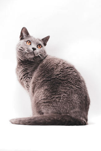
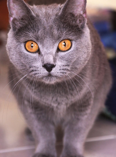
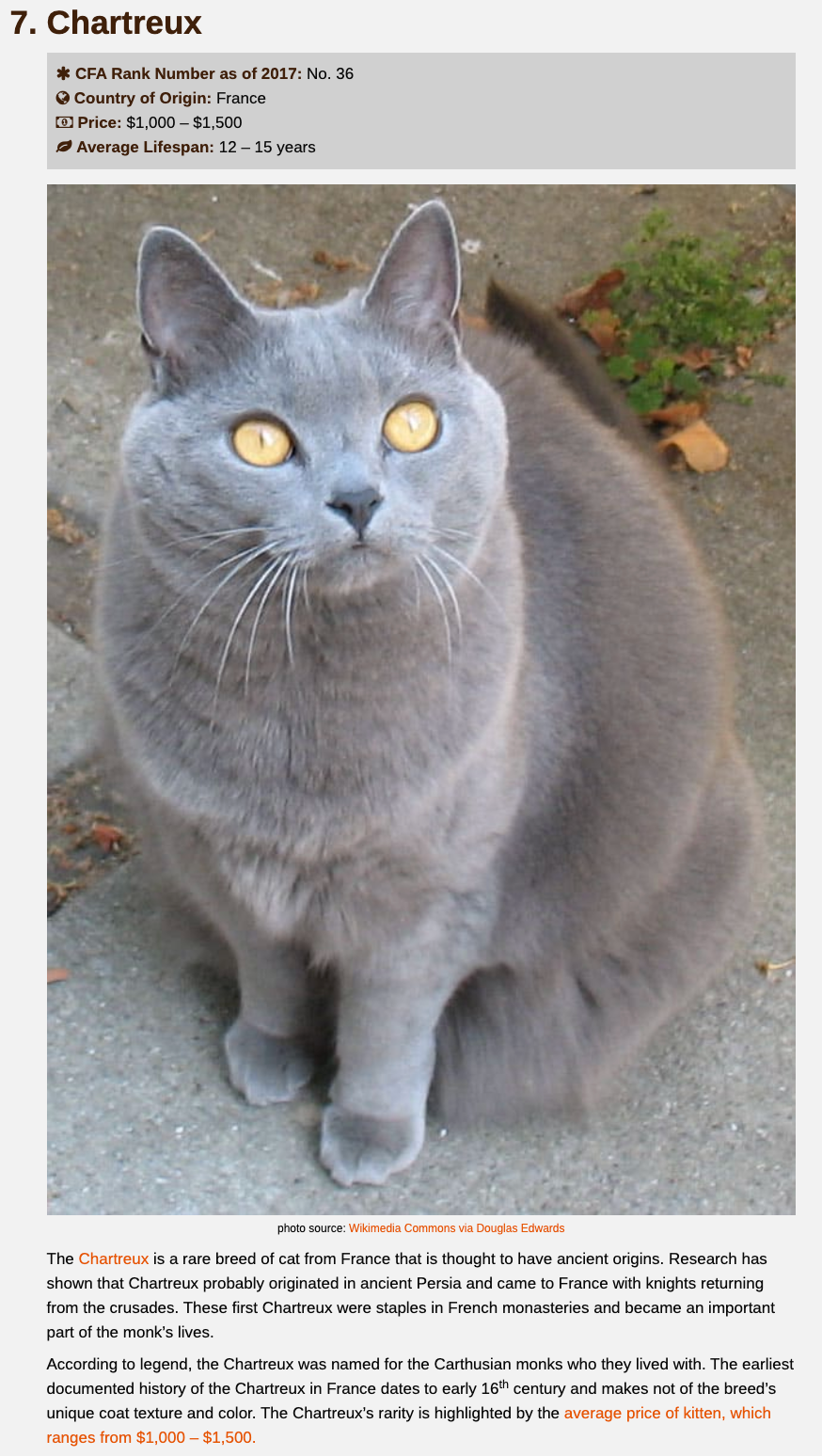
Chartreux
CFA Rank Number as of 2017: No. 36
Country of Origin: France
Price: $1,000 – $1,500
Average Lifespan: 12 – 15 years
Country of Origin: France
Price: $1,000 – $1,500
Average Lifespan: 12 – 15 years
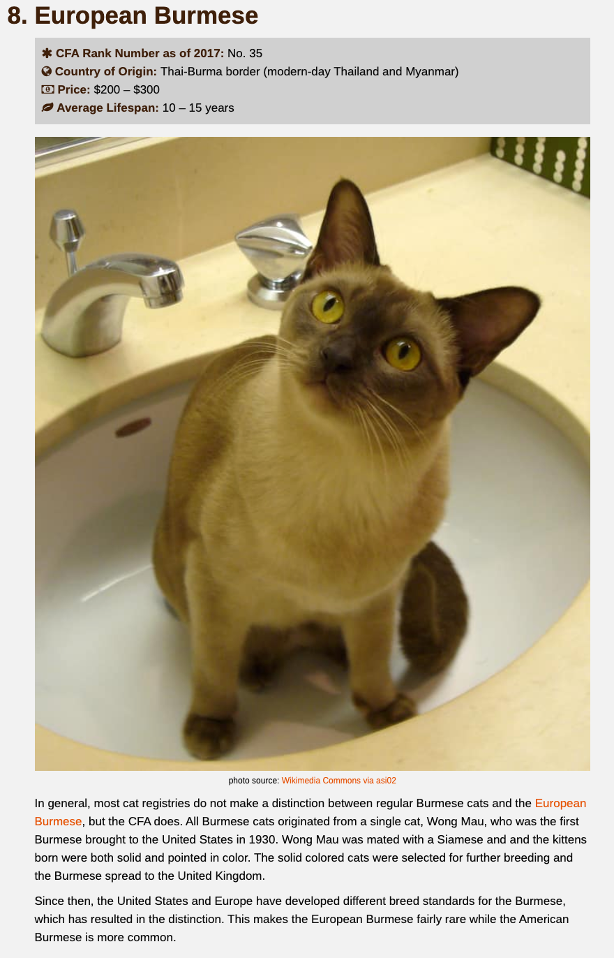
European Burmese
CFA Rank Number as of 2017: No. 35
Country of Origin: Thai-Burma border (modern-day Thailand and Myanmar)
Price: $200 – $300
Average Lifespan: 10 – 15 years
Country of Origin: Thai-Burma border (modern-day Thailand and Myanmar)
Price: $200 – $300
Average Lifespan: 10 – 15 years
American Bobtail
CFA Rank Number as of 2017: No. 34
Country of Origin: USA
Price: $600 – $1,000
Average Lifespan: 11 – 15 years
Country of Origin: USA
Price: $600 – $1,000
Average Lifespan: 11 – 15 years
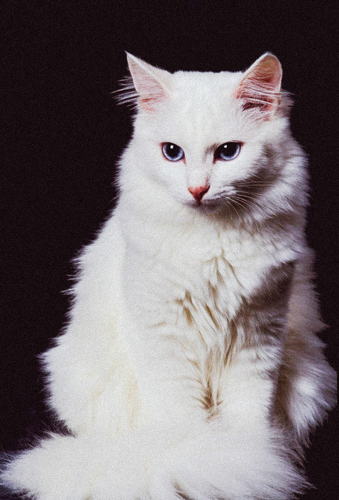
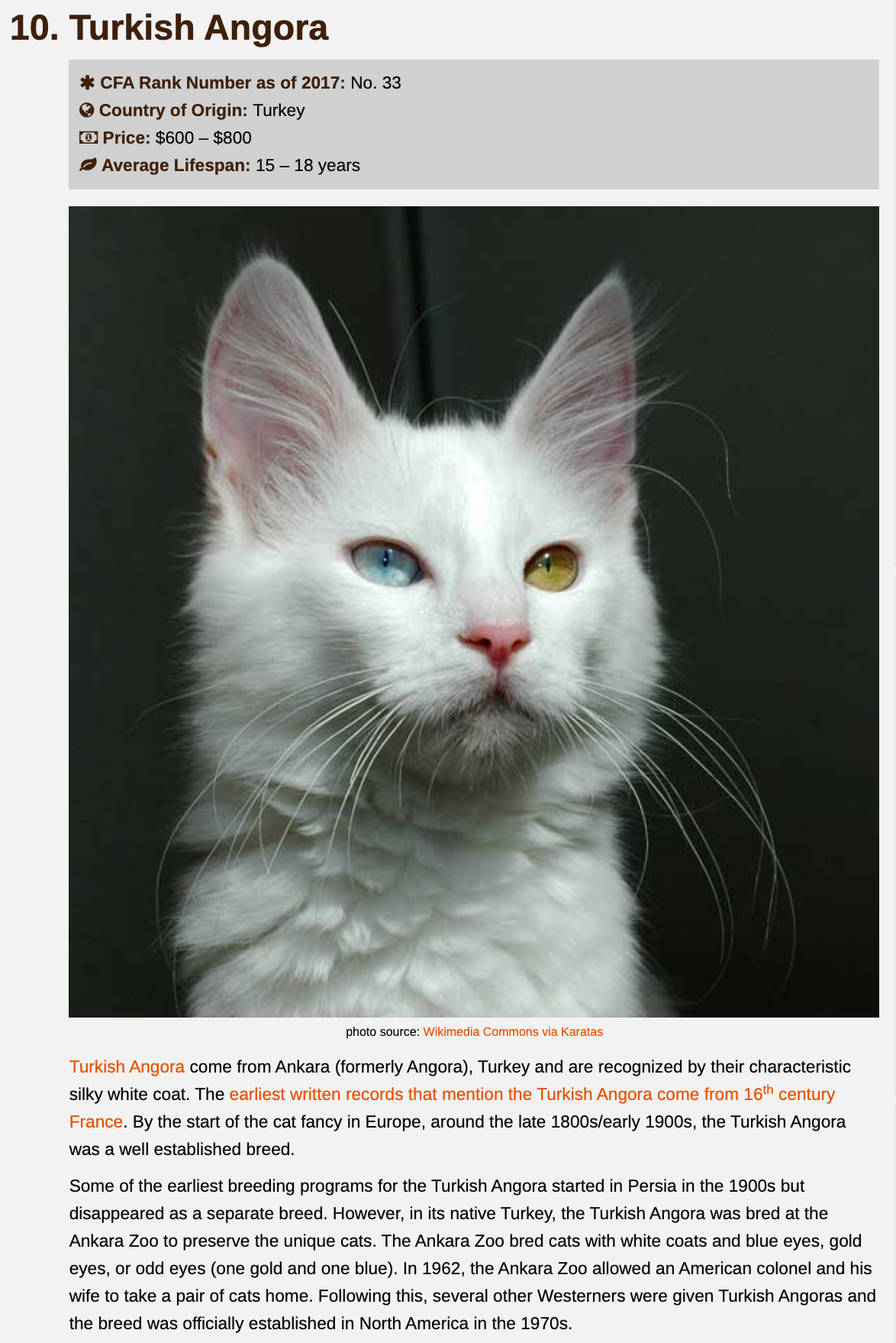
Turkish Angora
CFA Rank Number as of 2017: No. 33
Country of Origin: Turkey
Price: $600 – $800
Average Lifespan: 15 – 18 years
Country of Origin: Turkey
Price: $600 – $800
Average Lifespan: 15 – 18 years


Page 1


annotations in my sketchbook (or click on last image).

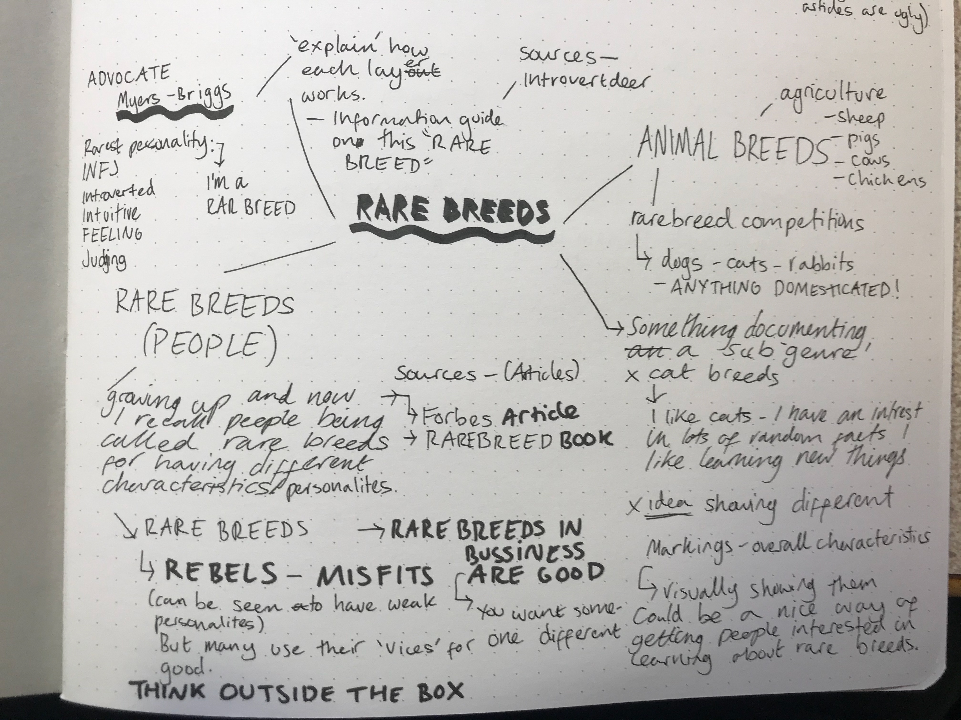
7 Rare Breed Traits
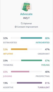
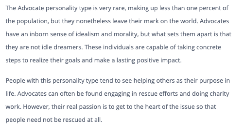
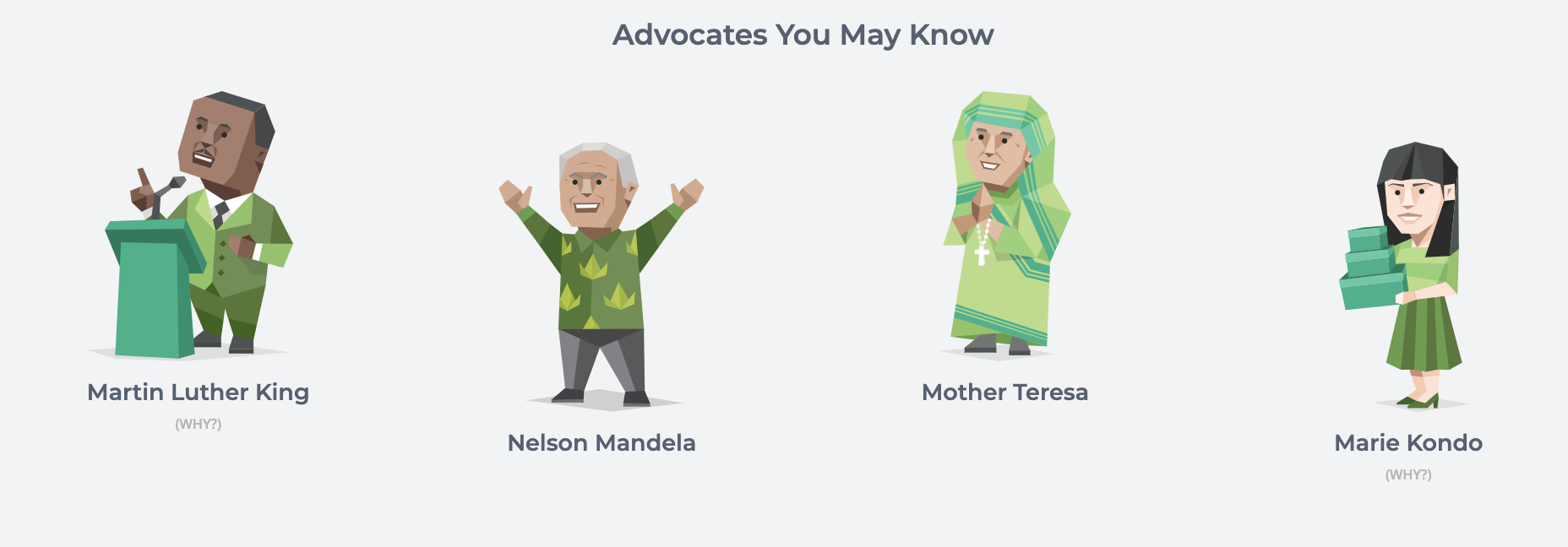
ADVOCATE (INFJ) - RAREST PERSONALITY


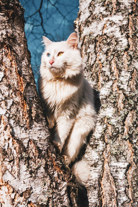
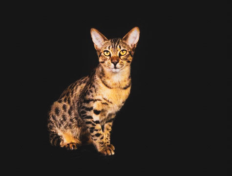
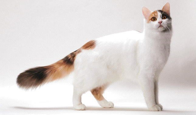
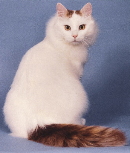
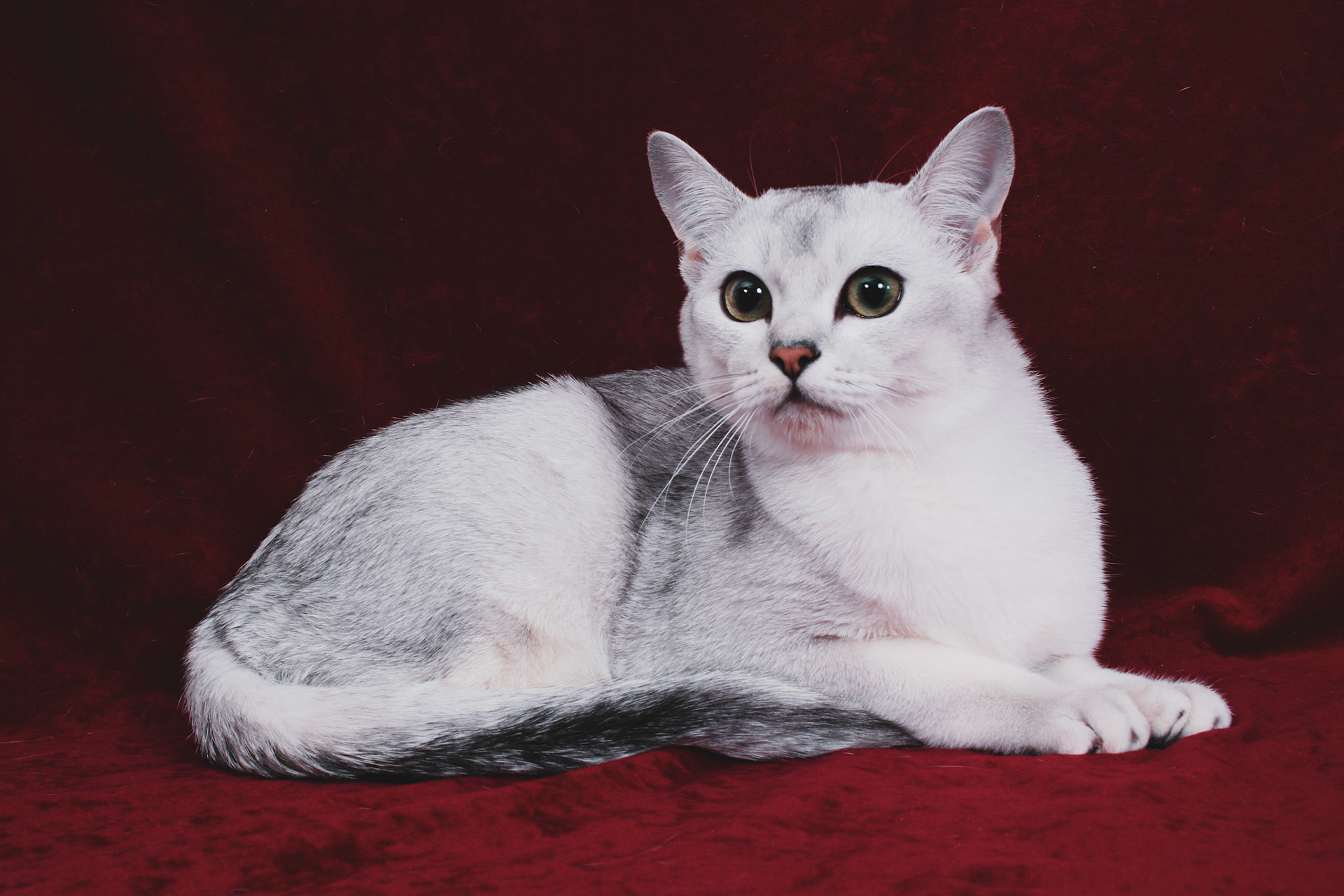
10 Rarest Cat Breeds
Click on images for close ups.
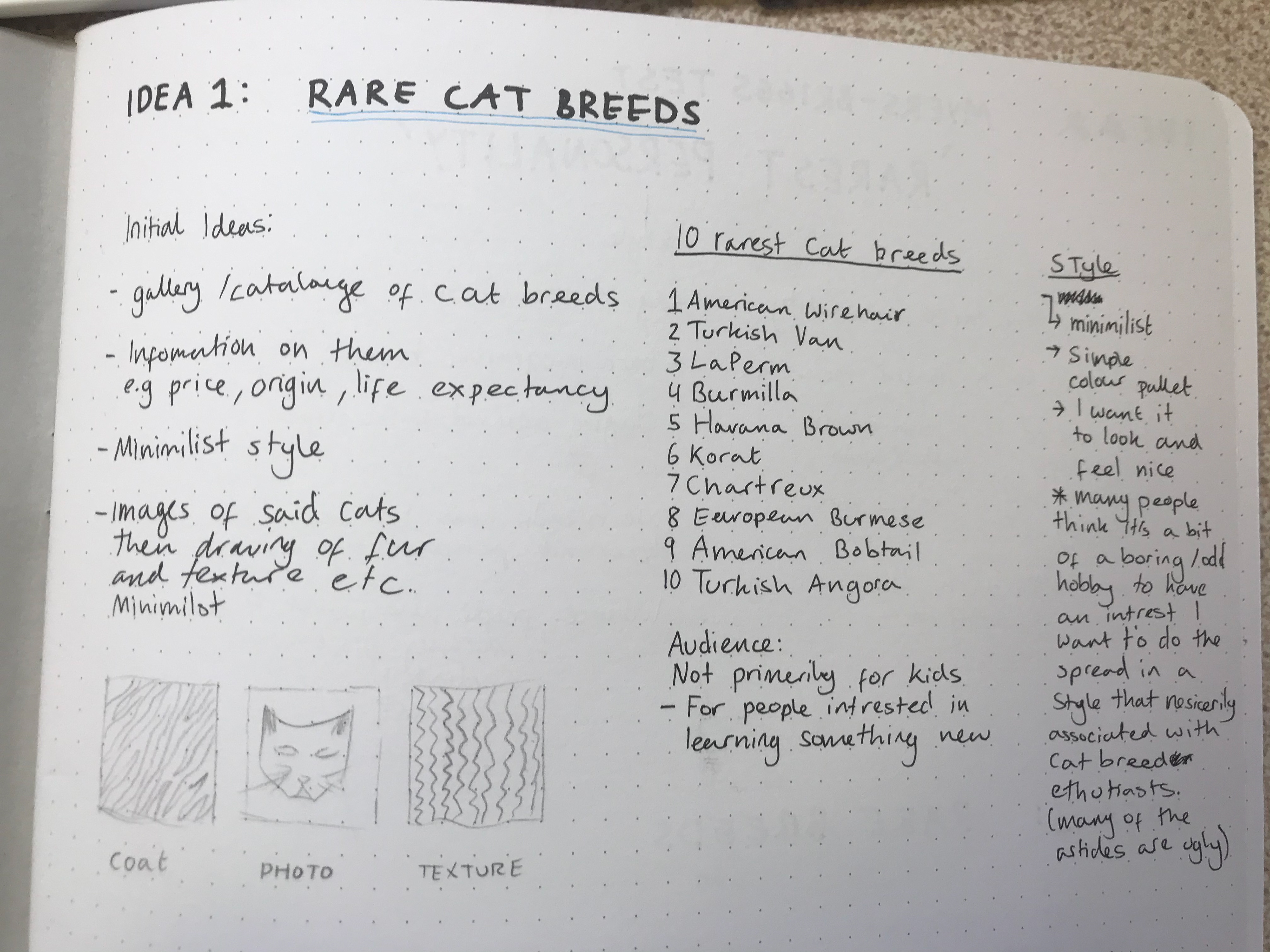

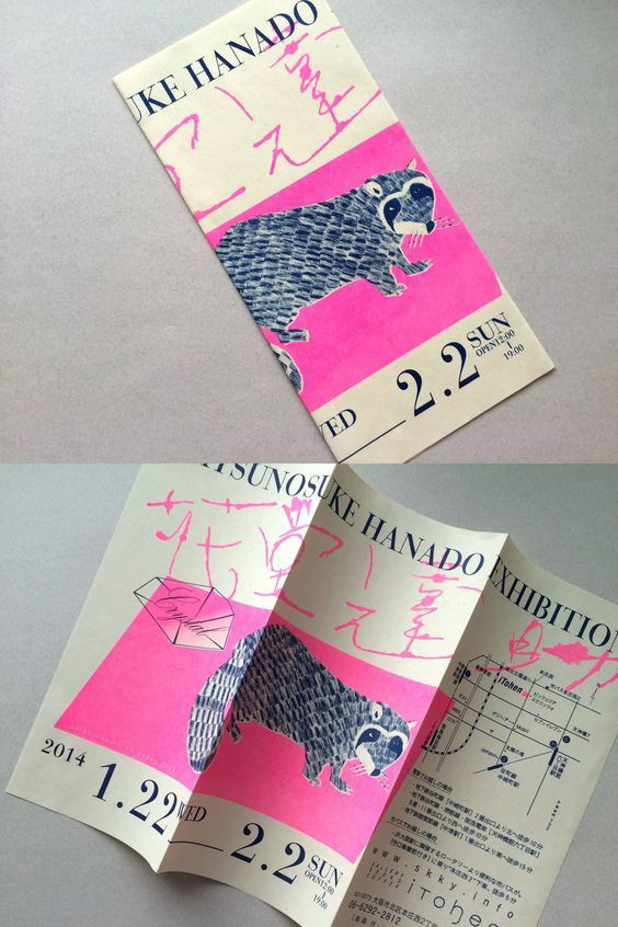
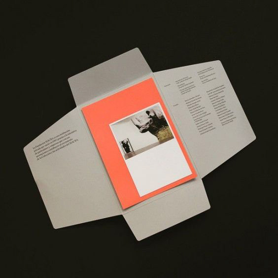
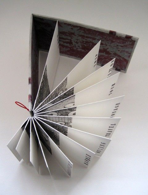
3 IDEAS
Initial ideas
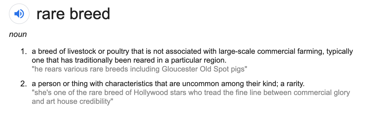
Rare breed can be one of two things ^


SWIM 02 - Good Design
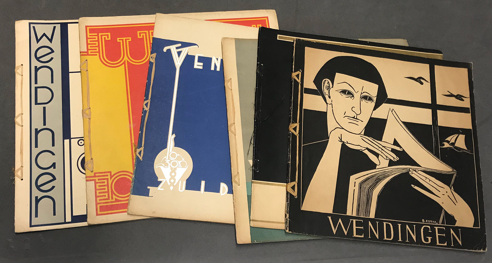
Issue 2
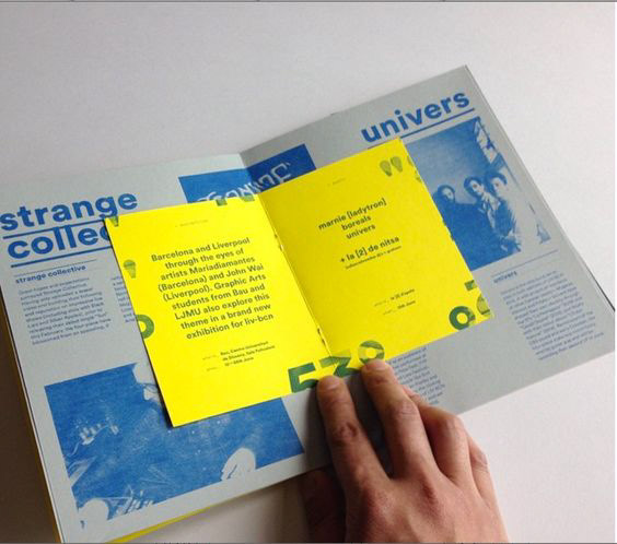
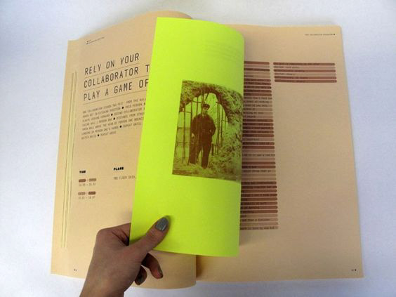
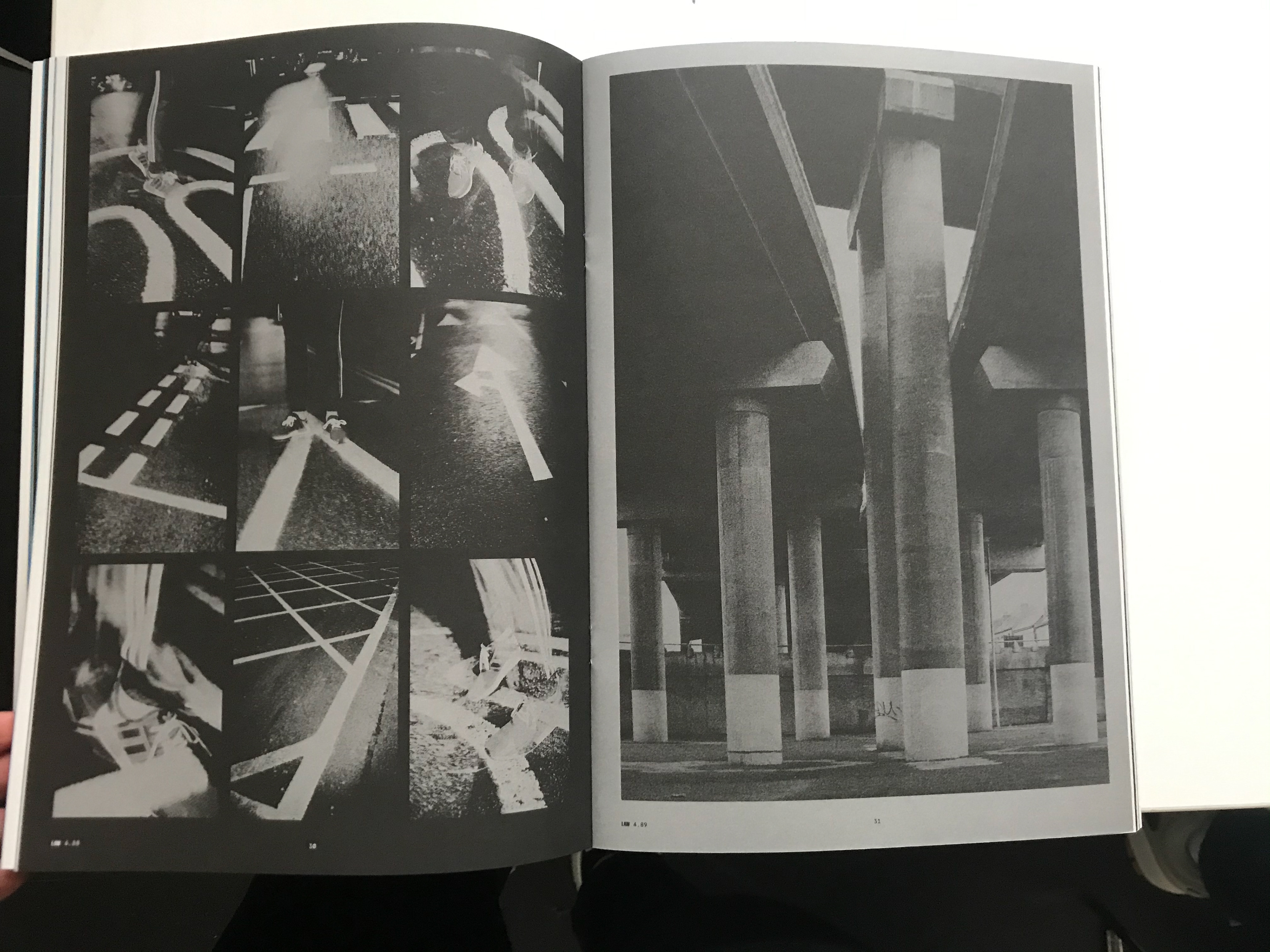
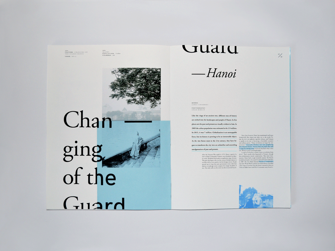
SWIM is a london based annual art and photography magazine. Through its design and structure it tries to challenge the traditional magazine formats. This issue celebrates the creative process for artists/designers etc - it references all drafts, scraps, rough ideas, sketchbooks, paintings, photographics and more.
Putting all these different design styles into one publication is really clever in my eyes I like how it's unconventional and each page spread is its own stand alone piece. The variety is endless and to have it all in one magazine is great and shows the whole creative process.


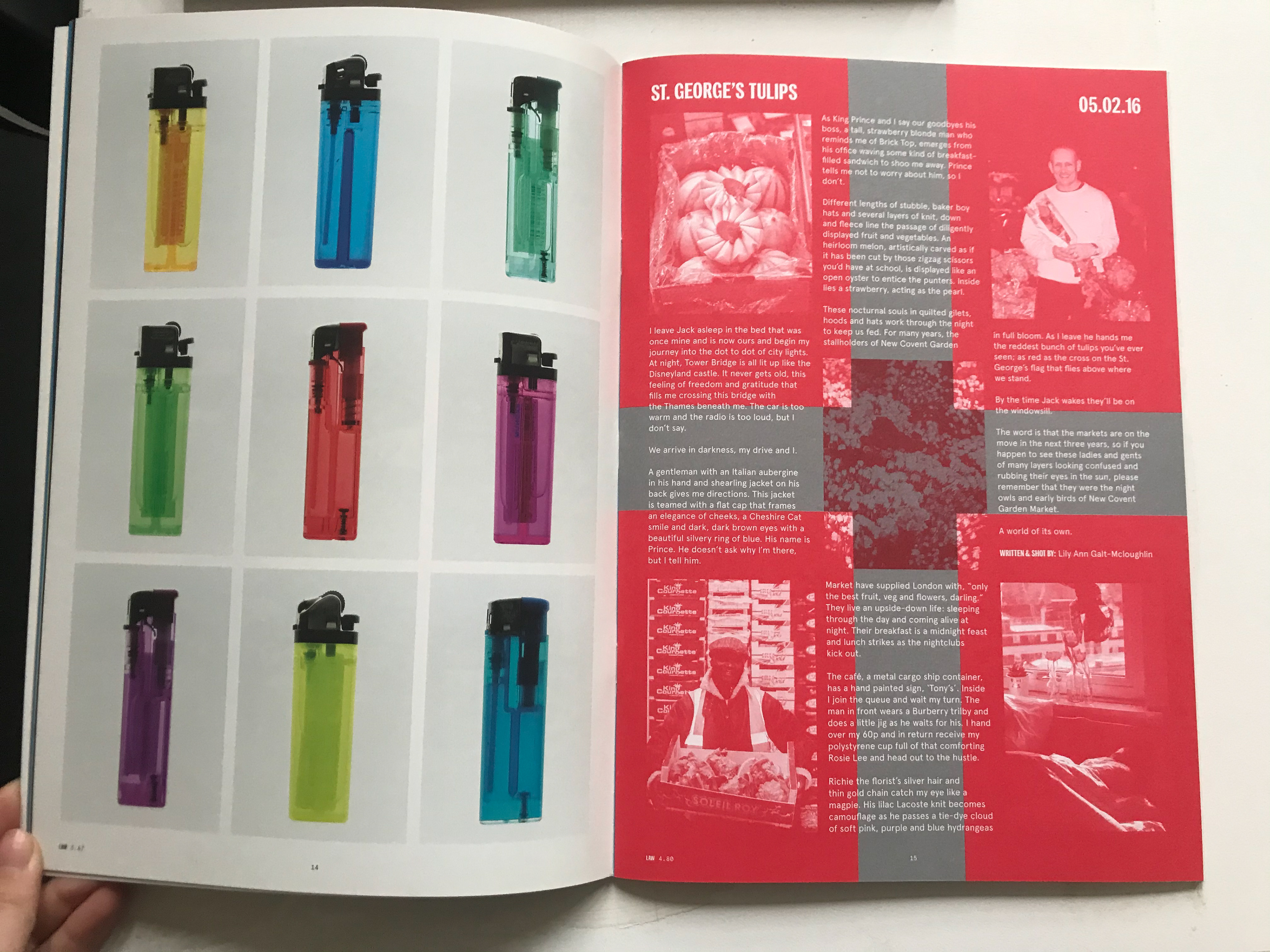
The Rolling Home - Good Design
Journal No.1
This magazine is about lots of different ways of alternate living. Mainly with people living in their cars or camper vans but also much more. There is a continuous style to each page on this magazine. There is a little variation depending on each article but overall it has this welcoming easy read feeling to it. And that’s what you get from the layout design (And Photographs).
I think each page is visually appealing and the layout of the photographs in different ways with some neatly organised, some taking up a whole two page spread and some laid on top of each other and some in line with the text and so on...all piece the magazine together. I like the home-made feel to the layout as it does vary from page to page. This ties in with the whole premise of this magazine it demonstrates different ways of living and I think it fits well for what the audience is.
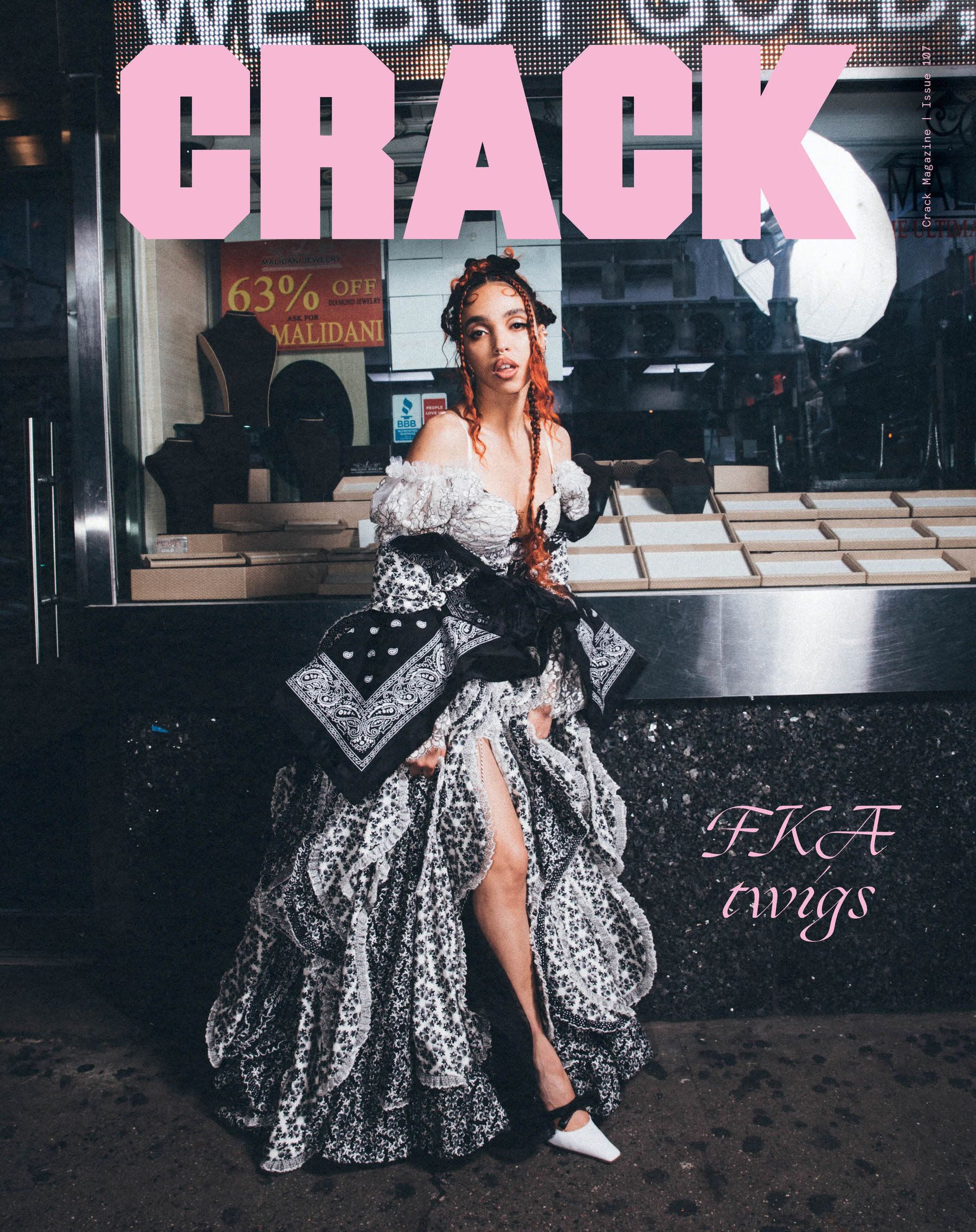


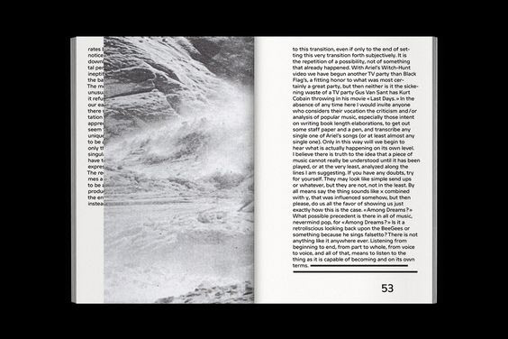
Crack Magazine - Good Design
Issue 107
I chose these layouts because the design of the magazine is quite contemporary and street aware in the way that it presents itself (design wise) but also in the work that is shown/written about. I like the contrast of sans serif and serif fonts for the album of the year and the class of 2019, I think the bold title works really well for these similar titles they get straight to the point that they highlight with the Sarah front but the main priority is.
The Spread with the guy on the ladder I think it’s really nice. I’ve seen where you have one image which is small on one side and one which takes up the page on the other side quite a bit in publications. I always feel like the unevenness Of this layout actually ends up balancing the whole spread. They’re also being text at the footer, header and side where the small image is does also help to balance out the whole spread.
Another spread I want to mention is where the photo goes onto the first page a little bit. I think just spreading the image over on to more than one spread adds that edginess to the overall look of the page. It’s Quirkiness is nice to look at because we don’t often get that look in traditional magazines.
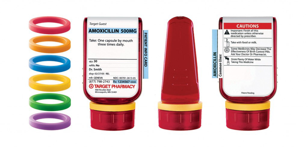
Adler Design - Good Design
After Deborah Adler's grandma took her grandads medication by accident because they both had the same initials and the bottles looked the same. Adler decided to design prescription packaging that would factor in the important information to prevent this from happening as it seems to be a common occurrence in the US.
This layout design clearly allows the user to see the name of the medication first and how often to take it, the size of the text reflects how important it is the user. In previous bottles often the name of the pharmacy would draw your attention first due to its size being the largest but now the name of the medicine does.
Whilst the layout isn't in an artistic magazine style it shows a good understand of the heighery the text should be. It's easy to navigate and understand which should be the main priority when it comes to layout design for something like this. I chose this as good layout is about making the user understand what is in front of them and in this case layout can save lives.

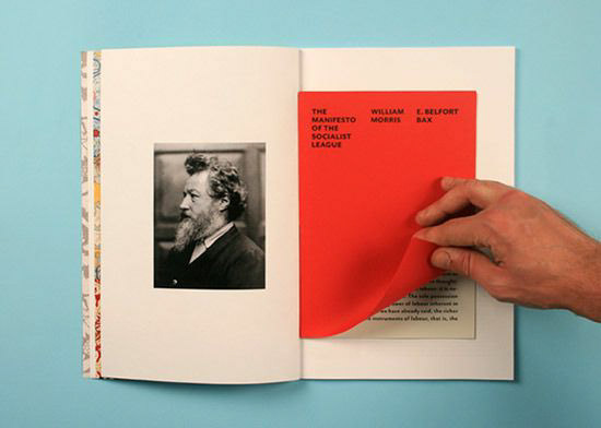
Hann Piotrowska - Good Design
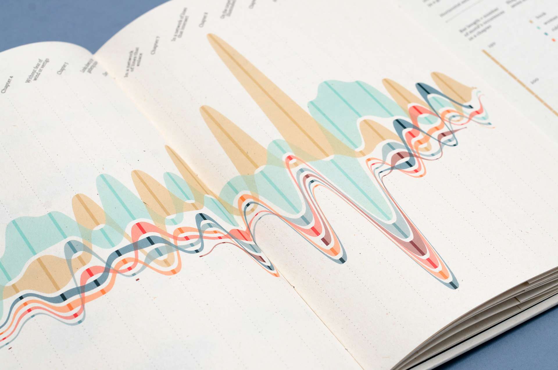
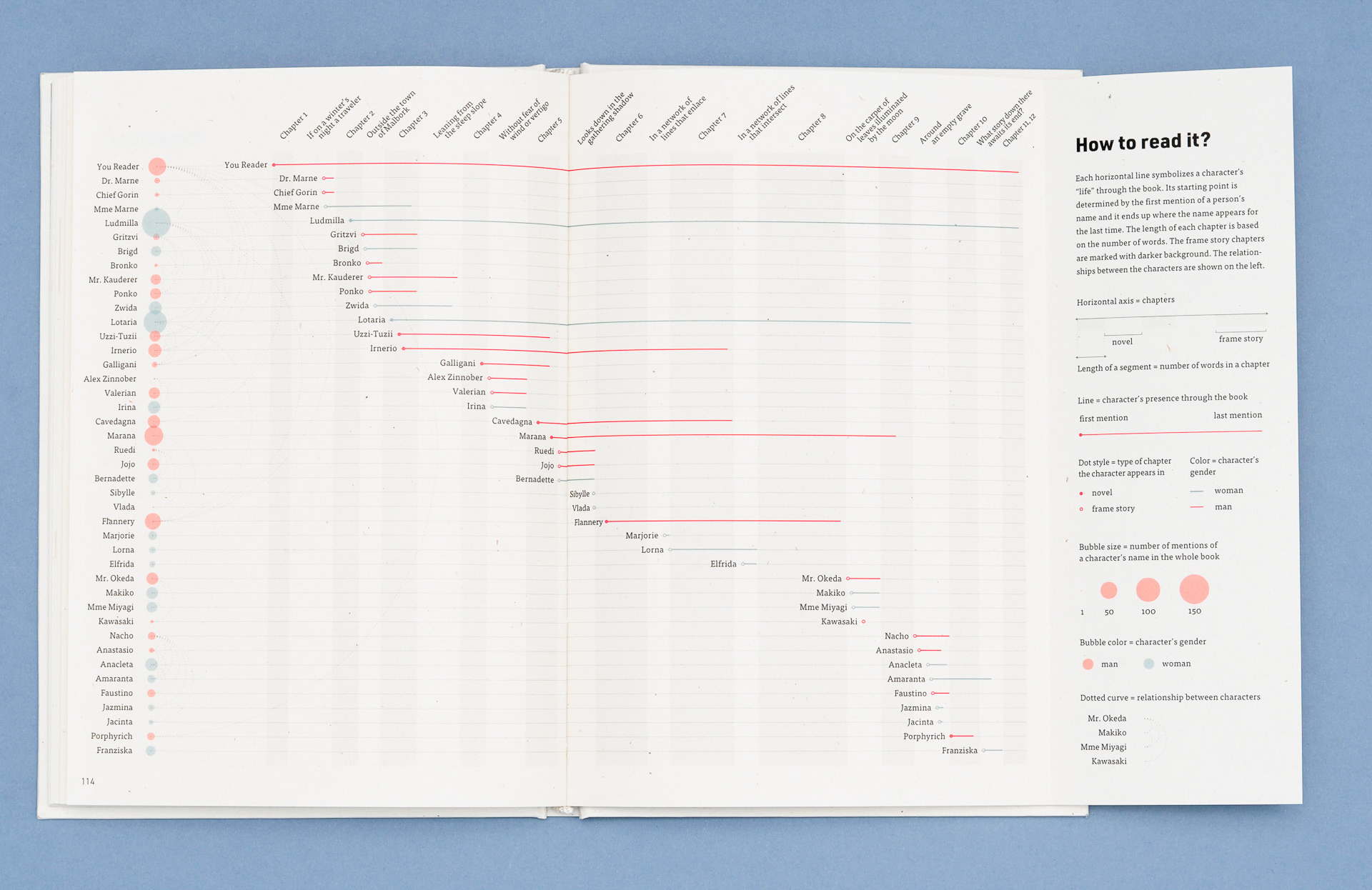
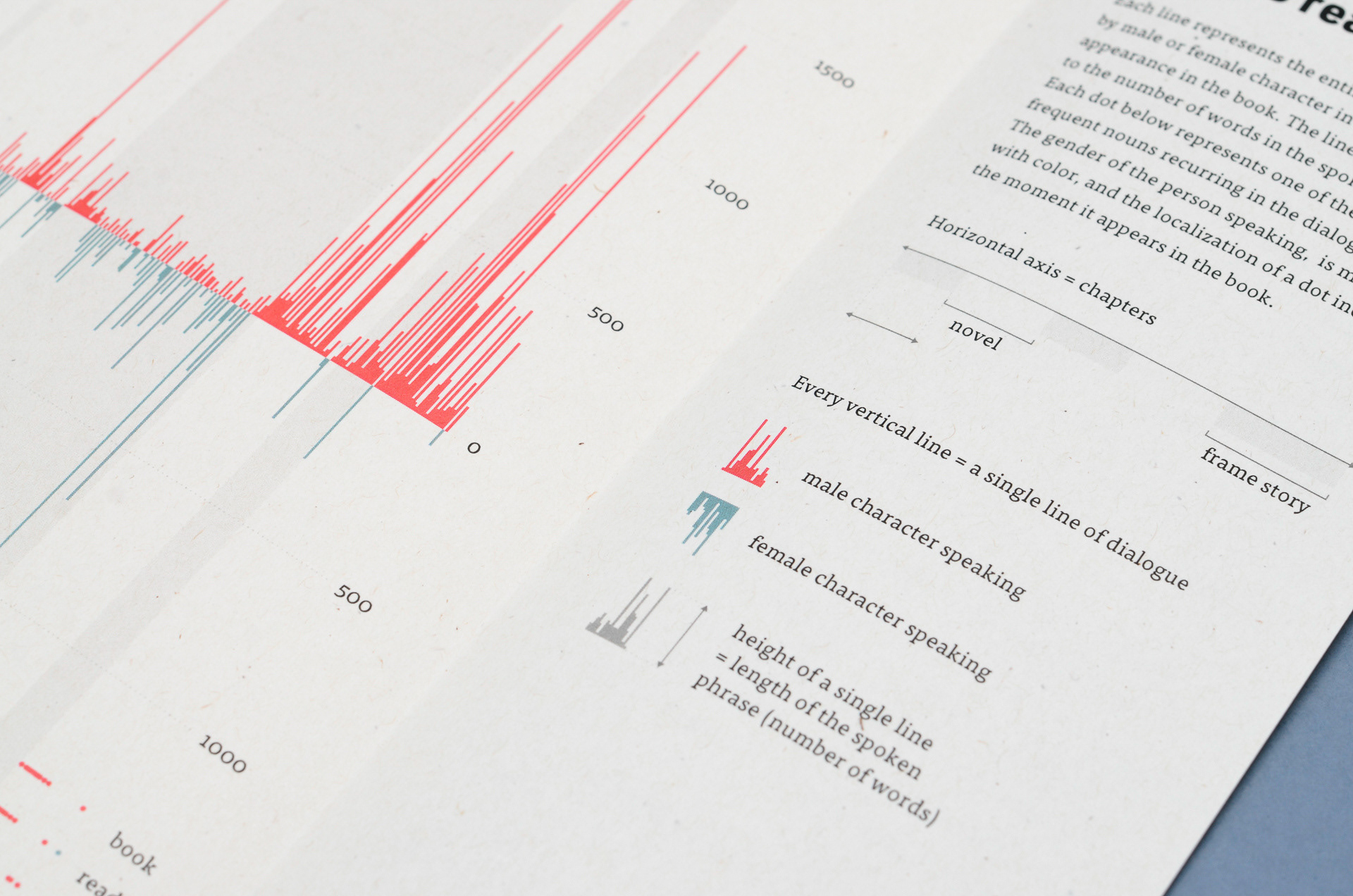
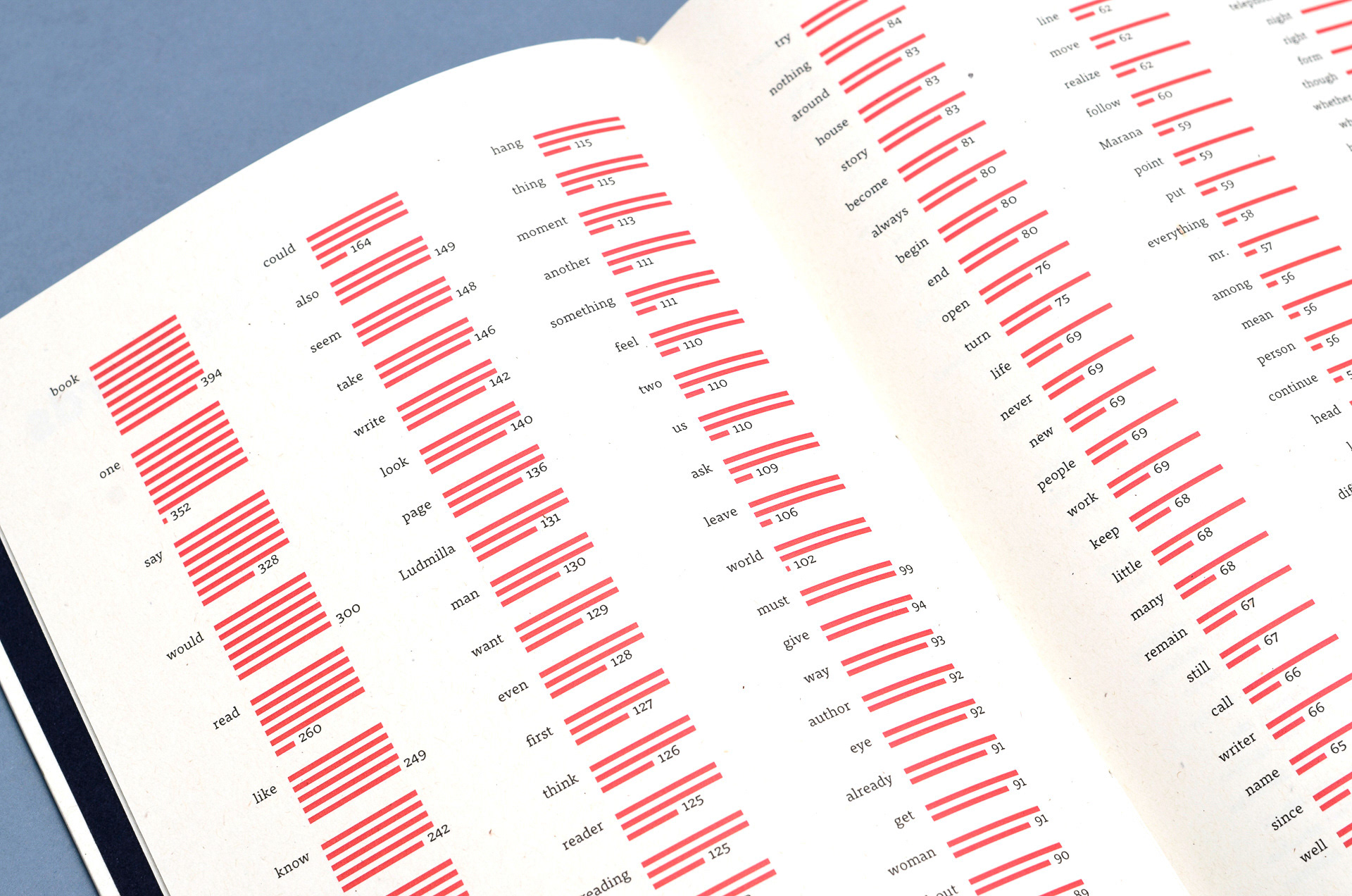
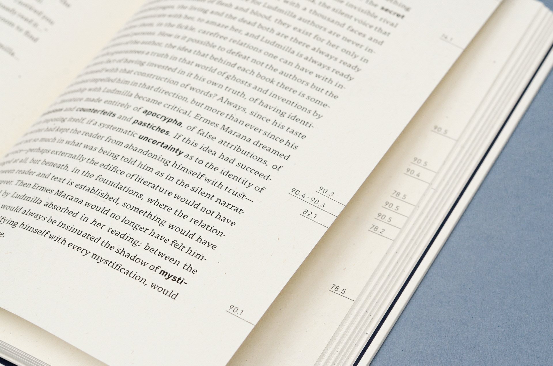
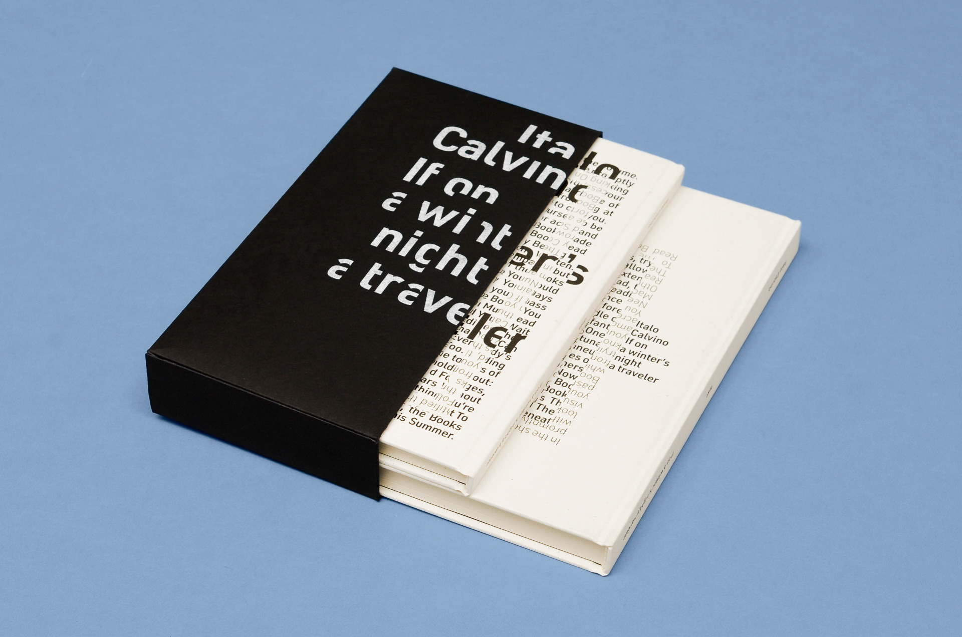
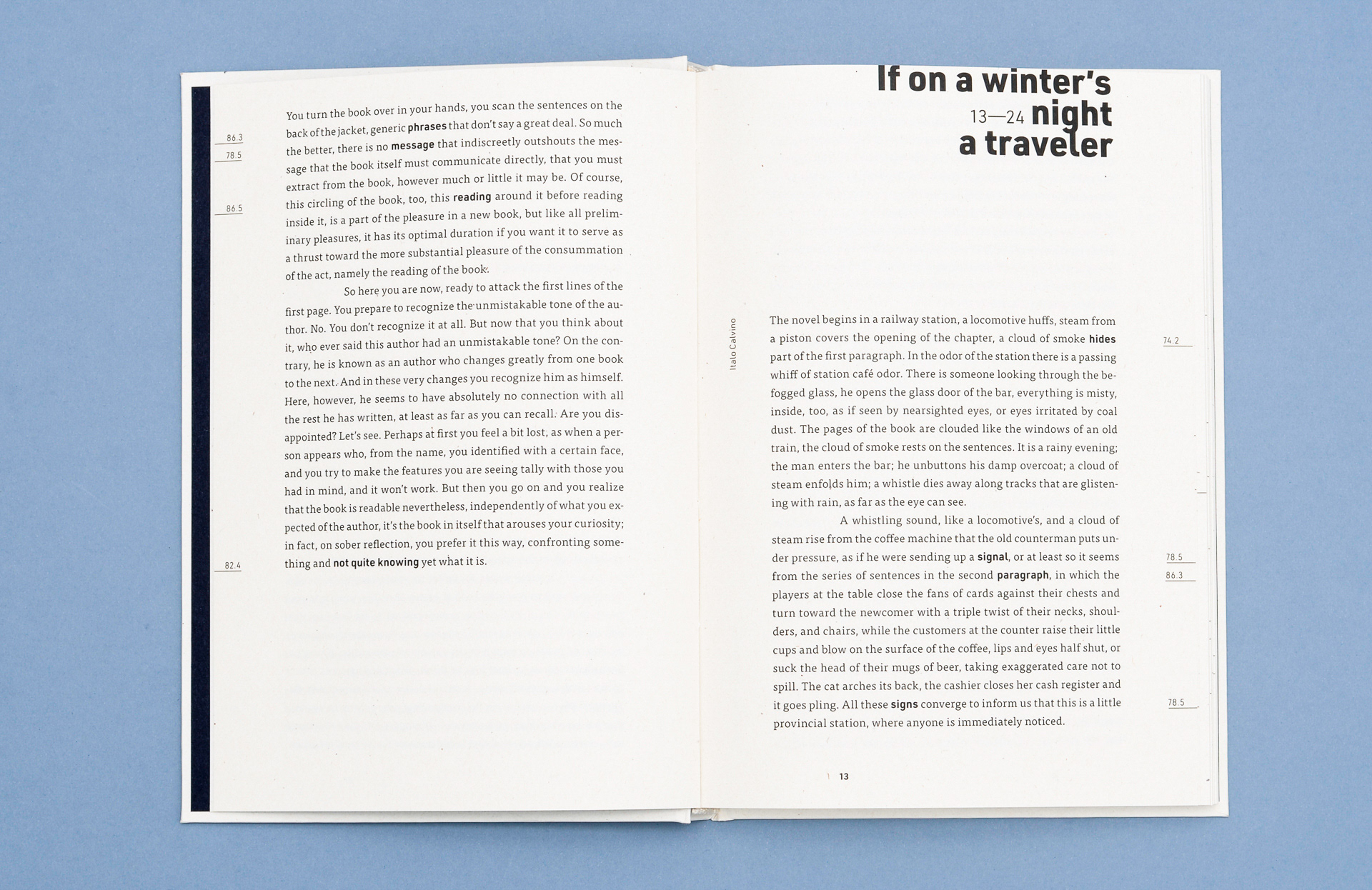
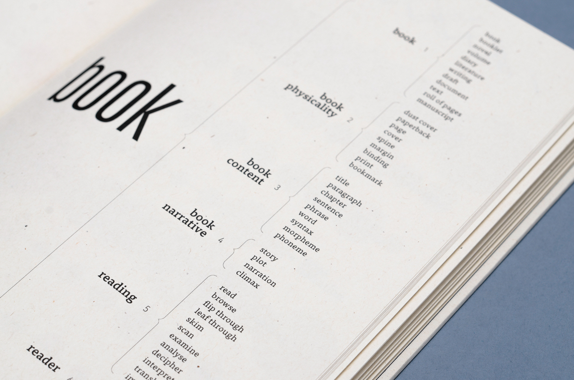
These two books are about a book called “if on a winter’s night a Traveler”. The first book contains the text of the novel and the second includes data visualisation taken from the text.
The first book has some keywords highlighted and some numbers on the margins that comply with the second book. The subtlety in this layout design I think is really beautiful the subtle highlights of the keywords in a different typeface work really nicely. The layout of the paragraphs are different to your traditional book, rather than the new paragraph starting at the margin of the book it starts in a little bit. This subtle change in the way that the paragraphs are set out I think are lovely.
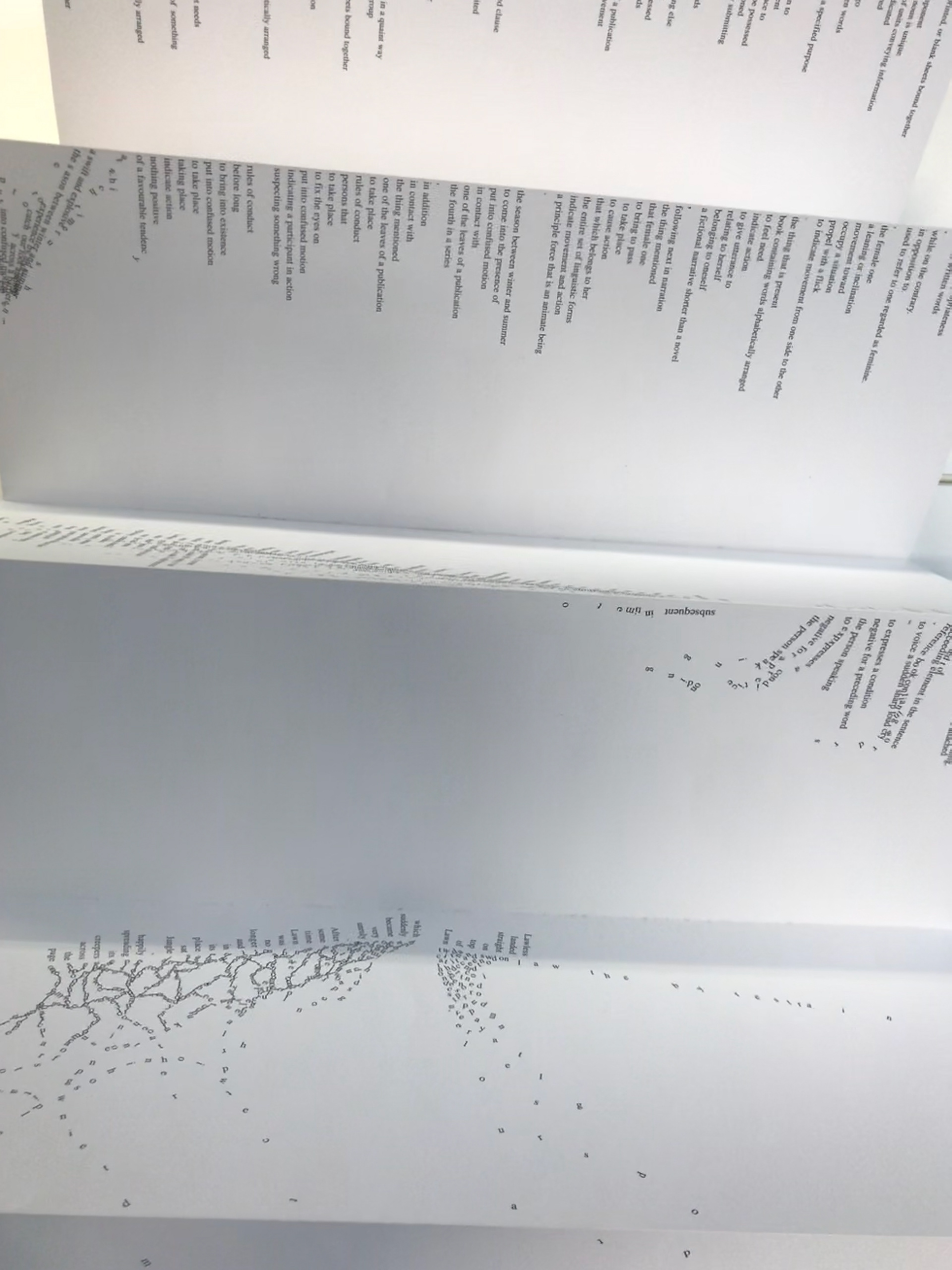
The second book is my favourite out of the two. It has all the data to do with the book and I love looking at data. For example with the amount of words which repeated the more lines there on that specific page to more times that word was used. Another good example is that of male character speaking versus female character speaking, I think it’s interesting to see how it’s all laid out. The colours work really nicely and it’s clear that it’s been well thought about with the margins, text, potion of the key and line separating sections, it just looks beautiful together. As with some of the other data visualisation pages each design is so neat and has a certain structure to it. Whilst each page is different you can tell that they all link up and just overall feels that the designs fit with each other.
Bad Design
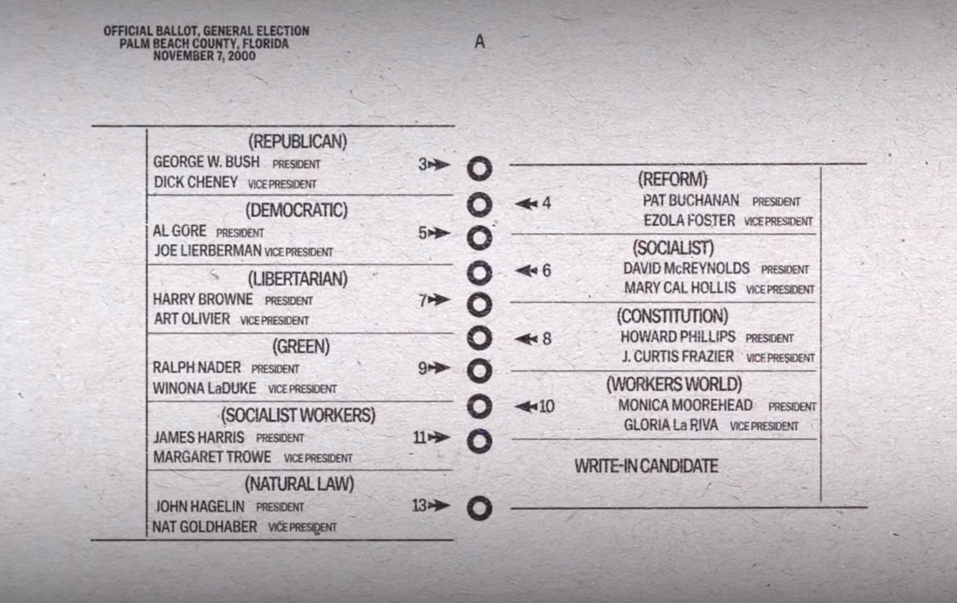
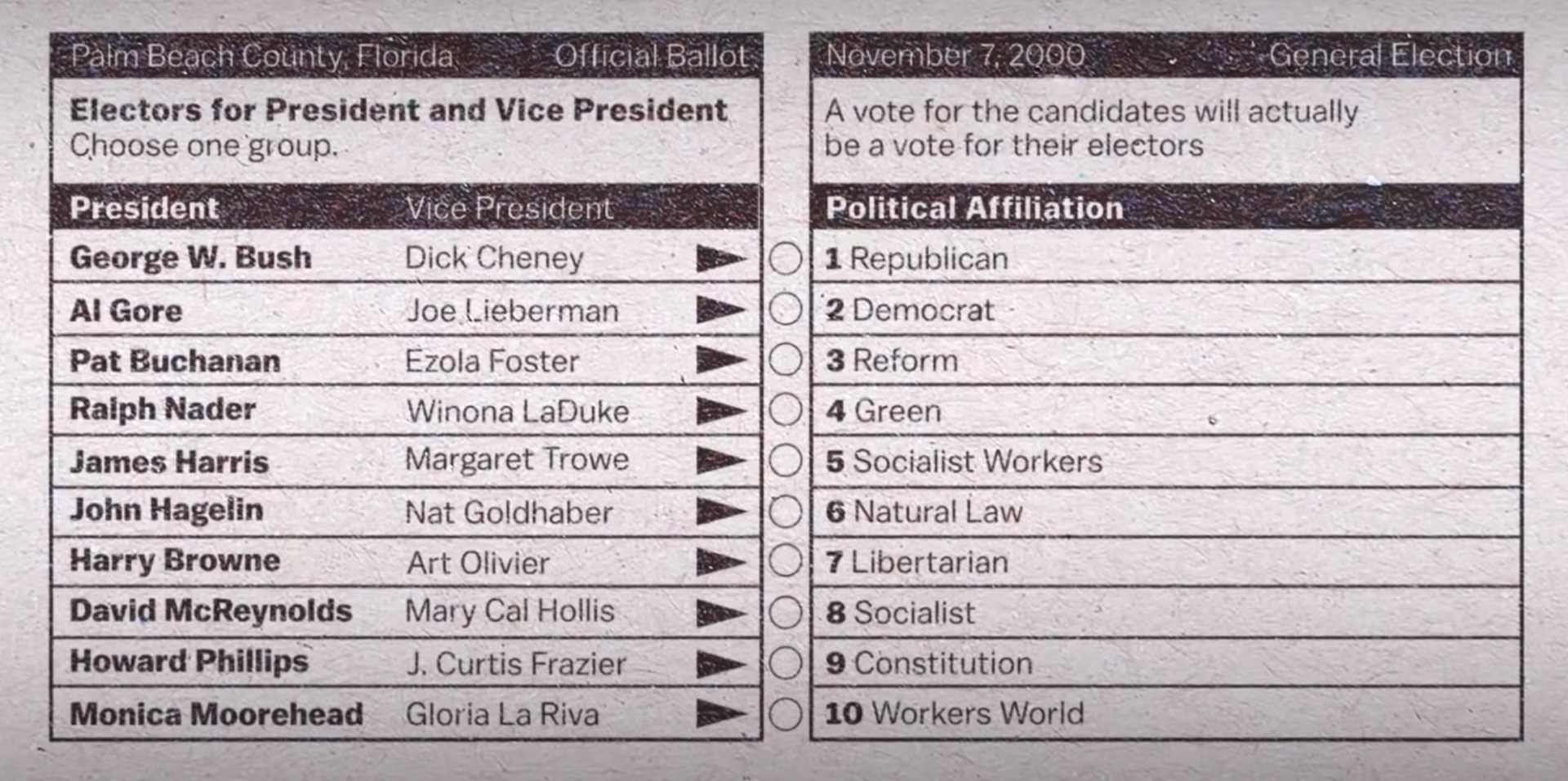
This was the ballot for palm beach county in the 2000 US presidential elections. (LEFT)
Bad layout design made the residents of palm beach country file lawsuits against the government as many residents either voted for Pat Buchanan thinking they were voting for Al Gore or punched twice after realising their mistake meaning their vote didn't count. Bush only won Florida by 537 votes and this bad layout design could have change the course of US history.
An alternate was created (RIGHT) by Michael Bierut which uses the same layout space but instead ads all names to one side to avoid confusion.
This poor layout design shows that have a thought out layout can prevent mistakes from happening. I chose this because it's a key examples of where bad design can have terrible effects.