I do feel as if I had more time I could have been nice to explore an interactive map idea that could be shared around easily and very user friendly so people can understand it.
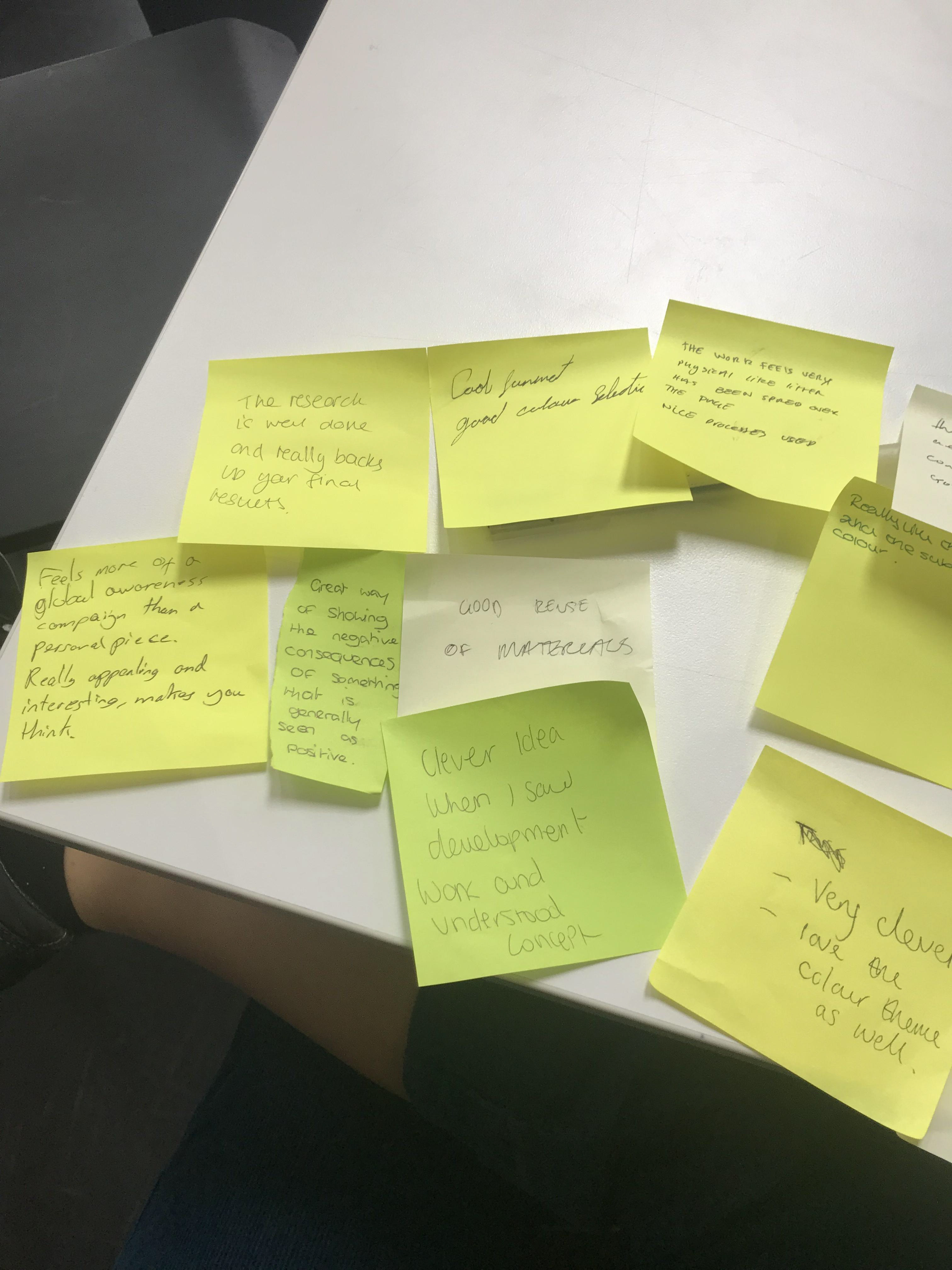
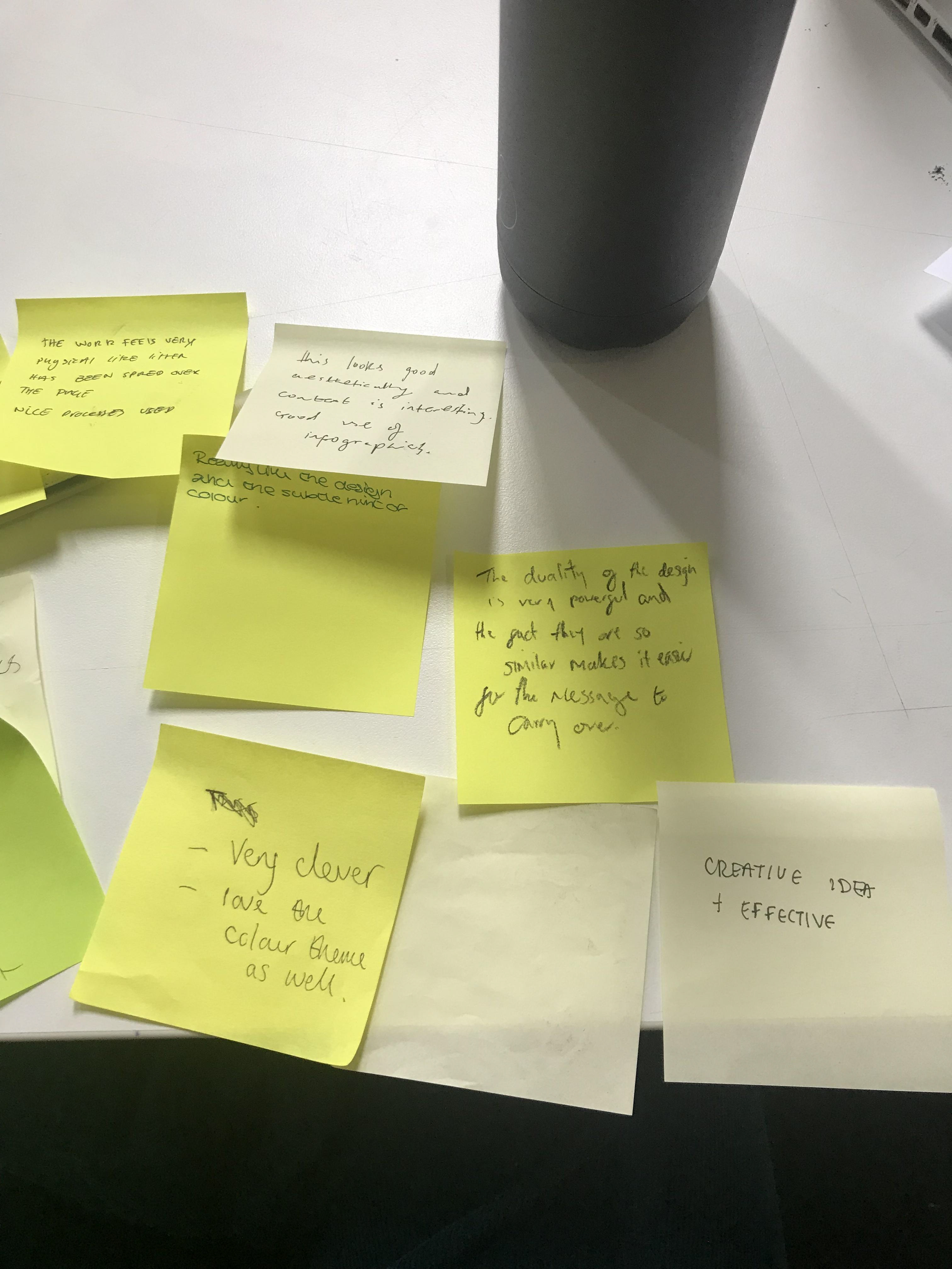
I'm really happy with the feedback. I feel as if people really understood it (with a little context). The fact they thought it was clever but also visually appealing made me think I'd done what I'd hoped to achieve. I was able to get people thinking, and to educate using a medium which wasn't just words.
The whole point of this it to show both sides to tourism (quite like how you have to physically turn over to the other side to see this). It's a sign that things need to change and opens peoples' eyes to how mass tourism and rubbish occur together.
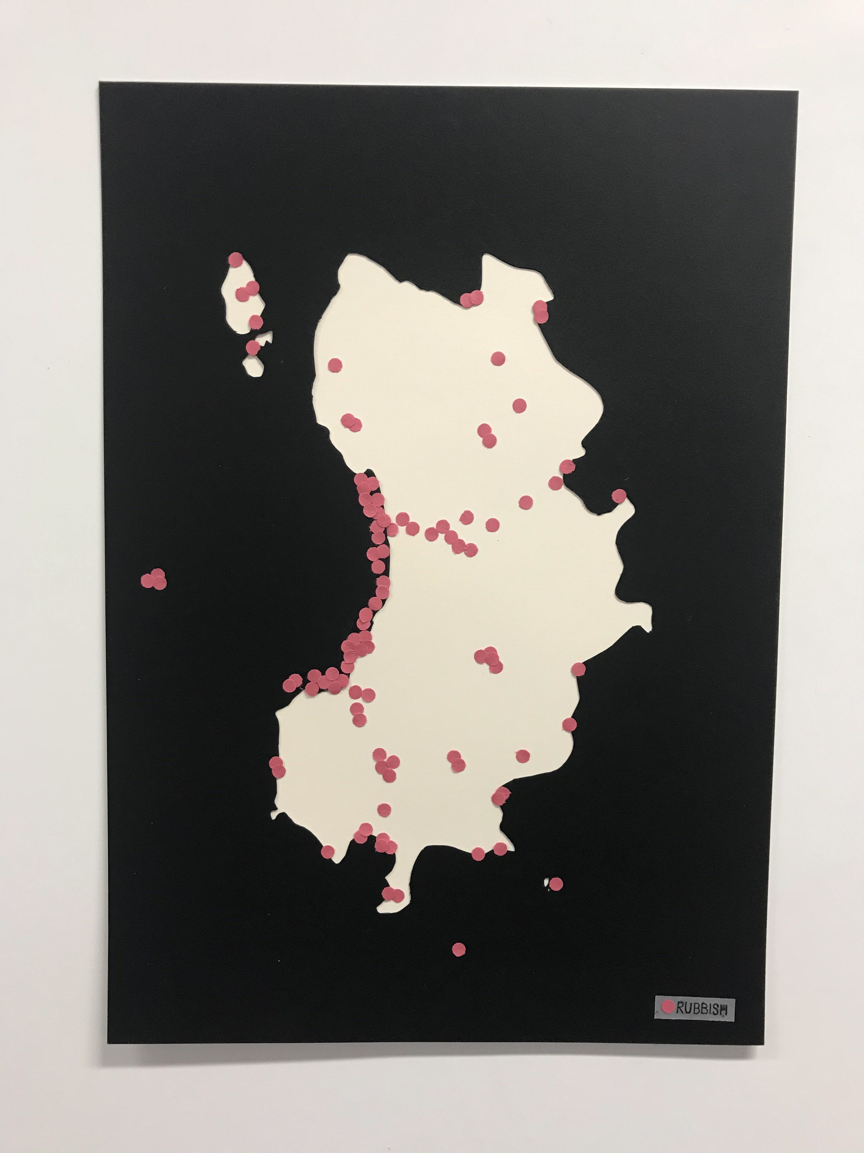
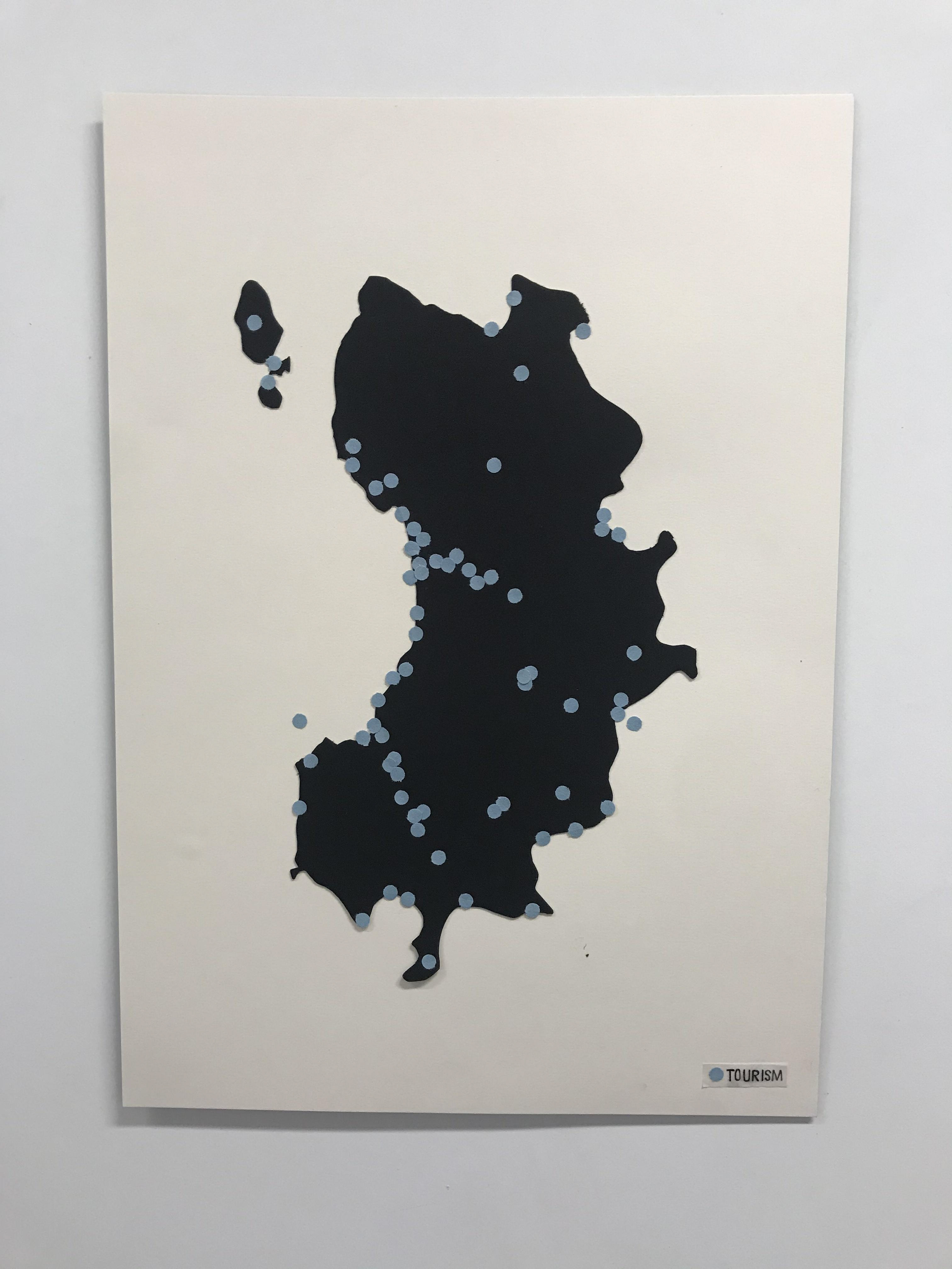
I used a hole punch to cut out perfect circles.
The red to show how alarming the pollution is and the blue to show the tourism and give a calm appearance.
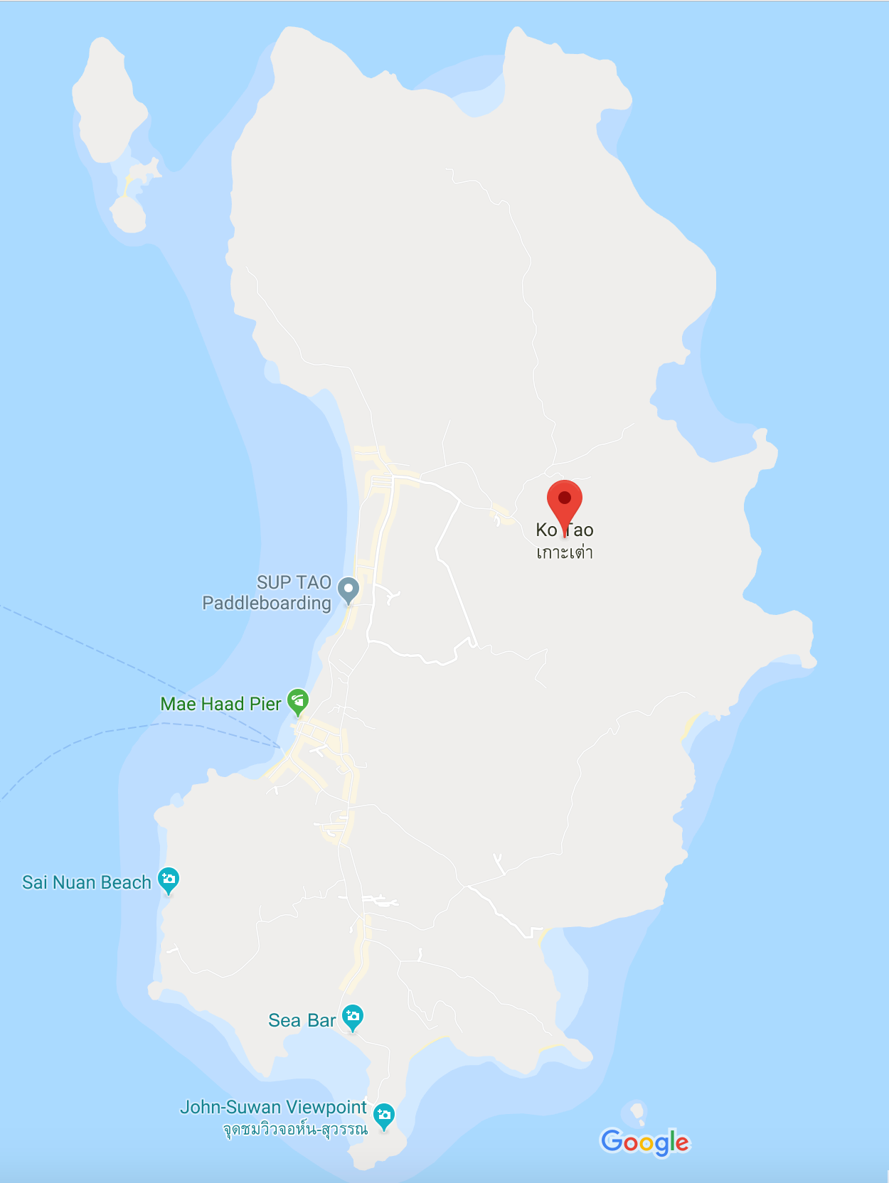
I tried looking at where rubbish is dispersed on the island, but I couldn't find anything. So I made an educated guess as to where the most tourism is and thus the rubbish as well. I also added some to bays as it can accumulate there.
I tried to find the patterns of sea currents in the area to see whether that would help but I couldn't find any data to help me with this.
As I was cutting rather than having just one map I thought of having two. This meant I could have one side with rubbish and one with tourism. Which I know may contradict what I said below but having them on separate sides shows the different sides to mass tourism on Koh Tao.
It would also mean I'm not wasting as much material (always a bonus).
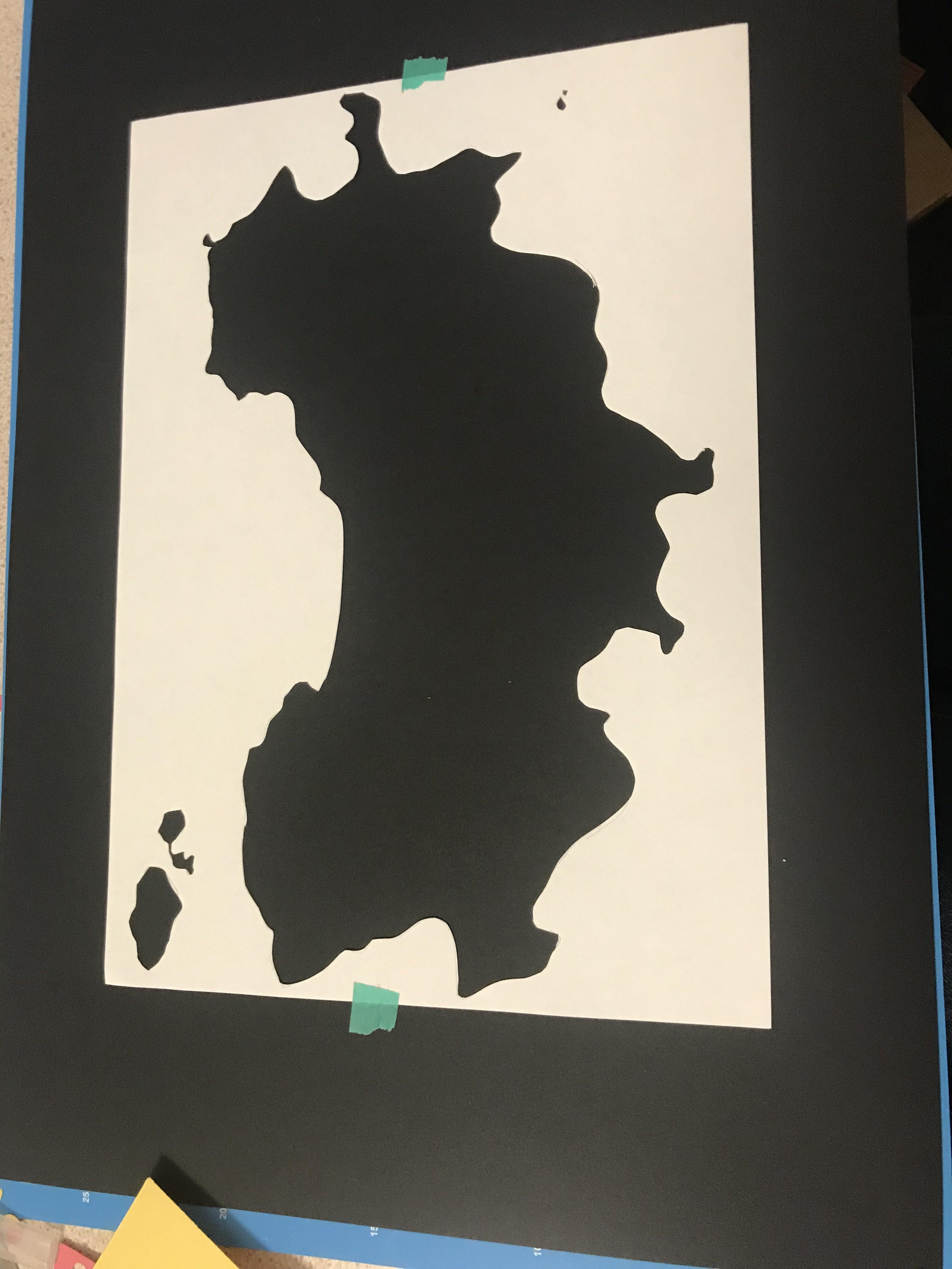

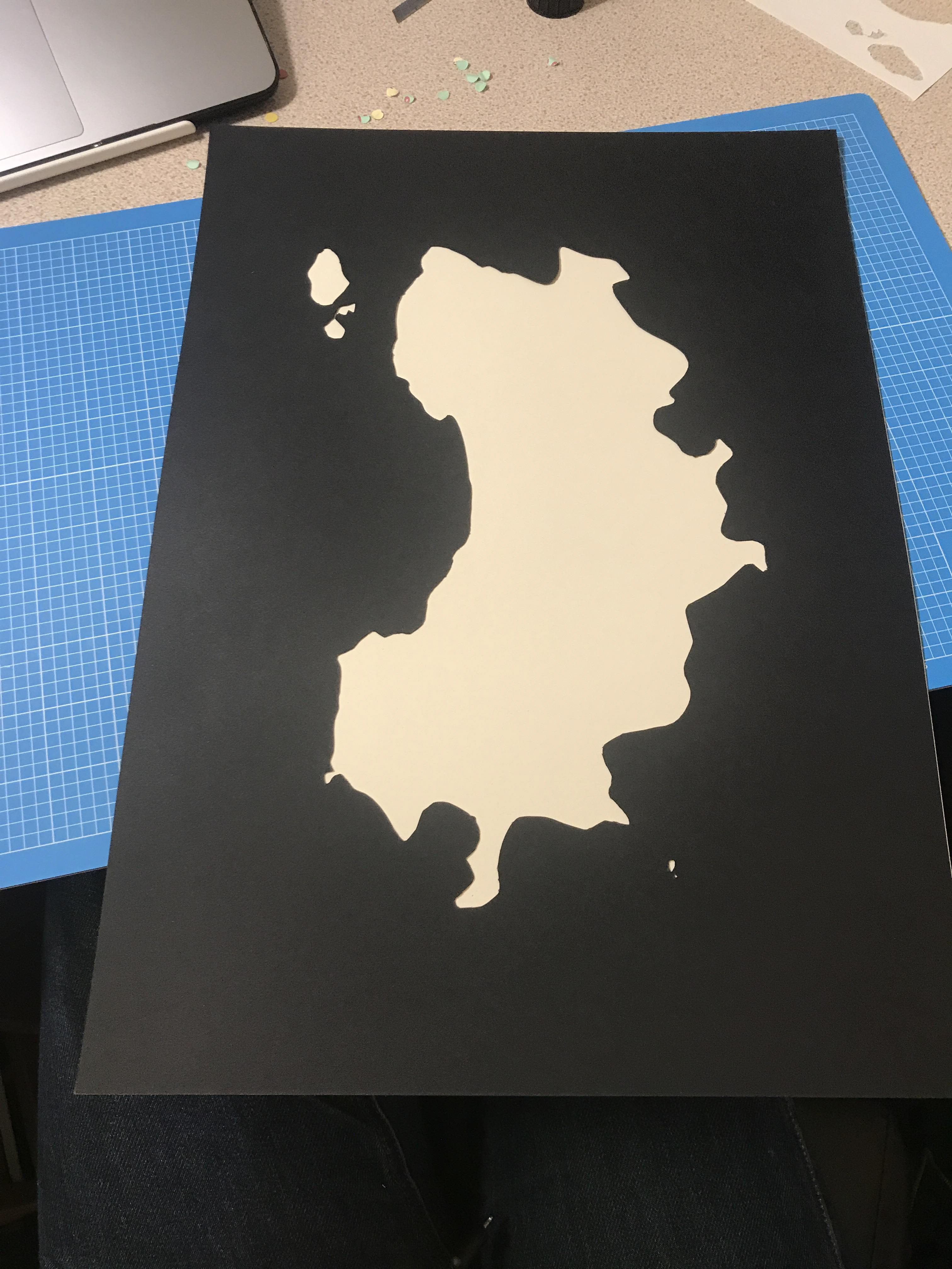
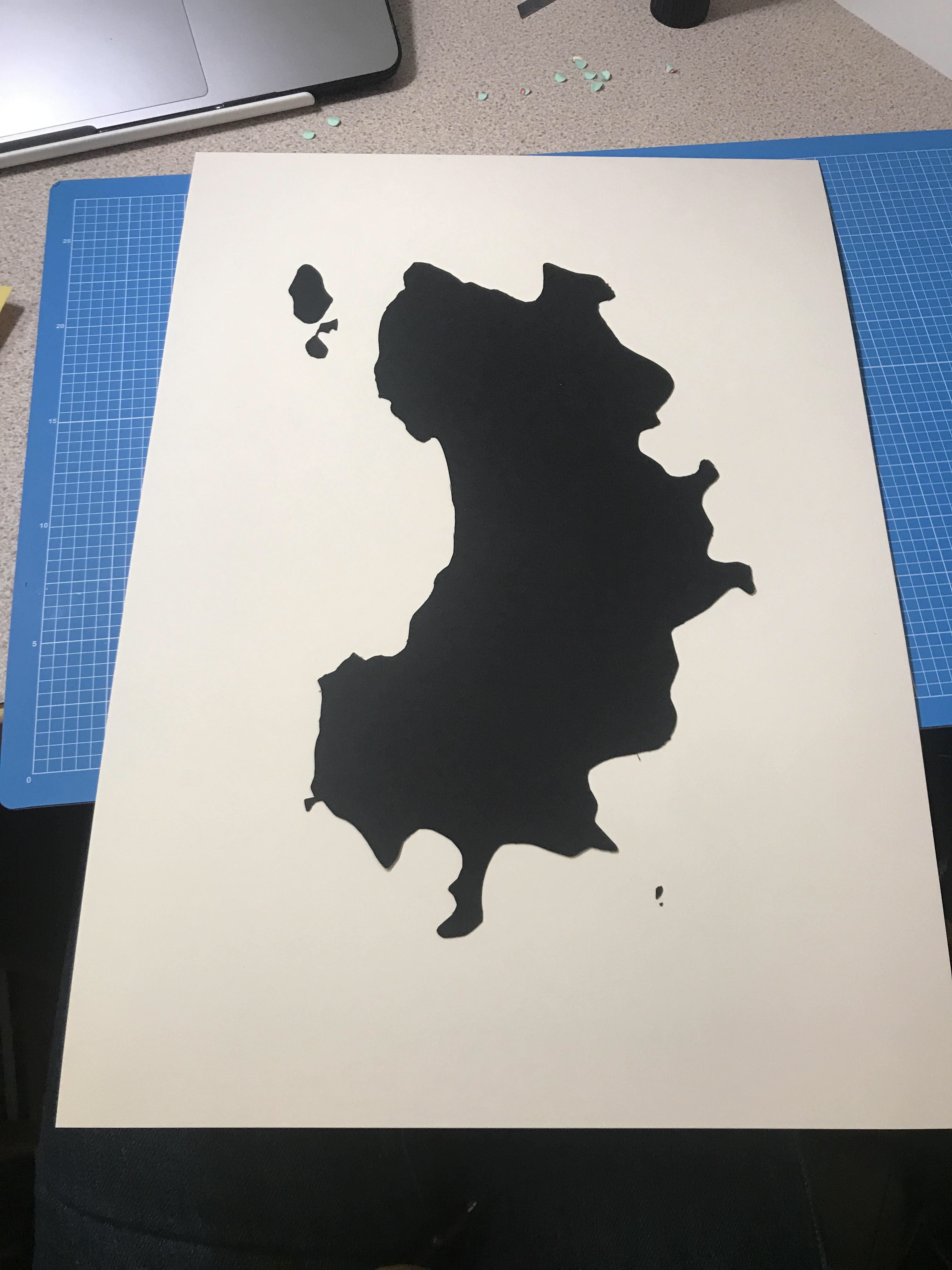
From the A4 piece of paper I made a stencil and cut out Koh Tao.
I chose black and white paper as I didn't want to distract from the main objective in this project. I'd rather have the colour come out in the way i'm going to show the data.
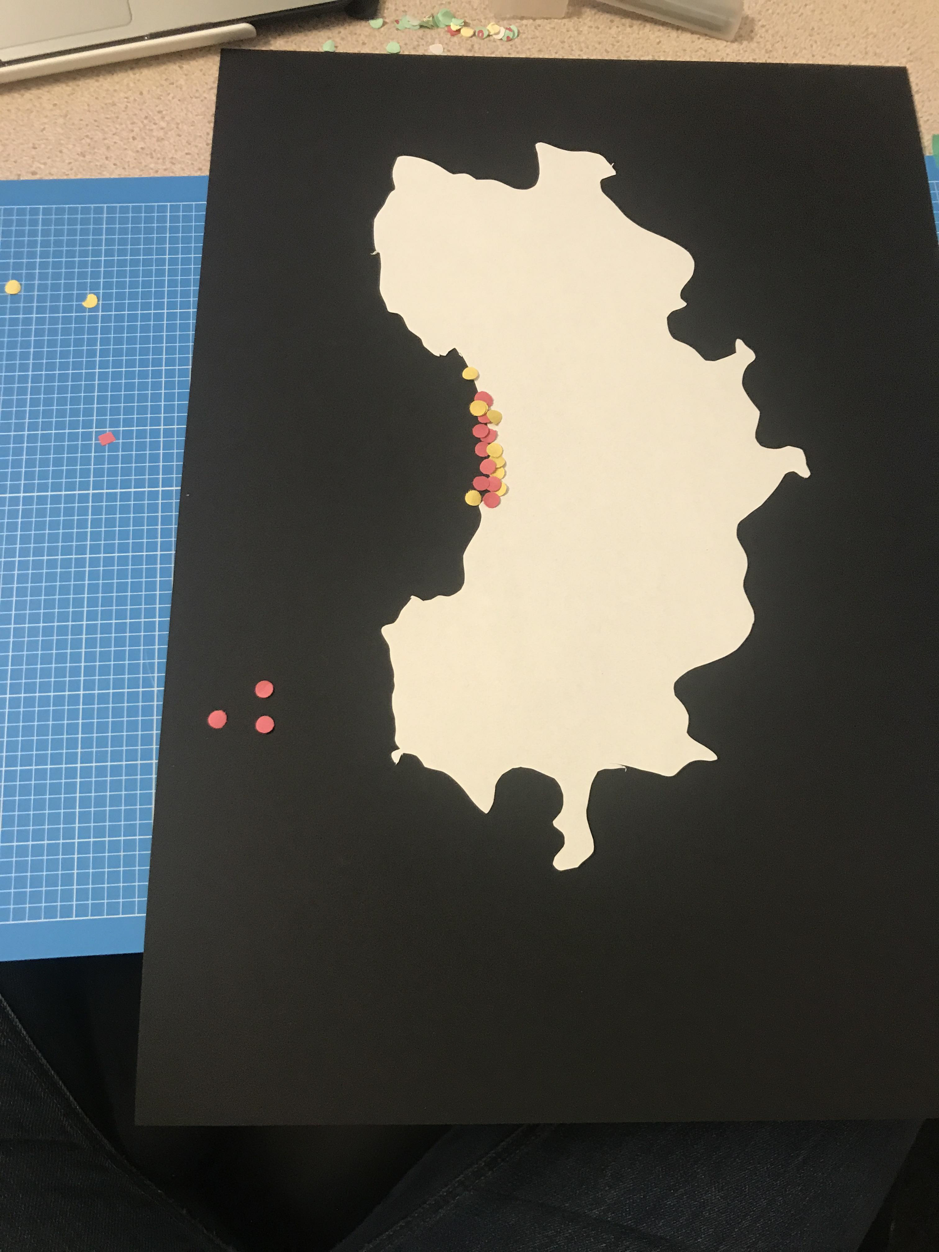
I tried out a test of cutting out an A4 piece of paper in the shape of Koh Tao and tested some dots to see how I could show the rubbish/pollution.
I think layering them in the same area could be a nice idea to show how close they are to each other and how one affects the other

This was a quick test of using a paper cut out to show the map of Koh Tao. My idea would then be to put x's or circles/dots to demonstrate the tourist areas and to link them with the build up of rubbish on the island.
I like the idea of working with paper as it's something you can feel, and if I end up layering dots this would work nicely. Whilst digital work is my comfort zone I want to work outside that area, and I do believe something handmade has a different feel to a print out in the way this work would end up.
I also feel like the use of cut out paper relates to matisse's work. Whilst it may not very similar I think it fits with an art style that holly likes as it's something you can actually feel and get a greater sense for than if it were digital. The use of simple shapes is something Holly has said she likes so feel like this style will fit well with her interests.
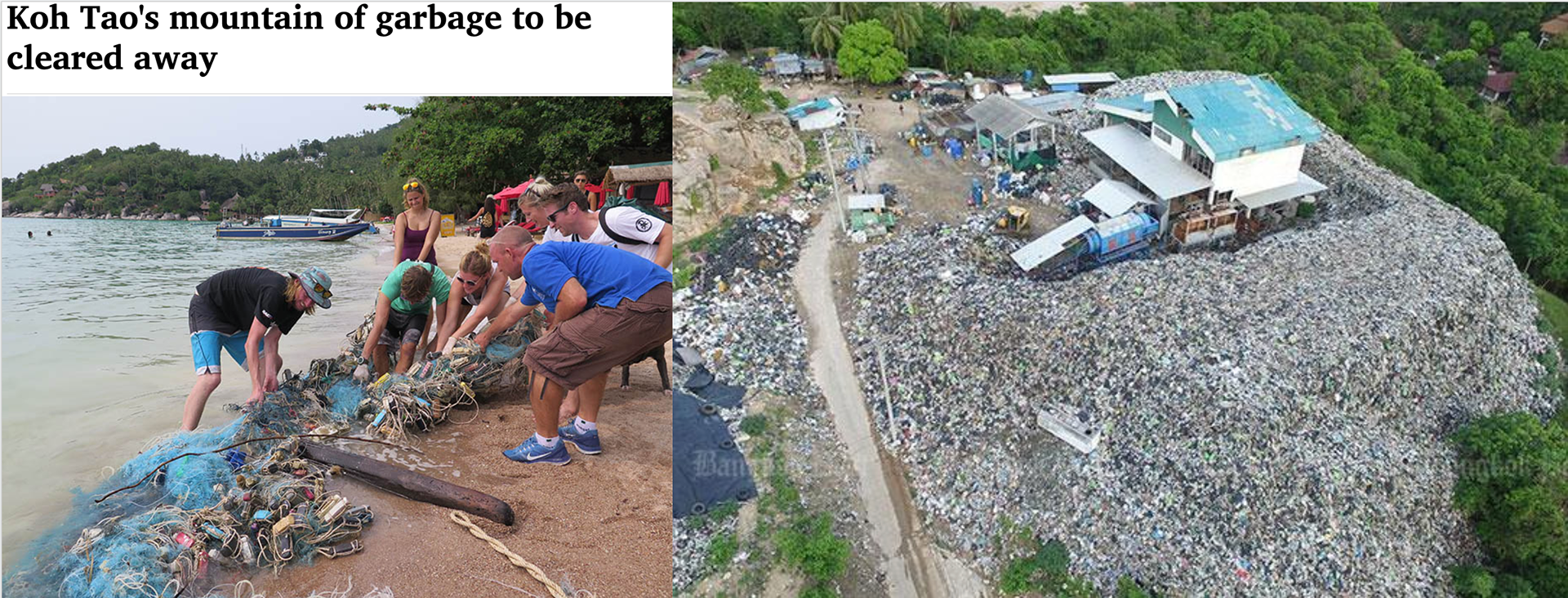
I wanted to look to see if I could find some proper evidence about Koh Tao and it’s rubbish problem. It’s clear they had a problem as images come up about the ‘mountain of garbage’ as well images of rubbish pollution in the sea. Articles that came up spoke about how it was all cleared up. However that was from 2018 and Holly spoke about the rubbish pollution having been there in 2019. I also found some forums talking about how it hasn’t been cleared.
Some people also complained about the island smelling in certain areas. The incinerator on the islands in that area doesn’t work, so a lot of the rubbish piles up as it has to be shipped to the mainland. With pollution on the increase and no sign of serious attempts to ensure sustainability on the island it doesn’t seem like this problem will be solved any time soon…
HowMuch. (2019). Top 18 Data Visualisations of 2018. [online] Available at: https://howmuch.net/articles/top-18-data-visualizations-2018 [Accessed 25 Oct. 2019].
Thailand Visa Forum by Thai Visa | The Nation. (2018). Koh Tao and its mountain of garbage awaiting disposal. [online] Available at: https://forum.thaivisa.com/topic/1058291-koh-tao-and-its-mountain-of-garbage-awaiting-disposal/ [Accessed 25 Oct. 2019].
Thaiger, T., Thaiger, T., Pulitzer, G. and Thaiger, T. (2018). Koh Tao finds a way to get rid of its trash | The Thaiger. [online] The Thaiger. Available at: https://thethaiger.com/news/samui/koh-tao-finds-a-way-to-get-rid-of-its-trash-2 [Accessed 25 Oct. 2019].

Here are a couple of examples of data visualisation that I think are effective in that you get the idea of it pretty quickly and don't need to do a lot of searching to understand it. I want to go down this route of demonstrating data as for me personally the climate and it's future is a topic close to my heart and I believe there need to be changes.
Most importantly, I wanted to link my piece to something that Holly was interested in. I think by finding a way to show the impact of mass tourism while at the same time illustrating the effects of pollution on the island is a good way of showing a part of what Holly is interested it but also things I am passionate about too.
McCandless, D. (2009). Information is beautiful. London: Collins.
HowMuch. (2019). Top 18 Data Visualizations of 2018. [online] Available at: https://howmuch.net/articles/top-18-data-visualizations-2018 [Accessed 25 Oct. 2019].
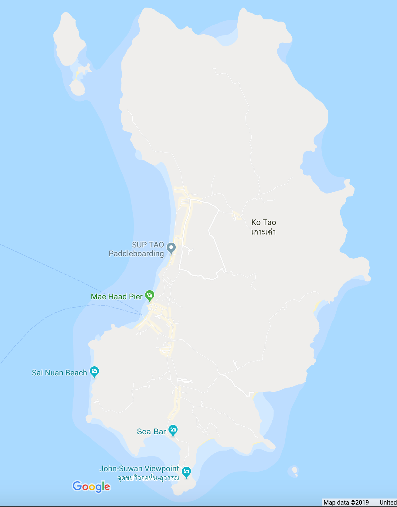
After getting some feedback I came up with the idea of doing a map to visualise tourism on the island of Koh Tao as well as illustrating the rubbish associated with it. The reason for this was that Holly went to Koh Tao 2012 and talked about how beautiful it was but that when she returned in 2019 it was badly polluted.
Whilst I haven't done as much development as the Byron Bay idea, I feel as if what I can produce with this idea would be more interesting and I would end up with a better response. It's an idea that I am more excited about to be doing as it whilst it links to Holly it in part has my interests (I care for how the planet is treated).
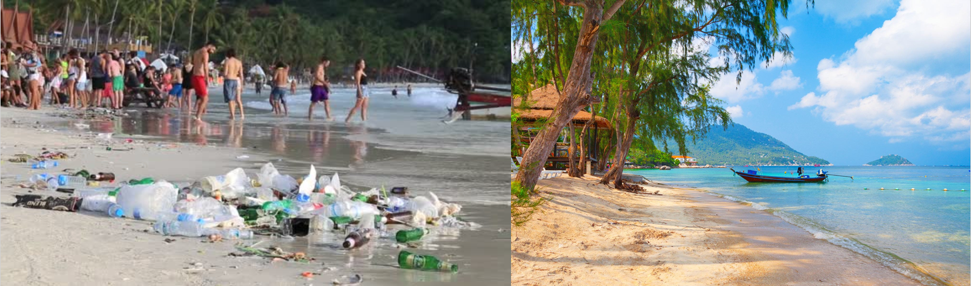
Another idea of mine - these are some initial photographs I gathered to see the two sides to Koh Tao island in Thailand. One is tranquil and looks so beautiful and the the other shows a beach party with rubbish all over, polluting the area.
This is the reality of mass tourism and something Holly noticed when she went back this year having been there previously around 10 years ago. There's a huge change in the cleanliness of the island which she spoke about and which can also be seen in the photographs above.
This clearly links to the idea of opposites - one of the first ideas Holly mentioned - by contrasting the beauty that attracts tourism with the rubbish it produces.

These pieces here link to Byron Bay.
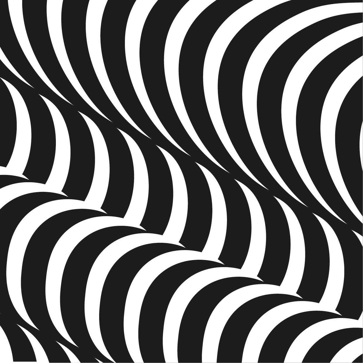
For this idea I wanted to focus on patterns. At first I was interested in finding the patterns found in clear water - where I got inspiration from the swimming pool illustration below. I feel like I could create a nice pattern of this if I developed it further. Having said that I think it would be nicer to create a 'clearer' sign as well as having something with a bit more meaning rather than it resembling sea water in a certain part of the world. Think it's a bit far fetched if I followed that idea.
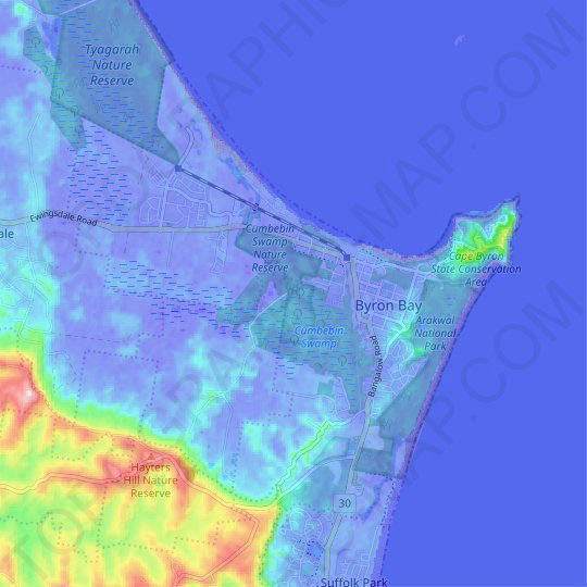
I then went on to look at the topography of Byron Bay - I thought with this I could still create some patterns while showing the contour lines there which, since she's been there, would resonate with her and possibly enable her to picture the places I was representing. I do think however it isn't the most exciting idea for a sign representing Holly as it's not like she said she loves the topography. But then again it could be a reminder of a place she really likes, presented in a more playful way, as I could do it in a style she likes and it would be a more artistic map of a place she loves.
Bay, B., maps, T., Wales, N., Valley, P., Bay, B., Byron, C. and notice, L. (2019). Byron Bay topographic map, relief map, elevations map. [online] topographic-map.com. Available at: https://en-au.topographic-map.com/maps/j8sj/Byron-Bay/ [Accessed 26 Oct. 2019].


These are some quick pen and ink drawing I did to symbolise different ways I could symbolise water. My favourite is the the one on the left because I could image it looking nice as a large water print pattern. The middle one is a well-known Japanese pattern (recently cleverly adapted for the Rugby World Cup) that is sometimes used to represent water, so I thought I'd try it. Even though I've done it poorly I think it's a beautiful pattern but unfortunately not suited to this project as it doesn't link to Byron Bay. The one on the right was nice to paint and could potentially work it into a pattern of some sort but I think the drawing on the left is a stronger image and I would rather work on that.
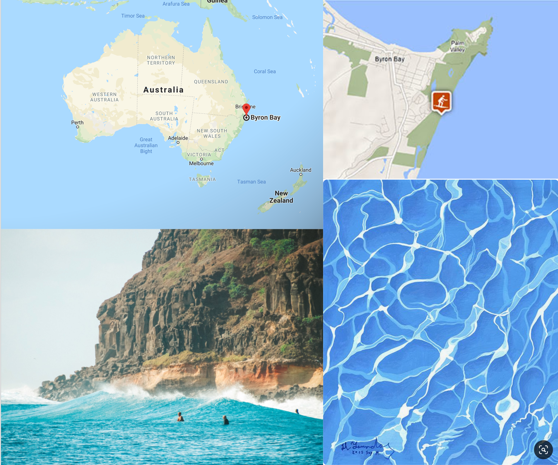
These are just some initial ideas I got for Byron Bay, another of Holly's favourite places, the water painting gave me the idea of doing a water pattern and the bay gave me the idea that I could potentially make a map as a sign.
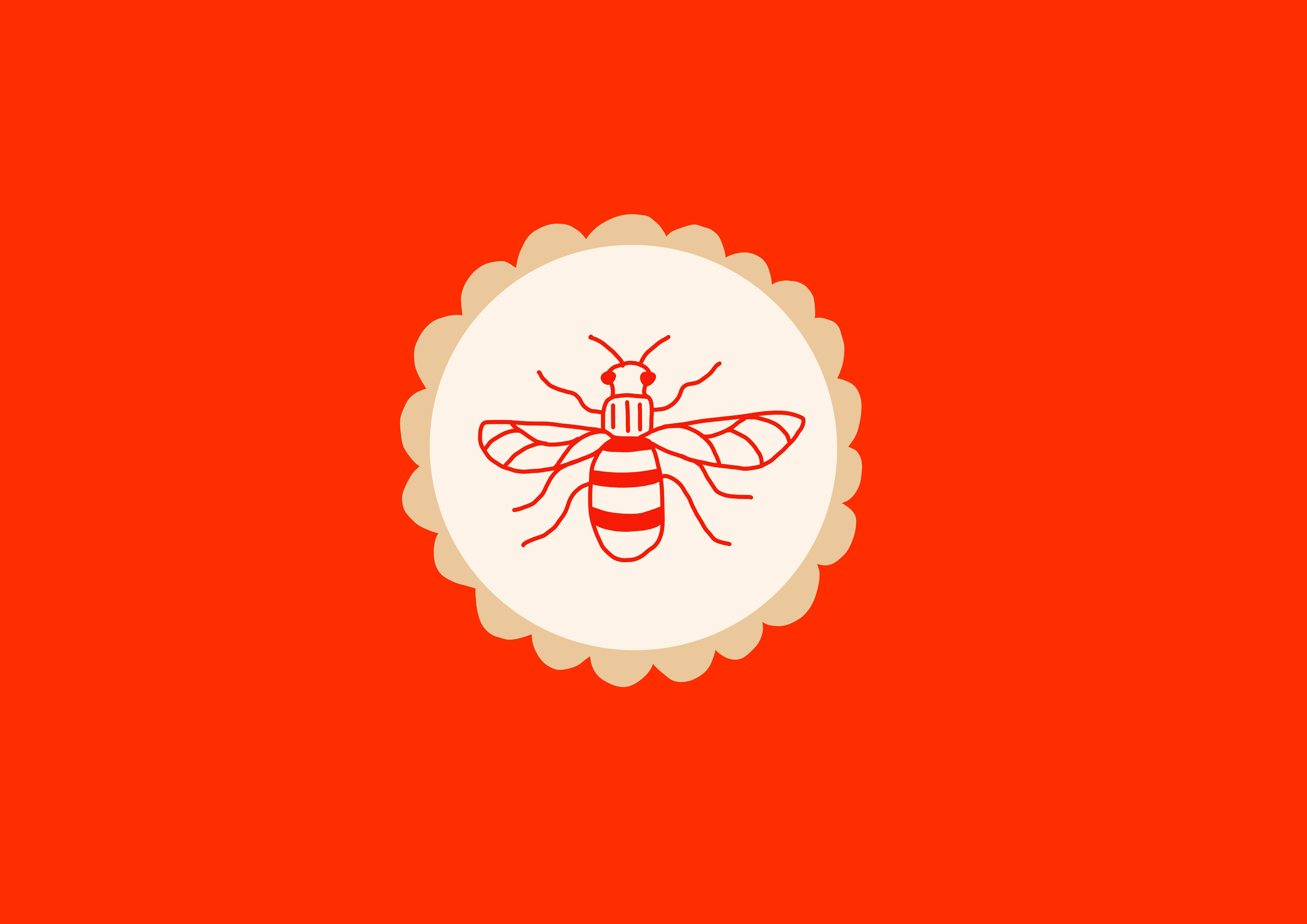
This was a very quick idea and not something to take too seriously, but it does I guess represent both sides to places Holly has lived in and does live in now. I think possibly developing this idea into a more pictogram style could benefit this idea. I do think however my other ideas are stronger and I will likely pursue those instead.
These two are linked in the sense that Manchester is where Holly lives now but Bakewell is where she grew up. Both have different meanings to her but, could be interpreted as old-new.
Here are some symbols and signs from two books I have which represent different symbols and signs.
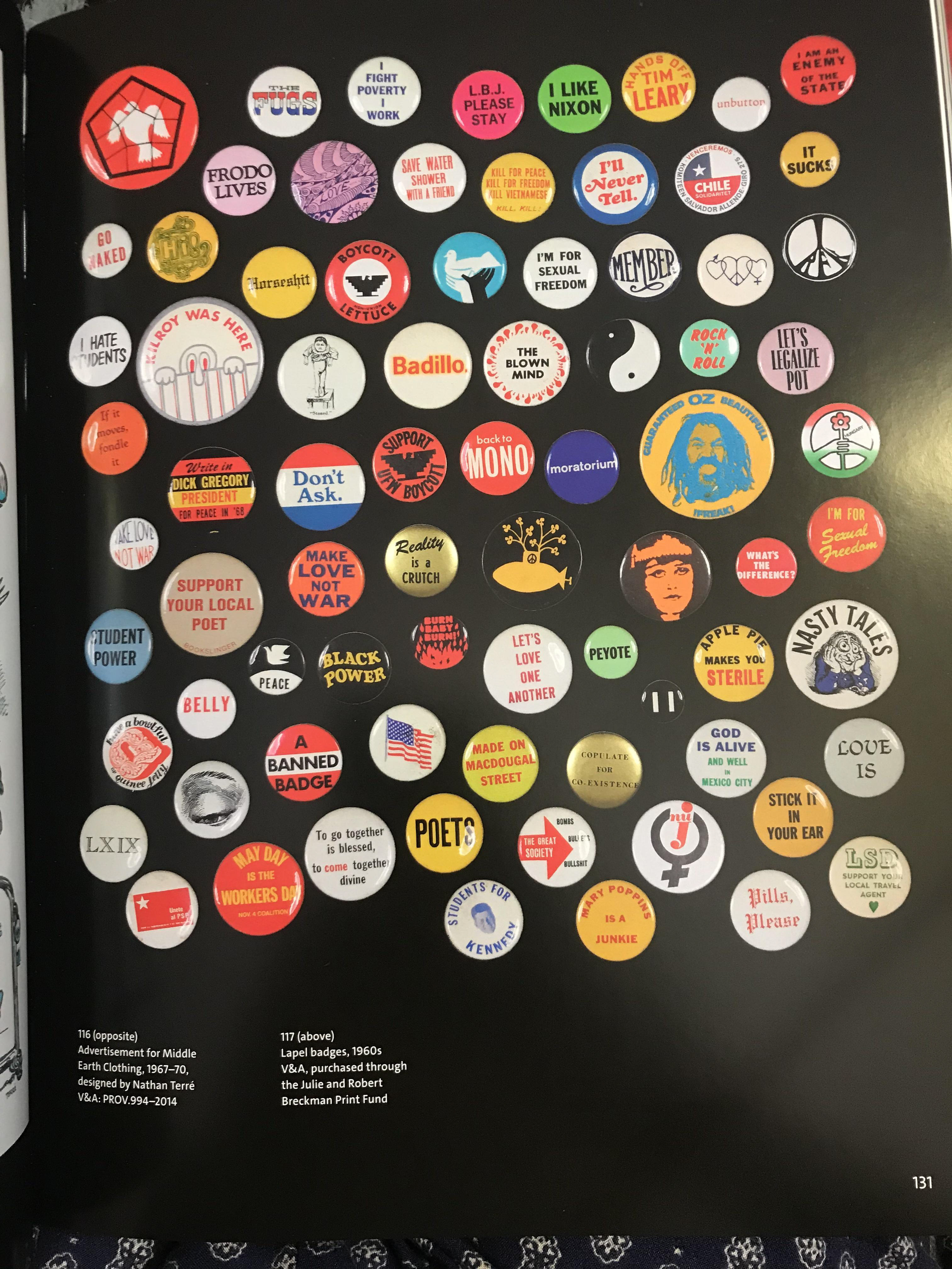
The 1960s were a big time for standing up for what you believe in (no way was it perfect - lots of tragedy also). What came with it was artwork to do with what was going on in politics and society as a whole. The badges in the first photograph are such a great collection on a mixture of topics. They all symbolise different movements/people/phases/logos, and I think they're a good way of showing different signs. For example, the ying yang one is instantly recognisable, which is exactly what you want a good sign to be: you want to be able to know what it's about in the first few moments.
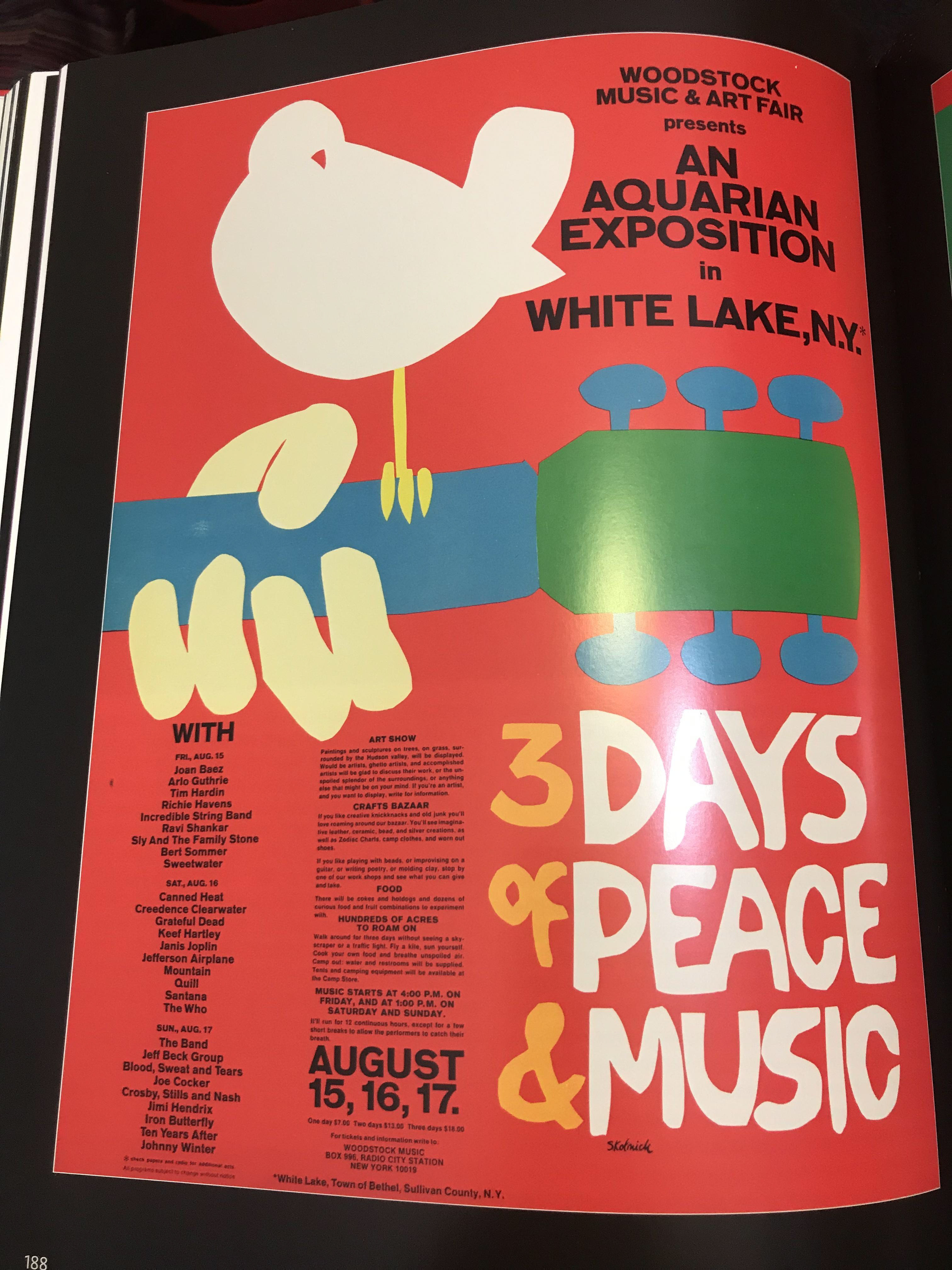
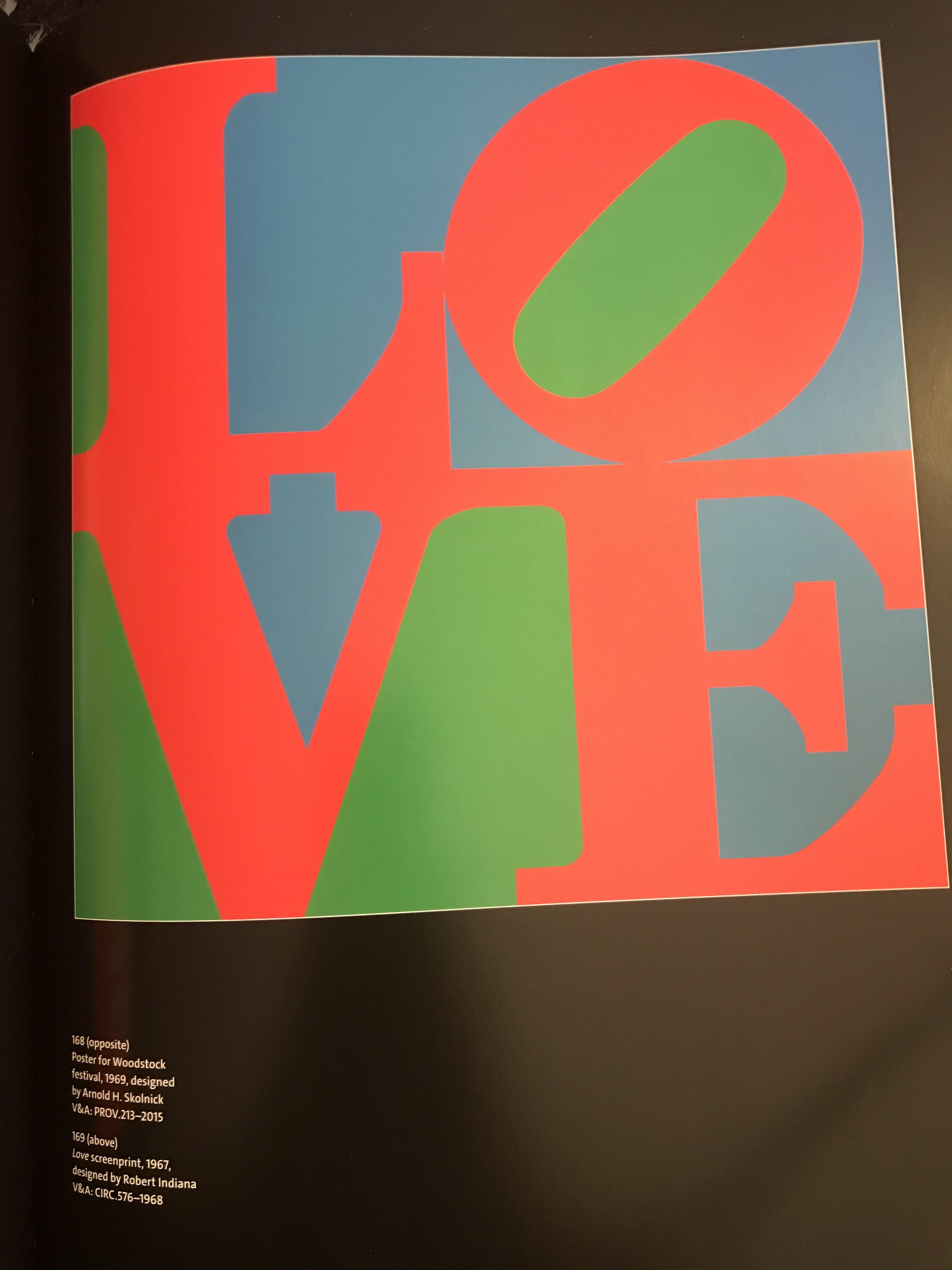
Then there's the poster for woodstock - a massive symbol of bringing people together for a celebration of peace and music. It's gone down in history as being a kind of symbol for coming together.
The Love piece is something most people recognise. I like the meaning behind it. In a time of difficulty it was a symbol for many things - for example it may have been seen as a sign hope whilst there was an uneasy political climate. Even though I like the meaning behind it I'm not an actual fan of the piece - I don't like the colours and I think it's a little childish. However I think that about other pop art pieces, which is a shame but it might be due to the fact of how overused it all is.
You say you want a revolution?. (2016). London: V & A Publishing.
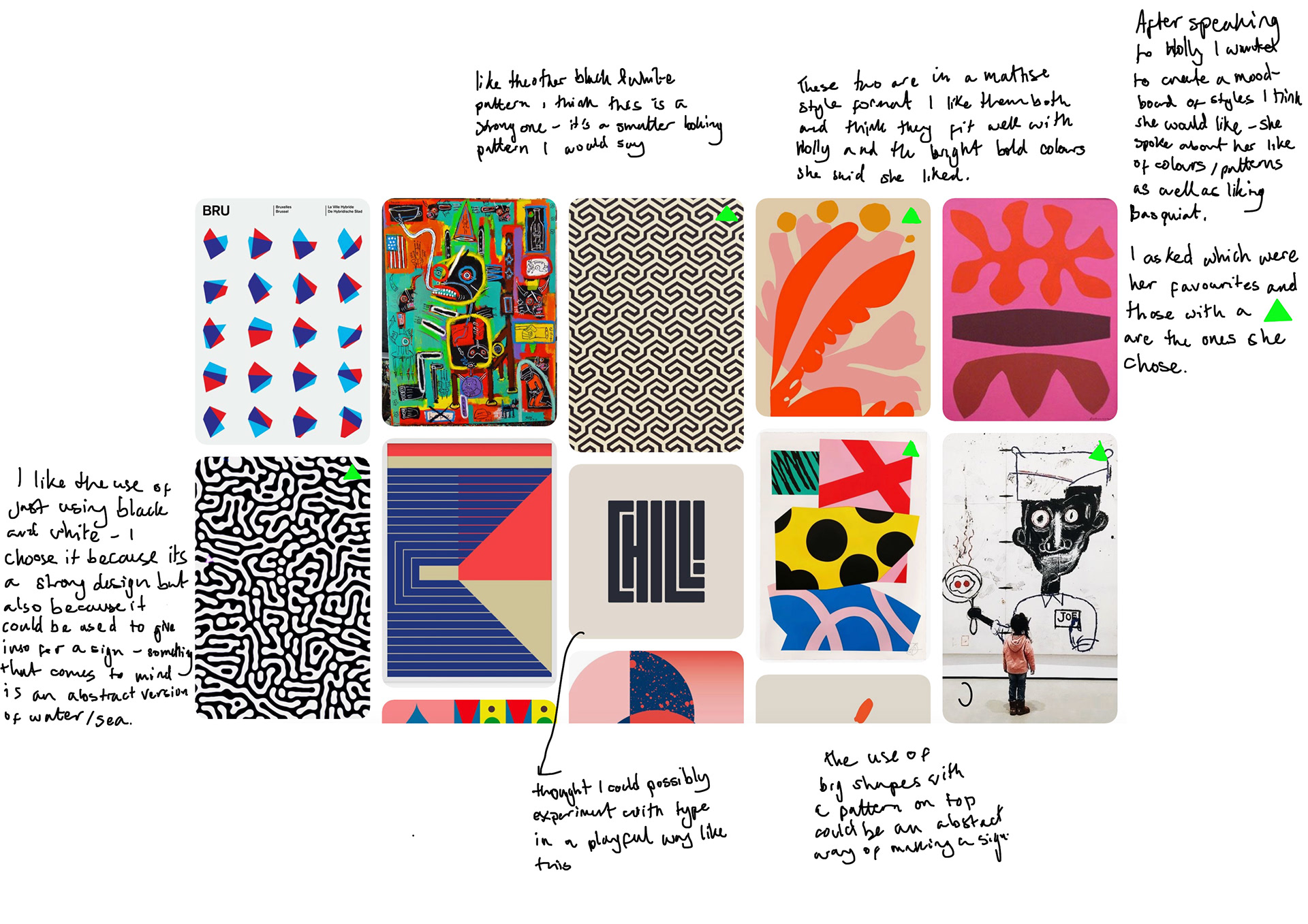
Styles that I think Holly would like for her sign.
I want my finished piece to reflect the style of work Holly likes in one way or another - I think I'm likely to go down a simple route, trying not to over-complicate things and possibly introduce a patterns at some point. I like the idea of doing something abstract but want to develop my ideas further so this may not end up being the case.
Left to right:
Club Sandwich. (2019). Club Sandwich — Hybrid City. [online] Available at: http://www.clubsandwich.cc/hybrid-city/ [Accessed 25 Oct. 2019].
Club Sandwich. (2019). Club Sandwich — Hybrid City. [online] Available at: http://www.clubsandwich.cc/hybrid-city/ [Accessed 25 Oct. 2019].
Sesow.com. (2019). 31 Days in July : Matt Sesow. [online] Available at: http://www.sesow.com/31days.htm [Accessed 25 Oct. 2019].
design indulgence. (2019). ANSWERS. [online] Available at: http://designindulgence.blogspot.com/2013/01/answers.html?utm_source=feedburner&utm_medium=email&utm_campaign=Feed:+blogspot/ysNDK+(design+indulgence) [Accessed 25 Oct. 2019].
Instagram. (2019). marleigh culver on Instagram. [online] Available at: https://www.instagram.com/p/BmxJgVbhngi/ [Accessed 25 Oct. 2019].
Stop-the-helloworld.tumblr.com. (2019). Tumblr. [online] Available at: https://stop-the-helloworld.tumblr.com/ [Accessed 25 Oct. 2019].
It’s Nice That. (2012). Treat your eyeballs to some perfect posters by Christopher Gray. [online] Available at: https://www.itsnicethat.com/articles/christopher-gray-posters [Accessed 25 Oct. 2019].
Instagram. (2019). Lucas Fields on Instagram. [online] Available at: https://www.instagram.com/p/BckK0hNAfbt/ [Accessed 25 Oct. 2019].
Andy Welland. (2019). Loose Ends (16) — Andy Welland. [online] Available at: https://andywelland.com/shop/looseends16 [Accessed 25 Oct. 2019].
Jean-Michel Basquiat. (1983) Eyes and Eggs [painting]. Available at: https://sometimes-now.com/post/186474928193 [Accessed 25 Oct. 2019].
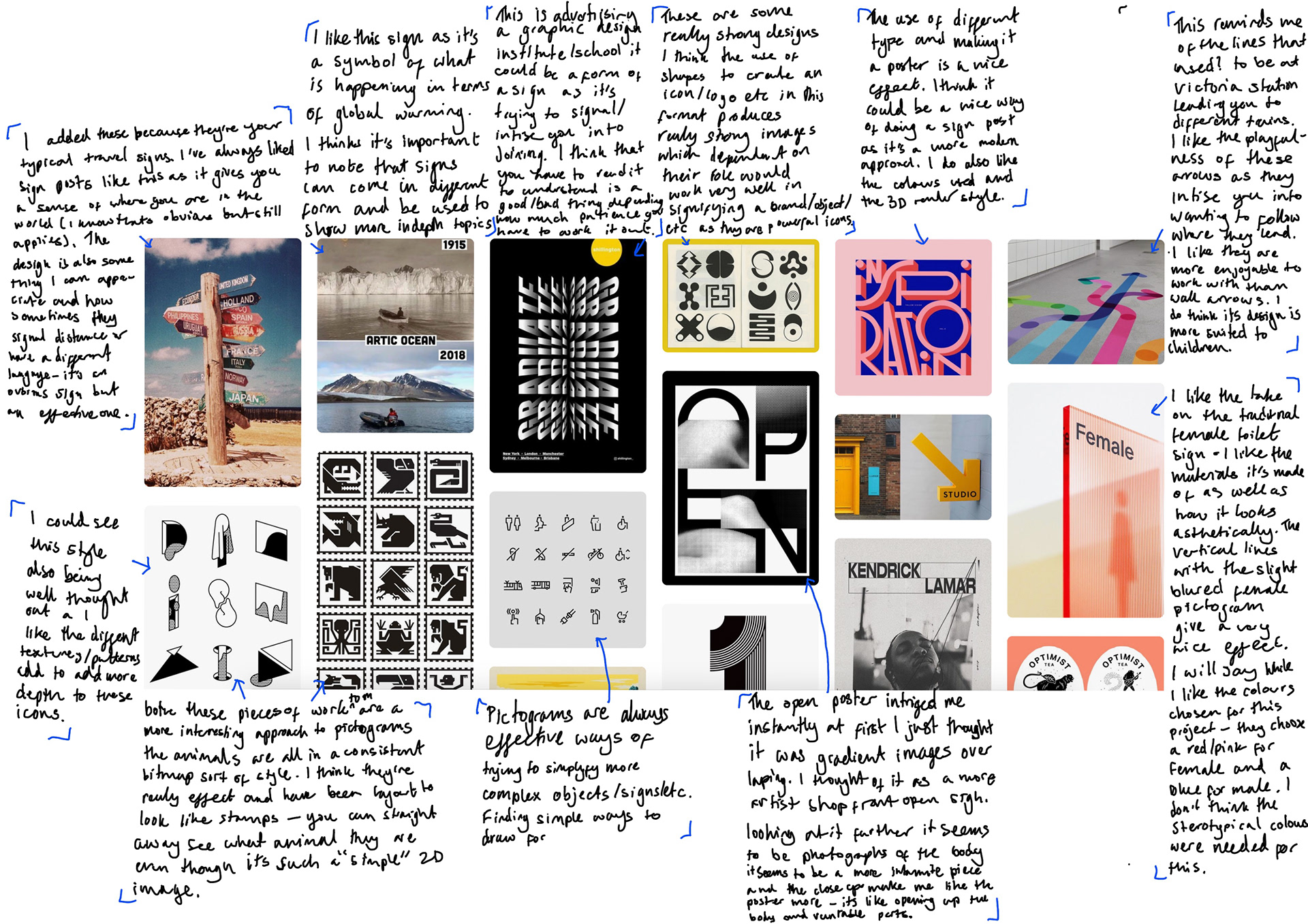
Interpretation of signs.
Left to right:
Medium. (2017). Caminhos fluídos. [online] Available at: https://medium.com/@ElisaMotta/carta-para-lilian-oliveira-c3fbca8d3bca [Accessed 25 Oct. 2019].
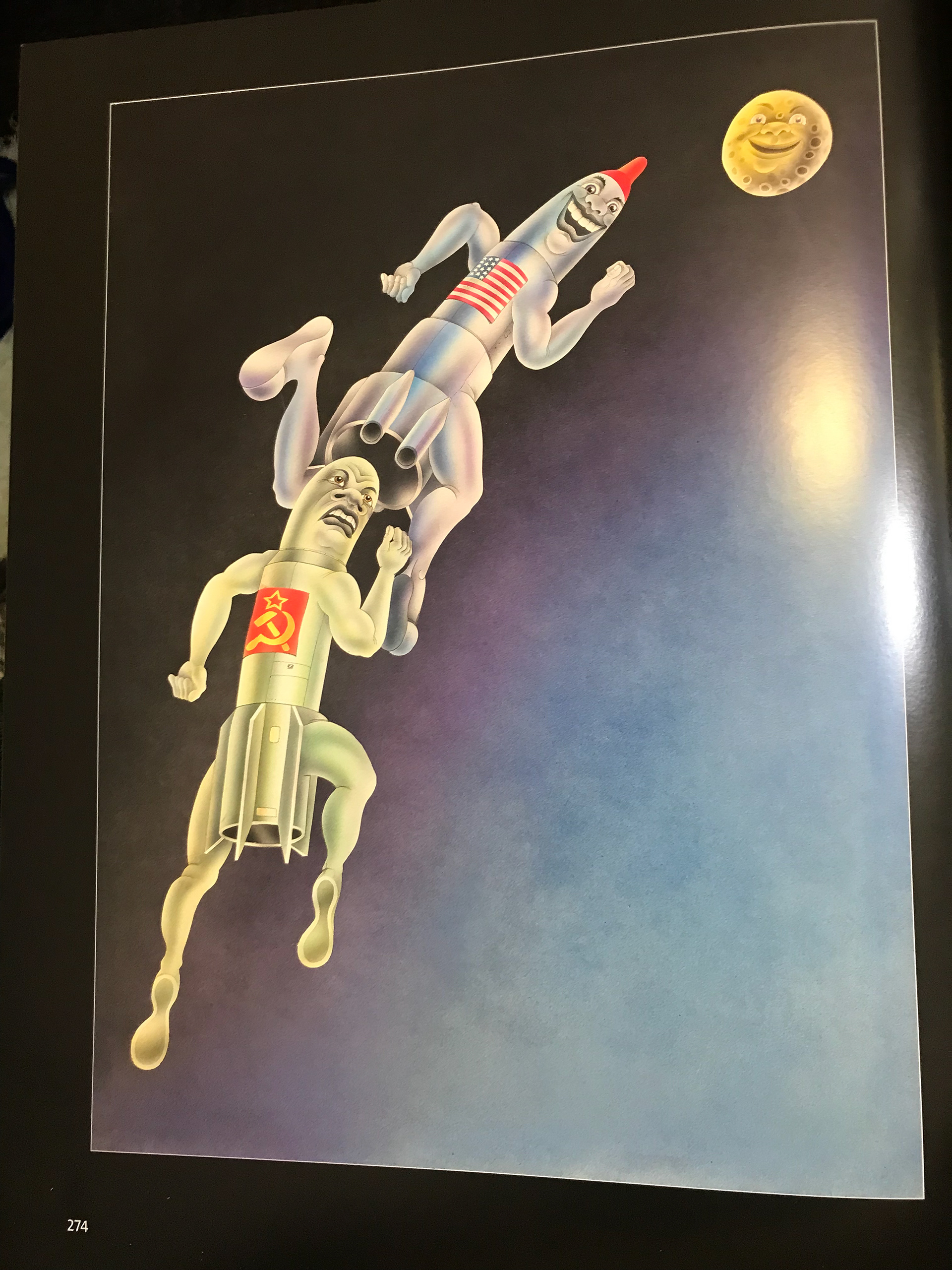
9GAG. (2019). Arctic* (And they say global warming is a myth).. [online] Available at: https://m.9gag.com/gag/aB0KjZD [Accessed 25 Oct. 2019].
Mossacres.ru. (2019). Party Poster Design Creative 68+ Ideas. [online] Available at: http://mossacres.ru/cz1qb3VybmFscGFydHlzbG9hbmUuc2ltaWRyZXNzLnJ1JnA9MjkzMTMyMC1wYXJ0eS1wb3N0ZXItZGVzaWduLWNyZWF0aXZlLTcwLWlkZWFzLWZvci0yMDE5Lmh0bWwmaT0w [Accessed 25 Oct. 2019].
It’s Nice That. (2019). Graphic designer Louise Borinski's practice focusses on symbols and their meanings. [online] Available at: https://www.itsnicethat.com/articles/louise-borinski-a-manifesto-for-signs-of-equality-graphic-design-050419 [Accessed 25 Oct. 2019].
Instagram. (2019). Violaine & Jérémy on Instagram: “Art Direction and Editorial Design Custom font. Yellow Vision is an annual magazine featuring articles about technology, modern cities,…”. [online] Available at: https://www.instagram.com/p/Bls9qyMADJb/ [Accessed 25 Oct. 2019].
Far'n'Beyond | Design Print Digital. (2019). Floor Sticker Printing | Retail Branding & Way Finding Graphics. [online] Available at: https://www.designprintdigital.com/printing/signage-printing/floor-sticker-printing/ [Accessed 25 Oct. 2019].
Domoa.tumblr.com. (2019). Tumblr. [online] Available at: https://domoa.tumblr.com/post/24959535694/oculto-disismaineim [Accessed 25 Oct. 2019].
Behance.net. (2019). Behance. [online] Available at: https://www.behance.net/gallery/7912831/Maya-Zoo-Pictogram-System [Accessed 25 Oct. 2019].
Aldebaran Dobrica
Instagram. (2019). filip piasecki on Instagram: “Zestaw piktogramów dla ZTM. #icondesign #pictogram #symbol #identitydesign #brandidentity #branddesign #identity #eyeondesign #minimal…”. [online] Available at: https://www.instagram.com/p/BfVVox0nSGE/?utm_source=ig_share_sheet&igshid=1o26mf0y5hrd1 [Accessed 25 Oct. 2019].
Studio Jimbo Graphic design & Art Direction. (2019). Studio Jimbo Graphic design & Art Direction. [online] Available at: https://jimbobarbu.com/post/185245852534/open-poster-by-studio-jimbo [Accessed 25 Oct. 2019].
Designbolts. (2019). 20 Outdoor / Indoor Creative Sign Design Ideas For Inspiration. [online] Available at: https://www.designbolts.com/2019/04/26/outdoor-indoor-creative-sign-design-ideas-for-inspiration/?utm_source=feedburner&utm_medium=email&utm_campaign=Feed:+DesignBolts+(Design+Bolts) [Accessed 25 Oct. 2019].
Econosys.jp. (2019). パナソニックデザイン京都|エコノシス デザイン事務所|京都のブランディング·デザイン事務所. [online] Available at: https://www.econosys.jp/works/131 [Accessed 25 Oct. 2019].
Jordan-metcalf.com. (2019). Jordan Metcalf Studio – Graphic Design and Lettering. [online] Available at: https://jordan-metcalf.com/ [Accessed 25 Oct. 2019].
Lamar, M. (2018). Makers of the Game with Kendrick Lamar on Inspirationde. [online] Inspirationde. Available at: https://www.inspirationde.com/image/83453/ [Accessed 25 Oct. 2019].
Laxalt, I. (2019). In this Together / Be in the Present by Peter Francis Laxalt on Inspirationde. [online] Inspirationde. Available at: https://www.inspirationde.com/image/89361/ [Accessed 25 Oct. 2019].

This is some of Holly’s work I did this so I can get some ideas to represent Holly's styles.
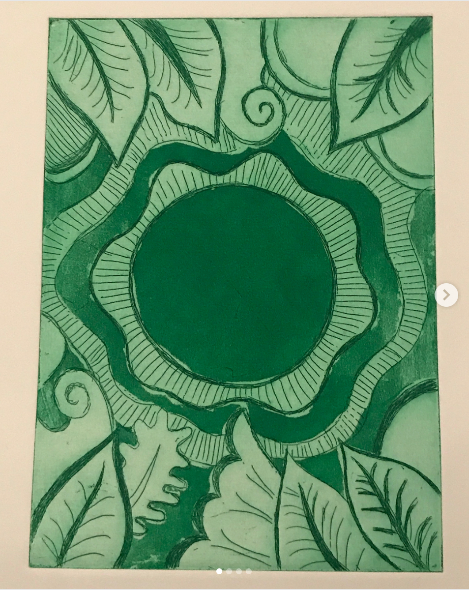
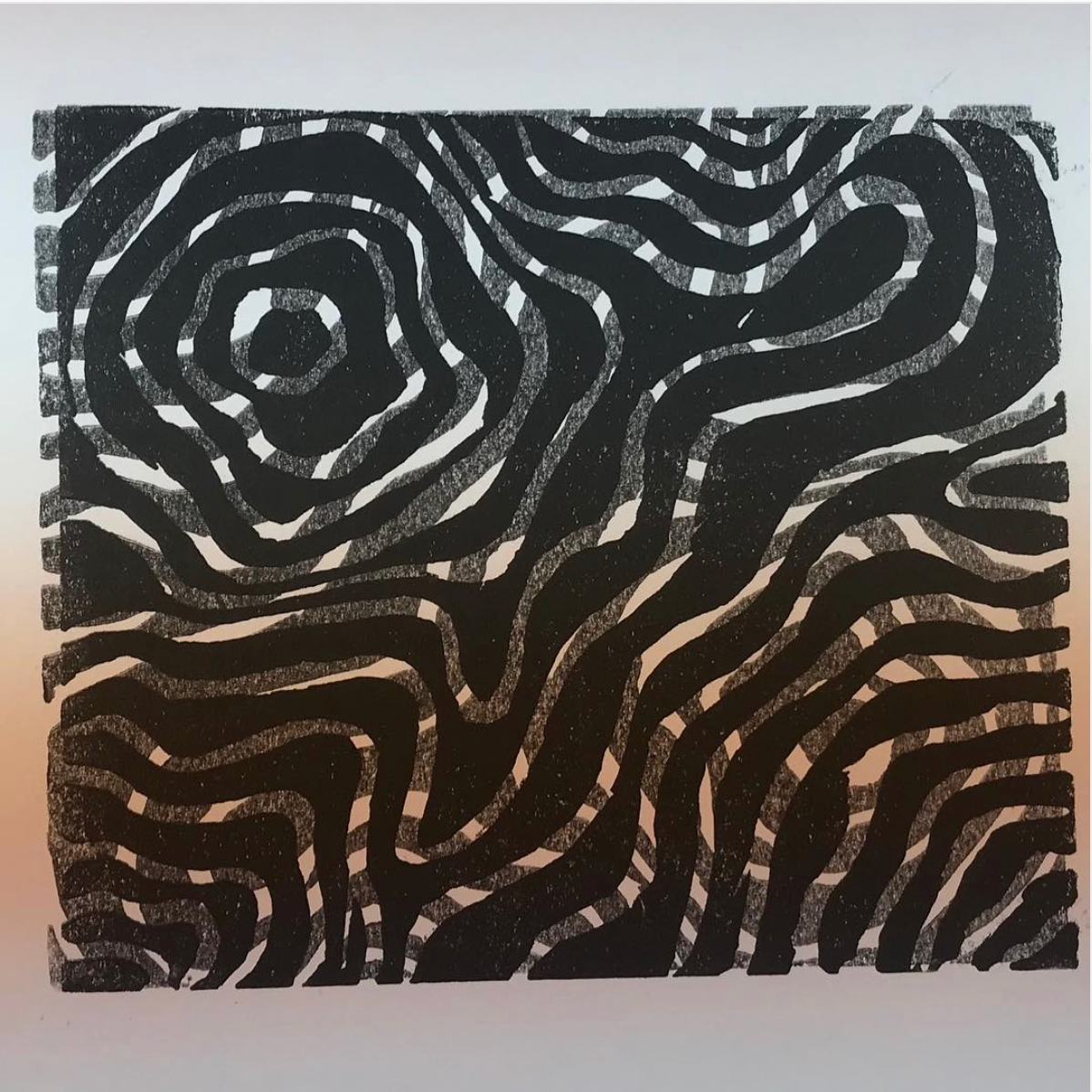
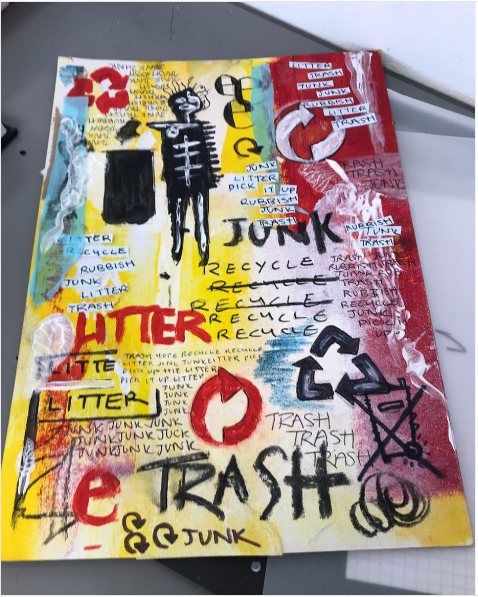
She spoke about how she likes patterns, shapes, colours as well as her favourite artist being Basquiat. Even though these are only a few pieces of her work I could quickly see the recurring pattern of bold designs and .colour. I especially like the topography styled black and white pieces. I like the use of layering but also think it's a nice design. I can see her interest very clearly in the Basquiat pastiche. The other mediums used in the other pieces of work (lino/graphic/digital) are giving me ideas in how I could work.
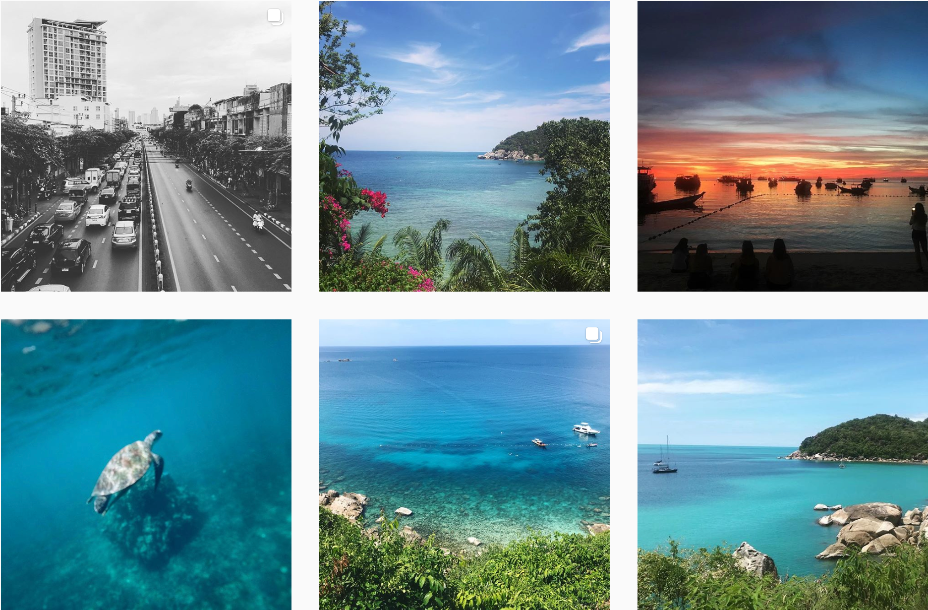
I’ve had a look at Holly's instagram account as I know she likes photography and travelling. Looking at these photographs it really shows me that she's into travel photography and that the composition of the photographs really entice you into wanting to be there.
I'm trying to get at the point also as how they're edited/lighting. (? - maybe: I´m trying to understand the light in the pictures and how they´ve been edited) It's clear that Holly has spent time by the beach but the ways the sea colours are shown gives her images tranquility and makes me think of possible colours I could explore that show her personality/interests. These type of blues are calming and I would imagine if pieced together right I could get the idea of holiday/travel/relaxation which I can tell Holly is interested in.

WRITE ABOUT POSTER AND PRINTING ERRORS
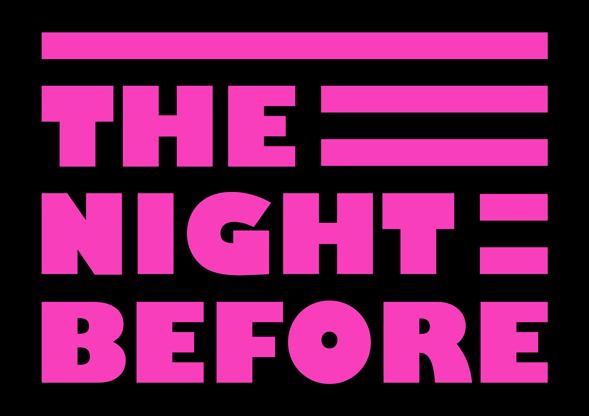
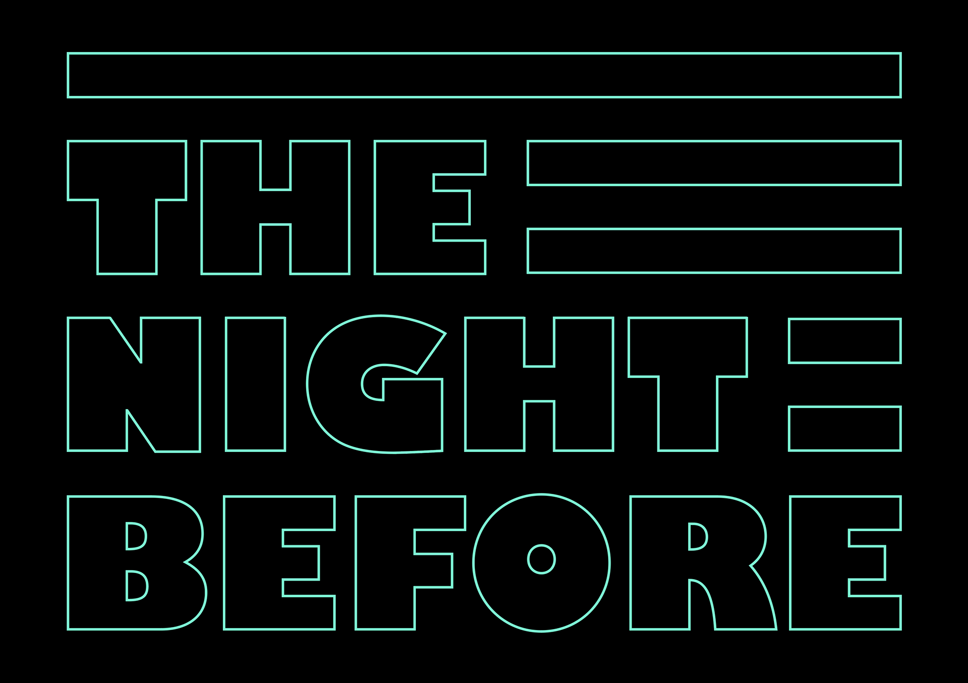
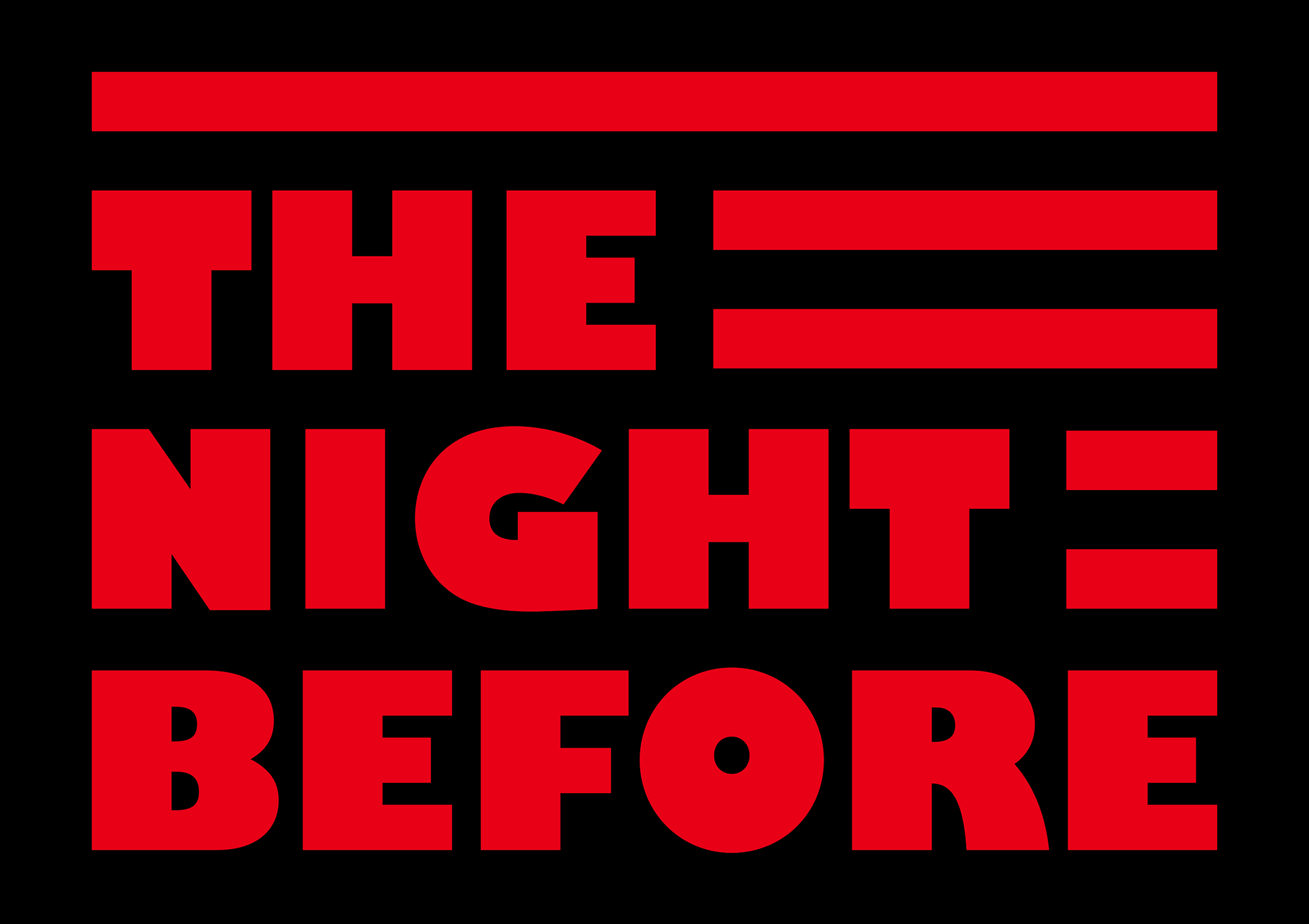
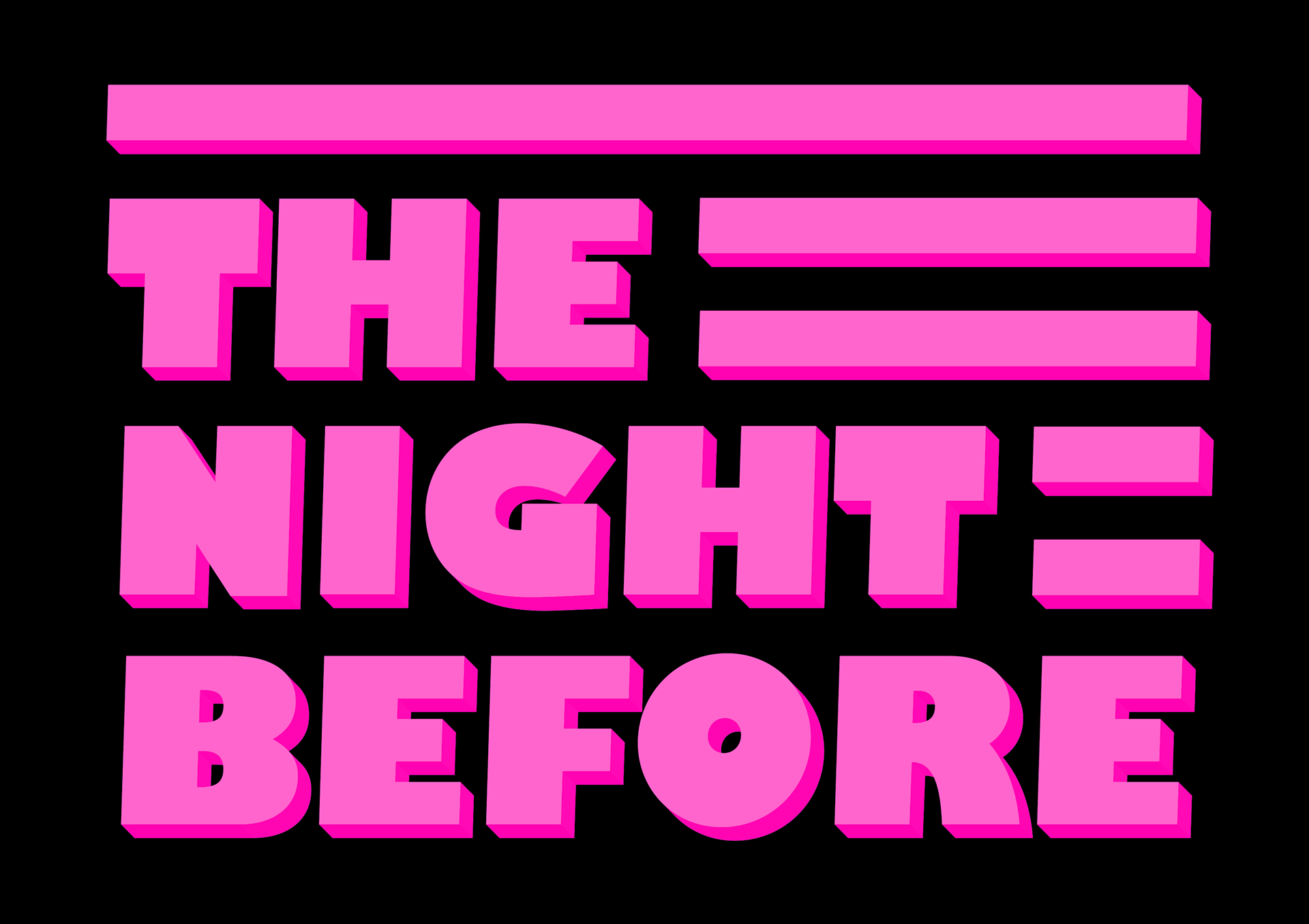
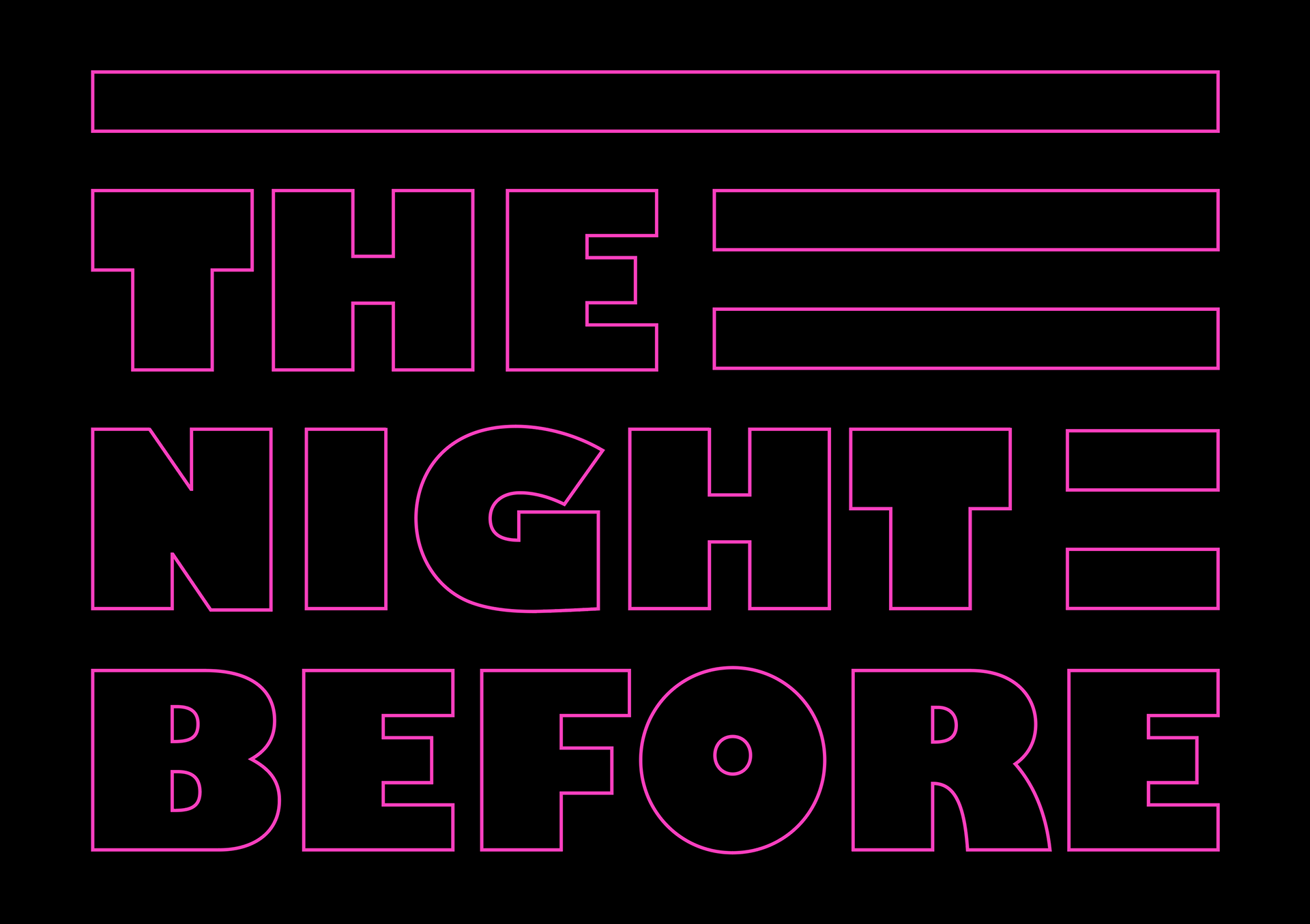
I went for this style as it reminds me of neon lighting and gives me that late night club vibe.
Since it's talking about 'the night before' I feel as if it never seems to be as perfect as you remember and it's a very human thing in the sense that we all have stories from the night before. Some being good and some not so much...
I wanted to develop this idea further as I think it needed to be more vibrant and to look like a real sign.
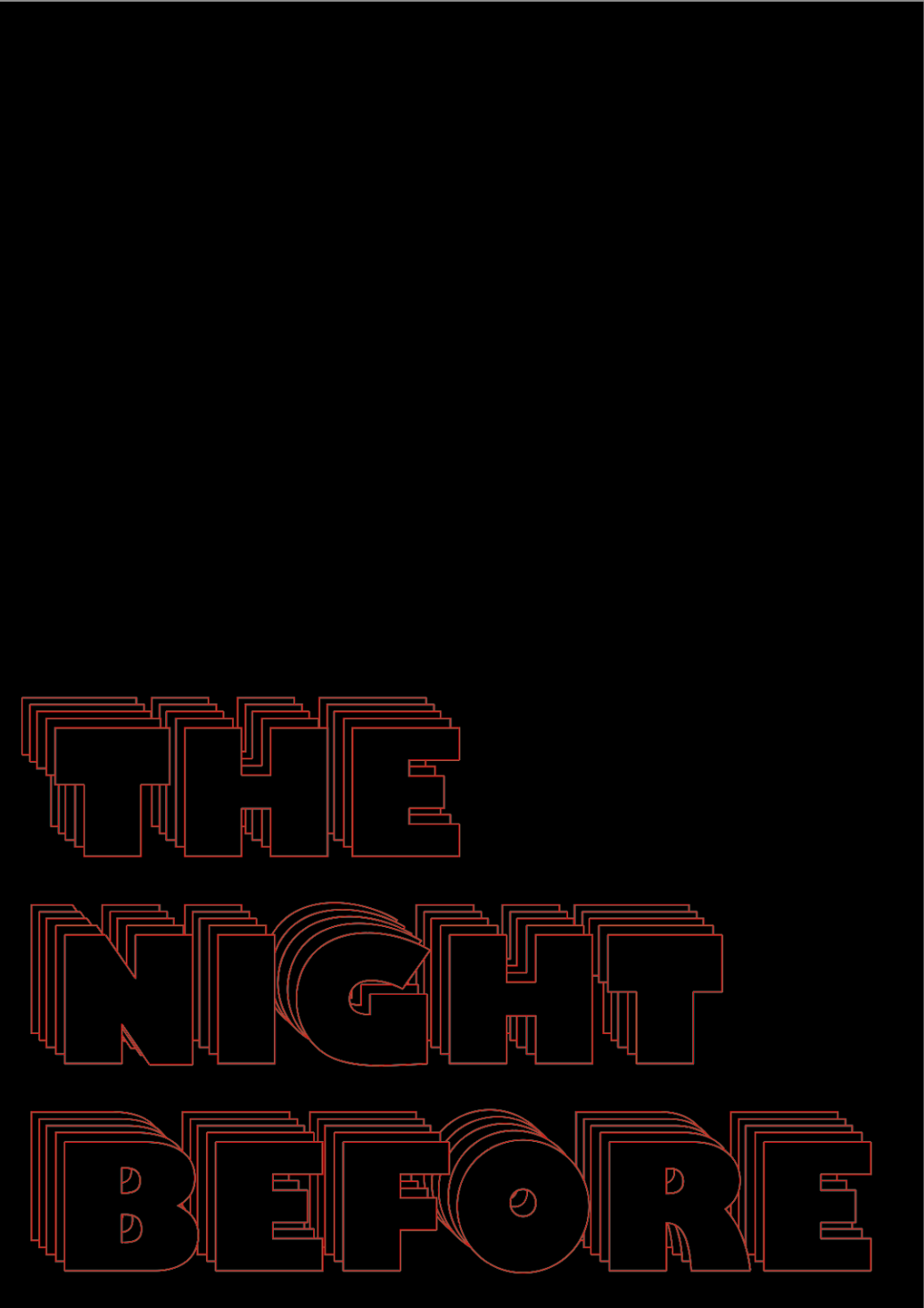
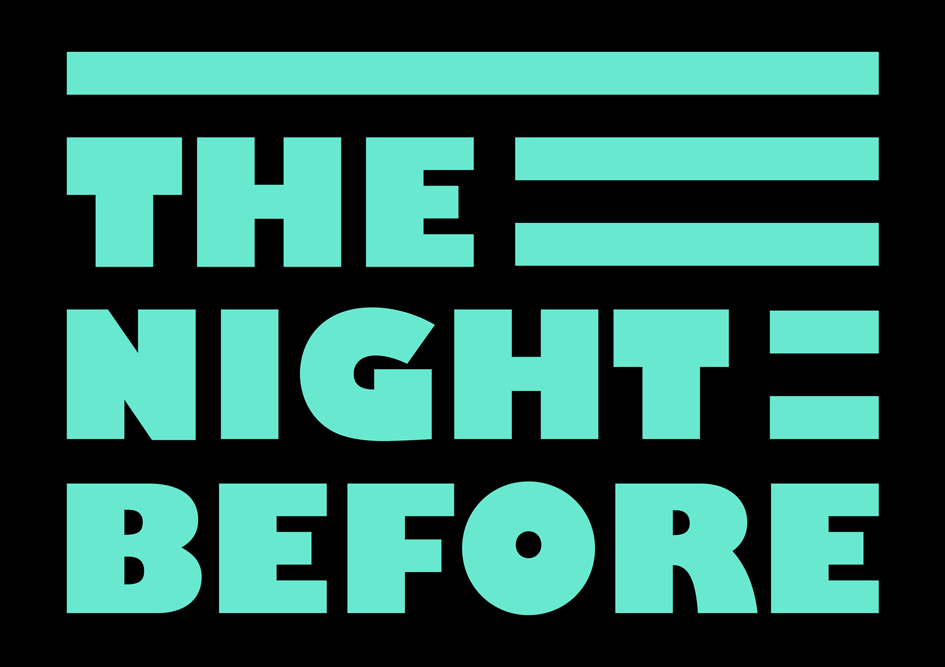
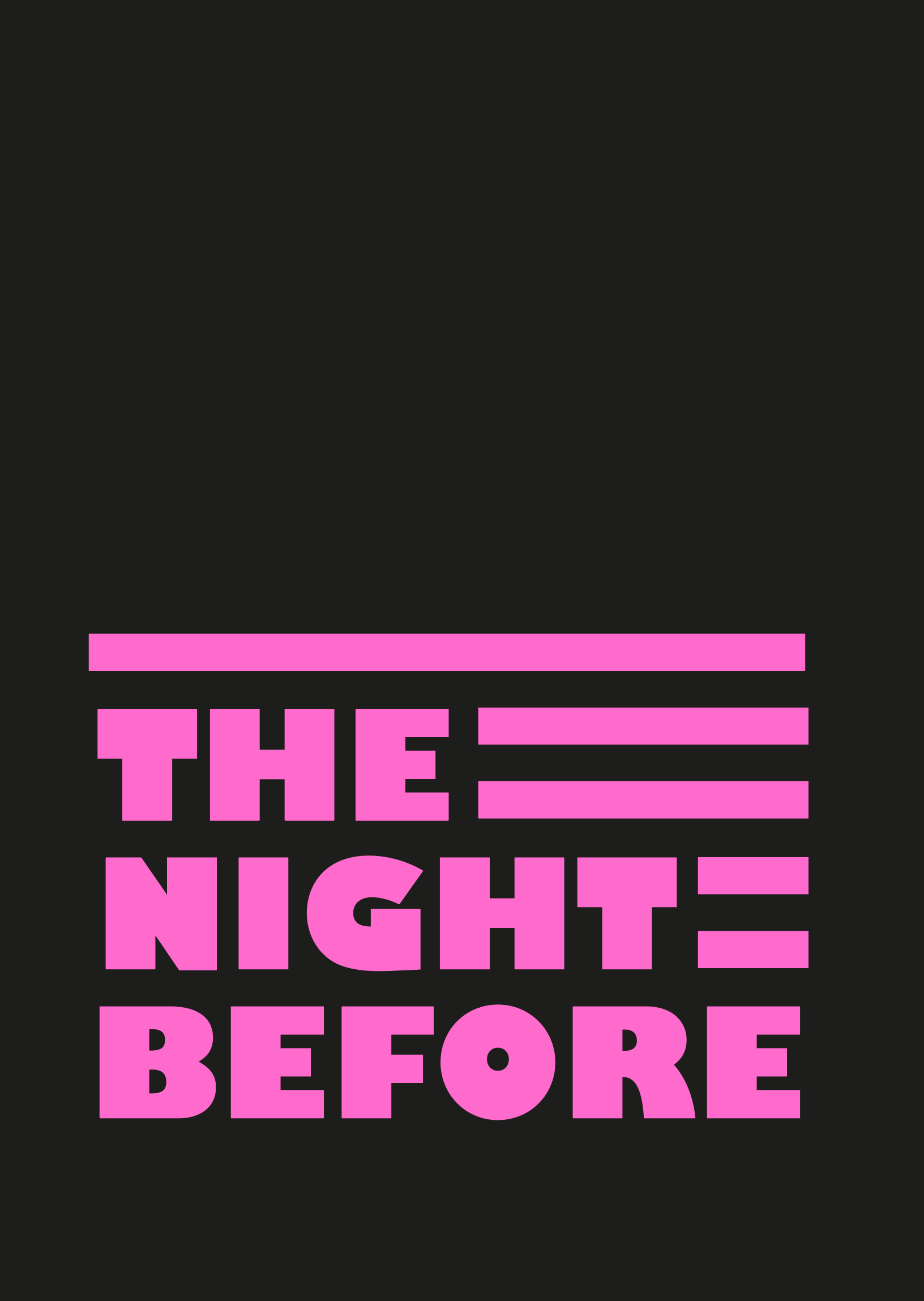
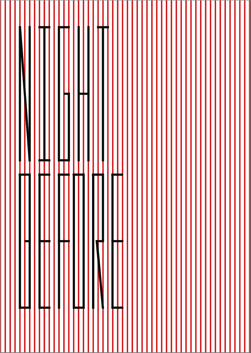
I had a lot of wasted space, so first I filled it with lines and then I changed the orientation. My plan for this was to print it out on coloured paper so I tested it out with the colours I have.
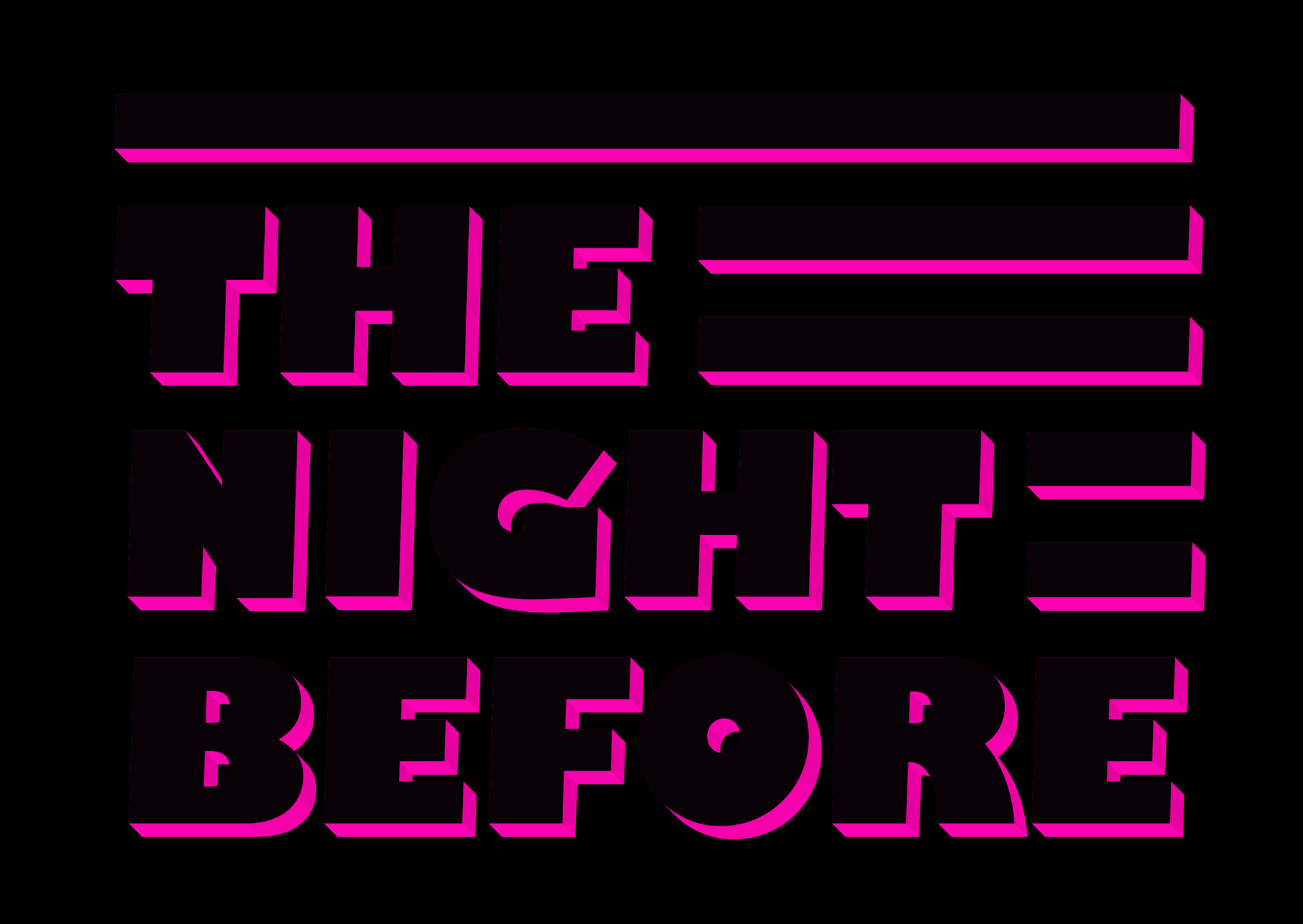
I feel as if the red it too intense and I tried a 3D effect which I like but it isn't the look I'm going for. Also with the one with the pink shadow the same applies as for the 3D one. I like the pink and light green/blue.
The green outline I like, as it reminds me of a neon sign and is a nice change. On the other hand the pink filled in one stands out more and would look more impressive to my eye it were to be printed out.


These are some other pieces I did, as I wanted to play around with ink. I liked where the idea was going with the two colours. However, I'm not a good enough calligrapher for it work out how I wanted it to. (do you really want to say you´re not good enough?)
I found a font I liked and tried it out with pink ink - I really like the way it looks and think I will develop it further digitally. I get the idea of a an event poster vibe?

These are some examples I did. I liked the idea of using shapes in the background to make the letters, but didn’t go to plan.
rough drafts of possible Ideas
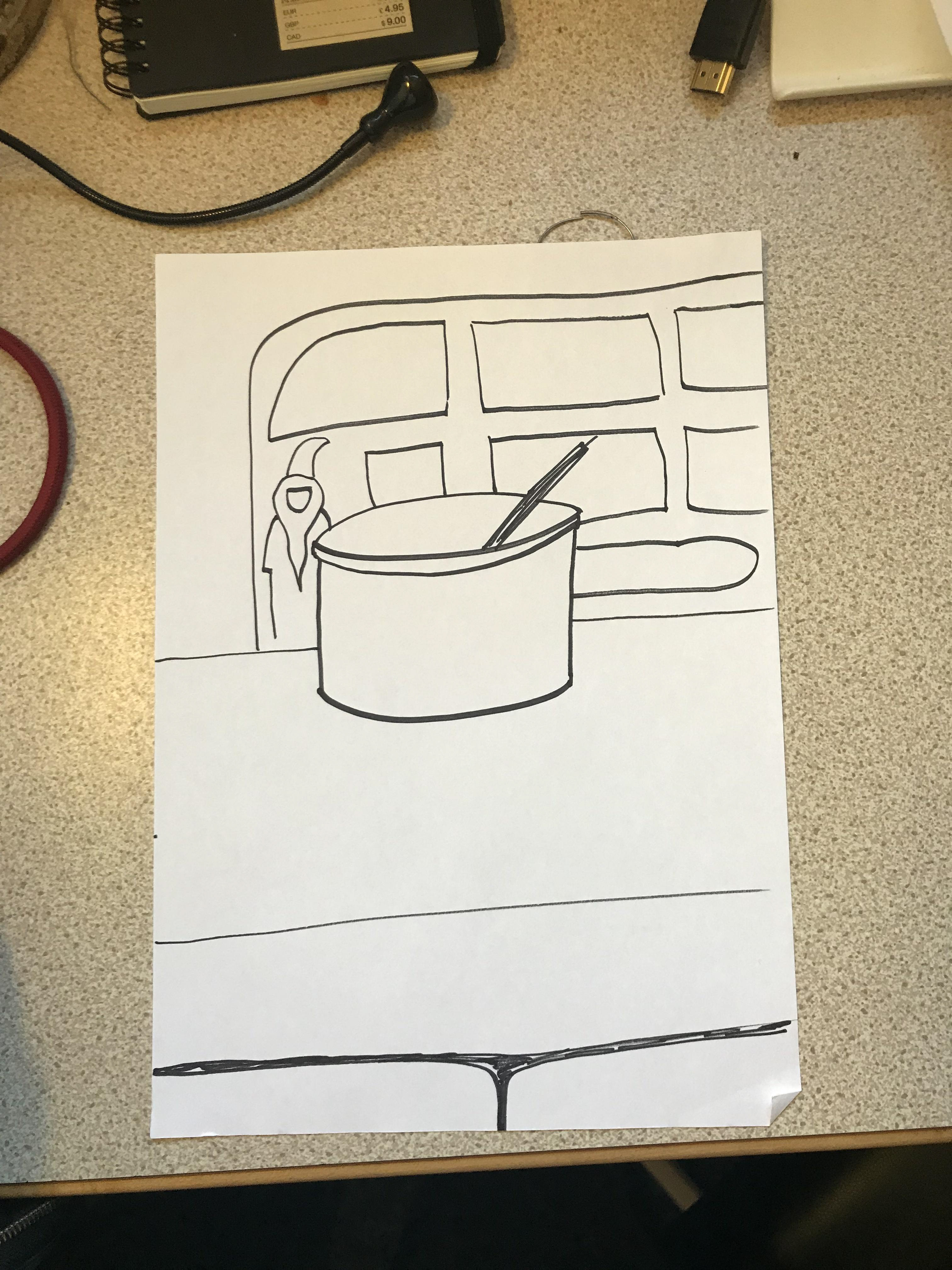
My initial idea was to do before and after images of objects I took pictures of.
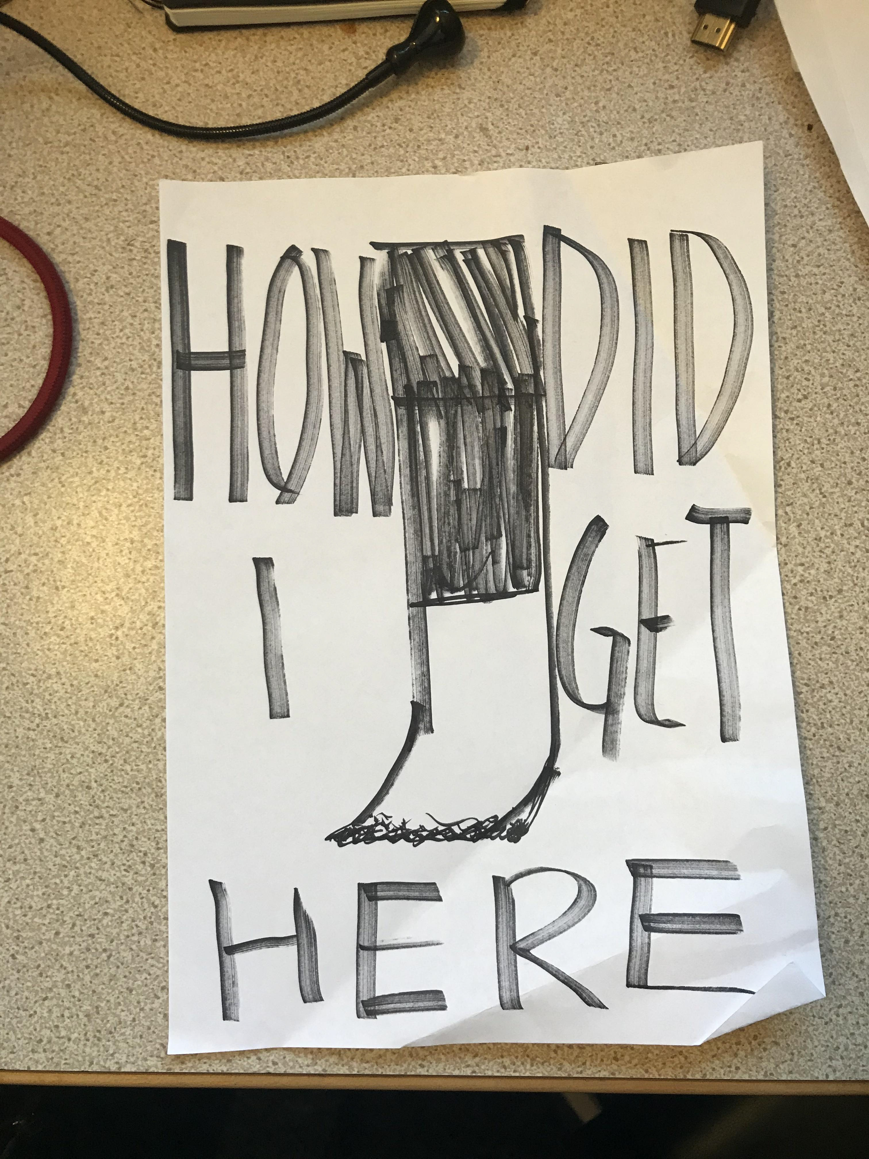
After speaking to Fern she suggested to just do a poster saying the night before which made sense considering the time frame, and it did fit with the brief- so I decided to come up with some ideas for that. (is it really a good idea to say you don´t have time?)
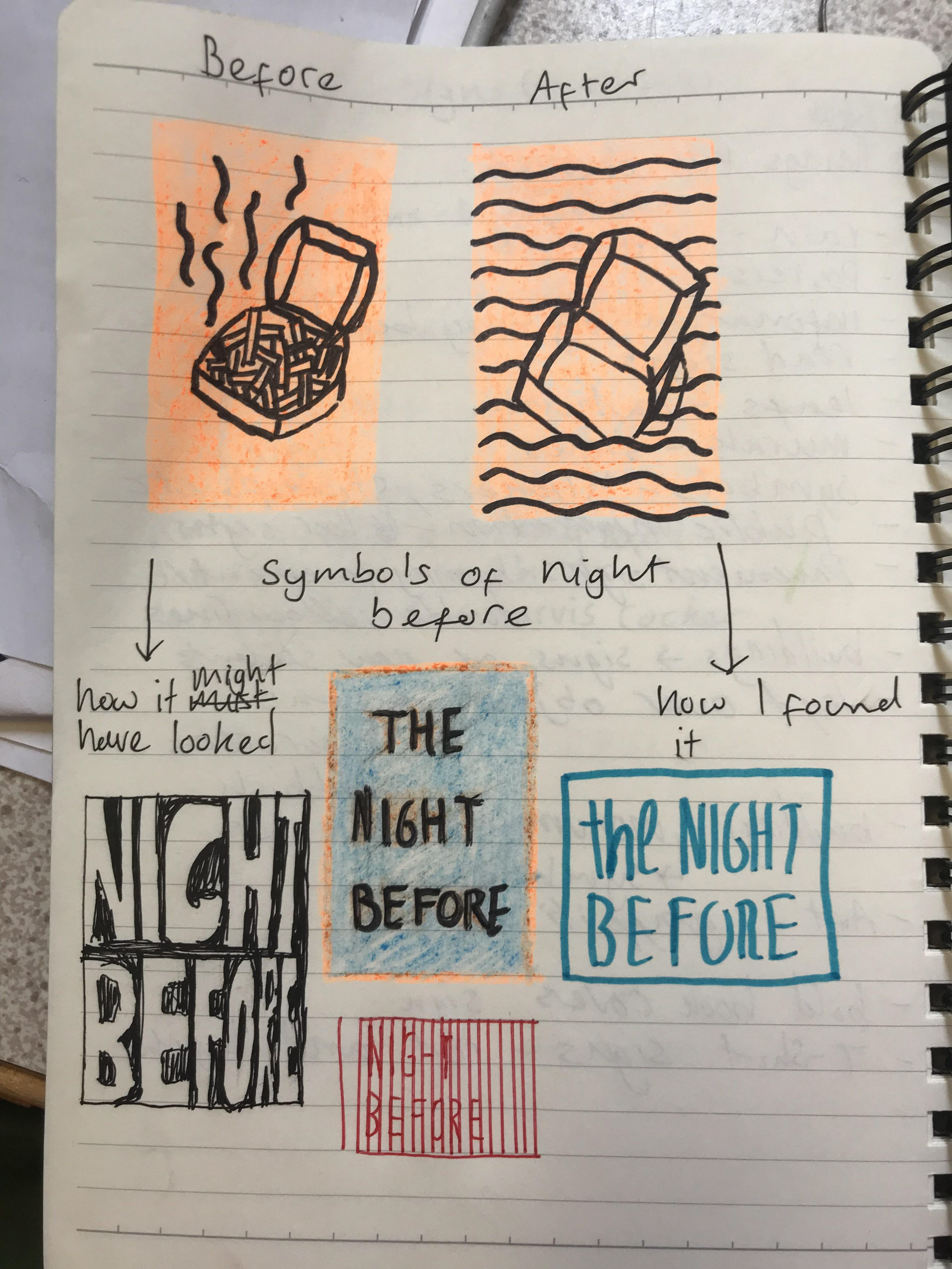
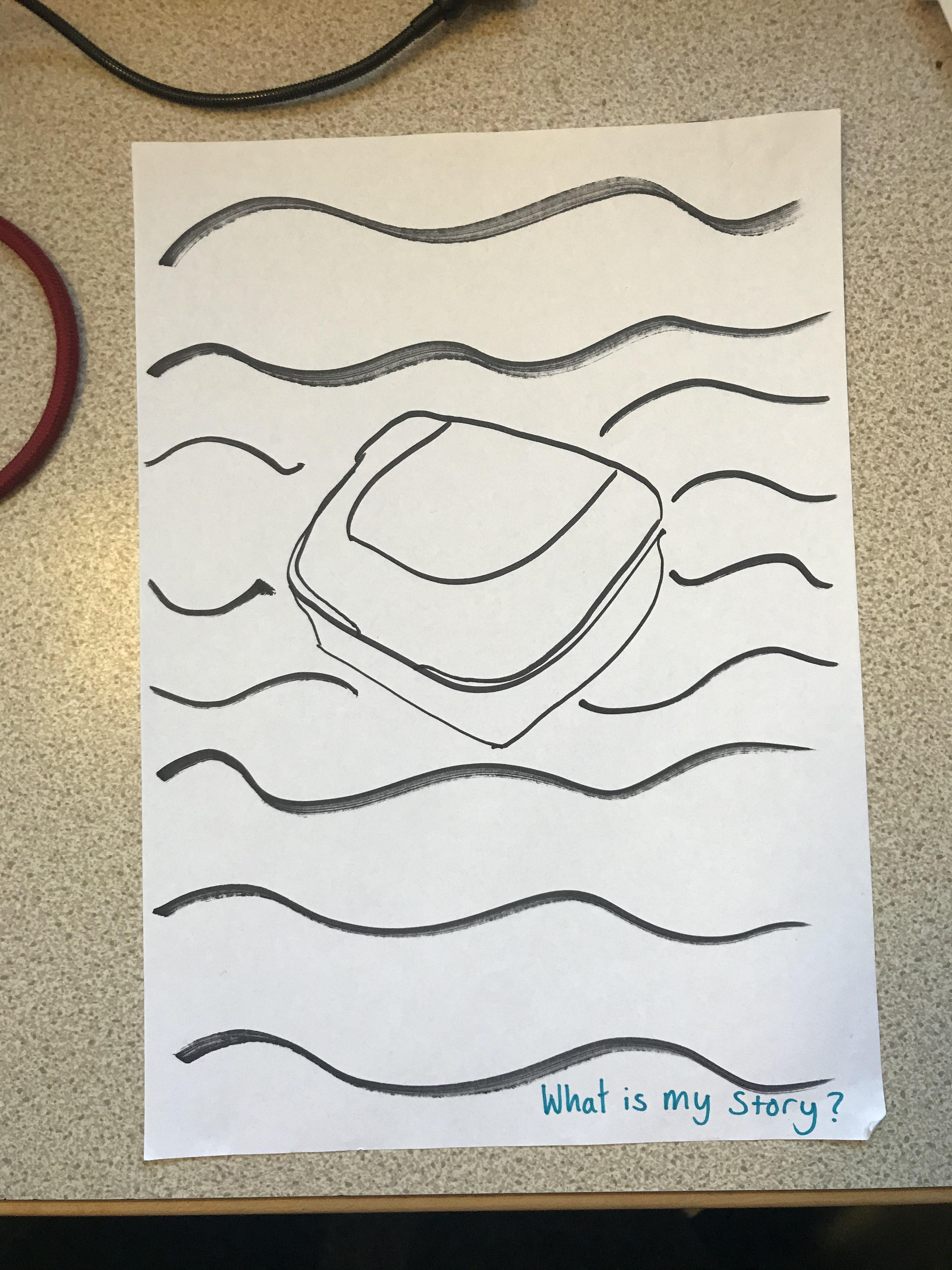
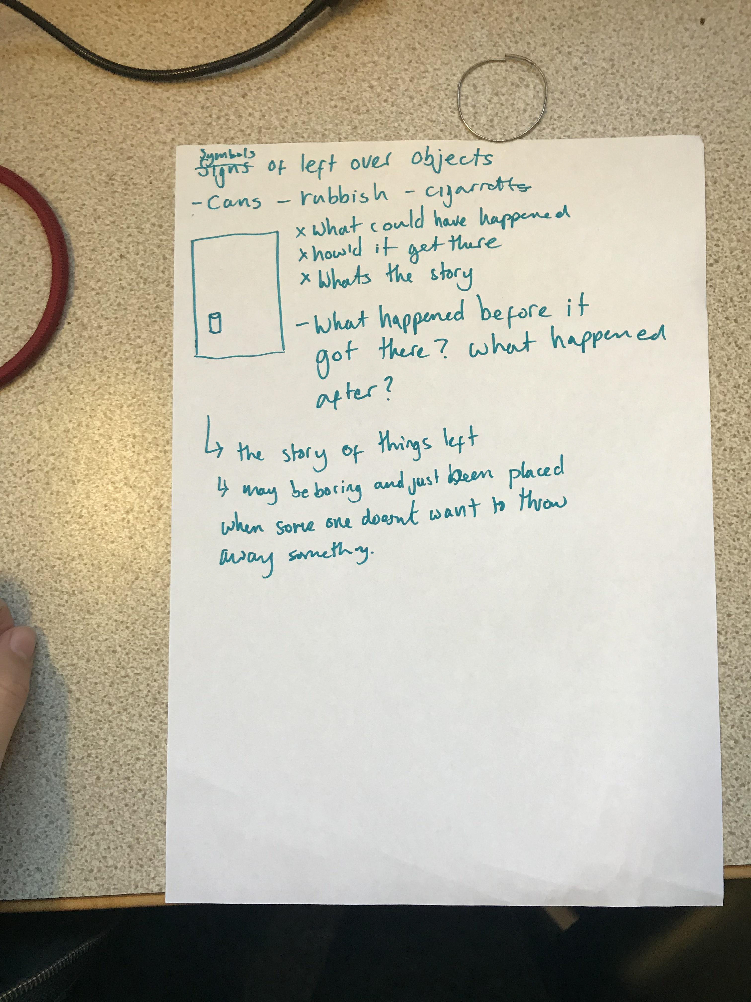
I had the idea of working on the idea of the ‘night before’ - There were many objects which symbols what could have happened the night before.
I like the idea of coming up with scenarios of how certain objects got into particular places and how a lot these things left behind symbolise certain aspects of the city.


Design - Symbols/Signs
Books are signs and symbols of many different things - as are murals. Here I have some photographs of rebellious zines and books. All demonstrate different symbols and signs. I have also included some dice, all of which have signs representing different things.
I like these types of symbols because they are design-led and made to be visually appealing. For me as a creative things looking nice is important as I think it's better to live in a pleasing environment. Then again, what I might see as beautiful someone may see as stupid or it may not make sense to them. It's important to take into account how others may react when creating something (but I guess you can't please everyone) and in the final analysis you have to be true to your own ideas.
'RUBBISH'
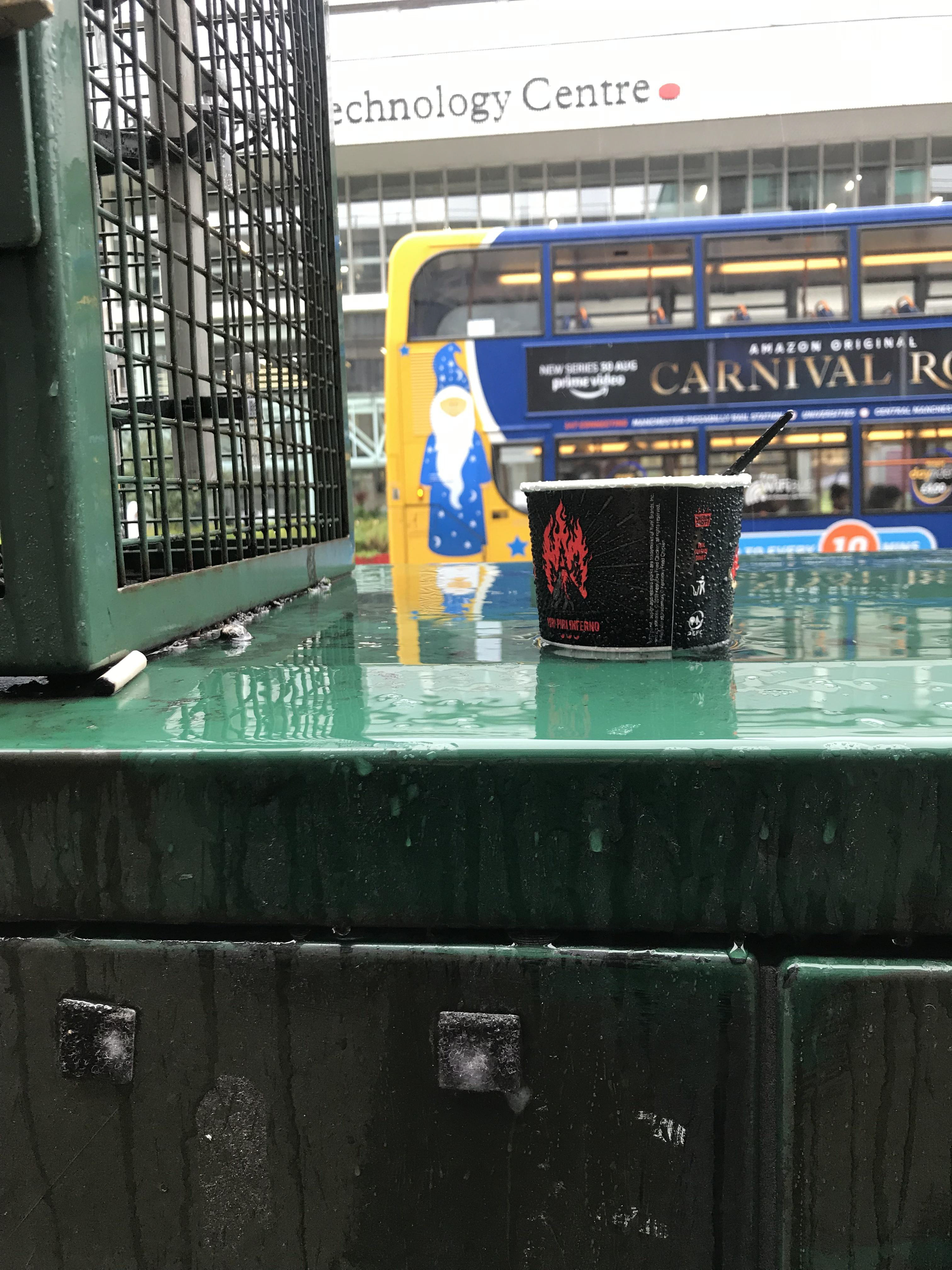
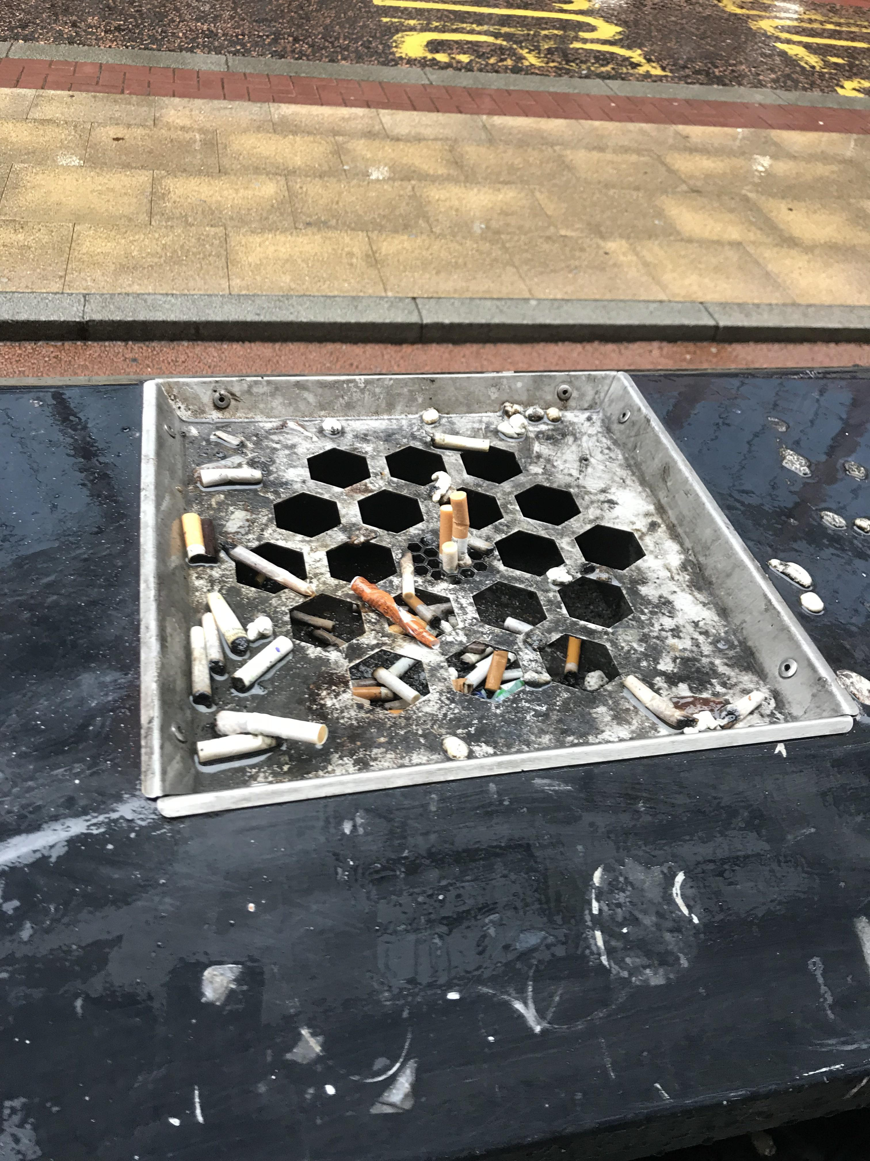
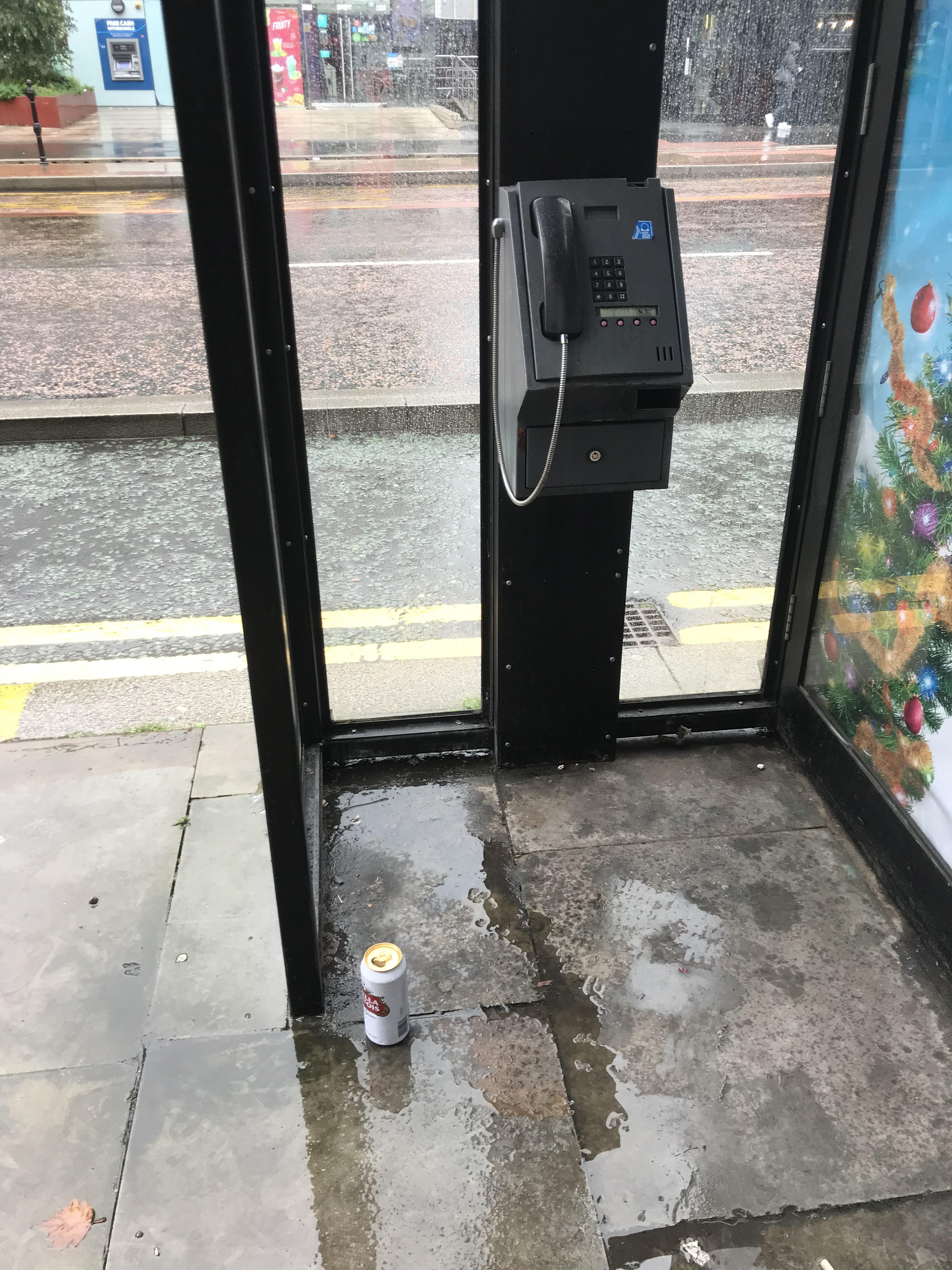
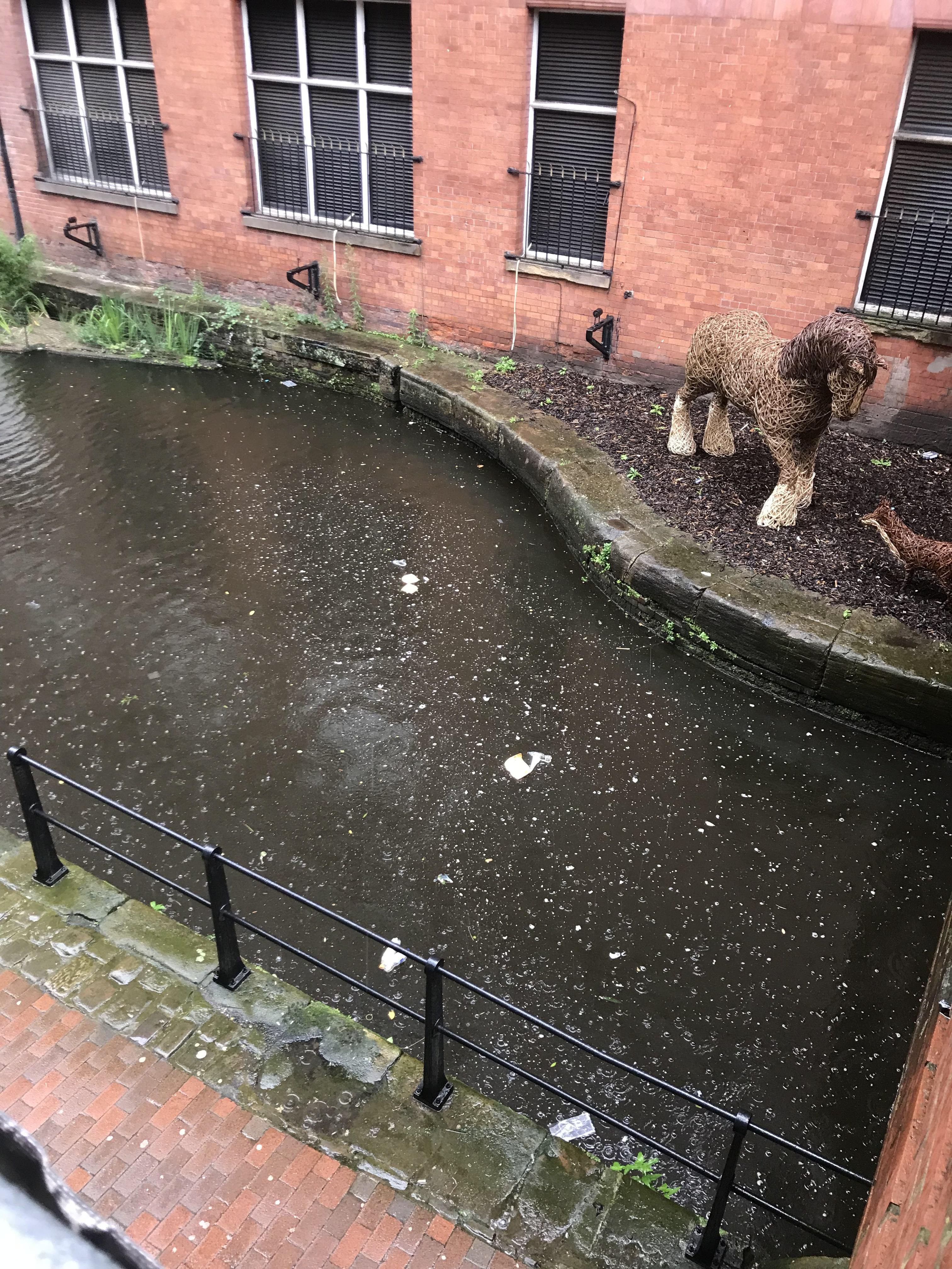
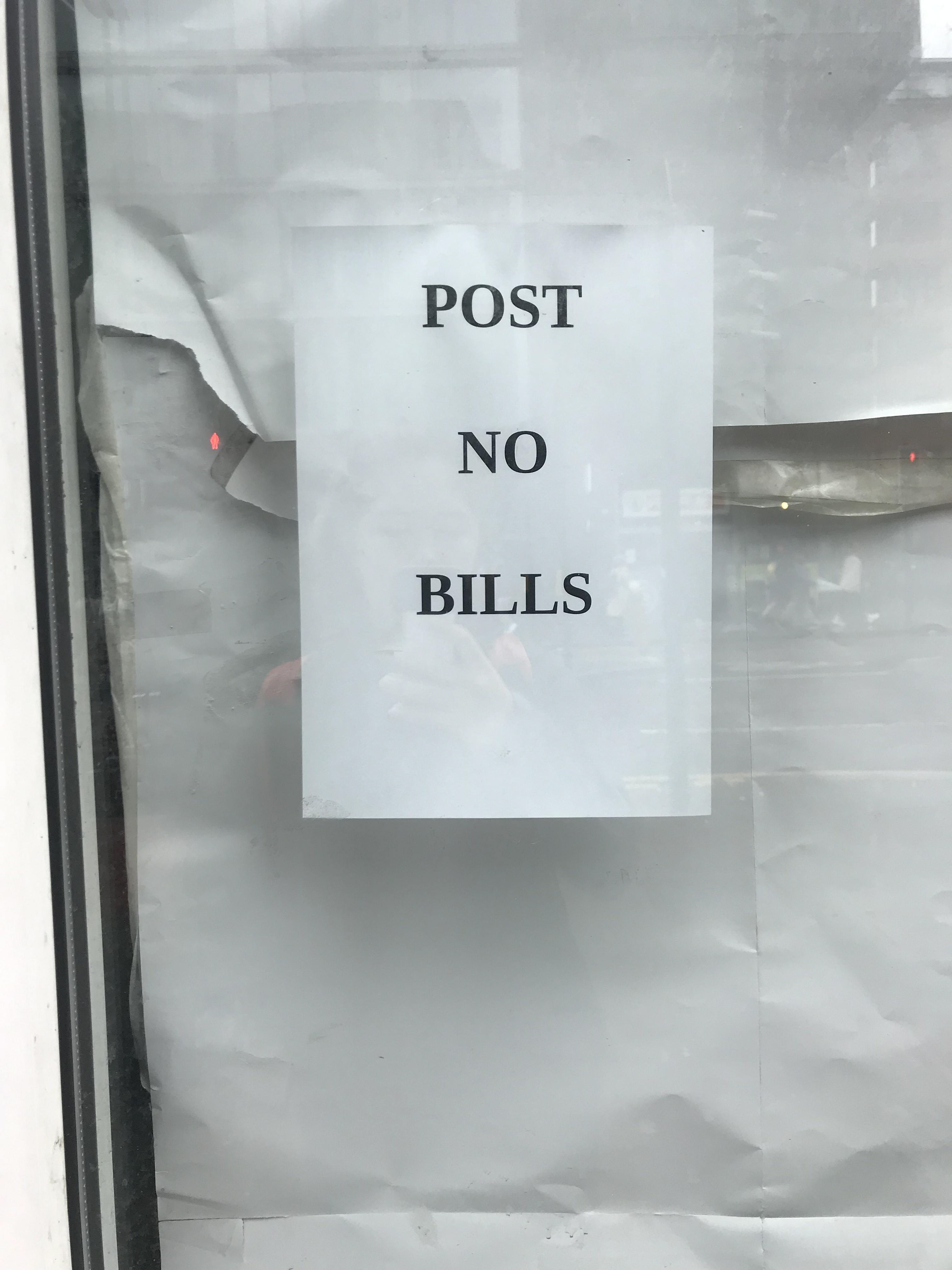
My Idea with these group of photos is mainly ‘rubbish’. The things that rubbish can symbolise - in the sense that they are a sign of what has been left and what happened before they were left.
I like the idea of possibly creating something to do with making up a story for how that particular object got there.
E.g. Was that beer left because the person couldn’t be bothered to find a bin? Or was it something more exciting like he had to run after someone who had dropped an item, or was murdered.
Traditional
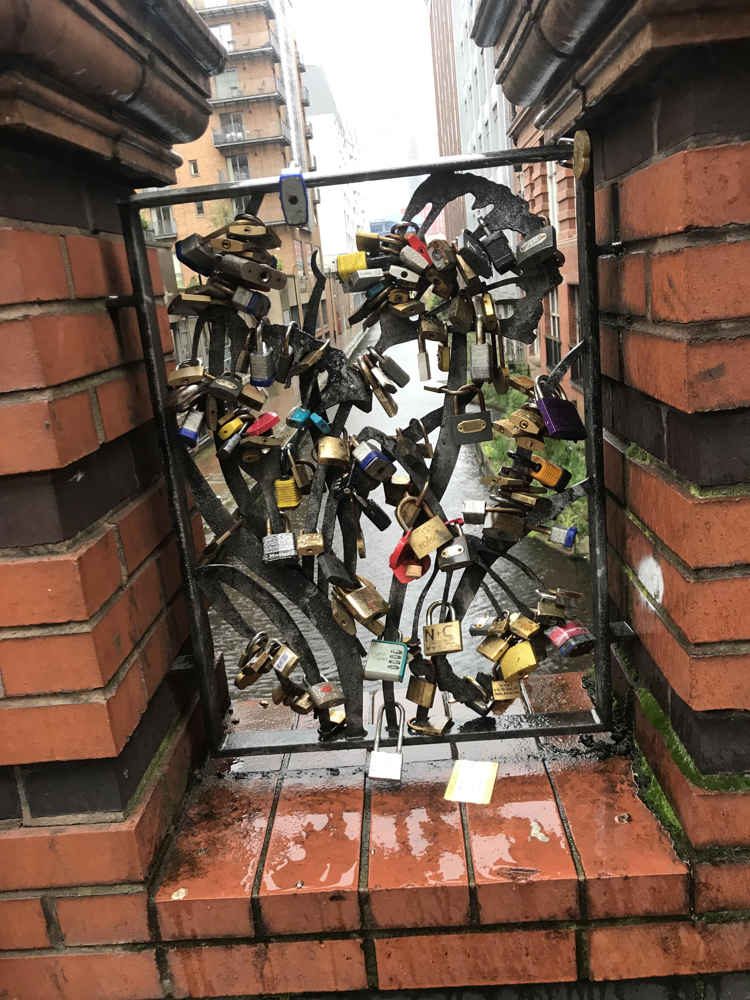
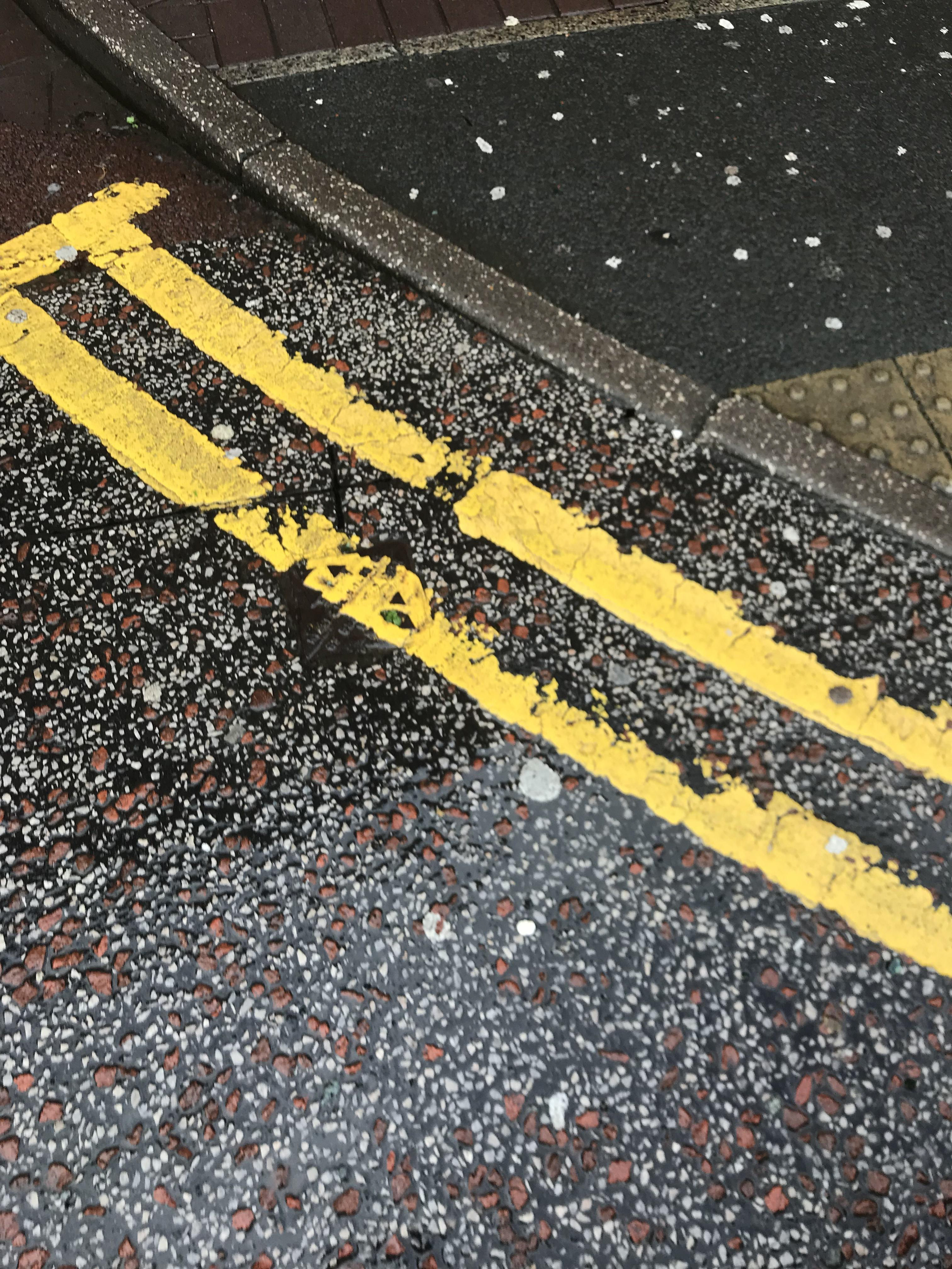
Here are some more traditional symbols and signs that most people can easily understand.
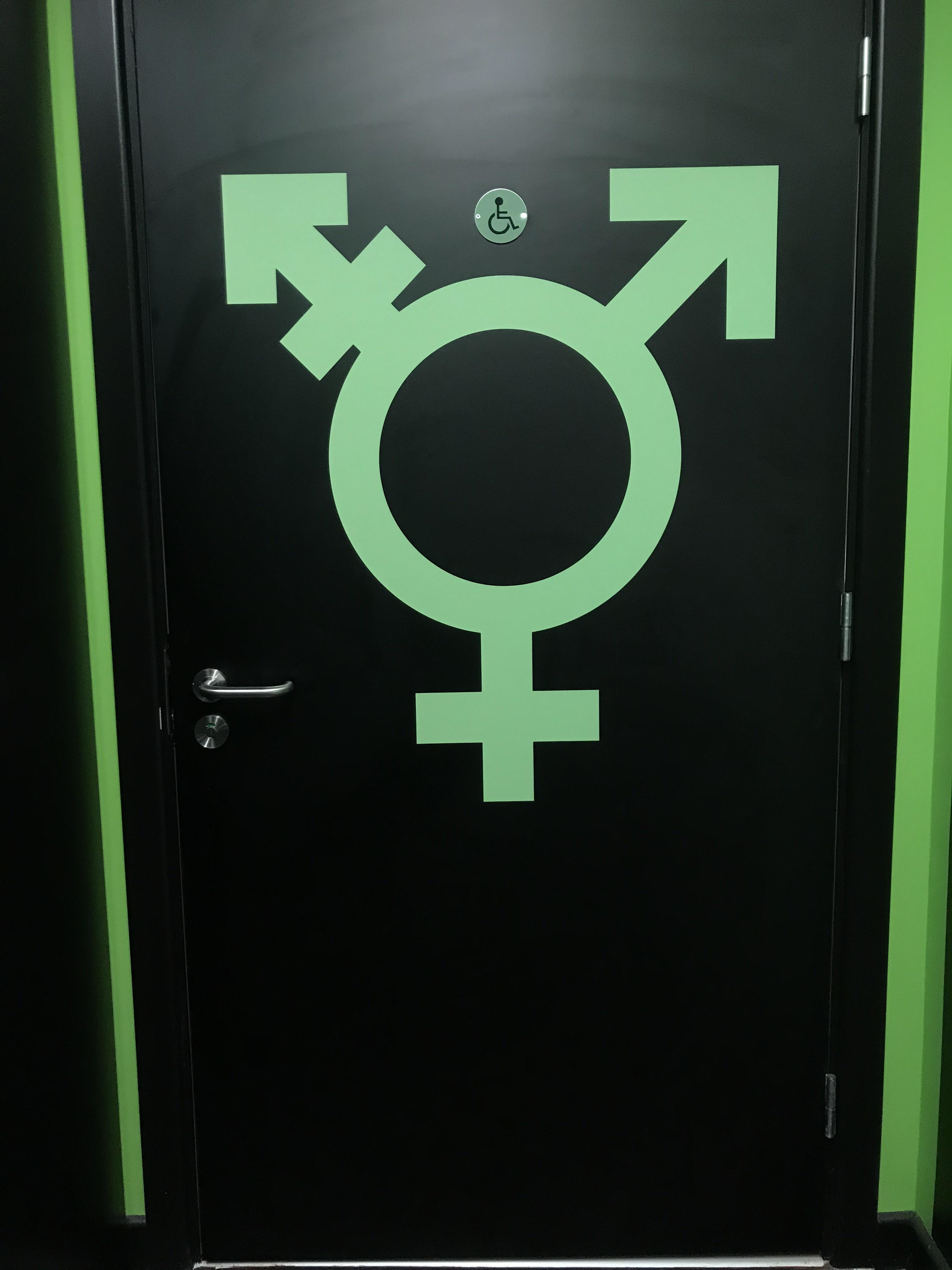
Double yellow lines are something you see everyday you may or may not notice them but they're everywhere. I always find it interesting that I barley see double red lines unless I'm in London which is where I see them often.
I understand that the toilet one may be out of place as I know not everyone knows the gender symbols and may not make the connection that it's for male female etc. It does however have the disabled logo which in my eyes is seen a more traditional sign and I think the big green one should be counted also.
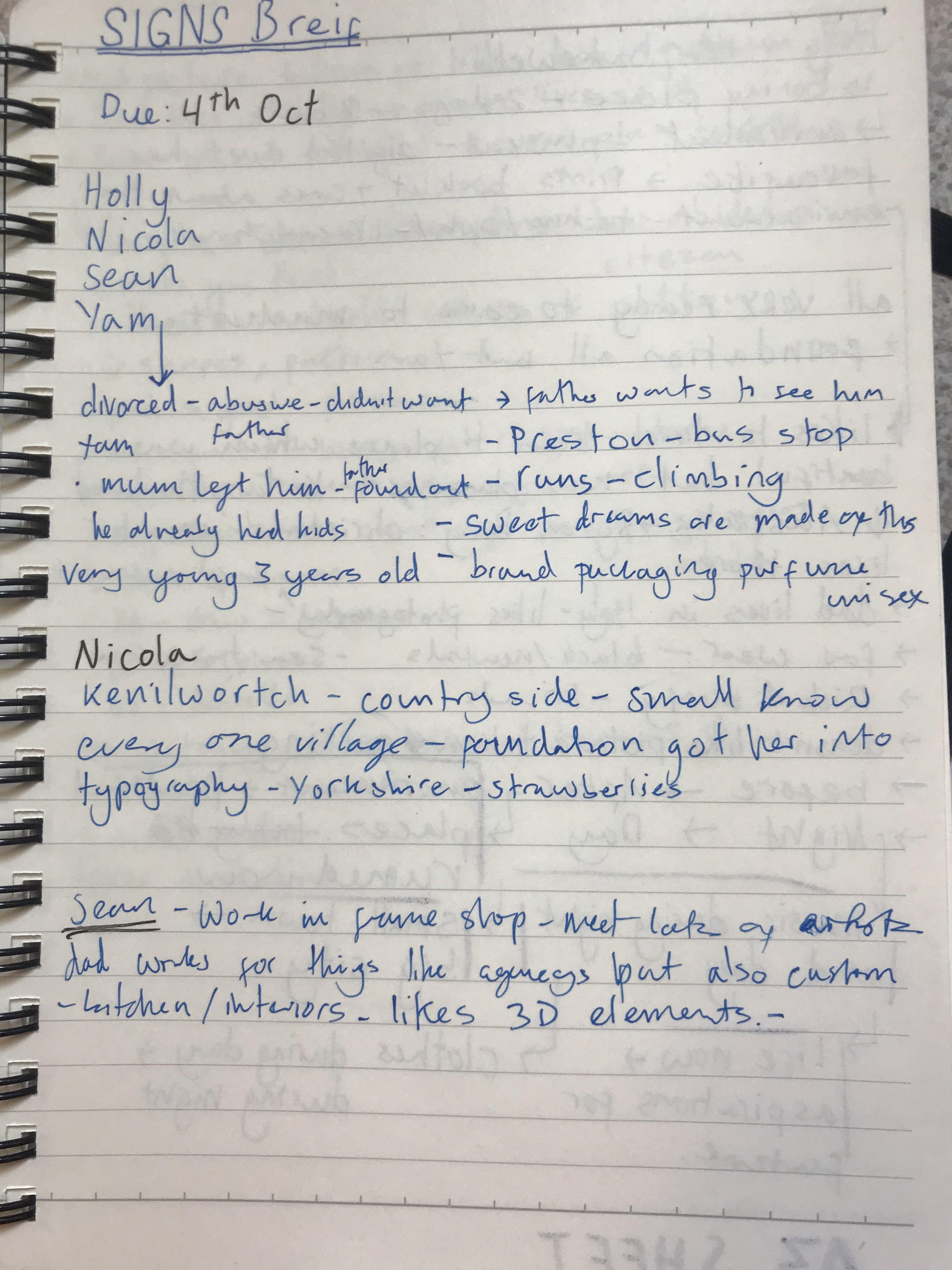
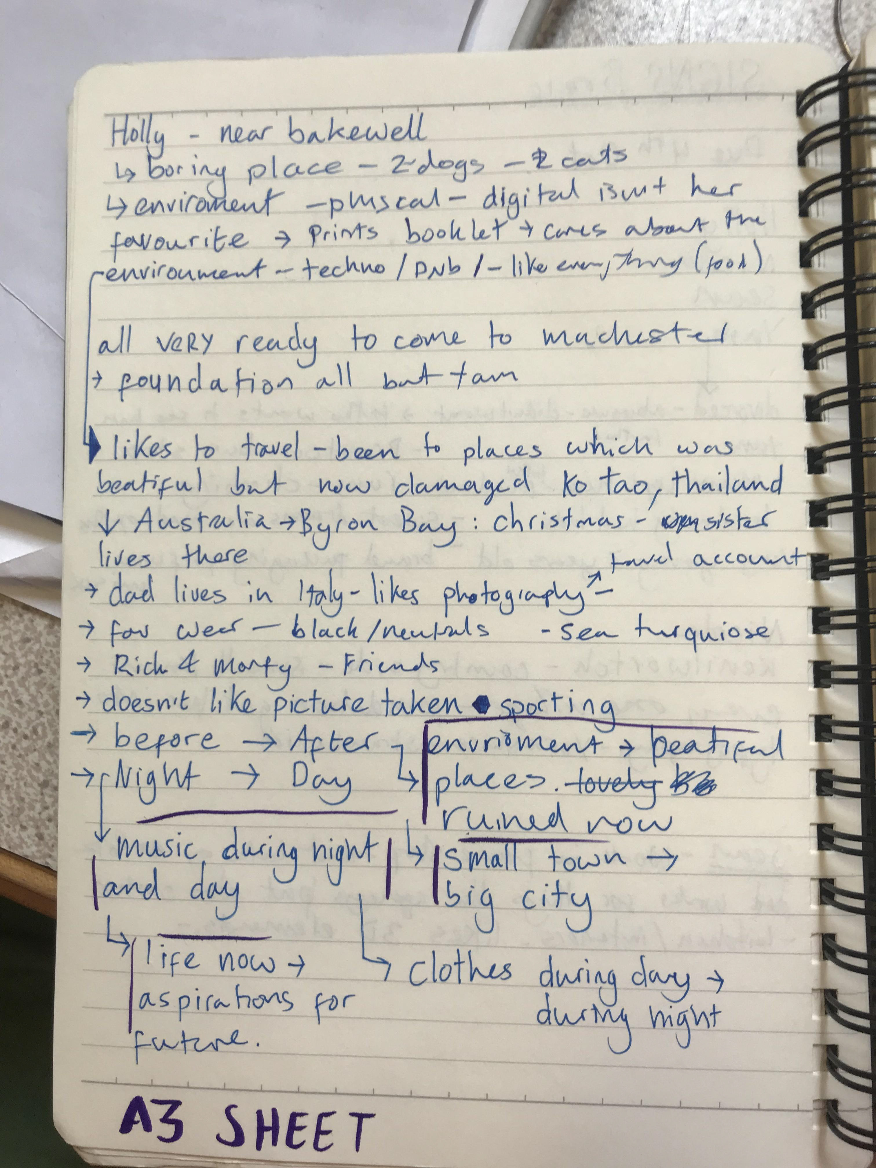
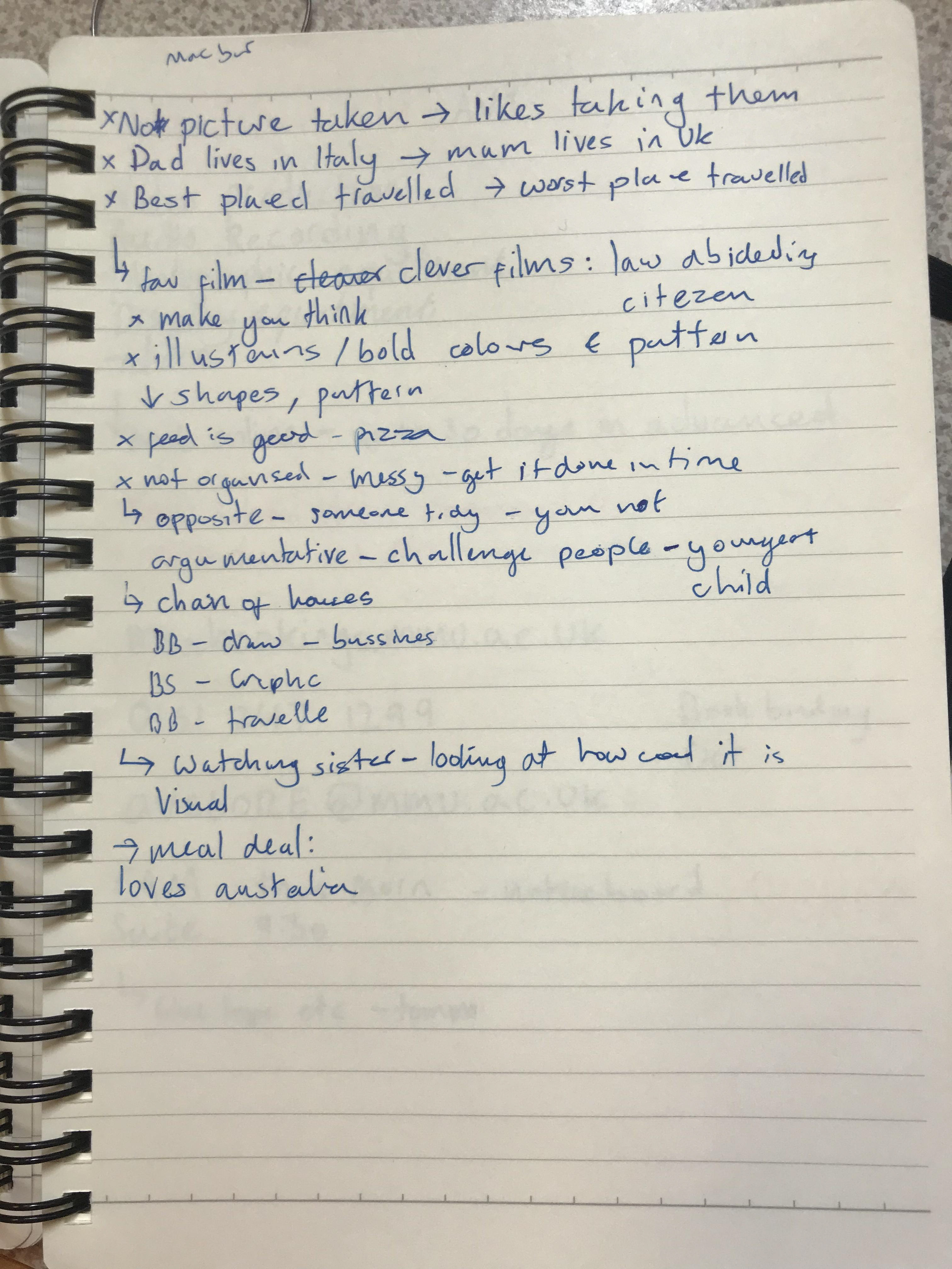
Above are notes from the first group session about this brief.
I've written down what i've found out about Holly and how that could possible evolve into an idea. On the page on the right I try link some opposites as well as some pairs from things I learnt. Things that draw me are her love of travel - finding out her favourite place: Byron Bay. Where she is from: Bakewell. As well as previous travels and her love of photography.
Initial thoughts
Holly loves to travel and has seen first hand what mass tourism can do to an area - I feel like this is something that she likes to talk about and wants to do after uni.
In terms of more local things of what she likes:
-Film/tv that make you think ~ law abiding citizen
-Art work illustrations/bold colours/patterns etc
-Sees herself as a messy and disorganised person but has also realised that she has been a lot better because her flat are worse.
-All her siblings are creative in one way or another which is the opposite to their parents.
In terms of ideas for signs I would like to do something in a creative style she likes. In terms of themes:
-Traveling-environment care-photography-music-fashion