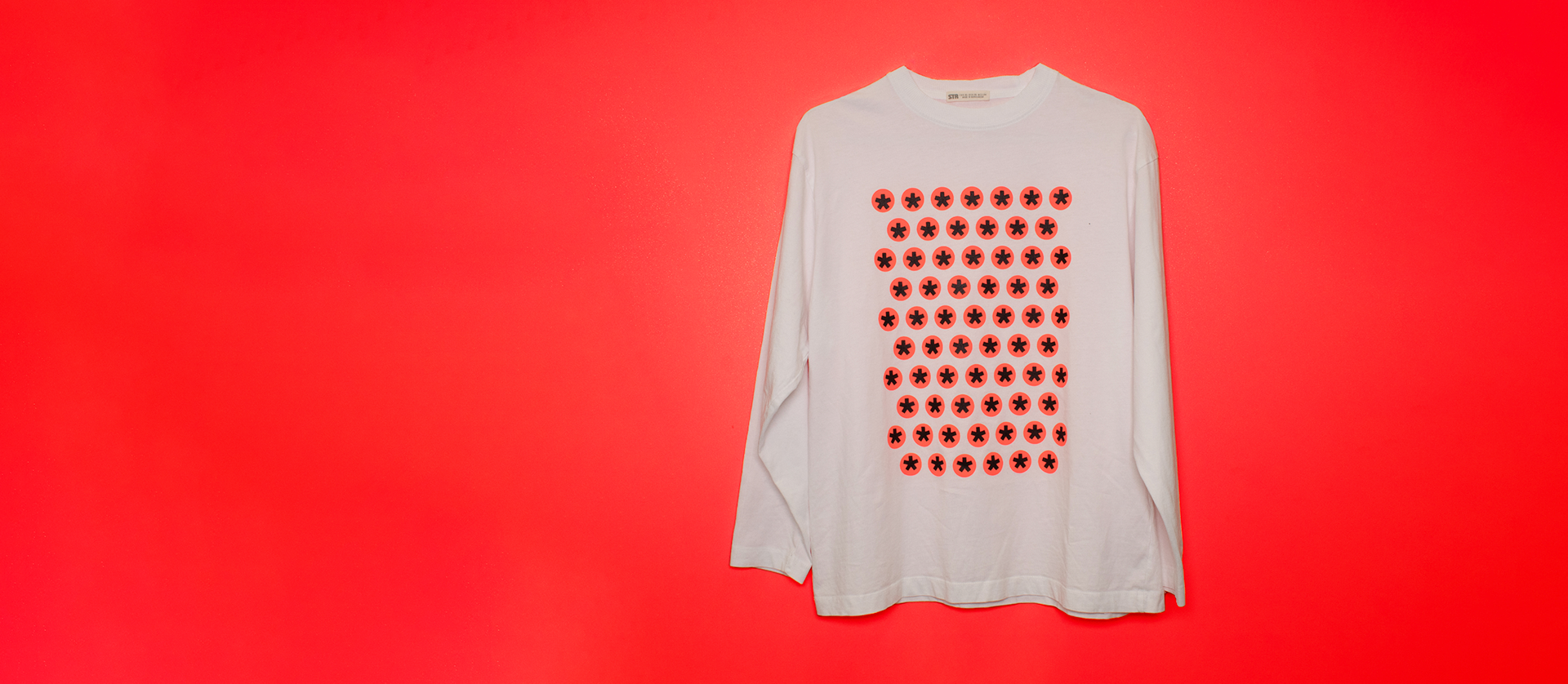
RAW Photographs
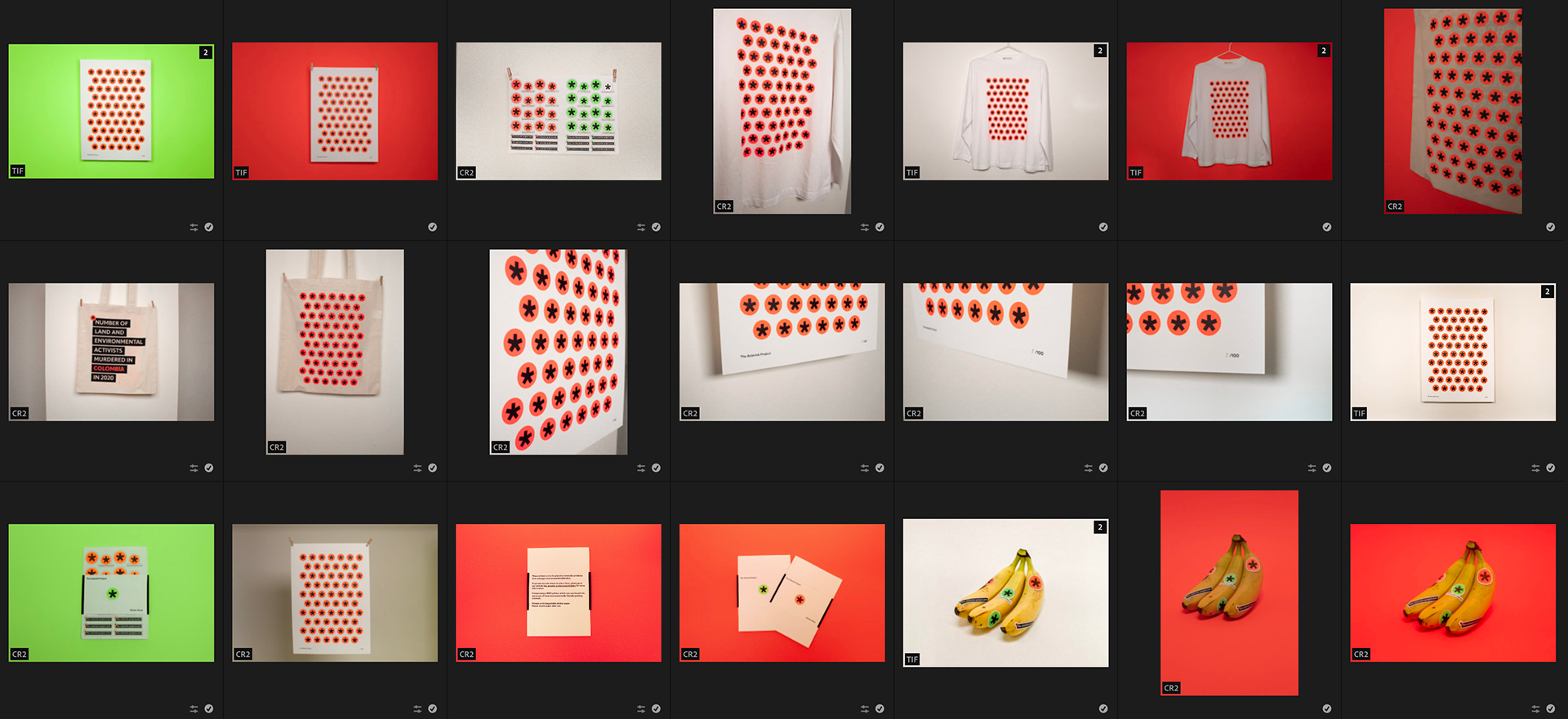
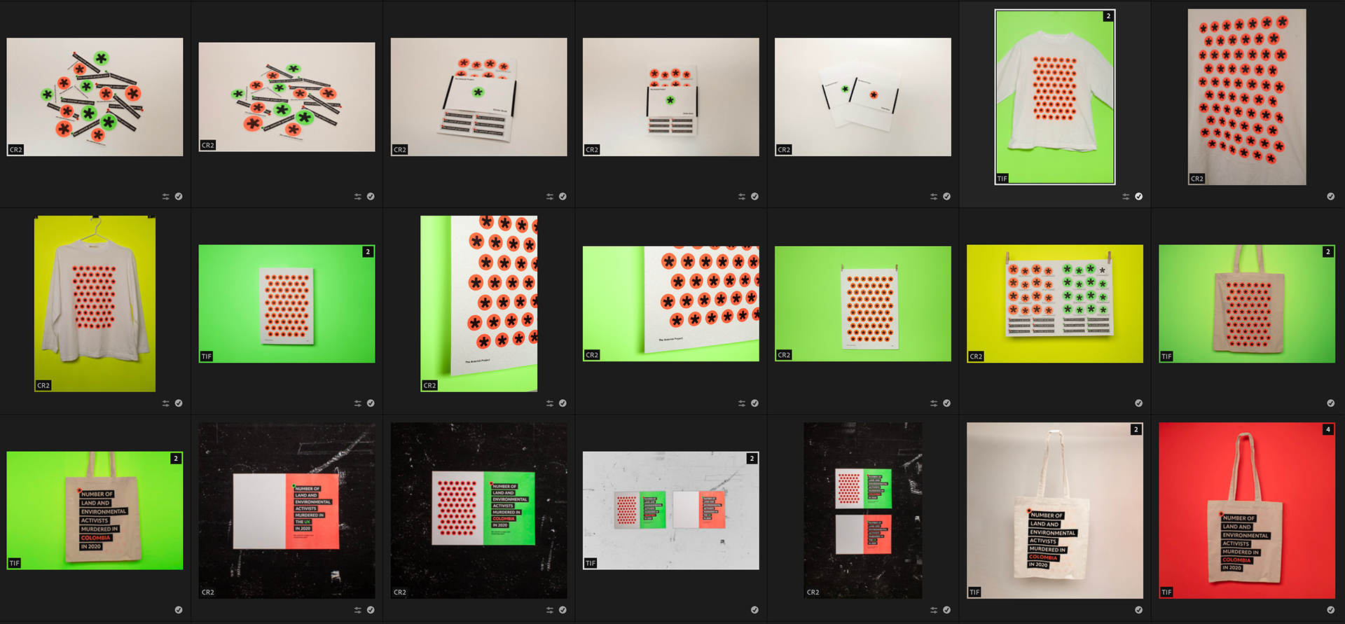
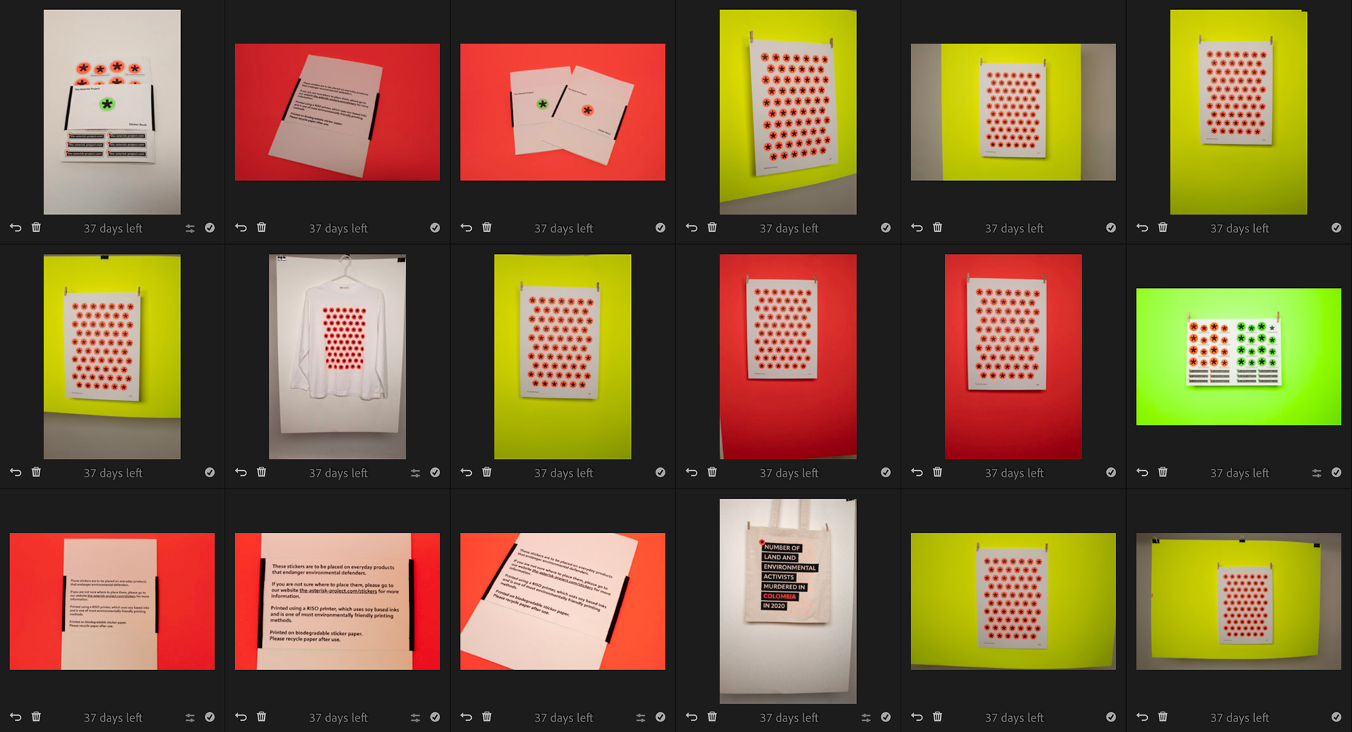
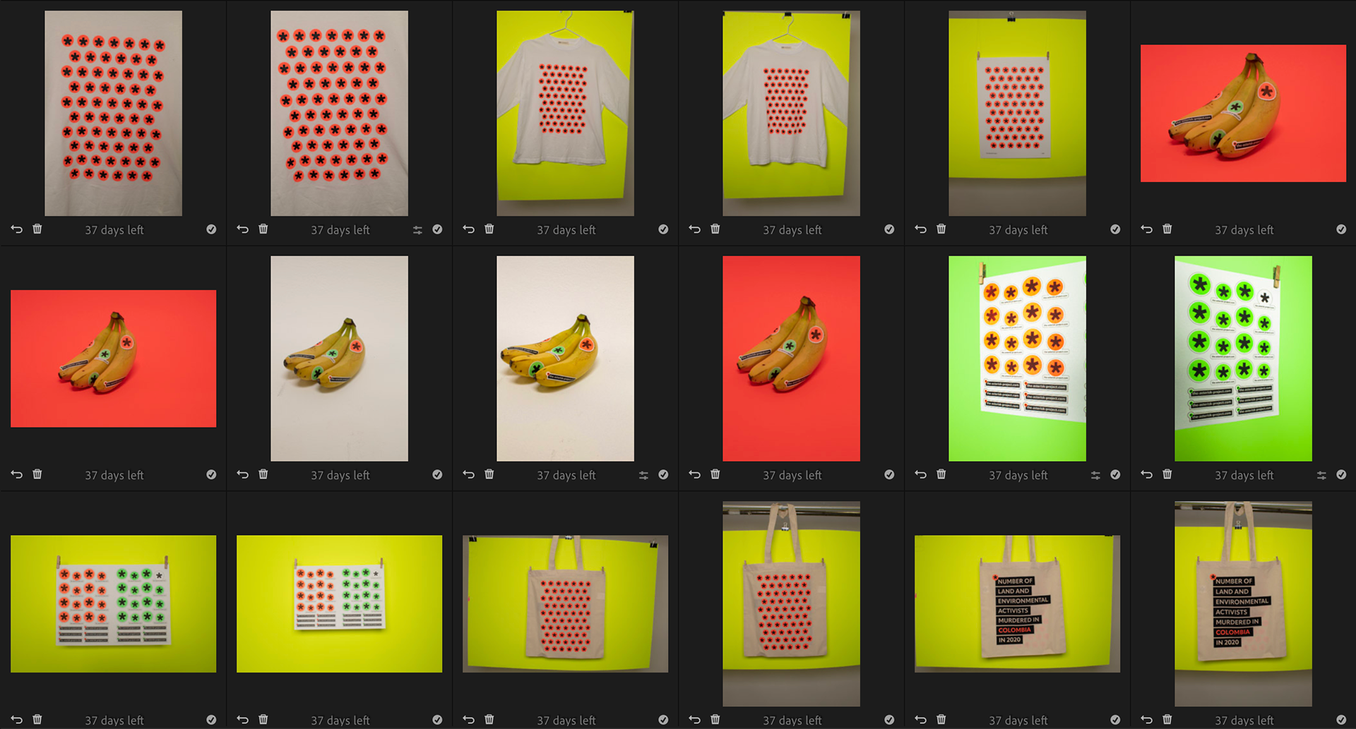
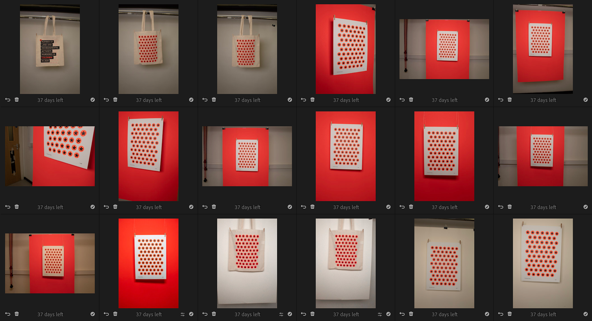
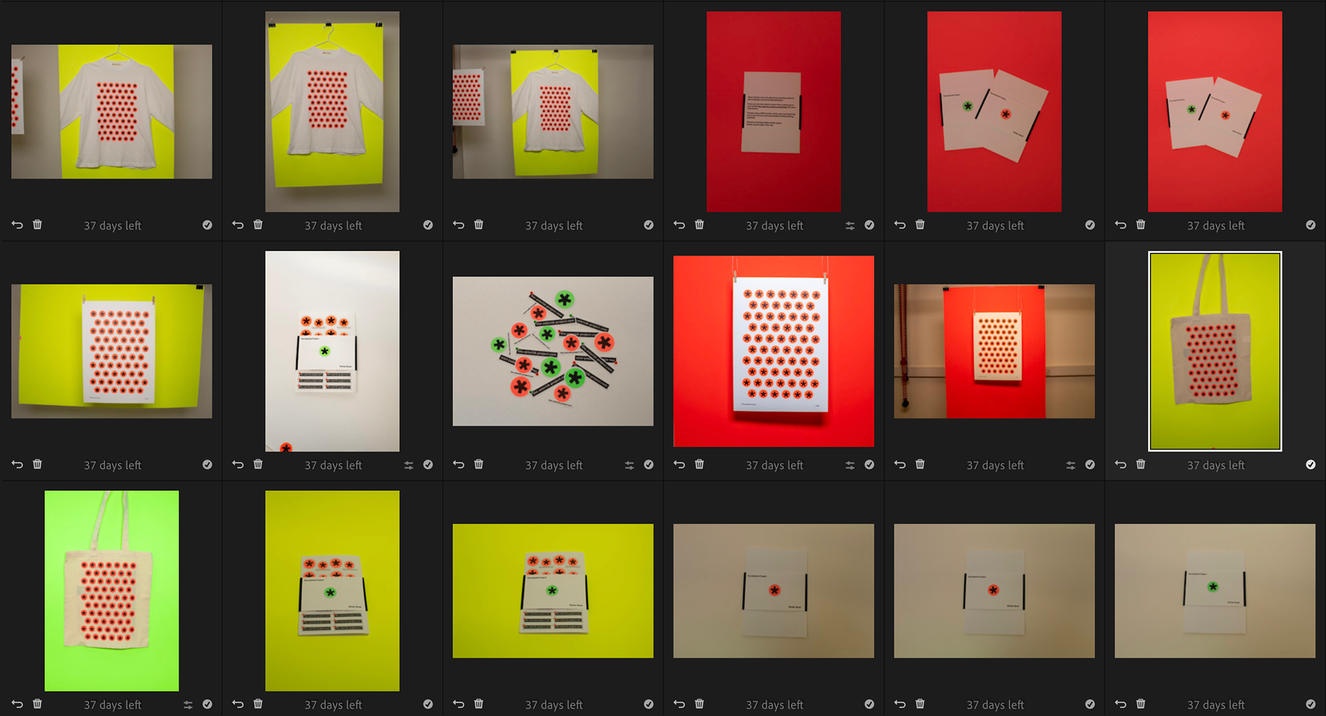
These are most of the images I took. I think it was a good idea to have booked out the daylight studio as it’s helped made the products look more professional.
I will use Photoshop to edit out things like fishing wire and clips and Lightroom to edit background colours and add vibrancy to the photographs.
Audience
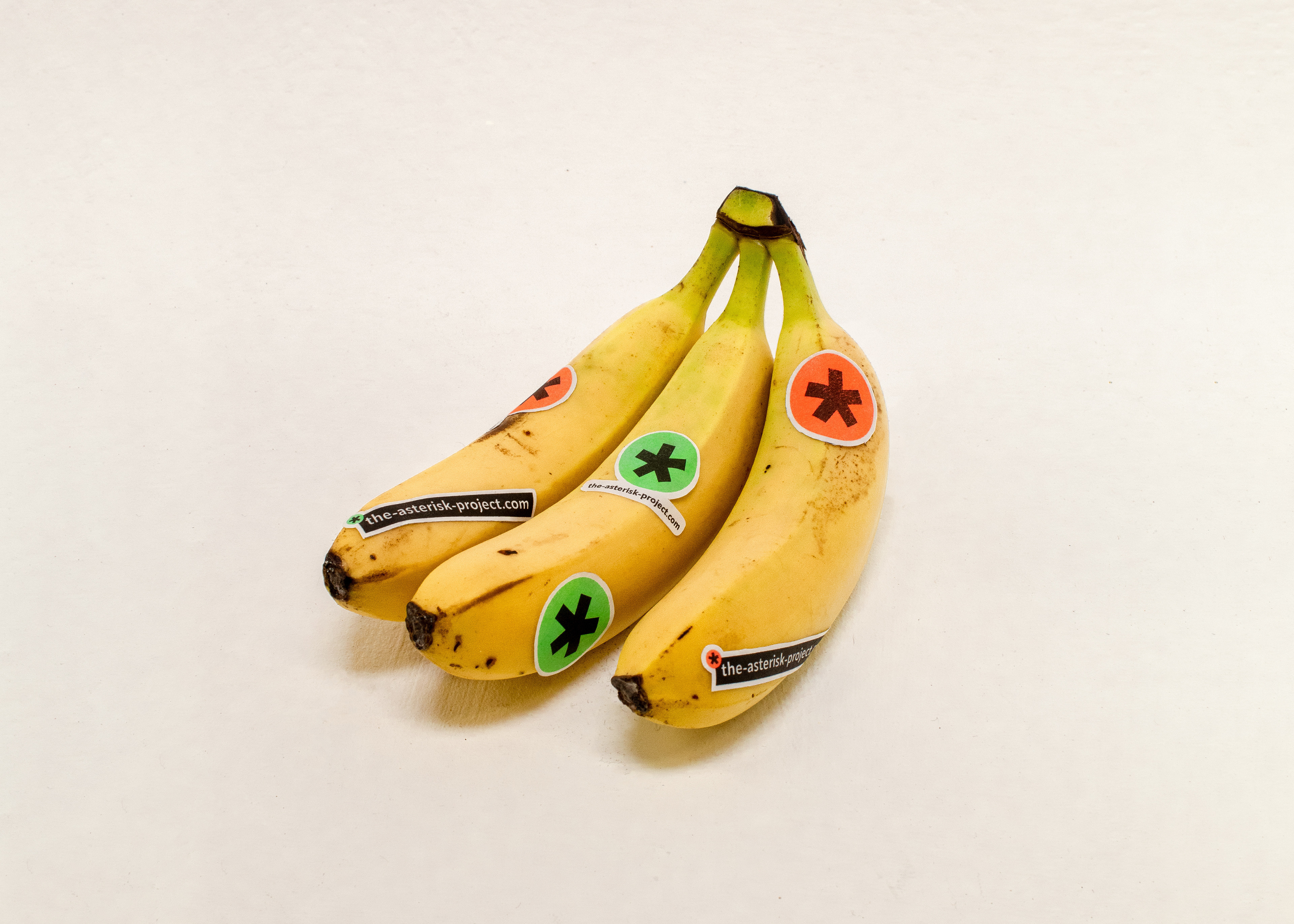
I have narrowed down my audience to young-mid adults (18-37 year olds). I feel by narrowing it down it fits better as the identity is quite vibrant and has design qualities which may not appeal to older audiences. The bright colours and sticker idea is something that might resonate with younger audiences. However I still hope that it would attract those older/younger as the different touch points I am creating allow for different entry points. E.g. Traditional Ads (older audience) Fly posting, social media etc could attract younger audiences.
Quick Website Mock ups
Website mockups from some of the original wireframes I did. I quite like these but feel they need more development and I should probably get my content outline and website map semi secured.
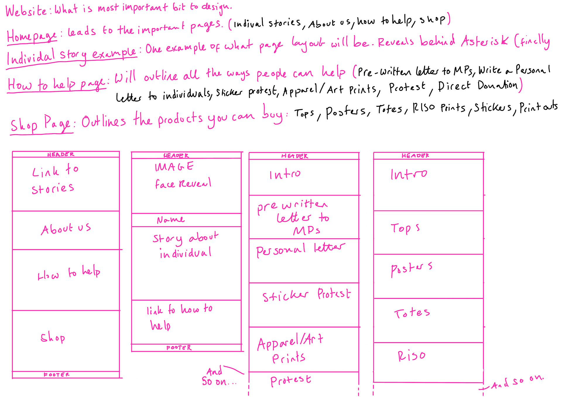
Website - Content Outline
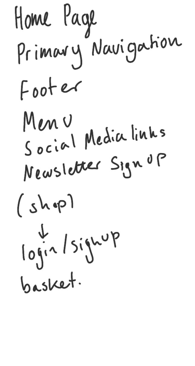
Going back to the website I wanted to work out a rough navigation.
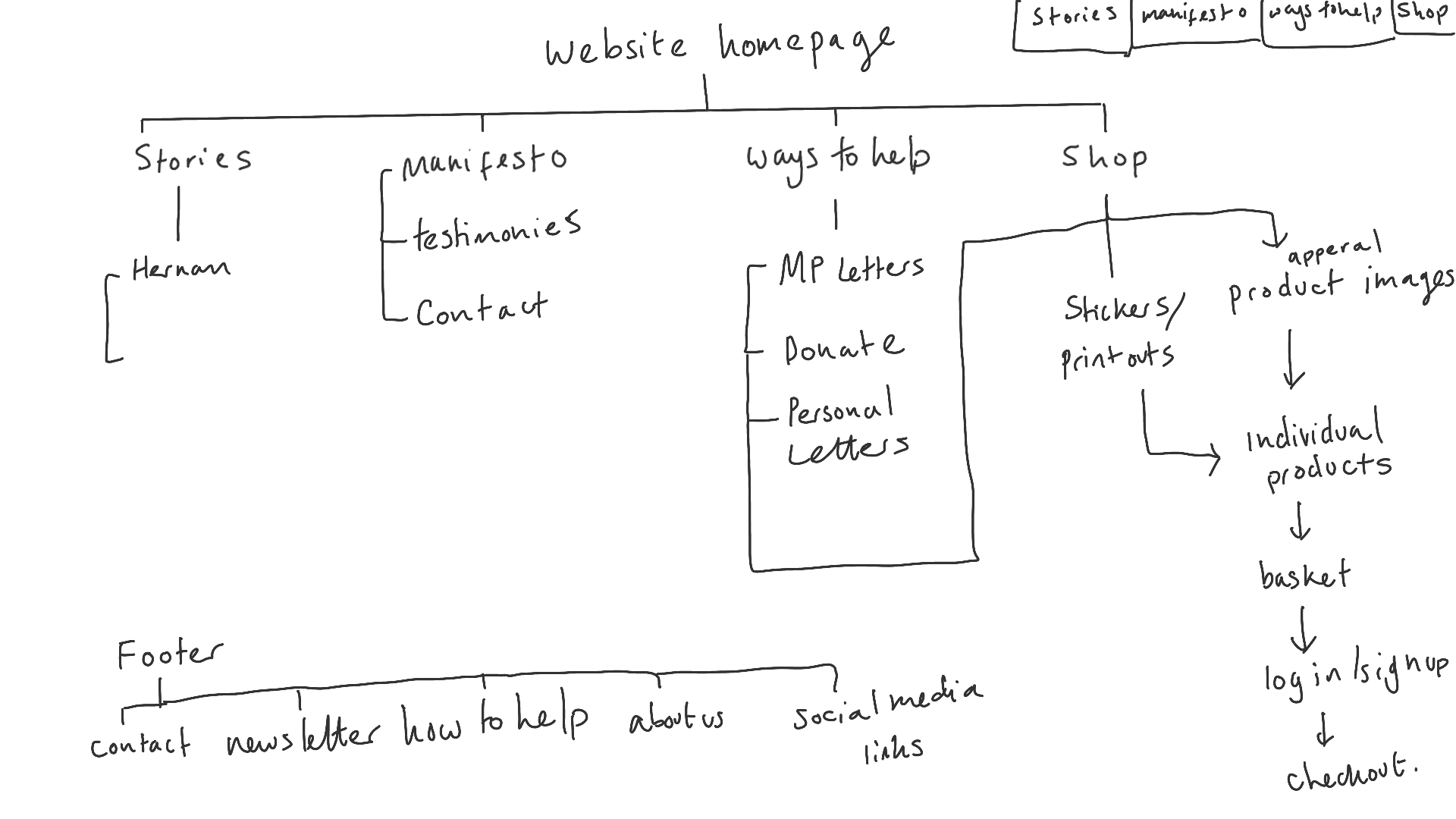
Wireframes
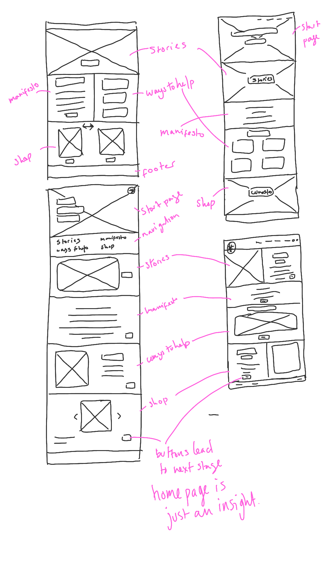
These are some homepage layouts I am going to try out. I want this website to be as easy to navigate as possible.
Website Layouts

Adobe XD Test
No. 1
No. 2
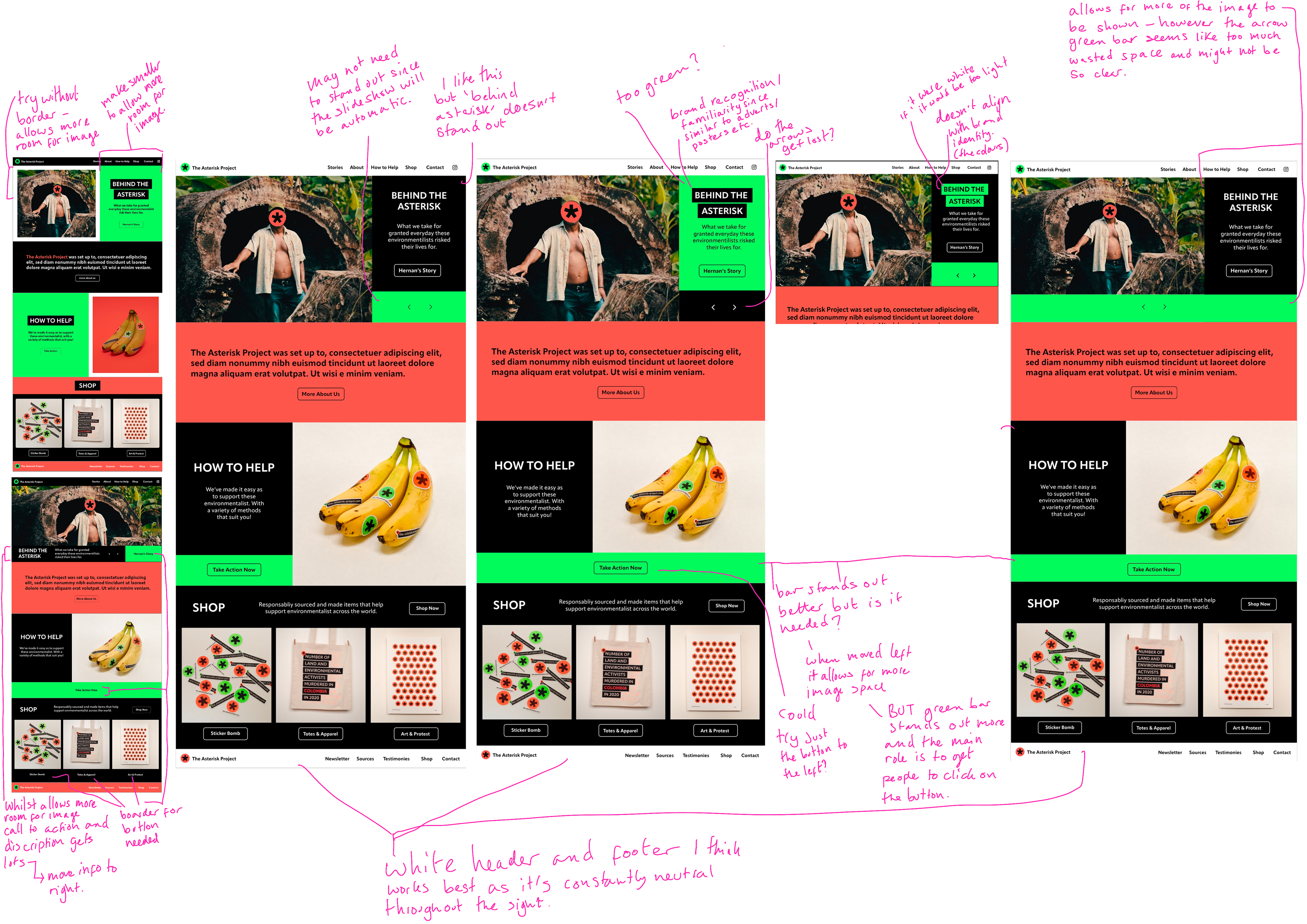
Feedback
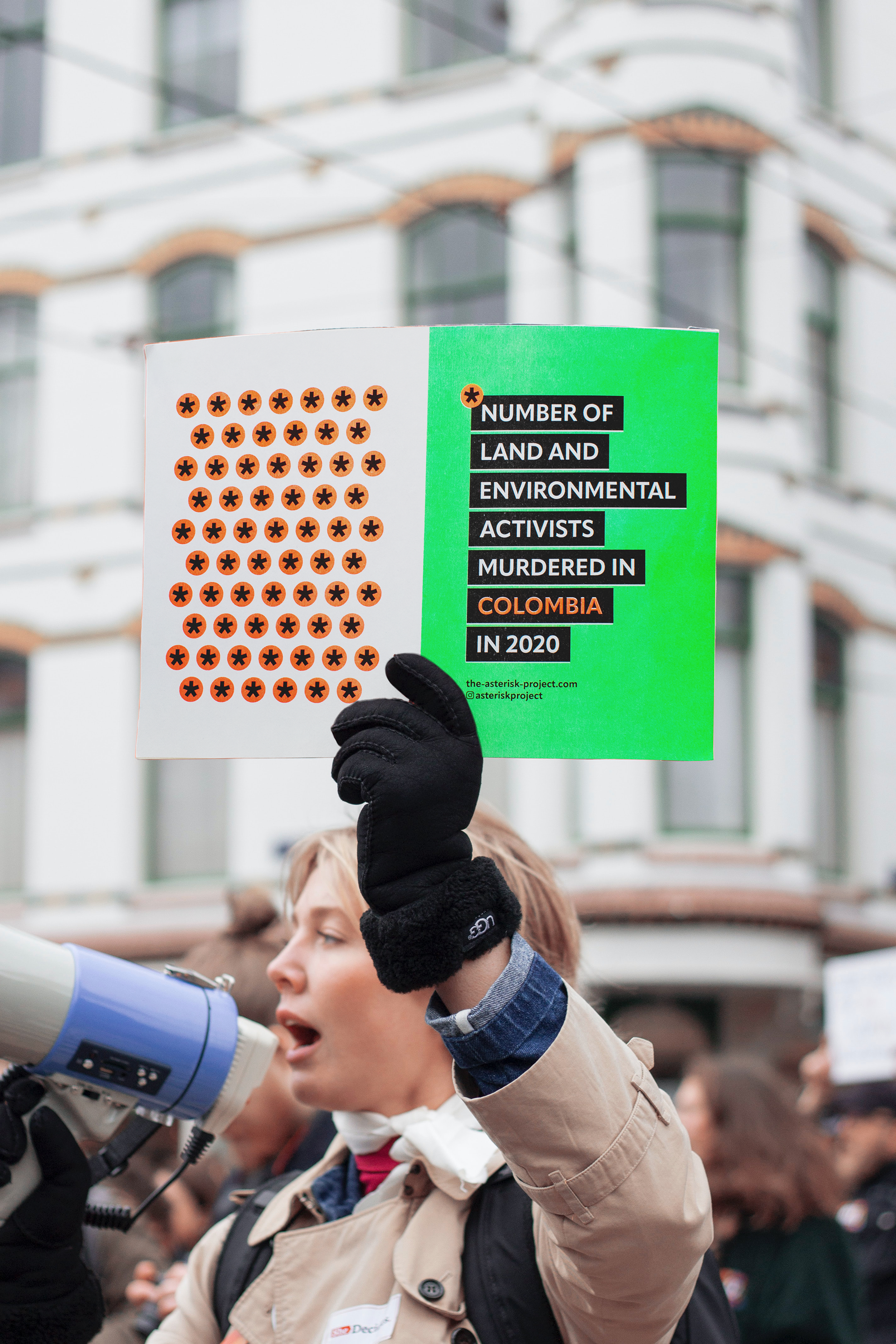
Person 1: Para mi, no. 2 gets the message across more immediately, the way it's laid out. I'm not sure about the bright green colour though, in terms of there being so much of it on the title slide thingy. I think they're both great but if the colour of no. 2 could be toned down a bit or changed somehow, then that would be my fave, purely in terms of message.
Person 2: I like 1 because the big photo ( and shows the banana plantain …. but agree with Trish that the #2 the message come clearer…. Or if you can make BEHIND THE ASTERISK in #1 bigger ? E.g. name of activist smaller or in the photo ….. Then the rest of #1 I prefer I like the how can you help with black and green background
This is some quick feedback I got, I am going to try and take onboard things both people said. Like: Making the 'behind the asterisk' stand out, making sure the way the green is used isn't too intense and not cropping the imaging too much.
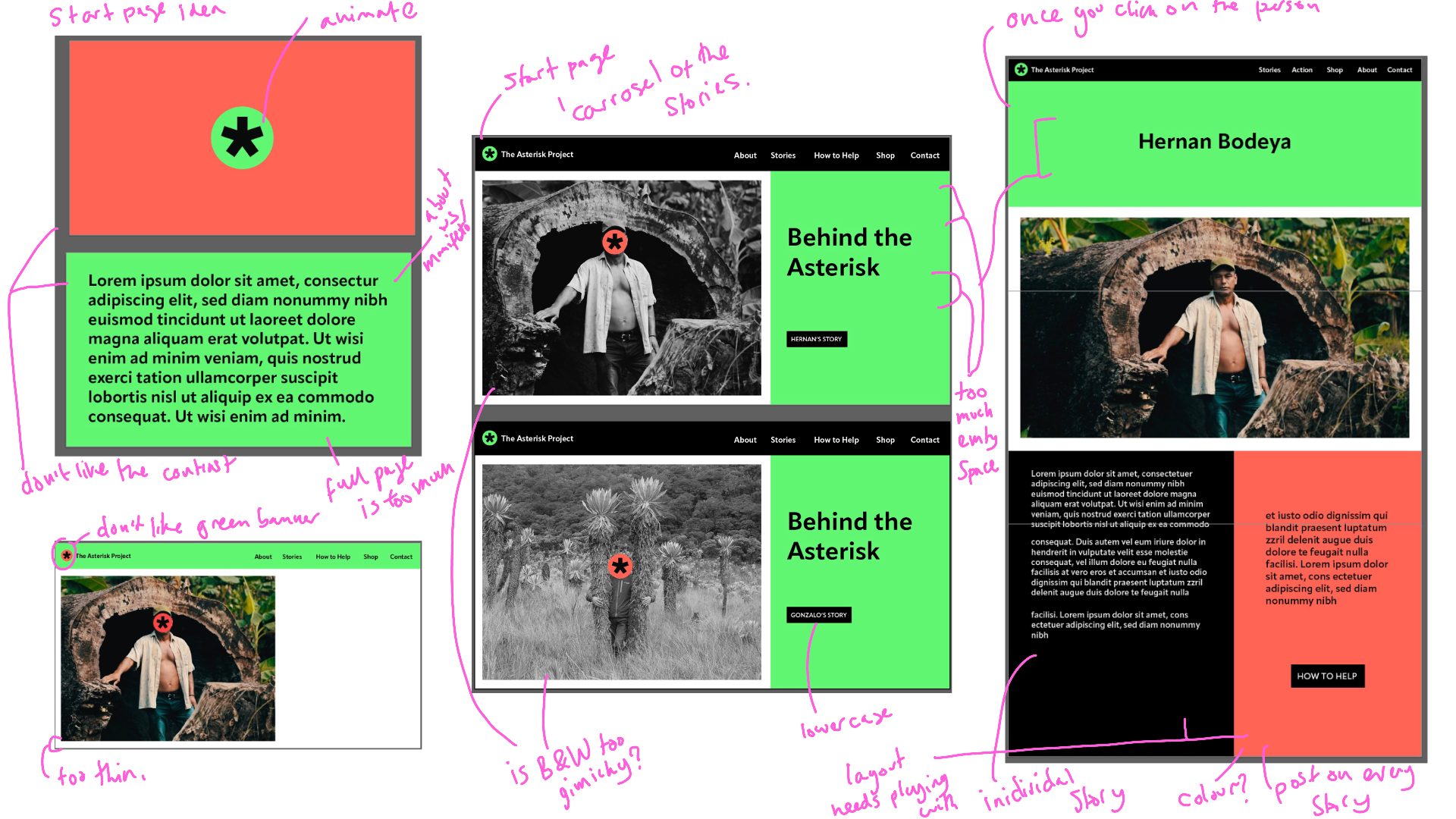
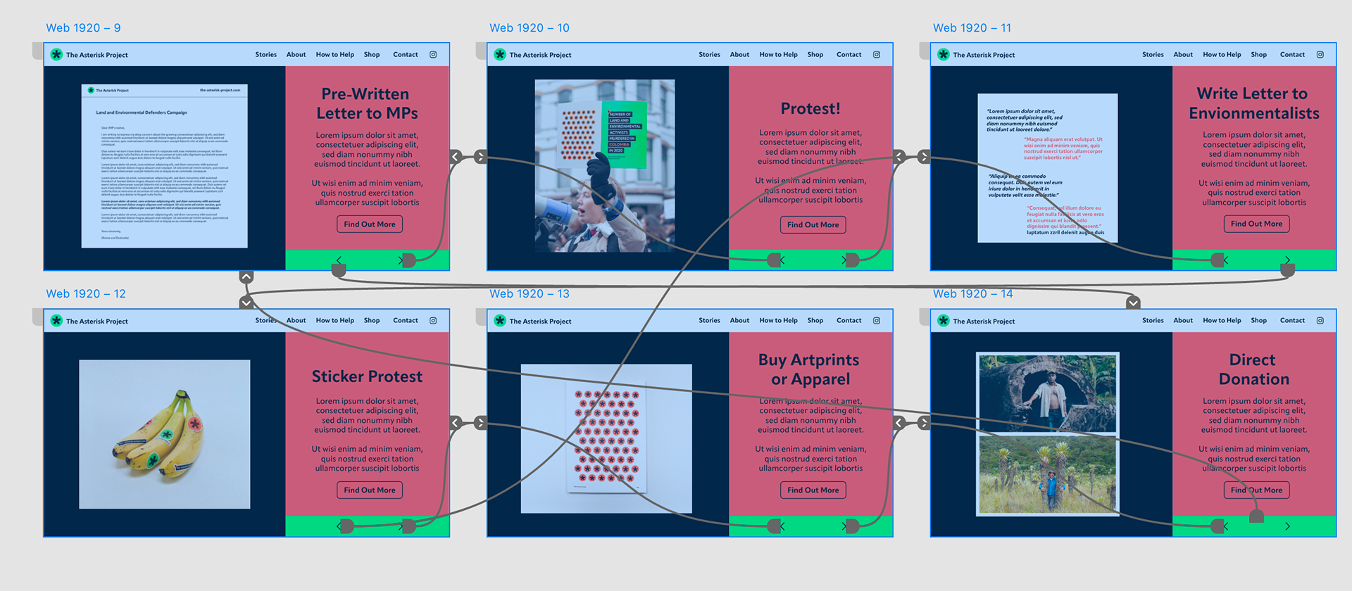
Start Page Development
Further development of the start page with annotations as well as some screen recordings. I'm quite happy with the layout but haven't settled on a favourite, I am going to develop and plan the other pages and revisit these.
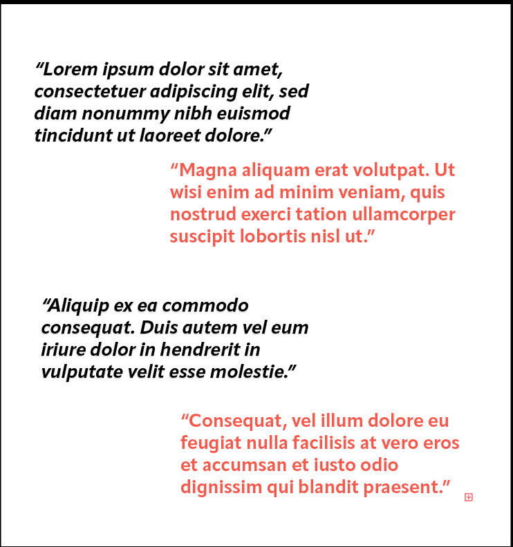
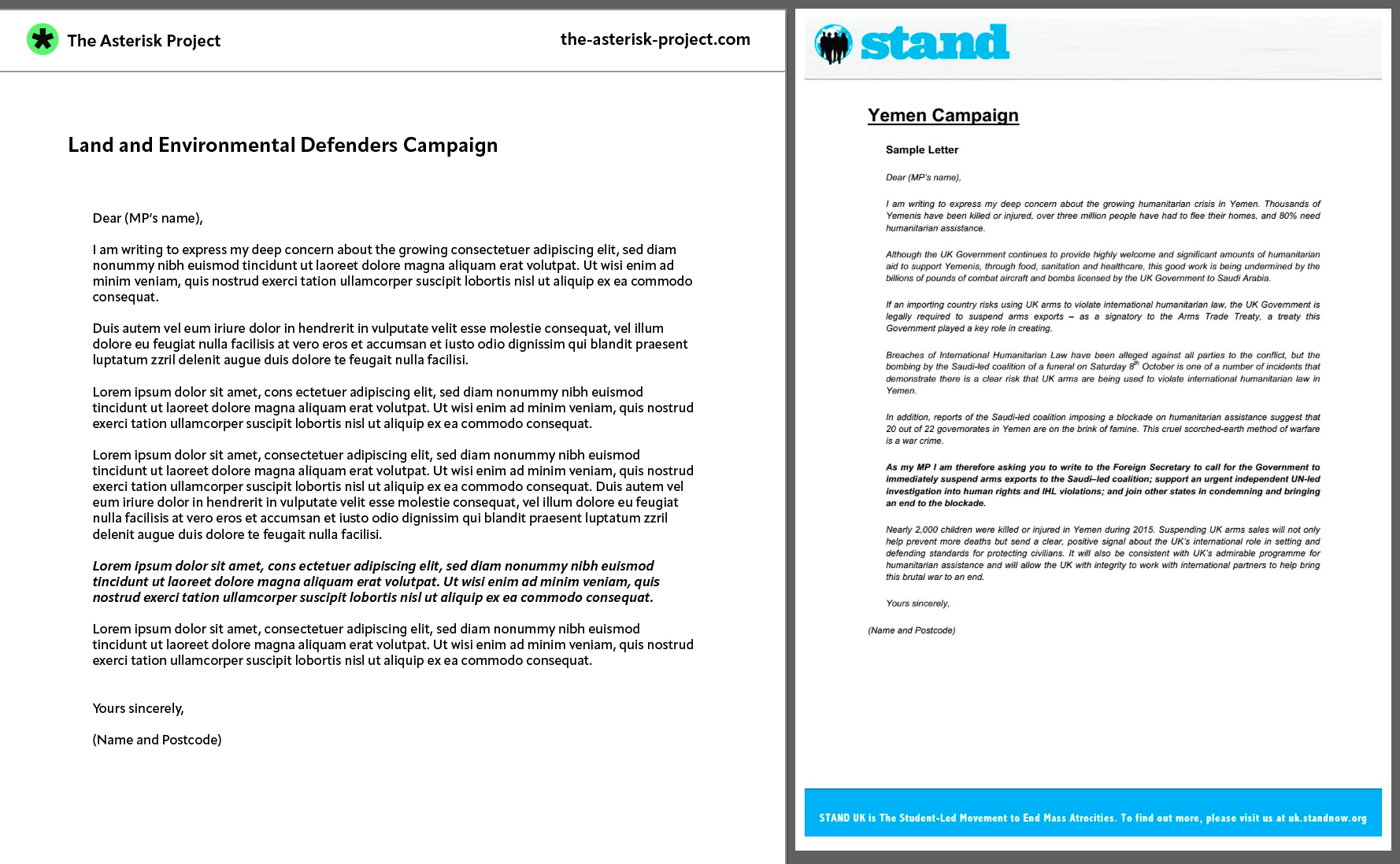
Individual Stories

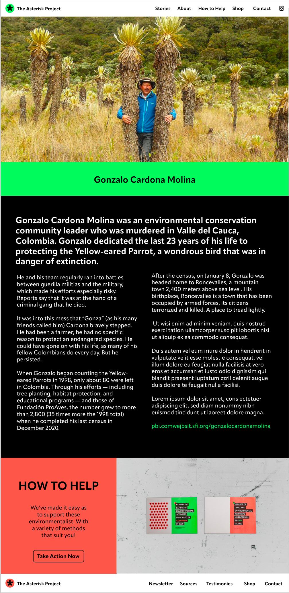
These are some examples I've done following the similar style to the homepage as it's important for the design to flow through the whole site. I don't want there to be too much writing as it can seem overwhelming, so i've put it in columns which are easier to read and process as well as breaking up paragraphs. There will also be the option to read more by going to one of the other charities that work with individual and people affected by violence against land and environmental activists.
Wireframes
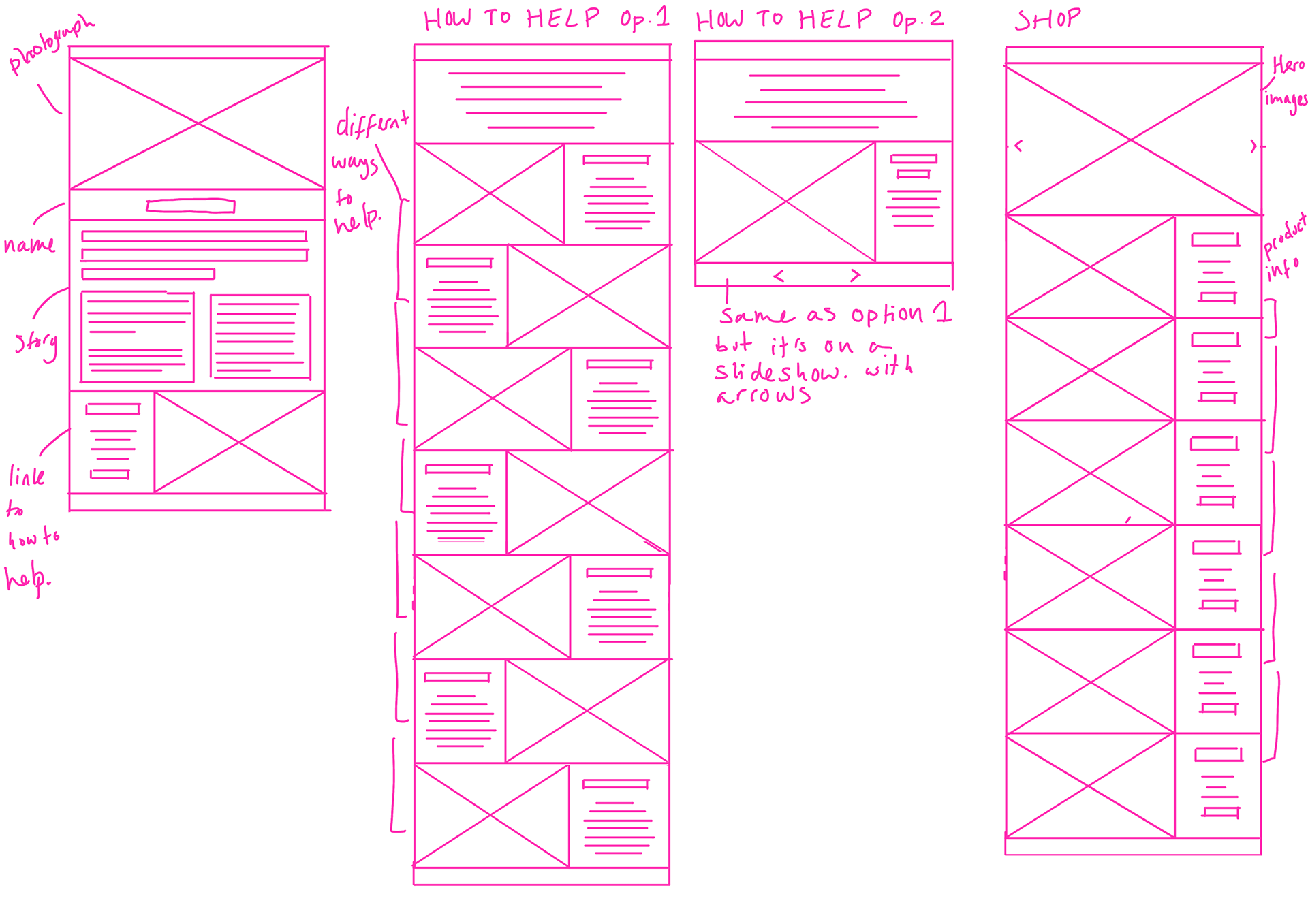
I just wanted to do a quick plan as a starting point for the other pages so it gives me more structure before designing. Annotations on wireframes.
Development in ILLUSTRATOR
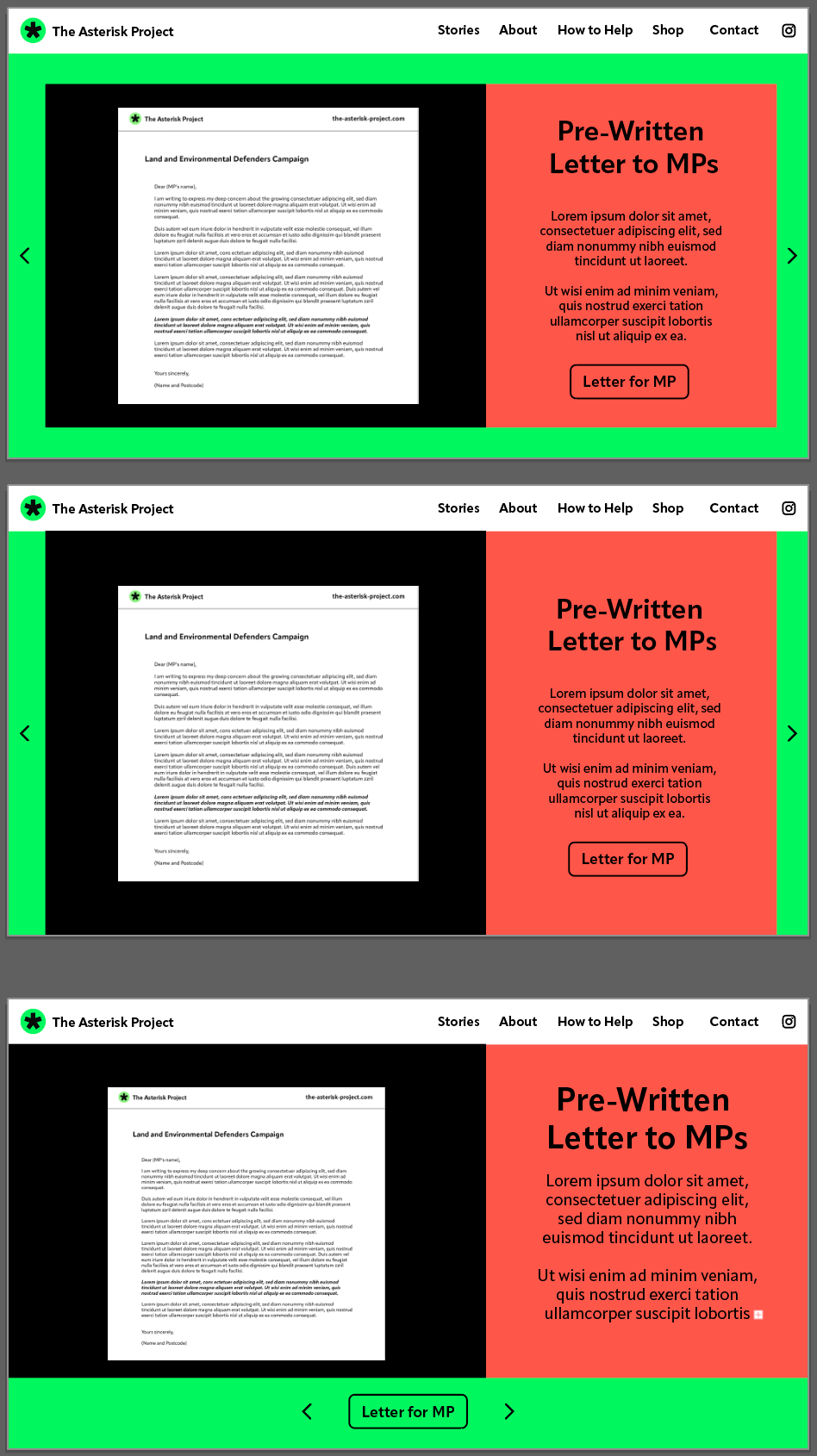
I like the idea of a slideshow so people can quickly flick through and there's no need to scroll down. It means they able to stop quickly if they see a way helping that interests them and are able to find out more. I want to have a bit of colour and have the arrows be noticable, but I feel my versions take up too much space so might try moving the arrows to the side. I did like the one without the arrows, but I feel it best for this page to be sliding sideways, thus arrows needs to help people navigate.
arrow development
How to Help Assets
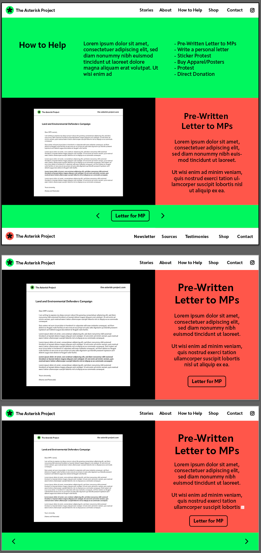
Testing layout for How to Help Page on xd
I'm happy with the way this looks, I think this layout style is fun and shows the viewer the range of ways to help in a quick way. In hopes they don't click off.
Things to add might be an intro for what the page is encase they have been directed there from an external source and I may also make the font smaller.
Shop Page development
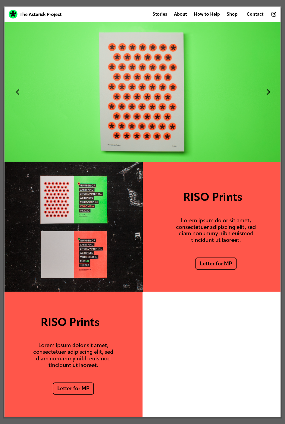
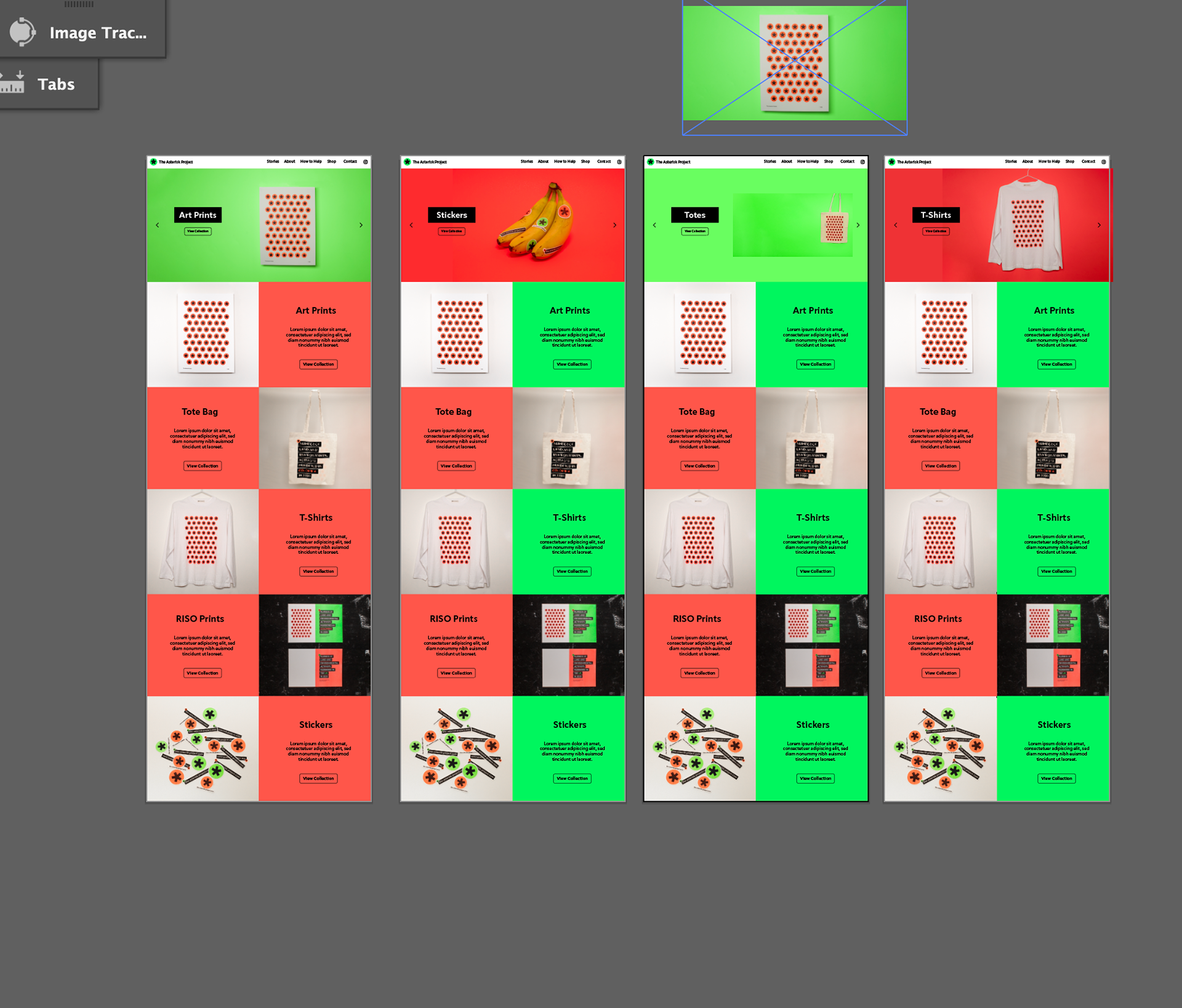
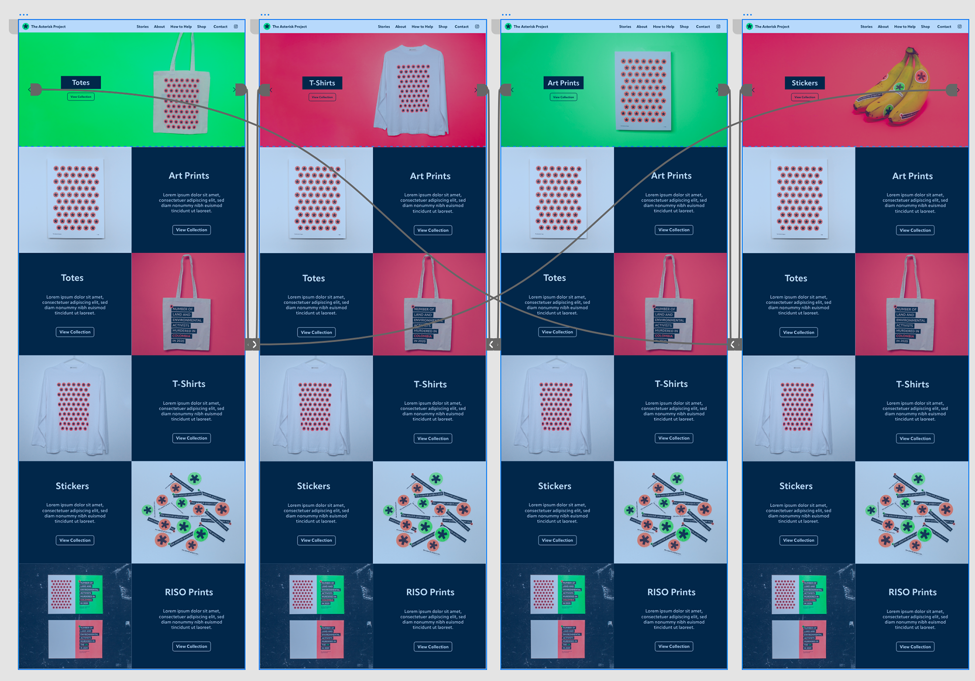
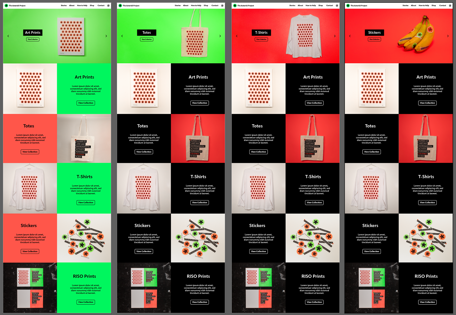
I started the shop page as quite colourful, I wanted a hero page at the top that people can see more impactful images (hero images). And so it can slide automatically and hopefully catch people's eyes. I then have the products with a small description so people can scroll down if they wish to know more. If interested they would then go to the collection page.
I've had a bit of problems with colour matching consistently but did try to make it a bit better, however I think this is an issue with how I took the pictures and what background I used.
I changed the profuct tiles to black to allow some neutrality since the hero images are bright colours and that it isn't too distracting when people are scrolling. I also changed the tote bag to red and the white background photo wasn't great quality. I've kept the background images white for the t-shirt and tote to help with avoiding too much colour, which I feel could be distracting.
I've tested it in adobe XD and I feel it flows well.
Instagram Plan
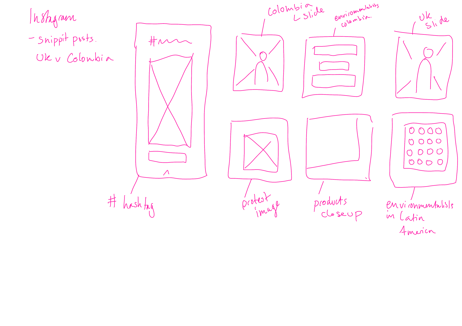
I don't want to overwhelmed with instagram content since the social media and website is just meant to be a snipit of info. I have plan out six pages and a story, this I feel is enough to give an idea of what the instagram page will look like.
Instagram Development
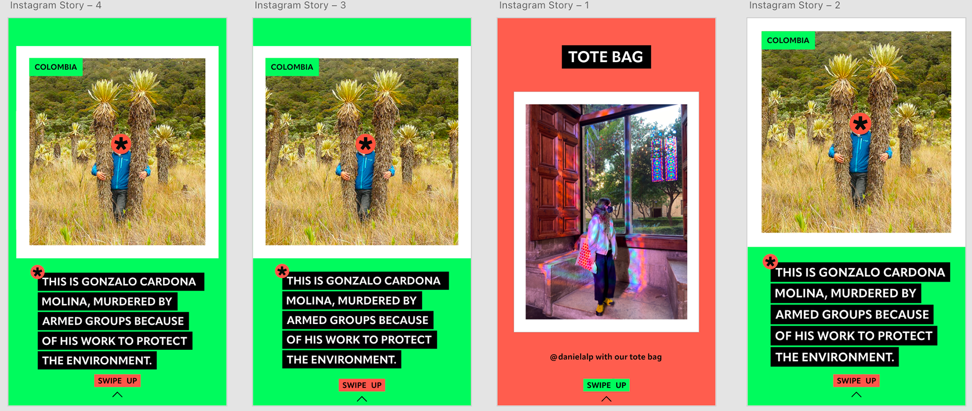
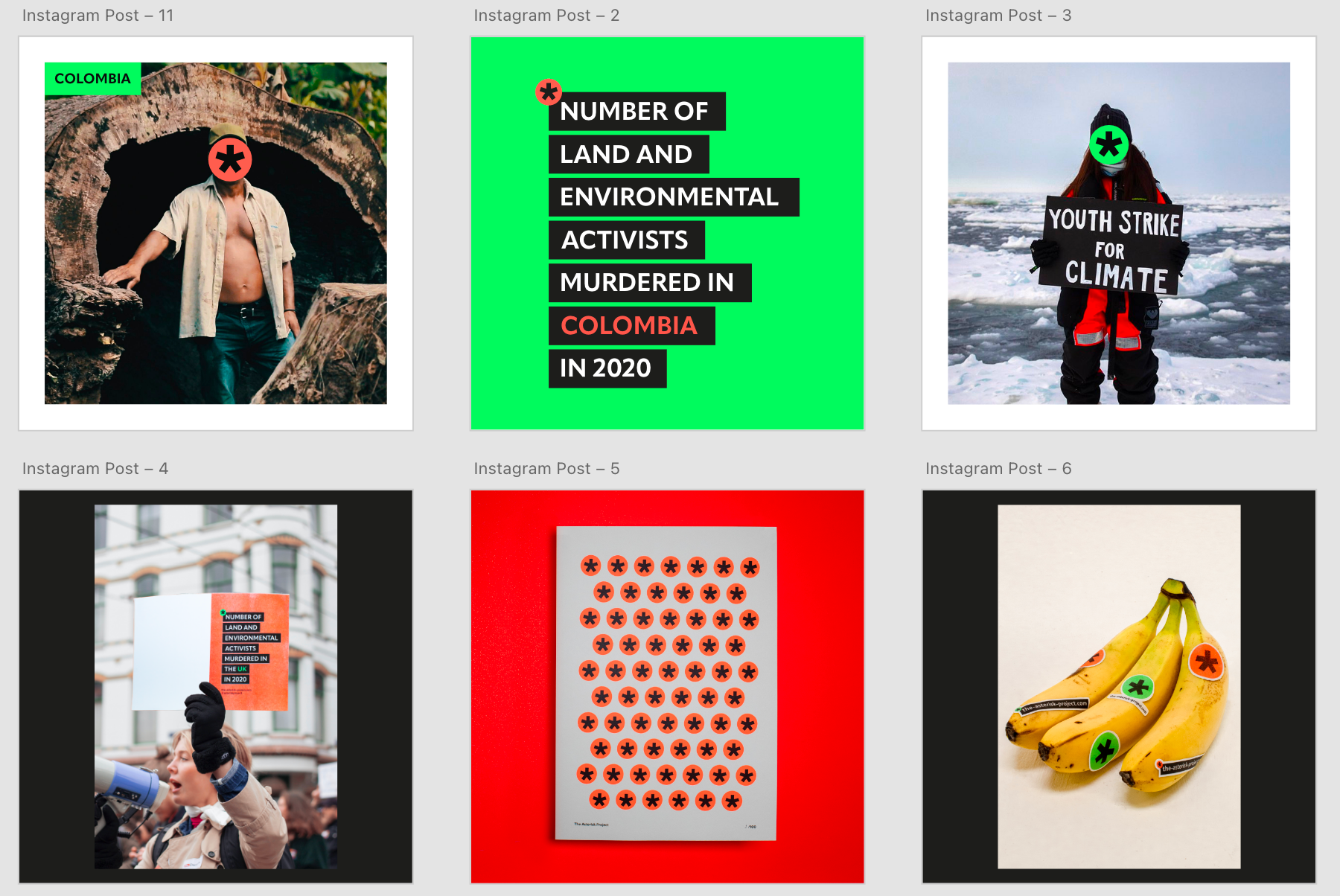
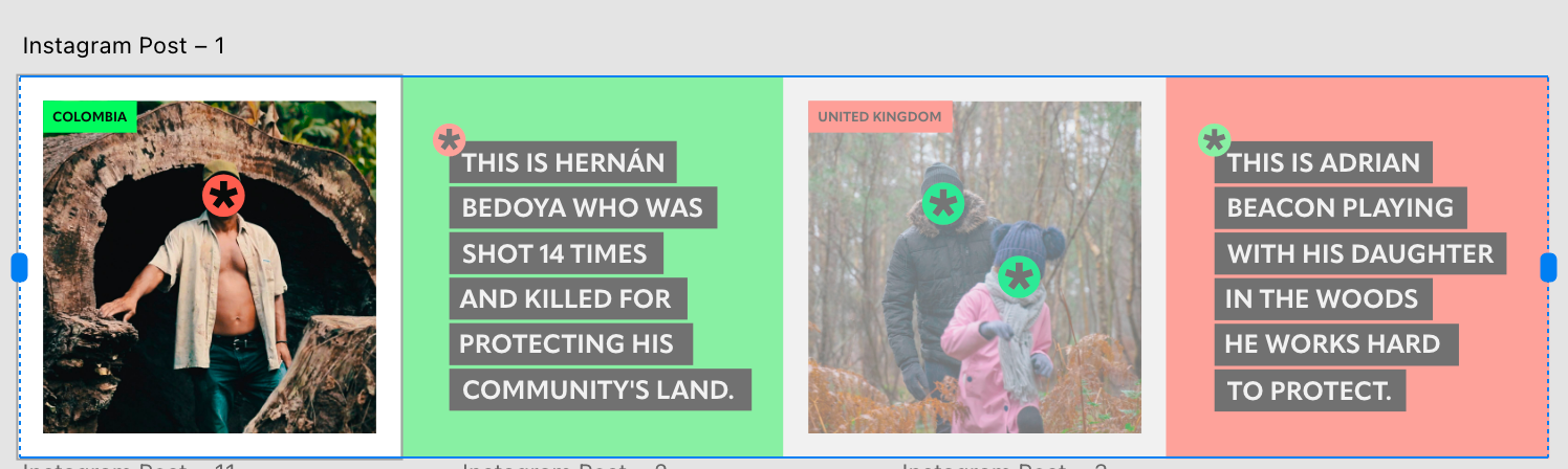
Using previous assets and resizing to instagrams sizes on adobe XD, has helped with keeping a consistent style but also with time.
I added another story as I feel it was necessary as it's something people can share easily, which can help spread the word and a link to the website article. The other story is to show members of the public what people have been up to with their products as well as swipe up which would take them directly to the shop.
The 6 posts show products, ways to help, call to actions and statistics. There would be a rotation of new topics/Current affairs relating to land and environmental defenders.
The purpose is to help spread word and it's where people can found out more info and even be led to the website.
Final Changes I've made
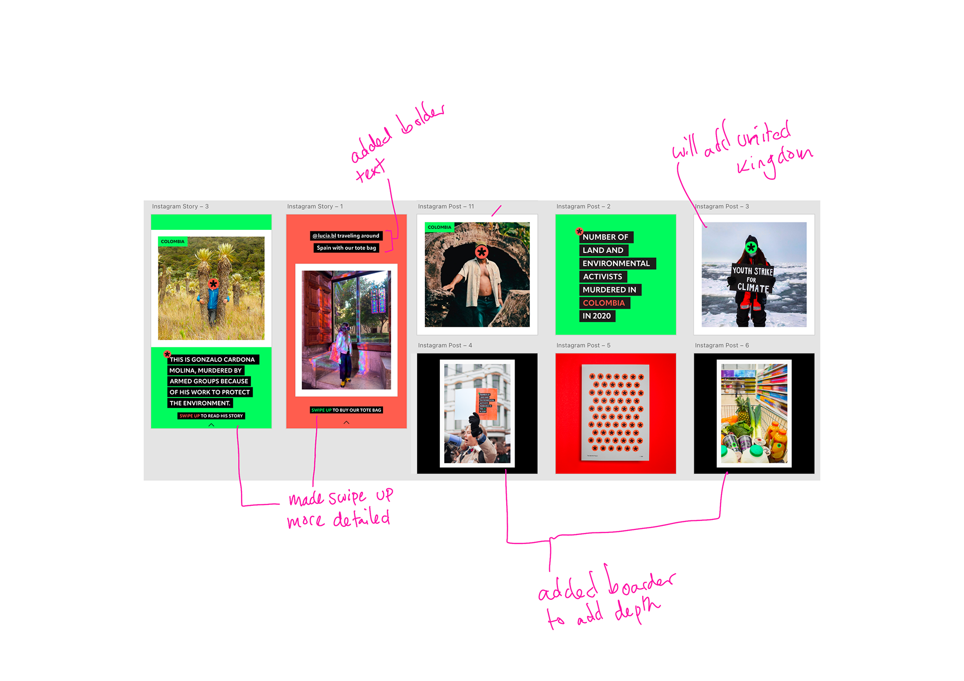
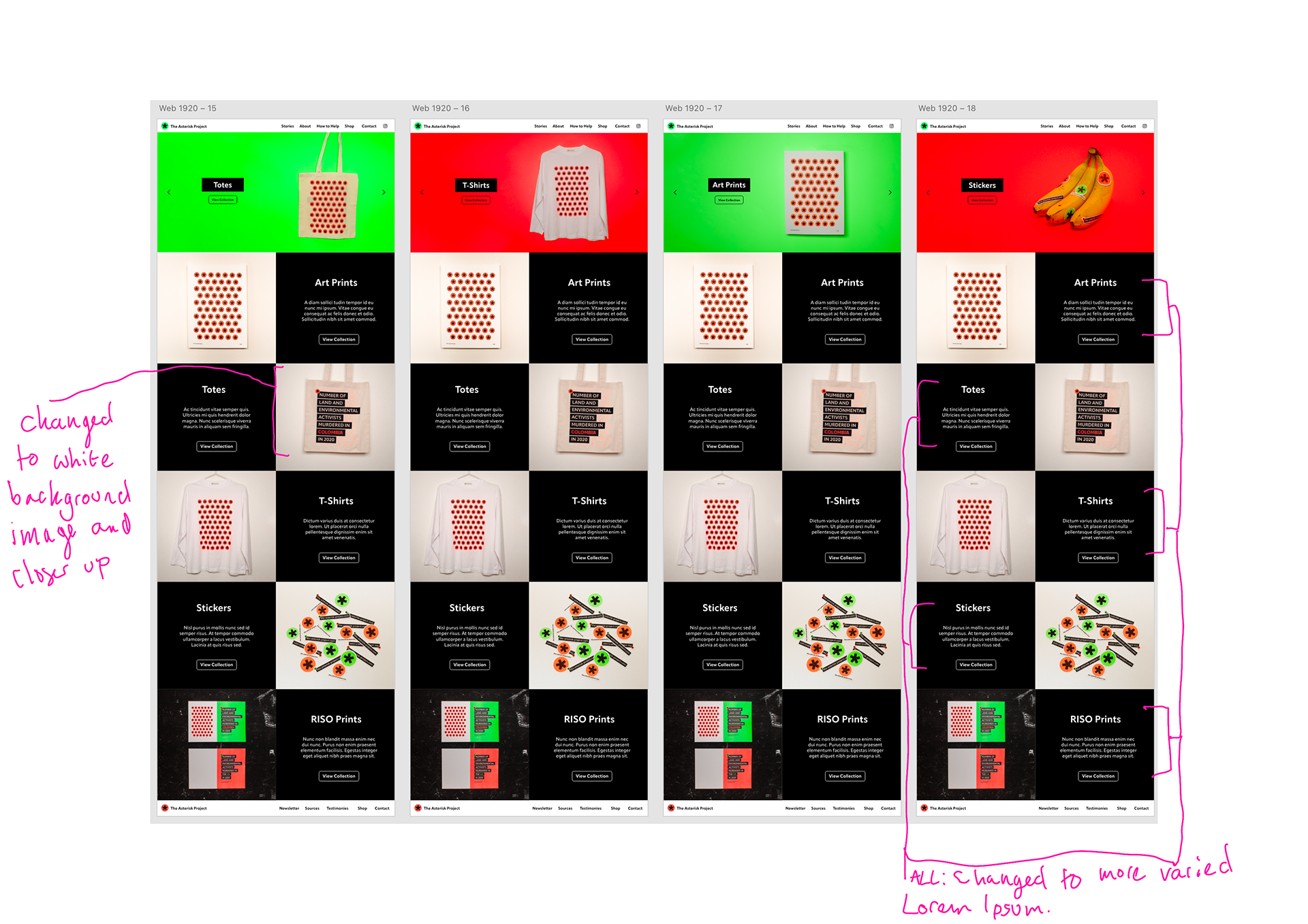
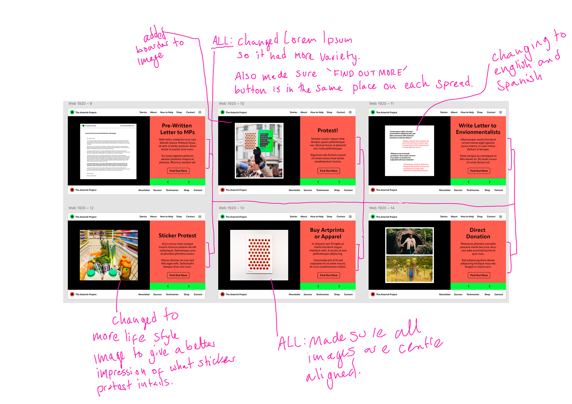
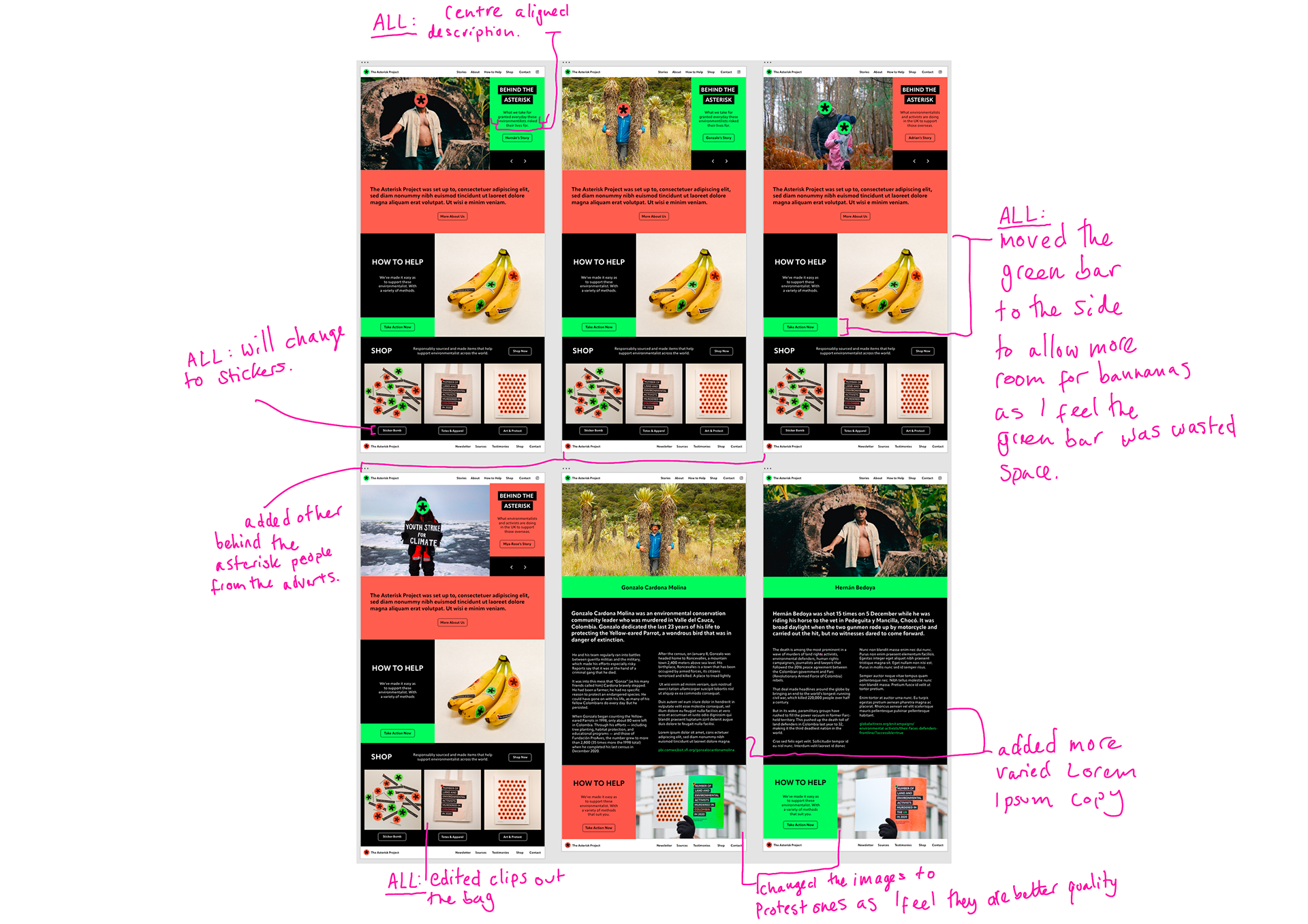
Annotated are the final changes I've made to the social media/website assets.
Animations
These are my final animations for social media/website assets
Portfolio