Feeling Lost
I’d been feeling a bit lost because I realised what I wanted to create I didn’t really have the time to do and was making myself overwhelmed with too many expectations I was giving myself. I had a talk with a friend and took on some of the advice from the tutorial. And I’ve ended up that it’s probably best to strip it back and just use the photos as the main content. The next step is working out how I might do this. Whether I stick to it being a personal thing, collaborative approach or something else like a travel brochure or something.
I am going to explore these angles and see what feels most natural. I need to find how I am going to piece them together in a concise colour as soon as I can so I can start designing.
POSSIBLE ROUTES
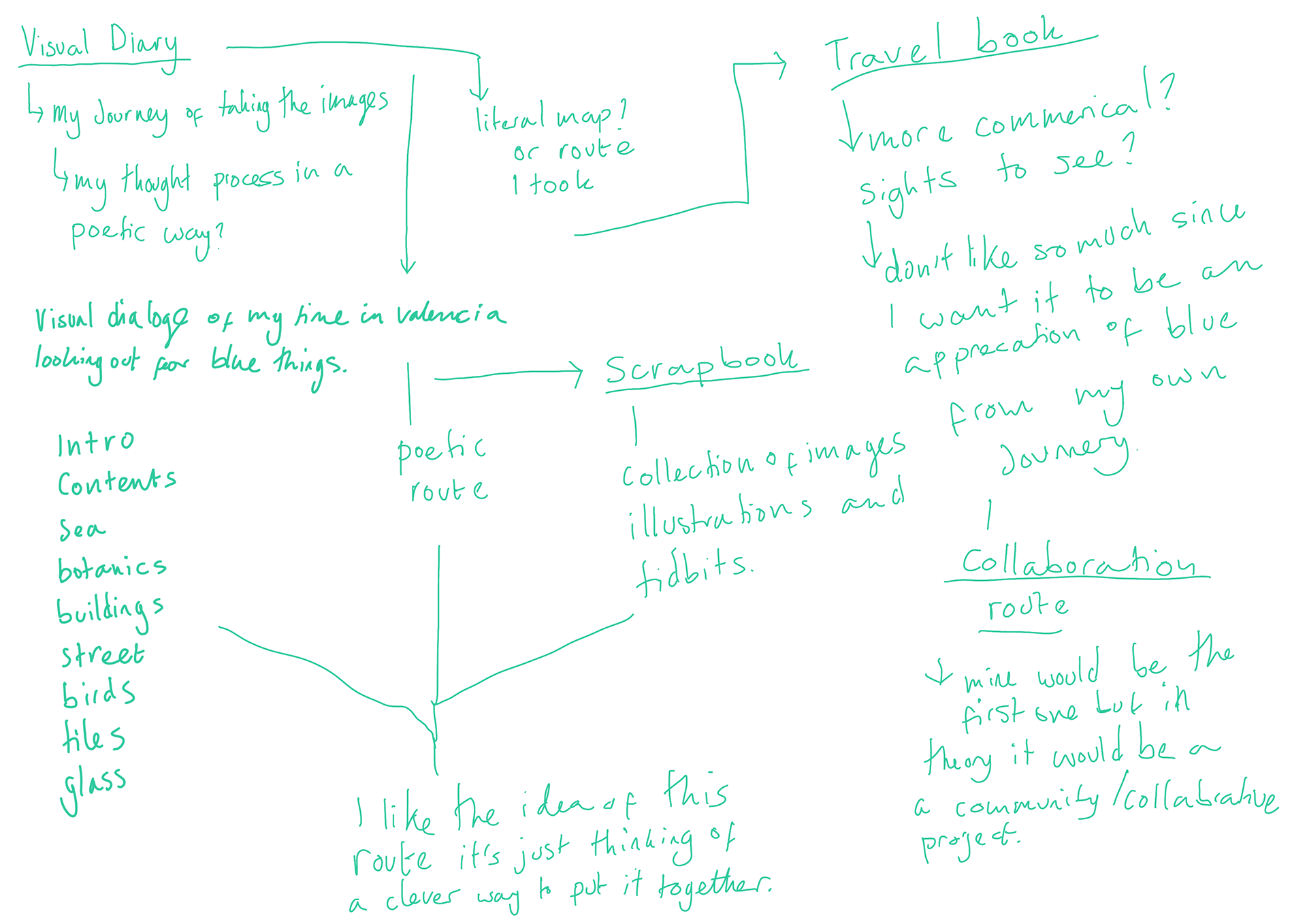
These are my notes and annotation of possible ways I could go. I've looked at the possibility of visual diary, scrapbook, travel publication and a collaborative piece.
Layouts


These are some rough ideas i've mocked up with some annotations.
Decision to do risograph and why
I have decided to do RISO graph printing as the method of printing for a couple reasons.
The effect RISO gives I feel that graining look will work well with the photographs especially since they aren't the highest of quality. Also I love the colours and I feel it will give the publication a really nice finish.
The sustainability aspect with RISO using soy based inks and being one of the most environmentally friendly printing methods there is.
The way it prints with having to line up the black and blue layers is hands on and I quite like that it takes a bit of time to do.
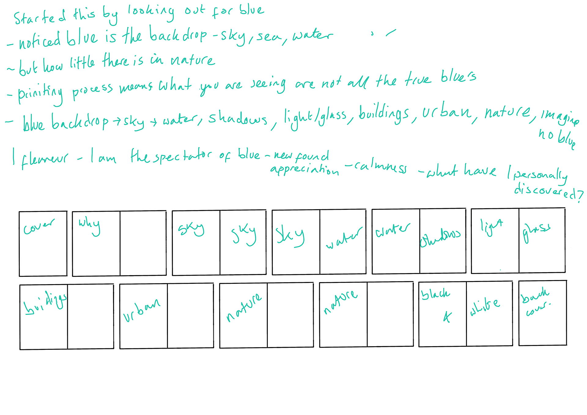
Compartmentalising and categorising the images
I have narrowed down to what I feel are the strongest images so it can help me not have too much to deal with. Above is how I have found a way to organise the images. EXPLAIN FURTHER ONCE IMAGE IS ADDED.
The ways I edit the images
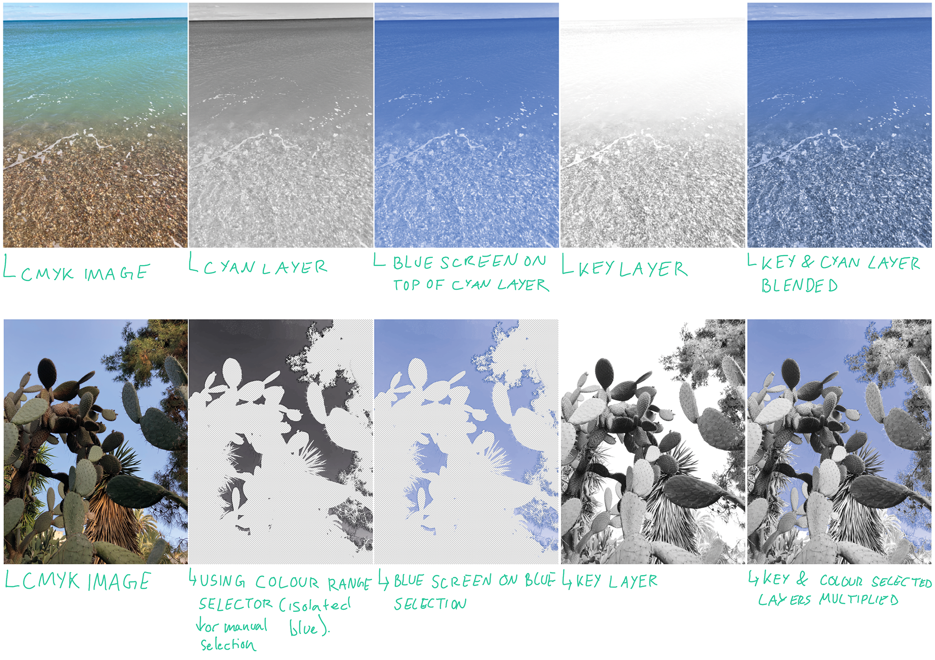
Depending on the photo will depending on how I edit for it to have the blue on its own. No matter what the photo is I convert it so I can see it's CMYK channels and then I try to use just the C and K and add a BLUE and Black layer on top. If there isn't much blue elsewhere in the photograph then I leave like that. If there is too much blue in other things I either colour pick the blue or manual select the blue. It can take quite a while to especially when my computer is over working.
Edited Images
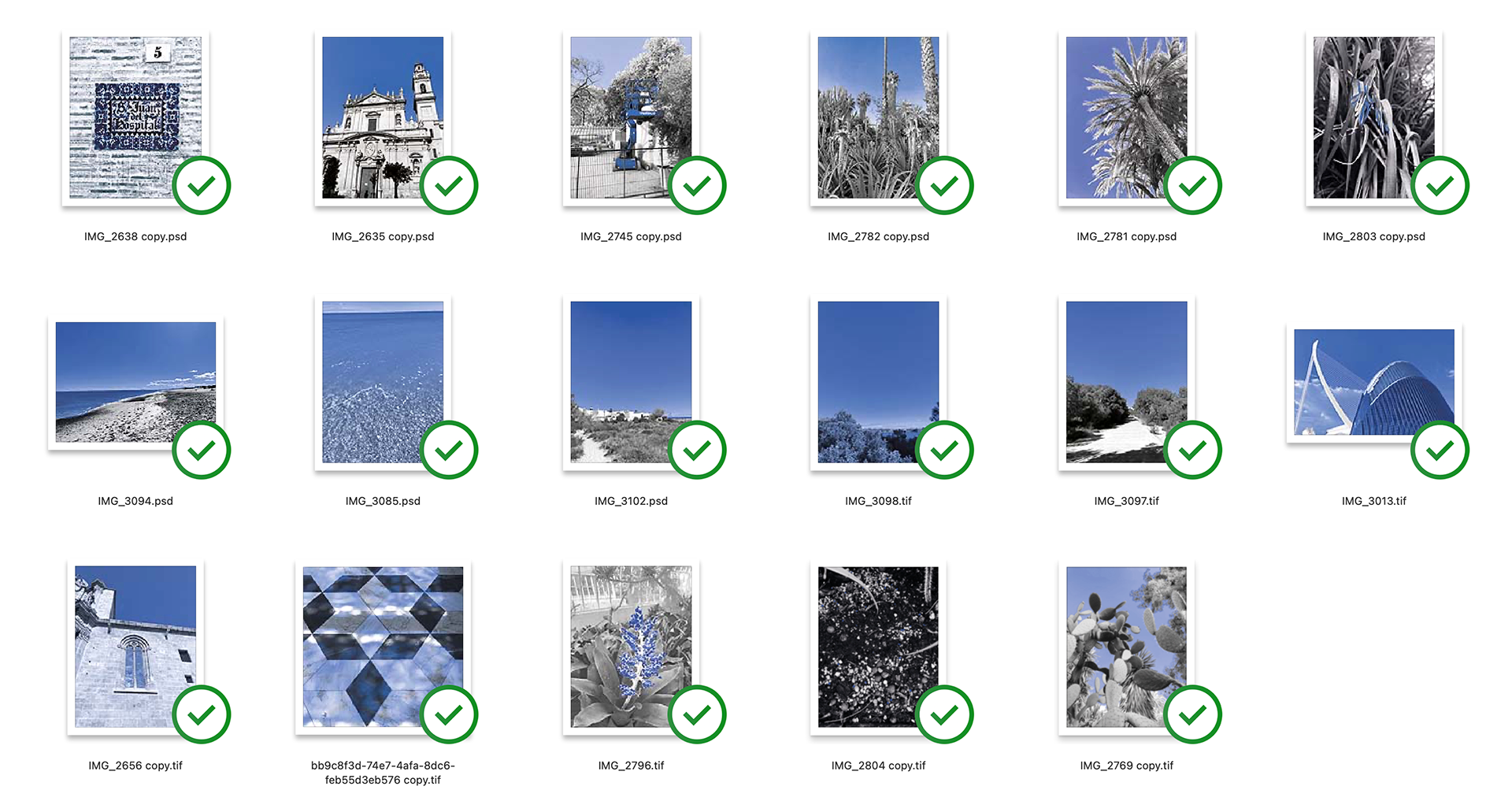
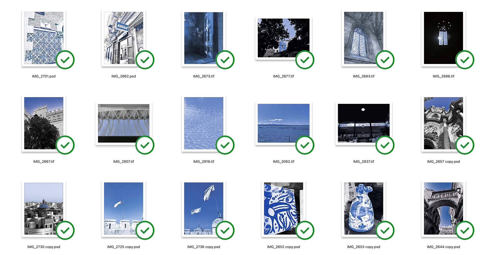
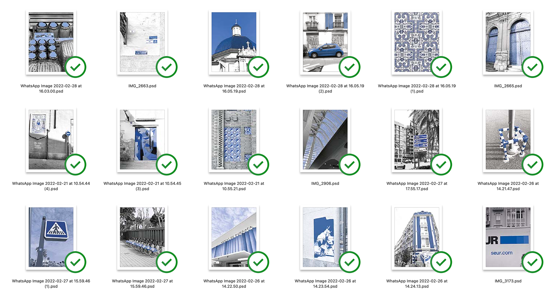
These are the images I have edited so far. I've done more than I hope to use so I have options when I am playing around with layout. This took up a lot of my time since for many I had to manually colour select. It has however been worth it as it has a nice affect.
Wireframes (Moodboard)
here are some sketches of layout ideas to help get me started
Tutorial
I showed the group my previous layout experiments and some of the images. And how I've tried sorting them in different categories (from natural, to urban, to buildings, to art, culture and more). I started with saying how I want to create a visual diary of my personal exploration of blue but and still trying to work out how to sort it. I spoke about the juxtapositions I found and how little natural blue there was and how as I got deeper into my search I noticed more of the little things. I start with the sky and water but move to a more urban landscape.
I still however felt lost as to what the right path was to take. Some people said the visual diary from a poet point of view sounds really good and it's something they'd be interested in.
Will spoke about flauner and a William blake quote about noticing the minute particulars. This is will look at as I feel it could help me explain the purpose of the publication.
For things like the grids and size of the pages it's to have a real meaning for them - possibly look at the grids of the roads in Valencia.
These are the notes I have from the tutorial:
scrapbook
diary (observational diary)
move and change
maps
direction and space
the journey I took
observational map and trail
start of with blue sky
nature blue sky
ocean
you get so used the ocean and sky
how many blue skys
William blake
Noticing the minute particulars
“he would do
general blue
appreciation of blue
nature to objects to black and white
filling in the blanks of blue
appreciate you were able to see the blue
and the copy
firgure out a system
what I am trying to say
what do I want them to do
exsits and appreciate
personal
ask myself a serious of questions
what time of day, how i felt
where what how why
flanuer - after industral revolution
becoming a tourist
push towards urbanisation - had the opportunity to appreciate things
poetic obersvation of
flabaur
alexca chung it
notes -
andei b
icon painter
struggling through a snowy winter
slug pellets
everything is observed things
a blue that doesn’t exisit in any of the images
unworldly stance
personal exploration of blue in valencia
map of turia images
river
the turia doesn’t exist
William Blake
Flâneur
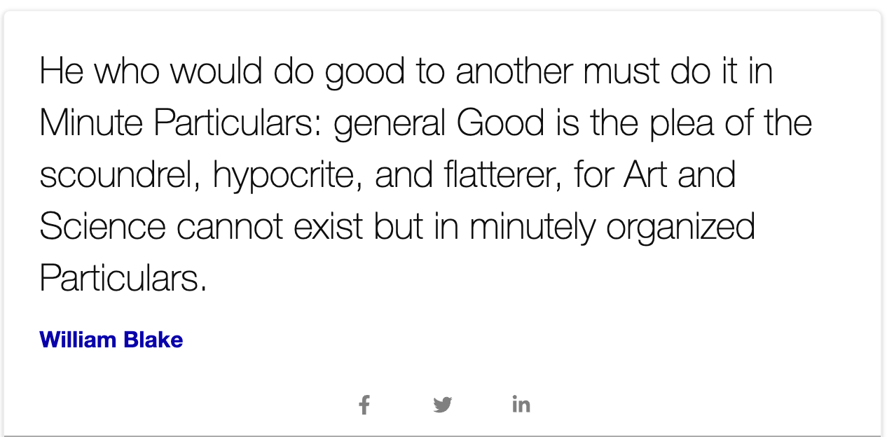
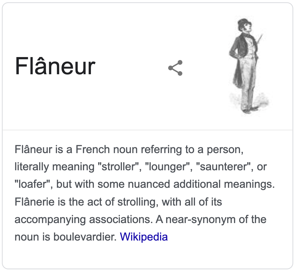
Blakes quote and the concept of flaneur I feel is turning point for me it makes me feel that I have purpose for my publication. I am the observer and on my own personal journey of blue in Valencia is was the reader will experience I am a tourist of sorts but of the colour blue and I saw and explored it from a new angle. I want to share this with the reader in hope they have a newfound appreciation for blue and individual colours in general. It's stipping back the busness of the 21st century and allowing myself and the reader to sit back and observe.
IMPORTANT
Fonts
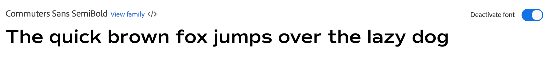


These are some font's I looked at, I ideally want to use a Sans Serif font as I feel they are more accessible. Currently my favourite is Commuters Sans SemiBold I feel it reads nicely and suits the publication.
Experiments
These are some layouts I have done. ADD MORE INFO WHEN IMAGES ADDED.
Order
Taking on the feedback from the group tutorial it helped give me an extra bit of confidence in working out an order that works.
Publication size Experiments
This is me going through different publication sizes. I made a range so I could physically feel them.
I've gone with 105mm (width) and 200mm (hight) - partly for the uncommon ratio and how it feels when holding but also because it resembles a travel brochure.
Further experiments
I like the boldness of these two images -Juxtaposition of nature and human made
I feel the slug pellets deserve full bleed - the only blue I find amgost nature is the blue that is designed to kill it (poetic)
sky is the backdrop to many things, in this case nature.
sky and sea many associate with blue, letting it speak for it's self - not sure about this layout though.
shadows, sky and water speak for itself. I like let this breath and placed it like this so people could pause
maybe too much to the left - I quite like the font
i think black background is too much
peak into peak was my though with this pair but feel they should be seperated
peak in to blue and get a glimpse - I like the fullness however a bit more offer centre I think would work better
don't like this
I like this photo but feel it's a shame with the text
two dome and image styles don't work
impactful and prominent architecture deserves centre alignment
filling up more less exciting

history link - not sure
I like this

too much going on in images and i don't like the white space

I like the white space of this page
could work but not sure
Annotations on image captions - click to enlarge.
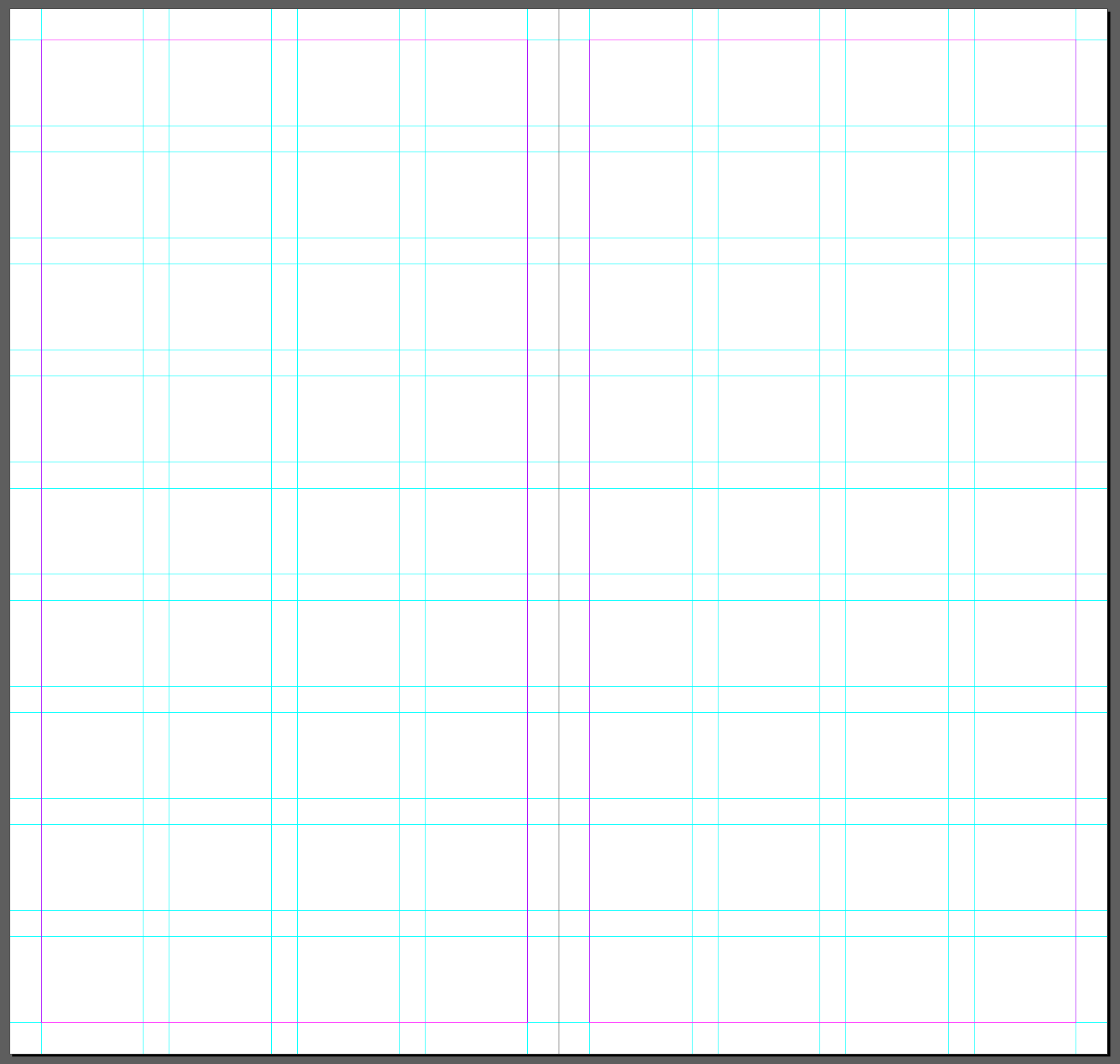
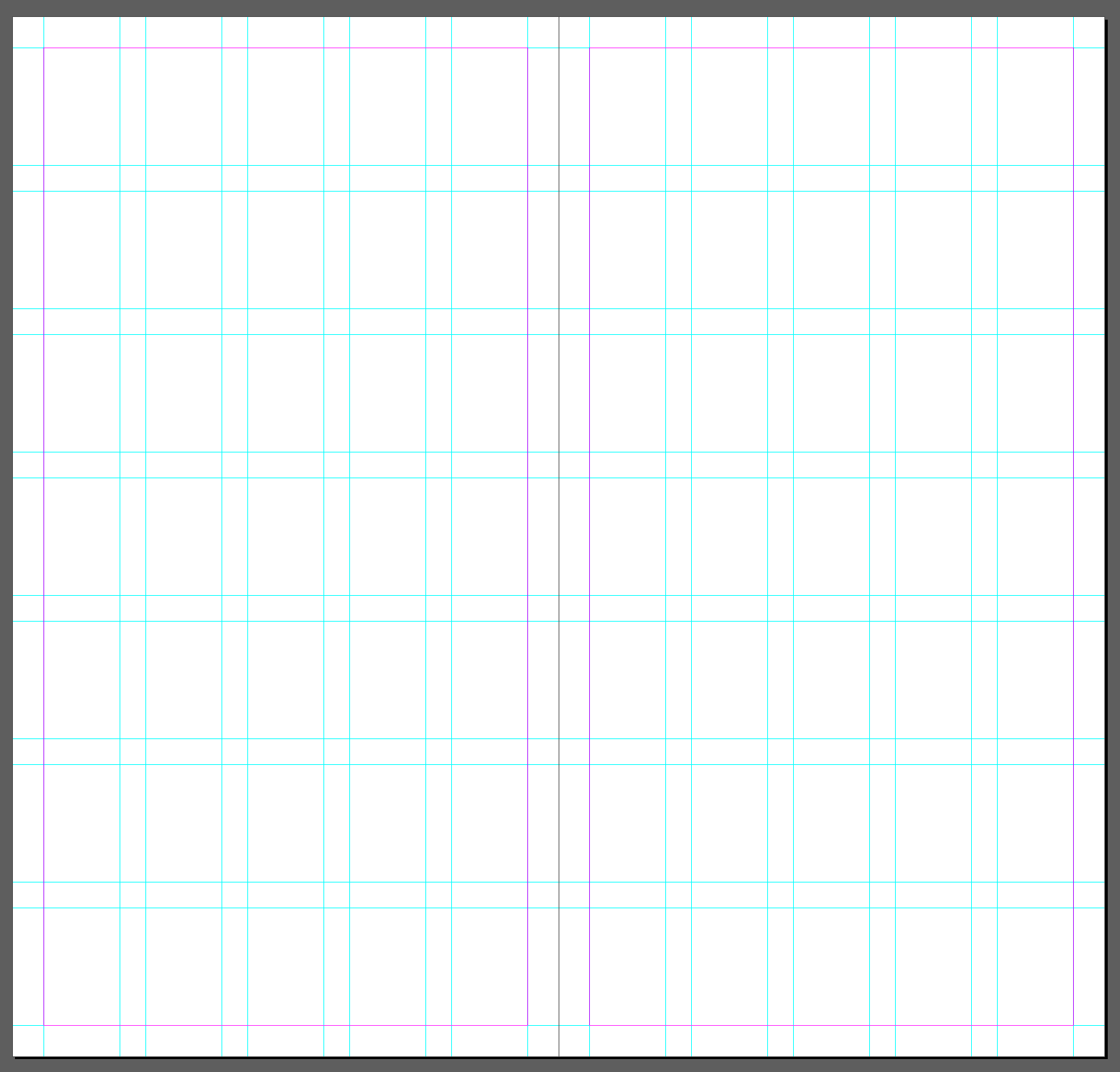
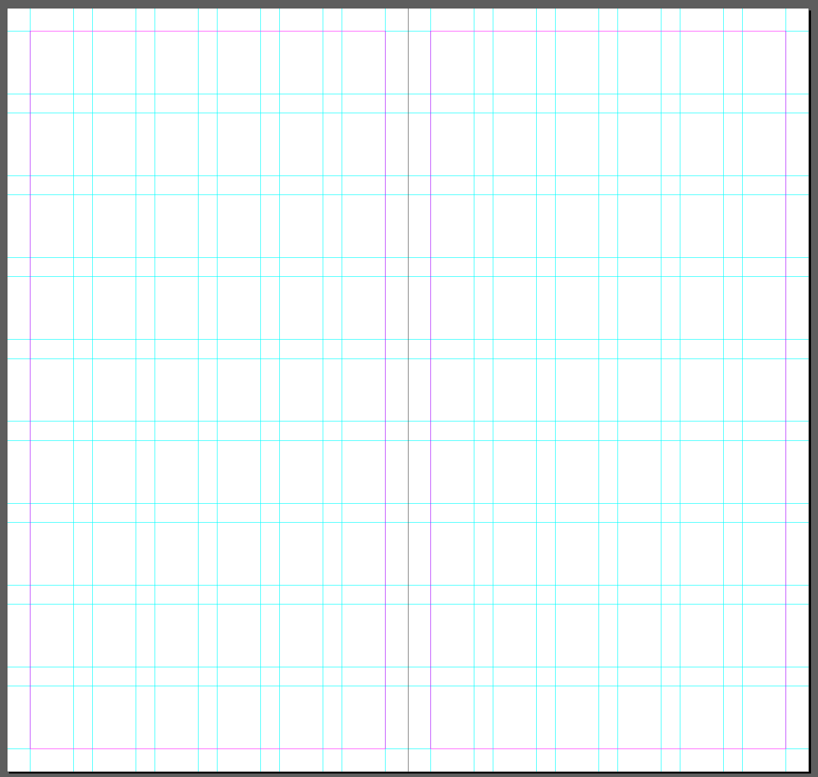
Grid OPTIONS
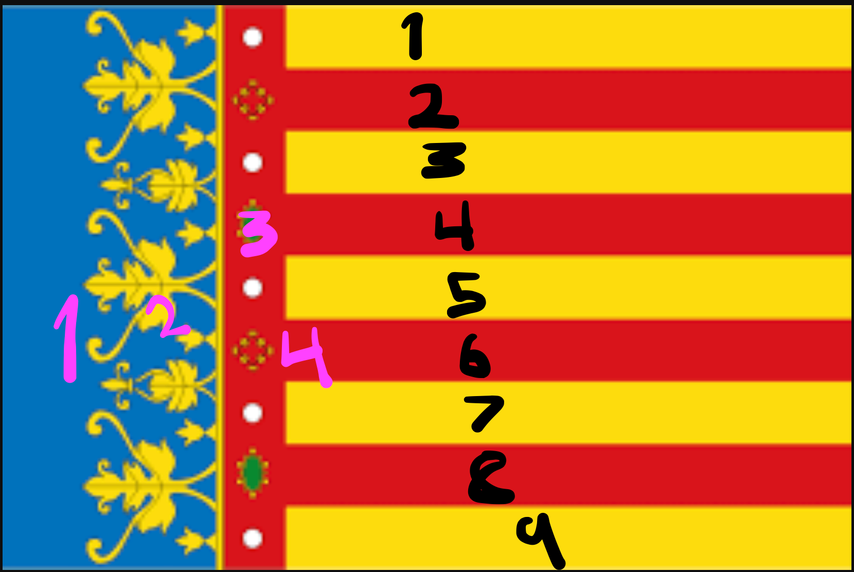
These were the options I came up with for the grid format - I decided with Right as the Turia is such a big part of Valencia city and the flags were dotted around everywhere.
Left: 4 columns - colours in valencian flag, 9 rows - stripes in valencian flag
Middle: 5 columns - days I was in Valencia, 9 rows - stripes in valencian flag
Right: 6 columns - Blocks I was away from the Turia Park, 9 rows - stripes in valencian flag
Further Photo Layouts
These are some layout variations where I try to establish more of a flow that fits with the categories I have sorted.
A rough route is it goes backdrop, nature, glimpse of the city, peeking through, light, history, little thing, markets/building, urban and nature (or lack thereof).


This is my favourite of the free I feel the images are able to speak for themselves and the white space I have left will allow my words (thought process).


I tried to experiment with this, I tried with some placeholder copy and dotted around images and copy, but i'm not sure that's the personally I want giving off in this publication. It isn't really my style to try and artsy with type as it's something I struggle with. As stand alone spreads I am quite happy with them but I don't think this style would work with the message I am trying to give.
Also I'm not a fan of the bif font and title. And if I were to use the copy like this a new font would be needed.
I tried some slight alterations in the later pages like a blue tidbid where the text would go on the last page and adding another market image. And balancing the urban images.


Not much different to the first one, but I did change the front/back cover a bit, again I think I am going wrong with the big text title. So I want to keep it simple and small like a personal notebook nothing too fancy.
I tried some slight image layout variations but not sure as I quite like imbalance when it come to layout and many of these have too much symmetry.
Test Prints
*sorry about the audio quality*
Here I have my first test print, I talk through my ideas and the flow of pages I have set up. (if you weren't able to here then it's basically what I say below in notes for copy). I also did it so I can look at the ratios and check the size is good - I am really happy with the way it looks, It needs a couple of tweak and copy added but I will wait to get some advice from katie.
Notes for Copy


These are notes I have written to help me write the copy for each page - I try to go into detail to explain my journey with blue in Valencia and my observations.
PLEASE LOOK AT THESE NOTES.
Final tutorial with Katie
I showd katie my test print - I think she liked the layout and when I showed my copy notes it made sense to her why the photos are in their certain order. She did say she didn't love the font which I agree with and she said to have a look at some of the fonts on klim font foundry.
Also with the urban and tile pages to maybe mix them together with introducing the bursts of blue and then on the following page show all sorts of blues in different settings. I feel this could work really well so I'll give it a go.
The main advice was to get on with the copy and try to express it in a poetic way and to allow it to be 'soppy' and poetic and that was this piece is about.
These are my notes from the tutorial:
portfolio outcomes
what will I have on each page
the grid and explanation as to why
do I have to explain size of book too ?
covers to other pages
order of book
best spread
other spread hand held
cover and covers
another spread close up
on a coffee table
in a book case
all three covers
promotional
on a magazine stand
instagram page?
with GIF
travel in hand - action shot
moslty doors
hand held
front covers
cpuple of favourite
individual photos (context)?
GIF?
bringing background to foreground - so unnoticed
focus on the backdrop and how even with colour - power of it being solely blue
window of time when the blue is there - we take it for granded and a uk audience - taking the fragments of blue celebrating it all
little history bit of the blue roofs - Valencia - hand written
faced with so much blue - blue as a scarsity withing history and it’s regalness
love and other robots - look at the languages and scale of it
fill the page with morelittle things - tile page
beyonds
homepage - website
instragram
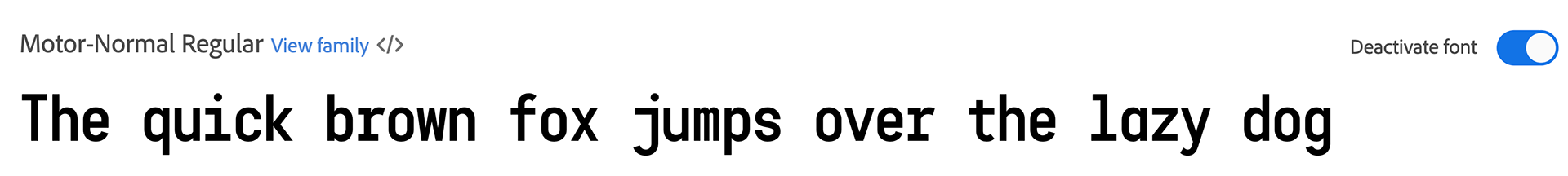
Kilm Type Foundry

I looked at the font library and I like the founder's grotesk mono, I wanted to stay away from serif fonts initially as I feel they are less approachable and accessible, for me and many others it is harder to read. I also feel they have a pretentious character especially if paired with the subject of this publication. However this Mono font is a good halfway point I feel.
Change to Free Font

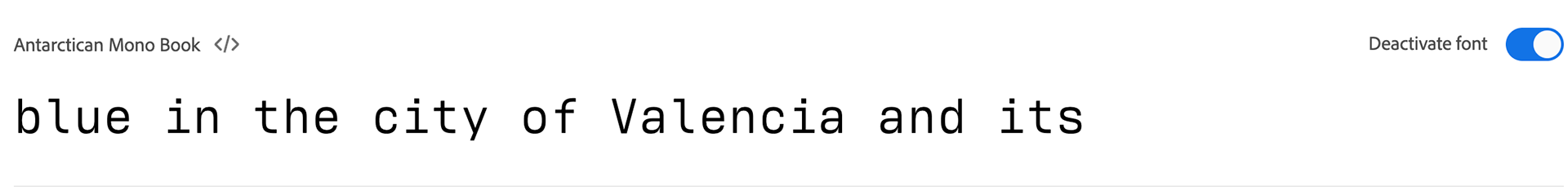
I had to search for an alternative to founder's grotesk mono as the free version didn't have all the characters I needed. So I searched for some alternatives on adobe fonts and have settled with Antarctican Mono Book. It has a similar look and gives of the same personality in my eyes.
Changes Made to Layout


From talking to katie these are some of the changes I've made - I made the page with tiles more simple and then made an explosion of blue itemed things on the next page. I feel this works a lot better and is fun to have one busy page. I enjoyed using the grids and I took inspiration from valencias streets and thin road parks. I also made minor movements of photos on some spreads.
Test Prints and binding options and paper
I went down to book bind and spoke about the amount of pages and style of book to see if they recommend a binding technique. I was thinking saddle stitch because it means photographs are not lost in the spine and I am able to line up the images well. They agreed with me and suggested 3 stitch or 5 stitch.
I printed these out on the printer but I messed up the orientation and print settings but you get the idea for the purpose of this test. The darker blue I did on 180gsm cartridge paper which I feel works well for the style of publication. I might try colourplan however I think RISO works well with this.
I will likely use 210gsm cartridge paper for the front cover and 180gsm cartridge paper for the inner pages.
I did realise that to crop a straight edge the most inner pages get cropped more than the outer. This means that I will need to do a final mock test before print so I can alter the layout but cutting off a couple millimeters in the inner pages.
I don't think the black thread works so will opt for white and I feel the empty space at the top from the three saddle stitches means I think five will be best.
Final Test Print and practice binding before adding Copy


I wanted to try out how making the publication with lining up the images to know I could do it and be aware of what to expect when I get the final pages printed.
I used tape to line up the images and spaced out the three holes 50mm apart with the centre as the base. I then used the needle type thing that makes the holes and stitch it all together. I lined it up well and it's good to know how to do it beforehand.
Written Copy
Below is my written copy for each page - i've tried to tell a sort of story of my journey through discovering blue in Valencia.
2/12
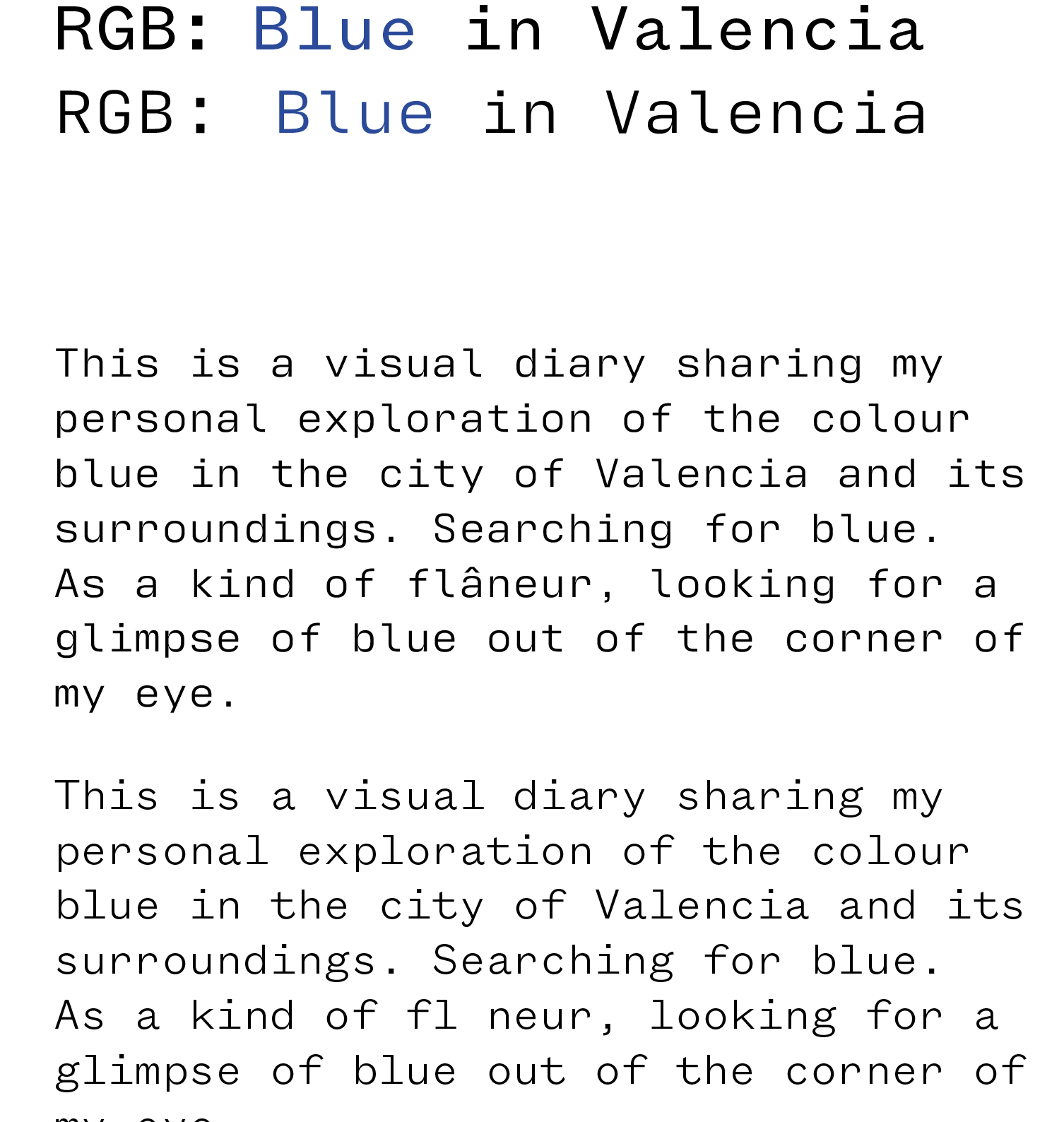
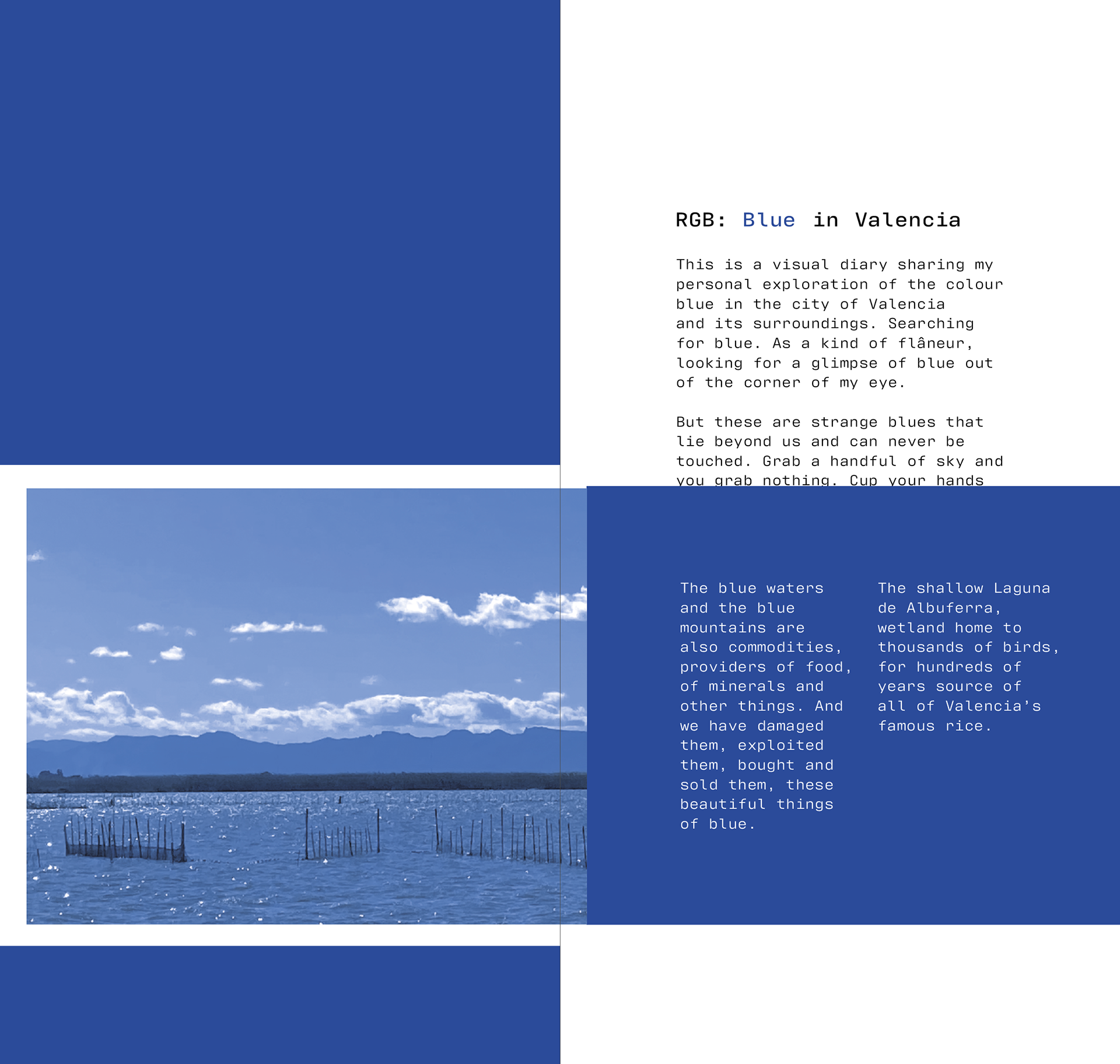
This is a visual diary sharing my personal exploration of the colour blue in the city of Valencia and its surroundings. Searching for blue. As a kind of flâneur, looking for a glimpse of blue out of the corner of my eye.
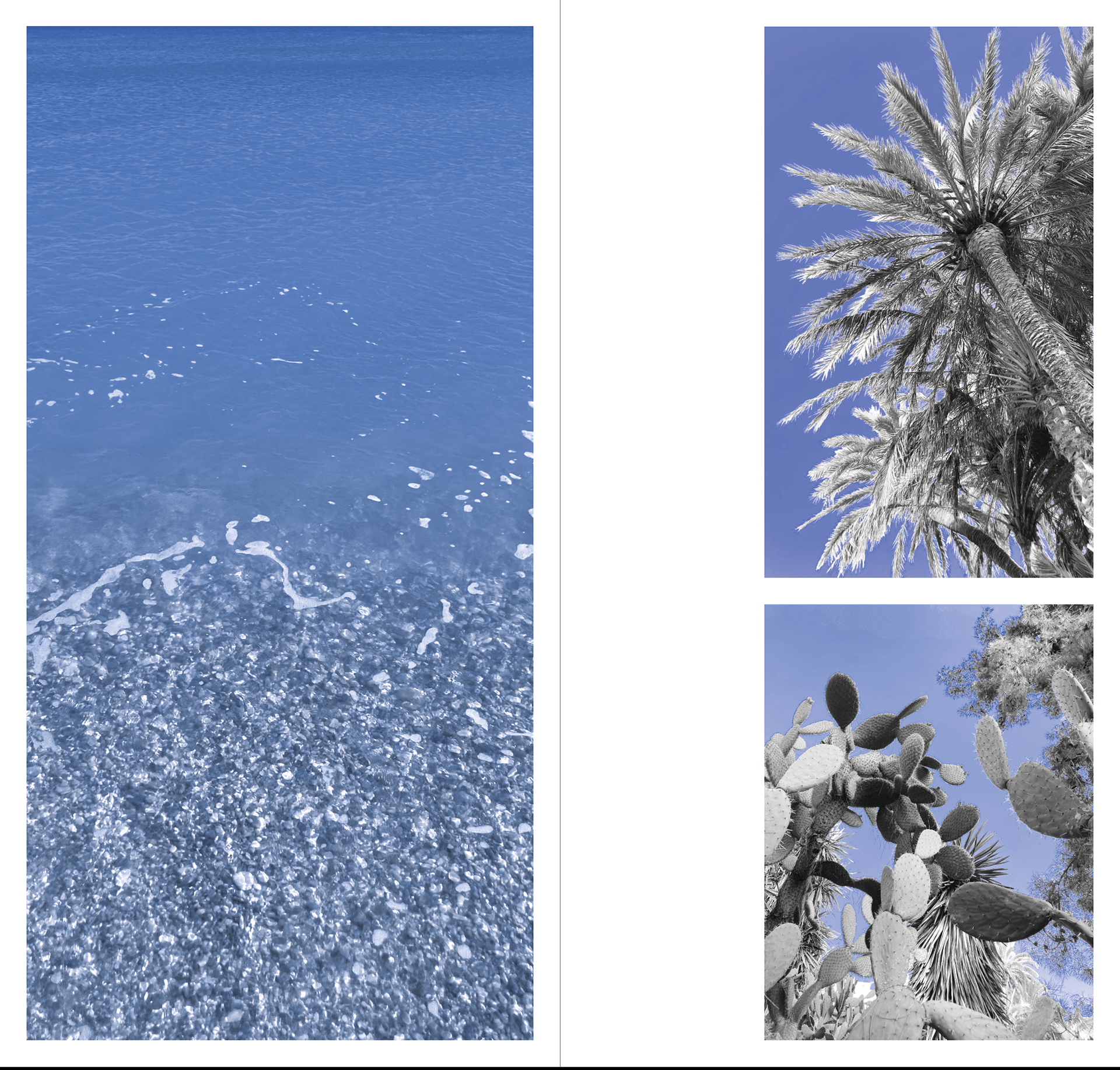
But these are strange blues that lie beyond us and can never be touched. Grab a handful of sky and you grab nothing. Cup your hands in the sea and it’s a colourless liquid. Dig your hands into the sides of the blue mountains and its soil and stone. Touch the blue shadow and you get some fleeting relief from the sun.
My walk took me through the city too, to encounter the blue made by human beings. These are blues you can touch…
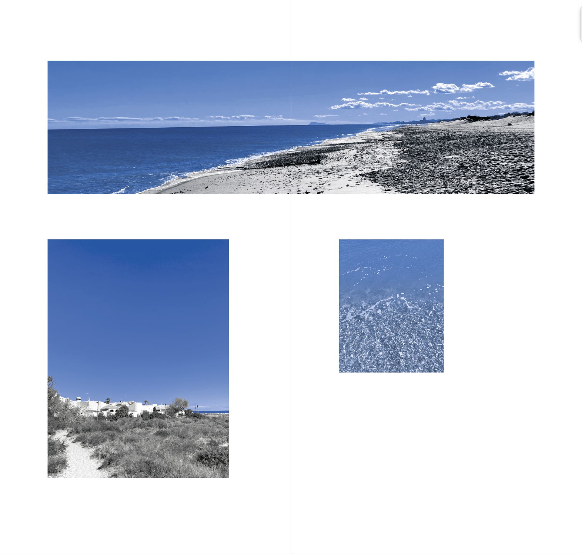
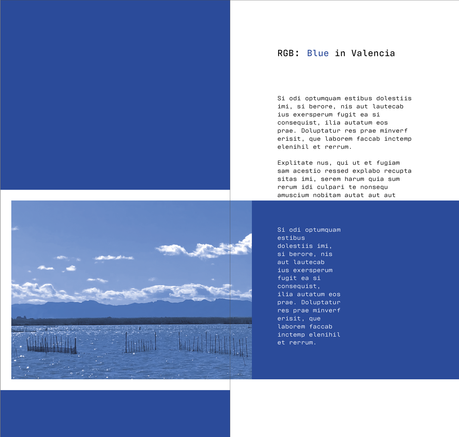
The blue waters and the blue mountains are also commodities, providers of food, of minerals and other things. And we have damaged them, exploited them, bought and sold them, these beautiful things of blue.[DLP1]
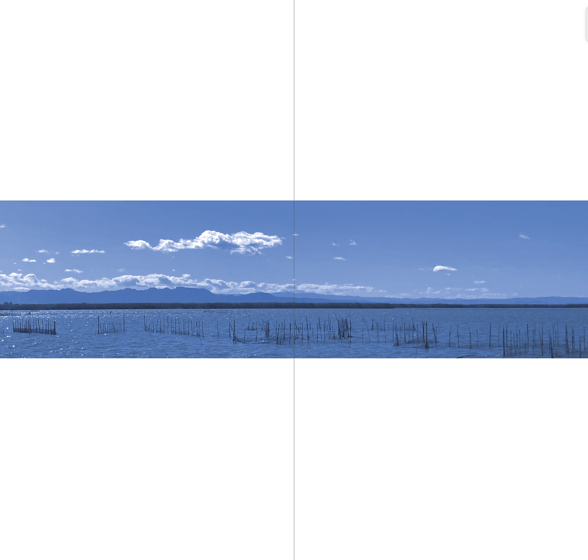
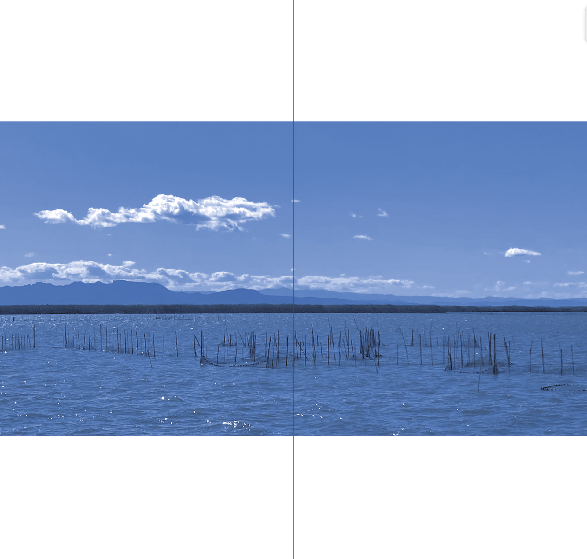
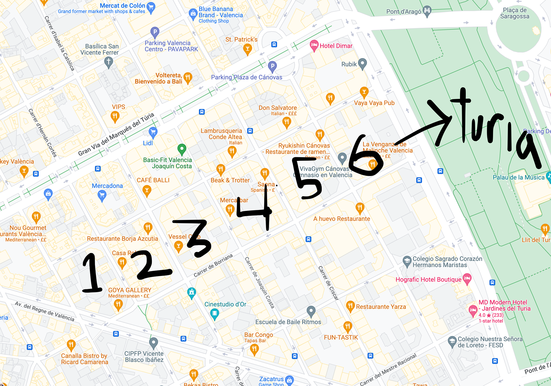
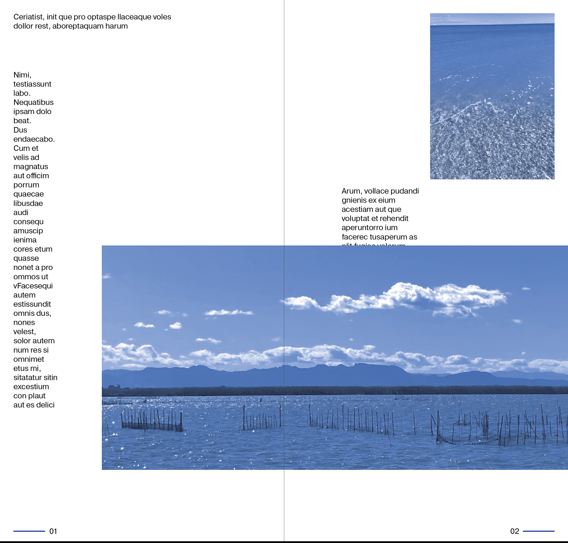
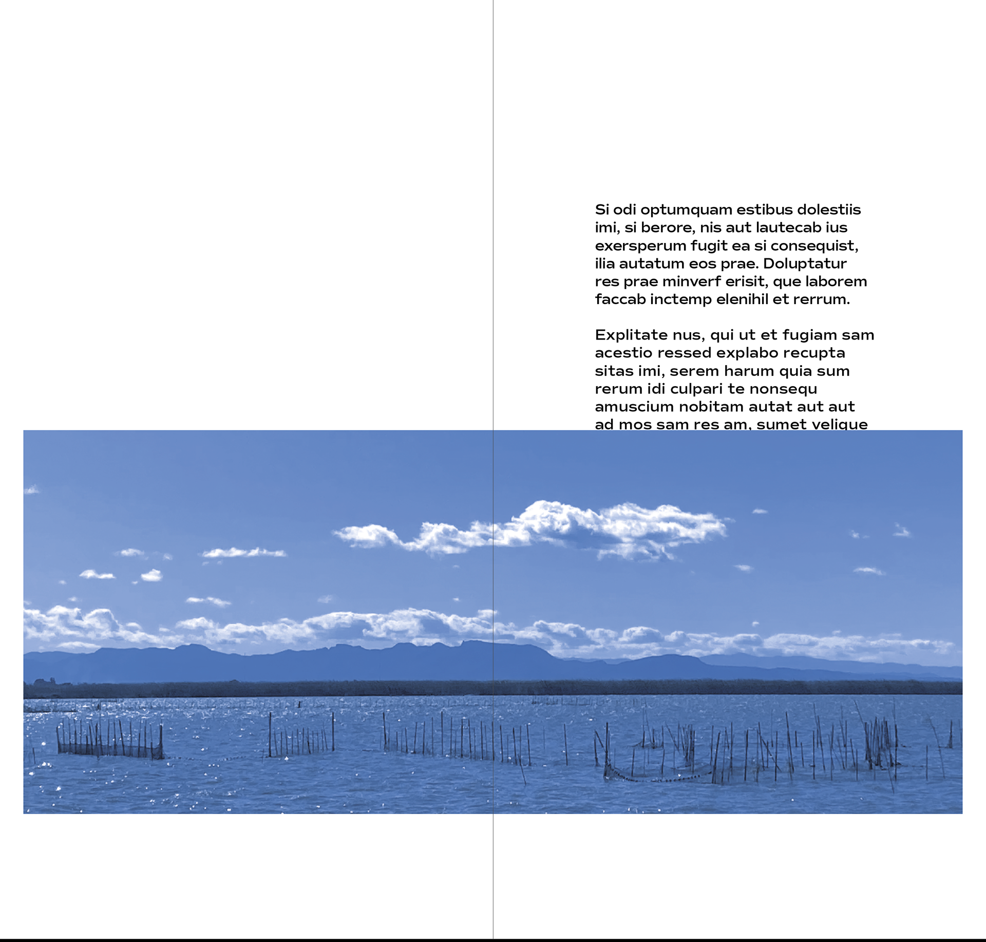
The shallow Laguna de Albuferra, wetland home to thousands of birds, for hundreds of years source of all of Valencia’s famous rice.
3/12
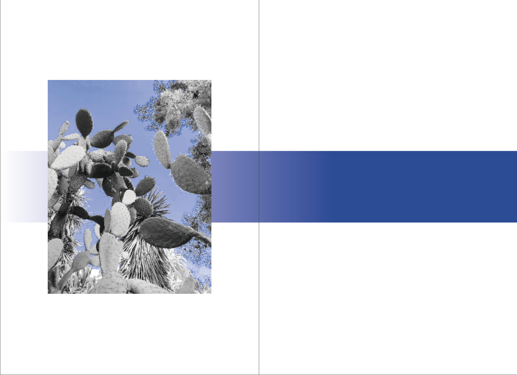
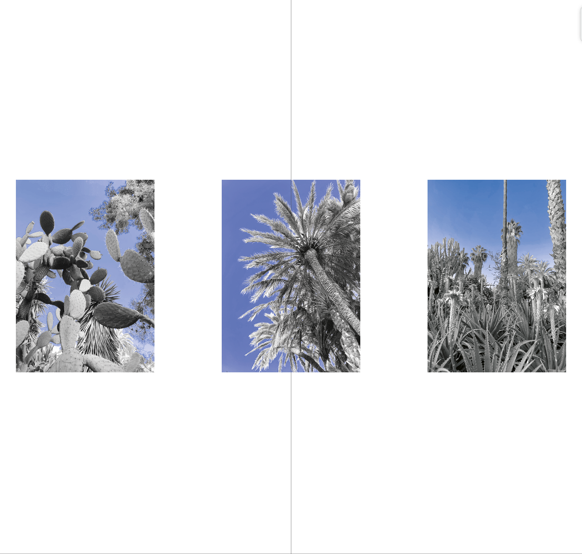
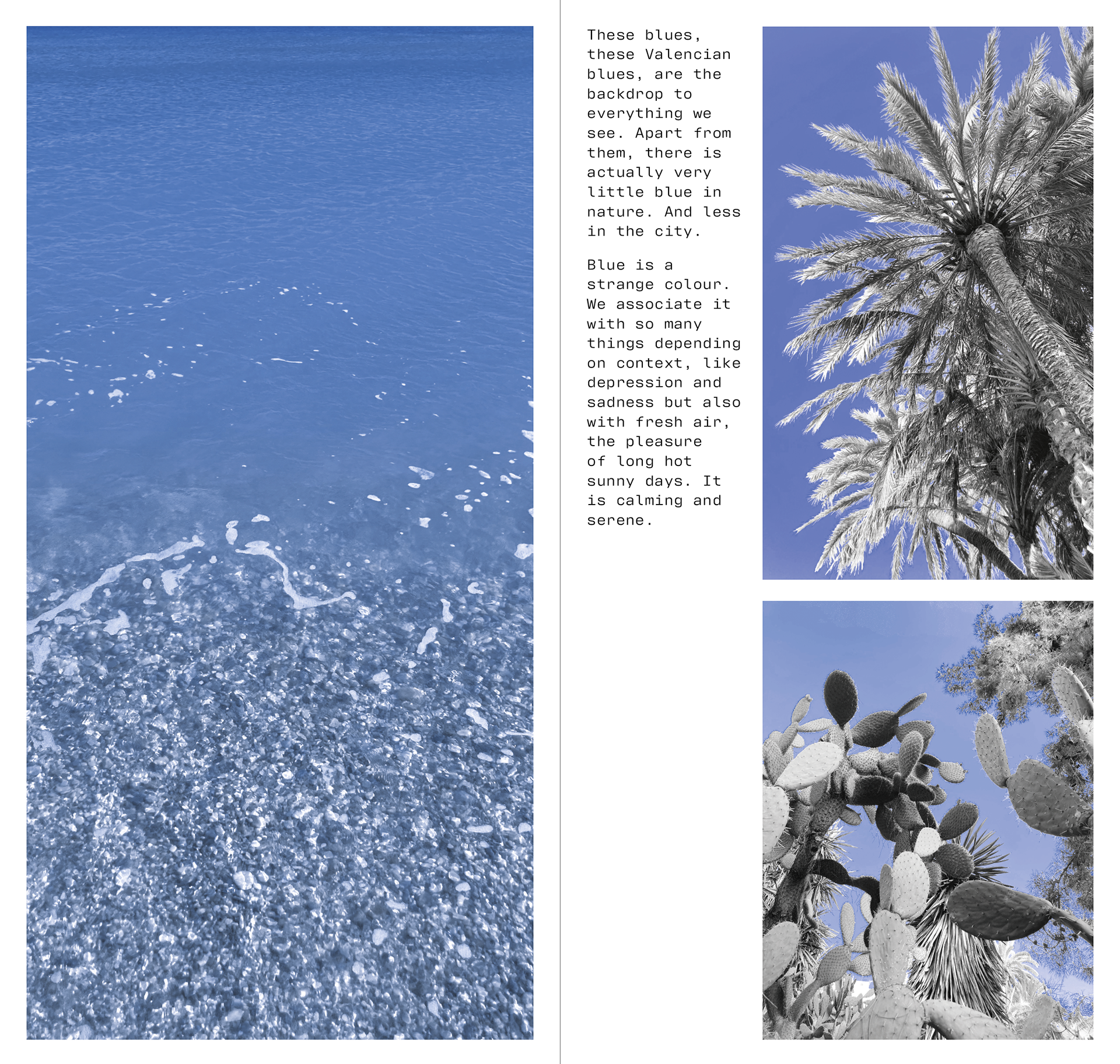
These blues, these Valencian blues, are the backdrop to everything we see. Apart from them, there is actually very little blue in nature. And less in the city.
Blue is a strange colour. We associate it with so many things depending on context, like depression and sadness but also with fresh air, the pleasure of long hot sunny days. It is calming and serene.
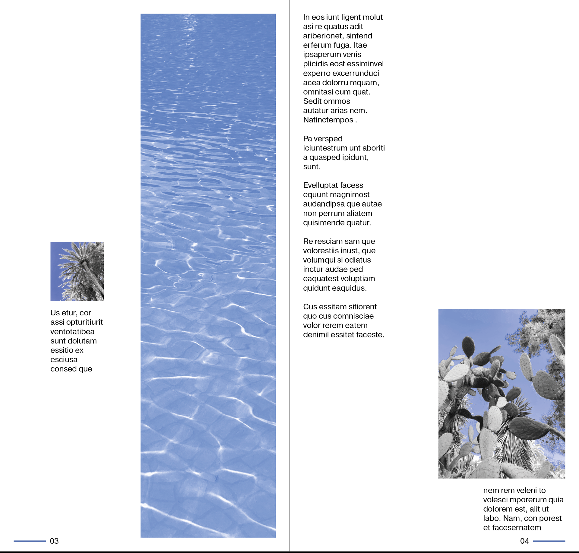
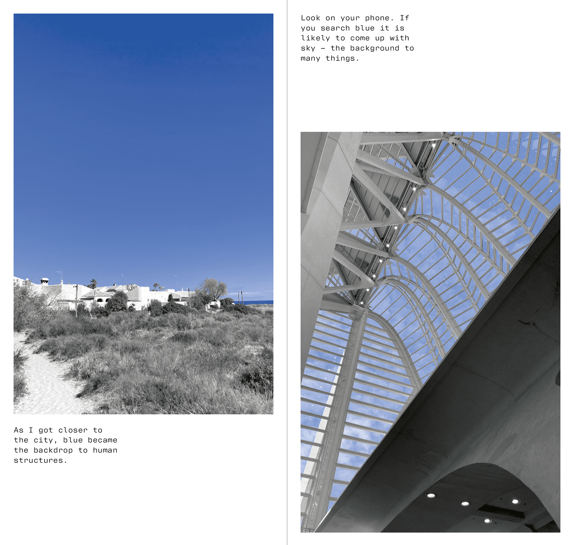
4/12
As I got closer to the city, blue became the backdrop to human structures. Look on your phone. If you search blue it is likely to come up with sky – the background to many things.
5/12
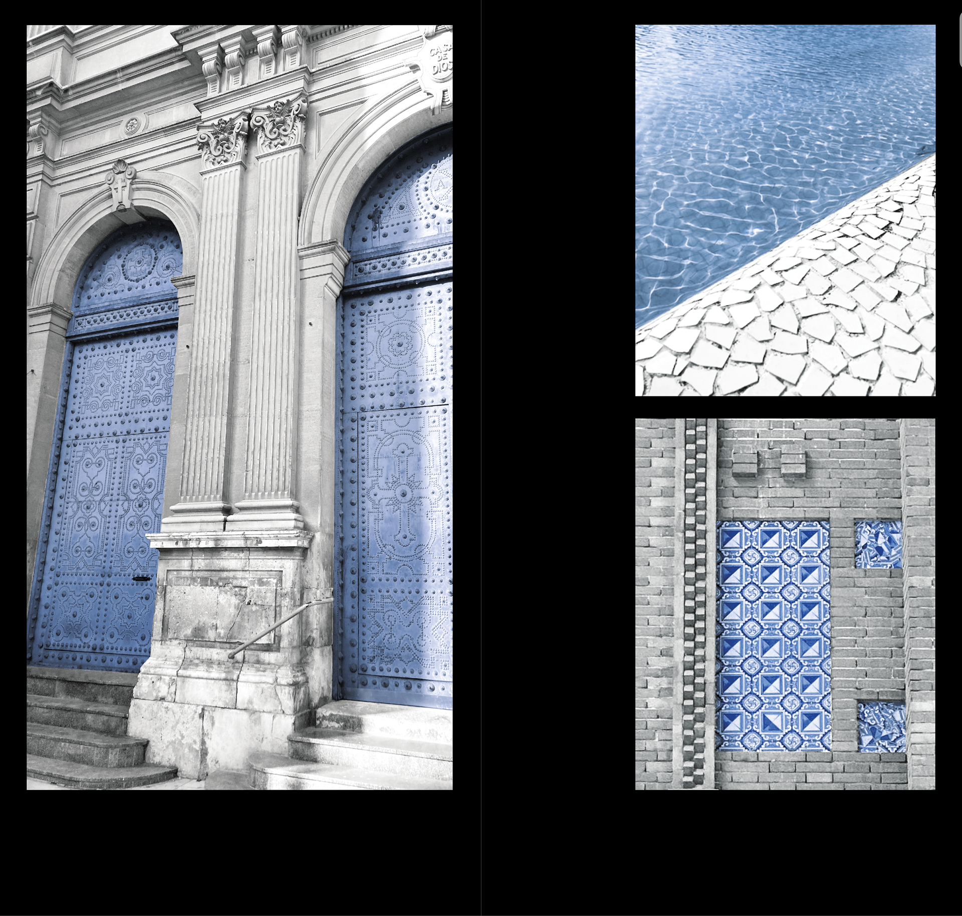
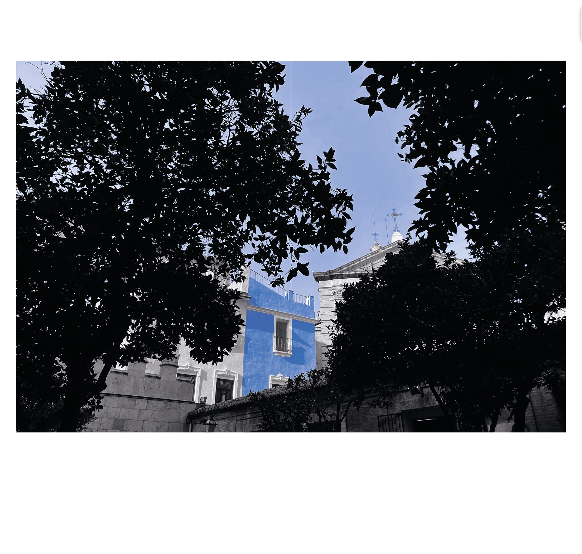
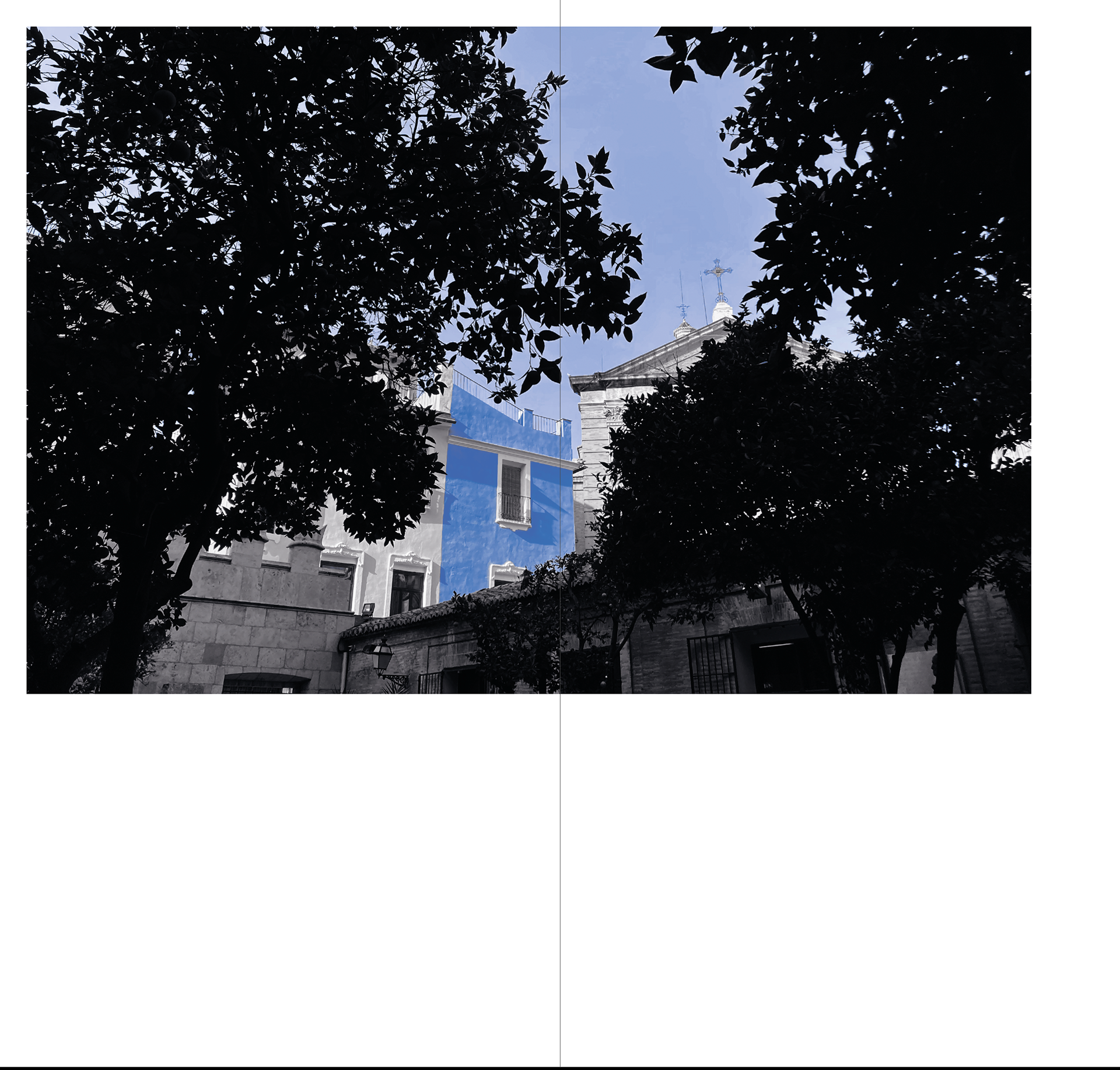
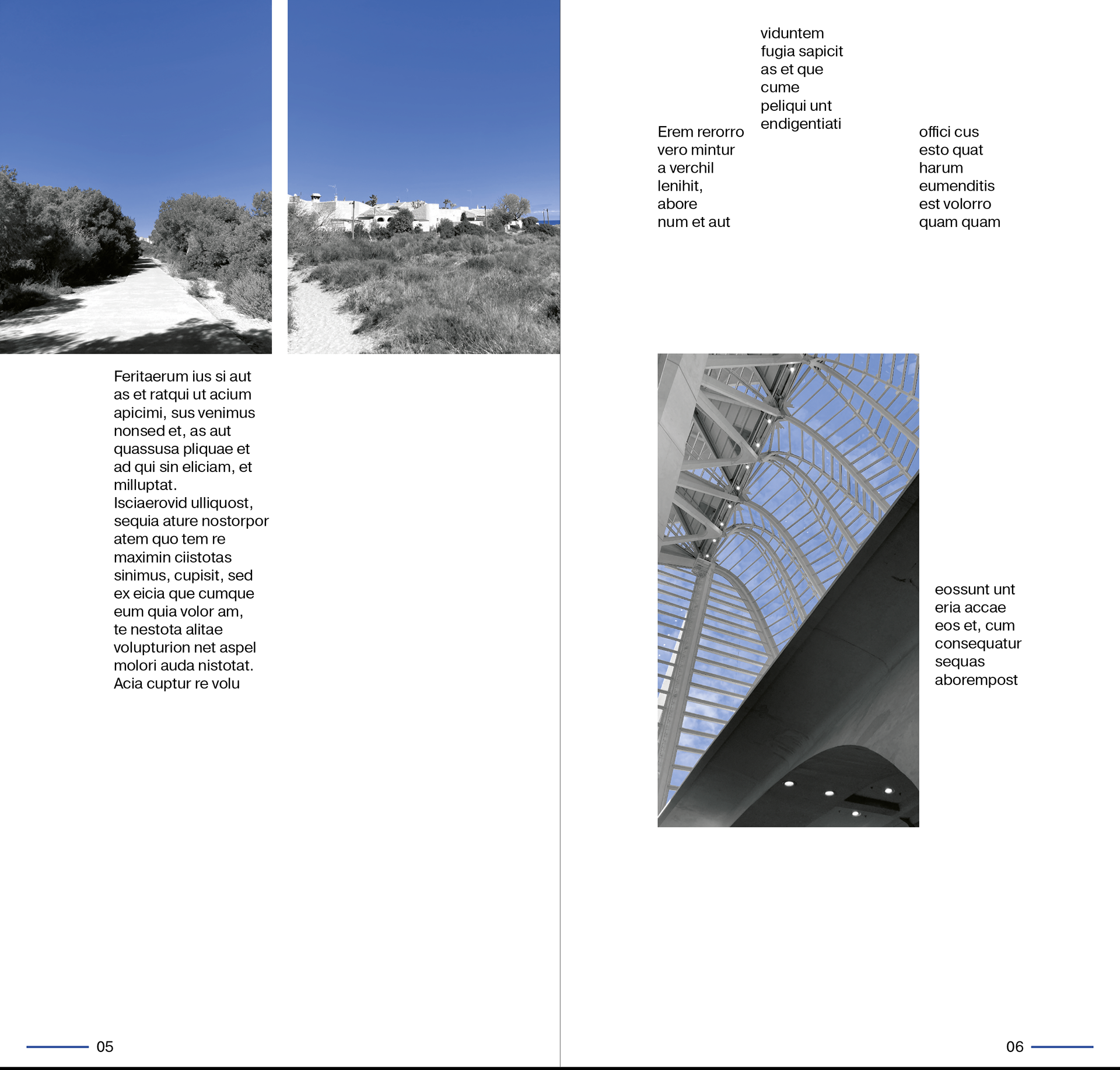
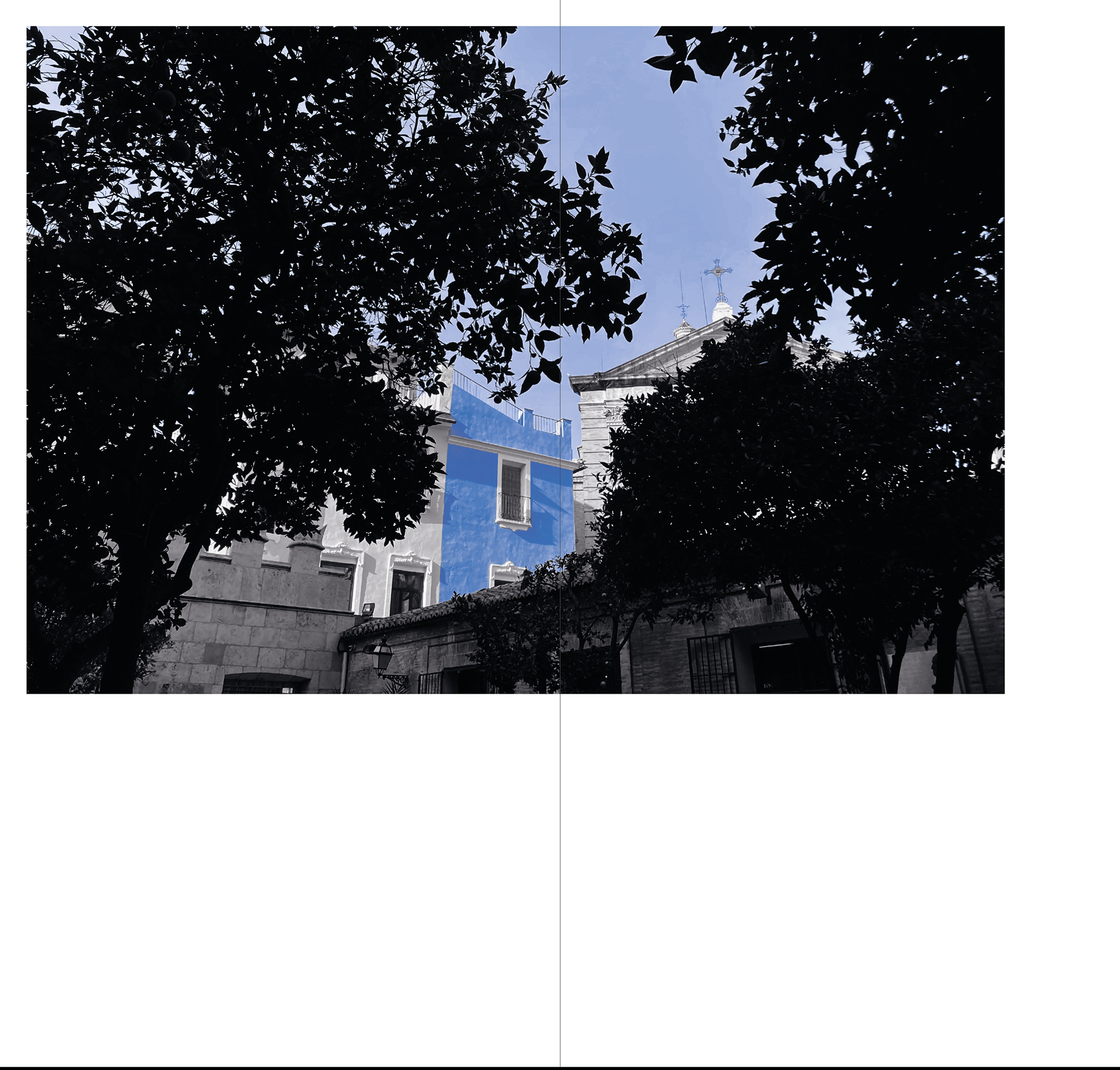
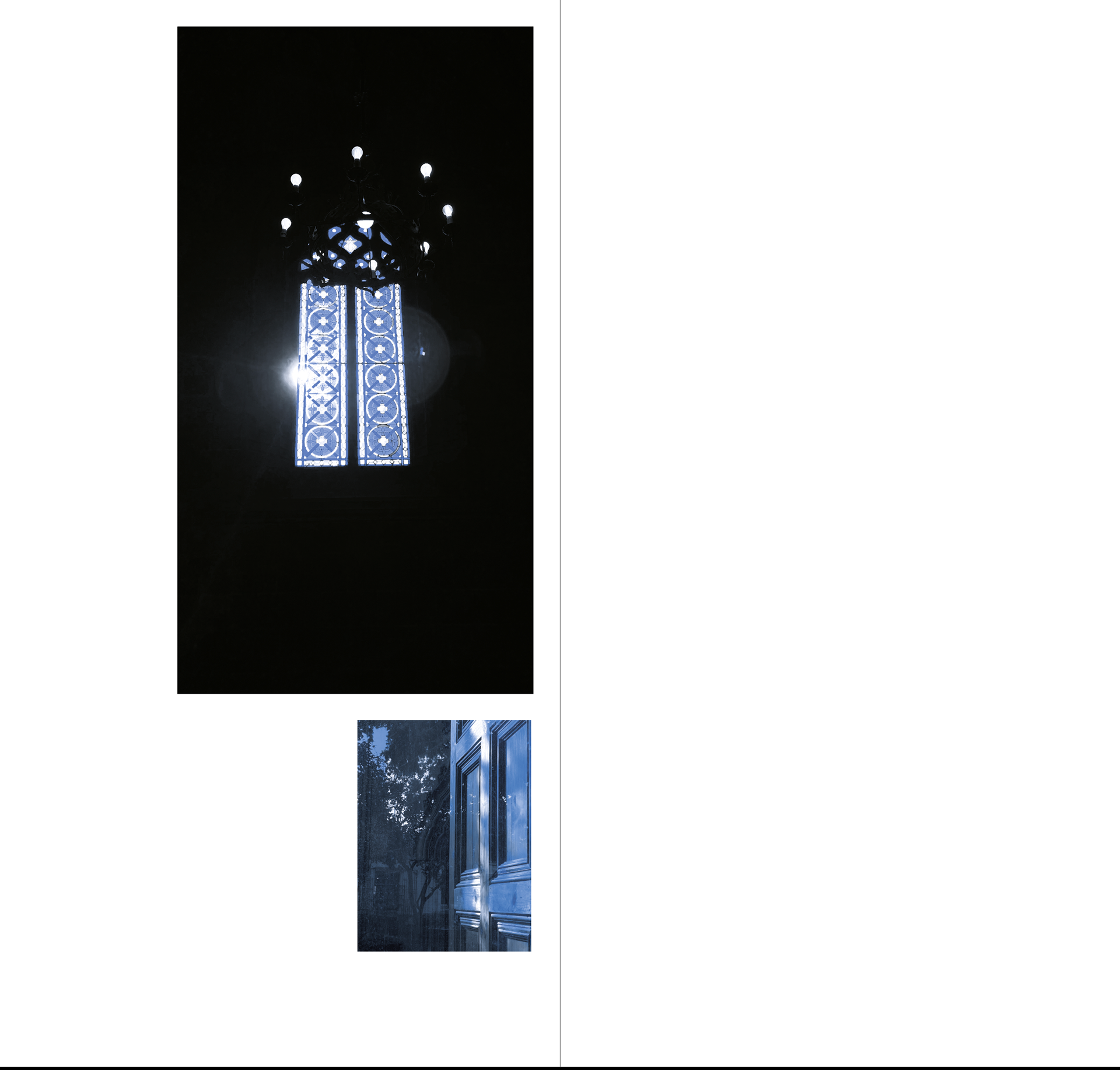
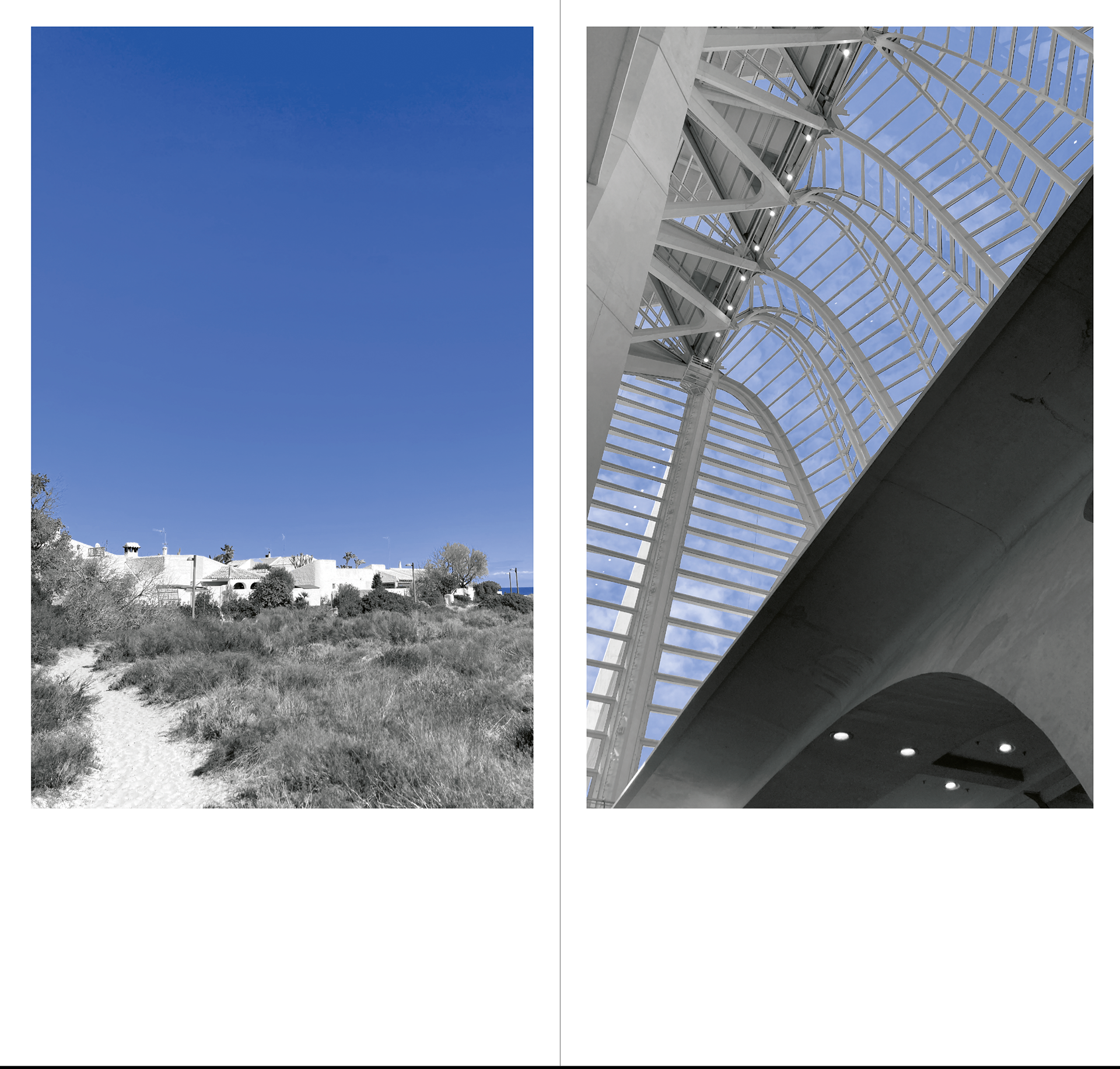
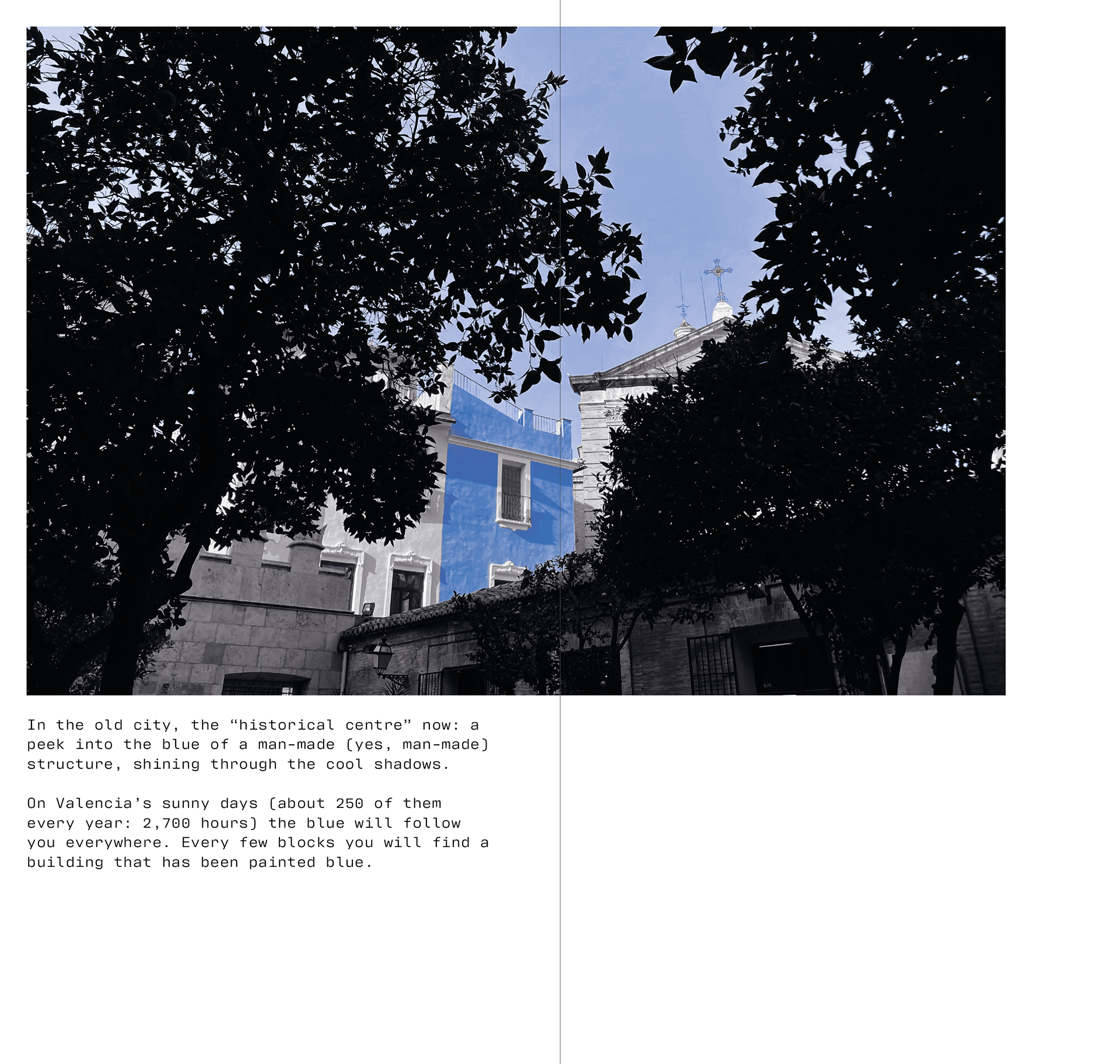
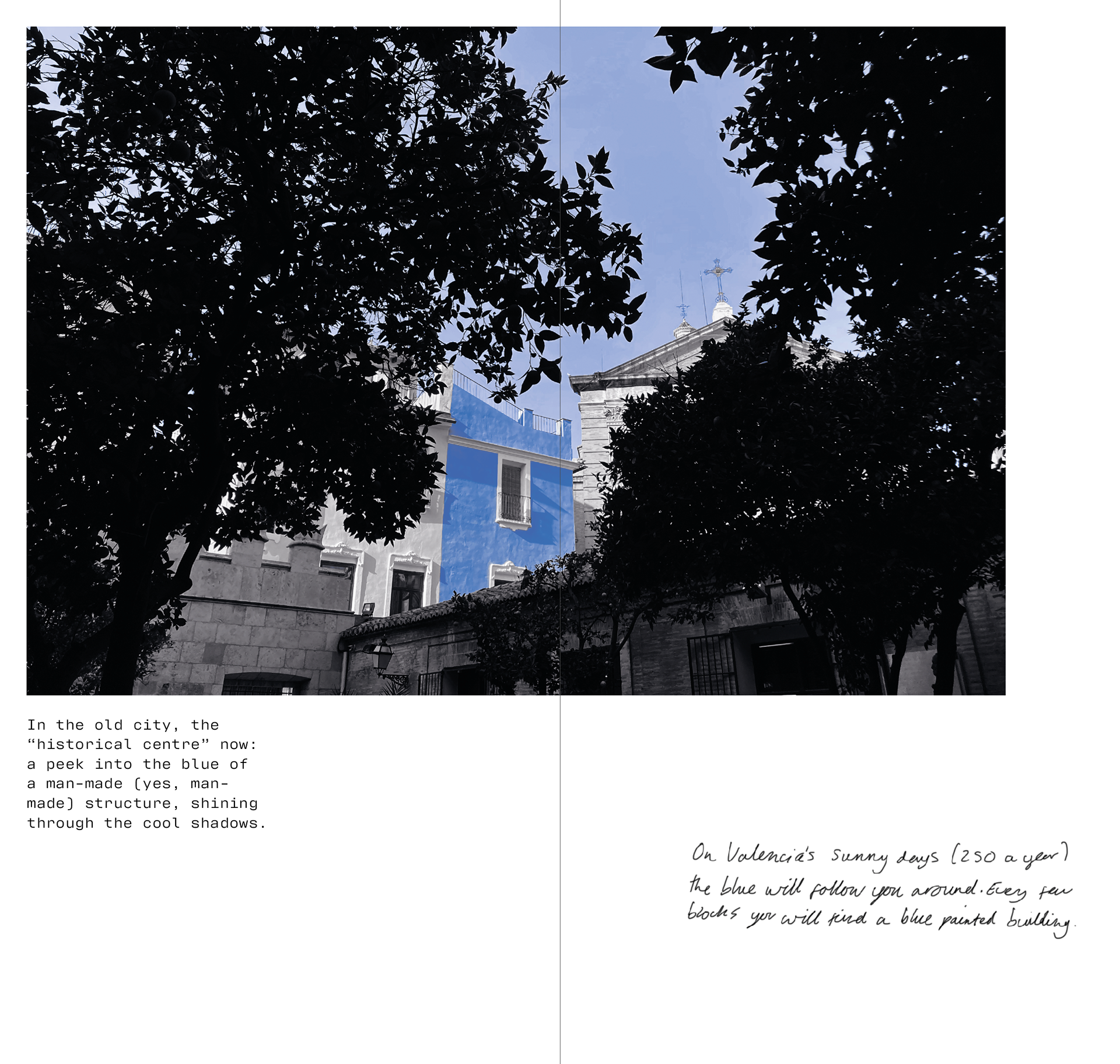
In the old city, the “historical centre” now: a peek into the blue of a man-made (yes, man-made) structure, shining through the cool shadows.
On Valencia’s sunny days (about 250 of them every year: 2,700 hours) the blue will follow you everywhere. Every few blocks you will find a building that has been painted blue.
6/12
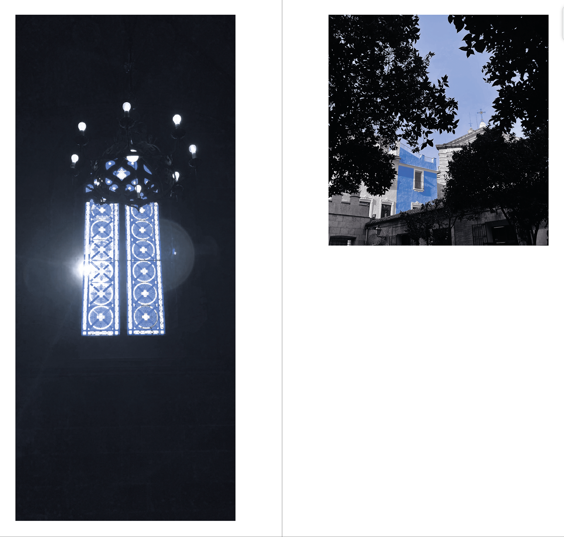
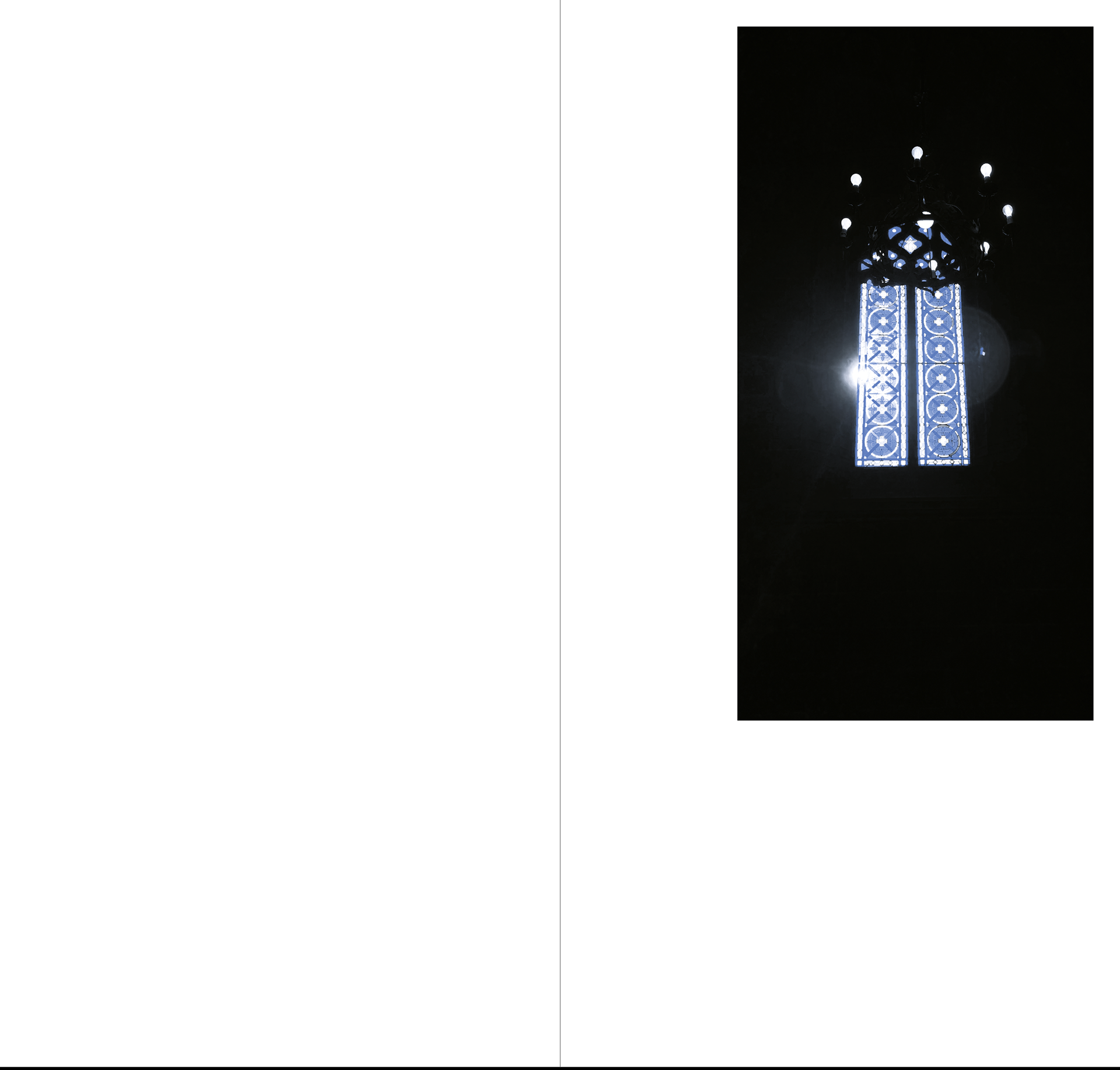
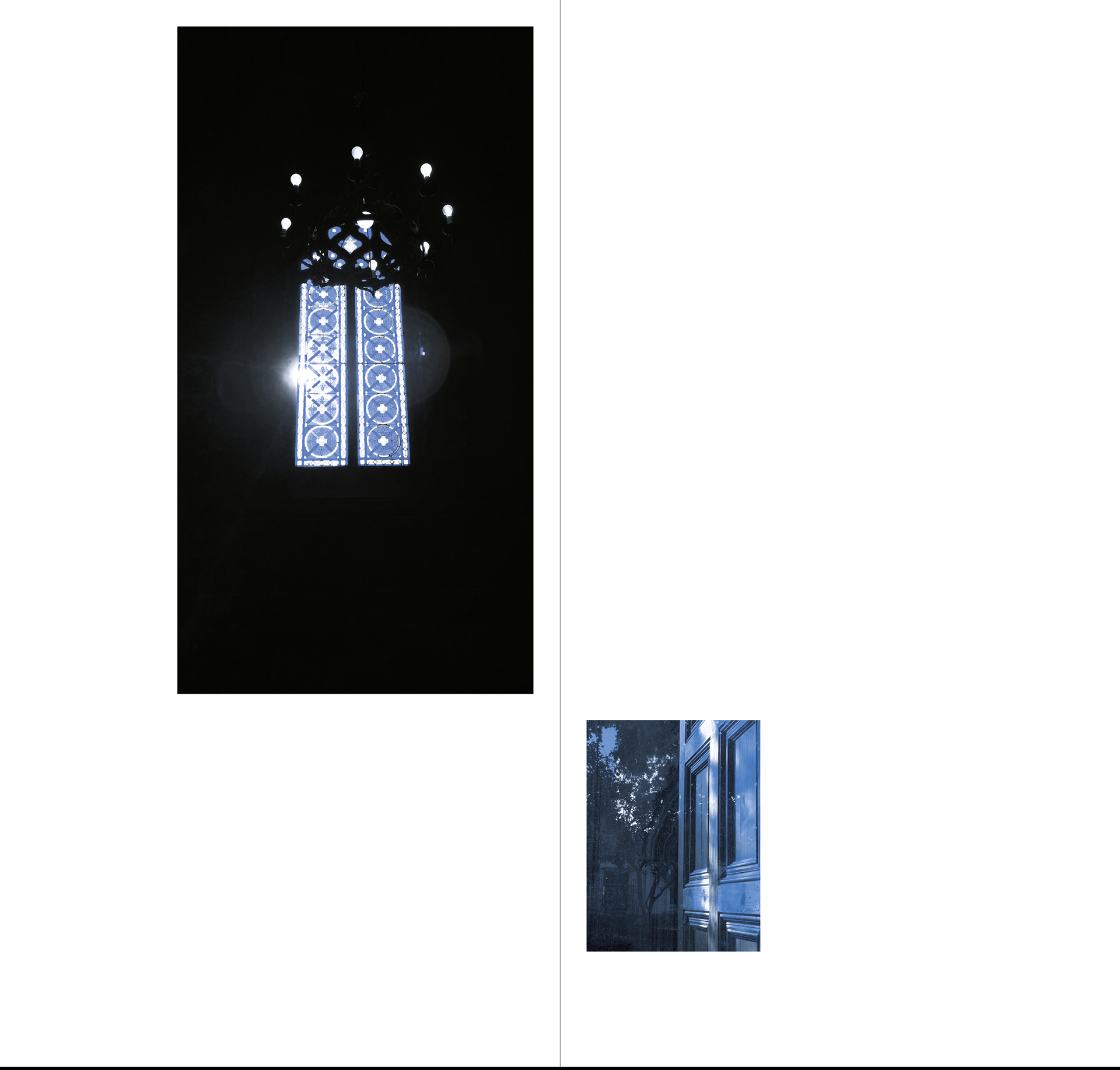
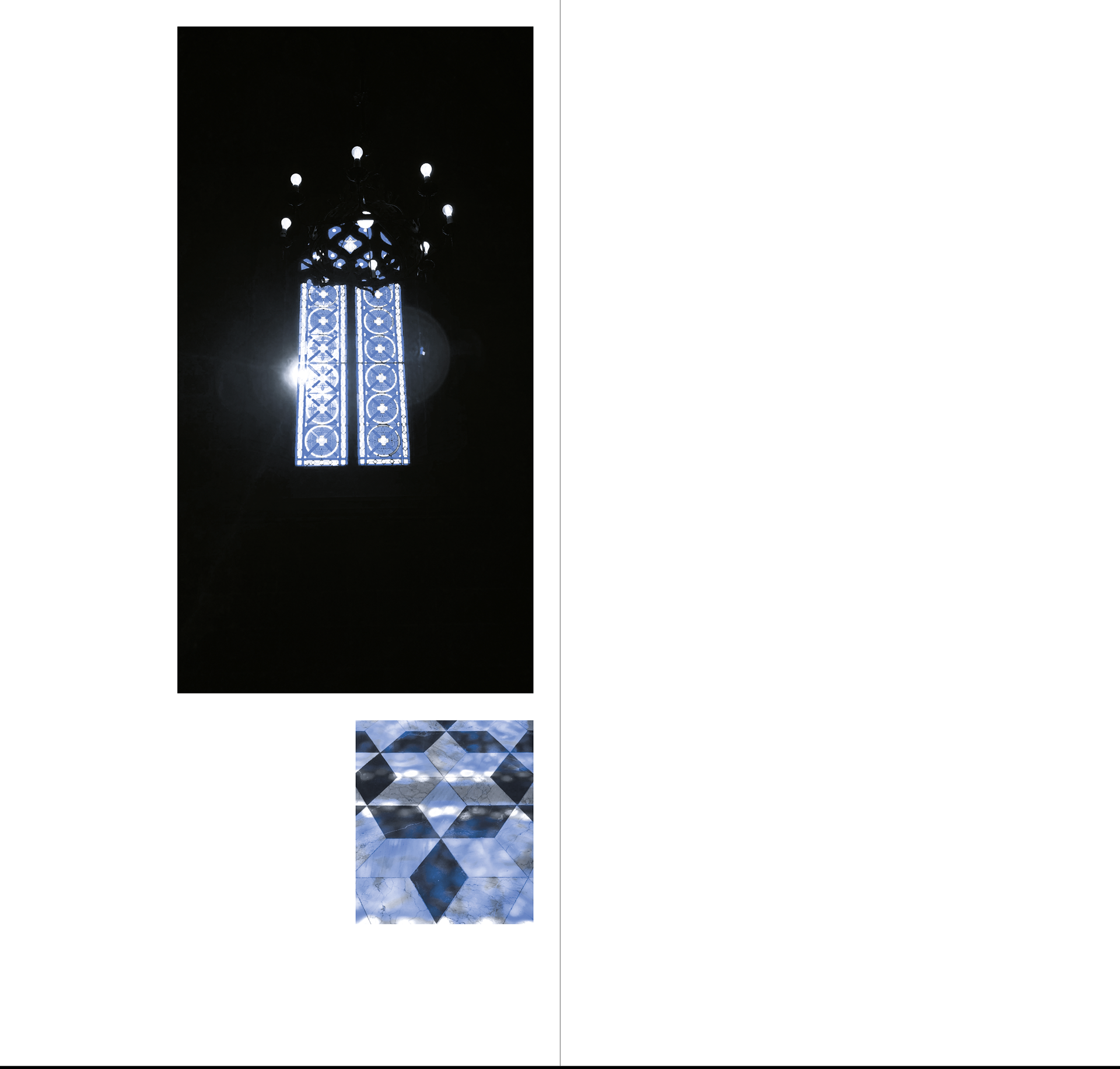
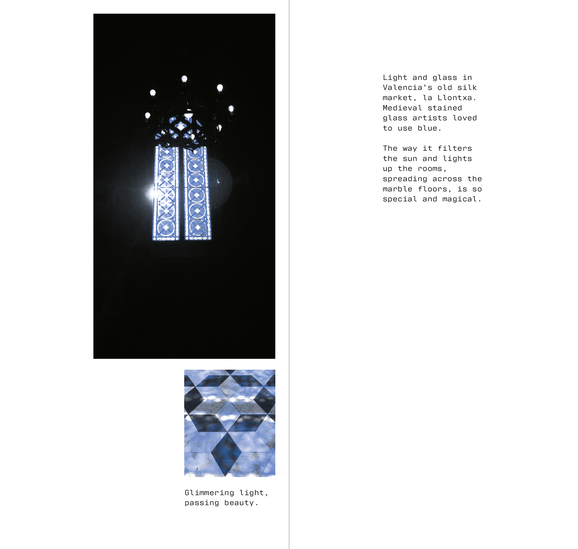
Light and glass in Valencia’s old silk market, la Llontxa. Medieval stained glass used a lot of loved blue. The way it filters the sun and lights up the rooms, spreading across the marble floors is so special and magical.
Coloured lights are always fun. Glimmering lights, passing beauty.
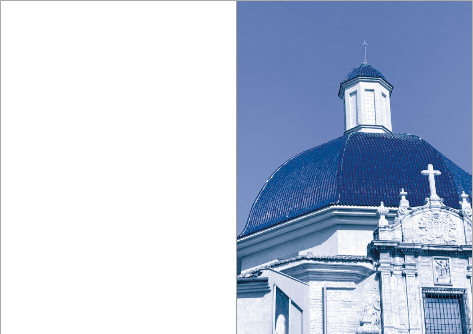
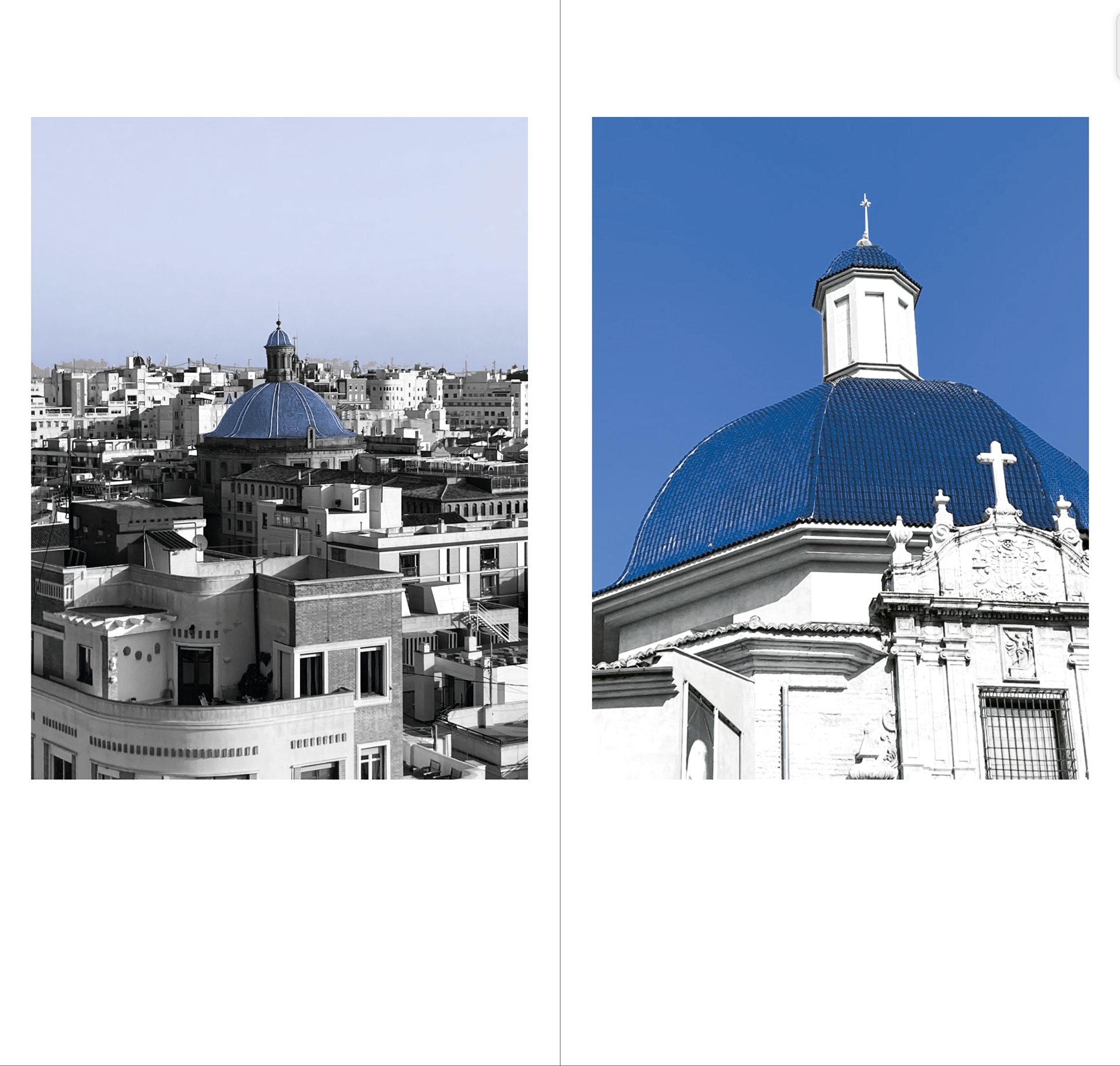
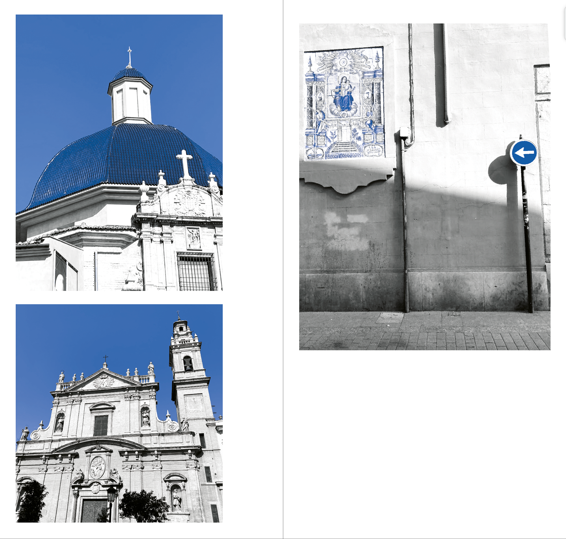
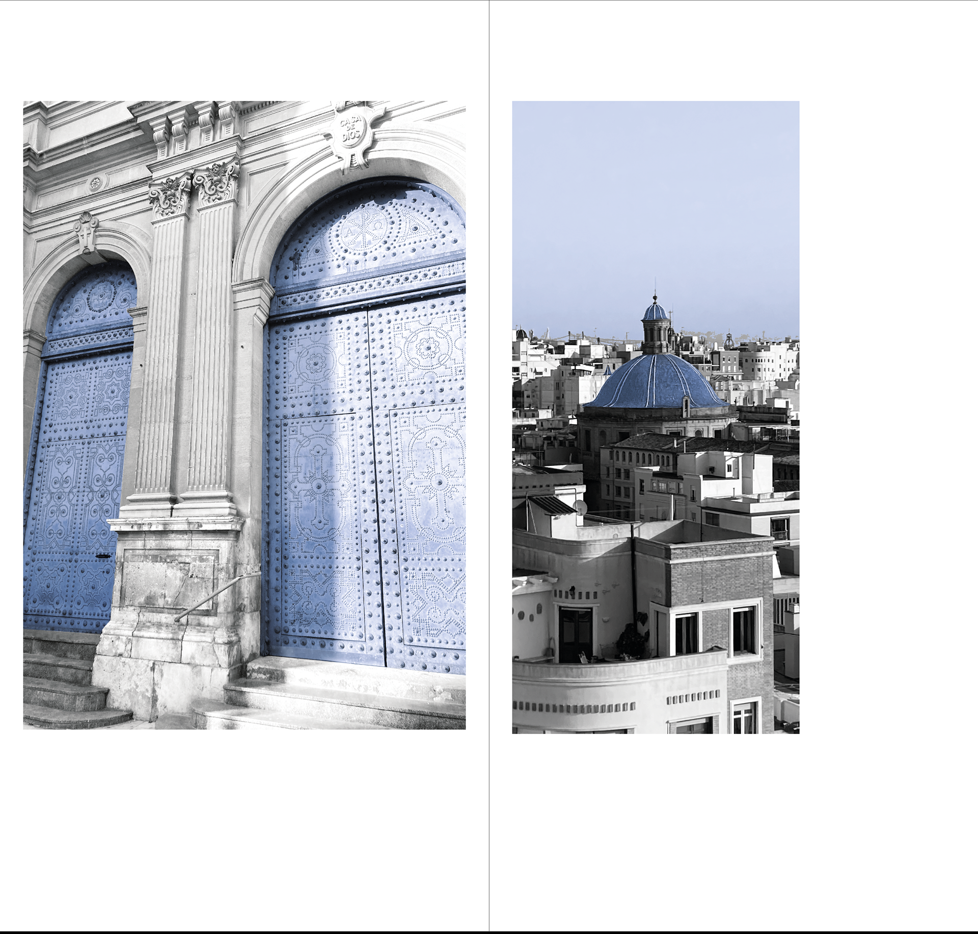
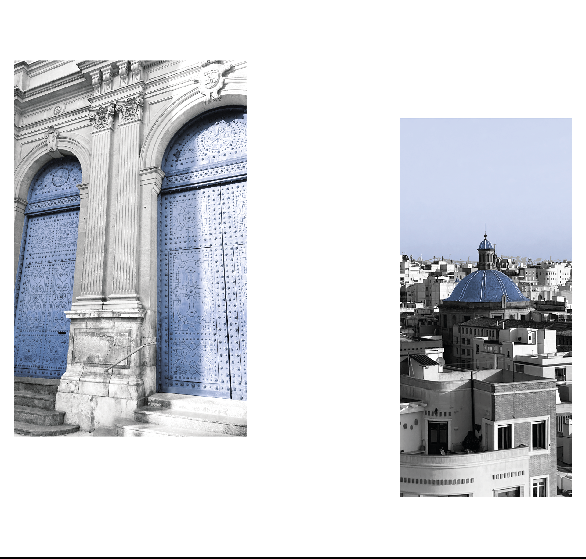
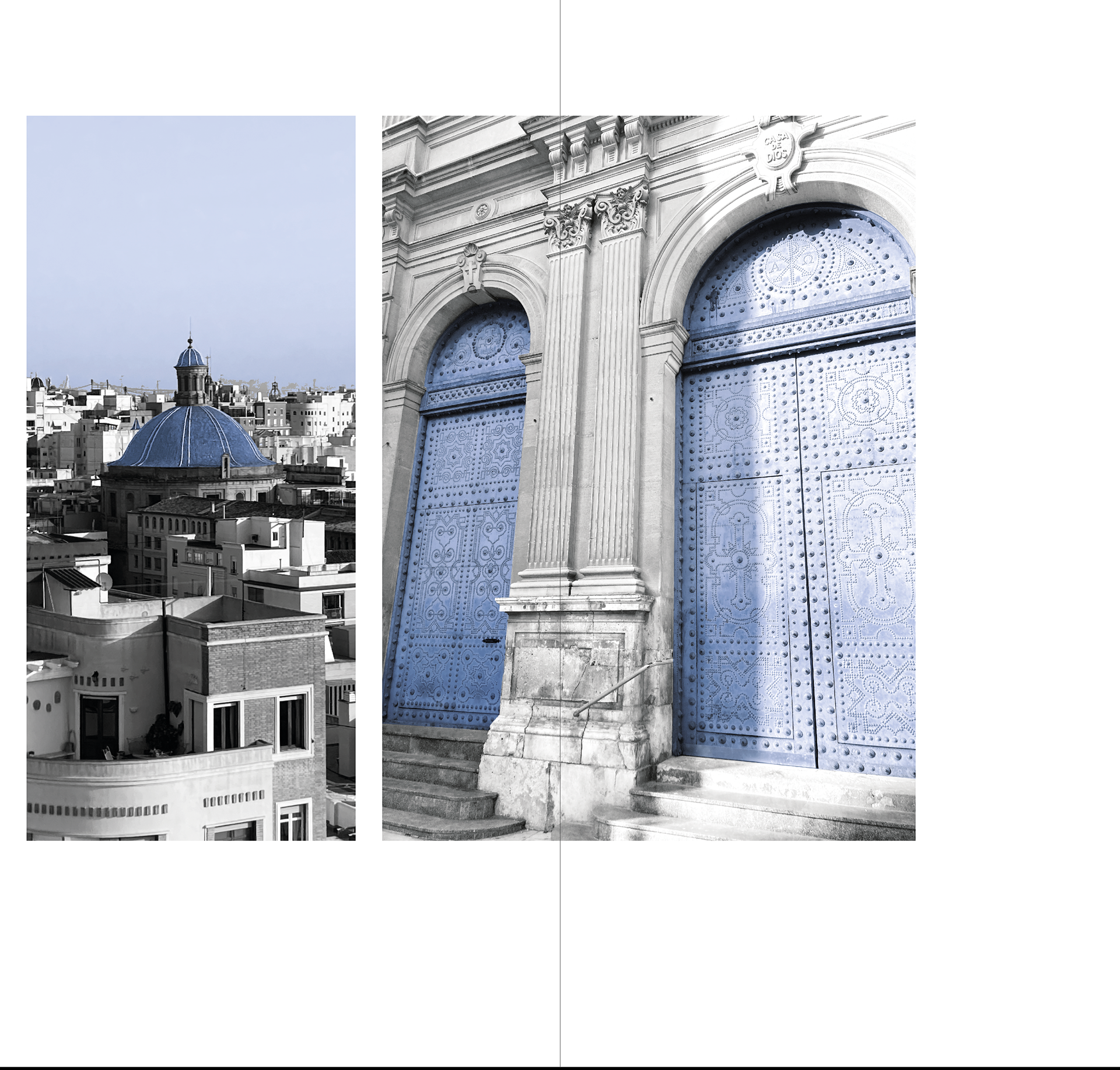
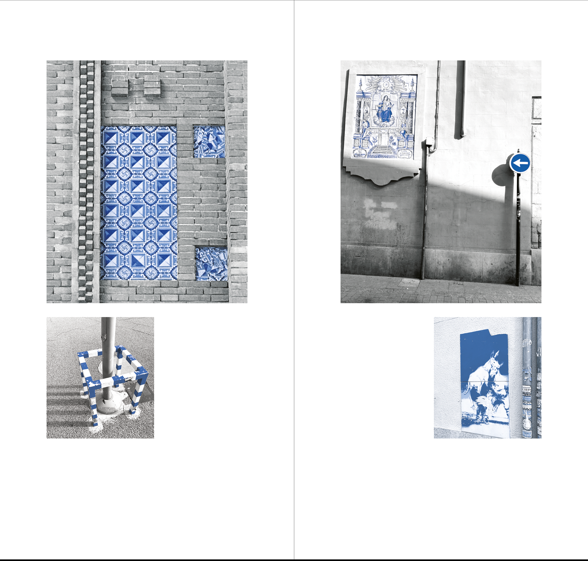
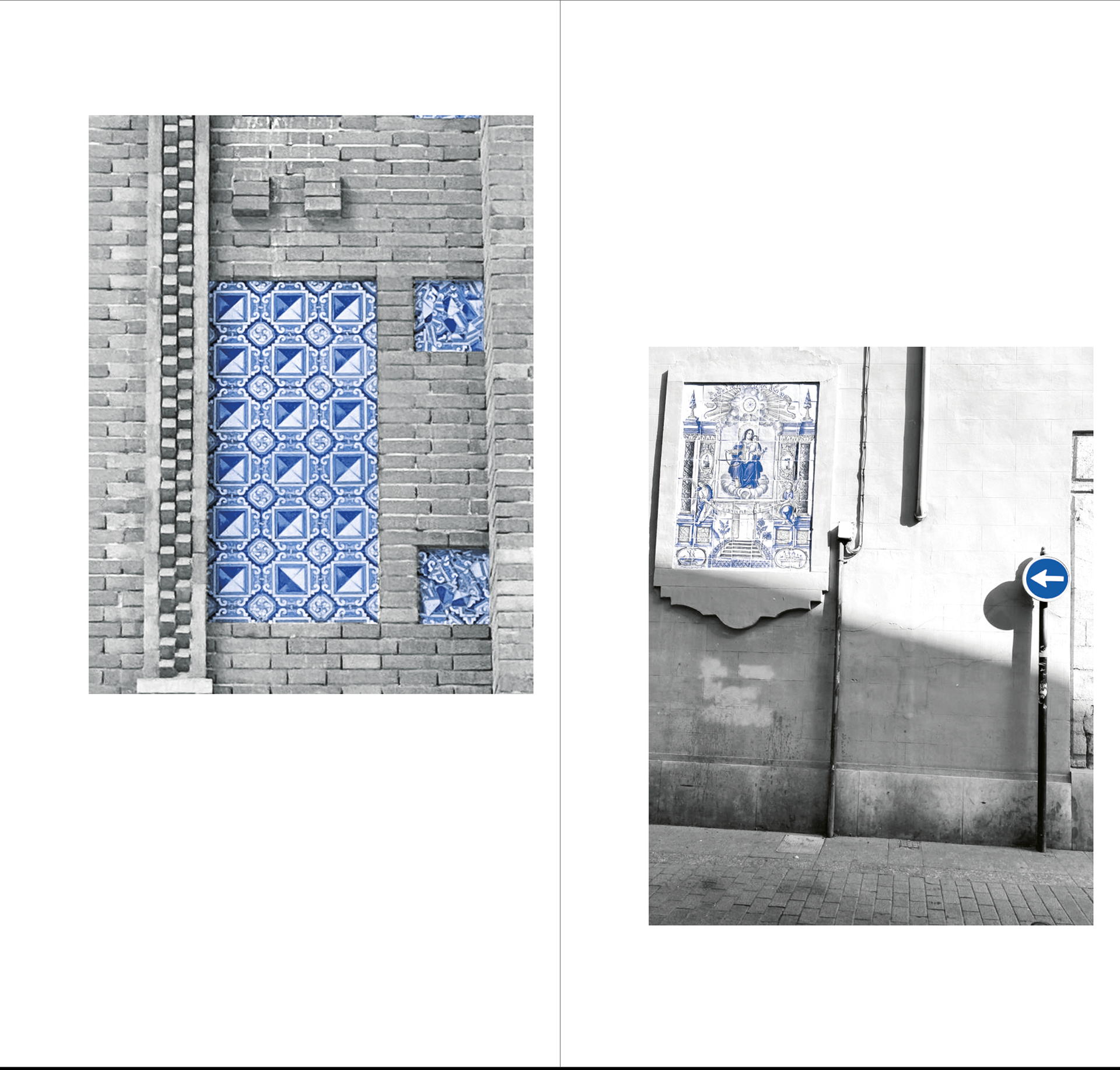
7/12
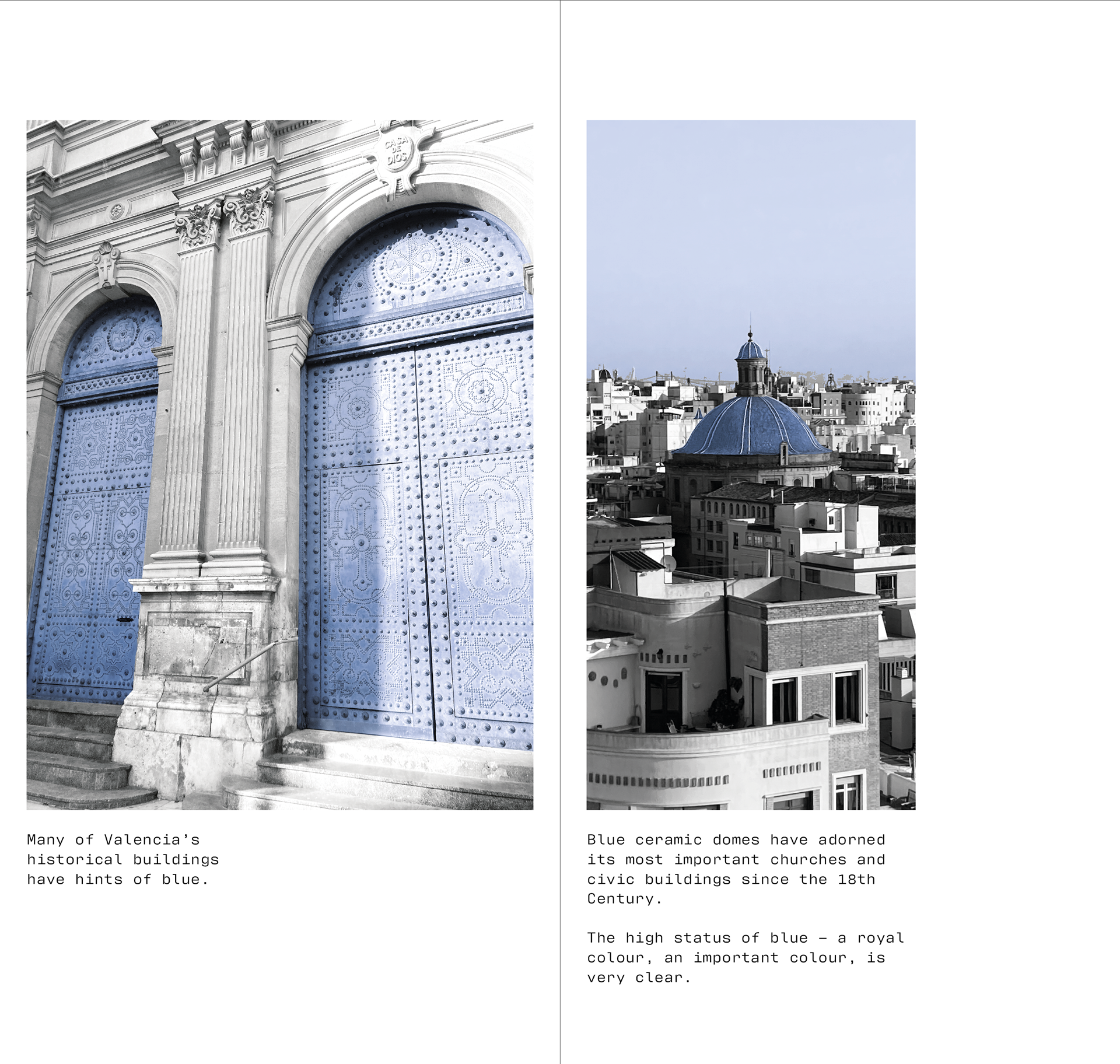
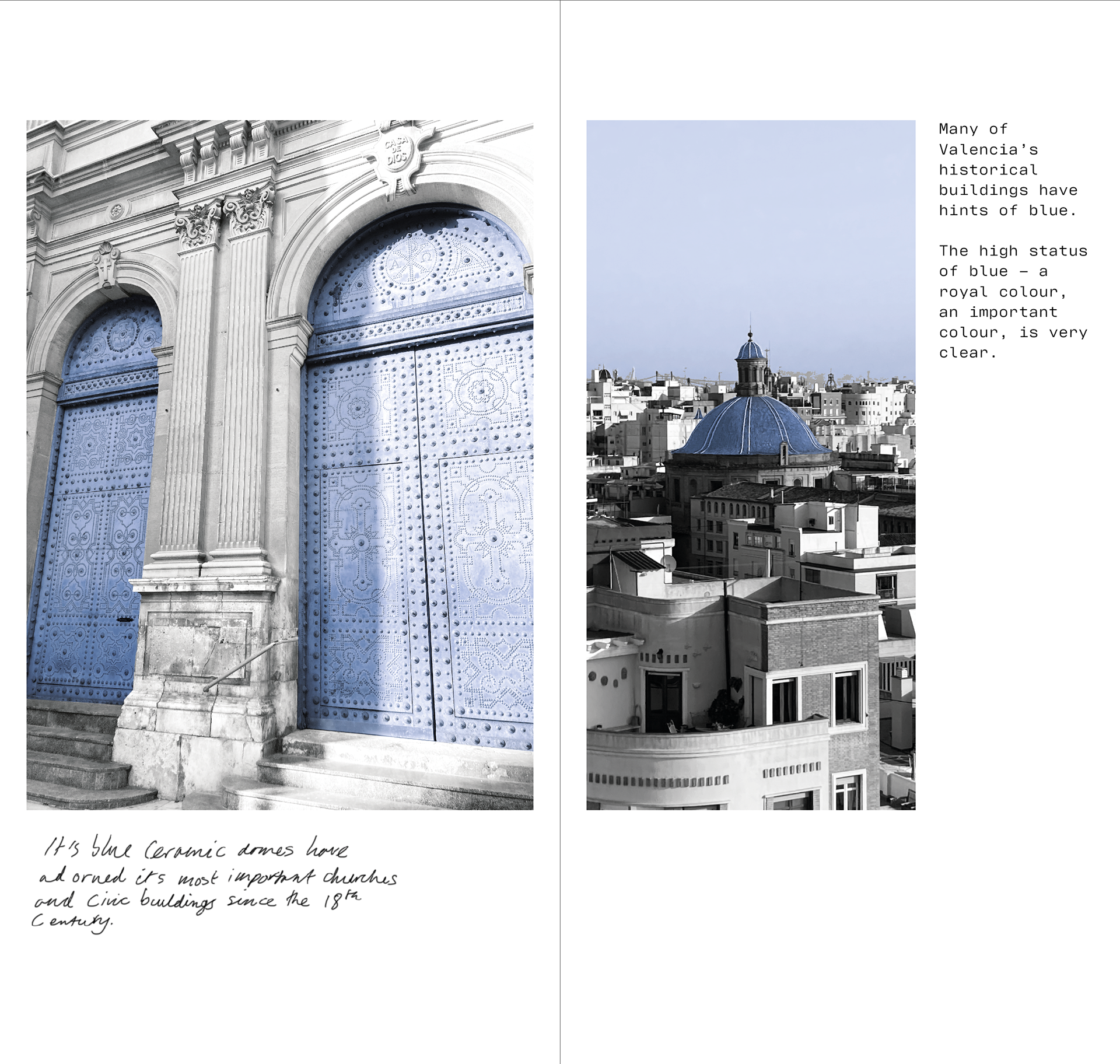
Many of Valencia’s historical buildings have hints of blue. Its blue ceramic domes have adorned its most important churches and civic buildings since the 18th Century.
The high status of blue – a royal colour, an important colour, is very clear.
8/12
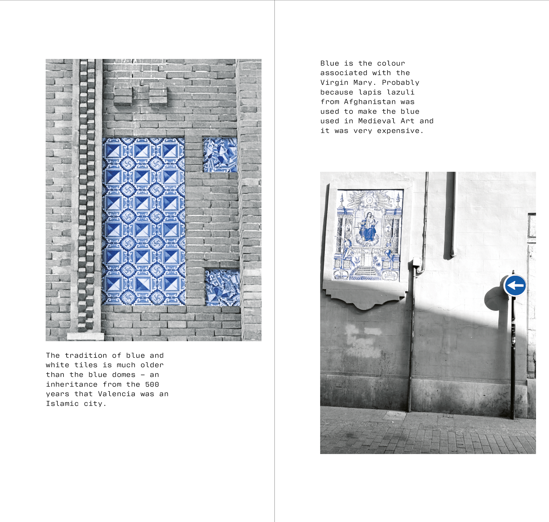
But the tradition of blue and white tiles is much older – an inheritance form the 500 years that Valencia was an Islamic city.
Blue is the colour associated with the Virgin Mary. Probably because lapis lazuli from Afghanistan was used to make the blue used in Medieval Art and it was very expensive.
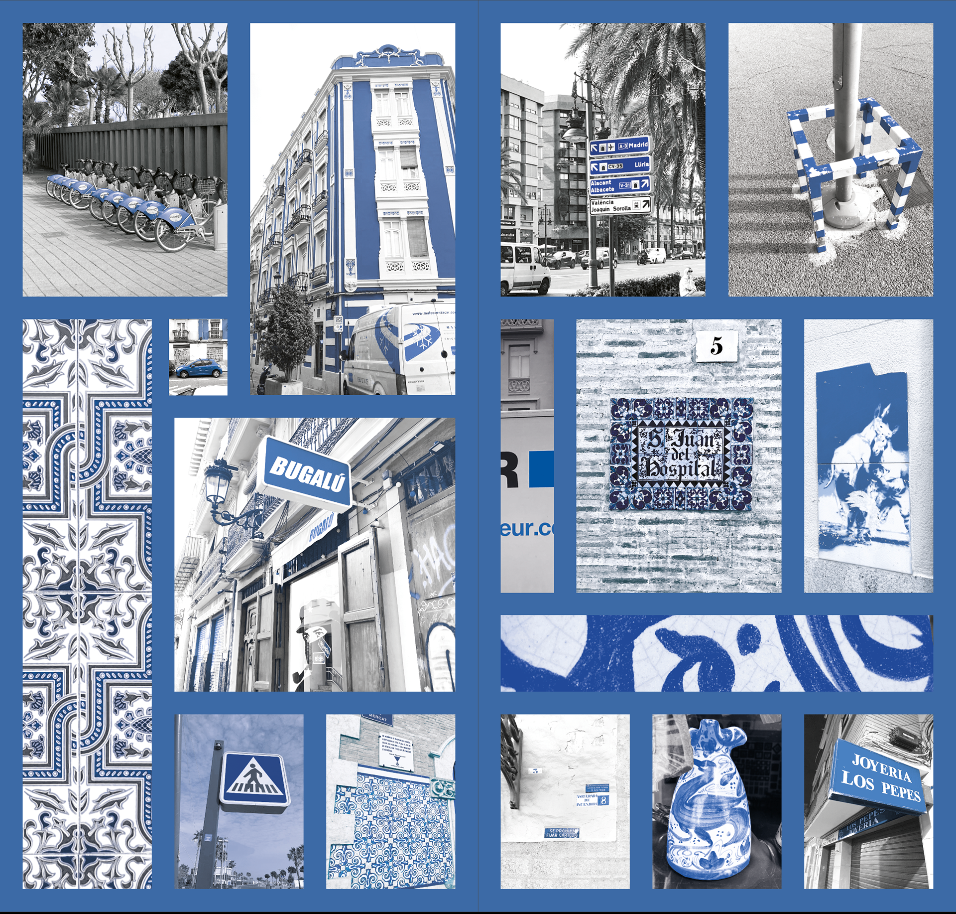
9/12
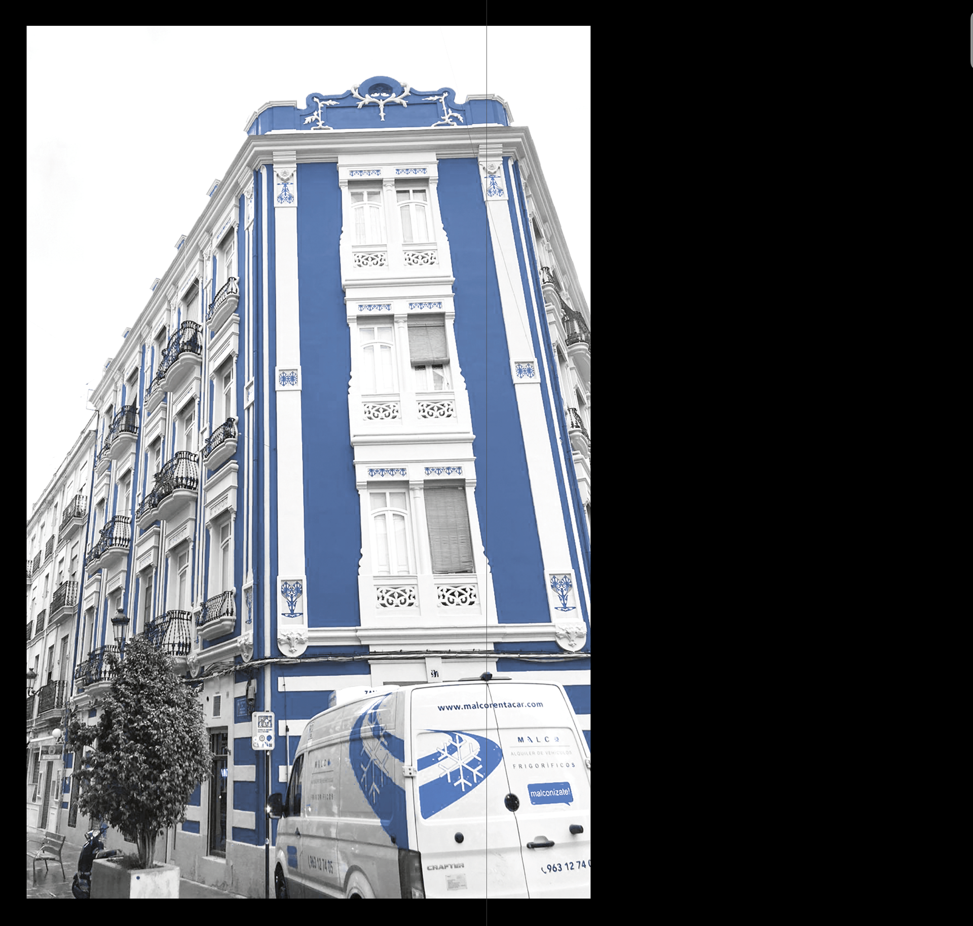
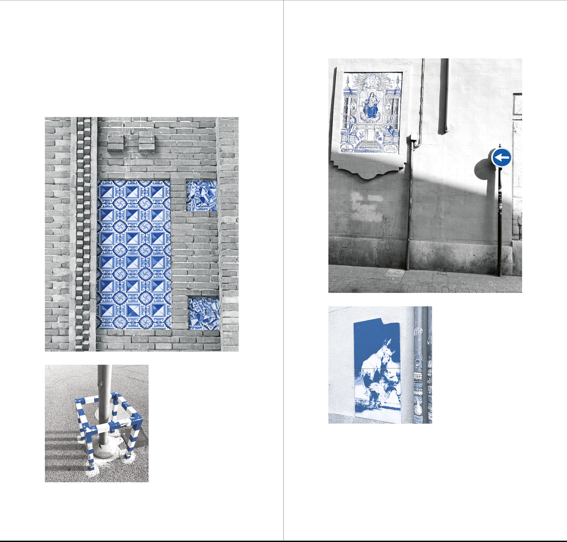
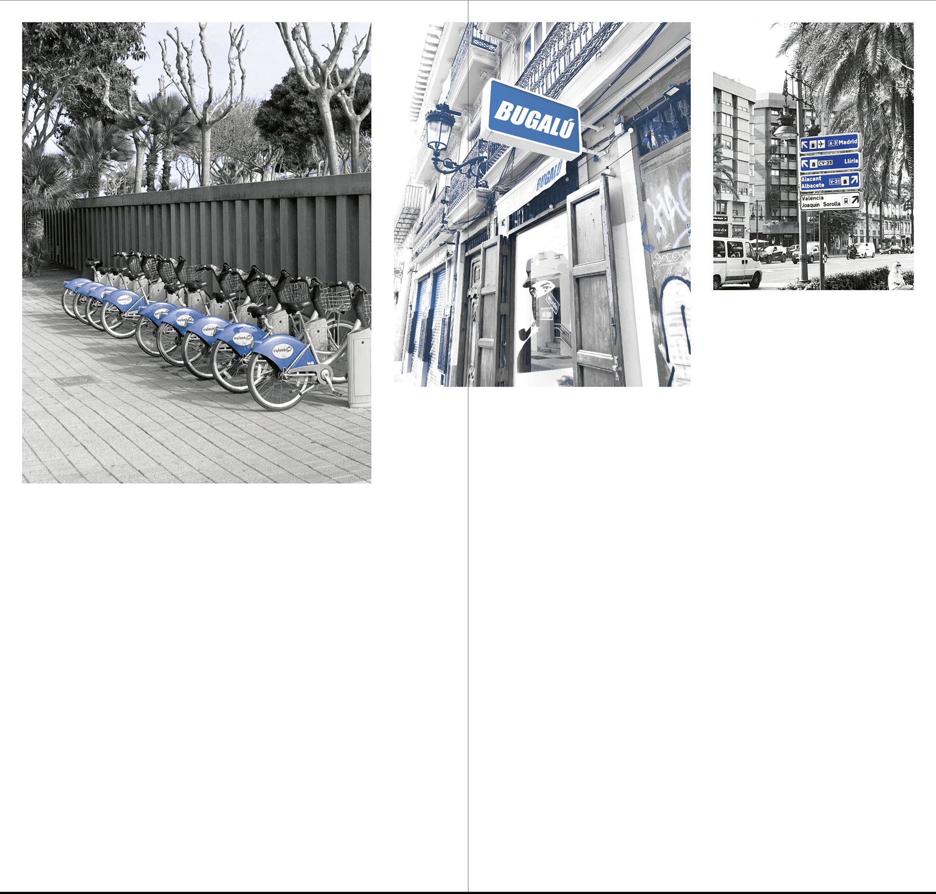
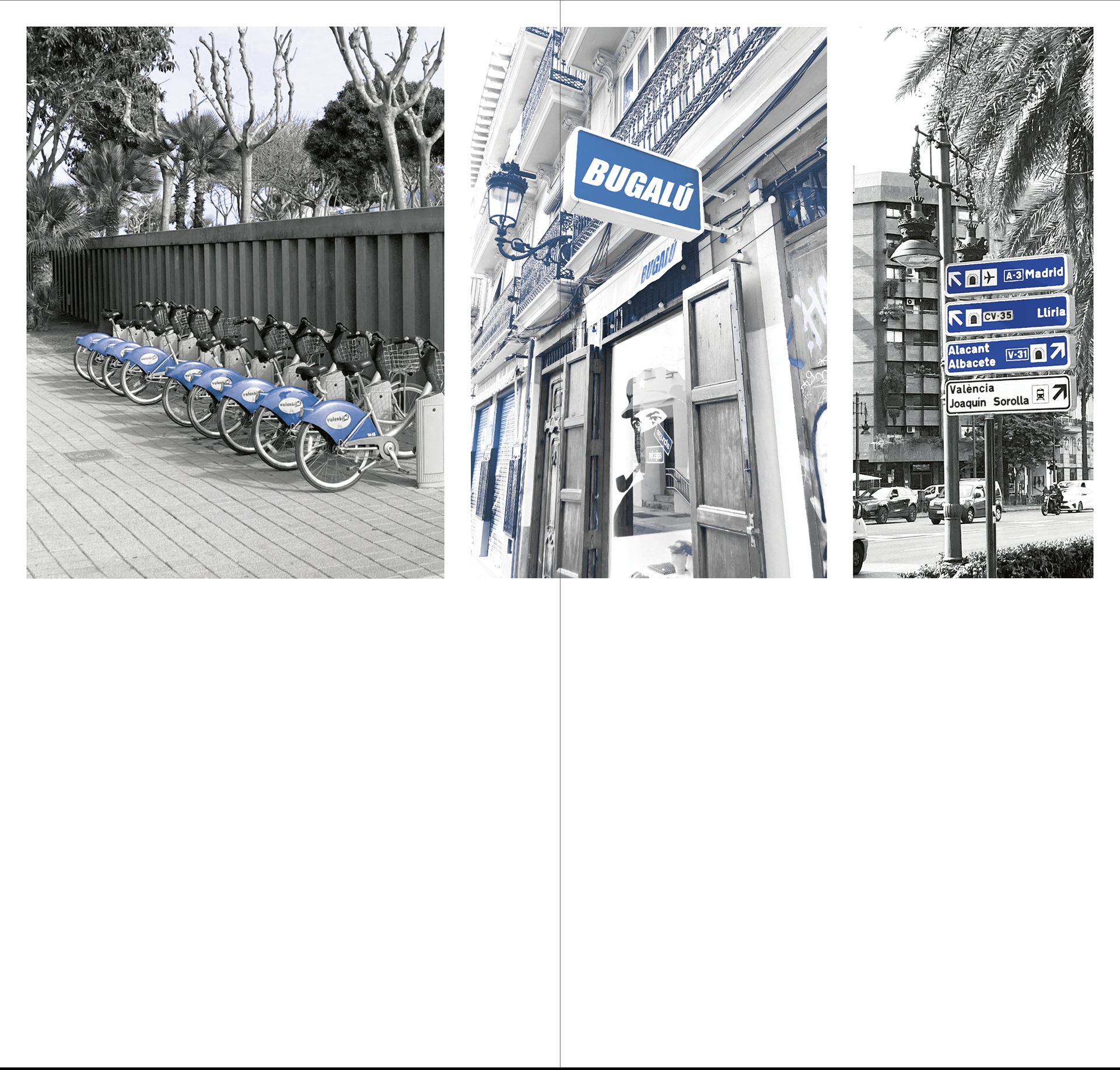
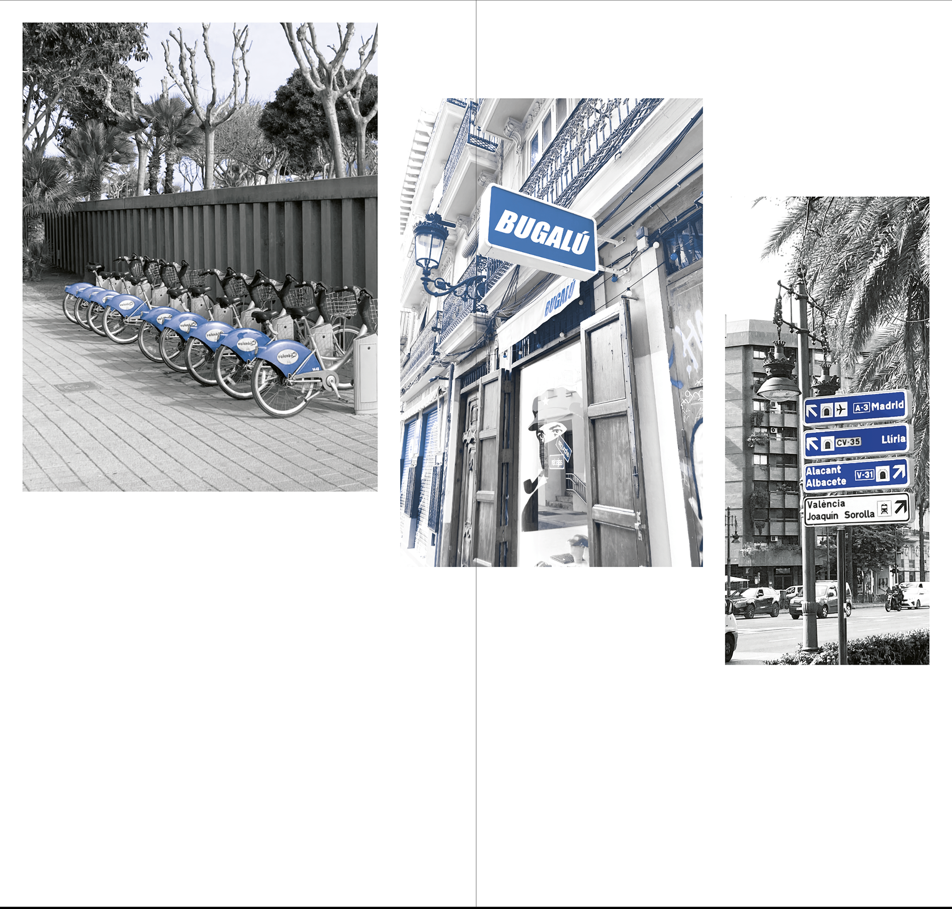
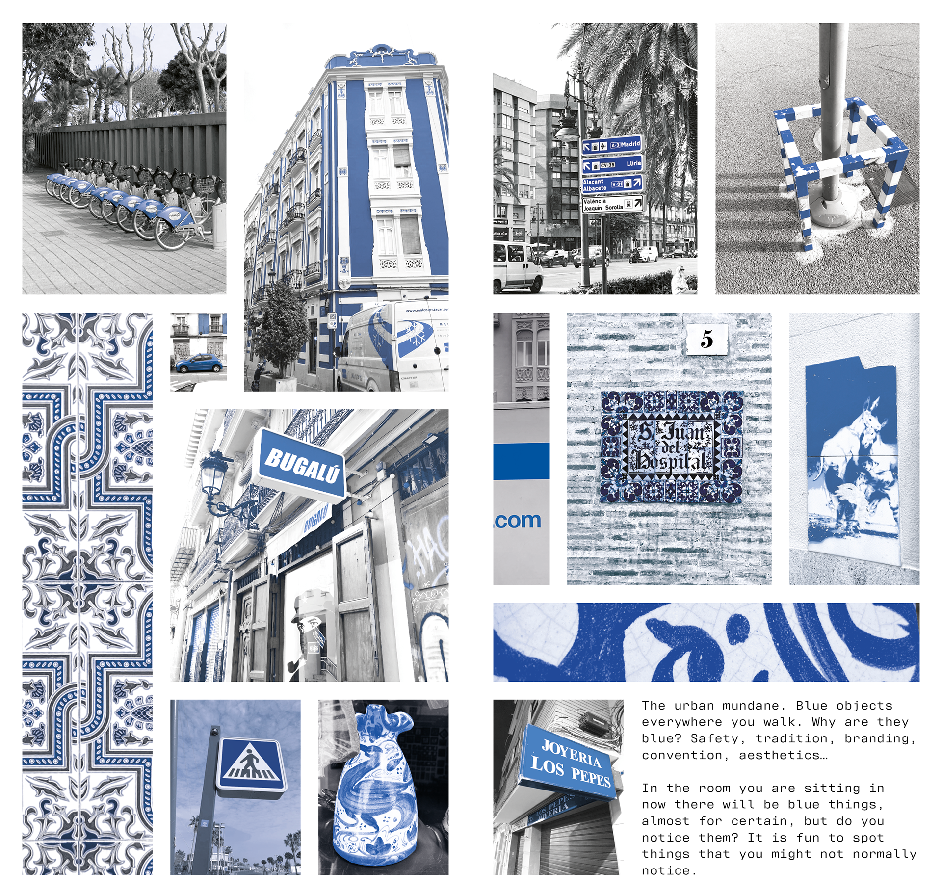
Whilst the tiles are beautiful, even the street signs, street art and furniture can be blue too, and are lovely in their own ways.
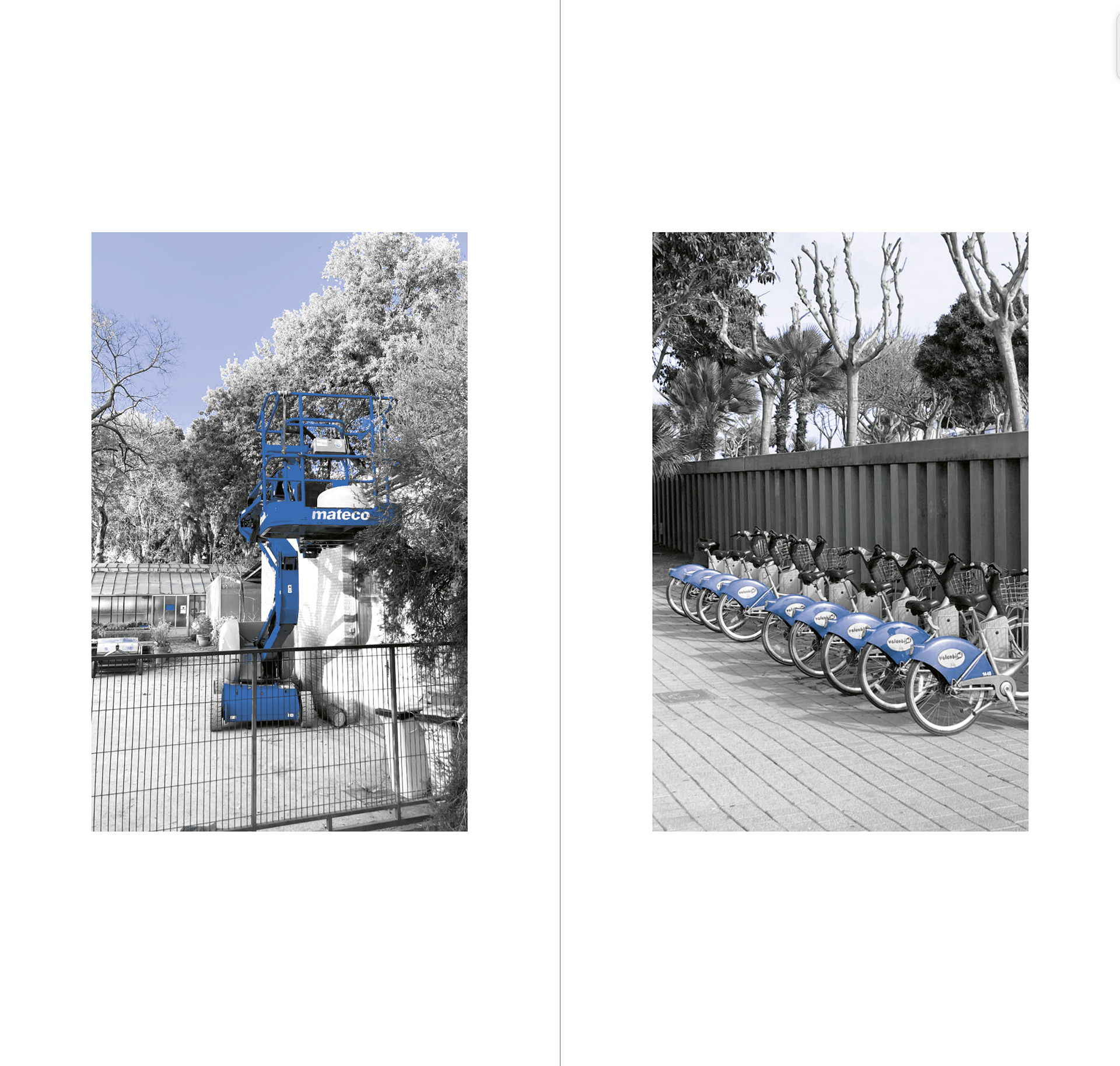
The urban mundane. Blue objects everywhere you walk. Why are they blue? Safety, branding, convention, aesthetics…
In the room you are sitting in now there will be blue things, almost for certain, but do you notice them. It is fun to spot things that might not normally notice.
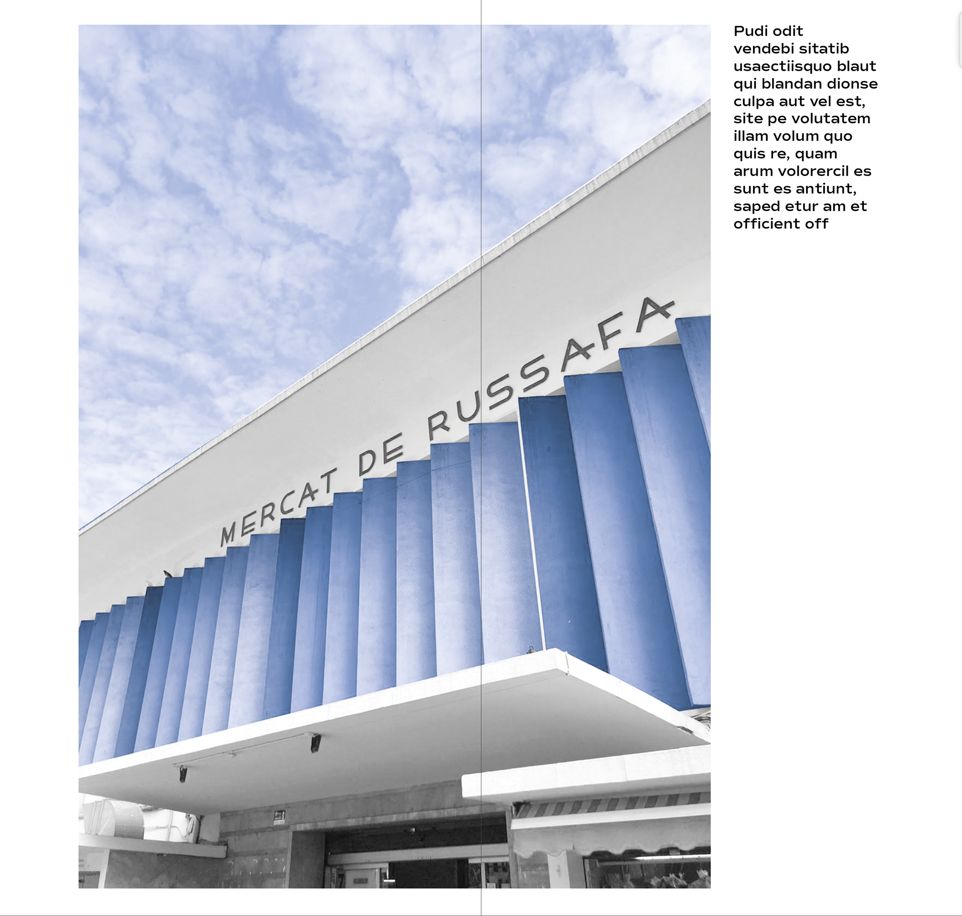
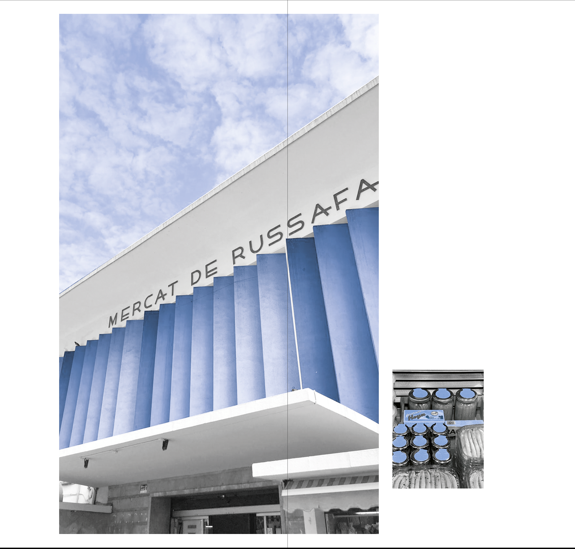
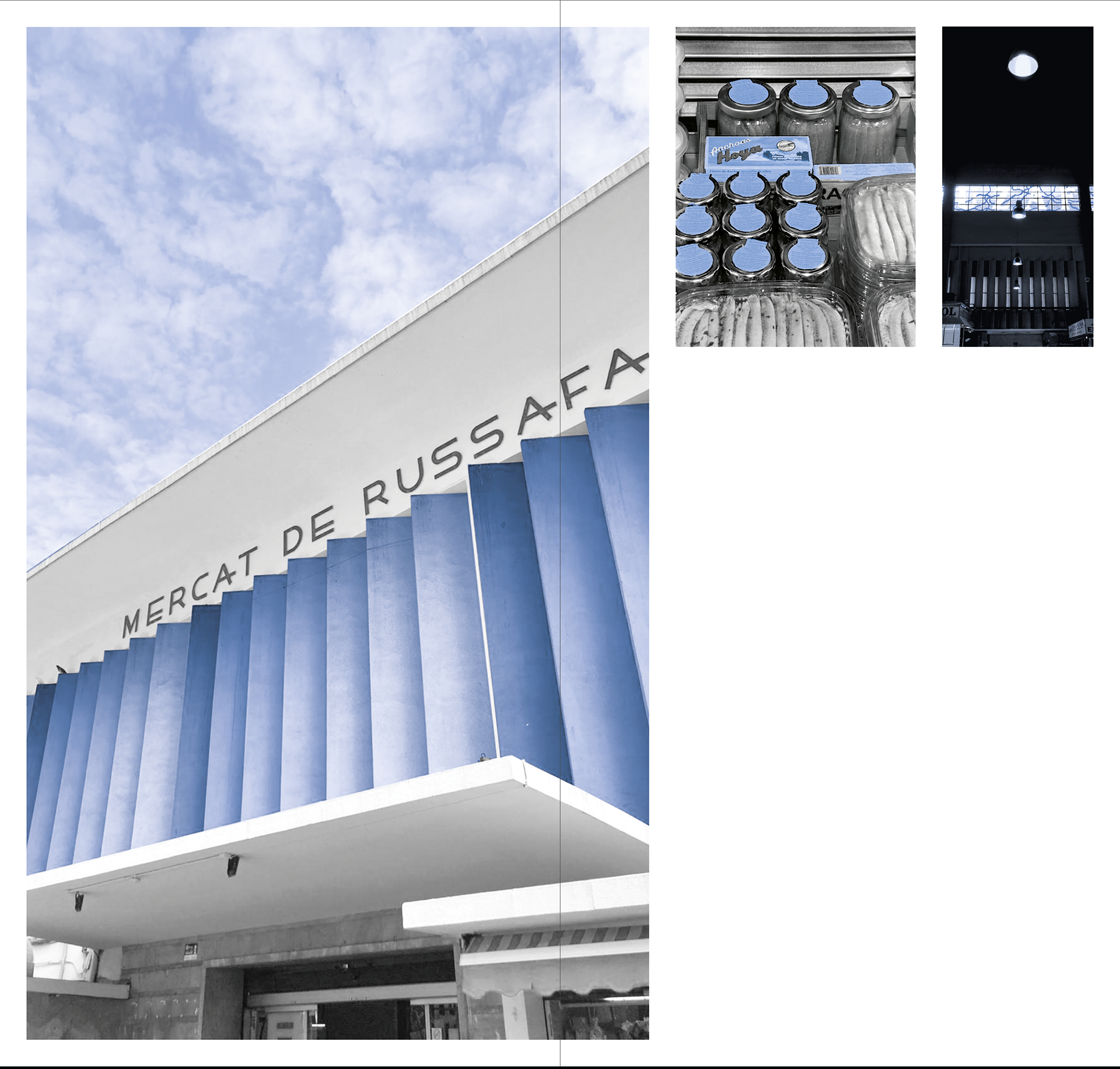
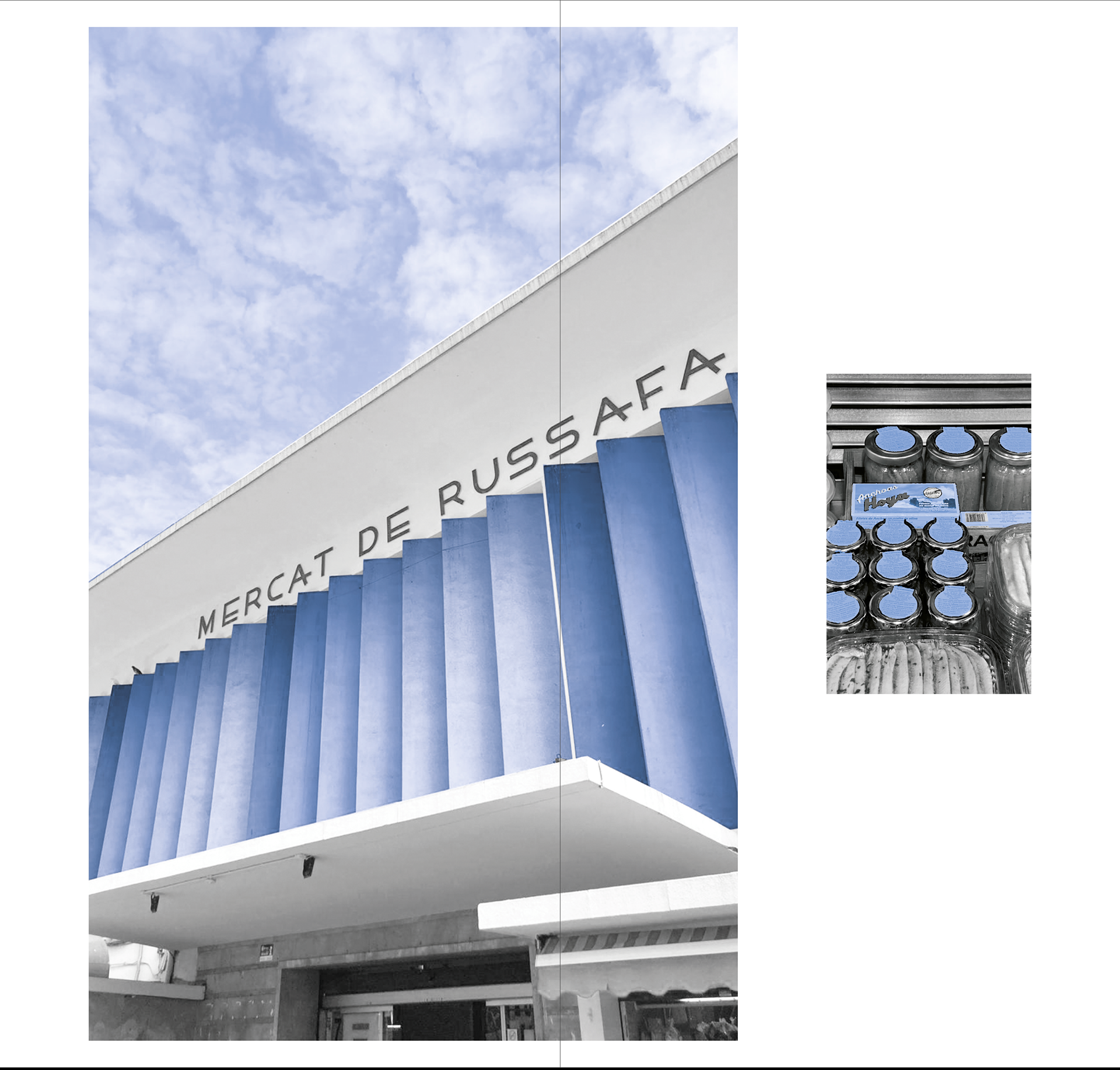
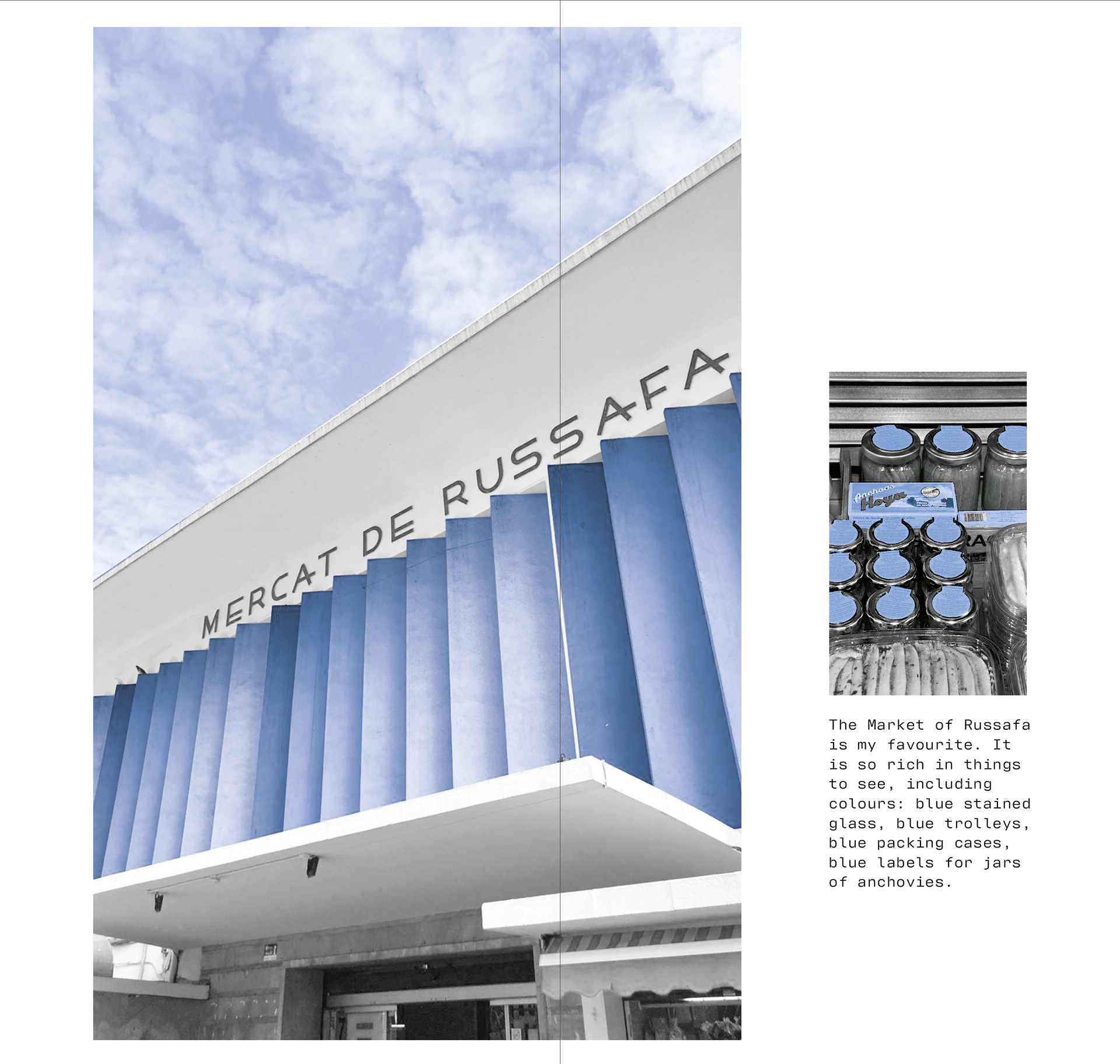
10/12
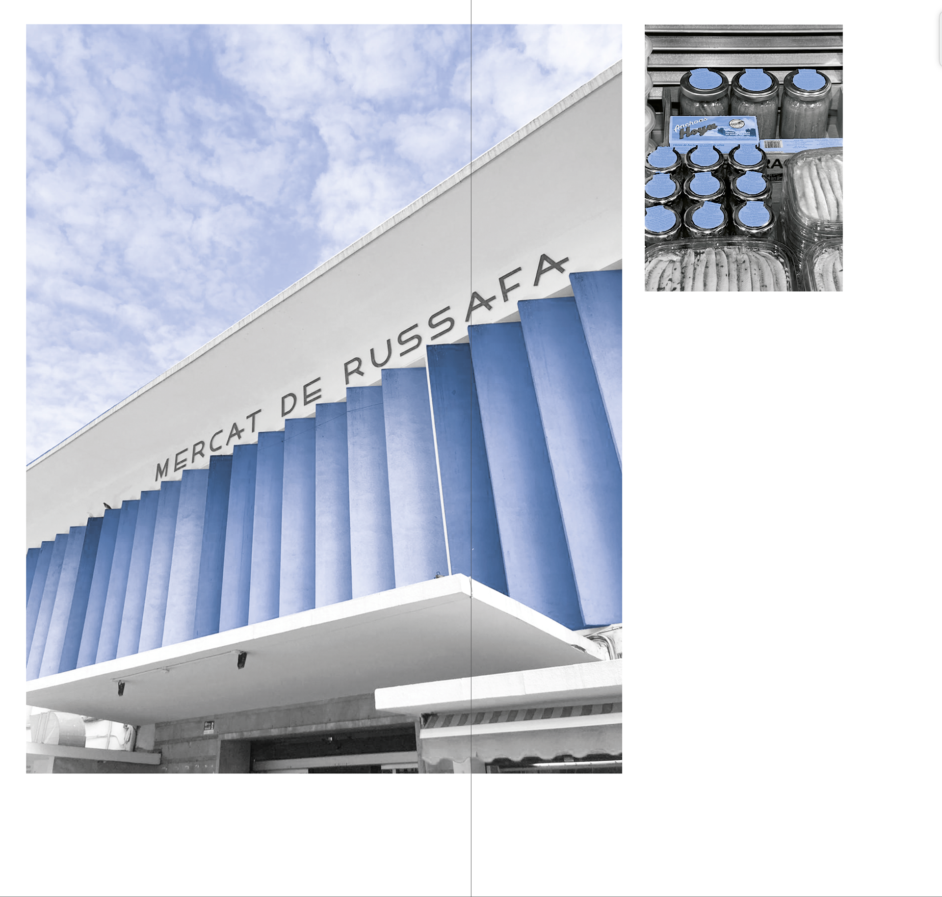
I love markets. The Market of Russafa is my favourite. It is so rich in things to see, including colours: blue stained glass, blue trolleys, blue packing cases, blue labels for jars of anchovies
11/12
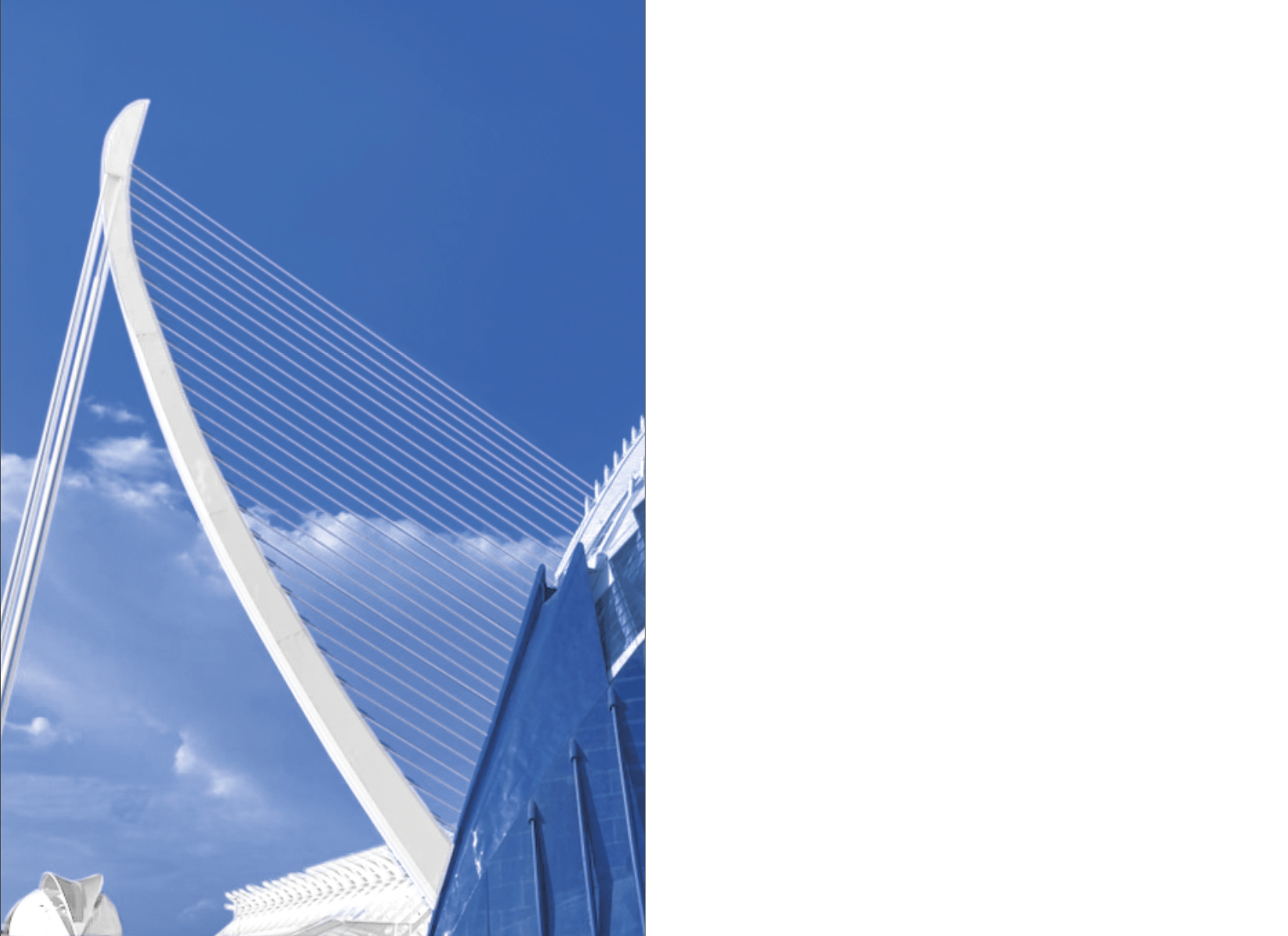
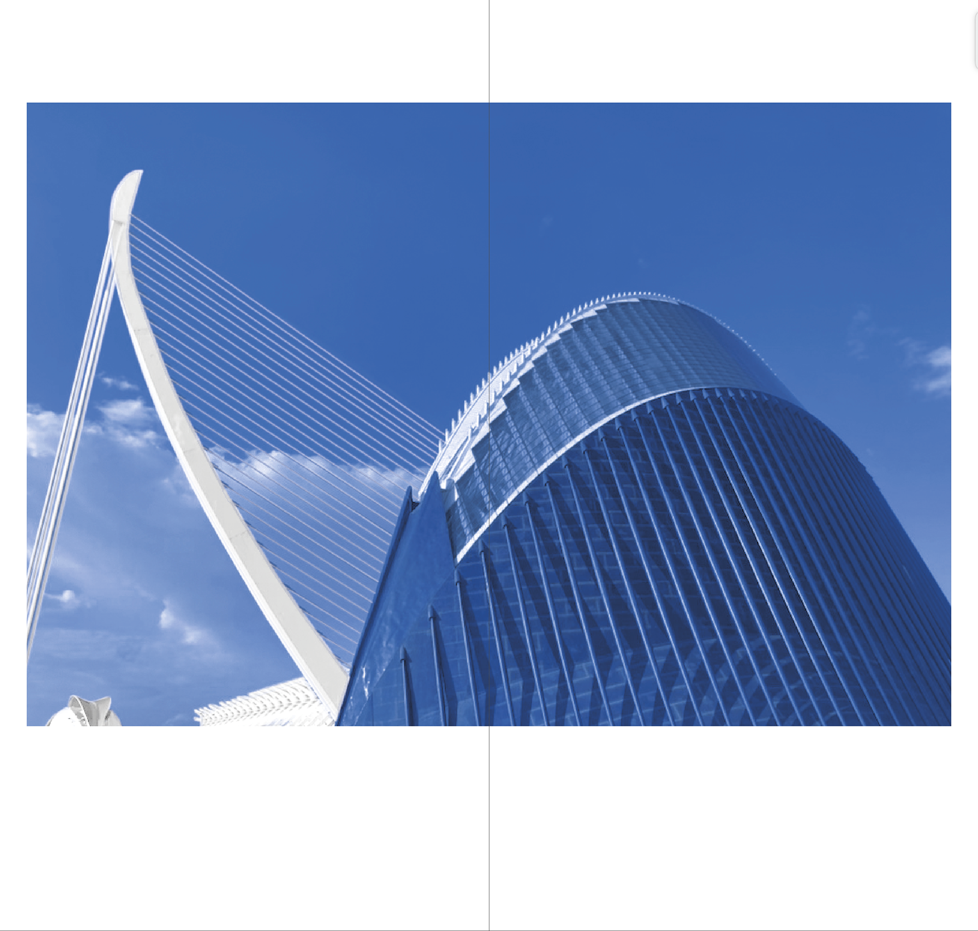
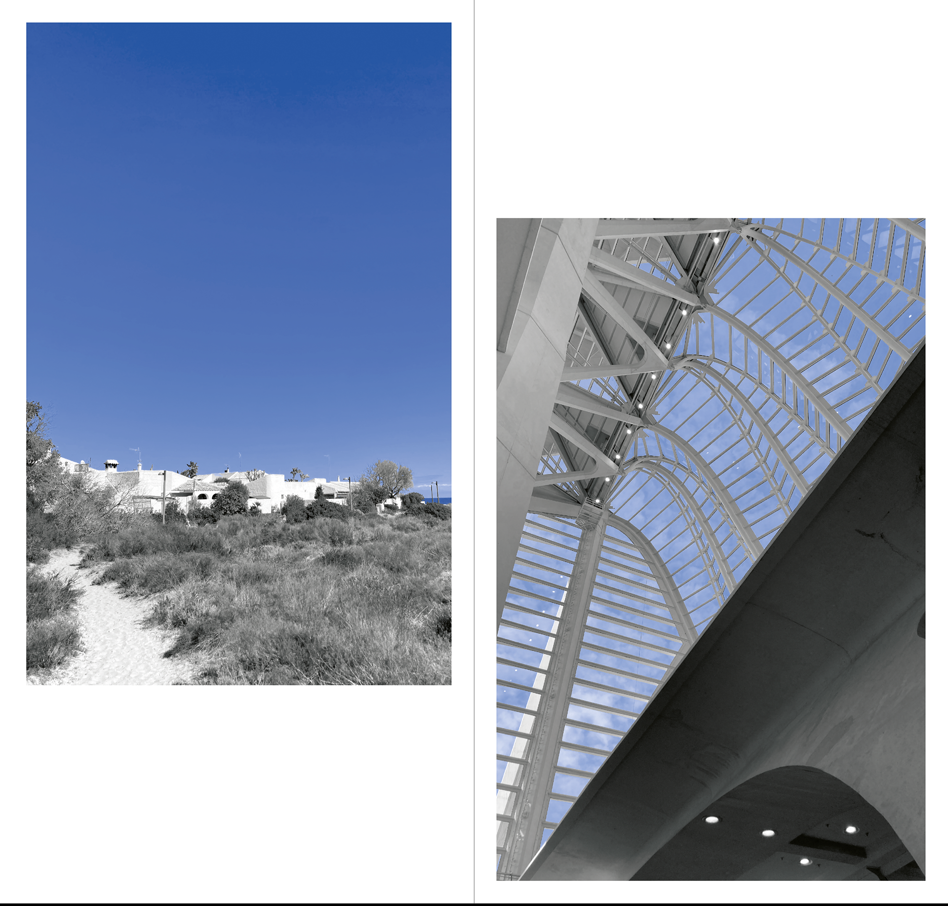
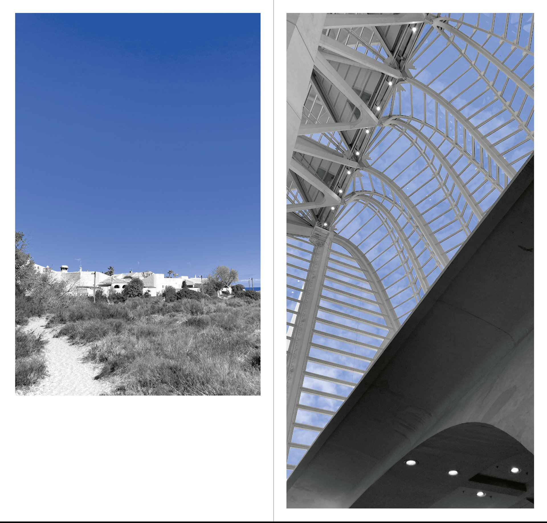
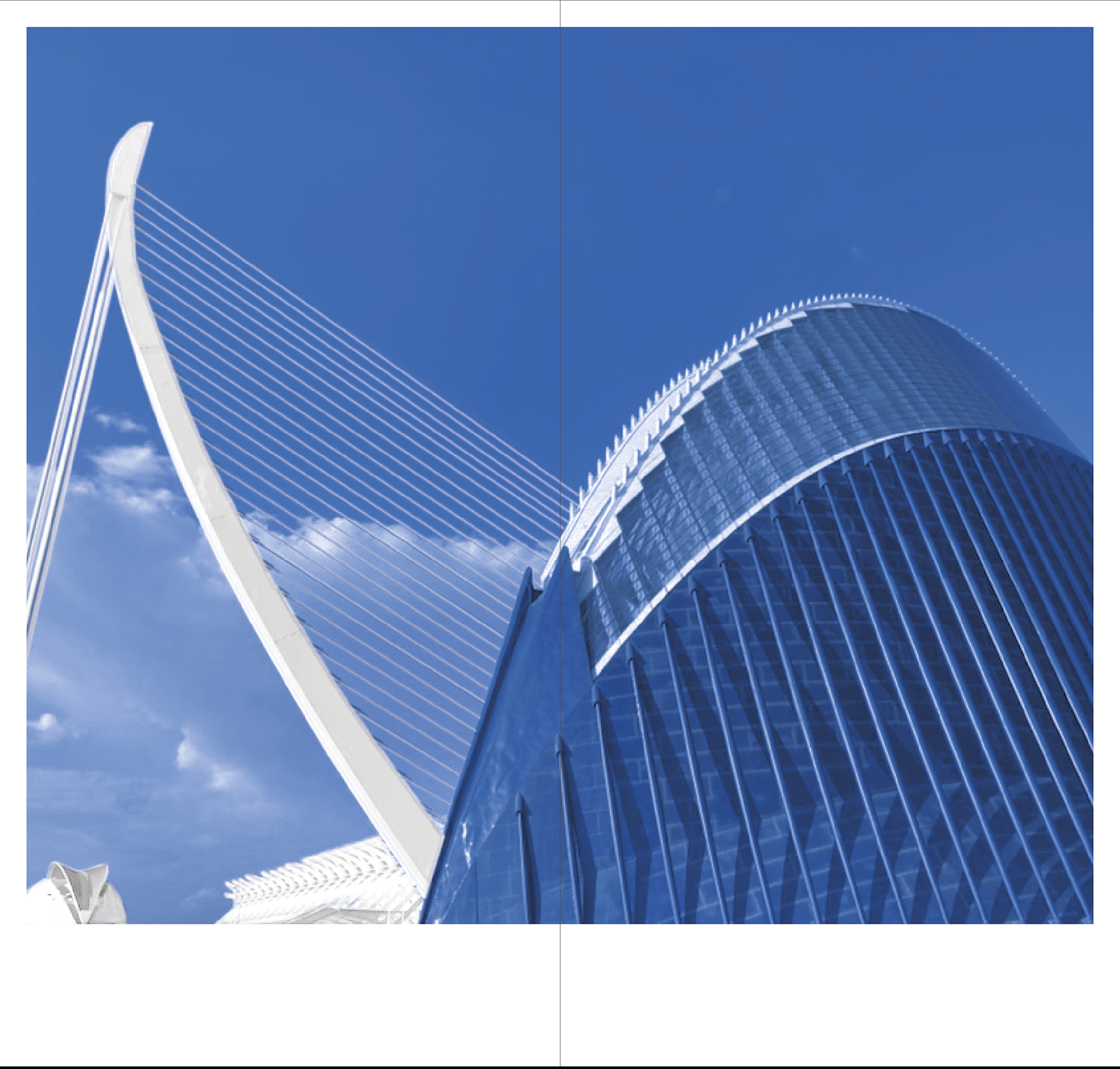
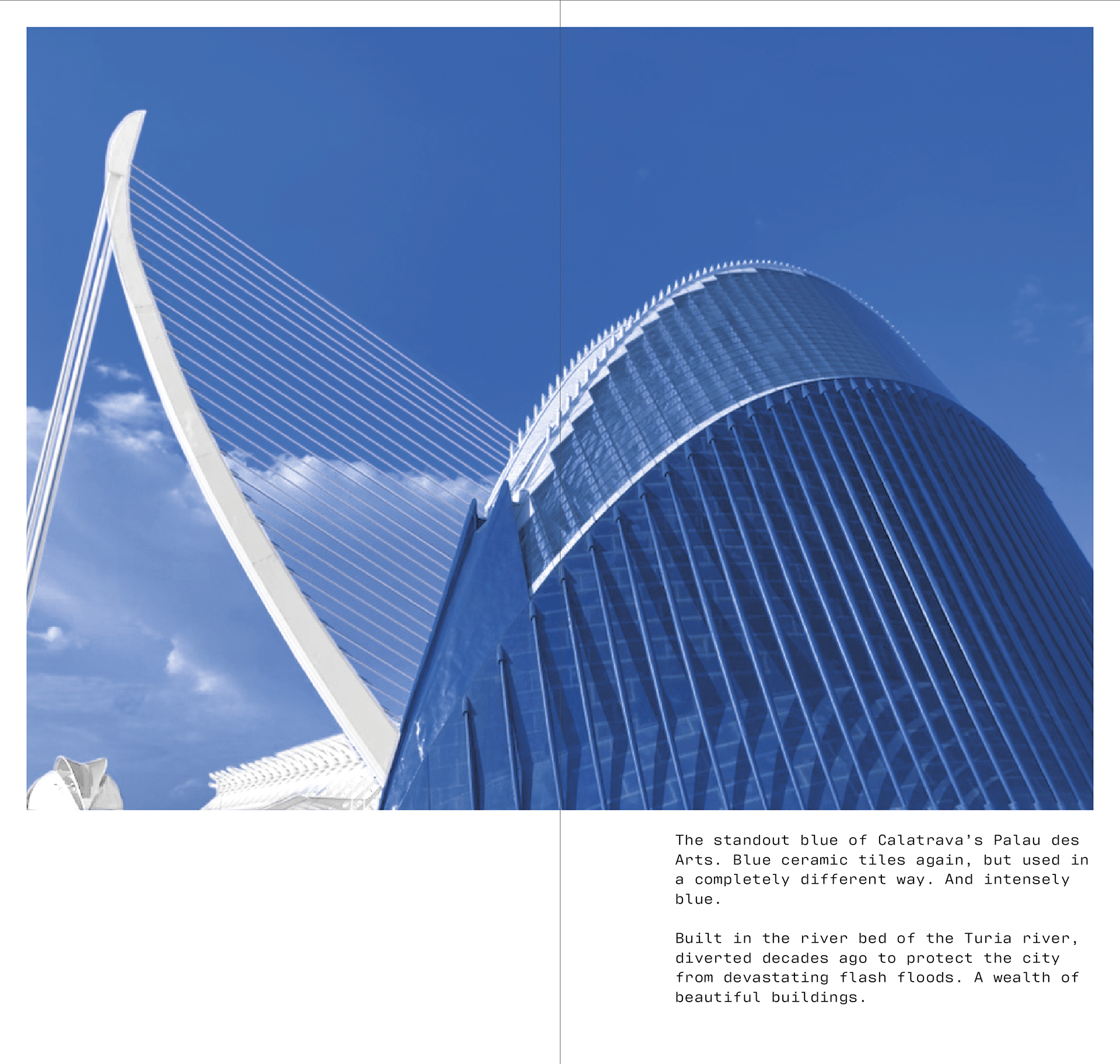
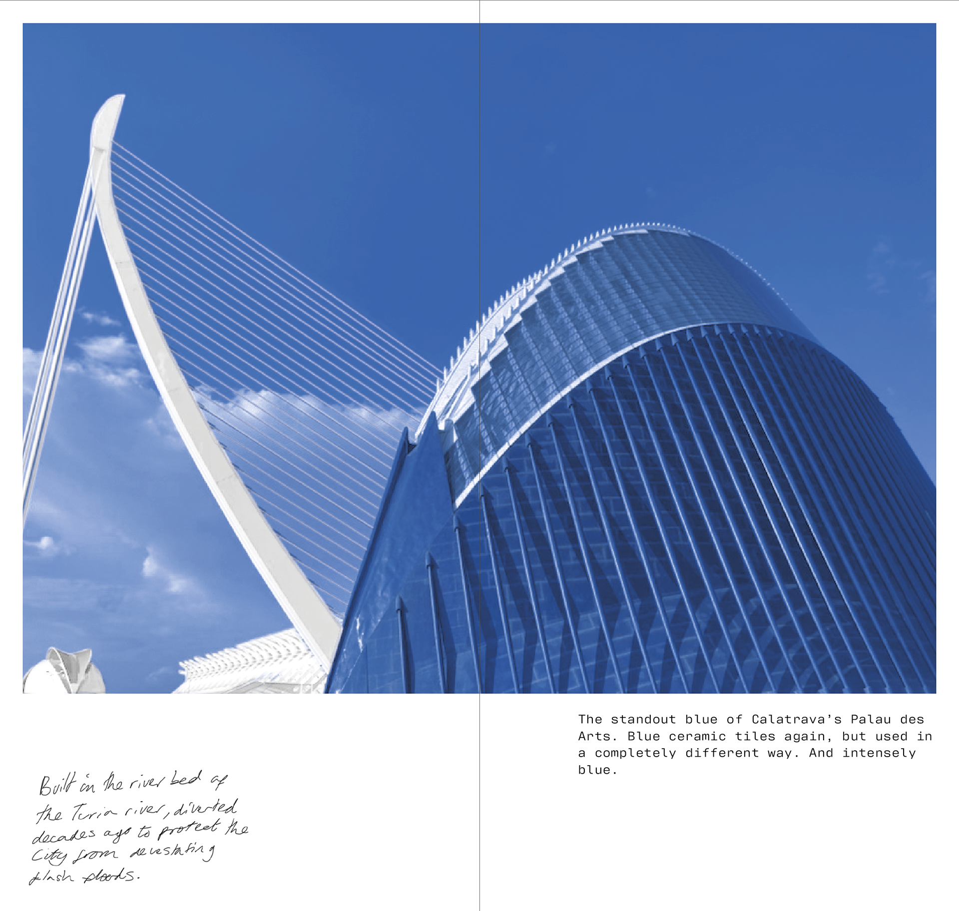
The standout blue of Calatrava’s Palau des Arts. Blue ceramic tiles again, but used in a completely different way. And intensely blue. Built in the river bed of the Turia river, diverted decades ago to protect the city from devastating flash floods. Such a wealth of beautiful buildings here.
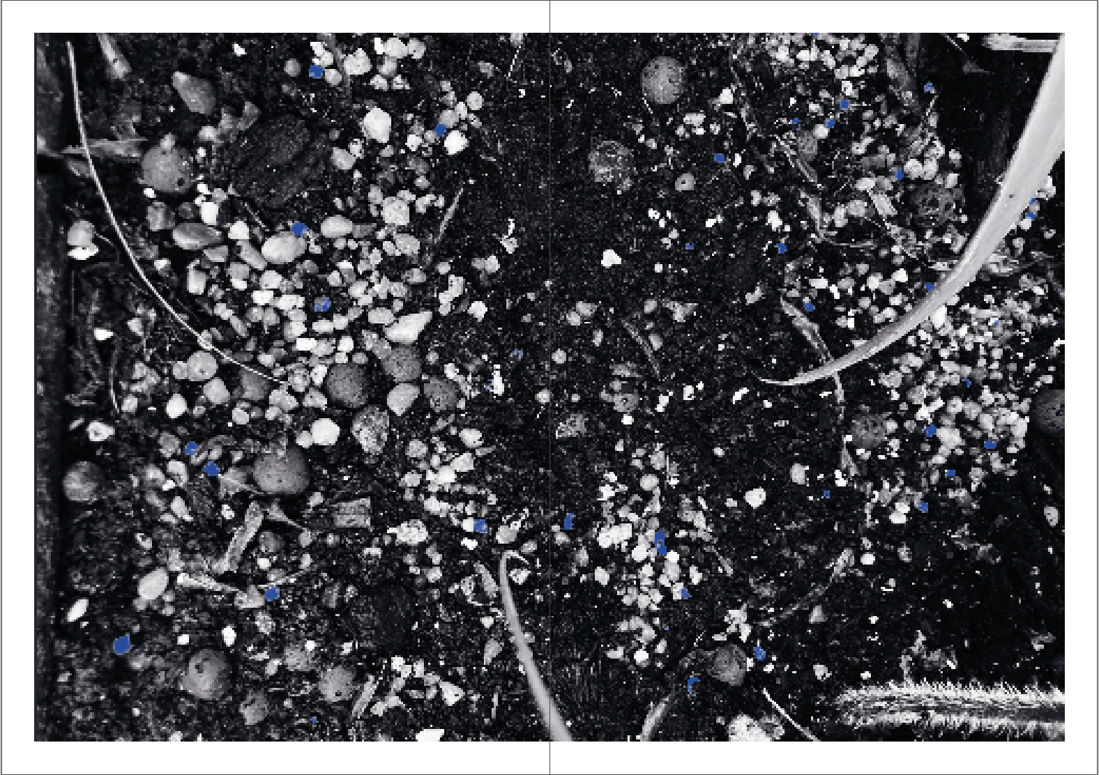
12/12
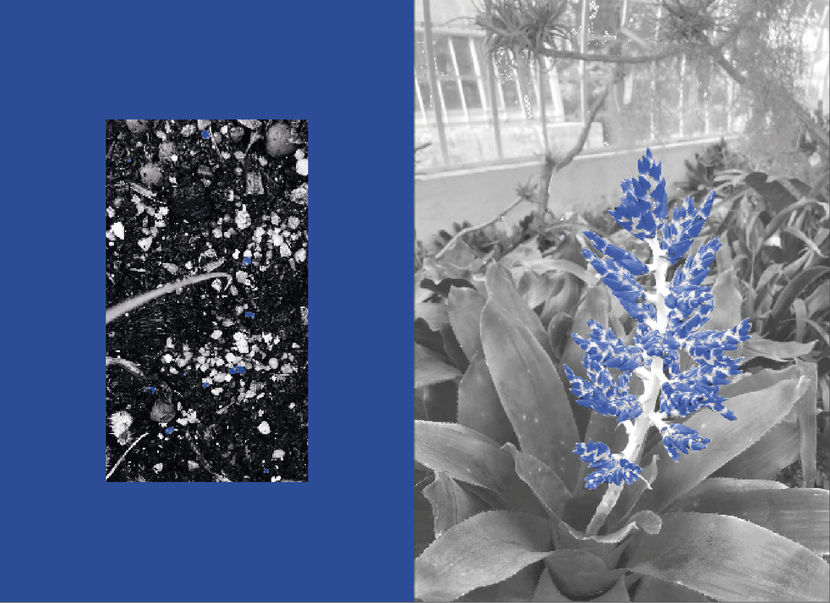
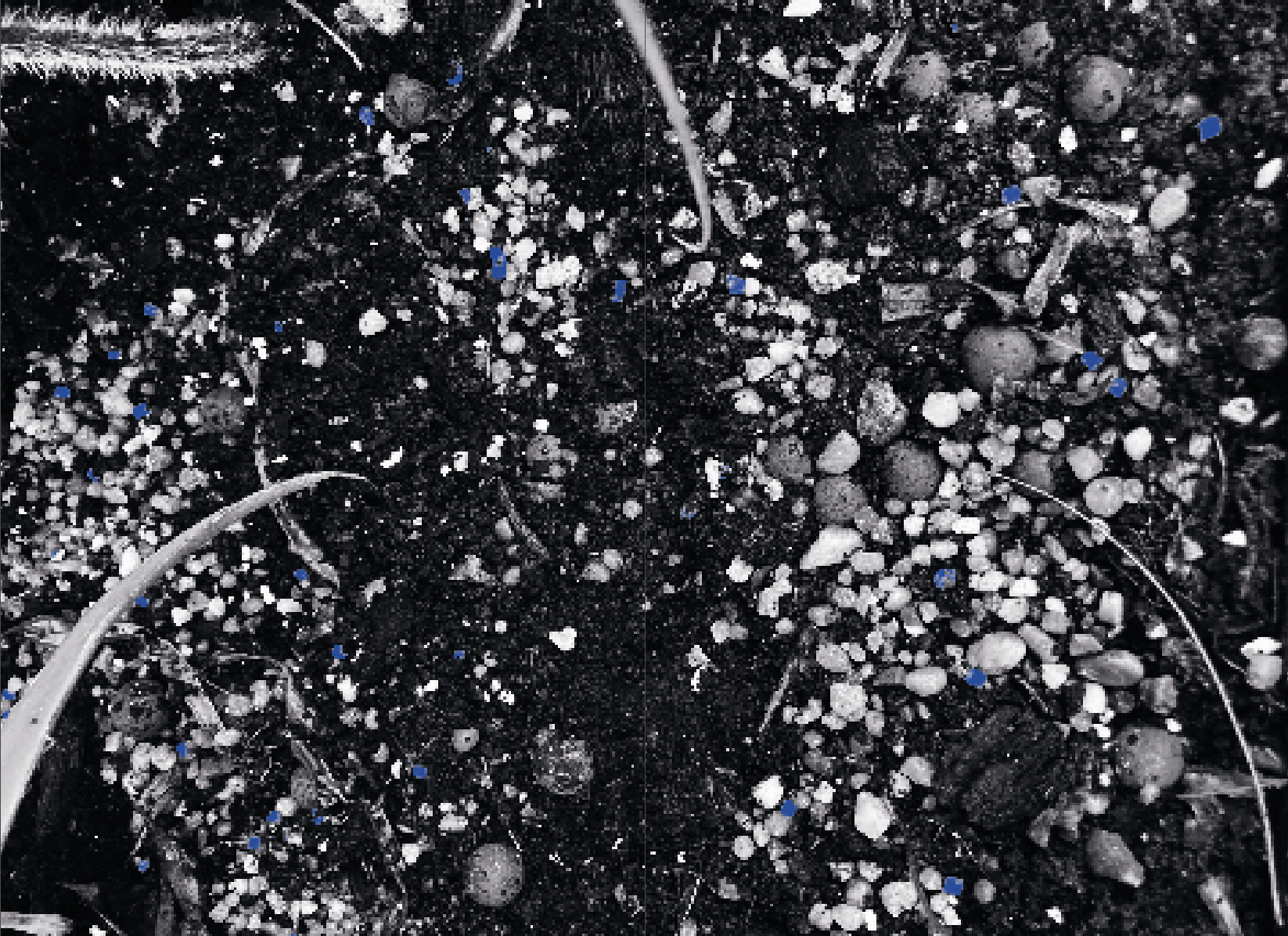
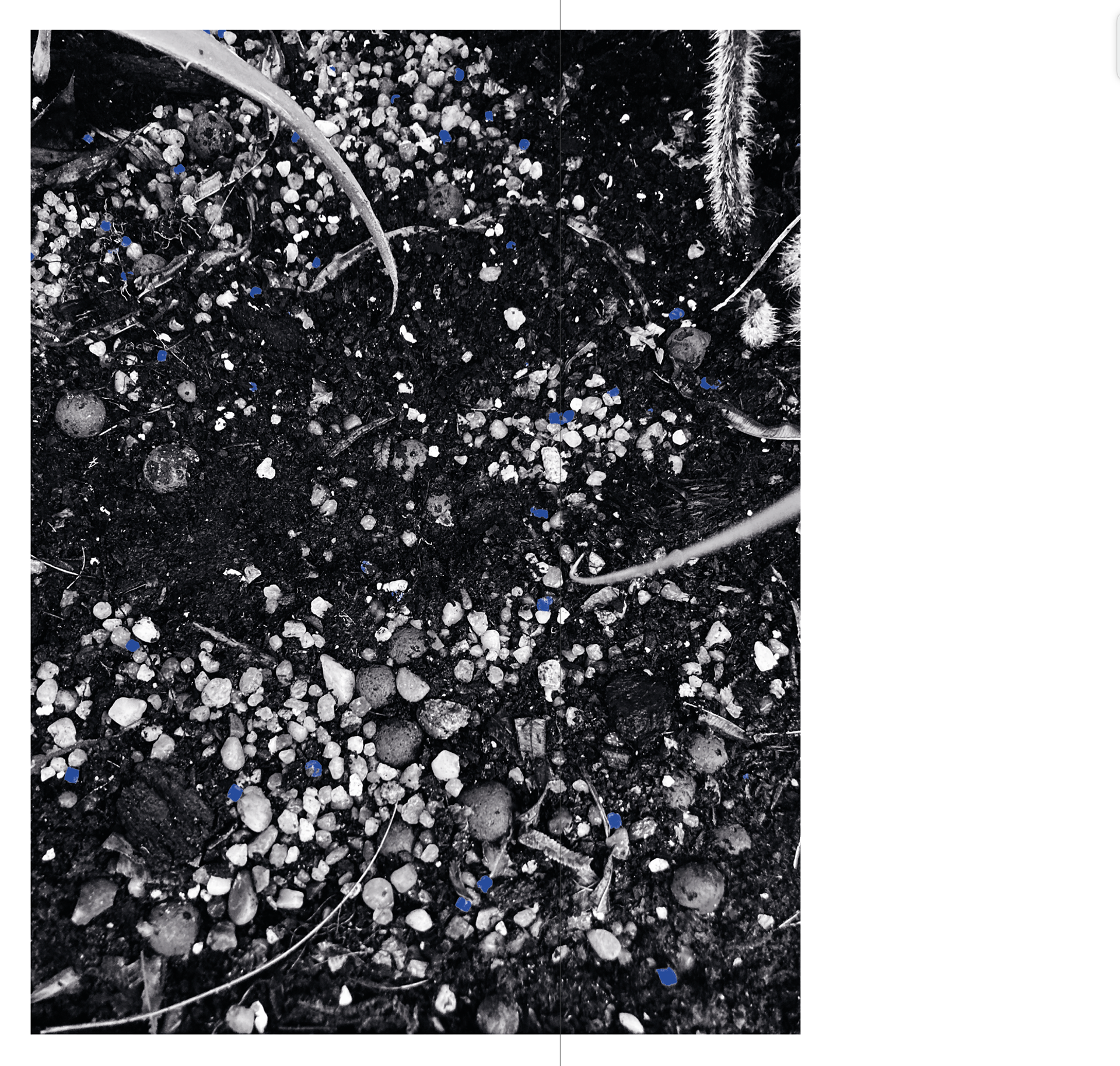
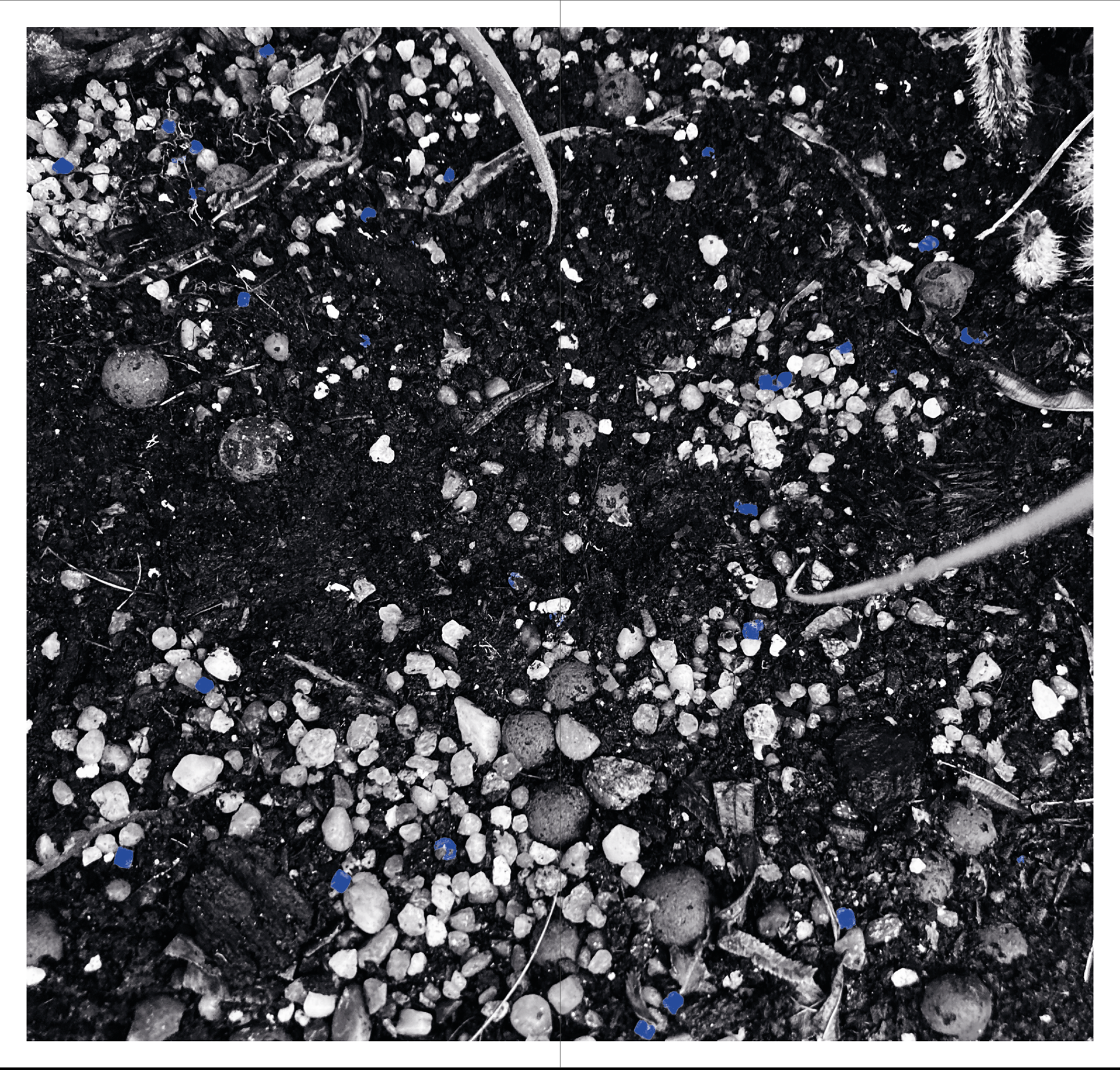
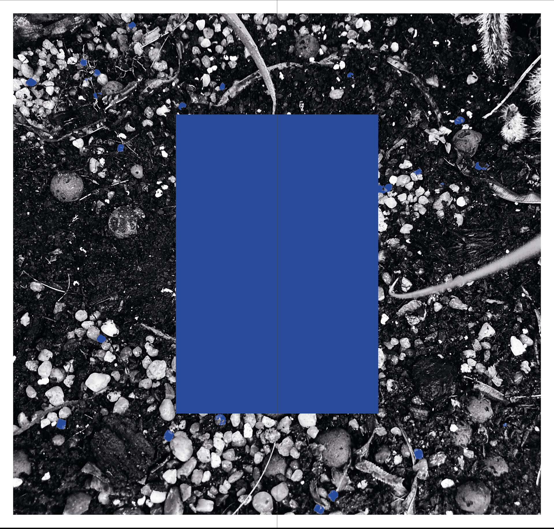
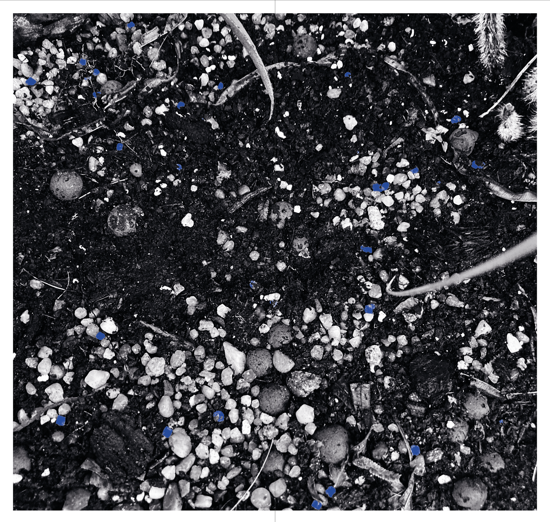
In nature there is actually very little blue, and in Valencia even less. All I could find were these slug pellets in the Botanical Gardens. Little pellets nestled in the soil, placed there to kill living things that kill plants.
Blue is so abundant in our lives. It is always there but if you want to touch it you’ll most likely have to touch something that has been made by humans not by nature. Even the blue in this book is a single tone, manufactured for the printing process. It is used here to represent the blues of Valencia, but in no case is it actually close to the blues found there.
Adding in copy and layout experiments
Adding the font has really made it look like it's coming together, these were some quick placements so will look over them again incase I feel a better layout would work. It has a solid flow and i'm excited about what it will look like.
I'd like to add a couple more tidbits/fold-outs/concertinas etc as I like the playfulness they add. I will likely add one on the last page for the copy maybe in the centre? and possibly on the page with all the photos or the market page to show what is inside the market.
I tried adding a handing writing aspect for the history bits, but to be honest I don't think it works and it's not adding to the design. The font i've chosen, photographs, and copy I feel are strong enough as it is.