
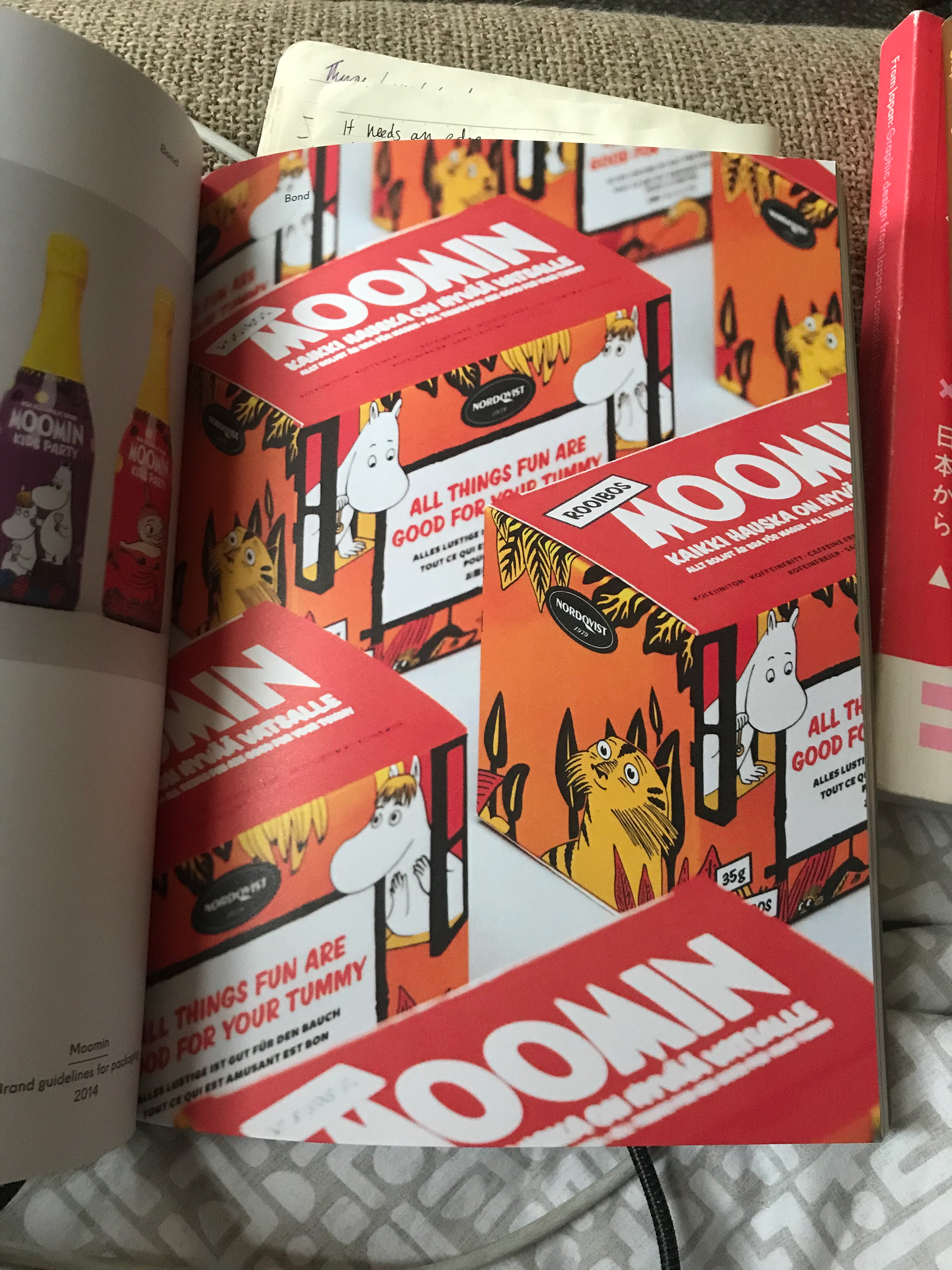
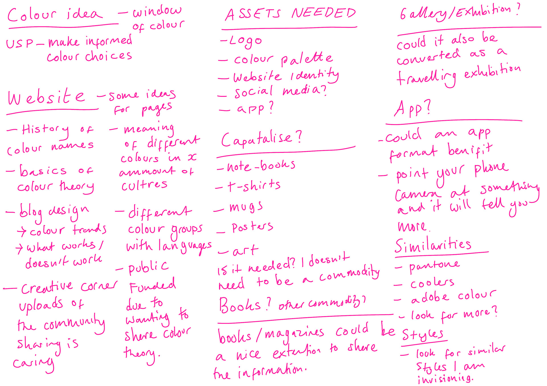
SCROLL TO BOTTOM OF PAGE - SOME IMAGES HAVE ANNOTATIONS (HOVER OVER TO CHECK)
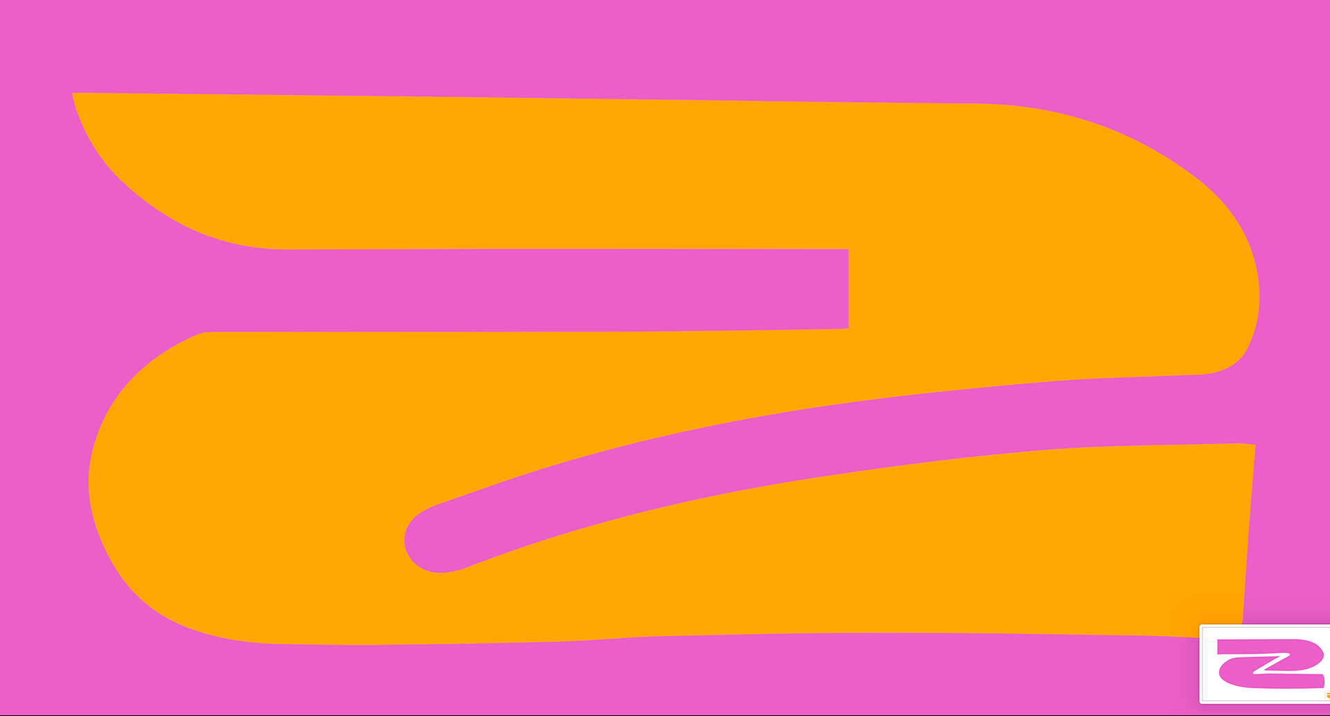
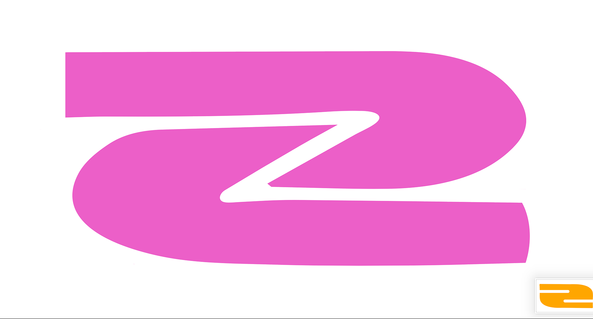
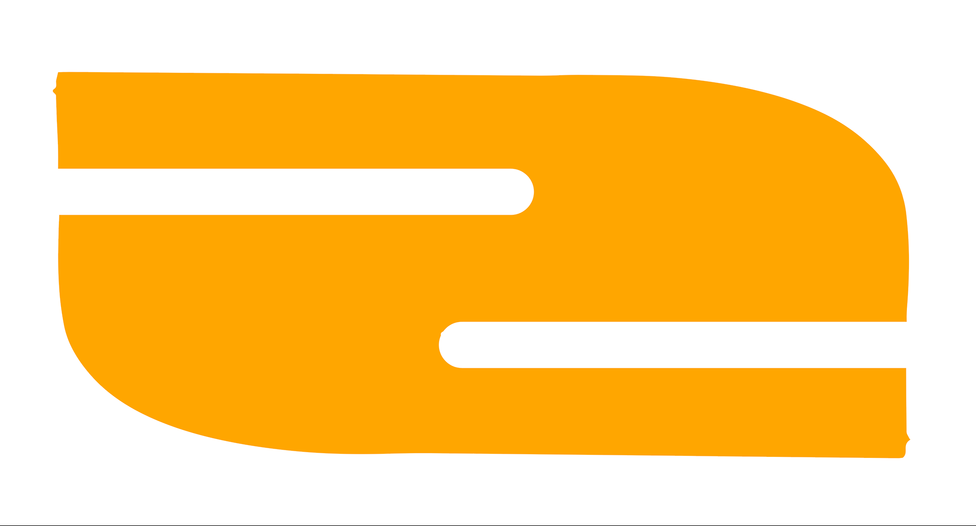
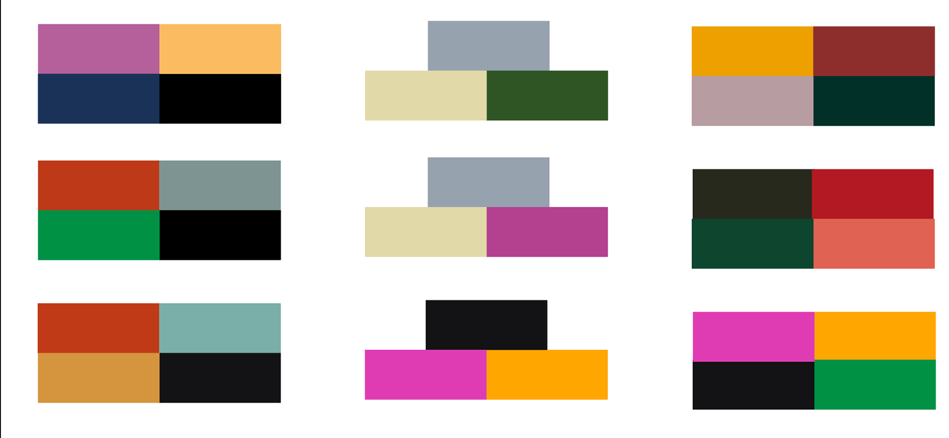
These colour palettes are nice as they are but don't think are very representative of my audience. I want some loud and a little in your face. The last one I have with the Z's I say works well, I quite like the look of it - I now need to thing how I will develop from here.
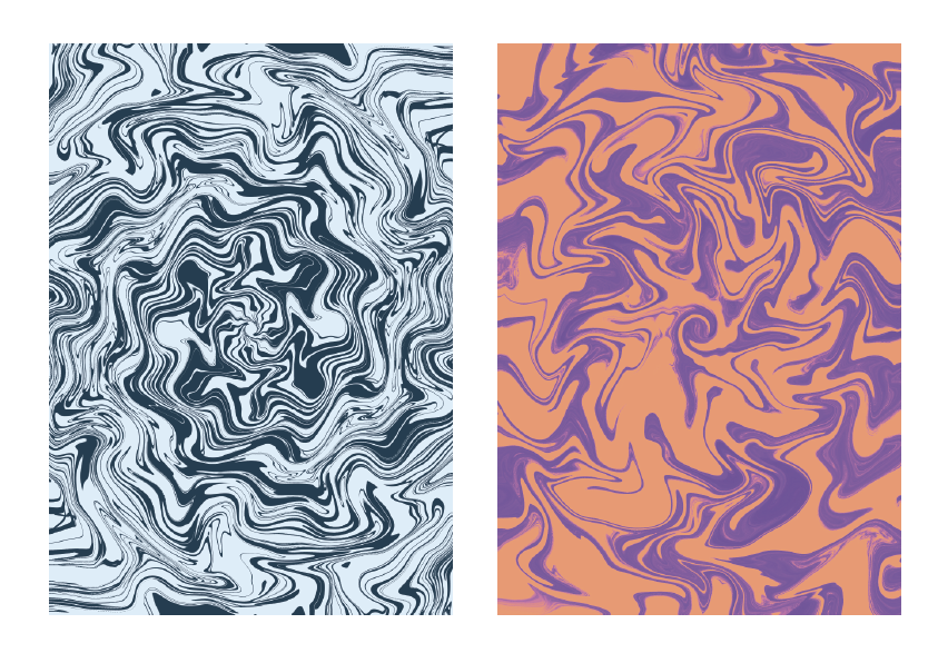
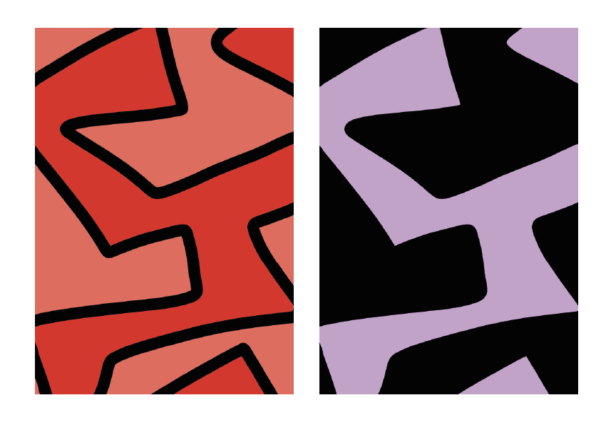

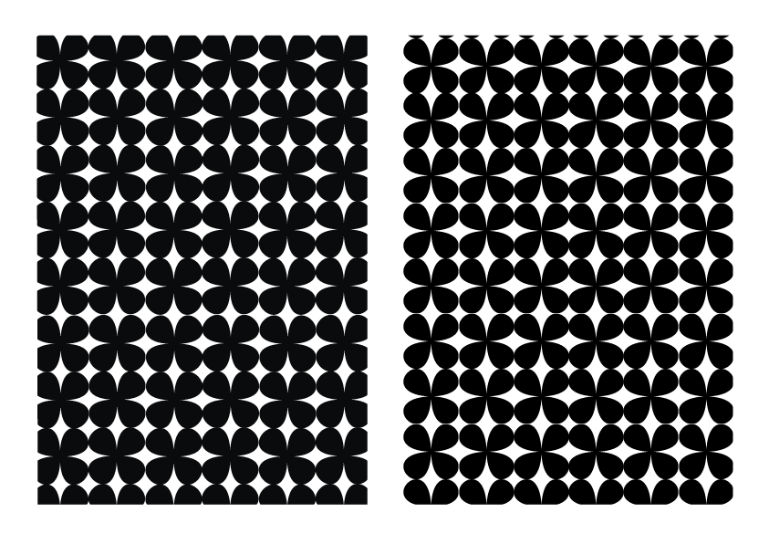
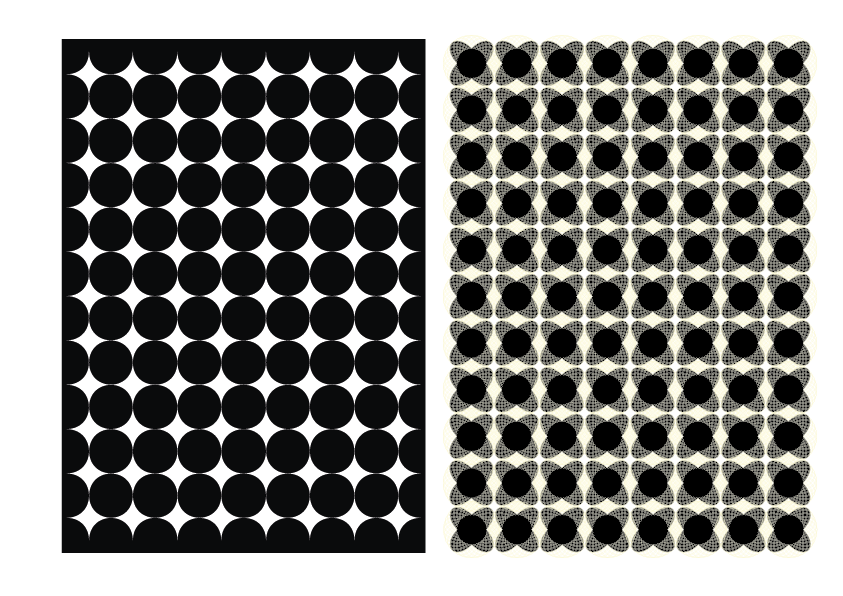
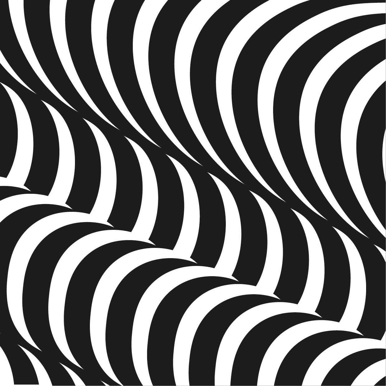
I made these patterns as I had come to a mental block - I thought they could maybe be incorporated into my final outcome. The marble style is alittle over used but I see the posters in the top right work as maybe a poster in the merch section or something.


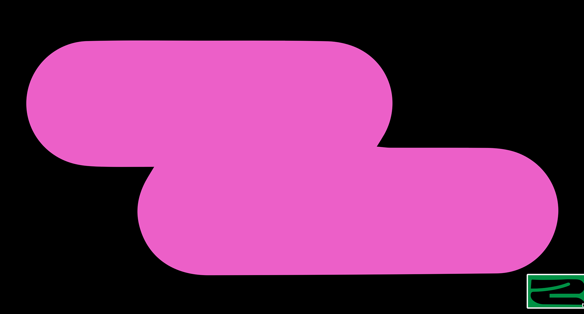
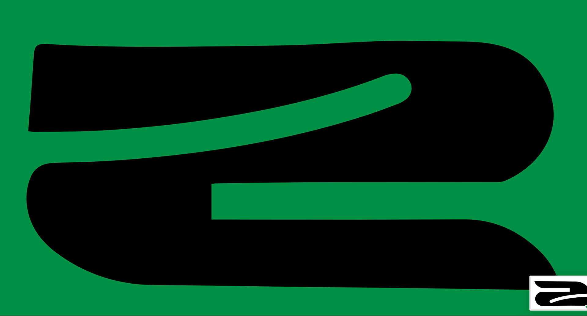
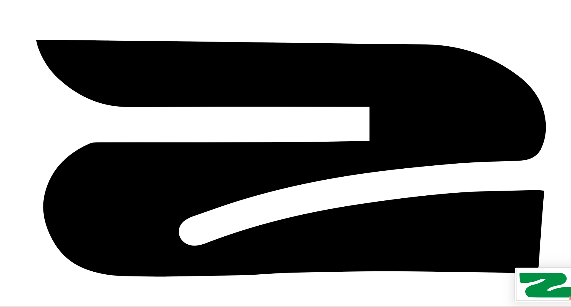
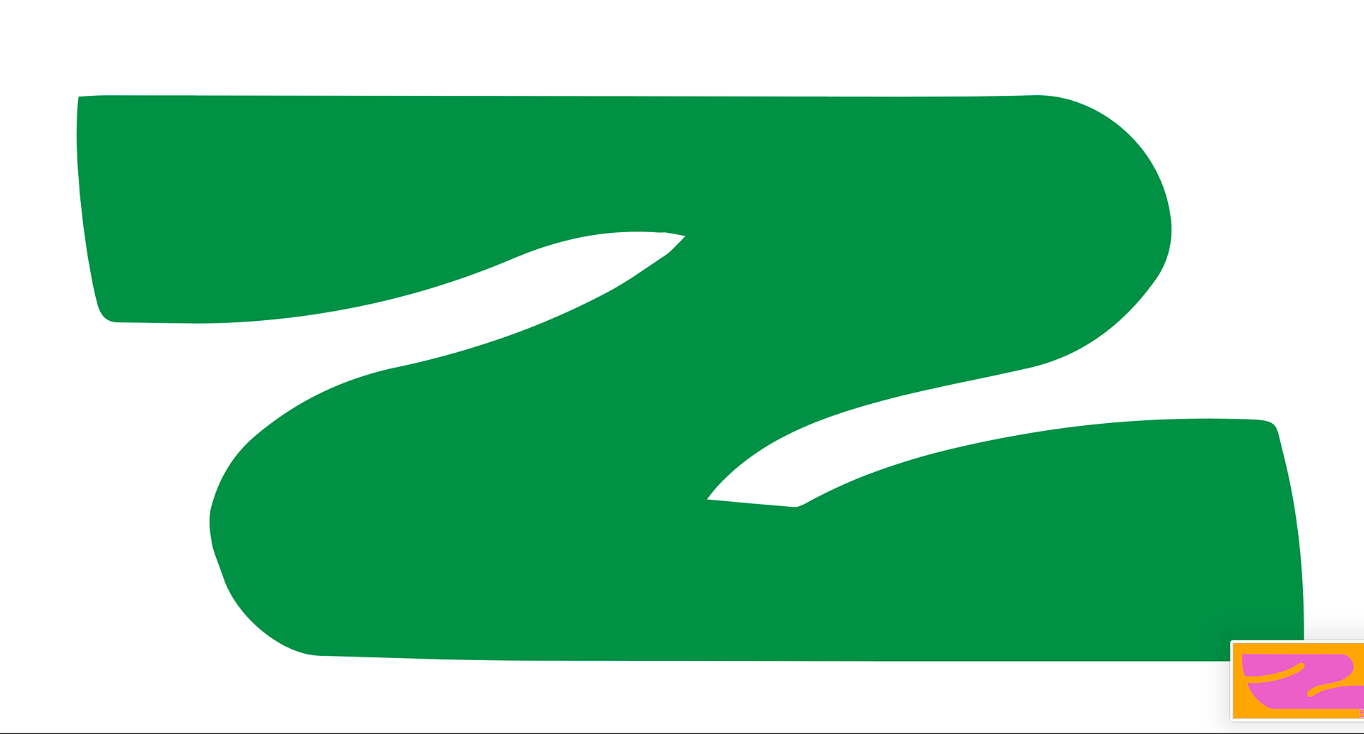
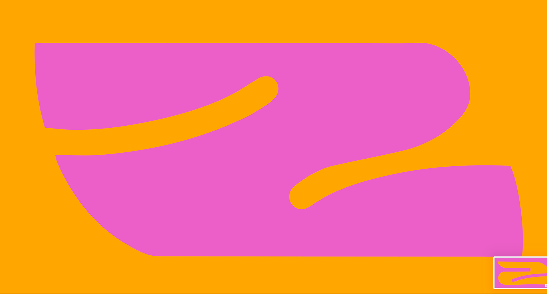
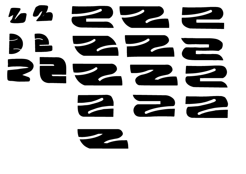
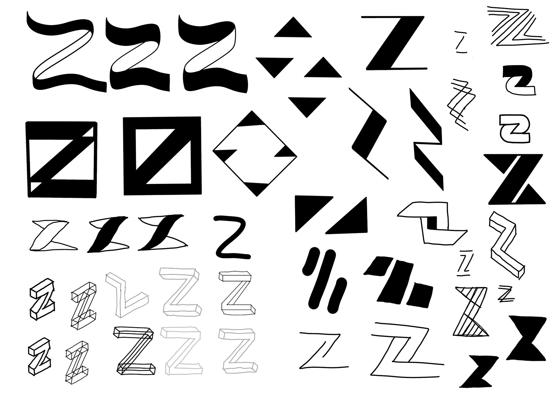
I thinking animating the Z's together has really done something - it makes me think a versatile logo could work and be a good characteristic for the brand
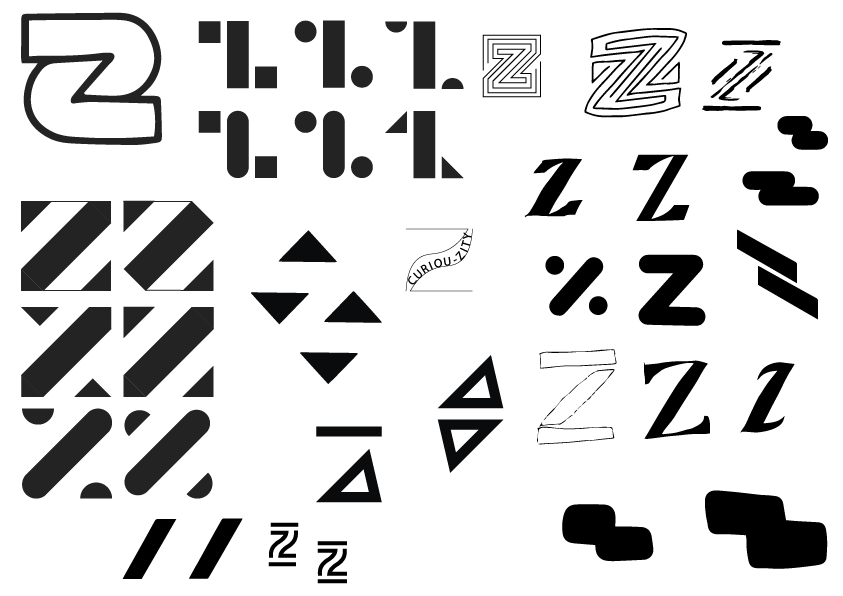
I am trying to use negative space with the Z or using shapes to make a z up I don't want it to be a traditional Z
some inspiration I've picked out from books I like the use of colour and layout styles would I think would work for my identity


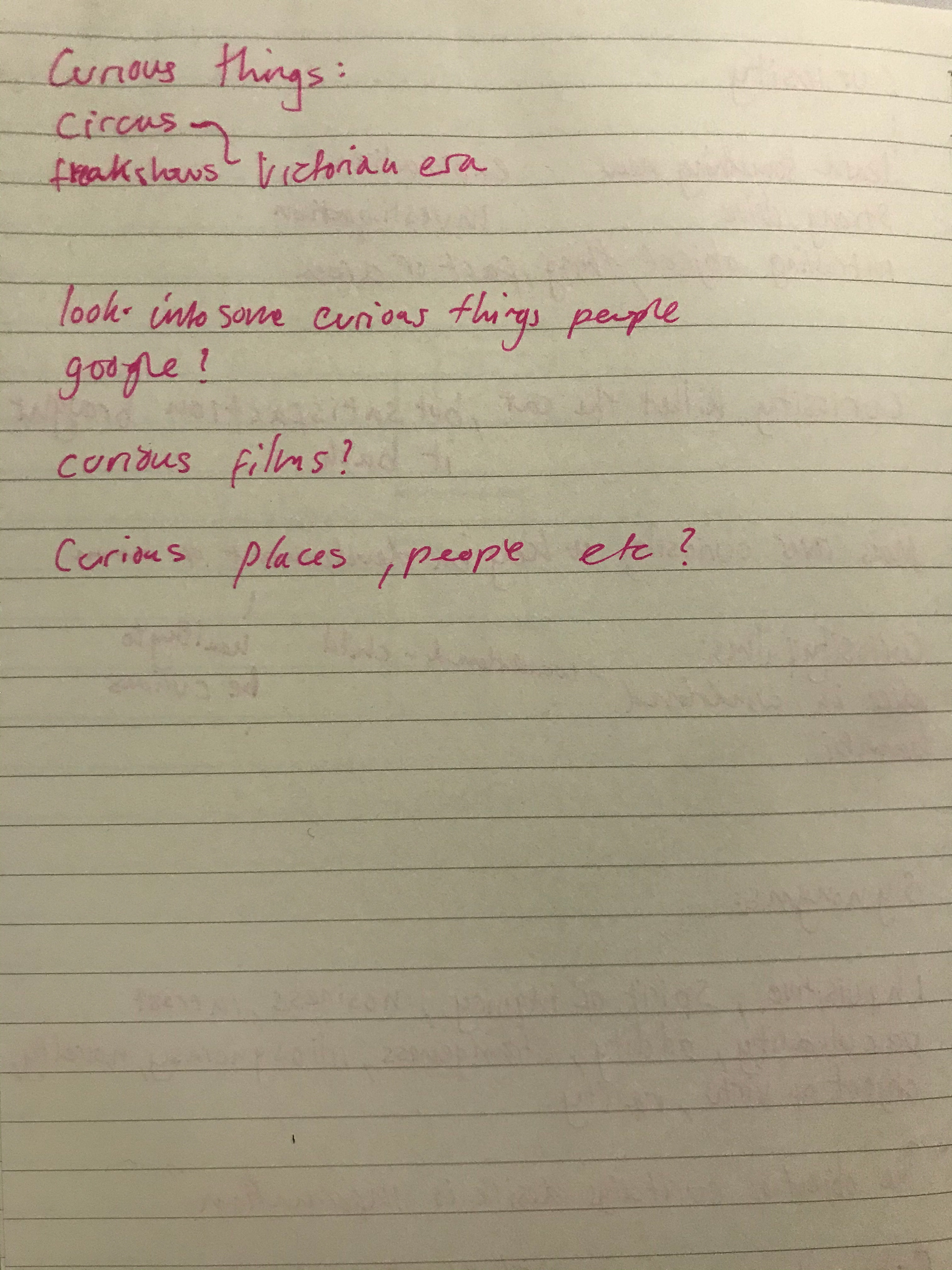
I am going to begin with designing a log and hopefully it will all come together - I want to design a Z as Gen z are my focus and want that to be the think to stand out in curioZity - I want a artsy style where the design isn't too smart - I'm happy with what I have so far but going to play around a little more
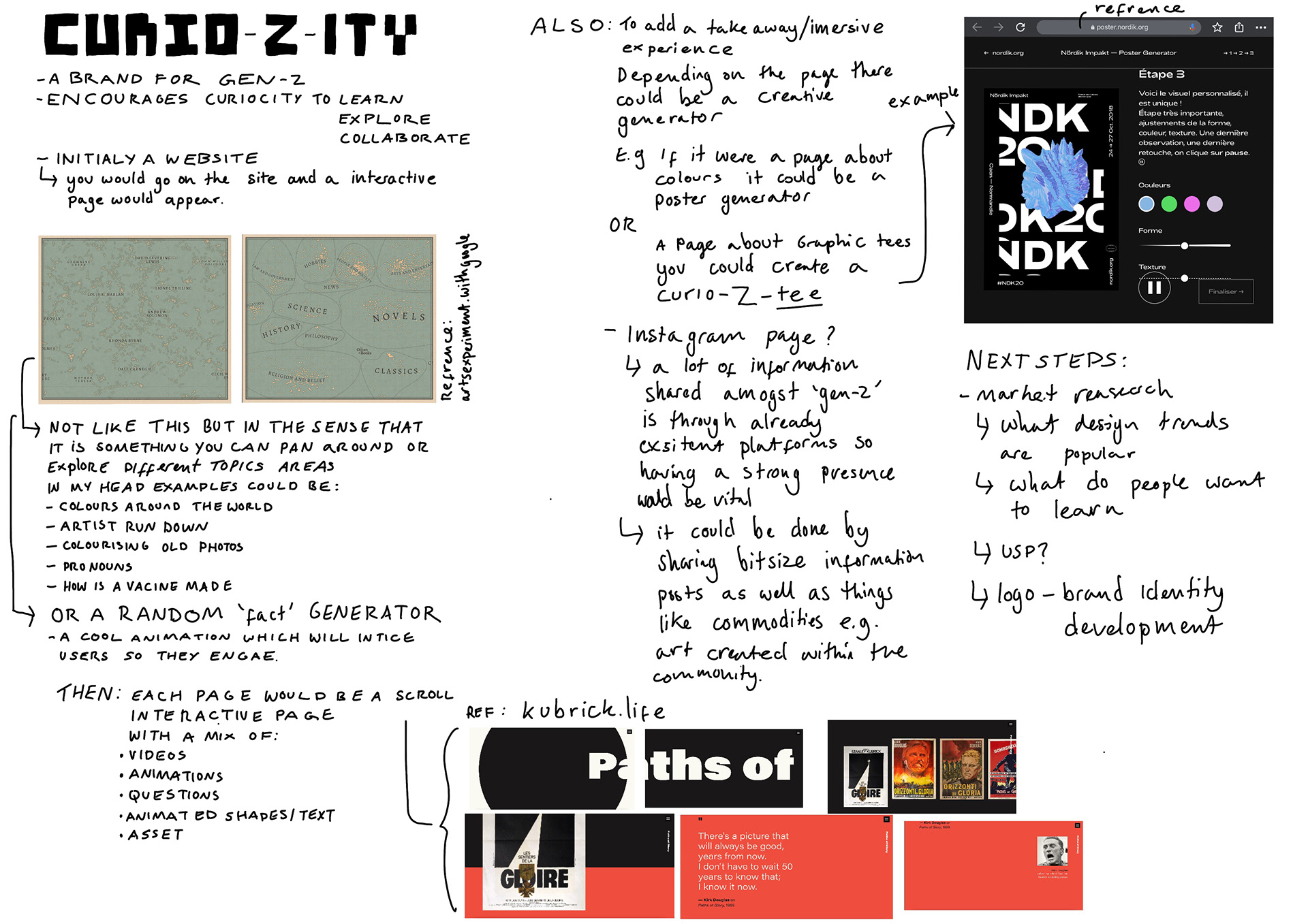

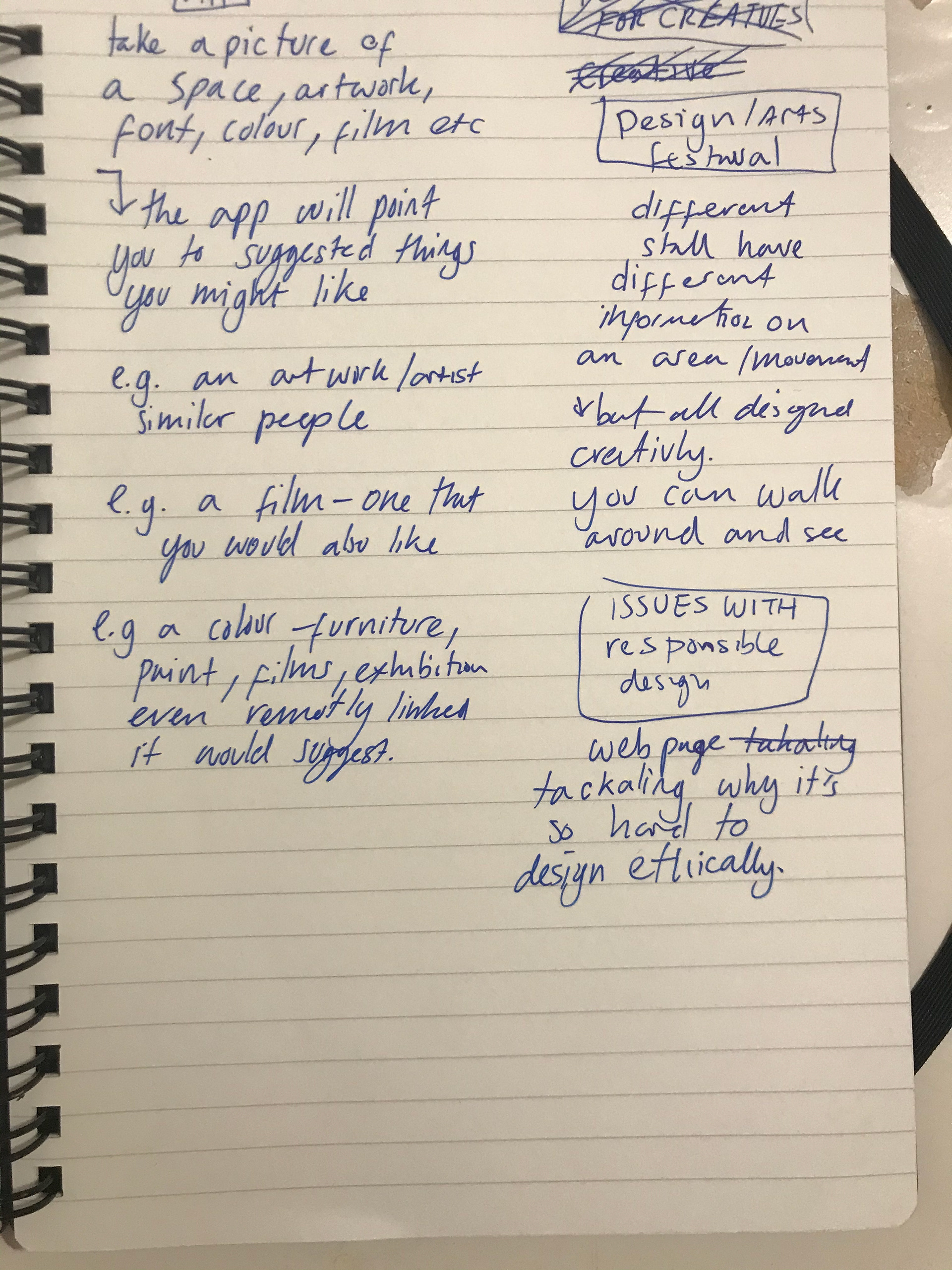
After speaking with fern and the rest of my tutor group one thing that was apparent was that I needed an edge and that it need to be clear what the purpose of this brand was and that the website isn't a brand by itself. And suggested maybe using random generators aspect to add curiosity and make it link back to what has been asked in the brief. I think she was right in suggesting this as I had got a bit lost in how I could make this idea curious. I thought that the idea that people would go to the website to learn to be curious enough that I think adding a more interactive aspect is what I need to look at doing next. We were talking about whether just doing a random facts website and adding that interactive aspect to it whether it be wearable merchandise or DIY tops or something that you send in the post maybe it's forgotten about facts or movements. I said also to develop whether an app or another sort of platform would suit this idea better and to maybe do some market research.
After having gone through this with my tutor group and thinking about it in the evening. I felt as if I didn't like my idea and I didn't see a specific brand that would work with this movement generator sort of thing. I liked the idea of doing a more interactive website whether it be in the quiz or something that you move yourself or whether you make something on the website what timeline kind of style are you scroll down. Choosing just one topic like my colour idea I thought would be curious enough could be leading you to new information. But I still had the issue about what would the brand be.
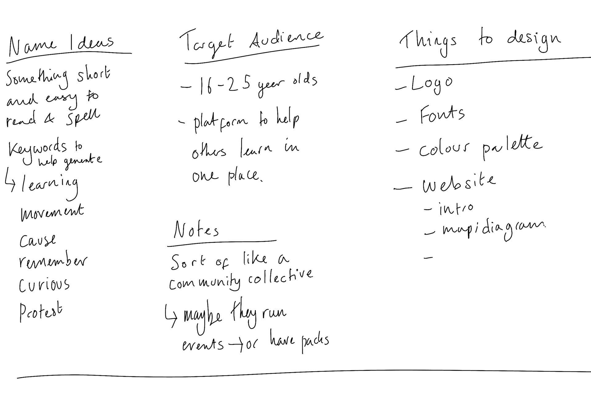
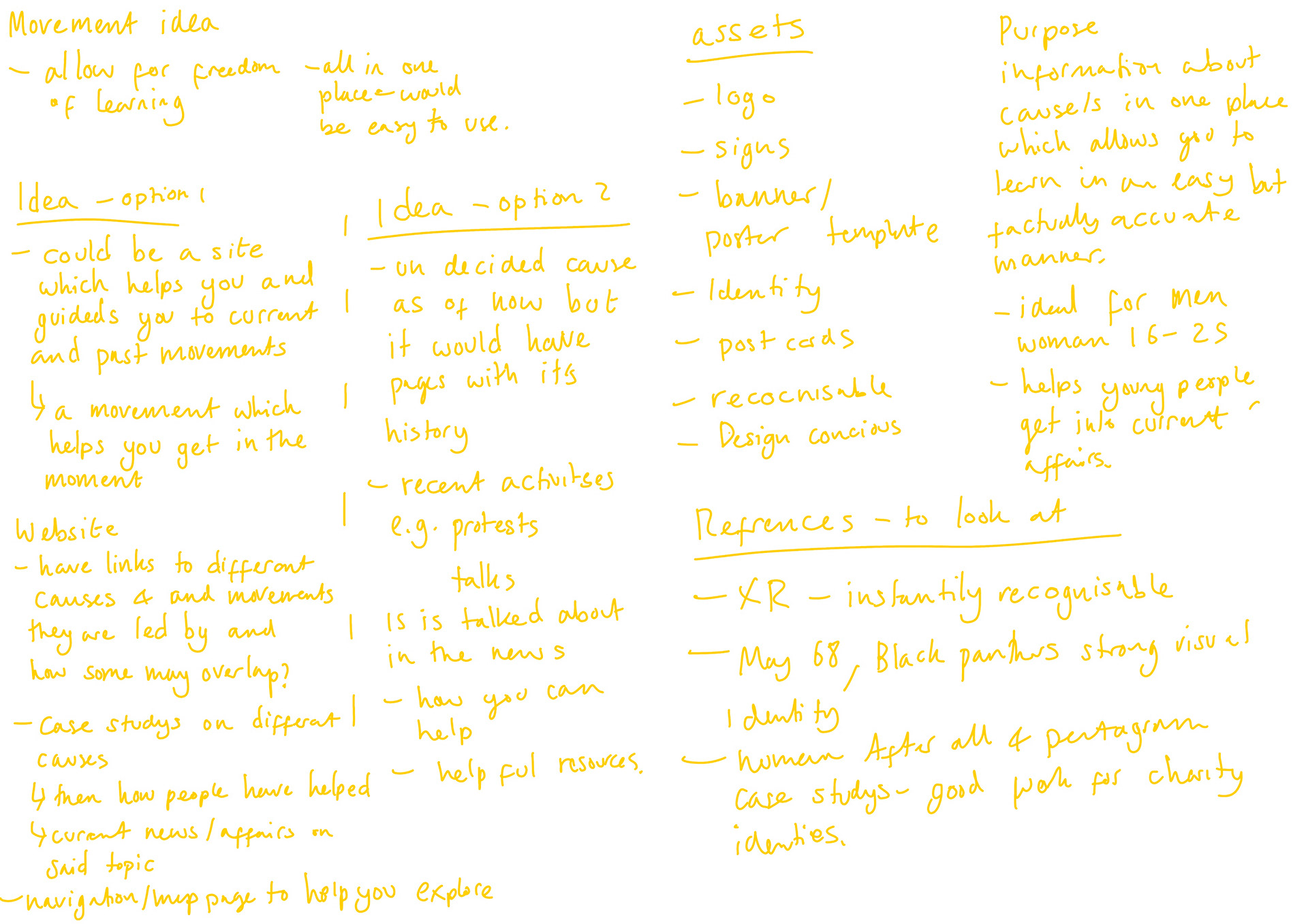
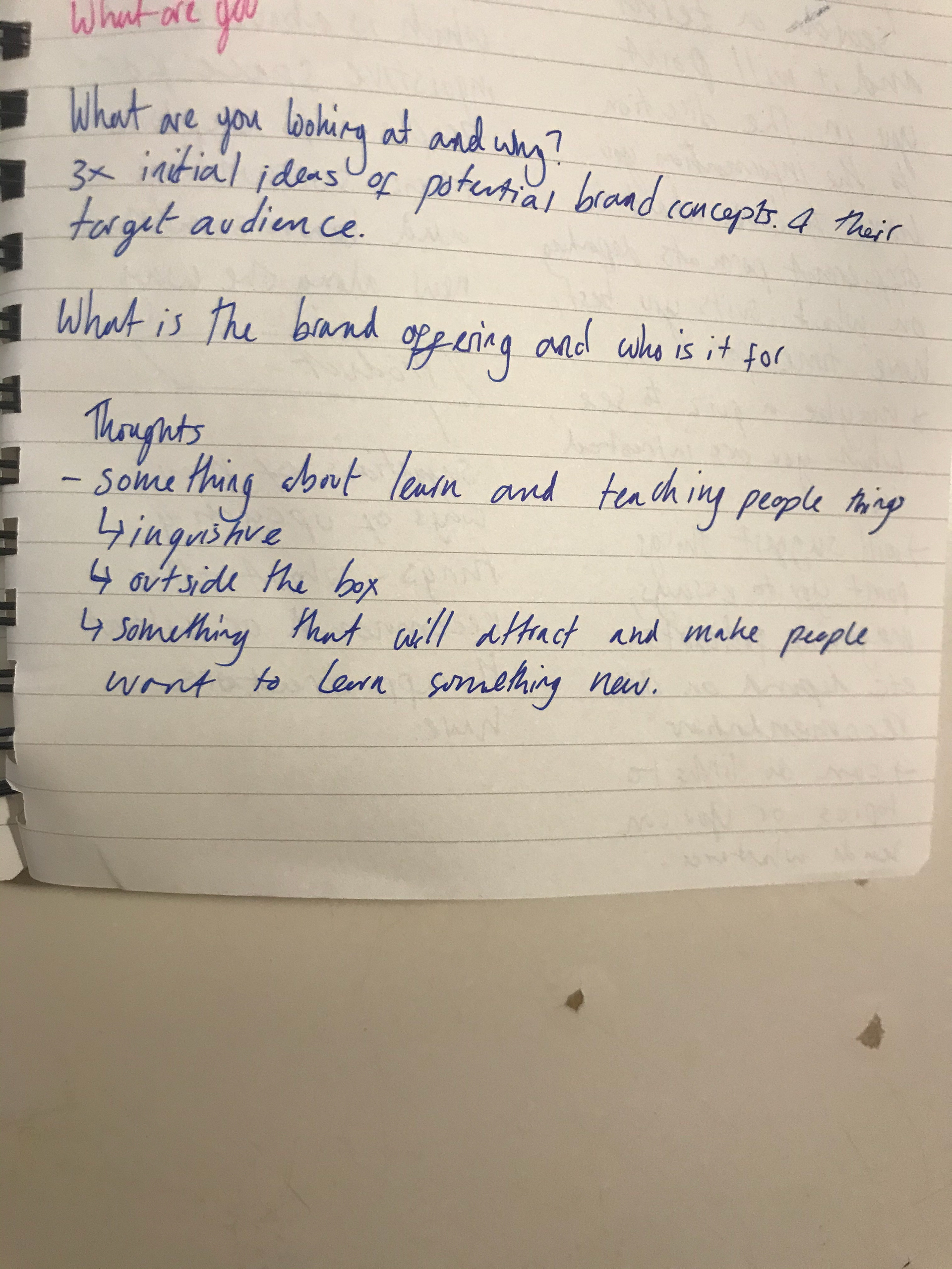
Since I want this to be targeted at like 16 to 25-year-olds which is about the Gen-Z age bracket I thought why not make a brand which is to cater and help the curiosity of Gen-Zers. Curio-Z-ity is an initial name which I think could work - my aim for the brand is to encourage curiosity and excitement for my age bracket on a vast arrow of topics.
I like the design of this but is it too traditional
the idea is you would move the images around
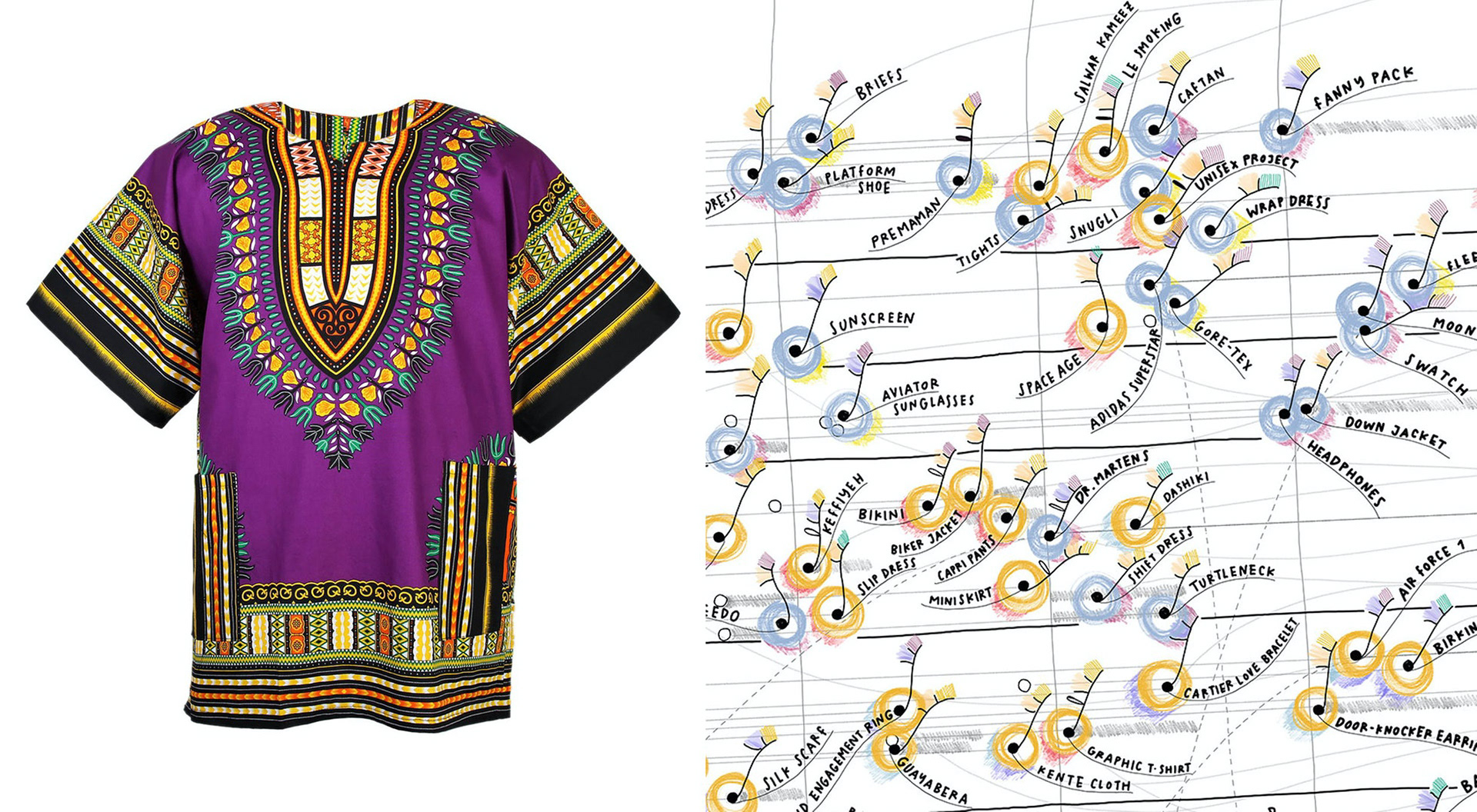
9/11 Truth movement - Abolitionist movement - Alternative movement - Animal rights movement - Animal Rebellion - Anti-Apartheid Movement - Anti-capitalism - Anti-consumerism - Anti-corporate activism - Anti-Extradition Law - Amendment Bill Movement - Anti-fascism - Anti-globalization movement - Anti-jock movement - Anti-liberalism - Anti-nuclear movement - Anti-psychiatry movement - Anti-war movement - Anti-vaccination movement - Asian American movement - Autism rights movement - Black - Consciousness Movement - Black Lives Matter - Black Power movement - Boycott, Divestment and Sanctions - Brights movement - Chicano Movement - Children's rights movement - Civil rights movement - Climate movement - Conservation movement - Counterculture movement - Cooperative movement - Cultural movement - Decolonization - Disability rights movement - Earth First! - Ecofeminism - Ecomasculinity - Economy for the Common Good - Effective altruism - Efficiency movement - Environmental justice movement - Environmental movement - Esperanto movement - Ethiopian movement - Extinction Rebellion - Fair trade movement - Farm-to-table movement - Farm Worker Movement - Feminist movement - Free culture movement - Free love - Free school movement - Free software movement - Gay rights movement - Gerakan Harapan Baru (New Hope Movement in Malaysia) - Global citizens movement - Global justice movement - Health at Every Size - Health freedom movement - Hippie movement - Hizmet movement - Human rights movement - Identitarian movement - Immigrant rights movement - India Against Corruption - Indigenous peoples movement - Indigenous movements in the Americas - 2017 pro-jallikattu protests - Labor movement - Landless Peoples Movement (South Africa) - Landless Workers' Movement (MST), the landless workers' movement in Brasil - Lawyers' Movement in Pakistan - Lebensreform - LGBTQ social movements - Mad Pride (psychiatric social movement) - March For Our Lives movement - Men's rights movement - Me Too movement - Mothers Against Drunk Driving - Multiculturalism - Namantar Andolan (Change Movement among Dalits in India) - Narmada Bachao Andolan - National Cleanup Day - Non-cooperation movement - Nonviolence movement - Occupy movement - Occupy Wall Street - Organic movement - Plogging - Popular Assembly of the Peoples of Oaxaca - Pro-choice movement - Pro-life movement - Psychiatric survivors movement - Qanon - Rape crisis movement - Rastafari movement - Reform movements in the United States - Reproductive justice - Right to health - Right to life - Rural People's Movement - Scouting Movement - Salt March (Salt Satyagraha movement) - Skeptical movement - Sex-positive movement - Sex Workers' Rights Movement - Slow Food movement - Slow movement - Situationist International - Social democracy - South African Unemployed Peoples' Movement - Soviet Jewry Movement - Student movement - Sunrise Movement - Tea Party movement - Temperance movement - The Zeitgeist Movement - Time to Change - Time's Up (movement) - Treatment Action Campaign - movement struggling for HIV/AIDS treatment in South Africa - Umbrella Movement - Veganism - Via Campesina - international peasants movement representing 150 million people, advocating food sovereignty. - Voluntary Human Extinction Movement - White Wednesdays - Western Cape Anti-Eviction Campaign South African movement struggling against evictions - Wikimedia movement - Women Against War - Woman's Exchange Movement - Women's liberation movement - Women's suffrage movement - World Cleanup Day
https://en.wikipedia.org/wiki/List_of_social_movements
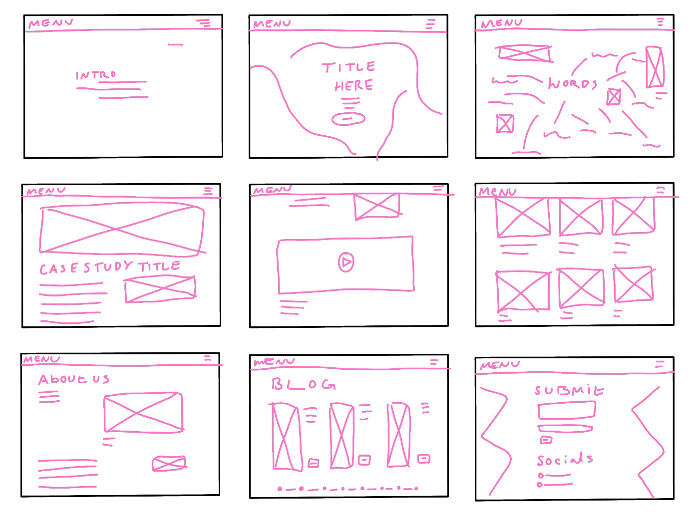
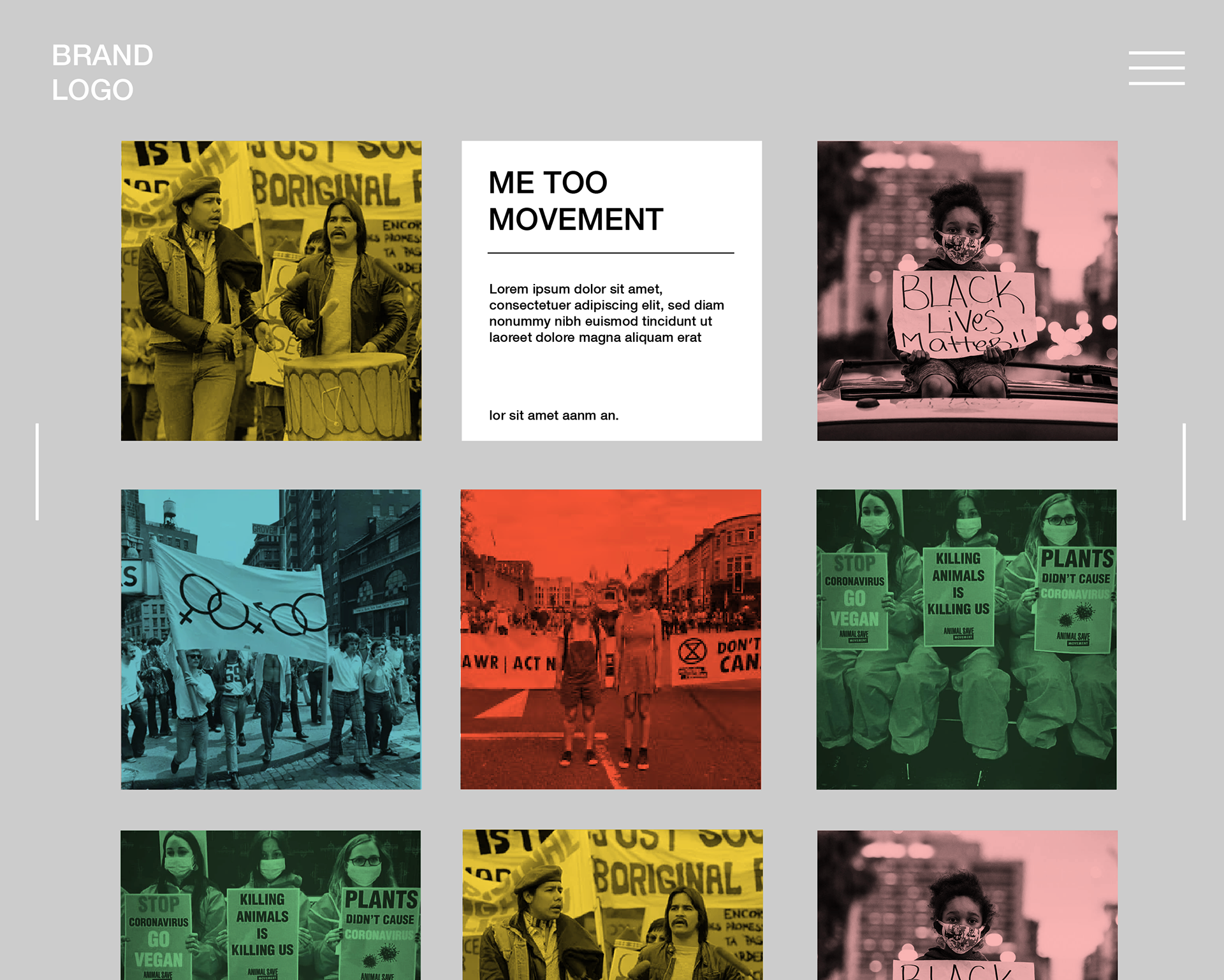
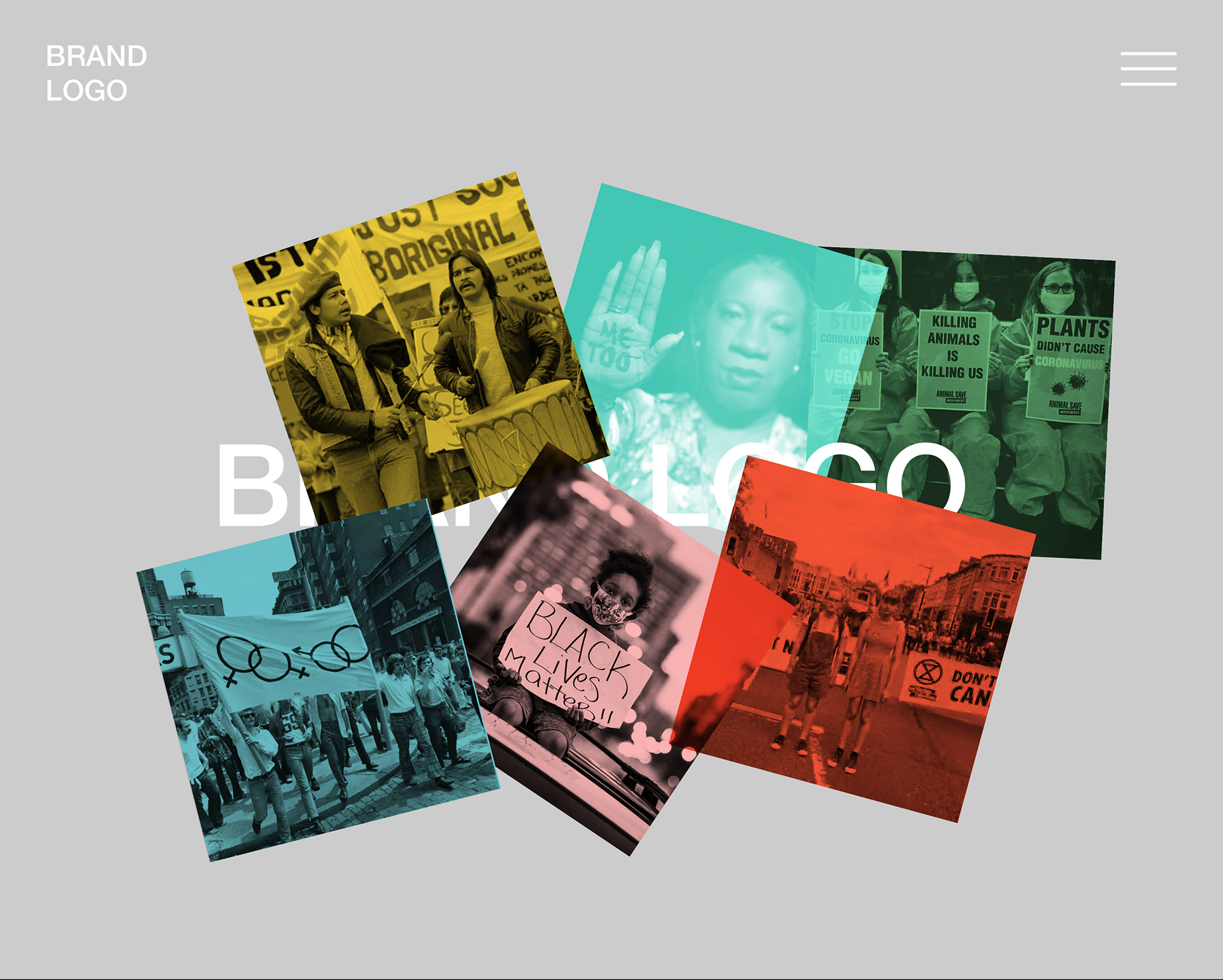
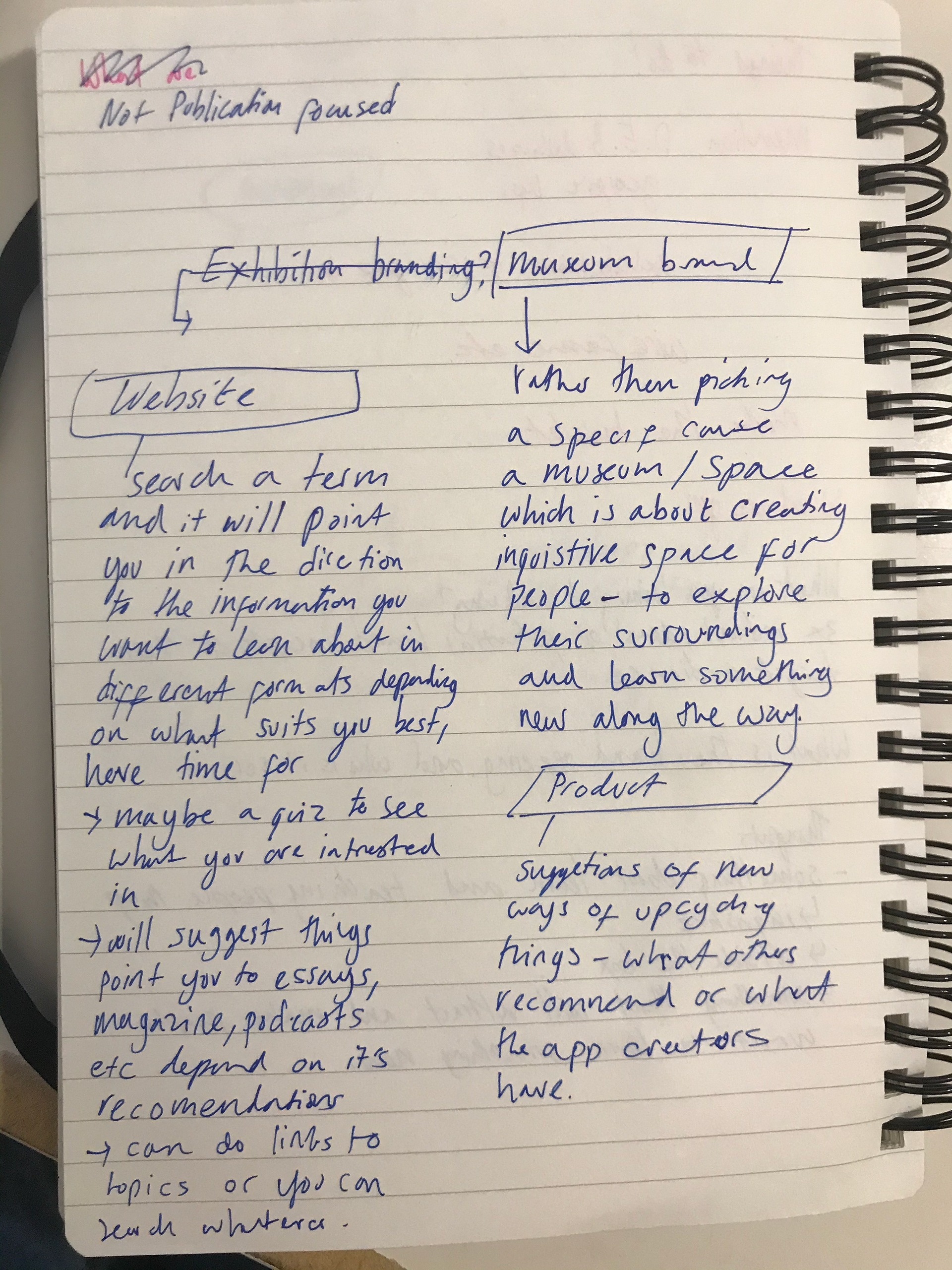
This is my wireframe for my chosen idea I want to do a site where you can go and learn about different movements but also be part of it - it will have that curiocity aspect as it will have a mind map kind of feature where you can explore and learn about new topics you may have no heard of


Links to this work is below - i'm just re-refreshing as they seem appropriate to my movement idea
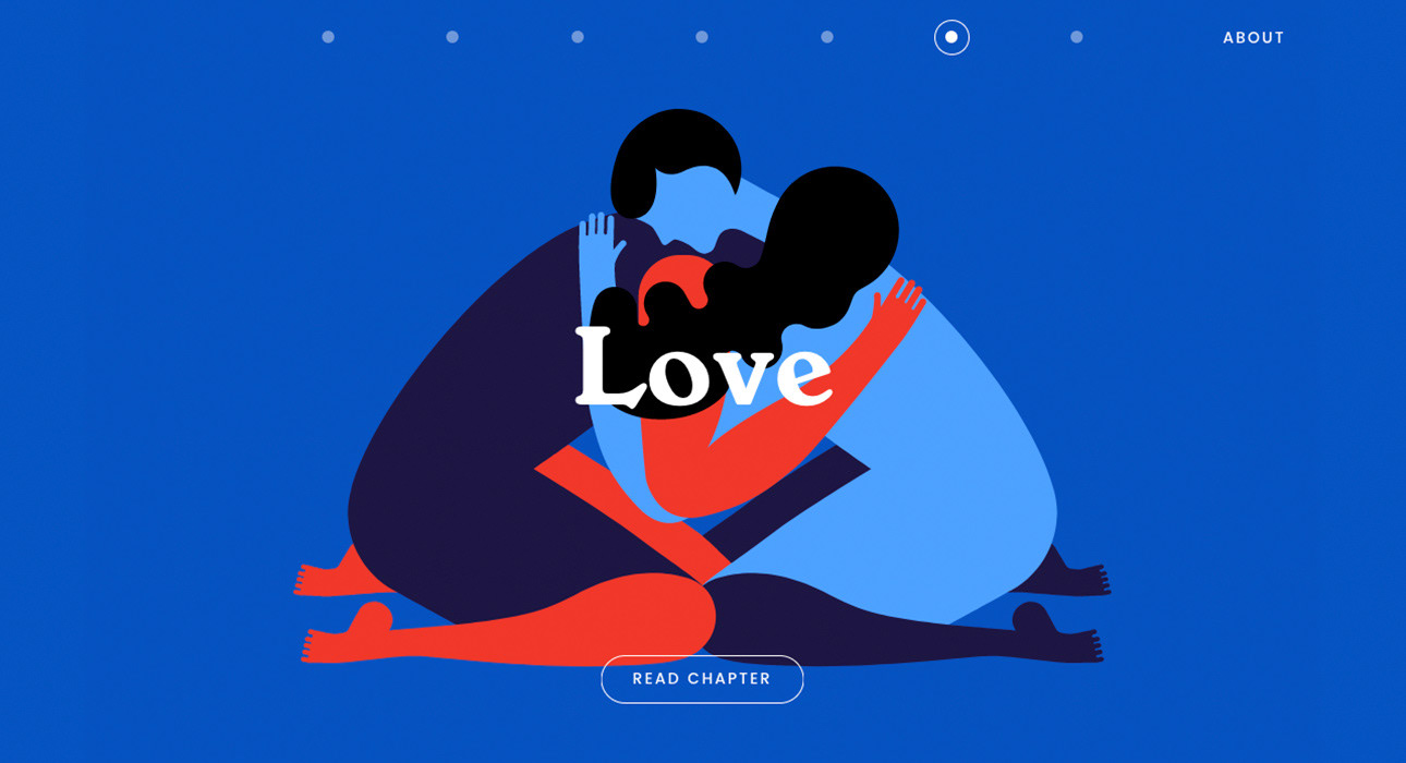
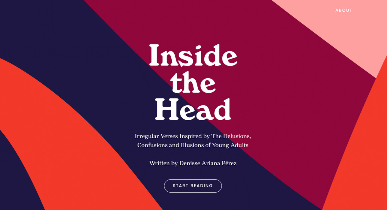
https://insidethehead.co/chapters
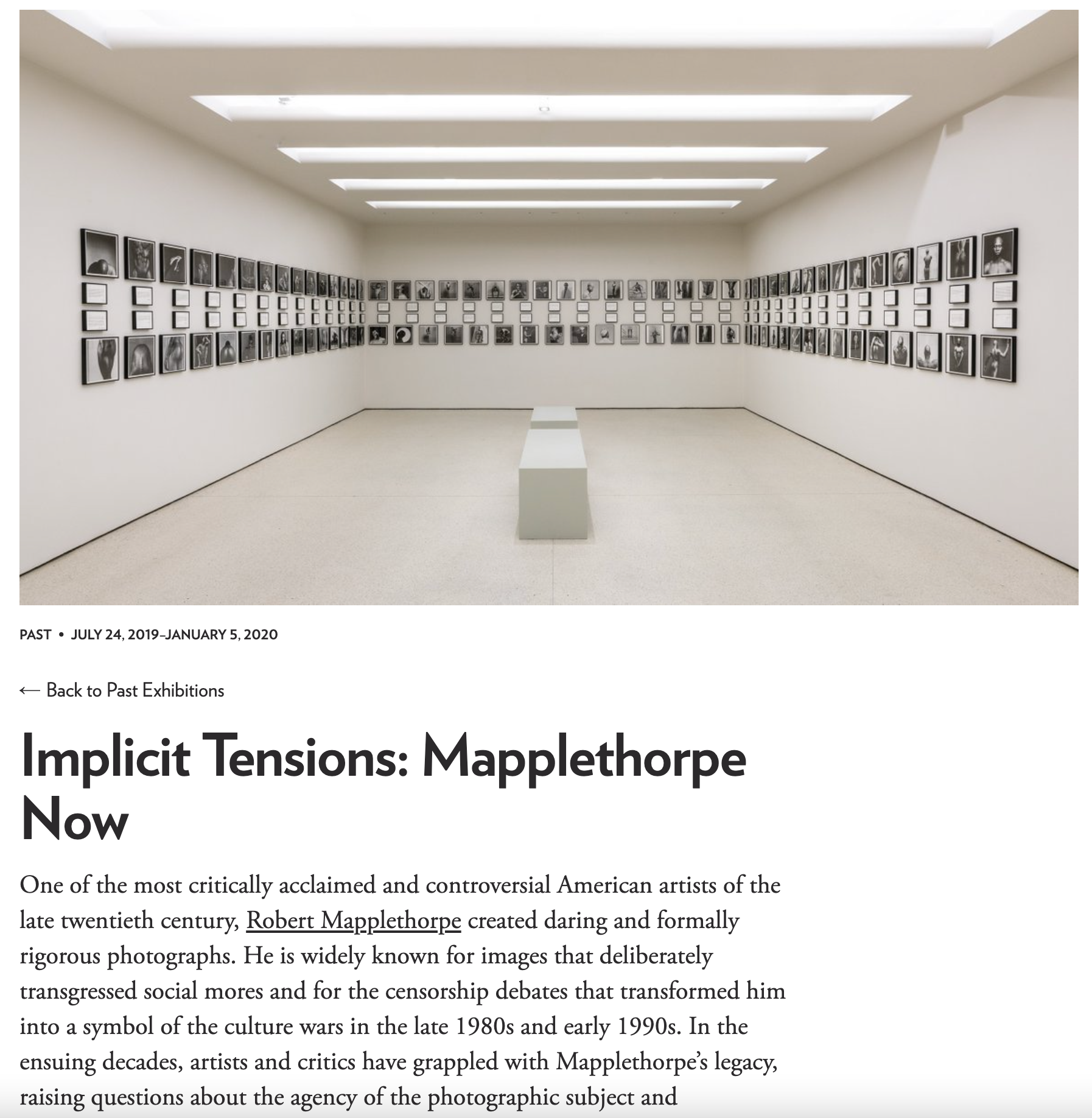
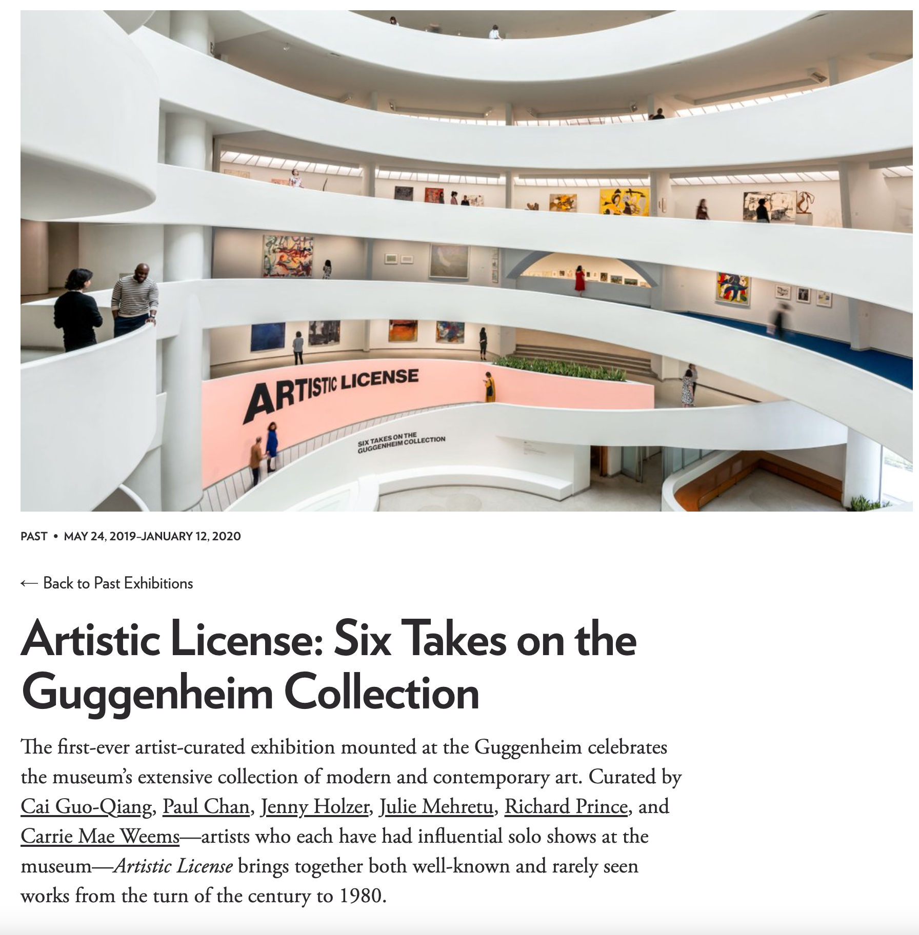
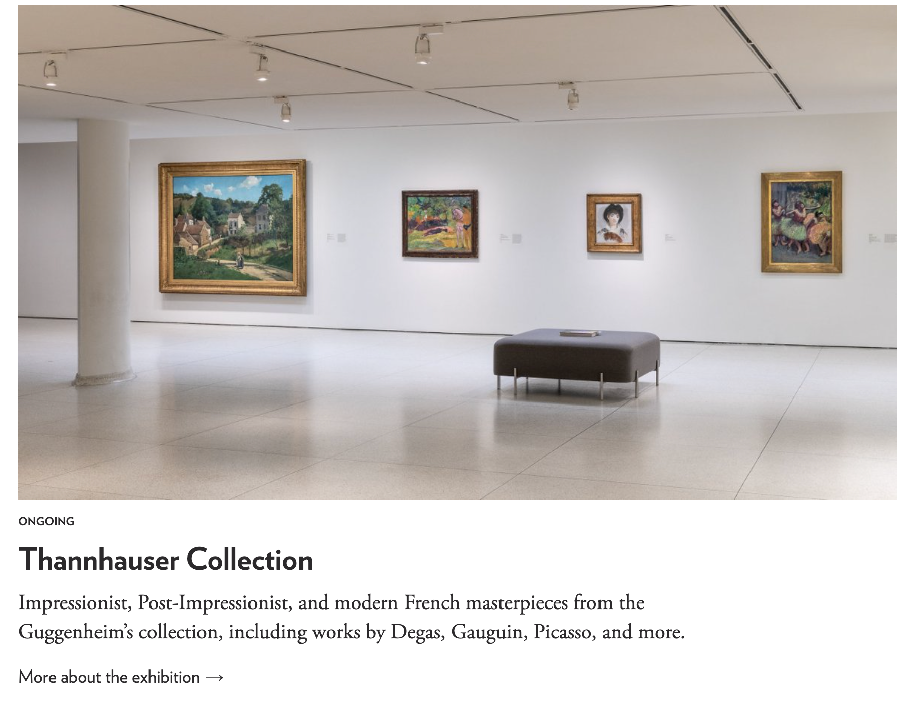

https://www.guggenheim.org/exhibitions
https://wellcomecollection.org/whats-on
https://designmuseum.org/#

https://saffron-consultants.com/projects/victoria-and-albert-museum/
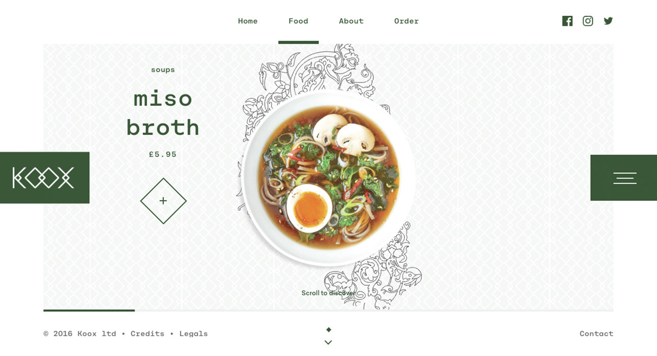

I think this website is also sweet and quite like it's friendly style. Taking inspiration from it could help me come up with a nice brand.
http://koox.co.uk/
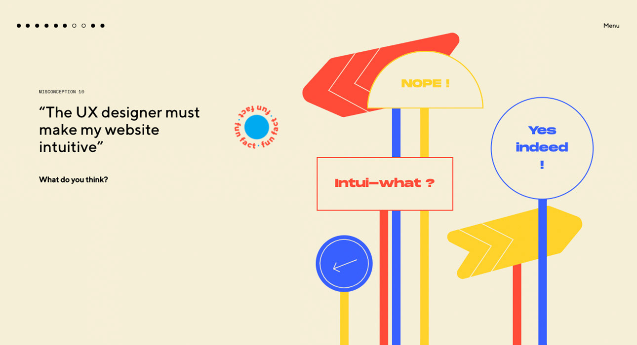

I love the interactivity of this website. The design works well and the quiz factor is clever. It's layout really makes it work, I could imagine something similar suiting my colour idea as I intend it to be educational similar to this site.
https://10ideesrecuesenuxdesign.castoretpollux.com/en/ideas/the-infinite-scroll-is-a-benchmark-in-designing-a-good-browsing-experience
( https://www.awwwards.com/sites/10-misconceptions-on-ux )
^ POSSIBLE WEBSITE STYLES ^
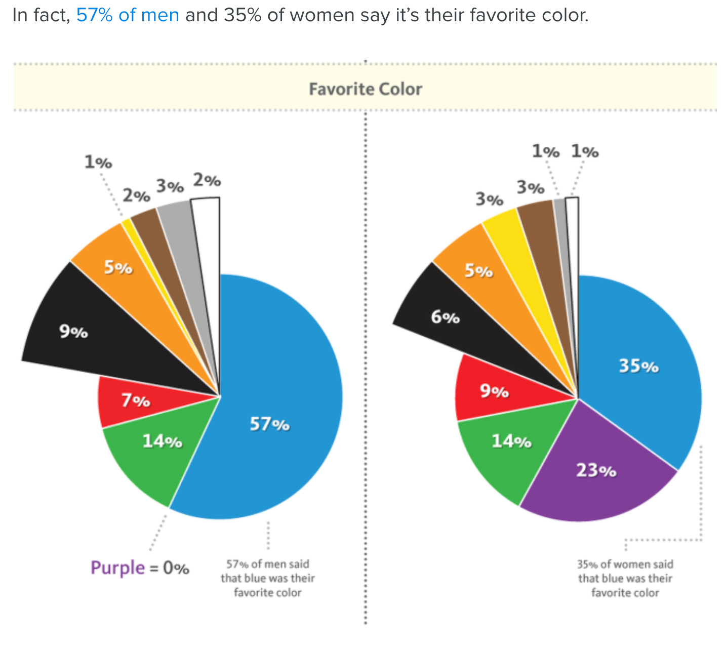
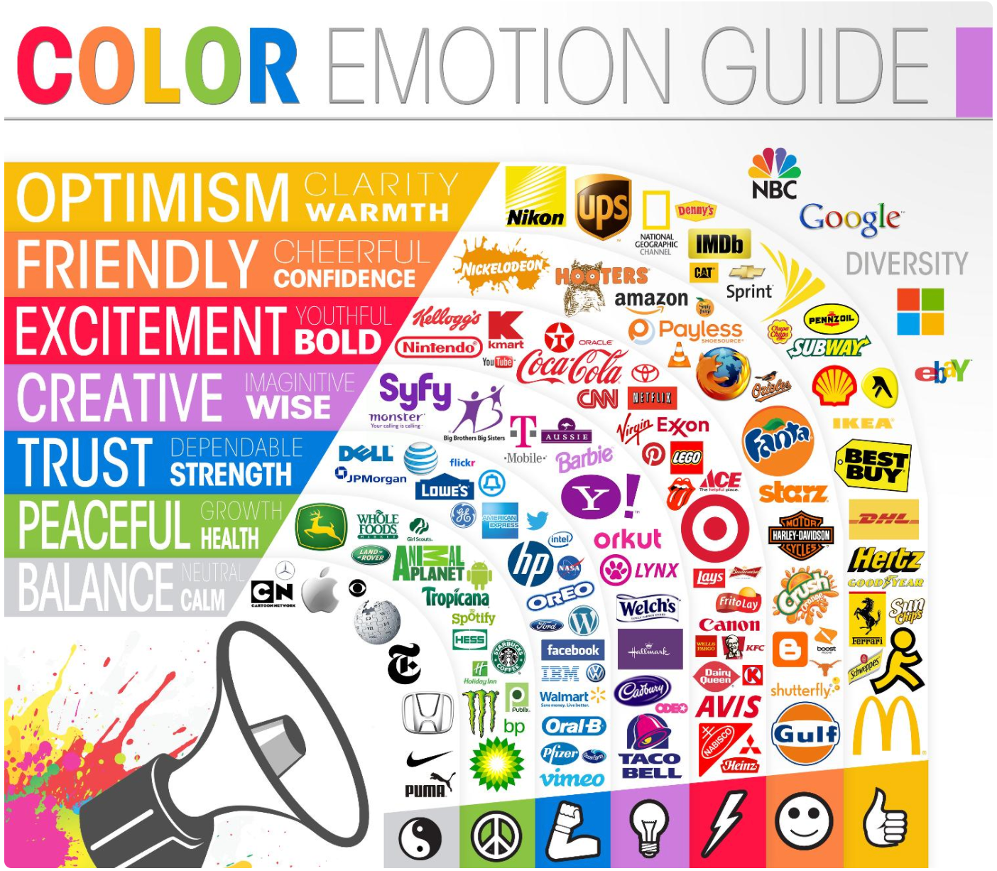
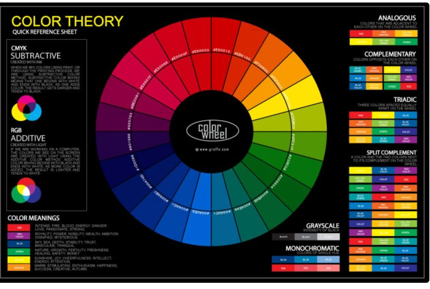
I like the idea of involving what different colours mean including around the world - I wouldn't want it to look like above I feel I could find a better way of showing the meaning of colours.
https://www.crazyegg.com/blog/website-color-palettes/
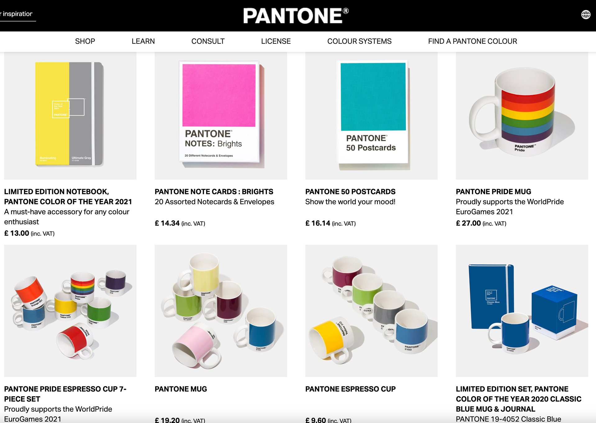
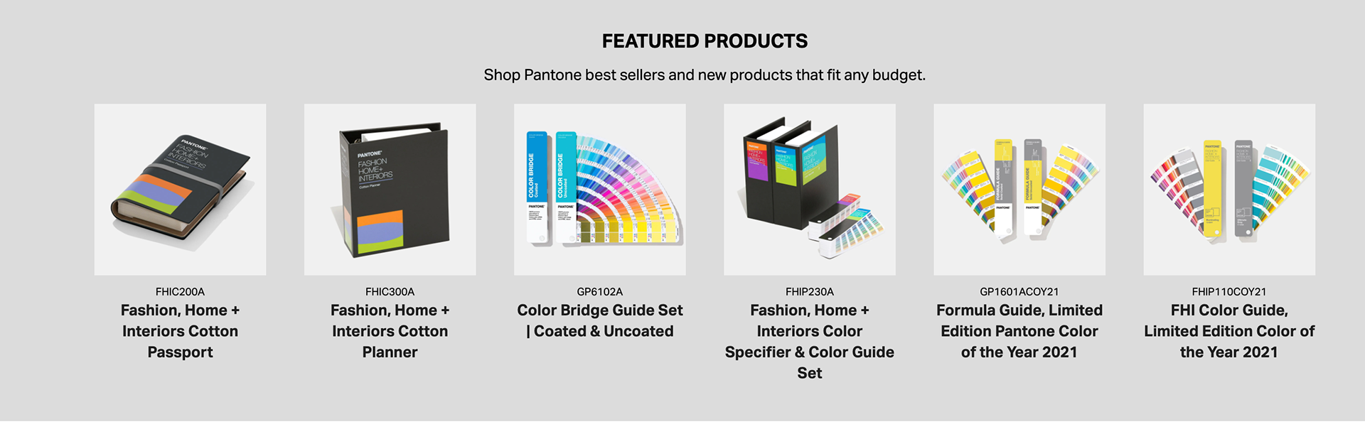
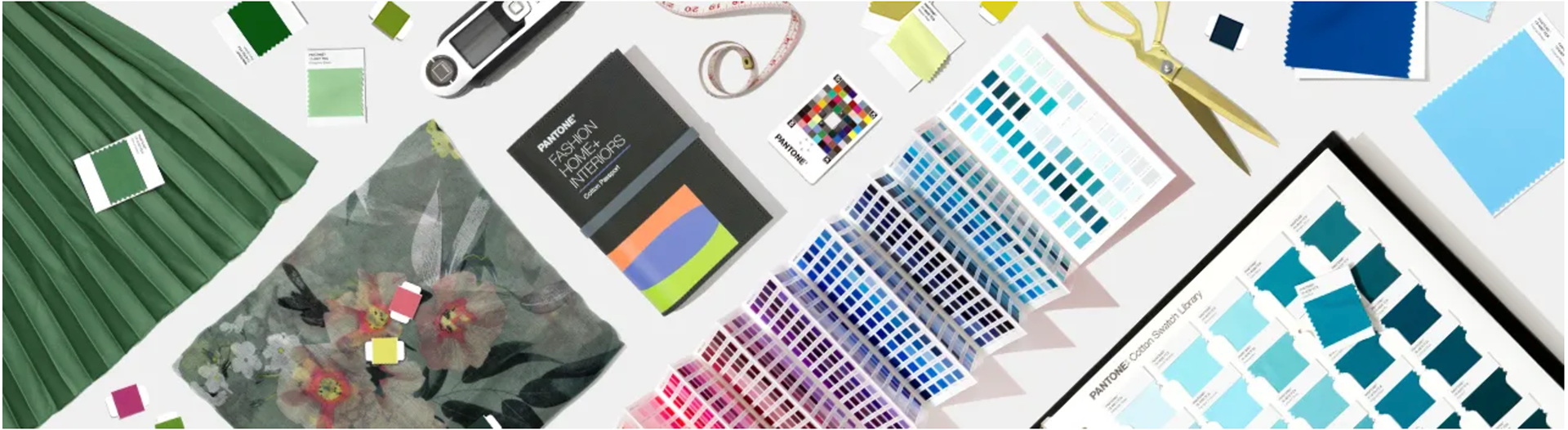
I could look at making side assets like patone does with mugs, postcards, notebooks, colour of the year etc. But is it really needed? I would rather it be used as a tool help people and not take their money.https://www.pantone.com/uk/en/
Coolors is a colour palette website which I could take inspiration from, but my main usp would be an educating area of what colours work and why which could be a tool that helps creatives, students etc to learn why certain colours work and the interesting history of colours.
https://coolors.co/
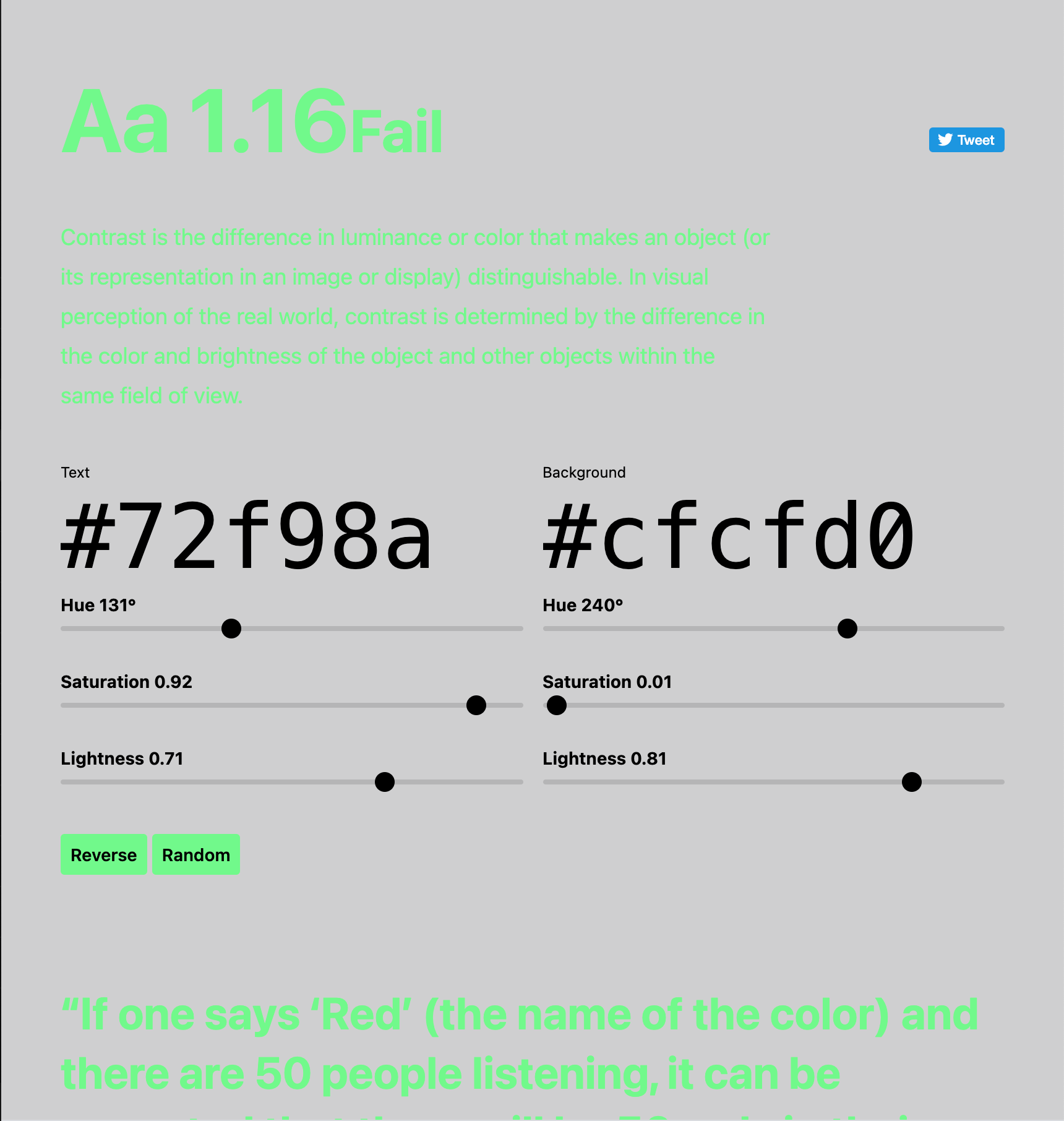
The Vox video explaining colours around the world could be an interesting spin as looking at how different cultures perceive colours. Also colorable is cool idea that my brand could expand the idea on.
https://colorable.jxnblk.com/72f98a/cfcfd0
^ BRANCH OFF OF / COMPETITION ^
IDEA ONE

Above are my initial ideas for my brand identity based on curiosity.
WRITE UP HERE
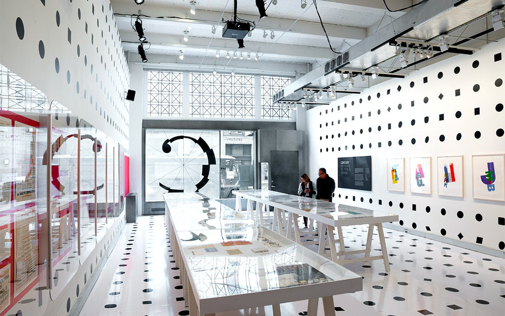
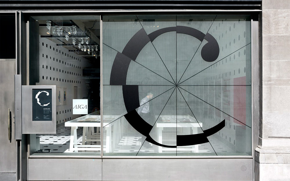
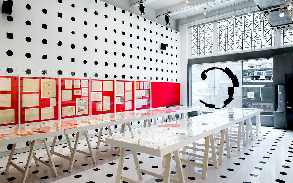
https://www.pentagram.com/work/century-100-years-of-type-and-design?rel=search&query=creative%2520design%2520identity&page=2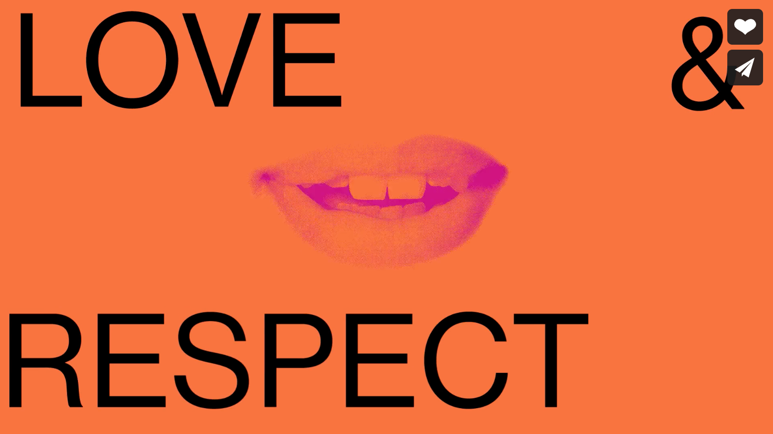
WRITE UP HERE
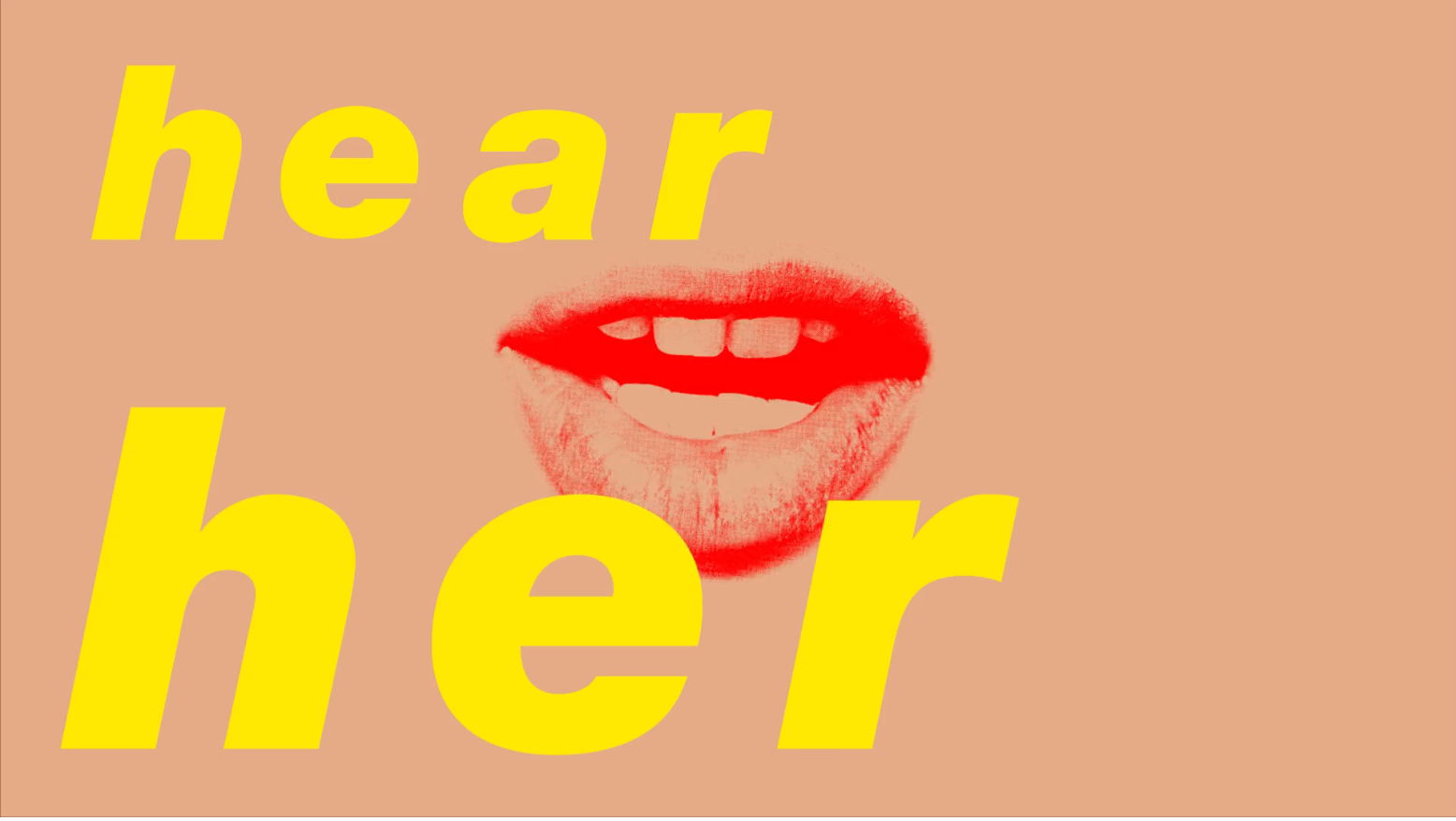
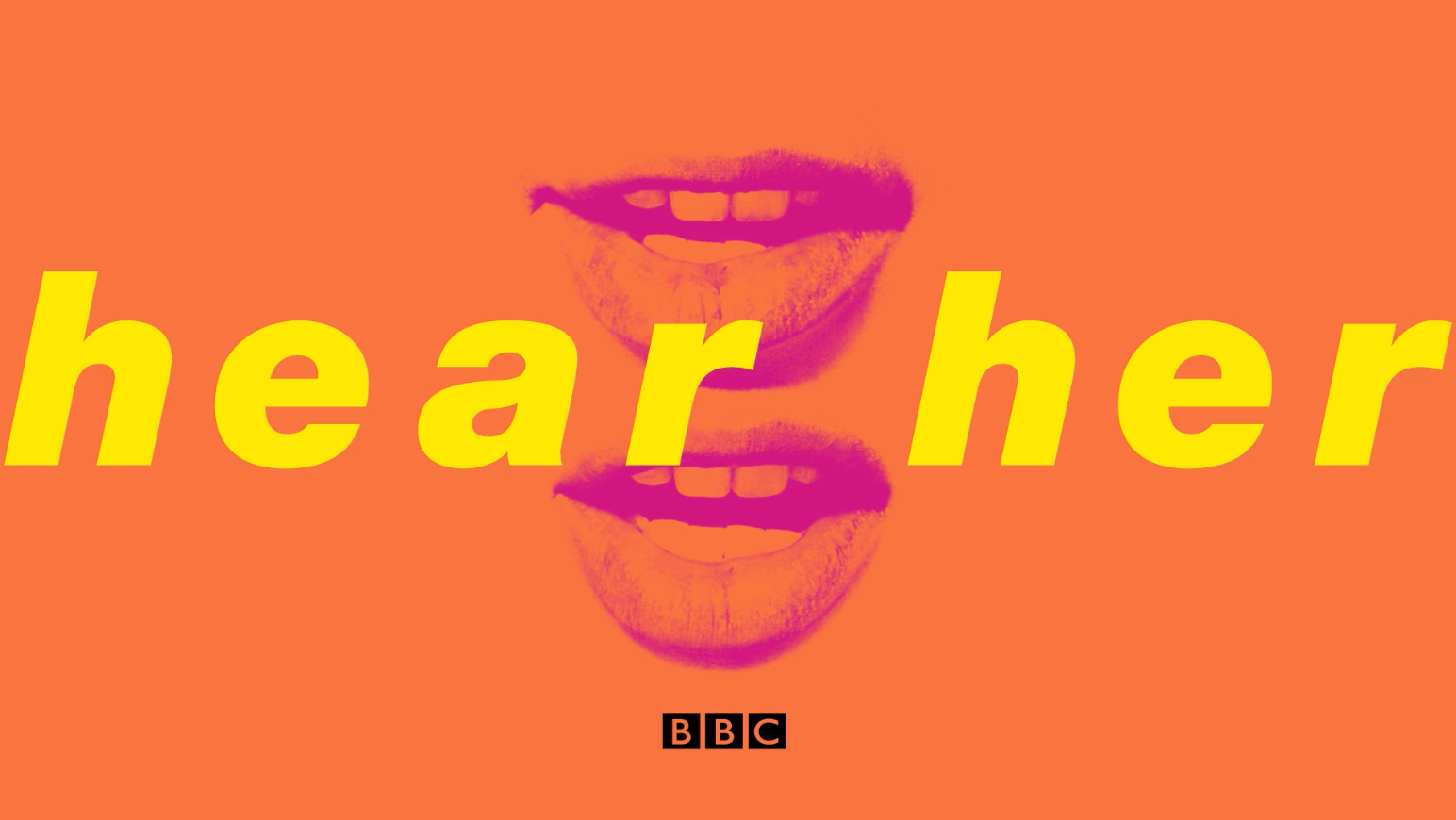
https://www.pentagram.com/work/hear-her?rel=search&query=creative%2520design%2520identity&page=1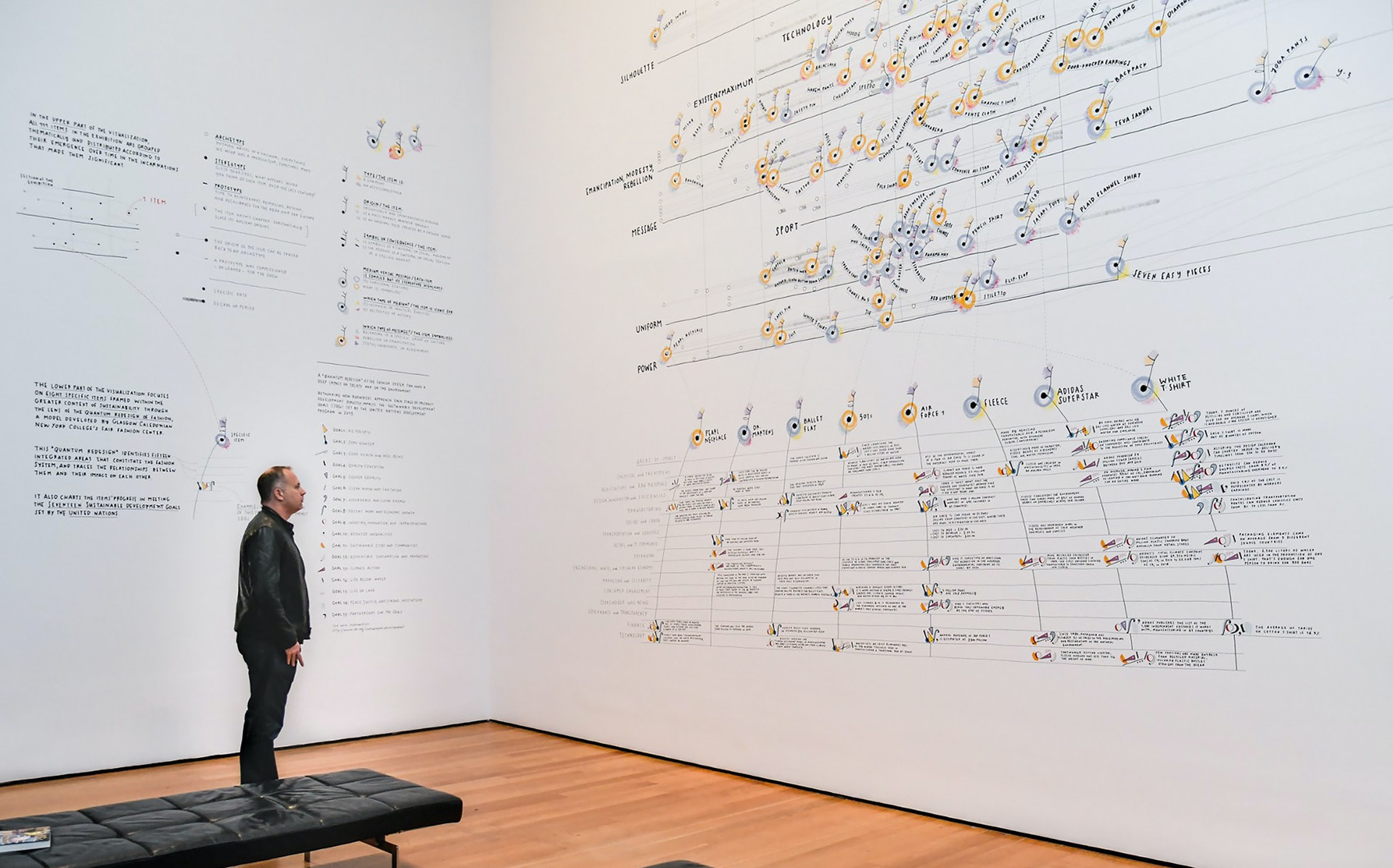
WRITE UP HERE
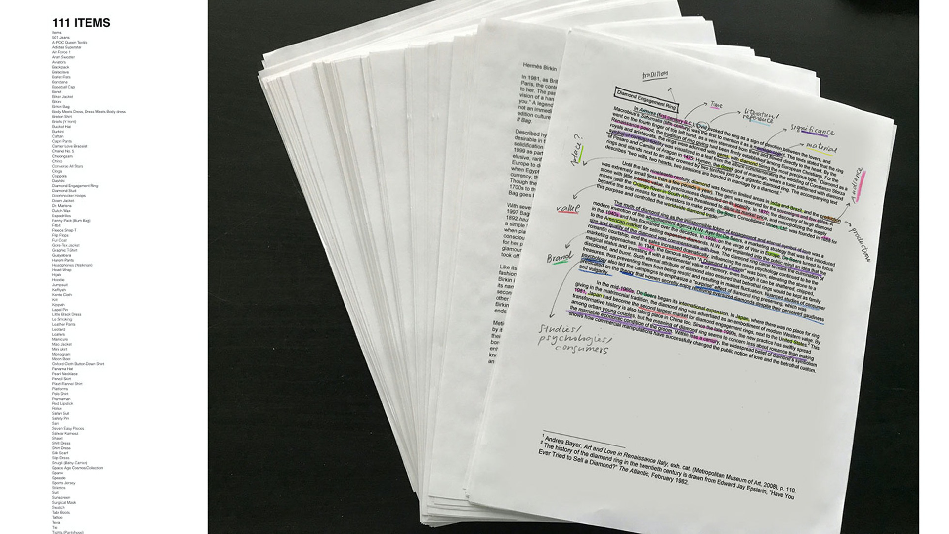
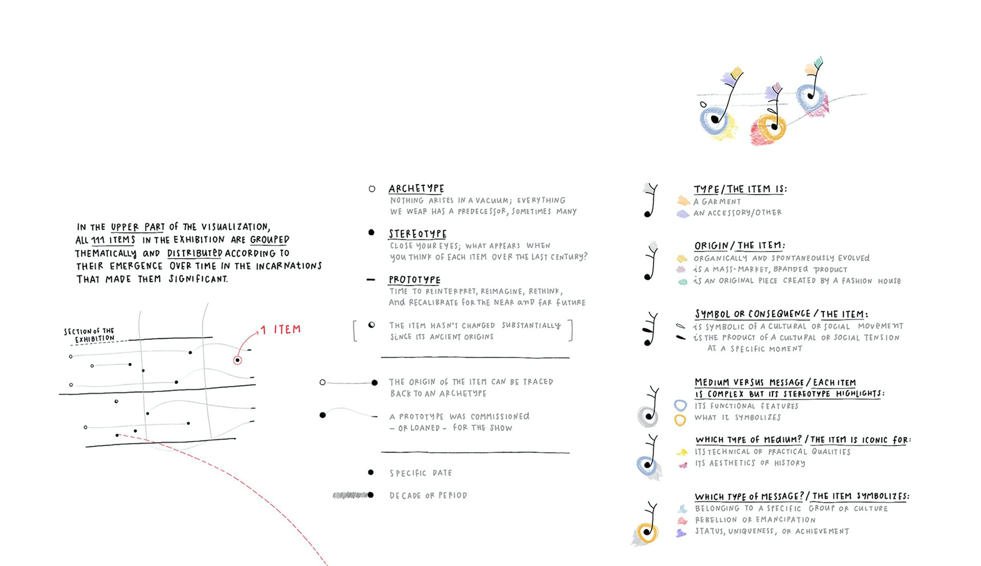
https://www.pentagram.com/work/data-items-a-fashion-landscape?rel=search&query=social%2520change%2520identiy&page=1

WRITE UP HERE
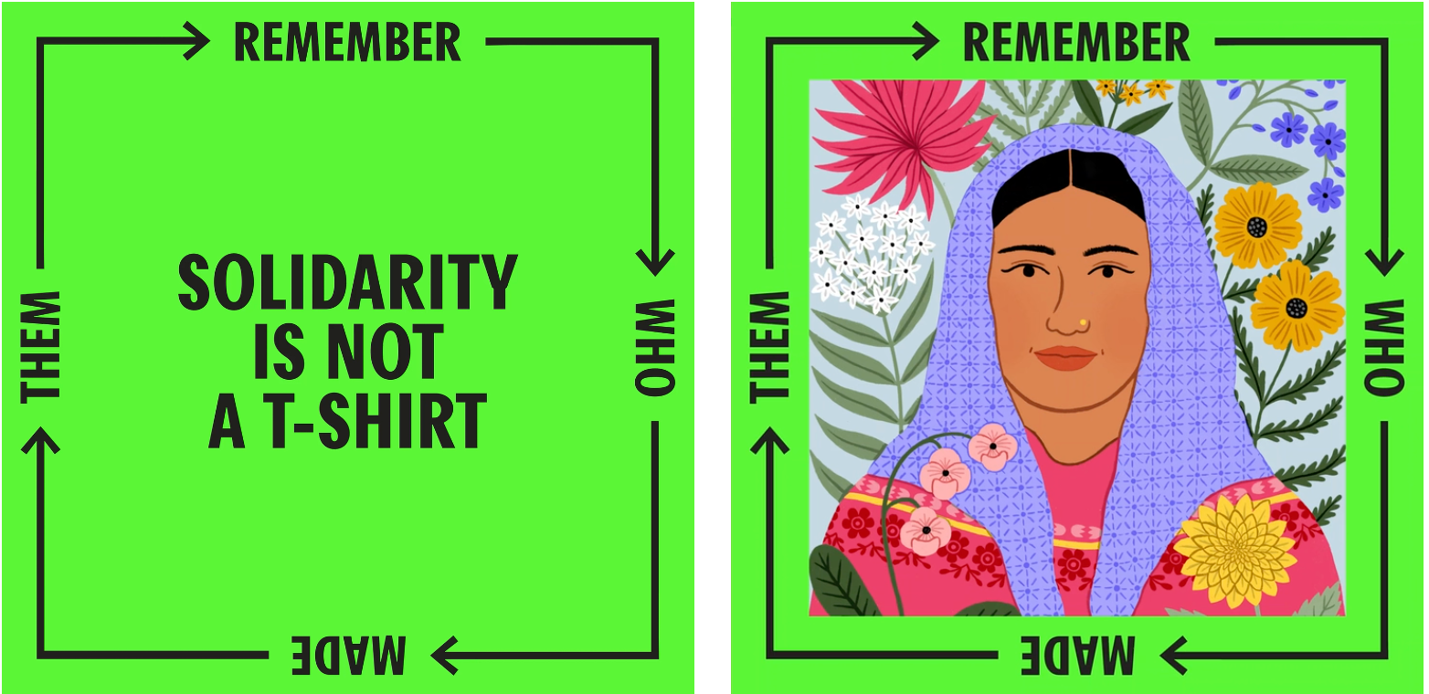
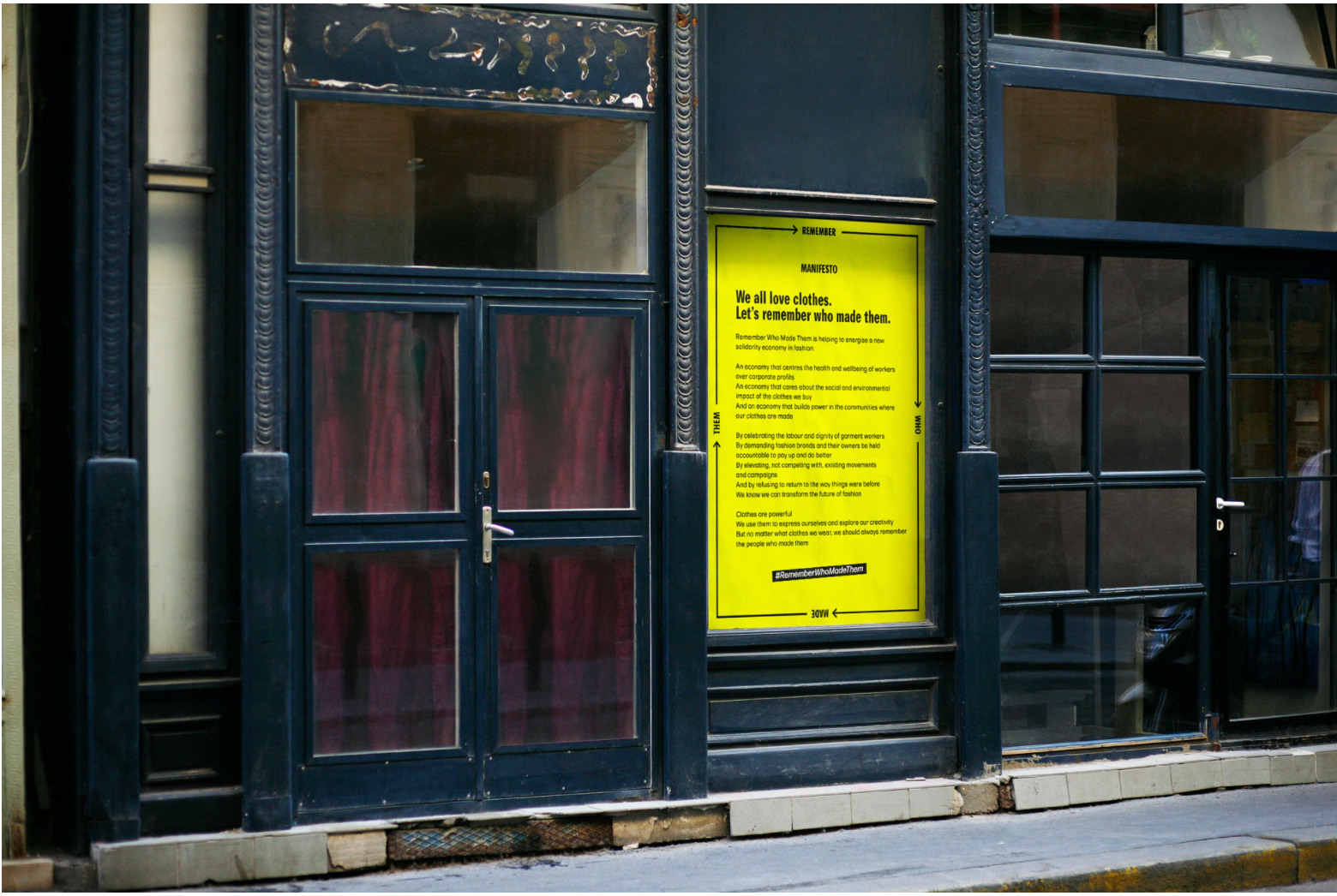
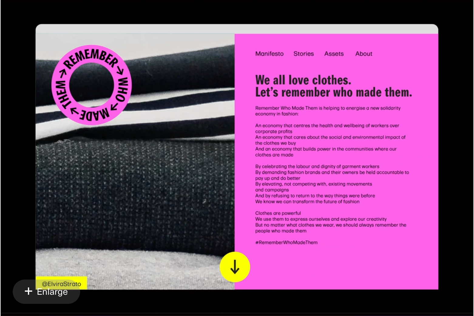
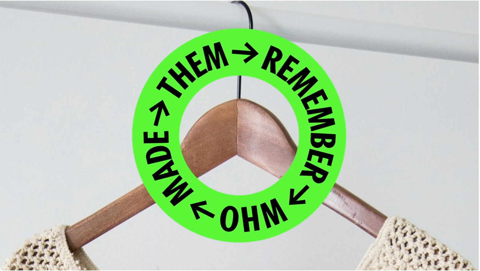
https://www.pentagram.com/work/remember-who-made-them?rel=search&query=social%2520change%2520identiy&page=1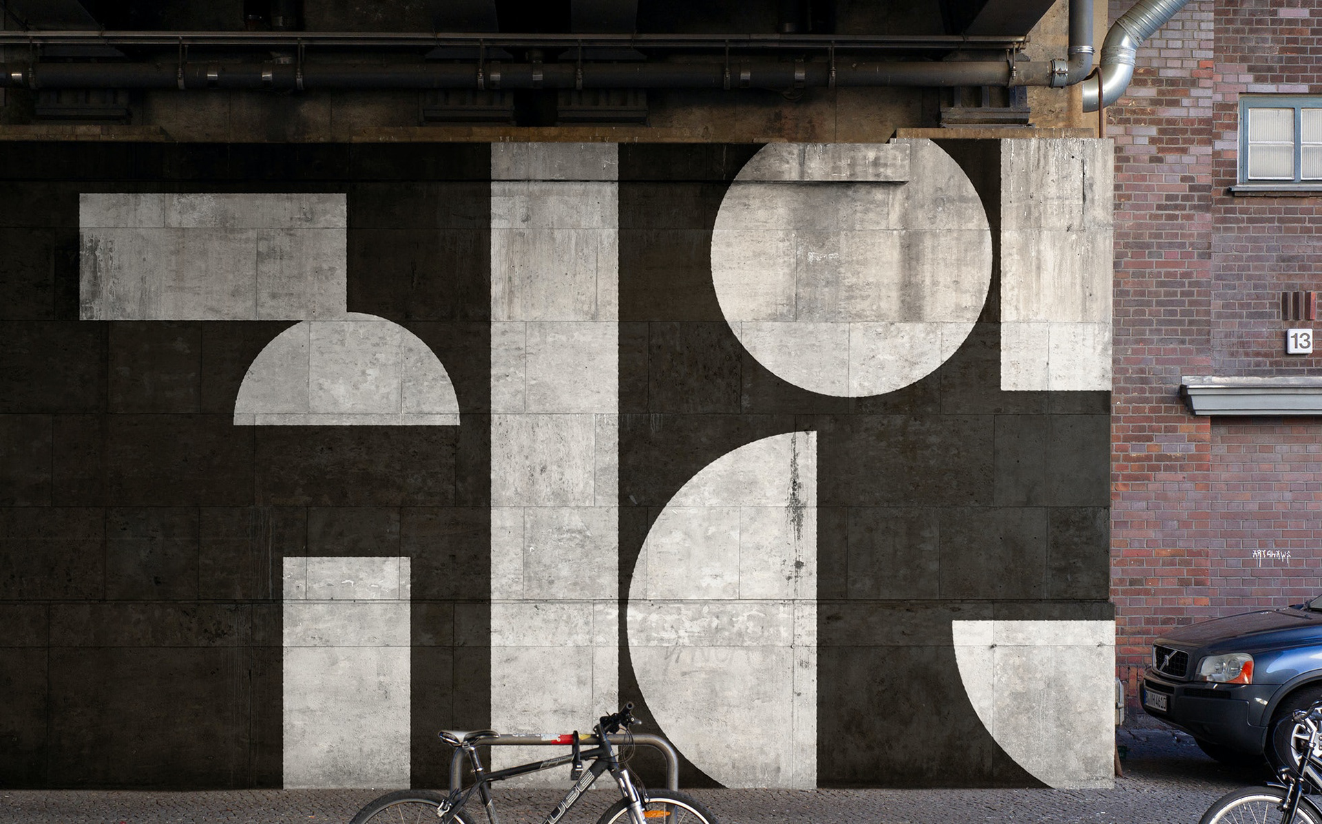

WRITE UP HERE
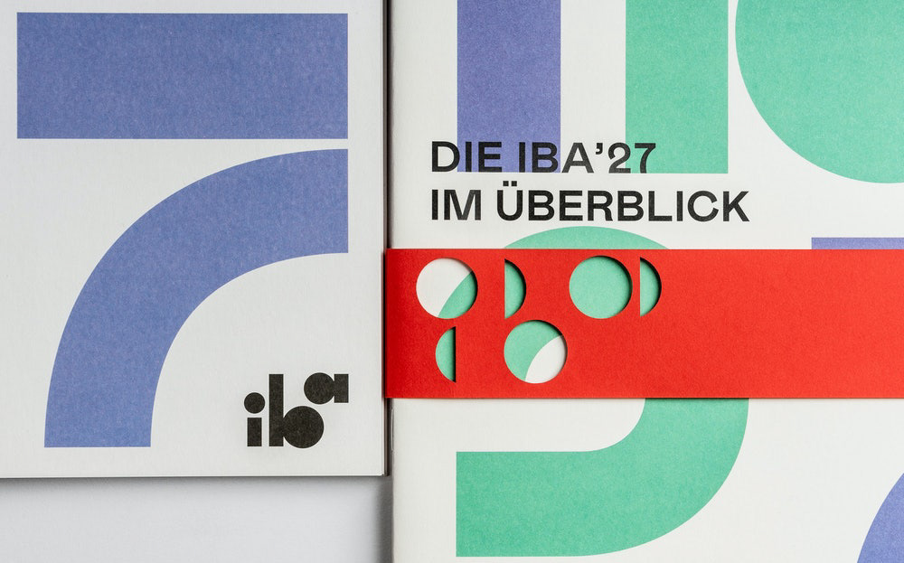
https://www.pentagram.com/work/iba-27?rel=search&query=social%2520change%2520identiy&page=1

WRITE UP HERE
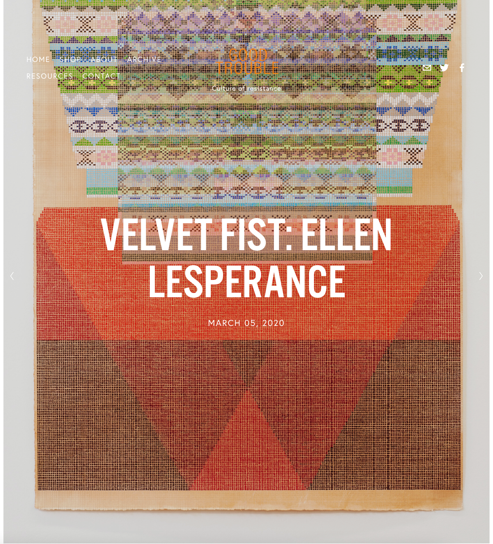
https://www.goodtroublemag.com/home/velvet-first-ellen-lesperance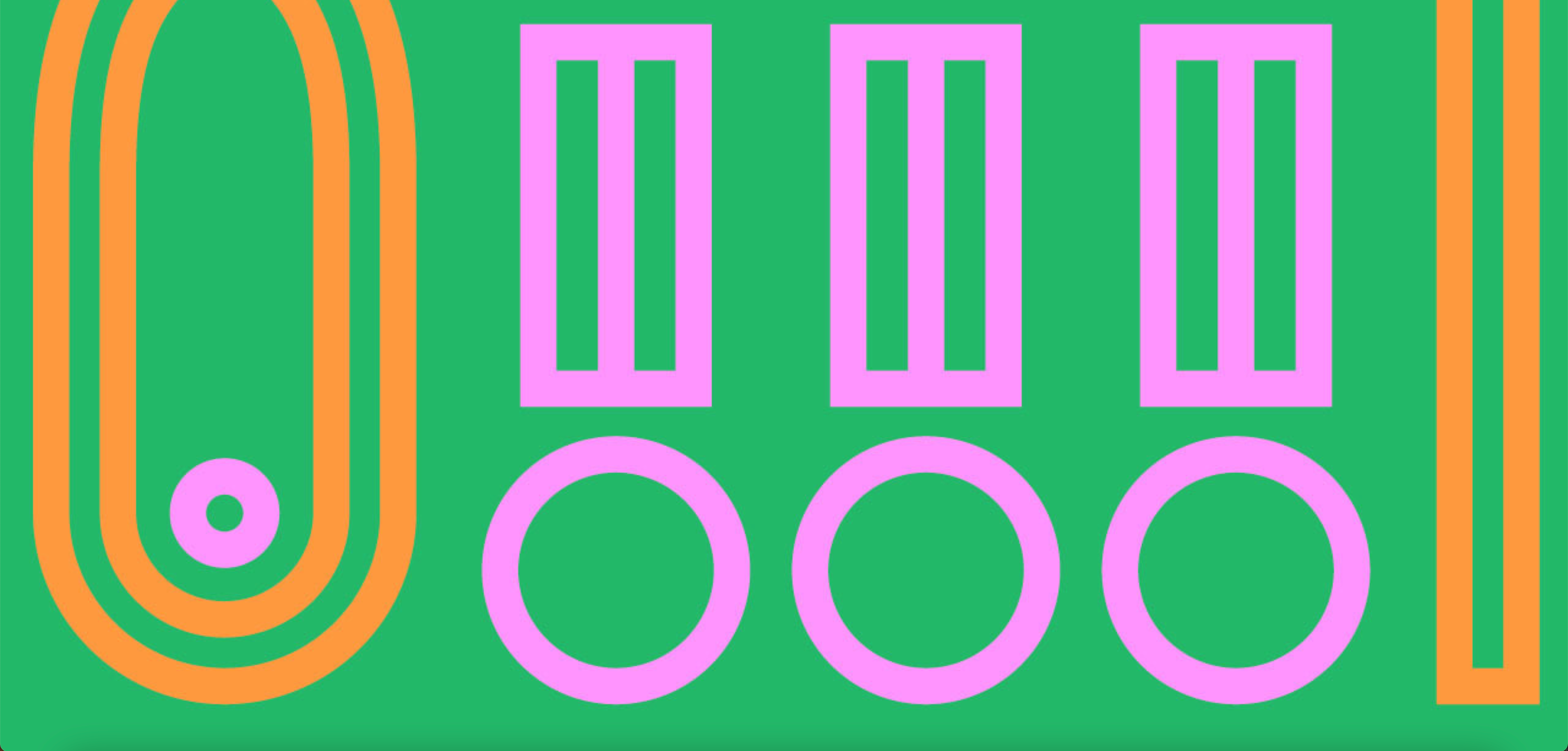
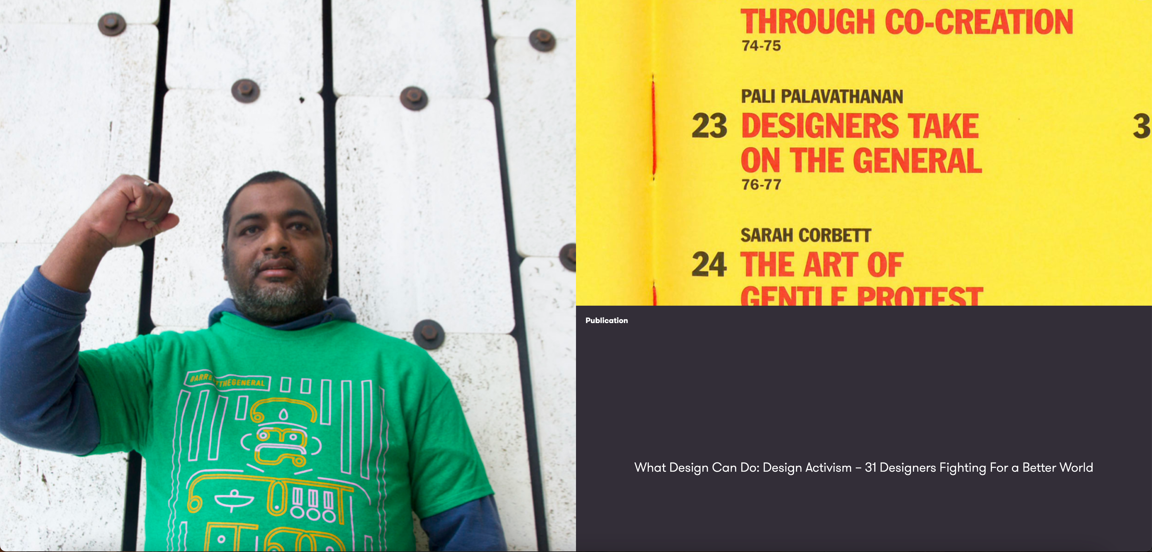
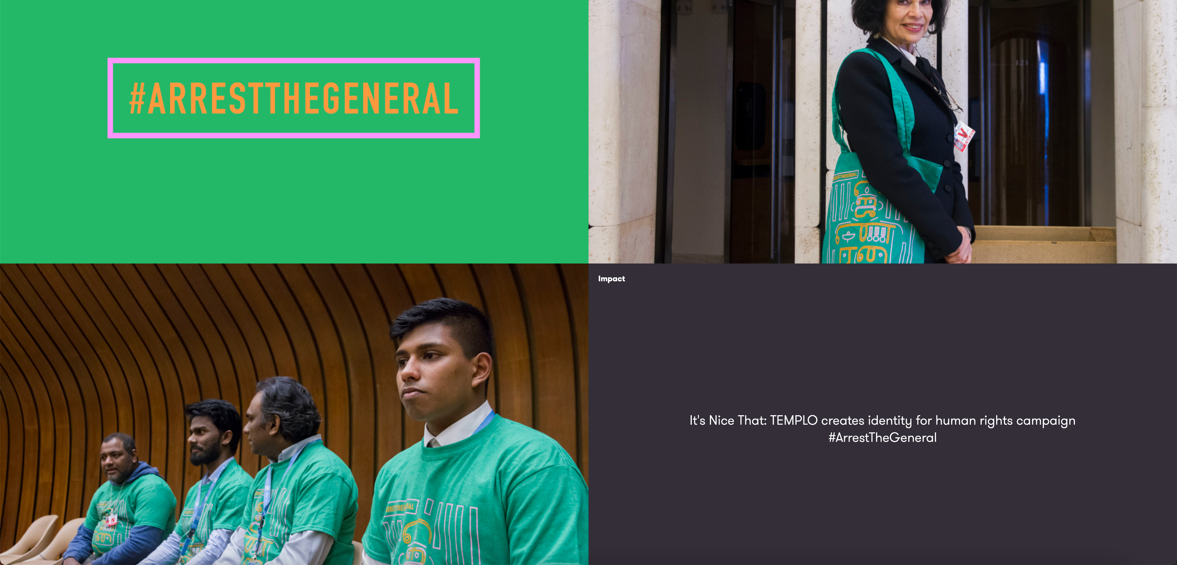

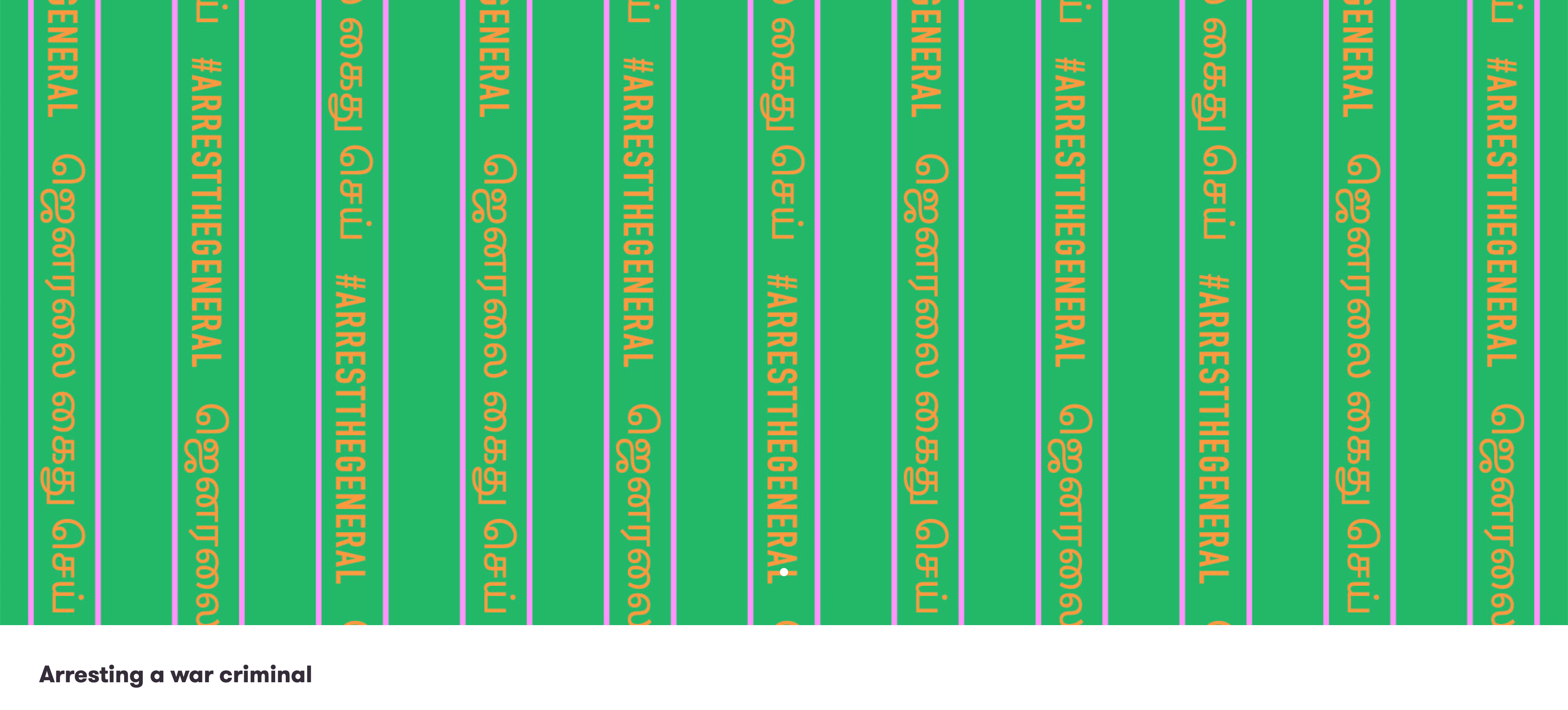
The patterns created with this identy are http://templo.co.uk/work/arrestthegeneral-campaign-identity


In your face design works well, the simple colour scheme means it isn't over complicated and gets right to the point (this is helped by the minimalist illustrations).
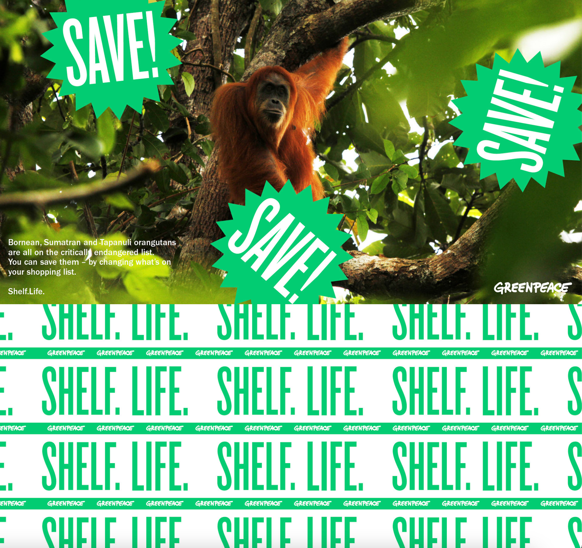
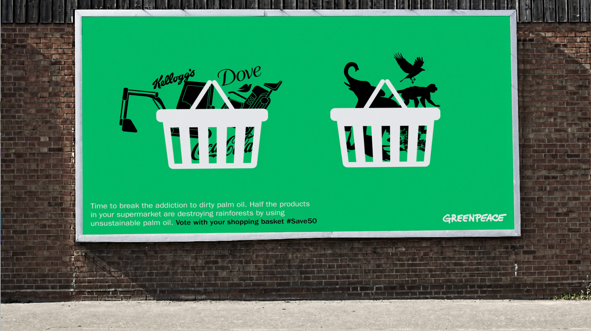
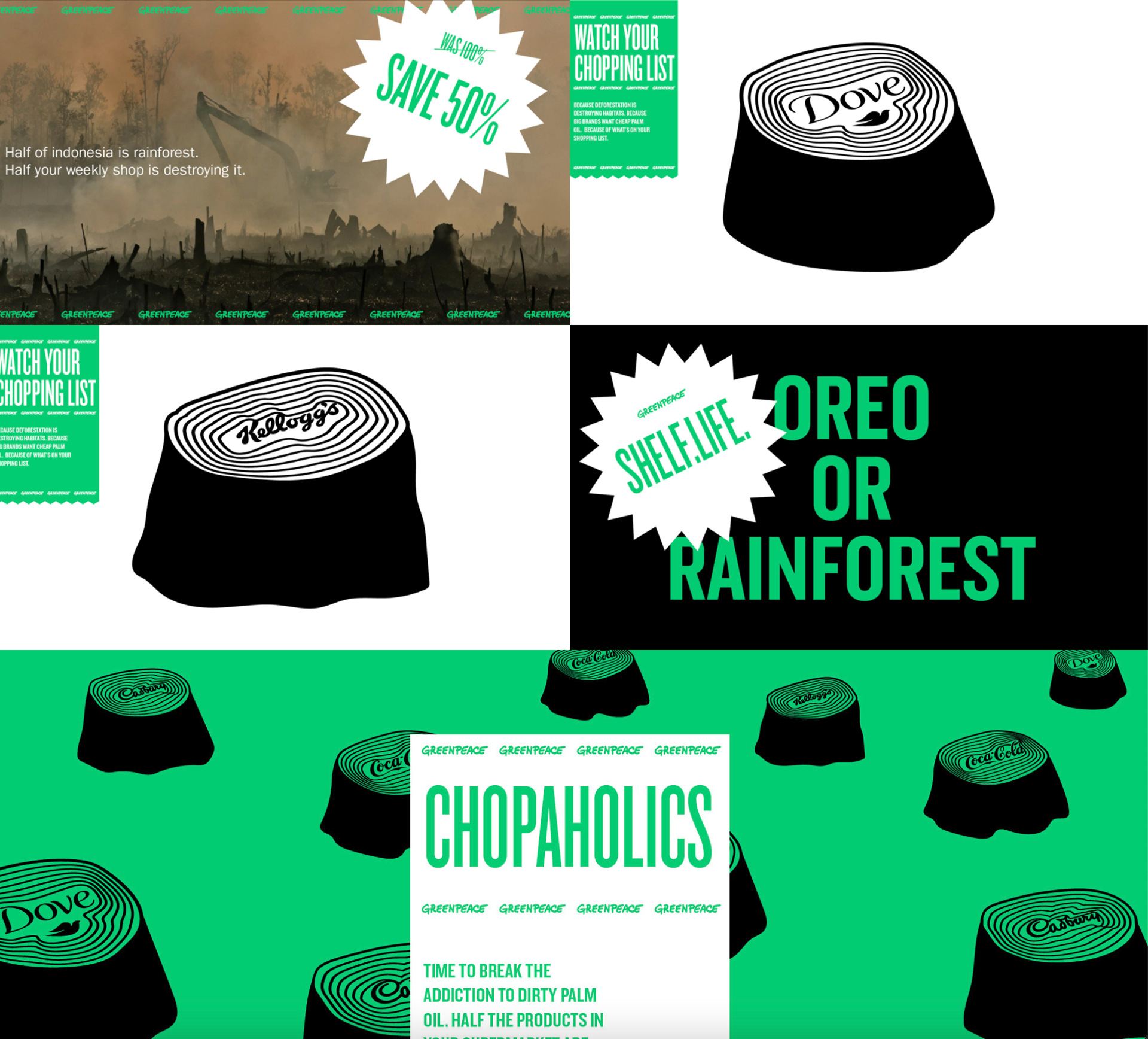
http://templo.co.uk/work/greenpeace-shelf-life-campaign
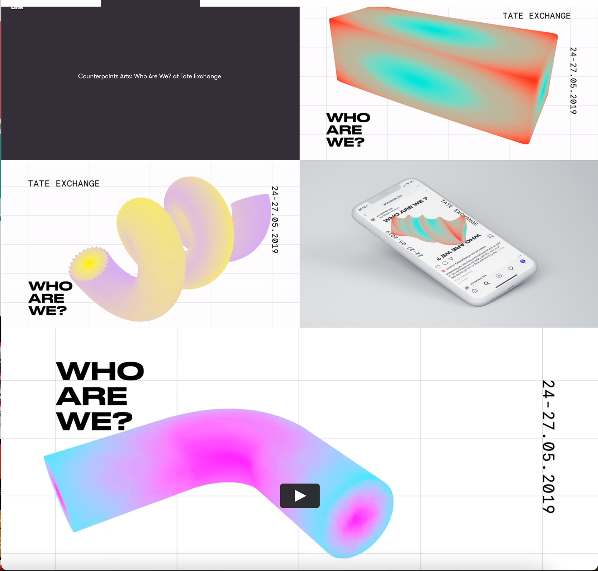
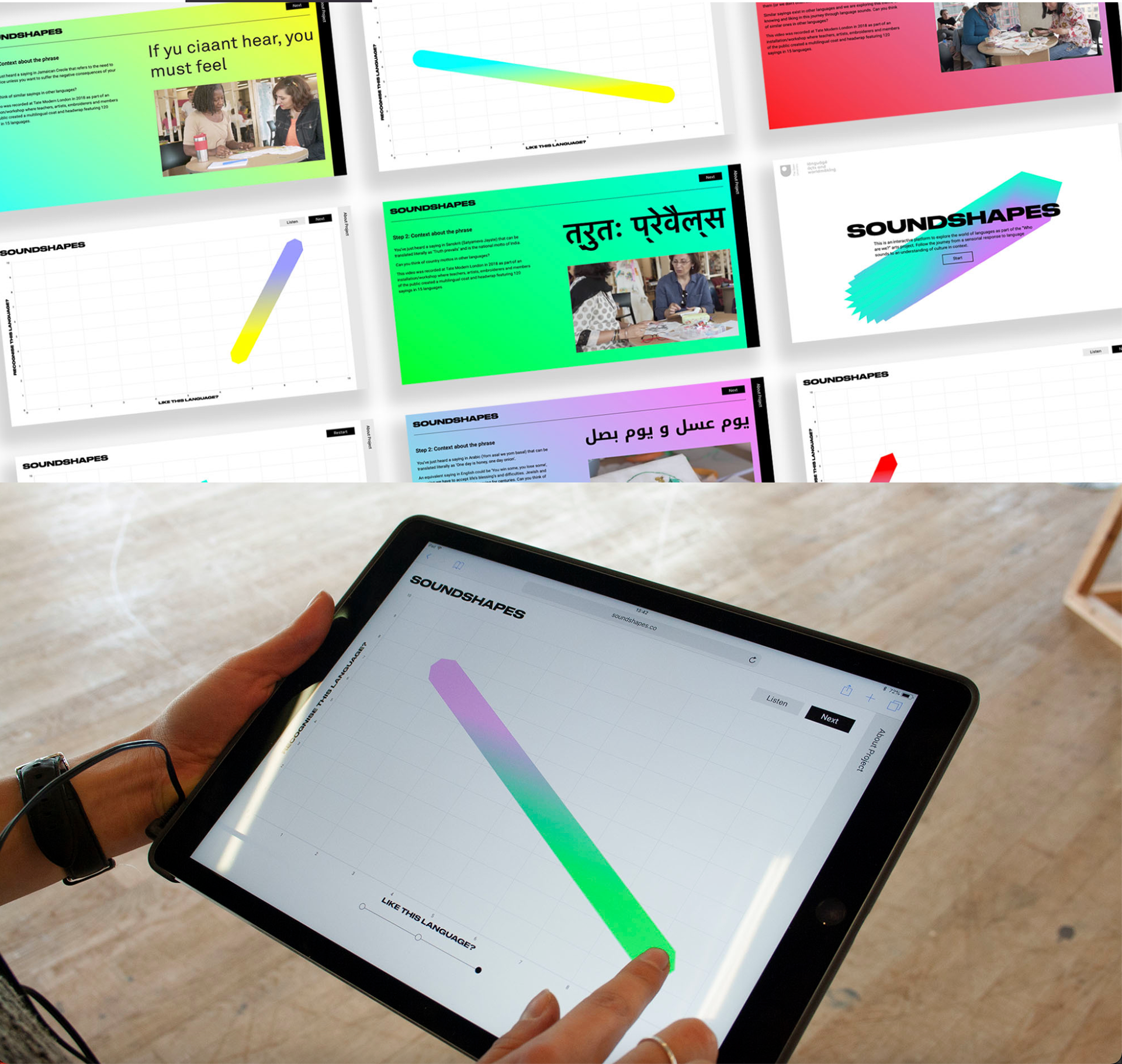
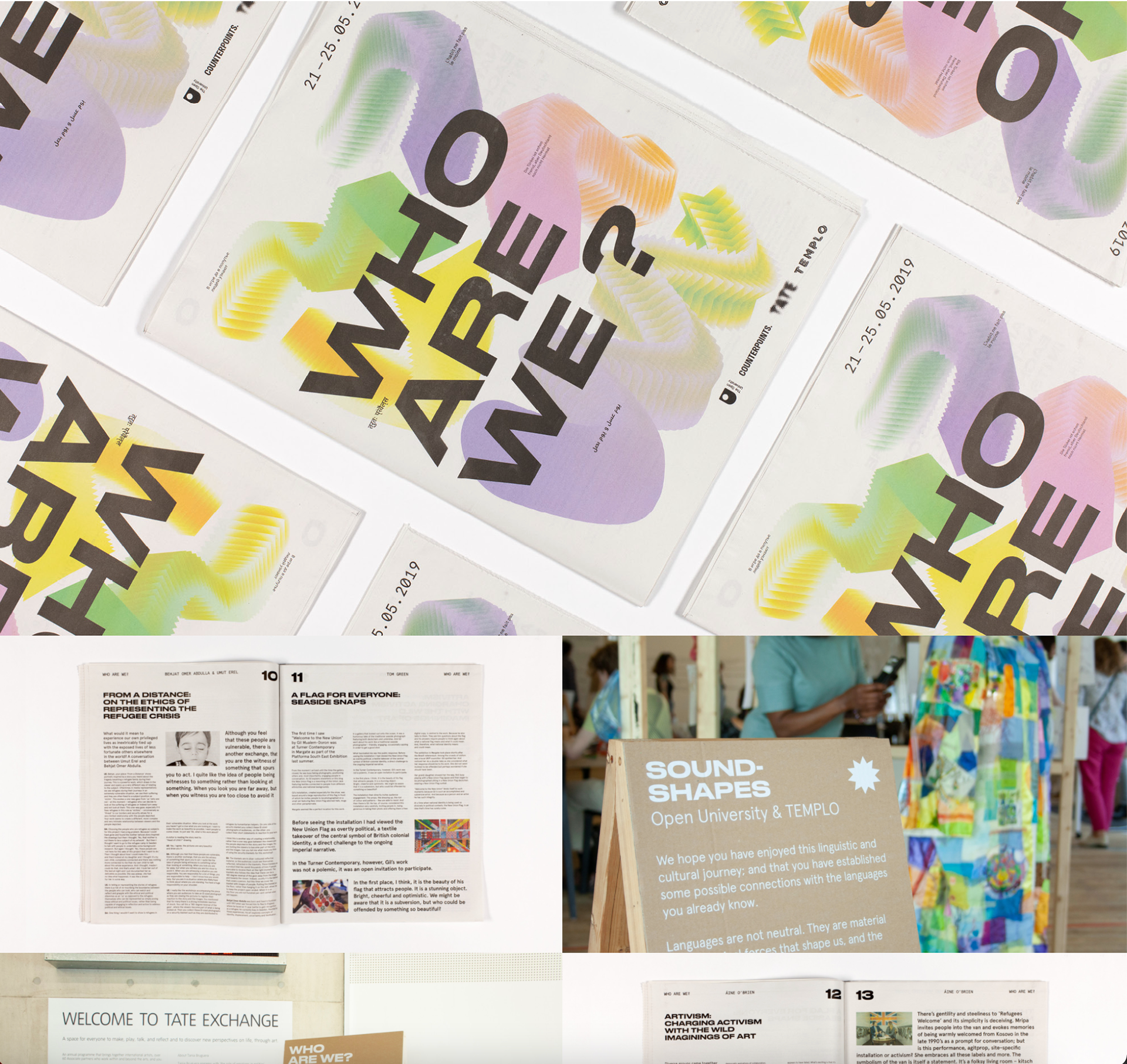
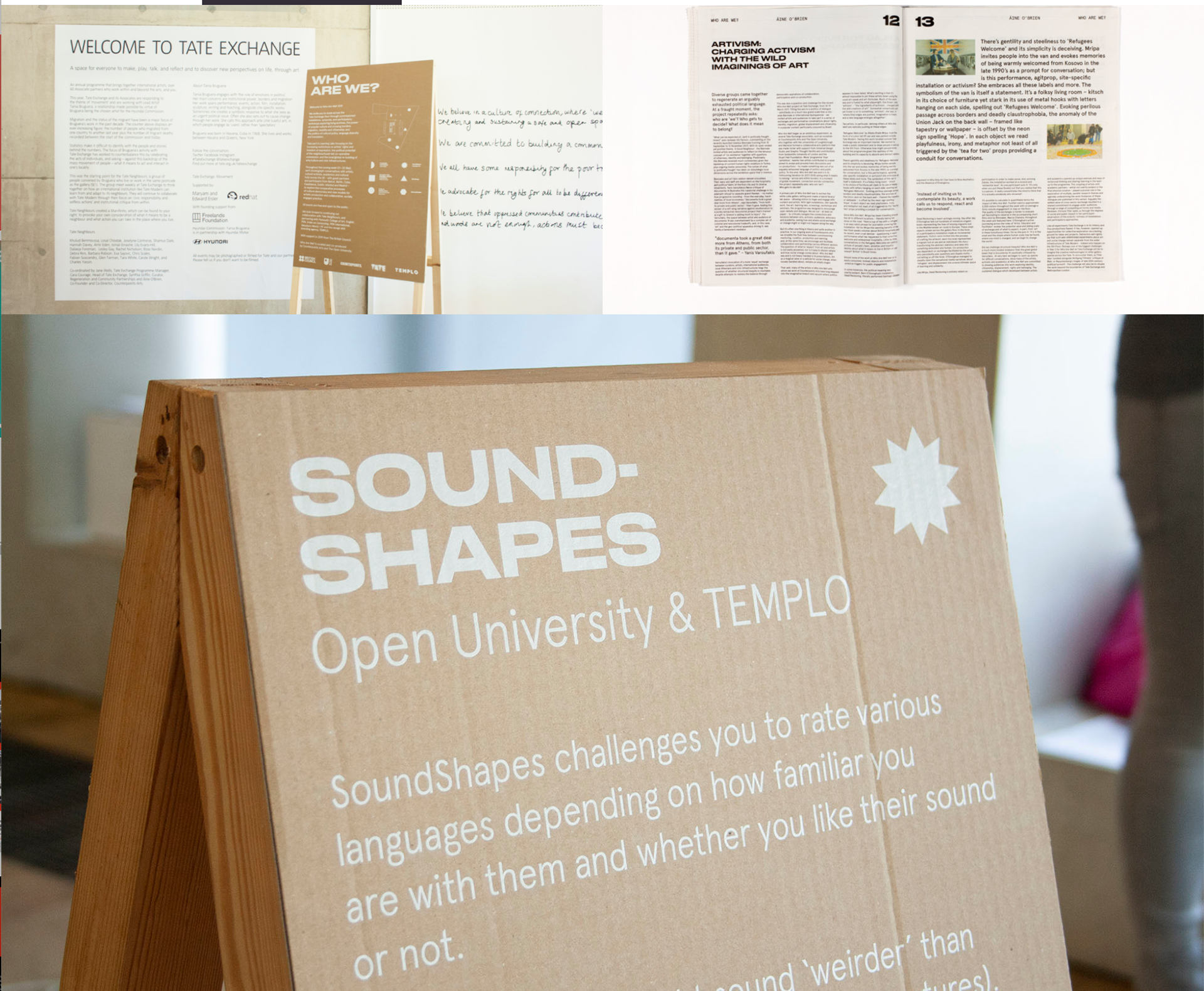
This event design by TEMPLO for the Tate is excellent in my opinion I really like the branding for it and I feel as if it works well for the target audience (young adults) it's got that modern/new style to it and it's very eye catching. Also the different deliverables like the newspaper, website, ipad website, banners etc show a wide range of items that bring the idenity out and makes it more exciting than if it were just a website.
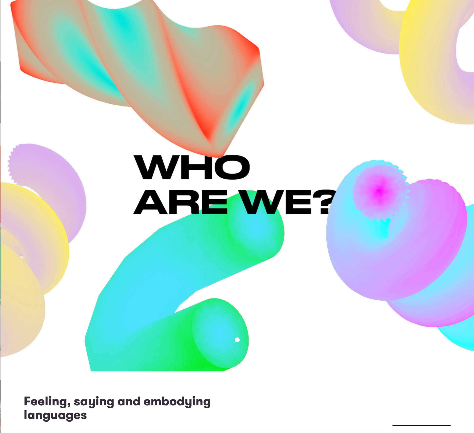
http://templo.co.uk/work/who-are-we-identity-digital-platform
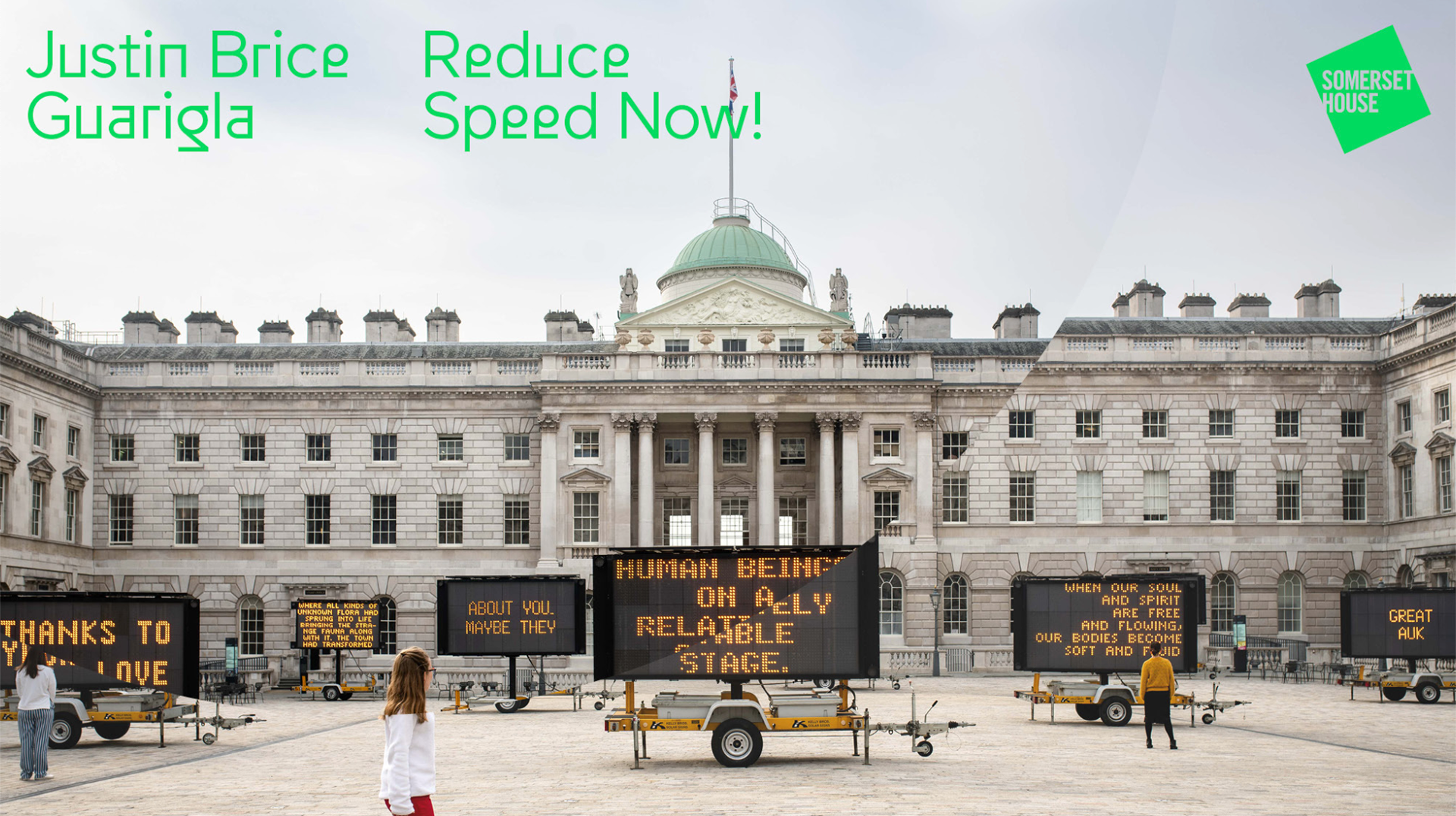
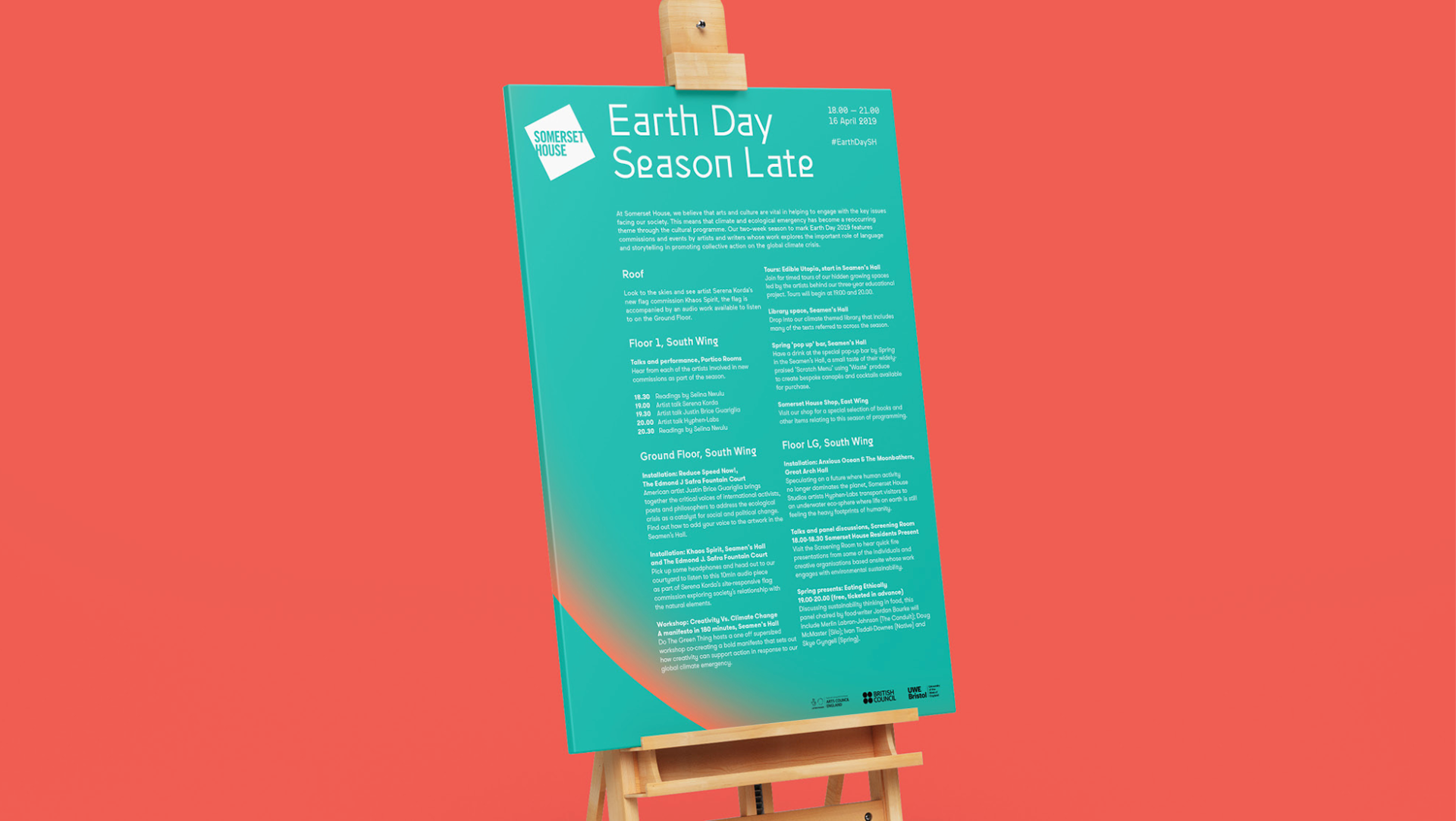
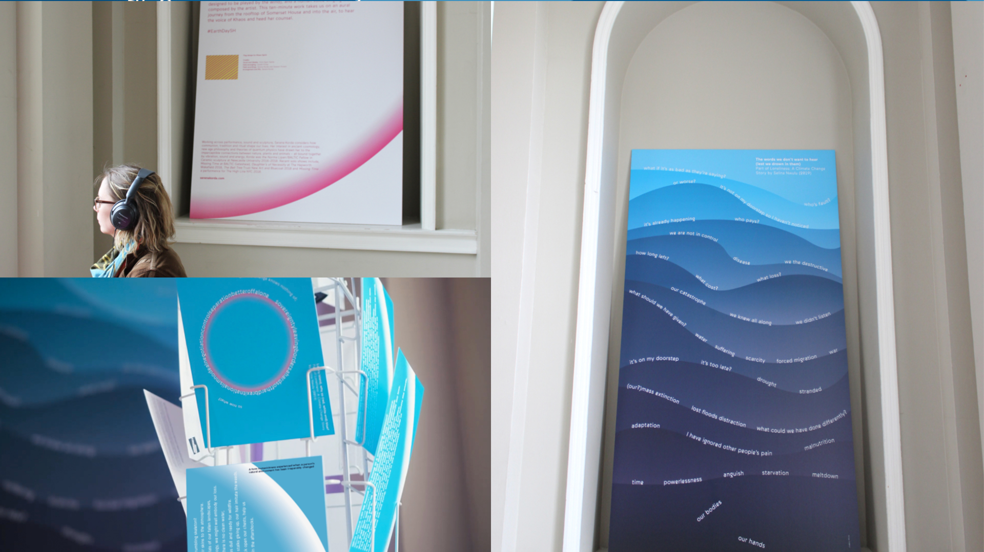
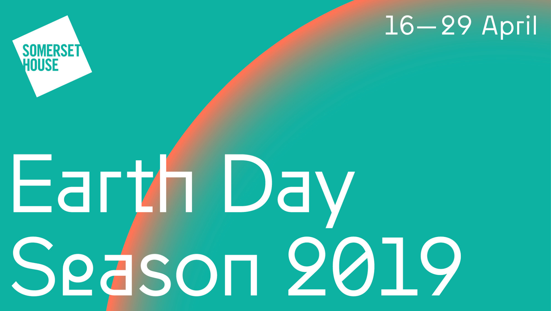
I came across this as I was trying to look into different ways a brand might have touch points depending on what it is. This events put on at Somerset house show the wide variety of things that may need designing for a festival. It's good to look into might be a good thing to design if I end up with a similar identity later on.http://templo.co.uk/work/somerset-house-earth-day-2019-identity
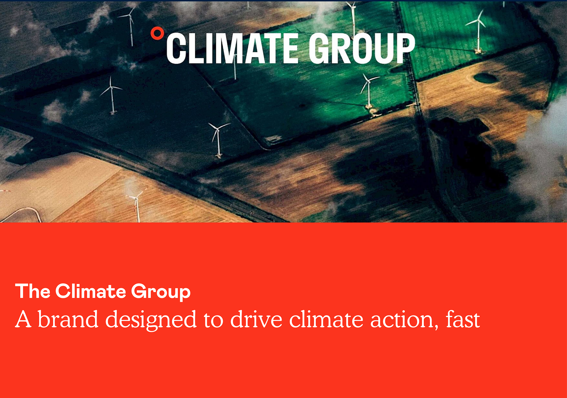
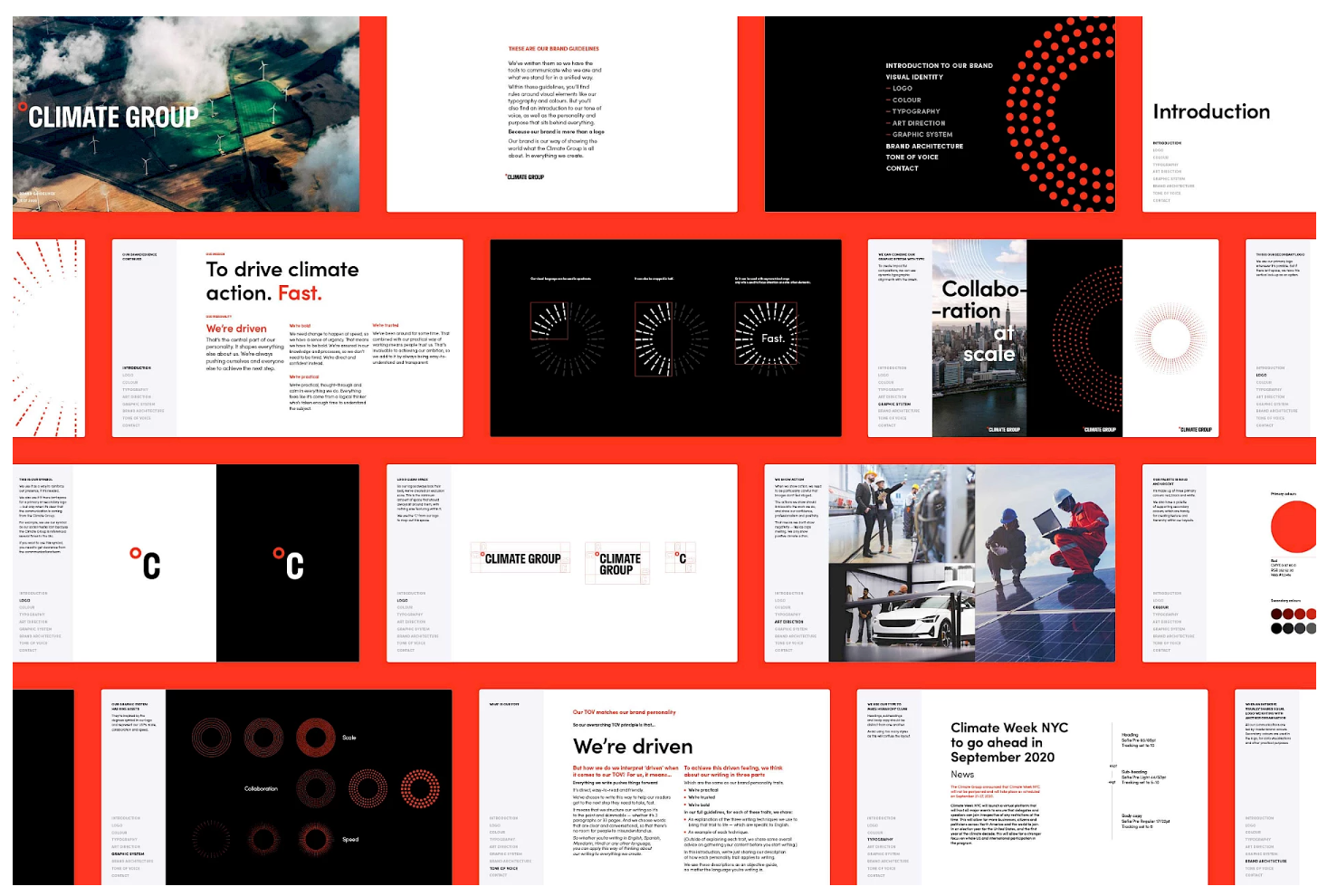
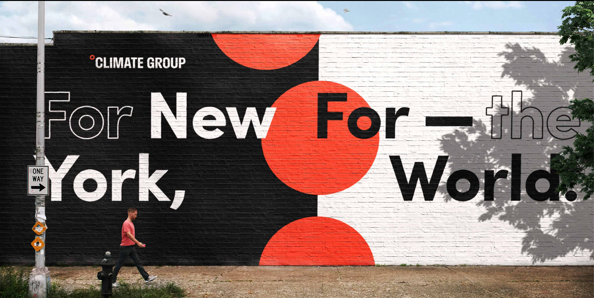
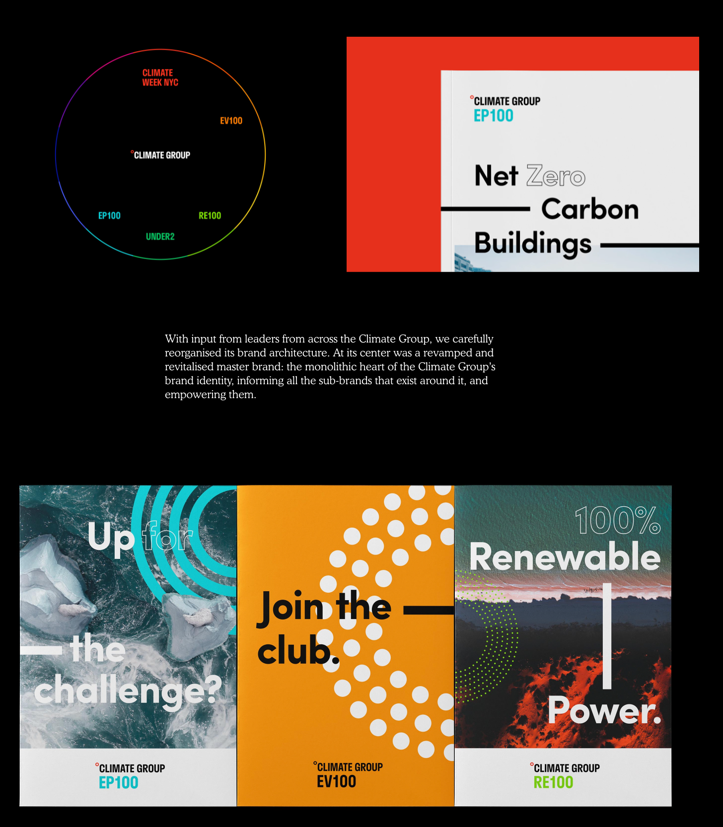
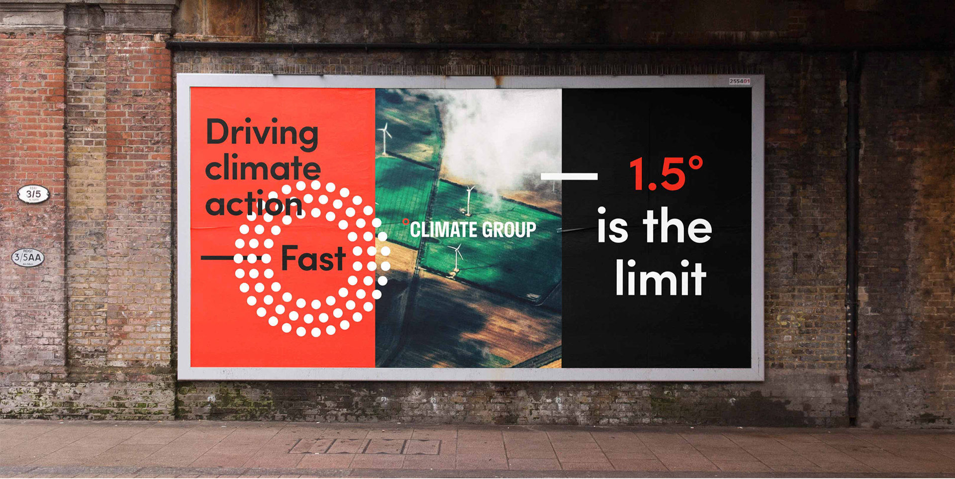
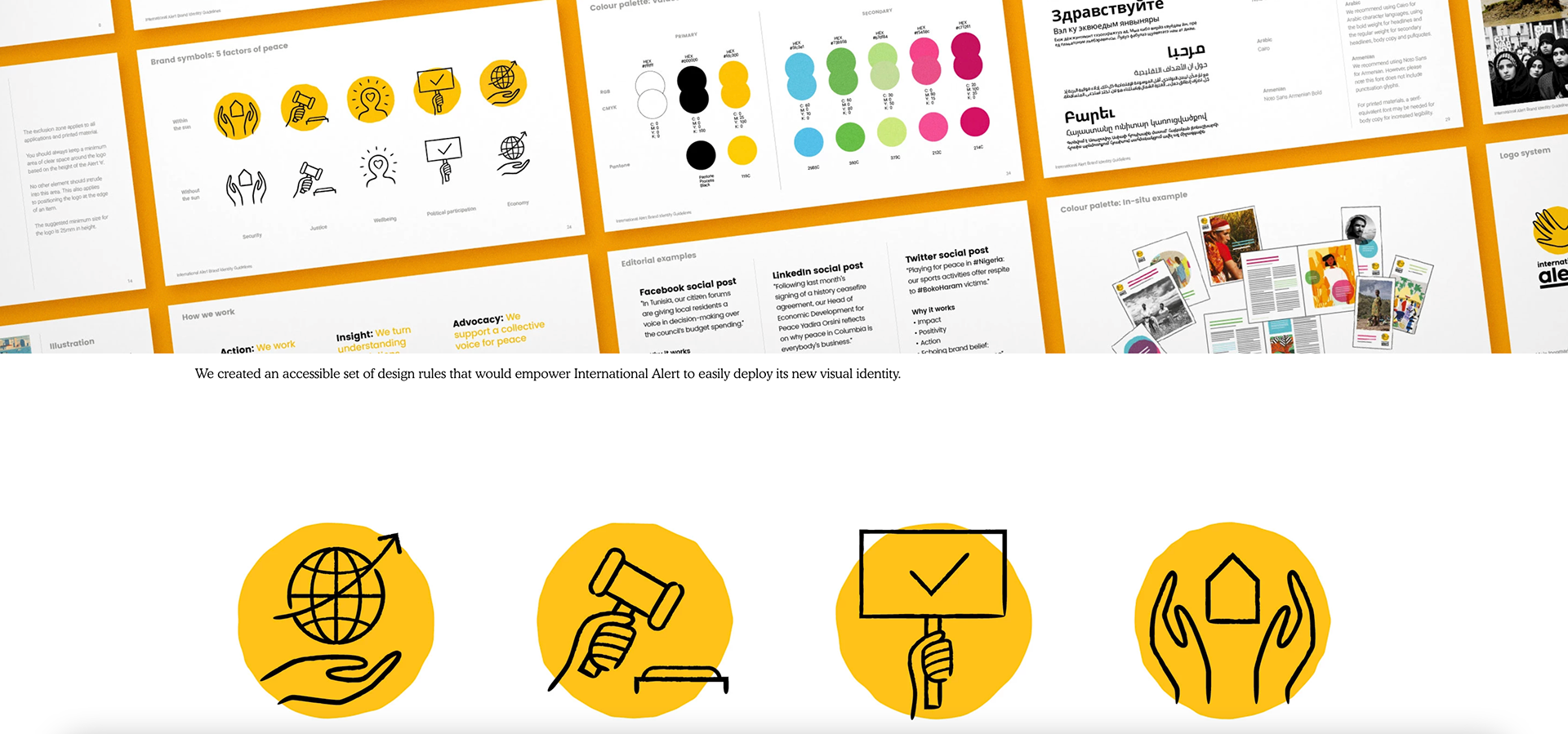
This other Identity I think works really well the colours stand out and the design is really eye catching (more so than the international alert one - I will say that I think each identity suits each cause however as this would be a good representation for the international alert anyways). For climate group I feel the modernity and big bold shapes or colour filling up space is a really well put together brand identity. The touchpoints are excellent I especially like the painted wall as I feel it would be something that would stop people in their tracks to found out more - I will take hints from these touchpoints for my brand if I feel it ends up suiting it.
https://humanafterall.studio/work/the-climate-group-case-study/
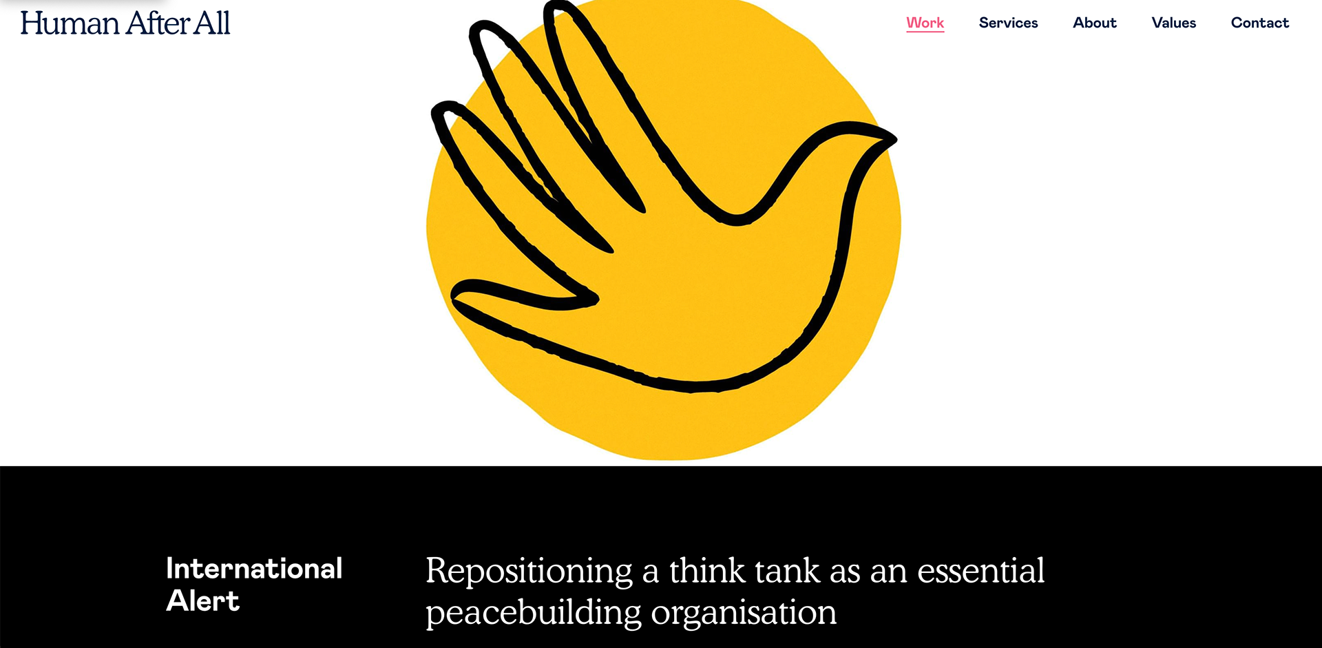
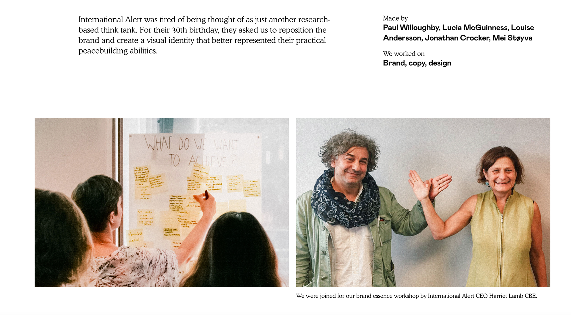
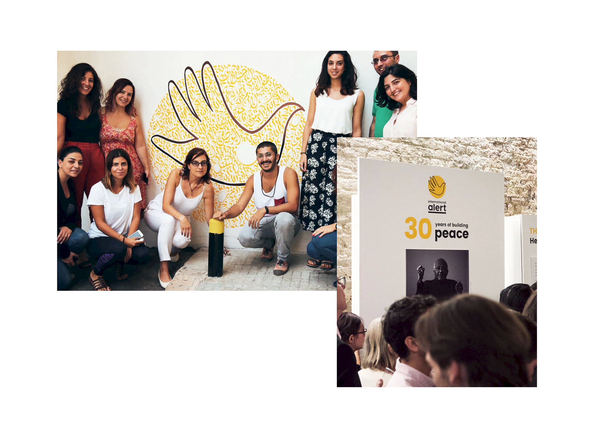
I like how this brand design is shown with the whole story from start to finish. It's played out in a way that makes it personal to the company they were doing the work for. I feel the identity gives International Alert the identity it deserves and suits it well. The deck is designed well and you can clearly see how each touch point works with each other and has real purpose. I may go back and reference this later.
https://humanafterall.studio/work/international-alert-case-study/
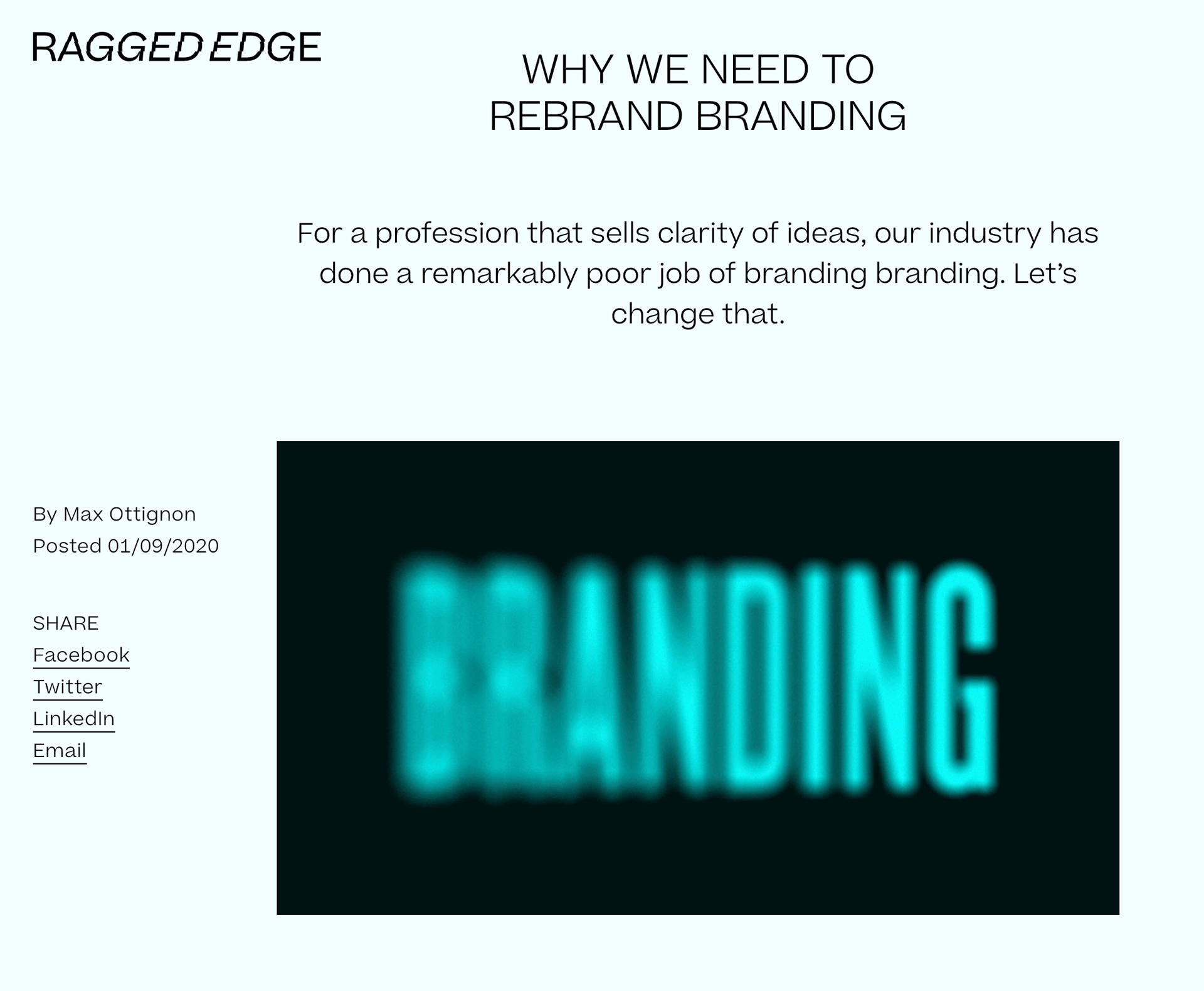
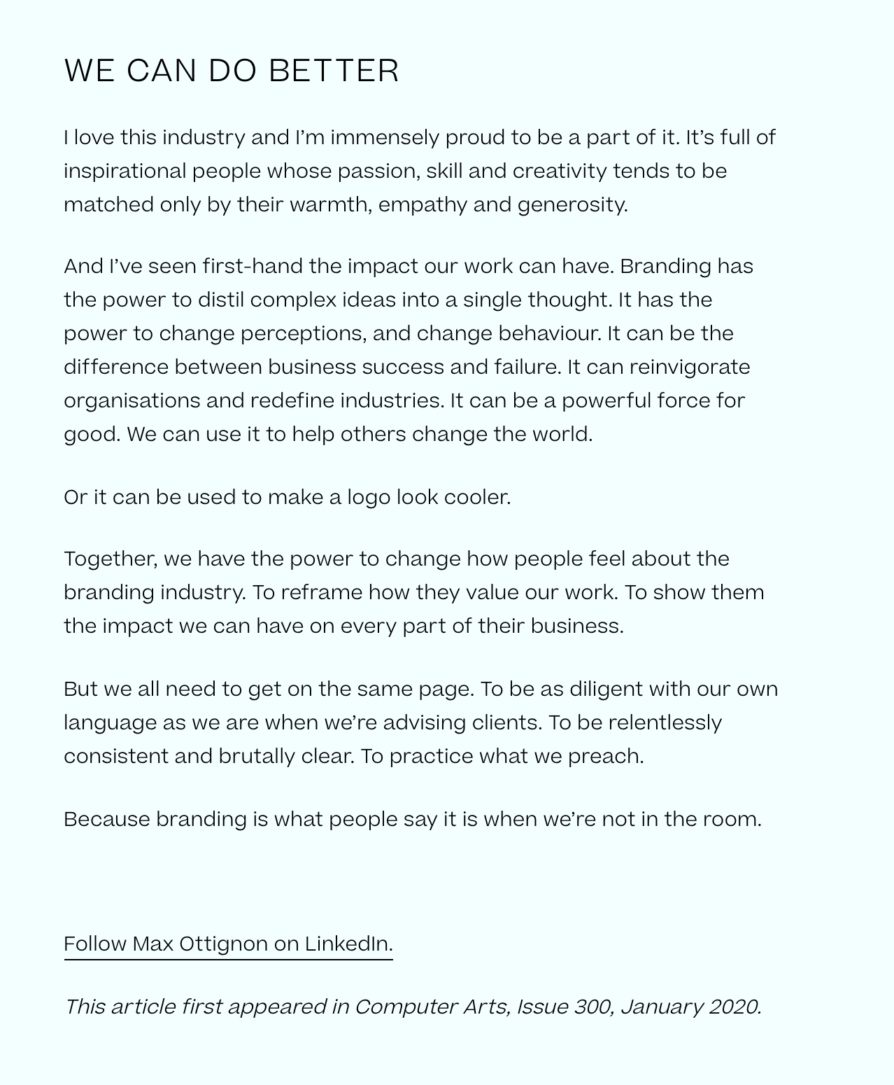
It's good to have that outside the box view on branding and who know max sounds kind of correct. I feel the word brand or identity can be over used or not used correctly but like he says he's also guilty. I think what I take from to get a good brand it's important to be aware of how important it is to get it right. Like he said 'branding is what people say when you're not in the room' you want it to be talked about but in a good way.
https://raggededge.com/opinion/rebranding-branding-max-ottignon/
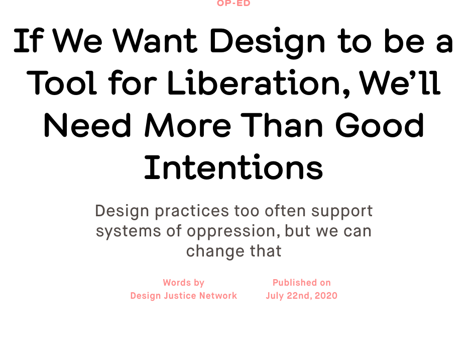
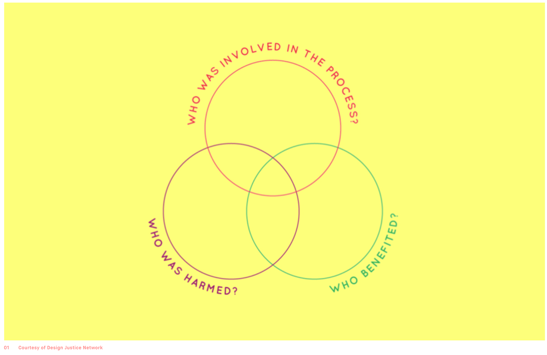
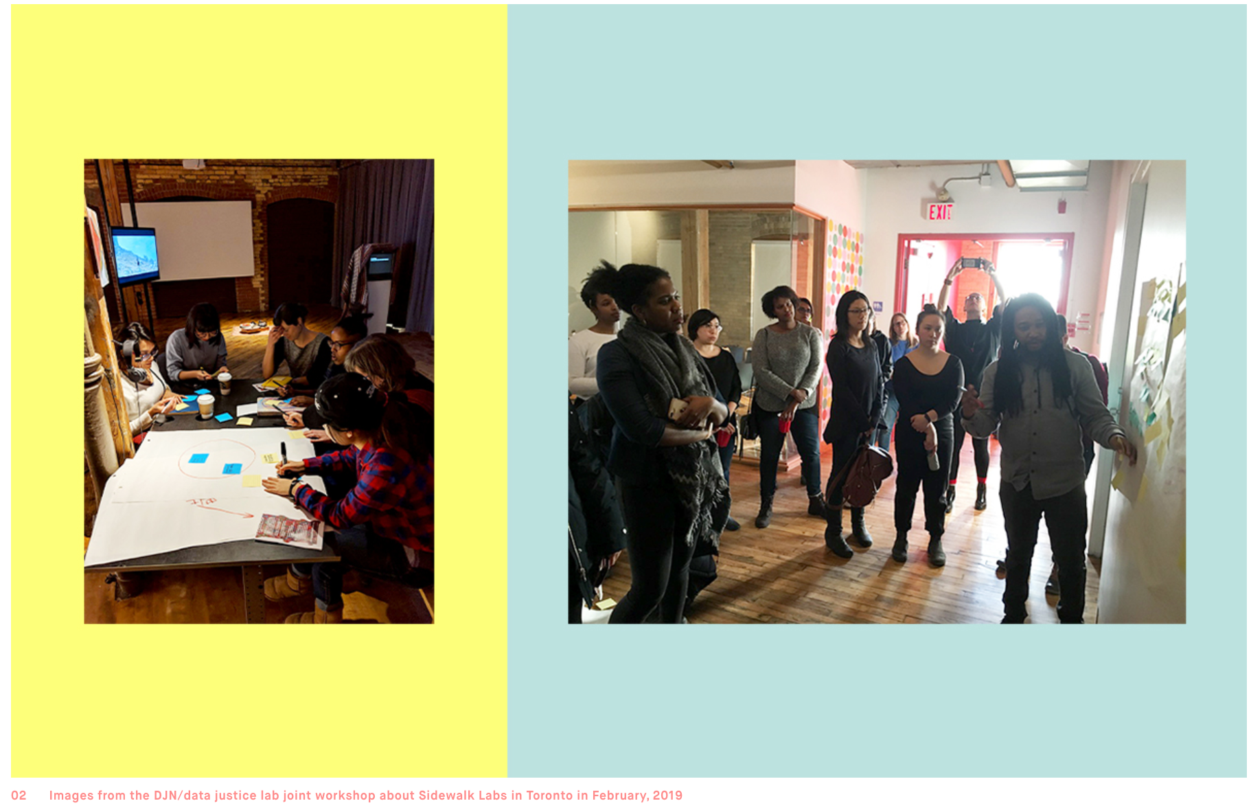
I like how DIN was set up to create a community to help address the challenges it's community faces whilst also helping empower one another. For my project I like the idea of doing something community based and feel this is a great example. Not exactly sure how I will end up doing that but I am in the process of working that out and this article has helped that!
https://eyeondesign.aiga.org/for-design-to-truly-be-a-tool-for-liberation-were-going-to-need-more-than-just-good-intentions/
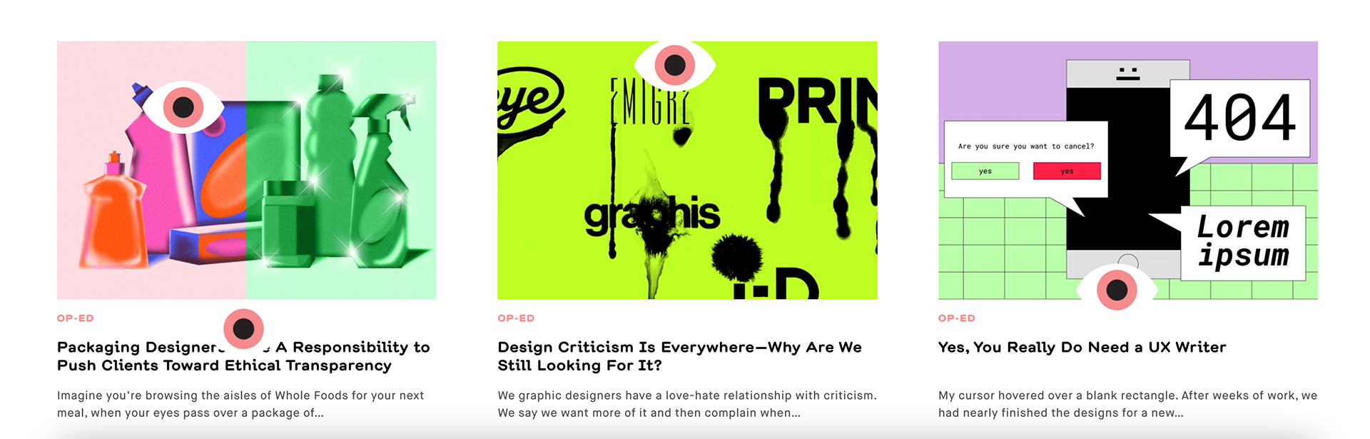
Gave this a quick skim read it's interesting to see the perspective of how design criticism can be seen and interpreted by different people but I guess that could be said for other fields, however they do make a note on the fact graphic design is in fact everywhere whether you notice it or not so I guess finding the right ways to approach it could make life a little easier.
https://eyeondesign.aiga.org/design-criticism-is-everywhere-why-are-we-still-looking-for-it/
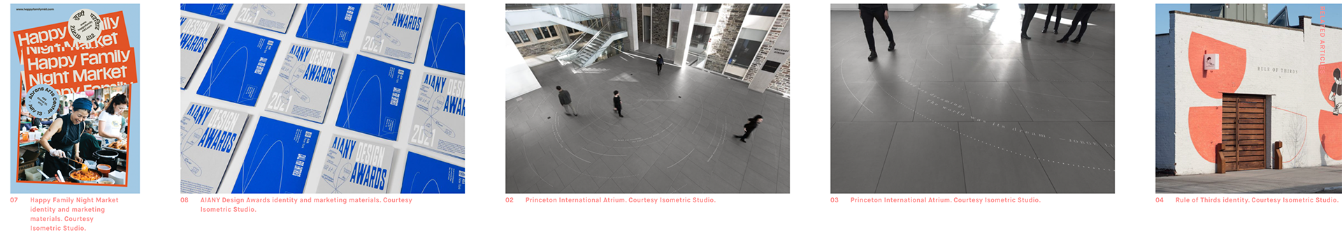
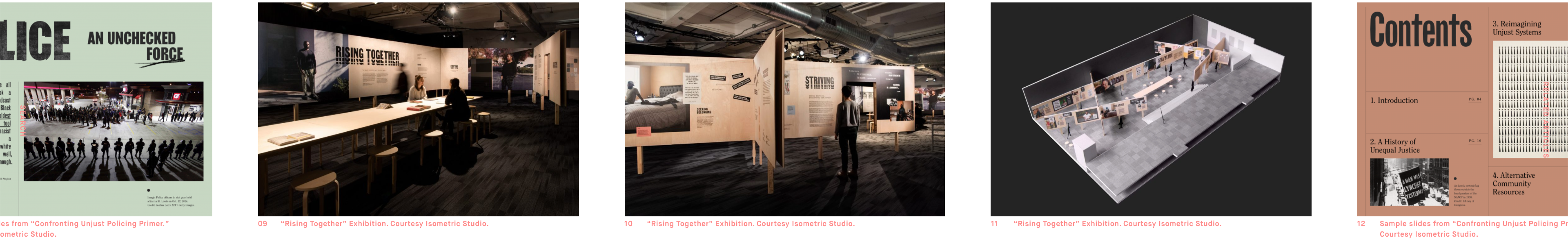

Design for change is so important and it's so great to hear about the things isometric have been doing for years especially when it wasn't always the popular outlook in the design industry. Whilst things are getting better from an ethics and environmental point of view it's still important to remember that this isn't just a trend that some companies seem to be hoping on. It's clear from the way they work they actually care, I've seen a few companies who say they care but it's clear they are just trying to tick the boxes of that sustainability/ethics bracket.
https://eyeondesign.aiga.org/isometric-studio-is-rethinking-what-it-means-to-design-for-social-good/

I think this article highlights a role more designers and studios should take more responsibility on. Often designers might be seen as a tool and just people to help visualise a companies image/product etc. For my I think a designers responsibility should be to push ethical transparency as I believe no matter who you are you should try to speak up for what is right. Like they mention it's a niche market but a market that is clearly growing if you look at the trends in our society. Whilst you might get some agencies that won't work with alcohol/cigarette companies as it might not align with their views or not align with their other clients I think this approach should be taken more in to considerations with ethics on all grounds as a basis.
I've referenced this article as I believe I should be taking this into consideration with any future project (including this one).
https://eyeondesign.aiga.org/packaging-designers-have-a-responsibility-to-push-their-clients-toward-ethical-transparency/
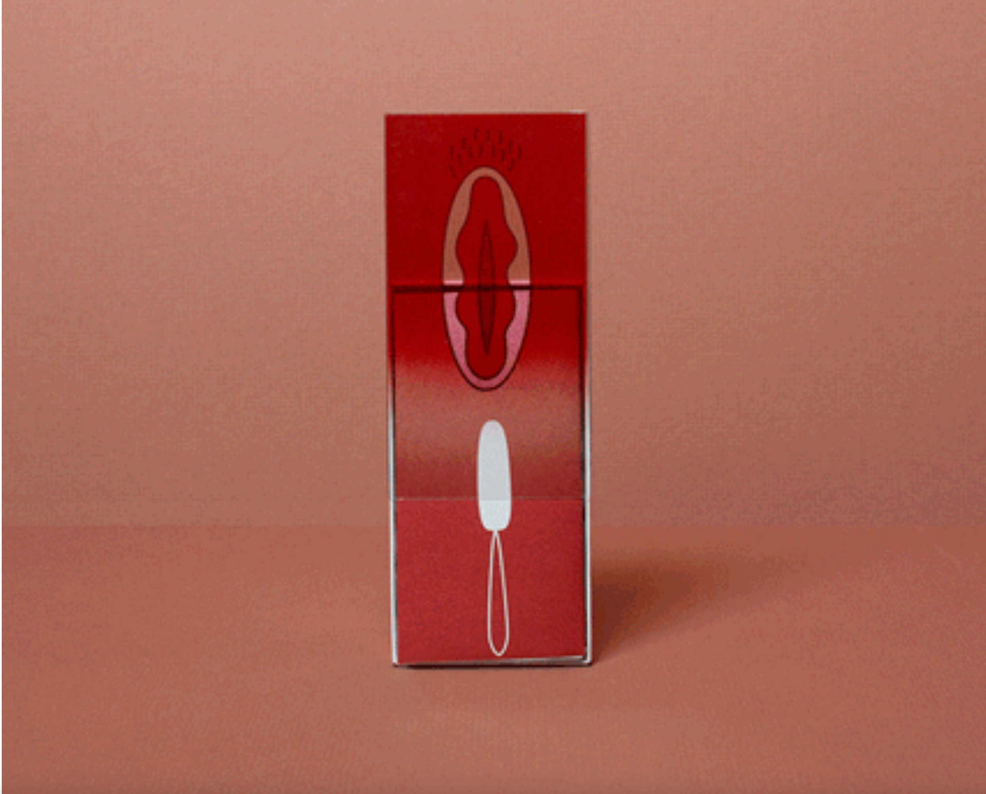
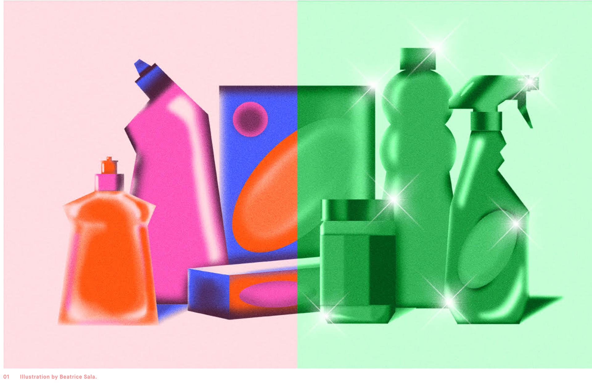
I like that this approach is being used for things like period products. I find it insulting when all i see are frills and stereotypically 'girly' things. The design is real and relatable it's telling the truth and i'd like to reference this out look if I can for the brand Identity I end up creating. Even if I don't I think the way THINXs looks as periods is what more companies need to take on; it isn't something to be ashamed of and should be embraced/celebrated and I think the way in which a company does it's graphic design can have a big impact on changing its voice.
https://eyeondesign.aiga.org/the-latest-brands-destigmatizing-periods-with-engaging-design/
varied example of idents in the 3D computer generated medium which I think work well but are also easily overused and little outdated stylistically but I think there is more that can be down within CG software.
Useful video I watched a couple years ago - I like his organic approach and just how simple it can be and that you don't need to over complicate designing a logo and as long as you understand why you're doing what you're doing and have a set meaning for how it works then it's pretty solid.
cute idents - personal and relatble bit of an issue with the last one as trying to help but the uk gov don't do that
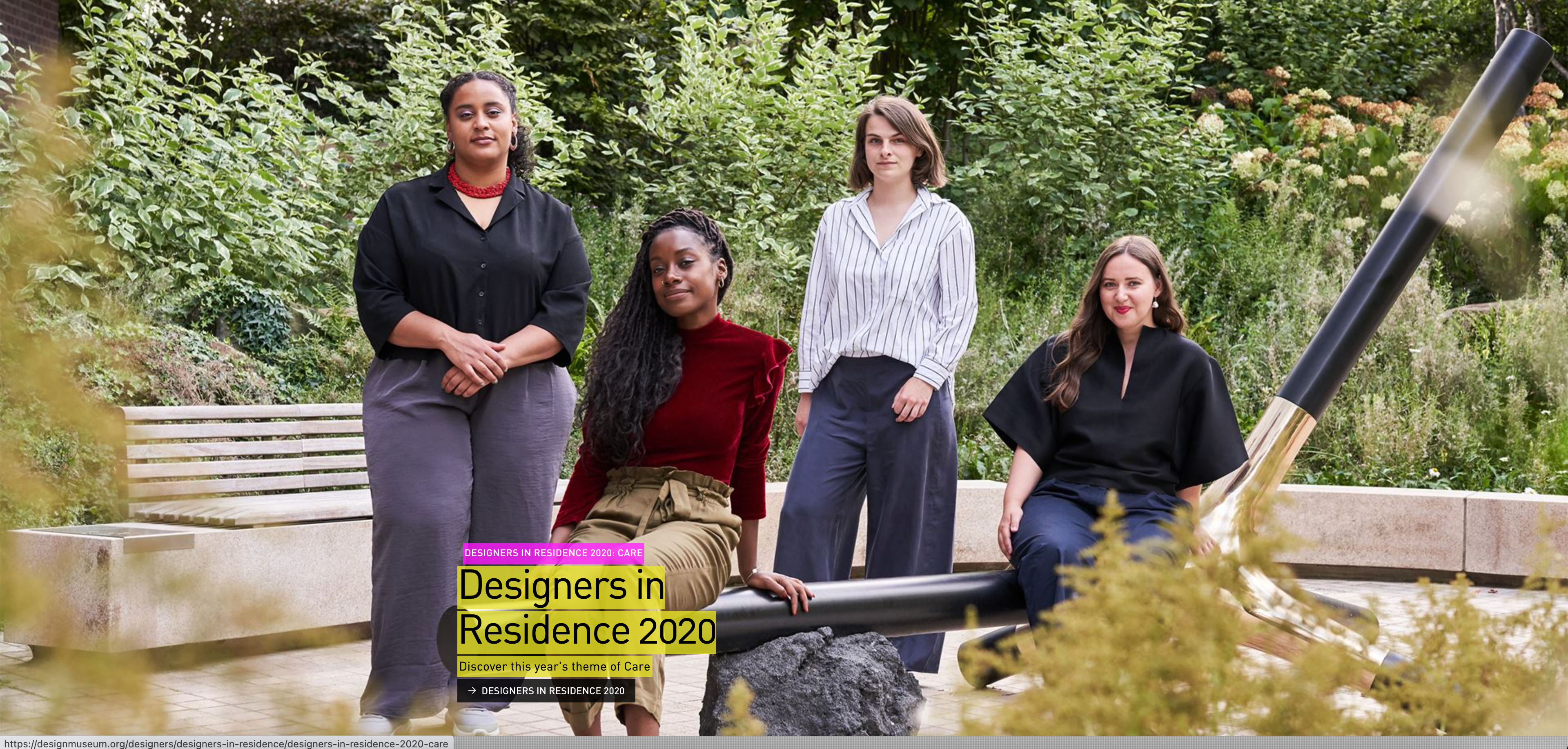
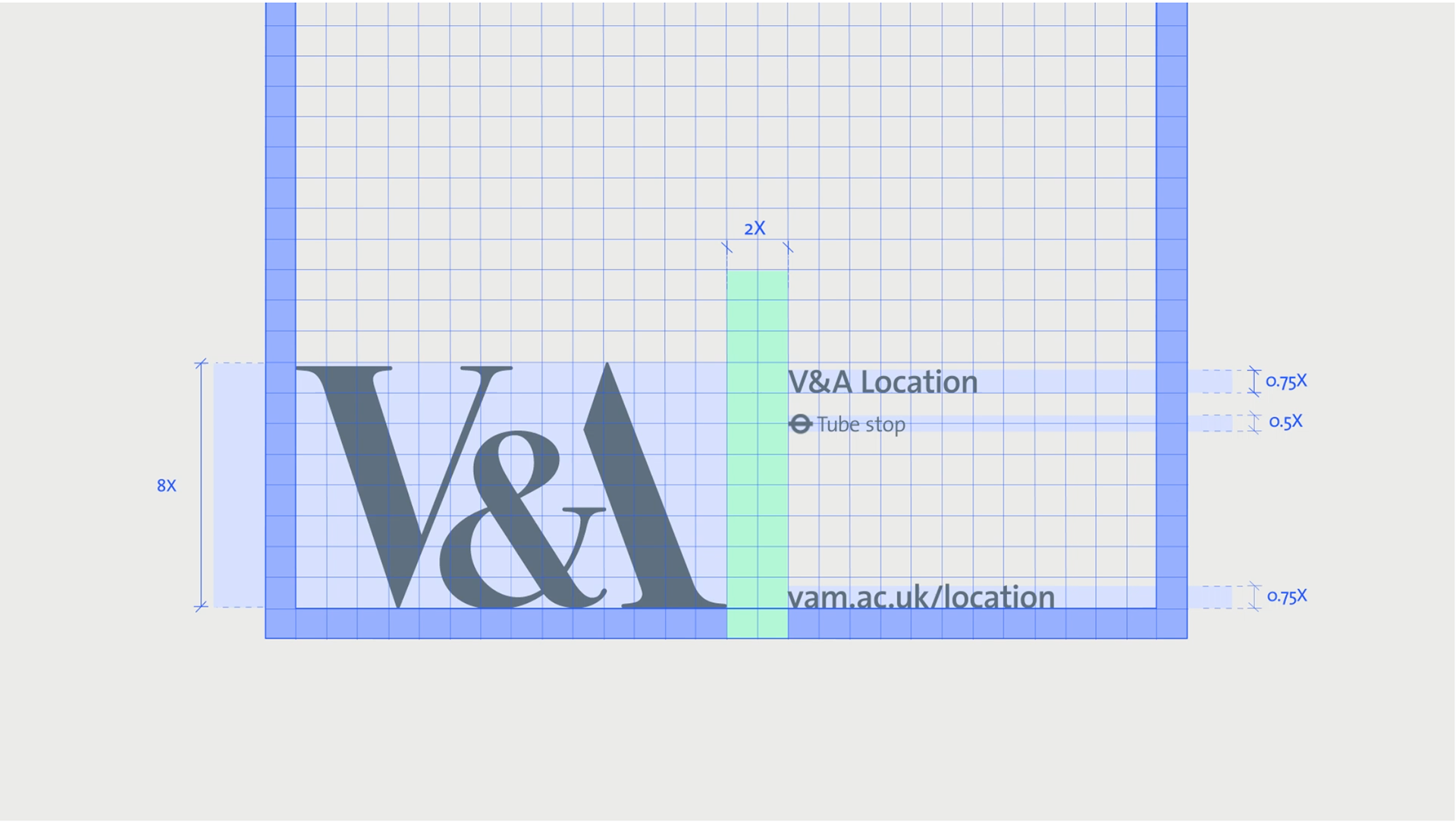
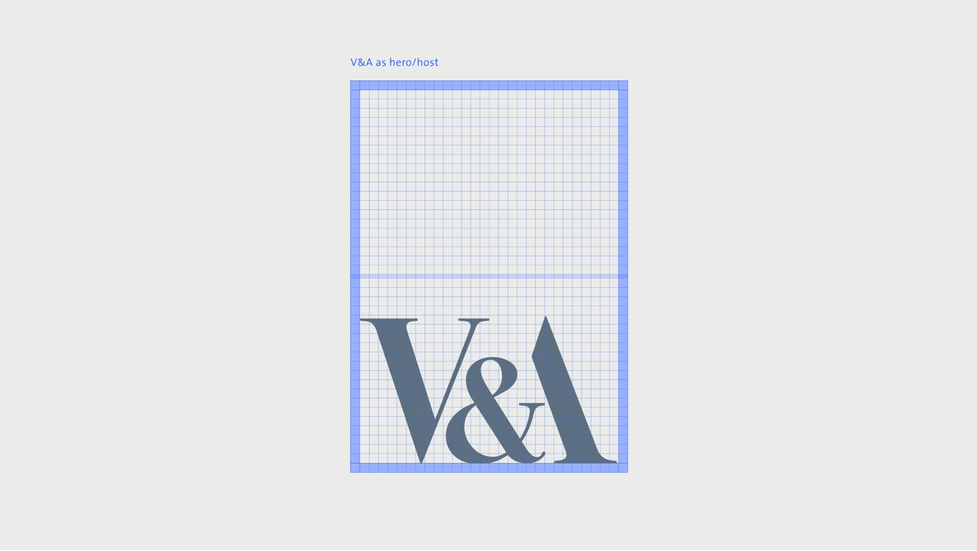
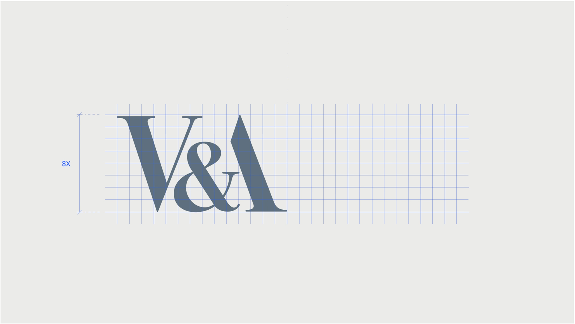
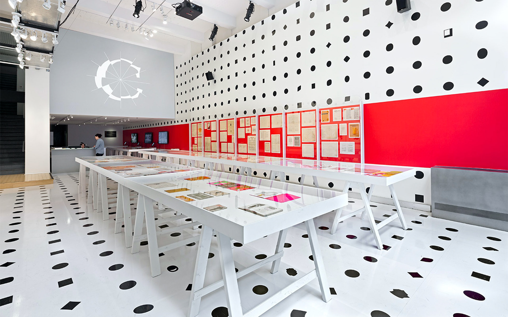
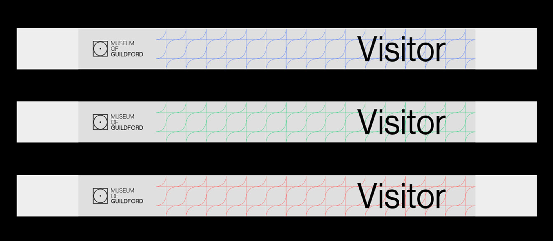
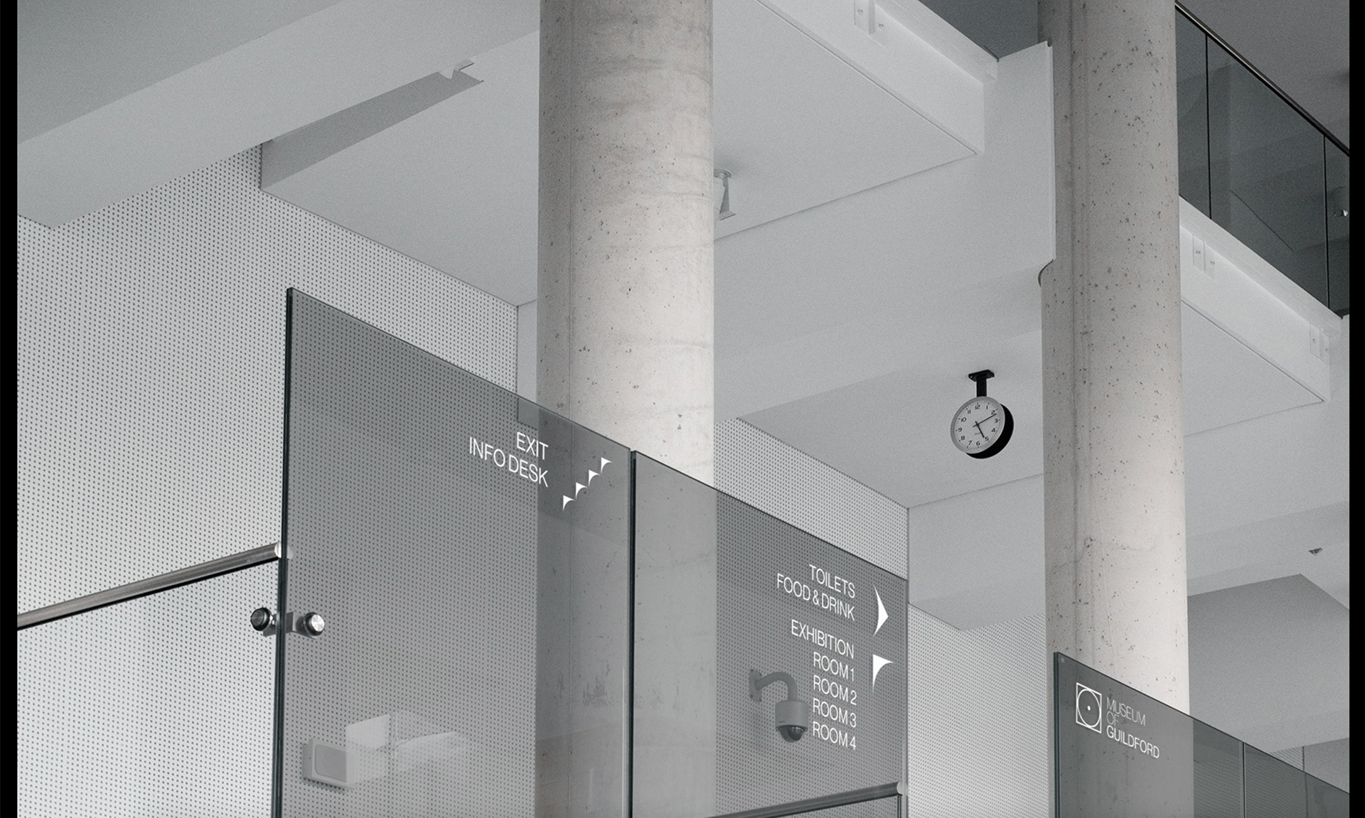
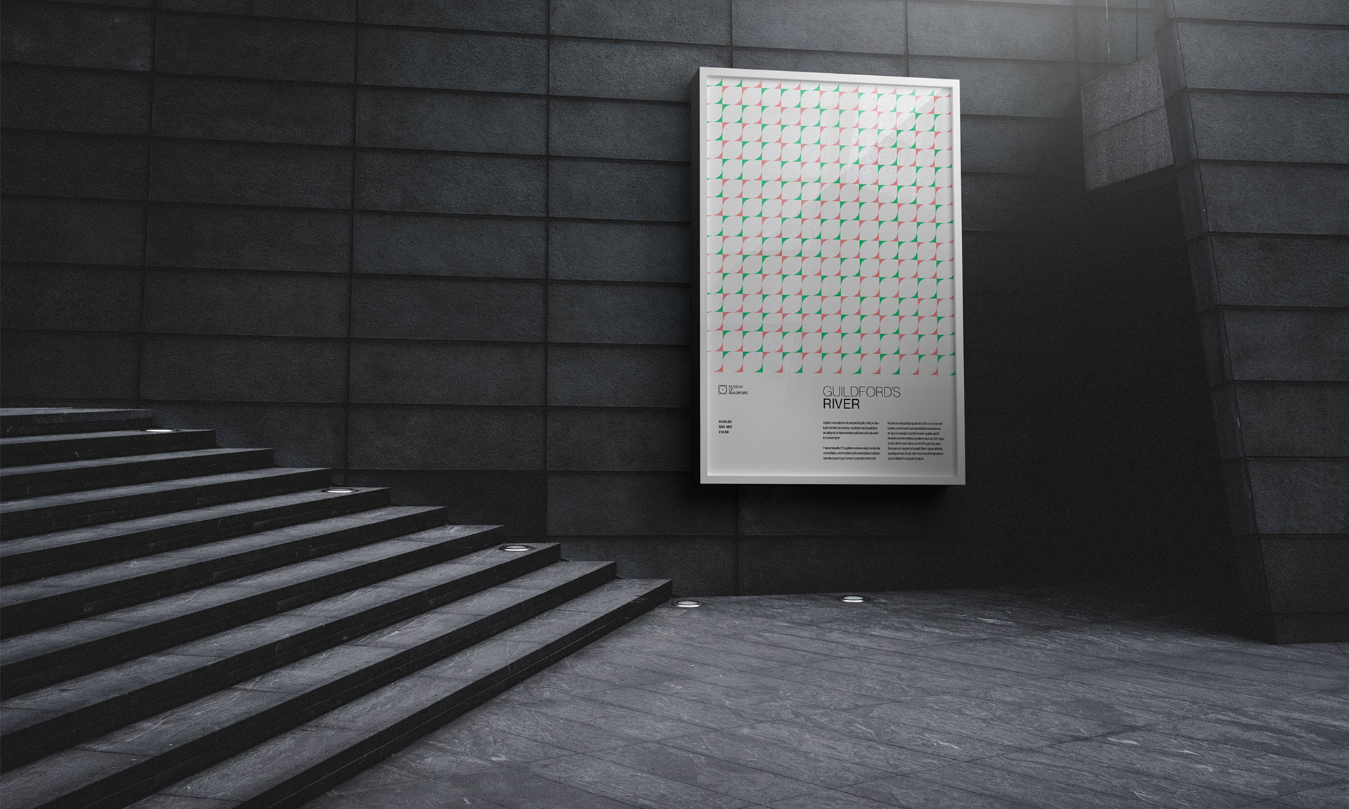
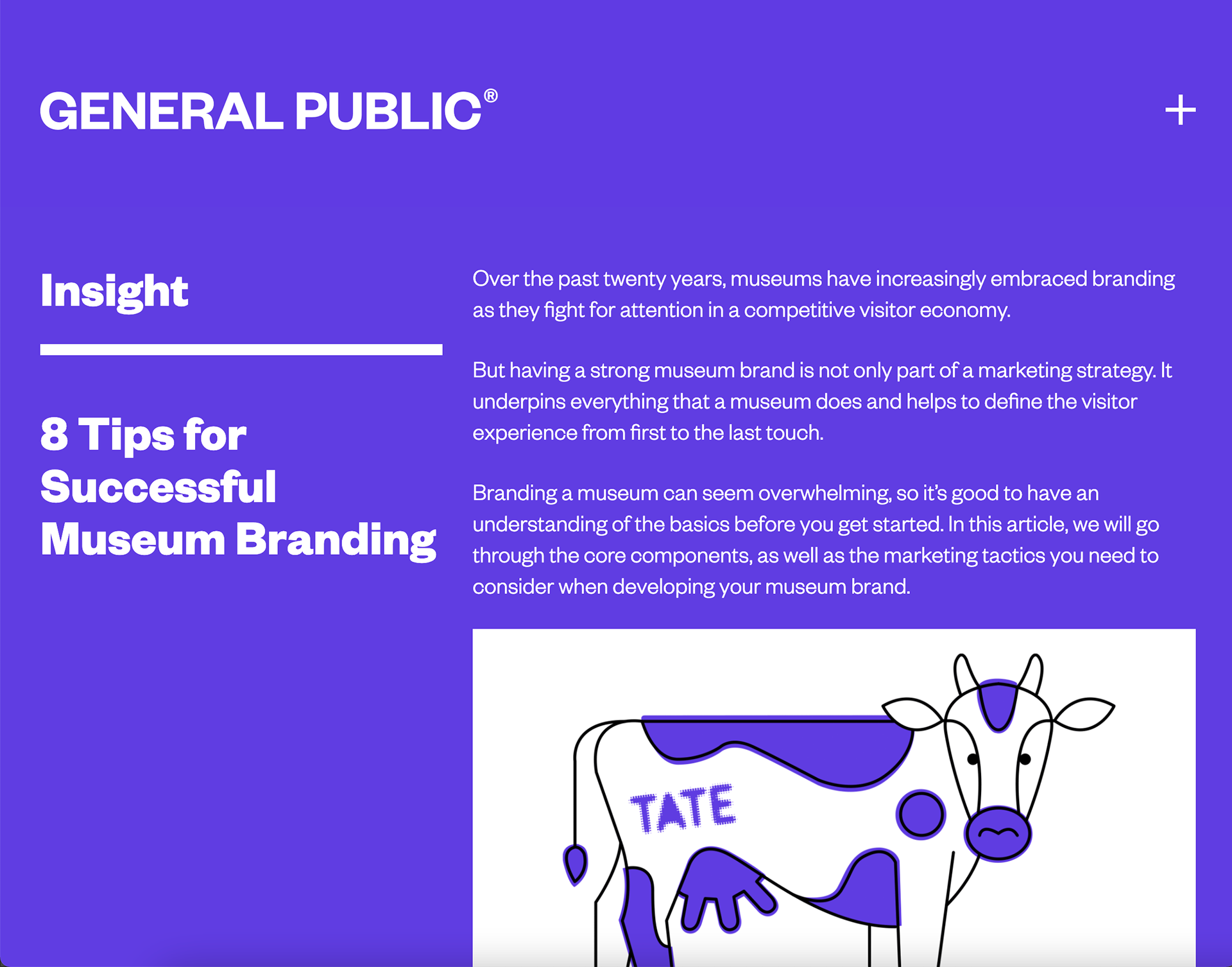
It's nice to see the process of designing an identity for a museum as it's something I am considering.
I like what they are saying about signs and how it has to links to everything eventually and how with corporate design each element must be part of the overall idea.
It's clear what they have come up with have all be thought through and works well together.
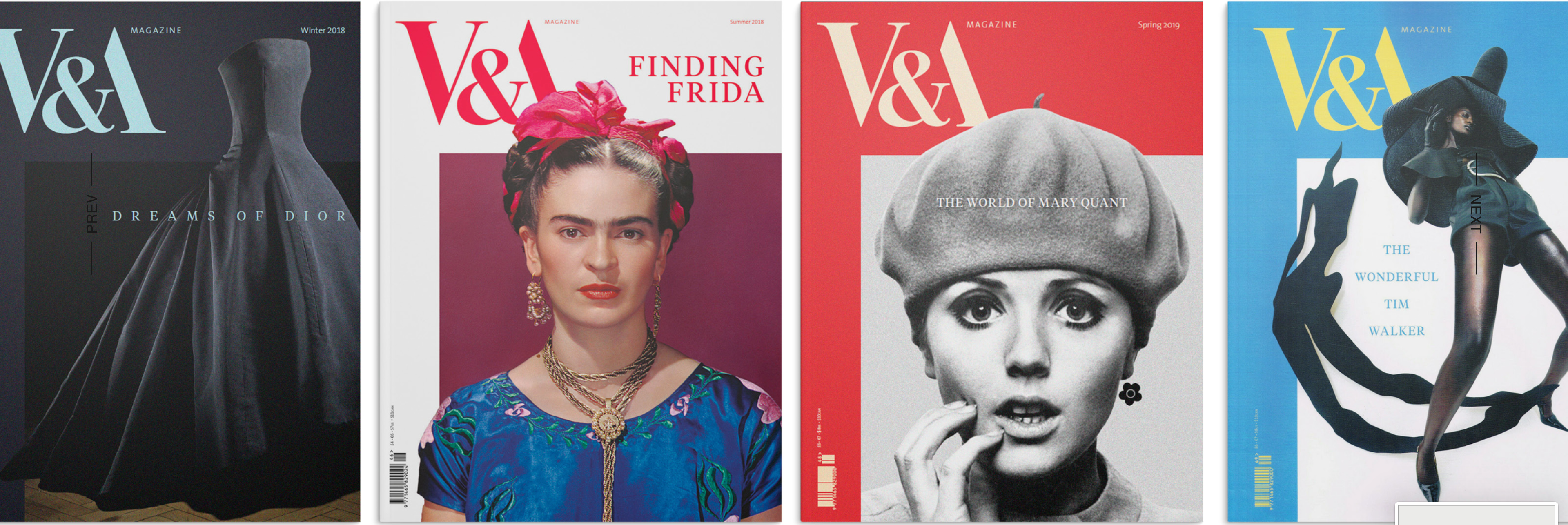
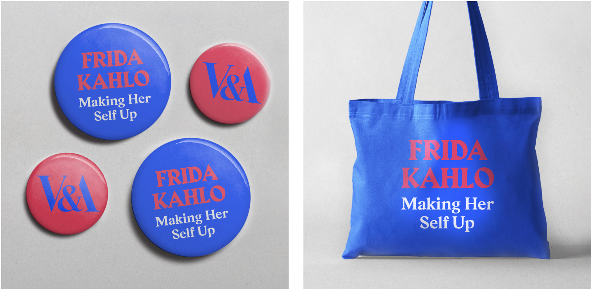
Wow I love these so much. The shapes/patterns so much they are so simple but look really good. Also the colours chosen go so well together.
The way in wish the posters are versatile and scale up or down depending on the need is so clever and that there's clearly a set identity to it all - they have thought of everything so even when a picture or bigger title needs to fit in it has all clearly been planned.
I don't love the design but I do think the way they've created it and it's friendliness and attablity are a nice touch. I like how each person has their own version of the logo even in it's own colours to give it personality. The way in which it is animated also works well and has a concise style and professionalism to it which I think does a perfect job of speaking on because of the company just that it isn't my particular style as it seems a little 2000s and dated.
AI is definitely a more expanding thing that is getting spoken about more and more. I've been to events where they try to encourage it and it cool to see how Matt Pyke created the interactive installation.
I think this sort of approach is a lot more enjoyable and human centered than if it had been written out - I will think about this when coming up with my ideas it's clear to see that seeing that blob will make you a lot more inquisitive and interested in the topic than if it were just a basic picture or audio or even a video/animation. You yourself are part of the explanation and I think that's a great piece of design.
I like how he puts branding - yes it's these things that we all know about but him talking about the complexities of branding and how things which are clever and executed. Different cultures have different work paces, styles, processes and it's interesting to consider how different places will look at a brand depending where you are.
I watched abstract when it first came out and just remember feeling so excited about the possibilities of the future. I'd only ever seen male 'big cheese' graphic designers and always felt a little deflated seeing so many men being associated with high design. The work she has done is so cool and varied and has definitely been one of my inspirations. Was also very lucky to see her talk twice last year!
I love this idea - it's great to think outside the box and it's exactly what these guys are doing. It's such a shame that all the water is going to waste in nyc - so this smart and relatively simple idea with the drive they have to see it happen is a great and can hopefully show that determination is key.
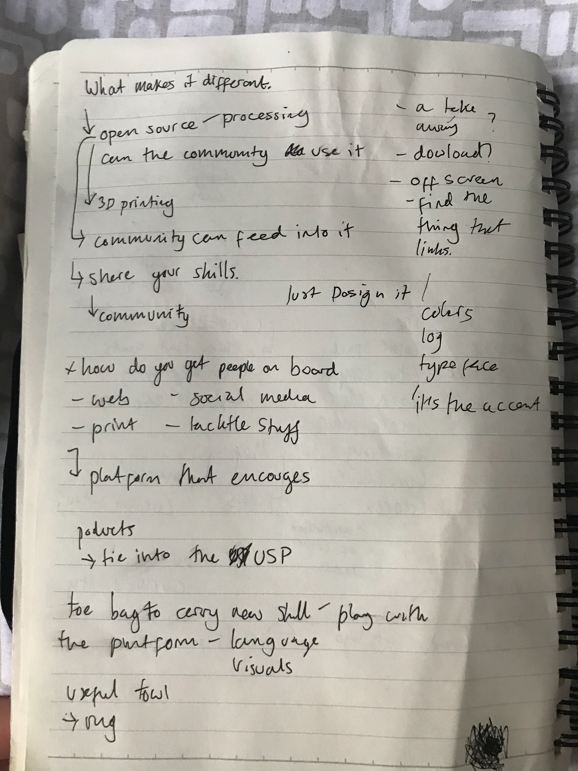
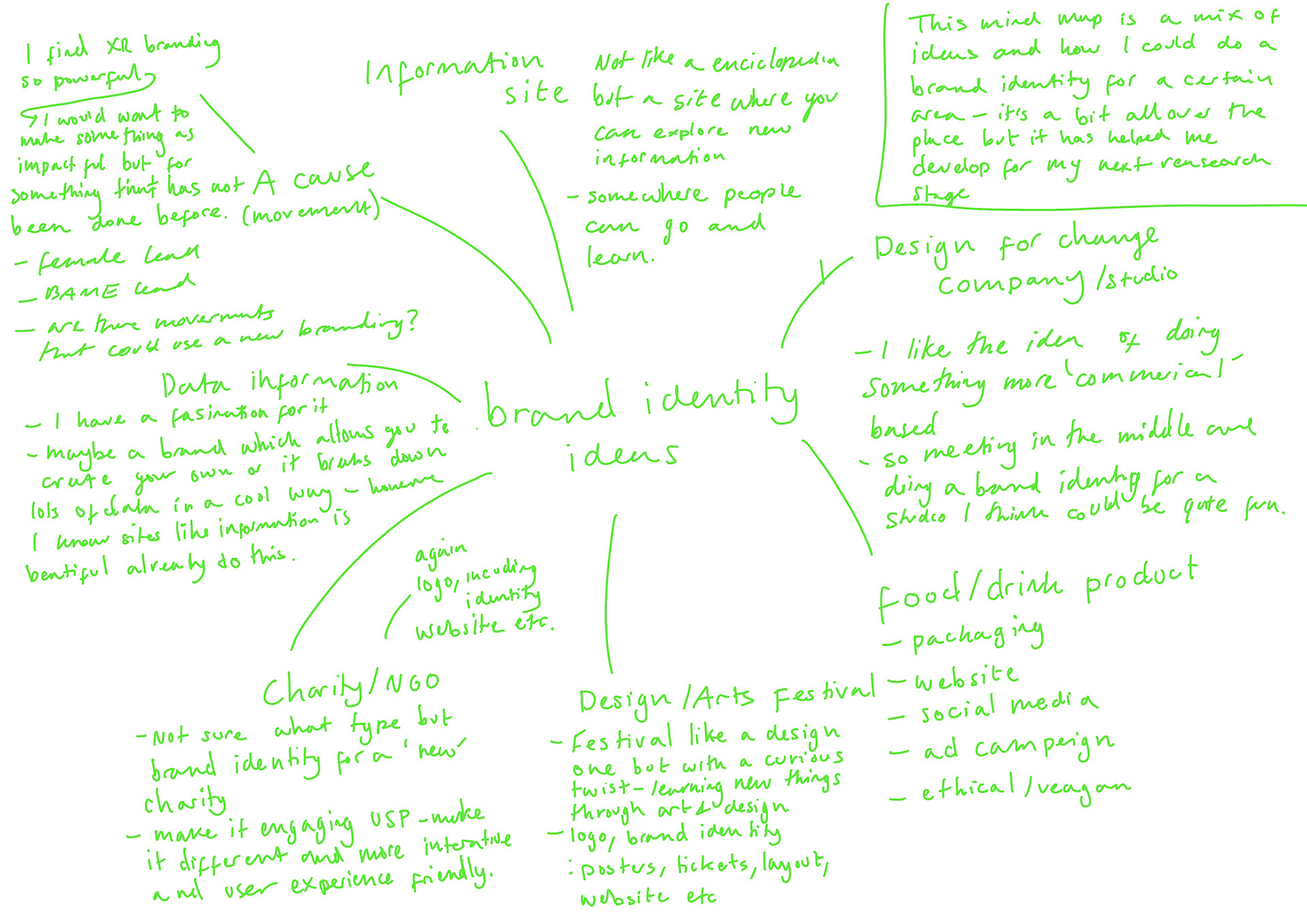
MAIN GOAL WITH THIS AND IT'S LINK TO CURIOSITY
I fell a little behind as I had my previous deadline - what I did do was develop some ideas further which i've written about above and some further thoughts. After some feedback from Fern and Will I'm going to go back and research more brands and identities as well as exploring existing brands/things that link to my current ideas - nothing however is set in stone and I am hoping to find and develop some stronger and more put together ideas once I research some more.
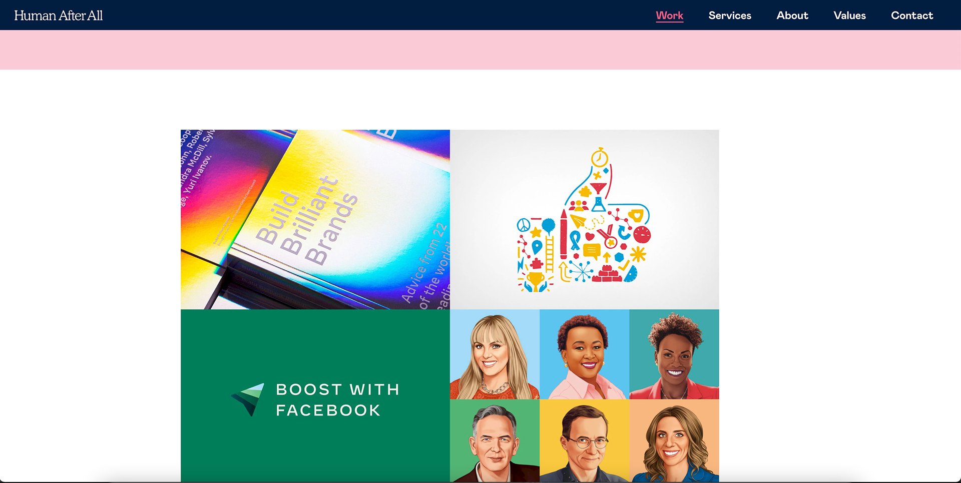
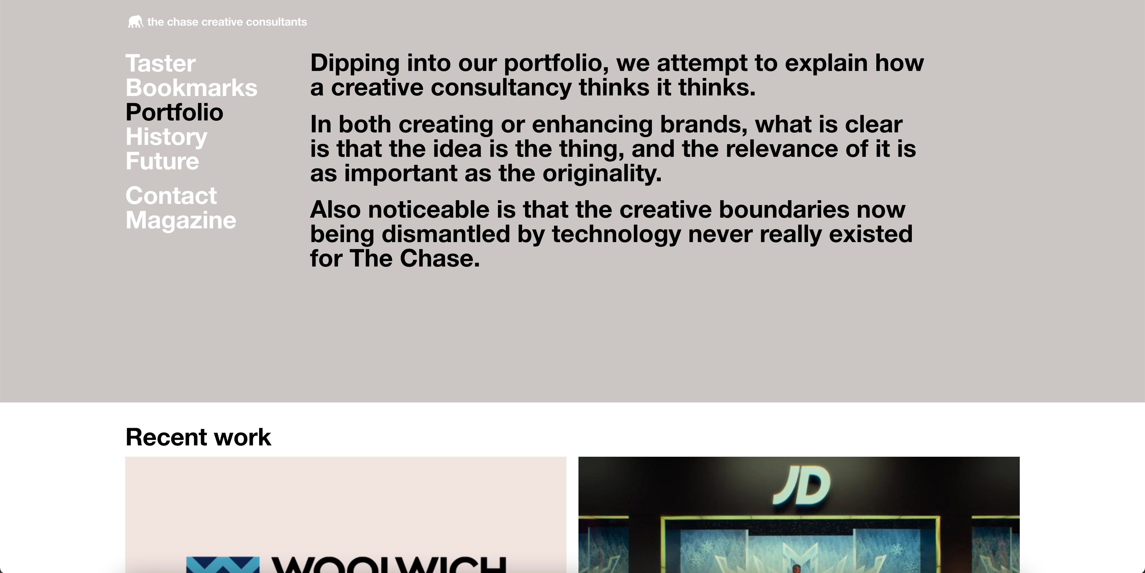
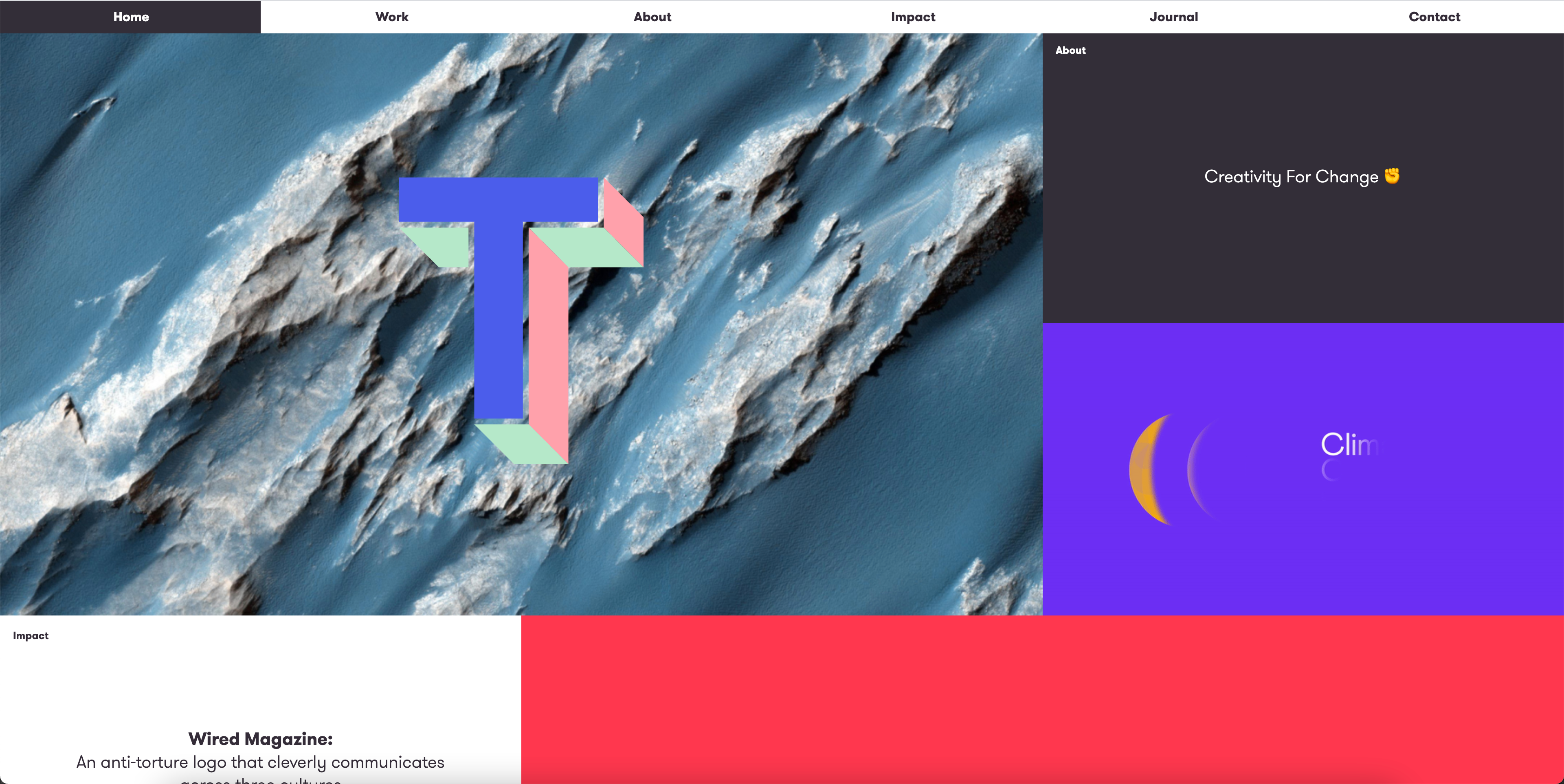
I had a quick look on Human After All, The Chase, Templo and Eye on Design.
Eye on design especially gave me ideas for the ideas I have above. As I go on to mention I didn't spend too long on these so they were quick browses.
(on the right)
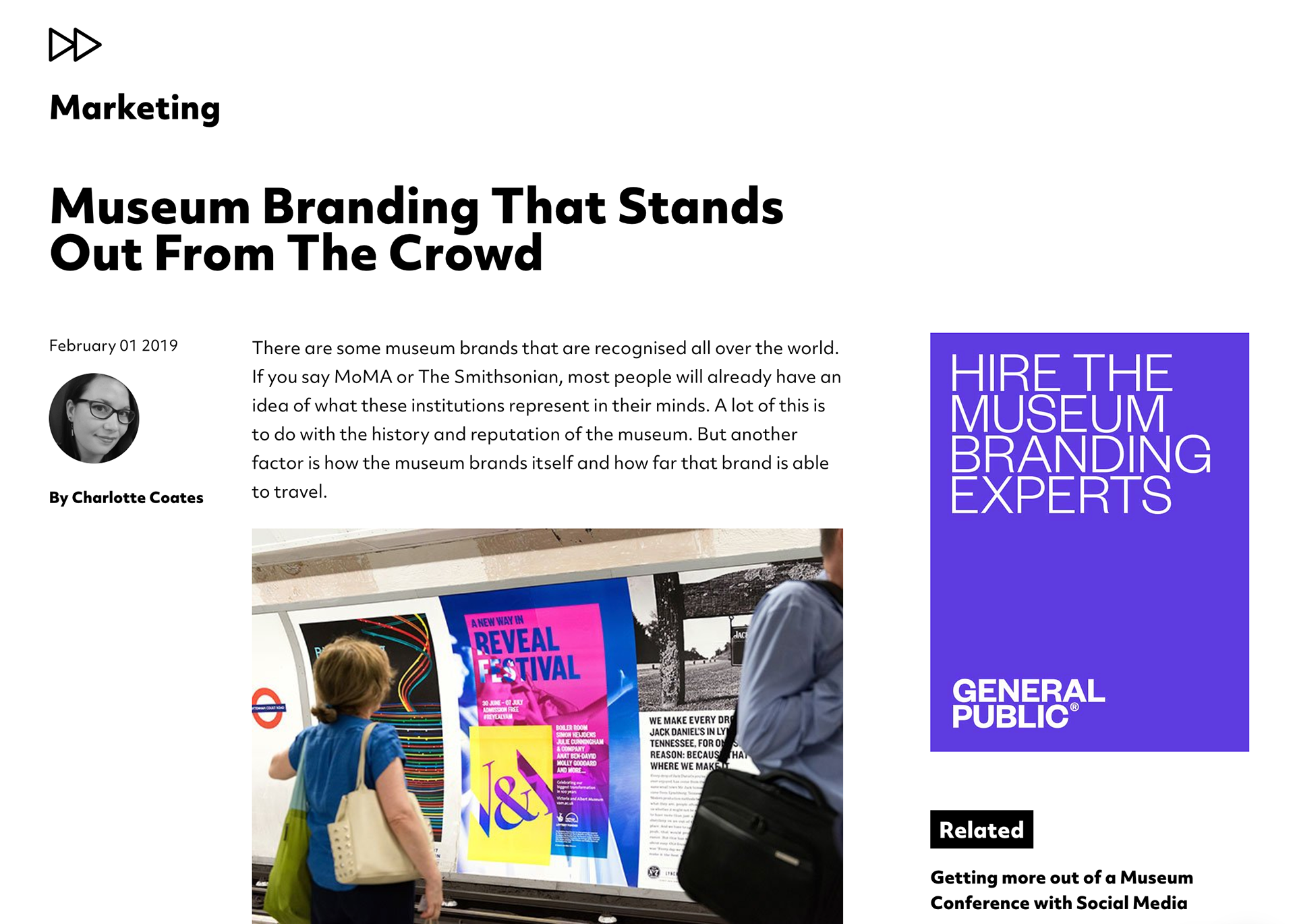
I also looked at some branding on behance, and a website which explained good museum identities but again didn't look too much into it.
https://generalpublic.co.uk/thinking/tips-for-successful-museum-branding/
https://www.museumnext.com/article/museum-branding-that-stands-out-from-the-crowd/
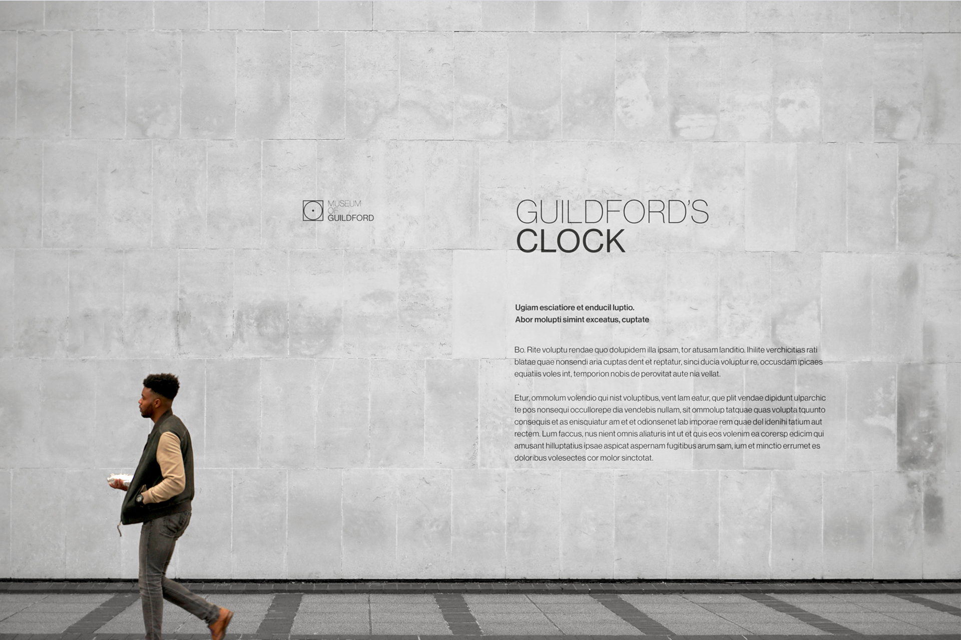
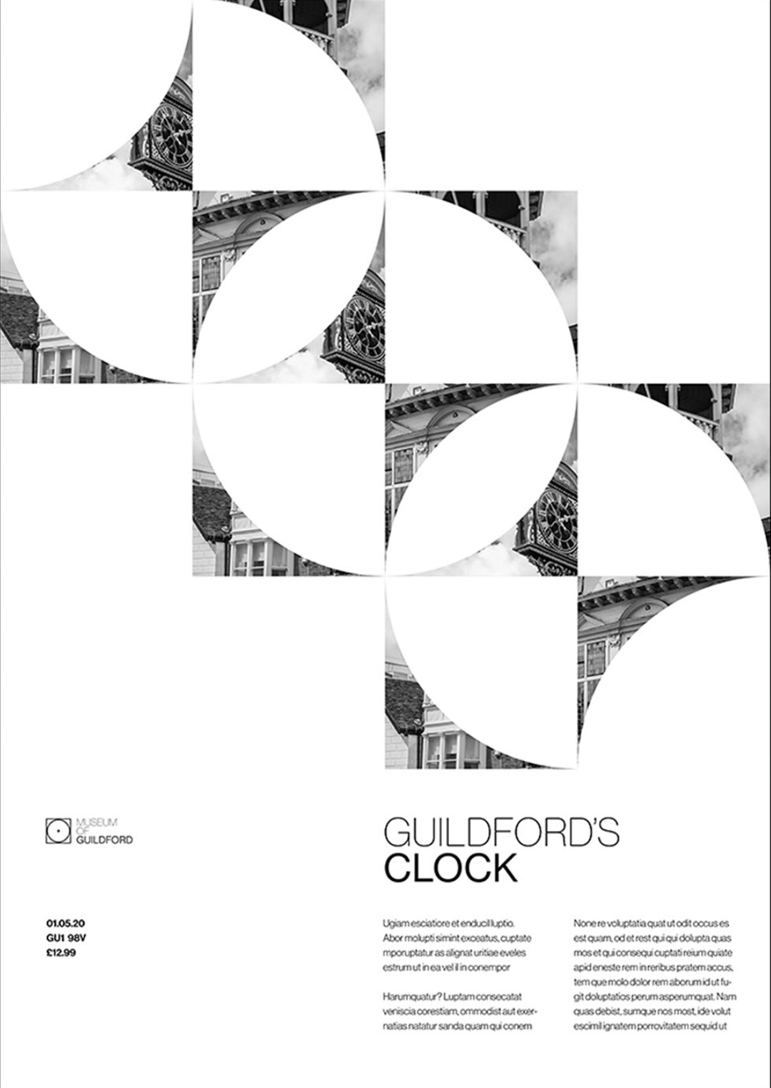
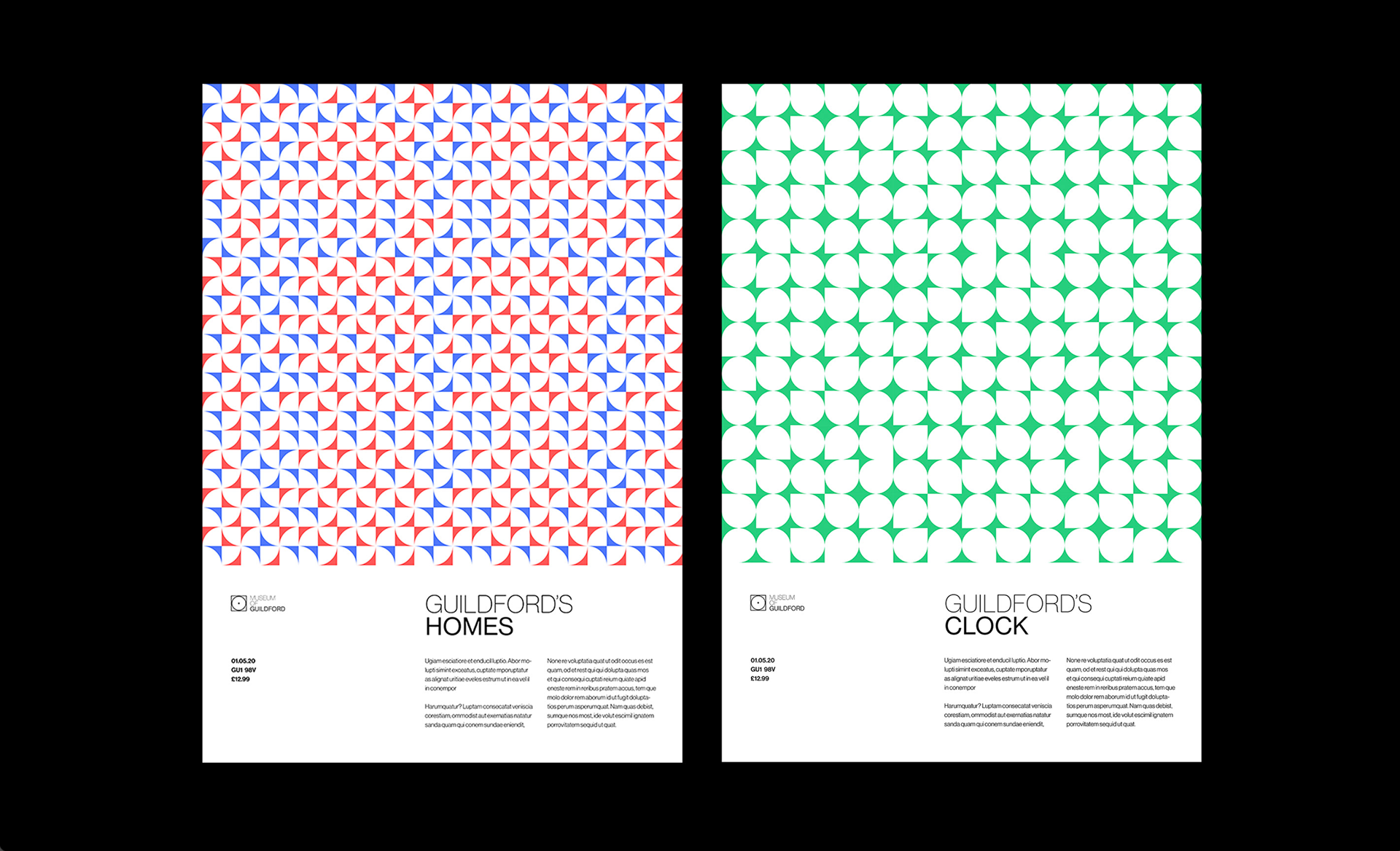
https://www.behance.net/gallery/95745453/Museum-of-Guildford?tracking_source=search_projects_recommended%7Cmuseum%20branding

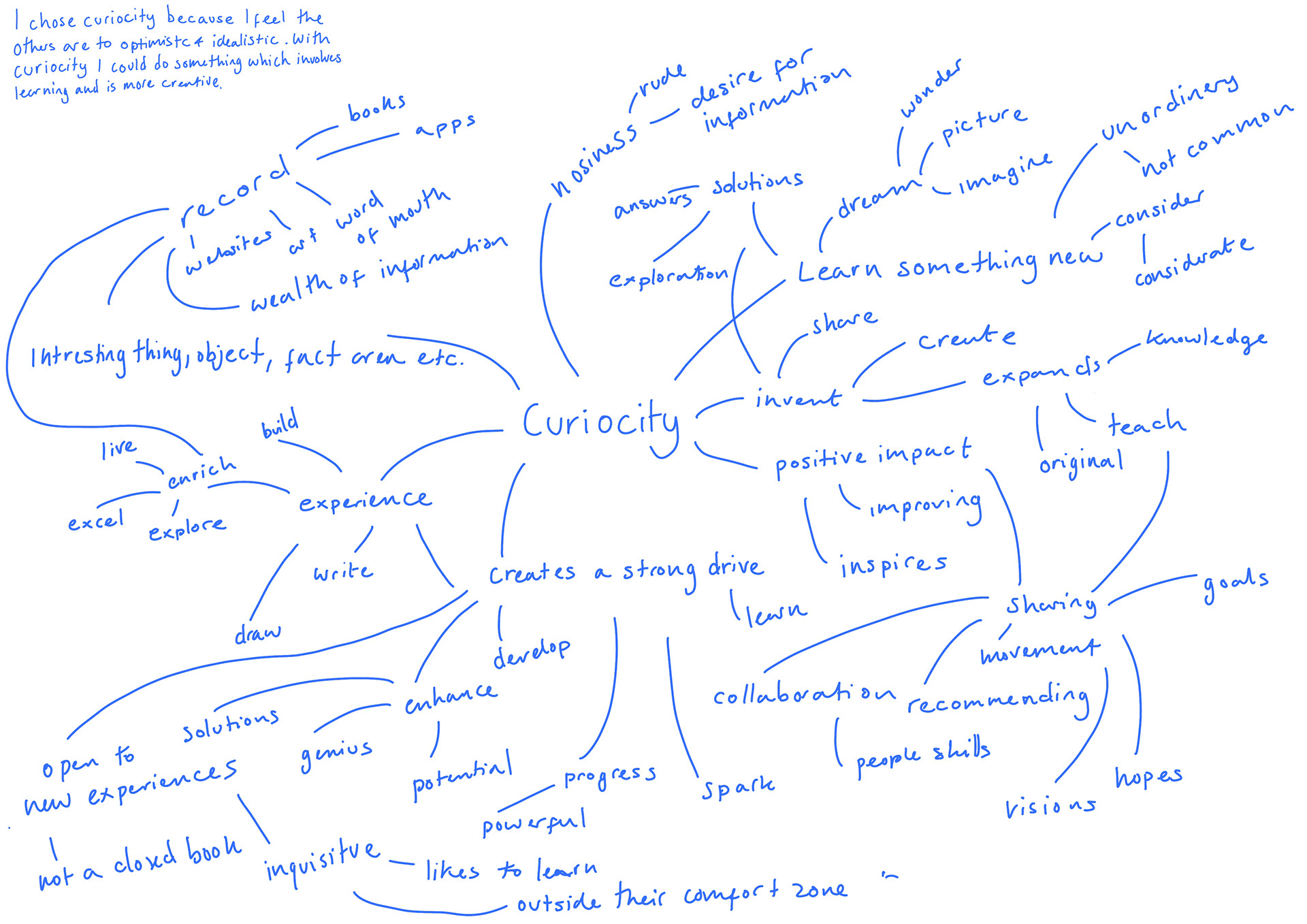
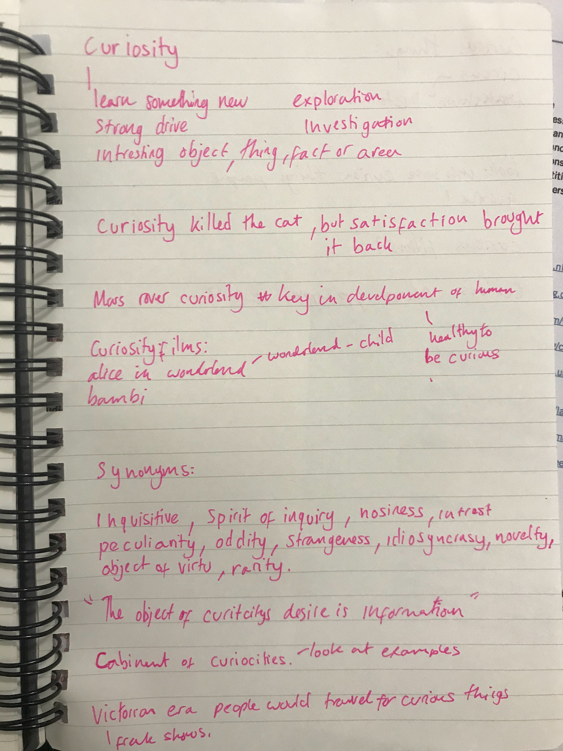
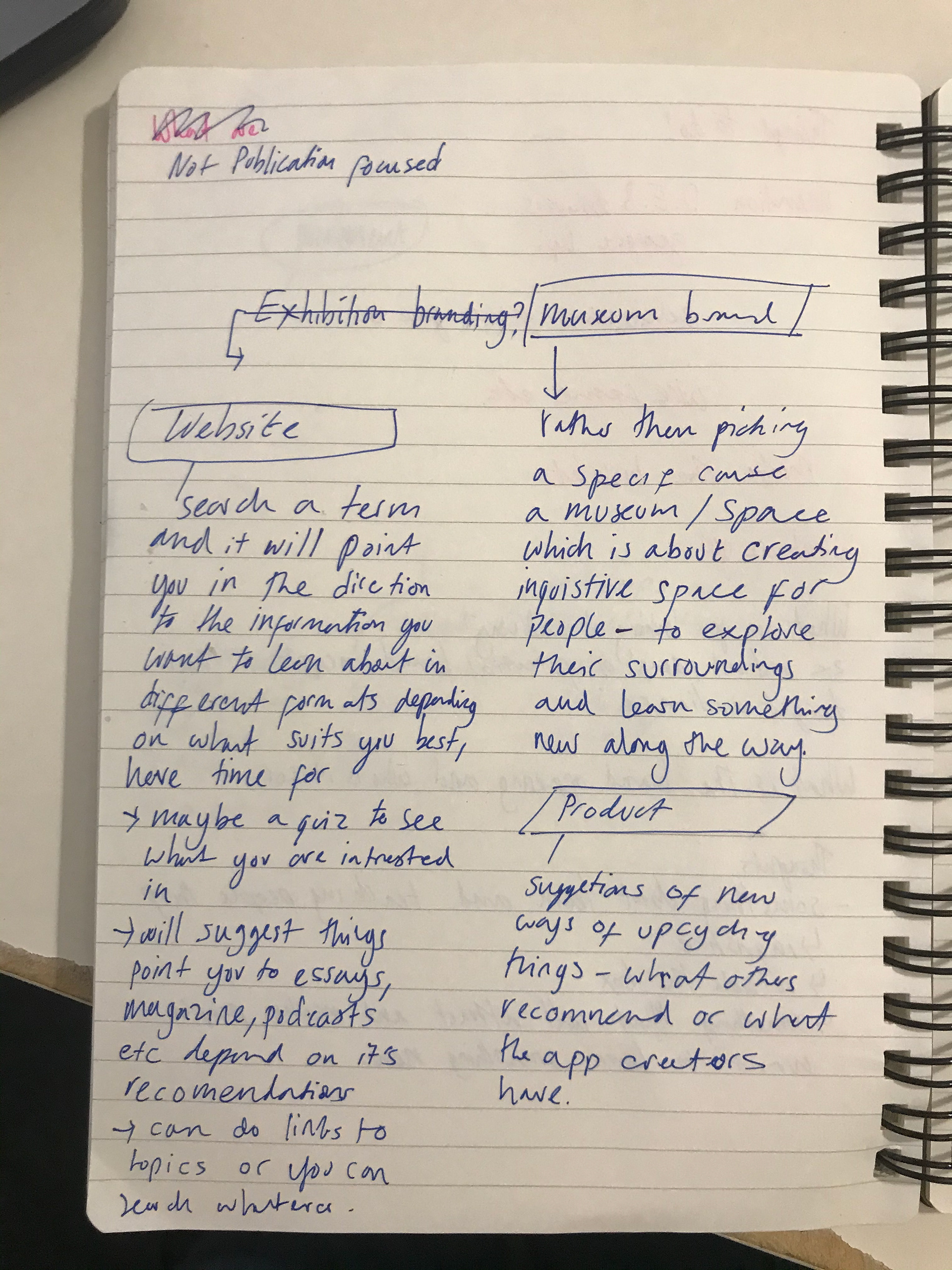
Tutor session we went of in breakout rooms and talked about the different route curiosity could go down these are some of the things we came up with
In our first tutor session we went through the brief by breaking it down and understanding what each bit meant.