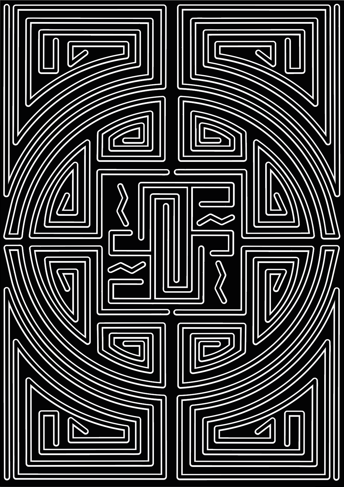
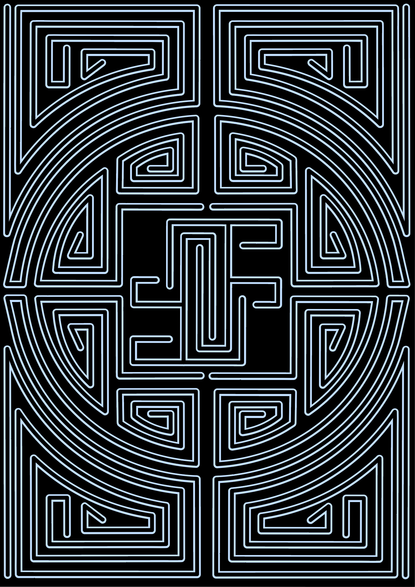
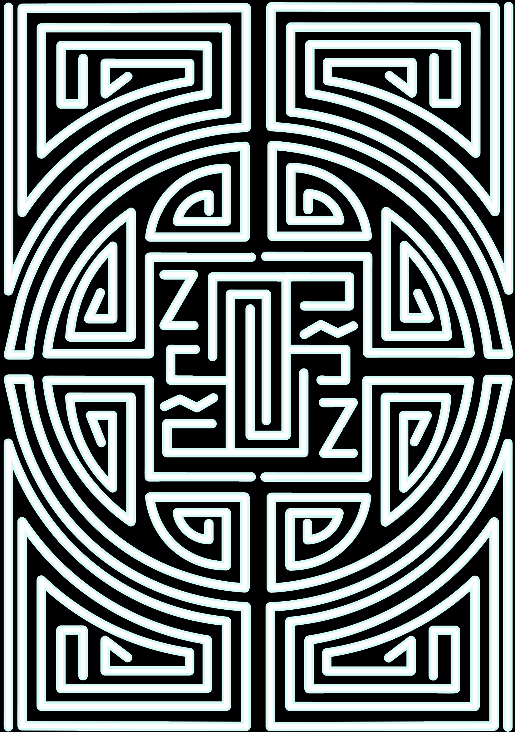
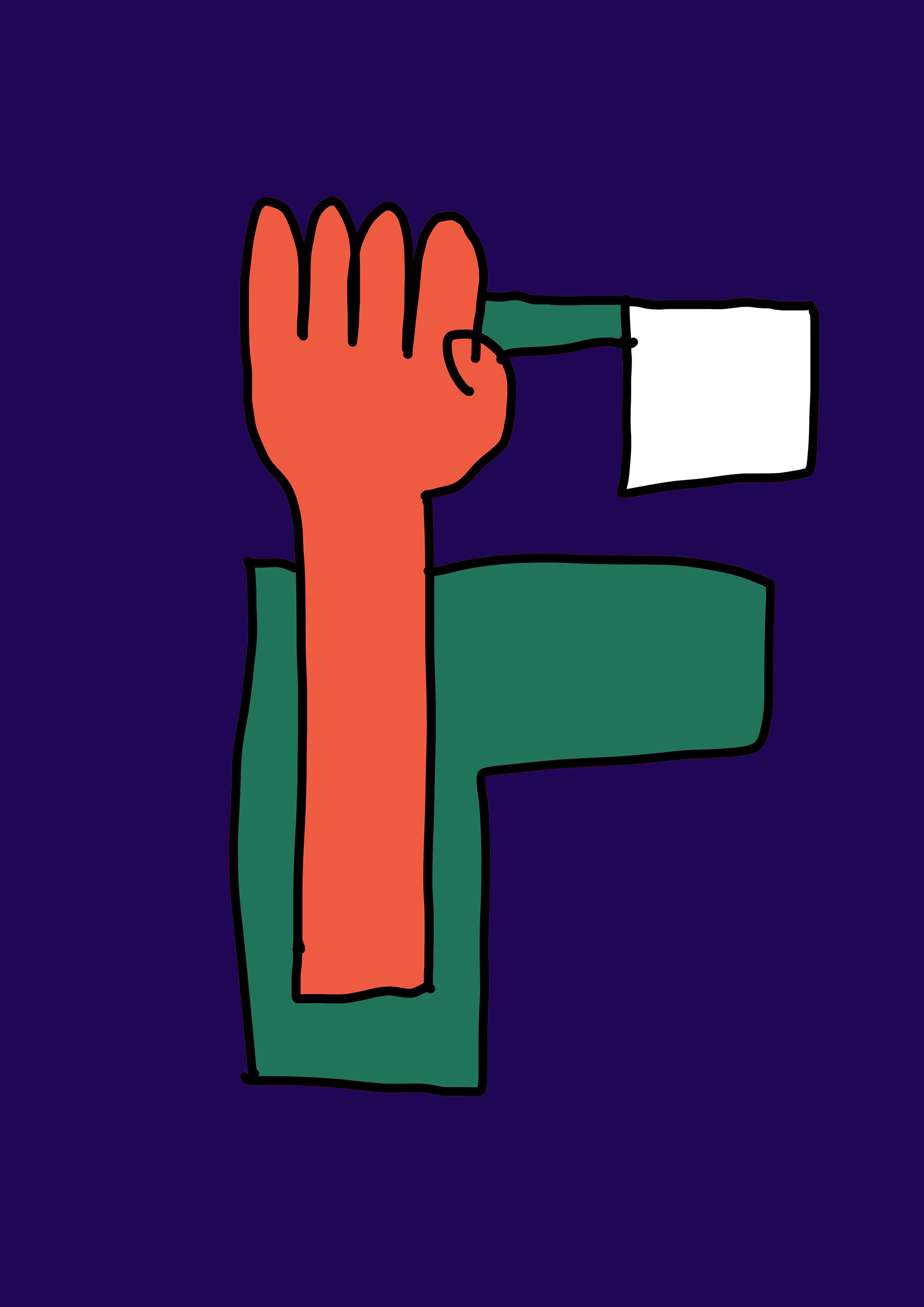
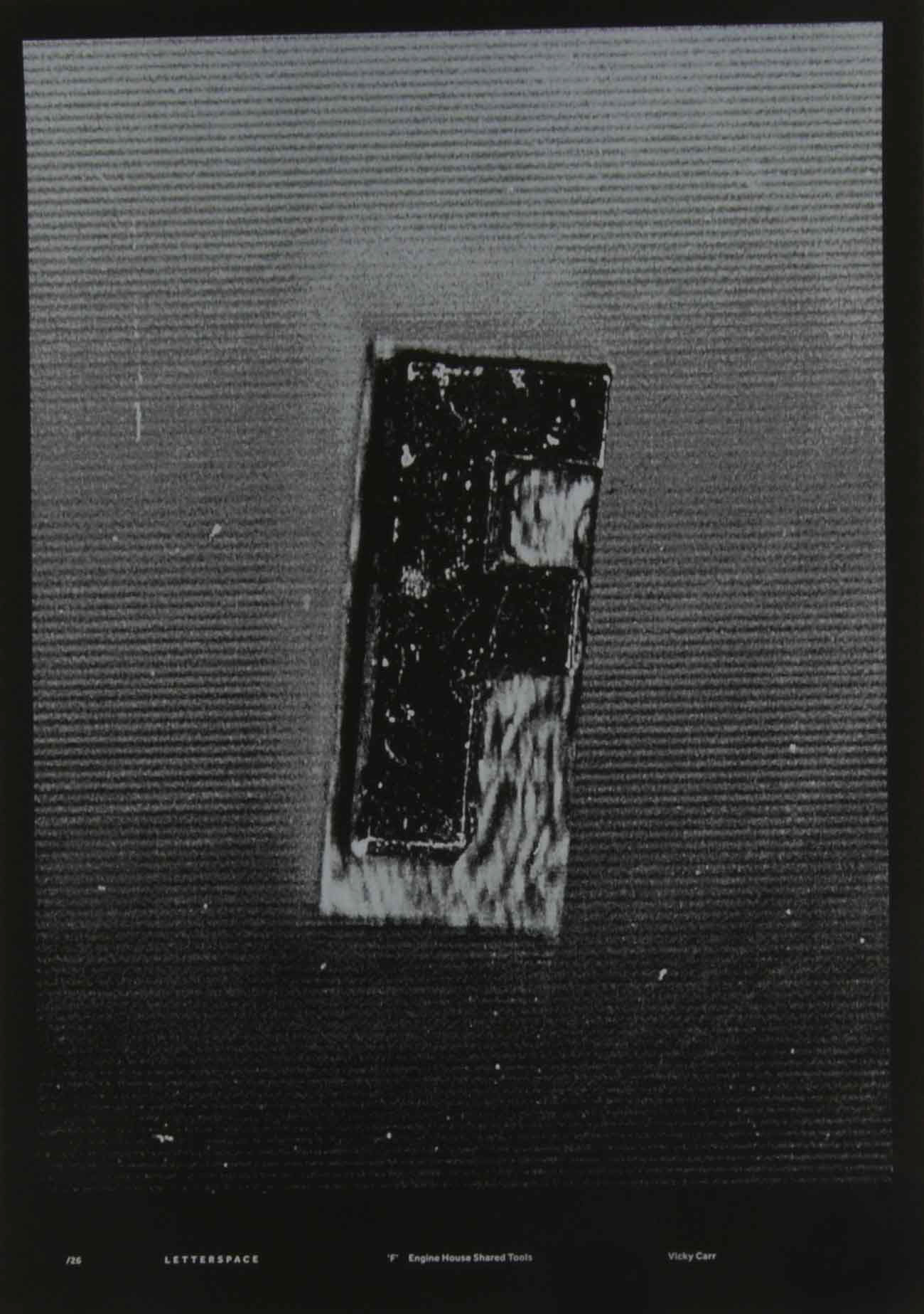
The feedback as a whole was good and was happy to get a couple stars from people, but people did struggle to identify the F as I suspected. Below are some amendments based on the feedback.
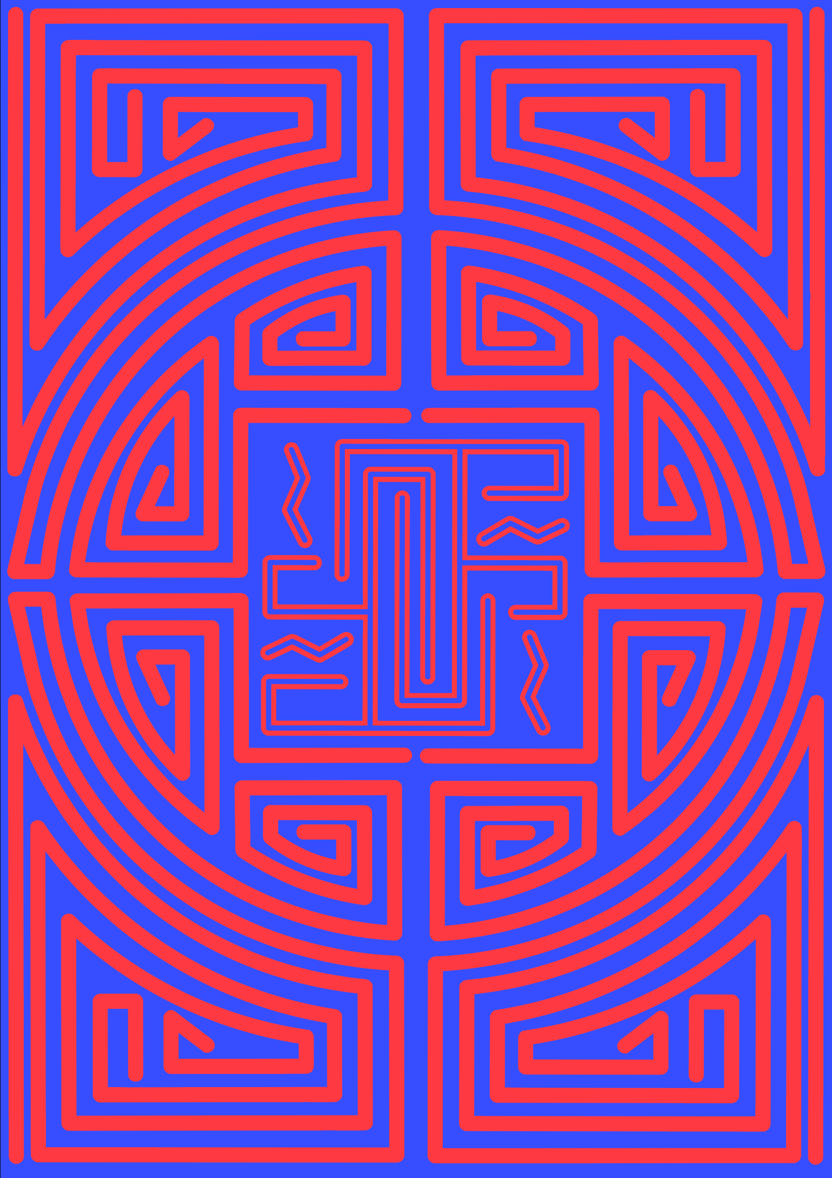
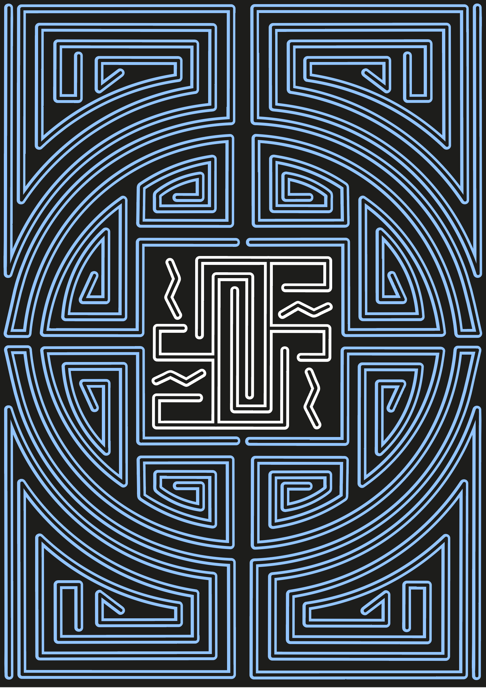
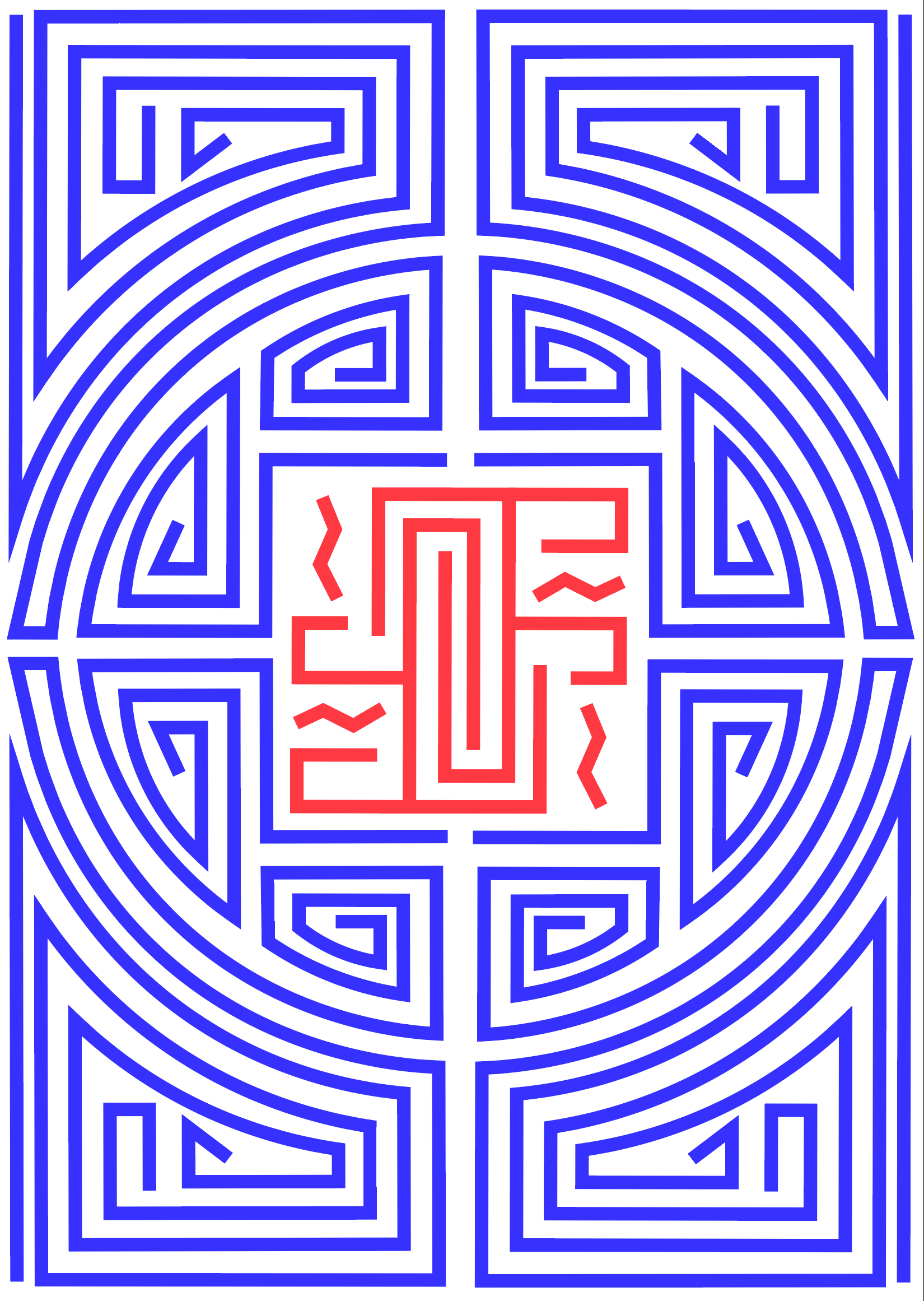
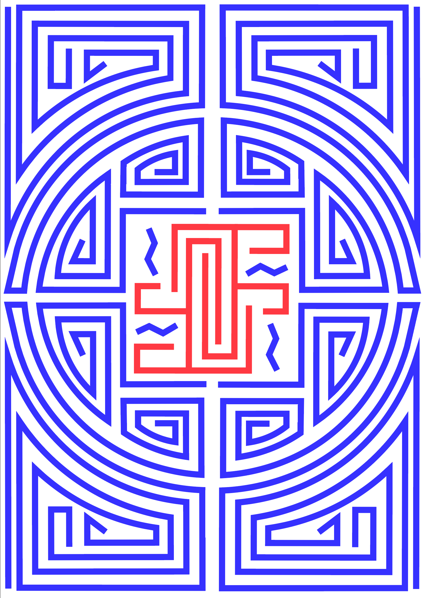
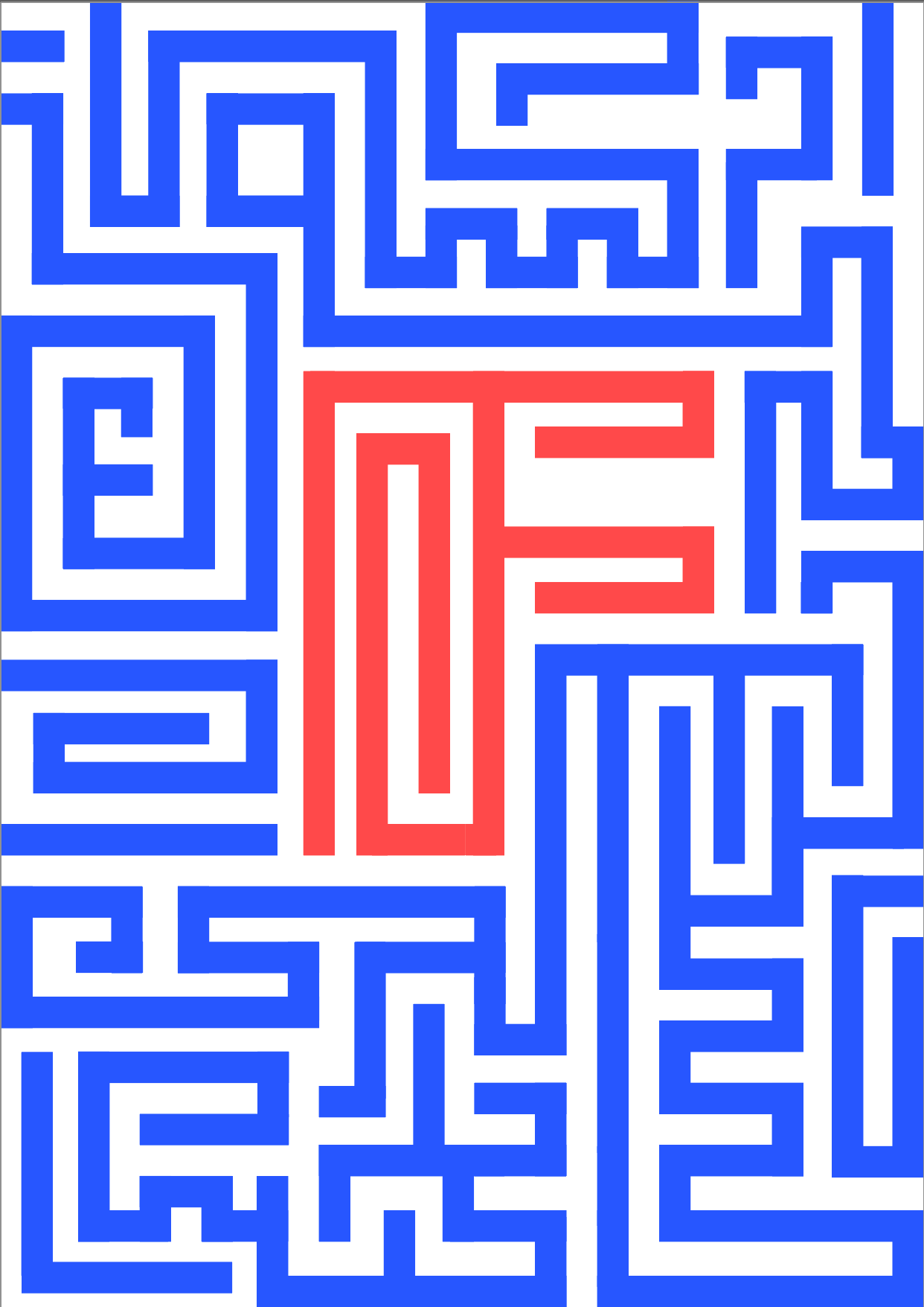
A couple of the notes like my original blue and white F so I did an updated variation on this to see how it turned out. I prefer my original F due to the culture and meaning behind it, but I do understand that I want it to be legible and sometimes it's a good thing to add a modern twist.
I do wish I had done something more eye-catching as many of the other letterforms in the artist letterspace project, but then again feel as if the meaning behind this piece is worth it.


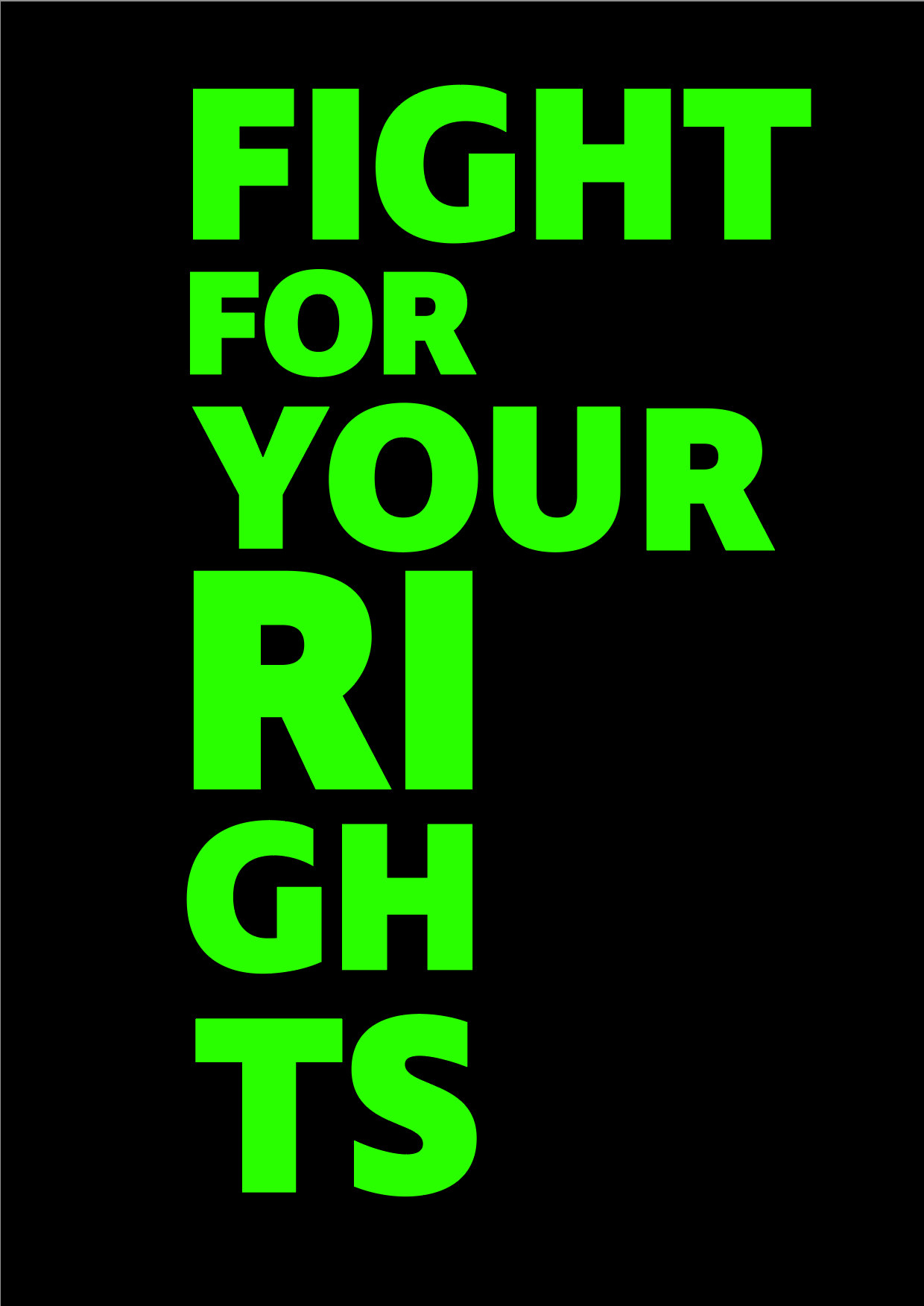
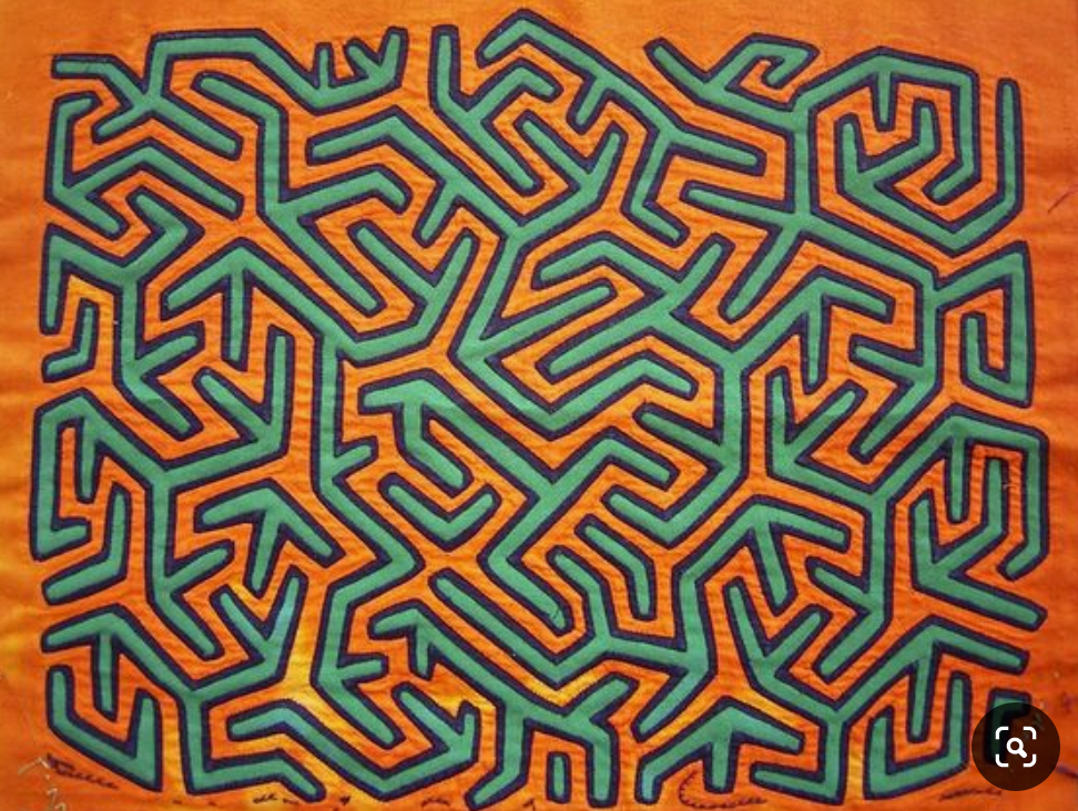
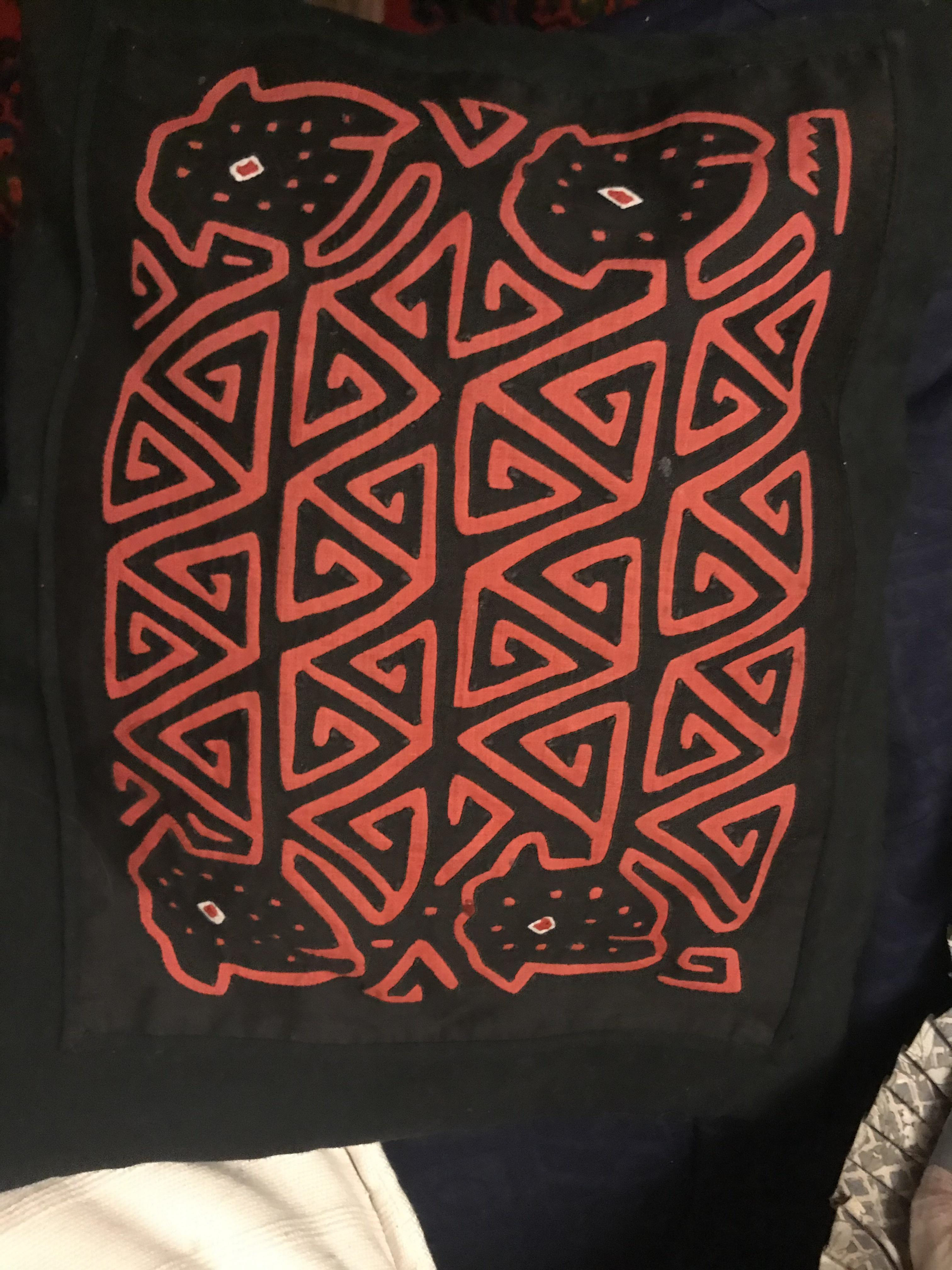
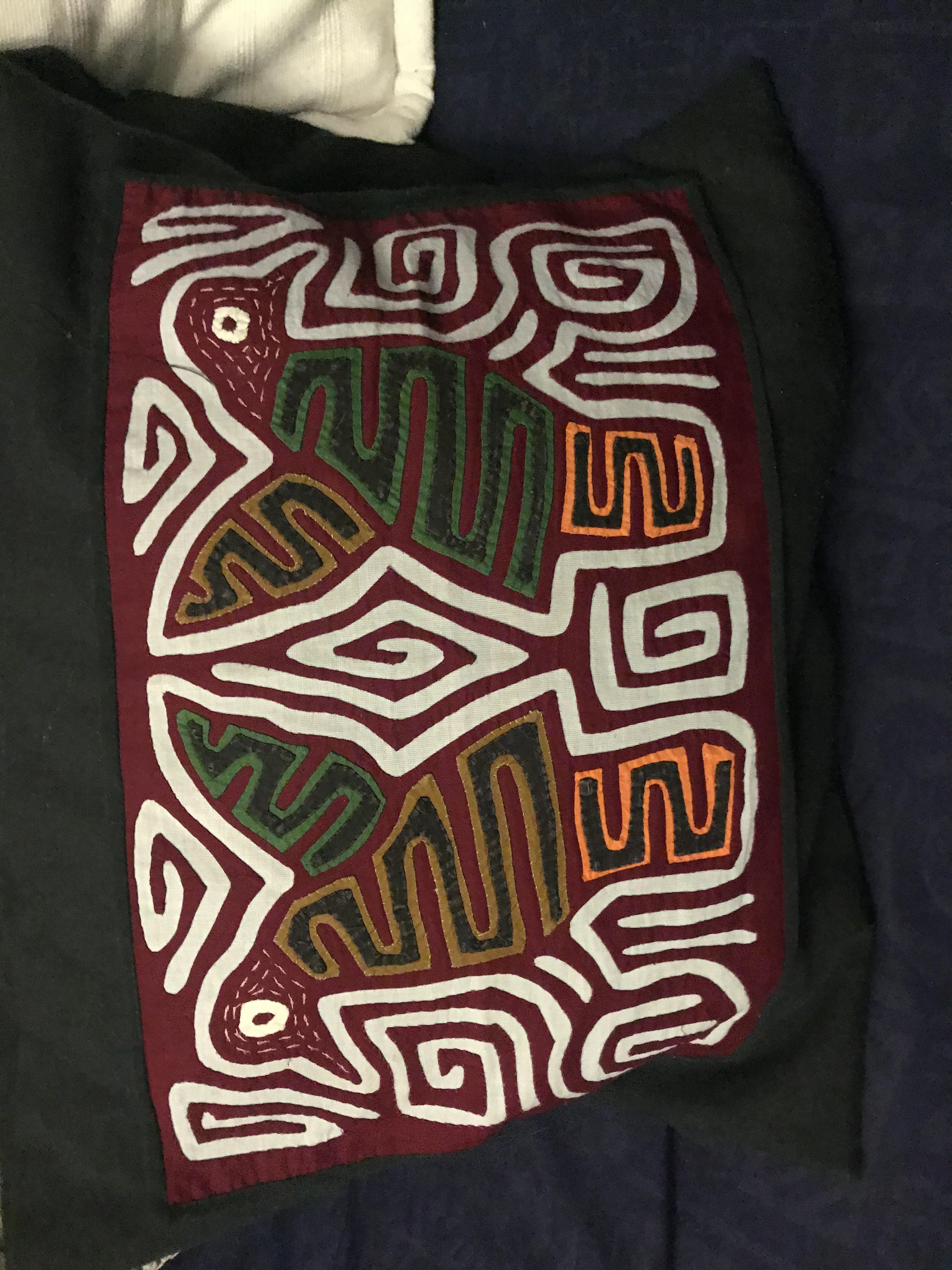
The idea of this piece is that this will give representation to the indigenous across the world - indigenous groups in Colombia/Panama are what I am focusing on as this piece is done in the style of their of art work 'Molas'. People are being forced off their land, raped and killed and that all this threatens their culture (including the molas which only the tule make).

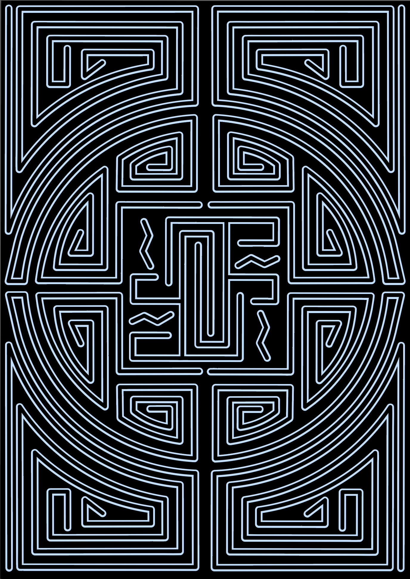
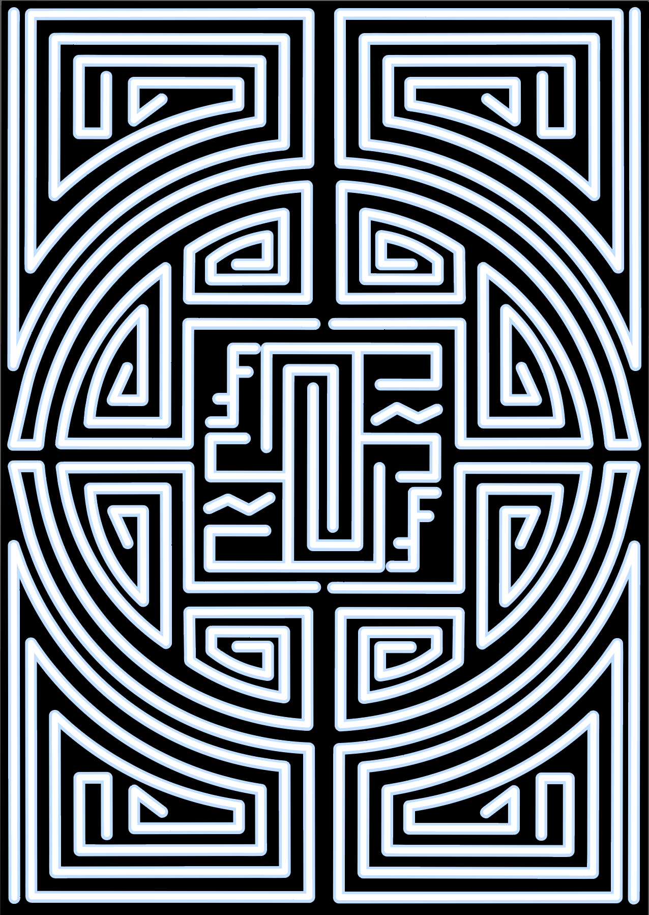
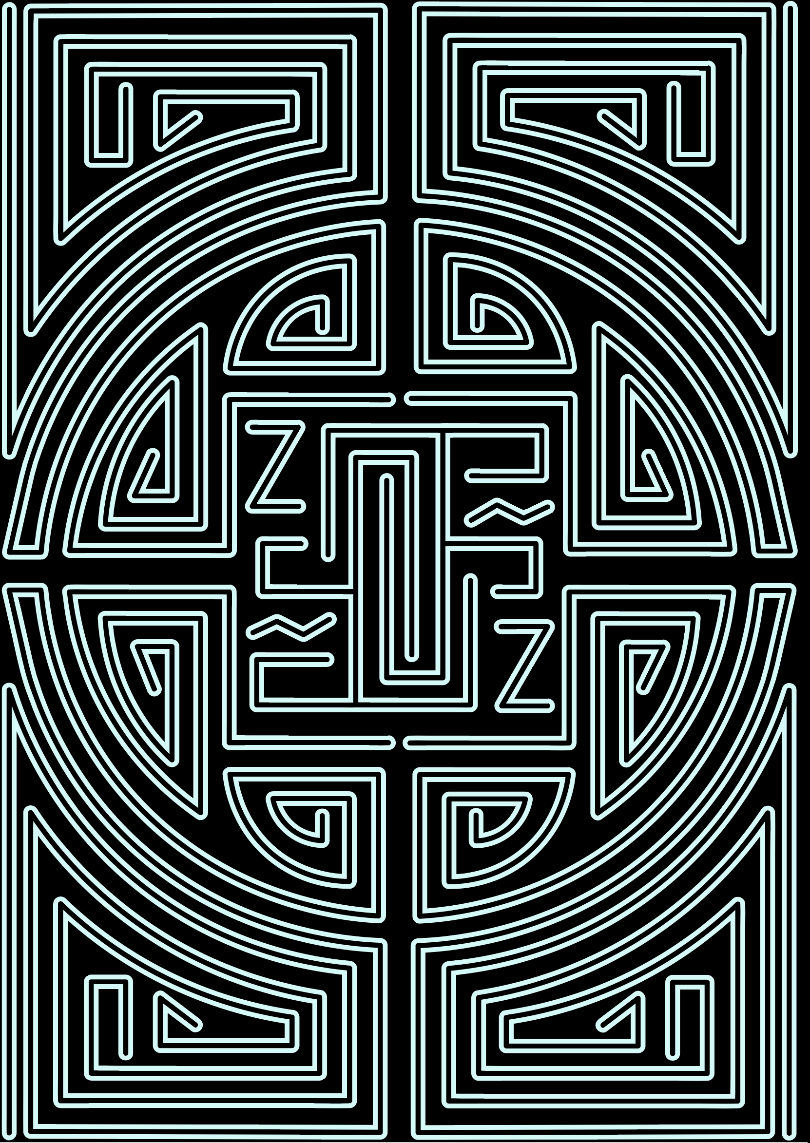
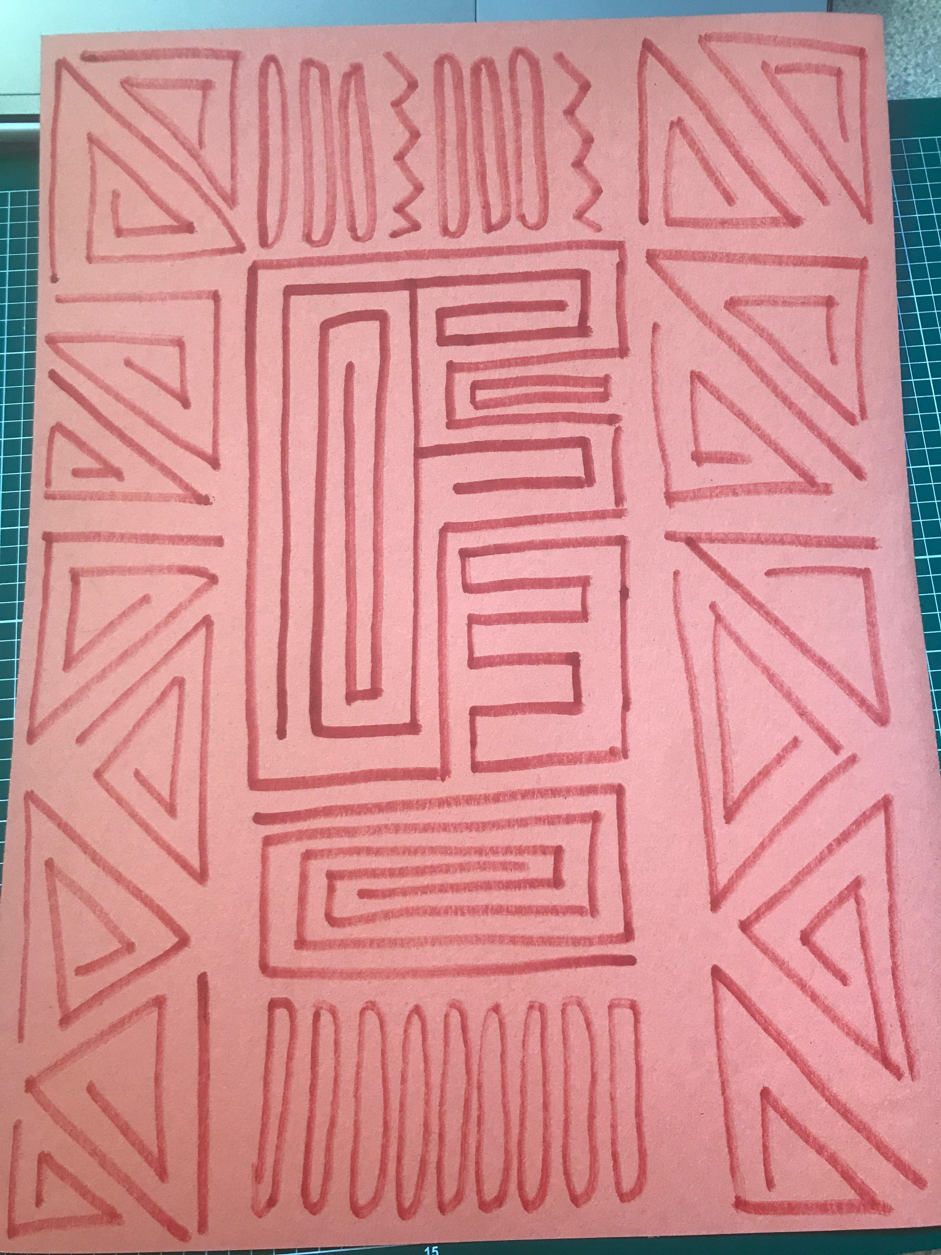
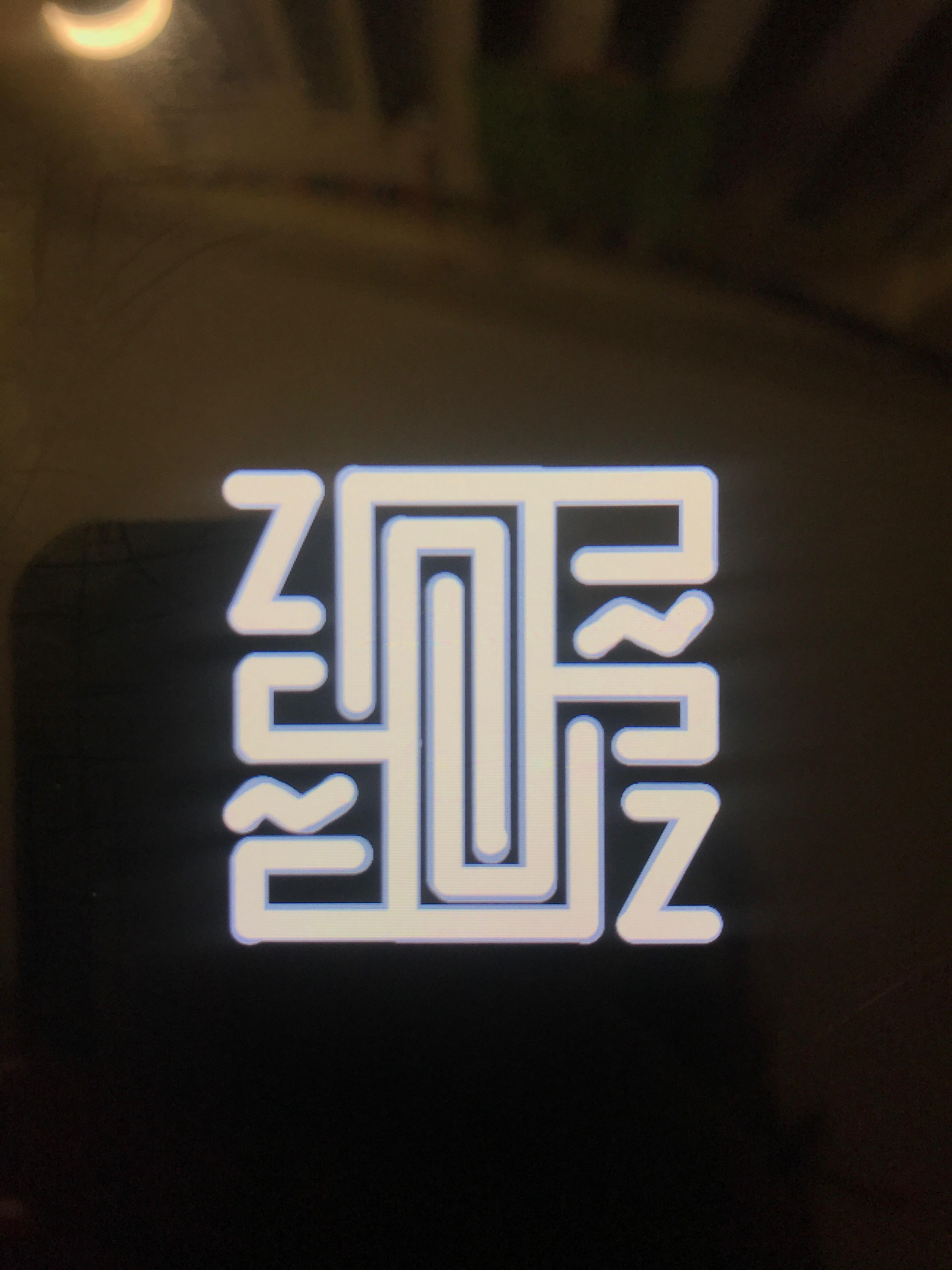
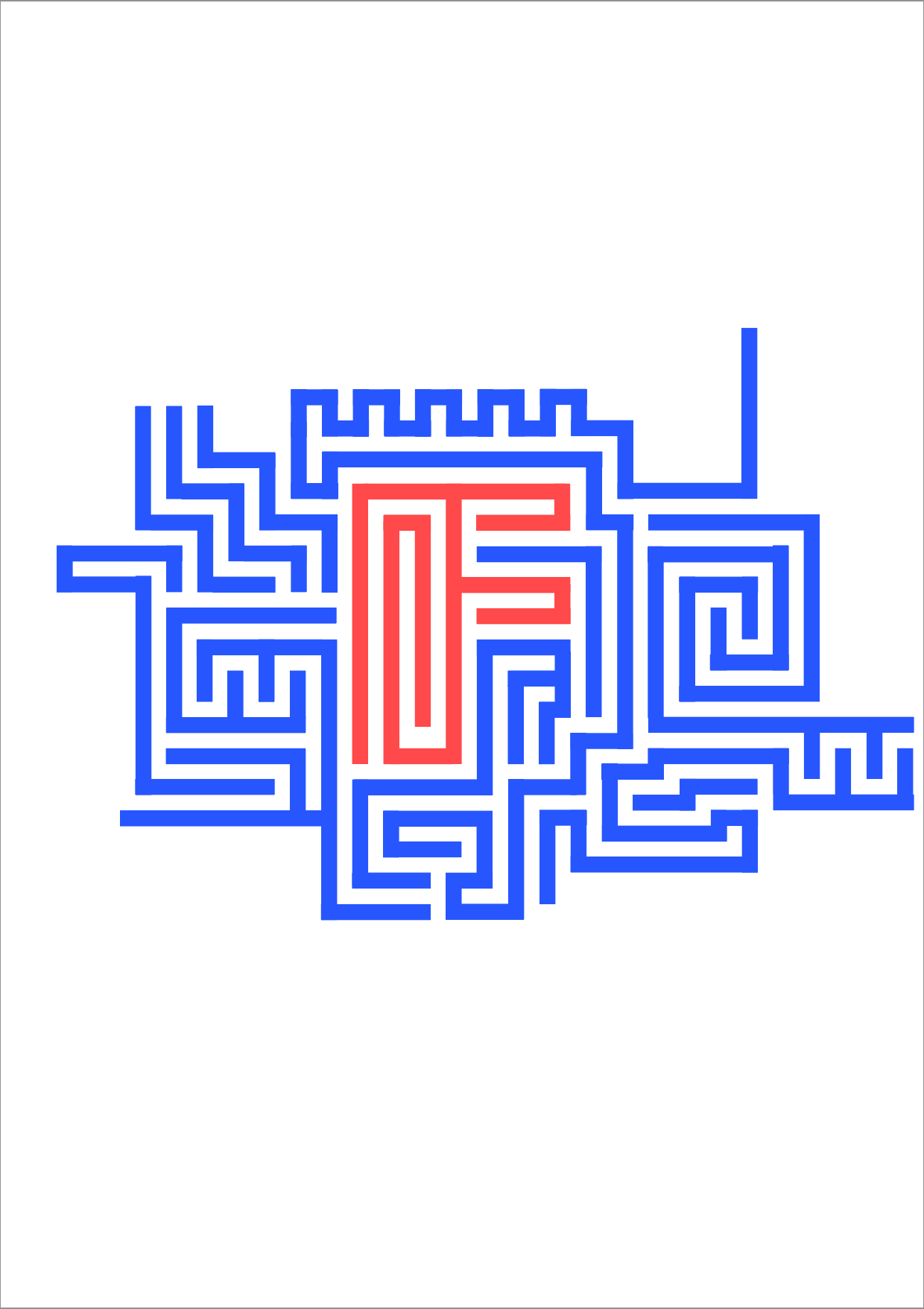
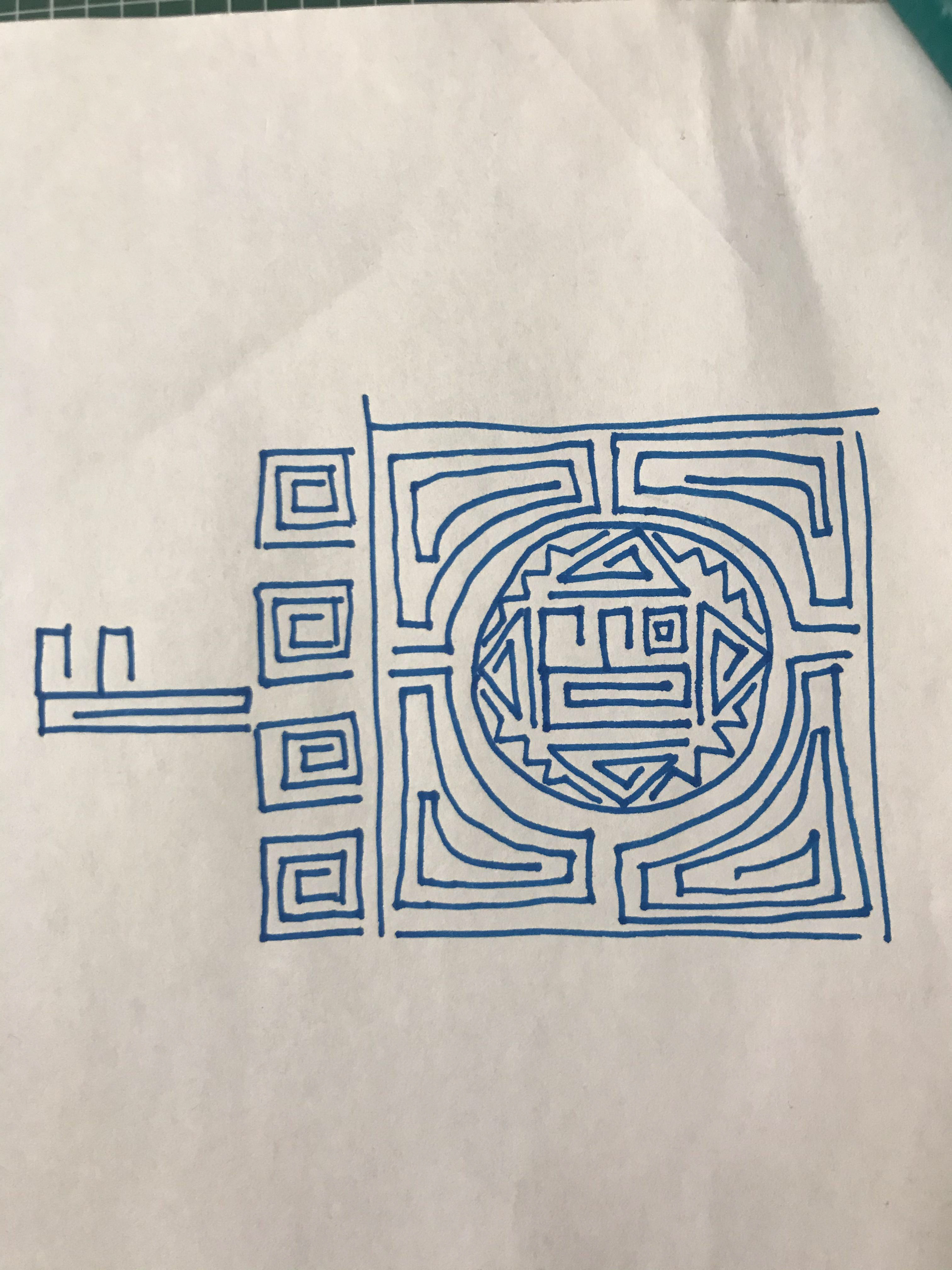
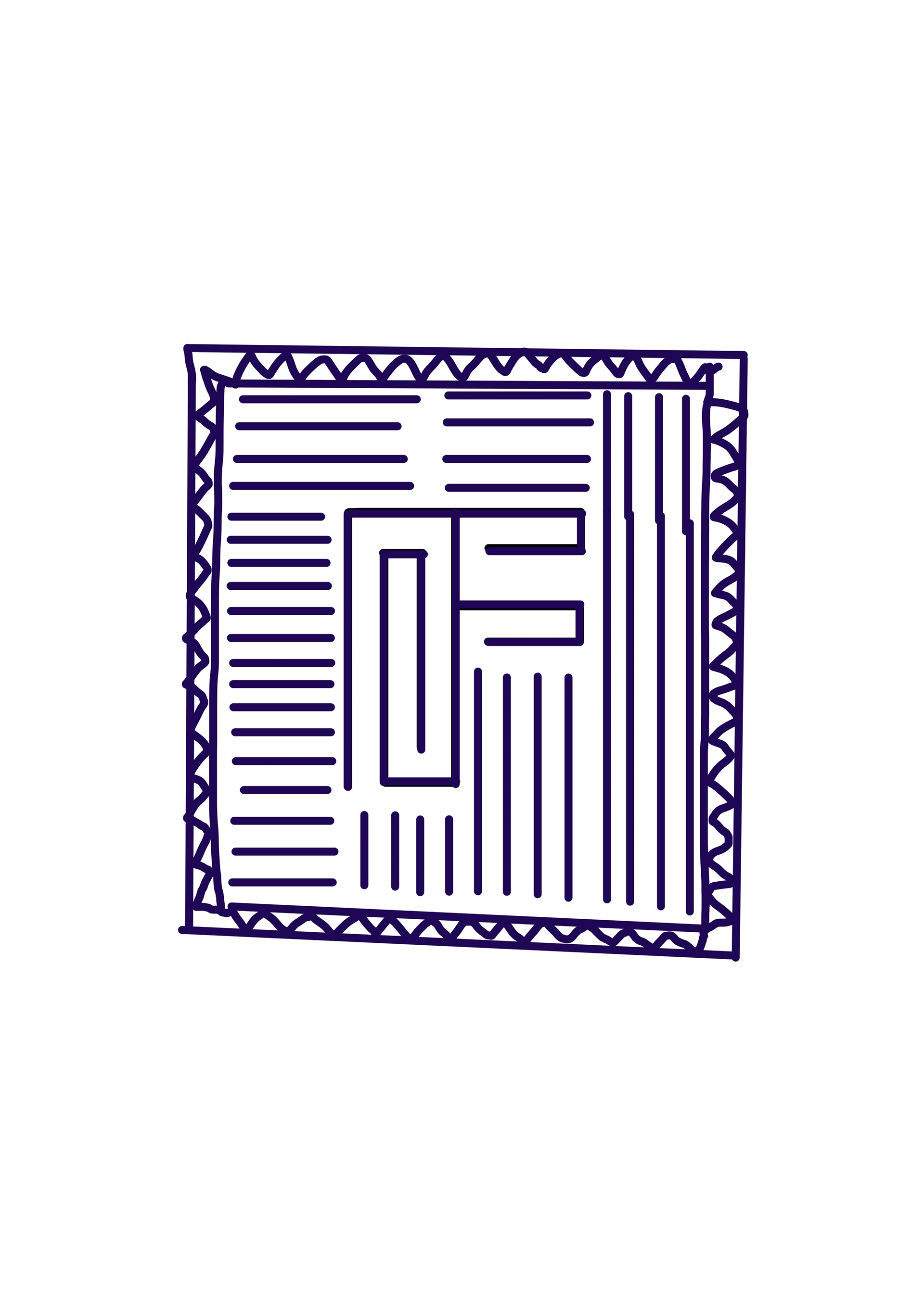
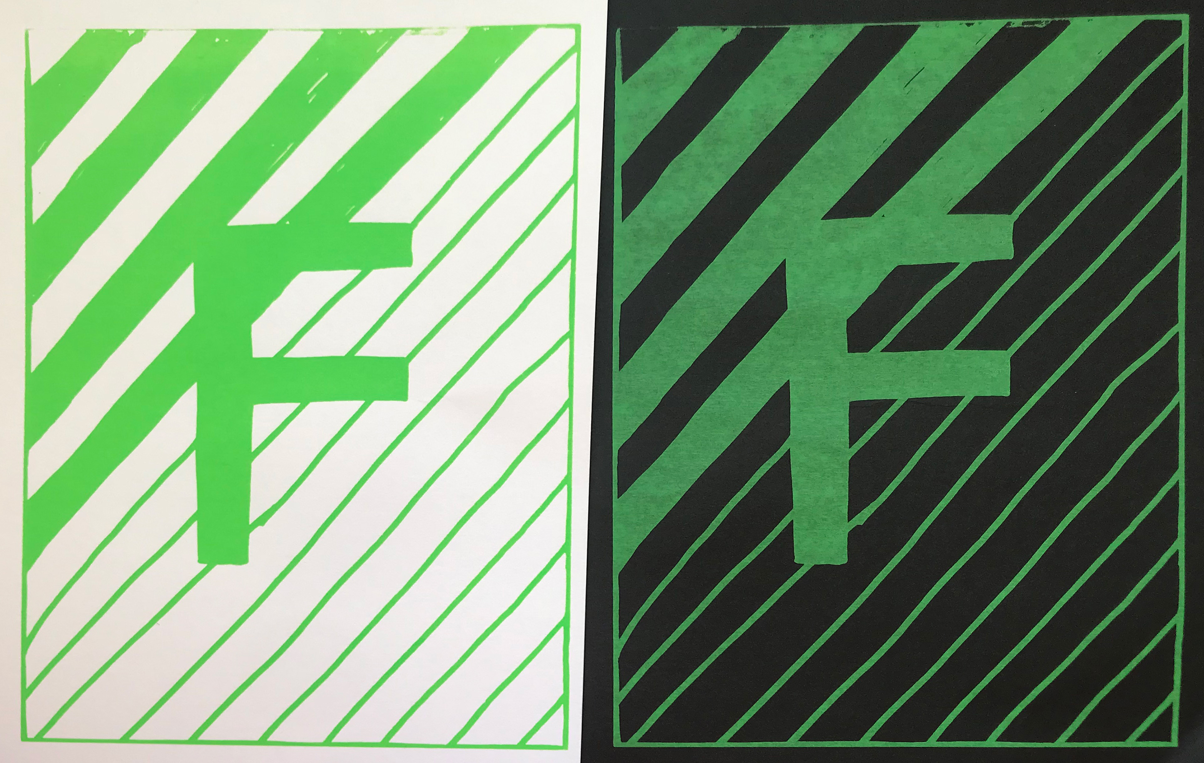
When I was happy with the draft I placed it into illustrator and drew a higher quality version. I added some subtle changes to the central F by adding some further Fs, as I thought the shapes in the corners looked too much like the letter Z. I then change the F as I thought it was too distracting, I tried it without anything in the corners of the F and with some subtle zig zags.
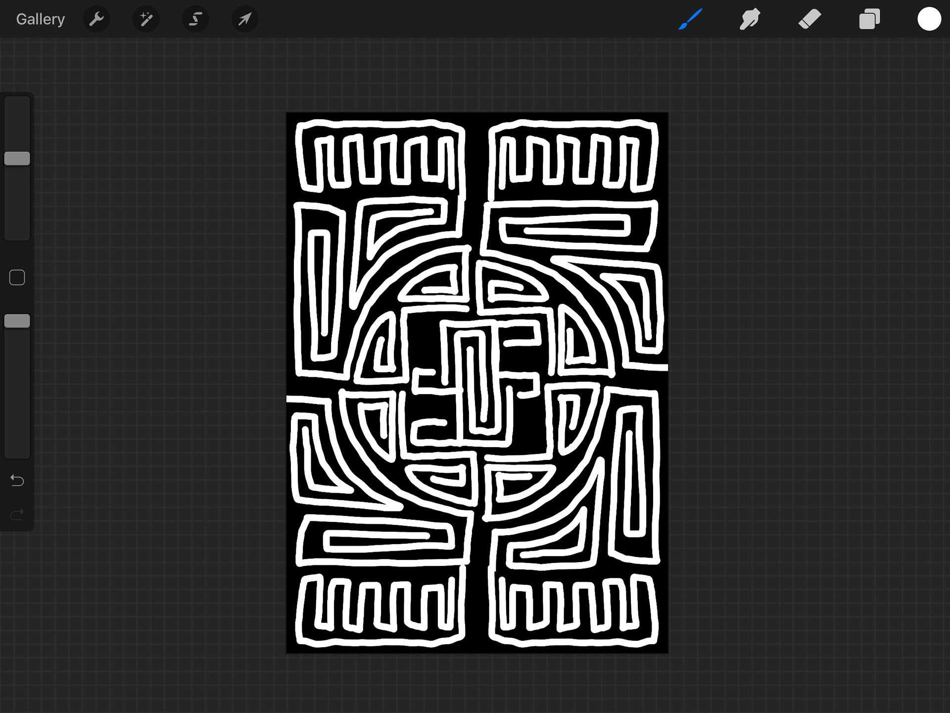
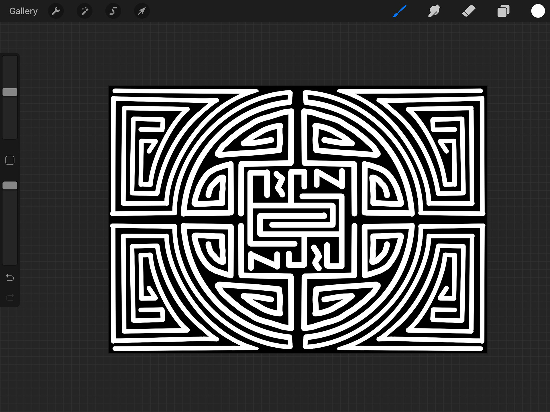
I do feel as if the F is lost a little and may not be noticed by someone who looks at it. I also think that it's okay that it's hidden. The whole piece is meant to represent the support for indigenous groups fighting for their rights and it's the type of work I hope will get people to ask questions so they areforced to find out more. I do like the F without anything in the corners but I think it breaks the style of the Mola so have decided to go for the ones with the subtle zig zags.
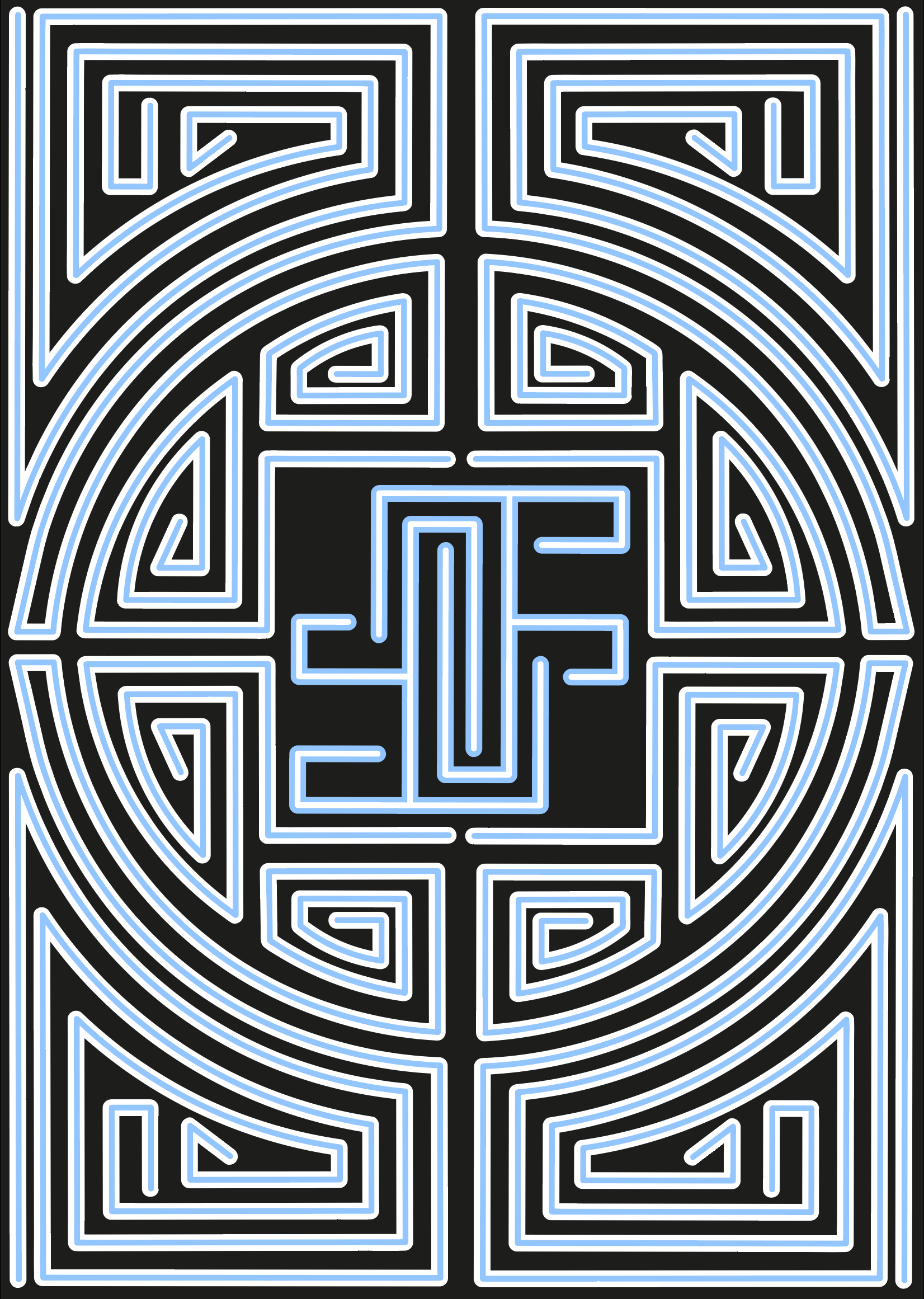
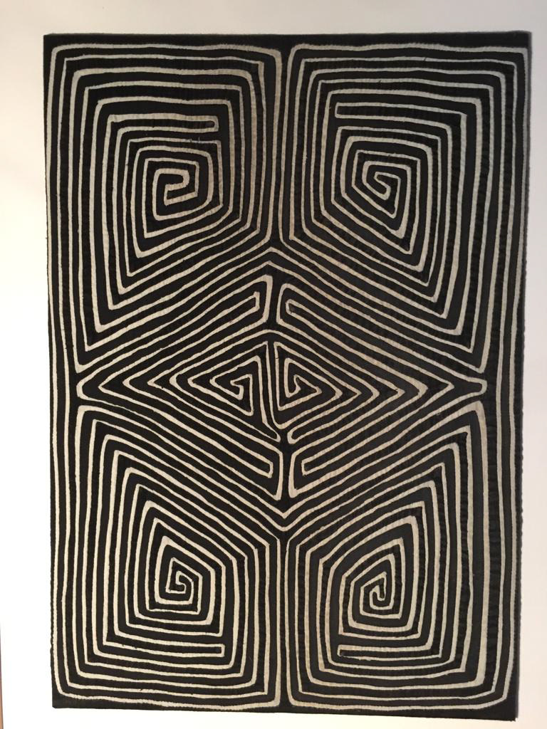
In terms of choosing the colours for this I decided I wanted a black background, as my favourite Molas have a black background. I didn't want this to be one the colourful ones you get. I wanted it to be a smarter looking one. I tried out green and black, white and black , red and black, white and red, blue and white as well as green and white. I felt as if the red was too intense and gave bad connotations. I then asked my family for advice and they preferred the black and white one and the blue and black. I decided to go for the blue one as I wanted to represent the peaceful fights that indigenous people have had to go through and I think the light blue represents that well.
I wanted to create more symmetry so I tried playing around with boxes as I've seen that with Molas. Whilst I was happier with this I still felt like I need to look at the F again.
I like how quick this was I just put pen to paper and it kind of flowed. Whilst this may be clear it's rushed it did help me relax into it and get me ready for just playing around for the other desings.
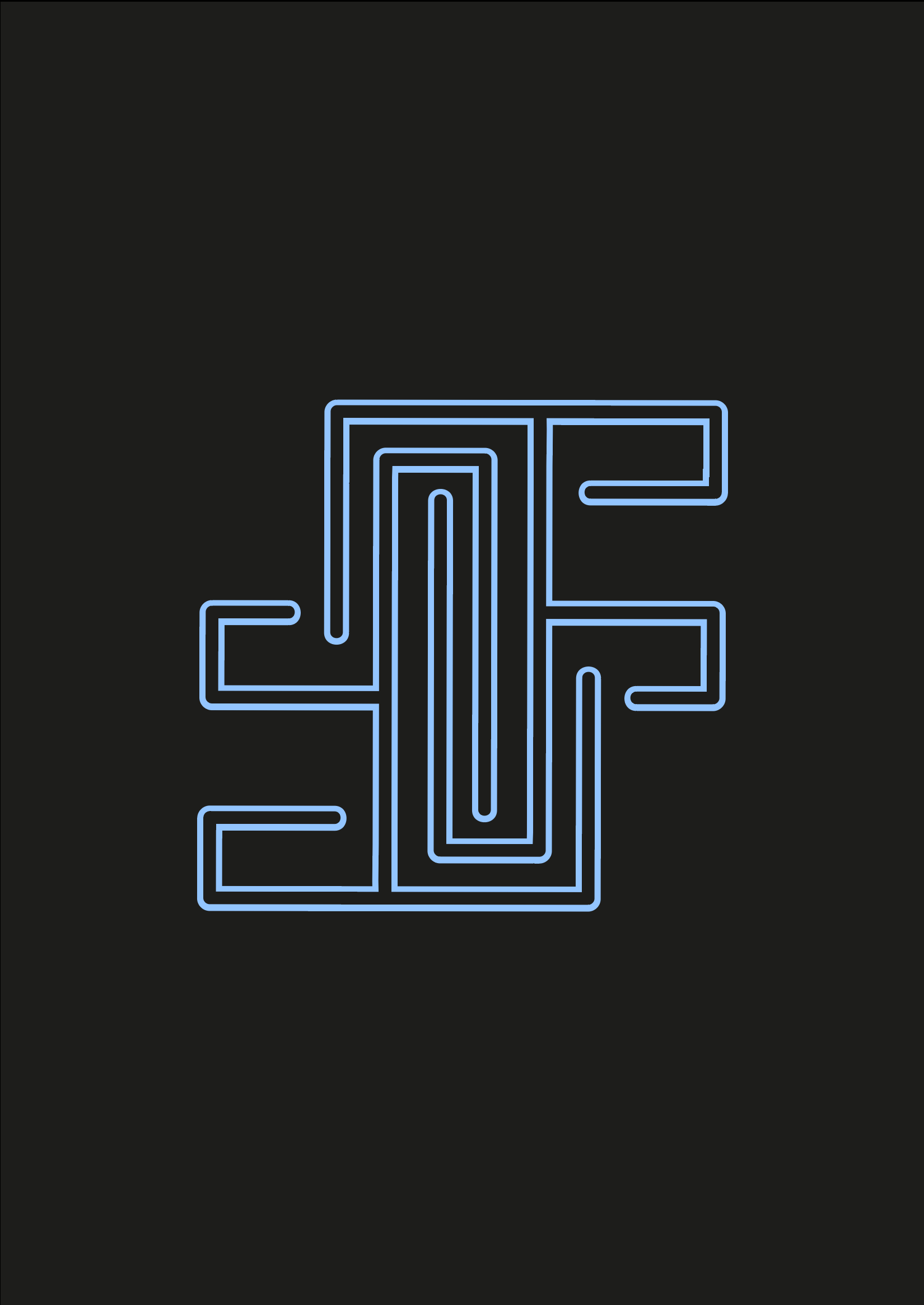
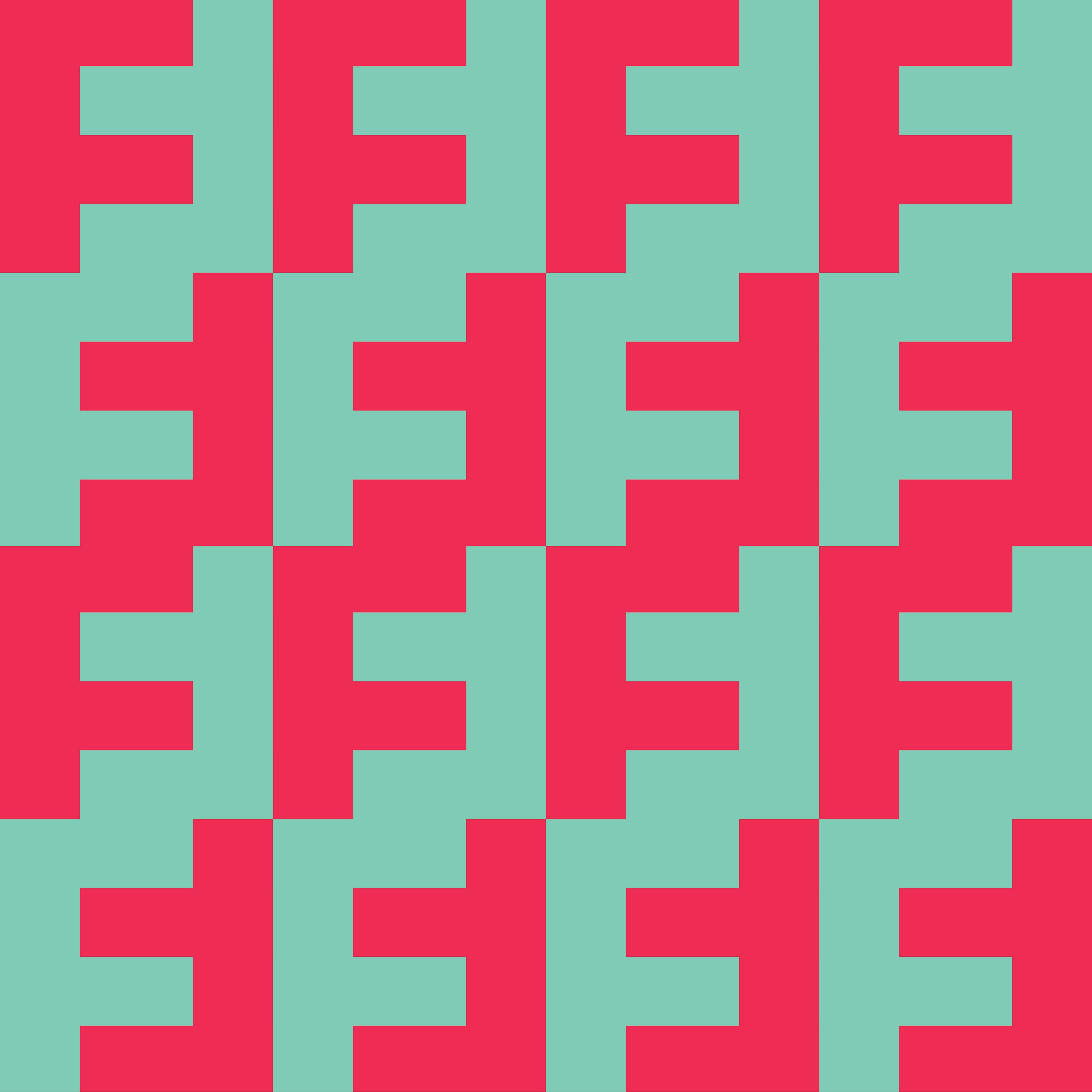
I thought of trying to make the F symmetrical in the way that if I turned it over it would look this same. I achieve this pretty easily by just widening it and then flipping a copy over. I then added some shapes to make it into a square.
After having played around and looking at my Mola styles as well as my reasearch. I found what different lines mean and tried to use different ones to get a variety. I am happy with this design but think it could use a little more tweaking.
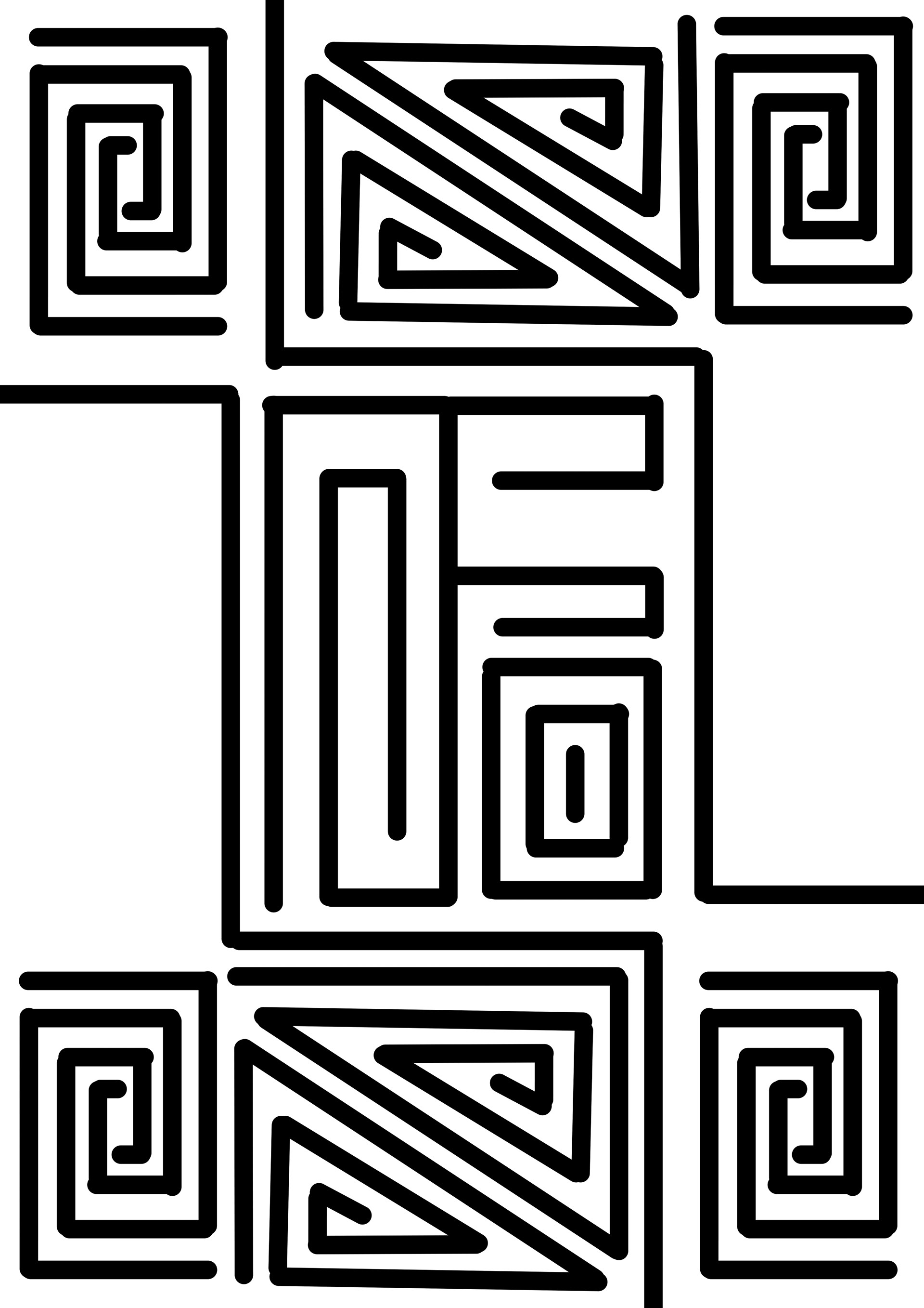
I am quite happy with the way this looks for a first draft. I've added an additional 4 F's which for most may be hard to see. They're in each corner and you can only see one the right way around at once.
I carried on a little more in trying to get a more authentic style for the Mola involving the F I did some more sketches.
I decided to go with the idea of Molas as it has a good meaning behind it and I think it would be beneficial to do a piece that raises awareness.
I do also like the data visualisation idea but feel as if that idea is only half there. I tried looking for reputable data on the subject where I could show gender inequality but ran into so much information that it would have made sense to use that on a project where it can all be represented. Working out how to use the data and represent it visually isn't viable in a 10 day project.
click on images for the annotations
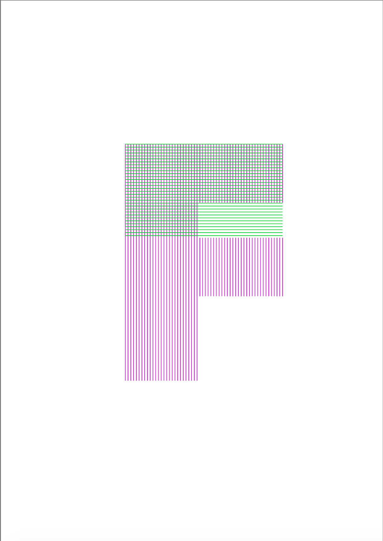
This shows pink lines going one way and green the other. My idea would be for this to be something about feminism since it uses the right colours. The idea would be the crossover of lines would represent a certain percentage or number.
The idea with this one would be that a certain number of shapes would be filled again representing either a number or percentage. I made this using a wire fence like pattern so was thinking it could be to do the Mexican/US boarder and how that's affecting people.
The idea with this one would be that a certain number of shapes would be crossed out representing either a number or percentage. I didn't have a specific topic in mind for this but it could still be an idea.
L --> R (number/annotations)
1,2,3 image click on the first three images for further annotations - The idea for these three is to do with representing data in different ways. Whilst I like the idea of doing data visualisation I would prefer to be able to get data which is 100% accurate and do a series rather than just a one-off poster. I also think doing the Molas lends itself well to this assignment.
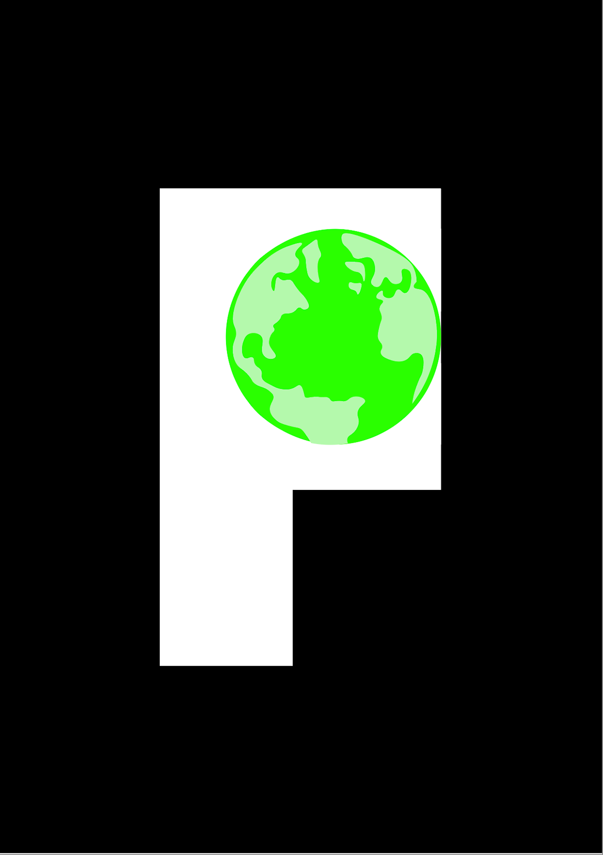
4,5 image These are focused on protests, including climate protests. I like the idea behind both. I think using the globe to help create an F is a nice idea but isn't executed to the best standard. I also like the idea of the 5th one, but I feel as if I would need to be more imaginative with it.
6,7 image I wanted to have a go at doing a 'modern' version of a Mola by using a pixel type of effect to make the F and the background. I do quite like these but feel as if it would be nice to stick to a more traditional Mola style.

Above are some further experiments.
L-->R (annotations)
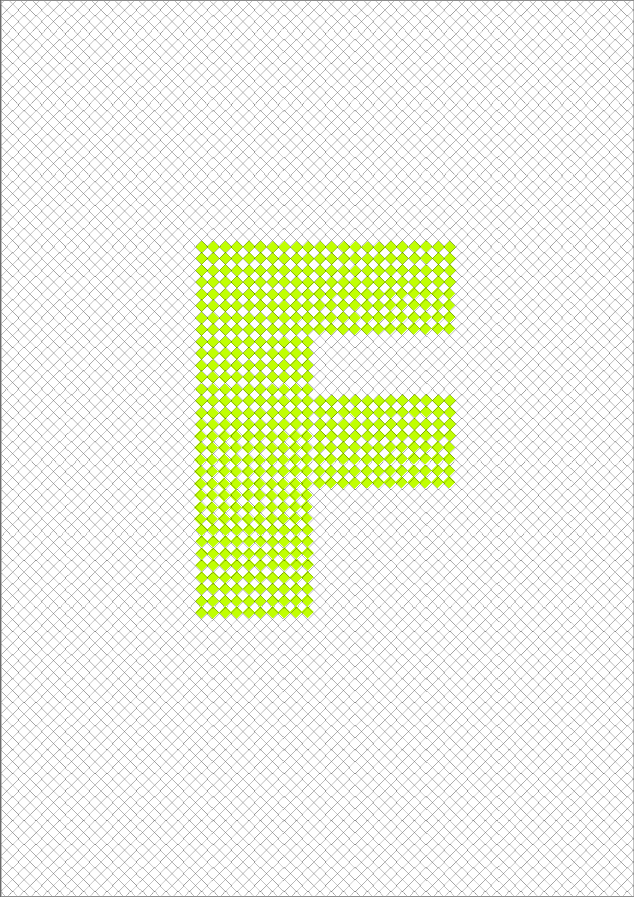
1, image This is a quick mockup to illustrate inequality. My idea with this would be to find some data on a human rights issue like gender inequality. How full the 'F' is would show how close we are to equality in that area. Also F can stand for feminism so I would strongly consider doing a topic related to gender equality.
2, image This was just a quick play around seeing if I could make some F pattern.
3, image The idea behind this one was something to do with fighting for peace. This is why there's a white flag and a very bad drawing of a fist pumping up like the one that symbolises "fighting" for your rights.


First - I was playing around with some paper to make an F, producing my first draft I think it's a good starting point for a piece in the style of traditional Molas. I do like the idea of doing a whole cut out mola however to get it at the standard I would like it may not be possible due to time restrictions.
Second to Fourth - These were some initial sketches I added on the theme of 'F'. I think these are a good start but still think there is something missing. Since Molas tend to be mostly symmetrical I want to work out a way I could do that.
MOLAS
Molas are often used as "living history books", showing hidden symbols of medical plants, protective symbols or legends and stories.
A traditional textile craft, they are made from layers of coloured fabric that are stitched and cut using applique techniques to create patterns and pictures. They originated in Panama and north west Colombia, by the women of the Kuna people.
I wanted to include these, as I grew up in a house with them and seeing them around the houses of friends and families when I was living in Colombia I always liked them. I'm always interested in what is going around us and thought that working in the style of molas might help raise awareness of those indigenous populations fighting for their rights. Every year around the world indigenous populations are still segregated, assaulted, displaced and murdered for protecting their land, culture and traditions. Whilst Molas are made by a specific indigenous group they are clearly an indigenous art form as the colours and designs are similar to indigenous artworks from around the world.
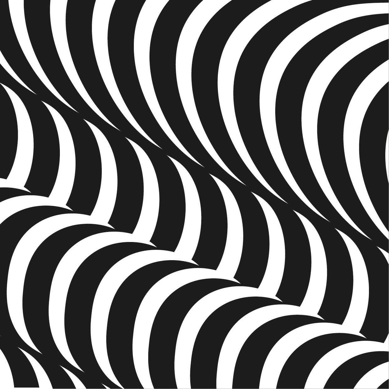
This shows a variant on a typeface the extruded effect works effectively together as it fills up the whole poster. It reminds me of those blocks you would play with as a child and I like how it juxtaposes the fact it's an 'adults' posters. It's the right cross between playfulness and good design.
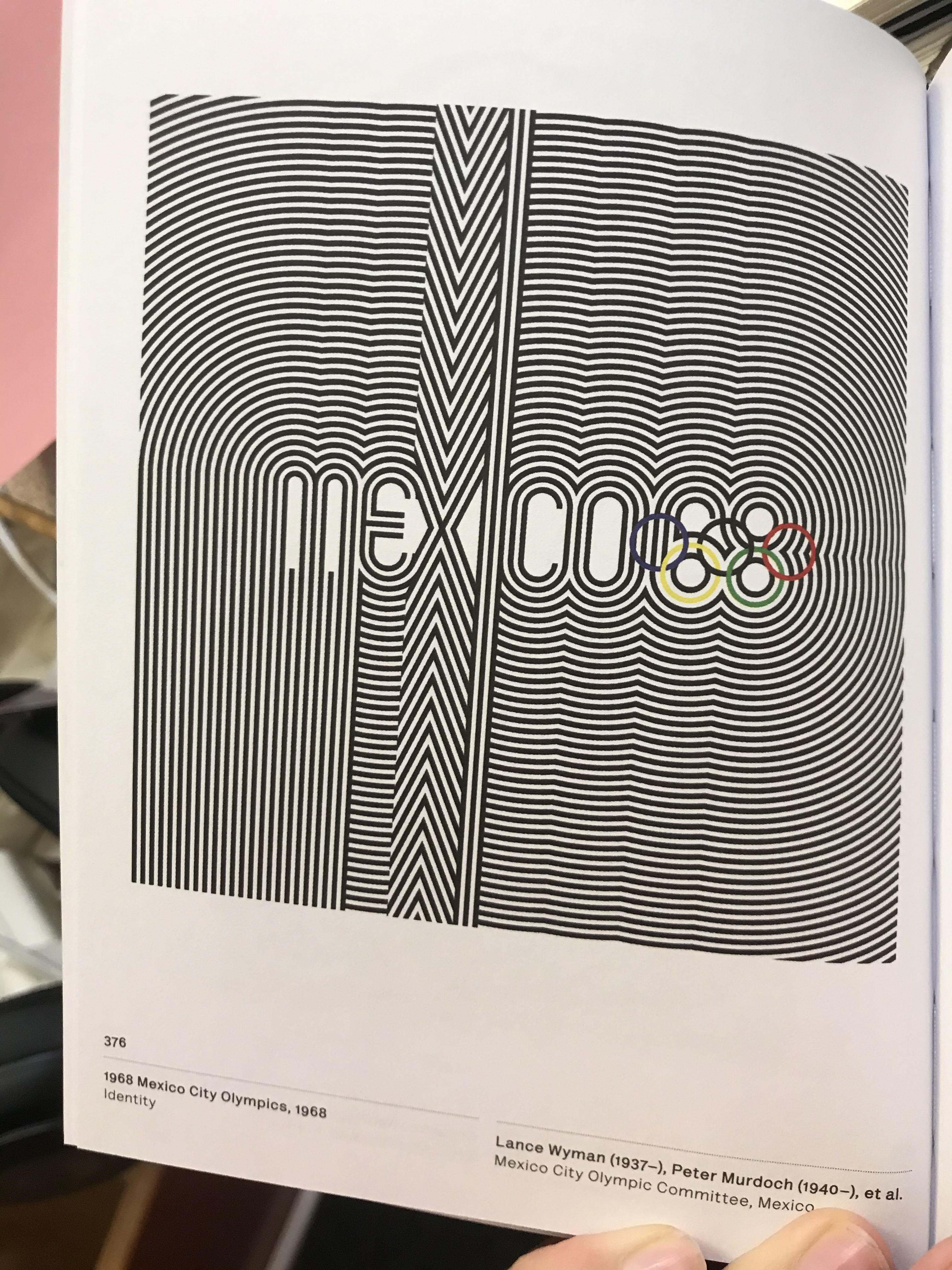
The Mexico 68 identity will always be iconic. It just fits together so well and I like how you can still read Mexico within the lines but also that it is hidden gives it an artist forma. I like how rather than me just thinking of a pictogram based olympic identity I think of the boundaries broken with this identity. I like the idea of letter being hidden in plain sight.
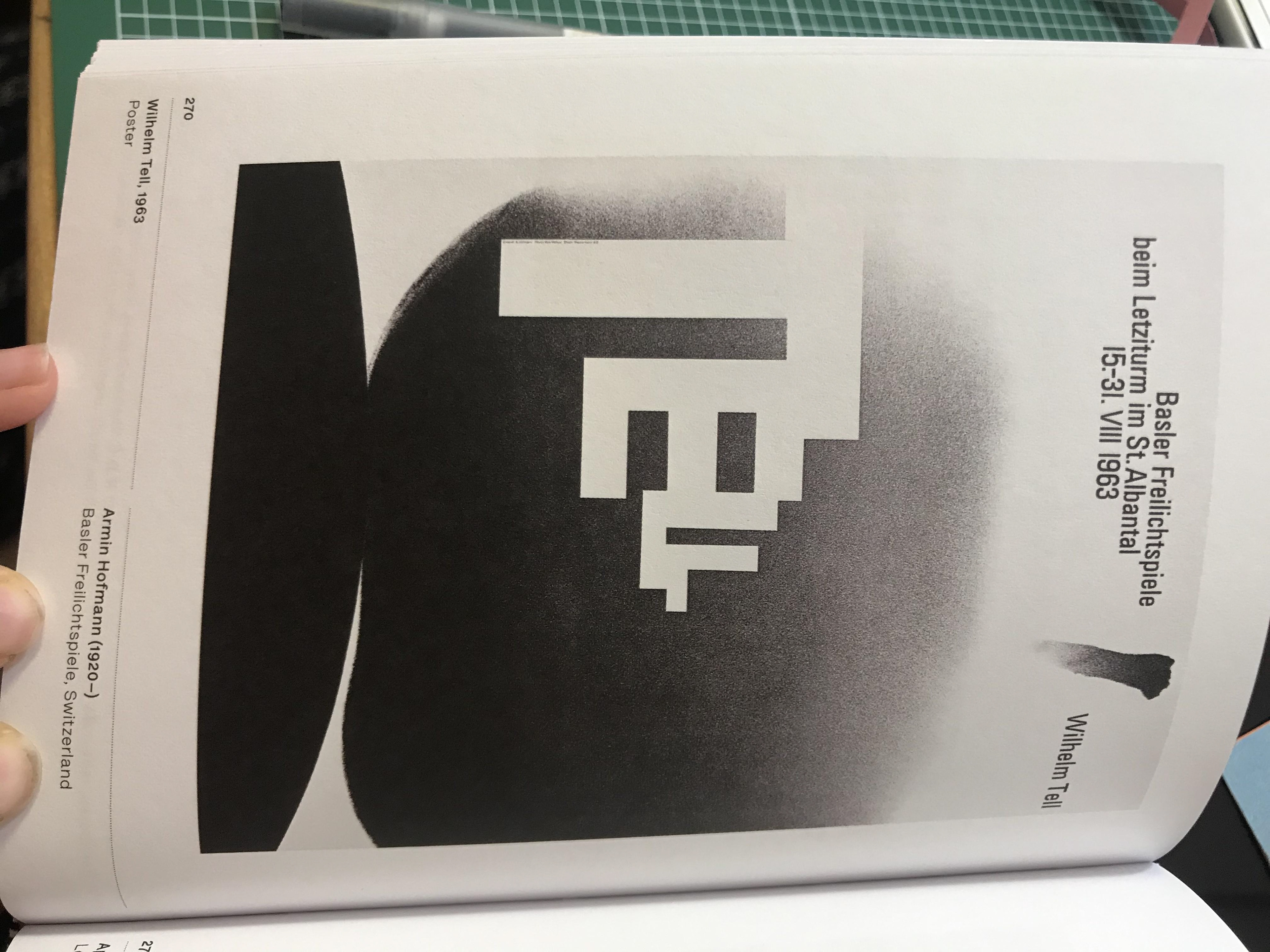
I like how the Z fits into this poster - it isn't just a typeface it's an artist part of the poster which I like the idea of as typography is an art form and working with it to fit into a design I think is a very nice touch.
Whilst this isn't trying to be a typeface I think this type of style could really work. Using shadows as well as an object using minimal colours could be a really strong design just like this one. This could easily be an L.
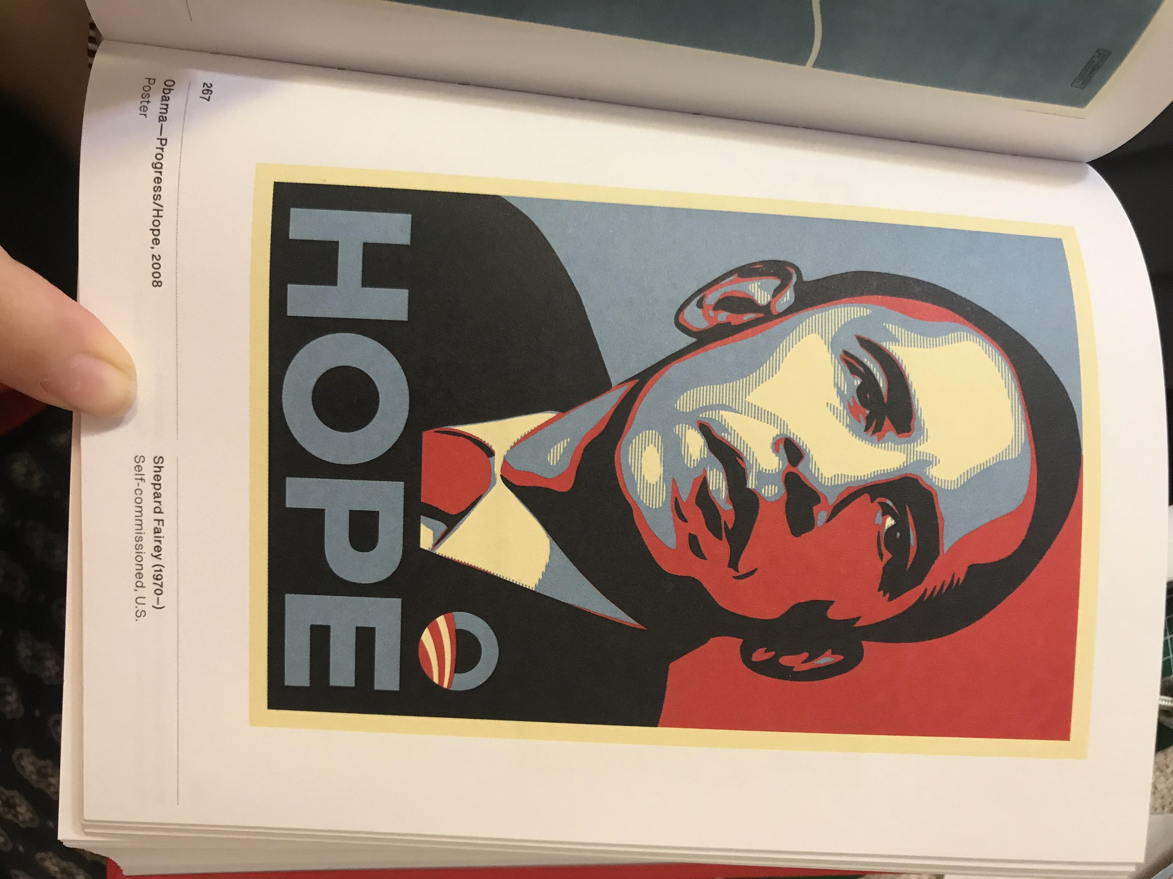
I think shepard Fairey's work it great - it has a proper meaning and he's fight for change thought design. Whilst there's no doubt this is an iconic piece of work I don't like it. I think it's just a cheap looking and I know Fairy himself thinks it's overused. I chose this because you recognise it instantly and likely remember what it meant at the time this was circulating.
Like the other two black and white piece I like this piece. The use of gradients I always like but also think the use of just black and white is always a nice touch.

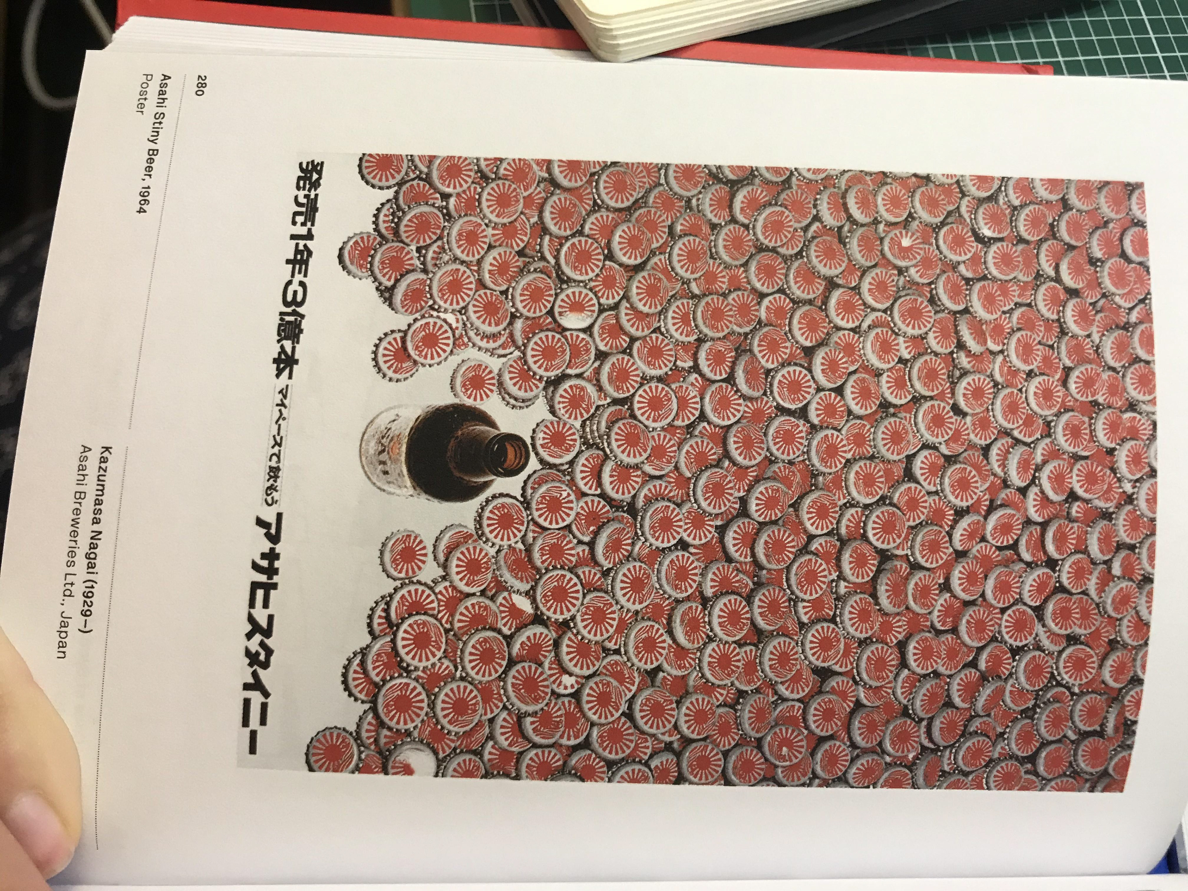
Simplicity is often the answer and I feel like this poster shows it - it doesn't also help that the japanese flag is so magnificent that you get recognise it pretty easily.
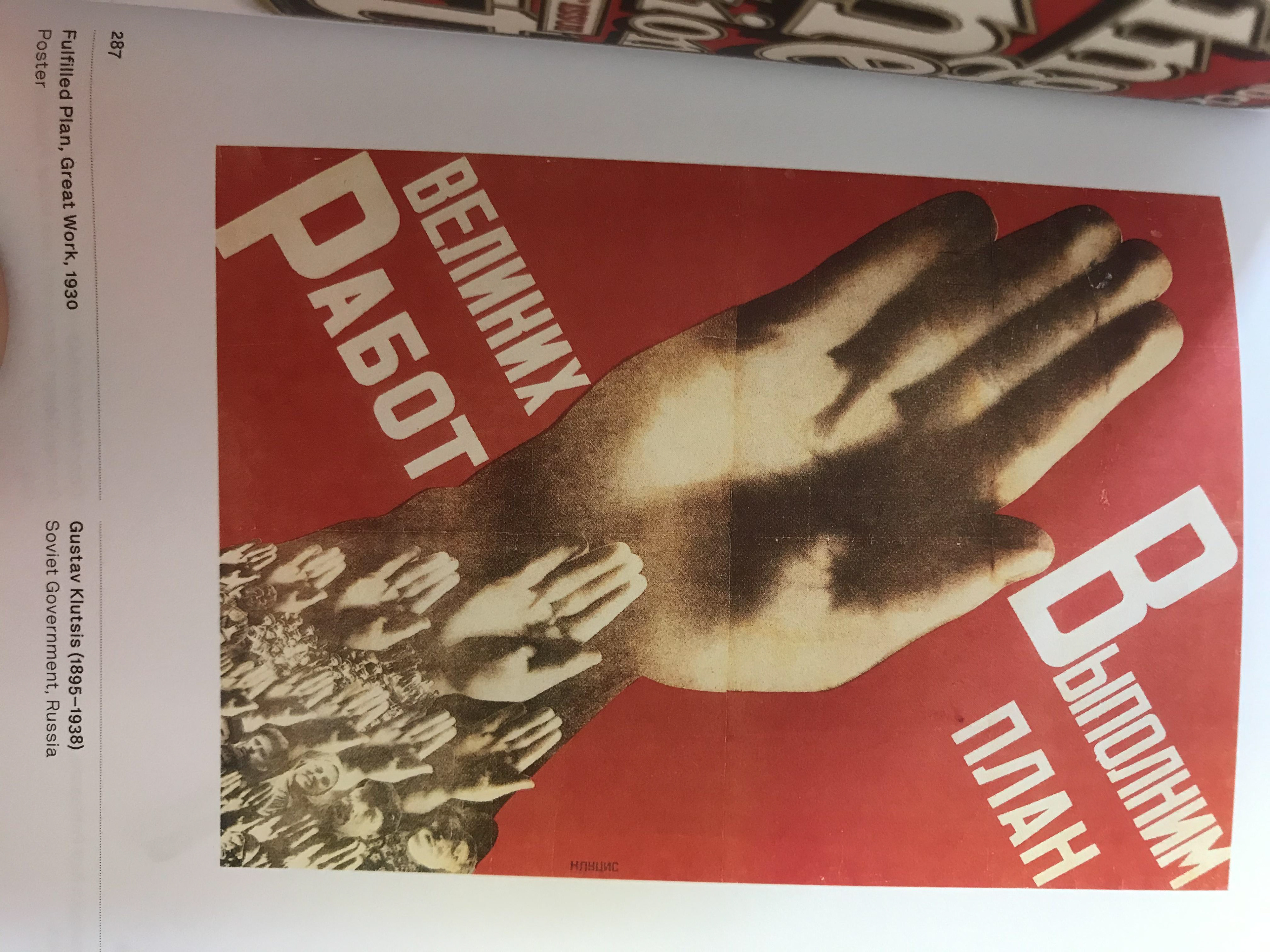
Soviet Russian design is so great - they did a good job at keeping it simple with strong images as well as having the consistent style which makes you know what era the work comes from instantly.
I like how this explores different mediums. Whilst this is using the caps for the beer its advertising I like the idea of using objects you wouldn't necessarily think of to make something new out of.
Visual Research
Here is some visual research I have done to get some inspiration on the style I want. I love the style of protest banners especially those from the 60s and 70s. However the ones now are also great as we are always recycling ideas.
click on images for annotations.
Development Ideas
I had some further thoughts on to how I could symbolise the F in regards to my chosen space.
I thought it could be a good idea to use the F to show statistics, literally showing why people should *fight* to fill it up.
I also like idea of working in the same style as traditional molas made by indigenous people from Panama and Colombia. I want to raise awareness for how even today indigenous people are stigmatised and murdered.

Chosen Space
This is an area that is close to me as I feel it's important to 'fight' for what you believe in.
I may want to delve into how I have a lot of advantages compared to some people, but am also disadvantaged compared to others.
I want to create something that has a purpose, given what is currently going on in our political space/climate
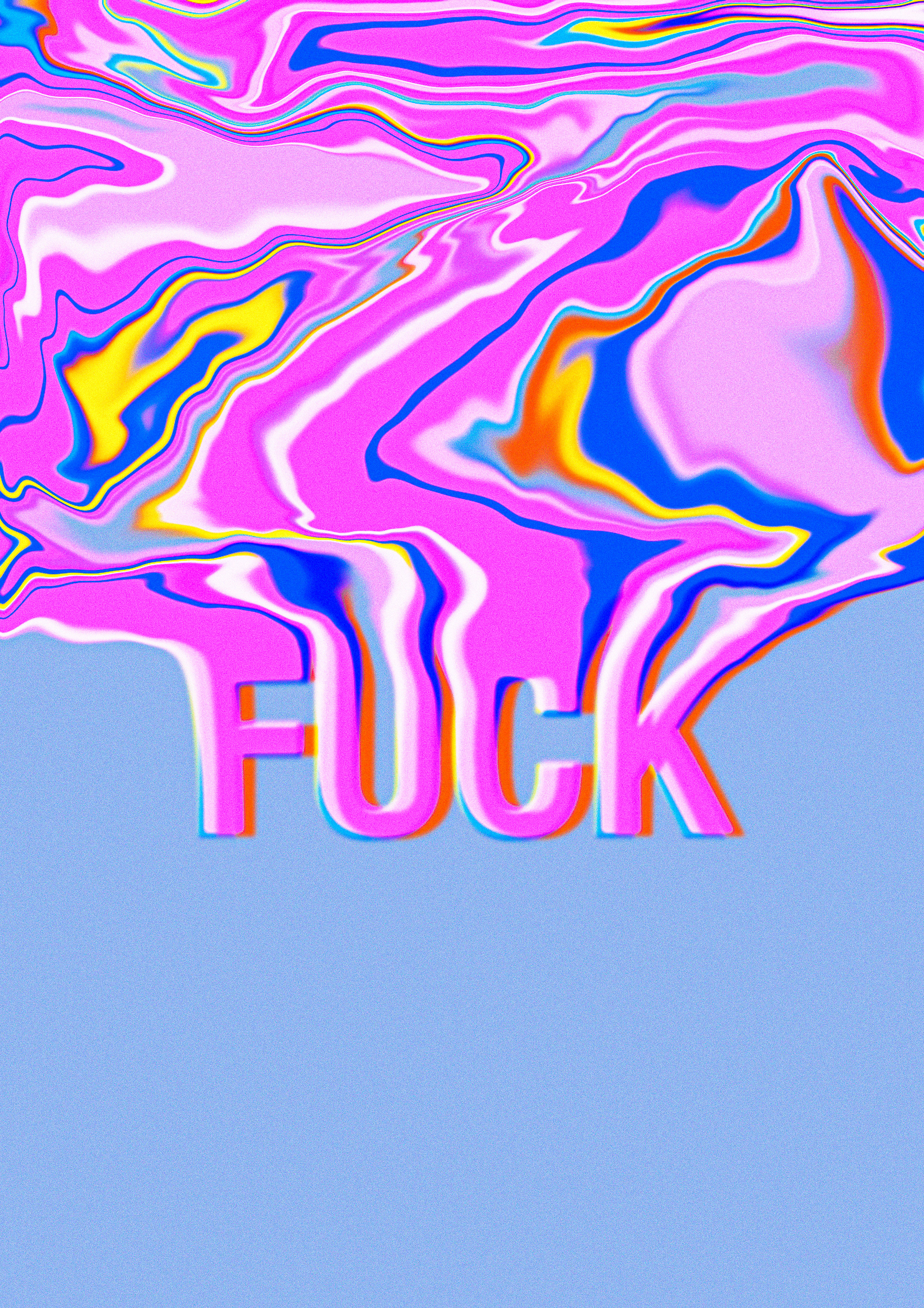
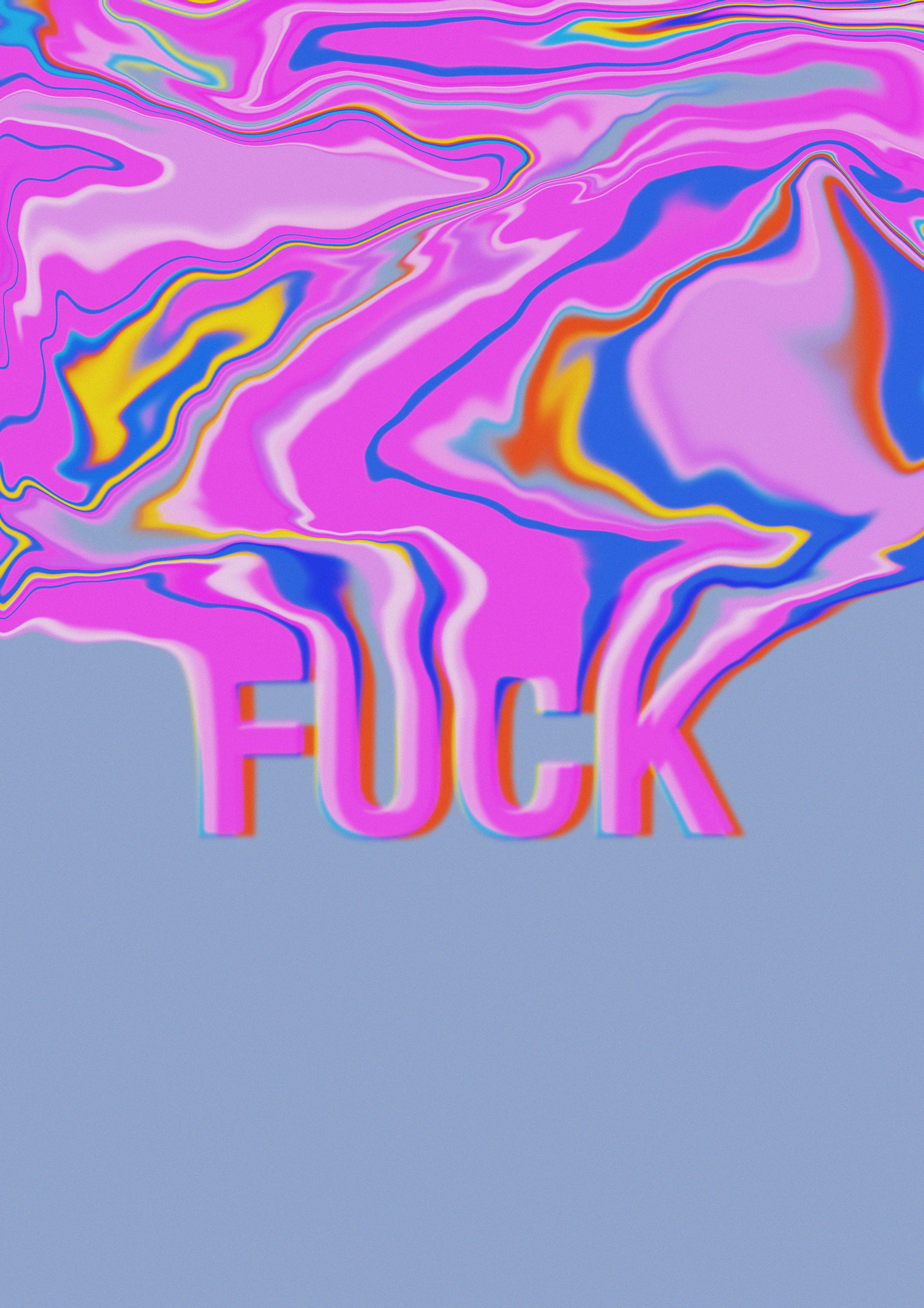
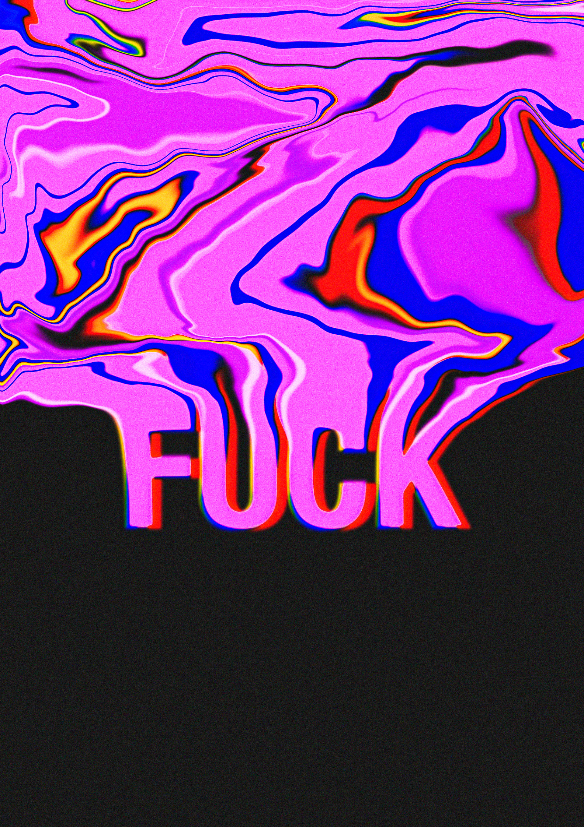
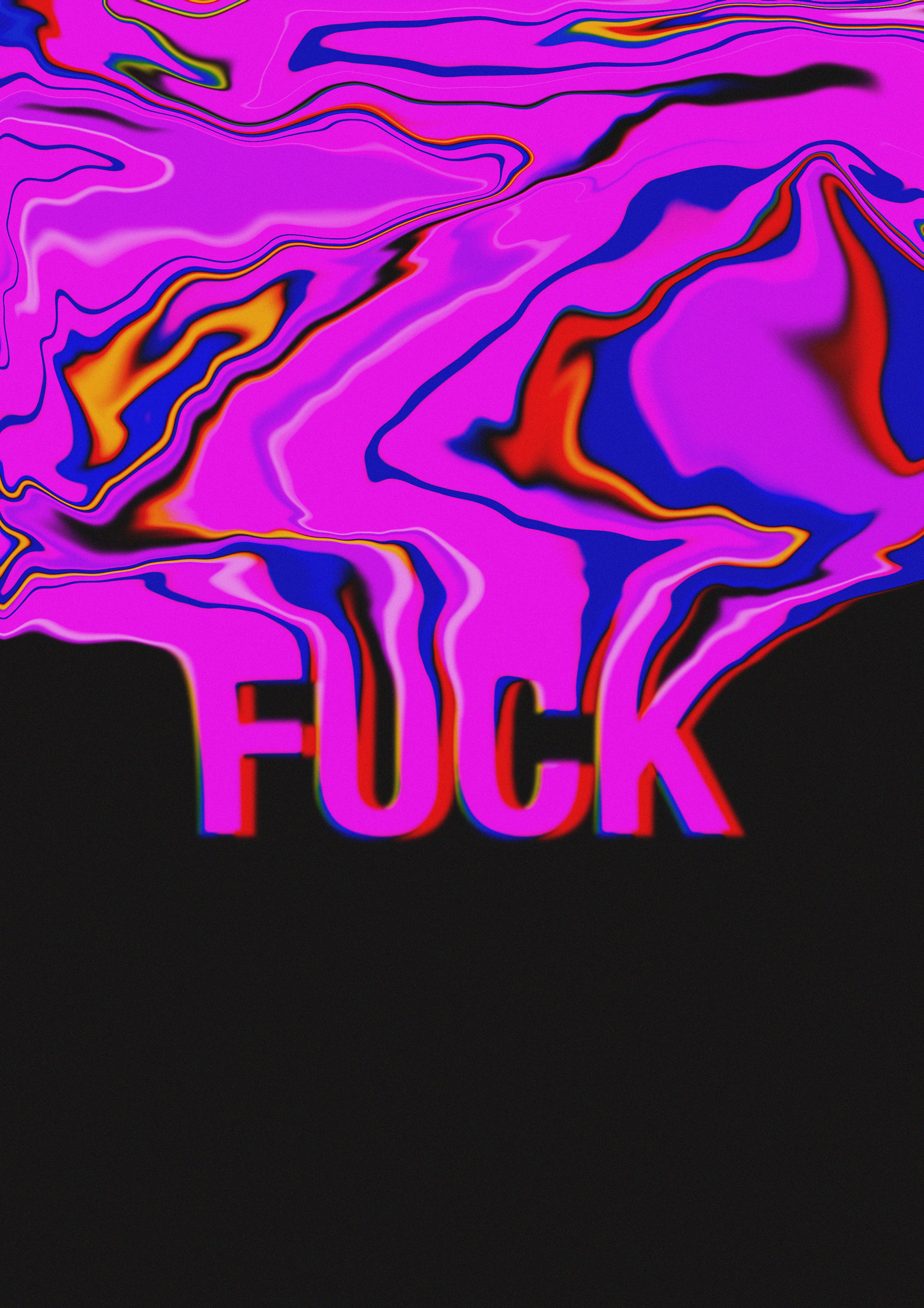

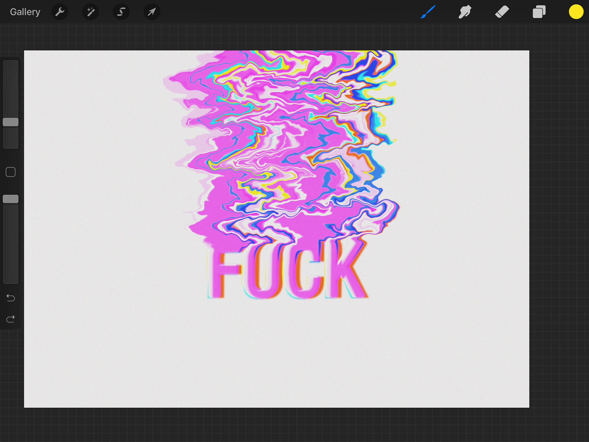
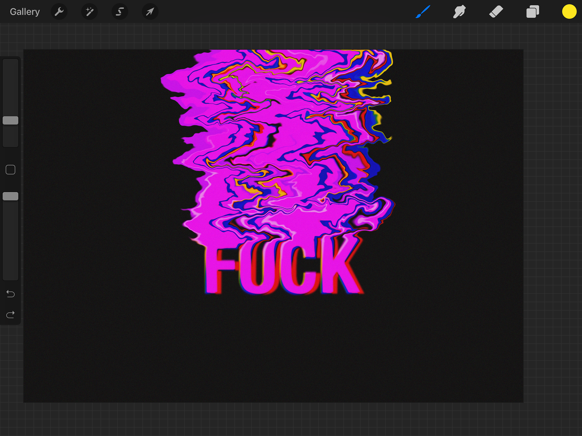
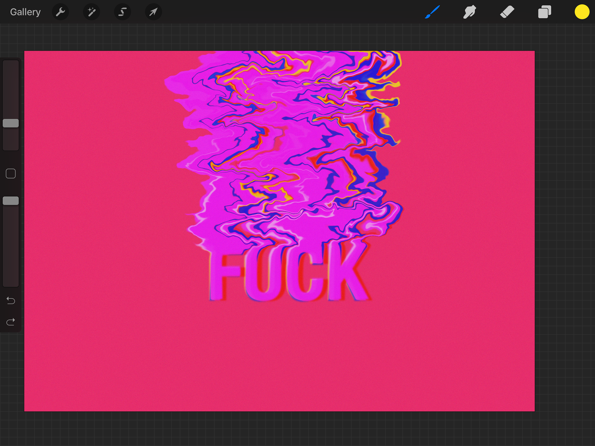
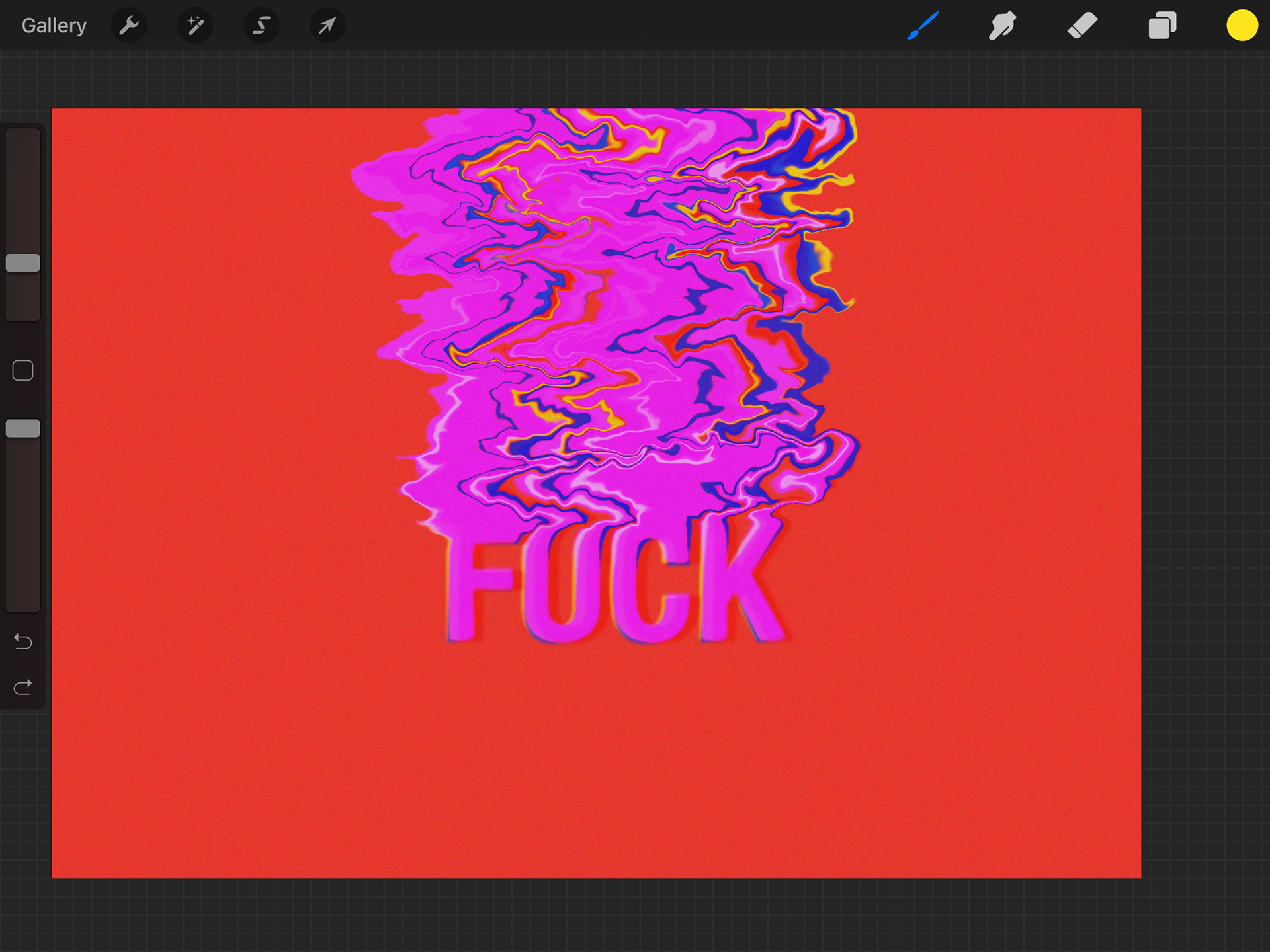
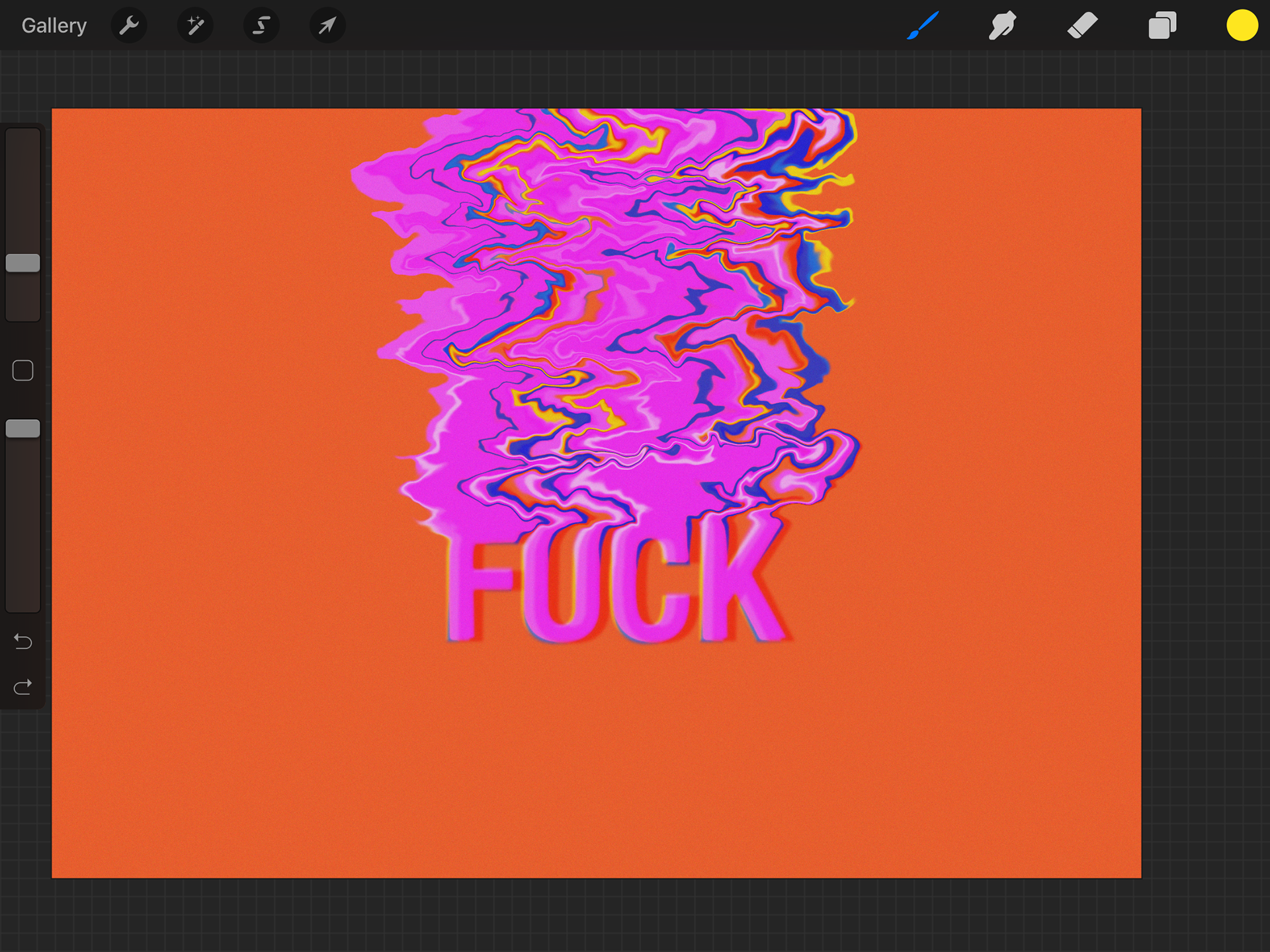
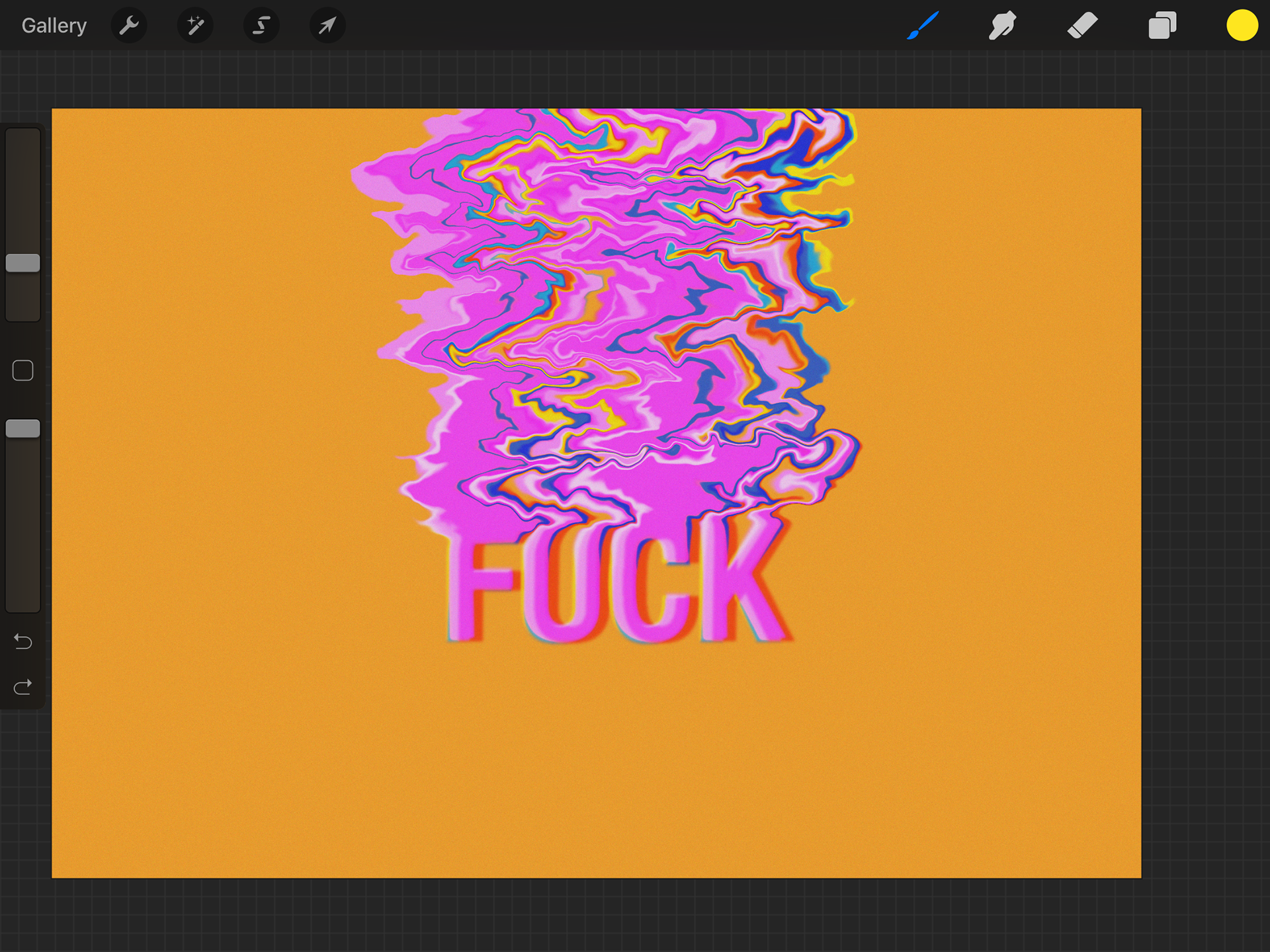
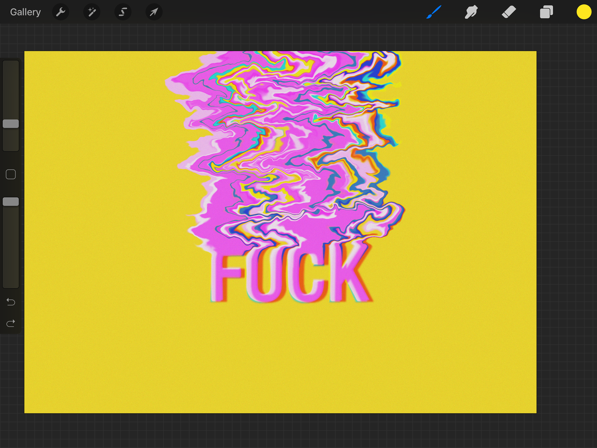
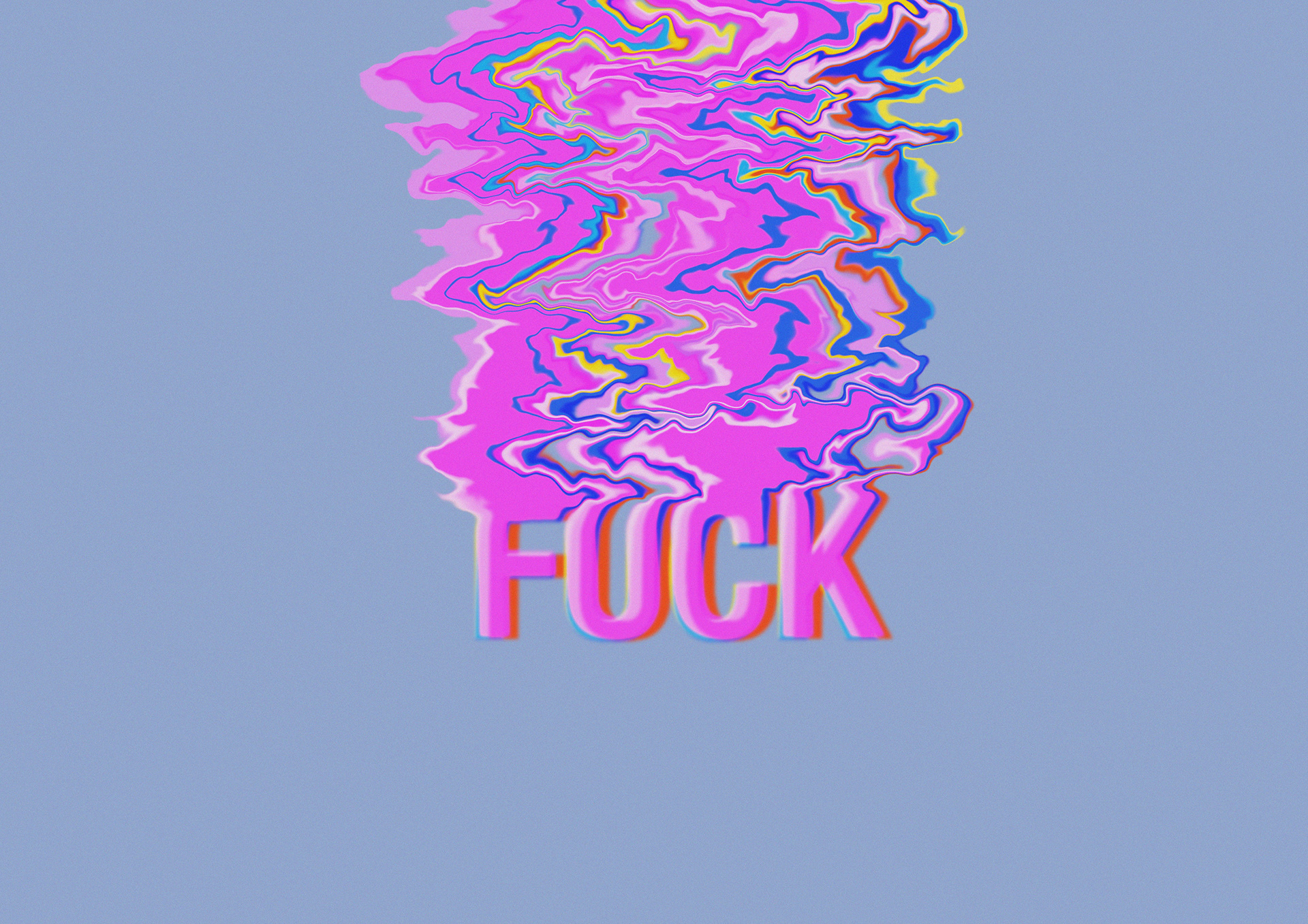
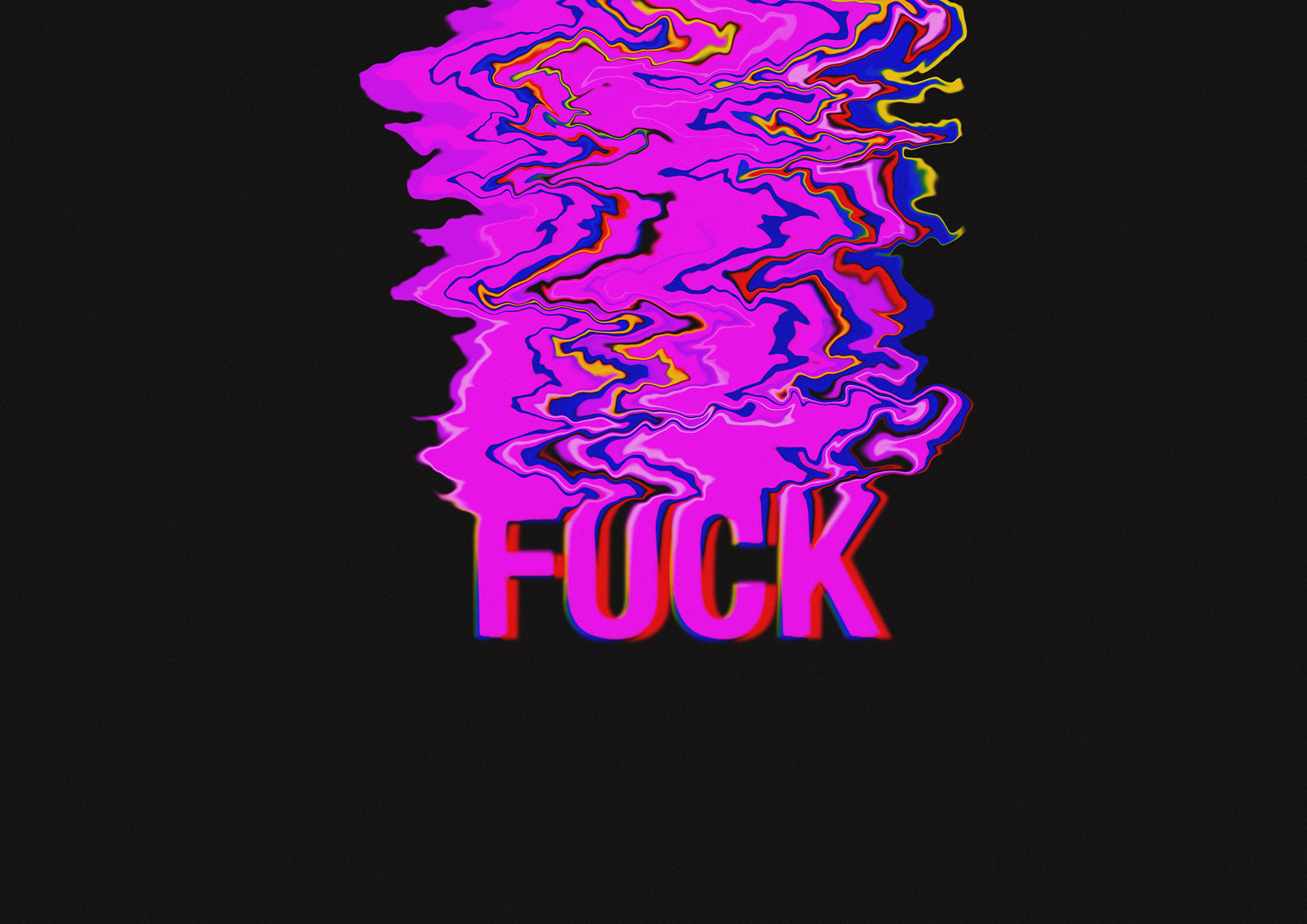
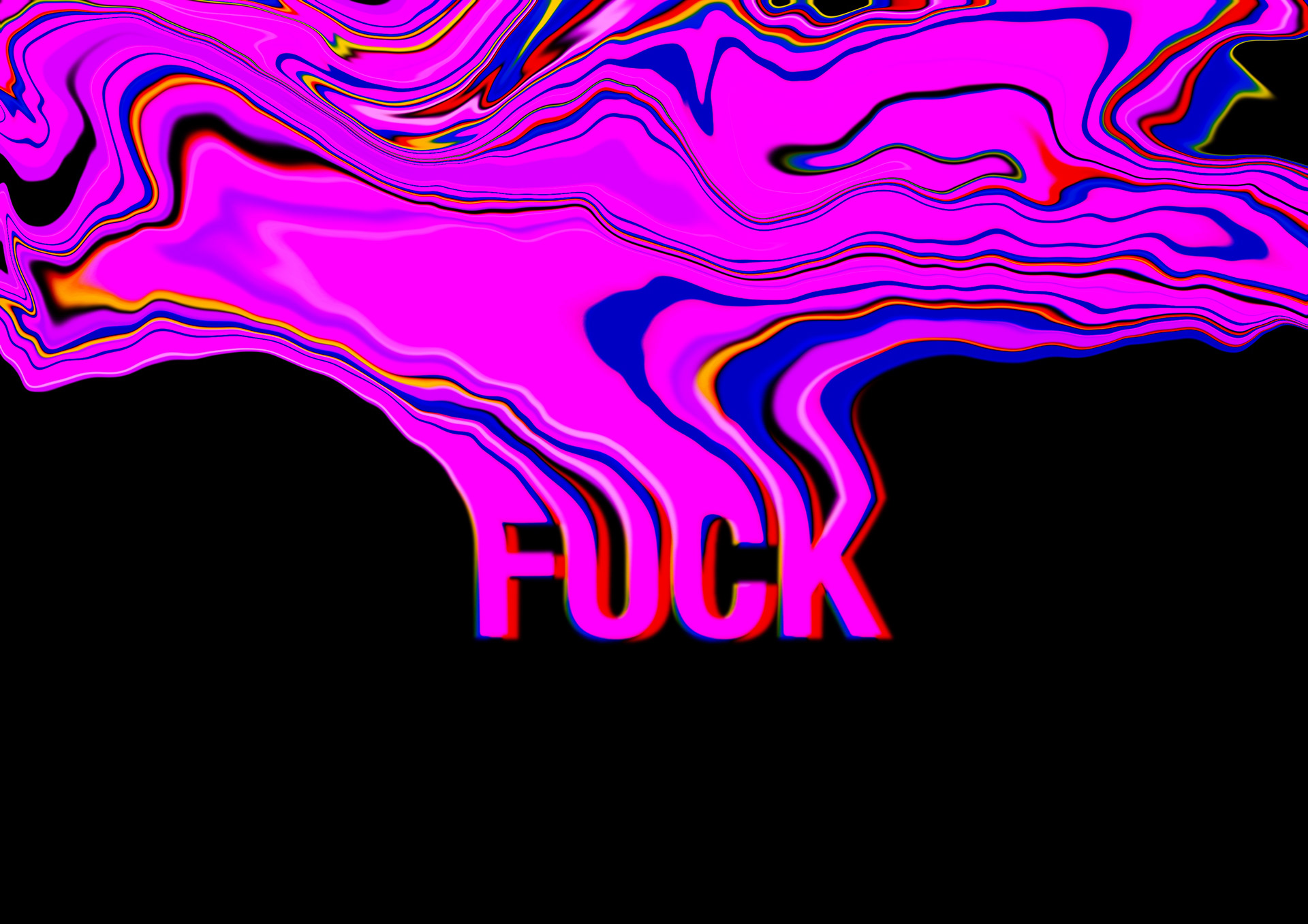
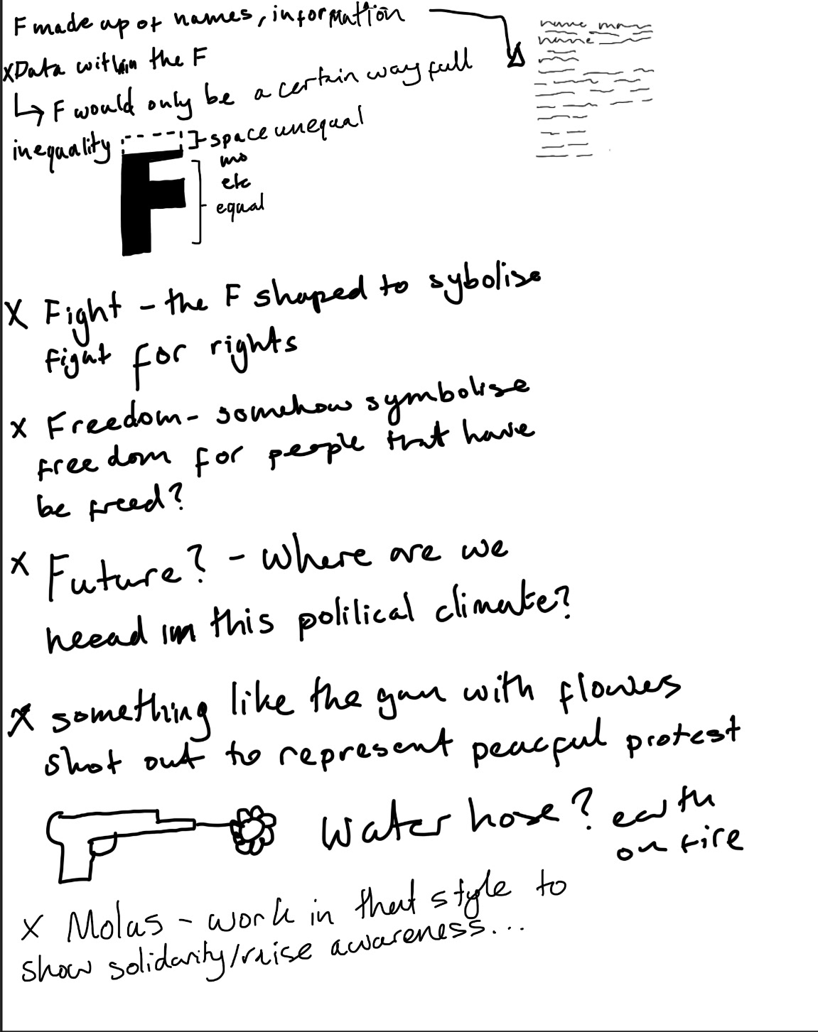
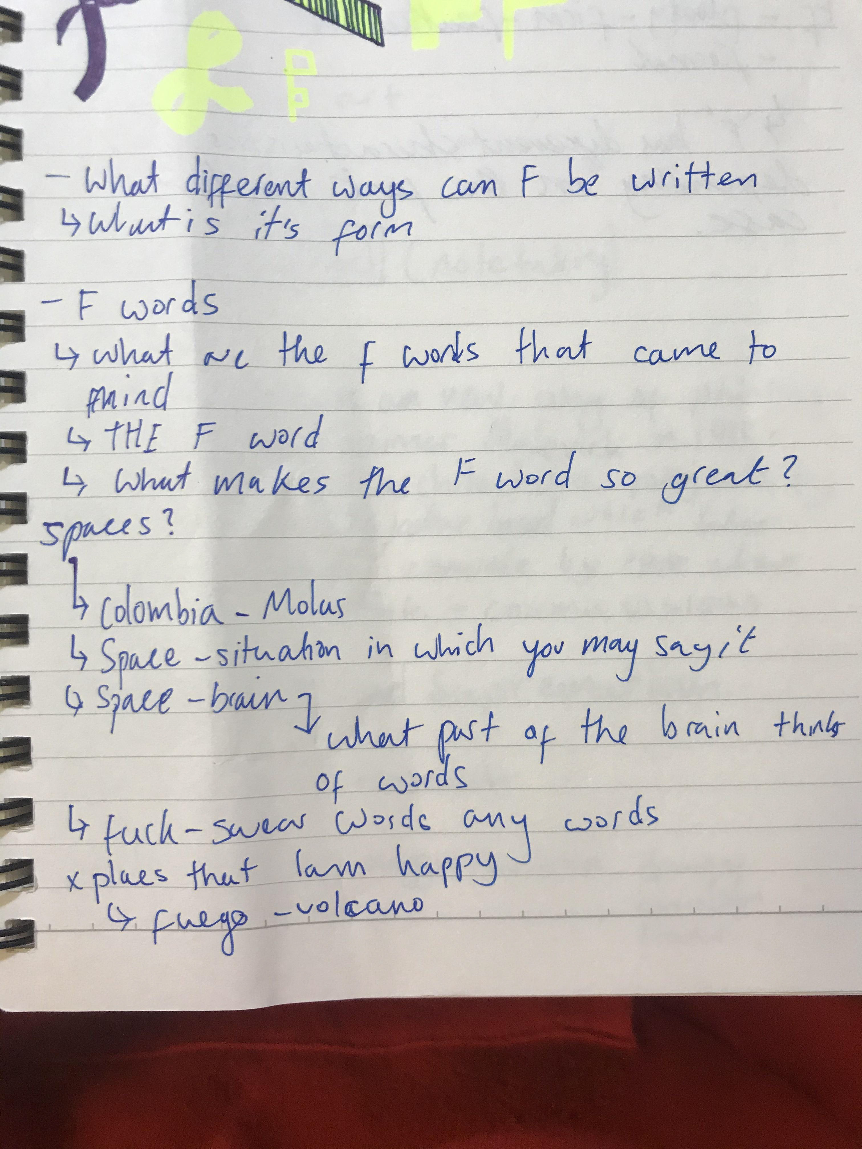
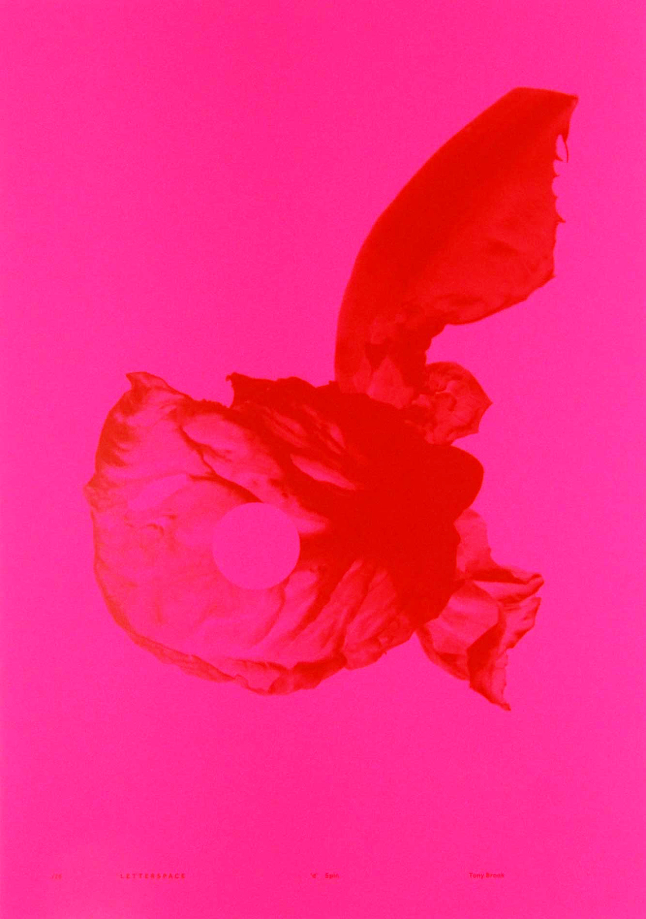
This was a kind of spur of the moment idea. I relate this to the space/location that is your mind. Something that comes to mind with the letter F is fuck. It got me thinking into what makes us swear and how it can't always be controlled. Why do some swear more than others and how can it affect you and/or others around you.
When I think of swearing I think of an explosion. Sometimes it just comes out and is released - at times in a calmer manner than in others, which is why there is a calmer disperse. I played around with colours as well, intensifying some but overall I quite like this as a starting point if I want to develop this idea.
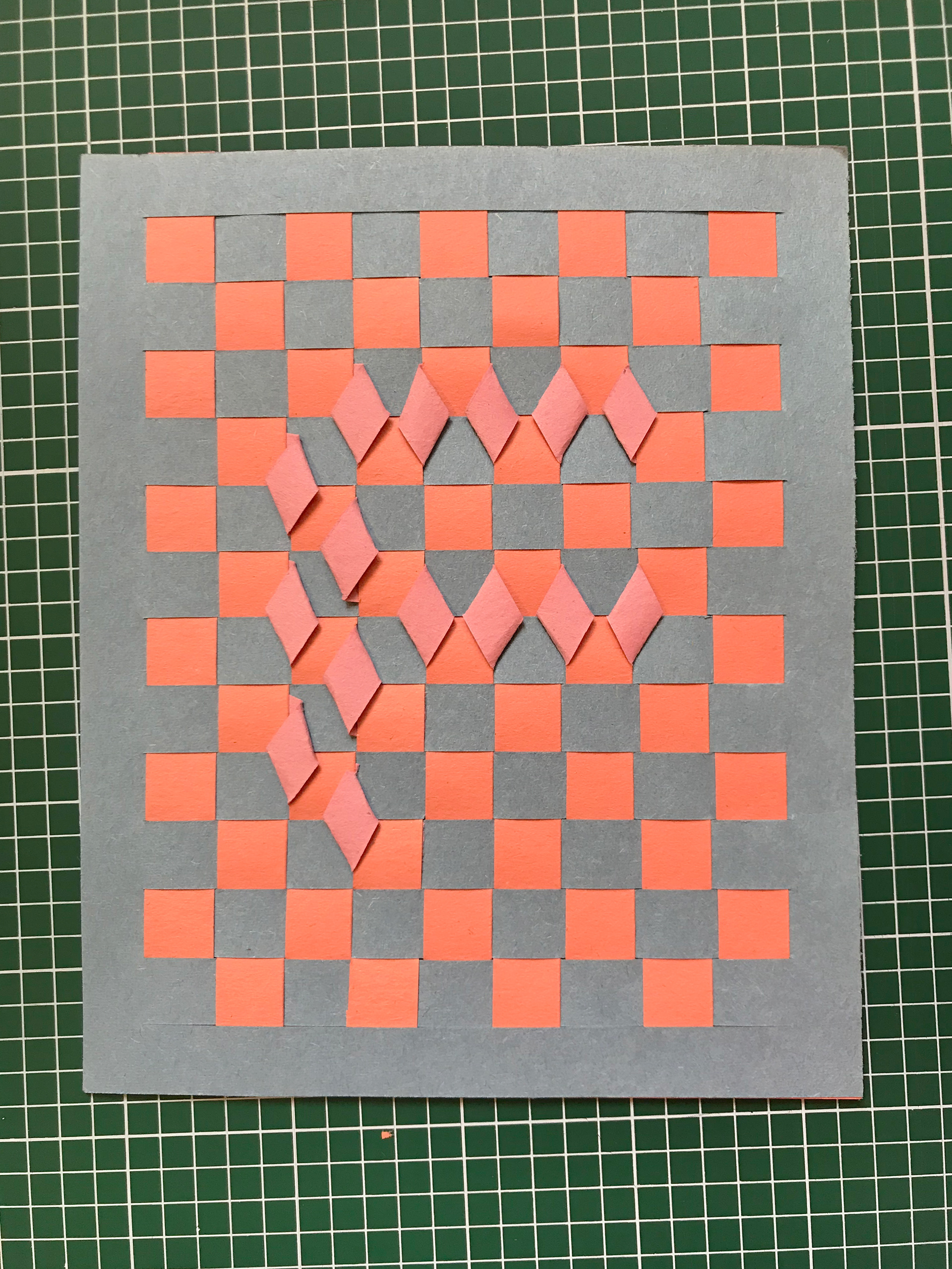
Paper Weaving
To get away from digital mediums I wanted to see what paper weaving could be like. It's something I enjoy doing and it always has a nice tactile feeling to it. If I were to possibly go down the natural route, then I would consider it. I think it could also work for other ideas and would probably use more vibrant colours.
Screen Printing
I wanted to explore this material as I have always wanted to do it but have never got the chance - I love the vibrant colours you get with screen printing and would strongly consider doing it.
I wanted to test on dark and light to see how the colour reacts with the paper, the white paper seems better quality and is opaque unlike the F with the dark background.


DIGITAL POSTERS
Above, are are some quick digital Fs I've illustrated just to get some creativity going as well and potentially explore making the poster digitally and then printing it out.
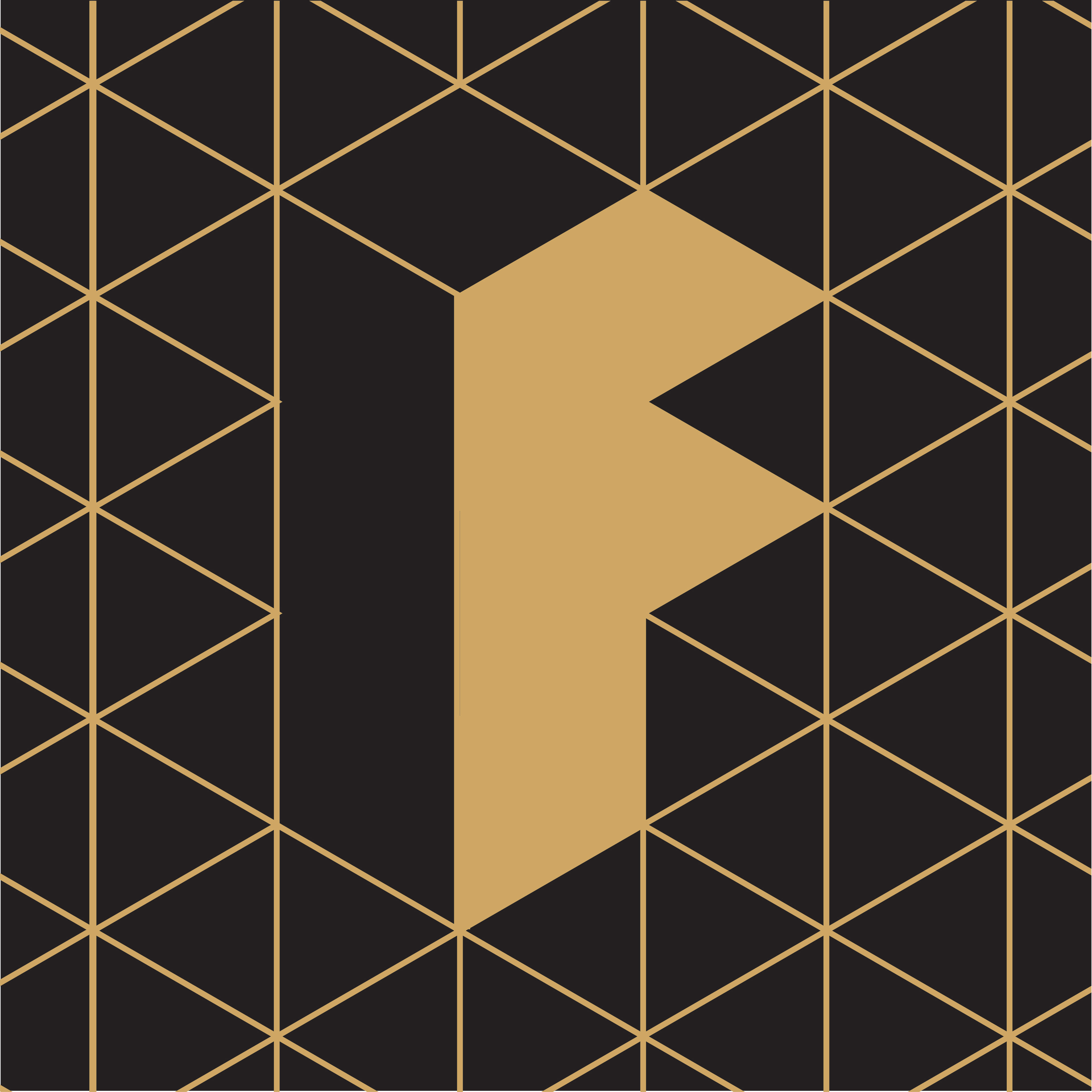
They don't directly relate to anything, but it's nice to work out some different style routes I could go down. I feel like the bottom right F could do with a touch up but could be a strong idea to do with fluidity. The top left, I think, is a strong image on it's own and I do like using simple shapes as I have a minimalist style to my work. The top middle is me just playing around with a pattern of F. I like the way it pieces together like a puzzle, though I'm not so sure how I could use this style in my final poster. I could imagine seeing the bottom left as a good gold screenprint and I like its geometric style. The middle bottom is just a variation of the same shapes used for the top left. It has a more playful appearance which may or may not come in handy when it comes to thinking up new ideas. The top right is inspired by some art deco fonts I saw in a book. Given the context I think you can clearly see its an F, I do think however that if you didn't know it was a typeface you might struggle.

Human signs - FUCK - F
I went on a walk over the weekend and thought it would be a good location to ask my friends to spell fuck as well as making the letter f.
I enjoyed watching them work out how to make the letters and liked the thinking process we had to go through to make this work. I think it's pretty well done.
some quick experiments in ways to write out the letter F
20 spaces/ location/places/
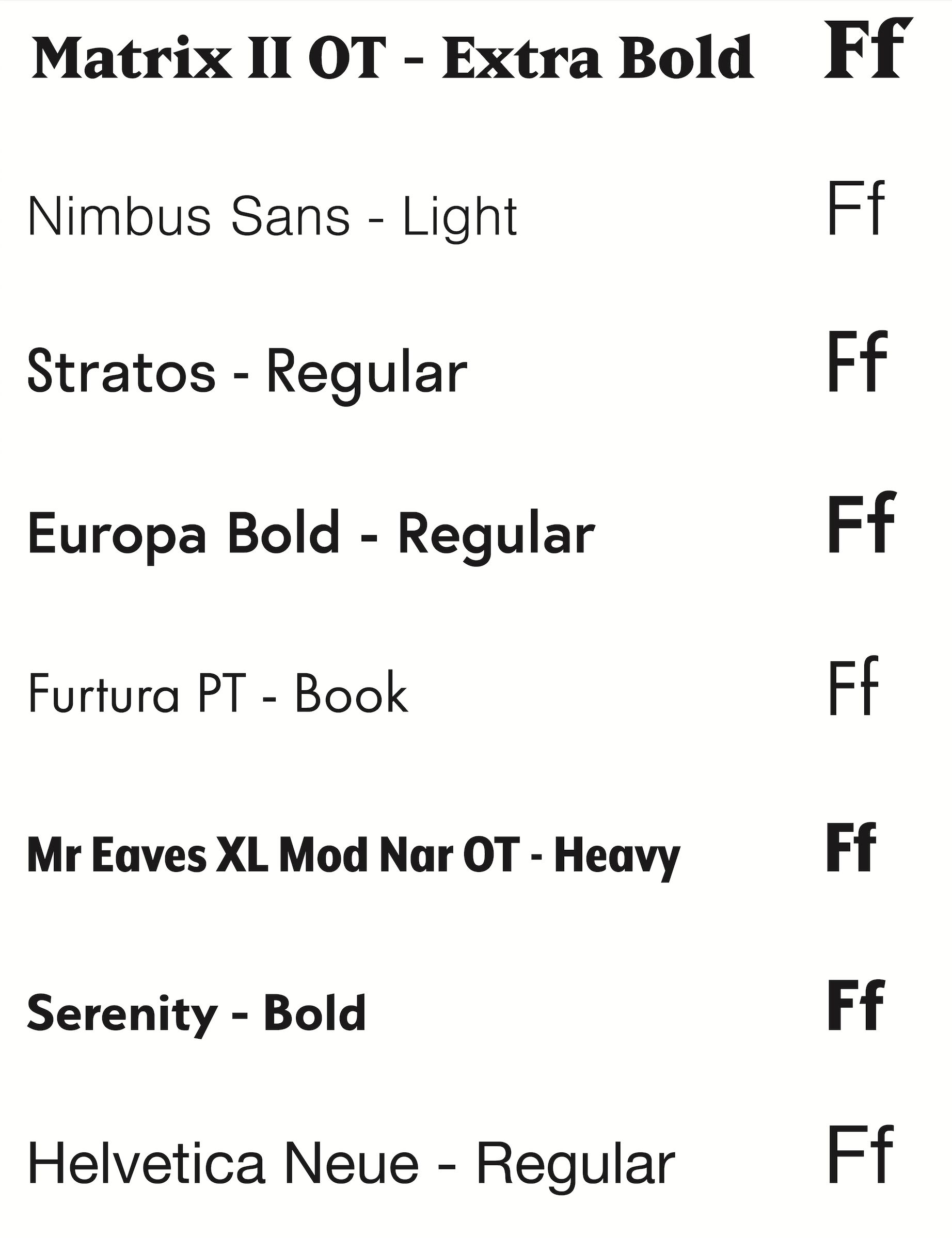
While I know a little about fonts I still have a lot to learn. Here are some of my favourites and also some I like the look of. I tend to stick to sans serif due to the fact I can find it quite distracting to read serif text. Sans serif tends to be easier to read for most people anyway, and I like to work with fonts that are more accessible to a wider audience.
I do also like decorative serif and sans serif fonts but in my opinion it's best to use them for sections with little writing like titles.
When choosing a font if I need to decide quickly. I tend to default to Helvetica Neue. While some think it's over used (I agree to an extent) I will say that to me it looks good in a lot of settings. There don't seem to be many irregularities either as the font seems to be very precise. I also like the size of the family, which allows me to use it to show different impressions without changing the overall style.
Matrix I've just come across, but I can imagine considering it if it lends well to any projects I've got coming up. I like the sharp pointed Serifs.
I also like Nimbus and Proxima nova (the one I'm typing in). I find them easy to read and I think they're nice to look at.
I like the way Stratos, Europa and Serenity, while all slightly different, appear to be more friendly typefaces. They're slightly more rounded in feel, even though for example serenity has slight angles on the top of b and d (which I haven't seen in more traditional typefaces).
Futura is another classic in my books, which I really like. It will always make me think of Barbara Kruger which I think is so powerful, but again can ruin it. Plus, I think it can be overused in certain situations.
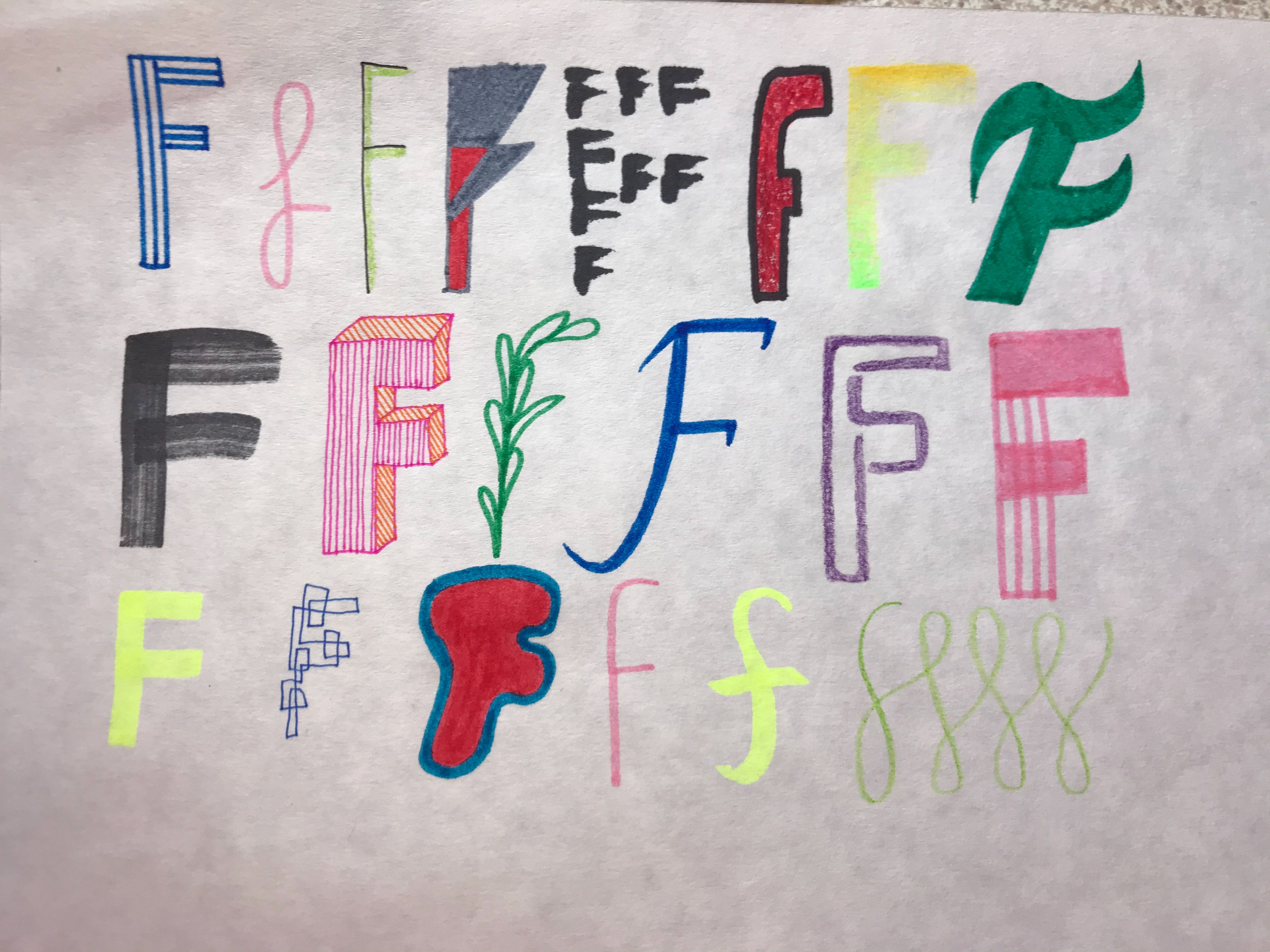
Different Versions
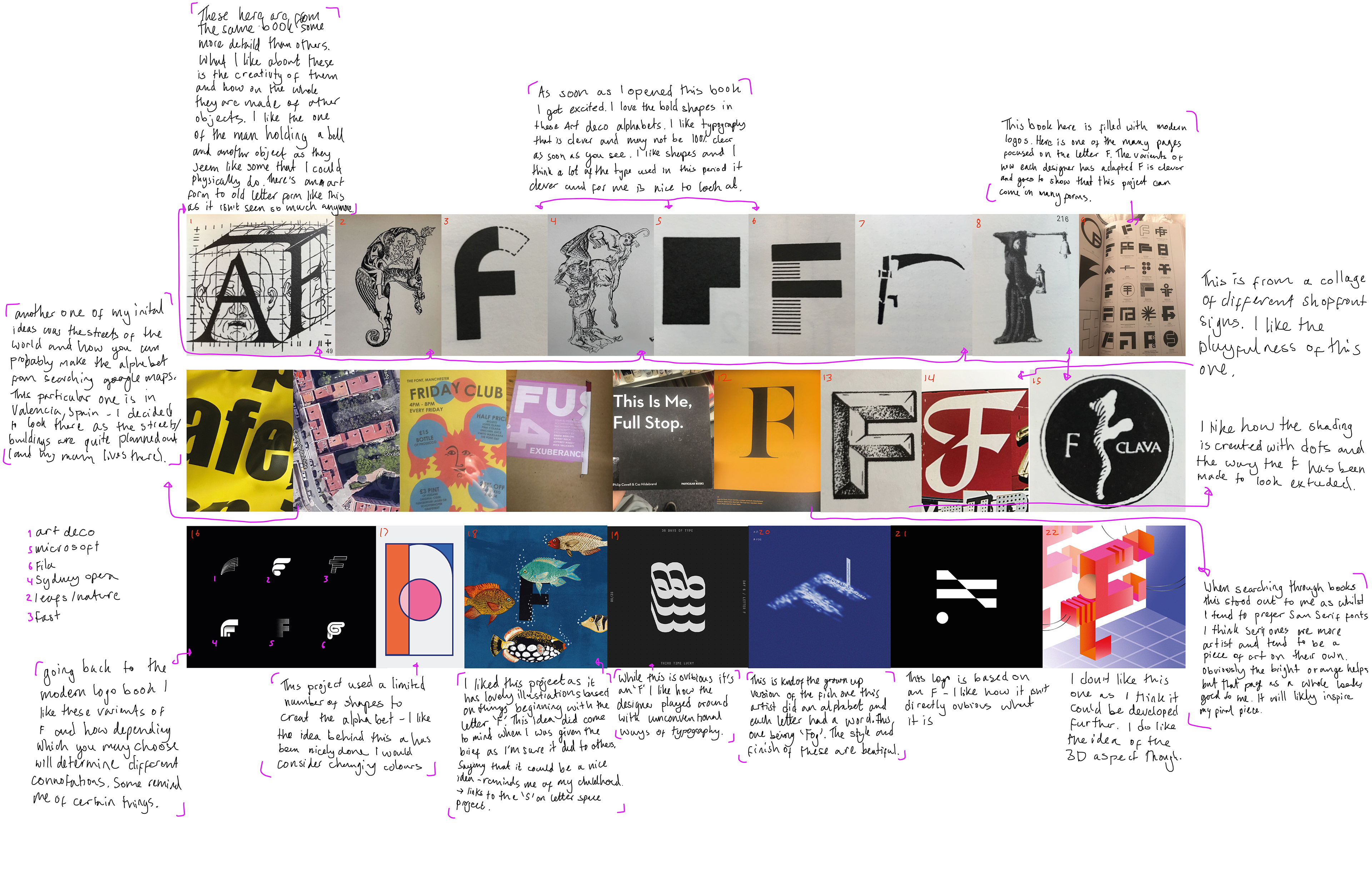
Above are different versions of 'F' I have found and why I chose them.
below are the references - number at beginning links to the red number on the images.
1,2,4,7,8,15 Massin. (1970). Letter and image. New York: Van Nostrand Reinhold Co., pp.31, 48, 50, 62, 63, 76.
3,5,6 Book of art deco alphabets. (1990). New York: Sterling Pub. Co.
9 Remington, R., Müller, J. and Wiedemann, J. (2015). Logo modernism. Köln: Taschen.
10 Carrer de Belchite. (2019). Carrer de Belchite. [online] Available at: https://www.google.com/maps/place/Carrer+de+Belchite,+46009+Val%C3%A8ncia,+Spain/@39.4867022,-0.3800983,363m/data=!3m1!1e3!4m5!3m4!1s0xd6045ff47182443:0x92241b9f7c946a39!8m2!3d39.4870751!4d-0.3791845 [Accessed 12 Oct. 2019].
11 Cowell, P. and Hildebrand, C. (2017). This is me, full stop. Particular Books.
12 Shaughnessy, A. and Brook, T. (2016). Herb Lubalin.
13 Handstyle lettering: from calligraphy to typography. (2017). 1st ed. Hong Kong: Viction Workshop Ltd, p.175.
14 Heller, S. and Ilić, M. (2004). Handwritten: expressive lettering in the digital age. 1st ed. london: Thames & Hudson, p.47
16 Behance.net. (2019). Behance. [online] Available at: https://www.behance.net/gallery/68827327/alphabet-project-part-1?tracking_source=search%7Cf%20letterform& [Accessed 15 Oct. 2019]. Arthur Bauer
17 Behance.net. (2019). Behance. [online] Available at: https://www.behance.net/gallery/69287505/A-Z-design-practice?tracking_source=search%7CLETTER%20F [Accessed 14 Oct. 2019]. Yun Zhu Chen
18 Behance.net. (2019). Behance. [online] Available at: https://www.behance.net/gallery/35084871/ Between10and5-The-Letter-F [Accessed 11 Oct. 2019]. Aurora Creative Studio
19 Behance.net. (2019). Behance. [online] Available at: https://www.behance.net/gallery/50866577/36-Days-Of-Type-2017?tracking_source=search%7CLETTER%20F [Accessed 14 Oct. 2019]. Andres Avila
20 Behance.net. (2019). Behance. [online] Available at: https://www.behance.net/gallery/65573529/A-B-C-D-E-F-G-H-T?tracking_source=search%7CLETTER%20F [Accessed 14 Oct. 2019]. 毛侃 maokan
21 Behance.net. (2019). Behance. [online] Available at: https://www.behance.net/gallery/86370161/FreshBrands?tracking_source=search%7CLETTER%20F [Accessed 14 Oct. 2019]. Mateusz Pałka
22 Behance.net. (2019). Behance. [online] Available at: https://www.behance.net/gallery/74566449/Drop-Cap-Designs-F-and-M?tracking_source=search%7CLETTER%20F [Accessed 14 Oct. 2019]. Selena Joe
Other Languages
Languages that use the Latin alphabet all include f. However the way it is pronounced may vary from language to language. For example a sole f in Welsh represents /v/ while ff represents /f/. Also, in spoken Icelandic if the f is in the middle of the word it is often pronounced v/.
An added bonus is that in Spanish (and in French) the letter f often became an h, eg: farina (flour) became harina or harine (in Italian they kept the f).
Different Forms
In mathematics f is used to denote an arbitrary function
℉ is used to demonstrate degrees fahrenheit
Music - dynamic
HISTORY
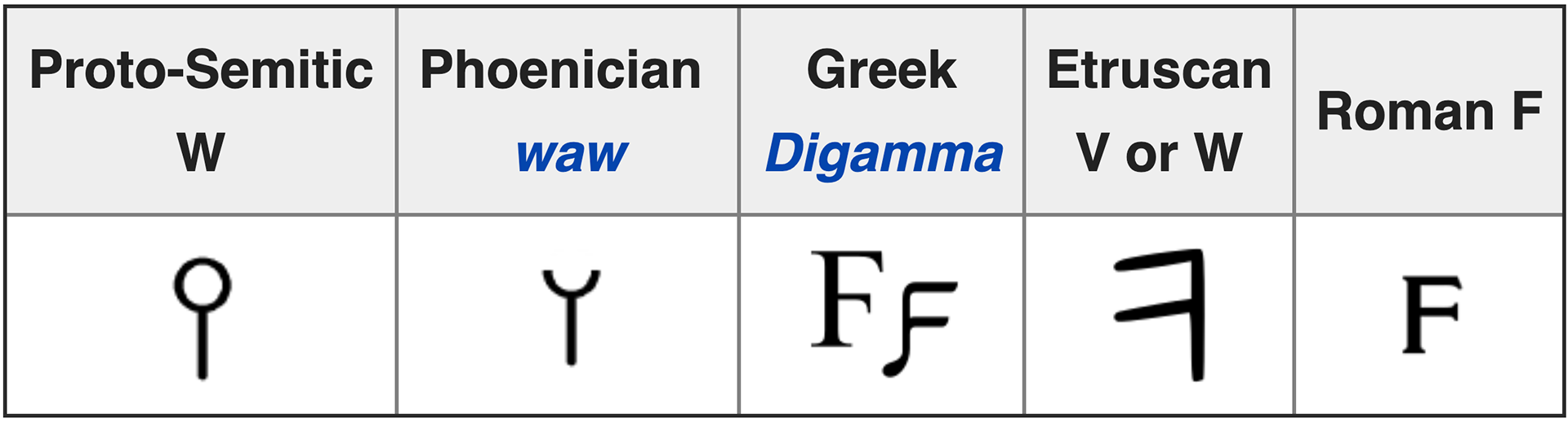
F comes from the Greek, Latin and Etruscan alphabets. Its origin is the semitic letter which sounds a little like /v/ or /w/. Its appearance probably originally depicted a hook or a club and was potentially linked to the Egyptian hieroglyph which represented the word mace.
In some early latin scripts it was used in combination with h to represent a sound like the English 'f'. However this was quickly dropped.
What I've found interesting is that, whatever the script, it eventually turned into the f we know today, but it has gone through a bit of evolution of the years.
En.wikipedia.org. (2019). F. [online] Available at: https://en.wikipedia.org/wiki/F [Accessed 12 Oct. 2019]. (image)
Encyclopedia Britannica. (2019). f | History, Etymology, & Pronunciation. [online] Available at: https://www.britannica.com/topic/F-letter [Accessed 13 Oct. 2019].
What I really like about this letter space brief created by Lucy is its huge variety - while some are more obvious I think what makes these special is the story behind them, not just the finished piece. While I think most are great pieces of work it is in my eyes important to note the story of each one.
For example with the letter E I did at first think it was a bit amateur to choose something relating to your name (the idea surely came into my mind). But as I read on I really got an understanding for what Ezer was going for. I like the poetic factor to this piece and the raw value to it as it explains his story and how E relates to his surname, middle east and more.
Another one that I like is the letter D. While I like the story of the garden and home grown vegetables and definitely see how it answers the brief, the letter D doesn't correlate directly to this. However, this wasn't the only letter form where I felt this happened (e.g. Manchester buildings for 'L'). It's just shown me that this brief can be answered in many ways, as this project has shown.

Letterspace.co.uk. (2019). Letterspace. [online] Available at: https://www.letterspace.co.uk/ [Accessed 13 Oct. 2019].

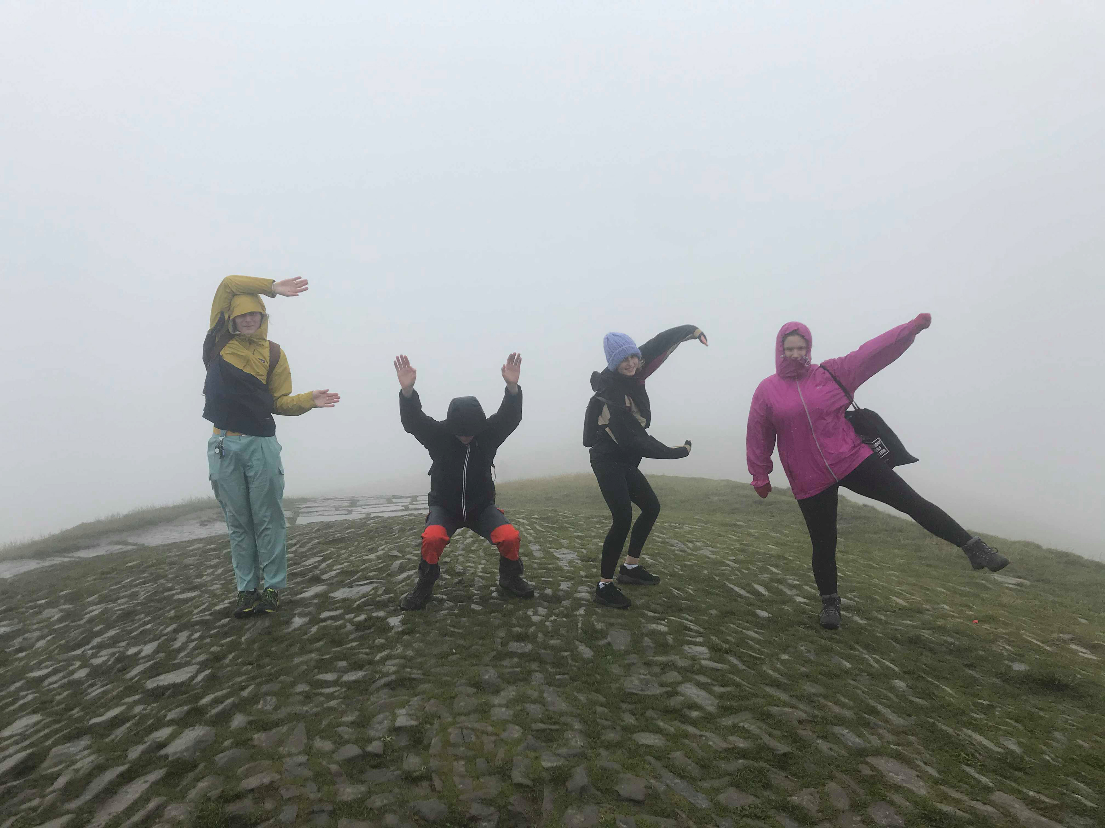
These are all photographs I have taken to demonstrate the letter F - some are photographs of places/things that mean a lot to me. I guess I link it to places I've had 'fun' in or are 'forward', or anything I can loosely relate it to, as they have all had an impact on me this year.
Food is also present in these images as I really love eating it, but also making it.
Some, on the other hand, are just letterforms containing the letter F, which I like.
Here is graph demonstrating the use of "F and f" over the years in Spanish language books.
Books.google.com. (2019). Google Ngram Viewer. [online] Available at: https://books.google.com/ngrams/graph?content=f%2CF&case_insensitive=on&year_start=1800&year_end=2008&corpus=10&smoothing=1&share=&direct_url=t4%3B%2Cf%3B%2Cc0%3B%2Cs0%3B%3Bf%3B%2Cc0%3B%3BF%3B%2Cc0%3B.t4%3B%2CF%3B%2Cc0%3B%2Cs0%3B%3Bf%3B%2Cc0%3B%3BF%3B%2Cc0 [Accessed 9 Oct. 2019].
Here is graph demonstrating the use of "F and f" over the years in English language books.
Books.google.com. (2019). Google Ngram Viewer. [online] Available at: https://books.google.com/ngrams/graph?content=f%2CF&case_insensitive=on&year_start=1800&year_end=2008&corpus=15&smoothing=1&share=&direct_url=t4%3B%2Cf%3B%2Cc0%3B%2Cs0%3B%3Bf%3B%2Cc0%3B%3BF%3B%2Cc0%3B.t4%3B%2CF%3B%2Cc0%3B%2Cs0%3B%3Bf%3B%2Cc0%3B%3BF%3B%2Cc0 [Accessed 9 Oct. 2019].
I asked some friends and family to read out the words below as I wanted to see how different accents pronounce words but also how they act them out. For example one of the recording sounds more forced and performed than the usual voice I know for that person.
My mum also read aloud and you can definitely tell the difference with hers as you can hear her reading some of the letters the way you would if you spoke Spanish (it's her native language)
What others think: these are some responses my friends & family gave
Feminism....
Both in English and in Spanish ... . Like it and support and consider myself feminist but also can be seen as radical so just to use the letter F can have the idea to hide it...
France ...: Fun
Fabulous... and Fiesta
I think F makes me feel positive/ open ...
Fabulous... and Fiesta
I think F makes me feel positive/ open ...
F makes me think of Freedom, Fearlessness, Frenzy and Fun, and Freezing days and the Fiery sun.
What comes to mind:
When I think of F I think of words like the ones below. Fun and freedom seem to stick. Freedom starts a whole rabbit hole scenario for me. I link it to the words fierce, feminism, fight, figures but also more tranquil terms like flow, flora, fly. I associate it with things I believe in, e.g. feminism.
It's a straight up smart looking letter but it comes in so many forms and stands for so many things that it can have its fun side.
F
fun - funk - form - free - fuck - friend - foe - flora - fox - fly - fake - fond - fled - flat - fauna - flake - FOOD - frog - fizz - flood - fry - fungus