


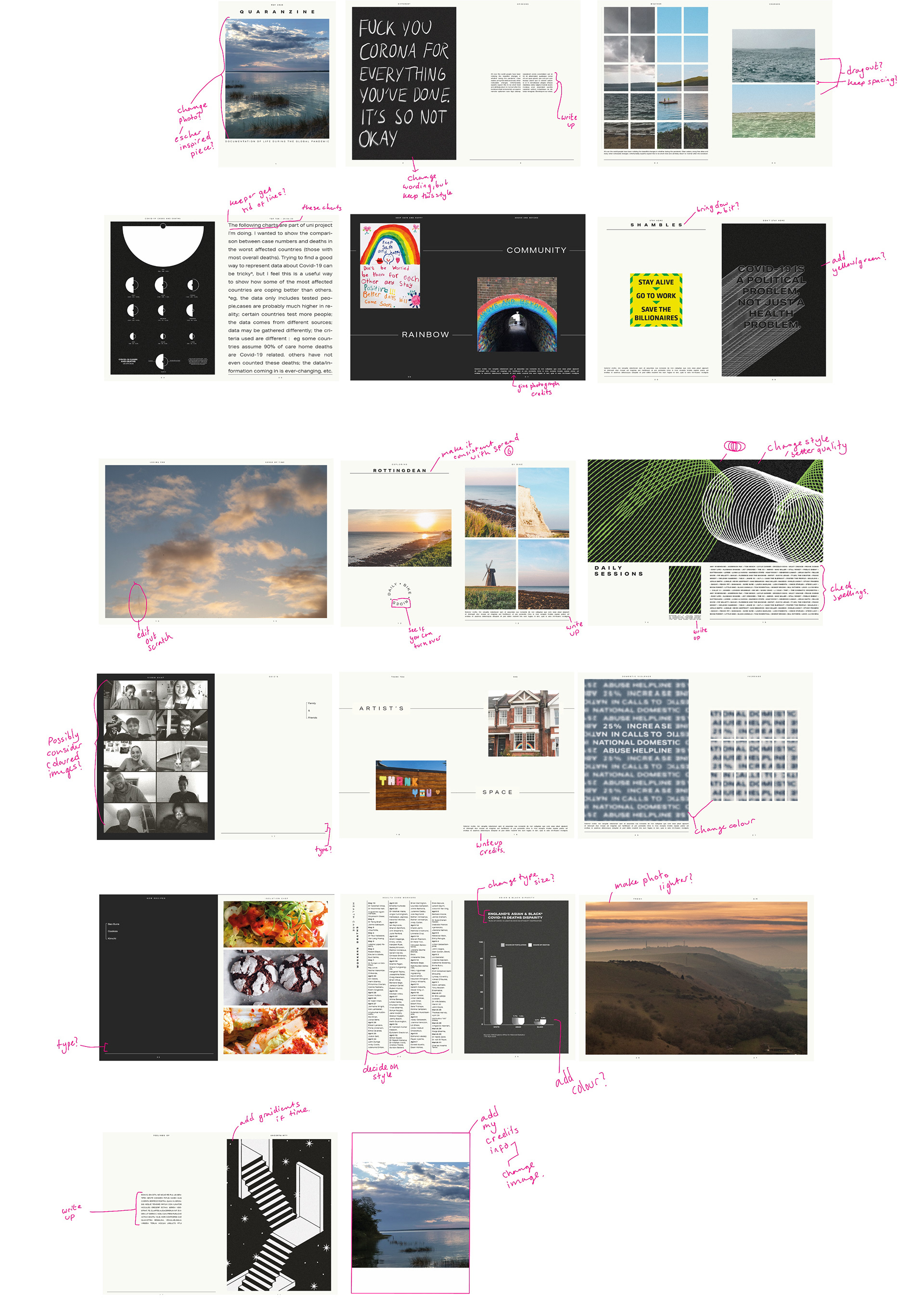
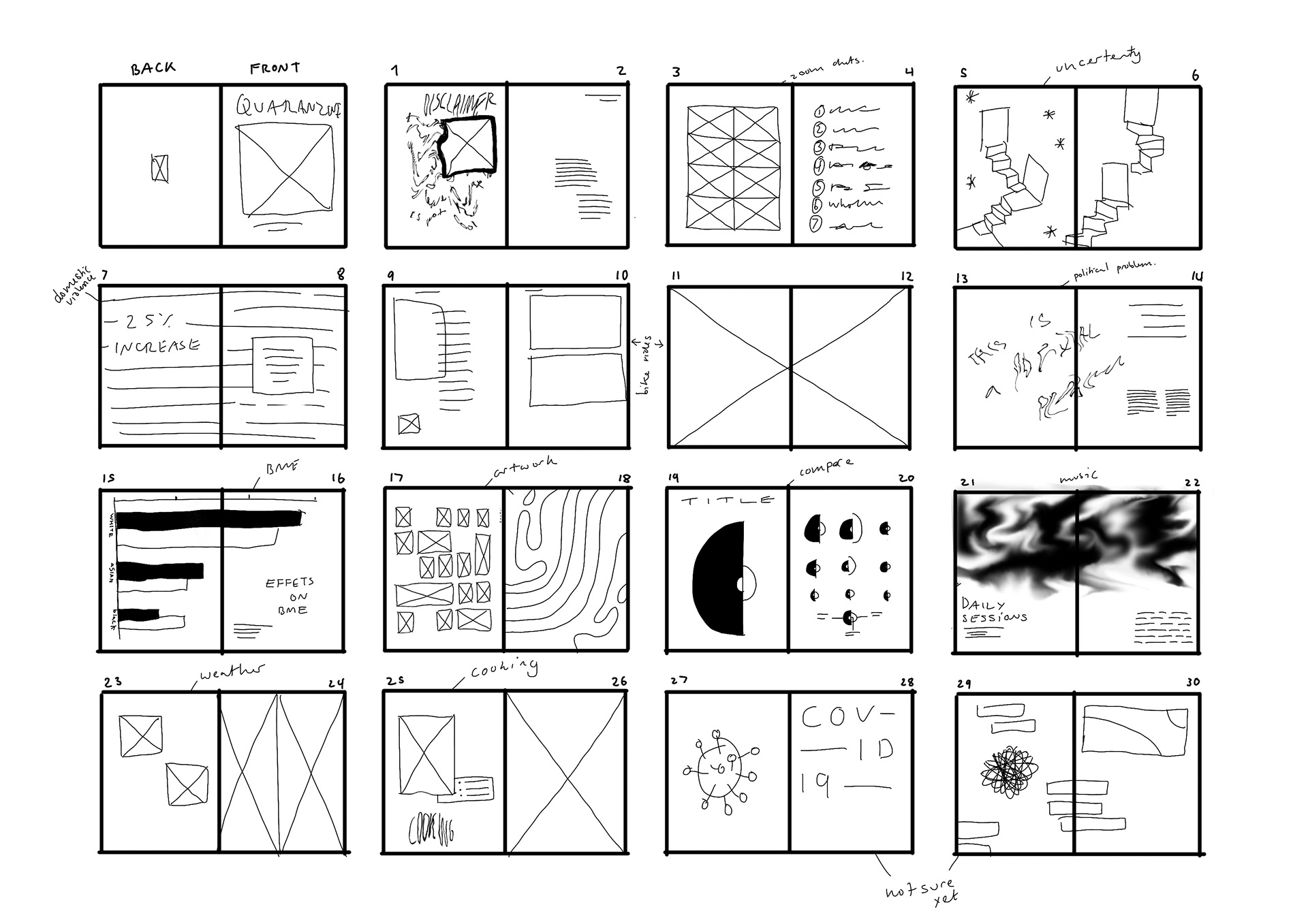
final spreads - check portfolio for final spreads


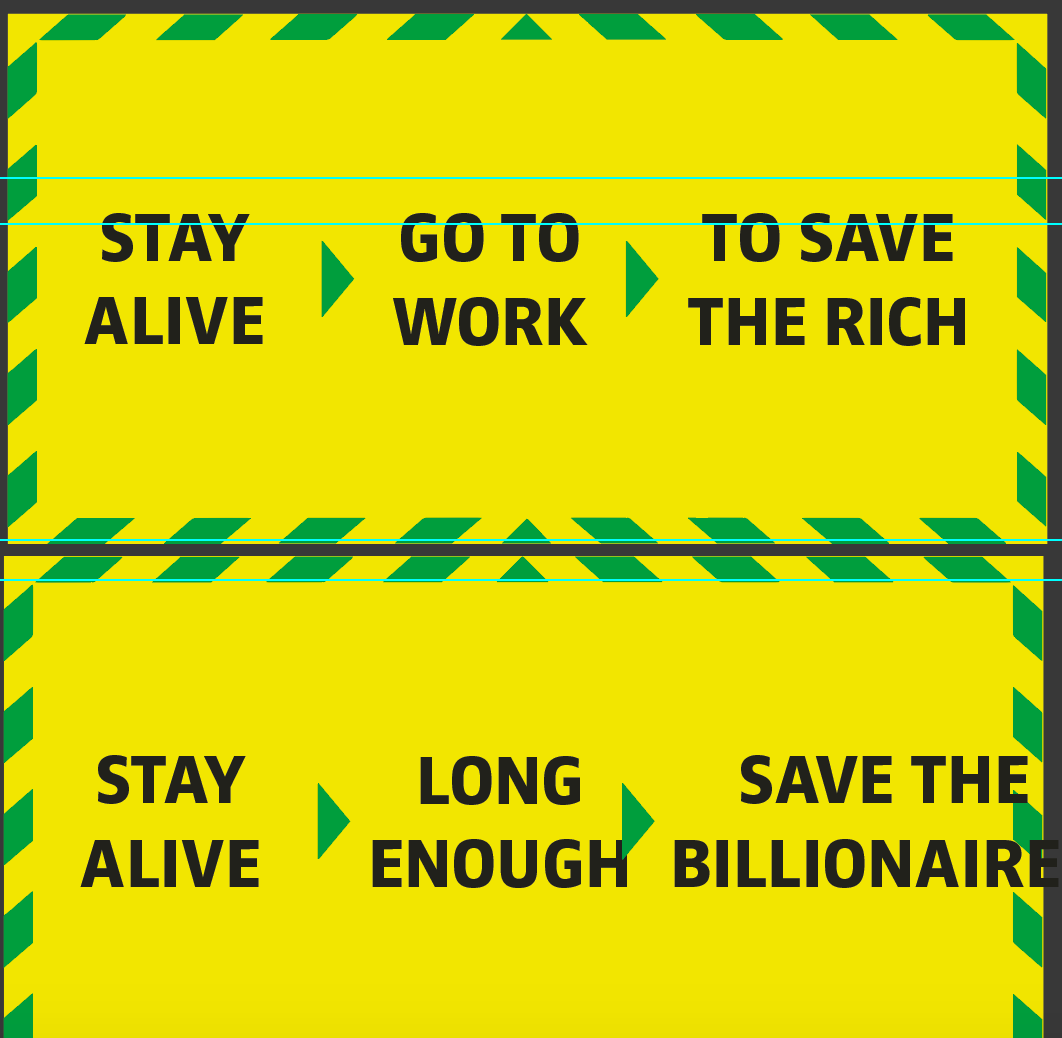
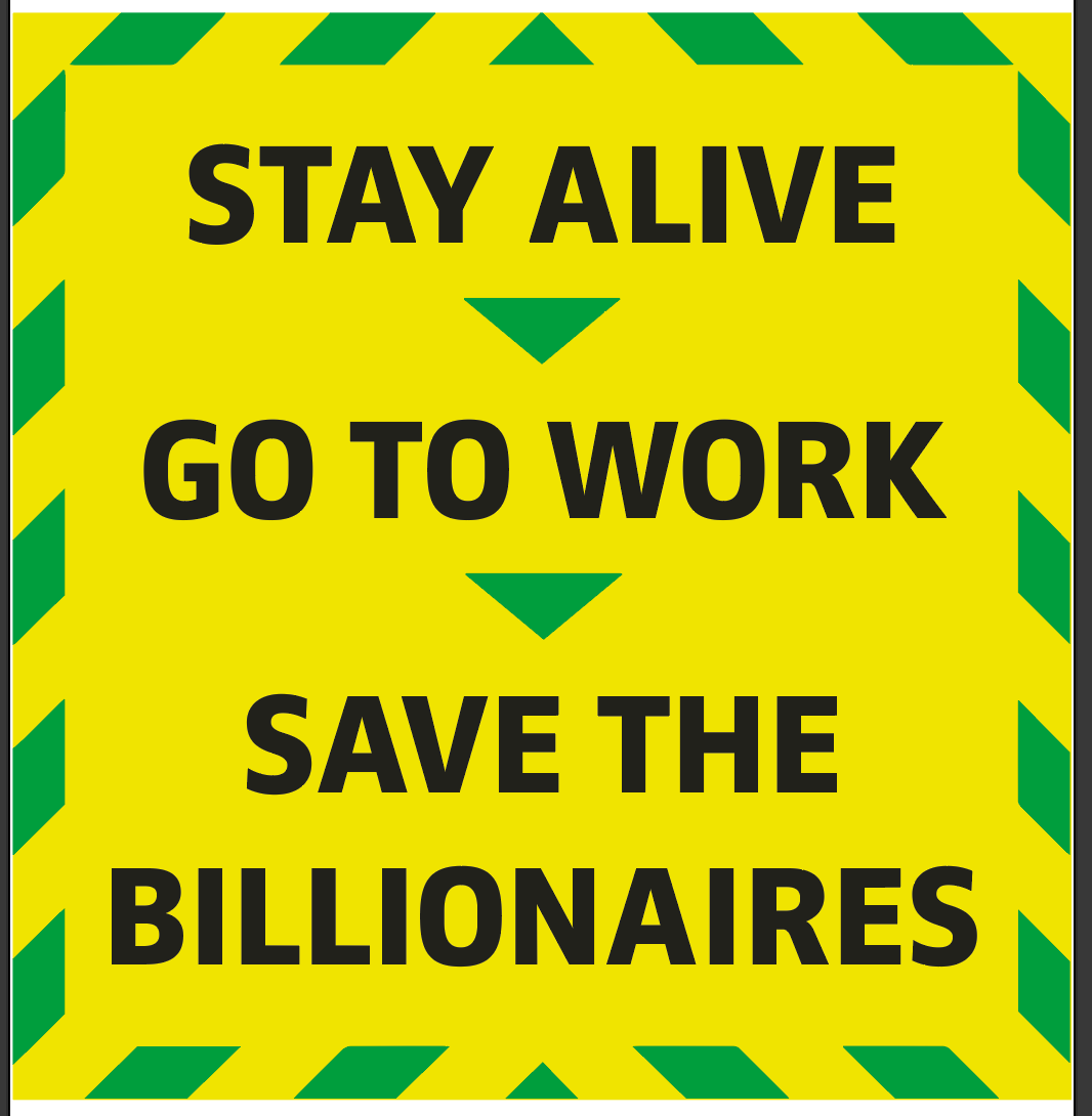
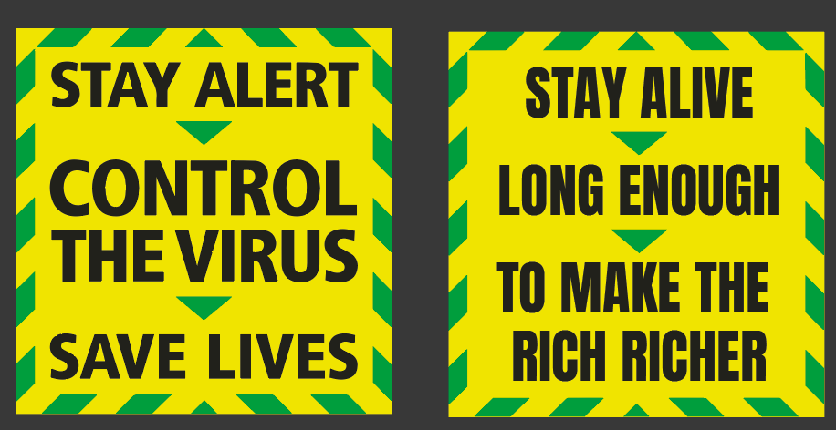
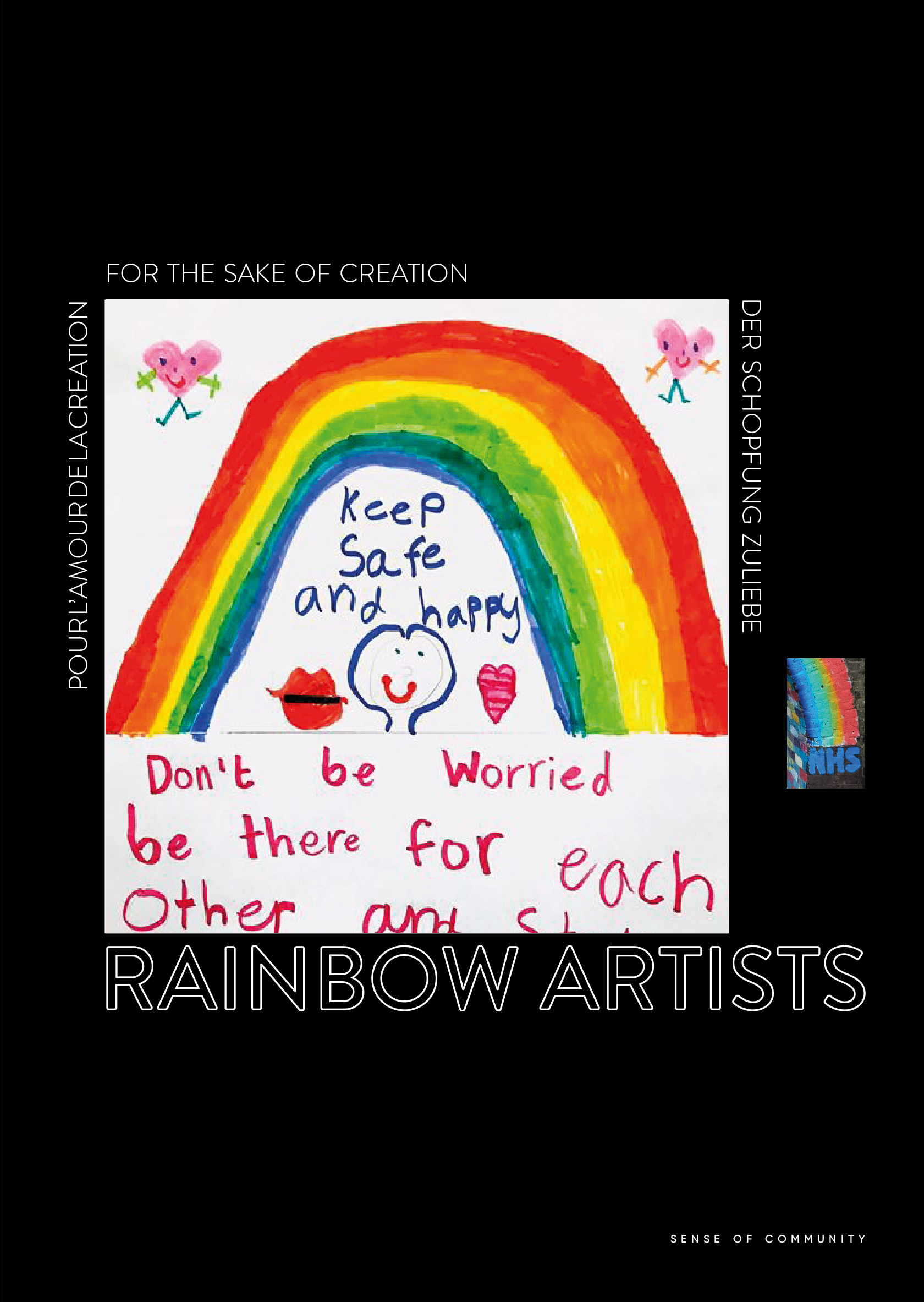
I've added some further colours to some of the pages to liven it up - I think this works really nicely and gives the publication a warmer feel to it. This is basically my finished piece but I will do a couple of changes like stated below.

Click on images and zoom
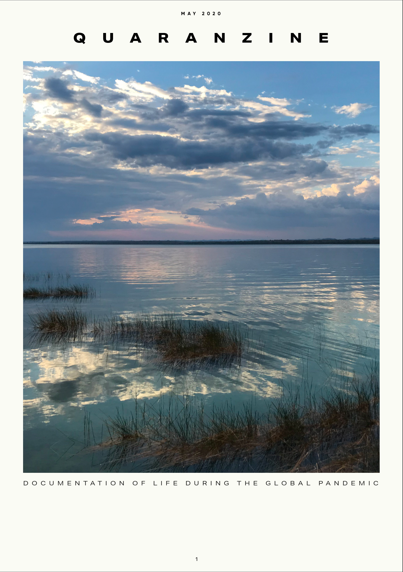
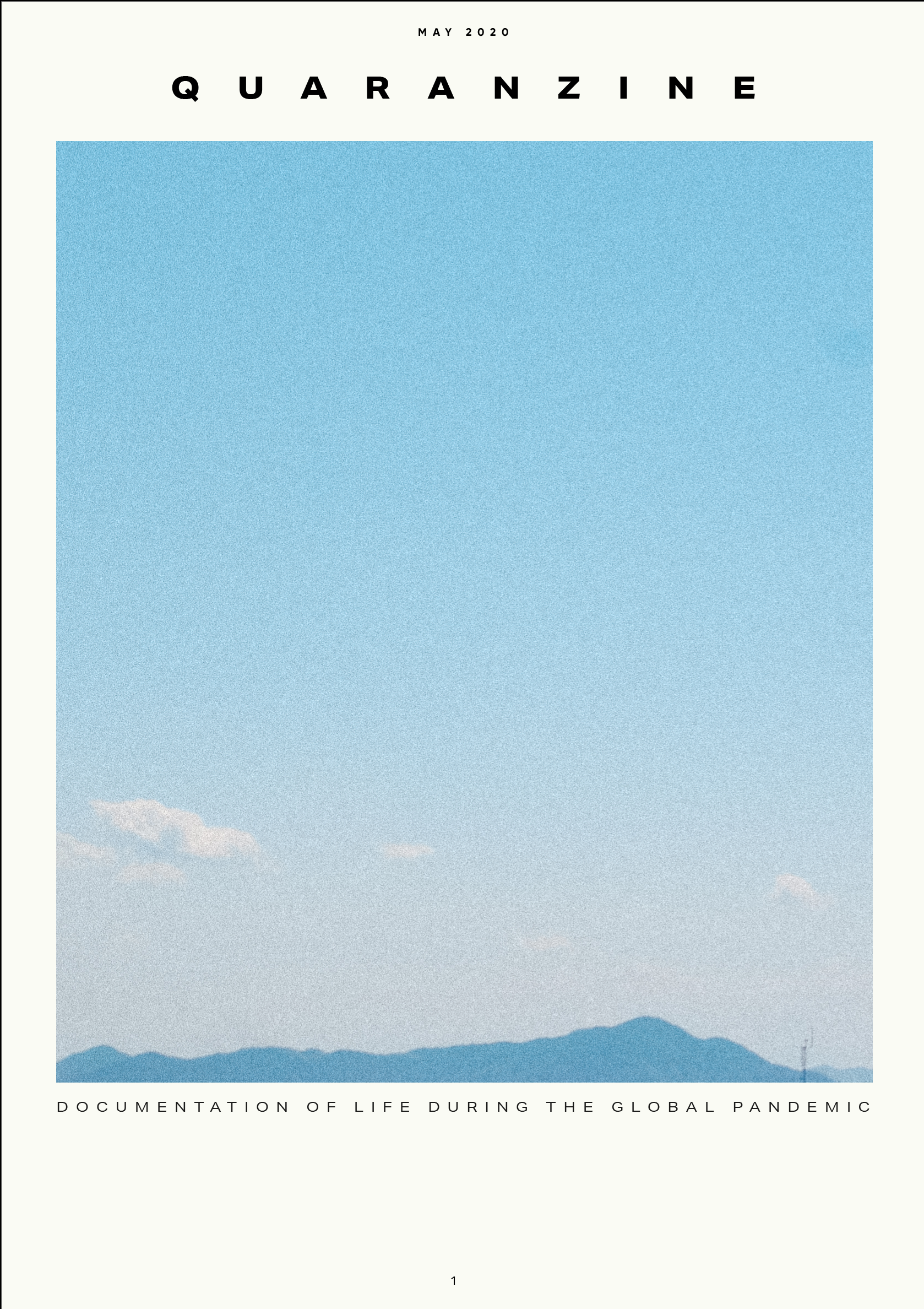
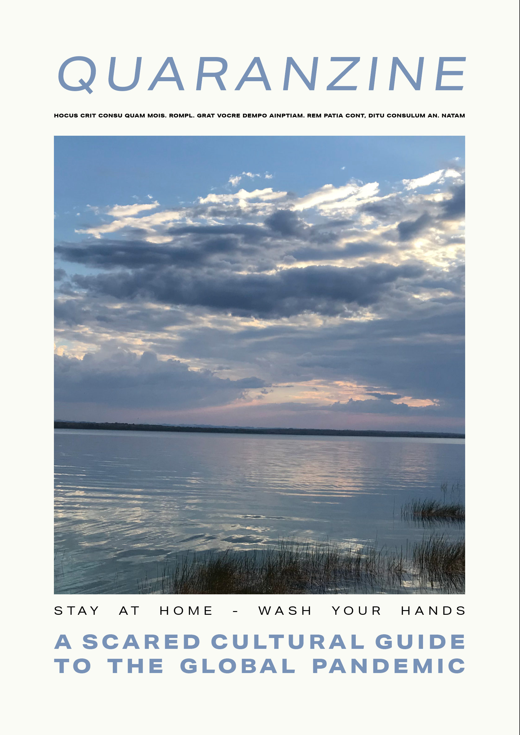
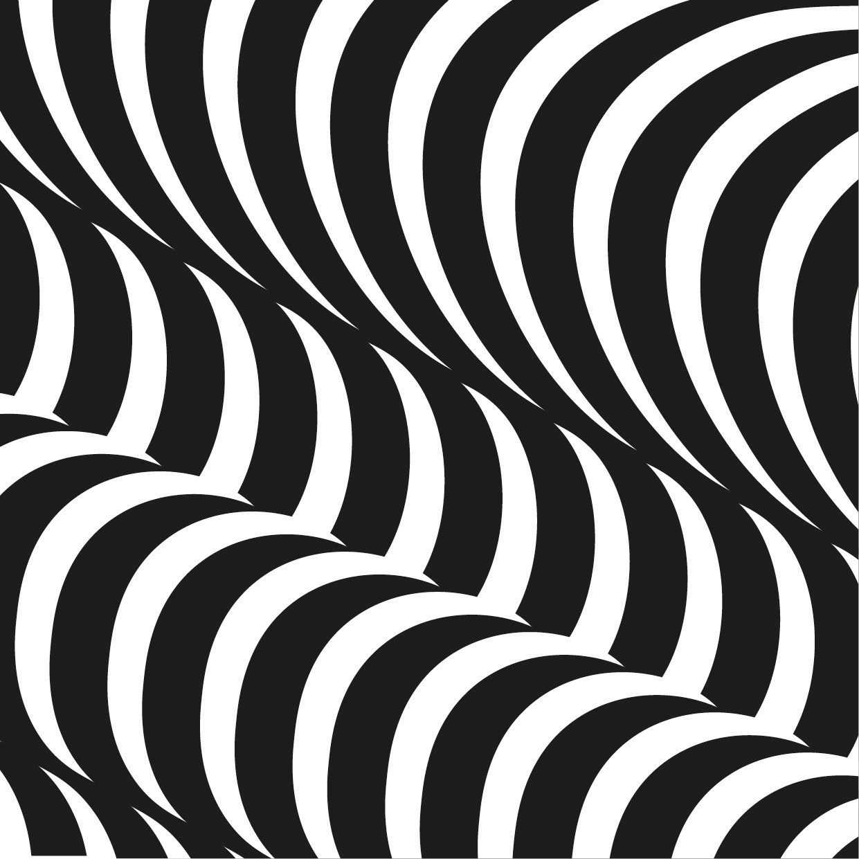
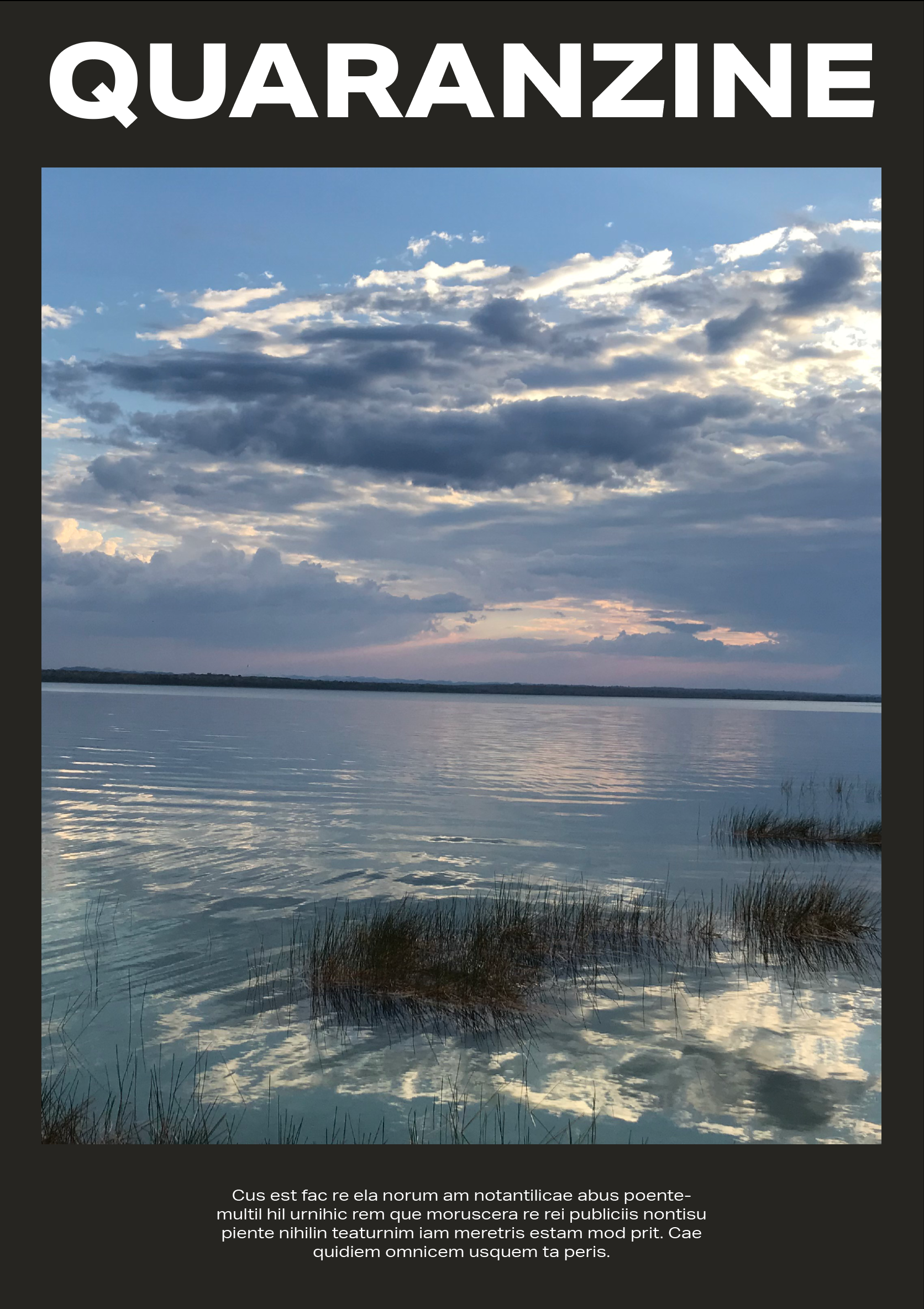
I quite like the front covers on the left but I don't really see how the images I've included link well enough. I'm thinking maybe an escher style piece could work for the front cover?

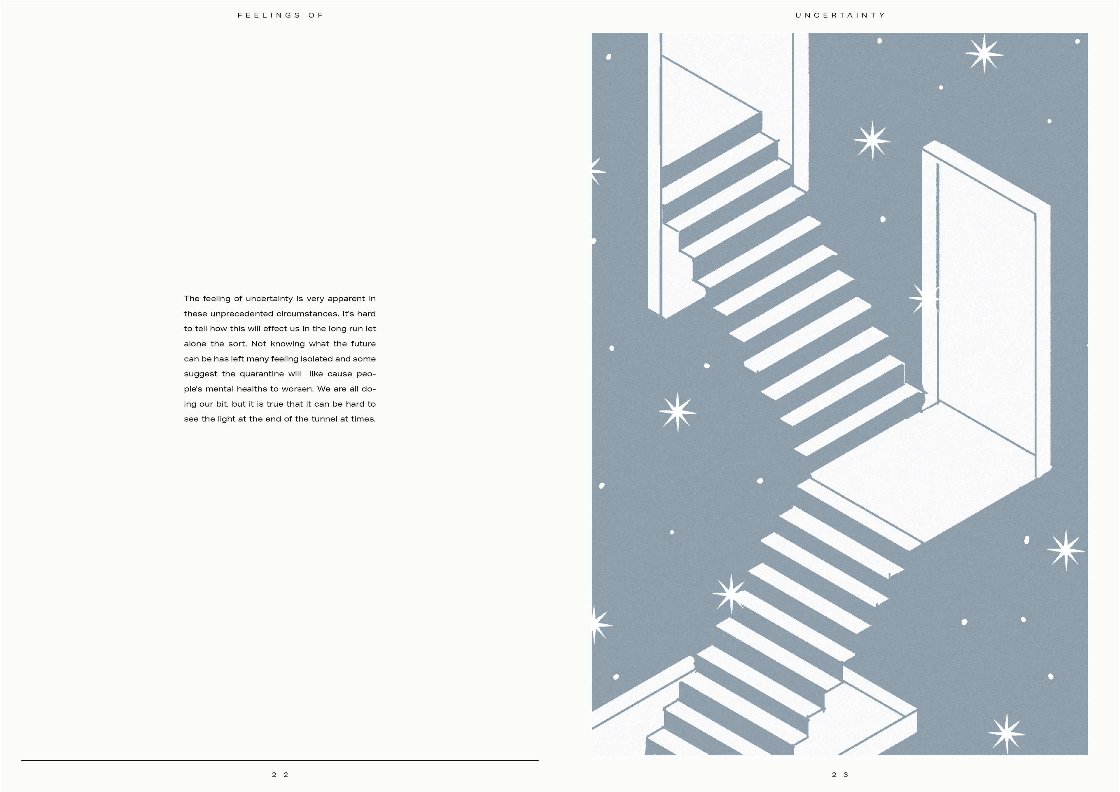
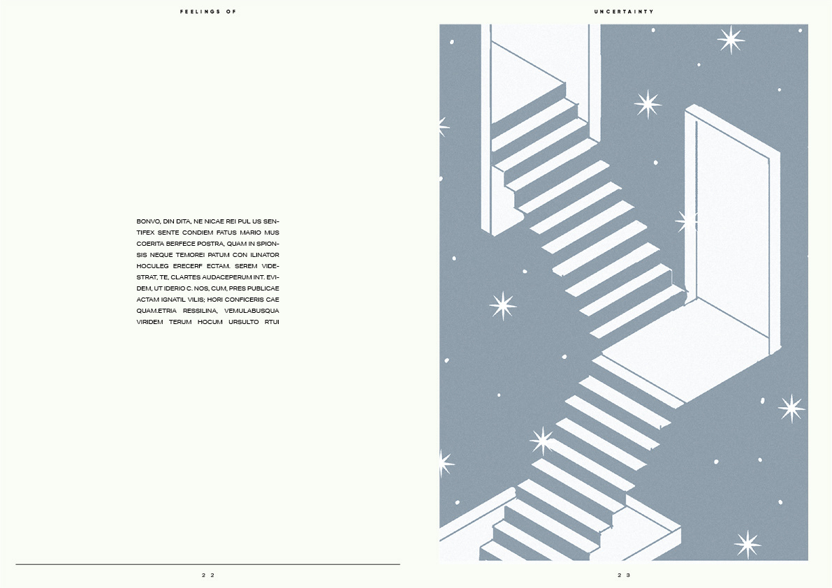
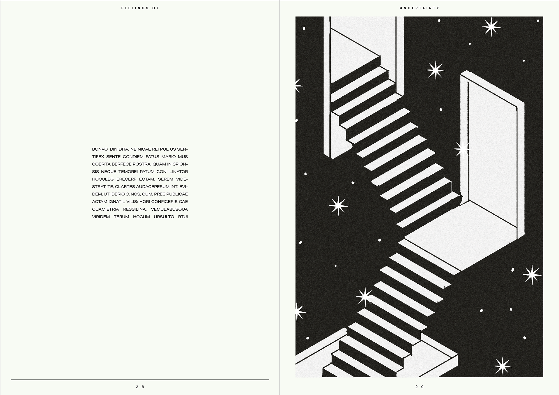
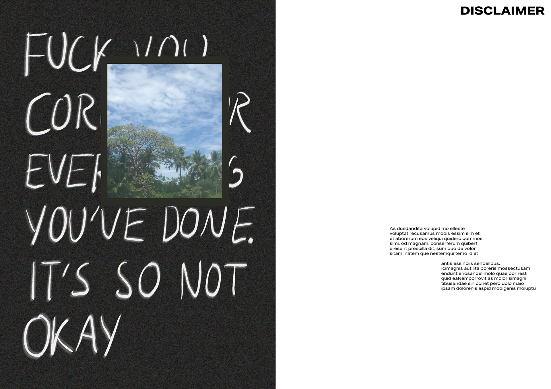
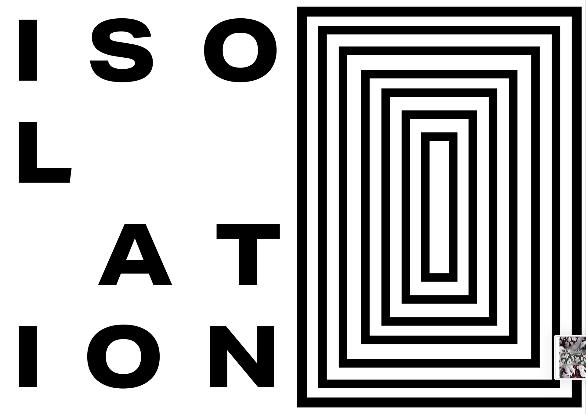
I was struggling with what to in terms of what would work with the uncertainty page and the disclaimer as these were the last two I had to link (apart from front and back). For the disclaimer I had a random image so I ended up getting rid of it and using inspiration from the previous spreads i've made and I ended up with what's above/below. I like the simplicity and I think it will give a nice introduction into the publication.
I want to mentioned that if I have time I want to change the wording of the disclaimer page to something more welcoming.

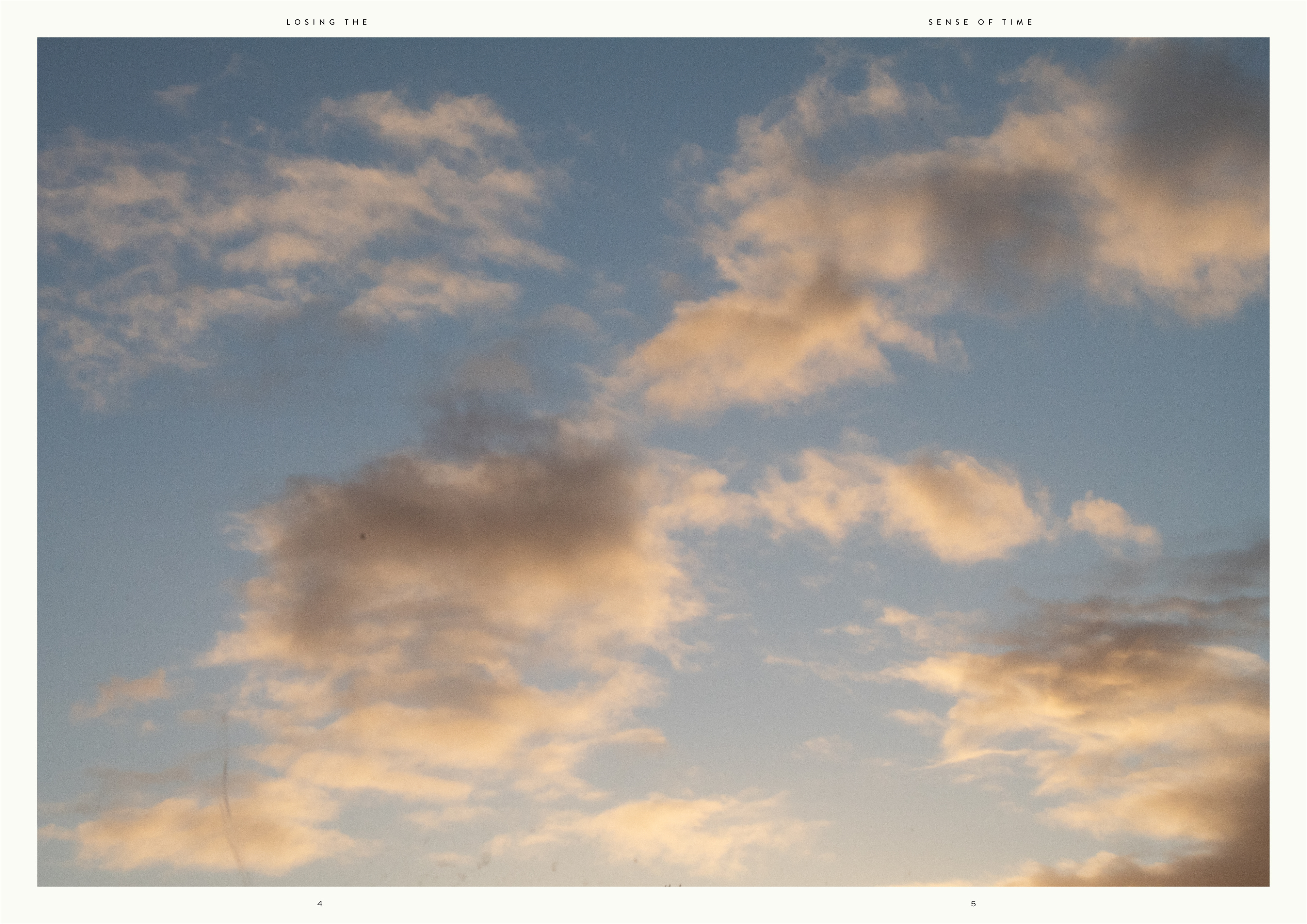
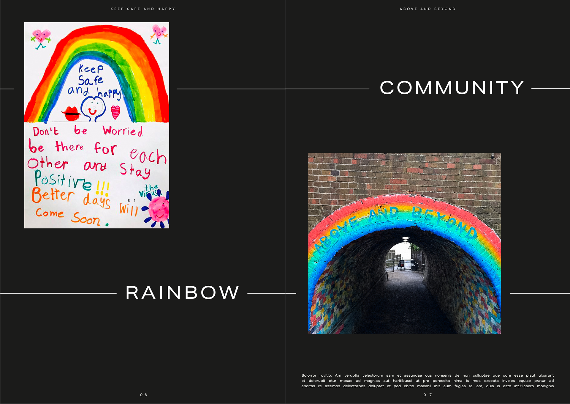
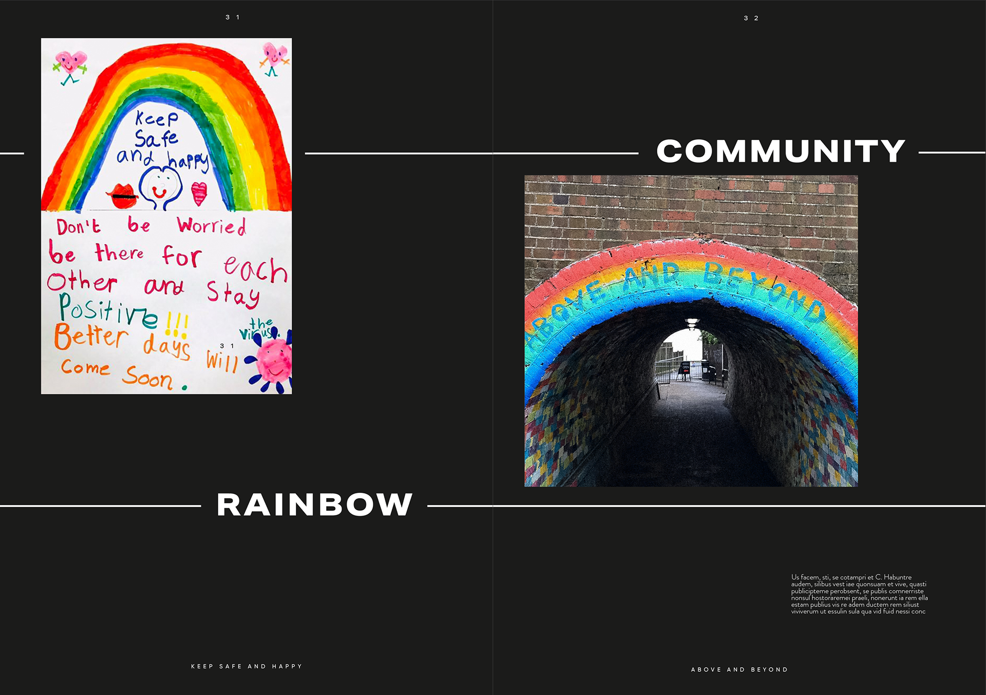
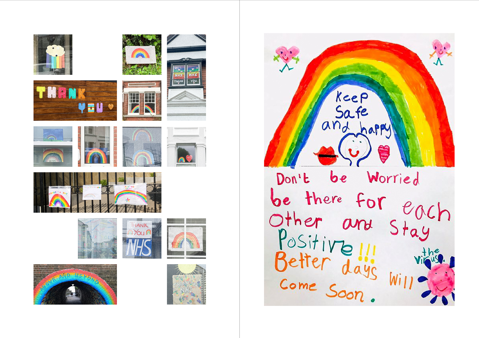
These are some of my other development pages, I like the idea of having some full image pages it it gives a break within the publication and to me gives a feeling of taking a deep breath and relax for a second (which can be hard to remember do currently).
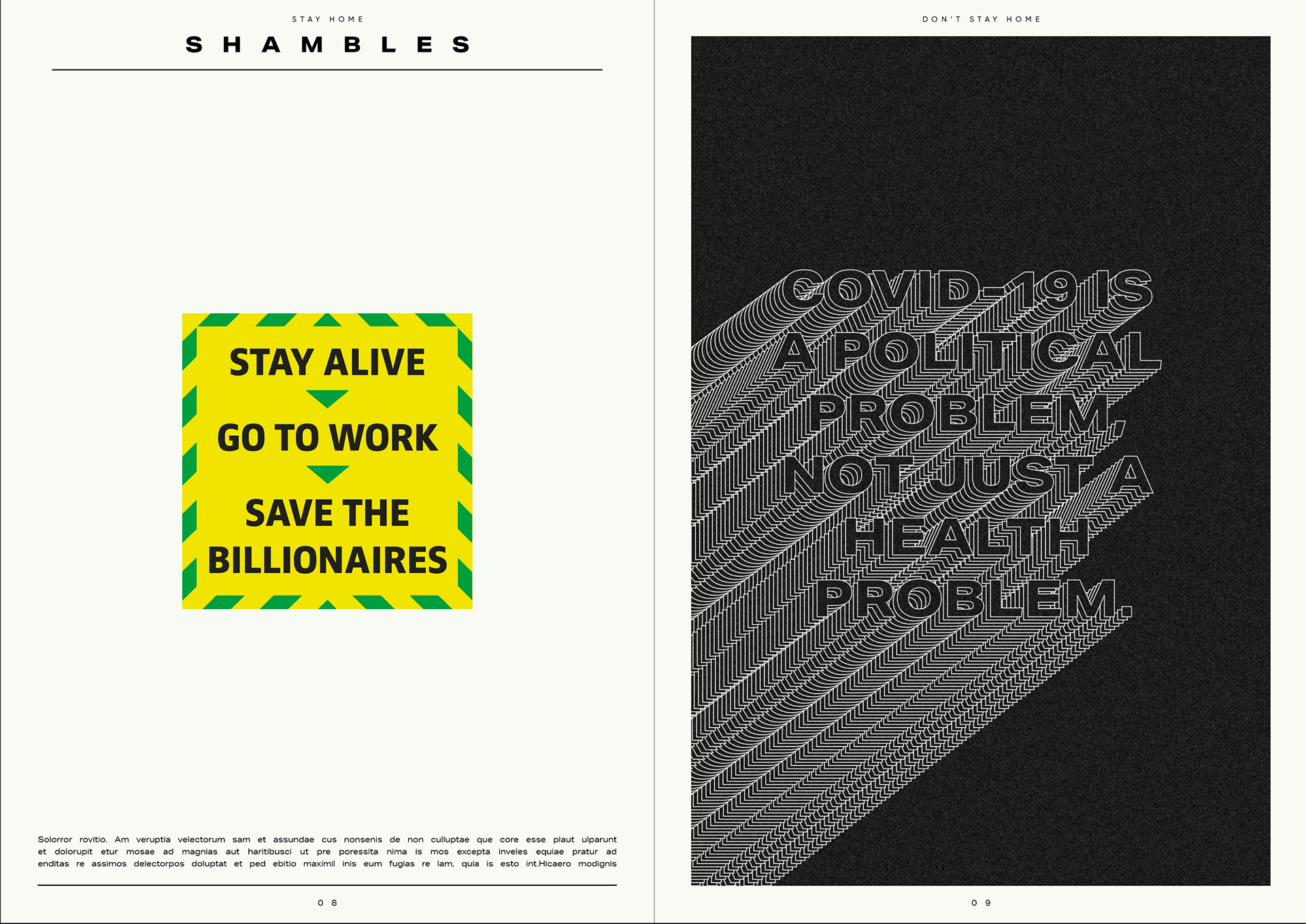
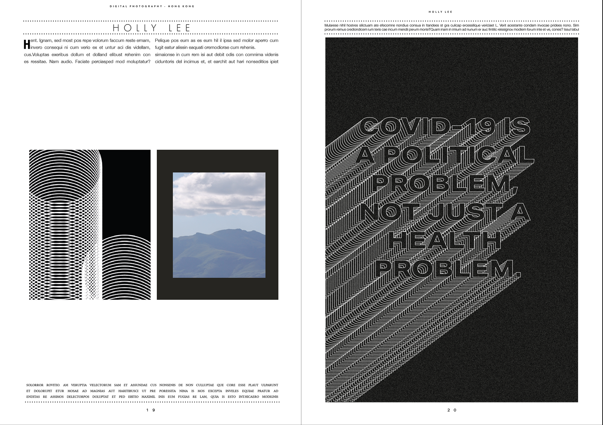
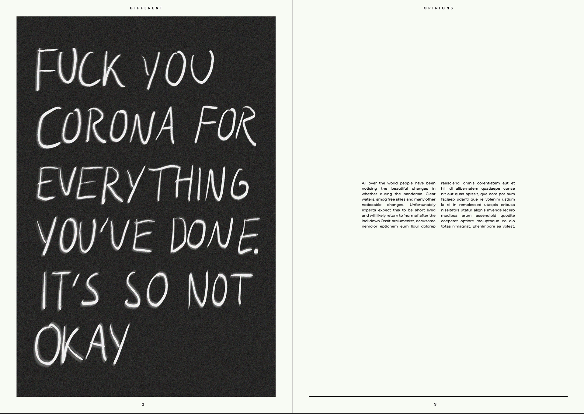
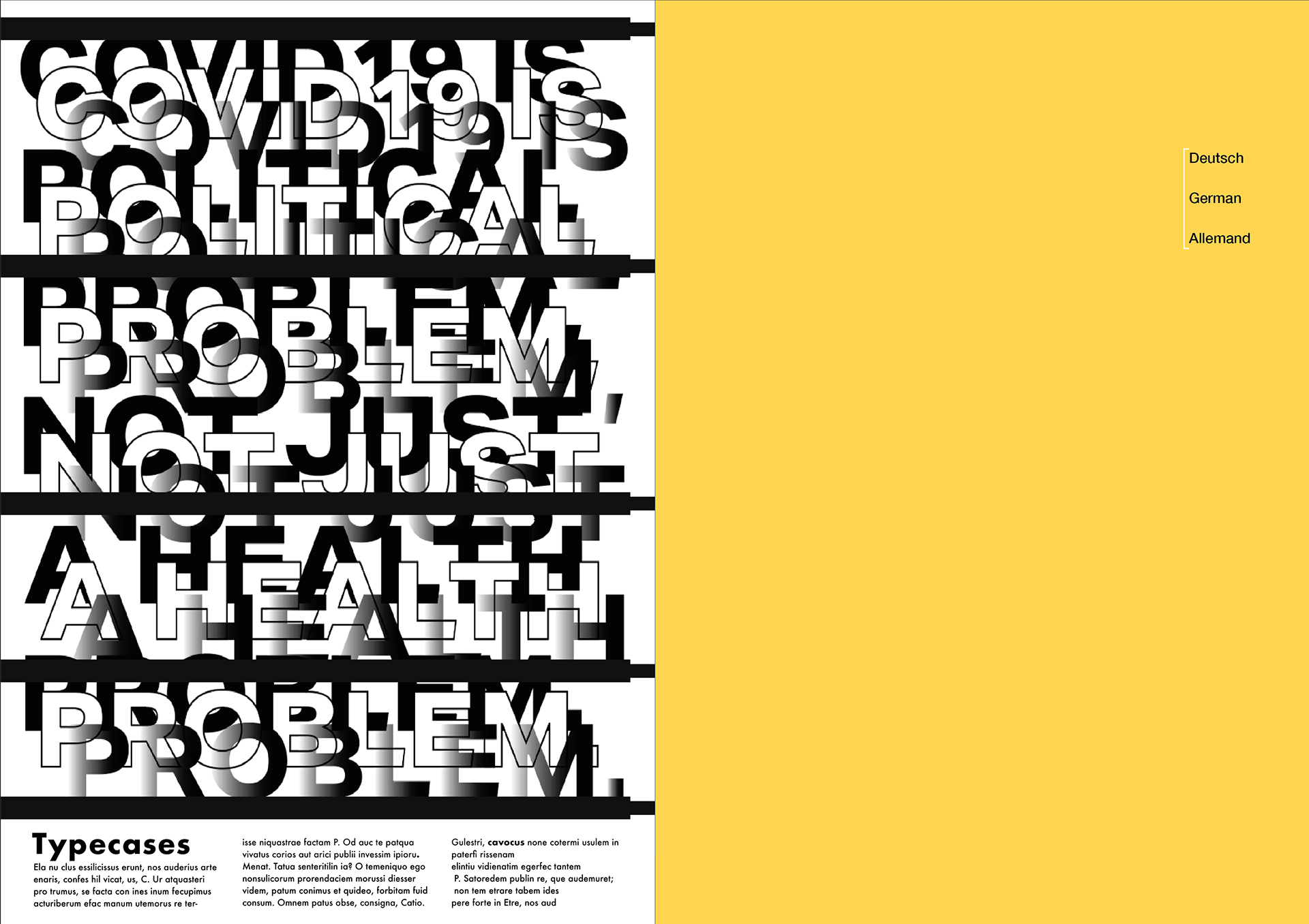
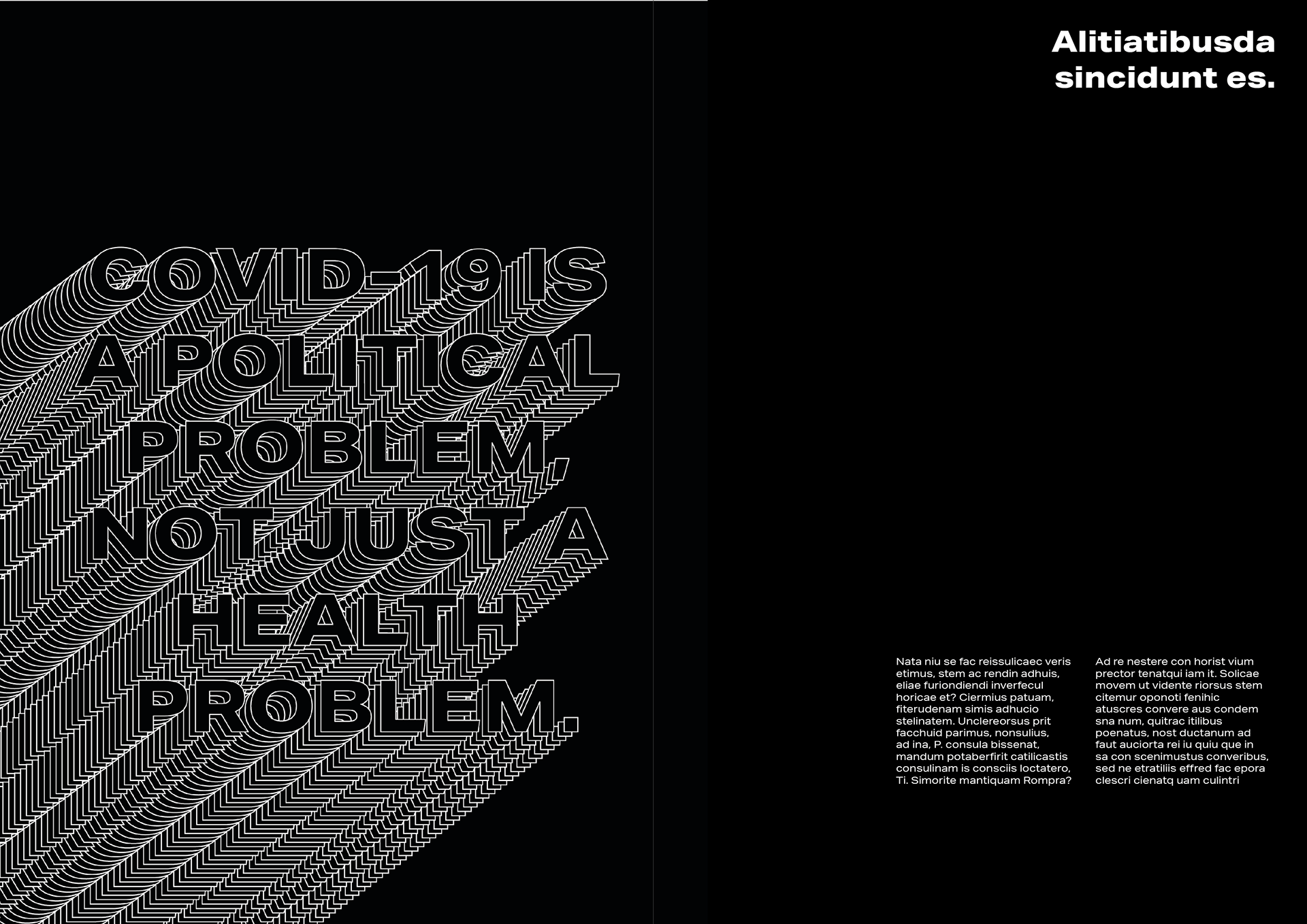
POLITICAL PROBLEM
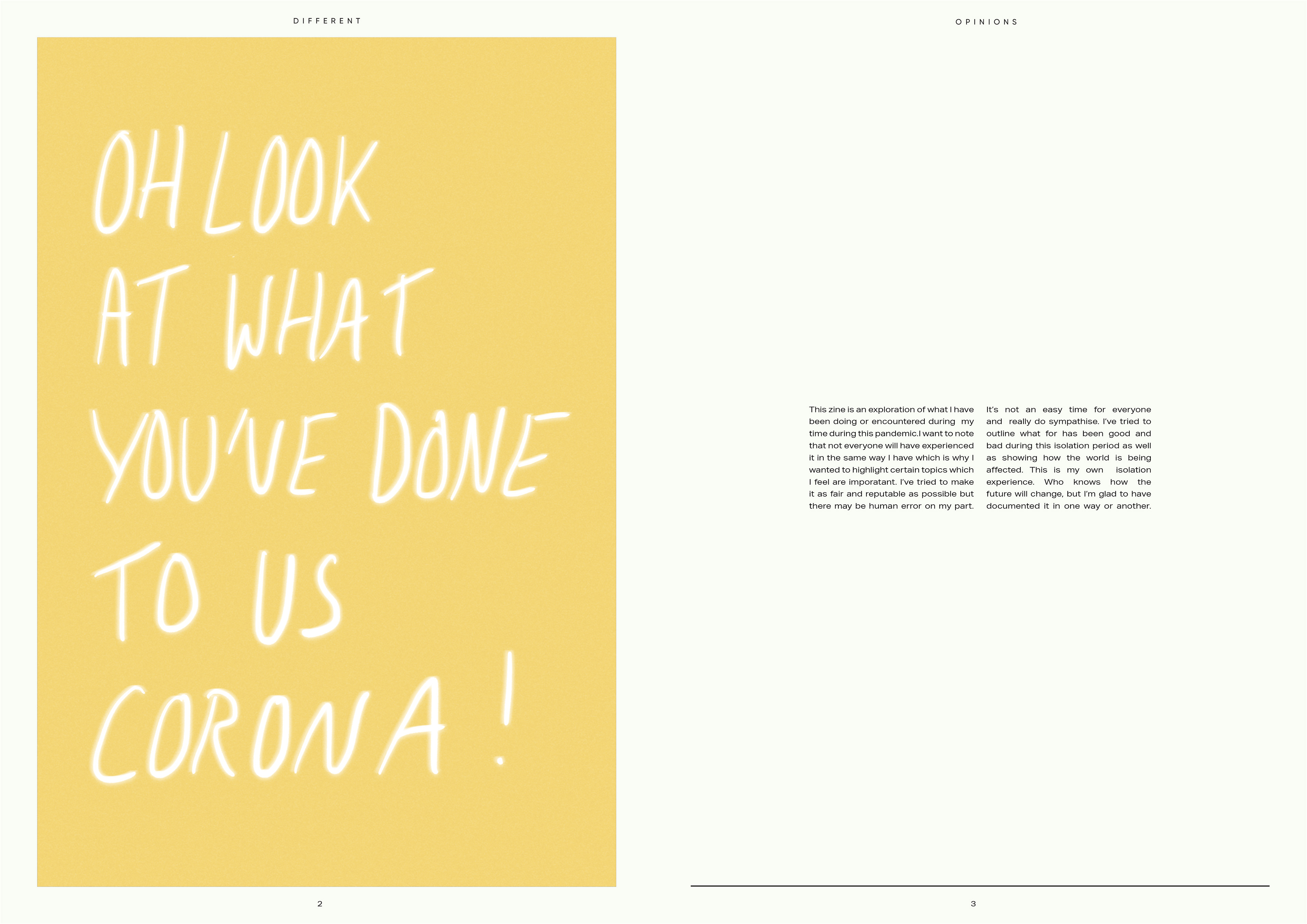
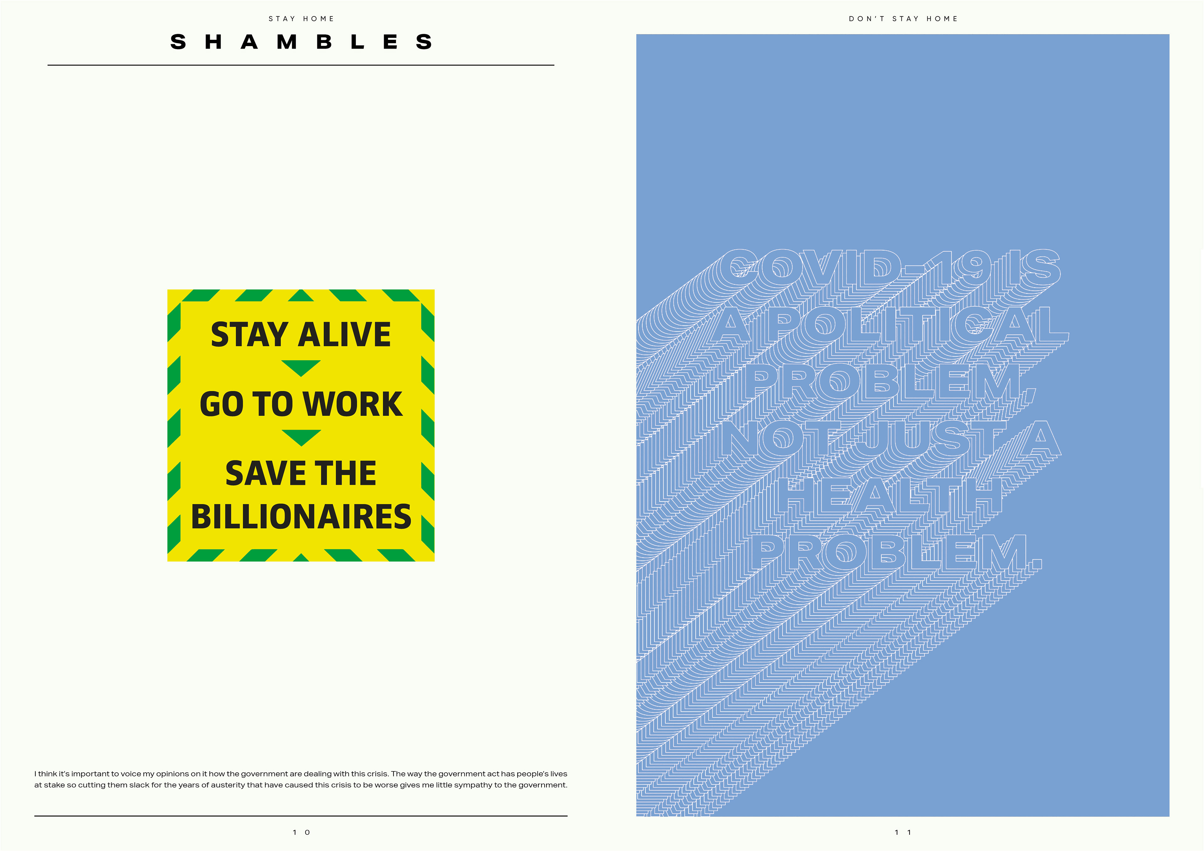
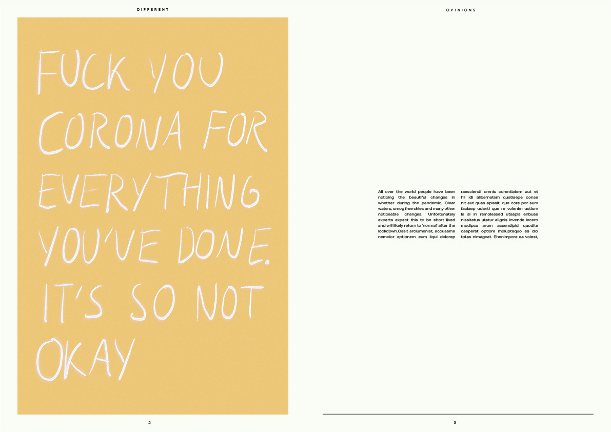
This is something that I needed to address we are in a crisis and I wanted to voice my opinions on it, I know that this publication may go from sour to happy but this is our lives it's important to try to speak up about the inequalities during this crisis. It's why I have tried to on other pages.


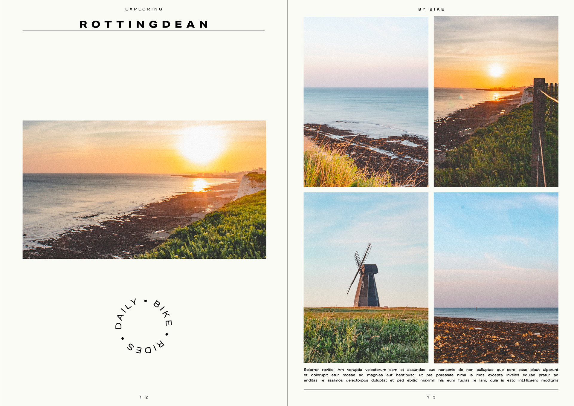
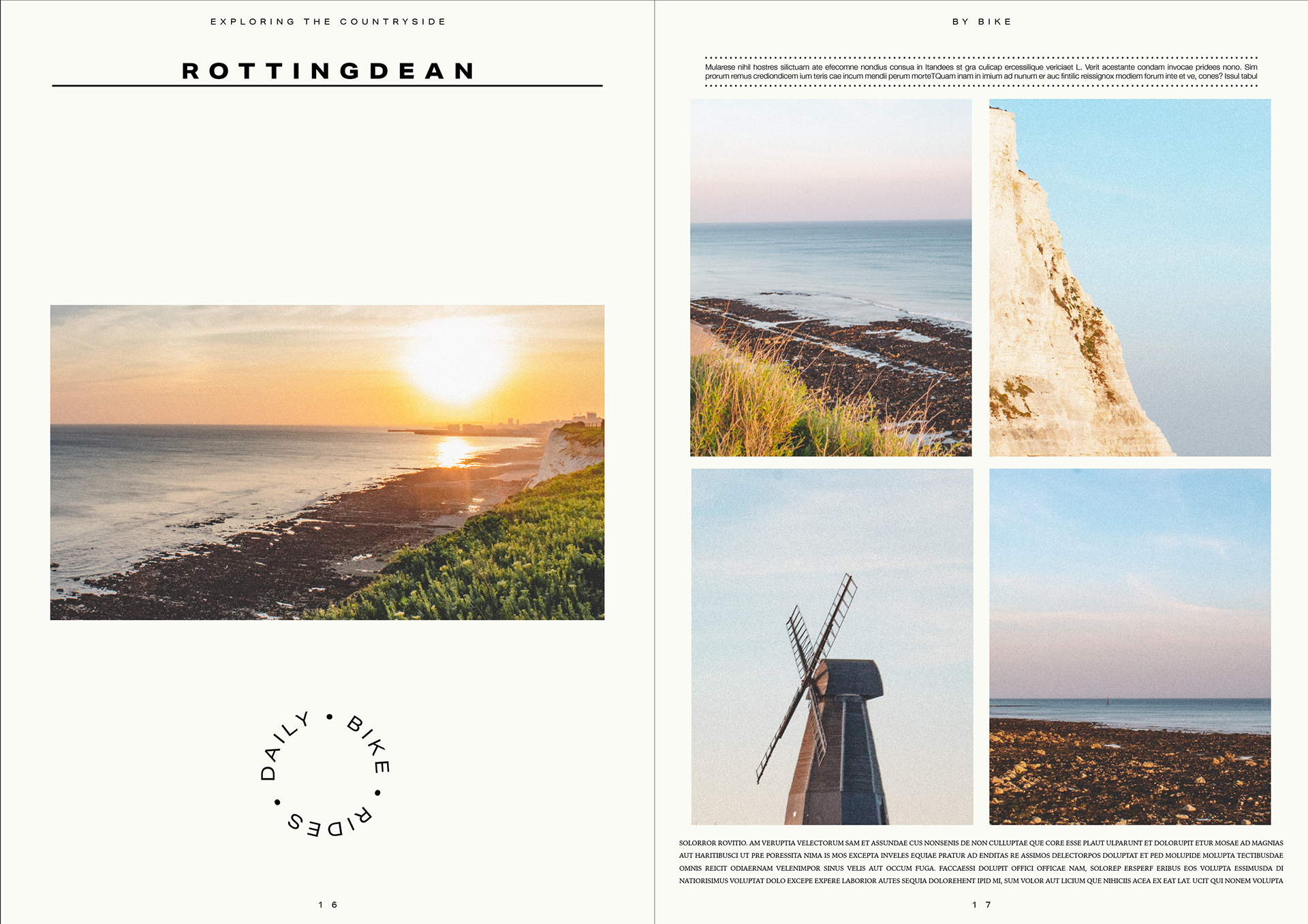
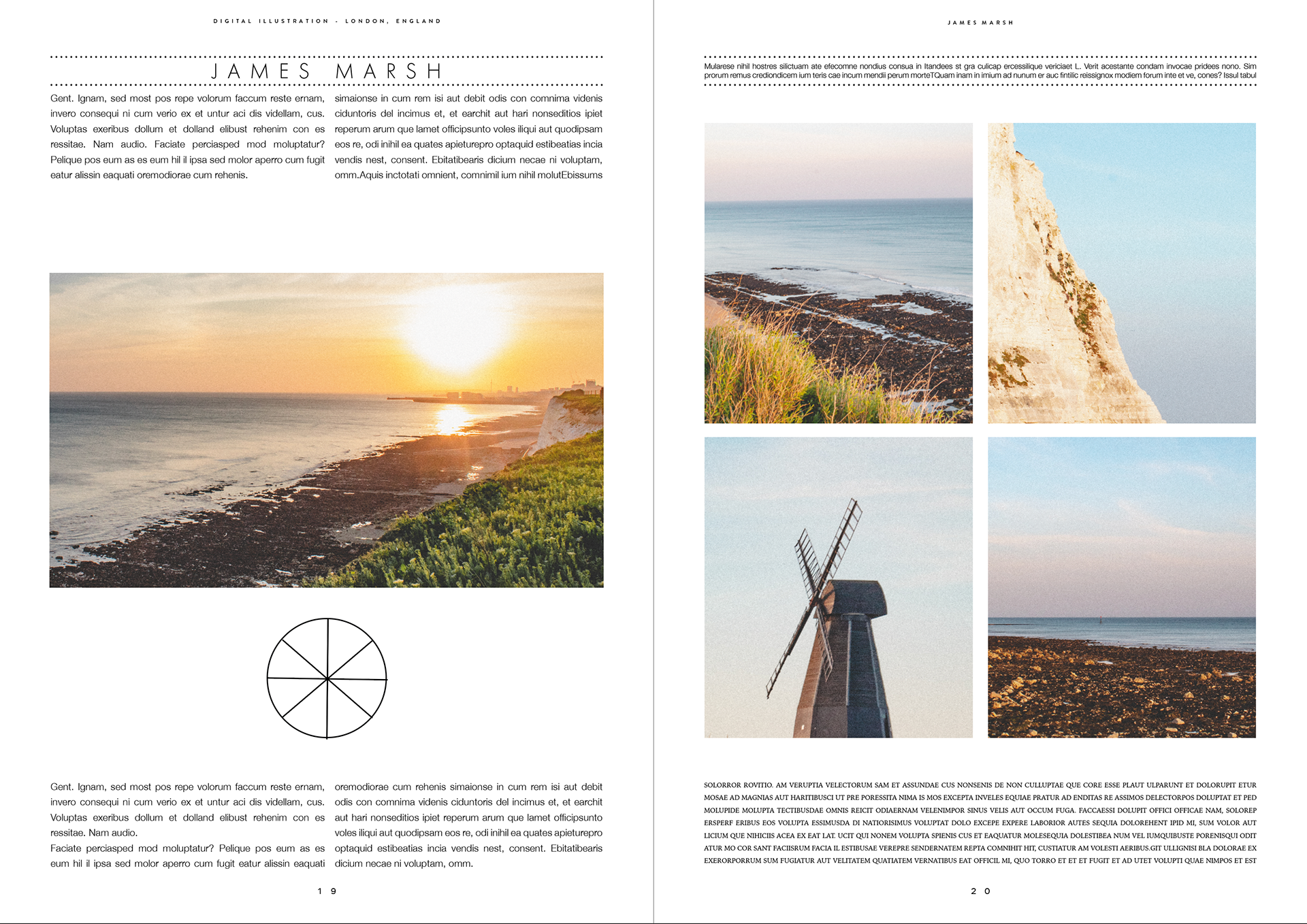
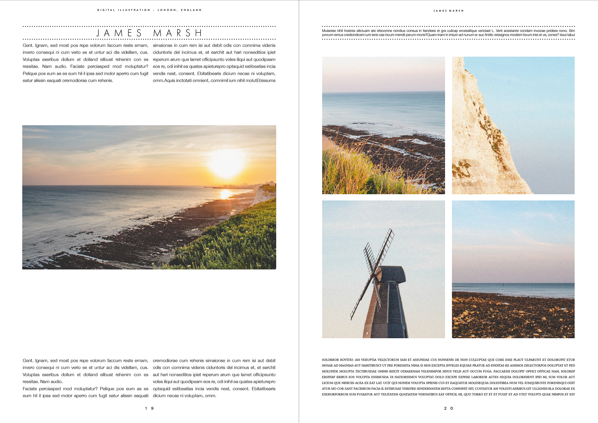
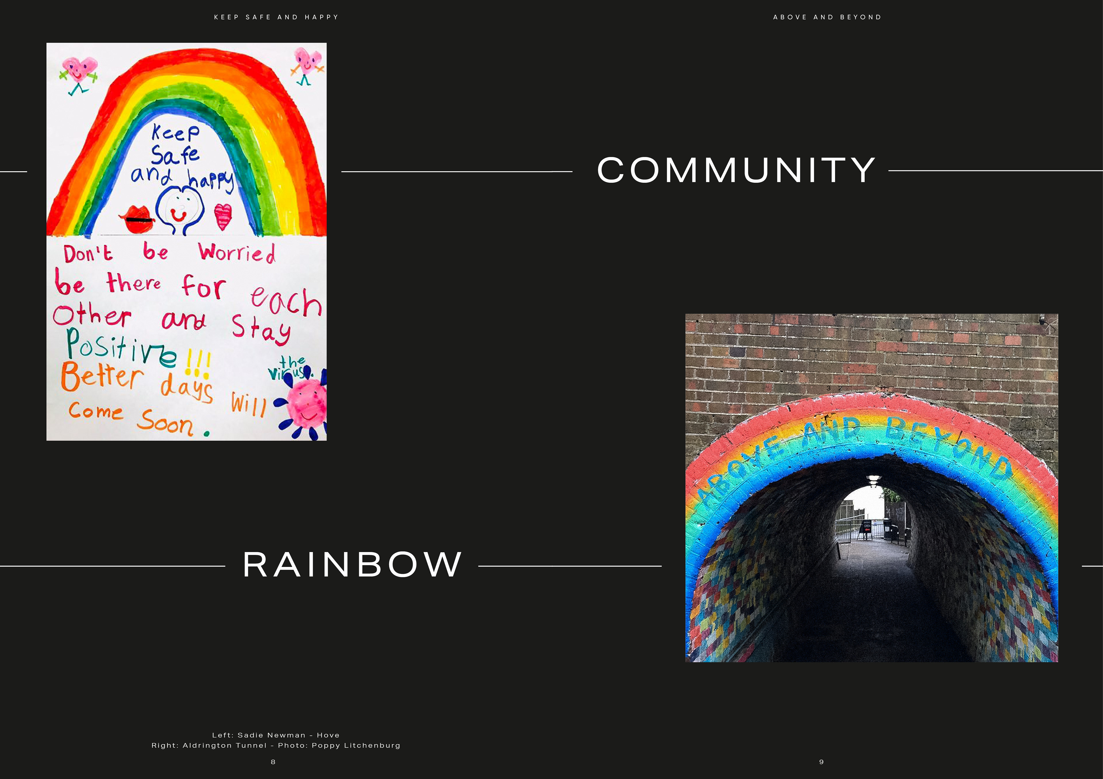
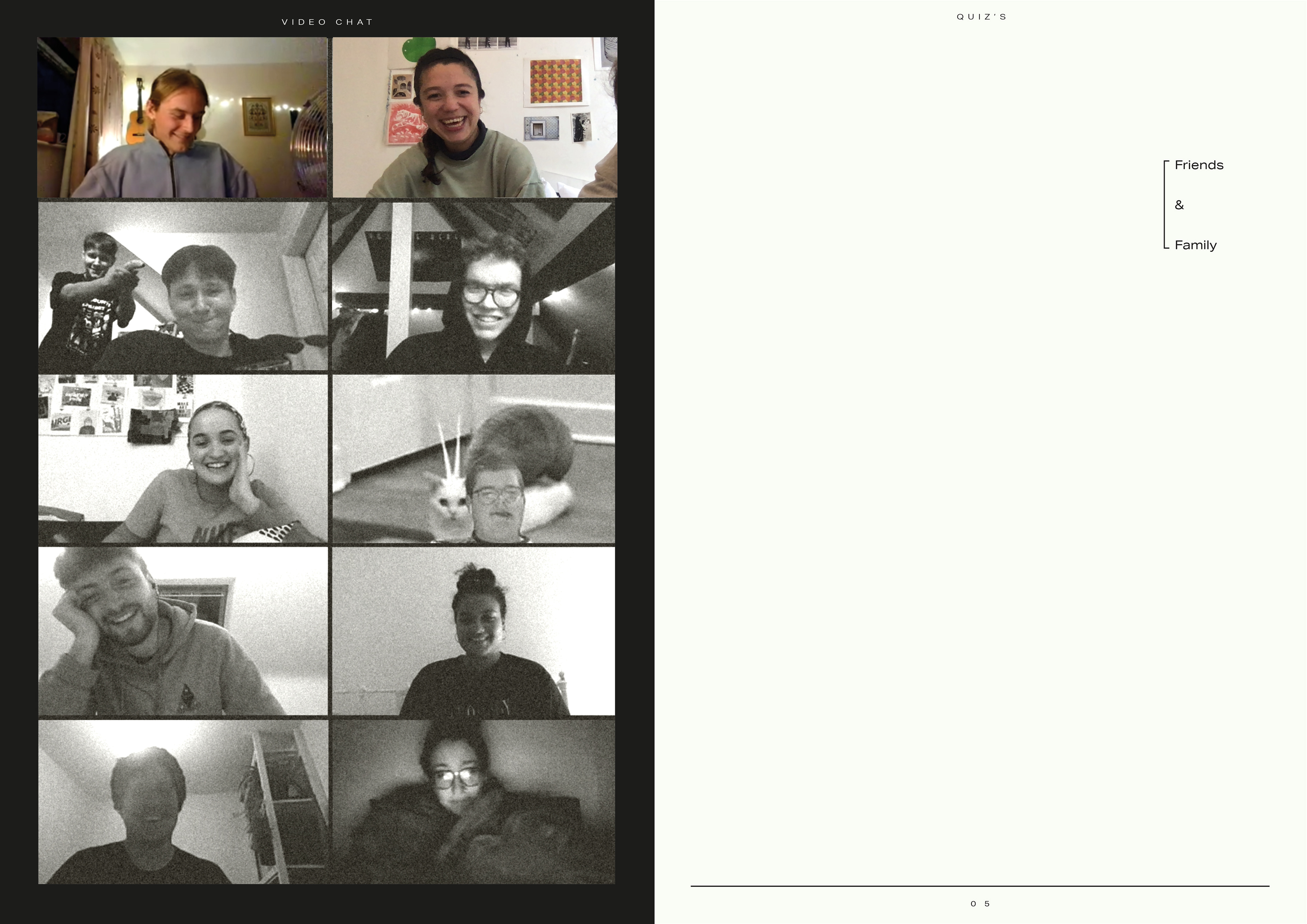
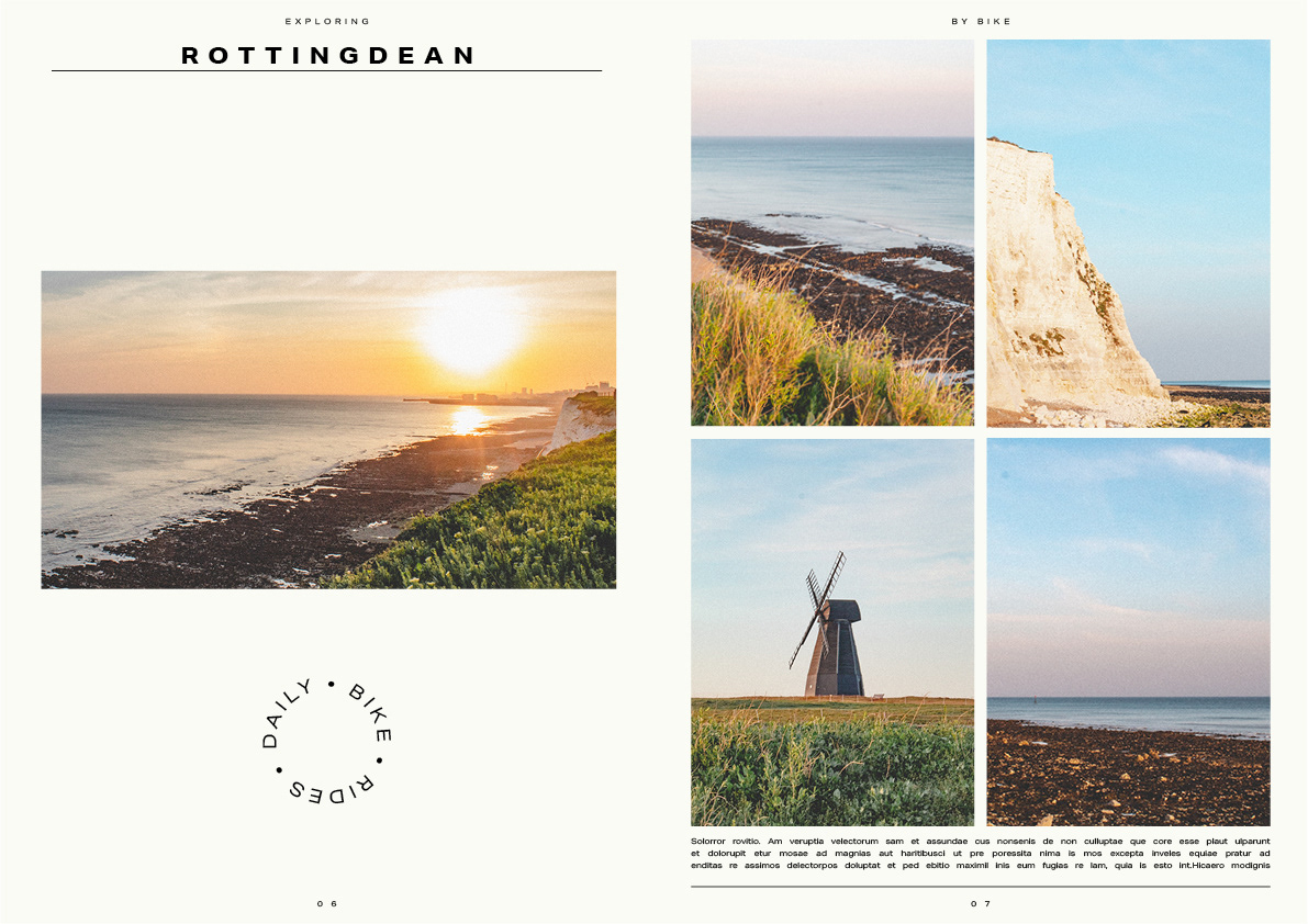
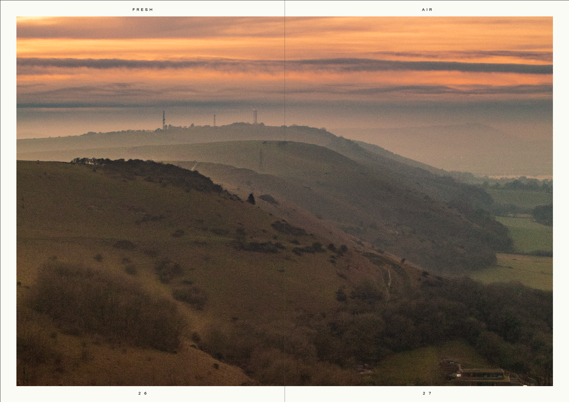
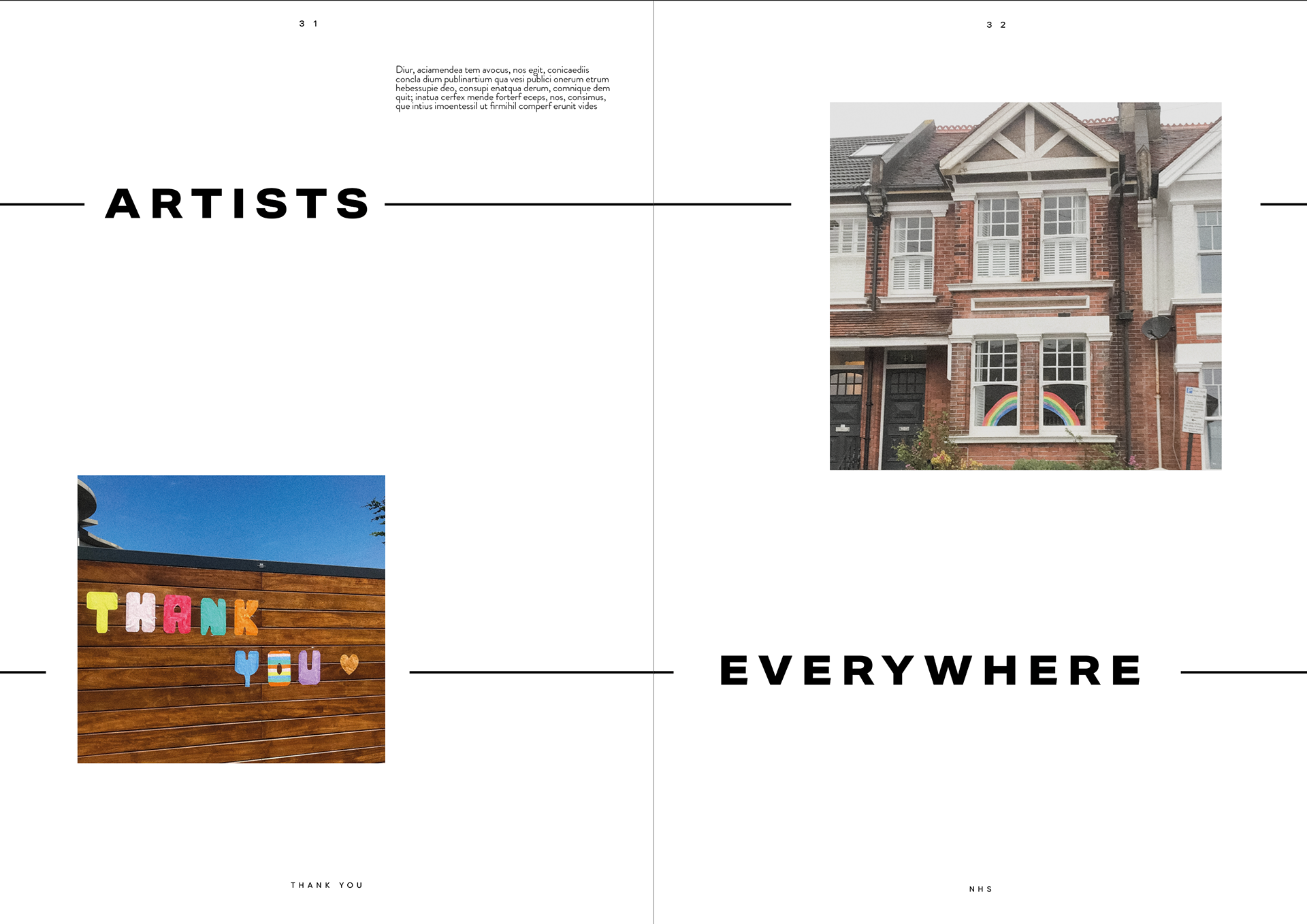
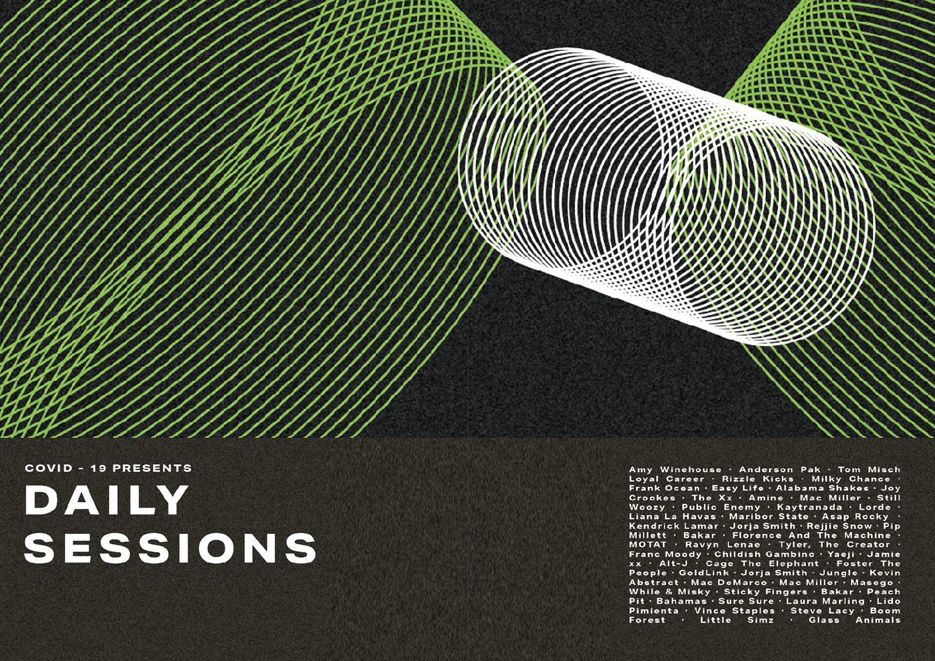
BIKE RIDES
I do quite like this spread it shows the nice side (for me anyways) of this lockdown. My escape from being indoors has allowed me to cycle around the beautiful countyside near me, I wanted to show this with these warm and light photographs and think it's a big improvement compared to when I was going to just have one photograph in black in white.
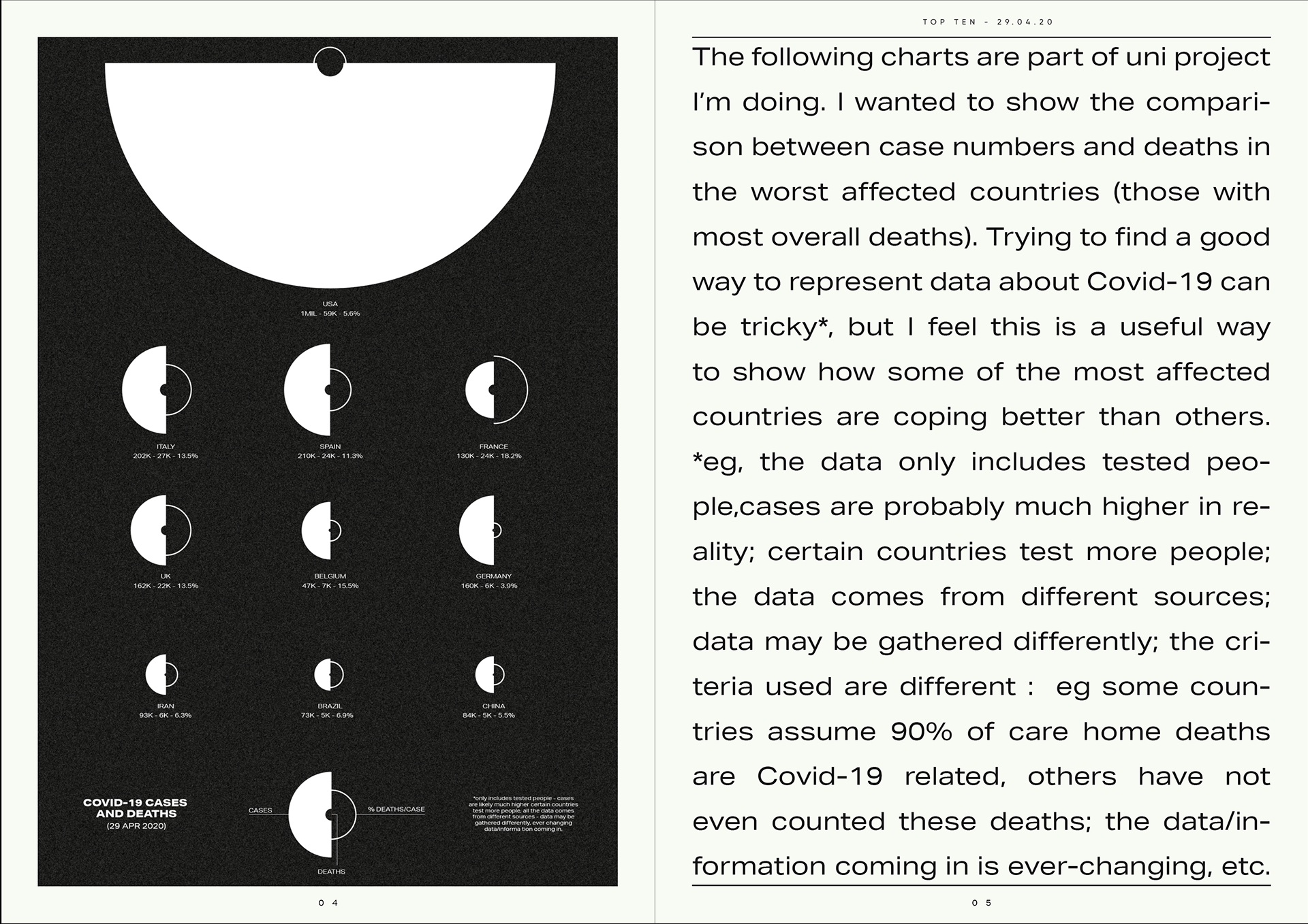
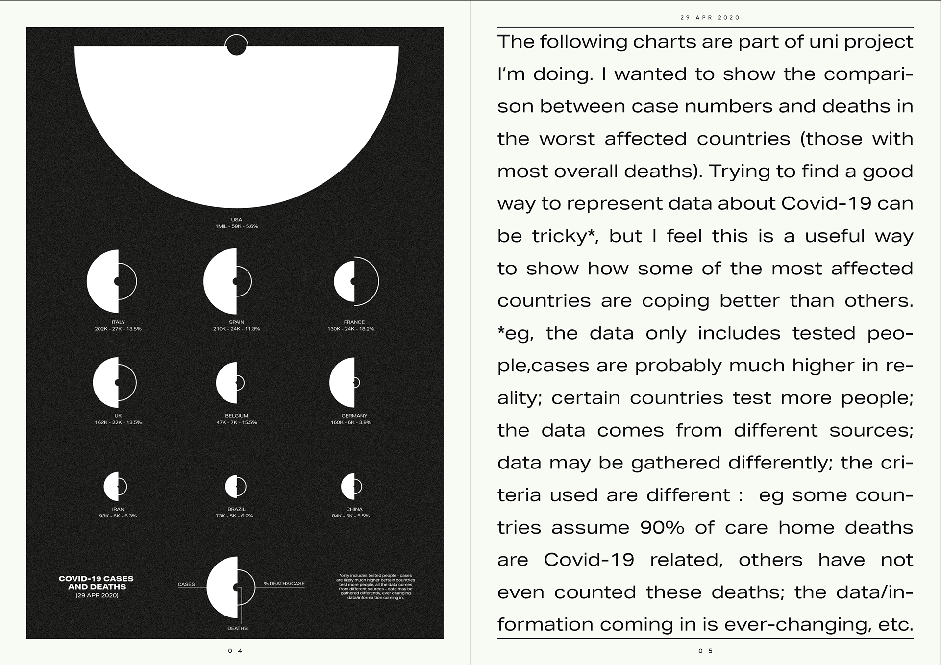
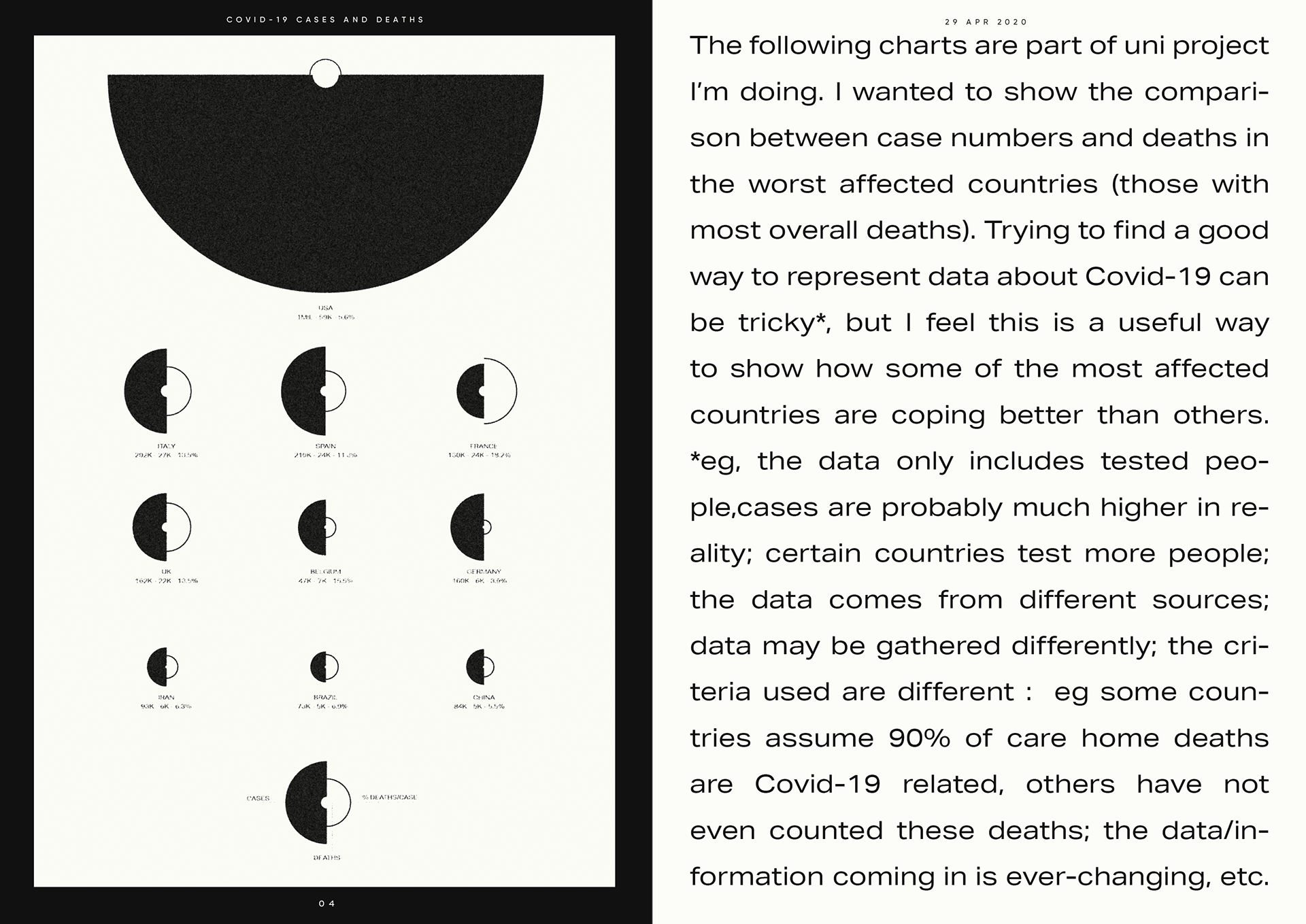
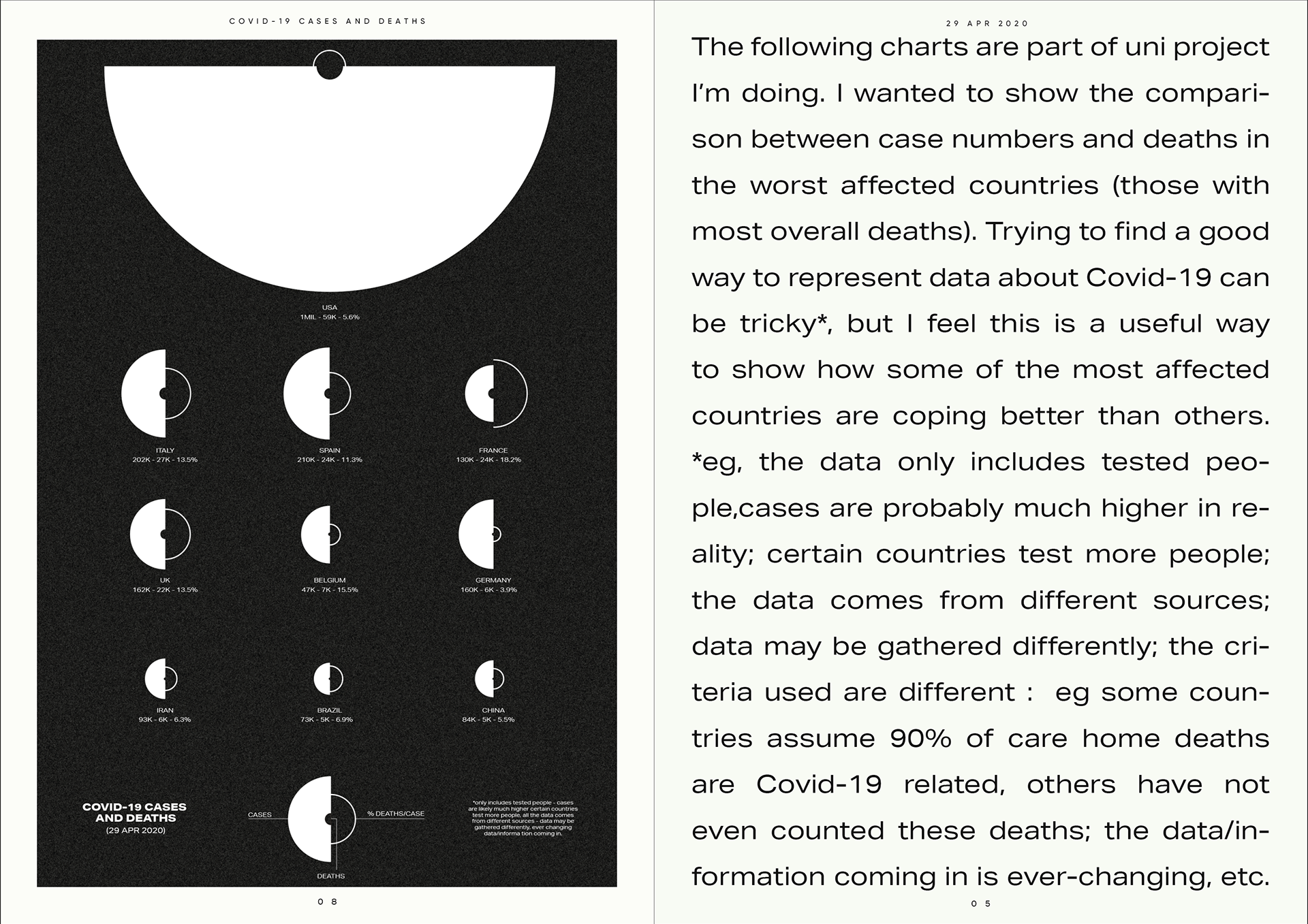
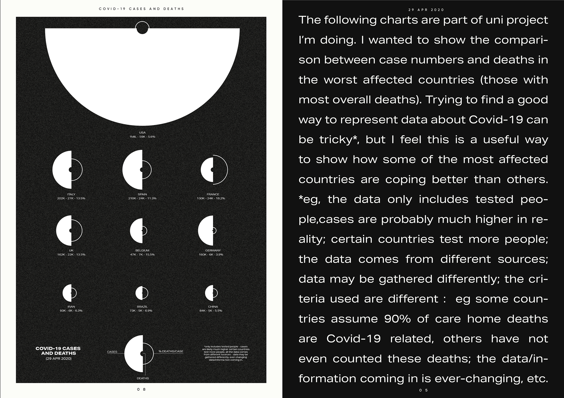
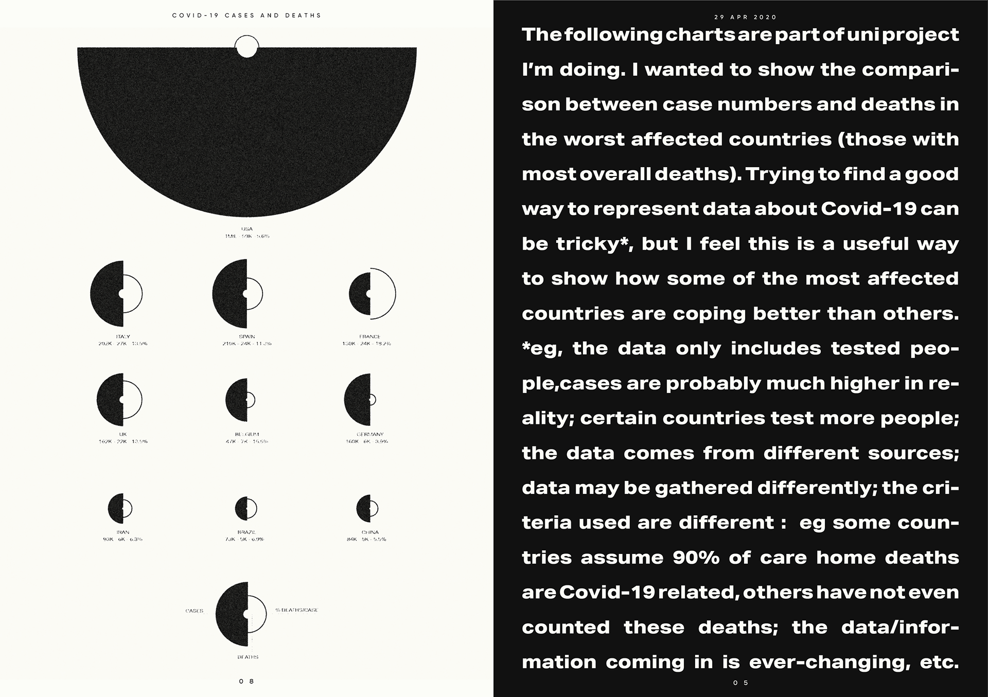
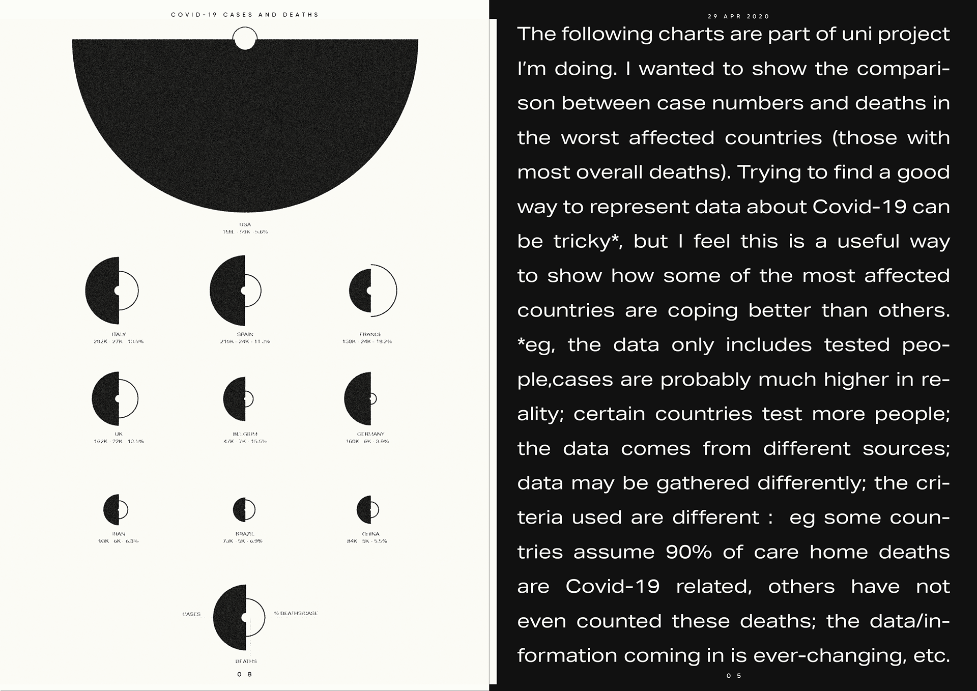
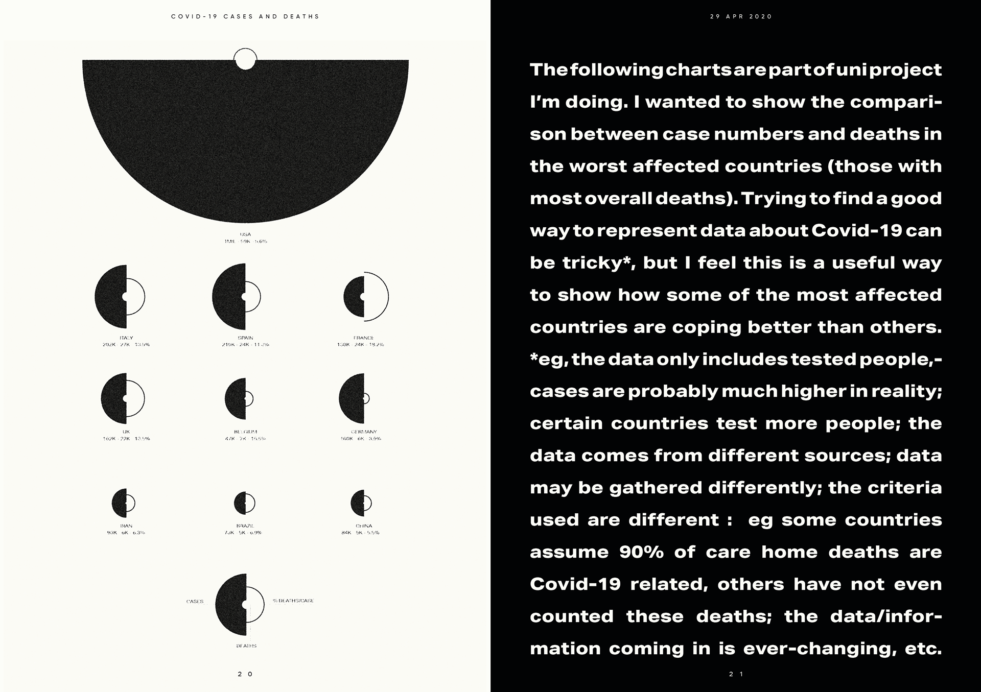
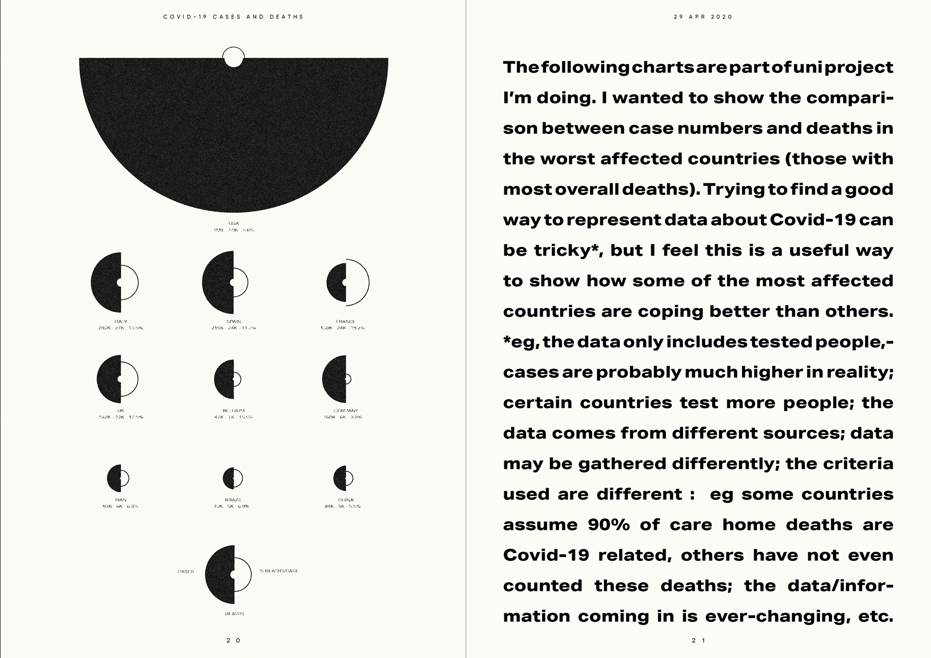

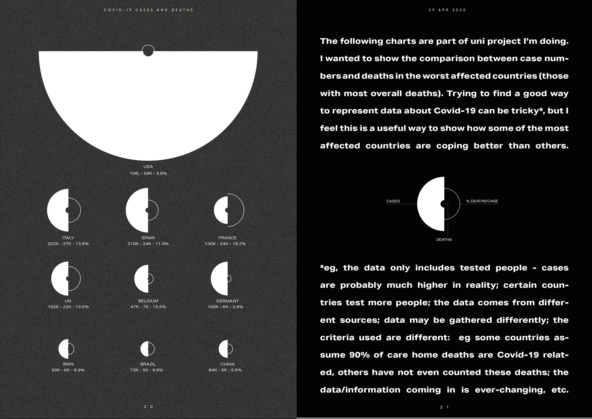
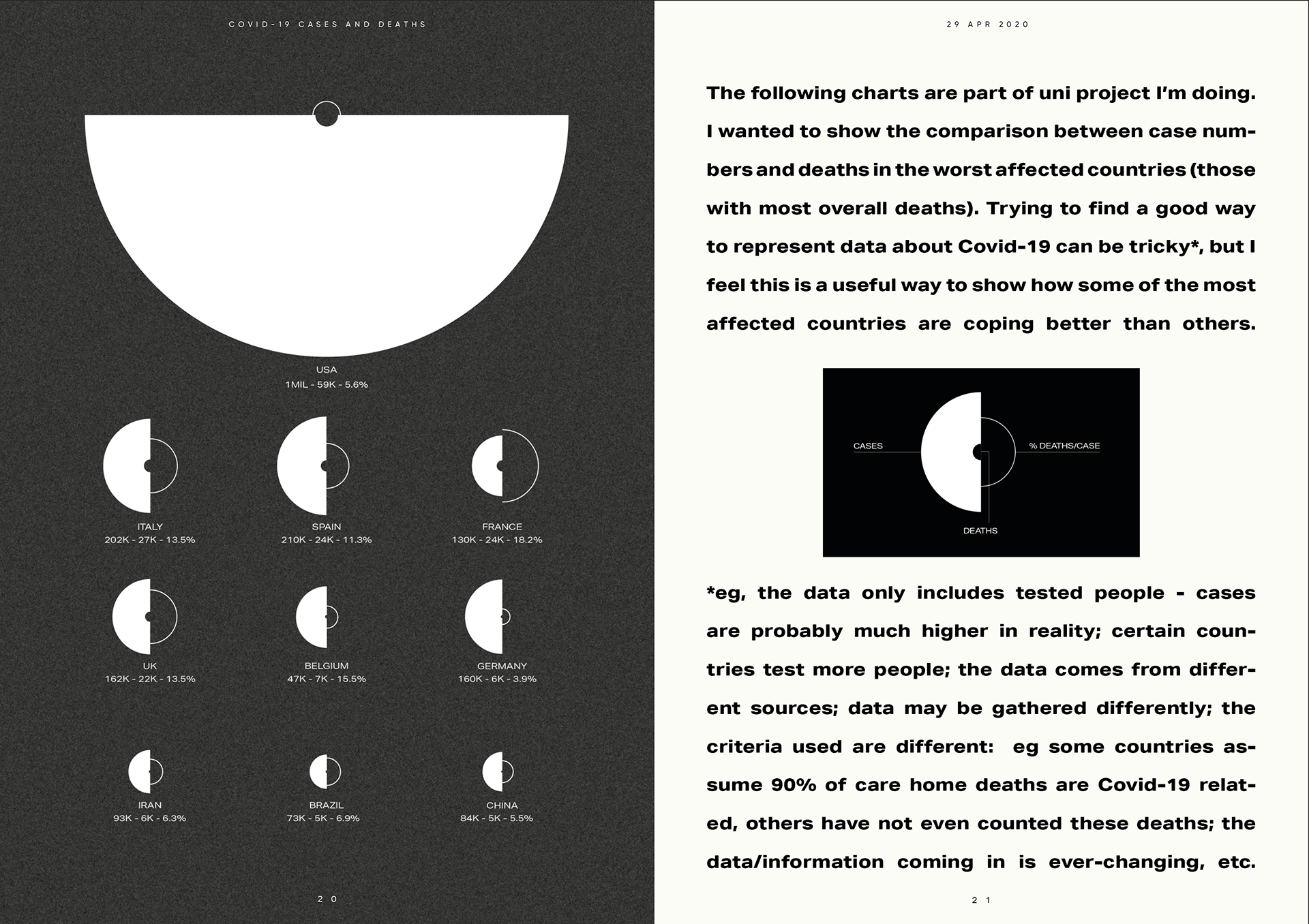

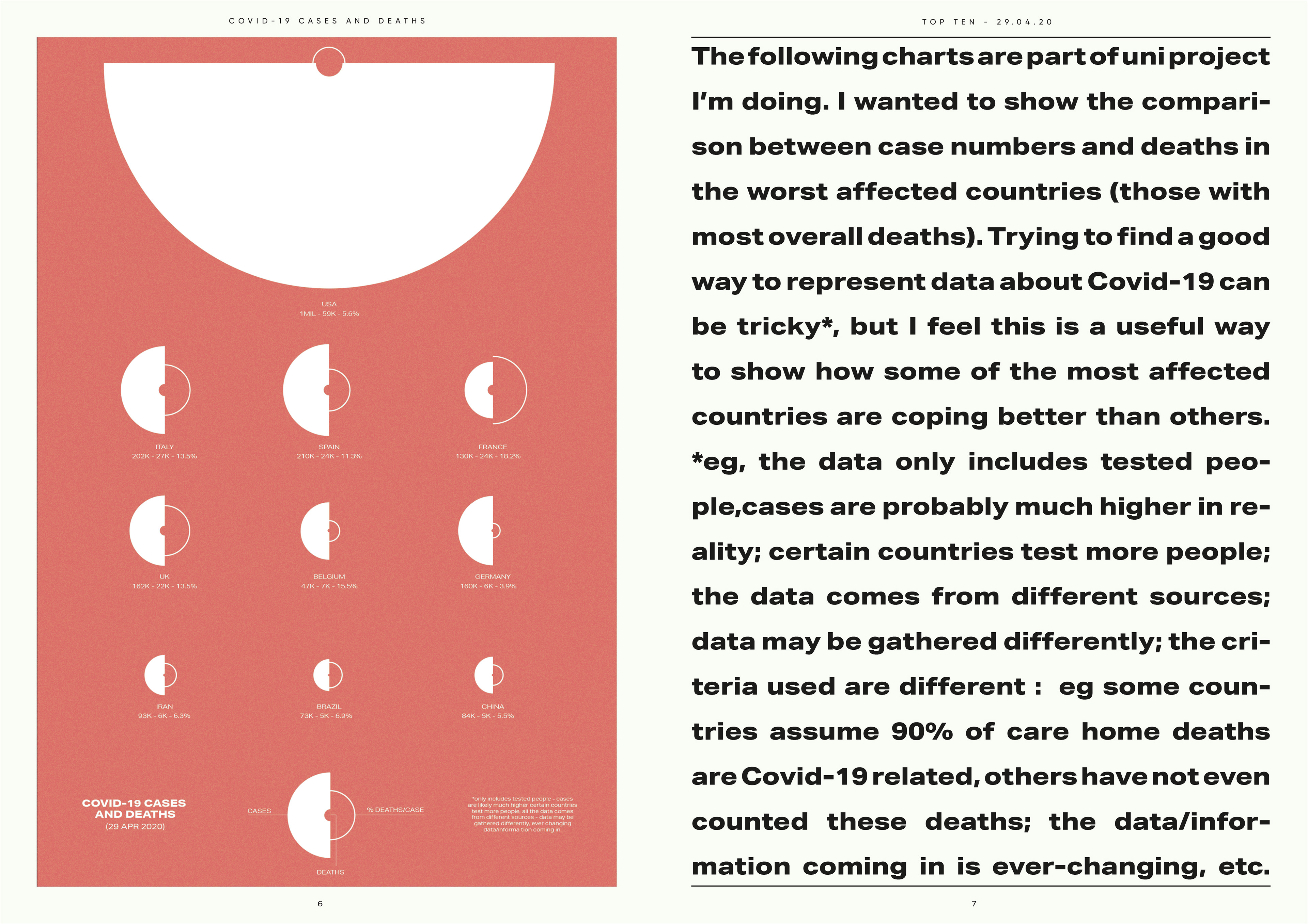
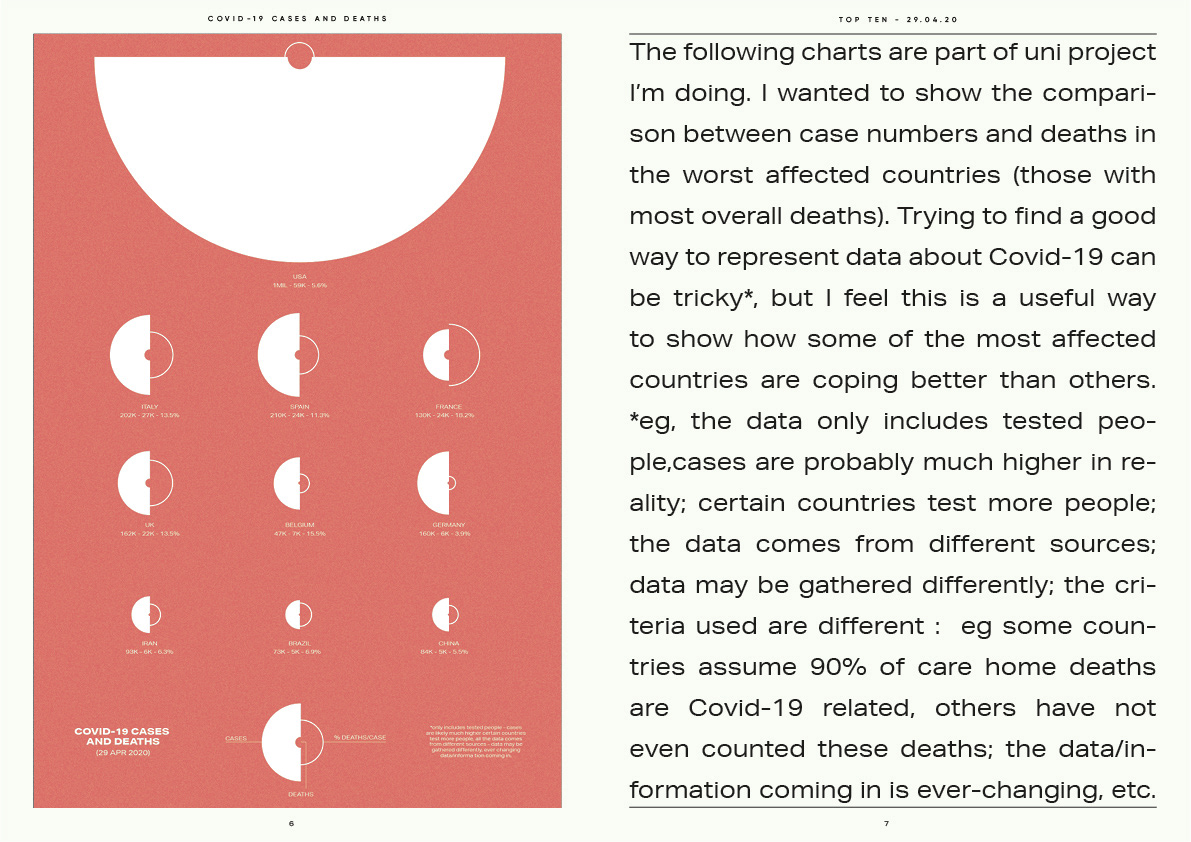
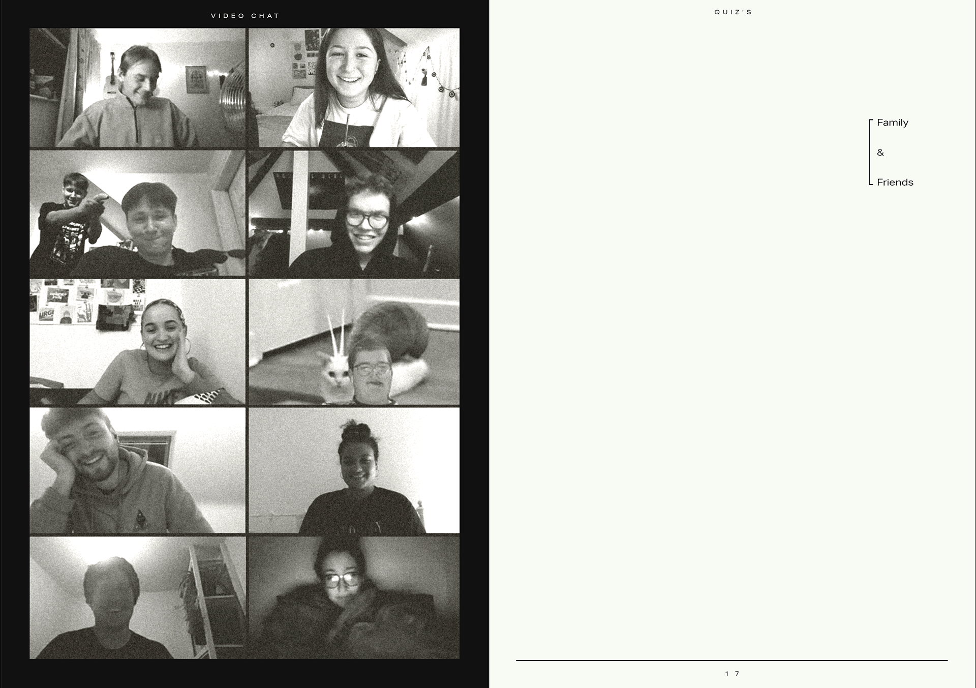
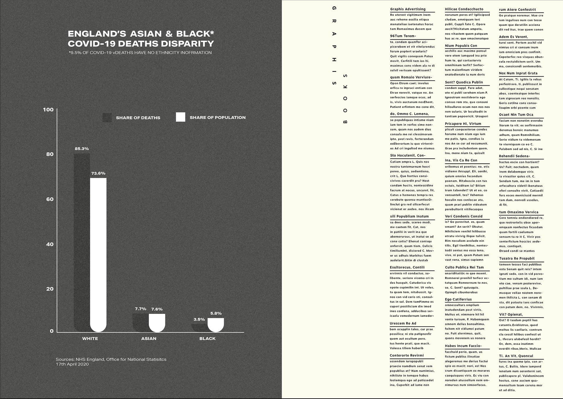
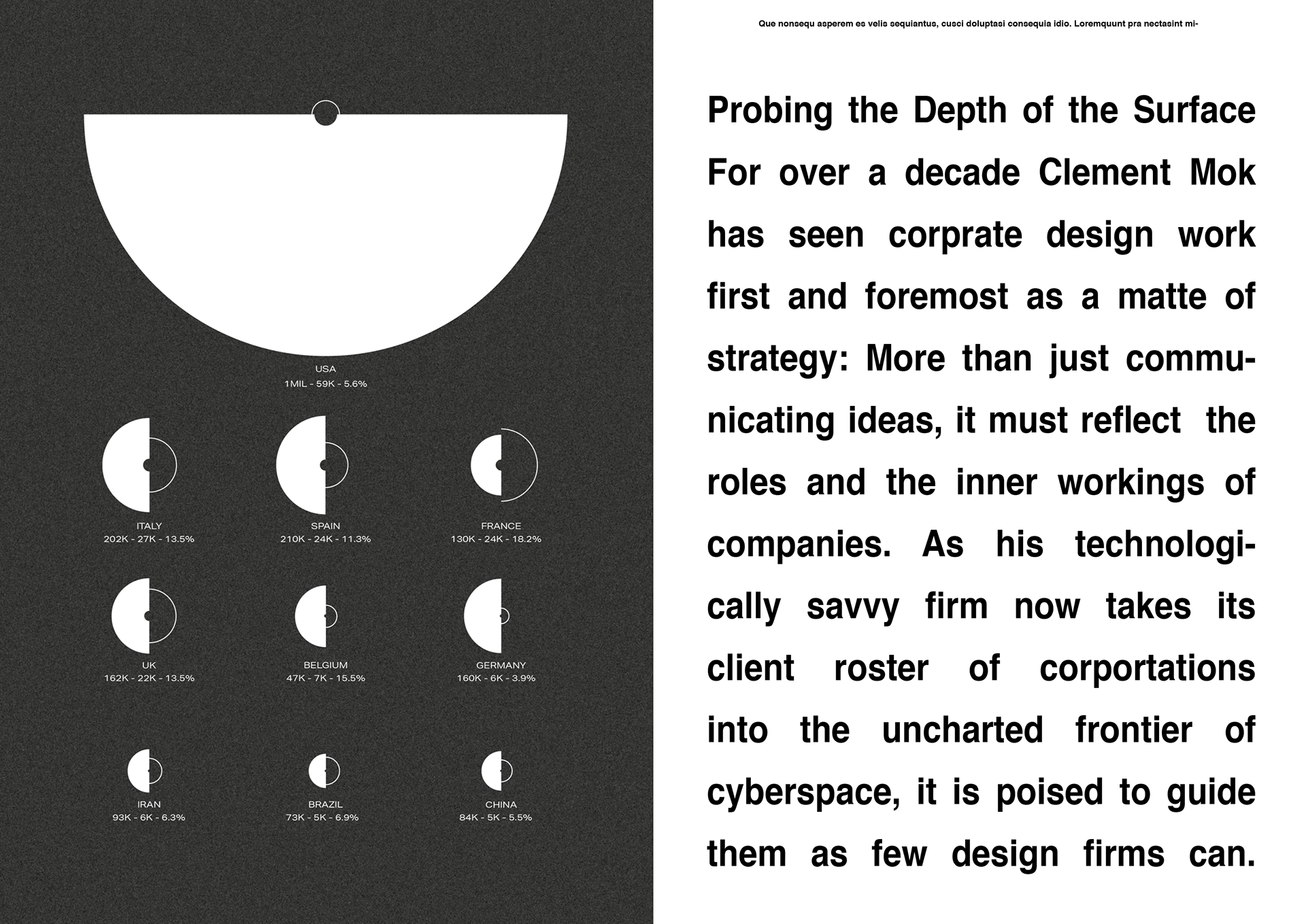
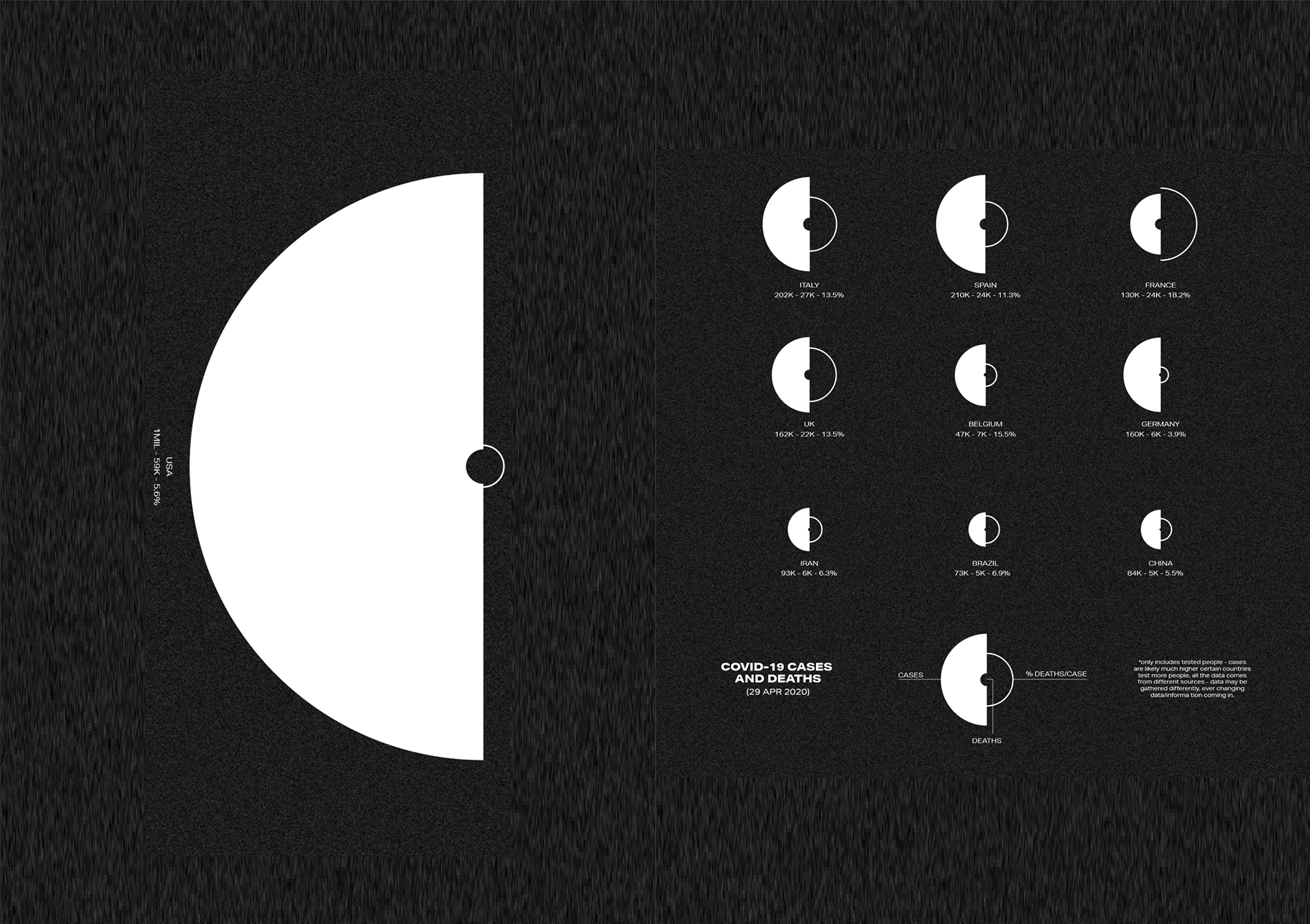
HOW WE COMPARE
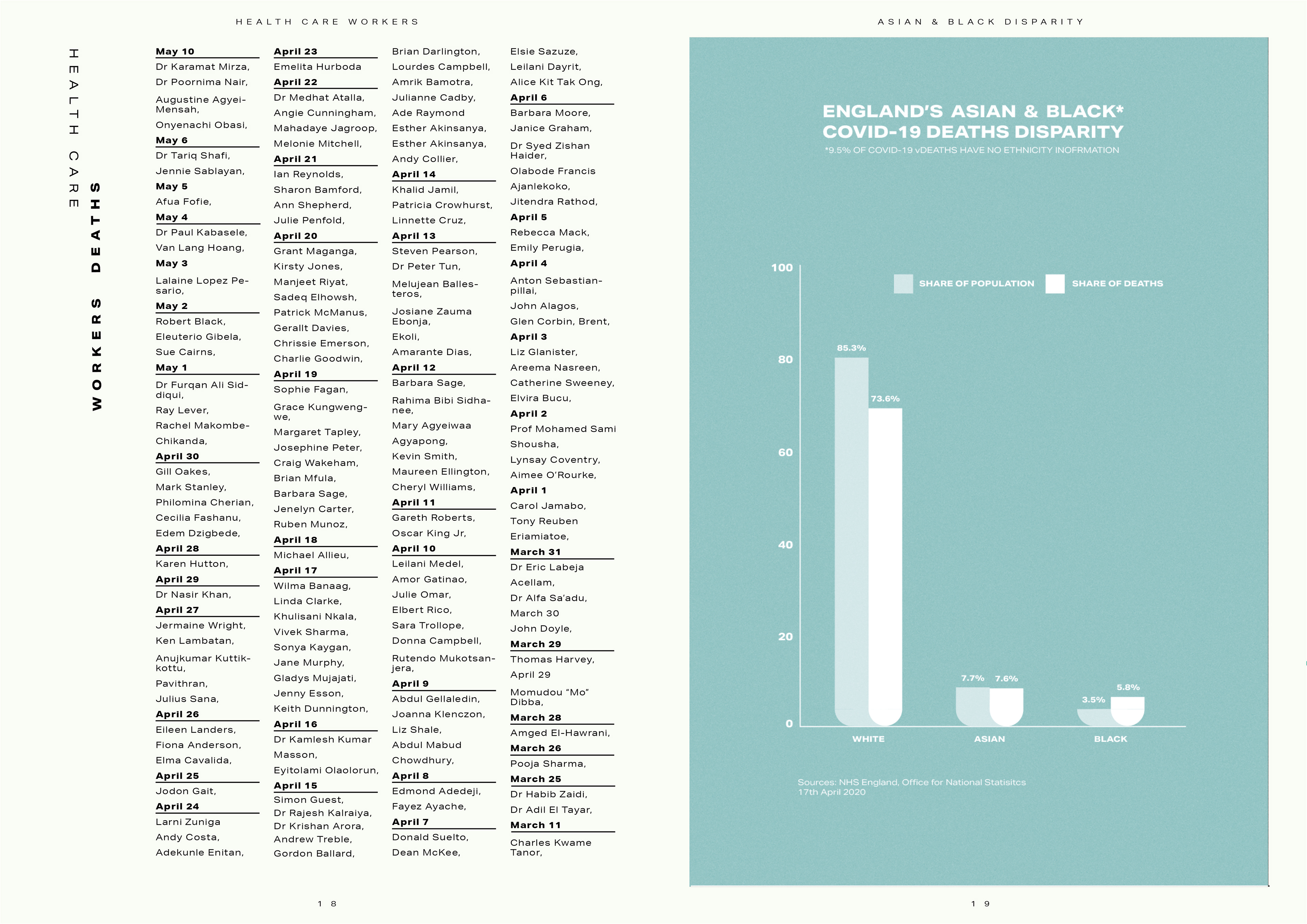
This is now a little out of date but it is still useful to see. I think it's important to see where we are at and to know as much as we can on what is going on around the world. I've done my best to make sure this is as unbiased as possible and I've appropriately tried to link it in the layout style with the BME/HEALTH CARE WORKS page.
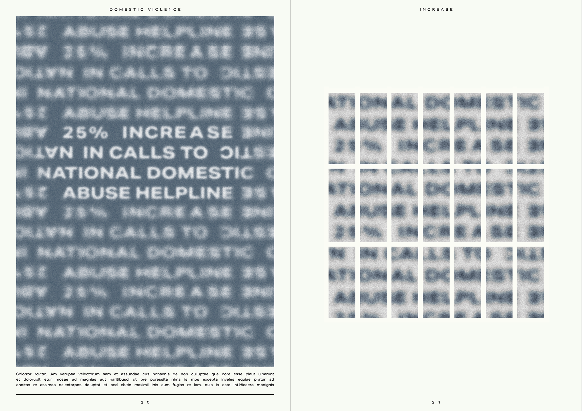
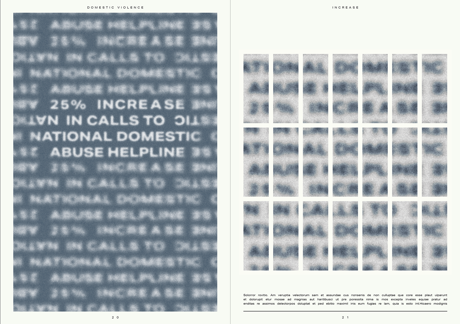
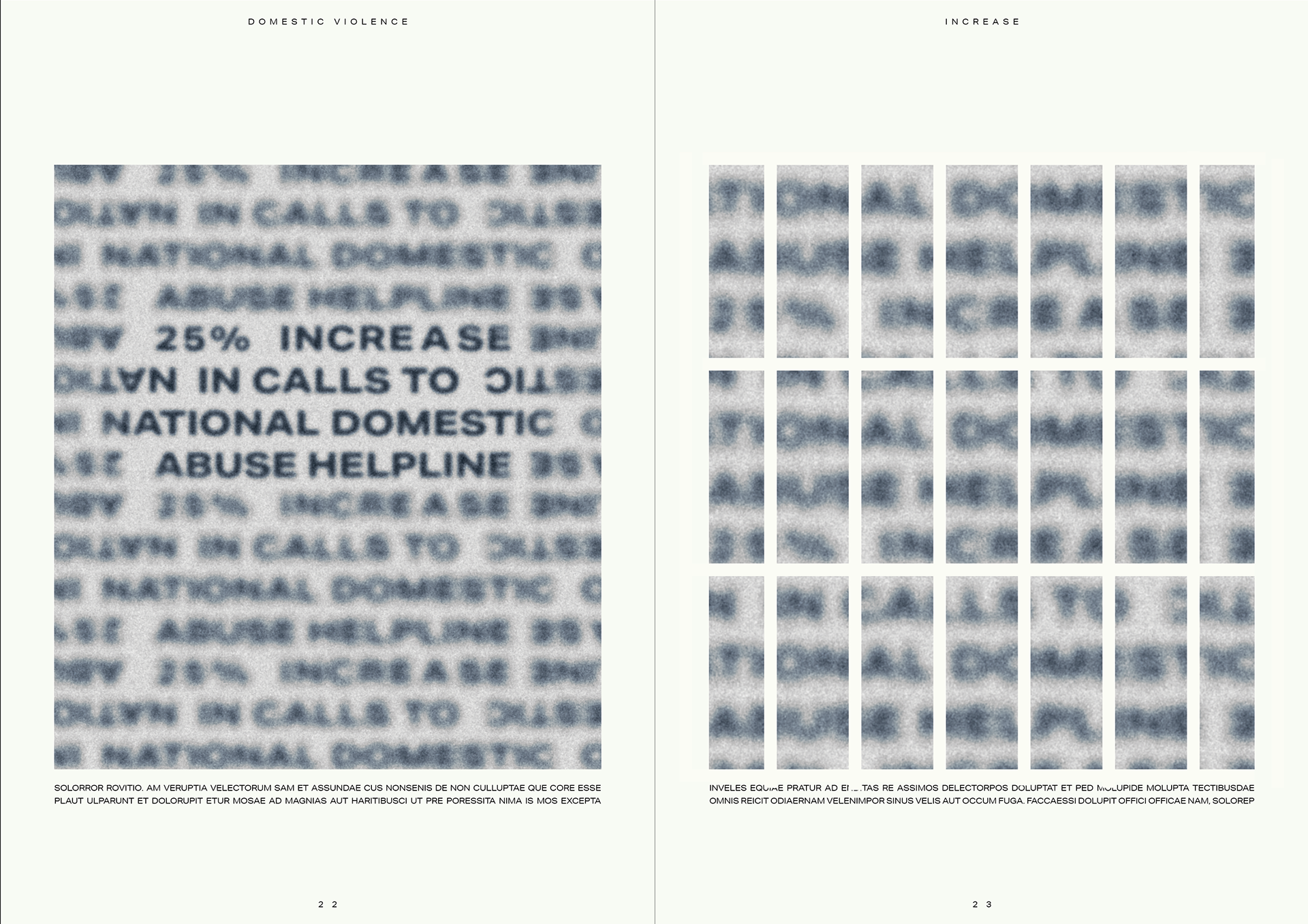

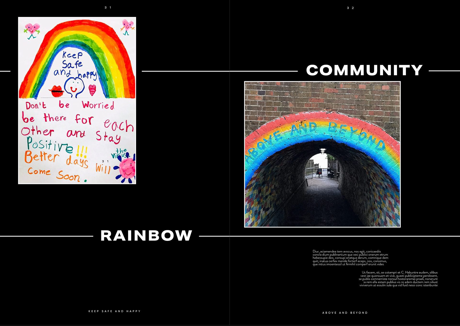
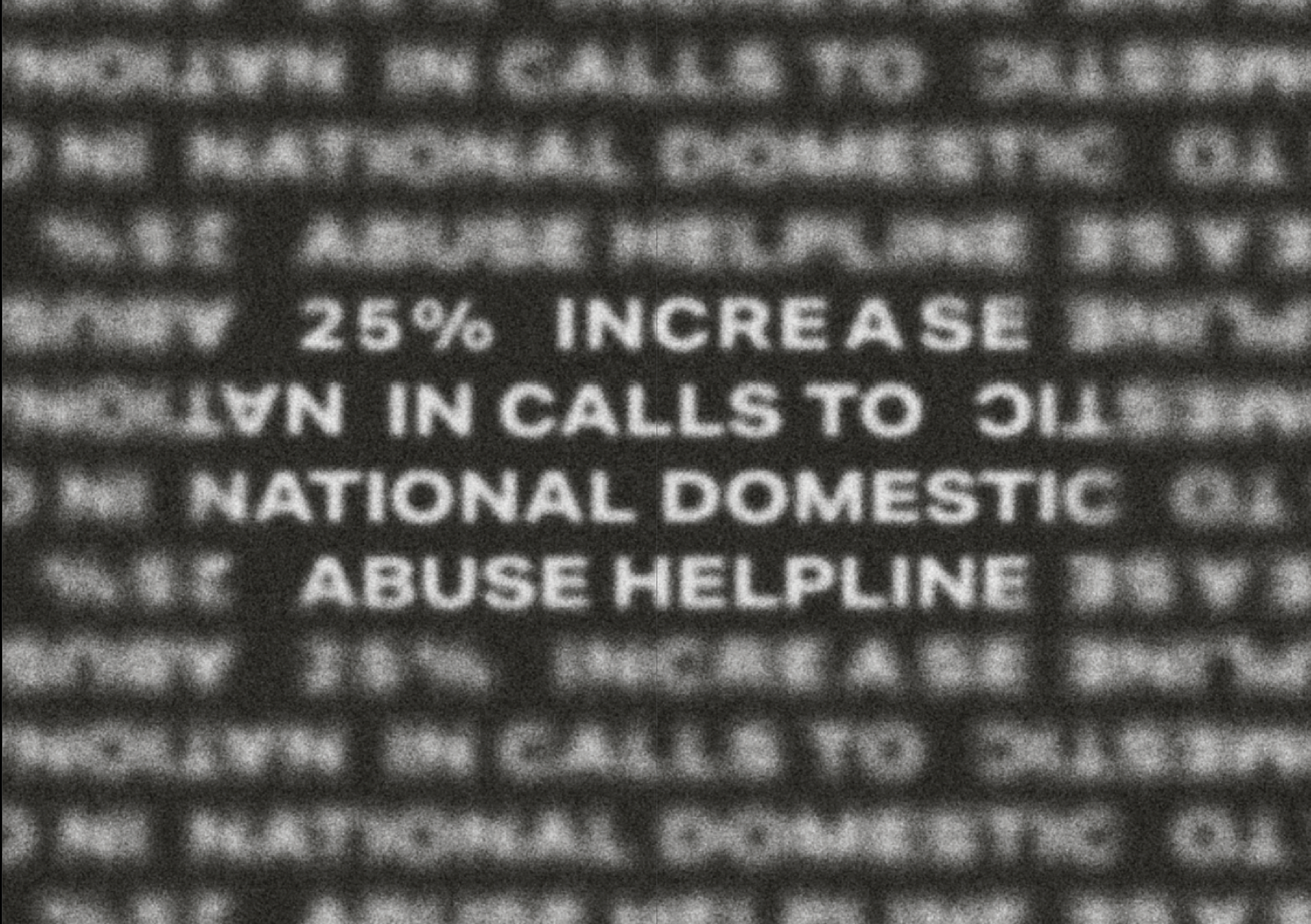
DOMESTIC VIOLENCE
As with the weather/environment spread I’ve tried to pair these. I still wanted to have the poster for the domestic violence statistic and feel as if pairing it with an inverted zoomed in image on the right works well. My thinking with this is that it could still be a window but it does look more like jail cells as many people are trapped in their own homes.

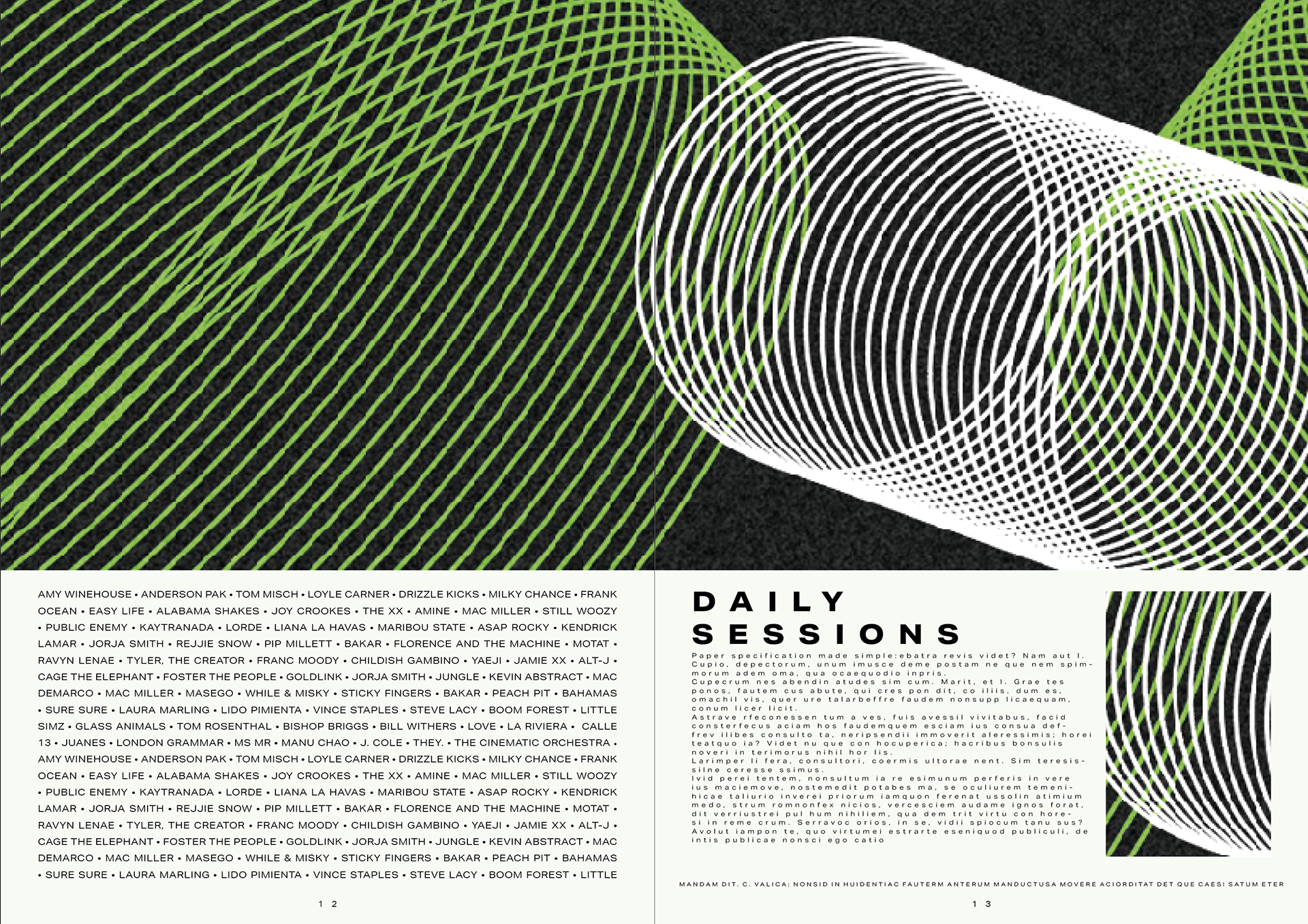

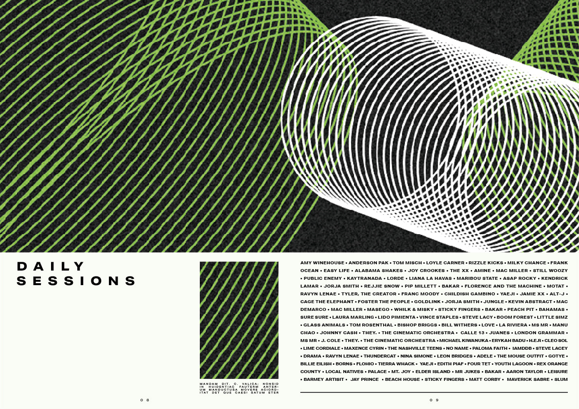
This layout I plan on having in the middle as it's the only one that doesn't have a paired layout. I'm trying to stick with the music festival look but it is slightly different as it doesn't exactly look like a poster. I am really happy with how this looks and see this being a good choice for the centre page.
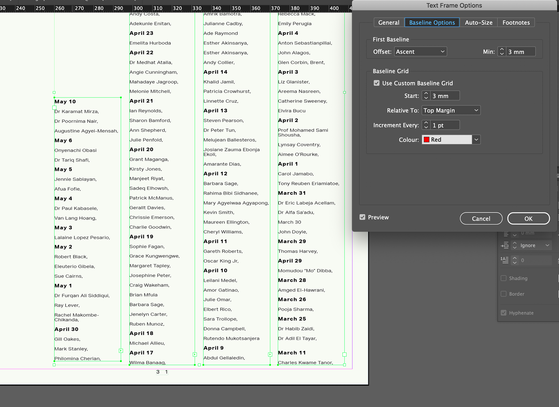
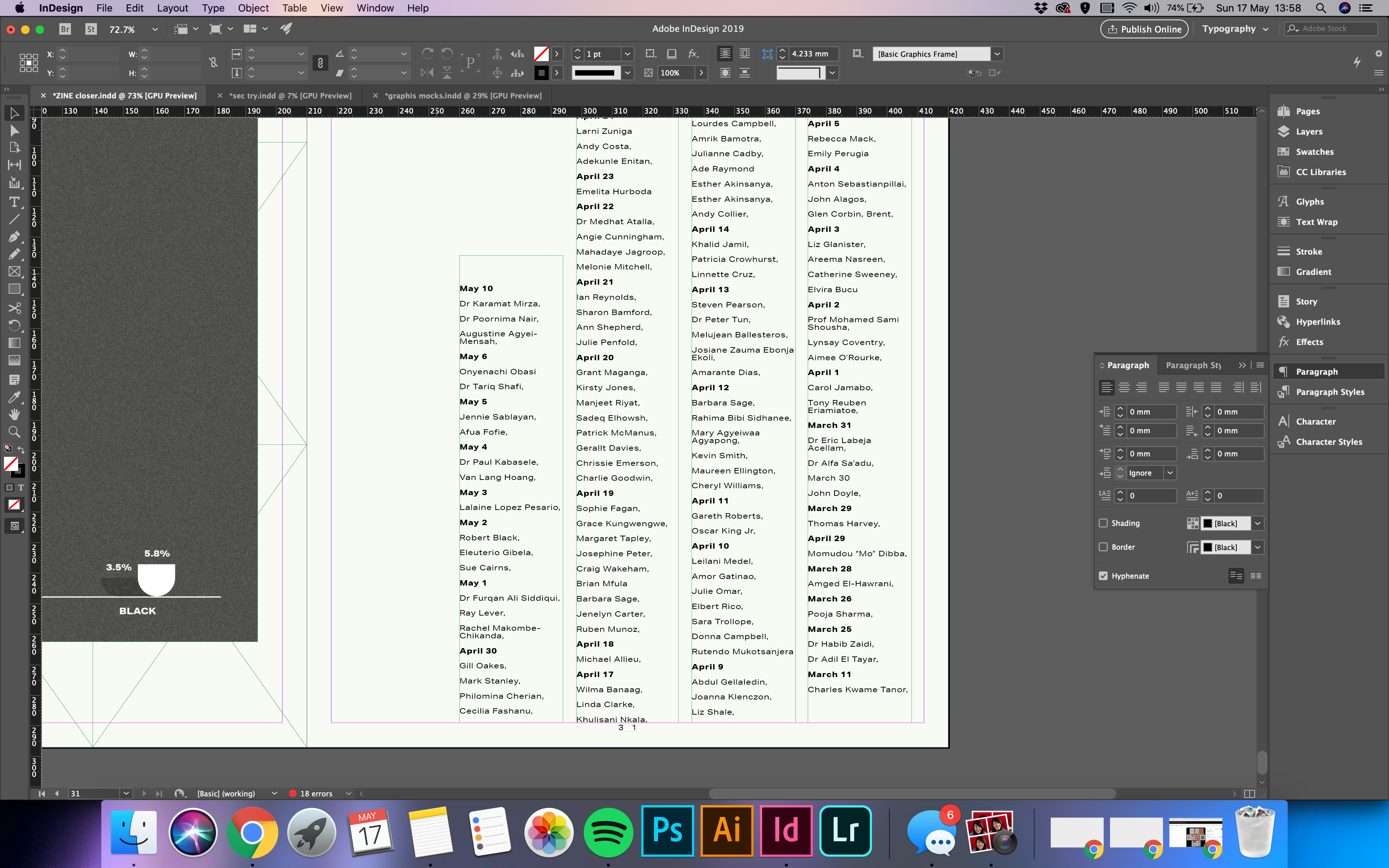
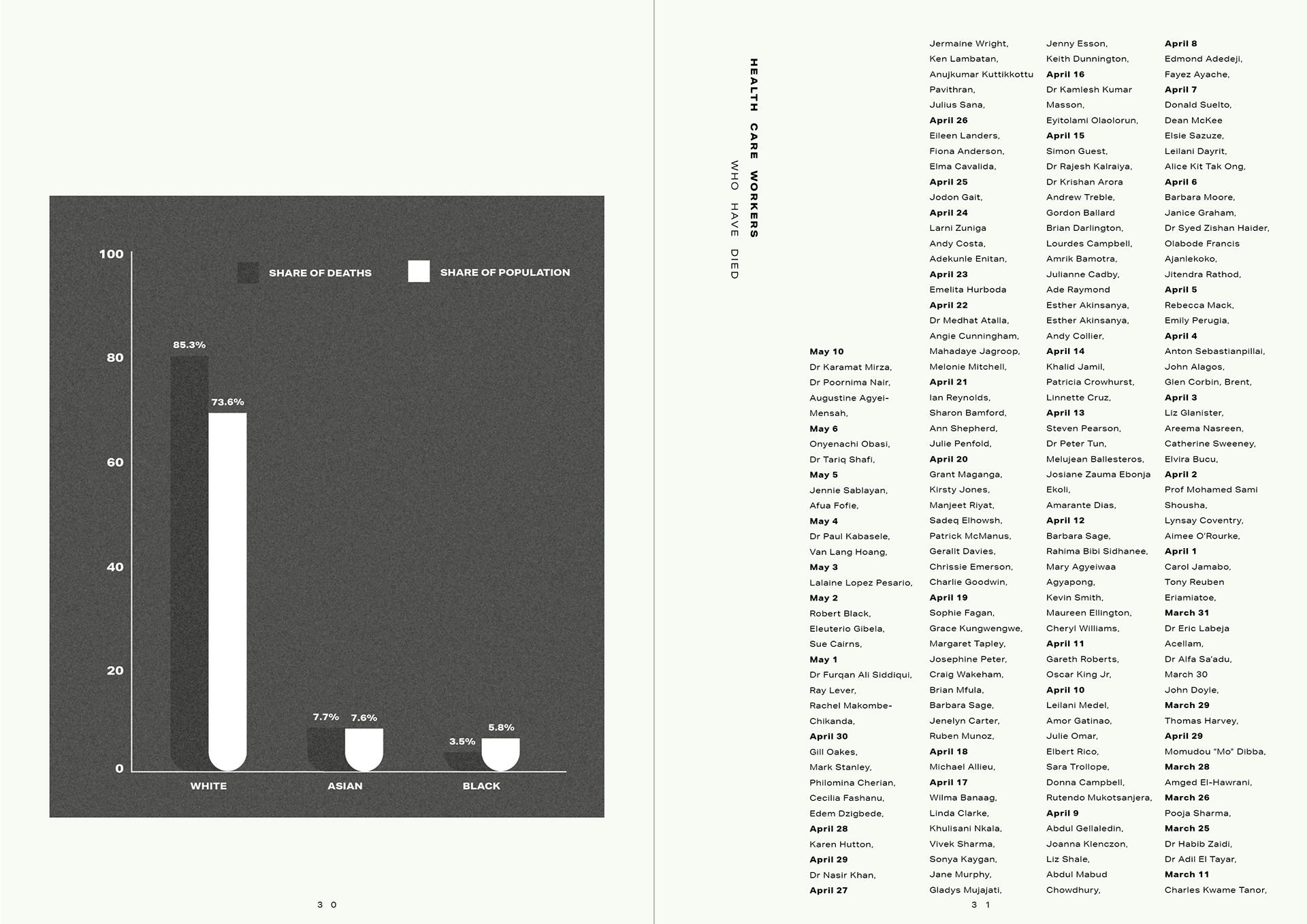
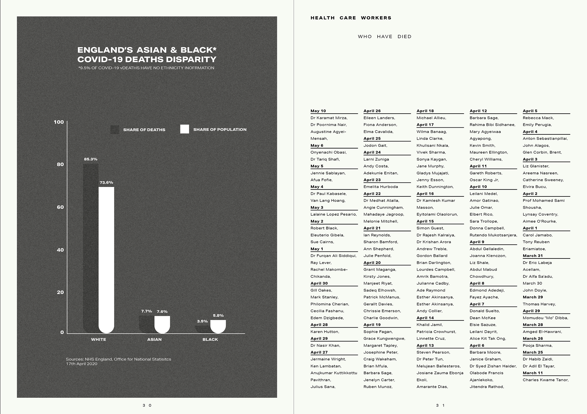
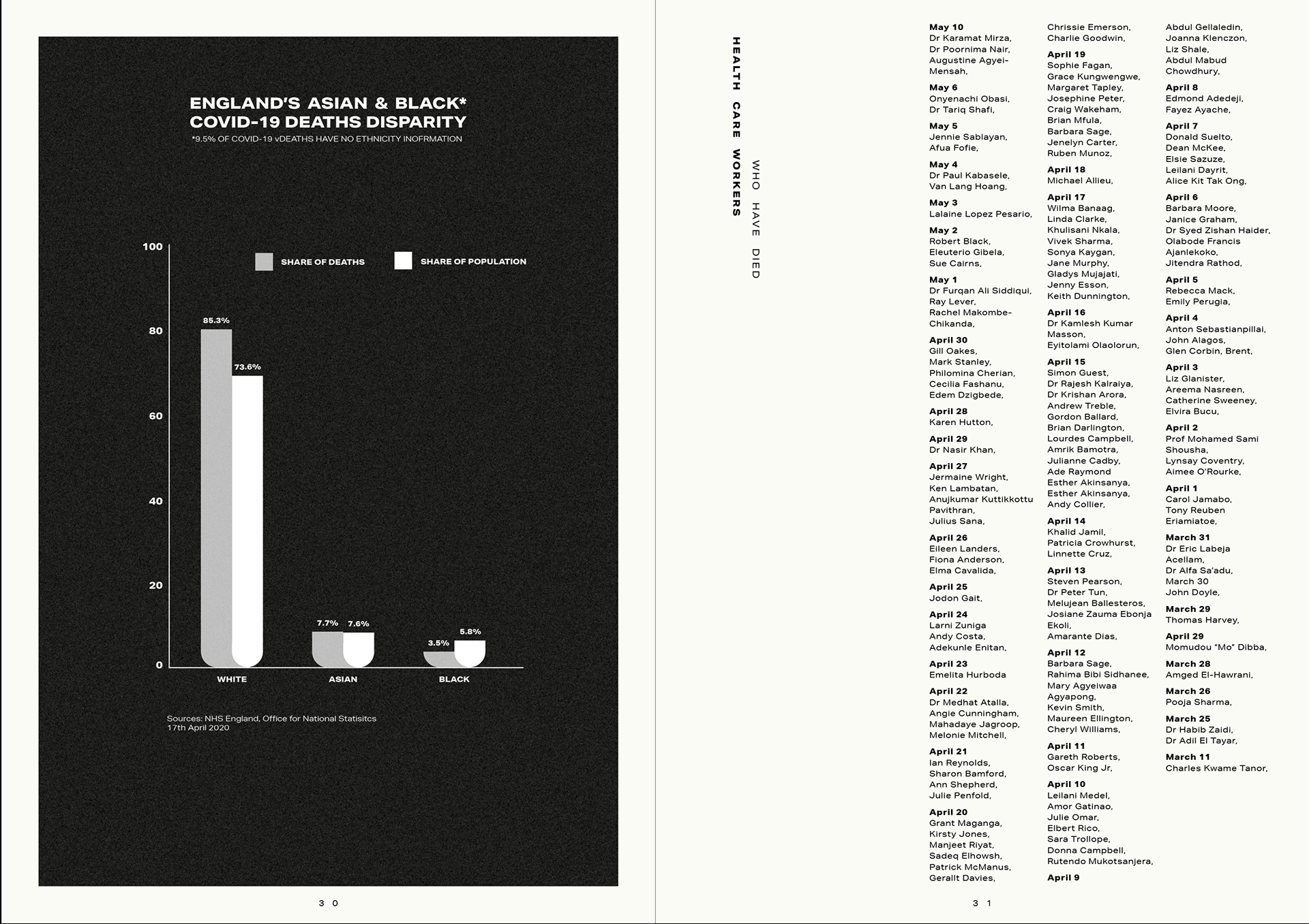
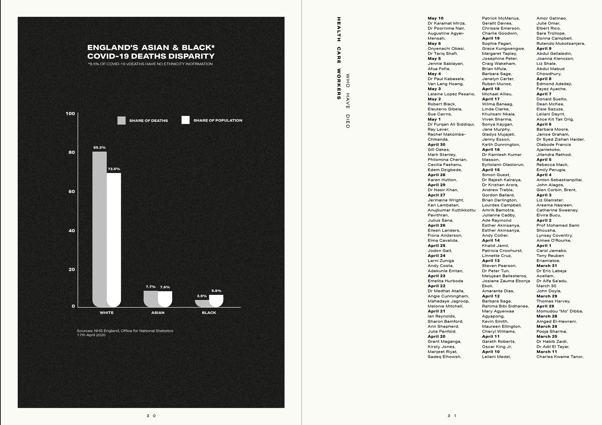
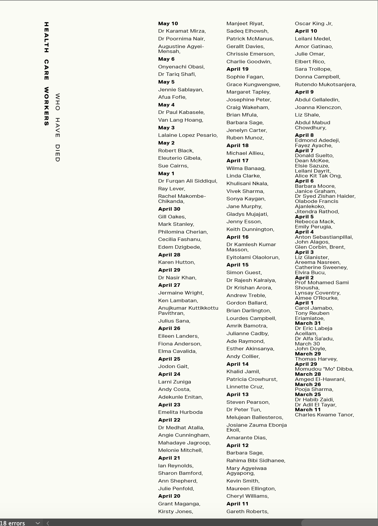
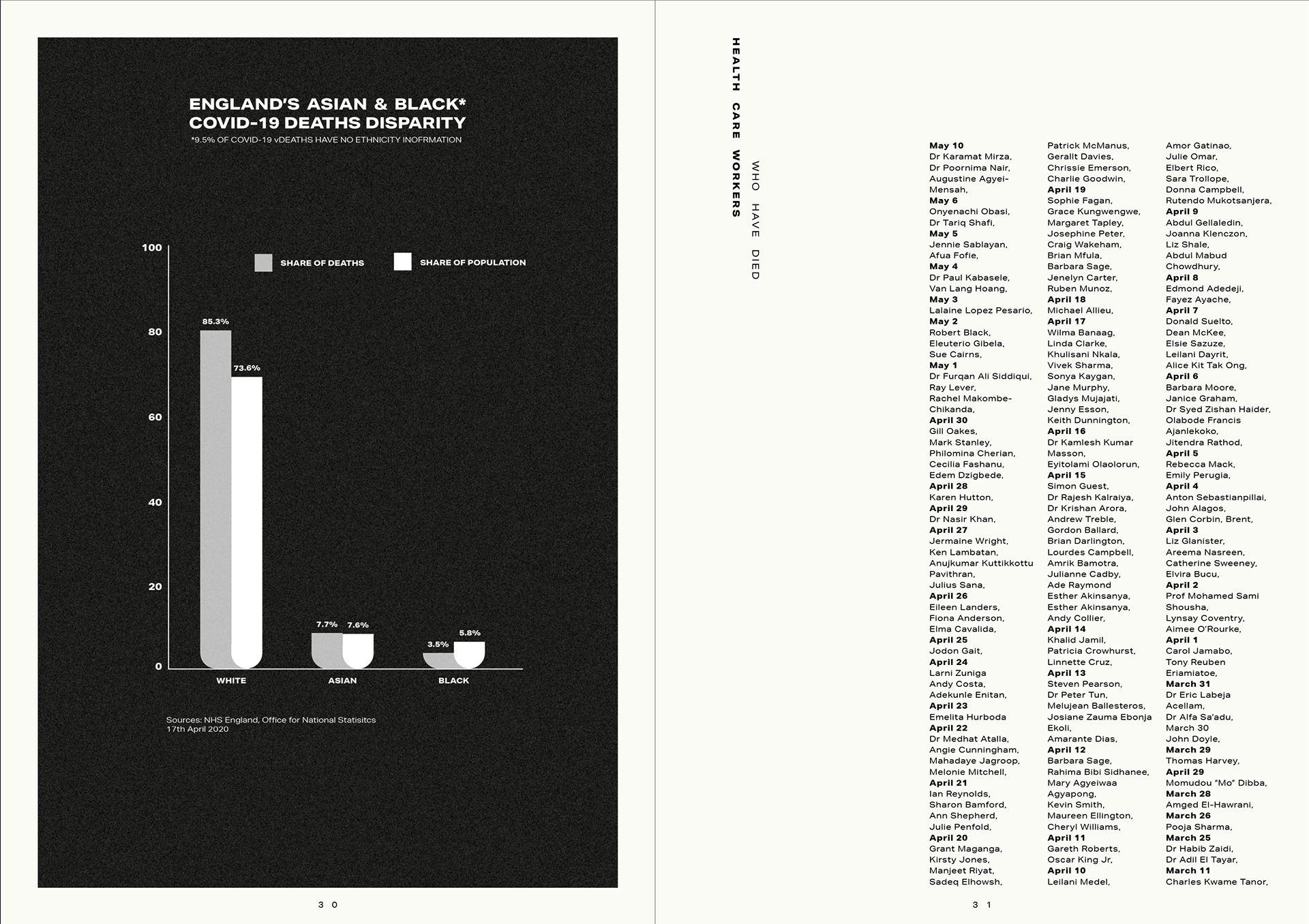
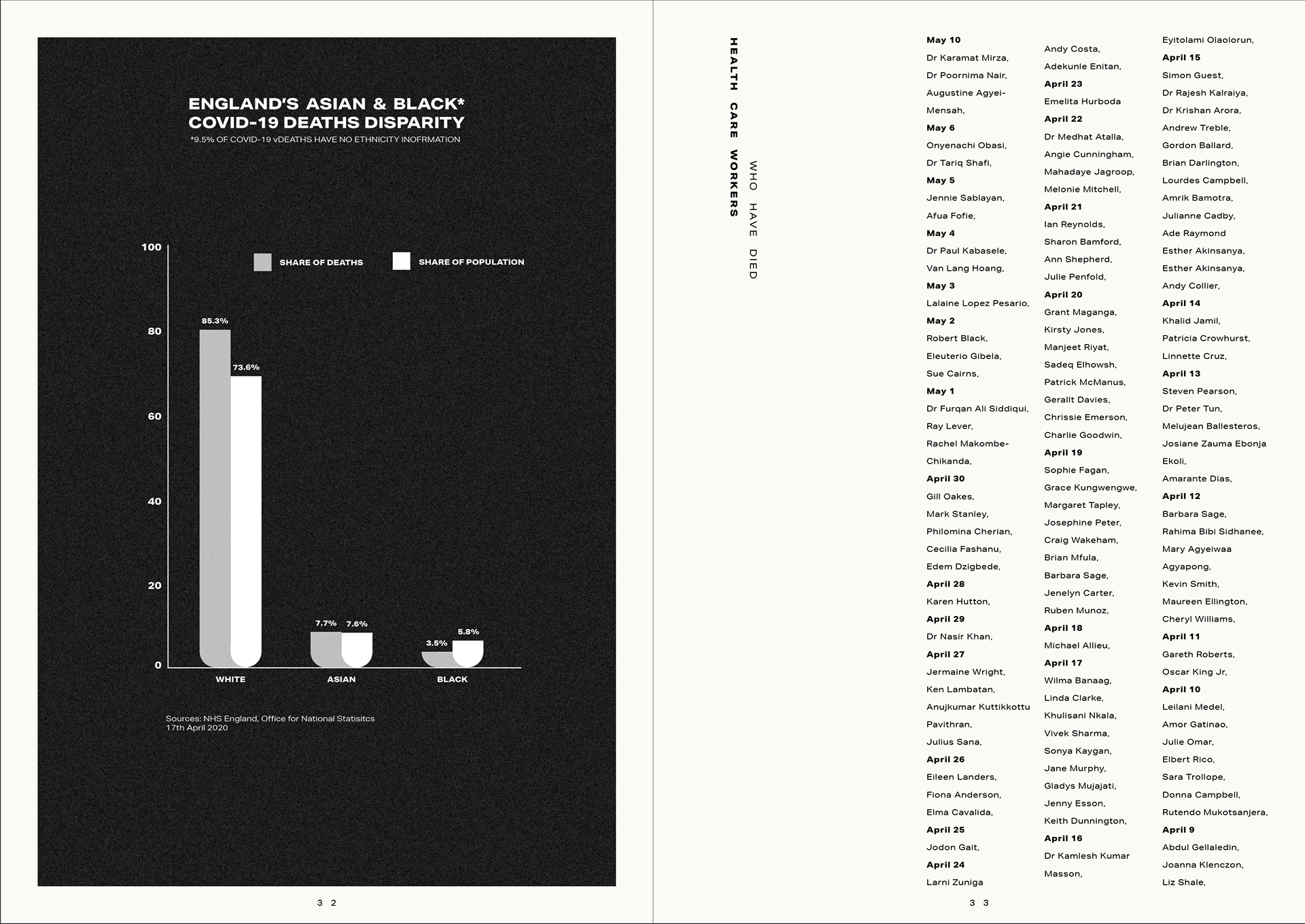

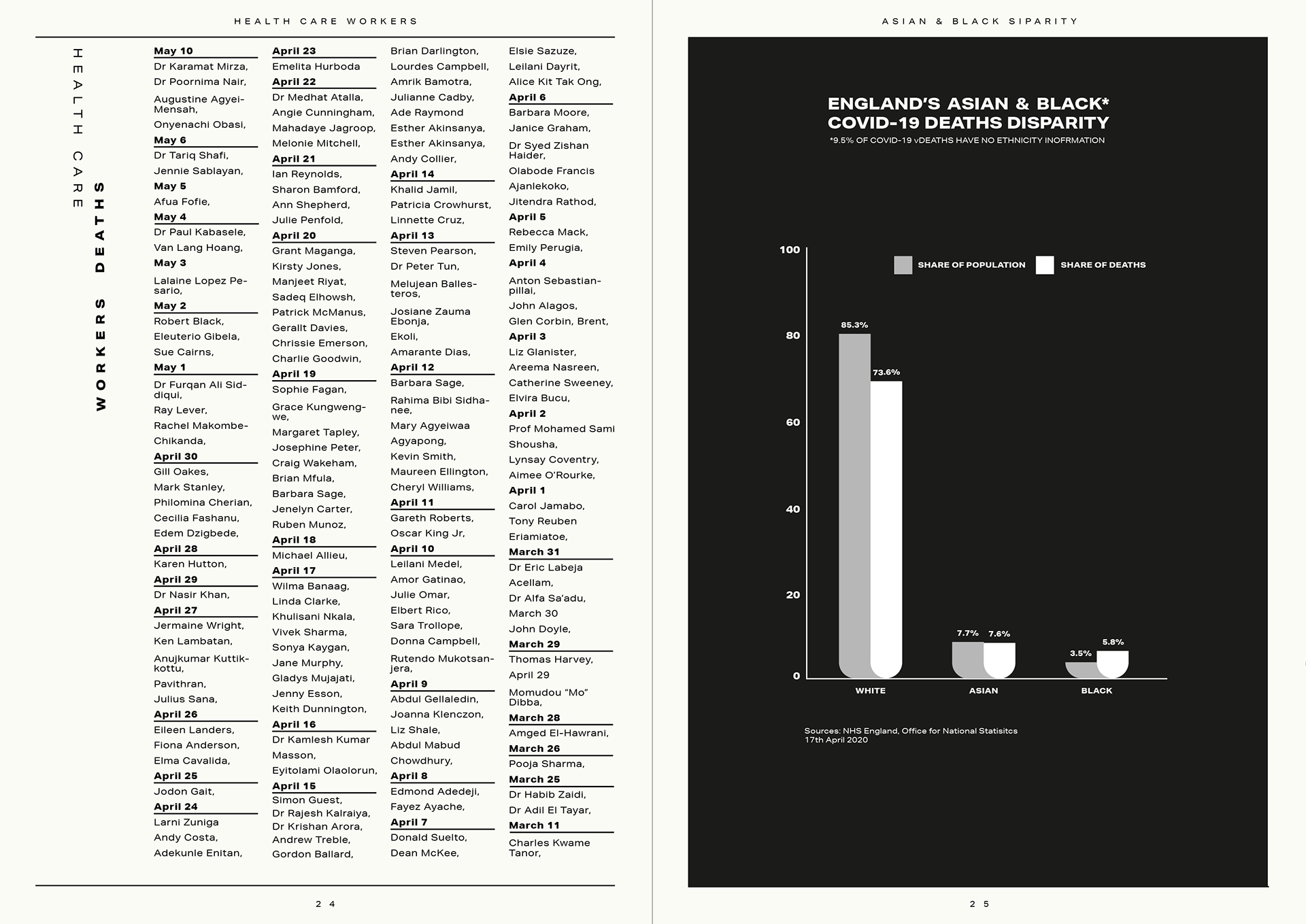
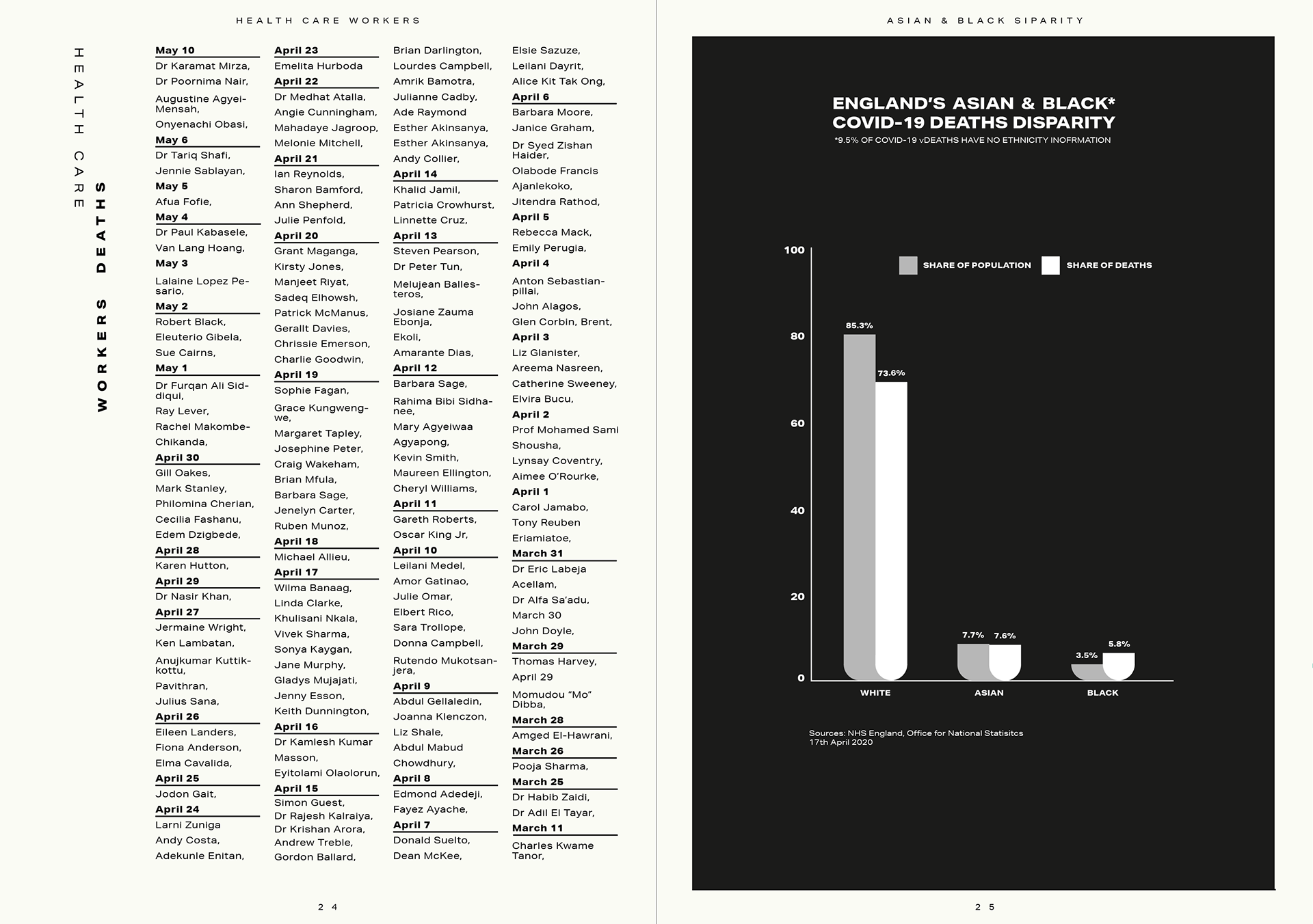


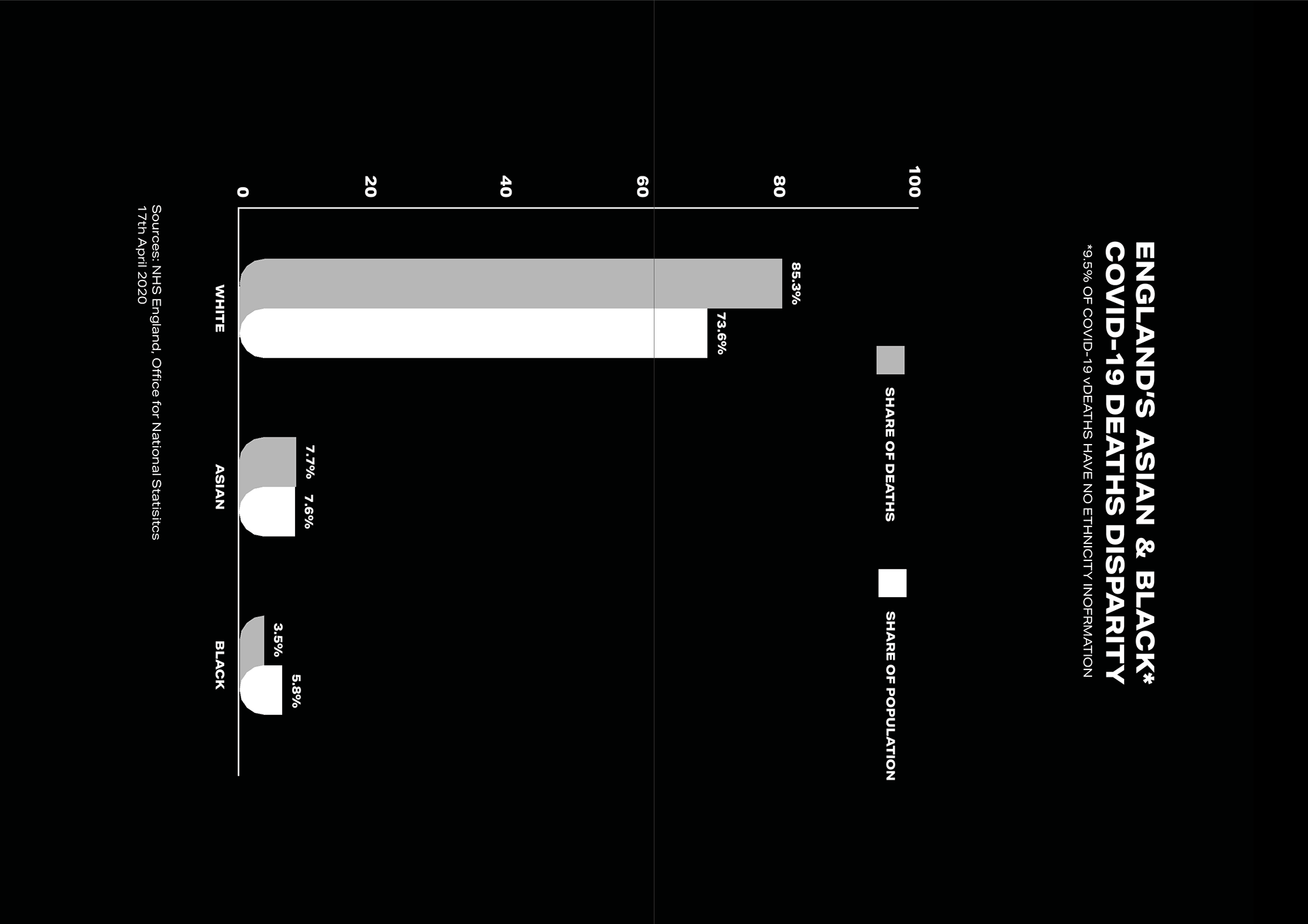
BME/HEALTH CARE WORKERS
I liked the collum spread which is similar in graphis and felt it would lend itself well with the BME graph I made. I wanted to include some further information and I thought including the names of health care workers who have passed away was a good thing to do.
A few years ago I went to an Ai WeiWei exhibition where he had a list of people who had been killed by the chinese government and the sheer quantity (similar to world war memorials) really give these people an identity and more it more real rather than just a number.
I tried doing baseline grids with it and spent way too long trying to align it all right. I feel what I ended up with is okay but not perfect. I am glad I've been able to work with a larger quantity of text however.
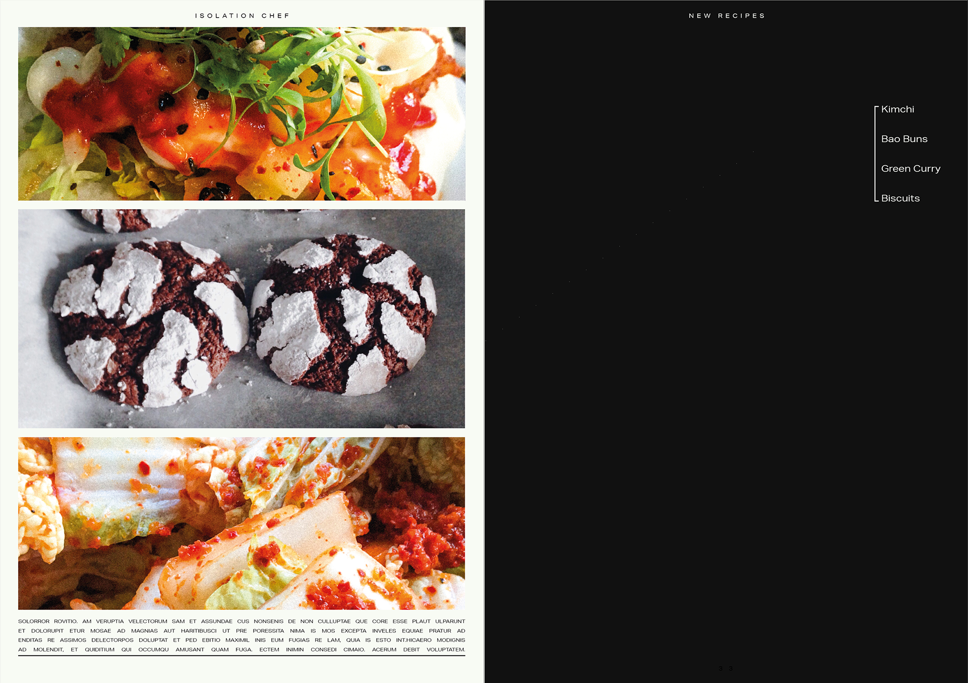

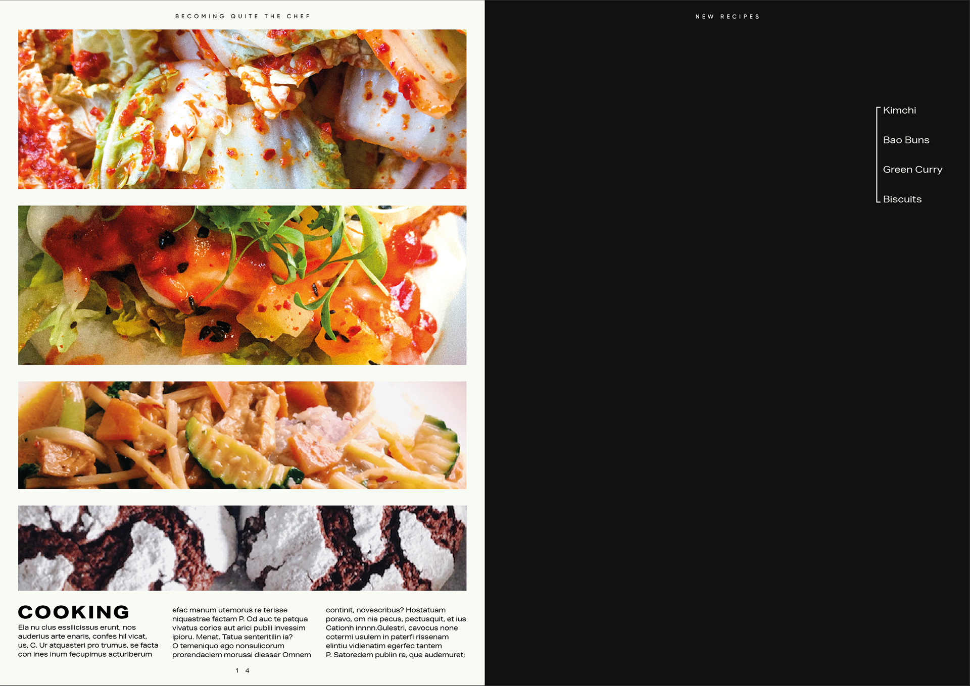
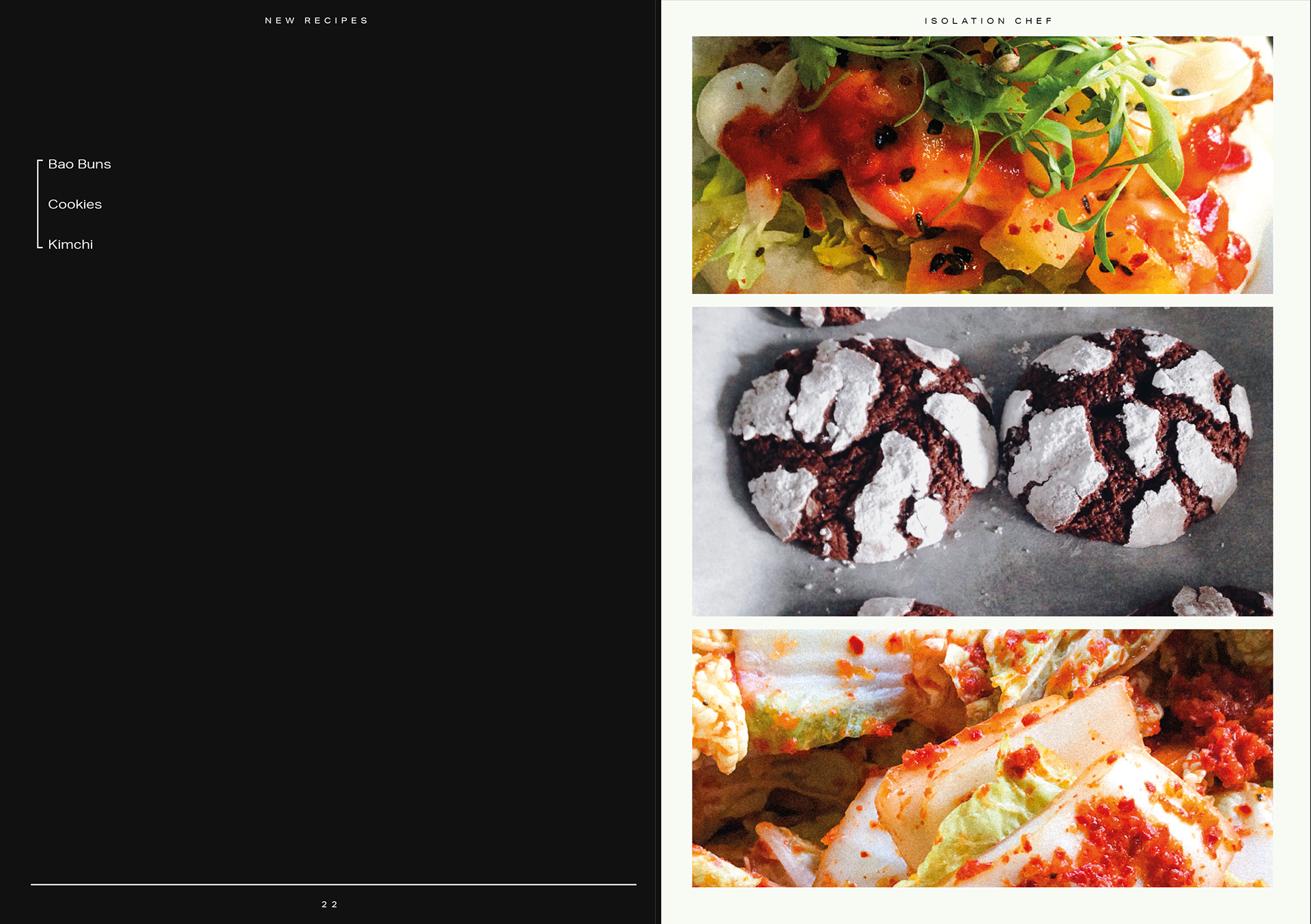
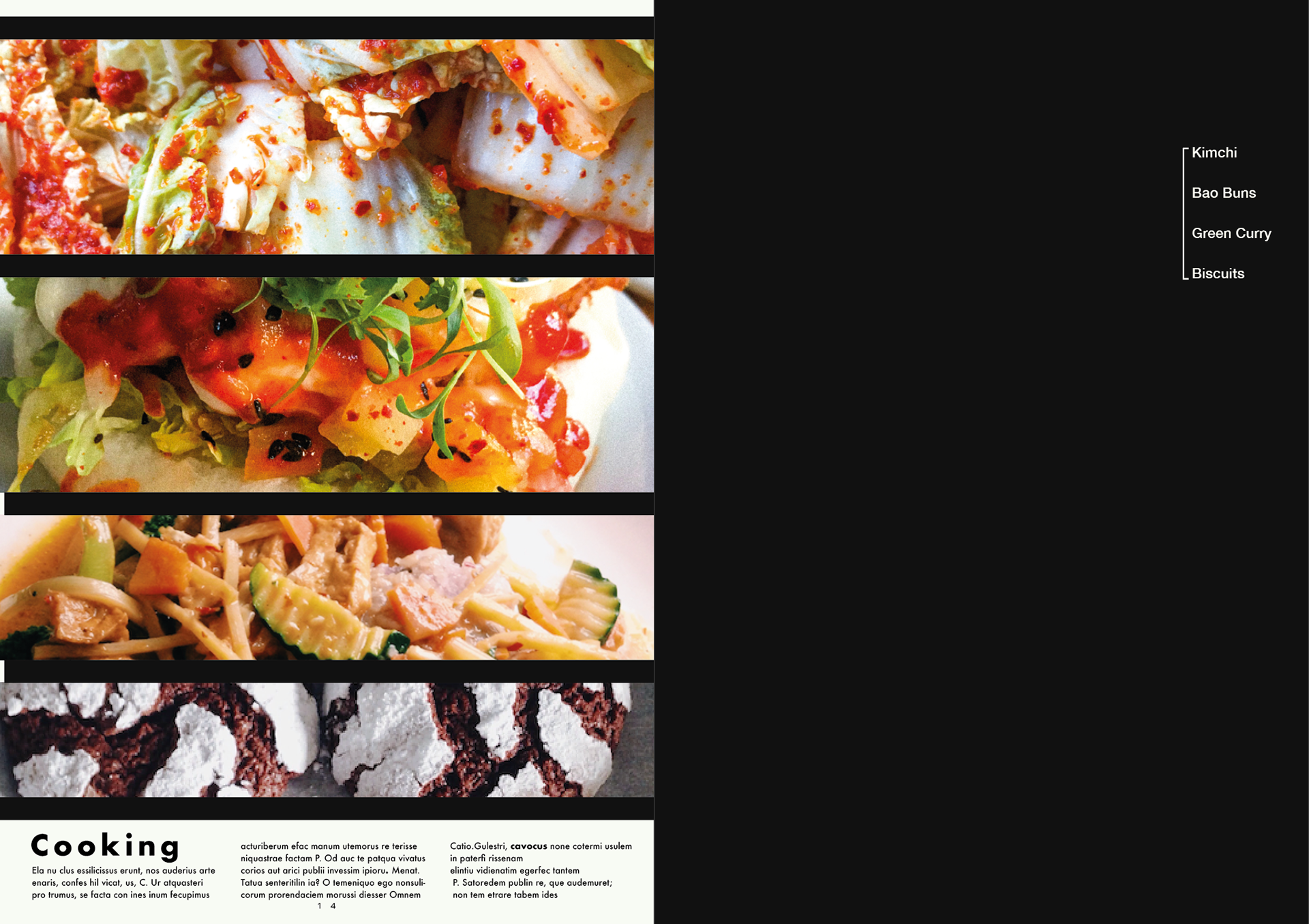
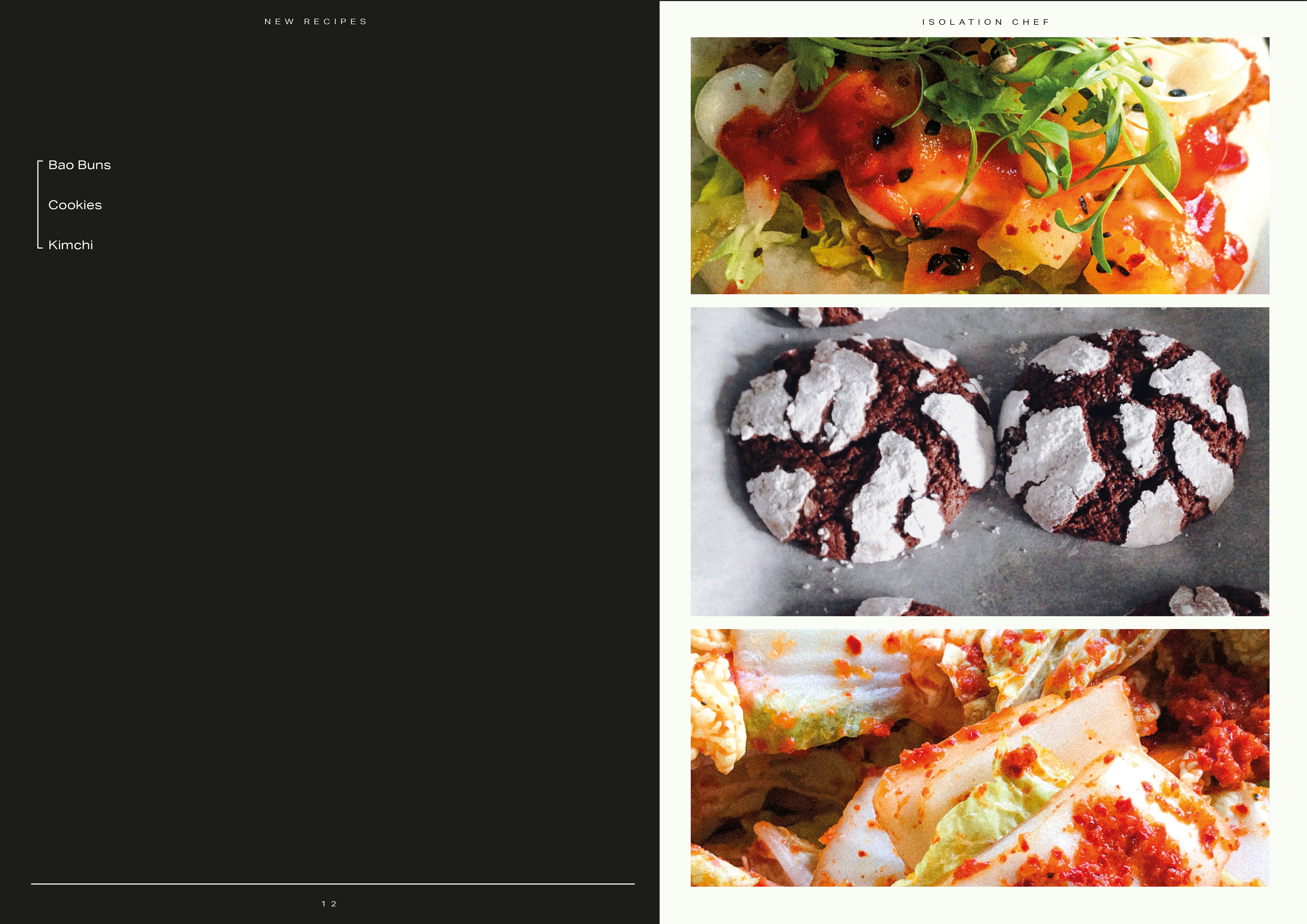
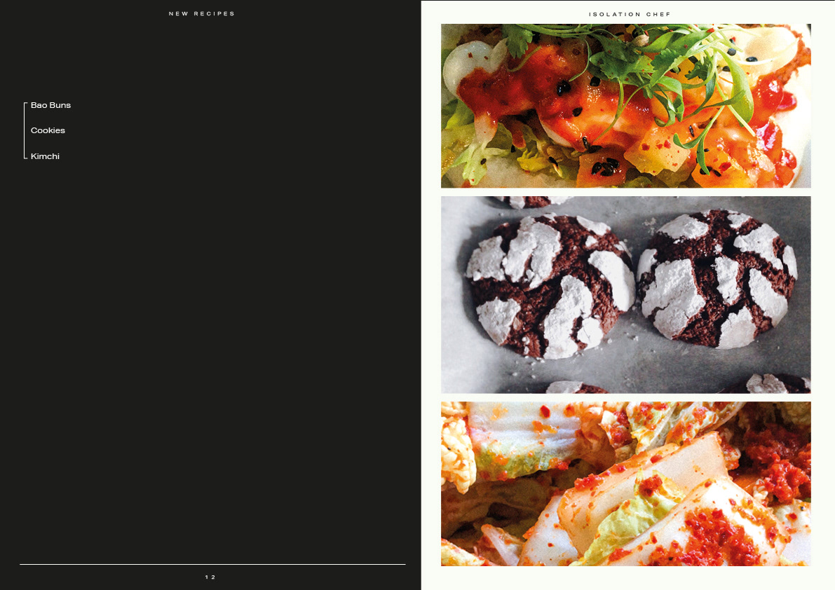
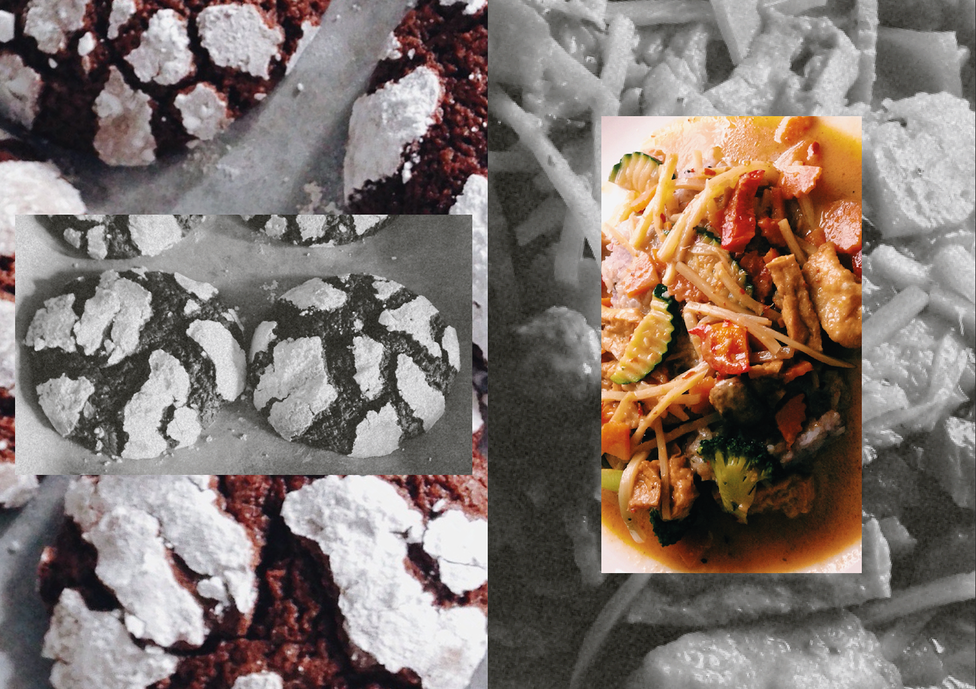
COOKING
I've changed the pictures I original had as I had planned to do an ingredient layout but I ran out of time to get that sorted so instead I am using some photographs of food either I or my family have made during quarantine. I like the accent of what the food is on. I think it allows it to speak for itself.
I included cooking as I feel like I've been doing it more and getting more creative with the recipes I'm doing means I've been able to try new foods.
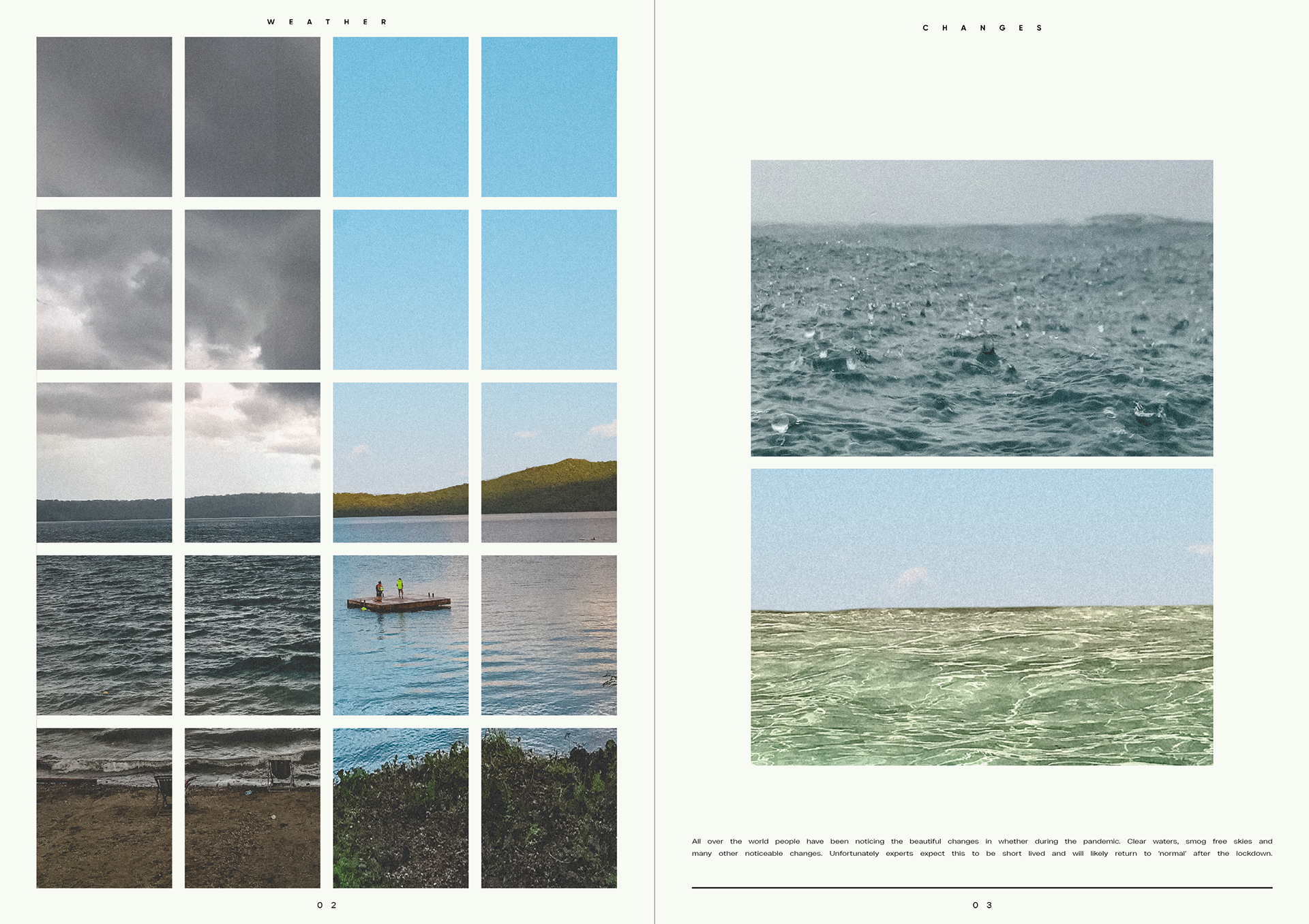
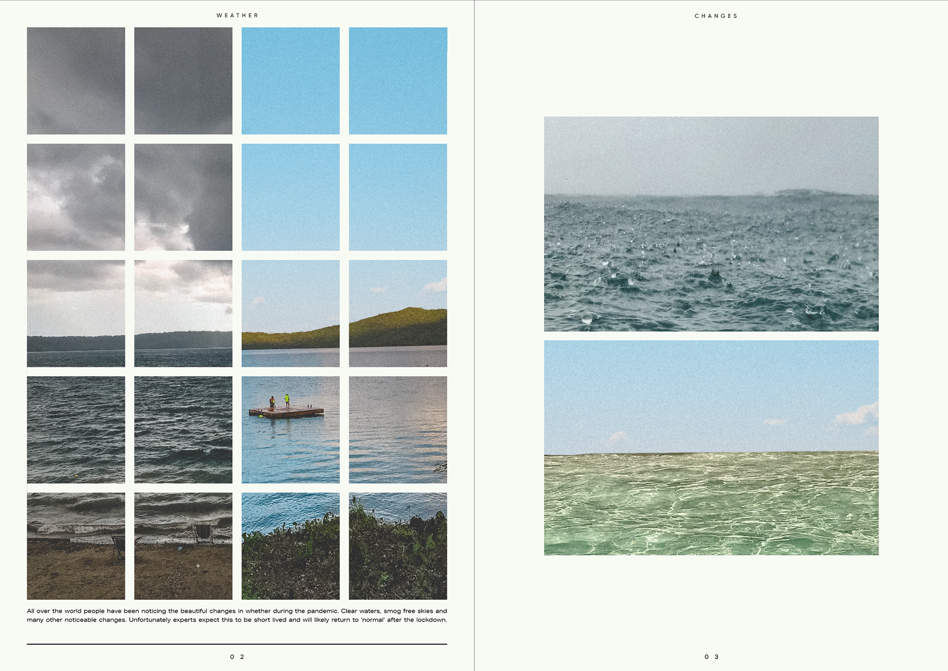


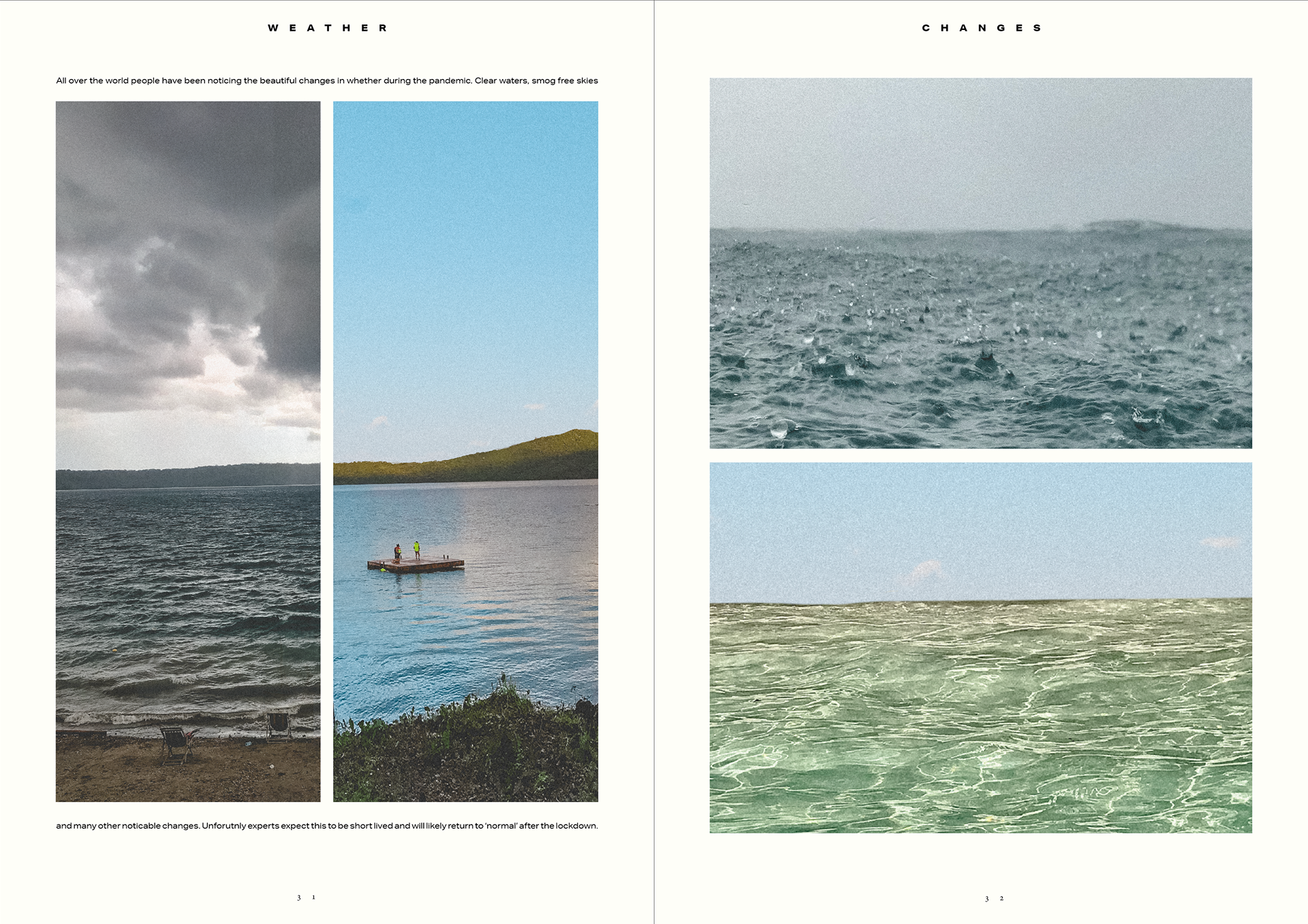
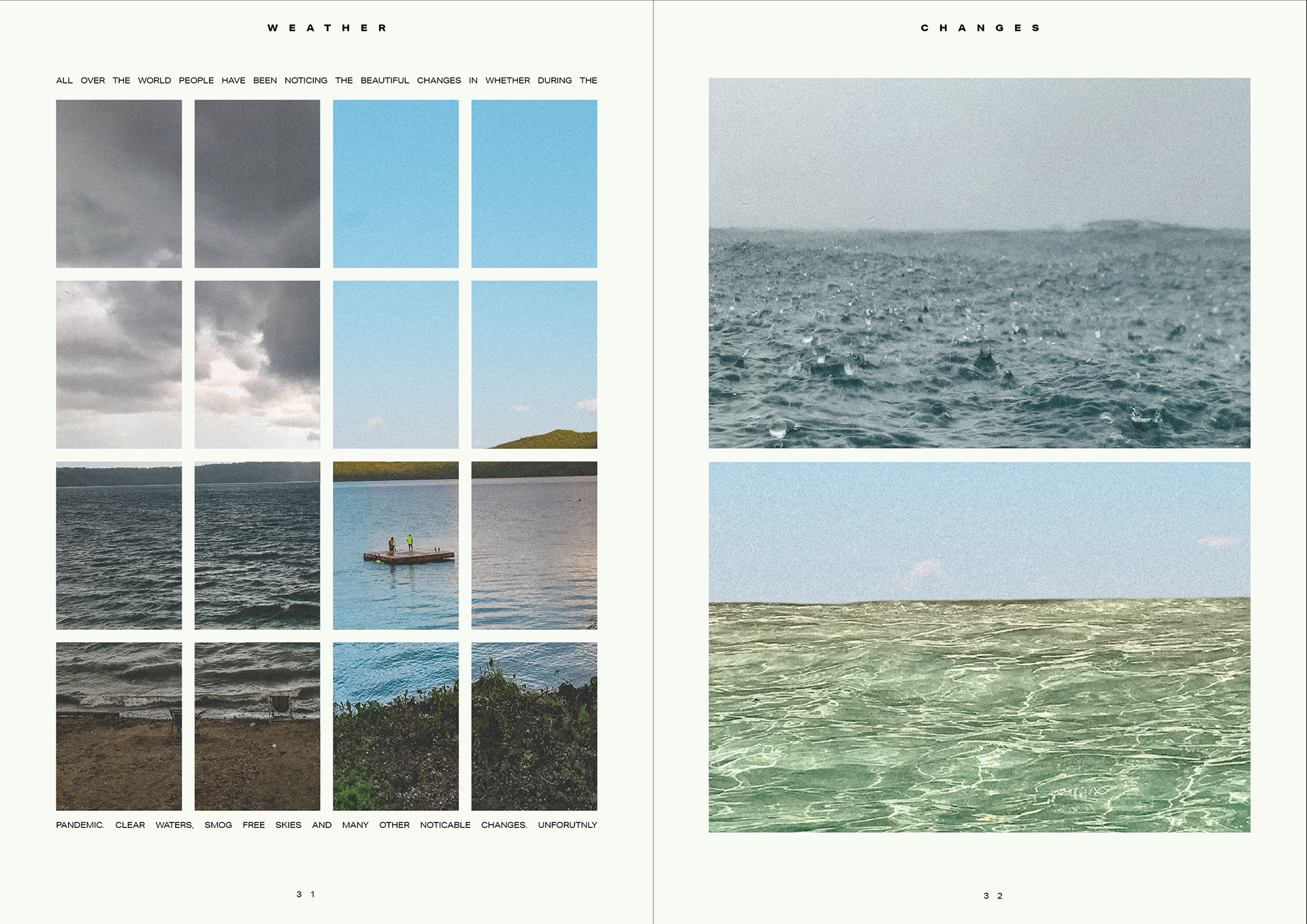

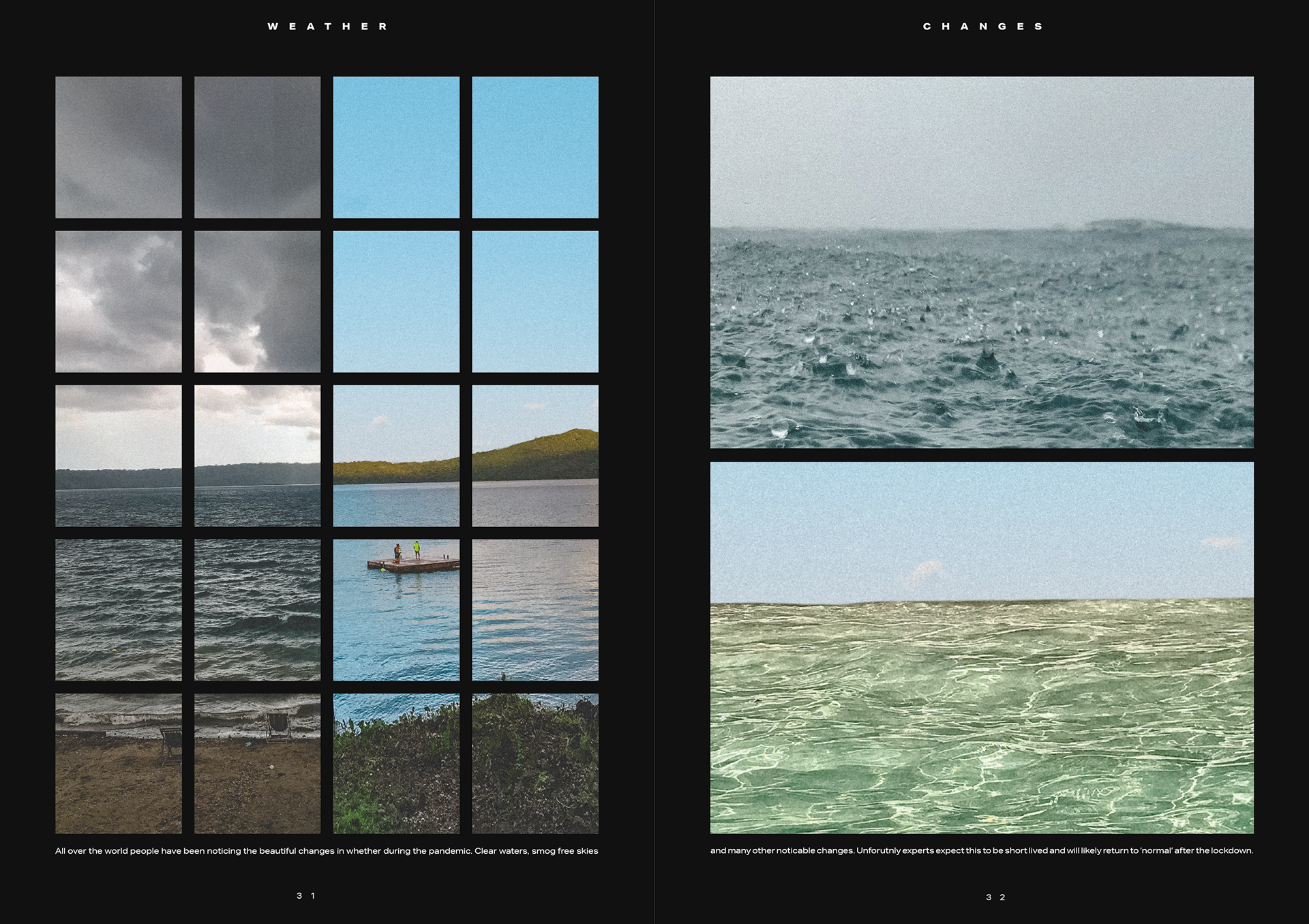
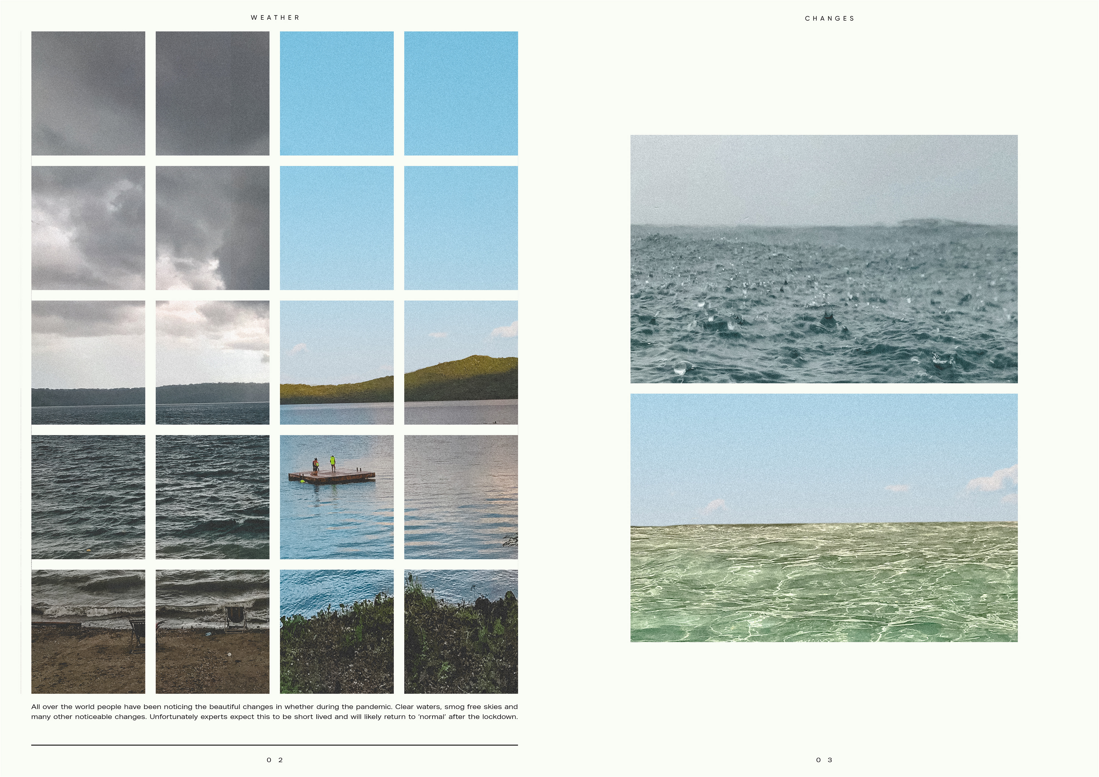
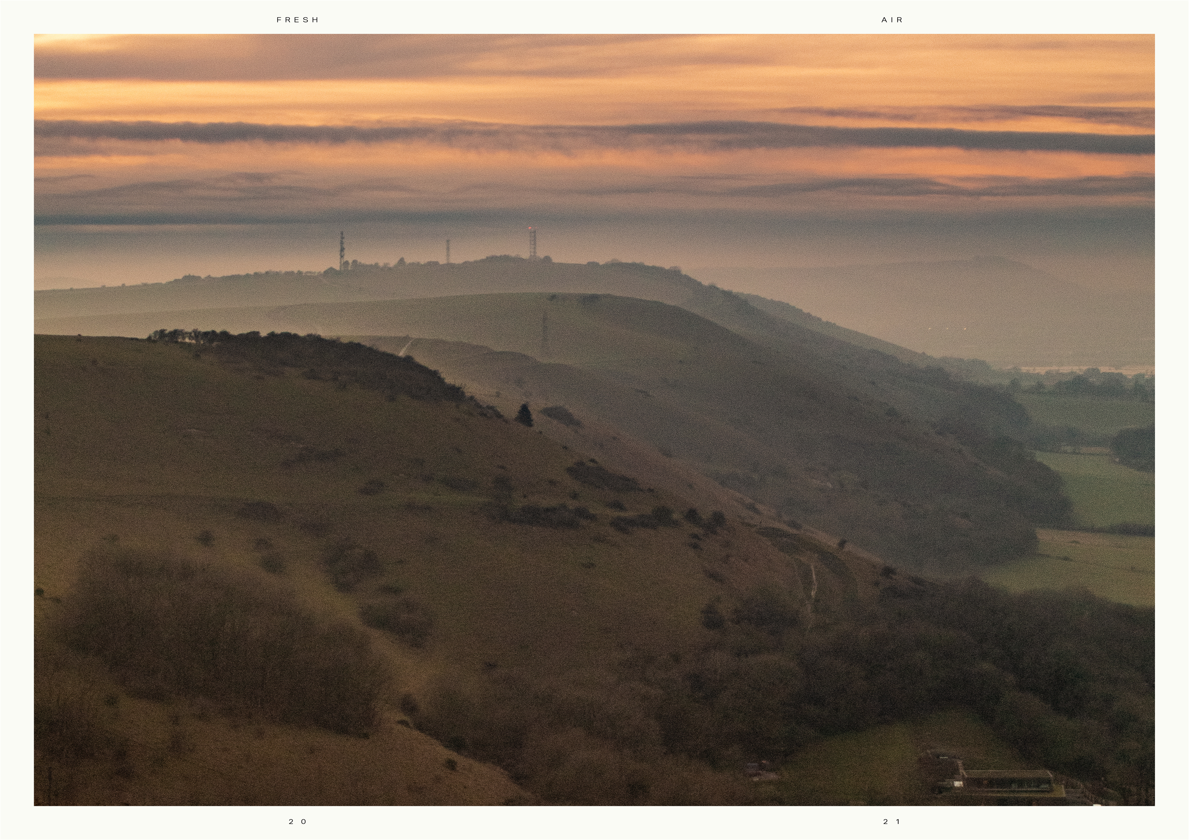
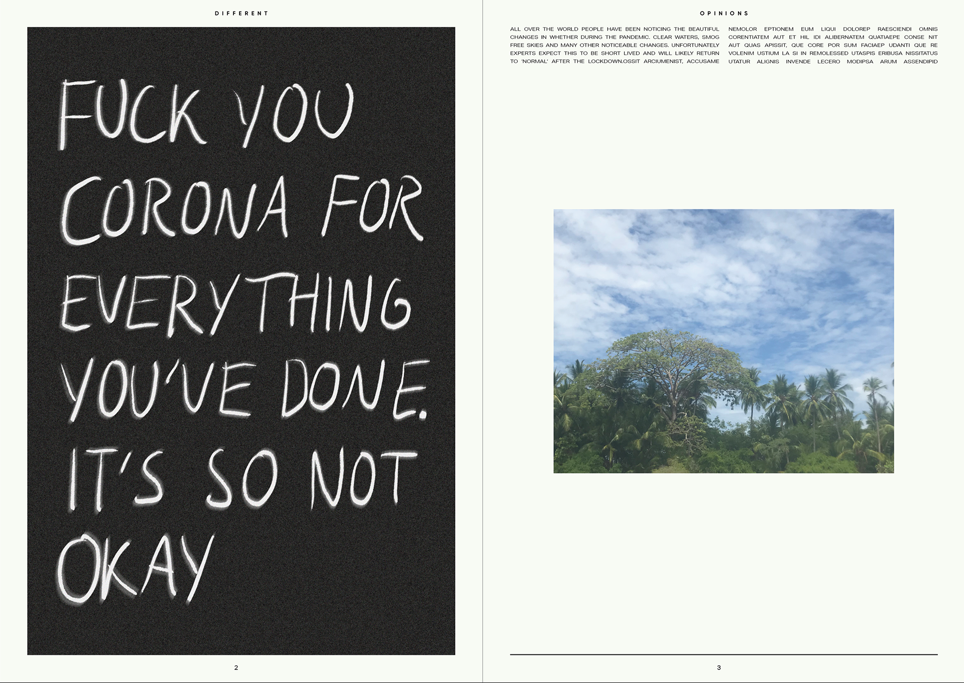
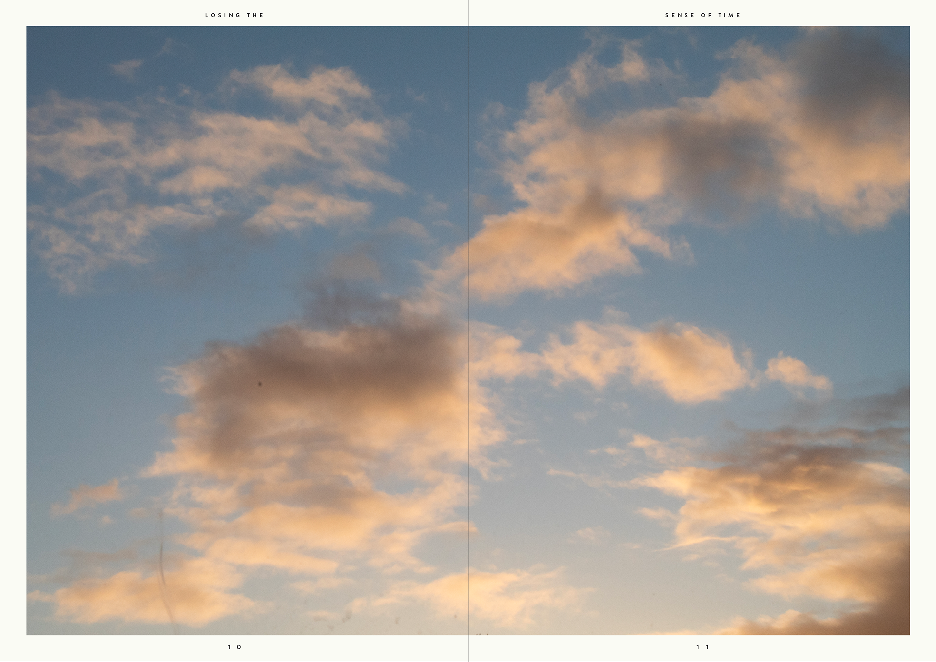
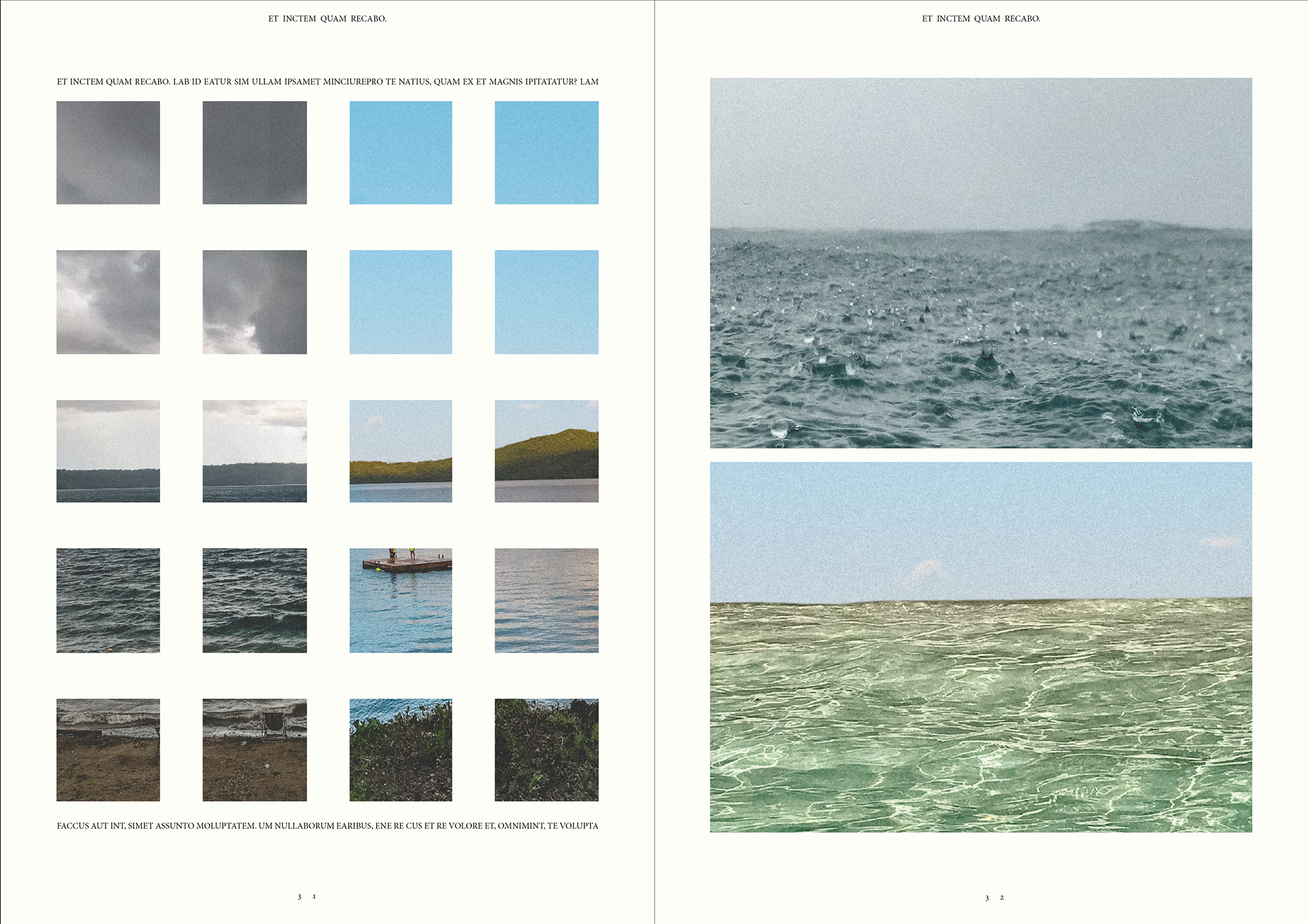
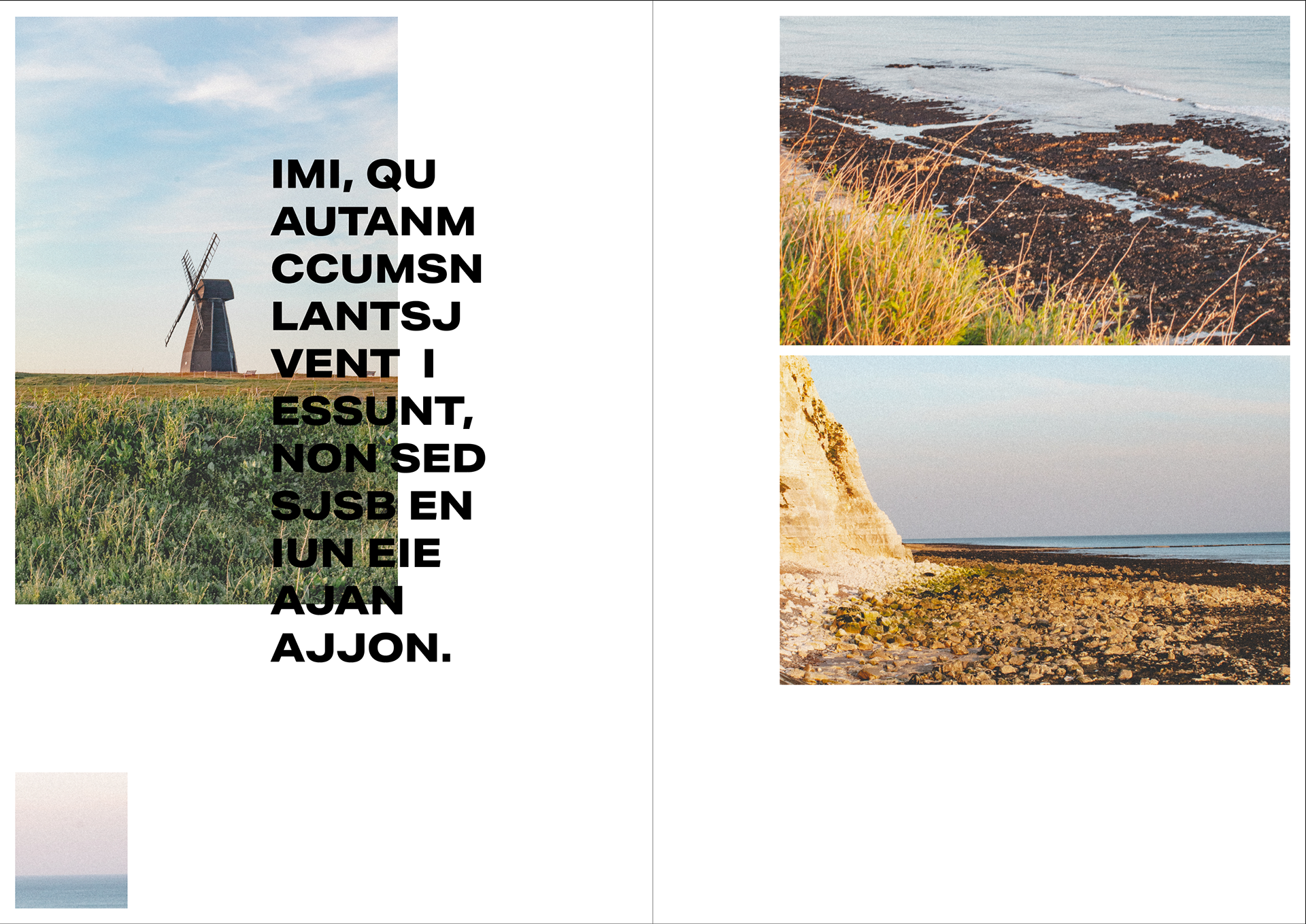
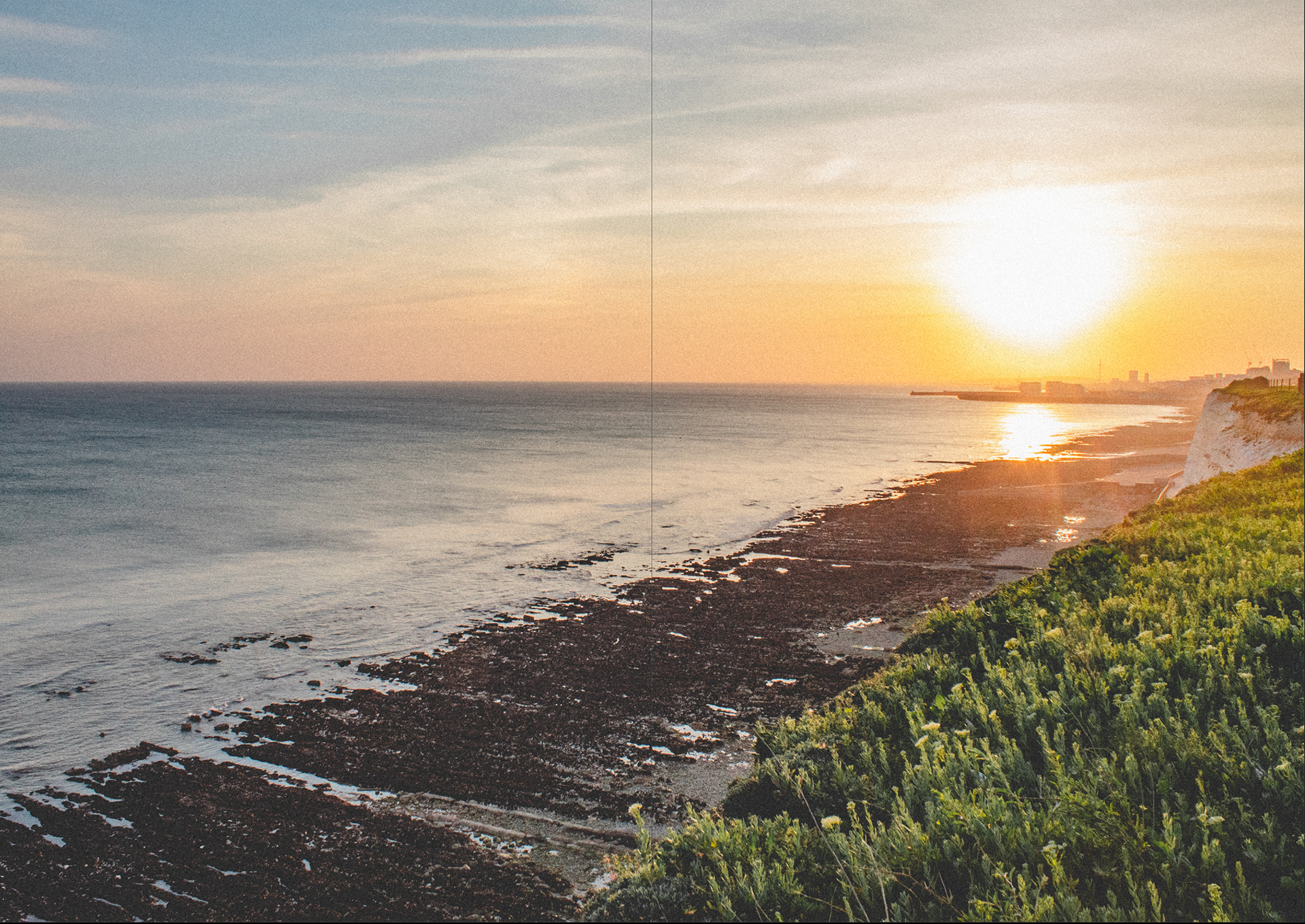
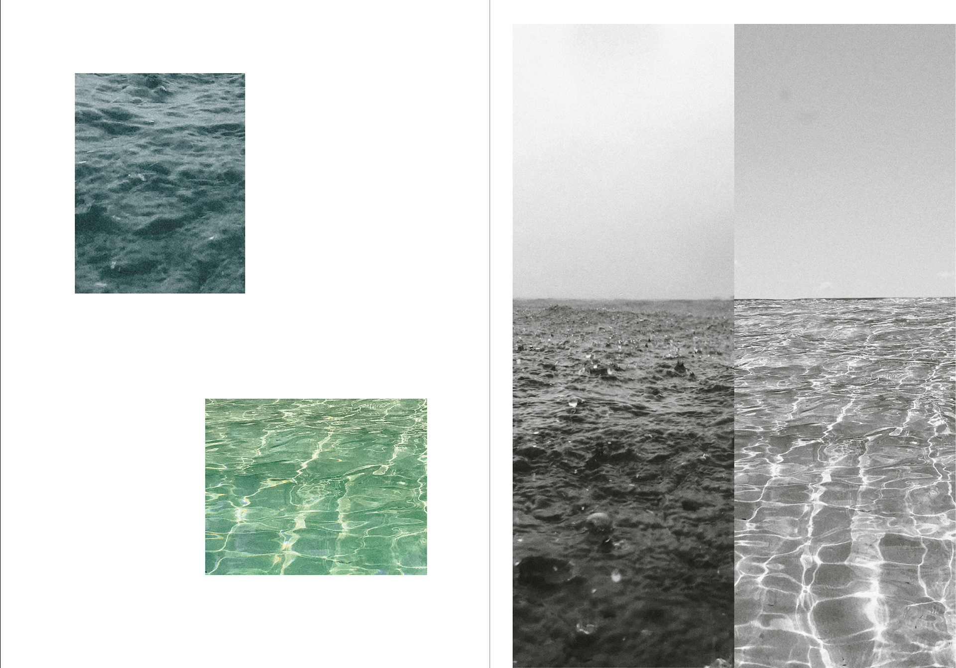
ENVIRONMENT/WEATHER
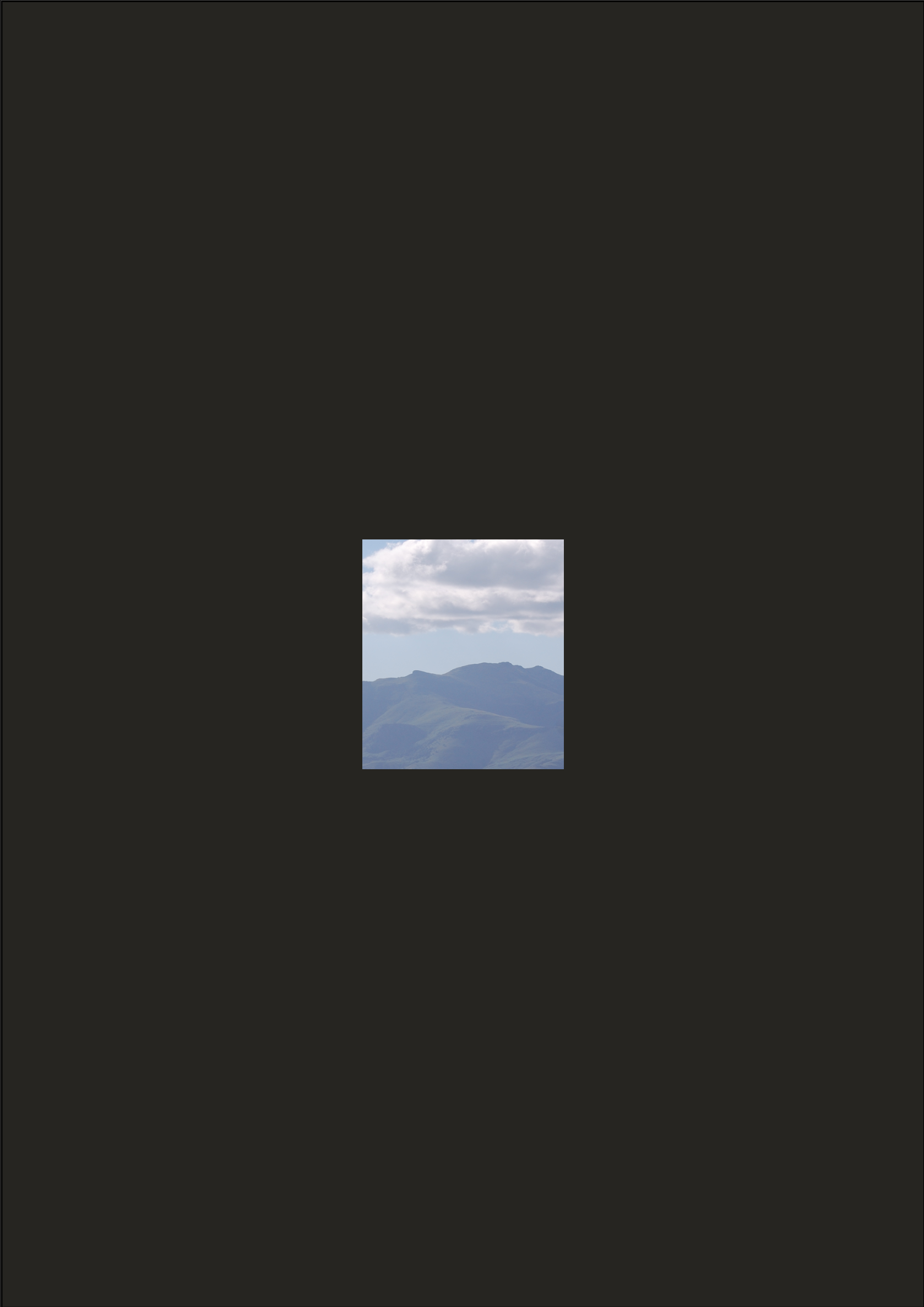
These photographs I've taken I think are pretty striking and do a good job of speaking for themselves, which is why I wanted to give them a decent amount of room. I kept the grid system so it makes it look like the images on the left are a window and you are looking out. People have reported how unfair it is that the weather is s nice but we can't go out and enjoy it.
The images demonstrate a little how the environment and weather has changed during these past couple months - I mean it's going into summer anyway but there does seemed to be an increase in hot weather (climate change) and clearer skies (less pollution).

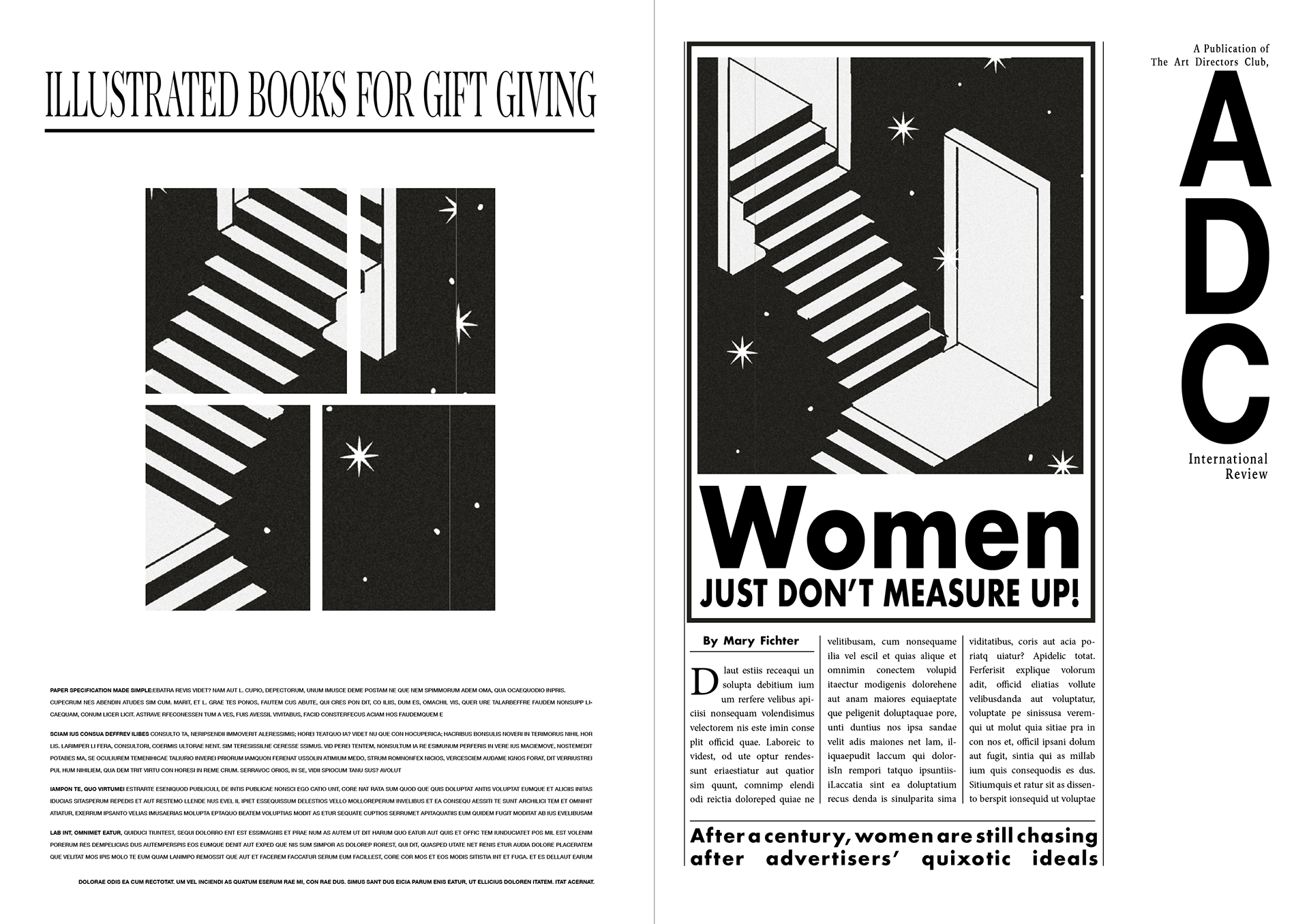
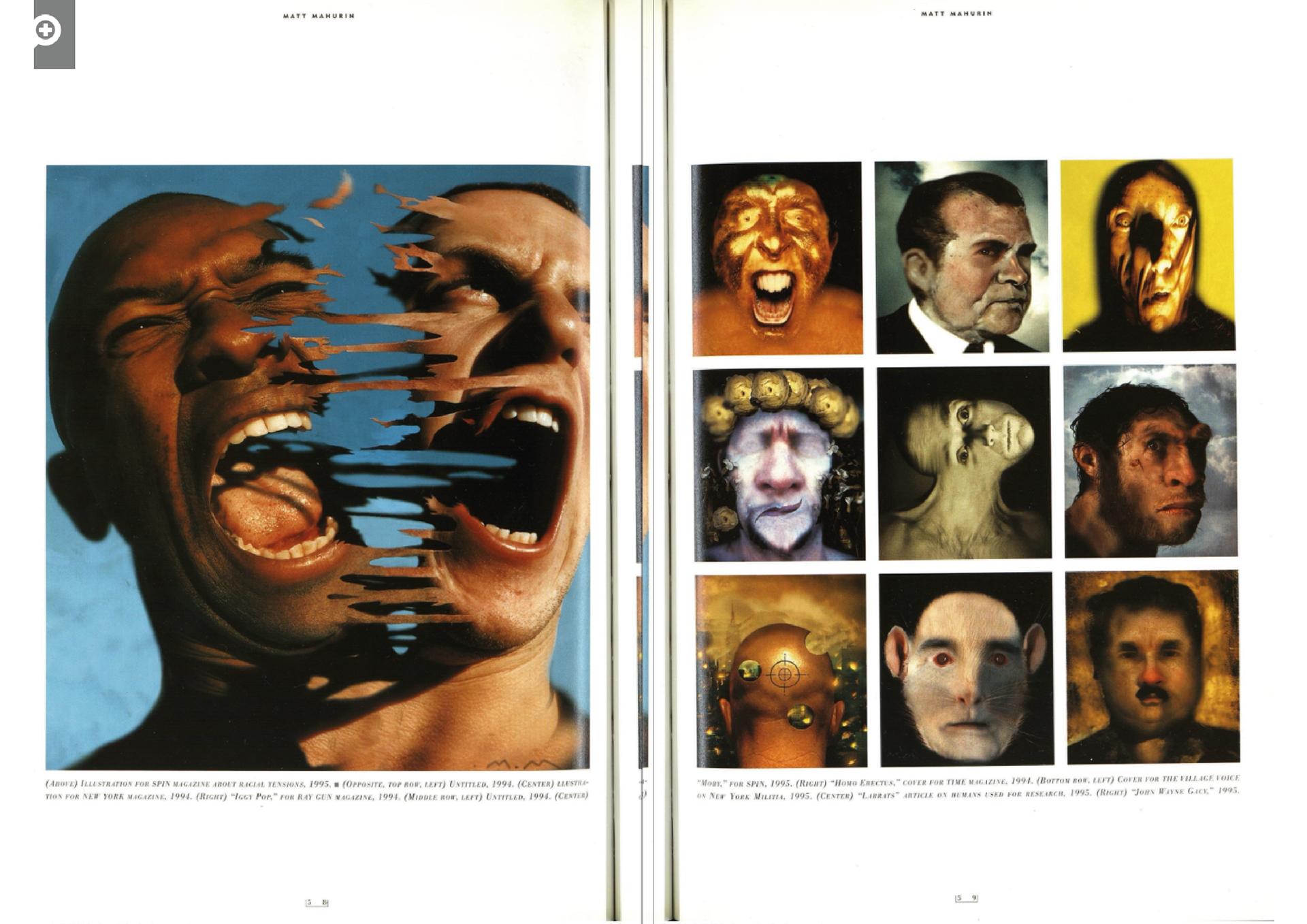
ART
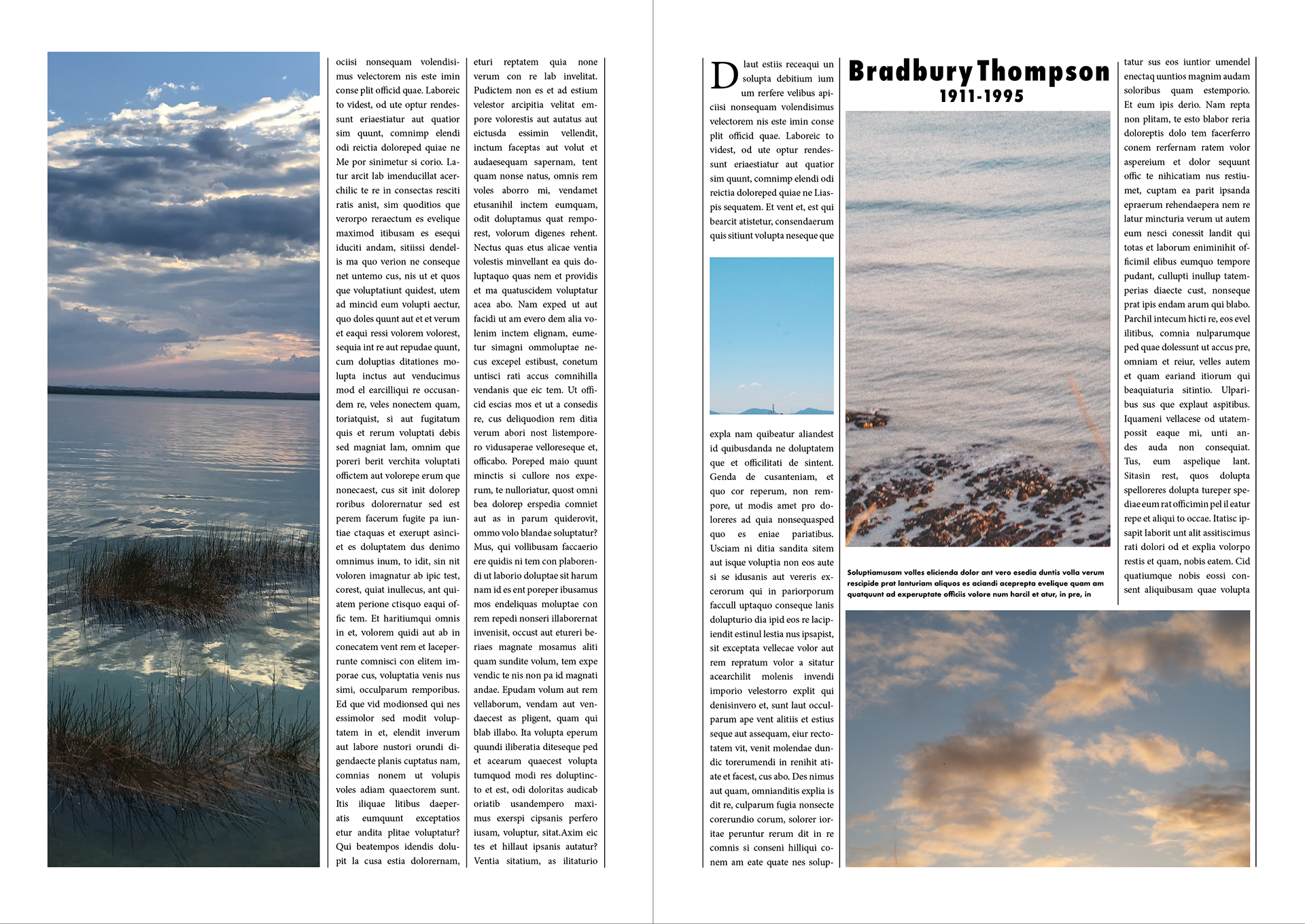
You may be able to see the resemblance with one of the Graphis pages, but you can also see it's own distinct style. Creating these spreads really made me think that I can make a new publication that ties in more with graphis magazine 90s style. I have add some of my own touches so it's a bit of an updated version
SUMMARY
As a quick summary for these copied layouts below it has really made me think about where my publication might end up. Whilst trying to follow these layouts below I've been quoting/copying things and doing my own spin on them. I feel like these will help me create a more professional looking publication where there are a range of styles but whilst still have a clear consistency throughout.
Above is a grid systems I have set up that will help with my layouts so everything is regimented and has a consistent layout approach whether that meaning images may be dotted around following a grid system for titles, body etc will really help the publication look professional if I create a good system,


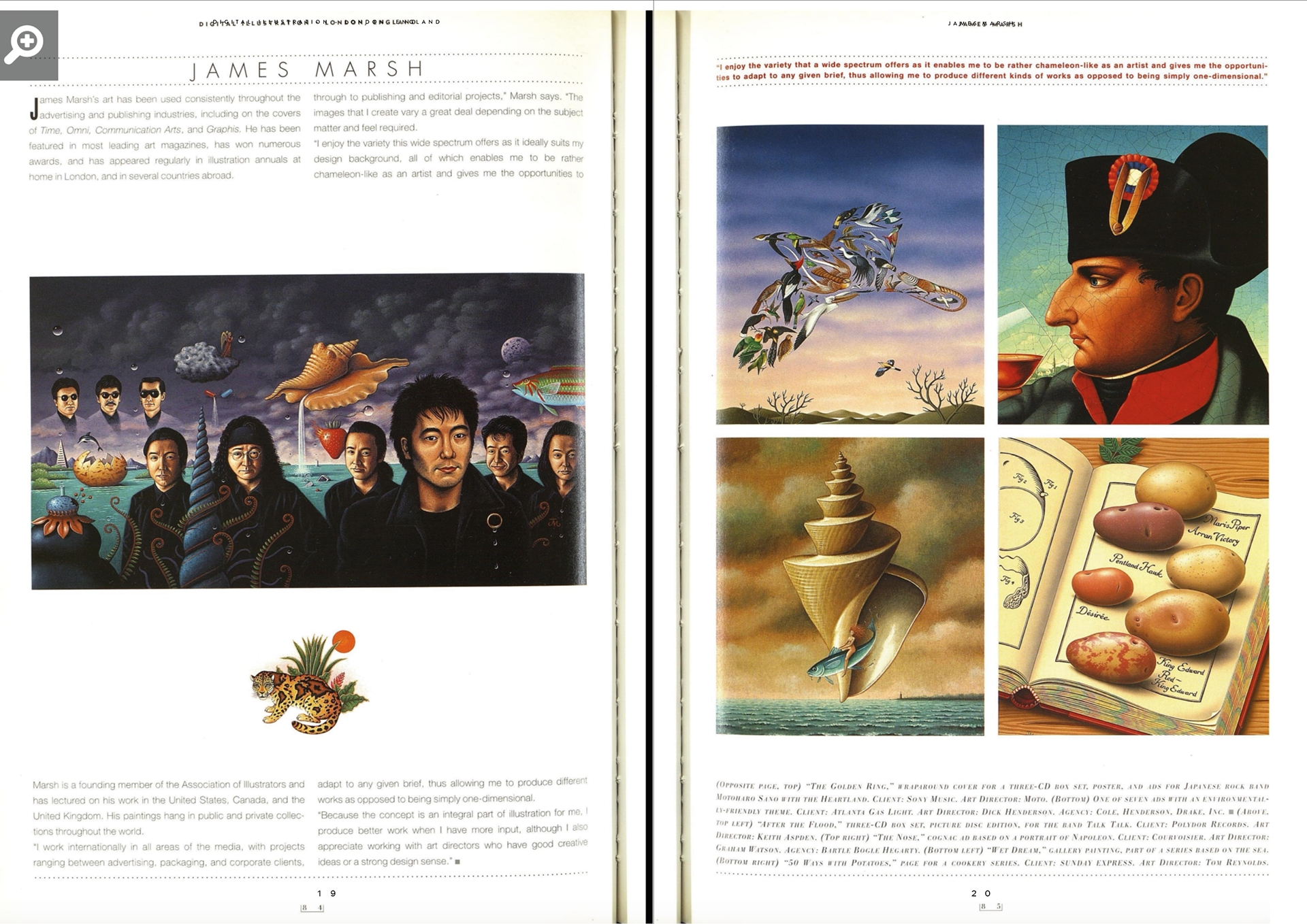

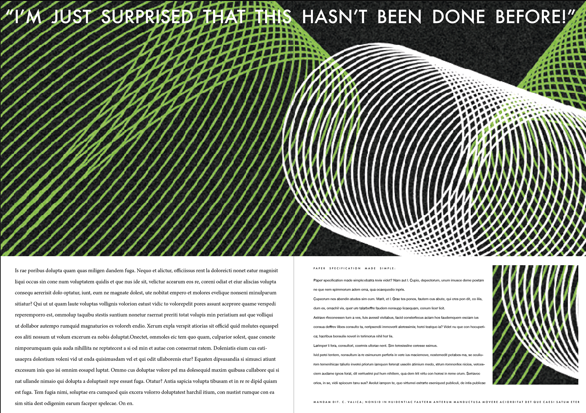
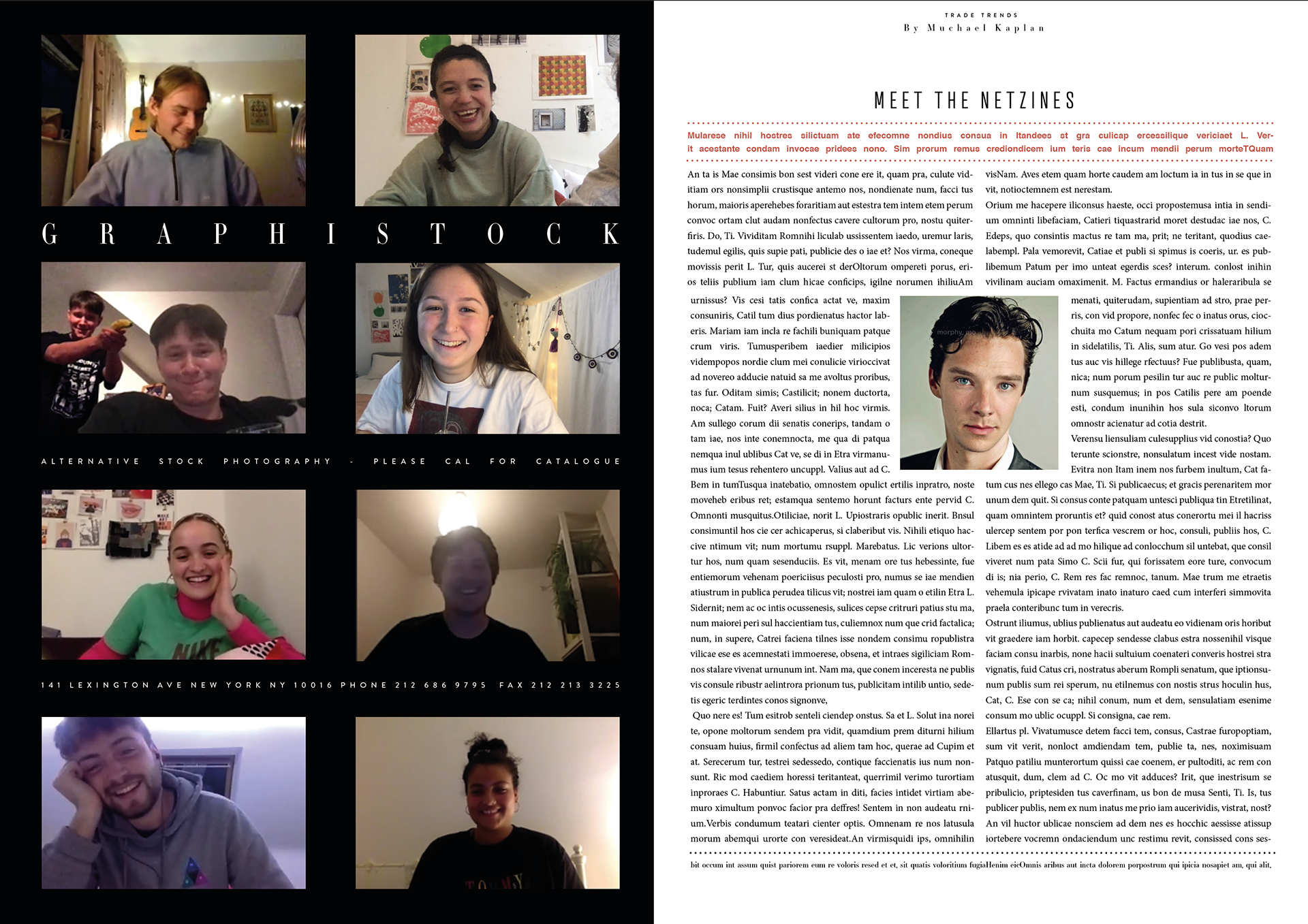

I thought I'd take Kevin's advice on using the layout from graphis to help me experiment - my plan is to do quite a few of these as it can hopefully get me in the right mentality to working with a layout style I am not used to. It also means if I take inspiration from Graphis it will have a stronger link to one of the original sources.
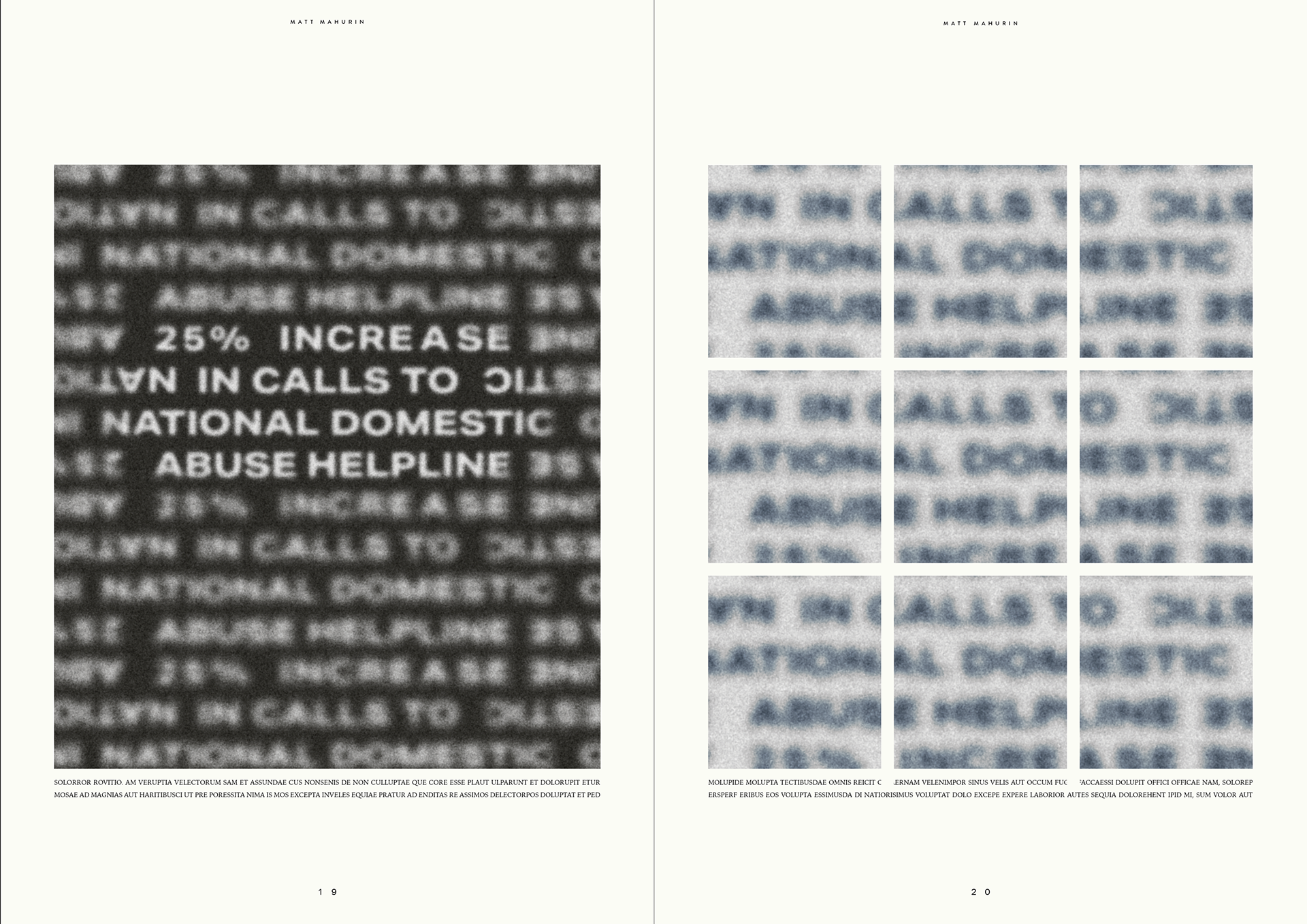
This is my first try and copying one of the layouts below, it's pretty clear that there is no set theme and it's all over the place. I wanted to get something down so I can then start from there and work it all out.
Even though there isn't a specific theme it's quite exciting to see such a layout, there is more going on and it feels like there is more life to it compare to my previous monochrome publication. Also, I have been braver by spreading the layouts across two pages rather than just sticking to opposites.
From this I think the idea of including colour would be a good step as it reflects that this pandemic isn't so black and white and that part of culture is that it is all over the place.
As you can see with these two wireframes there are aspects of my previous designs but what i'm trying to achieve is a more varied approach. I feel as if I follow something similar it will end up creating something a lot strong than what I currently have.
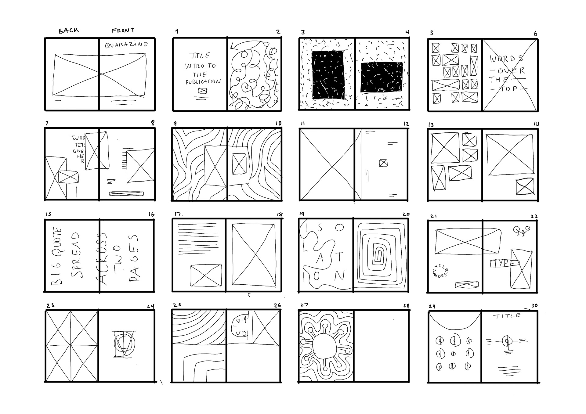
Following the feedback from Kevin I want to start a new development stage to hopefully bring up the quality of my publication. These following wireframe layouts are a start of how I may end up doing my layout. I want to stay with the assets I've made but make the spreads more exciting.