Next Steps Plans
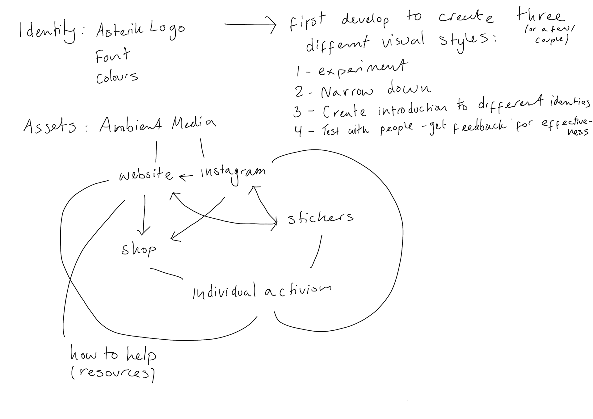
write them here.
Design Development

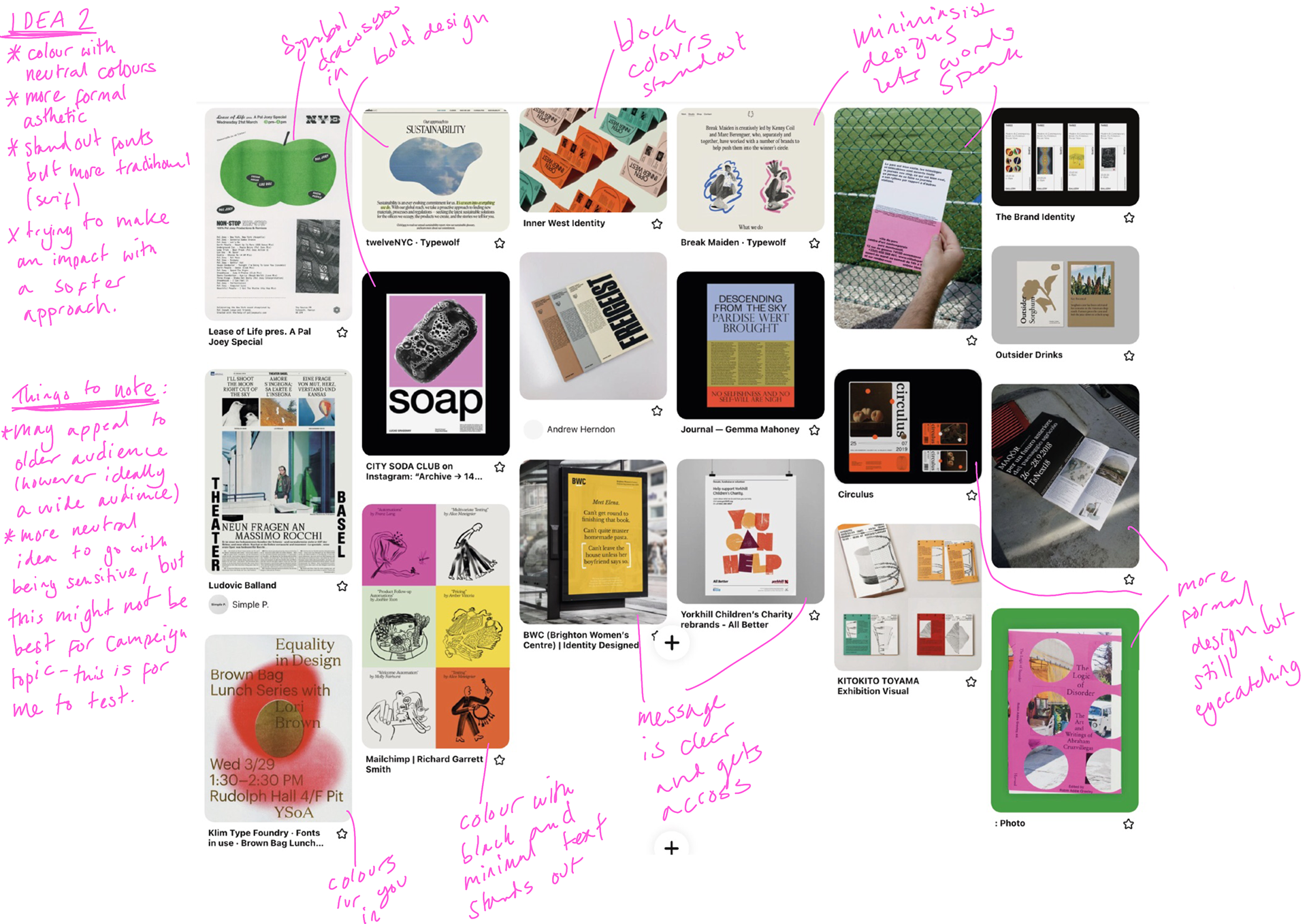
I want to experiment my identity further (as also suggested in my presentation feedback) theses are some moodboards I've put together for three different ideas. Each idea has annotations and what my thoughts are.
I will now explore experiment different styles. What may end up happening is that the identity forms into something that may appeal to certain audience, but I want to try and make it as open as possible.
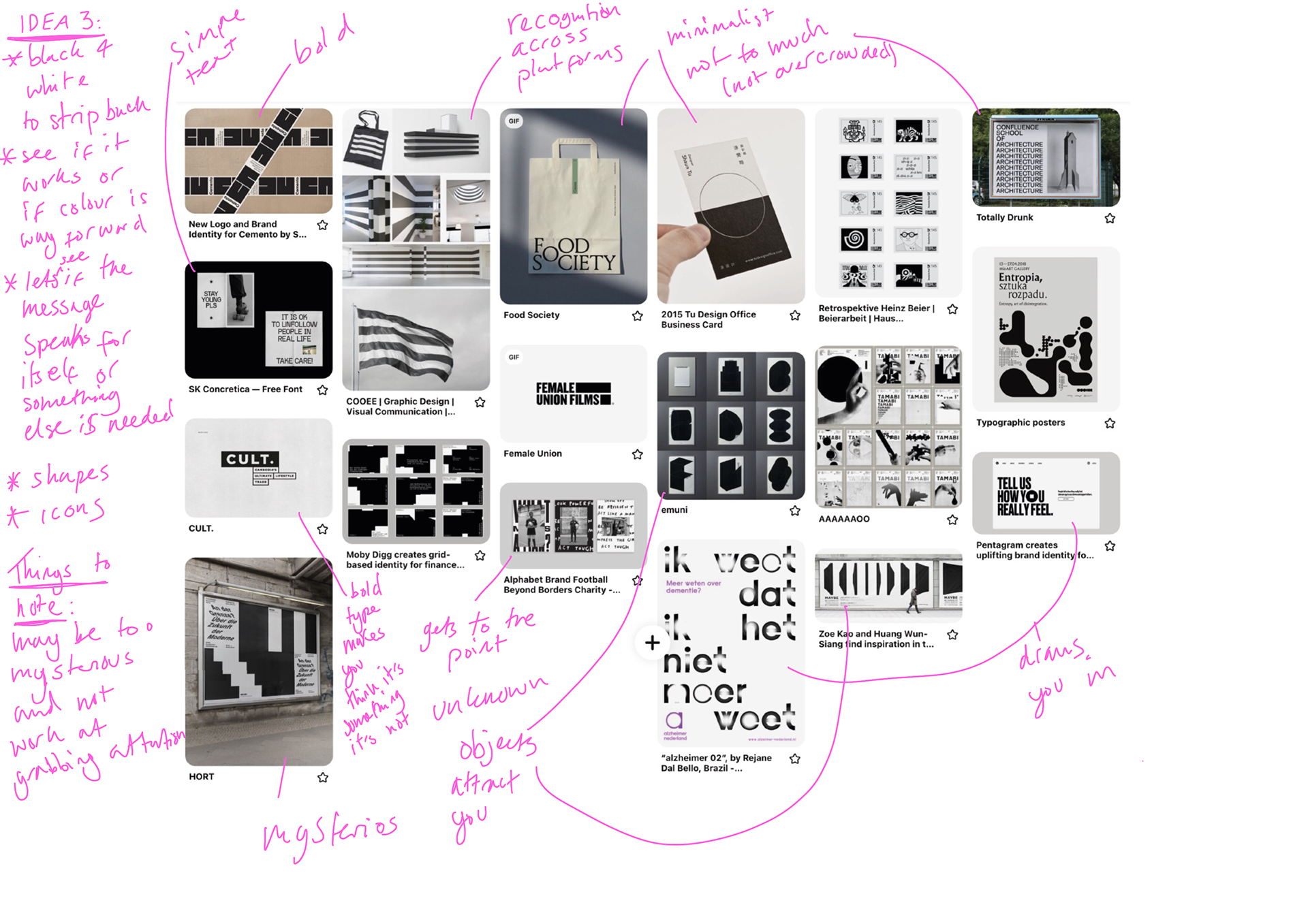
IDEA 3 DEVELOPMENT
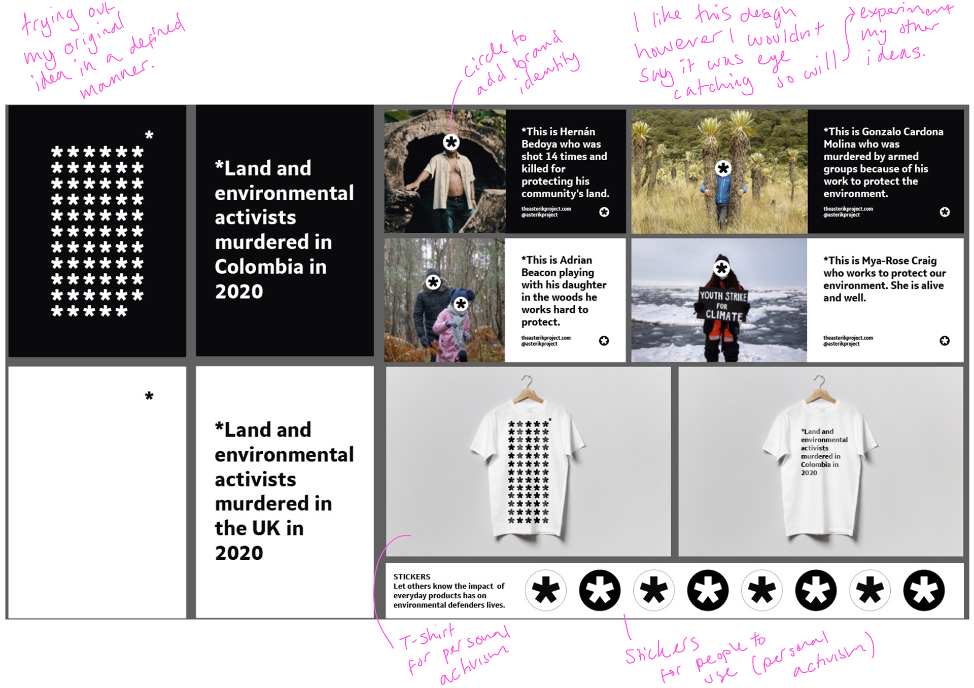
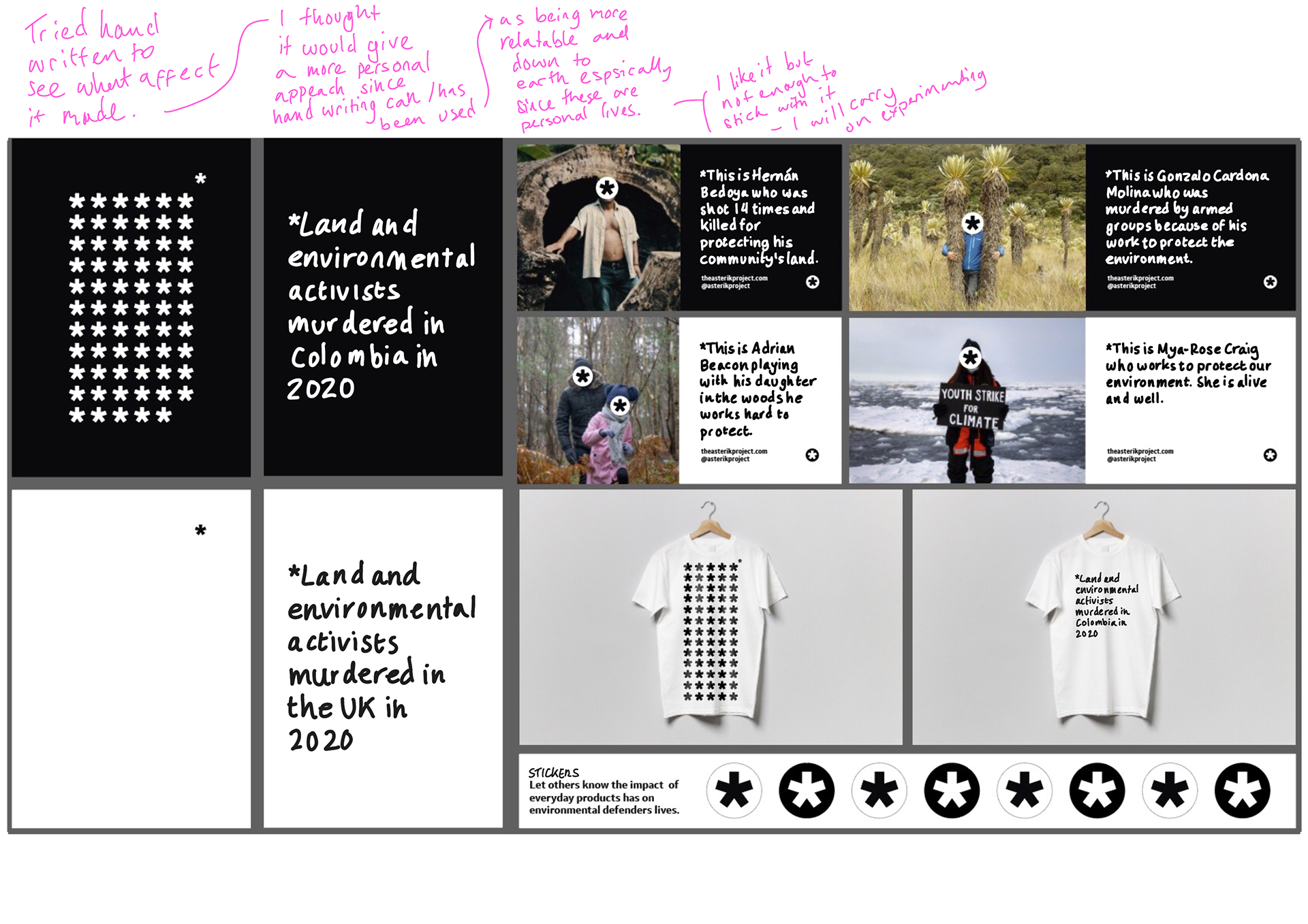
These are a development of what I have already done since I started with the black and white idea.
My process and annotations are on the images (click on images to enlarge).
IDEA 2 DEVELOPMENT

This idea I developed from the moodboard I created but also adding colour to my black and white images. I feel this is a step in the right direction.
My process and annotations are on the images (click on images to enlarge).
Idea 1
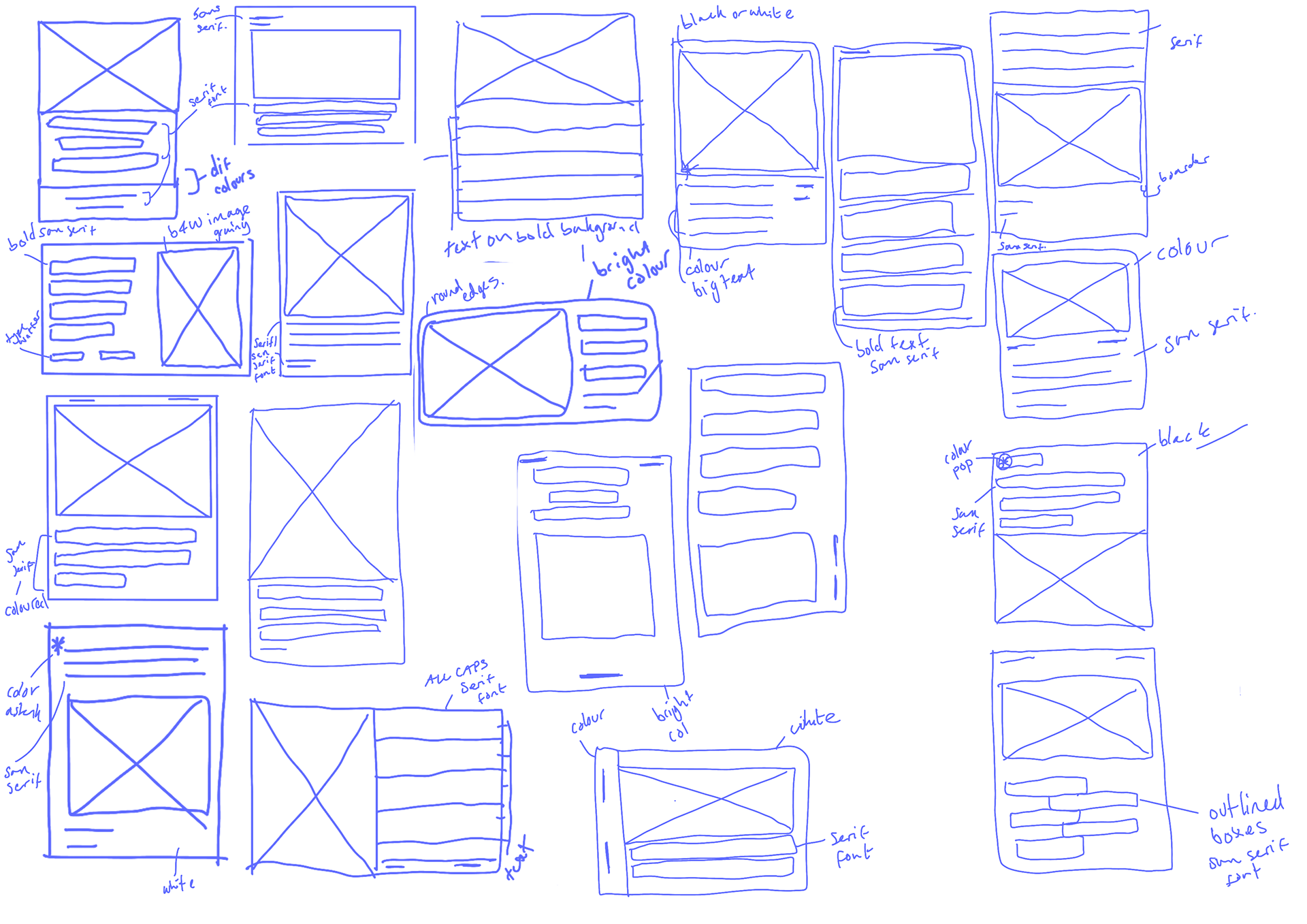
These I developed from the moodboard I created but also developing my previous ideas. With these I wanted to experiment with a different design style as I felt I was sticking to the same one. I'm glad I did these as I've developed designs I am happy with.
My process and annotations are on the images (click on images to enlarge).
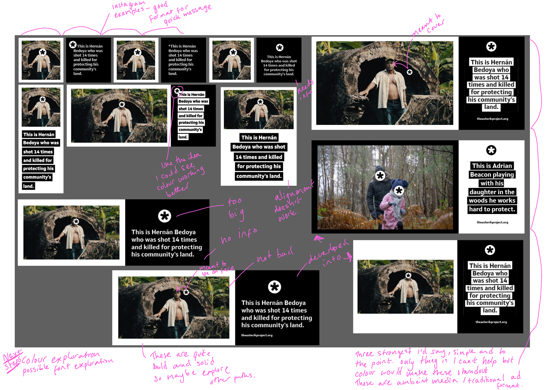
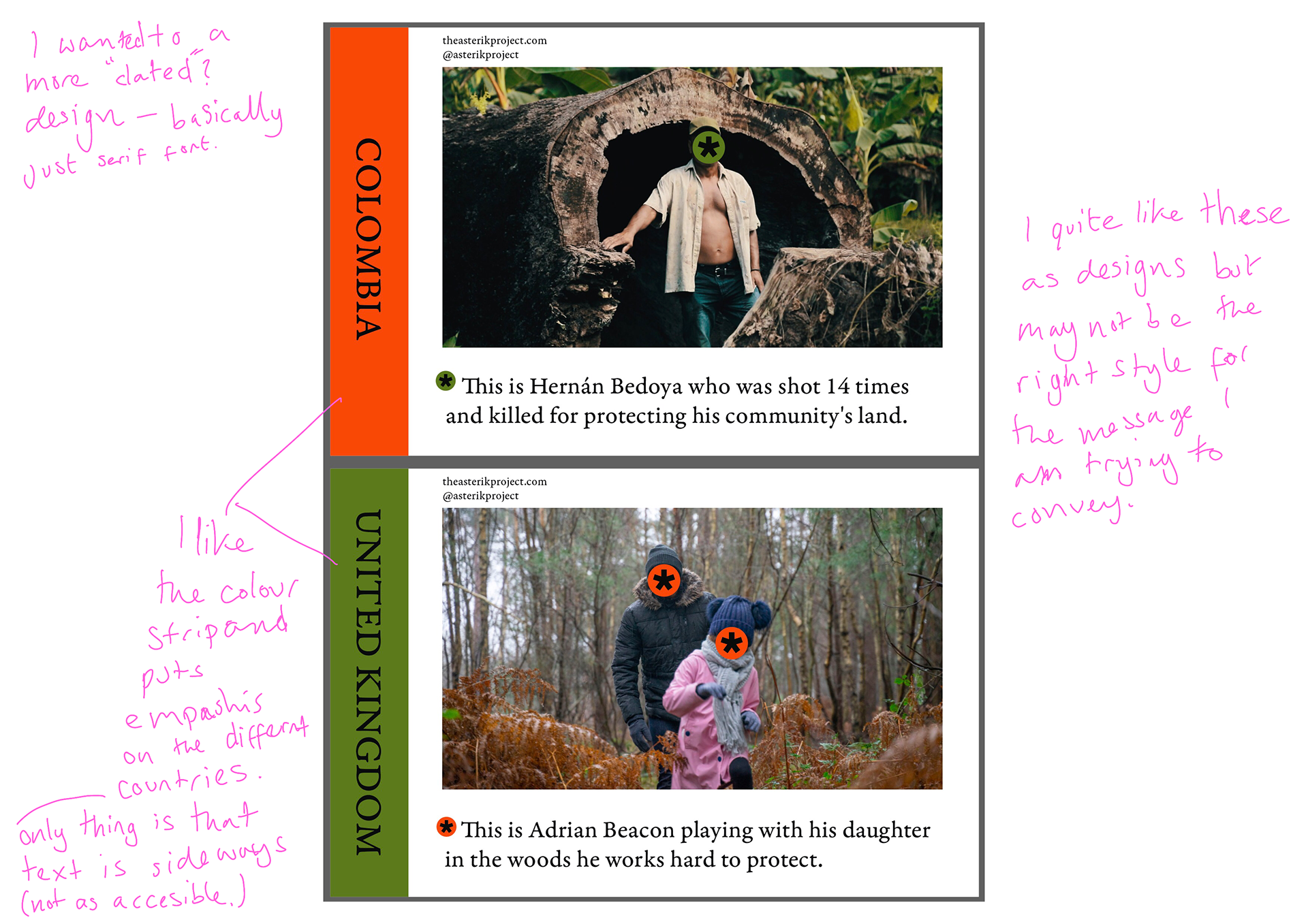
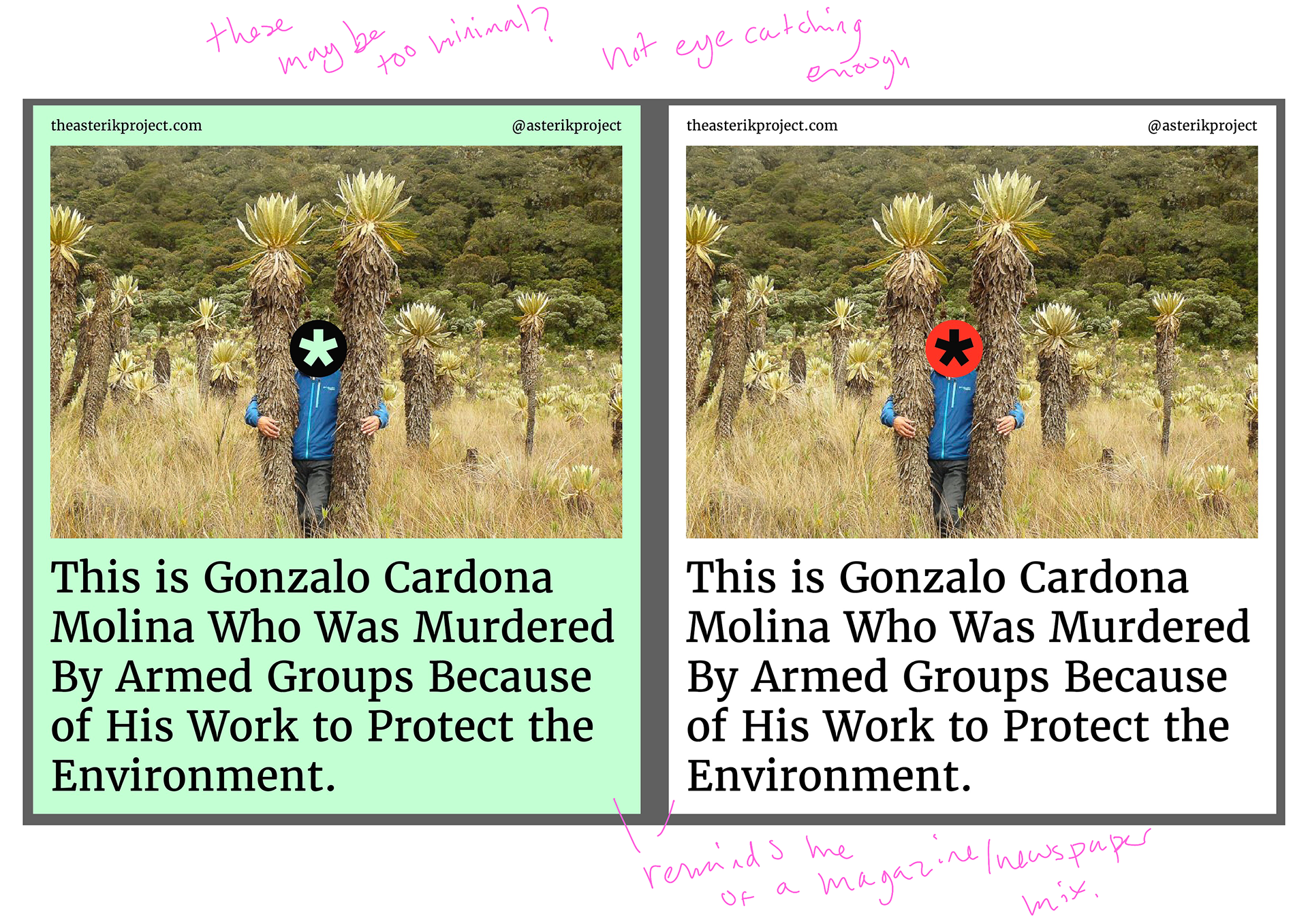
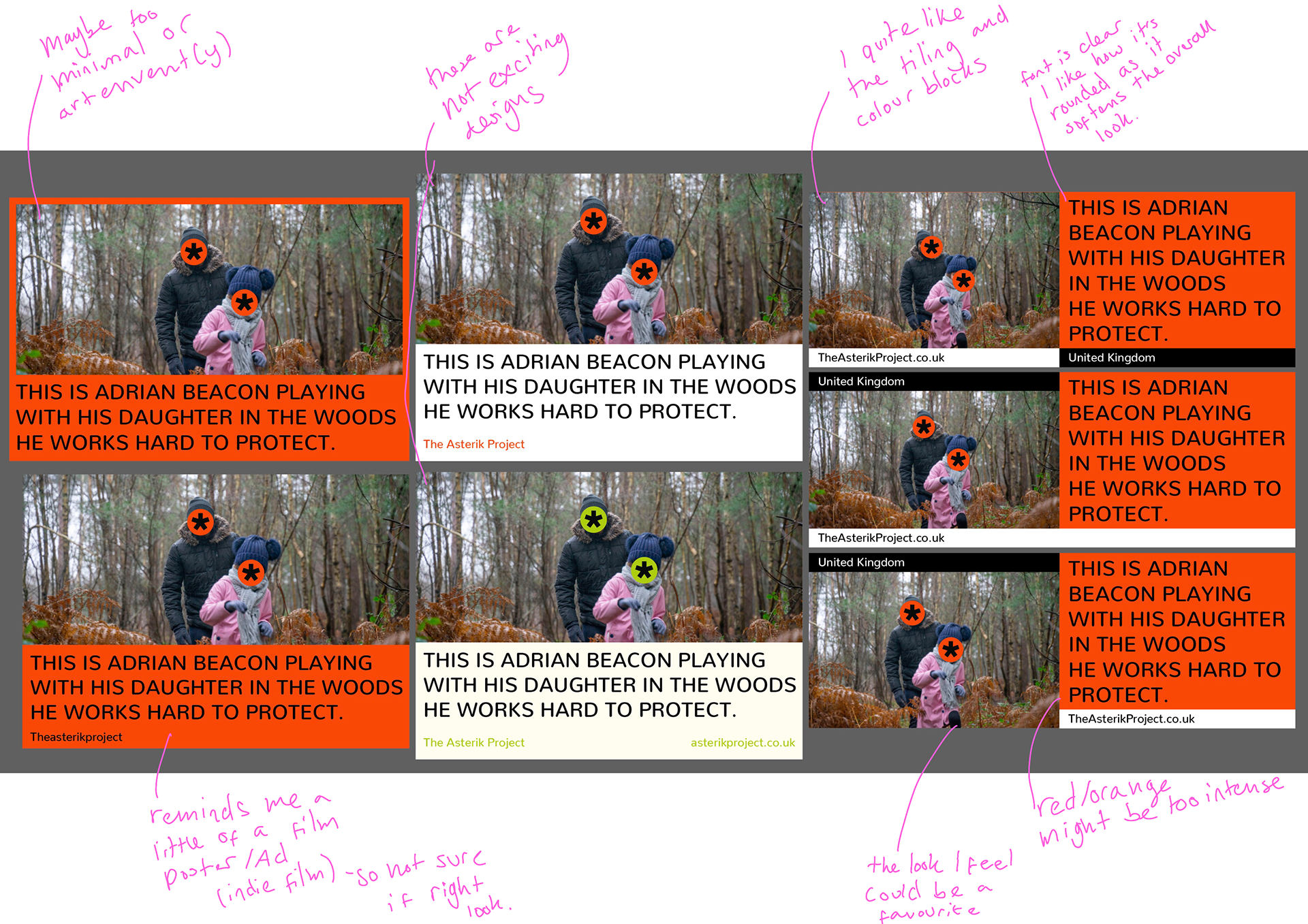
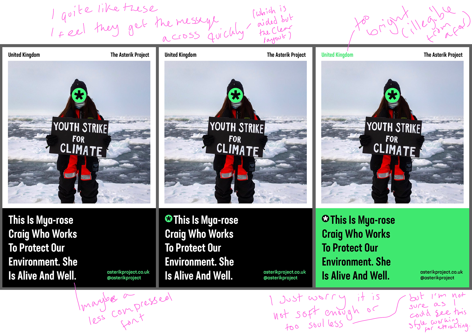
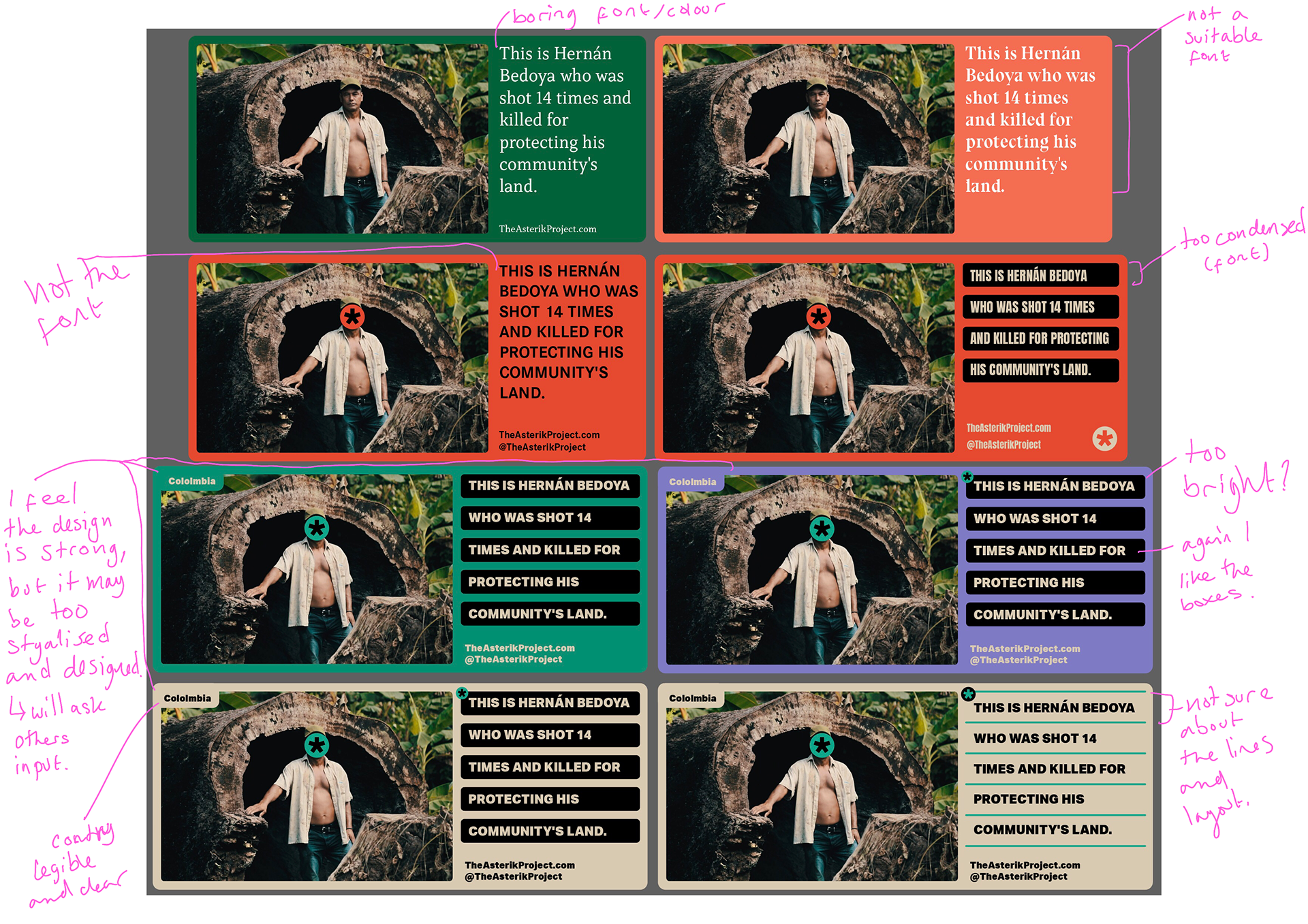
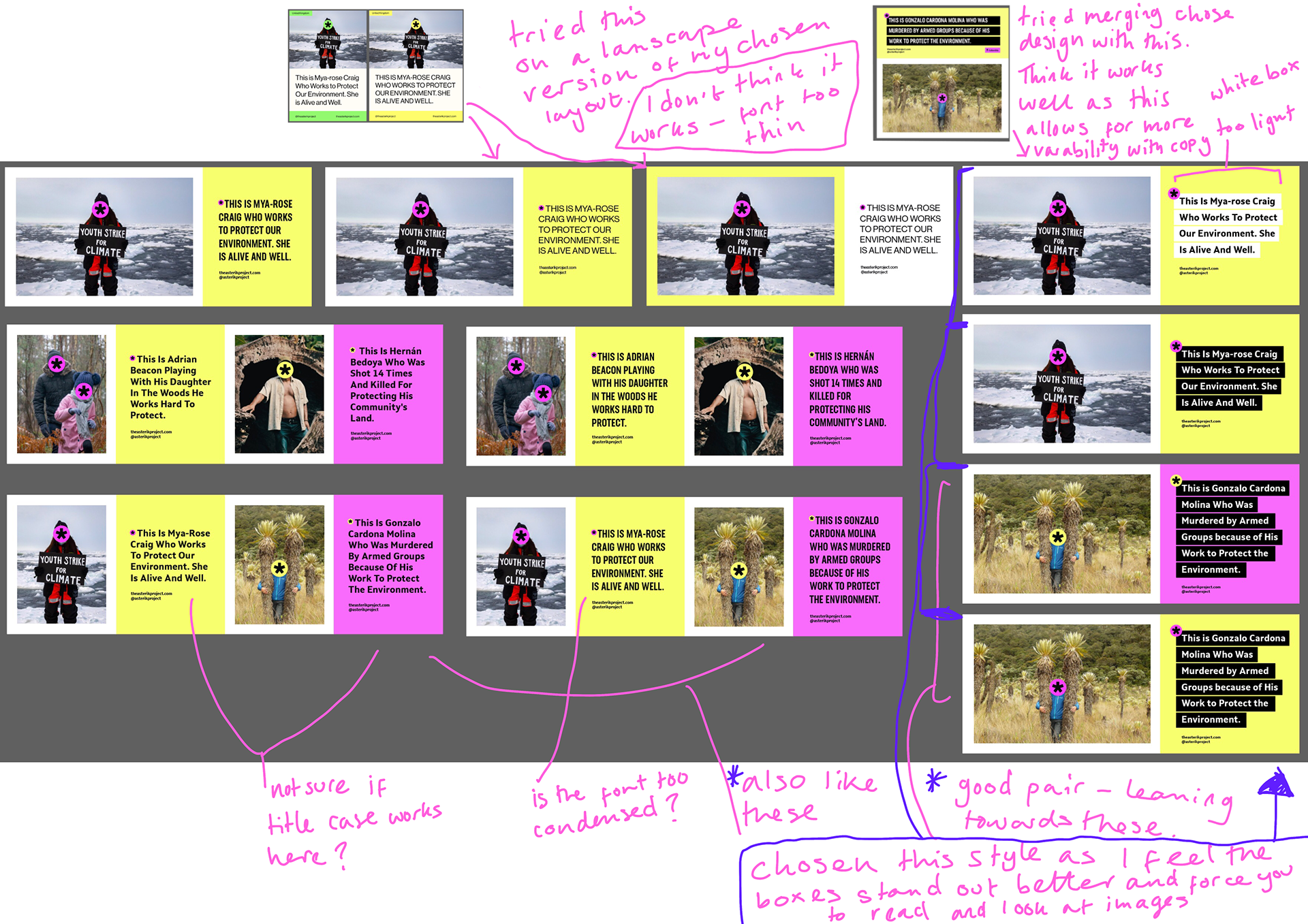
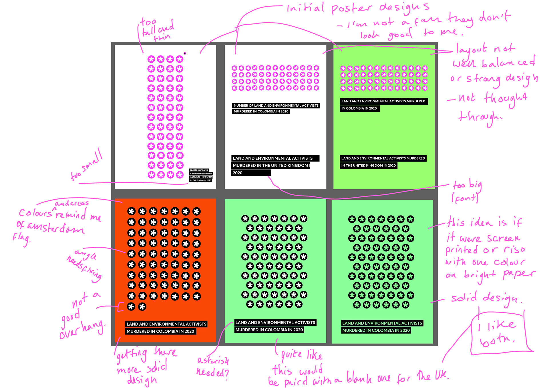
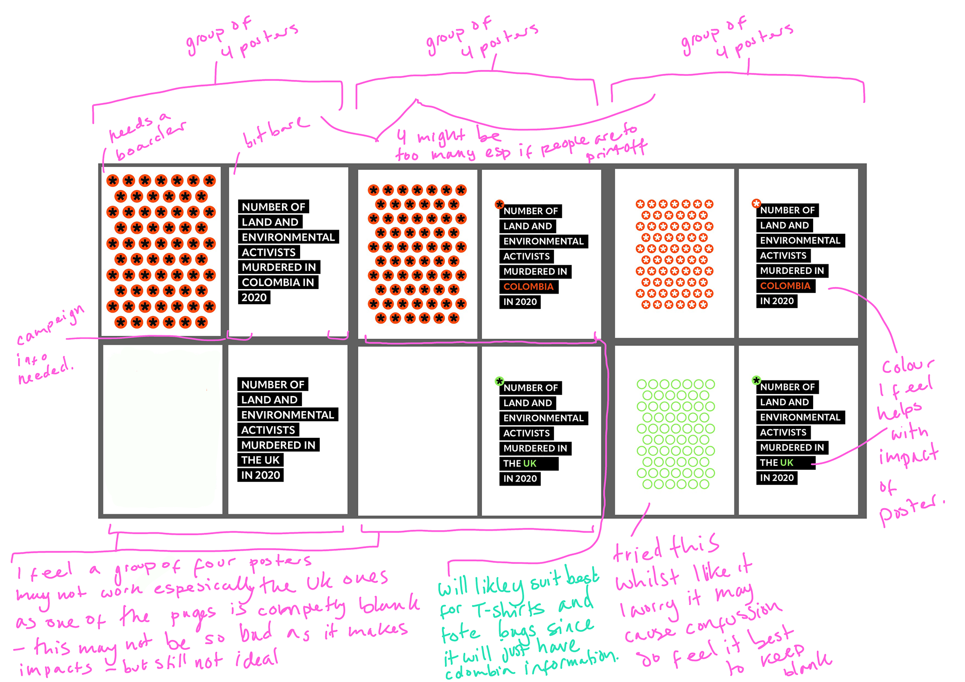
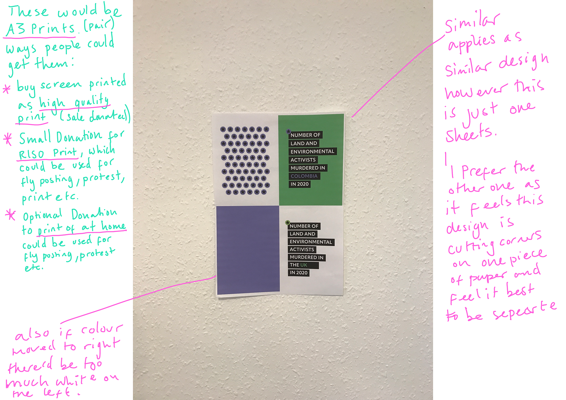
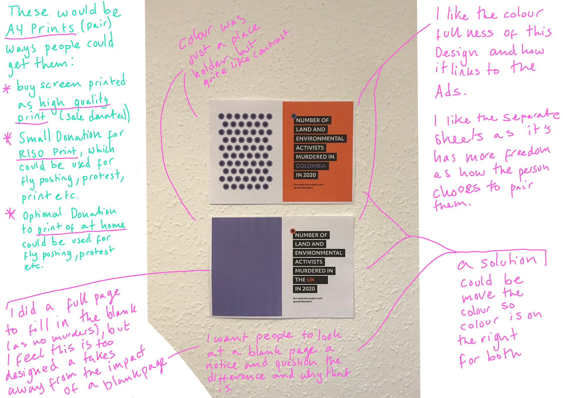
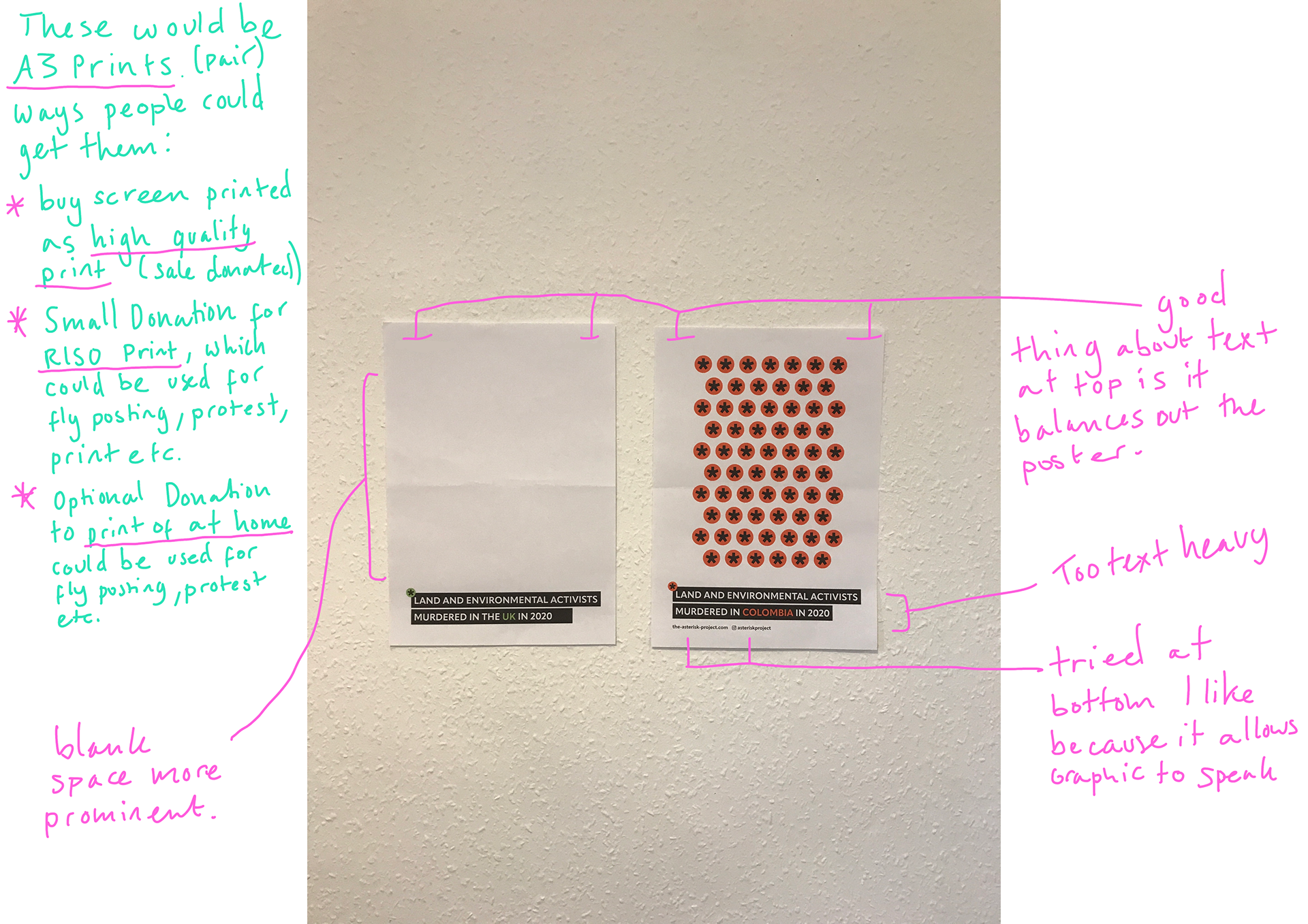
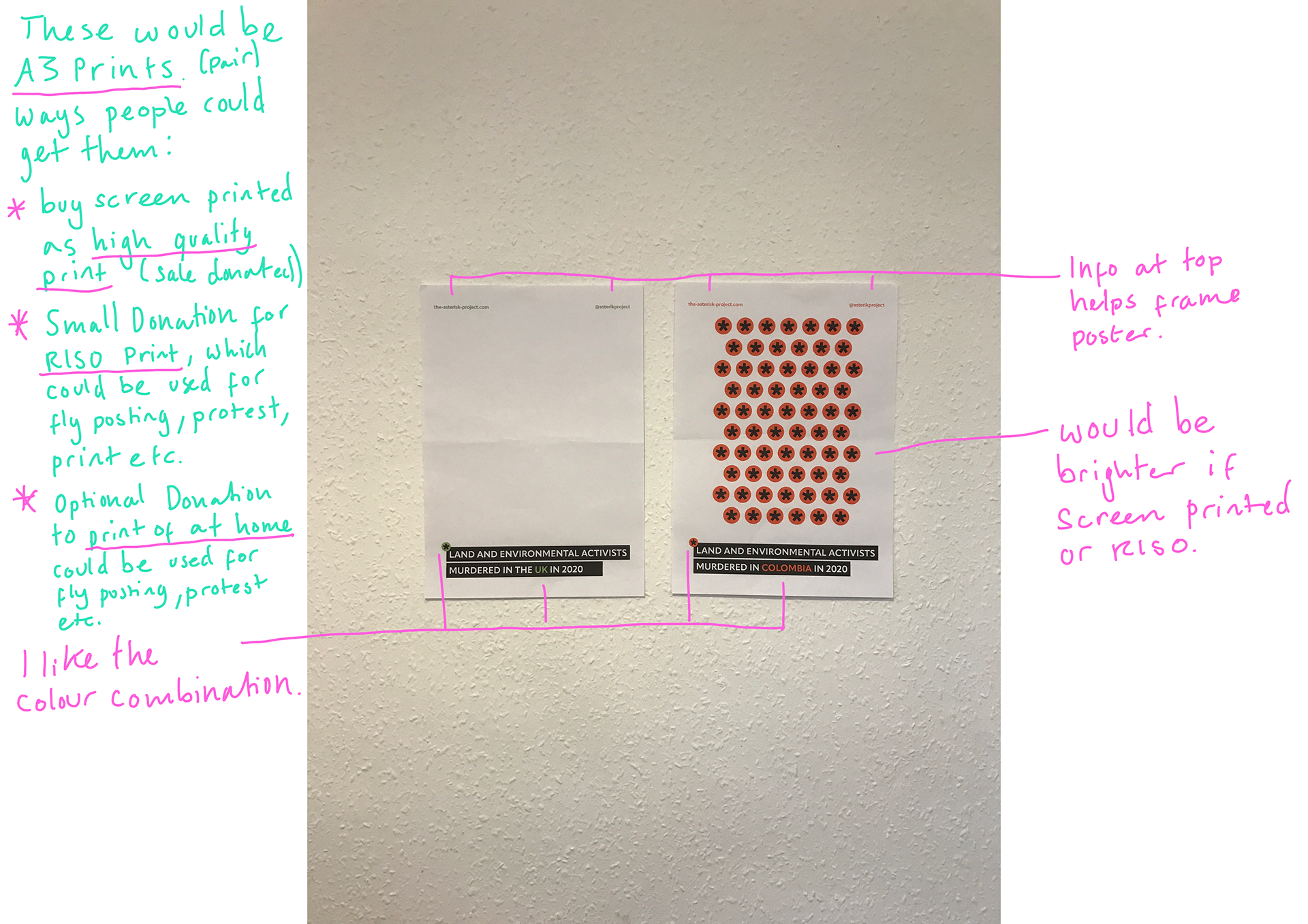
Narrowed Down and Feedback
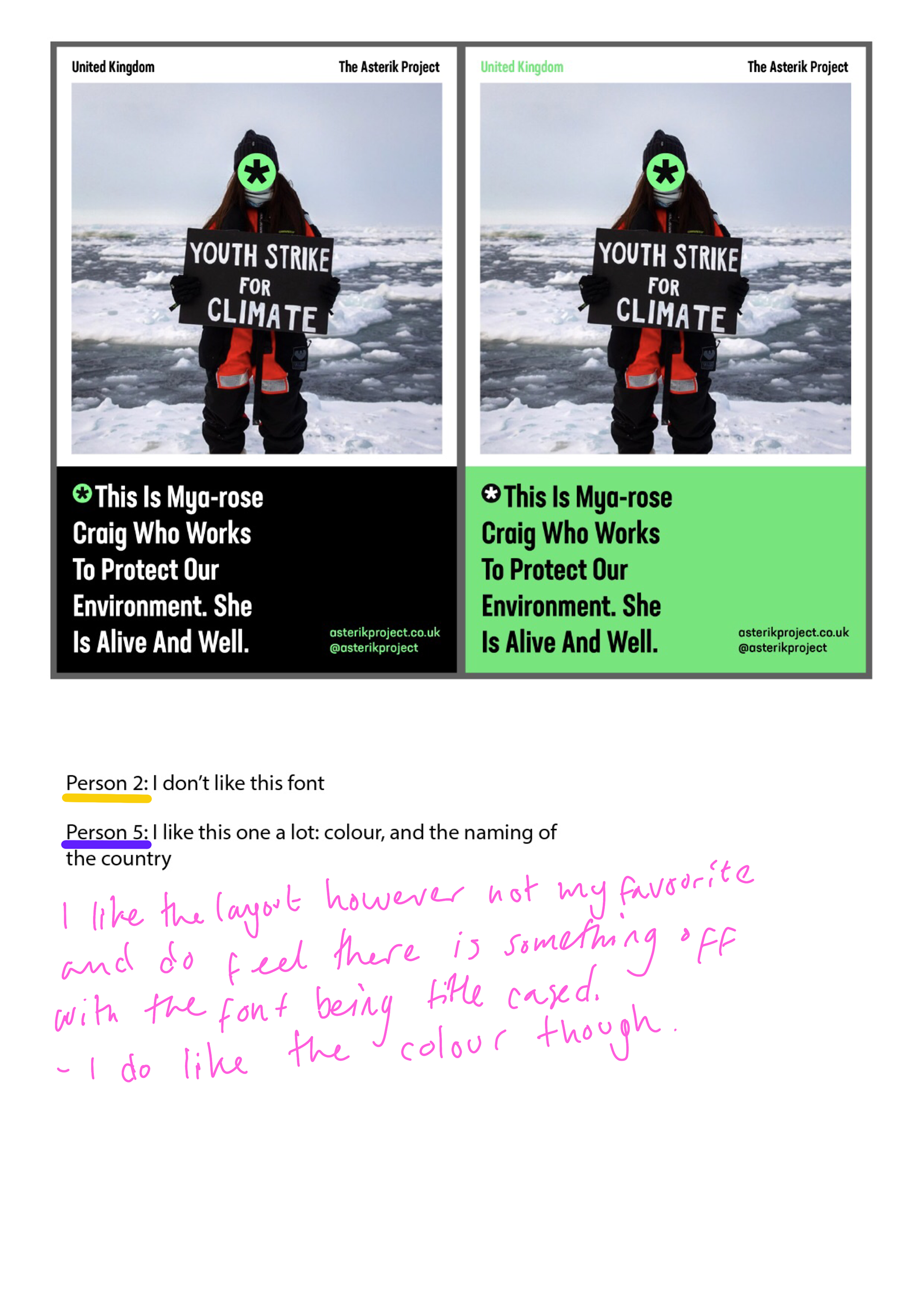
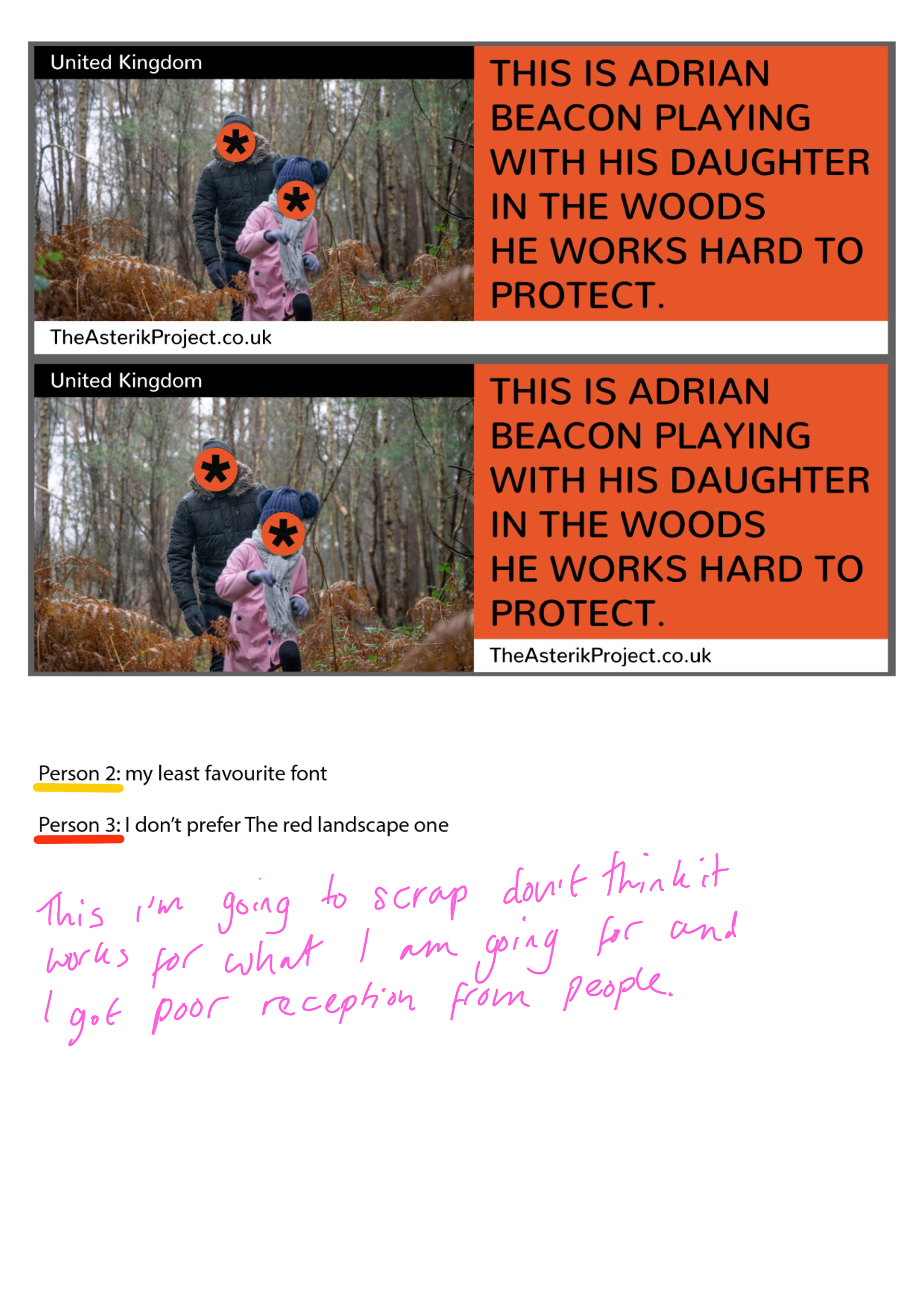
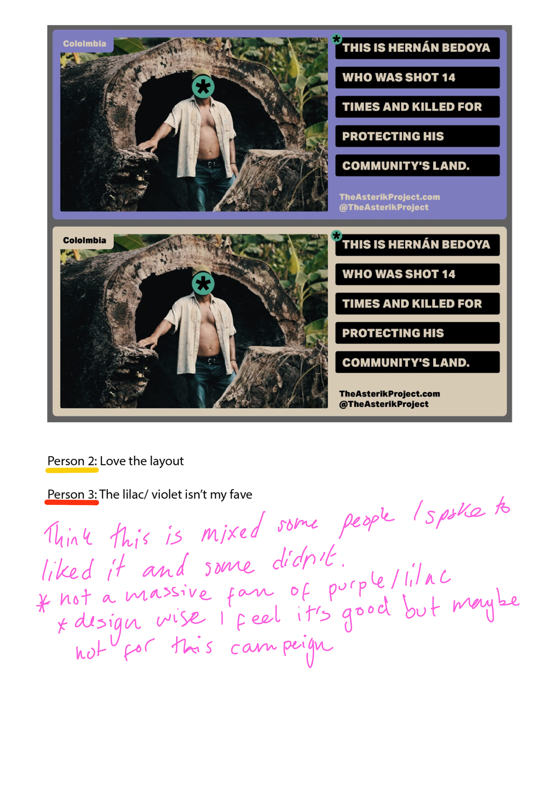
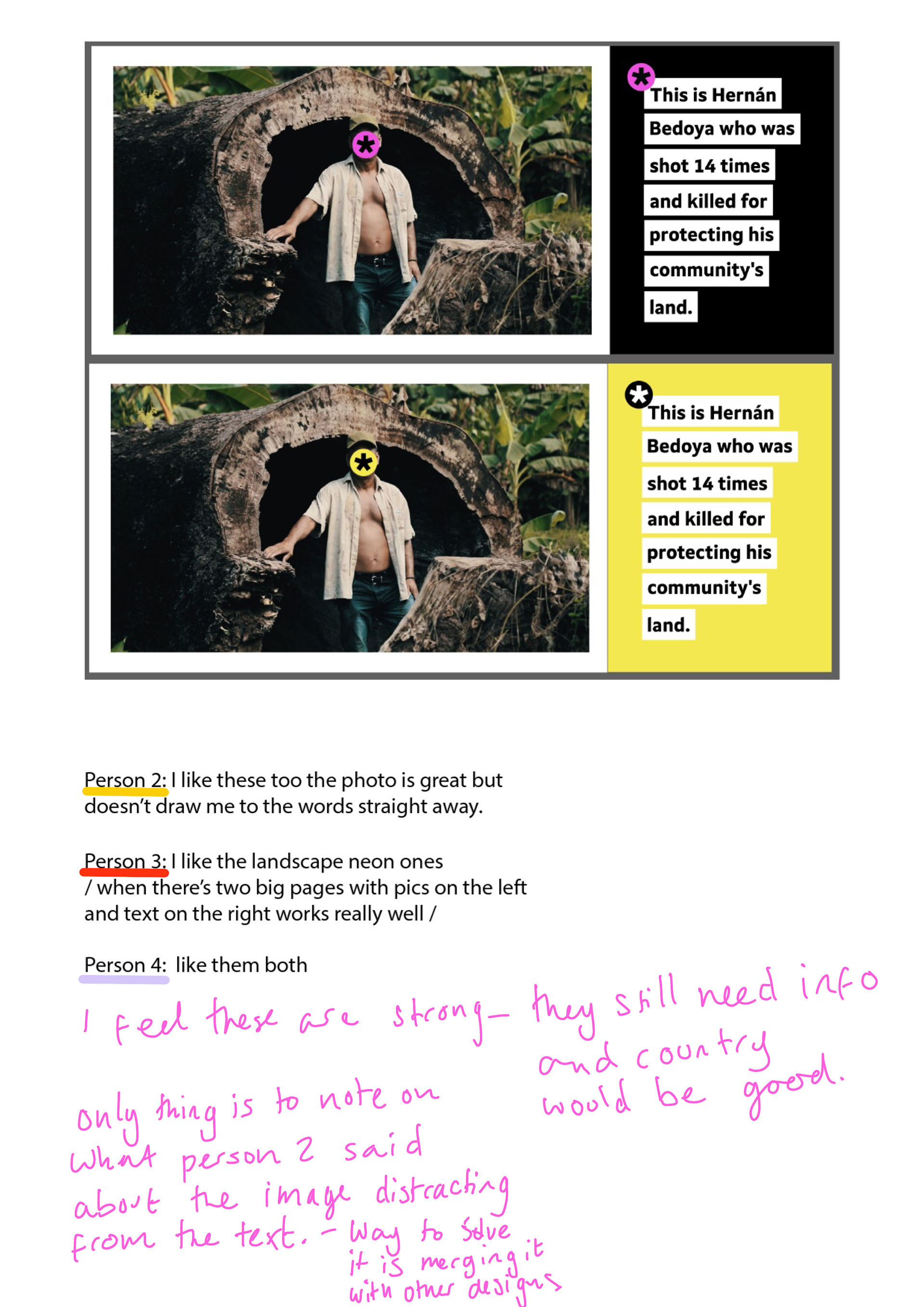
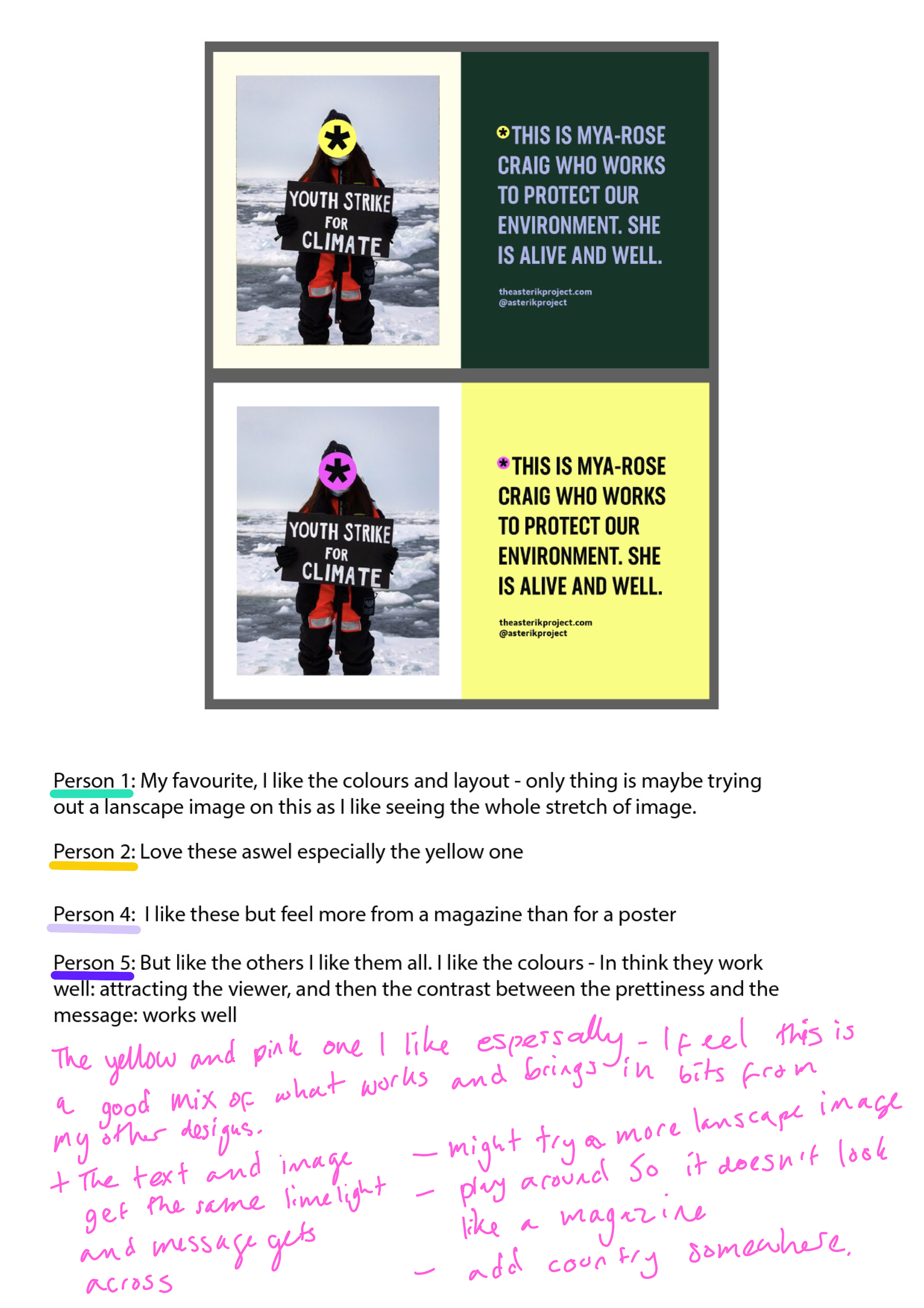
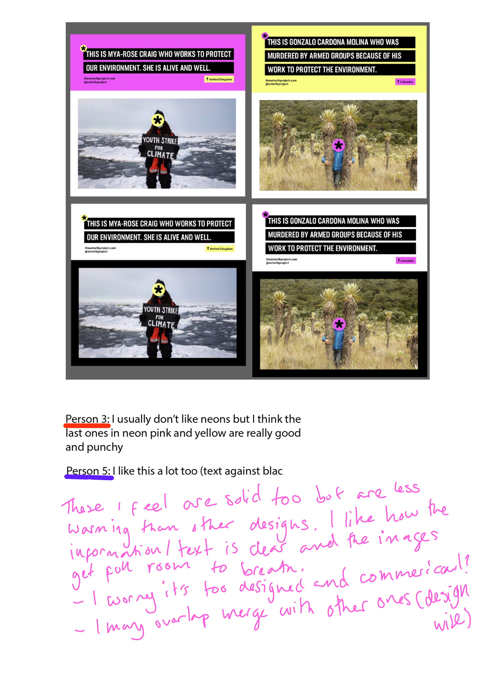
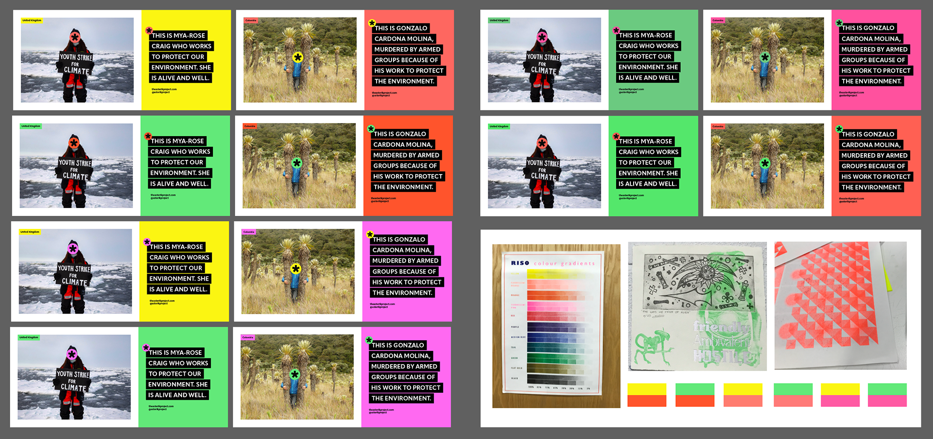
The tricky bit of trying to narrow down and choose a design. Whilst I tried to develop different ideas you can see that some have overlaps. I narrowed down to my favourite 7 (probably too many). And sent them to friends to see what they thought about them.
This was really useful as I get stuck in a bit of a rut when i'm the only one seeing the designs so it's been helpful getting other people's opinions.
The feedback from people and my annotations are on the images (click on images to enlarge).
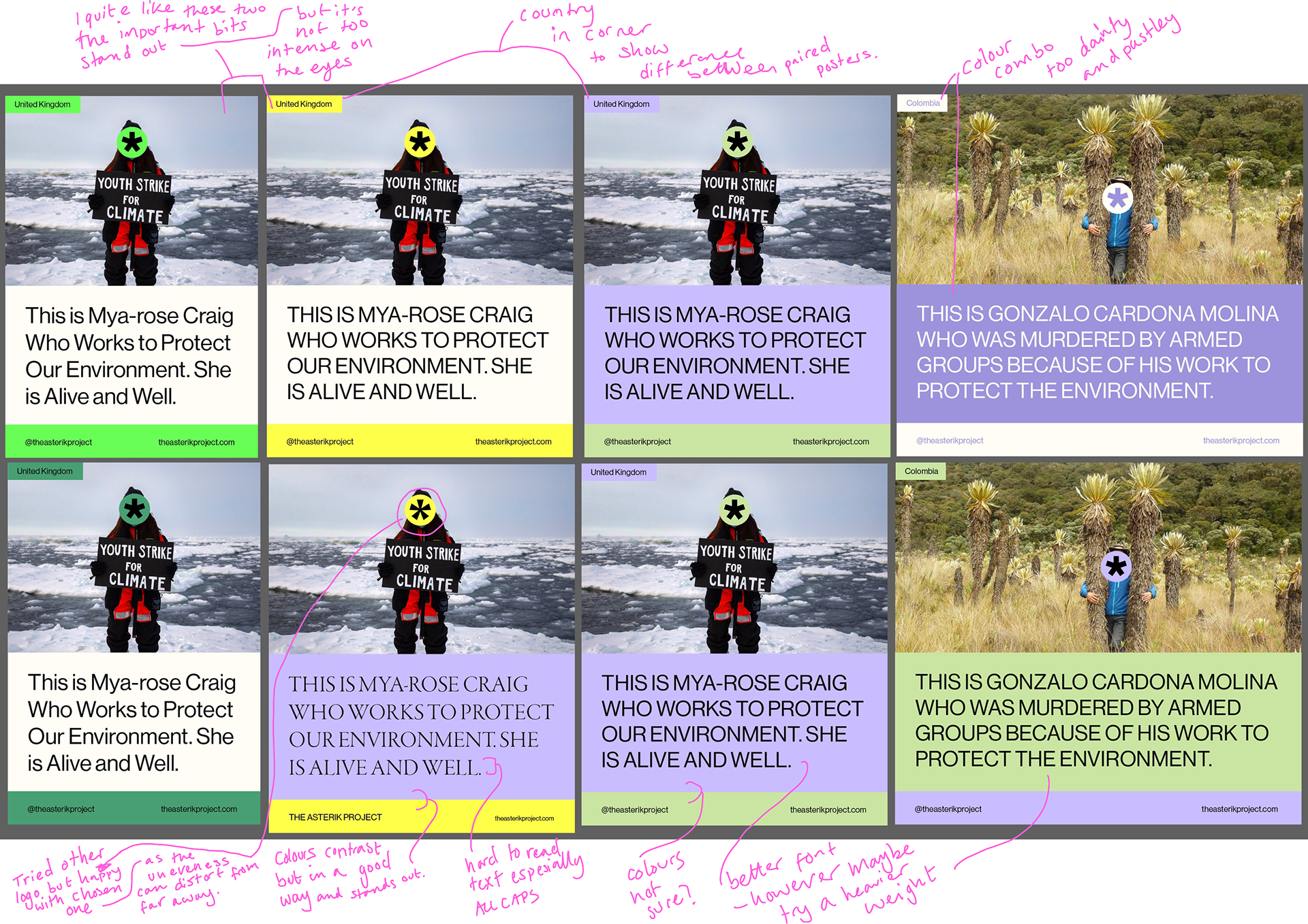
'Chosen' Design
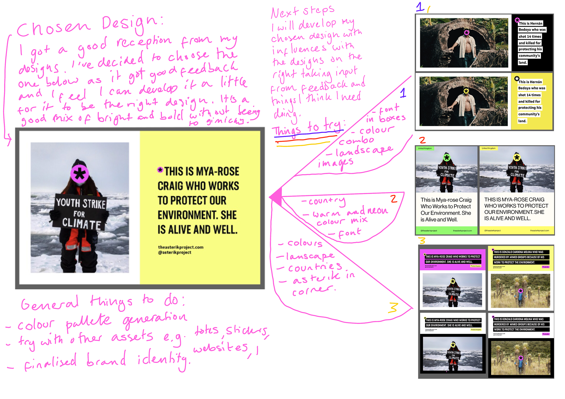
Above is how I have narrowed down my designs and my reasonings.
Also my next steps.
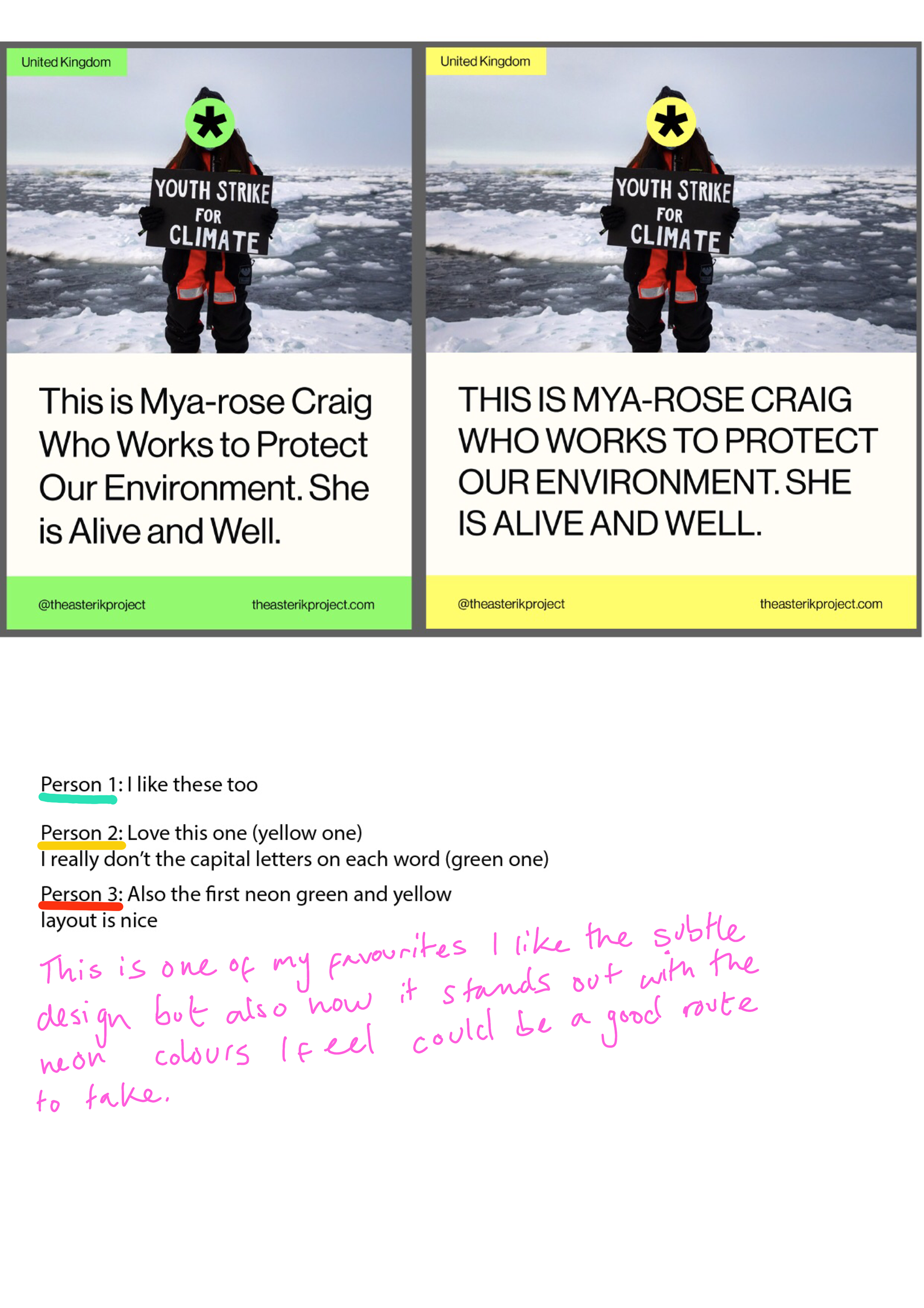
Narrowing Down
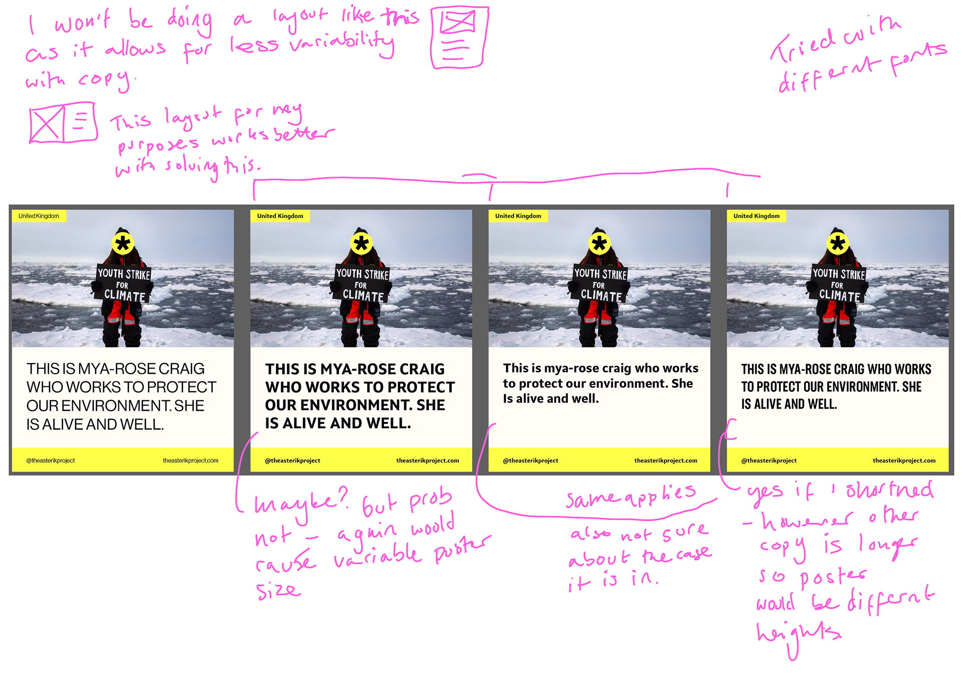

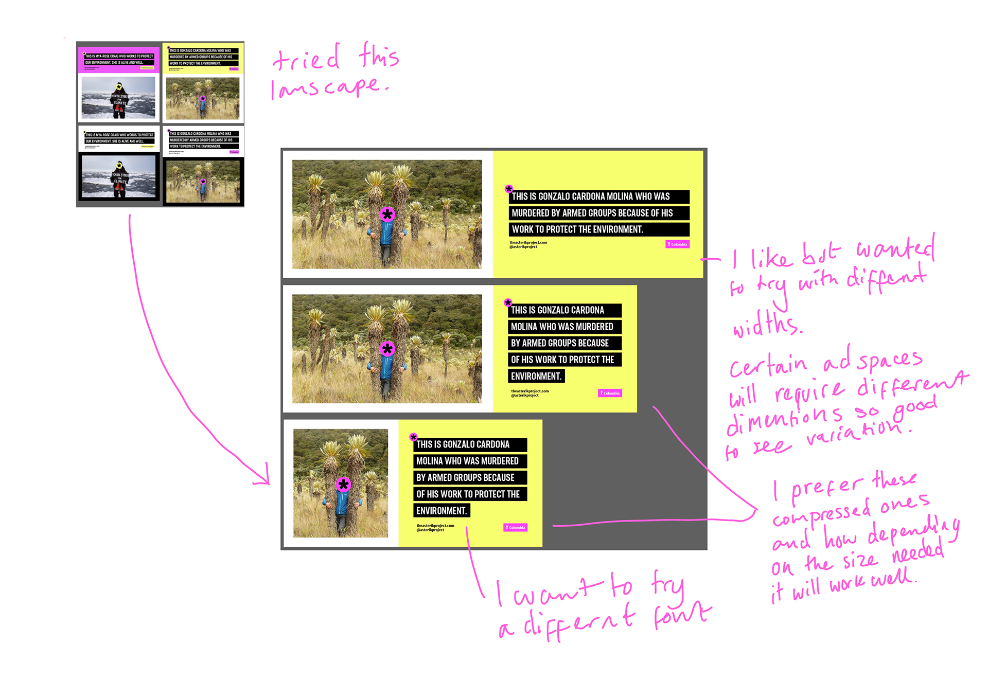
Chosen Design and Choosing Font
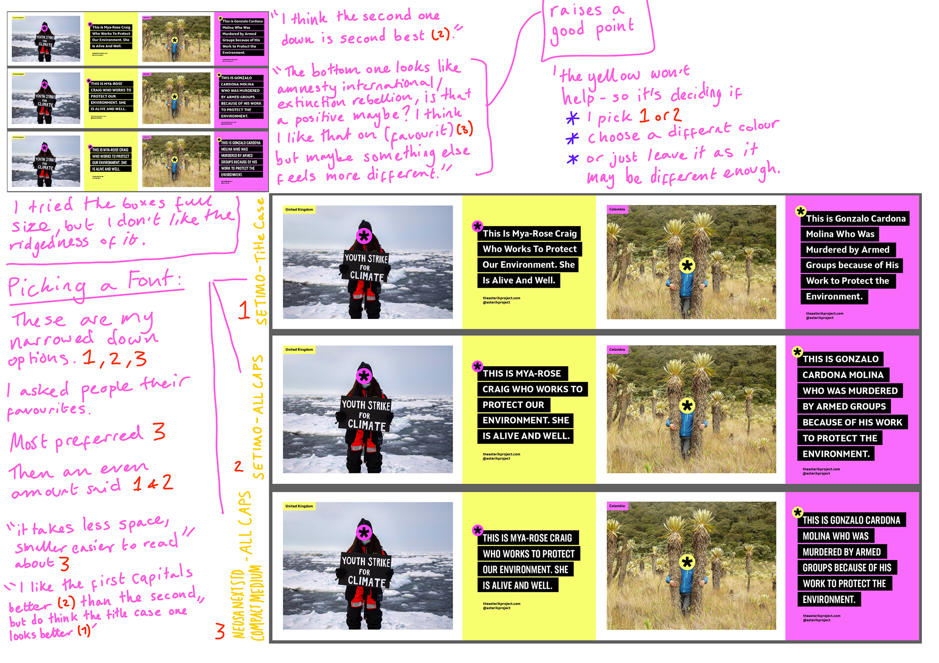
Refining my font chose but I ran into a bit of a problem. Explanation on annotations.
Font Case Accessibility
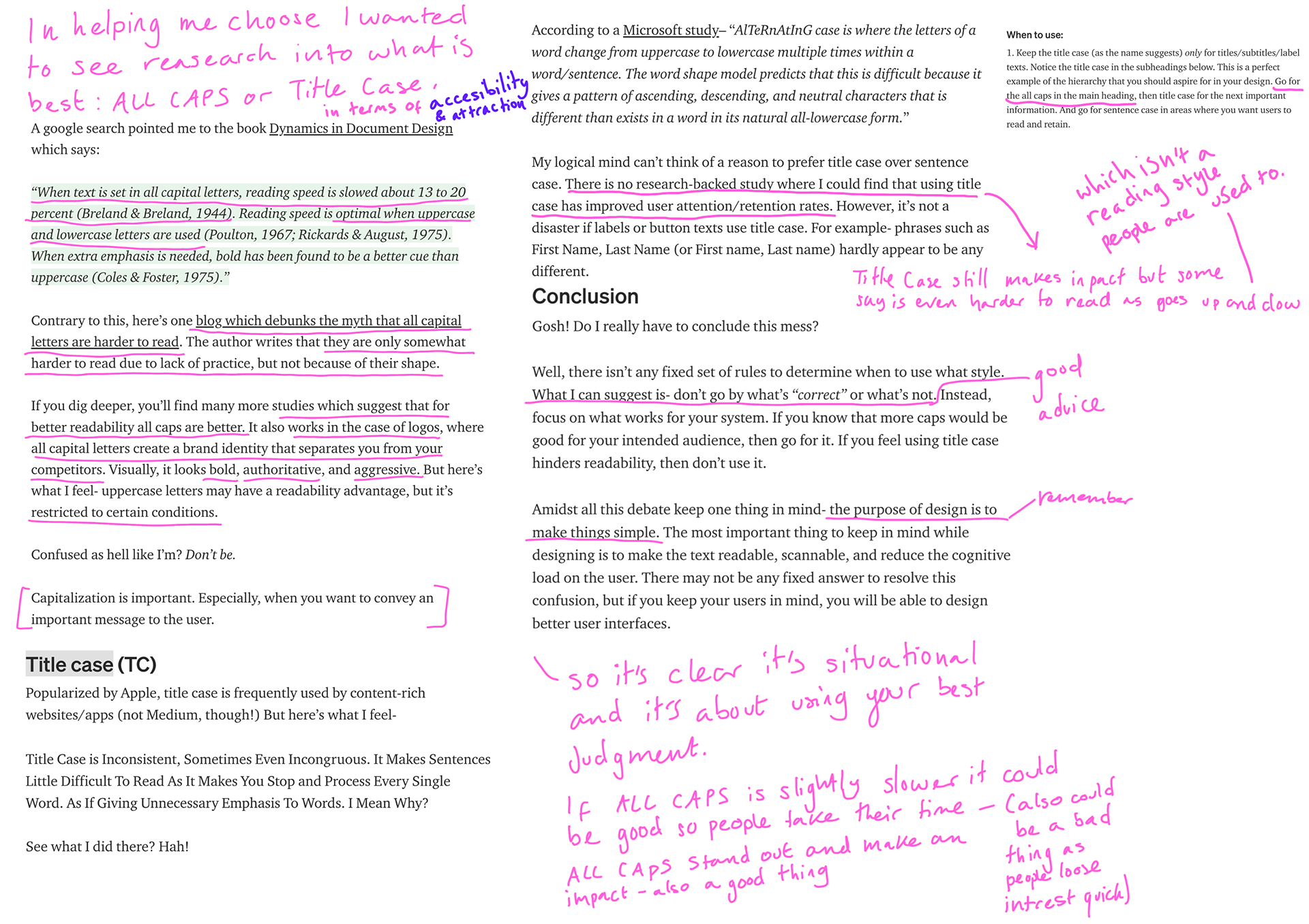
I wanted to have a look if certain cases are easier to read or not.
It's clear it's situational and it's about using the best judgment. (annotations and research above).
Choosing a Font
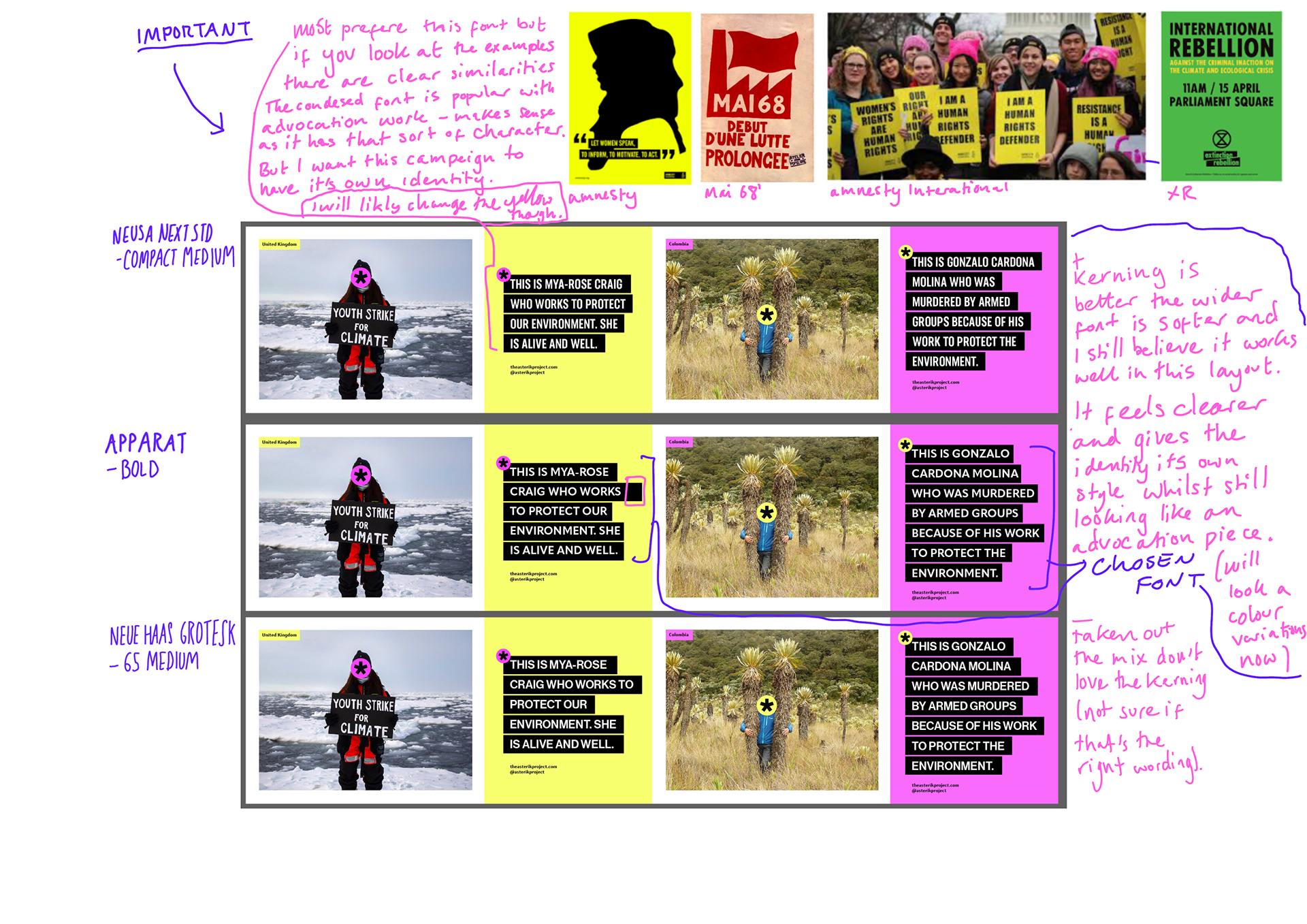
Reasons on image.
(click on image to enlarge)
Quick Colour Experiments and next steps
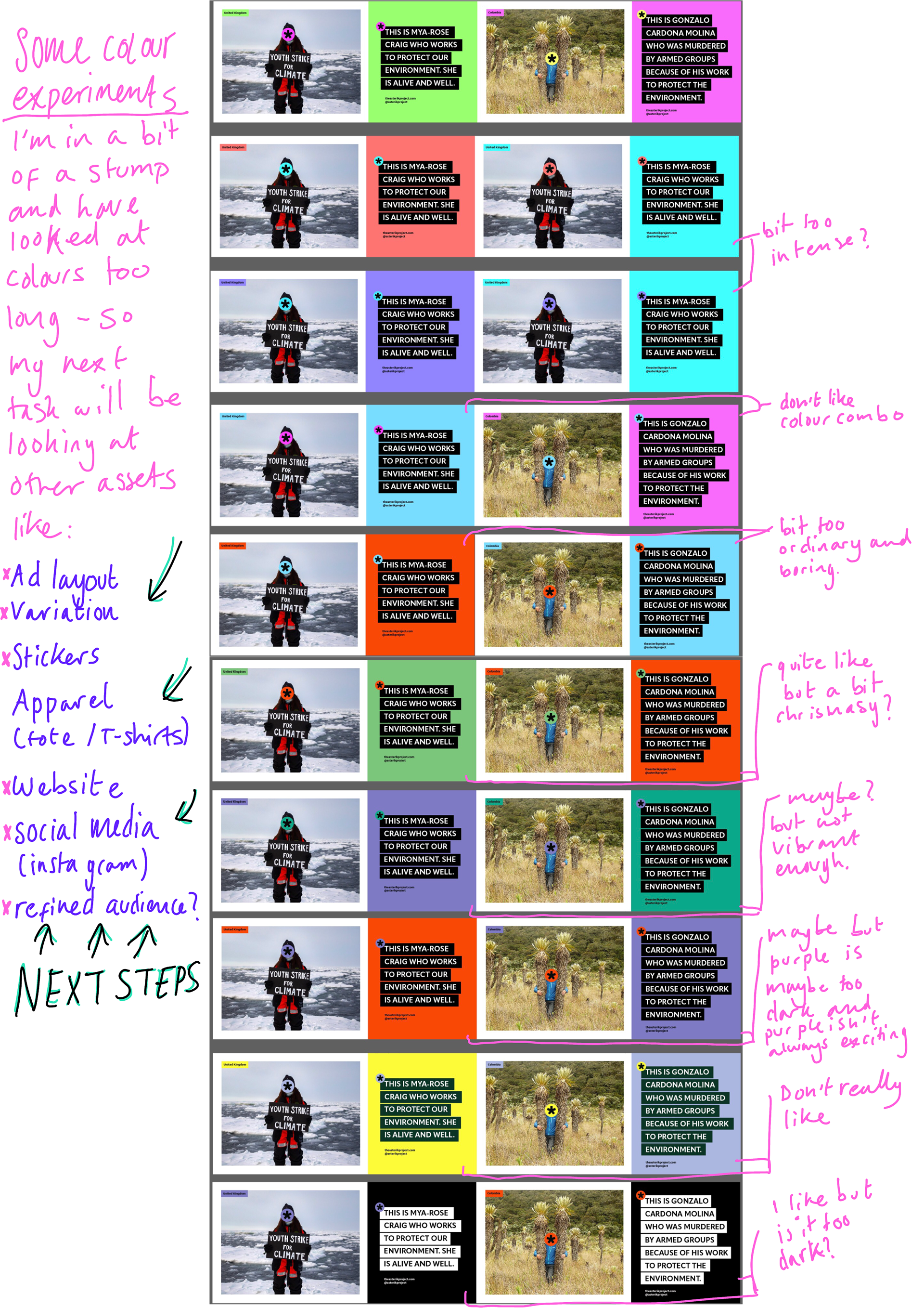
Explanation on image.
(click on image to enlarge)
ASSETS NEEDED (PLAN)
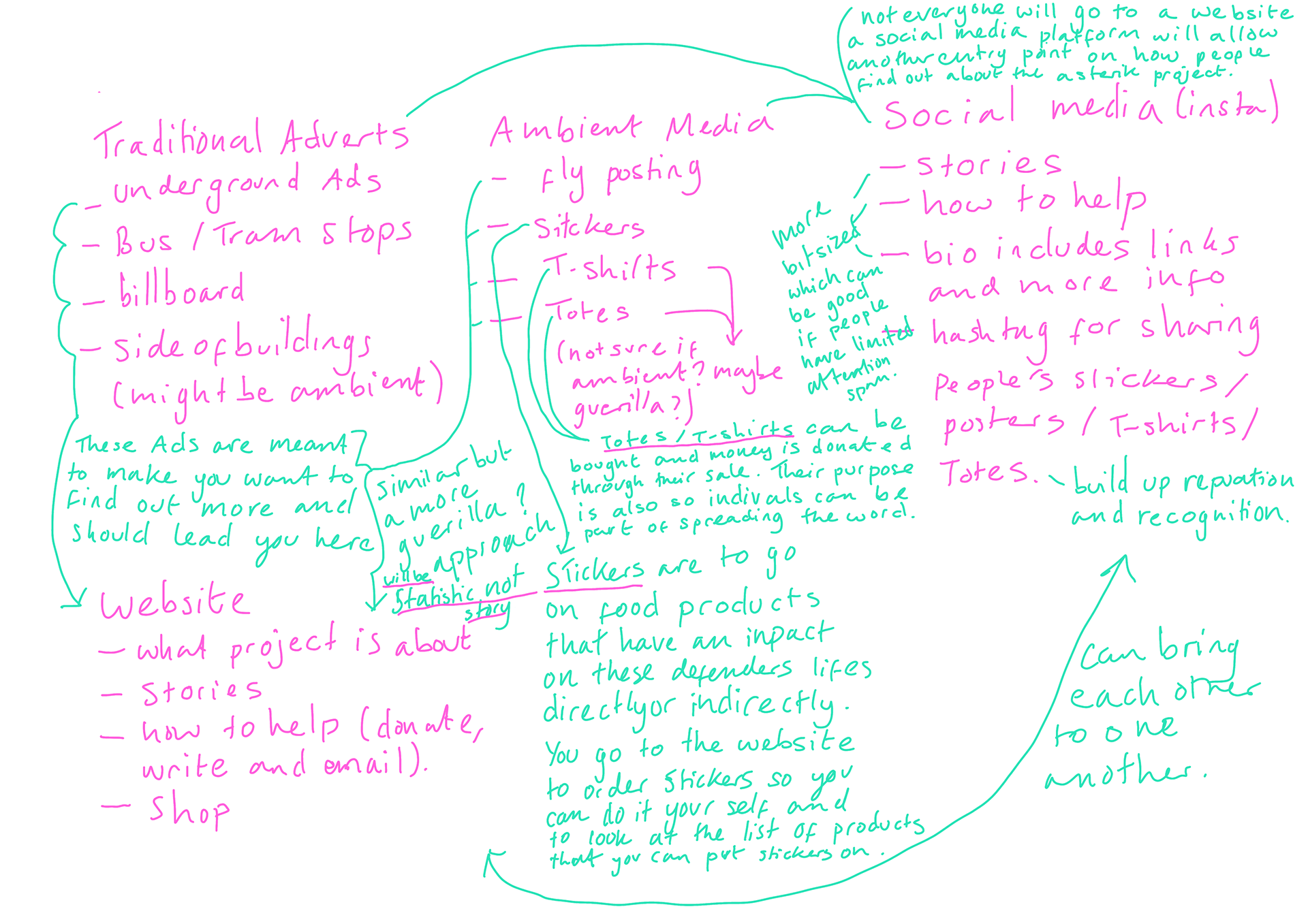
Plan outline on image.
(click on image to enlarge)
Audience Refinement
As I am progressing with this project its clear that I may need to refine my target audience. The vibrancy and playfulness of the identity it's developing into may be suited to a younger audience e.g. 18-36 olds. I'm not trying to block anyone above or below out as I feel the identity will still attract older and younger viewers as I plan for it to stand out, but narrowing it down will allow me to focus my design style better.
Asset Development
Visual development with my annotations.
(click on images to enlarge)
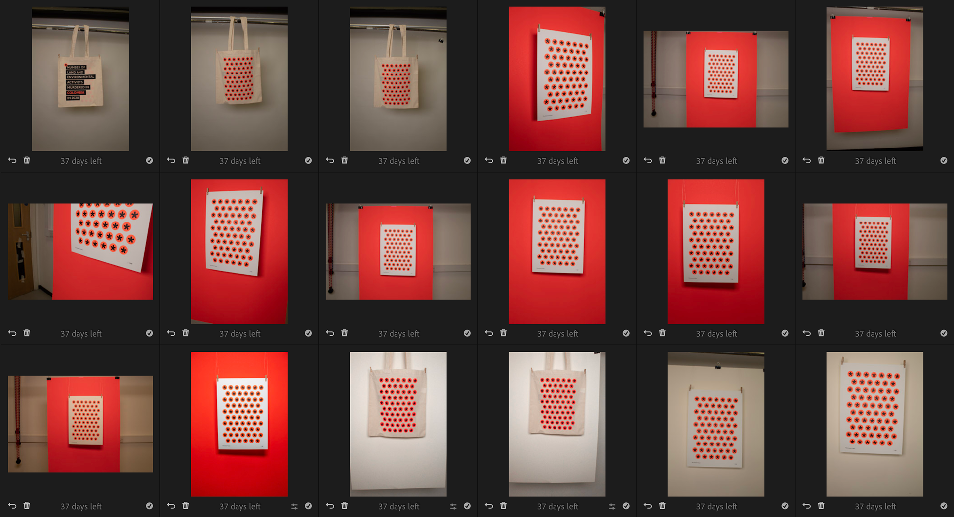
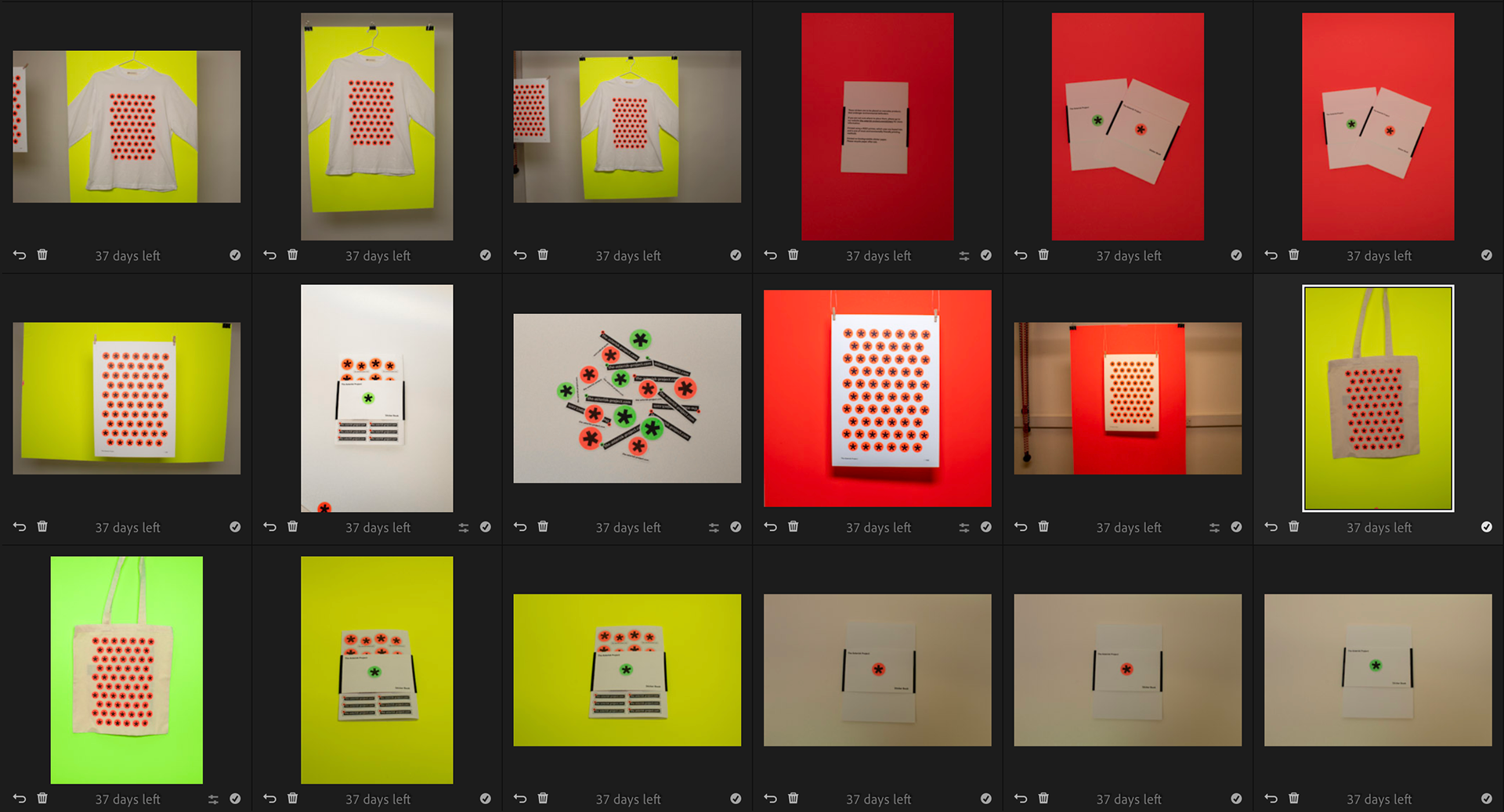
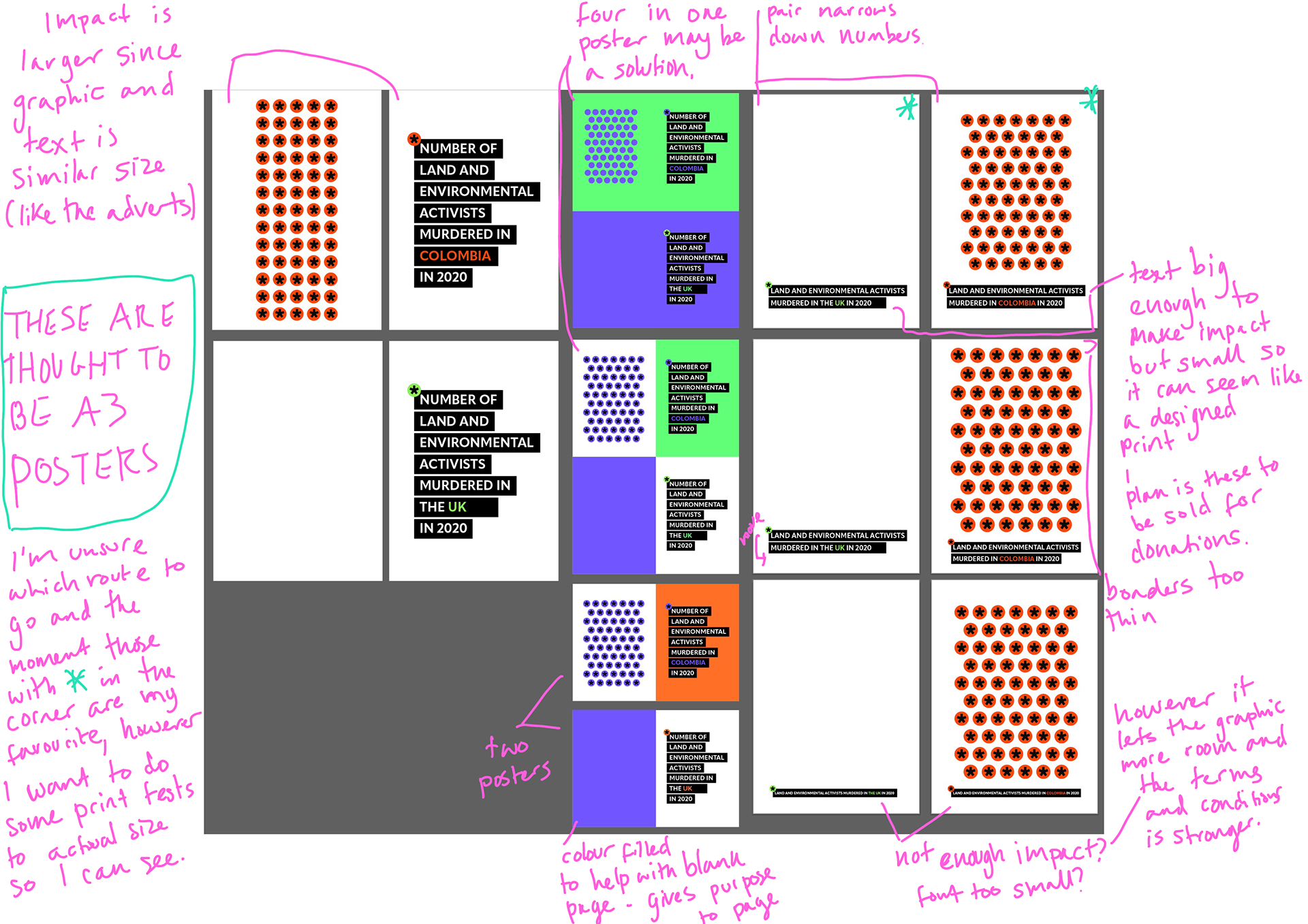
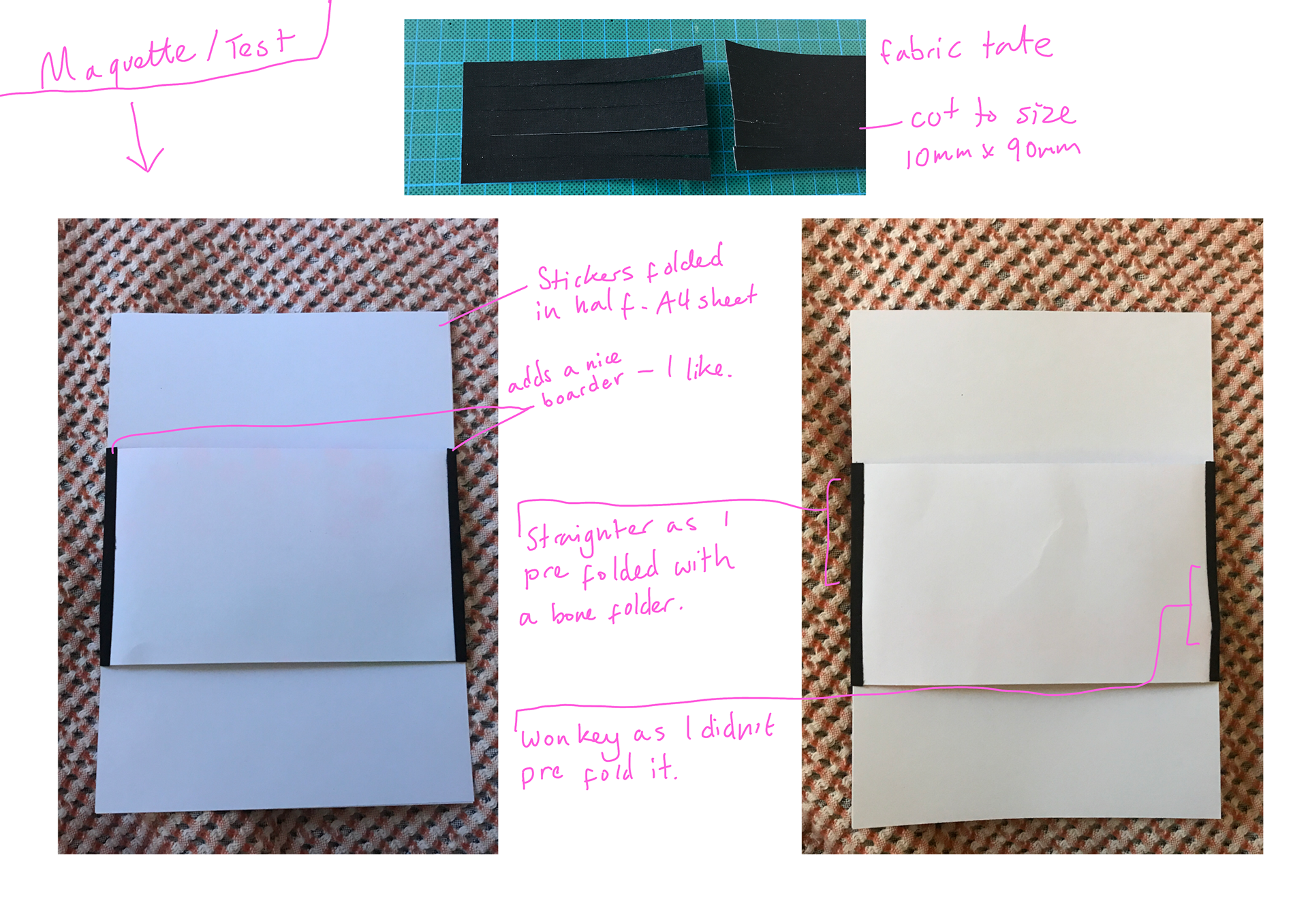
Test Prints
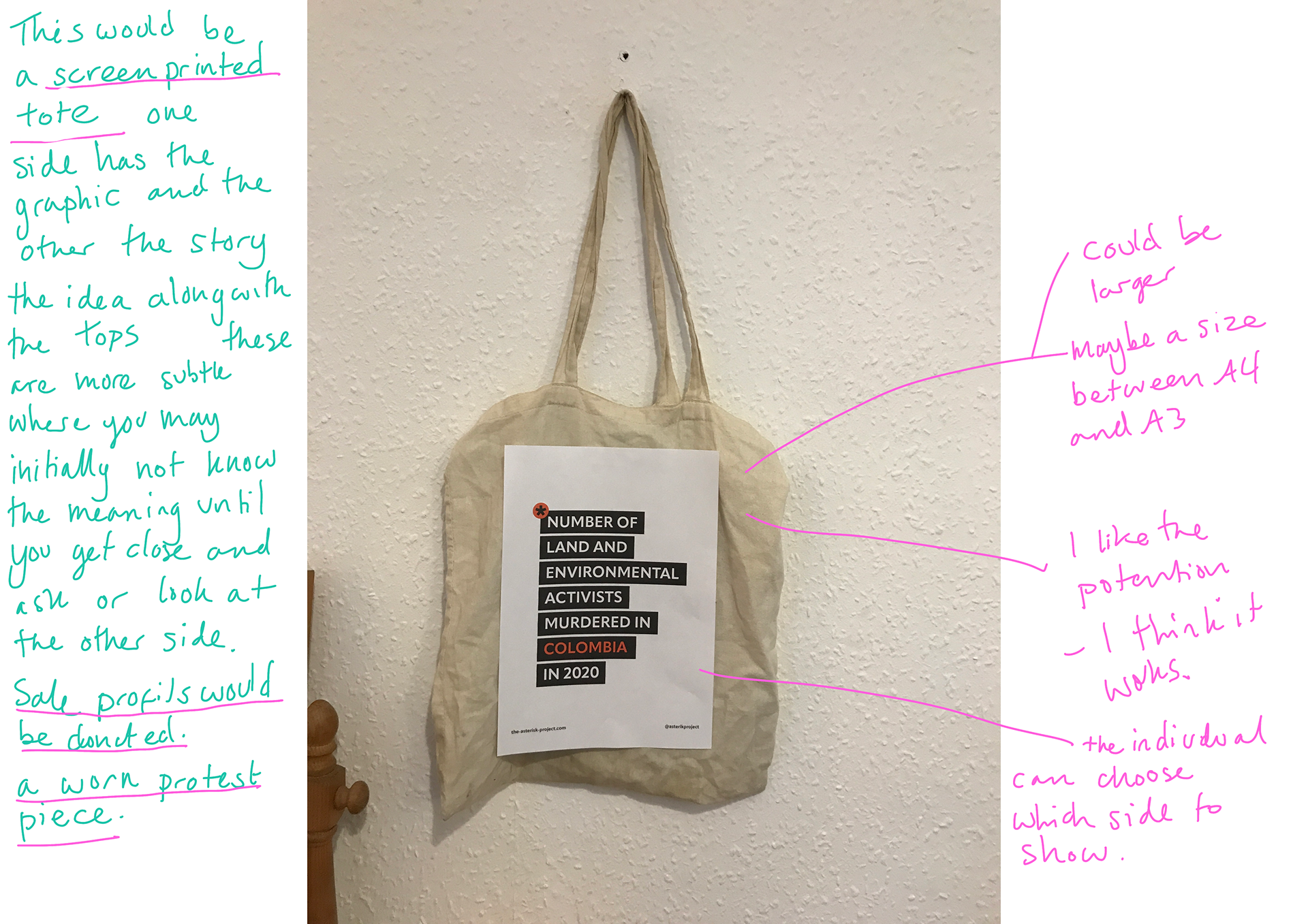
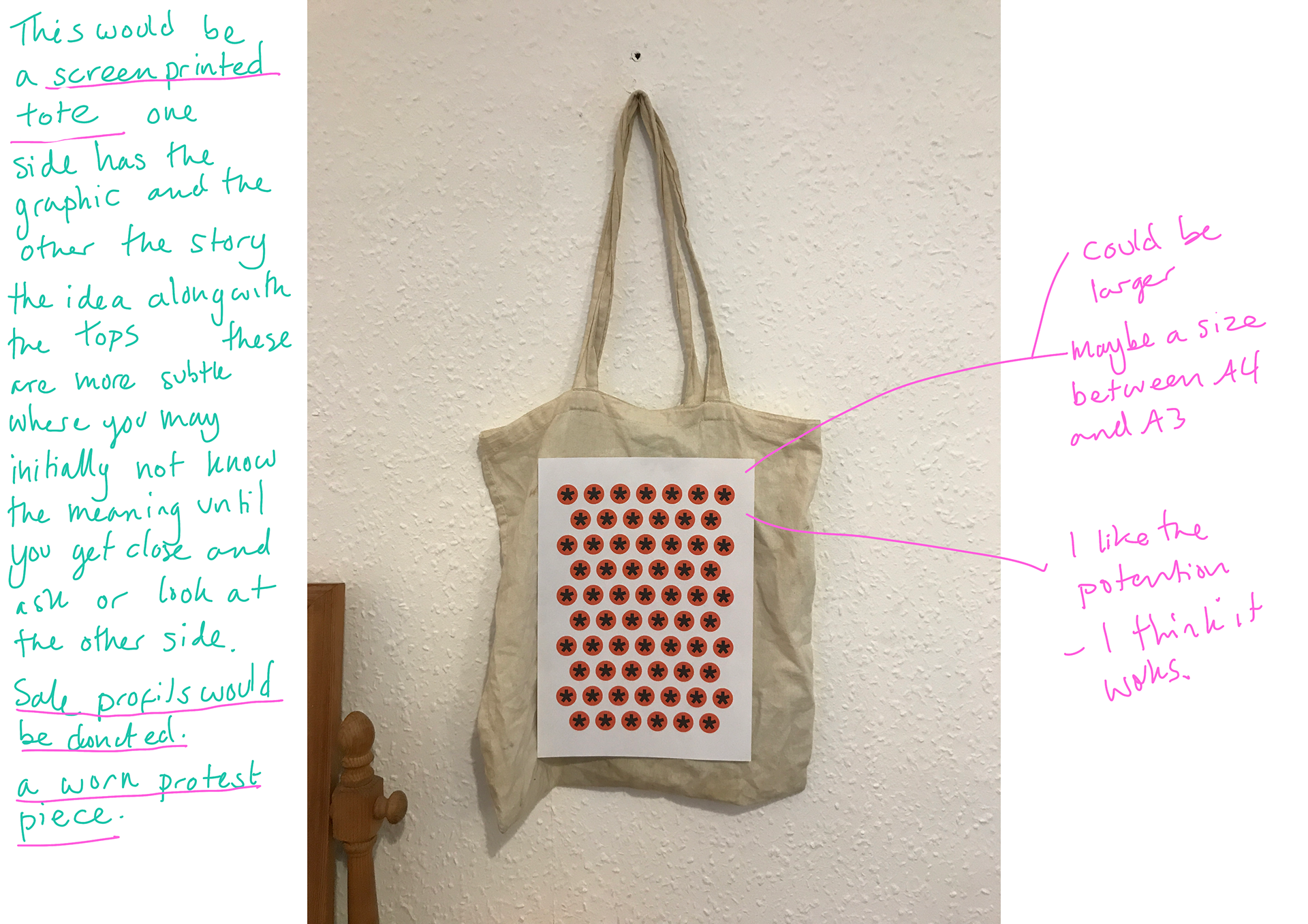
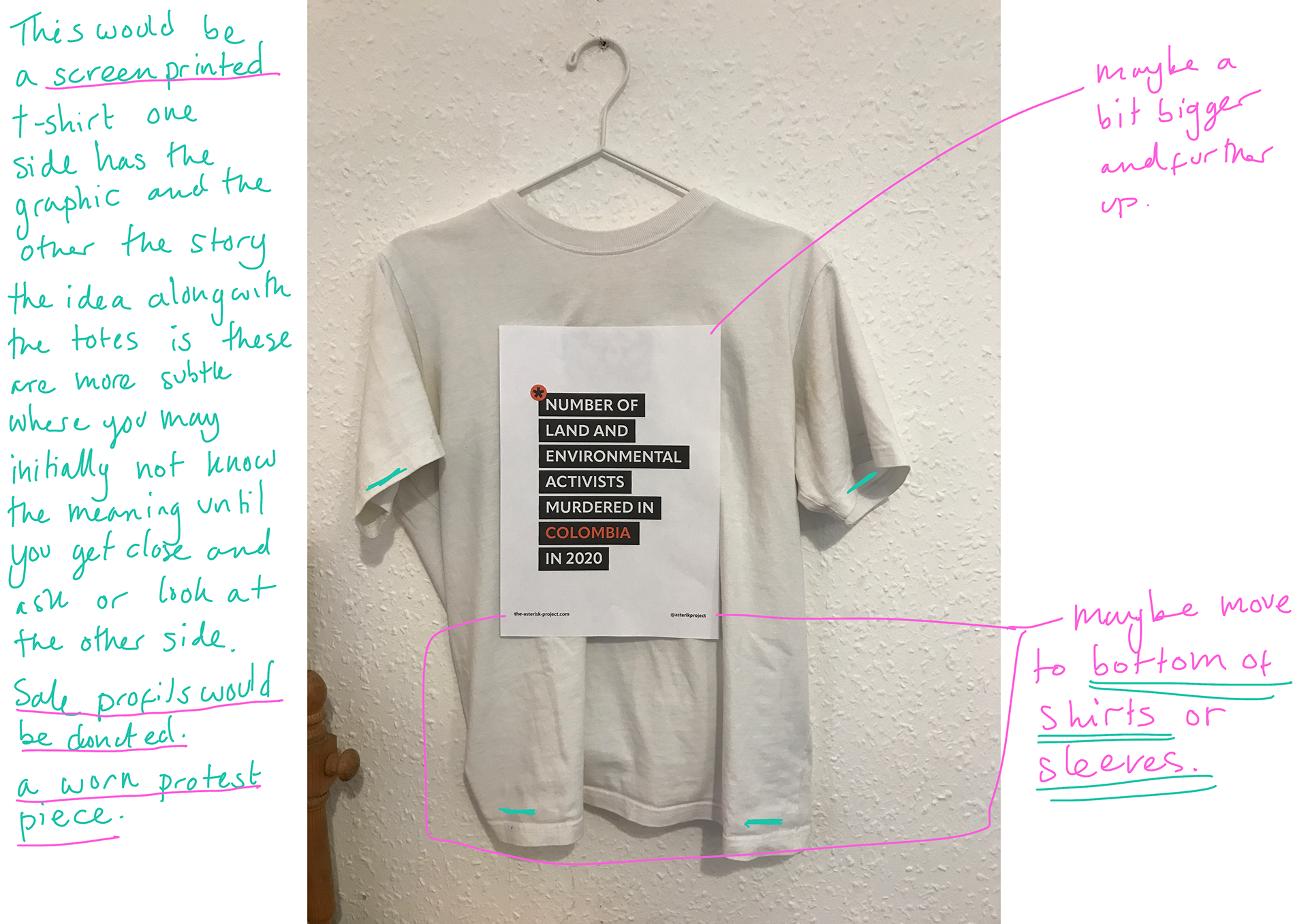
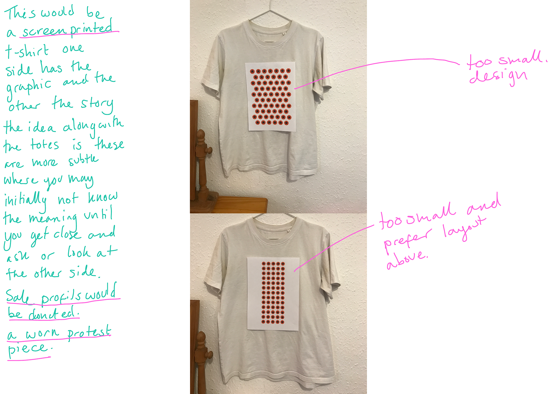
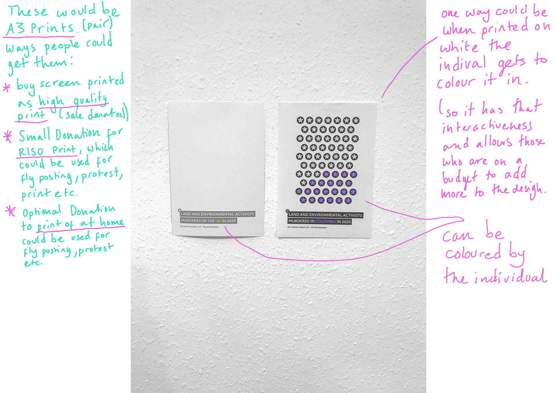
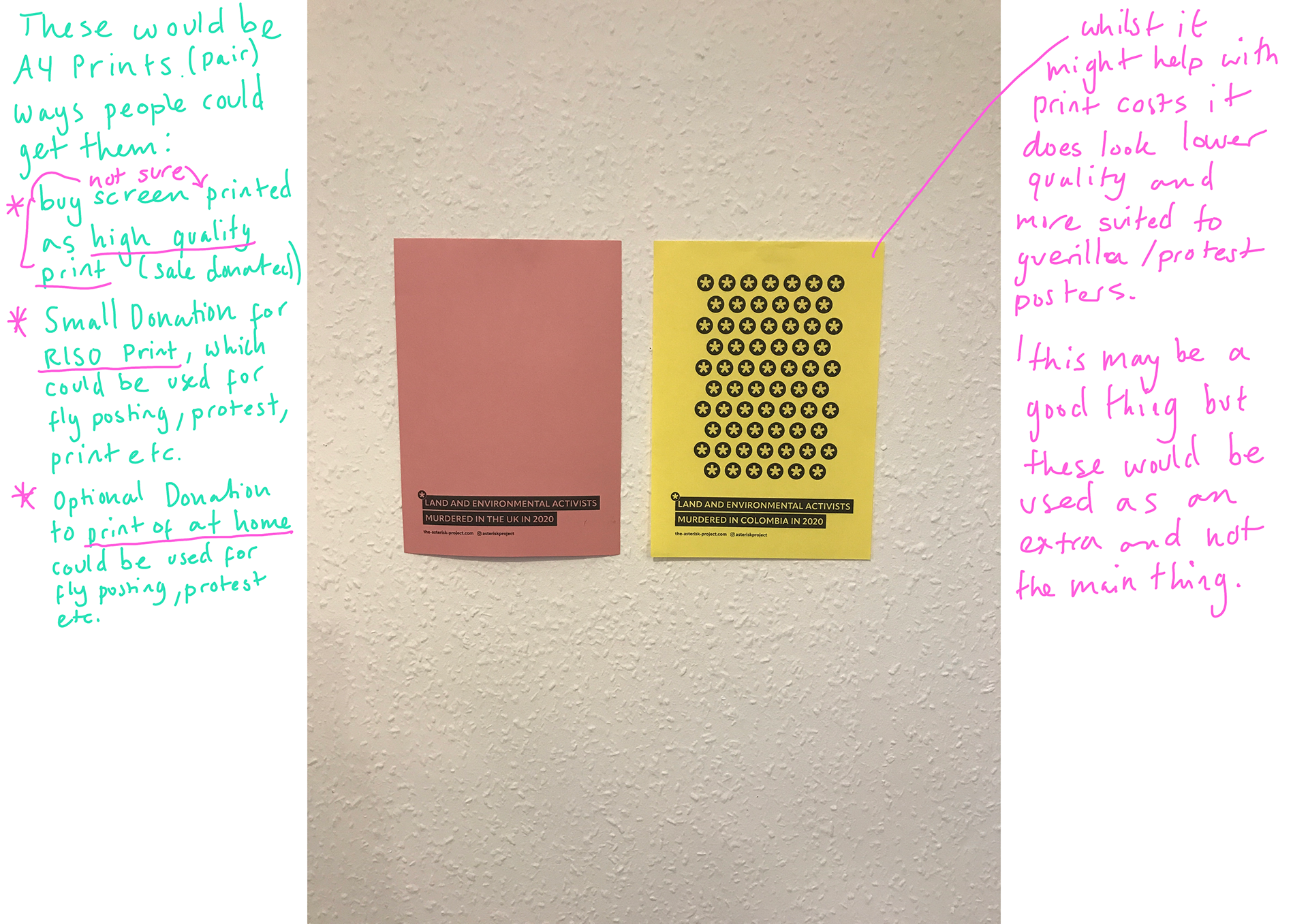

Above are my test prints for posters, stickers, totes, tops etc. I've annotated my thoughts and measurements. There are some changes like scale that I need to look at, but been very useful seeing the designs away from a screen.
(click on images to enlarge)
NARROWED DOWN AND NEXT STEPS
My voice over explaining the assets I am going to do.
Alignment FIXES

Before I start the next stage i wanted to fix the alignment issues on everything as many of the designs I just did quickly so it isn't all aligned as well as some of the text and spellings not being correct, so I will also fix that.
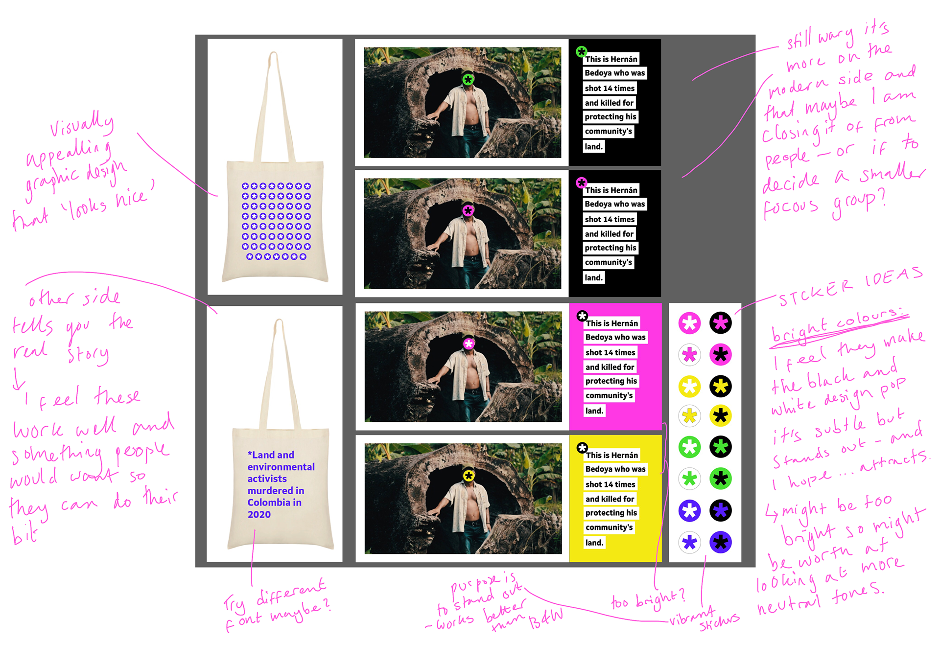
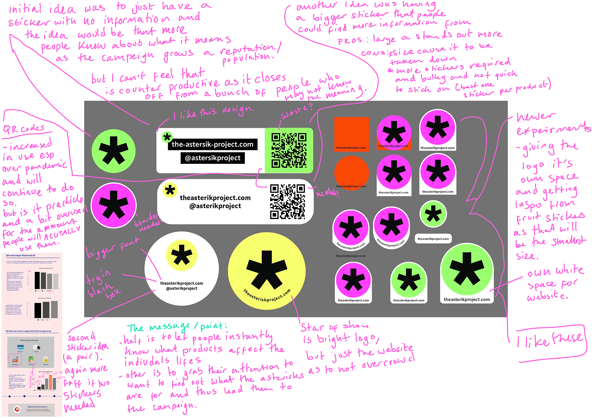
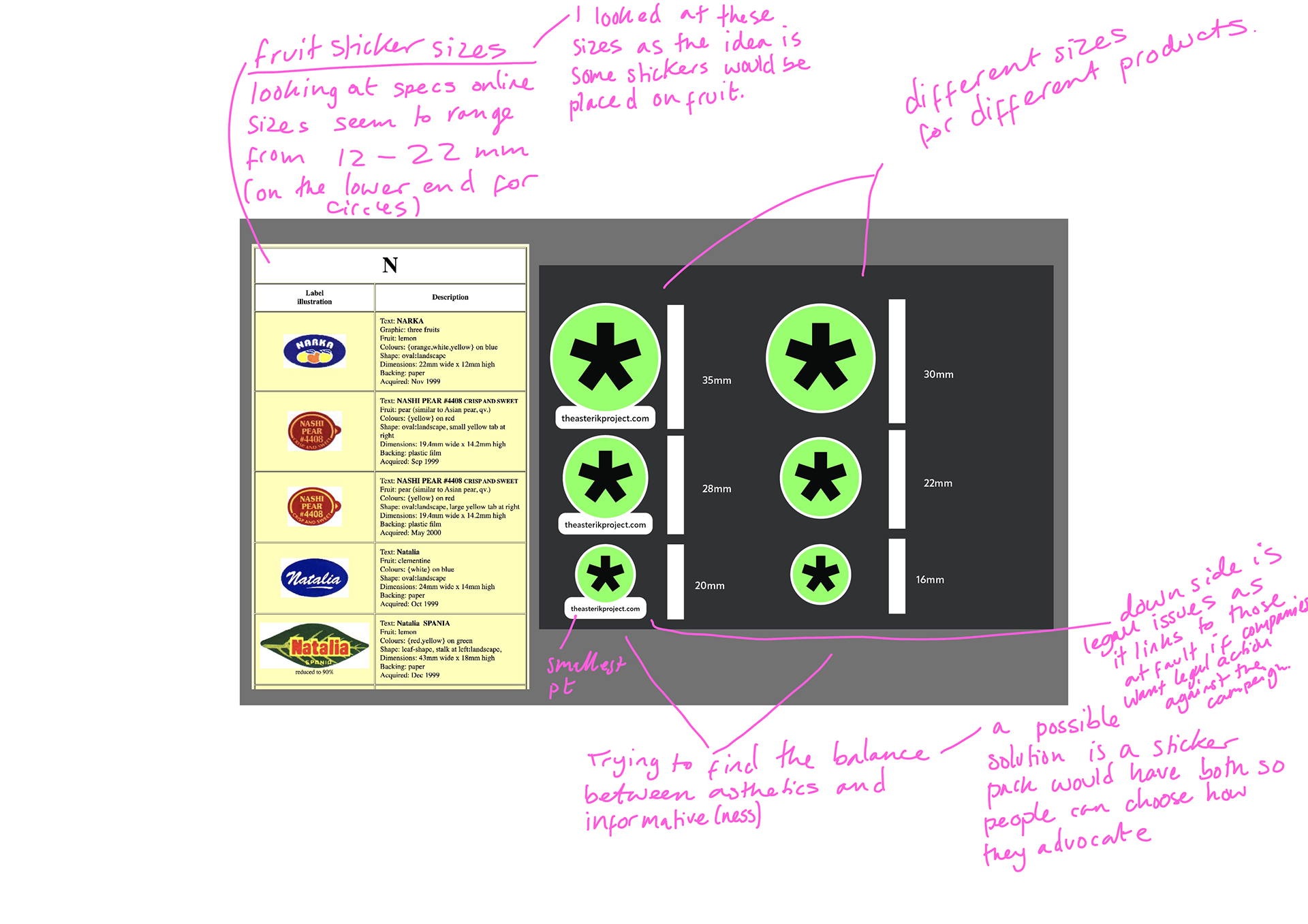
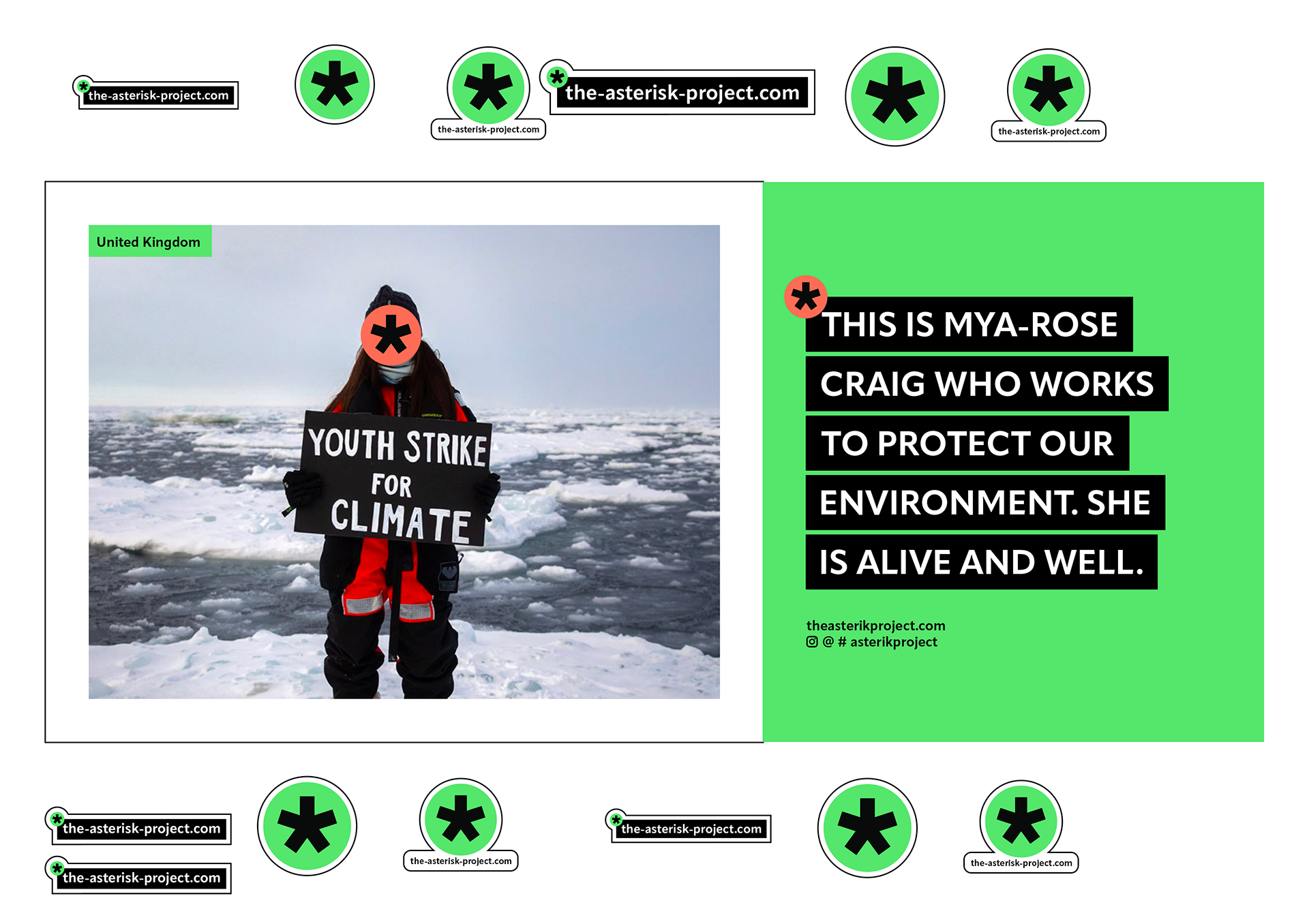
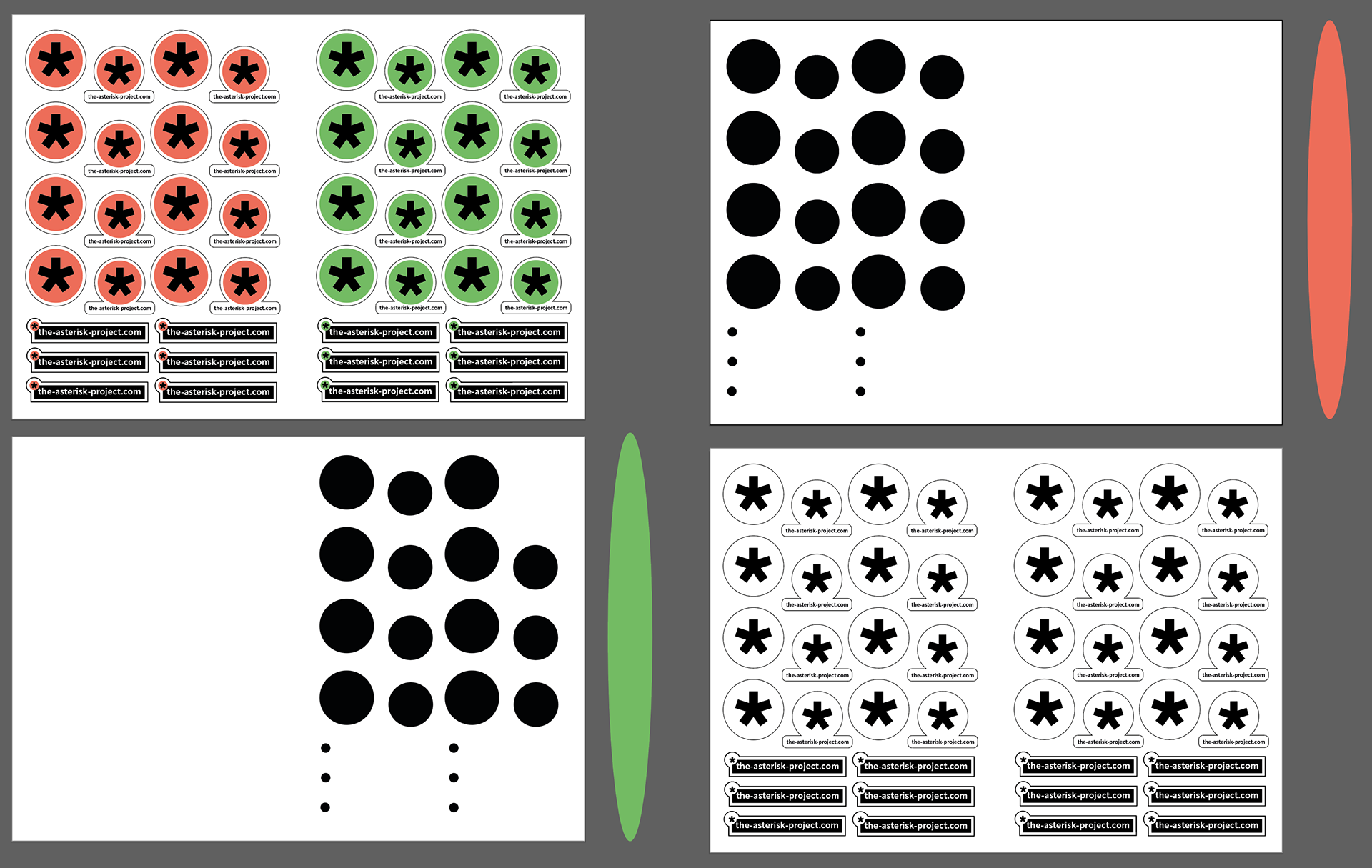
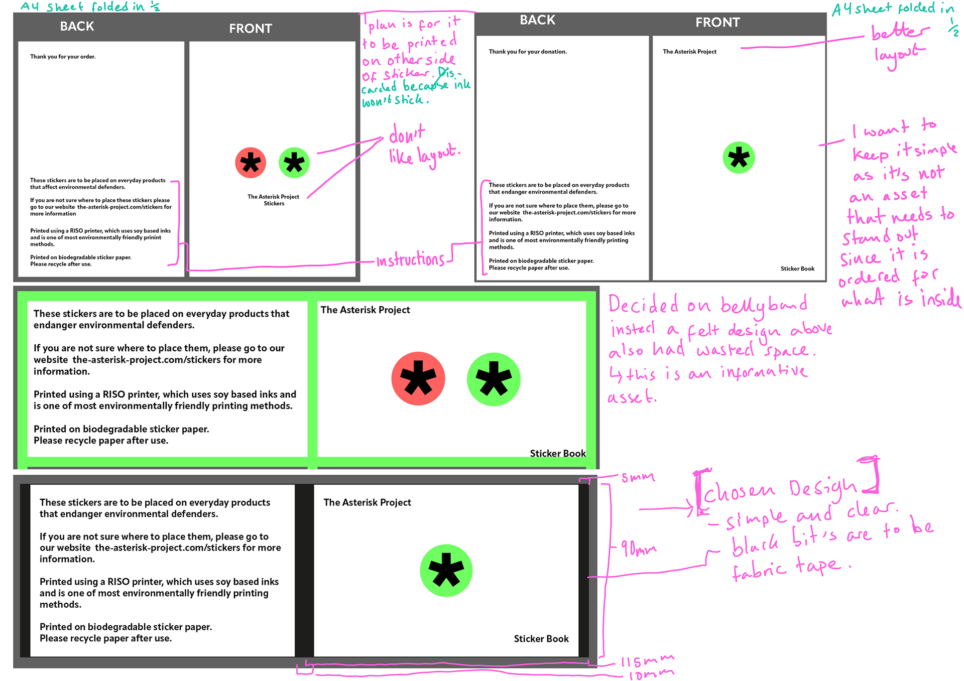
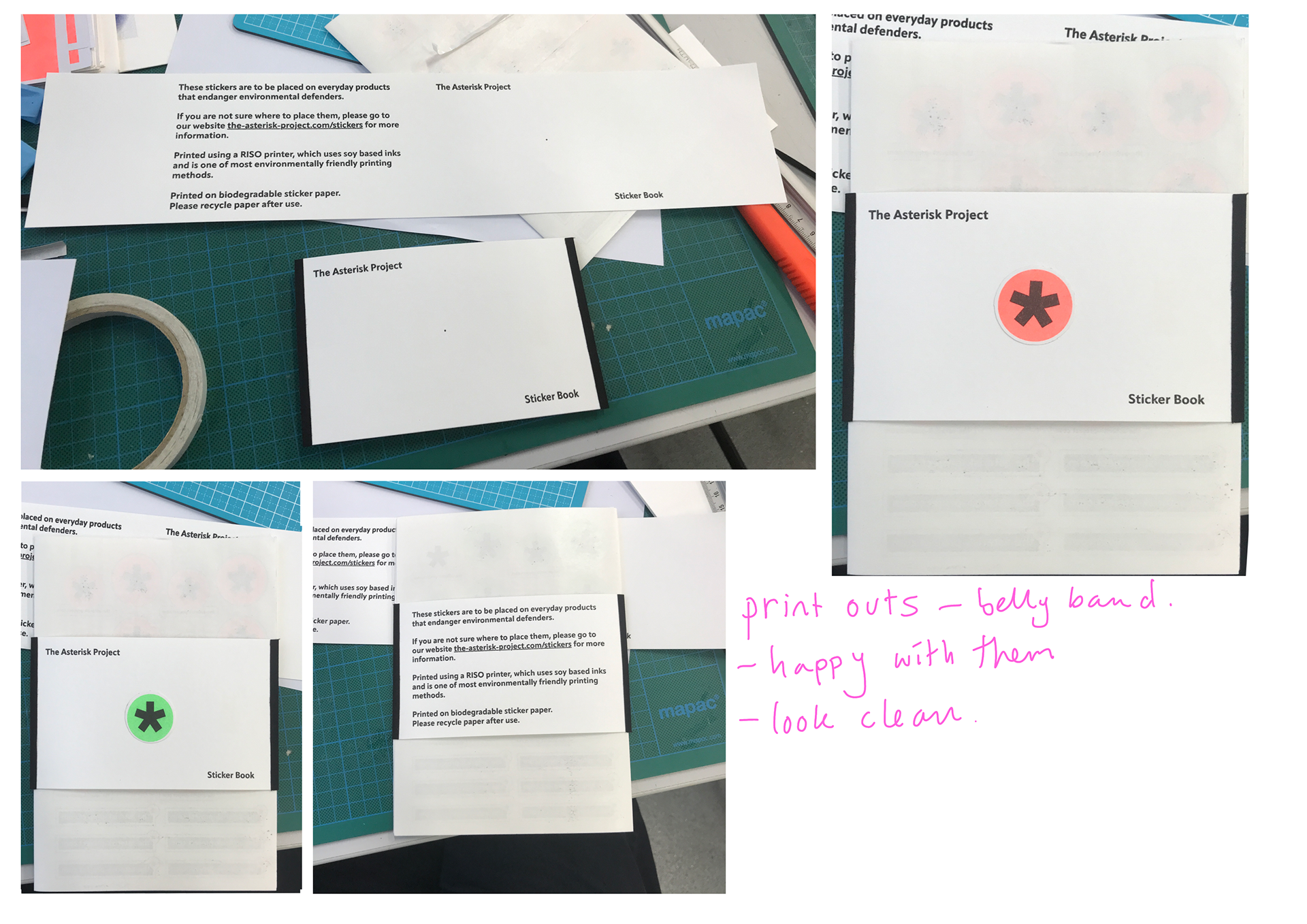
Sticker Development

I wanted to have one more play at the stickers to see if I could make them better. I liked to idea of having the website a box and it stands as it's own piece similar to the poster designs.
I showed a group of friends and they preferred the white ones (top right) as the website is clear and has the asterisk too, the black one initially they preferred but said it wouldn't stand out against products as much as the white. When I suggested incouperating the website with the small asterisk (top left) to the white ones (top right) they liked that idea as it included for variety and options. So that it what I am going to do.
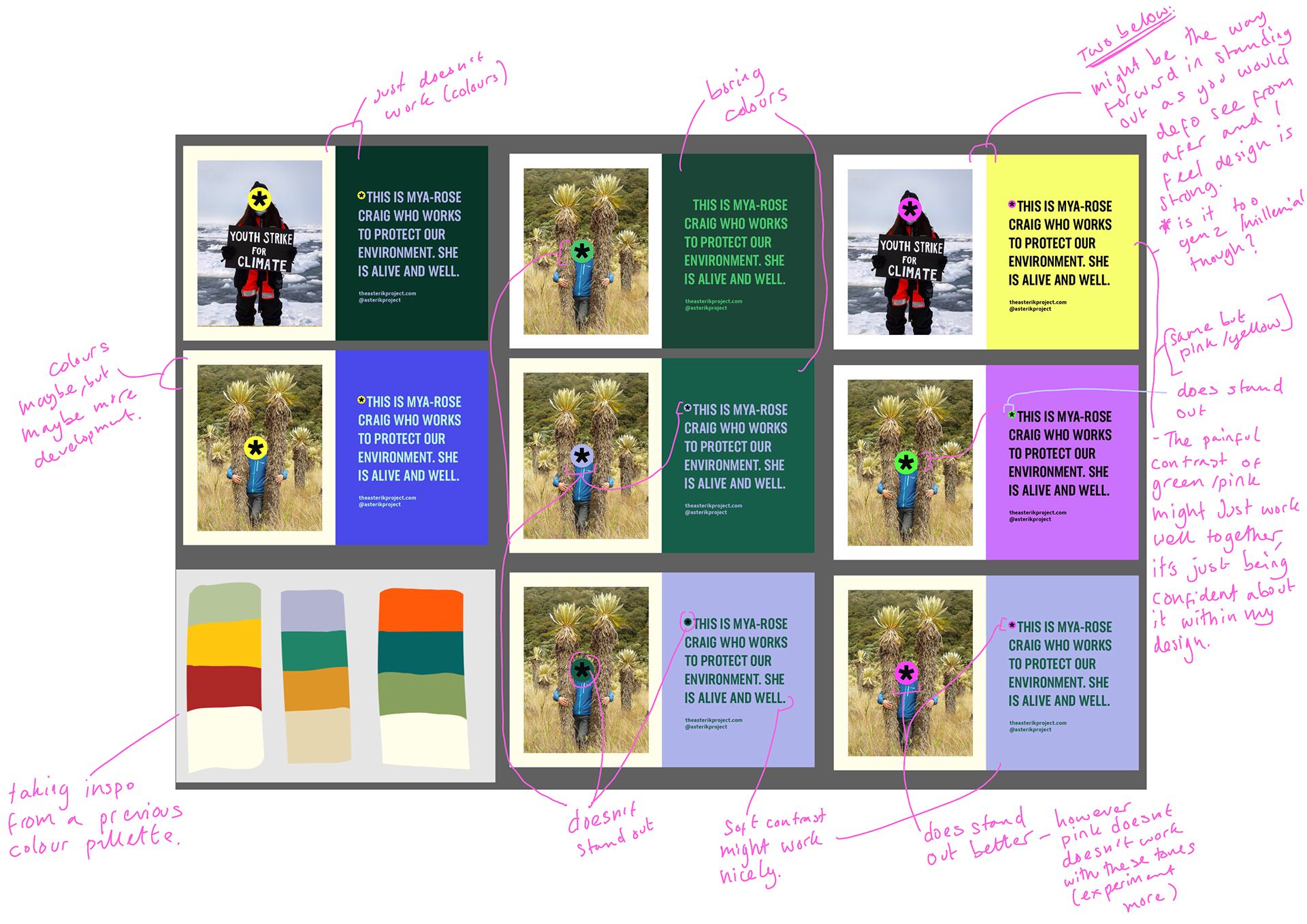
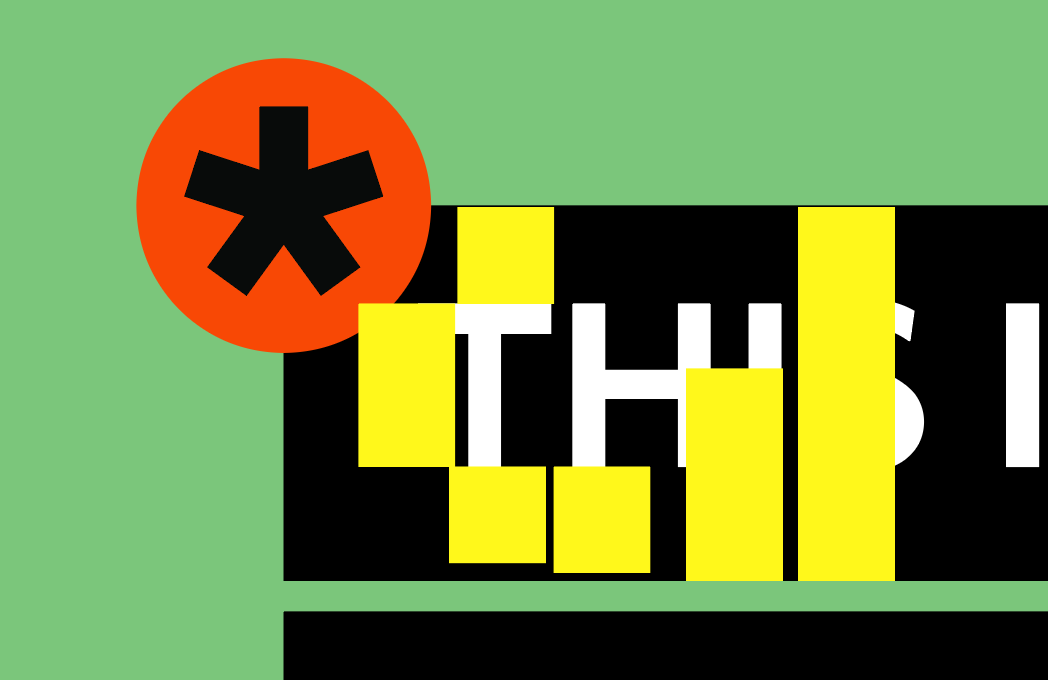
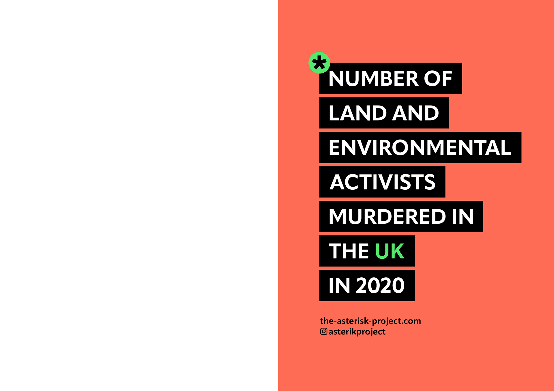
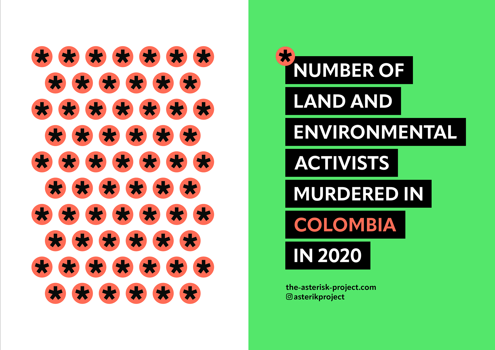
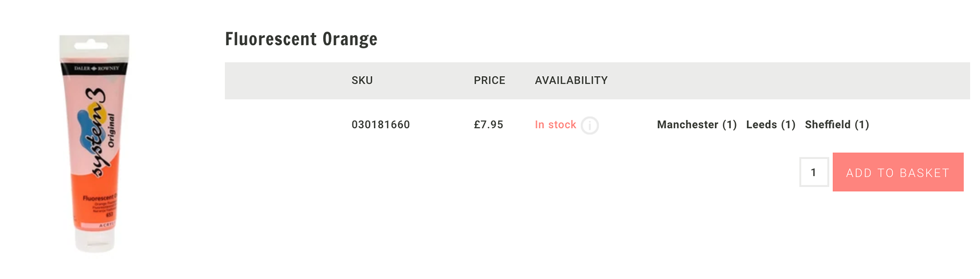
Colour Generation
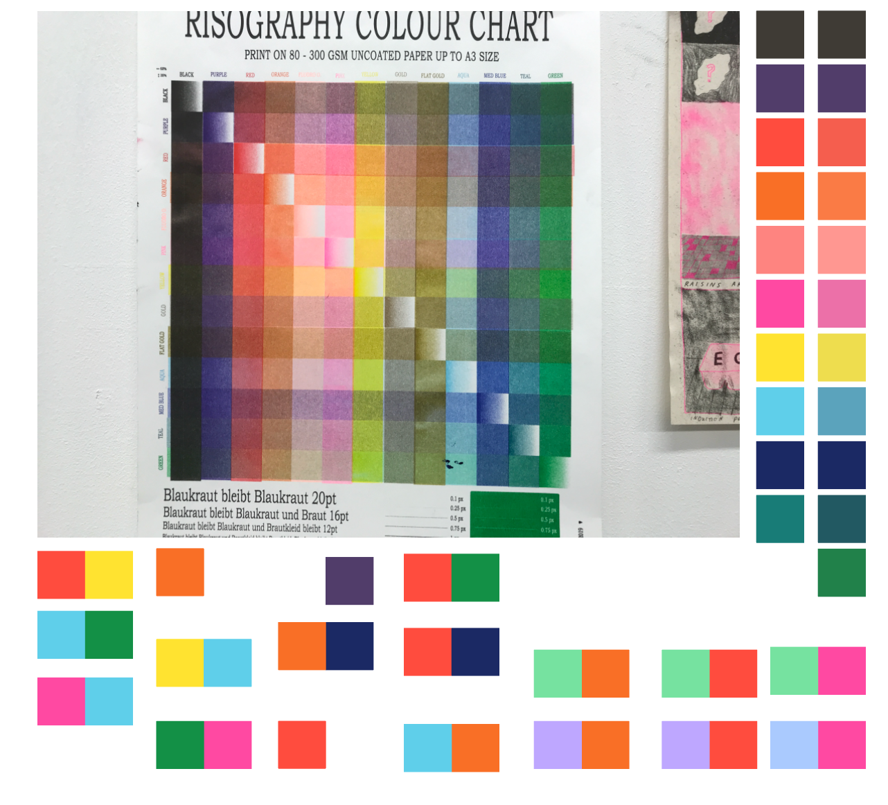
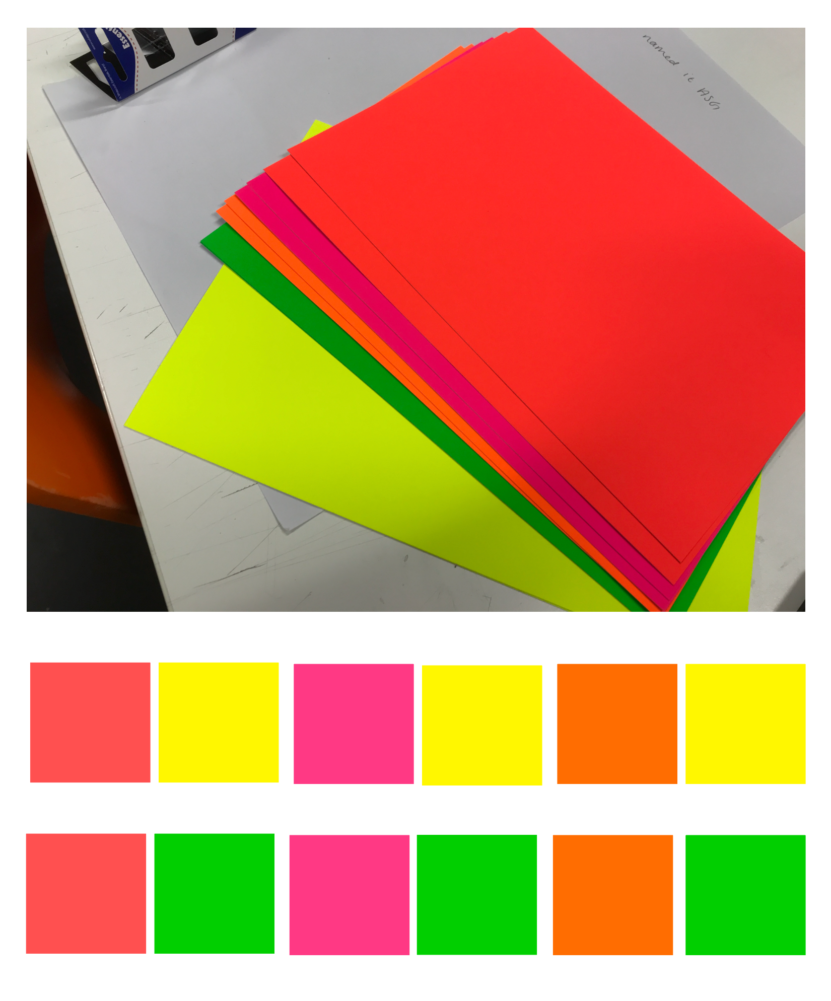
I had already decided that I wanted bright/neon colours as they stand out best. I looked at the RISO colours and neon paper sheets for inspiration as these are some good vibrant colours. I keep swaying to a cool and warm combination as I feel it is a good balance, the only thing is making sure the colours I choose are not too dark or light, all whilst going well together.
Finalisation of Colour
These are my narrowed down colours. Since I will be screen or RISO printing half of the campaign I went at looked at some examples in the RISO as I wanted to have a similar colour throughout all my campaign and RISO has the least flexibility.
Towards the Beginning of my project I liked the yellow, but it's used a lot especially by amnesty so I didn't want confusion, the vibrant green I think works well. I narrowed down to between fluorescent orange/pink and green/yellow.
The deeper orange i'd used in previous designs I liked but felt as if it was too dark and the pink I wasn't much of a fan of. So I ended up going with the fluorescent green and orange as I feel they stand out well and are good colour combination to create an impact.
Example in bottom right corner.
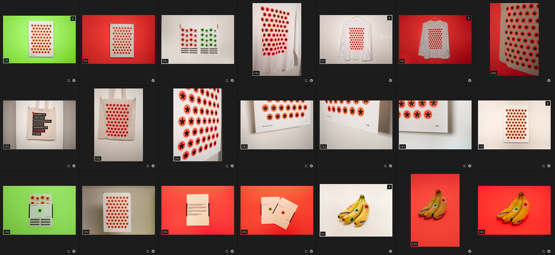
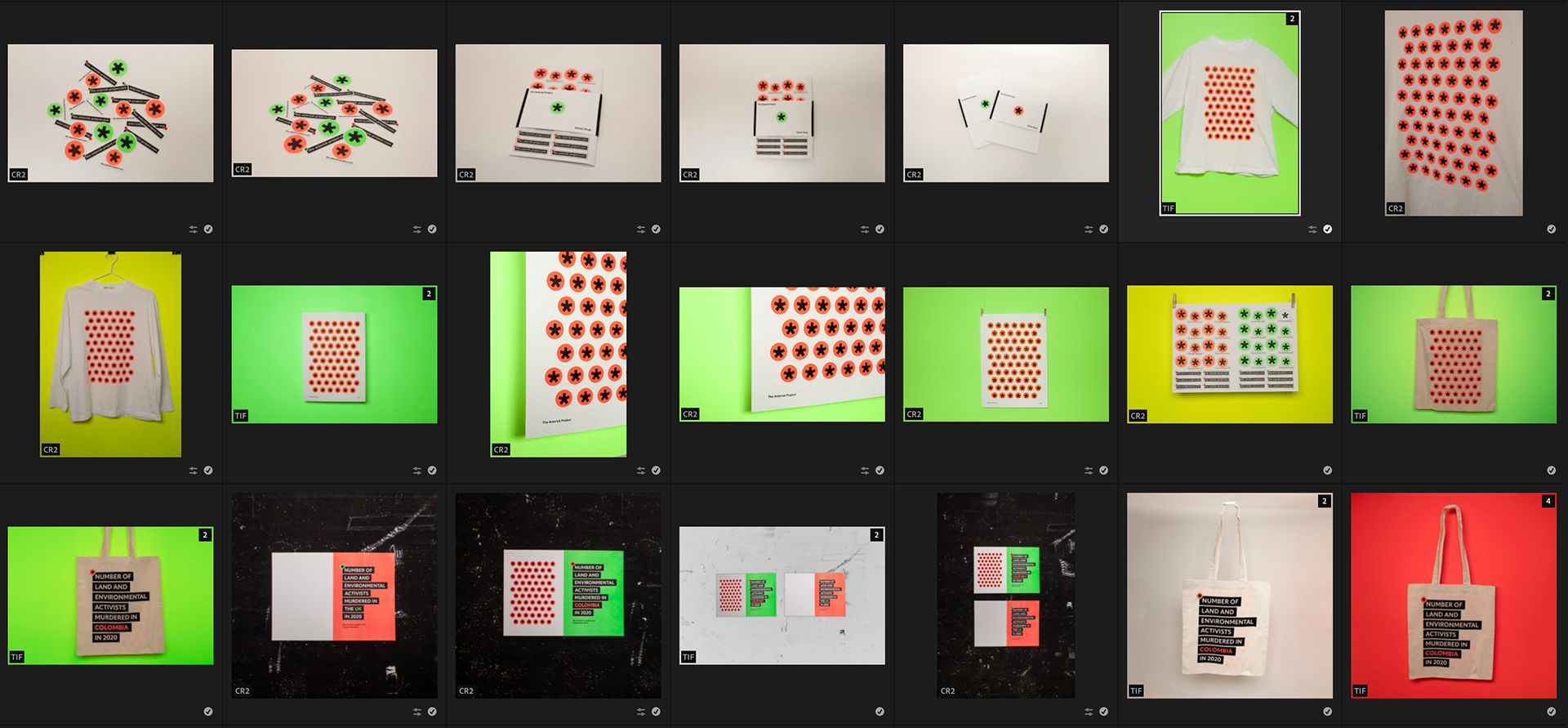
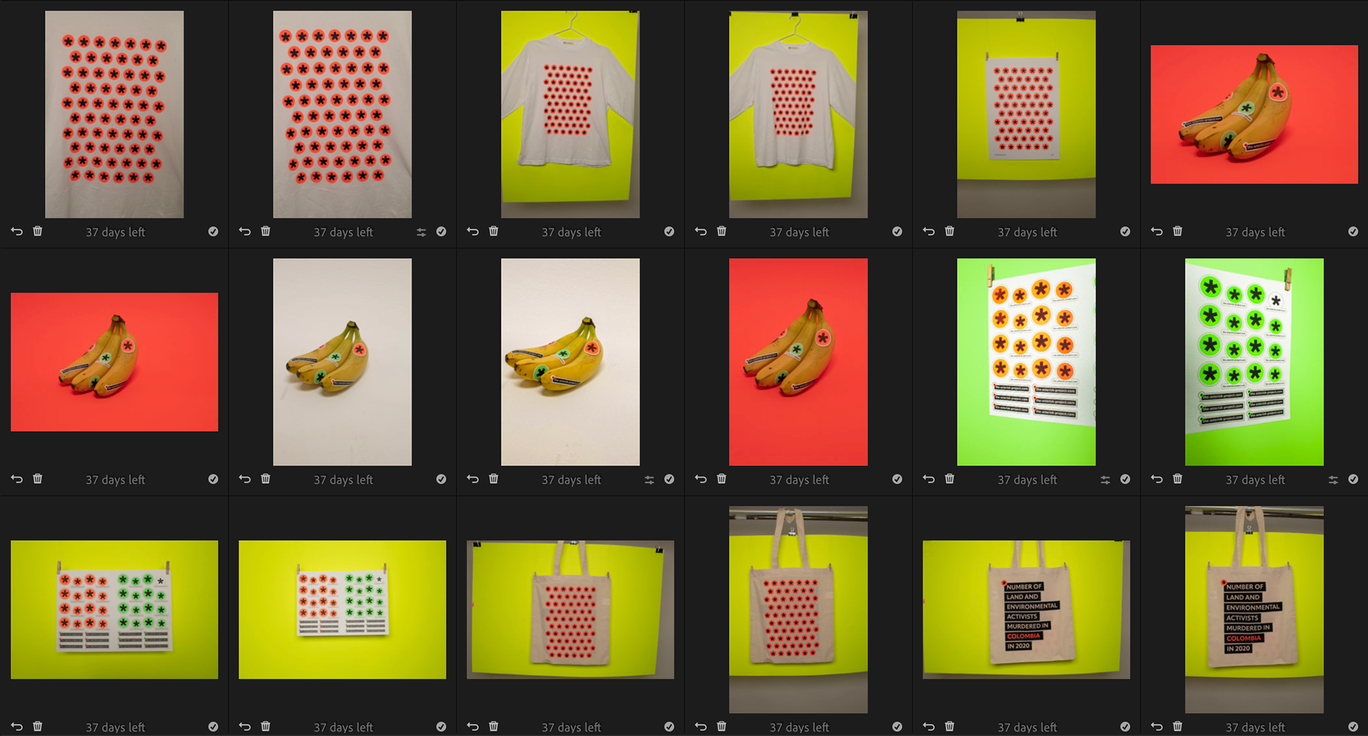
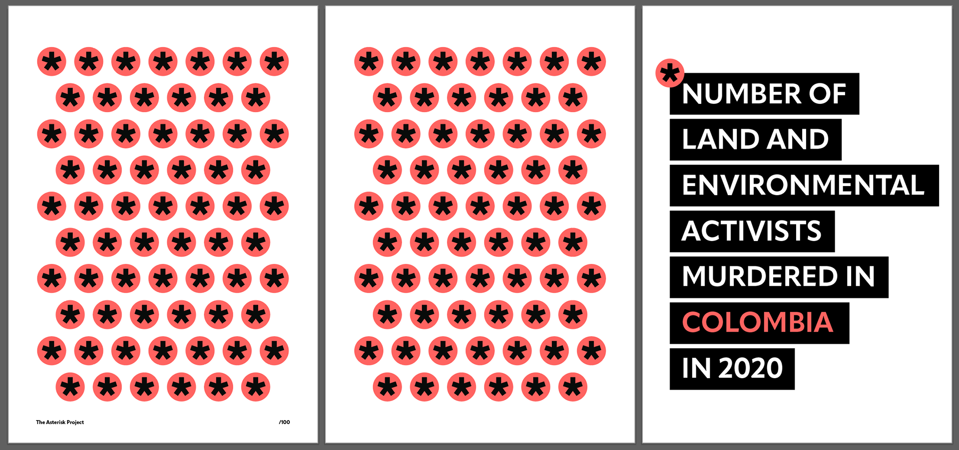
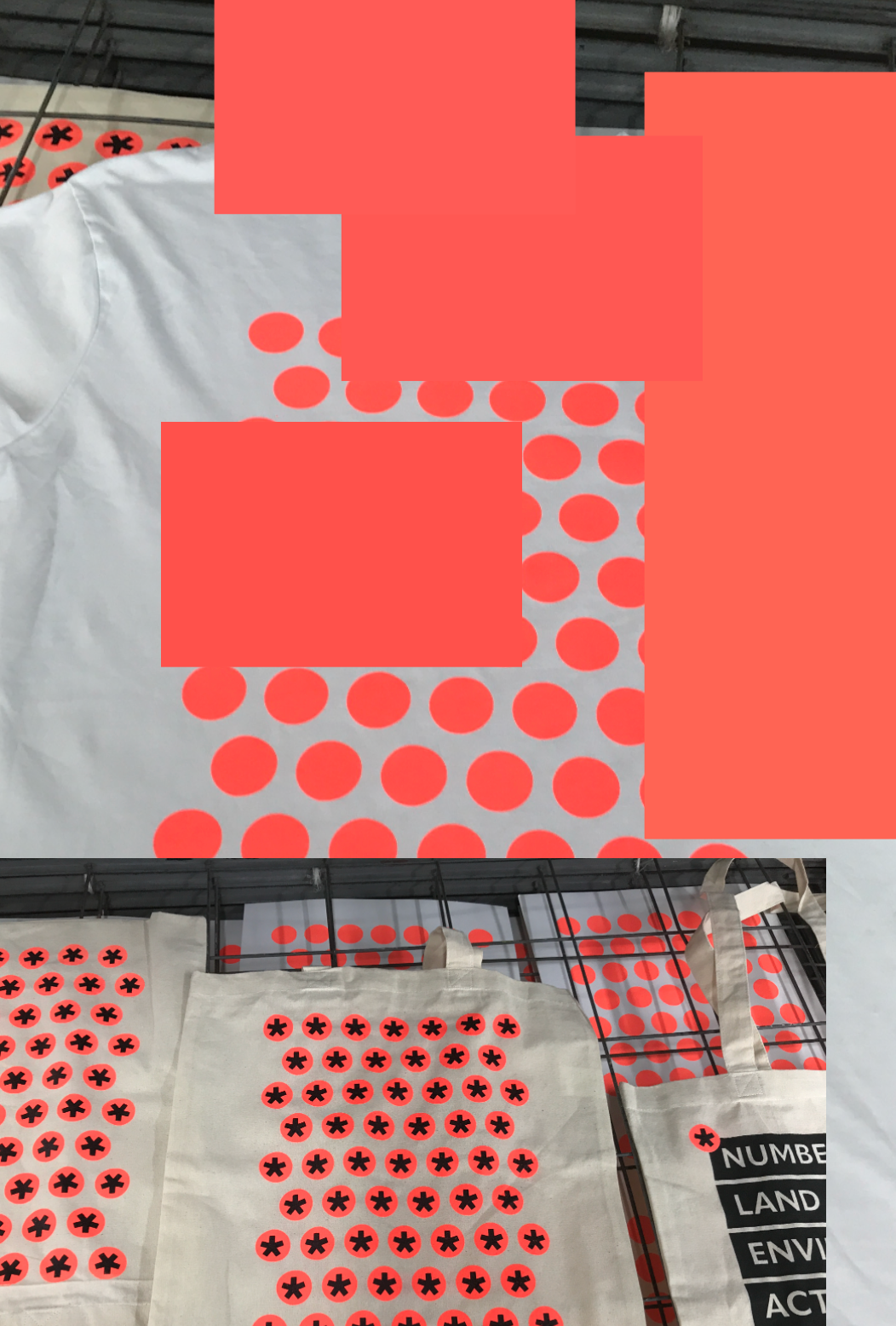
Test Prints


These are some final test prints I did before I RISO printed. I am very happy with the design. I tried the stickers at different sizes and have ended up going for the ones in the bottom left hand corner of the red/orange print outs.
COLOUR Accessibility
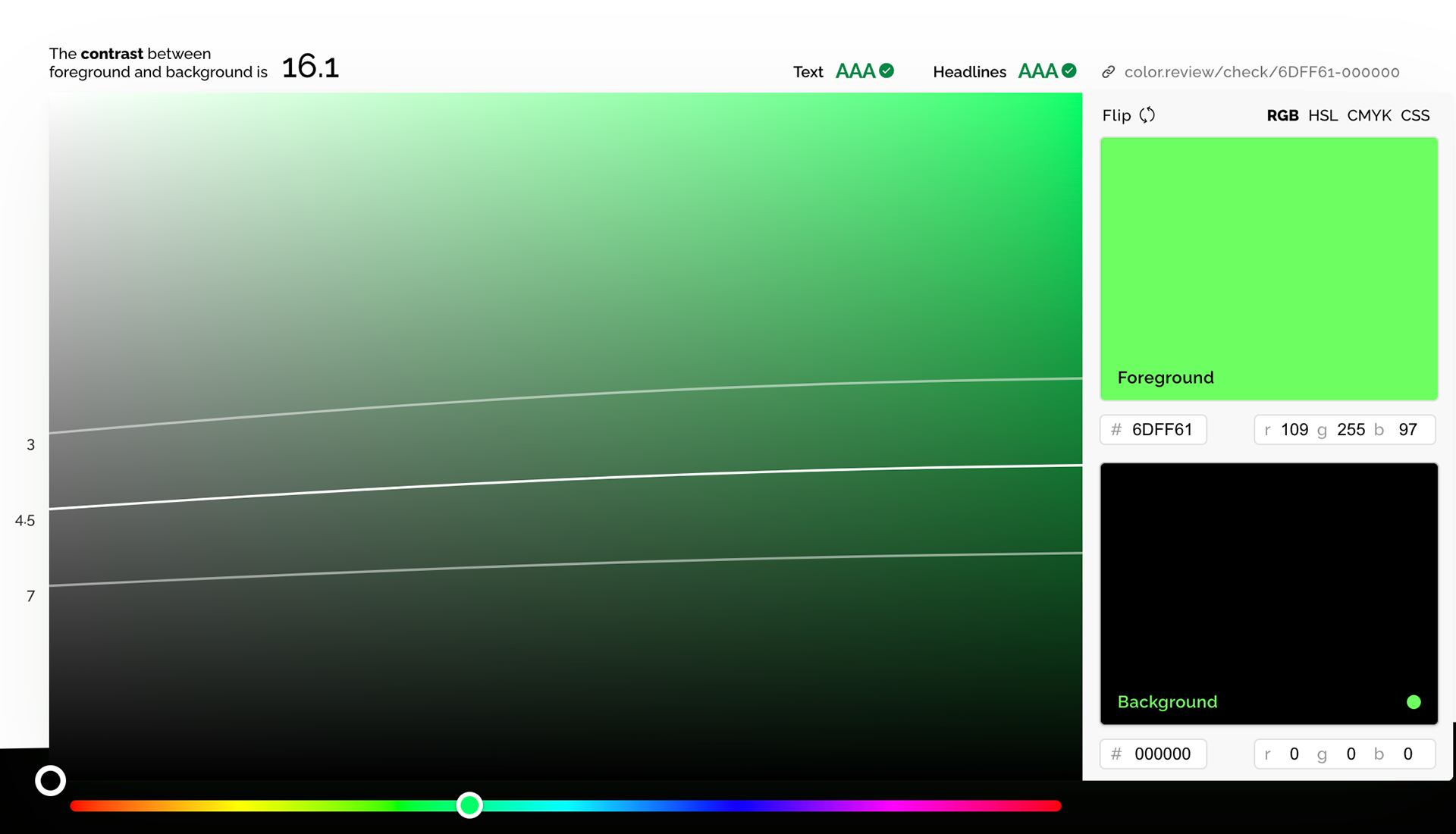

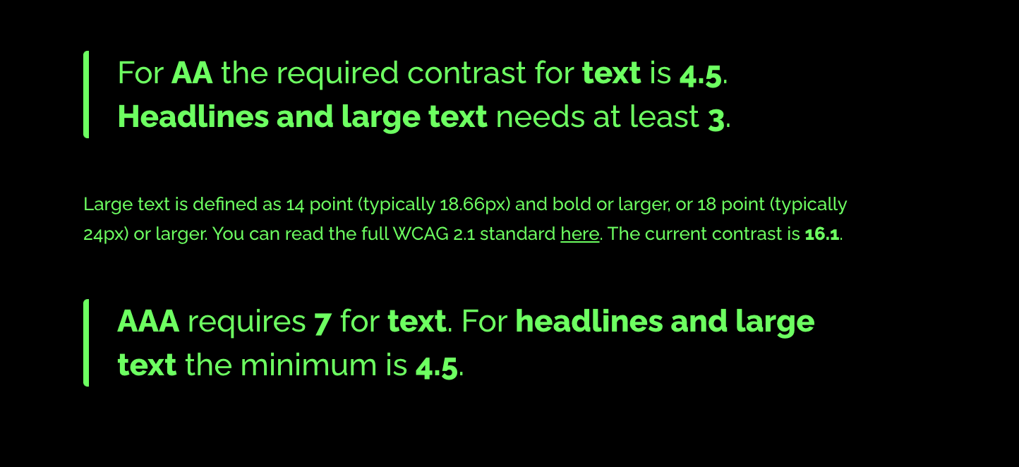
Whilst these are not 100% I used colour review to check if there are contrasting colour issues esp sine these colours I am choosing are quite vibrant. Luckily I am doing well. Black and white have a contrast of 20.6 so i'm good on that front too since most of the text is like that.
https://color.review/
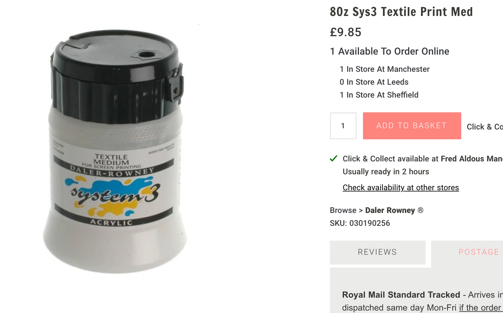
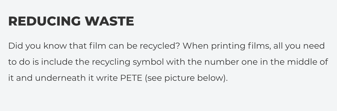
Materials For RISO Prints and Stickers. ETHICAL CONSIDERATIONS.
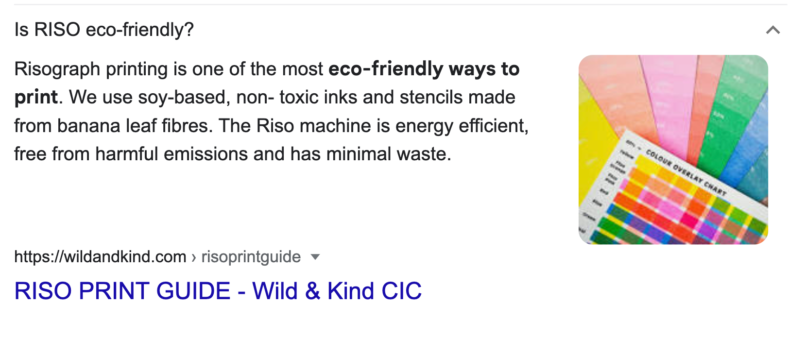
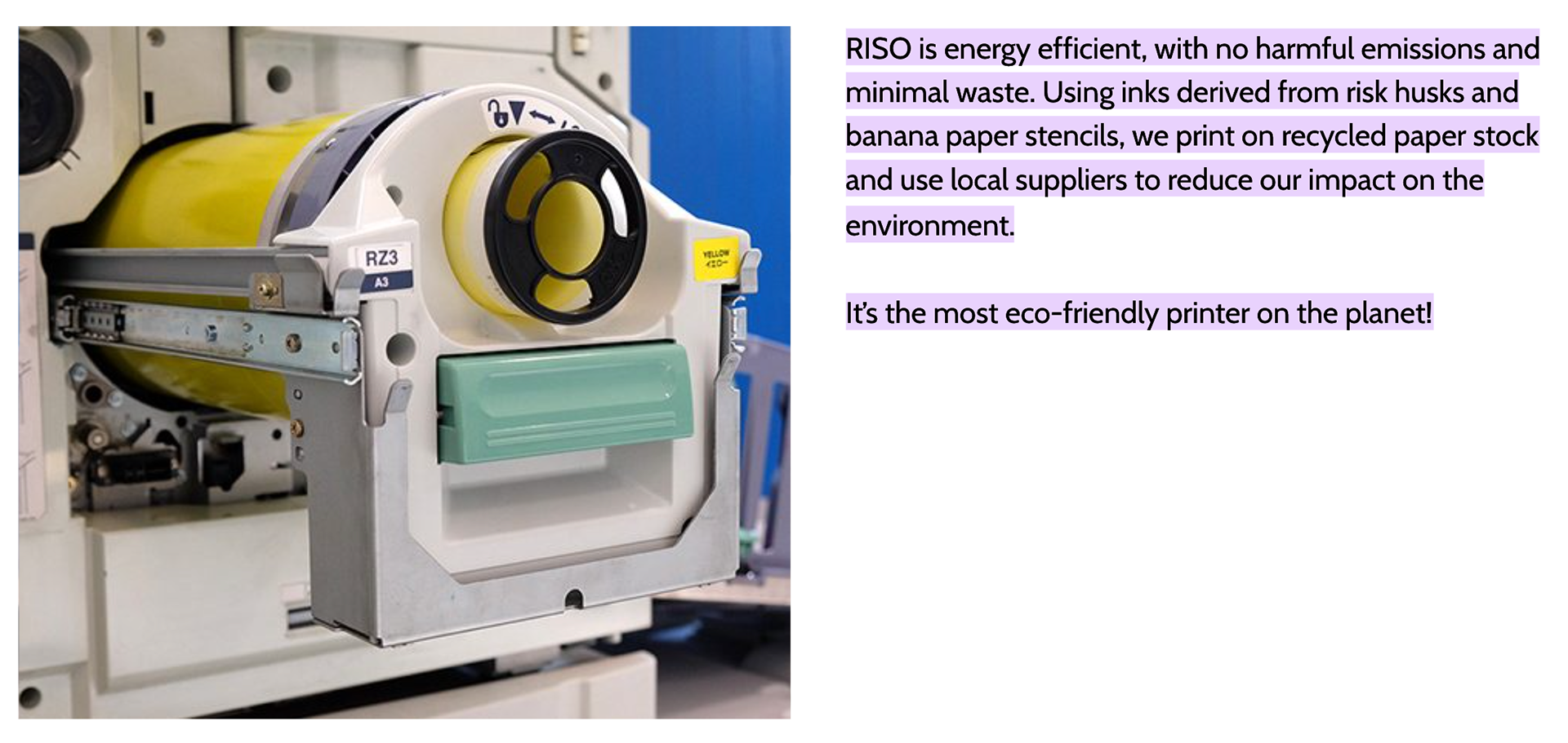
I have chosen RISO for it's vibrancy with colours but also it's sustainability, I want to be as conscious as I can with the assets I am making since the campaign is about environmental defenders. Pictures above show how 'it's the most eco friendly printer on the planet".
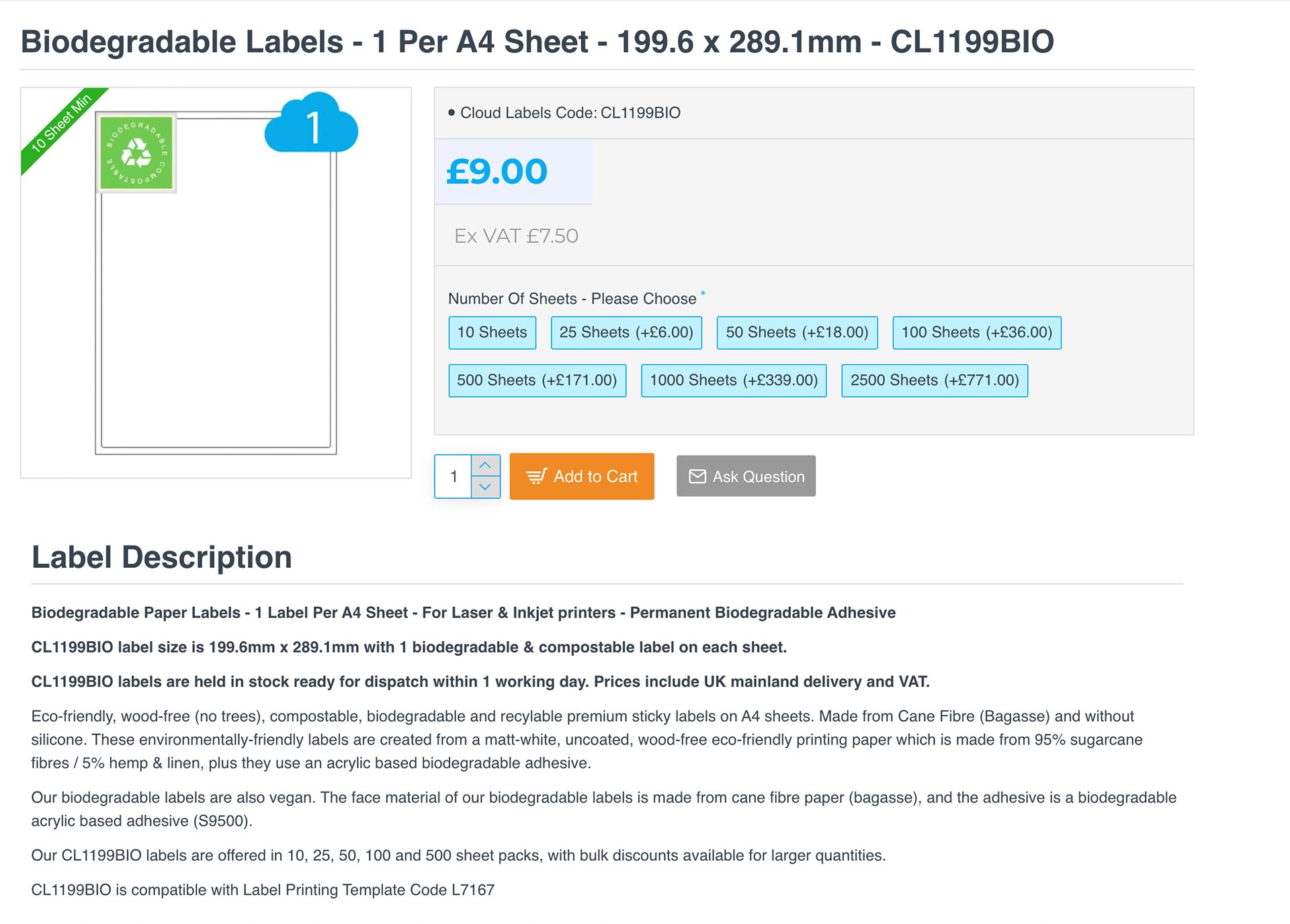
I have sourced biodegradable sticker sheets which don't contain plastic.
I will use 210gsm cartridge paper. (recycled paper is too shiny on the surface)
https://outoftheblueprint.org/riso/#:~:text=RISO%20is%20energy%20efficient%2C%20with,friendly%20printer%20on%20the%20planet!
https://www.google.com/search?q=is+riso+printing+eco+friendly&oq=is+riso+printing+&aqs=chrome.0.0i512j69i57j0i512j0i22i30l2j0i390l2.3311j0j4&sourceid=chrome&ie=UTF-8
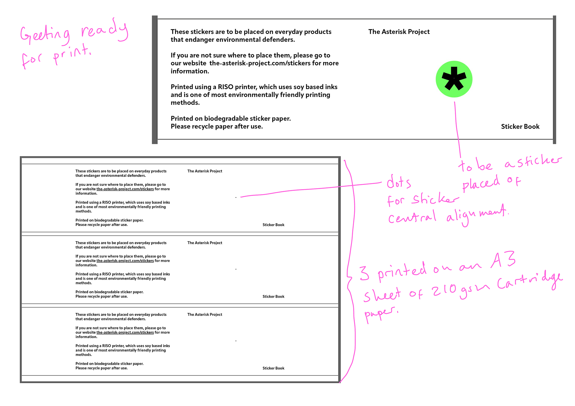
Getting Assets Ready for Riso

This is how I got my designs ready for the RISO printer.
RISO OUTCOME


Talk with Screen Printing Technicians

I want to do the limited edition posters as well as tote bag/t-shirt. I spoke to a technician to get a similar colour i'll get to get my own fabric medium and colours. I'm going to have to play around with trying to colour match.
Screen Print Test


I've made the asterisk design and text bigger as I felt they needed scale up from the previous tests I did, I've made them the same size to help with minimal printing costs. The asterisk on the front and back are the same size which I quite like as a small attention to detail piece.
Ethical Considerations Screen Printing
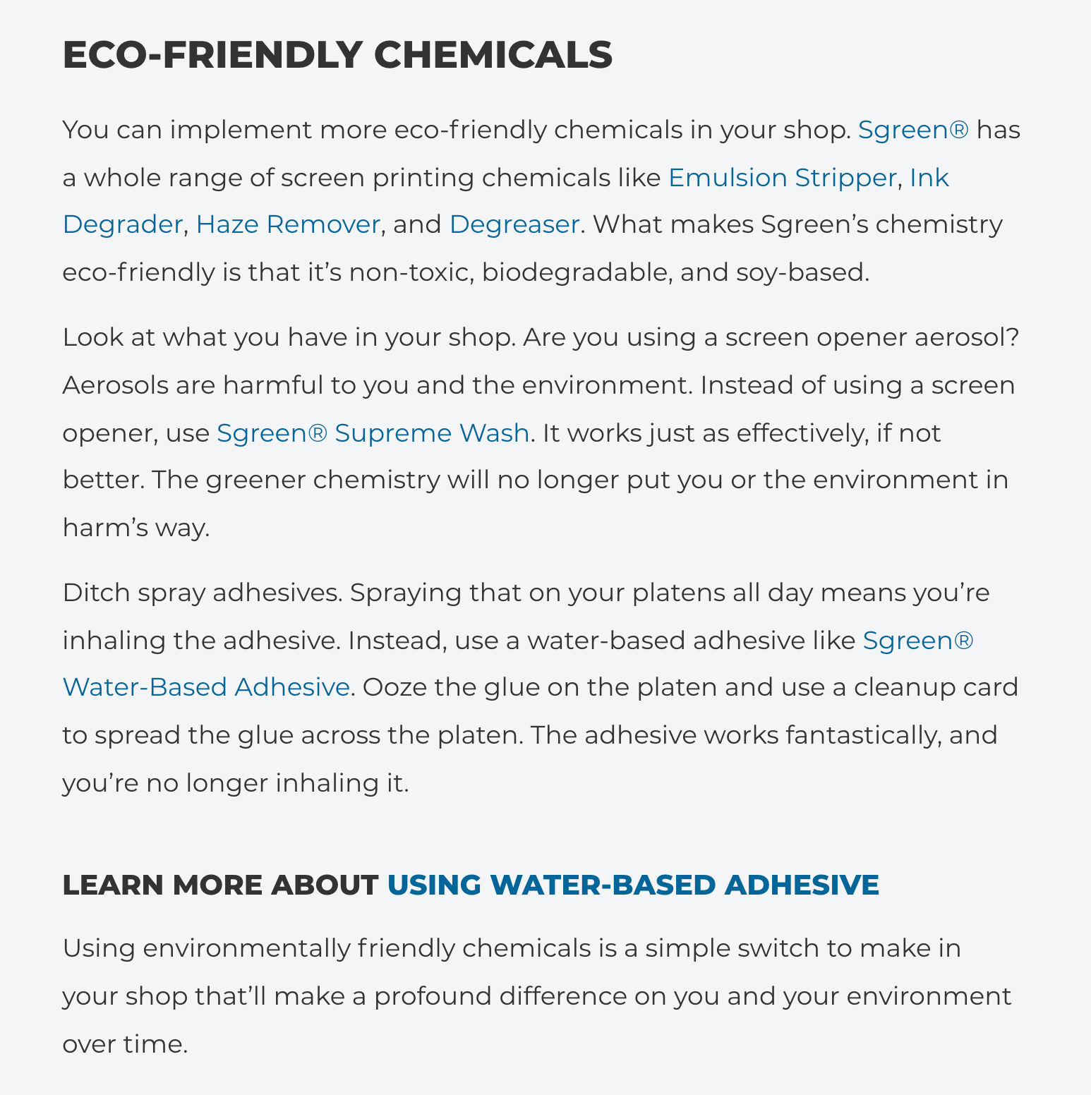

I'm a little wary doing screen printing as traditionally it's quite a toxic form of printing with the chemicals and paints used in the whole process.
I spoke with a technician and we chatted about how water-based inks are now used as they are less harmful than oil based ones, but that making the screens and the chemicals used for them can be harmful to the water system as well respiratory issues being a possibility to those who develop the screen from the chemicals being inhaled. Masks and better safety measures are better than before, but it's still not a solved issue.
There are ways in which you can limit the amount of chemicals a couple of examples are painting the chemicals directly on so you are only using what you need or using vinyl on the screen to block out instead. So not ideal still but could be better, but print quality won't be so high.
At the uni anyway they use toxic chemicals still and they get into waterways. However looking at this blog post from screenprinting.com they talk about eco-friendly chemicals and good ways of reduce waste when it comes to things like misprints. Taking on their advice is how i'd do the screen printing if it were a real campaign. I'd keep it low production anyway.
https://www.screenprinting.com/blogs/news/how-to-do-eco-friendly-screen-printing
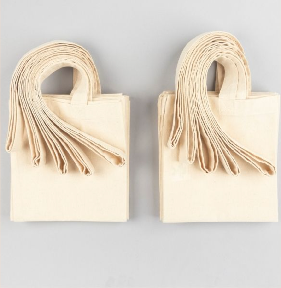
For the tote bags I have gotten organic cotton bags which are responsibility sourced from an ecological and social point of view - still not perfect but it's a step in the right direction. Ideally they would be made from recycled fabric.
For the T-Shirts I am going to use tops from charity shops so it doesn't add to new production of clothes.
For the prints I will use 210 gsm cartridge paper and test on three pieces of recycled paper.
I would only encourage people to buy if they will use these.
Sticker COATING AND Packaging
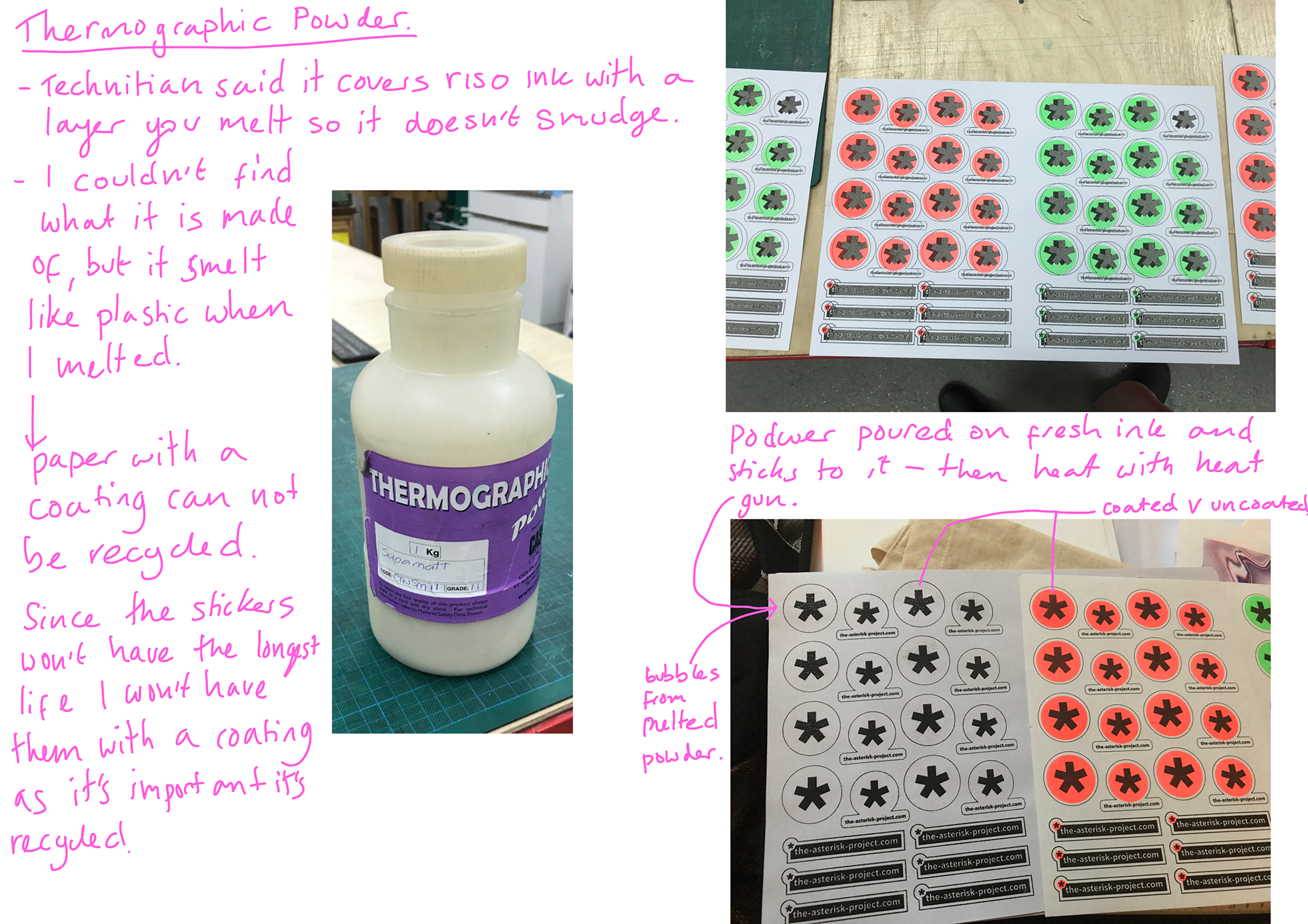
Sticker pack development and potential coating options. I decided against a coating as it likely has plastic and the idea that whilst the stickers may be on the temporary side it that they don't have a negative impact on the environment.
(click on images to see enlarged annotations)
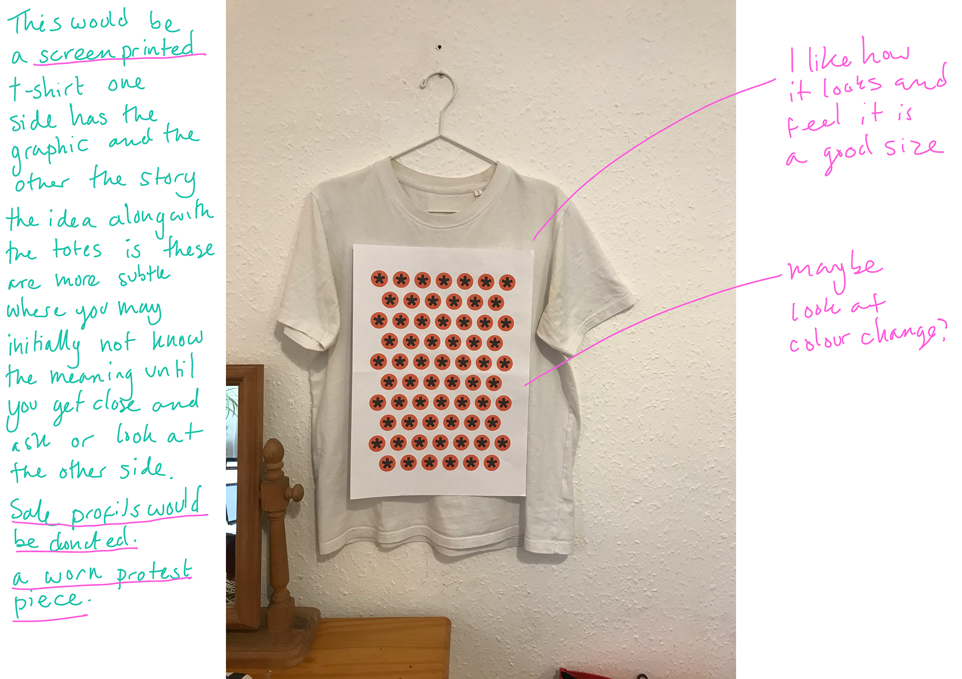
Templates Ready for Screen Printing

These are my final designs for the tote, shirts and prints. I will use the same asterisks for all assets.
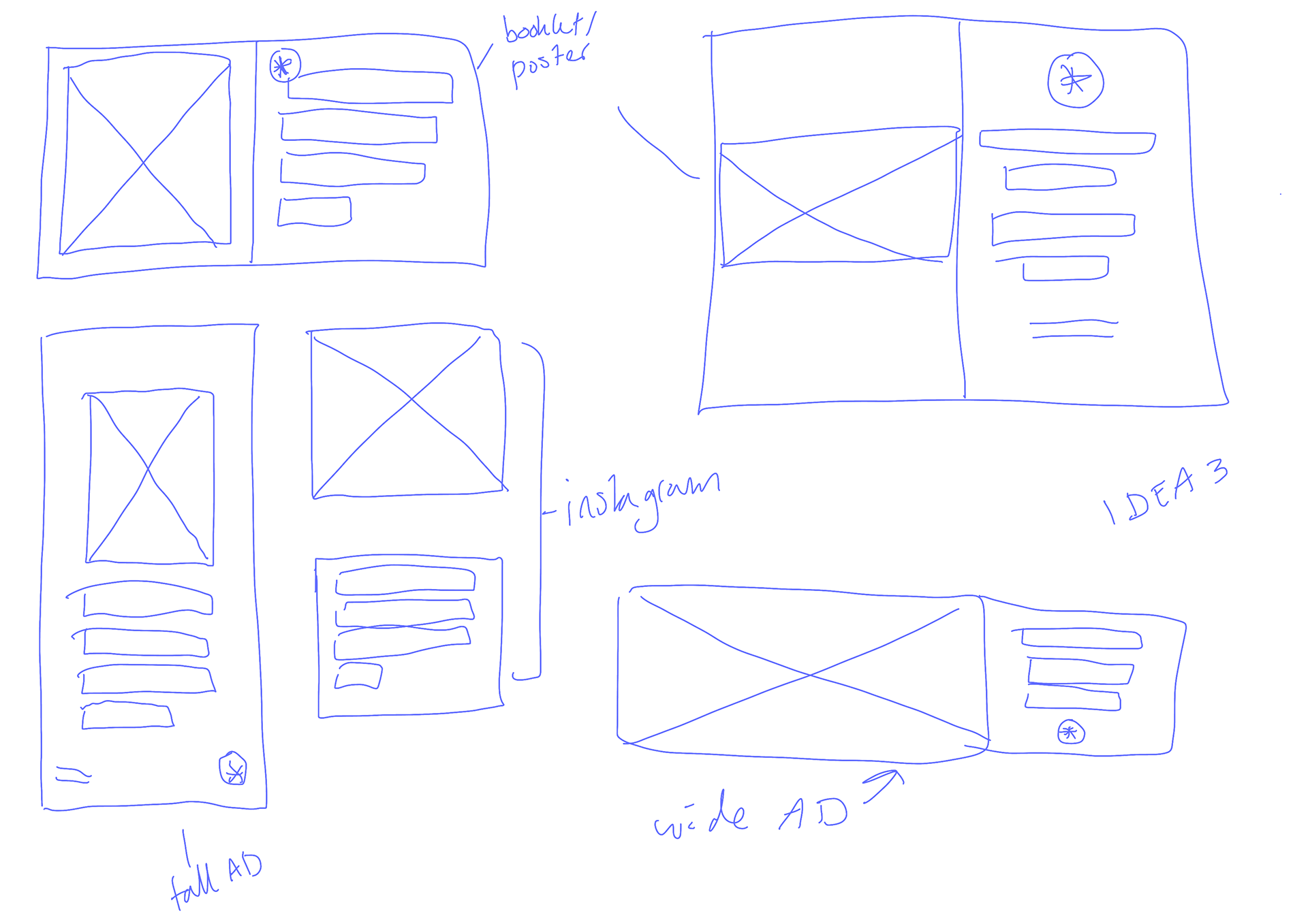
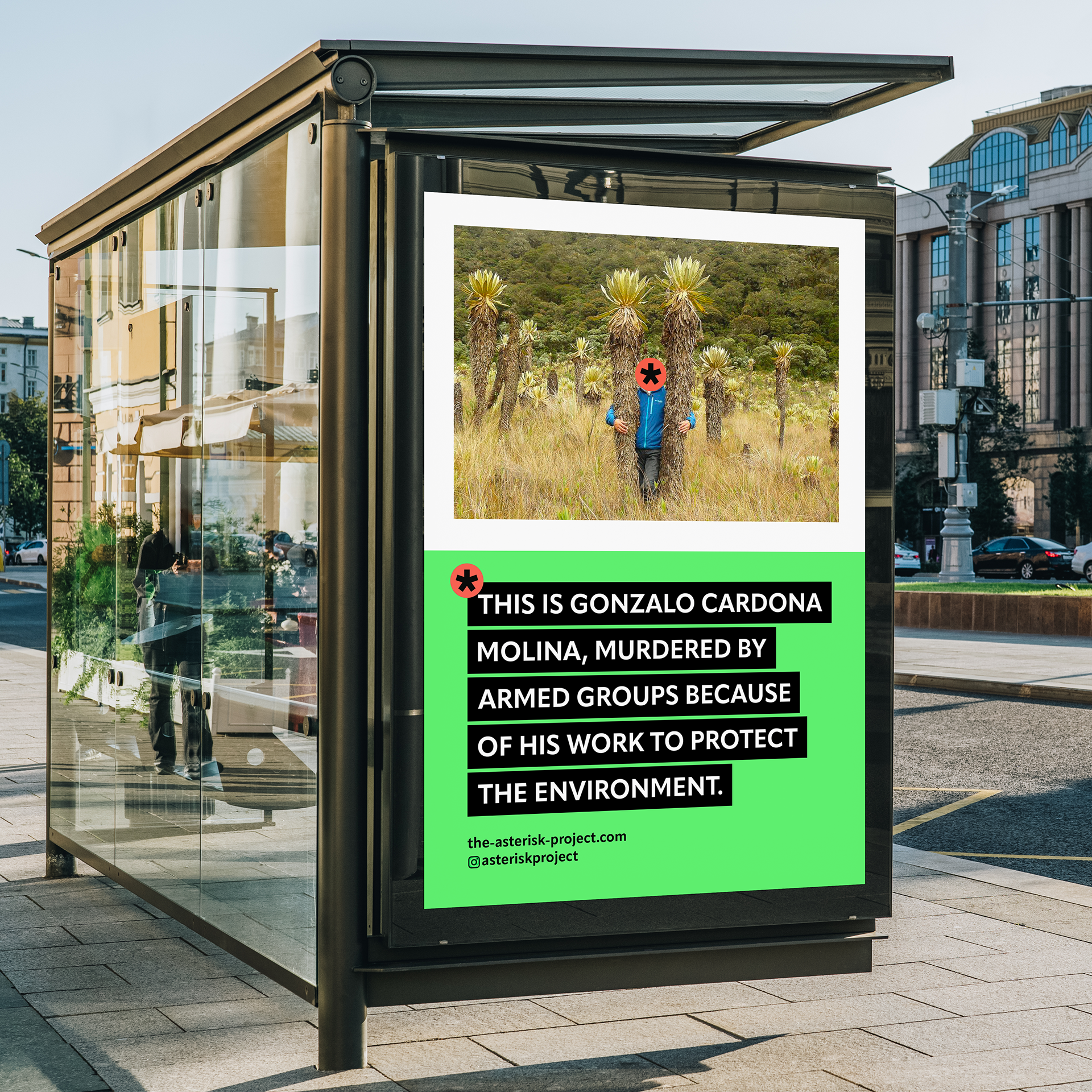
Mock Ups
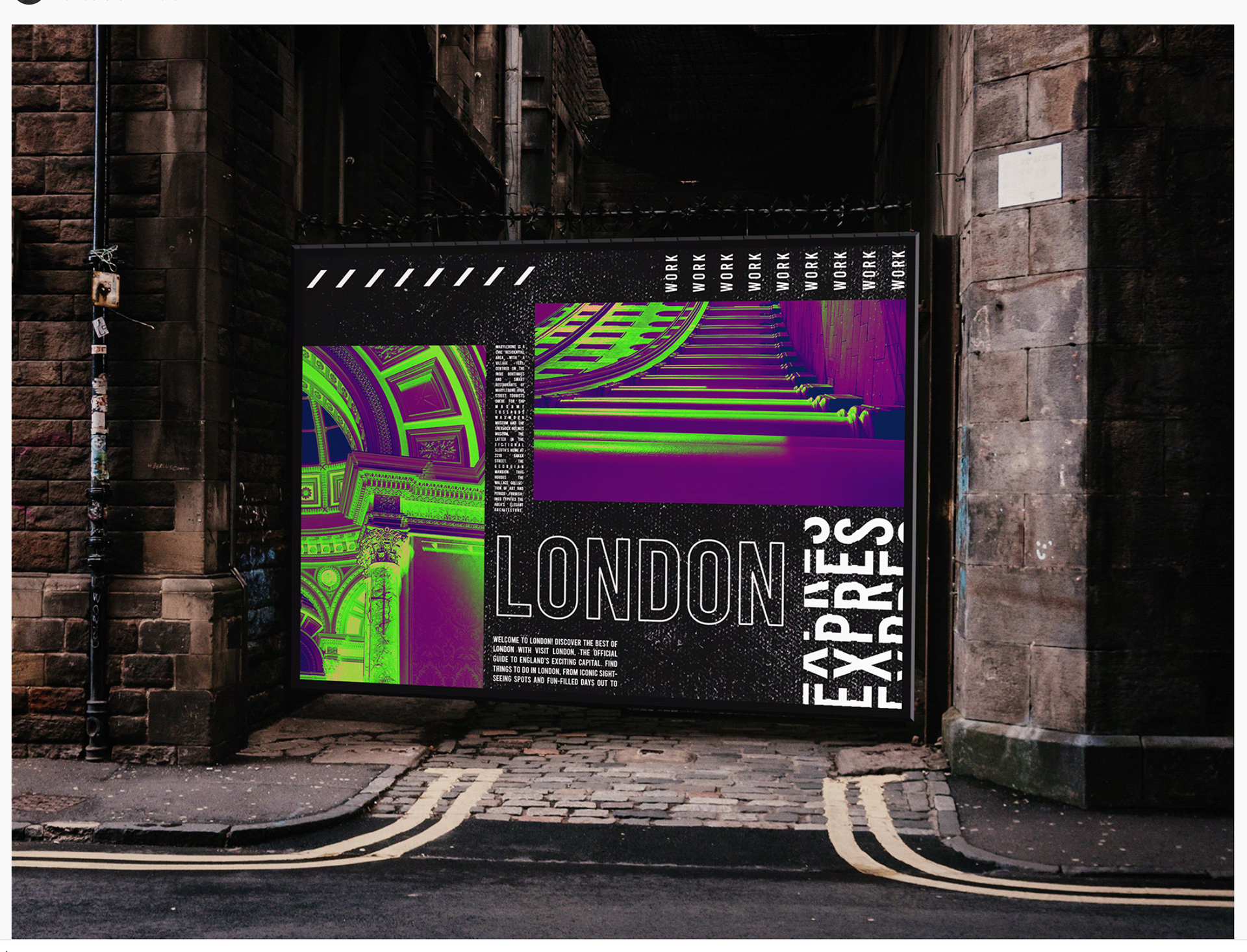
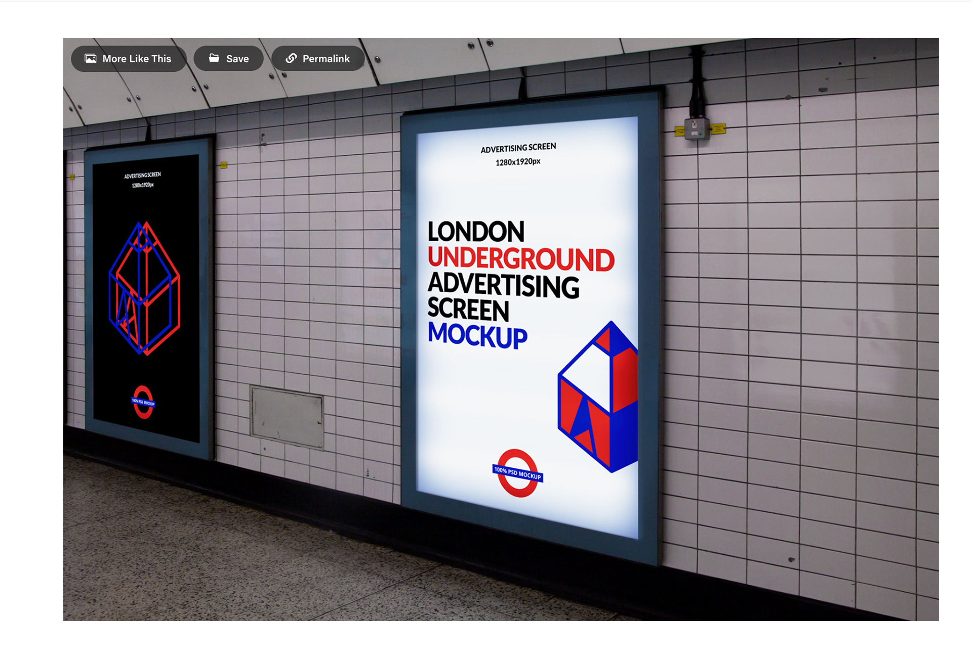
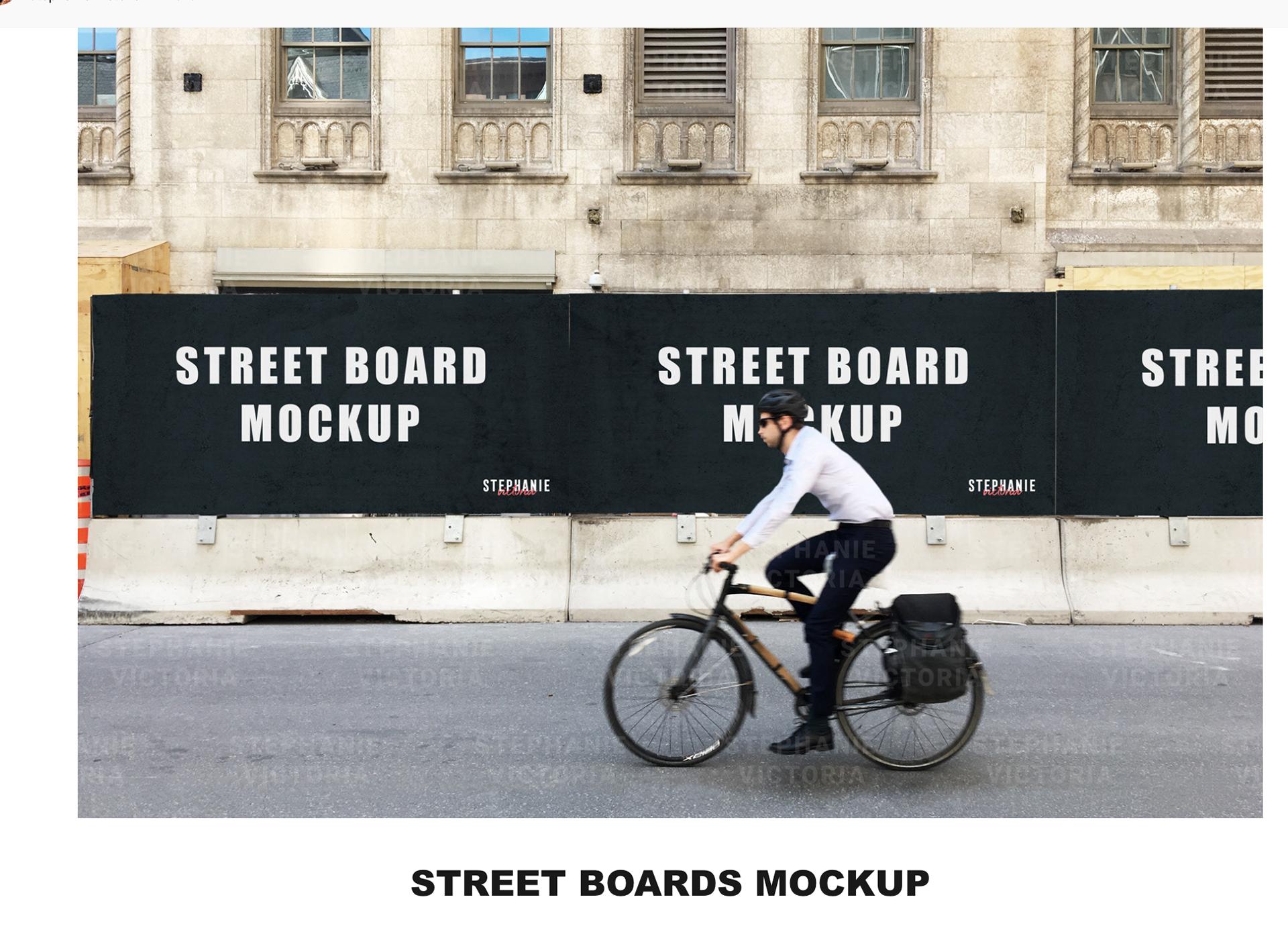

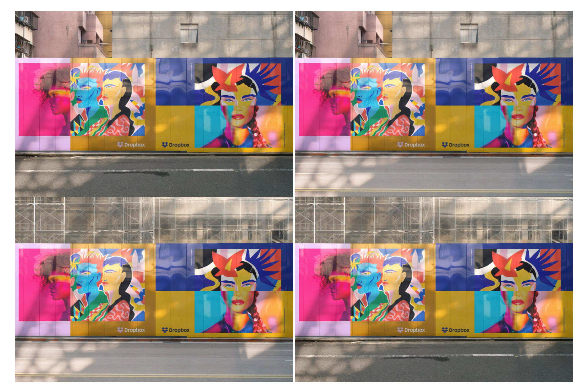
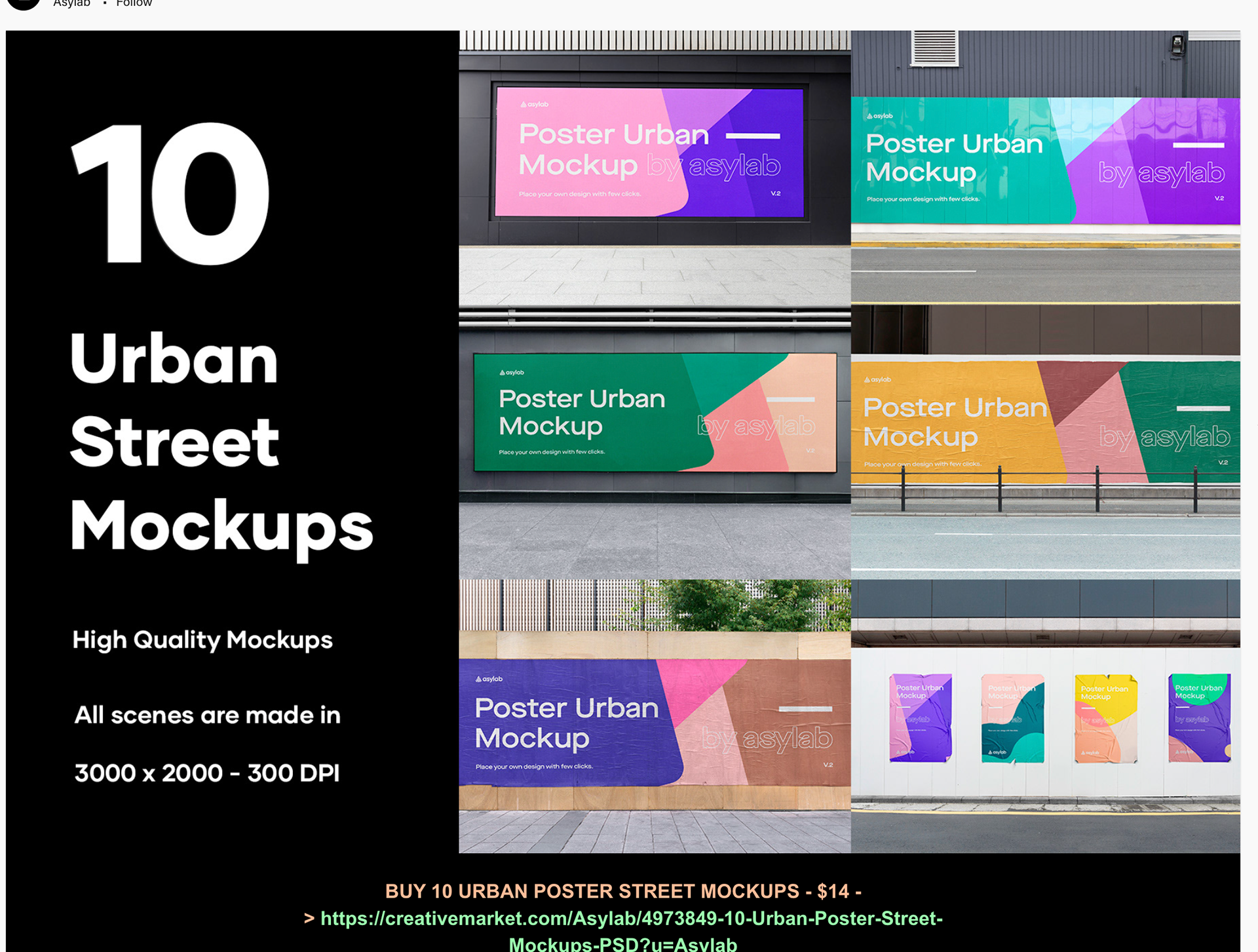
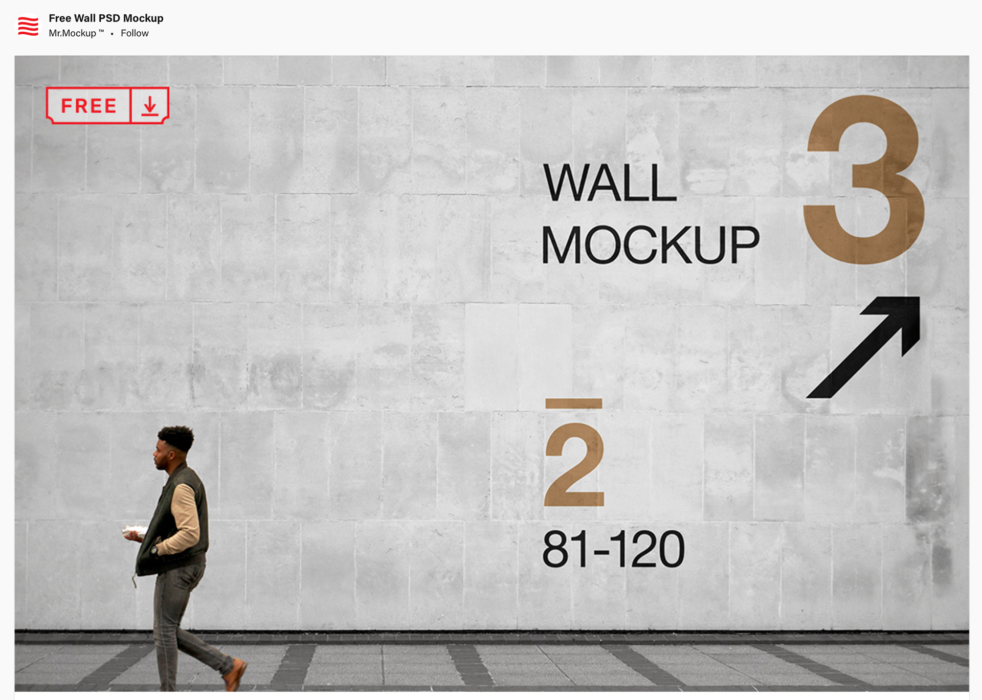
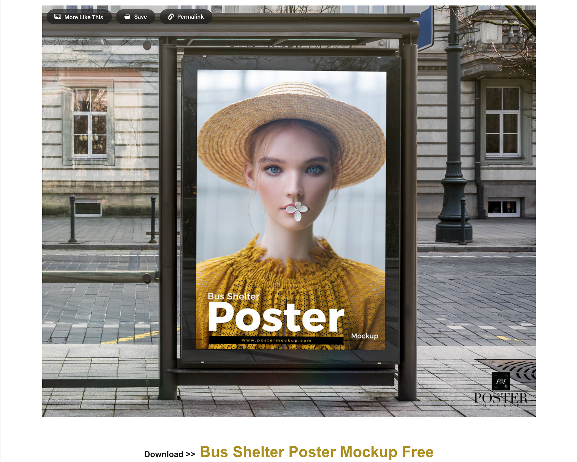
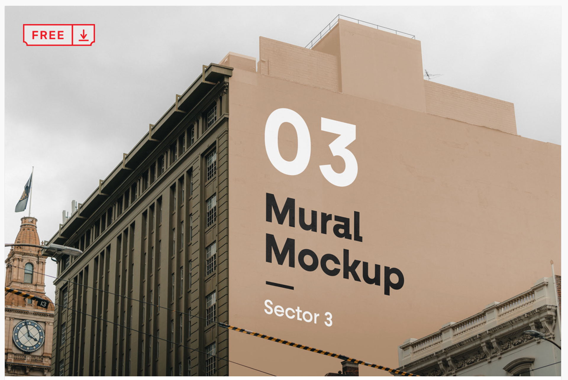
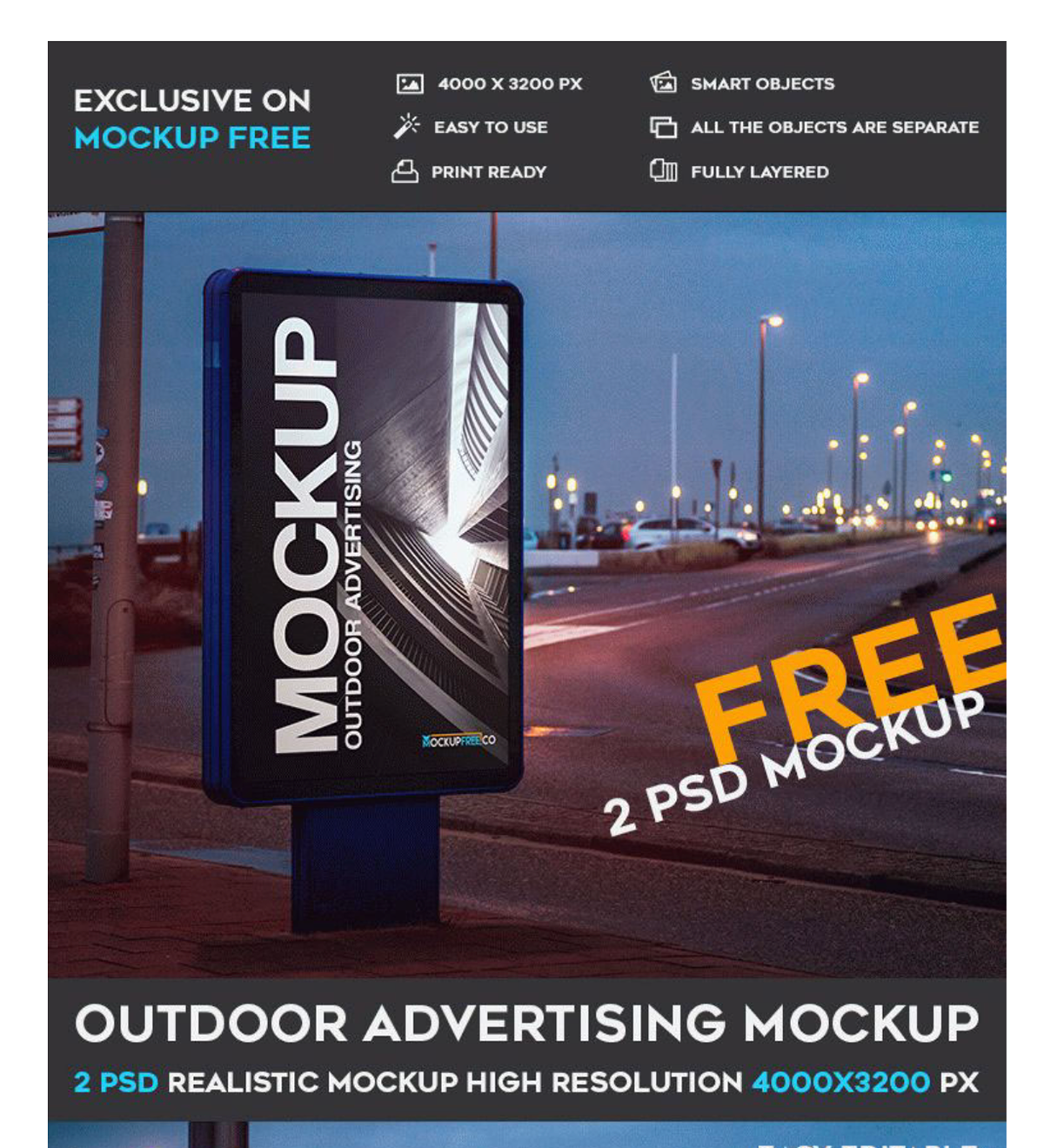
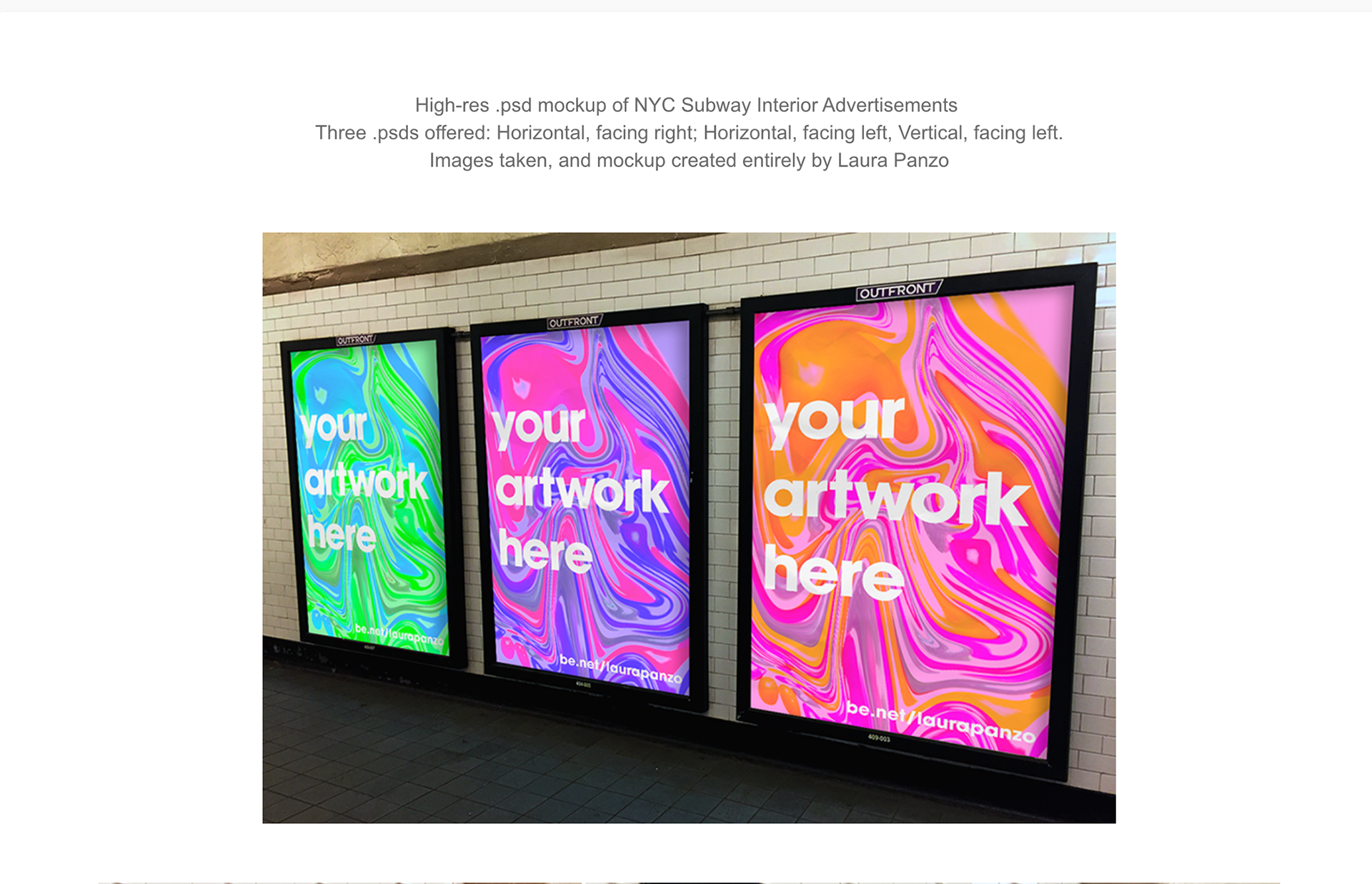
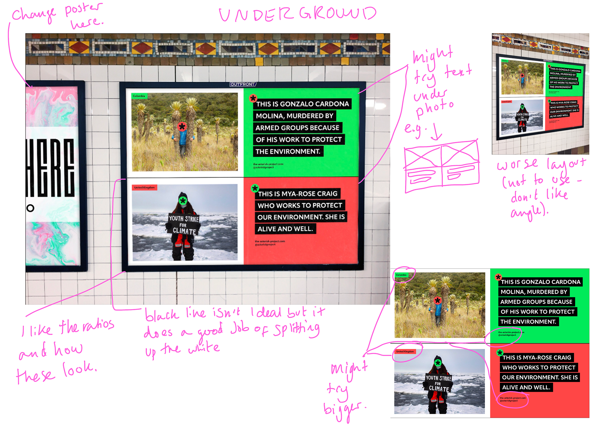
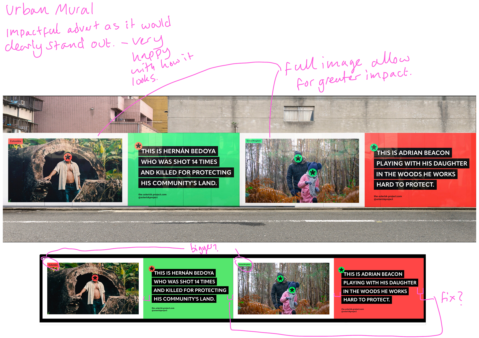
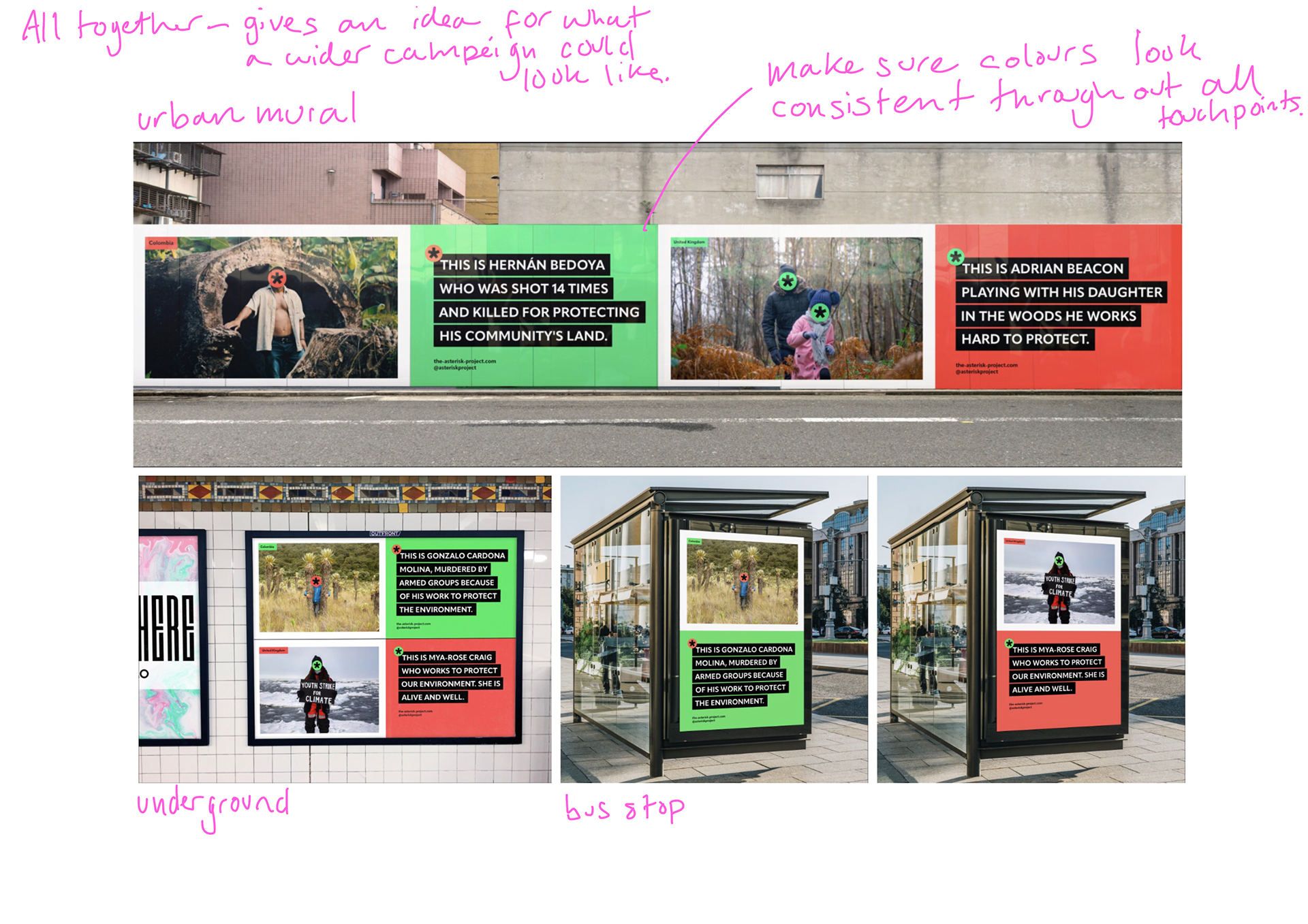
These are some mock ups I've found, I think i'll pick around three. One portrait (likely bus stop), one long landscape (mural/wall type thing) and a mid range landscape (billboard/wide advert).
I'm going to play around and see what fits best.
Resizing Posters For Mock ups
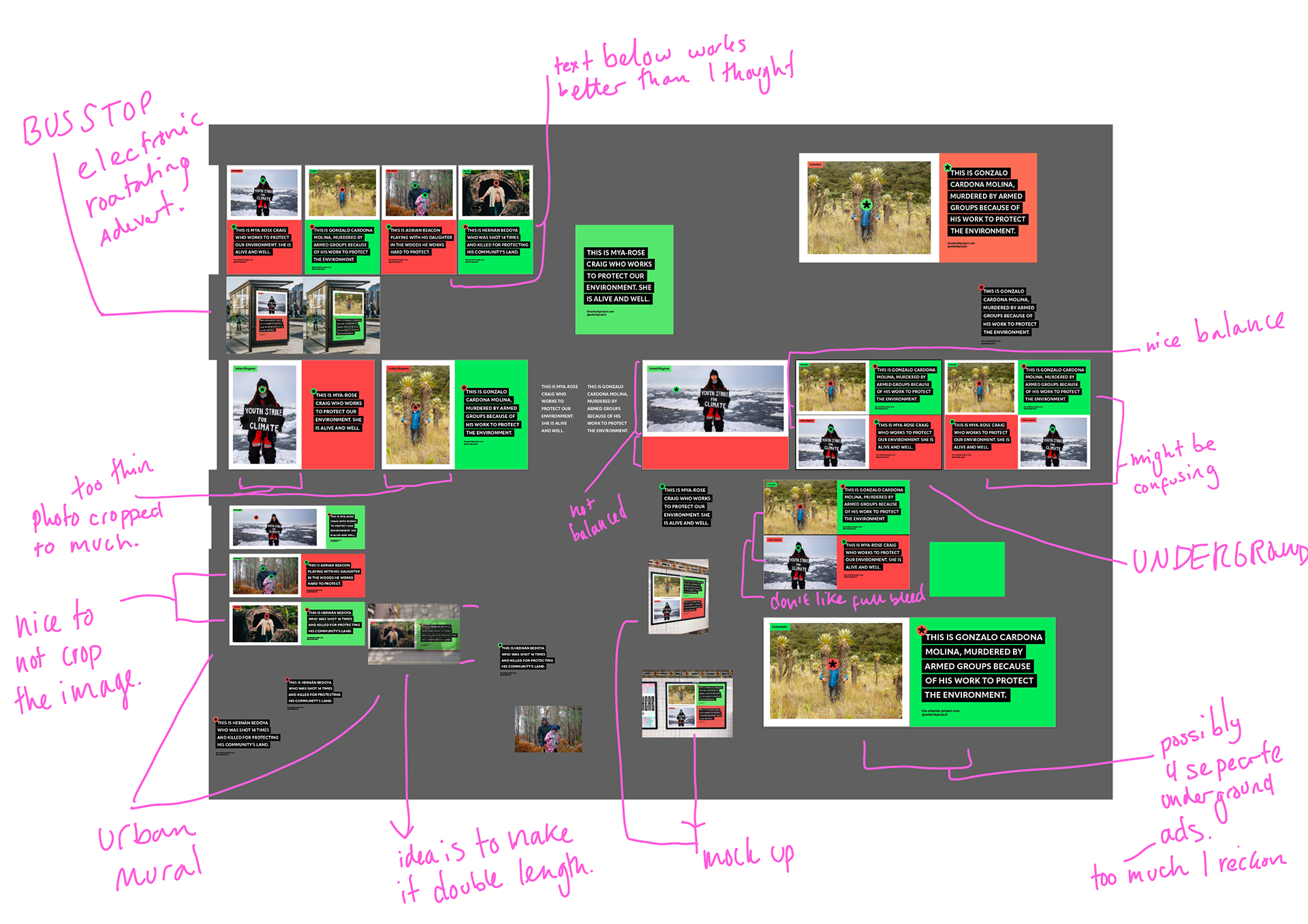
Chosen Mock Ups and Tweaks Needed
Website Development
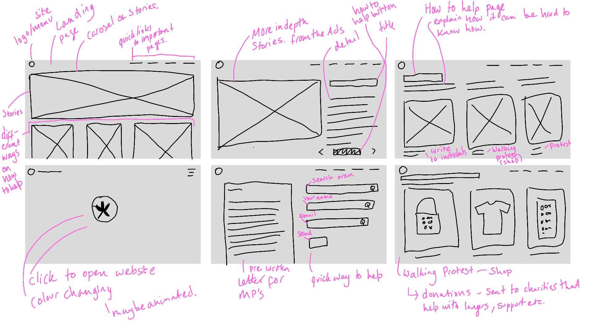
I want the website to be fairly simple and stripped back, I want it to be clear and easy to manoeuvre for each individual who goes there. It's important to note that the start page needs to grab enough attention to make people want to stay especially if they've put the website in the search box on a wim.
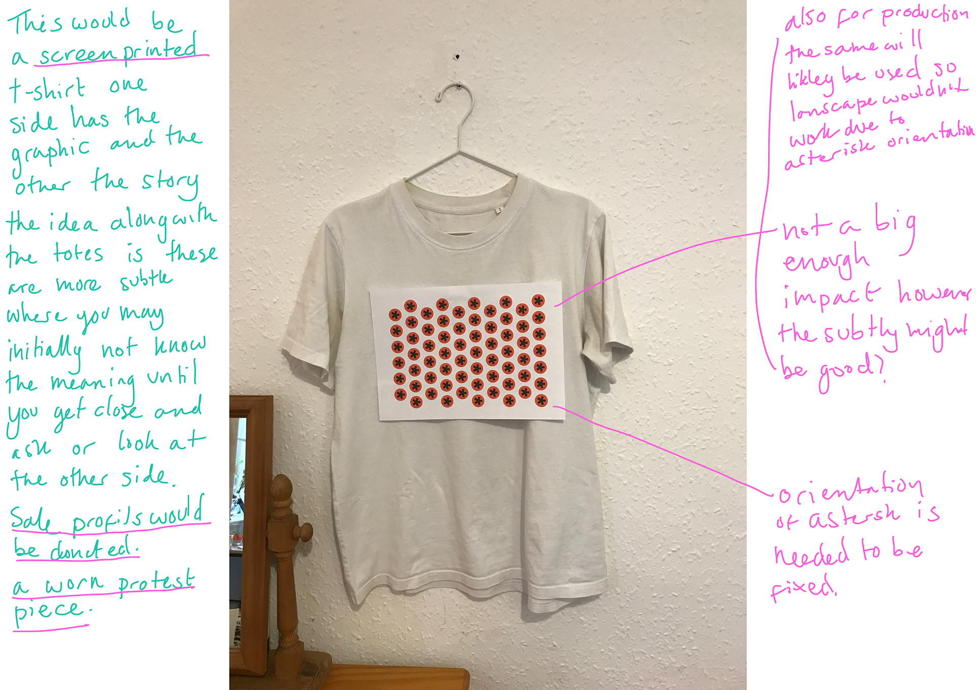
Screen Printing Process


Whilst I've done paper screen printing before I'd never done fabric pieces before, whilst very similar you have to wash the screen each time (in the access I have anyway), this meant it took a while to print but I luckily doubled up on screens after talking with a technician. I also did practise samples as well as making a couple mistakes with two A3 prints, but it's nothing compared to the last time I did screen printing.
I'm very happy with the results and feel these look like quality pieces.
Staging Stickers
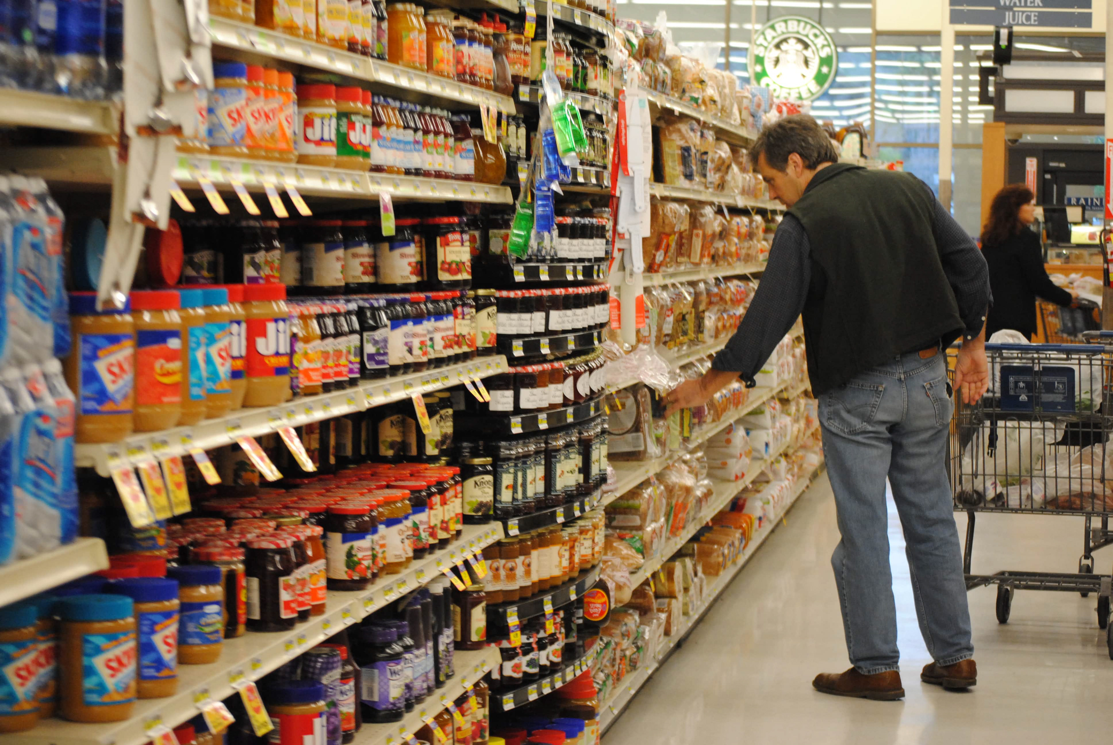
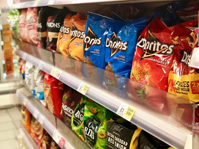

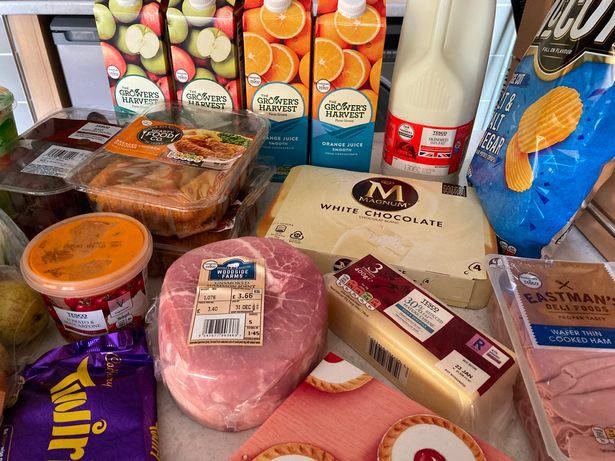
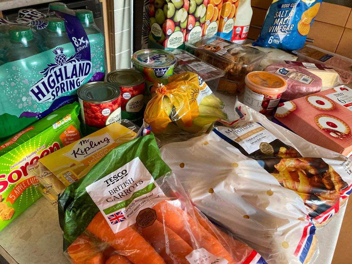
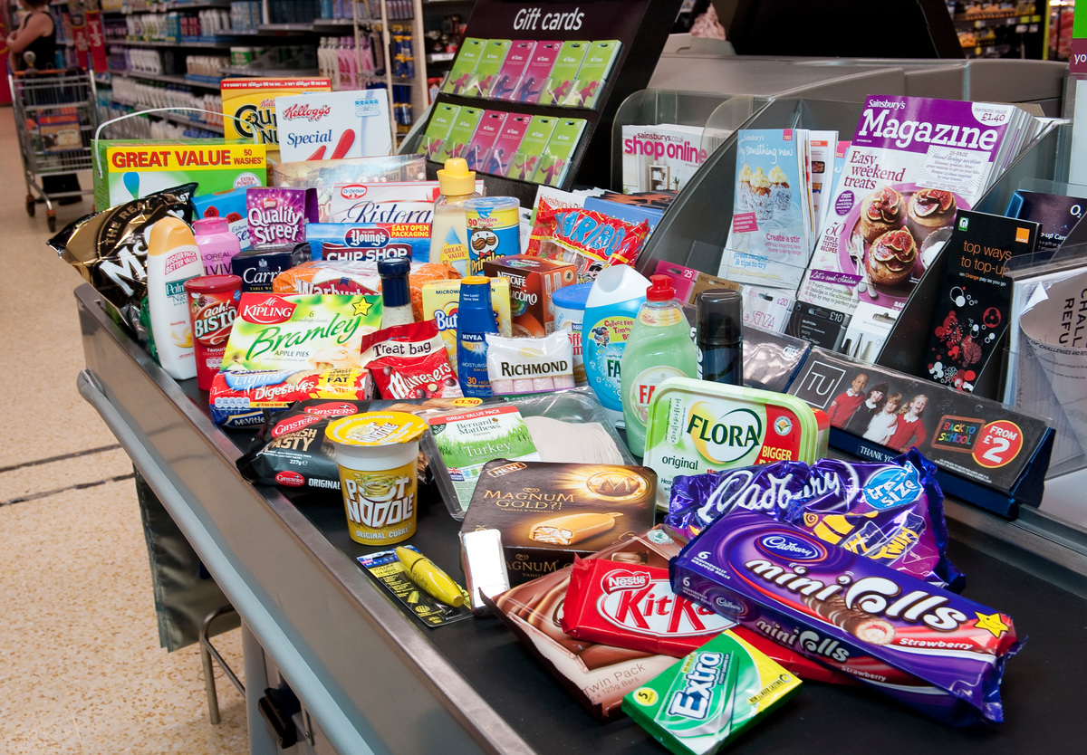
For the stickers I plan to do mocks ups similar to the image/video above I edited.
Photo examples I may use under the subheader.
However when I photograph the other photographs I plan to stage some products with the stickers.
photo from: https://www.edinburghlive.co.uk/best-in-edinburgh/shopping/lidl-aldi-tesco-asda-waitrose-18786289
Colour Matching
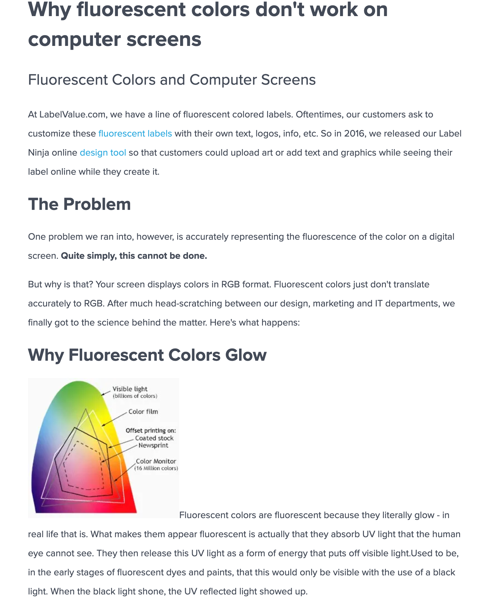
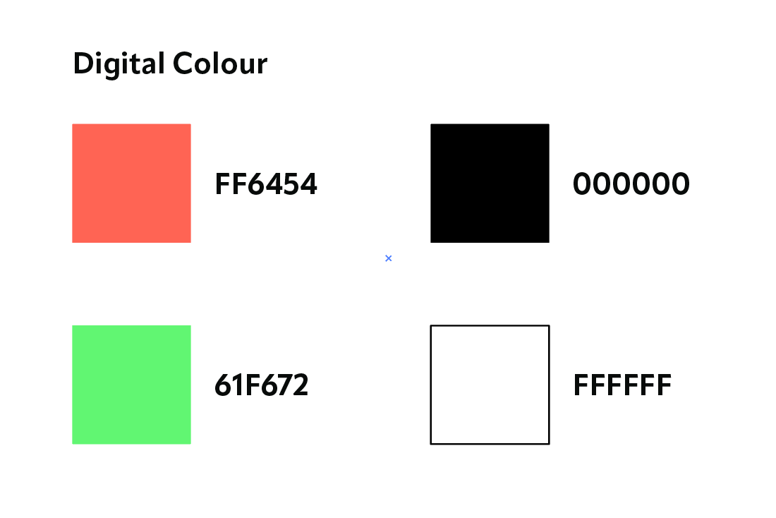
Whilst RGB allows for some vibrant colours (larger scale than CMYK), it's not as broad as certain inks and paints. I've been having troubles colour matching, but a snippet from this website explains why. I'm fine however with some of the printed products (totes, tops, RISO/screen prints) being more vibrant than the digital ads and website/socials will be.
These are the colours I've chosen as I feel they are the closest to the prints and also go well together.
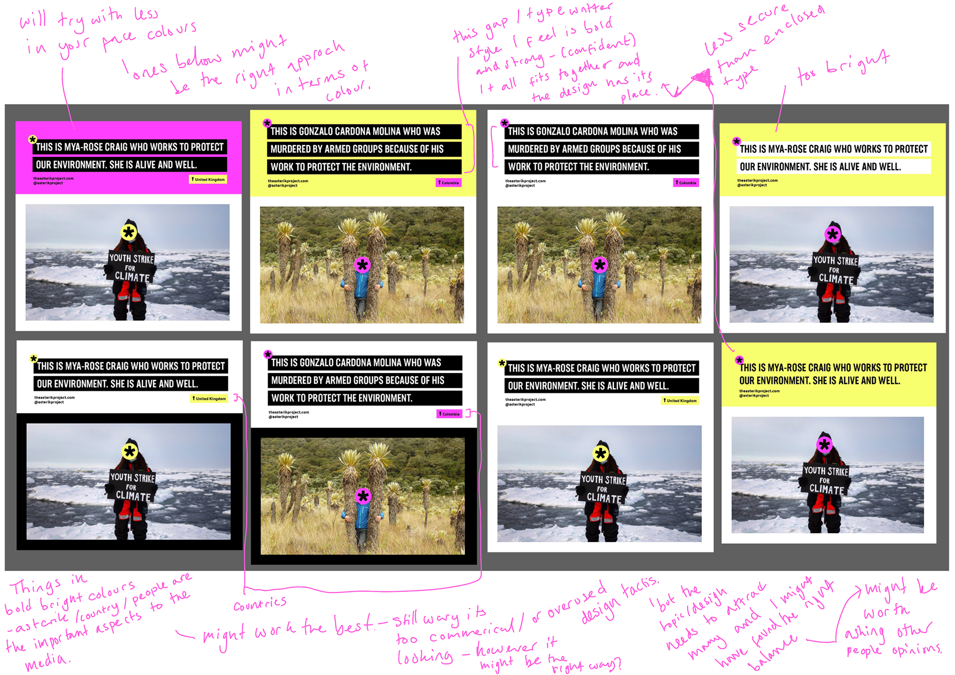
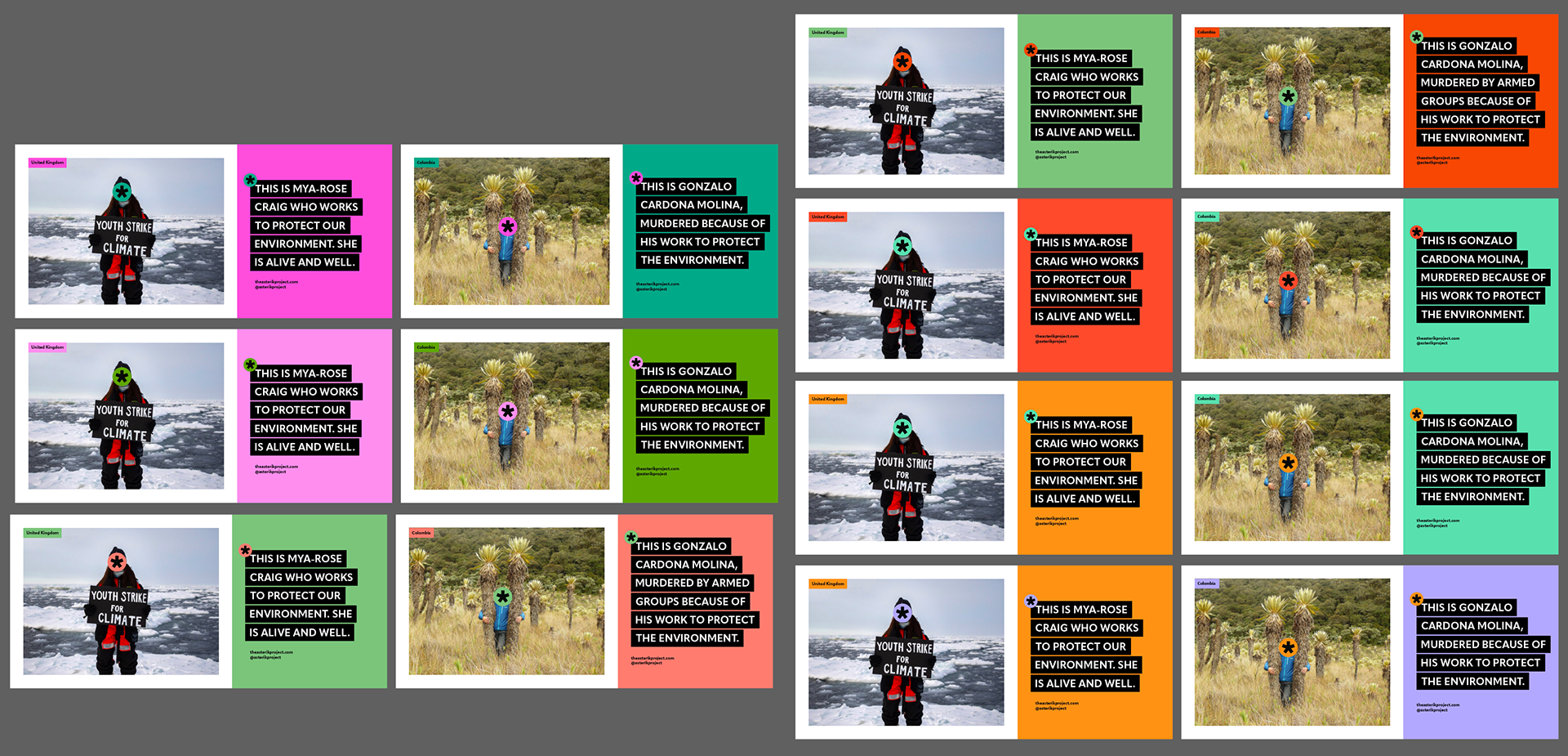
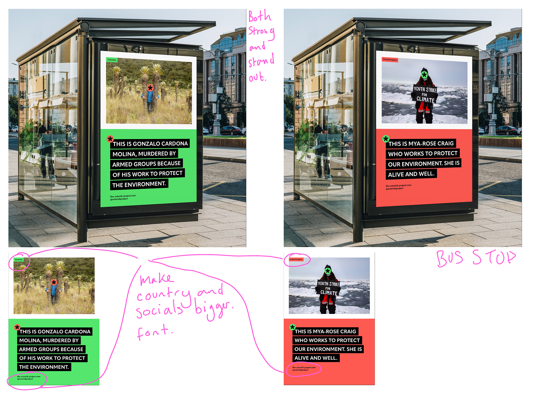
Final Mocks Ups of Traditional Ads

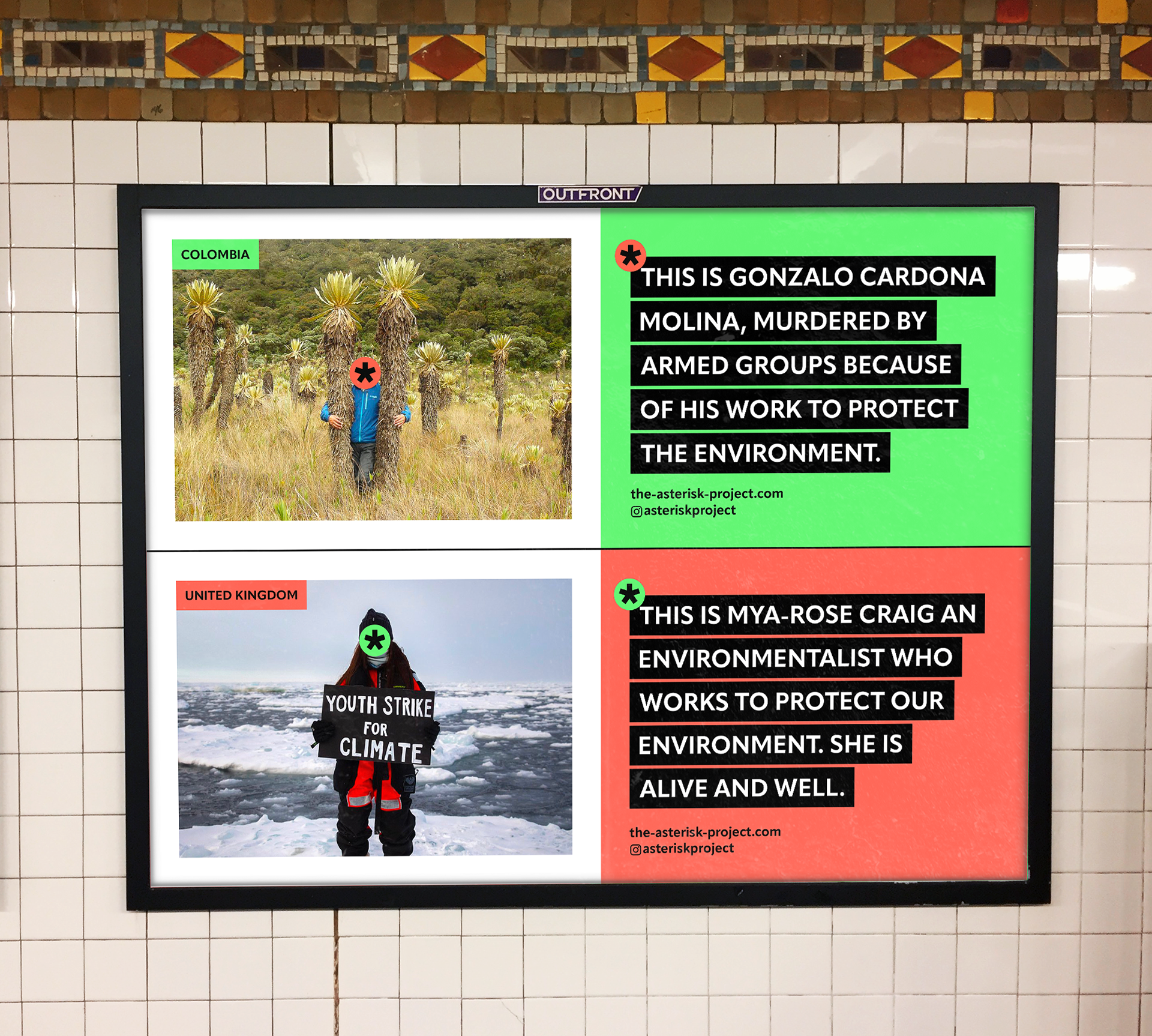
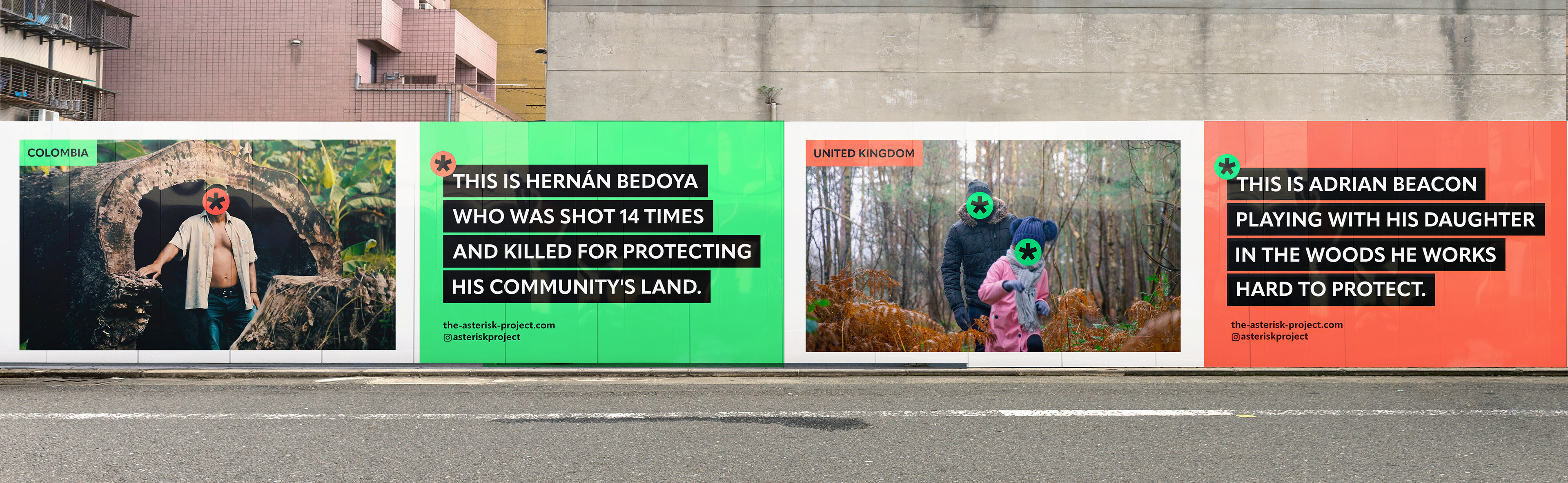
These are my final outcomes, I made changes to:
the countries: capital letters and larger font
layout: centre spaces the same on each side
colour correction and instagram logo
copy: lengthened Myas copy to fit the others.
Photoshoot prep


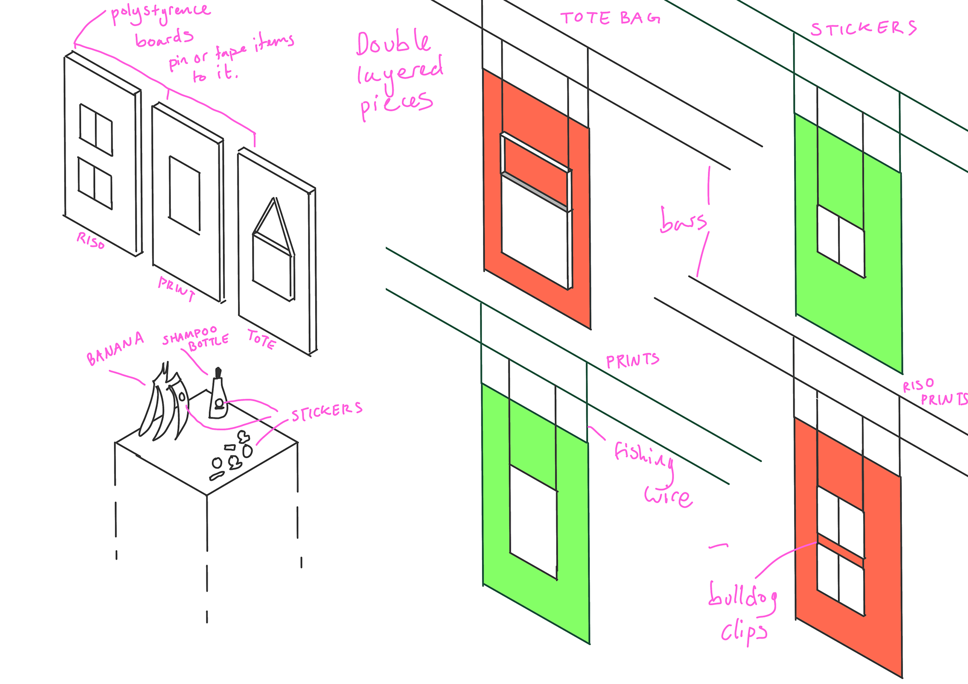
These are some prep items for the photo shoot. I wanted to possibly experiment with some coloured backgrounds as well and getting tools to help me hang things like bulldog clips and fishing wire.
I went and chatted with a technician to see what set up items I will have, they have bars that can be set up to hang things from, polystyrene boards to stick posters to and plinths for if I want to take pictures on products. It was good to check in before my session so I know what I am working with ahead of time and can plan accordingly.
I've also done a quick sketch of how I envision to plan out and take my pictures.
Photoshoot Images