SCROLL TO BOTTOM - SOME IMAGES HAVE ANNOTATIONS (HOVER OVER TO CHECK)
I found that when I tried to add animations on top it didn't work as my scroll speed on the screen recording wasn't consistent. My initial plan was to add animations in adobe xd but I found out towards the end they they don't support this unfortunately. I've tried to add in some animations but it is why the final video isn't to the standard I would have hoped.
Once i'd completed the design of the website I put it all in to Adobe Xd to add all the transitions and links between pages. What I have then done is screen recorded and will then import into after effects where I will add in some animations on top to give the idea of a functioning website.

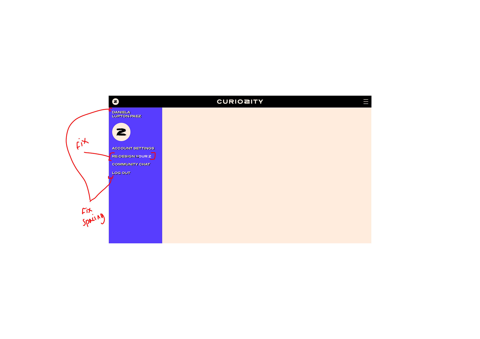
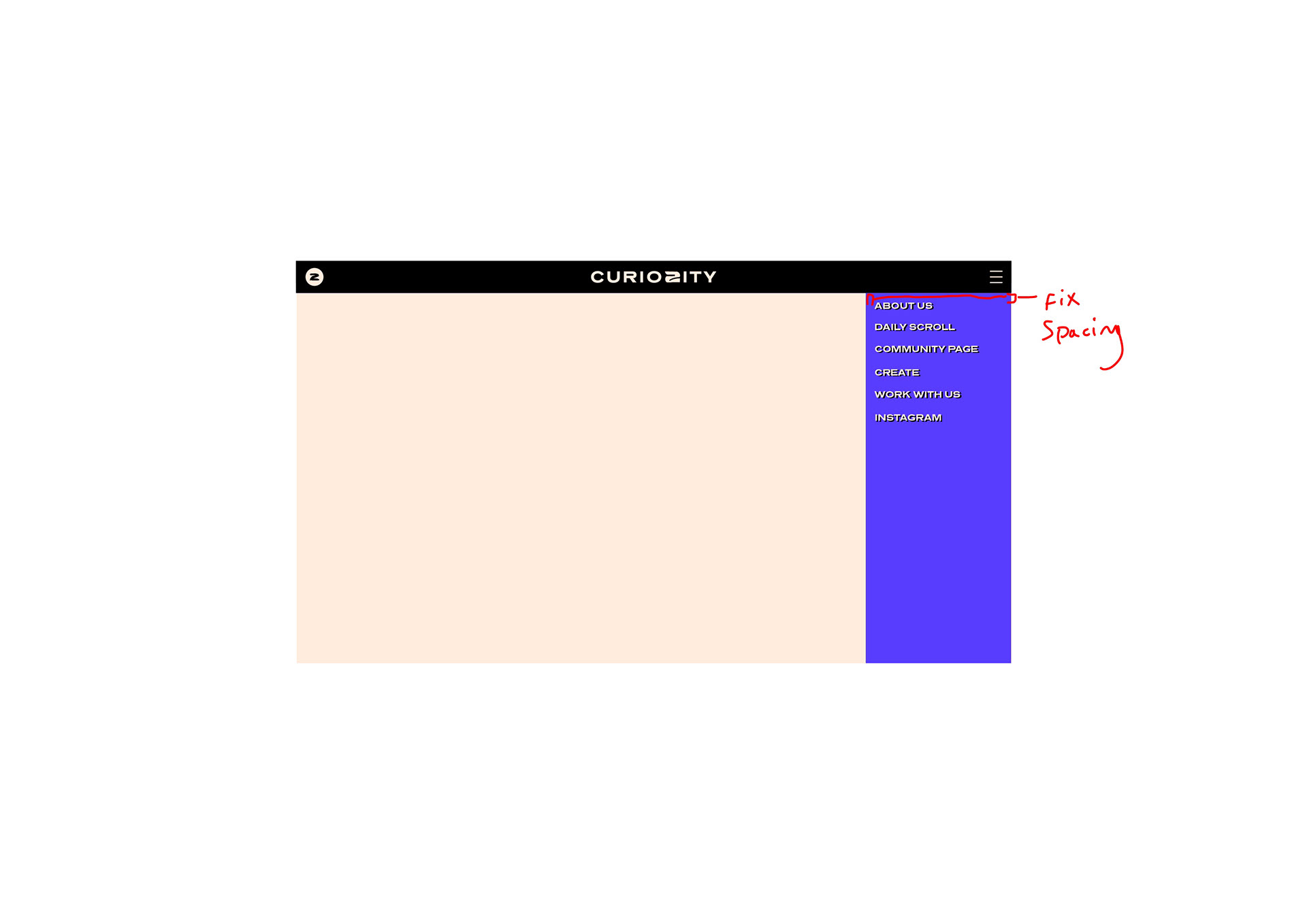

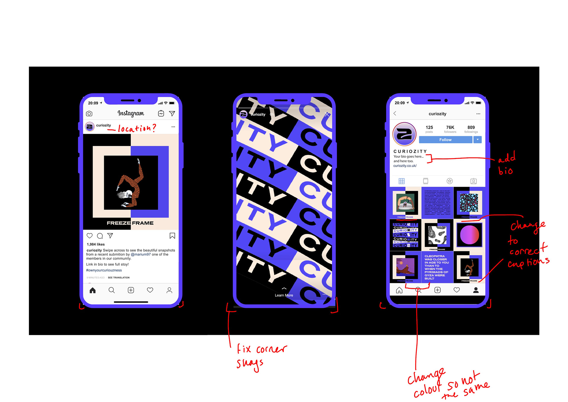
Final snag list of edits to be made before piecing together my portfolio.

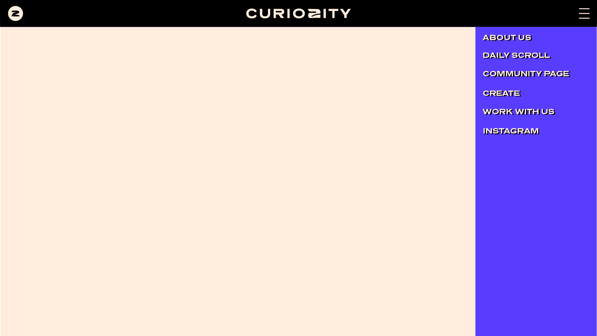
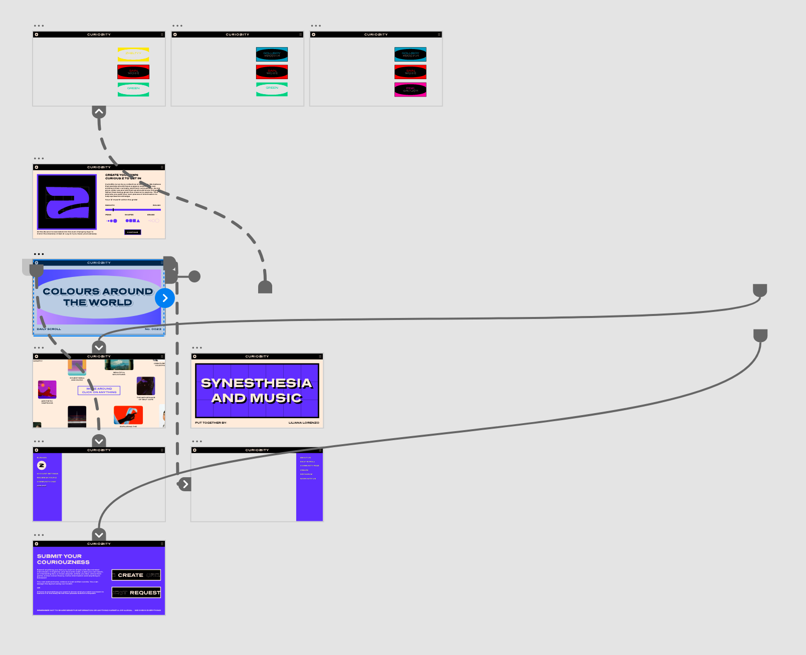
I thought I would add in some extra pages where you can get an idea for what the create page is like and how it works as well as demonstration that the links from the community pages go to a similar style of the daily scroll. And finally a menu and account tab to show the community aspects as well as other bits.
I used some discard designs and similar style to what I had already been doing.
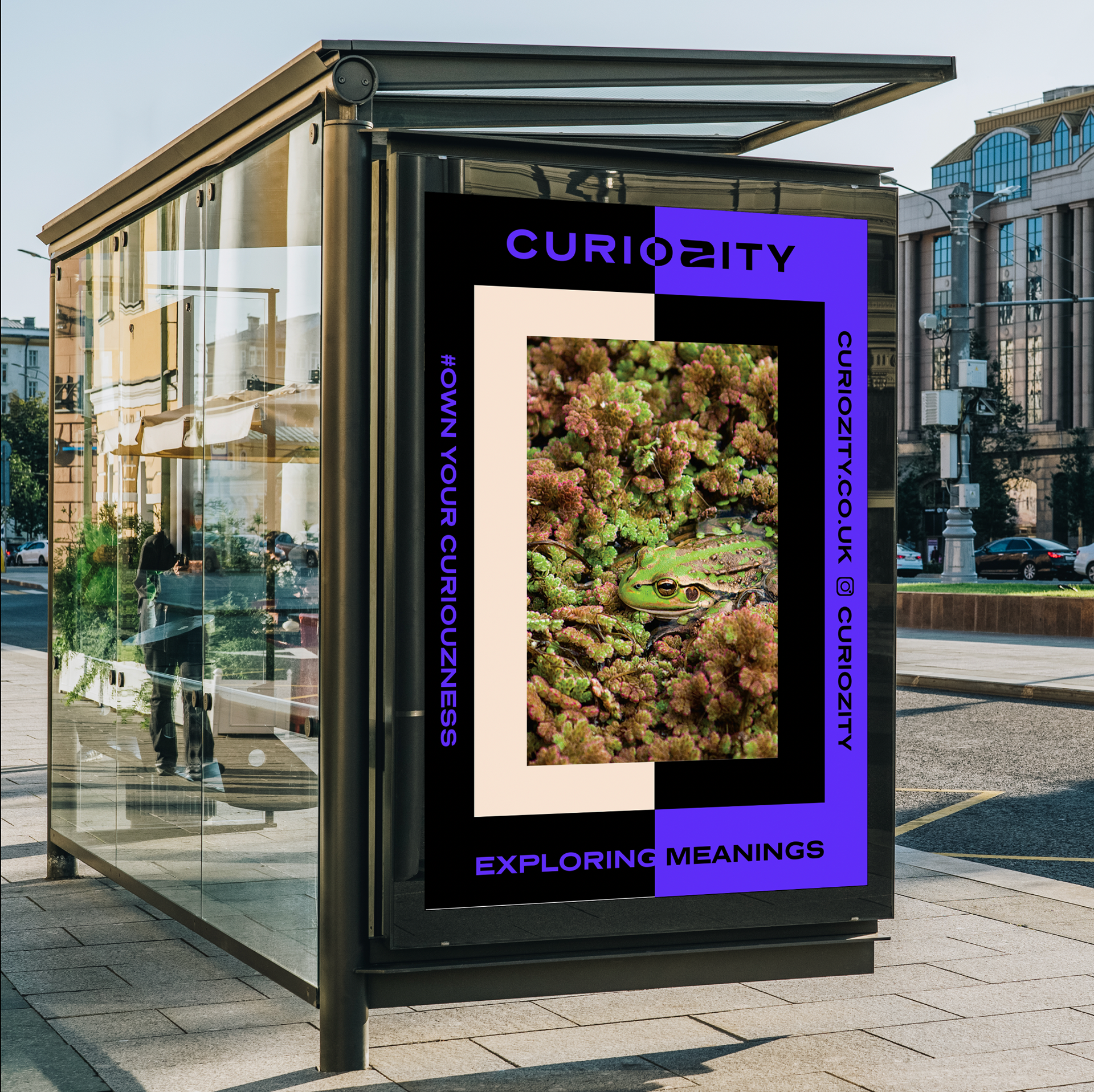
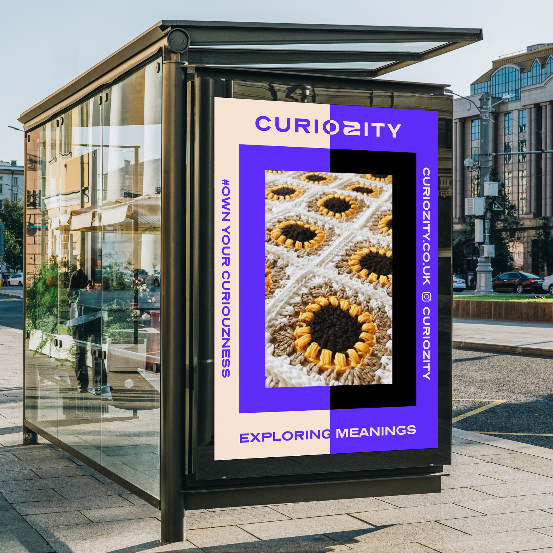
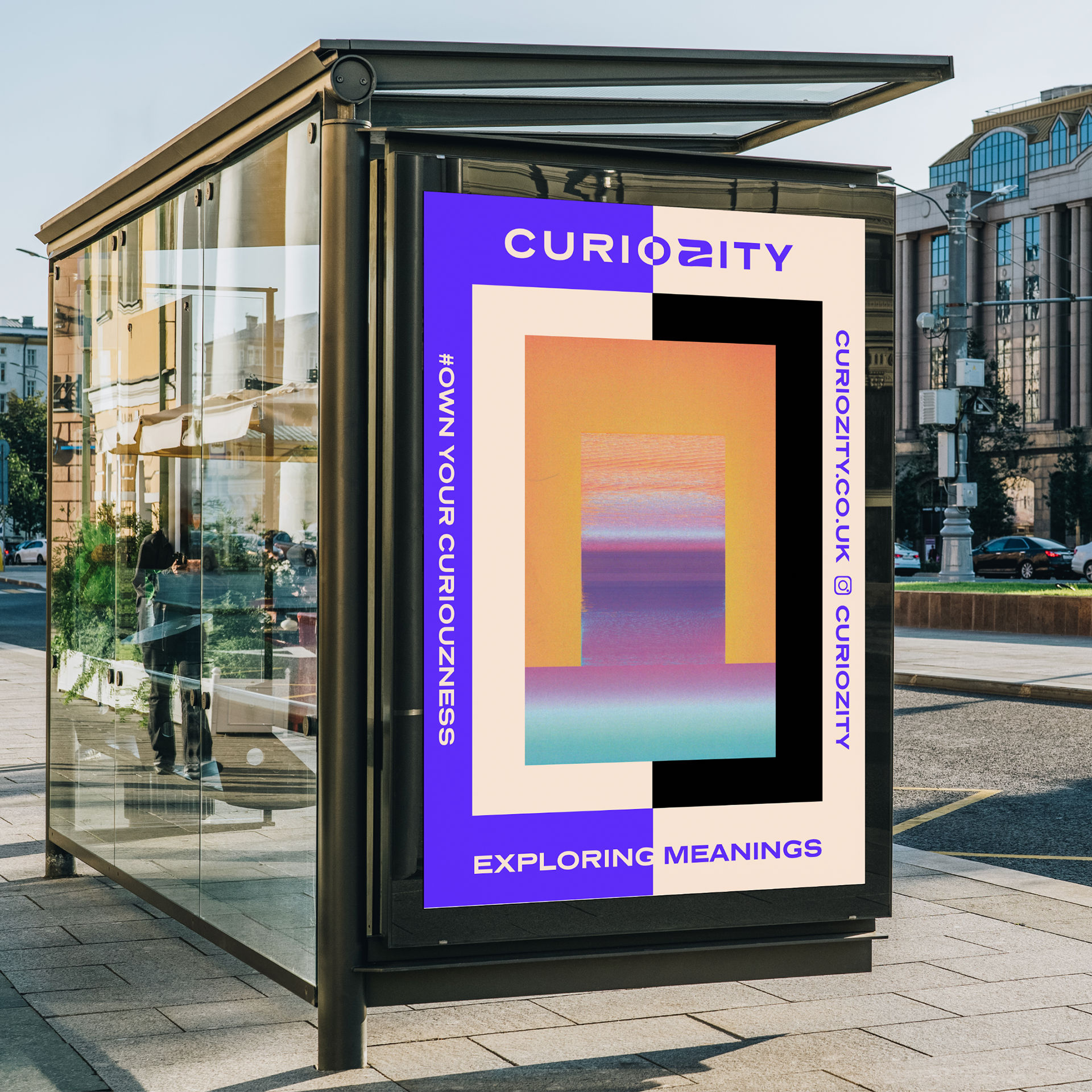
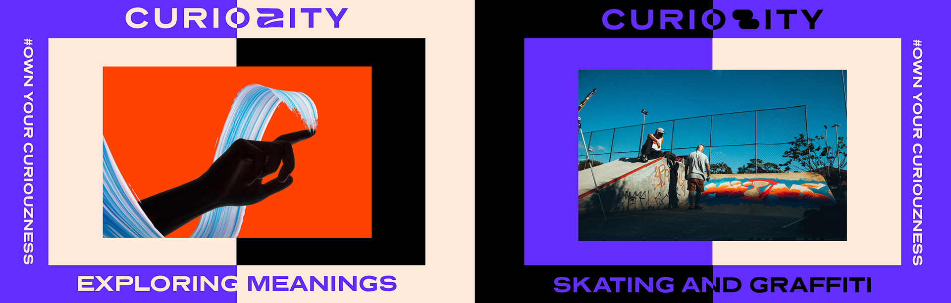
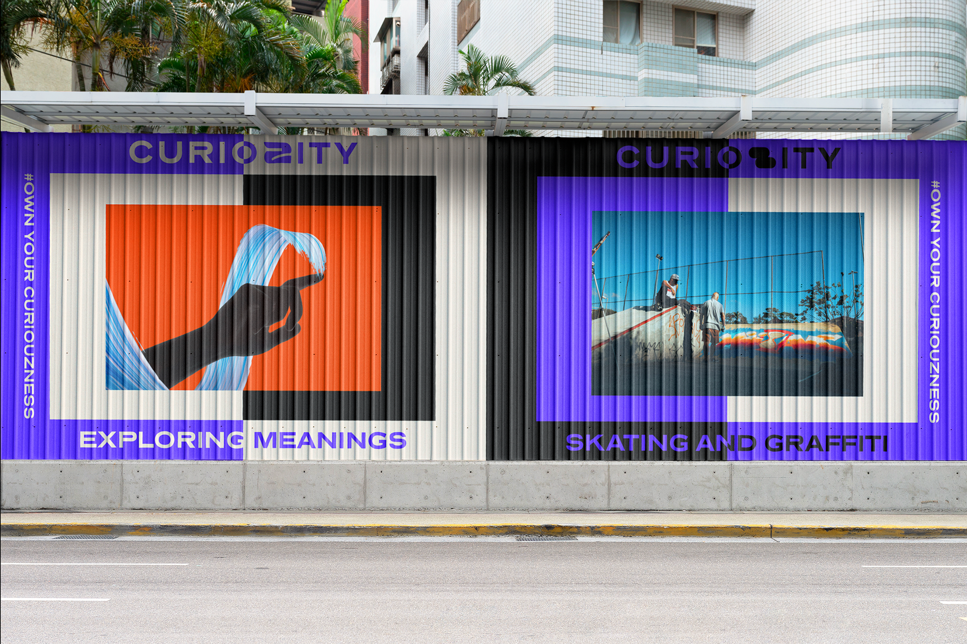

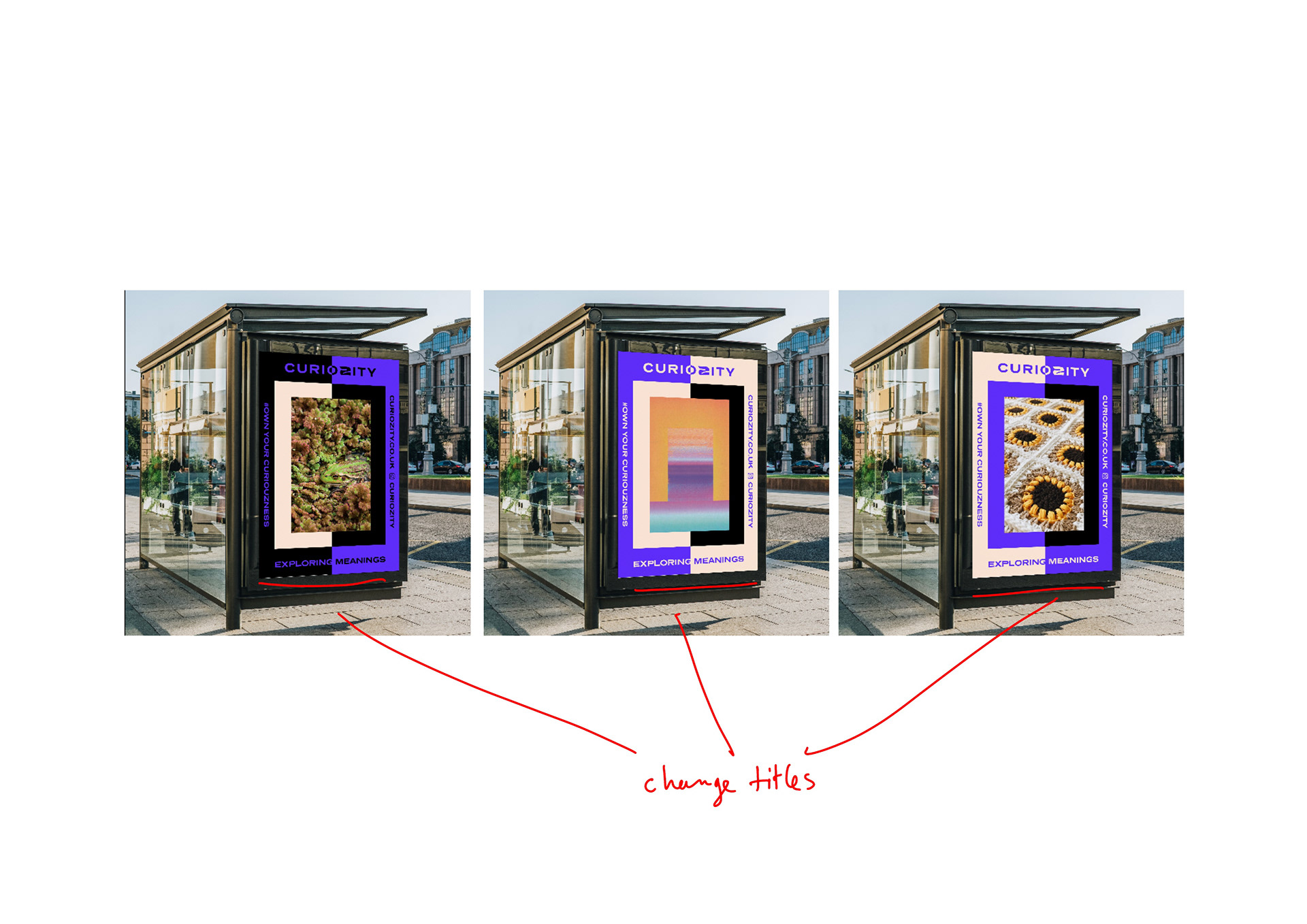
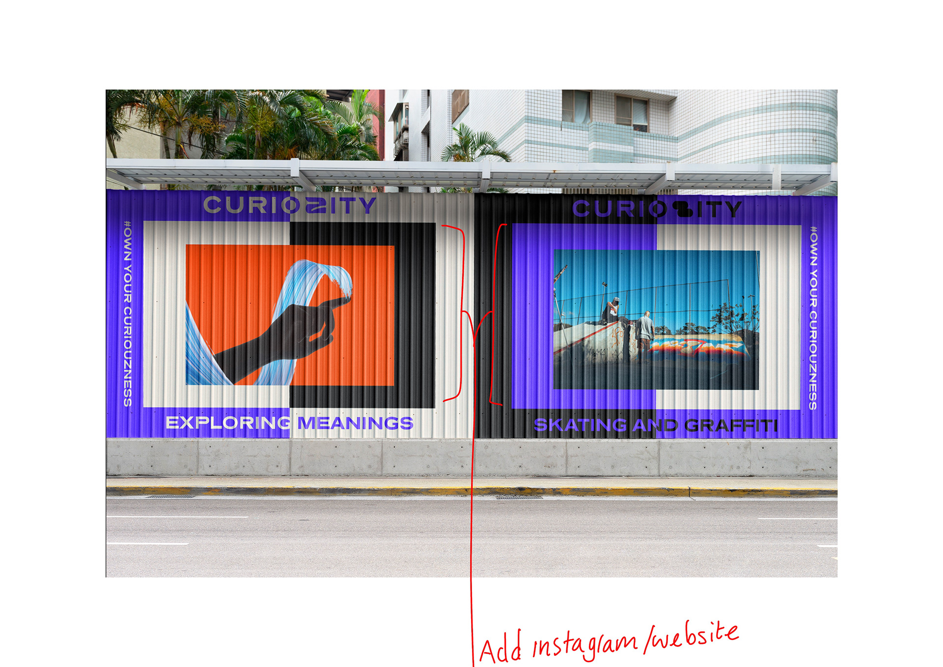
FIRST mock up round: mural, instagram, bus top AD campaign
I'm really happy with how these have turned out they are all consistent and seem as if they would really grab your attention. I have some layout snags like adding website, changing titles etc still to do.
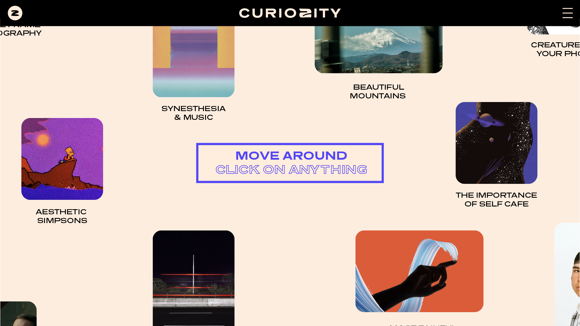
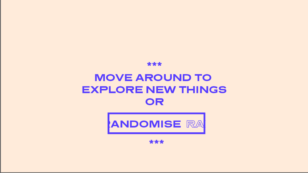
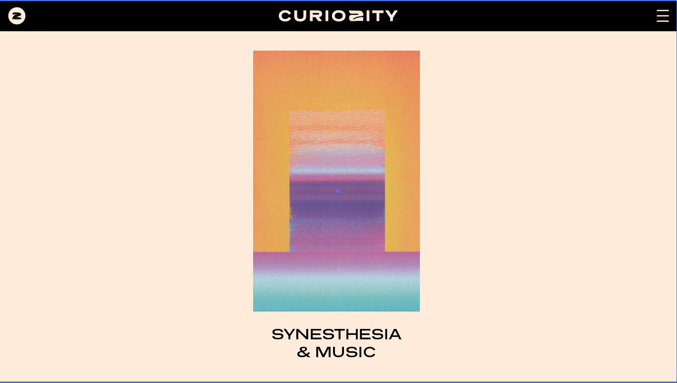
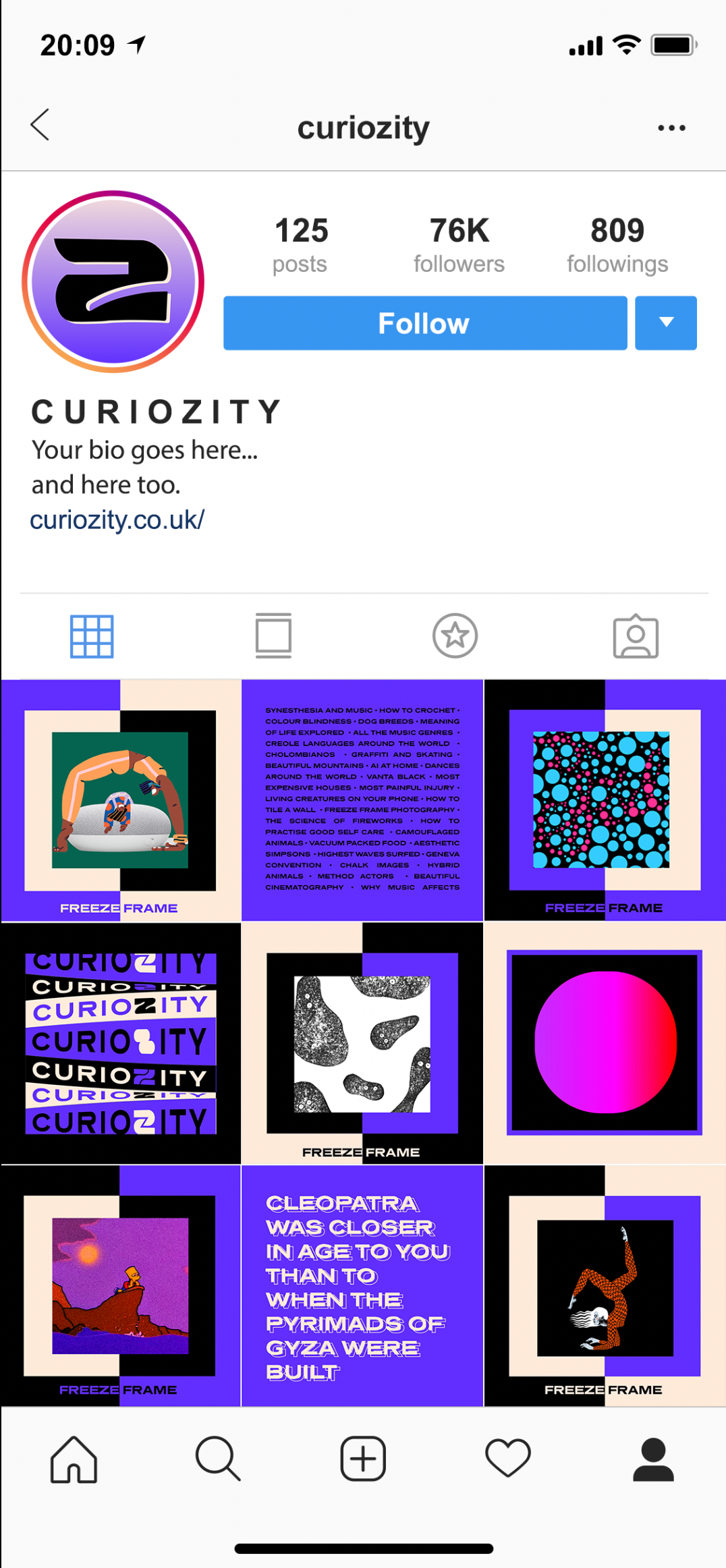
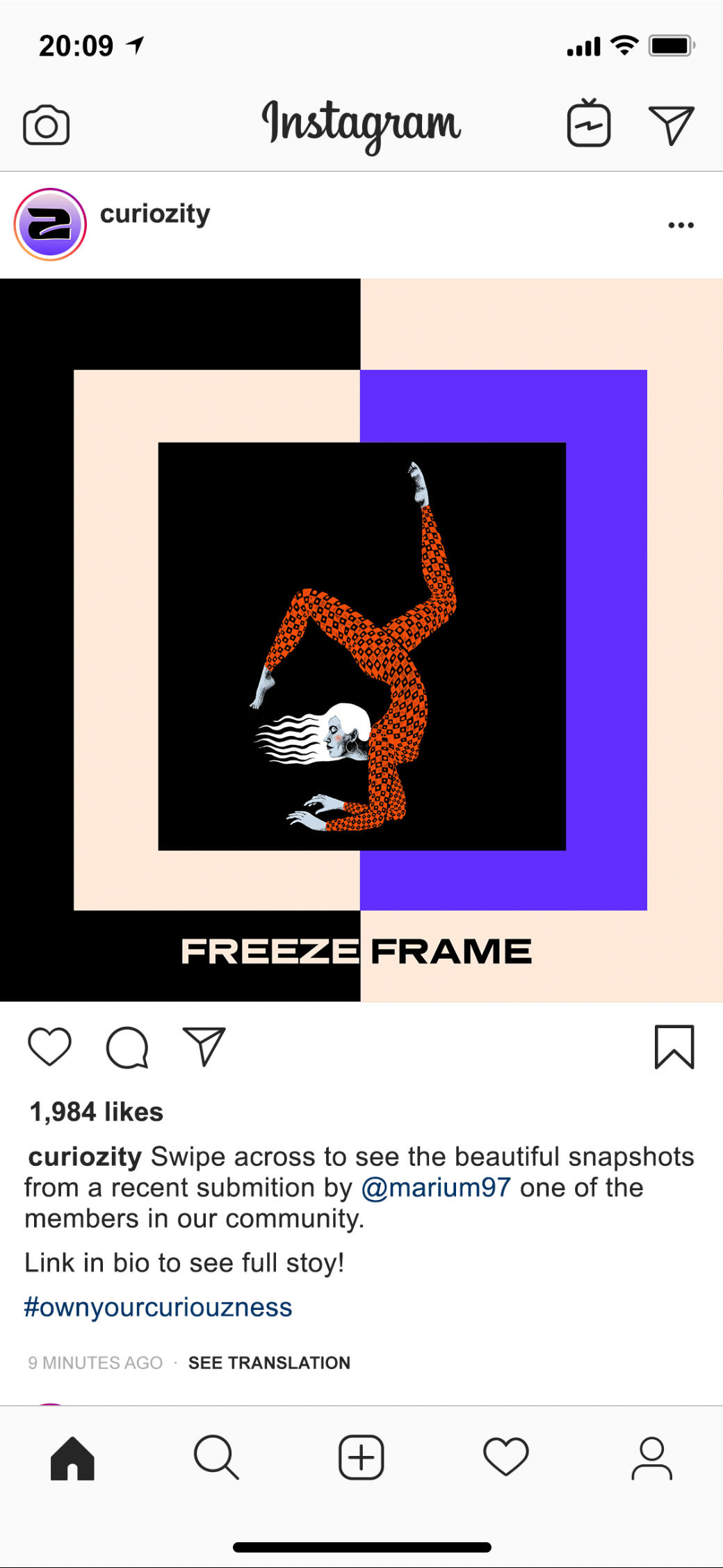
COMMUNITY PAGE DESIGN:
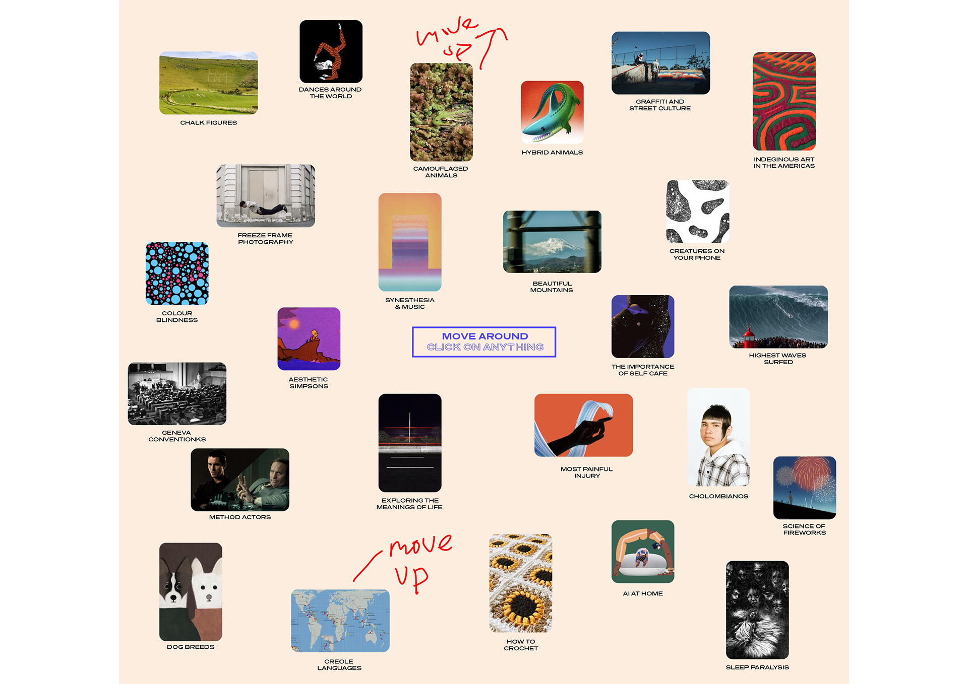
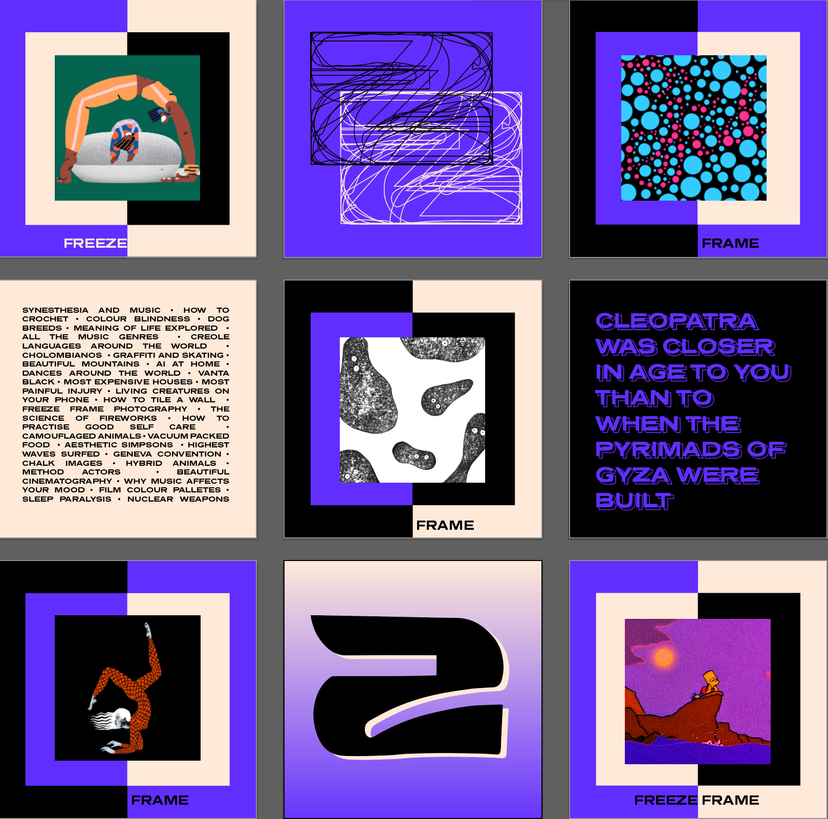
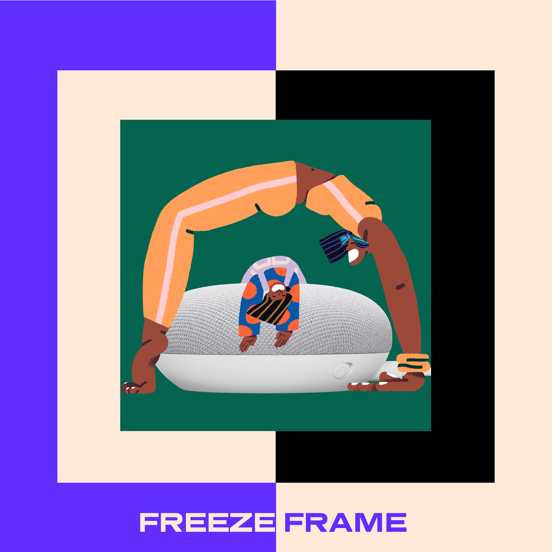
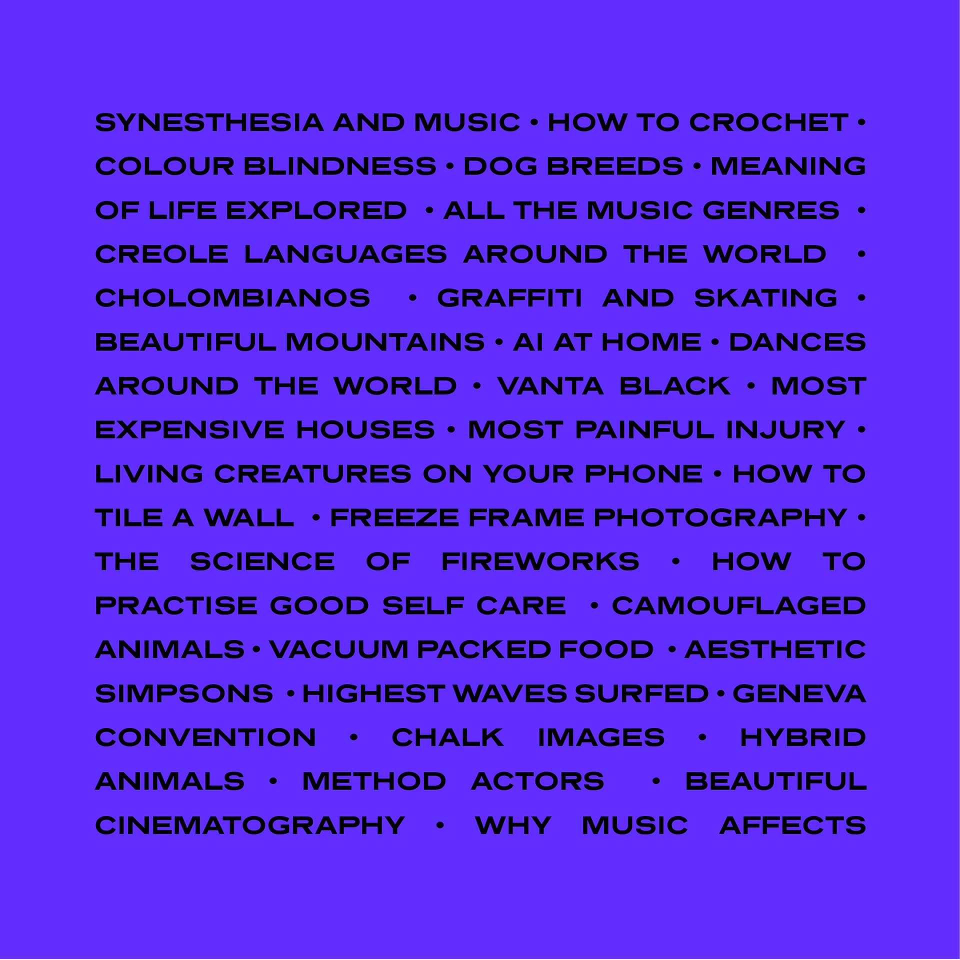
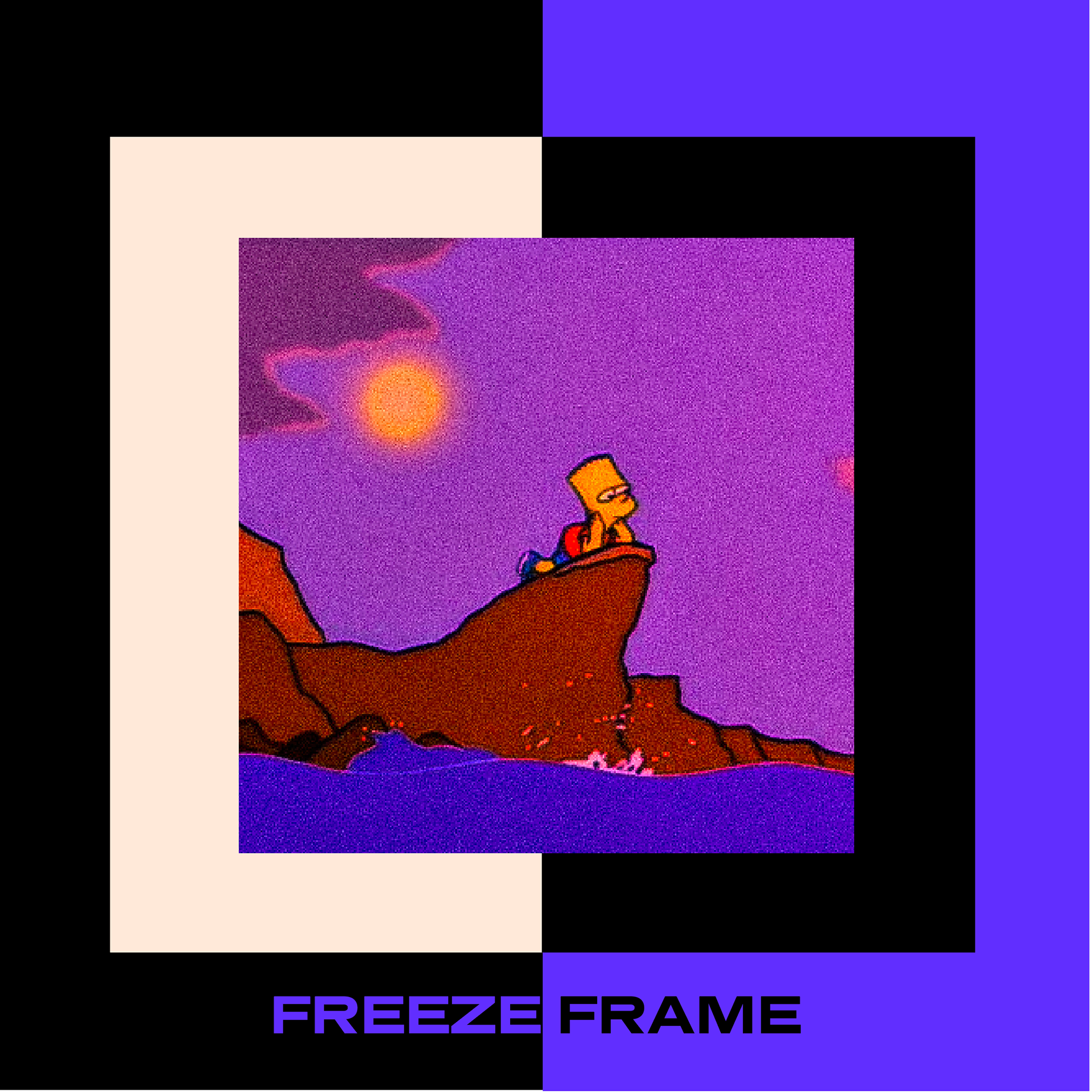
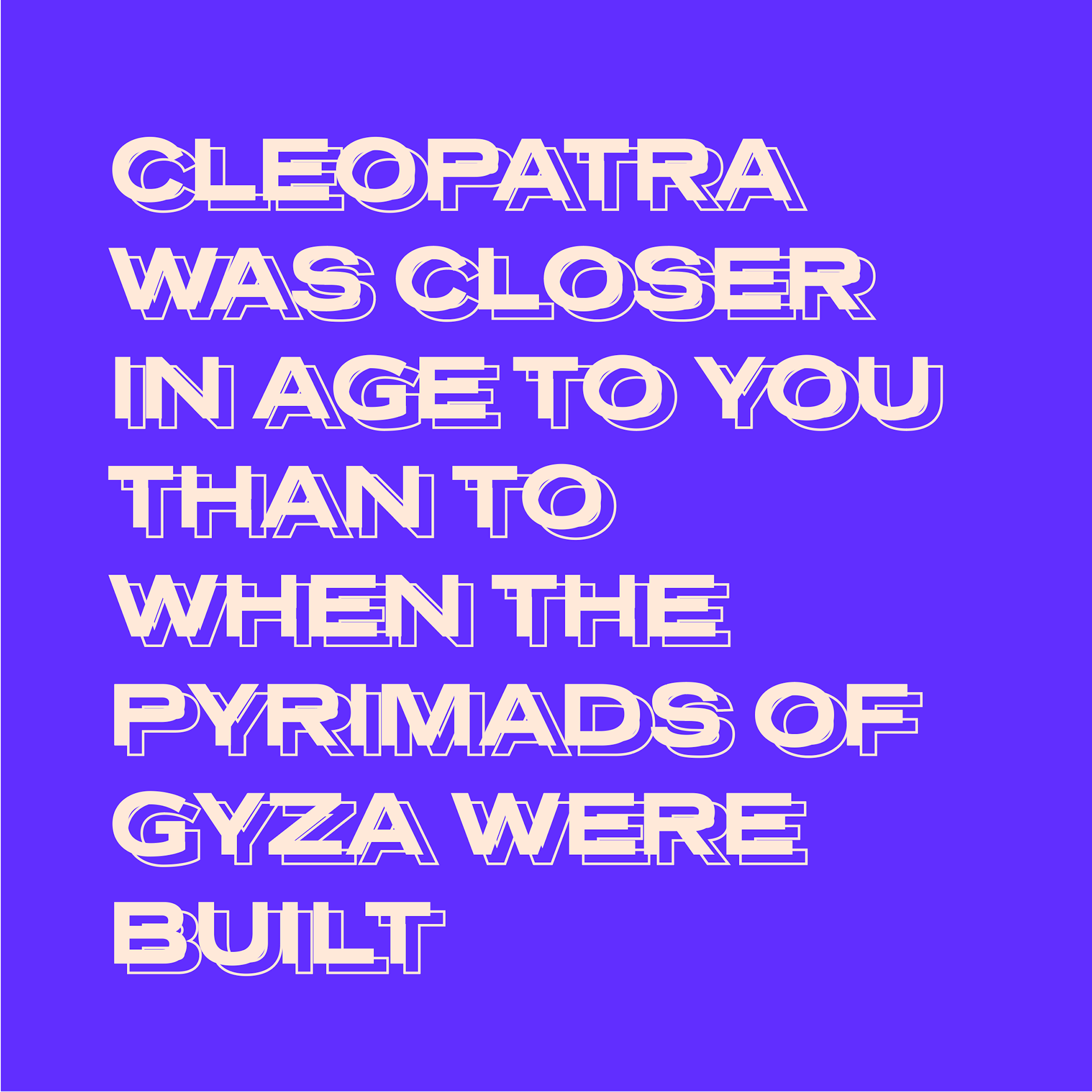
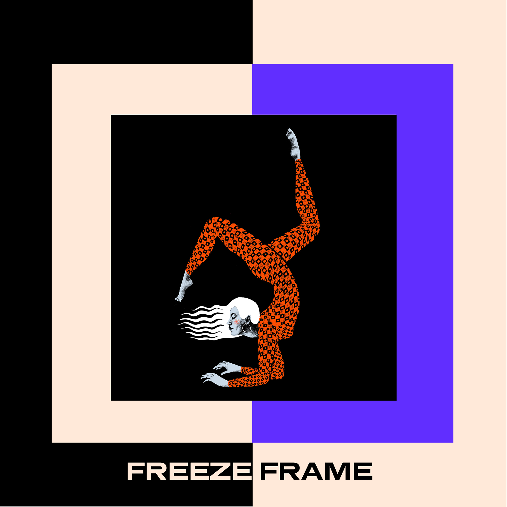
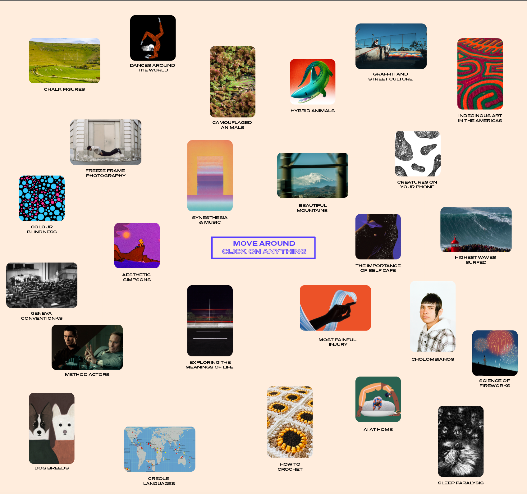
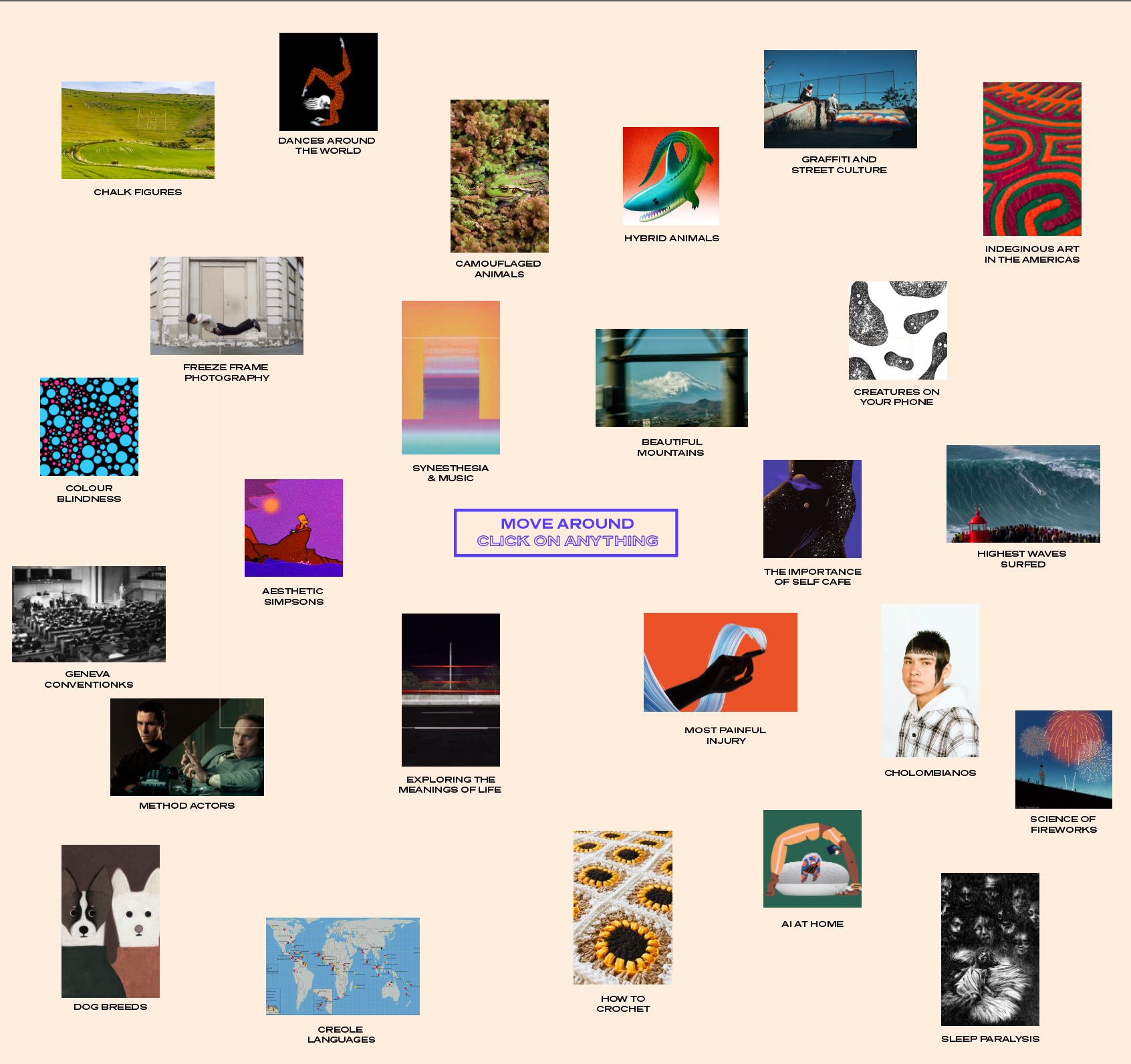
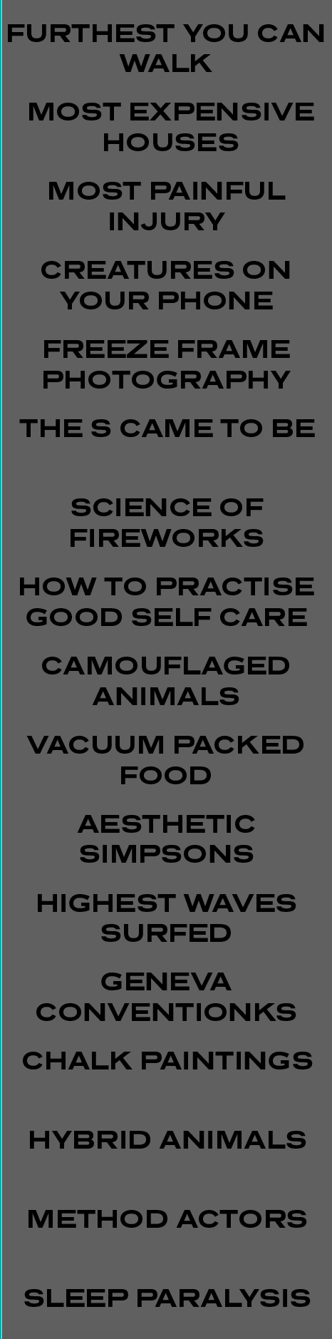
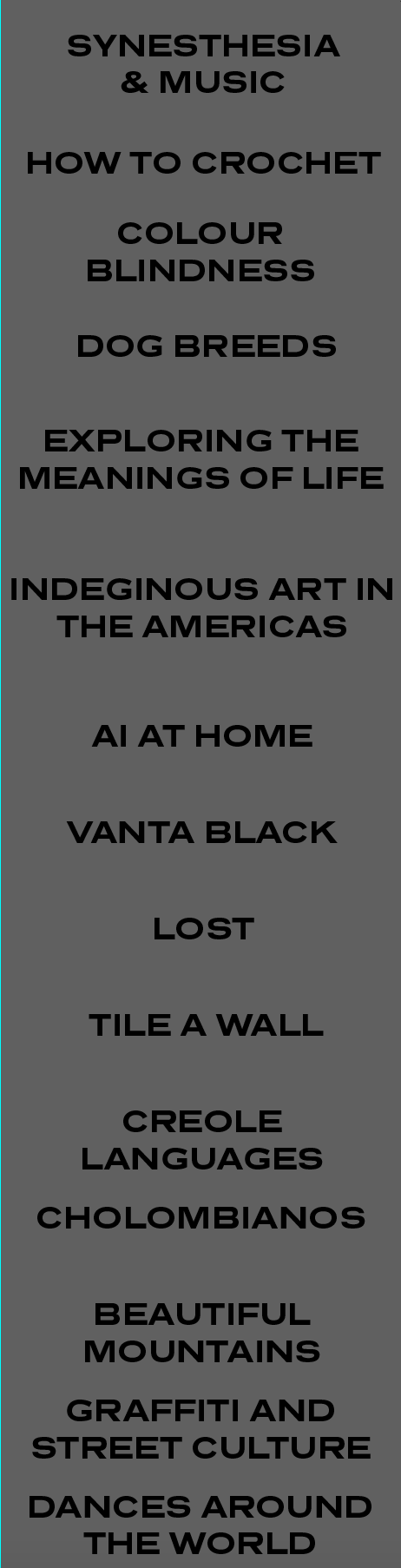
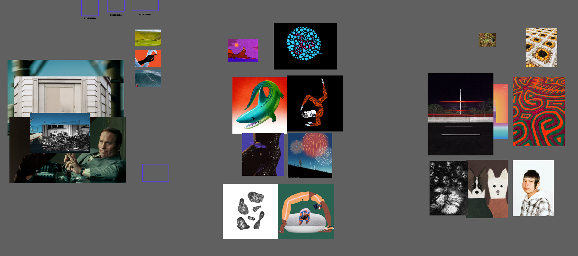
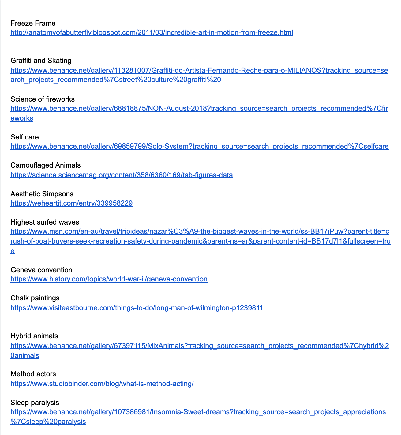
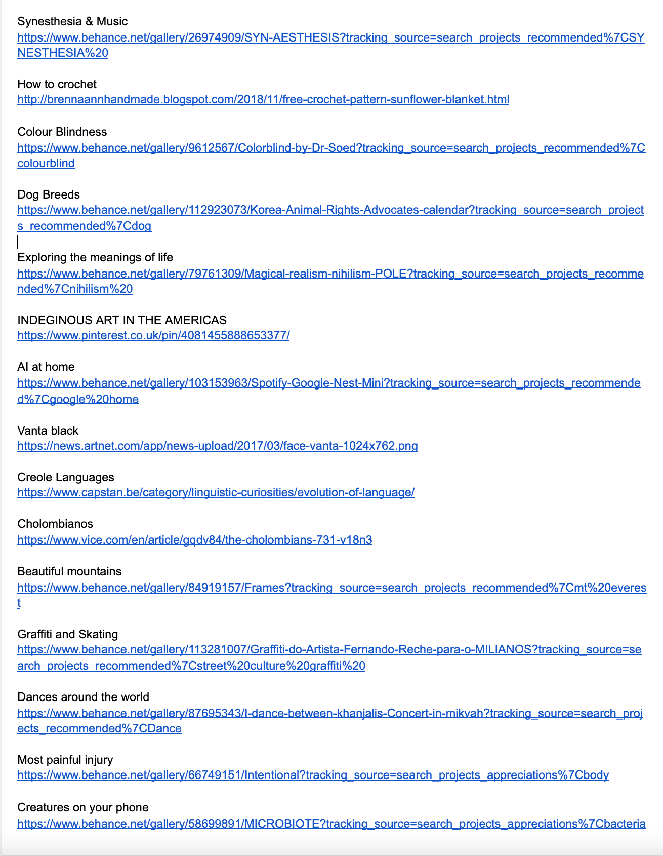
I wanted to have a range of random topics so did a list of things I want to know about/I think are interesting. I created a varied list, then I took to the Internet and mainly behance to find peoples work that I feel represent each topic. I used other people's work to show the diversity of styles that could be used for the community page.
In terms of design I used a similar format to my initial wireframes, I think this works well and I was able to find a pan around feature on Adobe Xd. I played around with style a little bit as you can see above - decided on rounded edges and getting rid of the bios I had originally planned.
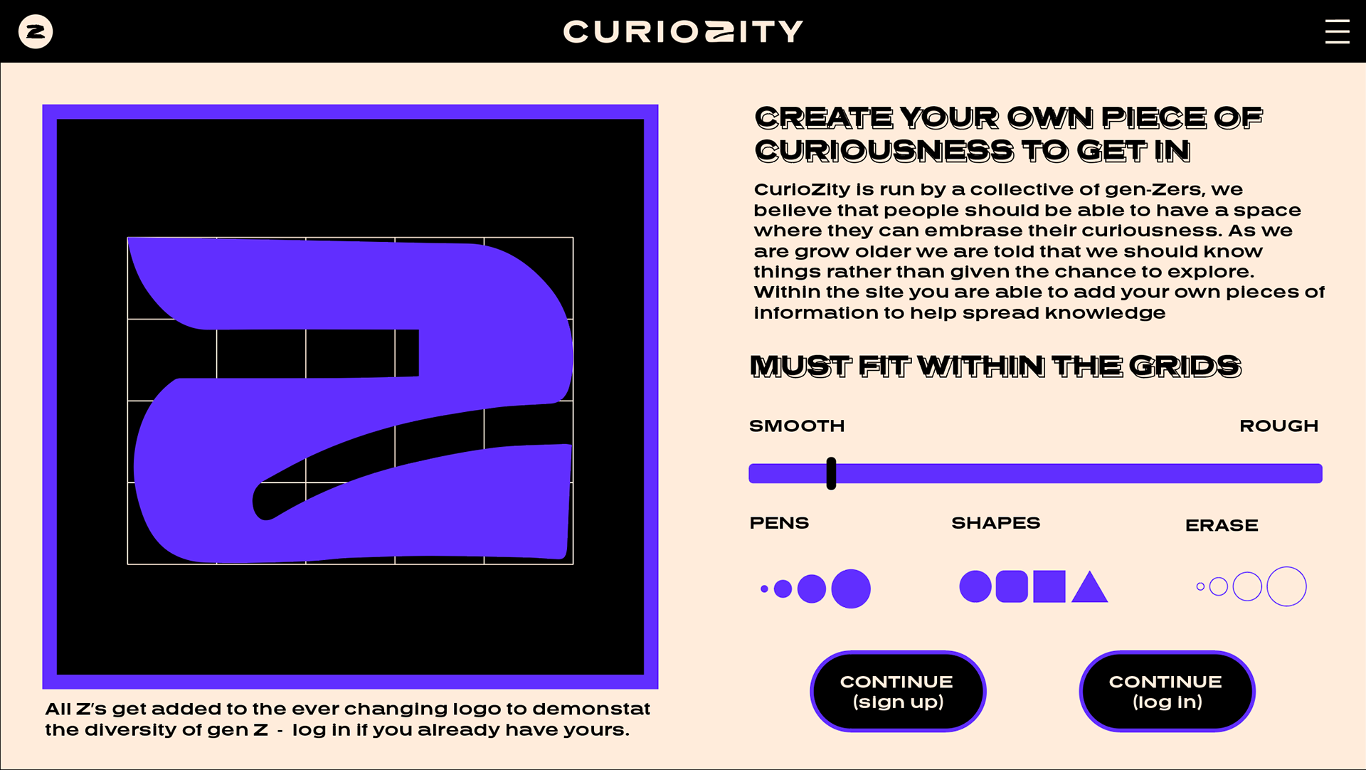
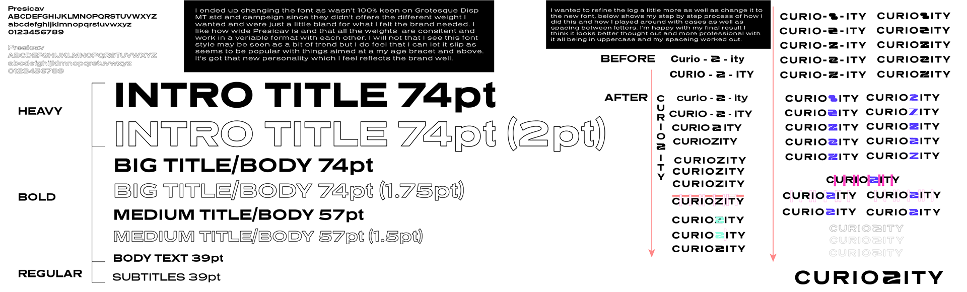
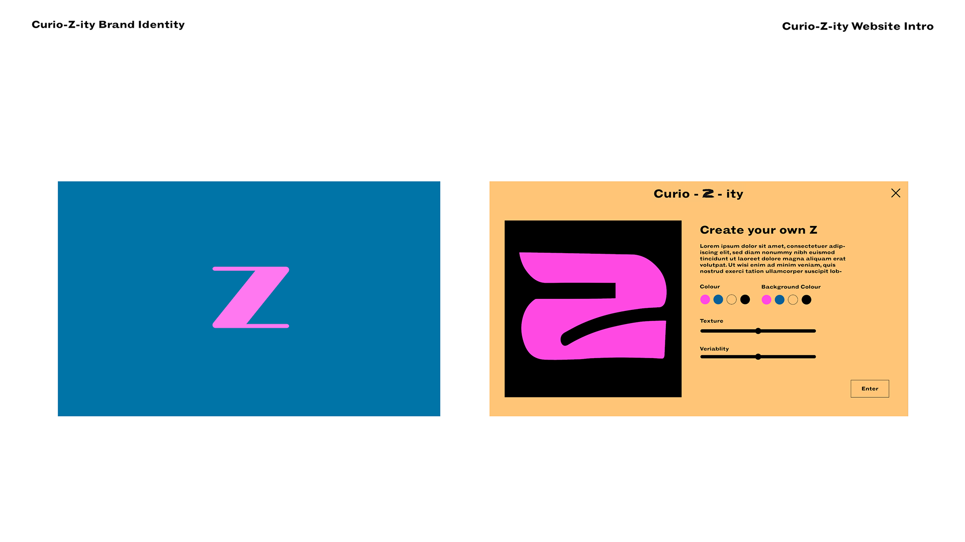
Similar style to my original wireframe I quite like the way it looks - I added a tool kit for making the Z as well as an introduction to curioZity since its the first bit someone will see on the website.
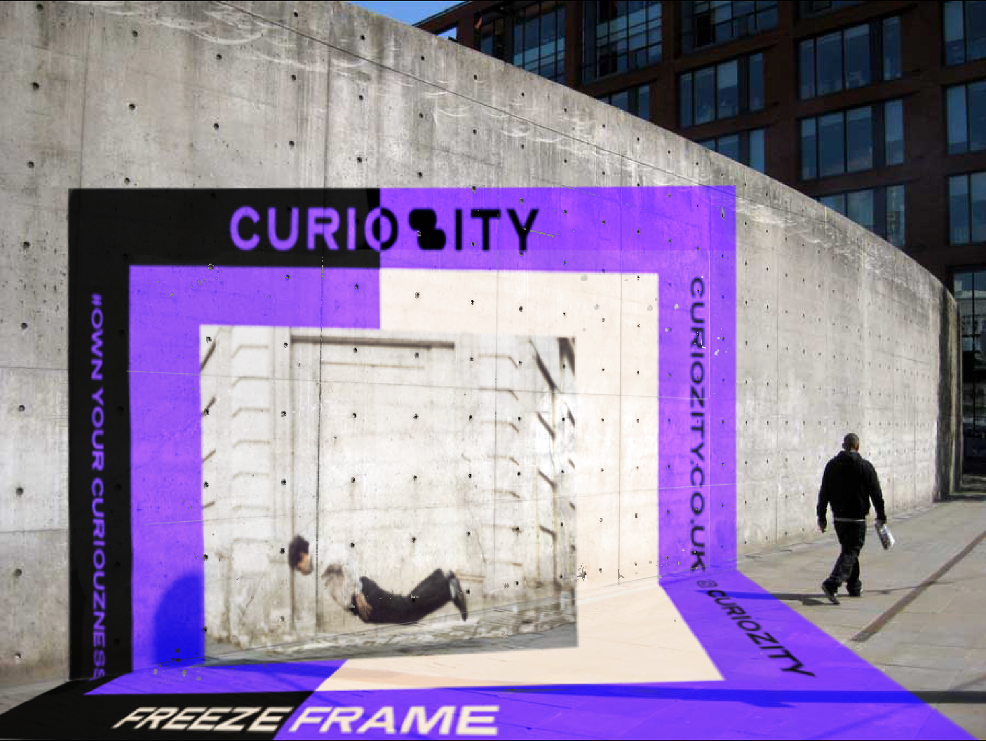
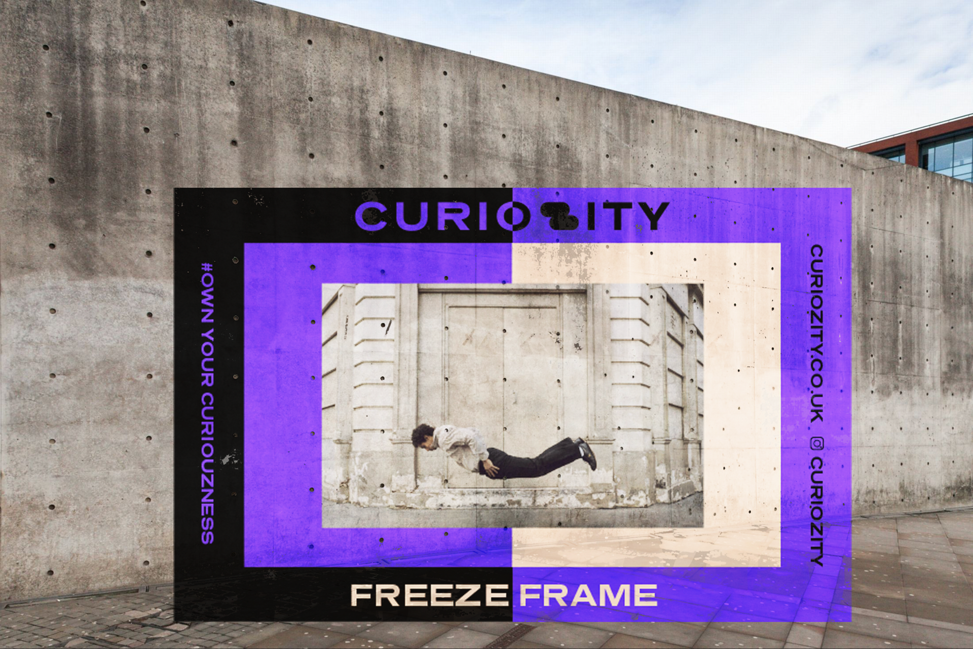
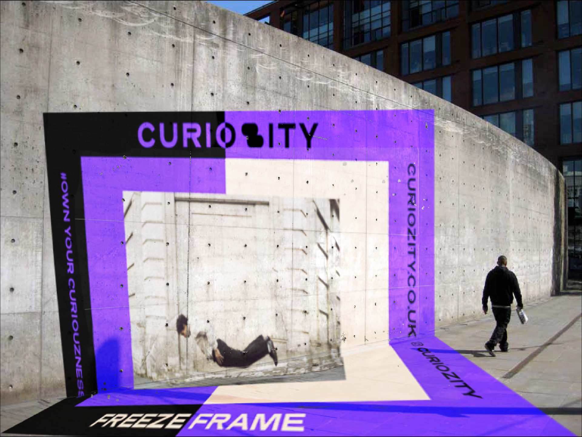

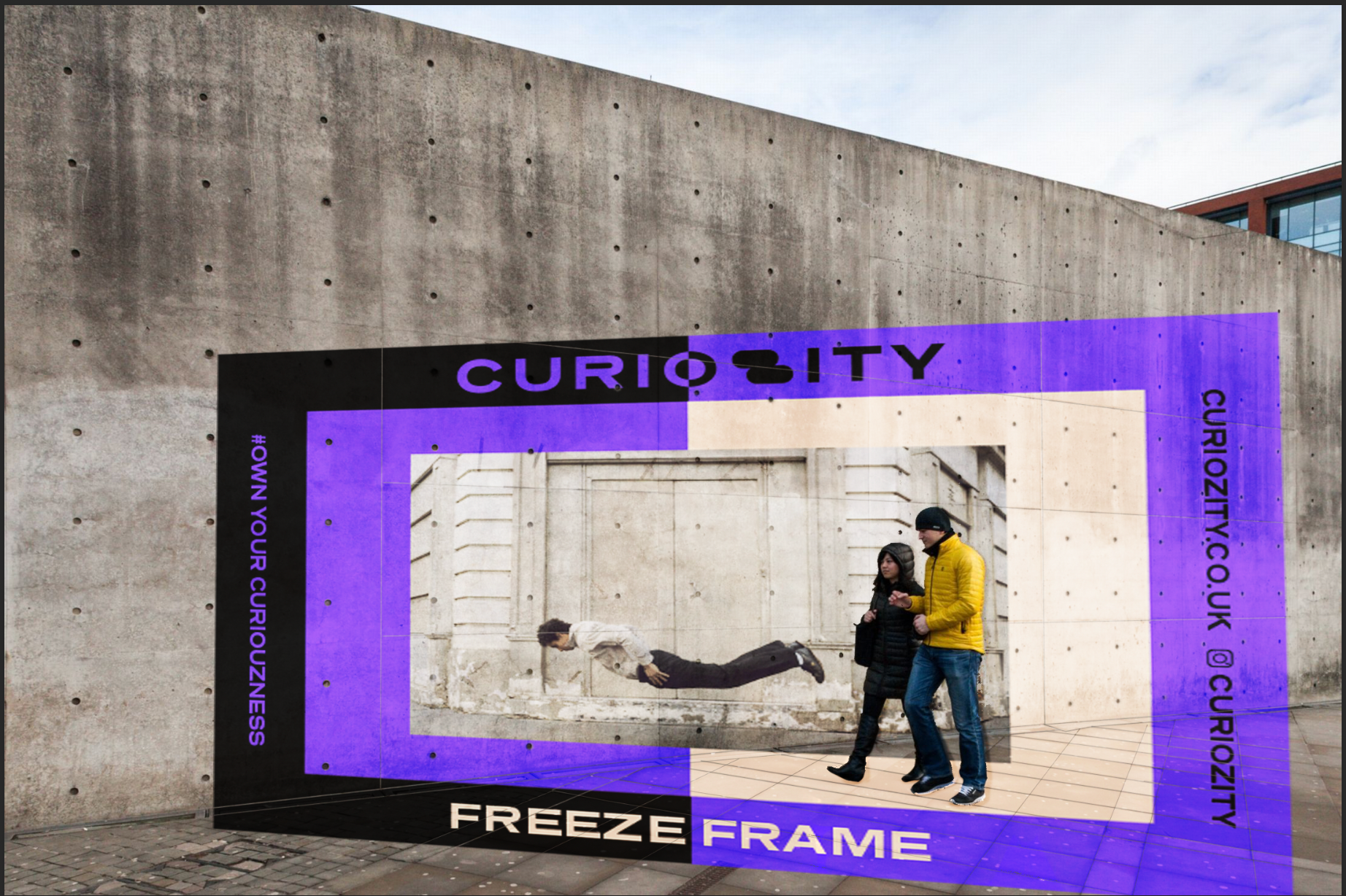
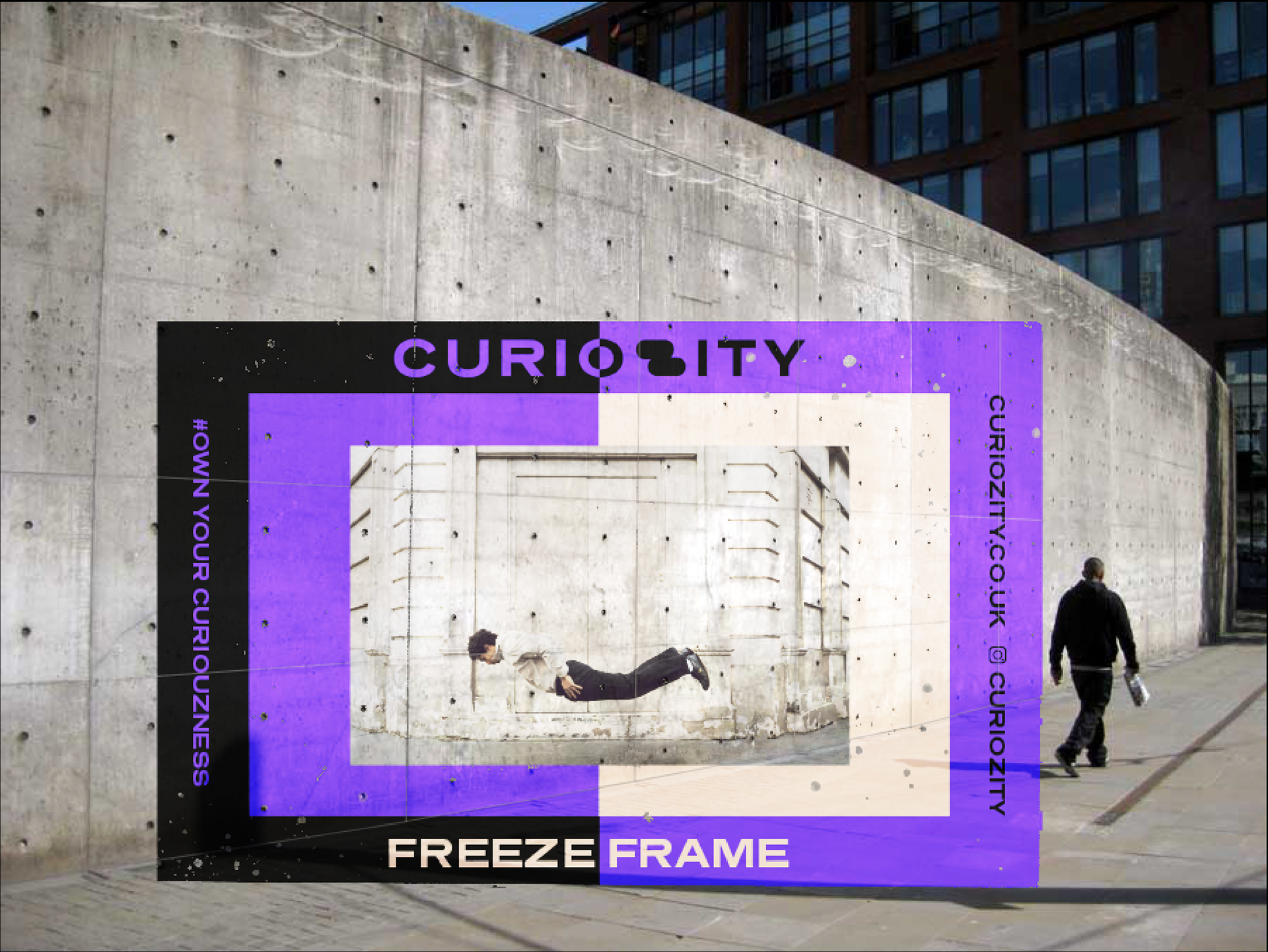
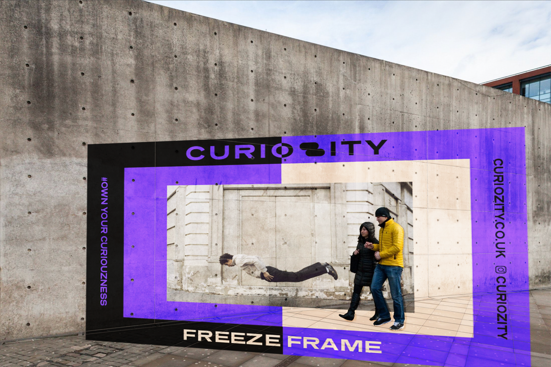
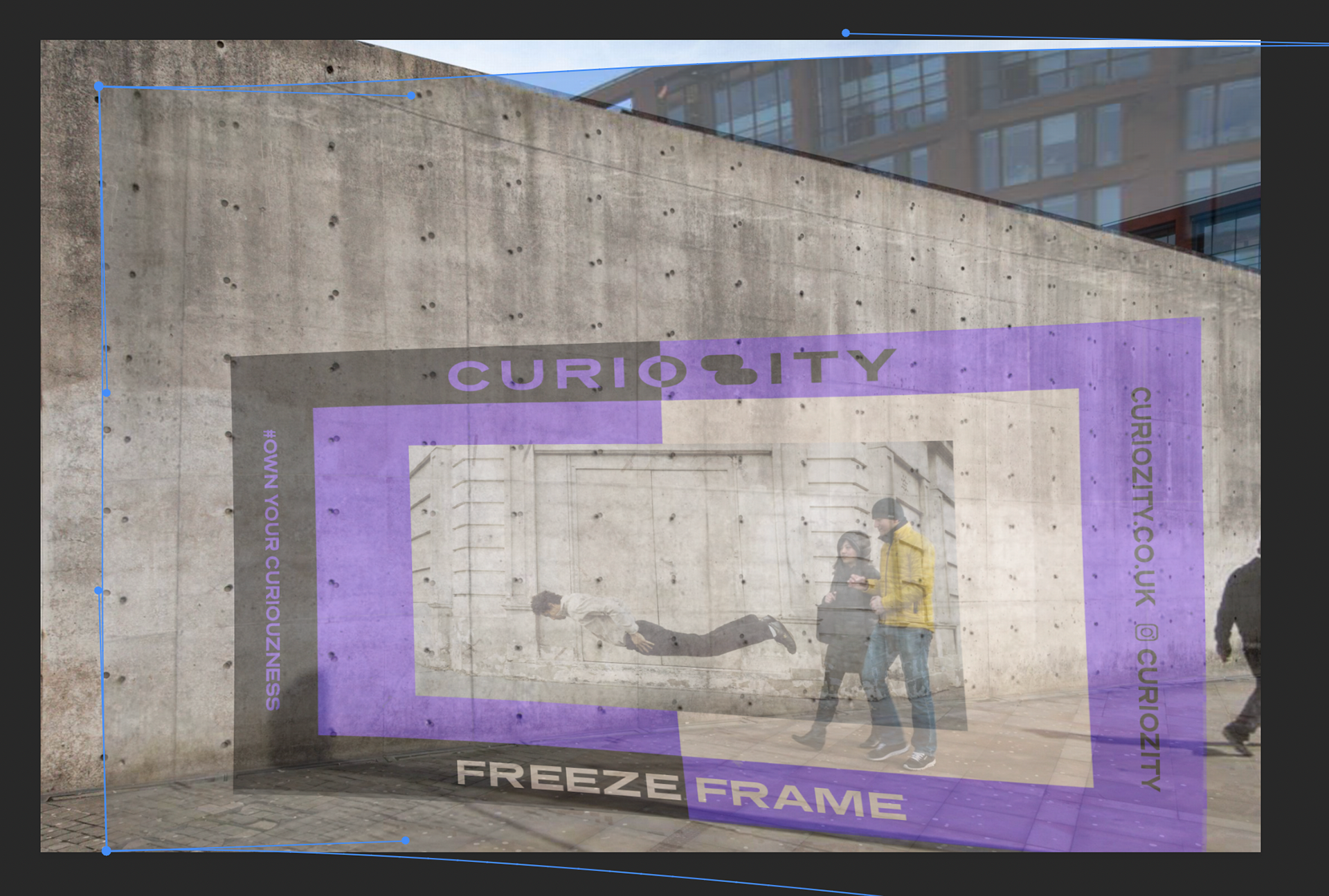
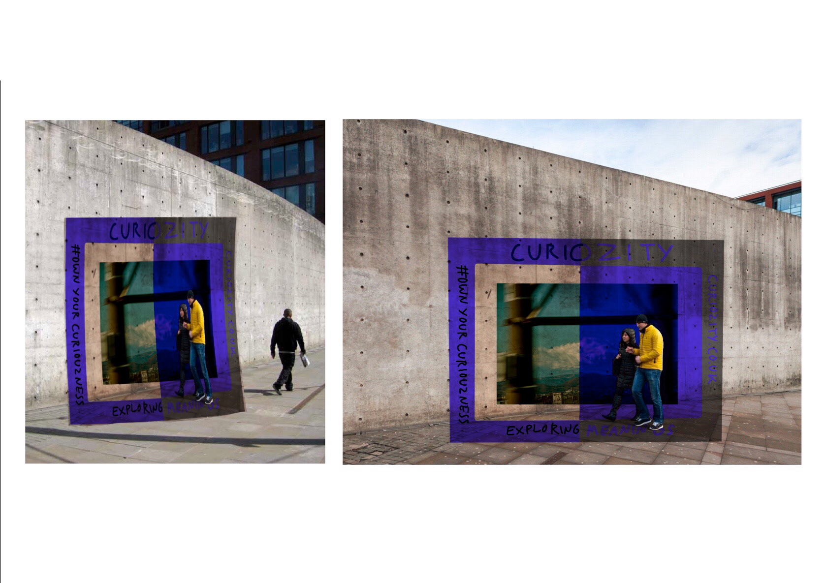
My attempt at design the anamorphic mural - I just couldn't quite get it but I am still going to include it as I think you can get the sentiment of it. If I had been able to take the photos myself it might have helped as i would have had better perspective.

I like the idea of doing an anamorphic type piece as the playfulness of it really fits with my brand identity - I'm am going to give it a go with the walls in Piccadilly gardens. I am wary as I'm not good at working these things out and it's more of a straight line compared to the examples above.
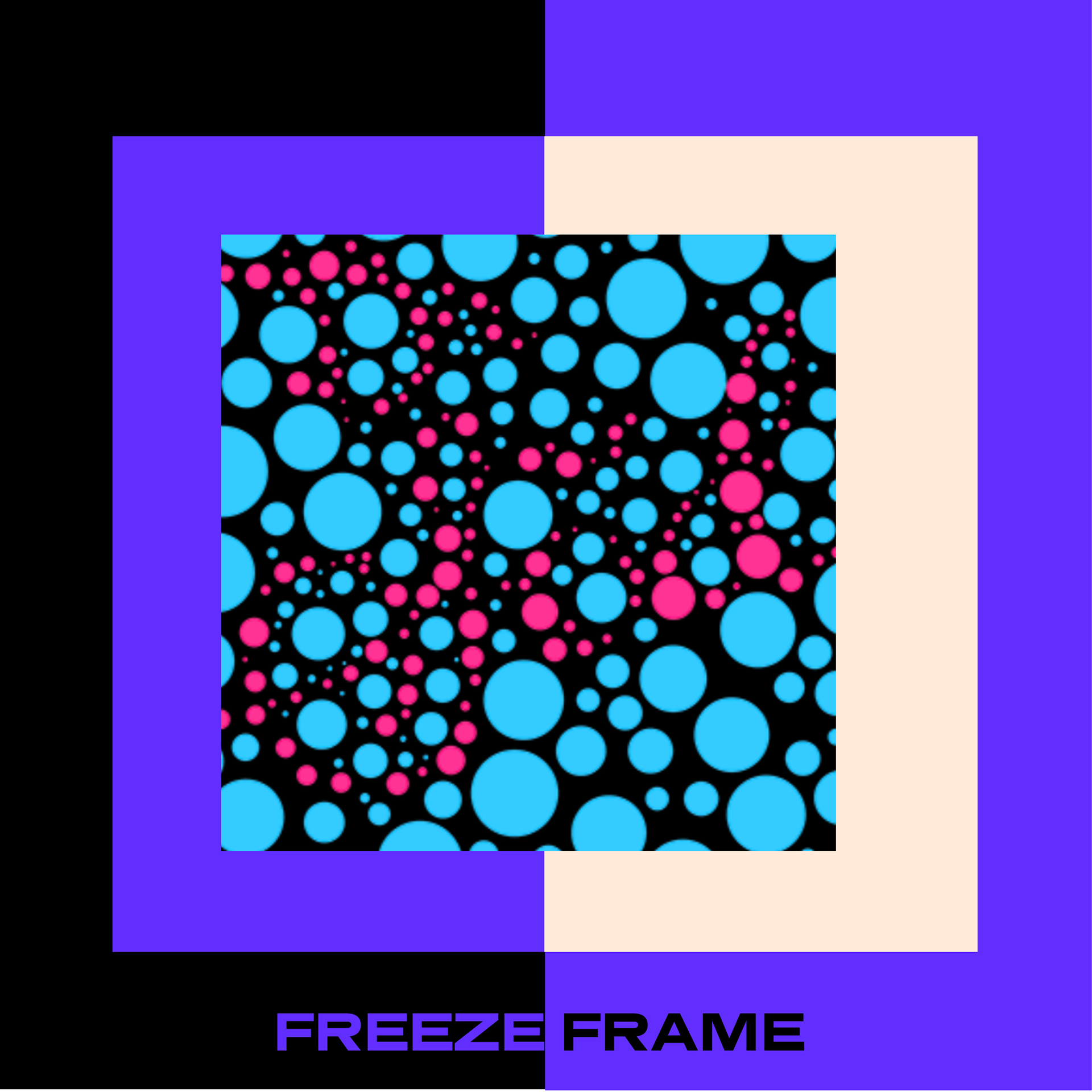
Like some of the examples below i really wanted to do a animation piece for the intro as it instantly is eye catching. Using the resources for the digital fridays I was able to create this.

Next step: Intro page/animation concept
To begin with I had a look at the kinetic type resources sent out with the digital fridays. I will have look at the designers as well as the YouTube videos to help with my design.
@designbyjake_ : I really like versatility of this looks so slick and well animated.
@burgess_john : I like how the letters morph into each other and how each letter has the same style throughout.
@kennybrandenberger: the variable font animation works well and the animated poster ad is something I want to end up doing.
Trying out the panning feature on xd I was pleasantly surprised - unfortunately after lots of googling I couldn't find a way in which you can zoom in and out in adobe Xd. Whilst I mention auto animate - I tried it again it just wasn't in the style I wanted.
These are based of my past wireframes.
Not keen on the black font on top too dark
I like this colour combo - one of my favs
quite like this but background and blue makesit all little dark
I like the white font and the pattern but I think it doesn't fit the style I am going for
I like this one - my plan would be for the gradient to animate.
I don't like the box that goes around its messy
I don't like the box that goes around its messy
like this one too like the oval created
bland colours
bit too 80s for my liking

To me these look like they all link up well unlike some of my previous mock ups
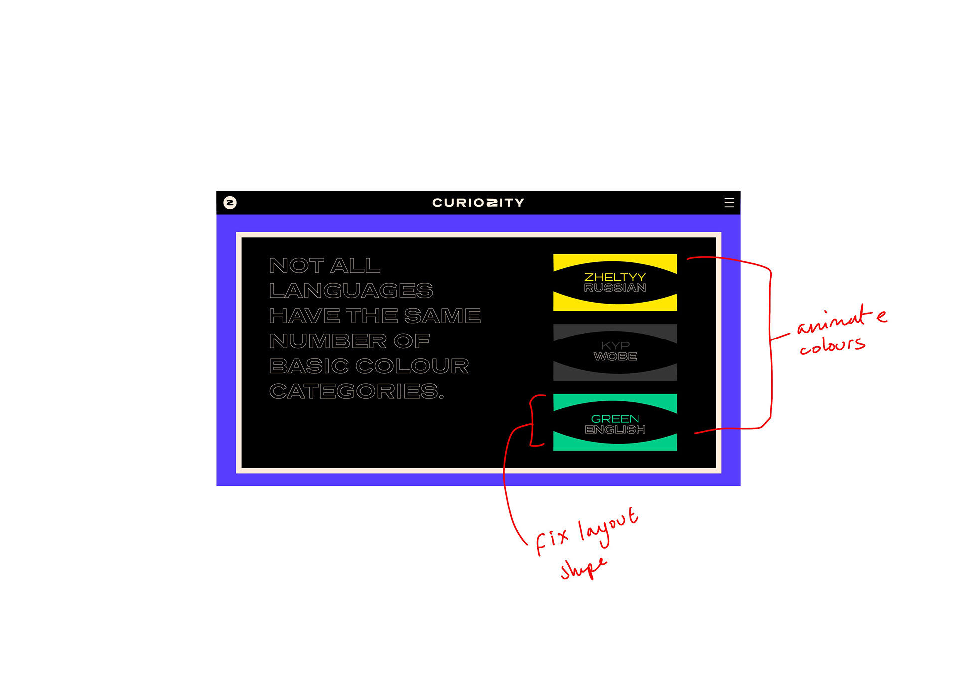
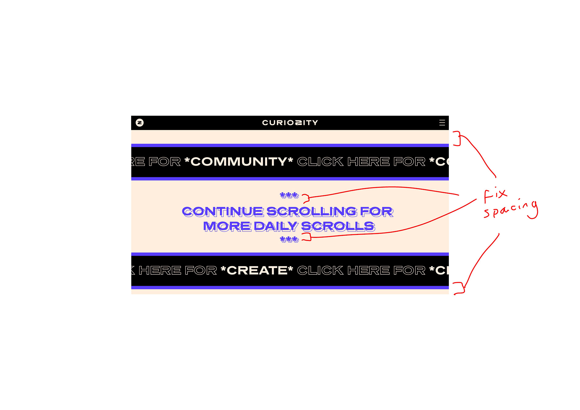
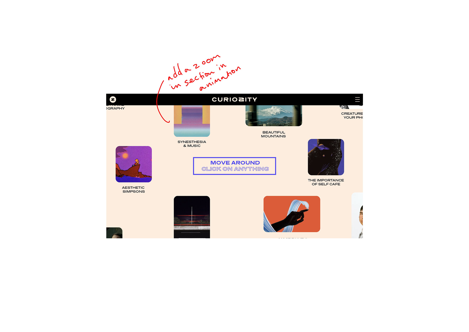
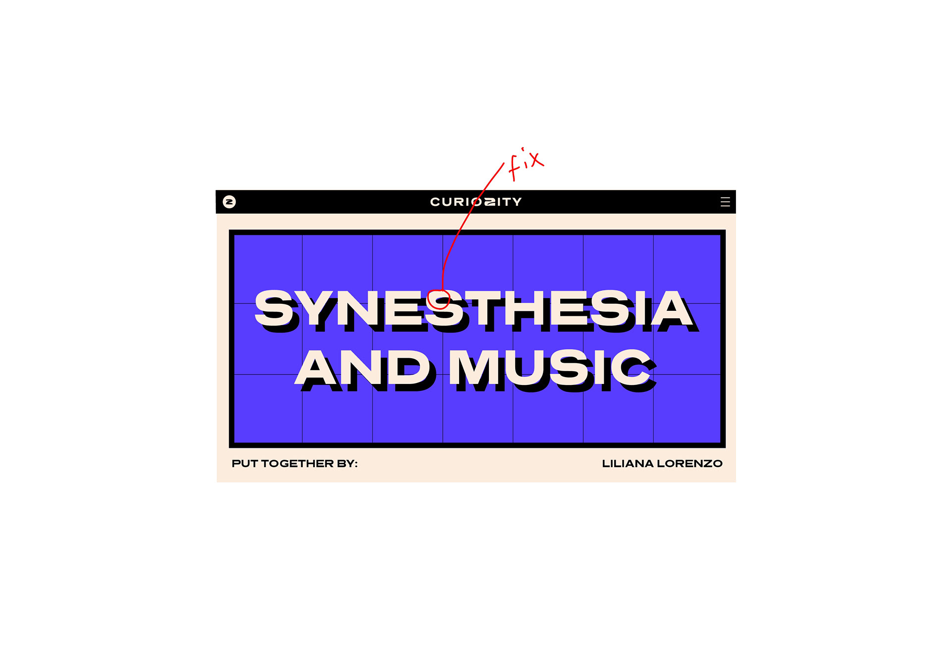
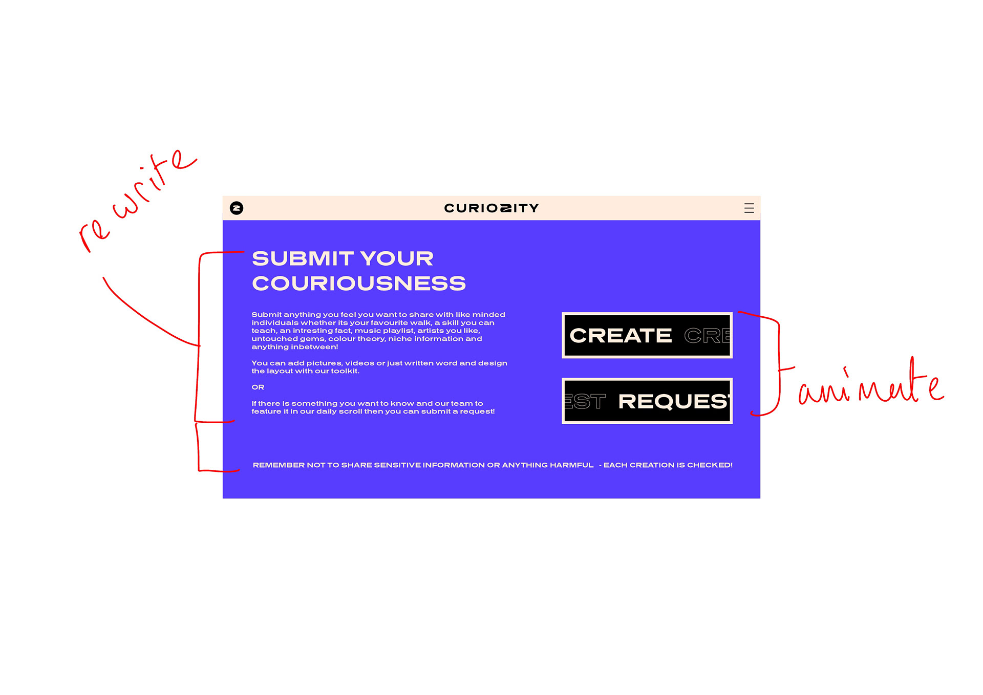
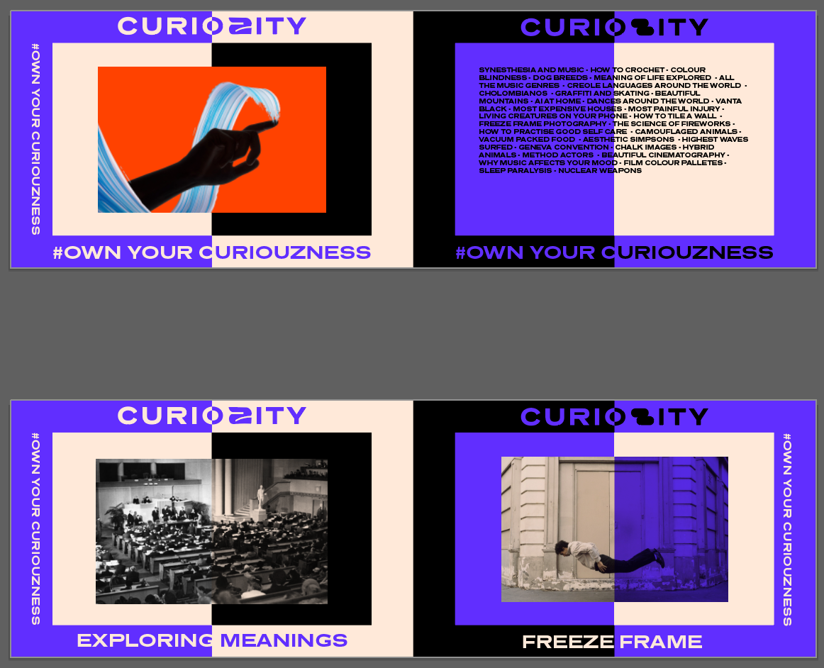
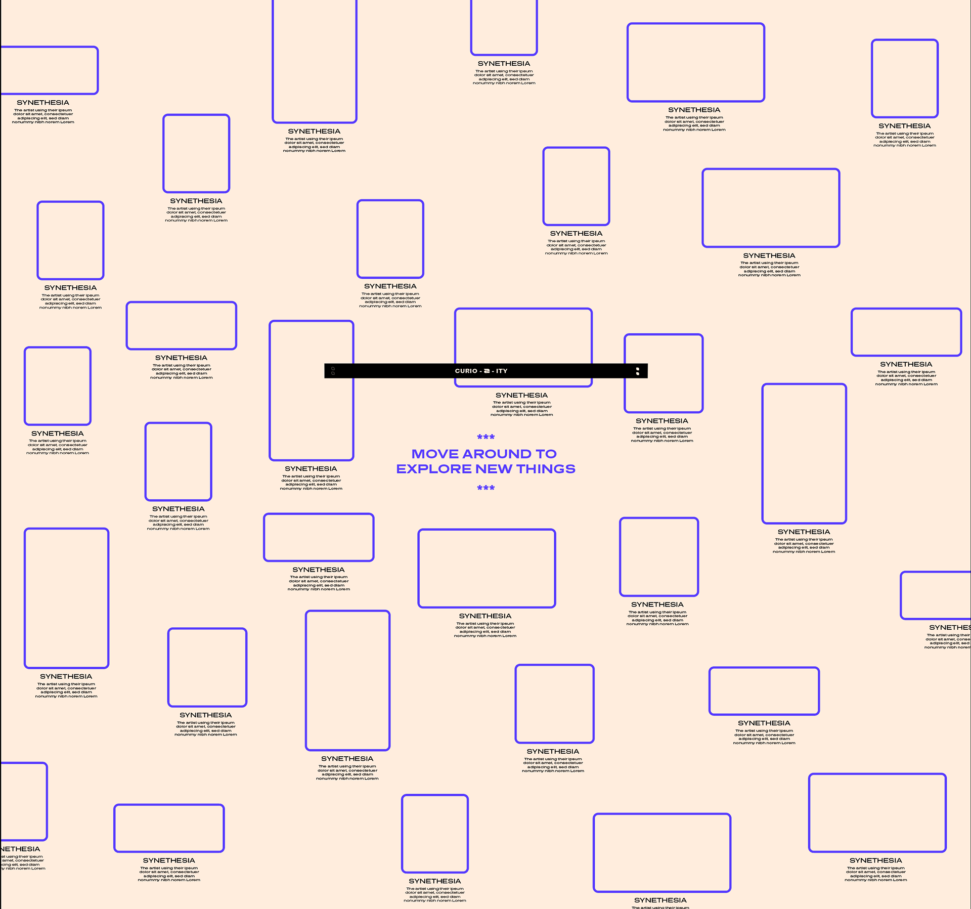
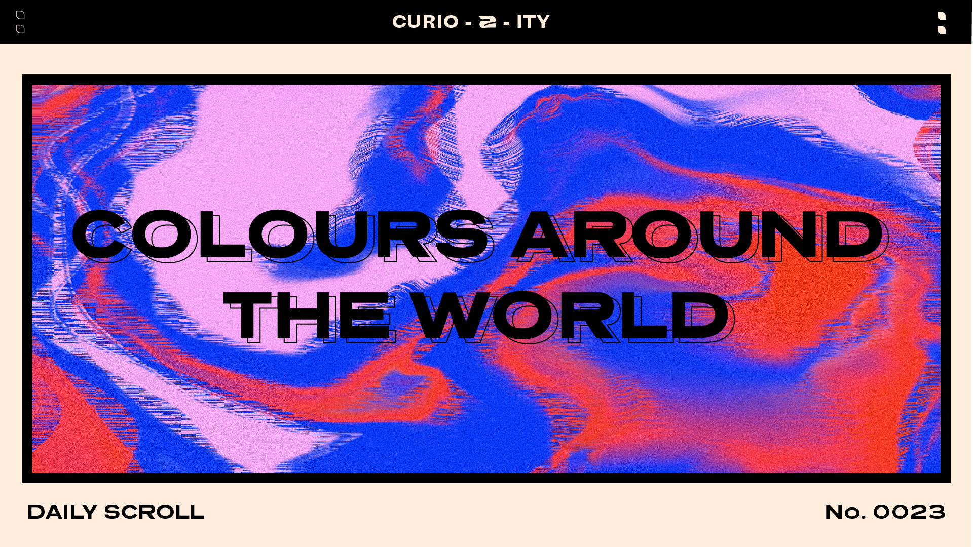
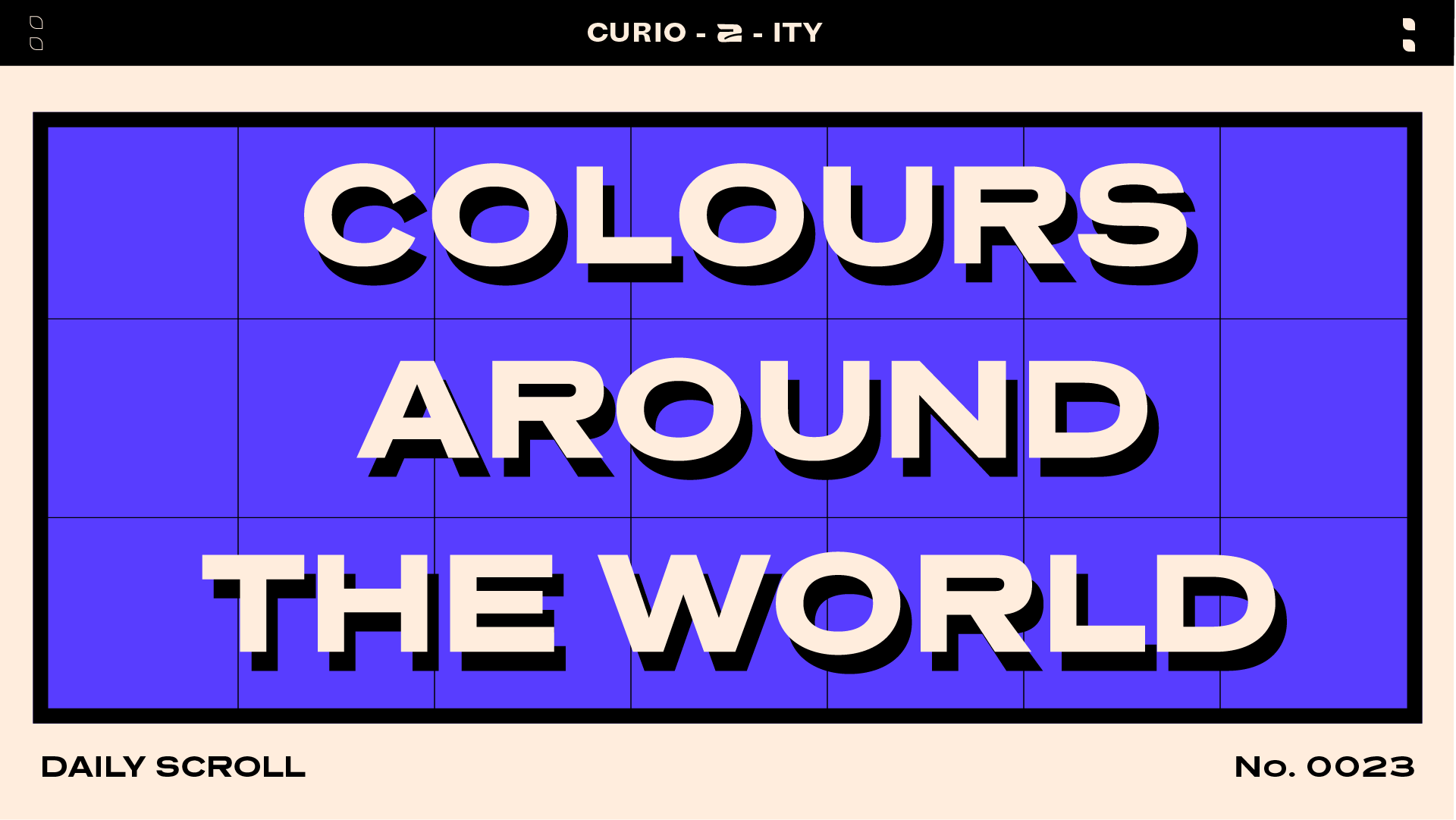
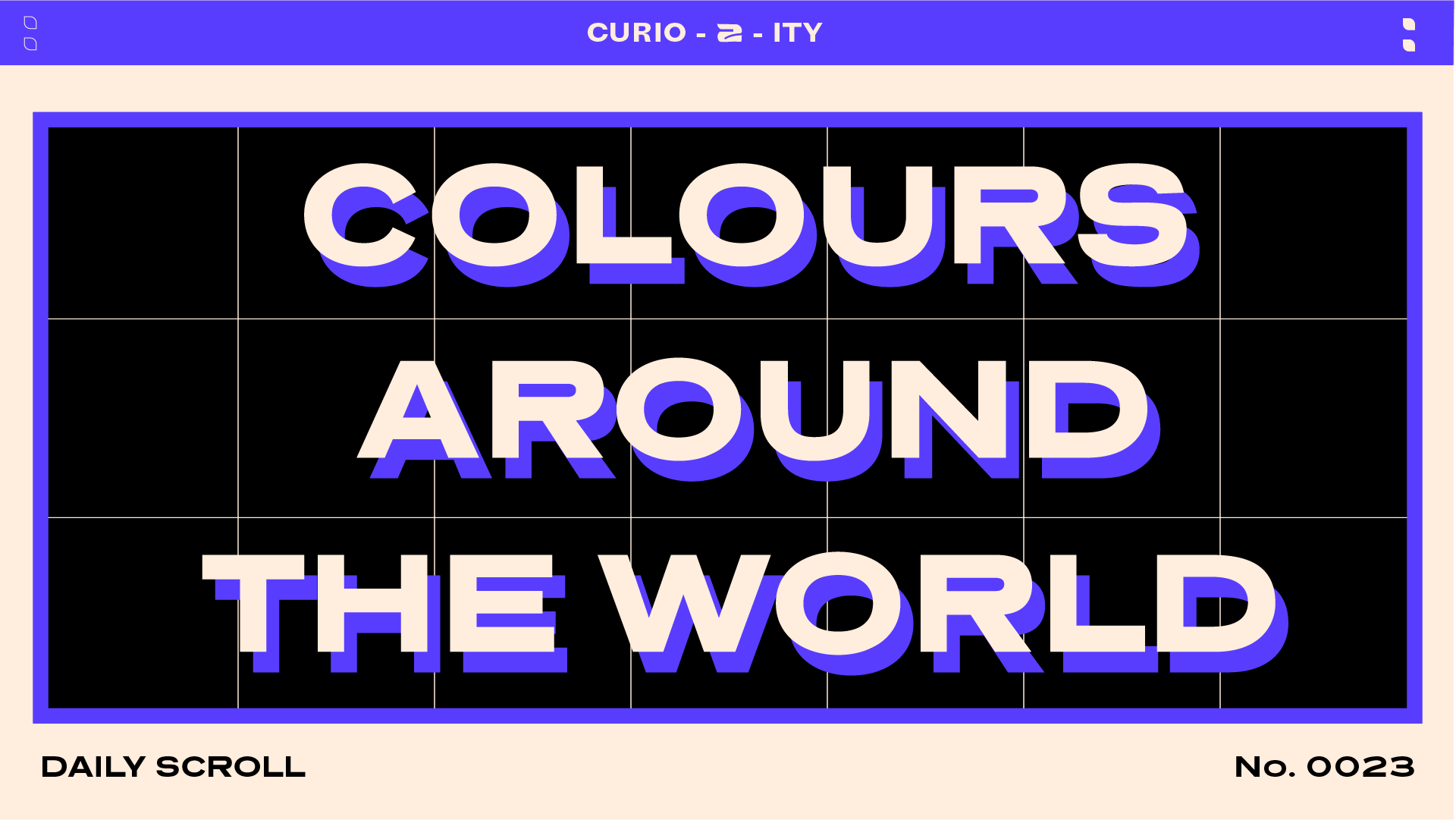
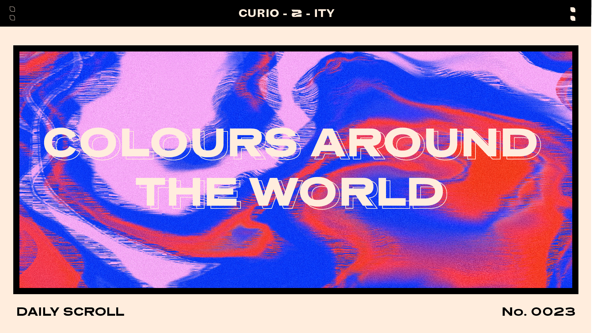
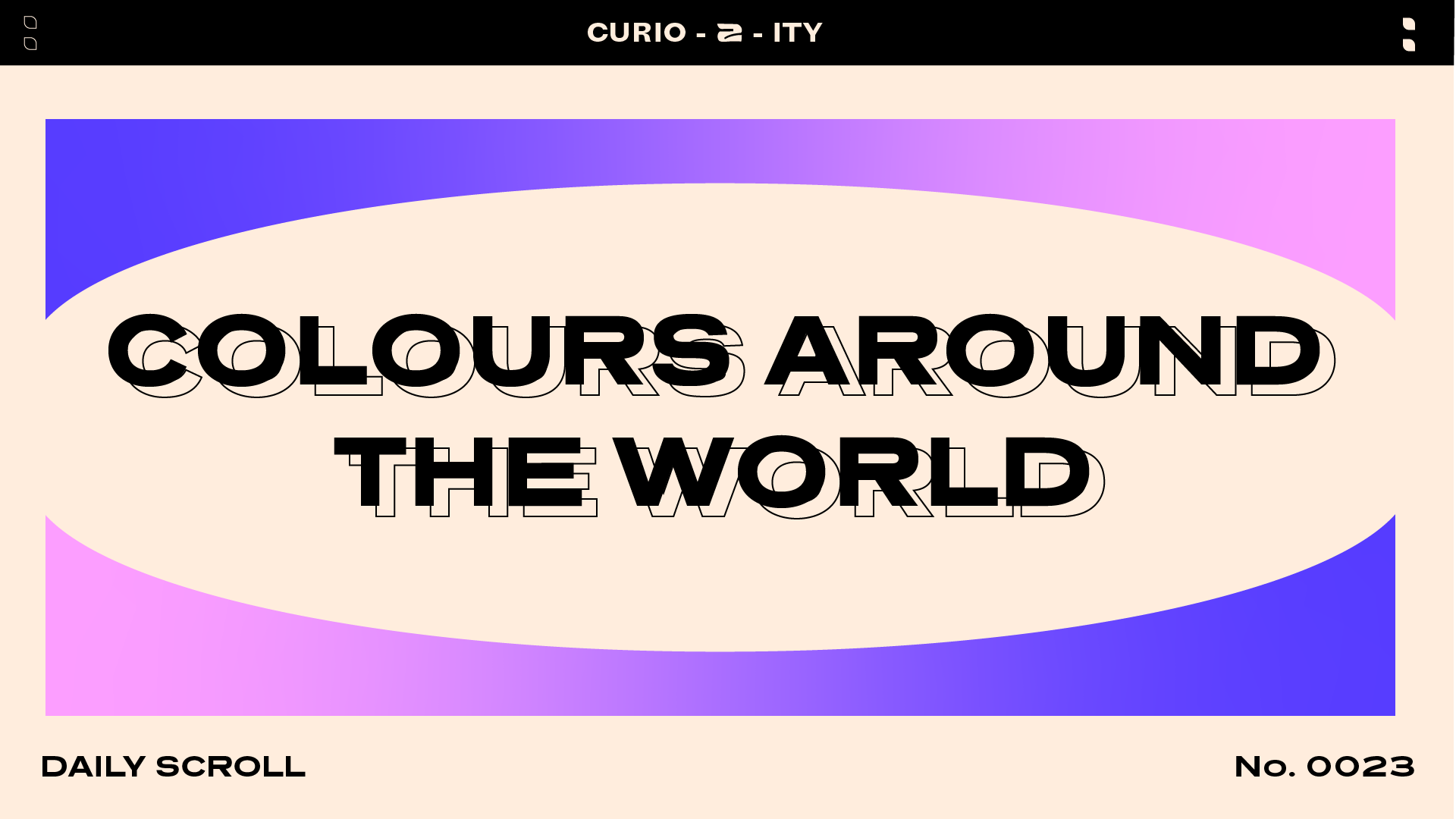
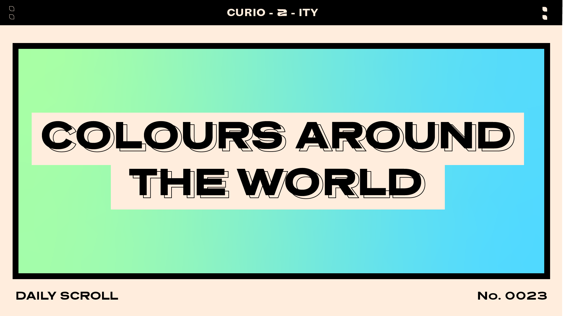
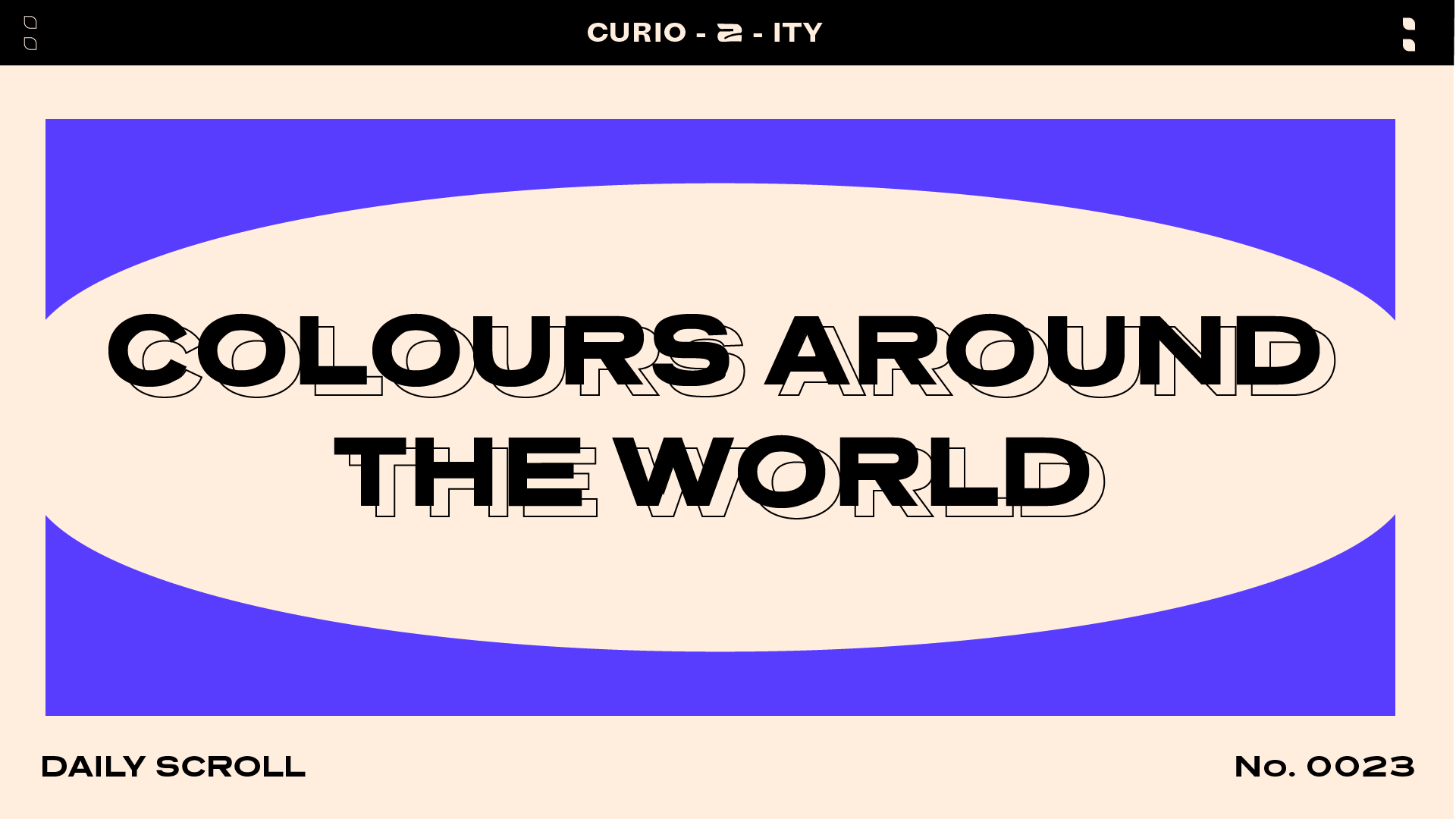
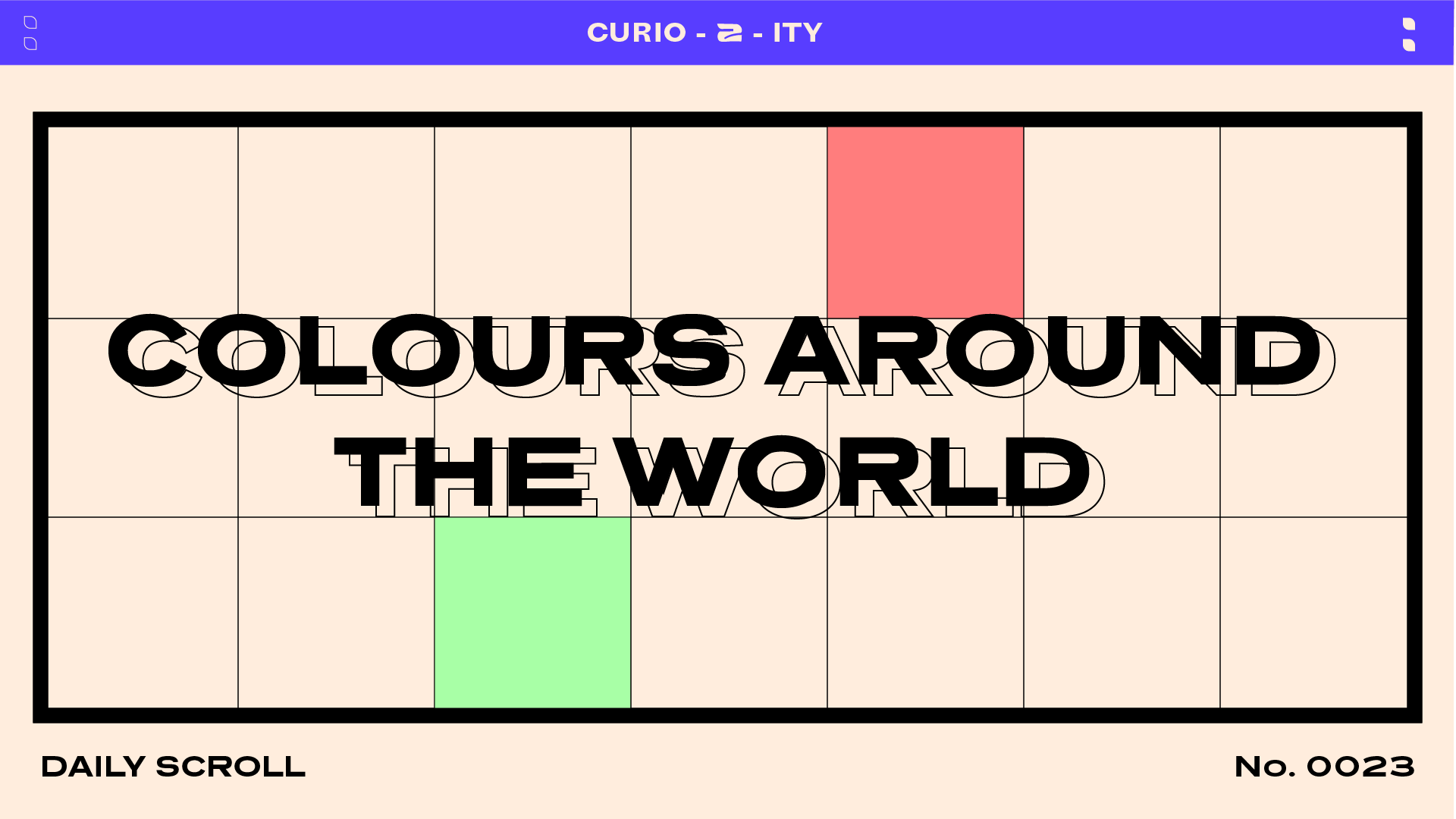
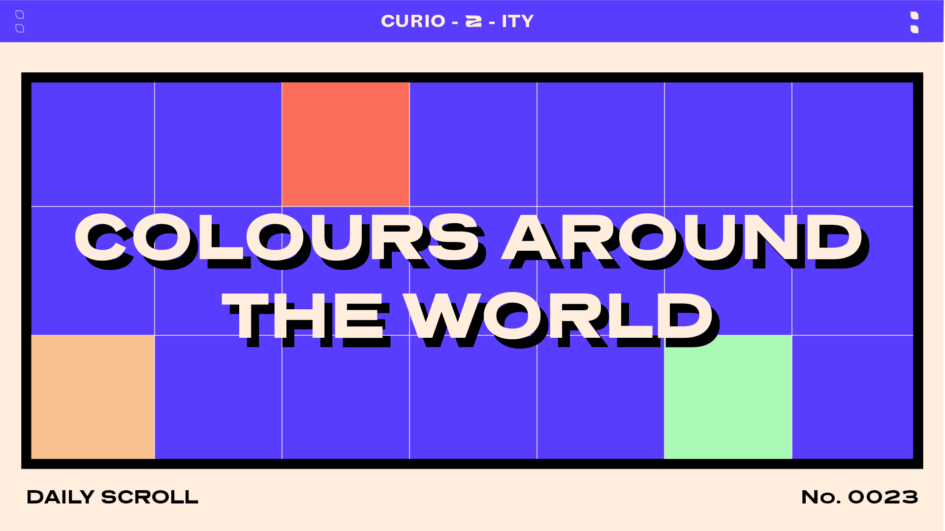
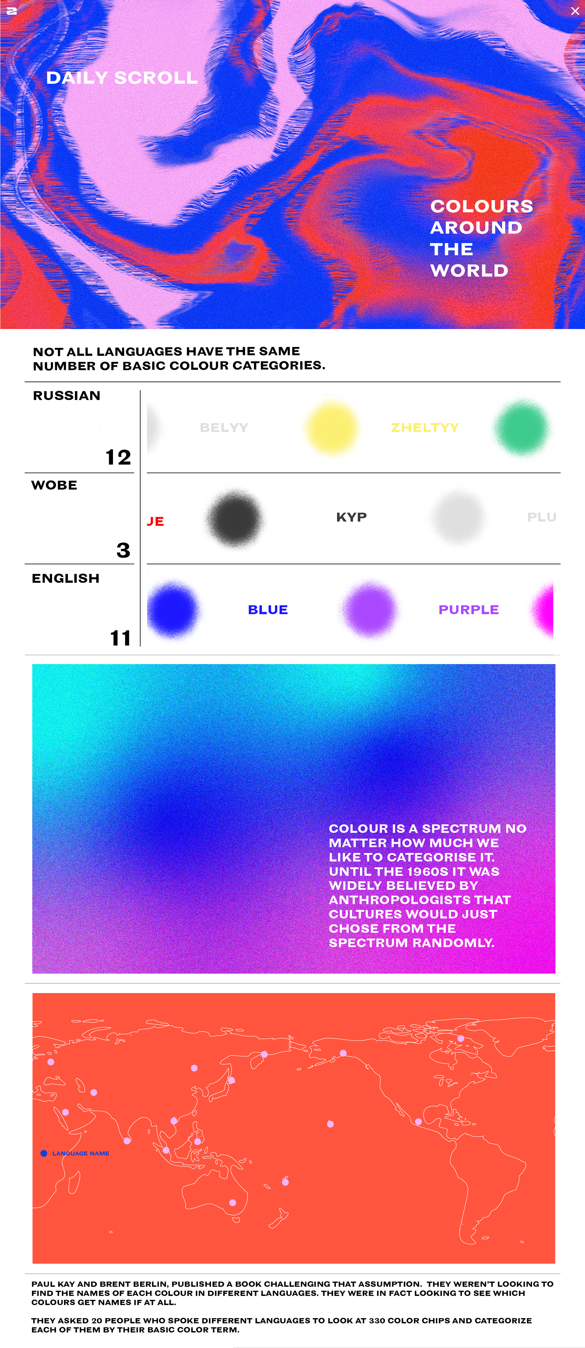
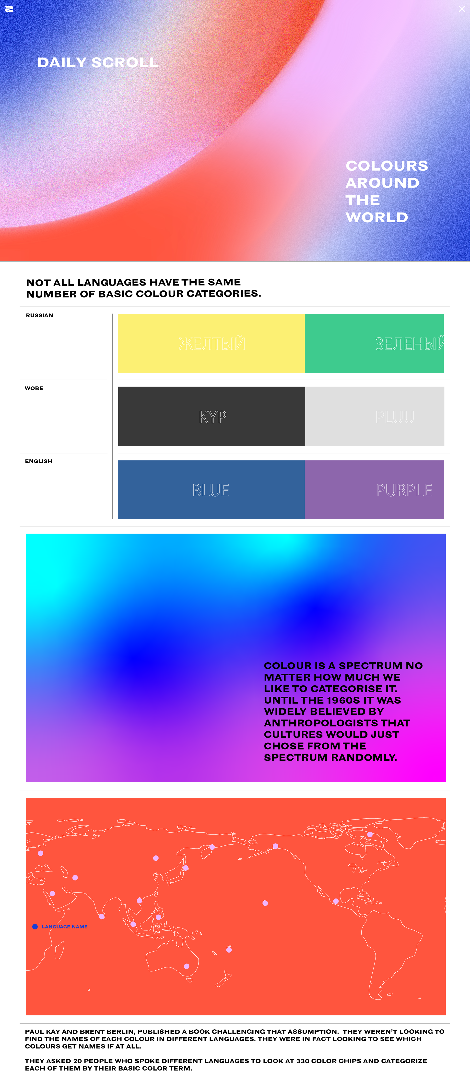
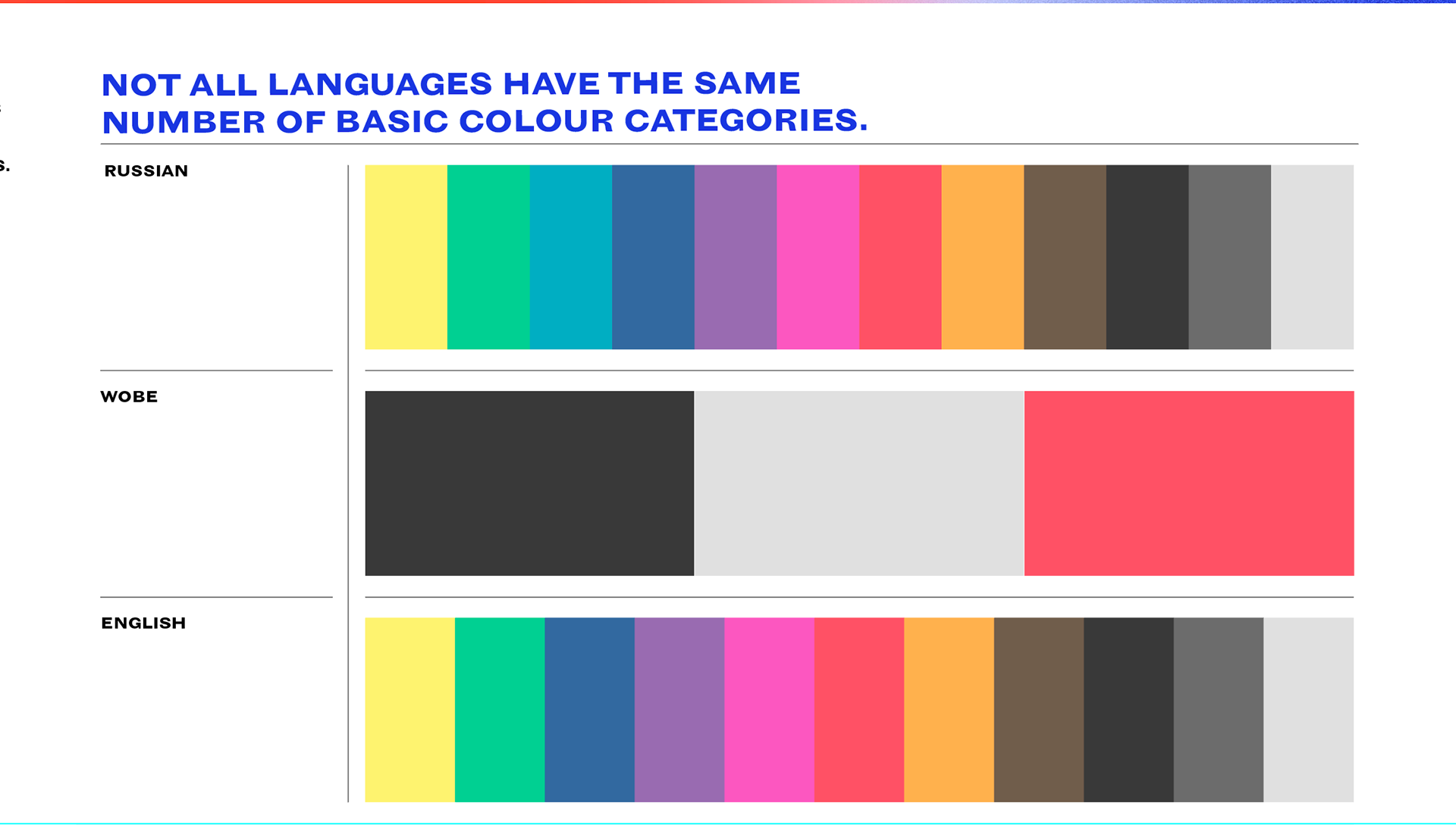
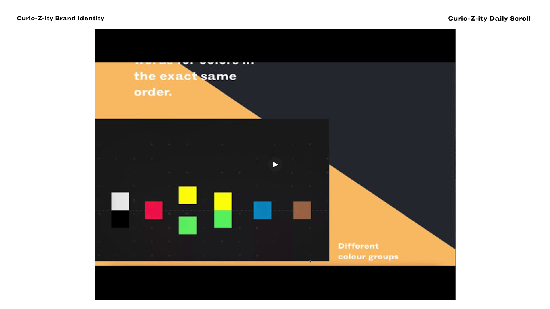
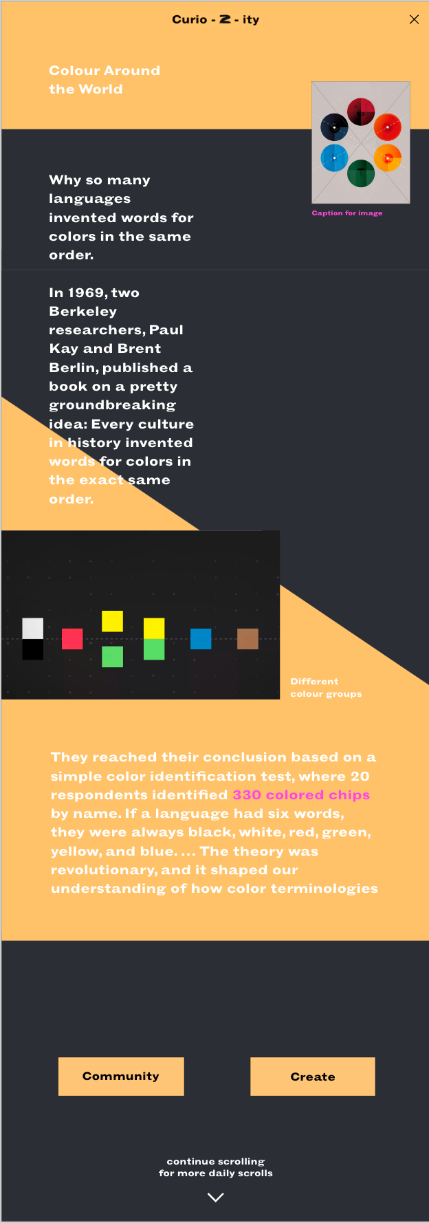
Further development of the daily scroll. I felt it needed some playing around with - annotations are on the photos.
As well as font change annotations on the image you you make have to zoom int.

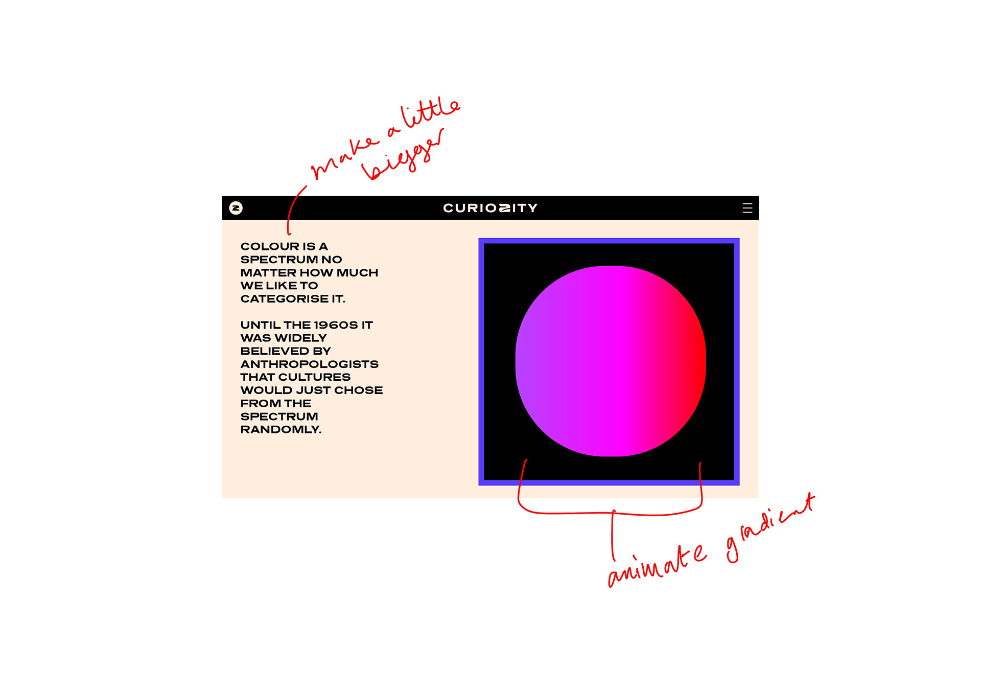
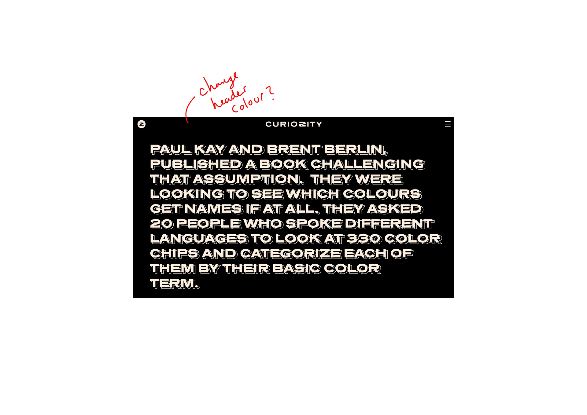
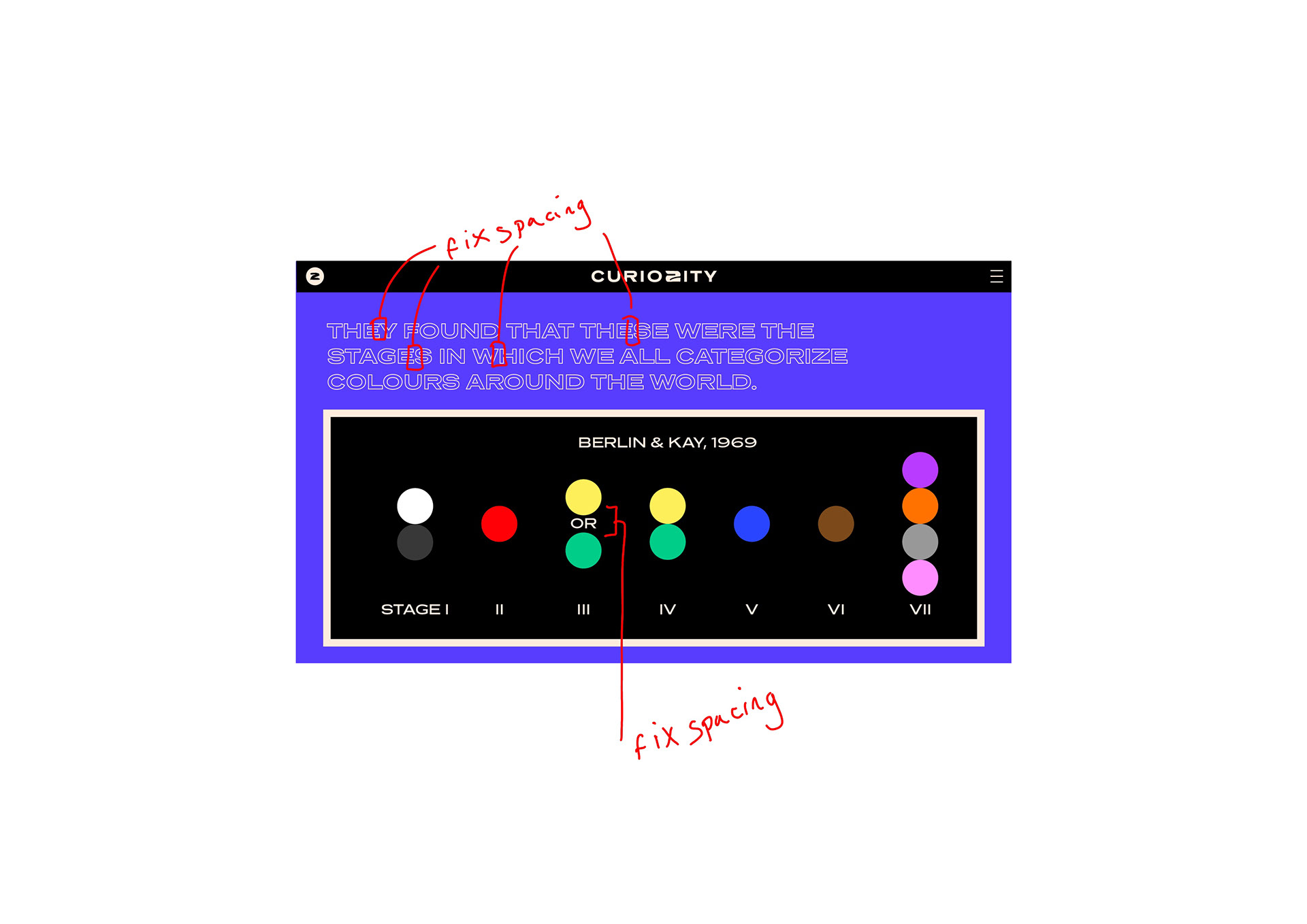
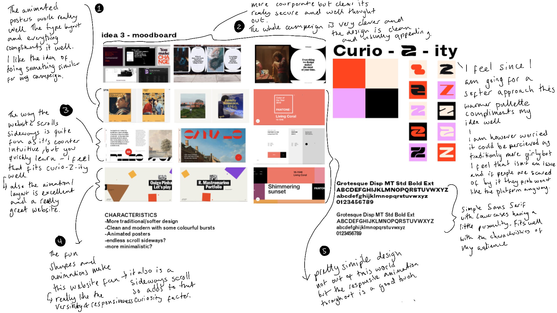
I've developed my initial 'idea three' design to this - you can see some of the similarities but I think you can see it's improved further. I feel like it's more secure and considered. I toned down the colours I felt I didn't need that many.
< Voice Over
< Voice Over
< Voice Over
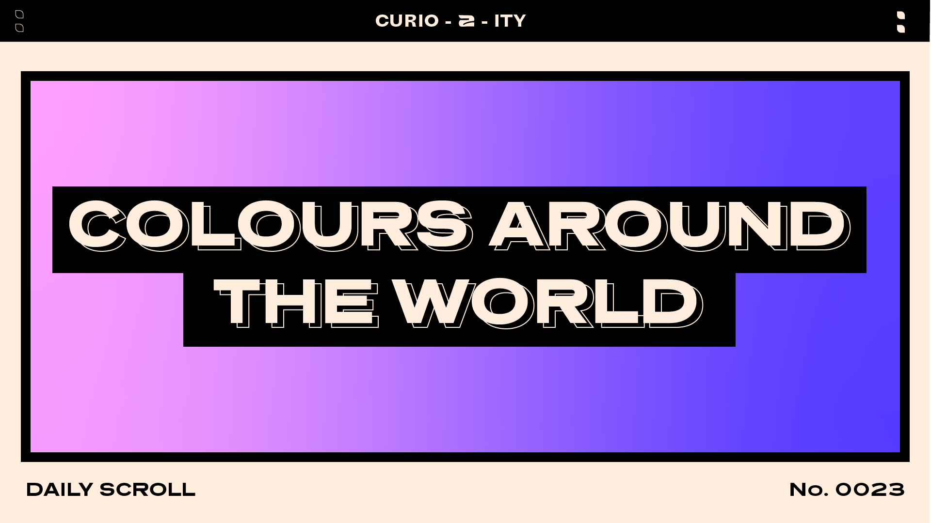
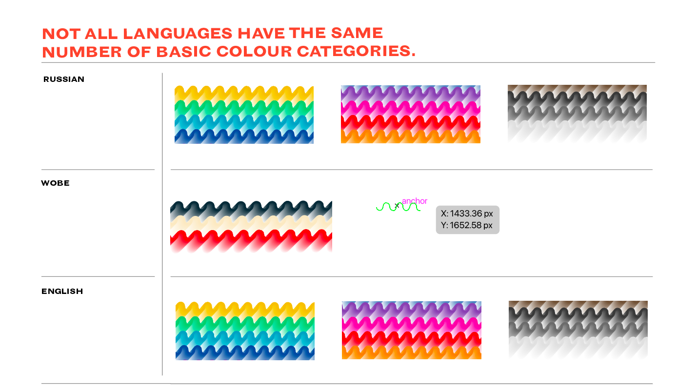
CHOSENT STYLE (IDEA THREE)
I am now Beginning the development of my chosen style, above is what I developed form my idea below. I will begin by designing the daily scroll and experiment with different ideas and angles. I may find that my style ends up changing a little or takes on inspiration from my other two style ideas but hoping to focus on the in your face style.
After the website is done I will look at the campaign and social media aspect.
With my other ideas I initially thought I would choose one of them but really glad I experimented as I didn't feel the design I did for them were so good. Shows it's good to experiement.

Voice Over ^
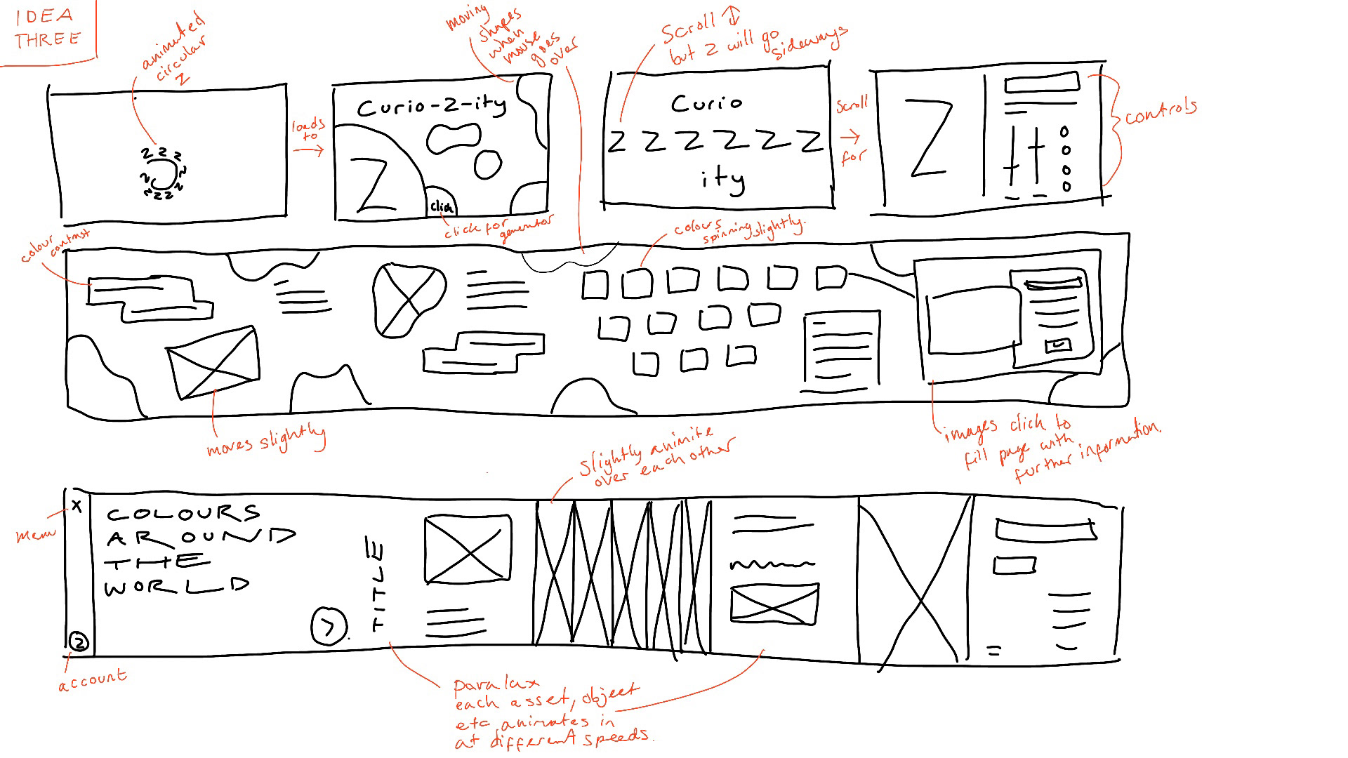
IDEA THREE
Above is my development for this idea.
1. https://spin.co.uk/work/mubi-campaigns
2. https://www.stinkstudios.com/work/wetransfer-please-leave / https://www.stinkstudios.com/work/youmake-wetransfer
3. https://canals-amsterdam.nl/
4. https://patrickheng.com/
5. https://color-of-the-year.com/


IDEA TWO
Above is my development for this idea.
1. https://www.newrafael.com/websites/
2. https://www.stinkstudios.com/work/riot-lcs
3. https://spin.co.uk/work/mubi
4. https://www.itsnicethat.com/partnerships/new-world-today-at-apple-its-nice-that
5. http://templo.co.uk/work/who-are-we-identity-digital-platform
6. https://www.pentagram.com/work/satalia?rel=search&query=deck%2520design&page=1
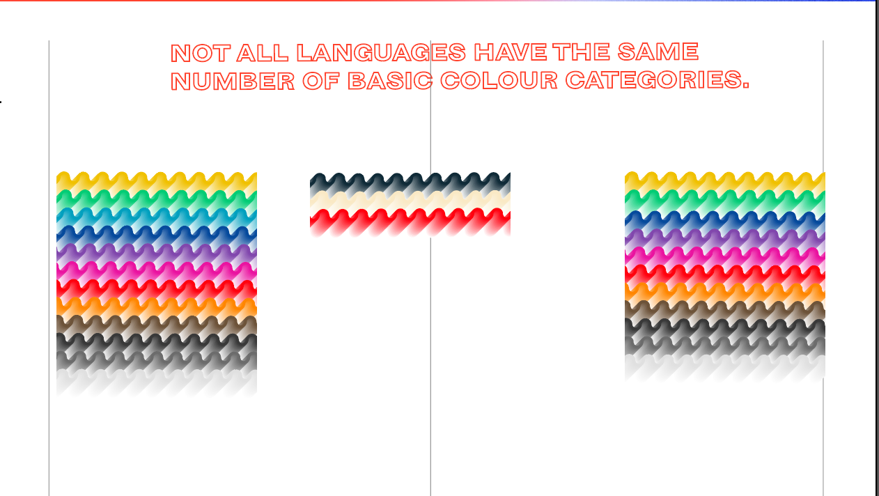
I did a voice over on the video instead of a written annotations.
I did a voice over on the video instead of a written annotations.

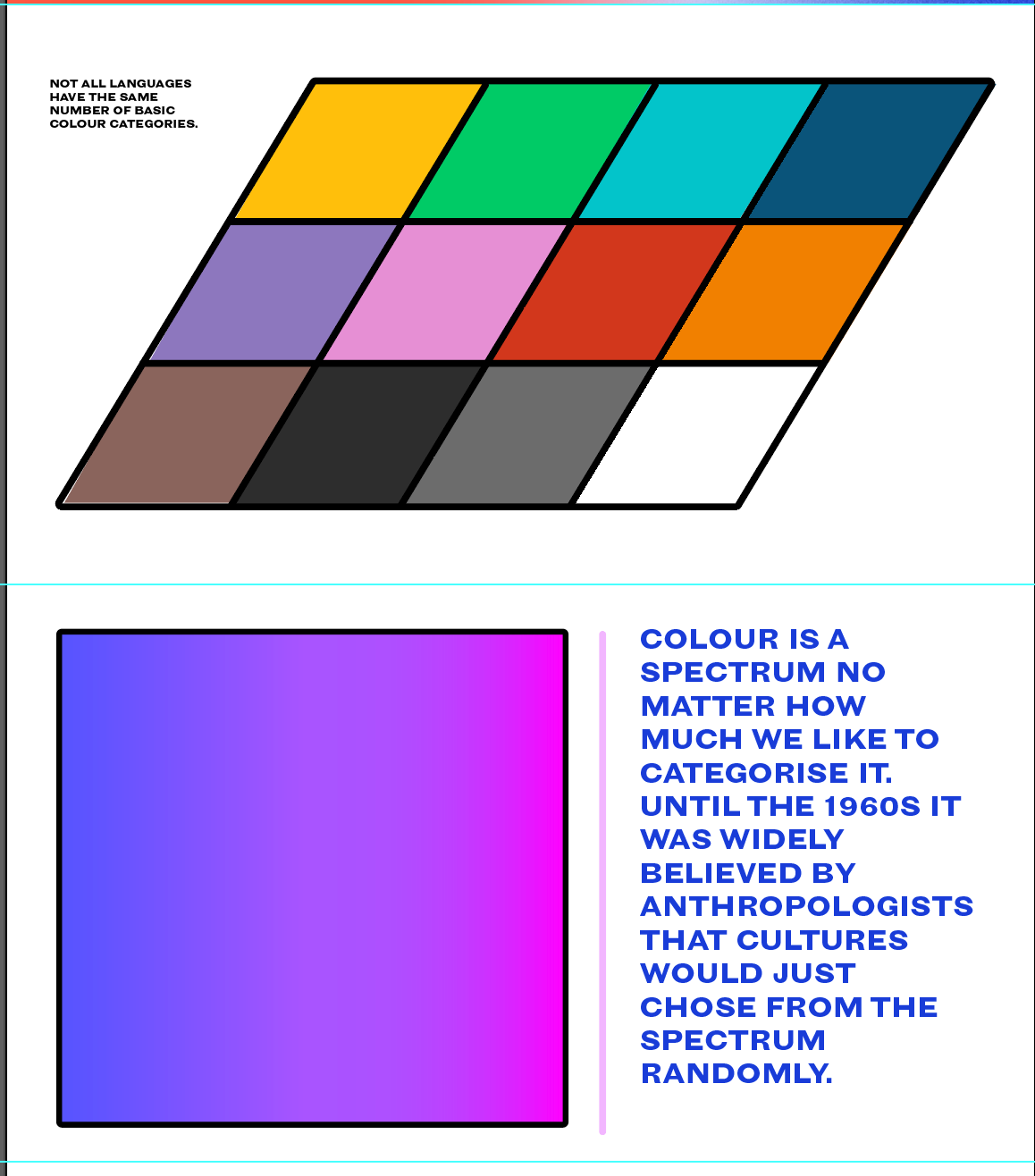
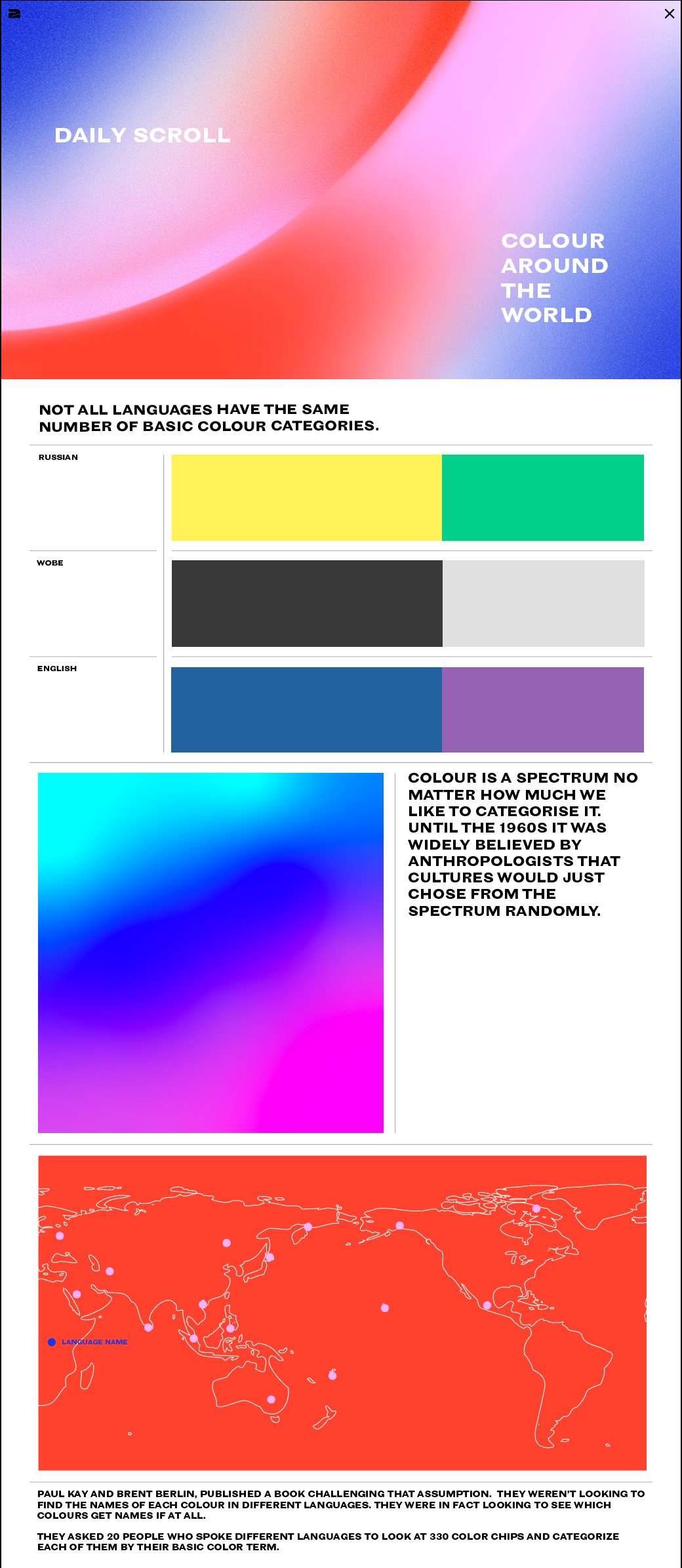
I develop it all a bit basing it on the wireframes below. I also spent some time fine tuning the written part from it from the help of: https://www.vox.com/videos/2017/5/16/15646500/color-pattern-language.
I wanted to have some brand shapes and try to use the color in a strong intense way without it being too over the top.
IDEA ONE
Above is my development for this idea.
1. https://www.stinkstudios.com/work/spotify-design
2. https://www.stinkstudios.com/work/spotify-spotify-x-notting-hill-carnival
3. https://rememberwhomadethem.com/
4. https://www.creativeboom.com/inspiration/ananya-mohan-on-social-purpose-avoiding-stereotypes-and-her-dazzling-practice/
5. https://www.creativeboom.com/inspiration/badal-patel/
Tutorial with Fern - questions.
Chatted with fern about what route to go - talked about developing three ideas now rather than going back as well as cutting down my deliverables. I really think these decisions will help me work end up being better. Also getting rid of the merch and festival idea as isn't directly needed.
Should I go back and annotate my colour choices etc, i'm worried I haven't developed enough. Might my development be good enough if when I get to doing my deliverables I show different versions of the same thing? In terms of talks and digital fridays what would be enough for a good enough grade - I couldn't make all of them but if I wrote about the artists/speakers would that help as I still want to find out about them.
Last project I developed one idea extensively which is in part why my grade was lower so I want to show that I have thought about things from all angles. jumped from research to final outcome quickly.
for the website do I need a chat room, sign up etc area designed?
I booked onto a tutorial with Graham and Darcy. I want to push my design further and make sure I experiment enough compared to my last unit. I asked about how I should present and whether similar to the desk that adam showed in house keeping would be good. Also spoke about annotating my work and that in terms of experimenting have a go at doing a couple different angles for each deliverable to show I've looked at the design from more than one angle.
In terms of places to look they agreed that sites like behance can be good but often they might just show current design trend - I explained that if I could whilst I'm trying for my identity to appeal to Gen Z and whilst a lot of the popular trends may only have their 15 minutes I would quite like to make it seem that it could last longer than fad design. They both suggested looking at creative boom, eye on design as well as design studios like Spin in London, Build in Leeds as well as Designers Republic. I mentioned that I have been looking at some along the way and that place like pentagram and they agreed that it's a good place to see design styles that have a solid and secure character.
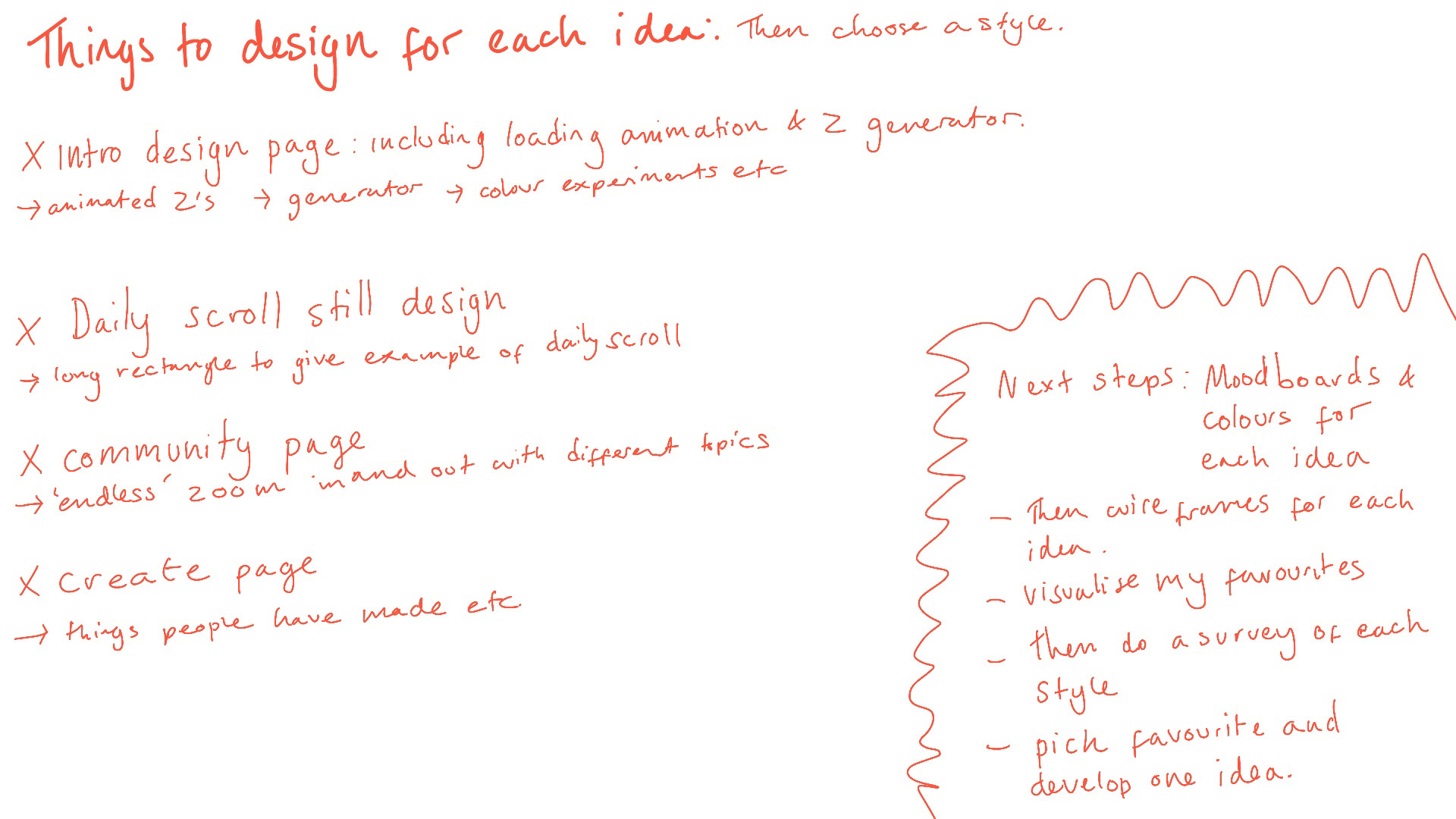
Deliverables
Questions - should I design it as a deck for my final portfolio? in terms of experimenting i need to show verity would experimenting my colour, font etc be good thing to do - find recommendations?
website: 4 Pages
intro page, daily scroll, community page, create page, shop page
social media: 1 page
instagram feed/stories
campaign: 1/2 pages
posters plastered around with minal but intriguing context to make you want to go to the website
kiosk for festivals and events: 1/2 pages
mockup of travelling desk - would sell things but also inform etc.
I booked onto a tutorial with Adam and Liz. My main reason was to get feedback on what to create for my deliverables. They liked my idea and the community aspect - would they did mention was to think of ways of presenting it outside the website/online platforms. How would people find out about? They spoke about a possible publication, festival kiosk and just to think of ways that it could be present externally.
Some ideas I have are posters with little context that would be plastered around e.g. around schools, billboards, student unions, club toilets,
Deliverables ?
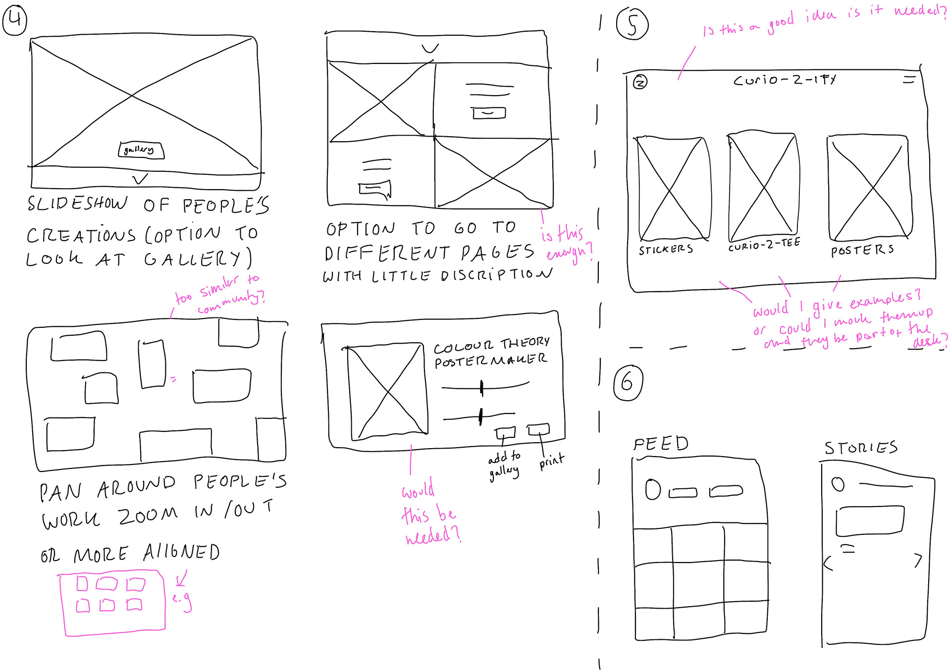
questions - do I need all of these examples, suggestions for how to mock it up? should i have a video xd thing but also design a deck for my final portfolio? is there something missing or do I have too much of something? do i put captions explaining on my portfolio? I want to community aspect to be clear and make sense. I will have one topic example is that okay? and with no. 3 I will have place holders can i use other imagery or best for it to be mine? do i need a mock up page for sign up/log in, how to add a submission/topic etc
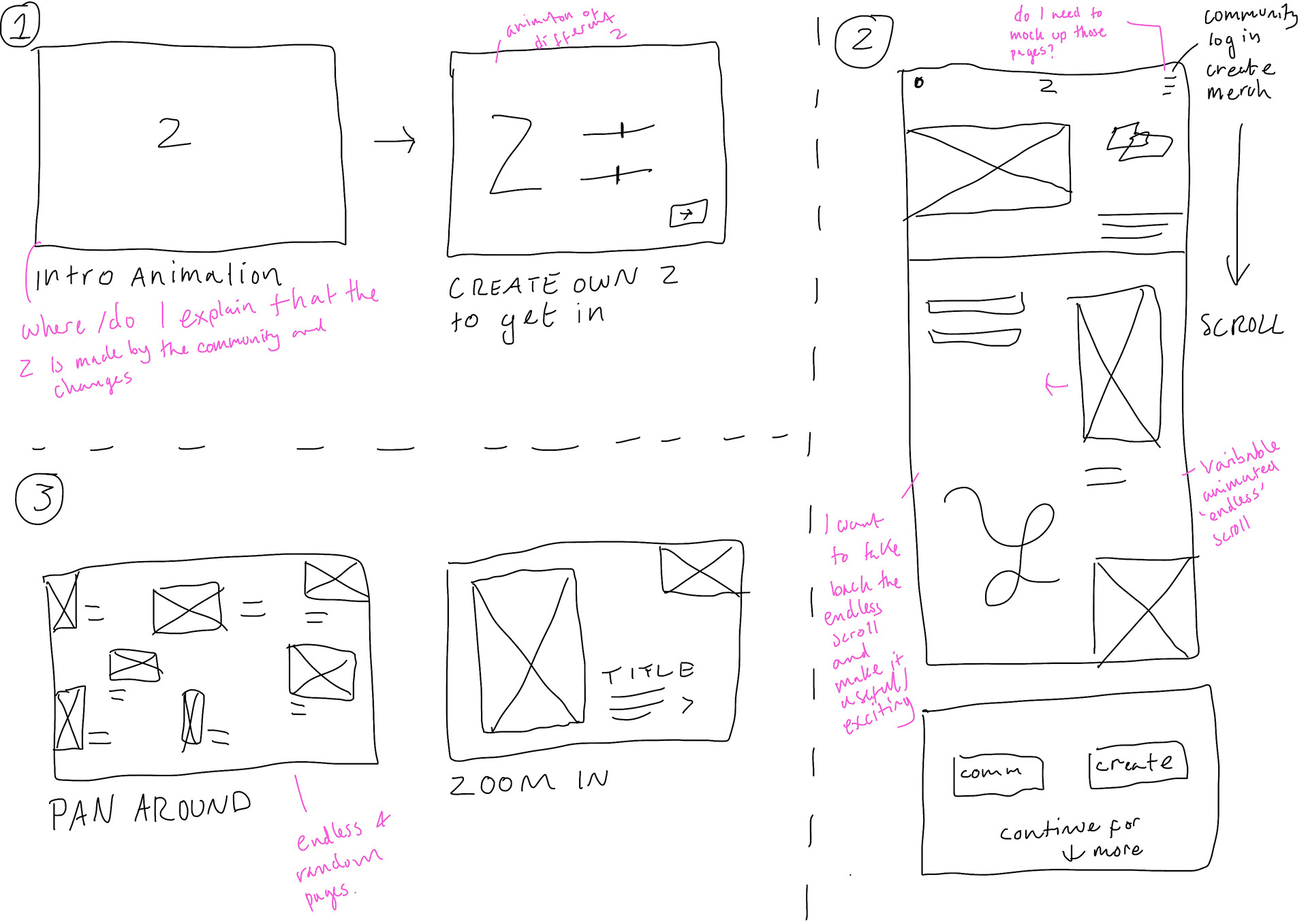
1. Animation of getting on website - 'curtain' open to Z creator.
2. Continuous scroll animation things animating in as you scroll. Gets you to continue, community or create option.
3. Pan around and you can zoom in and see what other people have shared/developed
4. Community page - leads to gallery
5. merch?
6. instagram feed
Bit too normal and boring nothing really stands out to me
Quite like this its a mix of boring but also a bit more character
I like the width of this one but not a fan of some of the letter like the R
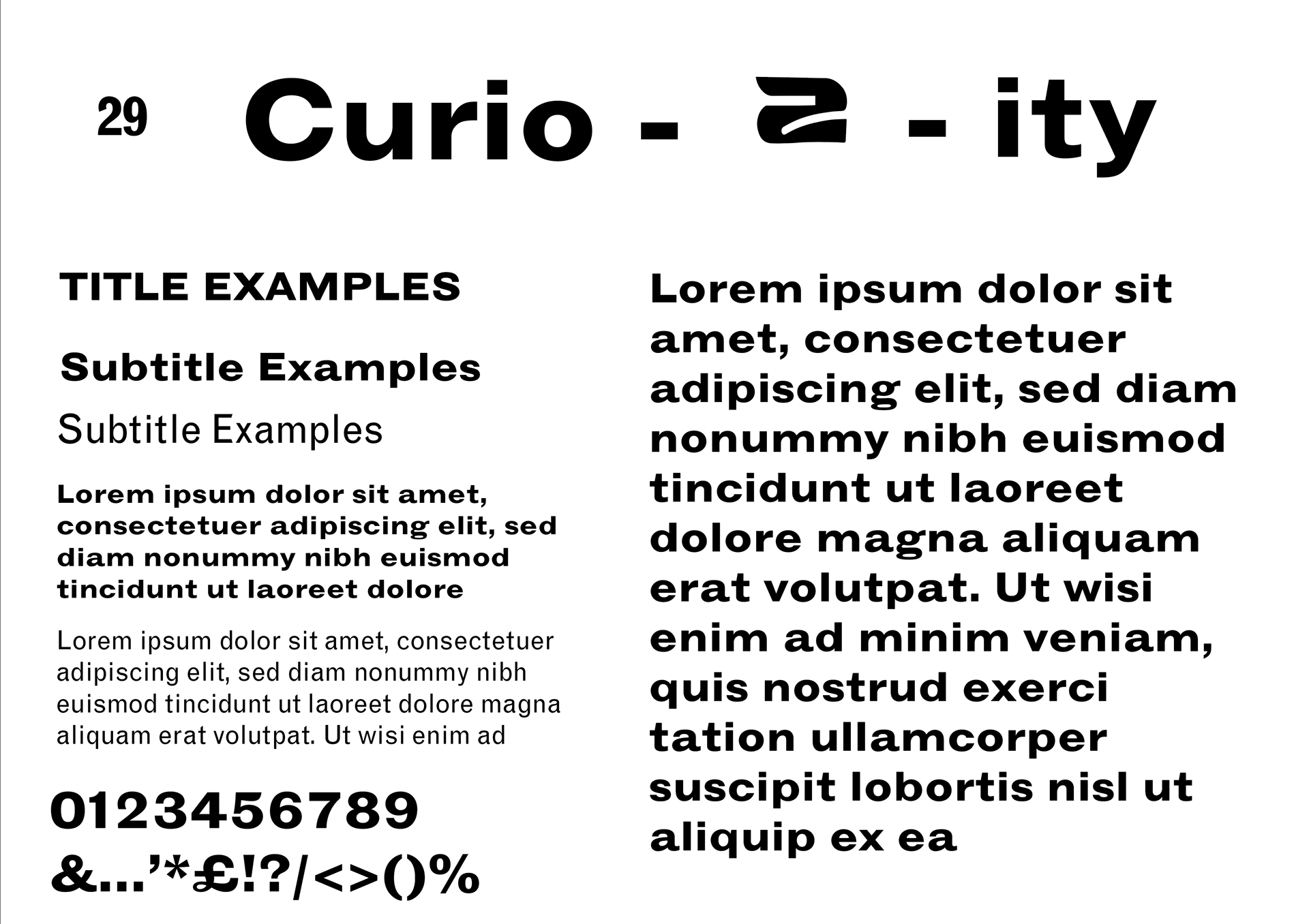
Similar to 29
I like the curves on some of the letters and exaggeration but think a little too thin

This is a meet in the middle version of 4 so also a possible
gives me cow boy vibe - don't like fore my brand
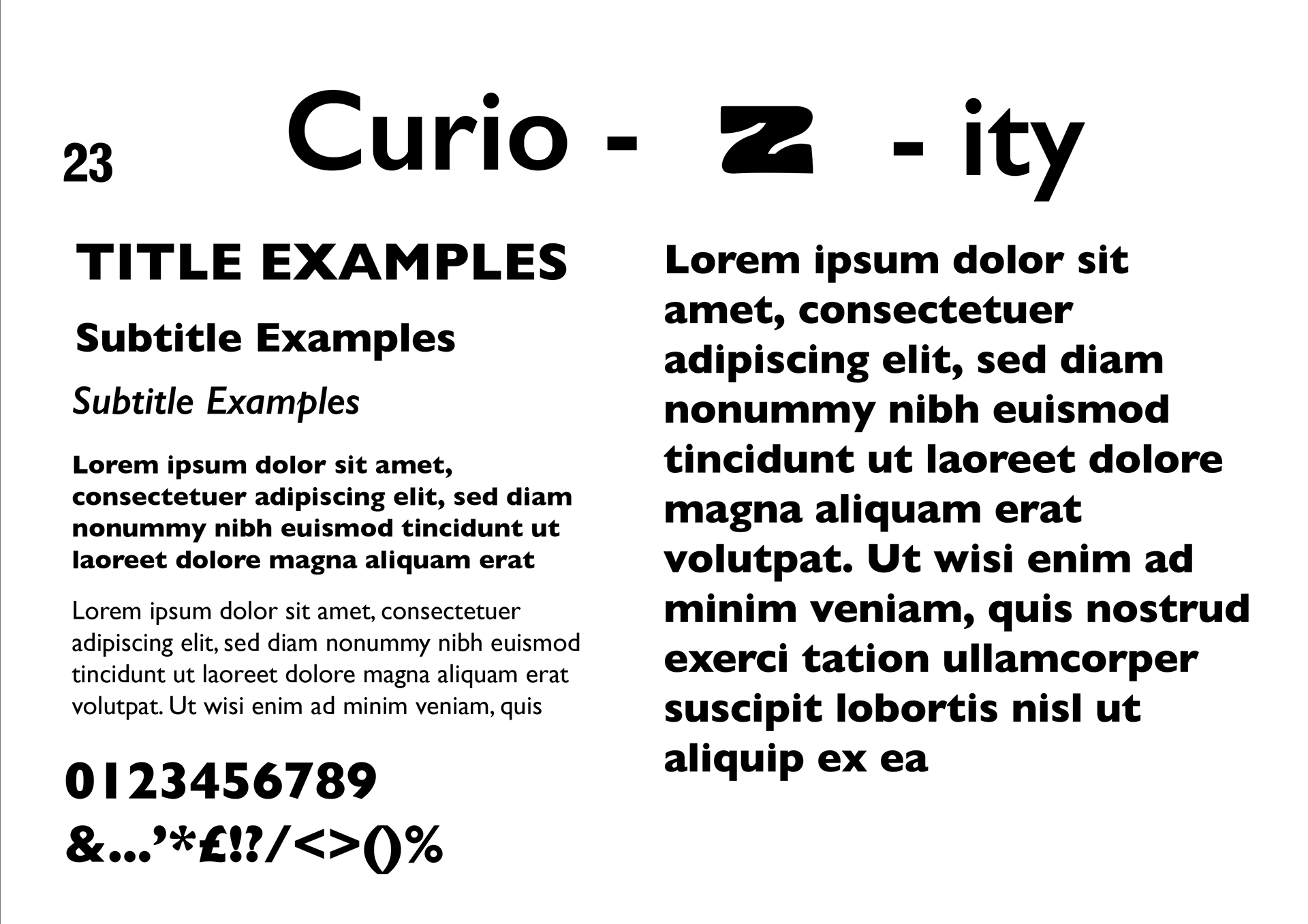
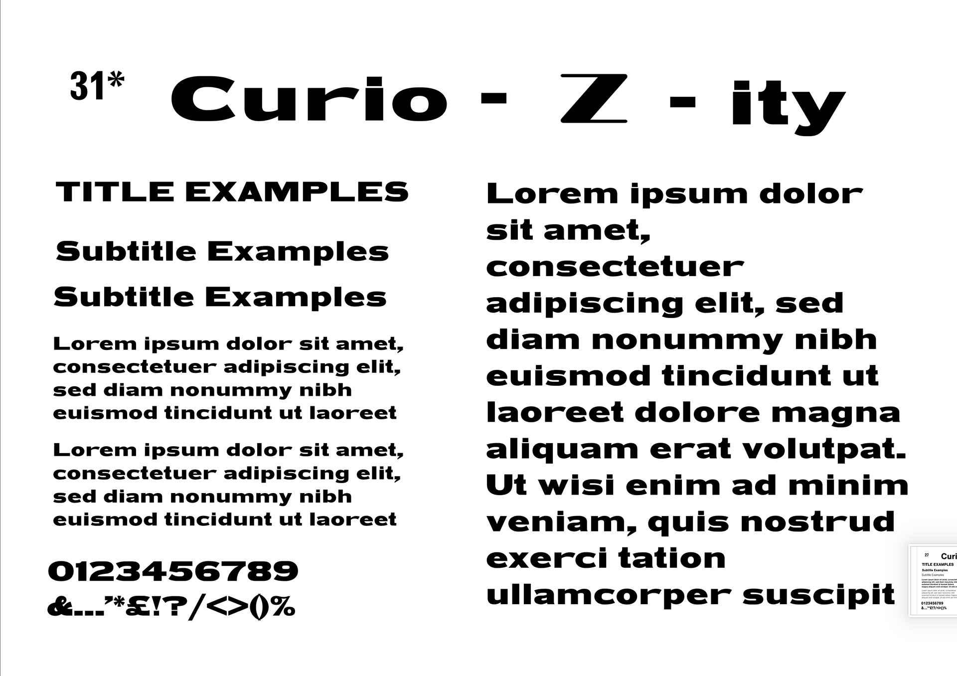
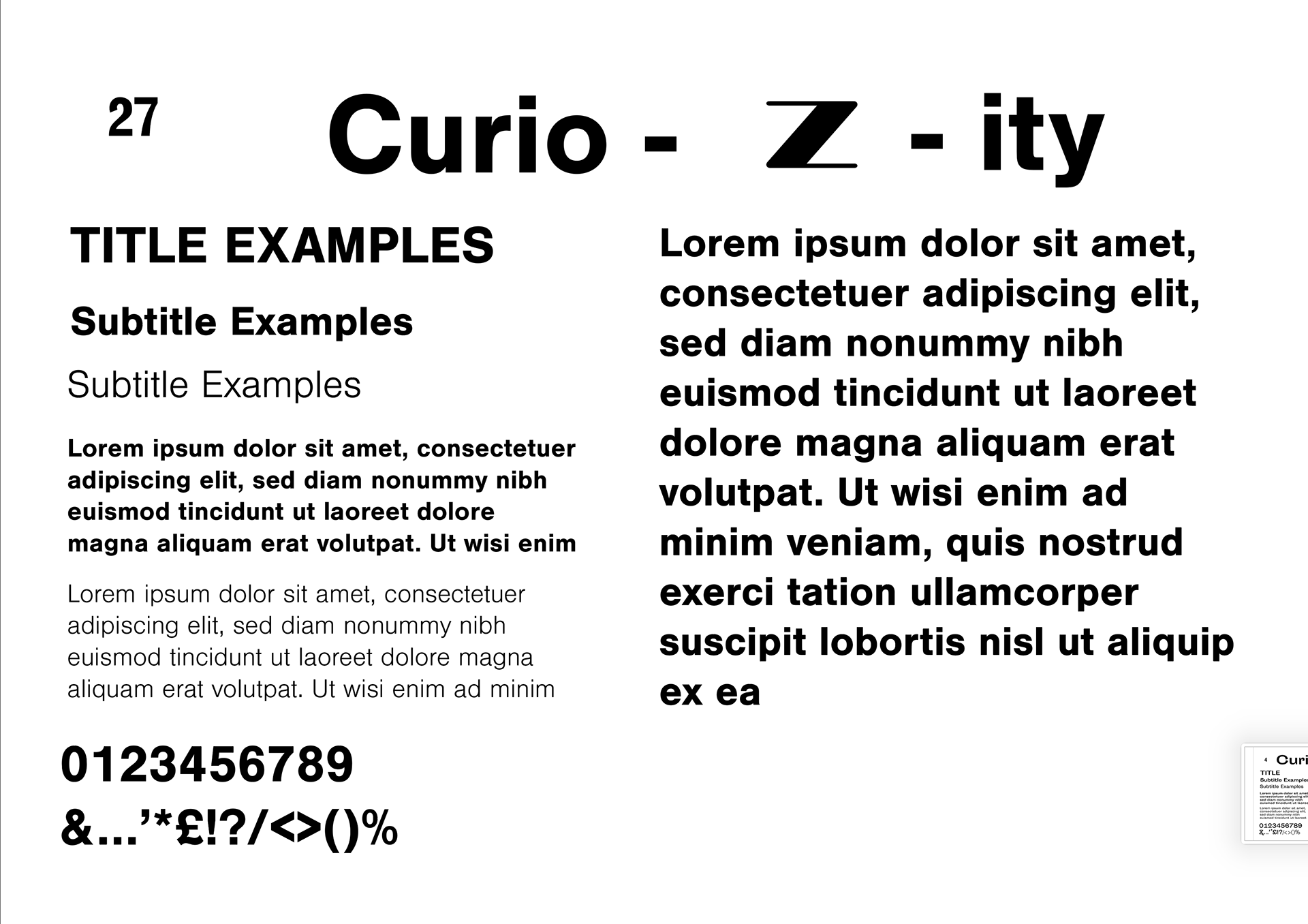
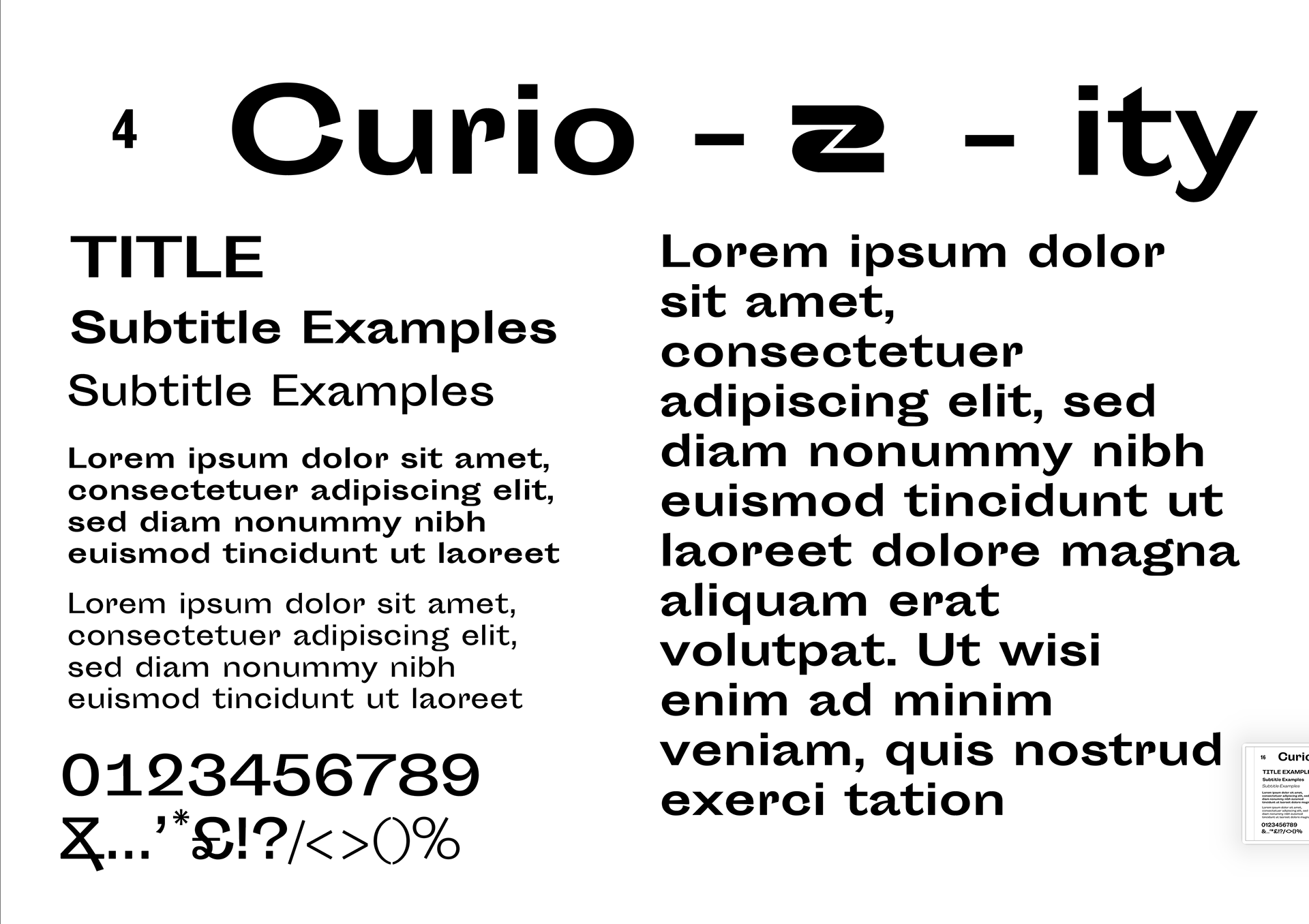
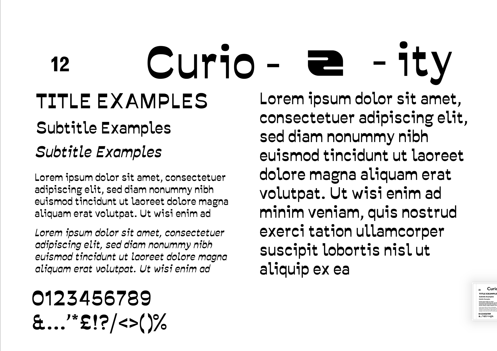
I've narrowed down my favourites from the 30 below as well as adding HWT Unit Gothic (31). I want to keep it simple and choose one font as to not over complicate things. Due to this I want to explore different weights so fonts which have more weight options might be a good thing - I am going to try to use real examples I would use them but to begin with I thought this was a could step up from below.
annotations on images
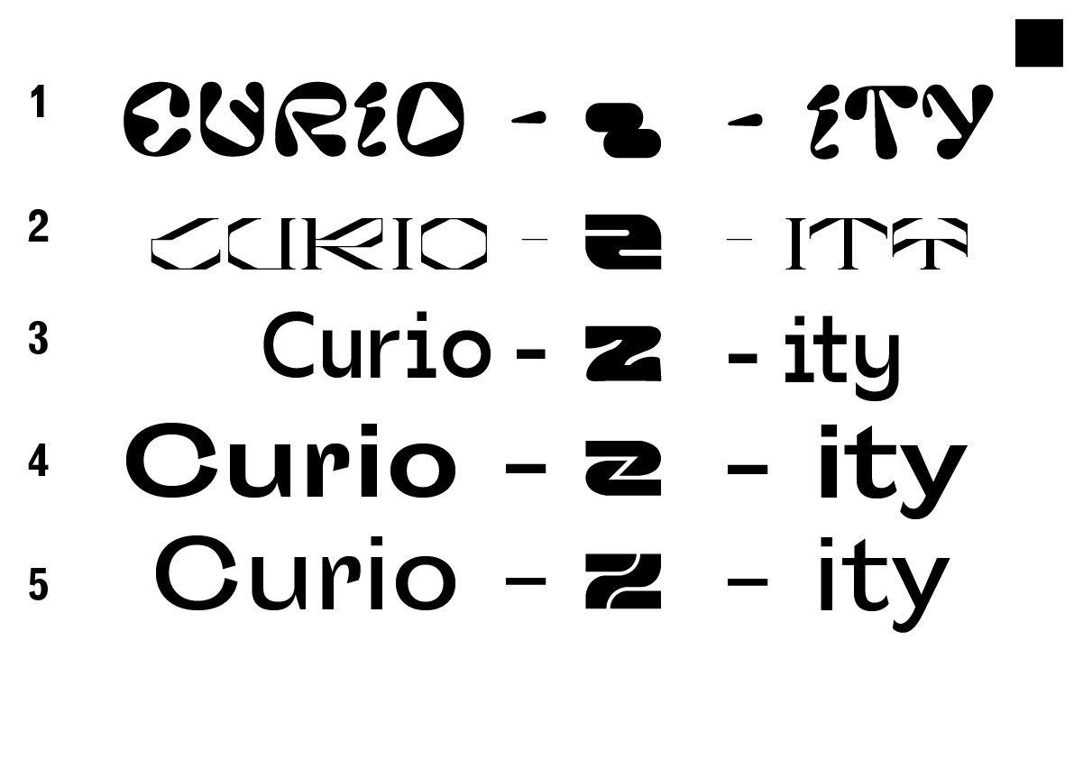
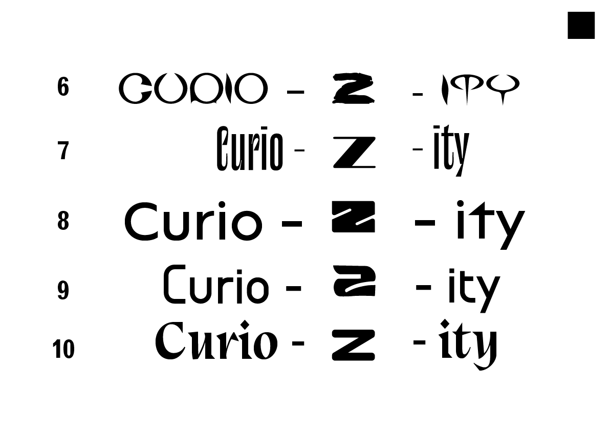
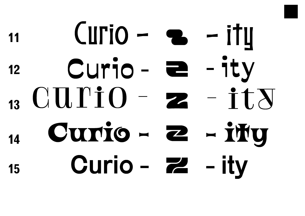
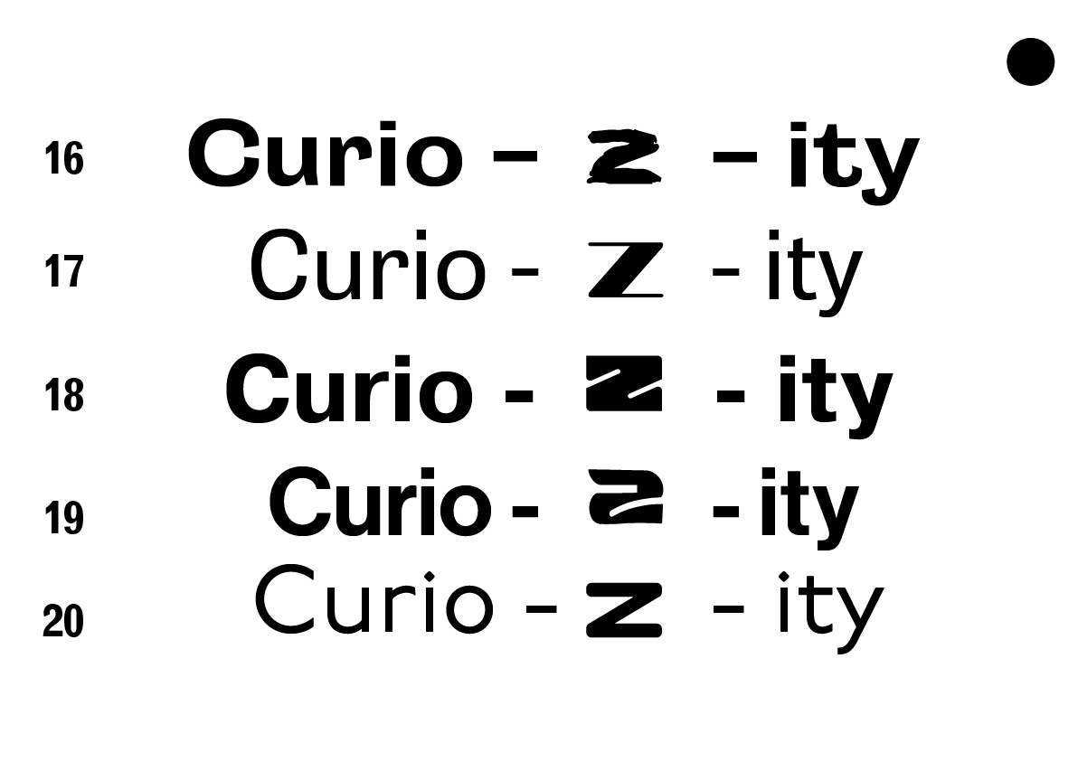
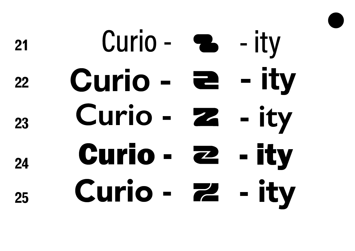
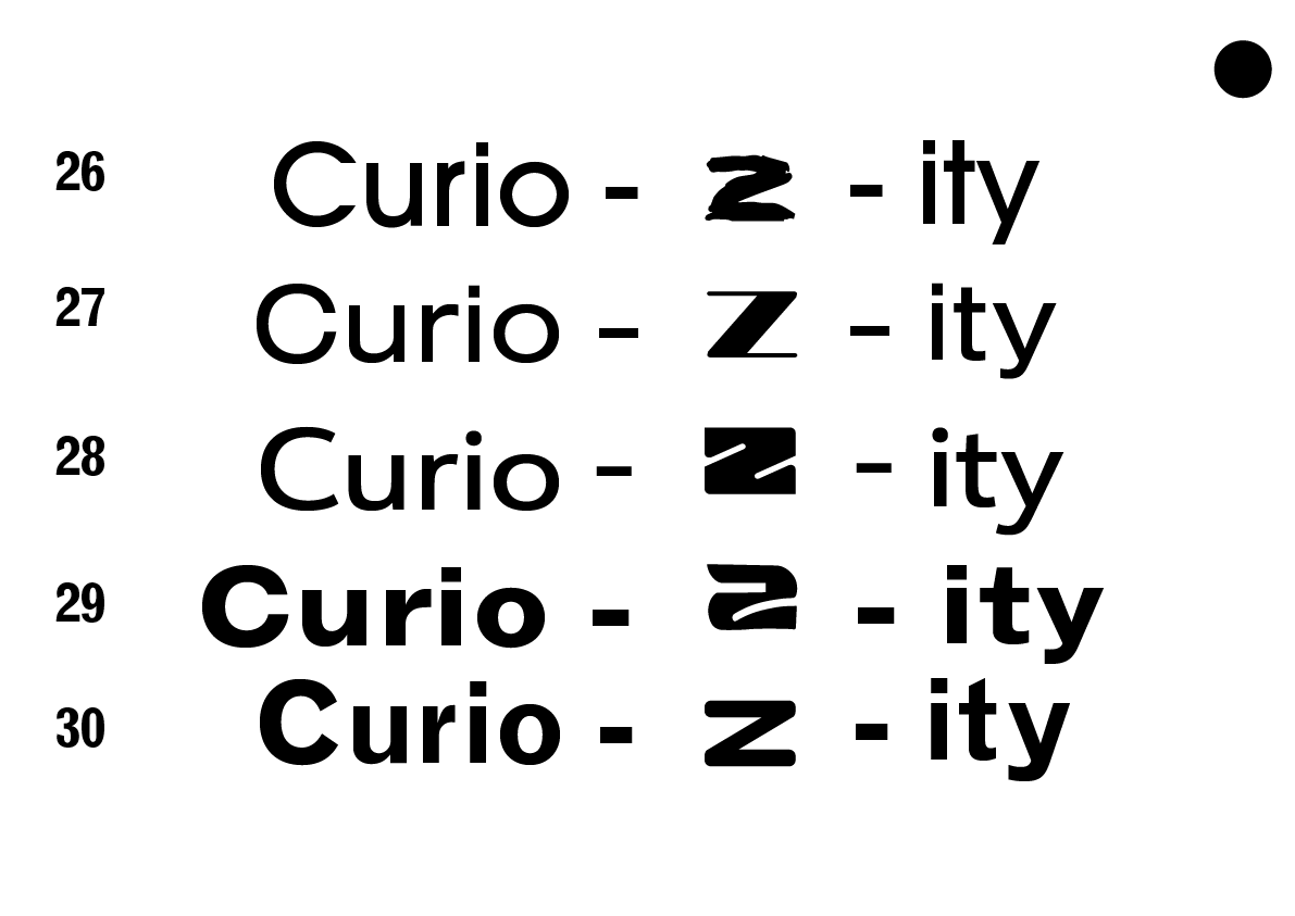
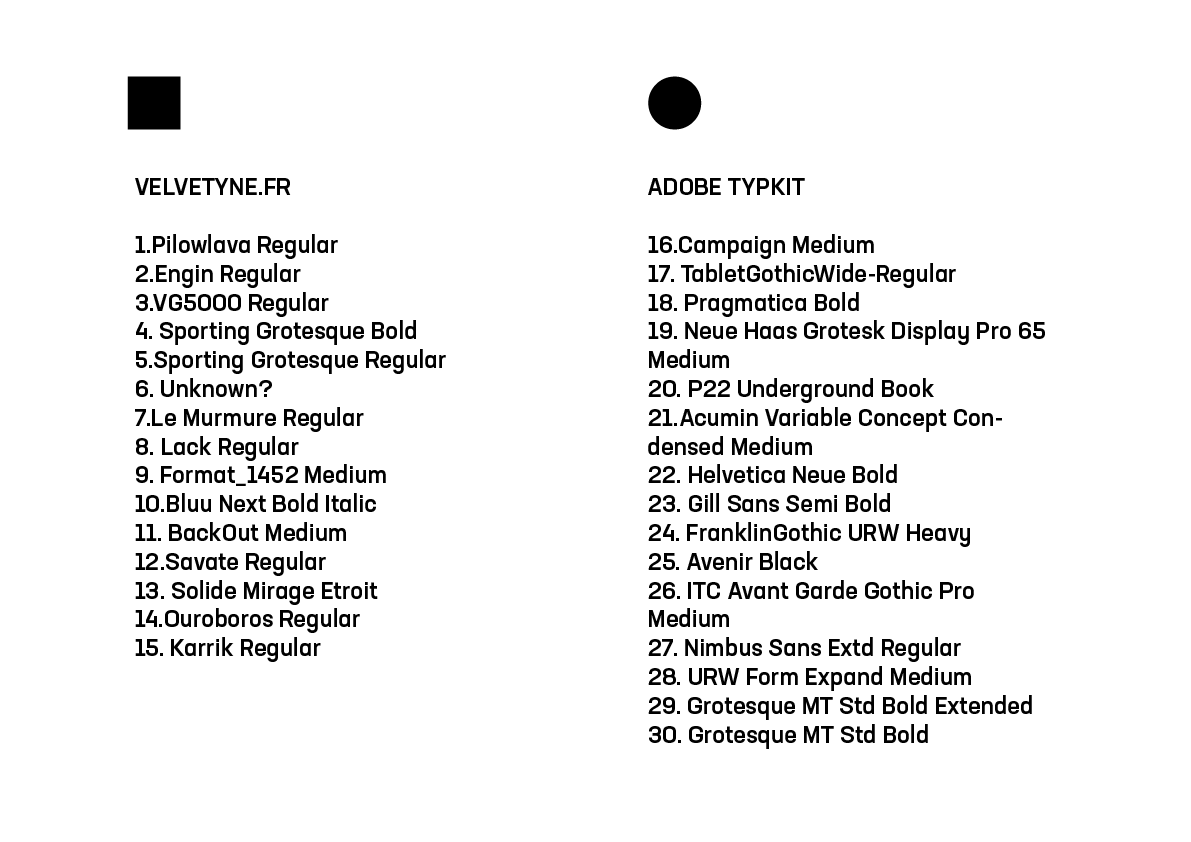
Even though I have a sort of design style I wanted to test out a range of fonts incase I found something I preferred. I got them from adobe fonts as well as velvetyne.fr. I've done previous research into font styles being used for sites, projects etc that attract my audience and these are some which seem to be popular or I think would work.
My favourite ones are from adobe typekit as many of them have variable weights - I am going to pic my favourites. I don't want something too traditional or ugly like 21 or too out there like 2.
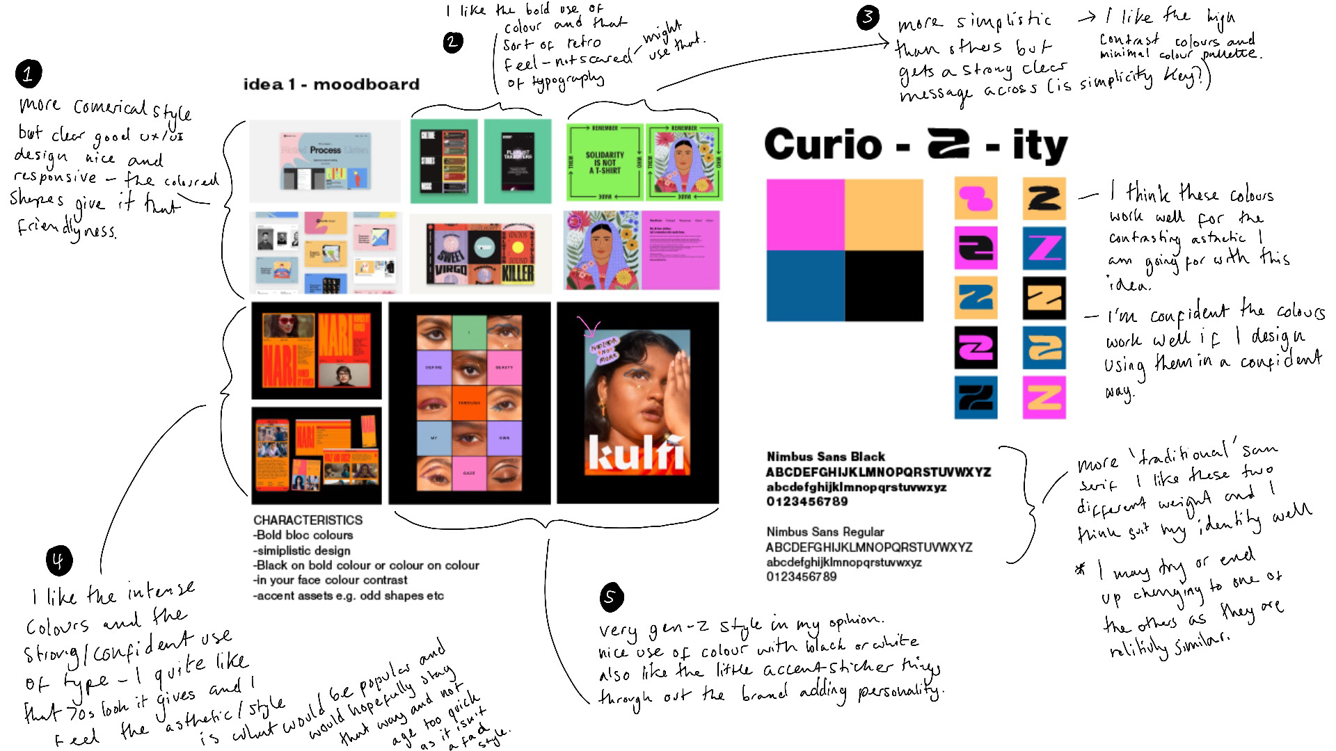
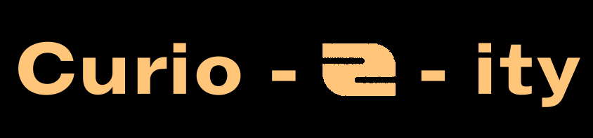
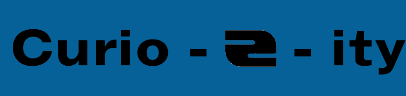
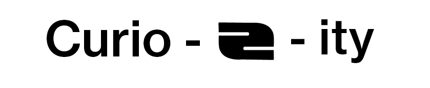
The Brief: Create a brand identify that centres around curiosity. Concept: A curious space for the curious. Where they will find the unexpected in an unexpected way, making the curious community curiouser and curiouser. Who is it for: People who are eager to learn and predominantly aimed at the older ‘Gen Z’ generation (say: 15-24years olds).
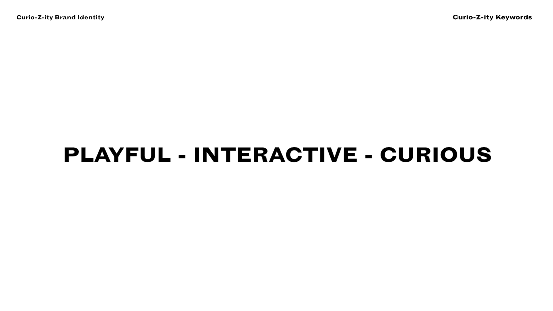
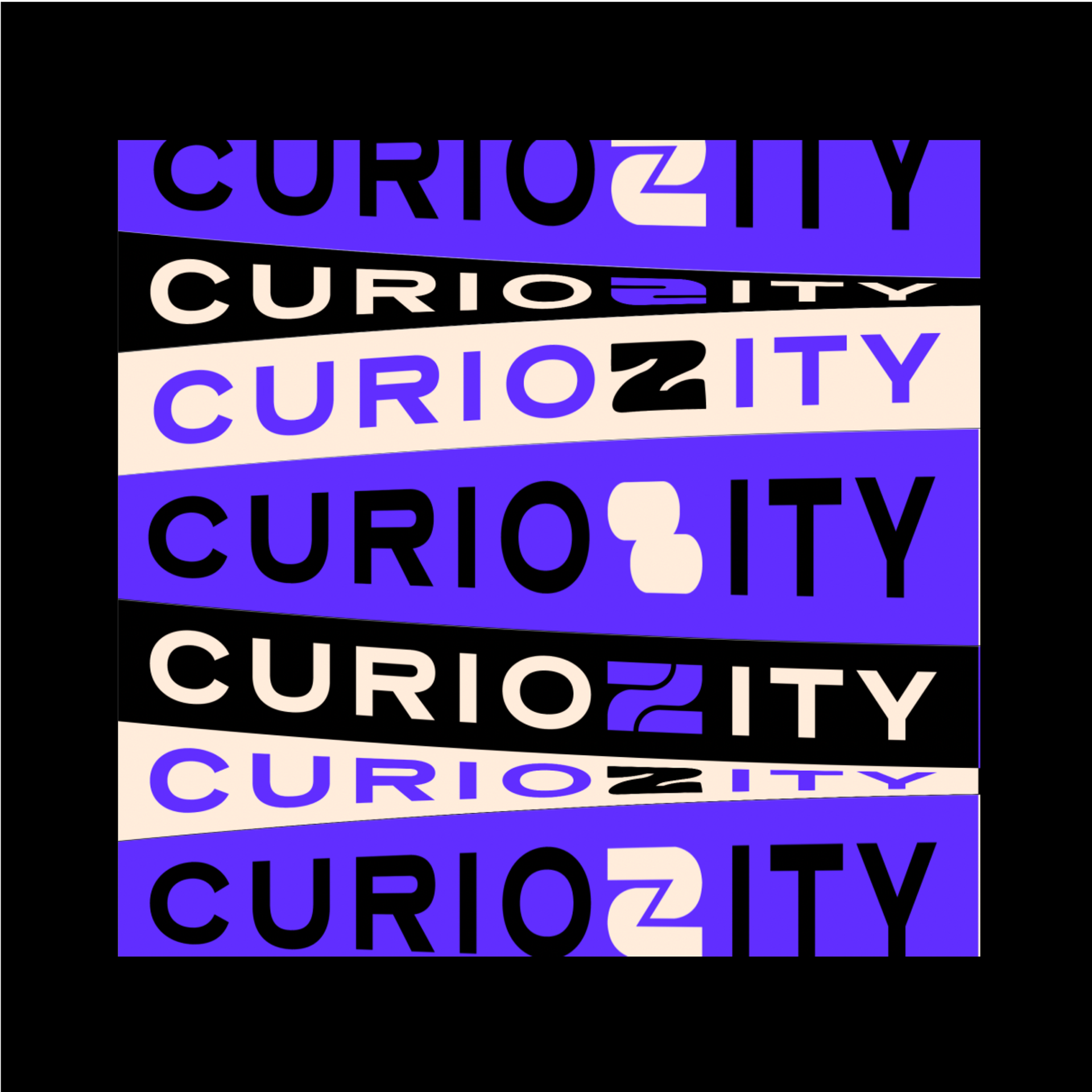
curio-Z-ity is Playful because: you learn through play Interactive Because: learn better by working with others curious: and well because it encourage curiosity strange and encourages curiosity
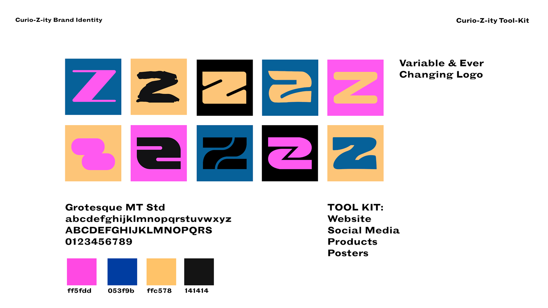
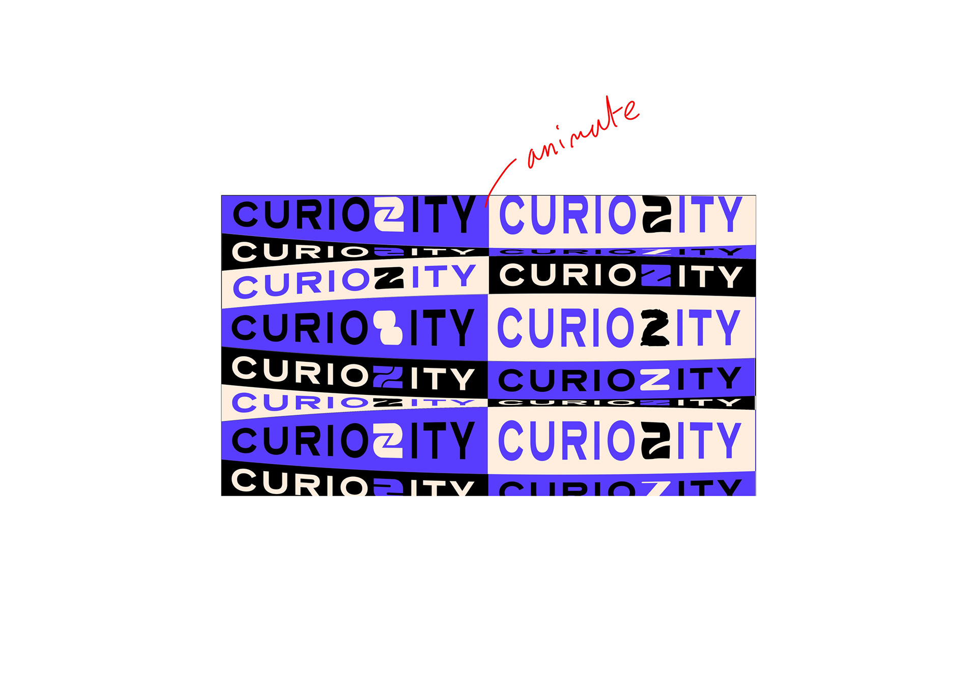
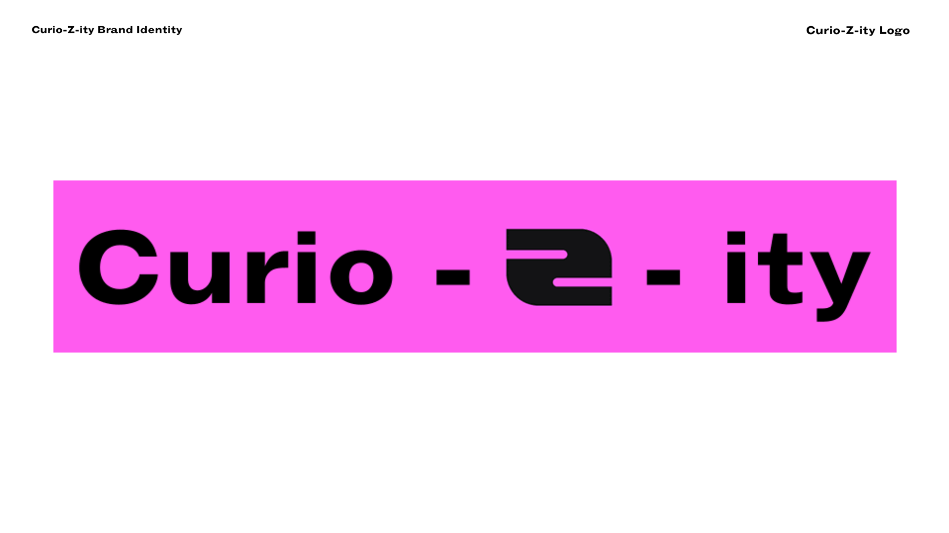
As we get older we are led to believe that being curious and inquisitive is a bad thing. Childish, imature and a waste of time. You’re meant to know things not find them out. I wanted to create a space where young adults could believe and celebrate, and most importantly not forget what a great thing it is to be curious. I’ve done this by creating a safe inclusive space people can escape to, where there is no judgment and they can find out about anything and everything. And contribute as well - giving and not just taking. I’ve created an identity that should be attractive to my particular audience. This is reflected in the dynamic variable logo which represents the diversity of Gen Z.
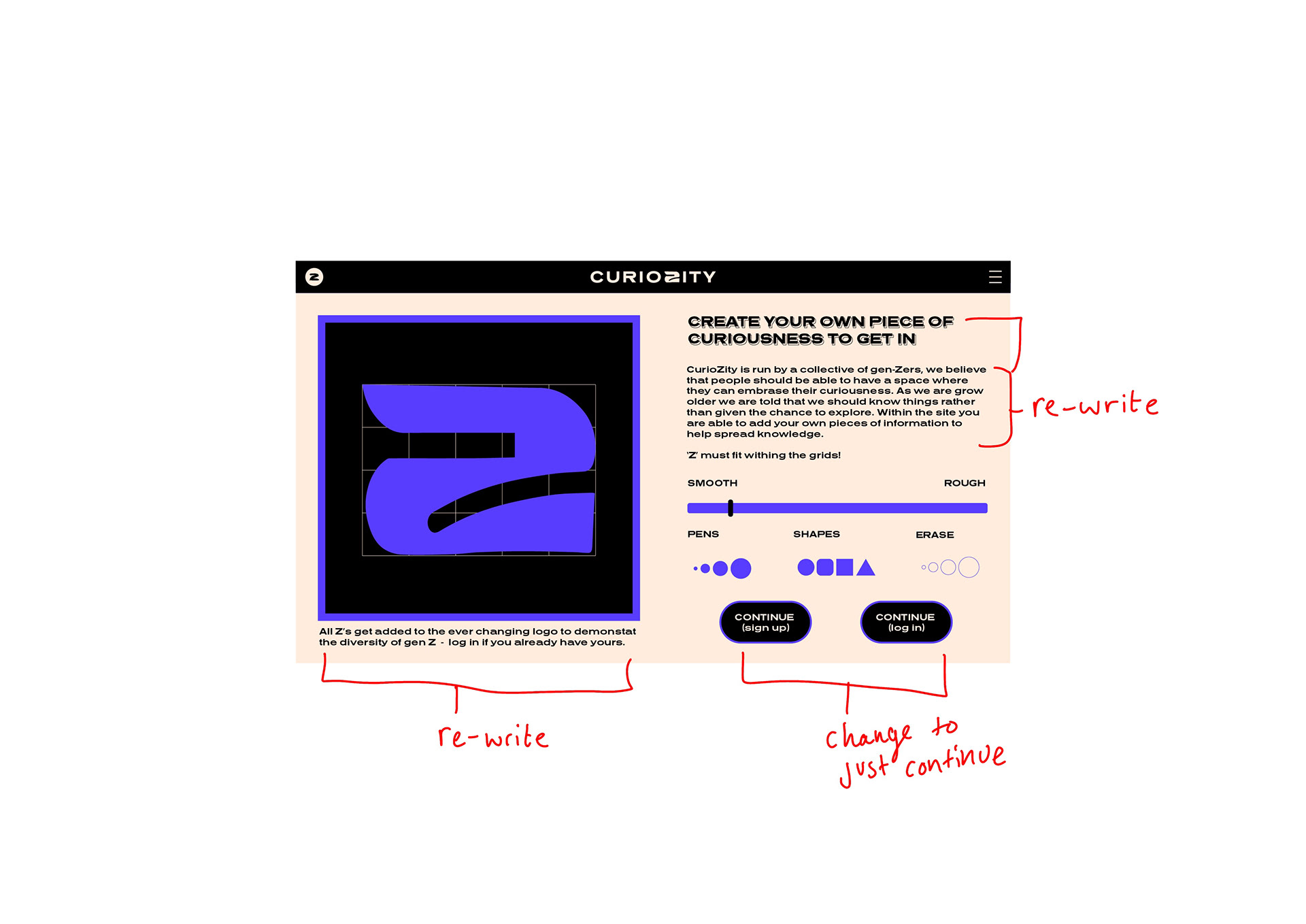
Drink me - (making a Z would open the ‘portal’ to the How the website will work ) - with the incentive that some will be incorporated into the logo in the top left hand corner weekly. Over time the logo will change but what is keep consistent is things like the colour pallete, layout, fonts etc just like us to reflect the ever changing Gen Z.
you go on and it shows endless scroll know as the ‘daily scroll’ which presents curated content. then goes to the different options Community -make your own -continue scroll where you can see past things
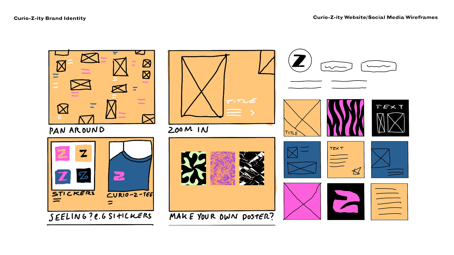
I still have further assets to develop but these are some of the wireframes for the community page, instagram feed/stories, merch/stickers/assets
PITCH/DECK PRESENTATION
Presentation notes are on each picture.
I was happy with my feedback I received that I presented well and was able to show the possibilities for me brand.
https://docs.google.com/presentation/d/1tOdrnd9fC8LPfWcy5z9VHupCgDrI5aY253KZY1X9n18/edit#slide=id.g7999a4a646_0_5

This is a font i've chosen as it's in a similar style to what I have seen around but I think what I will do is look at more fonts as I wanted show that I have experimented and tried things out.

A possible opening page for my website - the idea is you would click the z and it would take you to the page where you generate a Z.
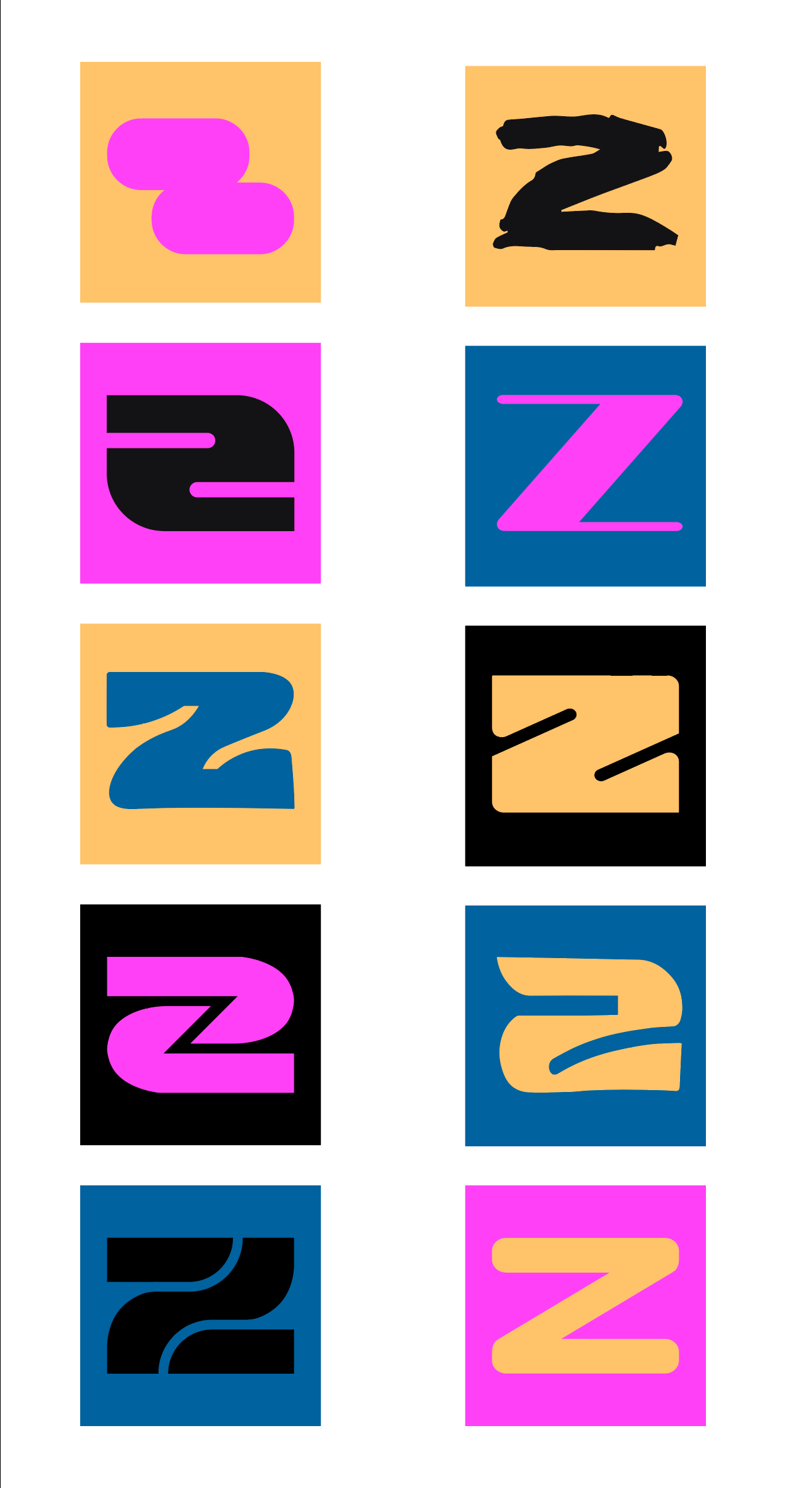
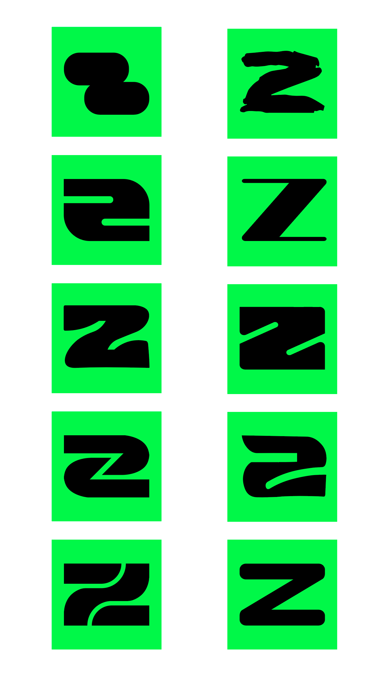
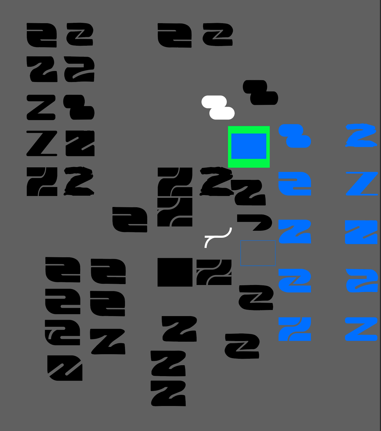
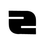

I tried the logo out as a square format as that seems to work best as most logos and areas are indeed square shaped. However I found that it looked too much like a 2 rather than a Z. I could tweak this a bit but do quite like the look of the rectangle version. I could try a meet in the middle version for it?
I asked two friends which they preferred and one said the square because it fits with many of the existing guidelines and the other said the rectangle because it looks more like a Z than the other.
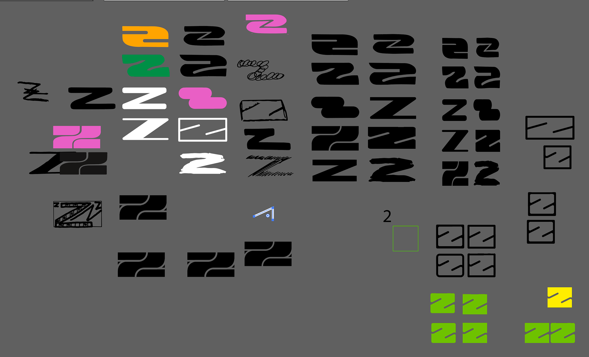
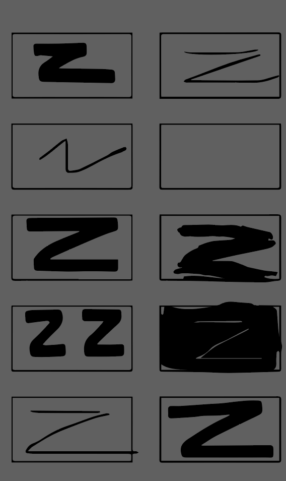
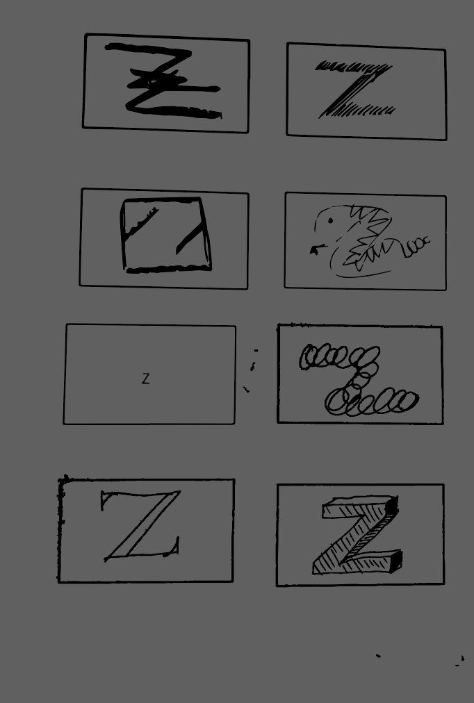
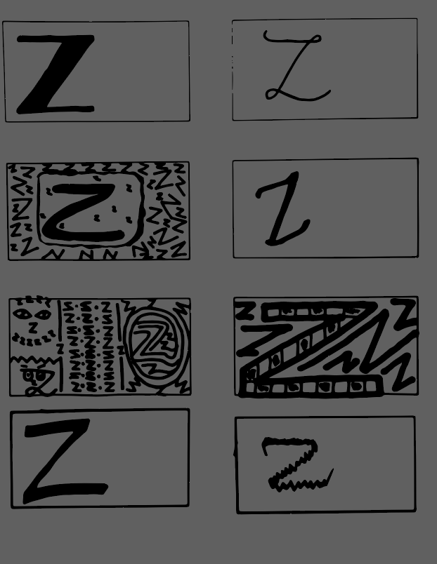
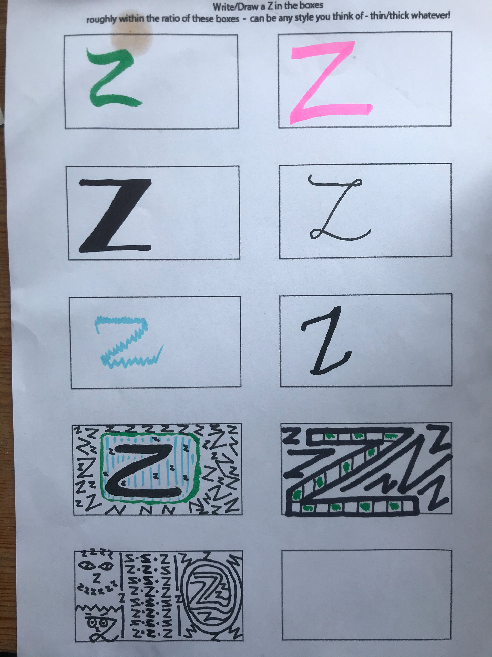
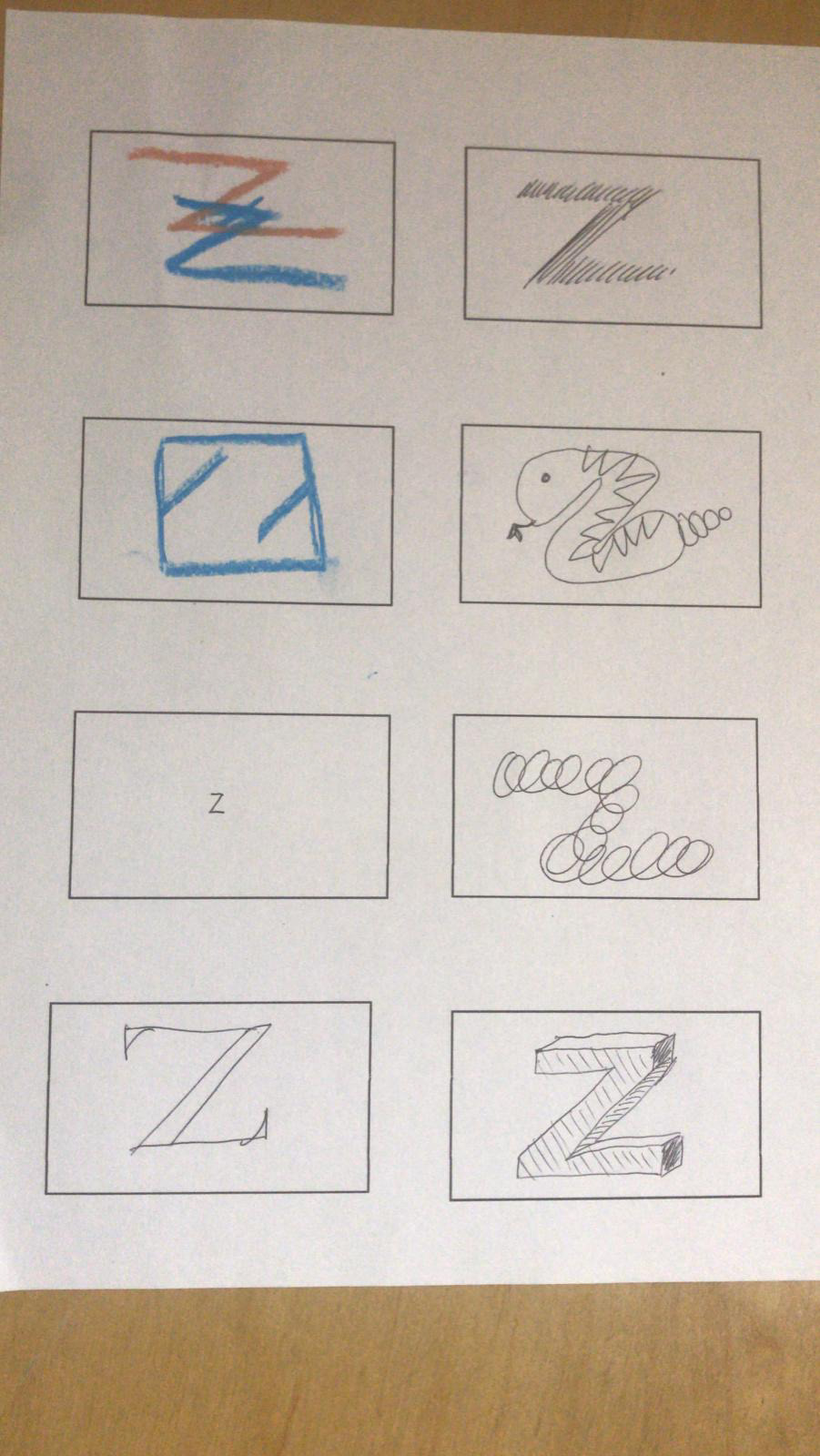
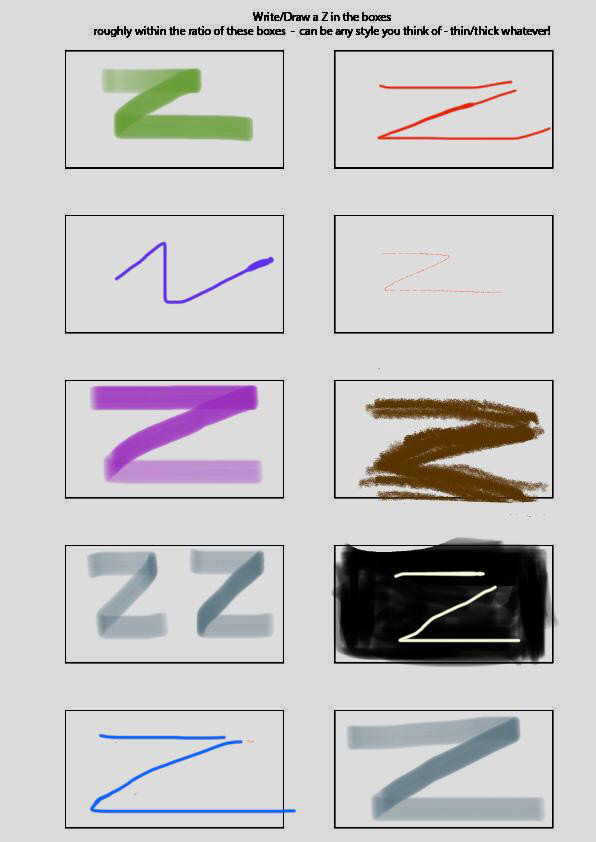
I asked friends to draw Z's in boxes which I could then convert to digital format and see if they would work to broaden my variable Z logo. Some haven't worked well but the ones that have I will neat up a bit and make the same ratio and see how they all look together. Fern did suggest 1:1 ratio which I may try out but I quite like the 'rectangle Z'.
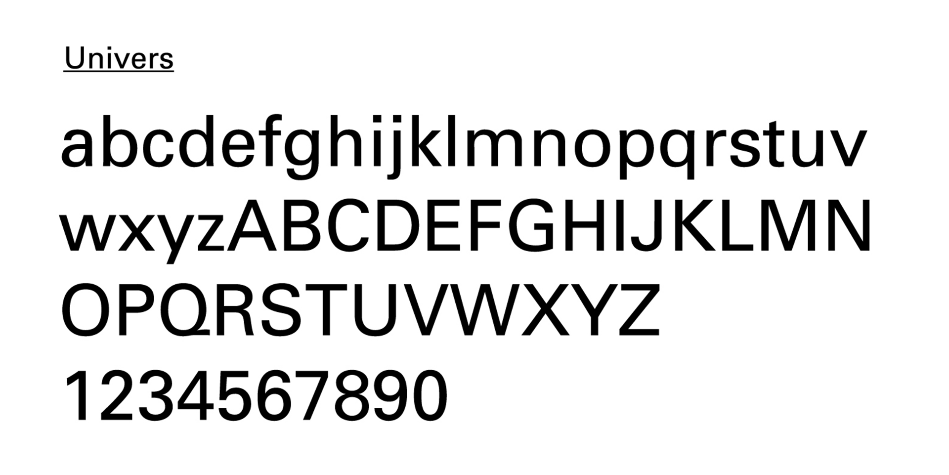
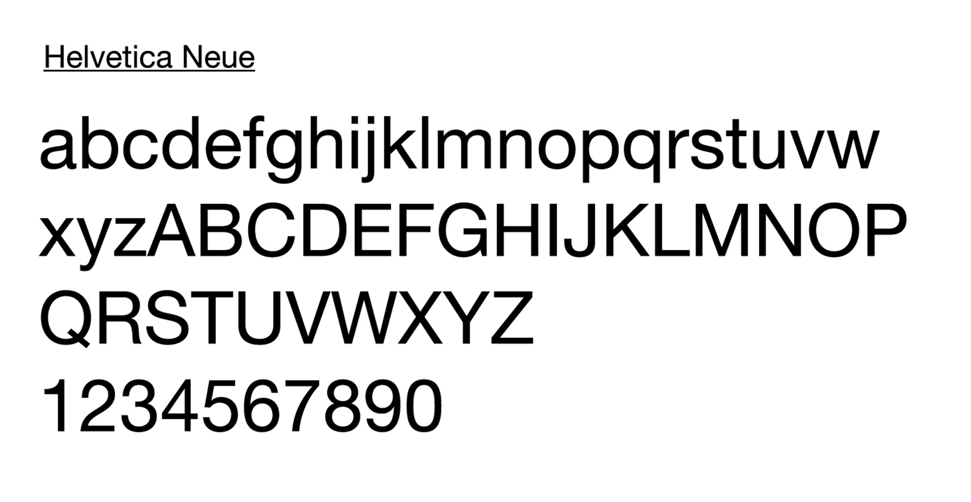
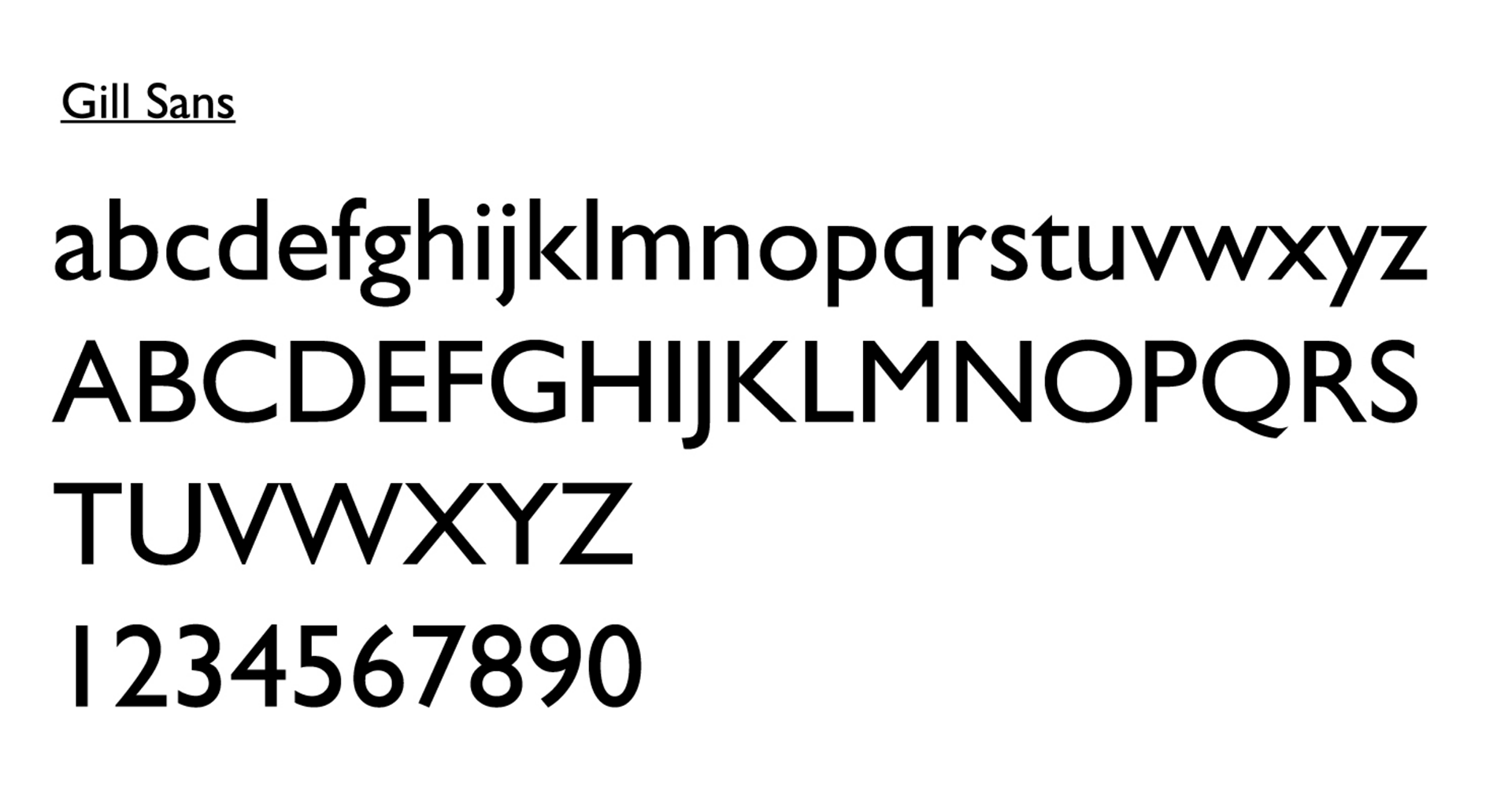
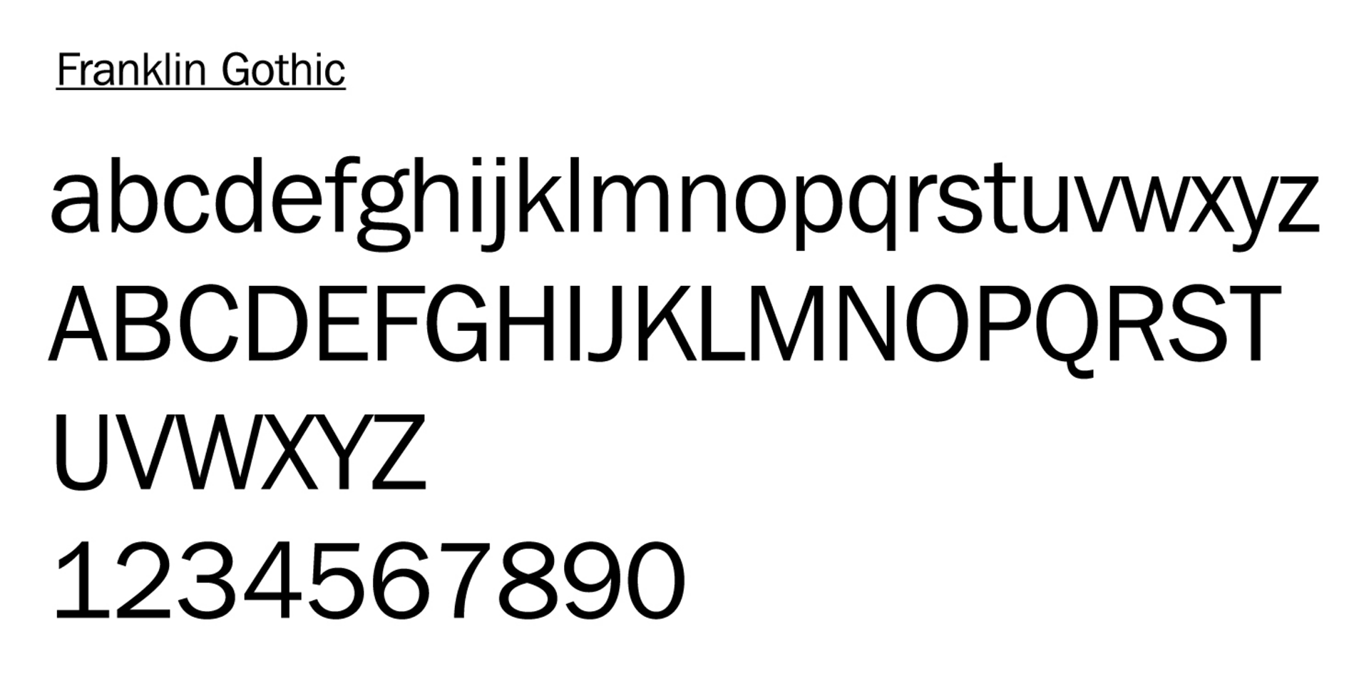
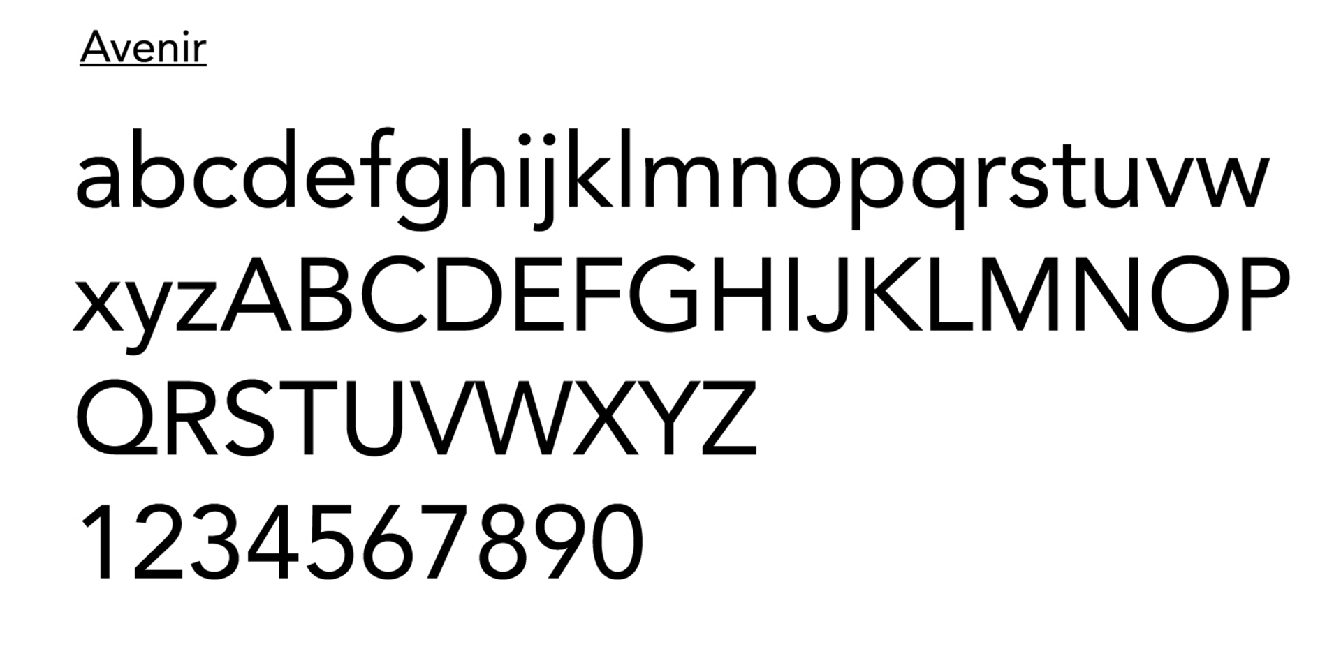
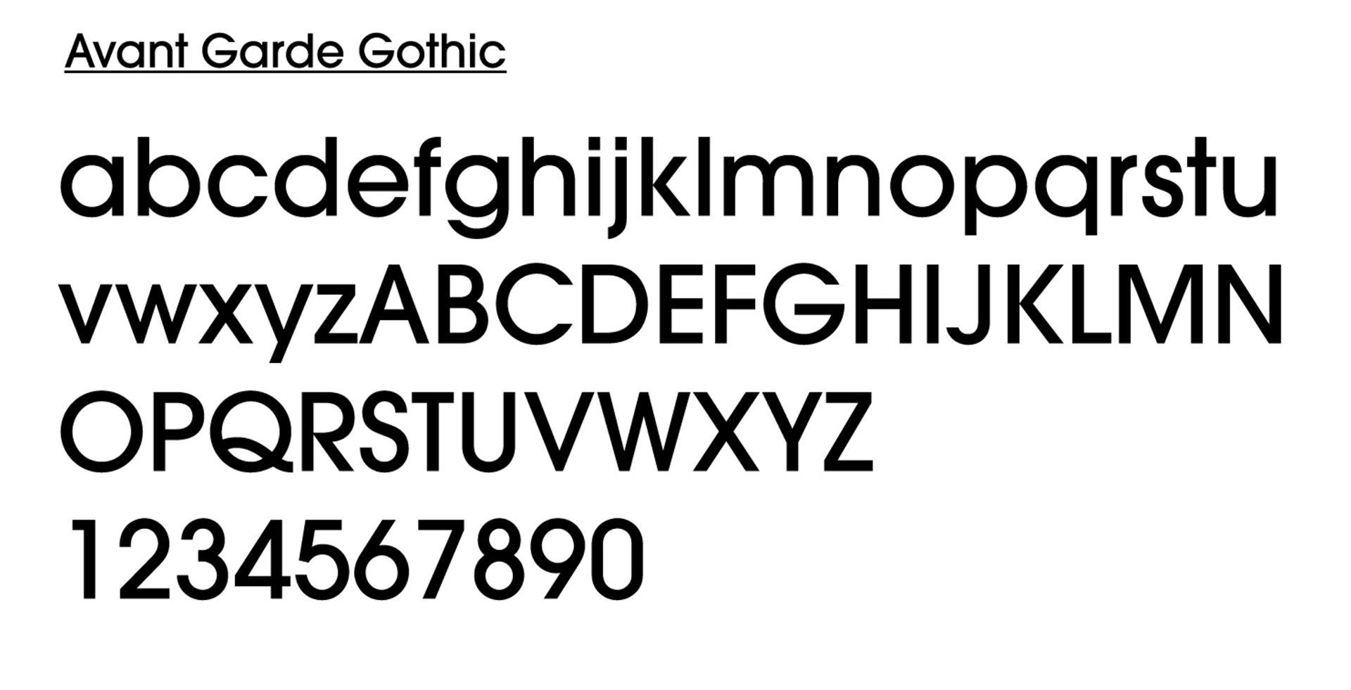

These are some fonts I may end up choosing for my body text, I feel I'll likely end up going for a san-serif font as I feel that they have a more modern feel and that for many they are easier to read so I want to be more inclusive as well. At the moment though I am still finaling my logo.
During tutor group I got okay feedback for my idea and how it seems it's coming together. I presented my different logos but still hadn't decided a final one. Fern suggested having a variable logo rather than just one to go with the diversity of gen Z. Also she said to decide a logo asap and work out a colour scheme etc as touch points and the rest of designing the assets need to start being designed ASAP.
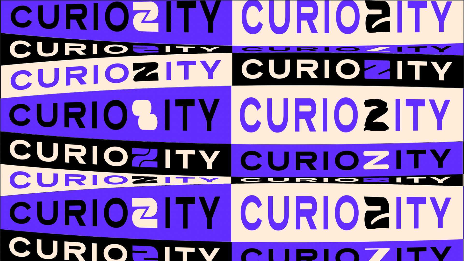
Above is an example of a variable font in the corner of the visual editions website. I think this will really for the brand aesthetic I am going for since having look at work aimed at Gen Z it seems to be a pretty characteristic for my audience. visual-editions.com
Also she recommended a type foundry velveteen which has lots of fonts which clearly fit the design style I am looking for I'll be having a look a those as well as adobe typekit and referencing some of the fonts spoken about in housekeeping. https://velvetyne.fr/